Best Bridal Shop Websites of 2026 (29 Real-World Examples)
Compare 29 bridal-shop and designer websites for distinctive imagery, useful collection browsing and clear routes to a real appointment.
A bridal website needs to communicate an aesthetic and answer practical questions. The photograph attracts attention; accurate designer, location, sample and appointment information helps someone decide what to do next.
Bridal websites often begin with fashion imagery, but their underlying business models vary. A local boutique, a designer selling through retailers, a consignment shop and a label with direct online ordering need different journeys. Start by explaining how the visitor can browse, try and buy. A large Book Now action is not enough if a bride cannot tell which location it serves or what kind of appointment is being requested.
The 29 examples below include independent boutiques, specialist designers and broader retailers with bridal departments. They are editorial design references, not a ranking of garments, inclusivity, fit or customer service. A campaign photograph does not prove local stock or sample availability. Borrow the visual thinking while writing the practical details around the designers, services and appointment model your own business actually offers.
Before the examples
What makes good bridal shop website design in 2026?
Connect the aesthetic to the buying model
Explain whether visitors book a boutique appointment, find a stockist, commission a custom gown or order online. Keep these routes distinct when several coexist. A designer’s collection page should not imply that every photographed gown is available to try in every shop. Give each next action a destination that explains the actual service rather than another general fashion campaign.
Answer appointment questions before the calendar
State the purpose of the visit, how the relevant location is chosen and where current preparation information lives. WildBride’s public FAQ illustrates why ordinary appointments, sample-sale visits and cancellation conditions deserve explicit explanation. Do not copy another shop’s terms or timings. Publish your own accurate conditions and review them whenever staffing, availability or booking arrangements change.
Keep promotional fashion content current
Trunk shows, sample sales and seasonal collection images have an expiry risk. Assign an owner who removes or updates the campaign after its useful period. A past date in a polished hero is still confusing. Keep the permanent designer catalogue and ordinary appointment route usable even when the homepage is temporarily promoting one event.
The collection · 29 examples
29 bridal shop websites worth studying
The examples below show monochrome boutique identities, designer-led fashion campaigns, local showroom pages and retail catalogues. Compare how each one moves from visual interest to a practical next step, not just how large its photographs appear.
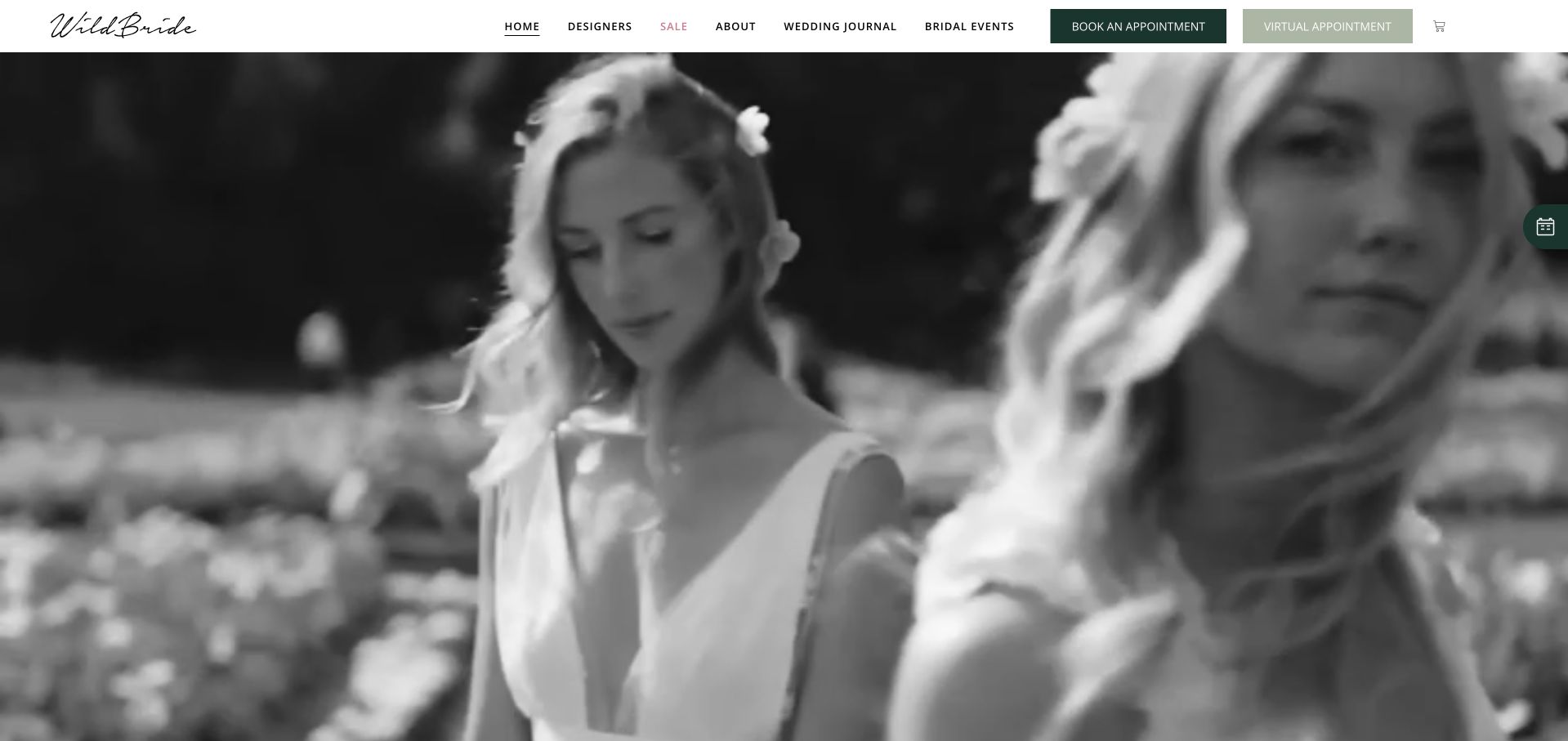
WildBride opens with monochrome outdoor bridal imagery beneath a clean white header and handwritten wordmark. Designer browsing, shop information and appointments have distinct routes, while physical and virtual appointment actions sit together. The restrained green buttons provide a practical counterpoint to the expressive photography. This San Francisco boutique is our smaller specialist editorial choice for the coherence of its visual identity and booking routes. The selection concerns website design, not garment quality or a guarantee of any customer’s shopping experience.
What you can learn
Let the image establish an aesthetic, then let the navigation answer practical questions. Keep designer information, appointment expectations and location details separate enough that a bride can investigate fit before choosing a physical or virtual visit.
Pros
Monochrome imagery and green actions create a coherent boutique identity.
Physical and virtual appointment labels explain two genuinely different routes.
Cons & considerations
Fashion imagery still needs budget, sample-size and timing information nearby.
Compact designer navigation requires careful mobile spacing and text sizing.
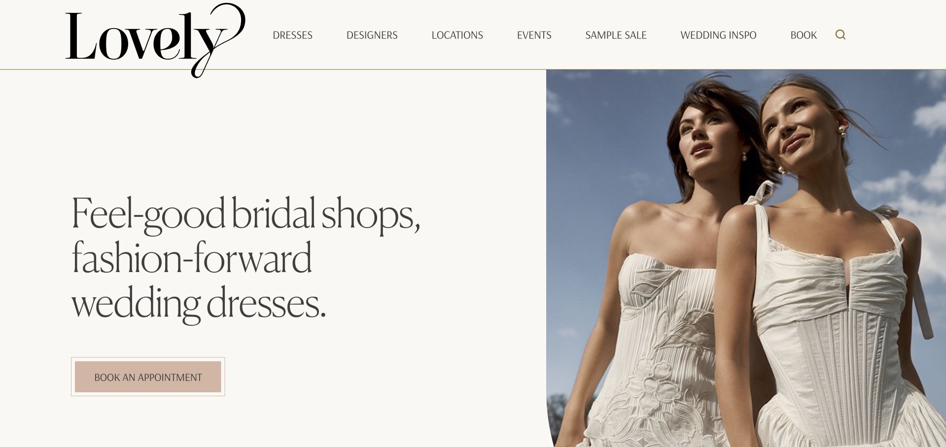
Lovely Bride gives its oversized serif wordmark room to breathe above a cream-and-photo split hero. The left side describes the bridal-shop offer in a few large lines, while a fashion photograph occupies the right. A muted appointment button supplies the main action without competing through a bright promotional colour. Designers, locations and events remain visible as separate navigation categories. This is a useful reference for a retailer with a distinctive voice that still needs a recognisable route from inspiration to a real shop visit.
What you can learn
A strong brand statement can coexist with plain practical labels. Keep the appointment action direct, then let location pages explain the designers, sample availability and visit arrangements that actually apply to each shop rather than relying on one national introduction.
Pros
A split layout protects text from the photographic crop itself.
The generous wordmark establishes recognition without additional campaign graphic clutter.
Cons & considerations
An airy introduction delays practical appointment and budget information initially.
Central designer lists need accurate qualification for each individual shop.
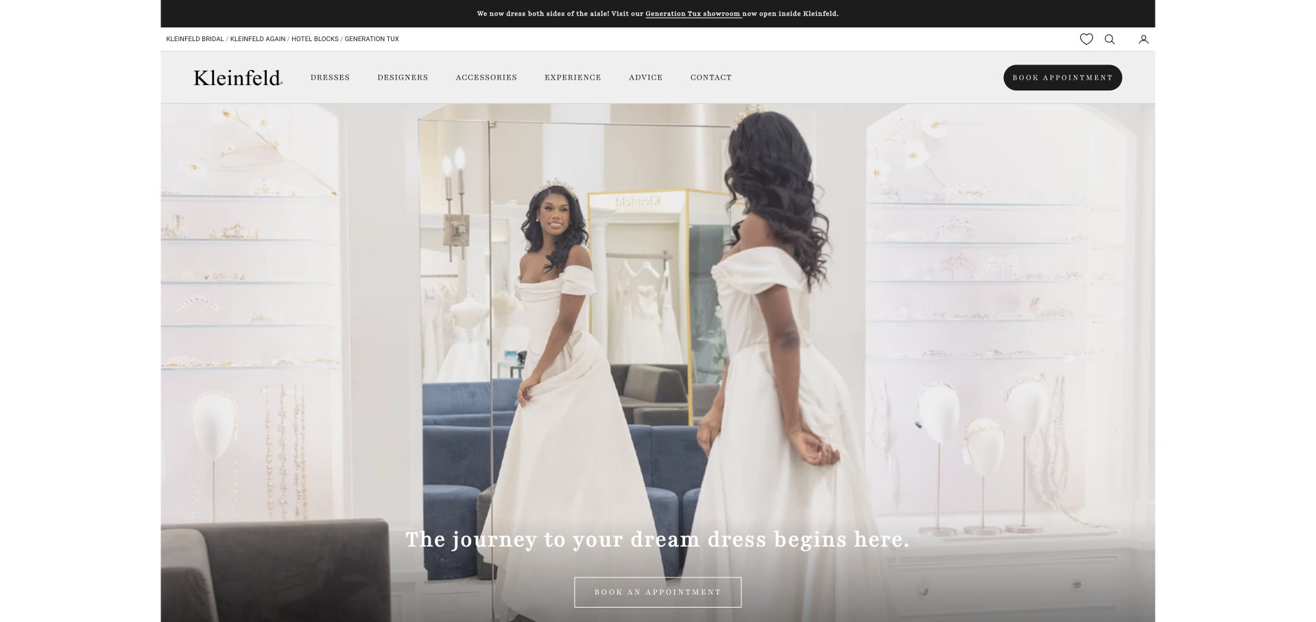
Kleinfeld uses a bright fitting-room photograph with a short white statement layered near the lower part of the image. The white header and small wordmark remain visually separate, while an appointment action sits at the upper right. The mirror and surrounding interior communicate a shopping environment rather than only a fashion campaign. The composition is restrained despite the business’s broad recognition. It is useful for showing how an actual service setting can introduce a bridal retailer without making the first view a product grid or enquiry form.
What you can learn
Use the shop environment to introduce the visit, then explain what an appointment includes on the destination page. A recognisable name does not remove the need for clear information about timing, companions, sample availability and how visitors prepare.
Pros
The fitting-room photograph gives the appointment route a concrete context.
A white header keeps retail navigation separate from photographic storytelling.
Cons & considerations
Small white copy needs contrast against the bright interior photograph.
The scene cannot establish current samples or appointment availability itself.
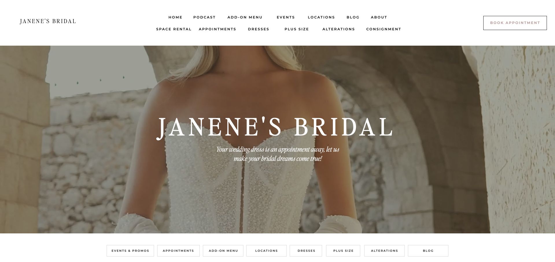
Janene’s Bridal places a literal boutique title over a softly cropped dress photograph beneath a spacious white header. The navigation distinguishes designers, services, locations and practical visitor information, with booking kept as a separate action. A row of service categories begins below the main image. This gives the page a clear retail purpose without relying on an abstract campaign slogan. Its usefulness is the relationship between a polished fashion introduction and the many logistical questions that surround a bridal appointment at a physical store.
What you can learn
A bridal homepage needs both aesthetic and operational clarity. Keep the main title plain enough to orient a newcomer, then group designer browsing, appointment preparation and services so a visitor does not confuse buying a gown with arranging a separate alteration appointment.
Pros
A literal title identifies the boutique before the fashion campaign.
Service and location routes recognise practical needs beyond dress browsing.
Cons & considerations
Soft photography needs dependable contrast beneath the white hero lettering.
Different services need labels explaining their separate appointment requirements clearly.
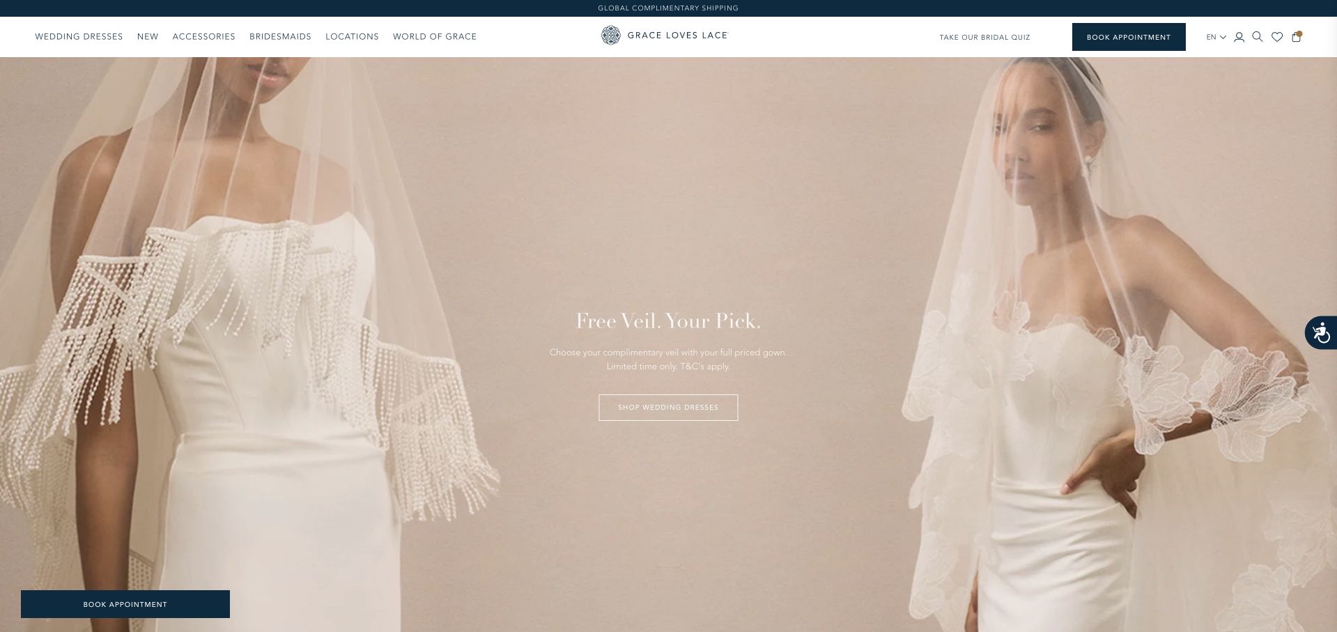
Grace Loves Lace uses two soft-toned fashion images beneath a narrow white header. The main message and action sit lightly within the imagery rather than occupying a separate text panel. Showroom, collection and appointment routes remain available above, giving visitors more than one way into the brand. The visual result is deliberately quiet and garment-focused. It is useful for studying how an ecommerce-oriented bridal brand can preserve a physical appointment route, although the very pale palette makes legibility an important part of the execution.
What you can learn
If shopping and showroom visits coexist, keep their routes distinct. Explain whether a garment is available to order online, try locally or request through a particular showroom. Preserve the restrained aesthetic while giving essential labels sufficient contrast and clear text alternatives.
Pros
Paired images establish one consistent aesthetic without a rotating carousel.
Showroom and appointment routes coexist with the main collection navigation.
Cons & considerations
Pale imagery and copy can reduce practical action visibility significantly.
Images cannot establish which samples are available at each showroom.
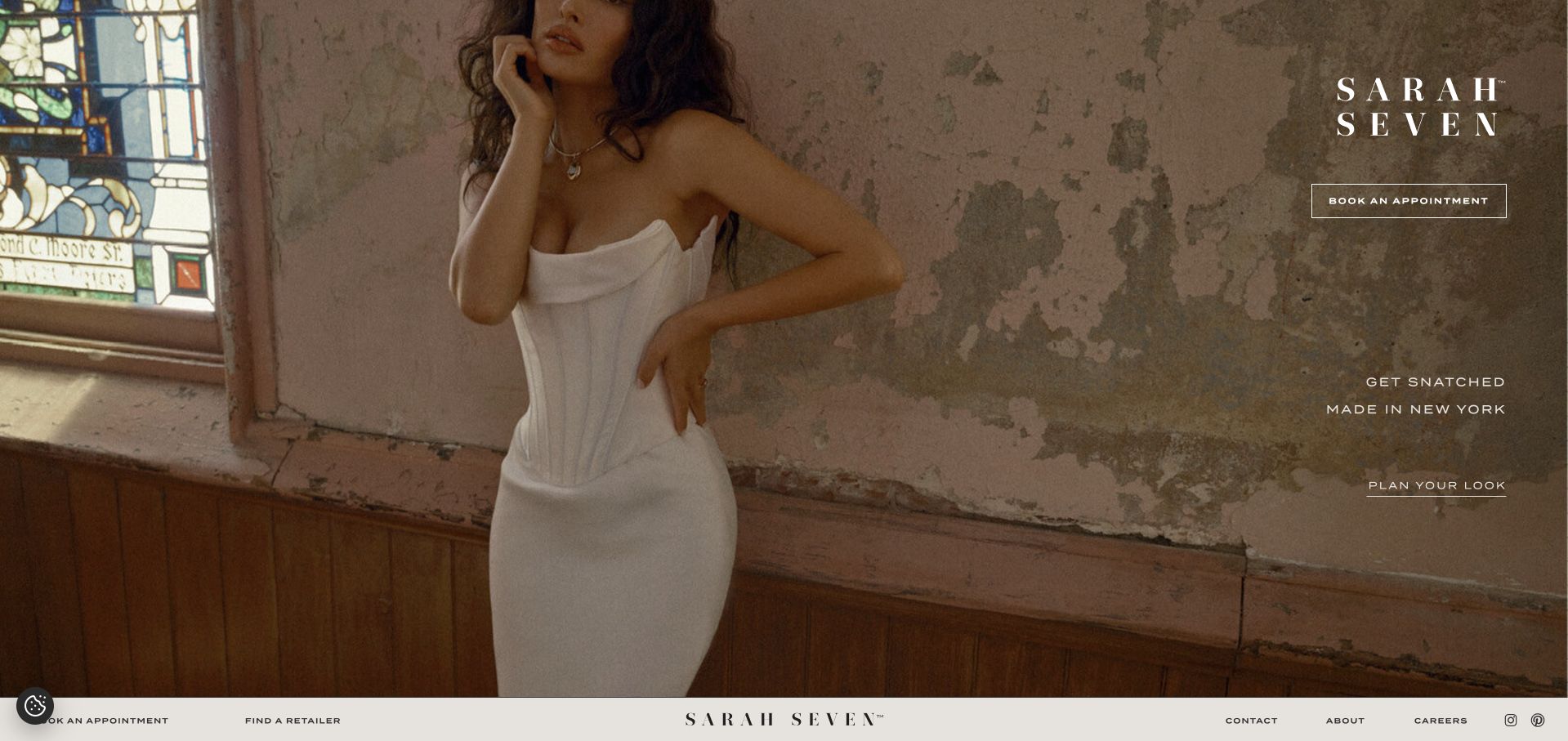
Sarah Seven places its stacked wordmark and appointment action to the right of a large fashion photograph. The model, textured room and warm palette do most of the storytelling, while a small collection-oriented statement sits below the wordmark. A simple navigation row begins underneath the image rather than crowding its top. The composition is editorial and intentionally spare. It gives the designer a strong visual identity, but visitors seeking a particular collection or stockist still need clear routes beyond the opening campaign.
What you can learn
A designer-led image works when the practical next step remains visible. Keep appointment, collection and stockist information easy to distinguish, and explain which location the appointment action serves. Do not make the visitor infer ordering arrangements from the fashion image alone.
Pros
An asymmetric wordmark leaves the main fashion subject visually unobstructed.
A restrained appointment button supplies a practical next step clearly.
Cons & considerations
Sparse introductory text leaves ordering and budget questions unanswered initially.
Navigation below the image may be less discoverable to newcomers.
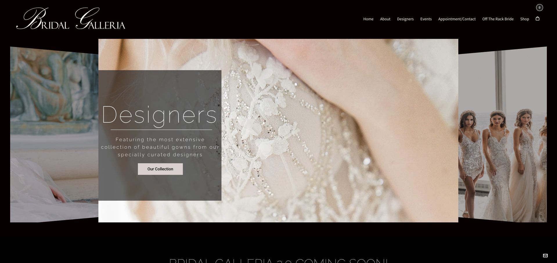
Bridal Galleria uses a black background and script wordmark to frame a dimensional arrangement of dress photographs. A translucent panel identifies the designer-browsing purpose and supplies a collection action, while adjacent images suggest additional selections. The visual treatment feels like an exhibition rather than a conventional product grid. The header remains sparse, with appointments and shop information above. This is useful inspiration for a boutique that wants to foreground its edited designer range, although the animated arrangement should not become the only route to that catalogue.
What you can learn
A carousel should support, not replace, a complete designer directory. Keep a plainly labelled catalogue link available and make the selected image understandable without motion. Visitors comparing collections should not have to wait for a slide transition to find a designer’s name or details.
Pros
A dark frame unifies different designer photographs into one presentation.
A collection action explains the purpose of the visual arrangement.
Cons & considerations
Rotating layers are less direct than a complete designer directory.
Translucent panels need contrast checks and accessible motion controls throughout.
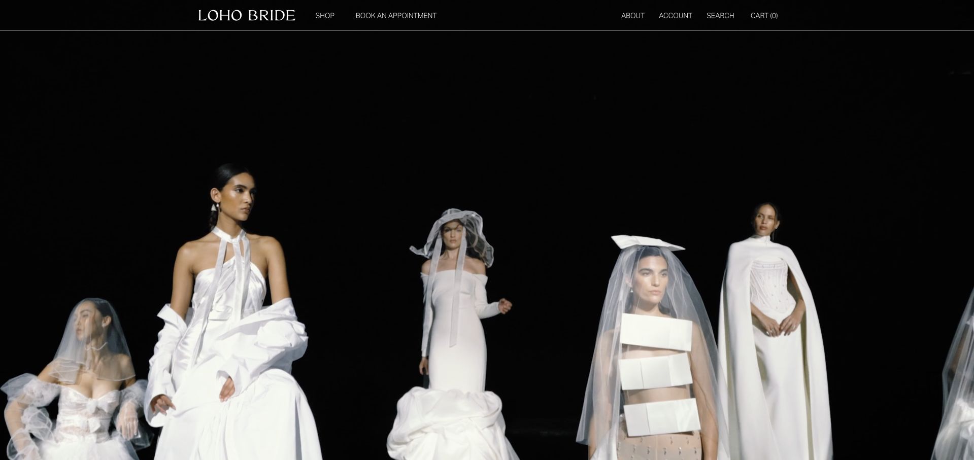
LOHO Bride uses a black stage-like opening with several white bridal looks across the lower part of the scene. The wordmark and a short navigation row remain restrained above it, including a visible appointment route. The composition presents the garments as an editorial selection rather than immediately asking visitors to choose a price or product filter. Its high contrast makes the fashion imagery distinctive. The tradeoff is that a first-time visitor learns relatively little about the boutique’s location, ordering process or appointment expectations from the initial view alone.
What you can learn
An editorial opening should be followed by an exceptionally clear boutique introduction. Keep designer and appointment routes readable, explain the physical shopping context and provide practical preparation details. The aesthetic should attract attention without becoming a barrier to understanding how someone can actually visit or buy.
Pros
A dark stage gives the white garments a strong focus.
Minimal navigation preserves an appointment route without crowding the image.
Cons & considerations
The first view provides little location or appointment preparation context.
Editorial images cannot establish samples, budgets or current ordering timelines.
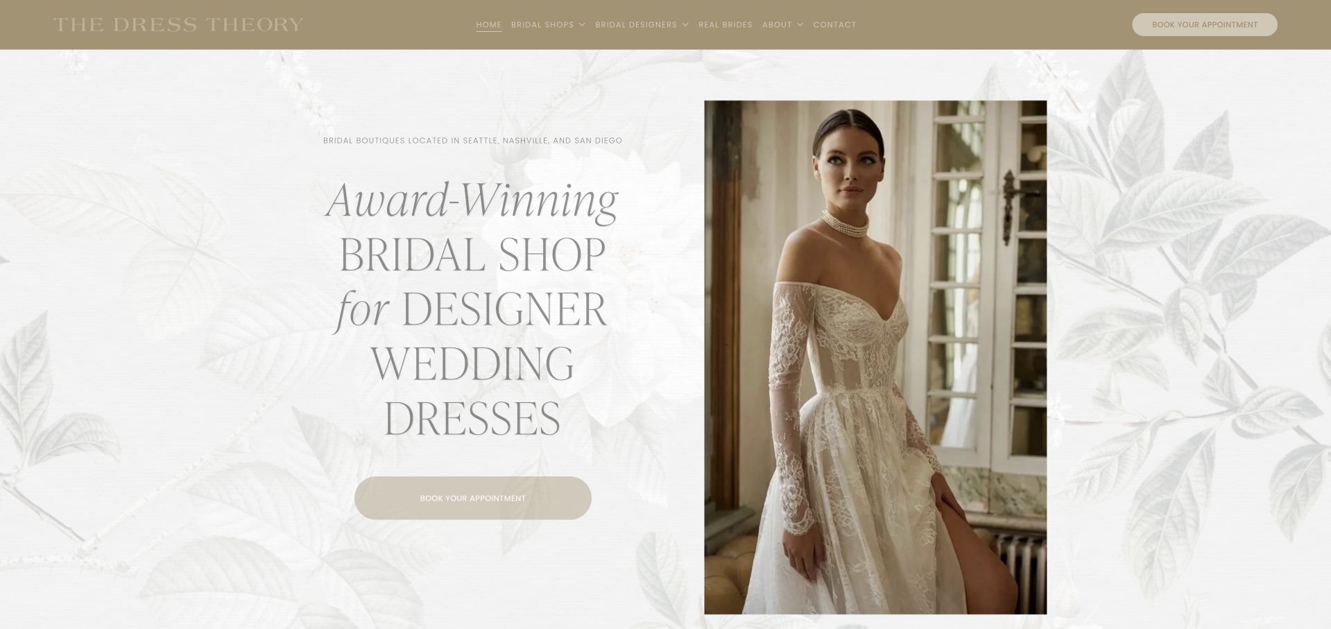
The Dress Theory uses a pale leaf-patterned background, fine serif typography and a framed fashion portrait. The headline occupies the left side, while a muted appointment action sits below it. A narrow coloured header contains the boutique navigation and another booking route. The composition feels like a printed invitation translated into a website, with a clear division between text and image. It is a useful reference for a delicate visual identity, although the low-contrast treatment needs deliberate care to keep all practical information readable.
What you can learn
A soft palette does not require faint text. Preserve the framed, editorial character while using strong enough contrast for headings, labels and actions. Give location and appointment details the same care as the photograph so the page remains useful beyond its first impression.
Pros
A framed portrait creates a clear text-and-image editorial reading order.
An appointment action remains visible within the introductory boutique section.
Cons & considerations
Pale text can lose clarity against the decorative leaf background.
An award-oriented heading cannot replace practical location and visiting information.
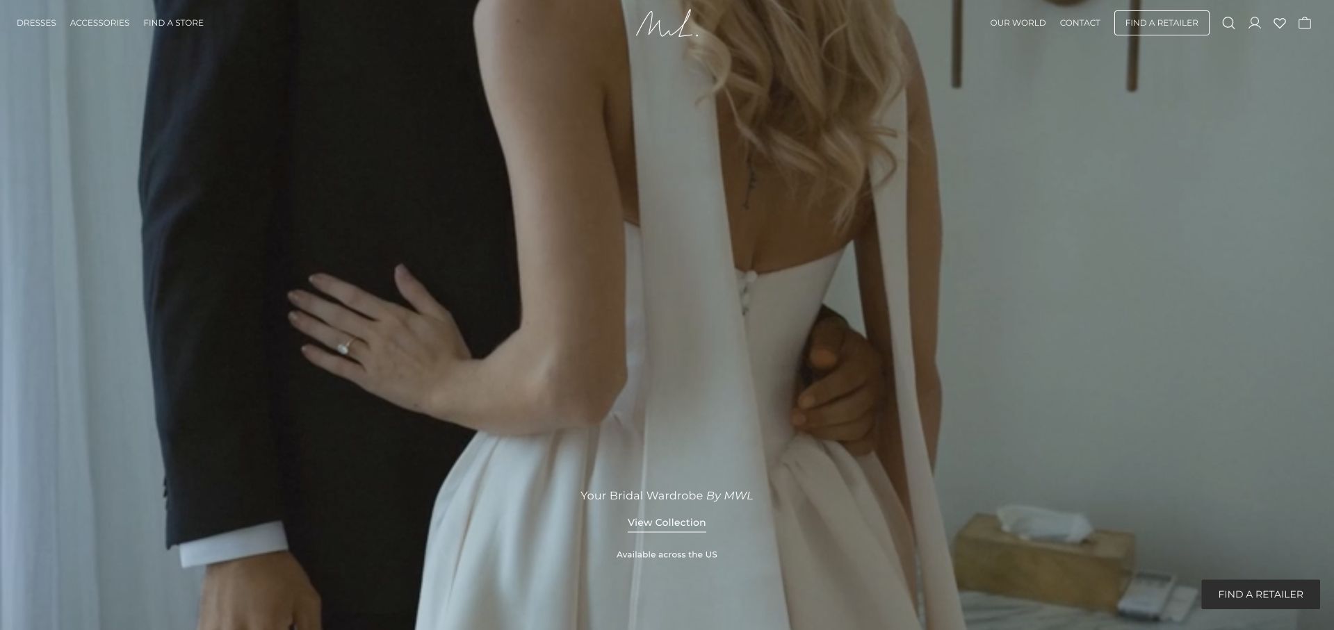
The Made With Love source now resolves to the MWL Bride public site. The observed opening uses a close couple photograph, a small white wordmark and restrained collection navigation. A Find a Retailer action appears within the image, reflecting a distribution model that is different from booking one local boutique. The page is useful for studying a fashion label’s handoff from inspiration to stockist information. Its imagery establishes the collection’s tone but cannot establish which gowns are currently available to try at a particular retailer.
What you can learn
When a label sells through stockists, make the retailer handoff explicit. Keep the current brand name and redirected source honest, then let location results explain where visitors can enquire about samples. Avoid implying that a campaign photograph is a live inventory listing.
Pros
A retailer action matches the brand’s distribution model directly overall.
Restrained copy lets the photograph establish one coherent collection mood.
Cons & considerations
Fine white navigation needs reliable contrast across responsive photographic crops.
Central collections need local sample confirmation before a fitting visit.
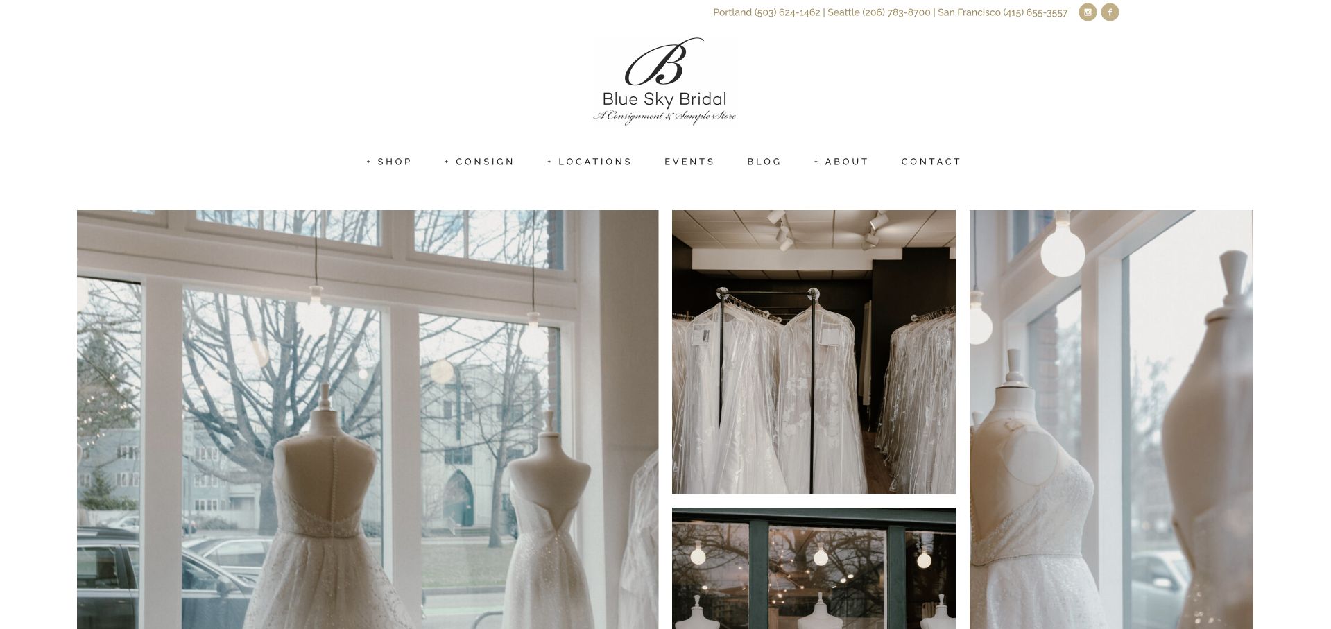
Blue Sky Bridal uses a script wordmark, generous white space and a three-part arrangement of shop-window and gown photographs. The main navigation separates shop information, consignment, locations and appointments. This matters because buying a consigned gown and consigning one are different journeys, even though both belong to the same business. The visual treatment is calm and boutique-like rather than resembling a classified marketplace. The opening establishes the retail atmosphere, while the consignment terms and location-specific selection still need to be learned from the relevant public pages.
What you can learn
Give buyers and consignors distinct routes before asking either group to enquire. Explain sample availability, condition and consignment requirements in plain language. A polished boutique identity should make an unfamiliar retail model easier to understand, not leave visitors to infer its rules from the photographs.
Pros
Separate consignment and shopping labels recognise two different visitor intentions.
Shop-window imagery gives the business a recognisable physical retail setting.
Cons & considerations
Photographs cannot establish the condition or availability of specific gowns.
Changing inventory needs accurate location-specific information and current catalogue maintenance.
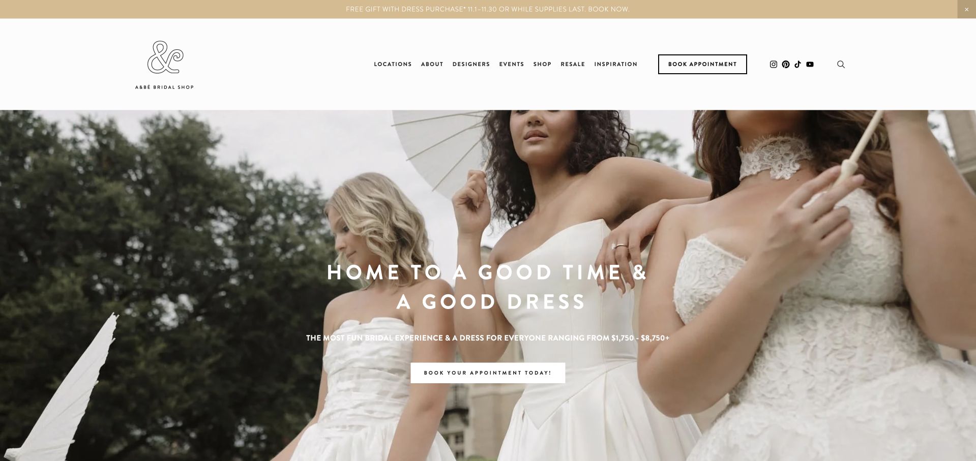
a&bé combines a white header, small decorative wordmark and a large outdoor bridal photograph with an enthusiastic, short headline. The appointment action is visible both in the main navigation and inside the hero. Designers and locations remain separate routes, supporting visitors who want to research the range before booking. The page feels contemporary without depending on a complicated layout. It is a useful example of a playful retail voice attached to conventional practical navigation, although current campaigns and collection availability still need careful local qualification.
What you can learn
Let the tone be playful while the task labels stay literal. Keep location selection and designer browsing separate, then explain the appointment process where it applies. Repeated booking routes should lead consistently rather than sending visitors into different unexplained forms from different parts of the same page.
Pros
A simple header keeps store navigation readable above expressive photography.
Designer and location routes allow research before an appointment booking.
Cons & considerations
Date-led campaigns need prompt maintenance when their useful period ends.
Wide photographs need mobile crops preserving the gown and headline.
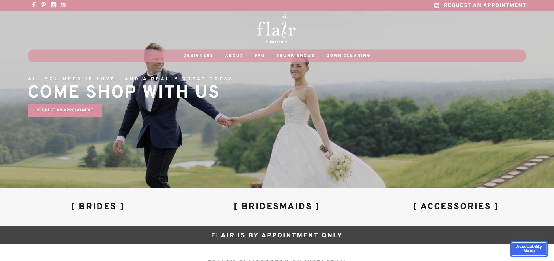
Flair Boston uses a clear boutique introduction with photography, a restrained navigation system and a direct invitation to shop. The official content distinguishes bridal gowns, bridesmaid dresses and accessories, keeping the broader wedding-party offer visible rather than presenting the business as only one designer’s collection. The homepage also offers a boutique-tour route, which gives visitors a way to understand the setting before an appointment. It is a useful small-business reference for connecting a local identity to several related retail categories without requiring an elaborate campaign system.
What you can learn
A local bridal shop should explain whom each appointment serves. Keep bridal and bridesmaid routes distinct, then publish preparation details, location information and current scheduling constraints. An optional tour can add context, but essential visit information should remain readable without playing a video.
Pros
A Boston identity gives the wedding-party offer recognisable local context.
Bridal and bridesmaid categories distinguish two different shopping journeys clearly.
Cons & considerations
Related categories need appointment labels that prevent mistaken booking choices.
A boutique video needs captions and a useful written alternative.
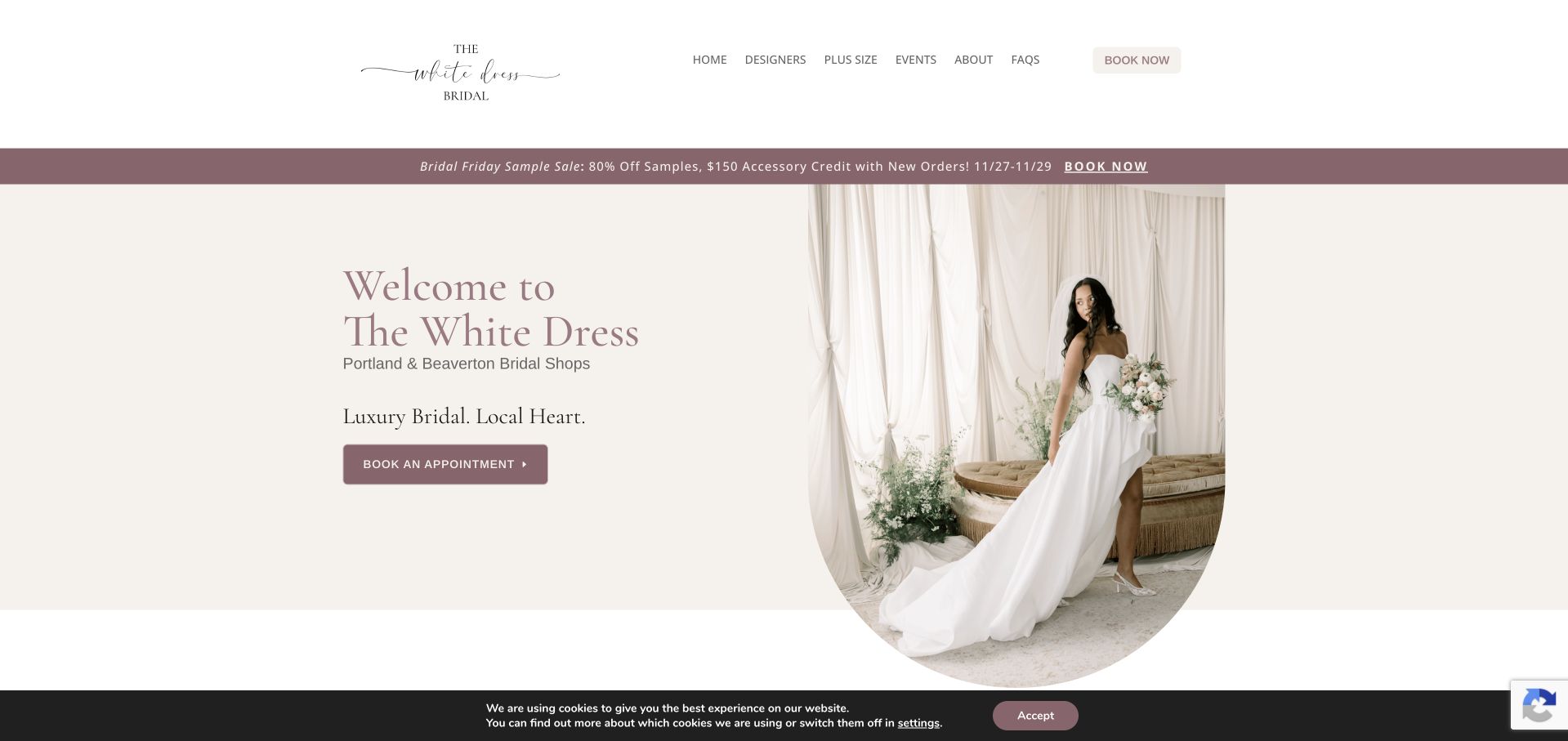
The White Dress uses a cream-and-mauve palette and a tall, softly framed gown photograph beside a direct welcome. The subheading names Portland and Beaverton, while the main action invites an appointment. The white header keeps designers, plus-size information, events and FAQs visible. This is useful because it treats practical shop information as part of the main navigation rather than an afterthought beneath a fashion campaign. The photograph creates a bridal atmosphere without replacing the text that identifies the business’s actual local setting.
What you can learn
Name the locations early when a boutique serves more than one nearby city. Keep appointment routes location-aware and explain which designers and samples are available at each shop. A consistent central brand should not blur the practical differences between the places someone can visit.
Pros
Named cities make the local shopping context immediately understandable overall.
Designer and FAQ routes address practical research alongside the photograph.
Cons & considerations
Fine pale typography needs dependable contrast across smaller bright displays.
Seasonal offers need maintenance so old events remain clearly distinguishable.
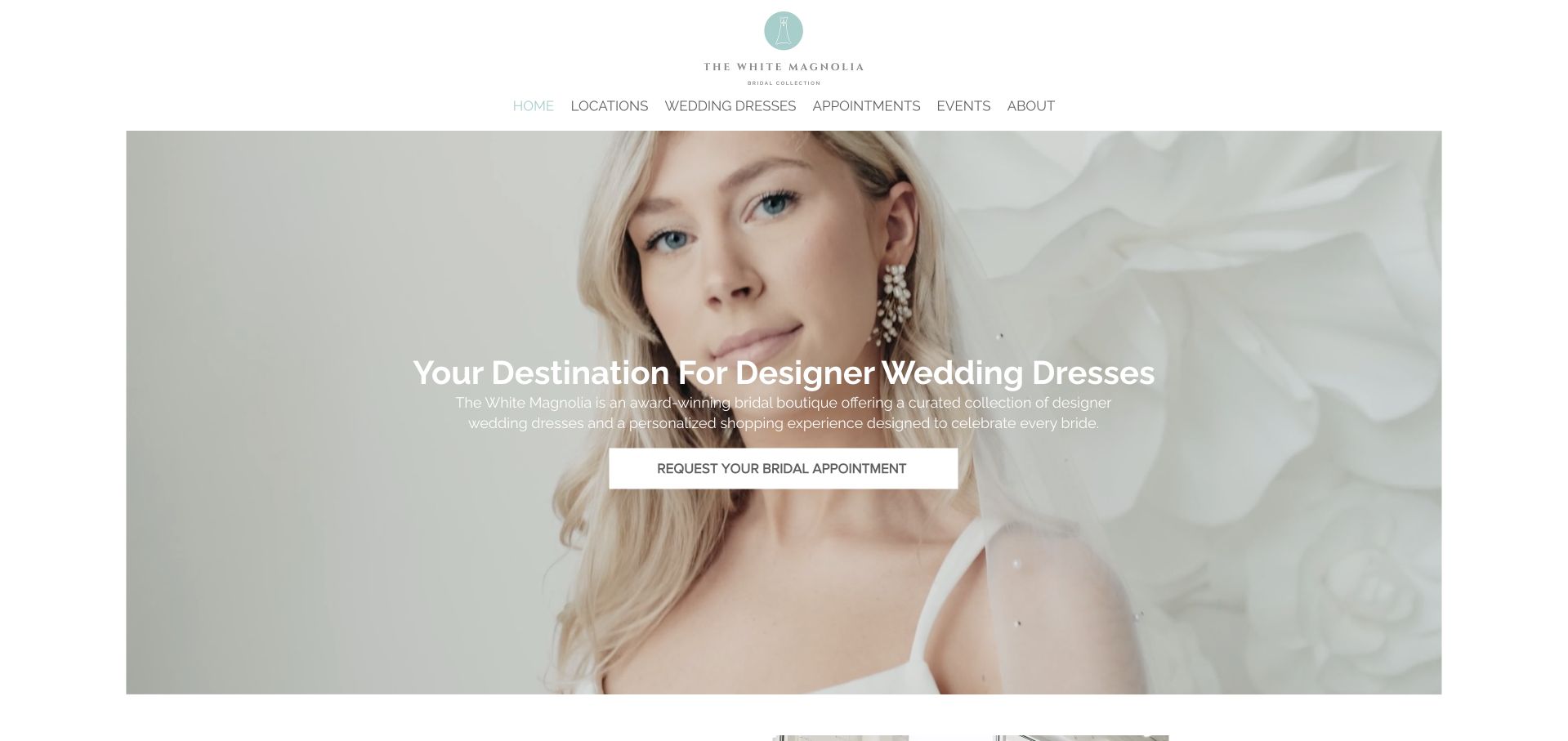
The White Magnolia frames a large fashion portrait beneath a narrow, spacious white header. A short statement about designer wedding dresses and a white appointment button sit centrally over the image. Locations, designers and appointment information remain distinct routes above. The image is bounded by white space rather than extending edge to edge without relief, giving the page an editorial quality. It is useful for studying a bridal retailer that wants a consistent brand presentation across several shops while keeping the appointment route obvious.
What you can learn
A central booking action should lead to the right location before it asks for visit details. Preserve the elegant photographic framing, but make sample range, designer availability and appointment expectations easy to discover. The main collection image should not be treated as proof of local stock.
Pros
White framing gives the photograph a clear editorial visual boundary.
A central appointment action stays visible without a conflicting colour.
Cons & considerations
Overlaid text needs contrast against the pale portrait on mobile.
Multi-location designer availability requires accurate qualification for each individual shop.
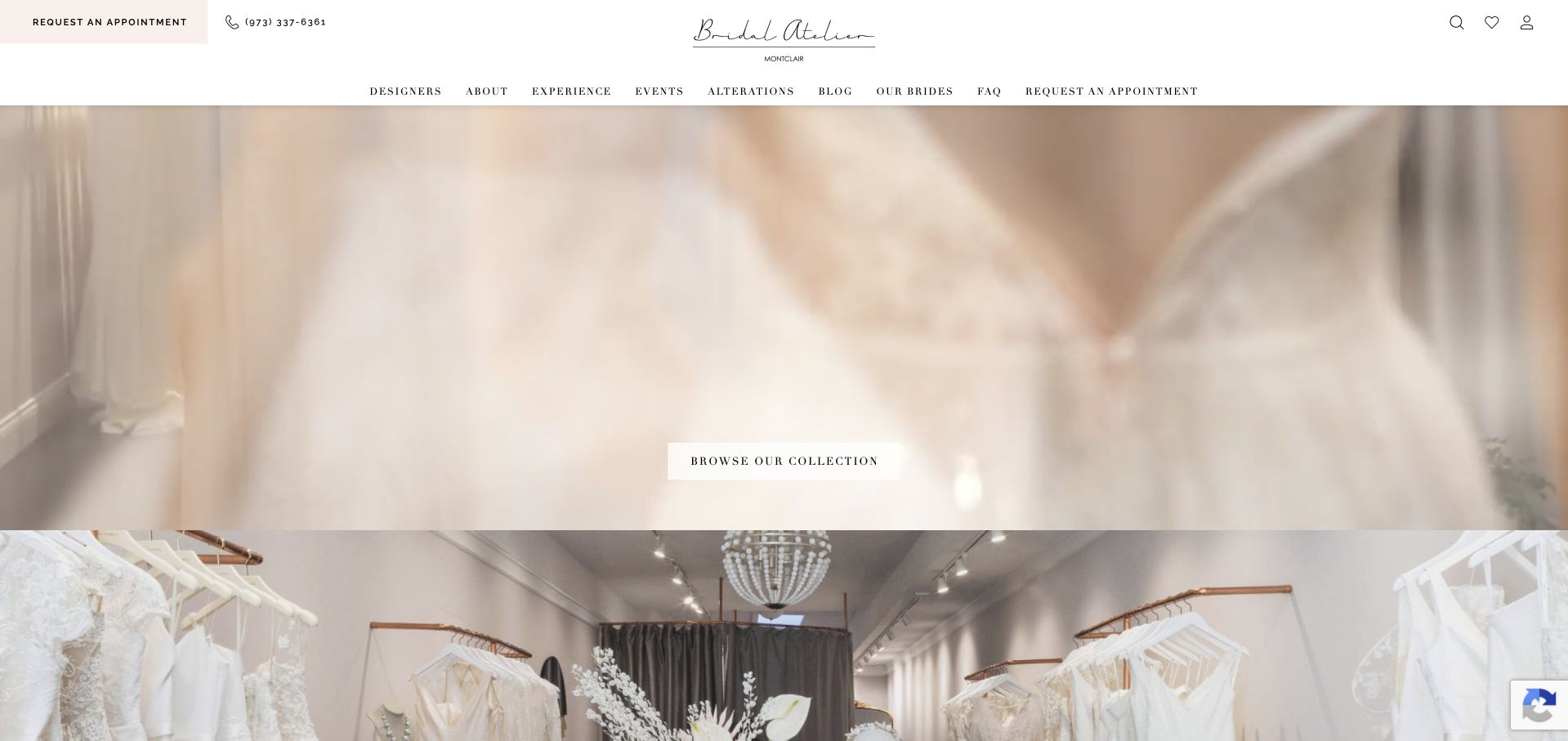
Bridal Atelier Montclair uses a soft-focus fashion sequence beneath a compact, centred wordmark and a two-level navigation. The header includes a request-appointment route and telephone contact, while designers, appointments and visitor information occupy their own labels. The visual treatment is intimate and deliberately subdued. Once the promotional and cookie overlays are dismissed, the underlying hierarchy is clear: boutique identity, visual atmosphere and practical ways to arrange a visit. This example is useful for its balance of service navigation and fashion presentation, not as evidence of a particular shopping outcome.
What you can learn
Keep event promotions easy to dismiss and separate from permanent appointment information. A boutique can promote a trunk show while still making ordinary visiting arrangements clear. Use readable text to explain timing, designers and preparation rather than relying on the softness of the moving imagery.
Pros
Phone and appointment routes support practical questions before a visit.
A restrained wordmark gives the soft film a coherent frame.
Cons & considerations
Soft-focus imagery needs sharper garment views on detailed collection pages.
Promotional overlays must not obscure permanent appointment and visitor-information routes.
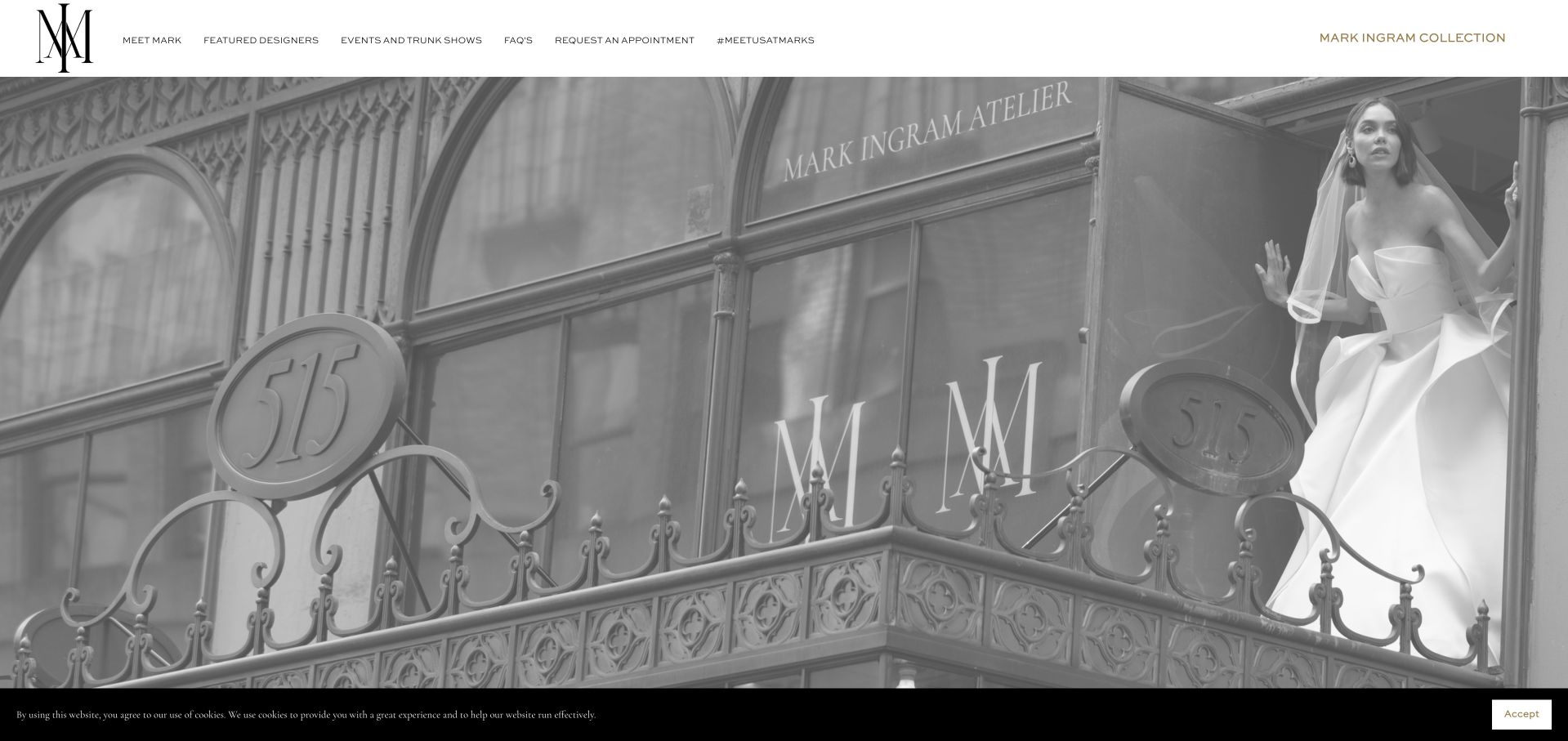
Mark Ingram Atelier uses a monochrome building façade and fashion image beneath a fine white header. The oversized architectural lettering in the photograph gives the atelier name a strong physical presence without needing an enormous on-page slogan. Collections and appointment routes remain available above the image, including the designer’s own collection. This creates a distinction between the boutique as a place and the broader fashion identity associated with it. The design is useful for studying how a recognisable physical setting can anchor a luxury retail introduction.
What you can learn
Use the atelier’s setting to introduce the business, then keep collection and appointment routes explicit. Visitors should understand whether they are browsing the retailer’s edited designer selection or a named designer’s own line before they enquire about a particular garment or arrange a visit.
Pros
The physical façade makes the atelier identity concrete and recognisable.
A restrained header preserves distinct collection and appointment navigation routes.
Cons & considerations
An exterior photograph cannot explain the appointment or ordering process.
Fine navigation needs careful sizing to preserve practical mobile readability.
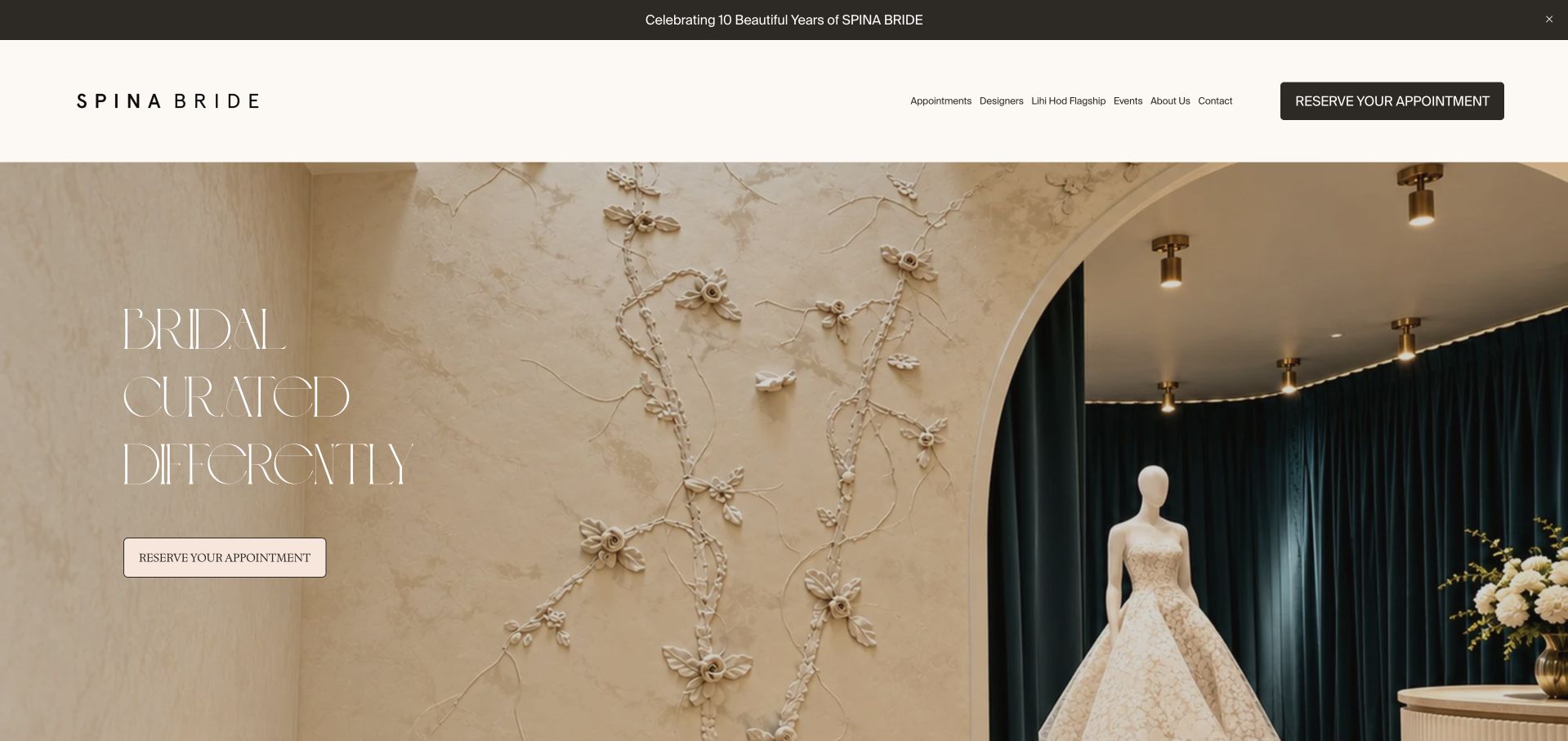
Spina Bride uses a warm interior photograph with an arch, textured wall and a single gown on a mannequin. The main phrase is short and placed in the open area of the image, while a pale appointment button sits below it. A white header separates designers, dresses, services and visit information. The composition introduces the boutique through space and material rather than only a model campaign. It is useful for studying how a physical shop can communicate its aesthetic while preserving a straightforward booking route.
What you can learn
An interior image can orient a future visitor, but it should not carry the entire explanation of the offer. Keep designer details, appointment expectations and location information available as text. Make the appointment action identify the next step rather than imply an immediate purchase.
Pros
An interior photograph gives the boutique a distinctive spatial identity.
The appointment action remains visible within the warm photographic introduction.
Cons & considerations
Fine text needs contrast against the textured wall on mobile.
Atmospheric interiors cannot explain sample sizes or current order timing.
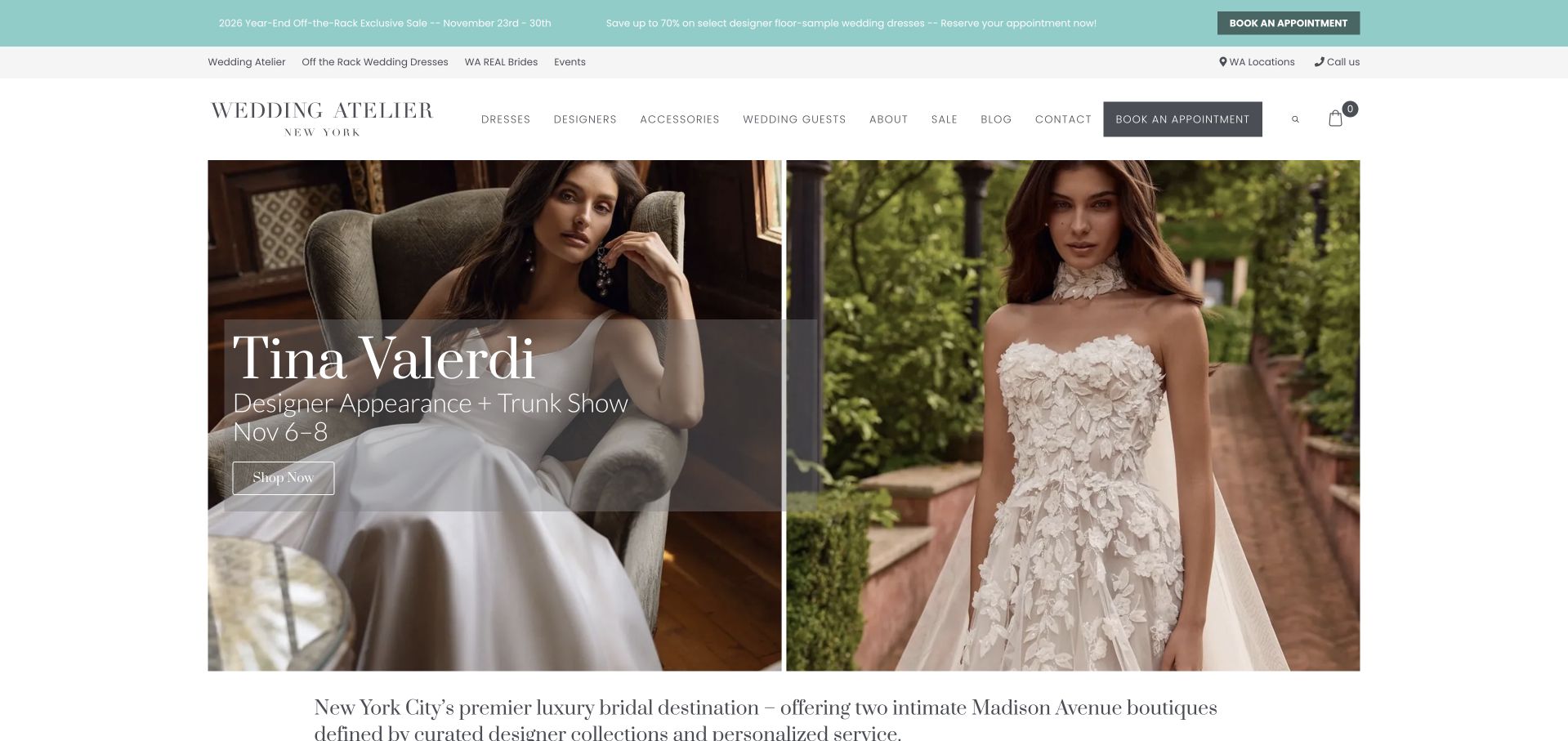
Wedding Atelier places a designer-event promotion over two large fashion photographs, with a turquoise announcement strip and white navigation above. The hero names the event and dates, while an appointment route remains visible in the header. This makes the homepage useful as a timely retail notice rather than a static brand statement. The captured event dates had just passed, which is an important editorial maintenance lesson. The promotion is evidence of the page’s campaign structure, not a claim that the event is still available to book today.
What you can learn
Date-led retail campaigns need an owner and an expiry plan. Remove or update the hero promptly after a trunk show, while keeping a stable designer directory and ordinary appointment route available. A beautifully designed event card is still confusing if its dates are no longer current.
Pros
Designer and date labels make the event campaign informative overall.
A header appointment route remains available outside the temporary promotion.
Cons & considerations
Past event dates need prompt review rather than passive retention.
A campaign must not obscure the permanent designer catalogue routes.
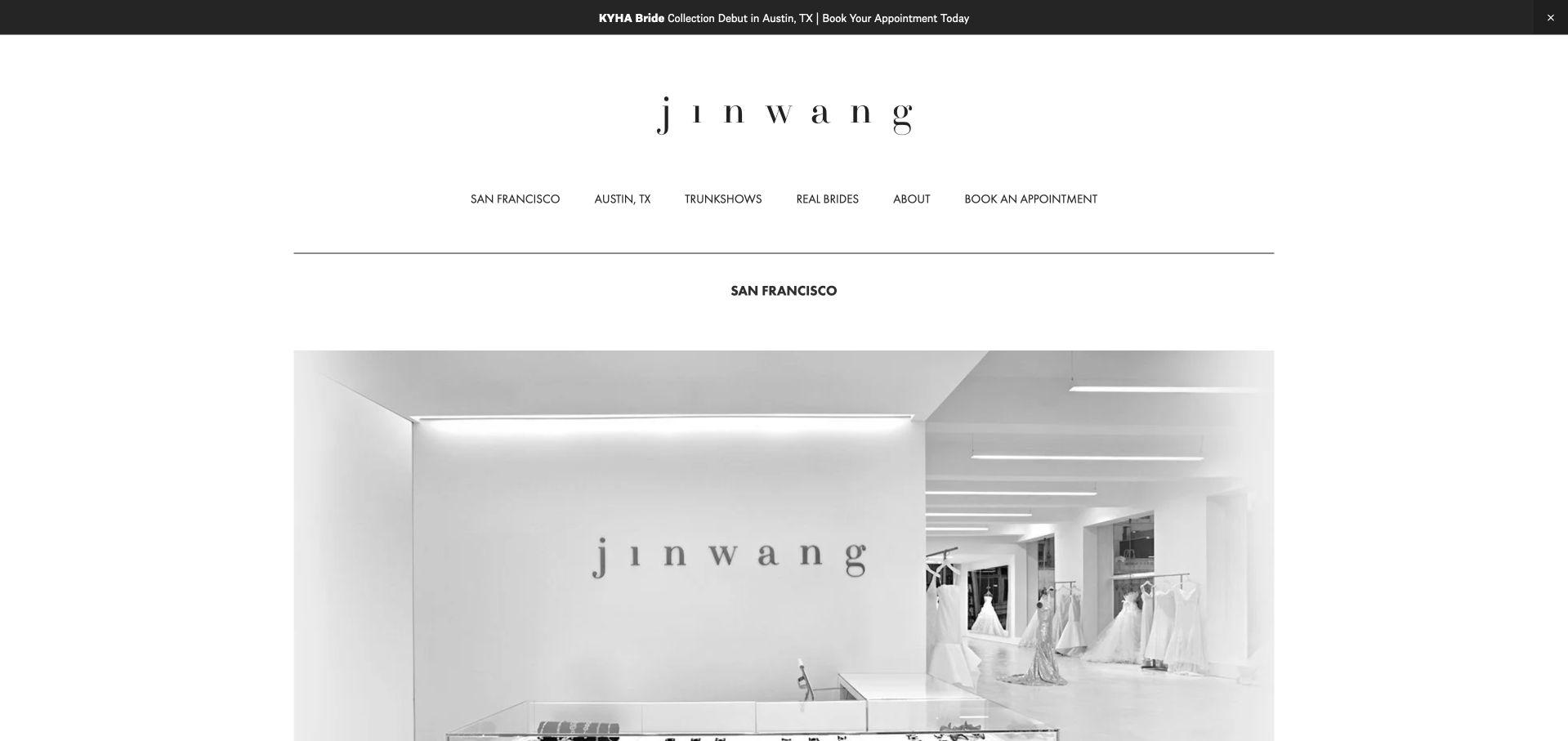
jinwang bride’s San Francisco landing page uses a fine wordmark, generous white space and a large showroom photograph. The page label names the city explicitly, while the header separates about, collection and appointment routes. This is the official city-specific public page, not an unrelated similarly named domain. Its restraint makes the physical shop the main subject. The design is useful for a designer who needs a focused local destination within a broader personal or collection-led identity, without filling the opening with several separate promotional claims.
What you can learn
Give a city-specific page its own clear identity and practical purpose. Explain the showroom location, visit arrangements and how it relates to the wider collection. Preserve the actual public destination in references so a similar business name does not send visitors to the wrong site.
Pros
The city label makes this local landing page’s purpose explicit.
White space keeps the showroom and appointment navigation visually separate.
Cons & considerations
Minimal landing pages still need practical written information about visits.
Fine wordmarks and small labels need careful mobile readability checks.
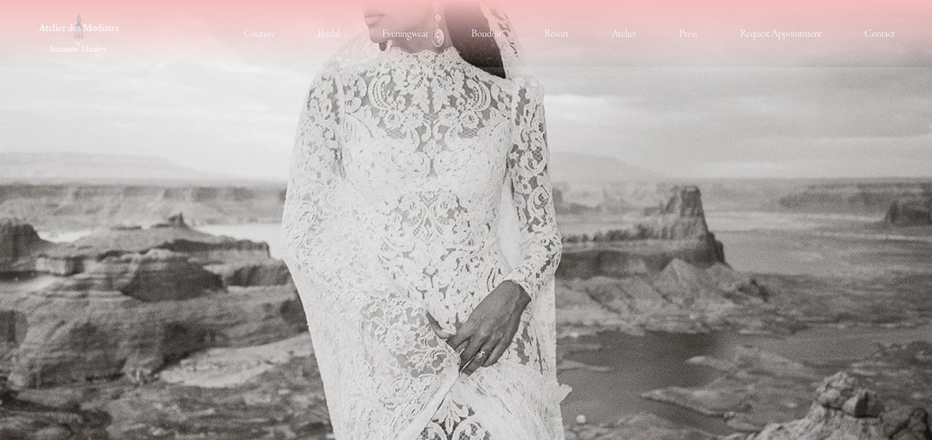
Atelier Des Modistes places a close crop of a lace gown against a coastal setting, with a soft pink header and restrained designer navigation above. The image emphasises fabric and silhouette rather than a catalogue of products. This gives the opening a recognisable aesthetic and suggests a designer-led practice without making several unsupported quality claims. The practical appointment and service details need to live in the linked pages. The visual is useful for studying how a single, detailed garment photograph can introduce a small custom bridal business.
What you can learn
A detailed photograph should lead into a clear account of the design process. Explain consultation, fittings and timing in text, and distinguish custom work from ready-to-order or alteration services. The image can introduce the aesthetic, but it cannot explain the conditions of a commission.
Pros
A close gown crop creates a strong material-detail visual focus.
Soft pink branding complements the photograph without unrelated graphic decoration.
Cons & considerations
A detail image cannot explain the full commissioned service range.
Fine pale labels require contrast and generous mobile touch targets.
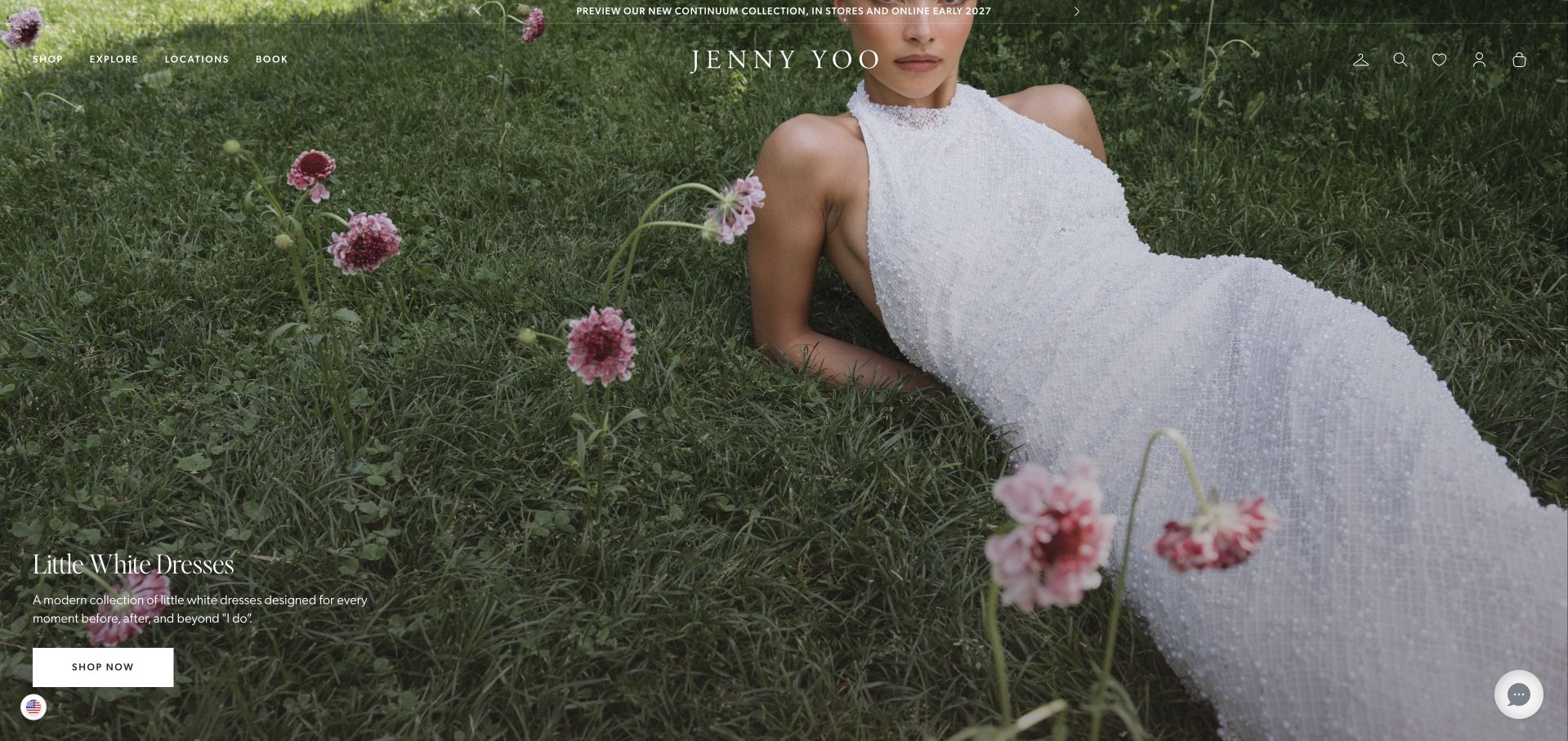
Jenny Yoo uses a large outdoor bridal photograph with a small collection title and a white Shop Now action placed low in the frame. The wordmark and navigation sit lightly over the image, preserving an expansive fashion presentation. Collection and showroom routes remain available for visitors with a more specific shopping task. The composition is a useful reference for a label balancing campaign imagery with retail navigation. The photograph is a collection introduction, not evidence that a particular gown is in stock or available locally for a fitting.
What you can learn
Keep the campaign’s retail action tied to the relevant current collection. Visitors should be able to distinguish online ordering from showroom visits and retailer enquiries. A large fashion photograph works best when its destination makes that distinction immediately clear rather than starting another ambiguous brand story.
Pros
A collection title gives the fashion photograph a useful destination.
A restrained retail header leaves room for the editorial introduction.
Cons & considerations
Small overlaid navigation needs reliable contrast across responsive photographic crops.
Collection images cannot confirm current stock or local fitting availability.
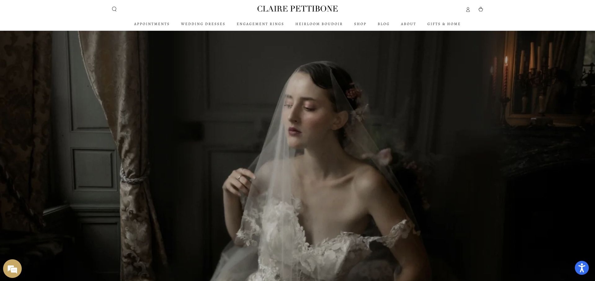
Claire Pettibone uses a dark, romantic interior photograph beneath a white header and fine wordmark. The gown and veil remain the primary visual subjects, while collection and appointment-related routes occupy the navigation rather than the image itself. The contrast between the bright header and dramatic photograph makes the aesthetic immediately recognisable. This is useful for studying a designer-led site that wants to communicate a particular visual world before listing individual garments, while still retaining conventional retail routes for people ready to investigate a collection.
What you can learn
A distinctive atmosphere should connect to practical collection pages. Keep garment names, ordering routes and stockist or appointment information explicit, and provide detailed imagery beyond the opening campaign. Do not assume a visitor understands how to buy simply because the designer’s aesthetic is clear.
Pros
The white header separates navigation from the darker fashion campaign.
One interior scene communicates a distinctive and coherent designer aesthetic.
Cons & considerations
Dark imagery needs brighter, detailed product views for garment comparison.
A strong aesthetic still needs explicit purchase and stockist instructions.
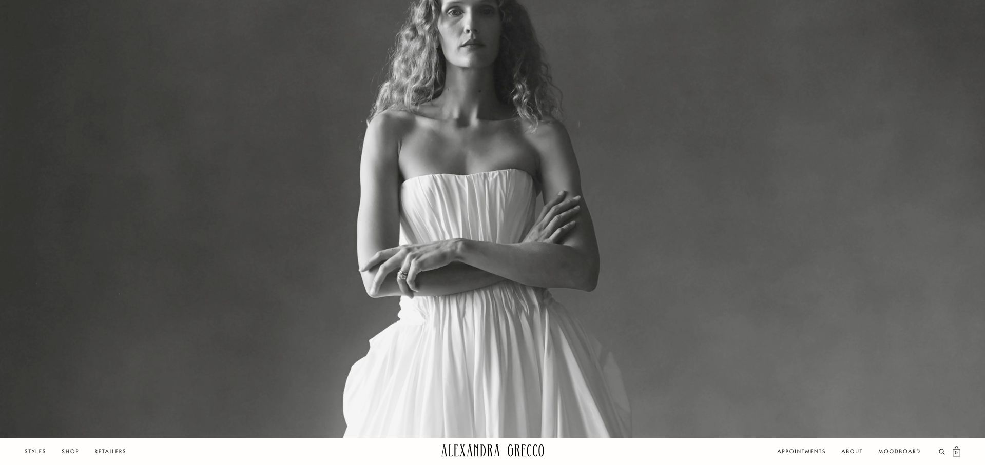
Alexandra Grecco gives the opening screen to a monochrome portrait of a bridal look, with a narrow navigation and wordmark strip beneath the image. This reverses the familiar pattern of placing the entire retail header above the hero. The result feels like a magazine cover followed by its contents rather than a conventional shop landing page. The garment silhouette remains readable because the composition is relatively uncluttered. The tradeoff is discoverability: practical collection and appointment routes are less immediate for visitors who expect navigation at the very top.
What you can learn
An unconventional header position should be tested with real browsing tasks. Keep collection, retailer and appointment routes easy to find on mobile, and provide a clear page structure for keyboard users. The editorial effect should not require visitors to guess where the practical navigation has moved.
Pros
An uncluttered monochrome portrait keeps the garment silhouette clearly readable.
A narrow wordmark strip introduces the practical retail navigation below.
Cons & considerations
Navigation below the hero may be harder for newcomers to discover.
A portrait cannot explain ordering, stockists or current fitting arrangements.
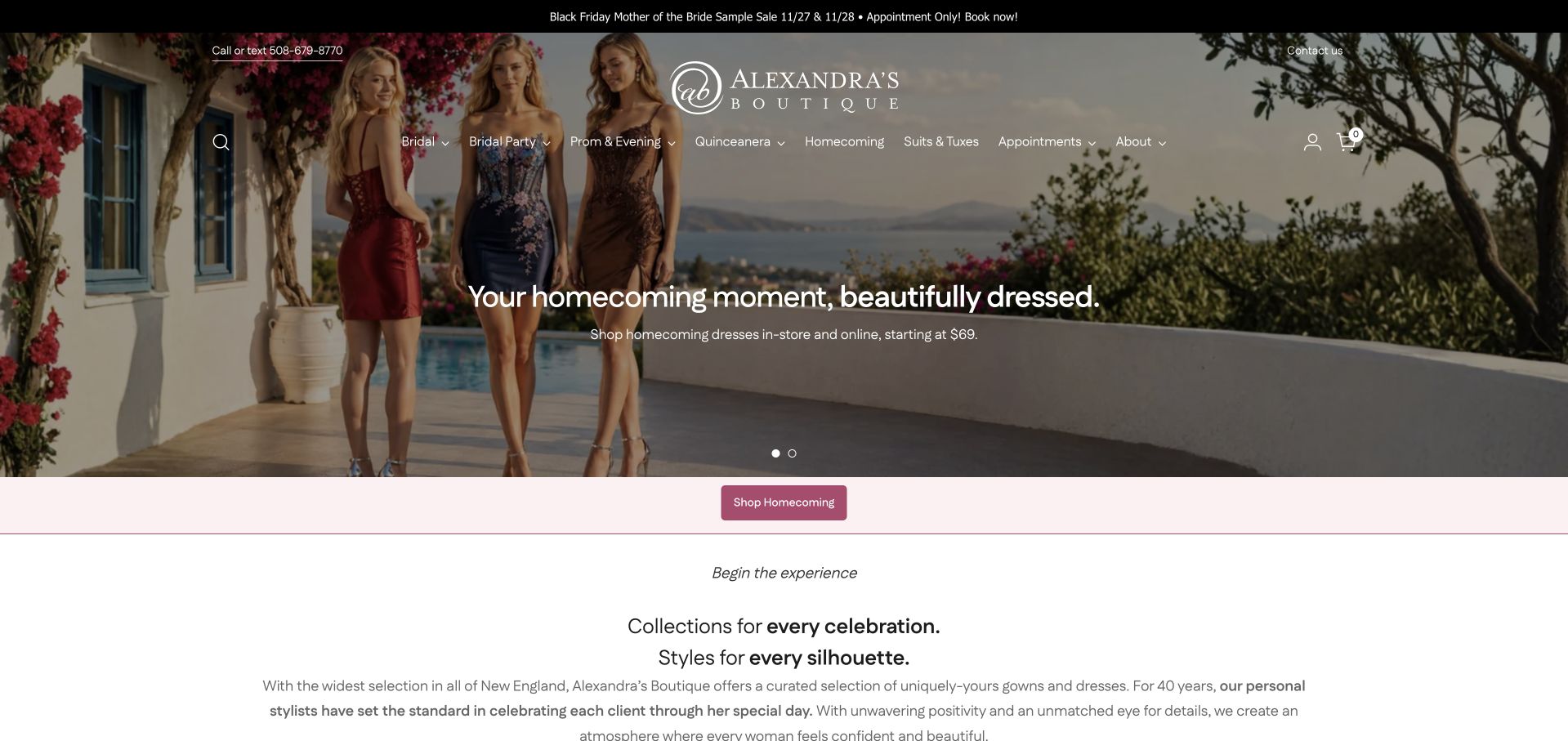
Alexandra’s Boutique opens with a homecoming campaign rather than a bridal-only photograph. The navigation, however, includes bridal alongside other occasionwear categories, and the next section introduces a wider collection for celebrations. This is useful because not every bridal retailer operates as a narrowly specialised gown shop. The site must let visitors distinguish different occasions before booking or shopping. The captured campaign is a public retail presentation, not evidence that every dress or service shown belongs to the bridal department or is available for an appointment.
What you can learn
When bridal shares a catalogue with other formalwear, make the department choice explicit. Keep appointment types and collection pages separate, and review seasonal campaigns promptly. A bridal visitor should not have to infer which part of a general occasionwear homepage applies to their own visit.
Pros
Occasion categories acknowledge the retailer’s broad catalogue and different audiences.
The campaign transitions into a wider collection introduction below it.
Cons & considerations
A non-bridal hero can delay orientation for wedding-gown visitors initially.
Seasonal occasionwear campaigns need accurate scope and prompt editorial maintenance.
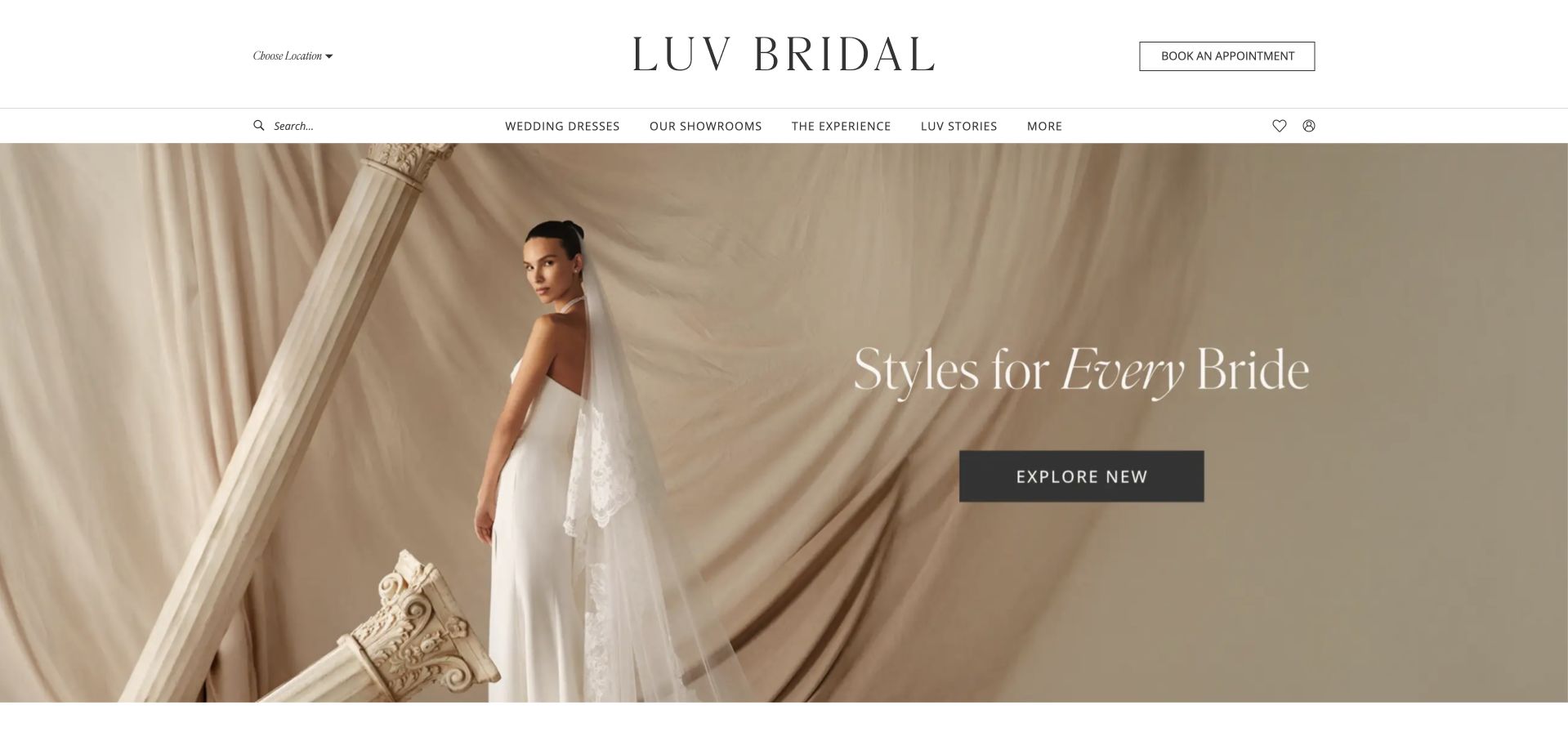
Luv Bridal uses a pale backdrop, a large fashion image and a short Styles for Every Bride statement. A dark Explore New action sits within the image, while Book an Appointment remains visible in the white header. The separate actions recognise two intentions: browsing a current collection and arranging a physical visit. Collection, designer and location navigation adds a conventional structure around the campaign. The design is useful for its restrained hierarchy, although the broad inclusive wording still needs concrete sample and sizing information on the relevant public pages.
What you can learn
Separate collection discovery from booking a visit, then make the handoff between them clear. Explain which location offers the relevant designers and samples before an appointment is requested. A broad welcome should be supported by accurate, specific information rather than left as an unqualified campaign statement.
Pros
Collection discovery and appointment actions recognise different visitor intentions clearly.
A white header preserves practical designer and location browsing routes.
Cons & considerations
Broad inclusive wording needs specific sample and sizing information nearby.
Pale imagery and fine labels need careful mobile contrast checks.
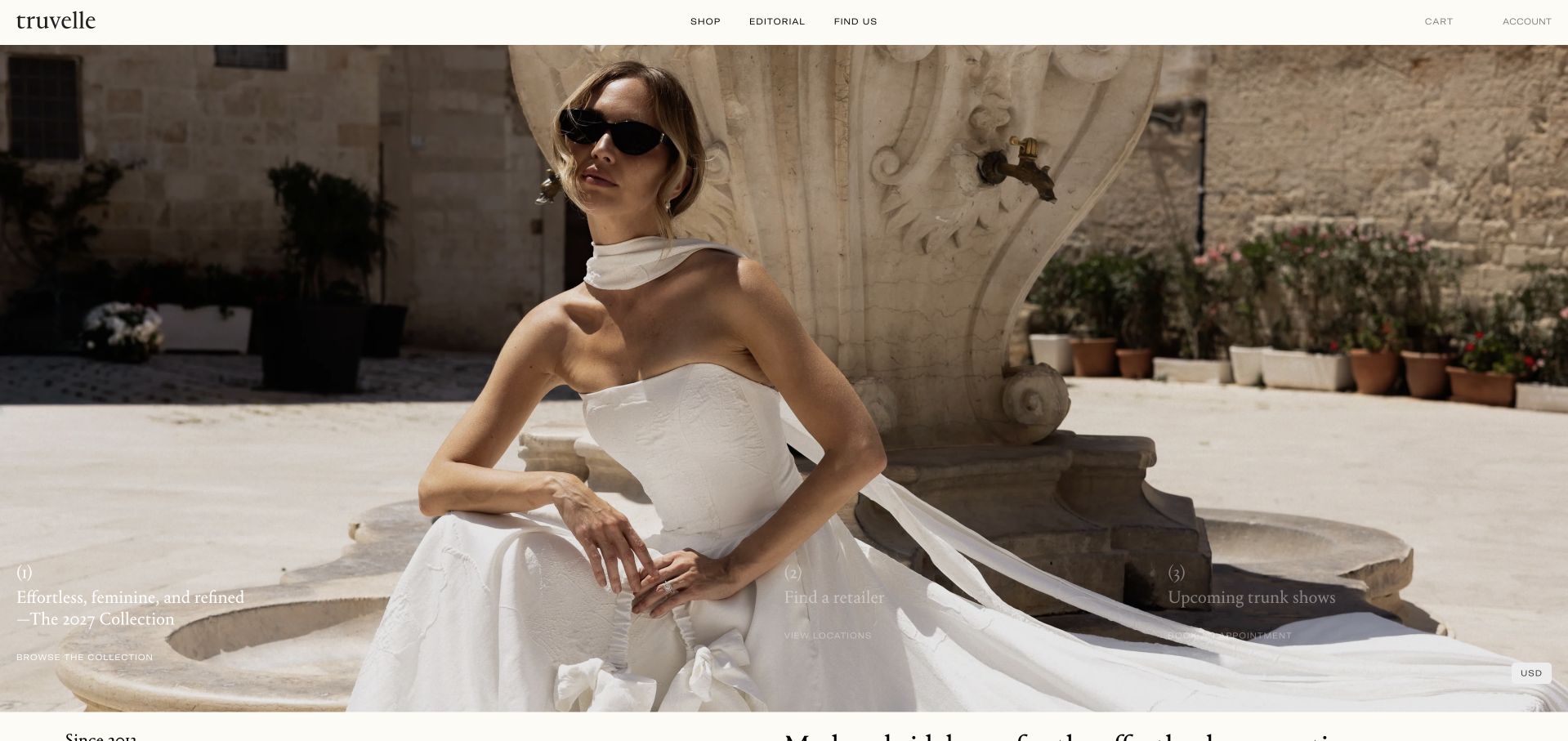
Truvelle uses an outdoor fashion photograph beneath a narrow white header and small black wordmark. The gown, stone setting and natural light provide visual detail without additional decorative graphics. Collection and stockist-related routes remain available in the navigation, while a small opening caption introduces the current fashion story. This is useful for studying how a label can make the garment the main subject without building a dense product catalogue into the hero. Practical purchase and fitting information still belongs in clearly labelled destinations beyond the campaign.
What you can learn
A minimal fashion page needs reliable practical navigation. Keep collection details, retailer information and ordering guidance easy to identify, then provide enough garment imagery for comparison. The opening photograph should introduce the aesthetic without being mistaken for a live availability or sample-location listing.
Pros
Natural light keeps the gown silhouette readable without decorative clutter.
A narrow white header preserves a clear, understated retail frame.
Cons & considerations
Small photographic captions need mobile placement that preserves text readability.
An editorial image cannot explain retailer availability or ordering arrangements.
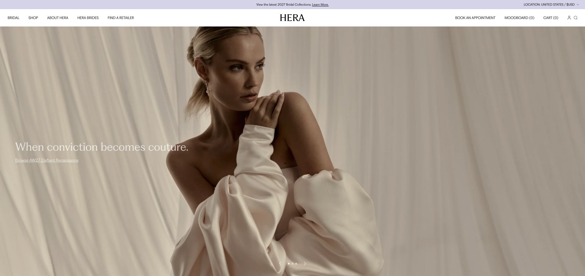
Hera Couture places a close bridal portrait beneath a compact white header, with a short couture statement over the lighter part of the image. The wordmark sits centrally, while collection and appointment routes remain available above. The restrained composition makes material, shape and portrait the primary introduction rather than a list of credentials. It is useful for a designer-led business that needs to feel editorial while still offering a practical visit route. The photograph does not establish the availability of a particular gown or service at any given location.
What you can learn
Keep the designer’s visual identity connected to an understandable purchase or fitting process. Explain collection, stockist and appointment relationships in ordinary text, and make the local context clear before someone enters personal details. A couture image should introduce the work, not stand in for the service terms.
Pros
A centred wordmark gives the portrait a stable brand frame.
An explicit appointment route remains visible in the conventional navigation.
Cons & considerations
White copy needs reliable contrast over a pale photographic background.
A close portrait cannot show full garment details or availability.
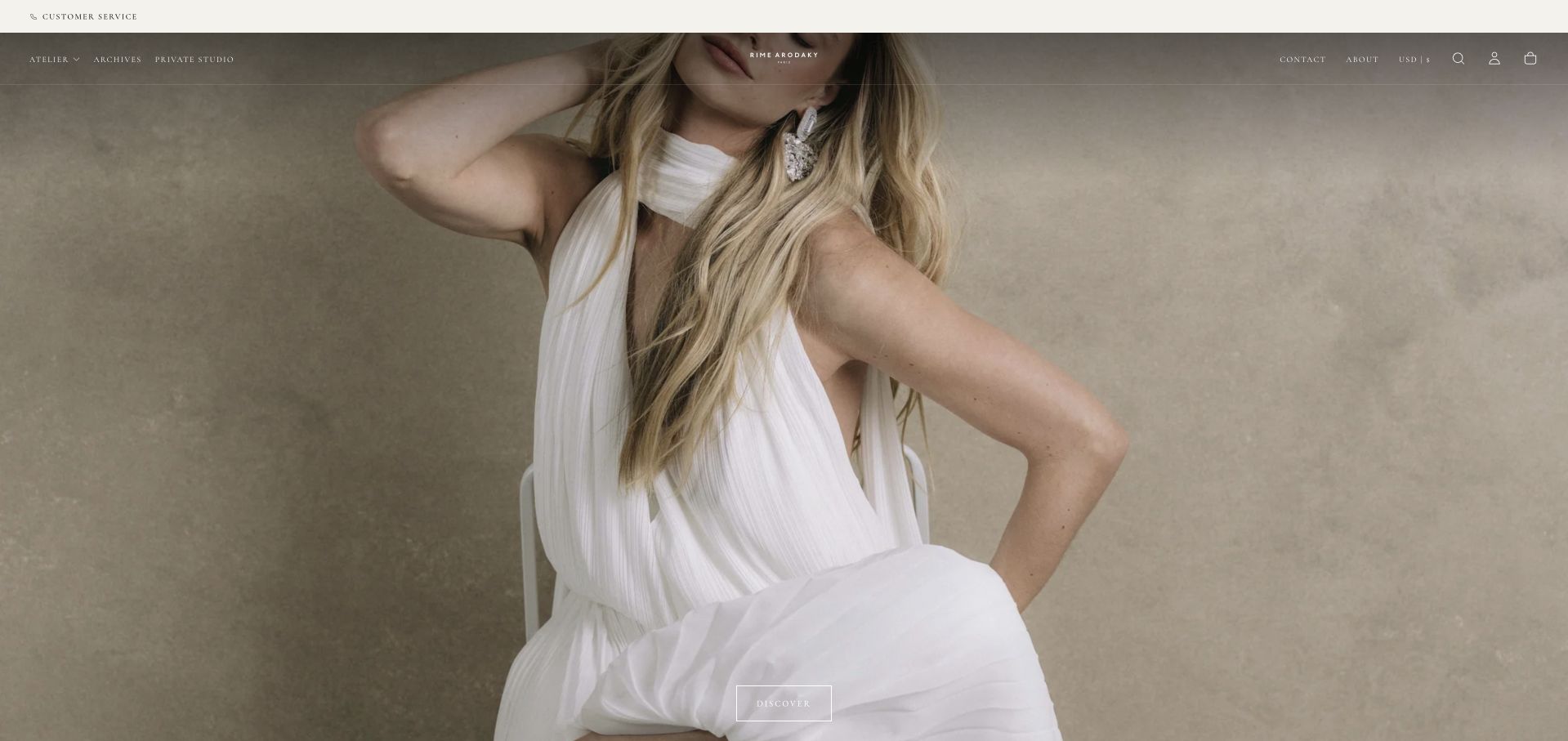
Rime Arodaky uses a large fashion crop with small white navigation placed over the photograph. The gown and model occupy almost the whole opening, with very little introductory copy competing for attention. This produces a confident editorial impression and lets the collection aesthetic do most of the storytelling. It also places a heavy burden on the header: visitors must identify the brand, collection and next action from a small amount of overlaid interface. The example is useful precisely because the visual impact and practical discoverability are in tension.
What you can learn
An image-led fashion hero should keep navigation readable across every crop and image change. Provide a plain route to collections, stockists and appointments, and make garment details available beyond the campaign. Visual confidence is not a reason to make practical shopping information difficult to locate or understand.
Pros
One large photograph creates a coherent, distinctly image-led editorial statement.
Minimal interface elements leave the main fashion subject visually intact.
Cons & considerations
Small white navigation can disappear against lighter responsive photographic crops.
A nearly copy-free introduction delays practical stockist and ordering context.
Kegan is a freelance web designer and developer with 15+ years of experience helping businesses turn complicated website requirements into clear, maintainable digital experiences. He works directly with clients from planning and design through development, launch, and ongoing support.
For bridal shop website design, his development approach focuses on designer collections, appointment expectations, showroom details, accessibility, and booking-system handoffs. The scope can be a targeted improvement or a complete custom build, with responsive layouts, thoughtful content structure, and integrations chosen around the people using and maintaining the site.
Show 3 other bridal shop website designersHide other bridal shop website designers
Plan the appointment and collection information together
Map the actual shopping journeys
List the visitor intentions the business supports: researching designers, checking a budget range, finding a shop, arranging a first visit, returning for a fitting or browsing sale samples. Give each a clear destination. If bridal shares the site with bridesmaid or occasionwear departments, keep appointment types explicit. The content should help someone choose the right route before entering personal details or a wedding date.
Create an accurate collection and location model
Decide how designers, gowns, locations and availability relate. A central designer list is not necessarily a local inventory. Explain whether a photograph represents a current collection, an example of past work or a sample available at a named shop. Give staff a manageable way to retire products and update location facts. Avoid publishing apparently precise stock information unless the business can maintain it reliably.
Prepare a sustainable photography system
Secure appropriate rights and credits for model campaigns, designer imagery and customer photographs. Preserve clear garment views on detailed pages even when the hero is atmospheric. Test crops so the dress and relevant text survive smaller screens. Use text alternatives suited to each image’s purpose and keep important facts outside graphics. Do not invent customer stories or imply that an editorial model image is a real client appointment.
The editing job behind the design
Choose tools around inventory truth and appointment clarity
[object Object]
[object Object]
[object Object]
Our WordPress website examples offer a separate look at publishing approaches. A visible platform label is evidence for that named page, not a guarantee that the same system will suit your requirements.
Before the public launch
Bridal website launch checklist
State whether the visitor books a boutique, finds a retailer or orders directly.
Keep bridal, bridesmaid, occasionwear and alteration appointment types clearly distinguished where relevant.
Name the chosen shop before collecting visit information through a calendar or form.
Publish accurate budget, sample and preparation context the business can keep current.
Distinguish collection photography from confirmed local inventory or individual sample availability.
Give trunk shows and sample-sale campaigns an owner and a review or expiry date.
Keep permanent designer and location routes available outside temporary homepage promotions.
Use permissioned photographs with appropriate credits and do not invent customer testimonials.
Test garment crops, pale text contrast and mobile navigation across the current campaign images.
Label form controls and make booking confirmation and error states understandable.
Explain external scheduling or retail handoffs before the visitor enters personal details.
Review stockist links, retired collections and appointment conditions after major content updates.
These checks are a project checklist, not a performance, legal, security, or accessibility certification. Test real journeys with the people responsible for the website before making claims about the result.
Sources & editorial method
How this collection was selected and reviewed
We inspected actual public pages and dated browser captures, then wrote original observations about imagery, navigation and shopping journeys. Selection is editorial, not a measured garment or service ranking. Designer campaigns and local inventory are not treated as interchangeable. Visible technology notes describe limited verified public signals.
Each example links to its actual source page. Screenshots are direct browser captures with their own capture dates; moving imagery, announcements and live designs can change. The notes describe observable design choices and conditional tradeoffs, not measured traffic, conversion results, service quality, or accessibility conformance.
Technology labels use public page metadata, asset evidence, or explicitly cited platform documentation. Platform documentation is not a complete current deployment audit. A component reference may be legacy or unused; it is not a complete backend inventory. Unknown stacks are omitted. These sites are editorial examples, not our client portfolio.
Written, Edited and Curated are separate editorial records, not timestamps advanced by a rebuild. Website designs and imagery belong to their owners. See our editorial standards or suggest a correction.
Questions worth asking
Bridal Shop website design questions
Should the homepage show dresses or the boutique interior?
Choose the image that best introduces the business, then provide the other context on supporting pages. A designer may lead with a collection, while a local boutique may benefit from showing its setting. Neither image replaces practical information about visiting, samples or ordering.
Can a boutique list all of a designer’s gowns?
Only with accurate scope. A designer’s full collection is not necessarily the shop’s sample inventory. Explain what the catalogue represents and provide a route to confirm local availability. Avoid presenting a central image gallery as a live stock system when staff cannot maintain it that way.
How much appointment information should be public?
Enough to understand the visit before booking: location, purpose, preparation and where current conditions can be read. Publish the business’s own accurate information rather than copying another boutique’s guest limits or cancellation terms. Keep sensitive personal details out of public content.
Do bridal sites need ecommerce?
Not always. An appointment-led boutique or stockist catalogue may need clear information more than a checkout. If direct ordering is offered, distinguish it from services requiring consultation or fittings and make product availability and order conditions clear before a transaction begins.
What should happen after a trunk show ends?
Update or remove the campaign, keep a useful event archive if appropriate and preserve a route to the current designer catalogue. Do not leave an expired date as the main homepage action. Assign someone responsibility for reviewing the promotion rather than relying on the original launch.
Build the fashion presentation around a reliable shopping journey. The right photograph can establish style in a moment, but useful collection scope, location details and appointment information are what make the page worth returning to during a longer decision.