An ASP.NET association says little about the experience a visitor receives. These examples show how public websites organize campaigns, services, locations, membership, and product information while keeping the framework evidence precisely scoped.
ASP.NET spans a long history of web development. Microsoft's documentation distinguishes traditional ASP.NET on .NET Framework from ASP.NET Core. This collection deliberately uses the broader family name: the public response signals supporting these examples do not establish Core, a runtime version, or a particular programming model.
The useful comparison is the public experience. A museum needs practical visiting routes around expressive imagery; a bank needs stable support links around product campaigns; a membership organization needs an understandable boundary between public resources and private services. The reviews focus on those decisions, with genuine screenshots and the original observation dates retained.
Before the examples
What makes good ASP.NET website development in 2026?
Name the actual implementation before choosing a pattern
For your own project, establish the framework generation, supported runtime, CMS dependencies, and deployment constraints from source and configuration. A response header on somebody else's website cannot answer those questions. Treat this collection as design evidence, then use documentation for your chosen implementation.
Keep page identity separate from campaign identity
Give services, projects, locations, and publications durable destinations. A campaign can introduce them without becoming their only route. If you choose ASP.NET Core, its routing documentation explains how requests and generated URLs relate to endpoints; your content model still needs explicit naming and redirect decisions.
An expired offer or service notice can remain visually polished while becoming operationally wrong. Define content review dates and what invalidates cached public output. ASP.NET Core offers several distinct caching approaches; choose one appropriate to the application and test when an editor's update becomes visible.
The opening five references are Microsoft .NET, AXA, the University of Chicago, Carlsberg Group, and Rijksmuseum. Each review examines a specific public property. The collection does not claim that connected accounts, bookings, payments, or other private systems use the same stack.
We start with five recognizable brands or organizations: Microsoft .NET, AXA UK, University of Chicago, Carlsberg Group, Rijksmuseum. Each attribution applies to the named website property, not every product or website belonging to its organization. This is a curated reading sequence, not a measured ranking.
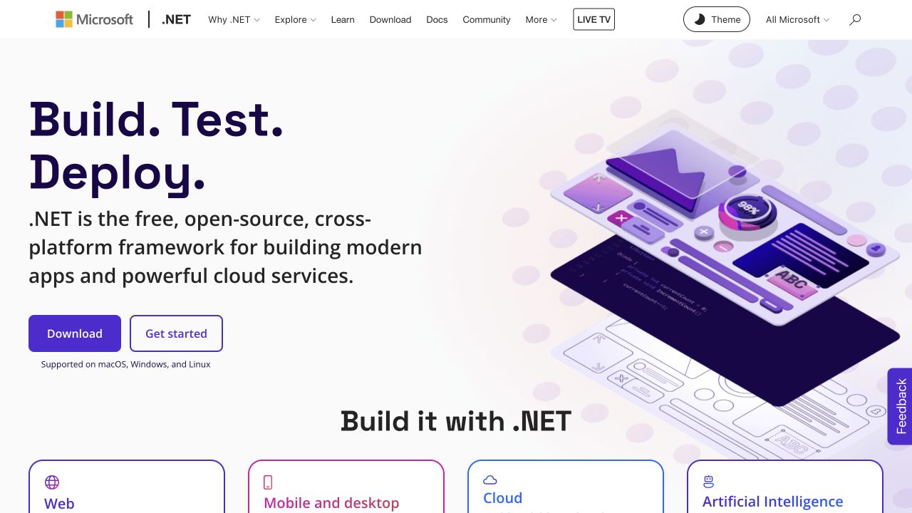
Microsoft's .NET entrance separates a substantial explanation and two practical actions from the application categories below. Purple illustration, rounded cards, and the combined Microsoft and .NET header establish a coherent product family without making every category look identical. For an ASP.NET project, the valuable reference is how a broad technical offering becomes navigable public content. The observed ASP.NET response header establishes a reported family association for this page; it does not identify Core, a version, or the implementation of the applications being promoted.
What you can learn
Model the introduction, download destination, learning route, and application cards as separate responsibilities. A release announcement should not force an editor to rebuild the category layout. Test long category names and translated descriptions against the same card structure, and keep the platform label out of claims about unrelated linked products.
Pros
Download and learning actions answer different visitor intentions immediately.
Repeated cards make the application range easier to compare.
Cons & considerations
Several technical audiences still share one introductory message.
The framework header cannot explain how individual content modules are rendered.
Platform source: Dated exact public source-page audit. x-powered-by response header identifies ASP.NET. Reported ASP.NET family association only; no inference of ASP.NET Core, runtime version, CMS, private applications or linked properties. Platform evidence is separate from the direct website screenshot and is not a complete current infrastructure audit.
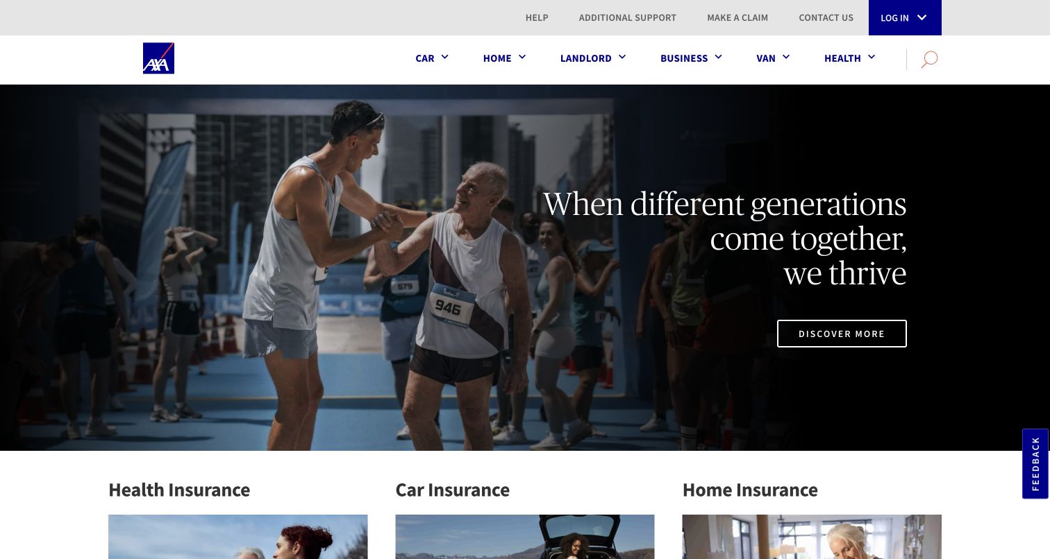
AXA's UK entrance uses campaign photography within an otherwise conventional product navigation. Routes for learning about cover, obtaining a quote, and getting help establish different kinds of task before a visitor enters a more detailed journey. This is useful ASP.NET inspiration because the public presentation must remain understandable while campaigns and product information change independently. The dated response evidence concerns the public website. It cannot tell us whether a quotation engine, claims application, or account area uses the same framework or shares its release process.
What you can learn
Design navigation and content models around those task distinctions. A product landing page should explain which action starts a new quote and which helps an existing customer. In implementation reviews, verify the destination and preserved product context at each boundary; do not allow a reusable button component to erase meaningful differences in the next step.
Pros
Campaign photography has a stable product structure around it.
Help remains a recognizable purpose alongside product discovery.
Cons & considerations
Similar looking actions need precise destination labels.
Separate service applications require their own implementation and usability review.
Platform source: Dated exact public source-page audit. Recognized cookie name (values discarded). Reported ASP.NET family association only; no inference of ASP.NET Core, runtime version, CMS, private applications or linked properties. Platform evidence is separate from the direct website screenshot and is not a complete current infrastructure audit.
The University of Chicago combines a research and campus opening with a recognizable maroon navigation system. Apply, contact, and visit routes give the broader university story practical destinations, while news adds a changing editorial layer. An ASP.NET team can study the separation between an institutional front door and the many specialized tasks beyond it. The public header observation is limited to the reviewed page; it is not evidence that admissions, departmental sites, research systems, or student services share a single application architecture.
What you can learn
Keep central navigation, current news, and audience actions in distinct content structures with explicit owners. Document which links remain within the main site and which hand visitors to a school or service. A useful release review follows a prospective student's next step and checks naming and context across that boundary, without assuming the destination uses the same templates.
Pros
University identity remains visible around changing research material.
Practical audience actions interrupt an otherwise broad institutional narrative.
Cons & considerations
Large media competes with time-sensitive visitor tasks.
Separate school destinations can introduce inconsistent navigation and terminology.
Platform source: Dated exact public source-page audit. Recognized cookie name (values discarded). Reported ASP.NET family association only; no inference of ASP.NET Core, runtime version, CMS, private applications or linked properties. Platform evidence is separate from the direct website screenshot and is not a complete current infrastructure audit.
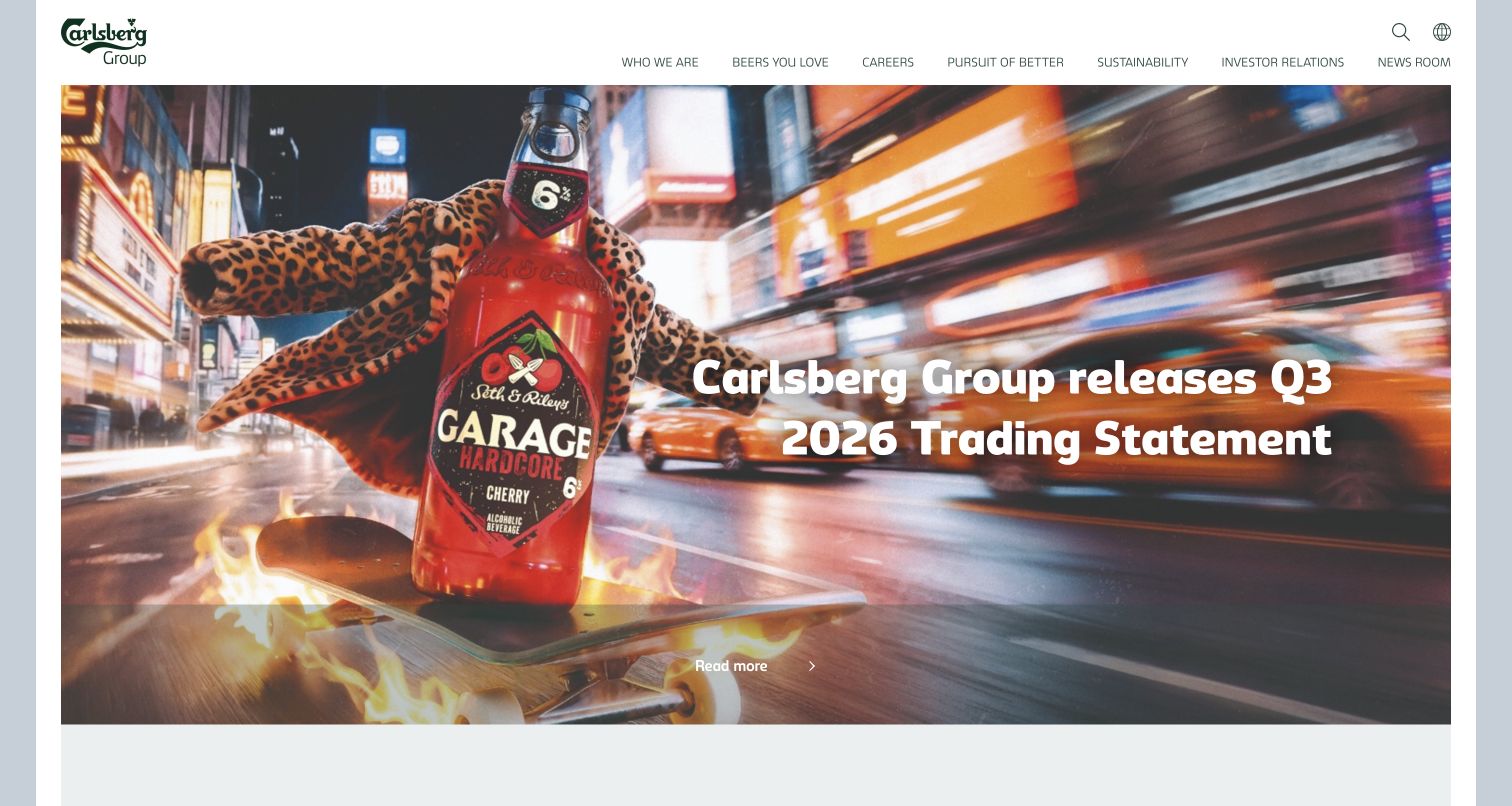
Carlsberg Group places colorful beverage imagery beneath restrained corporate navigation, pairing a strong brand world with a timely reporting message. Investors, prospective employees, and press audiences need different depths of information, so the quiet header matters as much as the campaign. For ASP.NET planning, this is a reference for a public corporate property that carries several editorial rhythms. Its family-level response evidence does not identify a specific runtime, and the associated corporate CMS history should not be extended to every beverage brand or regional website.
What you can learn
Give financial updates, employment content, and brand stories their own structured fields and review schedules. A report should retain its period and document destination when its promotional treatment changes. Test the same homepage template with an image-led story and a quieter reporting announcement so editorial flexibility does not depend on one unusually favorable campaign asset.
Pros
Colorful product photography gives a corporate site immediate identity.
Restrained navigation leaves room for different stakeholder journeys.
Cons & considerations
Reporting headlines become misleading when publication periods disappear.
Regional and brand destinations need separate evidence and navigation checks.
Platform source: Dated exact public source-page audit. x-powered-by response header identifies ASP.NET. Reported ASP.NET family association only; no inference of ASP.NET Core, runtime version, CMS, private applications or linked properties. Platform evidence is separate from the direct website screenshot and is not a complete current infrastructure audit.
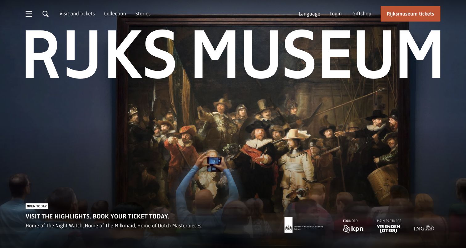
Rijksmuseum's entrance gives the institution's name and artwork unusual visual prominence while keeping navigation sparse. The result favors cultural recognition and collection discovery over a dense directory of practical choices. Its relevance to ASP.NET development lies in that balance: a public presentation layer can be expressive while still needing dependable visiting information underneath. A dated ASP.NET response signal identifies the family reported by the reviewed source, not the system behind ticket inventory, collection search, or every connected museum service.
What you can learn
Separate artwork presentation from practical visit records, and make opening information, access details, and ticket destinations easy to maintain. If a campaign occupies most of the first screen, test whether visitors can still find the permanent visit route without interpreting an artistic title. Keep artwork captions and image rights attached to the asset rather than embedded only in a layout.
Pros
Large artwork makes the museum's purpose immediately tangible.
Sparse navigation supports a calm and distinctive visual entrance.
Cons & considerations
Oversized identity pushes practical information farther down the page.
Minimal labels place extra responsibility on the visit landing page.
Platform source: Dated exact public source-page audit. x-powered-by response header identifies ASP.NET. Reported ASP.NET family association only; no inference of ASP.NET Core, runtime version, CMS, private applications or linked properties. Platform evidence is separate from the direct website screenshot and is not a complete current infrastructure audit.
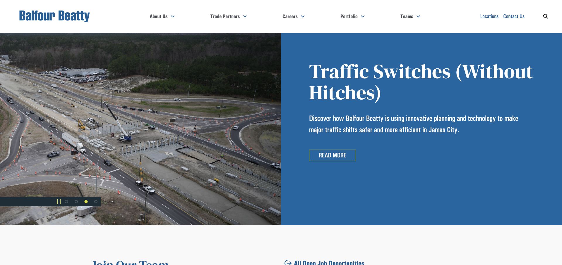
Balfour Beatty US treats its opening as an organizational front page, with a blue project story and news-led presentation. Portfolio, locations, careers, teams, trade partners, and contact remain durable choices around that changing material. For an ASP.NET implementation, the interesting problem is how editorial freshness coexists with long-lived capability evidence. The public source reports the ASP.NET family, but that observation cannot establish how project records are stored, whether recruitment shares the application, or which framework version serves a particular section.
What you can learn
Create an editorial slot with a defined owner, expiry review, and relationship to a permanent project record. Keep the project destination stable when the homepage story changes. During acceptance testing, replace the lead with company news and verify that a prospective client can still reach relevant work and an office without relying on the campaign headline.
Pros
Permanent portfolio links preserve access to substantial project evidence.
Current stories give returning visitors a reason to revisit.
Cons & considerations
The lead story may not match a client's immediate sector.
A news-led hero requires active retirement and replacement decisions.
Platform source: Dated exact public source-page audit. x-powered-by response header identifies ASP.NET. Reported ASP.NET family association only; no inference of ASP.NET Core, runtime version, CMS, private applications or linked properties. Platform evidence is separate from the direct website screenshot and is not a complete current infrastructure audit.
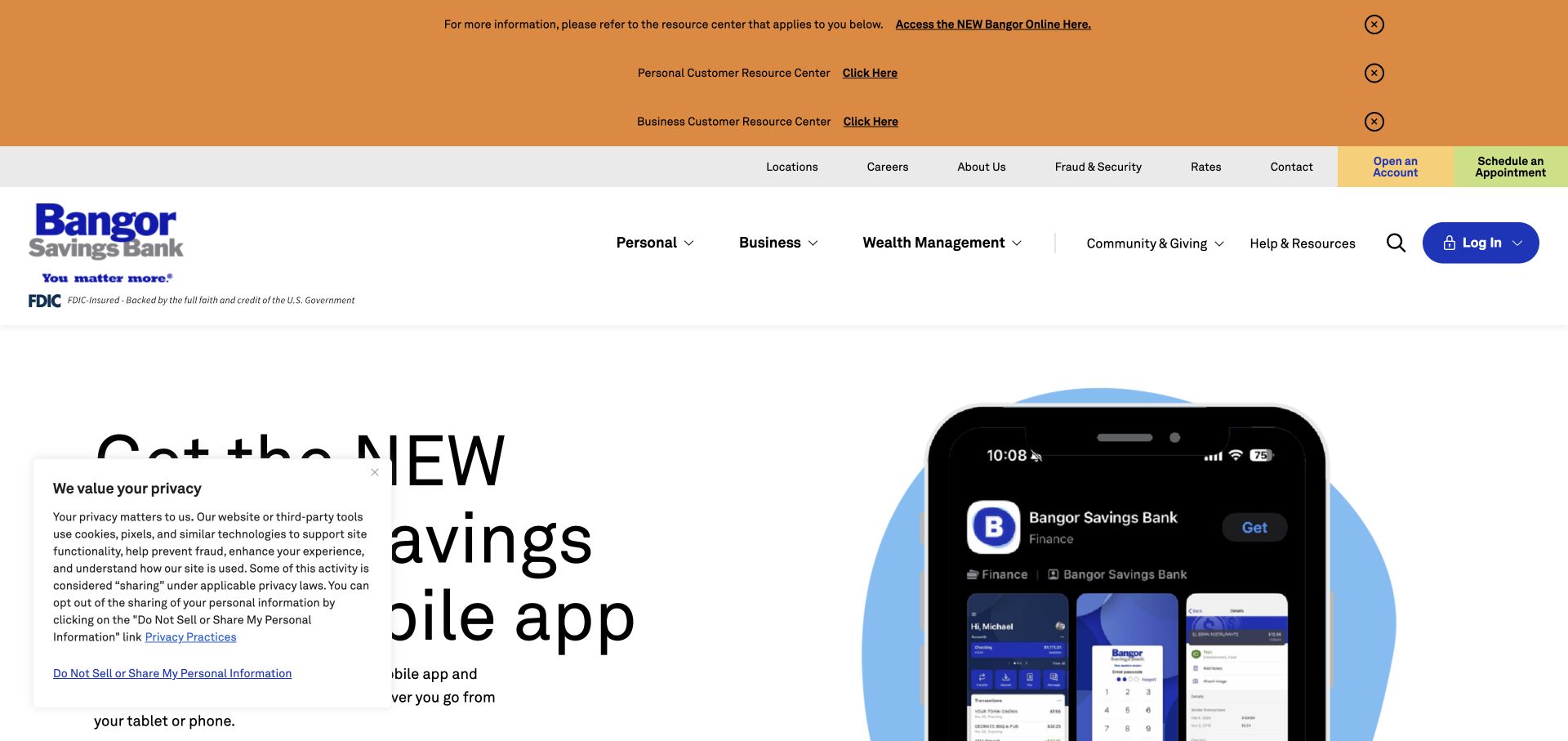
Bangor Savings Bank stacks orange assistance notices above a white navigation bar, separating personal and business messages before an app campaign appears. The phone imagery makes the digital-service subject concrete, but the notices and consent layer consume much of the opening view. This is a useful ASP.NET reference for temporary information architecture, rather than a demonstration of banking application code. The public header association does not expose account systems, establish transaction behavior, or show how those notices are administered internally.
What you can learn
Build service notices with audience, severity, destination, start date, and review date instead of treating each as an arbitrary banner. Preview several simultaneous notices alongside normal marketing content. Give an editor a clear way to consolidate related messages, and test that removing an expired notice restores spacing without altering the permanent navigation or burying help.
Pros
Audience labels distinguish personal and business assistance at entry.
Phone imagery connects the campaign to an understandable service object.
Cons & considerations
Several notice bands compete for scarce first-screen space.
Consent UI adds another layer to an already dense introduction.
Platform source: Dated exact public source-page audit. x-powered-by response header identifies ASP.NET. Reported ASP.NET family association only; no inference of ASP.NET Core, runtime version, CMS, private applications or linked properties. Platform evidence is separate from the direct website screenshot and is not a complete current infrastructure audit.
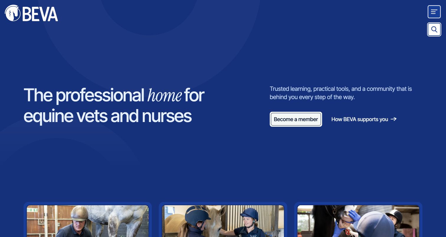
BEVA uses a deep-blue introduction to explain its professional community, with joining and learning about support presented as separate actions. Three photographic cards begin the next layer of the page. The composition suggests how a membership organization can connect a broad proposition to more specific audience paths. ASP.NET is a reported public-page association here; the visible website and documented CMS project do not verify private member access, CRM behavior, an app, or synchronization between the organization's connected services.
What you can learn
Treat audience, career stage, resource, and membership benefit as related records rather than copying content into isolated sections. Preserve a general browsing route for people who fit several categories. In a development brief, define the boundary between public information and authenticated services, then test the wording of that handoff before attempting more elaborate personalization.
Pros
Two opening actions separate joining from understanding available help.
The blue field gives the community proposition a clear reading area.
Cons & considerations
Compact navigation conceals detailed resources until another interaction.
Overlapping professional audiences require careful content relationships and ownership.
Platform source: Dated exact public source-page audit. x-powered-by response header identifies ASP.NET. Reported ASP.NET family association only; no inference of ASP.NET Core, runtime version, CMS, private applications or linked properties. Platform evidence is separate from the direct website screenshot and is not a complete current infrastructure audit.
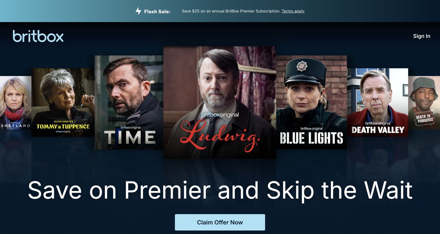
BritBox layers program portraits above a promotional headline on a dark-blue field, with a pale-blue action and a persistent sign-in route. A narrow strip repeats the annual incentive and links to terms. The captured campaign emphasizes a higher membership tier, so familiar shows carry much of the explanation. For ASP.NET planning, this is a public acquisition page with several content dependencies. The observed family header does not prove which technology operates billing, entitlement, video delivery, or the signed-in viewing experience.
What you can learn
Keep plan names, eligibility conditions, offer dates, and destination links consistent wherever the campaign appears. A reusable promotional strip should reference the same maintained offer as the hero. Test the page with the incentive removed: visitors should still understand the service and reach a meaningful plan comparison without a temporary discount providing the entire argument.
Pros
Program portraits make the editorial territory immediately recognizable.
Terms are linked near the repeated promotional message.
Cons & considerations
Tier names require explanation for people unfamiliar with the service.
Duplicated offer copy increases the chance of inconsistent updates.
Platform source: Dated exact public source-page audit. x-powered-by response header identifies ASP.NET. Reported ASP.NET family association only; no inference of ASP.NET Core, runtime version, CMS, private applications or linked properties. Platform evidence is separate from the direct website screenshot and is not a complete current infrastructure audit.
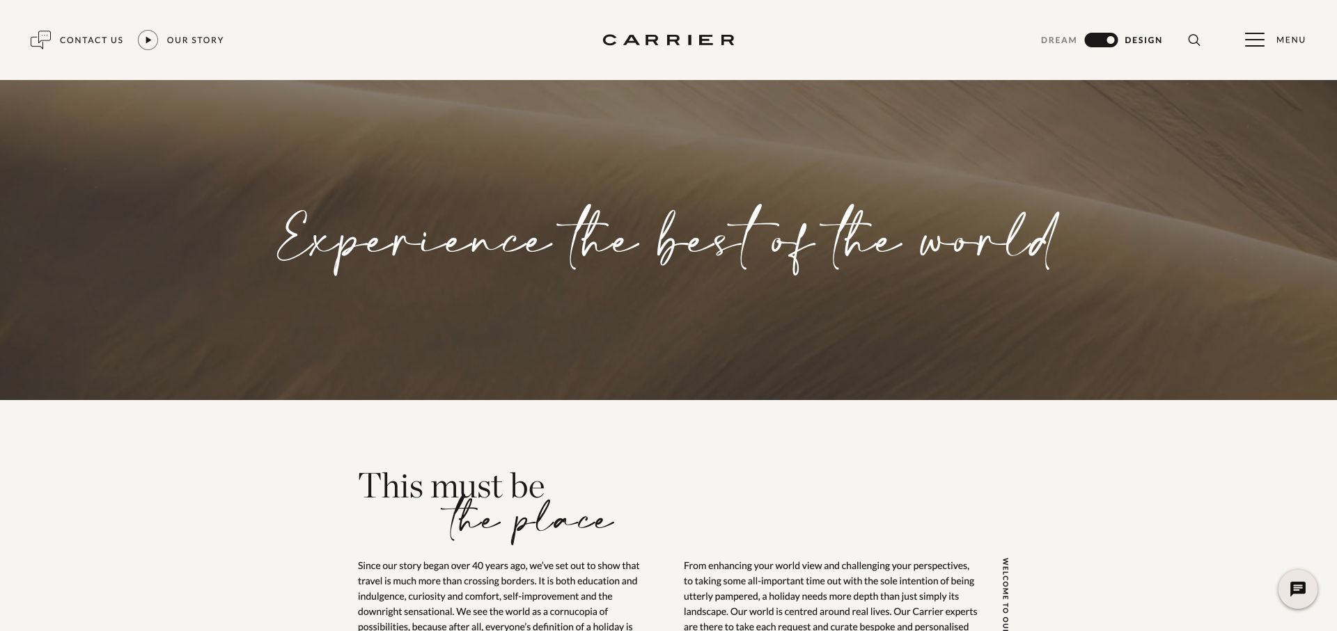
Carrier's reviewed Design page uses a warm white header, widely spaced identity, dune photography, and an editorial introduction. A Dream/Design switch explicitly recognizes the difference between imagining a trip and planning one. That distinction is useful for ASP.NET information architecture even though the screenshot does not reveal routing or application state. The public response identifies a family association for this property, without showing how private trip planning, customer records, or booking destinations are implemented beyond the inspected page.
What you can learn
Define what changes between the two modes: editorial tone, available destinations, and the next useful task. Keep shared company information and contact routes consistent. If a visitor switches while considering a particular destination, decide deliberately whether that context should persist, then verify the behavior in the actual implementation rather than inferring it from the presence of a toggle.
Pros
The persistent switch makes the planning-stage distinction visible.
Restrained chrome gives photography and editorial text room to work.
Cons & considerations
Sparse navigation reveals few detailed categories at first glance.
Atmospheric introductions still need a concrete planning destination nearby.
Platform source: Dated exact public source-page audit. x-powered-by response header identifies ASP.NET. Reported ASP.NET family association only; no inference of ASP.NET Core, runtime version, CMS, private applications or linked properties. Platform evidence is separate from the direct website screenshot and is not a complete current infrastructure audit.
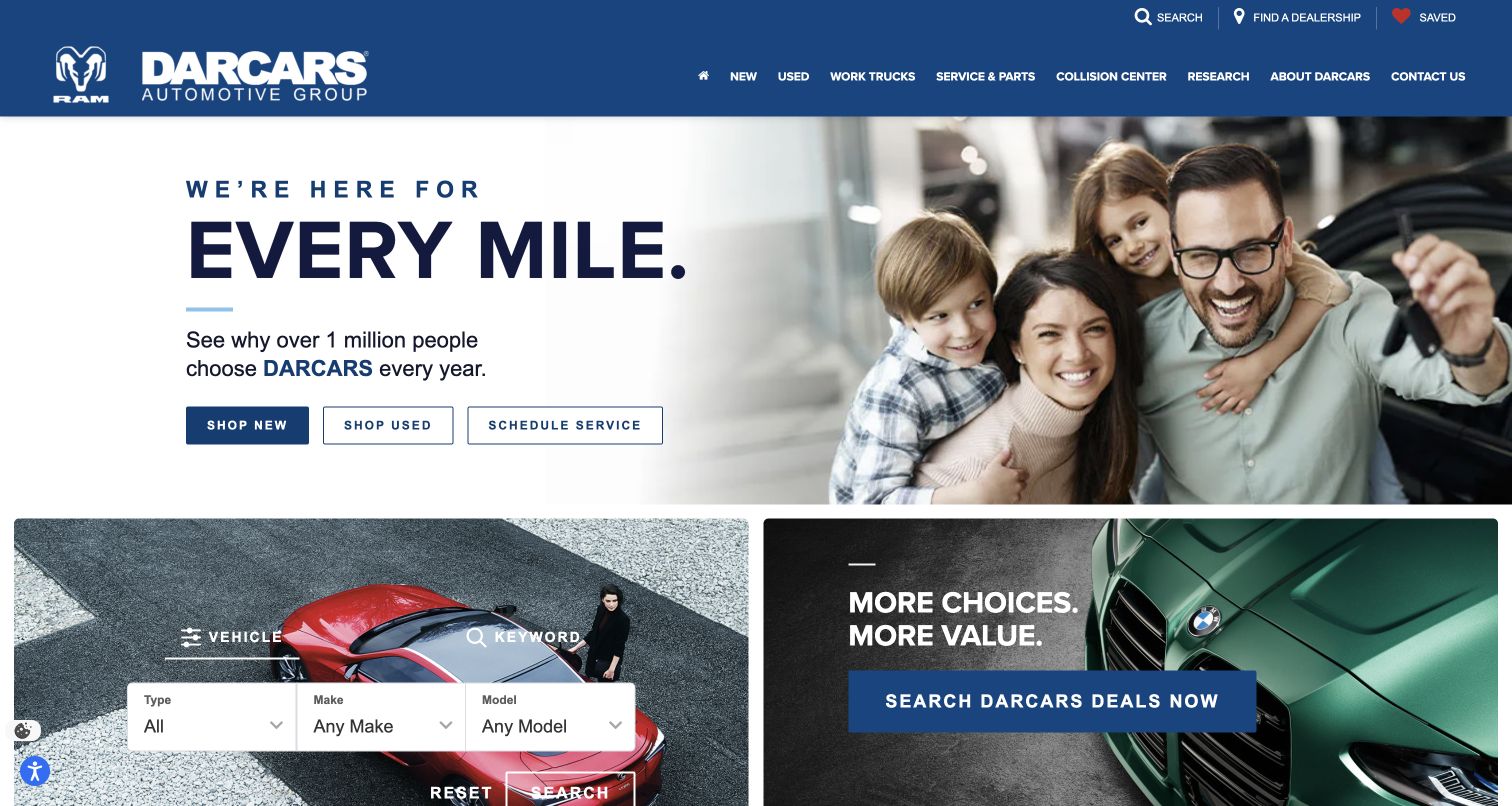
DARCARS places new vehicles, used vehicles, and service scheduling beneath a family-oriented headline, then introduces a vehicle-search panel and promotional card. Dealership discovery and saved items sit in the blue header. The page provides useful ASP.NET planning material because its broad group identity must hand people to more precise inventory and location tasks. The public response association does not establish the implementation of inventory feeds, appointment systems, dealership databases, or the persistence of saved vehicles across destinations.
What you can learn
Model primary tasks separately from promotions and preserve an explicit dealership context wherever the journey requires one. Define what happens when a visitor changes location after choosing a vehicle or service. On small screens, give the search panel a predictable place before unrelated offers, and verify that each group-level action explains the local destination it opens.
Pros
Three task buttons bridge brand messaging and detailed inventory.
The search panel supplies a more precise next step for shoppers.
Cons & considerations
Promotional cards can interrupt someone already narrowing a selection.
Group-level claims need context beyond broad customer-volume language.
Platform source: Dated exact public source-page audit. x-powered-by response header identifies ASP.NET. Reported ASP.NET family association only; no inference of ASP.NET Core, runtime version, CMS, private applications or linked properties. Platform evidence is separate from the direct website screenshot and is not a complete current infrastructure audit.
EisnerAmper's captured opening asks a specific tax-planning question in large serif type, using gold and charcoal to distinguish the campaign. Circular photography adds character without replacing the text, while service, industry, solution, and insight routes remain stable above it. Topic pills extend the editorial entrance. For an ASP.NET project, this is a useful model of timely content within durable navigation. A public framework-family signal does not identify the rules, data, or client systems supporting the firm's professional work.
What you can learn
Separate the campaign's question, action, relevant period, and related insights from the evergreen service model. Plan a review date before the topic becomes stale. A template should accommodate a shorter headline and a longer professional term without manual spacing fixes, while the action should continue to describe the promised content rather than a generic destination.
Pros
The action follows the tax question closely enough to set expectations.
Topic pills expose useful routes into a substantial insight library.
Cons & considerations
Seasonal expertise needs an explicit editorial retirement process.
Large serif headlines can become awkward at narrow widths.
Platform source: Dated exact public source-page audit. x-powered-by response header identifies ASP.NET. Reported ASP.NET family association only; no inference of ASP.NET Core, runtime version, CMS, private applications or linked properties. Platform evidence is separate from the direct website screenshot and is not a complete current infrastructure audit.
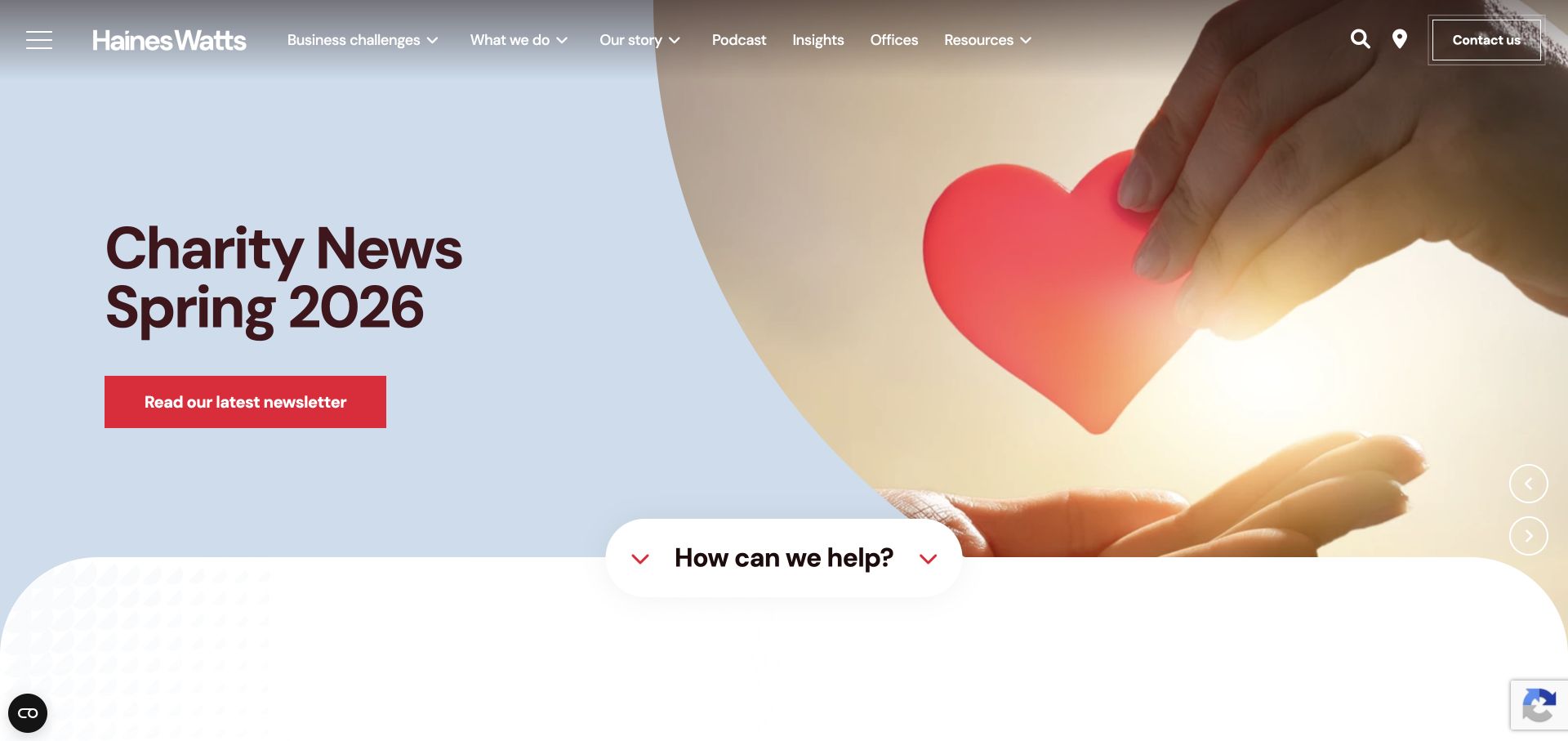
Haines Watts puts business challenges alongside conventional service names, giving owners a way to browse without accounting vocabulary. A light-blue campaign, red action, and curved transition lead toward practical help, with podcasts and resources adding an editorial layer. The ASP.NET lesson is about modeling two useful views of the same expertise. The source-page association is not evidence of how inquiries are processed, what CRM is connected, or whether every resource and office site shares one application.
What you can learn
Create relationships between challenge pages and service records instead of maintaining two disconnected libraries. An editor should be able to update a service once while keeping its problem-led entry points accurate. Test a visitor who arrives through a podcast topic and needs help immediately, then make sure the permanent contact route survives when the homepage campaign changes.
Pros
Challenge labels translate professional expertise into a visitor's language.
The transition toward help connects editorial content with a task.
Cons & considerations
A wide menu needs deliberate priorities on smaller screens.
Rotating campaigns can overshadow evergreen service discovery if unmanaged.
Platform source: Dated exact public source-page audit. Recognized cookie name (values discarded). Reported ASP.NET family association only; no inference of ASP.NET Core, runtime version, CMS, private applications or linked properties. Platform evidence is separate from the direct website screenshot and is not a complete current infrastructure audit.
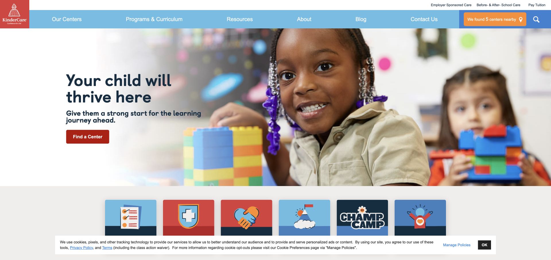
KinderCare combines colorful branding with a classroom photograph that fades toward a quieter text area. Center finding appears as a practical action, while programs, curriculum, resources, and company information remain distinct navigation choices. This is useful ASP.NET inspiration for a location-based service: families need a relevant local destination before they can evaluate the full offer. The dated public response does not identify the software behind enrollment, available places, family accounts, or individual center operations.
What you can learn
Give center records a clear relationship to programs and regional information, while keeping the national campaign independently editable. Decide which location details must be present before publishing a center page. Test the finder from both header and hero, including an empty result and a visitor who prefers to browse locations rather than supply a precise location immediately.
Pros
The faded image edge creates a calmer place for explanatory text.
Program and resource labels make major content purposes explicit.
Cons & considerations
National imagery provides little immediate detail about a specific center.
The captured consent strip reduces space for the next content layer.
Platform source: Dated exact public source-page audit. Recognized cookie name (values discarded). Reported ASP.NET family association only; no inference of ASP.NET Core, runtime version, CMS, private applications or linked properties. Platform evidence is separate from the direct website screenshot and is not a complete current infrastructure audit.
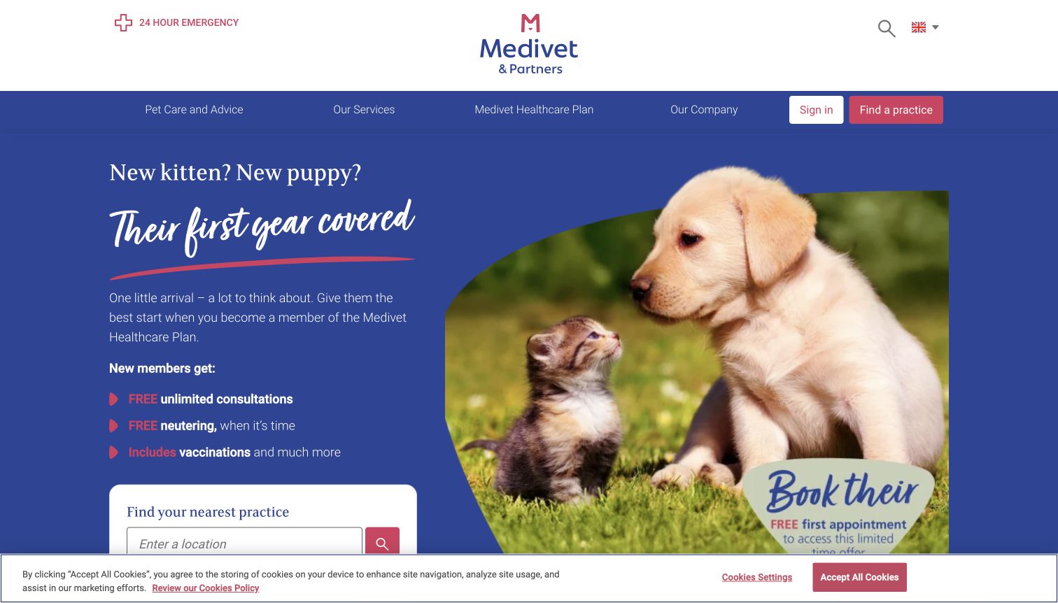
Medivet's puppy-and-kitten campaign promotes a healthcare plan, with a practice finder beneath its benefits. Emergency information remains separate above the main navigation, while sign-in and practice access retain clear positions. The ASP.NET planning value is the separation between a temporary life-stage message and permanent client tasks. Its public family-level source evidence does not establish appointment availability, plan administration, patient records, or the implementation of any linked private service. Those boundaries matter more than the framework label alone.
What you can learn
Model urgent links as permanent navigation requirements and campaign benefits as dated, reviewable content. A change to the plan hero must not move emergency access or alter the practice finder. Test a visitor with an older pet as well as someone responding to the campaign, and ensure each can reach a relevant local practice without interpreting promotional conditions first.
Pros
A focused life-stage message clearly identifies its intended audience.
Emergency access has a position outside the promotional hierarchy.
Cons & considerations
Older-pet owners may find the opening less immediately relevant.
Detailed plan benefits compete with the nearby practice-finding task.
Platform source: Dated exact public source-page audit. Recognized cookie name (values discarded). Reported ASP.NET family association only; no inference of ASP.NET Core, runtime version, CMS, private applications or linked properties. Platform evidence is separate from the direct website screenshot and is not a complete current infrastructure audit.
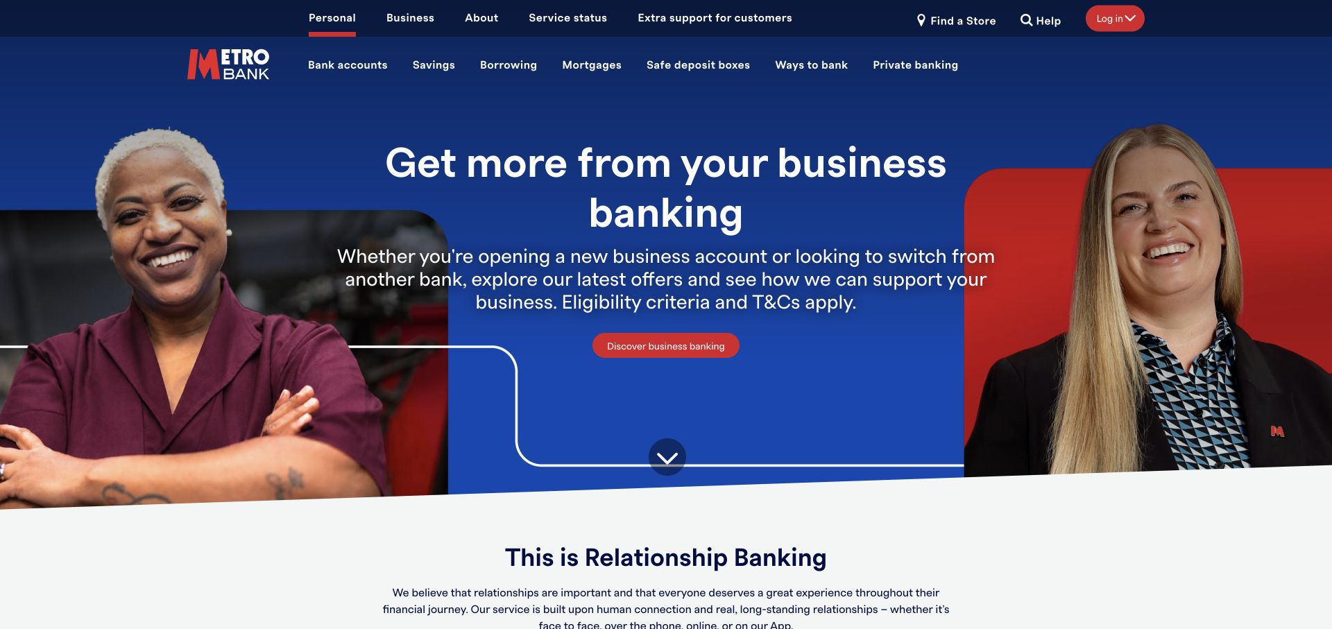
Metro Bank's navy-and-red header gives service status and extra support their own utility layer before product categories. A business-banking campaign places portraits around a centered message and red action, ending in a curved lower border. For ASP.NET development, this is a reference for template responsibilities: support links should remain predictable while promotional content changes. The public source reports the ASP.NET family without verifying the implementation of account access, payments, product applications, or service-status reporting systems.
What you can learn
Define utility navigation as a separately governed component with named destinations and content owners. Test its visibility when the campaign headline becomes longer and when a notice must be added. A personal customer should still reach an appropriate product route from a business-led homepage; audience-specific promotion should not silently change the meaning of universal help links.
Pros
Service status and extra help have explicit positions in the header.
A centered action clearly belongs to the business campaign.
Cons & considerations
Several header rows consume substantial vertical space before the message.
Personal customers must redirect through navigation from the business opening.
Platform source: Dated exact public source-page audit. Recognized cookie name (values discarded). Reported ASP.NET family association only; no inference of ASP.NET Core, runtime version, CMS, private applications or linked properties. Platform evidence is separate from the direct website screenshot and is not a complete current infrastructure audit.
MVRDV makes a condensed statement part of a large project image, then uses themes such as housing, transformation, and research to connect that visual position to its work. The approach offers ASP.NET teams a useful distinction between an expressive homepage and structured project discovery. Public response evidence identifies the reported family only. It does not show the content model, search implementation, image pipeline, or the software used for the architecture represented in those project photographs and graphics.
What you can learn
Treat projects, themes, locations, and research material as linked content with ordinary descriptive fields beneath the expressive surface. Test a project that belongs to several themes rather than forcing one category. Keep a separate reading style for facts and captions, and review long translated statements against quieter imagery before allowing every editor to reuse the same dramatic display treatment.
Pros
The display statement establishes a recognizable editorial voice immediately.
Themes provide routes into more substantial work beyond the hero.
Cons & considerations
Tall condensed type becomes demanding when it wraps on small images.
A dramatic opening still needs conventional project facts and contact routes.
Platform source: Dated exact public source-page audit. x-powered-by response header identifies ASP.NET. Reported ASP.NET family association only; no inference of ASP.NET Core, runtime version, CMS, private applications or linked properties. Platform evidence is separate from the direct website screenshot and is not a complete current infrastructure audit.
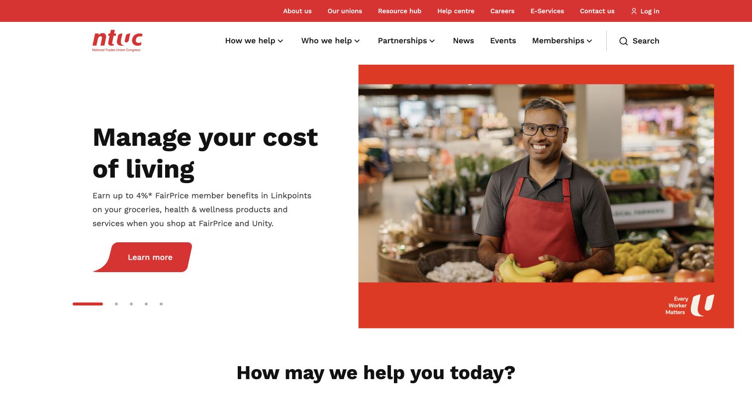
NTUC's public portal pairs a cost-of-living message with a shopkeeper photograph inside a red frame. Navigation asks how and whom the organization helps, while membership, news, events, and login have distinct places. The ASP.NET reference is a broad public service entrance with overlapping audiences. Its response evidence and documented publishing history do not verify member accounts, partner applications, affiliated union sites, or the systems deciding eligibility for particular benefits. Each connected destination needs its own review.
What you can learn
Represent audience, need, program, eligibility, and next step as explicit content relationships. Benefit figures should be maintained fields with supporting context, rather than text visible only inside an image. Test a visitor who qualifies for several audience groups and another who is unsure where they belong; both should be able to browse programs without understanding the organization's internal structure.
Pros
Everyday need labels offer an alternative to departmental navigation.
Human photography connects a practical campaign to a recognizable identity.
Cons & considerations
Broad audience taxonomies need disciplined handling on smaller screens.
Benefit figures and conditions require consistent ownership and review dates.
Platform source: Dated exact public source-page audit. Recognized cookie name (values discarded). Reported ASP.NET family association only; no inference of ASP.NET Core, runtime version, CMS, private applications or linked properties. Platform evidence is separate from the direct website screenshot and is not a complete current infrastructure audit.
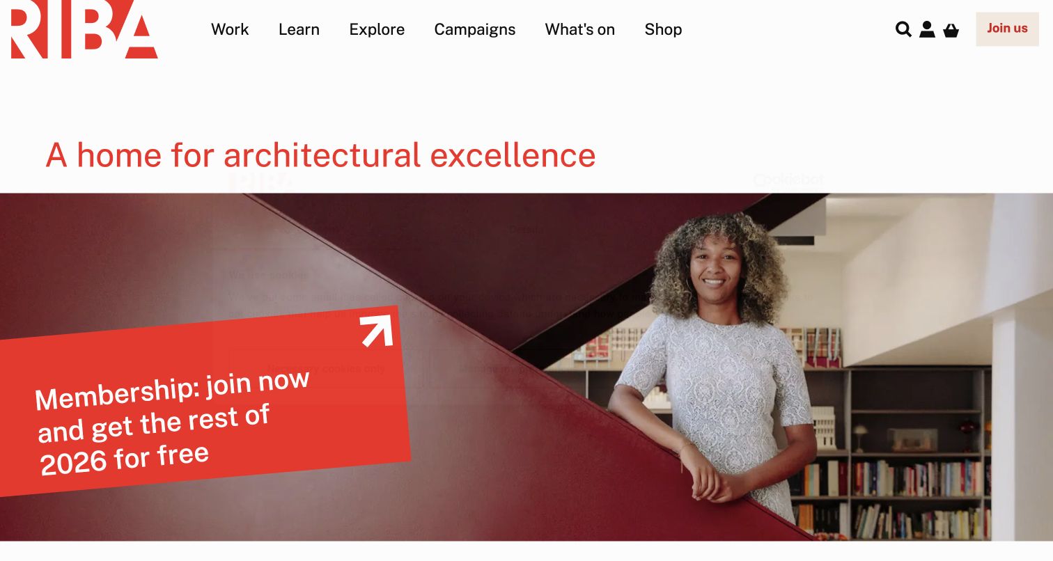
RIBA anchors its white header with a red identity and activity-led routes for work, learning, exploration, campaigns, events, and shopping. An architectural proposition leads into photography and an angled membership panel. This is useful ASP.NET inspiration for balancing a cultural role with a practical invitation to join. The public response identifies a family association; the documented CMS implementation does not make this a review of member-only tools, payment processing, or the data exchanged during a joining journey.
What you can learn
Build membership panels from maintained benefit and destination records that can also support related event or publication pages. Keep the activity taxonomy comprehensible when a campaign changes. Test a long event title, a new membership proposition, and a narrow viewport together, so the angled visual treatment does not require editorial shortcuts or obscure where the visitor will go next.
Pros
Activity labels describe recognizable tasks instead of internal departments.
Membership feels connected to the organization's broader professional purpose.
Cons & considerations
Angled panels place constraints on longer or translated content.
Several audiences sharing one entrance need ongoing navigation governance.
Platform source: Dated exact public source-page audit. x-powered-by response header identifies ASP.NET. Reported ASP.NET family association only; no inference of ASP.NET Core, runtime version, CMS, private applications or linked properties. Platform evidence is separate from the direct website screenshot and is not a complete current infrastructure audit.
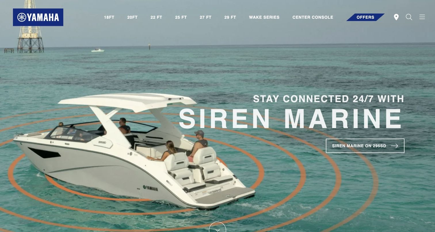
Yamaha Boats combines water imagery with permanent navigation organized by boat size and specialist ranges. The captured feature concerns connected boating, giving owners a reason to engage while shoppers can still reach the physical lineup. For ASP.NET planning, the useful pattern is a stable product taxonomy around seasonal editorial modules. The public response association and documented WaterCraft CMS history apply to the reviewed Boats property; they do not identify dealer systems, customer accounts, or software operating inside the products.
What you can learn
Keep model family, size, specifications, and comparison destinations in structured product records. An ownership campaign should reference those records without replacing the main shopping paths. Review the template with a service story, a new model announcement, and an ordinary product photograph, then check that a visitor can still bypass the promotion and reach a relevant range directly.
Pros
Size-based navigation gives returning shoppers a compact orientation system.
Water imagery keeps the ownership campaign connected to the product experience.
Cons & considerations
Light text competes with bright portions of the hero photograph.
New visitors may need clearer explanations of differences between named ranges.
Platform source: Dated exact public source-page audit. x-powered-by response header identifies ASP.NET. Reported ASP.NET family association only; no inference of ASP.NET Core, runtime version, CMS, private applications or linked properties. Platform evidence is separate from the direct website screenshot and is not a complete current infrastructure audit.
Choose the content architecture around the visitor's task
Editorial public website
Use stable service and project records with separately managed campaign slots. Give notices an owner and expiry review. The homepage can change frequently while the underlying destinations remain dependable.
Location or product discovery
Define the fields and relationships needed to narrow a choice before designing the finder. Include empty results, changed location, unavailable products, and ordinary browsing in the brief. A recognizable brand does not remove those practical requirements.
Public entrance to private services
Document the point where the public site hands a visitor to an account, membership, or booking application. Preserve labels and context across the boundary. Review that service separately instead of assuming a shared hostname or brand means a shared implementation.
From references to requirements
Prepare a useful ASP.NET website brief
Inventory the implementation and its owners
Record the actual framework generation, content system, hosting responsibility, and release process for your own application. Identify who approves navigation, who maintains time-sensitive content, and who owns each connected destination.
Prototype difficult content first
Test the longest service name, a translated campaign, multiple simultaneous notices, an empty finder, and a project belonging to several themes. These cases reveal template limits sooner than a short headline and ideal photograph.
Make publishing observable
Define how a successful update is checked through the public route, including redirects, metadata, cache freshness, assets, and the next task. Keep previews and production behavior distinguishable, and record a recovery path for a failed release.
A useful handover demonstration
Ask the actual team to carry out its routine job: publish a realistic update, correct a mistake, preview a narrow screen, and identify who owns an integration failure. For a library or frontend framework, also ask who maintains the content source and deployment. A polished screenshot does not answer those operational questions.
Beyond the screenshot
ASP.NET website planning checklist
Identify the actual framework generation from your own source and configuration.
Document supported runtime and CMS dependencies without inferring them from public examples.
Map permanent services, products, locations, and editorial records to durable URLs.
Assign ownership and review dates to campaigns, notices, figures, and offers.
Specify public-to-private service handoffs and the context each must preserve.
Check navigation, keyboard access, form labels, and long content at narrow widths.
Test public cache freshness when content changes or expires.
Verify redirects, metadata, assets, and the visitor's next task after deployment.
Test with real content, a keyboard, a small screen, slow or failed requests, and the people who will maintain the system. These are planning checks, not an accessibility, security, performance, or search-ranking certification.
Sources & editorial method
How this ASP.NET collection was reviewed
Twenty distinct public website properties were selected from genuine captured references and exact source-page audits. Each has a documented broad public stack-audit attempt. Original screenshot dates, dimensions, attribution, and technology observation dates are retained separately from this collection's review date. ASP.NET is recorded as a reported family association, not proof of ASP.NET Core, runtime version, complete architecture, or private-service behavior. Reviews are original editorial analysis; recommendations describe what to plan and test rather than claiming unobserved functionality.
Every image is an unmodified capture from the actual website, with its source and capture date. Some captures are reused from our shared catalog; their dates remain the original capture dates. None comes from a vendor gallery or a generated reconstruction. Moving imagery and live content can change.
Technology attribution uses public page assets or metadata, official platform documentation, or a cited first-party project case study. Documentary and framework-relationship evidence is identified where used; it is not a complete current backend inventory. A CMS image CDN alone does not establish a full CMS deployment. A library’s presence does not prove which individual controls use it, and a platform label does not establish AI authorship.
The composition notes, lessons, pros and tradeoffs are original editorial observations. We have not measured conversion, traffic, security, performance or accessibility conformance. Website owners retain their brands and imagery; these examples are not our client portfolio. Written, Edited and Curated are independent records, not dates advanced by a build. See our editorial standards or suggest a correction.
Questions worth asking
ASP.NET website development FAQs
Are all of these websites built with ASP.NET Core?
No such conclusion is supported. The collection records the ASP.NET family signal observed on each exact public source page. A generic response header cannot identify Core or distinguish the application's programming model and runtime.
Does ASP.NET determine the website's visual style?
No. The examples range from restrained corporate publishing to expressive cultural and architectural sites. Content structure, HTML, styling, media choices, and editorial decisions shape the visible experience; a framework label does not prescribe them.
Can these examples identify the CMS or account system?
Only separately documented evidence can support those associations. A public-page framework signal does not identify a hidden CMS, database, payment system, or authenticated application. The underlying source records retain the scope of each observation.
How should a new project use the Core documentation linked here?
Use it only after choosing and confirming ASP.NET Core for your own implementation. The routing and caching references support planning questions for that platform; they are not evidence that the reviewed properties use Core or the same configuration.
Use the examples to sharpen content models, permanent navigation, and service handoffs. Then validate the actual framework and release behavior in your own application.