Best Tire Shop Websites of 2026 (28 Real-World Examples)
28 real tire-shop websites reviewed for fitment guidance, local service information, product discovery, and the path from browsing to a useful appointment.
A useful tire-shop website helps drivers understand what fits, what the shop can do, and what happens next. Strong examples connect that practical work to clear locations and honest service expectations.
Tire shopping starts from several different situations. One visitor knows a tire size and wants options; another has a puncture and needs a nearby shop; a fleet operator may need a different conversation entirely. A homepage that treats all three as the same lead can make a simple visit unnecessarily difficult.
This collection studies 28 distinct public website properties, ranging from independent neighborhood shops to regional and national retailers. The reviews focus on observable design and communication. They do not test mechanical work, verify product availability, or recommend a particular tire, credit product, or service provider.
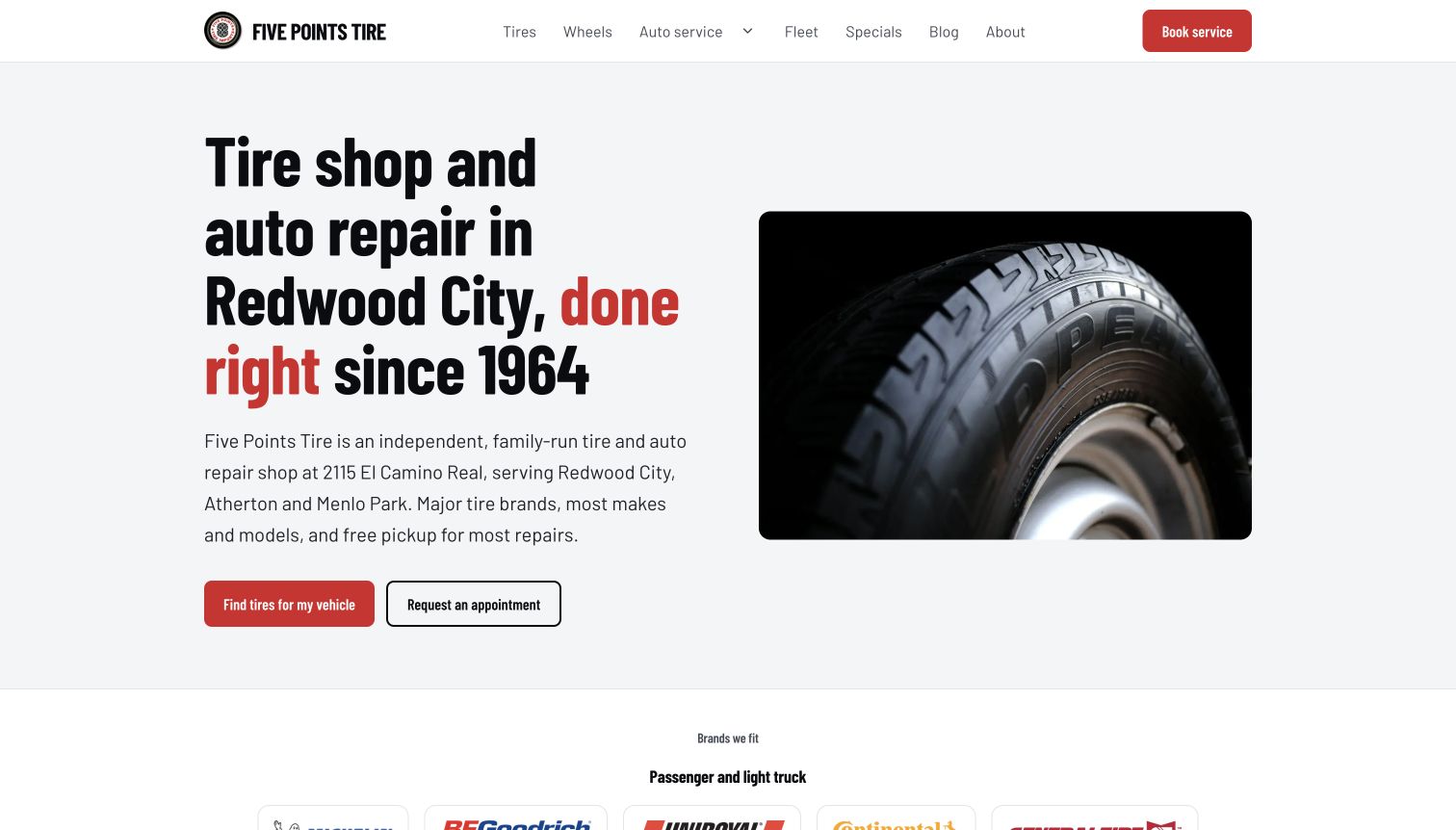
Five Points Tire is our researched Editors Choice for the way it explains local tire selection and human appointment confirmation. Other examples show useful alternatives, including vehicle finders, new-versus-used categories, commercial audience routing, and clear separation between shopping and repairs.
Before the examples
What makes good tire shop website design in 2026?
Establish fitment without overwhelming the visitor
Offer a clear vehicle or tire-size starting point, explain unfamiliar fields, and provide a human-help route. Do not imply that a homepage selection guarantees compatibility or local stock.
Connect online intent to the right shop
Make the selected location visible, easy to change, and consistent throughout shopping and booking. Show useful hours, telephone details, and a manual search alternative to location permissions.
Separate purchases, repairs, and appointments
A flat-tire assessment, replacement purchase, rotation, and alignment are different tasks. Give them distinct labels and explain whether an online action requests a callback or confirms a time.
The collection · 28 examples
28 tire shop websites worth studying
These examples pair actual source screenshots with original tire-shop-specific analysis. Read the strengths and limitations together: a useful navigation idea can coexist with a distracting promotion, an unclear location assumption, or a demanding form.
Five Points Tire starts with the service, city, and shop identity in one readable headline. A single tire photograph balances the text, while two distinct actions separate finding suitable tires from requesting an appointment. The supporting copy identifies the Redwood City address and nearby communities without turning the hero into a directory. Farther down, the page explains that vehicle details lead to options and pricing, then a fitting appointment. That sequence makes its assisted process understandable without pretending that the homepage is a live inventory checkout. The simple red, black, and white palette keeps the next step prominent.
What you can learn
Borrow the explicit explanation of what happens after a customer supplies vehicle information. A tire inquiry and a confirmed appointment are different promises; label each accurately and explain the human confirmation step before asking for details.
Pros
The opening names both the local service and the practical next actions.
Grouped repair services keep a broad offering separate from tire and wheel selection.
Cons & considerations
Customers wanting immediate stock and installed pricing need a follow-up conversation.
The tire photograph conveys the category more clearly than the physical shop experience.
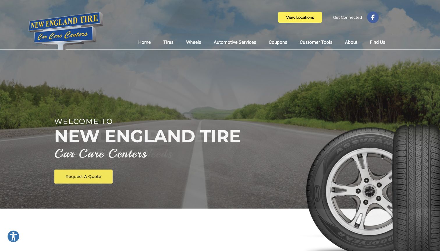
New England Tire uses a road scene and a large tire image to establish its category immediately. The yellow quote button is easy to find against the darker background, while the header keeps a location route separate from the main navigation. Its broader page distinguishes finding a branch, scheduling service, and requesting a quote. Those are useful differences for a tire retailer whose visitors may know their preferred location but still need help choosing products. The source also lists regional branches and common repair categories. The opening is more atmospheric than transactional, so the strongest practical information appears after the hero.
What you can learn
Give quote requests, service appointments, and branch selection their own labels. Customers should not have to discover which task a generic contact button supports after opening a form, particularly when multiple shops have different availability.
Pros
The bright quote action has clear contrast against the opening photograph.
Regional branch links and service categories provide useful routes beyond a single sales pitch.
Cons & considerations
The large introductory scene delays detailed tire selection on the opening screen.
Rotating promotions and services can distribute attention across several competing paths.
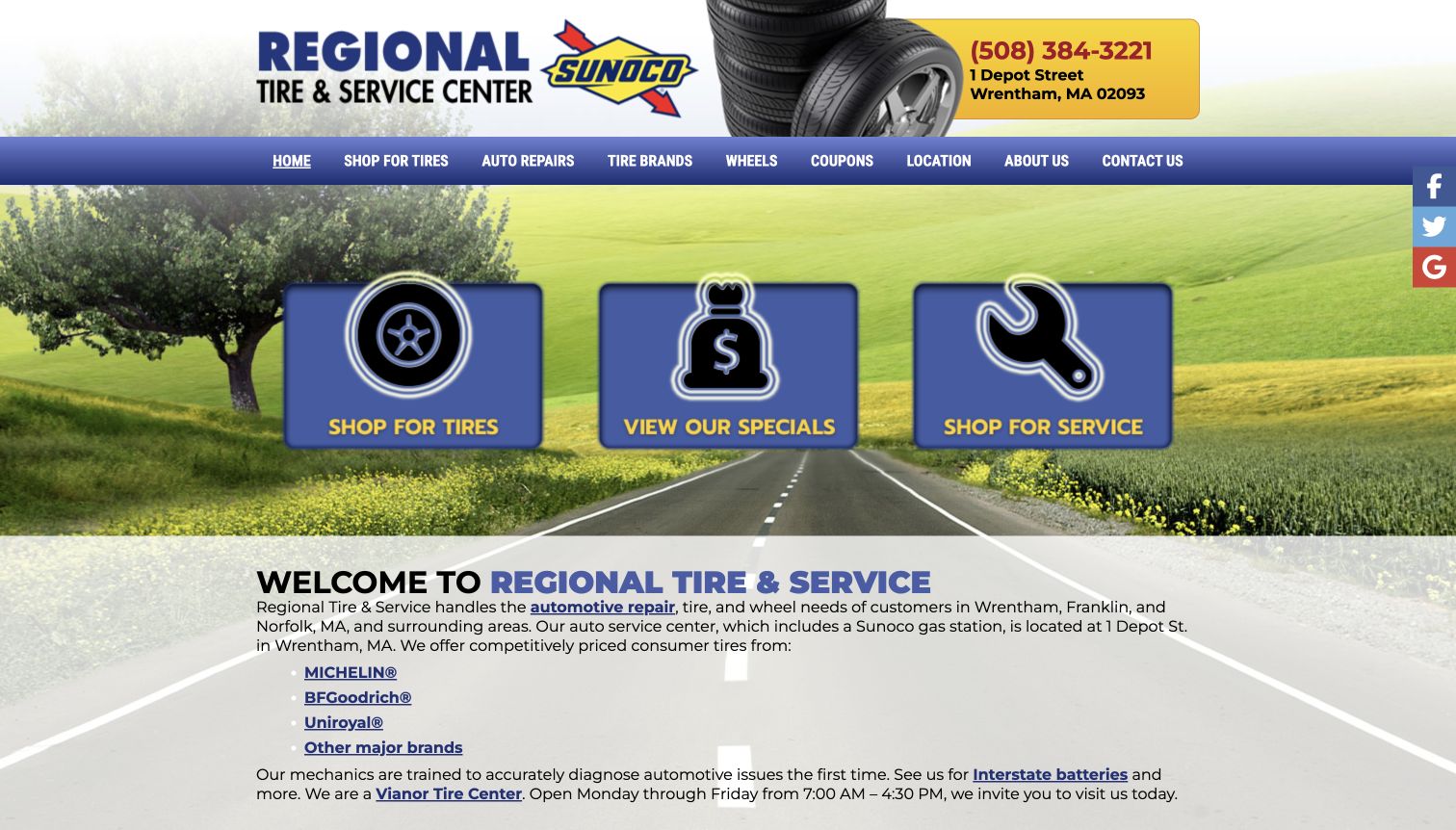
Regional Tire & Service puts its phone number and Wrentham address in a yellow header panel, making the physical destination part of the first impression. Three large illustrated tiles then divide the page into tire shopping, specials, and service. That structure works for a shop attached to a gas station because it gives automotive visitors a clear route without requiring knowledge of the company. Below, introductory copy names the surrounding towns and links to tire brands. The vehicle selector follows the explanation. The design is visually dense, but its main tasks remain concrete and recognizable throughout the page.
What you can learn
For a local shop, pair the address and phone with a small number of task-specific choices. Keep brand browsing and vehicle fitment available, but do not make customers parse a long company introduction before reaching the correct service.
Pros
The address and telephone are immediately visible in the main header.
Large tire, offer, and repair tiles make the main service split easy to understand.
Cons & considerations
Decorative backgrounds and strong gradients add visual competition around small text.
The detailed vehicle finder sits below introductory material instead of leading the page.
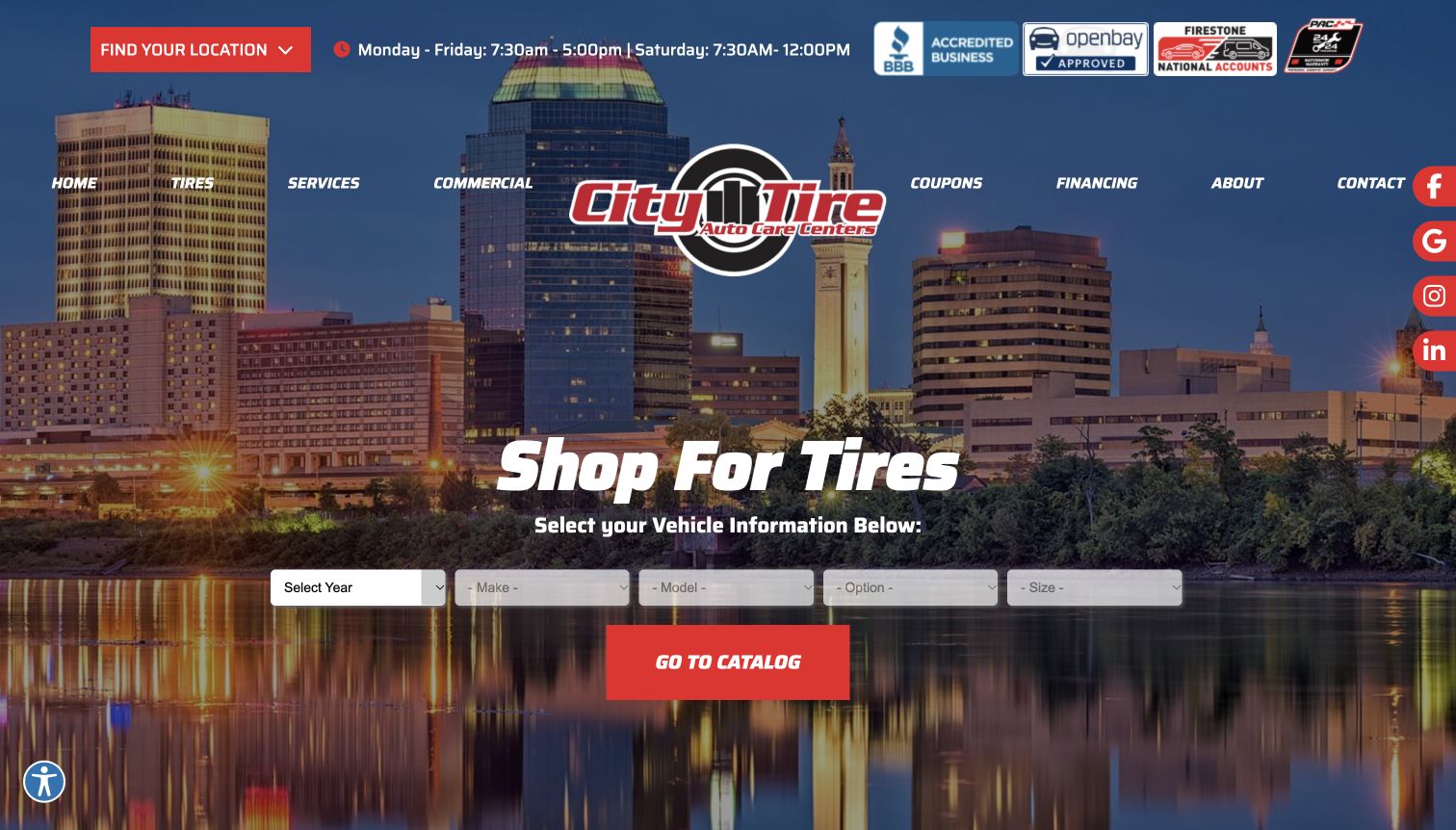
City Tire places its vehicle finder directly over a city skyline, combining a regional visual cue with an immediately useful shopping task. The stepwise fields move from year toward the specific vehicle and tire size, with a prominent red catalog action beneath them. Opening hours and a location selector remain above the navigation, while commercial customers have a separate menu destination. The rest of the homepage introduces repair services, customer quotations, and the company’s regional footprint. This makes the opening more task-oriented than a purely promotional tire site, although the photograph and numerous badges create a busy frame around the search.
What you can learn
Use the homepage to begin fitment selection when tire shopping is the dominant task. Keep commercial services visible as a separate route so fleet buyers do not mistake a passenger-vehicle selector for the full extent of the business.
Pros
The vehicle search is visible without scrolling through a promotional carousel.
Hours, locations, and commercial navigation support different types of tire customers.
Cons & considerations
The skyline, badges, social links, and search controls compete for initial attention.
Several dependent fields may feel demanding to customers unsure of their vehicle specification.
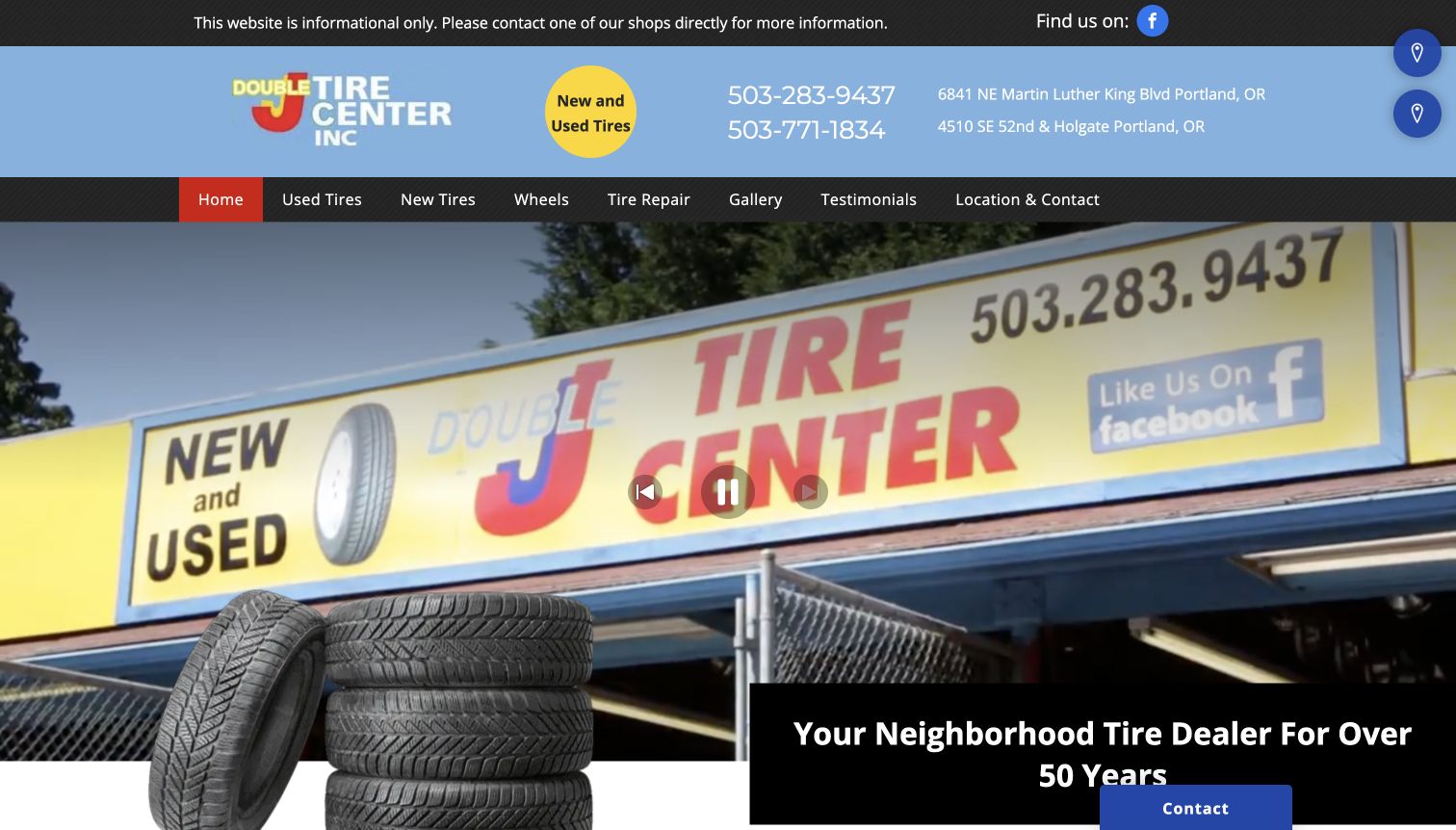
Double J Tire Center makes its operating model unusually clear: the site is informational and customers should contact a shop directly. Two phone numbers align with two Portland addresses, and separate navigation items distinguish new tires, used tires, wheels, and repairs. A large storefront image grounds the page in a real business rather than an anonymous product catalog. Supporting copy explains that quotes happen by phone and that unavailable brands can be discussed with the shop. The result is a useful reference for businesses without synchronized online inventory. Its large media area and overlapping panels, however, make the first screen less compact than the practical header.
What you can learn
A simple tire-shop website can be effective when it states its limits plainly. If staff confirm stock and suitability by phone, prioritize location-specific contact details and explain that process instead of presenting an incomplete online buying experience.
Pros
New and used tires have separate, plainly named navigation destinations.
Both shop addresses and their corresponding telephone numbers are visible immediately.
Cons & considerations
The large media presentation pushes descriptive service information toward the fold.
Customers cannot compare actual available tires or final installed costs from the opening page.
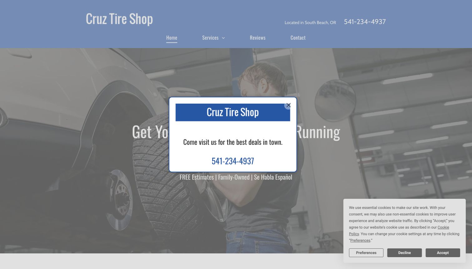
Cruz Tire Shop identifies South Beach in the header and places its telephone number beside a restrained four-item navigation. The homepage pairs a service-bay photograph with a broad repair headline, then explicitly mentions Spanish-language service and estimates. Tire sales, rims, brakes, and oil changes each receive a separate content block lower on the page. New and used products are described together, making the offering approachable for customers with different budgets. The captured opening also includes a promotional contact popup and a privacy notice. Those overlays are part of the observed experience and substantially interrupt an otherwise simple local-shop introduction.
What you can learn
Make language support and the route to a real shop visible early, especially where customers may need help describing their tires. Avoid stacking promotional dialogs over the same contact information already available in the header.
Pros
The location, telephone, and Spanish-language support are easy to identify in the page content.
Separate tire, rim, brake, and oil sections explain the scope without a complicated menu.
Cons & considerations
A central promotion and privacy notice obscure much of the initial captured view.
The generic automotive headline is less specific than the tire-focused services below it.
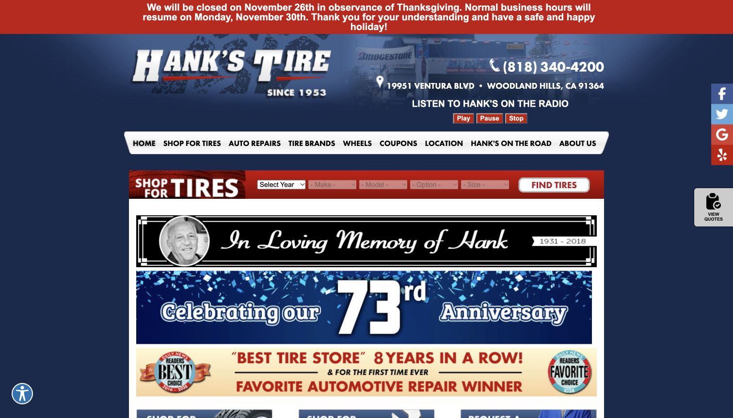
Hank’s Tire uses its long-running local identity throughout the homepage, from the logo and family story to commemorative banners. The Woodland Hills address and phone number sit high in the header, while a compact vehicle finder gives shoppers a practical action before the larger promotional content. Navigation includes tire brands, repairs, wheels, location information, and a distinctive community-oriented section. This combination demonstrates how a tire shop can retain personality without removing the basic shopping route. The opening also carries a holiday closure notice and multiple historical recognition graphics. These make the page informative but compete with the small fitment controls.
What you can learn
Let local history support confidence after the visitor can locate the shop and begin a tire inquiry. Time-sensitive hours notices deserve a visible place, but historical awards and anniversary graphics should not overwhelm the primary task.
Pros
Address, telephone, and a vehicle finder appear before the long business introduction.
The family story provides a specific identity beyond interchangeable tire-brand promotions.
Cons & considerations
Several banners compete with relatively small tire-selection fields near the top.
Radio controls and historical graphics add complexity for visitors who only need a quick quote.
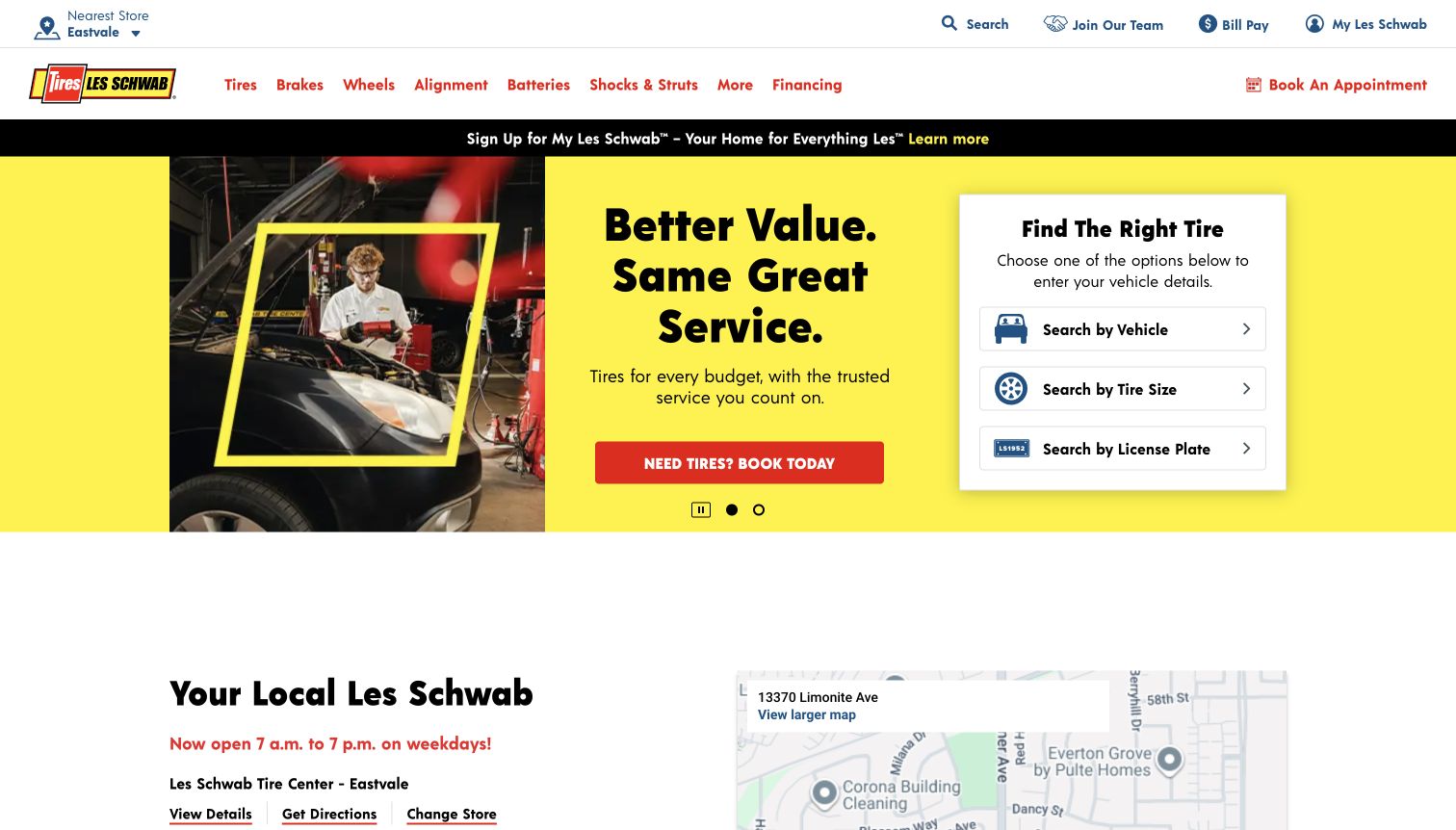
Les Schwab places a compact tire-selection card beside its hero message instead of relying on a general shopping button. Customers can start with a vehicle, tire size, or license plate, which acknowledges that not everyone arrives with the same information. The header maintains a separate appointment action, and the following section shows a specific store with directions and a change-store route. The captured page selected a regional branch automatically; that is interface context, not evidence of the reader’s location. Large yellow and red areas give the shopping card strong contrast, while the broader navigation covers repairs and related automotive services.
What you can learn
Offer alternative ways to establish fitment without making any one of them mandatory on the homepage. Keep the chosen store visible and easy to change before customers rely on local availability or service hours.
Pros
Vehicle, size, and plate options give shoppers clearly differentiated starting points.
Store details and appointment access connect online discovery to a physical visit.
Cons & considerations
Automatic store selection needs an obvious correction route when the suggested branch is wrong.
Account promotion and rotating hero content add distractions around an otherwise focused finder.
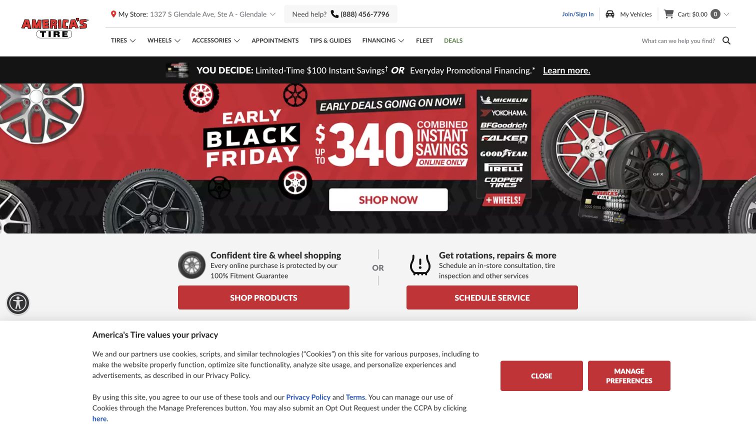
The Discount Tire visit resolved to the America’s Tire regional site, which explained the brand difference before showing the shopping experience. Its header retained store context and vehicle access, while the main page separated buying products from scheduling rotations, repairs, and inspections. That distinction matters for visitors who need tire care rather than a replacement purchase. A large seasonal campaign dominated the first screen, followed by supporting explanations of fitment, installed costs, and ongoing services. The capture retains a privacy notice. This example is reviewed as the actual America’s Tire destination, rather than treating the redirected address as a second independent website.
What you can learn
When a location changes the brand or storefront a customer sees, explain the transition and preserve their intended task. Product browsing and existing-tire service should remain separate routes even when both ultimately lead to the same shop.
Pros
Shopping and service actions describe different customer needs in plain language.
Persistent store context helps connect online tire selection with the intended installation location.
Cons & considerations
The seasonal campaign and privacy panel consume substantial space in the captured opening.
A regional redirect can initially confuse shoppers expecting the original brand name.
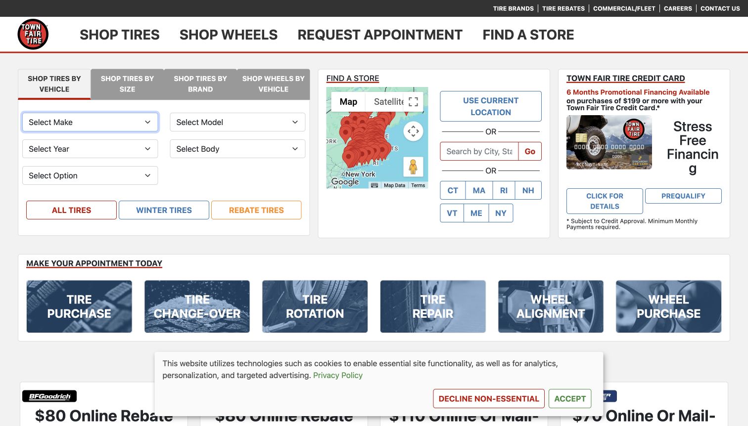
Town Fair Tire opens with a functional dashboard rather than an atmospheric hero. Tabs distinguish vehicle, tire-size, brand, and wheel searches, while a nearby location panel offers a map, text search, and state links. Below, separate appointment tiles name tire purchases, changeovers, rotations, repairs, alignments, and wheels. This is a strong reference for a business that needs customers to identify a specific service before visiting. The same screen also includes financing and promotional content, so it asks the visitor to process several panels at once. The captured privacy banner covers part of the lower offer area without hiding the main shopping tools.
What you can learn
Name appointment types in the language customers use before sending them into a booking flow. Preserve a manual location-search option alongside any location-permission control, and keep fitment inputs separate from financial offers.
Pros
Shopping tabs recognize different ways customers may know their required tire.
Distinct appointment categories reduce ambiguity between purchases, maintenance, and repairs.
Cons & considerations
Several equally prominent panels make the opening screen visually demanding.
The finance card competes with the more immediate tasks of finding tires and choosing a shop.
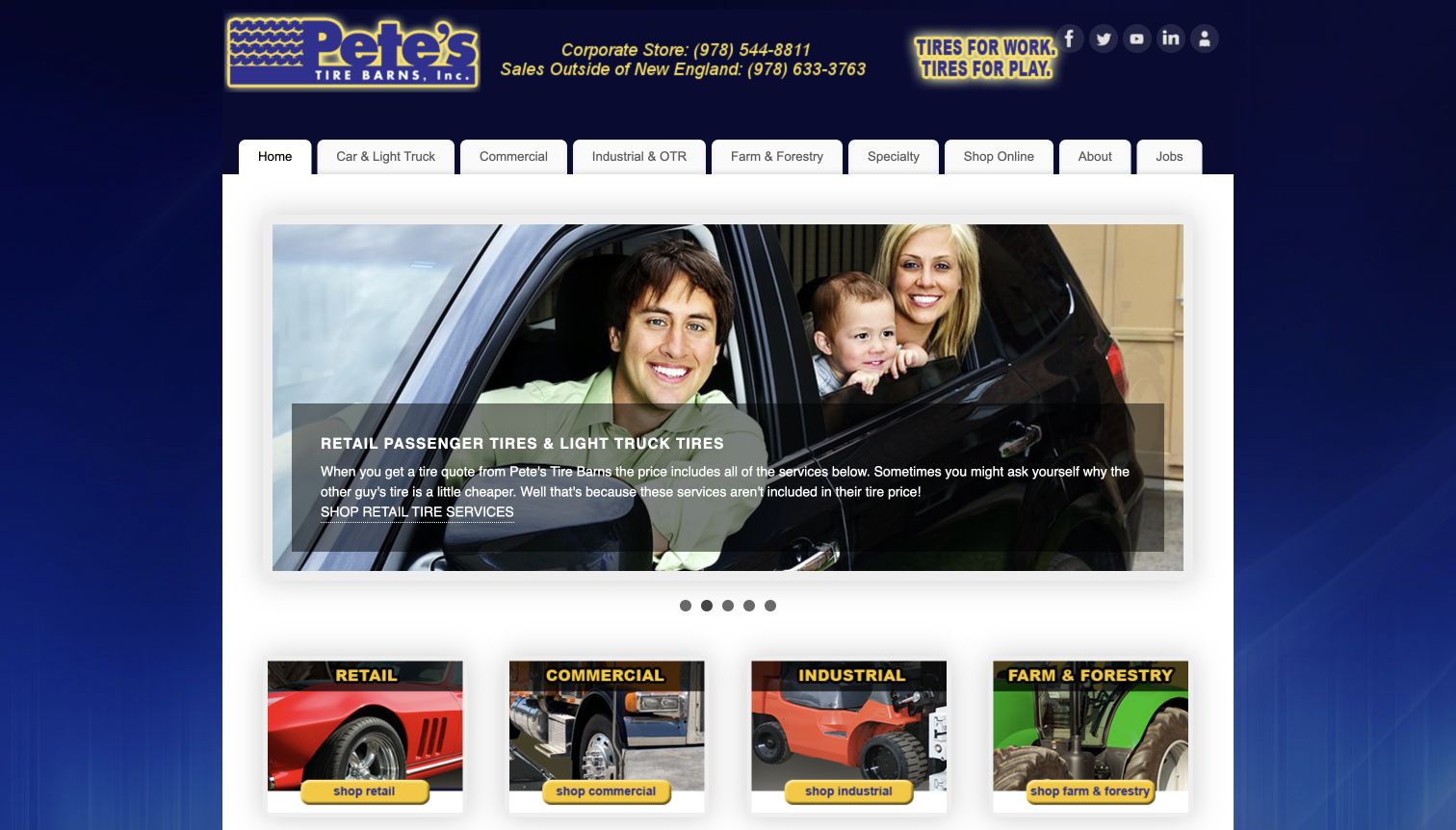
Pete’s Tire Barns organizes its navigation around the equipment and customers it serves: passenger vehicles, commercial fleets, industrial uses, farm and forestry, and specialty tires. That structure avoids forcing every visitor through a car-focused fitment form. The captured hero explains the retail tire quote in terms of included services, while image cards repeat the principal business categories beneath it. Corporate contact details and a separate online-store link remain visible. The layout is compact and relatively traditional, but its information architecture is distinctive. It shows how a broad tire business can explain its range without presenting a single overwhelming product list.
What you can learn
If a shop serves vehicles and equipment with very different purchasing requirements, separate those audiences first. Explain what a quote includes within the relevant category, then connect customers to the appropriate inventory or specialist conversation.
Pros
Commercial, industrial, agricultural, and passenger needs receive clearly named navigation routes.
The retail introduction draws attention to included installation-related services rather than price alone.
Cons & considerations
The separate online store creates a transition customers need to understand before purchasing.
Large slideshow content provides less immediate fitment detail than a dedicated vehicle-selection tool.
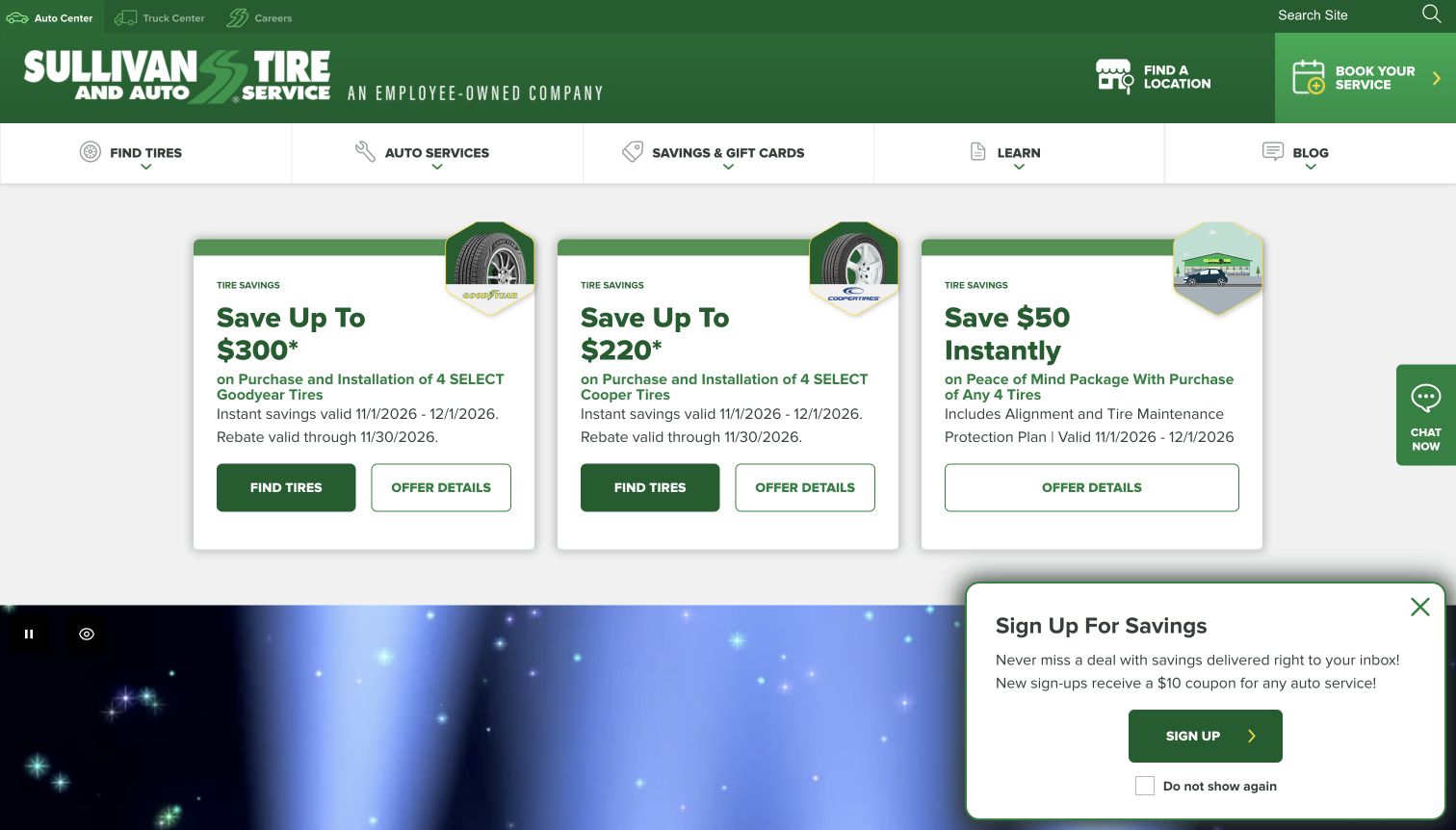
Sullivan Tire’s opening uses a strong green brand system and three offer cards that each separate the savings claim, qualifying purchase, dates, and next action. Tire-search links and offer-detail links are distinct, which helps a visitor investigate conditions without starting a purchase. The header separates auto and truck centers, provides location access, and keeps service booking prominent. Lower content introduces the company’s employee-owned identity and broader maintenance services. The captured page also displays a savings signup panel, adding another competing action. As a design reference, the value lies in the offer structure and audience separation, not in treating the advertised savings as a verified recommendation.
What you can learn
Keep eligibility, timing, and details beside each tire promotion rather than relying on a large discount headline alone. A service-booking route should remain available for customers who are not shopping a featured offer.
Pros
Offer cards distinguish tire selection from reading the terms of a promotion.
Auto and truck navigation acknowledges different vehicle and service requirements.
Cons & considerations
The signup panel adds another sales request to an already promotion-heavy opening.
Large campaign sections delay a quieter overview of routine tire and repair services.
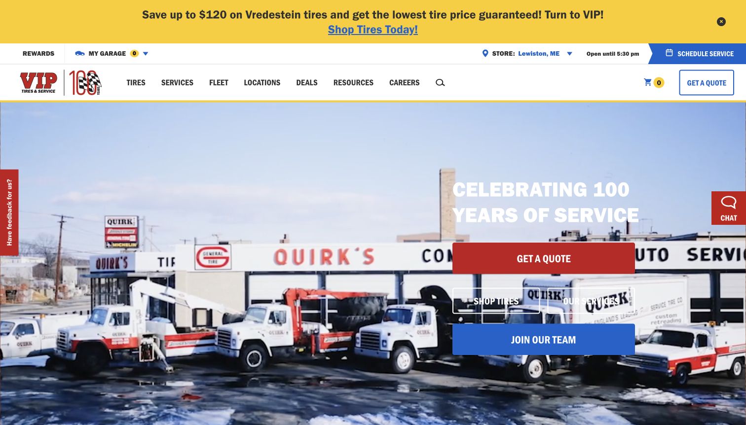
VIP Tires & Service places the selected store and its current hours in a utility row above the primary navigation. Tire shopping, services, locations, deals, and resources remain distinct, with quote and scheduling actions repeated. The captured hero uses a historic storefront and service vehicles to introduce the company’s anniversary rather than relying only on tire product photography. That gives the business a story while still offering routes to tires and repairs. The page also exposes garage and recently viewed features, suggesting a longer shopping journey. The numerous calls to action make hierarchy particularly important for someone arriving with an urgent tire problem.
What you can learn
Keep store context visible while customers move between browsing and service planning. If heritage is the lead story, pair it with direct shopping and repair routes so the narrative does not become an obstacle to a practical visit.
Pros
The selected store, hours, and service action remain grouped near the top.
Historical imagery adds a specific business identity to familiar tire-retail navigation.
Cons & considerations
Quote, shopping, service, recruiting, and chat actions compete within the first screen.
Large navigation menus may be more than a quick repair visitor needs to process.
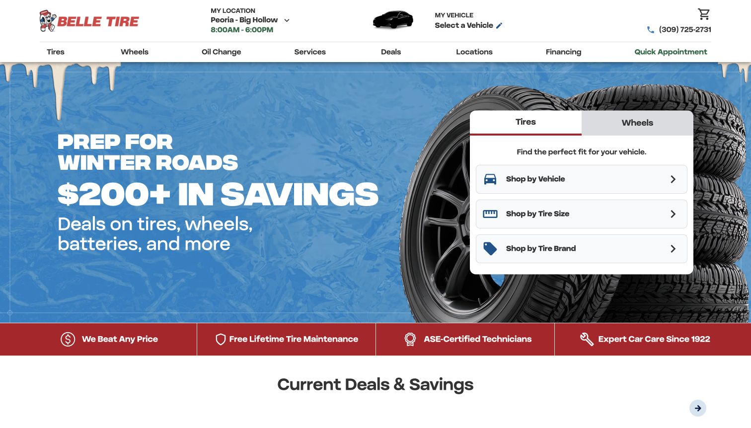
Belle Tire places a white selection card against a winter campaign image. Tire and wheel tabs establish the product category, then vehicle, tire-size, and brand routes let customers choose how to browse. The header separately shows store and vehicle context and provides a quick appointment link. Below the hero, a compact promise strip leads into offer cards and service categories. This is a useful example of making a finder visually stronger than a broad promotional scene. The initial store selection and seasonal savings still need interpretation, and the homepage cannot by itself prove availability or the full installed price for a particular vehicle.
What you can learn
Use a high-contrast finder to give a promotional homepage a stable practical center. Keep product selection, store context, and service booking distinct so customers can return to the task they intended without restarting the entire journey.
Pros
Vehicle, size, and brand routes are visible within one clearly bounded shopping card.
Store and vehicle controls provide useful context above the main product navigation.
Cons & considerations
The seasonal savings message remains larger than information about installation details.
Customers must still verify the selected location and applicable offer terms before relying on pricing.
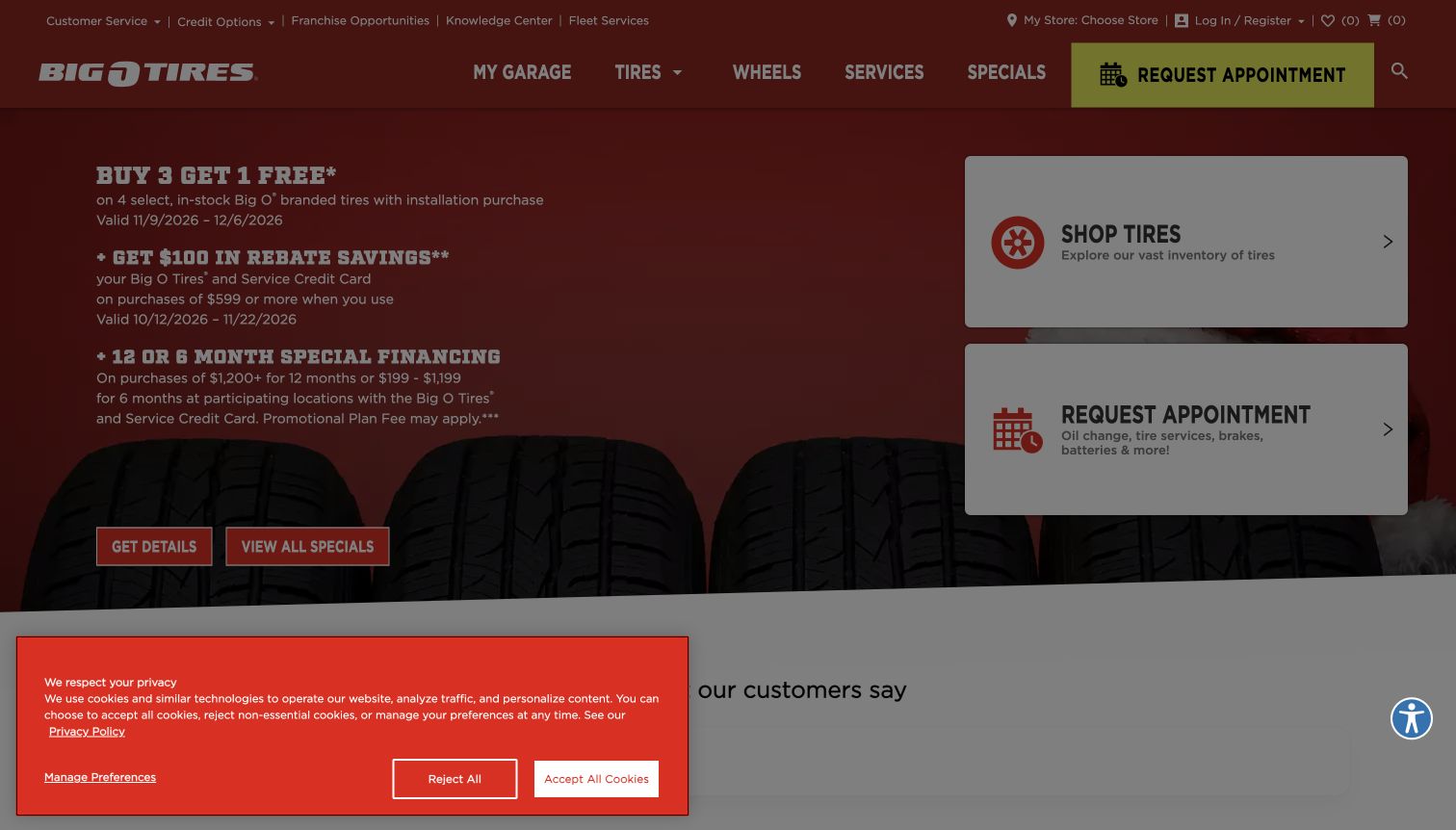
Big O Tires presents two large task cards beside its promotional copy: shop tires and request an appointment. Each includes a short explanation, making the difference clearer than two unexplained buttons. The header offers store selection and a separate garage route, while lower sections cover warranty information and additional promotions. The screenshot also preserves a privacy dialog and its dimmed background, an important part of the actual first-visit experience. Without that overlay, the underlying layout would provide a straightforward choice between products and service. The dense promotion includes several conditions, so the clarity of the task cards is more useful than the campaign’s visual complexity.
What you can learn
Anchor a busy retail homepage with a small number of clearly described actions. Explain what an appointment can cover, and keep promotion qualifications close to the claim instead of requiring customers to infer installation or purchase conditions.
Pros
The two task cards distinguish tire browsing from a broader service appointment.
Store selection and warranty information support decisions beyond the immediate promotion.
Cons & considerations
The privacy overlay visibly dims and interrupts the captured opening experience.
Several savings and financing conditions compete with the simple shopping and booking paths.
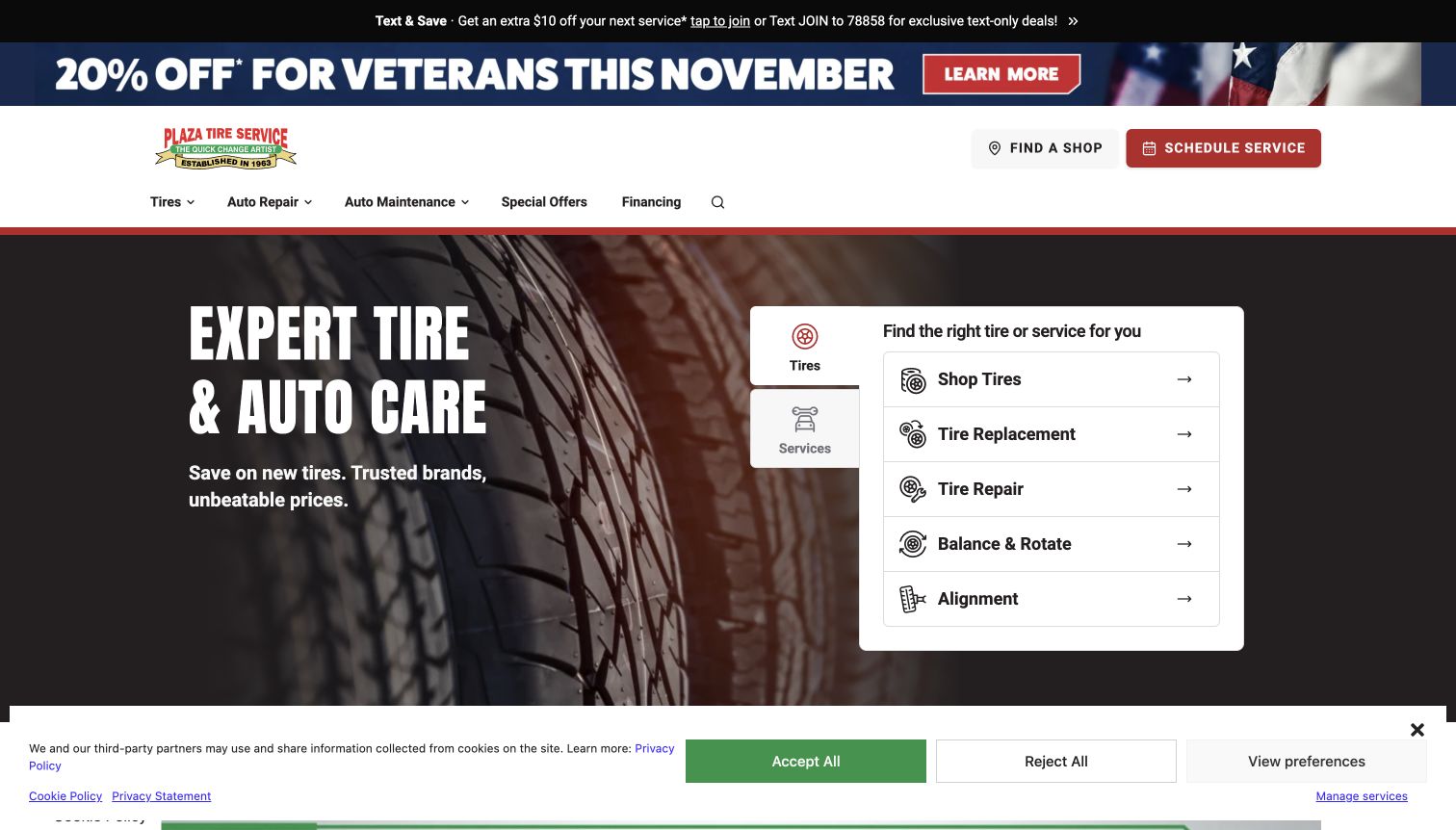
Plaza Tire Service presents a tire-focused task panel next to a restrained product photograph. The active tire tab lists shopping, replacement, repair, balancing and rotation, and alignment as separate actions. Someone with a puncture should not have to begin by browsing new products. A services tab allows broader automotive work to remain available without mixing every task into the same list. The header retains shop discovery and scheduling. Promotional strips and a privacy banner occupy additional space in the capture. The shared network identity appears lower on the source page, so the design should be understood as a regional branded property within an organization.
What you can learn
Organize the opening around what customers need done, not only the products a business sells. Separating repair, replacement, and maintenance can make a tire homepage useful to visitors who have no reason to open a product catalog.
Pros
The task panel distinguishes tire repair from replacement and routine maintenance.
Shop discovery and service scheduling remain explicit actions in the main header.
Cons & considerations
Multiple promotional strips reduce the space available for the core service interface.
The initial panel does not explain the requirements or timing of each appointment type.
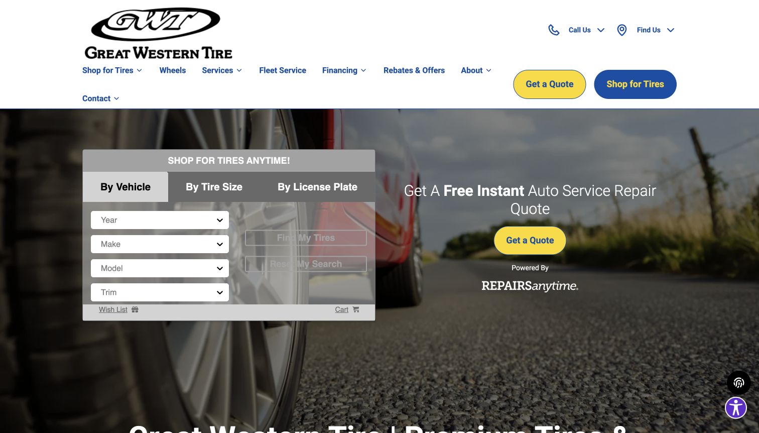
Great Western Tire places tire fitment and an automotive repair quote in parallel columns. The finder supports vehicle, tire-size, and plate-based starting points, while the adjacent quote action explains that repairs follow a separate route. Navigation also includes fleet service, wheels, rebates, and direct contact controls. The page later lays out a sequence from vehicle information through choosing tires and arranging installation. That process helps connect browsing with the actual visit. The opening uses a road-and-tire background behind multiple controls, which slightly reduces the calmness of the form. Its regional introduction establishes Oakley as the business context without requiring an immediate location-permission request.
What you can learn
Give tire shopping and repair estimating separate entry points when they rely on different information. Explain the steps between selecting a product and having it installed, especially where customers may assume an online choice guarantees a fitting time.
Pros
The page distinguishes product fitment from a broader repair quote.
Fleet navigation and a staged buying explanation acknowledge more than one customer journey.
Cons & considerations
Background imagery and layered panels create visual noise around form controls.
The instant-quote wording needs clear downstream scope so customers understand what remains subject to confirmation.
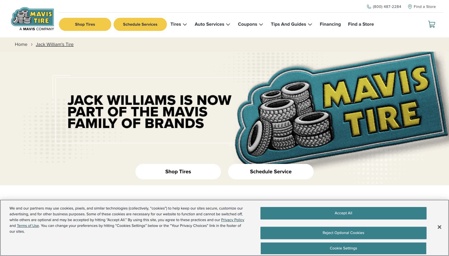
Jack Williams Tire’s current landing page sits within the Mavis website and directly explains the relationship. A large branded graphic announces the transition, while shop-tires and schedule-service actions appear immediately below it. The navigation and footer use Mavis destinations, giving returning customers a clear onward path instead of leaving an outdated standalone brand site. Supporting sections introduce local store search and offers. The screenshot includes a privacy banner, and the page’s emphasis is continuity rather than detailed product selection. This is a distinct branded source page, not evidence that the former business still runs an independent shopping platform or separate service network.
What you can learn
When consolidating a tire brand into another website, preserve the familiar name in a clear explanatory landing page. Tell customers what changed, then give them direct routes to shopping, service, and locations within the current system.
Pros
The page openly explains the brand relationship rather than silently replacing the destination.
Shopping and scheduling remain immediately available beneath the transition message.
Cons & considerations
Returning customers still need another step to identify their relevant local shop.
The large announcement and privacy notice leave limited space for practical tire details in the first view.
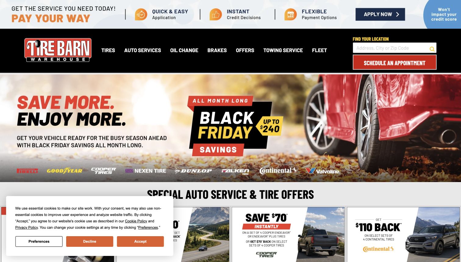
Tire Barn Warehouse combines a visible store finder and appointment button with a seasonal tire campaign. The black navigation bar keeps tires, repair categories, offers, towing, and fleet services accessible above the large promotional image. Below, offer tiles and service links broaden the page beyond product sales. The source identifies its connection to the Monro family of brands, so its nationwide statements should not be mistaken for a count of Tire Barn stores alone. The capture also retains a cookie notice. The strongest reusable feature is the local-service gateway; the layered promotional messaging is less helpful for a visitor seeking one urgent repair.
What you can learn
Keep location selection and booking visible even when the homepage changes for seasonal campaigns. Distinguish a branded chain’s own service footprint from broader network claims, and make routine repair routes as accessible as advertised tire deals.
Pros
A location field and appointment action remain prominent in the main header.
Navigation includes tire care, towing, and fleet routes alongside product shopping.
Cons & considerations
Financing, campaign graphics, and a privacy notice compete in the initial captured view.
Network-wide claims require careful wording so visitors do not assume every service is locally available.
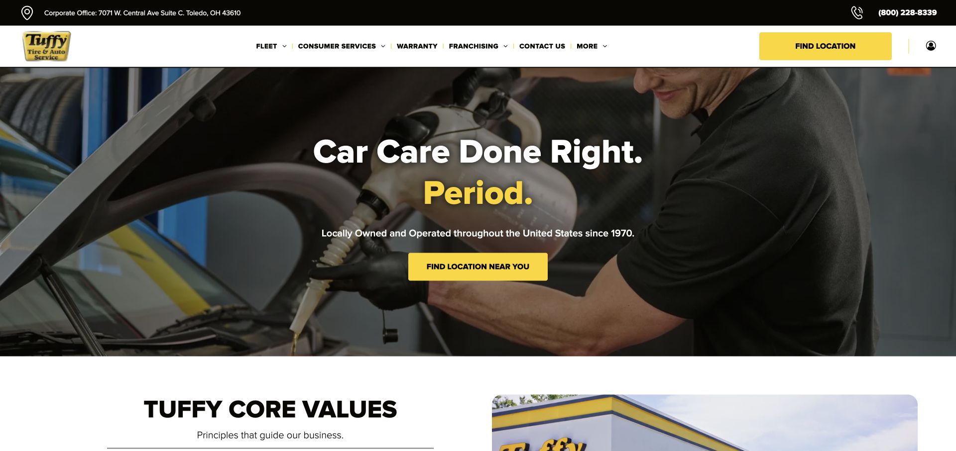
Tuffy’s retained November 3 capture leads with a mechanic photograph and a strong location action. The yellow brand color provides an obvious focal point against the dark hero, while the navigation groups consumer services, fleet work, and warranty information. This creates a service-business introduction before asking the customer to select a product. For a tire-shop guide, it is a useful contrast to retailers that begin with fitment fields. The drawback is that a visitor specifically comparing replacement tires has less immediate product guidance in the opening screen. The screenshot supports this layout observation; it does not establish current inventory, local availability, or workshop quality.
What you can learn
If a tire business relies on vehicle care, a local-service route can lead the homepage. Pair it with a clearly visible tire-specific destination so replacement shoppers do not have to interpret a broad repair menu before making progress.
Pros
The location action is easy to find against the restrained hero.
Fleet and warranty routes acknowledge service relationships beyond a one-time tire purchase.
Cons & considerations
Tire selection is less immediate than the broader location and repair message.
The opening photograph communicates the trade more clearly than specific local shop details.
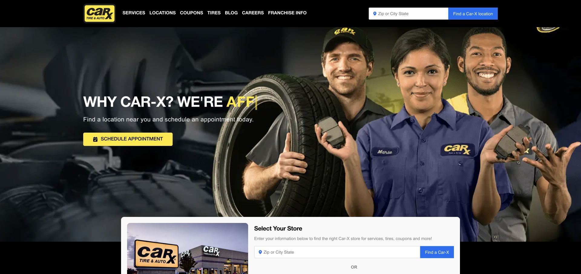
Car-X’s November 3 view puts a location search in the top navigation and repeats store selection in a white panel below the hero. The team photograph adds a human service context, while a yellow appointment button stands out from the darker brand elements. Tires remain a named menu destination among services, coupons, and business information. This is an example of a website treating the relevant shop as the first important choice. That can support clearer downstream information, but repeated location prompts take space that might otherwise explain tire fitment or installation. The captured rotating headline is also less stable than the persistent search controls around it.
What you can learn
Choose one clear point for selecting a store, then carry that context through tire browsing and booking. Repeating the same location question can create uncertainty about whether a visitor’s earlier choice has been retained.
Pros
The location search and appointment action are prominent in the opening interface.
A real service-team image provides a human counterpoint to product-focused tire sites.
Cons & considerations
Repeated store-selection panels consume space without explaining the next shopping step.
The broad automotive presentation gives limited immediate help with tire comparison or fitment.
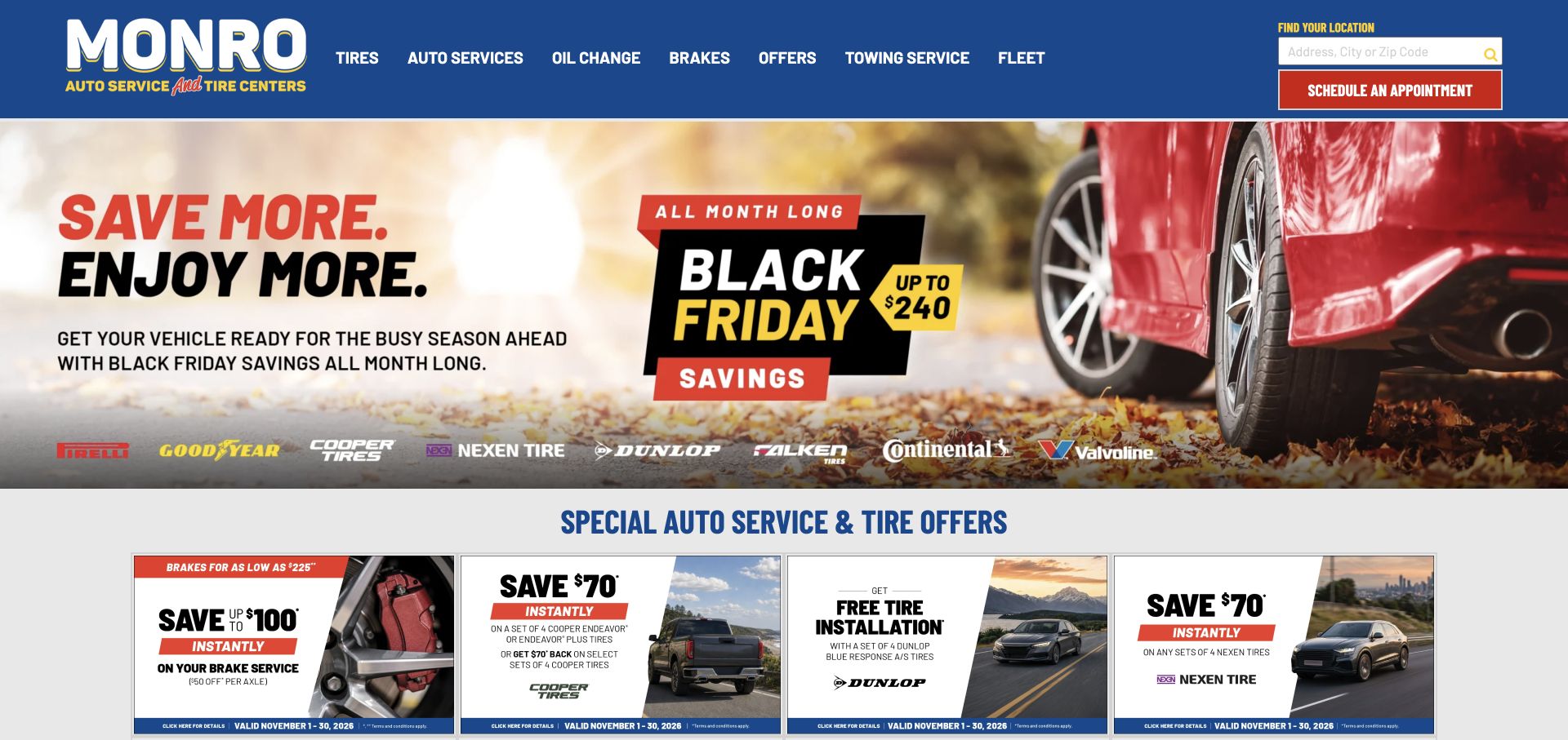
Monro’s November 3 screenshot uses a vivid blue header and a large seasonal tire promotion. Tire brands and several offer cards make the page read as a retail destination, while services, oil changes, brakes, towing, and fleet routes remain in the navigation. A red scheduling action provides a alternative to browsing promotions. The composition is useful for studying how a service network combines tire sales with broader maintenance. Its weakness is the amount of campaign material a visitor must scan before reaching more enduring information. The dated screenshot documents the design and offer presentation, not an assurance that those prices or terms remain available.
What you can learn
Build a stable service navigation around promotional content that will change frequently. Keep dates and qualifications attached to offers, and ensure a visitor with a repair need can reach scheduling without following the current sales campaign.
Pros
The main navigation preserves several automotive service routes alongside tire shopping.
A contrasting scheduling button offers a direct path for customers ready to arrange service.
Cons & considerations
Large seasonal graphics dominate the first impression more than fitment or installation guidance.
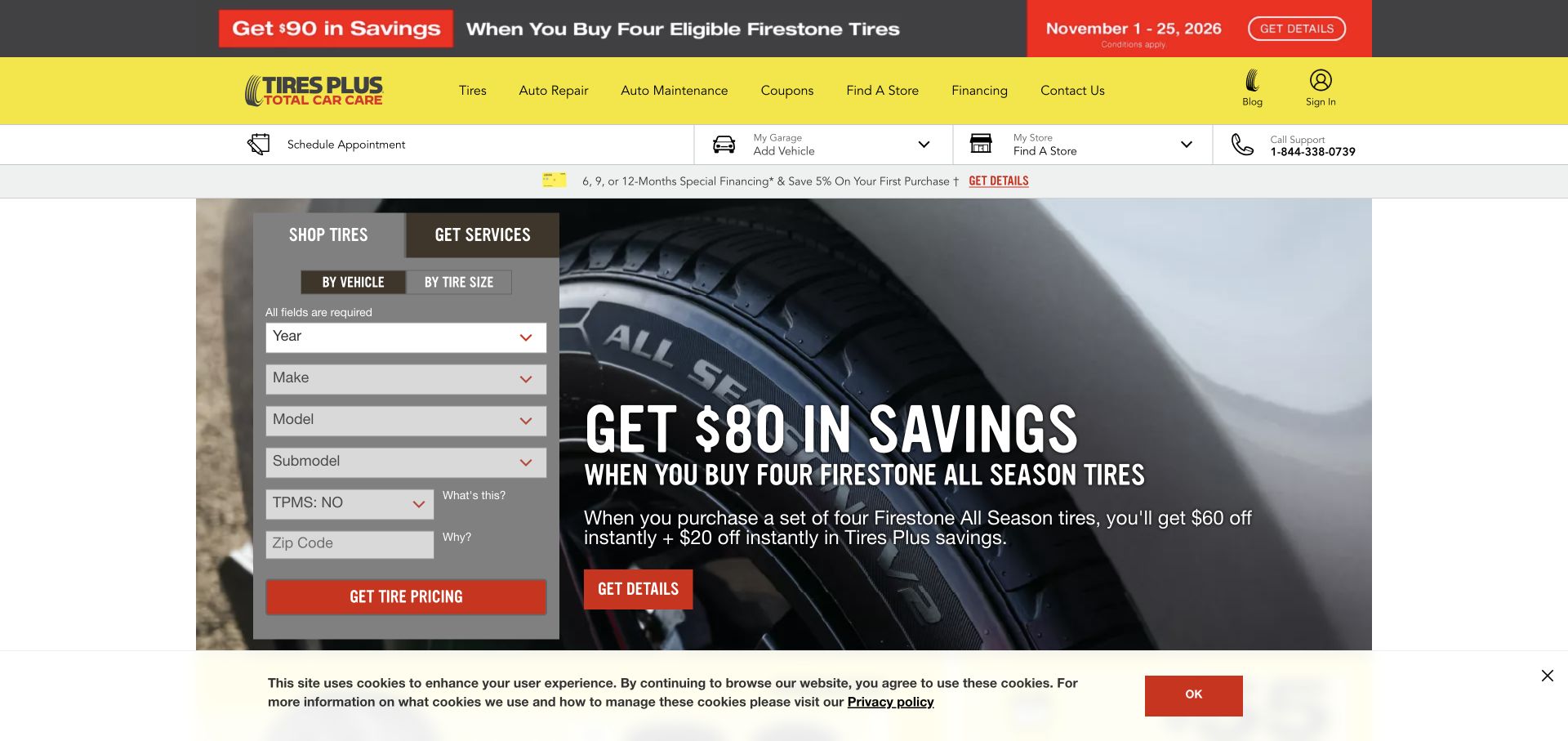
Tires Plus puts a shopping card at the center of its retained November 3 view. Tabs distinguish tires from services, and the tire panel supports vehicle and tire-size routes. The vehicle fields progress through year, make, model, and more detailed specification before pricing. Store and garage context sit in the header beside an appointment action. This makes fitment a visible part of the buying journey rather than an unexplained requirement later. The tradeoff is form density: the opening asks for several details while promotional material and a cookie notice occupy surrounding space. The design is most useful for visitors who already know their vehicle information.
What you can learn
Explain why a tire search needs detailed vehicle information and reveal dependent fields in a manageable sequence. Provide a tire-size route for knowledgeable customers while keeping service booking accessible to people who are not purchasing replacements.
Pros
The card separates tire shopping from services and offers two fitment starting points.
Store, vehicle, and appointment controls provide useful context around the search.
Cons & considerations
The number of fields can feel demanding before shoppers see any available choices.
Promotion and privacy elements reduce the visual breathing room around the form.
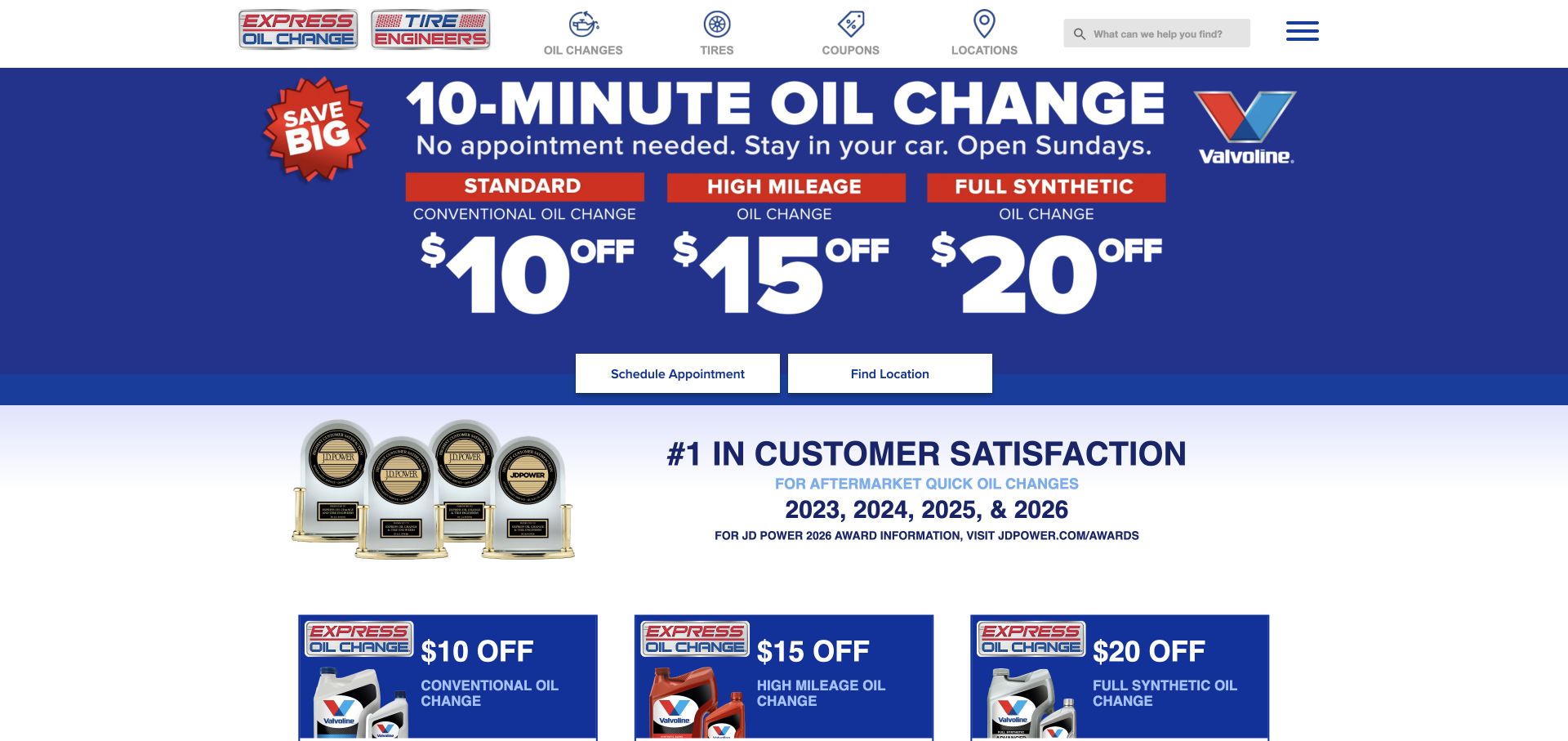
Express Oil Change & Tire Engineers displays both parts of its identity together in the November 3 screenshot. Icon-led navigation gives tires a direct route alongside oil changes, coupons, and locations. The hero, however, emphasizes the oil-change service and an introductory offer, with separate scheduling and location actions. That makes the page a useful example of managing related services that have different customer expectations. A tire buyer can find the correct category, but the dominant service promise should not be assumed to apply to tire installation. The layout’s bright blue and yellow areas create strong emphasis, though they leave limited space for tire-specific explanations above the fold.
What you can learn
When two services share a brand, label their journeys separately and keep operational promises attached to the right service. A quick oil-change message should not imply that tire fitting follows the same timing or appointment process.
Pros
The tire identity remains visible in both the branding and the primary navigation.
Location and scheduling actions offer practical routes beyond the opening promotion.
Cons & considerations
The oil-change campaign dominates the first view for visitors seeking tire products.
Different service expectations need explanation beyond the shared branding and navigation.
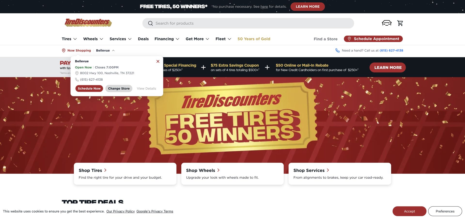
Tire Discounters’ November 3 capture gives the chosen store a role in the opening screen. Its location panel includes contact and hours information alongside change-store and scheduling routes. Tires, wheels, and services are also separated into large visual cards, making the main product and maintenance categories easy to distinguish. A broad search field sits above the navigation for visitors who already know what they need. The captured campaign and privacy notice add considerable noise around those useful tools. The review focuses on the category structure and store context, without treating the displayed contest or particular branch as an editorial recommendation.
What you can learn
Make the selected shop easy to inspect and change before a customer relies on local service information. Keep tire and wheel shopping distinct from repair scheduling, and avoid letting a temporary campaign obscure that practical structure.
Pros
The store panel puts local contact and scheduling information close to shopping routes.
Separate tire, wheel, and service cards provide clear category choices.
Cons & considerations
The campaign, store panel, and privacy notice make the first screen crowded.
A broad product search needs guidance for customers who do not know tire names or specifications.
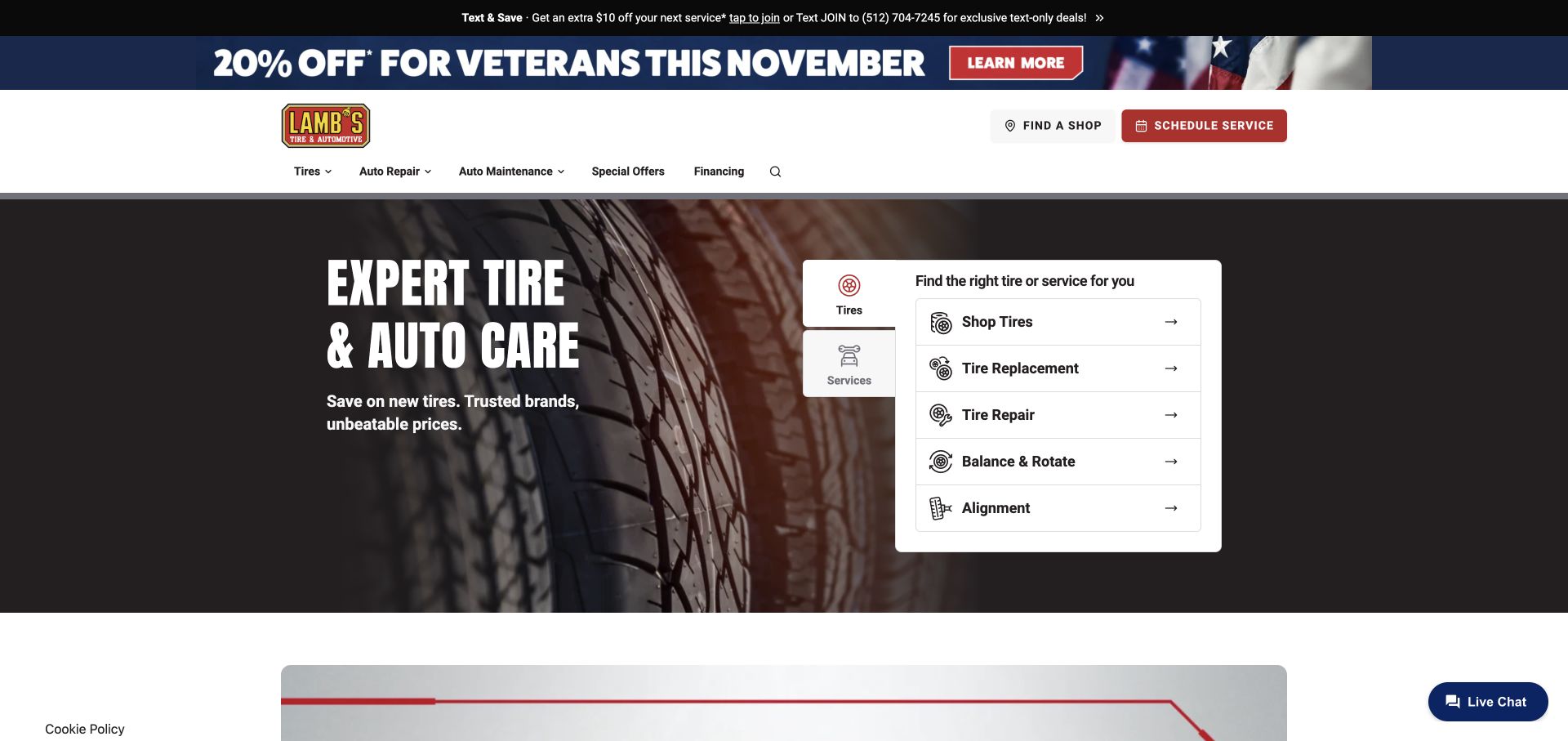
Lamb’s Tire & Automotive uses a tire closeup beside a structured service panel in its retained November 3 capture. The tire tab distinguishes shopping, replacement, repair, balancing and rotation, and alignment. That is a helpful breakdown for visitors who know the problem but do not yet know whether they need new tires. Find-shop and schedule actions sit in the header, while broad automotive categories remain accessible in navigation. The opening also includes promotional strips, making the page more crowded than the task panel alone. The example is valuable for its practical taxonomy, not as evidence that each listed action produces immediate availability or a confirmed appointment.
What you can learn
Use the customer’s problem to organize tire services before presenting the catalog. A clear repair route can prevent someone seeking a puncture assessment from being pushed prematurely into a replacement-shopping flow.
Pros
The tire panel differentiates repair, replacement, and routine maintenance tasks.
Shop discovery and scheduling remain visible above the broader service navigation.
Cons & considerations
Promotional strips compete with the task panel for attention and vertical space.
The opening does not explain which requests require inspection before pricing can be confirmed.
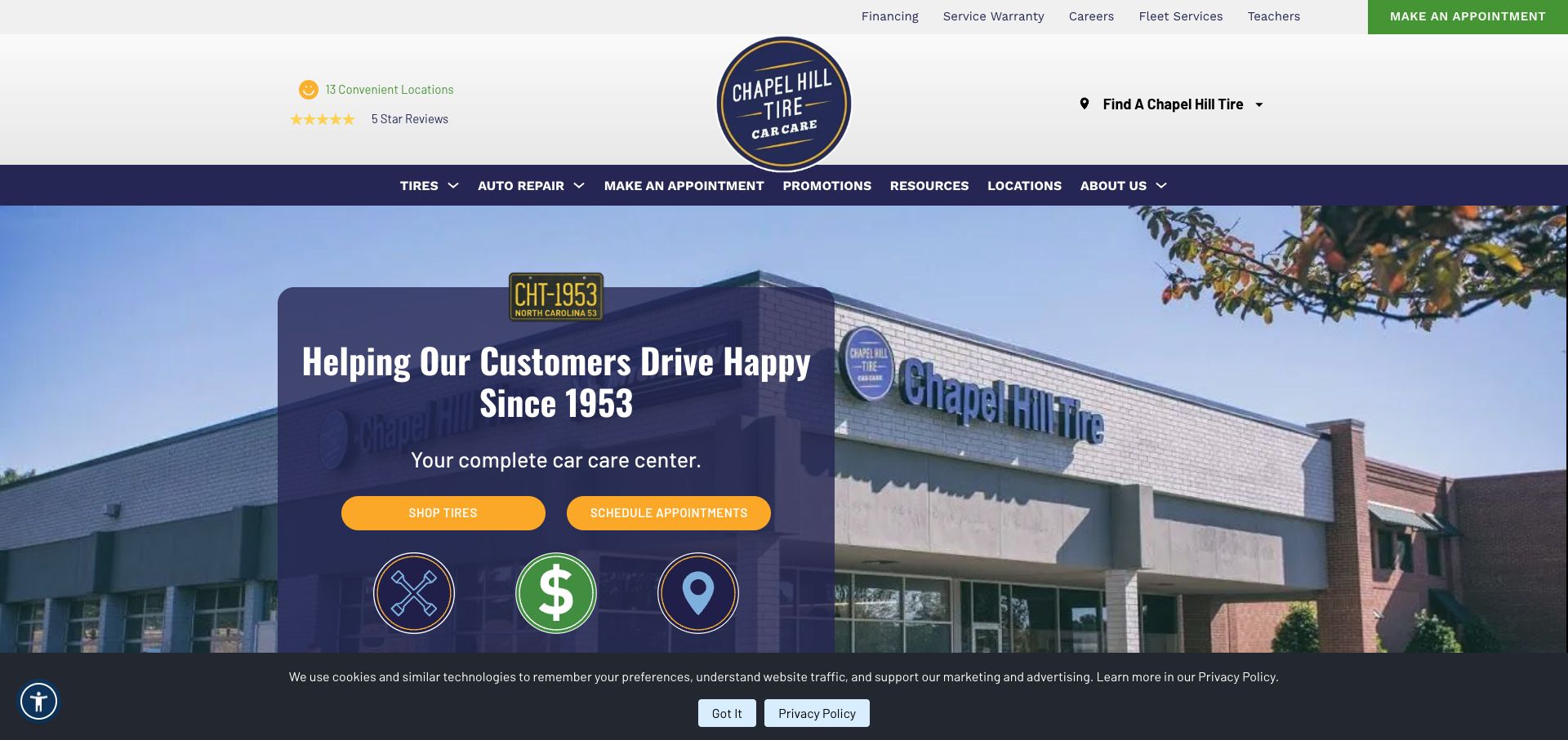
Chapel Hill Tire’s November 3 screenshot places a recognizable shop photograph behind its local service story. Two clear actions separate shopping for tires from scheduling an appointment, which keeps product selection and maintenance planning from collapsing into a single contact route. The navy, yellow, and green palette makes the brand distinctive without hiding the practical controls. Navigation and utility links also expose locations, warranty information, fleet services, and financing. The source’s review and location claims remain company statements rather than independent findings. The main design lesson is the combination of a real physical setting with task-specific buttons, tempered by the amount of utility content around them.
What you can learn
Show the real shop environment when local familiarity matters, then connect that confidence to concrete next steps. Keep product shopping and service booking separately labeled so visitors can choose based on their actual need.
Pros
The physical storefront provides a specific sense of place beyond generic tire imagery.
Separate shopping and scheduling buttons establish a useful distinction immediately.
Cons & considerations
Numerous utility links and trust claims add density around the primary navigation.
The first view provides less detail about fitment and installed pricing than dedicated shopping interfaces.
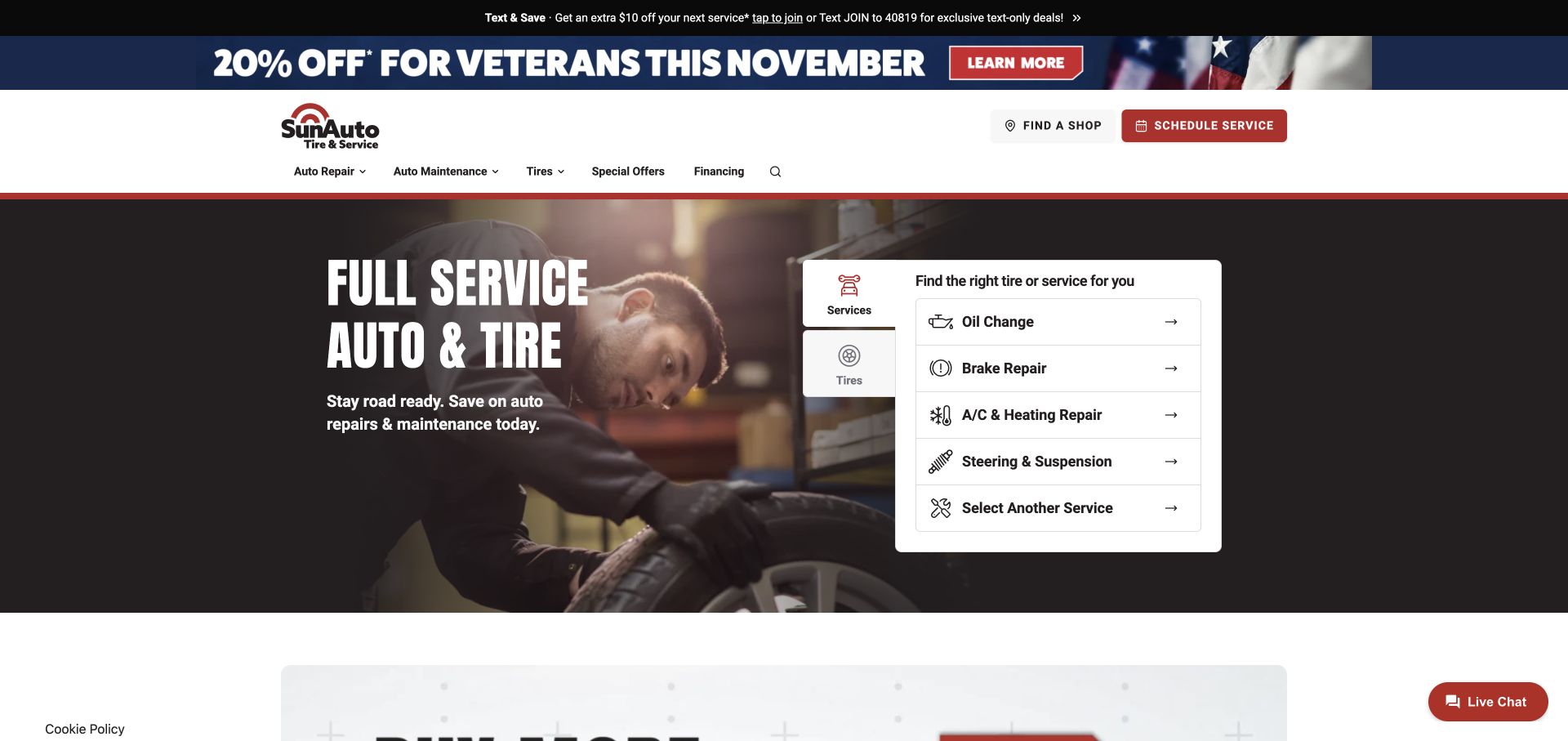
Sun Auto Tire & Service’s retained November 3 view leads with a mechanic image and a service-oriented task panel. The active services list includes routine maintenance and repair categories, while the tire tab remains available beside it. Find-shop and scheduling controls appear above the main navigation. This creates a useful contrast with tire-first versions of a similar interface: the structure can support different business priorities without hiding the alternative journey. The opening still contains promotional material and multiple possible actions. For a tire shopper, the design depends on the tire tab being unmistakable and on the subsequent route explaining product selection, inspection, and installation clearly.
What you can learn
Let the most common customer task determine the default panel, but keep the other major journey visible. Reusing a common interface works best when the labels and default state reflect the business emphasis.
Pros
The service panel names practical maintenance and repair needs in familiar language.
A visible tire tab preserves a direct alternative for replacement and tire-care customers.
Cons & considerations
Tire shoppers must switch context before reaching the more relevant task list.
Promotional material and several booking routes can weaken the hierarchy of the main panel.
Kegan is a freelance web designer and developer with 15+ years of experience helping businesses turn complicated website requirements into clear, maintainable digital experiences. He works directly with clients from planning and design through development, launch, and ongoing support.
For tire shop website design, his development approach focuses on vehicle and tire-fitment navigation, service comparisons and clear local appointment requests. The scope can be a targeted improvement or a complete custom build, with responsive layouts, thoughtful content structure, and integrations chosen around the people using and maintaining the site.
Show 3 other tire shop website designersHide other tire shop website designers
Start with the customer’s information, not the catalog structure
Map the questions a driver can answer before designing a tire finder. Some people know their vehicle’s year, make, and model; others can read a size from the sidewall but do not understand trim terminology. A third group only knows that a tire is losing air. These visitors need different entry points, and the homepage should make those differences visible rather than demanding the same form from everyone. Vehicle and size tabs can work well when their labels are plain and the next required step is predictable.
For an independent shop without reliable live inventory, an assisted inquiry may be more honest than a product catalog. Explain that staff will return with options and pricing, say which details help them respond, and distinguish that inquiry from an installation appointment. Five Points Tire makes this sequence unusually understandable. For a larger retailer, carry the selected vehicle and store into subsequent pages so customers can see what the results depend on.
Include a repair route that does not presume the visitor needs replacement tires. Let staff assess suitability and the actual problem. The website can organize the conversation without presenting a remote diagnosis. Test unclear, incomplete, and changed vehicle selections as carefully as the ideal path, and never let a polished search interface imply guaranteed fitment or stock.
Make location, timing, and price expectations explicit
A tire-shop website is often a bridge to a physical visit. Put the chosen shop, useful contact information, and service hours near actions that depend on them. If the site selects a location automatically, make the change control obvious and avoid describing that guess as the customer’s confirmed preference. Offer a manual city or postal-code search alongside any permission-based locator. Multi-location businesses also need to explain when a service or product is unavailable at a particular branch.
Appointment language deserves equal care. A request that staff will confirm is different from a reserved time. Explain the distinction before submission and repeat it in the confirmation. Separate tire purchases, changeovers, repairs, rotations, and other services when they require different information or workshop capacity. Town Fair Tire’s named appointment categories illustrate this useful separation without proving how any particular booking is fulfilled.
Treat pricing as a complete communication problem. A large tire discount is less helpful if customers cannot tell whether installation, balancing, disposal, or other charges are included. Keep eligibility and dates beside promotional claims, with a readable route to the details. Do not use an old screenshot’s offer as current sales copy. Assign responsibility for removing expired promotions and for checking that branch information remains accurate as the business changes.
Give the shop a recognizable identity without burying the task
Local tire businesses can earn attention through specific details that a generic product catalog cannot provide. A real storefront, a readable address, a clear service area, and an explanation of how staff handle inquiries can make the business feel understandable before a visitor calls. Double J Tire Center’s visible locations and call-first model, or Chapel Hill Tire’s physical-shop imagery, show different ways to establish that context. Company history can support the story, but it should not displace the practical route to products or service.
Keep promotional content subordinate to the visitor’s task. Multiple banners, signup prompts, rotating offers, chat panels, and privacy notices can leave little usable space for the tire finder. Design the first-visit state, including required notices, rather than reviewing only an ideal screen after every overlay has been dismissed. Preserve keyboard access, readable labels, visible focus, and enough contrast around controls that sit over photography.
For shops serving fleets, farm equipment, or commercial vehicles, introduce those audiences explicitly. Pete’s Tire Barns demonstrates how category names can route specialized needs before a passenger-vehicle form becomes a dead end. Finally, measure whether people reach useful next steps and whether staff receive complete inquiries. Do not confuse more form submissions with better service if visitors still misunderstand availability, pricing, or appointment confirmation.
The editing job behind the design
Choose technology that supports accurate local information
A tire website may combine a content system, fitment catalog, location data, booking interface, and supporting analytics or delivery services. Public references can reveal parts of that stack, but they cannot establish a hidden inventory system, workshop process, or backend integration. Keep those distinctions explicit when evaluating implementation choices.
Before adding a vehicle finder, decide who maintains its data and how exceptions reach a person. Before adding booking, define whether the result is a request or a confirmed reservation. A simple, clearly explained inquiry can serve a small shop better than a complex interface whose stock and scheduling information are not reliable.
Each source page in this collection has a recorded broad public technology-audit attempt. Existing evidence retains its original observation date; new attempts cover the actual reviewed source. Partial, blocked, or unavailable scans do not justify guesses about unseen systems. Screenshot dates and audit dates describe different evidence and are preserved separately.
Our WordPress website examples offer a separate look at publishing approaches. A visible platform label is evidence for that named page, not a guarantee that the same system will suit your requirements.
Before the public launch
Tire-shop website planning checklist
Name the tire and automotive services the shop actually offers, with a clear local context.
Give vehicle, tire-size, and human-help routes appropriate to the way the business sells.
Separate tire repair and maintenance from replacement-product shopping.
Make selected store context visible and easy to change throughout the journey.
Provide manual location search without requiring a device-location permission.
Show accurate branch hours, telephone details, directions, and service limitations.
Distinguish an appointment request from a confirmed booking before submission.
Explain quote scope, included work, offer eligibility, and applicable dates clearly.
Keep commercial, fleet, agricultural, and passenger audiences separate where needed.
Use real shop imagery and specific operational explanations instead of unsupported quality claims.
Check keyboard access, readable control labels, and the complete first-visit overlay state.
Assign owners for fitment data, branch changes, broken links, and expired campaigns.
These checks are a project checklist, not a performance, legal, security, or accessibility certification. Test real journeys with the people responsible for the website before making claims about the result.
Sources & editorial method
How this collection was selected and reviewed
We reviewed the public source pages and actual screenshots for all 28 examples. Nineteen captures were made directly on November 10, 2026 UTC; nine verified November 3 captures were inspected and reused with their original timestamps and source records intact. Collection-specific reviews examine tire shopping, service communication, locations, and visual hierarchy. Broad public stack audits retain exact source-page scope and original observation dates. Access restrictions were respected; unavailable or partial checks are not evidence of an absent technology. The Discount Tire visit resolved to its America’s Tire regional destination, and Jack Williams is reviewed as its current Mavis landing page; neither redirect creates a second example. Some screenshots retain source promotions or privacy notices. Editors Choice is an explicit website-design selection, not a mechanical-service endorsement, customer-vote result, or claim of independent ownership for every example. No bookings, purchases, quote requests, credit applications, votes, or messages were submitted.
Each example links to its actual source page. Screenshots are direct browser captures with their own capture dates; moving imagery, announcements and live designs can change. The notes describe observable design choices and conditional tradeoffs, not measured traffic, conversion results, service quality, or accessibility conformance.
Technology labels use public page metadata, asset evidence, or explicitly cited platform documentation. Platform documentation is not a complete current deployment audit. A component reference may be legacy or unused; it is not a complete backend inventory. Unknown stacks are omitted. These sites are editorial examples, not our client portfolio.
Written, Edited and Curated are separate editorial records, not timestamps advanced by a rebuild. Website designs and imagery belong to their owners. See our editorial standards or suggest a correction.
Questions worth asking
Tire Shop website design questions
What should a tire-shop homepage show first?
Show what the shop does, where it serves customers, and clear routes to tire selection, repairs, and appointments. The best order depends on whether the business mainly sells products online or confirms fitment and pricing through a local team. Do not make an urgent repair visitor work through a replacement catalog.
Does a tire shop need a live online catalog?
Only when the business can maintain dependable product, fitment, and availability information. An assisted inquiry can be a useful alternative if the page explains what details to provide, how staff respond, and what remains subject to confirmation. A catalog interface alone is not proof of current stock.
How should a multi-location tire site handle store selection?
Keep the selected branch visible and provide an easy change control. Offer manual city or postal-code search and explain when services, hours, or availability depend on the branch. An automatically suggested location should not be treated as a customer-confirmed choice.
Should tire quotes and service appointments use the same action?
They can share a system, but their labels and expectations should remain distinct. A quote may need staff review, while an appointment may be either a request or a confirmed reservation. Explain which outcome the customer should expect before they submit information.
What does Editors Choice mean in this collection?
It identifies our explicitly researched selection for website design and communication. Five Points Tire was chosen for its clear local introduction, separate tire and appointment actions, and explanation of human confirmation. The selection does not certify tire quality, repair work, prices, or service outcomes.
Build around the questions a driver can answer and the actions a shop can reliably fulfill. Clear fitment guidance, accurate store context, and honest appointment language are more useful than a larger promotion or a more complicated form.