Best Solar Installer Websites of 2026 (28 Real-World Examples)
Solar installer websites that explain fit, scope and the next step
A useful solar website helps a property owner understand whether the project fits before asking for a long sales conversation. These examples show different ways to explain service areas, installation scope, storage, project evidence and estimates.
Solar is a considered purchase with technical, financial and property-specific questions. A strong website does not need to answer all of them in the hero. It needs to establish where the company works, which kinds of systems it supports and what a visitor can learn before sharing personal information.
This collection compares public website design, information structure and inquiry paths. It does not rank installation quality, certify contractors or validate advertised savings, incentives, warranties or customer ratings. A visually effective claim still needs independent factual support.
Before the examples
What makes good solar installer website design in 2026?
Qualify the property and project
Name the service territory and distinguish residential, commercial, ground-mount, off-grid and maintenance work. Explain that a site assessment determines feasibility rather than presenting every roof as suitable.
Explain the system boundary
Solar panels, batteries, generators, EV chargers and electrical upgrades solve different problems. Show which components are part of the proposed service and which require a separate conversation.
Make estimates understandable
A calculator should identify its assumptions and avoid requiring contact information merely to reveal a basic estimate. A quote request should say what the team will review and when the visitor can expect a response.
Support the relationship after installation
Give existing owners a route for monitoring, maintenance, warranty questions and removal for roof work. Do not make every visitor enter a new-installation sales funnel.
The collection · 28 examples
28 solar installer websites worth studying
Compare the patterns rather than copying the claims. The most useful details are often a service-area label, a clear optional field, an explained project stage or an existing-customer link.
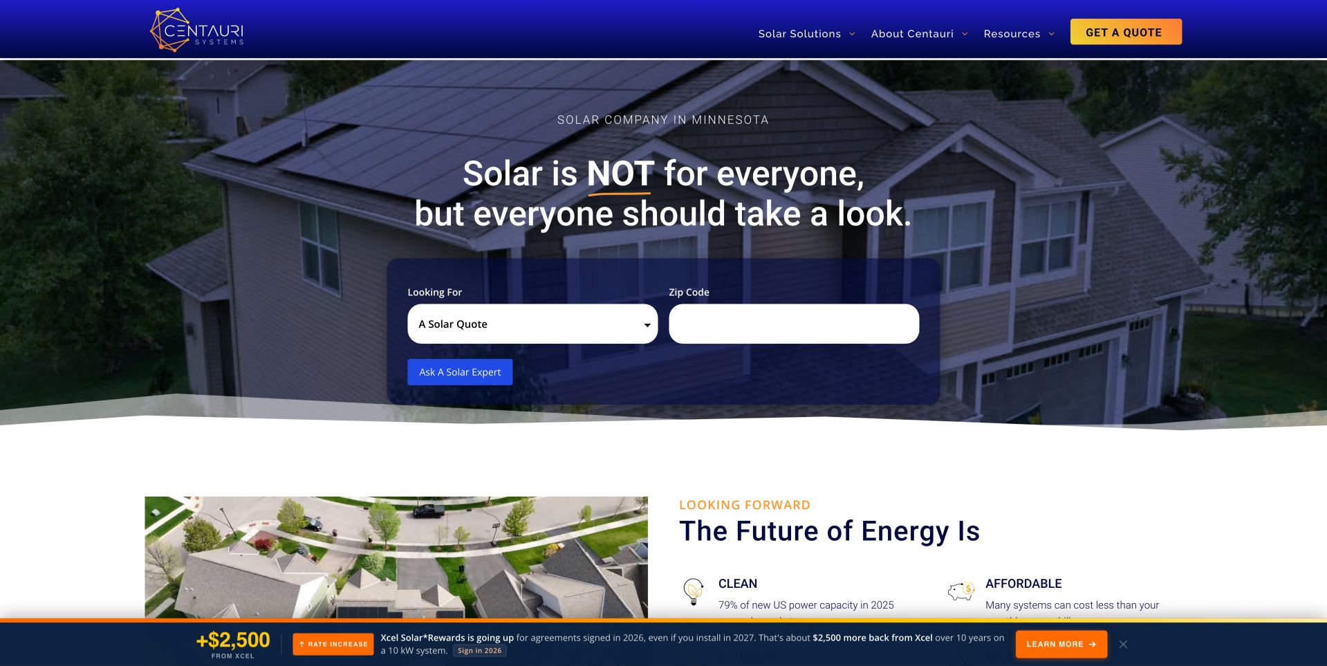
Centauri leads with the unusually candid statement that solar is not for everyone, then provides an inquiry selector for quotes, maintenance, removal and replacement, and information requests. Blue and orange styling keeps the form visible against a residential installation image. This is a useful counterweight to universal-savings messaging. The opening qualification changes the tone from universal persuasion to fit assessment. Its inquiry selector recognizes that an owner seeking maintenance is not necessarily shopping for a new array. The design still needs supporting explanations, because a candid headline alone cannot establish roof suitability, economics or service eligibility.
What you can learn
Ask what kind of help a visitor needs before collecting a long project history. Qualification language is most useful when the next page explains the conditions that determine whether solar fits. Carry the same honesty into the next step. Show which project questions can be answered immediately and which require an assessment, without turning a quick form into a claim of technical approval.
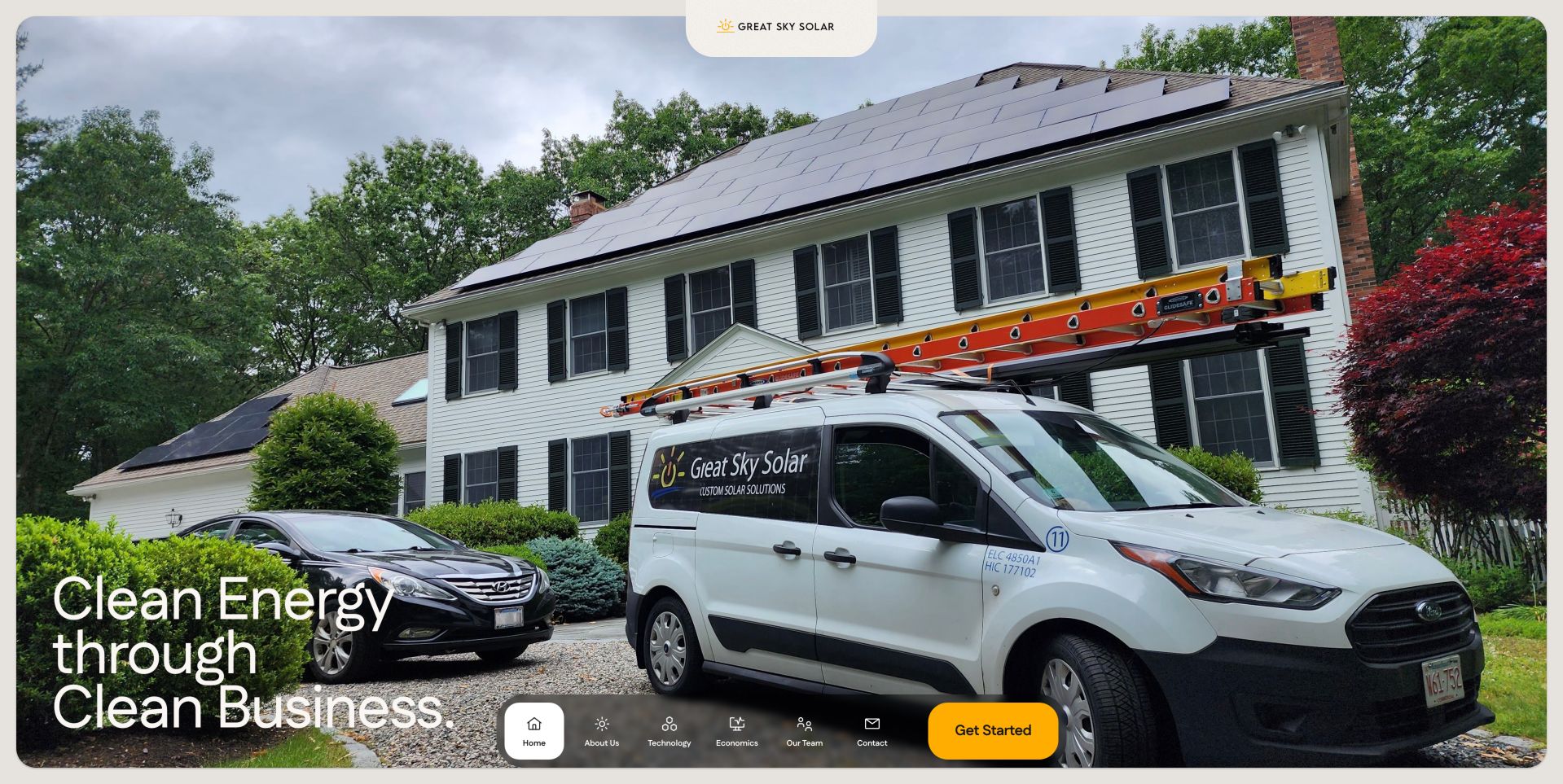
Great Sky pairs a real installation photograph and branded van with a six-part process, from custom design to sustained partnership. The unusual floating navigation keeps the main actions close to the bottom of the screen. Its installation map explains that addresses are approximate, a useful privacy detail when showing residential work. The strongest detail is the connection between visible fieldwork and the promise of continuing support. A homeowner can investigate the sequence of a project rather than simply decide whether to submit a lead. The floating menu is memorable, but its position should be tested with visitors expecting standard top navigation.
What you can learn
Describe the handoffs between design, installation and support instead of relying only on a savings headline. A map can provide local context without revealing customer addresses. For a redesign, map each process stage to a concrete question, responsible role and next action. Keep customer-location examples broad enough to protect privacy.
Pros
Six named process stages
Approximate-address disclosure
Cons & considerations
Bottom navigation is less conventional
Animated introductory content delays the first readable headline
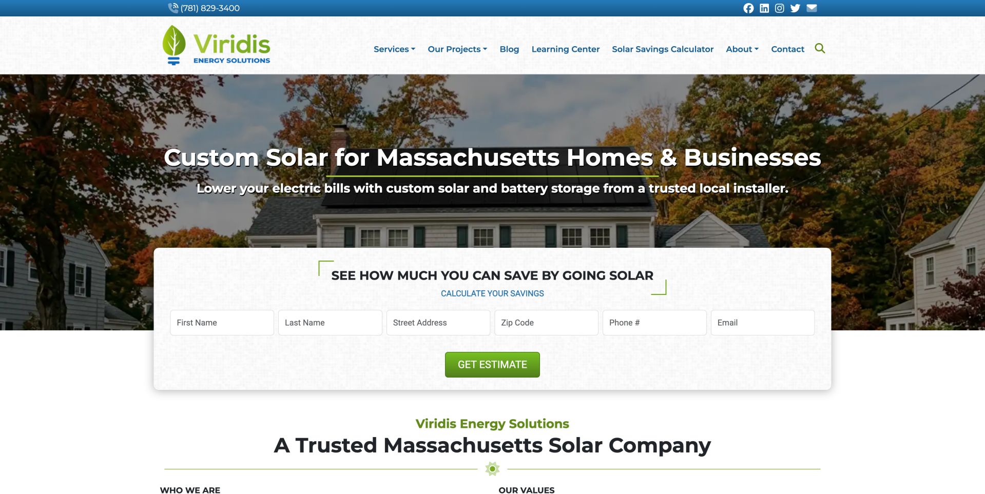
Viridis uses a residential installation image, a Massachusetts service statement and a broad lead form directly in the hero. The navigation separates projects, learning resources and the calculator. The main tradeoff is expectation: a savings-oriented invitation leads immediately into contact and property fields rather than showing an anonymous estimate. The form's placement is a business decision as much as a layout choice: it makes requesting contact the dominant behavior. The learning and project sections offer a lower-commitment alternative, but the hero should help visitors recognize that alternative before they begin supplying property details.
What you can learn
Make the difference between a calculator and a consultation request explicit before asking for an address. People should understand whether they are receiving an immediate estimate or requesting a follow-up. Compare the first-screen form with a shorter qualification step. Explain what information is necessary now, which fields can wait and how the request will be handled.
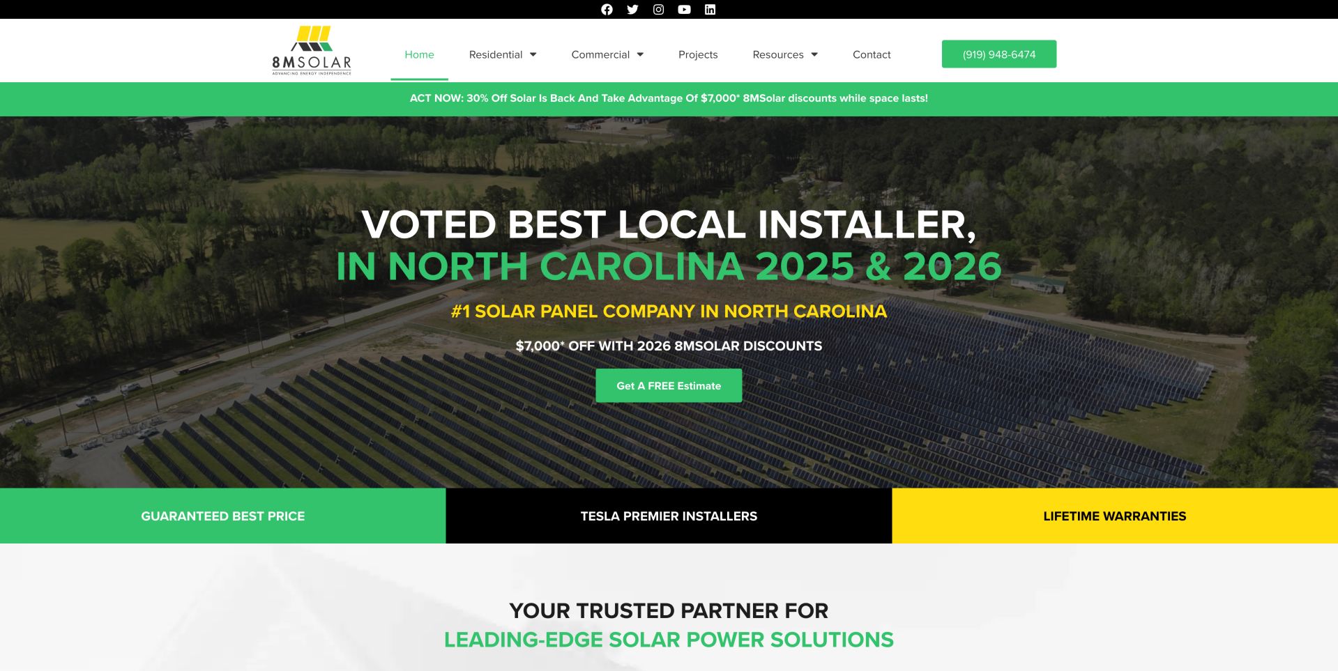
8MSolar combines a black, yellow and green palette with prominent ranking and discount claims above a solar installation image. Residential, commercial and project navigation provide more concrete routes beneath the campaign language. The large offer is easy to notice, but its value depends on terms that a buyer must examine separately. Separating residential and commercial destinations helps counterbalance the campaign because those audiences have different project needs. The color system can direct attention effectively, yet several strong claims presented together make it harder to identify which information is permanent and which belongs to a temporary offer.
What you can learn
Keep a promotion distinct from the permanent company proposition. Put eligibility, dates and exclusions close enough to the offer that the visual hierarchy does not imply universal savings. Keep a stable service explanation beneath changing campaigns. Test whether someone can find relevant project evidence without interpreting a ranking or calculating a promotional discount first.
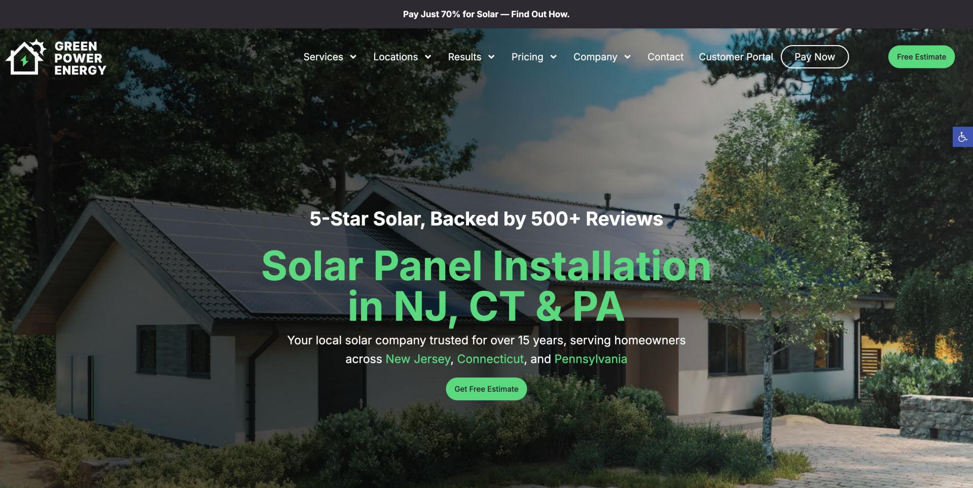
Green Power Energy places its New Jersey, Connecticut and Pennsylvania focus directly in the hero, with regional destinations integrated into the text. A house with solar panels supplies immediate category context. Customer portal and payment links are separate from the quote route, while a prepaid-lease promotion sits above the primary navigation. The geography is not merely a footer detail; it becomes part of the first decision. This is especially useful when a company works across jurisdictions with different programs. Existing-customer utilities also acknowledge that the website has a support role beyond collecting the next installation lead.
What you can learn
Use real service-area choices to qualify a visitor before a form. Keep account-management tasks available without allowing a financing campaign to overwhelm the basic installation offer. Maintain regional content as actual guidance rather than interchangeable location copy. Give the financing promotion a defined place that can change without disturbing account access or primary navigation.
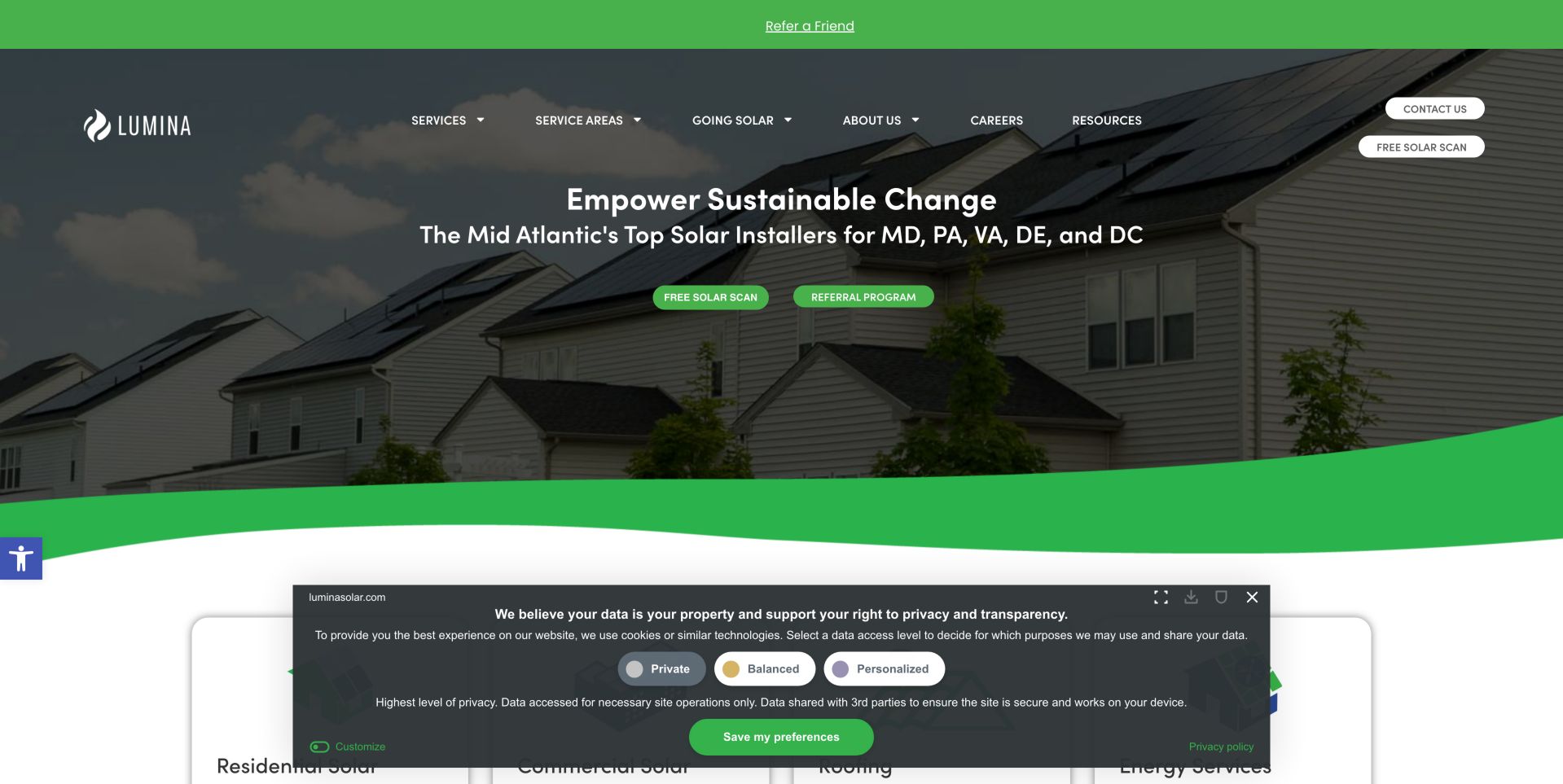
Lumina's curved green hero frames a house with panels and names the Mid-Atlantic states it serves. SolarScan and referral actions sit alongside the main service navigation. The visual treatment is approachable, but the combination of tools, referral incentives and a privacy panel adds choices before a new homeowner has understood the project process. The house image supplies a recognizable residential setting, while the curved composition softens an otherwise technical purchase. Tool and referral routes can serve different audiences well, but only if their labels make that distinction clear. A first-time visitor should not need to understand the company's referral program to navigate.
What you can learn
Give first-time buyers a primary path and reserve referral or customer tasks for a quieter secondary layer. A regional statement should be visible before any property information is requested. Review the opening with three scenarios: exploring solar, returning for support and referring someone. Each should have a recognizable path without competing equally for the first click.
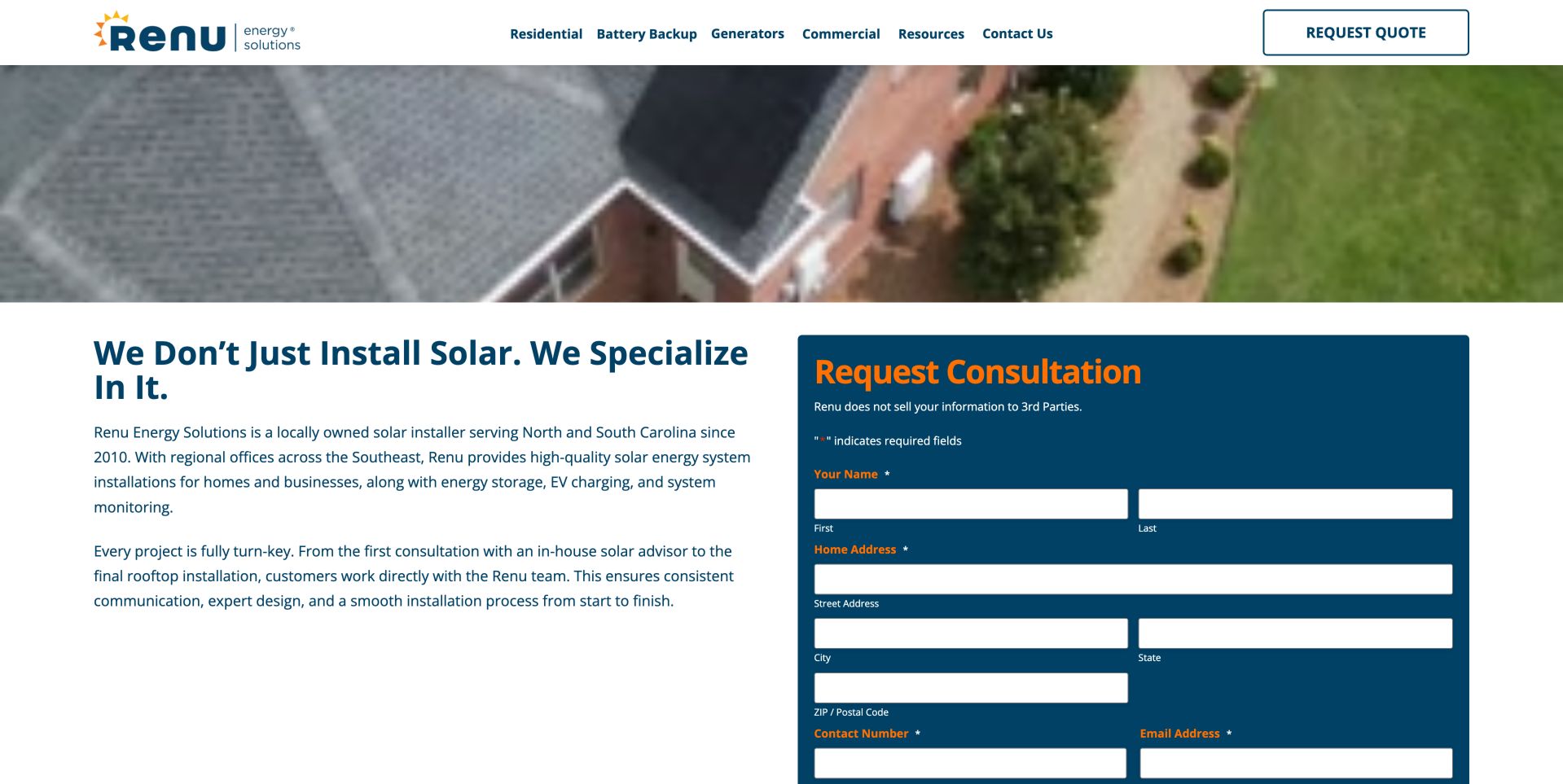
Renu's company page explains the relationship between installation, energy storage and ongoing service rather than presenting panels as an isolated purchase. Its inquiry choices distinguish solar and battery work, maintenance and other project types. The value of this pattern is routing: different requests should reach the right conversation without a generic sales form. The inspected opening uses a large blue media region, an orange About label and an anniversary badge before the detailed company copy. This makes the brand recognizable, although much of the first screen communicates atmosphere and company age rather than project scope. The inquiry form below brings the page back to practical routing.
What you can learn
Explain who handles each stage and let the visitor identify the purpose of the inquiry. Do not imply that selecting a service establishes technical feasibility or a final installed price. Keep the company narrative connected to the inquiry choices. A buyer comparing solar, storage or maintenance should understand the relevant responsibility without interpreting a broad anniversary or service claim.
Pros
Service-specific inquiry choices
Company and delivery explanation
Cons & considerations
Several adjacent services need clear boundaries
Large media region delays detailed company explanation
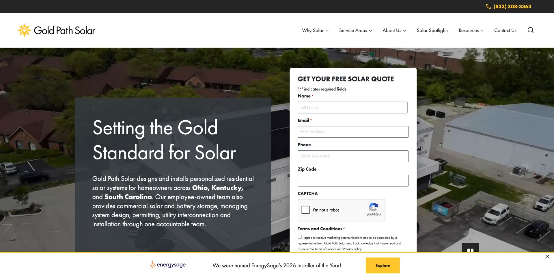
Gold Path Solar pairs black and yellow branding with a substantial quote form on the right of its opening section. Required fields, a verification step and a marketing-consent choice are visible rather than hidden after submission. State-specific links give the broader company navigation useful geographic depth. The form's visual prominence makes it clear where an interested visitor can begin, but it also consumes space that might otherwise explain the project process. State-specific navigation provides an important escape route for buyers who need to establish geographic fit before sharing their circumstances.
What you can learn
A prominent form can work when its scope and consent choices are clear. Keep required project information separate from optional marketing permission and describe what happens after submission. Measure form usefulness through task testing rather than field count alone. A clearly optional consent choice and an explanation of follow-up can reduce ambiguity without promising a particular sales outcome.
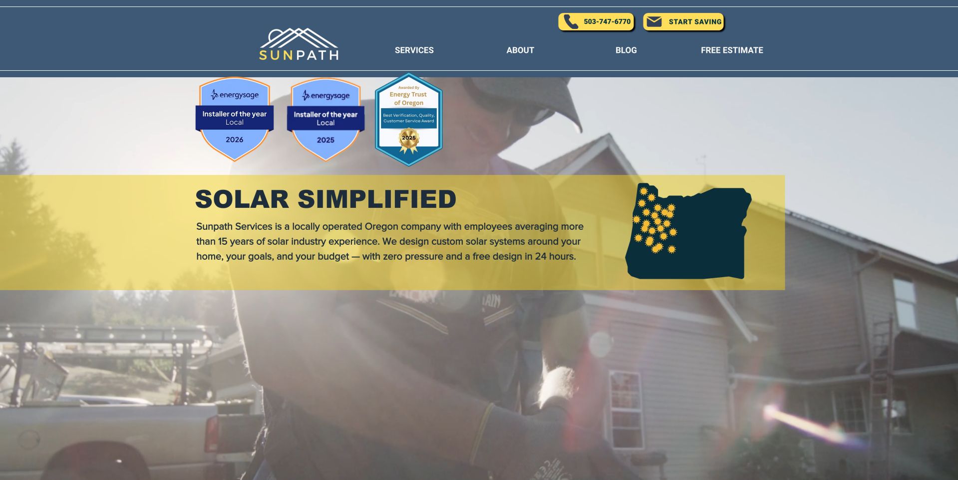
Sunpath Services combines a yellow Oregon-map graphic, the phrase Solar Simplified and a photograph of a technician at work. The concise header offers services, company information and an estimate route without a sprawling menu. Its local focus makes the page feel specific, while supporting process content explains more than the opening slogan alone. The map shape and technician photograph work together: one explains where the business operates, the other connects the offer to installation work. The short navigation avoids making a regional specialist look like a sprawling service marketplace. Supporting process content is essential because the slogan does not itself explain the buying journey.
What you can learn
Use a recognizable service-region cue and real working imagery to connect the promise to the people doing the work. Keep the estimate invitation close to an explanation of the next step. Translate the local identity into useful logistics, such as the areas served and the sequence of an assessment. Keep claims about savings separate from the observable design strengths.
Pros
Specific Oregon context
Human installation photography
Cons & considerations
Badge claims need independent confirmation
Broad savings language still needs project assumptions
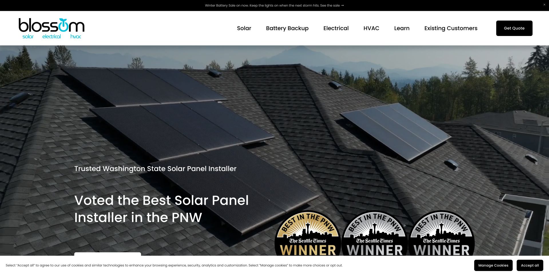
Blossom's homepage separates solar, batteries, electrical work and HVAC in a straightforward top navigation. A Washington-focused headline and rooftop image establish the solar offering, while an existing-customer route acknowledges that the relationship continues after purchase. This is useful architecture for a business that serves both new installations and support requests. A combined home-services business can easily blur its proposition. Here, distinct categories and an existing-customer route help separate installing a new system from maintaining an existing one. The rooftop image makes the solar context immediate, while the broader menu introduces other services without pretending they are identical projects.
What you can learn
Give existing customers a clear service route rather than forcing them into a new-sales funnel. When adding adjacent trades, keep each service's scope and project examples easy to distinguish. Audit each service destination for its own process, examples and contact routing. Shared branding should not make a homeowner guess whether a support request belongs to solar, batteries or another trade.
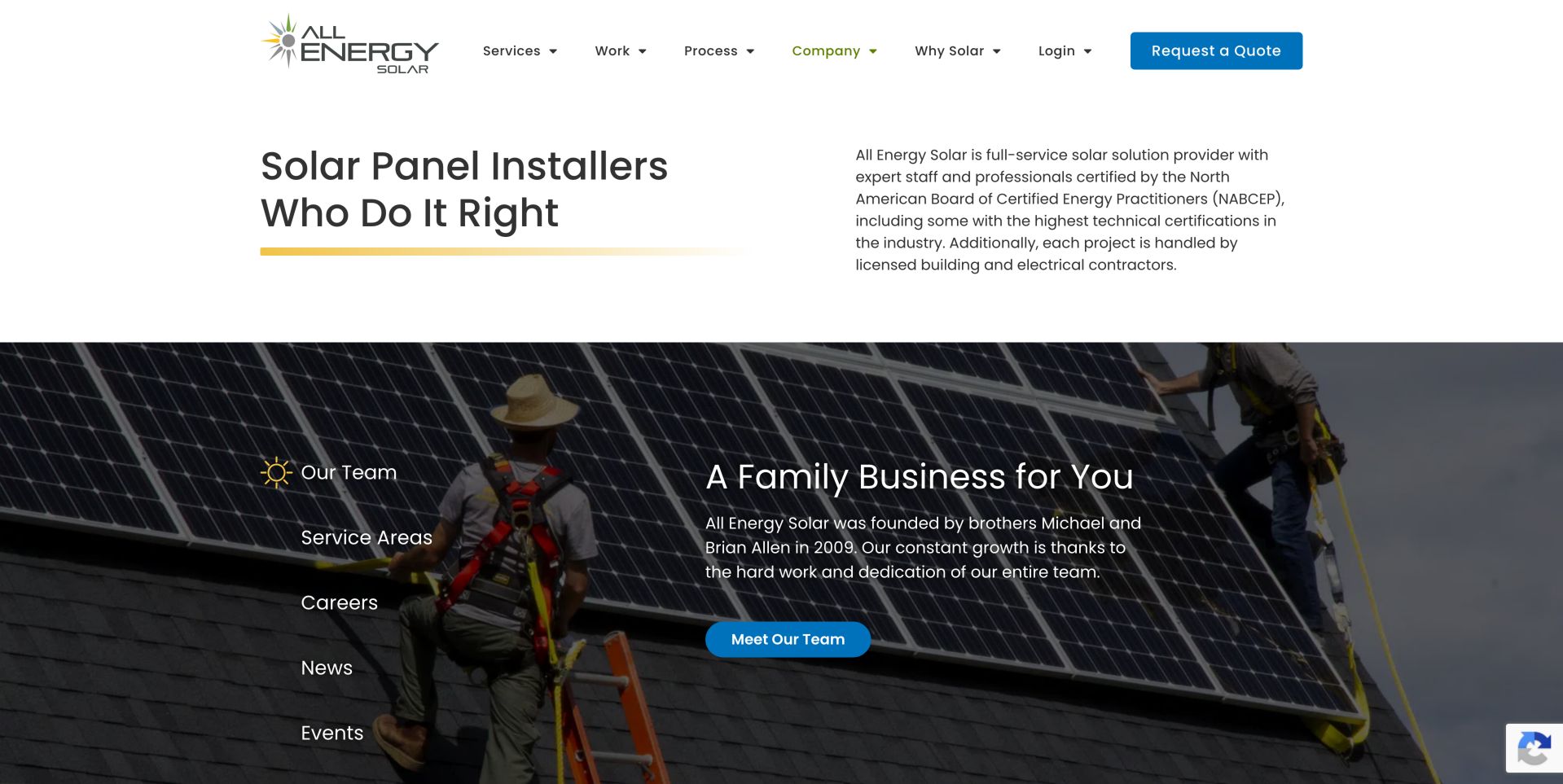
All Energy Solar's company page uses a clean introduction followed by a large installation-team image and tabs for team, service areas, careers, news and events. It turns a broad corporate story into several practical research paths. The tabbed layout reduces page length but makes some information less visible until a visitor chooses a section. The company introduction functions as a research hub rather than another conversion banner. People considering a larger team can investigate service coverage and company activity from the same location. The photograph contributes a human reference, but neither imagery nor a credential claim independently establishes how a specific project will be delivered.
What you can learn
Use company pages to answer who, where and how rather than repeating the sales headline. If tabs hide important coverage information, provide clear labels and accessible navigation. Put essential coverage details in a discoverable location even when tabs organize the remaining story. Test the tab labels and keyboard behavior before relying on them to contain important buying information.
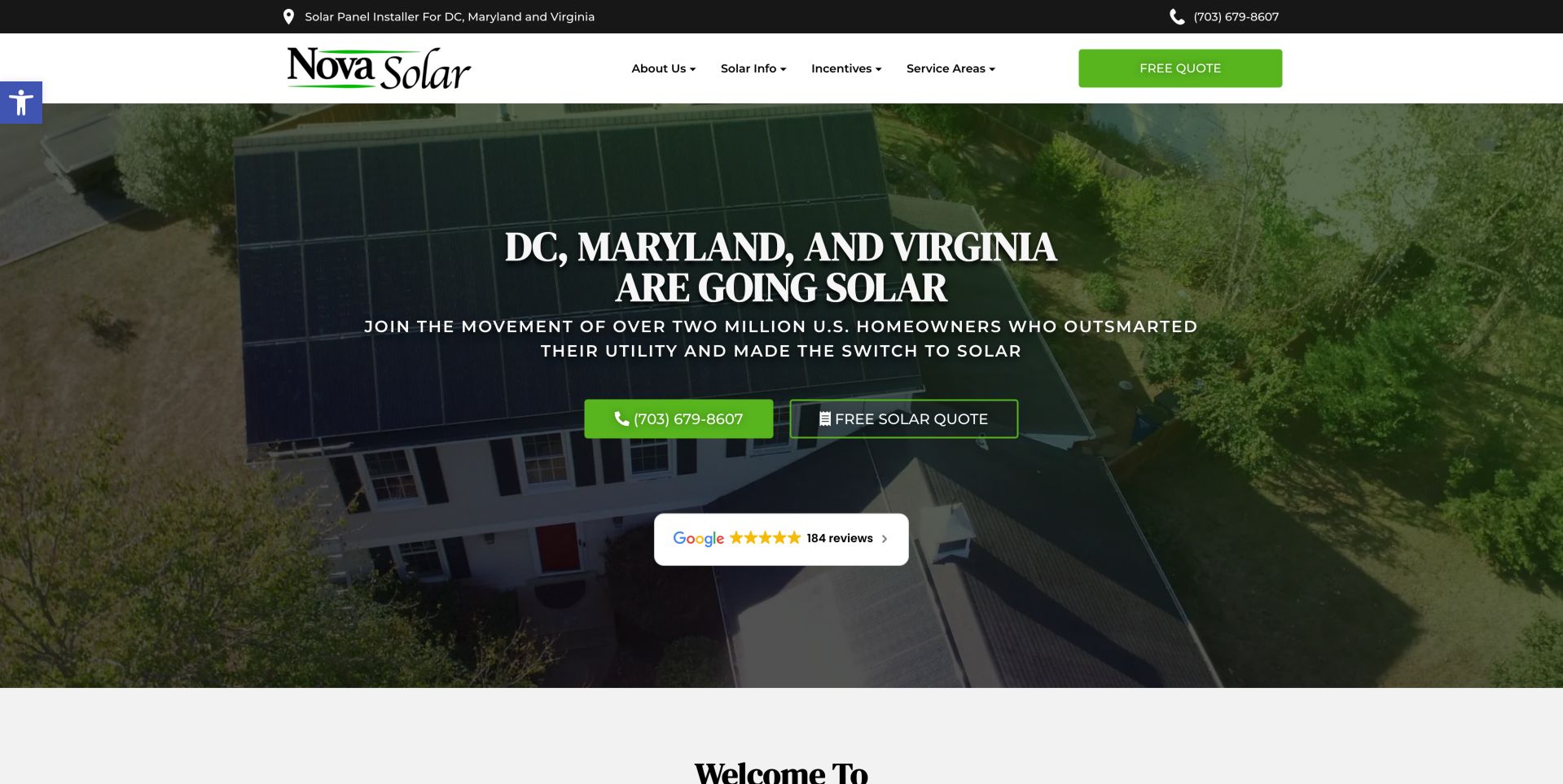
Nova uses a green and white palette, a rooftop aerial image and a prominent DC, Maryland and Virginia service statement. Calling and requesting a free quote are both easy to find. Lower-page utility and product material adds substance, although changing energy-price comparisons need dates and assumptions to remain useful. The regional statement reduces an early uncertainty: whether the company is relevant to the visitor's address. Offering a phone option alongside a quote request accommodates people who have questions before completing a form. The supporting product and utility material should deepen that initial clarity rather than overwhelm it with projections.
What you can learn
Let visitors choose between a phone conversation and an online inquiry without burying geography. Treat charts about future energy costs as maintained editorial content, not permanent decoration. Assign ownership to comparison charts and their assumptions. An attractive graph can become misleading when tariffs or time horizons change, even if the page layout still looks current.
Pros
Clear regional positioning
Phone and quote alternatives
Cons & considerations
Rate comparisons need dated assumptions
Review widgets are not independent project verification
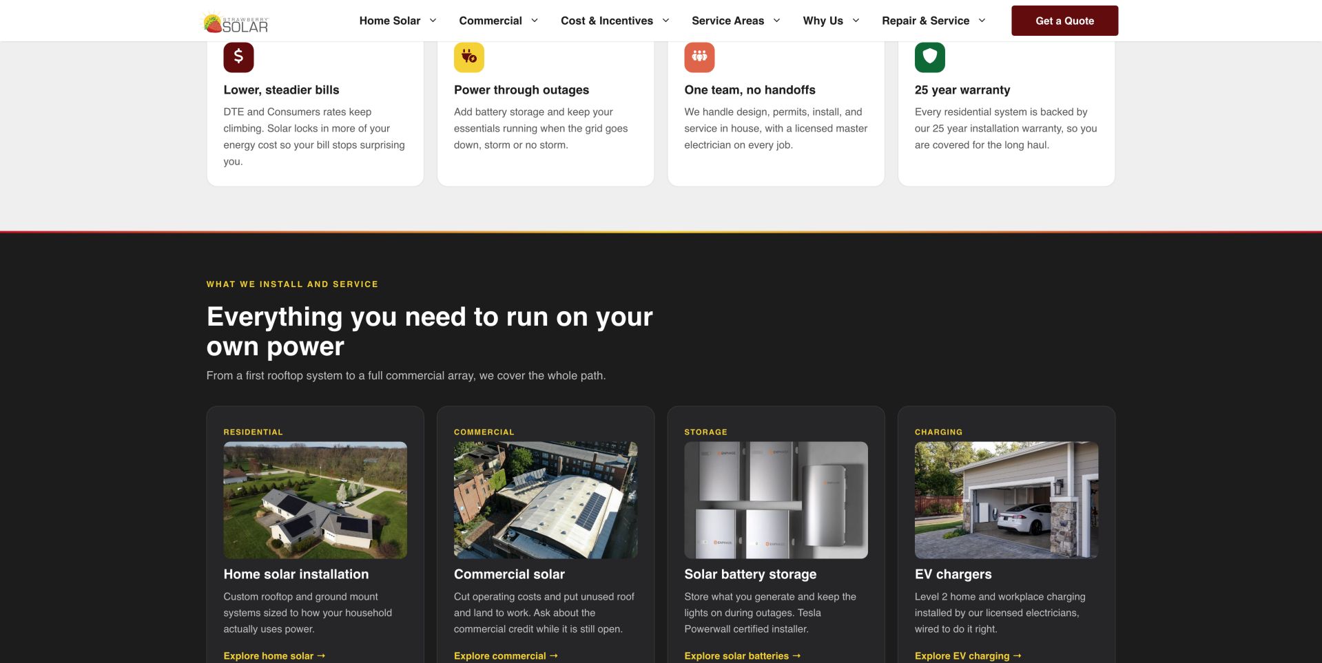
Strawberry Solar's deep red header sits above a Michigan-focused introduction and a visible phone option with working hours. The quote form distinguishes an optional utility-bill upload and optional marketing consent. Those details help a visitor understand what is necessary, while the form's length still asks for considerable commitment early. The strongest operational detail is the distinction between mandatory inquiry information and optional supporting material. A bill may help a later assessment, but its presence in an opening form deserves explanation. Publishing phone hours makes the alternative concrete rather than treating a telephone number as a decorative trust signal.
What you can learn
Explain optional uploads and warn against unnecessary sensitive information. A real contact alternative with hours gives visitors a way to ask questions before sharing property and utility details. Explain the purpose of any document request and the safer channel for it. Keep an initial conversation possible without requiring visitors to upload material they do not yet understand.
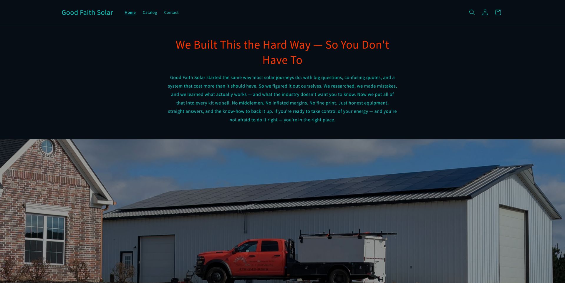
Good Faith Solar presents a dark, restrained storefront with a solar-building photograph, product navigation and a story about learning through hands-on work. DIY kits and installation services appear within a commerce-oriented experience. The important design challenge is scope: a kit price is not automatically a turnkey installation price. The commerce format encourages visitors to compare products, while the company narrative gives that catalog a personal context. This can be useful for knowledgeable buyers, but it also raises the risk that someone equates an equipment bundle with a complete permitted project. Clear scope labels matter more than a dramatic product photograph.
What you can learn
Separate equipment-only purchases from designed and installed systems. Product cards should say what is included and route visitors who need engineering, permitting or installation to a suitable service inquiry. Build distinct paths for experienced equipment buyers and people seeking a managed installation. Explain the handoff between purchasing hardware and arranging the services needed to use it appropriately.
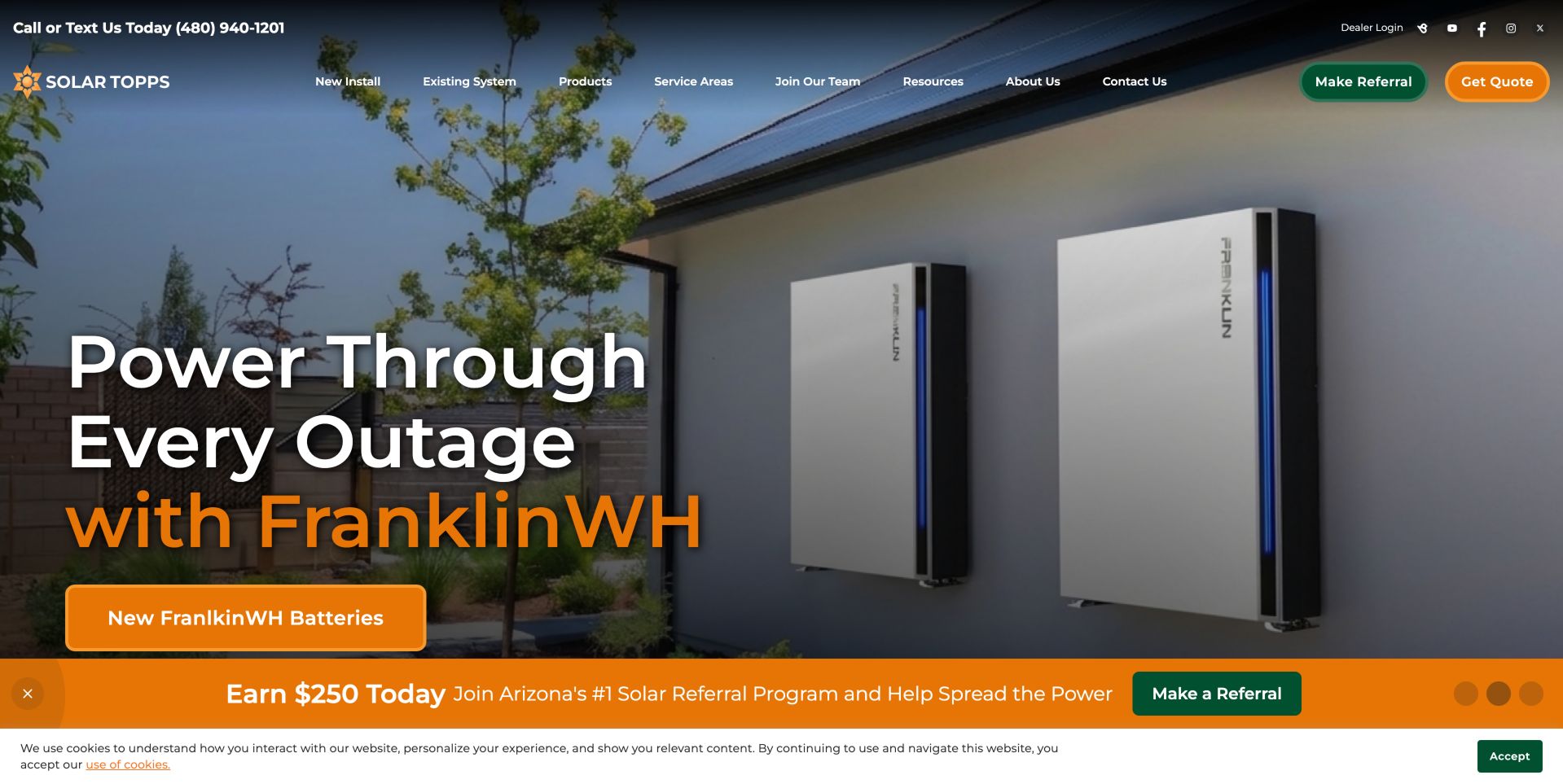
Solar Topps combines a dark photographic carousel with a long navigation separating new installations, existing systems, products, service areas and resources. Green referral and orange quote buttons receive strong emphasis. An orange promotional strip adds another changing message near the bottom, making the stable navigation particularly important. An early carousel transition lacked readable central text; the final captured slide pairs a battery image with a prominent product message. That variation illustrates why essential service information should not depend on an animation's timing. Lower company claims and awards provide research leads, but their presence does not independently verify comparative quality or installation results.
What you can learn
Give new buyers and existing system owners different routes before introducing promotional detail. Regional context and product categories should help a visitor establish relevance without depending on a rotating headline. Keep new-installation and existing-system tasks distinct. Preserve a stable plain-language introduction outside rotating campaigns, and make referral or recruitment promotions secondary to a visitor's immediate project needs.
Pros
Distinct new-install and existing-system navigation
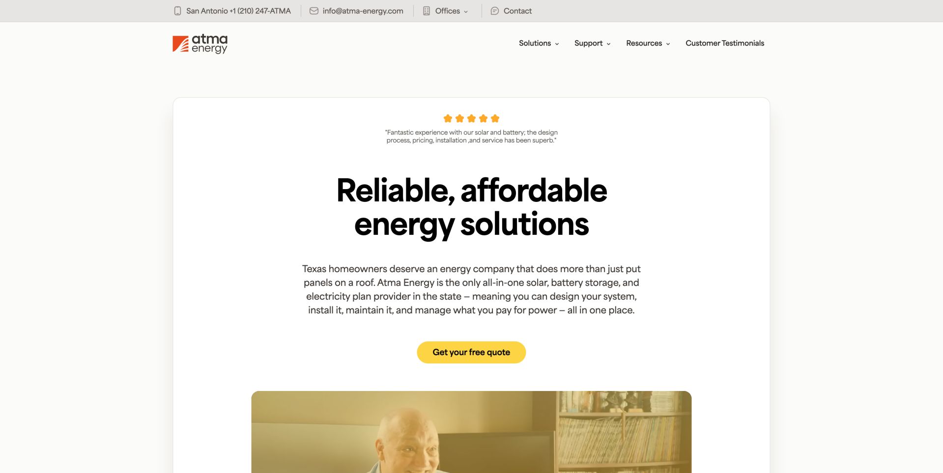
Atma's white card-like hero begins with a linked customer quotation, a plain-language energy proposition and a yellow quote button. The page explains solar design and support as related but distinct services, then connects them to a Texas company story. Its integrated-provider claim is marketing evidence, not something this design review independently verifies. The card-like composition creates a relatively calm setting for the central proposition and quote action. Design and support are presented as parts of a longer relationship, which is useful for buyers comparing responsibilities. The linked quotation offers a way to investigate its origin, although it does not validate every wider company claim.
What you can learn
Explain the service relationship in ordinary language before introducing equipment detail. Link testimonials to their source and distinguish a service promise from a verified comparative market claim. Distinguish proof of a quotation's source from proof of a market-wide comparison. Organize the page around responsibilities the customer can understand before adding stronger language about being uniquely integrated.
Pros
Linked testimonial source
Clear design and support categories
Cons & considerations
Exclusivity claim needs independent evidence
Long service promise can outrun concise qualification
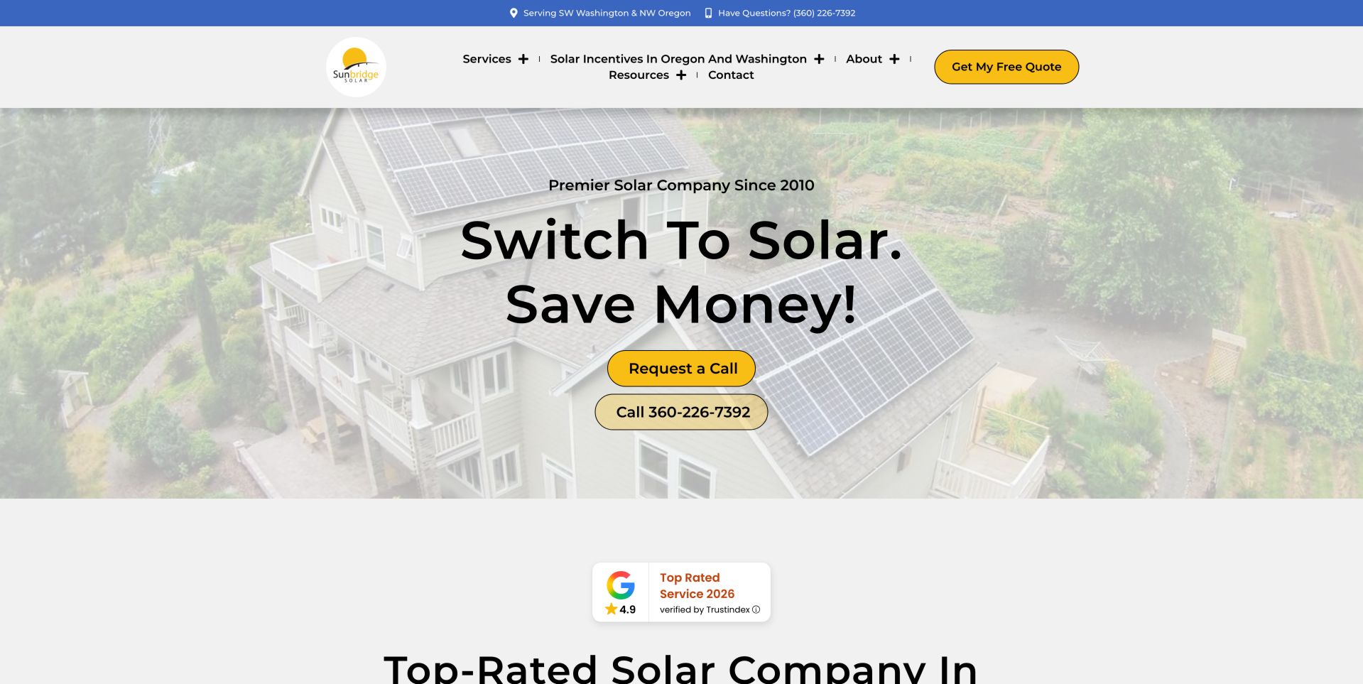
Sunbridge names southwest Washington and northwest Oregon in the top bar, then pairs Request a Call with a direct phone button over a residential installation image. Its resource and incentive navigation provide routes for people who are not ready to speak. A review badge below the hero adds social proof without replacing the service-area statement. The callback option is meaningful because not every visitor wants an immediate conversation. Its pairing with a direct telephone route makes that choice visible without forcing a long form first. Resource and incentive sections provide a research path, while the residential image anchors the otherwise broad promise in a recognizable project type.
What you can learn
Offer both asynchronous and immediate contact while keeping the region explicit. Incentive content needs its own update process because the design can remain unchanged while programs change. Write each contact label around the action it actually initiates. Keep incentive dates and eligibility in maintained content so a stable visual design does not accidentally preserve an expired promise.
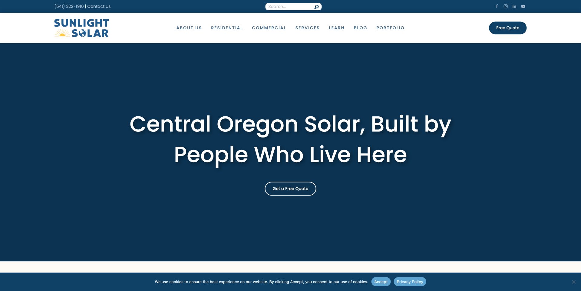
Sunlight Solar uses a broad blue hero and a direct Central Oregon headline instead of filling the first screen with several promotions. Residential, commercial, learning and portfolio routes are visible in the header. The page then explains design, permitting, installation and connection, making the scope more tangible than the opening quote button alone. The restrained opening gives the regional proposition room to be understood. Navigation distinguishes different customer types and provides a portfolio route, so readers can move from a general claim to concrete work. Explaining the stages below the hero helps frame installation as a coordinated project rather than a single equipment purchase.
What you can learn
A restrained hero can work when the words identify both the service and the place. Follow it with project evidence and the practical stages a customer will experience. Use the project sequence to explain responsibilities and dependencies. Keep the large introductory section concise enough that visitors can reach evidence without excessive scrolling or another promotional interruption.
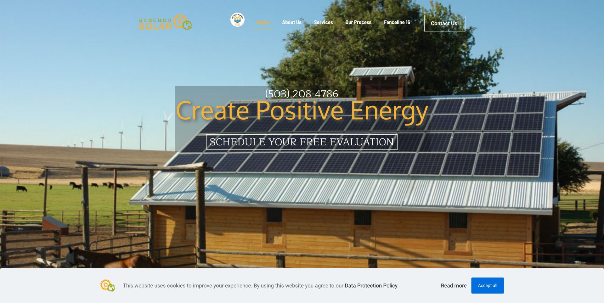
Synchro's opening photograph shows panels on a rural building, with a phone number and a free-evaluation invitation layered over it. Its lower content distinguishes residential and off-grid battery work, while the main menu includes a process page. The approach gives a specialist business room to explain more unusual installations. The rural building photograph gives the specialist scope a more concrete setting than an abstract energy graphic would. Residential and off-grid content can help visitors recognize different needs, but the opening evaluation invitation should not imply that every property qualifies. The process route is therefore an important supporting destination.
What you can learn
Use imagery that reflects the kinds of projects you want to discuss, then make specialized system categories explicit. Avoid treating a general incentives percentage as applicable to every visitor. Describe what an evaluation covers and what remains unknown afterward. Keep technical categories understandable to non-specialists, with project examples that explain context rather than implying a universal system design.
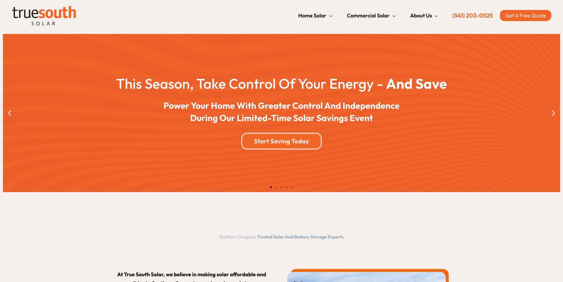
True South Solar uses an orange campaign slide in a multi-slide hero, with separate home-solar and commercial-solar navigation above it. Other slides address backup power, company identity and business installations. This lets one page hold several campaigns, but essential positioning should not depend on seeing a particular slide. The stable service navigation is valuable precisely because the promotional area changes. A visitor arriving on a backup-power slide can still locate residential or business services without waiting through the sequence. The carousel adds campaign flexibility, but it also increases the number of messages competing for a short first visit.
What you can learn
Keep core service and geographic information outside a rotating campaign area. If a carousel promotes limited-time savings, ensure dates and terms remain available independently of the active slide. Treat each slide as optional supporting content, not the only location of an essential fact. Test controls, motion preferences and the availability of offer details outside the animation.
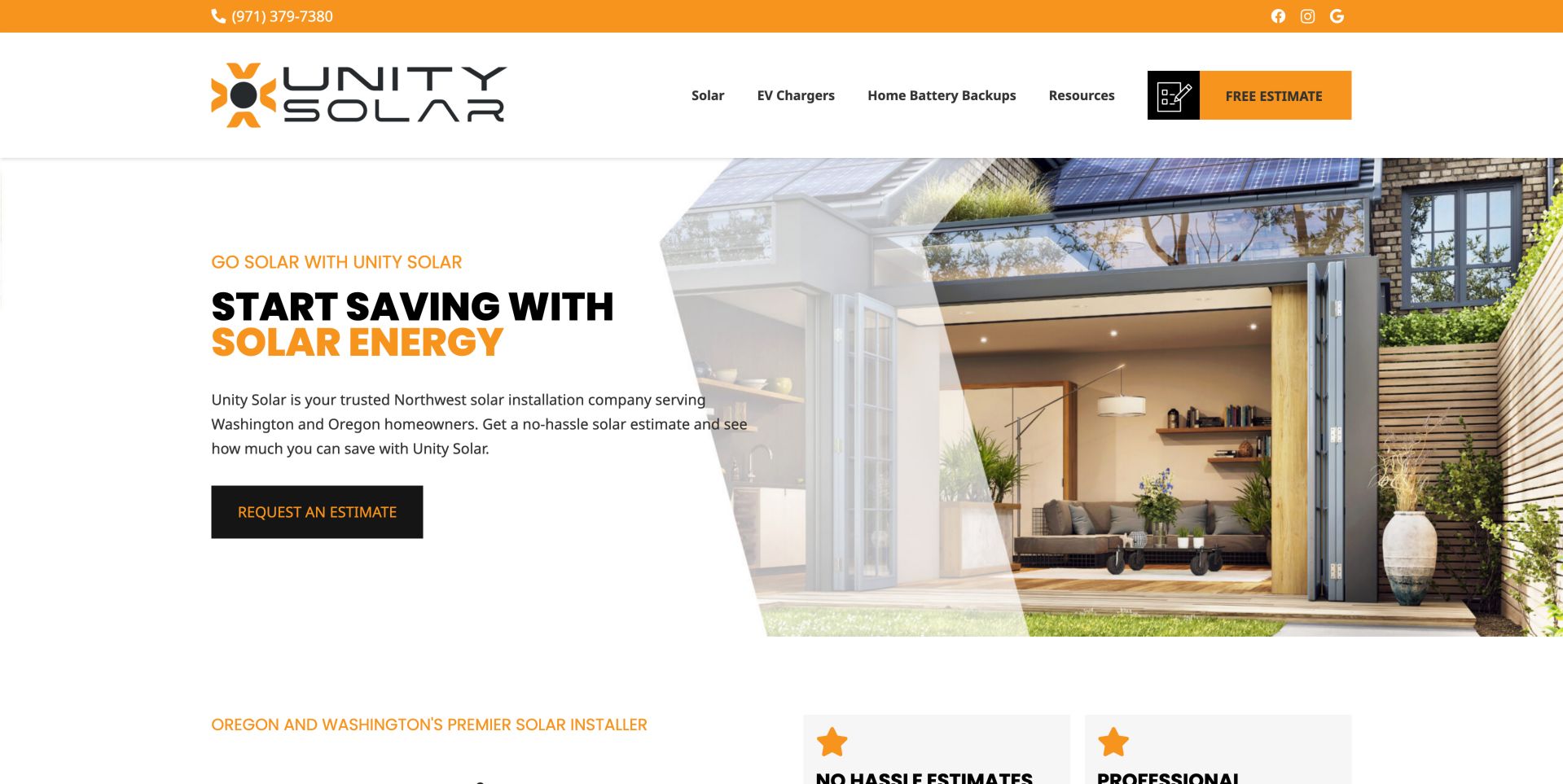
Unity combines a solar-equipped home image with a compact Oregon and Washington introduction. Solar, EV charging and home battery backups are organized into distinct navigation groups, each with geographic destinations. The main estimate action stays visually separate, giving visitors both research and inquiry routes. The service-state structure acknowledges that geography can affect the research a buyer needs. It also creates a maintenance burden: several related destinations must remain consistent without becoming near-duplicate pages. The separate estimate action offers a direct next step while the menus support more deliberate exploration.
What you can learn
When regulations and incentives differ by state, use geography within the service architecture. Avoid duplicating generic pages that differ only by location names; each destination needs useful local detail. Prototype the menu with a homeowner researching batteries and a business researching solar. Confirm that each can reach the relevant state-specific explanation without navigating through unrelated service categories.
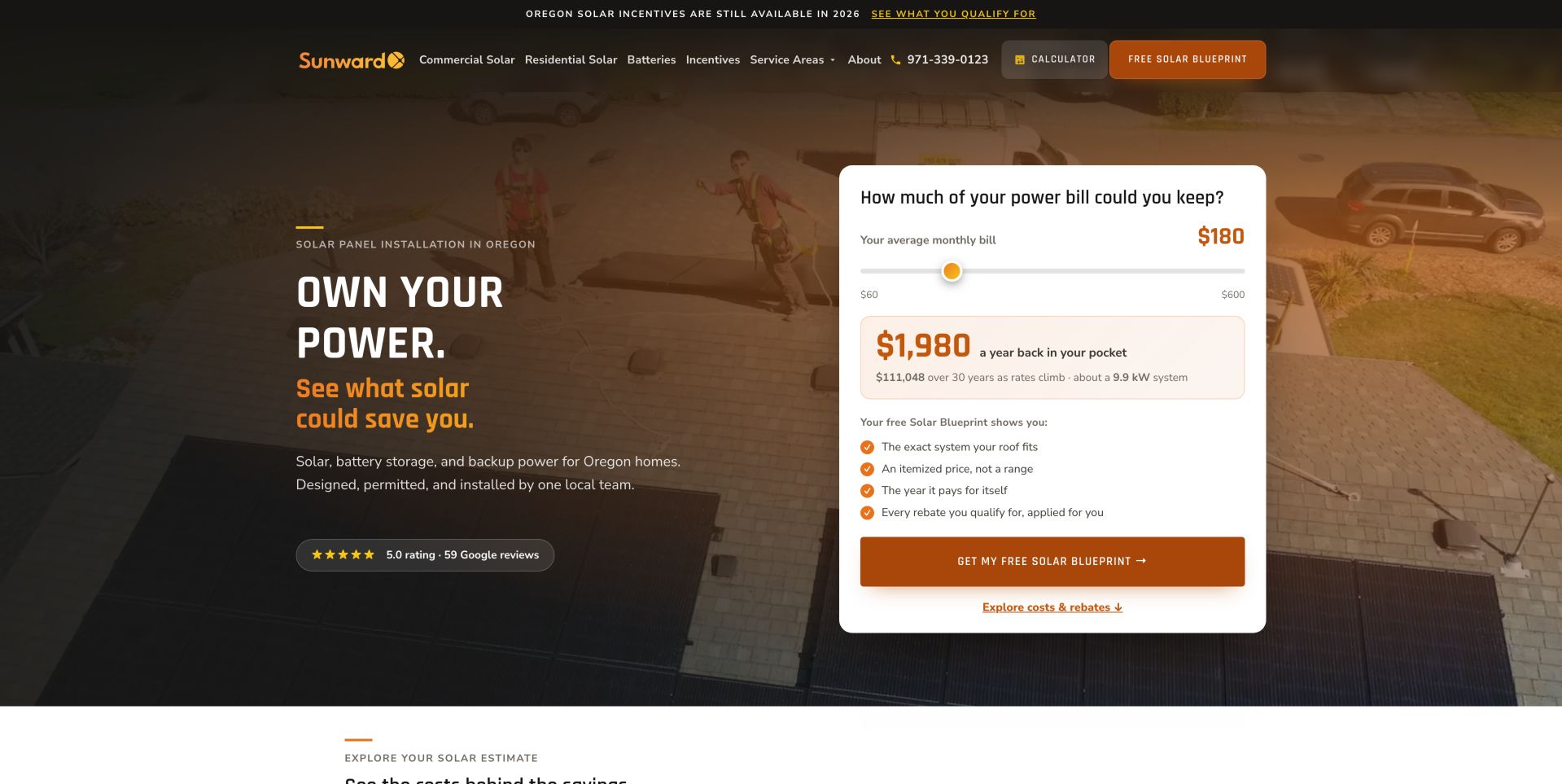
Sunward puts a monthly-bill slider and an estimated savings figure directly beside its Oregon installation proposition. A later calculator section says no contact details are needed, while the Solar Blueprint invitation explains the intended deliverable. This pattern offers useful value before lead collection, provided the assumptions are transparent. The slider gives the visitor something to explore before requesting contact, which changes the relationship from immediate lead collection to preliminary education. However, a precise-looking figure can feel authoritative even when based on limited inputs. Explaining the eventual blueprint helps distinguish an early illustration from a later project proposal.
What you can learn
Show an estimate as an estimate, with utility, system-size and rate assumptions nearby. Do not let a precise-looking long-term savings number appear more certain than the underlying inputs. Show the calculation's limits at the point of use, not only in distant fine print. Keep illustrative projections visibly separate from a site-specific design, quotation or financial recommendation.
Pros
Estimation before personal details
Explained quote deliverable
Cons & considerations
Long-term projections can imply false precision
Financial and incentive claims need current sources
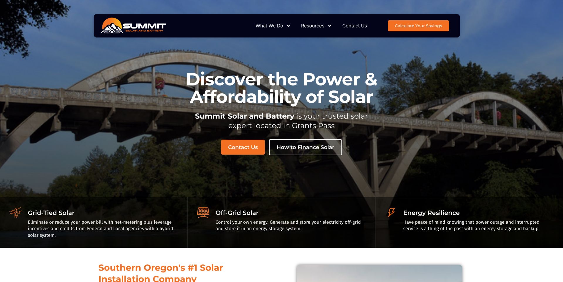
Summit uses a Grants Pass introduction and a three-part strip for grid-tied solar, off-grid solar and energy resilience. Contact and financing information sit side by side, while the service list includes maintenance and panel removal for roof work. This makes the business useful to existing owners as well as new buyers. Maintenance and roof-work removal acknowledge needs that arise after an installation is complete. Grouping grid-tied, off-grid and resilience services helps visitors recognize that these are different project conversations. Financing may be relevant, but it should not distract from understanding which technical scope is being discussed.
What you can learn
Group services by the problem a visitor is trying to solve, including repairs and roof replacement. Separate resilience benefits from guarantees about never experiencing an outage. Give existing owners a support-oriented route with clear scope questions. Explain resilience as a design objective with limitations, rather than letting an absolute phrase stand in for an actual system specification.
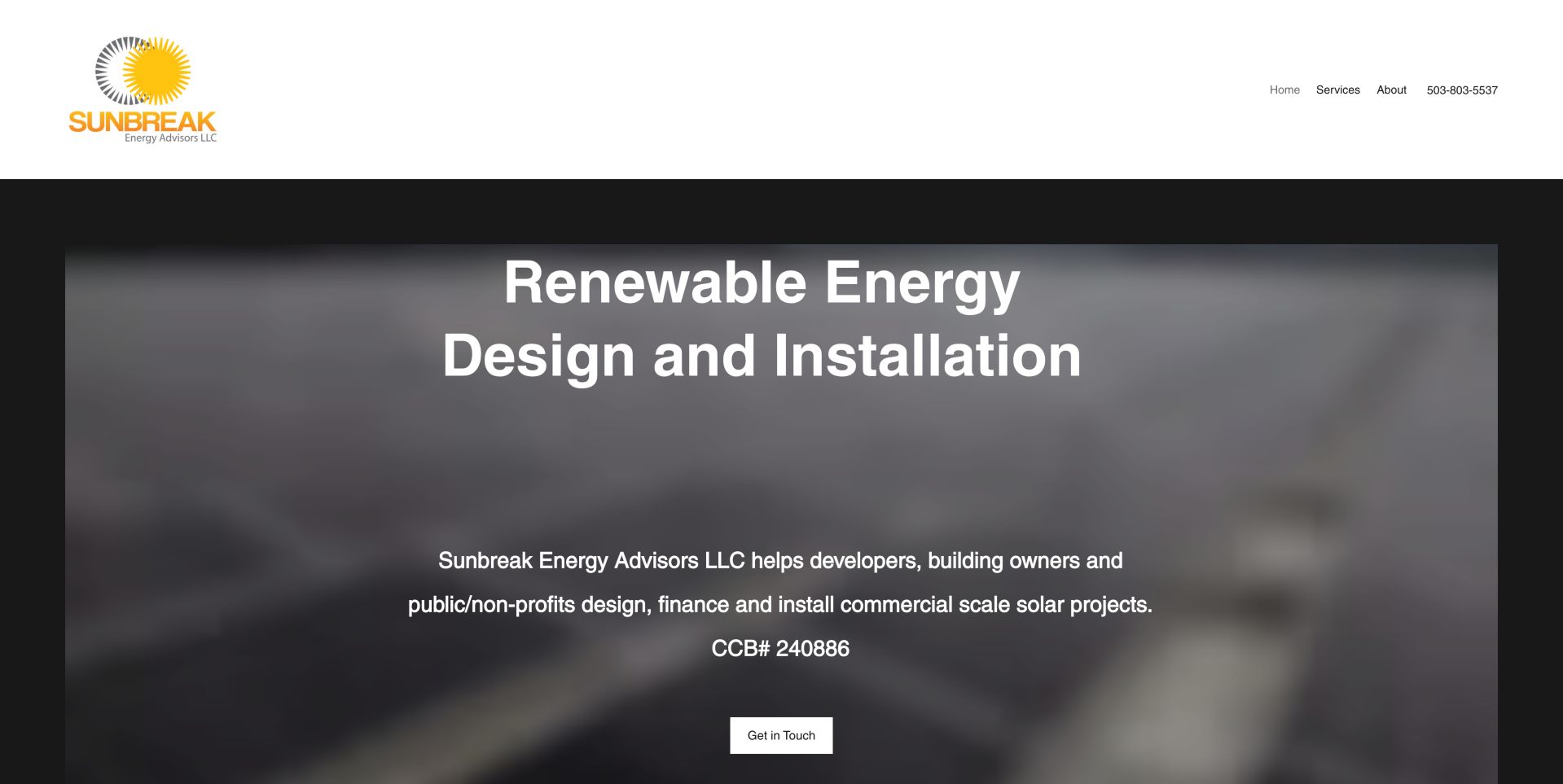
Sunbreak names developers, building owners and public or nonprofit organizations in its opening description. Its service sections distinguish feasibility studies, photovoltaic design, grant writing and project development. That specificity is more useful to a commercial buyer than a generic homeowner savings pitch, even though the page's visual treatment is restrained. Naming the audience narrows the proposition in a useful way. A developer assessing feasibility has different questions from a homeowner comparing monthly bills. Distinct study, design, funding and development services help the buyer locate their project stage, even when the restrained presentation offers less immediate visual drama.
What you can learn
Name the buyer and the project stage you support. Commercial solar inquiries need feasibility, design and funding context, not just a residential quote form with a different heading. Use service labels to describe deliverables and decision points. Make contact actions specific enough that a prospective client understands whether they are discussing an early study or an established project.
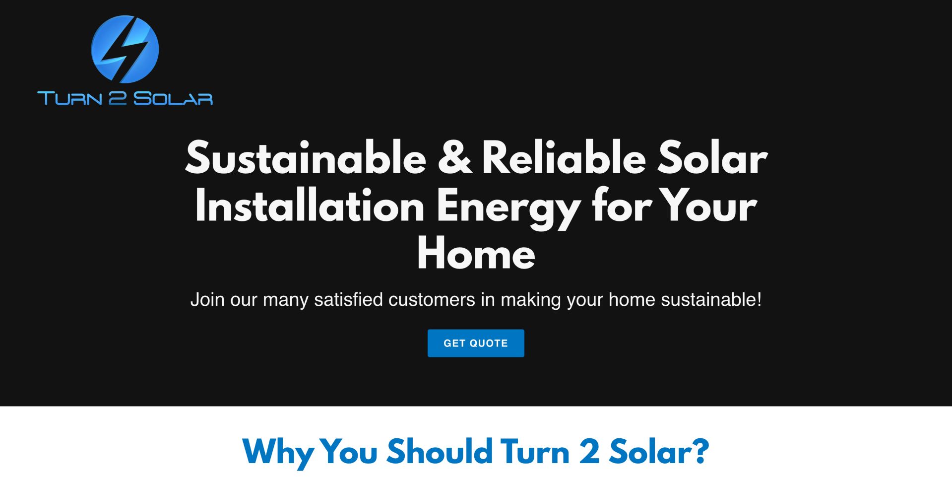
Turn 2 Solar presents a large black-and-blue introduction, a clear quote action and sections for company background, work and contact information. The page explains its installer-employment model and local address, while the quote route leads to a separate form service. A lengthy marketing-consent statement deserves attention before any submission. The compact structure gives the company story, work and contact information a manageable sequence. Explaining the installer-employment model can be relevant to buyers investigating responsibility, although the statement remains the company's own. The external form introduces a separate interaction that deserves a clear handoff rather than an unexplained jump.
What you can learn
A short site can still explain who installs the system and how to reach the team. Make external form destinations and communication consent understandable before the visitor follows the quote path. Keep consent information near the action it governs and explain the follow-up channel. Review older news links for relevance so the small site feels maintained without manufacturing a false update date.
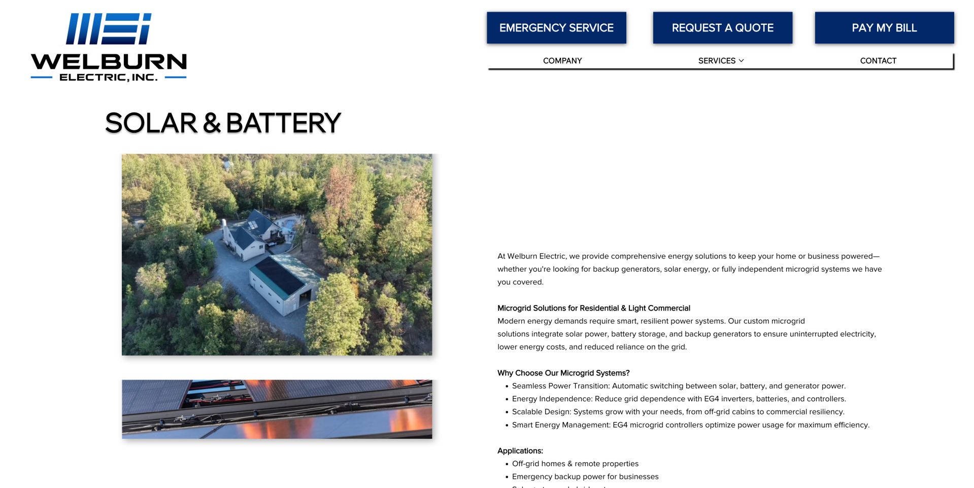
Welburn's solar and battery page pairs installation imagery with detailed microgrid, rooftop and ground-mount explanations. The shared header keeps emergency service, quotes and bill payment distinct. The useful pattern is a focused service page within a broader electrical business, though the opaque URL and long text make navigation and scanning less polished. A dedicated service page lets a broader contractor discuss energy systems without forcing them into a generic electrical-service description. Distinct utilities for urgent service and payment recognize different existing-customer needs. The dense explanation contains useful scope distinctions, but its presentation asks readers to do more work than a structured summary would.
What you can learn
Give a specialist service its own clear page and explain how solar, batteries and generators work together. Use descriptive URLs and real headings rather than relying on visual text styling alone. Break the technical story into buyer questions and genuine headings. Keep the service page's language and address descriptive so visitors can recognize and share it without remembering an opaque URL.
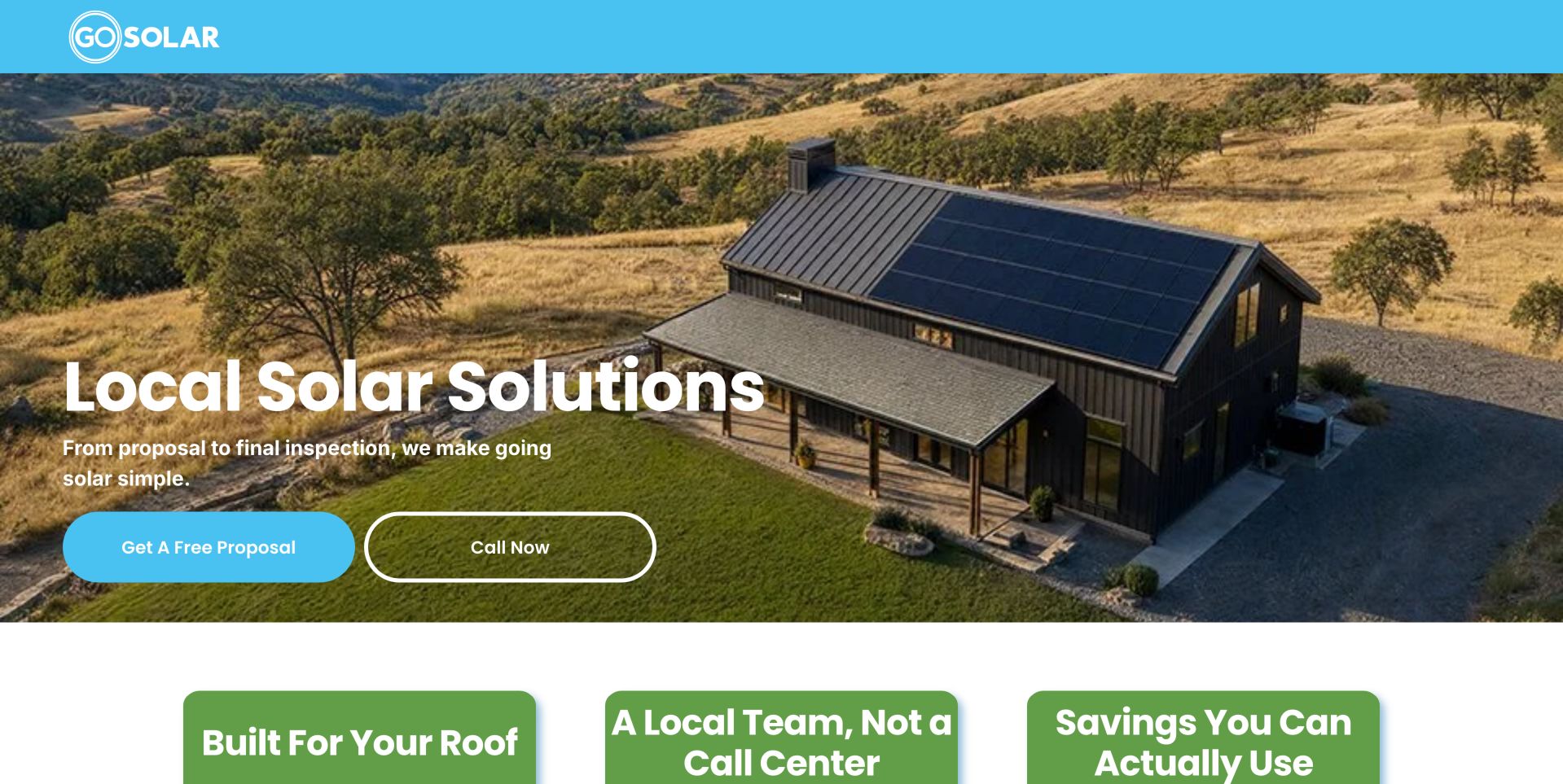
The former Sunshine Solar destination redirects to Go Solar, whose current page uses a hillside installation image and a simple proposal-or-call choice. A numbered process explains energy-history review, roof mapping and a joint design discussion. It makes the quote process concrete, although rate and production claims need careful qualifications. The current destination and numbered proposal sequence are more useful than relying on an older brand reference. Energy history, roof mapping and discussion each explain a different input to the proposal. This helps a visitor understand why information may be requested, while leaving performance claims subject to their actual written qualifications.
What you can learn
Show what the customer provides and what the installer does with it. Present utility-bill uploads as a later, explained step, and keep production guarantees tied to their written conditions. Preserve clear brand and redirect continuity when a business changes identity. Show the purpose and timing of requested inputs before asking someone to supply a bill or accept a production promise.
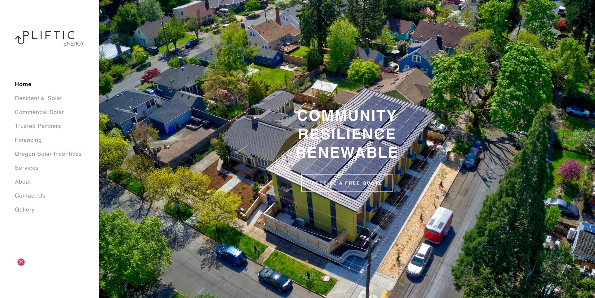
Upliftic uses a persistent left navigation and a large aerial residential installation image. Residential, commercial, financing, incentives, partners and gallery pages remain visible without a mega menu. The community-resilience language gives the site a distinct tone, while the crowded side menu creates a responsive-design challenge. The left-hand structure makes the available research paths visible together instead of concealing them in a large dropdown. This suits a focused service library, while the installation image gives scale and context. The same composition needs careful adaptation when the navigation and image compete for a narrow mobile viewport.
What you can learn
A side navigation can keep a compact service library accessible, but its mobile equivalent needs equal care. Let project imagery support the proposition without obscuring readable text and actions. Design the mobile navigation as a deliberate counterpart, not a compressed desktop sidebar. Keep readable proposition text outside visually busy areas and make financing or incentive content recognizable as separate research tasks.
Kegan is a freelance web designer and developer with 15+ years of experience helping businesses turn complicated website requirements into clear, maintainable digital experiences. He works directly with clients from planning and design through development, launch, and ongoing support.
For solar installer website design, his development approach focuses on service-area information, installation process explanations, verified project evidence, and straightforward consultation or quote-request journeys. The scope can be a targeted improvement or a complete custom build, with responsive layouts, thoughtful content structure, and integrations chosen around the people using and maintaining the site.
Show 3 other solar installer website designersHide other solar installer website designers
Plan a solar website around the homeowner's decisions
1. List the jobs the website must handle
Separate first-time installation research, battery additions, commercial feasibility, maintenance and customer support. Choose a primary path for each and decide which requests can share a form.
2. Build a service-area map with meaningful detail
Document the jurisdictions and utilities actually served. Link to useful local information, not near-identical pages with a different city name. Keep incentive and interconnection material dated and maintained.
3. Write the project process before designing the hero
Explain assessment, design, permitting, installation, inspection, interconnection and support in the order customers encounter them. State which stages depend on utilities or authorities and avoid promising dates that the installer cannot control.
4. Define the evidence needed for every claim
Collect approved project photographs, permission to identify clients, equipment details, public credential links and the source of testimonials. Verify financial promotions and avoid presenting historical incentives as current guarantees.
5. Design the minimum useful inquiry
Ask only for information needed to route the request. Explain why an address or utility bill is needed, mark uploads and marketing consent separately, and offer a phone alternative. Never ask for account passwords or unnecessary identity documents.
6. Assign ongoing ownership
Name who updates incentives, financing offers, service areas, equipment availability, staff and project examples. Test forms without sending real inquiries and keep customer-support destinations working after a redesign.
The editing job behind the design
Choose tools that support the inquiry without obscuring it
A content-managed site can handle service pages, project examples and educational articles without a custom portal. Choose an editing workflow the team can maintain and a form system that supports clear routing, spam controls, accessible labels and limited data collection.
Calculators, maps, scheduling tools and review widgets add operational and privacy obligations. Document what data they collect, which assumptions they use and who maintains them. Public page observations do not reveal every backend system or prove the accuracy of a savings estimate.
Our WordPress website examples offer a separate look at publishing approaches. A visible platform label is evidence for that named page, not a guarantee that the same system will suit your requirements.
Before the public launch
Solar website launch checklist
State the actual installation territory above or near the first inquiry action.
Separate solar generation, storage, backup and electrical-upgrade services.
Provide a route for commercial and unusual-site feasibility questions.
Explain the stages between an initial quote and interconnection.
Label calculators as estimates and publish their assumptions.
Date financial, utility-rate and incentive claims.
Link credential and testimonial claims to appropriate sources.
Use authorized project photographs without exposing private customer addresses.
Mark optional uploads and marketing permission clearly.
Offer customer support without a new-sales inquiry.
Test keyboard navigation, mobile menus and form error messages.
Assign a person to keep offers, contacts and service areas current.
These checks are a project checklist, not a performance, legal, security, or accessibility certification. Test real journeys with the people responsible for the website before making claims about the result.
Sources & editorial method
How this collection was selected and reviewed
The examples were reviewed through their public pages and actual browser captures. Each review describes visible design and information choices, including limitations. Screenshots and source observations retain their recorded dates; pages may change afterward. We did not submit inquiries, test financial eligibility, evaluate installation workmanship or audit the companies' guarantees. Editors Choice recognizes the website's researched design approach, not service quality.
Each example links to its actual source page. Screenshots are direct browser captures with their own capture dates; moving imagery, announcements and live designs can change. The notes describe observable design choices and conditional tradeoffs, not measured traffic, conversion results, service quality, or accessibility conformance.
Technology labels use public page metadata, asset evidence, or explicitly cited platform documentation. Platform documentation is not a complete current deployment audit. A component reference may be legacy or unused; it is not a complete backend inventory. Unknown stacks are omitted. These sites are editorial examples, not our client portfolio.
Written, Edited and Curated are separate editorial records, not timestamps advanced by a rebuild. Website designs and imagery belong to their owners. See our editorial standards or suggest a correction.
Questions worth asking
Solar Installer website design questions
Should a solar website show pricing?
It can explain cost drivers, included work and illustrative ranges when those figures are supported and kept current. Distinguish equipment-only prices from installed systems, and explain the property-specific work needed before a firm quote.
Is a savings calculator necessary?
No. A clear project process and useful examples may be more valuable than an opaque calculator. If you add one, show its assumptions, identify estimates and give visitors a useful result without unnecessary personal-data collection.
How should solar and battery services be organized?
Give each a distinct explanation and show how they relate. Solar generation does not automatically provide backup during an outage, and storage configurations differ. Avoid implying that every system includes every capability.
What makes a good project case study?
Describe the project type, general location, customer's goal, constraints and delivered scope with approved photographs. Identify the date and avoid publishing exact residential addresses or unsupported savings claims.
What does Editors Choice mean here?
It identifies an especially useful website-design example after reviewing the actual page. The choice is not based on votes and does not certify an installer, recommend a financial product or guarantee customer results.
Start with clarity about place, scope and the next step. A solar website earns attention when it helps people ask better questions before they become a lead.