Auto service websites must help people find the right kind of help without asking them to diagnose their own vehicle. These examples show how repair networks, independent shops, transmission specialists, mobile brake services, and maintenance providers organize the next step.
A visitor may arrive looking for a known service, a tire product, or help with an unfamiliar symptom. Those are different tasks. A useful website names its actual service range, identifies the appropriate location, and explains whether the main action requests an appointment, begins an estimate, or opens a shopping journey.
The collection includes general repair businesses and narrower service models. Routine oil-change providers are included for their maintenance and location journeys, not as evidence that every example performs every mechanical repair. Compare how the sites distinguish products, services, promotions, and local information, and how much practical context remains visible around their campaigns.
Before the examples
What makes good auto repair website design in 2026?
Describe the actual service range
Separate repair, maintenance, tires, and specialist work where the processes differ. Use plain service names and a route for customers who can only describe a symptom. Avoid making broad auto-care language imply that every location handles every vehicle or repair.
Keep shop context visible
Make location, hours, contact information, and service availability easy to find. Preserve a selected shop as visitors browse services and appointments. A single-location business can display these facts directly rather than adding an unnecessary search step.
Explain appointment and estimate states
Distinguish a requested time from a confirmed appointment, and a promotional package from an assessed repair price. Tell customers which vehicle details are needed and why. A website should support the conversation with the service team without pretending to complete a diagnosis.
The collection · 26 examples
26 auto repair websites worth studying
Look at the task structure around each hero. A vehicle selector, a local-shop finder, and an appointment button may appear together, but each answers a different question. The useful design is the one that keeps those questions understandable and preserves the visitor's context.
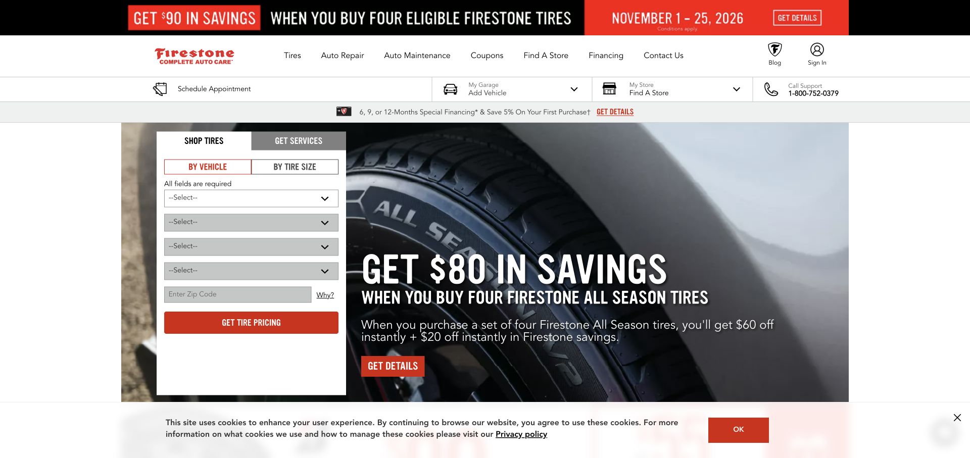
Firestone Complete Auto Care gives a vehicle-based tire selector prominent space beside a promotional hero. Auto Repair and Auto Maintenance are separate navigation routes, while scheduling, vehicle context, and store selection form another layer beneath the header. The arrangement reflects two different tasks: finding a compatible product and arranging work on a vehicle. Its promotional density is also instructive, because the service journey must remain easy to identify when several offers compete in the first screen.
What you can learn
Separate product compatibility from repair scheduling, and explain why a vehicle or store must be selected. Preserve those selections through the journey so the visitor does not repeatedly supply the same information when moving between tires, services, and appointments.
Pros
Vehicle and tire-size routes acknowledge different ways a customer may identify the product they need.
Repair, maintenance, and appointment paths remain named in navigation rather than being hidden behind the tire promotion.
Cons & considerations
Several promotional and utility strips can reduce the visible space available for the core service explanation.
A vehicle selector needs clear validation and recovery when visitors do not know a required trim or specification.
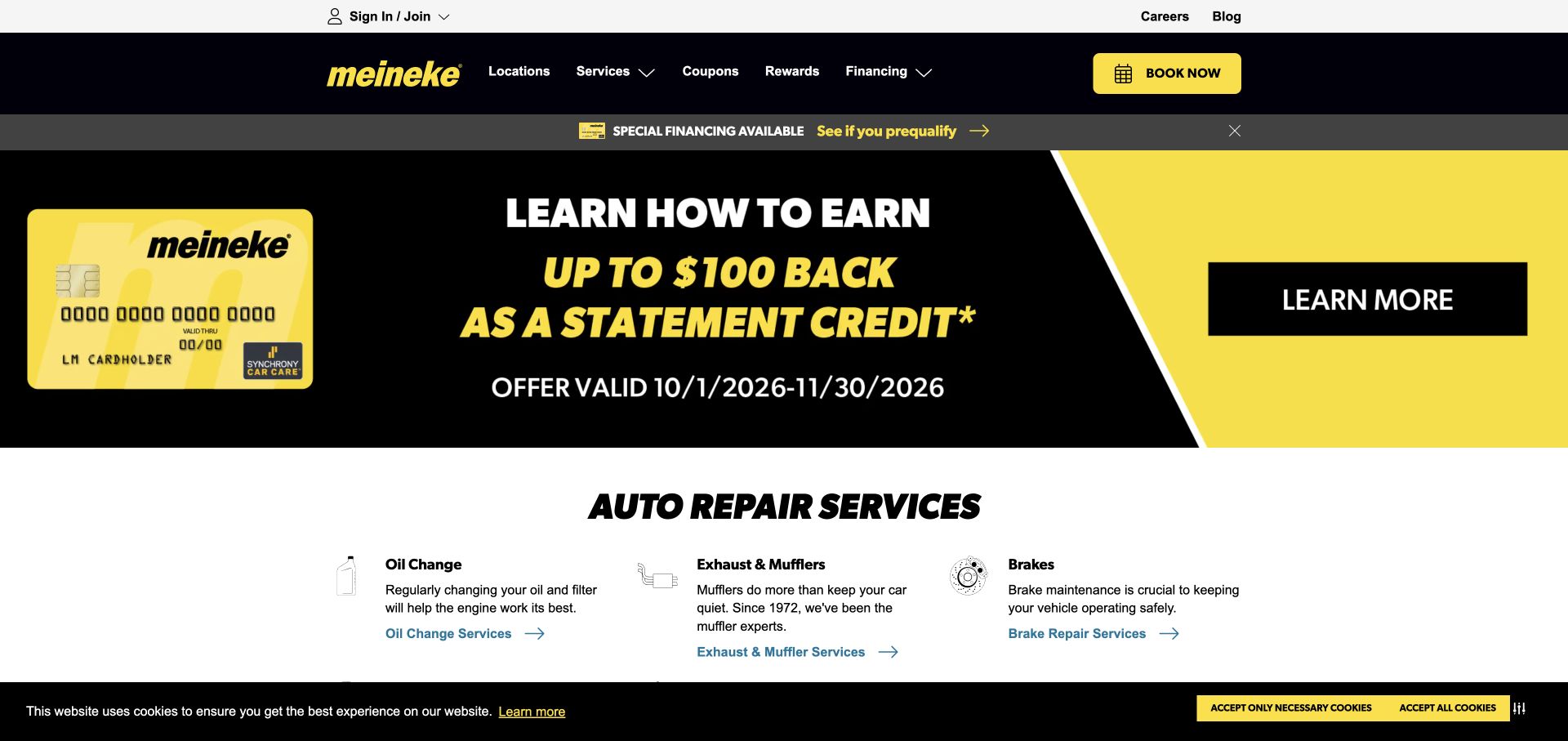
Meineke uses a black and yellow identity, with a large financial promotion occupying the captured hero. Immediately below, an Auto Repair Services section introduces oil changes, exhaust work, and brakes. Locations and a booking action stay in the header alongside coupons and rewards. The page demonstrates how a campaign can lead the homepage while a permanent service structure remains nearby. Its design tradeoff is the attention given to the offer before a visitor has identified the repair they actually need.
What you can learn
Keep durable service navigation and booking visible when promotions lead the page. Give offer conditions an appropriate place, but do not let a campaign become the only explanation of the business or force a service researcher through unrelated promotional material.
Pros
The high-contrast palette creates a consistent hierarchy between the header, campaign area, and booking action.
A named repair-services section starts beneath the promotion and gives visitors concrete service categories.
Cons & considerations
A financial campaign may be irrelevant to visitors whose first question is whether a particular repair is offered.
Multiple rewards, coupon, and financing routes need clear priority so they do not obscure location and service discovery.
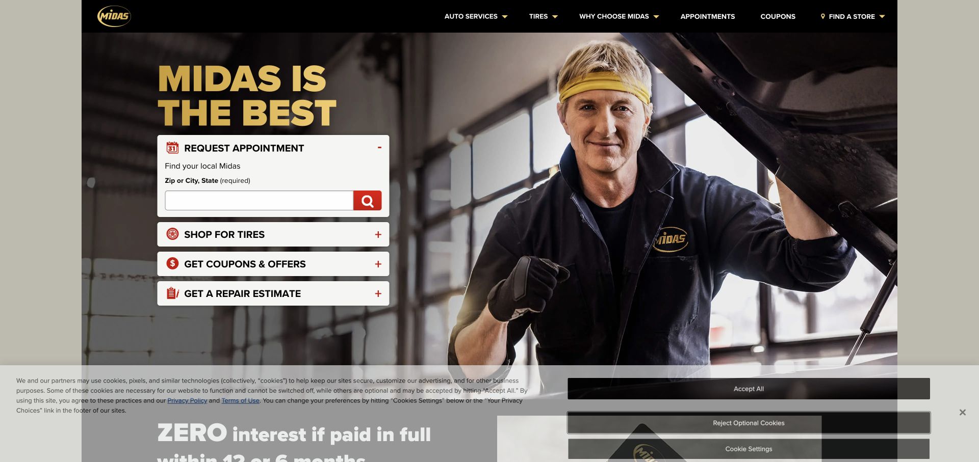
Midas places a mechanic photograph behind a compact panel of task choices: request an appointment, shop for tires, get offers, and request a repair estimate. The appointment section opens with local-store discovery. This gives the page a functional structure even though the headline is strongly promotional. The most useful detail is the distinction between booking and estimating; they are related activities, but a visitor may need to understand likely work before choosing an appointment.
What you can learn
Name tasks according to the user's intention and keep estimates distinct from appointments. When the first step is store discovery, explain why local context matters and carry it forward into the selected task rather than repeating the location question.
Pros
The four visible task labels make several common reasons for visiting an auto-service site easy to recognize.
The mechanic image gives the form panel a clear repair context while leaving the controls in a defined area.
Cons & considerations
Expandable panels need clear state and keyboard behavior so users understand which task is currently active.
A broad superlative headline provides little service detail and needs the functional panel and linked pages to supply it.
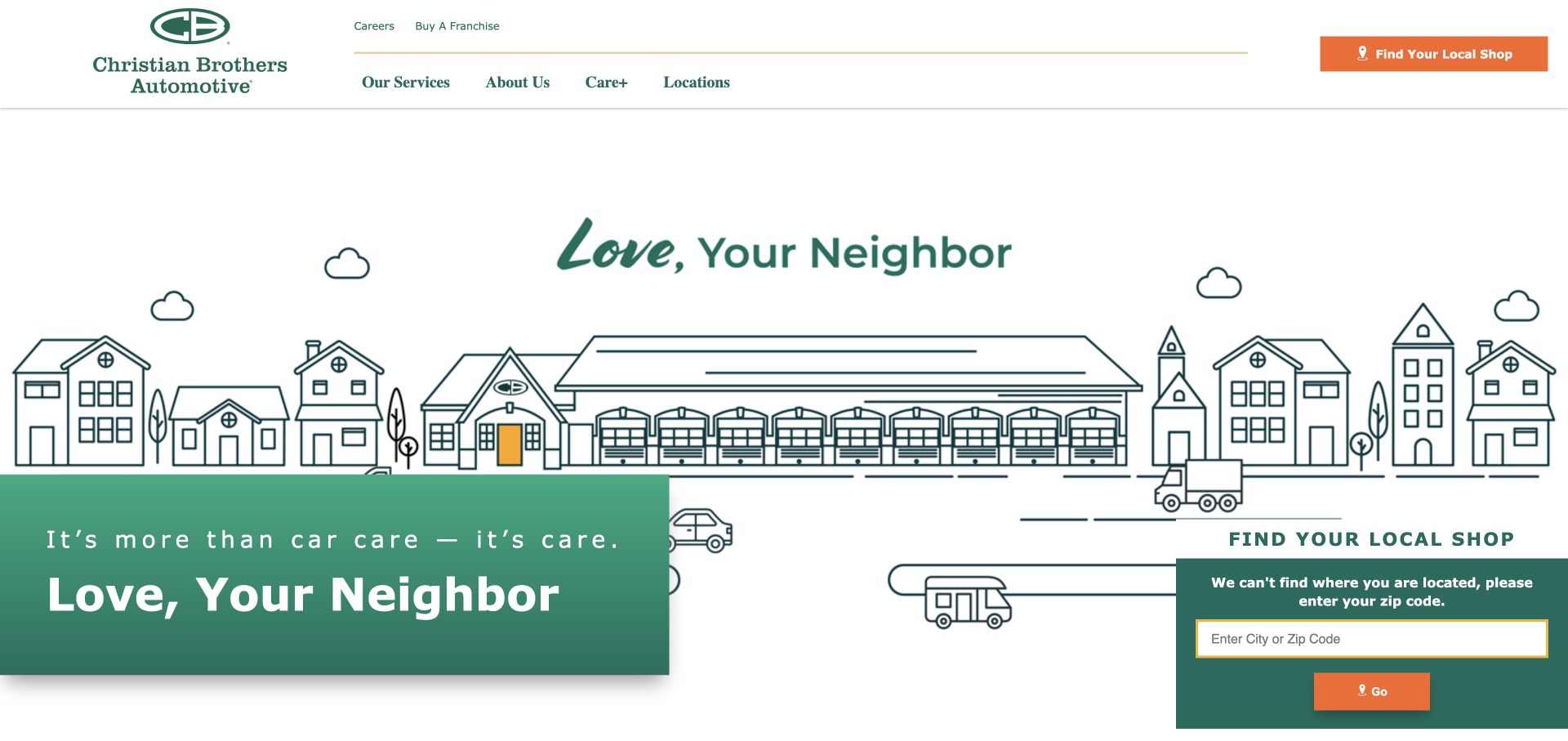
Christian Brothers Automotive uses a line-drawn neighborhood and shop illustration with green typography and a care-focused message. The main navigation stays relatively restrained, exposing services, company information, careers, and locations. A local-shop action is prominent, and the page's service content covers both routine maintenance and repair categories. The illustrative opening gives the brand a recognizable point of view without relying on a stock engine image, while location discovery connects that story to an actual place of service.
What you can learn
Use brand character to introduce the business, then provide clear service and location paths. A community-oriented message should lead to concrete shop information, contact methods, and repair categories so visitors can assess practical fit beyond the tone of the illustration.
Pros
The neighborhood illustration creates a coherent brand setting that differs from a conventional promotional tire banner.
Local-shop discovery is visible beside a concise set of navigation categories and service information.
Cons & considerations
A care-focused statement needs specific operational detail before it answers questions about repair scope or appointment handling.
Location prompts should remain unobtrusive and explain how users can select a shop when automatic detection is unavailable.
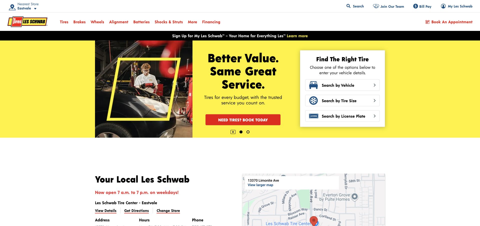
Les Schwab's captured homepage pairs a large award-led promotion with a tire-finding panel. The primary navigation explicitly names brakes, alignment, batteries, and shocks or struts alongside tires and wheels. Local-store context appears above, with a nearby appointment route. This makes the site a useful example of a tire-first business that still exposes its related repair scope. Visitors can distinguish shopping for a product from looking for a service without relying entirely on a broad automobile-care label.
What you can learn
Name the actual service categories a tire business performs and make local shop context clear. Keep product-search controls separate from service information so customers seeking a brake or suspension assessment do not have to begin by selecting tires.
Pros
Specific brake, alignment, battery, and suspension links expose the service range directly in the main navigation.
A tire-finding panel offers several identification routes while store context remains visible in the surrounding header.
Cons & considerations
A large award promotion requires source context and should not displace practical repair and location information.
Multiple product and service paths need clear labels so a customer does not mistake a tire search for an appointment request.
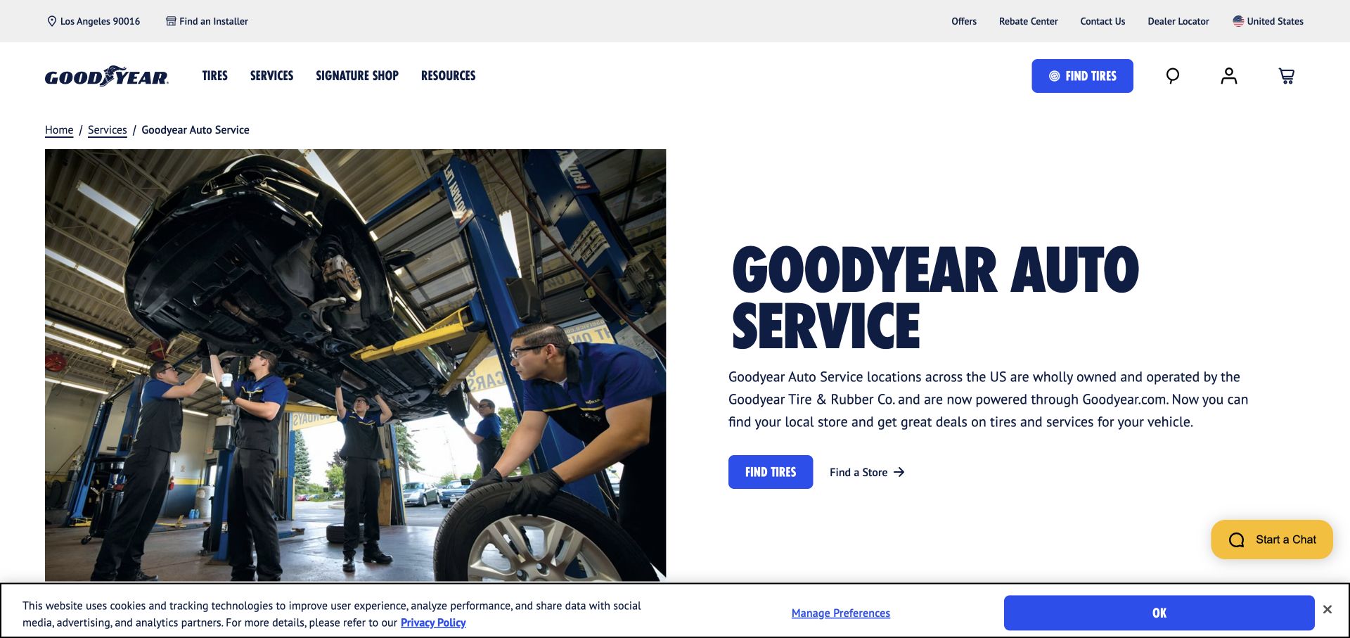
Goodyear Auto Service now opens within Goodyear's main site, where the captured landing page explains that relationship beside a technician-and-vehicle photograph. It provides a store-finding route and links into services such as brakes, oil changes, batteries, and alignment. The broader header still contains tire-shopping controls. This is useful to study when a service brand becomes part of a larger website: the page needs to orient existing customers and prevent the product catalog from swallowing the service journey.
What you can learn
Explain a site transition in plain language and retain a direct path to the original service task. A service landing page should identify the relevant locations and categories while making its relationship to the broader brand understandable without a corporate-history detour.
Pros
The landing page explicitly explains the service site's relationship to the larger Goodyear website.
Technician photography and service links keep vehicle care visible within a broader tire-shopping environment.
Cons & considerations
Product-oriented header controls can distract visitors whose immediate goal is a service appointment rather than tire selection.
A migrated service journey needs maintained redirects and consistent labels so returning customers recognize where they have arrived.
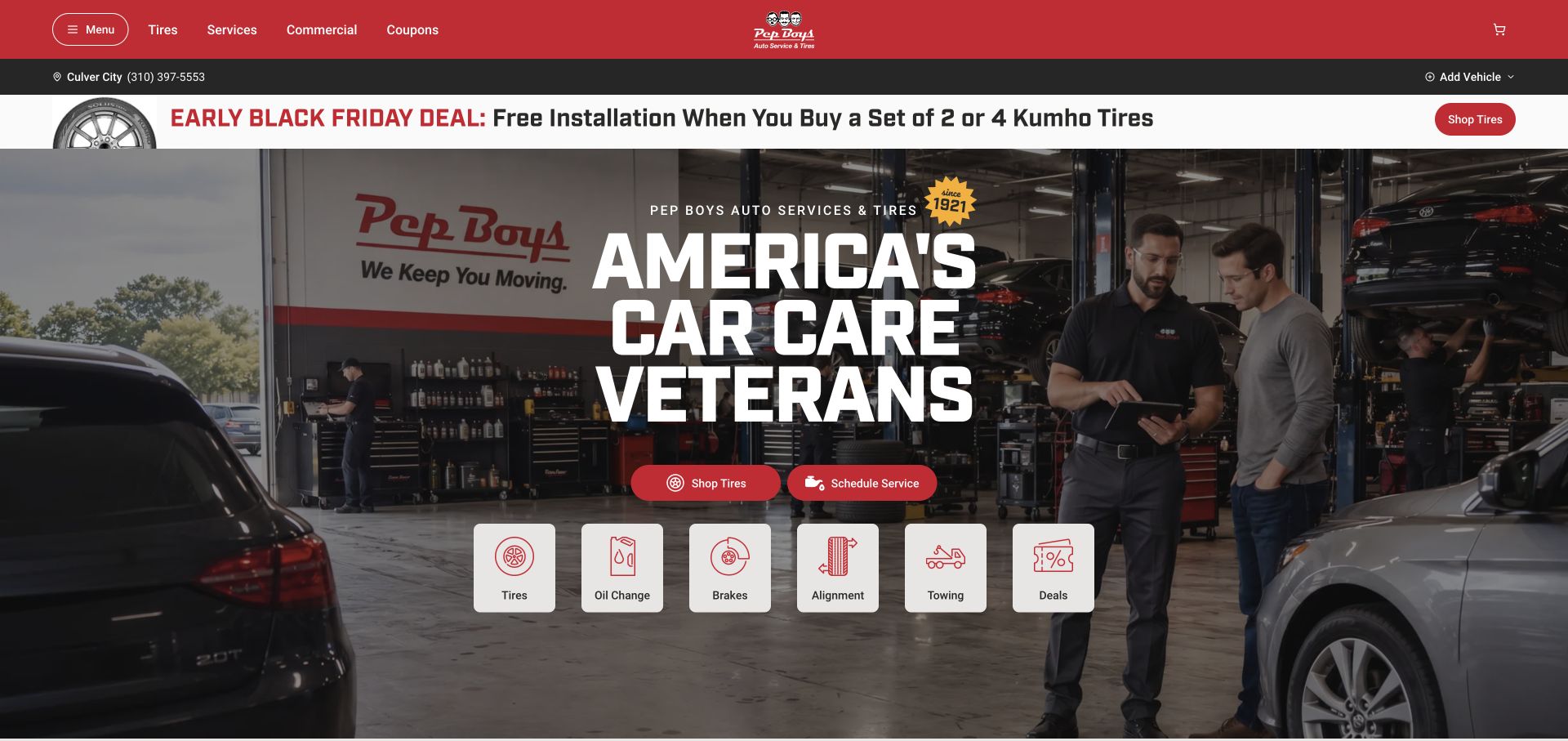
Pep Boys presents a workshop scene with staff and a customer beneath a red header and a large brand statement. Two primary actions separate tire shopping from scheduling service. Store and vehicle controls provide context above the hero, while service-category icons begin below. The paired actions are the most useful part of the design: they acknowledge that a tire purchase and a repair visit may share a brand but should not require the same first interaction or information sequence.
What you can learn
Make shopping and service scheduling visibly different tasks, then preserve store and vehicle context between them. Use service icons with plain labels, and ensure the appointment path explains whether a selected time is confirmed or merely requested.
Pros
The workshop photograph gives the service offer a concrete setting with both staff and a customer present.
Separate tire and scheduling actions reduce ambiguity about the two main tasks offered by the homepage.
Cons & considerations
Promotional strips and persistent context controls can crowd the first screen if they are all given equal emphasis.
A scheduling label should accurately describe confirmation behavior and should not imply a repair assessment has already occurred.
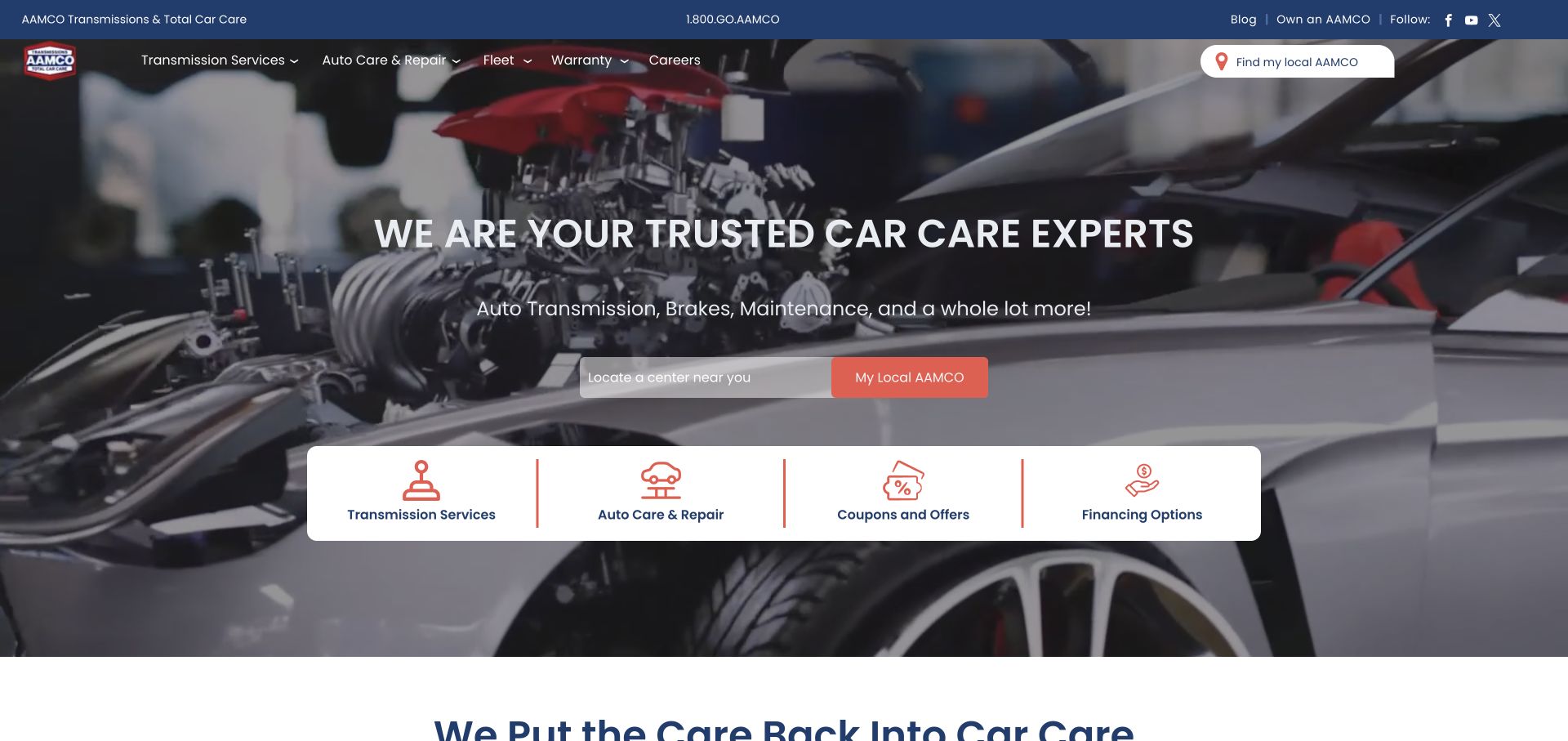
AAMCO places a transmission-and-auto-care message over a vehicle image, with local-center discovery and a row of four task cards. Transmission services, general auto care, offers, and financing are distinct choices. The structure recognizes the brand's specialist identity while exposing a broader service range. For a repair website, that distinction is useful: customers should be able to tell whether they are researching the specialty that brought them to the site or another kind of maintenance or repair.
What you can learn
Keep the specialist service explicit even when the business expands its offer. Give broader repair categories their own scope descriptions, and make local-center discovery part of the service journey so visitors can confirm what their chosen location actually handles.
Pros
Transmission and general auto-care routes are visibly separated rather than combined under a vague service heading.
The local-center control provides a practical next step close to the main service explanation.
Cons & considerations
A broad auto-care claim needs location-specific detail because readers may assume every center performs the same work.
Offer and financing cards should remain secondary to diagnosing the visitor's service need and finding the appropriate center.
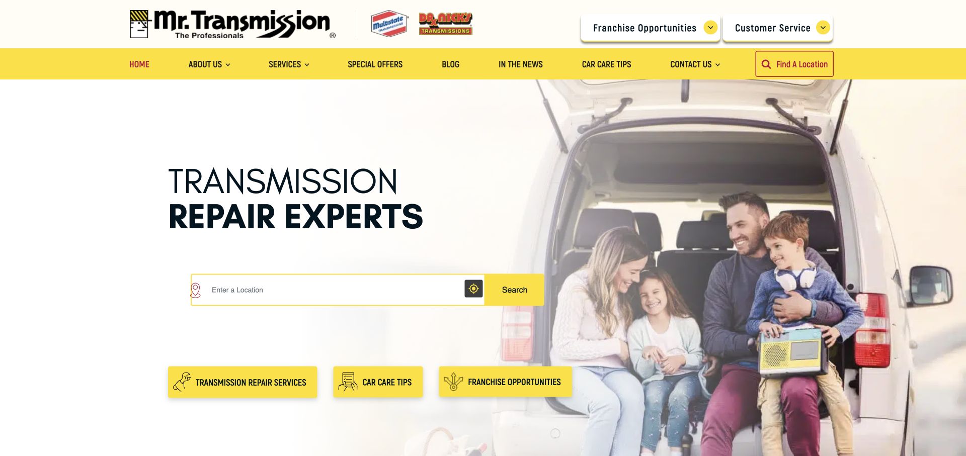
Mr. Transmission uses a white and yellow opening with a transmission-repair headline and a location search. A family beside an open vehicle provides the photographic context, while service, car-care-tip, and franchise shortcuts appear below. The navigation includes several related brand marks, making the local service route particularly important for orientation. The page demonstrates a specialist-led introduction that can remain simple, provided the relationship among the brands and the actual repair locations is explained clearly.
What you can learn
Lead with the specific repair specialty and route visitors to an appropriate local shop. Keep franchise and corporate information available without letting it compete with the customer task, and explain any multi-brand structure where it affects service or contact handling.
Pros
The transmission headline identifies a clear specialty before the visitor begins searching for a location.
The location field gives the sparse opening a practical next step rather than relying solely on brand messaging.
Cons & considerations
Several brand marks can create uncertainty unless their relationship and relevance to the customer are made explicit.
Franchise shortcuts near customer actions need visual separation so users do not enter an unrelated business-development journey.
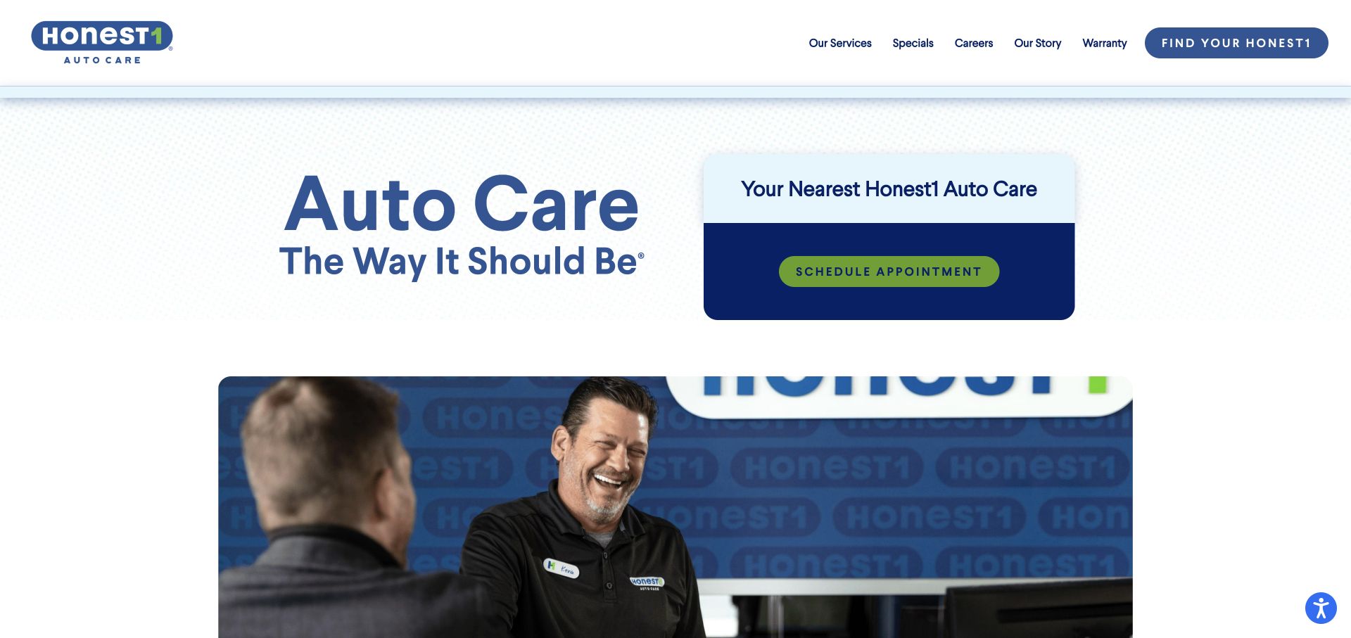
Honest1 uses a pale blue background, a large care-focused headline, and a dark appointment panel. Below, a photograph shows a staff member speaking with a customer. The navigation gives services, specials, the company story, and warranty information distinct destinations. The composition makes customer interaction part of the repair brand, while preserving a visible local appointment route. Its practical lesson is the balance between a relationship-oriented message and the information a visitor needs to identify a shop and service.
What you can learn
Use customer-service imagery to support the brand, then explain the actual appointment and communication process. Warranty and service pages should supply specific scope and conditions so a general trust message does not have to answer every operational question.
Pros
The appointment panel is visually distinct from the headline and gives the opening a clear task area.
Service, story, and warranty destinations recognize different kinds of information a cautious repair customer may seek.
Cons & considerations
A nearest-location panel should show useful context or a clear selection step when no shop has been identified.
Trust-oriented language needs concrete process details and should not be treated as independent evidence of repair quality.
Visible tech stack
Referenced on the public page
Google Analytics
nginxReported response header
Public source checked November 3, 2026. References may be embedded or legacy—not a complete backend inventory.
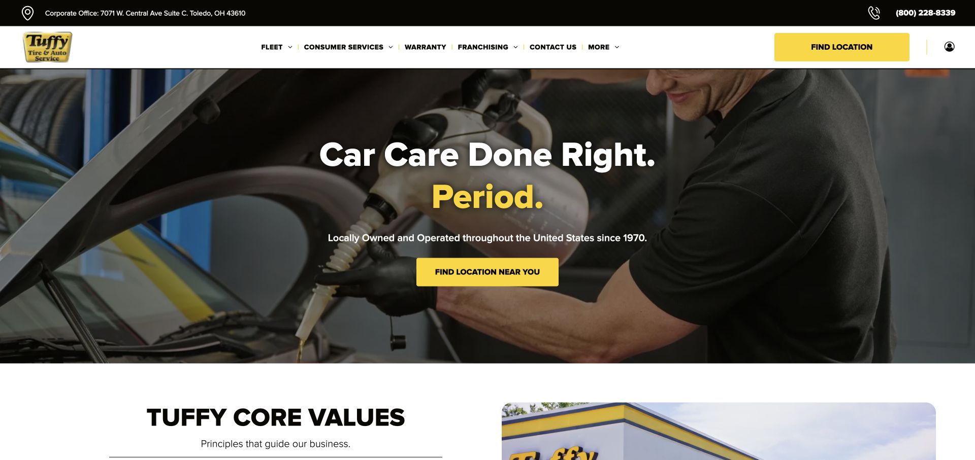
Tuffy uses a mechanic-at-work photograph, a large centered headline, and a yellow location button. Its navigation distinguishes fleet work from consumer services, with warranty and franchise information also available. A core-values section begins below the hero. The layout is direct and familiar, which makes the audience distinction in the navigation especially useful. A fleet manager can seek different information from a household customer without the site needing separate visual identities for the two kinds of visitor.
What you can learn
Separate fleet and consumer information where their requirements differ, while keeping the local-shop route obvious. Use company values to introduce the approach, then provide concrete service descriptions, contact details, and appointment expectations that each audience can act on.
Pros
The central yellow location action is easy to distinguish against the darkened workshop photograph.
Fleet and consumer navigation acknowledges two service audiences with different planning and account needs.
Cons & considerations
A corporate-office address in the header may need clear labeling so it is not mistaken for a local repair location.
A broad service slogan and values section require linked scope detail before visitors can assess a specific repair need.
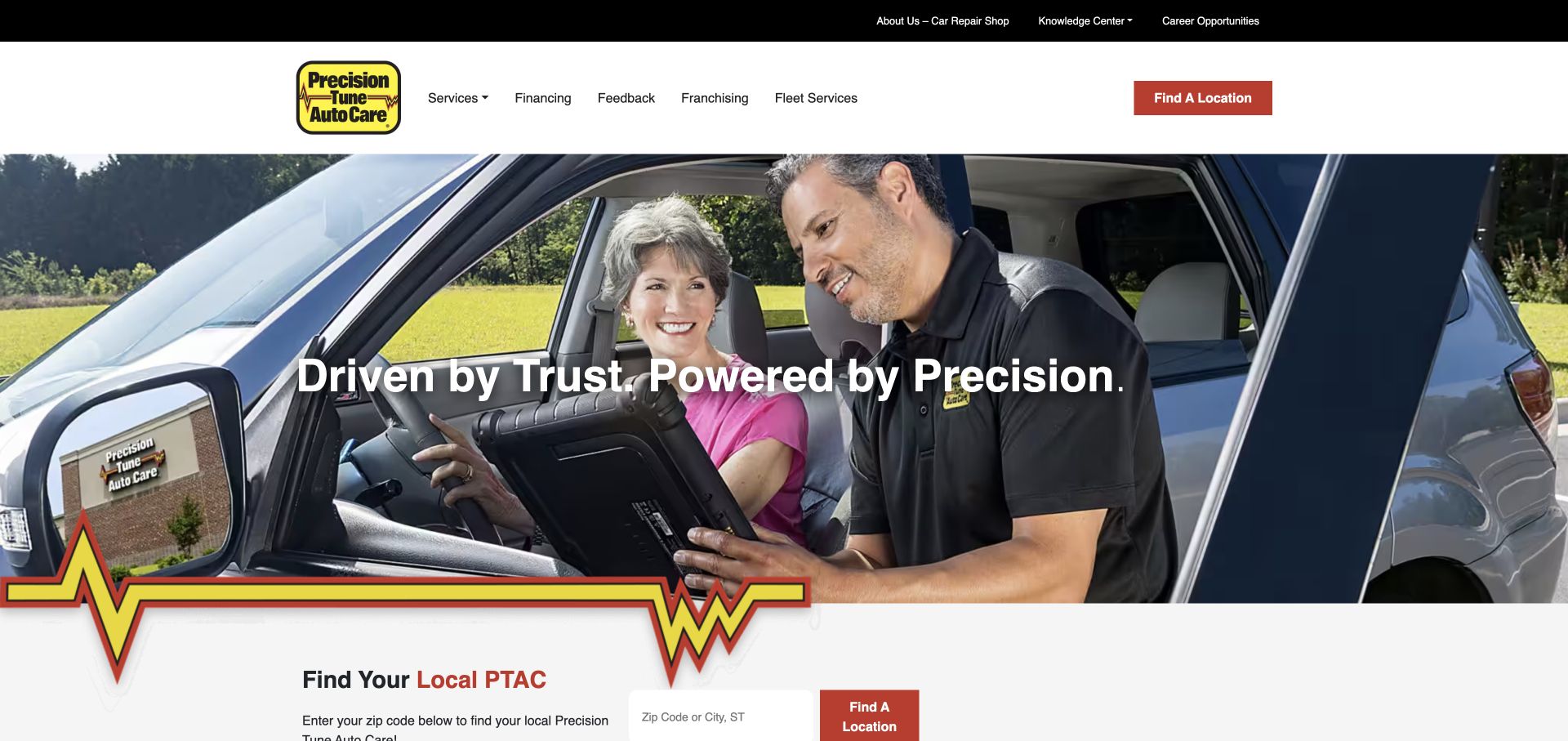
Precision Tune shows a technician speaking with a driver beside a prominent brand statement. A red-and-yellow graphic line connects the hero to a local-shop finder immediately below. The header provides services, feedback, fleet information, and a knowledge-center route. This gives the site several ways to support a customer who wants to understand a repair before arranging it. The useful pattern is the combination of an approachable service interaction and a concrete next step into local availability.
What you can learn
Pair approachable imagery with service explanations that answer common customer questions. Keep feedback and educational resources easy to find, but ensure they lead back to a relevant service or shop rather than becoming disconnected editorial destinations.
Pros
The technician-and-driver scene makes communication part of the service presentation instead of showing only vehicle parts.
The local-shop finder follows directly beneath the hero, connecting the brand introduction to a practical search task.
Cons & considerations
Decorative brand graphics should not interrupt reading order or consume excessive vertical space on a phone.
A broad knowledge center needs clear service relationships and maintained content so readers can find actionable information.
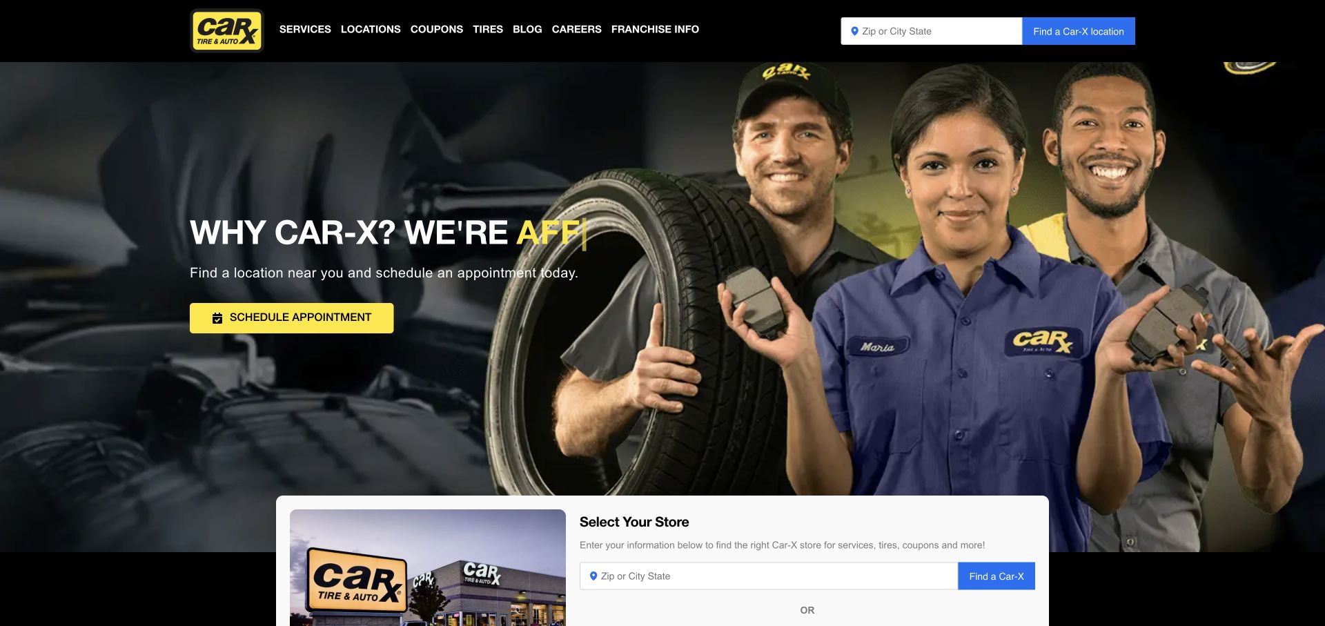
Car-X uses a dark hero with three uniformed staff members and a yellow appointment action. A ZIP-or-city field appears in the header, while a larger store-selection panel enters the page below. Services, locations, coupons, and tires are named in the navigation. The design clearly treats shop selection as a central requirement. Its main lesson is to make that requirement understandable and consistent, especially when more than one location control appears within the same initial view.
What you can learn
Explain what selecting a store changes, such as available services, contact details, or appointment options. Repeated selectors should share the same state, and the visitor's choice should remain visible when they move from the homepage into a service or coupon page.
Pros
The crew photograph gives the repair brand a human subject and a consistent dark-and-yellow visual identity.
Location and appointment entry points are visible early rather than being reserved for the footer or contact page.
Cons & considerations
Several store selectors can feel redundant unless their selected state is synchronized and their purpose remains clear.
Animated headline fragments need a stable readable fallback so visitors do not see an incomplete message during a transition.
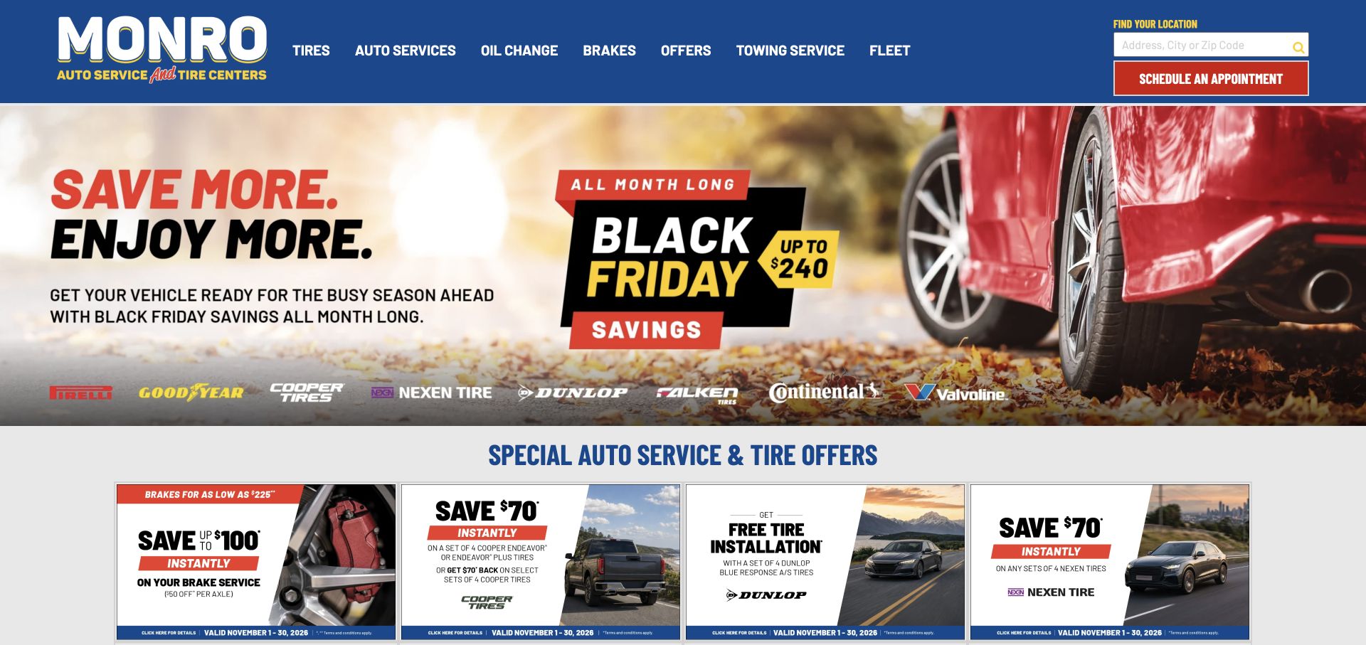
Monro uses a blue header, a red vehicle image, and a prominent seasonal savings campaign. The primary navigation names tires, auto services, oil changes, brakes, towing, and fleet work. A local finder and appointment action sit at the right. Offer cards begin immediately below the hero. This structure is useful for studying how a promotion-heavy website can retain service discovery, but it also shows the risk of letting temporary offers occupy more attention than the underlying repair scope.
What you can learn
Give seasonal campaigns a defined lifespan and preserve service and location routes around them. Organize offer cards by the work they apply to, with clear conditions, so visitors can understand relevance without treating every advertised amount as a universal repair price.
Pros
Oil change, brake, towing, and fleet links expose practical service categories directly in the main header.
The local finder and appointment action remain available even when the central content is dominated by promotions.
Cons & considerations
A dense offer grid can distract visitors who are trying to identify a repair rather than compare discounts.
Seasonal claims and savings amounts need regular maintenance, scope explanations, and a clear connection to participating locations.
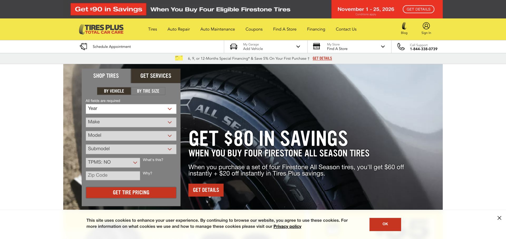
Tires Plus uses a yellow header and a tire promotion beside a panel with Shop Tires and Get Services tabs. Vehicle details occupy the panel, while repair, maintenance, coupons, and store discovery remain visible above. The tab distinction is useful because it shows two related tasks within the same visual container. It also creates a design responsibility: the fields and destination should change appropriately for the selected task rather than treating a service inquiry exactly like a tire purchase.
What you can learn
Use tabs only when their purpose and active state are obvious, and make the questions relevant to the chosen task. Preserve vehicle and shop context where useful, while allowing someone with an uncertain repair need to reach service information without completing a product search.
Pros
The tire-versus-service tabs expose a meaningful distinction within a compact first-screen task panel.
A strong yellow identity separates navigation from the promotional image and the form controls beneath it.
Cons & considerations
A vehicle-specific form can create friction when a customer does not know the exact trim or technical detail requested.
Multiple savings strips should not obscure the distinction between a tire offer and the price of repair work.
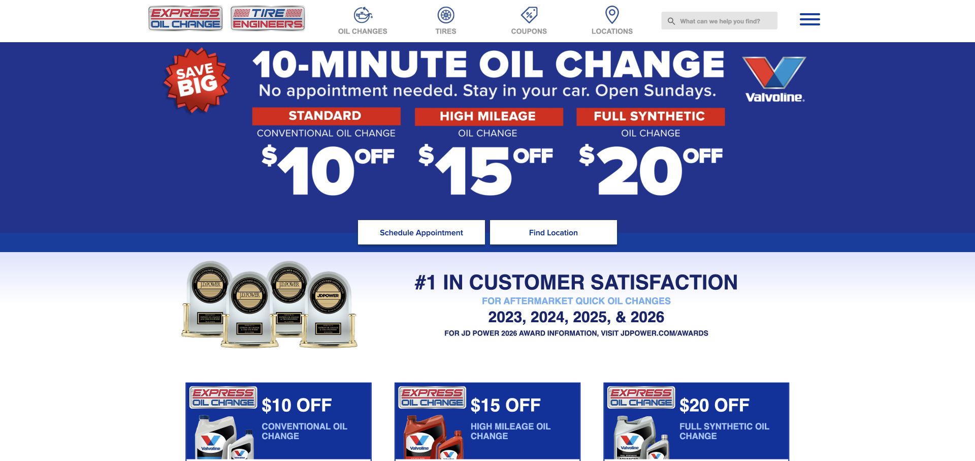
Express Oil Change & Tire Engineers leads with a blue oil-change offer panel and separate scheduling and location actions. The header uses compact icons for oil changes, tires, coupons, and locations, while a broader menu exposes additional repair services. The opening gives routine maintenance a strong priority. That is useful for a business known for a frequent service, but the website still needs to explain which work is handled as a quick visit and which requires a different assessment or appointment.
What you can learn
Make the primary routine service easy to find without implying that every repair follows the same process or timing. Separate quick-maintenance expectations from more involved work, and connect the larger service menu to local availability and clear next-step instructions.
Pros
The scheduling and location buttons sit directly beneath the main service offer rather than inside a hidden menu.
Compact header icons reinforce the frequent tasks that visitors may already associate with the brand.
Cons & considerations
Speed-oriented service claims need precise scope and conditions so customers do not apply them to unrelated repairs.
A broader repair menu can be overlooked when the first screen is dominated by oil-change promotions and awards.
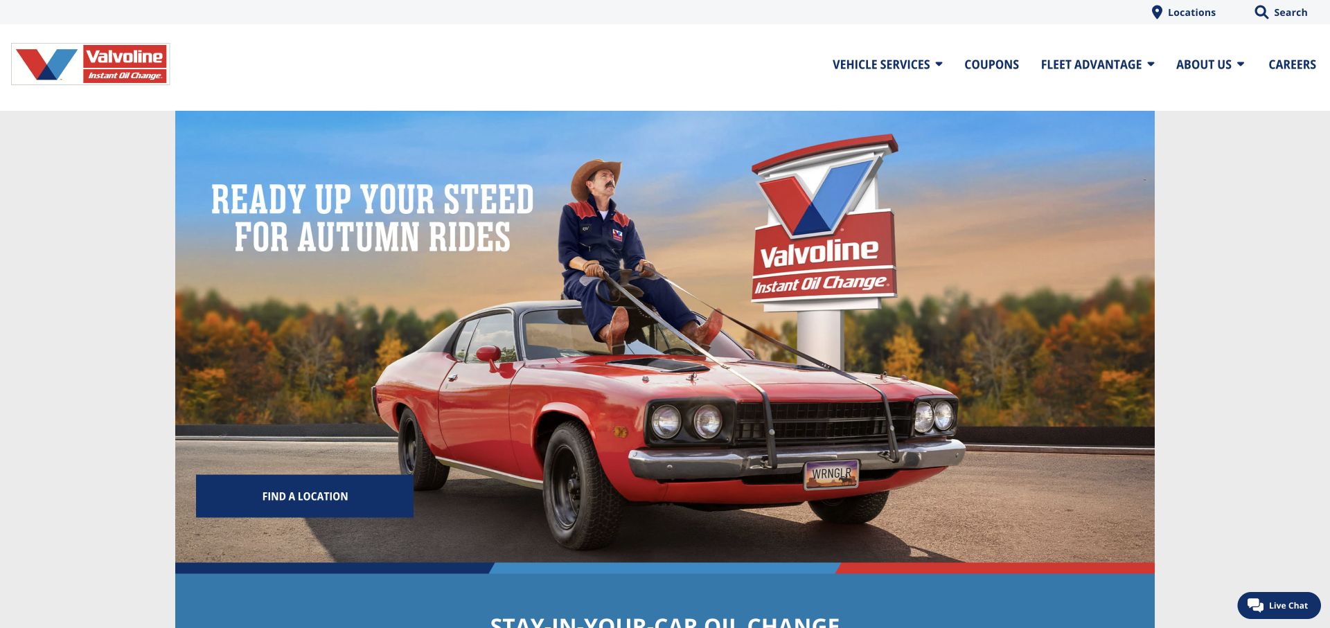
Valvoline Instant Oil Change uses a seasonal car photograph and a location action, with vehicle services and coupons in the header. Further page content emphasizes oil-change offers and maintenance information. This example belongs to the routine-maintenance side of the collection, rather than representing a full mechanical repair shop. Its design shows how a familiar service can be presented with a simple store-finding task, while the service menu must still define the actual range of work and any location-specific limitations.
What you can learn
Be explicit about the maintenance services offered and avoid letting a broad vehicle-care label imply unrestricted repair capability. Keep location discovery simple, and explain the visit process and offer conditions in the same language used by the local service team.
Pros
A clear location action gives visitors a practical first step within a relatively simple photographic opening.
Vehicle-service and coupon navigation keeps the core maintenance tasks separate from broader company information.
Cons & considerations
Seasonal imagery and offer wording require coordinated updates so the page does not present conflicting campaign dates.
A maintenance-focused brand should clearly identify services it does and does not provide before customers travel to a location.
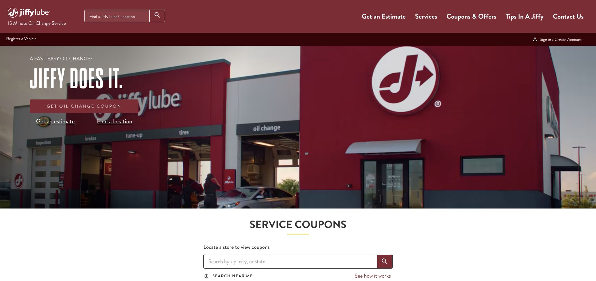
Jiffy Lube shows a recognizable service-bay building under a burgundy header. The opening offers an oil-change coupon, an estimate route, and location discovery, while a local coupon finder begins below. The composition uses the place of service as the central image, which can help connect the website to what customers will encounter offline. Its navigation also exposes service categories beyond oil changes. The key design issue is to distinguish those broader services from the specific routine-service message leading the page.
What you can learn
Connect the recognizable storefront to accurate local information and clear service scope. Keep estimate, coupon, and location actions distinct, and explain any timing claim in the context of the particular service rather than implying that every visit follows the same duration.
Pros
The service-bay photograph ties the online identity to a recognizable physical location and customer arrival context.
Separate estimate, coupon, and location paths acknowledge several common reasons for returning to a maintenance website.
Cons & considerations
Several adjacent actions need clear priority so first-time visitors know which one best matches their immediate question.
Timing and nationwide-service language need conditions and local applicability to avoid overstating what a particular shop provides.
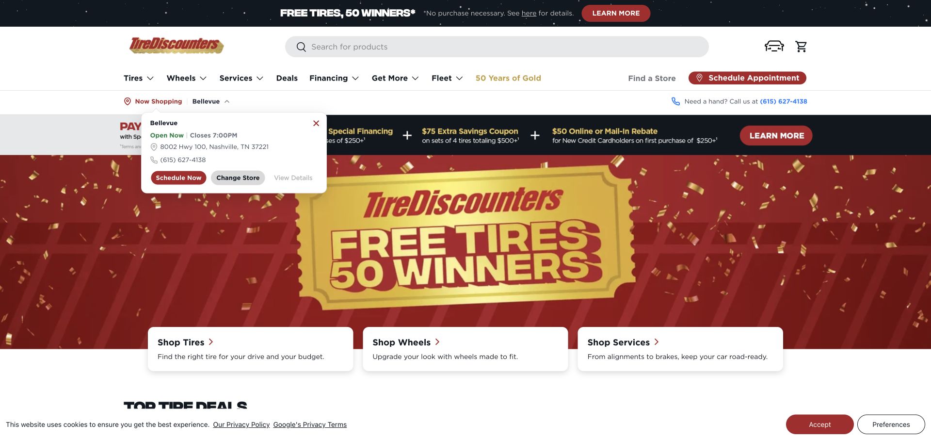
Tire Discounters uses a retail-style header with search, garage, and cart controls, followed by a large campaign panel. Three cards beneath it separate tires, wheels, and services. A selected-store area and scheduling action keep local context close to the shopping interface. The page is useful for comparing a commerce-heavy approach with service-oriented websites: the same visitor may buy a tire or request repair work, but those tasks require different explanations and confirmation steps.
What you can learn
Give repair services a clear route inside a retail interface and preserve local context without forcing a product purchase. Keep campaign content subordinate to the task structure, and explain whether an appointment action reserves time or simply begins a service request.
Pros
The three cards distinguish tires, wheels, and services immediately beneath the promotional opening.
Store context and a scheduling route are visible alongside the shopping tools rather than isolated on a contact page.
Cons & considerations
Search, garage, cart, offers, and store controls can make the header dense for visitors seeking a simple repair contact.
Large promotional campaigns require maintenance and should not make the service journey depend on understanding the offer.
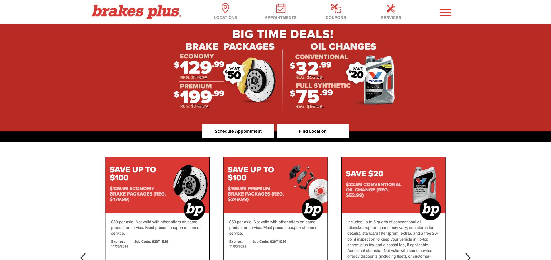
Brakes Plus opens with a red panel advertising brake packages and oil changes, with scheduling and location buttons below. The compact header names locations, appointments, coupons, and services. Additional offer cards repeat the main categories further down. The layout makes commercial offers prominent and provides direct next steps, but it also puts responsibility on the supporting pages to explain what each package covers and when additional work may be needed after an actual vehicle assessment.
What you can learn
Describe package inclusions and limits beside the offer destination, and keep appointment requests distinct from confirmed repair prices. A service website should help customers understand the advertised scope without suggesting that a promotional package replaces an assessment of their vehicle.
Pros
The two primary actions connect the promotional panel directly to scheduling and finding a local shop.
The header uses a small set of task-oriented labels that correspond to common service research needs.
Cons & considerations
Package prices can be misunderstood if required conditions or additional work are only explained far from the offer.
Repeated promotion cards may crowd out service explanations for visitors who are unsure which repair category applies.
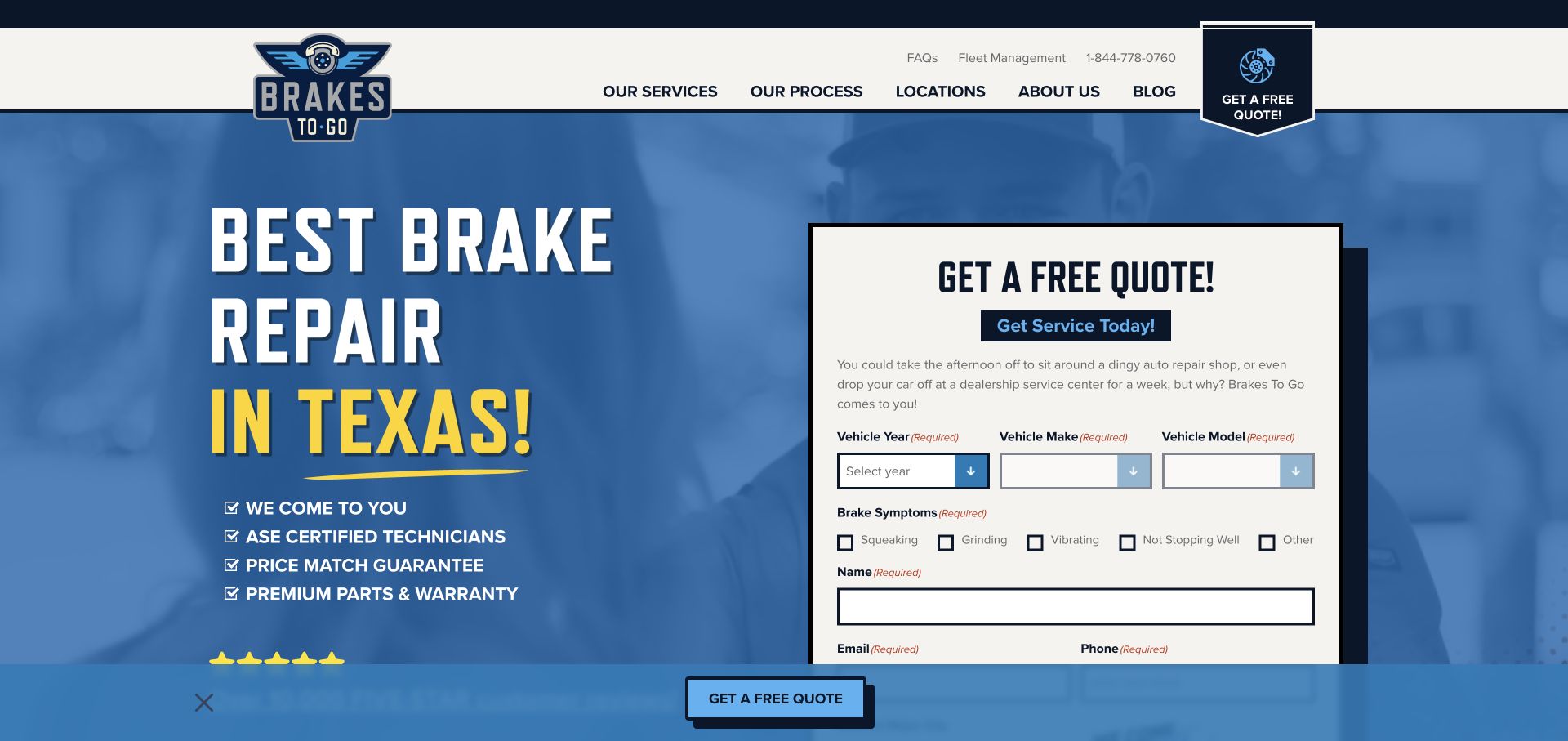
Brakes To Go pairs a blue mobile-brake-service message with a detailed quote form. The form begins with vehicle year, make, and model, then offers symptom checkboxes before contact fields. Navigation includes services, process, locations, and FAQs. This is a distinctive repair pattern because the business comes to the customer, so coverage and visit requirements matter as much as the repair category. The visible symptom choices also show how the site gathers context without requiring the customer to name a mechanical diagnosis.
What you can learn
For mobile repair, explain the visit process, coverage, and working conditions before booking. Let customers describe symptoms in ordinary language, while making clear that those descriptions support an inquiry and do not establish a diagnosis or a final repair price.
Pros
Vehicle and symptom fields give the initial inquiry useful context without asking customers to identify a failed component.
A dedicated process route addresses the practical questions created by a mobile service model.
Cons & considerations
A long form needs clear staging and readable labels so it remains manageable on a phone.
Same-day and price-match language requires accurate conditions and coverage detail before visitors rely on it for planning.
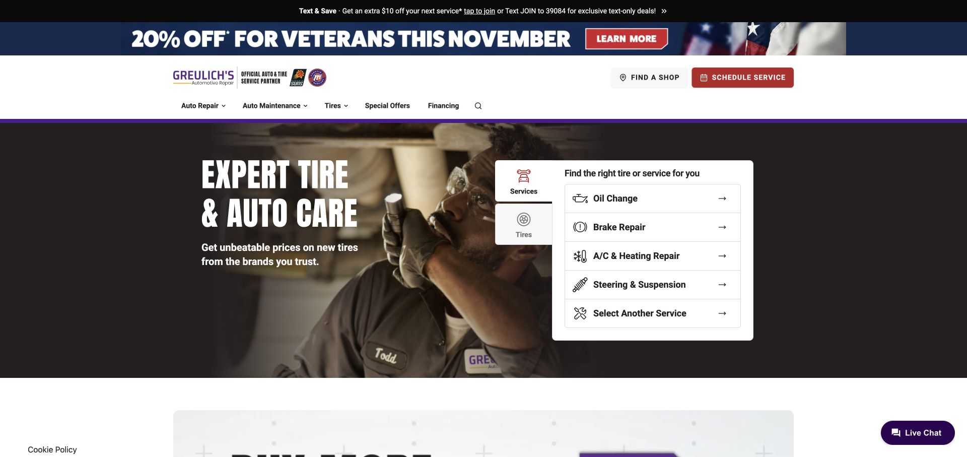
Greulich's shows a technician working on a vehicle beside a white service-selection panel. The visible choices include oil changes, brakes, heating and cooling, and steering or suspension. A separate tire tab and a schedule action sit within the same overall system. Purple accents distinguish the brand from neighboring promotional content. The design is useful for giving several common repair needs equal visibility without turning the first screen into a long list of every possible mechanical service.
What you can learn
Use a short service selector to route common needs, then offer a clear path for work that does not fit the initial list. Keep the distinction between tires and services obvious and connect each choice to accurate local availability and appointment expectations.
Pros
The short service list exposes several recognizable repair categories directly beside the main image.
A separate tire tab acknowledges product shopping without making it the only entry into the website.
Cons & considerations
Rotating offers and signup prompts can interrupt service selection if they appear before visitors have established their need.
Broad category labels need destination detail so customers understand what an initial service request actually covers.
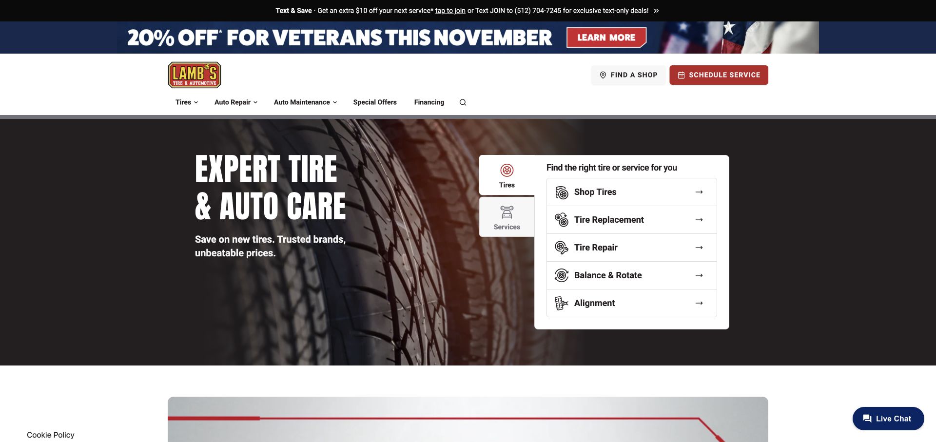
Lamb's Tire & Automotive uses a close tire photograph and a white panel that separates tire shopping, replacement, repair, rotation, and alignment. Auto repair and maintenance remain in the header, alongside a schedule action and shop finder. The saved view has the promotional text-signup overlay closed, making the underlying task structure visible. This is useful for studying how a tire-first opening can still give customers several distinct service choices instead of reducing all tire-related work to a single shopping button.
What you can learn
Name the different tire tasks plainly and retain a route to general repair. Promotional signup should remain optional and easy to dismiss, while service selection should lead to a clear explanation of local availability and what the appointment request means.
Pros
The panel distinguishes tire repair, rotation, alignment, and replacement rather than treating them as one undifferentiated task.
Shop discovery and general repair navigation remain available around the tire-focused introduction.
Cons & considerations
An automatically displayed text-signup modal can block useful service choices before a visitor understands the offer.
Tire-led imagery and promotions should not obscure the broader repair capabilities named in the navigation.
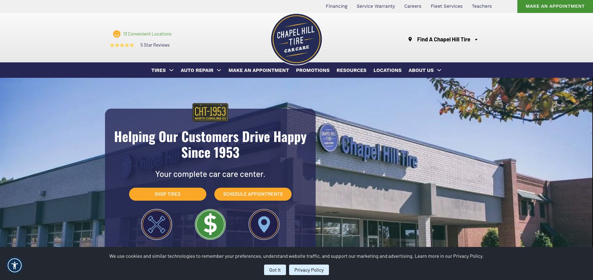
Chapel Hill Tire combines a prominent circular logo, regional location information, and a car-care message over photographic imagery. Two yellow actions distinguish shopping for tires from making an appointment. The header also exposes auto repair, promotions, resources, and locations, with warranty and fleet information in a utility layer. The page provides a useful example of a regional business presenting both retail and service tasks while keeping its local identity more visible than a generic national campaign.
What you can learn
Make the regional network easy to understand and give tire shopping and repair appointments separate routes. Keep utility information available, but prioritize the local shop details and service descriptions that help visitors decide where to take their vehicle.
Pros
The paired yellow actions make the difference between tire shopping and an appointment easy to recognize.
Location, repair, and resource links give the regional brand several practical paths beyond the introductory message.
Cons & considerations
Several header layers and badges can consume space that might otherwise show useful service or location details.
A rotating photographic background needs stable text placement so the headline remains readable during image transitions.
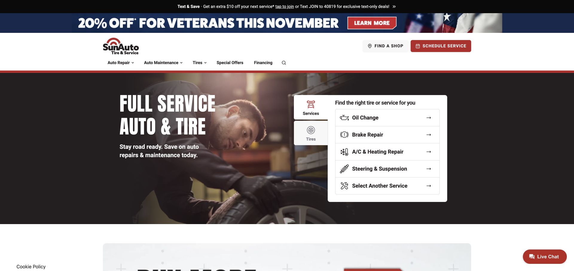
Sun Auto Tire & Service places a full-service message and technician photograph beside a compact selector for oil changes, brakes, heating and cooling, and steering or suspension. A tire tab offers an alternate task, while the header separates auto repair from maintenance. The panel makes the broad offer concrete by naming common categories. It also shows how a shared visual system can support a regional service brand, provided the local shop information and service scope remain specific rather than entirely generic.
What you can learn
Translate a full-service claim into named categories and a clear route for other needs. Preserve the selected category when a visitor chooses a shop, and explain any location-specific differences before the appointment process implies that all work is universally available.
Pros
The service panel gives the broad auto-care message concrete categories that a visitor can recognize and select.
Separate repair, maintenance, and tire routes support different reasons for visiting the same business website.
Cons & considerations
A shared visual system needs specific local information so the brand does not feel interchangeable with every related service site.
Promotional strips should remain secondary to the service selector and should not interrupt an active appointment inquiry.
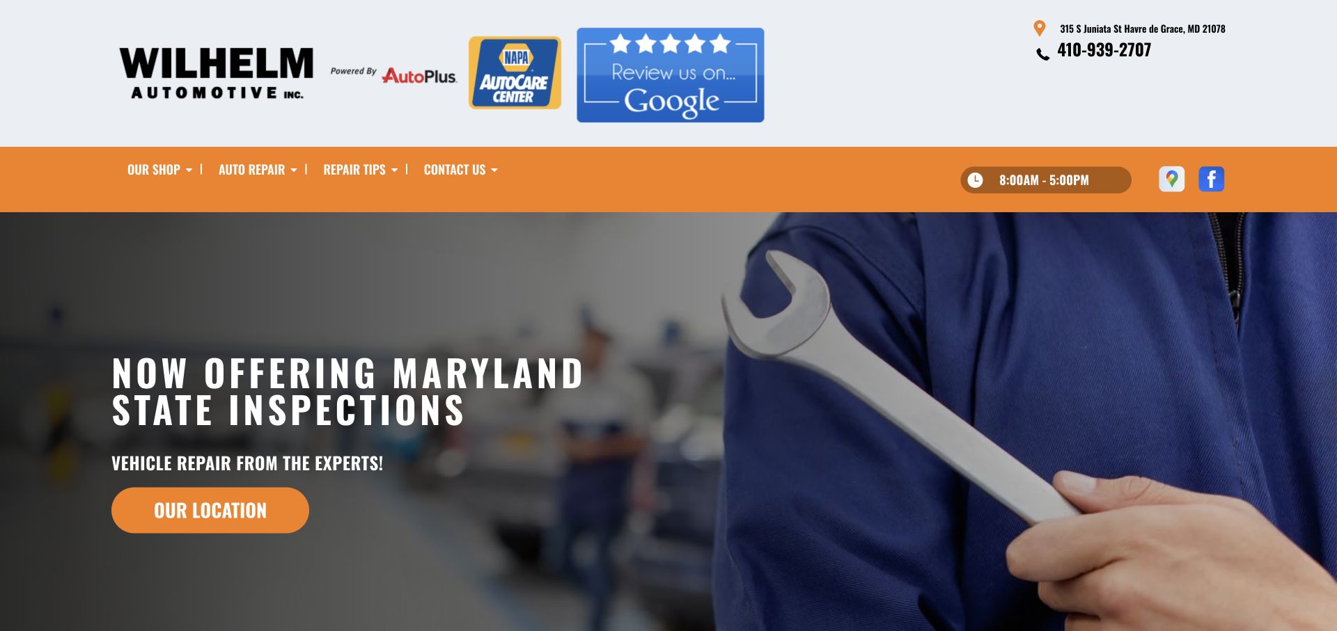
Wilhelm Automotive, Inc. in Havre de Grace places its address, phone number, and hours prominently above an orange navigation bar. The hero announces Maryland inspection services beside a technician image and a location action. Below, the page introduces the shop and lists a broad range of repairs. This is a useful contrast to the national networks in the collection: one shop can make practical arrival information available immediately, without asking visitors to search for a location that is already known.
What you can learn
For a single-location business, prioritize current contact details, hours, and an understandable service list. Keep announcements specific, and ensure appointment or drop-off instructions explain how customers should arrange work rather than relying only on a general phone number.
Pros
The address, phone number, and hours are visible before the visitor needs to open a location finder.
A specific service announcement gives the hero more practical information than a generic trust or performance slogan.
Cons & considerations
A long general-service page benefits from clear anchors so visitors can reach the relevant repair information quickly.
Badges and review invitations need visual restraint so essential contact details remain the easiest header information to identify.
Plan the repair journey around real service decisions
Map services to customer language
List the work the business actually performs, including any vehicle or location limitations. Connect technical service categories to the words customers use when asking for help. Offer a contact path for uncertain symptoms without implying that a checkbox can establish a diagnosis.
Define the local booking process
Document how the website hands a request to the shop and when the customer receives confirmation. Identify necessary vehicle and contact fields, and provide a route for missing information. Keep service, shop, and timing selections visible so customers can correct them before proceeding.
Separate campaigns from durable information
Give offers a clear owner, expiry date, and scope description. Maintain service pages, shop hours, and contact details independently of seasonal campaigns. Make tire shopping and repair scheduling distinct even when they share vehicle information or a selected location.
The editing job behind the design
Choose tools for service routing and accurate local information
Model shops, services, vehicle information, offers, and appointment states explicitly. The editorial team should be able to update hours and service scope without rebuilding every page. Use integrations that match the shop's actual workflow, and do not infer a preferred platform from the appearance of the examples.
Test vehicle selectors, location discovery, service tabs, and appointment forms with missing or uncertain information. Check that returning visitors can change a selected shop and that narrow screens retain clear labels and actions. Public observations in this collection did not include form submission, repair estimates, account access, or confirmed bookings.
Our WordPress website examples offer a separate look at publishing approaches. A visible platform label is evidence for that named page, not a guarantee that the same system will suit your requirements.
Before the public launch
Auto repair website review checklist
Repair, maintenance, tire shopping, and specialist services are named accurately.
Each shop has current contact details, hours, and applicable service information.
Selected vehicle and location context is preserved where it is useful.
Visitors can ask about an uncertain symptom without choosing a diagnosis.
Appointment requests and confirmations are clearly distinguished.
Promotional packages explain scope, conditions, and participating locations.
Service tabs, forms, and location controls remain understandable on phones.
Campaigns, review claims, and location details have an assigned maintenance owner.
These checks are a project checklist, not a performance, legal, security, or accessibility certification. Test real journeys with the people responsible for the website before making claims about the result.
Sources & editorial method
How this collection was selected and reviewed
We directly viewed and captured twenty-six distinct public auto-service websites on 3 November 2026. Each example has a source URL, actual browser image, and original review of visible layout, service navigation, and initial task structure. Goodyear Auto Service was reviewed at its redirected service landing page within Goodyear's main site. We did not submit appointments, request repair estimates, inspect customer accounts, or independently verify service quality, advertised timing, prices, or warranty claims.
Each example links to its actual source page. Screenshots are direct browser captures with their own capture dates; moving imagery, announcements and live designs can change. The notes describe observable design choices and conditional tradeoffs, not measured traffic, conversion results, service quality, or accessibility conformance.
Technology labels use public page metadata, asset evidence, or explicitly cited platform documentation. Platform documentation is not a complete current deployment audit. A component reference may be legacy or unused; it is not a complete backend inventory. Unknown stacks are omitted. These sites are editorial examples, not our client portfolio.
Written, Edited and Curated are separate editorial records, not timestamps advanced by a rebuild. Website designs and imagery belong to their owners. See our editorial standards or suggest a correction.
Questions worth asking
Auto Repair website design questions
Should an auto repair website ask customers to select a diagnosis?
It should provide a way to describe symptoms or request help when the customer is unsure. Service categories can support routing, but the site should not imply that a selected symptom establishes the work required or its final price.
How should tire shopping and repair scheduling fit together?
Give them distinct actions and relevant questions. They may share vehicle and shop context, but a product search should not be the only route to a service inquiry. Preserve useful selections without forcing unnecessary fields.
What should an appointment button promise?
Use language that matches the real process. If a shop must review the request, say that the time is requested and explain how confirmation arrives. Do not present an unconfirmed request as a guaranteed service slot.
Are all examples full-service repair shops?
No. The collection also includes transmission specialists, mobile brake service, tire businesses, and routine maintenance providers. Their narrower journeys are useful design references, and each business's actual service scope should be checked directly.
Do these reviews verify prices or repair quality?
No. They examine public website presentation and information structure. They do not assess mechanical work, quote accuracy, warranty coverage, service timing, or suitability for a particular vehicle.
Make the website a clear route to the right service team. Accurate scope, visible local information, and honest appointment expectations give product selectors and promotional design a useful foundation.