Best Garden Center Websites of 2026 (20 Real-World Examples)
Garden center websites that turn seasonal inspiration into a well-planned visit
A garden center website has to support a living, seasonal inventory and a physical destination at the same time. These examples show how to separate plant discovery, shopping, cafes, events and the practical details that get someone through the gate.
A visitor may arrive looking for a particular shrub, a bag of compost, a lunch menu or an afternoon out. Those intentions need different information. A beautiful seasonal photograph is useful, but it cannot answer whether a plant is in stock, whether delivery reaches a postcode or when the cafe kitchen closes. The strongest structures preserve those operational routes while campaigns change.
This collection studies public websites from local plant specialists and regional garden-center businesses. The reviews describe visible design decisions, not plant quality, customer service or sales results. Many captures show November seasonal promotions. Treat those as examples of merchandising structure, not a recommendation to let Christmas replace gardening information all year.
Before the examples
What makes good garden center website design in 2026?
Make the visit predictable
Put location, today's hours and directions near the top. Give cafes, concessions and event spaces their own hours when they differ. Explain parking, public transport, accessibility and dog policies in concrete terms.
Separate availability from inspiration
A photograph of a plant is not evidence that every branch has it today. State whether online listings are current stock, a selected range or inspiration, and provide a practical way to check availability.
Keep plant knowledge useful
Organize advice by the decisions customers face, such as sun, soil, mature size and care. Connect advice to relevant ranges without implying suitability that has not been checked.
Give seasonal content an expiry plan
Assign each event, offer and campaign an owner and end date. Keep permanent shopping and visiting routes stable when the homepage changes for spring planting, summer furniture or winter events.
The collection · 20 examples
20 garden center websites worth studying
Compare the sites by their main visitor task: planning a visit, finding plants, ordering supplies or attending an event. The examples deliberately include both ecommerce-heavy stores and centers whose website primarily supports in-person shopping.
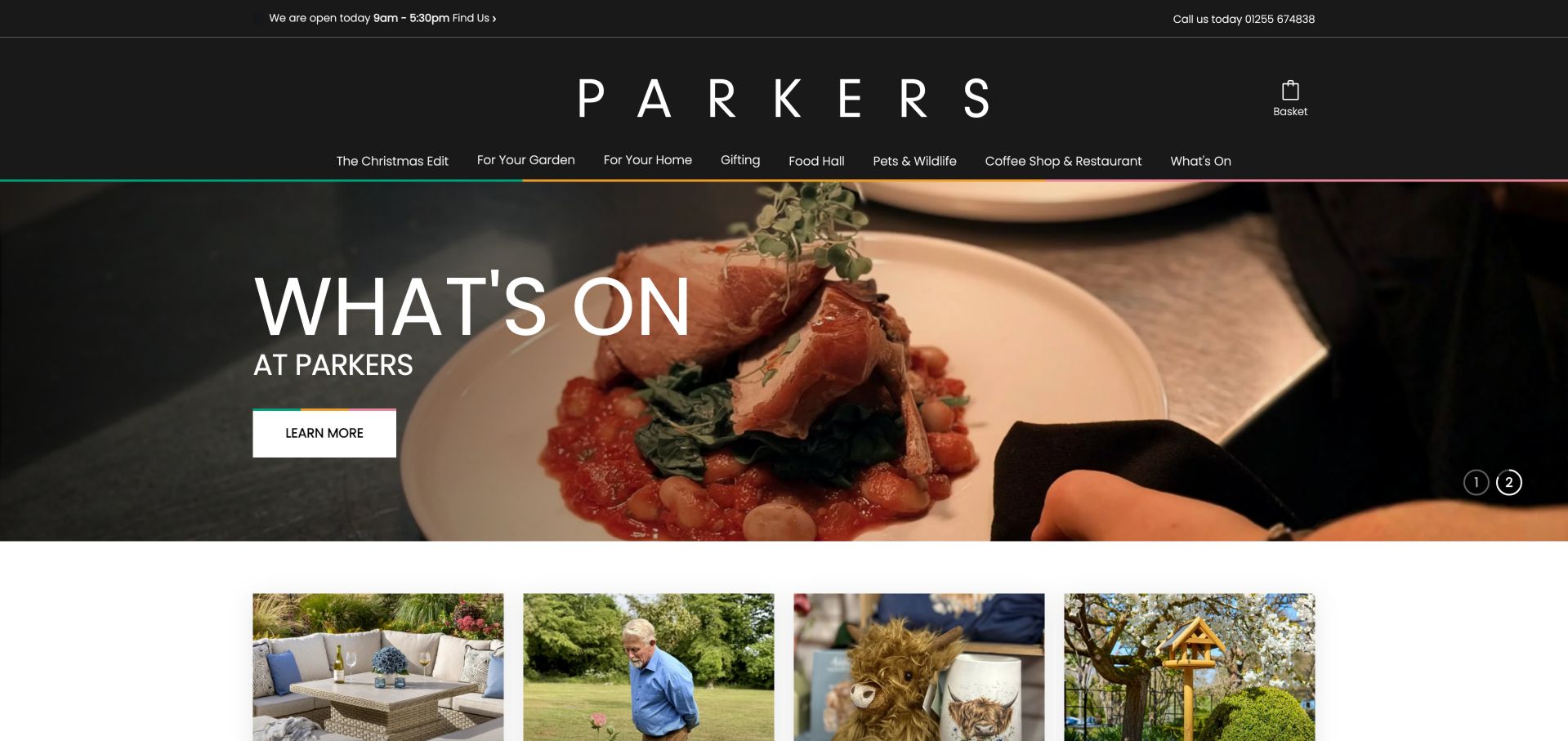
Parkers pairs a restrained black header with a direct opening-hours and Find Us strip. Its navigation uses understandable groupings such as For Your Garden, For Your Home and Coffee Shop & Restaurant. Large category cards lead into the broader offer, then a facilities section names practical details including parking, accessibility, delivery, carry-to-car service and bus routes. This is a useful balance of lifestyle photography and concrete visit planning. The family story supports the identity without replacing the actions a first-time visitor needs.
What you can learn
Use atmosphere to invite interest, then substantiate the visit with operational detail. A compact facilities checklist can answer more useful questions than another broad promise about service.
Pros
A prominent Find Us route accompanies current opening information.
Facilities and transport details support practical planning.
Cons & considerations
Several broad navigation headings require expansion for specific products.
The seasonal event hero can overshadow the core plant proposition.
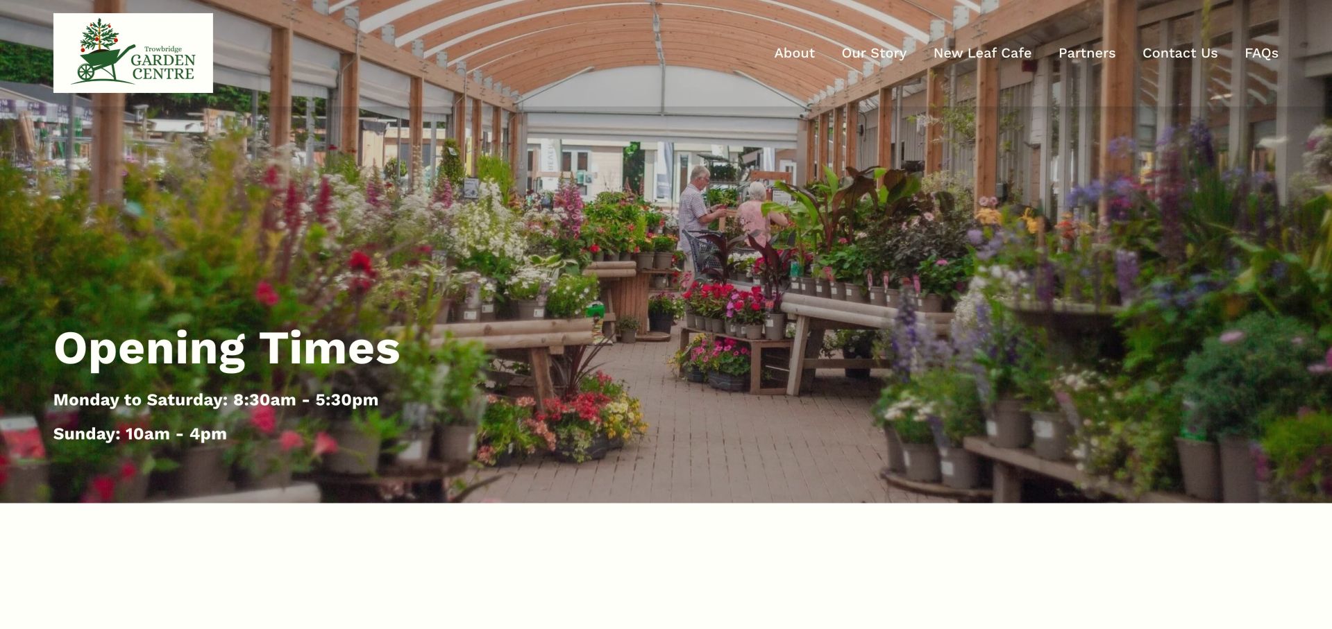
Trowbridge makes opening times the main message rather than hiding them below a seasonal sales campaign. A full-width photograph of the covered plant area gives those hours a physical setting. The short navigation identifies the cafe, story, partners and common questions. Farther down, the address and a labeled site map help visitors plan both their arrival and their route around the center. This is a compact local-service homepage, not an online plant catalog.
What you can learn
Make the first screen answer a real pre-visit question. Pair hours and an identifiable photograph with practical directions, then supply product or availability advice through a clearly named route.
Pros
Opening times are the primary heading.
A labeled site map supports on-site orientation.
Cons & considerations
The observed logo has a generic accessible name.
The map link had no usable destination in the observed markup.
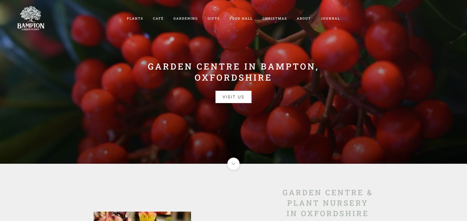
Bampton names its town and county in the opening and provides one direct Visit us action. The rest of the page separates plants, gardening and gifts before introducing the cafe and seasonal activities. Its text explains the nursery, food hall and surrounding catchment without making visitors infer the business from photography alone. The dark green opening and restrained typography leave the location statement prominent. The practical visit section describes travel options and parking rather than treating the address as a footer afterthought.
What you can learn
Use a plain location statement alongside your brand, especially when a nursery serves surrounding towns. Give dining and gifts their own routes without allowing them to erase the core plant offer.
Pros
The opening names both locality and business type.
Cafe menus and visiting information have separate destinations.
Cons & considerations
Several navigation categories depend on expanded menus.
The initial hero did not show imagery during the first observation.
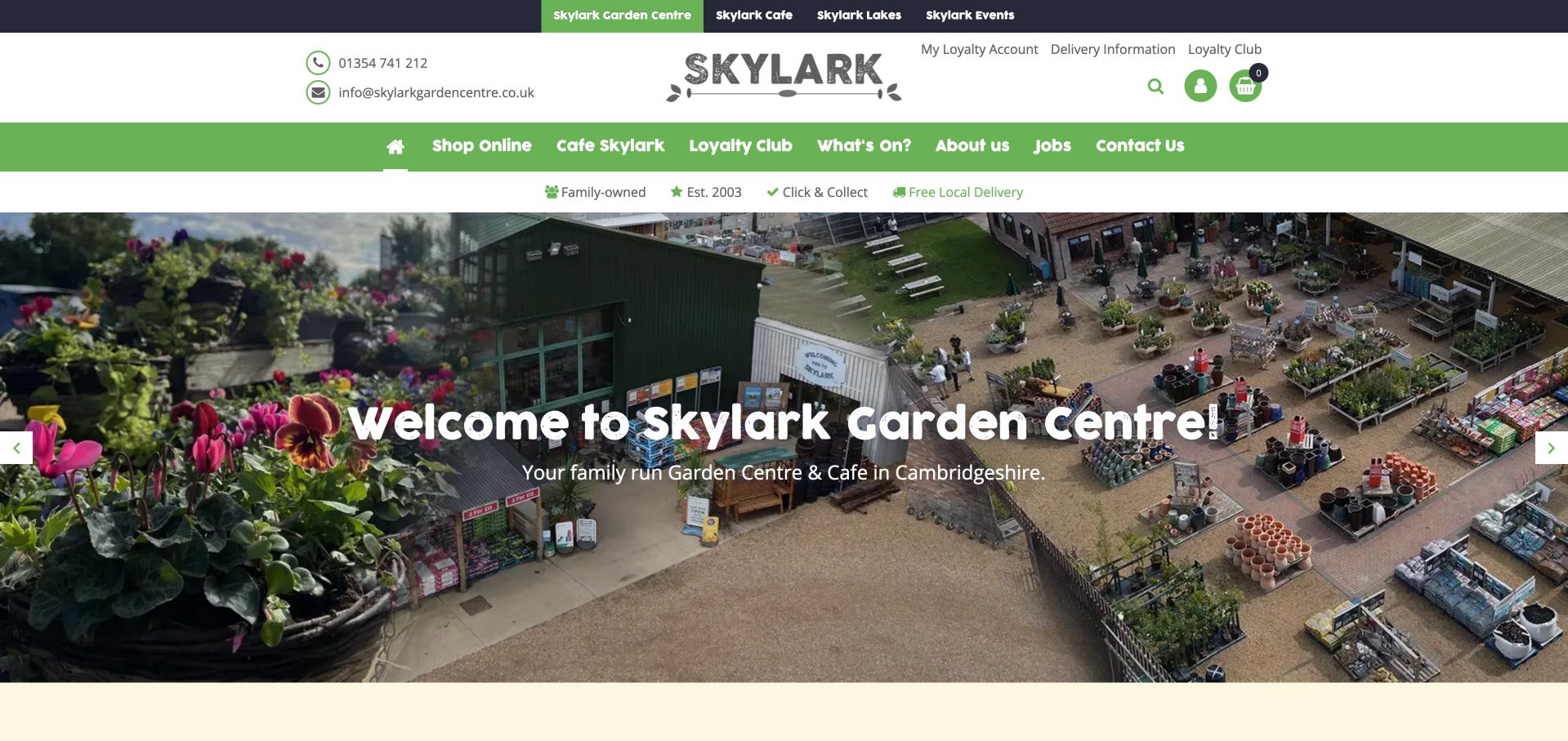
Skylark separates its garden center, cafe, lakes and events in a top-level strip, then uses another navigation row for shopping and visit-related tasks. A compact benefits row calls out collection and delivery while product search remains easy to find. Below the welcome, seasonal events, loyalty information and product categories have distinct links. The approach makes the breadth of the destination visible, although the several header layers compete for space before visitors reach the plants.
What you can learn
When one brand contains several activities, distinguish destinations from shopping categories. Explain which services belong to the main center and which lead to a separate event or leisure website.
Pros
Distinct destination links prevent cafe and event routes becoming hidden.
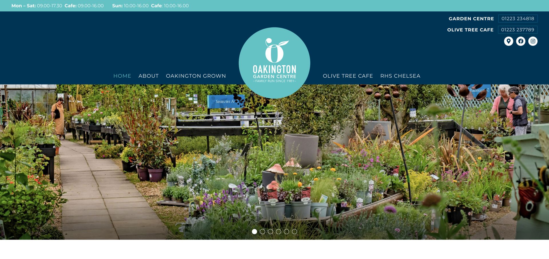
Oakington uses a broad nursery photograph beneath a strongly branded blue and turquoise header. Opening hours for both the center and cafe appear in the top strip, with separate contact numbers nearby. The short navigation gives Oakington Grown its own destination alongside the cafe and company story. Below, the page explains its plant focus, shows practical visitor information and provides an enquiry category for stock questions. This gives a local horticultural business a clear identity without forcing ecommerce onto every visit.
What you can learn
Treat different opening hours and phone numbers as separate pieces of information. A named own-grown range can deserve a primary navigation link when its source and availability are explained honestly.
Pros
Center and cafe contact details are distinguished.
The own-grown range receives a clear navigation route.
Cons & considerations
The large logo and header occupy substantial vertical space.
Several image labels in the observed markup were filenames.
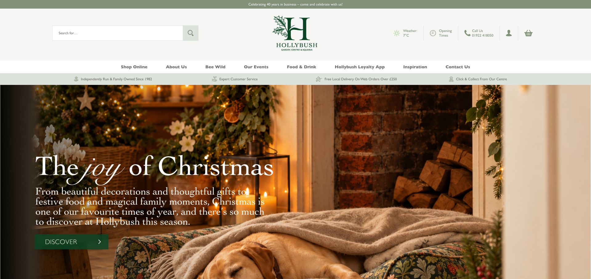
Hollybush combines an atmospheric seasonal hero with a functional header containing search, opening times and a phone link. The main navigation separates shopping, events, dining and inspiration. Below the campaign, department cards connect plants and gardening with pets, aquatics and gifts, while a Plant Finder provides a more purposeful route than browsing a seasonal promotion. The page is useful as a study in holding a large destination offer together under one recognizable local brand.
What you can learn
A visually rich seasonal page still needs dependable utility navigation. Preserve search, visit details and plant-selection help as stable routes while campaign artwork changes through the year.
Pros
Opening times and contact details remain in the header.
A Plant Finder complements department browsing.
Cons & considerations
Numerous departments can make the homepage long.
The seasonal hero pushes horticultural detail below the opening.
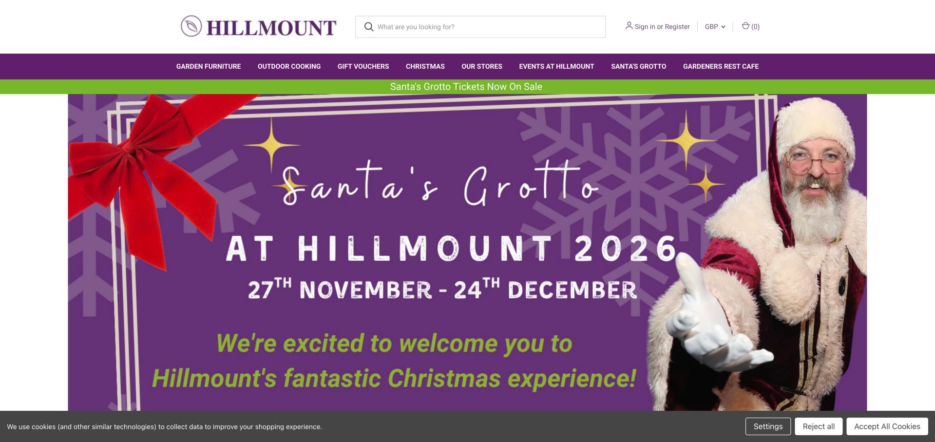
Hillmount places a large seasonal event banner beneath a clearly separated product navigation and search field. Store information, events and the cafe sit alongside furniture and outdoor cooking categories. Farther down, product cards expose prices, stock messages and collection-only wording in product names rather than leaving every practical detail until checkout. This mixes destination marketing with transactional retail, giving returning visitors a route to either a planned visit or a specific purchase.
What you can learn
Show the distinction between attending an event and buying a product. Product availability and collection restrictions should be readable before visitors invest time comparing options.
Pros
Store and event routes are visible in the primary navigation.
Product cards expose useful stock and fulfillment details.
Cons & considerations
Large seasonal artwork dominates the first screen.
Some carousel controls had generic accessible labels.
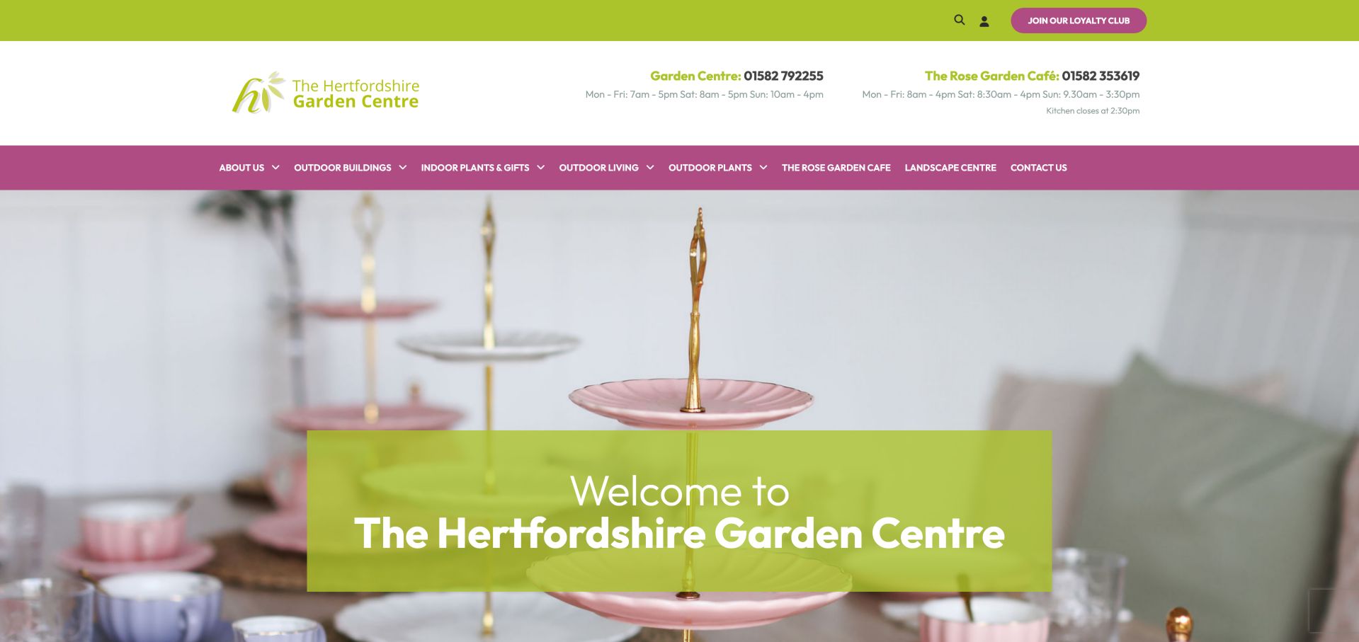
The Hertfordshire Garden Centre distinguishes the main center and Rose Garden Cafe in its header, including separate hours and contact details. Navigation names outdoor buildings, plants, outdoor living and the landscape center rather than grouping every offer under a vague shop label. The body explains the location and differentiates retail visitors from trade and domestic landscaping customers. Practical sections discuss delivery and dogs, helping the website answer questions that otherwise become phone calls.
What you can learn
Organize the site around genuinely different buying journeys. Someone sourcing bulk landscaping materials needs different delivery and quantity information from a visitor choosing plants and stopping for lunch.
Pros
Hours and contacts are separated by service.
The landscape-center route recognizes a distinct buying task.
Cons & considerations
The observed cafe-hours link pointed to an invalid-looking internal hostname.
A large header leaves less opening space for the main offer.
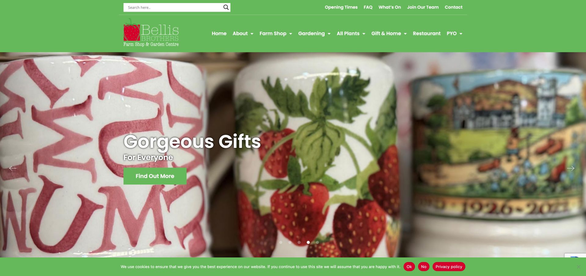
Bellis Brothers uses a familiar green header to connect its farm shop, garden center, gifts, restaurant and pick-your-own activities. The homepage distributes these offers into clearly labeled cards rather than making a single generic shop button carry every task. Its story section connects the business to its farming context, while practical links include opening times, plant returns, gardening tips and events. The design illustrates how a diversified rural destination can remain navigable when departments have distinct entry points.
What you can learn
Give each major reason to visit its own card and destination. Keep seasonal activities clearly separated from permanent departments so visitors can tell what is always available and what needs checking.
Pros
Department cards make the mixed offer easy to scan.
Opening times and common questions have utility links.
Cons & considerations
Generic Learn More labels repeat across several cards.
Rotating campaigns can hide a particular offer until its slide appears.
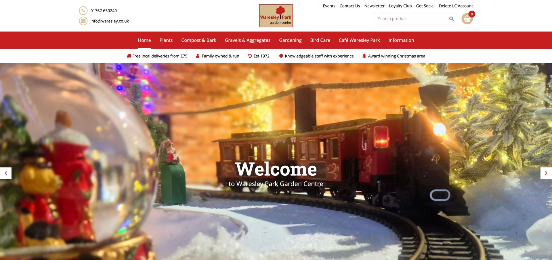
Waresley combines an online catalog with an explicit account of what visitors can find at the physical center. Its homepage separates shop and cafe opening hours into their own lists. Navigation includes plants, compost, aggregates and bird care, while the opening strip signals local delivery and family ownership. Seasonal imagery adds character, but the practical text distinguishes selected online products from the wider on-site offer. That boundary matters for customers who might otherwise assume the whole nursery is available to order.
What you can learn
Explain whether online stock is the full range or a selected subset. Give each service its own opening schedule, and link delivery limits from the places where customers first see the promise.
Pros
Separate shop and cafe schedules are easy to compare.
The online-versus-in-store distinction is stated in the introduction.
Cons & considerations
Several promotional tiles rely on image-only links.
The homepage mixes a long product list with visit planning.
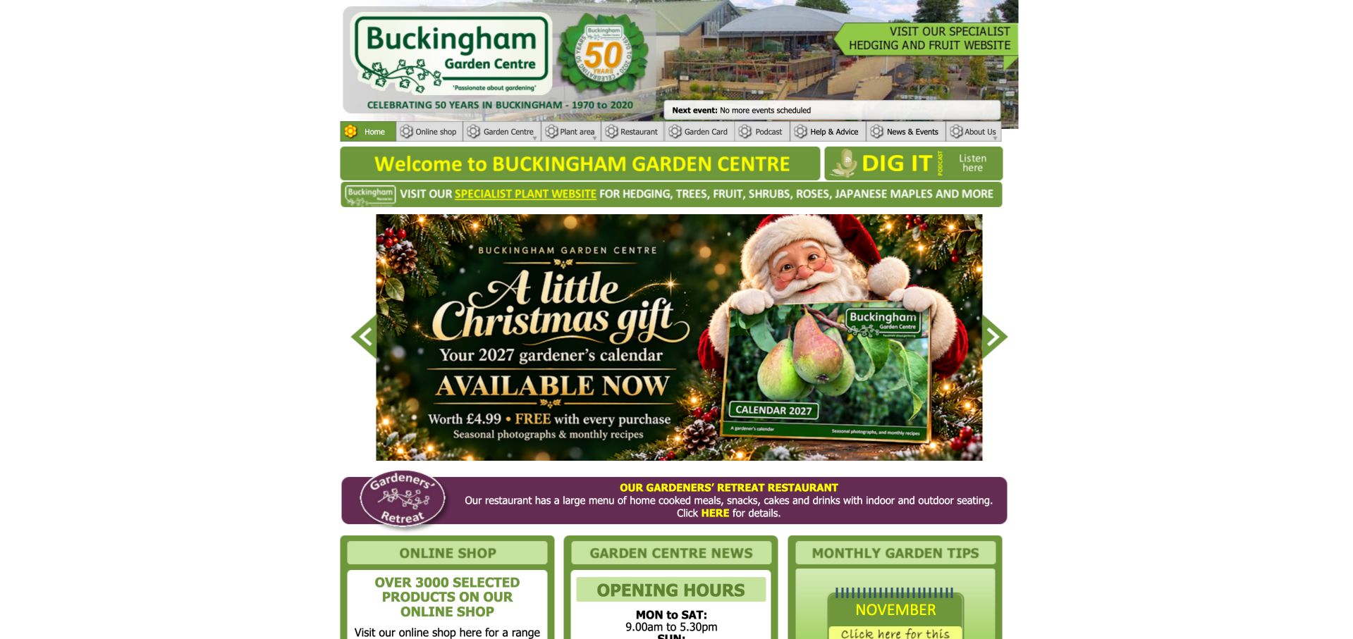
Buckingham packs its opening page with shop access, monthly garden tips, a podcast, restaurant information and opening hours. A dedicated banner points to its specialist hedging and fruit website, distinguishing that range from the general center. The compact, fixed-width layout feels more like an information board than a modern campaign landing page. It is particularly instructive for the usefulness of recurring advice and precise service information, while also showing how dated graphics and dense navigation can make that value harder to discover.
What you can learn
Keep specialist expertise visible through practical advice and clearly named resources. Modernize the presentation around that useful material rather than replacing it with an attractive but less informative hero.
Pros
Monthly advice and a podcast make horticultural knowledge visible.
The specialist plant website is clearly distinguished.
Cons & considerations
The fixed-width presentation underuses a wide screen.
Important information is sometimes embedded in graphics rather than ordinary text.
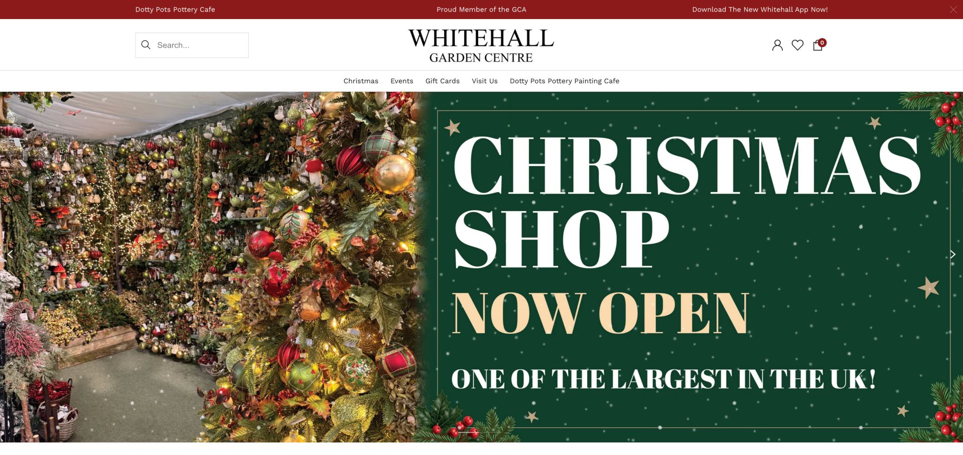
Whitehall's observed homepage is organized around a large Christmas campaign, followed by clearly named lighting, tree and miniature-village categories. The header keeps the navigation short and includes Visit Us alongside events and gift cards. Product cards carry price comparisons and quick-add actions, while separate sections introduce the pottery cafe and deli. It is an instructive example of a seasonal storefront that still needs to preserve a route to the physical garden center throughout a concentrated retail campaign.
What you can learn
Treat seasonal navigation as a temporary merchandising layer, not a replacement for core visit information. Keep the store location obvious and make it clear which offerings are booked elsewhere.
Pros
Visit Us remains a direct header destination.
Seasonal product categories are named specifically.
Cons & considerations
The opening strongly favors Christmas over year-round gardening.
Image-based campaign text needs equivalent accessible descriptions.
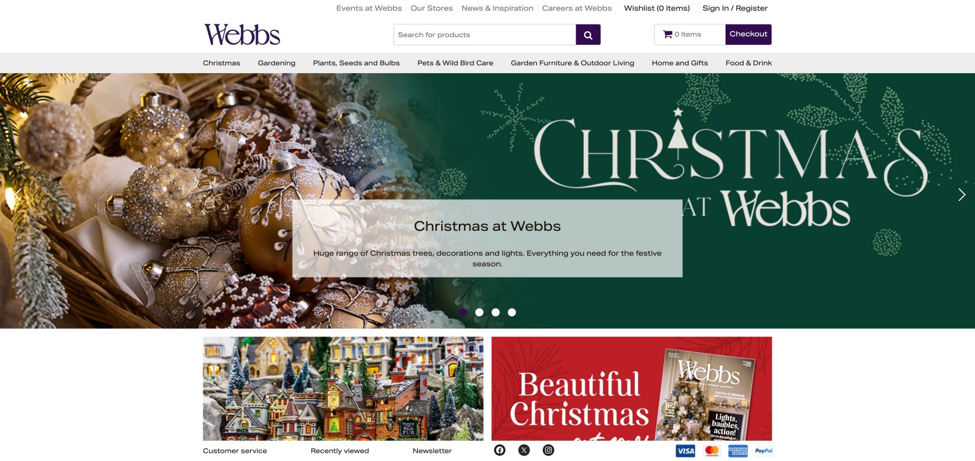
Webbs separates store information, events and inspiration from its main product-category navigation. Search is prominent, and the homepage places seasonal collections alongside gardening, roses and food rather than relying on one general shop link. Lower category panels expose furniture, bird care, landscaping and houseplants with descriptions and destinations. The design is useful for understanding a large garden-center catalog, but its many promotional routes need disciplined hierarchy so a visitor can reach ordinary garden supplies without following a seasonal detour.
What you can learn
Keep store utilities and product navigation distinct. For a wide catalog, pair descriptive categories with search and let seasonal promotions sit beside dependable year-round routes.
Pros
Store and event utilities are separated from product categories.
Category panels provide a readable alternative to search.
Cons & considerations
The range of promotions creates considerable page length.
A central cookie dialog initially obscured the opening content.
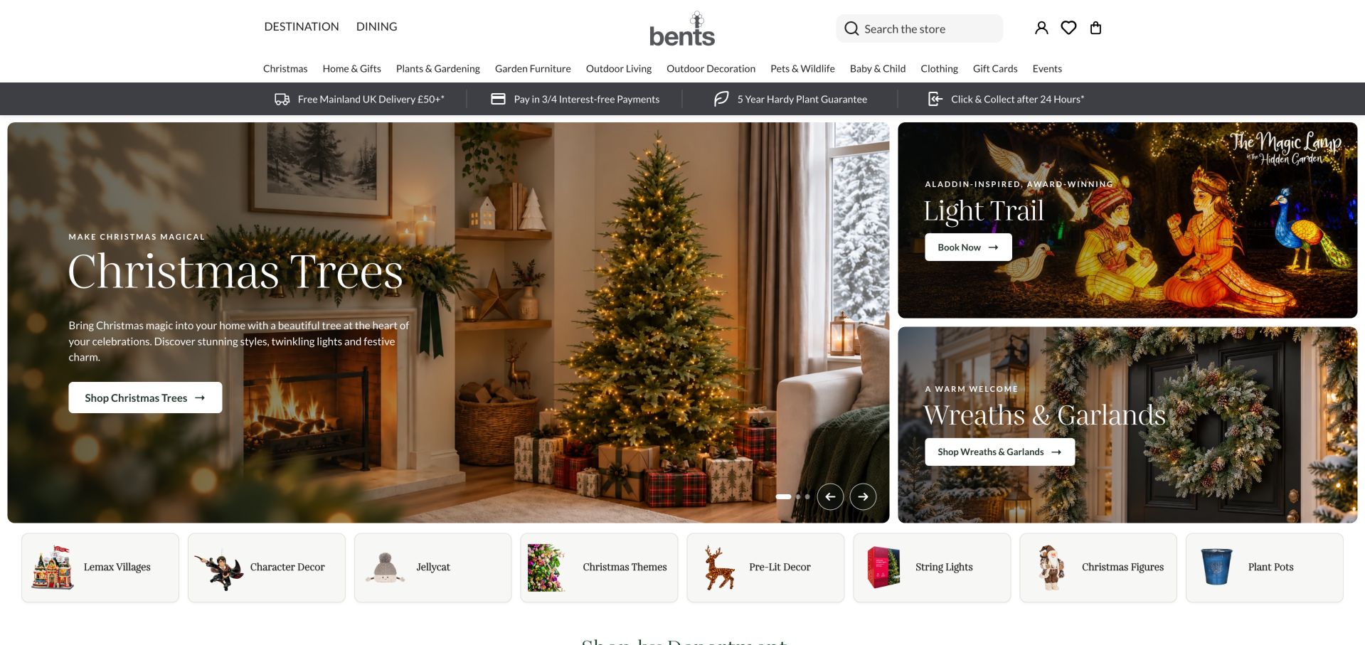
Bents divides its opening into one substantial product promotion and two smaller event or product panels. Each has a specific heading and action, so the layout communicates several priorities without a full-screen carousel being the only entry point. A utility strip summarizes delivery, collection and plant-guarantee routes, while Destination and Dining are separated from the retail catalog. This is a useful pattern for a broad garden-center business, provided the many departments remain manageable on narrower screens.
What you can learn
Assign unequal visual weight to unequal priorities. A campaign mosaic works best when each panel has one specific destination and service terms remain linked beside the offer.
Pros
The opening separates a main promotion from secondary priorities.
Delivery and collection information have dedicated utility links.
Cons & considerations
A wide department list needs careful mobile prioritization.
Seasonal retail occupies most of the first screen.
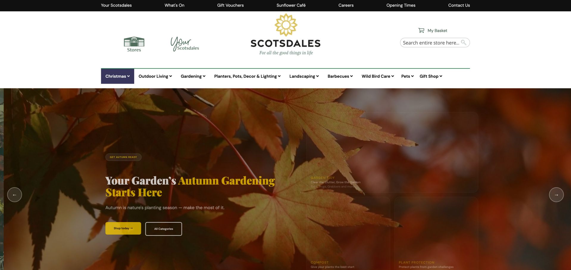
Scotsdales combines a large searchable catalog with a top utility row for opening times, stores, the cafe and events. The observed campaigns separate Christmas shopping from autumn gardening, using actions tied to those tasks rather than a single ambiguous discovery button. The main category row retains gardening, landscaping, barbecues and bird care. This illustrates the challenge of keeping useful horticultural categories visible when a retailer has enough stock to build very deep menus.
What you can learn
Organize seasonal content around the job the customer is trying to do. Preserve search and core categories so frequent customers do not have to navigate the current campaign to find routine supplies.
Pros
Store information and opening times have clear utility links.
Seasonal campaigns distinguish gardening from holiday shopping.
Cons & considerations
The extensive category hierarchy can feel dense.
The observed hero's small overlaid labels needed stronger contrast.
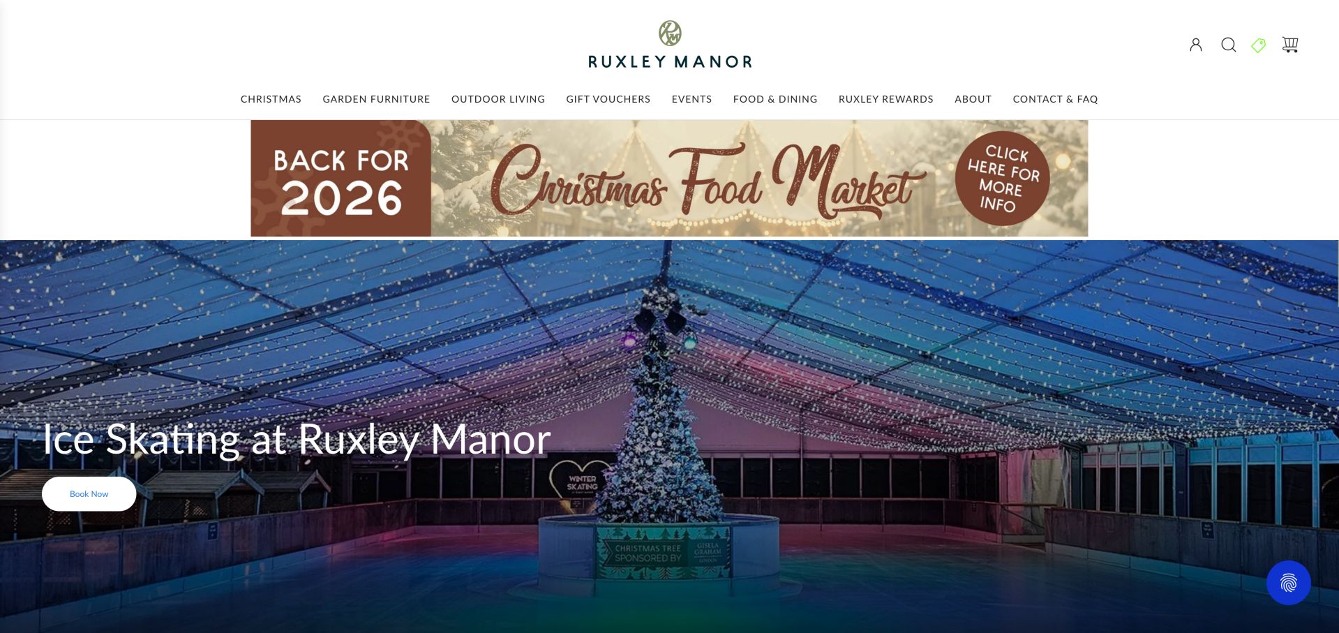
Ruxley Manor gives its ice-skating event and winter food market prominent opening positions while retaining dining, events and shopping routes in the header. Further down, the page explicitly separates categories available online or in store from departments available only in store. Plants, the food hall and houseplants are therefore not presented as though every item can be added to an online basket. That simple availability distinction is particularly useful for a destination garden center with both retail and leisure activities.
What you can learn
State which departments can be purchased online and which require a visit. Make that distinction before product browsing, then maintain location and event information as separate planning routes.
Pros
The page explicitly distinguishes online from in-store departments.
Events and food have their own primary destinations.
Cons & considerations
A prominent event campaign can reduce visibility of plants.
Several product offers and attractions compete for attention below the hero.
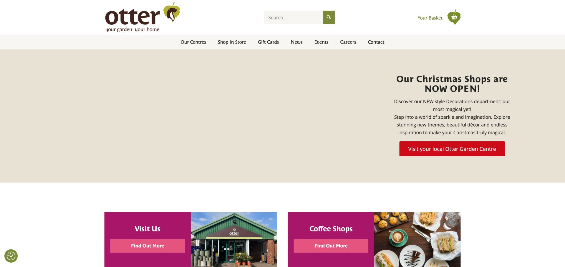
Otter uses a compact navigation with Our Centres, Shop In Store, news and events. The seasonal opening sends visitors to their local center, and the next panels distinguish visiting from coffee shops. Other sections connect plants grown by Otter, bulbs, garden buildings and practical environmental information to individual destinations. The site is useful as a regional gateway rather than a full product catalog, with repeated links back to location planning when the offer depends on the branch.
What you can learn
When most purchases happen in person, make the store finder a primary conversion path. Explain branch-specific details instead of implying every location has the same stock, cafe or event.
Pros
Location selection is a primary task.
Separate coffee-shop and own-grown plant routes support specific interests.
Cons & considerations
The first observation contained an unloaded hero media area.
Repeated Find Out More labels provide less context than destination-specific wording.
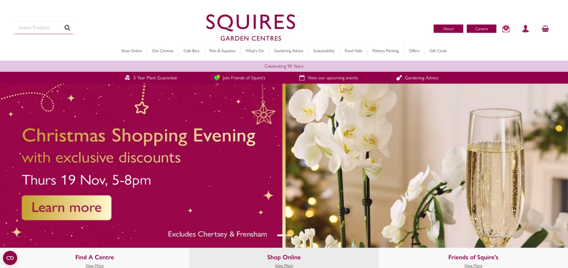
Squire's gives Find A Centre, Shop Online and Friends of Squire's distinct entry points beneath its seasonal opening. Its navigation also exposes cafe bars, gardening advice, food halls and events. Lower down, dated advice and plant-offer cards sit beside dining promotions, giving readers several ways to move from inspiration to a visit or a purchase. The structure is a useful example of separating location, transaction and membership tasks within one regional brand.
What you can learn
Name the three or four main visitor intentions and make them independent routes. Keep advice connected to relevant departments without turning every educational item into a membership pitch.
Pros
Store finding and online shopping are separate primary paths.
Gardening advice has a permanent navigation destination.
Cons & considerations
The wide navigation includes many competing categories.
The initial consent dialog covered a large part of the campaign.
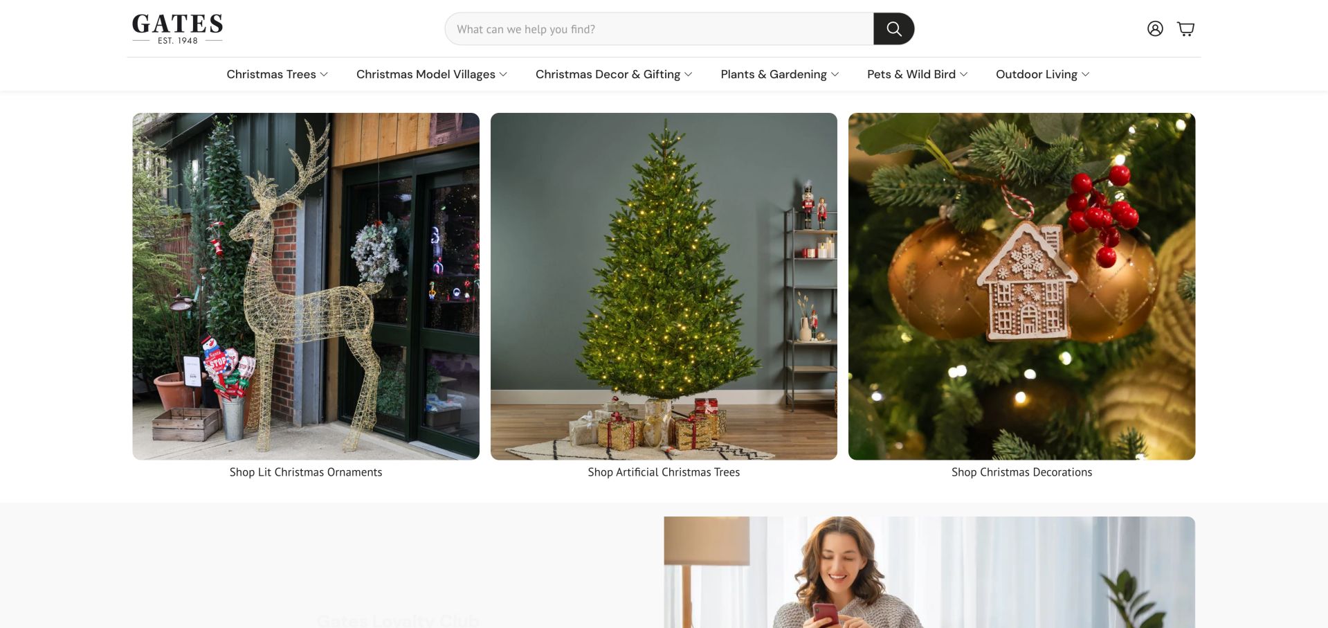
Gates uses a prominent search field and a clean category row above three large product-category photographs. The observed opening groups lit ornaments, artificial trees and decorations, while the menu breaks trees into height, style and accessories. That structure helps visitors who already know the kind of product they want, rather than requiring them to interpret an abstract lifestyle campaign. Plants and gardening remain in the main navigation, although the opening is strongly seasonal.
What you can learn
Use meaningful product attributes when the range is large enough to justify them. Keep the first-level labels simple, then expose height, use or style only where those distinctions help customers choose.
Pros
Search is visually prominent.
Specific category subdivisions reflect real shopping questions.
Cons & considerations
Seasonal taxonomy can overwhelm year-round plant browsing.
Large category images require clear text labels and responsive handling.
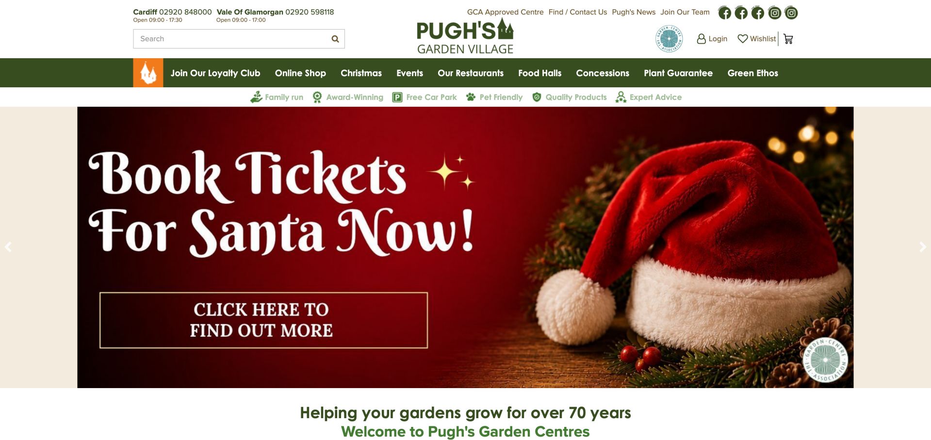
Pugh's places its Cardiff and Vale of Glamorgan phone numbers and opening information together at the top, making the branch distinction visible before visitors enter the main content. Its navigation includes restaurants, food halls, events and a plant guarantee, followed by separate sections for the two locations. A dated gardening blog connects seasonal advice to the broader destination. The page is useful for studying how a small regional network can acknowledge operational differences without building two disconnected websites.
What you can learn
Surface branch differences early, particularly hours and contact numbers. Use location-specific pages for the details, while shared gardening advice and brand information remain in one place.
Pros
Both branches have visible contact and opening details.
Kegan is a freelance web designer and developer with 15+ years of experience helping businesses turn complicated website requirements into clear, maintainable digital experiences. He works directly with clients from planning and design through development, launch, and ongoing support.
For garden center website design, his development approach focuses on plant and product discovery, branch information, seasonal publishing, event details, and clear shopping or visit-planning journeys. The scope can be a targeted improvement or a complete custom build, with responsive layouts, thoughtful content structure, and integrations chosen around the people using and maintaining the site.
Show 3 other garden center website designersHide other garden center website designers
Plan a garden center website around the whole visit
Map the actual customer journeys
List your main reasons to visit and the information each requires. A compost-delivery customer needs coverage, load options and access conditions. A cafe visitor needs menus and service hours. A plant shopper needs range, care and stock guidance. Give each a named route.
Create a branch information template
For each location, maintain address, map, opening exceptions, parking, accessibility, contact details and available departments. Do not copy one branch's facilities onto another without checking. Name the staff role responsible for keeping these details current.
Define what online shopping really covers
Decide which products can be shipped, collected or only viewed in store. Show location-specific availability and fulfillment restrictions before checkout. If the system cannot provide live stock, say so and provide a reliable enquiry route rather than implying certainty.
Treat cafes and events as distinct services
Separate kitchen hours from center hours and label external booking destinations. Give event pages dates, location, suitability, access information and the actual booking terms. Keep ordinary visit information available without requiring an event booking.
Build a seasonal publishing calendar
Plan campaign changes against plant seasons and operational capacity, not just attractive imagery. Prepare an evergreen fallback so expired events do not remain in the hero. Review linked menus, downloadable offers and third-party ticket pages when the campaign changes.
Test with real planning questions
Ask a tester to find tomorrow's hours, check whether dogs are allowed, locate the right branch and understand delivery eligibility. Test the same tasks on mobile and with keyboard navigation. Stop before submitting any real enquiry or purchase.
The editing job behind the design
Choose tools that match stock and staff capacity
A small local center may need a fast content site with a dependable location page more than a large ecommerce catalog. Add online sales only when inventory, fulfillment and customer-service processes can support the promises made on screen. Separate event booking and restaurant systems are acceptable when the transition is clearly labeled.
If multiple branches share a site, model locations, hours, facilities and stock rules as structured content. A shared source reduces contradictory information across the homepage, branch page and search listings. Technology observations in the examples reflect public evidence, not a complete inventory of private operational systems.
Our WordPress website examples offer a separate look at publishing approaches. A visible platform label is evidence for that named page, not a guarantee that the same system will suit your requirements.
Before the public launch
Garden center website planning checklist
Name the town or service area in the opening content.
Keep location and opening times accessible from every page.
Distinguish cafe, kitchen and store hours.
Publish holiday exceptions with an update owner.
Explain parking, transport, accessibility and pet policies.
Distinguish current stock from representative ranges.
State delivery coverage and collection restrictions before checkout.
Give plant advice clear sources and practical scope.
Label external booking and ordering destinations.
Add expiry dates to events and seasonal promotions.
Test navigation, search and image descriptions on mobile and keyboard.
Avoid publishing unverified availability, horticultural guarantees or customer-result claims.
These checks are a project checklist, not a performance, legal, security, or accessibility certification. Test real journeys with the people responsible for the website before making claims about the result.
Sources & editorial method
How this collection was selected and reviewed
The examples were inspected directly on their public websites and captured for editorial review on November 6, 2026 UTC. Reviews focus on observable navigation, information hierarchy, visit planning and shopping boundaries. We did not place orders, submit forms or verify plant quality or service outcomes. Seasonal offers and opening hours may change. Editors Choice is a researched editorial design selection, not a service endorsement or a vote-derived award.
Each example links to its actual source page. Screenshots are direct browser captures with their own capture dates; moving imagery, announcements and live designs can change. The notes describe observable design choices and conditional tradeoffs, not measured traffic, conversion results, service quality, or accessibility conformance.
Technology labels use public page metadata, asset evidence, or explicitly cited platform documentation. Platform documentation is not a complete current deployment audit. A component reference may be legacy or unused; it is not a complete backend inventory. Unknown stacks are omitted. These sites are editorial examples, not our client portfolio.
Written, Edited and Curated are separate editorial records, not timestamps advanced by a rebuild. Website designs and imagery belong to their owners. See our editorial standards or suggest a correction.
Questions worth asking
Garden Center website design questions
Does a garden center need to sell every product online?
No. A selected online range can be more useful than a large catalog that cannot be maintained accurately. Explain the boundary, identify in-store-only departments and offer a clear way to check stock. Add ecommerce only where fulfillment and inventory processes are dependable.
What should be most prominent on the homepage?
Start with the center's location and the main reason people visit, then keep hours and directions easy to find. The primary action depends on the business: plan a visit, find a branch or shop a reliable online range. Seasonal promotions should not hide those permanent tasks.
How should several locations share one website?
Use a common brand and content system, but give each branch a complete page with its own hours, facilities, contact details and department availability. Never assume that a cafe, event or delivery service exists at every location.
Should cafe and event information live on separate websites?
They can, especially where dedicated booking systems are already used. Make the transition explicit and keep essential information on the main site, including location and hours. Visitors should not have to start a booking merely to discover whether a service suits their visit.
How can plant advice support sales without overstating expertise?
Explain the conditions a plant needs and the limits of the advice. Connect readers to relevant ranges and human assistance, but do not imply that a generic recommendation fits every soil, climate or household. Give staff a clear process for updating guidance and correcting outdated information.
A useful garden center website makes the next visit easier. Keep plant discovery, fulfillment and practical visit details dependable, then let seasonal photography and campaigns add character around that foundation.