Best TablePress Websites of 2026 (20 Real-World Examples)
Real websites with TablePress references, plus practical lessons for useful comparisons, readable data, and maintainable WordPress tables.
TablePress helps publish and manage tables in WordPress. It is not the theme or builder that defines a whole website. These examples have scoped TablePress-specific public asset references, alongside independent reviews of their actual page design.
A table is a compact answer to a comparison question. It works well when rows represent comparable things and columns describe consistent attributes. It works poorly when unrelated paragraphs are forced into a spreadsheet-shaped layout. Before choosing a plugin, decide what a visitor needs to compare, what each value means, and who will keep it correct. An attractive table with ambiguous units or stale information is still an unreliable interface.
The websites below are visual references, not private data audits. A TablePress-specific asset path establishes a limited association with the exact page; it does not prove that a pictured table is active, that every number is current, or that the installation has a paid feature. Public resources may also be loaded more broadly than the components that use them. Keep the design lesson separate from the narrow product finding.
Before the examples
What makes good TablePress website development in 2026?
Start with the comparison a person needs to make
Write the question the table should answer, then select the smallest useful set of rows and columns. Consistent categories, clear units, and useful headings usually matter more than decorative cell styling. If the content is mainly prose, a list or ordinary section may communicate it better.
Explain abbreviations, empty values, date ranges, and whether a number is a total, rate, estimate, or limit. Do not rely on color alone to distinguish an important status. The table should remain understandable when a visitor reads one row out of its original visual context.
The official listing describes searching, sorting, pagination, and import/export capabilities, with additional features subject to edition. A small fixed comparison does not necessarily need every control. Test the real data and the current supported configuration rather than copying a demonstration.
Compare how these pages establish hierarchy and useful routes around potentially detailed information. The TablePress evidence is a dated exact-page asset reference, not a certification of the underlying dataset, active widget, or complete website stack.
We start with five recognizable brands or organizations: University of Florida Academic Advising Center, La Marzocco USA, WesTrac, Kiddie Academy, Smart Networks and Services JU. Each attribution applies to the named website property, not every product or website belonging to its organization. This is a curated reading sequence, not a measured ranking.
The University of Florida Academic Advising Center’s retained opening uses blue institutional branding, broad academic navigation and an orange Connect with an Advisor strip. A large tower image promotes an adviser-award nomination campaign with a historical deadline, while advising information begins below. Current page evidence references a TablePress stylesheet. That supports an association with table presentation, not a claim that the banner or appointment information is a TablePress table. The useful context is an office that must keep recurring information distinct from temporary announcements.
What you can learn
For structured advising information, define clear column meanings, a responsible editor and the term or date to which each row applies. Keep ordinary advising routes outside any table and campaign. Verify actual markup and small-screen behavior; a stylesheet cannot establish accessible headers, accurate requirements or a successful appointment.
Pros
A stable advising action is visually distinct from the campaign.
The navigation exposes several different academic support topics.
Cons & considerations
Historical deadlines must not be interpreted as current opportunities.
The observed stylesheet does not identify a pictured table or verify table behavior.
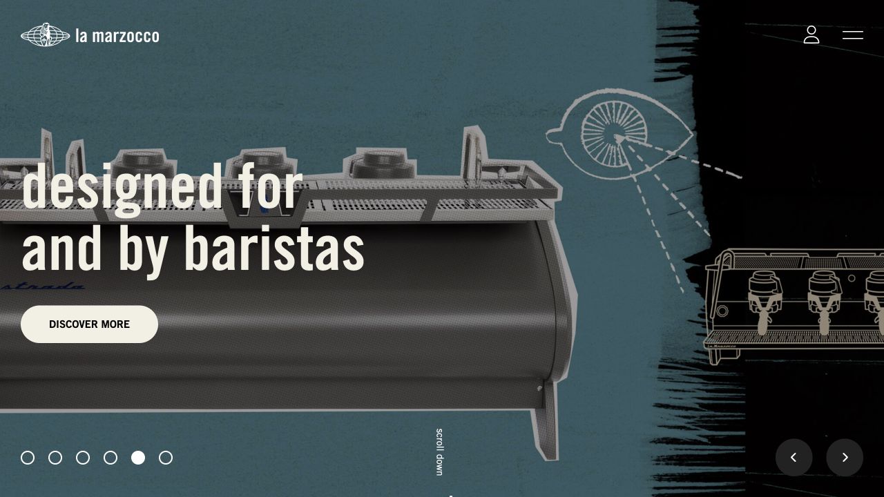
La Marzocco USA’s retained opening places an espresso machine against a graphic blue-and-black background. A large statement identifies the barista audience, with Discover More beside the product and compact account and menu controls above. Slide indicators remain along the bottom. Current source evidence references a TablePress stylesheet. This supports a public table-styling association, not a finding that the campaign image contains a table or that a comparison component has been tested. It also does not establish the implementation of other regional properties.
What you can learn
When equipment comparisons are useful, provide consistent units, model identifiers and links to the complete documentation. Keep the product introduction and support destinations useful outside a table. Review real header associations and overflow behavior rather than assuming an included stylesheet makes a specification table readable or correct.
Pros
The audience statement gives the equipment image a clear professional purpose.
The discovery action is close to the product rather than isolated in navigation.
Cons & considerations
Compact navigation can conceal technical information without clear supporting routes.
The detected stylesheet does not identify active tables or validate product specifications.
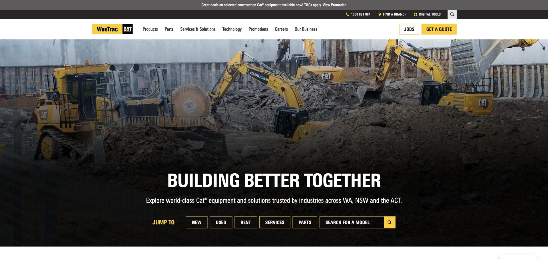
WesTrac’s retained homepage uses large machinery photography and a yellow-and-black identity. A row of literal shortcuts exposes new equipment, used equipment, rentals, services, parts and model search. Jobs and quotation remain distinct header actions. Current evidence references a TablePress stylesheet on the public page. That establishes a table-presentation association, not the implementation of stock search, enterprise data systems or a particular pictured component. The opening itself is a navigation and image composition rather than a demonstrated equipment comparison table.
What you can learn
If a dealer presents specifications in tables, attach units, model variants and qualification dates to the values, with clear links to full product records. Keep stock and quotation claims separate from static comparisons. Test the real markup and phone layout; a stylesheet cannot establish availability, sorting or accurate model data.
Pros
Task shortcuts make a broad equipment offering more navigable.
Quotation and employment are clearly different destinations.
Cons & considerations
Product comparison still requires detailed supporting records beyond the photograph.
The source reference does not identify initialized tables or verify the search workflow.
Kiddie Academy’s retained homepage combines a teacher-and-child photograph, hand-drawn yellow hearts and expressive typography. A city, state or ZIP field provides a practical location task, while Tuition & Enrollment is named in the main navigation. Utility links separate careers and franchising. Current source evidence references a TablePress stylesheet. This supports a table-presentation dependency, not a conclusion that the locator uses TablePress or that the opening contains a comparison table. The captured interface also does not establish individual-center availability or enrollment terms.
What you can learn
Where program or tuition information is tabular, make age groups, location scope and applicable dates explicit. Avoid turning local differences into an apparently universal grid. Keep a useful route to each center outside any table, and inspect header semantics and mobile layout directly rather than inferring them from styling assets.
Pros
The location field states the geographic input it expects.
Practical tuition and enrollment language is visible in the header.
Cons & considerations
Decorative lettering creates several competing accents around the main task.
The detected stylesheet cannot verify table accessibility, local terms or enrollment completion.
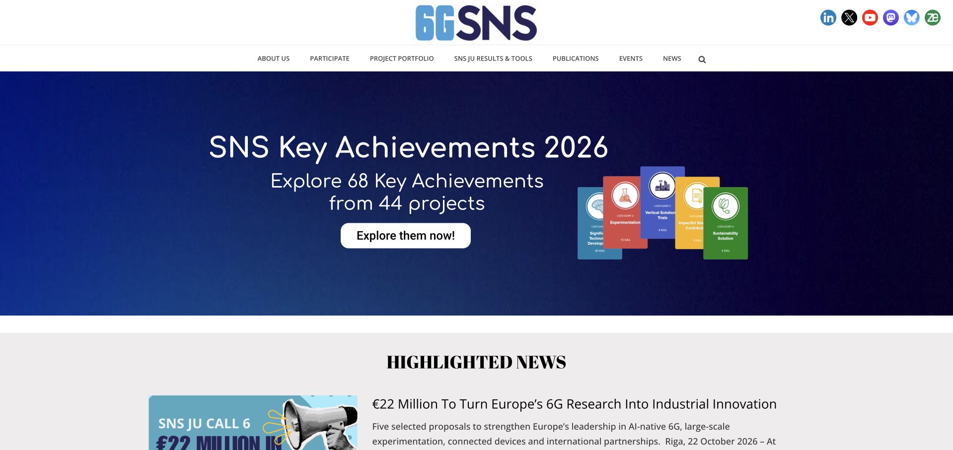
Smart Networks and Services JU’s retained opening presents a blue achievements campaign, with separate header routes for participation, projects, publications and results. Highlighted news begins below. The campaign names a collection of achievements rather than showing the full underlying records in this frame. Current source evidence references a TablePress stylesheet on the public page. That supports a table-styling association, not a finding that the campaign graphics or news use the plugin, and not a claim about funded projects’ own systems.
What you can learn
For a research directory or results table, define each column, project identifier and reporting period, and link rows to maintained source records. Distinguish a campaign total from the detailed data behind it. Test the actual table structure and small-screen reading order; a stylesheet cannot verify completeness, filtering or data accuracy.
Pros
Project discovery and participation have different navigation labels.
The campaign has a clear destination rather than only a decorative headline.
Cons & considerations
Important results should not exist solely inside campaign artwork.
The asset reference does not identify an active table or establish the underlying data model.
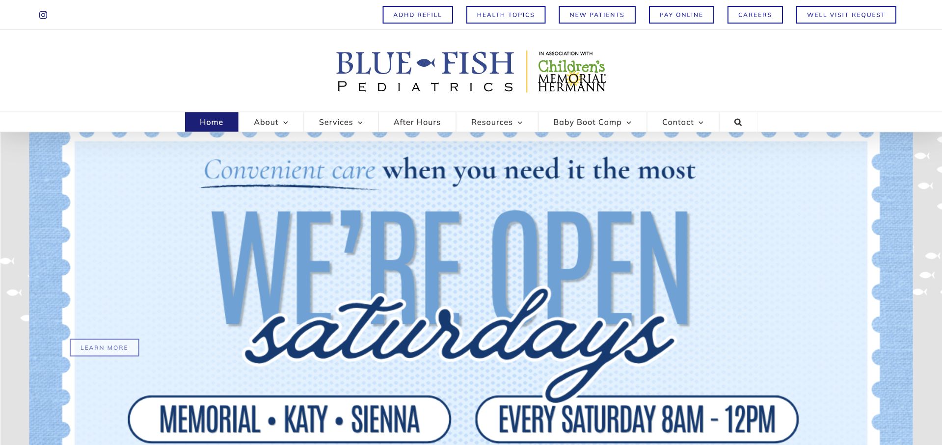
Blue Fish Pediatrics’ retained homepage exposes recurring tasks above a large practice identity and main navigation. The saved hero is a Saturday-opening announcement with location names, rather than a visible data table. Current source evidence references TablePress styling. That supports an association with the table plugin, not a claim that the announcement is a TablePress table or that every office schedule uses it. The useful design question is how structured administrative information can remain understandable while temporary announcements receive visual emphasis.
What you can learn
For any maintained schedule or comparison table, use meaningful headers, concise labels and a clear update owner. Keep urgent contact instructions separate from routine tabular information and have the appropriate practice reviewer approve them. Test narrow-screen and nonvisual reading directly; a stylesheet does not establish those qualities.
Pros
Recurring family tasks are available before a marketing sequence.
Location names give the visible announcement practical context.
Cons & considerations
Several navigation rows require careful prioritization on small screens.
A TablePress reference does not identify a rendered table or verify current office information.
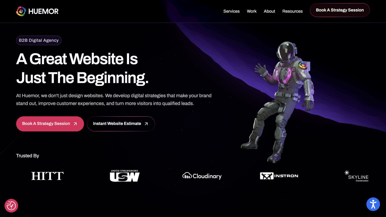
HUEMOR’s retained homepage places a B2B agency label and a direct website proposition beside an astronaut on a dark purple space scene. Strategy Session and Instant Website Estimate are distinct actions, with client marks below and ordinary service and work routes above. Current page evidence references a TablePress stylesheet. That supports a table-styling association without establishing that the pictured client marks, estimate interface or service proposition use the plugin. The visual theme is a communication choice, not proof of business results.
What you can learn
If an agency uses comparison tables, make deliverables, assumptions and exclusions explicit instead of letting a package name stand in for scope. Keep a route to relevant work and explanation outside the grid. Review the actual table and estimate journey separately; a styling asset cannot validate prices, accessibility or the quality of a proposal.
Pros
A stated audience anchors the expressive visual theme.
Strategy discussion and an estimate are differentiated actions.
Cons & considerations
Growth language needs concrete supporting context rather than visual polish alone.
The detected stylesheet does not identify table content or verify an estimate outcome.
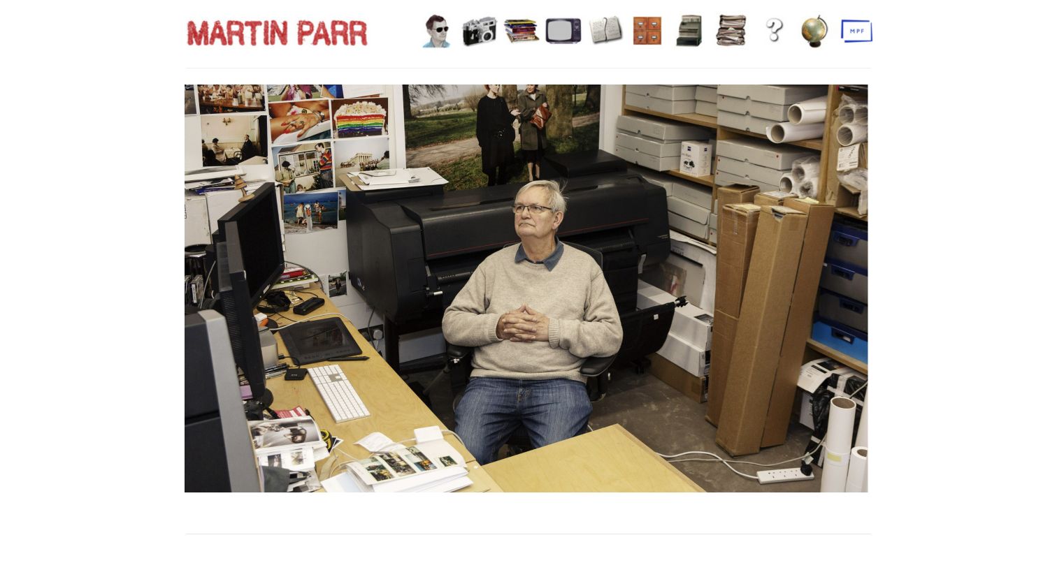
Martin Parr’s retained opening uses a red nameplate and a row of illustrated objects above a large studio photograph. The working environment gives the introduction a personal character, while the object-based navigation supplies the main route beyond the image. Current page evidence references a TablePress stylesheet. This identifies a table-styling association, not a finding that the photograph or illustrated menu is a table. It also does not establish how the wider archive is stored or whether any tabular feature is active in the pictured view.
What you can learn
For publication or exhibition records, use consistent titles, dates, roles and source links, with clear distinctions between a chronology and a complete catalogue. Pair expressive navigation with ordinary readable destinations. Check actual table headers and phone overflow separately; an asset path cannot verify archive completeness or make an icon’s meaning self-evident.
Pros
A small set of illustrated details creates a recognizable personal identity.
The studio photograph gives context beyond a conventional portfolio grid.
Cons & considerations
Object-based navigation may require interpretation from unfamiliar visitors.
The public stylesheet does not identify a pictured table or verify archive behavior.
Mortgageable’s retained homepage uses a cream background, oversized display type and an illustrated character. Research, Compare and Apply form a concise navigation sequence, while rate exploration and chat have different actions. The frame does not show a data table. Current evidence references TablePress styling, which identifies the plugin association but not the source of displayed rates, calculation logic or a completed comparison. The useful design pattern is a clear introductory sequence that can lead to more detailed information without presenting the whole application in the hero.
What you can learn
If comparison data is presented in a table, label its scope, source and update context rather than implying a guaranteed offer. Use proper headers and preserve important qualifications on narrow screens. A table plugin organizes presentation; it does not establish the accuracy or suitability of financial information.
Pros
The high-level navigation gives exploratory stages recognizable labels.
Different actions distinguish information research from a conversation.
Cons & considerations
Large display type can delay important supporting context.
The asset reference does not verify a live table, current rates or application eligibility.
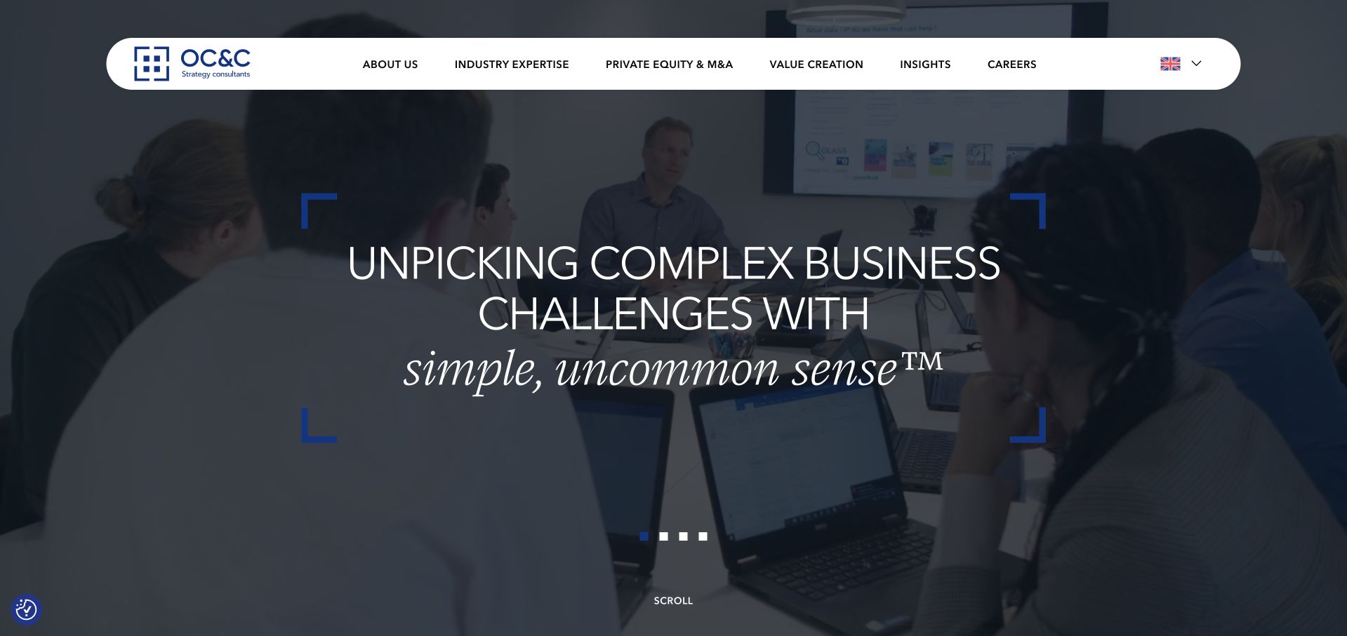
OC&C Strategy Consultants places a concise strategy proposition over a darkened working scene. A rounded white header distinguishes industry expertise, private equity, value creation, insights and careers. The saved frame shows no data table. Current evidence references TablePress styling, supporting a plugin association without identifying the content, calculations or source of any table elsewhere on the page. The useful example is a broad corporate introduction that keeps a separate route to more specific research and expertise rather than asking the opening statement to carry detailed evidence.
What you can learn
When a consultancy publishes tabular research, preserve clear headers, units, sources and qualifications. Keep the explanatory context beside the data instead of hiding it in an image or hover state. A table plugin does not validate the analysis, and a stylesheet alone does not prove that sorting or filtering is active.
Pros
Distinct expertise and insight routes support different research tasks.
The restrained header avoids competing with the main introduction.
Cons & considerations
A broad proposition needs concrete project or research evidence.
The public reference does not identify a rendered table or verify interactive controls.
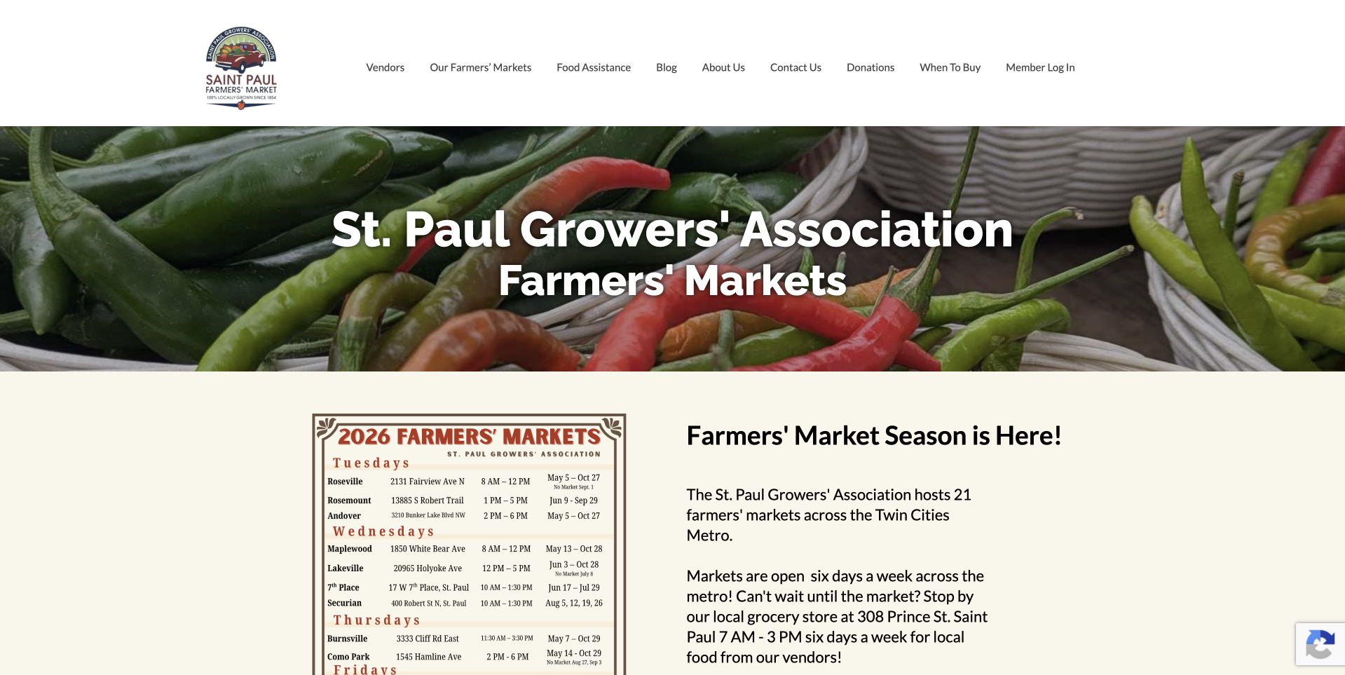
St. Paul Farmers’ Market’s retained opening places a growers-association heading over produce photography, followed by a cream section with a market schedule graphic and seasonal explanation. The header separates market discovery, vendors and food assistance. Current source evidence references a TablePress stylesheet. The visible schedule is artwork, so its rows must not be described as an inspected HTML or TablePress table. The captured season information is historical rather than a guarantee of current hours or exceptions.
What you can learn
Provide maintained, readable location and time records alongside any printable schedule artwork. For a table, separate weekday, address, hours, season and exception fields, and name who updates them. Test real header associations and phone reading order; a stylesheet cannot make image text accessible or establish that every market shares the same arrangements.
Pros
The opening exposes network information near the introduction.
Shopping, vendor and food-access tasks have distinct header routes.
Cons & considerations
A schedule graphic needs equivalent readable information and an update process.
The observed asset does not prove the pictured schedule is a TablePress component.
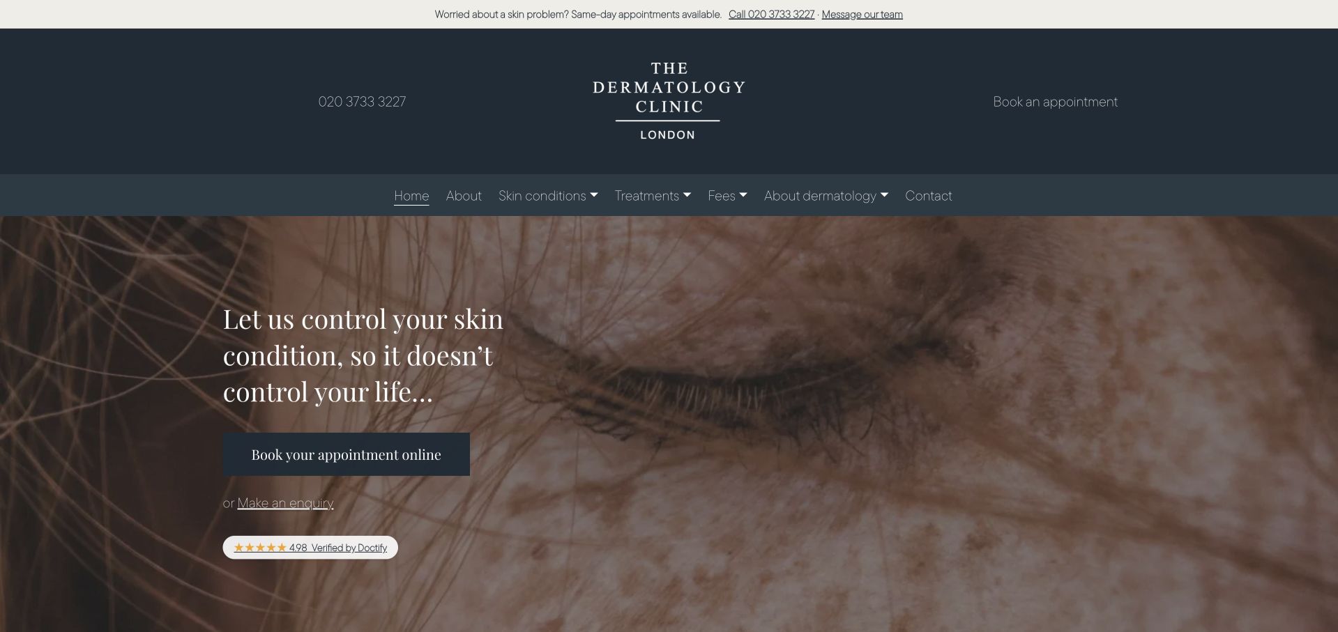
The Dermatology Clinic London’s retained opening uses dark slate branding, warm close-up imagery and a serif statement. Conditions, treatments, fees and contact are distinct navigation routes. Appointment and inquiry actions appear over the image, with phone and message options in the upper strip. Current page evidence references a TablePress stylesheet. This identifies a table-presentation association, not a claim that the opening includes a table or that the library powers booking. The saved availability language is a historical page claim, not verified current capacity.
What you can learn
If fees or services are tabulated, state the scope, qualifications and review date without implying that a row determines suitable treatment. Keep explanatory pages and written contact routes available outside the table. Inspect real markup and mobile layout directly; a stylesheet cannot validate clinical information, accessibility or a completed appointment.
Pros
Fees and service research have explicit navigation labels.
Appointment and general inquiry are presented as distinct actions.
Cons & considerations
Broad introductory language needs practical supporting information.
The detected asset does not establish table configuration, care suitability or current availability.
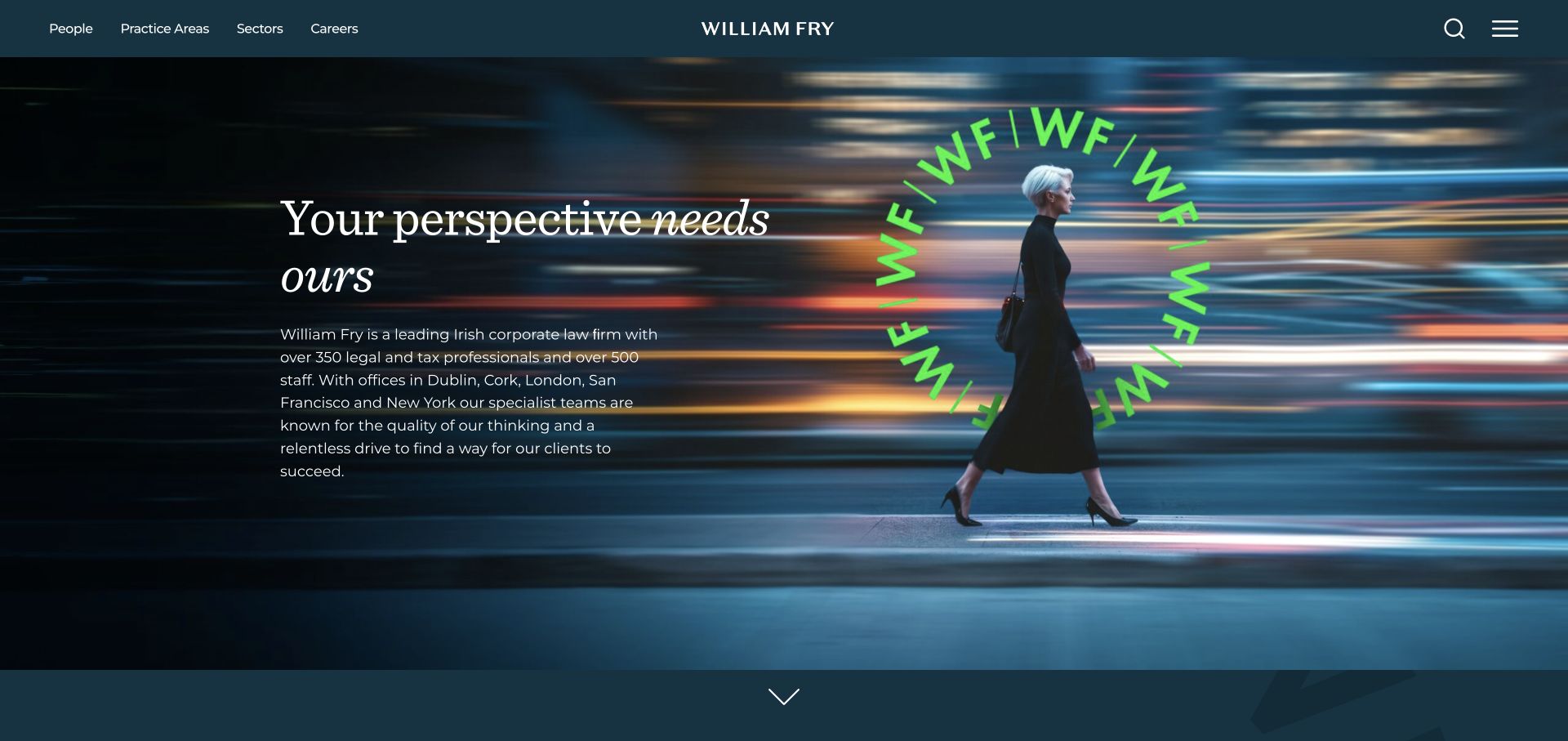
William Fry’s retained homepage combines a dark teal header, fine serif text and a vivid green circular monogram over a city scene. People, practice areas and sectors are separate routes, with search and menu controls at the right. Supporting copy gives the opening more substance than a purely visual campaign. Current source evidence references a TablePress stylesheet. That supports a public table-styling association, not a finding that the pictured introduction is tabular or that the plugin manages professional profiles or client matters.
What you can learn
If professional information is presented in tables, choose columns around a real comparison task and link every row to fuller context. Preserve both sector and practice routes rather than treating one grid as a universal service map. Verify actual table semantics and responsive behavior; a stylesheet cannot establish legal accuracy, completeness or accessible interaction.
Pros
Sector and practice labels support different valid research approaches.
The restrained header and green monogram create a recognizable identity.
Cons & considerations
Fine text over photography needs careful contrast review.
The source reference does not identify active tables or describe confidential systems.
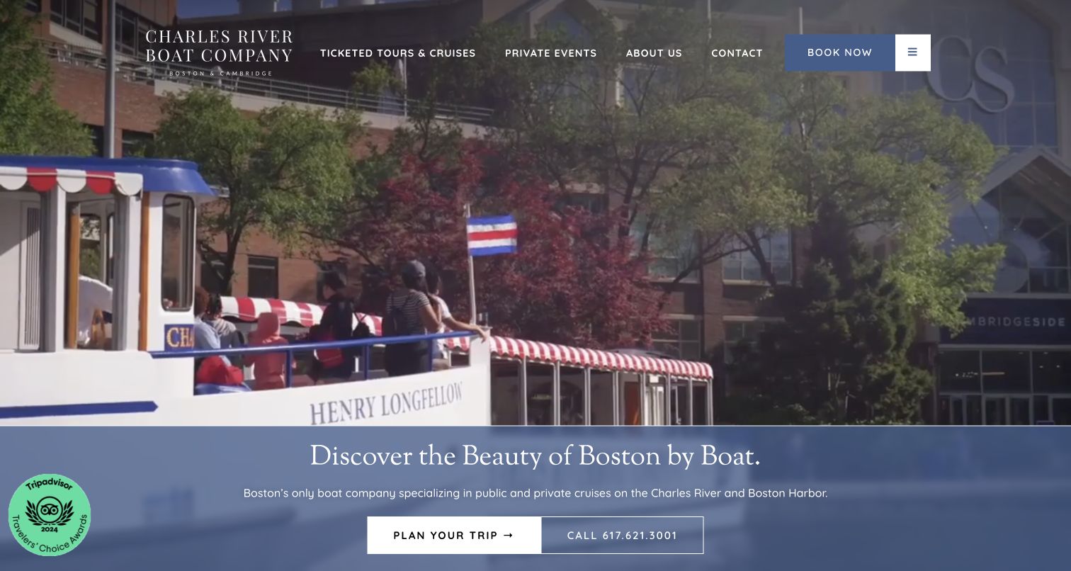
Charles Riverboat Company’s retained opening places concise navigation over a vessel beside the city. A blue panel below introduces Boston and provides planning and telephone routes. Ticketed tours and private events are separate header destinations, recognizing different visitor intentions. Current page evidence references a TablePress stylesheet. That supports a table-presentation association, not a claim that the pictured vessel scene or planning panel is a table, and not proof of the reservation system behind the Book Now action.
What you can learn
For tour comparisons, separate duration, departure location, included elements and applicable dates, and distinguish scheduled tickets from private-event inquiries. Give each row a maintained detail page rather than implying a static grid shows live inventory. Review actual table headers and phone layout; asset detection cannot verify availability, current prices or completed reservations.
Pros
Public tours and private events are recognizable separate tasks.
The blue panel gives location copy a stable reading surface below the image.
Cons & considerations
Large introductory media delays detailed trip comparisons.
The observed stylesheet does not identify initialized tables or establish booking behavior.
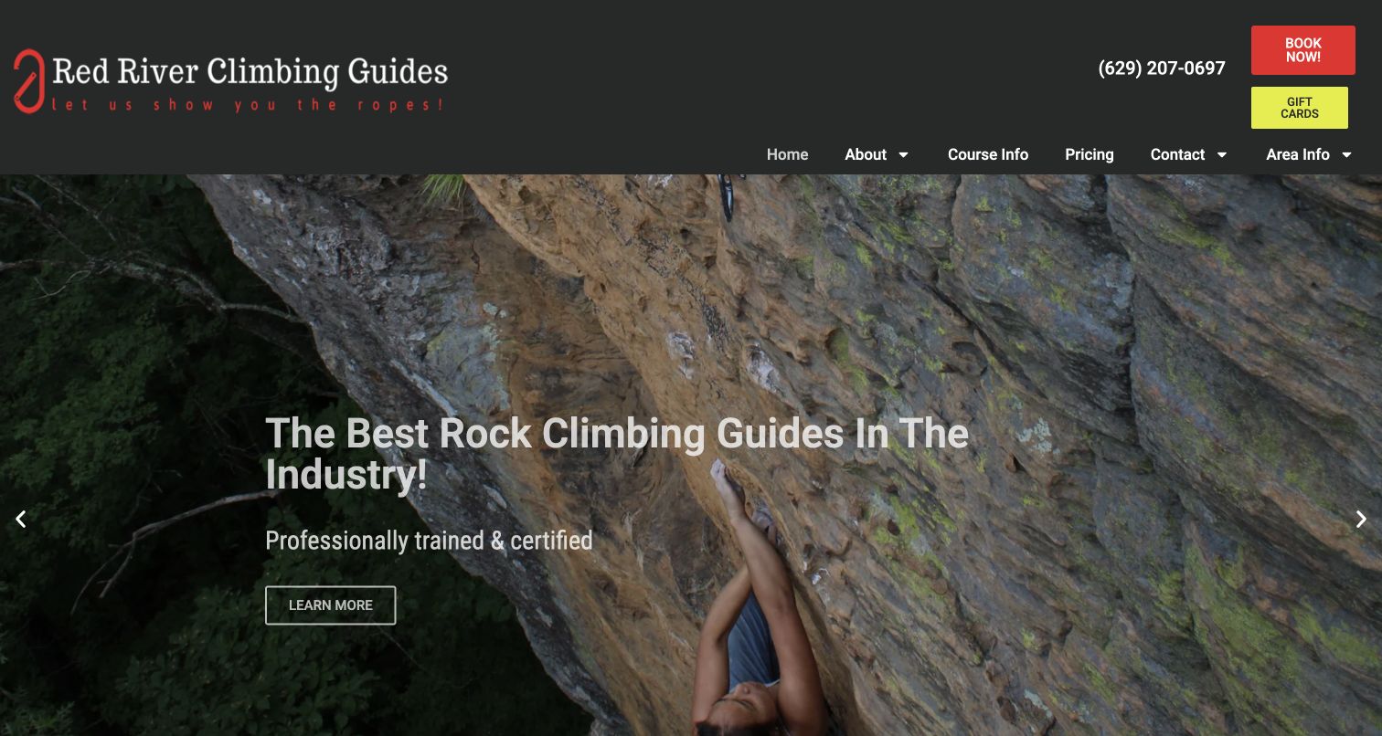
Red River Climbing Guides’ retained opening uses a dark header, red carabiner identity and a large sandstone-climbing photograph. Course Info, Pricing and Area Info are separate menu choices, with phone and booking actions above. The promotional statement sits over the image with a Learn More route. Current source evidence references a TablePress stylesheet. This supports a table-styling association, not a finding that the hero contains a table or that the plugin manages bookings, qualifications or safety information.
What you can learn
When comparing course formats, define duration, group format, stated prerequisites and what further discussion is required, with a maintained source page for each offer. Keep a way to ask questions outside the grid. Verify actual markup and small-screen reading order; a stylesheet cannot validate suitability, guide credentials or a visitor’s ability to participate.
Pros
Course, price and regional-planning questions have separate navigation labels.
The identity and photograph make the destination and activity recognizable.
Cons & considerations
Superlative promotional language offers less practical detail than clear course distinctions.
The detected asset cannot establish table behavior, booking success or activity safety.
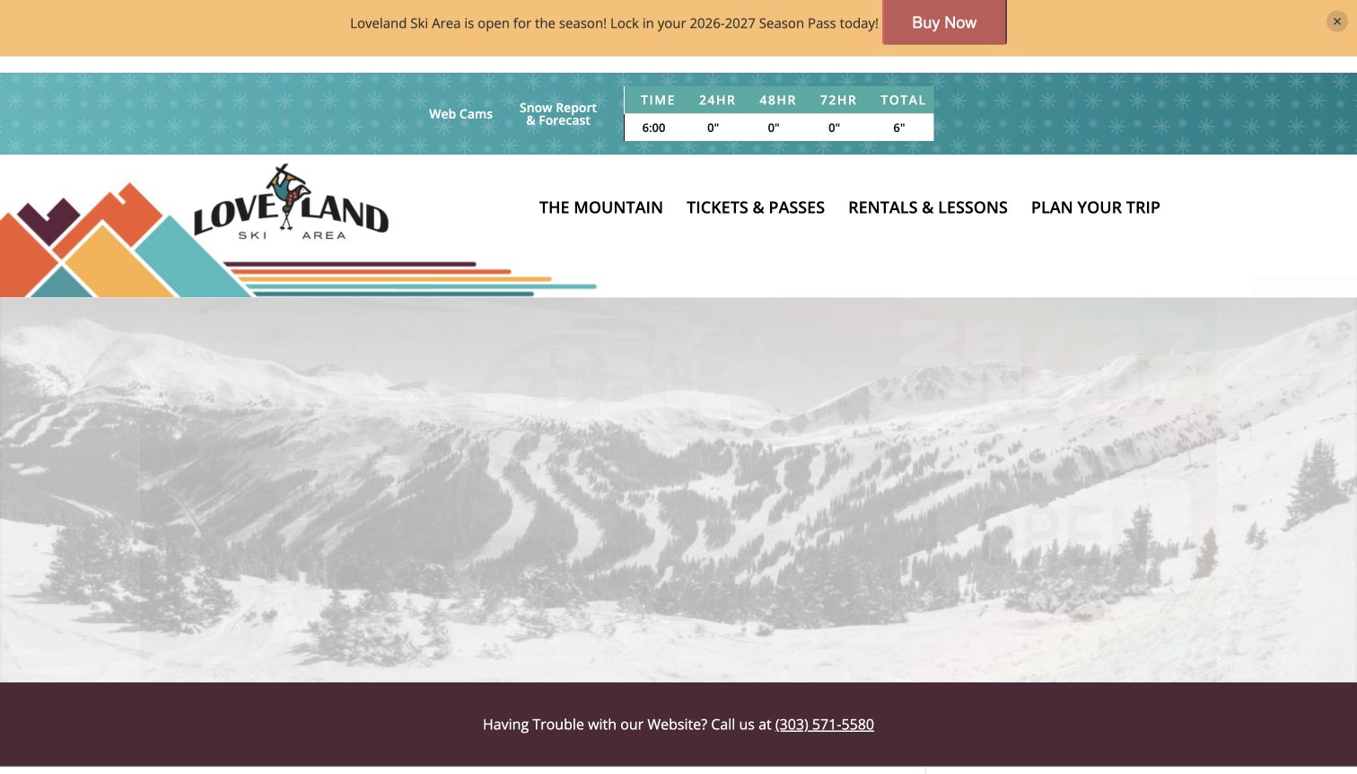
Loveland Ski Area’s retained opening includes a compact snow-report grid with a time label and separate accumulation periods. Webcam and forecast links sit beside it, above the striped brand treatment and four broad planning categories. A season-opening promotion and website-assistance line are also visible. Current evidence references TablePress styling, responsive-table assets and a plugin-path DataTables script. Those references support an association, but do not independently prove that TablePress renders the pictured grid or that its values are current.
What you can learn
Give operational tables explicit units, observation times and maintained source ownership, and distinguish reports from forecasts. Preserve useful assistance and planning links outside the data. Inspect actual header relationships, phone overflow and any sorting directly; a plugin asset cannot verify readings, conditions or successful interaction.
Pros
Time and measurement periods give the compact readings meaningful labels.
Related webcam and forecast routes are visible near the report.
Cons & considerations
Stacked promotion, report and navigation consume substantial vertical space.
The source references do not establish the pictured grid’s implementation or current conditions.
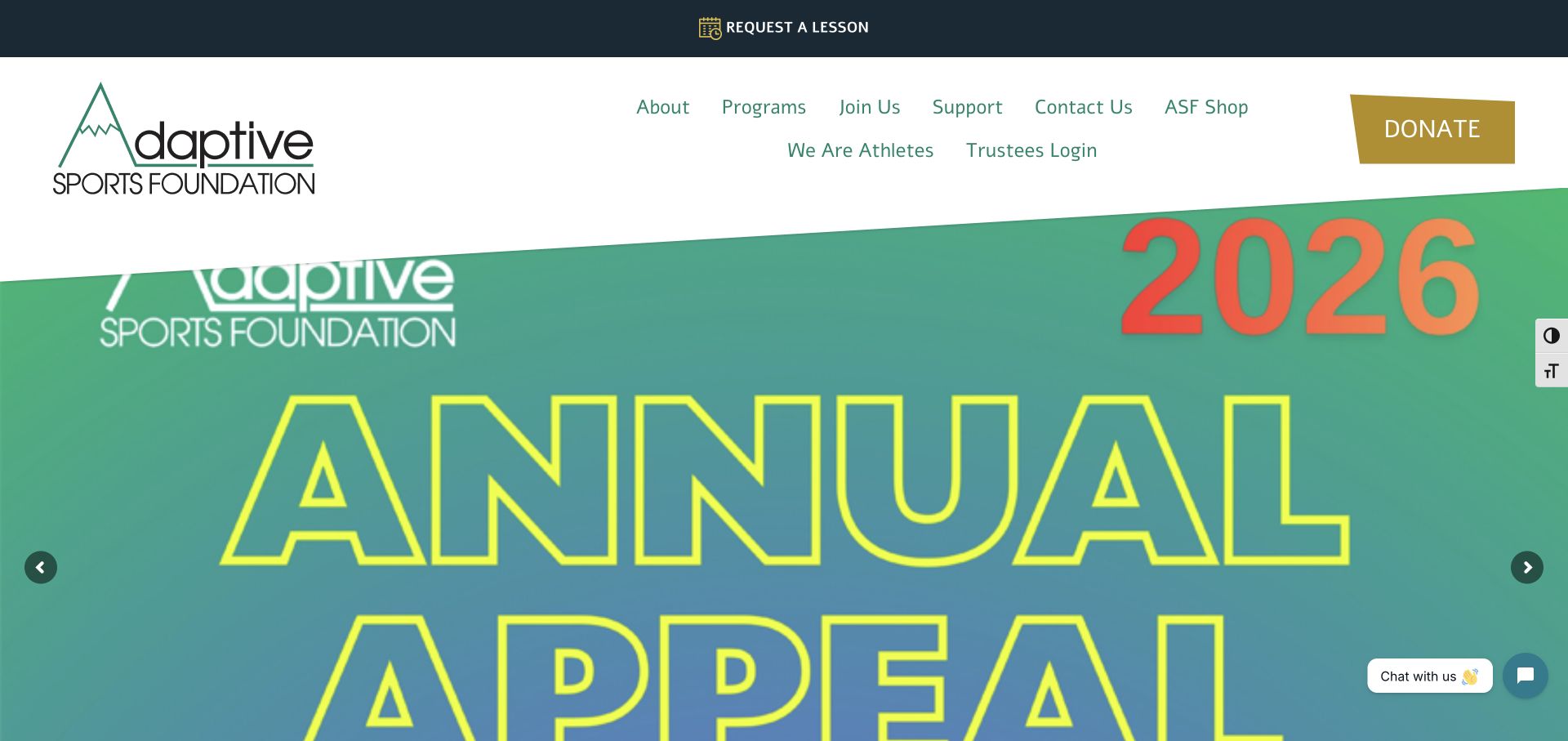
The Adaptive Sports Foundation’s retained homepage gives Request a Lesson a separate top strip, then distinguishes programs, joining, support and contact. A large annual-appeal image occupies the main frame, with normal site controls at the edges. No table is pictured. Current evidence references TablePress styling, but it does not establish which program information uses a table or verify eligibility, availability or participant outcomes. The useful design question is how to keep practical seasonal information discoverable while a fundraising campaign receives substantial visual space.
What you can learn
For any program table, use descriptive headers and explain which details remain to be confirmed. Keep lesson inquiries separate from donations and avoid publishing private participant information in a public data view. Test table reading on small screens and with assistive navigation rather than inferring usability from the plugin.
Pros
The lesson-request route remains distinct from the donation action.
Programs have an ordinary navigation destination above the campaign image.
Cons & considerations
A large fundraising frame delays the program introduction.
The asset reference does not prove that a table renders or that its information is current.
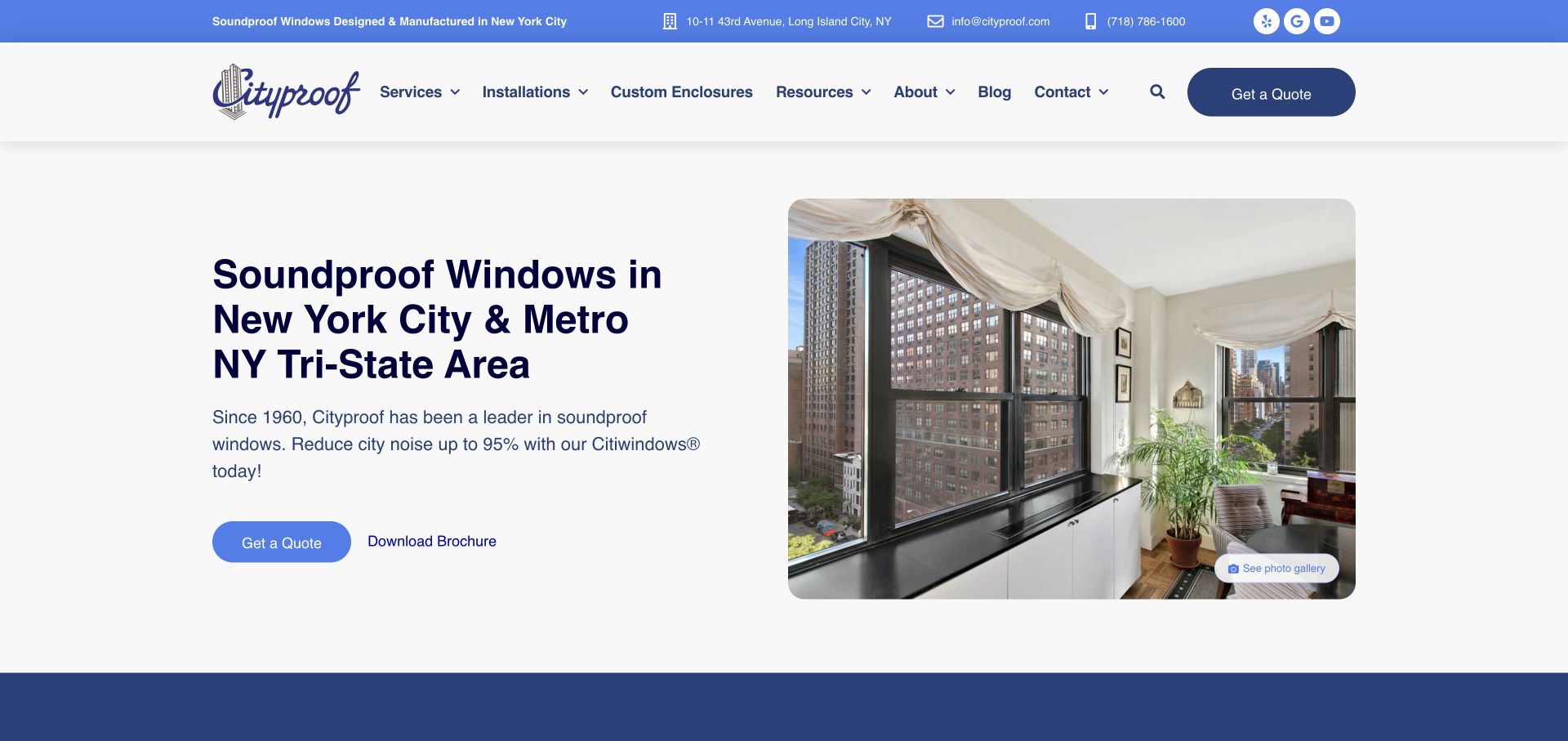
Cityproof’s retained homepage pairs an installed apartment-window image with a regional service description. Quote, brochure and gallery routes provide different research options, while ordinary contact details stay visible above. The saved frame contains no table. Current evidence references TablePress styling, establishing a plugin association rather than proving which specifications or comparisons use it. The picture and public asset do not independently validate the performance claims in the page copy. The useful pattern is a product explanation that can lead to more detailed supporting information without requiring an immediate inquiry.
What you can learn
If specifications are tabulated, identify units, conditions and appropriate supporting sources. Keep essential qualifications with the figures and preserve readable headers on narrow screens. A table is a presentation format, not evidence that a product meets a requirement or that its figures have been independently verified.
Pros
Separate research and contact routes support different levels of interest.
An installed-product image gives the introduction a concrete context.
Cons & considerations
Performance figures require defined conditions and evidence outside the plugin association.
A stylesheet reference does not establish a rendered table or working comparison controls.
Loch Duart’s retained opening uses underwater fish imagery, restrained gold branding and a compact menu. A short product-story line sits across the media, with section indicators at the right. This frame shows a narrative introduction, not a table. Current source evidence references TablePress styling. The association does not prove that the hero uses the plugin, identify a product dataset or validate the claims made in the brand story. The useful example is the contrast between immersive visual presentation and the separate structured information a professional buyer may need.
What you can learn
For any product or sourcing table, provide meaningful headers, clear terminology and a maintained source for the information. Keep a text-based route to practical details rather than requiring a visitor to progress through every media section. A table plugin does not establish provenance, product quality or the accuracy of a supply claim.
Pros
The restrained identity leaves the product imagery visually prominent.
Section indicators distinguish the media-led presentation from a conventional long paragraph.
Cons & considerations
Minimal menus can delay access to practical buyer information.
The public stylesheet does not identify an active table or verify its content and controls.
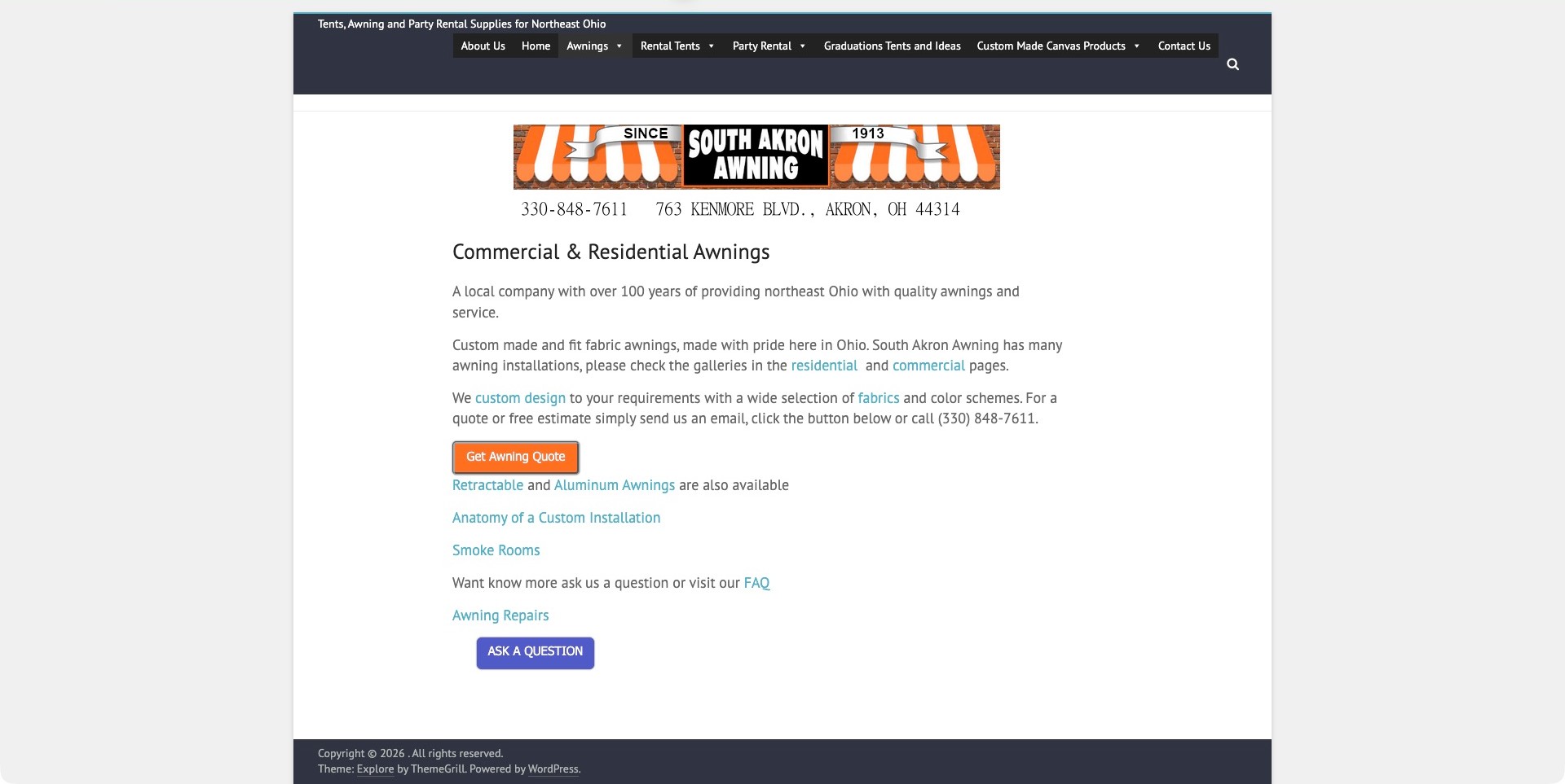
South Akron Awning’s retained service page uses a narrow central column, striped-awning banner and a literal commercial-and-residential heading. Short paragraphs link to galleries, custom design, fabrics and repair information. Quote and question buttons are distinct, while the broader header also covers rentals. Current evidence references a TablePress stylesheet on this exact service page. That supports a table-presentation association, not a claim that its ordinary paragraphs and links are a table or that quotation is implemented through the plugin.
What you can learn
If product choices become tabular, use clear category, material and next-step labels without implying a static grid determines installation suitability. Keep explanatory pages and a low-commitment question route available outside it. Inspect real headers and mobile overflow directly; a stylesheet cannot validate specifications, engineering requirements or a completed quote request.
Pros
Concrete body links connect the service explanation to supporting destinations.
Quotation and general questions are separate actions.
Cons & considerations
Contact information in banner artwork needs equivalent readable text.
The observed stylesheet does not identify an active table or establish quotation behavior.
Kegan has 15+ years of experience working with small businesses, Fortune 500 companies, and everything in between. No development job is too big or too small: he brings the same hands-on attention to a focused improvement, a complete website, or a custom application.
For TablePress projects, he can help with structured WordPress table content, useful column and header design, import and editing workflows, responsive and accessible presentation, and practical integration testing. He works directly with clients on scope, design, implementation, testing, and handover, with an emphasis on clear communication and a system that remains practical to maintain after launch.
Show 3 other TablePress developersHide other TablePress developers
Choose the right public presentation for the information
Use a small comparison table for a bounded decision
A few products, schedules, or specifications can benefit from a straightforward table with good headings and explanatory context. Put the main question above it and define the important exceptions nearby. Avoid making the visitor search a large interface for an answer available in five well-chosen rows.
Use search and sorting for a genuine reference collection
A larger directory or dataset may need controls that let visitors locate and compare entries. Give those controls meaningful labels and establish sensible default ordering. Explain what a search covers and what an empty result means instead of presenting a blank region with no recovery route.
Keep complex operational data in an appropriate system
A public publishing table is not automatically the right place for live inventory, private records, or a workflow requiring permissions and transactional updates. Establish the source of truth and update boundary before selecting the display tool. Use the table as a deliberate presentation layer, not an accidental replacement for a business application.
Plan data that stays understandable after the first publication
Define rows, columns, and the question they answer
Describe the visitor’s decision before opening a spreadsheet. Are they comparing service tiers, checking a schedule, looking up a specification, or finding a relevant organization? Choose a row model that fits that task. A row might represent one event, one product, or one location; mixing those entities usually makes the table harder to read and maintain. Define each column in ordinary language, including units and allowed values. This simple dictionary prevents a visually neat table from hiding inconsistent meanings.
Create a representative sample with realistic exceptions. Include long names, a missing optional value, a zero, an unavailable service, and any date or numeric range that might be misunderstood. Decide whether an empty cell means unknown, not applicable, or not yet supplied. Those states should not collapse into the same unexplained blank. Review the sample with the person who owns the information and someone who will use it. If the comparison cannot be explained clearly in a small sample, adding more rows or interactive controls is unlikely to solve the underlying content problem.
Separate the authoritative source from its public display
Identify where the approved data lives and who can change it. A spreadsheet supplied by one department, a maintained WordPress table, and a generated export from another system imply different update processes. Record which source is authoritative and how corrections reach the public page. Do not leave two editable copies with no agreed reconciliation rule. A useful table needs an owner who can answer where a value came from and when it was last materially reviewed, not just somebody who knows how to adjust the column width.
Document the import or manual-edit boundary. TablePress supports importing and exporting common data formats, but the project must define how incoming information is checked. Review a sample before replacing a published dataset, preserve an appropriate prior version, and verify the resulting page. Check identifiers, leading zeros, units, dates, and character encoding rather than assuming that a file which opens successfully is accurate. Avoid placing confidential information into a public import merely because it shares a convenient spreadsheet with approved rows. Keep the public dataset deliberately separate from private working material.
Make headings and numeric presentation explain the data
Use column headings that make sense without a lengthy legend whenever possible. Put units in the relevant heading or immediately associated explanation, and present comparable numbers consistently. Decide how rounding, ranges, and estimates should appear. A table of monthly prices, annual totals, and one-time charges should make those distinctions unmistakable. Align the display with the actual comparison task rather than treating every value as interchangeable text. Where a term needs an explanation, provide one close enough to be useful without making every cell a miniature article.
Review the reading experience beyond visual styling. Associate headers with the relevant data and preserve meaningful structure when the layout changes. Do not turn a table into an image just to keep its appearance fixed; that sacrifices useful text and interaction. Avoid conveying a critical status only through red or green cells. Check the actual rendered result with the project’s accessibility reviewer and representative content. A product’s accessibility features do not certify a custom table whose headings, controls, inserted content, and surrounding explanations have not been evaluated.
Choose responsive behavior with the important comparison in mind
Determine which relationships a visitor needs to see together on a narrow screen. A wide technical reference and a small pricing comparison may require different treatments. Test the actual selected TablePress configuration and its edition requirements before promising a responsive mode. Do not assume that shrinking type or hiding several columns preserves the meaning. If horizontal scrolling is appropriate, make the possibility understandable and keep the table’s context clear. A visitor should not mistake a partially visible dataset for a complete answer.
Use real long values and the expected number of columns during review. Check zoomed text, wrapped headings, links inside cells, and controls near the edges. Keep explanatory copy and important caveats available in every layout. If a mobile card treatment is proposed, verify that each value retains a clear association with its label and that comparison remains practical. Test the page around the table as well as the component itself; sticky navigation, sidebars, and other controls can create an awkward experience even when the isolated table demonstration appears successful.
Enable only the search and sorting behavior people need
For an interactive reference, define a useful default order and the purpose of each control. Check whether values sort as visitors expect: a number with a unit, a formatted date, and a label containing an embedded number can produce surprising results if their meaning is not handled deliberately. Give the search an understandable scope and a helpful empty-result state. If pagination is used, make it clear that more rows exist. A compact table should not grow an entire control panel simply because a plugin makes those features available.
Try a short set of real lookup tasks with the representative dataset. Ask a reviewer to locate one known entry, compare two related rows, change an order, and recover from a search with no match. Record where the interface is confusing before adding more filters. Include slow or failed enhancement behavior in the acceptance plan so the public content does not become an unexplained empty box. Keep the evidence modest: observing a TablePress asset on an admired website does not establish that its table interactions are correct, fast, accessible, or useful for your audience.
Have the responsible editor update a normal value, add a row, remove an obsolete entry, and correct an error using the actual intended workflow. Verify the public result rather than stopping at an administrator preview. Explain what requires a new data approval, what is an ordinary editorial correction, and who can restore a previous version. Keep the procedure short enough to follow when somebody reports a mistake. A complicated publishing routine that only the original developer understands is a maintenance risk even if the first dataset looks excellent.
Agree when the information should be reviewed and how staleness is communicated when it matters. Avoid automatically refreshing an editorial date merely because the page rebuilt or a stylesheet changed. If the data depends on another organization, record that boundary and the process for investigating discrepancies. Review meaningful changes to the schema, source, or presentation as a small release with representative checks. Do not promise better rankings or business outcomes from a table plugin alone. The durable benefit comes from a clear question, reliable information, and a publication process the organization can actually sustain.
Ask the actual team to carry out its routine job: publish a realistic update, correct a mistake, preview a narrow screen, and identify who owns an integration failure. For a library or frontend framework, also ask who maintains the content source and deployment. A polished screenshot does not answer those operational questions.
Beyond the screenshot
TablePress data and publishing checklist
Name the comparison or lookup task.
Define one consistent entity for each row.
Document headings, units, ranges, and allowed values.
Distinguish unknown, unavailable, zero, and not applicable.
Choose an authoritative source and responsible owner.
Keep private working data outside public imports.
Review imports and preserve an appropriate prior version.
Keep meaningful table headers and readable explanations.
Test narrow layouts with real long values.
Enable search, sorting, and pagination only for a clear purpose.
Verify controls and failure states on the actual page.
Rehearse updates, corrections, restoration, and review dates.
Test with real content, a keyboard, a small screen, slow or failed requests, and the people who will maintain the system. These are planning checks, not an accessibility, security, performance, or search-ranking certification.
Sources & editorial method
How this TablePress collection was reviewed
A dated public-source check found a TablePress-specific script or stylesheet reference on each exact cited page. That does not establish which pictured table is active, the accuracy of its contents, a particular paid edition, or the whole backend. Original screenshot provenance and dates are retained. The design reviews are independent observations; product planning refers to official documentation and the publisher-maintained listing.
Every image is an unmodified capture from the actual website, with its source and capture date. Some captures are reused from our shared catalog; their dates remain the original capture dates. None comes from a vendor gallery or a generated reconstruction. Moving imagery and live content can change.
Technology attribution uses public page assets or metadata, official platform documentation, or a cited first-party project case study. Documentary and framework-relationship evidence is identified where used; it is not a complete current backend inventory. A CMS image CDN alone does not establish a full CMS deployment. A library’s presence does not prove which individual controls use it, and a platform label does not establish AI authorship.
The composition notes, lessons, pros and tradeoffs are original editorial observations. We have not measured conversion, traffic, security, performance or accessibility conformance. Website owners retain their brands and imagery; these examples are not our client portfolio. Written, Edited and Curated are independent records, not dates advanced by a build. See our editorial standards or suggest a correction.
Questions worth asking
TablePress website development FAQs
Is TablePress a website builder?
No. It is a WordPress table publishing and management plugin. The theme, page layout, content system configuration, and broader application are separate parts of the website.
Does the reference prove a particular table uses it?
Not necessarily. A product-specific asset can be loaded on a page more broadly than its active components. The evidence here remains an exact-page association, not a complete runtime audit.
Should every table have search and pagination?
No. Choose controls according to the amount of data and the visitor’s task. A small comparison can be clearer without an extra control panel.
Can a screenshot prove the data is current?
No. A screenshot records an interface at a particular time. Accuracy, source ownership, and update processes need separate evidence.
What matters most at handover?
The editor should understand the authoritative source, update workflow, field meanings, correction process, and actual public result. Visual polish alone does not establish maintainability.
Borrow a clear comparison and useful hierarchy, then give your own data a precise meaning, a responsible owner, and a publishing process that survives routine changes.