Best Agricultural Technology Websites of 2026 (29 Real-World Examples)
Field robots, sensing platforms and farm software with useful lessons for an agricultural technology website.
The best agricultural technology websites explain a real farm task, show where the technology fits and help a grower investigate the conditions that matter.
Agricultural technology is not one buying journey. A grower comparing a field robot, an agronomist evaluating imagery and an enterprise team researching supplier data arrive with different questions. These 29 examples show how companies make equipment, measurements, software and service relationships understandable without asking a general innovation slogan to explain everything.
Look for the connection between the field and the next action. FarmDroid shows a physical robot and offers demonstrations; Phytech connects sensing with irrigation; Agworld exposes a recognizable field record. The editorial observations concern website communication and research paths, not independent tests of machinery, agronomic advice, savings or safety.
Before the examples
What makes good agricultural technology website design in 2026?
Start with the crop and the task
Name the growing context and the job before introducing the platform vocabulary. Crop, row geometry, terrain and operational constraints should lead into more detailed suitability information.
Connect the physical and digital parts
Show how machinery, sensors, imagery, software and field services relate. A dashboard alone does not describe installation, maintenance or the source of a recommendation.
Support investigation before contact
Offer a useful product explanation, example output or demonstration video before asking for a meeting. Keep dealer, trial, demo and existing-user routes distinct.
Qualify outcomes and automation
Put conditions and methods beside savings, yield, water and autonomy claims. An attractive website is not evidence of performance in a particular farm or season.
The original saved target is 29 distinct public websites. FarmDroid is the explicit Editors Choice for its focused field-robot explanation, practical investigation paths and demonstration context. This recognizes website communication, not equipment quality or an independently measured outcome.
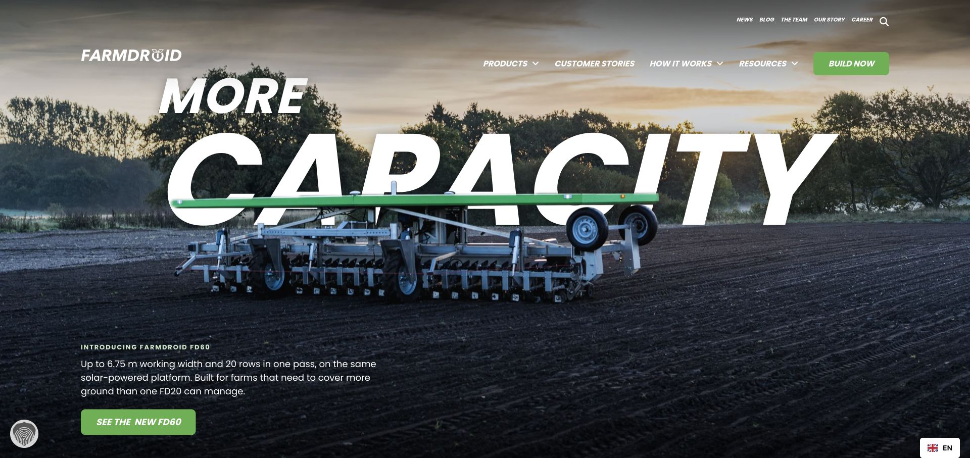
FarmDroid puts a working field robot beside a direct product introduction rather than relying on a general future-of-farming slogan. Configuration, a specialist conversation and field demonstrations provide different ways to investigate the equipment. How-it-works material and customer stories extend the first impression into a more useful research journey.
What you can learn
Show the actual machine in its working environment, then offer both a self-directed product route and a field-oriented conversation. A demonstration can be a more relevant next step than a generic sales form.
Pros
Field photography establishes what the product physically is and where it works.
Configuration, specialist contact and demonstration routes support different research stages.
Cons & considerations
Capacity statements need crop, field and operating conditions to support a real comparison.
A large product introduction needs concise compatibility information for buyers screening basic suitability.
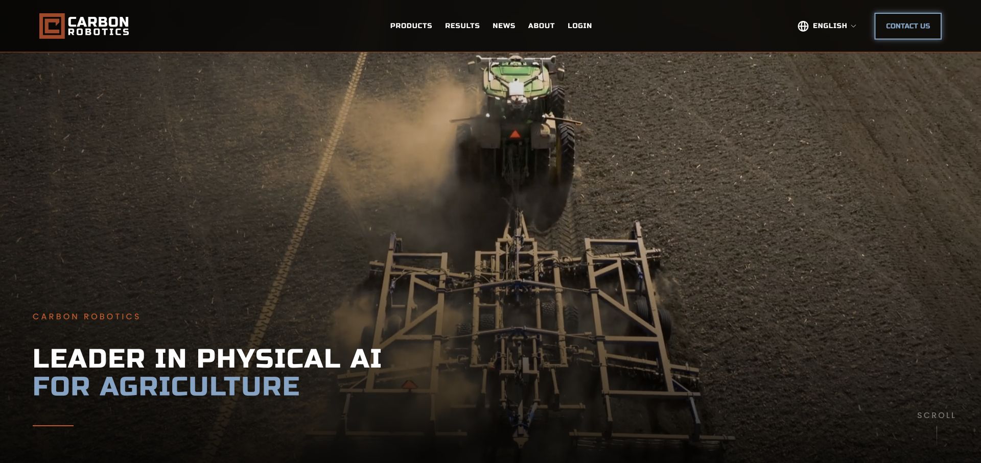
Carbon Robotics introduces physical AI for agriculture, then distinguishes LaserWeeder from its autonomy offering. Grower stories and product-specific information give the broad positioning more substance. Field imagery makes the machinery tangible while compatibility and results panels provide further routes for a reader investigating adoption.
What you can learn
Give every named product its own role in the story. A broad AI proposition becomes easier to understand when the page connects it to a particular machine, task and appropriate supporting explanation.
Pros
The product split avoids presenting all automation as one undifferentiated feature.
Grower stories connect the technical proposition to a working-farm context.
Cons & considerations
Return-on-investment and yield claims need their documented assumptions rather than visual emphasis alone.
An AI-led headline may need an early plain-language task description for less technical readers.
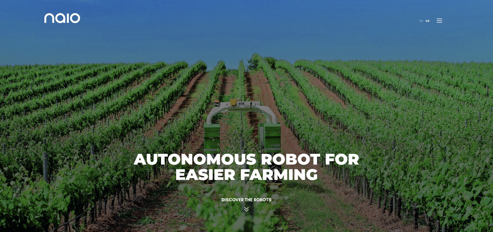
Naïo Technologies follows vineyard robot imagery with a five-product lineup that associates machines with market gardening, vineyards, narrower rows and other growing contexts. Dealer information, a companion monitoring app and customer stories appear as distinct paths. The result is a catalog that gives unfamiliar model names a practical agricultural meaning.
What you can learn
Put the crop or working context beside the model name. Visitors should not need to open every product page simply to learn which robot was intended for their type of operation.
Pros
Crop and application labels help readers distinguish similar robotic products.
Dealer, monitoring and customer-story routes acknowledge the surrounding ownership experience.
Cons & considerations
A crop label is only a starting point; terrain, row geometry and other constraints still need detailed treatment.
A broad product lineup needs consistent comparison fields to avoid making each model a separate research exercise.
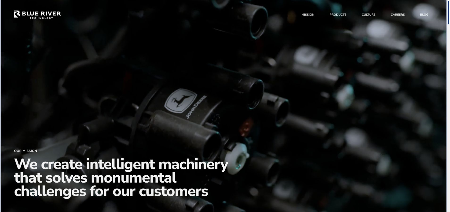
Blue River Technology explains its intelligent-machinery mission through See & Spray and the computer-vision distinction between crops and weeds. Machine learning, robotics, software, product work and field testing form separate capability themes. Company culture and careers are prominent, making this a different communication problem from a direct equipment storefront.
What you can learn
Explain a technical capability through the decision it makes in the field. If recruitment is an important website purpose, give prospective employees a clear view of the disciplines behind that work.
Pros
The crop-versus-weed explanation gives computer vision an understandable purpose.
Capability and careers content shows how the engineering organization presents its work.
Cons & considerations
A recruitment-oriented homepage may need a clearer equipment-purchase handoff for commercial visitors.
Public descriptions of a vision system do not establish its accuracy under every field condition.
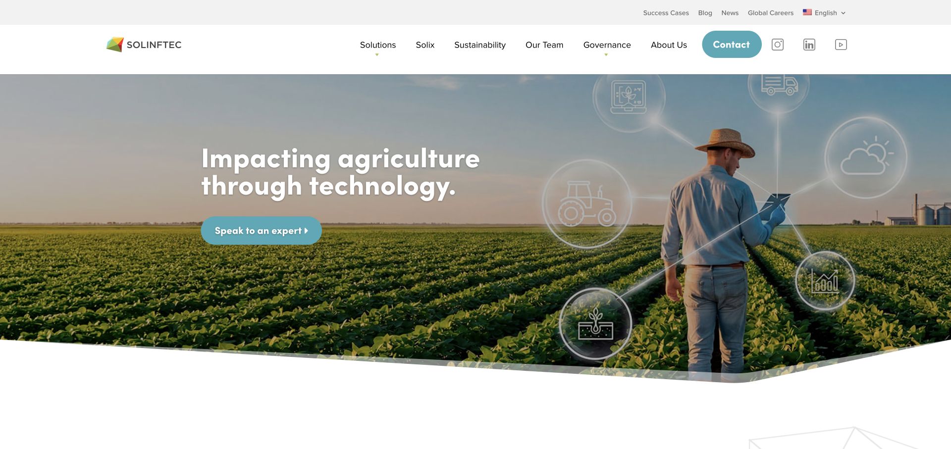
Solinftec pairs its technology positioning with plain-language descriptions of farm-operation intelligence through Alice AI. Solix robotics, customer cases and sustainability information are available as distinct destinations. The page connects a software platform to machinery and work in the field rather than leaving the offering entirely in abstract data language.
What you can learn
Translate platform capabilities into the operational questions a grower or manager is trying to answer. Keep software intelligence and physical robotics related but separately explainable. A grower should be able to distinguish investigating Alice’s operational information from investigating a Solix machine, without assuming that both involve the same deployment.
Pros
Benefit headings reduce reliance on platform terminology.
Robotics and customer cases offer more concrete ways into the broader proposition.
Cons & considerations
Broad sustainability language needs specific conditions and sources before it becomes a comparable claim.
Several named technologies can require an introductory relationship diagram for new visitors.
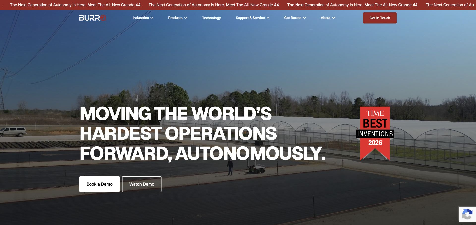
Burro separates watching a demonstration from booking one. Its autonomous work platform is described through carrying, towing, mowing and spraying, with vineyards, berries, orchards and nurseries providing application context. Agriculture and industrial operations are both acknowledged, while service and support remain visible around the product story.
What you can learn
Pair a low-commitment view of the machine working with a higher-commitment demonstration request. Label real tasks so a flexible platform does not become an unexplained list of possible attachments. A nursery manager can begin with a familiar setting, while the task labels establish a second route for someone comparing carrying with other uses.
Pros
Watch and book actions distinguish learning from contacting sales.
Task and crop labels make a general-purpose mobile platform easier to understand.
Cons & considerations
A broad application range needs clear compatibility and configuration information for each task.
Video-based explanations need equivalent readable information and usable playback controls.
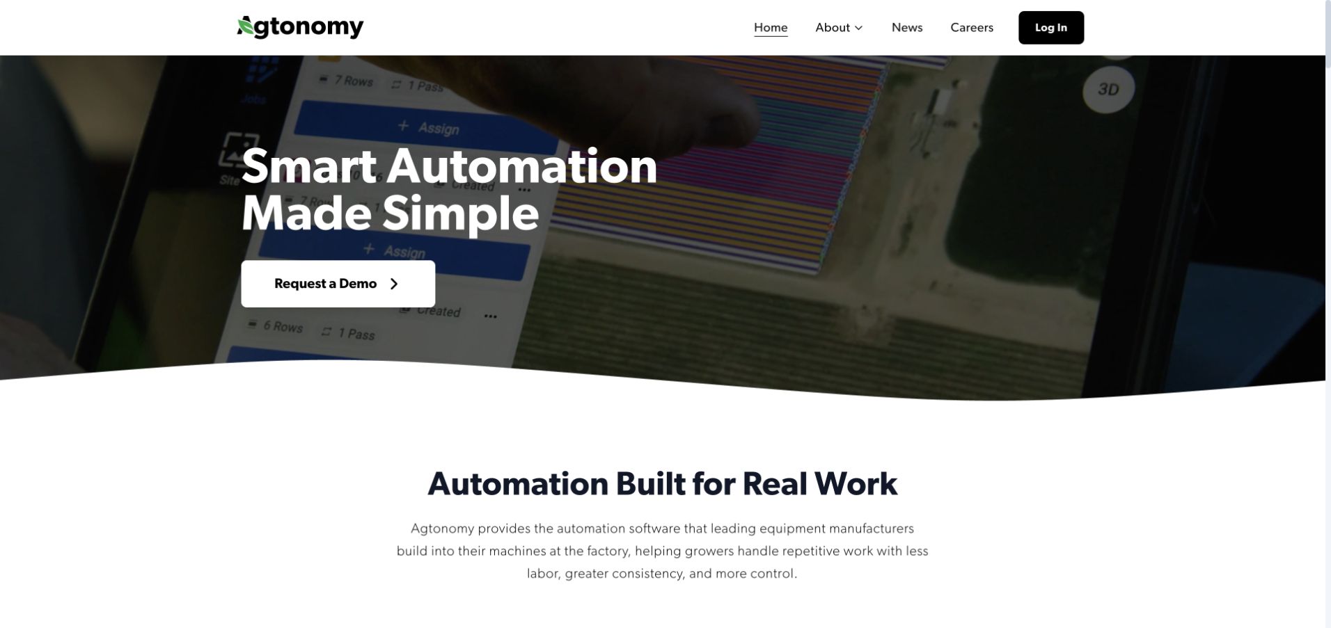
Agtonomy explains that its automation software is factory-integrated into manufacturer equipment. Crops, workloads and implements give the proposition context, while an app view and a plan-work-review sequence make the operating model more concrete. Partner identities help distinguish this approach from buying a standalone robot directly from the website.
What you can learn
Explain who supplies the equipment and where the technology fits. A short operating sequence is useful when the commercial relationship spans a software company, manufacturer and grower.
Pros
The manufacturer integration model is stated rather than left for visitors to infer.
App imagery and a three-stage workflow connect automation to everyday use.
Cons & considerations
Partner logos need clear links to availability and regional purchase information.
A short workflow still needs detailed limits and supervision requirements in the relevant product documentation.
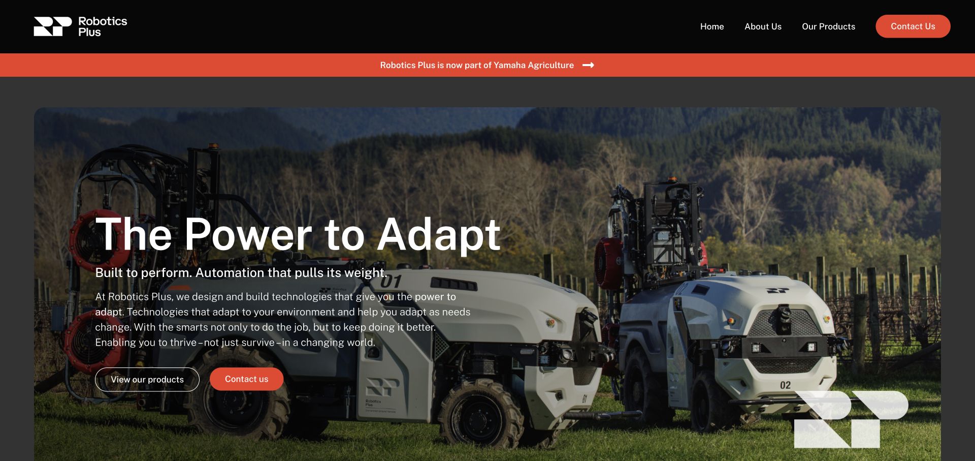
Robotics Plus makes its move into Yamaha Agriculture visible and provides an inquiry handoff rather than silently sending visitors elsewhere. The page still explains Prospr in orchard and vineyard work, alongside fruit-packing and log-scaling capabilities. The retained product context helps an existing reader understand what the company did and where to go next.
What you can learn
When a company changes ownership or brand structure, explain the transition and preserve useful product context. A clear handoff is more helpful than an unexplained redirect or an abandoned legacy homepage.
Pros
The ownership transition and onward contact route are explicit.
Retained application descriptions preserve context for existing product researchers.
Cons & considerations
Transition content needs an owner so it does not remain indefinitely ambiguous.
Multiple industries may require more focused routes for a grower who only needs the agricultural product.
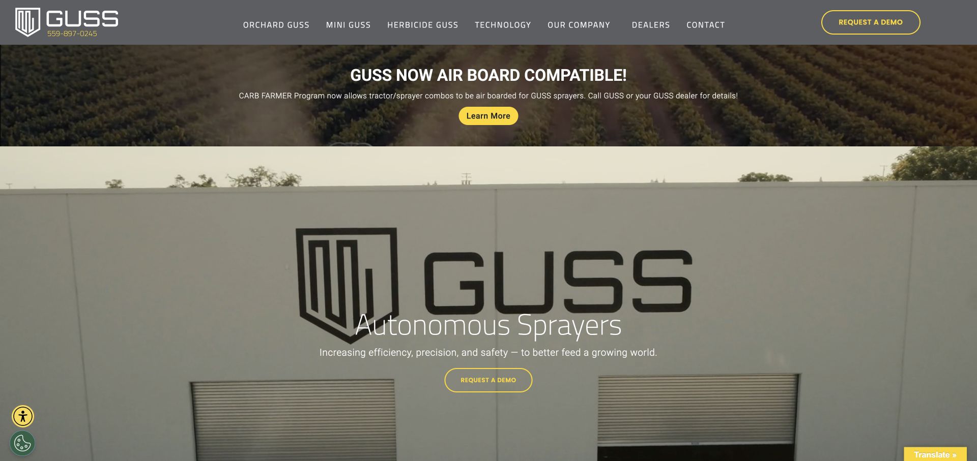
GUSS makes Orchard, Mini and Herbicide GUSS visible product choices rather than hiding the models inside a broad solutions menu. The autonomous-sprayer introduction leads toward demonstration and dealer information. A linked guide for the John Deere Operations Center connection adds a practical integration path beside the main product story.
What you can learn
Make meaningful variations visible in the product navigation, then support the buying journey with the actual connection and dealer information a prospective user will need. Model research, connection instructions and dealer discovery are distinct stages; placing them together helps someone investigate the machine without immediately requesting a sales conversation.
Pros
Product-family names are accessible from the main navigation.
A specific integration guide is more useful than an unsupported connected-farm assurance.
Cons & considerations
Model labels need consistent application and size comparisons for an unfamiliar buyer.
Automation messaging still needs clearly documented operating and supervision conditions.
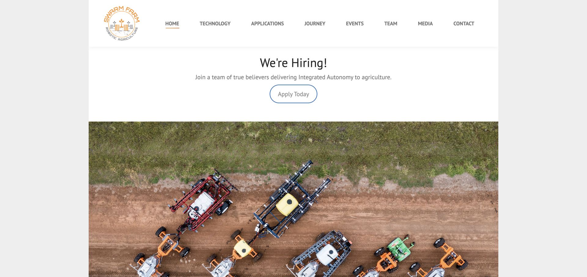
SwarmFarm uses a compact centered layout, with field-robot imagery and separate technology, applications and journey destinations. Its integrated-autonomy explanation is tied to the needs of farming systems rather than only a machine specification. At review time a recruitment panel appeared above the main agricultural image, revealing the competing purposes a specialist homepage may serve.
What you can learn
Organize the site around technology, practical application and company story, but decide which audience owns the first screen. Recruitment and equipment research do not always need the same entrance.
Pros
A small set of navigation choices keeps the specialist story manageable.
Application context connects autonomy with a farming-system problem.
Cons & considerations
A recruitment-first panel can delay the product explanation for prospective customers.
A compact layout still needs enough detail to explain where the approach is and is not suitable.
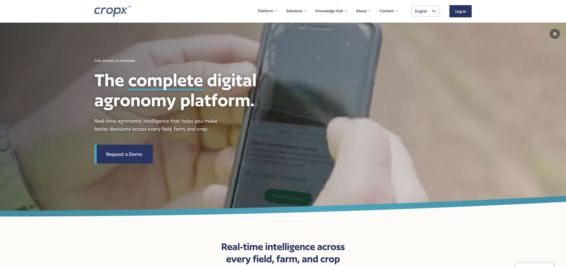
CropX explains its digital agronomy platform through soil, weather, satellite, crop-analysis and machinery-integration themes. Specific sensor and data product cards make the system less abstract. Demo and existing-user login routes are separate, allowing the page to serve research and day-to-day access without forcing both through one conversion path.
What you can learn
Show the parts of a data platform in terms a grower can investigate. Distinguish the measurements, analysis and integration layers instead of treating connected agriculture as a self-explanatory phrase.
Pros
Named data sources help explain what contributes to the platform.
Sensor and software paths are available alongside distinct demo and login actions.
Cons & considerations
A long platform feature list needs prioritization by crop and operational question.
The presence of several data inputs does not independently verify recommendation accuracy.
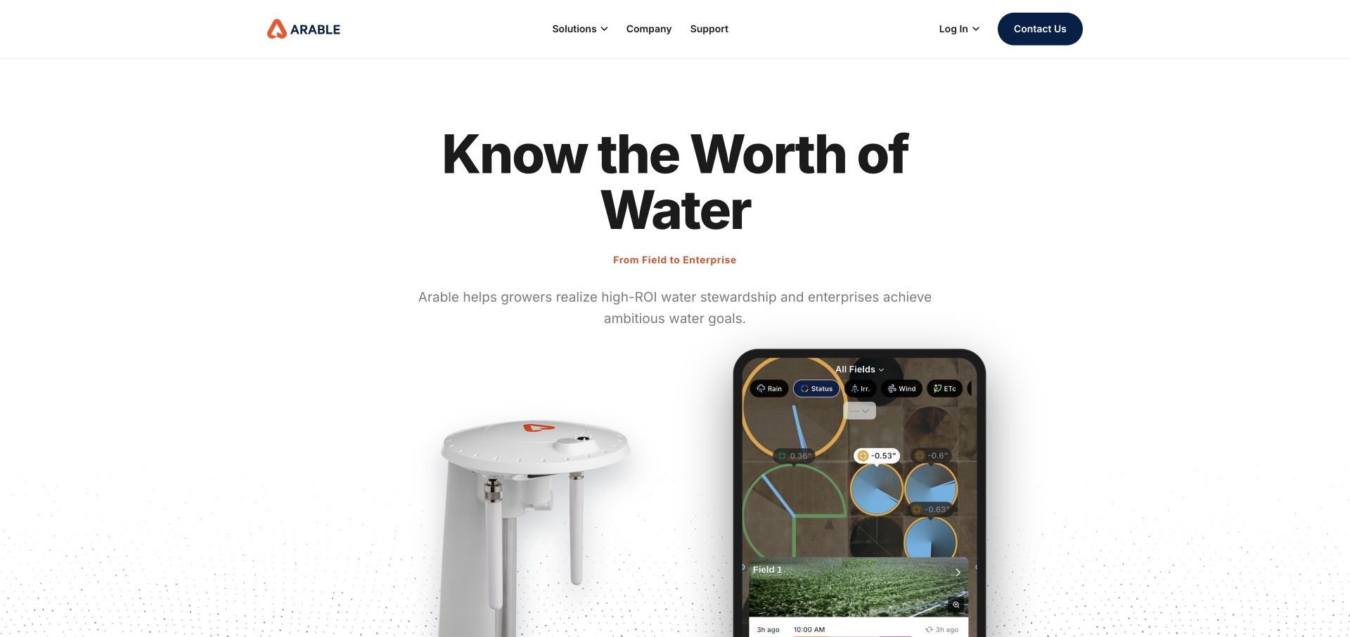
Arable centers the value of water and places a field sensor beside an application view. Monitor, optimize and scale form a readable sequence, while grower and enterprise contexts receive different benefit language. Project and news links provide additional context around the platform without requiring the introductory screen to carry every technical detail.
What you can learn
Connect the field instrument to the information people actually receive. Use separate grower and enterprise explanations when one product serves operational work and larger program reporting.
Pros
Hardware and app imagery explain two sides of the service in one introduction.
The monitor-optimize-scale sequence gives the platform a simple narrative.
Cons & considerations
Water-value claims need local context, methodology and conditions to be meaningful.
Enterprise partnerships should not substitute for crop-specific product suitability information.
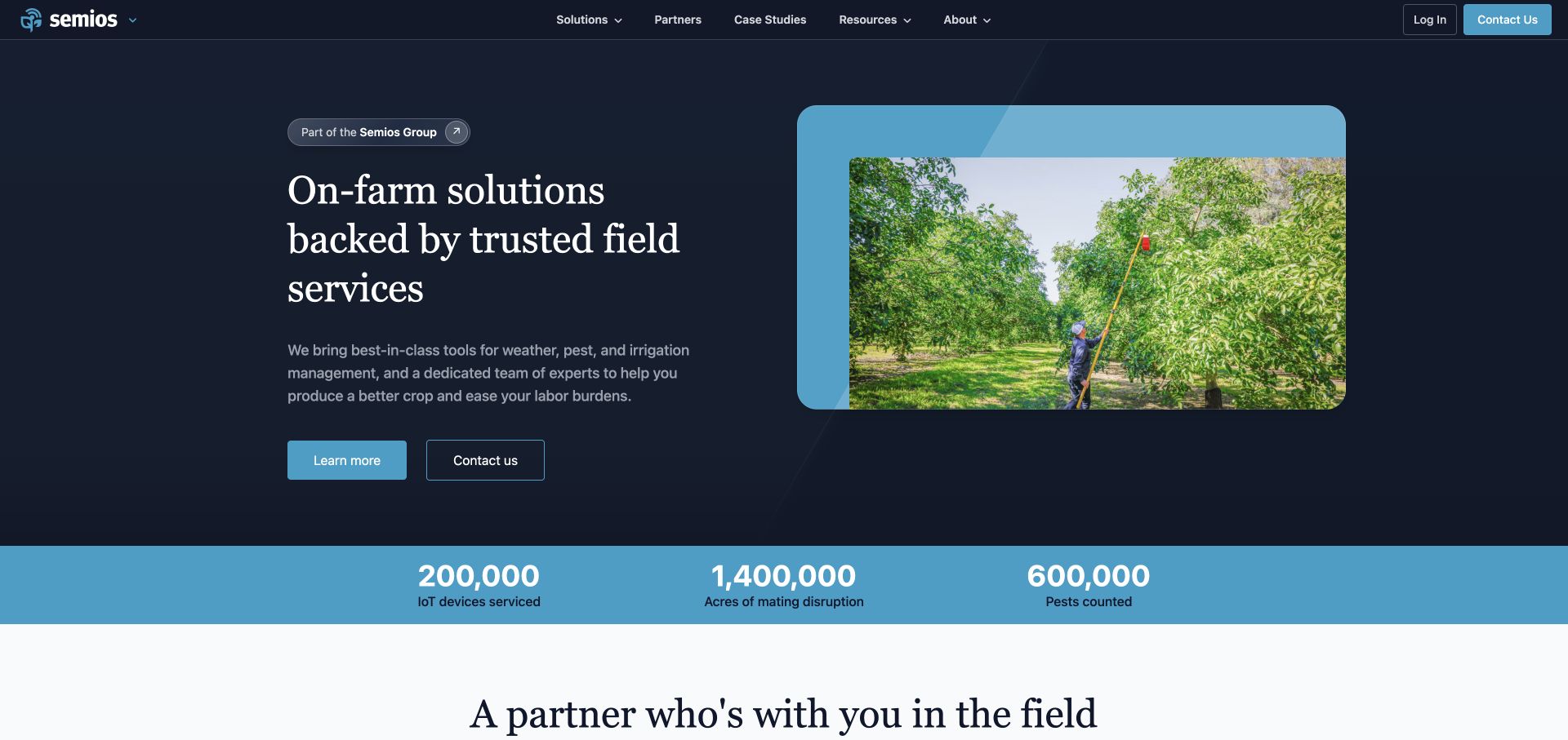
Semios puts field services beside weather, pest and irrigation technology rather than presenting the system as software alone. A technician image reinforces the explanation of installation, maintenance and local expertise. Solution cards, customer cases and a distinct login route make the surrounding engagement more visible to someone assessing an on-farm system.
What you can learn
If a product depends on people installing and maintaining it, make that service model part of the initial explanation. Technology screenshots alone can hide a consequential part of the customer relationship.
Pros
Installation and field-service responsibilities are visible in the proposition.
Solution and customer-case routes extend the introduction beyond a generic demo.
Cons & considerations
Local service language needs maintained coverage information for the visitor’s region.
A broad platform introduction may need a more explicit list of included and optional services.
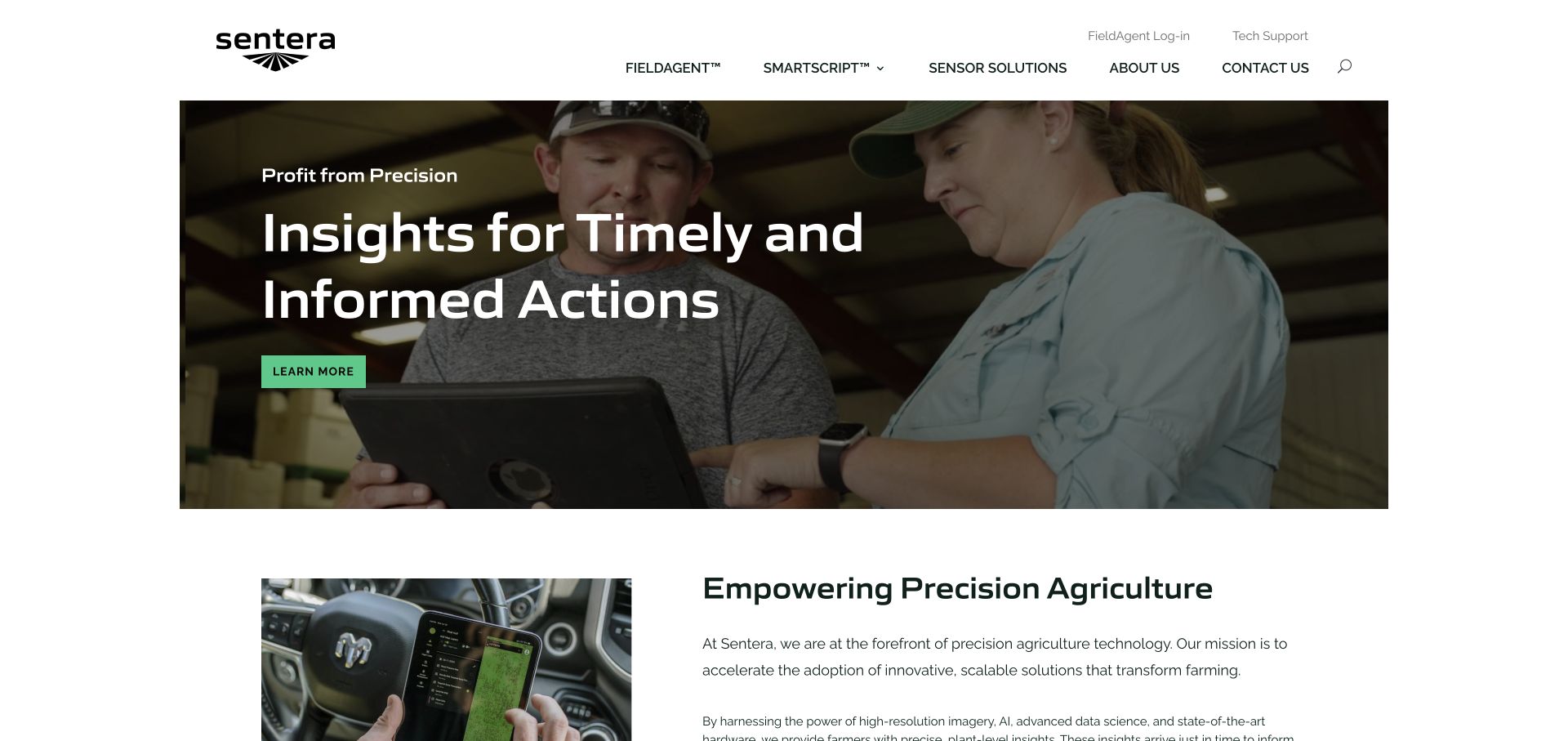
Sentera introduces timely agronomic insights with agricultural imagery and explains high-resolution, plant-level analysis. FieldAgent login has its own route, while sensor and support destinations are separately identified. The page therefore acknowledges that someone researching a new analytical capability and an existing hardware or software user may arrive with very different needs.
What you can learn
Separate the data product, the collection hardware and existing-user support. Explain how they relate without assuming every visitor is purchasing the same complete system.
Pros
Software access is distinct from general product exploration.
Plant-level and field imagery make the analytical subject concrete.
Cons & considerations
A general insight promise needs example outputs and conditions to establish practical relevance.
External sensor and support handoffs need clear labeling so users understand they are changing systems.
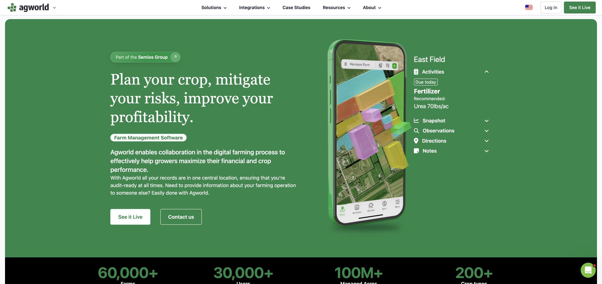
Agworld introduces growers, agronomists and contractors as distinct audiences, then shows field-record views labeled Activities, Snapshot, Observations, Directions and Notes. The interface context connects field work with operational and cost information. Integrations and demo/login actions surround the software story, and Semios Group ownership is explicitly visible.
What you can learn
Show a recognizable record and its tasks, not just a decorative dashboard. Audience labels and field-work terminology help explain where the application fits into a real collaboration. Activities and observations give the record an agricultural vocabulary, while directions and notes suggest where collaborators can find context rather than another unexplained chart.
Pros
Field-record labels expose what the software is designed to organize.
Grower, agronomist and contractor routes acknowledge different roles in the workflow.
Cons & considerations
Related-company ownership should remain clear when multiple brands appear in a collection.
Interface imagery needs readable explanatory text for users viewing it on small screens.
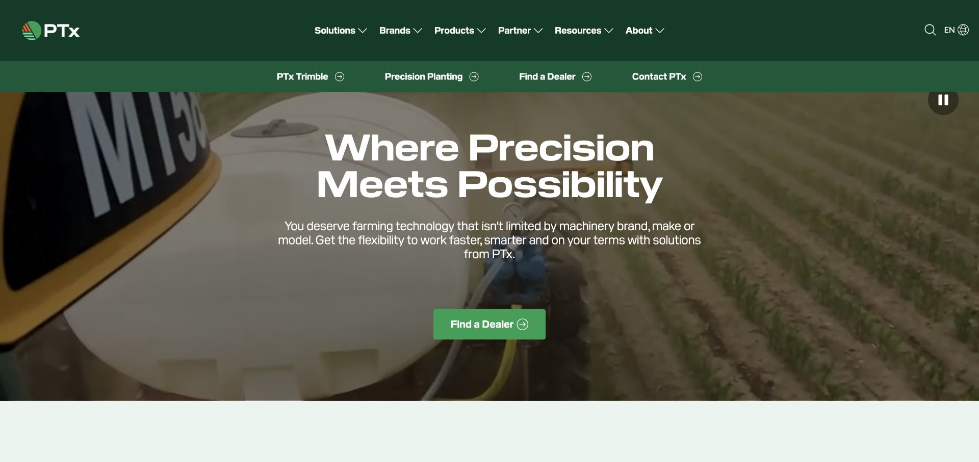
The reviewed Trimble Agriculture address leads to the PTx homepage, where PTx Trimble and Precision Planting are named explicitly. A compatibility proposition sits over field-equipment footage, and equipment upgrades, in-field platforms and digital farming are separate categories. A dealer route provides a practical next step through the wider product family.
What you can learn
When several brands share a technology portfolio, explain the relationship before asking users to choose a product. Compatibility is a useful entrance when customers already own machinery. An existing equipment owner can start with an upgrade question rather than needing to understand the full corporate portfolio before locating a relevant product category.
Pros
Brand relationships are visible rather than implied by a collection of logos.
Upgrade and digital-platform categories support different adoption questions.
Cons & considerations
Brand-independent positioning needs model-specific compatibility details before a purchase decision.
A dealer-led journey needs maintained geography and product coverage information.
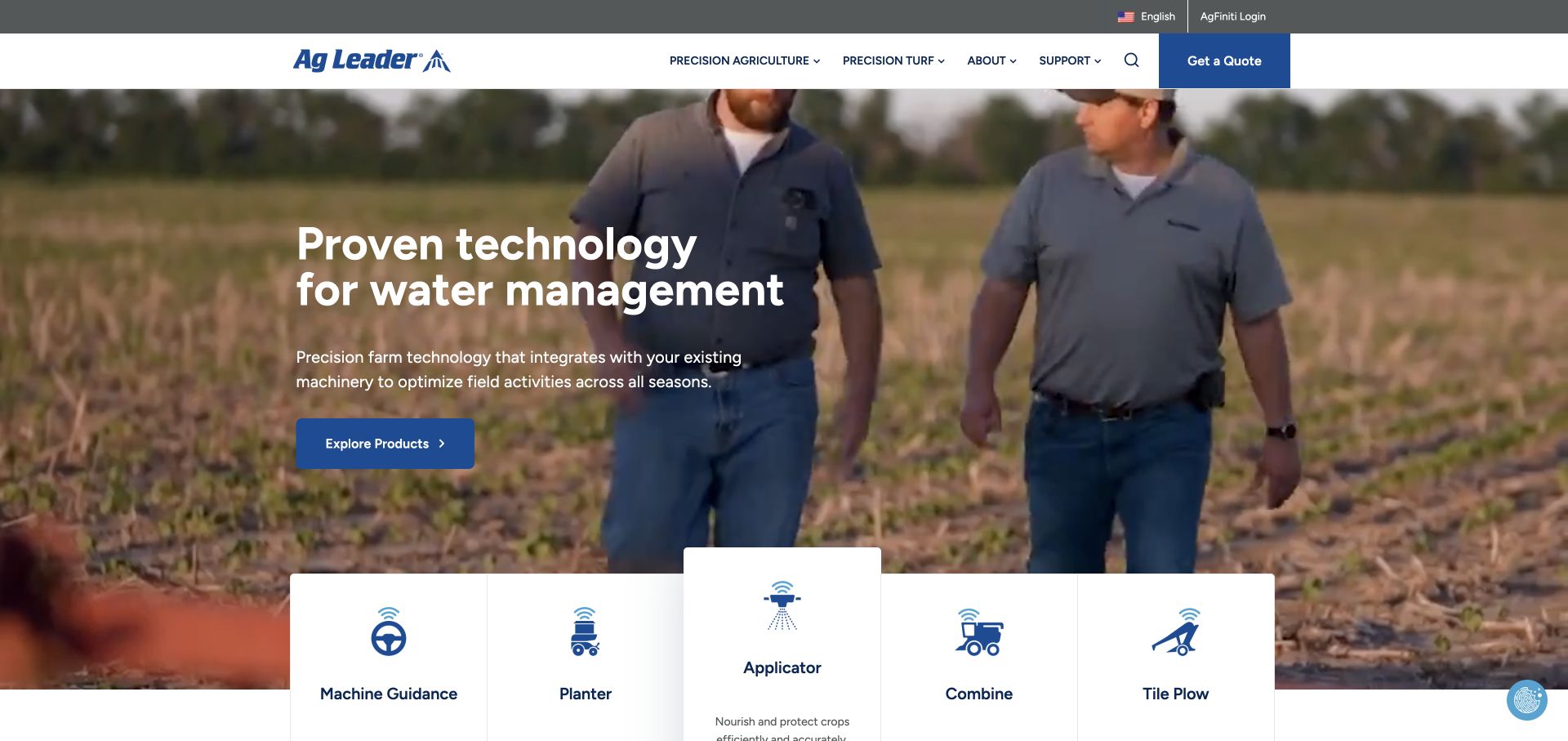
Ag Leader frames precision technology around planting, application, harvest and water management while explicitly addressing existing machinery. Machine guidance, planter, applicator, combine and tile-plow cards pair icons with plain descriptions. Quote, AgFiniti login, manuals and tutorial routes give new and existing users visibly different paths through the site.
What you can learn
Use the seasonal job and the equipment category as navigation aids. Keep support and existing-user access as easy to find as the new-business quote request. The combine and tile-plow cards make the seasonal structure concrete, while the support destinations acknowledge that equipment research continues well after the original purchase.
Pros
Equipment icons and descriptions make the initial catalog scannable.
Manuals, tutorials and software login support the long ownership relationship.
Cons & considerations
Rotating seasonal headline words need a stable readable equivalent and reduced-motion consideration.
Existing-machinery language still needs detailed compatibility records for individual configurations.
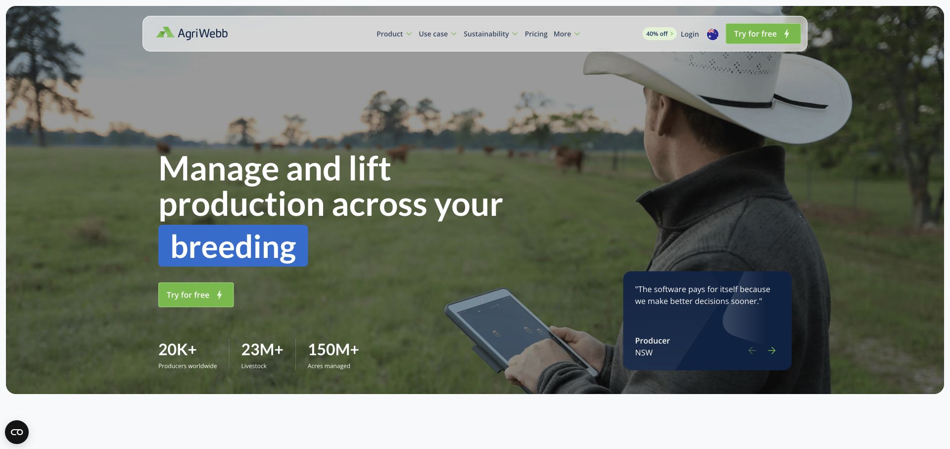
AgriWebb pairs a producer using a tablet with a livestock-management proposition and a direct trial action. Grazing management, farm records, mapping, team management and compliance appear as specific use cases. Pricing, integrations and existing-user login remain visible, giving the software a more concrete context than a general farm-efficiency claim.
What you can learn
Use the farm’s actual management tasks as routes into the software. A clear trial and pricing path becomes more useful when readers can first identify the record or workflow they need.
Pros
Use-case labels translate the product into recognizable livestock-management work.
Pricing, integrations and login are not buried inside a general contact journey.
Cons & considerations
Large aggregate usage figures need context and do not demonstrate results for a particular farm.
Rotating headline terms and promotional pricing need stable content and clearly maintained offer conditions.
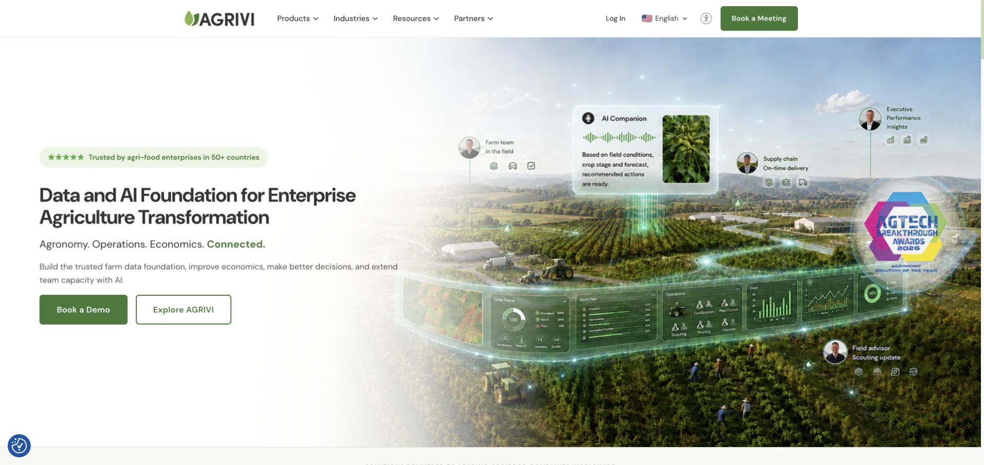
AGRIVI separates Farm Management Software from its AI Workforce rather than making every capability part of one broad AI headline. Farms, food businesses, input companies, retail and public-sector programs have individual explanations. Dashboard imagery and explore-versus-demo actions help a reader investigate the proposition before starting a sales conversation.
What you can learn
Separate the core record system from additional AI-enabled work. Audience-specific explanations make an enterprise platform more understandable than a universal transformation promise. Dashboard imagery anchors the data-foundation story, but an enterprise reader still needs to know whether the next conversation concerns farm records or an additional workforce product.
Pros
Two named product lines establish a meaningful distinction within the offer.
Value-chain audience descriptions give different enterprise readers a starting point.
Cons & considerations
Return and cost-reduction figures require documented assumptions and cannot be judged from the homepage.
A large cross-industry audience range needs concise use-case pages to avoid generic messaging.
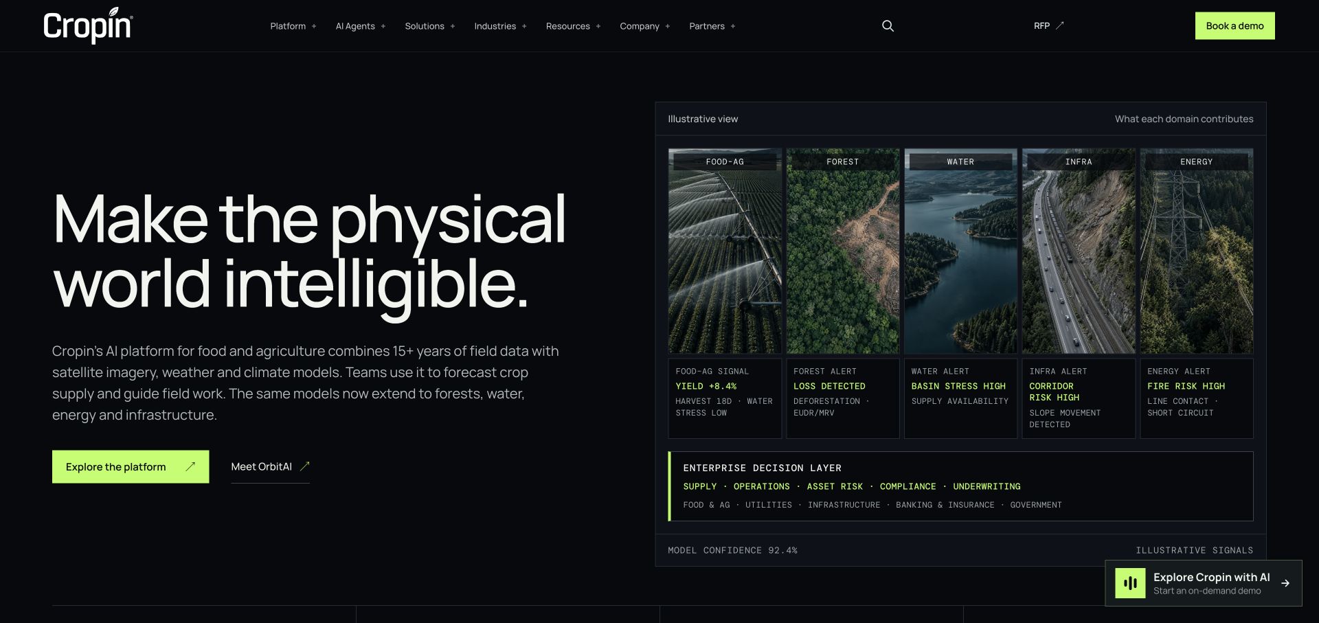
Cropin uses a dark, structured diagram to connect food and agriculture, forests, water, infrastructure and energy with enterprise decisions. The visible signal figures are labeled illustrative rather than silently presented as live measurements. Platform exploration, AI agents, customer films, an RFP route and booking a demo are separately available.
What you can learn
Use a diagram to explain a complex platform, but label sample values as illustrative. Separate learning, procurement and demonstration paths instead of giving all enterprise readers the same generic action.
Pros
The diagram makes relationships between data domains and decisions visible.
Illustrative labeling helps distinguish communication imagery from live operational evidence.
Cons & considerations
A broad physical-world headline depends on supporting copy to retain agricultural specificity.
Dense technical diagrams need a simplified readable equivalent on mobile and for assistive technology.
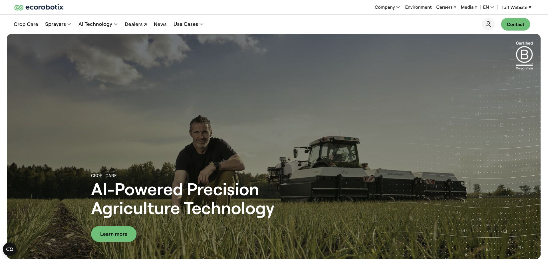
Ecorobotix introduces precision crop care with field imagery, then distinguishes ARA spraying hardware from Plant-by-Plant AI software. Dealer, regional and use-case destinations surround the product material. Customer accounts and research/news links provide additional reading without asking the first screen to explain the entire spraying system.
What you can learn
Explain the physical application system and the detection logic as related but distinct parts of the offer. Crop-specific cases can supply context that a general AI claim cannot.
Pros
Hardware and software have identifiable explanation routes.
Dealer and language choices acknowledge a regional equipment buying process.
Cons & considerations
Percentage savings claims need crop, treatment and study conditions before they can support a comparison.
Large hero media should retain a readable proposition when motion or optional media is unavailable.
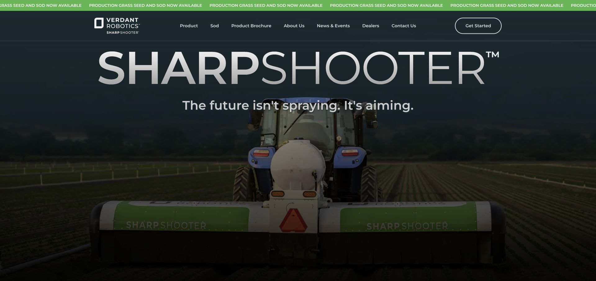
Verdant Robotics makes SharpShooter the dominant visual name and places it over real tractor-and-implement footage. Weeding, thinning and input application provide the practical structure beneath the introductory line. A product brochure and demo route support deeper investigation, while the page describes crop and utilization conditions around some commercial claims.
What you can learn
Let the product name be memorable, but follow it immediately with the jobs it performs. Keep brochures and demonstrations available for readers who need different levels of technical and commercial detail.
Pros
The equipment is shown as a physical implement working in a field.
Task categories explain a multi-use product more concretely than a feature slogan.
Cons & considerations
Large typography can leave little first-screen space for crop and equipment compatibility.
Savings and payback ranges need their assumptions and supporting evidence, not just a prominent display.
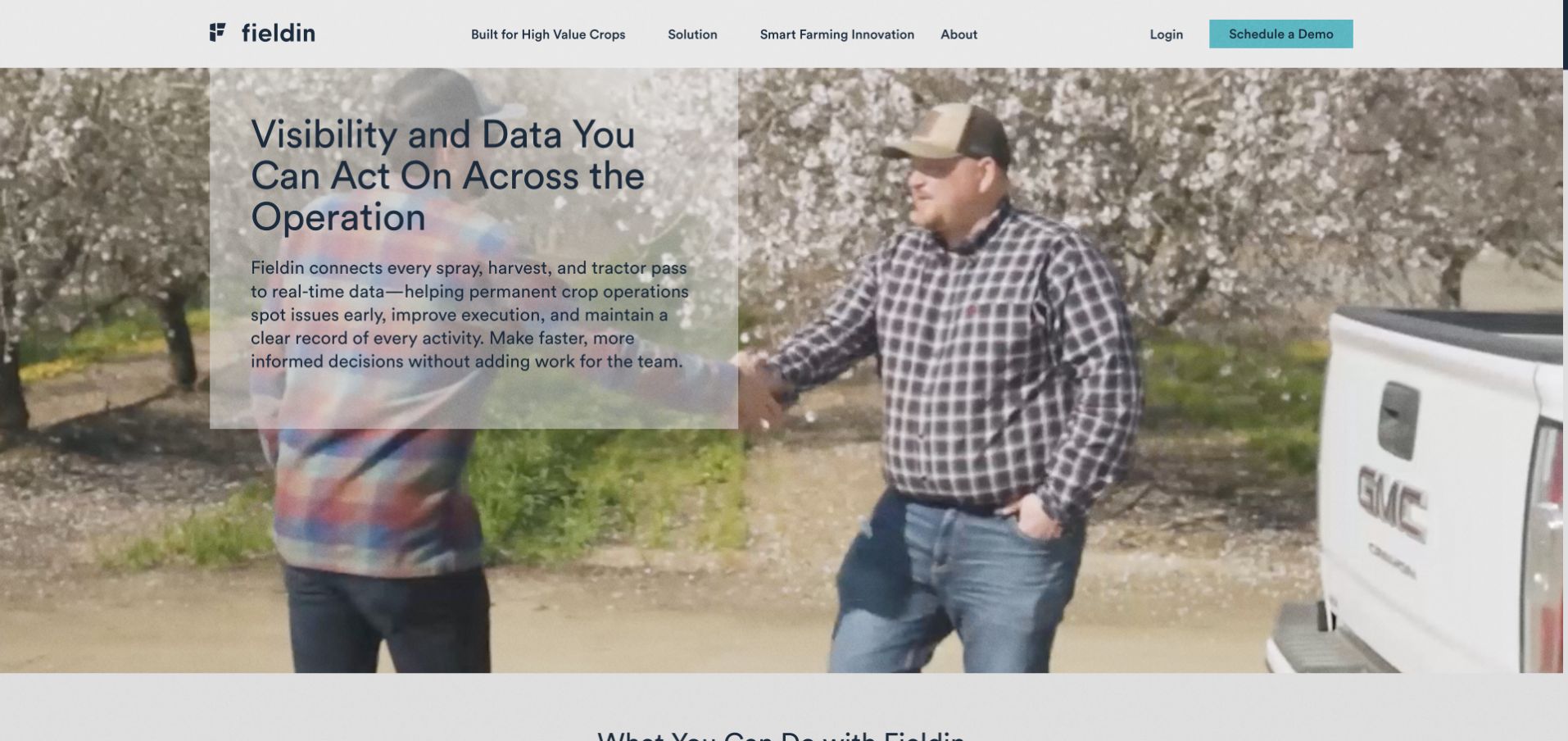
Fieldin explains its platform through spray, harvest and tractor passes instead of starting with a vague connected-farm abstraction. Crop-specific navigation includes nuts, grapes, apples, citrus and other high-value crops. The body moves from visibility to task instructions, execution records and analysis, with a separate login and demonstration route.
What you can learn
Describe the operational unit the software records. A sequence from observation to instructions, work and analysis can make an equipment-data platform easier to understand than a wall of dashboard features.
Pros
Concrete equipment activities make the platform’s subject clear.
Crop navigation provides a relevant entry point for permanent-crop growers.
Cons & considerations
A large background video can delay the first view of the actual software interface.
Efficiency and risk language needs case-specific evidence before it becomes a measurable business claim.
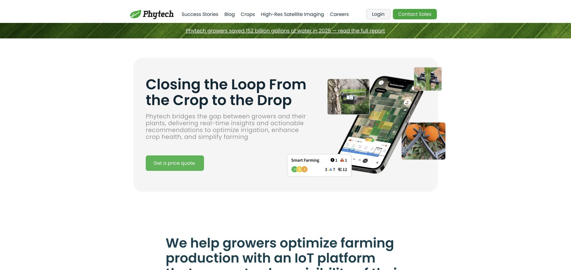
Phytech combines leaf texture, sensor photographs and a phone interface to connect plant sensing with irrigation decisions. Crop knowledge and customer stories provide further research paths, while login and sales contact are distinct. The body names hydraulic components, monitoring and alerts, making the platform more specific than the introductory crop-to-water metaphor alone.
What you can learn
Show the connection from field measurement to the information and action a grower receives. Specific monitored components help turn an attractive nature-led introduction into a usable technical explanation.
Pros
Sensor and application imagery connect the physical and digital parts of the offer.
Named monitoring and alert topics provide concrete follow-on research.
Cons & considerations
Large global water-saving claims need transparent methodology and cannot establish an individual farm’s outcome.
Long headings need careful wrapping and readable alternatives to image-based product detail.
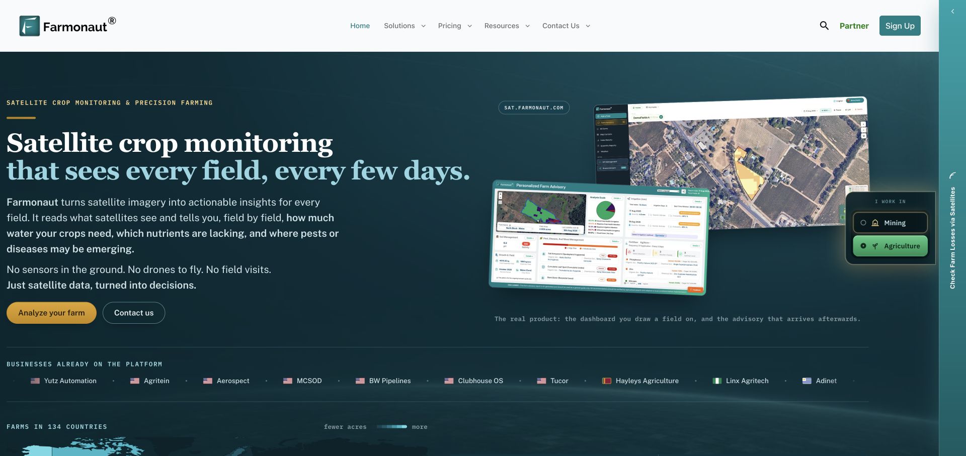
Farmonaut’s agriculture tab pairs a satellite field map with a sample advisory and an Analyze your farm action. The tab distinguishes agriculture from the mining content shown by default on the reviewed homepage. Pricing, contact and product access are separate, while the interface imagery makes the field-level analytical product visible rather than relying solely on aerial farmland photography.
What you can learn
When one homepage serves different industries, make the switch discoverable and preserve a direct link to the relevant state. Show a real product view with enough explanation to distinguish measurements from recommendations.
Pros
The agricultural tab presents dashboard and advisory examples together.
The selected industry has a shareable URL fragment and a direct product route.
Cons & considerations
A mining-first default can make agriculture harder to find for an arriving grower.
Satellite interpretation and advisory claims need documented limits; imagery alone does not verify diagnostic accuracy.
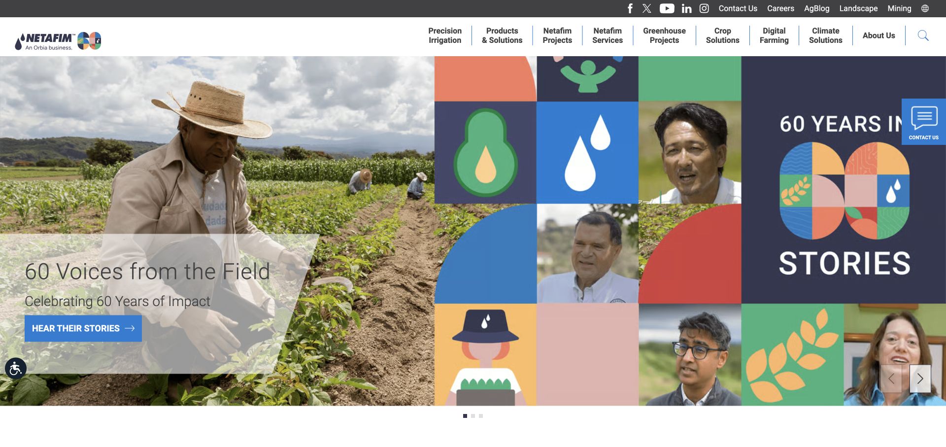
Netafim’s reviewed homepage leads with a farmer-story anniversary campaign, then connects precision irrigation with crop knowledge and digital farming. Products, projects, services and greenhouse work are distinct navigation routes. A visible regional prompt acknowledges that product and support information may differ by location rather than treating the global site as the only customer destination.
What you can learn
Make regional relevance and crop knowledge part of the product journey. A large irrigation catalog becomes easier to approach when visitors can start from their crop, project type or local support context.
Pros
Crop, product and service paths support different levels of prior knowledge.
Regional navigation acknowledges a consequential difference in commercial and support information.
Cons & considerations
An anniversary campaign needs a maintained path back to evergreen product information.
A broad navigation with many top-level categories can require clearer prioritization on smaller screens.
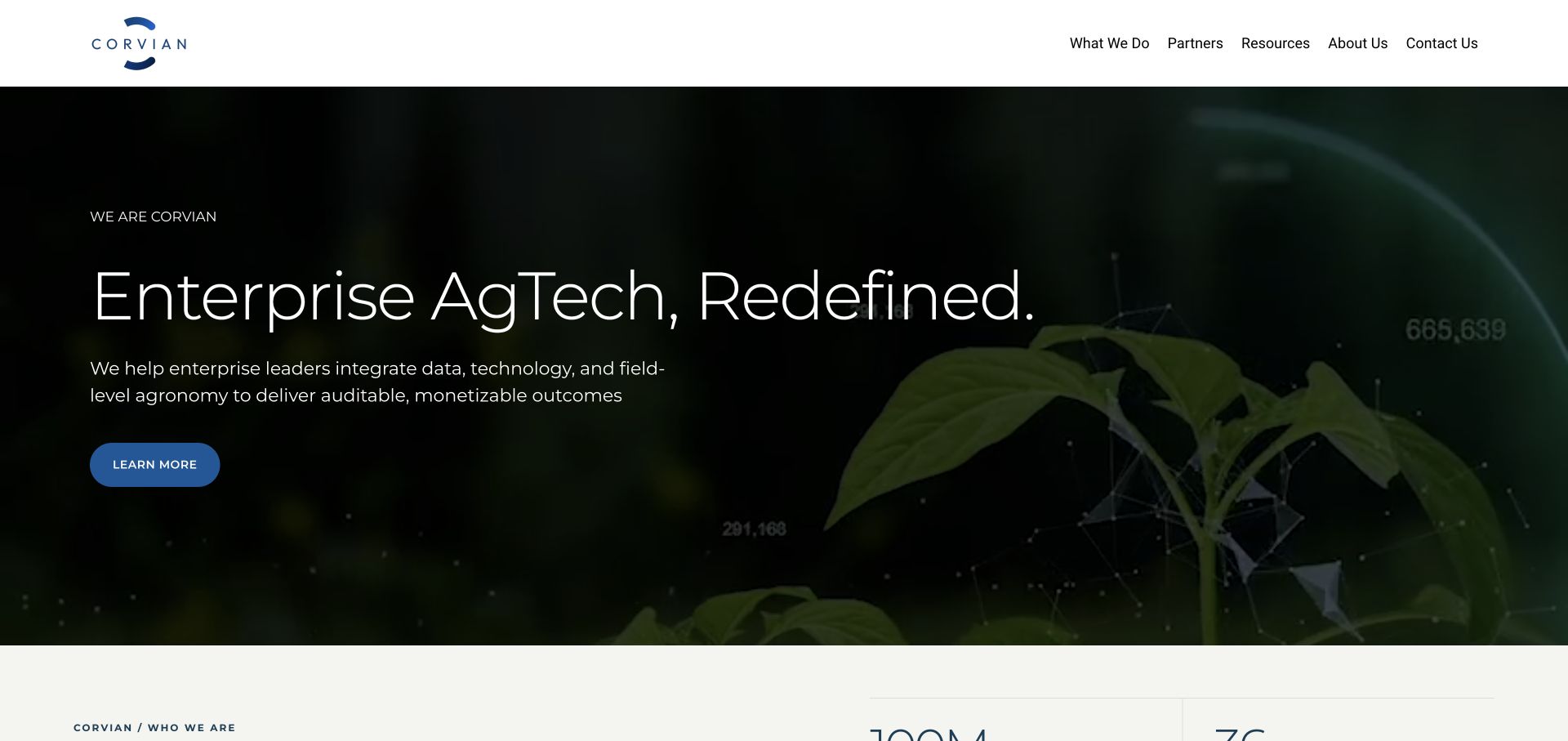
The reviewed Farmers Edge address redirects to Corvian, whose homepage identifies an enterprise agriculture proposition. Data infrastructure, managed services and strategy are separate offer categories. Agronomy, food, energy, insurance, finance and sustainability receive individual contexts, while a restrained crop-video hero leaves the introductory copy easy to identify.
What you can learn
For enterprise agricultural services, distinguish the data foundation from ongoing operations and advisory work. Clear service boundaries help a reader understand what engagement the business is actually proposing. A food-business reader and an insurance reader can recognize different contexts before exploring the same data foundation, without treating every enterprise engagement as identical.
Pros
Three service categories separate infrastructure, execution and strategic work.
Audience routes acknowledge different uses of agricultural data beyond farm operations alone.
Cons & considerations
Enterprise outcome language needs specific engagement examples to avoid sounding interchangeable.
A redirected legacy address benefits from clear brand-transition information for returning users.
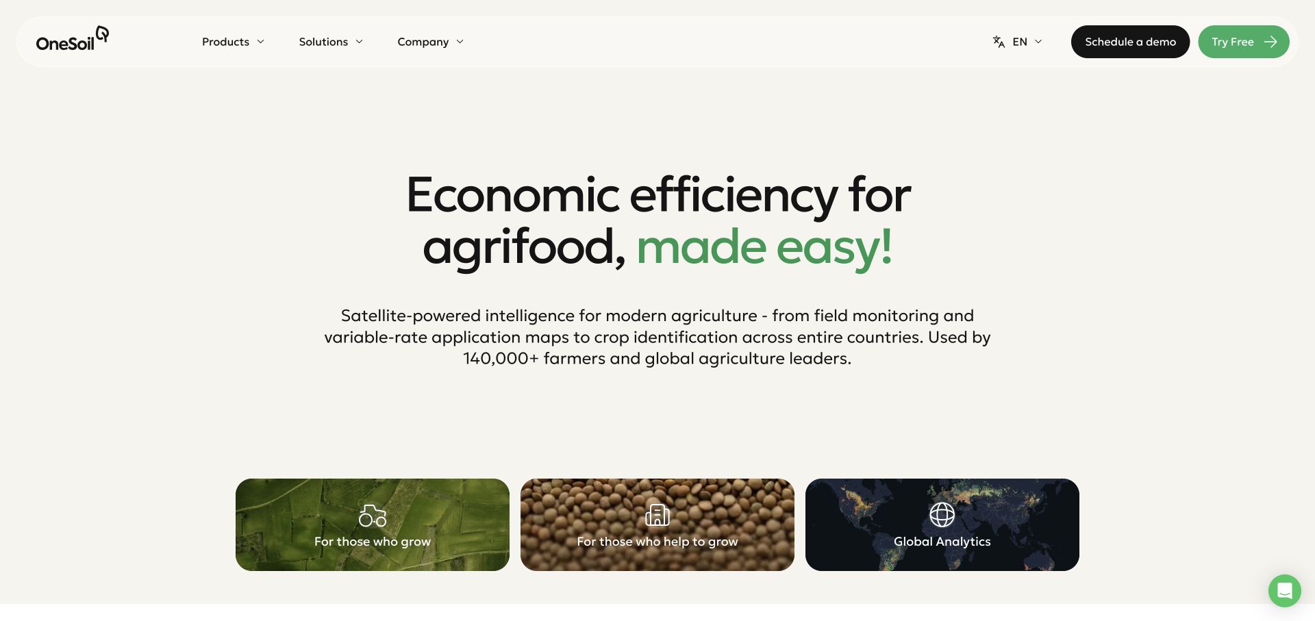
OneSoil uses three large image cards for people who grow, people who help them grow and global analytics. A free-product route and scheduled demonstration are distinct. The supporting material separates field monitoring and variable-rate maps from country-scale agricultural intelligence, preventing one broad satellite proposition from having to explain every audience at once.
What you can learn
Split a data platform by the reader’s role and scale of work. A grower planning field activity and an enterprise analyst assessing a region should not have to decode the same undifferentiated product pitch.
Pros
Audience cards are prominent and easy to scan.
Free access and a demonstration offer different levels of engagement.
Cons & considerations
A broad economic-efficiency headline depends on the supporting description for a concrete product meaning.
Role-based routes still need clear product boundaries and transparent data limitations.
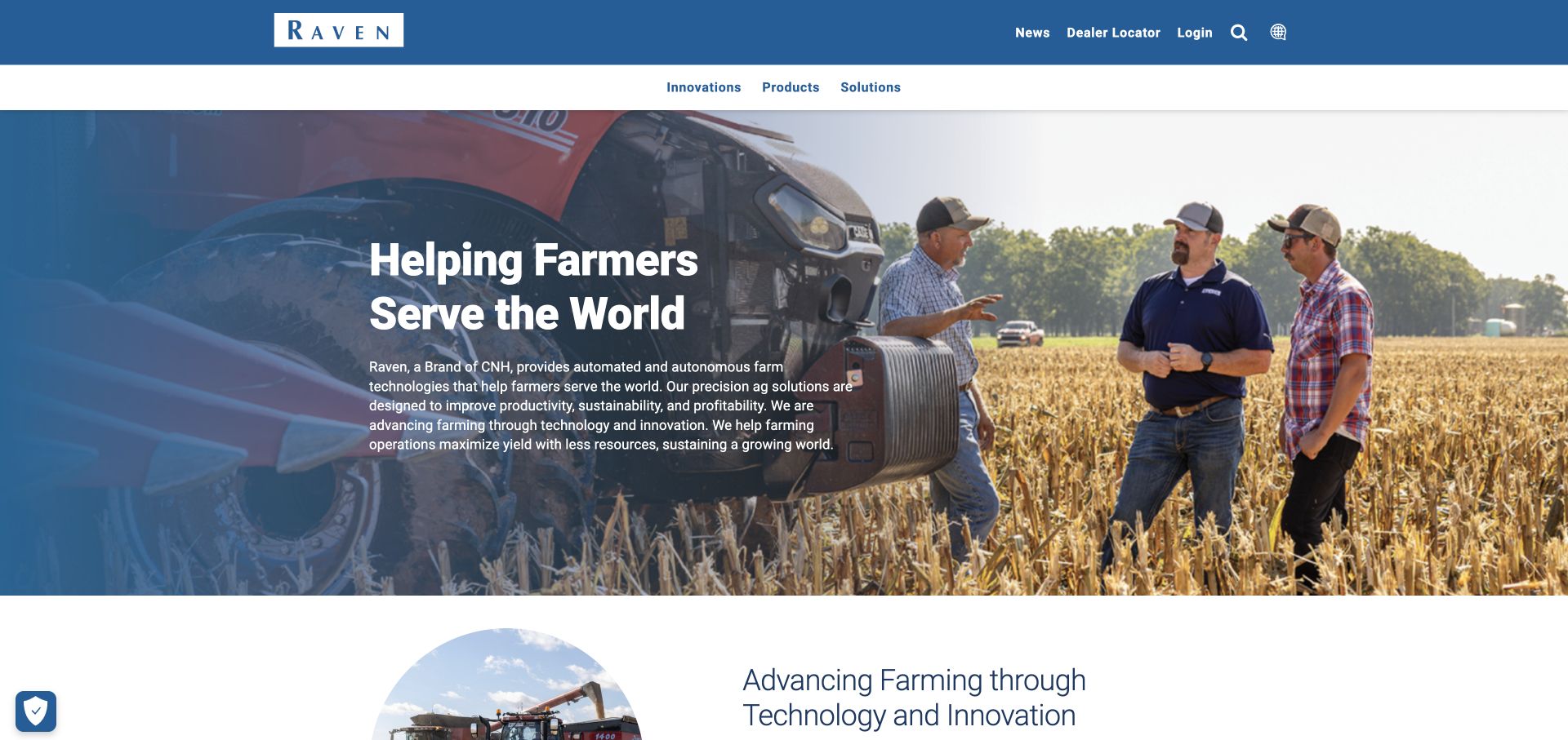
Raven introduces its CNH relationship and precision-farming offer over a field scene with machinery and people. Products, solutions and innovation are distinct main routes, while a dealer locator and login sit in the utility navigation. The body separates labor challenges from connected operations and uses named accounts to extend the high-level proposition.
What you can learn
Keep the product, application and support paths distinct even when the homepage begins with a broad company mission. Field context can establish the subject, but practical navigation must do the research work.
Pros
Dealer and existing-user access are visible without competing with the main catalog.
Labor and operations themes connect the technology with recognizable farm concerns.
Cons & considerations
A broad mission statement needs product-specific content to establish immediate fit.
Autonomy and performance language requires documented conditions rather than inference from testimonials.
Kegan is a freelance web designer and developer with 15+ years of experience helping businesses turn complicated website requirements into clear, maintainable digital experiences. He works directly with clients from planning and design through development, launch, and ongoing support.
For agricultural technology website design, his development approach focuses on crop and operational fit, hardware and software relationships, evidence-scoped field examples, support information, and useful demonstration and purchasing journeys. The scope can be a targeted improvement or a complete custom build, with responsive layouts, thoughtful content structure, and integrations chosen around the people using and maintaining the site.
Show 3 other agricultural technology website designersHide other agricultural technology website designers
Plan an agricultural technology website around a working farm decision
Identify the actual reader, crop and adoption question
Start with the decisions the business can genuinely support. Naïo associates individual robots with crop contexts; Fieldin offers permanent-crop routes; AgriWebb names grazing, records and compliance. These are more useful planning inputs than a universal promise to transform agriculture. Define the intended user and the operating context before selecting imagery or navigation labels.
Do not mix a grower, equipment manufacturer, dealer and enterprise buyer into one unexplained audience. Agtonomy makes its factory-integration model visible, while OneSoil distinguishes growers, their supporting businesses and global analytics. If the offer requires a partner or regional dealer, explain that relationship early and maintain the destination.
Give each audience a clear next step. A trial, machine configuration, field demonstration and procurement discussion are different commitments. Burro separates watching from booking a demo. Preserve that distinction and explain what a visitor should expect before asking for field boundaries, business details or other potentially sensitive operational data.
Show the measurement-to-action or machine-to-task connection
Decide which part of the workflow the product actually supplies. CropX names soil, weather, satellite and machine inputs. Arable and Phytech put hardware beside app views. Agworld shows a field record and its tasks. Use these patterns to explain what is measured, what is inferred and what a person or system does next.
Use real equipment and interface images with clear context. A tractor photograph does not demonstrate an autonomous capability, and a simulated dashboard should not look like live customer data. Cropin explicitly labels its illustrative signal diagram. Preserve privacy in screenshots and avoid exposing identifiable field or customer records without permission.
Explain the service model around the technology. Semios includes installation and maintenance in the proposition. Connected hardware may depend on coverage, field support, compatibility and replacement responsibilities. State which services are included, which are optional and where detailed technical or commercial documentation is available.
Make comparisons useful without promising universal farm outcomes
Create consistent records for each product, crop context, supported equipment and availability region. Ag Leader uses seasonal tasks and equipment icons; GUSS exposes a focused product family; PTx explains brand relationships and existing-machinery compatibility. Model these facts in maintainable content rather than burying them in campaign artwork.
Keep savings and performance figures connected to the conditions behind them. Field, crop, season, utilization, comparator and measurement method can change the meaning of a claim. A case study is a reported example, not a guarantee for the next farm. Avoid combining unlike figures into an unsupported comparison or letting a large number imply independent verification.
Give automation, AI and remote-sensing descriptions appropriate boundaries. Explain the user’s responsibilities and link to relevant limitations and operating documentation. This website collection does not establish safety, agronomic reliability or suitability. Make uncertainty and human oversight understandable rather than presenting them as inconvenient footnotes.
Design the site for seasonal research and long-term support
A grower may research between tasks on a phone, revisit a product during a seasonal decision and return later for a manual. Keep readable summaries and direct support paths available without a video or an optional tracking service. Use motion controls and reduced-motion behavior for machinery footage and rotating headline words.
Keep promotions and company transitions current. Netafim’s anniversary campaign is time-specific; Robotics Plus explains a Yamaha transition; the reviewed Farmers Edge address leads to Corvian. Give these items an owner and a review date so product, support and inquiry paths do not become unclear as the business changes.
Treat existing-user access as a first-class task. Many examples separate login from a demonstration request. Keep tutorials, manuals, integration help and service information equally clear when they belong to the offer. A useful agricultural technology website supports adoption and continued use, not only the first sales inquiry.
The editing job behind the design
Choose a website stack that keeps product and field information trustworthy
Structure crop contexts, product models, equipment compatibility, service coverage and supporting documents as maintained records. Reuse the same verified facts across product lists, application pages and relevant downloads.
Keep product browsing separate from software login, sensitive farm-data transfer and customer support. Explain when a visitor is moving to another system, and request only the information needed for the current step.
Public website signals do not reveal a company’s agronomic models, machine controls, sensor firmware or internal data infrastructure. Unknown website technologies remain unknown here until a bounded public audit provides evidence; no private operational stack is inferred.
Our WordPress website examples offer a separate look at publishing approaches. A visible platform label is evidence for that named page, not a guarantee that the same system will suit your requirements.
Identify the grower, agronomist, dealer, manufacturer or enterprise audience.
Name relevant crops and field tasks in plain language.
Show actual machinery, a clearly labeled interface or an illustrative output.
Distinguish measurements, estimates, recommendations and automated actions.
Explain installation, maintenance and field-service responsibilities.
Maintain model-specific compatibility and regional availability.
Separate learning, trial, demonstration, dealer and procurement routes.
Keep existing-user login and support easy to reach.
Qualify yield, water, labor and payback claims with conditions.
Protect customer and field information in imagery and forms.
Give moving media readable alternatives and usable controls.
Assign owners to seasonal offers, campaigns and brand transitions.
These checks are a project checklist, not a performance, legal, security, or accessibility certification. Test real journeys with the people responsible for the website before making claims about the result.
Sources & editorial method
How this collection was selected and reviewed
The original 29-example draw was preserved. Each included public website was directly reviewed and captured in a real browser. Optional cookies were declined or necessary-only settings retained where offered, and normal controls dismissed obstructing notices. Delayed cookie or chat-overlay originals for Ag Leader, AgriWebb, Cropin and OneSoil remain private and are excluded in favor of clean replacements. Farmonaut was captured after selecting its Agriculture tab, with the exact resulting URL preserved. The collection assesses website information design, not product testing, agronomic advice, automation safety or business outcomes. Related Semios and Agworld properties are identified as such rather than presented as independent organizations. FarmDroid is an explicit editorial communication choice. Every accepted source received a bounded broad public technology-audit attempt; unavailable findings are not invented.
Each example links to its actual source page. Screenshots are direct browser captures with their own capture dates; moving imagery, announcements and live designs can change. The notes describe observable design choices and conditional tradeoffs, not measured traffic, conversion results, service quality, or accessibility conformance.
Technology labels use public page metadata, asset evidence, or explicitly cited platform documentation. Platform documentation is not a complete current deployment audit. A component reference may be legacy or unused; it is not a complete backend inventory. Unknown stacks are omitted. These sites are editorial examples, not our client portfolio.
Written, Edited and Curated are separate editorial records, not timestamps advanced by a rebuild. Website designs and imagery belong to their owners. See our editorial standards or suggest a correction.
Questions worth asking
Agricultural Technology website design questions
What should an agricultural technology homepage explain first?
Identify the intended user, crop or operating context and the job the product supports. Then explain whether the offer is equipment, sensing, software, field service or a combination.
Should an agtech website show a dashboard or a machine?
Show the parts that explain the real workflow. A sensing product may need both field hardware and an application view; a robotics product needs task and working-environment context as well as technical detail.
How should farm-technology savings claims be presented?
Include the relevant crop, season, operating conditions, comparator and measurement method. A reported customer result does not guarantee the same result on another farm.
Do these examples prove that agricultural AI or autonomous machinery works safely?
No. This collection reviews public website communication. It does not test hardware, validate agronomic recommendations, establish operational safety or certify a product’s suitability.
Why is FarmDroid the Editors Choice?
Its reviewed homepage connects a concrete field robot with explanation, configuration, specialist contact and demonstration opportunities. The choice concerns a focused website research journey rather than a product-performance ranking.
Make the task concrete, explain the relationship between field technology and people, and provide a useful path into detailed research. A strong agtech website helps someone assess fit without confusing attractive imagery with evidence.