Best Asphalt Maintenance Websites of 2026 (13 Real-World Examples)
Parking lots, pavement care, project evidence, and the practical details a property manager needs before requesting a site visit.
A useful asphalt maintenance website makes the next decision clearer: what work the company handles, where it works, and what information an estimator needs. A photograph of a freshly striped parking lot is a beginning, not the whole explanation.
This collection is about website communication rather than a ranking of contractors or pavement treatments. A property manager comparing maintenance providers has different questions from a homeowner asking about a driveway. The strongest brief acknowledges both without pretending that every visitor needs the same scope.
Study how the references describe services, organize project photographs, show regional coverage, and invite an inquiry. Borrow the information structure rather than another contractor’s claims, photographs, prices, or credentials. A website cannot diagnose pavement condition or establish that a particular maintenance treatment is appropriate.
Before the examples
What makes good asphalt maintenance website design in 2026?
Name the actual maintenance services
Separate sealcoating, crack-related services, patching, markings, and other genuinely offered work with useful descriptions. Explain how a visitor requests an assessment rather than making a particular treatment sound automatically appropriate for every surface.
Show comparable property situations
Organize approved project examples around a recognizable property type and the scope the company actually delivered. A shopping-center entrance, apartment parking area, and residential driveway create different access and scheduling questions; an unexplained gallery makes those distinctions harder to see.
Make the estimate request operationally useful
Ask for location, property type, the visitor’s observed concern, and a preferred way to make contact. Explain what happens after submission and whether the next step is a conversation or site visit. Avoid a long compulsory questionnaire when an initial inquiry would do.
The collection · 13 examples
13 asphalt maintenance websites worth studying
Look at the relationship between service labels, project evidence, geographic specificity, and the estimate journey. The examples illustrate different presentation decisions rather than independently verified service outcomes.
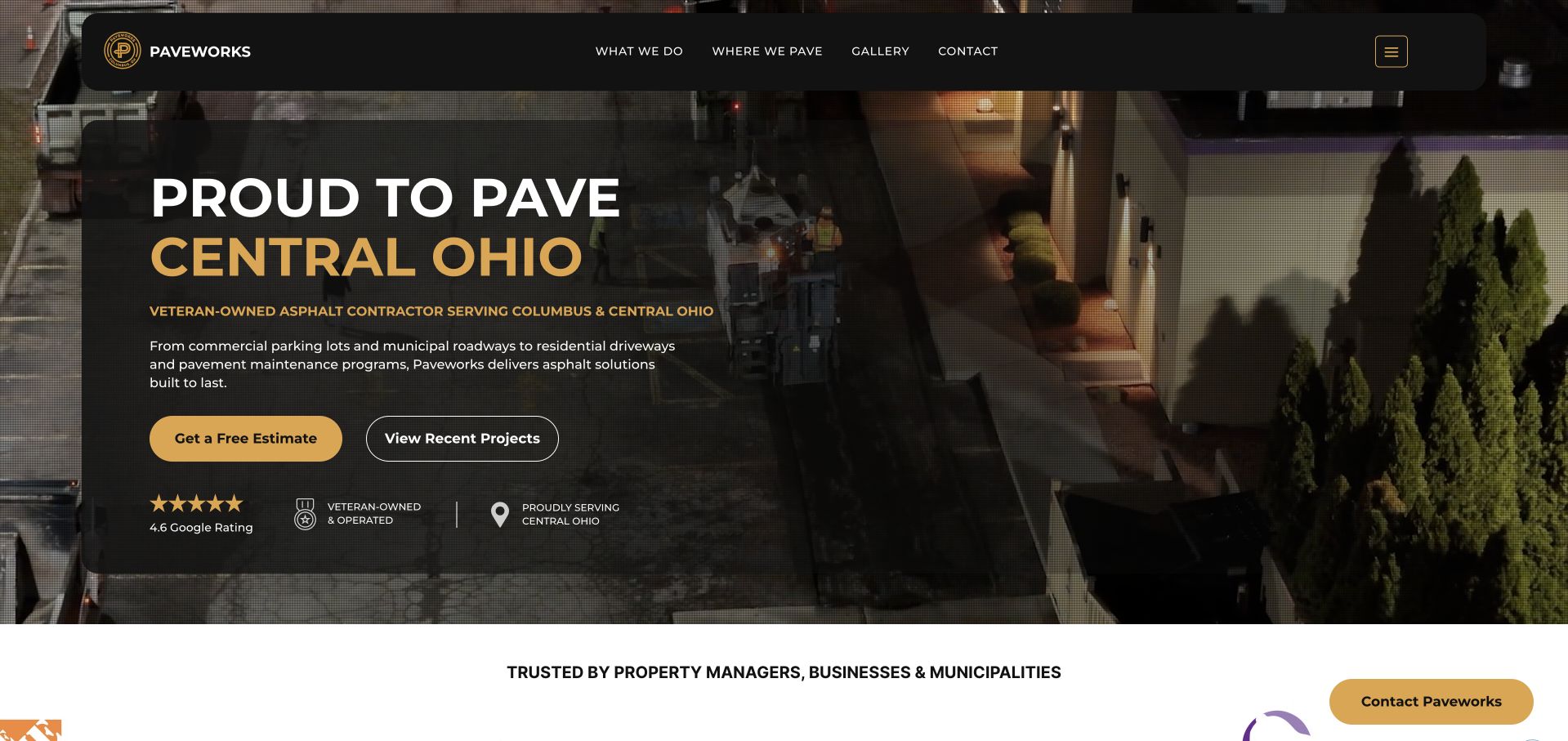
Paveworks places its Central Ohio identity inside a dark panel over working-site imagery, then gives the visitor an estimate action and a separate route to recent projects. That division is useful for maintenance: someone ready to talk and someone still assessing relevance do not have to take the same path. The current service navigation explicitly includes pavement maintenance, repairs, sealcoating, and striping. Gold accents connect the buttons, regional wording, and supporting identity details without turning every line into an equal-priority callout.
What you can learn
Give a property manager both a practical contact route and a low-commitment evidence route. Keep the operating region beside them so a compelling project image does not leave basic eligibility unanswered.
Pros
The estimate and project buttons support different stages of research without requiring an immediate form submission.
The Central Ohio emphasis gives the visual identity a concrete geographic meaning rather than a generic national promise.
Cons & considerations
If a maintenance inquiry is the main goal, the broad paving headline may still need a more specific supporting explanation.
The image-backed panel needs careful image selection as future photographs change; decorative contrast is not proof of accessibility.
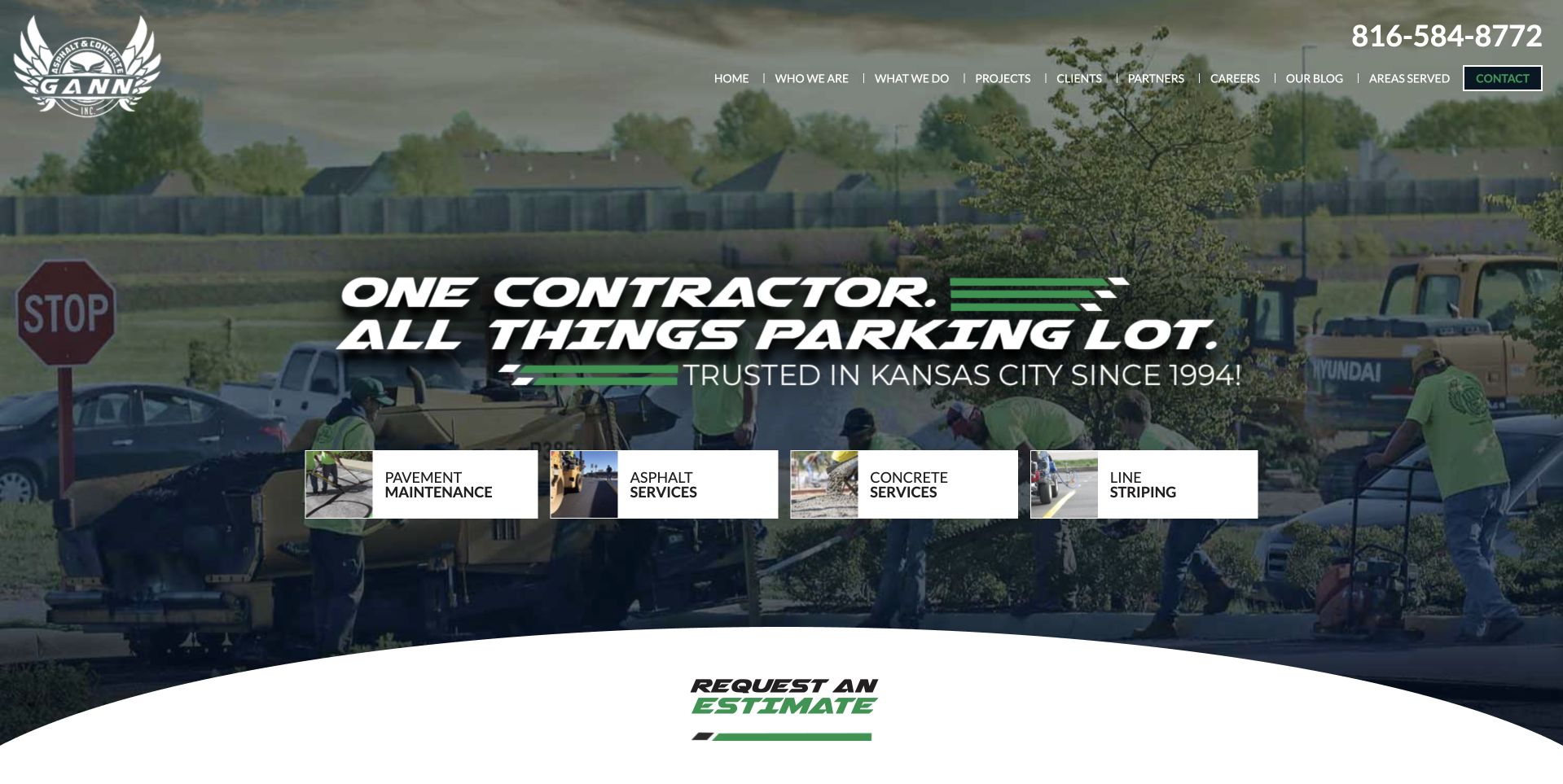
Gann gives the parking lot, rather than a single treatment, the leading role. The retained capture shows a working crew behind an emphatic headline and a row of four labeled service gateways, including pavement maintenance and line striping. Those small image-and-text blocks provide useful orientation beneath the larger brand statement. The current page then describes a pavement inventory process and separates repair, maintenance, signage, and related concrete work. This creates a relevant reference for a contractor whose customer is responsible for the whole property.
What you can learn
Lead with the property responsibility your customer recognizes, then let specific service categories explain the available work. A broad coordinated proposition is clearer when visitors can quickly find the maintenance task they actually need.
Pros
Maintenance is a visible first-screen destination rather than a minor item buried beneath new paving.
The crew photograph and service thumbnails give the central proposition a recognizable operational setting.
Cons & considerations
If copied too literally, the forceful display typography could overwhelm the quieter explanation a cautious buyer needs.
A large service tree needs disciplined naming so related repair and maintenance pages do not repeat one another.
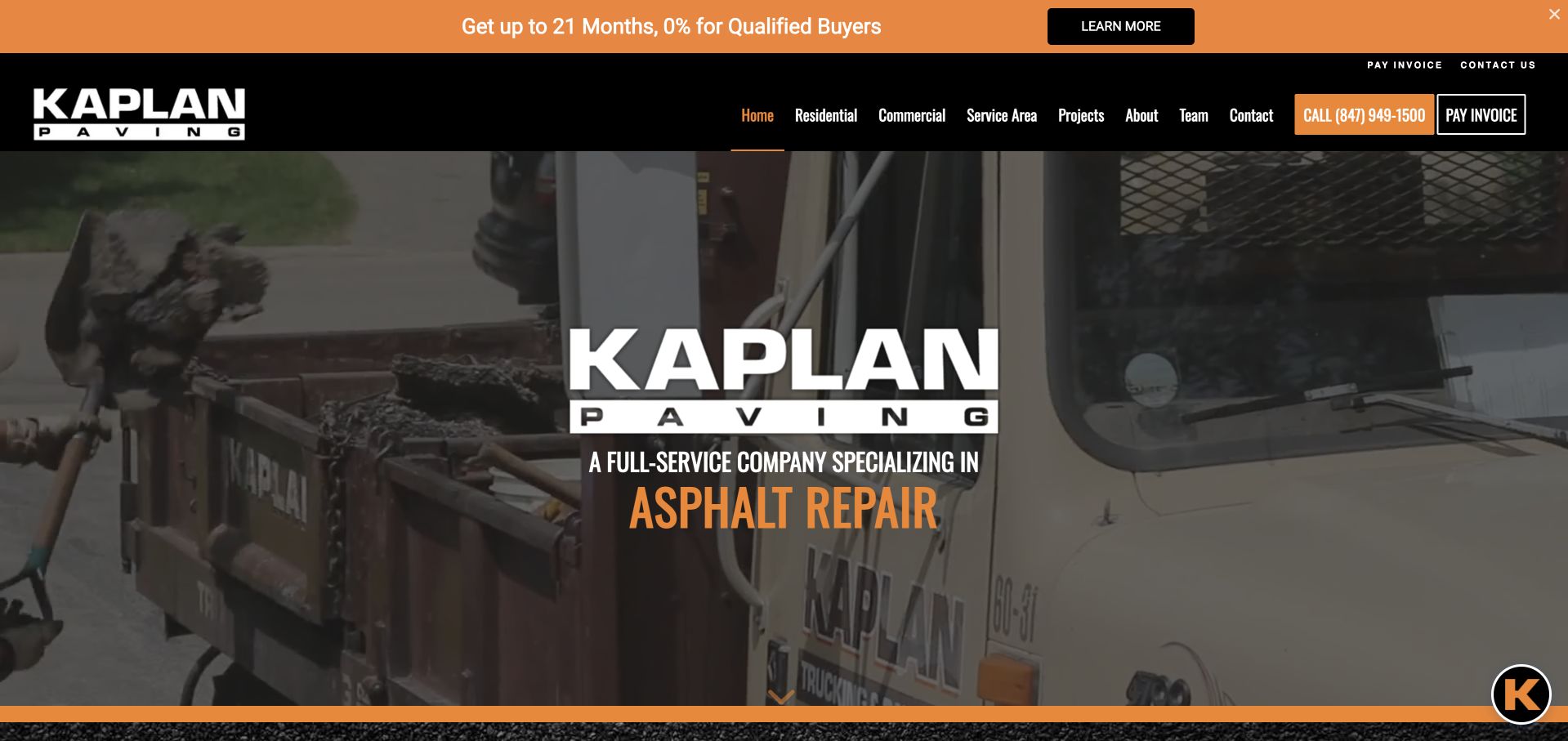
Kaplan uses a black-and-orange identity, a large central wordmark, and a photographed work scene to establish the trade immediately. Its navigation separates residential and commercial services while retaining projects, service area, contact, and invoice payment. On the current homepage, sealcoating and parking-lot maintenance have their own descriptions rather than being left inside a general paving statement. For a maintenance business, the useful idea is the relationship between customer type and service detail, not the promotional financing strip shown in the retained capture.
What you can learn
Organize maintenance content around the kind of property a visitor manages while keeping shared business tasks easy to find. Existing customers who need invoice payment should not have to follow the same path as a first-time estimate inquiry.
Pros
Separate commercial and residential navigation gives parking-lot and driveway questions distinct starting points.
Projects and regional coverage sit alongside services, making further qualification possible before contact.
Cons & considerations
A prominent financing promotion can compete with maintenance orientation when that offer is not relevant to the visitor.
A large image-backed wordmark consumes space that some smaller screens may need for specific service context.
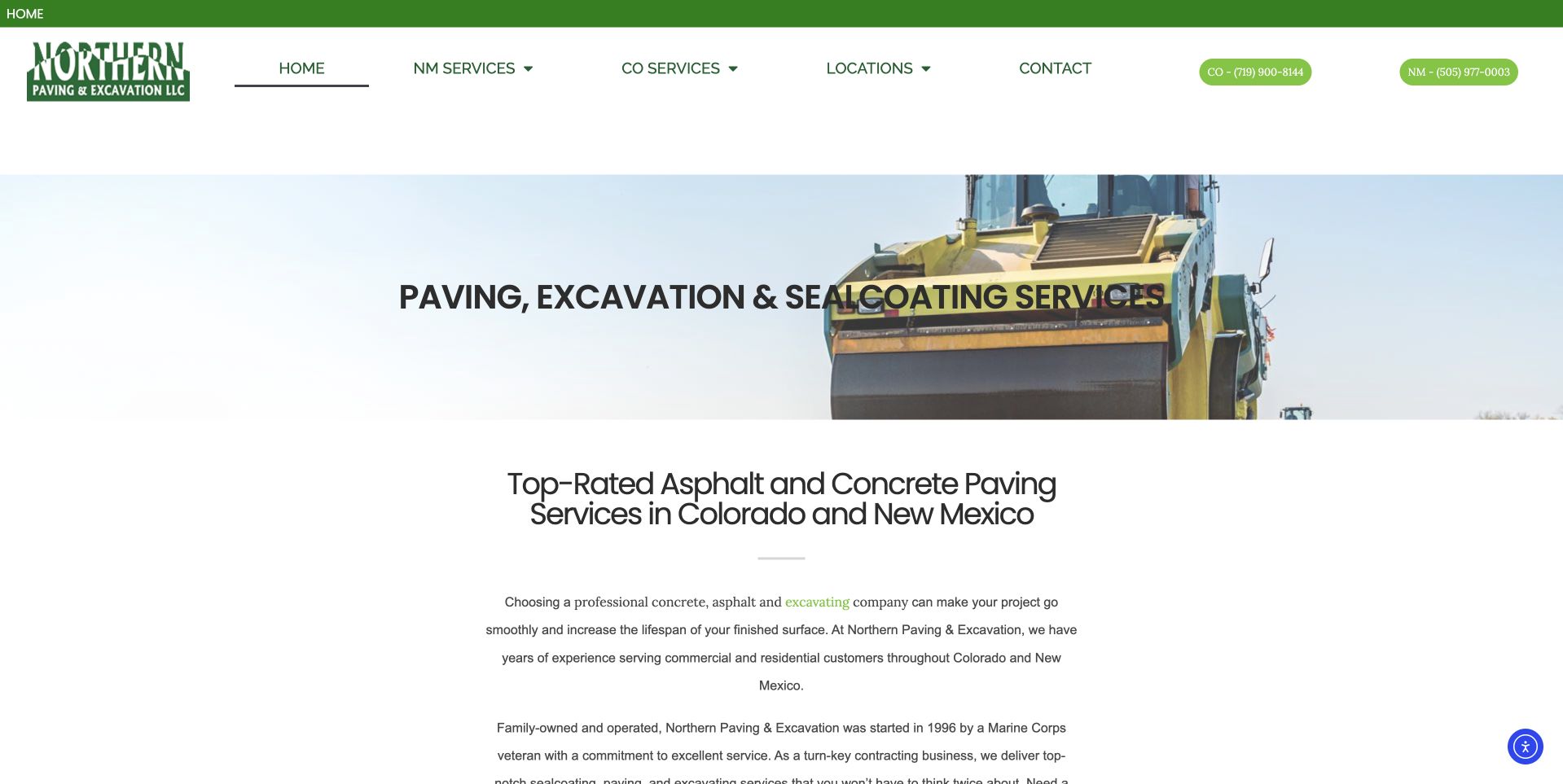
Northern Paving & Excavation makes Colorado and New Mexico visible as separate navigation routes and presents two labeled phone numbers in the retained header. Its main image introduces the equipment and service category without covering the opening explanation below. The current navigation includes asphalt sealcoating for each region, while the body identifies recognizable property customers and explains geographic coverage. This is a useful maintenance reference when the same business serves more than one operating area and the first question is which office should handle a property.
What you can learn
Put regional routing before the form when separate teams or contact numbers matter. Repeat a clear place label with each telephone number so the visitor does not have to infer which service area a number belongs to.
Pros
Two labeled regional numbers reduce ambiguity for a visitor who already knows the property location.
The opening text names the service category in ordinary terms before introducing the longer company story.
Cons & considerations
Duplicated regional service menus can become difficult to maintain if the two areas genuinely offer different work.
The central headline crosses a changing photograph, so future images need review rather than automatic substitution.
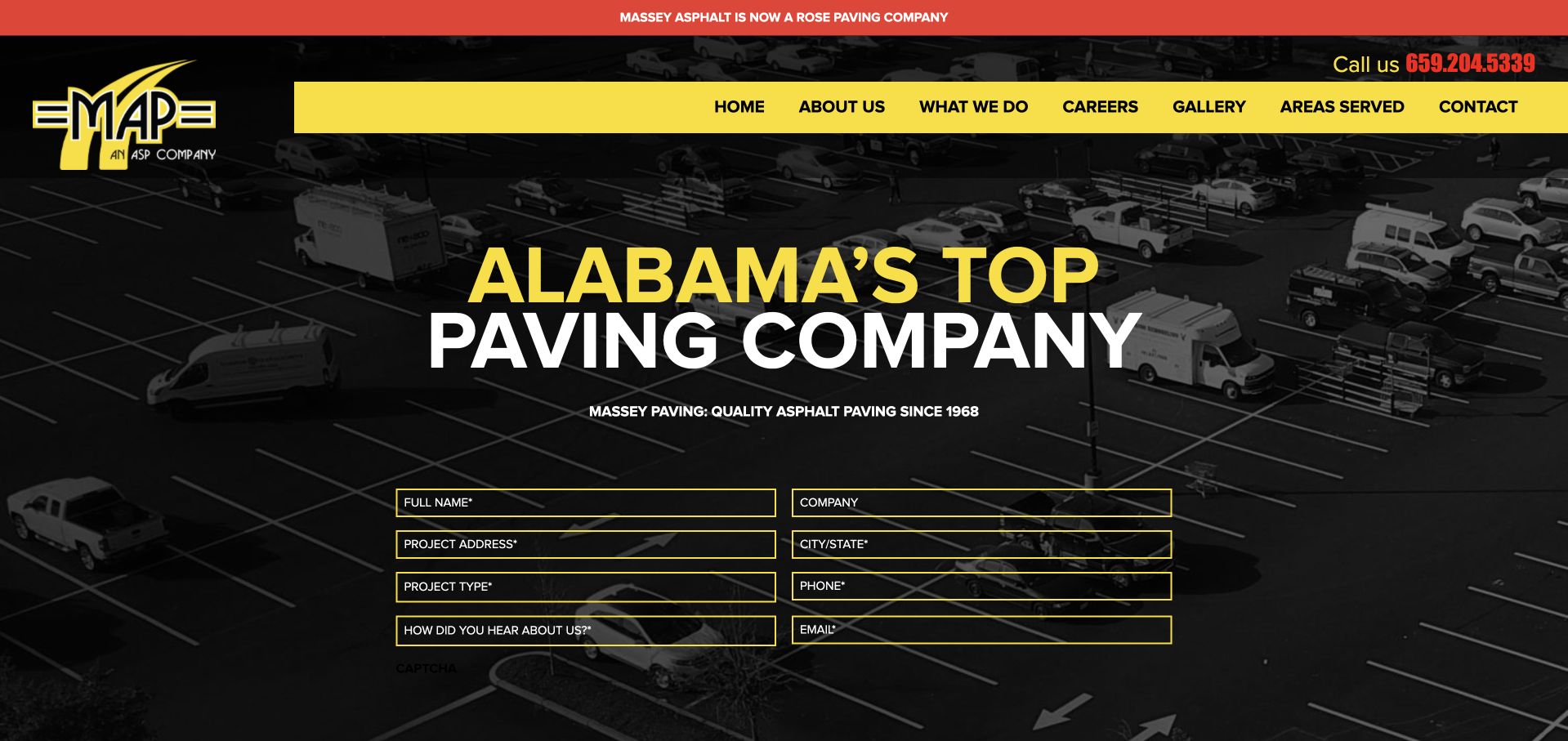
Massey pairs yellow accents and a dark aerial parking-lot image with a prominent notice about its Rose Paving relationship. The retained homepage places a multi-field estimate form directly within that first view, so the inquiry route is unmistakable. The current content separates commercial, municipal, and residential work and explicitly lists sealcoating and repair within its service structure. The maintenance lesson is how a company can retain an identifiable local presentation while communicating a change in business identity; the photograph itself does not substantiate the page’s service-quality claims.
What you can learn
If company ownership or branding changes, explain the relationship in a consistent visible place and preserve recognizable contact routes. Help a returning property manager establish who they are contacting before asking them to submit site information.
Pros
The business-relationship notice addresses a practical identity question rather than concealing the transition in a footer.
The first-screen form makes the estimate route apparent to visitors who are ready to provide project details.
Cons & considerations
A long form over a detailed photograph may demand too much from someone who only wants maintenance information.
Strong comparative headline claims still require substantiation; a bold presentation is not independent evidence of contractor quality.
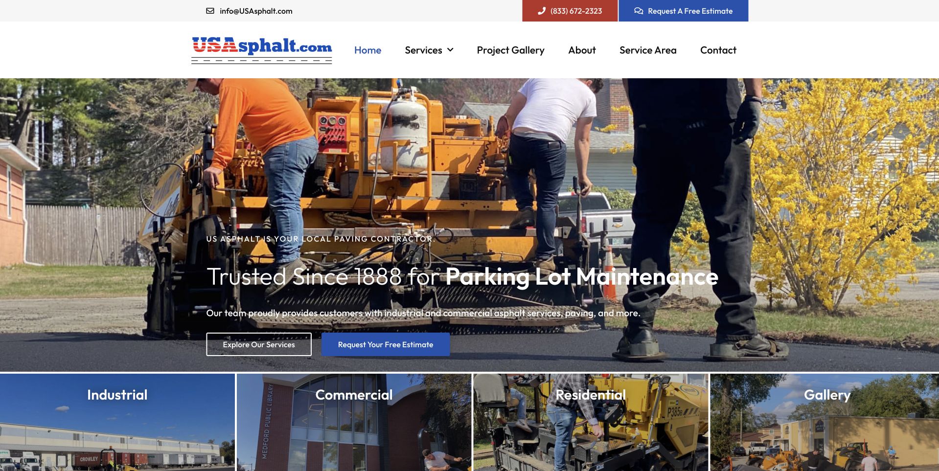
US Asphalt uses a crew-at-work photograph and a clearly separated header containing contact details and an estimate button. In the retained capture, the hero names parking-lot maintenance and offers a service-exploration link beside the estimate route. A row underneath distinguishes industrial, commercial, residential, and gallery content. The current page continues to identify parking-lot maintenance and repair within its broader offering. For a maintenance website, the reusable pattern is that combination of relevant work context, alternative next steps, and a quick way to choose the kind of property being discussed.
What you can learn
Show what the visitor can learn before asking for a lead. Pair the estimate route with a clear service overview and use property categories to keep an industrial maintenance inquiry from feeling identical to a residential driveway request.
Pros
The header and hero both provide contact routes while retaining a visible option to explore services first.
Property-type gateways help visitors narrow the large service offering without reading every general paragraph.
Cons & considerations
A rotating service phrase may be missed by visitors who arrive during a different slide or use reduced-motion preferences.
Broad geographic wording and local-office details need consistent explanation so maintenance availability is not assumed.
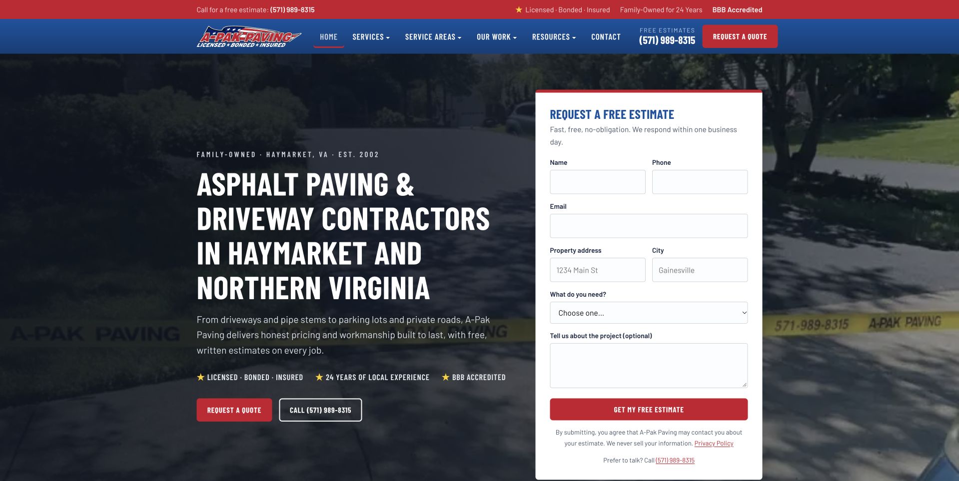
A-Pak uses a split hero: the local introduction and contact choices sit on the left, while a white form panel occupies the right. The retained capture gives each field a readable label and makes the project description optional. Current services include driveway repair, parking-lot work, and an HOA and property-manager route; the page describes crack filling and patching rather than only new installation. The repair-and-maintenance relevance is therefore specific, even though the broad headline is about paving. A useful supporting detail is the ordinary phone alternative beneath the form.
What you can learn
Ask for the information an estimator can use without requiring a visitor to diagnose the treatment. A plain project-description field and a telephone alternative accommodate people who know the problem but not the contractor’s terminology.
Pros
The white form panel separates data entry from the busier background and keeps labels close to their fields.
Local place names and an obvious phone option support basic qualification before a visitor commits to the form.
Cons & considerations
If the main objective is recurring commercial maintenance, the driveway-led headline may need a separate supporting route.
Published response-time promises should only be reused when the office can actually support and maintain them.
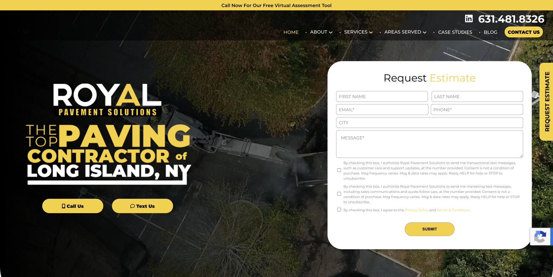
Royal makes Long Island central to its large yellow-and-white statement and carries the same yellow into call and text buttons. A substantial white estimate panel sits beside it in the retained capture, making the multiple contact methods visible at once. The current service menu explicitly distinguishes pavement maintenance, crack sealing, sealcoating, and striping, and links onward to case studies. This gives a property manager more relevant depth than the hero alone. The useful design reference is the clearly differentiated contact choices, not an assumption that the prominent marketing claims have been independently verified.
What you can learn
Let the visitor choose an appropriate communication channel, but make the purpose and consent of each route clear. A short maintenance overview can then connect that immediate contact choice to more specific service and project information.
Pros
Call and text controls are visually distinct from the longer form, supporting different visitor preferences.
Maintenance subcategories and case studies give the regional proposition somewhere substantive to lead.
Cons & considerations
Several consent statements add substantial reading to the first-screen form and should be designed with clear legal guidance.
Large comparative claims can dominate the explanation if the supporting service content remains farther down the page.
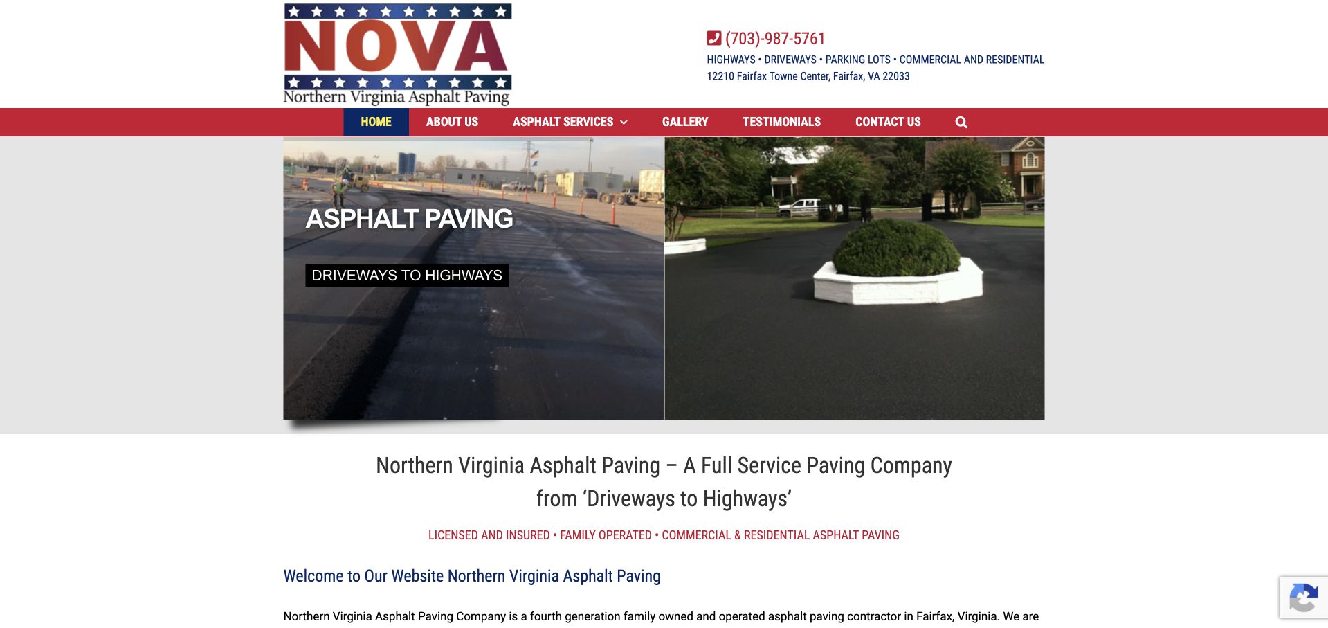
Northern Virginia Asphalt Paving uses a restrained central page width, a highly visible telephone number, and two contrasting pavement photographs in the retained view. Its text states the regional focus and gives residential and commercial visitors separate destinations. The current service list names sealcoating, maintenance, crack repair, patch work, and parking-lot striping, establishing a genuine maintenance context beyond the broad paving title. This is a useful example of straightforward service communication without a full-screen lead form, although the opening content still asks visitors to read rather than choose a sharply prioritized next step.
What you can learn
Use contrasting project contexts to make a broad service offering easier to recognize, then name the maintenance tasks in plain text. A regional contractor does not need elaborate interaction to establish fit, but it does need an unmistakable next action.
Pros
The telephone number and Fairfax location are easy to associate with the business identity in the header.
Separate commercial and residential links acknowledge different property contexts within one compact website.
Cons & considerations
If maintenance is the main visitor need, a general paving introduction can delay finding the specific relevant service.
Long lists and repeated regional wording require editorial restraint so practical distinctions remain easy to scan.
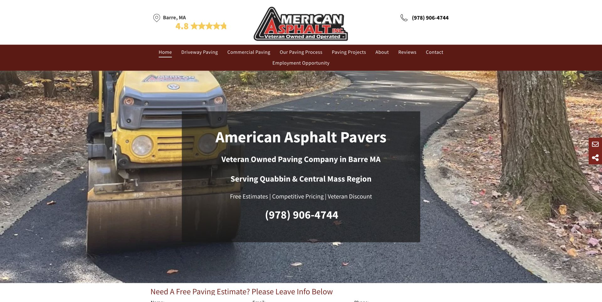
American Asphalt places a company introduction in a dark panel over a driveway work photograph, with the Barre location and phone number separately visible above. The retained header links to process, projects, and reviews, giving the visitor several ways to investigate the company beyond the first statement. Current public content explicitly offers patching and repair alongside residential and commercial paving, which supplies this collection’s maintenance relevance. The image helps establish the kind of property involved, but neither that image nor the displayed review stars verifies workmanship or guarantees a particular repair result.
What you can learn
Make the local service context concrete before adding promotional detail. Show relevant work and explain where repair information, process, and contact options live, so a visitor can assess relevance without treating a star graphic as the whole trust story.
Pros
The town and telephone number remain visible outside the hero artwork rather than being embedded in the photograph.
Process and project links provide understandable research routes for visitors not yet ready to request an estimate.
Cons & considerations
A large central introduction can occupy most of the first screen before a maintenance-specific action appears.
Displayed review ratings and promotional offers need active source and currency checks rather than automatic carryover.
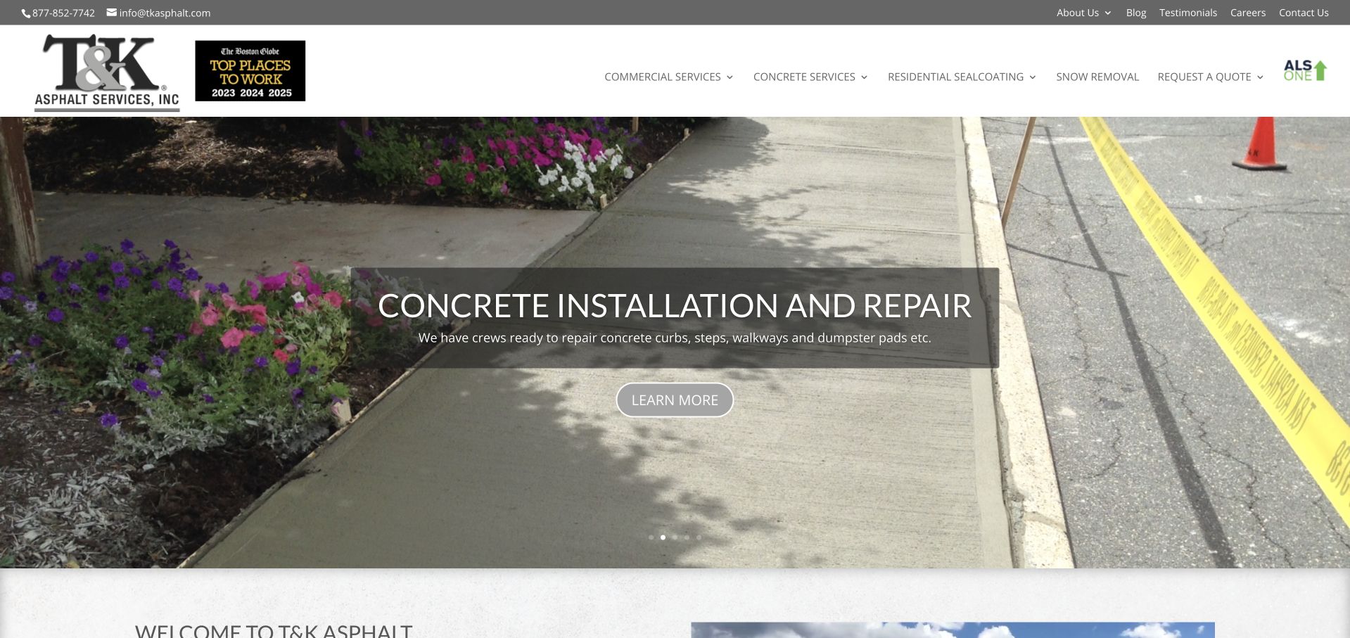
T&K separates commercial services, concrete, residential sealcoating, and quote requests in its main navigation. The retained image happens to show a concrete-repair slide, illustrating both the breadth of its offering and the limits of relying on a rotating hero for a specific maintenance message. Current homepage text explicitly addresses parking-lot maintenance for commercial property owners and driveway sealcoating for homeowners in named Massachusetts areas. That distinction is the most reusable design idea: the customer type, work, and relevant location are described together rather than left inside a general service list.
What you can learn
Give recurring commercial maintenance and residential sealcoating distinct paths when their information needs differ. Keep the essential category explanation outside any carousel so the right visitor does not have to wait for the relevant slide to appear.
Pros
Commercial and residential navigation provides direct routes into two genuinely different maintenance conversations.
Separate quote destinations can support tailored intake instead of forcing every property into one undifferentiated form.
Cons & considerations
A carousel may foreground an adjacent concrete service rather than the asphalt task a particular visitor came to research.
A broad navigation structure requires careful mobile organization to avoid turning useful distinctions into a crowded menu.
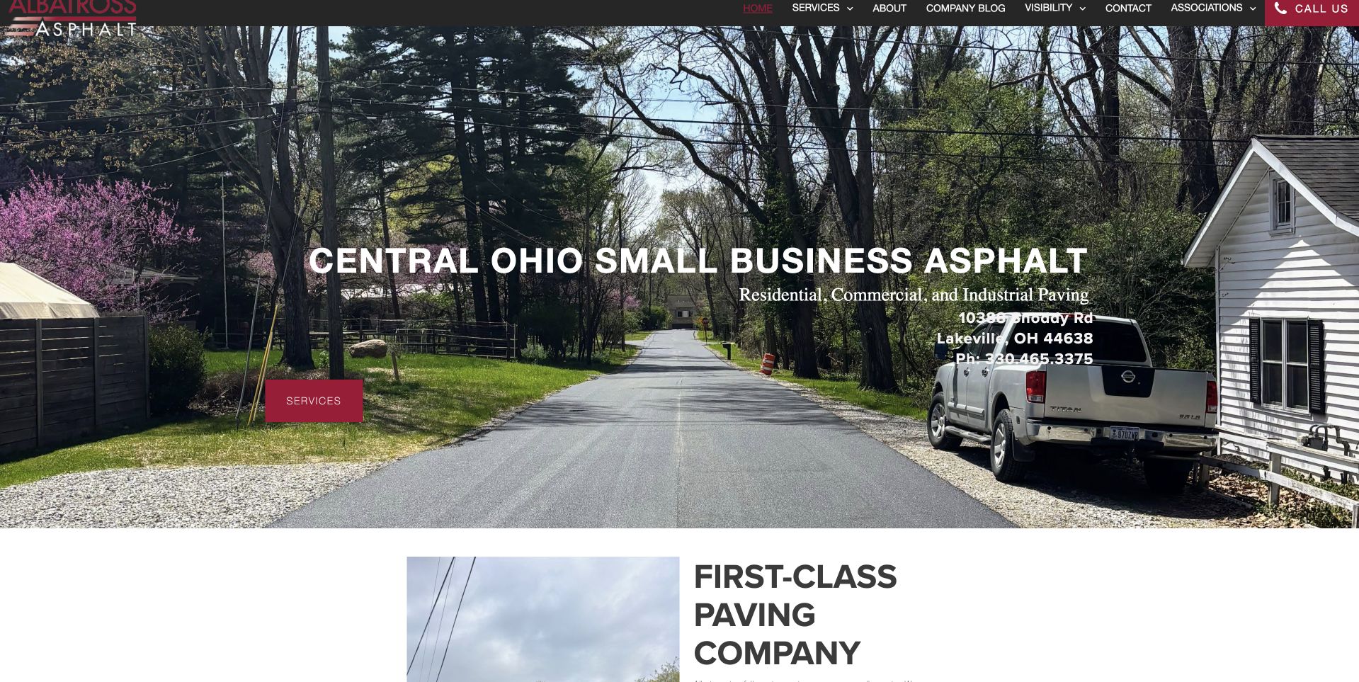
Albatross uses a photograph of a paved residential lane to give its Central Ohio introduction an immediate setting. The retained view keeps the service action conspicuous while showing a compact top navigation and visible contact information. Its current first-party service structure contains a dedicated restoration-and-maintenance destination that separates repair and sealcoating content. This makes it a useful reference for a smaller trade business whose homepage does not need to explain every treatment in the hero. The tradeoff is that the service detail depends on the visitor following the next link.
What you can learn
A simple local homepage can work as orientation if the next destination contains specific original service information. Use the project context to invite investigation, then explain the actual maintenance offering without relying on the photograph to make technical claims.
Pros
The residential setting makes the otherwise broad asphalt category immediately recognizable to a local property owner.
A dedicated maintenance destination gives the simple opening statement a clear place to develop its service detail.
Cons & considerations
Text across a detailed outdoor scene can become harder to read when the image is reused at narrower sizes.
A general Services action may need clearer supporting wording if maintenance is the business’s principal inquiry goal.
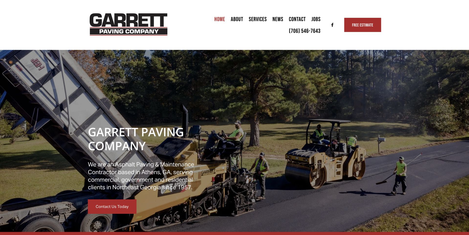
Garrett’s retained homepage identifies the company as a paving-and-maintenance contractor and names Athens and Northeast Georgia within the opening panel. A working crew and equipment fill the background while a red contact button repeats the restrained header accent. The current page also identifies commercial, government, and residential customers and presents project imagery and attributed quotations farther down. The practical maintenance lesson is the specificity of the opening explanation: the visitor learns what kind of contractor it is and where it operates without needing to interpret a slogan or infer a service territory from the logo.
What you can learn
Use the hero to answer category, location, and customer-context questions before introducing history or accolades. A readable regional explanation makes project imagery more relevant, while further evidence can support the visitor who wants a deeper look.
Pros
The opening paragraph combines maintenance relevance and geographic coverage in a compact, concrete explanation.
A consistent red contact treatment separates the primary action from the neutral navigation and photographic background.
Cons & considerations
The first-screen description is broad enough that a maintenance buyer may still need a direct service-specific route.
Older dated news or awards need context so they are not mistaken for a current verification of every claim.
Kegan is a freelance web designer and developer with 15+ years of experience helping businesses turn complicated website requirements into clear, maintainable digital experiences. He works directly with clients from planning and design through development, launch, and ongoing support.
For asphalt maintenance website design, his development approach focuses on pavement repair and maintenance distinctions, site and service-area information, project context, scheduling constraints, and useful commercial estimate enquiries. The scope can be a targeted improvement or a complete custom build, with responsive layouts, thoughtful content structure, and integrations chosen around the people using and maintaining the site.
Show 3 other asphalt maintenance website designersHide other asphalt maintenance website designers
Plan an asphalt maintenance website around the property manager’s next decision
Start with the property and the person responsible for it
Write down the real groups your office can help before drawing a homepage. A facilities manager looking after several commercial sites may need a documented scope and a clear contact, while a homeowner may simply need to know whether the company handles a driveway in their town. A homeowners association could have a committee, a management company, and an occupied property to consider. These are useful content differences, not invitations to invent separate services. Ask the estimating team which distinctions repeatedly affect the first conversation. Then create two or three recognizable routes through the site using the visitor’s language rather than your internal department names.
Give every route a clear destination and a sensible next step. If commercial maintenance is the core business, say so prominently rather than leaving a homeowner to discover that limitation after completing a form. If residential work is offered in only part of the region, explain that honestly. A short property-type selector can help a visitor find relevant examples, but should not prevent someone from reading the rest of the site. Test the labels with a person who has never booked this work. If they need you to translate the navigation, simplify the wording before commissioning more elaborate visual design.
Build a service inventory that does not pretend to diagnose the surface
List the services the business currently delivers and identify who is responsible for approving each description. Pavement maintenance includes several distinct tasks, and a marketing page should not blend them into one vague promise of restoration. Give each important service a plain-language introduction, suitable approved photographs, the types of inquiry the office can discuss, and a route to request professional assessment. Keep the descriptions focused on the offered work and the information a visitor needs to begin. Do not turn a design brief into an engineering recommendation, a universal treatment schedule, or a claim that every worn parking lot can be solved with the same product.
Separate maintenance, new construction, resurfacing, and any concrete work according to the company’s actual scope. A broad contractor can link between them, but a small specialist should not look incomplete for concentrating on one category. Decide whether each service needs its own substantive page or belongs within a well-organized overview. A separate page is useful when there is enough original information to answer a distinct visitor question; it is less useful when it repeats a generic paragraph with a different heading. Review technical wording with the qualified person in the business and assign a date and owner for checking it again.
Turn project photographs into understandable evidence
Create a project record before creating a gallery component. Record permission to publish, the actual work delivered, a suitable location description, the property type, and any limitations on naming the client. Choose photographs that help a prospective customer understand the scope rather than simply filling a grid with similar dark surfaces. A wide view can establish scale; a closer view can show an area mentioned in the accompanying description. Captions should say what the company actually did. They should not infer a safety certification, legal compliance, structural outcome, or measured service life from the appearance of a finished surface.
If you publish before-and-after imagery, make the relationship honest and easy to understand. Confirm that the photographs belong to the same project, identify the relevant phase, and avoid suggesting that differences in weather, lighting, angle, or image processing are proof of the contractor’s result. A pair of labeled static images can be more understandable than a slider that only works with a precise pointer movement. Keep text outside the image so it remains readable on a phone. A small number of well-documented projects often provides more useful decision support than an enormous gallery that has no captions, dates, or explanation of who carried out the work.
Describe access and coordination as a conversation, not a promise
A property manager may be thinking about deliveries, resident parking, customer access, and who needs advance notice. Give those concerns a visible place on the relevant service or process page. Explain the company’s actual approach to discussing access and agreeing a scope, while leaving project-specific timing to the appropriate assessment. Avoid a blanket promise that every job will be finished overnight or without disruption. The useful design pattern is a readable account of the conversation: inquiry, review, assessment when needed, written scope, agreed coordination, and the company’s actual handover process.
Show the next step after a quote is requested, including the normal communication channel and any documents the office typically asks a customer to provide. Do not publish an invented response-time guarantee simply because a competitor has one. If photographs can help the first discussion, make them optional and explain how they will be used. Never ask visitors to enter a restricted site, stand in traffic, or take a risky photograph for the sake of a form. Give people a normal phone or email alternative when they cannot provide details online. Good intake reduces avoidable back-and-forth without moving professional judgment onto the customer.
Make regional coverage and accountability concrete
State the genuine service region using town names or a readable regional description that an ordinary visitor recognizes. A map can complement that text, but should not be the only way to establish coverage. Distinguish an office location from a service area and from a past project location. Do not create dozens of near-identical city pages suggesting a local branch where none exists. If travel depends on project type or size, say that an inquiry is needed rather than drawing a misleading blanket boundary. Keep the same information consistent across the header, footer, contact page, and any business listings maintained by the company.
Give the business identity a practical role in the design. Use the correct trading name, a working telephone number, normal contact details, and any approved credential information with its real scope. A badge should link to a verifiable source when that is appropriate, and must not stand in for explaining who holds a qualification or what it covers. Obtain permission before publishing customer names, testimonials, or logos. Attribute review excerpts faithfully and avoid converting selected comments into an unsupported performance statistic. A visitor should be able to identify the company behind the site without decoding decorative slogans or relying on a stock photograph of an anonymous crew.
Design an estimate request that supports rather than obstructs contact
Keep the initial form short enough to complete from a phone at a desk or on a property walk-through. Useful fields often include name, company when relevant, a preferred contact method, the property location, the general work being considered, and an optional message. Ask the business which information is genuinely needed at this stage; do not make a budget, exact area measurement, or detailed treatment selection compulsory simply because the form component supports it. The visitor may not yet know the right service name. Include an option to describe the concern in their own words and a clear way to ask for help.
Write the confirmation and error states as carefully as the headline. A successful submission should explain that the request was received and what the normal next step is, without claiming a booking has been confirmed. Errors should identify the field or delivery problem in words and preserve information already entered where it is safe to do so. Keep spam protection server-verified and accessible. Decide how the office receives, assigns, and records inquiries before launch, and test the complete route with an obviously labeled internal test. Never display a success message for a request that the server rejected or could not store.
Set a maintenance plan for the website itself
An effective launch brief includes the people who will keep the information accurate. Assign responsibility for telephone changes, service-area updates, staff details, project permissions, and any time-limited offers. Create a small editorial checklist for adding a project so the next gallery entry has meaningful captions and an approved image rather than an unexplained filename. Keep original photographs separately from optimized website versions and document who owns them. If the company’s work changes seasonally, review the wording at the appropriate time rather than automatically displaying an old promotion year after year.
Test the ordinary tasks after launch: read the site on a phone, use the menu by keyboard, open an estimate form with errors, check telephone and email links, and confirm that a project image does not overwhelm the connection. Measure actual site behavior only through the organization’s approved privacy and analytics policy. Search visibility, lead volume, and conversion results need evidence; a redesign alone does not establish them. Schedule a simple review with the office team after real inquiries arrive and use their questions to improve missing explanations. Preserve a backup, clear administrator ownership, and an update process so a useful editorial site does not become a fragile one-off campaign.
The editing job behind the design
Choose publishing and inquiry tools the office can maintain
Choose the system after defining who edits services, projects, service areas, and contact details. A modest content-managed site can be enough when the central jobs are explaining work and receiving inquiries. A platform logo in another contractor’s stack is not a reason to adopt its entire setup.
Use structured records for service pages and project galleries so captions, image permissions, and relevant property types do not disappear into a page-builder layout. Keep inquiry delivery, spam protection, backup, and administrator access documented separately from the public design.
Optimize real project photographs, reserve image dimensions, and avoid loading a large video just to display a still image on a phone. Evaluate accessibility, security, and performance with appropriate tests rather than claiming that a particular framework guarantees any of them.
Our WordPress website examples offer a separate look at publishing approaches. A visible platform label is evidence for that named page, not a guarantee that the same system will suit your requirements.
Before the public launch
Asphalt maintenance website launch checklist
Confirm the trading name, phone number, email route, and genuine operating region.
Distinguish commercial, residential, and other actually supported property inquiries.
Have the appropriate business expert approve every service description.
Remove universal treatment recommendations and unsupported lifespan promises.
Verify permissions for every project photograph, customer name, logo, and review.
Caption projects with the actual delivered scope and an appropriate location description.
Label before-and-after photographs without implying a result from different lighting.
Explain the normal estimate process and avoid invented response-time guarantees.
Provide contact alternatives when the visitor cannot complete the online form.
Test form validation, server-side spam protection, delivery, and confirmation messages.
Check keyboard navigation, readable contrast, field labels, and phone-sized layouts.
Optimize images and test the published pages on an ordinary mobile connection.
Assign an owner for credentials, backups, updates, project records, and corrections.
These checks are a project checklist, not a performance, legal, security, or accessibility certification. Test real journeys with the people responsible for the website before making claims about the result.
Sources & editorial method
How this collection was selected and reviewed
This collection studies the public presentation of asphalt maintenance services, with attention to service definitions, property context, project documentation, regional coverage, and inquiry clarity. Editors Choice reflects a documented editorial design judgment, not a technical assessment of pavement work, a service-quality endorsement, or a measured commercial ranking.
Each example links to its actual source page. Screenshots are direct browser captures with their own capture dates; moving imagery, announcements and live designs can change. The notes describe observable design choices and conditional tradeoffs, not measured traffic, conversion results, service quality, or accessibility conformance.
Technology labels use public page metadata, asset evidence, or explicitly cited platform documentation. Platform documentation is not a complete current deployment audit. A component reference may be legacy or unused; it is not a complete backend inventory. Unknown stacks are omitted. These sites are editorial examples, not our client portfolio.
Written, Edited and Curated are separate editorial records, not timestamps advanced by a rebuild. Website designs and imagery belong to their owners. See our editorial standards or suggest a correction.
Questions worth asking
Asphalt Maintenance website design questions
Should sealcoating, crack-related services, and paving share one page?
They can share an overview, but distinct substantive pages are useful when the business offers different work and has original explanations, relevant projects, and clear inquiry information for each. Do not multiply pages that only change the heading.
Do we need a quote calculator?
Only if the business has a defensible way to qualify its output and explain its limitations. A simple assessment request may be more appropriate than an instant price that cannot account for a real property. The website should not diagnose a surface from a few fields.
What should project photographs explain?
Describe the property type, the work actually delivered, and the relevant viewing context with permission from the appropriate parties. Photographs do not independently prove structural performance, compliance, or a particular maintenance life.
How much location detail should we publish?
Enough to help visitors understand the genuine operating region and whether an inquiry is sensible. Keep office addresses, service areas, and past project locations distinct, and do not imply local offices that do not exist.
Will a new design guarantee more maintenance contracts?
No. Clearer information can support a better inquiry experience, but contract volume depends on many factors. Commercial results require actual measurement, and visual polish is not proof of service quality.
Borrow a clearer service structure, a more informative project caption, or a more useful estimate journey. Build the final brief around the work your company actually delivers and the questions your office can genuinely answer.