Best Music Festival Websites of 2026 (26 Real-World Examples)
Festival websites that connect a distinctive musical identity with clear dates, ticket states, program discovery and practical planning.
Explore 26 real music-festival websites, from regional roots gatherings to city festivals and international music-and-arts events. Compare how their current pages handle announcements, archives, ticket choices and the experience beyond the stage.
A festival website changes jobs throughout the year. Before the lineup announcement it may introduce the setting and collect interest; during the sale it needs to explain admission choices; close to the event it becomes a planning reference; afterward it holds memories and prepares visitors for the next edition. A strong design makes its current state obvious without discarding useful information from the previous one.
These examples were directly reviewed in November 2026, so many already present their 2027 dates while retaining earlier programs, photographs or merchandise. That seasonal overlap is part of the design analysis. The collection examines the actual captured pages rather than treating every banner as a current ticket offer. The most useful patterns connect an expressive identity to ordinary questions: which edition is this, where is it, what is available now and where should I go next?
Before the examples
What makes good music festival website design in 2026?
Make the edition and sales state unmistakable
Keep dates, venue and edition consistent across the header, hero, ticket links, document title and supporting information. Distinguish an active sale, waitlist, forthcoming announcement and completed-event archive rather than leaving visitors to infer the state from an old button.
Connect artist discovery to a realistic visit
Make the lineup easy to browse, then provide named routes to ticket formats, travel, camping, accessibility, maps and on-site practical information. A compelling artist announcement should lead toward a useful decision, not an unexplained external checkout.
Express the particular festival without overwhelming its tasks
Use actual performance photography, original artwork and place-specific stories to establish identity. Keep essential information readable when video is paused, optional cookies are declined or a visitor is trying to find one practical answer quickly.
The collection · 26 examples
26 music festival websites worth studying
These 26 distinct public properties match the original saved industry draw. Study their seasonal transitions, information architecture, art direction and practical routes. Pickathon is the explicitly researched Editors Choice for website design; the selection is not a ranking of festival experiences, safety, accessibility or service quality.
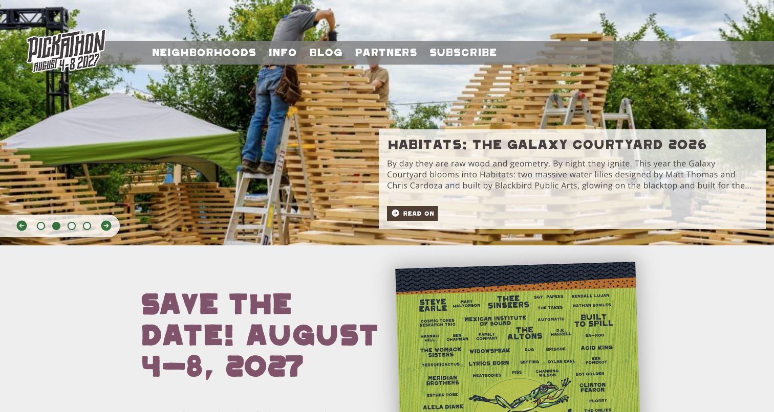
Pickathon introduces its festival through the places and people that build it. The opening carousel combines construction photography with stories about individual neighborhoods, while the next section supplies the forthcoming dates. This makes the physical environment part of the reason to attend, rather than treating scenery as interchangeable decoration. The information hub divides tickets, accommodation, travel and the creative project into useful tasks. A Woods neighborhood page connects its forest description to a map, amenities and design credit. The strongest pattern is this connection between an imaginative identity and concrete spatial orientation.
What you can learn
Give distinctive festival areas their own useful pages. Combine the atmosphere of a stage with a map, facilities and practical context, then connect those pages to travel and accommodation guidance rather than leaving visitors inside a purely promotional gallery.
Pros
Neighborhood stories make the festival's particular setting more tangible than a generic crowd photograph.
The information hub groups ticket, lodging and travel questions into clearly named destinations.
Cons & considerations
The homepage still combines forthcoming dates with earlier lineup and neighborhood material that needs explicit year labels.
Rotating stories and image-backed text need consistent contrast and stable alternatives for quick planning.
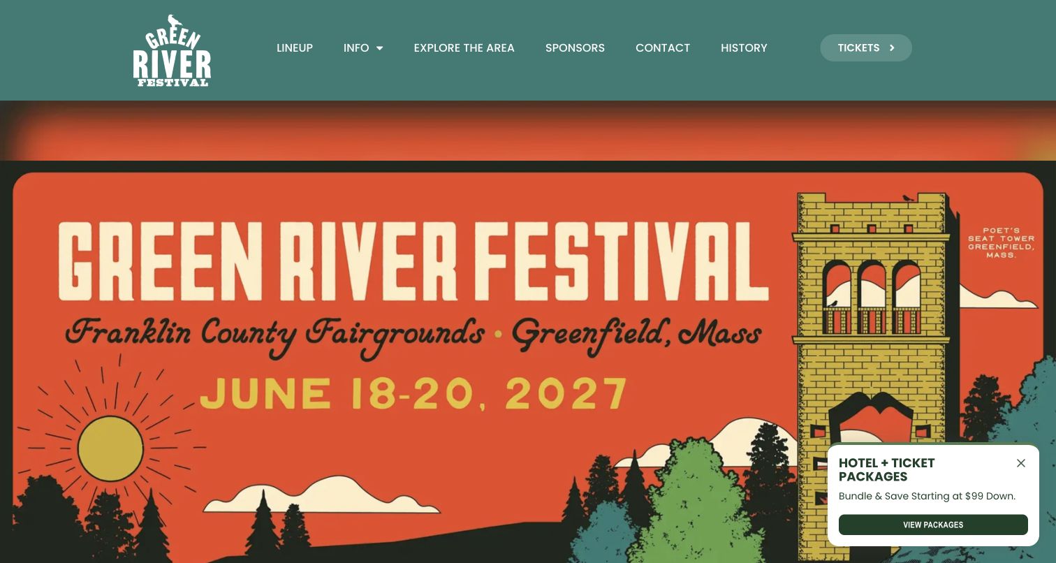
Green River Festival leads with a large illustrated poster that names the fairgrounds, town and forthcoming weekend. The warm orange artwork and teal navigation create a recognizable identity without relying on an enormous artist list. Its navigation gives visitors direct routes to lineup, practical information and the surrounding area. Further down, a release-stage schedule explains how ticket pricing changes across the sales period, alongside camping and other add-ons. The retained screenshot includes a small hotel-package promotion in the corner. That overlay demonstrates how travel marketing can compete with otherwise distinctive festival artwork.
What you can learn
Treat date, place and purchase stage as a single information system. A festival poster can establish personality, but ticket tiers and accommodation choices need ordinary text and clearly named destinations so visitors can understand the commitment beyond the artwork.
Pros
The illustrated local landmark and fairgrounds wording give the event a specific regional character.
Published sales-stage dates help explain why ticket options or prices may change over time.
Cons & considerations
Essential date and venue information inside artwork also needs accessible text outside the image.
The hotel promotion overlaps the poster, and nearby sales-stage copy requires synchronized seasonal updates.
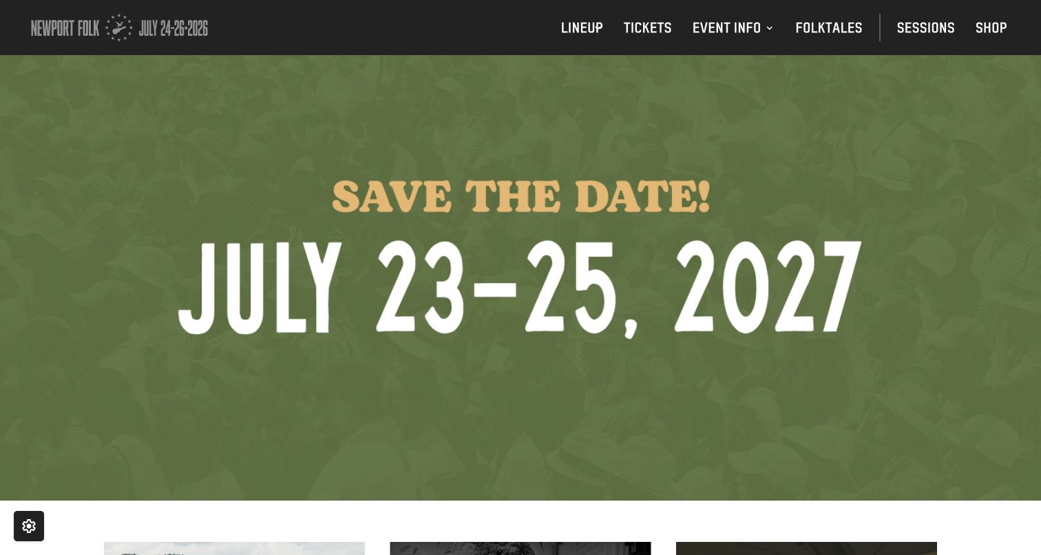
Newport Folk uses a quiet green photographic background and oversized date message to mark its between-season state. The compact black header keeps tickets, event information, stories and recorded sessions within reach. Below the announcement, editorial tiles and app links give returning visitors something useful to explore before a new lineup arrives. The page exposes a maintenance problem: the hero announces the forthcoming year while the header wordmark and document title still reference the previous edition. Its hierarchy is simple, but the competing year labels weaken an otherwise clear message.
What you can learn
Design an intentional between-season state, then update every date-bearing element together. Archives and sessions can keep a festival useful throughout the year, provided past editions are labeled separately from the next event and do not undermine its main announcement.
Pros
One large date message gives the opening screen a clear purpose before the next program launches.
Stories, sessions and a map destination extend the site beyond a short ticket-sales window.
Cons & considerations
The observed header and title retain an earlier year beside the new save-the-date message.
Several editorial image labels are filenames rather than descriptive alternatives, reducing their meaning outside the visuals.
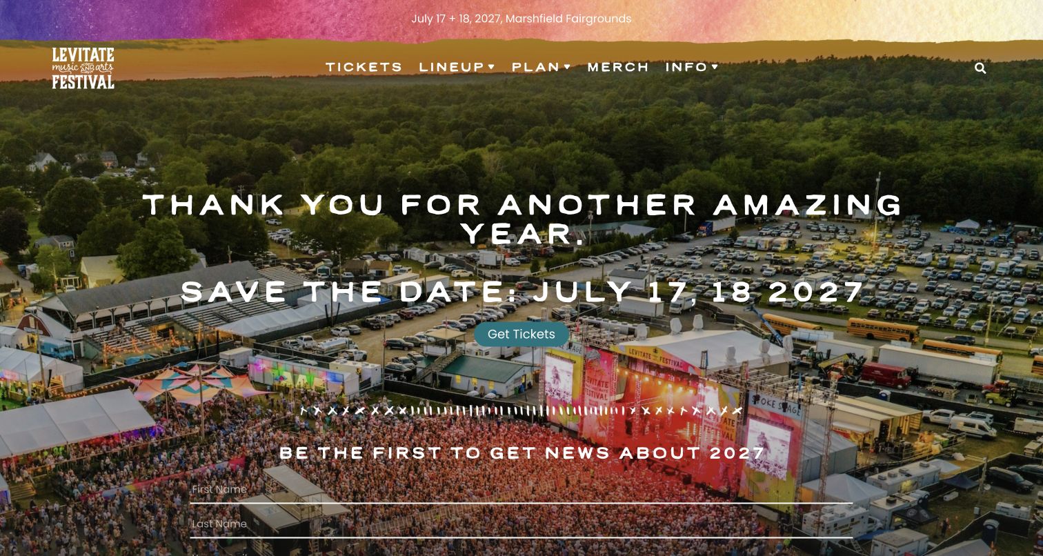
Levitate places its next dates and fairgrounds location in a narrow color-washed strip above an aerial festival photograph. A large thank-you message bridges the completed event and the following season, with ticket and news routes close by. Lower sections describe food, drinks, live art, a makers market and children's activities. These categories explain the wider experience before a complete artist announcement. The main tradeoff is density over the photograph: navigation, the seasonal headline, ticket action and mailing-list form all share a visually busy image in the first screen.
What you can learn
Use experience categories to explain what happens between performances. Keep the next date and location stable, then give food, art and family information their own readable sections instead of asking a panoramic photograph or an artist poster to communicate everything.
Pros
The aerial photograph connects the event to an identifiable fairground arrangement rather than an anonymous stage.
Separate experience categories explain why the festival might interest visitors with different priorities.
Cons & considerations
The news form competes with the main announcement and ticket action over a detailed background.
Rotating experience cards need persistent access to every category so useful information does not depend on timing.
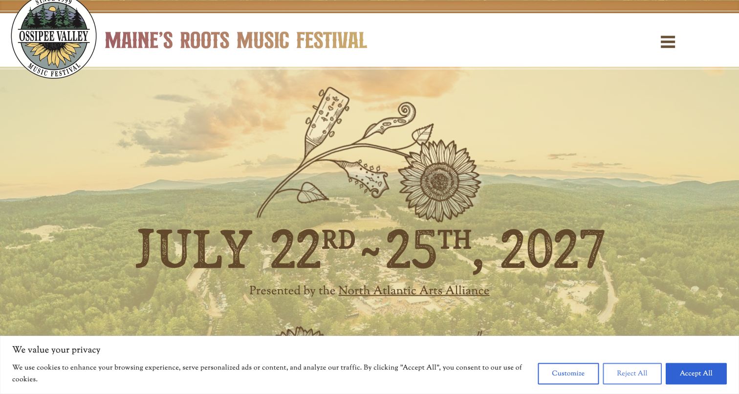
Ossipee Valley combines a sunflower-and-instrument emblem with a landscape photograph and a prominent forthcoming date. Its opening establishes a roots-music character before the page divides into lineup, activities and camping. The written introduction then explains the range of stages, workshops and family activities and situates the event in southern Maine. That is useful context for someone unfamiliar with the festival. The capture retains a privacy strip along the bottom, and the date uses an incorrect ordinal suffix. Those small editorial details matter because the surrounding presentation asks visitors to trust its planning information.
What you can learn
Pair expressive identity with practical routes that match the event format. A camping festival needs arrival and accommodation guidance as prominently as its music, while every seasonal date should be checked as carefully as the headline artist names.
Pros
The illustrated instruments, warm colors and rural photograph form a coherent roots-festival identity.
Lineup, activities and camping give visitors three immediately understandable ways to investigate the event.
Cons & considerations
The observed date contains an ordinal typo that should be corrected during the seasonal content review.
A substantial privacy banner and compact menu reduce the space available for practical first-screen information.
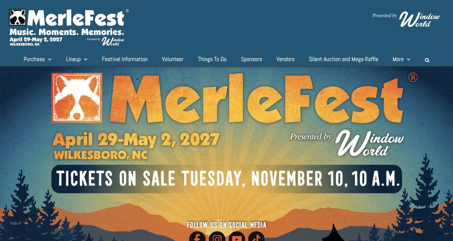
MerleFest uses a large illustrated campaign panel to announce the next dates and a specific ticket-launch time. The same event identity appears in the header, alongside a broad navigation row covering purchase, lineup, visitor information, volunteers and activities. Below the hero, individual cards explain those tasks with short descriptions and relevant photographs. The site is useful for festivals offering several kinds of participation beyond buying admission. Its busy header also shows the cost of giving many organizational needs equal prominence before a visitor reaches the main message.
What you can learn
Make a ticket launch understandable as an event in its own right. State the opening time clearly, explain the ticket families nearby and retain separate routes for travel, volunteering and other participation instead of forcing every visitor through one purchase page.
Pros
The hero makes the coming edition and ticket-release timing unmistakable in one composition.
Task cards connect festival logistics with descriptive copy and photographs rather than unexplained labels.
Cons & considerations
The broad navigation row creates a dense first impression with several secondary organizational links.
Promotional details embedded in the campaign artwork need matching accessible text and careful updates after the launch.
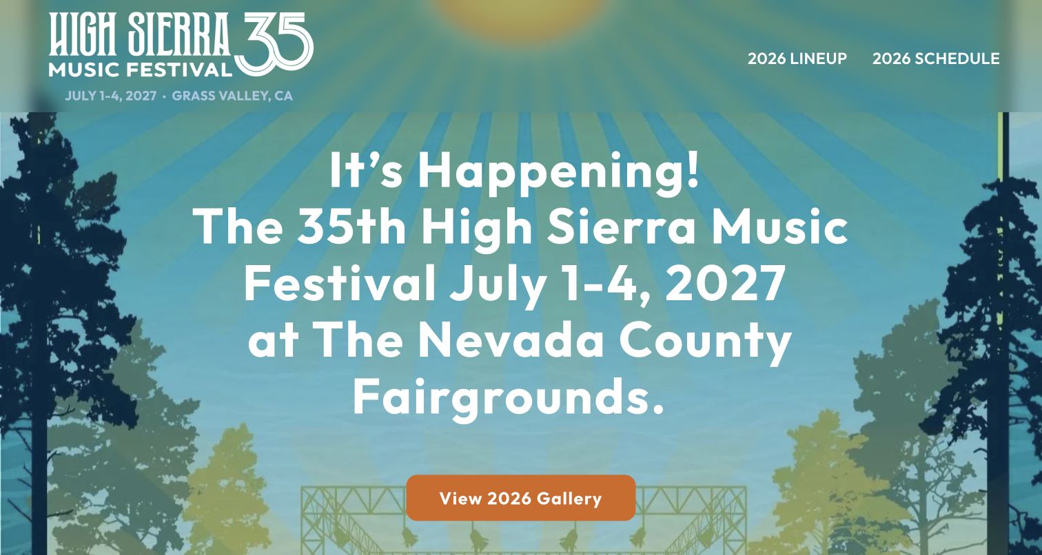
High Sierra places its return announcement at the center of the homepage, naming both the forthcoming dates and the Nevada County Fairgrounds. A landscape illustration, forest silhouettes and bright orange button provide a distinctive frame without obscuring the text. The header keeps earlier lineup and schedule links explicitly labeled with their year, while the main action points to the previous gallery. This between-season pattern keeps the archive available without presenting it as the new program. More detailed planning content sits further down or behind secondary links.
What you can learn
When the venue or operating context changes, put that fact in the opening message. Keep useful earlier material accessible, but label its year consistently and provide a distinct destination for the new edition as its information becomes available.
Pros
The return message names the dates and fairgrounds directly instead of relying on an unexplained campaign slogan.
Year labels on archive navigation help distinguish earlier performances from the forthcoming festival.
Cons & considerations
The large announcement leaves little room to preview transport, accommodation or ticket status in the first screen.
The document title still emphasizes buying tickets while the visible main action leads to an earlier gallery.
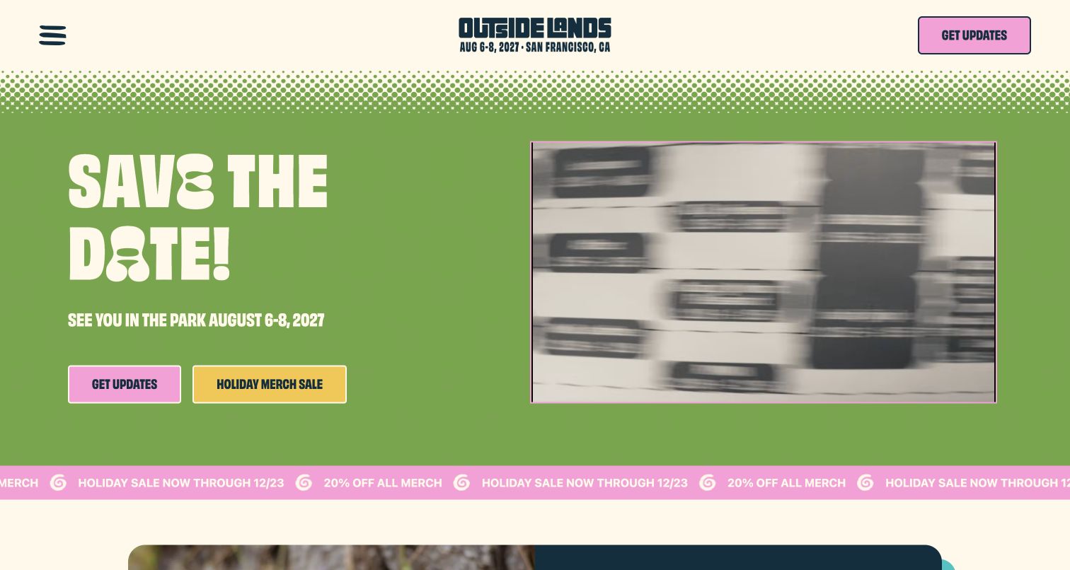
Outside Lands pairs a green-and-cream palette with pink and yellow action buttons, a bold save-the-date message and a contained festival video. The next weekend appears both near the logo and in the main content. Updates and a merchandise campaign are distinct choices rather than one ambiguous call to action. A moving promotion strip extends the current campaign below the hero. The site feels recognizably playful, but the video and repeated sale messaging can compete with the essential date information. Its simplified navigation also places most practical information behind the menu.
What you can learn
Give a between-season page one primary informational job, then make commercial and subscription routes visibly distinct. Keeping the video inside a defined frame helps preserve a stable text area, but motion should never be necessary to understand the next step.
Pros
The date is repeated in stable text near the brand and within the main announcement.
Distinctly colored buttons separate festival updates from the current merchandise promotion.
Cons & considerations
The animated video and repeating sale strip add movement around an otherwise simple message.
A compact menu hides most practical planning destinations from visitors scanning the opening screen.
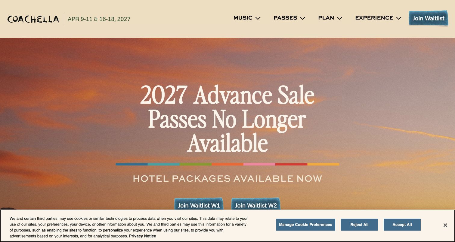
Coachella leads with an explicit availability statement instead of leaving visitors to discover the closed advance sale inside a checkout. Separate waitlist routes identify the two weekends, while hotel packages remain a distinct option. The restrained desert palette and spacious typography give this complex sales state a calm presentation. Further sections divide passes, camping, hotel bundles and payment information into manageable topics. The retained privacy notice covers part of the lower hero, illustrating how a clear availability message can still lose its nearby actions beneath a large first-visit overlay.
What you can learn
Design availability states with the same care as an active sale. Explain what has ended, identify the relevant weekend or admission product and distinguish legitimate alternatives so a visitor does not confuse a waitlist, hotel bundle and standard festival pass.
Pros
The opening message states the advance-sale status plainly before showing alternative routes.
Weekend-specific waitlists reduce ambiguity for visitors comparing two separate festival dates.
Cons & considerations
The substantial privacy banner overlaps lower hero actions in the retained first-visit view.
Older payment-plan promotion beneath the availability message needs careful coordination with the current sale state.
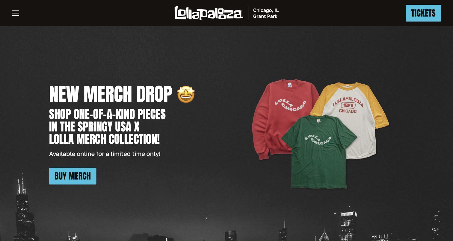
Lollapalooza's captured homepage is in a merchandise-led phase. Product cutouts and a concise campaign headline occupy a dark, city-themed hero, while the header keeps Chicago and Grant Park beside the logo. Beneath the promotion, apparel, headwear and future-update routes provide clear secondary choices. Later sections reintroduce the festival through performances, location and food. The design works as a seasonal brand storefront, although its permanent Tickets button is more prominent than the next edition's planning status. That tension is useful to study when adapting a festival homepage across the year.
What you can learn
Give each seasonal campaign a defined place without losing event orientation. Merchandise can sustain interest after the festival, but returning visitors still need a clear distinction between shopping, future announcements and any ticket information left from the previous edition.
Pros
Product photography and the dark background create a focused, easily recognized merchandise campaign.
The location stays visible beside the logo while secondary cards separate shopping categories and updates.
Cons & considerations
The next festival date is not the main message, so first-time planners must investigate further.
A persistent Tickets action can imply immediate availability unless its destination explains the current season clearly.
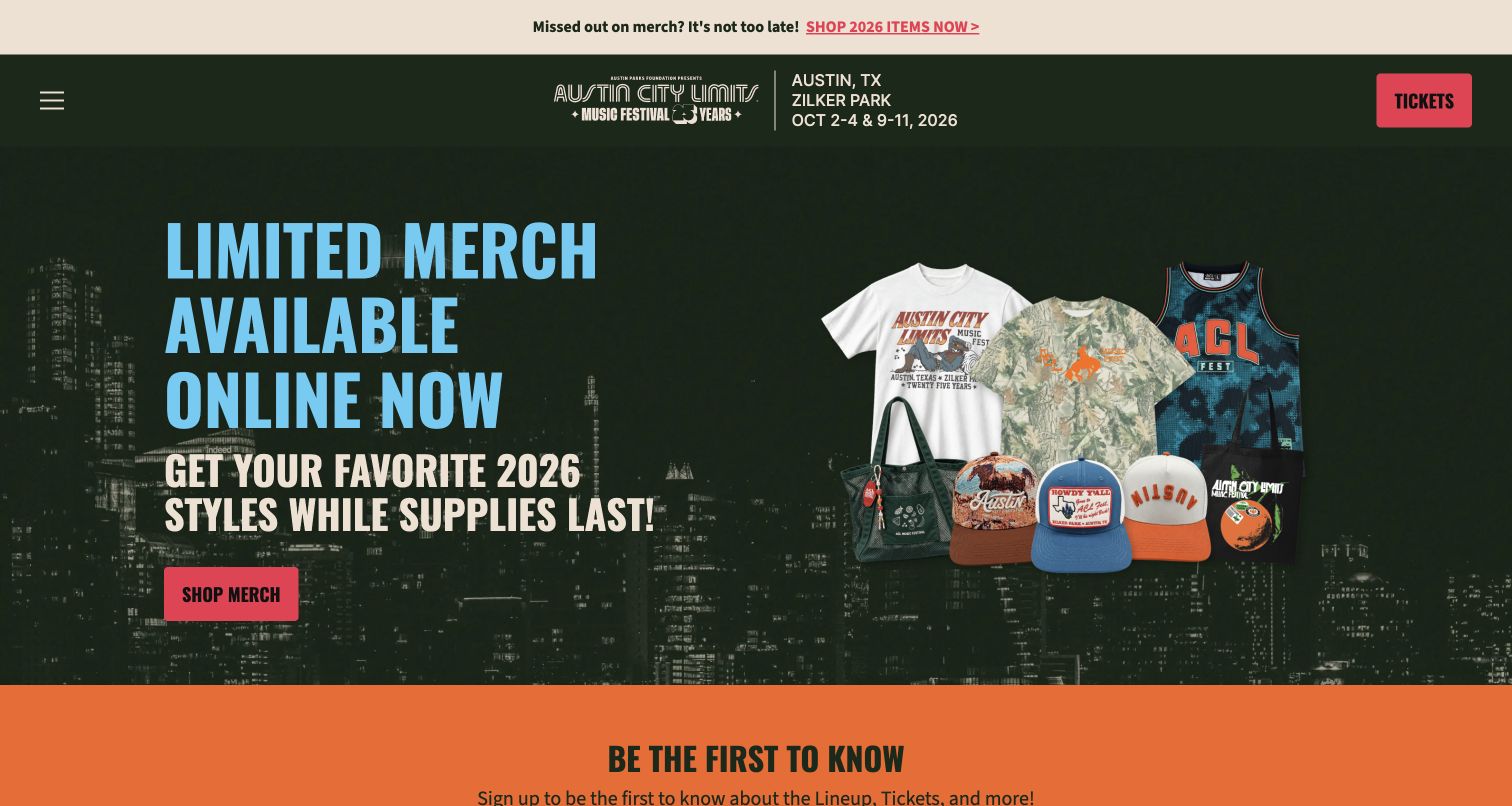
Austin City Limits Music Festival uses a post-event merchandise promotion as its opening campaign. The dark green city backdrop, colorful product cutouts and red action button form a clear visual hierarchy. Its header retains the park, city and completed edition's two weekends, giving visitors context even while the main action is shopping. An orange update section follows immediately, separating future news from the current merchandise sale. The page demonstrates a coherent seasonal transition, but newcomers still need a clearer statement about when the next event's practical information will replace the earlier dates.
What you can learn
Retain the edition context when a festival changes its homepage campaign. Use a separate area for forthcoming updates, and make it clear whether displayed dates describe the completed event or a future booking opportunity before visitors follow a permanent ticket link.
Pros
The city, park and two-weekend structure remain easy to identify beside the festival logo.
The contrasting update section gives future announcements a destination separate from merchandise sales.
Cons & considerations
Earlier dates remain prominent without an equally prominent next-edition status in the opening view.
Multiple merchandise messages repeat across the announcement strip and hero, narrowing the first-screen information mix.
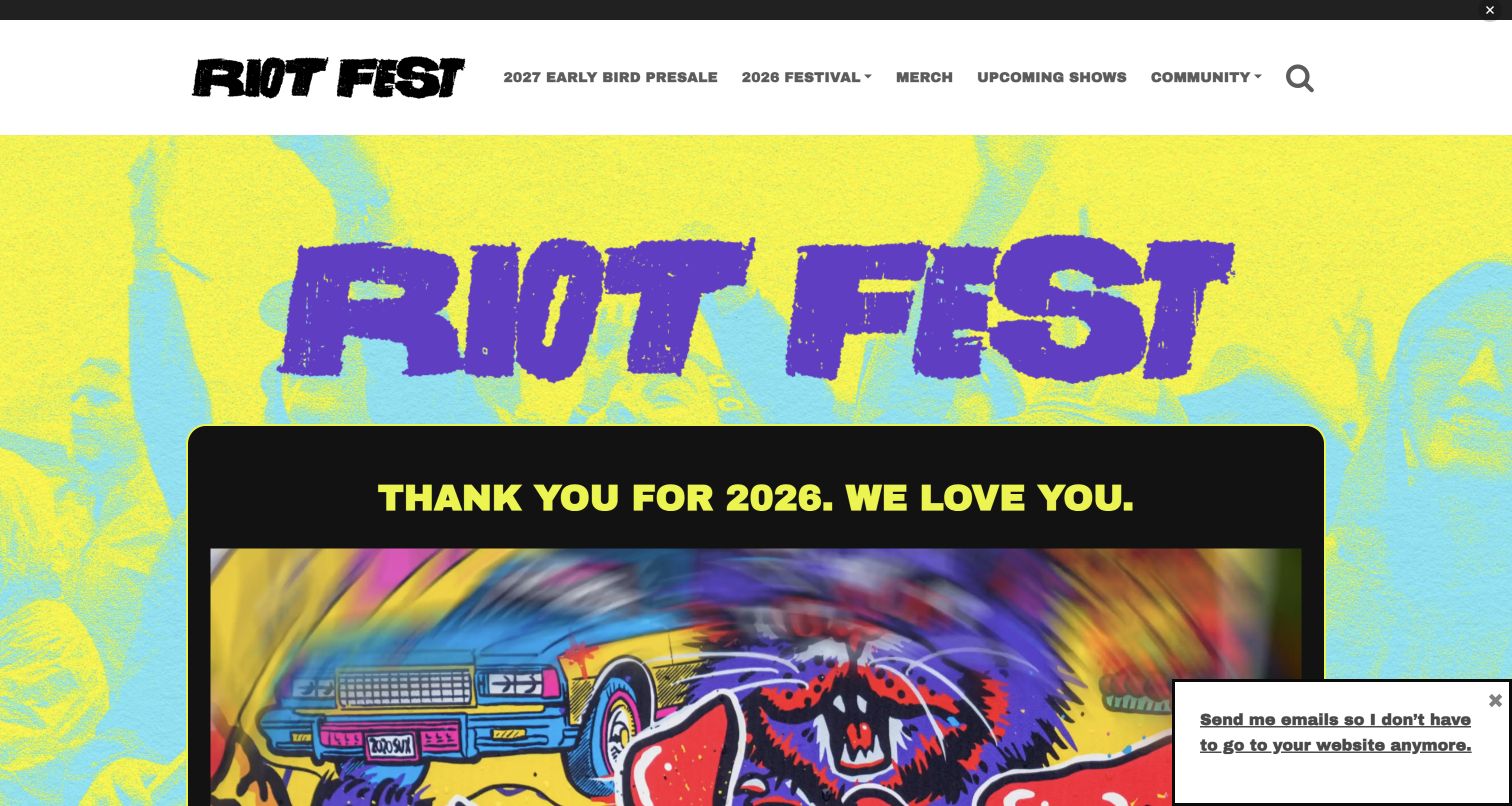
Riot Fest uses bright textured artwork and oversized lettering to create a recognizable, deliberately informal identity. The captured page thanks attendees for the completed edition while the header already offers a forthcoming presale route. Below the hero, dated articles cover local community activity, music-related features and upcoming shows. This keeps the site useful outside the festival weekend and makes its voice more distinctive than a conventional ticket funnel. A mailing-list popup and a narrow top bar add visual interruptions, while several different content streams compete for attention beneath the main announcement.
What you can learn
Use a festival's editorial voice to support useful year-round content, but distinguish event information from ongoing publication. Date articles, label the relevant edition and ensure community stories or promotions do not obscure the practical route to tickets and arrival details.
Pros
The strong typography and textured color treatment make the festival immediately recognizable.
Dated community and music articles give returning visitors reasons to browse between editions.
Cons & considerations
A mailing-list popup interrupts the lower corner of the retained first-screen composition.
Presale messaging and the hero's invitation to check back need synchronized wording to avoid conflicting expectations.
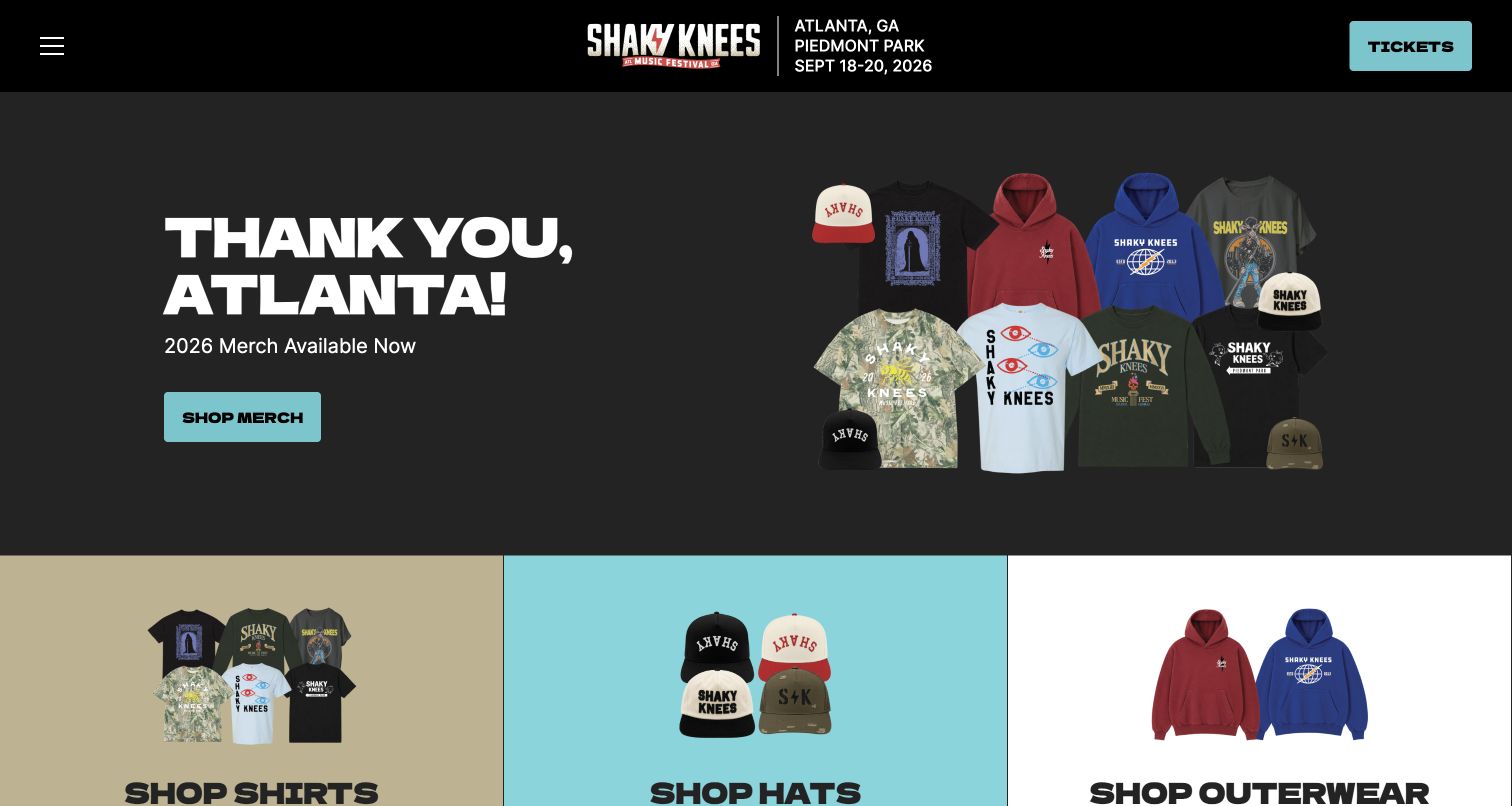
Shaky Knees keeps its city, park and completed festival dates in a compact black header above a thank-you campaign. A small selection of product images and a pale blue shopping action create a restrained first screen. Three cards immediately below divide shirts, hats and outerwear, making the current commercial purpose easy to understand. Further down, short sections explain the music, food and park experience through actual festival imagery. The simple composition is useful, but the next edition's status is less visible than the permanent ticket navigation and earlier dates.
What you can learn
Choose a limited set of campaign actions and give each a clear destination. After an event, a thank-you page can support merchandise and memories, while a separate dated notice should explain when visitors can expect the next lineup and ticket information.
Pros
The compact location block keeps the festival grounded in a specific city and park.
Three product categories provide clear routes without overwhelming the main thank-you message.
Cons & considerations
The first view emphasizes completed-edition merchandise rather than future attendance planning.
The permanent Tickets label needs accurate destination messaging while the header still displays earlier dates.
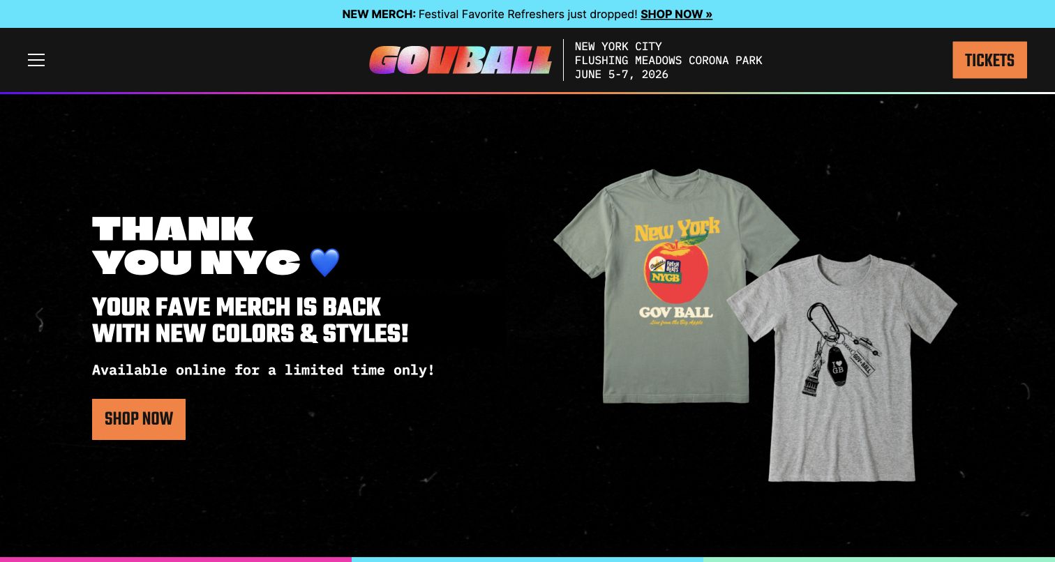
Governors Ball combines a gradient wordmark and thin colored borders with a largely black background. Its captured campaign thanks New York and presents refreshed merchandise through large product cutouts. The header supplies the city, park and completed edition's dates, while the next set of cards separates apparel, headwear and accessories. Further sections explain the festival experience with photographs of performances, food and gathering spaces. The result is commercially focused and easy to scan, although new visitors must move beyond the opening promotion to understand the next festival's planning state.
What you can learn
Use a stable venue block to keep a changing campaign connected to the event. Merchandise announcements should have clear categories, but the site also needs an explicit current-edition status so shopping, memories and future attendance remain distinguishable throughout the year.
Pros
The specific park and city remain visible beside the brand despite the changing campaign.
The restrained product layout makes the merchandise action easy to identify and understand.
Cons & considerations
The upper announcement strip repeats the same commercial goal already dominant in the hero.
Earlier festival dates and a persistent Tickets action can leave future visitors uncertain about availability.
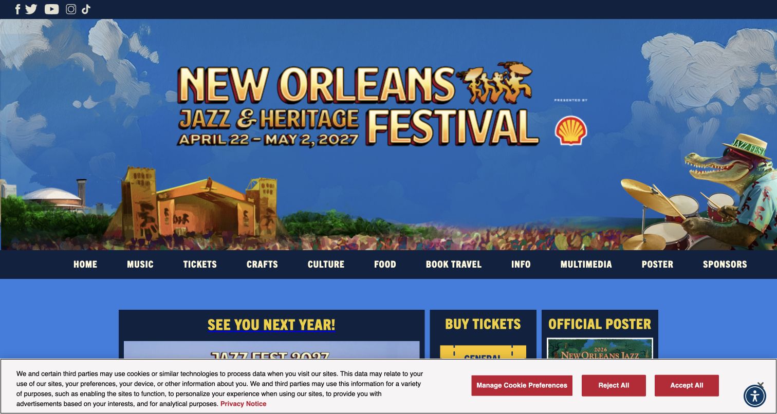
New Orleans Jazz & Heritage Festival presents a broad cultural identity through illustrated local imagery and a substantial horizontal navigation. Music, tickets, crafts, culture and food each receive their own route, reflecting the event's wider purpose. A large forthcoming date banner sits above smaller modules for the next edition, admission and the official poster. This directory approach is valuable for an event with several kinds of visitor interest. The tradeoff is visual density: the tall illustrated header, extensive navigation and first-visit privacy notice leave less space for the practical modules below.
What you can learn
Build the navigation around the actual breadth of the festival, not only its headline acts. Cultural programming and food can justify dedicated sections, provided the page still gives the next dates, admission status and essential visitor information a clear hierarchy.
Pros
Separate music, crafts, culture and food routes express the event's broader identity directly.
The illustrated setting and forthcoming date banner make the regional character immediately apparent.
Cons & considerations
The tall header and wide navigation consume much of the opening viewport before detailed information appears.
The captured privacy notice obscures part of the ticket and poster modules beneath the hero.
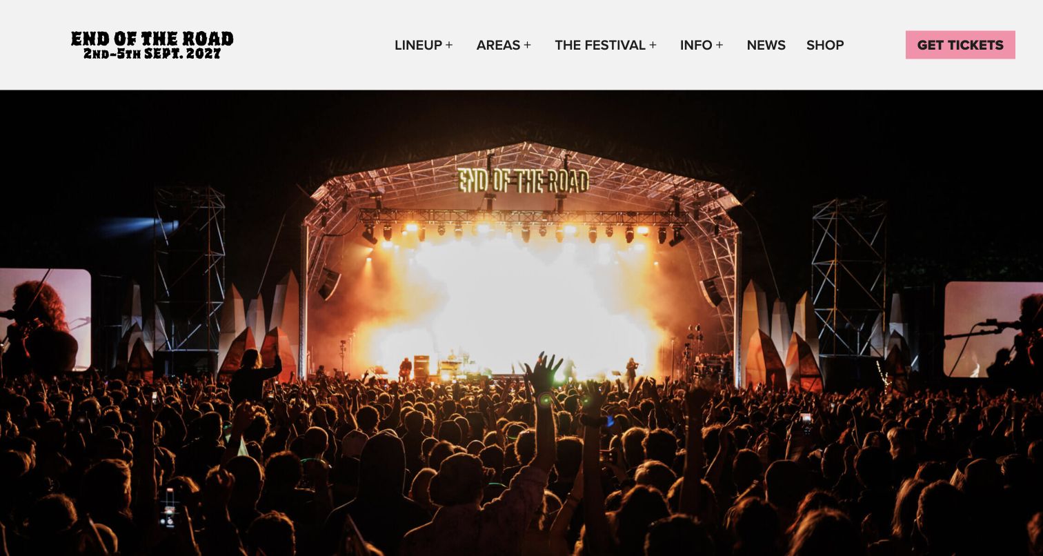
End of the Road opens with a full-width night-performance photograph beneath a clean white header. The wordmark includes the forthcoming dates, while lineup, areas, festival information and news remain visible alongside a pink ticket action. The image supplies energy without a large headline layered over the crowd. That restraint separates useful navigation from atmosphere. Press quotations and a mailing-list area continue the introduction. The homepage depends heavily on visitors using the navigation to learn the location and practical details that the photograph cannot explain.
What you can learn
Let one strong photograph establish mood while stable navigation carries the task structure. Avoid covering every image with promotional copy, but make sure dates, location and ticket status can still be understood without familiarity with the brand or its previous editions.
Pros
The white header keeps the main sections and ticket action separate from the busy performance image.
Dates integrated into the visible brand area provide useful seasonal context without another announcement banner.
Cons & considerations
The opening photograph does not itself explain the location, travel requirements or accommodation format.
Press quotations provide atmosphere but should not substitute for concrete planning information or current program details.
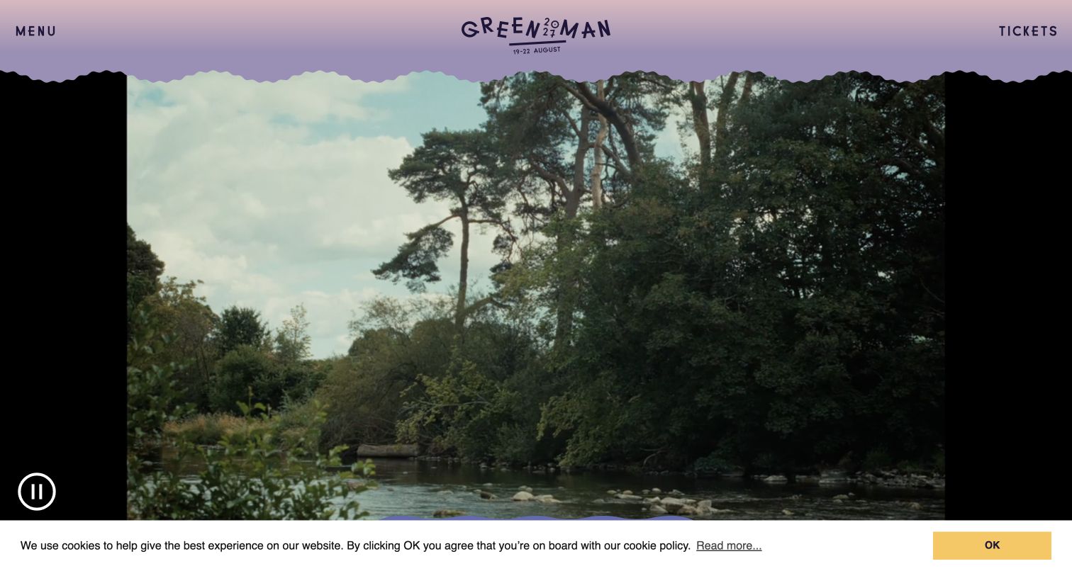
Green Man gives the first screen almost entirely to a landscape film, framed by a pastel header with a scalloped edge. The logo includes the forthcoming dates, with Menu and Tickets at opposite ends of the bar. A prominent pause control sits over the media, acknowledging that an atmospheric opening should remain controllable. The approach creates a distinctive feeling of place with very little interface text. Its limitation is equally clear: a first-time visitor learns little about the program or practical arrangements until opening the menu or moving further through the site.
What you can learn
Use environmental media deliberately and keep a visible way to stop it. A minimal festival homepage can be memorable, but essential date, location and planning information must have stable text destinations rather than depending on the mood of a changing video.
Pros
The landscape film and irregular header edge create a coherent identity tied to the setting.
A visible pause control gives visitors an immediate alternative to continuous background motion.
Cons & considerations
The opening screen offers very little explanatory content for visitors unfamiliar with the festival.
The retained cookie banner occupies the bottom of an already media-dominated first view.
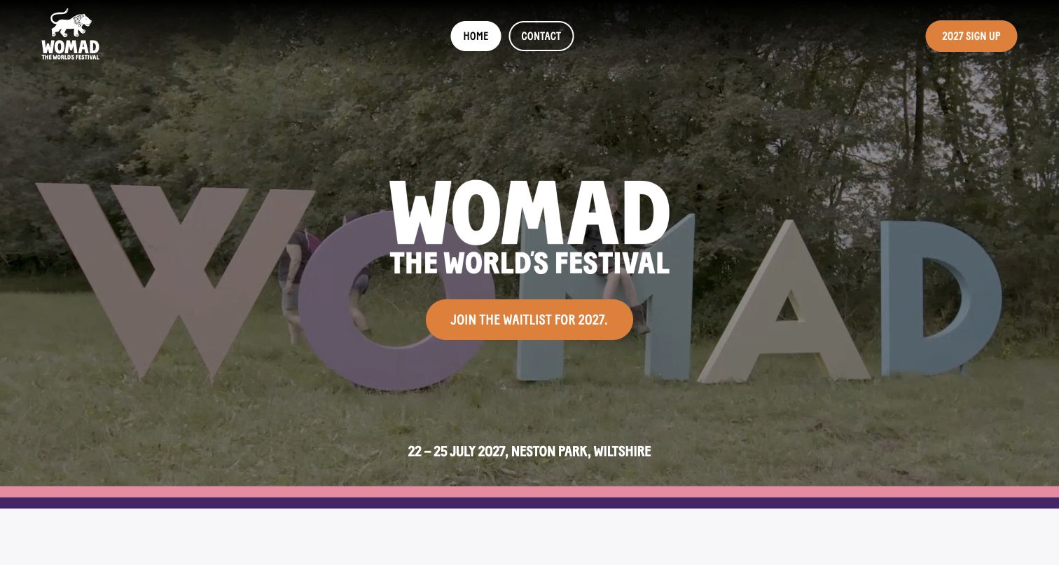
WOMAD UK's homepage presents a single waitlist action over footage of its physical festival lettering. The forthcoming dates and Wiltshire venue appear at the bottom of the hero, while the top navigation stays unusually sparse. Below, the page explains the event through music, workshops, children, talks and wellness rather than relying only on a performer list. Those categories communicate a wider experience to unfamiliar visitors. The simple opening is effective, but some lower footer labels are generic or point to placeholders, making the supporting information structure less polished than the hero.
What you can learn
When the next program is still developing, explain the kinds of experience visitors can expect and label the signup state plainly. A waitlist should not resemble an immediate ticket purchase, and the supporting navigation should be as carefully authored as the main campaign.
Pros
The waitlist message, forthcoming dates and named venue give the seasonal landing page a clear purpose.
Experience categories make workshops, family activities and talks visible alongside the music.
Cons & considerations
The very sparse top navigation gives few direct routes into detailed attendance planning.
Generic footer labels and placeholder links weaken the otherwise specific festival identity and deserve cleanup.
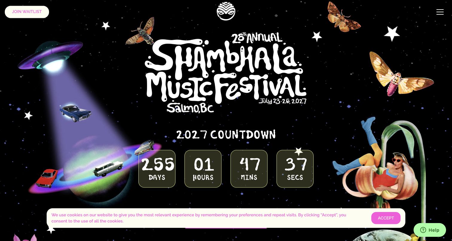
Shambhala builds its opening around a playful space collage, handmade-style lettering and a large countdown. The forthcoming dates and Salmo location sit within the artwork, while a waitlist action remains visible in the header. Lower sections state that the next edition is sold out and distinguish shuttles and other ways to engage with the festival. The illustrations create a memorable, consistent world beyond a generic concert background. However, the countdown occupies more immediate space than the availability explanation, and a cookie strip adds another layer over the composition.
What you can learn
Make expressive artwork serve a clear operating state. If admission is sold out, that fact should be as easy to find as the countdown, and waitlist, transport and other participation options should remain distinct so excitement does not create misleading expectations.
Pros
The consistent collage style gives the festival a recognizable personality across the opening screen.
A visible waitlist route and a plainly worded sold-out section support different stages of visitor interest.
Cons & considerations
The large countdown appears before the fuller explanation of the current admission situation.
Decorative objects, a cookie strip and a help widget compete around the same first-screen focal area.
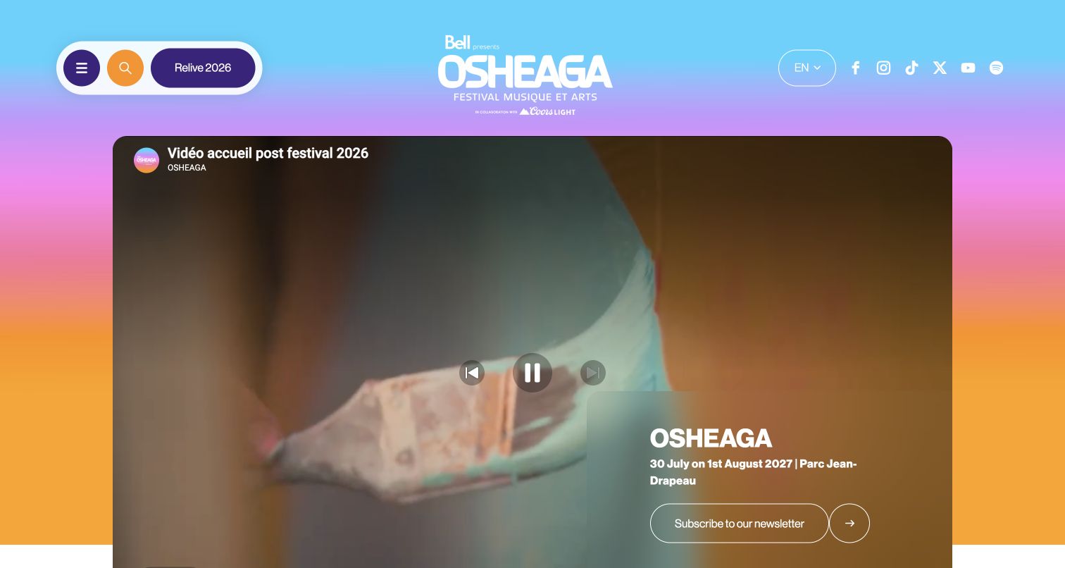
OSHEAGA places its recap video inside a large rounded frame against a bright multicolor background. The header gives the previous edition's archive its own action, while a translucent panel over the media carries the forthcoming dates, park and update route. This bridges memories and planning: the named archive remains distinct from the new program. The first visit required several privacy choices before the underlying page was visible. After declining optional processing, the capture shows the video, navigation and player controls.
What you can learn
Separate the year of the media from the year of the next event. A recap can convey atmosphere without pretending to show an upcoming lineup, provided its label and the forthcoming date remain clear and the underlying page still works after privacy choices.
Pros
The archive action explicitly identifies the completed edition while the hero supplies the next dates.
The framed video and rounded controls create a coherent system within a very colorful background.
Cons & considerations
The initial consent dialog hides most of the page and requires an additional step to refuse optional processing.
Video controls and overlay text share the same frame, making their placement important for readability.
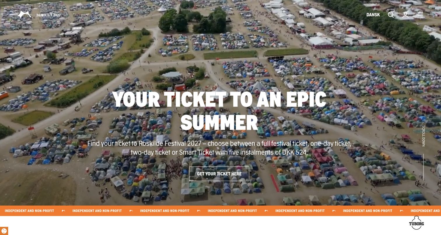
Roskilde's English homepage places a concise ticket proposition over an aerial view of the grounds. The supporting text names several admission formats and an installment option before a single ticket action. Below the hero, dated news connects program announcements with volunteering and the festival's stated nonprofit purpose. The orange repeated identity strip links these sections visually. The captured page remains understandable after selecting necessary cookies only. Its main weakness is contrast over detailed moving imagery, while a lower news card retains an earlier edition label that conflicts with the surrounding forthcoming-year material.
What you can learn
Explain ticket families in ordinary language before visitors reach a sales platform. Connect them to the festival's wider purpose through dated, clearly labeled content, and keep an explicit edition field so volunteer announcements and archived stories cannot accidentally appear current.
Pros
The opening text distinguishes admission formats instead of presenting an unexplained generic purchase action.
Dated news and purpose sections connect the event to activity beyond the performance program.
Cons & considerations
White copy over a busy aerial scene needs reliable contrast throughout every video frame.
The observed volunteer news label references an earlier edition within an otherwise forthcoming-season page.
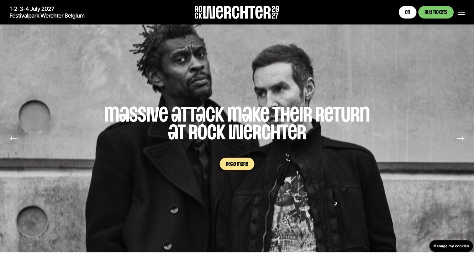
Rock Werchter uses monochrome artist photography, a compact black header and bright action colors to frame its latest announcements. The forthcoming dates and Belgian venue remain fixed above the rotating stories. Beneath the carousel, a dated news grid provides a stable record of announcements, followed by practical questions about transport, performance times and mobile tickets. This supports a gradual lineup release without making visitors wait for the right slide. The initial privacy dialog obscured much of the hero; the retained capture follows its rejection and shows the unobstructed artist story.
What you can learn
Pair a promotional carousel with a permanent, dated announcement list. Keep the next dates and venue stable, and place practical questions nearby so visitors can move from excitement about an artist to realistic attendance planning without hunting through unrelated pages.
Pros
Dates and location stay fixed while the main artist announcement changes beneath them.
Dated news and selected practical FAQs provide useful alternatives to browsing the rotating hero.
Cons & considerations
The large first-visit privacy dialog initially hides both the artist message and its supporting action.
Changing slides can interrupt reading, so essential announcements need the stable news destinations shown below.
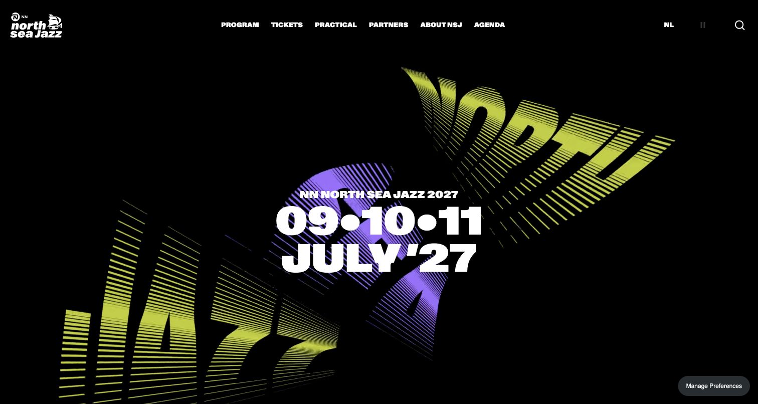
NN North Sea Jazz opens with animated striped typography on black and a large, stable forthcoming date. Its main navigation divides program, tickets, practical information, partners, organizational context and other concerts. The underlying practical menu distinguishes preparation from on-site needs, including travel, accessibility, opening times, maps and payment information. This is an effective separation for an event whose audience needs more than an artist list. The striking first screen has relatively little explanatory copy, but the visible pause and search controls give visitors ways to manage the motion and reach the extensive archive.
What you can learn
Organize practical information by when visitors need it. Before-arrival questions and on-site needs should have distinct destinations, while the visual identity can remain expressive as long as dates, navigation and motion controls stay readable and consistently available.
Pros
The high-contrast date remains legible within an unusually bold typographic visual treatment.
The practical information structure separates preparation from needs that arise during the festival itself.
Cons & considerations
The opening screen assumes some familiarity with the festival and offers little location explanation.
A deep archive and broad menu require careful year labeling so past programs do not look like current announcements.
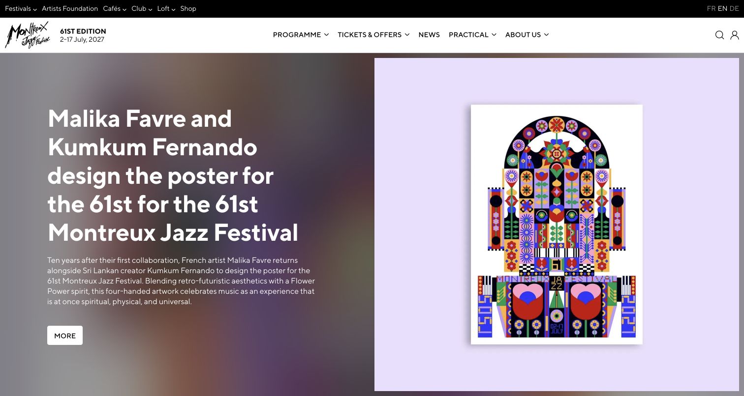
Montreux Jazz Festival uses its poster announcement as the homepage lead, placing the artwork beside a substantial editorial explanation and named artists. A clean white navigation bar separates program, ticket offers, news and practical information, while a thinner black strip connects the wider festival ecosystem. The forthcoming edition and dates remain close to the logo. This makes the visual identity editorial content rather than decoration. The English headline in the captured page repeats a phrase, showing how even a polished design can be undermined by a small publishing error.
What you can learn
Credit and explain festival artwork when it is central to the brand. Give that editorial story a clear route to more detail, but keep event dates and practical navigation separate so visitors can enjoy the design without losing their attendance-planning path.
Pros
The split layout gives the poster enough room while explaining the artists and creative context.
Separate navigation levels distinguish festival planning from the wider network of related properties.
Cons & considerations
The observed English headline repeats part of its wording and needs a straightforward copy edit.
The long editorial lead pushes ticket availability and practical attendance details beyond the first screen.
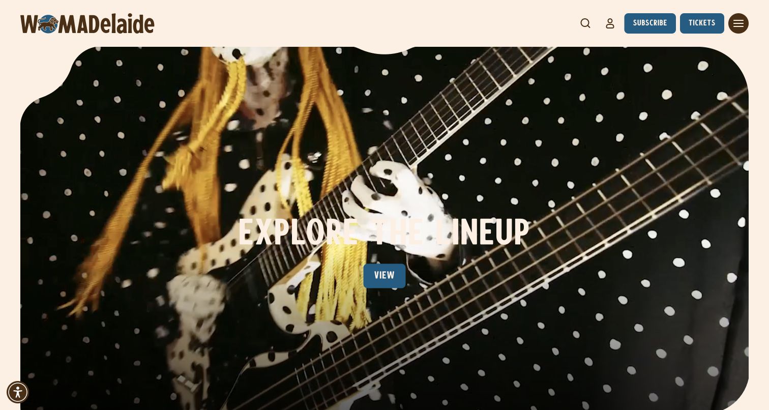
WOMADelaide first presents an acknowledgement of Country with a clear continue control, then opens a cream-colored homepage with a shaped media frame. The main message leads to the lineup, while tickets and updates remain distinct in the header. A short introduction below names the venue, forthcoming dates and breadth of the program, followed by cards for tickets, support and history. The capture shows the homepage after reading and dismissing the acknowledgement. This makes cultural context explicit while keeping the subsequent program gateway focused.
What you can learn
If a festival begins with an introductory statement, make the continuation clear and preserve that information elsewhere on the site. The main page should then quickly establish dates, location and the next useful action so the introduction does not replace practical orientation.
Pros
The initial acknowledgement has a direct continuation and remains available in the page's supporting information.
The lineup action, tickets and updates are visually distinct rather than competing as identical buttons.
Cons & considerations
The opening media frame is very large, placing the fuller date and venue explanation below the initial view.
Bright moving imagery can reduce text contrast, so the central program action needs a reliable readable backdrop.
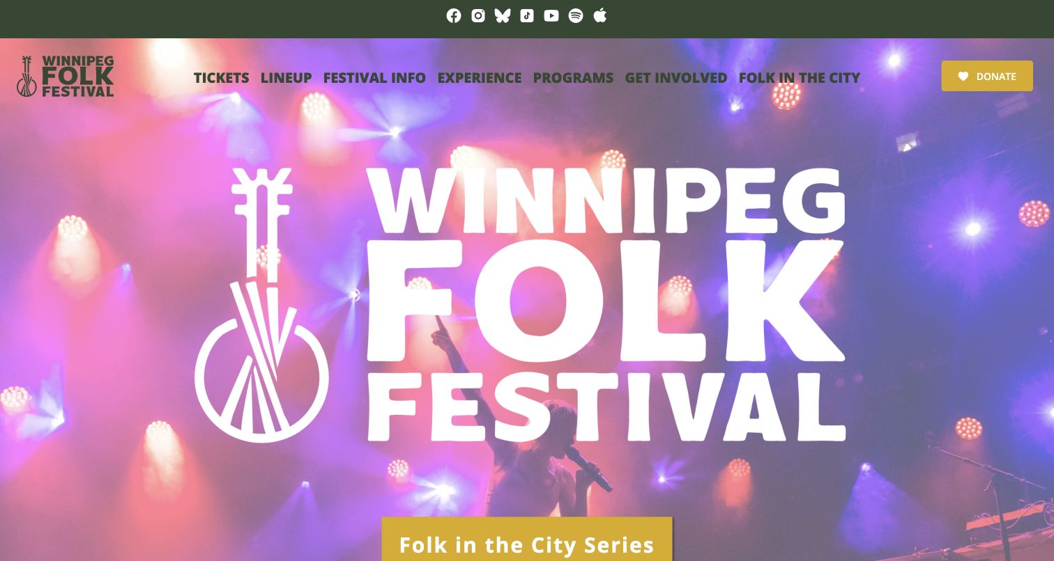
Winnipeg Folk Festival leads with an oversized wordmark over performance imagery, using a green header and yellow action to create a consistent visual identity. Its navigation separates the annual festival, wider programs, involvement and the city concert series. The next festival dates and a countdown appear below the hero, followed by named concerts with venues and times. This supports a year-round presence alongside the annual event. The main challenge is hierarchy: a new visitor sees the concert-series action before the forthcoming festival date and must distinguish both programs.
What you can learn
Separate an annual festival from the organization's other concerts using clear labels and dated listings. A shared brand can connect them, but each event needs its own venue, timing and ticket context so visitors understand what they are actually considering.
Pros
The navigation gives community programs and the city concert series explicit destinations alongside festival information.
Named concert cards include venue and time context instead of relying only on performer photographs.
Cons & considerations
The very large wordmark delays the next festival's date and practical information below the opening view.
The concert-series action can distract first-time visitors unless the distinction from the annual festival stays clear.
Kegan is a freelance web designer and developer with 15+ years of experience helping businesses turn complicated website requirements into clear, maintainable digital experiences. He works directly with clients from planning and design through development, launch, and ongoing support.
For music festival website design, his development approach focuses on program discovery, ticket distinctions, travel information and accessible event planning. The scope can be a targeted improvement or a complete custom build, with responsive layouts, thoughtful content structure, and integrations chosen around the people using and maintaining the site.
Show 3 other music festival website designersHide other music festival website designers
Plan a festival website around the edition, the decision and the day of attendance
Create an edition model before changing the artwork
Start by separating permanent festival information from details that belong to one edition. The brand story, general location and organizational background may remain stable, while dates, lineup, schedule, ticket products, maps and arrival instructions need their own year or version. Record who owns each fact and what source confirms it. This prevents a new hero image from sitting above an old ticket link or an earlier date hidden in the logo.
Define the seasonal states explicitly. A save-the-date page, an active sale, a sold-out event and a post-event archive need different main actions. Specify what appears in the header, hero and ticket destination for each state. If a waitlist is available, label it as a waitlist. If a program has not been announced, say so and offer useful background without implying that earlier artists will return. The reviewed sites show how quickly conflicting date labels weaken an otherwise polished design.
Preserve earlier editions as clearly labeled archives instead of repeatedly overwriting their identity. A past schedule, photograph collection or artist announcement may remain useful to attendees and researchers. Give the new edition a clear route, keep the archive year visible and check every date-bearing element when the season changes. A small content inventory and release checklist can prevent more confusion than another layer of animated artwork.
Connect the lineup to ticket and travel decisions
Map the questions a visitor needs to answer before attending. Some arrive for one artist, some choose by date and some are comparing the whole weekend. Support those different starting points with an understandable program, stable daily information when available and a clear explanation of admission formats. A festival ticket, camping pass, parking product and hotel package should never look interchangeable merely because the same provider sells them.
Put the comparison information before the external purchase step. Explain what each option covers, which days or areas it applies to and where authoritative conditions can be read. Avoid presenting a lowest advertised installment as though it were the entire cost. If prices or availability change, establish a maintenance process that keeps the festival page and ticket provider aligned. The design review here observes public information and links; it does not verify checkout behavior or guarantee any offer.
Treat travel and access planning as core content. Give visitors named routes to the venue, transport options, camping rules, accommodation, access services and the right contact for specific needs. State the applicable edition and the date of major updates. Do not bury essential logistics under an atmospheric label that only returning attendees understand. On the day of the festival, the same site should help an existing ticket holder find a map or arrival answer without retracing the promotional journey.
Use the festival identity to orient, not obscure
Choose images and artwork that explain what is particular about the event. A regional landscape, a distinctive stage, a makers market or the people constructing a temporary venue can communicate more than an anonymous crowd. Pickathon's neighborhood pages are useful because the storytelling connects to maps, amenities and planning routes. A poster launch can also become meaningful editorial content when artists are credited and the creative context is explained.
Keep essential text independent of decorative media. Dates and venue details should not exist only inside an image, and important actions must remain legible throughout moving backgrounds. Provide a visible way to pause animation and a useful static state. Inspect the page after ordinary privacy choices, since an external video or embedded service may behave differently when optional processing is declined. A functional fallback is part of the actual visitor experience, not a secondary design exercise.
Plan the full first-visit composition, including notices and overlays. A subscription dialog, ticket promotion, help widget and cookie panel can collectively hide the message that looked clear in a design file. Use proportionate, plainly labeled controls and avoid making visitors navigate several interruptions before understanding the festival. Review keyboard focus, meaningful link names, image alternatives and readable contrast as implementation requirements. A visual review alone cannot establish accessibility conformance or the operational suitability of an event.
The editing job behind the design
Choose publishing and ticketing tools around accurate festival information
Model editions, artists, stages, dates and ticket types as structured content rather than disconnected promotional blocks. The publishing system should make it difficult to attach an earlier artist announcement or schedule to the next edition accidentally. Keep permanent pages and dated archives related without giving them identical current-state labels.
Use an authorized ticket provider for transactions and keep the public site's explanation synchronized with it. Label external purchase, waitlist, accommodation and merchandise destinations clearly. Do not collect payment information through a homemade form merely to make the design feel seamless, and do not claim that a link review proves checkout availability.
Budget for image weight, video fallbacks and optional embeds. Store meaningful text independently of artwork, provide visible motion controls and make maps or practical information usable without unnecessary marketing scripts. Public source signals can identify some tools and dependencies, but they do not establish the complete publishing stack, private integrations or attendee-data handling.
Our WordPress website examples offer a separate look at publishing approaches. A visible platform label is evidence for that named page, not a guarantee that the same system will suit your requirements.
Before the public launch
Music-festival website brief checklist
Identify the current edition, dates, city and venue in stable readable text.
Label the actual state: announced, on sale, waitlisted, sold out or archived.
Check year references in the logo, title, metadata, hero and ticket destinations.
Separate admission, camping, parking, transport and accommodation products.
Explain ticket formats and link to the authoritative conditions before checkout.
Give lineup announcements and daily schedules clear edition labels.
Keep a permanent, dated alternative to any rotating announcement carousel.
Provide named routes to travel, arrival, access information and on-site maps.
Explain food, art, workshops and family activities when they are part of the real program.
Credit commissioned artwork and use actual festival photographs with appropriate rights.
Keep essential information available when optional media or cookies are disabled.
Provide readable contrast, meaningful image alternatives and visible motion controls.
Test keyboard navigation and focus behavior in menus, dialogs and accordions.
Assign content owners and expiry rules for sale notices, schedules and seasonal campaigns.
Preserve clearly dated archives without presenting past lineups as future commitments.
Keep mailing-list consent distinct from attendance information and ticket purchase.
These checks are a project checklist, not a performance, legal, security, or accessibility certification. Test real journeys with the people responsible for the website before making claims about the result.
Sources & editorial method
How this collection was selected and reviewed
This collection contains 26 distinct public festival website properties, matching the original saved random draw. The source pages received actual direct browser captures on November 10, 2026, with source URLs, capture times, dimensions, attribution and file hashes retained. Each screenshot was inspected and the reviews describe the observed seasonal state, including earlier labels, privacy notices or transitional campaigns where relevant. Initial overlay views remain private when a later ordinary dismissal produced the retained screenshot. Twenty-eight candidates were inspected; two were retained privately and excluded from the final selection for editorial scope and variety, without changing the saved count.
Every selected source page received one bounded broad public technology-audit attempt. Twenty-four completed, Newport Folk encountered an access check, and Roskilde returned a partial homepage-only result without linked-asset scanning. Restrictions were respected and no hidden platform was inferred. Pickathon's Editors Choice also draws on separately opened information-hub and neighborhood pages. The selection concerns website communication and design only. No tickets, accounts, subscriptions or forms were submitted, and this review does not certify accessibility, safety, event operations or service quality.
Each example links to its actual source page. Screenshots are direct browser captures with their own capture dates; moving imagery, announcements and live designs can change. The notes describe observable design choices and conditional tradeoffs, not measured traffic, conversion results, service quality, or accessibility conformance.
Technology labels use public page metadata, asset evidence, or explicitly cited platform documentation. Platform documentation is not a complete current deployment audit. A component reference may be legacy or unused; it is not a complete backend inventory. Unknown stacks are omitted. These sites are editorial examples, not our client portfolio.
Written, Edited and Curated are separate editorial records, not timestamps advanced by a rebuild. Website designs and imagery belong to their owners. See our editorial standards or suggest a correction.
Questions worth asking
Music Festival website design questions
What should a music-festival homepage explain first?
Identify the current edition, dates, location and practical state. Visitors should understand whether tickets are available, a waitlist is open or the next announcement is still pending. The main action should match that state, with clear routes to the program and attendance information.
What should the website show before a lineup is announced?
Publish confirmed dates and venue information, explain the festival format and provide useful planning context. Clearly labeled archives, photographs and experience categories can communicate the character of the event. Do not imply that an earlier lineup is confirmed for the forthcoming edition.
How should a festival website handle sold-out tickets?
State the sold-out condition directly and distinguish any official waitlist, resale or alternative products. Explain which edition, day or ticket type the message concerns. Keep the public page aligned with the authorized ticket provider instead of leaving an unchanged purchase button to explain the situation later.
Should festival websites use background video?
Video can communicate atmosphere, but dates, location and actions should remain readable without it. Provide a visible pause control, useful static fallback and sensible file sizes. Check the experience after ordinary privacy choices because external media may load differently when optional processing is declined.
How do festival archives stay useful without confusing visitors?
Give earlier lineups, schedules and galleries explicit edition labels and preserve stable destinations. Make the current event easy to find separately. Seasonal updates should cover headers, logos, titles, metadata and ticket links as well as the obvious homepage banner.
Does an Editors Choice badge recommend attending that festival?
No. The selection identifies an independently reviewed website-design reference. It does not assess event safety, accessibility, artist quality, ticket value or service performance. Visitors should use the organizer’s current official information when making attendance decisions.
Can a public website audit identify the complete festival technology stack?
No. A bounded audit can observe public markup, linked resources and permitted responses. Access restrictions or unavailable resources can limit the result, and private ticketing integrations, databases or internal publishing systems may remain unknown. The source records retain those limits rather than filling gaps with guesses.
Borrow the connection between a festival’s personality and the decisions its visitors need to make. Keep the current edition explicit, connect exciting announcements to useful planning information and make the website remain understandable throughout the whole year.