Best Tutor Websites of 2026 (25 Real-World Examples)
Study 25 tutor websites for clear subjects, honest service distinctions and practical routes from research to an initial conversation.
A useful tutor website helps learners and families understand who the service supports, how sessions work and what happens next without turning every educational concern into an immediate sales form.
Tutoring sites can look similar while offering very different services. A subject tutor, test-preparation practice, executive-function coach and marketplace do not necessarily work in the same way. Good design makes those boundaries clear. Start with subject, learner stage, delivery format and the process for finding the right person. Reassuring language matters, but it should not leave the visitor guessing whether the service is local, online, one-to-one or a larger group programme.
This collection includes specialist practices, centre networks and broader platforms so you can compare different information problems. It is not an endorsement of tutoring effectiveness, admissions results or any clinical claim. Photographs and publisher testimonials are design material, not evidence that a particular learner will have the same experience. Borrow the structure that suits your actual offer, then write the details around your own staff, schedule and responsibilities.
Before the examples
What makes good tutor website design in 2026?
Name the service before promising a result
Explain subjects, school stages and format in ordinary language. If coaching or admissions consulting sits beside tutoring, give it a distinct page and scope. Educational Connections’ public FAQ separates several related services and identifies virtual delivery; the important design lesson is the clarity of those distinctions, not an assumption that every tutoring practice should use the same model.
Show what the first step involves
A consultation, assessment, subject search and tutor booking are different actions. Name the actual next step and explain its purpose before collecting details. Tell visitors whether they will receive a call, browse profiles or complete a separate registration. Keep initial questions proportionate to that task instead of asking for an extensive learner history in a general contact form.
Give claims their proper context
A testimonial, a test-score statistic and a general motivation statement are not interchangeable evidence. Explain the scope of published figures where they are used and avoid presenting them as guaranteed individual outcomes. Clear tutor biographies, process descriptions and current service facts are more useful than adding unqualified badges or stronger language to every section.
The collection · 25 examples
25 tutor websites worth studying
The 25 tutor examples below range from a simple subject-search interface to a local-centre finder and a specialist consultation-led practice. Compare how each model handles uncertainty before borrowing its calls to action or layout.
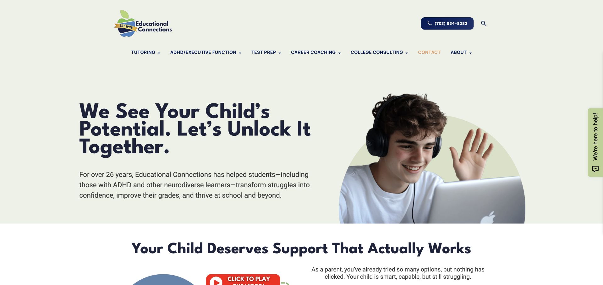
Educational Connections uses a pale green background, a bold navy headline and a learner-at-a-laptop image to introduce several related services. Tutoring, executive function, test preparation, career coaching and college consulting have distinct navigation labels. A phone action remains available above them. The design avoids turning every service into a competing hero button. This founder-led specialist is our editorial selection for its coherent hierarchy and clear service naming; the choice concerns the website, not the effectiveness of its tutoring or support for any individual learner.
What you can learn
Borrow the separation of service categories before borrowing the reassuring headline. Families should be able to distinguish subject tutoring from organisational coaching and test preparation, then find the relevant process and provider information without completing a consultation form first.
Pros
Navy and green give the related services a coherent identity.
A visible phone route supports questions without dominating the introduction.
Cons & considerations
Broad reassurance needs concrete service explanations before meaningful provider comparison.
The photograph cannot establish the circumstances of the people shown.
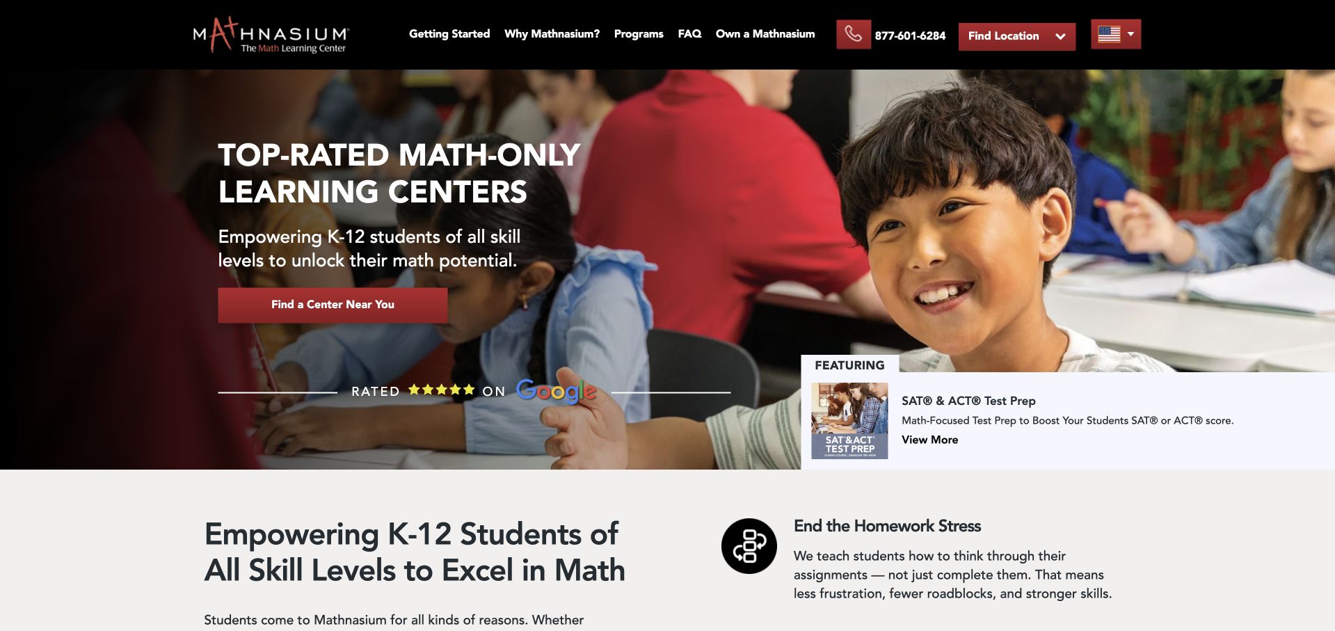
Mathnasium uses black and red branding above a photograph of a learner working at a table. The headline makes the subject focus explicit, while Find a Center Near You gives the national homepage a practical local destination. A secondary panel introduces SAT and ACT preparation without replacing the main math-focused introduction. The layout shows how a franchise network can maintain one recognisable identity while directing parents toward location-specific information. Claims about ratings or results remain the publisher’s marketing statements rather than findings established by this design review.
What you can learn
For a location-based tutoring network, make the centre search more prominent than a general enquiry. The next page should clarify the local programme, address and contact arrangements so a parent does not mistake national information for the exact offer at every branch.
Pros
The subject focus is clear before the smaller supporting text.
A centre finder connects national branding to a practical locality.
Cons & considerations
A secondary exam promotion competes with the main local journey.
Rating and outcome claims need their own clearly stated context.
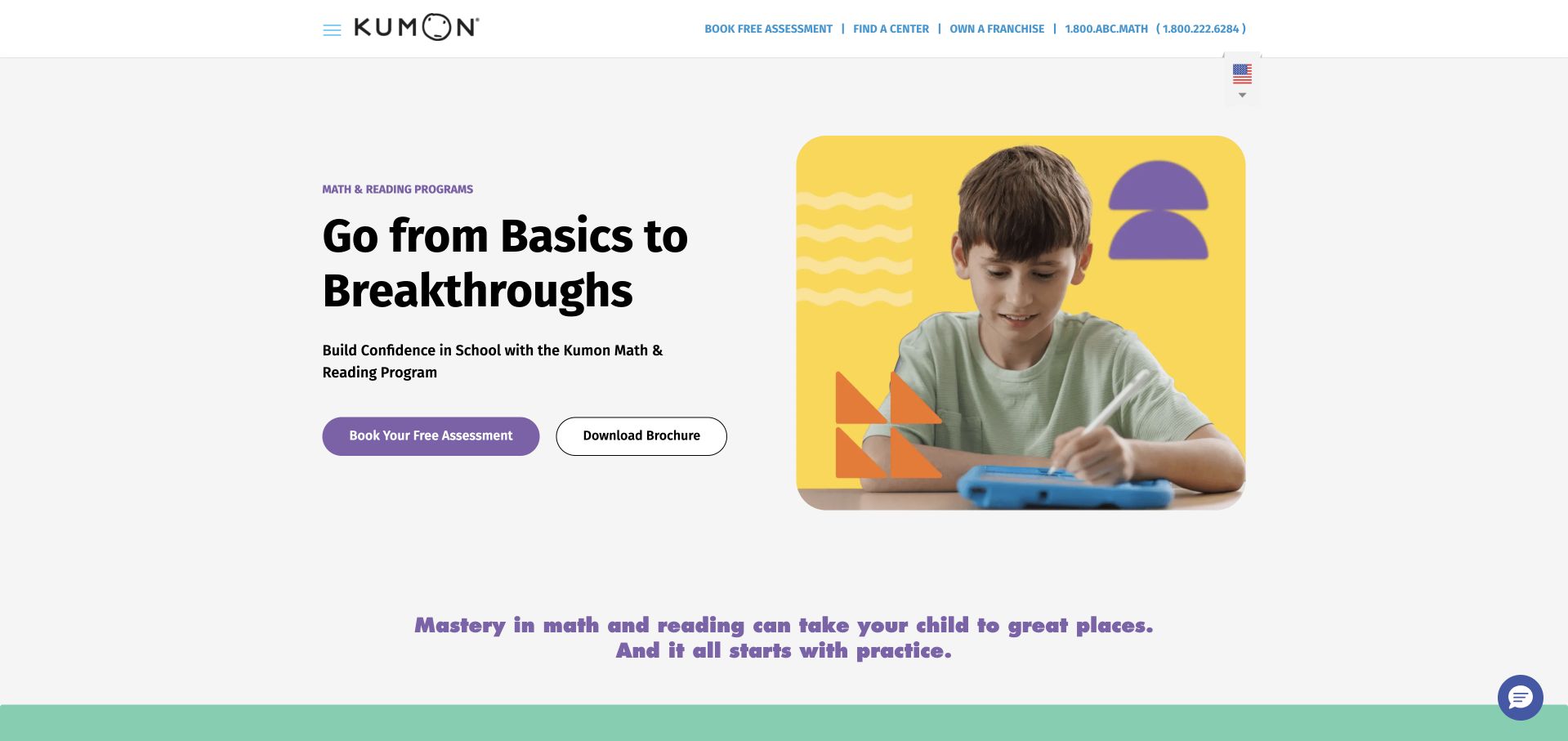
Kumon uses a mostly white opening with dark text, purple actions and a bright yellow photographic frame. The headline about basics and breakthroughs is followed by a short explanation of the maths and reading offer. Book Your Free Assessment and Download Brochure are placed together, recognising that not every parent is ready for an appointment. The compact navigation leaves generous space around the main message. The photograph supplies a human focal point without taking over the screen or requiring the visitor to watch a video.
What you can learn
Pair an assessment action with a lower-commitment information route when families need time to compare options. Explain what the assessment involves on its destination page, and keep brochure content available as readable web text as well as a download.
Pros
Assessment and brochure actions recognise different stages of family research.
A bright yellow frame emphasises the image without obscuring text.
Cons & considerations
The broad headline needs more programme detail to explain differentiation.
A brochure requires separate accessibility checks and ongoing content maintenance.
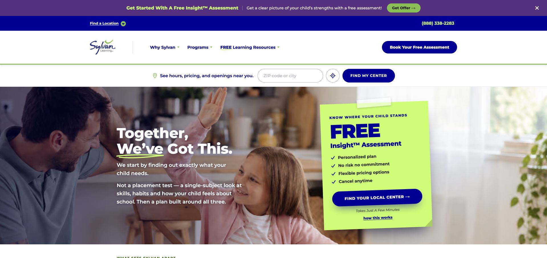
Sylvan combines purple utility navigation with a learner-and-adult photograph and a bright green assessment card. The card names the offer and directs visitors to their local centre, while the surrounding hero uses a short supportive statement. The large green shape is visually unmistakable against the darker photograph. Below the header, tutoring and learning-resource routes remain available for parents who want more detail first. This is a conversion-led composition, but the actual assessment terms and local availability still belong on the linked public pages.
What you can learn
A distinct action card can work better than placing several buttons over a busy image. Keep its language specific about the next step, then explain the assessment, location and any conditions before requesting family details. Treat visual prominence as navigation, not as proof that the offer suits everyone.
Pros
A contrasting assessment card creates one unmistakable primary visual focus.
Local-centre wording connects a national introduction to nearby service information.
Cons & considerations
Announcement and assessment promotions can compete in the opening view.
The card needs a mobile layout that preserves photographic context.
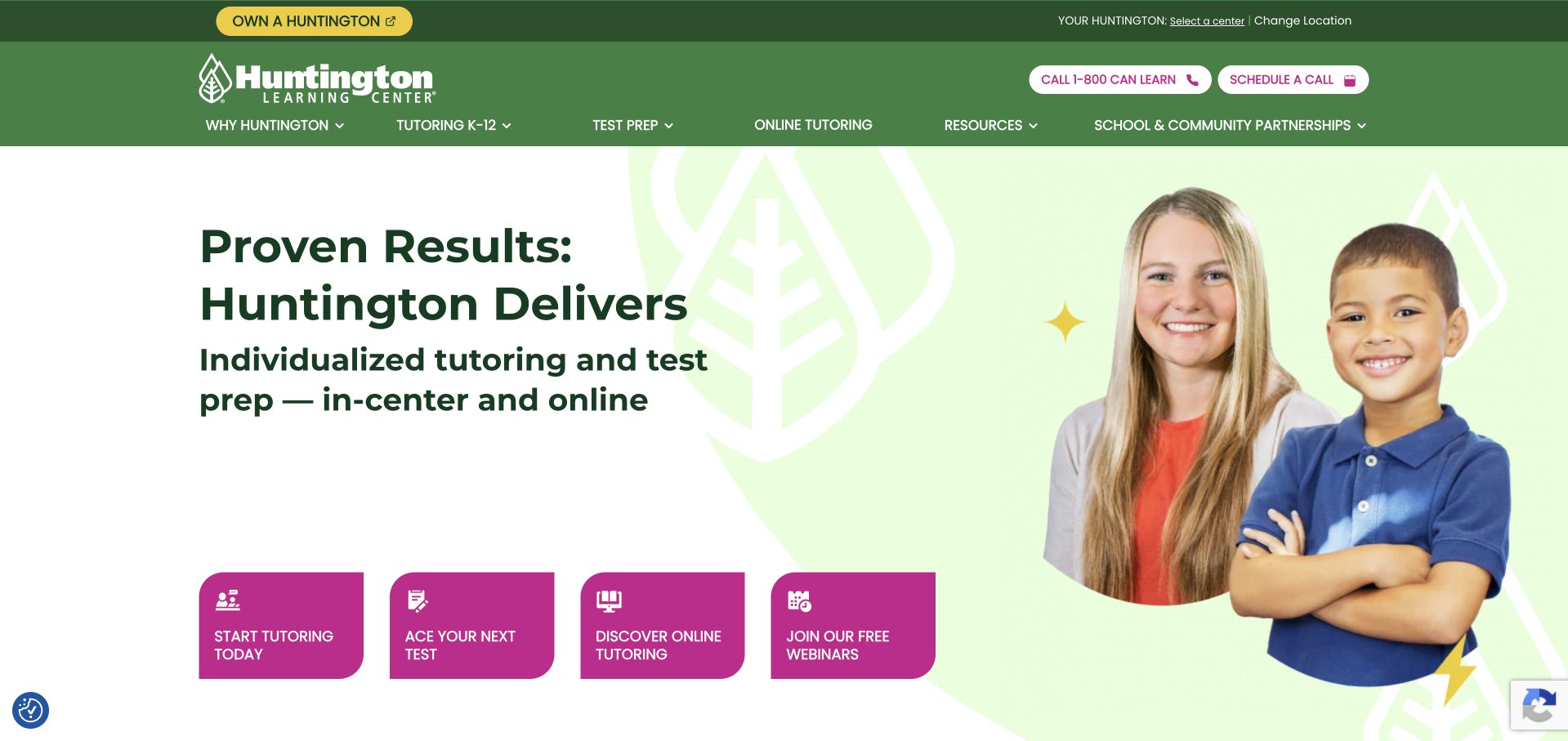
Huntington uses green consistently across the logo, navigation and hero, with a pale background behind an adult-and-child portrait. The large headline is followed by a plain description of tutoring and test preparation in-centre and online. The main page exposes separate routes for starting tutoring, preparing for a test and discovering online support. This gives the broad offer a usable structure instead of presenting every parent with the same form. Its results-focused wording is the company’s own claim, not an outcome verified by the screenshot.
What you can learn
Name delivery formats and service types early, especially when they overlap. A parent looking for online subject help should not have to navigate through an exam-preparation campaign to discover whether the relevant service exists. Keep the language factual before adding stronger promotional claims.
Pros
Consistent green branding connects the broad collection of service routes.
Explicit online and in-centre wording answers a practical delivery question.
Cons & considerations
Results-led statements need context rather than implying individual outcome guarantees.
A broad service menu needs careful grouping on smaller screens.
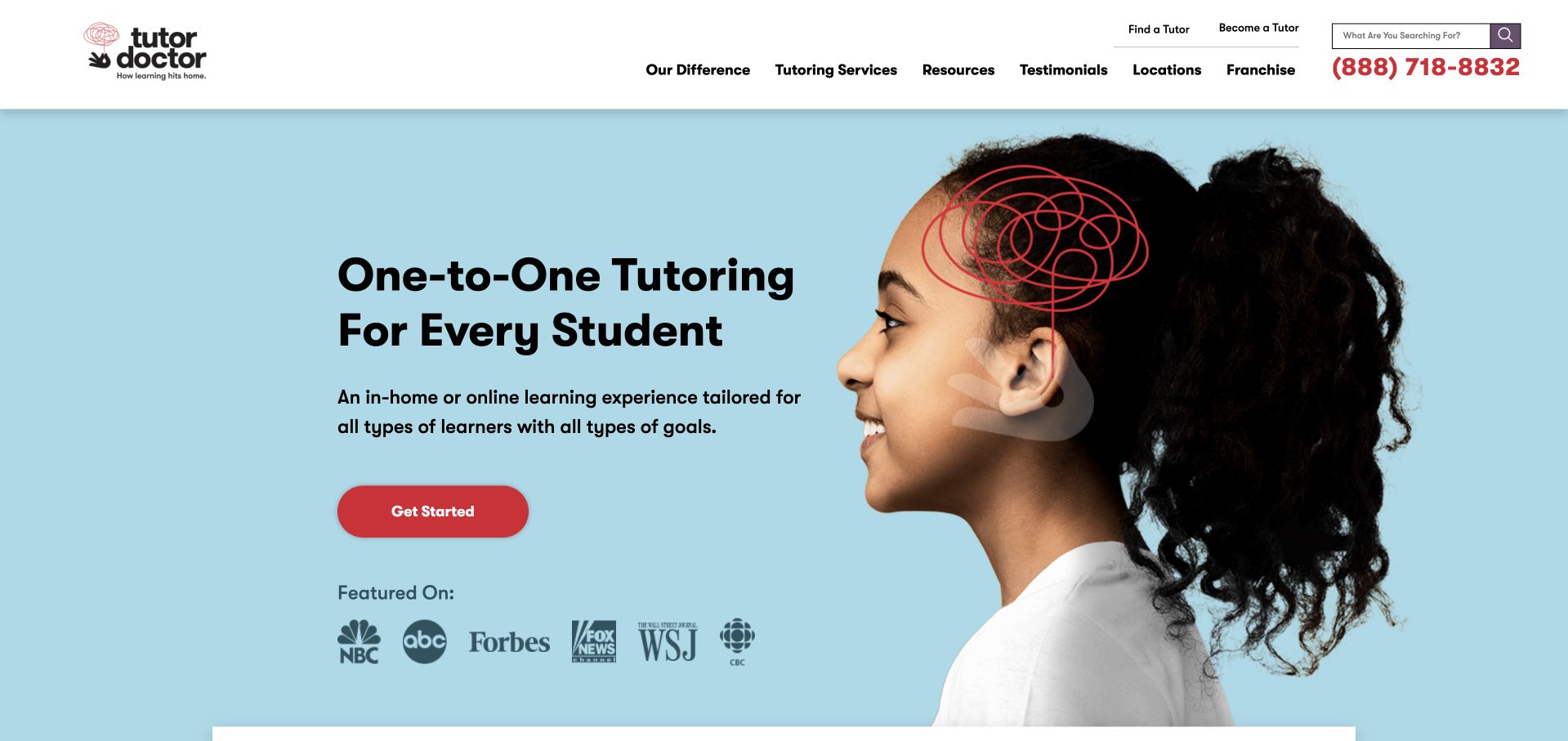
Tutor Doctor uses a light blue background, a large learner portrait and a red Get Started button. A simple line illustration around the head adds character without replacing the photograph. The headline states the one-to-one format directly, while a short paragraph broadens the introduction to different learners and goals. Featured-media logos occupy a secondary row rather than overwhelming the main action. The page is easy to understand as a service introduction, although the details of tutor matching and delivery must still be learned elsewhere.
What you can learn
State the tutoring format in ordinary language before asking a visitor to begin. Personalised is less useful than an explanation of who teaches, where sessions happen and how a match is made. A clear first screen should lead into those details rather than merely repeat reassurance.
Pros
One red action stands out against the pale blue background.
The one-to-one format is stated directly rather than merely illustrated.
Cons & considerations
The portrait does not explain tutor matching or ongoing communication.
Featured-media logos need context rather than implying independent service endorsement.
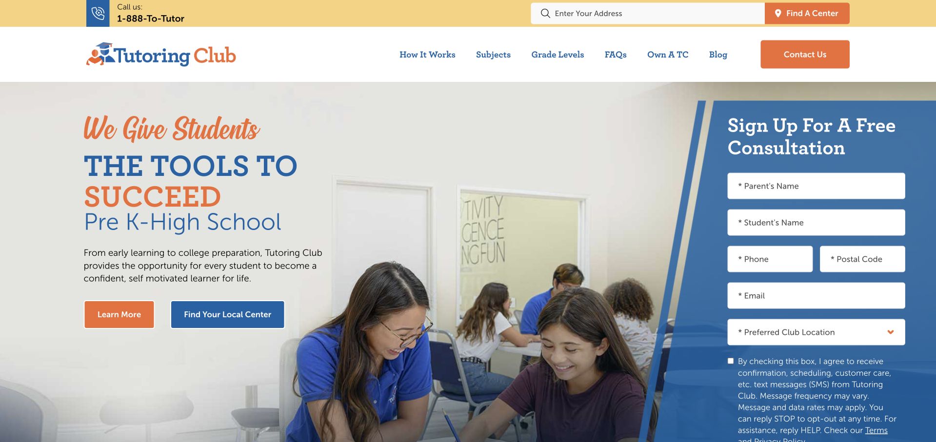
Tutoring Club places an enquiry form beside a photographic service introduction rather than sending visitors to a separate contact page first. The header offers location search and a centre finder, while the hero names the school-stage range. A photograph anchors the left side and the form occupies a contrasting blue panel on the right. This makes the next action obvious for a visitor already interested in a consultation. It also means the page asks for personal information before explaining much of the tutoring process or the local centre’s specific arrangements.
What you can learn
An embedded form should complement, not replace, informative service pages. Let parents explore subjects, centre details and the consultation process before they submit. Keep the form short, labelled and explicit about who receives the enquiry, especially when a brand operates across several locations.
Pros
A contrasting form panel clearly distinguishes enquiry from service description.
Centre-finding controls remain available beside the main tutoring introduction itself.
Cons & considerations
A form-heavy hero leaves less room for useful process information.
Several contact routes need clear labels explaining their different purposes.
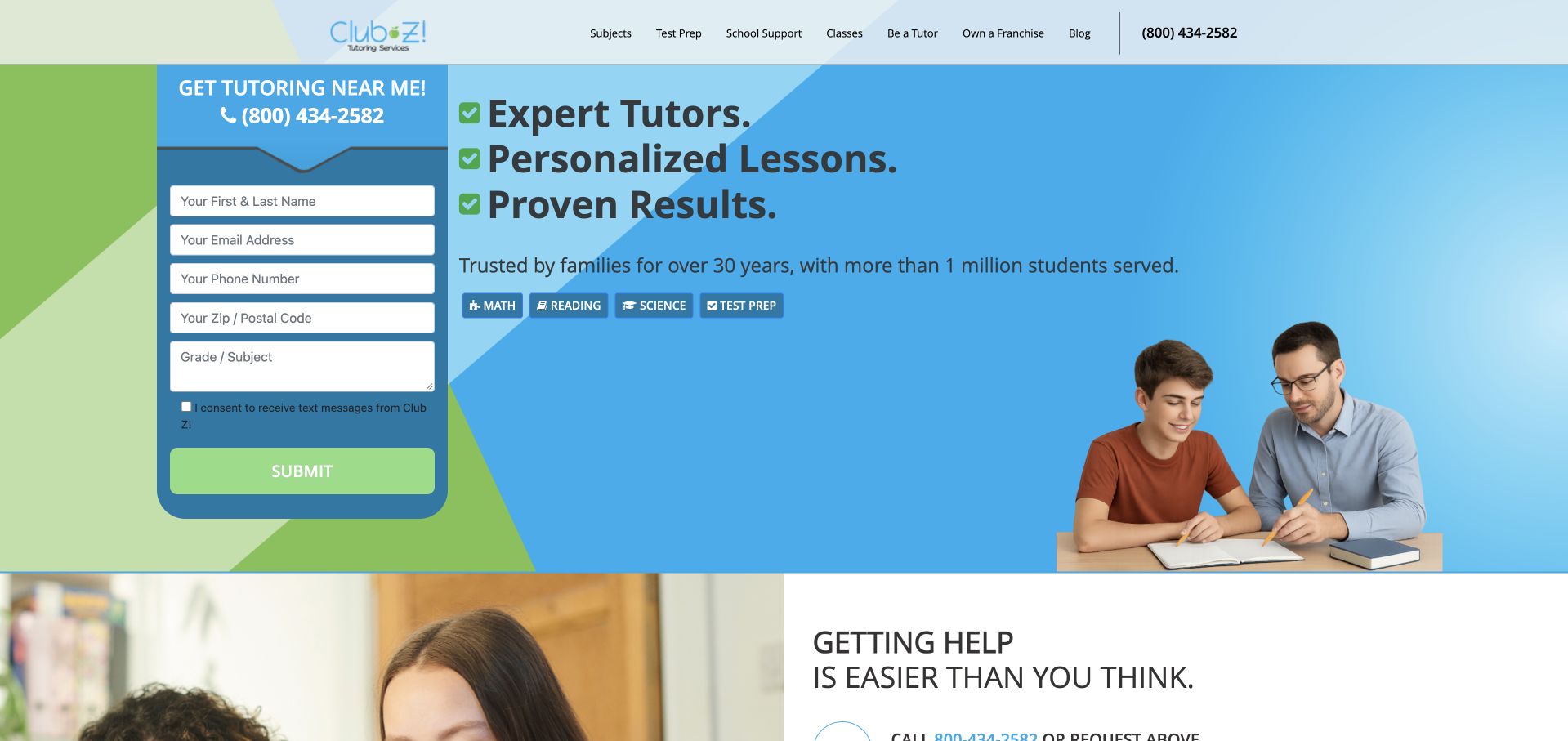
Club Z! uses a bright green-and-blue identity and a conventional service-led homepage rather than an editorial campus presentation. The settled opening view pairs a tutoring message with people-focused imagery and direct calls to find help. The brand’s location and service navigation is important because the same national introduction must support visitors with different subjects and delivery needs. Its usefulness as a reference lies in making a broad tutoring offer feel navigable. The homepage alone does not establish the availability, credentials or exact scheduling arrangements of any particular local tutor.
What you can learn
For a distributed tutoring business, build the national page around a reliable local handoff. Name the delivery options and make the next page’s purpose clear. Keep tutor details and service availability tied to the relevant location rather than assuming the brand introduction answers every parent’s practical questions.
Pros
Consistent bright branding gives the broad service catalogue recognisable framing.
Direct location navigation suits visitors with an immediate tutoring need.
Cons & considerations
A national overview cannot establish every local tutor’s current availability.
Numerous services need concise grouping to avoid a dense directory.
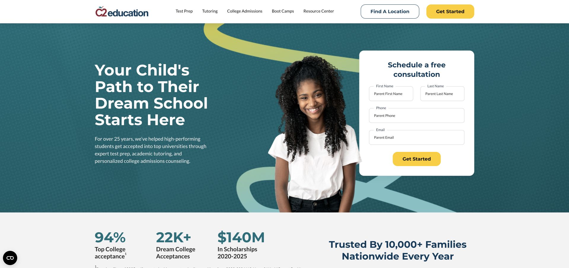
C2 Education opens with a dark teal hero, a large school-admissions message and a compact consultation form. Yellow accents highlight the main action and tie it to the top Get Started link. The navigation separates test preparation, tutoring, college admissions and boot camps, keeping the broad service mix visible. A row of numerical claims begins immediately below the hero. The composition is strongly enquiry-oriented, but those figures need the publisher’s stated scope and methodology; they are not findings independently established by our visual review.
What you can learn
When a provider combines several educational services, let the navigation explain the distinctions before the form captures an enquiry. Place the context for numerical claims close to them, and give families a way to investigate the relevant programme without making a consultation the only useful next step.
Pros
Teal and yellow connect the consultation action to the headline.
Separate categories distinguish tutoring from test preparation and admissions consulting.
Cons & considerations
Contact fields precede much explanation of the actual consultation process.
Outcome figures need qualification rather than implying guaranteed individual results.
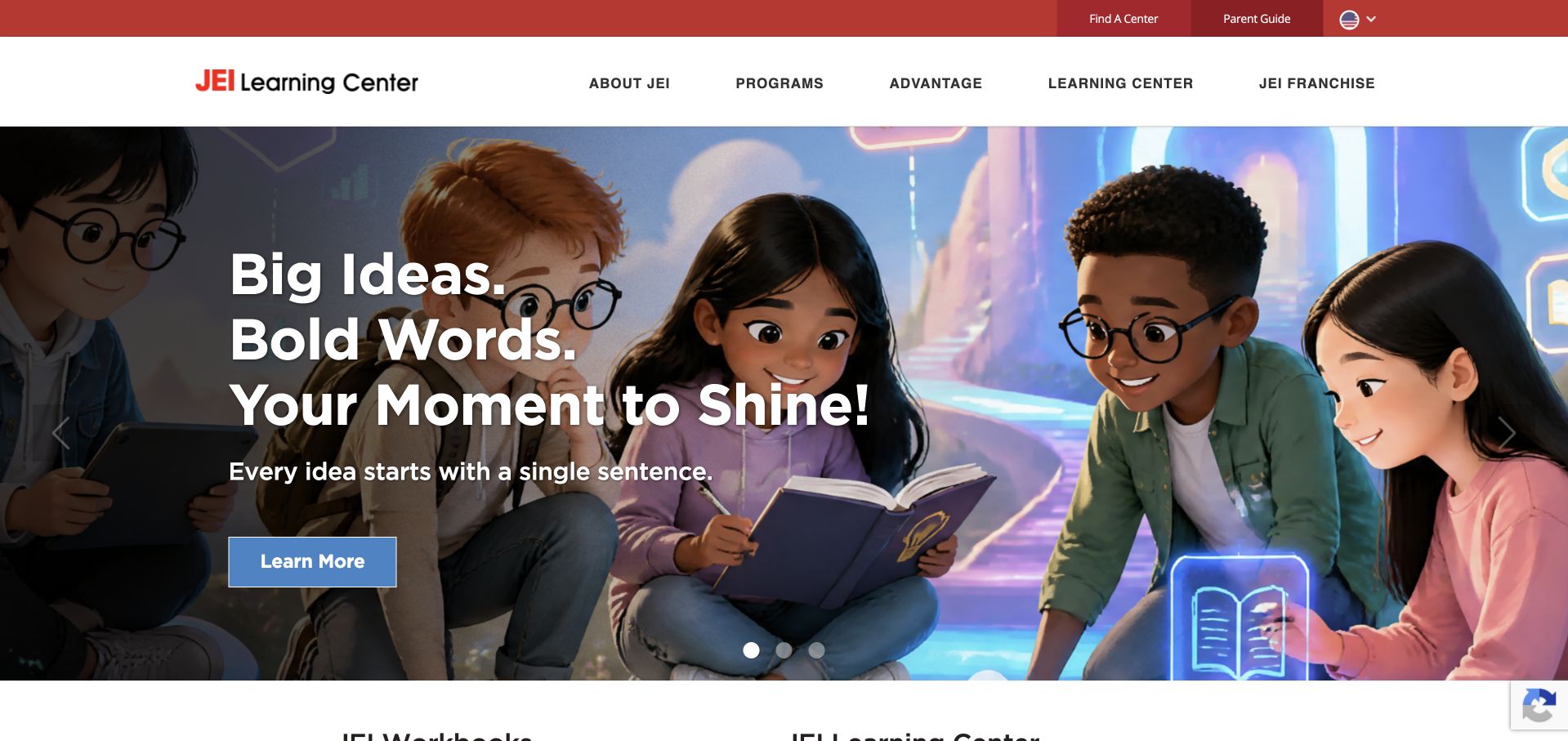
JEI uses a vivid illustrated scene beneath a straightforward red-and-white header. The opening message about ideas, words and a moment to shine gives the illustration a clear typographic centre. A single Learn More button keeps the hero simple, while programme, advantage, location and franchise routes remain in the navigation. The contrast between an imaginative visual world and practical labels is useful: the page can feel playful without making parents decode the main information architecture. The illustration is a brand device, not evidence of a particular learning environment or result.
What you can learn
Use illustration to create a recognisable tone, then keep programme and location information literal. Parents still need age ranges, subjects and session details in plain text. Avoid allowing a playful campaign to obscure the practical difference between enrolling a learner and enquiring about a franchise business.
Pros
One colourful illustration gives the campaign a coherent visual identity.
Literal programme and location labels keep practical navigation readily understandable.
Cons & considerations
An illustrated scene cannot show the actual learning-centre environment itself.
Learn More supplies less destination context than a named programme.
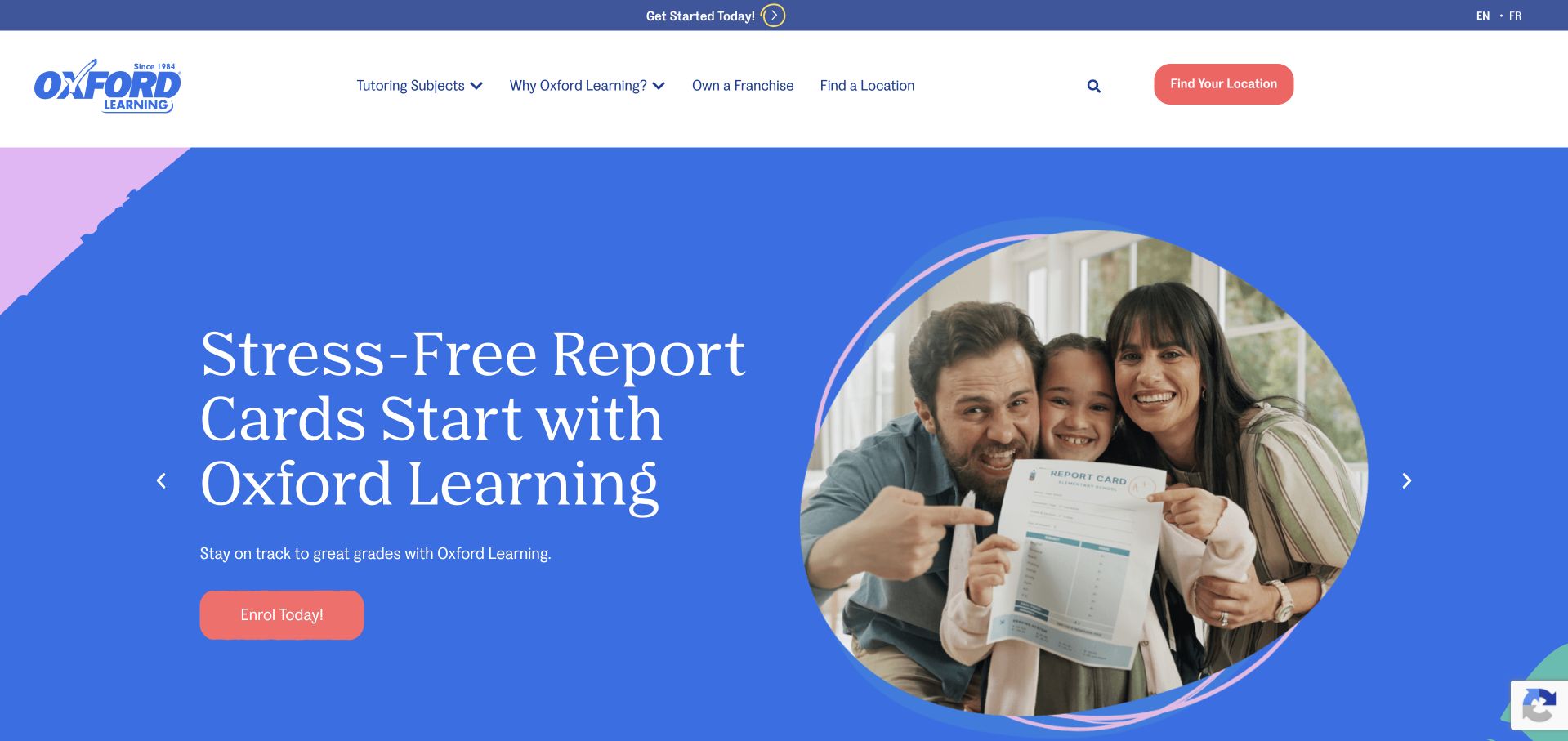
Oxford Learning builds its opening campaign around report cards, using a large blue field, a family photograph inside a circular frame and coral actions. The white navigation above it keeps tutoring levels and location search available. This gives a broad service a timely entry point without discarding the underlying programme structure. The visual rhythm is simple enough to read quickly: concern, image and next action. The campaign’s reassurance is a marketing message, however, and should not be read as a promise that tutoring removes stress for every family.
What you can learn
A seasonal campaign needs a stable service architecture beneath it. Update the message when the school calendar changes, but keep subjects, age ranges and location routes consistent. Give the campaign a specific destination that explains the offer rather than sending every visitor into an undifferentiated general enquiry.
Pros
A single campaign concern makes the first screen easy to scan.
Location search remains available above the current report-card promotional message.
Cons & considerations
Seasonal messaging needs maintenance when the relevant school period ends.
Reassurance about report cards needs a concrete explanation of services.
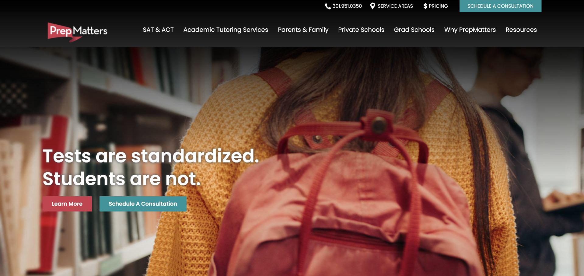
PrepMatters uses the line about standardised tests and individual students over a close photographic scene. Red and teal actions distinguish learning more from scheduling a consultation, while the header separates test preparation, tutoring and educational planning. The homepage also offers a video rather than making video playback the only source of information. Once the promotional overlay is dismissed, the opening has a clear relationship between message, image and service navigation. The design is useful for a specialist practice balancing several adjacent offers without making them look identical.
What you can learn
A service distinction becomes persuasive when the next page explains how it changes the process. Use the student-centred headline to invite exploration, then describe tutor matching, planning and communication concretely. Keep any downloadable promotion optional so it does not obstruct the information a family came to read.
Pros
The main statement distinguishes standardised tests from the individual learner.
Separate categories distinguish tutoring from broader educational planning services clearly.
Cons & considerations
Promotional overlays can interrupt the otherwise straightforward introductory reading order.
Individualisation claims need process details to explain the practical difference.
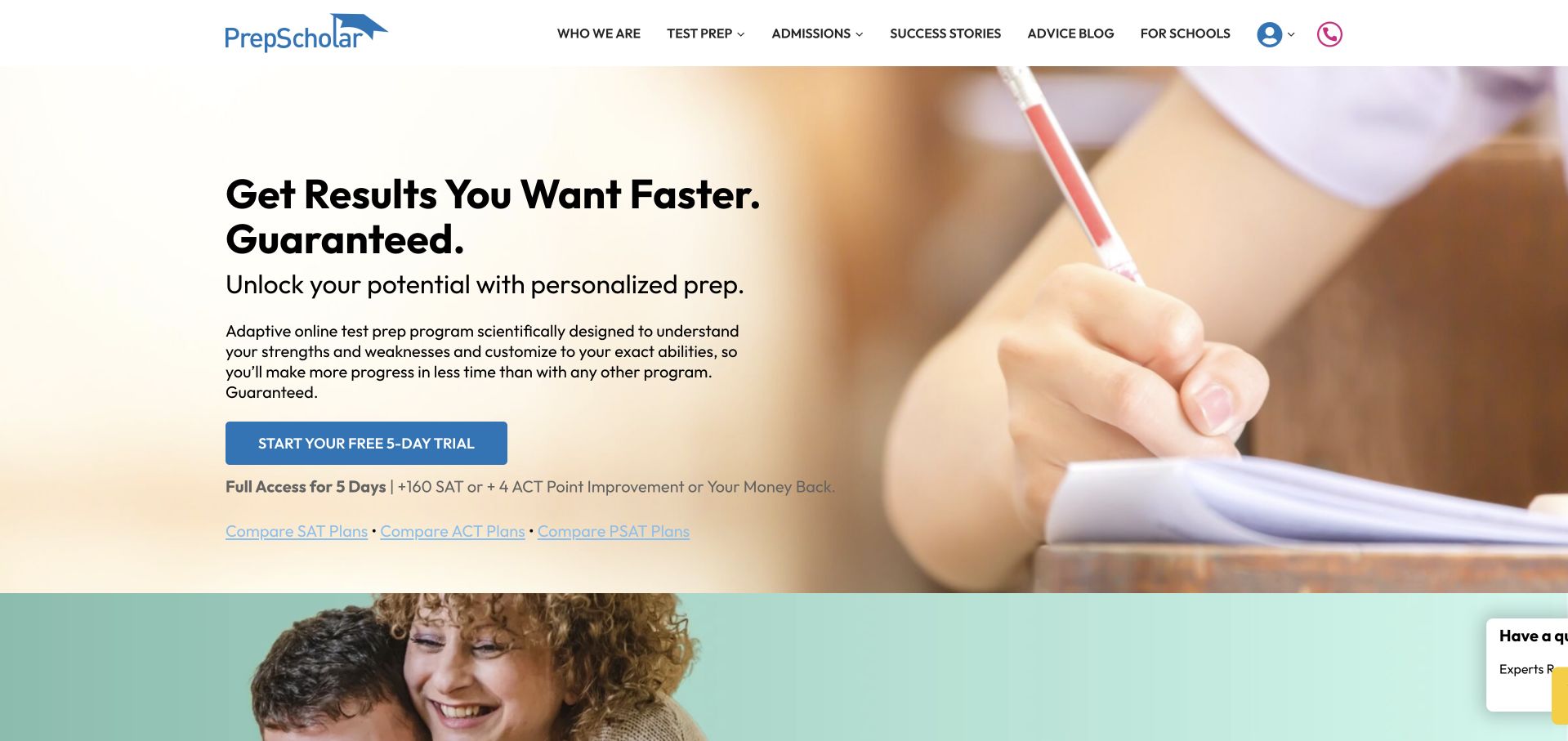
PrepScholar pairs a cream background and large dark headline with a close photograph of writing. A blue trial action sits below concise supporting text, while the header exposes what the service does, subjects, reviews and school-facing information. The hero is more like a digital product landing page than a local tutoring-centre directory. Its guarantee language is visually prominent, so readers need the actual terms before interpreting the offer. The photograph and clean layout create clarity, but they do not verify the educational claims made in the headline.
What you can learn
If a trial or guarantee is central to the offer, make its conditions accessible before sign-up. Use the landing page to explain the format and next step, then connect the claim to terms, eligibility and scope. Keep promotional certainty separate from a promise of individual educational results.
Pros
A blue trial action clearly stands out on the pale background.
The writing image establishes study context without requiring autoplay video.
Cons & considerations
Guarantee language needs visible terms before visitors interpret the offer.
A product-like trial may delay explanation of ongoing tutor relationships.
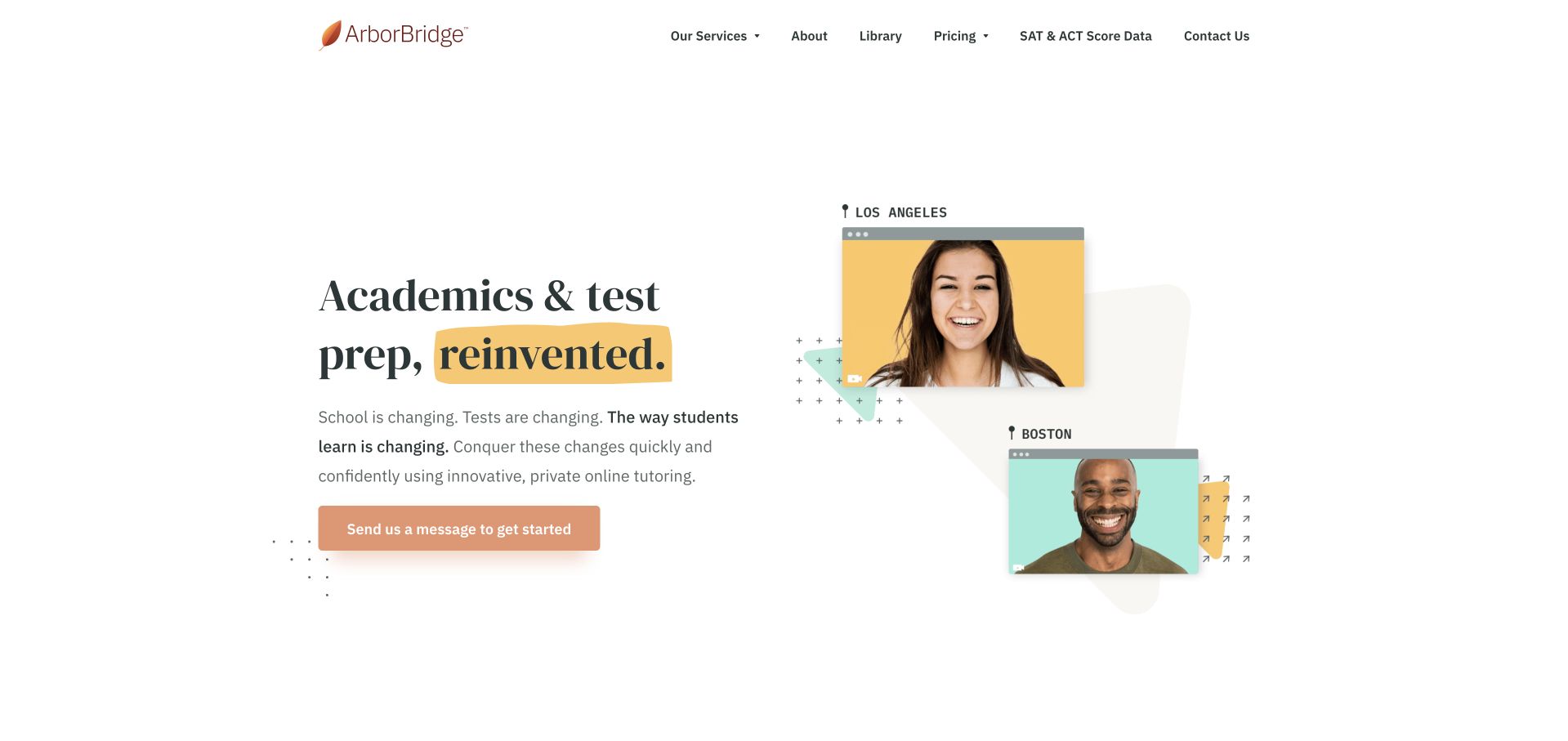
ArborBridge uses generous white space, serif typography and a warm highlighted word inside the headline. Two portrait cards overlap on the right, introducing tutors as people rather than leaving the service entirely abstract. An orange consultation action provides the main route onward, while pricing and services have their own navigation labels. The composition is unusually restrained for a tutoring homepage: the portraits, headline and button do most of the work. It is a useful reference for making a specialist service feel personal without building the first view around an enquiry form.
What you can learn
Introduce people with enough context to make their presence useful. Named portraits should lead to relevant biographies or an explanation of tutor matching, not function only as decoration. Keeping pricing visible in the navigation can also help families decide whether a consultation is appropriate before sharing personal details.
Pros
Portrait cards introduce people within a clear two-column editorial layout.
Services and pricing remain visible alternatives to requesting a consultation.
Cons & considerations
Overlapping portraits need simplification to preserve names on mobile screens.
A broad academic headline still needs programme-specific detail for comparison.
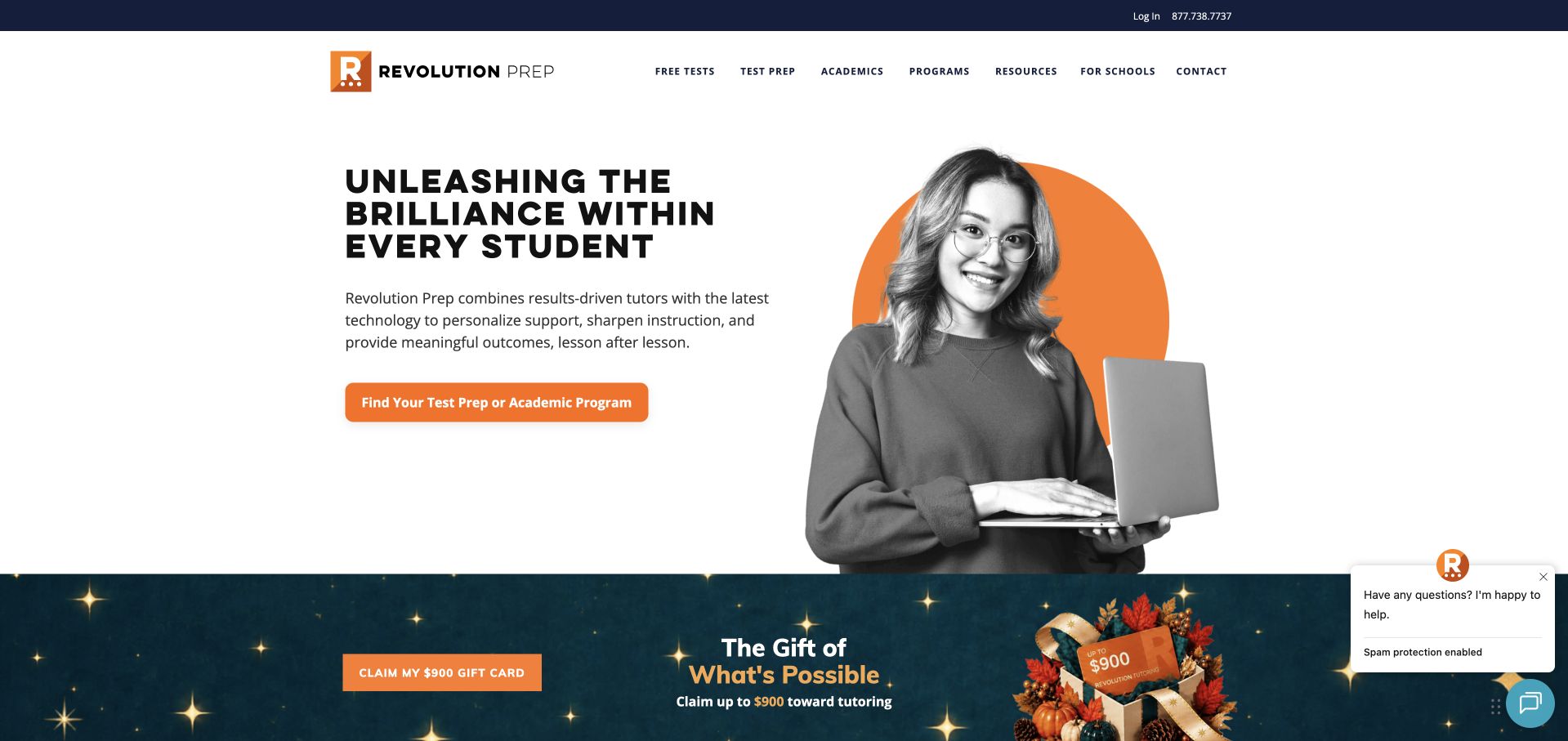
Revolution Prep uses a large learner portrait against an orange circle, balanced by a bold black headline on white. The main orange action invites visitors to find tutoring rather than navigate an institutional admissions process. A seasonal promotional section begins directly below, while the header keeps tutoring, test preparation and company information separate. The opening is energetic without relying on a full-screen film. Its language about potential is motivational positioning, not evidence that the service produces the same result for each learner who uses it.
What you can learn
A portrait-and-shape layout can communicate energy while remaining lightweight and readable. Let the main action name the service, then use subsequent pages to explain the format, tutor relationship and scheduling. Keep seasonal promotions subordinate so they do not displace the more durable information parents need when comparing providers.
Pros
Orange connects the portrait frame and main tutoring action clearly.
A service-naming action gives more context than a generic start.
Cons & considerations
A seasonal promotion below competes with the durable tutoring journey.
Motivational language needs concrete information about delivery and tutor support.
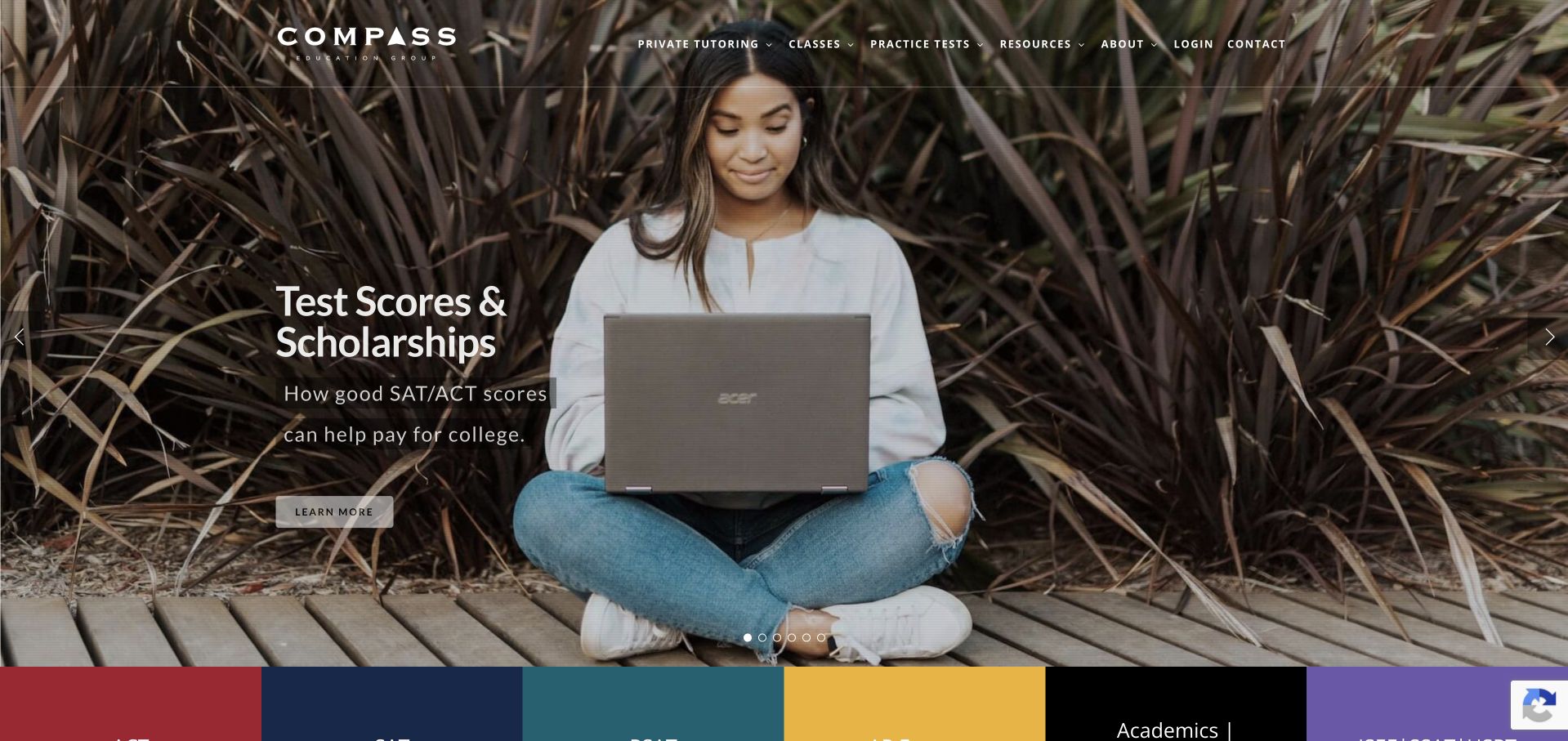
Compass opens with a learner using a laptop outdoors, overlaid with a short campaign about test scores and scholarships. The white wordmark and compact navigation sit over the photograph, while a coloured row of service categories begins at the bottom of the view. This creates a transition from a specific campaign into the wider programme catalogue. The visual treatment is more editorial than form-led, leaving room for the image to establish tone. Scholarship-related messaging still requires careful explanation of its scope and must not be read as an assured financial outcome.
What you can learn
Connect a campaign to a stable programme directory rather than making it the entire website. A visitor should be able to identify the relevant exam or service without accepting the campaign’s assumptions. Explain any scholarship relationship factually and distinguish informational guidance from guaranteed eligibility or awards.
Pros
A photographic campaign transitions into a clearly grouped service directory.
Concise text leaves the learner image readable rather than overcrowded.
Cons & considerations
White links over foliage need dependable contrast across responsive crops.
Scholarship messaging needs qualification and cannot imply guaranteed financial awards.
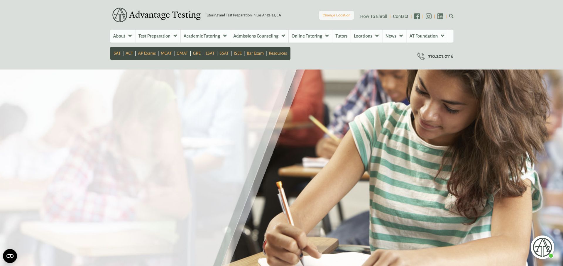
Advantage Testing uses muted green, a compact identity block and a dense navigation system above its photographic introduction. The visible header identifies a location and provides a change-location route, while a second row lists many exam types. This is useful for visitors who already know the subject or test they need. It is less cinematic than many examples here and more concerned with exposing the breadth of the service catalogue. Publisher claims about reputation remain separate from what the interface actually demonstrates: a detailed, explicitly labelled navigation structure.
What you can learn
A large exam catalogue needs more than a long menu. Group related tests and academic services in a way a parent or adult learner can recognise, and keep the selected location clear. Make sure a location-specific header does not imply that every listed service is available everywhere.
Pros
Location identification makes the currently viewed practice easier to understand.
Explicit exam labels support visitors arriving with a precise task.
Cons & considerations
Several navigation rows can overwhelm a first-time or uncertain visitor.
A large test catalogue needs thoughtful mobile grouping and maintenance.
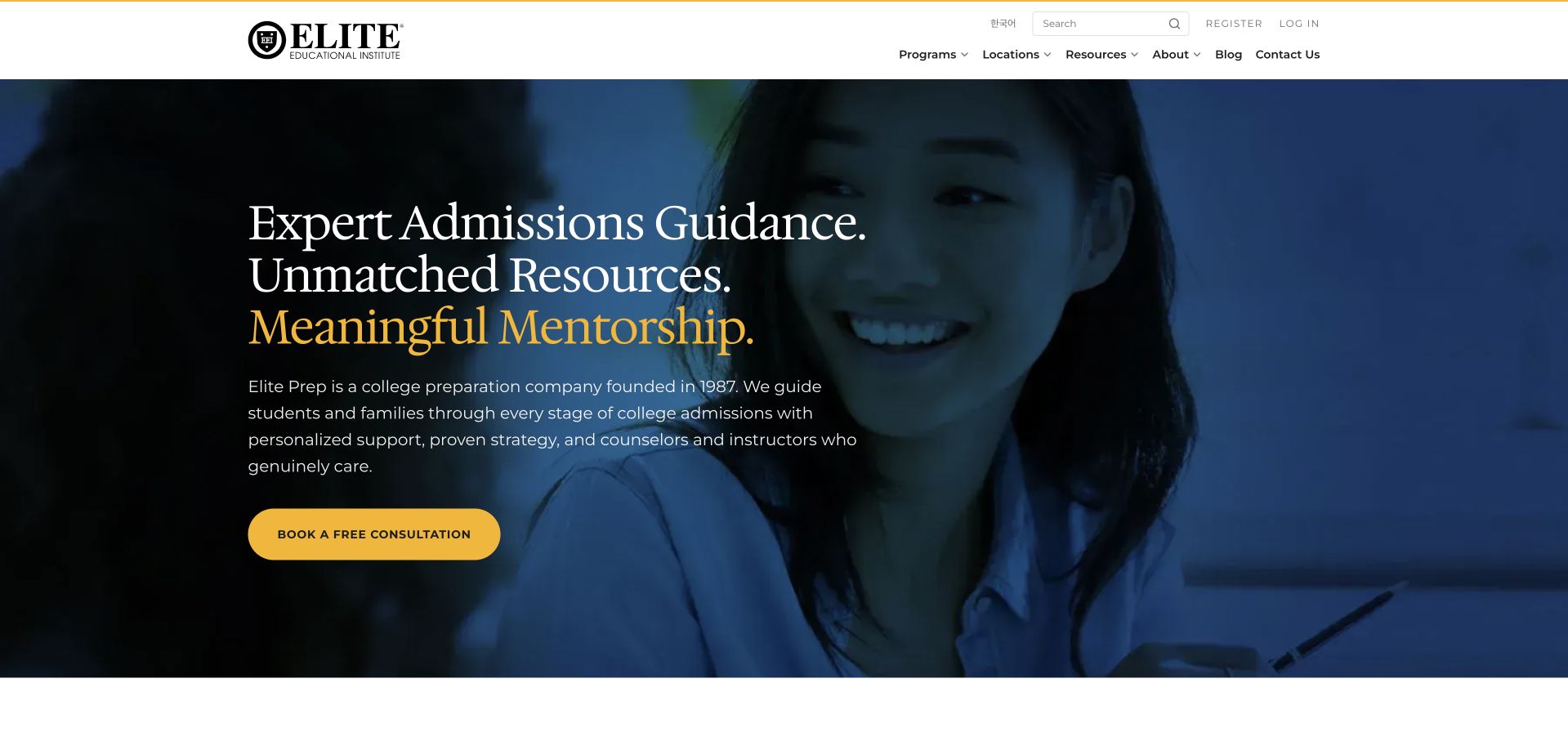
Elite Prep uses a dark blue portrait background, cream typography and a yellow consultation button. Three short statements about guidance, resources and mentorship establish a clear vertical rhythm rather than a long introductory paragraph. The white header separates programme navigation from the photographic opening. This gives the site a polished advisory character while leaving the first action easy to identify. It is a useful reference for combining academic tutoring and admissions-related services visually, although the practical boundaries between those offers still need to be explained on their own pages.
What you can learn
Short statements work best when each leads to a concrete service explanation. Define what tutoring, mentorship and admissions support actually include, and make the consultation’s purpose clear before collecting family information. An elegant first view should reduce uncertainty rather than replace it with more aspirational language.
Pros
A yellow action remains clear against the blue-and-cream brand palette.
Short statements establish a scanning rhythm without a dense introduction.
Cons & considerations
Advisory language does not explain each service’s actual practical boundaries.
Text over a portrait needs careful responsive positioning and contrast.
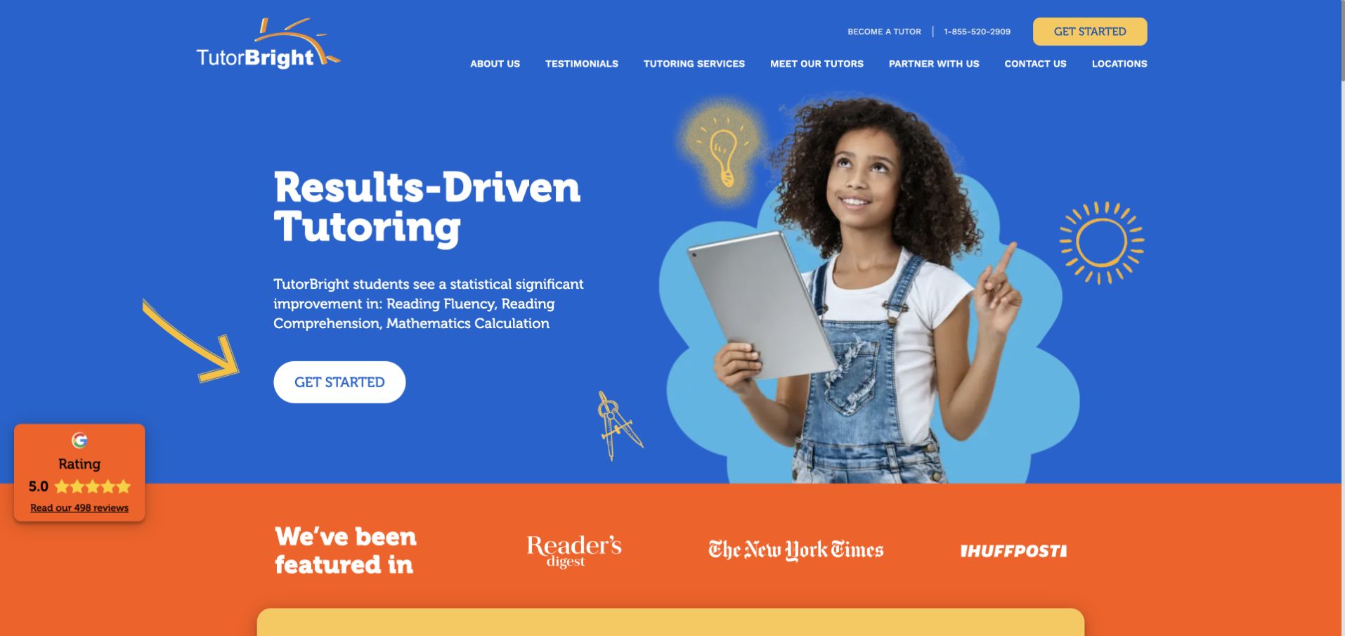
TutorBright uses a vivid blue background, yellow illustrated arrows and a large learner portrait. An orange band below introduces featured-publication logos, separating that material from the main tutoring message. The header includes tutor and testimonial routes alongside a bright Get Started action. The palette gives the page energy while the first view remains relatively simple. Its numerical improvement statements are the publisher’s own claims; the design review does not verify their methodology or establish what any individual learner should expect from the service.
What you can learn
Use bright colour to establish hierarchy, not to substitute for an explanation of the programme. Put the context for result claims close to the figures and keep tutor information easy to reach. Media recognition, testimonials and measured outcomes are different types of evidence and should not be blurred together.
Pros
Distinct colour roles give the energetic opening a coherent hierarchy.
A separate supporting-logo row avoids crowding the main tutoring introduction.
Cons & considerations
Improvement figures need methodological context rather than individual outcome promises.
Decorative arrows should not displace the reading order on mobile.
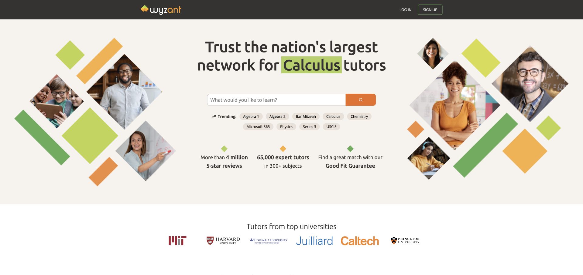
Wyzant organises its cream-coloured opening around a subject search rather than a consultation form. Diamond-shaped portraits form a loose frame around the central text, with orange and green accents repeated across the collage. A row of university names appears beneath the search area. The layout makes the marketplace model understandable: visitors begin by naming what they want to learn, then explore people who may help. Institutional names and broad network claims remain publisher-provided context rather than independent endorsements established by this screenshot.
What you can learn
For a marketplace, let search do real navigational work. Provide useful subject suggestions and a clear route to profile details, pricing and availability. Keep decorative portraits separate from actual search results so visitors do not assume every person shown is available for their chosen subject or location.
Pros
Central subject search matches visitors arriving with a specific need.
Portraits introduce people without interrupting the core search-field reading order.
Cons & considerations
University names need context rather than implying approval of tutors.
Diamond portrait crops need simplification rather than shrinking on mobile.
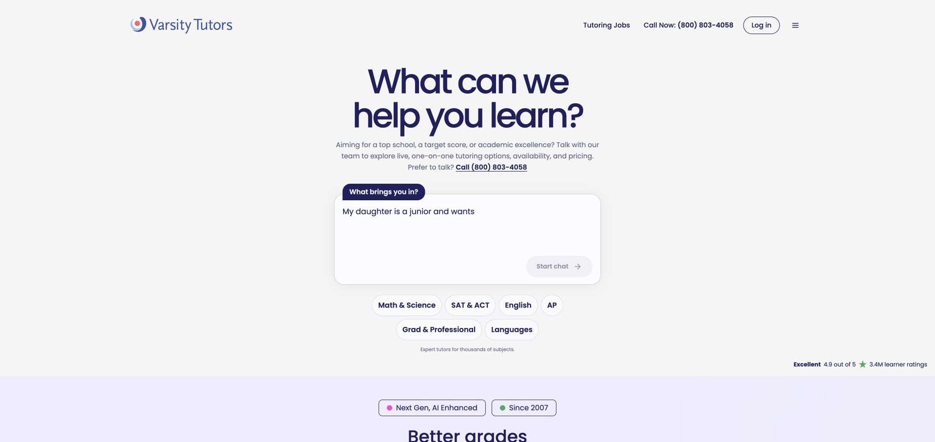
Varsity Tutors uses a sparse white opening dominated by the question about what the visitor wants to learn. A large input area sits below, followed by recognisable subject and school-stage shortcuts. The purple wordmark and heading supply most of the visual identity; there is no large background photograph competing with the prompt. A supporting section begins on pale purple below. This is an unusually task-focused approach to a broad tutoring catalogue, though a conversational-looking interface still needs to explain what happens after someone enters information.
What you can learn
A broad catalogue can begin with a simple question when the next step is clear. Explain whether input produces search results, a recommendation or an enquiry, and avoid asking for sensitive learner details before that is understood. Keep conventional subject browsing available alongside the open-ended prompt.
Pros
The uncluttered question prioritises a learning task over promotional imagery.
Subject shortcuts give a browsing alternative to the open-ended prompt.
Cons & considerations
An open prompt needs explanation of what happens after submission.
The sparse introduction reveals little about matching or ongoing delivery.
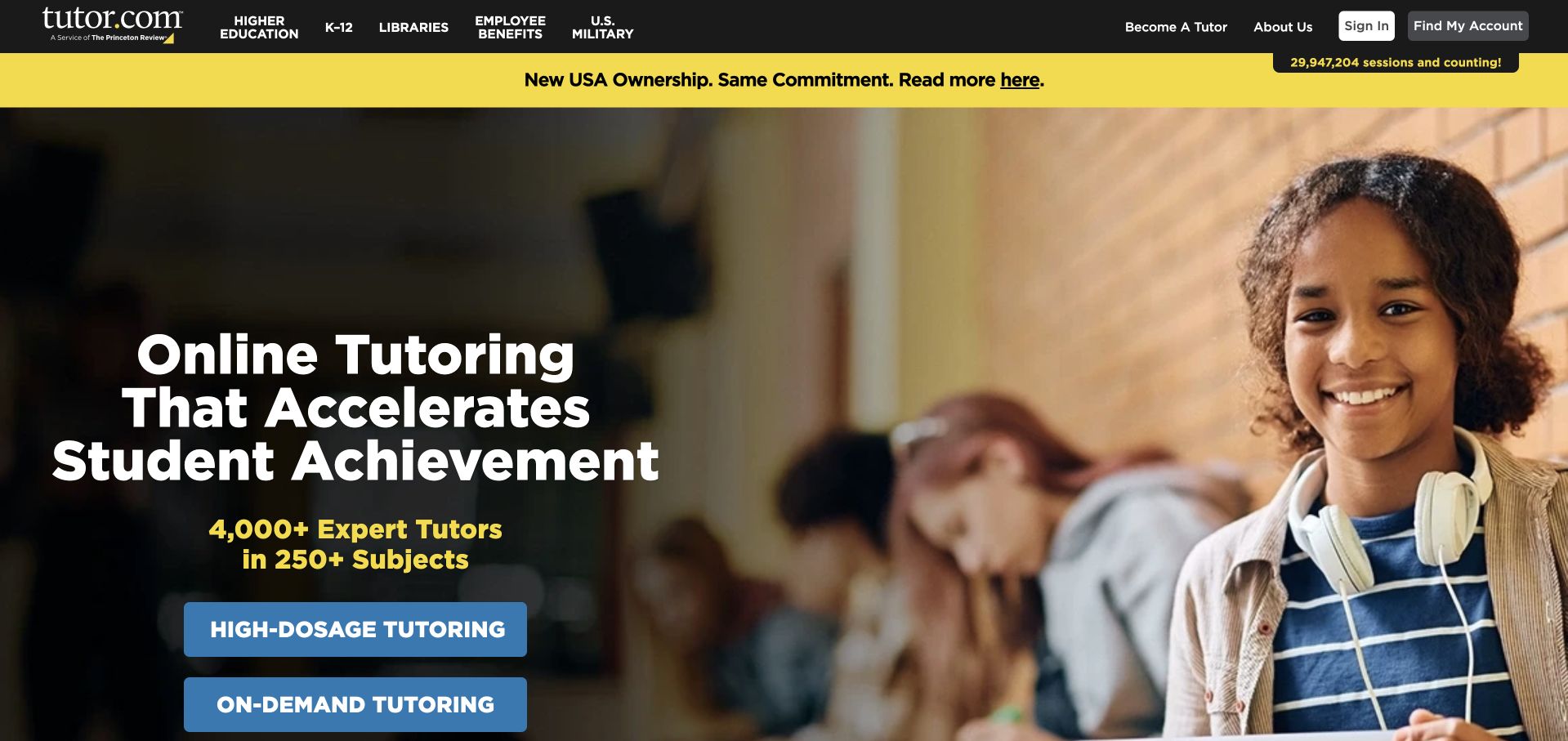
Tutor.com places a large learner photograph beside a darkened text area and two blue actions for different tutoring formats. A black header and yellow announcement strip provide a strong, recognisable frame. The navigation distinguishes higher education, libraries, employers and military audiences, making the business’s several routes visible rather than treating every visitor as the same customer. The headline and large subject-count claims are promotional statements. What the interface demonstrates is the deliberate separation of audience and service-format choices before a visitor reaches a more detailed page.
What you can learn
When several audiences use the same platform, separate their routes explicitly. A library visitor, institutional buyer and individual learner may need very different information. Keep the service-format labels literal, then explain access requirements on the destination page instead of assuming all visitors can begin through the same route.
Pros
Audience-specific navigation recognises institutional and individual visitors’ different needs clearly.
Two format-naming actions provide more information than one generic start.
Cons & considerations
Promotional counts cannot establish the suitability of a particular tutor.
Announcement and navigation rows add density before the main choice.
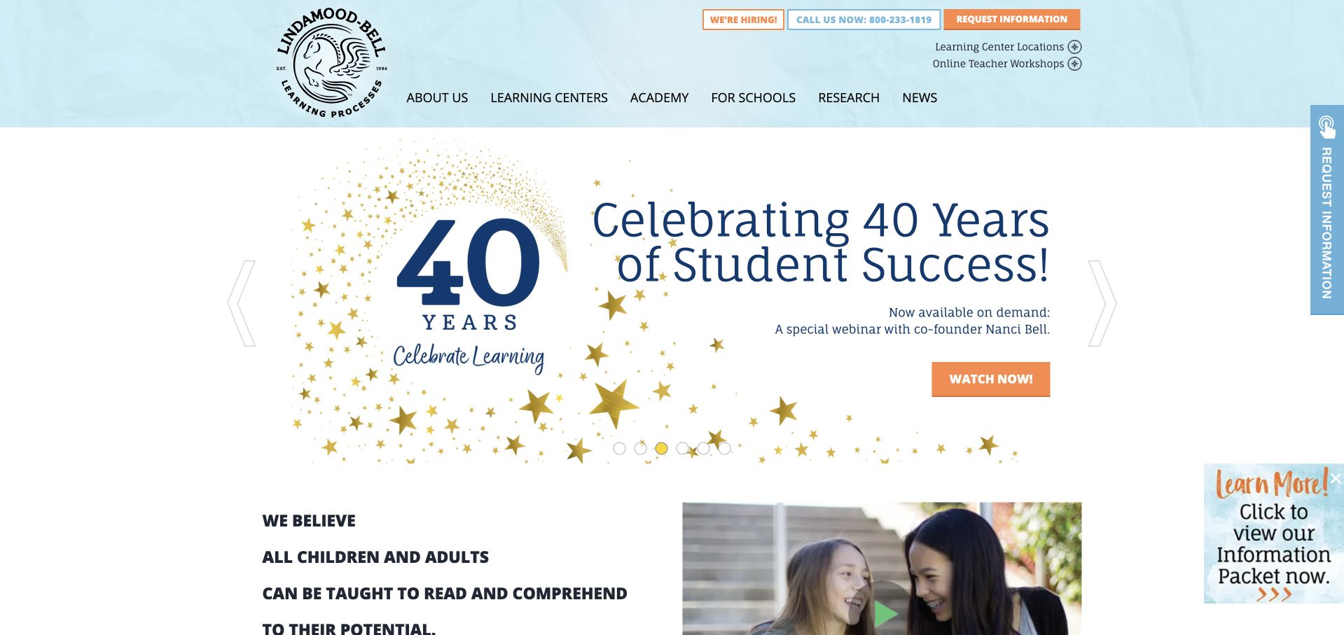
Lindamood-Bell’s observed opening celebrates an anniversary with a large typographic treatment, stars and a short introductory statement below. A pale blue header contains the round wordmark and explicit routes for about, learning centres, academy, schools, research and news. The page combines an established institutional identity with a service directory, rather than asking visitors to select a single broad tutoring subject immediately. Claims about student success belong to the publisher and are not independently evaluated here. This example is included for its information structure and branding, not a clinical or educational recommendation.
What you can learn
Specialist services need clearly separated explanations of settings and formats. Let families distinguish a learning centre from a school-facing programme before they enquire. Use anniversary material as a temporary editorial layer while keeping the underlying service navigation stable and the scope of any research claims clearly stated.
Pros
Distinct service settings remain visible within the institutional navigation structure.
A consistent round wordmark gives the broad information catalogue recognition.
Cons & considerations
A large anniversary campaign delays the practical introduction for newcomers.
Success language needs context rather than implying assured educational outcomes.
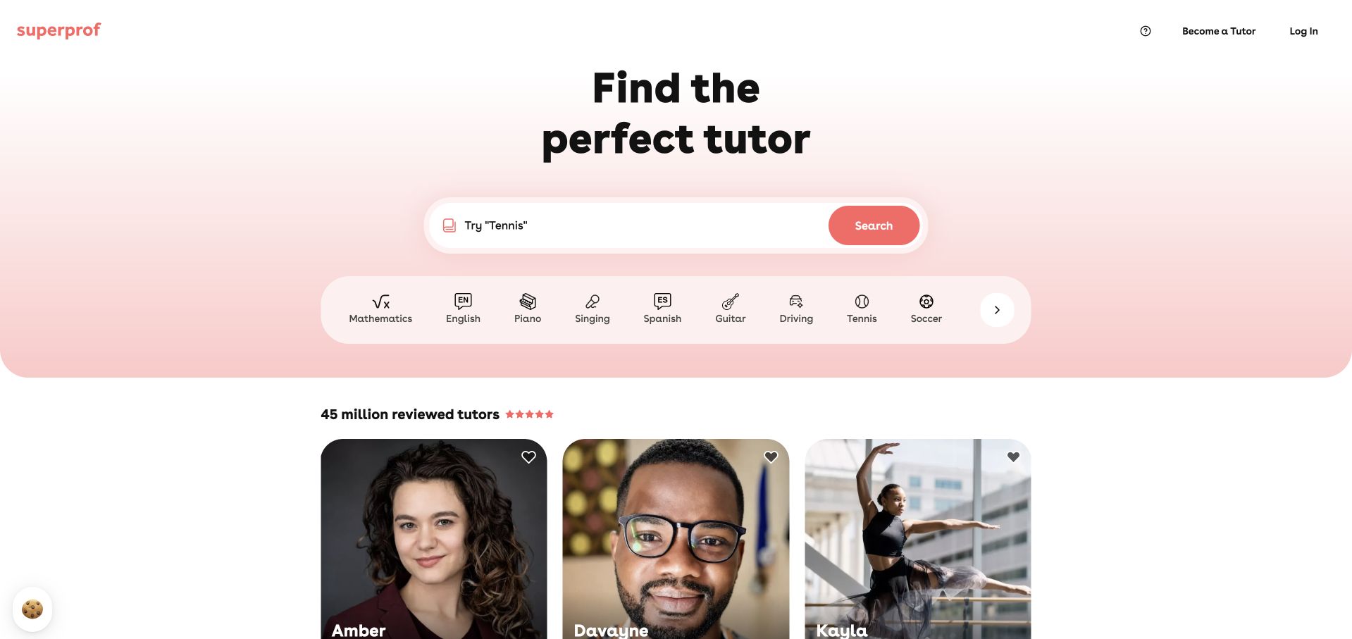
Superprof centres a rounded search field within a pale pink gradient, with subject icons arranged directly underneath. A short headline asks visitors to find the tutor who suits them, while public profile cards begin below the search area. The interface puts browsing and discovery ahead of an enquiry form, which fits a broad marketplace. Its light palette and rounded controls create an approachable tone without needing a large hero photograph. Profile information and review counts remain marketplace-provided material, not independently verified measures of a tutor’s suitability.
What you can learn
A broad marketplace benefits from a small set of recognisable starting categories. Make the search results explain subject, format, price and availability before a visitor contacts someone. Keep public profile photographs and marketplace metrics clearly associated with their actual profiles rather than using them as general outcome evidence.
Pros
Subject icons offer quick browsing alternatives beside the main search.
Public profile cards connect the search task to actual listings.
Cons & considerations
A friendly interface cannot explain marketplace responsibilities by itself alone.
Tutor counts and reviews need context rather than implying independent verification.
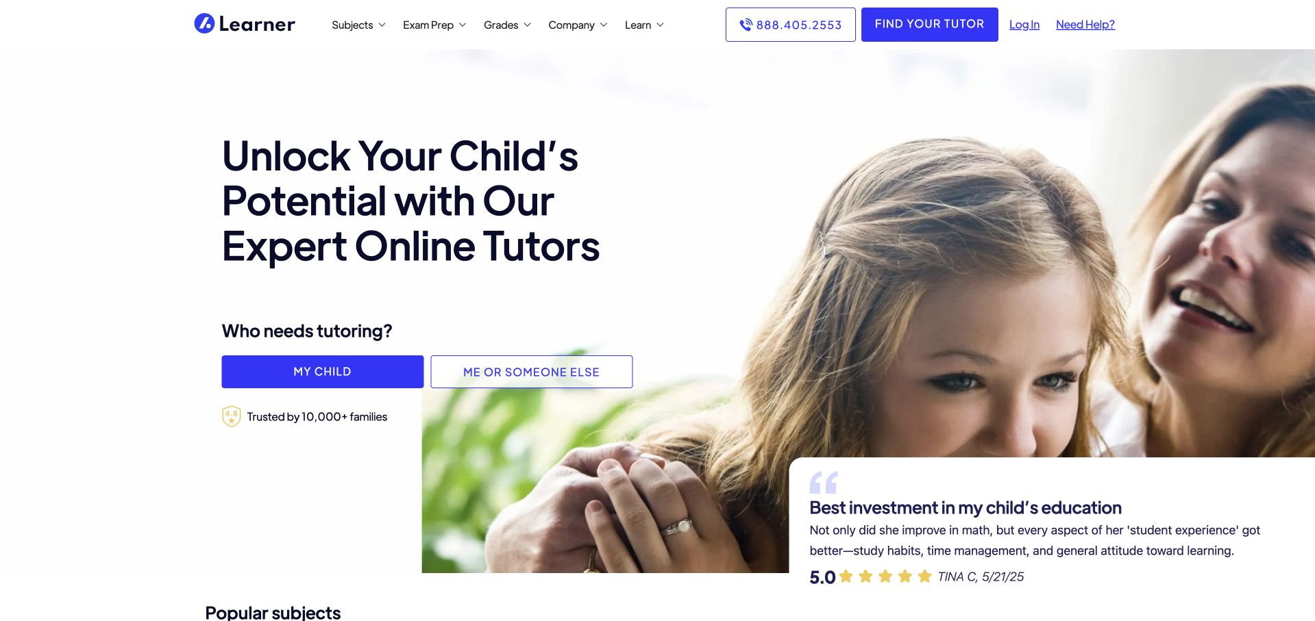
Learner uses a white opening, a blue-purple wordmark and a large parent-and-child photograph. The main heading introduces online tutoring, then asks who needs help with two clearly separated buttons. A supporting testimonial card overlaps the image rather than replacing the main action. The navigation offers subjects, grades and company information, giving visitors more than a single route into a consultation. The design makes the intended family audience obvious, but its promotional wording and testimonial remain publisher-supplied material rather than independently verified evidence of learning results.
What you can learn
A short audience choice can make a broad service easier to navigate if the next page respects that choice. Ask only what is necessary to route the visitor, and provide programme details before collecting a long learner history. Keep testimonial context visible instead of treating one quote as universal proof.
Pros
Two audience choices avoid a lengthy form in the introduction.
Subject and grade navigation supports research before an initial enquiry.
Cons & considerations
An overlapping testimonial needs mobile placement that preserves practical controls.
A family photograph cannot establish an individual learner’s service fit.
Kegan is a freelance web designer and developer with 15+ years of experience helping businesses turn complicated website requirements into clear, maintainable digital experiences. He works directly with clients from planning and design through development, launch, and ongoing support.
For tutor website design, his development approach focuses on subjects and age groups, tutor information, learning formats, and assessment or scheduling inquiries. The scope can be a targeted improvement or a complete custom build, with responsive layouts, thoughtful content structure, and integrations chosen around the people using and maintaining the site.
Show 3 other tutor website designersHide other tutor website designers
List the subjects, stages and formats the practice actually provides. Identify any age, region, timetable or access restrictions, then write a concise explanation for each service. Avoid using personalised as the only distinction. Explain who teaches, what an ordinary session involves and how changes are discussed. Keep educational support separate from any clinical assessment or treatment the practice does not provide, and have qualified staff review sensitive descriptions.
Design a sensible matching or enquiry route
Map the route from first question to service discussion and tutor selection. For a solo tutor, this may be a short contact form and a clearly described introductory conversation. For a network, it may involve a location or subject filter before an enquiry. State who receives the information and what happens next. Do not request school records, diagnoses or detailed private family circumstances merely to let someone ask about availability.
Make practical information easy to maintain
Assign ownership of tutor biographies, subjects, prices or package explanations and delivery-format pages. Keep local availability tied to the relevant centre rather than repeating a broad national promise. Review links to external scheduling or lesson platforms after updates. If a tutor leaves, a subject changes or sessions move online, update the public pages promptly so a polished homepage does not continue to imply an outdated service.
The editing job behind the design
Choose tools that support the real service model
[object Object]
[object Object]
[object Object]
Our WordPress website examples offer a separate look at publishing approaches. A visible platform label is evidence for that named page, not a guarantee that the same system will suit your requirements.
Before the public launch
Tutor website launch checklist
Name actual subjects, learner stages and delivery formats in readable public text.
Separate subject tutoring from coaching, admissions consulting and other adjacent services.
Explain the first consultation, assessment or search action before collecting contact details.
Identify who teaches and provide accurate biographies without inventing credentials or associations.
Keep location-specific availability separate from broad national or platform-level service descriptions.
Publish useful price or package context where the practice can maintain it accurately.
Give outcome figures clear scope and avoid guarantees about an individual learner’s results.
Use permissioned photographs and correctly contextualised testimonials rather than invented social proof.
Label form controls and make error and confirmation messages understandable without colour alone.
Clarify time zones and external scheduling handoffs for online tutoring visitors.
Do not collect unnecessary private learner records through an ordinary initial-enquiry form.
Assign owners to tutor profiles, service descriptions, programme changes and broken-link reviews.
These checks are a project checklist, not a performance, legal, security, or accessibility certification. Test real journeys with the people responsible for the website before making claims about the result.
Sources & editorial method
How this collection was selected and reviewed
These are original design observations based on public page inspection and actual dated browser captures. We compare navigation, visual hierarchy and service explanation, not tutoring effectiveness or individual suitability. Publisher claims remain attributed to the publisher. Technology notes describe limited verified public signals rather than a complete inventory.
Each example links to its actual source page. Screenshots are direct browser captures with their own capture dates; moving imagery, announcements and live designs can change. The notes describe observable design choices and conditional tradeoffs, not measured traffic, conversion results, service quality, or accessibility conformance.
Technology labels use public page metadata, asset evidence, or explicitly cited platform documentation. Platform documentation is not a complete current deployment audit. A component reference may be legacy or unused; it is not a complete backend inventory. Unknown stacks are omitted. These sites are editorial examples, not our client portfolio.
Written, Edited and Curated are separate editorial records, not timestamps advanced by a rebuild. Website designs and imagery belong to their owners. See our editorial standards or suggest a correction.
Questions worth asking
Tutor website design questions
Should a tutor publish prices?
Publish useful, accurate context when possible, whether that is a session price, package explanation or a clear description of how a quote is determined. Avoid an apparently precise price that excludes essential conditions. The design should help visitors decide whether an enquiry is appropriate.
Is a consultation form better than subject search?
It depends on the service. A specialist practice may need a conversation before matching, while a marketplace may begin with subject results. Name the actual next step and explain what happens after it instead of copying a form or search box from a different business model.
How should tutor biographies be structured?
Give the person’s role, subjects, relevant experience and delivery context in a consistent format. Keep claims accurate and current. A portrait can make a service feel personal, but it cannot replace the factual information a family needs to understand who might teach.
Can the homepage use testimonials and score figures?
They need accurate attribution and appropriate context. Do not imply that a quote represents everyone or that an aggregate result guarantees an individual outcome. Keep the tutoring format and process understandable even if a visitor skips the testimonial section entirely.
Does online tutoring need a different website?
Not necessarily, but delivery information should be explicit. Explain the session format, time-zone handling, scheduling and required tools before registration. Keep a public service description available without asking a prospective learner to create an account merely to understand the offer.
Use the collection to make the service easier to understand before making it more persuasive. A clear subject, a credible person and an honest explanation of the next step are stronger foundations than a larger promise about potential or results.