Best IT Consulting Websites of 2026 (30 Real-World Examples)
How to explain technical consulting clearly, turn capabilities into useful evidence and help the right people start a scoped conversation.
An IT consulting website should help a visitor understand the work before asking for a meeting. The strongest information connects a specific technical problem, the consultancy’s contribution and the evidence needed to judge whether a conversation makes sense.
Technical consulting covers different kinds of work. A practice may advise on architecture, develop an application, integrate a business platform, assess a digital product or help operate an existing system. This collection includes broad technology-service groups and specialist implementation and accessibility consultancies. They are not presented as interchangeable suppliers. The point is to study how each website explains its actual role and gives an evaluator a useful route into more detail.
The audience is rarely one person. A business sponsor may be trying to define a problem, a technical lead may be examining capability and delivery boundaries, and a procurement colleague may need company information. Someone considering a career has a different task again. A good public structure recognises these needs without making the homepage reproduce a proposal or sending every visitor to an undifferentiated contact form.
Use the examples as references for communication, not service endorsements. A polished case image, partner mark, report or confident headline does not independently establish implementation quality, accessibility conformance, security, legal compliance or business results. The reviews describe the actual accepted source view and conditional design lessons. Older screenshots retain their original dates and bytes even when current official service material is checked again.
Before the examples
What makes good it consulting website design in 2026?
State the technical work in ordinary language
Explain whether the practice advises, assesses, builds, integrates, operates or combines those activities. Name the systems or problems where the distinction matters. A transformation statement can introduce a brand, but it should not force visitors to guess what an engagement actually involves.
Connect services to documented contributions
A case record should explain the problem, the consultancy’s role, relevant constraints and what was delivered. Keep collaborator and platform relationships clear. A client logo or attractive screen is useful context, not a substitute for scope or independent evidence of an outcome.
Separate different reasons for contact
Project enquiries, existing-client support, careers, press and partner discussions need different destinations. Label the routes around the actual processes. Someone with a technical question should not have to choose a sales action merely because it is the only visible way to reach the company.
Make specialisation useful rather than restrictive
Explain the kinds of work the practice is equipped to discuss and where another route may be needed. A specialist should not sound like a universal provider, and a broad consultancy should not hide every capability behind one umbrella phrase. Help visitors identify fit through concrete information.
Keep research and service evidence distinct
A report can explain a point of view; a technical article can demonstrate how an author reasons; a case can document a particular engagement. Identify the content type and its scope. Do not let a research claim imply that every future project will have the same conditions or results.
Design for investigation before commitment
Give visitors enough maintained information to assess whether a conversation is relevant. Clear capability pages, project records and process explanations can support that decision. A prominent meeting button should not replace the content a technical evaluator needs to bring useful context to the discussion.
The collection · 30 examples
30 it consulting websites worth studying
The examples span technology strategy, application delivery, platform integration and specialist digital assessment. Compare their communication patterns within that scope. A campaign, resource-led opening or captured content section is described accurately rather than treated as a complete map of every service the practice offers.
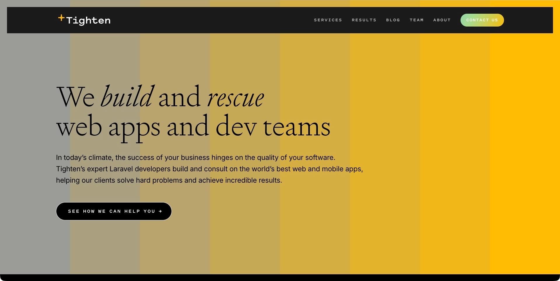
Tighten’s captured opening uses a yellow-to-grey striped field beneath a broad black navigation bar. A large serif statement identifies building and rescuing web applications and development teams, with italic emphasis on the two verbs. Supporting copy adds the Laravel-oriented context, and a service-investigation action remains separate from contact in the header. The useful pattern is naming the work in ordinary language before showing a complicated technical diagram. The statement about quality and results is supplier positioning, not independent evidence of an engagement’s outcome or a particular application’s condition.
What you can learn
Explain both the technical object and the kind of help offered. Building, improving an existing application and supporting a team can be different engagements, so let the service material clarify their boundaries. Keep a visitor’s route to understanding those choices distinct from immediately starting a commercial conversation.
Pros
The main statement identifies concrete work and audiences.
The information action is separate from contact.
Cons & considerations
If rescue language is prominent, explain how scope and condition are assessed.
If a platform specialism supports the offer, distinguish it from a guarantee of project results.
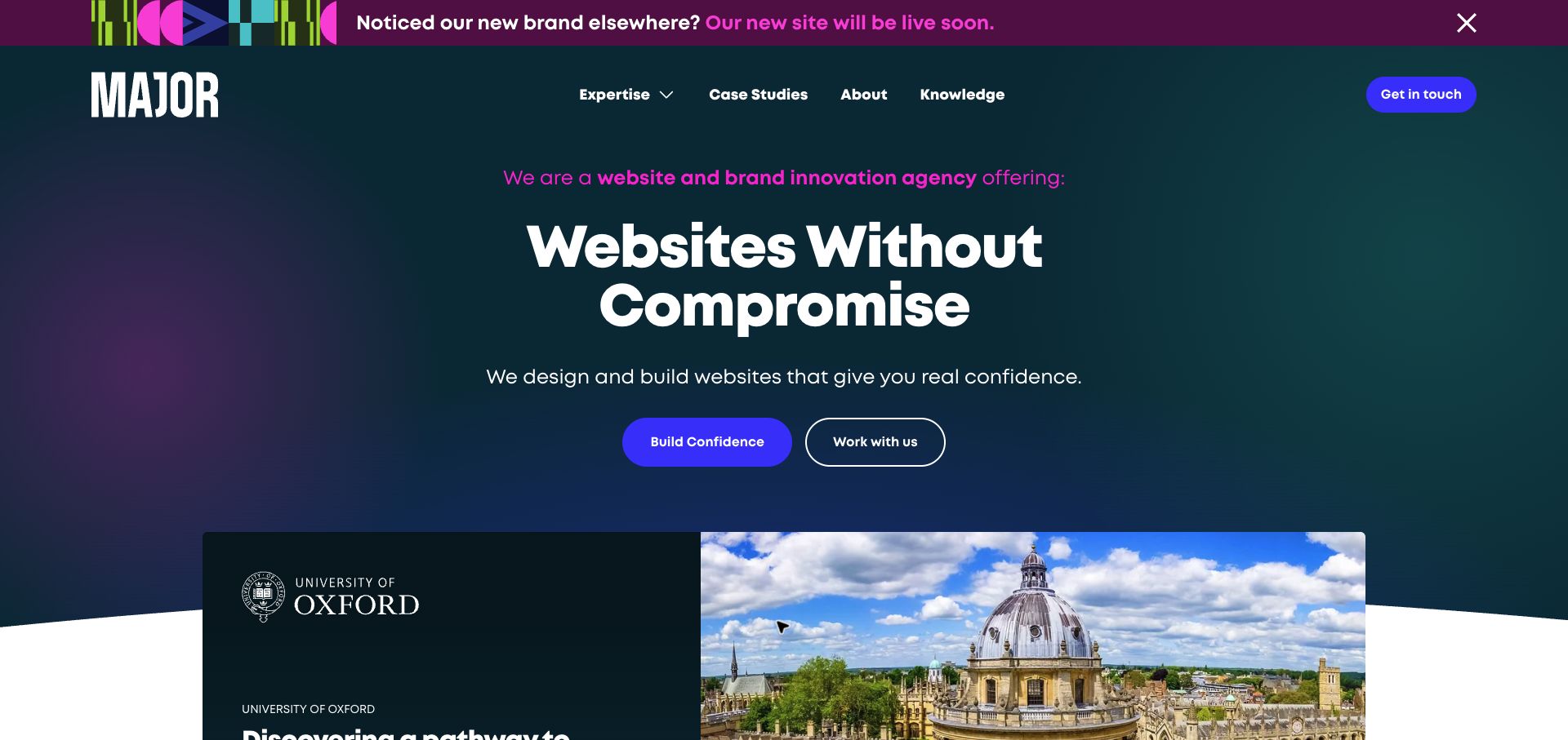
Major Digital’s dark teal introduction uses a large central statement, a short design-and-build explanation and two distinct actions. A named Oxford project card begins below, while the header keeps expertise, case studies and contact available. The top rebrand announcement is separate from the permanent proposition. The useful pattern is moving from a broad confidence message to a concrete project destination. This is a specialist web implementation practice within the wider technical-consulting field, not a claim that the company provides every infrastructure service. The pictured client association and confidence language do not independently establish results or the precise scope of a past engagement.
What you can learn
Connect the service proposition to case records that explain the technical problem and the practice’s actual contribution. A reader should be able to distinguish exploring expertise from starting a commercial conversation. Keep temporary brand announcements from becoming essential to understanding the permanent offer.
Pros
The named project gives the broad introduction a concrete next destination.
Information and contact actions are visually distinct.
Cons & considerations
If the proposition is confidence-led, follow it with specific technical scope.
If a rebrand notice persists, keep old and current identities understandable.
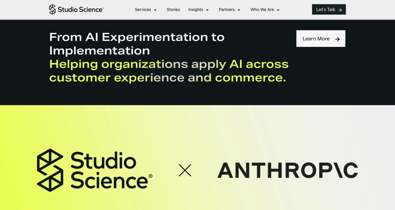
The accepted Studio Science capture shows an AI-implementation section rather than the entire initial homepage. White and bright yellow text sits on a dark field above a large yellow Studio Science and Anthropic panel. A separate learn-more action and permanent header provide routes beyond the campaign. The useful pattern is giving a technical-services business one recognisable topic without losing its broader services navigation. Current official material separately identifies technology solutions, managed services and platform integrations. The partner artwork and implementation statement are public presentation, not independent verification of an affiliation’s current conditions, a deployment or business results.
What you can learn
Explain what the consultancy contributes to a platform engagement instead of relying on the partner logo to carry the offer. Identify the practical problem, relevant work and route into supporting detail. Keep campaign material separate from the maintained explanation of services and customer responsibilities.
Pros
The strong yellow panel gives the campaign a clear visual identity.
A learn-more route lets visitors investigate before contacting the practice.
Cons & considerations
If a partner mark leads, explain the actual scope and relationship behind it.
If a campaign section is prominent, retain clear routes to the wider service offer.
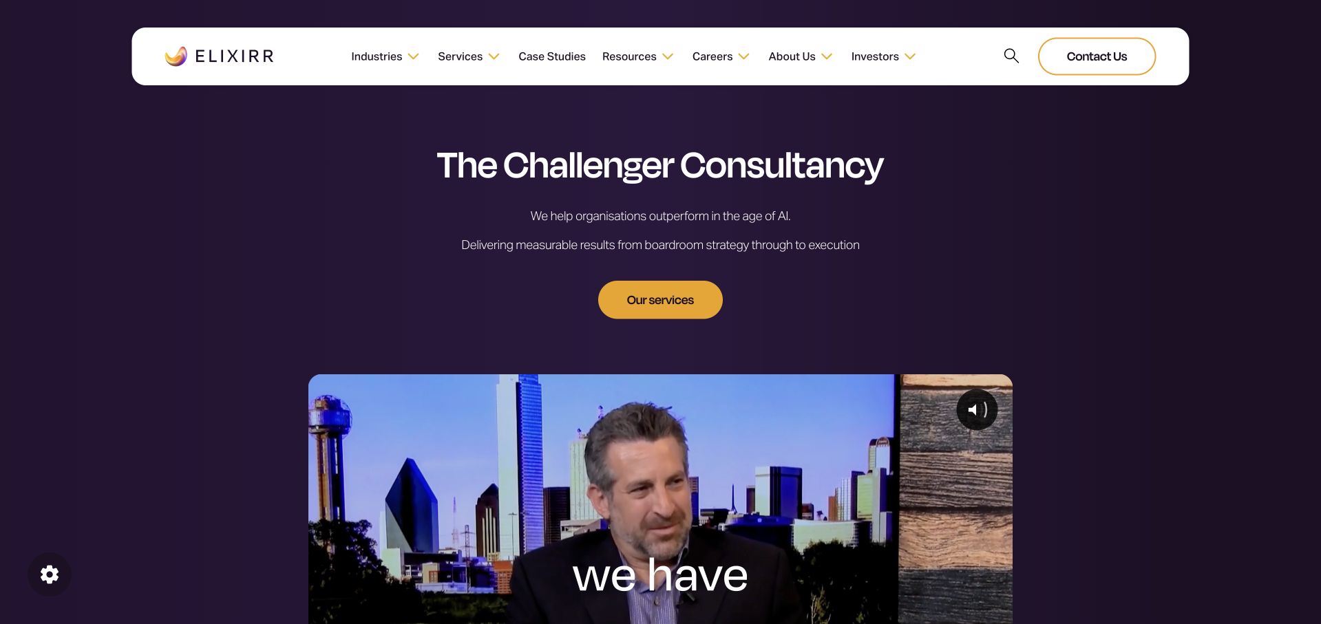
Elixirr’s original homepage uses a purple field and a rounded white navigation bar to frame a concise consultancy introduction. A yellow services action stands above a large video frame, keeping a written route into the offer available without requiring playback. The useful pattern is separating brand positioning from investigation of actual capabilities. The homepage fetch failed during this review; a current official data-and-technology service page positively establishes IT strategy, cloud architecture, managed services and application work. That supporting observation does not make the older image fresh or independently verify the results language in the captured introduction.
What you can learn
Give an umbrella consultancy identity a clear service map. Strategy, implementation and ongoing operation are related but not identical engagements, so explain their boundaries in the linked material. A company film can introduce people and perspective, but it should not replace a readable account of the work offered.
Pros
The services action provides a practical route beneath the positioning statement.
The rounded navigation remains distinct from the video and background.
Cons & considerations
If results language is broad, support it with scoped engagement evidence.
If video is important, keep the essential explanation available without playback.
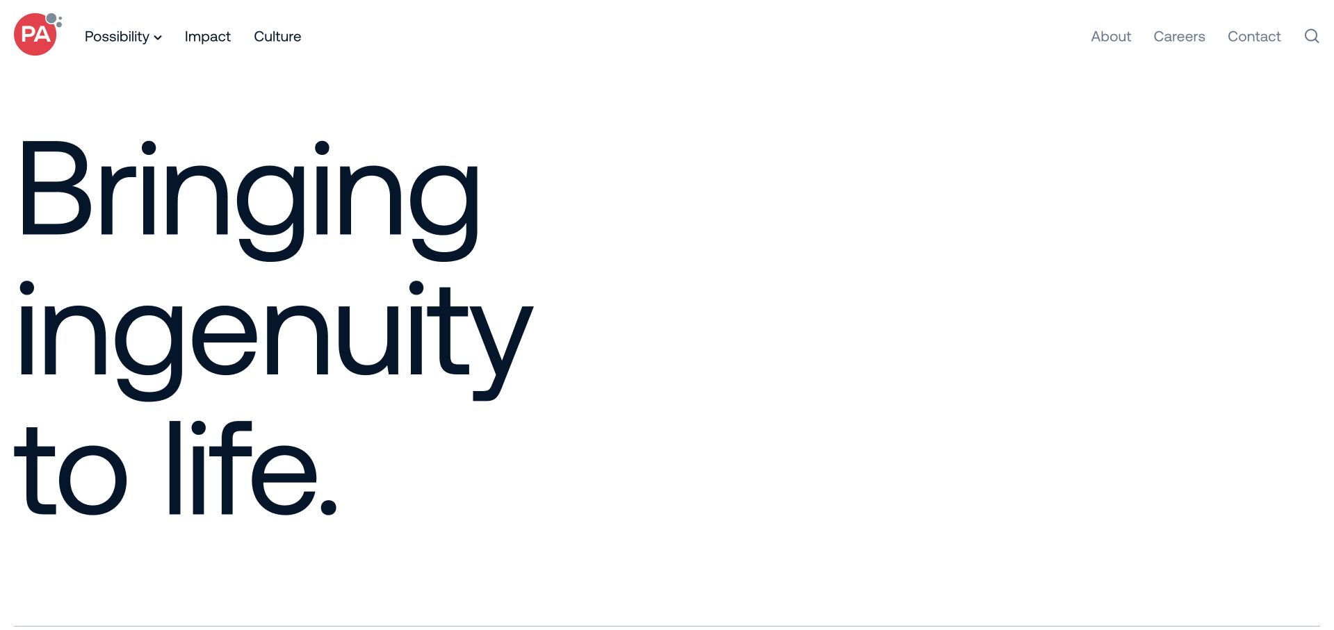
PA Consulting’s captured opening is intentionally sparse: a white field, very large navy typography and a restrained header. The main navigation separates the practice’s work, impact and culture, while about, careers, contact and search sit apart. There is no large project photograph competing with the initial statement. The useful pattern is a strong editorial identity that makes the wording itself the visual subject. Current official material lists digital, data, product and complex-programme services within a broader consultancy; the short opening alone is not evidence of every technical capability or a customer outcome.
What you can learn
A minimal introduction needs a precise next layer. Help a visitor move from an identity statement to relevant capabilities and documented work without assuming they already understand the firm. Keep technical service scope and business context explicit in supporting pages, especially when the first screen deliberately postpones detail.
Pros
The oversized type establishes an unmistakable visual hierarchy.
Contact and search remain identifiable despite the sparse composition.
Cons & considerations
If the first statement is broad, provide concrete service context promptly below.
If typography fills the opening, test the information sequence on short and narrow screens.
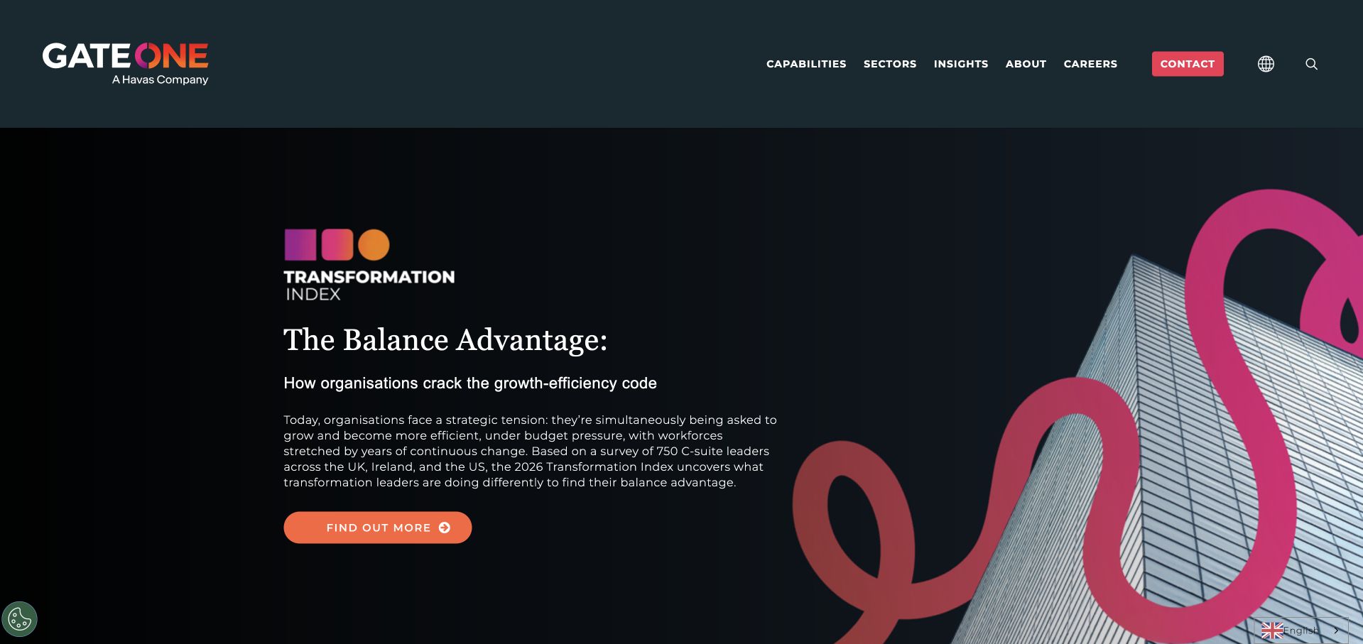
Gate One’s dark captured opening promotes a named Transformation Index rather than listing services immediately. A substantial explanatory paragraph sits beside building imagery and a coloured loop motif, with an orange information action beneath. Capabilities, sectors and contact stay in the permanent header. The useful pattern is giving broad transformation positioning a concrete publication that visitors can investigate. Current official source material explicitly includes digital, technology, AI and data capabilities. The report’s survey description and growth language remain supplier presentation; this review does not independently assess the research method or the results of a consulting engagement.
What you can learn
Keep a publication’s purpose distinct from the consultancy’s service offer. Explain what the research concerns, then provide clear routes into relevant capabilities and project evidence. A reader interested in a specific technical problem should not have to treat a thought-leadership report as the only way to understand the practice.
Pros
The publication has a clear name and explanatory context.
Permanent capability and contact routes remain available above the campaign.
Cons & considerations
If research leads the homepage, retain a direct service-selection path.
If survey findings support claims, make the underlying scope and method discoverable.
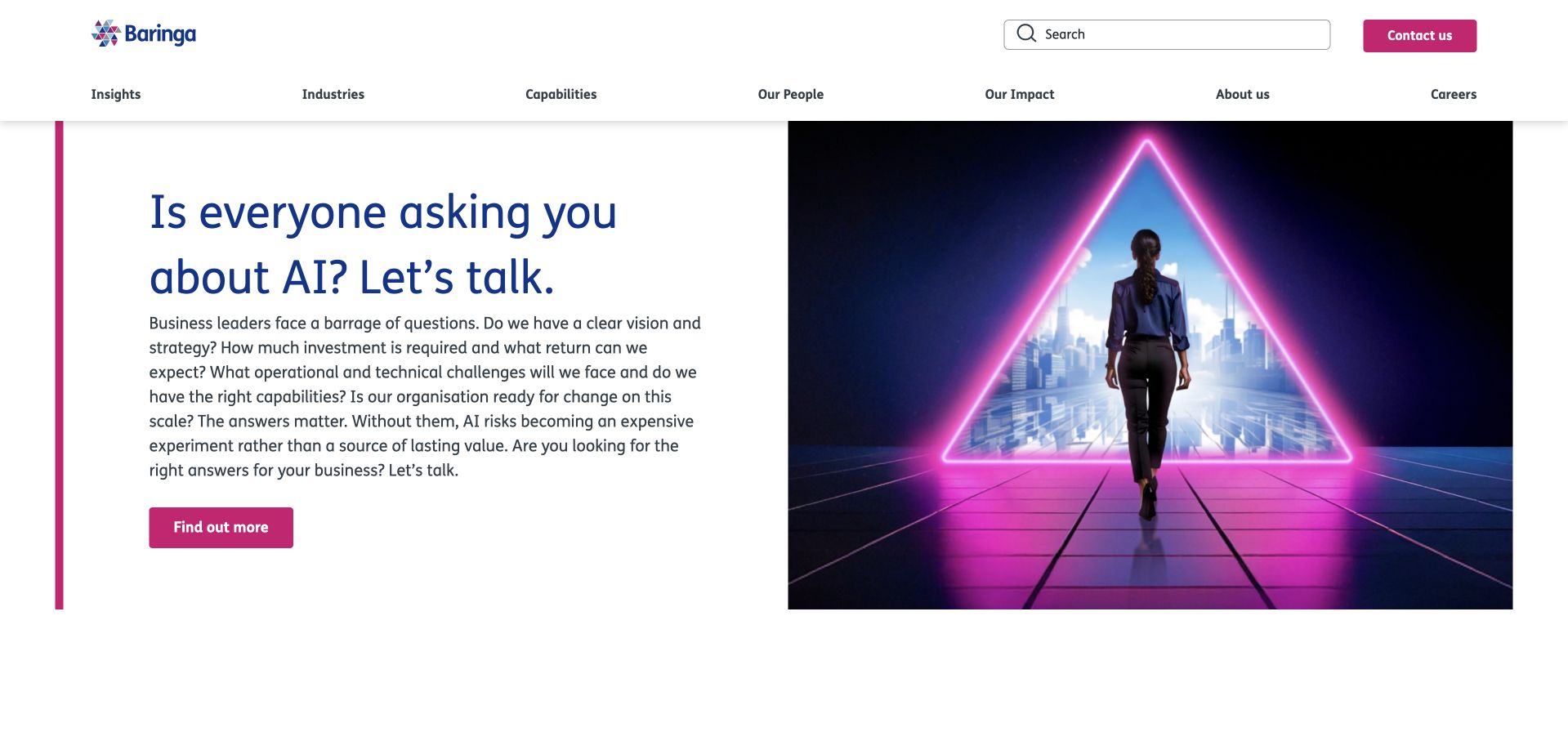
Baringa’s captured opening pairs an AI-related question with a substantial paragraph about strategy, investment, technical challenges and organisational readiness. The white text column faces a pink triangular city illustration containing a person, while a matching action gives the material a next step. Search, capabilities and contact remain in the header. The useful pattern is introducing consulting through the evaluator’s unresolved questions rather than a wall of service acronyms. Current official material also discusses technology architecture and digital-data work. The image and business-value language do not independently establish advice quality or the outcome of an implementation.
What you can learn
Name the decisions a visitor needs help making, then connect them to specific advisory or delivery capabilities. Keep strategy questions distinct from promised technical results. Supporting content should explain the scope, inputs and practical work of an engagement instead of relying on a transformation metaphor to make that relationship clear.
Pros
The explanatory paragraph gives the initial question useful context.
The split composition separates reading from conceptual imagery.
Cons & considerations
If the paragraph is dense, preserve a readable sequence on smaller screens.
If AI frames a broad practice, retain routes for other technical consulting needs.
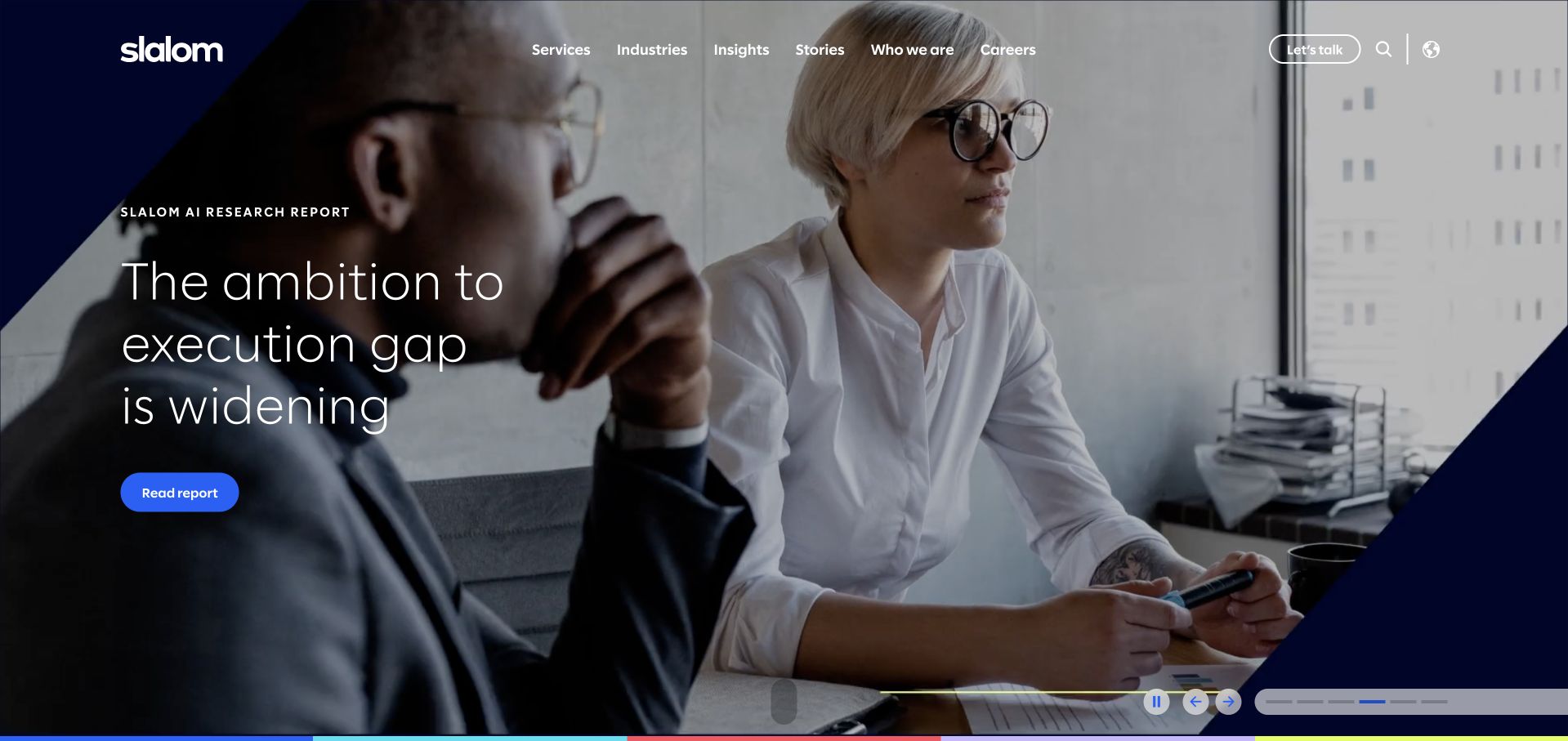
Slalom’s captured frame uses a workplace photograph, navy geometric corners and a report-led heading about the distance between ambition and execution. A report action and carousel controls identify the campaign as one route through the site. Services, industries and stories remain in the header. The useful pattern is connecting a broad business concern to a specific reading destination while preserving the wider offer. Official source material lists cloud, systems implementation, data engineering and product building. The report framing and photograph do not independently establish project outcomes or the team composition for another engagement.
What you can learn
Let research introduce a problem, then help readers reach the service or project material relevant to their own situation. Rotating campaigns need understandable controls and complete meaning within each frame. Keep a direct capability route for evaluators who arrive with a defined technical requirement rather than an interest in the featured report.
Pros
The report action makes the campaign’s next step identifiable.
Service navigation remains separate from the photographic frame.
Cons & considerations
If campaigns rotate, preserve readable timing and independent meaning for each frame.
If a report supports the proposition, explain its actual scope rather than implying universal results.
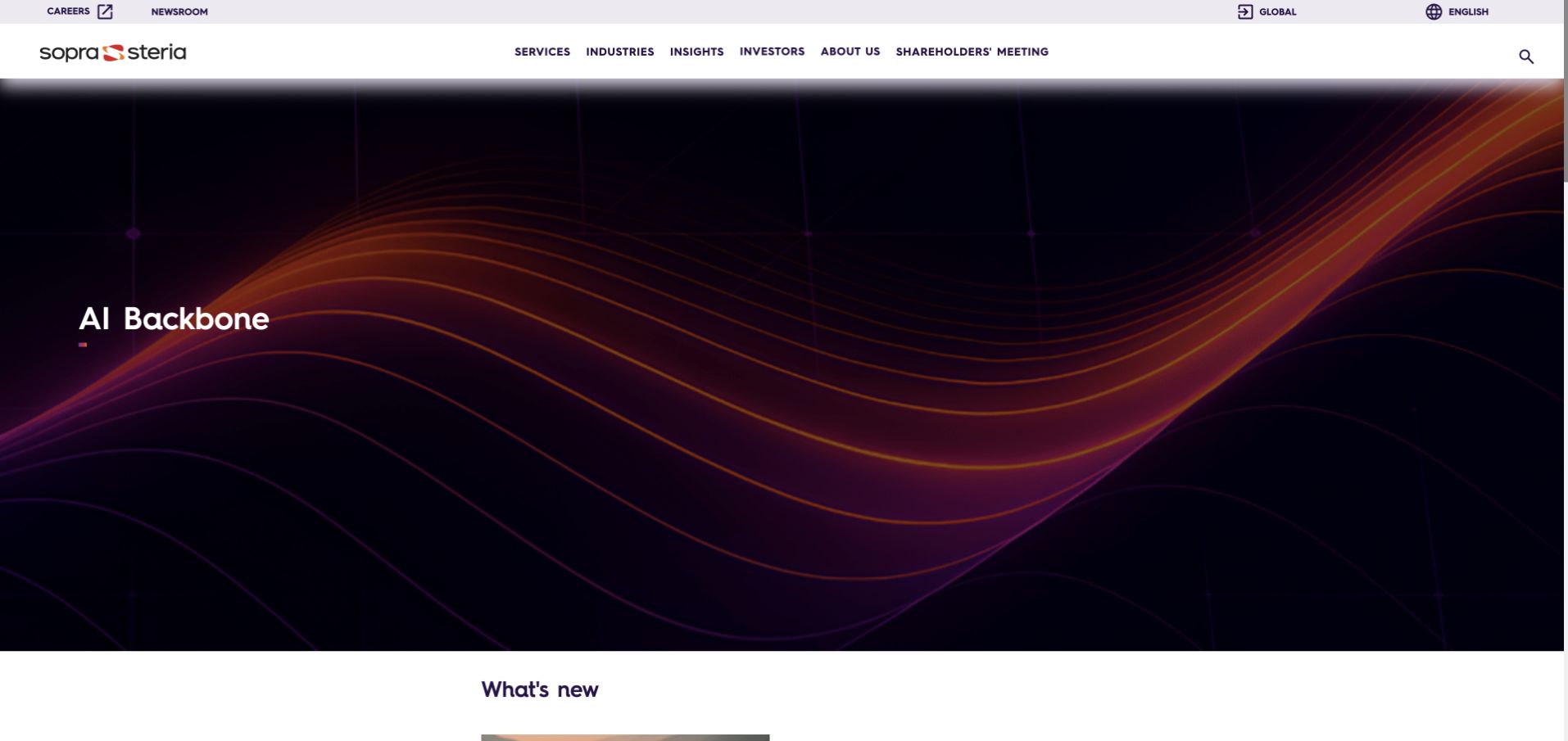
Sopra Steria’s accepted frame uses a dark background and coloured wave imagery with a short AI Backbone label. The wide white header separates services, industries, insights and corporate information, while a news section begins below. The useful pattern is letting a campaign establish a visual mood without replacing the portfolio’s stable entry points. This brief campaign frame is not a complete service description. A current official about page independently establishes consulting and digital-services fit. Neither the campaign art nor that company description verifies an implementation or customer result.
What you can learn
A compact campaign still needs a meaningful route into explanation. Use the surrounding navigation and following content to connect a technical term to its actual purpose and scope. Do not require an unfamiliar evaluator to infer the service model from an abstract visual or a very short branded phrase.
Pros
The permanent header keeps several investigation routes identifiable.
The visual campaign is distinct from the news content beginning below.
Cons & considerations
If a campaign uses a specialist phrase, supply a plain-language explanation nearby.
If imagery carries most of the first screen, ensure it is not the only route to relevant detail.
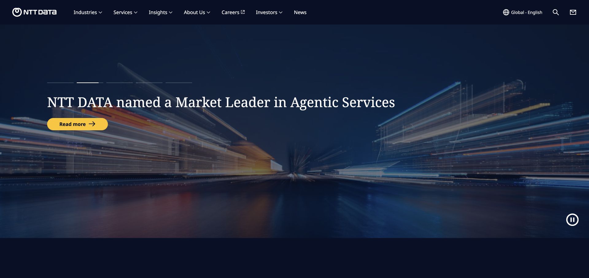
NTT DATA’s clean original frame uses dark city light trails behind a named agentic-services announcement. A yellow reading action provides a clear destination, with progress indicators and a pause control making the rotating format visible. The header separates industries, services, insights, careers and news. The useful pattern is an announcement-led introduction that still preserves a broad portfolio structure. Current official material explicitly lists consulting, application services, cloud, networking and data analytics. The promoted leadership statement is a supplier-presented announcement, not an independent finding about the quality or suitability of another consulting engagement.
What you can learn
Identify the source and scope of recognition-style content and make the next destination informative. Preserve direct routes to capabilities for visitors whose needs are unrelated to the featured campaign. A broad service portfolio needs clear category language beneath the announcement so the visual identity does not become the entire explanation.
Pros
The yellow action is visually distinct within the dark frame.
Campaign controls are visible rather than leaving rotation unexplained.
Cons & considerations
If a recognition claim leads, identify what it actually evaluates.
If one announcement fills the opening, keep task-based service routes easy to find.
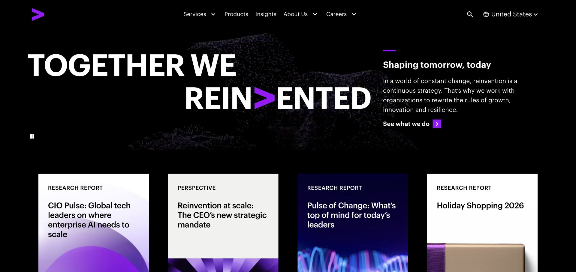
Accenture’s separately accepted clean original uses a black background, oversized reinvention typography and a quieter explanatory column. Purple accents connect the lettering to the brand mark, while a row of labelled research and perspective cards begins beneath. The useful pattern is a forceful identity supported by more specific editorial destinations. This later source image is distinct from the earlier cookie-obstructed candidate; its original date and bytes are retained. Current official material explicitly identifies technology transformation, cloud, engineering and managed services. A Workday customer association in older research is not used to infer consultancy capability or the website’s runtime.
What you can learn
Give a broad positioning statement useful reading paths that identify their subject and content type. Connect research to maintained service material and documented engagements. Keep supplier claims, external recognition and actual project scope distinct so an assertive visual identity does not substitute for evidence.
Pros
The limited palette and large type create a coherent identity.
Labelled editorial cards begin to provide concrete investigation routes.
Cons & considerations
If the umbrella proposition is broad, offer specific capability detail nearby.
If animated lettering is used, preserve meaning and useful navigation when motion is unavailable.
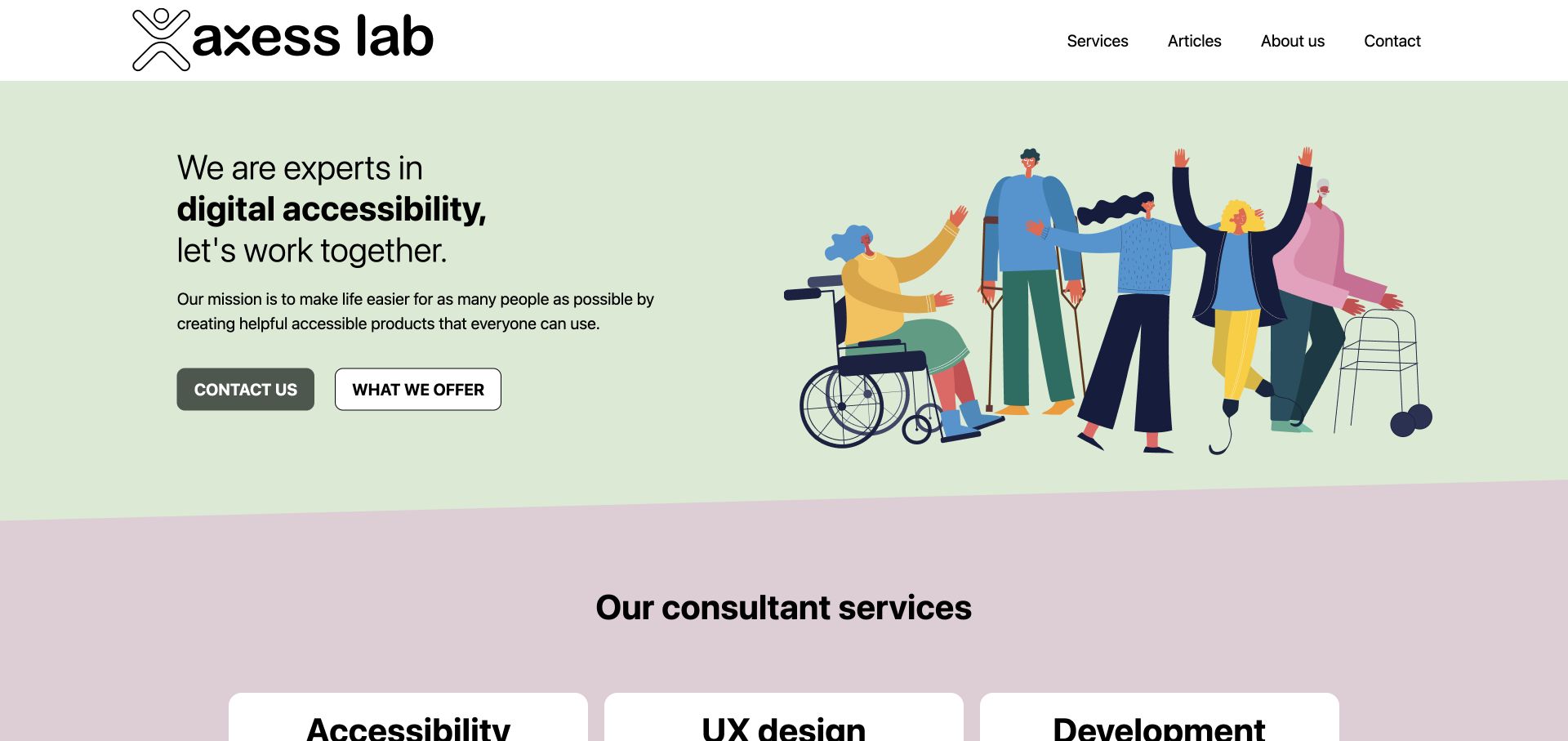
Axess Lab’s original light-green introduction pairs a direct digital-accessibility statement with an illustration of people using different mobility aids. Contact and offer actions are separated, and a service-card row begins below with accessibility, user experience and development. The useful pattern is a specialist technical practice explaining its discipline without beginning with a generic transformation slogan. Current official source material explicitly lists front-end and back-end development, project management and audits. That establishes genuine technical-consulting scope, not proof that the pictured website or every delivered product conforms to an accessibility standard.
What you can learn
Use the specialism to organise the offer, then explain the work within each service. Assessment, research, implementation and training require different inputs and outputs. Keep a visitor’s path to learning about those differences separate from initiating a conversation, and qualify any standards-related statements through appropriate supporting material.
Pros
The specialism is stated directly rather than implied by imagery.
The offer action gives a useful alternative to immediate contact.
Cons & considerations
If several disciplines share the practice, clarify their distinct engagement scopes.
If inclusive imagery supports the introduction, retain concrete technical and process detail beneath it.
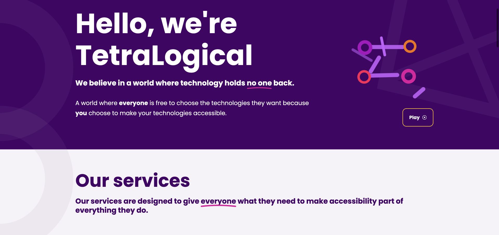
TetraLogical’s captured content view uses a deep purple field, oversized white introduction and geometric artwork. A short purpose statement connects the identity to the usability of technology, and a play control offers optional media. The services section begins immediately below. The useful pattern is a memorable introduction that moves toward the practical work rather than stopping at a mission. Current official material explicitly identifies assessments, consultancy and training. This is specialist technical advice within the IT field, not a claim that the practice supplies every infrastructure service or that a screenshot independently proves conformance.
What you can learn
Follow a purpose-led opening with the distinct tasks an engagement can address. Explain how an assessment, advisory relationship and training programme differ, including the information a visitor needs to choose a starting point. Keep the essential explanation available in text instead of depending on the optional film.
Pros
The purple field and large type create a recognisable specialist identity.
The services section gives the mission an immediate practical continuation.
Cons & considerations
If the opening is mission-led, provide service boundaries before requesting commitment.
If optional media explains the practice, preserve a useful text equivalent and clear controls.
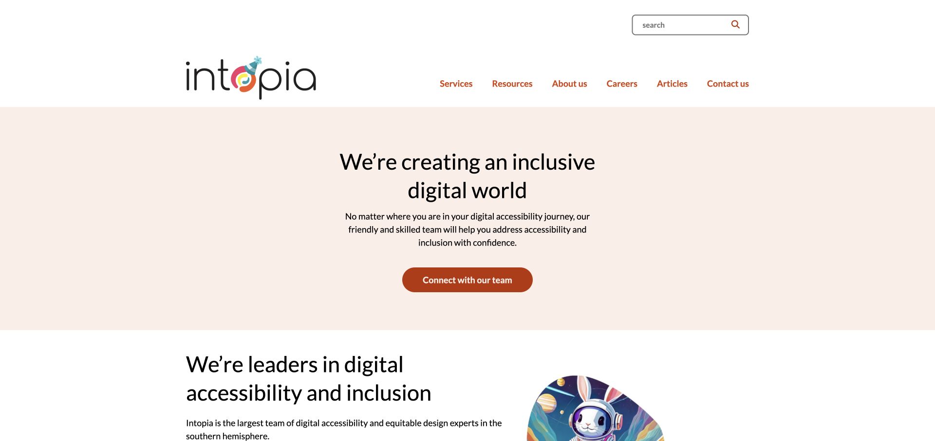
Intopia’s original white-and-peach introduction centres a short inclusion statement, supporting paragraph and rust-coloured contact action. Services and resources are named separately in the header, while a more detailed explanation begins below. The useful pattern is a calm reading hierarchy for a specialist technical topic without presenting an audit interface as a universal solution. Current official material lists digital assessments, strategy, research, training and AccessibilityOps. The review treats those as declared service categories, not independent verification that the site, a client product or an organisation meets a particular technical or legal requirement.
What you can learn
Give readers a straightforward explanation of the specialism and let them investigate relevant service detail before an enquiry. Separate free learning resources from the work of a scoped assessment or advisory engagement. A reassuring tone should make technical material approachable without replacing the need to explain scope, method and responsibilities.
Pros
The restrained colour system gives the introduction a clear reading order.
Services and resources are distinct navigation labels.
Cons & considerations
If the introduction is broad, make the actual engagement choices easy to find next.
If leadership or expertise statements appear, distinguish them from independently assessed service outcomes.
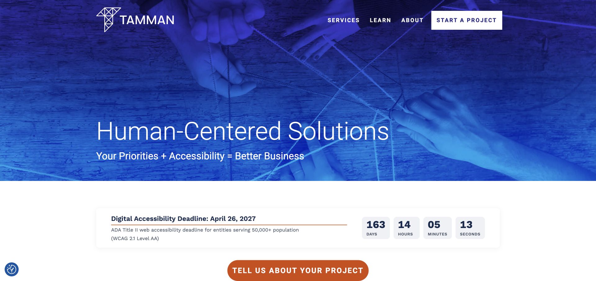
Tamman’s original opening uses a blue-toned teamwork photograph, a human-centred service statement and a prominent project-starting route. Services, learning material and company information remain separate in the header. A dated advisory countdown appears below the hero as ordinary page content. The useful pattern is relating a specialist technical practice to both a project conversation and continuing learning. Current official material explicitly describes software engineers, integrations, web applications and technical consulting. The countdown is not independently endorsed legal guidance, and the photograph or business-value language does not establish the results of an engagement.
What you can learn
Explain what a project conversation begins and which technical work the practice offers. Keep educational or deadline-related material separate from the service scope, with appropriate review ownership. A concise first contact should gather context for a real discussion rather than imply that an initial form completes an assessment or defines an implementation.
Pros
Project contact is easy to identify within the blue introduction.
Learning material has a distinct route from services and company information.
Cons & considerations
If dated advisory content is prominent, maintain its scope and currency carefully.
If several technical disciplines share one practice, explain the relevant engagement boundaries.
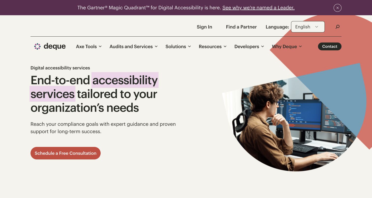
Deque’s retained services page uses a cream background, highlighted accessibility wording and a photograph of a person working at code-filled monitors. A consultation action sits beneath the introduction. The header gives audits and services a place separate from the product catalogue, with developer and resource routes also visible. A purple report announcement occupies its own strip above the navigation. The useful pattern is explaining a service category within a business that also sells technical tools. This is a specialist accessibility-consulting example, not a general infrastructure outsourcer; the compliance, expertise and recognition language is supplier presentation rather than an independent finding.
What you can learn
Separate the service engagement from the software product so visitors can understand what people will actually contribute. Explain audits, technical guidance and implementation support in distinct terms, with the relevant scope and handover. Keep commercial recognition secondary to useful descriptions of the work and its limitations.
Pros
Services have a distinct navigation identity beside products.
The consultation action follows an explicit service introduction.
Cons & considerations
If compliance language leads, avoid implying a guaranteed legal outcome.
If the offer spans tools and people, explain their separate responsibilities.
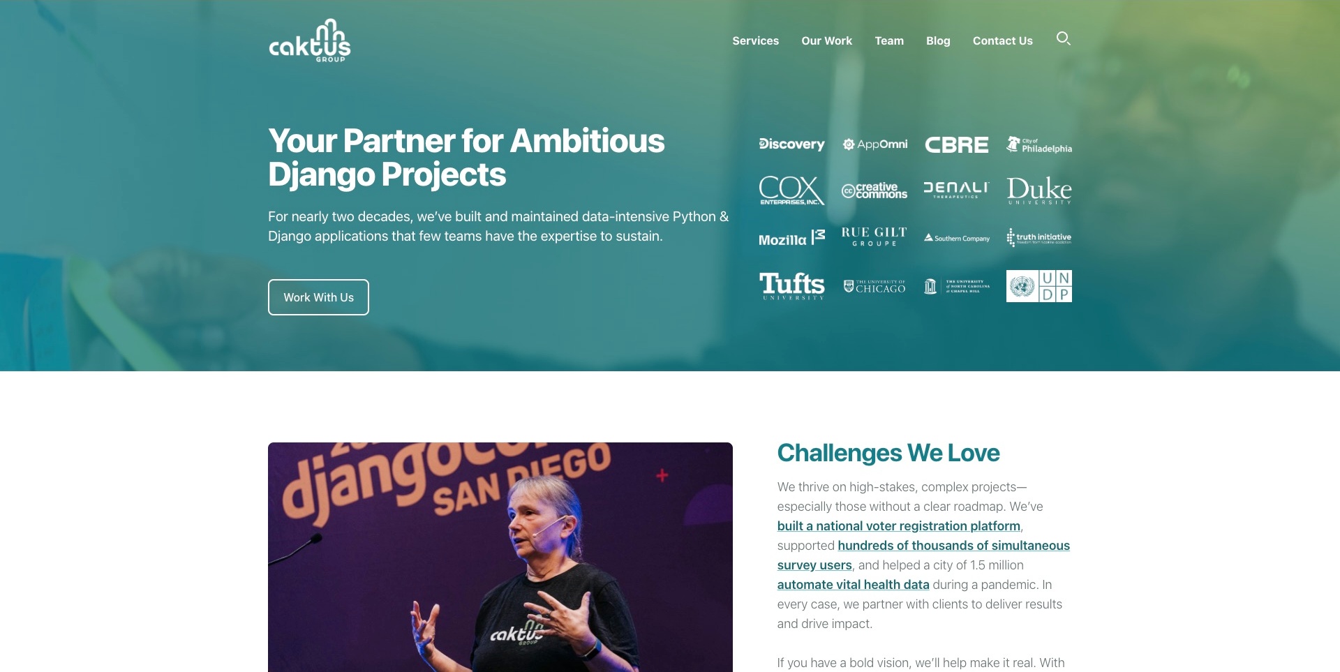
Caktus Group’s teal opening puts a Django-project proposition and a short data-application explanation beside a grid of client marks. A single work-with-us action is easy to identify, with services and team information in the header. A conference photograph and a more detailed challenges section begin below. The useful pattern is moving from a clear specialism into concrete reading material rather than filling the first screen with every capability. The client marks, experience language and project figures remain supplier-presented evidence; this review does not independently verify application quality, scale or a client result.
What you can learn
Use the specialism to help visitors identify relevance, then explain the actual contributions through well-scoped cases and services. A technical community photograph can add context, but it should not stand in for delivery evidence. Keep maintaining an existing application distinguishable from building a new one.
Pros
The technical category is explicit in the opening.
The lower section begins to connect positioning with project context.
Cons & considerations
If client marks imply broad experience, support them with clear role descriptions.
If scale figures are used, identify their source and conditions.
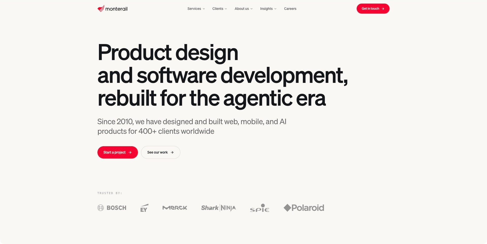
Monterail’s captured page uses a pale background, oversized black typography and red accents to introduce product design and software development. A supporting sentence names web, mobile and AI product work. Separate project-starting and work-viewing actions sit above a restrained customer-mark row, while services and insights remain in the header. The useful pattern is giving the work category a clear written place even as the proposition references a changing agentic context. The stated history, client count and customer associations remain supplier presentation, not independent evidence of implementation quality or another project’s business result.
What you can learn
Make the stable service category understandable before adding a current technical theme. Give evaluators a route to documented work as well as contact, and explain the team’s actual contribution within those records. A large statement should introduce the practice rather than replace useful scope and engagement information.
Pros
The service category remains explicit within the campaign wording.
Work exploration is distinct from starting a project.
Cons & considerations
If the technical theme changes, keep capability information current underneath it.
If client counts support the introduction, do not treat them as a substitute for relevant case detail.
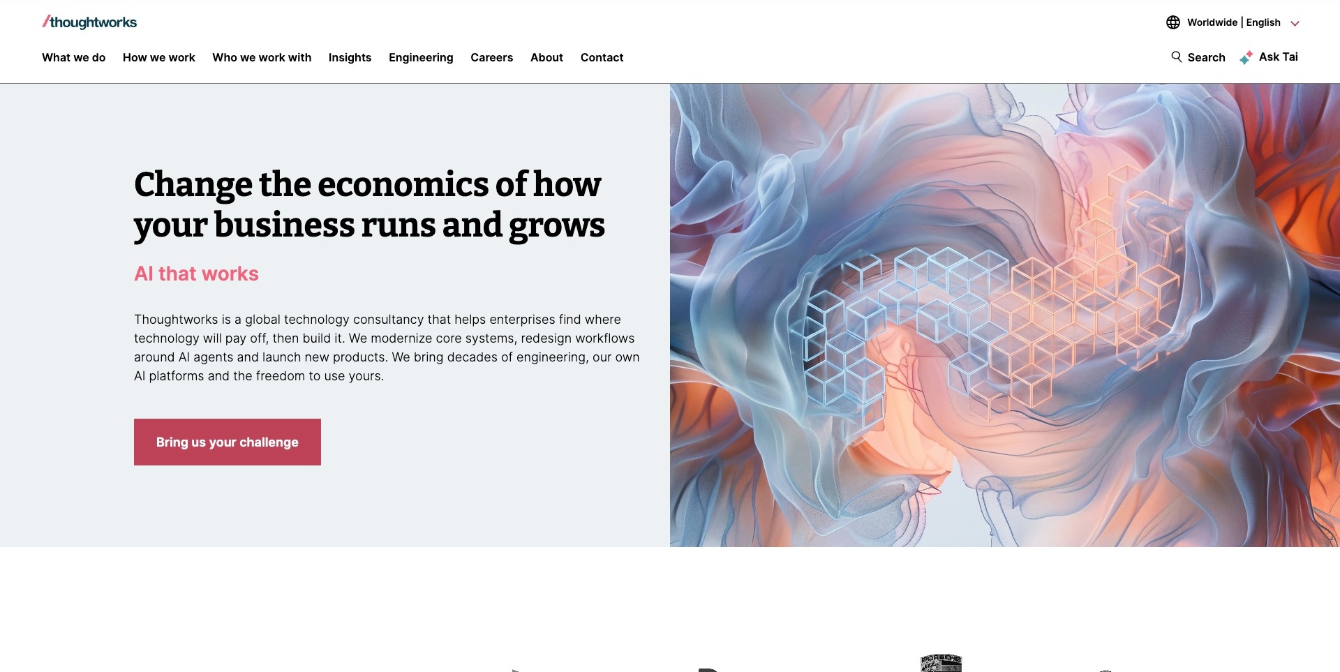
Thoughtworks’ captured opening uses a split layout: a pale reading area on the left and flowing abstract artwork on the right. The heading and short pink emphasis are followed by a paragraph describing consultancy, system modernisation, workflow change and product building. A challenge-oriented contact action sits beneath. The header separates what the practice does, how it works and who it works with. The useful pattern is giving a broad business proposition enough technical explanation to become understandable. The economic and AI-related language remains supplier positioning, not independent verification of a transformation outcome.
What you can learn
Connect the umbrella business problem to the actual engineering and advisory contribution. Keep service, process and client-context routes distinct so visitors can investigate from different starting points. Abstract art can establish an identity, but written scope should carry the explanation that an evaluator needs before a conversation.
Pros
The paragraph connects broad positioning to practical technical work.
Service and process navigation are separately labelled.
Cons & considerations
If the explanation is dense, preserve a clear reading order on small screens.
If business outcomes lead, support them with appropriately scoped project evidence.
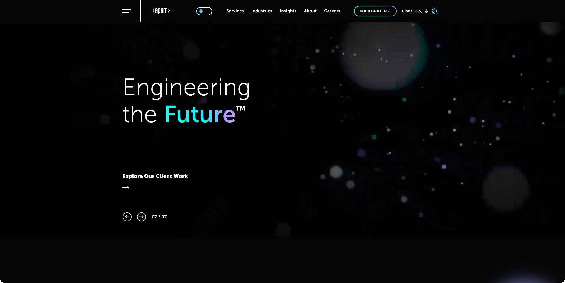
EPAM’s accepted frame shows a dark field of soft particles behind a short engineering statement, with a colour-gradient accent in the final word. A client-work route sits below, and a seven-frame indicator with arrows makes the carousel structure visible. Services, industries and contact remain in the permanent header. This is the complete engineering frame, not an earlier news announcement from the same rotating area. The useful pattern is connecting a broad technical identity to documented work while keeping wider navigation available. The visual treatment does not independently establish engineering quality or a customer implementation.
What you can learn
Give every campaign frame a complete meaning and a useful destination. A short engineering statement needs detailed capability and project material behind it, especially in a broad portfolio. Keep visitors able to investigate services without waiting through the full rotation, and preserve useful content when motion is unavailable.
Pros
The client-work route provides a concrete investigation path.
Visible controls explain that the introduction rotates.
Cons & considerations
If the proposition is very short, provide technical context promptly next.
If several frames share the opening, test readable timing and independent navigation.
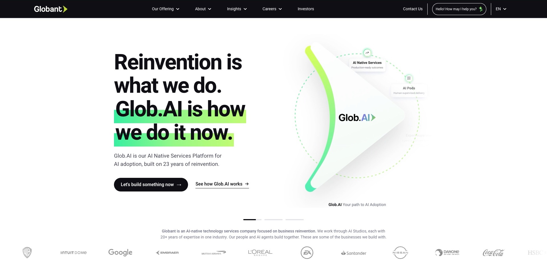
Globant’s accepted opening places a large black statement and green highlights beside an arrow-shaped Glob.AI illustration. Two actions distinguish starting a conversation from understanding the platform. The permanent dark header keeps offerings, company information and contact available, while a supplier-written technology-services explanation and client marks begin below. The useful pattern is connecting a newly named platform to a recognisable practice rather than expecting a name to explain the engagement. The picture is a presentation of the offer, not an observed operating environment; the adoption, experience and customer language remains supplier positioning rather than independently verified delivery evidence.
What you can learn
When introducing a proprietary service model, explain what it changes for the buyer and where detailed scope lives. Keep investigation distinct from contact. Make the relationship between the parent consultancy, its platform and individual capabilities understandable without requiring a visitor to interpret an animated diagram.
Pros
The two actions distinguish learning from starting a discussion.
Permanent navigation remains available outside the campaign.
Cons & considerations
If a platform name leads, explain the actual deliverables beneath it.
If client marks support the offer, give them appropriately scoped case context.
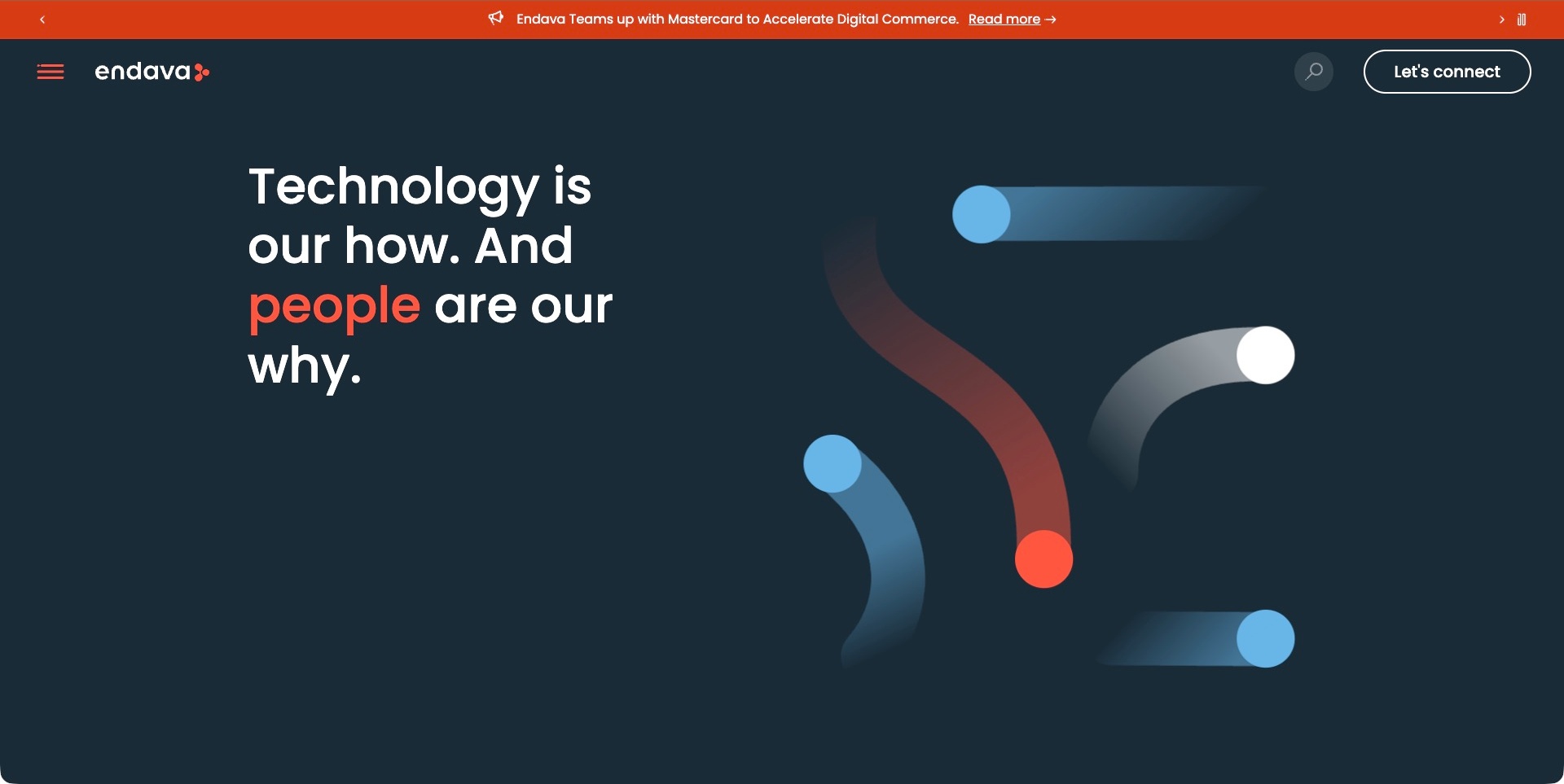
Endava’s captured opening uses a dark blue field, a short multi-line statement and a restrained abstract illustration. One word receives the orange brand accent. A slim news strip sits above a compact header with a menu, search and a conversation action. The wider official page explains digital transformation, sector routes and capabilities, giving the short opening a more concrete continuation. The useful pattern is separating a memorable introduction from the detailed service architecture behind it. The news association and growth language are presented by the consultancy; this screenshot does not independently verify partnership scope, engineering quality or a customer’s results.
What you can learn
Give a broad opening an accessible route into practical capabilities and relevant industries. Keep news secondary to the enduring proposition, and let visitors investigate without requiring contact. A hidden menu may simplify the composition, but its labels and hierarchy still need to make a large service portfolio understandable.
Pros
The short opening has a clear written hierarchy.
Search offers an alternative to navigating a broad menu.
Cons & considerations
If most navigation is collapsed, test discoverability beyond the first screen.
If abstract positioning leads, provide concrete engagement information promptly.
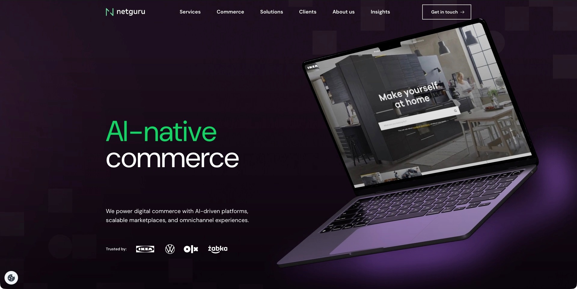
Netguru’s accepted frame uses a dark purple background, green accent text and a large angled laptop presentation to introduce AI-native commerce. The laptop visibly contains an IKEA-branded interface; it is part of Netguru’s own presentation, not a separate capture of the retailer. A short explanatory sentence and a customer-mark row sit beneath the heading, while services, commerce, solutions and clients have distinct header routes. The useful pattern is making a sector focus explicit before presenting the wider engineering offer. The displayed interface and client marks remain supplier case context, not independent verification of contribution, application behaviour or commercial results.
What you can learn
Use a sector-specific example to explain relevance, then document the actual design, engineering and integration contribution behind it. Keep the service route distinct from the customer portfolio. Product imagery should support the proposition without making a visitor infer which work was performed or which results were independently measured.
Pros
The commerce focus is visible in both headline and supporting copy.
Services and client investigation have separate navigation.
Cons & considerations
If a branded interface dominates, explain the consultancy’s exact role.
If the presentation moves, preserve a complete readable proposition in every frame.
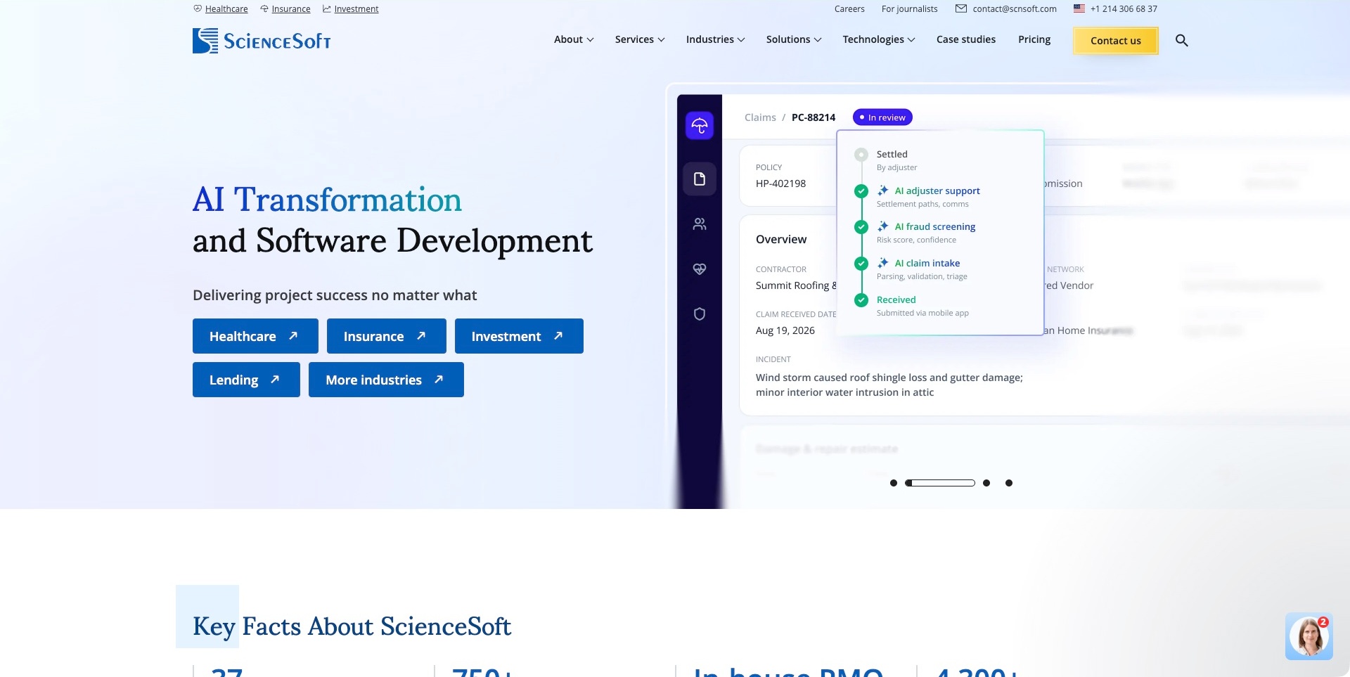
ScienceSoft’s captured frame pairs a serif software-development heading with an insurance-workflow illustration. A status card describes claim intake, screening and adjuster support over a larger application-style screen. Blue industry buttons provide routes into healthcare, insurance, investment and lending, while case studies and pricing remain in the header. A facts section begins beneath the hero. The useful pattern is relating an otherwise broad technical offer to recognisable tasks and audiences. The application screen is a marketing illustration, not a verified customer record or a demonstrated live system; the success statement is supplier positioning rather than an independent outcome finding.
What you can learn
Make a complicated service understandable through a bounded workflow, then explain the actual engagement and delivery responsibilities. Let industry routes lead to useful detail rather than simply changing the heading. Keep illustrative records visibly separate from evidence about a real deployment, its security, accuracy or business effect.
Pros
Industry actions give the broad proposition several concrete starting points.
The workflow image makes an abstract service easier to discuss.
Cons & considerations
If an application mockup implies automation, explain its illustrative scope.
If success language leads, support it with attributable and qualified project evidence.
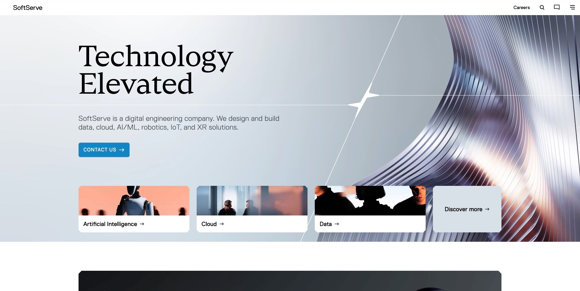
SoftServe’s accepted page pairs a large black serif heading with a metallic abstract image and a small star-shaped brand detail. A plain paragraph explicitly identifies digital engineering and names data, cloud and related solution categories. Three image cards expose artificial intelligence, cloud and data routes, alongside a separate discovery card. The white header is deliberately spare, with contact and menu icons rather than a full visible service catalogue. The useful pattern is using technical nouns to support an atmospheric opening. The composition introduces the practice; it does not independently establish solution performance, implementation quality or a customer’s outcome.
What you can learn
A memorable headline needs enough ordinary explanation to identify the work. Use a few capability cards to give that explanation useful destinations, then document the contribution and engagement boundaries beneath them. Keep the menu and conversation routes understandable even when a minimalist header removes most written navigation.
Pros
The supporting paragraph names the actual technical categories.
Visible cards give the opening more than one investigation route.
Cons & considerations
If the main menu uses only an icon, check discoverability and labelling.
If an abstract image dominates, preserve clear text and capability routes on narrow screens.
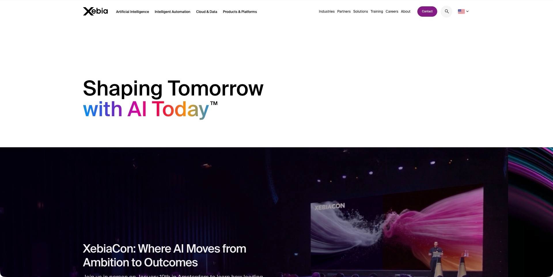
Xebia’s captured page uses a white field, a large black statement and a multicolour phrase to introduce an AI-oriented proposition. The header names artificial intelligence, automation, cloud and data, products and platforms, alongside training and company routes. An event feature with stage imagery begins beneath the opening. The wider official page explicitly describes consulting, software engineering and training, keeping the practice’s technical role identifiable beyond the campaign. The useful pattern is making knowledge-sharing visible without removing capability navigation. The event and transformation language are supplier presentation; this review does not verify attendance, productivity improvements or a project’s results.
What you can learn
Give professional learning its own meaningful place while preserving clear routes into paid services. Explain whether a visitor is investigating training, advisory work or engineering rather than treating those as one engagement. A concise campaign can establish identity, but the actual offer still needs concrete scope and deliverable information.
Pros
Technical categories are visible directly in the header.
The event feature gives the proposition a knowledge-oriented continuation.
Cons & considerations
If many categories share the header, maintain usable grouping on smaller layouts.
If campaign wording is broad, clarify the actual work in the next sections.
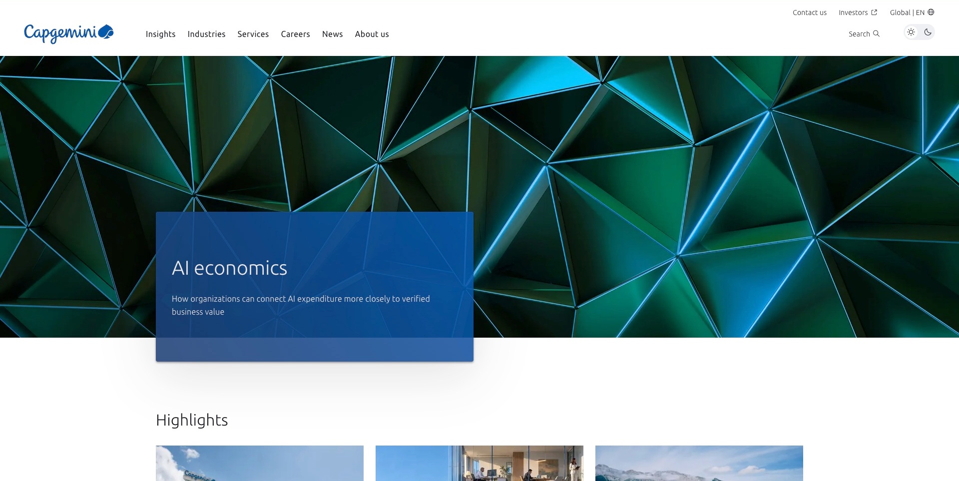
Capgemini’s opening places a translucent blue editorial panel over a faceted green-and-blue image. The AI-economics topic is explained in one sentence, with a highlights section beginning below. Services and industries sit in the permanent navigation alongside insights, news and company information; contact and investor routes occupy a separate utility row. The useful pattern is keeping a current research theme inside a stable information architecture rather than rebuilding the whole introduction around a capability list. The panel introduces the source’s business-value discussion, not an independently verified economic finding or evidence of a customer implementation.
What you can learn
Let editorial topics help visitors investigate a technical practice, but keep direct routes into services and industry context visible. Distinguish a report’s argument from a delivered project and explain the source of any numerical claim. Maintain a useful next step when the campaign changes or its background media is unavailable.
Pros
Services and editorial investigation have separately labelled routes.
The campaign panel preserves a readable written focal point.
Cons & considerations
If a report leads, connect it to relevant capabilities without implying measured client results.
If artwork fills the opening, test text contrast and hierarchy across its actual frames.
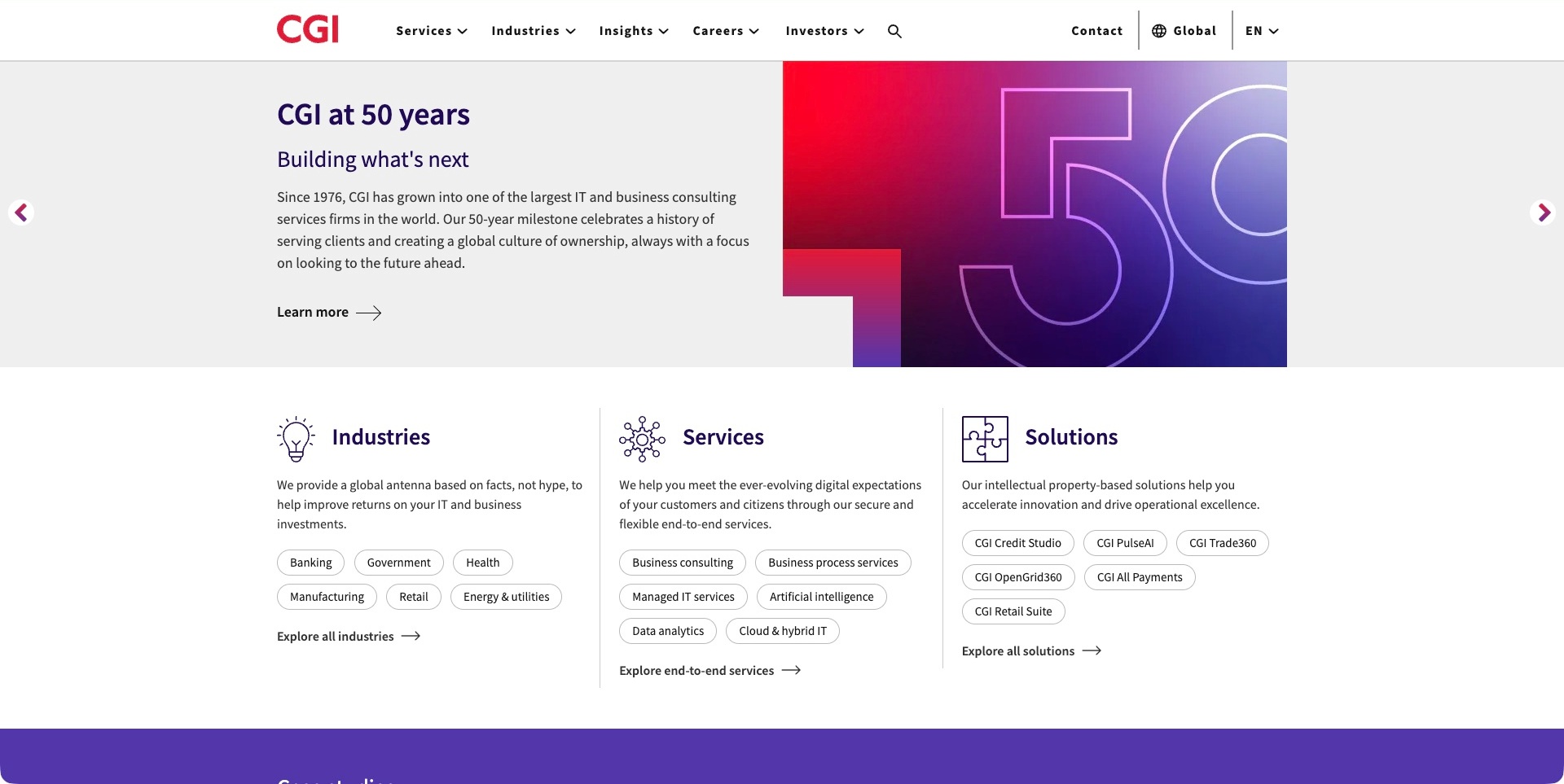
CGI’s accepted frame pairs a fiftieth-anniversary introduction with a large pink-to-purple numeral graphic. The text identifies an IT and business-consulting practice, while a learn-more action leads into the corporate story. Immediately below, three columns distinguish industries, services and named solutions, using compact topic pills and exploration links. The permanent header repeats the service and industry routes alongside insights and contact. The useful pattern is making institutional history a temporary introduction rather than the only way to understand the offer. The age, scale and delivery language remain company statements; this image does not independently verify project quality or financial outcomes.
What you can learn
Follow corporate storytelling with a practical taxonomy that helps visitors identify relevance. Explain the difference between a service, an industry specialism and a named solution instead of mixing them in one list. Keep the current offer available outside the carousel so an evaluator need not wait for a particular campaign frame.
Pros
The lower three-column taxonomy separates different investigation needs.
Permanent navigation remains useful independently of the milestone.
Cons & considerations
If a milestone dominates, keep it secondary to current engagement information.
If topic pills proliferate, maintain clear grouping and descriptive destination pages.
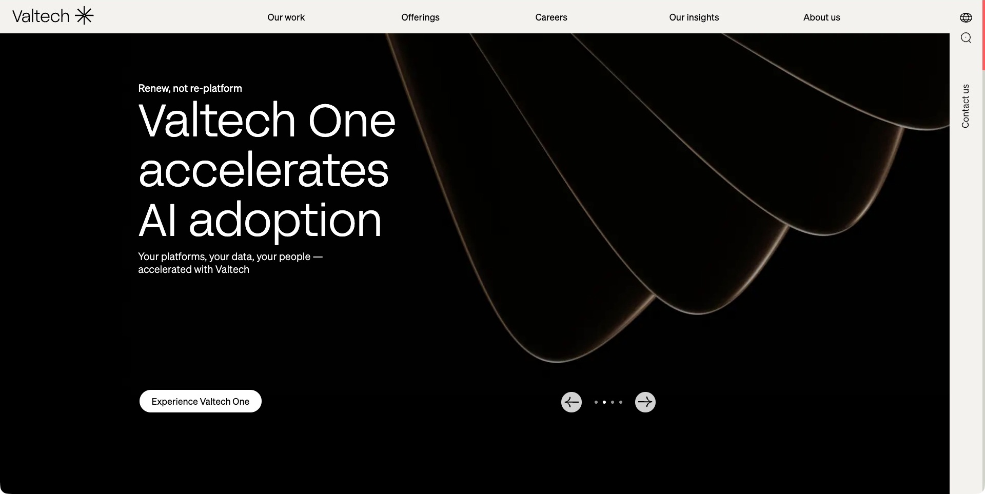
Valtech’s accepted frame uses a black background, a white product-style statement and a sculptural looping image. A short line relates the offering to platforms, data and people, and an action invites further investigation. Carousel controls remain visible below. The pale header keeps work, offerings, insights and company routes separate, while contact occupies a narrow right-hand rail. This is the Valtech One campaign frame, not a different presentation from the same rotating area. The useful pattern is giving a named offering its own identity inside a stable consultancy structure. Acceleration language is supplier positioning rather than an independently measured result.
What you can learn
Explain how a newly named offer relates to the consultancy’s actual contribution, and provide a descriptive destination behind its campaign action. Keep portfolio and service investigation available outside the rotation. Distinguish the promise of a presentation from evidence about an implementation, its maintenance obligations or a customer’s business effect.
Pros
The campaign action names the offering being investigated.
Work and offerings remain separate permanent routes.
Cons & considerations
If the offer uses a new name, explain its scope promptly.
If contact sits in a side rail, preserve an obvious route on narrow layouts.
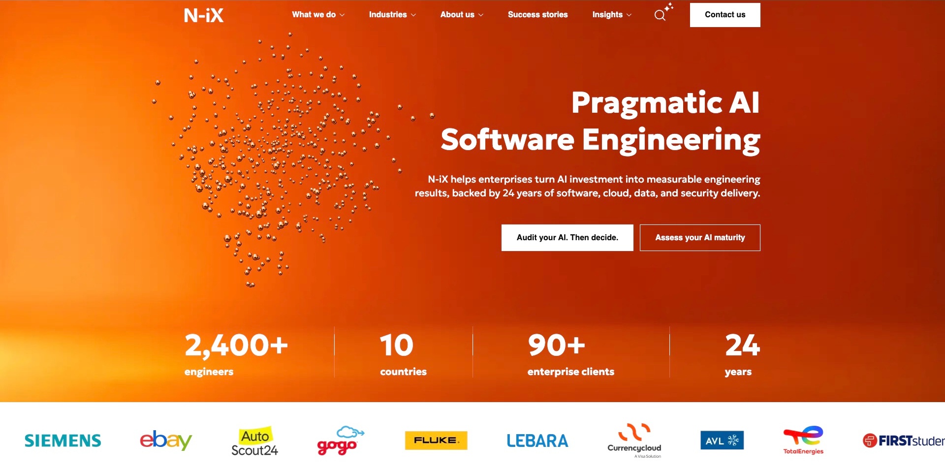
N-iX’s opening uses an orange field, a metallic particle illustration and a white software-engineering heading. A supporting sentence connects the proposition with software, cloud, data and security work. Two actions distinguish an audit-oriented starting point from an organizational-maturity assessment. A supplier-presented figures row and customer marks follow, with services and success stories available in the header. The useful pattern is offering a defined investigation step rather than only an undifferentiated contact invitation. The staffing, experience and results language remains supplier evidence; the image does not independently verify assessment quality, project outcomes or any customer’s technical configuration.
What you can learn
When an assessment is a starting point, explain its inputs, output, boundaries and what happens afterwards. Keep different assessment routes distinguishable so visitors understand which question each answers. Support broad experience language with scoped case material, and avoid making an illustrative technical image carry claims that only delivery evidence could establish.
Pros
The two assessment routes have distinguishable labels.
The supporting copy relates the current theme to enduring technical capabilities.
Cons & considerations
If figures support the opening, state their periods and definitions.
If an audit is promoted, explain access requirements and limits before it begins.
Kegan is a freelance web designer and developer with 15+ years of experience helping businesses turn complicated website requirements into clear, maintainable digital experiences. He works directly with clients from planning and design through development, launch, and ongoing support.
For it consulting website design, his development approach focuses on clearly scoped technical consulting and engineering services, credited project context, understandable engagement processes, useful team information, and practical project-discovery enquiries. The scope can be a targeted improvement or a complete custom build, with responsive layouts, thoughtful content structure, and integrations chosen around the people using and maintaining the site.
Show 3 other it consulting website designersHide other it consulting website designers
Plan an IT consulting website around a credible evaluation journey
Define the practice before writing the positioning statement
Start by listing the work the company actually offers and the problems that bring people to it. Separate advisory work from implementation and ongoing operation where those are different engagements. Identify the intended buyer, the technical participants and the information each needs before a useful first discussion. Avoid beginning with a list of fashionable terms and trying to make the service fit afterwards.
Write a plain description of the contribution. If the practice builds and integrates software, say that. If it specialises in an assessment discipline, explain the scope without claiming responsibility for every part of a client’s systems. A concise public statement becomes more useful when it is supported by precise capability pages rather than repeated in different words throughout the site.
Use this definition to select the examples worth borrowing from. A small specialist and a multinational group can both provide useful design references, but their navigation, commercial processes and content needs are not identical. Borrow a clear relationship between information and task, not an unsupported impression of company size or capability.
Create service pages that answer practical evaluation questions
A useful service page explains the type of problem, the work offered and how an engagement is scoped. It should help a visitor distinguish an architecture review from building an application, or a technical assessment from ongoing remediation support. The page does not need to prewrite a proposal, but it should make the nature of the conversation understandable.
Connect related services deliberately. Strategy may lead into delivery, and an assessment may inform later implementation, but do not imply that every customer must buy a fixed sequence unless that is actually the business model. Explain which decisions need discovery and which information can be provided before an enquiry. Let visitors enter through the service that matches the problem they already recognise.
Have the responsible practitioners review these pages. Marketing language can make a practice sound broader than the work it is prepared to deliver. Maintain terminology across service pages, case records and enquiry routing so visitors do not encounter three names for the same capability or one label covering unrelated engagements.
Give project evidence an explicit role and scope
Plan case records around the questions an evaluator needs answered: what was the context, what contribution did the consultancy make, which constraints mattered and what can be shared responsibly? A screenshot can show a public interface, but it cannot explain the implementation team, internal systems or delivery responsibilities by itself.
Distinguish the consultancy’s work from that of partners, client teams and software vendors. If a case describes an outcome, identify its source and relevant conditions rather than converting a single project into a universal promise. Where results cannot be disclosed, explain the visible design or technical decision without inventing a metric to make the case look complete.
Keep evidence maintainable. Obtain the appropriate approvals for names, images and quotations, and assign someone to review whether the public account remains accurate. A dated case can still be useful, but its age should not be hidden by automatically changing the editorial date whenever navigation or an internal link changes.
Map the information needs of each audience
Sketch the journey for a business sponsor, technical evaluator and procurement reader before deciding the menu. They may share service and case pages, but they are often looking for different kinds of detail. Recruitment, investor and media material can matter to the business without belonging in the same enquiry flow as a new project.
Use explicit labels and meaningful content groupings. Capabilities should help a person choose, industries should explain relevant context, and insights should identify what kind of material is available. Search can support a known topic, but it should not be the only way to discover whether the practice handles an unfamiliar requirement.
Consider deep entry points as well as the homepage. Someone arriving through a technical article should be able to understand who wrote it, which service context is relevant and where to investigate next. Keep those relationships useful without turning every paragraph into a sales pitch or requiring the reader to book a meeting to access basic explanations.
Explain the first conversation without making premature promises
Describe what an initial enquiry is for and which information helps route it. A short problem summary, relevant context and a contact method may be enough to begin; detailed access credentials, private datasets or system logs do not belong in an ordinary public enquiry form. Design the process with the people who will actually receive and assess the request.
Separate a request for discussion from a quote, scheduled engagement or support commitment. Avoid suggesting that submitting a form confirms availability, solves an urgent technical incident or establishes a delivery timetable. Explain external scheduling or routing handoffs honestly, and keep alternative contact instructions consistent with the real business process.
Test the entire public journey: required fields, labels, errors, successful confirmation and duplicate handling. The presence of a form plugin does not establish correct storage, email delivery or appropriate information collection. Verify those separately through an authorised implementation review rather than treating an attractive form as a complete workflow.
Use identity and motion to support the explanation
Consulting websites can be expressive without abandoning practical information. A strong colour field, typographic composition, project image or film can establish a memorable identity. Decide what that visual is meant to explain, and provide the written service context that it cannot establish on its own. A photograph of collaboration is not proof of how another engagement will be staffed.
If campaigns rotate, ensure that each complete frame has meaning and that the visitor can reach stable information without waiting through a sequence. If a film introduces the team, keep essential scope available without playback. Technical diagrams should distinguish conceptual illustrations from documented customer architectures.
Test the real content at realistic screen sizes and with appropriate input methods. Oversized headings, dense case tables and horizontal capability lists can change the reading order materially. A technology or accessibility specialism does not independently establish the quality of the practice’s own public website; the actual implementation still needs review.
Build an editorial system the practice can keep accurate
Create reusable content structures for services, cases, people and insights, but do not turn every page into the same generic paragraph. A case needs contribution and context; a service needs scope and engagement information; a technical article needs author, topic and relevant assumptions. Plan the relationships between them rather than adding unrelated recommended links at the end.
Assign owners to changing material such as service names, partner descriptions, office information and dated advisory content. Have the appropriate specialists review standards, legal or security-related language. Preserve the difference between a supplier statement and independently established evidence, especially when an attractive badge or report cover is used to support the proposition.
Define a review process for old links and withdrawn offers. Keep useful historical context where appropriate, explain meaningful replacements and avoid redirecting every obsolete case or article to the homepage. The website should remain a reliable way to understand the practice as it changes, not merely a record of whichever campaign was most recently launched.
The editing job behind the design
Keep public website technology separate from consulting capability
A consultancy’s marketing site can use a different stack from the systems it designs or integrates for clients. A detected public component, analytics tag or hosted image does not independently establish the practice’s complete delivery capability or the architecture of a client engagement.
Use dated, scoped public evidence for visible technology notes and leave unknown components unlisted. A partner relationship or a vendor customer story can describe a particular association, but it is not automatically evidence of the pictured page’s runtime or a current certification.
Choose the website’s own implementation around the content team, documentation, project records, forms and maintenance process. Copying a technical-services brand’s frontend is not a substitute for selecting tools that the practice can operate and keep accurate.
Our WordPress website examples offer a separate look at publishing approaches. A visible platform label is evidence for that named page, not a guarantee that the same system will suit your requirements.
Before the public launch
IT consulting website planning checklist
Describe the actual advisory, assessment, build or operating work.
Identify the main evaluator and technical participants for each service.
Separate broad positioning from precise capability information.
Give each service a clear scope and related investigation route.
Explain the consultancy’s contribution in every project record.
Keep client, collaborator and vendor relationships distinguishable.
Identify sources and conditions for public outcome statements.
Separate project enquiries from careers, support and media tasks.
Explain what an initial conversation does and does not establish.
Avoid collecting sensitive technical information in ordinary public forms.
Verify the actual form workflow separately from plugin detection.
Keep service context understandable without motion or video.
Review narrow-screen navigation, headings, diagrams and case material.
Assign editorial owners to changing services, relationships and advisory copy.
These checks are a project checklist, not a performance, legal, security, or accessibility certification. Test real journeys with the people responsible for the website before making claims about the result.
Sources & editorial method
How this collection was selected and reviewed
This collection contains exactly 30 distinct public website examples, matching the original random target saved before research. Every accepted image was independently inspected. Reused original direct screenshots retain their exact bytes, source identity and original capture dates; new direct screenshots retain actual UTC timestamps and browser-only crop records. Current official source observations establish topic fit without turning older images into fresh captures. Reviews are original industry-specific editorial analysis of the visible communication, including conditional tradeoffs; illustrations and vendor claims are not independently tested product outcomes. Tighten is the explicitly researched Editors Choice for the stated website-design reasons, not a vote-derived or measured ranking. Unknown technologies remain unlisted until supported by a scoped dated observation. External imagery and trademarks belong to their respective owners.
Each example links to its actual source page. Screenshots are direct browser captures with their own capture dates; moving imagery, announcements and live designs can change. The notes describe observable design choices and conditional tradeoffs, not measured traffic, conversion results, service quality, or accessibility conformance.
Technology labels use public page metadata, asset evidence, or explicitly cited platform documentation. Platform documentation is not a complete current deployment audit. A component reference may be legacy or unused; it is not a complete backend inventory. Unknown stacks are omitted. These sites are editorial examples, not our client portfolio.
Written, Edited and Curated are separate editorial records, not timestamps advanced by a rebuild. Website designs and imagery belong to their owners. See our editorial standards or suggest a correction.
Questions worth asking
IT Consulting website design questions
Should a consultancy lead with services or outcomes?
A concise outcome-oriented introduction can be useful, but it needs enough service context to be understandable. Explain the work offered and connect it to appropriately scoped project evidence. A broad result statement should not imply that every engagement has the same conditions. The right emphasis depends on the practice and the decisions visitors arrive to make.
Are specialist assessment and accessibility consultancies relevant?
Yes, when their actual public offer includes technical assessment, development or advisory work. The collection identifies that specialism rather than portraying every practice as a general infrastructure outsourcer. These examples provide useful references for explaining a defined discipline and its engagement boundaries, not a claim that all technical services are interchangeable.
How detailed should a case study be?
Detailed enough to explain context, contribution and relevant constraints without disclosing information that should remain private. Identify who did what and distinguish a public supplier statement from independently verified results. A few precise explanations can be more useful than a long gallery whose images do not establish the scope of the consultancy’s work.
Does a partner logo establish technical expertise?
Not by itself. Explain the actual relationship and link to relevant, current supporting material where appropriate. A customer association, implementation relationship and certification are different facts. The website should not blur them or treat a logo as evidence that a particular project will have a specified result.
Can a short enquiry form replace discovery?
No. It can gather enough context to route a useful conversation, but it does not define a complete engagement, confirm availability or assess a private technical environment. Keep the first request proportionate, explain its purpose and leave sensitive information for an appropriate later process. Verify form handling through authorised implementation checks.
Borrow the clearest way of explaining a contribution, not the largest promise. Build a public site that helps the right people understand the practice, investigate its work and begin a properly scoped conversation.