Best Marina Websites of 2026 (27 Real-World Examples)
Real marina websites that connect waterfront character with clear berthing, pricing and arrival information.
A useful marina website helps a skipper understand whether a berth fits the boat, what a stay involves and how to request it. These 27 examples show different ways to connect destination appeal with practical decisions.
Marina visitors arrive with different intentions. Some need a berth for one night, others are comparing a seasonal home for their boat, and existing customers may simply need a fuel-dock schedule or a current notice. A good website recognizes those differences before directing everyone to one generic contact form.
This collection examines local marinas, public ports and larger networks through their actual public pages. The reviews focus on information structure, vessel-fit explanations, pricing, navigation, reservation expectations and the relationship between water access and shore facilities. They evaluate website communication, not marina service quality or the safety of a voyage.
Before the examples
What makes good marina website design in 2026?
Answer the suitability question
Explain the types of berth, vessel measurements and utilities the marina can accommodate. Distinguish guest stays, recurring moorage and ownership so visitors can assess the relevant arrangement before beginning an enquiry.
Make the next step explicit
Label a request as a request when staff still need to confirm availability. Explain what information is needed, who responds and where a visitor should look for arrival instructions after confirmation.
Keep operating information current
Treat hours, seasonal closures, rate periods and access notices as maintained content. Live widgets and destination photographs can help, but neither replaces clear text, dated guidance and a dependable contact route.
The collection · 27 examples
27 marina websites worth studying
These 27 distinct website properties include local operators, destination marinas and regional networks. Each example has an actual direct source capture and an original review. Lymington Yacht Haven and Berthon Lymington Marina are different properties; the two retained MDL captures document one example only.
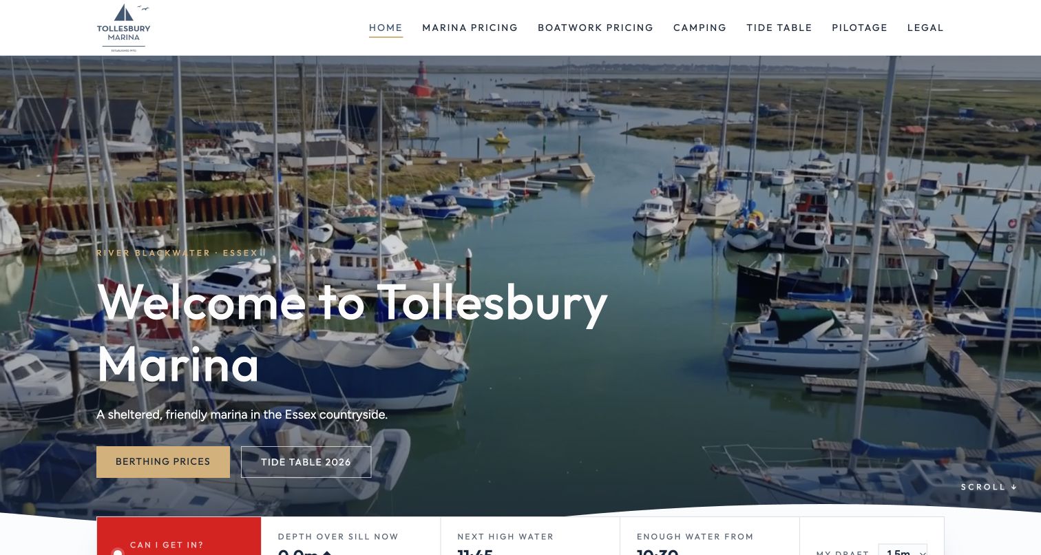
Tollesbury combines a recognizable basin photograph with two unusually useful opening routes: berthing prices and a dated tide table. The navigation also names pilotage and boatwork pricing directly. Below the hero, a draft selector and water-depth panel address the question a skipper actually needs answered, while an adjacent warning explains that modelled estimates are not navigation information. The page continues with service cards, a visitor-price estimator, office hours and separate camping details. Its strongest quality is this connection between an appealing place and specific planning tasks. The initial snapshot still showed loading text for some conditions, and the long page asks visitors to distinguish marina, camping and club offers.
What you can learn
Bring access constraints and cost explanations close to the first decision. An estimate can help frame an enquiry, but label its limits, preserve official pilotage guidance and make clear that a request still needs staff confirmation before arrival.
Pros
Pricing and tide-table routes are explicit in the opening screen.
The estimator explains assumptions and separates optional electricity.
Cons & considerations
Modelled conditions require conspicuous caveats and dependable loading states.
Camping and membership content lengthen the core berthing journey.
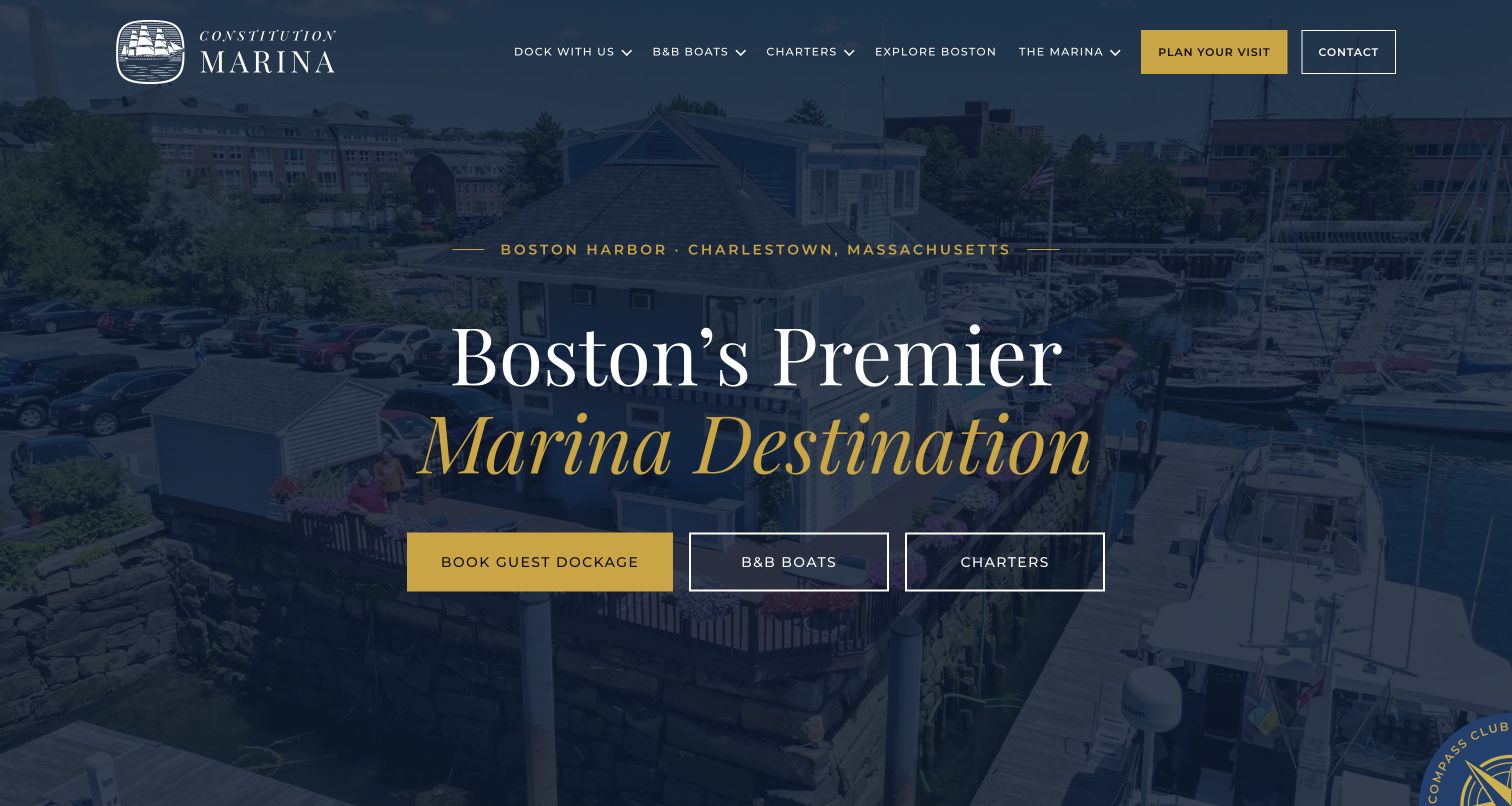
Constitution Marina treats visiting with a boat, staying on a boat and chartering one as different intentions. Three buttons across the navy-and-gold hero establish those choices, then the next row restates them in plain language. This is more useful than sending every visitor into a generic booking funnel. The homepage connects the waterfront location to nearby Boston landmarks before introducing accommodation, amenities and guest stories. Dated recognition is presented as historical material rather than an unexplained badge. The page is visually confident, although a very large photograph postpones the practical details. Berthing rates and arrival information require another page, so the introductory promises need those supporting routes to remain reliable.
What you can learn
Organize a mixed waterfront business around the visitor's actual plan. Give boat owners, overnight guests and charter customers separate destinations, then repeat those distinctions consistently in navigation, explanatory cards and booking links so that similarly named services do not blur together.
Pros
Guest dockage, floating accommodation and charters have separate entry points.
Place-specific copy explains the relationship to nearby city attractions.
Cons & considerations
The tall hero pushes detailed visiting information below the opening view.
Prices and seasonal arrangements depend on linked supporting pages.
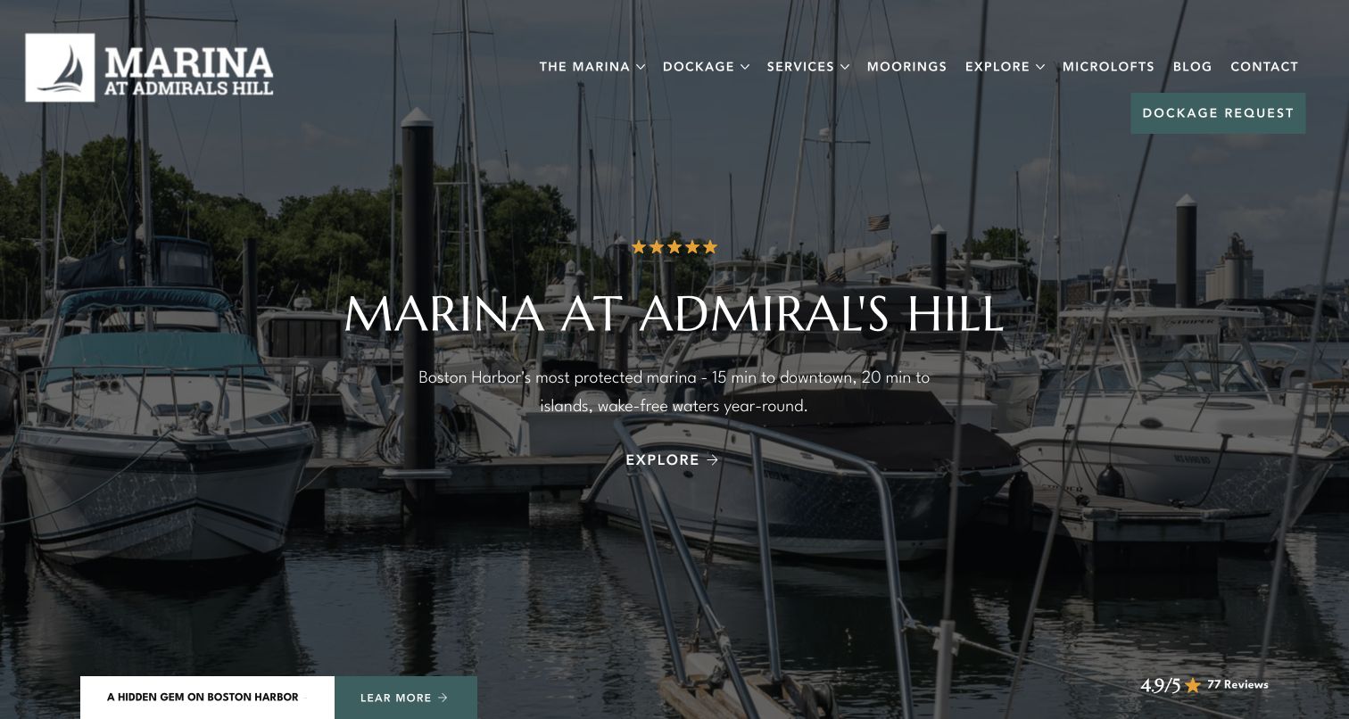
Marina at Admiral's Hill uses a photograph taken between moored boats to make its harbor setting tangible. A teal Dockage Request button remains distinct from the broad Explore action in the hero. Farther down, the page divides slips, winter storage and documents into separate cards, followed by practical amenity information. The final request section explains why vessel details are needed and that staff review the application, a helpful distinction from instant booking. Some of the strongest opening claims are promotional rather than independently demonstrated. Navigation also covers moorings, microlofts and other offerings, and several generic card labels make visitors work harder to predict the destination before clicking.
What you can learn
Explain the purpose of a berth enquiry before collecting boat details. Keep seasonal storage, transient visits and permanent dockage visibly separate, and replace generic exploration labels with the task or information available at the destination wherever the page offers several similar choices.
Pros
The dockage enquiry has a recognizable persistent header action.
The request explanation sets expectations about manual staff review.
Cons & considerations
Broad protection and travel-time claims need appropriate supporting context.
Generic card links and numerous offerings dilute the marina decision path.
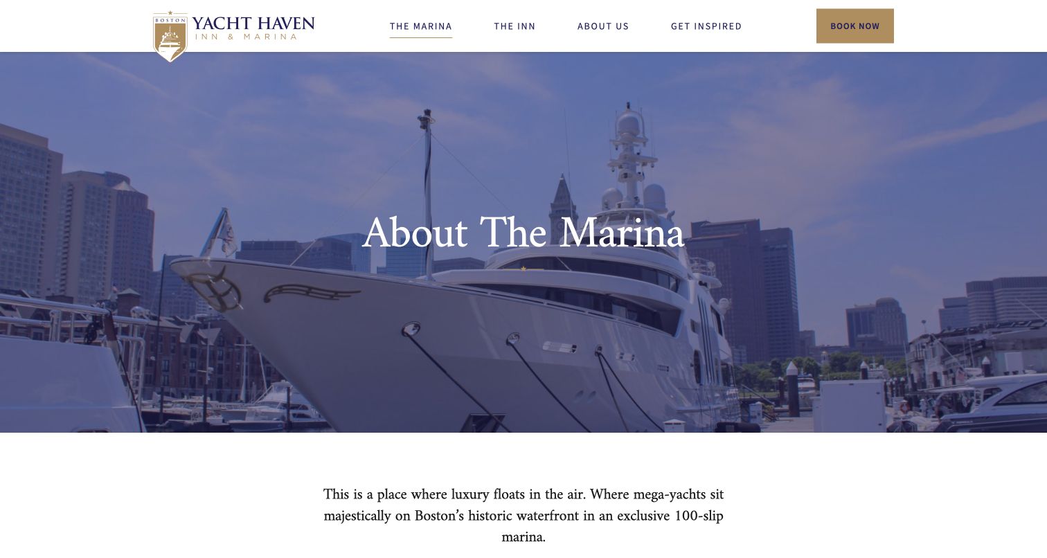
Boston Yacht Haven separates The Marina and The Inn in its main navigation, an important distinction for a property selling both berths and rooms. The marina page pairs yacht photography with location, radio contact and vessel specifications. Power arrangements, amenities and services are grouped instead of being scattered through promotional paragraphs. A dedicated rates link follows this operational material. Accessibility information also distinguishes the inn's penthouse from other rooms rather than making an unqualified blanket claim. The shared Book Now label is less precise than the surrounding navigation, and the long introduction means a skipper must scroll before reaching technical fit and contact details.
What you can learn
Give marina and hotel guests separate information structures even when they share one brand. Pair the destination story with vessel dimensions, utility options and clear rate links, and describe accessibility by actual facility rather than treating the whole property as one identical experience.
Pros
Vessel specifications and power options form an identifiable information group.
Marina and inn navigation keeps the two accommodation types distinct.
Cons & considerations
The shared booking label does not immediately identify the booking type.
A large introductory image delays the operational information below it.
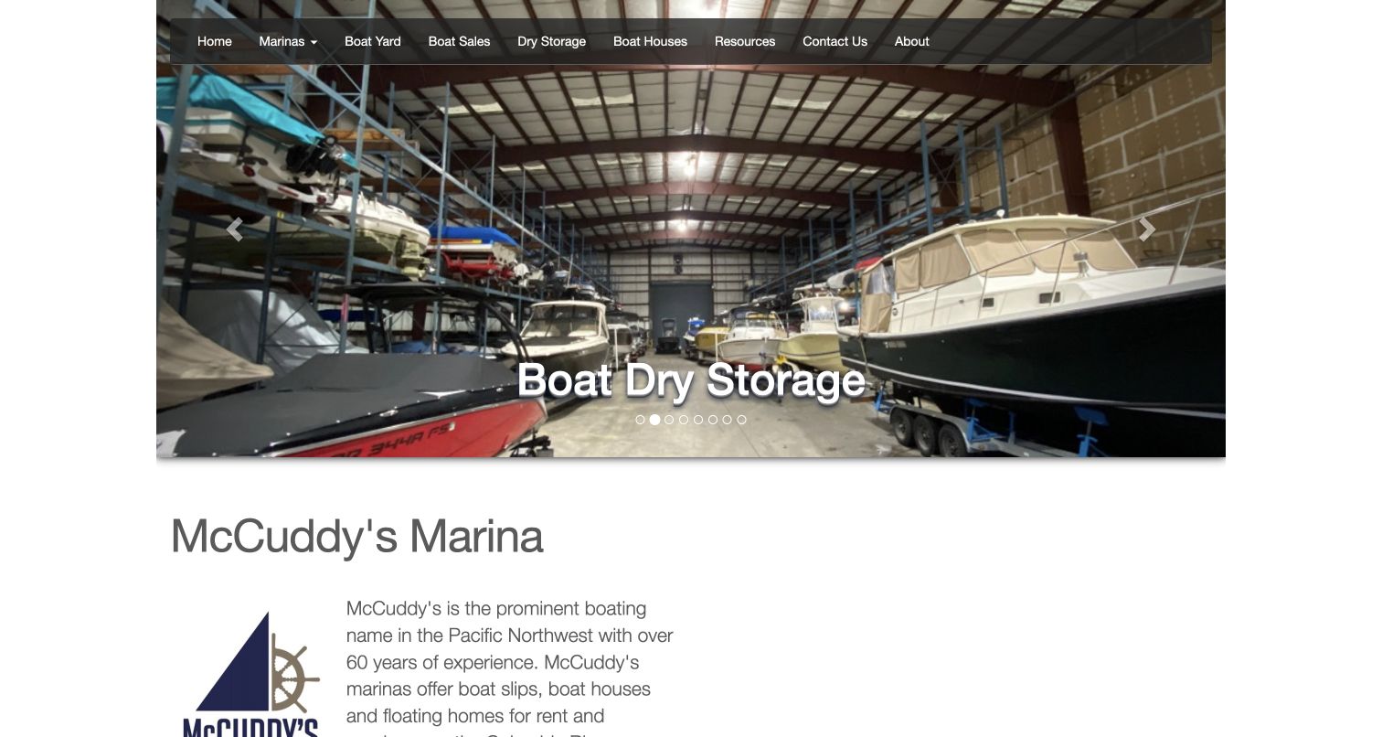
McCuddy's opening carousel uses working facilities rather than only scenic water: the retained capture shows boats stored inside a large covered structure. The horizontal navigation names boatyard work, sales, dry storage and boat houses, immediately exposing the breadth of the business. Below it, a short company introduction and separate slips and sales sections connect those services to telephone contacts. Its presentation is less polished than newer destination sites, with a constrained content width and a rotating headline. Some detail links are generic, and the many service categories still require location-specific investigation before a customer can assess availability.
What you can learn
Photograph the actual facility that makes a service different, then label it in everyday language. A regional operator benefits from a simple service directory, but each route should eventually identify the relevant location, contact and availability process rather than ending in another broad overview.
Pros
Facility photography makes covered storage and boatyard work concrete.
Service categories are named directly in the main navigation.
Cons & considerations
The rotating opening can emphasize a different service on each visit.
Generic detail buttons offer less context than task-specific link labels.
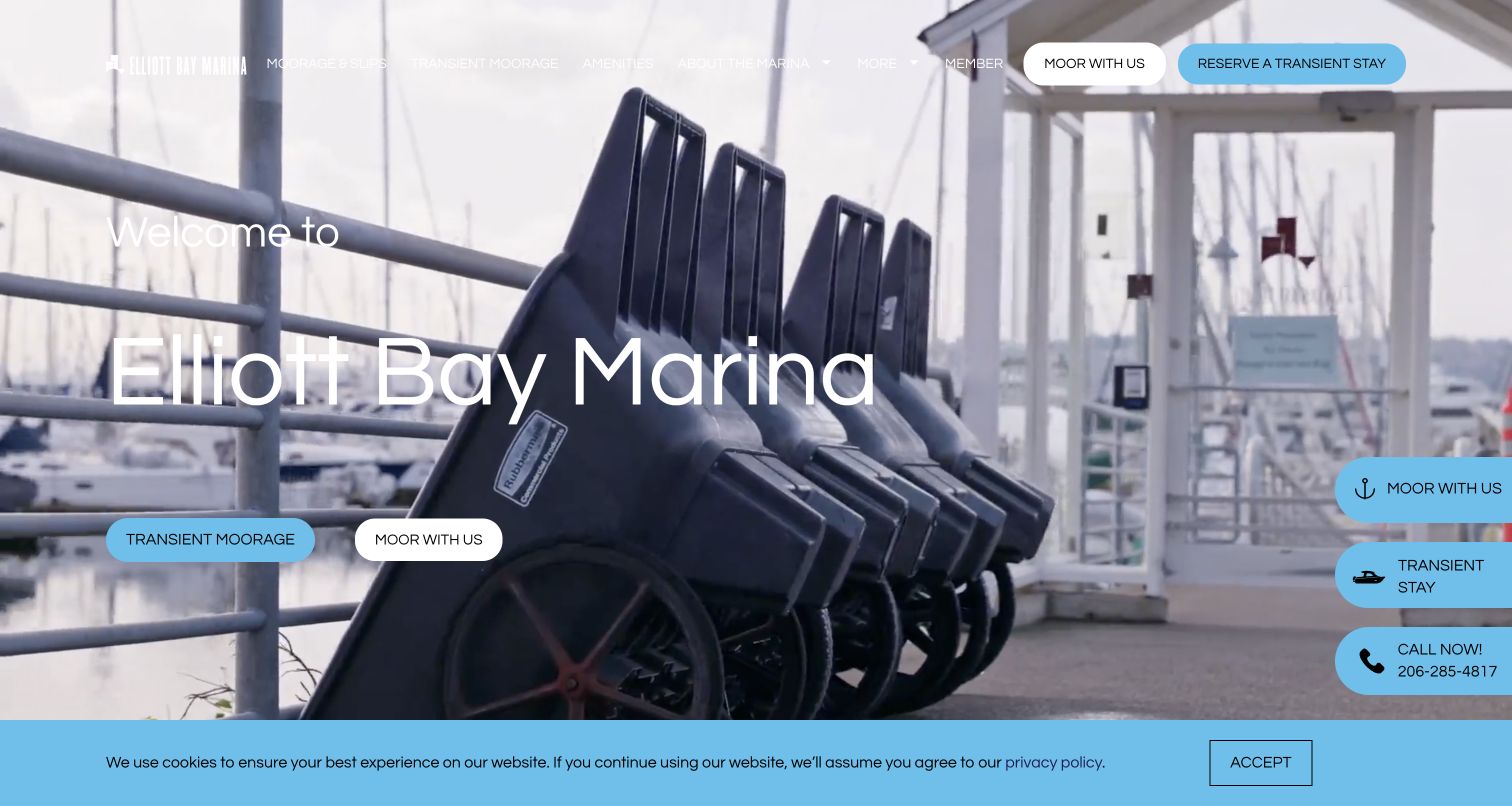
Elliott Bay Marina places permanent moorage and transient stays in separate rounded buttons, repeating them in the header and at the side of the page. The capture shows dockside carts and railings, a useful view of everyday marina infrastructure rather than an anonymous skyline. Below the introductory copy, an arrival section explicitly separates Here by Water from Here by Land. Those routes acknowledge that customers and their guests reach a marina in different ways. The repeated floating actions, however, compete with the hero buttons, while white navigation over the bright image loses clarity in parts of the captured view.
What you can learn
Support both approaches to a waterfront property: arriving aboard a vessel and reaching it from shore. Keep those instructions easy to find, and choose one consistent place for primary booking actions so repeated buttons do not crowd the practical information they are meant to support.
Pros
Transient and longer-term moorage are visibly different actions.
Arrival guidance recognizes both water access and vehicle access.
Cons & considerations
Repeated floating calls to action make the opening feel crowded.
Light navigation text has uneven contrast against the captured background.
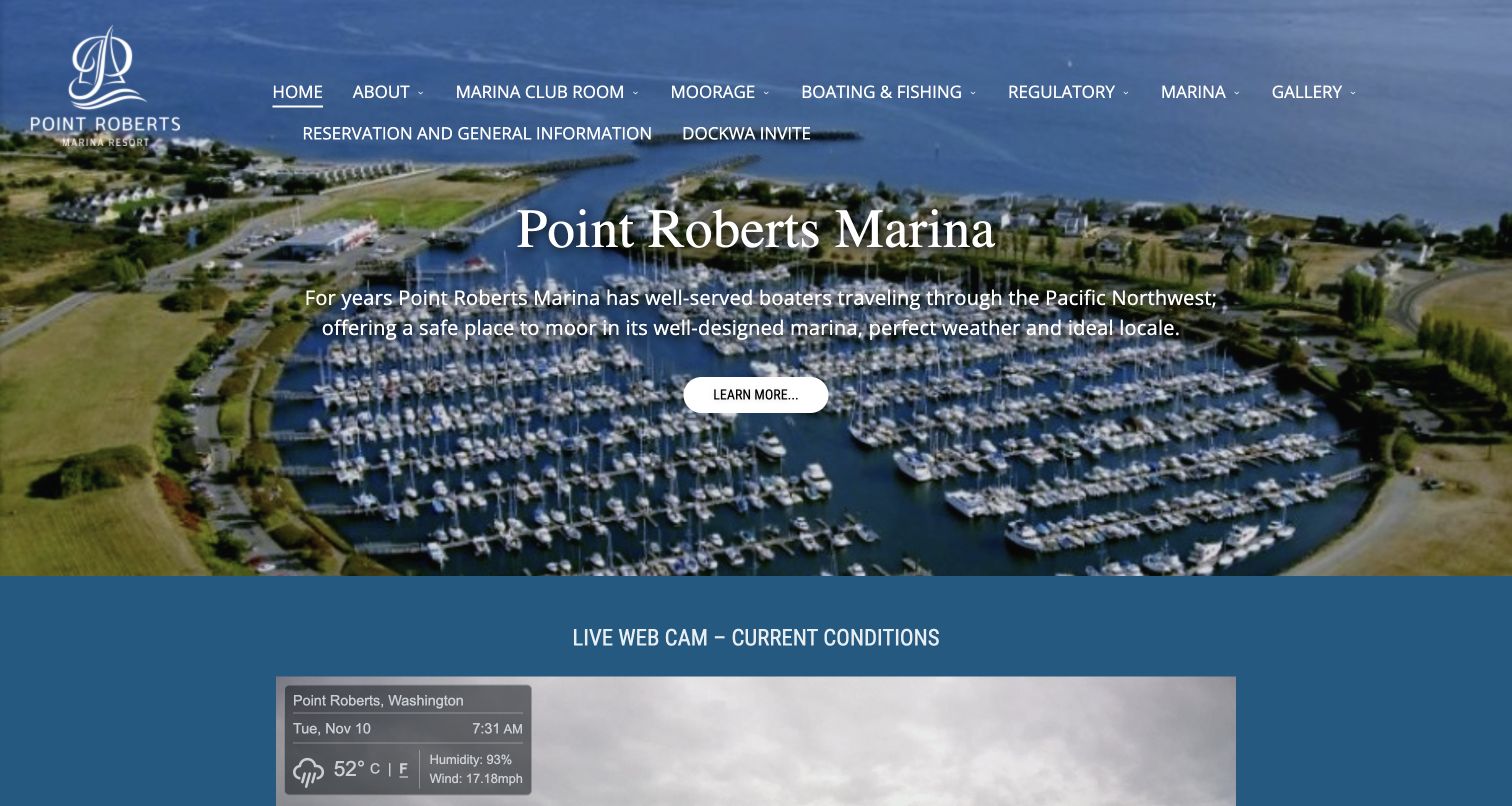
Point Roberts puts its basin aerial above a live-camera section, then continues with fuel prices, moorage links, tide charts and several sets of operating hours. The navigation includes a distinct regulatory category, a useful acknowledgement of the location's boating context. The captured weather panel conveys the time-sensitive nature of these details, while the saved document also reports an offline camera state. That combination is a reminder that live widgets need useful fallback information. The two-row navigation is crowded, and repeated large headings make the page feel more like a noticeboard than a carefully ordered arrival guide.
What you can learn
Treat frequently changing marina information as maintained operational content. Show when conditions were observed, provide a useful fallback when a camera is unavailable, and separate hours, rates and official guidance so visitors do not mistake an attractive live panel for complete arrival instructions.
Pros
Fuel, tide and opening-hour information gives returning visitors practical value.
Regulatory guidance has a visible category in the main navigation.
Cons & considerations
The dense two-row menu makes the most important task harder to isolate.
Camera availability varies and needs clear alternatives when the feed fails.
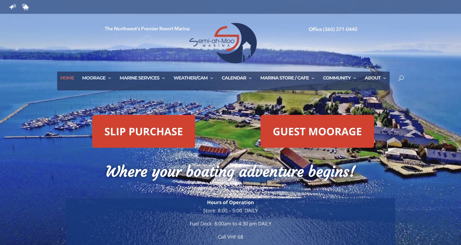
Semiahmoo makes its principal distinction impossible to miss: Slip Purchase and Guest Moorage occupy two large orange buttons over the harbor photograph. The page keeps the office number near the logo and places store, fuel and office hours directly in the opening sequence. This is a practical hierarchy for a property serving owners and visitors with different commitments. The busy photograph sits behind several layers of text, which makes the composition less calm. The main buttons also use similar visual weight, so someone seeking an ordinary berth rental may need to investigate the moorage menu.
What you can learn
Expose fundamentally different commercial arrangements before visitors enter an enquiry. Ownership and a temporary stay should never look interchangeable. Support that split with clear operating hours and a facility map, while keeping the photographic backdrop quiet enough that the labels remain effortless to read.
Pros
Slip purchase and guest moorage are separated in unusually prominent buttons.
Office and fuel information appears early instead of only in the footer.
Cons & considerations
Multiple text layers compete with the detailed harbor background.
The headline choices leave other moorage arrangements to secondary navigation.
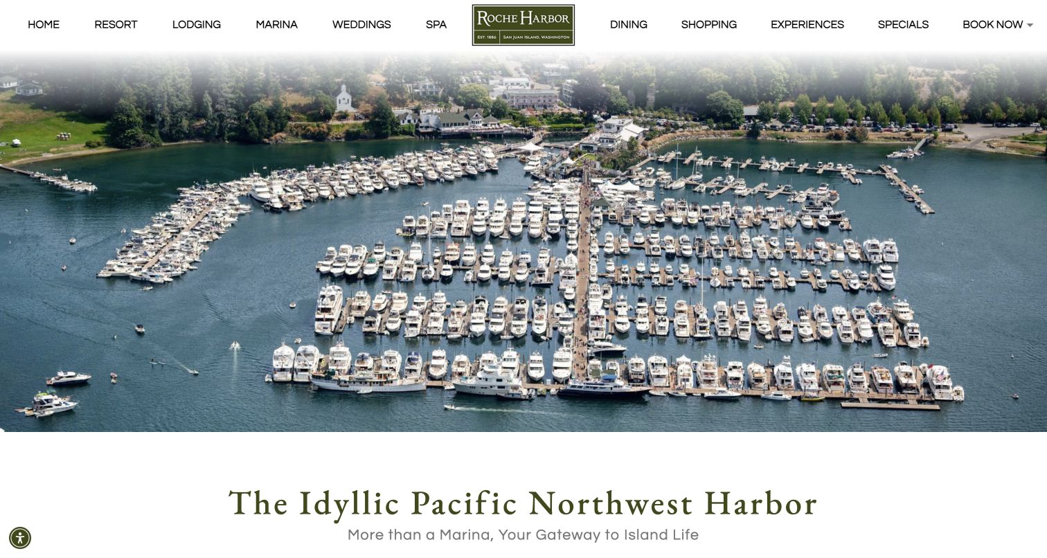
Roche Harbor's marina page opens with an aerial that clearly shows the relationship between docks and the resort on shore. Amenities, vessel capacity and utility options appear in recognizable groups, followed by team information and policies. Particularly useful is the explanation that staff review a reservation request and may approve, waitlist or decline it. That wording distinguishes an enquiry from a confirmed berth. The page is extensive, however, and resort-wide navigation competes with marina tasks. Seasonal service descriptions and special-event limitations require careful maintenance because they sit alongside more permanent facility information.
What you can learn
A destination marina can sell the wider experience while remaining precise about the booking process. State what a request means, explain how availability is decided, and distinguish seasonal services from year-round facilities so a compelling resort story does not become an accidental promise of a berth.
Pros
The aerial photograph explains the marina's physical relationship to the resort.
Reservation copy clearly distinguishes approval, waitlisting and rejection.
Cons & considerations
The long page mixes durable facility facts with seasonal arrangements.
Resort-wide navigation gives marina visitors several unrelated choices.
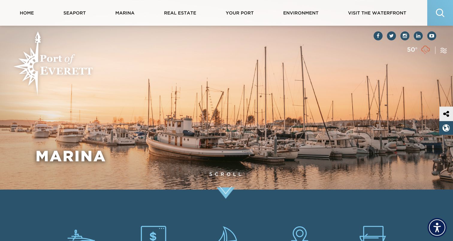
The Port of Everett gives its marina a distinct landing page inside a much broader organization. A warm harbor photograph and large Marina title establish the section, then a row of illustrated links introduces the practical choices below. Permanent moorage, guest moorage, boatyard services, facilities and the boat launch each receive separate headings. That structure is valuable because a berth holder and a trailered-boat visitor are seeking different information. The tall opening photograph is attractive but delays the choices, and the shared port branding is more prominent than the immediate next step.
What you can learn
Create a focused service hub when recreational marina information lives inside a larger public organization. Group tasks by the user's purpose, preserve a clear local contact route and avoid making boaters learn the port's internal department structure before finding a berth, launch or maintenance service.
Pros
Permanent moorage, guest visits and launch services have distinct sections.
The harbor photograph gives the marina a recognizable sense of place.
Cons & considerations
Organization-wide navigation adds choices unrelated to recreational boating.
The large opening image postpones the most useful service links.
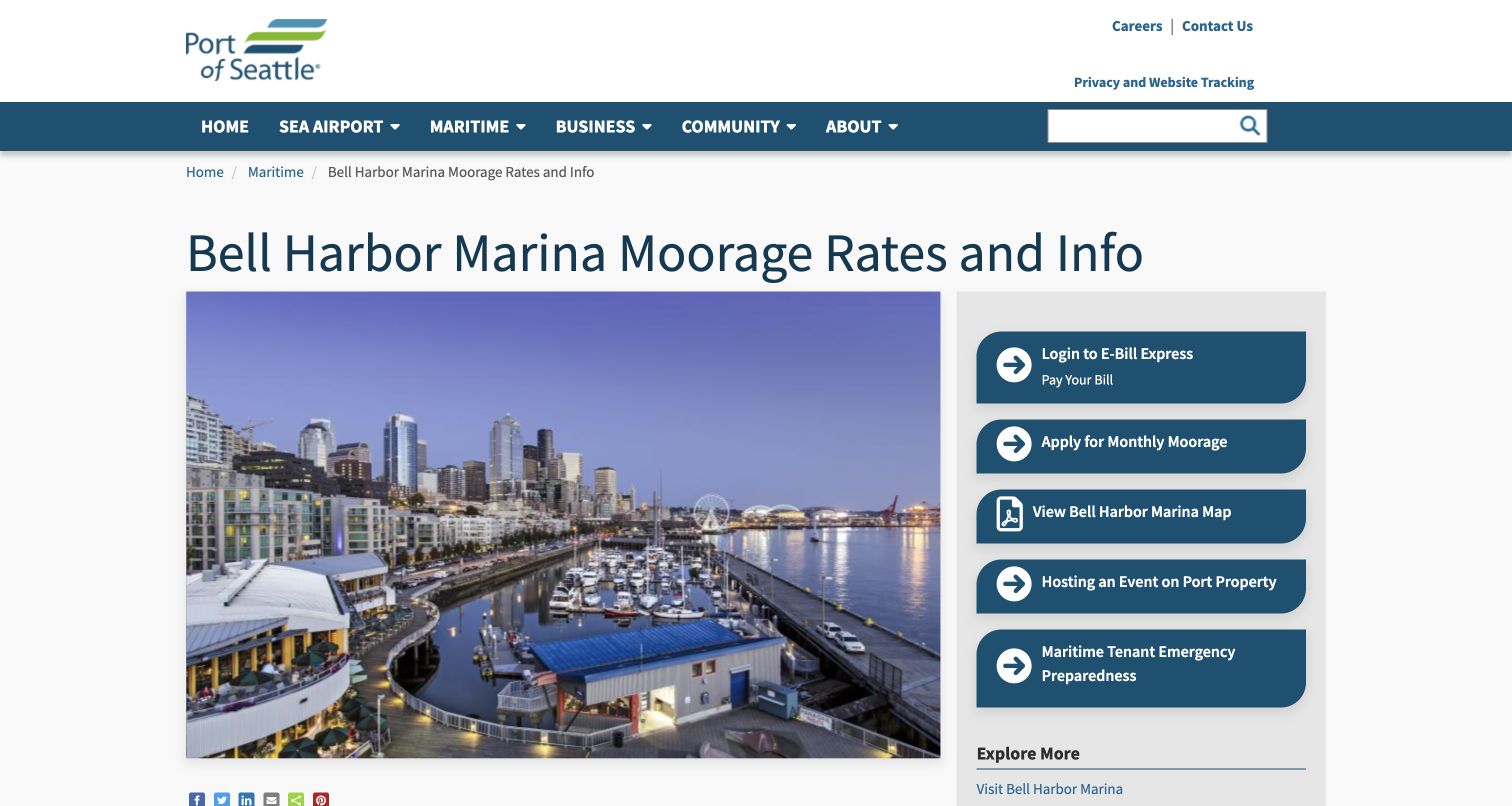
Bell Harbor's page uses a conventional public-agency layout: a descriptive heading, waterfront photograph, main article and right-hand action column. The sidebar connects visitors to monthly moorage, a marina map, billing and emergency information without burying those tasks in the text. In the article, guest rates, power, monthly arrangements, superyachts and charter vessels are separated by headings. The same layout also has drawbacks: the large photograph delays the first rates section, and the port-wide navigation includes airport and business topics. Payment, applications and visitor planning share the sidebar, so its ordering matters for readers who are not existing tenants.
What you can learn
Use an action sidebar to keep frequently needed marina documents close to detailed policy content. Distinguish guest visits, recurring moorage and commercial operations, and make the status of each destination clear so a first-time visitor does not confuse a tenant payment portal with a reservation request.
Pros
Guest, monthly, power and charter information have separate descriptive headings.
A persistent adjacent column exposes maps and practical tenant resources.
Cons & considerations
The initial photograph pushes rate details farther down the page.
Port-wide navigation and mixed sidebar audiences add unnecessary choices.
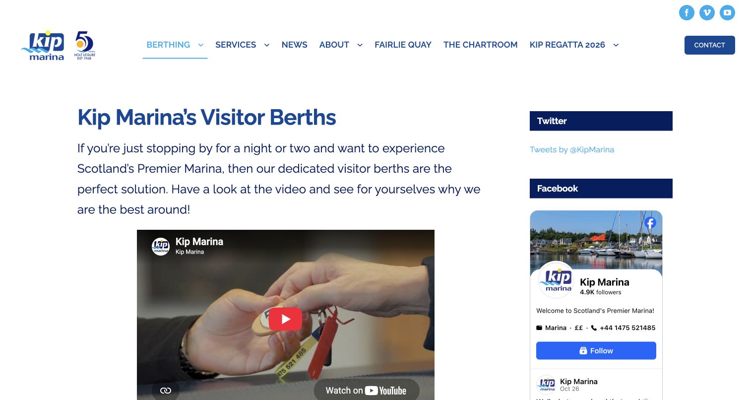
Kip Marina's visitor page begins directly with the subject rather than a full-screen image. Large blue type and generous spacing make the short introduction easy to find. An embedded video follows, while the text explains the position of visitor berths and availability of shore power. Much of the first screen is allocated to video and social feeds. The right-hand Twitter and Facebook blocks compete with the actual visitor information, and the brief body does not itself provide a detailed arrival sequence or rate comparison. Those questions require continuing through the wider website or contacting the marina.
What you can learn
A visitor page can be short when its purpose is clear, but it should still answer the practical next questions. Place prices, access and enquiry routes beside any video, and keep social content secondary so essential information remains useful even when external embeds fail to load.
Pros
The page title identifies visitor berths immediately and without decorative ambiguity.
The copy mentions berth position and shore-power availability in ordinary language.
Cons & considerations
Social embeds occupy substantial space beside a comparatively short article.
Detailed prices and arrival steps are not assembled on this page.
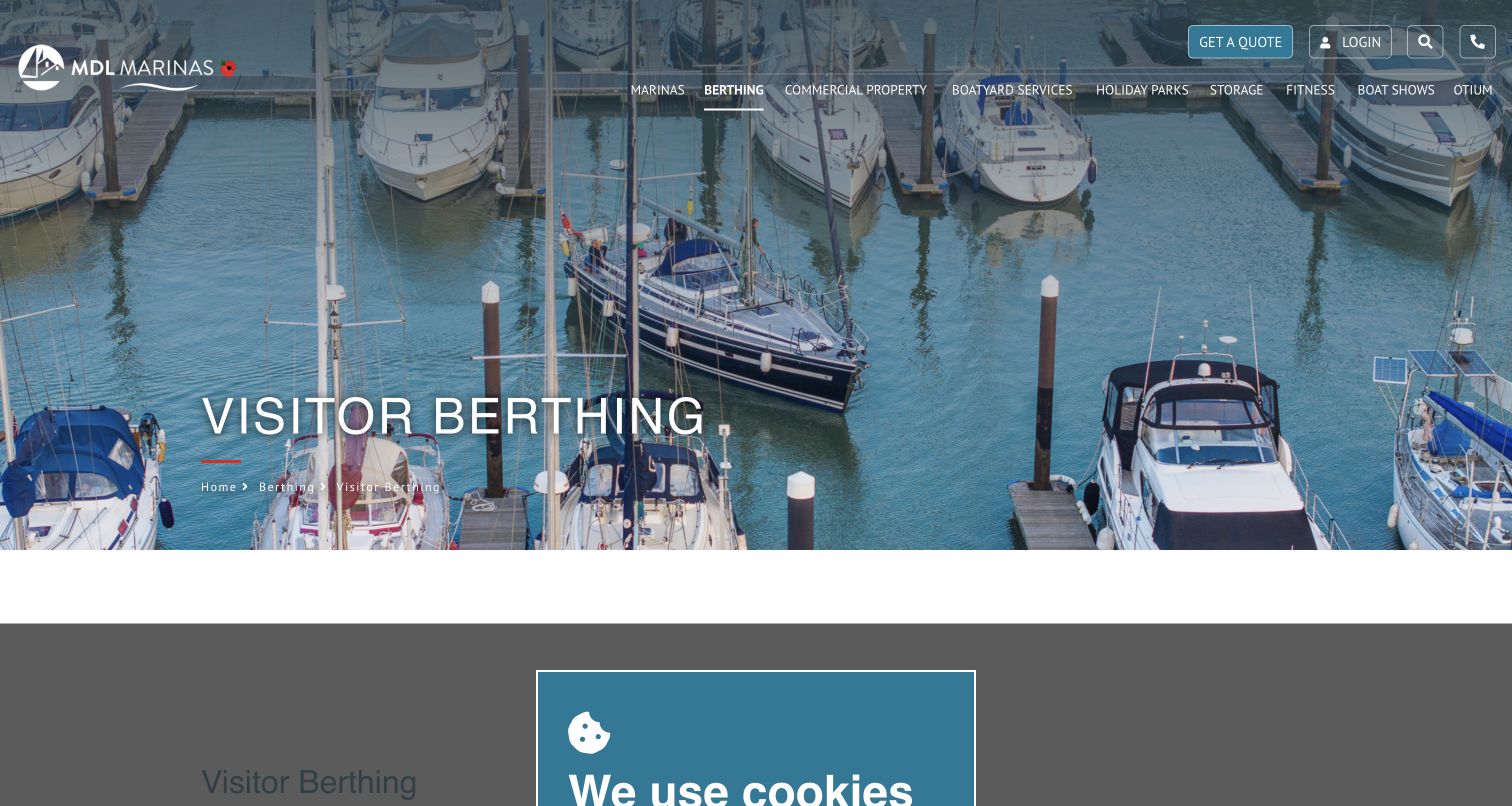
MDL's visitor page uses an aerial of pontoons and boats, a clear Visitor Berthing heading and a breadcrumb to establish its place within the network. The body introduces facilities and cruising destinations, then separates online visitor booking, monthly berthing, rewards and cruising bundles. This makes the offer broader than a single booking button, while retaining a dedicated short-stay entry point. It also lengthens a page intended for visitors and brings loyalty terminology into an otherwise straightforward task. The retained capture includes the site's cookie panel, which obstructs the beginning of the article; the review preserves that real initial experience rather than presenting a cleaned-up reconstruction.
What you can learn
Explain stay duration before introducing membership or reward products. A network can provide shared orientation, but visitors still need to reach the exact marina's availability and conditions. Keep promotional bundles subordinate to that location-specific decision and make consent controls avoid obscuring essential introductory information.
Pros
Short-stay, monthly and annual arrangements are described as different products.
The breadcrumb and page heading provide clear network-level orientation.
Cons & considerations
Rewards and annual-package content lengthen the visitor-focused journey.
The initial cookie panel obstructs part of the reviewed article.
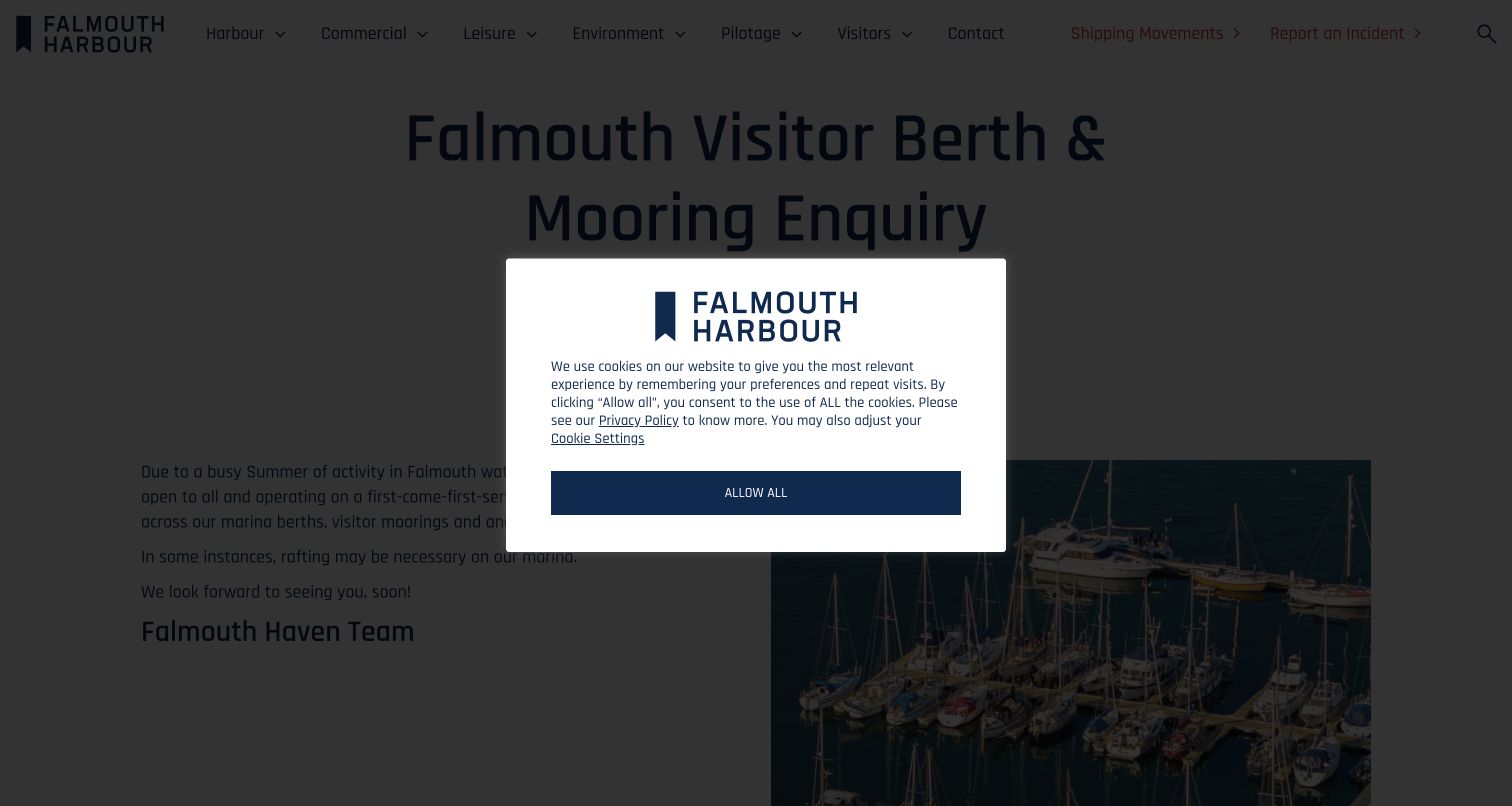
Falmouth Harbour's enquiry page places an unusually explicit operational message beneath its large heading: visitors are being handled on a first-come-first-served basis across berths, moorings and anchorage. That is valuable expectation-setting, because the page title alone could suggest an advance booking form. The two-column content pairs the short explanation with a marina photograph, while the main navigation keeps visitors, pilotage and shipping information distinct. The saved capture includes a centered consent dialog obscuring much of that message. The notice also refers to a busy summer without a conspicuous update date, making its ongoing applicability harder to judge from a later visit.
What you can learn
When reservation arrangements change, state the operational reality prominently and revise the page title and surrounding actions to match. Date seasonal notices, explain any practical implications such as rafting, and ensure consent interfaces do not hide the information visitors need before deciding whether to make contact.
Pros
The page explicitly distinguishes first-come arrangements from advance confirmation.
The short notice identifies rafting as a possible part of the visit.
Cons & considerations
A centered consent dialog obscures the core message in the initial capture.
Seasonal wording lacks a prominent freshness cue for later visitors.
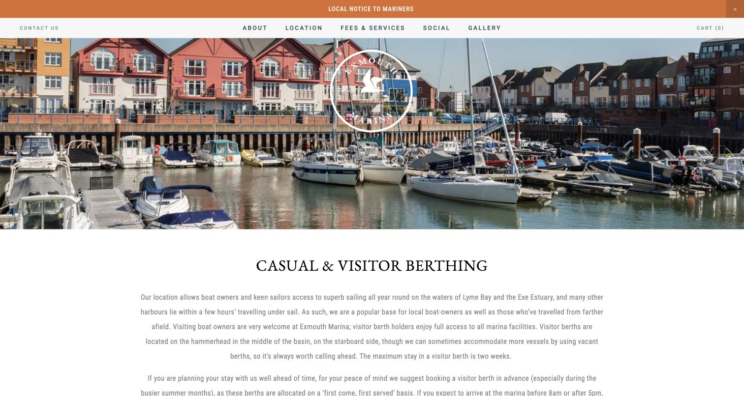
Exmouth's visitor page combines a colorful basin photograph with a plain Casual and Visitor Berthing heading. A prominent notice-to-mariners strip remains above the main navigation. The article explains where visitors are normally accommodated, the maximum stay and the value of calling ahead, then separates summer, winter and short-stay prices. Its form introduction is particularly useful: submitting details leads to staff contact and payment before confirmation. The prose is lengthy and centered, which makes practical details harder to scan than a short labeled list. The retained cart indicator also belongs to the broader site and does not clarify the separate staff-confirmed berth process.
What you can learn
Connect a berth enquiry to its actual confirmation process. Explain what happens after submission, which vessel dimensions are required and whether rafting may occur. Put arrival instructions and seasonal prices into scannable groups so a visitor can prepare without reading several long introductory paragraphs.
Pros
The form introduction explains staff follow-up and confirmation after submission.
Seasonal and short-stay arrangements are presented as separate categories.
Cons & considerations
Long centered paragraphs make operational details slower to locate.
The broader site's cart control adds ambiguity to a manually confirmed service.
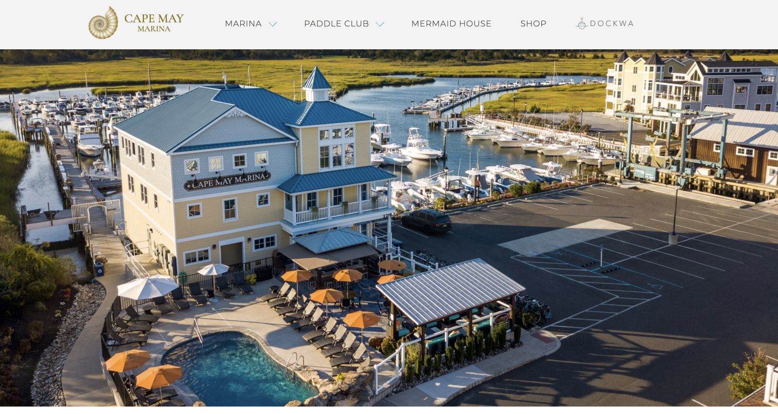
Cape May Marina opens with an aerial that shows the docks, buildings and pool as one connected waterfront property. A distinctive shell-shaped logo anchors the white header, whose navigation names services, the paddle club and contact information. The page then introduces slip accommodation, fuel and boatyard capabilities, with a recognizable booking-platform route for visitors. Its opening relies heavily on photography, however: there is little immediate explanation of the next step or the type of berth available. The combined marina and club presentation also asks users to distinguish boating requirements from optional leisure offerings before they can plan a practical visit.
What you can learn
Use an aerial when the relationship between docks and shore facilities is part of the proposition. Pair it with a short statement of berth types and a precise enquiry action, then separate maintenance, visitor accommodation and recreational memberships so the image supports a decision rather than replacing one.
Pros
The aerial explains the physical connection between docks and shore facilities.
Service and contact destinations remain visible in the restrained header.
Cons & considerations
The first screen gives photography more space than practical berth information.
Club and marina offerings need clearer separation for task-focused visitors.
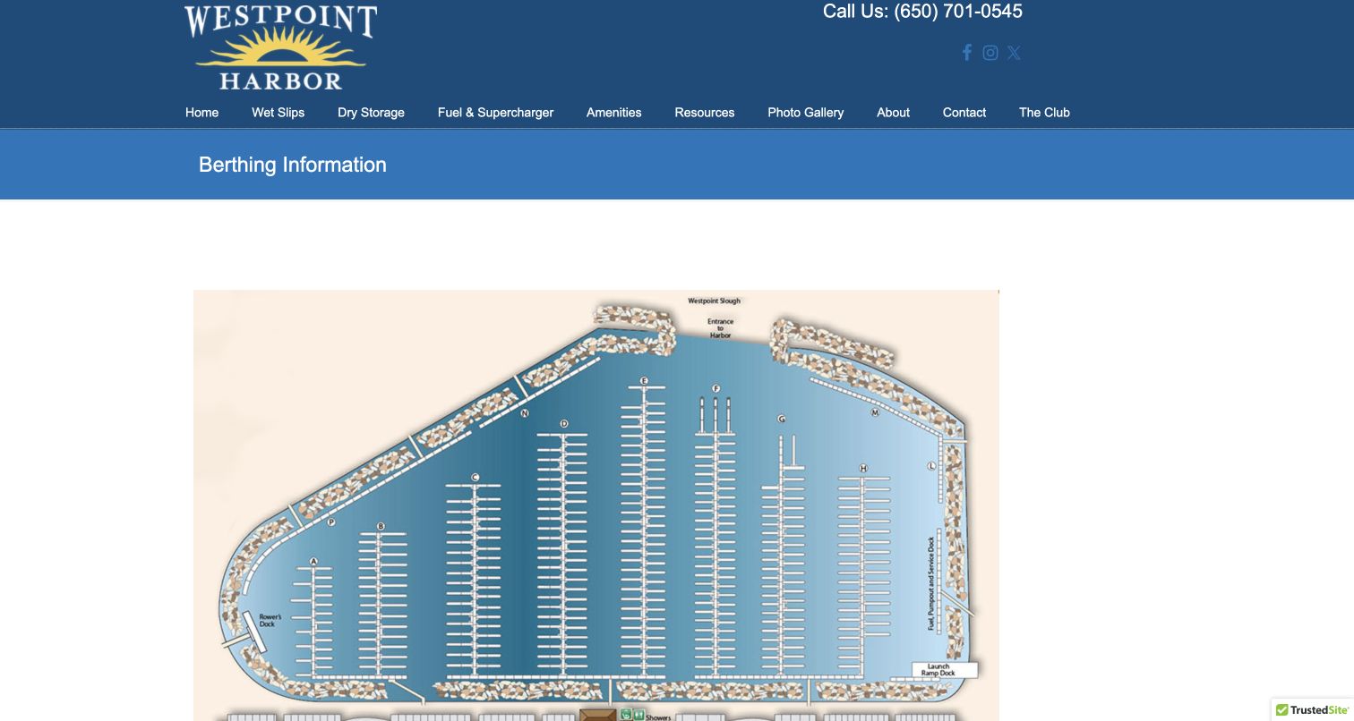
Westpoint Harbor's berthing page foregrounds a large labeled harbor map beneath a straightforward title. That is a strong choice for visitors trying to understand the property's layout rather than simply admire it. The surrounding copy separates guest accommodation from longer-term berthing and links to pricing, harbor rules and the application process. Requirements and the liveaboard waiting-list distinction provide useful context before someone submits details. Some important material remains in linked documents, so the page depends on those files staying current and usable. A static map also benefits from a text explanation for readers who cannot easily interpret its small labels.
What you can learn
Treat a marina map as decision support, not decoration. Explain its important labels in text, distinguish visitor and recurring berth arrangements, and list application prerequisites before the form. Keep document links descriptive and dated so users can tell which rate or rule version they are about to consult.
Pros
The basin map gives concrete spatial context for the berthing discussion.
Guest, long-term and liveaboard arrangements are explicitly distinguished.
Cons & considerations
Key prices and rules require opening supporting documents.
Small map labels need a useful textual alternative for easier interpretation.
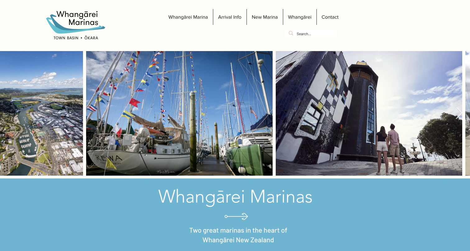
Whangārei Marinas uses a strip of harbor, boat and town photographs to introduce both the waterfront and its surrounding destination. The clear white header sits above a pale-blue title area, giving the page a calmer rhythm than a full-screen promotional slideshow. Visitor berths and berth purchase are distinct routes, while later content introduces locations, arrival information and the developing Okara area. Bridge and tide links acknowledge practical constraints that destination photography cannot explain. New-development information and ownership opportunities can distract a short-stay visitor who needs only an arrival procedure, location and contact route.
What you can learn
Connect the marina to its town while preserving a direct path for arriving boats. Keep visitor stays, ownership and future development separate, and expose bridge, tide and location guidance early. Destination storytelling becomes more helpful when it leads naturally to the constraints of the actual approach and berth.
Pros
The photographic sequence introduces both the harbor and the nearby town.
Visitor accommodation and berth purchase are treated as different intentions.
Cons & considerations
Several locations and development stories lengthen the visitor journey.
Practical arrival details still depend on following supporting information links.
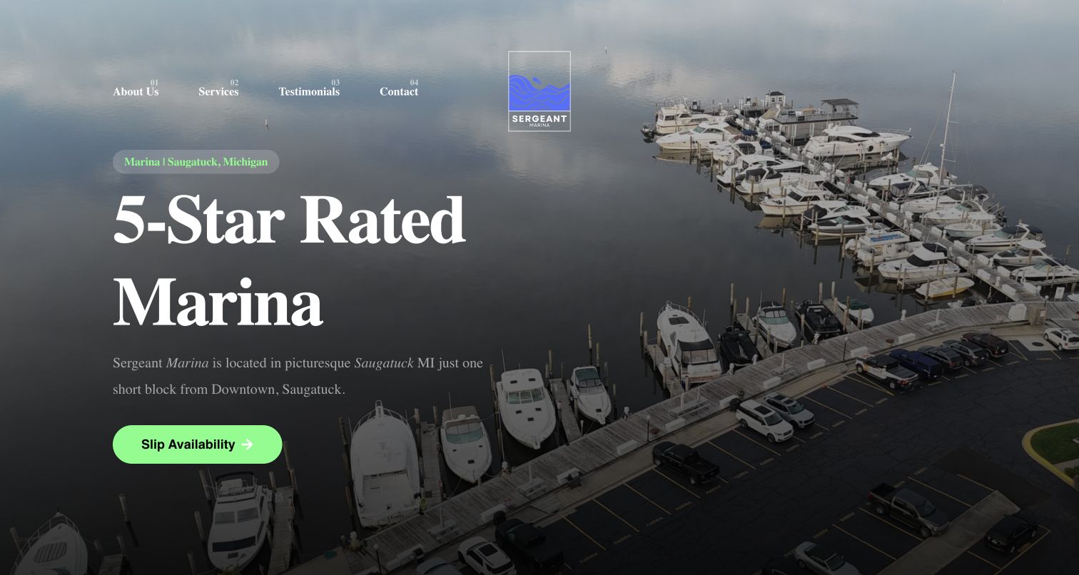
Sergeant Marina leads with an aerial of its Saugatuck setting and a dark overlay that gives the large serif headline a clear stage. The compact numbered navigation and green Slip Availability button create a more distinctive identity than a generic waterfront template. Services, amenities and a telephone contact follow. Its central claim is a five-star rating, however, which should be read as the site's own marketing rather than an independently verified service assessment. The opening is visually memorable but gives relatively little immediate detail about vessel fit, visiting arrangements or the meaning of availability.
What you can learn
A small marina can use a single strong enquiry action effectively when the surrounding text explains what it leads to. Pair a distinctive visual identity with location, berth types and a clear next step, and provide context for rating claims rather than relying on the number alone.
Pros
The slip-availability action has a clear contrasting color and prominent placement.
The local setting is established with both location text and aerial photography.
Cons & considerations
The main rating claim lacks explanatory context in the opening view.
Vessel-fit and visitor-arrival details are not immediately visible beside the action.
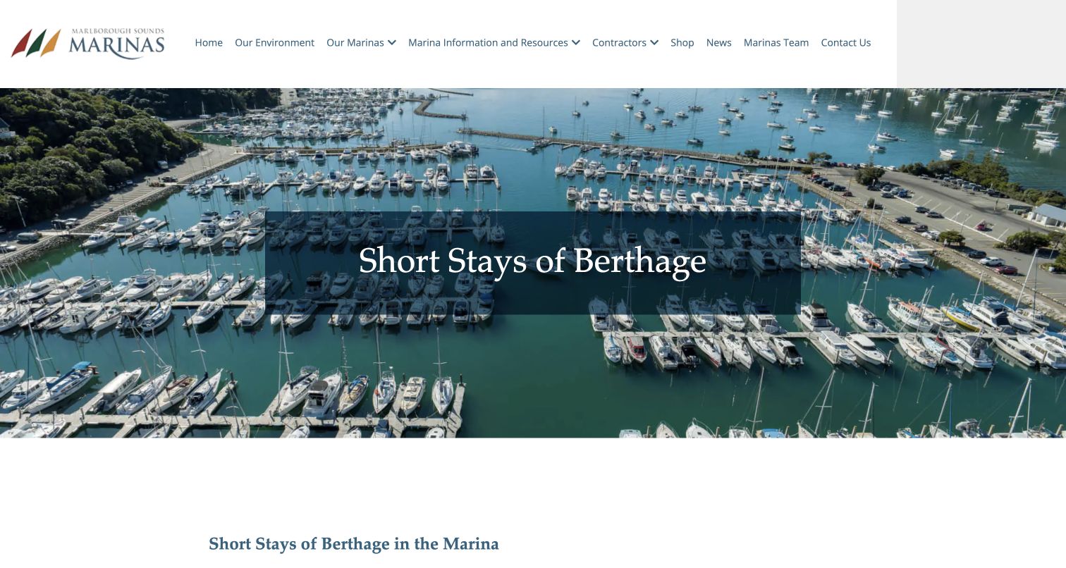
Marlborough Marinas presents short stays as a specific information topic rather than a general destination campaign. A harbor aerial and dark title panel introduce the page, followed by two distinct categories: visitor jetties and berths, and casual berths. The text then differentiates arrangements at Picton, Havelock and Waikawa instead of implying that one rate or stay limit applies everywhere. This location-level qualification is the page's most useful design decision. Some pricing is set out as dense inline text rather than a structured comparison, however, and users must read carefully to keep each harbor's conditions associated with the correct location.
What you can learn
A network should explain where its rules differ rather than hiding variation behind a universal price. Use a location-by-duration table or clearly labeled groups, retain the specific service-center contact and distinguish a casual berth from a short-stop jetty so visitors can compare the correct arrangement.
Pros
Short-stay jetty use and casual berths are introduced as separate options.
Location-specific rules acknowledge genuine differences across the marina network.
Cons & considerations
Inline pricing text is harder to compare than a structured table.
Readers must carefully connect each condition with its relevant harbor.
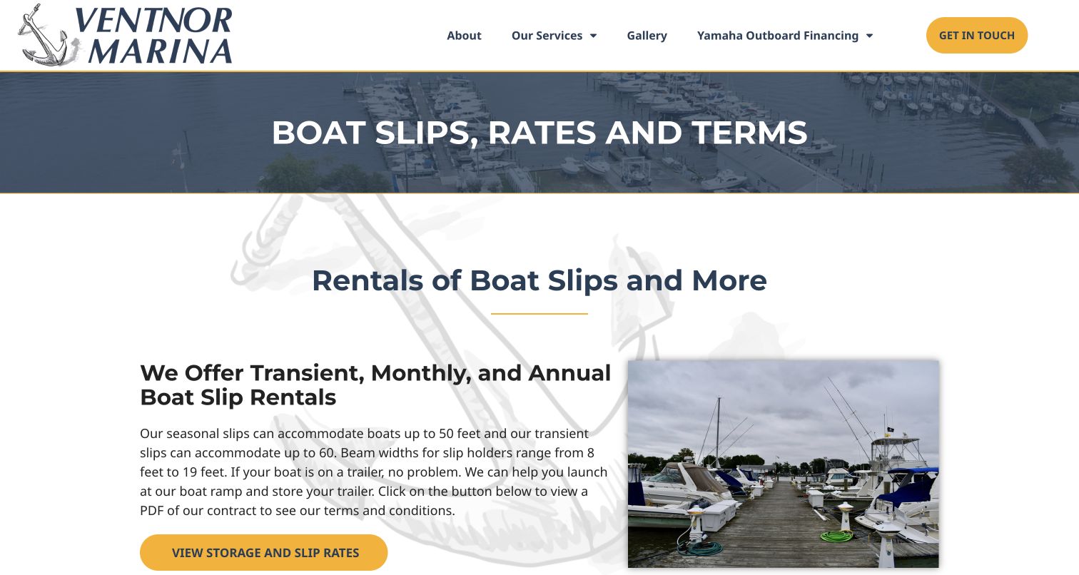
Ventnor's slips page uses a simple two-column layout: explanatory text sits beside a photograph of boats and docks. A large anchor logo, dark title strip and yellow actions establish a consistent visual hierarchy. Transient, monthly and annual rentals are named explicitly. Boat-fit information and a rate-download route give prospective customers a starting point before contacting staff. The main drawback is that the detailed price document opens outside the page, and the linked file is a word-processing document rather than a readily scannable HTML comparison. Several similar headings also repeat the subject without adding much information, making the introduction longer than it needs to be.
What you can learn
Start with the rental periods a marina actually offers, then put the conditions and vessel limits beside each option. Publish essential prices in accessible page content even when a downloadable document is retained, and label the file type so users know what will open before selecting it.
Pros
Transient, monthly and annual slip rentals are identified clearly.
The text-and-photo arrangement keeps the facility visible beside practical information.
Cons & considerations
Detailed rate information depends on a separate word-processing download.
Repeated headings consume space without consistently advancing the visitor's decision.
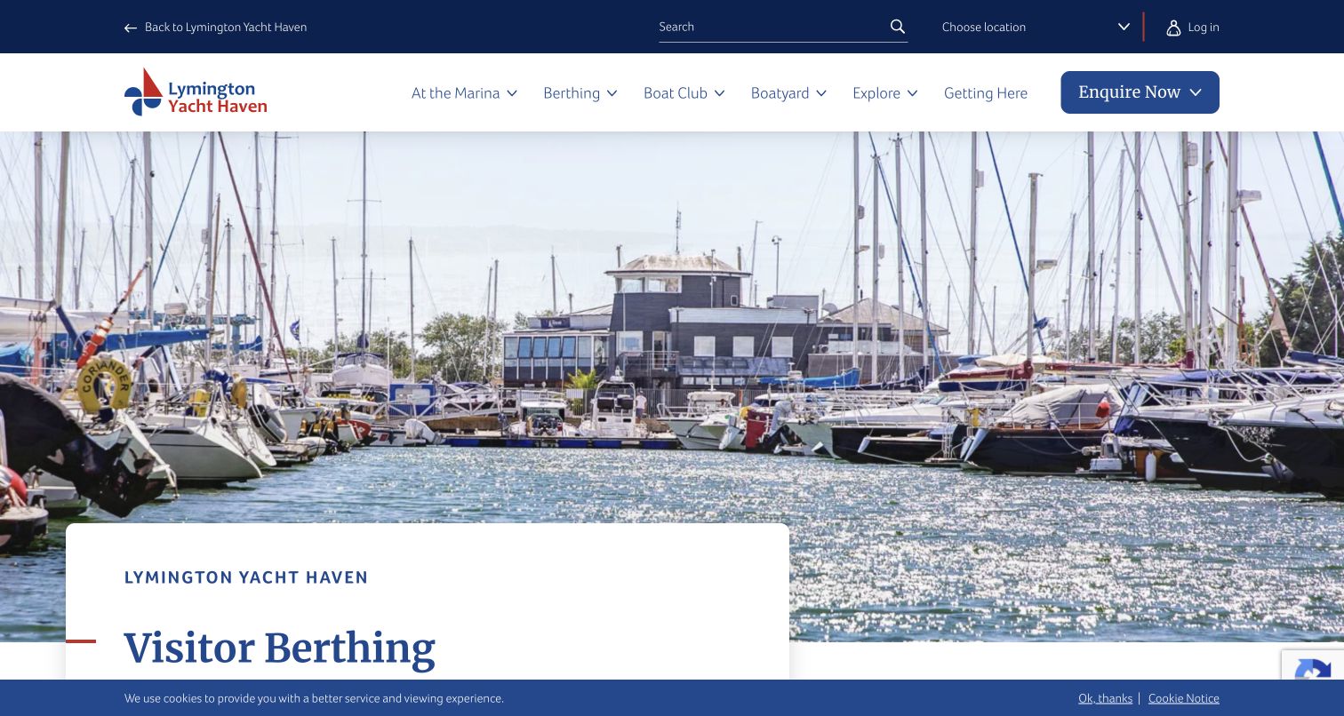
Lymington Yacht Haven's visitor page places its title in a white panel overlapping a photograph taken between moored boats. Facility cards describe water, electricity, washrooms and fuel, followed by visitor rates, group visits and arrival information. A Before You Arrive section supplies the radio-contact route, and the enquiry area includes a What Happens Next explanation. This is a useful progression from interest to preparation. The page is long, though, and repeated promotional claims add weight around the practical material. The small cookie banner remains visible in the capture, documenting the actual initial presentation rather than a reconstructed clean screen.
What you can learn
Build a visitor page around the sequence of decisions: suitability, cost, approach and confirmation. Group amenities for scanning, put arrival contacts near the request form and explain the response process. Keep promotional language concise so the practical route remains clear throughout a substantial page.
Pros
Facilities, visitor arrangements and arrival guidance share one coherent page.
The enquiry section explicitly introduces what happens after a request.
Cons & considerations
The amount of content makes quick scanning depend heavily on headings.
Promotional language repeats around information that could be more concise.
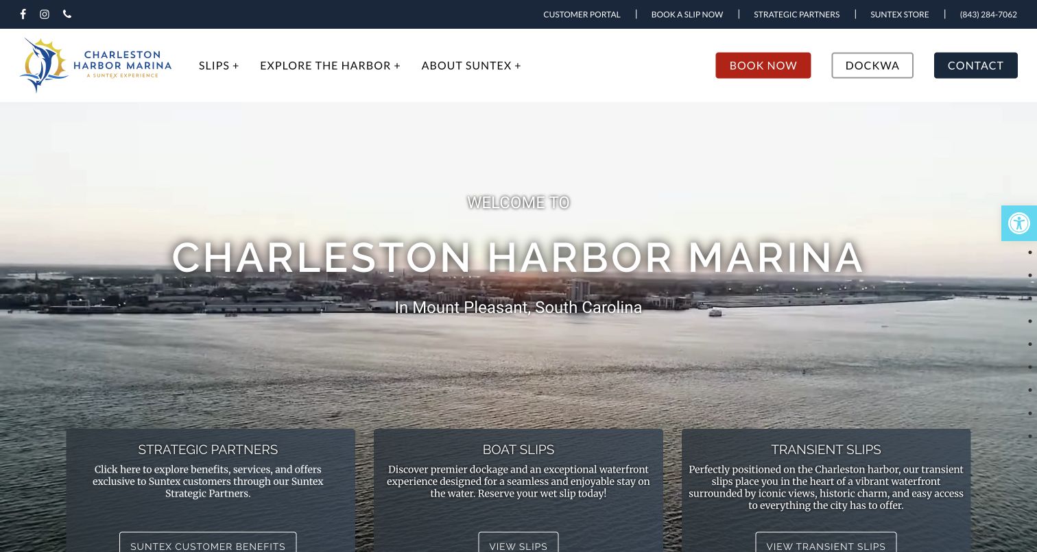
Charleston Harbor Marina combines a broad harbor scene with three introductory cards covering partner benefits, boat slips and transient slips. The location appears beneath the site name; a utility row provides customer and booking routes. The main header offers separate Book Now, Dockwa and Contact buttons, making several methods visible without searching the footer. Their similarity also creates uncertainty: the page does not immediately explain how the two booking actions differ. The hero cards contain substantial text over the photograph, and partner benefits receive the same opening weight as the core slip decisions, which weakens the priority for a visitor simply looking for dockage.
What you can learn
Keep permanent and transient slip decisions distinct, and reserve a separate utility route for existing customers. When several reservation methods are available, explain their relationship rather than presenting near-duplicate buttons. Give optional partner programs less prominence than the primary questions of fit, availability and arrival.
Pros
Boat slips and transient slips have separate descriptive opening cards.
The customer portal is distinct from the main navigation for new visitors.
Cons & considerations
Book Now and Dockwa actions need clearer differentiation.
Partner benefits compete with core marina decisions in the first screen.
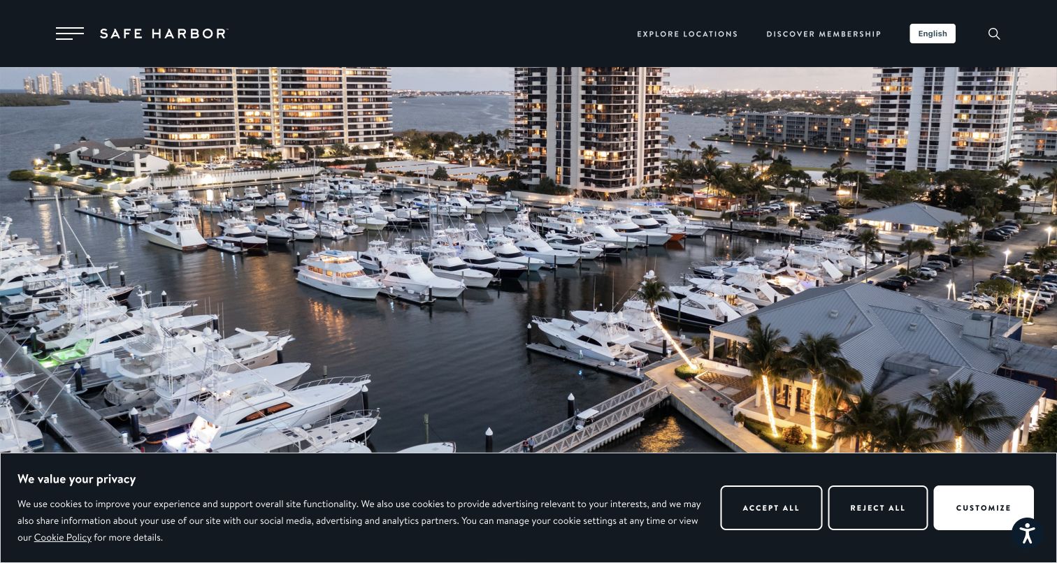
Safe Harbor Old Port Cove leads with an expansive evening aerial, while the dark header keeps network exploration and membership visible. Beneath the image, the property-specific page supplies location, radio information and a set of service tabs. Wet and transient slips are separated, and the berth information lists length, height, beam and draft constraints in labeled fields. Amenities and nearby destinations extend the page into travel planning. The opening capture is heavily occupied by the photo and cookie banner, however, so these useful specifications are initially hidden. Network membership also competes with the more immediate property enquiry.
What you can learn
Use consistent vessel-fit fields across every location in a marina network. Keep their units and scope clear, distinguish transient from recurring arrangements and offer a property-specific enquiry. Destination amenities can support the decision, but they should not displace the dimensions and operating constraints that determine suitability.
Pros
Length, height, beam and draft are presented as distinct labeled constraints.
Property services separate wet slips, transient stays and shore facilities.
Cons & considerations
The large image and consent banner delay access to technical information.
Network membership messaging competes with the individual marina's enquiry route.
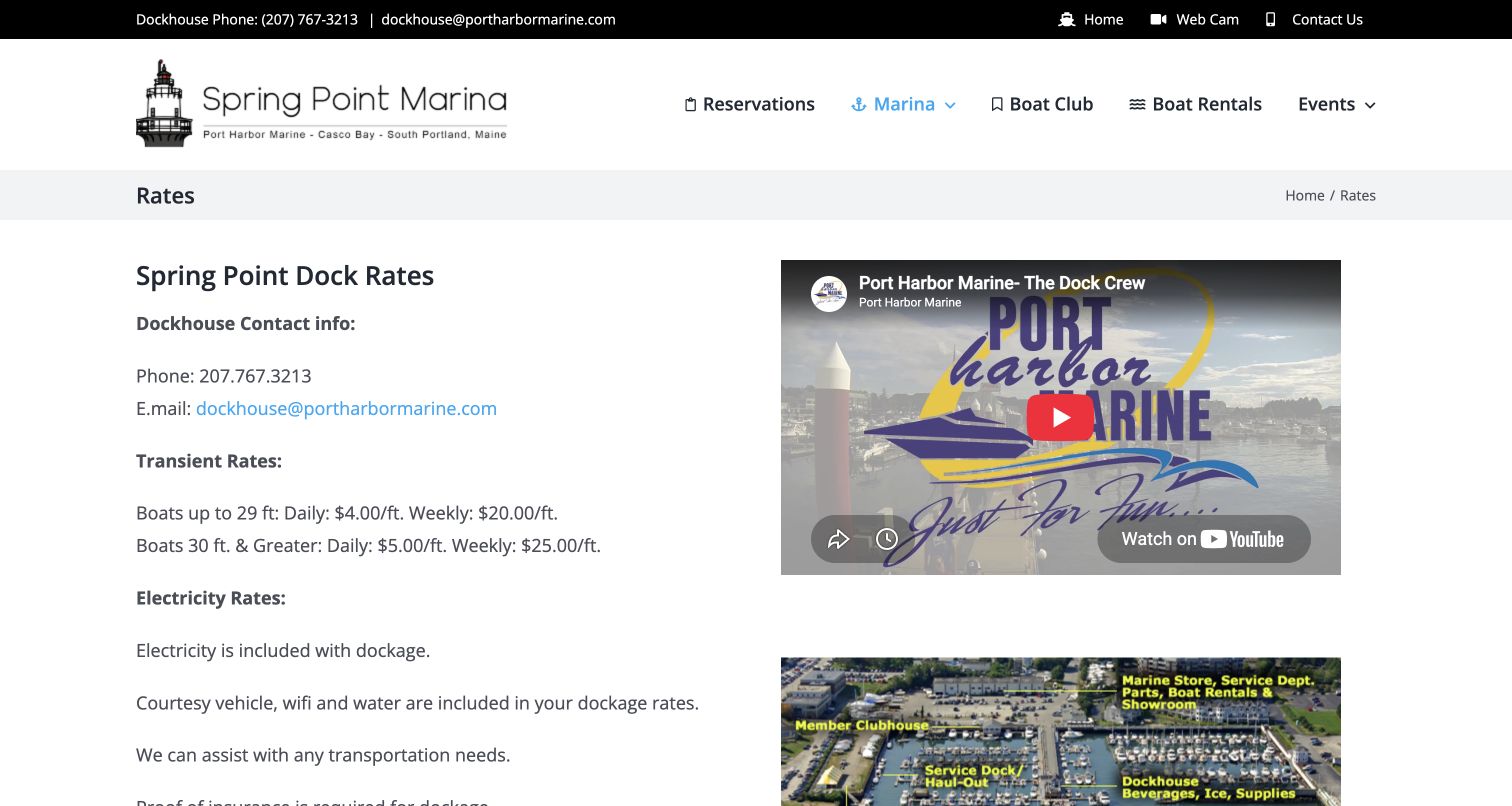
Spring Point's rates page avoids a scenic introduction and presents its dockhouse contact, transient rates and utility explanation in the main column. A video and layout image occupy the adjacent column. The text distinguishes boat-size bands and daily versus weekly stays, then explains summer dockage and how overall length affects the charge. Insurance requirements and inclusions appear in page text rather than only a download. The layout is less refined where headings and paragraphs accumulate, and some qualifications appear in all capitals. The embedded video is useful context but takes substantial space beside information that visitors may want to compare quickly.
What you can learn
Show how a rate is calculated as well as the headline amount. Explain vessel measurement, utility inclusions and prerequisites beside the relevant price, then use a concise table to compare durations. Supporting video and maps should enrich that decision without replacing the scannable text needed for planning.
Pros
The page explains chargeable length and inclusions in readable public text.
Transient and summer dockage are presented as different rate categories.
Cons & considerations
Paragraph-based prices are slower to compare than a compact rate table.
All-capital qualifications and a large embed interrupt the reading rhythm.
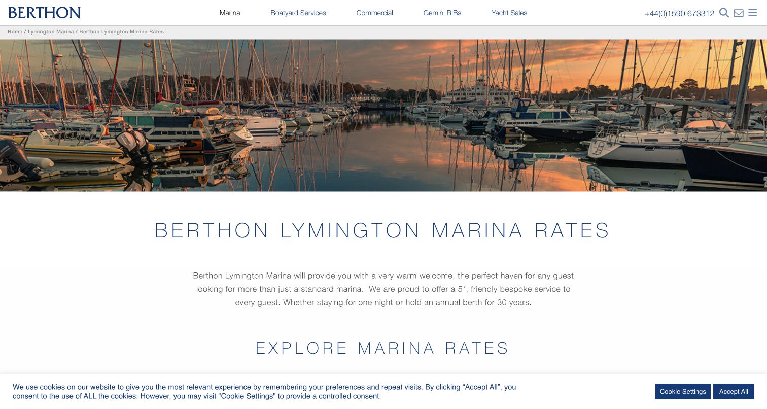
Berthon's marina rates page starts with a sunset basin photograph, a title and breadcrumb back to the marina section. The next area introduces rate categories through linked cards, including overnight, casual and annual berthing, alongside a calculator route. Further down, separate sections explain the main berth arrangements and ancillary charges such as electricity and storage. The broad company navigation also includes boatyard, commercial work and yacht sales, so this marina-specific page is an important point of orientation. The card carousel makes some categories less immediately visible, and the opening descriptive paragraph delays the actual prices despite the page's clear rates-focused title.
What you can learn
Give each berthing commitment its own clearly labeled rate section and keep extras close enough to understand the total. A calculator can supplement published information, but it should not become the only way to compare choices. Prefer visible category links when a carousel would conceal essential pricing routes.
Pros
Overnight, casual and annual commitments are clearly named as separate categories.
Electricity and other ancillary charges receive their own sections.
Cons & considerations
The category carousel can conceal some important rate destinations.
Promotional introductory text delays a page whose main purpose is pricing.
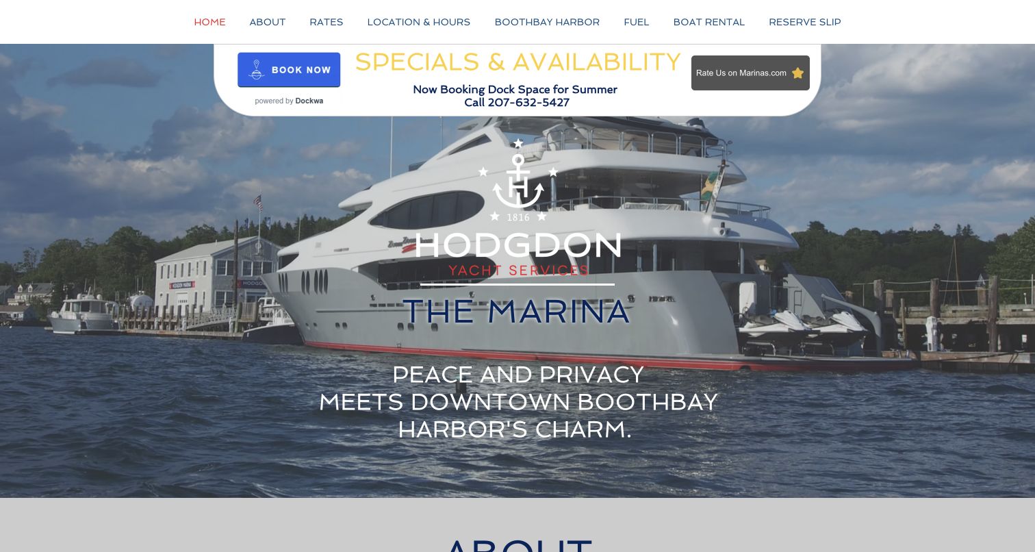
Hodgdon Marina places a Dockwa booking action and availability message above a large waterfront photograph. The navigation links to rates, location, fuel and reservations, while the long homepage continues with a marina description, amenities and a named dockmaster. The rate section distinguishes vessel-size bands, moorings and utility charges, giving visitors more context than a simple starting price. This is a useful mix of hospitality and practical detail, but the opening summer-booking message can feel out of step with a later-season visit. Several navigation items resolve within the same long page, and the repeated booking graphics compete with the descriptive content.
What you can learn
Put a human contact beside the operational details of a seasonal marina, then keep the entire page's timing consistent. Update availability messages, opening dates and closure notices together. Clearly distinguish dockage, moorings and utility charges before directing users to an external reservation service.
Pros
A named dockmaster gives the practical information a clear local contact context.
Dockage, mooring and utility rates are distinguished on the same page.
Cons & considerations
Summer booking language needs coordination with seasonal closing information.
Repeated booking graphics and a long page make navigation less direct.
Kegan is a freelance web designer and developer with 15+ years of experience helping businesses turn complicated website requirements into clear, maintainable digital experiences. He works directly with clients from planning and design through development, launch, and ongoing support.
For marina website design, his development approach focuses on marina websites that explain berth options, facilities, approach guidance and visitor enquiries without concealing practical limitations. The scope can be a targeted improvement or a complete custom build, with responsive layouts, thoughtful content structure, and integrations chosen around the people using and maintaining the site.
Show 3 other marina website designersHide other marina website designers
Plan a marina website around the actual berth decision
Start with vessels, stays and visitor intentions
Before designing the homepage, list the arrangements the marina actually offers. Guest berths, annual moorage, dry storage, moorings and slip ownership are different products, even when they share a basin. Give each a clear description and identify who can confirm suitability. Record the dimensions that matter for your facility using consistent units and verified operator information. Explain whether a listed limit applies to an individual berth, a basin or the approach, and avoid letting a photograph imply that every vessel can be accommodated. Group utility options and shore facilities beside the relevant arrangement. A visitor should understand whether power, water or parking is included before starting an enquiry. For a network, maintain a separate location record rather than applying one universal rule across every harbor. Include the address, normal contact route and a map with a useful text description. Keep navigation oriented around customer tasks, not internal departments. Someone arriving by road may need parking information; someone arriving by water needs the marina's current official instructions. Finally, walk through the page as a first-time visitor: can they identify the right location, type of stay and next step without knowing your terminology already?
Explain rates and confirmation before collecting details
A marina price is often conditional on vessel size, duration, season and utility use. Present those factors together so visitors can understand the basis of a quote. Use a compact comparison for daily, weekly, monthly and annual arrangements where those options exist. State the measurement basis and identify extras near the relevant rate, rather than relying on a distant document to explain them later. If an estimate tool is useful, label it as an estimate and expose the assumptions it uses. Do not suggest that a calculated price reserves space. When staff review requests, say so before the form and explain what happens next. Collect the vessel and visit details needed for that decision, with optional marketing choices clearly separate. An external reservation service should have a descriptive link and an understandable transition from the marina's own site. Keep an ordinary contact alternative available if that service is unavailable. Explain where visitors can read cancellation terms and any current restrictions before they commit. Review every button label against the real process: request, check availability and confirmed booking mean different things. Consistent wording helps visitors prepare and reduces avoidable clarification work for marina staff.
Maintain arrival guidance as operational content
Assign responsibility for keeping operating information current before launch. A marina website may need to change when office hours, seasonal services, fuel availability or visitor arrangements change. Keep those details in editable text with a clear review routine, rather than placing them only inside photographs or downloadable brochures. Date temporary notices and remove or revise them when the situation changes. Avoid leaving a summer availability message beside a winter closure without explaining the relationship. Publish only operator-approved arrival instructions and direct visitors to the appropriate official guidance; a promotional website is not a substitute for navigation information. If tide, weather or camera widgets appear, identify their source and limitations and provide useful fallback text when they fail. Keep shore access, parking and facility maps understandable without relying on an interactive embed. Check that contact links reach the correct location and that an external booking outage does not hide essential information. Use real photography that shows the basin, pontoons and shore facilities accurately, with readable labels outside busy images. Record meaningful content changes so the team can distinguish a current operating update from an older page that merely looks freshly redesigned.
The editing job behind the design
Choose technology for reliable marina information
A marina content system should make location details, rate periods, facility lists and temporary notices easy for staff to maintain. A small local operator may need only clear pages and an enquiry route; a network may need structured location records and a consistent set of berth fields.
Public technology audits can show a builder, library, font, analytics reference or delivery service. They cannot establish how a marina's reservation database, access system or on-site equipment works. Each reviewed source received a bounded broad audit attempt, and unavailable or partial results remain qualified in the evidence records.
Treat booking platforms, cameras and weather widgets as supporting services. Keep essential details readable when they are unavailable, explain transitions to outside services and avoid collecting visitor information that is unnecessary for the task.
Our WordPress website examples offer a separate look at publishing approaches. A visible platform label is evidence for that named page, not a guarantee that the same system will suit your requirements.
Before the public launch
Marina website planning checklist
Distinguish guest berths, recurring moorage, storage, moorings and ownership where offered.
Use verified vessel-fit information with consistent measurement units.
Show the exact location, normal contact route and useful facility-map context.
Keep visitor and existing-customer tasks separate in the navigation.
Explain rate periods, measurement basis and optional utility charges together.
Label calculators as estimates and expose their assumptions.
Distinguish a staff-reviewed enquiry from confirmed space.
Explain what happens after a request and provide a contact alternative.
Link to current operator-approved arrival information and relevant official guidance.
Date seasonal notices and reconcile them with opening and closure messages.
Provide fallback information and scope labels for weather, tide and camera widgets.
Use actual facility photographs with readable text and maintain supporting document links.
These checks are a project checklist, not a performance, legal, security, or accessibility certification. Test real journeys with the people responsible for the website before making claims about the result.
Sources & editorial method
How this collection was selected and reviewed
The saved random target for this new industry guide is 27. All 27 distinct public website properties were directly inspected and captured on November 10, 2026; the later MDL capture is an alternate view of the same example, not an additional property. Original reviews address visible design, content and navigation. Captures preserve real dimensions, timestamps, attribution and visible source notices, including consent panels where present. Tollesbury Marina was explicitly selected after reviewing its homepage, pricing routes, draft and tide information, visitor estimate explanation and operating details. Editors Choice recognizes website communication, not service quality, navigational reliability, berth availability or a customer rating. Every exact source page received a bounded broad technology-audit attempt. Checked, partial and unavailable results remain distinct, and no hidden backend is inferred. No booking forms, payments, account changes or messages were submitted.
Each example links to its actual source page. Screenshots are direct browser captures with their own capture dates; moving imagery, announcements and live designs can change. The notes describe observable design choices and conditional tradeoffs, not measured traffic, conversion results, service quality, or accessibility conformance.
Technology labels use public page metadata, asset evidence, or explicitly cited platform documentation. Platform documentation is not a complete current deployment audit. A component reference may be legacy or unused; it is not a complete backend inventory. Unknown stacks are omitted. These sites are editorial examples, not our client portfolio.
Written, Edited and Curated are separate editorial records, not timestamps advanced by a rebuild. Website designs and imagery belong to their owners. See our editorial standards or suggest a correction.
Questions worth asking
Marina website design questions
What should a marina homepage show first?
Identify the location and the main customer choices, such as a guest stay, recurring berth or existing-customer task. Give visitors an obvious route to suitability, prices and arrival information instead of relying on waterfront photography to explain the offer.
Should every marina offer instant online booking?
The website should reflect the actual operating process. If staff need to assess vessel dimensions, dates or berth suitability, label the action as a request and explain how confirmation follows. A third-party reservation tool can be useful when its role is clear.
How should berth prices be presented?
Explain the measurement basis, stay duration, applicable period and included services near the price. Distinguish utility charges and other extras, and label a calculator as an estimate when staff confirmation is still required.
Are live weather and tide widgets enough for arrival guidance?
No. Such widgets need source information, limitations and useful fallbacks, and they should not replace current operator-approved instructions or the appropriate official navigation sources. This design guide does not provide passage-planning advice.
Does Editors Choice verify marina quality or safety?
No. The selection concerns the design and communication of the public website. Screenshots, interface reviews and technology observations do not establish service quality, navigational suitability, berth availability or the accuracy of promotional ratings.
Borrow the useful structure: a clear visitor route, a well-labeled basin map, an understandable rate comparison or an honest confirmation explanation. Then keep those details current so the website remains practical after its first impression.