Best Business Consultant Websites of 2026 (14 Real-World Examples)
Turn an intangible consulting offer into recognisable problems, clear interventions and credible evidence.
A consulting website should help a buyer understand what changes when the consultancy becomes involved. A promise about growth or transformation is not enough on its own. Good design connects a recognisable situation with a method, a team, an engagement scope and evidence that can be examined without taking every marketing statement on trust.
The examples range from specialist organisational-design studios to broad strategy and technology consultancies. Their audiences, buying cycles and service models differ. A small practice can explain a narrow intervention with a workshop photograph and a short service page; a larger firm may need sector, capability and expert discovery. More navigation is not automatically more credible, and a smaller firm should not manufacture a global scale it does not have.
This collection evaluates public website design, not consulting quality, commercial outcomes or the truth of every publisher claim. A client logo may indicate a relationship without explaining the work. A research report may be interesting without demonstrating a delivered client result. Keep those evidence types separate when planning your own site, and obtain permission before publishing client names, quotations or sensitive operational information.
Before the examples
What makes good business consultant website design in 2026?
Name the buying situation in plain language
Describe the decisions or constraints that bring a client to the practice. An operating-model redesign, a pricing question and a leadership-team intervention are not interchangeable. Pair your preferred service terminology with a short explanation of what the client is trying to resolve. Avoid expecting a visitor to translate an internal framework name or an abstract transformation headline into a practical engagement.
Show the intervention and the people
Explain what the consultancy does during the engagement, what the client team contributes and what is left behind. Use real working scenes and named professionals when they add information. Be honest about senior involvement, implementation and handover. A workshop photograph can make the service tangible, but it should not stand in for deliverables, decision rights or an explanation of how the work continues after the consultant leaves.
Separate cases, research and recognition
Use different templates for client cases, authored analysis and external recognition. A case should explain the context, role, constraints, intervention and any attributable result. A report should state its authorship, date and scope. Recognition should retain its source and criteria. Do not combine these into an undifferentiated wall of authority that makes a reader assume a publication or logo proves a specific client outcome.
The collection · 14 examples
14 business consultant websites worth studying
Compare how these consultancies explain work that cannot be shown as a simple product photograph. The first choice highlights a smaller specialist practice; the wider examples explore text-first propositions, research-led openings, regional service catalogues and large solution programmes. The ordering is editorial, not a measured ranking of consulting results.
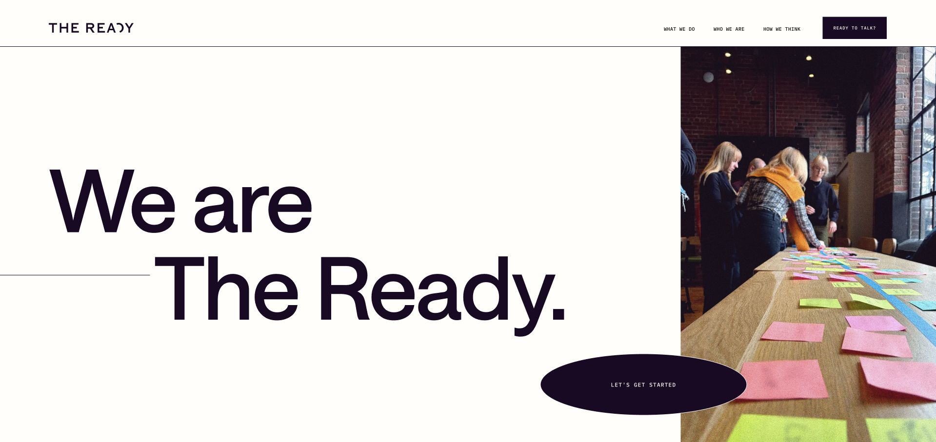
The Ready divides its opening between enormous black typography and a genuine workshop scene with people working around sticky notes. A large oval action bridges the two areas, while the small header limits navigation to the firm’s work, people and thinking. The following section names Work Design and explains the organisational decisions behind it, moving beyond an abstract transformation promise. This is useful for a smaller specialist consultancy: the photograph shows a working mode, not merely a finished presentation. The first screen itself remains brand-led, so an unfamiliar buyer needs the next section to understand the intervention. Client stories and published engagement figures also need their original context rather than being treated as independently measured outcomes.
What you can learn
Make an intangible consulting service visible through a real working situation, then explain what changes in the client organisation. A workshop image should introduce the method, not stand in for a clear scope, deliverables or evidence of impact.
Pros
A real workshop scene makes organisational design feel like a tangible working process rather than corporate abstraction.
The following Work Design explanation gives the expressive opening a specific service vocabulary.
Cons & considerations
The oversized opening identity delays the literal service description until the reader continues down the page.
Client stories and scale figures need clear attribution and context rather than implying guaranteed transformation results.
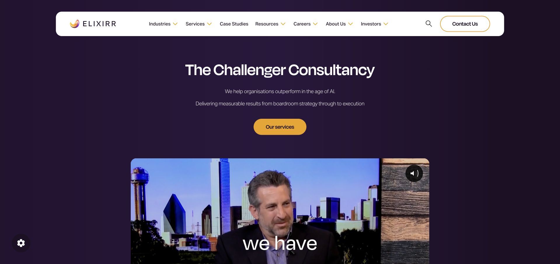
Elixirr uses a deep purple field, a floating white navigation bar and a gold action to give its challenger-consultancy proposition a controlled visual hierarchy. Short supporting lines explain the connection between strategy and execution, while a substantial film appears below rather than replacing the written introduction. The next section breaks the offer into recognisable capabilities, including operational excellence, research and digital experience. This is useful for buyers who need more than a strategy document but may not know which internal service label fits their problem. The broad AI-era framing is timely, yet it can become generic without specific cases. The film also needs to remain optional, with the core proposition understandable in text.
What you can learn
Explain the relationship between strategy and delivery before listing a consultancy’s capabilities. Keep a brand film supplementary and use case studies to show the actual intervention, constraints and client responsibilities behind broad transformation language.
Pros
The written proposition remains understandable before the visitor watches the substantial brand film.
Capability cards break a broad strategy-to-execution offer into more recognisable areas of work.
Cons & considerations
AI-era positioning needs concrete cases so it does not become interchangeable with other consulting brands.
A large floating navigation and substantial media section require careful mobile hierarchy and performance treatment.
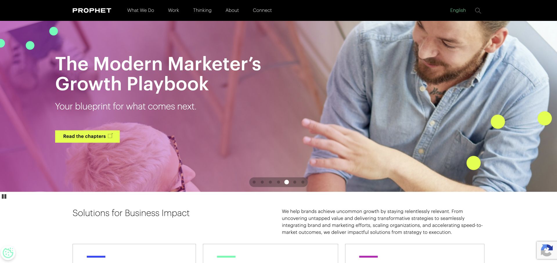
Prophet opens with a large editorial carousel rather than a single company manifesto. The observed feature uses a photographic background, bright colour accents and a playbook-style invitation, while the black header exposes work, thinking, company and service routes. Below, a plain-language introduction connects the research-led presentation to business impact and the firm’s capabilities. This gives prospective clients a useful way to sample the consultancy’s perspective before making contact. The tradeoff is that the first message changes with the carousel and may not match the visitor’s problem. Research, marketing and advisory services also need clear boundaries so an attractive publication does not obscure what an actual engagement includes.
What you can learn
Thought leadership can be a useful consulting entry point when it connects directly to named services and relevant cases. Keep the underlying proposition stable and label research clearly so readers understand its scope, date and relationship to commercial work.
Pros
The research-led opening gives visitors something substantive to explore before an enquiry.
Visible work and service routes connect editorial material to the consultancy’s practical offer.
Cons & considerations
A rotating publication feature makes the first message inconsistent and can delay service qualification.
A large editorial catalogue needs clear labels so reports, opinion and client case studies are not mistaken for the same kind of evidence.
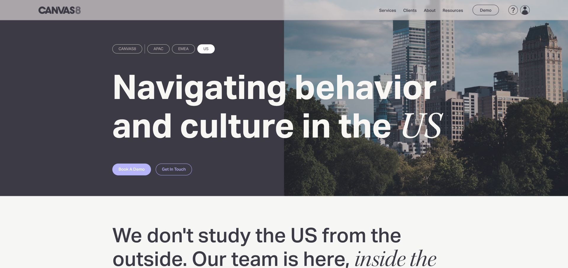
Canvas8’s reviewed US page pairs a large regional headline with a city photograph and a compact set of region choices. A dark left panel and photographic right panel create a clear reading hierarchy, while demo and contact actions support different levels of interest. The following case studies identify clients and the research questions being addressed, making the service more tangible than a list of insight-related adjectives. This is useful for a consultancy whose value depends on understanding people in context. The regional interface needs to avoid confusing a research-library subscription with a bespoke consulting engagement, and case-study descriptions should distinguish the client’s challenge from any independently measured outcome.
What you can learn
For a research consultancy, explain the market and question before describing the method. Use case studies to show what needed to be understood, and distinguish access to a research product from commissioning a tailored study or strategic engagement.
Pros
The regional headline and market controls make the geographic context of the research offer explicit.
Client case studies introduce concrete research questions rather than leaving the service entirely abstract.
Cons & considerations
Demo, library and consulting routes need clear scope so prospective buyers understand what each relationship includes.
Large regional typography and a split photograph require careful mobile stacking and readable contrast.
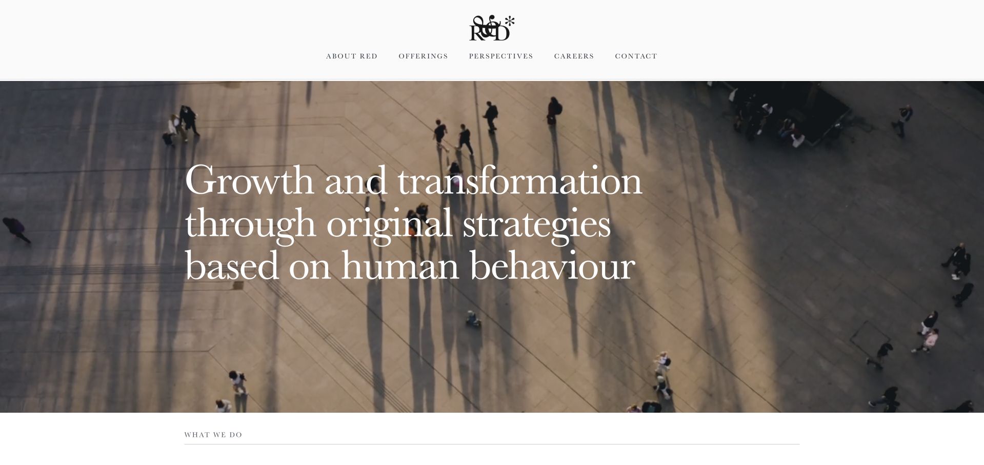
ReD Associates uses an overhead public-space photograph and elegant white typography to introduce a strategy proposition grounded in human behaviour. A centred identity and small navigation give the opening an editorial calm. The following section narrows the work into growth strategy and organisational change, then links into specific perspectives and projects. This is useful because the visual scene supports the method: people in a real environment are more relevant than a generic boardroom for this particular positioning. The opening is still a long sentence, and the refined presentation can postpone practical information about an engagement. Buyers need to understand what research, analysis and decision support they would actually receive.
What you can learn
Let imagery reinforce a consultancy’s real method, then describe the intervention in concrete terms. A research-led identity should lead to questions, deliverables and decision contexts rather than another layer of abstract positioning.
Pros
The public-space photograph aligns with the firm’s human-behaviour positioning rather than generic corporate imagery.
Growth strategy and organisational change provide a useful first division of the commercial offer.
Cons & considerations
The long opening proposition needs careful line lengths and a shorter mobile hierarchy.
A refined editorial presentation still needs clear engagement scope and deliverable explanations for practical buyers.
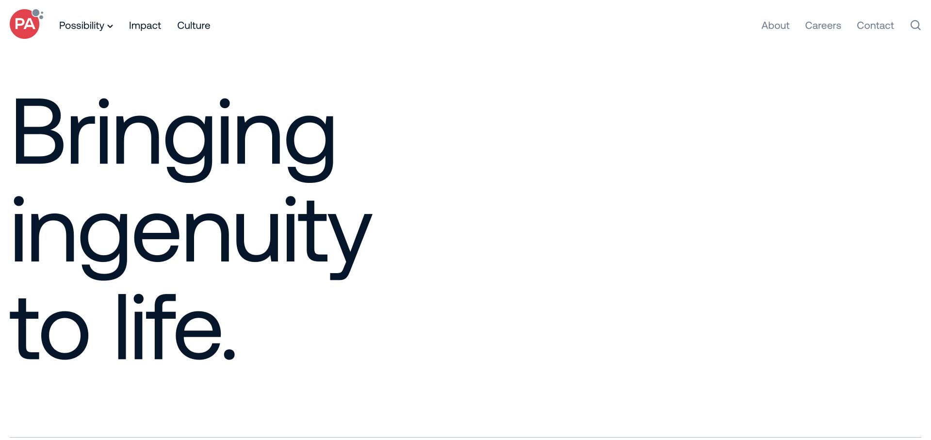
PA Consulting gives its main idea an unusually large amount of white space and typographic scale. The opening contains little visual decoration, with a simple identity and a short set of navigation concepts. The following text explains the business in more detail, then introduces reports, sector material and impact stories. This is a useful study in confidence through restraint: a broad consultancy does not have to place every capability in the first screen. The cost is immediate specificity. A buyer seeking a defined service must interpret the umbrella language and continue into the next layer, so service routes and case-study responsibilities need to be especially clear.
What you can learn
An umbrella consulting idea can lead a site when the next layer quickly explains the actual work. Use the visual restraint to create focus, not to avoid practical descriptions of services, sectors, deliverables and the client’s role in an engagement.
Pros
Large-scale typography and white space create a recognisable identity without a heavy introductory film.
Reports and impact material provide substantive onward routes beyond the initial brand idea.
Cons & considerations
The abstract opening gives little immediate guidance about a specific consulting service or buying situation.
Unconventional navigation concepts need clear labels and supporting structure so users can predict where information lives.
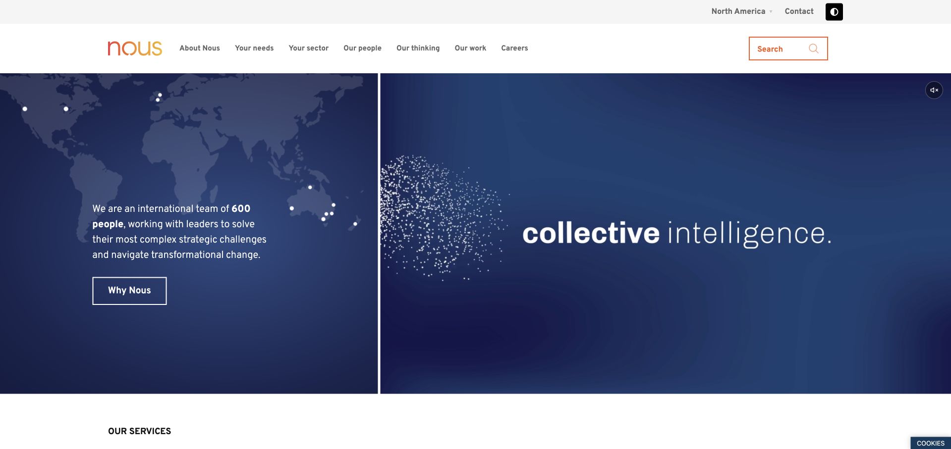
Nous Group uses a split opening with a world map, a concise team description and an animated collective-intelligence treatment. The header makes region, people, needs and sectors visible, while the following services section names strategy, public policy, economics, evaluation and other capabilities. This is a useful way to give a broad consultancy an understandable information structure without pretending every buyer starts from the same problem. The regional context matters because policy and public-sector work are not interchangeable across markets. The animated concept remains secondary to the written service explanations, which should carry the practical meaning. Published people counts are context rather than a measure of the team assigned to a future project.
What you can learn
Organise a broad consultancy around both client needs and named capabilities. Keep region visible, especially for policy-related work, and explain the actual team and scope of an engagement rather than letting a global headcount imply delivery arrangements.
Pros
The concise team description gives the international identity a clear written explanation alongside the visual concept.
Named service categories help users navigate a consultancy spanning strategy, policy and implementation.
Cons & considerations
The animated collective-intelligence treatment needs a meaningful static state and reduced-motion handling.
Global scale figures do not explain who would actually work on a particular client engagement.
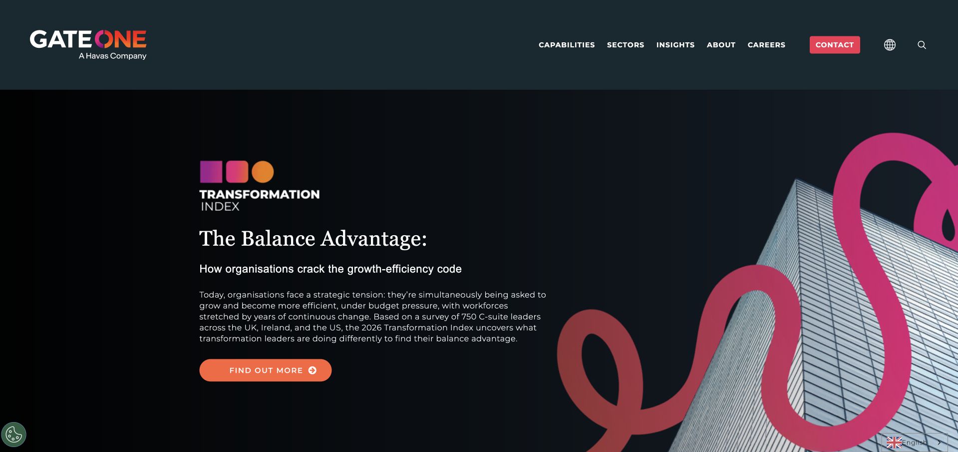
Gate One opens with a large transformation-research feature, combining a dark field, building imagery and a bright looping brand motif. A clear report action leads from the introduction, while capabilities and sectors remain visible in the header. The wider navigation groups digital, change, customer and operating-model work, helping a broad offer feel more organised. This is useful for showing how a consulting business can use research as an entry point without hiding its services. The report-led first view is still only one message, and readers need to distinguish survey findings from evidence of the consultancy’s own project results. A strong brand motif should also remain decorative rather than carrying essential information.
What you can learn
Use a report to open a consulting conversation when its topic connects to clearly named services. Explain the study’s scope and separate research findings from client case outcomes; then provide a direct route for buyers who already know the capability they need.
Pros
The report feature offers substantive material rather than only an immediate sales enquiry.
Grouped capability navigation makes a broad transformation offer easier to scan.
Cons & considerations
A research-led hero may not address the particular service question that brought a visitor to the site.
Survey findings and consultancy project results need distinct labelling so one is not mistaken for the other.
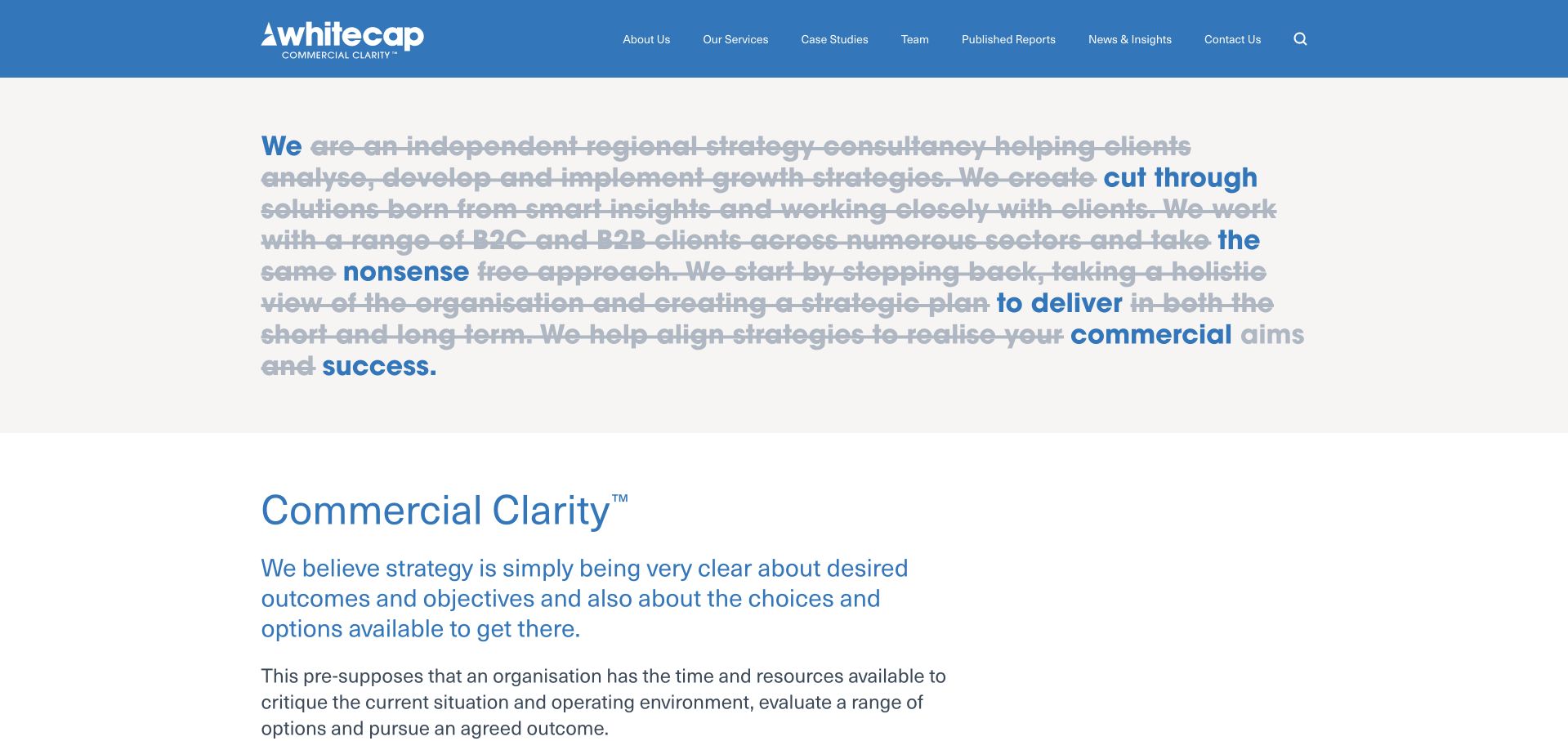
Whitecap Consulting turns its opening paragraph into a visual editing exercise: much of the long sentence is struck through, leaving a shorter commercial message in blue. The effect demonstrates the firm’s clarity-led positioning instead of merely announcing it. A straightforward blue header exposes services, case studies, team and published reports, while the next section explains the regional strategy offer and intended client scale. This is useful for a smaller consultancy because the design idea is closely connected to the service. It also presents an accessibility and comprehension challenge. Struck-through text can be distracting or confusing, and the surviving message needs to make sense in reading order rather than only as a visual trick.
What you can learn
A consulting brand idea is stronger when the interface demonstrates it. If a visual edit or typographic device carries the proposition, provide a concise linear equivalent so the meaning remains clear to screen readers and people who do not parse the visual effect.
Pros
The edited-paragraph device demonstrates a clarity proposition through the design itself.
Visible case-study, team and report routes support practical evaluation of a regional consultancy.
Cons & considerations
Struck-through prose can create visual clutter and a confusing reading order without careful semantic treatment.
The distinctive opening still needs a short, literal explanation of engagement scope and client fit.
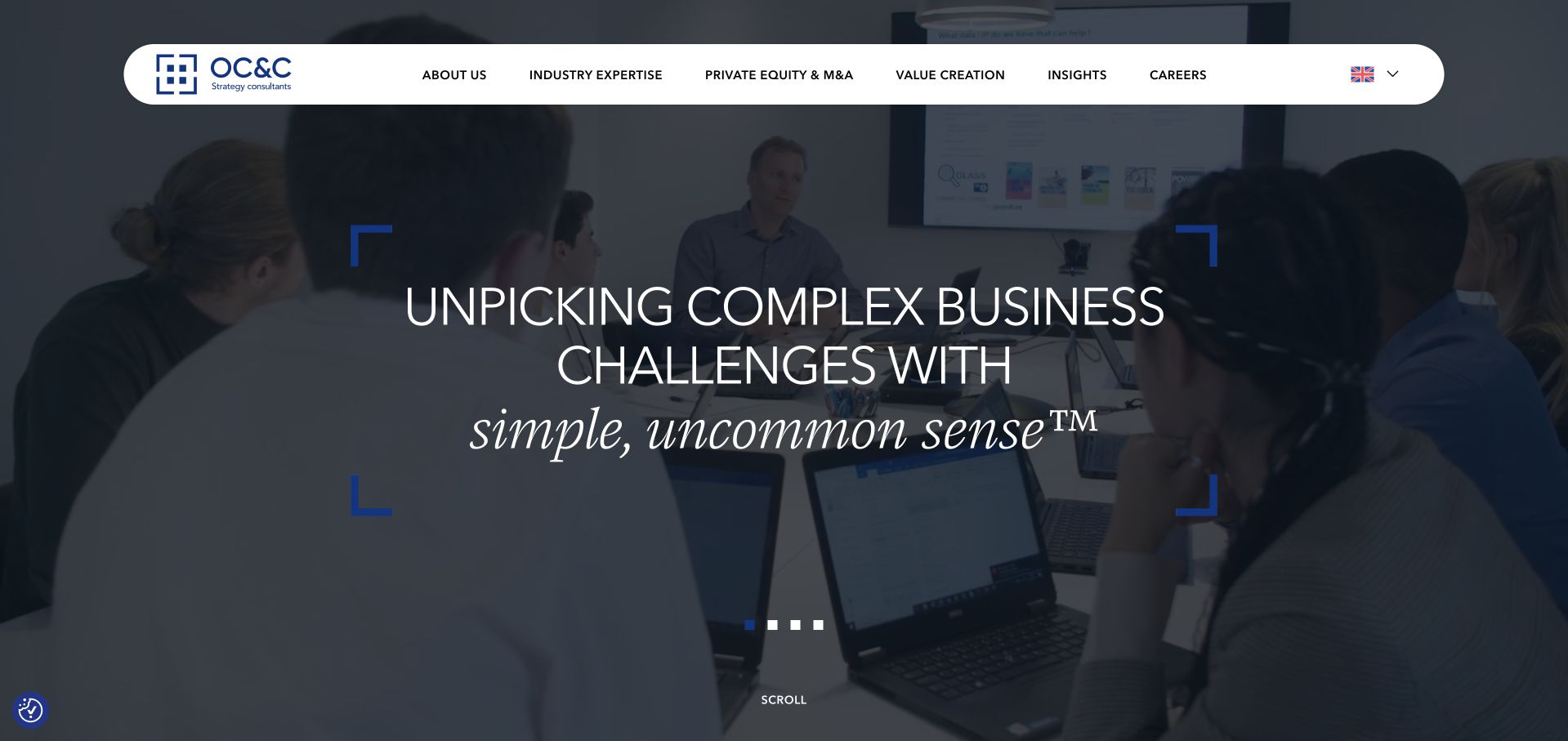
OC&C Strategy Consultants uses a large darkened working scene with a short strategy-oriented proposition and a rounded white navigation bar. The opening feels controlled rather than overloaded with every possible capability. Industry expertise, private equity and value-creation routes provide a more specific structure for professional buyers, while insights and careers are kept distinct. This is useful for a consultancy with a clearly defined discipline and several buying contexts. The broad central statement is not itself a service specification, however. A visitor needs relevant cases, sector experience and a clear explanation of what a project would involve. Regional prompts should also remain a convenience rather than blocking access to the underlying material.
What you can learn
A focused consulting discipline can support a concise homepage, provided the next layer distinguishes real buying contexts. Keep region selection non-disruptive and explain project scope through specific cases rather than expanding the hero into a long capability list.
Pros
The restrained opening avoids making a strategy consultancy look like an undifferentiated catalogue of services.
Industry, private-equity and value-creation routes reflect meaningful professional buying contexts.
Cons & considerations
The central proposition is broad and needs concrete case material to explain the actual intervention.
Regional prompts can interrupt research if they obscure the page or repeatedly demand a choice.
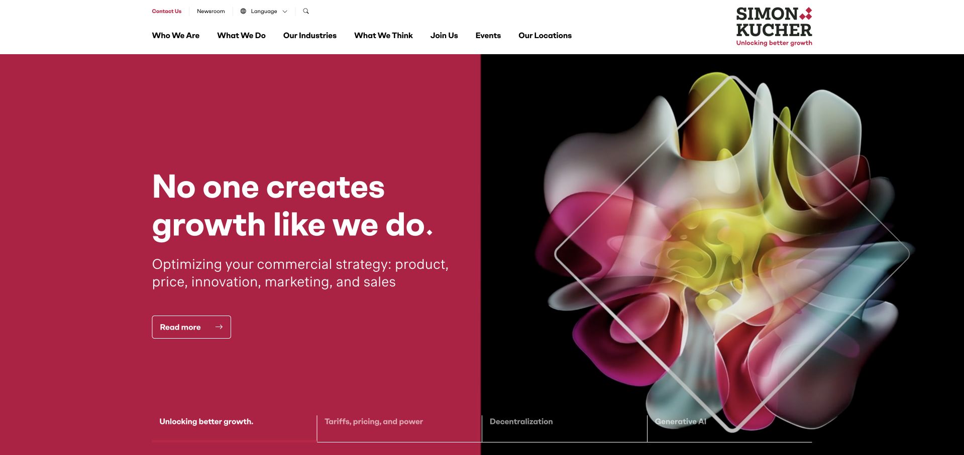
Simon-Kucher uses a strong red and black split hero with an abstract colour image and a concise growth proposition. The supporting line names product, price, innovation, marketing and sales, making the specialism more concrete than a general business-transformation promise. Carousel topics and the following capability sections connect the umbrella idea with specific commercial questions. This is useful because the service language describes levers a buyer recognises. The large claim remains marketing, not proof that any future client will achieve a particular result. Abstract imagery also cannot explain a project’s method, so cases and service pages need to show the analysis, choices and implementation responsibilities behind the commercial language.
What you can learn
Name the commercial levers a consultancy works on rather than relying only on a growth promise. Use cases to explain decisions and methods, and keep outcome claims attributed, dated and scoped to the relevant engagement.
Pros
The supporting service line makes the commercial specialism explicit through recognisable business levers.
A consistent red, black and white system gives a broad consulting site a strong visual identity.
Cons & considerations
A superlative growth message needs evidence and should not be interpreted as a guarantee of client results.
Abstract imagery and rotating topics require concrete service and case explanations in the next layer.
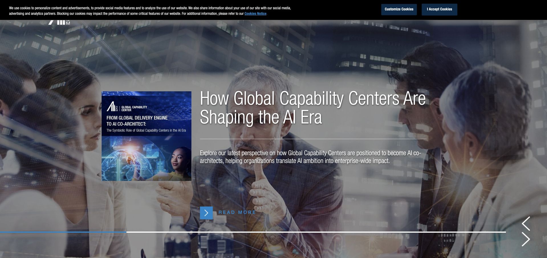
Alvarez & Marsal uses a large editorial carousel to introduce current business questions, with a report image, substantial explanatory text and an onward reading action. The dark blue visual treatment and long corporate navigation reflect an enterprise-scale professional-services business. Expertise, industries and people remain separate destinations, allowing a reader to move from an idea to a relevant specialist. This is useful for studying how a large content programme can support service discovery. The first screen is dense, however, and a current report may not answer a buyer’s immediate project question. Research analysis, opinion and client delivery evidence should remain clearly distinguished rather than being combined into a single impression of authority.
What you can learn
Connect thought leadership with expertise and people, but preserve the distinction between analysis and delivery evidence. Give practical buyers a direct route to services so a current publication does not become a mandatory detour before finding a relevant team.
Pros
Expertise, industry and people routes support several professional ways of finding a relevant consulting team.
The report feature gives readers substantive context rather than only a short generic brand statement.
Cons & considerations
A dense editorial hero can overwhelm the first view and delay practical service qualification.
Research and opinion content need clear scope and authorship so they are not mistaken for verified client outcomes.
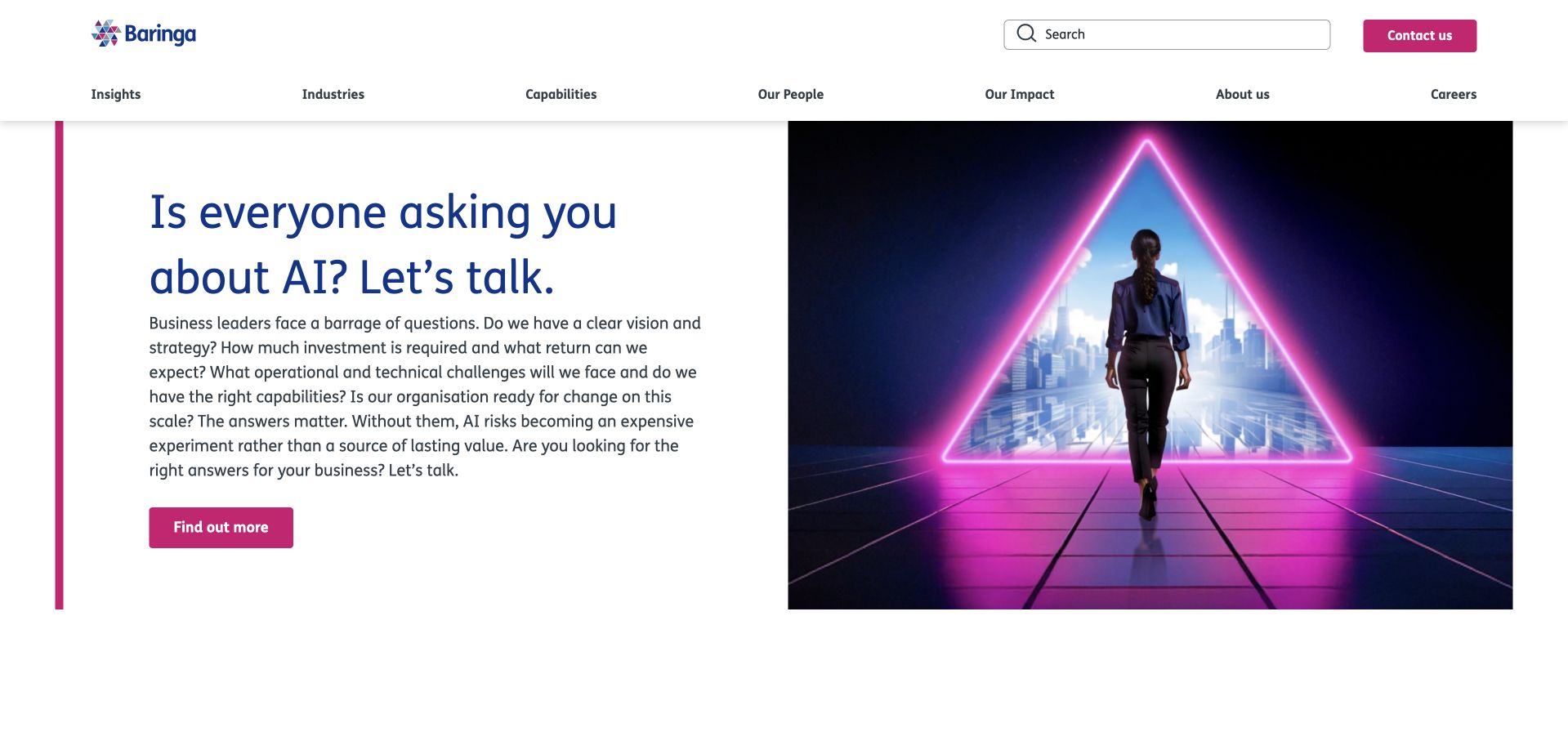
Baringa opens with a direct question about AI and follows it with a substantial paragraph naming the strategic, operational and capability questions behind an investment. A split illustration and text layout keeps that explanation readable, while a visible search field and capability navigation support deeper research. This is useful because the topic is not presented only as a visual trend: the copy describes what a leader needs to decide. The paragraph is long for a hero, and the stylised future-facing image adds less practical information than the text. The surrounding recognition and research material should retain its source and date rather than becoming an independent promise about project results.
What you can learn
A topical consulting proposition becomes more useful when it names the decisions behind the trend. Edit the opening for scanability, connect each question to a real service scope and treat recognition as contextual evidence rather than a substitute for case detail.
Pros
The opening names concrete strategic and operational questions rather than relying on an AI label alone.
Search and capability navigation provide useful routes into a substantial professional-content catalogue.
Cons & considerations
The long hero paragraph needs careful editing and mobile line lengths to remain approachable.
A stylised future-facing illustration contributes less practical evidence than a specific method or project example would.
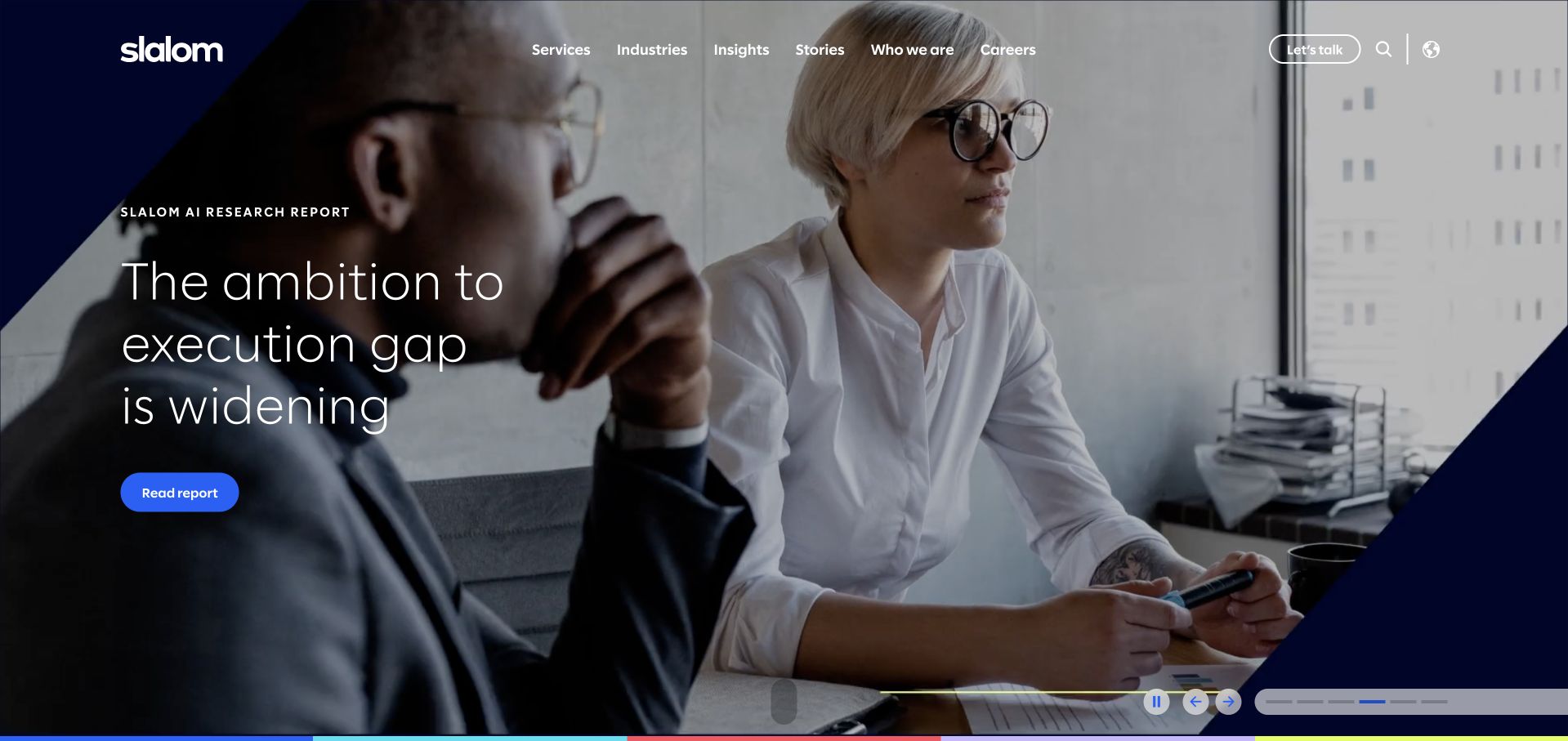
Slalom uses large moving imagery and a strong dark-blue brand shape to frame a carousel of current solutions and stories. The navigation separates services, industries, insights and customer stories, which is important for a consultancy spanning business, technology and AI work. A short company explanation follows the hero, providing a stable description beneath the changing feature. This is useful for studying how a broad consultancy can keep current initiatives visible without rebuilding its whole information structure. The cost is a media-heavy first view and a message that changes between visits. Buyers should still be able to find a specific service and understand its scope without watching a film or waiting for a relevant slide.
What you can learn
Keep changing solution campaigns above a stable explanation of the consultancy, and separate customer stories from general insights. Make every featured message useful without autoplay so that service discovery does not depend on timing or media playback.
Pros
Separate services, industries, insights and customer-story routes clarify different kinds of professional information.
A stable company introduction beneath the carousel provides context when the featured campaign changes.
Cons & considerations
Large moving media and multiple slides create performance, motion and reading-order challenges.
The first featured campaign may not match a buyer’s need, so direct service discovery must remain easy.
Kegan is a freelance web designer and developer with 15+ years of experience helping businesses turn complicated website requirements into clear, maintainable digital experiences. He works directly with clients from planning and design through development, launch, and ongoing support.
For business consultant website design, his development approach focuses on clear specialist positioning, service and methodology pages, evidence-led case studies, and consultation requests. The scope can be a targeted improvement or a complete custom build, with responsive layouts, thoughtful content structure, and integrations chosen around the people using and maintaining the site.
Show 3 other business consultant website designersHide other business consultant website designers
Build a consulting site around a decision, an intervention and evidence
Write a service page without the framework name
Describe the client situation, the decision to be made, the work involved and the practical outcome or deliverable. Then decide whether the framework name adds useful meaning. Include who needs to participate, whether implementation is in scope and what a first conversation covers. This exercise often reveals where a site is selling an attractive idea without explaining a service. Have the actual delivery team review the description before publication.
Create an evidence policy for case studies
Record what can be named, what must remain anonymised and which results the client has approved for publication. Describe your role precisely when several partners were involved. Distinguish measured results from client quotations and intended benefits. If no quantified result can be supported, explain the work honestly instead of inventing a percentage. Give case studies meaningful dates and review them when the relationship or service changes.
Keep the first enquiry proportionate
Ask for the business context, the decision or challenge, timing and a reasonable contact route. Offer enough service information that a buyer can decide whether the conversation is relevant before sharing internal plans. Avoid requesting confidential strategy decks or employee information through a public marketing form. Explain who responds and what happens next, and keep recruitment, media and client enquiries distinguishable when the same site serves several audiences.
The editing job behind the design
Choose a publishing structure that preserves evidence and expertise
A consulting CMS should distinguish services, sectors, people, cases and insights rather than storing everything as an interchangeable article. Relate a service to genuinely relevant experts and approved case material. Keep report versions and authorship explicit, and avoid creating thin sector pages that merely replace the industry name in a generic paragraph. A specialist practice may need far fewer content types than a global firm; the structure should match real editorial capacity.
Media should support the explanation rather than gate it. Keep the core proposition readable without autoplay, give films useful posters and let users pause moving content. Test keyboard menus and search as carefully as the visual homepage. Use the W3C reference below as an accessibility starting point. Technology observations on example pages do not establish the systems used to deliver consulting work, and a product partnership should not be confused with a complete marketing-site stack.
Our WordPress website examples offer a separate look at publishing approaches. A visible platform label is evidence for that named page, not a guarantee that the same system will suit your requirements.
Before the public launch
Business consultant website planning checklist
Name the client situations and decisions the practice actually addresses.
Pair framework names with plain-language service explanations.
State whether diagnosis, strategy, implementation and handover are in scope.
Explain the client team’s role and the consultancy’s responsibilities.
Show current professionals and describe senior involvement accurately.
Separate client cases, research, opinion and external recognition.
Obtain permission for names, logos, quotations and project details.
Attribute measured results and avoid inventing percentages or commercial outcomes.
Keep service, sector, expert and case relationships genuinely relevant.
Do not request confidential internal material before explaining the enquiry process.
Make films optional and preserve a clear static proposition.
Assign editorial ownership for case permissions, report versions and people information.
These checks are a project checklist, not a performance, legal, security, or accessibility certification. Test real journeys with the people responsible for the website before making claims about the result.
Sources & editorial method
How this collection was selected and reviewed
These are original observations from public consulting pages and direct browser captures. We did not inspect private client work, verify commercial outcomes or submit enquiries. Primary company pages provide the examples; the accessibility reference supports implementation planning. Published claims remain attributed to their owners rather than adopted as independent findings.
Each example links to its actual source page. Screenshots are direct browser captures with their own capture dates; moving imagery, announcements and live designs can change. The notes describe observable design choices and conditional tradeoffs, not measured traffic, conversion results, service quality, or accessibility conformance.
Technology labels use public page metadata, asset evidence, or explicitly cited platform documentation. Platform documentation is not a complete current deployment audit. A component reference may be legacy or unused; it is not a complete backend inventory. Unknown stacks are omitted. These sites are editorial examples, not our client portfolio.
Written, Edited and Curated are separate editorial records, not timestamps advanced by a rebuild. Website designs and imagery belong to their owners. See our editorial standards or suggest a correction.
Questions worth asking
Business Consultant website design questions
Should a consultant lead with an outcome promise?
A clear benefit can help, but it needs a concrete service explanation and careful wording. Say what the practice does and what the client receives. Do not turn an intended benefit into a guaranteed commercial outcome or use an unsupported percentage because it looks persuasive.
What if clients will not approve public case studies?
Use approved anonymised descriptions, explain methods through clearly labelled demonstrations or publish substantive original analysis. State the limits honestly. Do not invent clients or imply that a demonstration is a completed commission simply to fill a portfolio grid.
How many service pages does a small consultancy need?
Enough to distinguish real buying situations and engagement models. A concise site can be stronger than a large catalogue of near-identical pages. Start with the services the team can describe, evidence and maintain rather than copying a global firm’s taxonomy.
Can research reports replace client evidence?
They show a perspective or method, not necessarily a delivered client result. Keep reports authored and dated, explain their scope and link them to relevant services. Use separate case material where the claim concerns work performed for a client.
Should the enquiry form ask for a strategy deck?
Not by default. Begin with a high-level description of the challenge and a contact route. Explain confidentiality and the next step before inviting sensitive files, and use a suitable transfer process if detailed internal information later becomes necessary.
Borrow the strongest examples’ ability to explain an intangible service. Make the client situation recognisable, the intervention concrete and the evidence proportionate. A consulting site should make the work easier to understand, not make the language more impressive.