Best Boat Rental Websites of 2026 (19 Real-World Examples)
Boat rental websites that turn an appealing day on the water into a clear choice of vessel, departure point and rental period.
Explore 19 real boat rental websites, including electric day boats, inland holiday cruisers, charter marketplaces and regional marinas. Compare how their designs explain capacity, locations and the next step toward a suitable outing.
A boat photograph can make a trip look inviting, but it cannot tell a group whether they fit, where to collect the vessel or who will operate it. Useful rental websites connect the atmosphere of the outing with those practical decisions. The best structure depends on whether the business hires boats by the hour, supplies accommodation afloat or helps customers compare a larger charter market.
This collection includes dedicated rental operators and marine businesses with an explicit boat-hire service. The reviews focus on website communication, browsing and planning information. They do not independently assess vessel condition, operator qualifications, insurance, service quality or the suitability of a particular trip.
Before the examples
What makes good boat rental website design in 2026?
Explain the rental format before the search
Distinguish self-drive boats, captained outings and overnight charters before asking visitors to compare models. State the departure location and rental period in ordinary language, then provide the appropriate route into the fleet or availability search.
Make boats comparable through useful attributes
Use consistent passenger or berth counts, operating format, enclosure and relevant facilities. A day boat needs different information from a holiday cruiser. Show the differences that change the customer’s decision, rather than relying on unexplained fleet names.
Keep practical conditions close to the offer
Provide a clear route to current requirements, inclusions, deposits, collection details and cancellation terms. Explain seasonal availability and changed launch locations where visitors will see them before booking. Attractive imagery should support these details rather than obscure them.
The collection · 19 examples
19 boat rental websites worth studying
Compare 19 distinct rental businesses and marketplaces through their public entry pages and practical planning content. The Electric Boat Company is the researched Editors Choice for combining a clear regional outing with useful comparisons between its electric boat styles.
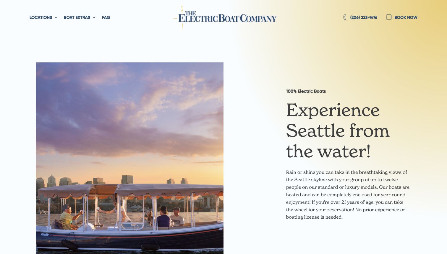
The Electric Boat Company pairs a warmly lit boat photograph with a spacious explanation of the Seattle outing. The soft background and large serif headline give the page a calm pace, while the header keeps locations, extras and booking within reach. Its most useful rental content comes in the fleet comparison: standard, luxury and catamaran options are distinguished by passenger capacity and practical features rather than names alone. Heating, seating and the shape of the boat help a group picture the experience. Extras such as food and a self-guided tour sit alongside that core decision instead of becoming the entire pitch.
What you can learn
Use the opening image to establish the place, then let a compact comparison answer which boat fits. Capacity, enclosure and rental duration deserve consistent labels so customers do not have to translate lifestyle language into practical requirements.
Pros
The three boat styles have tangible differences a first-time renter can compare.
Location links and a prominent booking action keep the local outing easy to identify.
Cons & considerations
The spacious introduction places the detailed fleet comparison below the first view.
Customers still need to check the selected boat and time for current availability and conditions.
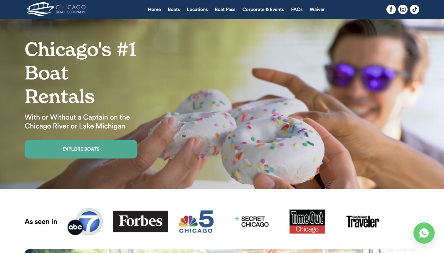
Chicago Boat Company presents the river and lake as a collection of different outings. Its dark header and bright action color provide a clear visual frame, while the hero uses moving lifestyle imagery and a short invitation to explore boats. The search distinguishes cruise type before asking for the rest of the trip details. The boat cards then introduce capacity, duration and individual formats, including seasonal experiences. That structure can help someone who knows the occasion but not the vessel. In the captured video frame, however, the activity is less obvious than it would be in a stable photograph of the boat.
What you can learn
Start with the decision that changes the rest of the search. For a mixed fleet, self-drive versus captained use may be more useful than an unexplained model name. Follow that choice with comparable capacity and duration information.
Pros
The outing categories acknowledge that renters arrive with different plans.
Boat cards attach practical trip information to the individual experience.
Cons & considerations
A changing hero frame does not always communicate the rental product clearly.
Seasonal promotions need careful maintenance so they match the current booking period.
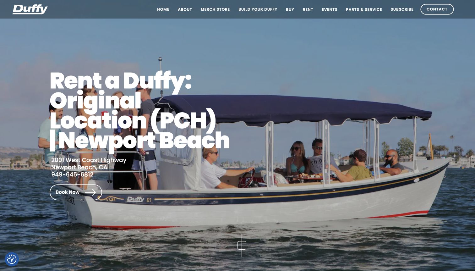
Duffy’s Newport Beach page gives its rental operation a dedicated destination within a broader boat-brand website. A large photograph of passengers on the water supports an emphatic location headline, and the address, telephone number and booking action establish where the outing starts. Further down, hours and operating details cover the practical questions that a visitor needs before choosing a time. The page is useful precisely because it moves beyond a general product presentation into the conditions of hiring a boat at a particular dock. The shared navigation still includes purchasing, parts and merchandise, so the rental visitor shares space with several other audiences.
What you can learn
Give each operating location a focused rental page with its own address, hours and next step. Keep the essentials close to the booking action, and make it clear when a visitor is exploring boats for sale instead of reserving an outing.
Pros
The page identifies a specific rental location instead of relying on a brand-wide promise.
Operating details provide substance beyond the attractive passenger photograph.
Cons & considerations
The oversized headline occupies much of the opening image.
Manufacturer and merchandise navigation can distract from the local rental task.
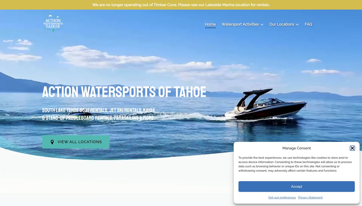
Action Watersports uses a full-width water scene and bold condensed lettering to introduce its Lake Tahoe activities. A location action appears directly in the hero, which is useful for a business whose products depend on the departure marina. The conspicuous notice about leaving Timber Cove is especially relevant: a familiar customer could otherwise arrive at an old launch point. Below the introduction, the site combines boat rentals with other watersports and guided activities, then provides location information. That breadth offers several routes into the business, but it also requires careful labeling so a boat rental is not confused with an activity led by staff.
What you can learn
Treat the departure location as part of the product. Announce changed operating locations near the top and use the same names throughout menus, activity cards and directions. A location-first journey is valuable only when every reference stays consistent.
Pros
The operational location notice addresses a real planning problem immediately.
The hero gives visitors a direct route to the available marinas.
Cons & considerations
The wide activity range needs clear distinctions between rentals and guided experiences.
Location counts and older descriptive headings need to stay aligned when operations change.
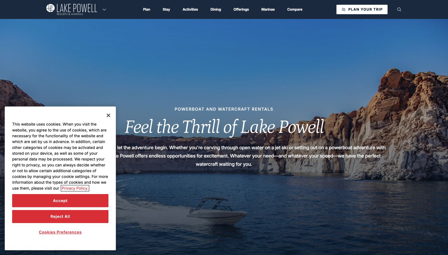
Lake Powell’s powerboat and watercraft page places rental equipment inside the larger destination experience. The canyon-and-water hero conveys the setting, while the sections below introduce individual boat types with capacity and equipment details. Rate tables, marina names and pickup information provide a much more practical layer than the atmospheric opening. This is particularly useful when a visitor needs to match the boat to both a group and a launch point. The surrounding resort navigation remains extensive, covering stays, dining and activities, so the rental page has to work harder to keep its own decision path apparent.
What you can learn
When a rental lives within a resort website, provide a complete equipment comparison on the actual rental page. Repeat the launch point beside each relevant boat and explain what a displayed rate includes, rather than making guests combine facts from several destination sections.
Pros
Boat specifications and capacity make the equipment easier to evaluate.
The page includes practical collection and return information alongside rental options.
Cons & considerations
The large destination hero delays access to the detailed comparisons.
Resort-wide navigation and notices compete with an already information-heavy rental page.
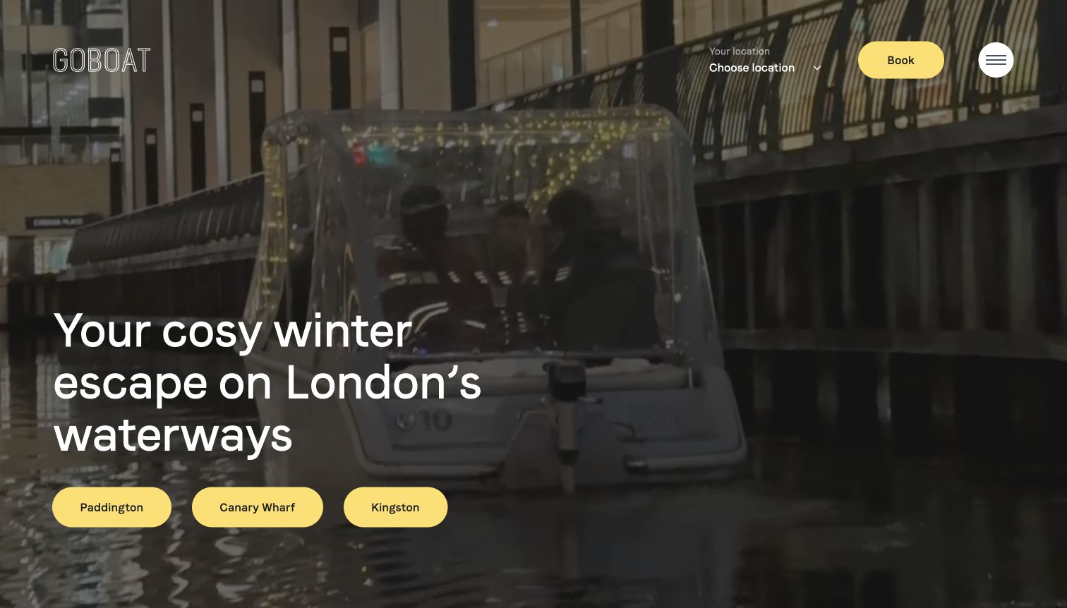
GoBoat’s UK page adapts its opening to the winter experience. A canal photograph, large white headline and bright destination buttons make the seasonal proposition easy to see. The named locations are more helpful than a single generic booking prompt because the experience is not identical at each dock. The page distinguishes self-drive pods from a skippered format in its location content, giving the imagery a practical counterpart. The minimal header and strong yellow actions keep the first screen focused. Visitors still need to read the selected location carefully; a seasonal theme alone cannot explain all of the differences in capacity, route or who operates the boat.
What you can learn
Make seasonal campaigns change the information architecture as well as the photograph. If the service differs by location, present those choices before asking for a date and explain the operating format in language a first-time renter understands.
Pros
The named destination buttons provide a concrete next step from the hero.
Seasonal photographs and copy describe a recognizable outing rather than an abstract fleet.
Cons & considerations
Self-drive and skippered offerings require close attention to the selected location.
A shared seasonal headline cannot substitute for the individual rental conditions.
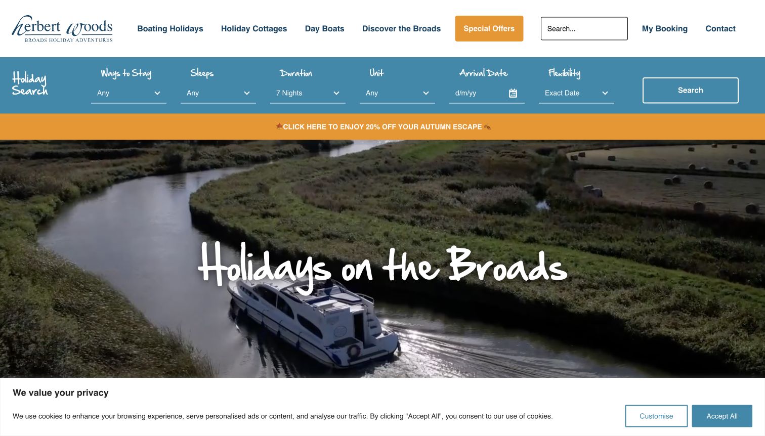
Herbert Woods puts a substantial holiday finder near the top of its page. The questions about sleeping capacity, duration and arrival make sense for an overnight boat holiday, while a separate day-boat route keeps shorter outings visible in the navigation. The river imagery and handwritten styling suggest a relaxed break, but the search gives the page an immediately practical purpose. Combining boating holidays and cottages also makes the wider accommodation offer clear. The unit selector is useful for returning customers who know a particular boat; a newcomer is more likely to need a plain comparison of layouts and facilities before recognizing a name.
What you can learn
Choose search labels that match the rental period. Overnight trips need sleeping arrangements and nights, while day hire needs passenger capacity and hours. If both products share a website, identify the mode first and keep the subsequent questions appropriate to it.
Pros
The finder asks about the practical shape of an overnight holiday.
Separate navigation acknowledges the difference between day boats and accommodation.
Cons & considerations
Named units can be difficult to choose without an accompanying fleet comparison.
Several accommodation and holiday controls make the first interaction relatively dense.
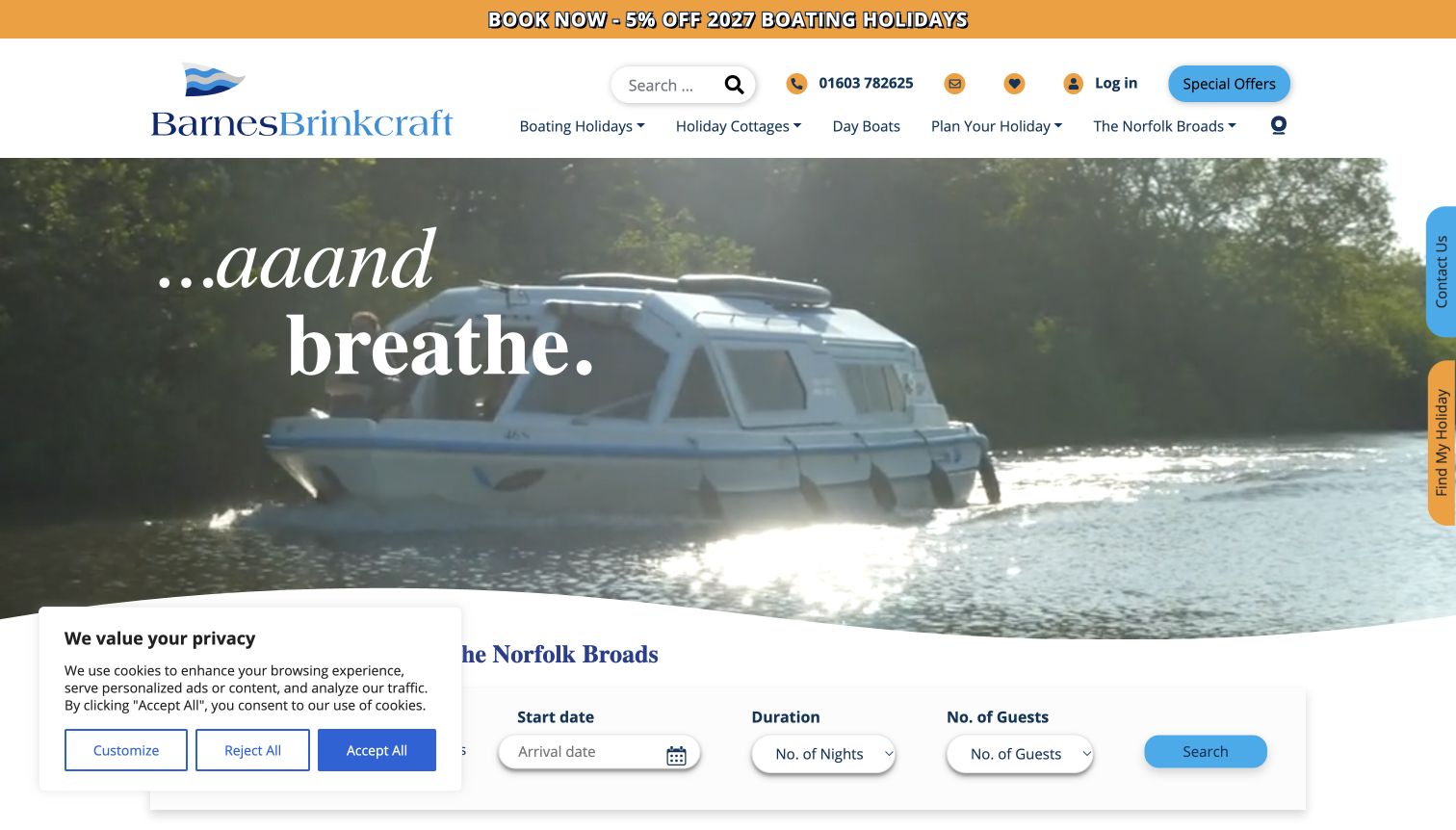
Barnes Brinkcraft places boating and cottage holidays inside one recognizable search component. The two modes let visitors identify the kind of stay before choosing dates, nights and guests. A wide scenic hero and the relaxed introductory phrase establish the holiday mood, while the finder near its lower edge gives that scene an action. The header also provides repeat-visitor tools such as a shortlist and account access. Seasonal content distinguishes future bookings from the operating period, an important detail for a leisure business viewed outside summer. The generous video area and promotional strip, however, create several competing points of attention before a visitor reaches the fuller fleet information.
What you can learn
A combined holiday search works when its modes are explicit and the fields remain predictable. Keep seasonal booking availability separate from the dates when trips actually operate, and support repeat visitors without making account access the starting point.
Pros
The two holiday modes explain why different accommodation appears on one site.
Dates, nights and guests form a familiar sequence for planning a stay.
Cons & considerations
The scenic hero and offer strip can overshadow more specific rental details.
A generic opening phrase gives little help choosing between the individual boats.
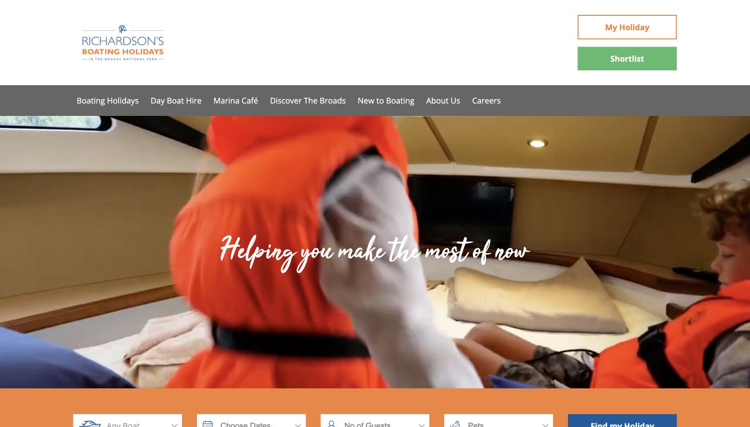
Richardson’s combines an expansive holiday image with a compact finder for boat, dates, guests and pets. Including pets in the early decision is a useful acknowledgment that a family trip can depend on more than passenger count. The page also separates holiday boating from day hire and points inexperienced visitors toward introductory material. Those educational routes make the service less dependent on prior knowledge of boating terminology. Visually, the large header and image reserve considerable room for the brand before the more practical choices appear. The broad introductory slogan communicates leisure, but the finder and beginner resources do most of the work of explaining what can actually be booked.
What you can learn
Ask early about constraints that can make an otherwise suitable boat unusable for a group. Pair those filters with plain introductory guidance, so the website helps people decide whether the experience fits before they confront detailed vessel names.
Pros
The pet filter addresses a concrete family planning requirement.
Beginner resources complement the booking interface instead of assuming existing expertise.
Cons & considerations
The tall opening area delays some of the detailed rental information.
The broad headline is less informative than the practical controls below it.
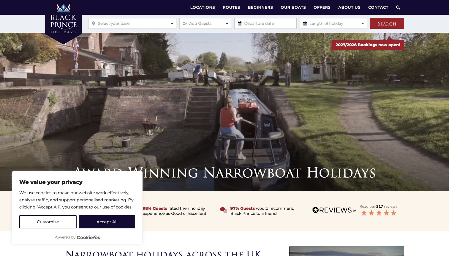
Black Prince places its holiday search directly beneath a straightforward navigation bar. Base, party size, dates and duration give visitors a manageable starting point before the larger image of a narrowboat journey. The navigation’s separate beginner section matters because a boat holiday asks different questions from a hotel stay. Later choices help visitors think about the holiday, boat and route as related decisions rather than one enormous inventory list. The page also states the seasonal operating context and availability of future bookings. Those messages are useful, although multiple future years and offers need disciplined labeling to avoid confusing booking availability with immediate departure availability.
What you can learn
Break a specialist rental decision into the questions newcomers actually ask: where to start, which boat fits, and what the route involves. Keep that learning route visible alongside search instead of forcing everyone straight into a date picker.
Pros
The compact search establishes the basic trip requirements near the top.
Beginner and route guidance provides an alternative to knowing a boat in advance.
Cons & considerations
Multiple booking years and seasonal messages require careful reading.
The opening controls cannot explain the differences between every base and itinerary.
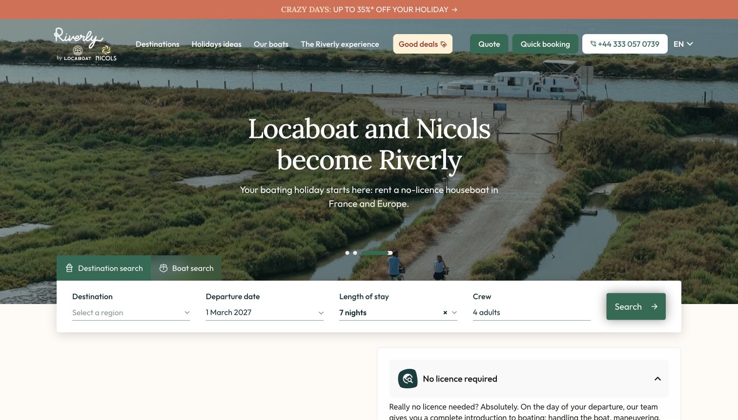
Riverly explicitly explains that Locaboat and Nicols have become one brand. The older names remain visible with the new identity, reducing the uncertainty a returning customer might feel on a redirected website. A natural palette and waterside photograph maintain the relaxed holiday setting, while search offers destination and boat routes rather than one compulsory starting point. Region, date, duration and crew controls then turn that choice into a possible trip. The transition helps visitors who recognize one predecessor but not the other. Promotional material still competes with that explanation and the booking interface.
What you can learn
When rental brands combine, explain the relationship on the page customers actually reach. Preserve recognizable names while giving newcomers a clear destination-first or boat-first path. Preselected dates and party sizes should be easy to notice and change before results are interpreted.
Pros
The former brand names clarify why familiar visitors arrived on a new website.
Destination and boat search modes support different ways of planning a holiday.
Cons & considerations
Brand-transition messaging and promotions compete for the same opening attention.
Default trip settings need review rather than being mistaken for a customer’s requirements.
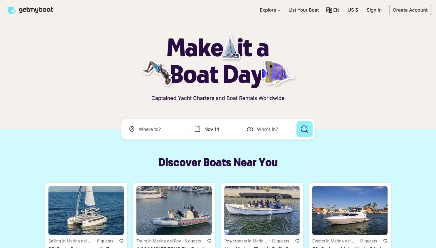
Getmyboat uses playful typography and boat-related illustrations to make a broad marketplace feel approachable. The primary search asks where, when and who is joining, so the decorative opening still has a concrete task. Listing cards introduce photographs, location, capacity and the pricing unit rather than relying entirely on vessel names. The page includes both captained experiences and rental boats, which widens its appeal but also makes the distinction between those formats important. Owner-facing navigation is present without replacing the renter’s search. The cheerful visual language is memorable; the next step must do the more exact work of explaining who operates the boat and what the listed price covers.
What you can learn
Keep a marketplace’s personality around a small set of useful search questions. In the results, make capacity, duration and operating format consistent across cards so customers can compare unlike boats without assuming that each listing includes the same service.
Pros
The search begins with familiar trip requirements rather than technical boat specifications.
Listing cards place practical attributes alongside the photographs.
Cons & considerations
Captained outings and self-operated rentals need clear labeling throughout the journey.
Headline prices require their duration and included services to remain visible.
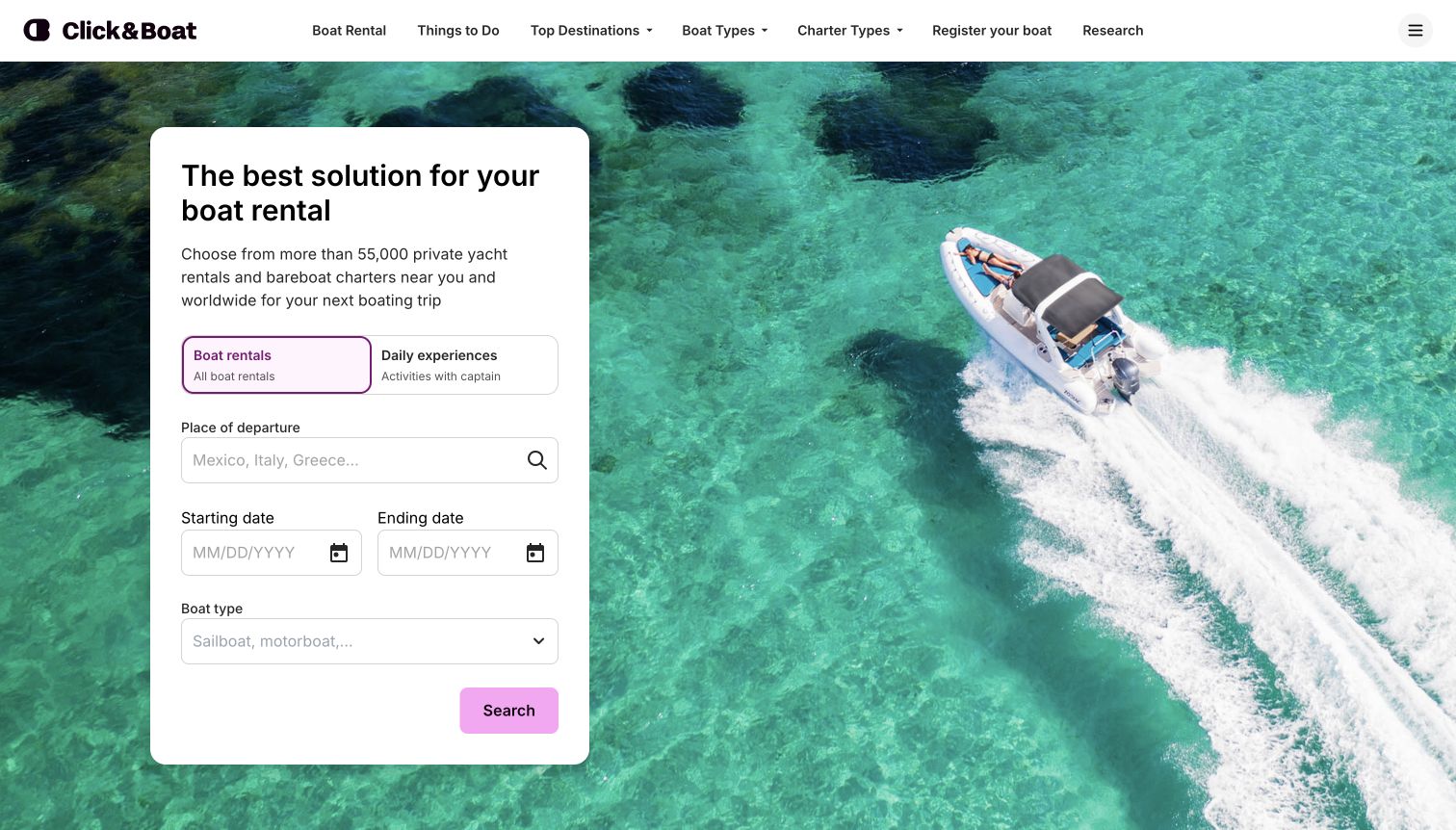
Click&Boat places a white search card over an aerial photograph of a small boat in clear water. The contrast makes the interface easy to distinguish from the destination imagery. Its two prominent modes separate boat rentals from daily experiences with a captain, an important distinction before a visitor starts comparing prices. Departure place, start and end dates, and boat type then follow a conventional sequence. Destination tiles and customer reviews extend discovery beneath the opening. The review presentation distinguishes rental dates from review dates, adding useful context. The broad headline is less distinctive than the interface; individual listings still need clear conditions.
What you can learn
Separate different service models before collecting detailed requirements. A person renting a vessel and a person buying a captained activity may start with the same destination but need different information, prices and expectations from the results.
Pros
The two modes explain the difference between renting and joining a captained experience.
A solid search panel remains readable against the large water photograph.
Cons & considerations
The introductory wording says less about selection criteria than the controls do.
Individual listings still need explicit explanations of crew, fuel and other inclusions.
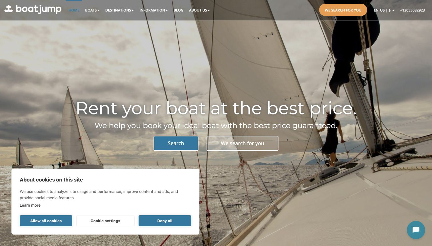
Boatjump presents two routes in its hero: searching independently and asking the company to search. The pairing helps customers who know a destination but need a boat recommendation. The sail photograph establishes the product, while region sections below connect broad destinations to specific ports and available boat categories. A short process explanation describes comparison and reservation steps. The strongest design idea is the visible alternative to self-service; assistance is not hidden at the end of an unsuccessful search. The first screen leans heavily on a price promise, though, and its consent panel occupies a substantial portion of the lower image in the captured view.
What you can learn
Offer a clearly labeled assisted path when the catalog requires specialist knowledge. Explain what help the customer will receive and keep it distinct from a search button, rather than using two similar calls to action that conceal different processes.
Pros
The opening offers both independent search and personal selection assistance.
Destination sections connect regional inspiration with practical ports and boat options.
Cons & considerations
A broad price claim gives little detail about what makes one charter suitable.
The large consent notice reduces the unobstructed space in the first view.
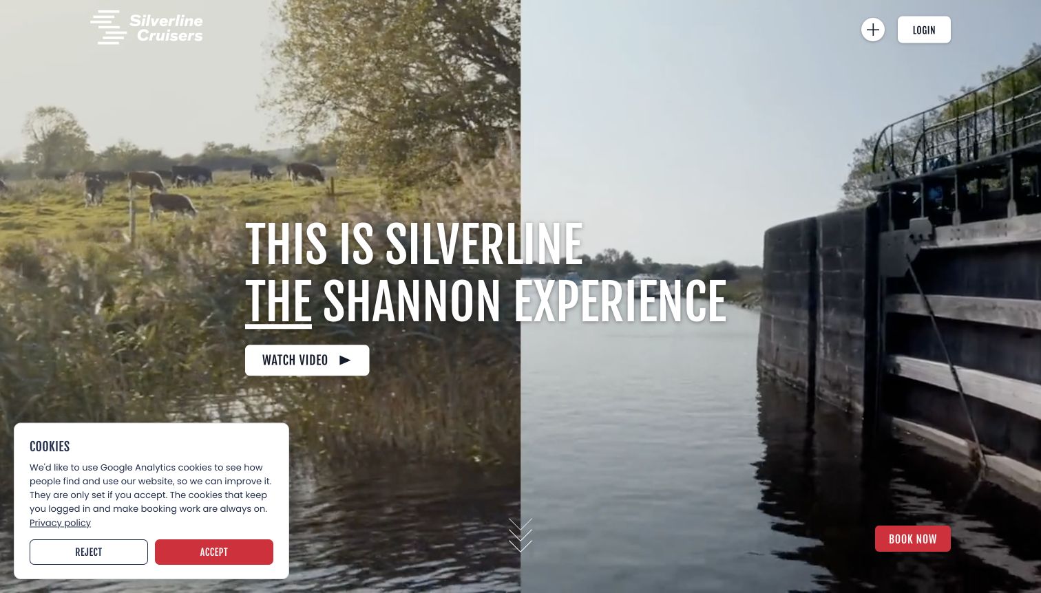
Silverline Cruisers leads with the Shannon setting through large moving imagery and an assertive regional headline. The opening asks visitors to picture the journey before selecting a vessel, with a booking action retained at the edge of the view. Below it, the page becomes more practical: an example boat has berth, dimensions and a minimum rental period, while activity links and a downloadable guide explain the surrounding trip. That combination is useful for a holiday whose value extends beyond the boat itself. The navigation is visually compact, but its plus control is less immediately descriptive than a conventional labeled menu.
What you can learn
Use destination storytelling to explain the holiday, then support it with real accommodation specifications and route resources. Keep the booking path persistent without allowing it to replace the information needed to choose an appropriate boat and length of stay.
Pros
Boat details connect the scenic pitch with berth and trip-length decisions.
The activities and navigation guide give the local setting practical value.
Cons & considerations
The large media-led opening postpones the fleet comparison.
A compact plus-style navigation control asks visitors to discover what it contains.
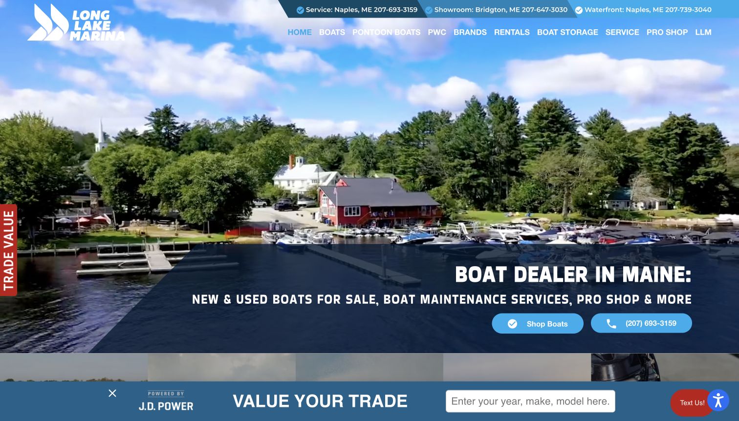
Long Lake Marina’s retained homepage view shows the physical waterfront and a clear Rentals item in the main navigation. The underlying business includes sales, service and storage, so this is a useful example of a rental offer sharing a larger commercial site. The current homepage also links a rental map, giving the rental path a practical companion rather than only a sales-style inquiry. The wide photograph establishes a real waterfront setting, and the utility strip distinguishes the service, showroom and waterfront contacts. The dominant headline and shop action remain oriented toward buying a boat. In the captured view, trade-in prompts further compete with the visitor who only wants to hire one.
What you can learn
Give rentals a first-level navigation item when they coexist with boat sales. Make the dock location and rental information easy to reach without requiring visitors to interpret inventory, financing or trade-in language intended for buyers.
Pros
The Rentals navigation item is visible within the broad marina offer.
Location-specific contact labels help distinguish the waterfront from other facilities.
Cons & considerations
The hero’s sales emphasis does little to explain the rental fleet.
Trade-in prompts occupy space that is not useful to a rental customer.
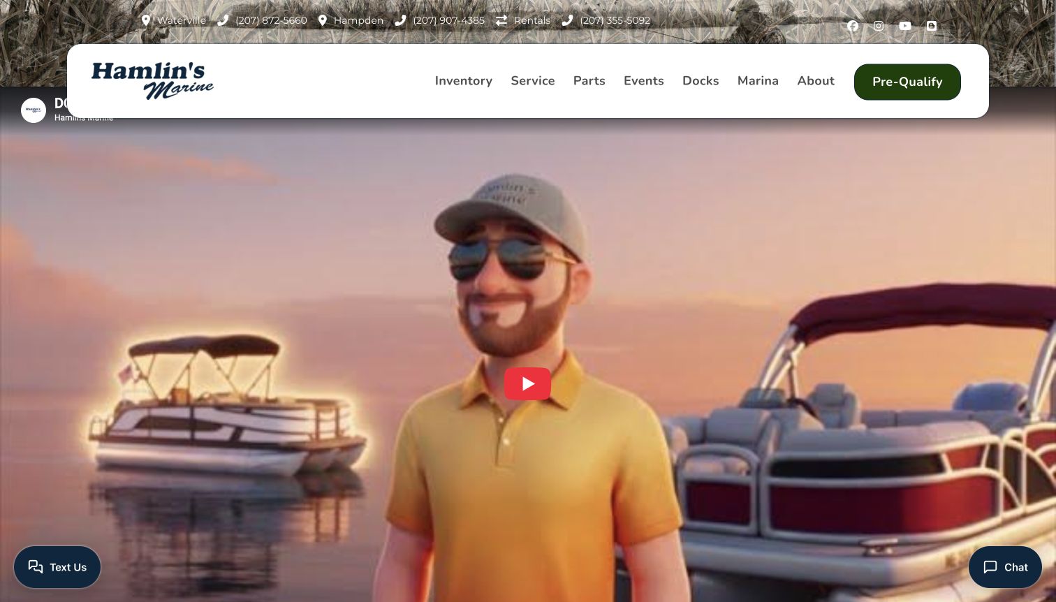
Hamlin’s Marine makes its rental telephone contact visible in the upper utility strip, alongside the locations serving its wider dealership business. The homepage also names boat rentals as a separate service, confirming that hiring a boat belongs within the offer rather than being inferred from marina imagery. Its retained opening view is dominated by a playful illustrated video thumbnail and a rounded white navigation bar. That adds personality, but the primary navigation and pre-qualification action are more relevant to buyers than renters. The rental service therefore relies on smaller utility information and the service content farther down the page to become clear.
What you can learn
A dedicated rental contact helps, but it should sit alongside a distinct rental journey. When a website serves ownership and short-term hire, label the two paths consistently and avoid sending a renter toward financing or a sales appointment by default.
Pros
The utility strip distinguishes the rental contact from the dealership locations.
The homepage explicitly includes rentals among the services offered.
Cons & considerations
The large video opening provides little practical information about hiring a boat.
Buyer-oriented navigation and pre-qualification receive stronger visual emphasis than rentals.
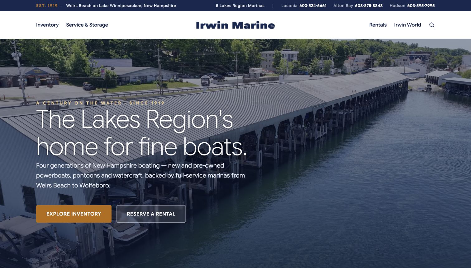
Irwin Marine gives rentals a prominent place in its retained hero. Beside the inventory action is a separate rental reservation button, so a visitor does not have to use a sales journey to find the short-term offer. A restrained navy header, large waterfront photograph and airy typography establish the regional setting. The current page also includes a rental section naming boat types and rental periods, then provides another availability action. The utility bar distinguishes locations, which matters when the business operates several facilities. Although the overall headline still describes a broad marine business, the paired calls to action acknowledge two different customer intentions at arrival.
What you can learn
When renting and buying are both important services, give each a clear entry point in the hero. Keep the labels specific and follow the rental path with duration, fleet and departure-location information instead of reusing the sales inventory structure.
Pros
The hero offers a direct rental action alongside inventory browsing.
Location contacts and a dedicated rental section make the wider operation easier to understand.
Cons & considerations
The broad brand headline does not itself describe the rental product.
Customers must still distinguish the relevant rental dock from other service locations.
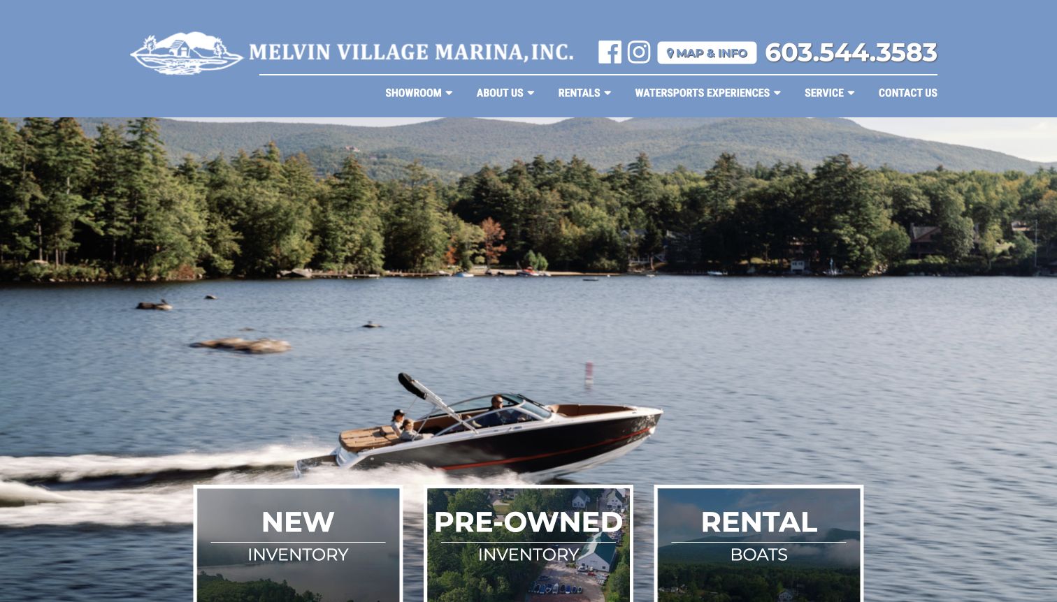
Melvin Village Marina places three large choices over its lake imagery: new inventory, pre-owned inventory and rental boats. Equal visual weight helps a business whose homepage also serves buyers. The navigation reinforces that distinction with a Rentals section, while the prominent telephone number and map link support local planning. The retained photograph establishes the lake setting without requiring a customer to watch a video. The company introduction and brand catalog emphasize dealership services, so the rental cards perform the initial sorting. Rental timing and policies belong on the linked detail pages rather than being assumed from the image.
What you can learn
Separate ownership from temporary use with clear category cards. If a marina has several services, let the rental route stand beside inventory and ensure it leads to the boat options, booking information and practical conditions needed for that specific task.
Pros
Rental boats receive equal prominence beside new and pre-owned categories.
The header makes local contact and map information straightforward to find.
Cons & considerations
The main image does not explain the available rental durations or capacities.
Dealership-oriented copy requires the dedicated rental pages to carry the practical detail.
Kegan is a freelance web designer and developer with 15+ years of experience helping businesses turn complicated website requirements into clear, maintainable digital experiences. He works directly with clients from planning and design through development, launch, and ongoing support.
For boat rental website design, his development approach focuses on rental fleet comparisons, capacity and location information, availability guidance and clear booking conditions. The scope can be a targeted improvement or a complete custom build, with responsive layouts, thoughtful content structure, and integrations chosen around the people using and maintaining the site.
Show 3 other boat rental website designersHide other boat rental website designers
Plan a boat rental website around the real booking decisions
Define the product and the departure point
Begin by mapping the actual rental offer. An hourly electric boat outing, a self-drive canal holiday and a captained charter may all involve a boat, but they have different durations, capacities and preparation needs. Explain the format before showing a large inventory. A small local fleet may only need a clear comparison and a date selector; a marketplace needs more structured filtering and a careful distinction between vessel hire and hosted activities.
Treat the departure point as part of the product. Give each operating location an accurate name, address and directions, and distinguish it from a sales showroom or service yard. If the business changes docks, place that information near the relevant booking route. Location names should agree across navigation, fleet cards, confirmations and practical guidance so returning customers do not rely on an outdated address.
Keep the rental path easy to recognize when the business also sells boats, provides storage or runs tours. A visitor should not need to understand dealership categories to find a short-term hire. Give renting its own navigation label and action, then make sure it leads to rental information instead of a sales appointment. Use separate wording for buying, hiring and joining a guided experience.
Build a fleet comparison that answers practical questions
Choose fields that reflect the kind of trip. For a day boat, passenger capacity, seating, weather cover and rental duration can be more useful than a long equipment list. For an overnight cruiser, sleeping arrangements and onboard facilities become central. Use the same units and labels across comparable boats, and explain unfamiliar terms. Customers should be able to identify a suitable option without inferring its capacity from a photograph.
Put the price basis beside the price. Explain whether the display concerns an hour, day, night or longer period and where to review inclusions and optional extras. Keep changing availability connected to maintained booking information rather than manually repeating it across many promotional pages. Where a marketplace lists different operators, do not imply that crew, fuel or other services are included identically across every result.
Show photographs that explain the vessel as well as the destination. Seating, boarding access and enclosed spaces can answer questions that an aerial water scene cannot. Label the boat or view where useful and keep essential written details available when video fails to load. A carousel or dramatic hero can establish atmosphere, but a plain comparison should still do the practical work of helping a group choose.
Support the customer before and after availability search
Provide beginner guidance without making unsupported promises. Explain the operator’s published requirements, the distinction between self-drive and captained use, and where a customer can ask about individual needs. Link to the current rental conditions at the relevant stage. Do not bury important information under broad reassurance or assume that an attractive website establishes the safety or suitability of a particular outing.
For longer holidays, connect boats with routes and local resources. A map, guide or destination page can help visitors understand the shape of the trip, but it should retain its own date and scope. Distinguish a suggested journey from a guaranteed itinerary, and keep seasonal operating periods separate from the ability to reserve a future date. Make changes in availability or launch arrangements visible where they affect a decision.
Keep inquiries focused and optional assistance easy to find. Some customers will want to search independently, while others need help narrowing down a boat or departure point. Label those routes differently and explain what happens after an inquiry. Avoid interrupting the initial decision with subscription prompts or unrelated sales messages, especially when a small screen already has to accommodate several trip controls.
The editing job behind the design
Choose tools that keep fleet and booking information consistent
Model boats, departure locations and rental periods as related records. Reuse their maintained descriptions across cards and detail pages instead of duplicating practical information in unrelated promotional sections.
Connect availability to the actual reservation system while preserving readable boat and location pages. Search widgets should improve comparison without becoming the only place to find capacities, operating format or the basis of a displayed price.
The technology observations accompanying these examples come from bounded public-page audits and retained source evidence. They identify supported public signals, not a complete inventory of private booking software, payment systems or vessel operations.
Our WordPress website examples offer a separate look at publishing approaches. A visible platform label is evidence for that named page, not a guarantee that the same system will suit your requirements.
Before the public launch
Boat rental website brief checklist
Identify whether the offer is self-drive, captained or an overnight charter.
Use clear rental actions distinct from boat sales and guided tours.
Name the actual departure point and distinguish it from other facilities.
Keep changed docks and seasonal operating notices visible.
Show passenger capacity or sleeping arrangements as appropriate.
Explain rental durations using consistent units.
Compare useful facilities instead of relying on vessel names alone.
Provide photographs that clarify the boat and its usable spaces.
Explain the basis of displayed prices and where to check inclusions.
Keep current requirements and rental conditions easy to investigate.
Connect availability labels to maintained booking information.
Offer route or destination resources for longer trips.
Provide an assisted inquiry route for customers who need help choosing.
Keep essential information readable without optional video or marketing widgets.
These checks are a project checklist, not a performance, legal, security, or accessibility certification. Test real journeys with the people responsible for the website before making claims about the result.
Sources & editorial method
How this collection was selected and reviewed
We reviewed these public websites on November 11, 2026, comparing rental formats, location choices, fleet information and the relationship between imagery and practical planning. Fifteen source views were captured directly that day; four original marina homepage captures from November 10 are retained with their actual dates and were reviewed again for this collection. The examples include dedicated rental operators, marketplaces and marine businesses with an explicit rental service. The Electric Boat Company was selected after comparison for its regional identity and practical distinctions between electric boat styles. Captures preserve the observed viewport, including notices and frames from moving media; the Duffy and Lake Powell views show specific rental pages. Every included exact source page has a bounded broad public technology-audit attempt or a retained prior record. This is an editorial assessment of website design and communication, not an endorsement of vessels, safety, qualifications or rental service quality.
Each example links to its actual source page. Screenshots are direct browser captures with their own capture dates; moving imagery, announcements and live designs can change. The notes describe observable design choices and conditional tradeoffs, not measured traffic, conversion results, service quality, or accessibility conformance.
Technology labels use public page metadata, asset evidence, or explicitly cited platform documentation. Platform documentation is not a complete current deployment audit. A component reference may be legacy or unused; it is not a complete backend inventory. Unknown stacks are omitted. These sites are editorial examples, not our client portfolio.
Written, Edited and Curated are separate editorial records, not timestamps advanced by a rebuild. Website designs and imagery belong to their owners. See our editorial standards or suggest a correction.
Questions worth asking
Boat Rental website design questions
What should a boat rental homepage explain first?
Identify the kind of outing, the departure location and whether customers operate the boat or travel with a captain. Then provide a clear route to suitable boats and current availability.
Should a small fleet use a large search tool?
Not necessarily. A small fleet may be clearer as a short comparison with capacity, facilities and rental periods. Add filters when the number and variety of options make them useful and the underlying information can be maintained.
How should day rentals and overnight holidays differ?
Day rentals need clear passenger capacity and hours, while overnight trips need sleeping arrangements, nights and relevant onboard facilities. Let visitors choose the format before presenting detailed search fields.
Can a dealership homepage also work for rental customers?
Yes, if renting has a clear navigation label and a distinct action. The rental route should lead to its own boats, practical information and booking conditions instead of a sales or financing journey.
What makes rental pricing easier to understand?
Keep the duration and price basis visible, explain where to review inclusions and extras, and connect availability to current booking information. Avoid implying that unlike listings include the same crew, fuel or services.
Does Editors Choice recommend the rental operator?
The selection recognizes observed website design and communication. It does not independently verify vessel condition, operator qualifications, insurance, safety or service quality.
Borrow the useful decisions behind the scenic images. Help visitors understand the boat, the departure point and the rental period before inviting them to reserve their time on the water.