Best Surf School Websites of 2026 (22 Real-World Examples)
22 surf-school websites showing how to explain lessons, learner levels, local logistics and the difference between coaching and a surf holiday.
A useful surf-school website turns the appeal of a wave into an understandable next step. These 22 examples show how imagery, lesson choices, ability descriptions and practical information can help a visitor decide what to investigate.
A first-time surfer, a parent arranging a family session and an experienced learner looking for focused coaching arrive with different questions. A good website acknowledges those differences before asking everyone to use the same booking button. It explains where lessons take place, how the formats differ and where someone can find the preparation information relevant to their situation.
This collection includes independent schools, local surf shops with teaching programs, residential coaching businesses and broader coastal activity operators. Each example has a directly inspected public page and an actual screenshot. The reviews concern website communication; inclusion does not verify instructional quality, safety, credentials, availability or the suitability of a particular lesson. Prices and seasonal statements are observations of what the provider published, not promises about a future booking.
Before the examples
What makes good surf school website design in 2026?
Describe the learner before naming the package
Explain ability levels with ordinary, concrete descriptions. Separate a first experience from a progression course, and distinguish age or group format from skill level. A person should not need to know specialist vocabulary to find a useful starting page.
Connect the beach image to the actual lesson
Use authentic teaching and location imagery, then explain the format, duration, meeting arrangements and equipment information. A dramatic wave can establish atmosphere, but a visitor still needs a clear account of what they are considering.
Keep practical information current
Seasonal hours, booking openings, meeting bases and lesson restrictions change. Give those facts an obvious home, make external booking transitions clear and review older links so a polished page does not lead to a placeholder or development address.
The collection · 22 examples
22 surf school websites worth studying
Look at how each site connects its opening image to a decision: audience routes, lesson comparisons, ability descriptions and local planning details. Capture labels identify the actual page and observed state. The reviews retain limitations such as intrusive promotions, older seasonal wording and unclear links instead of treating every example as a flawless template.
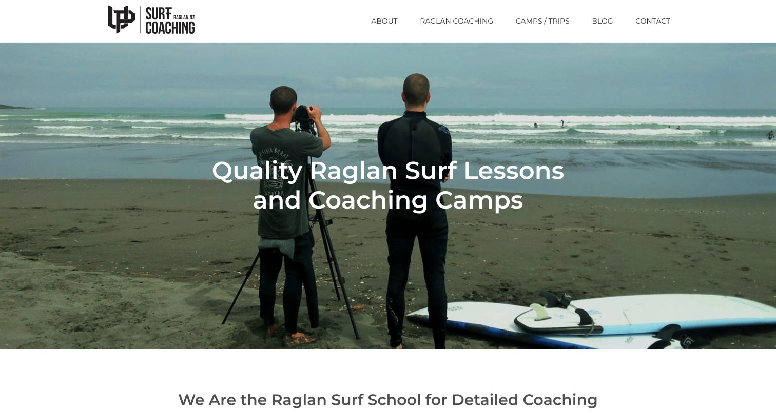
UP Surf Coaching makes the learning process visible. Its opening photograph shows a coach using a camera beside a student, giving the coaching proposition a specific visual rather than relying only on a beautiful wave. The homepage distinguishes lessons, multiday courses and more focused coaching, while the directly reviewed New Here page defines four levels through things a surfer can actually do. Those descriptions connect to appropriate course routes, making an unfamiliar catalog easier to interpret. The modest layout is less polished than some larger resort sites, and readers must leave the homepage to get the clearest level definitions. Its strength is the practical relationship between self-assessment and the next page.
What you can learn
Describe learning stages through observable abilities, then connect each stage to a relevant explanation. Keep the definitions easy to reach and avoid turning a course label into a promise that everyone will progress at the same pace.
Pros
The coaching photograph supports the stated teaching approach.
The level guide gives concrete distinctions between learner needs.
Cons & considerations
The most useful level definitions sit on a separate page.
The restrained presentation could make key course comparisons more prominent.
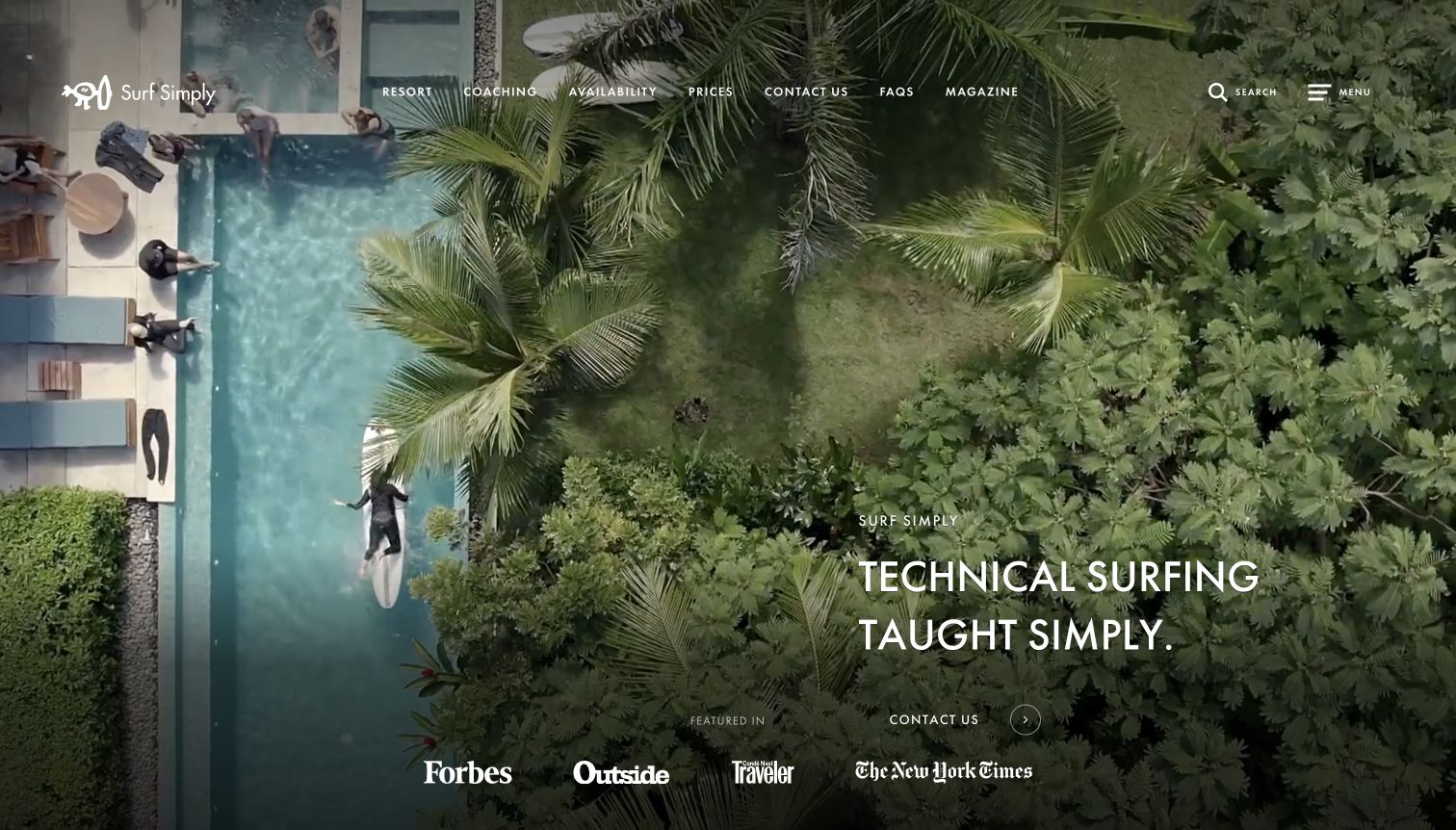
Surf Simply opens with a quiet aerial view of its resort, a small brand mark and a concise technical-coaching proposition. The navigation gives prices, availability and the coaching approach their own routes, which helps an expensive, immersive experience feel explorable. Farther down, the site describes video feedback, theory and in-water work as parts of one method. Tutorials, a skill framework and other learning resources extend that idea beyond the sales page. The opening can still look more like a hotel than a school, and the prominent media references do not explain the course by themselves. Detailed learning and inclusion pages are essential to understanding the offer.
What you can learn
When accommodation and teaching form one product, explain their relationship explicitly. Let imagery establish the setting, then give the curriculum, inclusions and planning information equal prominence so visitors can distinguish a learning program from a holiday with optional lessons.
Pros
Coaching, prices and availability have clear independent navigation routes.
Educational resources demonstrate how the site explains its subject.
Cons & considerations
The resort image initially outweighs the teaching detail.
Media logos require supporting substance rather than standing in for course information.
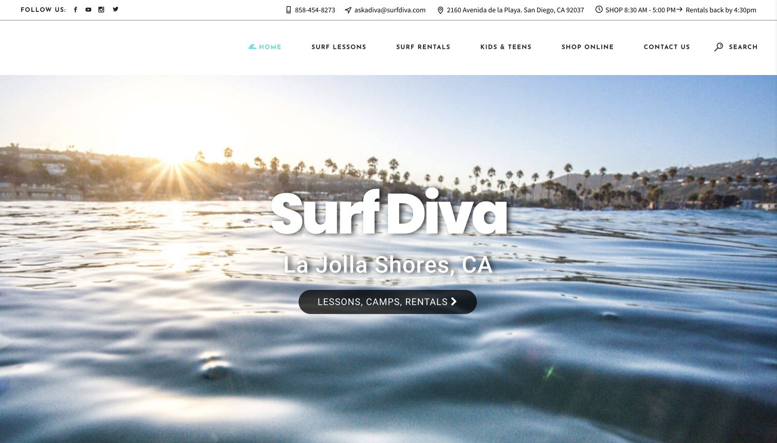
Surf Diva uses a beach-at-sunset image to establish La Jolla Shores, then places lessons, camps and rentals directly over it. The utility header includes the shop location, opening hours and equipment-return timing, bringing practical information unusually close to the top. Below, cards separate women’s clinics, youth camps, paddle lessons and team activities, with a further section acknowledging different surfing abilities. White lettering over the changing photograph also needs careful contrast. The strongest idea is the combination of a recognizable local place with three plain service labels rather than an abstract adventure slogan.
What you can learn
Use a small number of clear service choices at the entrance, then reveal audience-specific programs below. Practical shop and return information deserves a stable place of its own instead of being buried inside a booking process.
Pros
Lessons, camps and rentals are understandable first choices.
Location and operating details are visible in the utility header.
Cons & considerations
Repeated testimonial material lengthens the page without adding equivalent clarity.
Light hero lettering depends on the photograph behind it.
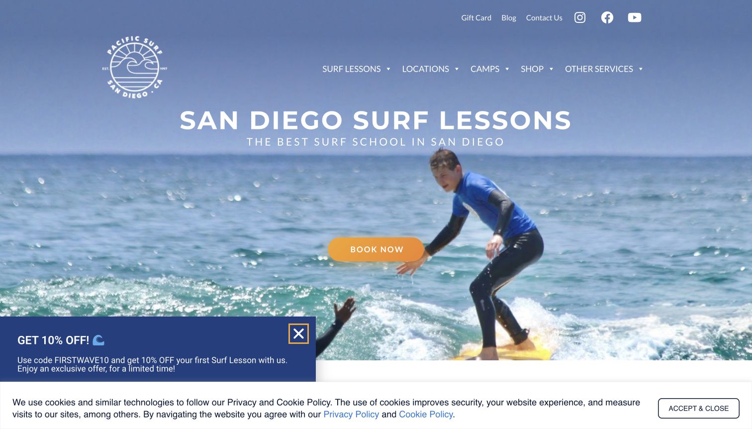
Pacific Surf School San Diego names both the activity and city in its main heading, with an amber booking button against a close photograph of a learner. The page then separates lessons, camps, packages and coaching instead of treating them as one offer. Its more useful local detail appears in the meeting information: named beaches, a street address and a description of the canopy to look for. Those details turn a broad destination promise into an arrival plan. The first-visit capture also contains a discount prompt and cookie notice that compete with the central action. Reputation statements and repeated booking buttons make the page insistent; the concrete location guidance is more persuasive than the superlatives.
What you can learn
Connect location language to an actual meeting explanation. A visitor planning an unfamiliar beach activity needs to know how the school is found, while promotions should leave the main lesson choices and practical directions easy to read.
Pros
The main heading establishes the activity and geographic area immediately.
Meeting-point details extend beyond a generic city name.
Cons & considerations
Several overlays compete with the initial lesson proposition.
Repeated booking prompts and superlatives dilute useful practical information.
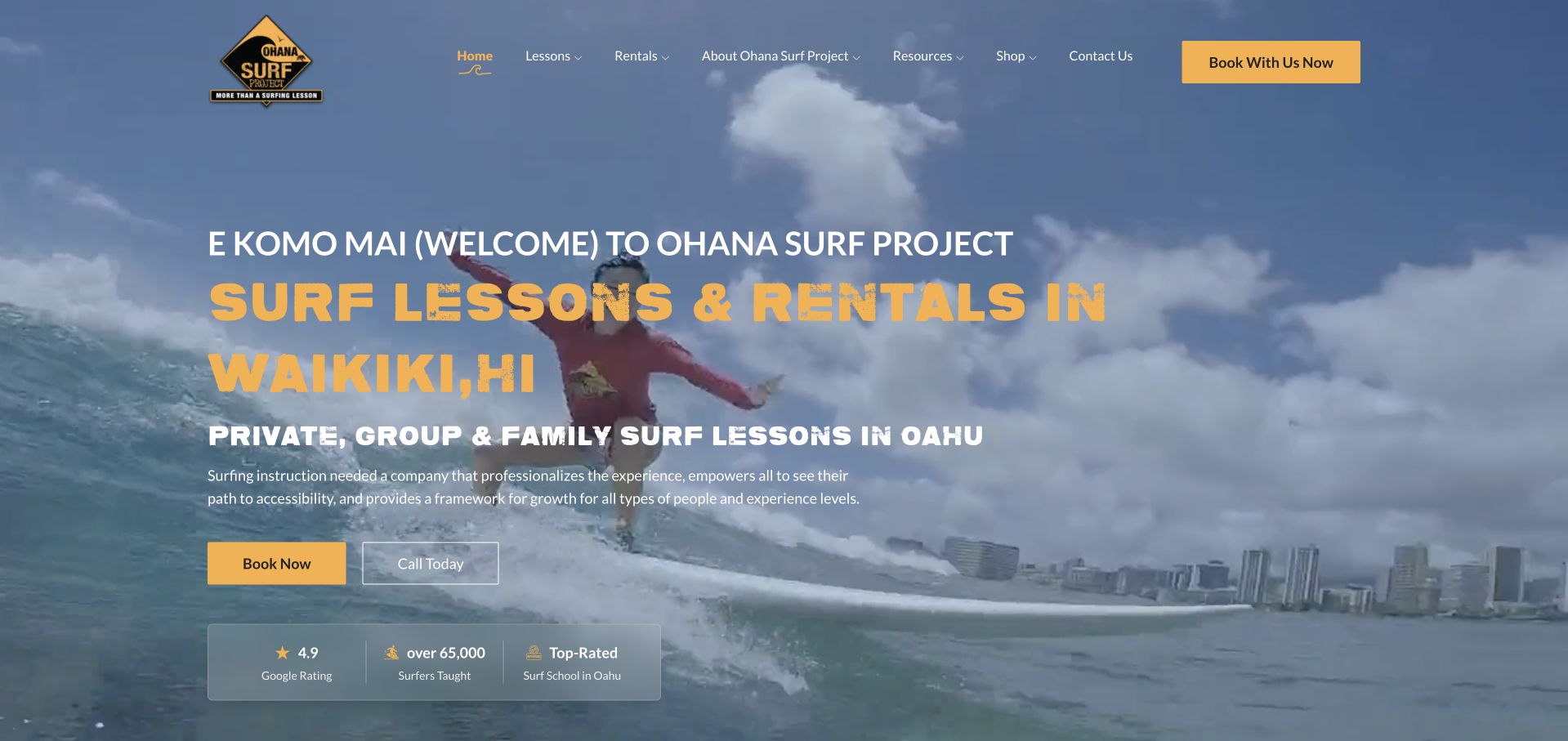
Ohana Surf Project combines a large Waikiki heading with separate booking and telephone actions over moving surf imagery. The page becomes more useful when it reaches the activity cards: surfing, paddleboarding and bodyboarding each receive a short purpose, duration and starting-price treatment. That repeated structure makes a mixed offer easier to compare. Rentals have their own section rather than appearing as another lesson type. The final capture follows an ordinary dismissal of a large promotion; the original interrupted view is retained in the research. The site also exposes some links to a development hostname in its public content, a maintenance weakness worth catching before visitors follow them. Safety and reputation claims remain the provider’s statements.
What you can learn
Use one concise information pattern for related activities, then keep lesson and rental paths distinct. Review every public destination during maintenance, including links inside otherwise polished cards, and keep promotional interruptions proportionate to the visitor’s task.
Pros
Activity cards consistently show purpose and duration.
A telephone option provides a clear alternative to online booking.
Cons & considerations
The initial promotional overlay conceals much of the homepage.
Some public links still point to a development hostname.
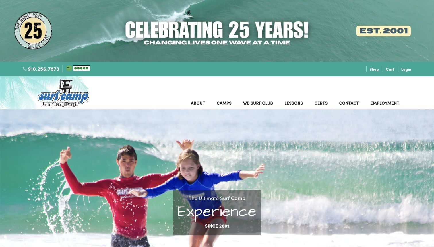
WB Surf Camp places an anniversary banner above its main navigation and uses a bright photograph of young surfers to establish an energetic camp identity. Camps, the surf club and lessons are separate top-level choices, while the expanded catalog distinguishes children, teens, adults and families. That audience structure matters because a residential camp and a local lesson involve very different decisions. Mission, environmental interests and editorial articles sit beside the commercial routes. Its opening spends a substantial amount of vertical space on heritage and branding before explaining an individual program. The catalog is extensive, so a newcomer may still need clearer guidance about which route fits their age and intended duration.
What you can learn
For a broad camp business, organize the catalog around audience and format before promoting individual destinations. Heritage can support recognition, but the first useful decision should not depend on reading an anniversary banner or understanding every internal program name.
Pros
Camps and local lessons have distinct navigation routes.
Audience groups help explain a varied program catalog.
Cons & considerations
Large branding areas postpone the first detailed program explanation.
The extensive menu can overwhelm a visitor choosing a first experience.
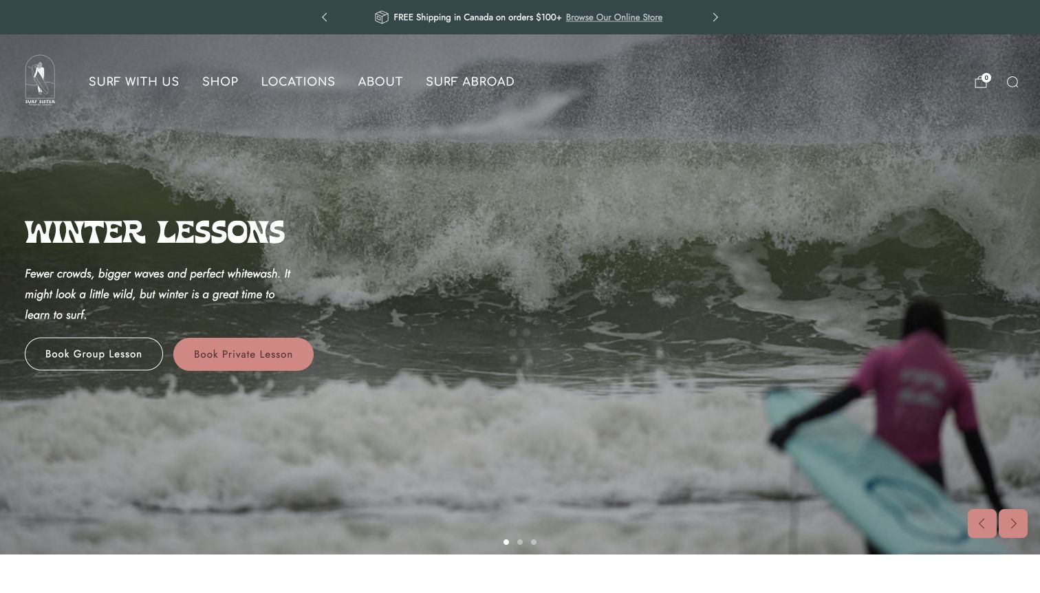
Surf Sister’s captured winter hero pairs a wave photograph with separate group and private lesson buttons. That is a useful seasonal change because it keeps the immediate choices specific instead of leaving a summer-only campaign at the entrance. Below, the site explicitly describes the people it welcomes and distinguishes lessons, camps, large groups and a resort-based surf shack. The guest-only restriction on the resort option is especially helpful: proximity does not imply that every visitor can use it. Pink accents and expressive type give the school a recognizable identity, while the shop and merchandise occupy considerable space later on. A rotating hero can also make important information dependent on which slide happens to appear first.
What you can learn
Update the entrance for the actual season and explain restrictions beside the relevant offer. An inclusive welcome becomes more useful when it connects to clear lesson choices, practical audience information and honest distinctions between public and guest-only services.
Pros
The winter entrance offers direct group and private lesson routes.
The resort option clearly identifies its guest-only scope.
Cons & considerations
Merchandise takes substantial space beside the teaching offer.
A rotating hero can make the opening message inconsistent between visits.
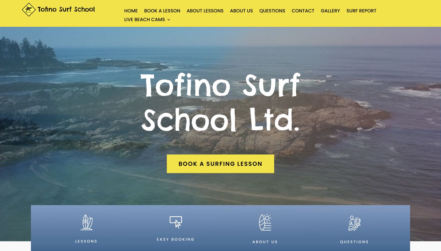
Tofino Surf School uses a yellow header and matching booking button against a large coastal photograph. The name and action are difficult to miss. Below, two lesson summaries make the offer more concrete: a group introduction and a private-group option with family context. A short owner-operated introduction and prominent questions route give the site a personal, local character. The explanation of a typical group ratio is more informative than the broader claims about experience that follow it. The opening title takes up considerable space, and the navigation contains many similarly weighted links. A tighter hierarchy could bring practical lesson differences into view earlier without losing the friendly presentation.
What you can learn
A narrow service range can be an advantage when the differences are explained clearly. Put the two or three relevant formats side by side, state the intended audience, and let a recognizable action color guide visitors toward the next planning step.
Pros
The action color is consistent across the header and main button.
Group and private-group summaries describe different visitor needs.
Cons & considerations
The oversized opening title delays the lesson comparison.
Many equally prominent navigation links weaken the primary path.
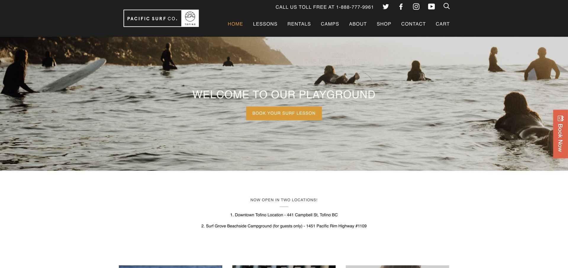
Pacific Surf Co opens with a warm water-level photograph and a direct surf-lesson action, then immediately explains its two locations. The distinction between the downtown shop and a campground service for guests is useful operational information, not just a second address. Three service blocks separate lessons, rentals and apparel, preserving different intentions within a retail-led business. A black header keeps these routes visually consistent. A newsletter promotion originally obscured the page; the final capture follows its ordinary Close control, with the first view retained privately. Farther down, social links, merchandise and older editorial posts compete with lesson planning. The page would benefit from bringing equipment and arrival details closer to its principal action.
What you can learn
When several locations offer different access, explain the distinction before booking. Keep retail and instruction clearly labeled, and avoid using an immediate subscription request to interrupt a visitor who has not yet understood where the service takes place.
Pros
The two-location explanation states the campground access restriction.
Lessons, rentals and apparel are distinct service routes.
Cons & considerations
The initial signup overlay blocks much of the first view.
Retail and social content lengthen the path to practical lesson information.
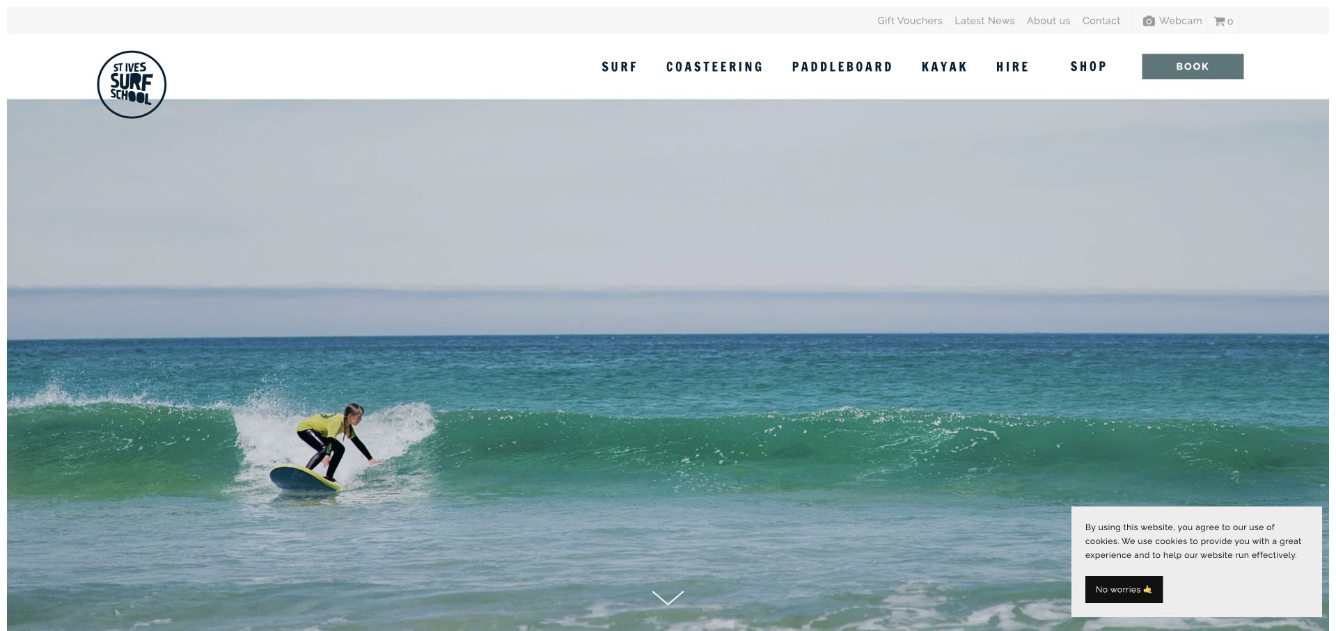
St Ives Surf School lets a large surf photograph dominate the entrance, framed by a restrained white header and activity labels. Surfing, paddleboarding, kayaking, coasteering and hire remain distinct rather than disappearing into a generic experiences menu. The body explains that different equipment and activities operate from two beach bases, giving the scenery a practical geographic meaning. Illustrations and photography credits add personality. The main image carries little explanatory text, so a new visitor must scroll to understand the service. A seasonal modal appeared in the original capture but was absent on the later revisit used here; the cookie notice remains visible. Both states illustrate the need to keep announcements from interrupting the core activity choice.
What you can learn
Use an evocative place image alongside explicit activity routes and base information. If different beaches serve different purposes, explain that relationship early, and make seasonal updates readable without requiring an interruption before the visitor can explore the school.
Pros
The main navigation separates activities using familiar labels.
The body explains how services differ between the two beach bases.
Cons & considerations
The image-heavy opening delays the practical introduction.
Seasonal and cookie notices can compete with the first impression.
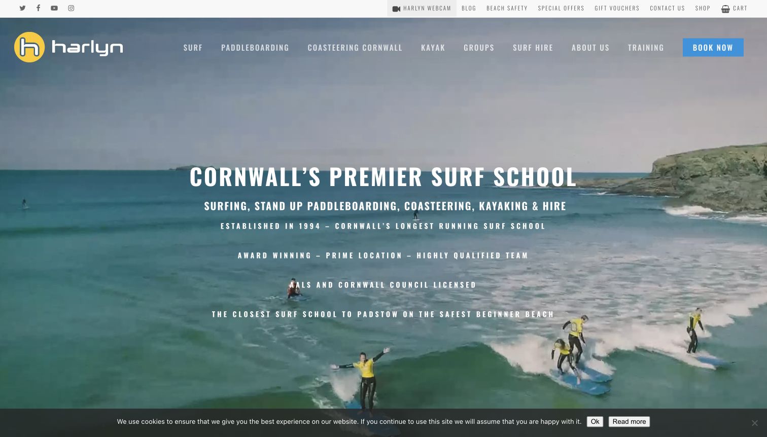
Harlyn Surf School uses a moving coastal scene and a wordmark to establish its setting and names the activity range in the opening text. Surfing, paddleboarding, coasteering, kayaking and hire receive separate navigation routes and corresponding sections below. Utility links for the webcam, beach information and contact sit above the main menu, keeping local planning resources accessible. The photograph communicates the beach environment, but the dense set of all-capital claims competes with that clarity. Assertions about being the premier school or safest beach should not substitute for specific participant information. A cookie strip occupies the lower edge. The transferable idea is the clear activity architecture, supported by practical local resources rather than reputation language alone.
What you can learn
A multi-activity school needs an explicit category system and relevant local planning links. Keep the main introduction concise, then explain each activity’s audience and format on its own page instead of asking a long list of superlatives to do the work.
Pros
Distinct activity routes make the wider offer discoverable.
Local information is accessible through the utility navigation.
Cons & considerations
Dense all-capital text competes with the coastal imagery.
Broad comparative claims provide less help than concrete course details.
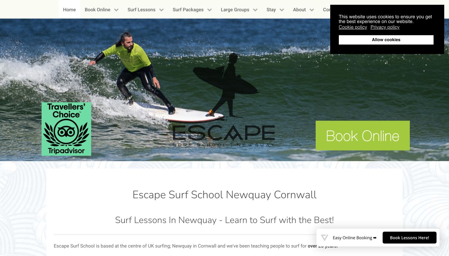
Escape Surf School combines an action photograph, a prominent logo and a bright booking button at the top of its Newquay homepage. Its more distinctive contribution is the range of learning routes below: private lessons, group courses, intermediate instruction and a dedicated progression weekend. Prices, accommodation packages and larger-group options are also directly named. The opening is visually busy, with a third-party award graphic, a cookie panel and a floating booking control competing with the image. The black logo is less readable over darker parts of the photograph. A calmer first screen would let the useful progression choices carry more of the message.
What you can learn
Do not make every visitor enter through a beginner offer. Explain the next step for returning learners, give progression products meaningful names and descriptions, and keep decorative recognition or repeated booking controls subordinate to those distinctions.
Pros
Intermediate instruction has a visible place in the service structure.
Prices and accommodation packages have explicit routes.
Cons & considerations
Multiple overlays and promotional elements crowd the opening.
The dark logo loses clarity against parts of the hero photograph.
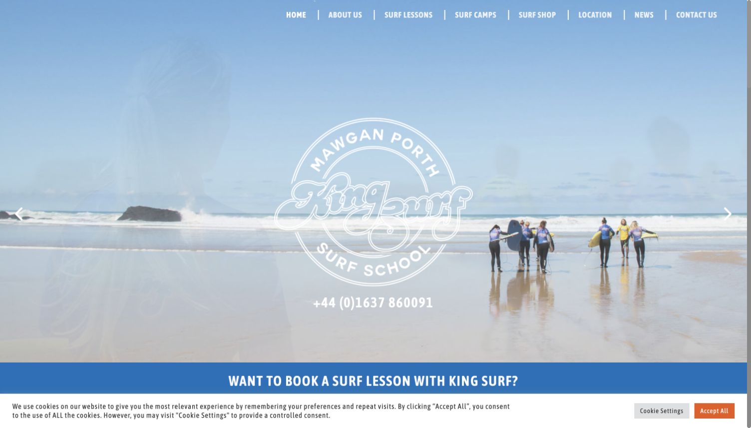
Kingsurf’s large circular mark sits over a wide view of Mawgan Porth, with a prominent telephone number and a blue booking strip below. Navigation separates beginner, intermediate, family, private and group lessons, which gives visitors more useful choices than a single undifferentiated booking link. Location content extends to accommodation and places to eat, acknowledging that some visitors are planning a trip around the lesson. The large logo and pale treatment reduce contrast in the opening, while course specifics remain below the first screen. The copy also relies on sweeping claims about uncrowded conditions and progress; those statements need provider confirmation and should not be treated as conclusions of this review.
What you can learn
A local beach identity can support discovery, but practical lesson routes should remain legible over the imagery. Separate audience and ability choices, and use destination information to support planning without promising conditions that the website cannot guarantee.
Pros
Lesson navigation distinguishes both ability and group format.
Location resources recognize the needs of visiting learners.
Cons & considerations
The pale hero treatment makes the main identity less distinct.
Broad condition and progress promises need more careful qualification.
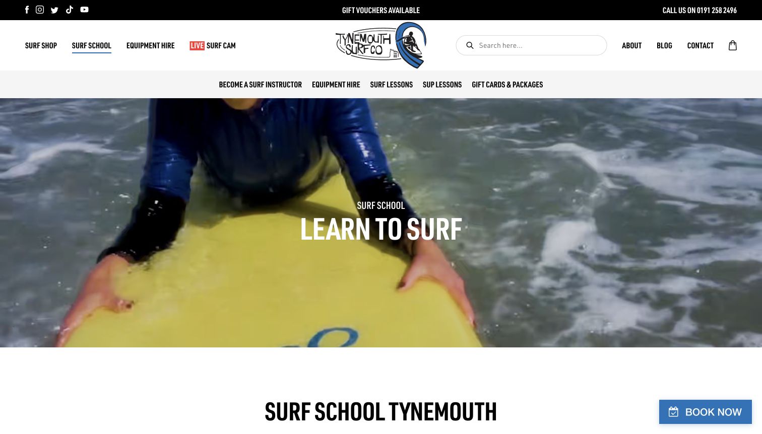
Tynemouth Surf Co gives its school a dedicated page and secondary navigation within the broader shop website. The captured hero shows a learner at water level rather than presenting merchandise, making the change of context clear. Below, lesson cards expose useful comparison details such as intended age, duration and format, while private sessions and school groups have their own options. Instructor training and equipment hire are available without replacing the core lesson route. The layered header is comparatively tall, and the large hero pushes the practical cards down the page. Customer quotations also repeat extensively in the extracted content.
What you can learn
When a school shares a site with a shop, create a focused instruction landing page. Keep lesson facts in a consistent pattern and make the transition clear, so someone comparing learning options does not have to navigate the full product catalog.
Pros
The school has a distinct route and supporting navigation.
Lesson cards expose age, duration and format information.
Cons & considerations
Several navigation layers consume substantial vertical space.
Repeated testimonials lengthen the page after the useful comparisons.
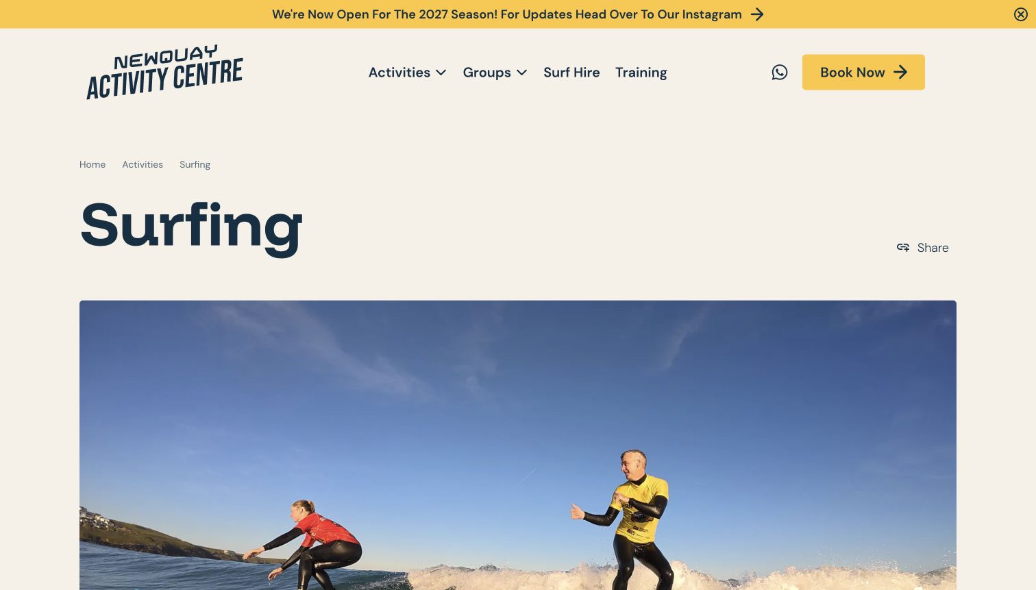
Newquay Activity Centre’s surfing page uses a simple breadcrumb, a very large activity title and a wide photograph before introducing the lesson options. Its cards provide the strongest planning pattern: public, family and private sessions show audience, duration and price basis in a repeated sequence. That makes the difference between a per-person offer and a group arrangement easier to spot. Qualifications and team information have their own routes farther down. The opening photograph occupies most of the first view, while the seasonal announcement refers to the following year. That banner needs careful wording so advance planning is not confused with current operating availability.
What you can learn
Use comparable facts to distinguish lesson formats within a larger activities business. Label the price basis and audience clearly, and keep future-season announcements separate from current availability so visitors understand exactly what a booking action refers to.
Pros
Lesson cards use a consistent set of practical comparison fields.
Breadcrumbs clarify the page’s place within the activities catalog.
Cons & considerations
The large opening postpones the actual lesson choices.
A future-season announcement needs explicit context for present-day visitors.
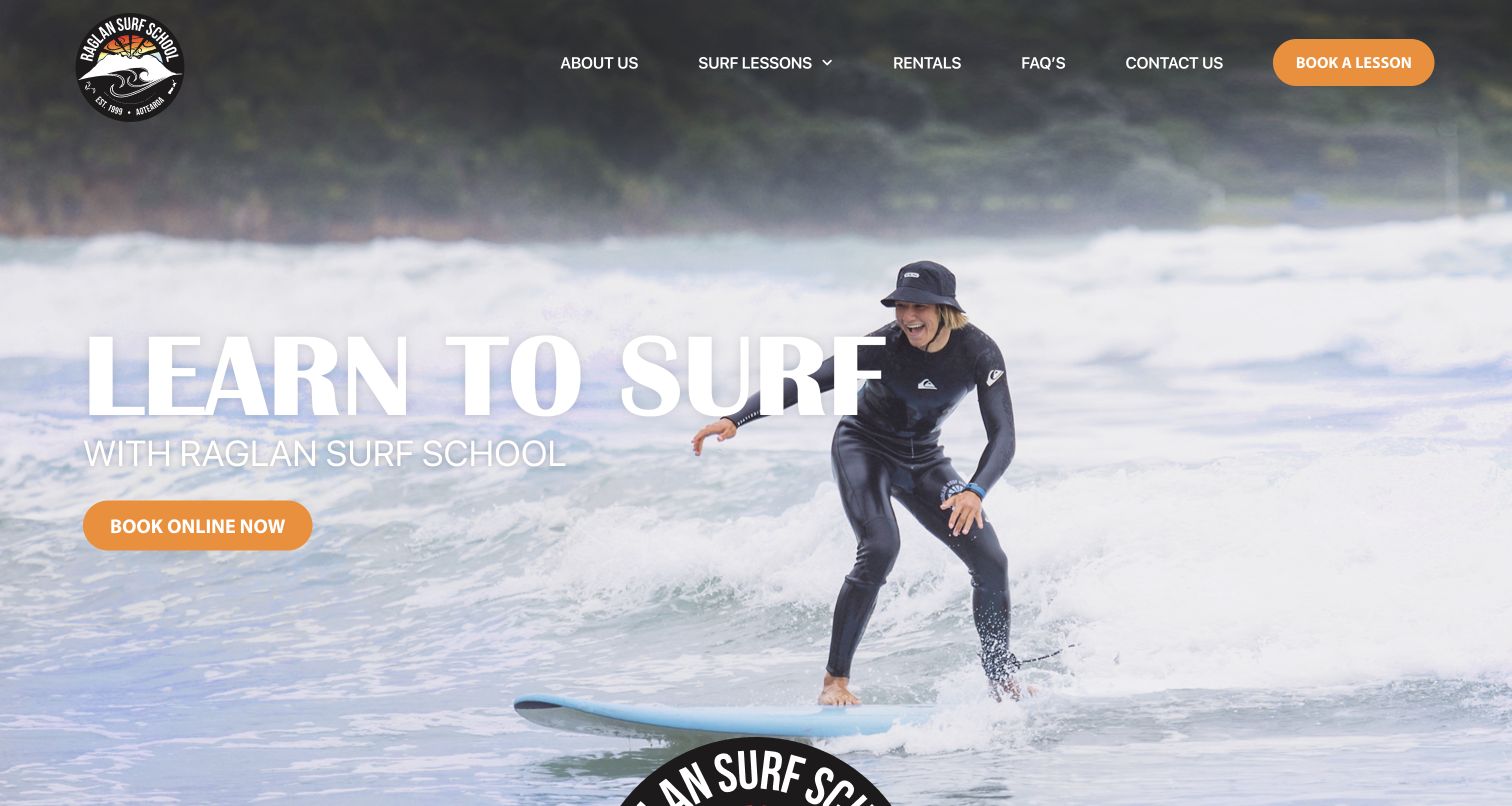
Raglan Surf School places a smiling learner and a straightforward learn-to-surf message at the center of the homepage. The orange booking action stands out without requiring a separate promotional panel, and the crest gives the otherwise simple layout a recognizable identity. Below, the school separates group lessons, private sessions, family options, packages and rentals. The visual warmth is useful for a visitor uncertain about a first lesson, although the initial message does little to distinguish the individual formats. Repeated enthusiastic language farther down could be replaced with more concise preparation details. The design works best when the welcoming image leads quickly to a specific choice.
What you can learn
For a beginner-focused school, show the learner as well as the wave. Follow the welcome with clear format differences and practical preparation, so a reassuring first impression develops into an informed decision rather than a string of promotional statements.
Pros
The learner photograph makes the opening approachable.
Group, private and family routes are separately named.
Cons & considerations
The opening does not yet explain how lesson formats differ.
Repeated enthusiastic copy competes with practical preparation information.
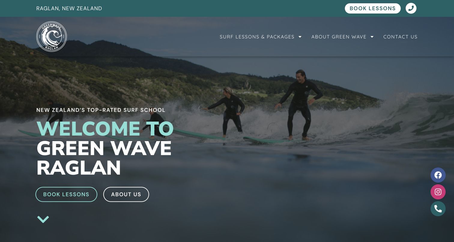
Green Wave Raglan uses a teal utility strip for location, lesson booking and telephone contact, then repeats the color in a large welcome heading over surf imagery. The longer page distinguishes daily lessons and packages and answers concrete questions about meeting arrangements, equipment and cancellations. Those explanations help a visitor evaluate the logistics before making contact. Vertical social icons and the large overlaid heading add visual competition around the central offer. One public FAQ link points to a test-site hostname, which is a useful reminder that polished content still needs destination checks. The practical questions clarify the difference between one-day experiences and continued instruction.
What you can learn
Put everyday planning questions close to the offer and keep contact information easy to find. When a site is revised, check the destinations inside older FAQ answers as carefully as the prominent buttons, because those links remain part of the visitor journey.
Pros
The utility strip keeps local contact and booking information visible.
FAQs address practical details beyond the initial promotion.
Cons & considerations
The large heading and social controls compete for attention.
A test-site link remains in the public FAQ content.
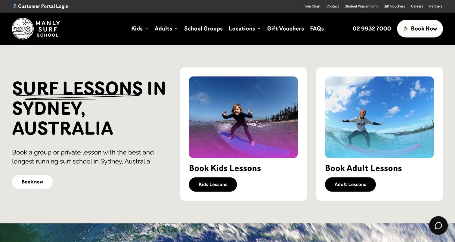
Manly Surf School uses two large rounded image cards to split the entrance into children and adults. That decision is easy to understand before a visitor reads the broader Sydney proposition. A dark header, cream background and oversized typography give the page a clear visual identity, while the main booking action remains separate from utility links. The wider site also exposes a participant portal, tide information, contact and preparation-related resources. The header carries many tasks, however, and a broad age split alone cannot explain ability level, lesson format or location. The cards work as a starting point, followed by comparisons that acknowledge different adult learning needs.
What you can learn
Use a small number of audience cards when they represent genuinely different services. Treat them as the start of the decision process, then explain ability, format and location within each route while keeping returning-customer tools visually secondary.
Pros
Children and adults have immediately understandable starting points.
The visual card system makes the first choice prominent.
Cons & considerations
Utility tools and business links make the header relatively busy.
Age alone does not explain the full range of learner needs.
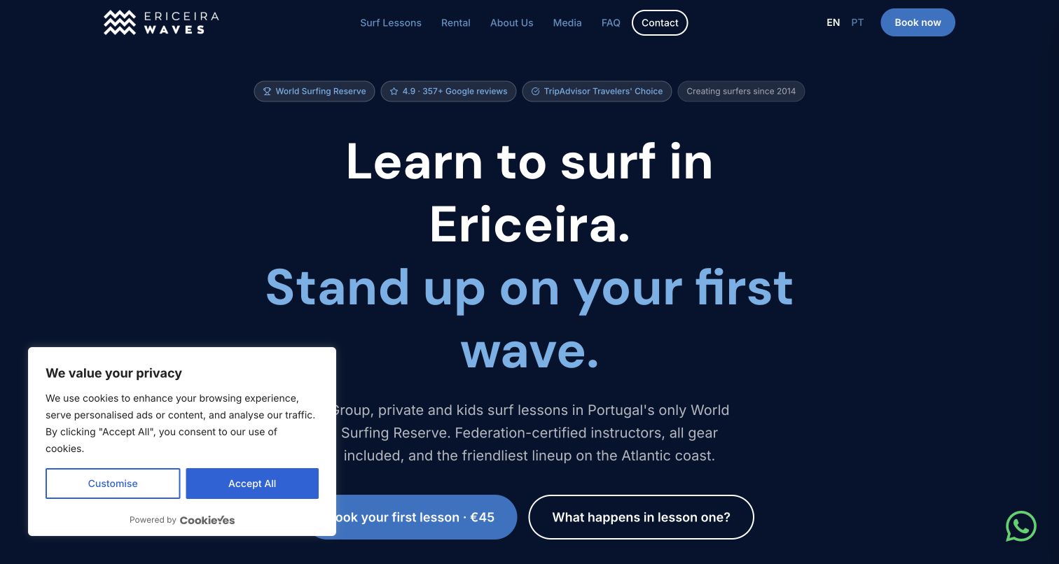
Ericeira Waves places its location and beginner offer in a large centered heading on a dark blue background. A prominent lesson action sits beside a route explaining what happens in the first session, a useful alternative for someone who is interested but not ready to book. The page continues with lesson stages, equipment inclusions, audience choices and practical pricing information. Light blue highlights and generous spacing make the explanation feel coherent. The opening also contains a bold progress promise that should not replace realistic expectations about individual learning. A cookie panel overlaps part of the initial view. The valuable pattern is the explicit invitation to understand the lesson before committing, supported by concrete descriptions rather than only images of accomplished surfers.
What you can learn
Give uncertain beginners a clear explanation route beside the booking action. Describe the session, inclusions and intended audience in ordinary language, while avoiding guarantees about a particular result that will vary with the person and conditions.
Pros
A first-lesson explanation offers an alternative to immediate booking.
Practical lesson stages and inclusions support the main offer.
Cons & considerations
A prominent progress promise needs careful qualification.
The first-visit cookie panel overlaps the introductory view.
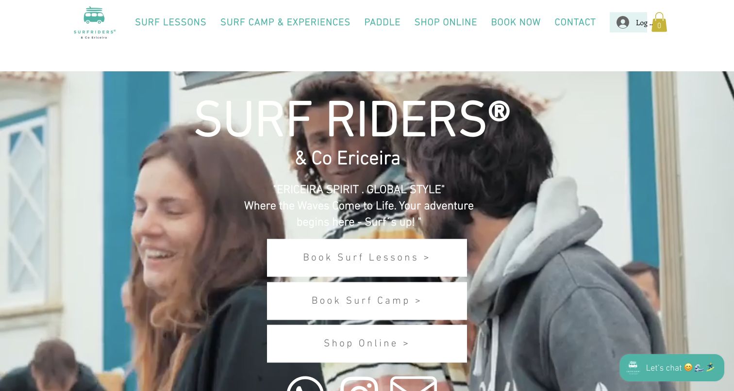
Surf Riders & Co uses a mint-colored identity and a broad lifestyle image to introduce its Ericeira business. Three large buttons separate surf lessons, surf camp and shop, making the combined operation understandable without a long explanation. Below, service cards and product information extend those routes, while location and meeting-point details give visitors practical context. The opening image shows the social setting more strongly than the teaching process, which may leave a first-time learner looking for further reassurance about the lesson itself. Retail prices and accommodation content also compete with instruction as the page continues. Its three routes organize related but different commercial offers.
What you can learn
When lessons, stays and retail share a brand, give each a clear destination before mixing their details. Use lifestyle imagery to establish the setting, then show the actual learning format so the visitor does not have to infer what a lesson includes.
Pros
Lessons, camp and shop are clearly separated at the entrance.
Location information connects the lifestyle presentation to practical planning.
Cons & considerations
The opening emphasizes the social setting more than instruction.
Retail and accommodation content compete with lesson details farther down.
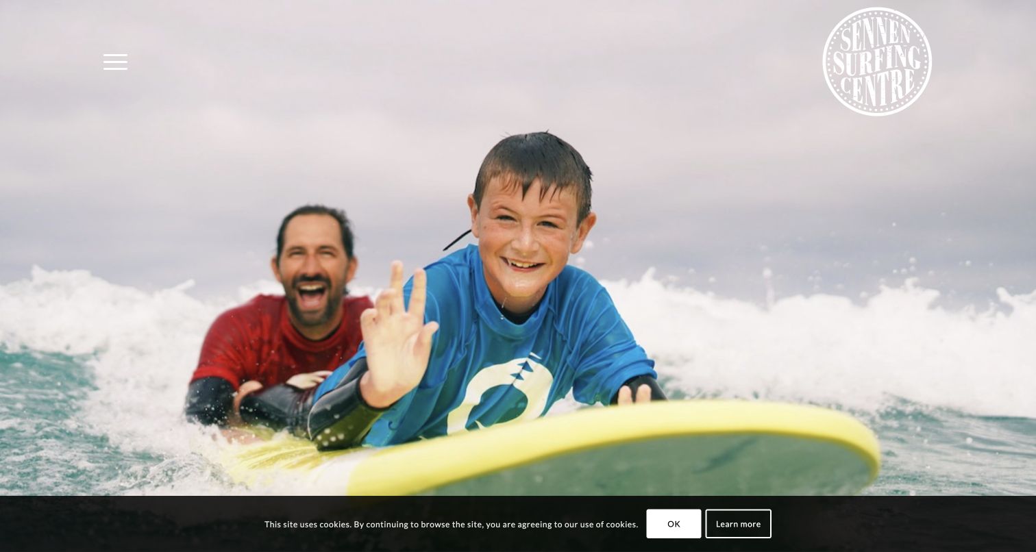
Sennen Surfing Centre opens with a close photograph of a child on a board and an instructor behind, creating a more personal first impression than a distant wave. The crest and compact menu leave most of the image unobstructed, although the lack of an explanatory headline means the visitor must scroll for the offer. Below, group and private lessons, team information and practical details begin to establish the school. The reviewed page still carries summer wording and an October closing reference despite the November observation, making its current status unclear. One booking link also retains a placeholder destination. These limitations matter because an appealing photograph cannot compensate for uncertain operational information.
What you can learn
Choose a photograph that shows the teaching relationship, then support it with current service information. Assign responsibility for seasonal copy and booking destinations so the emotional promise is followed by a dependable explanation of what visitors can actually arrange.
Pros
The close teaching photograph communicates a human learning experience.
Group and private instruction are described separately below.
Cons & considerations
Seasonal wording is older than the observation date.
A public booking destination remains a placeholder link.
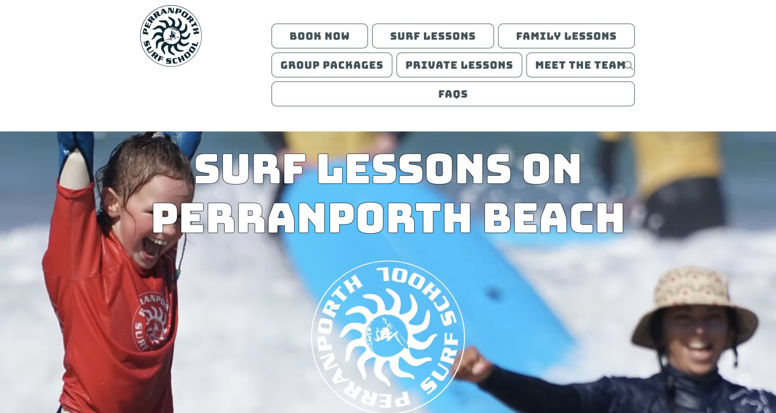
Perranporth Surf School combines a large crest with a grid of outlined navigation buttons for booking, lessons, families, groups, private sessions and common questions. The labels make the range visible without requiring a visitor to discover a hidden catalog. A cheerful beach-group photograph provides the emotional context, while the longer page describes lesson duration, beginner suitability and practical contact arrangements. The oversized branding repeats the place name and consumes space that could explain the lesson sooner. Equal treatment of many buttons also makes the primary route less clear. The useful lesson is the visible service menu, supported by practical questions and seasonal arrival information.
What you can learn
Make the main lesson formats easy to discover and keep arrival information current throughout the year. A welcoming group image can support that structure, but the design still needs a clear first action and room for a concise explanation of the session.
Pros
The navigation exposes family, group and private lesson routes.
Practical questions and seasonal location details support planning.
Cons & considerations
Oversized repeated branding delays the service explanation.
Similarly styled navigation buttons create a weak priority hierarchy.
Kegan is a freelance web designer and developer with 15+ years of experience helping businesses turn complicated website requirements into clear, maintainable digital experiences. He works directly with clients from planning and design through development, launch, and ongoing support.
For surf school website design, his development approach focuses on surf school websites that explain ability levels, lesson formats, equipment and coastal conditions with clear booking information. The scope can be a targeted improvement or a complete custom build, with responsive layouts, thoughtful content structure, and integrations chosen around the people using and maintaining the site.
Show 3 other surf school website designersHide other surf school website designers
Plan a surf-school website around the learner’s next question
Build a useful lesson decision map
List the questions people ask before they know your product names. Some want to try surfing once; others want a private family session, a sequence of lessons or help with a particular skill. Begin with those intentions and map them to the services you actually offer. Keep audience, ability and format separate: an adult is not necessarily a beginner, and a private lesson is not automatically advanced. Write short level descriptions using observable abilities rather than vague labels such as confident or experienced. Let people read those descriptions without entering a booking system. For each route, explain who it is intended for, which published prerequisites apply and where an uncertain visitor can ask for clarification. Avoid making an online self-assessment look like a professional suitability decision. Review the map with the staff who answer inquiries, because they know which terms regularly confuse visitors. Then test the page structure with a few realistic questions, such as a parent comparing a family lesson with a children’s group or a returning learner considering a multiday course. Each route should lead to a useful explanation before requesting personal information.
Create one dependable lesson information pattern
Choose a consistent sequence of facts for comparable lesson pages. Start with intended audience and learning format, then explain the published duration, meeting location, equipment arrangements and next planning action. If prices are displayed, label whether they apply to a person, a private group, a session or a package. Explain what a starting price leaves unresolved without making visitors interpret a calendar to understand the basic offer. A school with several beaches or shop locations should state which one applies to each product and how any later location confirmation works. Keep preparation and cancellation information accessible from the lesson description, with clear provider-approved language. Do not replace those details with broad guarantees about conditions, progress or safety. When an external service handles reservations, identify the transition and maintain the explanation on the school’s own website. Someone should still understand the lesson if they choose not to open that tool. Finally, compare the homepage cards, detailed pages and external listings together. Repeated facts should agree, and each booking button should lead to the intended service rather than a general catalog that forces the visitor to start again.
Plan seasonal maintenance before publishing
Create an inventory of every time-sensitive statement: lesson seasons, office hours, school-holiday programs, camp dates, special offers and future booking announcements. Assign someone to each item and give updates a normal place in the operating routine. A school may stop teaching for a season while still taking inquiries, so explain those states separately. Avoid a large future-season banner that leaves present availability ambiguous. Check public link destinations after a redesign, especially older FAQ answers and embedded product cards; test-site addresses and placeholder links can survive even when the main navigation looks finished. Keep ordinary notices proportionate to the task. A newsletter offer should not cover the entire lesson proposition before a visitor has read it, and dismissing it should not require a subscription. Review imagery as well as text when programs change so the website continues to represent the current offer. Preserve useful learning resources when a season ends, but label dated announcements honestly. A small recurring content review is more valuable than an occasional visual redesign if it keeps the practical facts and next steps dependable throughout the year.
The editing job behind the design
Choose tools that keep lesson information consistent
Choose a content system the school can maintain during the operating season. Updating a lesson format, meeting instruction or seasonal notice should not require copying the same fact into several unrelated templates.
Keep booking, retail and instruction content distinct even if they share one platform. A visitor should be able to understand the lesson without creating an account, entering personal details or navigating a product shop.
Use photographs and video deliberately. Provide readable text and a meaningful static frame so the offer remains understandable when motion does not play or a carousel opens on another slide.
The example stacks record bounded public-source observations. Visible libraries, analytics references, fonts and delivery services do not reveal the entire backend or prove an unseen booking system. Unavailable and limited audits remain qualified; missing components are not guessed.
Our WordPress website examples offer a separate look at publishing approaches. A visible platform label is evidence for that named page, not a guarantee that the same system will suit your requirements.
Before the public launch
Surf-school website planning checklist
Give first-time learners a plainly labeled starting route.
Describe ability levels with concrete, understandable criteria.
Separate audience, ability and private or group format.
Explain how a single lesson differs from a package or residential course.
State the relevant meeting base and preparation route for each offer.
Label price basis and equipment inclusions where the provider publishes them.
Keep lesson information readable before an external booking transition.
Review seasonal dates, office status and future booking announcements together.
Check every public link for old development or placeholder destinations.
Keep promotional overlays dismissible and proportionate.
Use authentic teaching imagery alongside place photography.
Keep provider claims about credentials, safety and outcomes accurately qualified.
These checks are a project checklist, not a performance, legal, security, or accessibility certification. Test real journeys with the people responsible for the website before making claims about the result.
Sources & editorial method
How this collection was selected and reviewed
This collection preserves the saved random draw of 22 distinct surf-school website properties. Each original review combines direct reading with an inspected browser screenshot captured on November 10, 2026 UTC. Two examples use specific instruction pages; the remaining examples use their public homepages. Three earlier captures obscured by promotions were retained privately and replaced by genuine later views after ordinary dismissal or revisit; no image content was fabricated. Other notices remain visible as captured. No forms, subscriptions, accounts, payments or bookings were submitted. Every captured source page received a bounded broad technology-audit attempt, with access restrictions and unavailable results respected. UP Surf Coaching is the explicit Editors Choice for its concrete ability-level explanation and connections to relevant learning routes, supported by direct review of its New Here page. This is an editorial website-design selection, not a service-quality, safety or qualification endorsement. Seasonal wording and other limitations remain part of the reviews.
Each example links to its actual source page. Screenshots are direct browser captures with their own capture dates; moving imagery, announcements and live designs can change. The notes describe observable design choices and conditional tradeoffs, not measured traffic, conversion results, service quality, or accessibility conformance.
Technology labels use public page metadata, asset evidence, or explicitly cited platform documentation. Platform documentation is not a complete current deployment audit. A component reference may be legacy or unused; it is not a complete backend inventory. Unknown stacks are omitted. These sites are editorial examples, not our client portfolio.
Written, Edited and Curated are separate editorial records, not timestamps advanced by a rebuild. Website designs and imagery belong to their owners. See our editorial standards or suggest a correction.
Questions worth asking
Surf School website design questions
What should a surf-school homepage explain first?
Identify the school’s location, the main learning formats and the starting route for a new visitor. A short explanation of who each lesson serves is more useful than a large list of packages without context.
How should beginner and intermediate lessons be separated?
Explain the intended starting abilities in ordinary language and connect those definitions to the relevant course pages. Do not assume that a visitor understands the school’s internal level names or that age determines ability.
Should the website lead directly into online booking?
A clear booking action is useful, but visitors should also have a route to lesson details. Keep format, preparation, meeting information and provider-approved policies accessible before personal information or payment is requested.
How can a surf shop present lessons clearly?
Give instruction its own landing page and navigation context. Separate lessons from rentals and retail, then explain the relationships where they matter rather than requiring a prospective student to browse the product catalog.
What seasonal details need maintenance?
Check teaching dates, office hours, meeting bases, holiday programs, promotions and future booking announcements. Explain current operations separately from advance planning, and review the website alongside any external booking listings.
Does Editors Choice verify the school’s safety or instruction?
No. It identifies an explicitly researched website-design example. The selection and reviews do not establish service quality, credentials, safety, current prices or availability; relevant details should be confirmed directly with the provider.
A convincing surf-school website helps visitors understand the next step. Combine a real sense of place with clear learner routes, comparable lesson facts and current practical information, then make both further reading and direct contact easy to find.