Definitive guide · Plausible Analytics website development
Plausible Analytics website examples and measurement lessons (20 Real-World Examples)
Twenty public properties with scoped analytics evidence, genuine screenshots and practical lessons for measuring useful website journeys.
A useful analytics setup begins with the decisions a website team needs to make. These examples connect visible design choices with clear questions about discovery, intent and completion.
Plausible Analytics is a web analytics product used across software, publishing, portfolios, hospitality and services. The collection includes direct hosted-script references, verified same-origin tracker scripts and a first-party disclosure of self-hosted Community Edition. Those distinctions remain attached to the individual examples.
Analytics does not create the visual design shown in these screenshots. It supplies one way to study a public experience. Our reviews examine the relationship between a page's structure and useful measurement questions, without claiming access to private reports, configured goals, visitor records or conversion results. Recommendations describe what a team could measure in its own authorized implementation.
Before the examples
What makes good Plausible Analytics website development in 2026?
Start with one decision, then choose the signal
Write down the question before naming an event. A publisher might need to understand how people discover a newsletter; a manufacturer might need to know whether a product page leads to documentation or a dealer. Plausible supports pageview and custom-event goals, but the goal only becomes useful when its meaning is precise. A button click and a completed signup should answer different questions.
Record the website, relevant subdomains, tracker source and intended reporting destination. A public script reference is evidence of an association, not proof that events are arriving correctly. Plausible's installation guidance includes an integration verification step and several implementation methods. Use the current instructions for your own setup, and distinguish hosted service configurations from self-hosted Community Edition.
A booking link, retailer link, donation route or newsletter link may move a visitor to another property. Plausible can report outbound-link activity, but that describes the departure from your page. It does not independently confirm a reservation, payment or subscription elsewhere. Name that intermediate step honestly and reconcile final outcomes only with a suitable authorized source.
A small set of meaningful categories can distinguish articles from project pages, product discovery from support, or a header action from a footer action. Custom properties can add that context to pageviews or events. Keep the vocabulary stable and send only necessary, non-identifying values. Avoid free-form inquiry text, email addresses, personal names and precise locations.
Use consistent campaign names for links you control and preserve their query strings through redirects. Source and campaign reports can help compare how audiences reach a site, but unavailable referrer information and attribution rules limit interpretation. A report should state its period, scope and relevant changes rather than implying that every visit has a perfectly known origin.
Menus, forms, redirects and publishing templates change over time. Include analytics verification in the release process, check for duplicate installation and document exclusions for internal or test traffic. Investigate a surprising report alongside the actual page experience. A measurement failure, a layout change and a change in audience intent can produce similar-looking numbers.
Python, Hugging Face, Basecamp, Ghost and Direct Relief open this collection. The remaining examples broaden the view across architecture, hospitality, local services, independent publishing and agricultural equipment. Each review keeps the exact public property and evidence scope visible; no private dashboard or outcome data was inspected.
We start with five recognizable brands or organizations: Python, Hugging Face, Basecamp, Ghost, Direct Relief. Each attribution applies to the named website property, not every product or website belonging to its organization. This is a curated reading sequence, not a measured ranking.
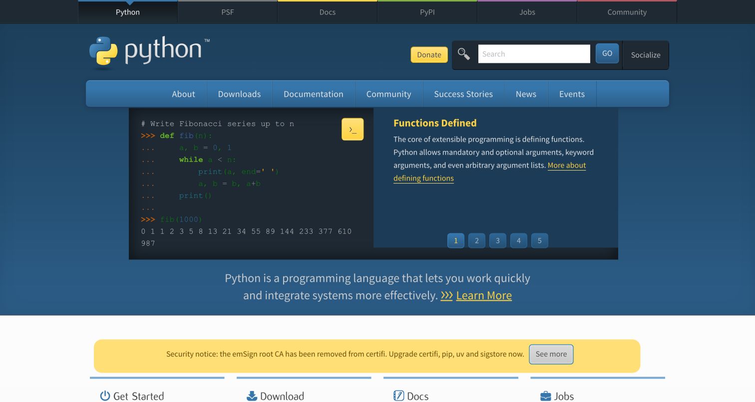
Python.org uses a familiar blue header to organize a broad ecosystem of documentation, downloads, jobs and community resources. A code example and explanatory panel make the language tangible, while the lower task cards give newcomers a practical route forward. The Python Software Foundation's privacy notice explicitly identifies self-hosted Plausible Community Edition for python.org analytics. This documented deployment should not be described as use of the hosted cloud service. The design suggests several different visitor intentions that a useful measurement plan would distinguish, rather than treating all traffic as a single measure of project adoption.
What you can learn
Define separate questions for learning, downloading and community participation. Measure the public routes that answer those questions, while keeping package downloads and activity on other ecosystem domains outside the interpretation unless they have their own verified instrumentation. A homepage visit is not an installation.
Pros
Task-oriented navigation makes a large software ecosystem approachable.
A visible code example connects an abstract language promise to recognizable syntax.
Cons & considerations
Several navigation layers demand clear reporting boundaries between properties.
Aggregate visits cannot establish successful installations or long-term programming activity.
Platform source: Public reference: policies.python.org. First-party python.org privacy notice dated February 10, 2026 explicitly identifies self-hosted Plausible Community Edition on analytics.python.org for this website; not a hosted-cloud claim. Platform evidence is separate from the direct website screenshot and is not a complete current infrastructure audit.
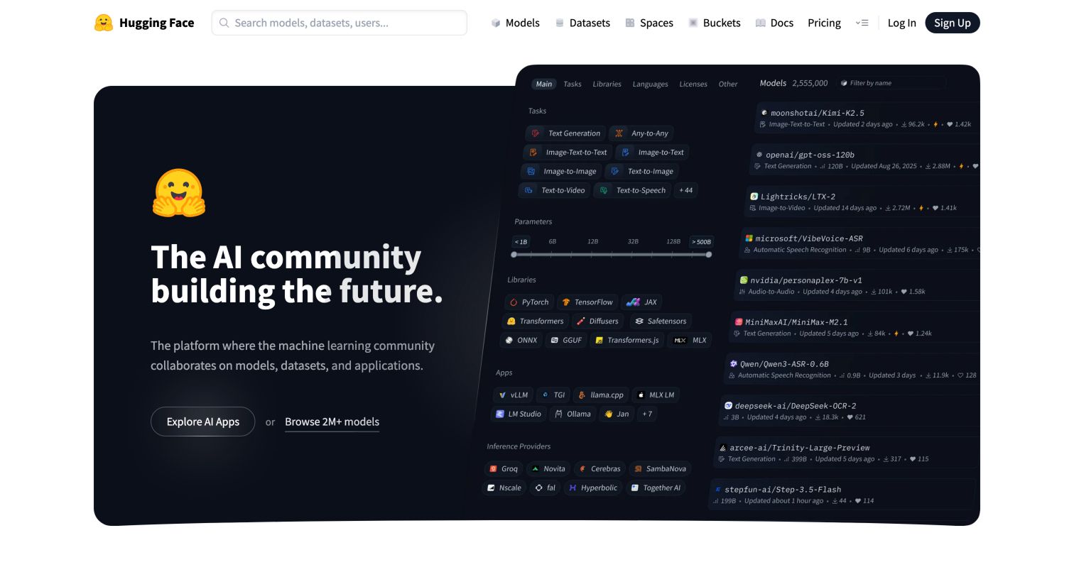
Hugging Face combines a restrained white navigation bar with a dark feature panel and an expansive model-browser illustration. Search, Models, Datasets and Spaces expose different kinds of exploration before a visitor creates an account. The exact homepage initializes Plausible, and its publicly linked local script contains the tracker implementation. That evidence applies to this public property; it says nothing about private repositories or individual model workloads. The prominent choice between exploring applications and browsing models makes the homepage useful for thinking about intent-specific reporting, with content discovery treated separately from registration or paid infrastructure interest.
What you can learn
Choose a small set of public discovery questions and use consistent categories for their destinations. Preserve the distinction between opening a catalog, viewing an individual item and performing a later product action; a click toward a model does not demonstrate that someone downloaded or used it.
Pros
Clear content categories make different discovery tasks visible at the top.
The product illustration gives the community proposition concrete visual context.
Cons & considerations
An enormous catalog can make raw pageview totals difficult to interpret.
Public marketing evidence does not reveal the instrumentation of authenticated tools.
Platform source: Public reference: huggingface.co. Exact homepage initializes window.plausible with /api/event; inspected same-origin linked /js/script.js contains Plausible tracker implementation. Public property only. Platform evidence is separate from the direct website screenshot and is not a complete current infrastructure audit.
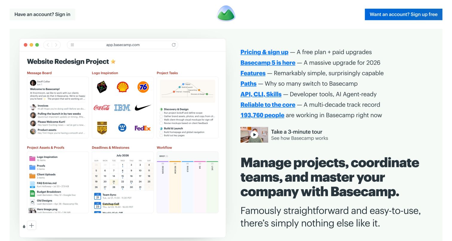
Basecamp presents a large project-board illustration against a pale green background, with concise product links gathered beside it. Existing customers have a sign-in route, while prospective customers can start a trial or watch a short tour. This separation creates a useful measurement distinction: returning to work is different from evaluating a product. The homepage references a same-origin analytics script with the basecamp.com domain, and a direct read of that linked script confirms Plausible code. The observation supports the marketing-property association, without establishing private application tracking, current goal configuration or the success of any campaign.
What you can learn
Keep product education and trial acquisition as separate reporting questions. Evaluate whether people reach the tour, features and pricing information that help them decide, then define successful registration from an appropriate confirmation signal instead of equating a prominent trial-button click with a completed account.
Pros
The project illustration makes the software understandable without a login.
Separate sign-in and trial paths reflect different visitor intentions.
Cons & considerations
Numerous adjacent product links can compete for attention.
Marketing-page events cannot by themselves establish adoption inside the application.
Platform source: Public reference: basecamp.com. Exact homepage references this script with data-domain basecamp.com; one direct read on November 5, 2026 confirmed Plausible tracker implementation. Marketing website only, no private application claim. Platform evidence is separate from the direct website screenshot and is not a complete current infrastructure audit.
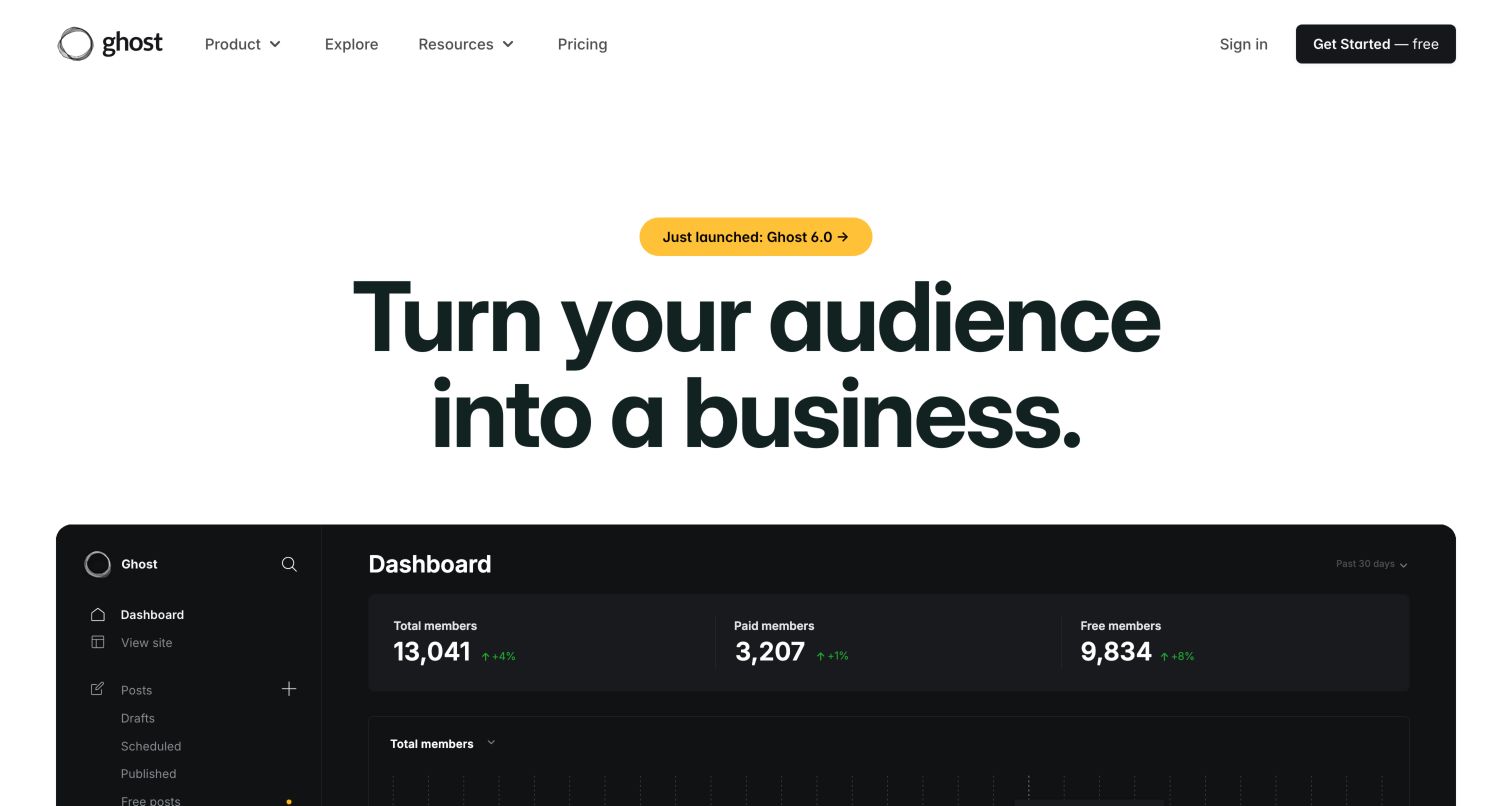
Ghost's homepage centers a large business-oriented headline above a product dashboard image. A yellow release announcement adds a timely entry point, while product, resources and pricing navigation support visitors who need more detail before starting. The homepage's same-origin script contains Plausible tracker code, and visible signup links carry Plausible event class names. These are concrete public implementation signals, but they do not demonstrate that a particular event reached a dashboard. The layout makes a useful distinction between learning about publishing capabilities and crossing into the separate account-creation experience.
What you can learn
Specify the meaning of a trial call-to-action event before using it in a report. Keep announcement engagement, product exploration and confirmed registration distinct, and check the handoff to an account domain in an authorized test environment. A useful naming convention should survive changes to headline copy and button placement.
Pros
A strong central headline gives visitors one clear product proposition.
Resources and pricing remain accessible beside the primary trial path.
Cons & considerations
The large dashboard image can compete with explanatory copy below the fold.
Public event labels establish intent to measure, not successful collection or conversion.
Platform source: Public reference: ghost.org. Exact homepage references this same-origin script; inspected public script contains Plausible tracker implementation. Homepage links also carry plausible-event-name=Signup-CTA-clicked classes. Platform evidence is separate from the direct website screenshot and is not a complete current infrastructure audit.
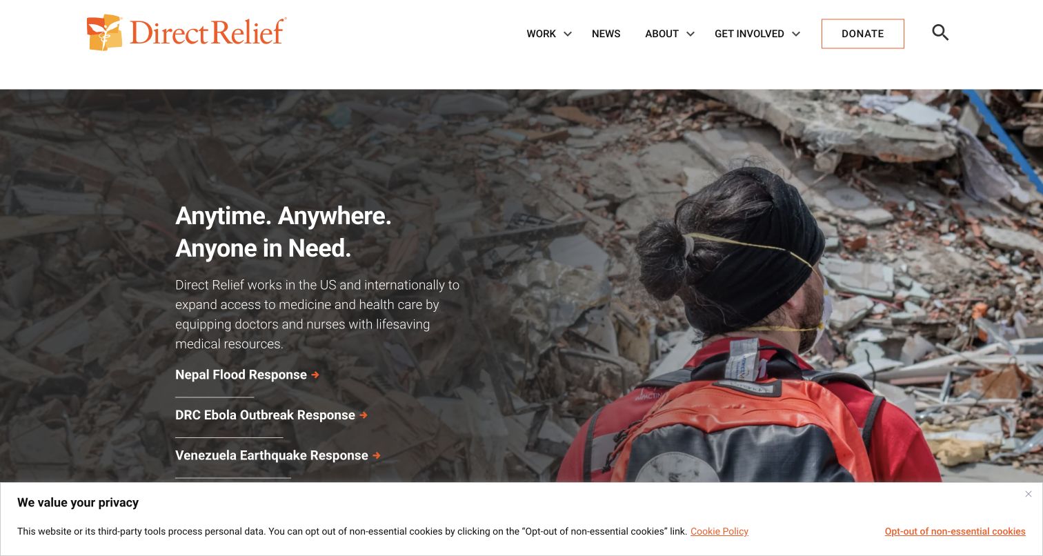
Direct Relief gives current response work prominent space beneath a clear organizational header. The saved view pairs a disaster photograph with a concise mission statement and several emergency links, while Donate remains distinct in the navigation. A dated public script observation associates this exact website with Plausible Analytics. The screenshot also retains a bottom privacy notice, reminding readers that one analytics product does not describe every service on a site. Here the most useful measurement questions concern whether visitors understand the work, find an emergency response and reach the appropriate support information.
What you can learn
Keep informational engagement separate from donation completion. A click to a giving journey is a meaningful intermediate action, but fundraising results need their own verified confirmation source. Choose broad content categories and avoid placing donor details or sensitive circumstances into event names, URLs or custom properties.
Pros
Current response links connect the mission to concrete public work.
A distinct donation control remains easy to identify in the header.
Cons & considerations
Several urgent stories can divide attention within one hero section.
The saved privacy notice occupies screen space and reflects a broader site configuration.
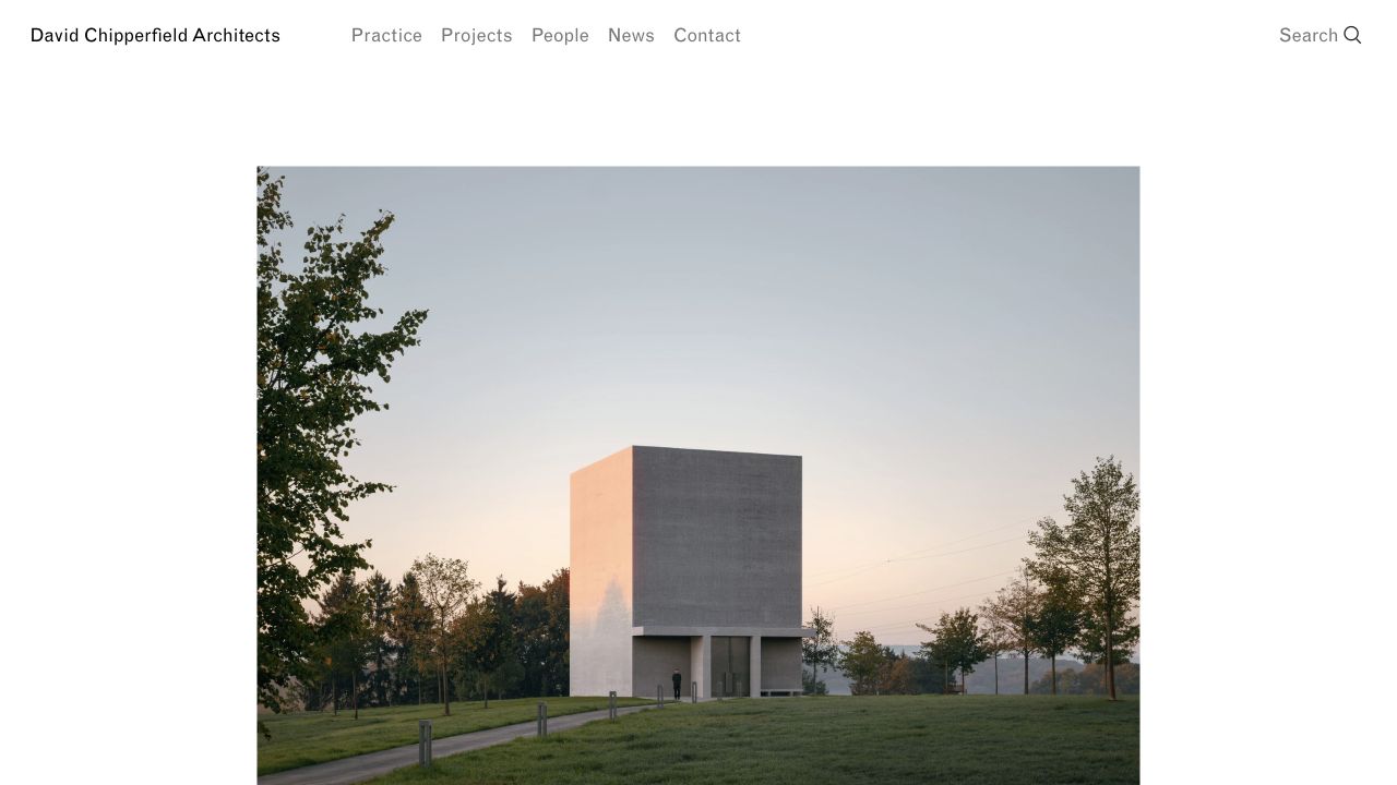
David Chipperfield Architects frames a large project photograph with generous white margins and a compact, plainly labeled navigation. Practice, Projects, People, News and Contact offer a stable map around an image-led first impression. Dated evidence records a Plausible script on the exact public property, while the reused screenshot retains its original capture date. The quiet composition is useful for considering how an editorial portfolio should be evaluated: a visitor may arrive to study a building, understand the practice or find a contact, and these intentions should not collapse into one homepage total.
What you can learn
Organize reporting around meaningful content families and useful next steps. Compare project discovery with visits to practice and contact information, but avoid treating every image interaction as commercial interest. Keep project identifiers stable enough for longitudinal comparisons when titles, featured photography or homepage ordering change.
Pros
Familiar navigation labels support a substantial architecture archive.
Generous image space makes the work itself the principal introduction.
Cons & considerations
The opening photograph supplies little immediate textual context about the featured project.
A long browsing session may indicate research rather than an inquiry or purchase intention.
Palm Heights uses a full-width beach view, pale colors and widely spaced lettering to establish a destination mood. A compact menu sits at one corner and the booking action at the other, leaving the center almost entirely to the hotel name and location. Plausible is supported by a dated public script observation on this property, rather than inferred from the visual design. The restrained opening creates a measurement challenge: people may appreciate the atmosphere without finding practical details, and a booking-link click may simply open another system rather than complete a reservation.
What you can learn
Evaluate whether visitors move from the atmospheric opening to rooms, amenities, location and reservation information. Treat the booking handoff as a distinct step and reconcile completed reservations only through an authorized, reliable source. Compare meaningful journeys across devices before deciding that more hero engagement represents better commercial performance.
Pros
The destination photograph gives the page a coherent and memorable mood.
Menu and booking controls occupy predictable opposing corners.
Cons & considerations
Light text and pale imagery can make the opening controls harder to notice.
An image-led first view offers limited practical information for visitors ready to compare stays.
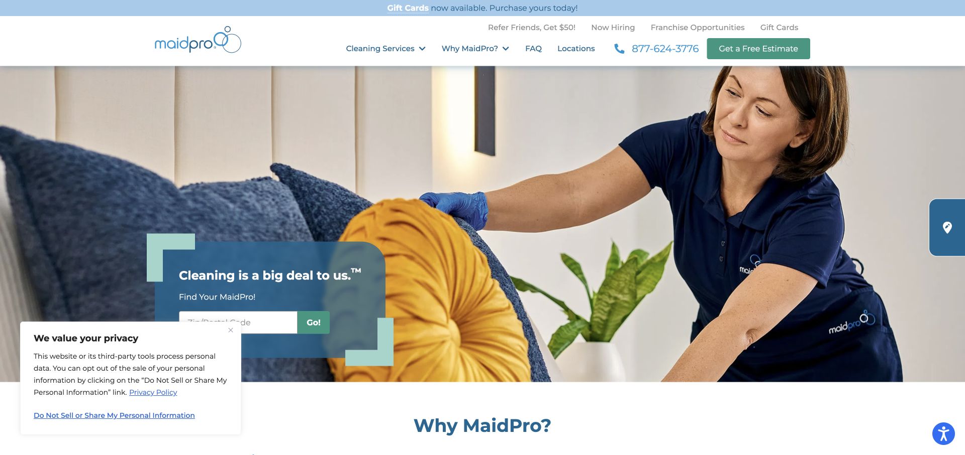
MaidPro places a cleaning photograph behind a compact location-finder panel, while the header exposes services, locations, a phone number and a free-estimate action. The page offers several routes to the same broad need, but each expresses a different level of readiness. A dated public Plausible script reference supports the association for the named property. The saved image includes a small privacy panel that overlaps part of the finder, so the review concerns the observed layout rather than an idealized presentation. Analytics planning should begin with whether visitors can identify their local service path.
What you can learn
Separate location searches, telephone-link clicks and estimate starts in the measurement plan. Use coarse, necessary categories and avoid sending entered addresses, names or other inquiry details into analytics. Confirm successful inquiry completion with an appropriate test signal instead of counting every click on a bright estimate button as a lead.
Pros
The cleaning image explains the service without requiring extensive copy.
Location, phone and estimate paths accommodate different stages of readiness.
Cons & considerations
Promotional and franchise links add competing priorities to the header.
The saved privacy panel partially overlaps the location-finder area.
Hello Monday's saved opening is unusually spare: a small corner identity, an illustrated pair of characters and an oversized product word occupy a broad white field. The composition asks visitors to explore rather than presenting a conventional grid of service links. A dated exact-property script reference establishes Plausible Analytics in the public evidence. It does not tell us which animated states or interactions are measured. This example is useful because a playful experience can produce attention without answering a prospective client's practical questions about capabilities, relevant work or how to contact the studio.
What you can learn
Measure progress toward substantive project and capability information, not merely interaction with an entertaining opening. Define a few stable milestones that survive motion and content changes, then combine aggregate behavior with direct usability review to understand whether the experience helps people find suitable work examples.
Pros
The illustration creates a distinctive voice with very little interface clutter.
Large typography gives the first screen a clear visual focus.
Cons & considerations
Sparse navigation in the captured view makes practical destinations less immediate.
Interaction counts alone cannot distinguish delighted exploration from difficulty finding the next step.
Canongate introduces its publishing identity over a diagonal wall of book covers, with a dark overlay preserving space for the wordmark and independent-publisher message. Books, Authors, News, About and Contact provide a familiar navigation beside a visible search control. The exact website has dated public Plausible evidence, separate from the screenshot's design observations. For analytics planning, the cover montage creates a useful question: does the brand-led opening help visitors enter the catalog, or do they primarily arrive looking for a specific author or title through search and direct links?
What you can learn
Keep catalog discovery, author research and editorial reading distinct in reporting. Use stable title or category identifiers where appropriate, and distinguish a retailer handoff from a completed book sale. Review search usefulness without sending unnecessary raw search text that could contain personal information into custom properties.
Pros
Book imagery connects the publisher identity directly to its catalog.
Familiar navigation labels support several common literary research tasks.
Cons & considerations
The dense cover background competes with the central brand message.
Outbound retailer activity cannot establish purchases without a separate reliable source.
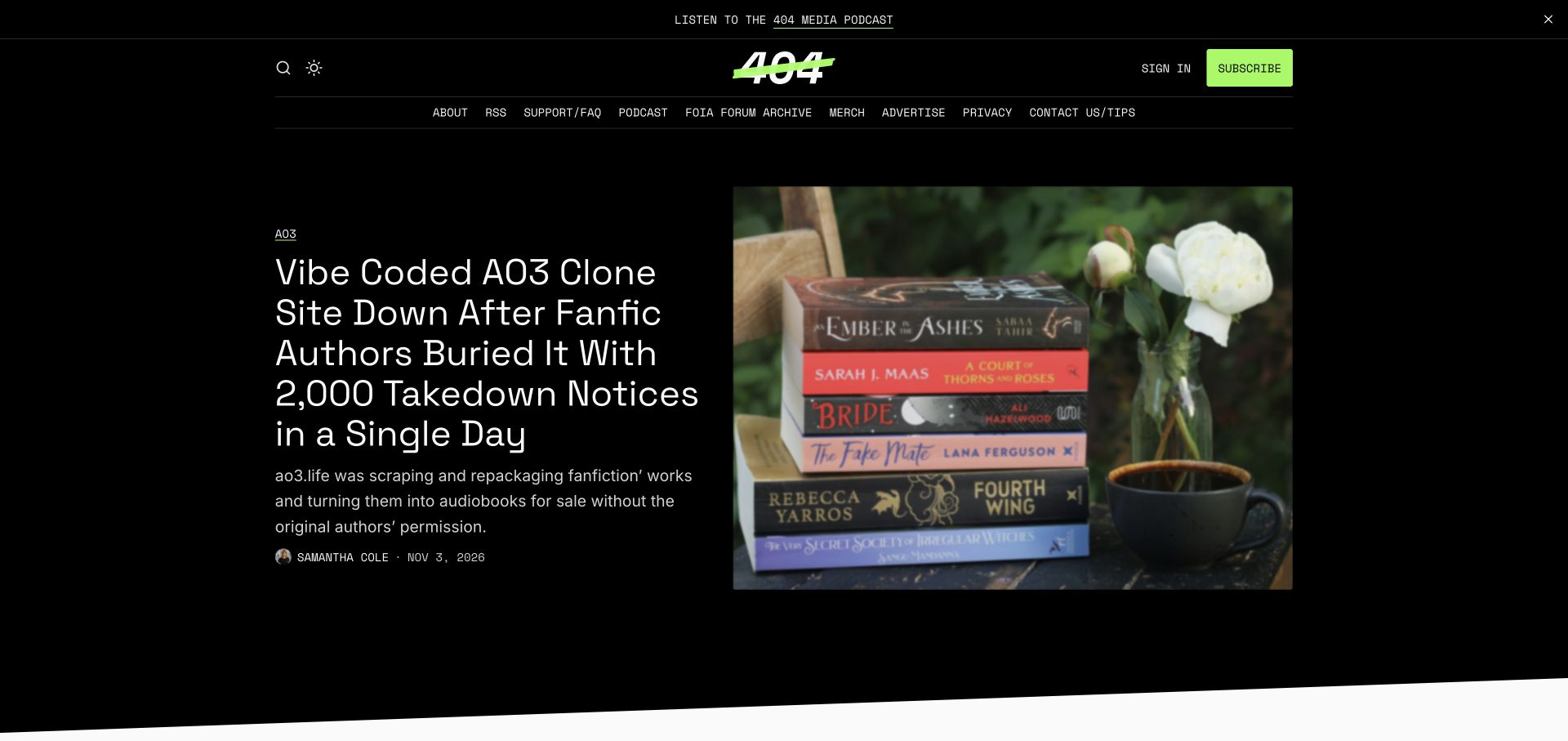
404 Media uses a black background, a vivid green subscription button and a large split feature pairing a headline with a photograph. A dense but plainly labeled navigation exposes podcasts, archives, support and other publication resources. The saved screenshot provides a dated view of that hierarchy, while an exact-property Plausible script observation supports the technology association. Neither establishes the publication's current membership funnel. The useful design question is whether the strong feature draws readers into reporting while leaving a clear path to subscription information for people who already understand the publication's value.
What you can learn
Distinguish article entry, archive exploration and subscription-intent actions in reporting. Compare content categories over a meaningful period instead of judging a newsroom by one prominent story's traffic. Treat a subscription-button click as an intermediate signal, and use an appropriate confirmation source for completed memberships.
Pros
A vivid subscription control stands apart from the otherwise restrained palette.
The split feature gives headline and supporting image substantial space.
Cons & considerations
A long horizontal resource menu can require prioritization on smaller screens.
A single lead story may dominate homepage metrics without representing the wider reporting archive.
Platform source: Official Ghost Explore publication profile. Official Ghost Explore profile links directly to this named publication. This is documentary evidence of its Ghost publishing association, not an independent inventory of every current backend, application, commerce or email component. Platform evidence is separate from the direct website screenshot and is not a complete current infrastructure audit.
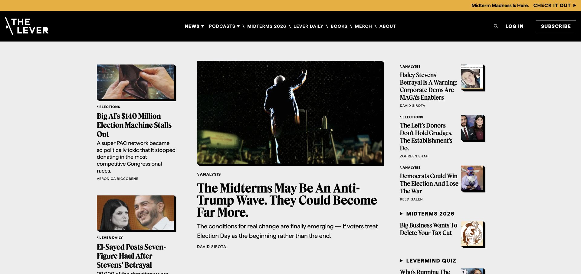
The Lever's saved homepage uses a dark masthead, a narrow promotional band and a multi-column story grid. A dominant central feature is surrounded by smaller articles, category labels and author names, giving readers several ways into the publication. Plausible appears in dated public evidence for the exact property. That association does not disclose how its editorial team evaluates success. The layout illustrates why an analytics review should account for placement: a large central image and headline receive different exposure from a compact sidebar item, even when both links lead to substantive reporting.
What you can learn
Compare similar editorial placements and content types when judging discovery. Record major layout changes alongside reports so an increase in clicks is not automatically attributed to a story topic. Keep subscription interest distinct from reading activity, and avoid treating all visits as equal evidence of sustained reader support.
Pros
Column sizes establish a clear lead story while preserving secondary options.
Category and author labels add useful context before a reader opens an article.
Cons & considerations
Dense competing headlines can increase the effort required to choose a starting point.
Promotional bands and changing story positions complicate simple period-to-period comparisons.
Platform source: Official Ghost Explore publication profile. Official Ghost Explore profile links directly to this named publication. This is documentary evidence of its Ghost publishing association, not an independent inventory of every current backend, application, commerce or email component. Platform evidence is separate from the direct website screenshot and is not a complete current infrastructure audit.
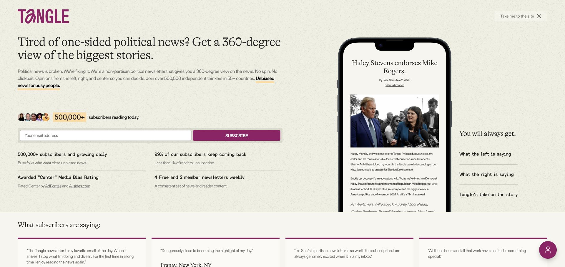
Tangle's saved opening presents a newsletter proposition on a lightly textured background, with a wide email field and contrasting subscription button. A phone mockup demonstrates the product, and supporting claims and testimonials surround the acquisition message. A dated public Plausible observation applies to this exact website. The design offers a useful distinction between understanding the newsletter, beginning signup and becoming a confirmed subscriber. Its prominent growth and retention claims are page content, not measurements verified by this review, and they should not be repeated as proof that the illustrated layout caused those results.
What you can learn
Define a successful signup using the actual confirmation state and keep that separate from clicking Subscribe. Measure whether visitors reach a sample or the main site when they need more context. Review form usability directly, since a conversion report alone cannot explain uncertainty about frequency, content or membership terms.
Pros
A product preview makes an email publication tangible before signup.
The contrasting subscription action is easy to locate within the main proposition.
Cons & considerations
Numerous supporting statistics compete for attention around the form.
A prominent acquisition screen may slow readers who simply want to browse existing reporting.
Platform source: Official Ghost Explore publication profile. Official Ghost Explore profile links directly to this named publication. This is documentary evidence of its Ghost publishing association, not an independent inventory of every current backend, application, commerce or email component. Platform evidence is separate from the direct website screenshot and is not a complete current infrastructure audit.
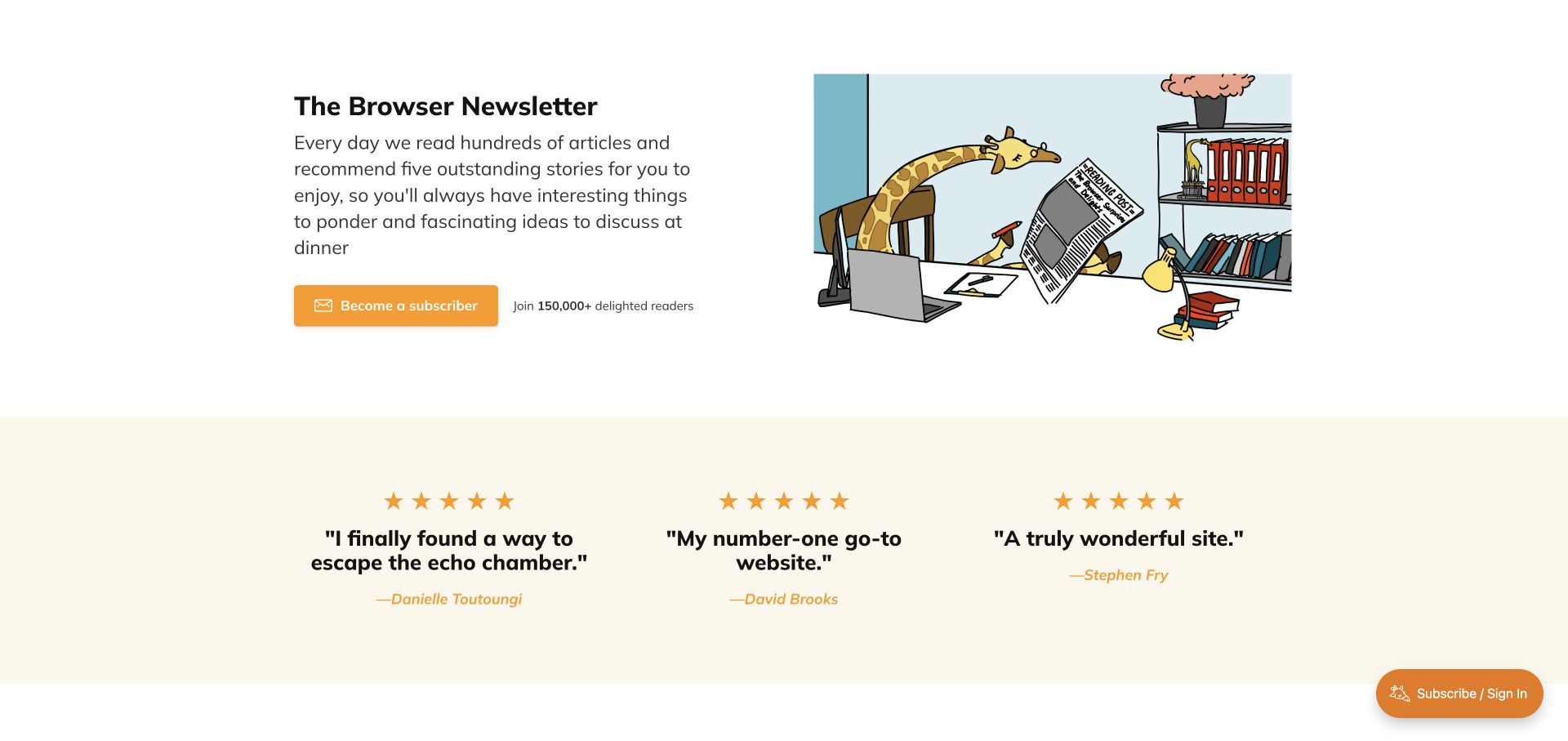
The Browser's saved view places a compact newsletter explanation beside a playful illustrated reading scene. An orange subscription button stands out below the copy, while a pale testimonial band provides a second layer of reassurance. A floating subscription and sign-in control offers another route for visitors at a different stage. Dated exact-property evidence identifies Plausible Analytics. The layout is useful for considering how a short product explanation performs: visitors should understand what arrives, how often it arrives and why curation is valuable before a click is interpreted as meaningful membership interest.
What you can learn
Separate visits to the subscription offer from confirmed membership and existing-reader sign-in. If the same action appears in several positions, use consistent event meaning with a restrained placement category. Review whether testimonials help resolve a decision, rather than assuming more interaction with endorsements means better understanding.
Pros
The illustration reinforces the reading proposition without overwhelming the copy.
A clear orange action provides a visible next step after the explanation.
Cons & considerations
Multiple subscription entry points need consistent interpretation in reports.
Testimonials provide reassurance but cannot replace clear product and membership details.
Platform source: Official Ghost Explore publication profile. Official Ghost Explore profile links directly to this named publication. This is documentary evidence of its Ghost publishing association, not an independent inventory of every current backend, application, commerce or email component. Platform evidence is separate from the direct website screenshot and is not a complete current infrastructure audit.
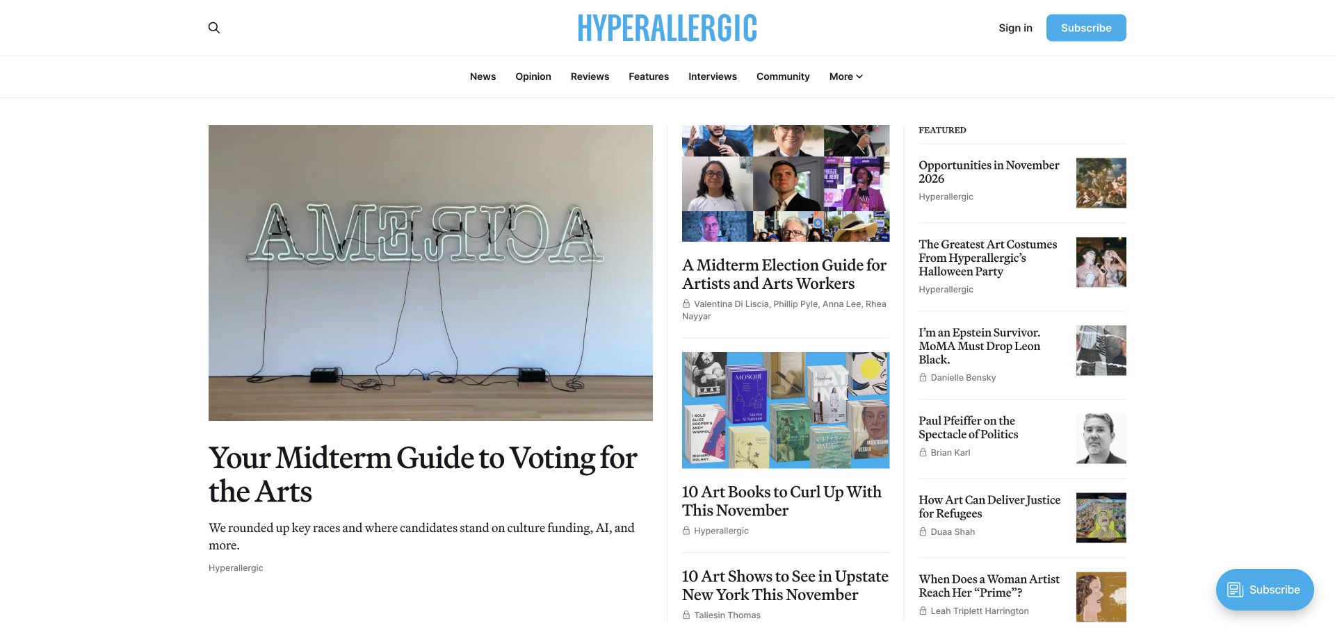
Hyperallergic's saved homepage combines a bright blue identity with a white canvas and a three-column editorial arrangement. The lead story receives a large artwork image, while neighboring columns offer smaller features and a list of recommendations. Subscription controls appear in the header and as a floating action. A dated public Plausible script observation supports the association for this property. This composition invites analysis of how readers enter different editorial formats, but it does not justify equating high traffic with journalistic value or treating a visible subscription control as proof of completed membership.
What you can learn
Use content-type and placement categories that reflect the editorial structure. Compare the discovery of reviews, features and community resources separately, and document layout changes that affect exposure. Validate any subscription goal against its real confirmation step instead of counting every route toward the offer as a new paying reader.
Pros
A clear lead image creates an immediate focal point within a broad archive.
Section labels help readers understand the publication's different editorial formats.
Cons & considerations
Several nearby columns can compete with the main feature on narrower screens.
Repeated subscription controls can create duplicate or ambiguous intent measurements if defined poorly.
Platform source: Official Ghost Explore publication profile. Official Ghost Explore profile links directly to this named publication. This is documentary evidence of its Ghost publishing association, not an independent inventory of every current backend, application, commerce or email component. Platform evidence is separate from the direct website screenshot and is not a complete current infrastructure audit.
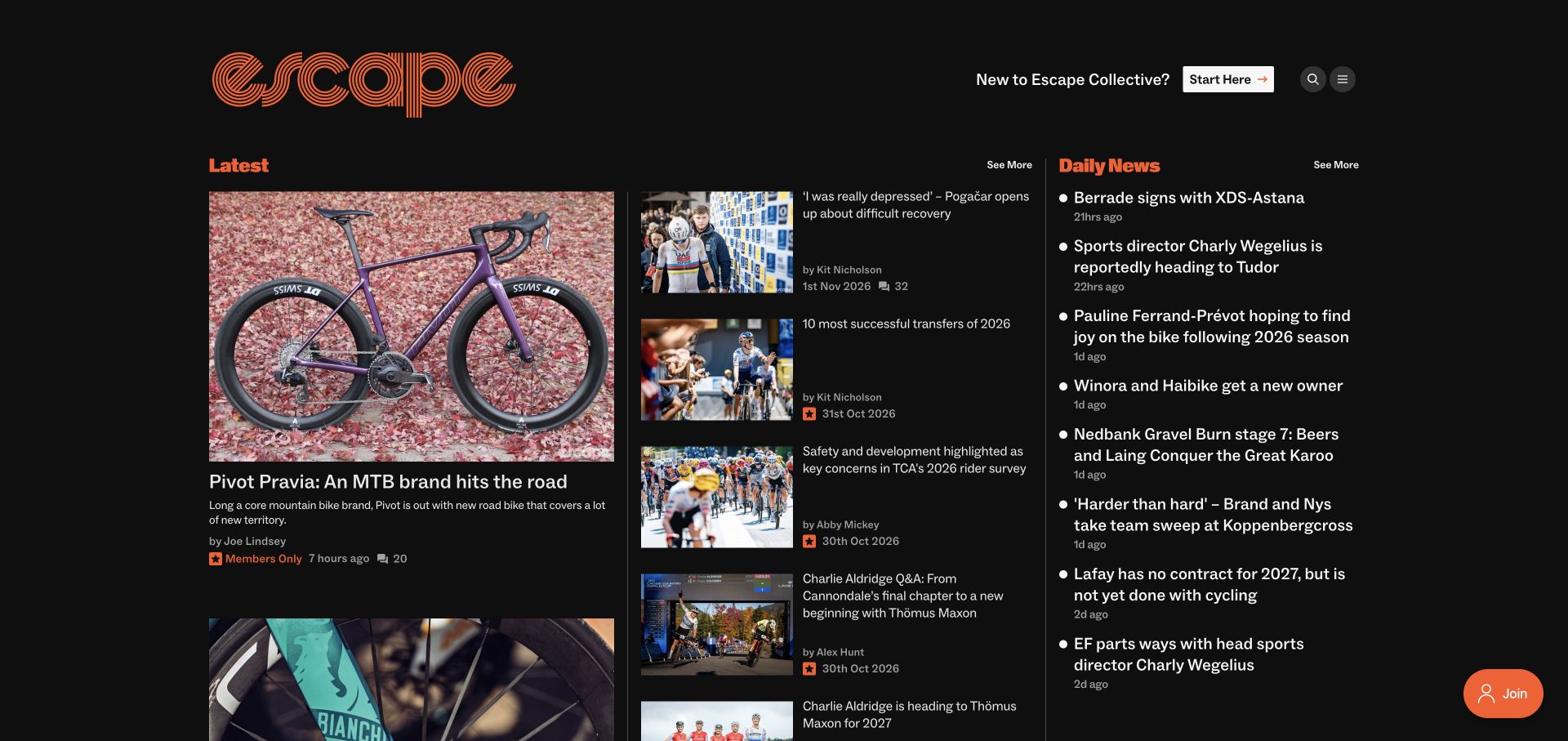
Escape Collective uses an orange identity and section labels against a dark background. A large cycling feature anchors the left column, a middle column mixes smaller stories, and Daily News offers compact updates on the right. Membership markers and a Join control make the support model visible without erasing the editorial hierarchy. Dated public evidence records Plausible on the exact website. The design is useful for examining different kinds of attention: checking a short update and reading a detailed product feature are both plausible successful visits, despite producing very different browsing patterns.
What you can learn
Define reporting questions around the publication's distinct formats before comparing engagement. Separate quick-news discovery, feature exploration and membership intent, and interpret short sessions in context. A visitor who finds a concise update quickly may have completed the task successfully rather than failed to engage.
Pros
Distinct section headings organize a dense mix of specialist content.
Membership labels communicate access expectations before a reader opens selected stories.
Cons & considerations
Several simultaneous columns create a demanding hierarchy for mobile adaptation.
Raw duration comparisons can misrepresent the value of concise news versus long-form features.
Platform source: Official Ghost Explore publication profile. Official Ghost Explore profile links directly to this named publication. This is documentary evidence of its Ghost publishing association, not an independent inventory of every current backend, application, commerce or email component. Platform evidence is separate from the direct website screenshot and is not a complete current infrastructure audit.
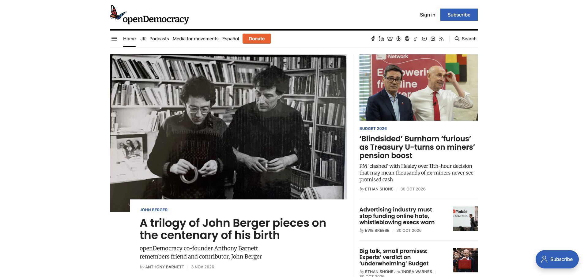
openDemocracy's saved homepage pairs a large lead image with smaller adjacent stories and a compact navigation strip. Subscribe appears in blue, while Donate is orange, making two support-related actions visually distinct. Topic and language routes sit alongside podcasts and search. The exact property has dated public Plausible evidence, but the public observation does not reveal donor records or a configured conversion model. The layout is useful for thinking about a media organization whose audiences may arrive to read, research, follow a topic, subscribe or contribute financially through different downstream journeys.
What you can learn
Keep subscription and donation intentions separate from the beginning, and define completion using the appropriate systems. Report broad editorial engagement without transferring personal donation or account details into analytics. When reviewing changes, compare similar content and placement conditions so a different lead story does not masquerade as a navigation improvement.
Pros
Different colors distinguish subscription and donation paths in the header.
Visible language and topic routes support several public reading intentions.
Cons & considerations
Social icons and numerous utility links add density to the navigation strip.
Clicks toward financial support do not establish completed donations or their value.
Platform source: Official Ghost Explore publication profile. Official Ghost Explore profile links directly to this named publication. This is documentary evidence of its Ghost publishing association, not an independent inventory of every current backend, application, commerce or email component. Platform evidence is separate from the direct website screenshot and is not a complete current infrastructure audit.
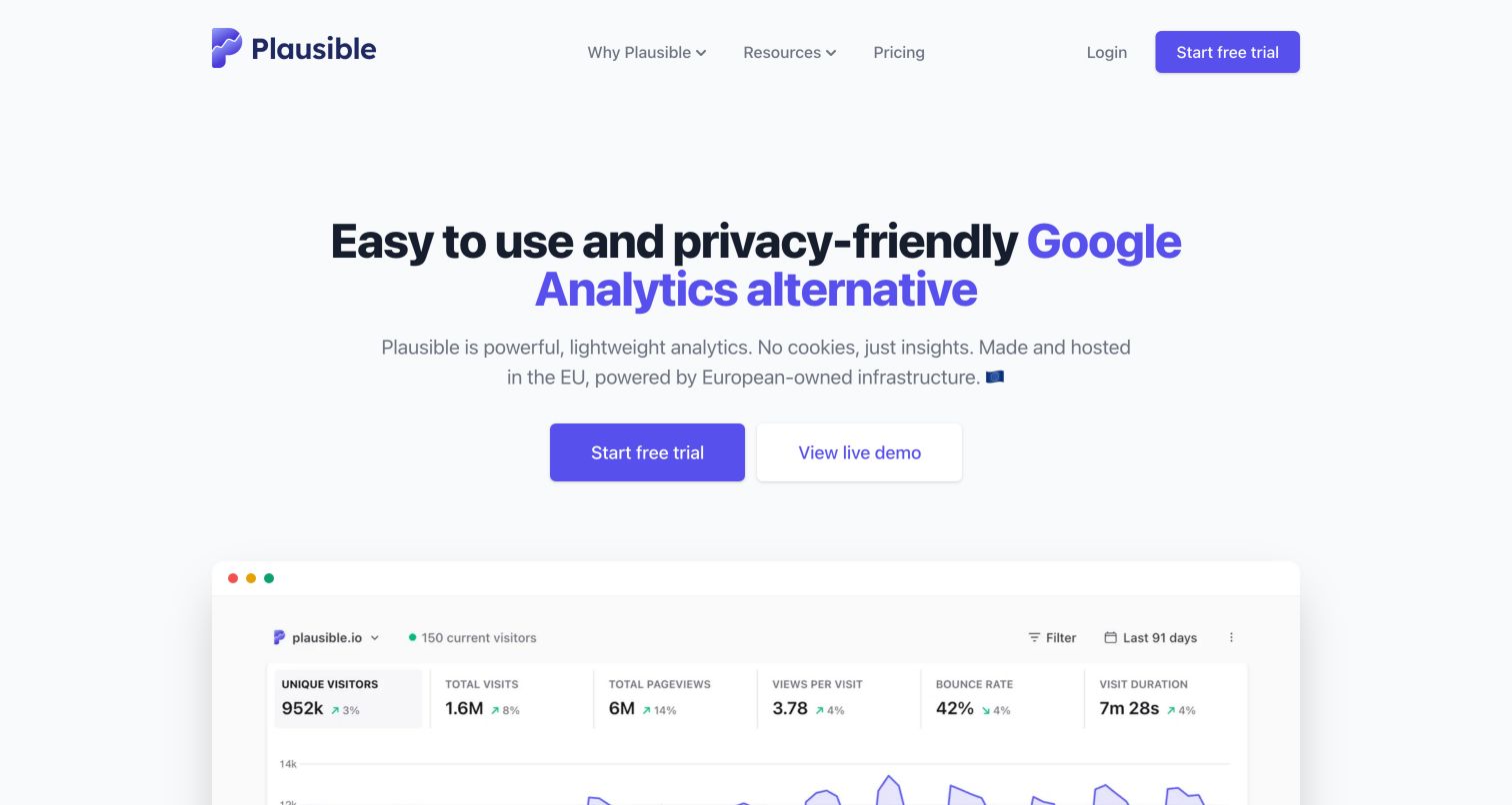
Plausible's own homepage centers a concise analytics proposition above paired trial and live-demo actions. A large dashboard preview begins below, supported by a restrained gray background, purple brand accents and a compact navigation. The exact public HTML initializes Plausible and includes explicit call-to-action event handlers, providing direct product-scoped evidence on the vendor's own property. These visible hooks still do not reveal whether a request was received or how a private report is interpreted. The design is useful because an analytics product can demonstrate its interface before asking a visitor to create an account.
What you can learn
Give the demo and trial paths separate meanings in a measurement plan. Someone exploring a dashboard is evaluating the product, while confirmed registration is a later outcome. Keep event labels stable across placements and validate them in an authorized environment instead of inferring success from the presence of tracking code.
Pros
Paired actions accommodate both exploratory and ready-to-start visitors.
The dashboard preview makes the product experience visible early in the page.
Cons & considerations
Large product claims need their own supporting context beyond the visual preview.
Public event handlers do not expose delivery success, deduplication or the complete reporting setup.
Visible tech stack
Referenced on the public page
Jekyll
Alpine.js
Plausible Analytics
Platform source: Public reference: plausible.io. Exact public homepage initializes window.plausible, inserts https://plausible.io/js/pa-6_srOGVV9SLMWJ1ZpUAbG.js and defines explicit Plausible CTA event handlers. Event delivery not inspected. Platform evidence is separate from the direct website screenshot and is not a complete current infrastructure audit.
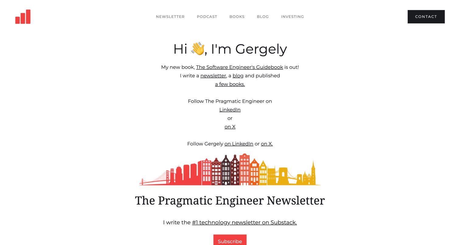
The Pragmatic Engineer's homepage uses a personal introduction, sparse typography and text links to connect books, a blog, a newsletter and social profiles. A city illustration introduces the newsletter section, with a red subscription action below it. The exact public page references Plausible's hosted script, but the observed data-domain value contains a spelling mismatch. This supports a public script association while leaving collection and attribution uncertain. The page is valuable as a design reference because a personal publishing hub often routes visitors to several separate domains with different purposes and ownership boundaries.
What you can learn
Define outbound destination categories before interpreting hub engagement. A newsletter click, a book link and a social-profile visit represent different intentions, and none proves a completed subscription or purchase. Validate the configured analytics domain and downstream reporting separately rather than assuming a visible script guarantees useful data.
Pros
The personal introduction makes the relationship between the writer and publications clear.
Text links provide lightweight routes to several kinds of editorial work.
Cons & considerations
Many similarly styled links can weaken the priority of the newsletter proposition.
The observed domain mismatch means successful analytics collection cannot be inferred from the script alone.
Platform source: Public reference: plausible.io. Exact homepage directly references Plausible hosted script. Observed data-domain="pragamticengineer.com" contains a spelling mismatch; script association only, collection and correct attribution unconfirmed. Platform evidence is separate from the direct website screenshot and is not a complete current infrastructure audit.
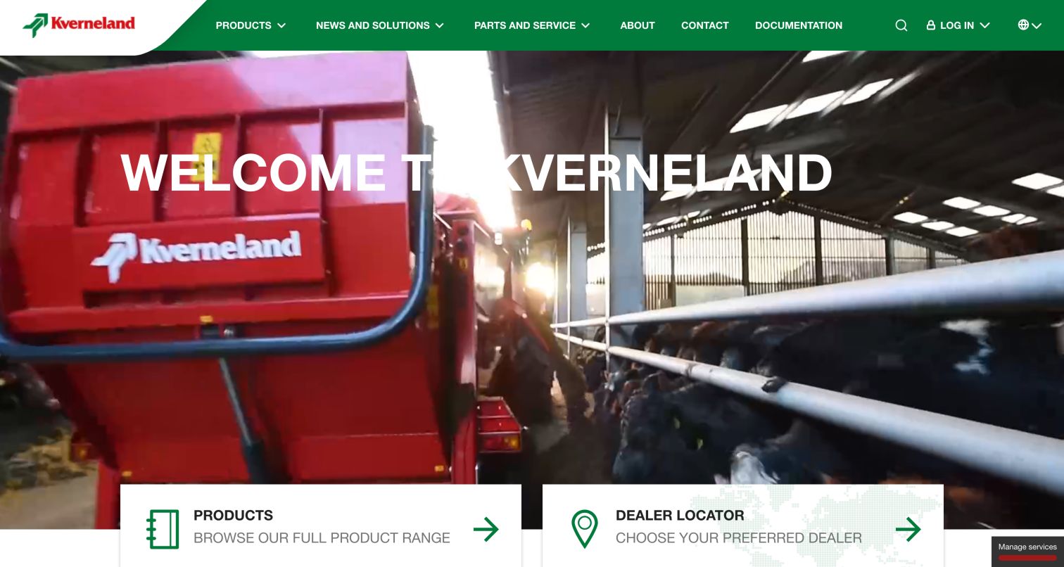
Kverneland's green navigation and red equipment imagery create a strong, consistent brand frame around a large agricultural hero. Products and Dealer Locator appear as prominent cards at the bottom of the captured view, while documentation, parts and service remain available above. A current public audit identifies a Plausible script on the exact international English property. That evidence does not extend automatically to regional sites, dealer websites or logged-in systems. The design makes a useful measurement distinction between researching equipment, finding practical support and moving toward a local commercial conversation.
What you can learn
Give product exploration, documentation access and dealer discovery separate meanings in the measurement brief. A dealer-locator visit is useful intent evidence, but it does not establish a qualified inquiry or completed machinery sale. Compare routes across devices and preserve language and regional context when interpreting results.
Pros
Prominent product and dealer cards identify two practical next steps.
Consistent brand colors tie the navigation to the equipment imagery.
Cons & considerations
The large moving-image area can compete with the welcome message.
Regional and dealer handoffs require explicit reporting boundaries to avoid overstating outcomes.
Kegan has 15+ years of experience working with small businesses, Fortune 500 companies, and everything in between. No development job is too big or too small: he brings the same hands-on attention to a focused improvement, a complete website, or a custom application.
For Plausible Analytics projects, he can help with website integrations, form and campaign connections, analytics implementation, testing, and clear ownership after launch. He works directly with clients on scope, design, implementation, testing, and handover, with an emphasis on clear communication and a system that remains practical to maintain after launch.
Show 3 other Plausible Analytics developersHide other Plausible Analytics developers
For a portfolio, publication or product catalog, begin with whether visitors reach useful content. Group pages by a small number of durable types and examine the paths that support a real task. A short visit can be successful when someone quickly finds a specific answer, and a long visit can reflect confusion.
Intent and completion
For newsletters, trials, inquiries and reservations, describe the intermediate actions separately from the completed result. Make the confirmation source explicit and test it with controlled data. This prevents a prominent button from becoming a misleading proxy for a new customer, subscriber or donor.
Support and returning use
Existing customers may arrive for documentation, a login route, service details or a location finder. Their journeys deserve a separate interpretation from new-business acquisition. Decide which public support tasks the website can actually observe and keep authenticated product activity outside that scope unless independently instrumented and authorized.
From references to requirements
Prepare a small, maintainable measurement brief
Name the questions and their owners
List the decisions the team expects to make, the person who will review the results and the frequency of that review. Choose a manageable number of signals. If nobody can explain what action follows a metric changing, reconsider whether it belongs in the first implementation.
Document the event contract
For each proposed event, record its meaning, trigger, allowed properties and completion condition. State what it does not establish. Keep event meanings stable when button copy or page position changes, and avoid sending raw field values or identifying information through convenience shortcuts.
Review the entire journey
Walk through desktop and mobile navigation, external handoffs, confirmation states and failure states in an authorized environment. Inspect the visible experience as well as the measurement result. Preserve campaign parameters through redirects and verify that a page is not counted twice after a template or integration change.
A useful handover demonstration
Ask the actual team to carry out its routine job: publish a realistic update, correct a mistake, preview a narrow screen, and identify who owns an integration failure. For a library or frontend framework, also ask who maintains the content source and deployment. A polished screenshot does not answer those operational questions.
Beyond the screenshot
Plausible Analytics planning checklist
Define the exact public property and any included subdomains.
Distinguish hosted Plausible from self-hosted Community Edition where relevant.
Choose a small set of decisions the analytics should support.
Separate discovery, intent and confirmed completion.
Define stable event meanings and restrained content categories.
Exclude personal details and unnecessary free-form values from analytics payloads.
Verify installation, redirects, duplicate tracking and internal-traffic handling.
Keep screenshots, source observations and later implementation changes dated.
Test with real content, a keyboard, a small screen, slow or failed requests, and the people who will maintain the system. These are planning checks, not an accessibility, security, performance, or search-ranking certification.
Sources & editorial method
How this Plausible Analytics collection was reviewed
The twenty examples represent distinct public website properties. Stable authoring captures and newly recorded browser captures retain their actual source URLs, capture dates, dimensions and attribution. Exact technology observations retain their original dates, and each source has a documented broad public stack-audit attempt. Direct script references, inspected same-origin tracker code and first-party implementation disclosures are distinguished in the evidence. Python's disclosure specifically identifies self-hosted Community Edition. A mismatched tracker-domain value on the Pragmatic Engineer example is explicitly qualified; a reference alone cannot prove collection or attribution. The visual reviews are original analysis of the captured pages, not reports from private analytics accounts.
Every image is an unmodified capture from the actual website, with its source and capture date. Some captures are reused from our shared catalog; their dates remain the original capture dates. None comes from a vendor gallery or a generated reconstruction. Moving imagery and live content can change.
Technology attribution uses public page assets or metadata, official platform documentation, or a cited first-party project case study. Documentary and framework-relationship evidence is identified where used; it is not a complete current backend inventory. A CMS image CDN alone does not establish a full CMS deployment. A library’s presence does not prove which individual controls use it, and a platform label does not establish AI authorship.
The composition notes, lessons, pros and tradeoffs are original editorial observations. We have not measured conversion, traffic, security, performance or accessibility conformance. Website owners retain their brands and imagery; these examples are not our client portfolio. Written, Edited and Curated are independent records, not dates advanced by a build. See our editorial standards or suggest a correction.
Questions worth asking
Plausible Analytics website development FAQs
Does a Plausible script prove analytics are working?
No. It establishes a public association with the product, while successful collection depends on the actual integration and reporting configuration. The examples distinguish direct references, verified local scripts and first-party disclosures. Validate your own installation before interpreting its reports.
Do these examples all use Plausible's hosted service?
No. Python's own privacy notice specifies self-hosted Plausible Community Edition. Other examples expose hosted or same-origin script references with the scope described in their source evidence. A same-origin URL alone does not identify who operates the analytics backend.
Can an outbound click be treated as a sale or subscription?
Treat it as a handoff unless a separate reliable source confirms the final outcome. A reservation, payment or signup may fail or be abandoned after the visitor leaves the referring page. Keep the intermediate event and completed result distinct in reports.
Does using Plausible certify a website's privacy or accessibility?
No. This collection does not certify legal compliance, accessibility or the full behavior of a website. Other services, data flows, content and implementation choices remain relevant. The examples support practical design and measurement review within their stated evidence scope.