Best Pantheon Websites of 2026 (20 Real-World Examples)
Twenty public websites with documented Pantheon relationships, genuine screenshots and practical lessons for maintaining Drupal and WordPress content.
A successful Pantheon project needs a useful public website and a dependable way to maintain it. These examples show how institutions, publishers and product brands organize changing content without losing their familiar identity or essential visitor tasks.
Start with the work the website needs to support: publishing an urgent notice, replacing a campaign, updating a course listing or helping a reader find a specific resource. Hosting provides an operating foundation, but the content structure and editorial responsibilities determine whether the site remains useful. A visually memorable opening still needs stable destinations underneath it.
The collection opens with Doctors Without Borders’ US property, New Relic’s marketing site, the City of San Diego, Easterseals and GOLF.com. Their identities are sourced separately from their technology associations. Each selection has an official Pantheon case study tied to the named public property; the guide does not claim that every account, application, regional association or related brand uses the same platform.
Before the examples
What makes good Pantheon website development in 2026?
Make changing content independent of the page frame
An operational alert, a featured story and an evergreen service link should not be the same kind of content merely because they share a homepage. Give each a clear purpose, owner and expected lifetime. A reusable layout should accept ordinary editorial changes without forcing staff to rebuild the navigation or hide an essential task behind the latest campaign.
Separate release code from editorial content
Pantheon describes distinct Dev, Test and Live environments, with code promoted toward Live and current content normally copied down for development. Plan the project around that separation. Record which changes belong in version control and which are routine publishing, and avoid treating a database copy as a harmless substitute for deploying a theme or module update.
A civic site, museum and software brand have different audiences, but each benefits from familiar task routes. Identify what returning visitors need before designing the largest visual feature. Preserve useful labels and destinations when campaigns change, and make secondary pathways understandable without requiring visitors to interpret the organization’s internal department structure.
The collection · 20 examples
20 Pantheon website examples worth studying
The reviews assess specific public properties through actual direct browser captures. Pantheon’s official case studies provide documentary platform associations, which are kept distinct from dated public-source stack observations. A screenshot cannot prove present hosting, a private backend, performance improvement or the implementation of an account system linked from the page.
We start with five recognizable brands or organizations: Doctors Without Borders (MSF-USA), New Relic, City of San Diego, Easterseals, GOLF.com. Each attribution applies to the named website property, not every product or website belonging to its organization. This is a curated reading sequence, not a measured ranking.
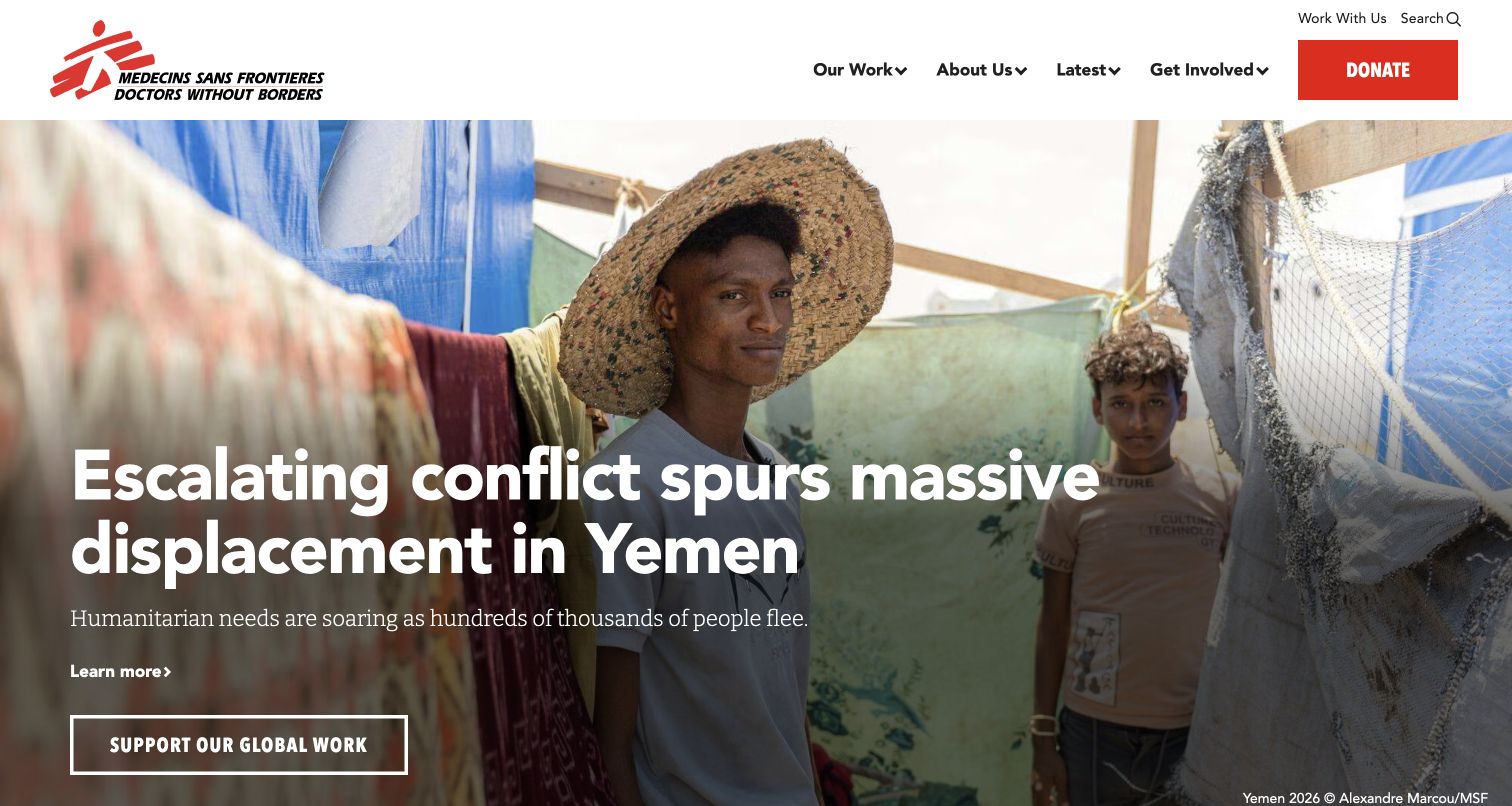
The saved MSF-USA homepage puts a field photograph behind a substantial news headline, with a short explanation and a distinct route to support the organization. Its white masthead keeps the red donation action visible without making the entire navigation feel like a fundraising form. This is useful for a Pantheon project because the editorial surface must accommodate changing stories while preserving familiar tasks. Pantheon documents the US association’s public website foundation; that association does not establish the systems used by every MSF organization or donation destination.
What you can learn
Treat urgent stories as structured editorial content with an image, readable headline, contextual summary and clear next action. Keep the persistent navigation independent of that campaign so replacing the lead story does not require rebuilding the surrounding experience.
Pros
The primary support action remains conspicuous beside a compact set of organizational navigation choices.
A short contextual line gives the large photograph and headline a useful editorial relationship.
Cons & considerations
Headline contrast needs checking against every replacement photograph, especially across changing image crops.
A dramatic lead story can push practical information beyond the first screen for returning visitors.
Platform source: Official Pantheon case study for this public property. The case study links the US association primary site and describes its existing Pantheon foundation and public fundraising/communications redevelopment. Scope excludes other MSF associations. Official documentary association for the described project; not a fresh runtime observation or proof of every current company system. Platform evidence is separate from the direct website screenshot and is not a complete current infrastructure audit.
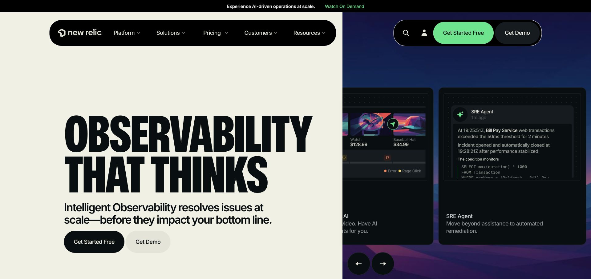
New Relic’s saved marketing homepage divides the opening into a pale proposition panel and a darker product illustration. Large condensed lettering creates a strong focal point, while rounded navigation groups separate general exploration from account and conversion actions. The illustration offers a concrete visual counterpart to an abstract observability message. Pantheon’s case study concerns the public marketing property and its Drupal consolidation, so the application interfaces pictured here should not be treated as proof that Pantheon runs the observability product itself. The distinction is essential when borrowing this presentation.
What you can learn
Give the marketing site and the product application separate architectural descriptions. A useful public page can explain a technical service through selected interface imagery while retaining a simple content model, stable navigation and independently managed editorial publishing.
Pros
The split composition distinguishes the product promise from the supporting interface illustration immediately.
Repeated free-start and demo routes accommodate visitors with different levels of readiness and commitment.
Cons & considerations
Very large display lettering can crowd supporting explanation when the available screen becomes narrower.
Product illustrations need maintenance when the actual interface changes, even if the marketing layout remains stable.
Platform source: Official Pantheon case study for this public property. The case study links newrelic.com and explicitly describes consolidation of its flagship public marketing website onto Drupal and Pantheon. This is not a claim about the observability SaaS backend. Official documentary association for the described project; not a fresh runtime observation or proof of every current company system. Platform evidence is separate from the direct website screenshot and is not a complete current infrastructure audit.
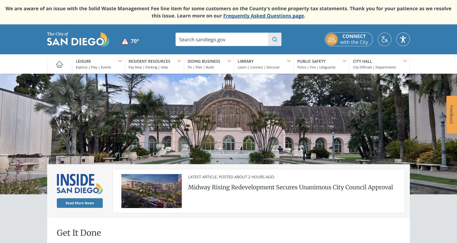
San Diego’s homepage combines a civic masthead, service navigation and a large local photograph with an overlapping news panel. The opening notice sits above the main brand area, making an operational update distinguishable from ordinary editorial promotion. Search and the visible service categories give residents alternatives to browsing the featured story. This composition is instructive for content-heavy Pantheon sites because urgent notices and evergreen service information have different lifecycles. Pantheon’s published account explicitly names sandiego.gov and its Drupal migration; the selection does not extend that evidence to every city system.
What you can learn
Model an alert separately from the homepage feature and the service directory. Each needs an owner, expiry rule and predictable place in the hierarchy, so a temporary operational message does not quietly become permanent navigation or displace essential resident tasks.
Pros
The civic photograph establishes place while the masthead retains a clear institutional identity.
Search and service categories offer task-oriented routes beyond the prominent editorial news treatment.
Cons & considerations
Stacked alert, header and navigation bands consume substantial space before the main content begins.
An overlapping news card needs resilient text and image rules as headlines change over time.
Platform source: Official Pantheon case study for this public property. The case explicitly identifies sandiego.gov as the City flagship and describes its hosting migration to Pantheon. Scope excludes external payment, library catalog and vendor services. Official documentary association for the described project; not a fresh runtime observation or proof of every current company system. Platform evidence is separate from the direct website screenshot and is not a complete current infrastructure audit.
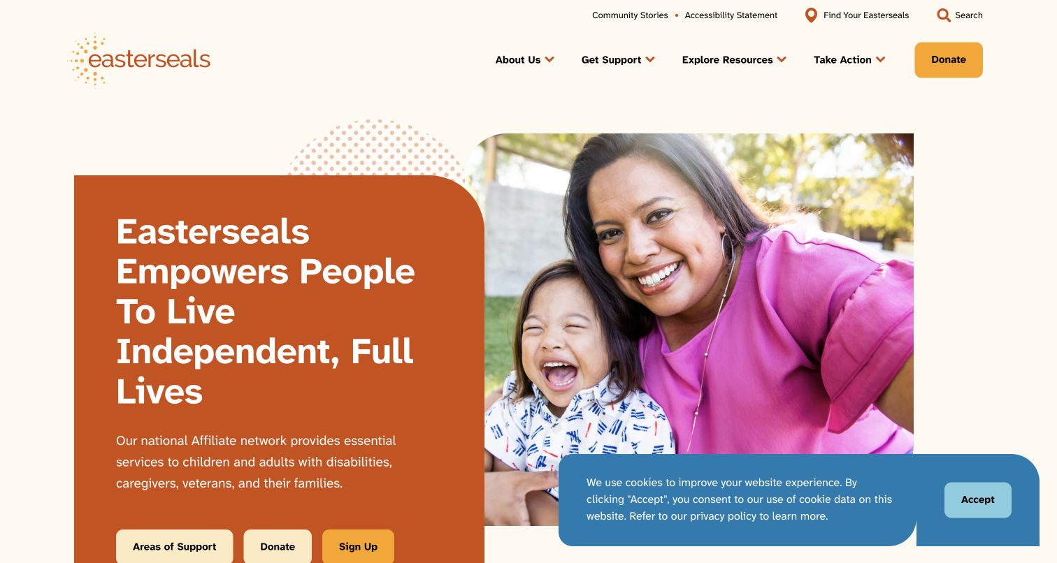
Easterseals pairs a warm family photograph with an orange statement panel, using rounded corners and a restrained cream background to soften a substantial opening message. The header separates finding a local affiliate from learning about support, resources and participation. Three actions beneath the introduction acknowledge that a visitor may need help, want to donate or wish to follow the organization. Pantheon documents the national website and affiliate rollout; this example is the national public homepage alone. Its unsuccessful bounded audit does not create new runtime claims, and the technology association remains documentary.
What you can learn
Distinguish audiences by their next task rather than forcing every visitor through the same fundraising route. A shared CMS should let editors maintain support, locality and participation content independently while keeping their presentation consistent across the national entry point.
Pros
The photograph and direct statement establish a human context before introducing organizational detail.
The affiliate locator receives a distinct utility position rather than being buried among general pages.
Cons & considerations
A tall headline panel leaves some introductory actions close to the lower viewport edge.
The captured cookie notice overlaps part of the photograph and competes with the opening composition.
Visible tech stack
Earlier / documented evidence
Pantheon
Platform source: Official Pantheon case study for this public property. The case links the national website and details its national/affiliate Drupal rollout onto Pantheon. Count only the national public property, not 40 affiliates as separate brands. Official documentary association for the described project; not a fresh runtime observation or proof of every current company system. Platform evidence is separate from the direct website screenshot and is not a complete current infrastructure audit.
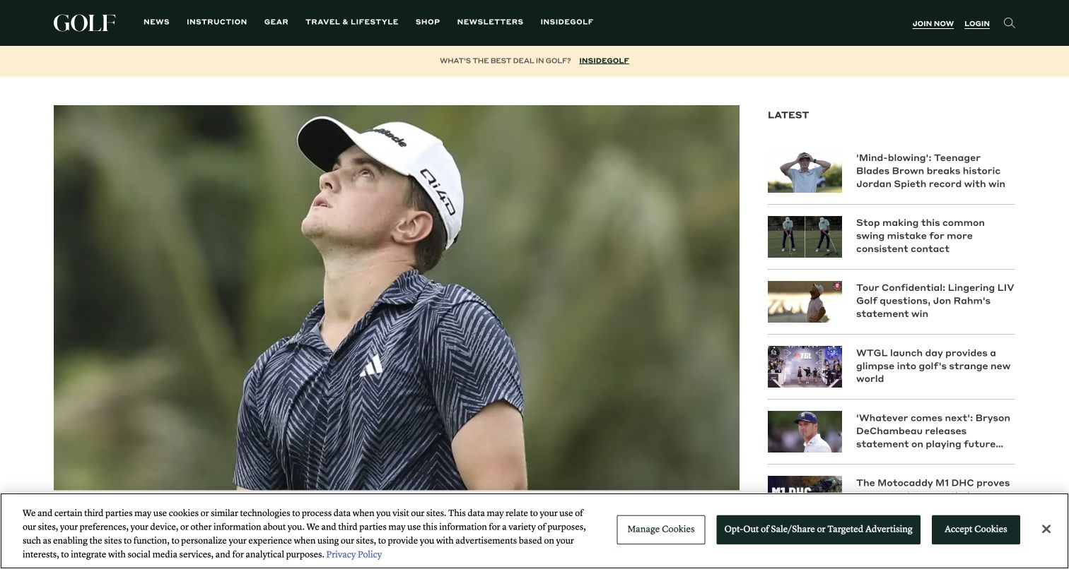
GOLF.com gives a large lead photograph most of the opening width and places a compact latest-news list alongside it. The dark green masthead carries recognizable editorial categories, while a lighter promotional strip remains visually separate from the story area. Thumbnail, headline and divider patterns make the right column easy to scan without duplicating the hero’s visual weight. Pantheon’s case study specifically describes the WordPress GOLF.com publishing property. It is useful evidence of a documented website relationship, but not proof of present performance figures, subscription implementation or every commerce destination linked from the magazine.
What you can learn
Create separate editorial controls for the featured story and the chronological feed. A reusable publishing layout should accept different image crops and headline lengths without allowing one oversized feature to obscure the stream of fresh reporting beside it.
Pros
The large image and smaller news rail establish a clear difference between feature and update.
Consistent thumbnail rows give recurring stories a recognizable, compact format for rapid browsing.
Cons & considerations
The lead image occupies much of the first screen before readers reach its full story context.
The captured consent banner covers the lower edge and reduces the immediately visible editorial area.
Platform source: Official Pantheon case study for this public property. The case names golf.com as Golf Magazine’s digital publication and documents migration of its WordPress site and delivery infrastructure to Pantheon. Official documentary association for the described project; not a fresh runtime observation or proof of every current company system. Platform evidence is separate from the direct website screenshot and is not a complete current infrastructure audit.
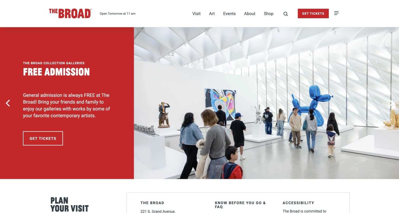
The Broad’s opening uses a saturated red text panel beside a bright gallery photograph. Free admission is the dominant message, with an outlined ticket action inside the panel and another ticket route in the header. The next section begins practical visit planning, so the page connects cultural interest with the logistics of attending. This is a useful Pantheon example because exhibition promotion and visitor information must change at different rates. The official case study identifies the museum’s public Drupal website; separate progressive applications and other museum experiences are outside this property’s evidence.
What you can learn
Give each exhibition feature a consistent editorial structure while keeping admissions, opening status and access information independently maintained. A strong image should invite exploration, but essential visitor details need a stable destination that survives the next exhibition campaign.
Pros
The red panel provides dependable contrast without placing all essential text directly over artwork.
Ticket access appears in both the persistent header and the relevant introductory content panel.
Cons & considerations
Carousel content can hide alternative messages unless visitors discover and understand the slide controls.
Large gallery imagery requires thoughtful crops so important artwork and visitor context are not lost.
Platform source: Official Pantheon case study for this public property. The case explicitly links thebroad.org and describes moving its Drupal site from Contegix to Pantheon. Exclude its separately discussed PWA and Social Forest property from this entry. Official documentary association for the described project; not a fresh runtime observation or proof of every current company system. Platform evidence is separate from the direct website screenshot and is not a complete current infrastructure audit.
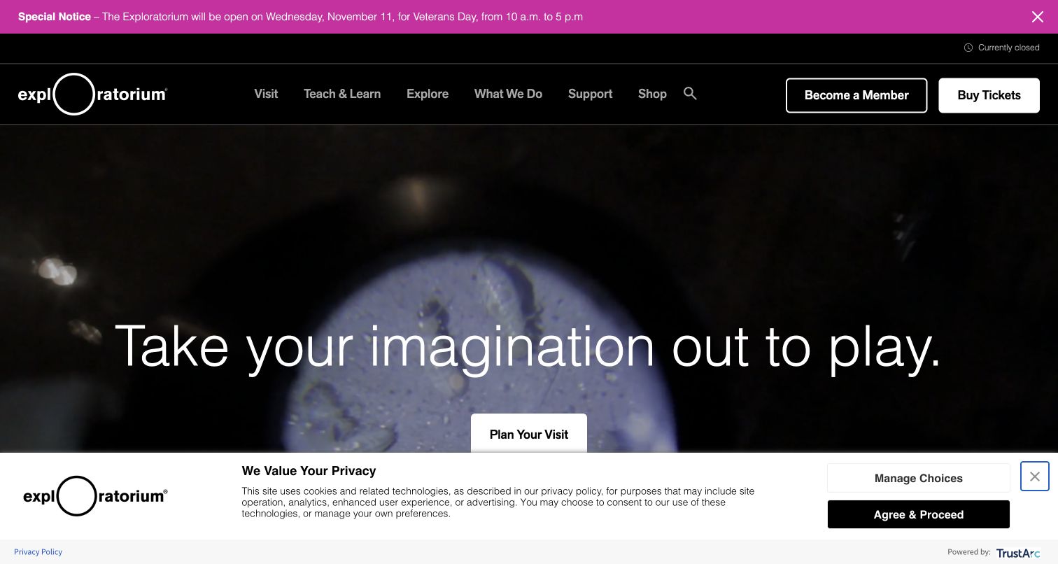
The Exploratorium opens with dark moving imagery, a light invitation and a direct visit-planning action. Its black navigation separates visiting from teaching, exploration and institutional information, acknowledging that the public website serves more than ticket buyers. A contrasting notice bar places a temporary schedule update above those ongoing choices. Pantheon describes the principal Drupal property and its content migration, rather than every archived educational page or separate store. The broad audit was unavailable, so this review retains that limit and uses the official case study for the platform association.
What you can learn
Keep experience-led media subordinate to a reliable content structure. A museum can use motion to express curiosity while giving teachers, visitors and supporters stable routes, clear schedule information and a useful page even when the visual treatment is reduced.
Pros
Distinct visit, learning and exploration categories acknowledge several genuine reasons to use the site.
Membership and ticket actions remain clearly separated from the temporary announcement above the masthead.
Cons & considerations
Dark moving imagery needs careful text contrast and a dependable still-image fallback across devices.
The captured privacy notice occupies a substantial band and competes with the primary visit action.
Visible tech stack
Earlier / documented evidence
Pantheon
Platform source: Official Pantheon case study for this public property. The case identifies exploratorium.edu and states the main Drupal site was already on Pantheon during its migration. Do not extend hosting evidence to the separately archived annex domain. Official documentary association for the described project; not a fresh runtime observation or proof of every current company system. Platform evidence is separate from the direct website screenshot and is not a complete current infrastructure audit.
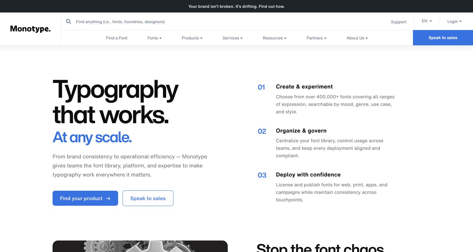
Monotype’s homepage makes its product category visible through typography itself: a large black statement and blue emphasis occupy the left, while three numbered stages explain the work on the right. A substantial navigation area combines font discovery, portfolio categories and a separate sales action. The composition is quieter than a large product-video hero, with enough structure to make an extensive offering approachable. Pantheon’s case study names monotype.com as the Drupal content hub. That evidence should not be expanded into claims about MyFonts, font delivery infrastructure or authenticated product applications.
What you can learn
Use the opening to explain the organizing idea behind a complex portfolio before listing every product. Build repeatable editorial sections around recognizable customer tasks, and make the boundary between the public content hub and separate product destinations explicit.
Pros
The numbered create, organize and deploy sequence adds explanatory structure beside the brand statement.
A product-discovery action offers a lower-commitment route alongside the clearly distinguished sales destination.
Cons & considerations
The large multi-level header demands clear hierarchy to avoid overwhelming first-time visitors with choices.
A type-led opening depends on deliberate font loading and robust text wrapping when space changes.
Platform source: Official Pantheon case study for this public property. The case specifically names monotype.com as the Drupal content hub and discusses Pantheon support for that marketing property. Do not infer the same stack for MyFonts or product accounts. Official documentary association for the described project; not a fresh runtime observation or proof of every current company system. Platform evidence is separate from the direct website screenshot and is not a complete current infrastructure audit.
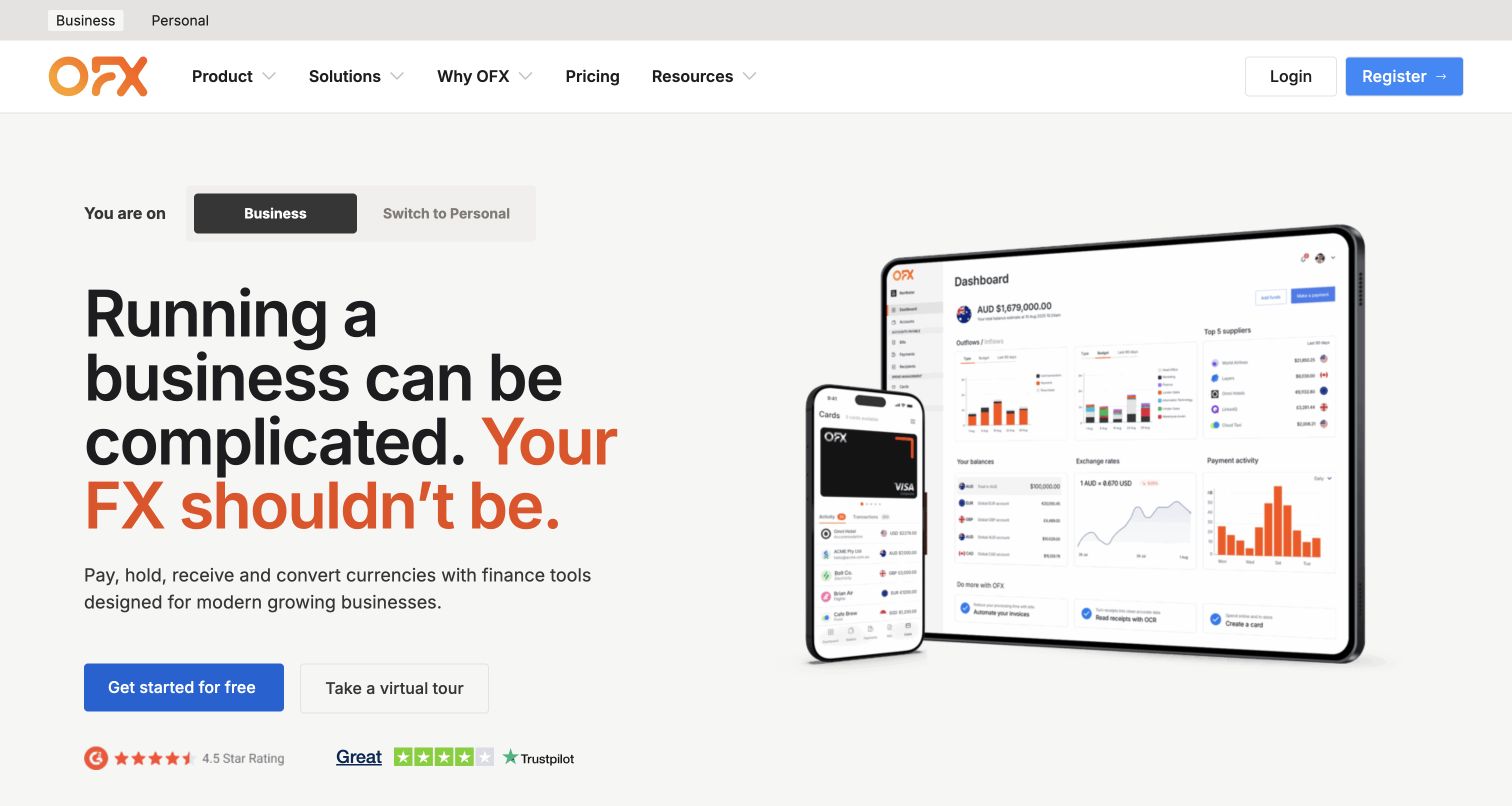
OFX’s Australian public page explicitly identifies the business audience and offers a switch to personal content before presenting the main proposition. An orange emphasis links the headline to the logo, while a large device illustration explains the product visually. The primary action and virtual tour offer different levels of commitment. Pantheon’s case study documents regional WordPress marketing sites on the OFX domain; this selection is specifically the en-au property. The depicted dashboard, sign-in destination and registration application are separate scopes, and the screenshot establishes neither financial suitability nor the implementation of those private services.
What you can learn
Make region and audience visible parts of the content model. Keep public product explanations, locally applicable disclosures and external account destinations distinct, so an editorial update cannot silently imply that every regional or transactional experience shares the same implementation.
Pros
The business-versus-personal distinction appears before visitors commit to exploring the product explanation.
Device imagery gives an otherwise abstract financial platform message a concrete visual reference.
Cons & considerations
A broad product promise still requires detailed supporting pages to explain individual services and conditions.
Public interface illustrations can become outdated independently of the surrounding marketing copy and navigation.
Platform source: Official Pantheon case study for this public property. The case explicitly documents OFX’s regional WordPress sites hosted on Pantheon under ofx.com. Public root resolves to en-au; use the pictured regional marketing page, not the logged-in transfer application. Official documentary association for the described project; not a fresh runtime observation or proof of every current company system. Platform evidence is separate from the direct website screenshot and is not a complete current infrastructure audit.
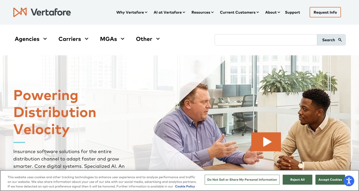
Vertafore separates its corporate navigation from a second row naming agencies, carriers and MGAs. The hero combines an orange proposition with a workplace photograph and an obvious video control, giving a specialized insurance-software message a human setting. Search receives substantial space beside the audience navigation. The structure demonstrates how a public marketing site can organize a large product estate without treating every visitor as the same buyer. Pantheon documents the relaunch of vertafore.com on Drupal; the evidence concerns this marketing property, not the insurance applications or customer support system linked from it.
What you can learn
Create an audience structure before building product landing pages. Each audience should have a clear destination, consistent terminology and relevant supporting content, while shared corporate material remains available without crowding the primary path through a complex service portfolio.
Pros
The separate audience row gives specialist visitors recognizable categories before they explore individual products.
The workplace photograph supplies human context for an abstract promise about distribution and software.
Cons & considerations
Two navigation rows and a large search field reduce the space available to explain the opening offer.
The captured cookie banner overlaps the lower hero and competes with its supporting description.
Platform source: Official Pantheon case study for this public property. The case identifies vertafore.com as the flagship website and documents its Drupal migration and relaunch on Pantheon, separate from insurance applications. Official documentary association for the described project; not a fresh runtime observation or proof of every current company system. Platform evidence is separate from the direct website screenshot and is not a complete current infrastructure audit.
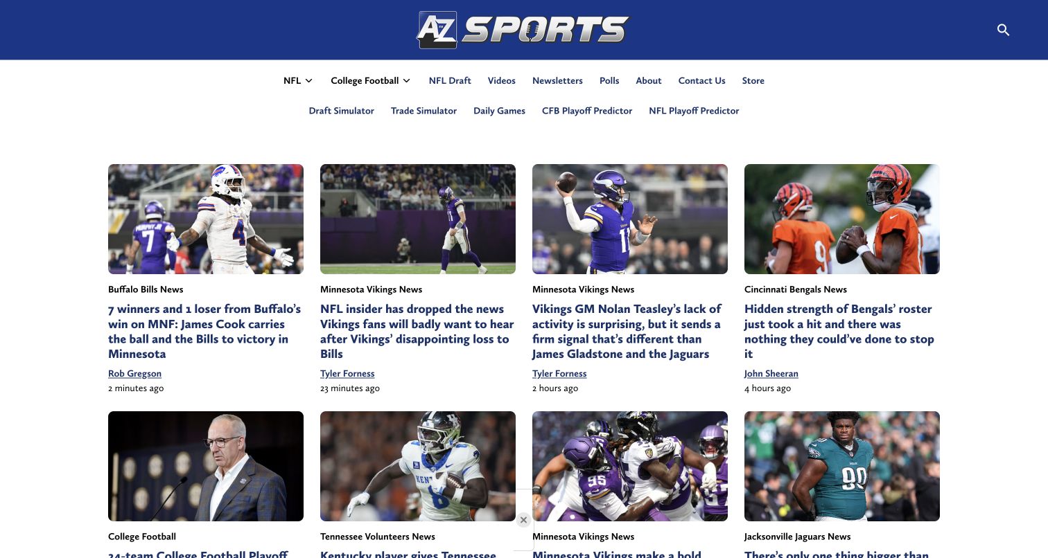
A to Z Sports presents an grid of article cards beneath its blue masthead. Each card repeats image, team or category, headline, author and relative publication time, making a busy news page comparatively predictable. Navigation distinguishes core coverage from simulations and other interactive destinations. Pantheon’s case study describes the main WordPress publishing rebuild, and this review concerns atozsports.com alone. A linked draft simulator is not counted as another example or assumed to use the same architecture. The useful pattern is the editorial card system, not an inferred connection between every linked feature.
What you can learn
Define an article card as a content contract with required category, title, author and date fields. Keep separate interactive products clearly identified, and test long headlines so regular publishing does not produce uneven or ambiguous reading paths through the grid.
Pros
Repeated bylines and publication times make authorship and recency visible directly within the listing.
Team labels provide context before readers open a story, helping distinguish similar sports headlines.
Cons & considerations
Several long headlines in adjacent columns create a demanding reading field despite the consistent structure.
A large category estate needs ongoing editorial discipline to keep labels and destinations understandable.
Platform source: Official Pantheon case study for this public property. Official case explicitly links atozsports.com and describes its standard WordPress rebuild on Pantheon. Exclude the separately discussed draft-simulator subdomain and private publishing tools. Official documentary association for the described project; not a fresh runtime observation or proof of every current company system. Platform evidence is separate from the direct website screenshot and is not a complete current infrastructure audit.
The University of San Francisco pairs a large student photograph with a green campaign panel, keeping its logo over the image and menu controls at the far edge. The captured slide promotes a timely classroom visit, showing how the homepage can respond to an admissions moment without replacing the institutional identity. Further content separates program exploration, campus experience and educational value. Pantheon’s case study explicitly concerns the usfca.edu flagship Drupal property. It does not establish the platform for the separate university portal, application systems or every linked service used by students.
What you can learn
Give recruitment campaigns an expiry date and a predictable editorial slot. Preserve stable routes to programs, visits and institutional information underneath changing promotions, and ensure a time-limited homepage message cannot become the only route to an essential admissions task.
Pros
The photograph and adjacent green panel separate student context from the campaign’s explanatory text.
A specific visit invitation gives the opening a concrete next step beyond generic institutional positioning.
Cons & considerations
The compact menu hides the wider information architecture until visitors actively open the navigation.
The captured consent band removes a significant portion of the first viewport from the recruitment message.
Platform source: Official Pantheon case study for this public property. The case explicitly identifies usfca.edu as its flagship Drupal website on Pantheon. Do not substitute the separate internally focused myusf portal. Official documentary association for the described project; not a fresh runtime observation or proof of every current company system. Platform evidence is separate from the direct website screenshot and is not a complete current infrastructure audit.
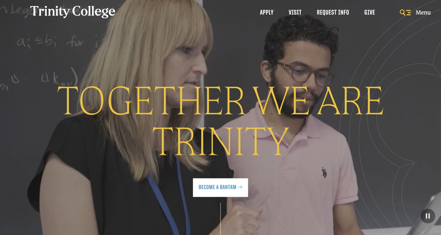
Trinity College uses a full-width campus video frame, oversized gold lettering and a centered admissions action to establish a communal introduction. Apply, visit, request information and give remain visible in the upper utility navigation, so the emotional opening does not remove practical routes. Academic, student-life and athletics content follows in distinct sections. Pantheon documents the trincoll.edu WordPress website and its migration from SharePoint. The case study’s separate Summit application is outside this review, and visible campus imagery should not be mistaken for evidence about student outcomes or the implementation of admissions systems.
What you can learn
Treat an immersive hero as one replaceable presentation of the institution, with practical tasks maintained independently in the surrounding navigation. Keep a pause control and a suitable still image available, and give editors guidance on scenes that support readable overlay text.
Pros
Frequently needed admissions actions remain present above the large community-focused introductory message.
The central admissions button creates a clear next step without adding several competing hero actions.
Cons & considerations
Very large overlay lettering can dominate the photograph and requires careful behavior at narrower widths.
A video opening adds media-management work that must remain separate from routine editorial content updates.
Platform source: Official Pantheon case study for this public property. The case links trincoll.edu and documents migration of the flagship from SharePoint to WordPress on Pantheon. Do not substitute the Summit microsite. Official documentary association for the described project; not a fresh runtime observation or proof of every current company system. Platform evidence is separate from the direct website screenshot and is not a complete current infrastructure audit.
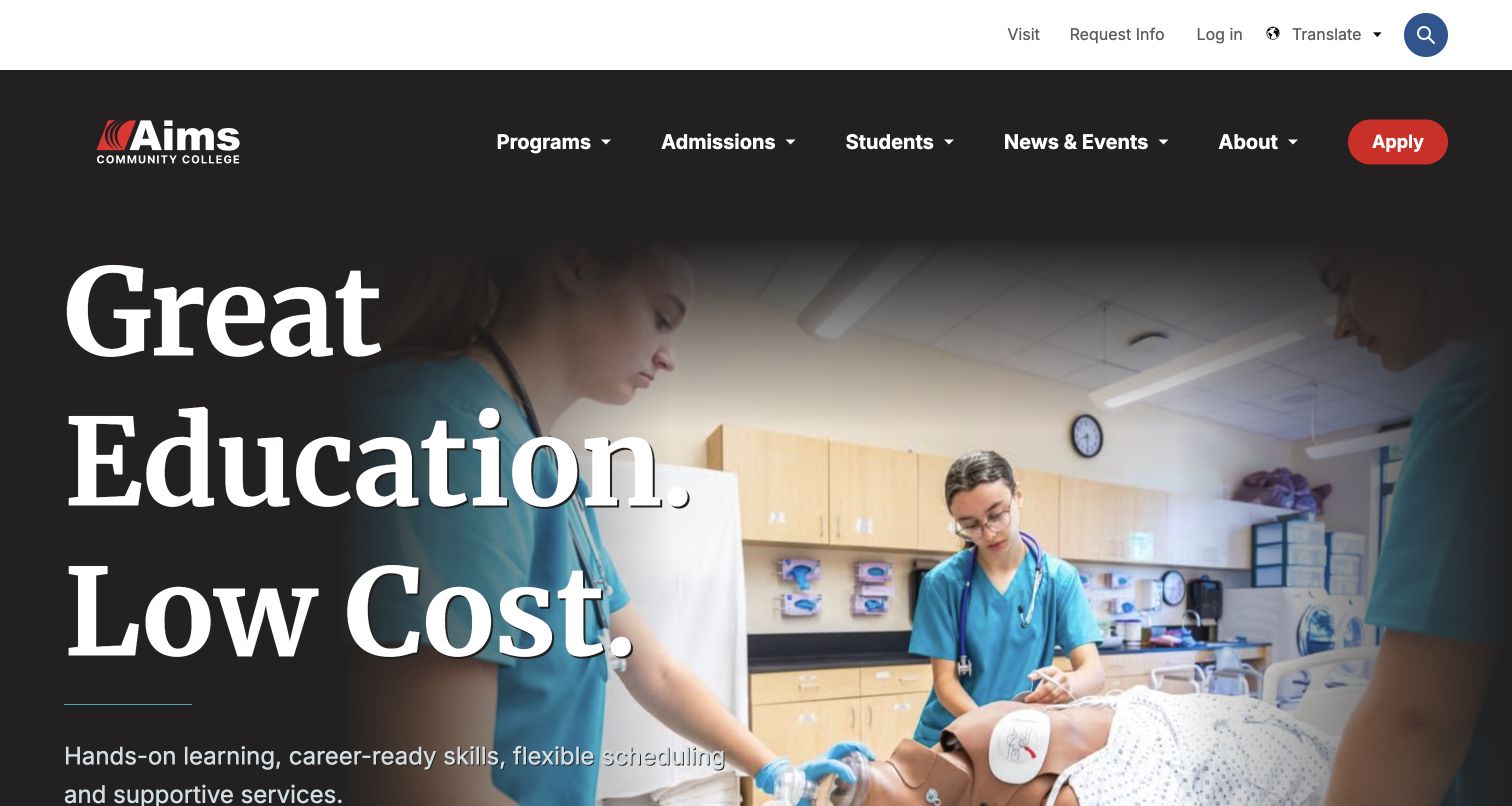
Aims Community College leads with a short statement about education and cost, set in large white type over a photograph of practical healthcare training. The dark navigation groups programs, admissions, students and institutional information, with a red apply action at the edge. The following content offers degrees, visits and aid as separate routes. Pantheon’s case study identifies aims.edu as the public Drupal relaunch. That documentary relationship does not validate tuition comparisons or establish the systems used by the login, event service or application destinations, which remain distinct from the reviewed homepage.
What you can learn
Connect the opening proposition to concrete tasks and realistic program imagery. A reusable college homepage should let editors change the featured discipline while preserving clear paths to program details, application information and financial-support content that prospective students need to compare.
Pros
The practical training photograph gives a specific educational context to an otherwise broad value statement.
Programs and admissions receive clear navigation positions, with the application route visually distinguished.
Cons & considerations
Large introductory typography leaves limited first-screen room for the supporting explanation and lower actions.
Broad cost language needs current, clearly linked detail rather than relying on the homepage promise alone.
Platform source: Official Pantheon case study for this public property. The case explicitly links aims.edu and describes its public Drupal website relaunch on Pantheon. External application/catalog services are outside this hosting claim. Official documentary association for the described project; not a fresh runtime observation or proof of every current company system. Platform evidence is separate from the direct website screenshot and is not a complete current infrastructure audit.
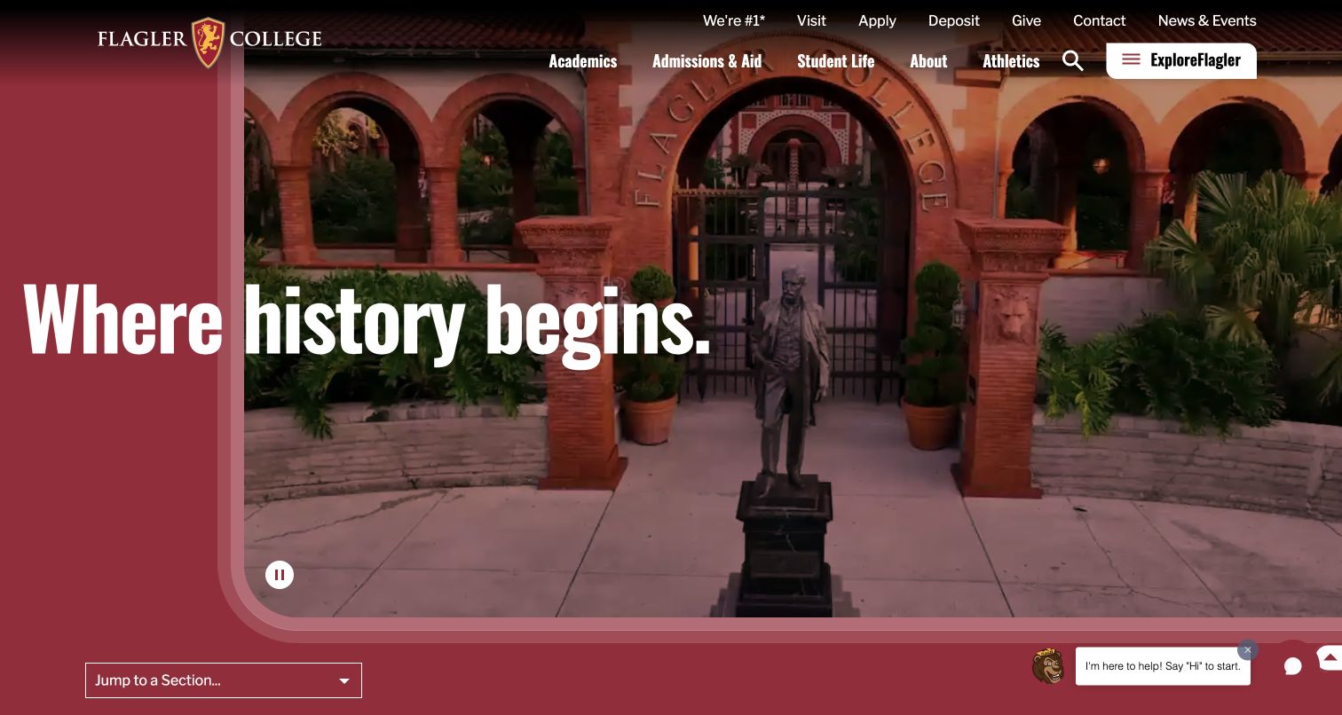
Flagler College frames a campus video with a burgundy field and rounded lower corner, turning its architectural setting into the opening identity. The headline crosses the visual boundary between brand color and photograph, while admissions and utility links remain above. A section-jump control appears below the hero, acknowledging the length of the page. Pantheon’s case study describes the flagler.edu Drupal migration, not every athletics, giving or application destination. The screenshot is a record of this public composition and does not independently substantiate rankings or institutional performance claims elsewhere on the page.
What you can learn
Use a recognizable framing system that can survive changes in media and campaign copy. When a long homepage covers several recruitment themes, give visitors a clear route to those sections and maintain practical admissions links outside the cinematic introduction.
Pros
The burgundy frame and campus imagery produce a distinctive identity without requiring a long introductory paragraph.
A section-jump control acknowledges that visitors may want specific content beyond the opening presentation.
Cons & considerations
Text crossing color and photographic areas needs careful contrast checks for every replacement scene.
Numerous utility links compete with the large visual opening and require consistent grouping as content grows.
Platform source: Official Pantheon case study for this public property. The case identifies flagler.edu and explicitly documents its rebuild in Drupal 10 on Pantheon. Official documentary association for the described project; not a fresh runtime observation or proof of every current company system. Platform evidence is separate from the direct website screenshot and is not a complete current infrastructure audit.
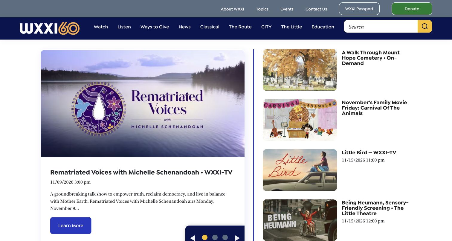
WXXI gives a featured program a card with artwork, airtime, description and action, while a neighboring column lists additional programming. Its masthead distinguishes watch and listen routes from related news, music and cultural properties. This approach makes the homepage useful as both a brand entrance and an editorial schedule. Pantheon’s case study concerns the wxxi.org WordPress publishing property and its multisite work. The linked news and music brands are not counted as separate examples or automatically assigned the same technology from their shared organizational relationship.
What you can learn
Model program promotion with title, image, channel, time and destination as fields. Keep links to related properties clearly labeled, and assign expiry or archive behavior to scheduled content so a familiar card does not continue suggesting that an old broadcast is upcoming.
Pros
Airtime and channel context appear beside the featured program rather than being hidden in the detail page.
The secondary program column supports discovery without giving every item the same visual weight.
Cons & considerations
Many related-brand links in the header can make the distinction between sections and separate sites unclear.
Carousel-led features need deliberate date maintenance so recurring visits do not encounter outdated program emphasis.
Platform source: Official Pantheon case study for this public property. The case explicitly identifies wxxi.org as the flagship and describes its WordPress Multisite transition on Pantheon. Do not infer hosting of every affiliated station. Official documentary association for the described project; not a fresh runtime observation or proof of every current company system. Platform evidence is separate from the direct website screenshot and is not a complete current infrastructure audit.
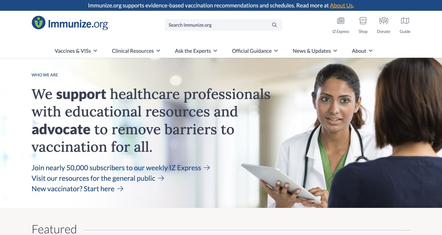
Immunize.org combines a prominent search field with clearly named resource categories and an introduction aimed at healthcare professionals. The hero pairs a serif statement with a clinical photograph, then offers distinct links for subscribers, the general public and new vaccinators. The arrangement makes a substantial resource library approachable without making every visitor read its full taxonomy. Pantheon documents the immunize.org WordPress redesign, which is the property reviewed here. This design analysis does not evaluate medical recommendations, verify clinical accuracy or extend the platform association to the separate shop and public-information website.
What you can learn
Identify the reader’s role before sending them into a large reference library. Structure content around useful subjects, document types and update information, and make editorial responsibility explicit so presentation quality is never confused with independent validation of specialist advice.
Pros
Search and descriptive resource categories give experienced readers direct routes to a large information collection.
Separate public and newcomer links acknowledge different levels of knowledge before users enter detailed resources.
Cons & considerations
Long introductory text occupies space that returning specialists may prefer to use for immediate resource discovery.
A dense specialist navigation requires careful terminology maintenance as guidance and document collections change.
Platform source: Official Pantheon case study for this public property. The case identifies immunize.org and documents redesign of its public WordPress information site with Pantheon. This is editorial technology evidence, not independent validation of medical content. Official documentary association for the described project; not a fresh runtime observation or proof of every current company system. Platform evidence is separate from the direct website screenshot and is not a complete current infrastructure audit.
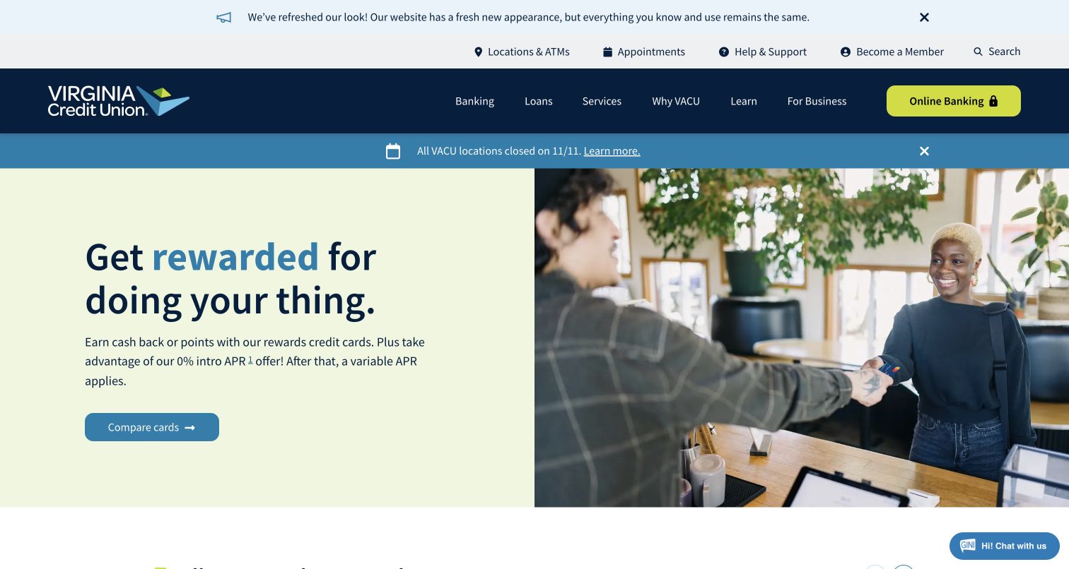
Virginia Credit Union layers a redesign notice, utility links, main navigation and a closure alert above a pale promotional panel. A brightly colored online-banking action remains visually distinct from the public product categories. The hero pairs an everyday transaction photograph with a credit-card message and a comparison route. Pantheon’s case study explicitly describes the vacu.org Drupal website, so the online-banking application is outside this review’s technology scope. The example illustrates information hierarchy and public content maintenance, not the suitability of financial products, accuracy of current rates or security of the account system.
What you can learn
Separate operational notices, public product descriptions and authenticated account access in the architecture and content model. Each has a different owner and risk profile; a promotional update should never obscure the account route or make temporary service information difficult to find.
Pros
The contrasting banking action helps returning members identify the account destination within a busy header.
Operational closure information receives its own visible band above the main promotional content.
Cons & considerations
Several stacked header bands significantly reduce the first viewport available for product explanation.
Promotional rates and conditions need ongoing ownership and supporting disclosures beyond an attractive introductory card.
Platform source: Official Pantheon case study for this public property. The source’s actual URL uses rescources. It links vacu.org and describes the Drupal public website moving from legacy hosting to Pantheon; online banking is outside this claim. Official documentary association for the described project; not a fresh runtime observation or proof of every current company system. Platform evidence is separate from the direct website screenshot and is not a complete current infrastructure audit.
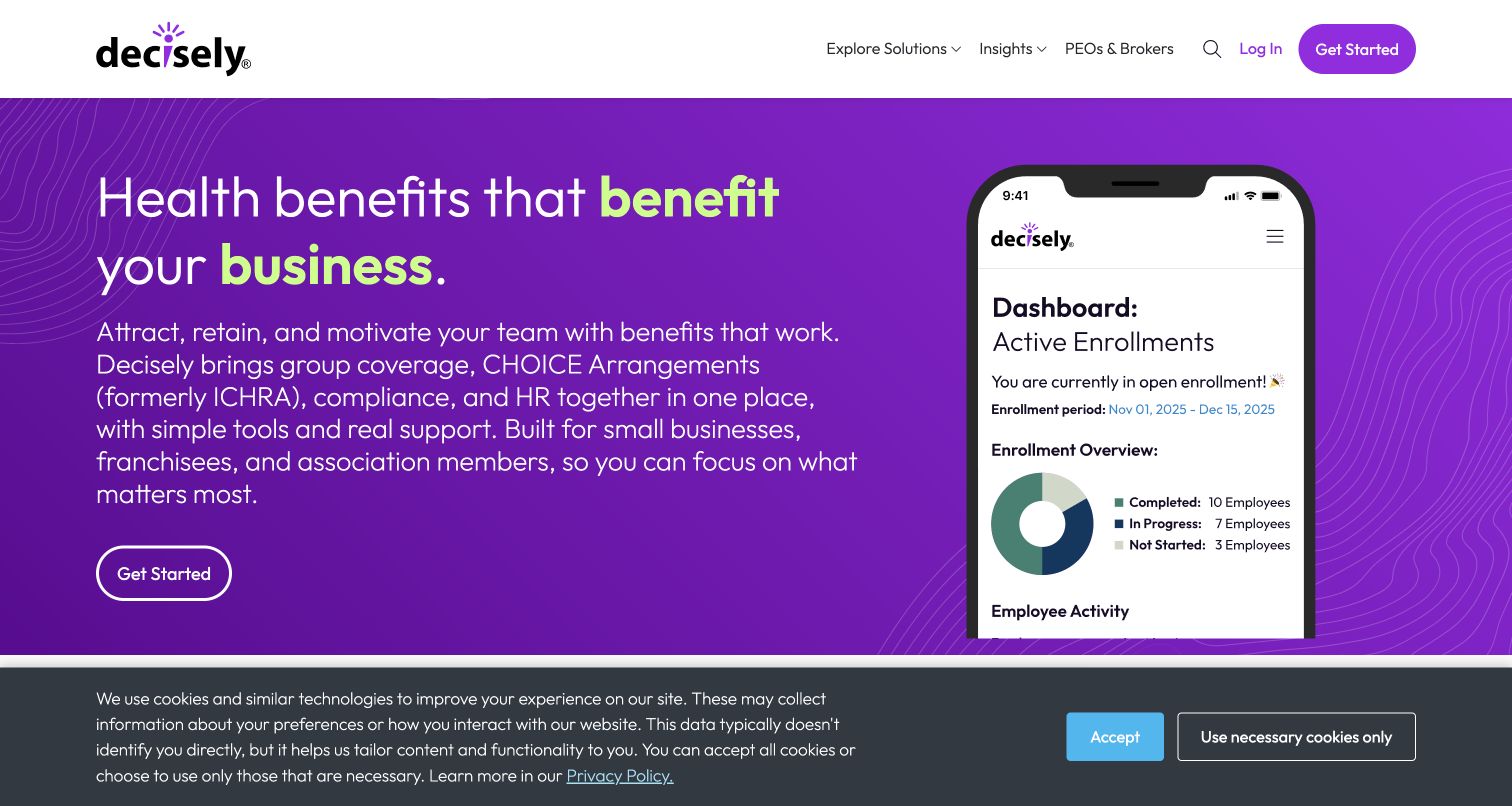
Decisely’s purple hero places a benefits proposition beside a phone illustration, using green emphasis to connect the language to its brand accents. The header offers solutions, insights and partner information while distinguishing login from the main enquiry action. The page then breaks the offering into healthcare, compliance and HR categories. Pantheon’s case study documents the public WordPress marketing estate, including the flagship Decisely site. The depicted enrollment dashboard is illustrative content here, not evidence that the private employee-benefits application runs on Pantheon or that its displayed data represents actual users.
What you can learn
Keep product illustration, marketing copy and authenticated workflows explicitly separate. A public CMS can explain a complex service through useful categories and selected interface imagery, but editors need a process for updating those illustrations without implying new capabilities or verified customer outcomes.
Pros
The contrasting phone illustration gives the service proposition a concrete reference beside the explanatory copy.
Login and the public enquiry route are visually distinguishable in the header.
Cons & considerations
A long introductory paragraph makes the hero more demanding to scan than the headline initially suggests.
The captured cookie notice takes a lower band and competes with the main content boundary.
Platform source: Official Pantheon case study for this public property. The case links decisely.com and shows its public homepage while describing the flagship and connected WordPress Multisite portfolio transition to Pantheon. Do not count its 150 benefit sites or claim the private HR app uses this stack. Official documentary association for the described project; not a fresh runtime observation or proof of every current company system. Platform evidence is separate from the direct website screenshot and is not a complete current infrastructure audit.
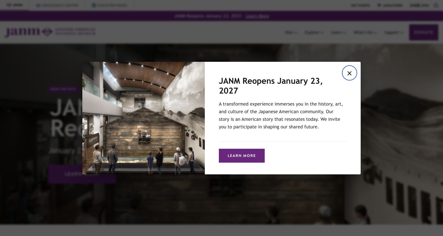
The Japanese American National Museum’s captured opening includes a reopening announcement dialog over the homepage. Its split image-and-text panel gives the date and practical destination immediate prominence, while a visible close control offers a return to the underlying navigation. The page behind it retains museum, education, support and event routes. Pantheon’s case study identifies janm.org as the public Drupal property following its hosting migration. Separate stores and related cultural sites are not included in that evidence. This screenshot deliberately records the genuine announcement state rather than presenting a reconstructed view of the obscured page.
What you can learn
Give major operational announcements a lifetime, dismissal and a detail page. Preserve essential information within the ordinary site structure so visitors who close the notice, return later or use another reading mode can still find it.
Pros
The announcement pairs a concrete reopening date with one destination and contextual museum imagery.
A close control gives visitors a clear way to return to the underlying institutional content.
Cons & considerations
The dialog initially obscures the homepage and interrupts visitors seeking unrelated event or educational information.
Time-sensitive notices need explicit removal ownership so an important temporary message does not outlive its usefulness.
Platform source: Official Pantheon case study for this public property. The case expressly links janm.org as the flagship Drupal site powered by Pantheon and describes its migration from Linode. Exclude separate museum properties. Official documentary association for the described project; not a fresh runtime observation or proof of every current company system. Platform evidence is separate from the direct website screenshot and is not a complete current infrastructure audit.
Kegan has 15+ years of experience working with small businesses, Fortune 500 companies, and everything in between. No development job is too big or too small: he brings the same hands-on attention to a focused improvement, a complete website, or a custom application.
For Pantheon projects, he can help with responsive interfaces, reusable components, custom functionality, API connections, and performance-minded implementation. He works directly with clients on scope, design, implementation, testing, and handover, with an emphasis on clear communication and a system that remains practical to maintain after launch.
Show 3 other Pantheon developersHide other Pantheon developers
For a college, nonprofit or local authority, begin with the decisions visitors need to make and the information they must find. Define repeatable structures for programs, services, locations and notices before choosing a homepage feature. Keep practical information available independently of promotional storytelling, and give each recurring content category a clear editorial owner.
Give parallel development an isolated environment
Pantheon’s Multidev documentation describes separate development environments containing code, database and files, supporting independent work before code changes are merged. Availability depends on the account arrangement. Decide how a team will identify, validate and retire its working environments, and avoid confusing a development URL with the public publication record.
Pantheon documents Custom Upstreams as a way to maintain common code and distribute changes to individual site repositories. That can support a portfolio with shared conventions, while site-specific customization remains separate. Agree on which elements are truly shared and who owns local content before introducing a common foundation; repeated branding alone does not establish identical editorial needs.
Plan the operating responsibilities with the design
Know what recovery actually restores
Pantheon’s backup documentation distinguishes committed code, database content and uploaded files, and identifies exclusions such as uncommitted SFTP code changes and generated assets. A recovery plan should identify the relevant components and their owners. Record what must be restored together and how to check the result, rather than treating the existence of a backup as a complete operational plan.
Pantheon documents both granular and full cache clearing for Drupal and WordPress, including integration with its Global CDN. Content updates need a deliberate freshness strategy. Identify which pages depend on a changed item and verify the public result after publishing; clearing one layer does not necessarily explain the behavior of an additional delivery service in front of the site.
Marketing pages frequently link to donations, admissions, online banking, ticketing or account applications. Record where those journeys leave the public website, who maintains each destination and what visitors should expect. An interface pictured in a homepage illustration is not evidence that the marketing CMS stores its data or implements its authenticated workflow.
A useful handover demonstration
Ask the actual team to carry out its routine job: publish a realistic update, correct a mistake, preview a narrow screen, and identify who owns an integration failure. For a library or frontend framework, also ask who maintains the content source and deployment. A polished screenshot does not answer those operational questions.
Beyond the screenshot
A practical Pantheon website checklist
Identify the exact public property, its audiences and the tasks the website must support.
Separate temporary alerts, campaigns and evergreen information in the content model.
Give every changing content category an owner and a review or expiry condition.
Keep practical task links available when the featured image or campaign changes.
Document which changes are version-controlled code and which are editorial content.
Define the working environment and responsible owner for parallel development.
Use realistic long titles, varied images and incomplete optional fields when checking layouts.
Keep meaningful headings, control names, image descriptions and media alternatives.
Document separate account, payment, donation, ticketing and application destinations.
Check backup coverage and the steps needed to verify a restored public website.
Plan cache freshness for changed content and verify the resulting public page.
Run automated checks, build and deploy through the approved route, then verify the live release.
Test with real content, a keyboard, a small screen, slow or failed requests, and the people who will maintain the system. These are planning checks, not an accessibility, security, performance, or search-ranking certification.
Sources & editorial method
How this Pantheon collection was reviewed
We selected twenty distinct public website properties with explicit official Pantheon case studies tied to the named website. The five opening organizations have separately sourced identities; the sequence is editorial, not a measured traffic or service-quality ranking. Eighteen original browser captures were made on November 9, 2026 Pacific, and two verified earlier captures were reused with their dates intact. All twenty images were inspected for these collection-specific reviews. The Japanese American National Museum image intentionally records its genuine reopening-announcement dialog; several other images retain ordinary cookie notices. Broad public stack audits are recorded independently of platform case studies. Sixteen new scans completed and two retained bounded failures; the two reused audit records retain their original successful observation dates. No account login, form submission, transaction, medical assessment or financial-product evaluation was performed. Documentary associations describe their published project scope and are not presented as newly observed private infrastructure.
Every image is an unmodified capture from the actual website, with its source and capture date. Some captures are reused from our shared catalog; their dates remain the original capture dates. None comes from a vendor gallery or a generated reconstruction. Moving imagery and live content can change.
Technology attribution uses public page assets or metadata, official platform documentation, or a cited first-party project case study. Documentary and framework-relationship evidence is identified where used; it is not a complete current backend inventory. A CMS image CDN alone does not establish a full CMS deployment. A library’s presence does not prove which individual controls use it, and a platform label does not establish AI authorship.
The composition notes, lessons, pros and tradeoffs are original editorial observations. We have not measured conversion, traffic, security, performance or accessibility conformance. Website owners retain their brands and imagery; these examples are not our client portfolio. Written, Edited and Curated are independent records, not dates advanced by a build. See our editorial standards or suggest a correction.
Questions worth asking
Pantheon website development FAQs
Is Pantheon the same thing as WordPress or Drupal?
No. In these documented projects, WordPress or Drupal supplies the content-management application, while Pantheon supplies the website operating platform and workflow. The public design and editorial structure still depend on the particular project and team.
Does an official case study prove a website still uses Pantheon today?
Not by itself. A case study documents the relationship and project it describes. Current public-source observations can add dated evidence, but neither should be extended to every application, subdomain or later redesign without separate support.
How do code and content move through the Pantheon workflow?
Pantheon documents code moving from Dev through Test to Live, with content normally copied down from Live for development. Pushing a database toward an already active Live site can overwrite newer content, so code deployment and content replacement must be treated as different operations.
Are the account applications pictured in these websites hosted on Pantheon?
The screenshots do not establish that. Product illustrations and links to online banking, admissions, donations or software accounts belong to separate scopes unless explicit evidence connects those systems. This collection reviews the named public websites.
Why are some stack audits unavailable?
The bounded scanner retained a decoded-response-size limit for Easterseals and an HTTP 403 response for Exploratorium. It did not bypass either restriction or invent a fresh stack result. Their platform inclusion rests on explicit official case studies and their screenshots were captured directly from the public browser pages.
Why do two screenshot dates differ from this review date?
The guide reuses two genuine earlier captures and their existing audit records while adding new collection-specific analysis. Capture dates, successful observation dates and editorial dates describe different events and remain separate.
Borrow the content structure that helps people find what they need and helps editors maintain it. Pair a clear public experience with explicit release, content and recovery responsibilities, then judge the result by the actual published property.