Best Docker Websites of 2026 (20 Real-World Examples)
Public design references with documented Docker customer, development or service associations
These 20 examples connect useful website design with scoped Docker evidence. Docker is a packaging and development technology, not a visual style. A company using Docker in tests or development does not establish that its marketing homepage is served from a Docker container.
A container can make an application’s environment easier to reproduce, but it does not decide what the website should say, how editors publish, or which database owns a customer record. A useful Docker brief explains what is being packaged, where the resulting image runs, and who maintains the surrounding system. Those choices matter more than placing a container logo in a technology list.
Ancestry, Netflix, Microsoft, Spotify and ADP open the collection with recognizable organizations and explicit primary evidence. The source scopes are deliberately different: some describe development and testing, some document earlier service architectures, and some are customer-catalog associations only. The public design reviews stand on their own; none of those sources is expanded into a complete current backend inventory.
Before the examples
What makes good Docker website development in 2026?
Make the image’s responsibility explicit
Identify whether the image builds frontend assets, runs an application, supports a test or provides a development dependency. Those are different responsibilities. A project can use Docker successfully without serving public requests from a container, and a containerized public service still needs a deliberate content and user-experience design.
Package only what the runtime needs
Docker’s build guidance describes separating build stages from the final runtime and choosing appropriate base images. In the project brief, turn that into a concrete question: what files and capabilities must the deployed service actually contain? Development tools, private source material and local caches should not become production payload by accident.
A Dockerfile is not a permanent guarantee of identical behavior. Dependencies, base images, external services and configuration can change. Decide how updates are reviewed and tested, how a release image is identified, and how the operator returns to a known working version when an update fails.
The collection · 20 examples
20 Docker website examples worth studying
Study the public interface first, then read the cited Docker association for its actual meaning. A listed customer, a conference demonstration and a historical service migration provide different kinds of evidence. None automatically identifies the container runtime of the captured public page.
We start with five recognizable brands or organizations: Ancestry, Netflix, Microsoft, Spotify, ADP. Each attribution applies to the named website property, not every product or website belonging to its organization. This is a curated reading sequence, not a measured ranking.
Ancestry’s public opening asks a simple question about family history before exposing the complexity of its records and research tools. A restrained cream-and-green palette, family photographs and a clear trial route make the subject approachable. The header distinguishes genealogy, DNA and other offerings, while account access remains separate. A seasonal promotion occupies its own band rather than replacing the whole introduction. This is useful for a service whose real workflow may involve substantial searching: the homepage starts with a reason to explore rather than a dense inventory of databases.
What you can learn
Keep the public proposition understandable even when the application behind it is complicated. CNCF’s 2017 case documents Docker-based services at Ancestry; it is historical development evidence, not a verified description of this current marketing page’s container setup.
Pros
The family-history question connects a technical search product to an understandable personal motivation.
Separate navigation for genealogy and DNA helps distinguish related but different offerings.
Cons & considerations
A trial action still needs clear pricing and renewal information later in the journey.
Family imagery can be evocative without explaining record coverage, uncertainty or research limitations.
Platform source: Primary documented Docker association. CNCF’s 2017 Ancestry study documents Docker-containerized services. Platform evidence is separate from the direct website screenshot and is not a complete current infrastructure audit.
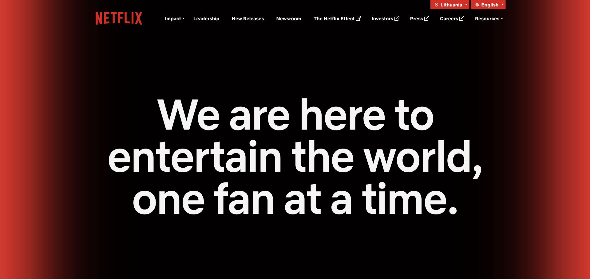
Netflix’s corporate introduction relies on a small number of navigational choices and a prominent purpose statement. The dark background and red edge treatment make the brand recognizable without borrowing the subscriber interface’s rows of entertainment tiles. Leadership, newsroom, careers and investor destinations have room to serve their own audiences. That restraint is worth studying when a company’s technical product has become very large: a public information site can remain compact, provided its routes and editorial purpose are clearly defined rather than added as an afterthought.
What you can learn
Separate the deployment unit from the user-facing task. Docker’s Netflix feature discusses engineering tests and Testcontainers workflows, not a public claim that this About page is delivered by Docker or that a particular container tool creates its visual design.
Pros
The corporate page avoids importing unnecessary application complexity into a simple information journey.
A limited navigation gives several non-subscriber audiences clear destinations.
Cons & considerations
A very restrained opening depends on useful supporting content to explain the organization concretely.
Large typography still needs careful wrapping and spacing when translated or viewed on a narrow screen.
Platform source: Primary documented Docker association. Docker features Netflix engineers discussing Docker and Testcontainers in testing workflows. Platform evidence is separate from the direct website screenshot and is not a complete current infrastructure audit.
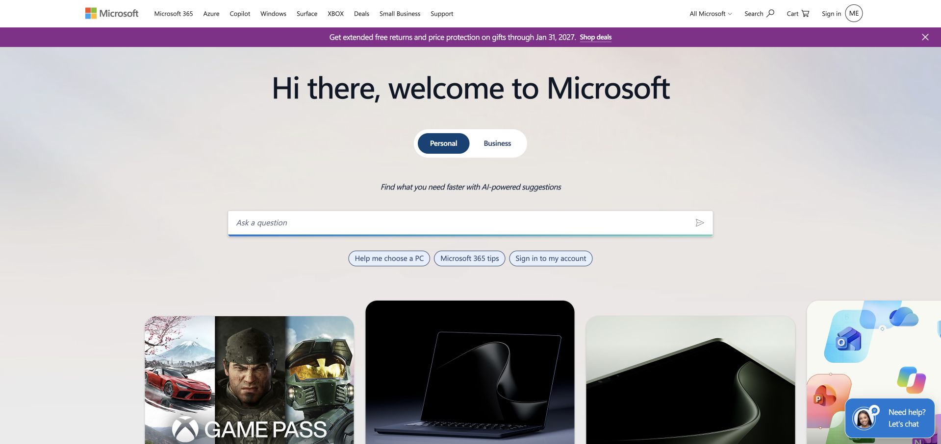
Microsoft’s public homepage combines a recognizable navigation shell with a large introductory area and a set of product-oriented cards. The header keeps major families such as Microsoft 365, Azure, Windows, Surface and Xbox accessible, while the opening can emphasize a particular campaign or way to get help. The useful lesson is the distinction between the shared brand and the individual destination. A visitor does not need to learn the whole organization before following a product route, but the surrounding system still makes that wider organization understandable.
What you can learn
Make a broad platform feel navigable through explicit destinations. Docker’s cited Microsoft feature concerns Docker Desktop and Microsoft Dev Box interoperability in a development demonstration; it is not evidence that this public homepage’s production runtime uses Docker.
Pros
Well-known product-family labels provide useful shortcuts for returning visitors with a defined task.
A consistent shell can accommodate changing campaigns without changing the underlying navigation model.
Cons & considerations
A large portfolio can still overwhelm someone who knows their problem but not the relevant product name.
Several promotional cards need disciplined prioritization so that the primary purpose stays clear.
Platform source: Primary documented Docker association. Docker describes a Docker Desktop and Microsoft Dev Box development demonstration. Platform evidence is separate from the direct website screenshot and is not a complete current infrastructure audit.
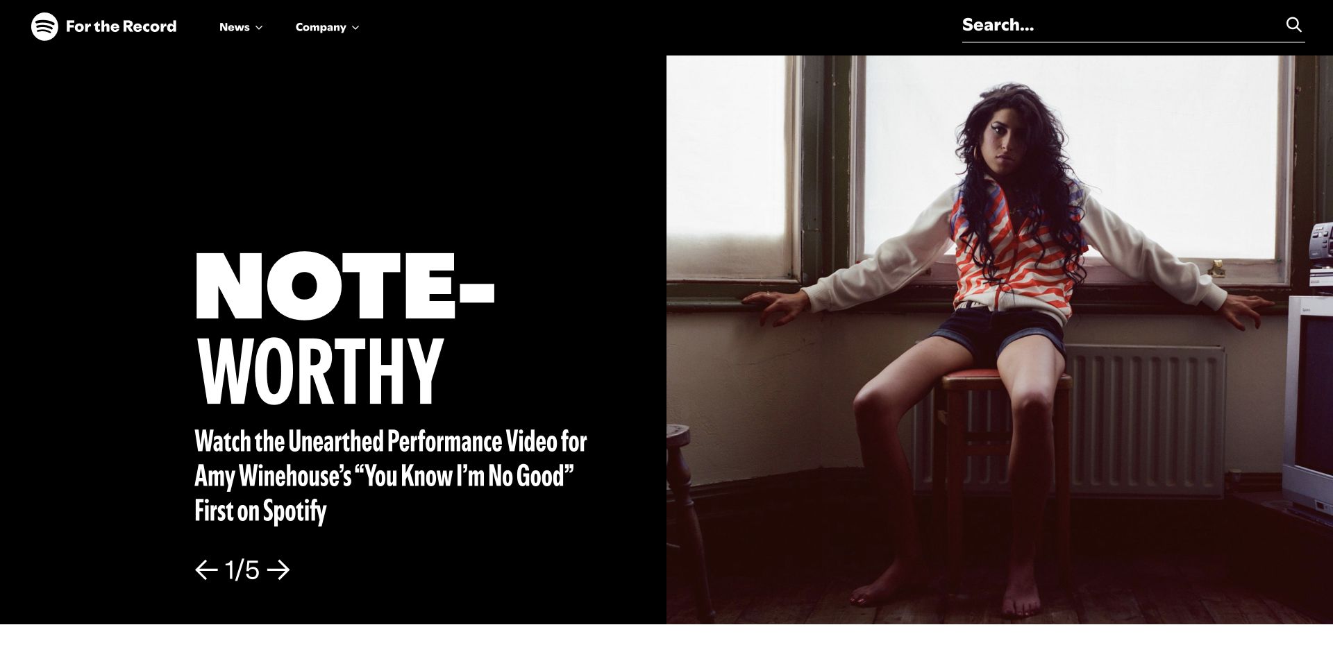
Spotify’s newsroom treats its opening as an editorial feature, combining bold display type with a substantial photograph and visible controls for a sequence of stories. The navigation is deliberately simpler than the listening application: news, company context and search are the main reference points. This makes the page useful to people looking for an announcement or business explanation rather than a playlist. The design shows how a familiar consumer brand can keep its personality while adapting its information architecture to a different kind of reading task.
What you can learn
Reuse brand language, not necessarily application structure. CNCF’s 2019 Spotify case describes Docker-containerized microservices. That documentary association says nothing by itself about the current newsroom’s CMS, container packaging, build process or complete deployment architecture.
Pros
The editorial feature gives a clear starting point while keeping the corporate publication recognizable.
A small navigation suits the task of finding and reading announcements.
Cons & considerations
Rotating editorial features need clear controls and should not be the only route to important information.
Very large display type can reduce the amount of context visible before scrolling.
Platform source: Primary documented Docker association. CNCF's 2019 Spotify case study describes Docker-containerized microservices. Platform evidence is separate from the direct website screenshot and is not a complete current infrastructure audit.
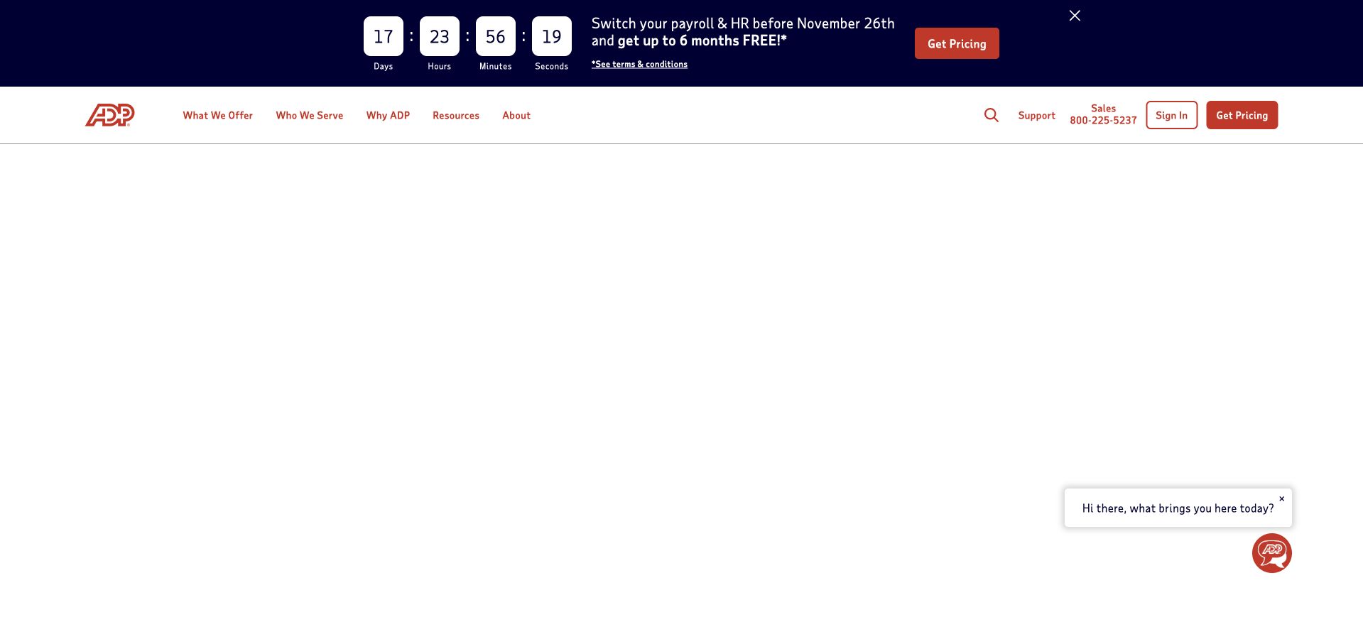
ADP’s homepage pairs a direct HR-and-payroll proposition with an illustration and a visible business-size selector. The primary navigation distinguishes what is offered, who it serves, resources and company information, while support, sales and sign-in remain separate practical routes. This is useful because a small employer and a larger enterprise may recognize the same service category but need very different implementation detail. The selector creates a more relevant starting point without requiring a long qualification form before a visitor can learn anything about the offering.
What you can learn
Segment by a variable that genuinely changes the buying journey. Docker’s customer catalog lists ADP, establishing a documented customer association only; it does not identify the particular team, current deployment or container runtime of the page shown here.
Pros
Business-size choices provide a concrete way to narrow a broad HR and payroll proposition.
Support and account access remain visible for people who are not new sales prospects.
Cons & considerations
A size label alone cannot capture every organization’s geographic, compliance or integration requirements.
Concurrent promotions and chat widgets can compete with the main segmentation task.
Platform source: Primary documented Docker association. Docker customer catalog lists ADP. Platform evidence is separate from the direct website screenshot and is not a complete current infrastructure audit.
ING’s global website uses its orange identity confidently, combining a broad company message with a large image and a compact, rounded navigation area. About, sustainability, investor and newsroom routes make the corporate purpose of the page understandable. The visible route to ING Guide and the company-oriented labels differ from a conventional personal-banking dashboard. This is a useful distinction for an organization operating across markets: a global introduction can communicate shared direction without pretending to be the place where every visitor should open an account or manage daily transactions.
What you can learn
Make global and local responsibilities legible in the navigation. Docker’s customer catalog lists ING, but a logo association is not evidence of which current banking systems use Docker, or of the hosting configuration of this global corporate page.
Pros
A strong and restrained color system connects the corporate introduction with a recognizable brand.
Corporate audience routes reduce confusion between company information and everyday banking tasks.
Cons & considerations
A broad corporate message may be too abstract for visitors seeking a specific local service.
The path from global information to the correct market needs to remain obvious and accessible.
Platform source: Primary documented Docker association. Docker customer catalog lists ING. Platform evidence is separate from the direct website screenshot and is not a complete current infrastructure audit.
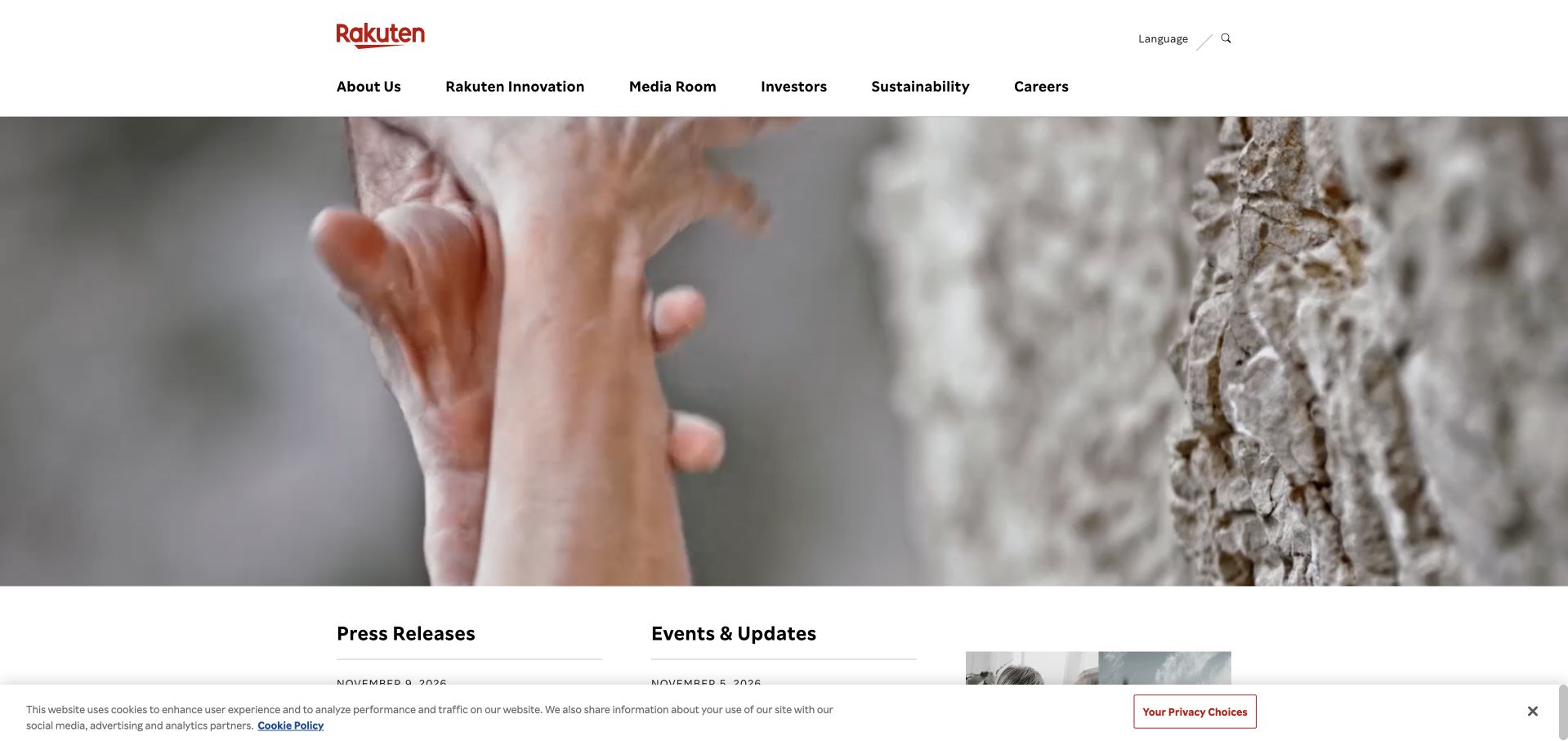
Rakuten’s corporate site introduces a large visual story while keeping company information, innovation, media, investors, sustainability and careers in the shared navigation. The relatively restrained white header gives the changing image a consistent frame. Press releases and other reference material begin beneath the lead, helping the site operate as more than a campaign landing page. This is a useful approach to a business with many product brands: the corporate page can explain the wider group while leaving detailed transactions and product journeys to their own destinations.
What you can learn
A shared brand gateway needs stable editorial and institutional routes. Docker’s customer catalog names Rakuten; the cited logo does not establish a particular subsidiary, current engineering workflow or the runtime used to render this captured corporate page.
Pros
The white navigation shell keeps a diverse organization navigable while visual features change.
Corporate reference content has a clear place below the main campaign.
Cons & considerations
A group-level introduction can leave the relationship between individual services insufficiently explained.
A rotating visual feature needs descriptive labels so it remains meaningful without animation or imagery.
Platform source: Primary documented Docker association. Docker customer catalog lists Rakuten. Platform evidence is separate from the direct website screenshot and is not a complete current infrastructure audit.
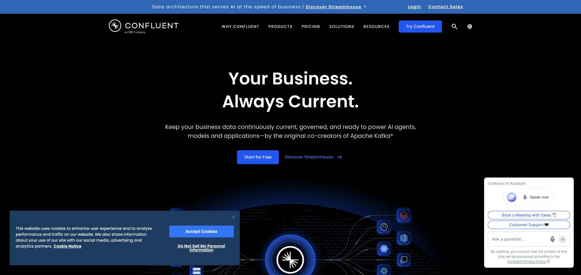
Confluent’s homepage pairs a short current-data proposition with a dark field and a flowing visual motif. The primary navigation gives products, pricing, solutions and resources distinct places, while a primary trial route is separated from a product-tour action. That is useful for visitors with different levels of readiness: someone evaluating the concept can explore, while a developer who already understands it can take a more direct path. The page makes a technical category feel coherent, although the metaphor needs concrete examples further down to explain the actual workflow.
What you can learn
Offer both exploration and implementation routes without making them visually identical. Docker lists Confluent in its customer catalog; that customer relationship does not demonstrate the deployment arrangement of the public page or imply that every Confluent product runs in the same container environment.
Pros
The brief proposition and consistent visual field provide a strong introduction to a technical category.
Tour and trial routes acknowledge visitors who are not equally ready to adopt the product.
Cons & considerations
A flowing-data metaphor needs practical examples to explain what a user can actually accomplish.
Persistent chat and consent interfaces can reduce the clarity of an otherwise focused opening.
Platform source: Primary documented Docker association. Docker customer catalog lists Confluent. Platform evidence is separate from the direct website screenshot and is not a complete current infrastructure audit.
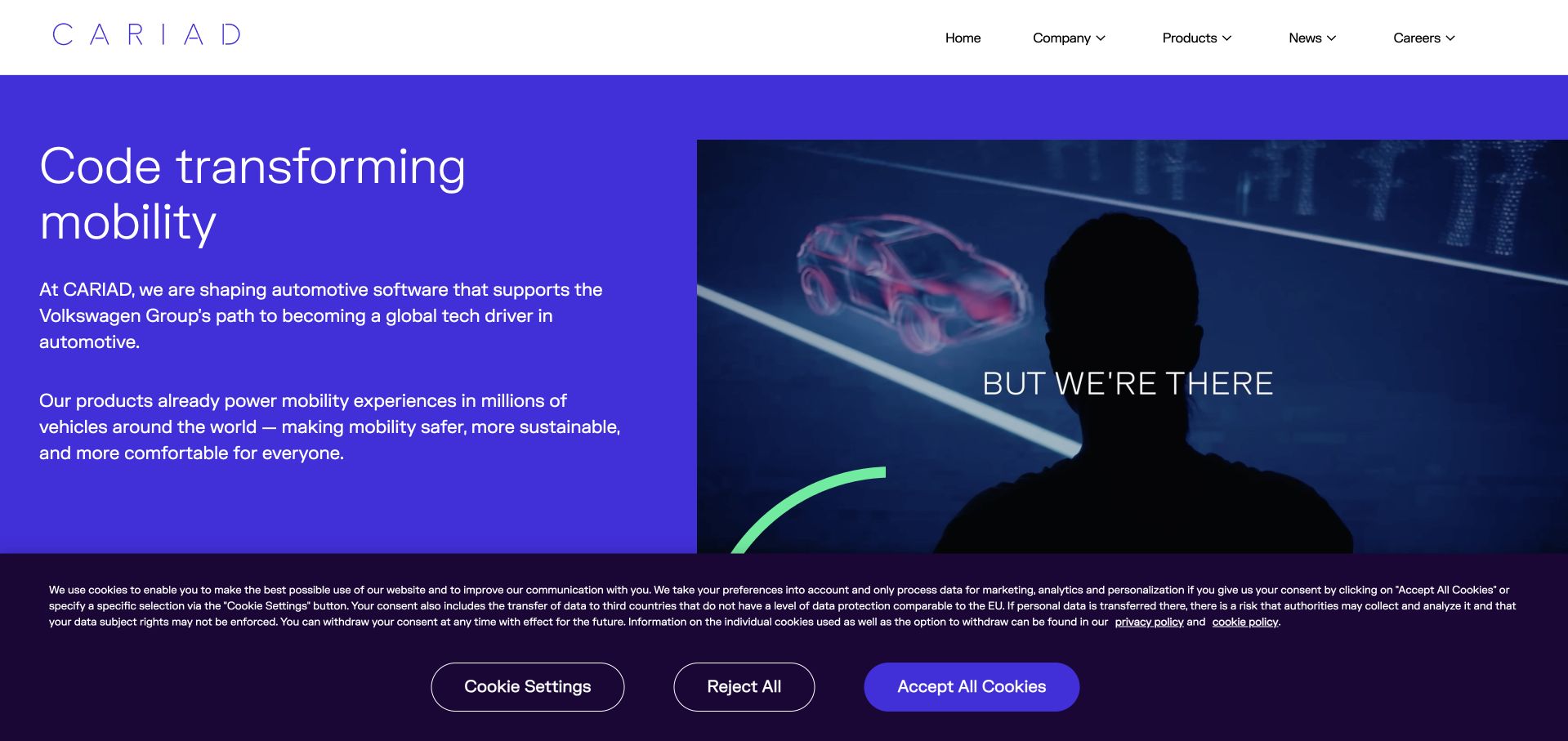
CARIAD’s opening places a compact statement about automotive software next to a large visual showing people and technology. The purple-and-white composition makes the two parts readable as a single introduction rather than a collage of unrelated capabilities. Company, products, news and careers are the main routes, with the Volkswagen Group relationship visible in the brand identity. This is useful for a specialist business whose work may be hidden inside other products: the page explains its role before asking the visitor to explore individual technical offerings.
What you can learn
State where the company fits in the wider product ecosystem. Docker’s catalog includes CARIAD as a customer association; that does not identify which software program, development team or current public-site runtime uses Docker.
Pros
The split composition gives explanatory text enough space beside the main visual.
A small set of routes makes a specialist business easier to understand before deeper exploration.
Cons & considerations
General capability language still needs concrete product examples to show the boundaries of the work.
The parent-group relationship can be mistaken for a claim about every subsidiary’s technology choices.
Platform source: Primary documented Docker association. Docker customer catalog lists CARIAD. Platform evidence is separate from the direct website screenshot and is not a complete current infrastructure audit.
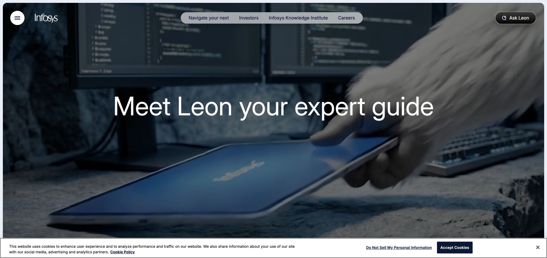
Infosys gives the opening to a large technology-oriented image and a concise guiding concept rather than a complete list of services. A compact header exposes company reference points such as investors, knowledge, careers and the main menu. The visual treatment helps the page feel like a deliberate introduction rather than an index of departments, but it also places responsibility on the navigation and following content to explain what the organization actually does. It is a useful example of the tension between a memorable corporate campaign and the everyday need to find a specific service.
What you can learn
A strong campaign must connect quickly to concrete capabilities. Docker’s customer catalog lists Infosys, which is a qualified customer relationship rather than proof that a particular Infosys client, consulting engagement or public homepage uses Docker.
Pros
A recognizable visual concept gives a very broad organization a more memorable first impression.
Persistent institutional routes keep investor and career tasks available alongside the main campaign.
Cons & considerations
Abstract campaign language can delay comprehension for a visitor seeking a narrowly defined service.
A menu-driven information architecture needs testing so that important capabilities are not concealed.
Visible tech stack
Earlier / documented evidence
Docker
Platform source: Primary documented Docker association. Docker customer catalog lists Infosys. Platform evidence is separate from the direct website screenshot and is not a complete current infrastructure audit.
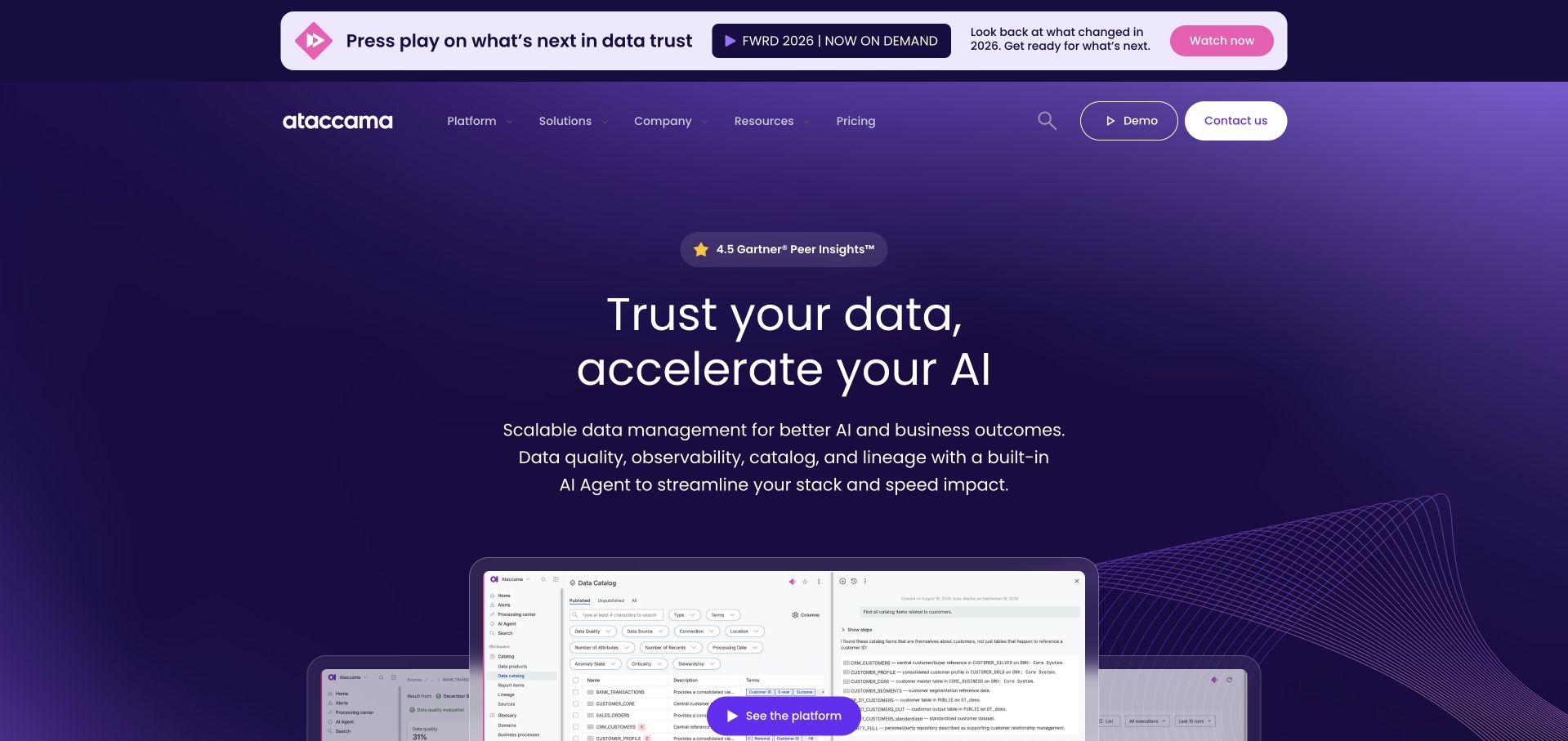
Ataccama’s homepage pairs a concise data-trust proposition with a substantial interface preview. The purple visual field is distinctive, while the product screen introduces something more concrete than an abstract network illustration. Platform, solutions, company and resources are separate navigation areas, with demo and contact routes available for different levels of interest. The useful relationship is between the claim and the evidence: the opening can communicate a broad idea about data quality, but the visible product context begins to show how that idea becomes a working interface.
What you can learn
Use a product preview to give a technical promise a practical reference point. Docker’s Ataccama case documents development tooling and Docker Business; it does not establish the runtime of the marketing page or independently validate its product claims.
Pros
The interface preview adds useful specificity to a proposition that could otherwise remain abstract.
The consistent color system helps platform and resource content feel part of one experience.
Cons & considerations
A reduced product screenshot can become decorative if important labels are too small to read.
Several data-management terms need explanation for visitors unfamiliar with the category.
Platform source: Primary documented Docker association. Docker documents Ataccama's development workflow using Docker Business. Platform evidence is separate from the direct website screenshot and is not a complete current infrastructure audit.
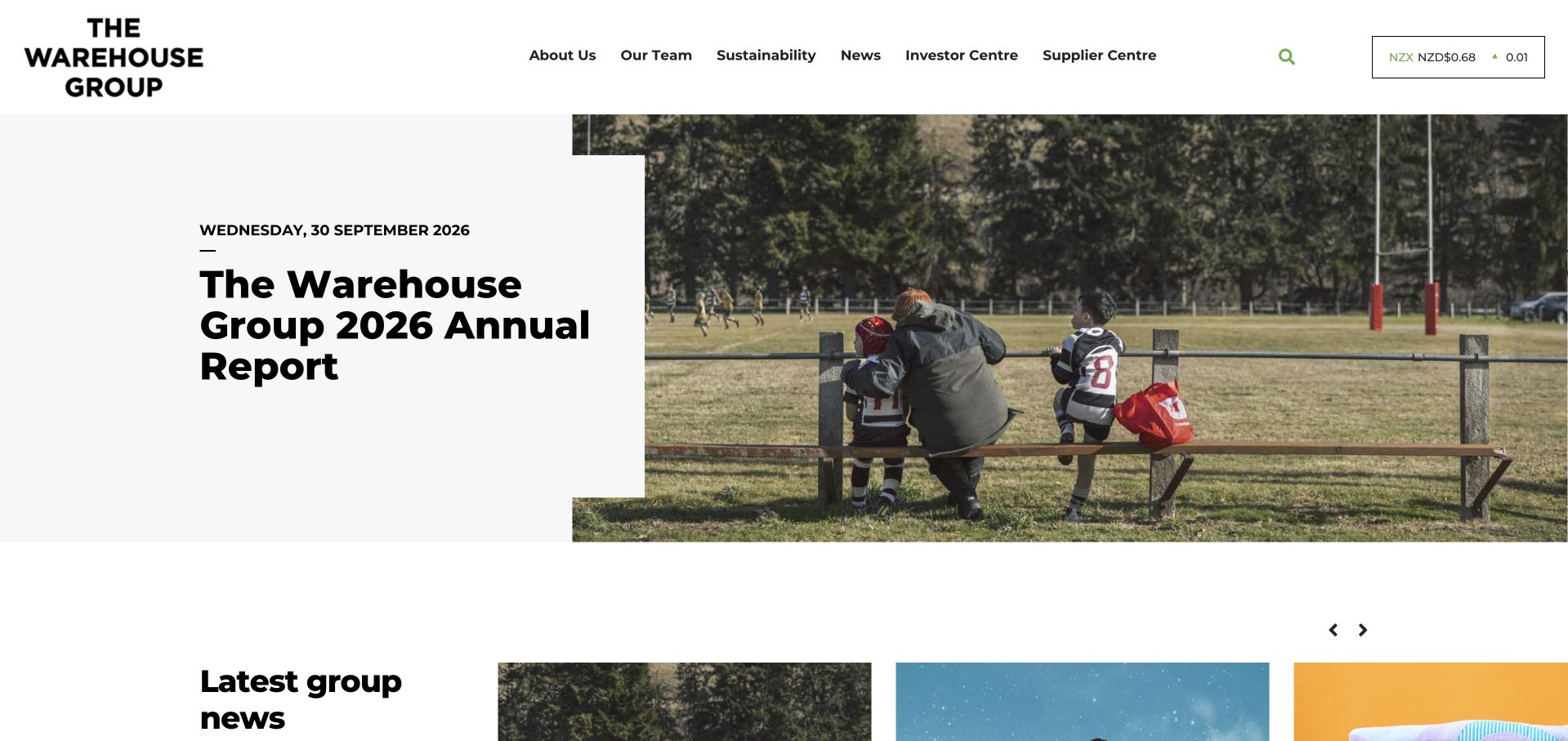
The Warehouse Group’s corporate homepage leads with a report-focused feature beside a contextual photograph. The header gives about, team, sustainability, news, investor and supplier information distinct places, while a compact share-information element reinforces the institutional audience. This is different from a retail shopfront: the site does not begin with a grid of products or a basket. It is worth studying when a group has several brands, because the parent site needs to explain the organization and its responsibilities rather than duplicate the shopping interfaces of its businesses.
What you can learn
Choose the homepage’s audience explicitly before choosing its content modules. Docker’s case describes The Warehouse Group’s development environments; that association is not evidence that its corporate reporting page or every retail brand uses a single Docker deployment pattern.
Pros
The editorial lead gives an institutional visitor a concrete document to explore.
Supplier, investor and sustainability routes acknowledge tasks that a retail storefront would not serve well.
Cons & considerations
A report-led opening can feel less relevant to a visitor looking for a particular consumer brand.
Corporate reporting needs accessible document alternatives and clear publication dates beyond the hero.
Platform source: Primary documented Docker association. Docker describes container-based development environments for The Warehouse Group. Platform evidence is separate from the direct website screenshot and is not a complete current infrastructure audit.
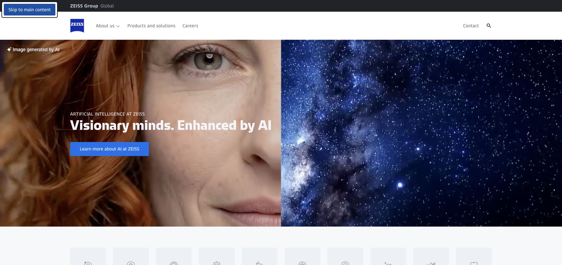
ZEISS’s corporate homepage uses a large photographic feature to establish its scientific and technical identity. A restrained blue-and-white header keeps company information, products and careers available, while supporting modules introduce the wider group. The visual system feels consistent without requiring every business area to use the same kind of product image. This is useful for a company spanning multiple technical fields: a shared introduction can communicate an approach to engineering, provided the subsequent routes explain the distinct applications and audiences clearly.
What you can learn
Let a shared visual identity connect specialist areas, but keep their application boundaries explicit. Docker’s ZEISS feature specifically concerns microscopy development and model deployment. That is not evidence that every ZEISS business, product or the corporate homepage uses the same container tooling.
Pros
A consistent header and visual language connect business areas that would otherwise feel unrelated.
Product and career routes remain practical entry points beside a more aspirational lead.
Cons & considerations
A broad scientific message requires specific application examples to become useful to prospective buyers.
Large photographic and animated assets need careful loading and contrast choices across devices.
Platform source: Primary documented Docker association. Docker describes ZEISS Microscopy's Docker Business model deployment workflow. Platform evidence is separate from the direct website screenshot and is not a complete current infrastructure audit.
OneMain Financial pairs a large human photograph with a concise personal-loan proposition and a prominent route to explore options. Product, branch, resource and account-access routes remain visible in the header. Supporting details about payment examples and rates sit close to the action rather than being entirely displaced by the photograph. The relevant design lesson is the proximity of explanation to the next step, not a recommendation of the product. A visitor should be able to distinguish a general introduction from a personalized offer before entering sensitive information.
What you can learn
Place essential qualification beside the action it affects. Docker’s customer catalog lists OneMain, establishing a customer association only; it is not an independent finding about the lending service’s security, financial suitability or current website infrastructure.
Pros
The main action is accompanied by supporting financial context rather than presented in isolation.
Branch and resource routes offer alternatives to immediately starting an online application.
Cons & considerations
Friendly imagery must not obscure the importance of rates, eligibility and repayment obligations.
A homepage cannot communicate every financial condition or establish whether a product fits an individual visitor.
Platform source: Primary documented Docker association. Docker customer catalog lists OneMain Financial. Platform evidence is separate from the direct website screenshot and is not a complete current infrastructure audit.
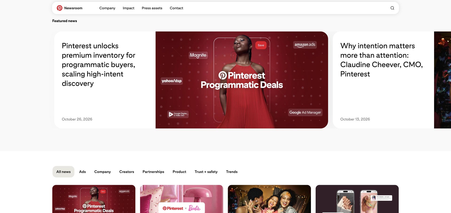
Pinterest’s newsroom gives one announcement a dominant visual treatment, then offers a secondary story and topic filters for the wider archive. Company context, impact, press assets and contact are visible navigation choices. The site feels connected to Pinterest’s visual culture, but its task is reading and reference rather than saving ideas to a personal account. That distinction is valuable for teams planning separate public and product surfaces: the same organization can need different content structures, even when the overall visual identity is shared.
What you can learn
Choose content modules around the reader’s task, not around an internal deployment tool. Docker’s catalog names Pinterest as a customer; the logo does not identify a current team or establish that the newsroom’s CMS and public delivery runtime are containerized with Docker.
Pros
The feature and archive filters support both current reading and later reference.
Press assets have a recognizable destination rather than being mixed into consumer product navigation.
Cons & considerations
A company newsroom should make its promotional perspective clear to readers.
Visual story cards need sufficiently descriptive text to remain useful without their images.
Platform source: Primary documented Docker association. Docker customer catalog lists Pinterest Newsroom. Platform evidence is separate from the direct website screenshot and is not a complete current infrastructure audit.
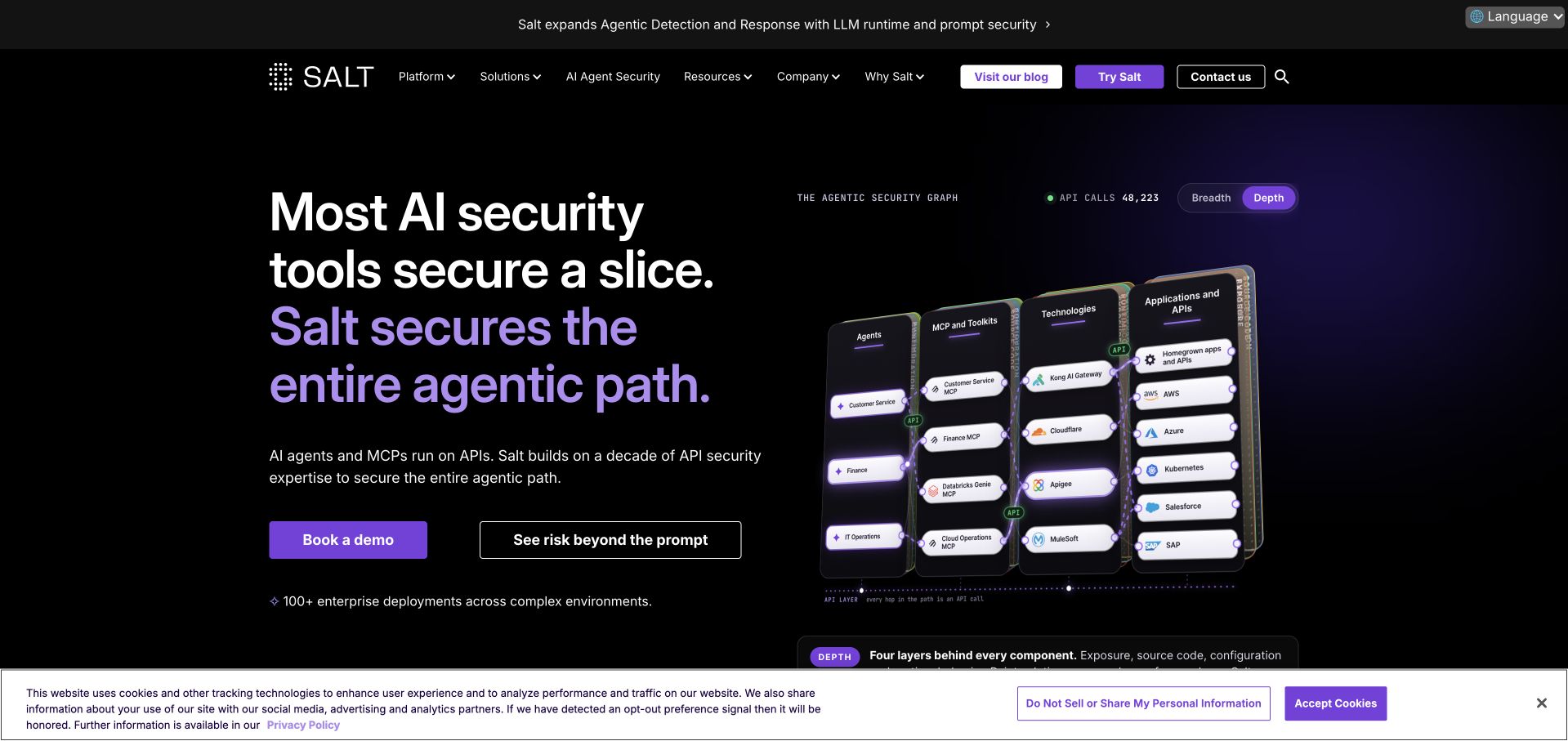
Salt Security’s opening combines a short security proposition with a diagram-like product visual. Purple highlights connect the main action, emphasis and interface imagery against a dark background. Navigation distinguishes the platform, solutions, resources and company information, while a secondary explanation route provides an alternative to booking a demo. The useful pattern is the attempt to make a technical scope visible: instead of showing only an abstract shield, the page begins to represent relationships between components and the kinds of work the product addresses.
What you can learn
Make technical scope legible before asking for a sales conversation. Docker’s customer catalog lists Salt Security, which is a customer association, not a verification of its security claims, protected customers or the runtime of this public marketing page.
Pros
The product-oriented visual offers a more concrete introduction than a generic cybersecurity stock photograph.
Demo and explanatory routes accommodate visitors at different stages of evaluation.
Cons & considerations
Dense system imagery may be difficult to interpret at smaller sizes without a text explanation.
Broad security language requires precise documentation of coverage and limitations further into the site.
Visible tech stack
Earlier / documented evidence
Docker
Platform source: Primary documented Docker association. Docker customer catalog lists Salt Security. Platform evidence is separate from the direct website screenshot and is not a complete current infrastructure audit.
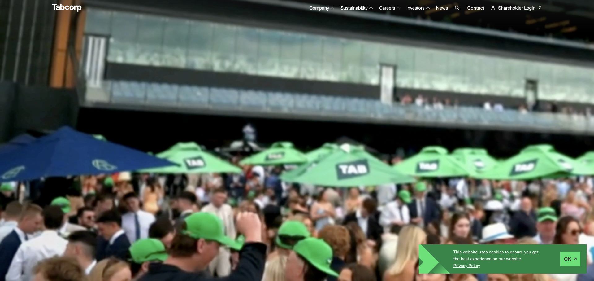
Tabcorp’s corporate opening uses a wide event photograph and a concise statement about its entertainment businesses. The header separates company information, sustainability, careers, investors and news, with shareholder access treated as its own destination. Brand links beneath the opening introduce the wider portfolio without making the corporate site behave like each individual product. The design is useful as a reference for parent-company communication: imagery can express the setting in which a group operates, while the surrounding structure serves people who need organizational information rather than a consumer transaction.
What you can learn
Keep the corporate task distinct from the product action. Docker’s customer catalog includes Tabcorp, establishing a documented customer relationship rather than proof about the current runtime of its corporate website or any particular betting product.
Pros
The institutional navigation makes the parent site’s purpose clearer than a product-only campaign would.
Portfolio links can introduce the wider business without duplicating each brand’s interface.
Cons & considerations
Event photography offers atmosphere but little detail about the organization’s specific responsibilities.
A broad entertainment message needs clear risk, governance and business context elsewhere on the site.
Visible tech stack
Earlier / documented evidence
Docker
Platform source: Primary documented Docker association. Docker customer catalog lists Tabcorp. Platform evidence is separate from the direct website screenshot and is not a complete current infrastructure audit.
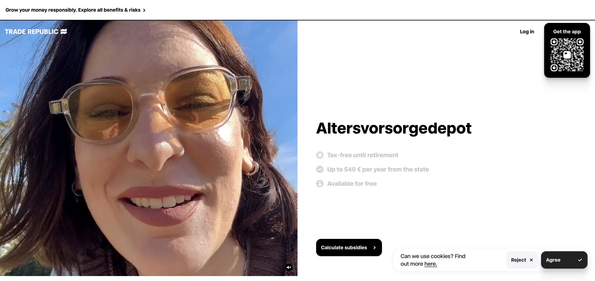
Trade Republic’s public opening gives a single proposition a large typographic treatment, with a short list of supporting features and an app-oriented next step. The navigation is intentionally compact, separating account access from the main introduction. A substantial visual and restrained layout make the page feel more like a focused product launch than a comprehensive financial directory. This can be useful when the next task is to understand one offering, but it places extra responsibility on the following content to explain suitability, restrictions and the relationship to other services.
What you can learn
A small number of features can support comprehension, but cannot replace full qualification. Docker’s catalog lists Trade Republic; that association is not evidence about investment outcomes, current application security or the deployment configuration of this captured public page.
Pros
A short feature list gives the main proposition more substance than a headline alone.
The compact header separates returning account access from first-time exploration.
Cons & considerations
A focused campaign may not reveal the full range of restrictions or product differences.
Financial benefits and risk language need careful explanation beyond a visually clean first screen.
Platform source: Primary documented Docker association. Docker customer catalog lists Trade Republic. Platform evidence is separate from the direct website screenshot and is not a complete current infrastructure audit.
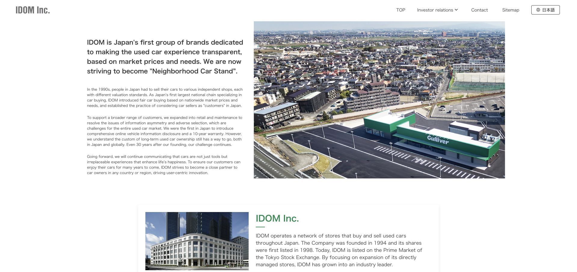
IDOM’s English corporate page places a substantial introductory paragraph beside an aerial photograph of a retail location. A restrained navigation exposes investor relations, contact, sitemap and language access, while company and business information begin below. The page does not depend on a giant advertising headline to establish its purpose. Instead, it explains the relationship between the organization and the used-car experience it supports. This is a useful reference when an internationally oriented corporate site needs to be informative before it becomes visually spectacular.
What you can learn
Use a concrete explanation to connect the company name with the customer-facing business. Docker’s IDOM story establishes a development-workflow association; it does not prove that the English corporate page, every store system or the whole group shares one Docker runtime.
Pros
The opening paragraph gives an unfamiliar corporate name useful context immediately.
A location photograph connects the business explanation with a tangible operating environment.
Cons & considerations
Long introductory copy needs careful line length and mobile spacing to remain approachable.
A restrained institutional page may need stronger routes for visitors seeking a particular consumer service.
Platform source: Primary documented Docker association. Docker documents IDOM’s development workflow. Platform evidence is separate from the direct website screenshot and is not a complete current infrastructure audit.
Bitso’s homepage uses a broad pastel visual field, a large benefit-oriented statement and a person holding a phone. The primary route points toward the app, while prices, product information, support and business services remain accessible in the header. The product is presented as something a visitor can recognize and use, rather than as an unexplained financial technology stack. This is useful when the public website’s job is to introduce and route people into a separate application, provided that product limitations and regional differences remain easy to find.
What you can learn
A clear app destination can simplify the homepage, but the website still needs enough information for informed evaluation. Docker’s Bitso case concerns development tooling, not proof of investment suitability, asset safety or the current hosting architecture of the public marketing page.
Pros
The phone and primary app route make the next destination concrete rather than abstract.
Supporting navigation offers product and business information beyond the headline benefit.
Cons & considerations
Promotional financial language needs clear risk and availability context for the relevant market.
A large lifestyle visual can delay explanation of fees, eligibility and how the service actually works.
Visible tech stack
Earlier / documented evidence
Docker
Platform source: Primary documented Docker association. Docker documents Bitso’s Docker Business development environment. Platform evidence is separate from the direct website screenshot and is not a complete current infrastructure audit.
Kegan has 15+ years of experience working with small businesses, Fortune 500 companies, and everything in between. No development job is too big or too small: he brings the same hands-on attention to a focused improvement, a complete website, or a custom application.
For Docker projects, he can help with content architecture, custom functionality, system integrations, testing, and maintainable handover. He works directly with clients on scope, design, implementation, testing, and handover, with an emphasis on clear communication and a system that remains practical to maintain after launch.
Show 3 other Docker developersHide other Docker developers
Use a documented environment to help a new developer run the project with fewer machine-specific assumptions. Include safe sample data, required services and a clear start process. Do not make a working local environment depend on copying production credentials or a real customer database onto every laptop.
A build or test workflow
A container may compile assets, run integration tests or provide a temporary database without becoming part of the public production runtime. Keep test data and external effects controlled. The build should make failures visible and produce an identifiable artifact, not merely report that a container process started.
A deployed application image
Describe the service’s inputs, storage boundaries, health behavior and shutdown path. Decide which configuration is supplied at runtime and which files belong in the image. A deployed container must fit the selected hosting platform’s limits and operating model; local success alone does not establish production readiness.
From references to requirements
Plan the container lifecycle, not only the first build
Separate data from replaceable application files
List what must survive an image replacement and where it is stored. Uploaded files, customer records and job state need explicit ownership and backup arrangements. A container’s temporary filesystem is not a durable business-record strategy, and a working volume on one developer machine is not a restoration plan.
Verify a clean build and a controlled release
Build from documented inputs in a clean environment, test representative requests and inspect the output. Record the release artifact so it can be identified later. Rehearse failure and rollback without overwriting the only known working copy or relying on an undocumented local image that another maintainer cannot reproduce.
Assign update and incident responsibilities
Decide who reviews runtime, library and image updates, who responds to alerts, and how urgent fixes reach production. Include resource bounds and useful logs without exposing private data. A successful handover should make routine maintenance understandable to someone who did not write the first Dockerfile.
A useful handover demonstration
Ask the actual team to carry out its routine job: publish a realistic update, correct a mistake, preview a narrow screen, and identify who owns an integration failure. For a library or frontend framework, also ask who maintains the content source and deployment. A polished screenshot does not answer those operational questions.
Beyond the screenshot
Docker delivery checklist
Name the image’s actual responsibility.
Separate development, testing and production uses.
Document clean build inputs.
Keep private files out of the build context.
Review the final runtime contents.
Supply secrets through the approved runtime boundary.
Identify durable data and backups.
Set appropriate resource and request bounds.
Test startup, health and shutdown behavior.
Record the exact release artifact.
Rehearse rollback and data compatibility.
Assign routine update and incident ownership.
Test with real content, a keyboard, a small screen, slow or failed requests, and the people who will maintain the system. These are planning checks, not an accessibility, security, performance, or search-ranking certification.
Sources & editorial method
How this Docker collection was reviewed
These 20 public references have original design reviews and direct source-page captures. The first five are established major organizations. Target-technology evidence comes from official customer or engineering sources and retains its specific scope and historical context. Reused captures keep their original provenance and dates; public source audits do not imply visibility into private build systems.
Every image is an unmodified capture from the actual website, with its source and capture date. Some captures are reused from our shared catalog; their dates remain the original capture dates. None comes from a vendor gallery or a generated reconstruction. Moving imagery and live content can change.
Technology attribution uses public page assets or metadata, official platform documentation, or a cited first-party project case study. Documentary and framework-relationship evidence is identified where used; it is not a complete current backend inventory. A CMS image CDN alone does not establish a full CMS deployment. A library’s presence does not prove which individual controls use it, and a platform label does not establish AI authorship.
The composition notes, lessons, pros and tradeoffs are original editorial observations. We have not measured conversion, traffic, security, performance or accessibility conformance. Website owners retain their brands and imagery; these examples are not our client portfolio. Written, Edited and Curated are independent records, not dates advanced by a build. See our editorial standards or suggest a correction.
Questions worth asking
Docker website development FAQs
Does Docker create the visual website design?
No. It packages or supports software environments. The layout, navigation, content and accessibility decisions remain application and design work. Two sites using Docker can look entirely different, and a similar interface can be delivered without Docker at all.
Are these20 public pages confirmed Docker deployments?
No. The sources support customer, development, testing or specific service associations. Some are historical and others are limited to a customer catalog. The reviews do not expand those associations into claims about the current runtime of every captured page.
Do I need Kubernetes because I use Docker?
Not automatically. Container packaging and cluster orchestration solve different problems. Decide where and how the application will run, what needs to scale, and who will operate it. Avoid adding a cluster simply to reproduce a website layout.
Can uploaded files live inside the application container?
Only with an explicit durability design that survives the platform’s replacement and restart behavior. Treat customer uploads and business records separately from replaceable application files. Test restoration rather than assuming a local filesystem arrangement will remain available in production.
What makes a container handover complete?
A documented clean build, an identifiable release artifact, configuration and secret boundaries, durable storage and restoration procedures, useful operational checks, and named maintenance ownership. Another developer should be able to run and update the application without relying on the original author’s laptop.
A useful Docker workflow makes a defined application responsibility easier to deliver and maintain. Start with that responsibility, then judge the packaging, deployment and handover against it.