Definitive guide · CockroachDB website development
Best CockroachDB Websites of 2026 (20 Real-World Examples)
Public website inspiration with bounded distributed-SQL references and practical delivery questions.
Explore 20 public interfaces associated with documented CockroachDB workloads. The database references concern particular application services, not the current technology of each marketing page.
Netflix, DoorDash, Bose, Booking.com and Cisco open the collection. The sources include a February 2024 DoorDash account, a January 2021 Bose Galapagos story and a Cisco AI implementation. Booking.com’s order-management reference is paired with its parent’s public investor site; that pairing is explicit, not evidence across all Booking Holdings brands.
The rest of the collection covers payments, video, appointments, logistics, document management and education. Their public pages have different design goals. The database stories separately suggest questions about application state, geography and failure behavior. Neither a polished homepage nor a recognizable customer logo establishes the right architecture for your project.
Before the examples
What makes good CockroachDB website development in 2026?
Define the operation that must remain correct
Begin with an action such as reserving an item, accepting an order or updating an account. Describe its valid starting and ending states. An application brief should explain what cannot happen twice and what must remain consistent before discussing the number of regions in a deployment.
Treat retries as part of the application contract
CockroachDB documents transaction retry errors and client-side handling when automatic resolution is insufficient. An operation may need to restart. Review the actual driver and transaction approach, then ensure surrounding side effects are not casually repeated. The user experience should explain uncertain or incomplete work rather than invite blind resubmission.
Choose geography against requirements, not a map graphic
The multi-region documentation describes locality and survival choices with tradeoffs. Identify where users and data belong, what outage the service must tolerate and what latency is acceptable. A region icon on a diagram is not proof that the complete application can continue usefully during an incident.
Twenty public design reviews beside checked, scoped customer references. Historical team and product boundaries remain visible in the evidence.
We start with five recognizable brands or organizations: Netflix, DoorDash, Bose, Booking.com, Cisco. Each attribution applies to the named website property, not every product or website belonging to its organization. This is a curated reading sequence, not a measured ranking.
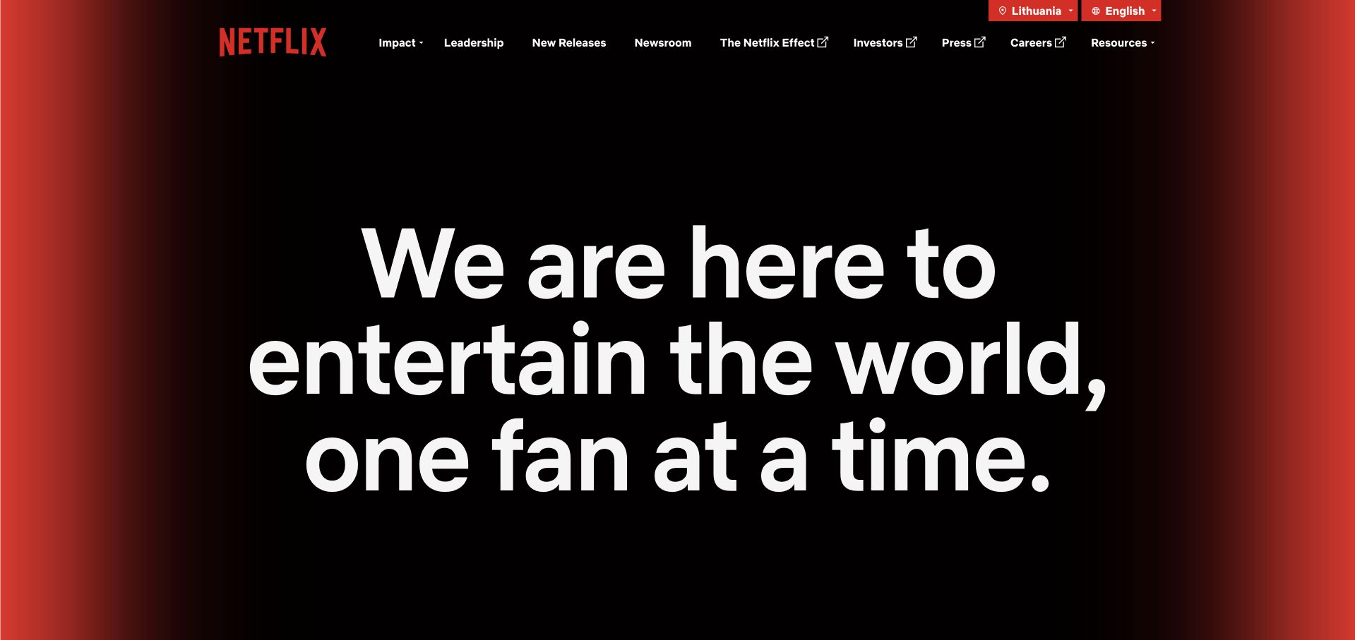
Netflix’s corporate page uses a black center and glowing red edges around a large white statement of purpose. The typography fills the opening rather than competing with a collection of entertainment images. Upper navigation offers impact, leadership, news and other organizational routes, making the destination’s role clear. This is an effective reference for a company that wants to explain itself without imitating its product interface. The CockroachDB customer source concerns a particular database service within Netflix. It does not establish the corporate publishing frontend or the complete architecture of its streaming products.
What you can learn
Give a corporate page a clear purpose and preserve the information routes its audience expects. A short statement can replace a visual collage when it is supported by concrete material below. Keep the composition readable at smaller sizes, and distinguish company exploration from actions that open the consumer product.
Pros
A single typographic feature creates an immediate reading priority.
Corporate navigation clearly differs from a streaming catalog.
Cons & considerations
Very large text needs careful responsive line breaks.
The broad purpose needs specific evidence and useful continuation.
Platform source: Primary documented CockroachDB association. Documented association: Documented database service within Netflix; not the public corporate publishing frontend or entire streaming platform. Platform evidence is separate from the direct website screenshot and is not a complete current infrastructure audit.
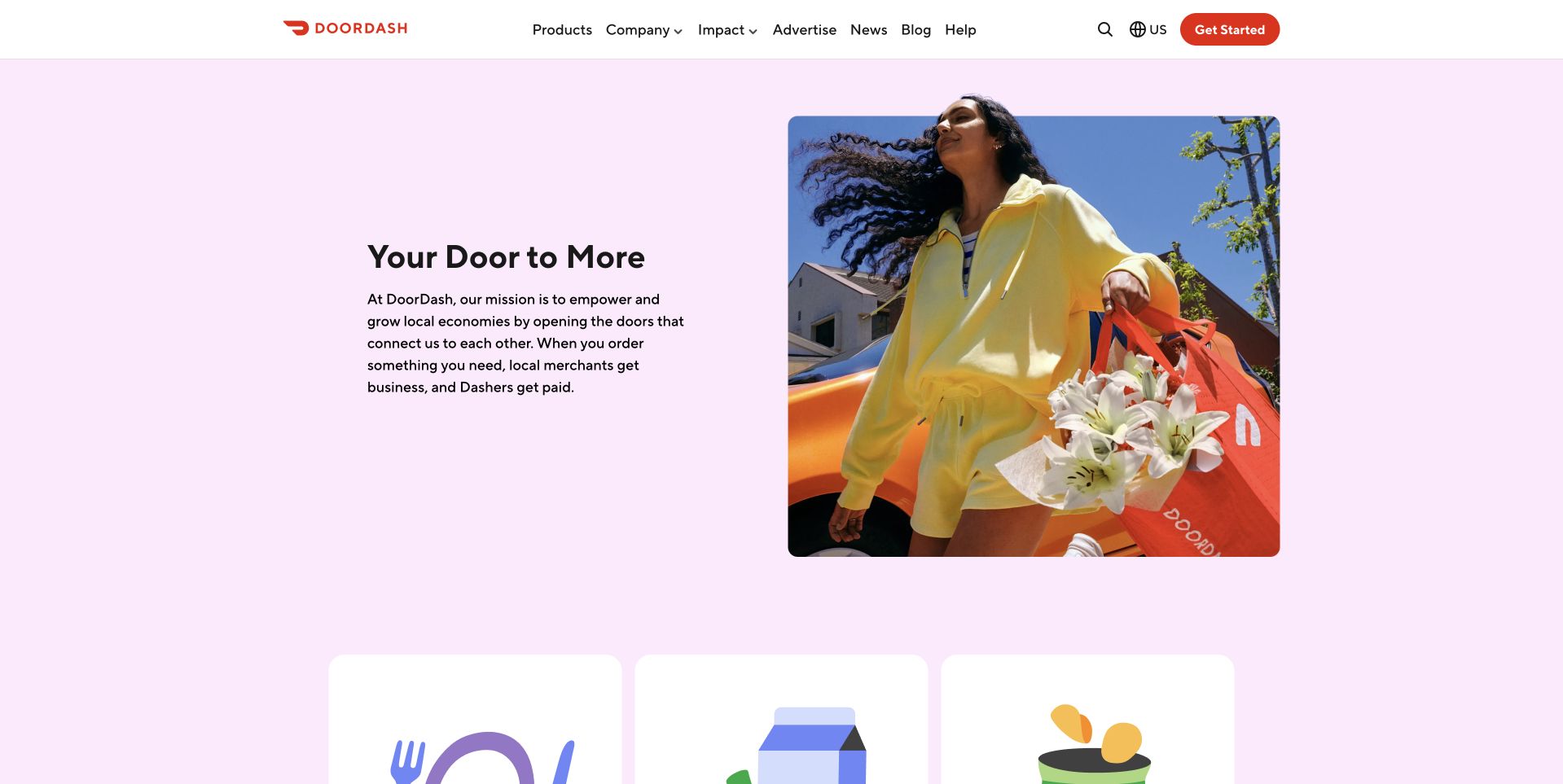
DoorDash’s corporate introduction places a short mission statement beside a person carrying flowers and branded bags against a bright pink setting. The scene gives the platform’s broad language a recognizable everyday context. Below it, a row of simple illustrated cards begins a second layer of explanation. A white header preserves company, impact, advertising and news routes without becoming a retail ordering interface. The CockroachDB source is a February 2024 storage-infrastructure account. That historical application workload is separate from the current corporate page and does not identify how this public design is rendered.
What you can learn
Use a tangible scene to make a broad platform mission easier to understand, then organize supporting topics into clear destinations. Keep corporate exploration separate from ordering or joining. A friendly image works best when the adjacent copy explains the organization’s role rather than asking viewers to infer the whole service from branded props.
Pros
The pink scene gives the mission a memorable human setting.
Illustrated cards introduce a second level without a dense text wall.
Cons & considerations
A staged scene needs useful descriptive context.
Corporate and transactional routes must remain easy to distinguish.
Visible tech stack
Earlier / documented evidence
CockroachDB
Platform source: Primary documented CockroachDB association. Documented association: February 2024 storage-infrastructure account; historical specific database-service workload, not corporate-page rendering. Platform evidence is separate from the direct website screenshot and is not a complete current infrastructure audit.
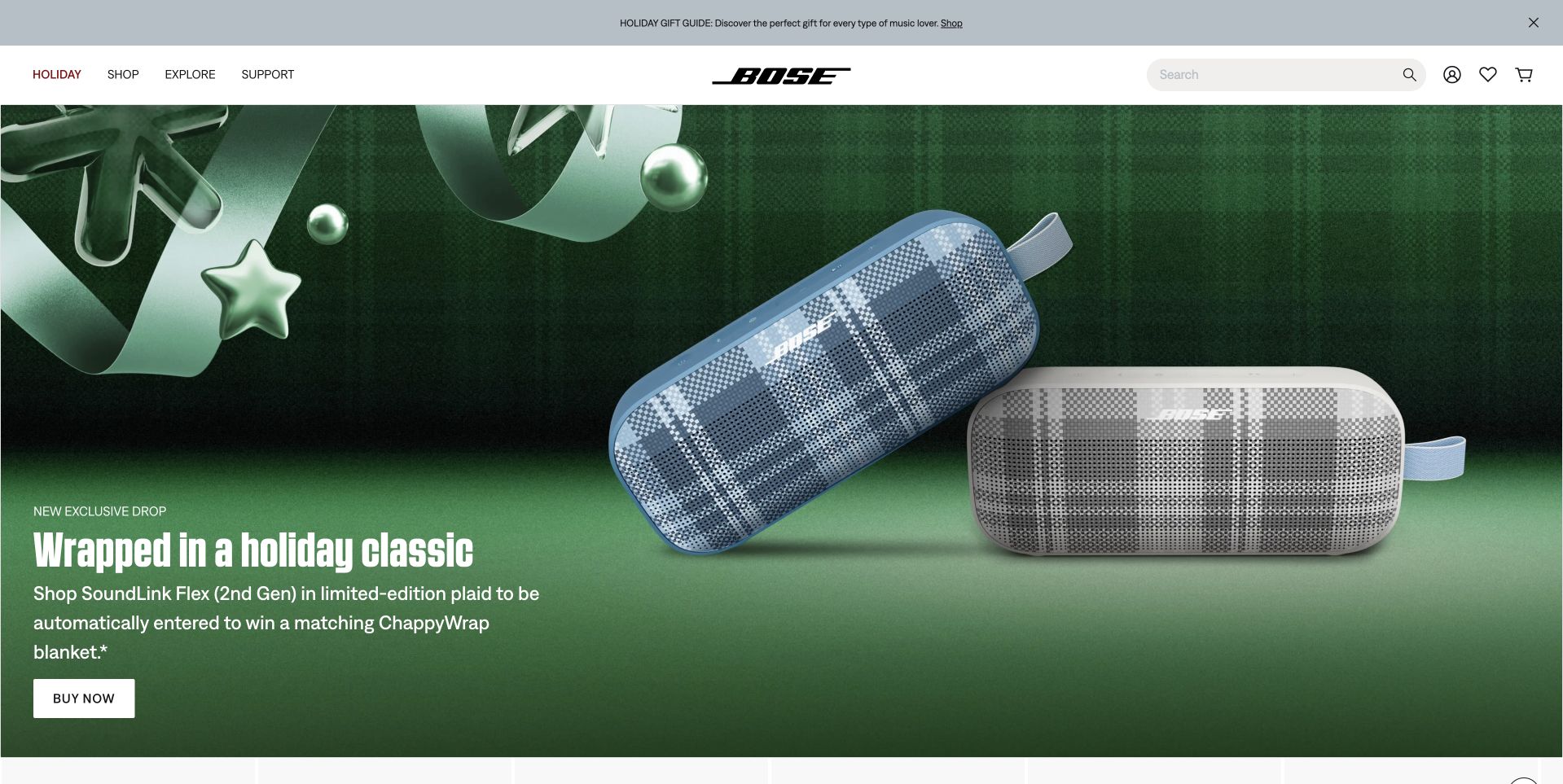
Bose’s inspected storefront opens with portable speakers and holiday decorations on a textured green background. A large product-led message and a white buying action sit to one side, while a centered logo, search and shopping utilities remain in a separate white header. The composition makes the campaign recognizable without hiding the store’s underlying structure. It is useful for studying how a technical product can be presented through color and physical form rather than specifications alone. The CockroachDB association comes from a January 2021 Galapagos cloud-platform account, not every Bose product or the current storefront.
What you can learn
Keep a seasonal campaign bounded and make its practical action easy to locate. Explain promotional conditions and product differences through clear supporting destinations. The permanent shopping frame should remain familiar when imagery changes, and the campaign needs a readable fallback for visitors who cannot interpret its decorative scene.
Pros
The green field unifies the seasonal product presentation.
Search and shopping utilities remain outside the campaign artwork.
Cons & considerations
Seasonal offers need explicit dates and conditions.
A lifestyle composition cannot replace product comparison information.
Platform source: Primary documented CockroachDB association. Documented association: January 2021 Galapagos cloud-connected-platform account; historical team scope, not every Bose product or public storefront. Platform evidence is separate from the direct website screenshot and is not a complete current infrastructure audit.
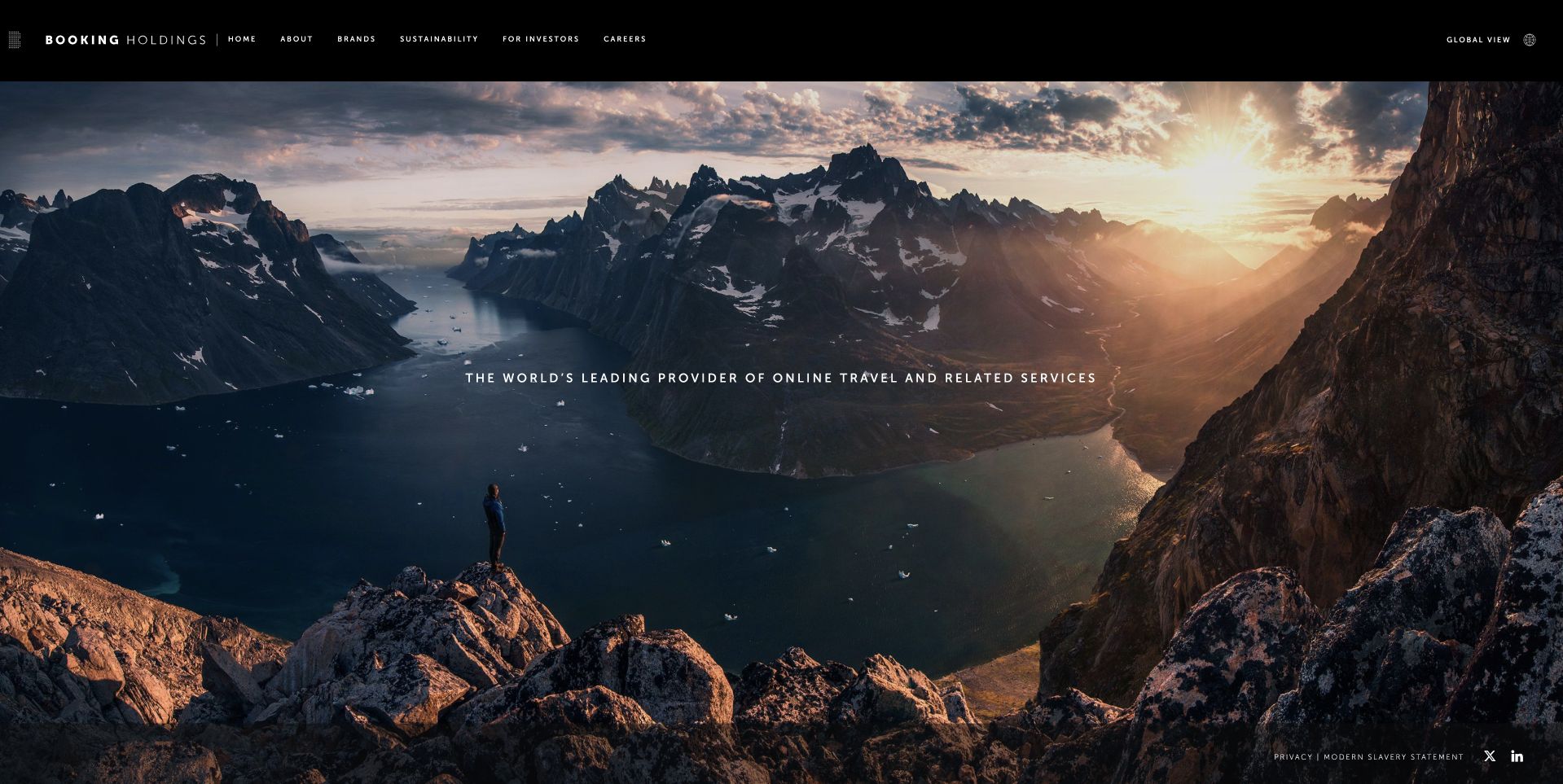
Booking Holdings’ public page uses a wide mountainous travel scene beneath a narrow black corporate header. A short central description connects the image to the group’s travel and related-services identity. The first screen is deliberately atmospheric, with brands, sustainability, investor and career routes available above it. This offers a useful study in giving a holding company a coherent public face without reproducing every subsidiary’s booking interface. The CockroachDB case concerns Booking.com order management. The parent’s page is reviewed only as a design reference, not evidence of the same system across the entire group.
What you can learn
Use one recognizable market context to introduce a parent organization, then make the corporate tasks concrete. Keep brand exploration and investor information clearly separated. A panoramic image can establish the setting, but the subsequent content must explain the organization’s structure rather than letting scenery stand in for useful company information.
Pros
The panoramic landscape gives the group a coherent travel context.
A compact corporate header preserves several practical destinations.
Cons & considerations
The atmosphere alone does not explain the group’s structure.
Large landscape imagery needs useful narrow-screen cropping.
Visible tech stack
Earlier / documented evidence
CockroachDB
Platform source: Primary documented CockroachDB association. Documented association: Booking.com order-management case; parent Booking Holdings public page is a design reference, not proof across all group brands. Platform evidence is separate from the direct website screenshot and is not a complete current infrastructure audit.
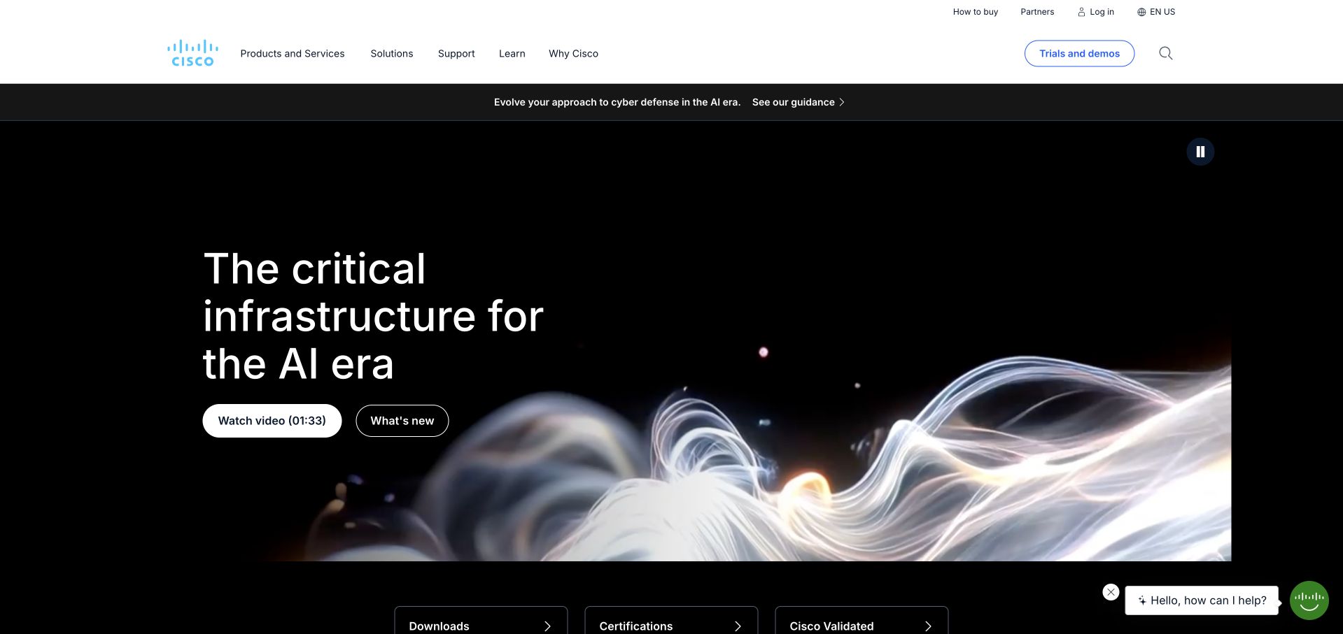
Cisco’s public homepage uses a dark AI-infrastructure feature below a white navigation frame. A flowing light-like image supports the theme while the headline remains offset to one side. Separate discovery actions and technical utilities prevent the page from relying entirely on the visual. The contrast between campaign and header helps a broad enterprise catalog feel less dense at the entry point. The CockroachDB customer reference specifically concerns Cisco AI. It does not establish adoption across every Cisco division, the implementation of networking hardware or the technology rendering this public marketing surface.
What you can learn
Bound the campaign and preserve the utilities that returning technical visitors need. Make a new platform theme lead to specific capabilities rather than a second abstract message. The page should support both someone researching a change and someone looking for an existing product, certification or download without treating those intentions as identical.
Pros
The white header provides a stable frame around the campaign.
Operational routes remain separate from promotional discovery actions.
Cons & considerations
Abstract imagery needs concrete explanation in adjacent content.
A broad platform catalog requires disciplined mobile navigation.
Platform source: Primary documented CockroachDB association. Documented association: Cisco AI application workload; no inference across every Cisco product or public marketing page. Platform evidence is separate from the direct website screenshot and is not a complete current infrastructure audit.
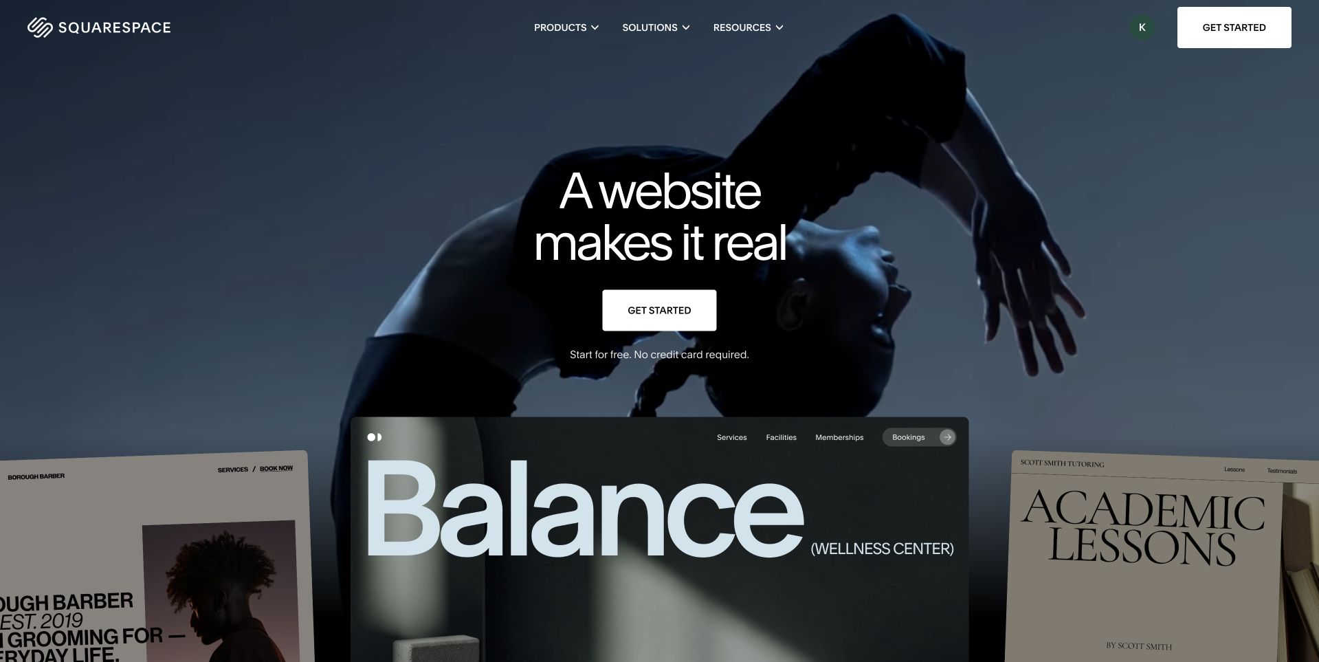
Squarespace’s homepage overlays a compact creation-oriented message on a dark photographic feature, with several finished-site panels rising into the foreground. Those examples make the platform’s intended output visible without opening an editor. A white starting action stands out, while the top navigation remains sparse. The composition is useful for studying the relationship between a product promise and a preview of what a customer might create. The CockroachDB case concerns an application-data migration. It does not mean every Squarespace customer directly operates CockroachDB or identify the public marketing page’s complete implementation.
What you can learn
Show the output a platform helps people create, then preserve a simple route into it. Keep examples readable enough to communicate structure rather than treating them only as decorative cards. Explain editing, plans and setup through accessible supporting content so the visual promise does not hide the practical decisions involved.
Pros
Finished-site panels make the abstract creation promise tangible.
A sparse header leaves the principal action easy to find.
Cons & considerations
Small preview text cannot carry essential product information.
Dark media requires consistent contrast for overlaid controls.
Platform source: Primary documented CockroachDB association. Documented association: Cited application-data migration; not a claim that every Squarespace customer uses CockroachDB directly. Platform evidence is separate from the direct website screenshot and is not a complete current infrastructure audit.
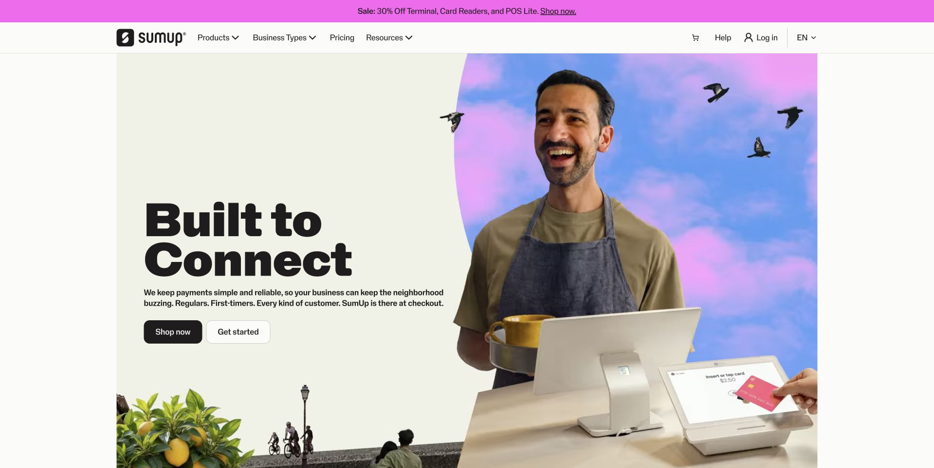
SumUp’s US page combines large black type with a smiling merchant and counter equipment against a colorful background. The pale reading field gives the explanation room, and separate shopping and starting actions acknowledge different visitor intentions. The header organizes products, business types and pricing without turning the opening into a specification sheet. This is a useful reference for a financial-technology service that wants to feel connected to everyday work. The CockroachDB customer case concerns the payments platform’s database workload, not the marketing frontend or a judgment about the suitability of its financial services.
What you can learn
Show the practical work around a financial product, then distinguish buying equipment from starting a service relationship. Keep terms, eligibility and regional availability easy to find. A human scene can make the offer approachable, but it should not replace the information a business needs to compare operational and commercial commitments.
Pros
The merchant scene grounds the platform in an everyday setting.
Two actions distinguish shopping from broader service exploration.
Cons & considerations
Financial terms need a clear route beyond the friendly hero.
Promotional strips can reduce space for the main message on mobile.
Visible tech stack
Earlier / documented evidence
CockroachDB
Platform source: Primary documented CockroachDB association. Documented association: Payments-platform database workload; not proof of the marketing frontend or financial-product suitability. Platform evidence is separate from the direct website screenshot and is not a complete current infrastructure audit.
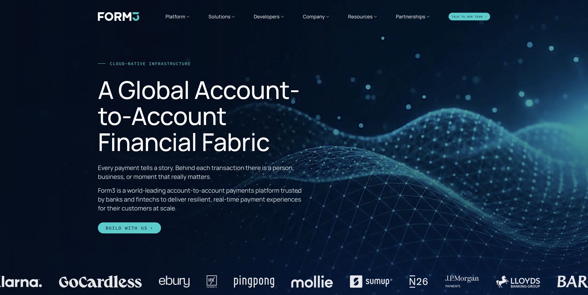
Form3’s public page uses a deep blue field with a dotted wave-like landscape beside a large account-to-account payments headline. The image suggests connected infrastructure while leaving room for a short explanation. The top navigation separates platform, solutions, developers and company material, acknowledging different levels of technical intent. This is a useful design reference for an enterprise service whose underlying implementation is more complex than its opening should be. The CockroachDB case concerns real-time payments infrastructure. It does not identify the public marketing frontend or independently validate every availability claim in the service proposition.
What you can learn
Use a technical visual metaphor to establish the setting, then explain the actual responsibility the service assumes. Keep developer resources distinct from sales-oriented solution pages. The next content should show supported workflows and boundaries so a broad infrastructure headline becomes understandable rather than merely impressive.
Pros
A limited blue palette gives the technical story a coherent frame.
Developer navigation is distinct from general solution exploration.
Cons & considerations
The abstract landscape cannot explain operational behavior by itself.
Infrastructure claims require concrete scope and supporting evidence.
Platform source: Primary documented CockroachDB association. Documented association: Real-time payments infrastructure case; public marketing design is reviewed separately. Platform evidence is separate from the direct website screenshot and is not a complete current infrastructure audit.
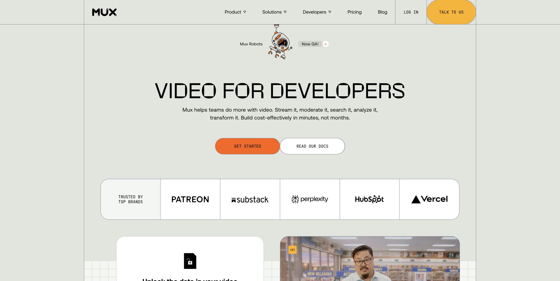
Mux’s homepage places an oversized video-for-developers message on a pale green-gray background. A small robot-themed announcement adds character without becoming the main visual. Distinct actions point toward starting and documentation, and the header preserves developer resources and pricing. The composition is useful for studying how to introduce a specialized API product without opening with a large code listing. The CockroachDB customer story concerns a multi-cloud, multi-region application database. That does not establish the implementation of every video-delivery component or the technology behind this public marketing page.
What you can learn
Let a developer platform explain its job in one plain statement, then provide both practical documentation and a product-start route. Use playful artwork sparingly so it does not compete with technical clarity. The supporting content should show the actual integration boundary and what the customer team still needs to build.
Pros
Large type makes the specialized product category immediately clear.
Documentation has a direct route beside product exploration.
Cons & considerations
A broad capability statement still needs integration examples.
Consent panels should not cover the main actions or previews.
Platform source: Primary documented CockroachDB association. Documented association: Multi-cloud and multi-region application database case; not all video-delivery or marketing-page systems. Platform evidence is separate from the direct website screenshot and is not a complete current infrastructure audit.
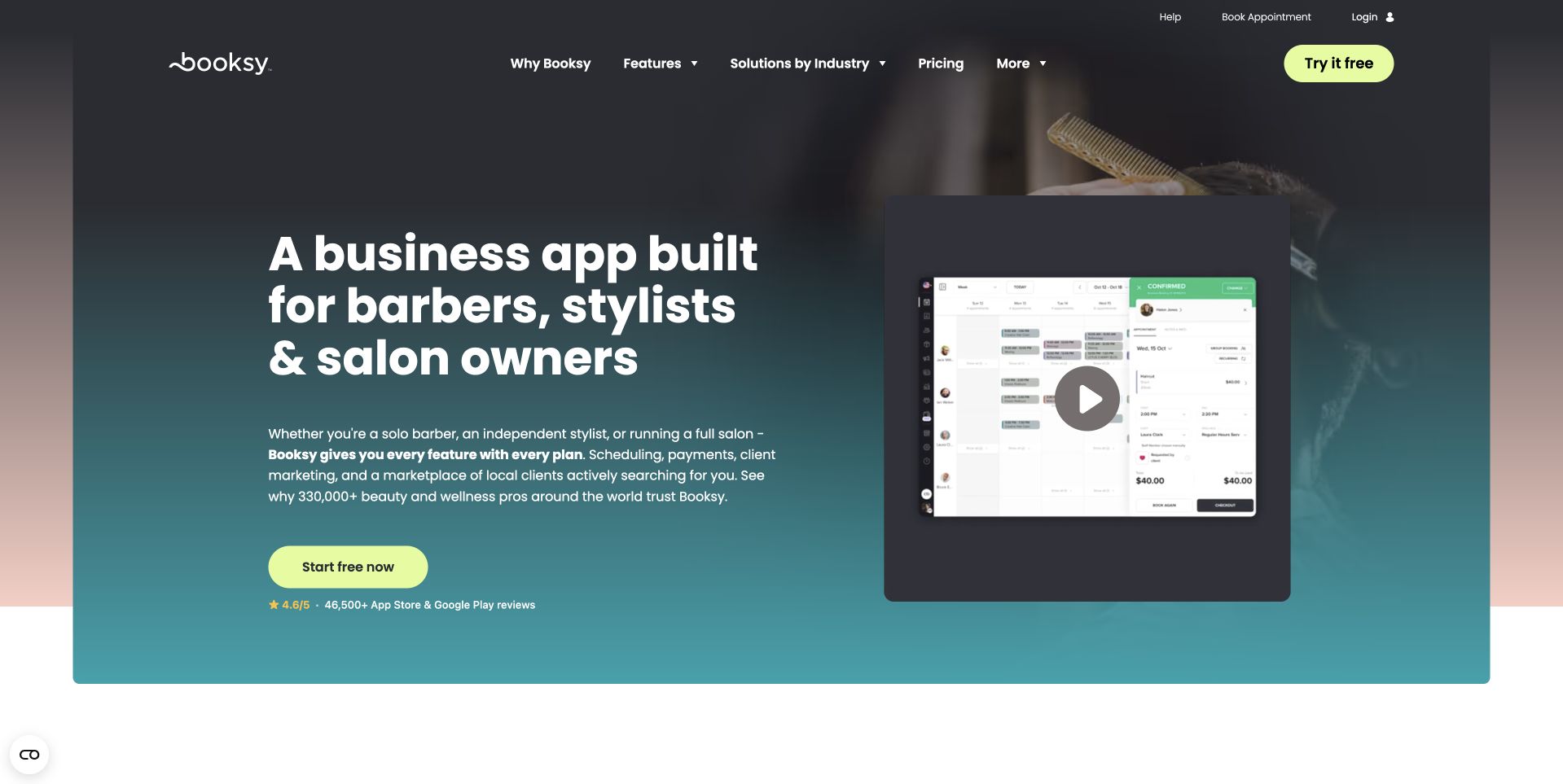
Booksy’s business page explicitly names barbers, stylists and salon owners in a large white heading on a dark feature. A product demonstration preview sits opposite, making the business-app proposition more concrete. A bright rounded starting action stands out from the muted background, while the header offers features, industry solutions and pricing. The page is a useful reference for narrowing a broad software category to the people who will actually use it. The CockroachDB account concerns the booking platform’s application workload, not proof of the public business-marketing page’s framework or database.
What you can learn
Name the audience and show a task-relevant product surface before listing every feature. Distinguish watching a demonstration from starting an account, and explain what setup requires. Industry-specific language works when the surrounding content answers the practical questions of that business rather than simply inserting an occupation into generic software copy.
Pros
The intended professional audience is named unambiguously.
A demonstration preview supports the otherwise broad app proposition.
Cons & considerations
A small interface preview needs explanatory text outside the video.
Starting-account expectations and commercial terms must remain clear.
Platform source: Primary documented CockroachDB association. Documented association: Booking-platform workload; public business-marketing page is a separate surface. Platform evidence is separate from the direct website screenshot and is not a complete current infrastructure audit.
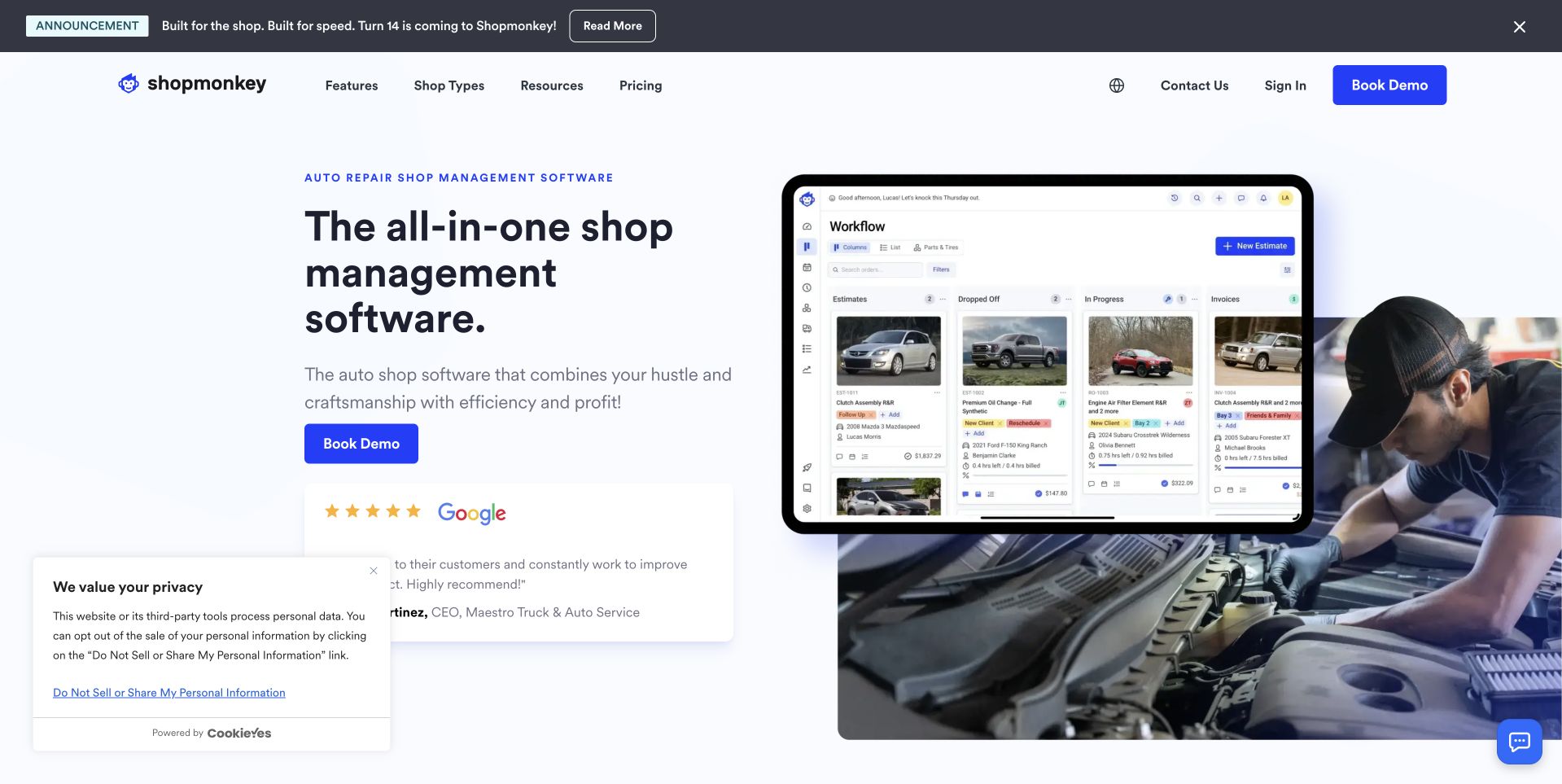
Shopmonkey’s homepage sets an auto-shop management message beside a product interface and a mechanic working on a vehicle. The composition uses a mostly white reading field with blue actions, making the software and its physical context visible together. Shop-type, feature and pricing routes remain in the header, while a separate announcement strip has its own place above them. It is useful for studying how specialist software can avoid looking like an interchangeable dashboard product. The CockroachDB case concerns application-data modernization, not the implementation of the public marketing site.
What you can learn
Show both the software and the work it supports. Give owners a route by business type without assuming every shop has the same workflow. Keep the interface preview legible and explain the operational change involved, rather than allowing a reassuring workplace photograph to carry the whole value proposition.
Pros
The mechanic scene gives the interface a clear business context.
A restrained white-and-blue hierarchy keeps actions easy to locate.
Cons & considerations
Small dashboard details need supporting explanations.
Announcement and privacy layers can crowd the first screen.
Platform source: Primary documented CockroachDB association. Documented association: Application-data modernization case; not proof of the public marketing stack. Platform evidence is separate from the direct website screenshot and is not a complete current infrastructure audit.
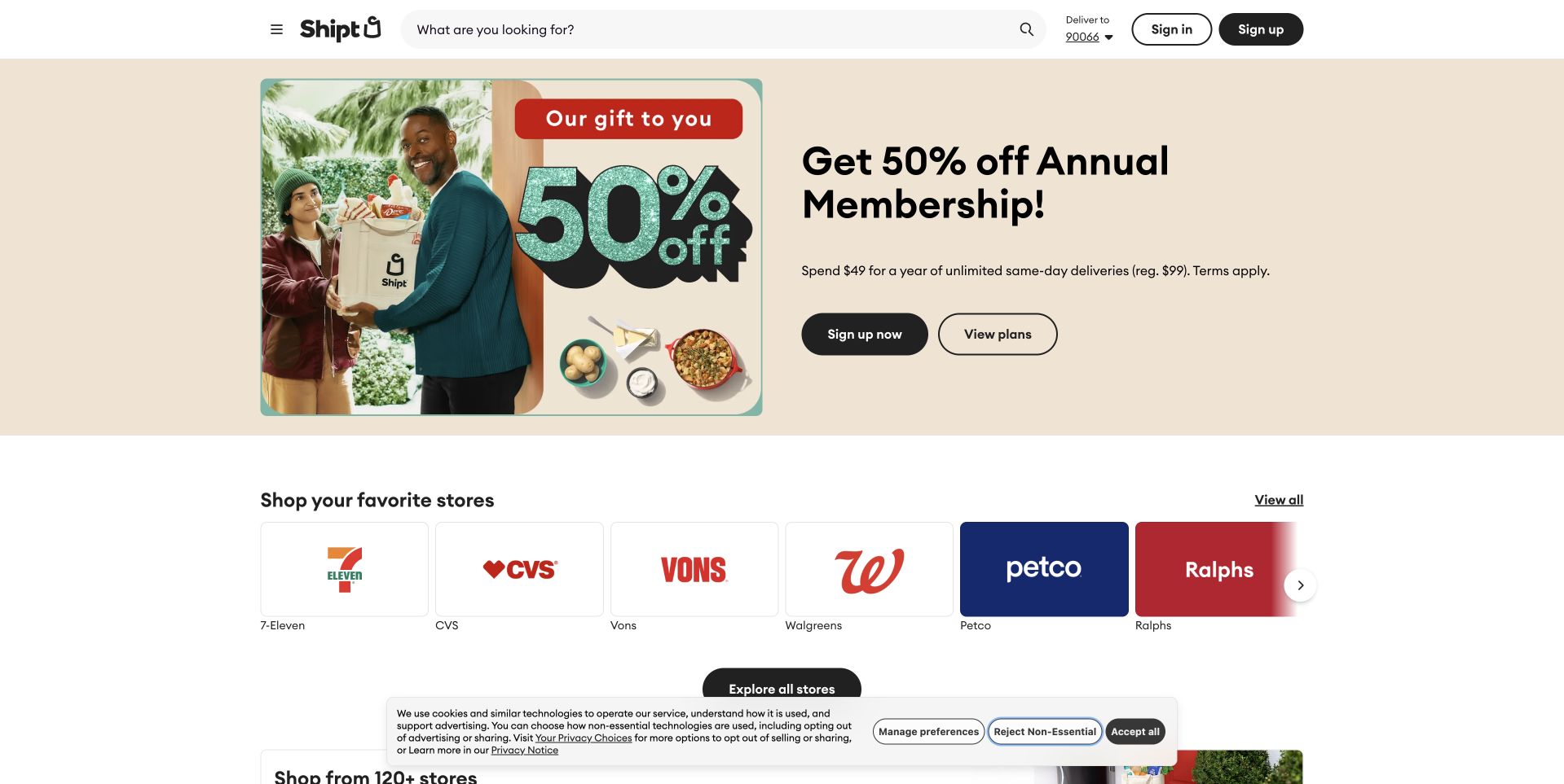
Shipt’s public homepage uses a pale promotional feature with a person holding a branded shopping bag, a membership offer and two short actions. A retailer row begins just below, connecting the campaign to the stores people recognize. Search, delivery location and account utilities remain in a practical white header. This combination is useful for studying a service where promotional discovery and repeat task completion coexist. The CockroachDB source describes a distributed payment workload at Shipt. It does not identify the public page’s technology or establish adoption across all systems of its parent company.
What you can learn
Give a temporary offer its own bounded space while keeping the permanent shopping task close at hand. Make membership conditions and geographic availability clear. Returning visitors should be able to search or choose a store without interpreting a campaign, while new visitors still have a useful route to understand the service.
Pros
Recognizable retailer choices connect the campaign to a real task.
Search and location utilities remain available above the promotion.
Cons & considerations
Membership conditions need readable supporting detail.
Store availability must be tied clearly to the selected geography.
Platform source: Primary documented CockroachDB association. Documented association: Distributed payments workload at Shipt; not a claim across every Target system or public page. Platform evidence is separate from the direct website screenshot and is not a complete current infrastructure audit.
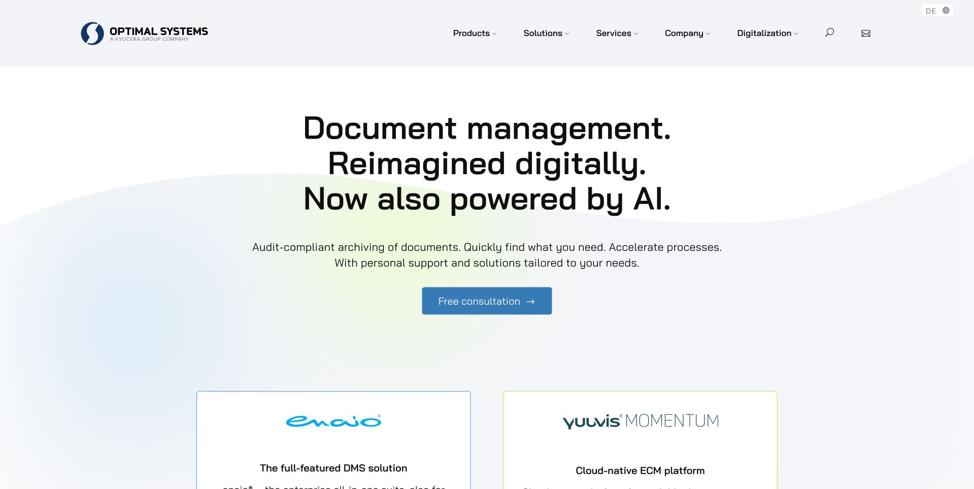
OPTIMAL SYSTEMS’ English page uses large centered type over a pale blue-and-green background to introduce document management and AI-assisted capabilities. A single consultation action sits beneath the explanation. Two product-family cards begin below, giving enaio and yuuvis Momentum distinct identities rather than folding them into one undifferentiated platform. The restrained header keeps products, solutions and services accessible. This is useful for studying a company with related but different offerings. The CockroachDB case concerns a specific document-storage product workload; it does not establish every product or the database behind this public company page.
What you can learn
Introduce the shared business problem, then distinguish the products that address it. Give each family a clear role before asking readers to compare implementation detail. Keep claims about archiving or compliance precisely scoped and supported; a broad headline should not be treated as proof that every configuration meets every organizational requirement.
Pros
Product-family cards create a clear next level of comparison.
The pale background supports a readable centered introduction.
Cons & considerations
A broad AI statement needs concrete workflow explanations.
Compliance-oriented language requires specific, qualified supporting material.
Platform source: Primary documented CockroachDB association. Documented association: Specific document-storage product workload; not every product or the public company-site runtime. Platform evidence is separate from the direct website screenshot and is not a complete current infrastructure audit.
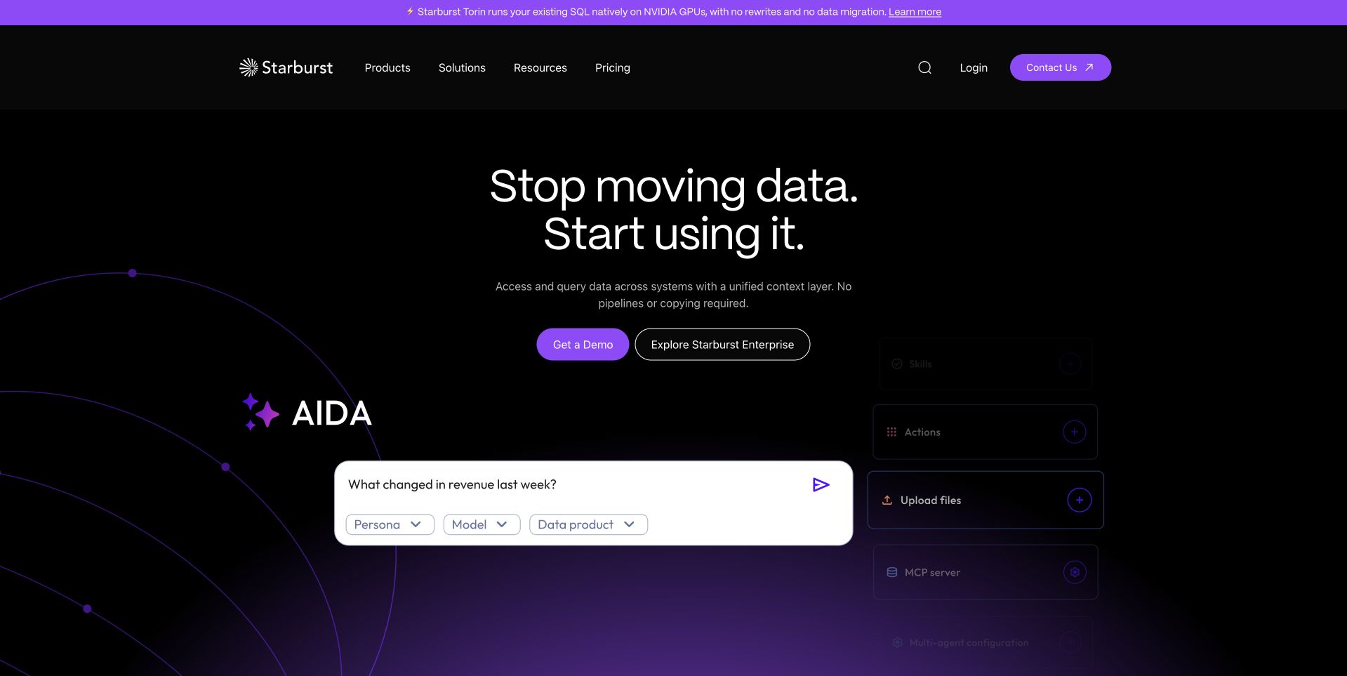
Starburst’s homepage places a short data-movement proposition on a black background with a purple interface preview below. The preview contains a question about changed revenue, showing a more concrete task than an abstract data diagram would. Separate demo and enterprise exploration actions appear near the introduction. A bright announcement strip is distinct from the product navigation. The CockroachDB reference concerns a particular distributed operational workload. It should not be confused with every component of Starburst’s query product or the technology used to render this marketing page.
What you can learn
Show the question the platform helps a person answer, then explain the underlying responsibility in subsequent content. Keep demonstration and product exploration distinct. A prompt-style preview is only useful when the surrounding explanation clarifies data access, source meaning and the review needed before someone relies on the resulting answer.
Pros
The question-oriented preview gives the data story a concrete task.
A limited black-and-purple palette creates a strong hierarchy.
Cons & considerations
A natural-language prompt cannot establish data correctness.
The platform’s scope needs more detail than a short opening slogan.
Platform source: Primary documented CockroachDB association. Documented association: Specific distributed operational workload; distinct from the data-query product and public frontend. Platform evidence is separate from the direct website screenshot and is not a complete current infrastructure audit.
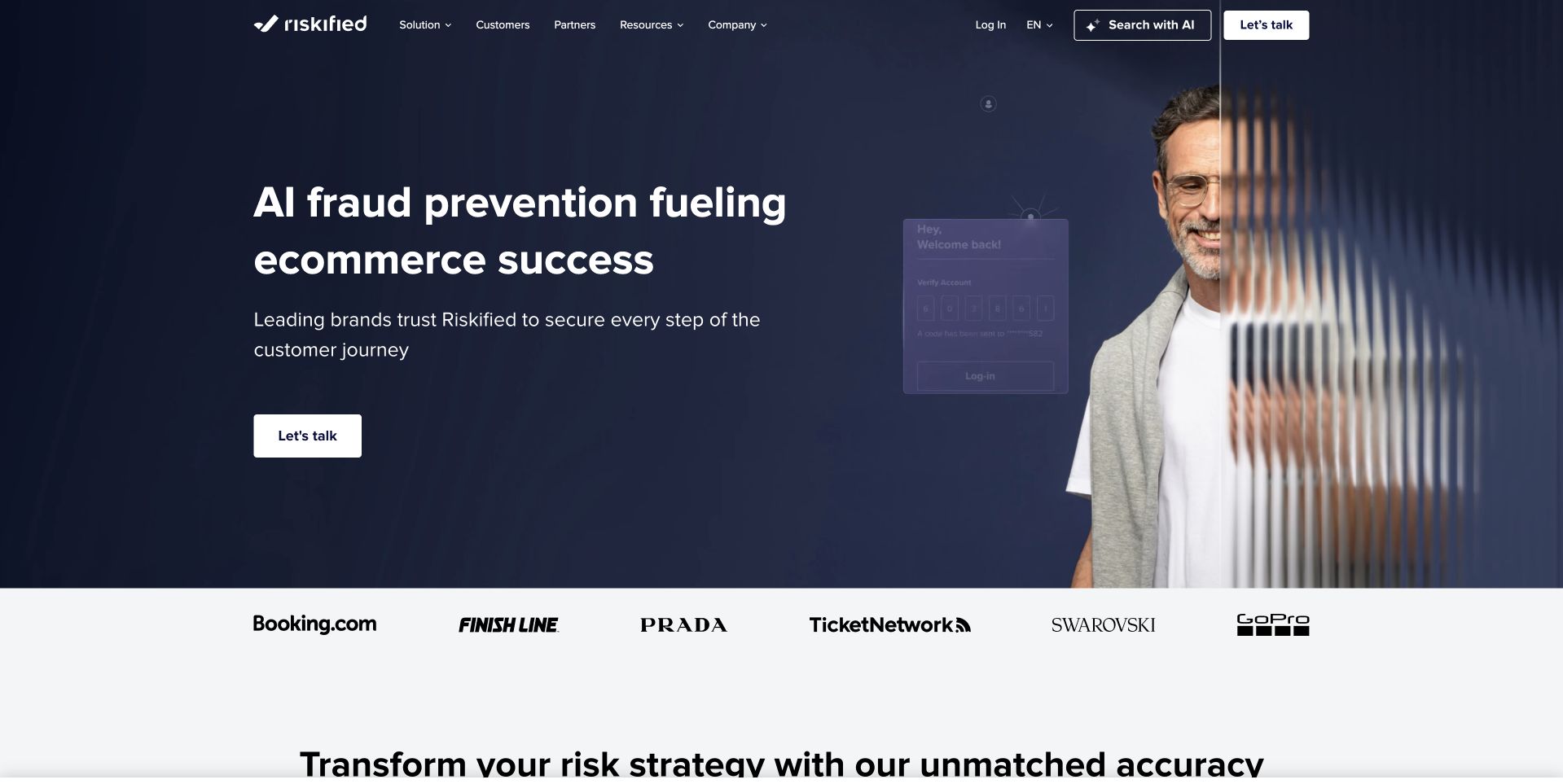
Riskified’s public page places a large fraud-prevention statement beside a portrait-like image and faint interface elements. A dark blue field keeps the opening unified, with a small white action providing the main continuation. Customer marks appear in a separate white strip below rather than being layered into the heading. This is useful for studying how a specialist enterprise service can combine a human visual with a technical proposition. The CockroachDB source concerns an application-data bottleneck migration. It does not independently validate fraud outcomes or identify the public marketing page’s implementation.
What you can learn
Keep the service proposition and the next action easy to identify, then provide specific evidence for the promised work. Client marks should lead to properly scoped examples rather than act as universal proof. Use human imagery to create context without implying that a photograph establishes the effectiveness of a risk-control product.
Pros
The dark field gives the message and action a clear frame.
A separate client strip avoids crowding the main heading.
Cons & considerations
Outcome language needs qualified supporting evidence.
Faint interface decoration cannot replace a readable product explanation.
Visible tech stack
Earlier / documented evidence
CockroachDB
Platform source: Primary documented CockroachDB association. Documented association: Cited application-data bottleneck migration; not proof of fraud outcomes or marketing-page technology. Platform evidence is separate from the direct website screenshot and is not a complete current infrastructure audit.
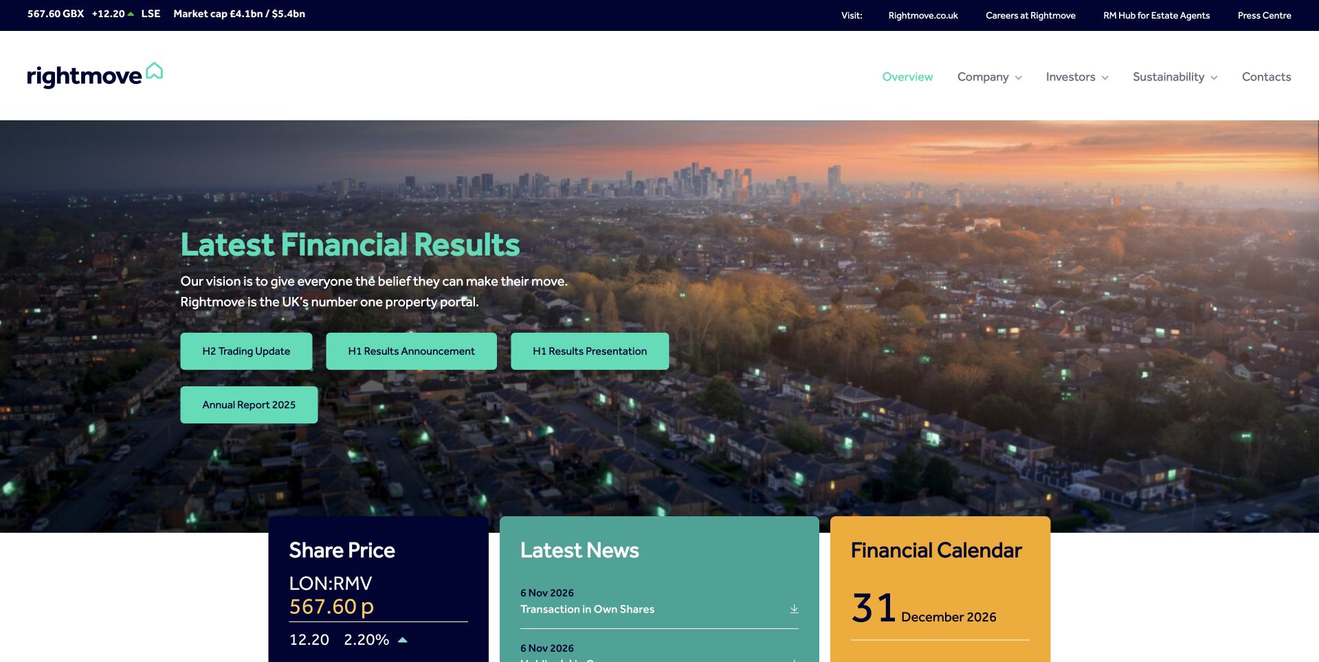
Rightmove’s investor page uses a city panorama behind a financial-results feature, then presents share-price, news and calendar cards in contrasting brand colors. The layered composition connects the organization to property while giving repeat investors direct routes to information. A practical upper navigation separates company, investor, sustainability and contact material. This is a useful study in combining a broad corporate identity with task-oriented reporting access. The CockroachDB source concerns application modernization at Rightmove, not the technology serving this investor page or an independent assessment of its financial performance.
What you can learn
Place time-sensitive reporting in a clear feature and preserve stable utility destinations underneath. Date results and calendar information explicitly so visitors can distinguish current material from archives. A scenic background can establish the market context, but the page’s usefulness depends on the reliability and clarity of its documents and reporting routes.
Platform source: Primary documented CockroachDB association. Documented association: Application modernization case; public investor page is independently reviewed. Platform evidence is separate from the direct website screenshot and is not a complete current infrastructure audit.
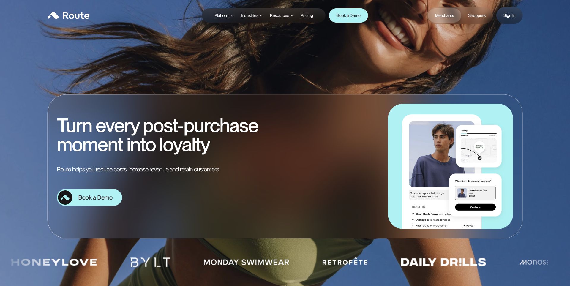
Route’s homepage overlays a translucent rounded panel on a lifestyle image, with a short post-purchase message beside a mobile interface preview. Pale blue actions and framing tie the feature together without obscuring the person in the background. A row of merchant marks sits below, adding a separate proof-oriented layer. The design is useful for studying how an infrastructure-adjacent product can be introduced through the customer experience it supports. The CockroachDB customer story concerns order-related application data. It does not establish every commerce integration or the runtime of this public marketing page.
What you can learn
Show the customer-facing result of an operational service, then explain the merchant’s setup and responsibilities. Keep the demo action distinguishable from a consumer tracking route. Translucent panels need enough contrast to remain readable as the background changes, and product previews need text that explains the task outside the miniature interface.
Pros
The mobile preview makes the post-purchase context tangible.
Rounded blue framing gives the feature a coherent visual system.
Platform source: Primary documented CockroachDB association. Documented association: Order-related application-data workload; no assertion about every current commerce integration or public frontend. Platform evidence is separate from the direct website screenshot and is not a complete current infrastructure audit.
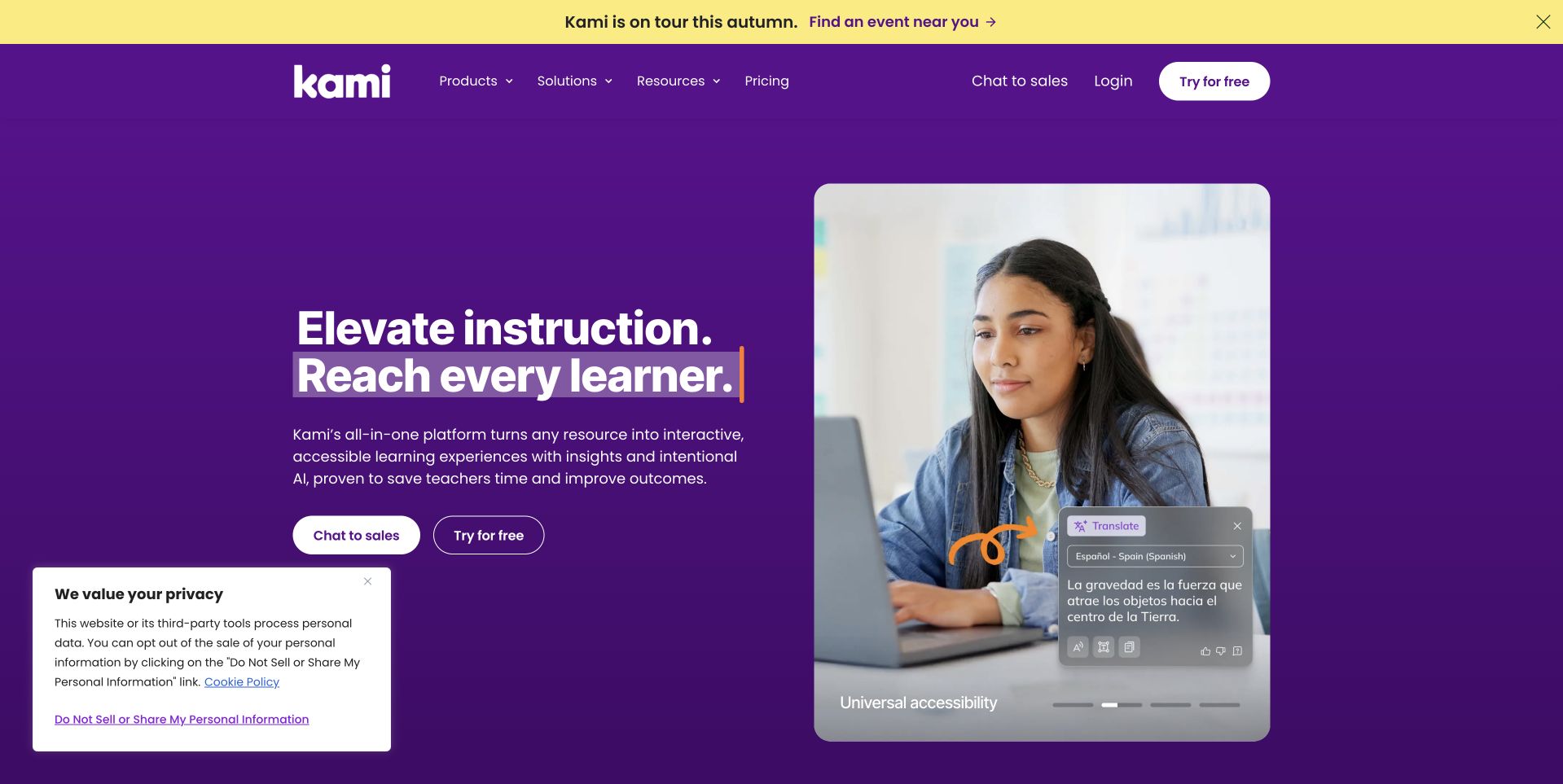
Kami’s homepage places an instruction-focused headline on a saturated purple field beside a teacher using a laptop. A small overlaid interface makes the software’s setting visible without replacing the human subject. Separate sales and login actions recognize that evaluators and existing users arrive with different needs. A yellow tour announcement remains above the main navigation. This is a useful reference for an education platform that wants to feel practical rather than purely institutional. The CockroachDB source describes pandemic-era application scaling, not a current audit of the public website or a guarantee of educational outcomes.
What you can learn
Show the educational task and keep evaluation separate from existing-user access. Explain classroom workflows in concrete terms rather than relying only on an inclusion-oriented slogan. The supporting content should clarify how teachers and learners use the product, while preserving accessible alternatives to small interface overlays and promotional media.
Pros
The teacher scene gives the platform a clear working context.
Login and sales actions serve different visitor stages.
Cons & considerations
Educational promises need specific workflow explanations.
A small overlay cannot carry essential accessibility information.
Platform source: Primary documented CockroachDB association. Documented association: Pandemic-era application scaling case; historical workload, not proof of the current public website. Platform evidence is separate from the direct website screenshot and is not a complete current infrastructure audit.
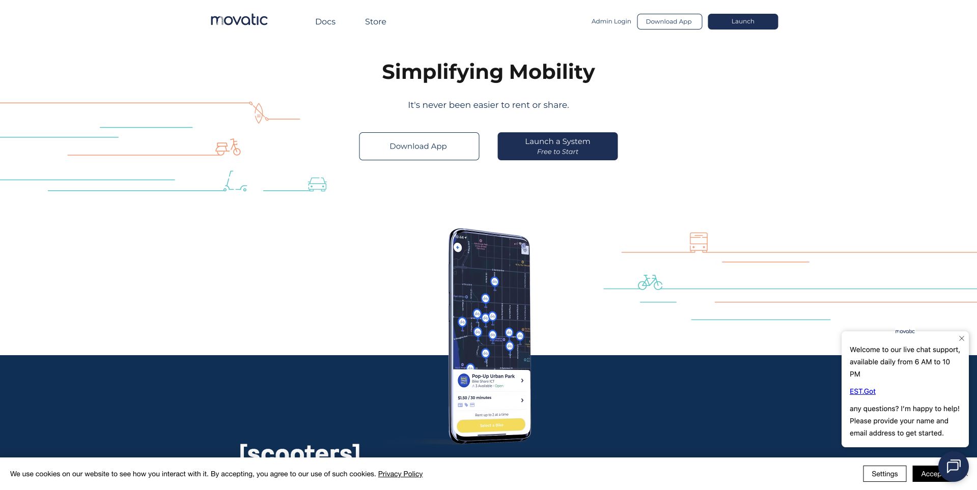
Movatic’s homepage uses a mostly white composition around a centered mobility message and a large phone illustration. Rider downloads and system-launch actions are separated, while admin login and documentation remain visible in the compact header. Thin route-like graphics give the feature a sense of movement without dominating the screen. The layout is useful for studying a platform that must serve riders, operators and technical maintainers at once. The CockroachDB customer account concerns an IoT application-data workload deployed with Kubernetes, not the public company page’s frontend or a complete current infrastructure inventory.
What you can learn
Separate the platform’s audiences before adding feature detail. A rider looking for an app should not have to follow an operator sales journey. Use the phone illustration to establish the setting, then explain the operational service in readable text and keep support or documentation from obscuring the main choices.
Pros
Separate rider and operator actions clarify distinct intentions.
The spacious composition keeps a multi-audience service approachable.
Cons & considerations
A large phone illustration needs explanatory content beyond the image.
Support panels should not cover practical navigation or actions.
Platform source: Primary documented CockroachDB association. Documented association: Kubernetes-hosted IoT application-data workload; not the public company page. Platform evidence is separate from the direct website screenshot and is not a complete current infrastructure audit.
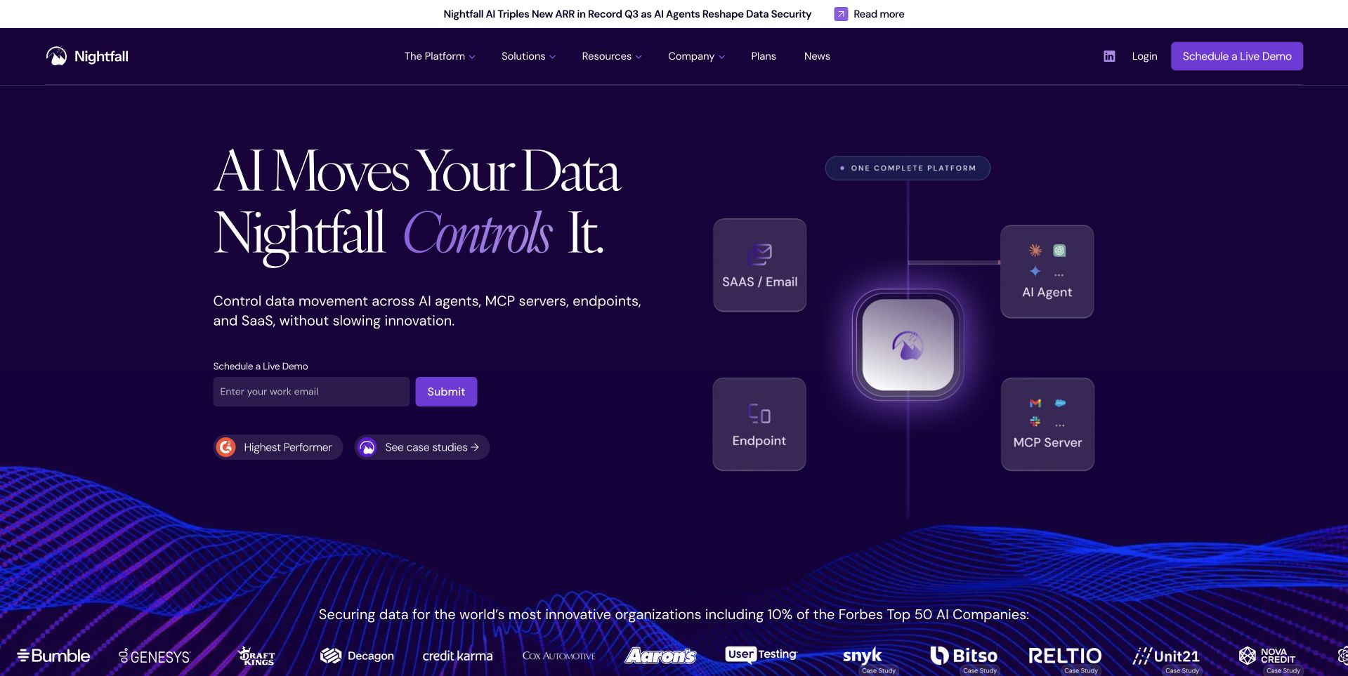
Nightfall AI’s public page uses a deep purple field with a two-part message about AI moving data and the platform controlling it. A diagram-like cluster of application categories gives the proposition a visual structure, while an email entry offers a direct continuation. Customer marks and small evidence-oriented badges sit in separate supporting areas. This is useful for studying how a security product can introduce several contexts without opening with a dense architecture chart. The CockroachDB source concerns an application-data case, not independent validation of security effectiveness or the implementation of this public homepage.
What you can learn
Give a broad security proposition a clear organizing idea, then lead to specific supported workflows and limits. Keep evidence, customer cases and product claims distinct. An email action should explain the next step, while the diagram needs an accessible textual account rather than asking visitors to infer protection from connected icons.
Pros
The purple field creates a consistent frame for a complex subject.
Category clusters make the scope easier to recognize at a glance.
Cons & considerations
Security outcome language needs precise supporting evidence.
Diagram-like decoration cannot establish actual control behavior.
Platform source: Primary documented CockroachDB association. Documented association: Always-on application-data case; not an independent security-performance endorsement or public-page stack audit. Platform evidence is separate from the direct website screenshot and is not a complete current infrastructure audit.
Kegan has 15+ years of experience working with small businesses, Fortune 500 companies, and everything in between. No development job is too big or too small: he brings the same hands-on attention to a focused improvement, a complete website, or a custom application.
For CockroachDB projects, he can help with data modeling, application data access, query design, search and cache integrations, migration planning, access boundaries, and maintainable handover. He works directly with clients on scope, design, implementation, testing, and handover, with an emphasis on clear communication and a system that remains practical to maintain after launch.
Show 3 other CockroachDB developersHide other CockroachDB developers
Pick one operation with clear correctness requirements. Keep its permissions, data ownership and expected result small enough to review thoroughly. A single well-tested workflow creates a stronger foundation than a broad prototype whose failure behavior is still unknown.
An existing application with regional needs
Map the real reasons for adding geography: user experience, resilience or an organizational data requirement. Separate those goals because they can call for different decisions. Test the dependencies surrounding the database too; an unavailable identity service or queue can still interrupt the customer journey.
A database migration with an explainable comparison
Preserve representative records and the application operations they support. State which behavior must remain unchanged and which change is intentional. Give the migration a staged acceptance and rollback route rather than treating the first successful import as the finish line.
From references to requirements
Plan the transaction, the geography and the maintenance handoff
Write the important state changes in plain language
Describe a normal operation and an awkward one. For an appointment, include two people attempting the same slot. For an order, include a late response after the customer has pressed submit. Ask the business owner to review the expected final state and the message the user should receive. These examples make correctness discussable without requiring everyone to read database code.
List external effects separately from stored state. A notification, payment request or third-party API call may have its own success and retry behavior. The implementation needs a deliberate way to coordinate them, not an assumption that everything around a transaction becomes atomic automatically. Preserve identifiers that support reconciliation by an authorized operator.
Keep these scenarios as acceptance tests throughout delivery. When an optimization or migration changes the implementation, the user-visible promise should still be checked. A successful normal path cannot demonstrate that competing requests or uncertain responses are handled correctly.
Make regional behavior a complete application exercise
Describe the primary user locations and the information each workflow needs. Identify any organizational restrictions on placement and involve the appropriate reviewers rather than improvising legal conclusions from a vendor setting. Explain the selected locality and survival choices in the project record, with a reason for each.
CockroachDB’s documentation provides the technical multi-region concepts, but the acceptance exercise must include the whole service. Test the application path, its identity dependency, its external integrations and the information operators need during a disruption. Measure the intended user experience rather than only a database connection from an administrator’s machine.
Record what the service should do when it cannot meet its normal promise. Some actions may need to wait or become temporarily unavailable. Use explicit, accessible messages and avoid presenting stale or incomplete state as current. A clear limitation is more useful than a reassuring interface that hides an uncertain result.
Build a maintainable operating and change procedure
Review the chosen client’s transaction handling with the implementation owner. CockroachDB documents retry errors using SQLSTATE 40001 and supported handling approaches. Keep the retry logic tied to the actual transaction boundary and test it with representative contention. Do not treat a repeated network request as a complete retry strategy.
Give maintainers a concise picture of deployment, permissions, migration steps, monitoring and recovery. Name the owner of application changes as well as the database operator. Describe how they decide whether a release is safe to continue, needs to pause or must be reversed. Keep diagnostic detail protected while retaining enough context to investigate an affected operation.
The final review should include another person following the runbook. Ask them to identify a failed operation, explain its state and demonstrate the agreed recovery or escalation. A system is ready for handoff when the team can maintain its promises without depending on the original author to remember every exception.
Ask the actual team to carry out its routine job: publish a realistic update, correct a mistake, preview a narrow screen, and identify who owns an integration failure. For a library or frontend framework, also ask who maintains the content source and deployment. A polished screenshot does not answer those operational questions.
Beyond the screenshot
CockroachDB project planning checklist
Name one important state transition.
Define valid starting and ending states.
Test competing requests and late responses.
Identify side effects outside the database transaction.
Review the actual client’s retry approach.
Keep reconciliation identifiers available to authorized operators.
Define user locations and placement requirements.
Explain locality and survival choices.
Test surrounding dependencies during disruption.
Show honest waiting and unavailable states.
Document migration, monitoring and recovery ownership.
Rehearse handoff with a second maintainer.
Test with real content, a keyboard, a small screen, slow or failed requests, and the people who will maintain the system. These are planning checks, not an accessibility, security, performance, or search-ranking certification.
Sources & editorial method
How this CockroachDB collection was reviewed
The collection separates actual public-interface observations from primary database customer references. Dated engineering stories and specific teams remain qualified. The planning framework is not a performance guarantee, compliance opinion or complete current infrastructure audit.
Every image is an unmodified capture from the actual website, with its source and capture date. Some captures are reused from our shared catalog; their dates remain the original capture dates. None comes from a vendor gallery or a generated reconstruction. Moving imagery and live content can change.
Technology attribution uses public page assets or metadata, official platform documentation, or a cited first-party project case study. Documentary and framework-relationship evidence is identified where used; it is not a complete current backend inventory. A CMS image CDN alone does not establish a full CMS deployment. A library’s presence does not prove which individual controls use it, and a platform label does not establish AI authorship.
The composition notes, lessons, pros and tradeoffs are original editorial observations. We have not measured conversion, traffic, security, performance or accessibility conformance. Website owners retain their brands and imagery; these examples are not our client portfolio. Written, Edited and Curated are independent records, not dates advanced by a build. See our editorial standards or suggest a correction.
Questions worth asking
CockroachDB website development FAQs
Does a CockroachDB case identify a company’s public website stack?
No. The sources describe particular application workloads. Public pages are reviewed separately for design and communication.
Why is Booking Holdings pictured for Booking.com?
The parent’s public site is a design reference. The primary case concerns Booking.com order management, not all group brands or the parent site’s implementation.
Do retries matter if the database is managed?
Yes. Review the documented transaction behavior and chosen client. Application logic and external effects still need a deliberate response to retried or uncertain operations.
Is adding regions automatically better?
No. Choose against geography, resilience and application requirements, with measured tradeoffs. More locations are not a substitute for a coherent operating design.
What proves readiness beyond a successful query?
Correct state transitions, useful failure messages, tested dependencies, clear ownership and a demonstrated recovery procedure. Include contention and disruption in acceptance.