Best Kubernetes Websites of 2026 (20 Real-World Examples)
Public design references from organizations with documented Kubernetes platform and application workloads
These 20 references connect visible website design with primary Kubernetes evidence. A cluster used for AI development, internal services or a payment platform does not prove that a separate corporate homepage runs on Kubernetes. Read the design and the infrastructure association as different findings.
Kubernetes manages containerized workloads; it is not a CMS, a visual builder or an automatic upgrade to a website’s quality. A useful project begins by asking whether orchestration solves a real operating problem. The answer depends on the application, its dependencies, release requirements and the people who will maintain the result—not on whether a large reference company uses a cluster.
Spotify, adidas, Subaru, Michelin and HDFC Bank open the collection with established major-brand cases. The later examples span school software, research computing, travel technology and financial infrastructure. Some sources are historical, and several describe highly specialized workloads. Borrow useful interface patterns without assuming that their operational complexity belongs in your own website brief.
Before the examples
What makes good Kubernetes website development in 2026?
Justify the orchestration responsibility
Name the workload, the scaling or deployment problem, and the team that owns it. A content publication with a protected form may not need a cluster at all. If the proposal cannot explain the benefit in concrete operating terms, adding Kubernetes can increase maintenance work without improving the visitor’s experience.
Plan production beyond the application image
A cluster introduces responsibilities around networking, access, capacity, storage and upgrades. Official production guidance is a starting point for identifying those decisions, not evidence that a copied configuration is safe for a new environment. Ask who operates each layer and how the application is tested when those layers change.
Define the authority and resource needs of each workload instead of granting broad access or unlimited capacity by default. Resource requests and limits are part of an operating plan, not decoration in a configuration file. Review security boundaries alongside application behavior, especially when several teams or workloads share infrastructure.
Study navigation, content hierarchy and the visible user task in each public reference. Then read the primary case for its exact Kubernetes association. A model-training platform, private cluster or historical service migration should not be presented as a current inventory of the pictured marketing page.
We start with five recognizable brands or organizations: Spotify, adidas, Subaru, Michelin, HDFC Bank. Each attribution applies to the named website property, not every product or website belonging to its organization. This is a curated reading sequence, not a measured ranking.
Spotify’s newsroom has a strong publication identity: a large feature combines expressive type with a photograph, while a restrained header exposes news, company context and search. It does not require visitors to interpret the listening application’s personalized interface before reading a public announcement. The useful pattern is the separation of two user experiences inside one organization. Public stories need understandable titles, archives and reference routes, whereas the product itself has a different set of discovery and account tasks.
What you can learn
Separate content delivery decisions from product-platform operations. CNCF’s 2019 case describes Spotify’s migration from homegrown orchestration toward Kubernetes. That is historical service-platform evidence, not a claim that the current newsroom uses Kubernetes or that its public CMS shares the same deployment lifecycle.
Pros
The publication structure gives public announcements a destination that can be read without a product account.
A recognizable visual identity connects the newsroom with the wider brand without copying the application.
Cons & considerations
A large rotating feature needs direct archive routes for readers seeking a specific older announcement.
Public brand storytelling should not be mistaken for independent evaluation of the company or its products.
Platform source: Primary documented Kubernetes association. CNCF’s 2019 study describes Spotify’s Kubernetes service migration. Platform evidence is separate from the direct website screenshot and is not a complete current infrastructure audit.
The captured adidas storefront pairs a large footwear campaign with a compact white header and clearly separated shopping categories. Search and account-related controls remain visible above the promotion, while smaller audience choices connect the offer to an actual product range. This is a useful reference because the imagery can be seasonal without making the basic catalog structure temporary. A returning shopper should still recognize where to search, browse a category or find a product even when the main photograph and promotional message have changed.
What you can learn
Keep the discovery structure stable beneath changing campaigns. CNCF’s 2019 adidas case explicitly describes ecommerce and platform workloads on Kubernetes; it remains dated documentary evidence rather than a fresh audit of the current storefront or its complete infrastructure.
Pros
The familiar header and clear shopping categories provide continuity across different campaigns.
A product-focused photograph makes the promotion concrete rather than purely typographic.
Cons & considerations
Offer badges and merchandising prompts can crowd the opening and distract from product comparison.
The capture records one promotion at one date, not current pricing, stock or availability.
Visible tech stack
Earlier / documented evidence
Kubernetes
Platform source: Primary documented Kubernetes association. CNCF’s 2019 study describes adidas ecommerce and platform Kubernetes workloads. Platform evidence is separate from the direct website screenshot and is not a complete current infrastructure audit.
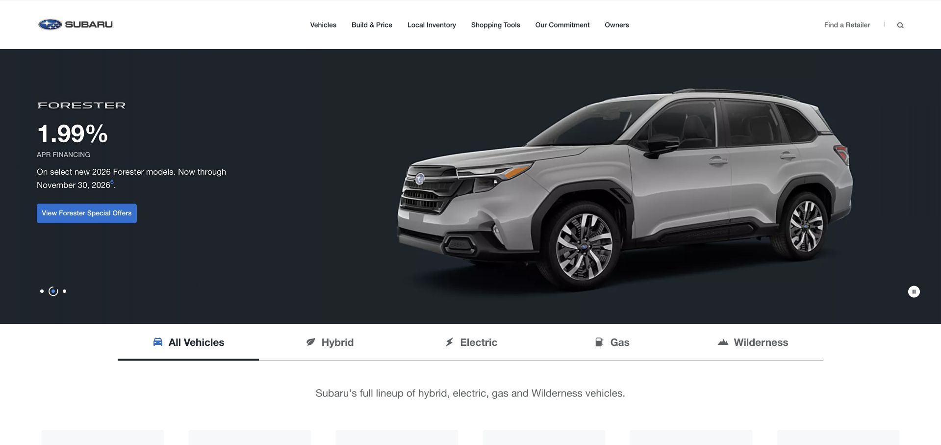
Subaru’s public homepage gives a vehicle feature a wide visual canvas, with build, inventory, shopping and ownership-related routes in the header. A row of vehicle categories begins beneath the opening, helping visitors move from a particular campaign to the wider lineup. The useful design relationship is between a focused image and an understandable set of alternatives. Someone who likes the brand but not the featured vehicle should still be able to find the relevant category without restarting their journey through a separate menu.
What you can learn
Build a graceful route from the promoted item to the wider catalog. CNCF’s July 2026 case concerns Subaru’s EyeSight AI-development platform using Kubernetes, not proof of the US marketing page’s runtime or a finding about a vehicle’s safety performance.
Pros
Build and local-inventory routes make the campaign useful for a concrete shopping task.
Visible vehicle categories provide alternatives to the model currently featured in the hero.
Cons & considerations
Vehicle specifications, offers and availability require more current regional detail than the opening provides.
A large campaign visual needs efficient mobile variants and controls that remain readable over different images.
Platform source: Primary documented Kubernetes association. CNCF’s July2026 study describes Subaru EyeSight AI development on Kubernetes. Platform evidence is separate from the direct website screenshot and is not a complete current infrastructure audit.
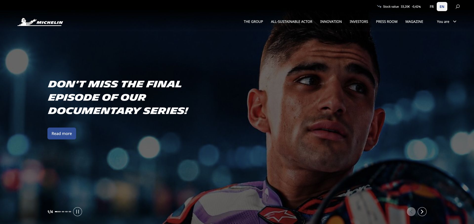
Michelin’s corporate opening gives a documentary-style feature substantial photographic space, with a compact navigation for the group, sustainability, innovation, investors and newsroom content. The page does not behave like a local tire shop or a product configurator. Instead, it uses an editorial story to express a wider company identity, while the surrounding structure supports institutional readers. This is useful for a brand whose public associations may be narrower than its actual organization: the homepage can broaden that understanding without becoming a dense list of business units.
What you can learn
Use a concrete editorial story to introduce the wider organization, but keep practical routes discoverable. CNCF’s July 2026 case describes Michelin Kubernetes Services networking with Cilium; it does not establish the current runtime of this corporate publication or every Michelin product site.
Pros
Documentary storytelling gives the corporate destination a recognizable subject beyond a generic brand statement.
Investor, newsroom and innovation routes serve institutional tasks alongside the featured story.
Cons & considerations
A cinematic feature may be less useful to someone seeking a specific product or local service.
Video-led storytelling requires accessible controls, text context and restrained loading behavior.
Platform source: Primary documented Kubernetes association. CNCF’s July2026 study describes Michelin’s Kubernetes networking migration. Platform evidence is separate from the direct website screenshot and is not a complete current infrastructure audit.
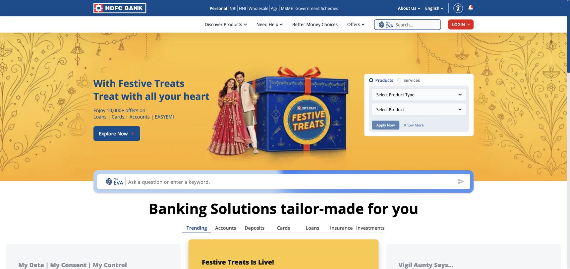
HDFC Bank’s homepage uses a multi-layered navigation to separate personal, NRI, wholesale, agricultural and small-business audiences. A campaign panel shares the opening with a product-and-service selector, while search and account access remain visible. The structure is dense, but its intention is useful: a broad institution can reduce ambiguity by making the visitor’s relationship and task explicit. The product selector provides a different route from reading the current offer, allowing the first screen to serve more than one kind of visitor.
What you can learn
Make task and audience boundaries clear before adding more promotional modules. CNCF’s 2026 HDFC case describes the Enterprise Payment Hub on Kubernetes across clouds, not a security assessment or a current infrastructure inventory of this public banking page.
Pros
Audience categories acknowledge several genuinely different banking relationships.
The product selector provides a practical alternative to following the current campaign.
Cons & considerations
Multiple header layers and controls create a substantial mobile and keyboard-navigation challenge.
Banking promotions need complete eligibility and product terms beyond what the first screen can explain.
Platform source: Primary documented Kubernetes association. CNCF’s July2026 study describes HDFC Bank’s Kubernetes-based payment platform. Platform evidence is separate from the direct website screenshot and is not a complete current infrastructure audit.
The SERES Group English site uses a large frontal vehicle image beneath a restrained white header. A short intelligence-and-luxury proposition sits within the image, while company, products, investors, press and career information are organized through the navigation. The opening has a clear visual subject, but deliberately little technical detail. This is useful as a reference for a company whose underlying engineering is complex: the first screen can establish a recognizable product world, provided that the following routes explain the organization and its actual capabilities.
What you can learn
A focused product image can introduce complexity without explaining all of it at once. CNCF’s November 2026 case concerns the internal SeresCloud Kubernetes AI-inference platform; it does not prove that this group website runs on Kubernetes or establish any vehicle capability or outcome.
Pros
A single product subject gives the opening a strong and immediately understandable visual focus.
The restrained header leaves room for the main image while retaining institutional destinations.
Cons & considerations
A brief luxury-and-intelligence statement needs specific supporting information to become meaningful.
Image-led automotive positioning cannot establish engineering performance, safety or availability on its own.
Platform source: Primary documented Kubernetes association. CNCF describes SeresCloud’s Kubernetes AI-inference platform. Platform evidence is separate from the direct website screenshot and is not a complete current infrastructure audit.
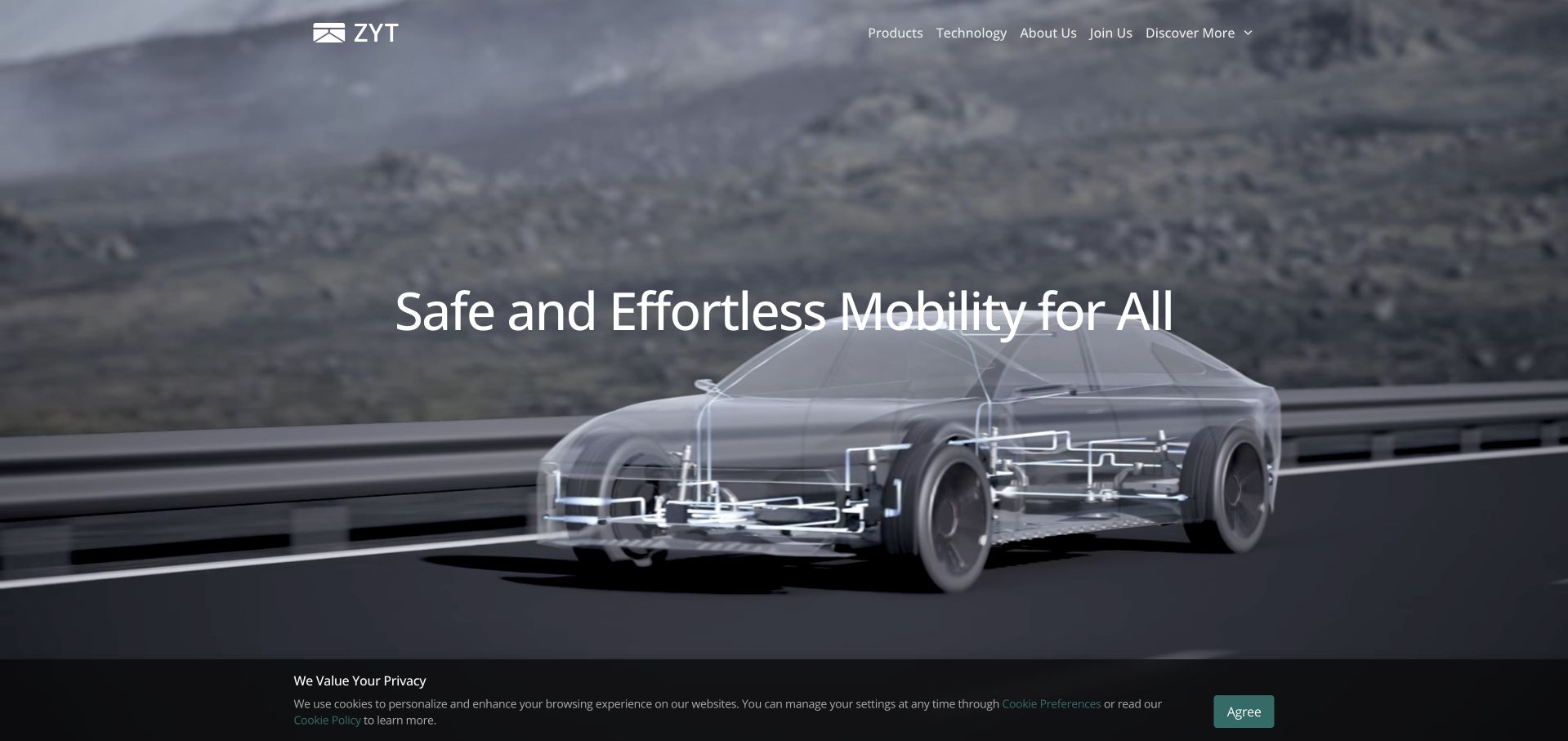
Zhuoyu’s English page pairs a concise mobility proposition with a vehicle illustration that exposes technical components within a real driving setting. Product, technology, company and career routes remain compact and visible above it. The visual gives the visitor a more concrete reference than a generic abstract background would, while the short message avoids turning the hero into a technical paper. This is useful for a supplier whose work may be embedded inside other companies’ products: the opening needs to explain its role before a visitor can evaluate individual capabilities.
What you can learn
Use a visual model to introduce the subject, then explain the actual scope in supporting content. CNCF’s September 2026 case documents Kubernetes GPU scheduling at Zhuoyu, not the marketing page’s current runtime or proof of an autonomous-driving capability.
Pros
The vehicle-and-system visual makes a specialist engineering subject easier to recognize.
Compact product and technology routes support deeper investigation without overwhelming the introduction.
Cons & considerations
Illustrated technical components can imply more specificity than the introductory text actually explains.
Safety and engineering claims require detailed evidence beyond a polished mobility visualization.
Platform source: Primary documented Kubernetes association. CNCF describes Zhuoyu’s Kubernetes GPU allocation. Platform evidence is separate from the direct website screenshot and is not a complete current infrastructure audit.
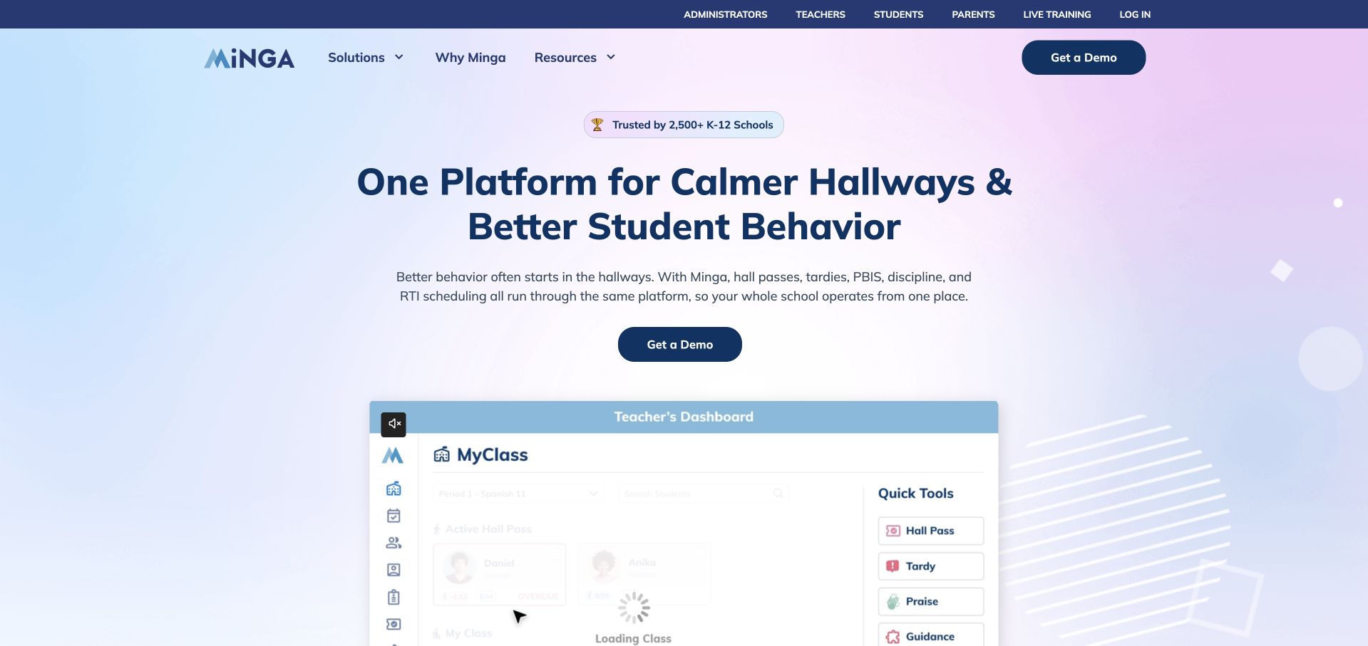
Minga’s homepage gives administrators, teachers, students and parents visible routes before the main product introduction. A soft gradient field supports a short school-management proposition and a preview of the interface, with a demo route for evaluators. The useful feature is the explicit role structure. A school buyer evaluating the platform and a parent looking for help should not have to interpret the same sales journey to reach relevant information. The product preview also gives the broader proposition a recognizable working context rather than leaving it as an abstract promise.
What you can learn
Map roles and permissions in the public information architecture before implementing the application. CNCF’s September 2026 case documents Minga’s Kubernetes-related platform operations; that association does not verify the marketing site’s runtime, student-data practices or the effectiveness of any school policy.
Pros
Role-specific routes acknowledge that daily users and prospective buyers have different needs.
A visible interface preview provides more product context than a purely abstract illustration.
Cons & considerations
A reduced product preview may be hard to interpret without descriptive supporting text.
School-related claims and data handling require careful explanation beyond the homepage’s sales proposition.
Platform source: Primary documented Kubernetes association. CNCF describes Minga’s cloud-native campus check-in infrastructure. Platform evidence is separate from the direct website screenshot and is not a complete current infrastructure audit.
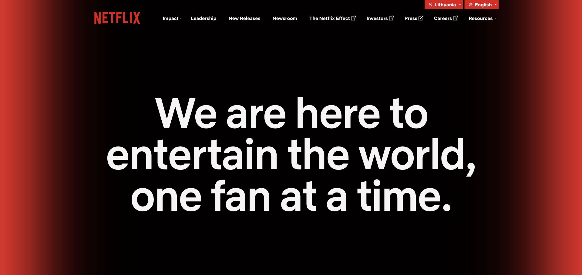
About Netflix uses a large purpose statement, a restrained dark visual field and a small set of institutional routes. Leadership, releases, newsroom, investors, press and careers have clear destinations, without importing the subscription product’s browsing interface. This is useful for a large digital business because the public company site does not need to expose the complexity of the service it describes. A visitor can understand the organizational context first, then follow the route that matches their reason for arriving rather than navigating an application designed for someone else.
What you can learn
A public page and a product platform can have different release boundaries and user tasks. AWS’s Netflix innovator page describes an Amazon EKS migration, establishing a scoped Kubernetes association rather than the complete current architecture of this corporate page or every Netflix service.
Pros
A limited institutional navigation makes non-subscriber tasks easier to identify.
The restrained introduction remains recognizable without a complex collection of promotional cards.
Cons & considerations
An abstract purpose statement requires concrete supporting material to explain the organization.
Large display text needs careful wrapping and meaningful heading structure across translations and devices.
Platform source: Primary documented Kubernetes association. AWS’s Netflix innovator page describes its Amazon EKS migration. Platform evidence is separate from the direct website screenshot and is not a complete current infrastructure audit.
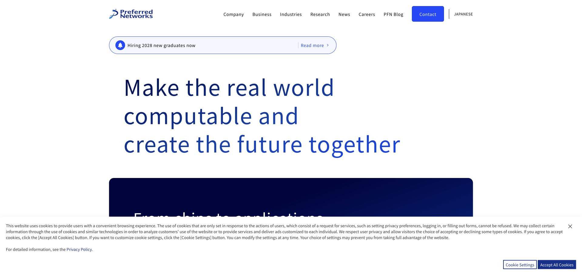
Preferred Networks’ English site uses a clean white header and a large typographic proposition, with company, business, industry, research, news, career and contact routes clearly separated. A supporting announcement band and the next visual section provide further entry points without overloading the opening. The page is useful for a technical organization with several kinds of work: it can establish a broad direction while giving different audiences recognizable ways to investigate. The restraint works best when the following content provides concrete examples rather than repeating the same general claim.
What you can learn
Create clear routes into distinct kinds of expertise instead of treating a broad technical mission as sufficient explanation. CNCF’s September 2026 case concerns Preferred Networks’ Kubernetes cluster networking, not a claim about this marketing page’s runtime or every research system.
Pros
The restrained header and typography make the information structure easy to identify.
Research, industry and business routes support different ways of evaluating the organization.
Cons & considerations
A broad computational proposition needs concrete applications to explain what is actually offered.
Several top-level routes can still become difficult to scan when compressed into a small-screen menu.
Platform source: Primary documented Kubernetes association. CNCF describes Preferred Networks’ Kubernetes cluster networking. Platform evidence is separate from the direct website screenshot and is not a complete current infrastructure audit.
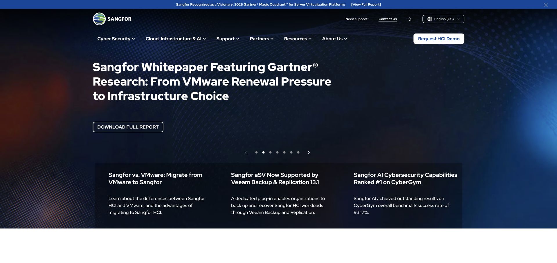
Sangfor’s homepage leads with a technical resource-oriented feature, then introduces supporting product and topic cards beneath it. Cloud, cybersecurity, support, partners, resources and company routes give the broader portfolio an understandable structure. The opening is useful because it can start from an evaluator’s current concern rather than only a generic product claim. The challenge is maintaining the relationship between that editorial lead and the actual offerings: a report or whitepaper should help someone understand the category, not become an obstacle between them and practical product information.
What you can learn
Use current technical resources as an entry point while keeping the product taxonomy stable. CNCF’s September 2026 case documents a Sangfor Kubernetes AI-compute platform, not a verification of the public marketing site’s deployment or an independent assessment of security effectiveness.
Pros
A concrete technical resource gives the first screen a more specific subject than a broad capability slogan.
Product and support routes remain available beyond the featured resource.
Cons & considerations
Several rotating technical promotions can compete with a visitor’s immediate product-comparison task.
Enterprise security and performance claims need full supporting evidence, not only a report-led campaign.
Visible tech stack
Earlier / documented evidence
Kubernetes
Platform source: Primary documented Kubernetes association. CNCF describes Sangfor’s Kubernetes AI compute platform. Platform evidence is separate from the direct website screenshot and is not a complete current infrastructure audit.
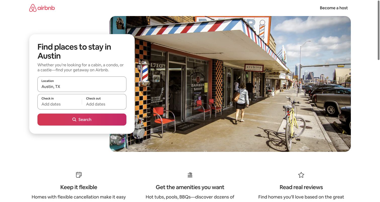
Airbnb’s Austin page gives a place-specific search panel a clear position beside a substantial destination image. Location and dates provide the initial context, while supporting benefits sit below the main task. The page does not try to show every filter, listing attribute or comparison tool in the first screen. This is useful for a large application because a public landing page can help someone formulate an initial request before handing them into a more detailed interface. The destination context makes the first decision more concrete than a generic search box would.
What you can learn
Design the landing page and results application as related but distinct tasks. AWS documents Kubernetes control-plane access controls in Airbnb infrastructure; that is not proof that this Austin page is itself served by Kubernetes or that every listing feature shares the same implementation.
Pros
The place-specific context gives the search a useful starting point without a complicated introductory form.
The image and search panel support the same task rather than competing promotional goals.
Cons & considerations
Dates and calendar behavior add complexity that must remain usable by keyboard and assistive technology.
A destination image cannot establish accommodation availability, suitability or final pricing.
Platform source: Primary documented Kubernetes association. AWS describes Airbnb’s Kubernetes control-plane access controls on EC2. Platform evidence is separate from the direct website screenshot and is not a complete current infrastructure audit.
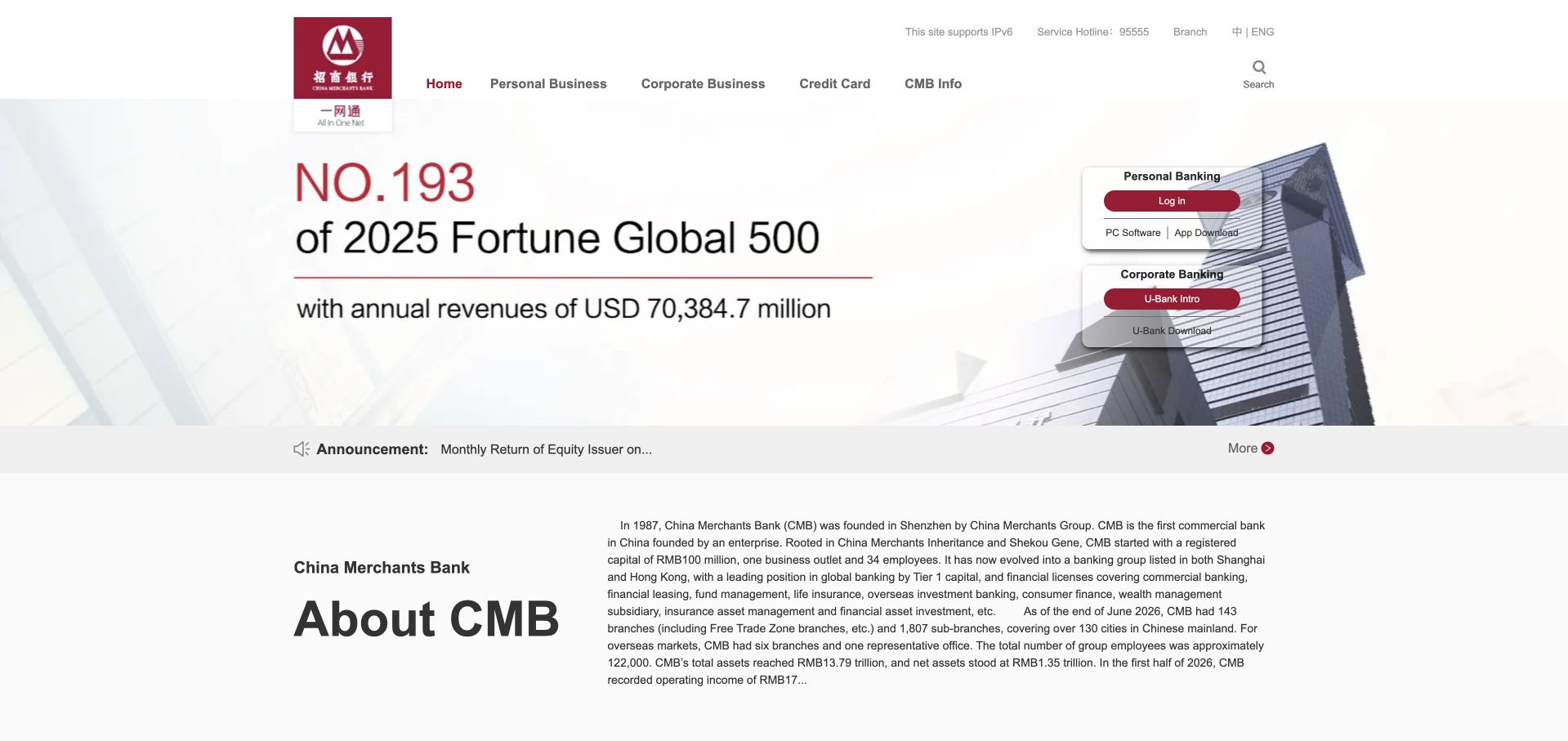
China Merchants Bank’s English homepage combines a recognizable institutional header with a broad corporate feature and an introductory company section. Personal, corporate, card and company-information routes remain distinct, while account-related links are visible without turning the whole page into a login screen. The page is useful as a reference for cross-market communication: a visitor may need to understand the organization before deciding which service or institutional document is relevant. Clear navigation and a concise company introduction can do more useful work than a purely visual brand campaign.
What you can learn
Explain the institution and its service boundaries before exposing more detailed workflows. CNCF’s September 2026 case describes the bank’s Kubernetes training-and-inference platform, not a current inventory of the English public page or an independent finding about banking security and financial suitability.
Pros
The company introduction provides useful context for visitors unfamiliar with the institution.
Personal, corporate and institutional routes are visibly distinguishable.
Cons & considerations
Several navigation systems and small reference links can make the page difficult to scan on mobile.
Corporate scale and promotional information require dated sources and cannot establish the suitability of a financial product.
Platform source: Primary documented Kubernetes association. CNCF describes China Merchants Bank’s Kubernetes training and inference pool. Platform evidence is separate from the direct website screenshot and is not a complete current infrastructure audit.
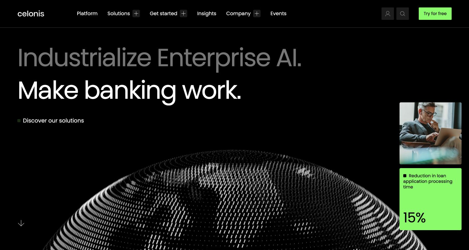
Celonis’ opening combines an ambitious enterprise-AI proposition with a more specific industry-oriented statement and a supporting visual. The dark field and bright accent create a strong visual hierarchy, while platform, solutions, insights, company information and trial routes remain available. This is useful for a technical product whose category may not be familiar to every visitor. A concrete industry example can provide a starting point, but the surrounding content still needs to explain the actual workflow, the inputs involved and the boundaries of the result being described.
What you can learn
Anchor an abstract platform category in a specific application before asking for adoption. CNCF’s August 2026 case documents Celonis Kubernetes networking across clusters and clouds; it does not establish the deployment of this public page or independently validate any product-performance claim.
Pros
The industry reference gives the broad platform proposition a more concrete point of entry.
A strong contrast system separates the main message from supporting navigation.
Cons & considerations
Abstract platform terminology can remain difficult for someone who does not already know the category.
Outcome-oriented visual cards need clear supporting context rather than being treated as universal results.
Platform source: Primary documented Kubernetes association. CNCF describes Celonis Kubernetes networking across its clusters. Platform evidence is separate from the direct website screenshot and is not a complete current infrastructure audit.
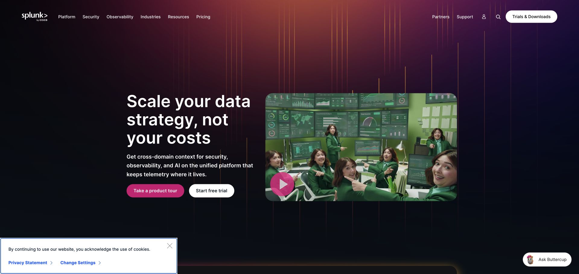
Splunk’s homepage pairs a short data-platform proposition with a large visual that combines people, screens and recognizable product context. Security, observability, industries, resources and pricing remain distinct navigation routes. The opening is useful because the platform spans several technical audiences, and a single generic dashboard would not explain all of them. A concise proposition can establish the direction, while product tours, trials and supporting information provide different levels of commitment for visitors who need to understand the platform before speaking with a sales team.
What you can learn
Give evaluators more than one way to learn about a complex platform. CNCF’s August 2026 case concerns Splunk’s Kubernetes security-observability work with Tetragon, not proof that the public marketing page uses Kubernetes or an independent assessment of the product’s effectiveness.
Pros
Distinct security and observability routes acknowledge different evaluation needs within the same platform.
Product-tour and trial actions provide alternatives to an immediate sales conversation.
Cons & considerations
A broad data proposition needs concrete workflows to explain what a particular user will actually do.
Dense enterprise navigation and persistent widgets can reduce clarity on a smaller screen.
Platform source: Primary documented Kubernetes association. CNCF describes Splunk’s Kubernetes security observability with Tetragon. Platform evidence is separate from the direct website screenshot and is not a complete current infrastructure audit.
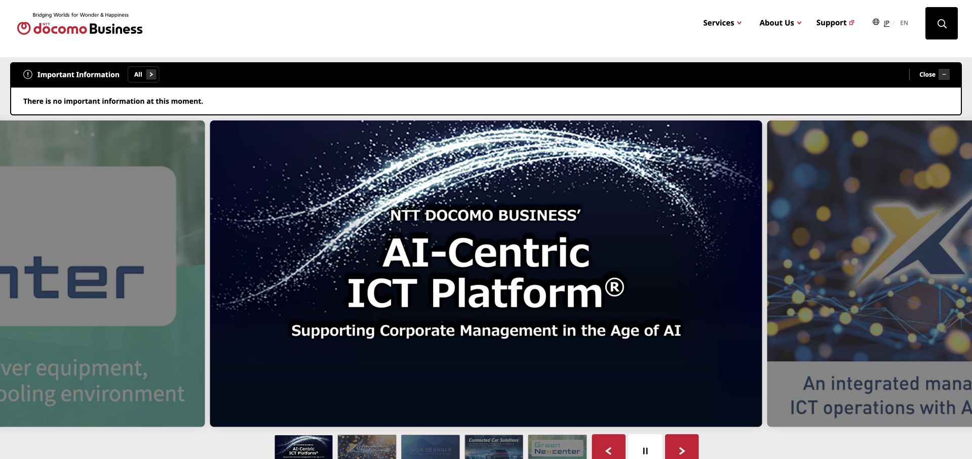
NTT DOCOMO Business’s English homepage uses a large feature area with visible supporting thumbnails and controls, framed by a compact service-and-company navigation. The opening can highlight a specific infrastructure or AI topic while keeping support and language access available. This is useful for a large technical organization because the first screen can show a tangible area of work without pretending that it represents the entire portfolio. The visible sequence of topics also makes the feature system more understandable than an automatically changing image with no clear controls.
What you can learn
Give changing features explicit labels and controls, then connect them to stable service information. CNCF’s July 2026 case describes an NTT DOCOMO Business multi-data-center Kubernetes GPU testbed, not the current hosting of this English corporate page or every commercial service.
Pros
Visible feature controls help explain that the lead is one topic within a broader portfolio.
Support and language routes remain practical destinations alongside the promotional introduction.
Cons & considerations
Several infrastructure topics can be difficult to interpret without concise explanatory text.
A carousel should not be the only route to important service or company information.
Visible tech stack
Earlier / documented evidence
Kubernetes
Platform source: Primary documented Kubernetes association. CNCF describes NTT DOCOMO Business GPU infrastructure using KubeVirt. Platform evidence is separate from the direct website screenshot and is not a complete current infrastructure audit.
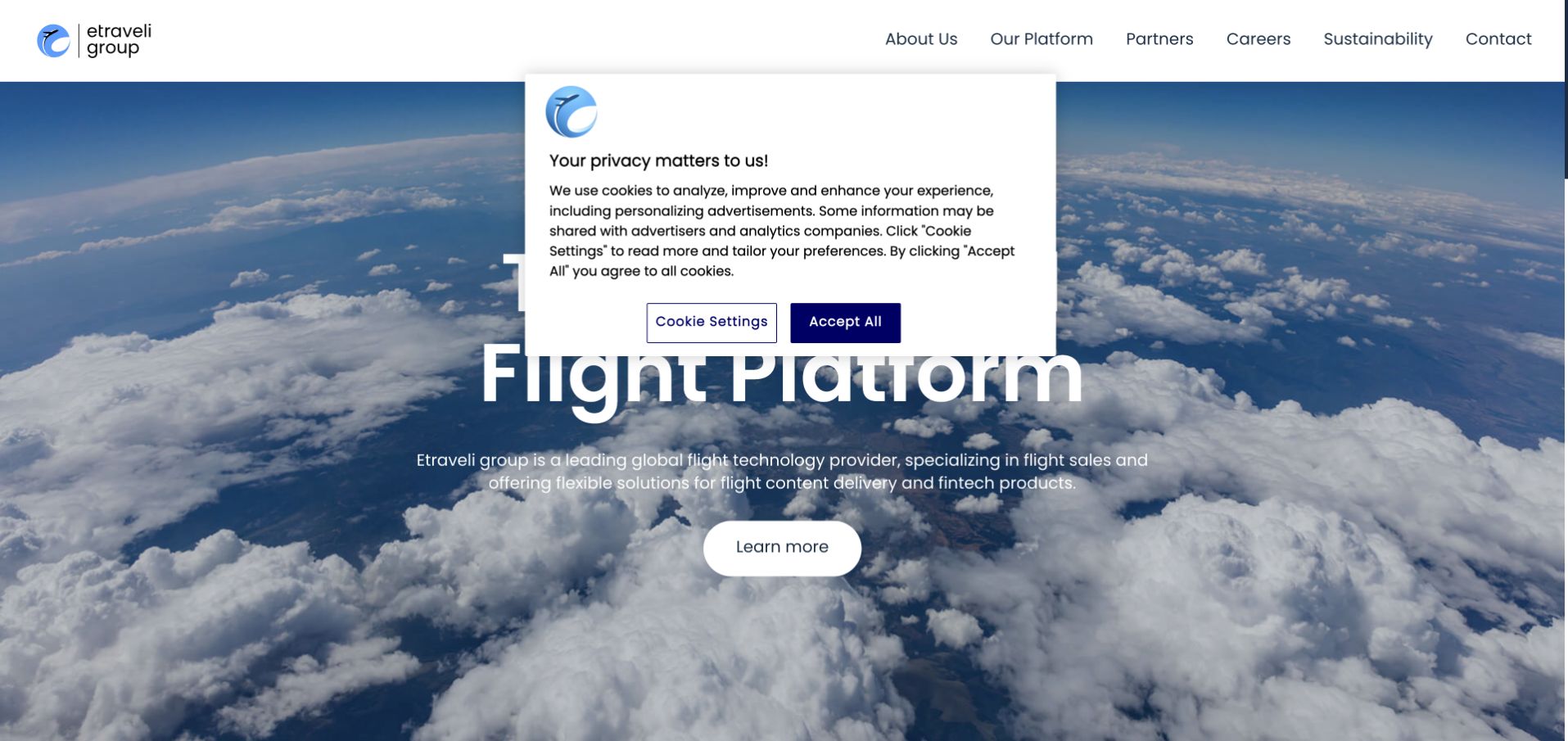
Etraveli Group’s homepage places a clear flight-platform proposition over a large aerial-cloud image. About, platform, partners, careers, sustainability and contact routes form a restrained header above it. The visual is closely related to the business category rather than an arbitrary abstract illustration, helping an unfamiliar corporate name acquire context quickly. This is useful for a provider whose technology may sit behind other customer-facing services: the page first explains the kind of system involved, then provides routes to the organization, partnerships and underlying platform.
What you can learn
Explain the role of the platform before listing its technical components. CNCF’s July 2026 case documents Etraveli Group’s Kubernetes networking and load-balancing migration; it does not establish that the corporate homepage uses that infrastructure or guarantee any travel-booking outcome.
Pros
A relevant flight context makes an unfamiliar corporate brand easier to place.
The small navigation gives platform and partner information clear destinations.
Cons & considerations
A broad platform claim needs concrete descriptions of responsibilities and integration boundaries.
An atmospheric image cannot explain availability, operational resilience or the terms of any travel service.
Platform source: Primary documented Kubernetes association. CNCF describes Etraveli Group’s Kubernetes load-balancing and networking work. Platform evidence is separate from the direct website screenshot and is not a complete current infrastructure audit.
LY Corporation’s English homepage uses a large photograph and a short user-oriented statement beneath a clean white header. Corporate information, news, technology and design, privacy and security, sustainability and recruitment have visible routes. This gives the parent organization a human entry point without reducing the opening to a list of service logos. The pattern is useful for a group with several familiar products: visitors can understand the shared organizational context, then move toward the specific reference or technical information that brought them to the site.
What you can learn
A parent-company page should explain the shared organization while keeping product and institutional boundaries clear. CNCF’s July 2026 case describes LY Corporation’s automated private Kubernetes platform, not the current runtime of this public corporate page or every service within the group.
Pros
The human photograph gives a large technology organization an approachable opening.
Technical, privacy and recruitment information have distinct destinations in the shared navigation.
Cons & considerations
A short user-oriented statement needs concrete portfolio explanations to become informative.
A parent-company identity can leave visitors uncertain about where responsibility for a particular product sits.
Platform source: Primary documented Kubernetes association. CNCF describes LY Corporation’s automated Kubernetes cluster operations. Platform evidence is separate from the direct website screenshot and is not a complete current infrastructure audit.
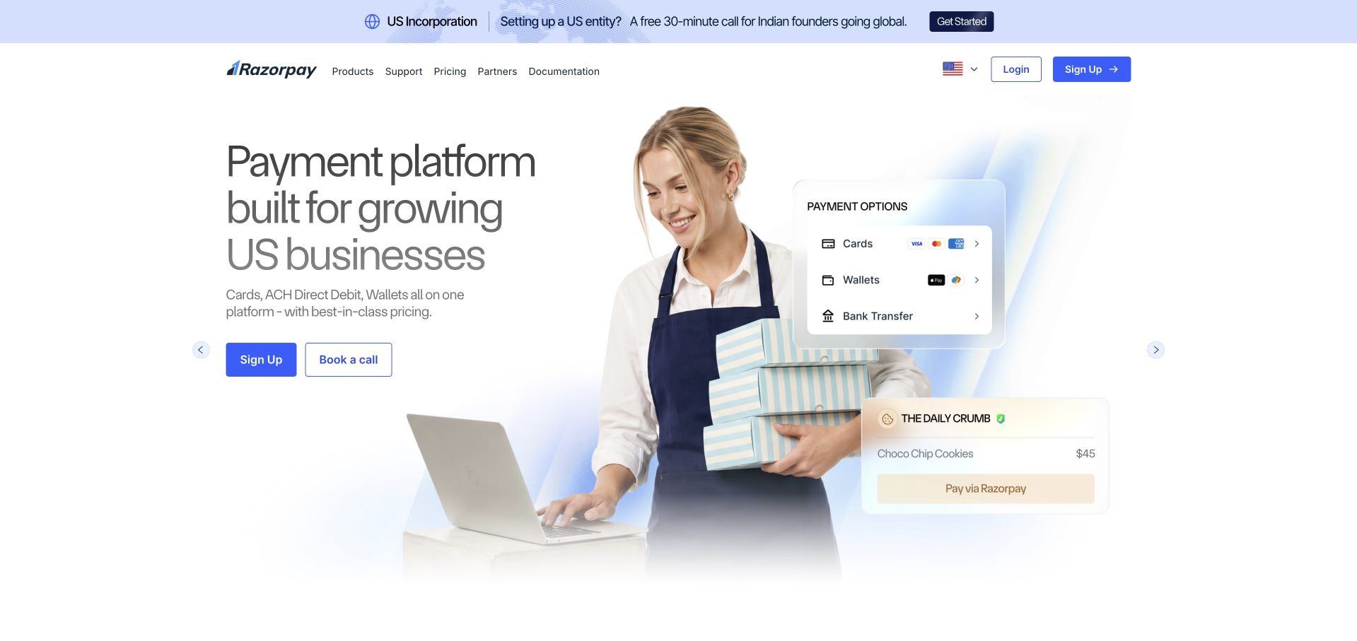
Razorpay’s US page pairs a concise payment-platform proposition with a business photograph and a small interface-style payment visual. Product, pricing, documentation, partner and support routes remain available, while signup and a conversation route offer different next steps. This is useful for an API-based service because the public site can explain the commercial task before exposing integration detail. The documentation route is particularly important: a technical evaluator should not have to begin a sales process just to understand whether the service can fit an existing system.
What you can learn
Connect the business proposition with explicit implementation and support routes. CNCF’s June 2026 case describes Kubernetes policy controls for Razorpay infrastructure, not proof that this regional marketing page uses Kubernetes or a guarantee about payment acceptance, compliance or security.
Pros
The business-and-payment visual provides a concrete context for an otherwise technical platform category.
Visible documentation gives developers a route that does not depend on a sales conversation.
Cons & considerations
Regional payment availability and eligibility need precise explanation beyond the main proposition.
A polished interface illustration cannot establish the security or compliance of a real integration.
Platform source: Primary documented Kubernetes association. CNCF describes Razorpay’s policy-as-code controls for Kubernetes nodes. Platform evidence is separate from the direct website screenshot and is not a complete current infrastructure audit.
Ancestry’s opening connects family-history questions with a restrained cream-and-green visual system and a collection of family photographs. The navigation separates genealogy, DNA and other offerings, while a clear trial route provides a next step. The useful design feature is the translation from a complex records product into an understandable personal task. Visitors can recognize why they might explore before they need to understand the different databases, search tools or account features involved in the service.
What you can learn
Keep the user’s question visible as application complexity grows. CNCF’s 2017 case documents Ancestry’s transition toward Docker and Kubernetes services. It is historical platform evidence, not a fresh assertion about the current public homepage, every records system or the completeness of a person’s research results.
Pros
The family-history question provides a recognizable reason to engage with a complex information product.
Separate genealogy and DNA routes help distinguish related but different services.
Cons & considerations
Trial and promotional actions require clear subscription and renewal context later in the journey.
Evocative family imagery cannot explain record coverage, uncertainty or the limitations of a particular search.
Platform source: Primary documented Kubernetes association. CNCF’s 2017 study describes Ancestry’s Docker and Kubernetes service migration. Platform evidence is separate from the direct website screenshot and is not a complete current infrastructure audit.
Kegan has 15+ years of experience working with small businesses, Fortune 500 companies, and everything in between. No development job is too big or too small: he brings the same hands-on attention to a focused improvement, a complete website, or a custom application.
For Kubernetes projects, he can help with content architecture, custom functionality, system integrations, testing, and maintainable handover. He works directly with clients on scope, design, implementation, testing, and handover, with an emphasis on clear communication and a system that remains practical to maintain after launch.
Show 3 other Kubernetes developersHide other Kubernetes developers
Choose an operating model before choosing a cluster
Use a simpler platform when it meets the need
A managed application service, container runtime or hosted publishing platform may provide an easier release and support model for a smaller website. Compare the complete maintenance burden, including updates and incidents. The absence of a cluster is not a weakness when the real requirements are met more clearly by another arrangement.
Use a managed cluster for a defined application platform
Describe which responsibilities the provider handles and which remain with the application team. Include workloads, network exposure, data services, permissions and release boundaries. Managed control-plane operations do not eliminate the need to maintain application dependencies, review access or test the effect of a platform upgrade.
Operate specialist or shared infrastructure deliberately
GPU scheduling, private networking, multi-team environments and distributed processing may create a stronger orchestration need. Document isolation, admission, data access and capacity ownership. A specialized case study can help frame questions, but its scale and organizational resources should not be assumed to match a new website project.
From references to requirements
Plan the cluster and application lifecycle together
Make the public boundary explicit
Identify which services should accept public traffic and which must remain private. Map administrative authority, service identities and data access. A namespace name is not by itself a complete isolation strategy, and a secret object does not replace a deliberate policy for credential ownership, rotation and exposure.
Rehearse change and partial failure
Test a representative release, failed rollout, unavailable dependency and interrupted request using safe data. Include readiness, shutdown and persistent-state behavior. A healthy cluster does not necessarily mean the user’s transaction succeeded, so monitoring should connect infrastructure signals with the application’s actual business tasks.
Budget for upgrades and recovery
Assign ownership for platform versions, workload updates, image review, backups and restoration. Identify the current release and keep a workable recovery path. The handover should explain routine operations to another maintainer, not rely on a collection of commands that only the original developer knows when to run.
A useful handover demonstration
Ask the actual team to carry out its routine job: publish a realistic update, correct a mistake, preview a narrow screen, and identify who owns an integration failure. For a library or frontend framework, also ask who maintains the content source and deployment. A polished screenshot does not answer those operational questions.
Beyond the screenshot
Kubernetes website planning checklist
Explain why orchestration is needed.
Name the team that will operate the platform.
Separate application and cluster responsibilities.
Map public and private network exposure.
Review human and workload permissions.
Identify durable data and backup ownership.
Define realistic resource needs and capacity bounds.
Test readiness, shutdown and interrupted requests.
Rehearse deployment failure and recovery.
Plan version and dependency updates.
Connect monitoring to actual user tasks.
Document operations another maintainer can follow.
Test with real content, a keyboard, a small screen, slow or failed requests, and the people who will maintain the system. These are planning checks, not an accessibility, security, performance, or search-ranking certification.
Sources & editorial method
How this Kubernetes collection was reviewed
The 20 references combine direct public-page captures, independent design critiques and primary CNCF or provider engineering sources. The first five are established major organizations. Original publication dates and workload scopes remain qualified, and reused captures keep their actual provenance. Public-source audits may reveal a different publishing layer without contradicting a separately documented internal Kubernetes workload.
Every image is an unmodified capture from the actual website, with its source and capture date. Some captures are reused from our shared catalog; their dates remain the original capture dates. None comes from a vendor gallery or a generated reconstruction. Moving imagery and live content can change.
Technology attribution uses public page assets or metadata, official platform documentation, or a cited first-party project case study. Documentary and framework-relationship evidence is identified where used; it is not a complete current backend inventory. A CMS image CDN alone does not establish a full CMS deployment. A library’s presence does not prove which individual controls use it, and a platform label does not establish AI authorship.
The composition notes, lessons, pros and tradeoffs are original editorial observations. We have not measured conversion, traffic, security, performance or accessibility conformance. Website owners retain their brands and imagery; these examples are not our client portfolio. Written, Edited and Curated are independent records, not dates advanced by a build. See our editorial standards or suggest a correction.
Questions worth asking
Kubernetes website development FAQs
Does a Kubernetes case prove the captured homepage uses Kubernetes?
No. A primary case may describe a private platform, product service, AI-development environment or an earlier deployment. The public screenshot and its design review are separate evidence. We do not infer the complete current architecture of a company from one case.
Should every new website use Kubernetes?
No. Start with the actual workload and the team that must operate it. A simpler managed application or publishing platform may meet the requirements with less ongoing complexity. Use orchestration when its benefits justify the additional responsibilities, not because a famous example uses it.
Is Kubernetes the same as Docker?
No. Container packaging and cluster orchestration address different responsibilities. A project can use Docker in development or testing without running a Kubernetes production platform. Document what each technology actually does in the proposed delivery process.
Does a managed cluster remove the maintenance burden?
It can remove particular infrastructure responsibilities, but the application team still needs to manage workloads, access, dependencies, data, monitoring and recovery. The exact division depends on the selected service and configuration, and should be explicit in the proposal and handover.
What is the most useful acceptance test?
A representative application workflow that remains understandable through a normal release and a rehearsed failure. Include permissions, persistent state, recovery and operator visibility. A running Pod or a healthy dashboard alone does not demonstrate that a customer’s intended task completes correctly.
A good Kubernetes brief explains a real operating need and who will maintain the result. Keep the public experience clear, the platform responsibility explicit and the evidence narrower than the claims it can actually support.