Best Heroku Websites of 2026 (20 Real-World Examples)
Twenty public websites from documented Heroku-associated organizations and applications, with historical scope and present platform conditions made explicit.
Heroku’s useful design connection is not a particular aesthetic: it is a clear boundary between application work and platform operations. Evaluate that boundary against today’s requirements and availability.
The public pages below range from institutional introductions to task-driven service sites. Their Heroku evidence concerns specific systems: Salesforce BaseCamp’s integration backend, a Davos attendee chat, Kawasaki Engines business workflows and many other applications. A company can operate those systems on Heroku while publishing its homepage somewhere else. Older commerce stories also remain historical accounts rather than being treated as present-day fingerprints.
Current context matters. Heroku’s February 6, 2026 announcement described a sustaining-engineering model and stopped offering new Enterprise Account contracts, while allowing existing contracts and credit-card use to continue under the stated conditions. Its March and October updates subsequently documented platform enhancements. Do not simplify those sources into either a shutdown claim or a promise that every historical enterprise arrangement is available to a new buyer. Confirm the exact product and contractual requirements before committing a project.
Before the examples
What makes good Heroku website development in 2026?
Model web and background work separately
Heroku’s architecture guide distinguishes application process types, including web requests and queue workers. Reflect that distinction in the product design: a request can be accepted before its background task finishes. Give customers clear pending and completed states, and define safe retries. Scaling the web process alone does not necessarily solve a growing queue.
A release combines built application code with configuration. Maintain a reproducible build, explicit environment settings and a review process for deployment changes. Distinguish rolling back application code from restoring data or reversing a schema change. The existence of a release history does not mean every external side effect can automatically be undone.
Verify current eligibility, not just historical capability
A customer story may describe Private Spaces, Shield, support arrangements or older data plans. Confirm the current offering, your account’s eligibility and the requirements of your workload. Preserve the dates and application scope in planning notes so a successful earlier deployment does not become an unsupported commercial or compliance commitment.
The opening five examples are recognizable organizations with exact official Heroku cases. Each public screenshot is a design reference, not an assertion about its runtime; historical commerce and integration stories keep their original context.
We start with five recognizable brands or organizations: Salesforce, World Economic Forum, Kawasaki Engines, Align Technology, S&P Global Market Intelligence. Each attribution applies to the named website property, not every product or website belonging to its organization. This is a curated reading sequence, not a measured ranking.
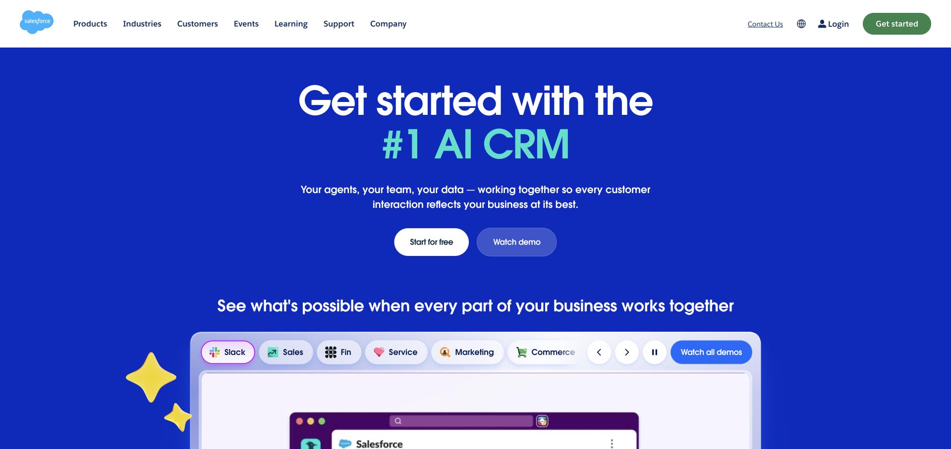
Salesforce’s public homepage uses a vivid blue field, a large centered AI CRM headline and two modestly sized actions. A row of product-category pills leads into a demonstration frame, making the breadth of the platform visible without showing a complete dashboard at once. Heroku’s case specifically concerns Salesforce’s internal BaseCamp employee-support integration layer; it explicitly distinguishes that backend from its Experience Cloud frontend. It is not evidence that Salesforce’s public marketing homepage is hosted on Heroku.
What you can learn
Separate the product story from the architecture of a particular internal application. For a multi-system support portal, the valuable design lesson is reducing the number of systems an employee must understand. The implementation still needs explicit data ownership, authorization boundaries and failure handling across the connected organizations.
Pros
A clear central headline and two actions prevent the broad platform catalog from dominating the first decision.
Category pills offer a recognizable way to explore capabilities within one consistent demonstration area.
Cons & considerations
The AI-led positioning remains broad until a visitor explores a more specific product workflow.
Several moving demonstration elements can compete with supporting explanations and small navigation text.
Platform source: Official technology-specific customer or workload source. Heroku’s case specifically identifies Salesforce BaseCamp’s internal integration backend on Heroku, while explicitly identifying Experience Cloud as the frontend. It is not the public Salesforce marketing site. This evidence establishes only the stated product, workload, organization or historical association. It does not prove that the pictured public page uses the technology, reveal its CMS/frontend, establish a complete current architecture or independently verify vendor-reported outcomes. Platform evidence is separate from the direct website screenshot and is not a complete current infrastructure audit.
The World Economic Forum pairs a saturated blue statement panel with a video frame of people in conversation. The restrained white header leaves this split introduction visually dominant, while an impact section starts immediately below. The long headline defines an institutional role rather than a single product. Heroku’s source concerns a separate Davos attendee-support chat built with a React interface on a Dyno and Salesforce-related data integration. It does not identify the corporate website’s content platform or general publishing infrastructure.
What you can learn
An institutional homepage and an event-support application serve different audiences. Borrow the human context, but define the application around specific attendee tasks, authorized information and escalation paths. A successful short-lived event service does not automatically establish the right architecture for an organization’s long-term publication.
Pros
The split layout gives equal visual weight to a stated mission and the people involved in it.
A concise header keeps routes to events, publications and organizational information available without dominating the scene.
Cons & considerations
The long opening statement requires sustained reading before a visitor finds a specific task.
The video context adds atmosphere but needs surrounding information to explain the organization’s practical activities.
Visible tech stack
Earlier / documented evidence
Heroku
Platform source: Official technology-specific customer or workload source. Heroku describes a Davos attendee-support chat interface built in React and deployed on a Dyno with Salesforce-related data integration, not the World Economic Forum corporate publication. This evidence establishes only the stated product, workload, organization or historical association. It does not prove that the pictured public page uses the technology, reveal its CMS/frontend, establish a complete current architecture or independently verify vendor-reported outcomes. Platform evidence is separate from the direct website screenshot and is not a complete current infrastructure audit.
Kawasaki Engines combines black product panels, bold condensed headings and bright red dealer actions. A large engine image supports the main dealer message, while an adjacent oil feature introduces another product path. Three photographs below separate landscapers, homeowners and dealers. Heroku’s LaunchPad Lab case specifically documents a Kawasaki Engines business application using Postgres, Dynos and Salesforce synchronization. It does not establish that the public catalog pictured here uses Heroku or identify every Kawasaki division’s infrastructure.
What you can learn
Organize the public experience around how customers buy and receive support. A dealer-based business needs clear audience routes, while its internal application may need very different tools for transactions and shared records. Keep product discovery and business-system integration as connected but separately specified parts of the brief.
Pros
The dealer action appears prominently in both the header and main product panel.
Audience photographs and labels make professional, household and dealer needs easy to distinguish.
Cons & considerations
Several bold black panels can make the opening feel crowded despite its clear grid.
The large product presentation provides limited immediate help comparing engine compatibility or specific maintenance needs.
Platform source: Official technology-specific customer or workload source. Heroku’s LaunchPad Lab case specifically identifies Kawasaki Engines business workflows using Heroku Postgres, Connect and Dynos. The case links directly to the pictured Kawasaki Engines business. This evidence establishes only the stated product, workload, organization or historical association. It does not prove that the pictured public page uses the technology, reveal its CMS/frontend, establish a complete current architecture or independently verify vendor-reported outcomes. Platform evidence is separate from the direct website screenshot and is not a complete current infrastructure audit.
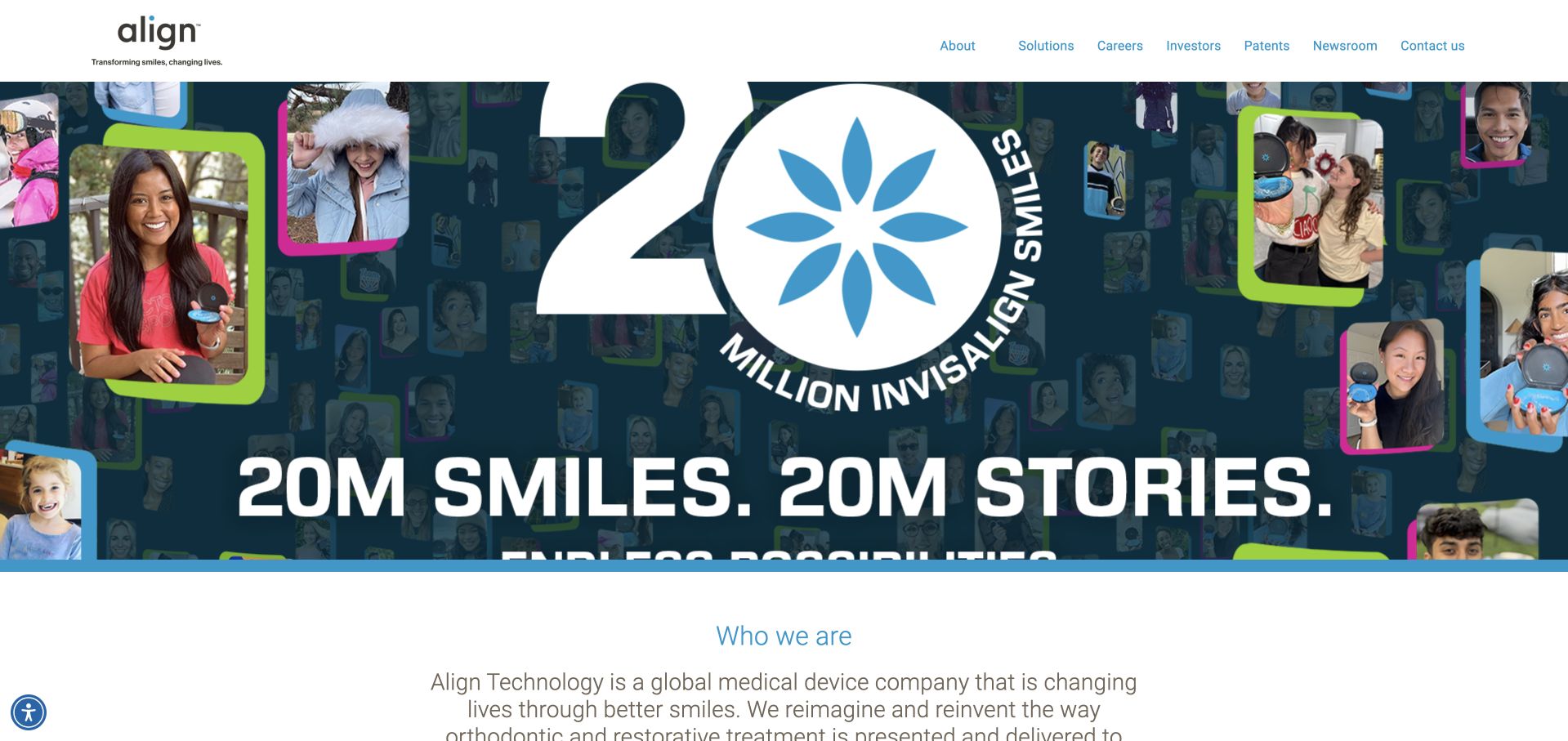
Align Technology opens with a wide collage of smiling people around a prominent Invisalign milestone graphic. The restrained corporate header leaves the imagery as the strongest signal, while the next section starts explaining the company’s products. The visual relationship between a parent company and consumer brand is clear. Heroku’s published case concerns the Invisalign consumer application portfolio and development workflow at the time described. It does not prove that this corporate page currently uses Heroku or independently verify the clinical and market claims in the promotion.
What you can learn
Make the relationship between a parent organization, product brand and customer audience understandable. A public corporate page should not be confused with a treatment-selection application. Scope technical evidence to the specific property and period documented, and keep clinical assertions separate from observations about visual presentation.
Pros
The patient collage connects the corporate organization to a recognizable consumer-facing product.
Quiet corporate navigation preserves access to solutions, investors and contact information without fighting the large campaign.
Cons & considerations
The milestone artwork provides less practical information than a direct explanation of the company’s solutions.
Large embedded campaign text is harder to adapt and maintain than ordinary responsive page copy.
Platform source: Official technology-specific customer or workload source. Heroku’s published Align Technology case describes the Invisalign consumer web-application portfolio and development workflow in that account. It does not establish the current Align corporate homepage runtime. This evidence establishes only the stated product, workload, organization or historical association. It does not prove that the pictured public page uses the technology, reveal its CMS/frontend, establish a complete current architecture or independently verify vendor-reported outcomes. Platform evidence is separate from the direct website screenshot and is not a complete current infrastructure audit.
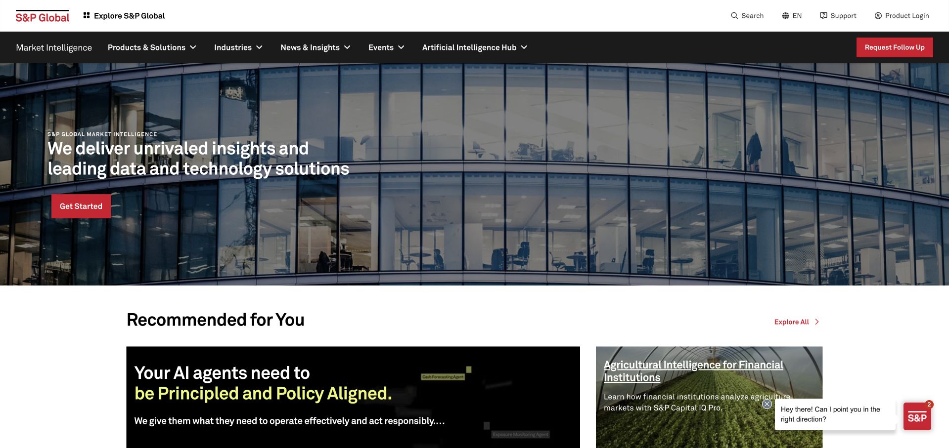
S&P Global Market Intelligence places a concise white proposition over a photograph of a glass-fronted building. A red start action supplies a familiar brand accent, and recommended research begins directly below in clearly separated cards. Utility and product navigation occupy distinct dark and light rows. Heroku’s case documents an S&P Capital IQ Salesforce application built for the October 2014 Dreamforce context. This is dated application evidence, not proof of the current Market Intelligence homepage’s renderer, hosting or complete data architecture.
What you can learn
Separate the browsing needs of a research reader from those of a product evaluator. Keep calls to action explicit, and connect editorial material to the relevant product context without assuming every reader is a qualified lead. Historical integration stories remain useful when their dates and application boundaries stay visible.
Pros
The red action remains easy to locate within a visually restrained enterprise composition.
Recommended research starts close to the product introduction, connecting expertise and commercial discovery.
Cons & considerations
Multiple utility and product navigation layers make the header dense for first-time visitors.
The architectural photograph communicates scale but reveals little about the actual data tools or workflows.
Visible tech stack
Earlier / documented evidence
Heroku
Platform source: Official technology-specific customer or workload source. Heroku’s S&P Capital IQ case describes a Salesforce AppExchange application prepared for the October 2014 Dreamforce context, using Heroku and Postgres. This is historical application evidence. This evidence establishes only the stated product, workload, organization or historical association. It does not prove that the pictured public page uses the technology, reveal its CMS/frontend, establish a complete current architecture or independently verify vendor-reported outcomes. Platform evidence is separate from the direct website screenshot and is not a complete current infrastructure audit.
Unsplash presents a broad search field, a short introduction and small editorial feature cards above a clean image grid. A narrow icon rail and category row keep repeated browsing tasks available while allowing photography to remain the primary content. The page balances a known query with the invitation to explore. Heroku’s published story documents Unsplash’s historical transition from Tumblr to a Rails application and managed services. It does not establish the present platform architecture or prove that every image-related service remains on Heroku.
What you can learn
Support both a visitor who knows the needed subject and one who is still discovering an aesthetic. Keep image previews informative, but make licensing and source context easy to reach. A successful early platform migration should not be treated as an up-to-date inventory of a large media service.
Pros
The search-first structure supports a clear task without hiding the visual collection.
Editorial cards offer a manageable starting point for visitors who arrive without a precise query.
Cons & considerations
Several compact navigation layers can compete with the primary search field.
Licensing and account distinctions need further explanation beyond the attractive image previews.
Platform source: Official technology-specific customer or workload source. Heroku’s case describes Unsplash’s early transition from a Tumblr project begun in May 2013 to a Rails application with managed services. It is an early-growth historical account, not a complete current architecture. This evidence establishes only the stated product, workload, organization or historical association. It does not prove that the pictured public page uses the technology, reveal its CMS/frontend, establish a complete current architecture or independently verify vendor-reported outcomes. Platform evidence is separate from the direct website screenshot and is not a complete current infrastructure audit.
Everlane pairs a large fashion portrait with a small seasonal label, restrained white headline and understated shopping links. Thin promotional and navigation rows keep practical shopping routes above the image, while the sparse main composition lets the garment and model establish the collection’s mood. Heroku’s case describes an earlier Rails and React commerce application estate, including managed data services and Review Apps. It does not prove that the current storefront or checkout retains that architecture; the captured contemporary design is a separate observation.
What you can learn
Preserve a calm brand presentation without making basic shopping routes difficult to find. Editorial photography and commerce infrastructure have different lifecycles. When replatforming, inventory the actual current catalog, checkout and customer integrations rather than rebuilding from an old customer-story diagram or assuming that visible design continuity means technical continuity.
Pros
The restrained headline and photograph give the collection a coherent editorial identity.
Product categories remain available in a compact navigation row above the seasonal feature.
Cons & considerations
Several narrow promotional strips reduce the simplicity of the otherwise quiet composition.
Small shopping links may not be sufficiently conspicuous for visitors unfamiliar with the site’s visual conventions.
Platform source: Official technology-specific customer or workload source. Heroku’s published Everlane story describes an earlier Rails and React commerce application estate, managed data services and Review Apps. It does not establish the current storefront implementation. This evidence establishes only the stated product, workload, organization or historical association. It does not prove that the pictured public page uses the technology, reveal its CMS/frontend, establish a complete current architecture or independently verify vendor-reported outcomes. Platform evidence is separate from the direct website screenshot and is not a complete current infrastructure audit.
Bonobos places a seasonal discount strip above a lifestyle scene and a bold white campaign heading. The familiar wordmark, broad category navigation and discreet search field keep the store recognizable even while the main image changes. The campaign has a clear shopping destination rather than a separate microsite feel. Heroku’s source explicitly describes a migration beginning in early 2016 and a Solidus-based commerce environment of that period. It is historical evidence, not proof of the current Bonobos storefront’s platform or continued Heroku deployment.
What you can learn
Keep campaign changes within a stable shopping framework, but do not confuse stable branding with an unchanged implementation. Before a commerce rebuild, verify the actual current system of record for products, inventory and orders. Historical architecture can explain an earlier decision without determining a present migration plan.
Pros
The large scene gives the promotion a recognizable seasonal identity beyond a percentage discount alone.
Straightforward product navigation keeps the store usable for visitors who want to bypass the campaign.
Cons & considerations
Repeated offer and utility strips add substantial header complexity before the main content.
A cinematic hero provides less immediate detail about fit, materials and product availability than a catalog view.
Platform source: Official technology-specific customer or workload source. Heroku’s Bonobos case explicitly describes an early-2016 migration and a Solidus commerce environment at that time. It is historical evidence, not a claim about the present commerce platform. This evidence establishes only the stated product, workload, organization or historical association. It does not prove that the pictured public page uses the technology, reveal its CMS/frontend, establish a complete current architecture or independently verify vendor-reported outcomes. Platform evidence is separate from the direct website screenshot and is not a complete current infrastructure audit.
charity: water places a donation panel beside a large portrait of a child holding a glass of water. The short mission statement, yellow accents and clear recurring-versus-once control make the desired next action understandable. The organization’s restrained navigation stays separate from the giving interface. Heroku’s published case describes fundraising and field-service systems, including sensor-related applications; it explicitly distinguished a separately hosted marketing site at that time. The case therefore cannot establish the runtime of the current public donation landing page.
What you can learn
Connect an emotional story to a clearly labeled commitment. Explain frequency, amount and what happens next before payment begins. On the technical side, separate public storytelling, payment processing and field-data systems, and avoid exposing donor or operational records simply because several applications share a platform.
Pros
The donation panel translates a broad mission into an understandable amount and frequency decision.
The portrait and limited yellow accents create a direct visual relationship between purpose and action.
Cons & considerations
A large emotional image leaves limited room for detailed evidence about project operations in the opening view.
Suggested recurring amounts need clear supporting explanations so visitors understand the commitment before continuing.
Platform source: Official technology-specific customer or workload source. Heroku’s case describes charity: water fundraising, field-service and well-sensor applications. It explicitly distinguished the separately hosted marketing site at the time described. This evidence establishes only the stated product, workload, organization or historical association. It does not prove that the pictured public page uses the technology, reveal its CMS/frontend, establish a complete current architecture or independently verify vendor-reported outcomes. Platform evidence is separate from the direct website screenshot and is not a complete current infrastructure audit.
New England Biolabs places its scientific mission over a landscape photograph while keeping a large search field and practical product navigation above it. An action strip below the hero directs readers toward support, ordering and research. The approach is calmer than a conventional reagent catalog. Heroku’s case specifically concerns touchscreen-enabled smart freezers and their connection to customer and inventory information. It does not establish the public NEB catalog’s backend, and its earlier deployment story is not a current inventory of every field device.
What you can learn
A research supplier must accommodate both broad discovery and a customer who already knows an exact product. Keep search and support paths visible while explaining the brand. For connected dispensing systems, define offline behavior, stock reconciliation and user authorization separately from the requirements of the public catalog.
Pros
The large search field supports precise product tasks without abandoning the broader scientific introduction.
A short action strip makes practical support and ordering routes available immediately below the hero.
Cons & considerations
The lengthy mission copy is more demanding to read over photography than a concise product explanation.
A scenic opening offers limited immediate detail for researchers comparing specific reagents or experimental requirements.
Visible tech stack
Earlier / documented evidence
Heroku
Platform source: Official technology-specific customer or workload source. Heroku’s case describes New England Biolabs smart-freezer touchscreen applications and customer/inventory integration, with a project narrative beginning in 2012. It does not establish the public catalog backend. This evidence establishes only the stated product, workload, organization or historical association. It does not prove that the pictured public page uses the technology, reveal its CMS/frontend, establish a complete current architecture or independently verify vendor-reported outcomes. Platform evidence is separate from the direct website screenshot and is not a complete current infrastructure audit.
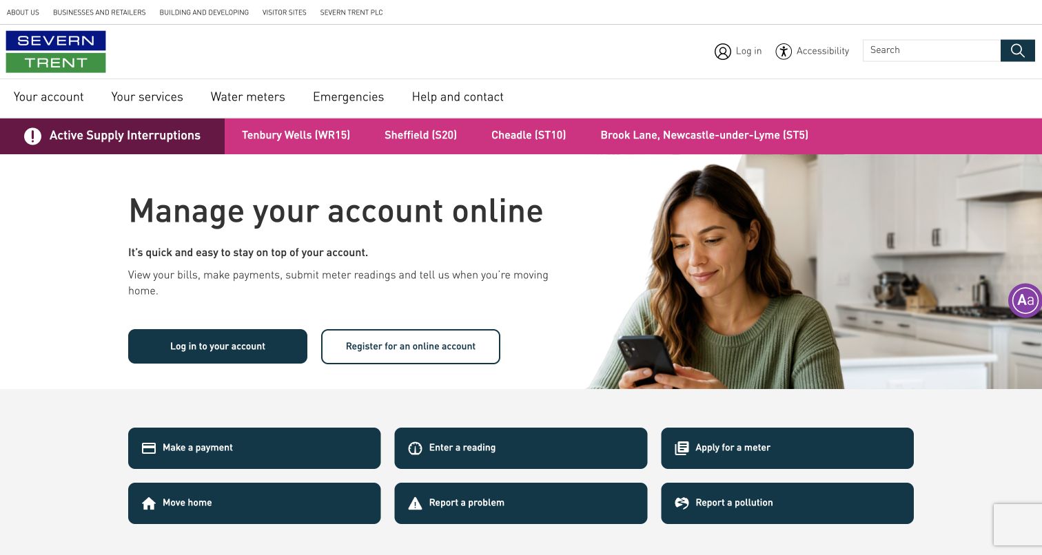
Severn Trent’s captured homepage places active supply interruptions in a vivid horizontal strip above the main account-management feature. Large dark teal task buttons below separate payments, meter readings and common service requests. The structure is practical rather than decorative. Heroku’s case concerns Real-Time Alarms and related mobile and backend applications supporting technicians. It does not establish that the public account homepage runs on Heroku, nor does a vendor quotation independently prove current service availability.
What you can learn
Prioritize the customer’s immediate situation before encouraging routine account activity. Public incident information should remain usable when authentication or internal systems are degraded. In the architecture brief, distinguish alarm ingestion, technician notification and the public status surface so that one failure does not unnecessarily remove all three.
Pros
The interruption strip makes urgent service information visible before routine account messaging.
Clearly labeled task buttons support common utility actions without a long explanatory introduction.
Cons & considerations
Several navigation and utility rows make the header information-dense.
An account-led hero may still be less useful than location-specific service guidance for an affected customer.
Platform source: Official technology-specific customer or workload source. Heroku identifies Severn Trent Real-Time Alarms and related mobile/backend applications for technician information and notifications, not the public account homepage. This evidence establishes only the stated product, workload, organization or historical association. It does not prove that the pictured public page uses the technology, reveal its CMS/frontend, establish a complete current architecture or independently verify vendor-reported outcomes. Platform evidence is separate from the direct website screenshot and is not a complete current infrastructure audit.
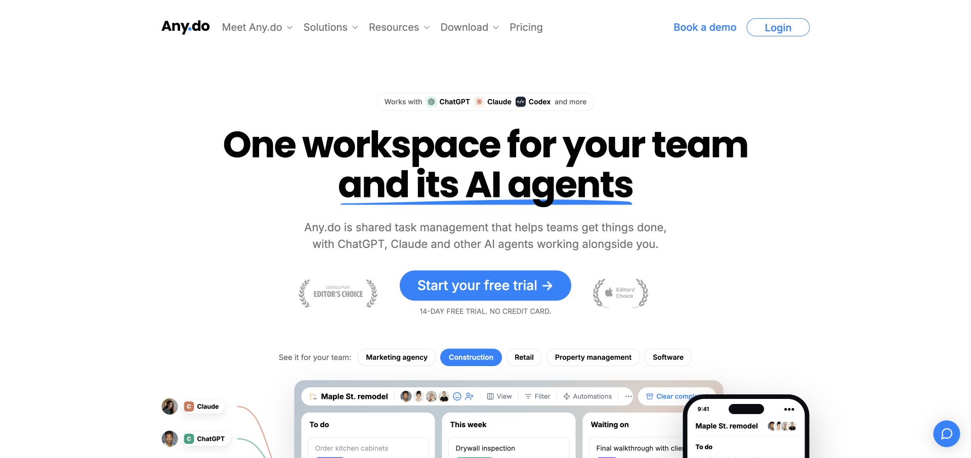
Any.do uses an open white composition, a large two-line headline and a bright blue trial action. Small assistant logos frame the AI context, while tabs and a task-board preview begin to show how a team might use the product. A compact header keeps pricing and downloading nearby. Heroku’s case describes the application platform’s infrastructure and development model. It does not establish the hosting of this marketing page or prove that every newly advertised agent integration uses the same backend.
What you can learn
Explain a new category through the work people still recognize: tasks, ownership and progress. If automated collaborators are involved, the interface should clarify what they can change and where a person reviews the result. Managed deployment simplifies infrastructure operations, not the need for clear product permissions.
Pros
The task-board preview connects a broad AI-team headline to a recognizable working interface.
A single prominent trial action keeps the main conversion path easy to identify.
Cons & considerations
Assistant logos can imply capabilities that need a much more specific explanation of permissions and behavior.
Several audience tabs may be confusing before a new visitor understands the product’s basic workflow.
Platform source: Official technology-specific customer or workload source. Heroku’s case describes Any.do’s application infrastructure and low-operations development model, not the implementation of every current agent integration or the public marketing page. This evidence establishes only the stated product, workload, organization or historical association. It does not prove that the pictured public page uses the technology, reveal its CMS/frontend, establish a complete current architecture or independently verify vendor-reported outcomes. Platform evidence is separate from the direct website screenshot and is not a complete current infrastructure audit.
Cambly’s captured opening uses a close-up video scene, a large white learning promise and one bright yellow starting button. The yellow benefits strip below introduces level suitability, native-speaker conversations and availability. A course-oriented navigation gives more deliberate learners additional routes. Heroku’s published case identifies Cambly’s backend and early iOS prototype growing on its managed application platform. It does not establish the public landing page’s frontend or prove that all video, tutoring and current AI features share one implementation.
What you can learn
Show the kind of experience a learner is choosing, then explain the practical conditions. Distinguish a signup from booking and completing a lesson. Video delivery, scheduling, tutor availability and billing have different failure modes, even if a managed platform supports part of the application.
Pros
The human video scene makes an online learning service feel more concrete than an abstract feature list.
A clear benefits strip introduces several practical questions immediately below the main message.
Cons & considerations
The promotional countdown and offer strip compete with the long-term educational proposition.
Broad progress language needs fuller explanation of lesson structure and learner responsibilities before purchase.
Visible tech stack
Earlier / documented evidence
Heroku
Platform source: Official technology-specific customer or workload source. Heroku’s case identifies Cambly’s backend and early iOS prototype growing on Heroku, with other third-party services integrated separately. This evidence establishes only the stated product, workload, organization or historical association. It does not prove that the pictured public page uses the technology, reveal its CMS/frontend, establish a complete current architecture or independently verify vendor-reported outcomes. Platform evidence is separate from the direct website screenshot and is not a complete current infrastructure audit.
Kajabi places a short business-building statement and email entry beside a video of a creator in a domestic setting. The mostly white layout gives both parts room, while a separate event banner remains clearly contained above. The interface prioritizes starting over an exhaustive product diagram. Heroku’s case describes a Rails application, Postgres and Dataclips-based reporting in the environment documented. It does not establish the current marketing page’s runtime or imply that every published customer website uses Heroku.
What you can learn
Connect the creator’s goal to the first meaningful product step without concealing the commitment. A reporting layer should be designed around access and freshness, not just the convenience of sharing a query result. Public marketing forms, creator accounts and customer transaction data require distinct handling and permissions.
Pros
The real creator scene gives a broad software promise an approachable human context.
A short form and restrained navigation keep the starting path clear within the white composition.
Cons & considerations
A large event banner competes with the evergreen product proposition for initial attention.
The opening gives little immediate detail about the differences between content creation, marketing and payment features.
Platform source: Official technology-specific customer or workload source. Heroku’s published Kajabi case identifies a Rails application, Postgres and Dataclips-based reporting in the environment documented, not every customer-published site. This evidence establishes only the stated product, workload, organization or historical association. It does not prove that the pictured public page uses the technology, reveal its CMS/frontend, establish a complete current architecture or independently verify vendor-reported outcomes. Platform evidence is separate from the direct website screenshot and is not a complete current infrastructure audit.
HealthSherpa pairs a straightforward insurance-selling explanation with a photograph of people working together at a laptop. Separate account actions for ACA and Medicare make the audience and next decision explicit. A familiar white-and-blue presentation avoids turning an already complex subject into a dense dashboard at the top. Heroku’s case concerns application scaling, database connections and support around enrollment demand. It does not establish the public page’s hosting, independently verify availability or mean a new customer can obtain the same historical enterprise arrangement.
What you can learn
Name the audience and product path before asking for account details. For enrollment systems, plan peak concurrency and database connections alongside privacy and access controls. A managed platform does not remove the need to validate workflows, test capacity and confirm current contractual eligibility for required features.
Pros
The two account paths make a practical distinction visible before the user enters an application.
The collaborative photograph supports the professional audience without overwhelming the explanation.
Cons & considerations
Broad ease-of-use claims need more detailed workflow information for a first-time insurance professional.
Several product and login routes can still be difficult to distinguish without familiarity with the insurance categories.
Platform source: Official technology-specific customer or workload source. Heroku’s HealthSherpa case identifies application scaling, Postgres connection capacity and support around peak enrollment demand. Historical enterprise arrangements are not assumed available to new customers. This evidence establishes only the stated product, workload, organization or historical association. It does not prove that the pictured public page uses the technology, reveal its CMS/frontend, establish a complete current architecture or independently verify vendor-reported outcomes. Platform evidence is separate from the direct website screenshot and is not a complete current infrastructure audit.
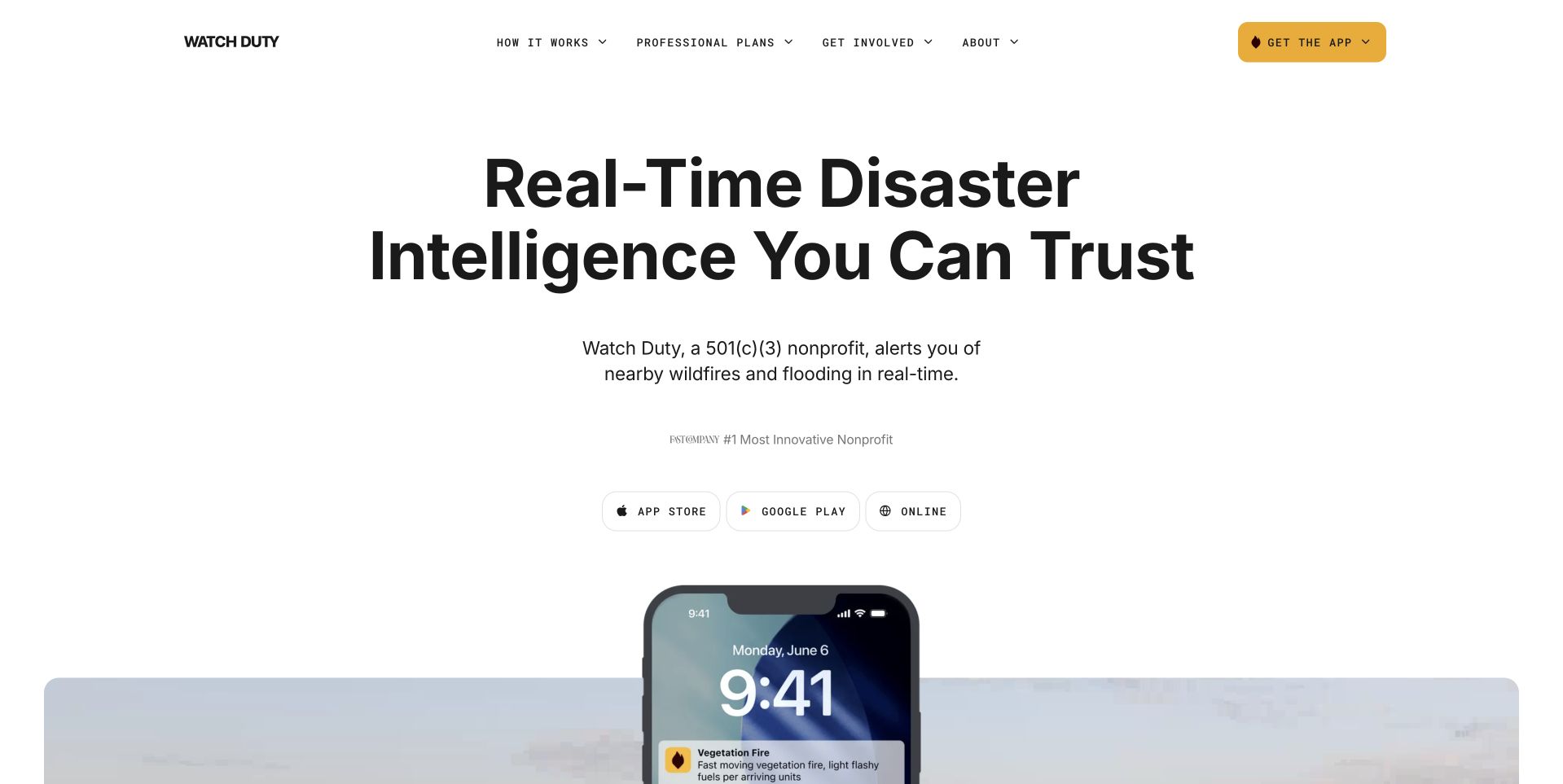
Watch Duty uses a large black headline, a short nonprofit explanation and three clear access routes for iOS, Android and the web. A phone preview begins below the opening, while a yellow header action reinforces the main task. The sparse page lets the service’s purpose dominate. Heroku’s case documents a Python backend, APIs and scaling during the January 2025 Los Angeles fires. Its availability figures are vendor-reported; the evidence does not independently verify current emergency coverage or identify the marketing site’s runtime.
What you can learn
Make access to a time-sensitive service more prominent than the organization’s promotional story. Explain coverage, verification and notification limits near the product. Architect public information and alert delivery for degraded conditions, and rehearse load changes rather than assuming a previous emergency’s performance guarantees the next one.
Pros
Three platform-specific access choices help visitors reach the service without a long explanatory funnel.
The limited color palette keeps the public-safety purpose and main action easy to identify.
Cons & considerations
A broad real-time promise requires clear supporting information about coverage and update limitations.
Large empty areas delay some practical product details for visitors who need immediate operational guidance.
Platform source: Official technology-specific customer or workload source. Heroku documents Watch Duty’s Python backend, APIs and scaling during the January 2025 Los Angeles fires. Availability outcomes remain vendor-reported rather than independent measurements. This evidence establishes only the stated product, workload, organization or historical association. It does not prove that the pictured public page uses the technology, reveal its CMS/frontend, establish a complete current architecture or independently verify vendor-reported outcomes. Platform evidence is separate from the direct website screenshot and is not a complete current infrastructure audit.
PensionBee’s entry page combines a concise retirement message, a person using a phone and small interface-like account fragments. A country selector and yellow visit button make the jurisdiction choice the central task. A review panel below includes a visible qualification about individual experiences. Heroku’s case specifically concerns the UK pension platform, customer-facing application and Salesforce synchronization. It does not establish the architecture of every international offering or turn the captured page’s testimonial presentation into independent investment or service-quality evidence.
What you can learn
Make jurisdiction and product boundaries explicit before presenting a financial onboarding path. Design the simplest route for a new visitor, but preserve obvious login choices for existing customers. Shared infrastructure does not mean account rules, regulatory obligations or available products are interchangeable across countries.
Pros
The country selector makes an important service boundary explicit before users start a more detailed journey.
Small account fragments explain consolidation more concretely than the headline alone.
Cons & considerations
A sparse entry page offers limited detail about fees and transfer eligibility before the next step.
The prominent review score can attract more attention than its important qualifying explanation.
Visible tech stack
Earlier / documented evidence
Heroku
Platform source: Official technology-specific customer or workload source. Heroku’s case specifically concerns PensionBee’s UK pension application and Salesforce synchronization through Heroku Connect, not every international offering. This evidence establishes only the stated product, workload, organization or historical association. It does not prove that the pictured public page uses the technology, reveal its CMS/frontend, establish a complete current architecture or independently verify vendor-reported outcomes. Platform evidence is separate from the direct website screenshot and is not a complete current infrastructure audit.
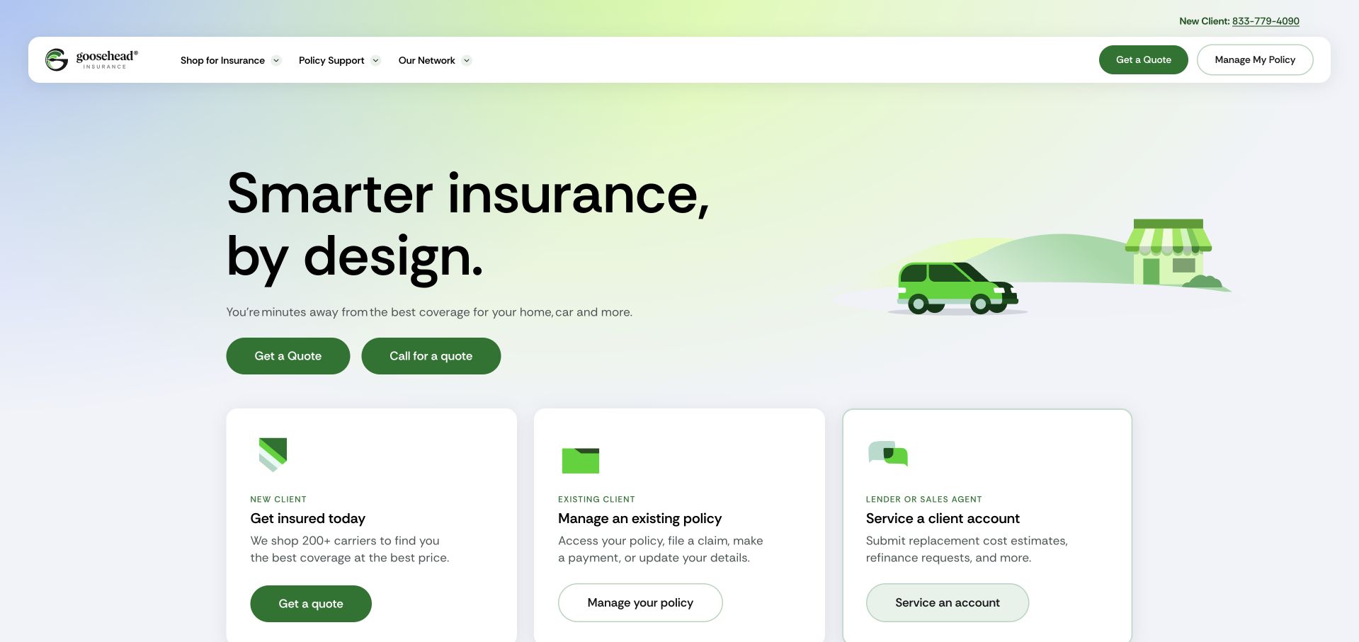
Goosehead uses a light gradient, simple green illustrations and a short insurance headline. Three equal cards divide new-client shopping, existing-policy management and lender or sales-agent support. The rounded white header repeats the two main client actions without disrupting the grid. Heroku’s case identifies the Aviator agent application and Digital Agent Platform, including Private Spaces, Shield and Salesforce-related integrations in the described environment. It does not identify the public homepage’s implementation or independently verify quoted speed and efficiency outcomes.
What you can learn
Organize around the visitor’s relationship to the business, not only the company’s departmental structure. Each card should lead to an appropriately scoped workflow with its own permissions and support route. Confirm current platform and contract availability before assuming a historical regulated-application arrangement can be reproduced unchanged.
Pros
Equal audience cards make three different service tasks understandable within the first screen.
A restrained illustration style keeps the page approachable without hiding the practical choices.
Cons & considerations
Claims about finding the best coverage need more explanation than the compact opening can provide.
Repeated quote and policy actions can compete with the partner-service route for attention.
Platform source: Official technology-specific customer or workload source. Heroku identifies Goosehead Aviator and Digital Agent Platform application work, including Private Spaces, Shield and Salesforce-related integration in the described environment. This evidence establishes only the stated product, workload, organization or historical association. It does not prove that the pictured public page uses the technology, reveal its CMS/frontend, establish a complete current architecture or independently verify vendor-reported outcomes. Platform evidence is separate from the direct website screenshot and is not a complete current infrastructure audit.
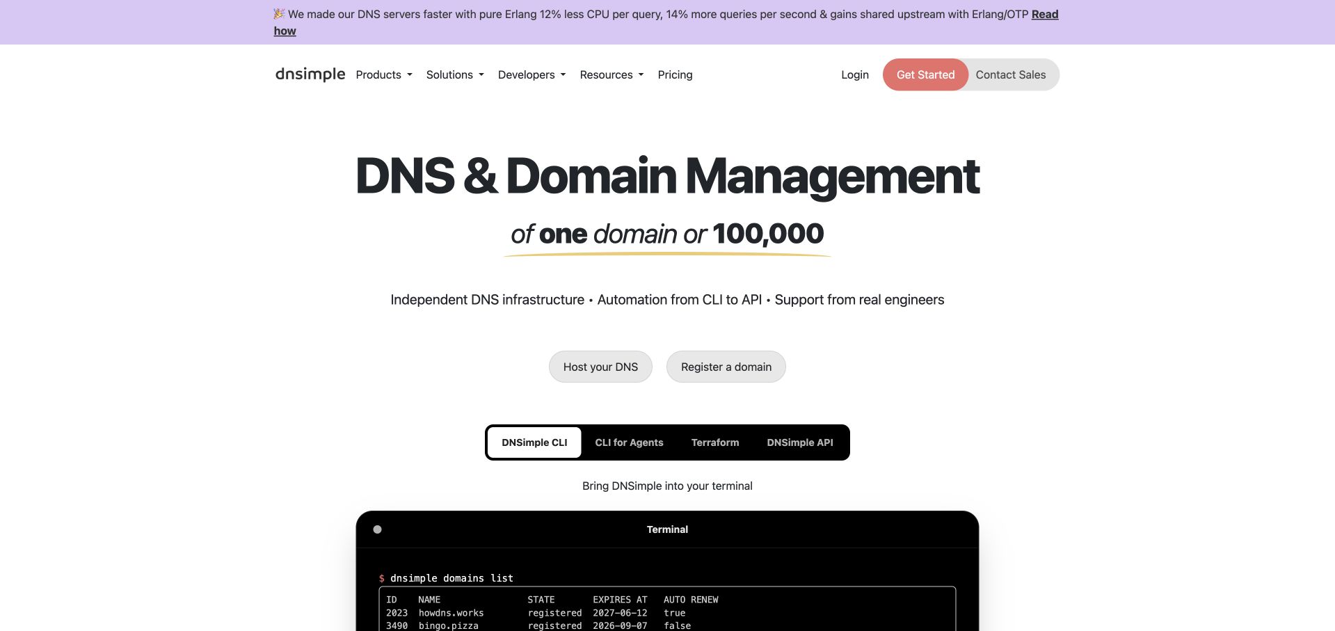
DNSimple centers a domain-management proposition above two restrained product actions and a tabbed technical example. The headline explicitly accommodates one domain or a large estate, while a small announcement strip links to an engineering article. The white layout and dark terminal preview give the page a practical developer tone. Heroku’s case specifically describes supplementary tools and services alongside DNSimple’s own infrastructure. It does not establish that the authoritative DNS service or the public homepage itself runs entirely on Heroku.
What you can learn
Explain the boundary of a developer service before showing implementation examples. Distinguish registration, DNS hosting and automation rather than treating them as one invisible backend. A supporting application can benefit from managed deployment while the critical core service remains on separately operated infrastructure.
Pros
The explicit range from one domain to a large estate welcomes different levels of customer complexity.
Tabbed technical examples give developers a more concrete next step than a generic sales promise.
Cons & considerations
The broad domain-management category still needs detailed explanations of individual service responsibilities.
Small announcement and navigation text can be easy to overlook beside the centered headline.
Platform source: Official technology-specific customer or workload source. Heroku’s DNSimple case specifically describes supplementary tools and services alongside DNSimple’s separately operated core infrastructure. It does not establish that authoritative DNS runs entirely on Heroku. This evidence establishes only the stated product, workload, organization or historical association. It does not prove that the pictured public page uses the technology, reveal its CMS/frontend, establish a complete current architecture or independently verify vendor-reported outcomes. Platform evidence is separate from the direct website screenshot and is not a complete current infrastructure audit.
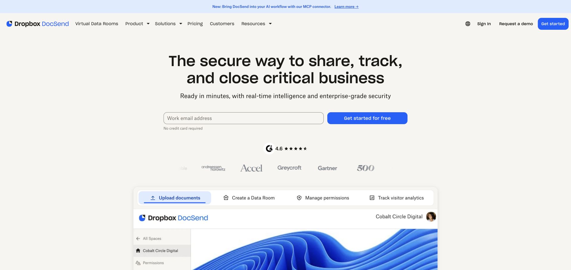
DocSend combines a concise sharing proposition, a work-email field and a large product preview. A pale background, blue action and compact ratings row keep the page visually restrained. Tabs above the preview identify upload, room creation, permissions and analytics as related stages. Heroku’s published case describes a Rails application, Postgres and worker processes for document upload and rendering. It does not establish the current Dropbox DocSend marketing site’s runtime or independently validate the security of any particular document-sharing configuration.
What you can learn
Explain the sequence from preparing a document to controlling access and understanding engagement. Keep security promises tied to specific settings and permissions, not simply the chosen hosting platform. Rendering jobs, access checks and analytics can have different resource requirements and should fail without exposing private documents.
Pros
The workflow tabs make several stages of document sharing visible within one coherent product preview.
A small starting form creates a clear entry point without dominating the explanation.
Cons & considerations
Security language needs detailed supporting documentation before a customer can evaluate suitability for sensitive files.
Small preview details and ratings provide limited context without further exploration of the actual workflow.
Platform source: Official technology-specific customer or workload source. Heroku’s published DocSend case describes a Rails application, Postgres and worker processes for document upload and rendering, not a complete current Dropbox DocSend architecture. This evidence establishes only the stated product, workload, organization or historical association. It does not prove that the pictured public page uses the technology, reveal its CMS/frontend, establish a complete current architecture or independently verify vendor-reported outcomes. Platform evidence is separate from the direct website screenshot and is not a complete current infrastructure audit.
Kegan has 15+ years of experience working with small businesses, Fortune 500 companies, and everything in between. No development job is too big or too small: he brings the same hands-on attention to a focused improvement, a complete website, or a custom application.
For Heroku projects, he can help with content architecture, custom functionality, system integrations, testing, and maintainable handover. He works directly with clients on scope, design, implementation, testing, and handover, with an emphasis on clear communication and a system that remains practical to maintain after launch.
Show 3 other Heroku developersHide other Heroku developers
Begin with one complete task and a maintained application framework. Specify the process that serves requests, the data service it uses and any worker responsible for longer jobs. Keep a separate public content site when that better serves editors. Shared branding does not require the marketing site and private application to be deployed as one service.
A Salesforce-connected service
Define which records belong in Salesforce, which belong in the application and what the integration may change. Synchronization should have a documented direction, conflict rule and recovery path. Salesforce BaseCamp’s case explicitly separates its Experience Cloud frontend from Heroku’s integration role; that is a more useful precedent than assuming Heroku replaces the entire Salesforce interface.
An existing application modernization
Inventory the current runtime, buildpacks, data services, add-ons and external dependencies. Compare current documentation with historical customer-story products before designing a migration. Test a representative release and database change, then set a rollback decision and reconciliation process. Avoid combining a visual redesign with an untested platform move under one vague acceptance criterion.
From references to requirements
Plan around the whole application lifecycle
Specify the operating envelope
Record ordinary and peak request patterns, background-job volume, connection needs and recovery expectations. Identify which tasks can queue and which require an immediate response. Use realistic files, records and integrations in testing. A famous customer’s account of a traffic spike is not a capacity guarantee for a different application.
Review data and integration ownership
Assign owners for the primary database, queues, uploads and external systems. Decide what survives a process restart, where long-lived files belong and how failed jobs are retried without duplicate effects. Keep credentials protected and scoped. The platform can operate infrastructure while your team remains responsible for authorization, application logic and the correctness of business changes.
Make launch and support expectations explicit
Confirm available plans and support terms directly before promising response times, geographic handling or a regulated deployment. Prepare release checks, operational alerts and an escalation path. Test unsuccessful states in the actual interface, including interrupted uploads and delayed jobs. A platform’s continuing development updates do not remove the need for a clear owner of the customer’s service.
Ask the actual team to carry out its routine job: publish a realistic update, correct a mistake, preview a narrow screen, and identify who owns an integration failure. For a library or frontend framework, also ask who maintains the content source and deployment. A polished screenshot does not answer those operational questions.
Beyond the screenshot
A Heroku application planning checklist
Identify web, worker and scheduled processes.
Document the actual build and runtime requirements.
Separate source code from environment configuration.
Assign authoritative data and integration owners.
Design safe retries and duplicate prevention.
Keep persistent files and records independent of process lifetime.
Test database connection and queue limits.
Rehearse code rollback and data recovery separately.
Inventory and review third-party add-ons.
Confirm current product and account eligibility.
Agree support, monitoring and escalation responsibilities.
Validate complete customer tasks before launch.
Test with real content, a keyboard, a small screen, slow or failed requests, and the people who will maintain the system. These are planning checks, not an accessibility, security, performance, or search-ranking certification.
Sources & editorial method
How this Heroku collection was reviewed
Public designs and actual captured images were independently inspected. Official Heroku cases support their specific applications and periods, not a complete current stack. Current platform context was checked against February, March and October 2026 announcements and the architecture guide. Vendor performance claims were not independently reproduced.
Every image is an unmodified capture from the actual website, with its source and capture date. Some captures are reused from our shared catalog; their dates remain the original capture dates. None comes from a vendor gallery or a generated reconstruction. Moving imagery and live content can change.
Technology attribution uses public page assets or metadata, official platform documentation, or a cited first-party project case study. Documentary and framework-relationship evidence is identified where used; it is not a complete current backend inventory. A CMS image CDN alone does not establish a full CMS deployment. A library’s presence does not prove which individual controls use it, and a platform label does not establish AI authorship.
The composition notes, lessons, pros and tradeoffs are original editorial observations. We have not measured conversion, traffic, security, performance or accessibility conformance. Website owners retain their brands and imagery; these examples are not our client portfolio. Written, Edited and Curated are independent records, not dates advanced by a build. See our editorial standards or suggest a correction.
Questions worth asking
Heroku website development FAQs
Is Heroku shutting down?
The official February 2026 announcement did not announce a shutdown. It described continuing support and specific contract changes; later March and October updates documented platform enhancements. Verify current terms for the service you need.
Can a new project assume the enterprise setup in an older case?
No. The February announcement restricted new Enterprise Account contracts. Confirm your actual eligibility, available products and support arrangement before treating a historical case as a purchasable configuration.
Does a customer story prove the homepage runs on Heroku?
No. Many cases describe internal applications, event services or a specific product backend. The pictured corporate or marketing property may be separate.
Does managed hosting eliminate operational work?
No. Your team still owns application behavior, access rules, data definitions, integration correctness and a response process for failed customer tasks.
What should a first prototype include?
One complete workflow with a real deployment path, the necessary data and worker behavior, and understandable states for failure or delay. This reveals more than disconnected successful screens.
Choose the platform around an explicit application and operating agreement, then make the customer journey as understandable as the deployment process.