Best Slack Websites of 2026 (20 Real-World Examples)
Public design inspiration and precisely scoped examples of Slack collaboration, workflows and integrations.
Study twenty organizations with official Slack adoption stories, then plan a collaboration experience around clear channels, useful context and accountable actions. Their public websites are design references, not proof that Slack powers the frontend.
Slack development is not the same project as building a marketing website. It can involve a purposeful channel structure, a workflow that routes a request, or a custom application that brings an approved action closer to the people doing the work. The organizations here illustrate those operational relationships while their public pages supply separate visual and communication lessons.
The first useful question is not which bot to build. It is where people lose context, repeat information or wait for somebody who is not included in the conversation. A well-designed integration might remove one unnecessary handoff. A poorly designed one can create another noisy stream that nobody trusts. Start with the task, its owner and the record that remains authoritative after the conversation ends.
Before the examples
What makes good Slack website development in 2026?
Organize around durable purposes
A project, incident, account or recurring request should have a recognizable home. Give channels plain names, descriptions and ownership, and explain what belongs elsewhere. Avoid creating overlapping destinations that require insider knowledge. A public channel can improve discoverability, but confidentiality and the actual audience still determine what information should be shared.
An approval button is only helpful when the reviewer can see what is changing, where the information came from and what the consequences are. Link back to the authoritative record and verify permissions at the moment of action. Do not assume membership in a conversation is enough authorization to change a financial, customer or employee record.
A useful notification has a recipient, a reason and an expected response. Group routine updates, reserve urgent alerts for genuinely actionable events and provide a way to investigate without flooding the channel. When a workflow fails, tell the responsible person what happened instead of generating repeated indistinguishable warnings that everyone learns to ignore.
These are actual public pages paired with official Slack cases. Historical adoption dates, regional business units and departmental scope remain attached. A marketing site can offer a strong design lesson even when the documented Slack use is entirely internal.
We start with five recognizable brands or organizations: IBM, Target, Spotify, Salesforce, OpenAI. Each attribution applies to the named website property, not every product or website belonging to its organization. This is a curated reading sequence, not a measured ranking.
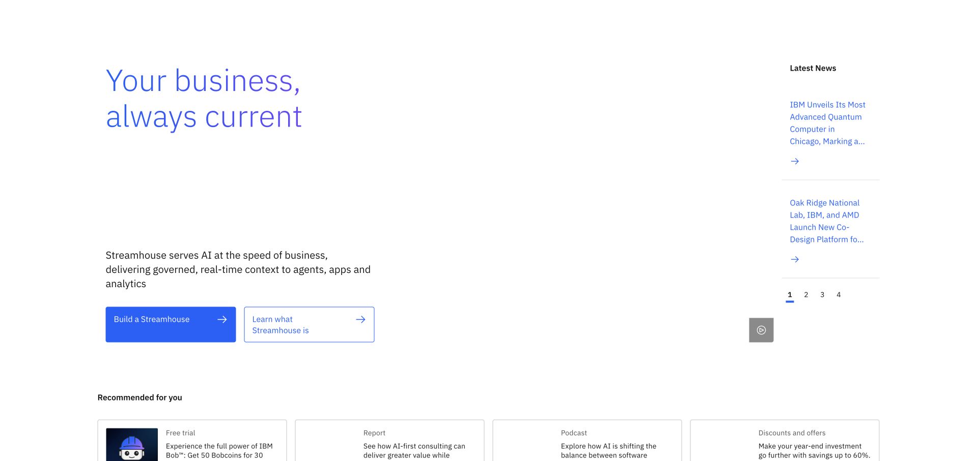
IBM’s homepage uses a spacious white composition with a business headline, supporting explanation and paired actions at the left. A narrow news column occupies the opposite side, while recommendation cards begin below. The design gives a broad technology business several ways to speak without making all its messages equally prominent. Slack documents IBM employee collaboration, workflows and sales coordination, including Salesforce-related integrations. Customer and consulting-partner relationships are distinct from IBM website hosting.
What you can learn
A collaboration hub benefits from the same hierarchy: distinguish the channel’s purpose, current action and optional background material. Avoid turning every notification into a headline. Public presentation and internal collaboration are separate layers, so the photographed homepage should not be treated as evidence of a messaging implementation.
Pros
The news column creates an alternate reading route while preserving a clear primary message.
Consistent blue actions and restrained typography keep the enterprise introduction visually controlled.
Cons & considerations
Large areas of white space may appear underexplained if visitors overlook supporting content.
A broad business proposition requires specific technical detail on its destination pages.
Platform source: Official product-specific customer case or dated announcement. Slack documents IBM employee collaboration, workflows and sales coordination, including Salesforce-related integrations. Customer and consulting-partner relationships are distinct from IBM website hosting. This establishes only the stated organization, workload, product family, regional or historical association. It does not prove the pictured public page runtime, reveal its CMS or frontend, establish a complete current stack, or independently verify vendor-reported results. Platform evidence is separate from the direct website screenshot and is not a complete current infrastructure audit.
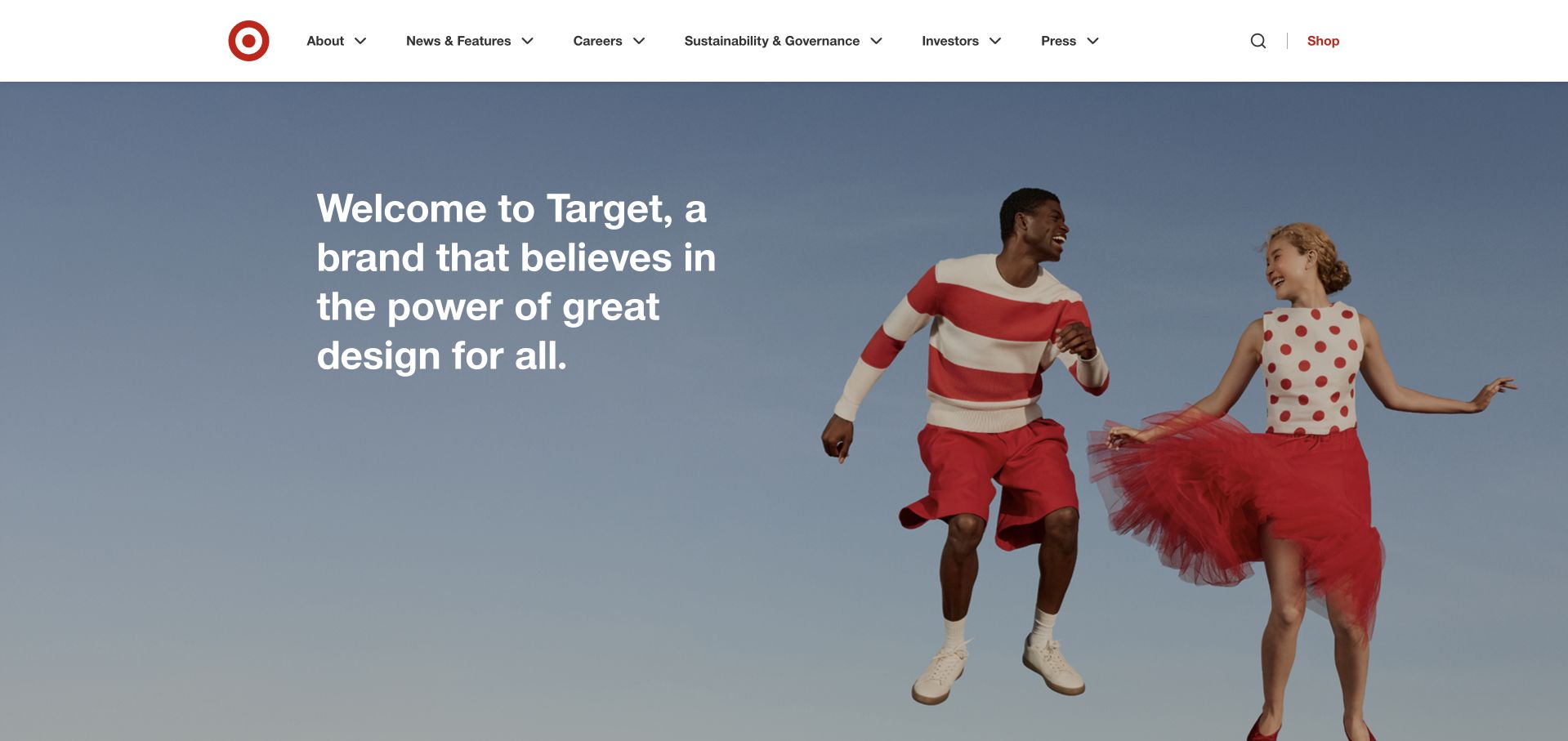
Target’s corporate page uses a simple welcome statement and a photograph of two people in playful red-and-white clothing. A light blue background softens the image, while a restrained company header preserves practical routes. The page establishes a recognizable brand personality without borrowing the density of the consumer shopping catalog. The Target case describes late-2017 Enterprise Grid adoption for engineers and subsequent expansion into other business teams, in a story referring to 2018 retail results.
What you can learn
Make the intended audience clear before presenting tools or content. A corporate reader needs different routes from a shopper, just as a project channel needs a different purpose from an incident channel. Keep historic adoption context attached to the associated collaboration case rather than implying a newly audited deployment.
Pros
Human photography expresses the brand’s design personality without requiring a product promotion.
A compact corporate header gives the welcome feature enough space to feel intentional.
Cons & considerations
The purpose-led opening needs deeper stories to answer specific operational or investor questions.
Photographic overlays need responsive contrast checks rather than relying only on a desktop composition.
Platform source: Official product-specific customer case or dated announcement. The Target case describes late-2017 Enterprise Grid adoption for engineers and subsequent expansion into other business teams, in a story referring to 2018 retail results. This establishes only the stated organization, workload, product family, regional or historical association. It does not prove the pictured public page runtime, reveal its CMS or frontend, establish a complete current stack, or independently verify vendor-reported results. Platform evidence is separate from the direct website screenshot and is not a complete current infrastructure audit.
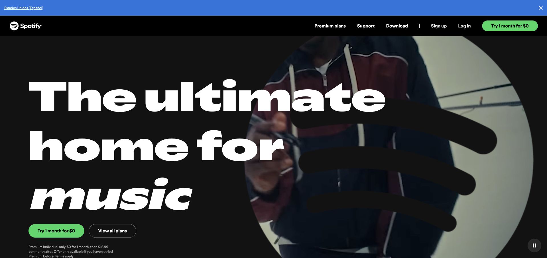
Spotify’s Premium page pairs enormous white lettering with a musician photograph against a dark field. Green trial and plan actions are easy to distinguish, while a compact black header keeps support, download and account routes accessible. The composition is unmistakably consumer-facing, even though the documented Slack association concerns an internal advertising team. The case is specifically Spotify Advertising sales, campaign and account-management collaboration integrated with Salesforce, not music playback delivery.
What you can learn
Match the page to one audience and one decision, then offer a secondary route for comparison. A collaboration workflow can do the same by putting account context beside the relevant conversation. Do not generalize a sales-team case into claims about the service’s playback, subscription billing or public frontend.
Pros
The large headline and familiar green actions create an immediately recognizable subscription proposition.
A plan-comparison route accommodates visitors who are not ready to begin a trial.
Cons & considerations
Trial terms and regional eligibility need readable explanations beyond the main promotional headline.
A large photographic hero can delay substantive plan differences on smaller screens.
Platform source: Official product-specific customer case or dated announcement. The case is specifically Spotify Advertising sales, campaign and account-management collaboration integrated with Salesforce, not music playback delivery. This establishes only the stated organization, workload, product family, regional or historical association. It does not prove the pictured public page runtime, reveal its CMS or frontend, establish a complete current stack, or independently verify vendor-reported results. Platform evidence is separate from the direct website screenshot and is not a complete current infrastructure audit.
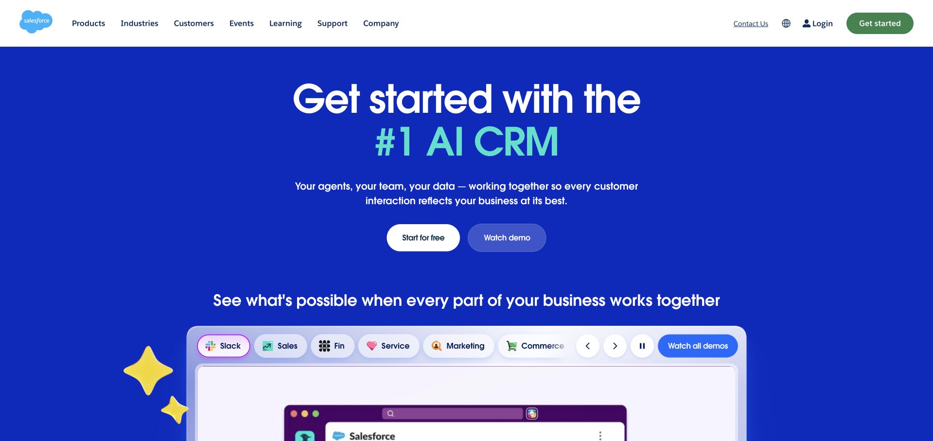
Salesforce’s blue opening places its main AI CRM message above a pair of actions and a rounded demonstration area. Category chips introduce different parts of the suite, including Slack, without replacing the core proposition. The visual system uses brighter characters and accents to give a substantial enterprise platform a more approachable tone. Salesforce describes using its own Salesforce channels in Slack for sales and customer-success work tied to CRM records.
What you can learn
Connect a broad platform story to specific tasks and records. In a collaboration app, a live account context is more useful than a stream of disconnected updates. Keep product demonstrations distinguishable from editorial proof and explain how permissions and record access carry through any integrated action.
Pros
Product-category chips expose the breadth of the suite without a dense introductory table.
Trial and demo actions support different stages of enterprise evaluation.
Cons & considerations
A broad AI proposition needs concrete examples before buyers can assess the actual scope.
Several colorful interface and decorative elements can compete for attention around the main demonstration.
Platform source: Official product-specific customer case or dated announcement. Salesforce describes using its own Salesforce channels in Slack for sales and customer-success work tied to CRM records. This establishes only the stated organization, workload, product family, regional or historical association. It does not prove the pictured public page runtime, reveal its CMS or frontend, establish a complete current stack, or independently verify vendor-reported results. Platform evidence is separate from the direct website screenshot and is not a complete current infrastructure audit.
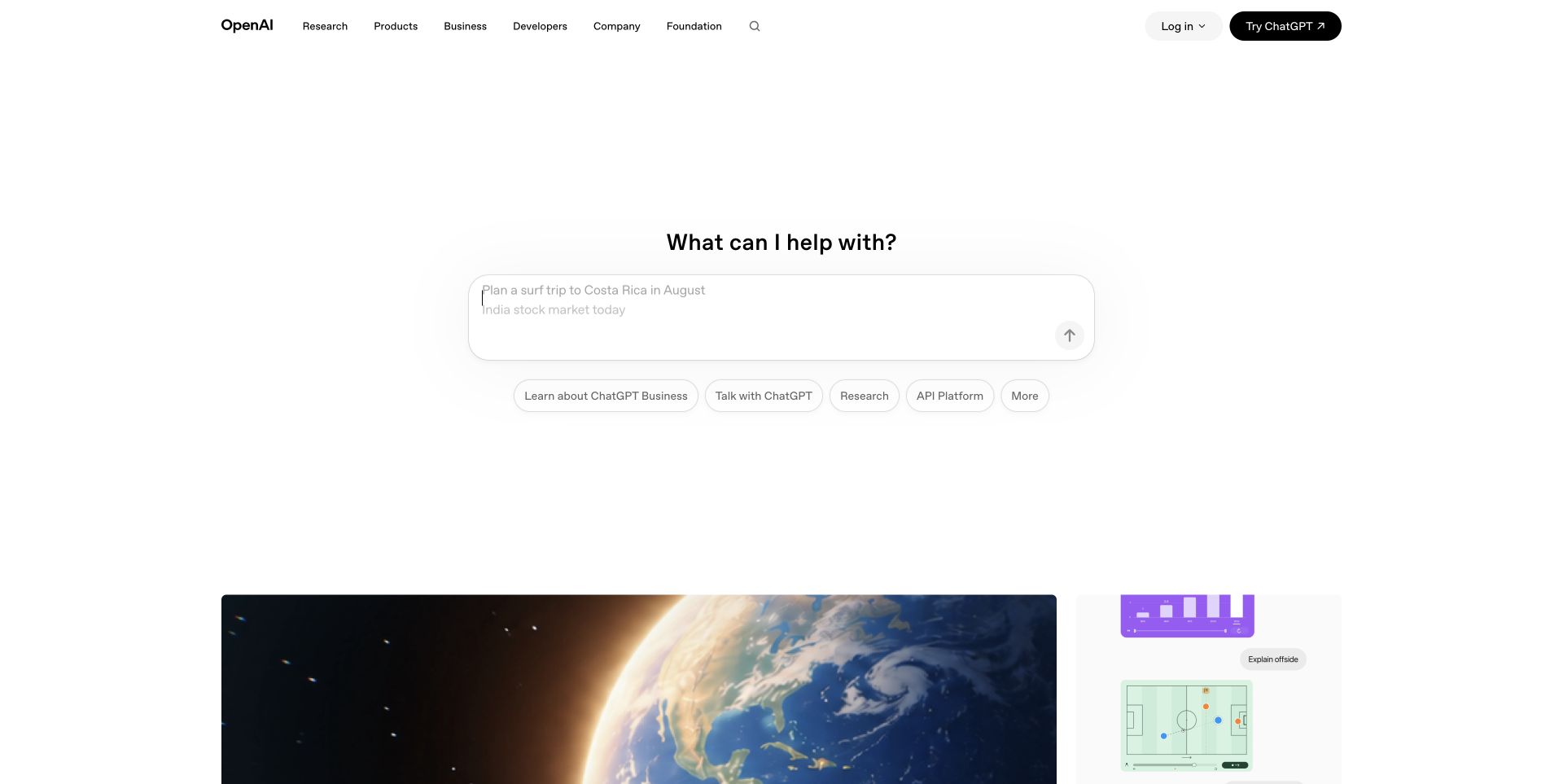
OpenAI’s public homepage centers a prompt-like entry area, with small links for business, research and development beneath it. Large margins and a compact header keep the opening calm, while editorial cards begin lower down. The visible prompt is empty; the capture does not include a personal conversation, account data or submitted content. Slack documents OpenAI internal collaboration and customer-facing Slack Connect, with a customer relationship dating from 2018. Proposed additional Salesforce integrations remain proposed.
What you can learn
Offer an obvious starting point, then expose specialist routes only when they become relevant. A customer channel can similarly reduce friction by keeping context and the right collaborators together. Preserve the distinction between customer communication tools and the AI systems being discussed or marketed on the public page.
Pros
A single central interaction makes the opening easy to understand without a long feature list.
Audience-specific links allow business and technical visitors to bypass the general introduction.
Cons & considerations
A sparse first screen may not provide enough immediate detail for a complex enterprise purchase.
A prompt interface needs clear behavior and information-handling boundaries, not just a clean appearance.
Platform source: Official product-specific customer case or dated announcement. Slack documents OpenAI internal collaboration and customer-facing Slack Connect, with a customer relationship dating from 2018. Proposed additional Salesforce integrations remain proposed. This establishes only the stated organization, workload, product family, regional or historical association. It does not prove the pictured public page runtime, reveal its CMS or frontend, establish a complete current stack, or independently verify vendor-reported results. Platform evidence is separate from the direct website screenshot and is not a complete current infrastructure audit.
Rivian’s homepage places an SUV on a sunlit road, with an award-themed headline and two small actions on the left. The white rounded header floats over the image, while carousel indicators and navigation arrows remain visible. The physical setting does much of the storytelling before any detailed vehicle specification appears. Rivian’s digital workplace case covers employee onboarding, factory and office collaboration, app integrations and manufacturing incident notifications.
What you can learn
Show the product in a context that helps visitors imagine its purpose, then provide a route to verify details. For employee collaboration, the equivalent is organizing around a real operational task rather than an abstract channel list. A factory-workflow case does not identify the vehicle configurator or public site stack.
Pros
The landscape photograph gives the vehicle a concrete setting rather than isolating it on a blank canvas.
Separate design and reservation actions acknowledge different levels of purchase readiness.
Cons & considerations
Awards and campaign claims need clear source context and detailed supporting information.
The floating header and rotating imagery require careful contrast and accessible motion controls.
Platform source: Official product-specific customer case or dated announcement. Rivian’s digital workplace case covers employee onboarding, factory and office collaboration, app integrations and manufacturing incident notifications. This establishes only the stated organization, workload, product family, regional or historical association. It does not prove the pictured public page runtime, reveal its CMS or frontend, establish a complete current stack, or independently verify vendor-reported results. Platform evidence is separate from the direct website screenshot and is not a complete current infrastructure audit.
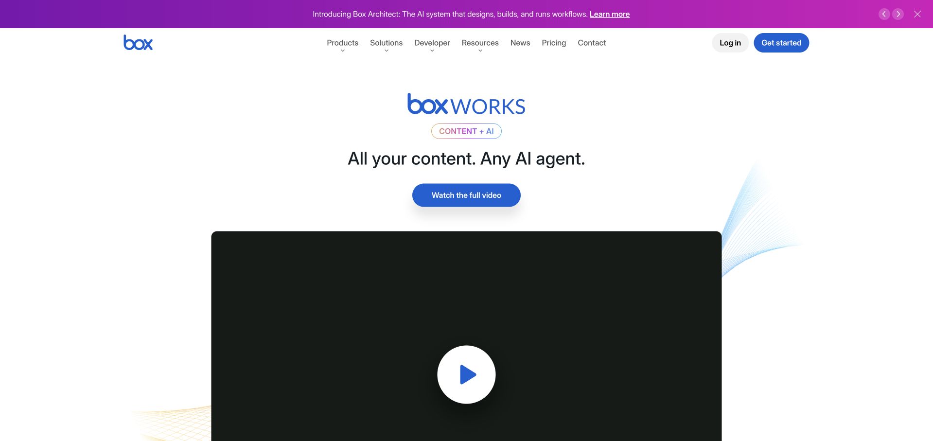
Box’s page gives an event-related proposition a centered white layout, with a substantial video preview below the main action. A purple announcement strip introduces a separate product update above the header. The restrained content area contrasts with the more colorful top strip, creating an obvious main story and a secondary news layer. The Box case recounts sales collaboration, executive AMAs and Slack Connect from a Slack Frontiers presentation by its former CRO; it is not a current workforce census.
What you can learn
A company can promote one timely event while preserving durable product and support navigation. Apply that discipline to internal channels: distinguish announcements, recurring questions and sales collaboration instead of putting every conversation in one stream. Historical team stories should remain dated examples, not current staffing claims.
Pros
The centered event proposition and video preview create a clear entry into the featured content.
Persistent product and resource navigation keeps the broader software offer within reach.
Cons & considerations
Multiple simultaneous announcements can make the site’s current priority less obvious.
A large video region needs a useful fallback and a concise written explanation for non-viewers.
Platform source: Official product-specific customer case or dated announcement. The Box case recounts sales collaboration, executive AMAs and Slack Connect from a Slack Frontiers presentation by its former CRO; it is not a current workforce census. This establishes only the stated organization, workload, product family, regional or historical association. It does not prove the pictured public page runtime, reveal its CMS or frontend, establish a complete current stack, or independently verify vendor-reported results. Platform evidence is separate from the direct website screenshot and is not a complete current infrastructure audit.
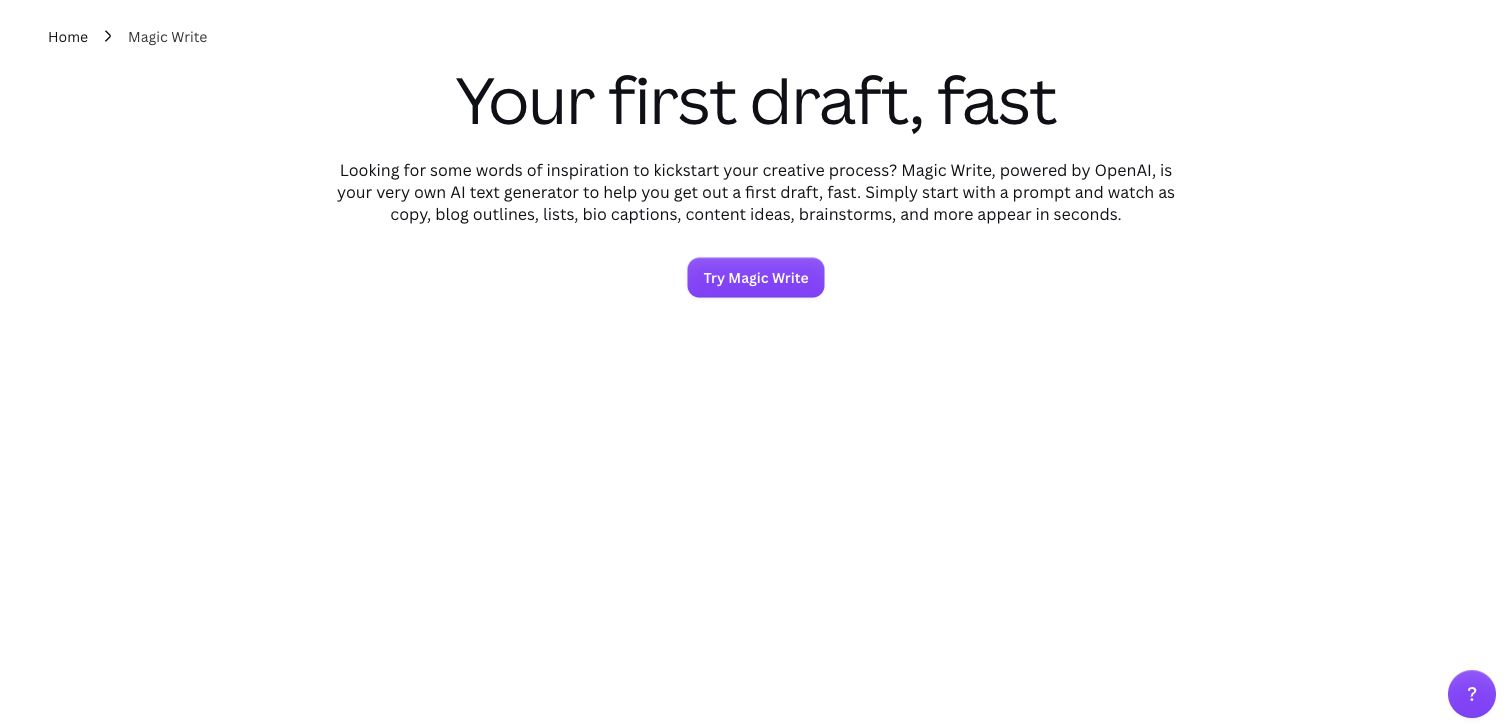
Canva’s Magic Write page uses a small breadcrumb, a large draft-writing headline and a compact explanatory paragraph above a purple trial action. White space dominates the captured view, leaving the specific feature as the main subject. The page is useful for studying a focused product introduction rather than a general company homepage. The Canva case describes collaboration since 2016, with employee and workflow figures framed around 2021; the Magic Write public page is a separate design reference.
What you can learn
A specialist feature page should explain what changes for the user before expanding into the larger platform. Keep a collaboration case separate from the feature’s implementation: a team can use Slack to coordinate its work without that messaging platform powering the product, public page or underlying generation model.
Pros
A feature-specific headline and short paragraph make the purpose easier to understand than a broad suite overview.
A breadcrumb gives the focused page a visible relationship to the wider site.
Cons & considerations
The sparse opening could benefit from a concrete output example or workflow demonstration.
A generation feature needs clear limits and review guidance beyond a prominent trial button.
Platform source: Official product-specific customer case or dated announcement. The Canva case describes collaboration since 2016, with employee and workflow figures framed around 2021; the Magic Write public page is a separate design reference. This establishes only the stated organization, workload, product family, regional or historical association. It does not prove the pictured public page runtime, reveal its CMS or frontend, establish a complete current stack, or independently verify vendor-reported results. Platform evidence is separate from the direct website screenshot and is not a complete current infrastructure audit.
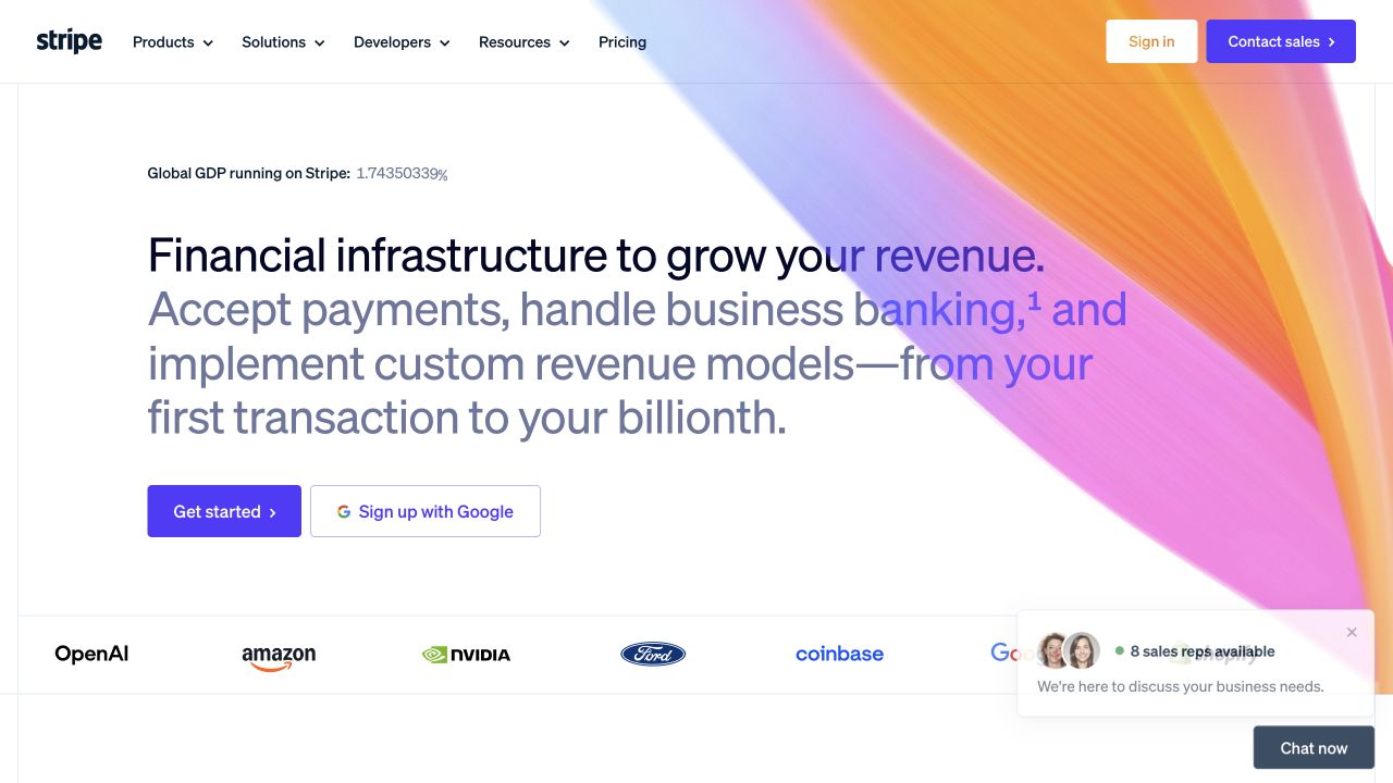
Stripe’s homepage blends a large financial-infrastructure statement with a colorful diagonal graphic. Trial and sales actions sit above a row of recognizable customer logos, creating a clear move from proposition to social proof. The layout is more expressive than a conventional financial-services page while retaining familiar product and developer navigation. Stripe’s corporate engineering case describes onboarding, standardized requests and internal business-system integrations in Slack.
What you can learn
A technical platform can be visually distinctive and still provide clear routes for evaluation. For an internal automation, pair the action with enough record context to make the next step understandable. A collaboration case about corporate engineering is not evidence of payment processing or customer-account architecture.
Pros
The gradient graphic creates a recognizable identity without replacing the product explanation.
Distinct entry and sales routes serve both self-directed developers and larger procurement teams.
Cons & considerations
A broad infrastructure proposition needs more specific product boundaries on deeper pages.
Additional chat and promotional elements can compete with the main navigation and action hierarchy.
Platform source: Official product-specific customer case or dated announcement. Stripe’s corporate engineering case describes onboarding, standardized requests and internal business-system integrations in Slack. This establishes only the stated organization, workload, product family, regional or historical association. It does not prove the pictured public page runtime, reveal its CMS or frontend, establish a complete current stack, or independently verify vendor-reported results. Platform evidence is separate from the direct website screenshot and is not a complete current infrastructure audit.
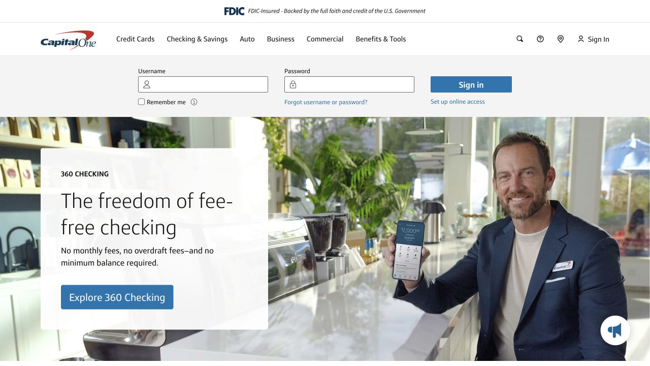
Capital One places a compact account-access area above a promotional banking feature. A white information panel overlays a photograph of a person holding a phone, with a blue action leading into the featured offer. The public capture contains blank credential fields only; no account was opened or accessed. Capital One uses Slack for internal cross-functional channels and automation; the vendor case references its 2022 innovation award, not a bank account interface implementation.
What you can learn
Returning customers and new visitors need different paths, and those boundaries should remain obvious. Borrow the separation of account access from promotional explanation rather than copying financial claims. Internal employee collaboration tools are not evidence of the technology securing customer accounts or making banking decisions.
Pros
The page acknowledges account access without forcing every visitor into the same acquisition journey.
A solid text panel maintains legibility over a detailed lifestyle photograph.
Platform source: Official product-specific customer case or dated announcement. Capital One uses Slack for internal cross-functional channels and automation; the vendor case references its 2022 innovation award, not a bank account interface implementation. This establishes only the stated organization, workload, product family, regional or historical association. It does not prove the pictured public page runtime, reveal its CMS or frontend, establish a complete current stack, or independently verify vendor-reported results. Platform evidence is separate from the direct website screenshot and is not a complete current infrastructure audit.
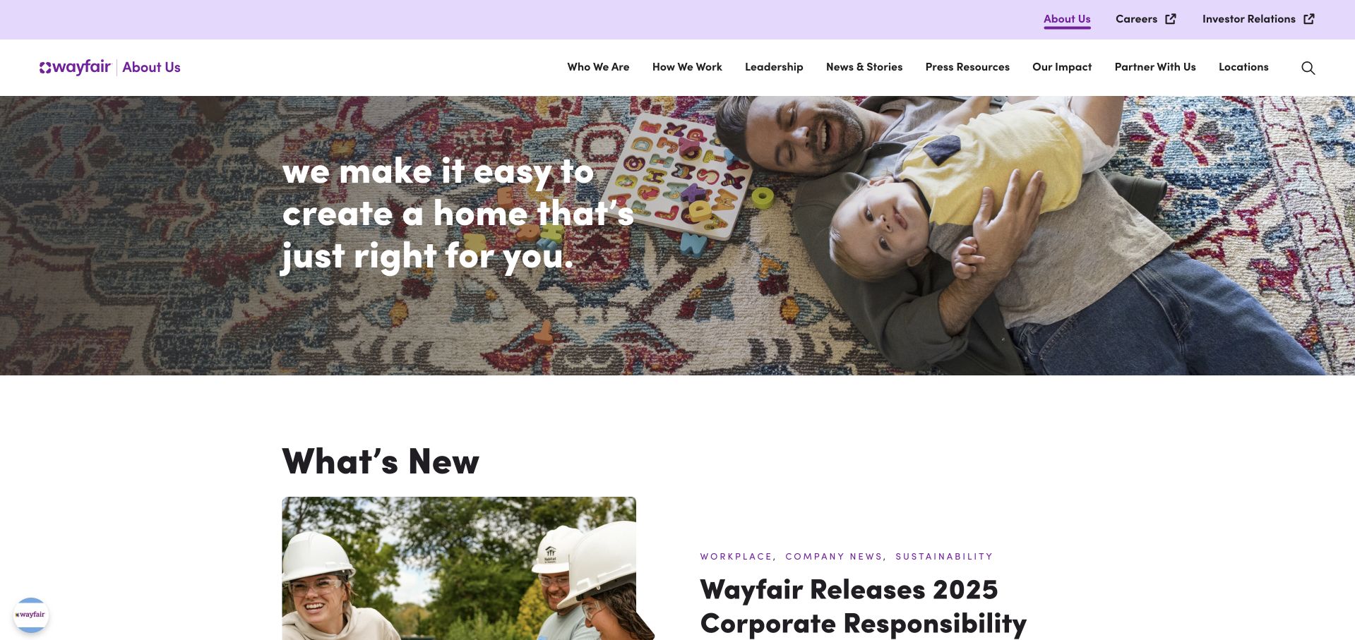
Wayfair’s company page pairs a family-at-home photograph with a short statement about creating a suitable home. A pale purple utility strip and a compact corporate menu distinguish the property from its retail catalog. The next section highlights company news, moving from brand purpose into current organizational information. Wayfair’s sales and operations case describes channels, account collaboration and Slack Connect bridging teams with different CRM access.
What you can learn
Use a relatable setting to explain a large organization, then support it with concrete stories. Behind the scenes, define how design, logistics and account teams exchange context rather than adding another disconnected message stream. An internal sales collaboration case does not establish storefront rendering or fulfillment-system architecture.
Pros
The domestic photograph gives the company mission a recognizable and relevant human setting.
A clearly labeled news section supplies a natural next step after the purpose-led introduction.
Cons & considerations
A general brand promise does not immediately answer practical supplier or investor questions.
The separate corporate and shopping properties need clear links so visitors do not become disoriented.
Platform source: Official product-specific customer case or dated announcement. Wayfair’s sales and operations case describes channels, account collaboration and Slack Connect bridging teams with different CRM access. This establishes only the stated organization, workload, product family, regional or historical association. It does not prove the pictured public page runtime, reveal its CMS or frontend, establish a complete current stack, or independently verify vendor-reported results. Platform evidence is separate from the direct website screenshot and is not a complete current infrastructure audit.
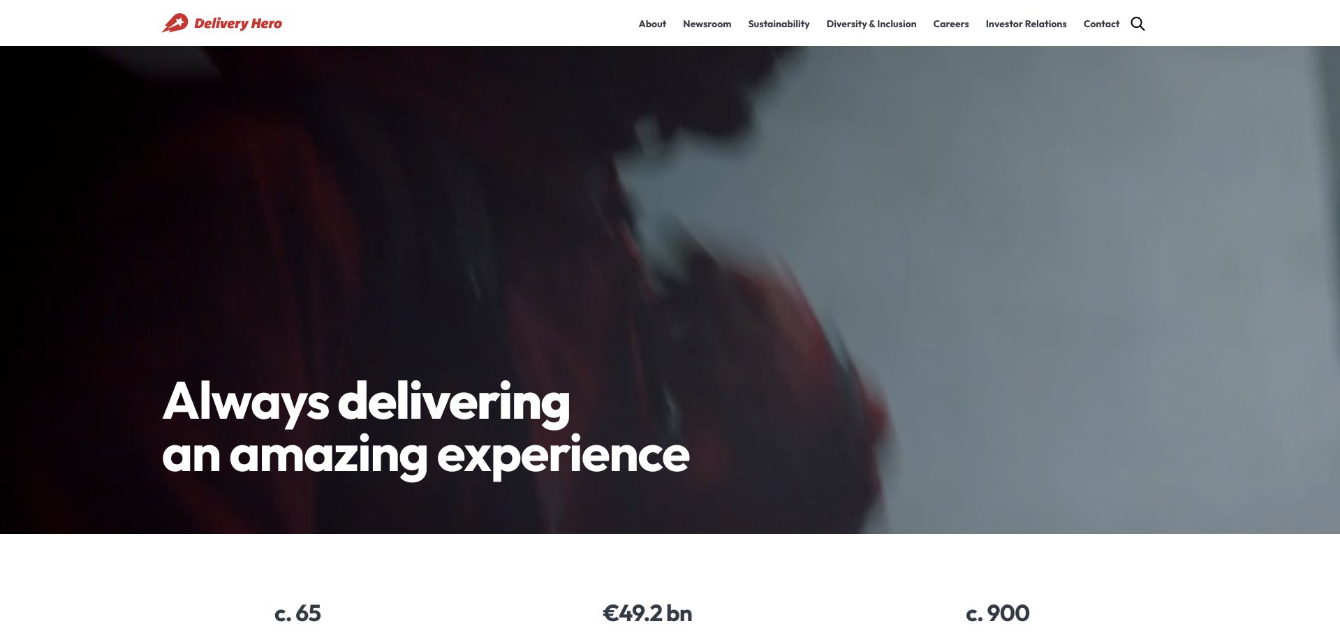
Delivery Hero’s public site uses a short white headline over a dark moving-image feature, with a familiar corporate menu above. A row of scale-related figures begins below the hero, providing a transition into the organization’s wider story. The opening emphasizes experience and reach rather than a local food-ordering interface. Delivery Hero describes Enterprise Grid collaboration, developer notifications and internal integrations, with Slack entering through the 2016 Foodpanda acquisition.
What you can learn
A parent organization should explain its role without being mistaken for a particular consumer brand or country service. Collaboration workflows need similarly explicit boundaries between company-wide announcements, product teams and local operations. Preserve acquisition and adoption context instead of implying every historical group structure is current.
Pros
The darkened image field keeps the short positioning statement prominent.
A stable corporate header offers useful routes beyond the motion-heavy opening feature.
Cons & considerations
A broad experience claim requires specific business and market explanations further down.
Large video content can impose loading and accessibility costs without strong fallback behavior.
Visible tech stack
Earlier / documented evidence
Slack
Platform source: Official product-specific customer case or dated announcement. Delivery Hero describes Enterprise Grid collaboration, developer notifications and internal integrations, with Slack entering through the 2016 Foodpanda acquisition. This establishes only the stated organization, workload, product family, regional or historical association. It does not prove the pictured public page runtime, reveal its CMS or frontend, establish a complete current stack, or independently verify vendor-reported results. Platform evidence is separate from the direct website screenshot and is not a complete current infrastructure audit.
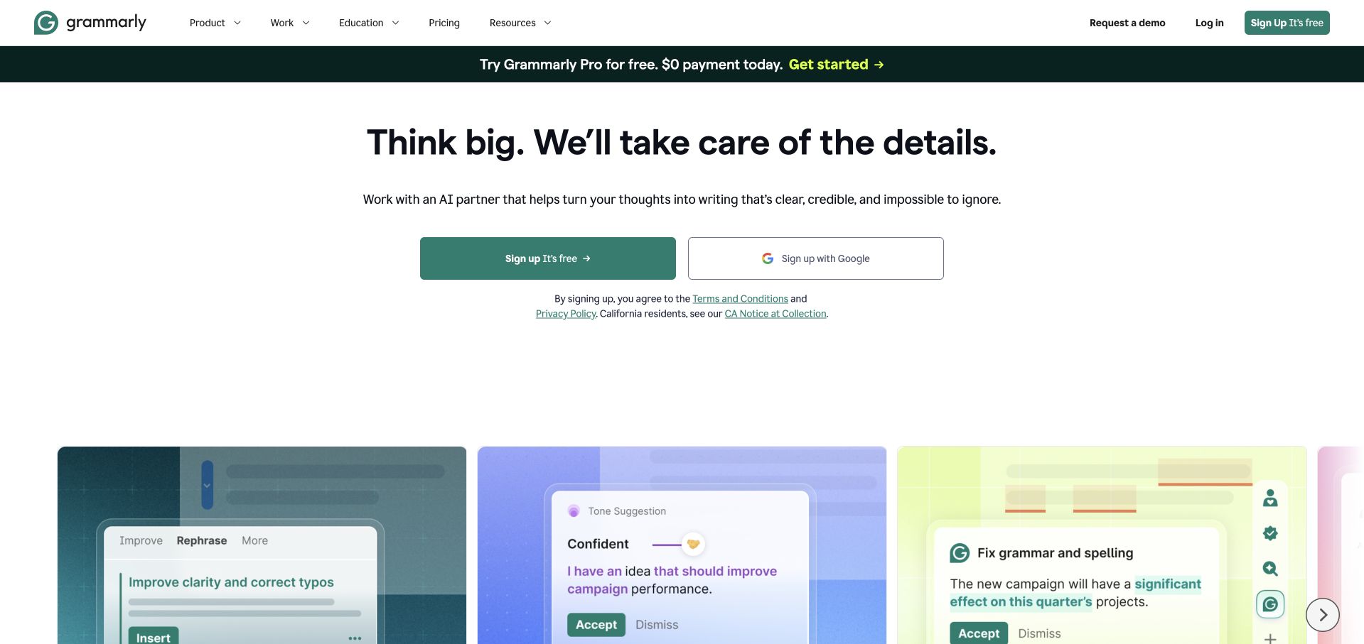
Grammarly combines a centered writing-assistance proposition with two signup choices and a row of colorful interface examples. The cards show tasks such as clarity, grammar and tone, turning an abstract promise into recognizable actions. A green promotional strip and restrained header keep the product identity consistent across the opening. Grammarly marketing operations describes project communication, lead handoffs and discussions of analytics in Slack, not its writing model runtime.
What you can learn
Use a small set of concrete examples to make an assistant’s role understandable, then explain its limits and review process. For workplace integration, share the relevant lead or chart context rather than merely forwarding alerts. A marketing-team collaboration case does not document the model or editor runtime.
Pros
The interface cards make several writing tasks visible without a long explanatory paragraph.
Alternative signup routes and a separate demo link support different visitor intentions.
Cons & considerations
Promotional messaging can compete with the underlying product benefit when several offers appear together.
Small embedded interface text needs an accessible explanation outside the decorative screenshots.
Platform source: Official product-specific customer case or dated announcement. Grammarly marketing operations describes project communication, lead handoffs and discussions of analytics in Slack, not its writing model runtime. This establishes only the stated organization, workload, product family, regional or historical association. It does not prove the pictured public page runtime, reveal its CMS or frontend, establish a complete current stack, or independently verify vendor-reported results. Platform evidence is separate from the direct website screenshot and is not a complete current infrastructure audit.
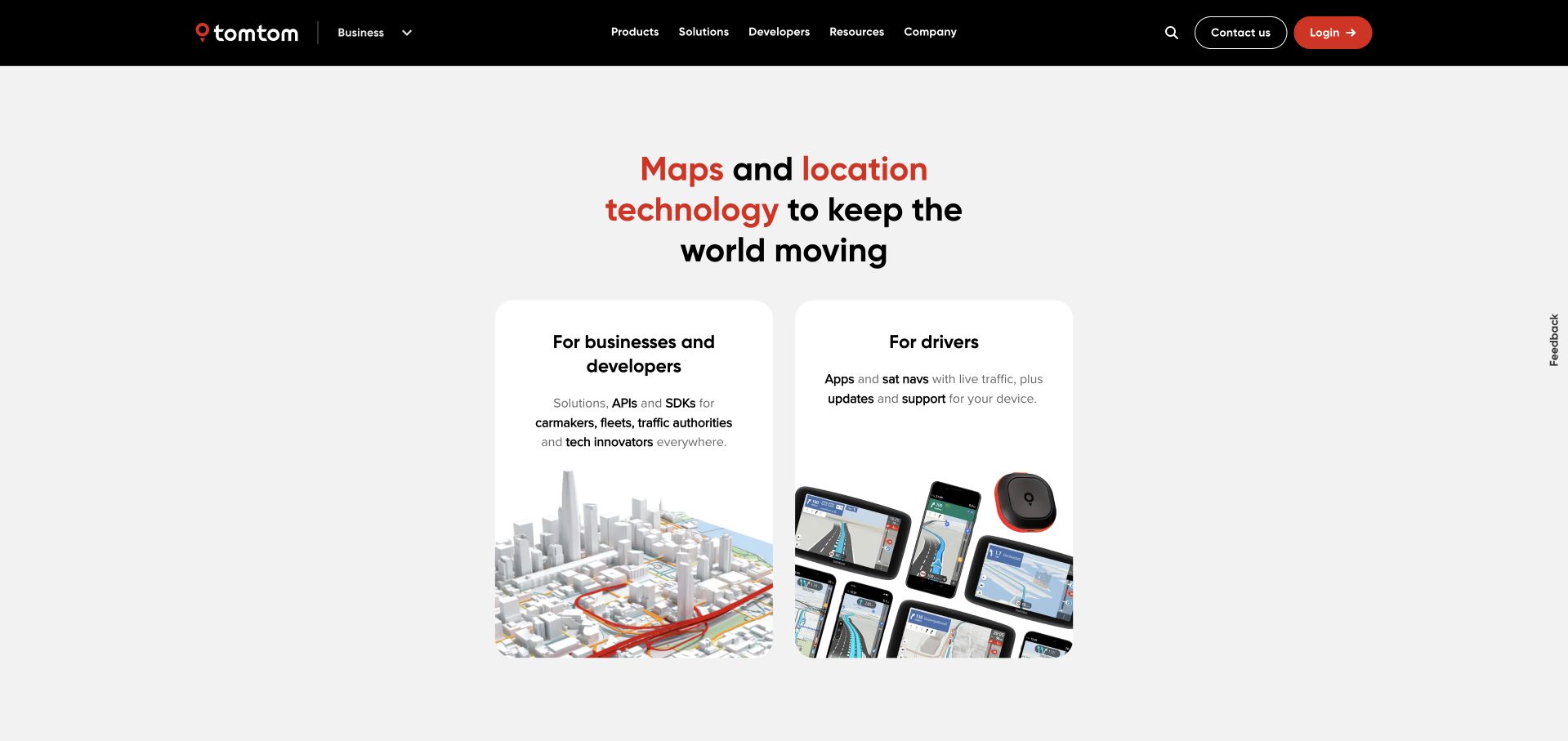
TomTom’s current page centers a concise maps-and-location proposition above two rounded audience cards: businesses and developers, and drivers. Each card combines a short explanation with a different product visual. A black header and red accents keep the page branded without making the distinction between professional tools and consumer navigation difficult to see. TomTom describes project channels, a shared workflow library and employee collaboration; this is separate from map rendering or navigation software.
What you can learn
Make audience selection explicit when one company serves fundamentally different jobs. In an internal collaboration system, similarly distinguish project channels, incident coordination and general announcements. A documented employee workflow should not be generalized into claims about mapping infrastructure, vehicle integrations or the photographed public page’s implementation.
Pros
Two audience cards simplify an otherwise broad mapping and navigation portfolio.
Different product visuals reinforce the distinction between developer tooling and driver-facing products.
Cons & considerations
A very compact overview leaves technical buyers needing deeper documentation before evaluation.
Audience cards must remain meaningful links with clear labels, not just attractive decorative blocks.
Platform source: Official product-specific customer case or dated announcement. TomTom describes project channels, a shared workflow library and employee collaboration; this is separate from map rendering or navigation software. This establishes only the stated organization, workload, product family, regional or historical association. It does not prove the pictured public page runtime, reveal its CMS or frontend, establish a complete current stack, or independently verify vendor-reported results. Platform evidence is separate from the direct website screenshot and is not a complete current infrastructure audit.
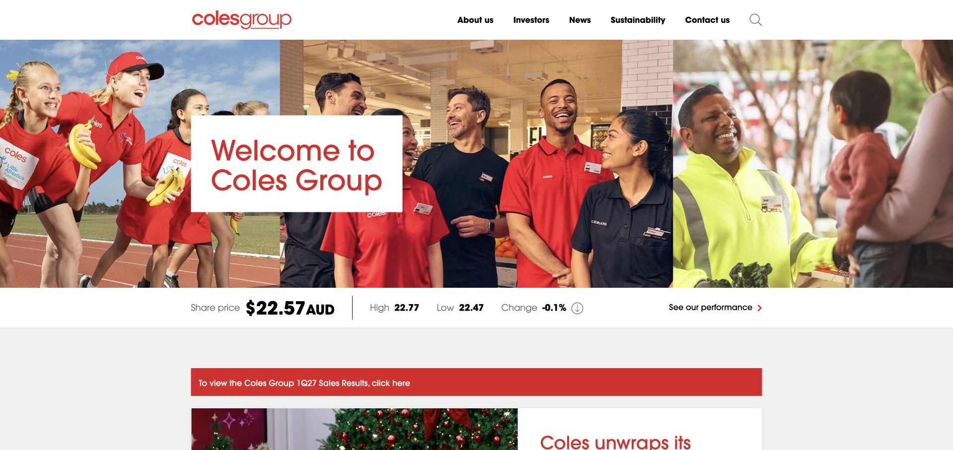
Coles Group presents a wide collage of employees beneath a restrained corporate header, with a white welcome panel placed over the center. A share-price strip and a red results notice follow. The design clearly belongs to the parent company’s corporate communications rather than an online grocery basket or store-finder task. The case covers Coles Digital product and engineering release collaboration following a 2020 omnichannel initiative; daily releases are described as a future target, not a verified completed change.
What you can learn
A corporate property can show the people behind a service while preserving investor and news routes. For digital-team collaboration, organize around release ownership and incident context rather than generic chat. Do not turn a stated future release target into an accomplished result or a company-wide technology claim.
Pros
The employee collage connects the retail group to recognizable human roles and settings.
Investor and results information is present without displacing the main corporate welcome.
Cons & considerations
Several information strips can make the opening feel busy despite its simple central message.
A corporate gateway needs clear paths to consumer shopping sites for misdirected visitors.
Platform source: Official product-specific customer case or dated announcement. The case covers Coles Digital product and engineering release collaboration following a 2020 omnichannel initiative; daily releases are described as a future target, not a verified completed change. This establishes only the stated organization, workload, product family, regional or historical association. It does not prove the pictured public page runtime, reveal its CMS or frontend, establish a complete current stack, or independently verify vendor-reported results. Platform evidence is separate from the direct website screenshot and is not a complete current infrastructure audit.
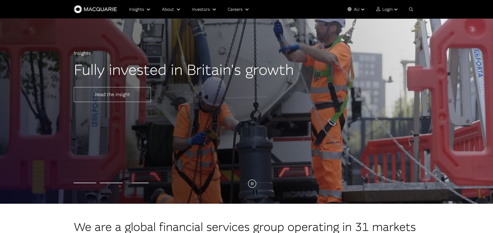
Macquarie opens with a large infrastructure-related feature, restrained white typography and a dark corporate header. The photograph gives a current growth-oriented article a physical setting, while slide indicators and a pause control remain visible. A brief organization-scale statement begins below, connecting the individual story to the wider group. The case is specifically Macquarie Banking and Financial Services employee collaboration and engineering workflows, recognized in 2023, not every Macquarie group business.
What you can learn
Give a broad company a concrete editorial entry point, but keep business-unit boundaries visible in both navigation and technical claims. A Banking and Financial Services collaboration case should not silently become a claim about every investment or infrastructure operation in the group. Stable labels matter more than dramatic movement.
Pros
A real infrastructure scene gives the corporate insight a specific and relevant visual context.
Visible motion controls let readers pause the feature while deciding where to go next.
Cons & considerations
A story-led opening can postpone direct explanations of the group’s different business areas.
Text over moving photography needs dependable contrast and sensible reduced-motion behavior.
Platform source: Official product-specific customer case or dated announcement. The case is specifically Macquarie Banking and Financial Services employee collaboration and engineering workflows, recognized in 2023, not every Macquarie group business. This establishes only the stated organization, workload, product family, regional or historical association. It does not prove the pictured public page runtime, reveal its CMS or frontend, establish a complete current stack, or independently verify vendor-reported results. Platform evidence is separate from the direct website screenshot and is not a complete current infrastructure audit.
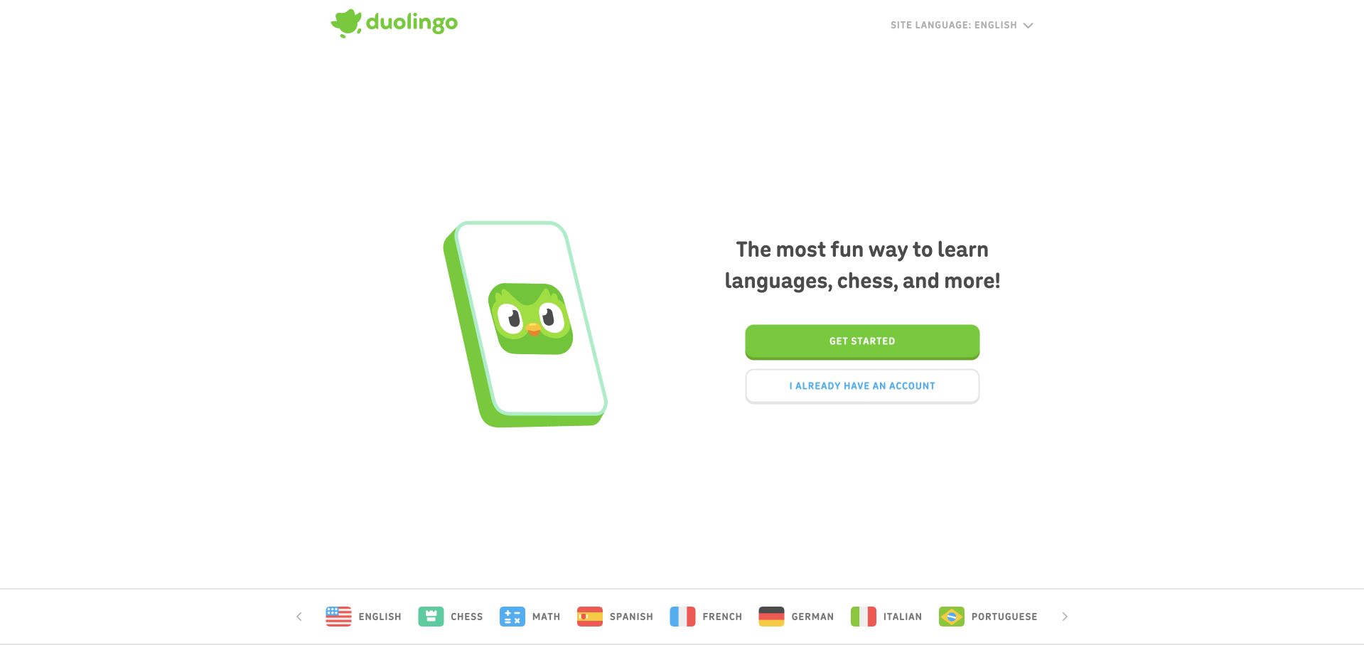
Duolingo’s homepage pairs its green character and phone illustration with a short learning proposition and two account-status choices. A row of subject and language options sits below. The large white field feels deliberately uncluttered, making the distinction between starting and returning more important than a dense description of curriculum features. Duolingo describes cross-functional employee collaboration, talent-brand work and international team communication, not lesson delivery infrastructure.
What you can learn
A clear first step can reduce uncertainty when visitors are new to a product. Use the same discipline in a team workflow by making the channel’s purpose and next action obvious. Employee communication tools should remain separate from claims about lesson delivery, adaptive learning or the public onboarding interface.
Pros
New and returning visitors receive distinct, plainly labeled starting routes.
A consistent mascot and green action color provide recognition without a complex visual system.
Cons & considerations
The brief proposition leaves teaching methods and accessibility details for later exploration.
A playful visual tone should not make account, payment or learning-data boundaries unclear.
Platform source: Official product-specific customer case or dated announcement. Duolingo describes cross-functional employee collaboration, talent-brand work and international team communication, not lesson delivery infrastructure. This establishes only the stated organization, workload, product family, regional or historical association. It does not prove the pictured public page runtime, reveal its CMS or frontend, establish a complete current stack, or independently verify vendor-reported results. Platform evidence is separate from the direct website screenshot and is not a complete current infrastructure audit.
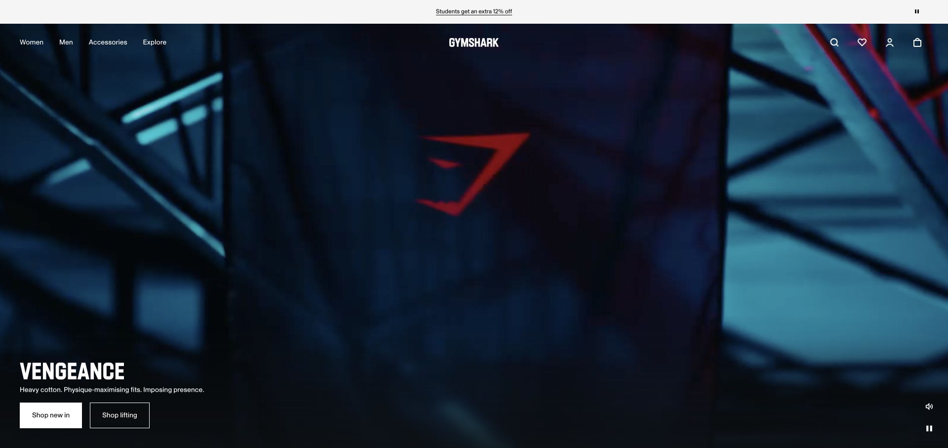
Gymshark’s captured homepage uses a dark fitness-campaign image, a short product line and two shopping actions. A minimal black header preserves department navigation, while the campaign’s dramatic lighting carries much of the visual character. The composition is mood-led, but the buttons provide a clear path toward specific shopping categories. The Gymshark story recounts employee channel adoption beginning in 2017 and pandemic-era ticketing and launch workflows. Its historical employee count is not presented as current.
What you can learn
A strong campaign should still make the intended action easy to identify. For collaboration, preserve equally clear routes for requests, updates and decisions rather than letting company culture replace structure. Historical employee communication stories illustrate a process, not the current commerce frontend or fulfillment system.
Pros
The campaign image and restrained typography form a coherent and recognizable retail identity.
Two specific shopping routes keep the atmospheric opening from becoming purely decorative.
Cons & considerations
Dark imagery can hide product detail or reduce legibility when cropped on small screens.
A campaign-focused hero may delay sizing, fit and material information needed for comparison.
Platform source: Official product-specific customer case or dated announcement. The Gymshark story recounts employee channel adoption beginning in 2017 and pandemic-era ticketing and launch workflows. Its historical employee count is not presented as current. This establishes only the stated organization, workload, product family, regional or historical association. It does not prove the pictured public page runtime, reveal its CMS or frontend, establish a complete current stack, or independently verify vendor-reported results. Platform evidence is separate from the direct website screenshot and is not a complete current infrastructure audit.
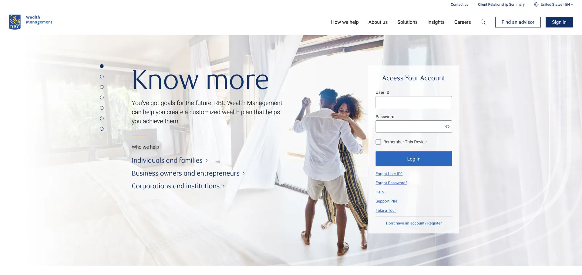
RBC Wealth Management’s US page places a quiet introductory message and audience links on a pale photographic background, with a separate blank account-access panel at the right. The header includes an advisor-finding route and familiar corporate navigation. The captured view is public and contains no entered credentials or client information. The case specifically concerns RBC Wealth Management–U.S. Technology and Support, discussed at Dreamforce 2023, including Financial Services Cloud-related workflows.
What you can learn
Make the boundary between general information, advisor discovery and account access unambiguous. For a connected support workflow, limit record visibility and actions to appropriate roles rather than treating shared conversation as universal access. The US wealth-management case should not be expanded into a claim about the entire bank.
Pros
Audience links and an advisor route support visitors who are not attempting to log in.
A distinct account panel keeps authenticated tasks visually separate from the introductory message.
Cons & considerations
Pale photography and thin typography need careful contrast testing across devices.
Financial-services interfaces require clear disclosures and secure behavior that a visual review alone cannot establish.
Visible tech stack
Earlier / documented evidence
Slack
Platform source: Official product-specific customer case or dated announcement. The case specifically concerns RBC Wealth Management–U.S. Technology and Support, discussed at Dreamforce 2023, including Financial Services Cloud-related workflows. This establishes only the stated organization, workload, product family, regional or historical association. It does not prove the pictured public page runtime, reveal its CMS or frontend, establish a complete current stack, or independently verify vendor-reported results. Platform evidence is separate from the direct website screenshot and is not a complete current infrastructure audit.
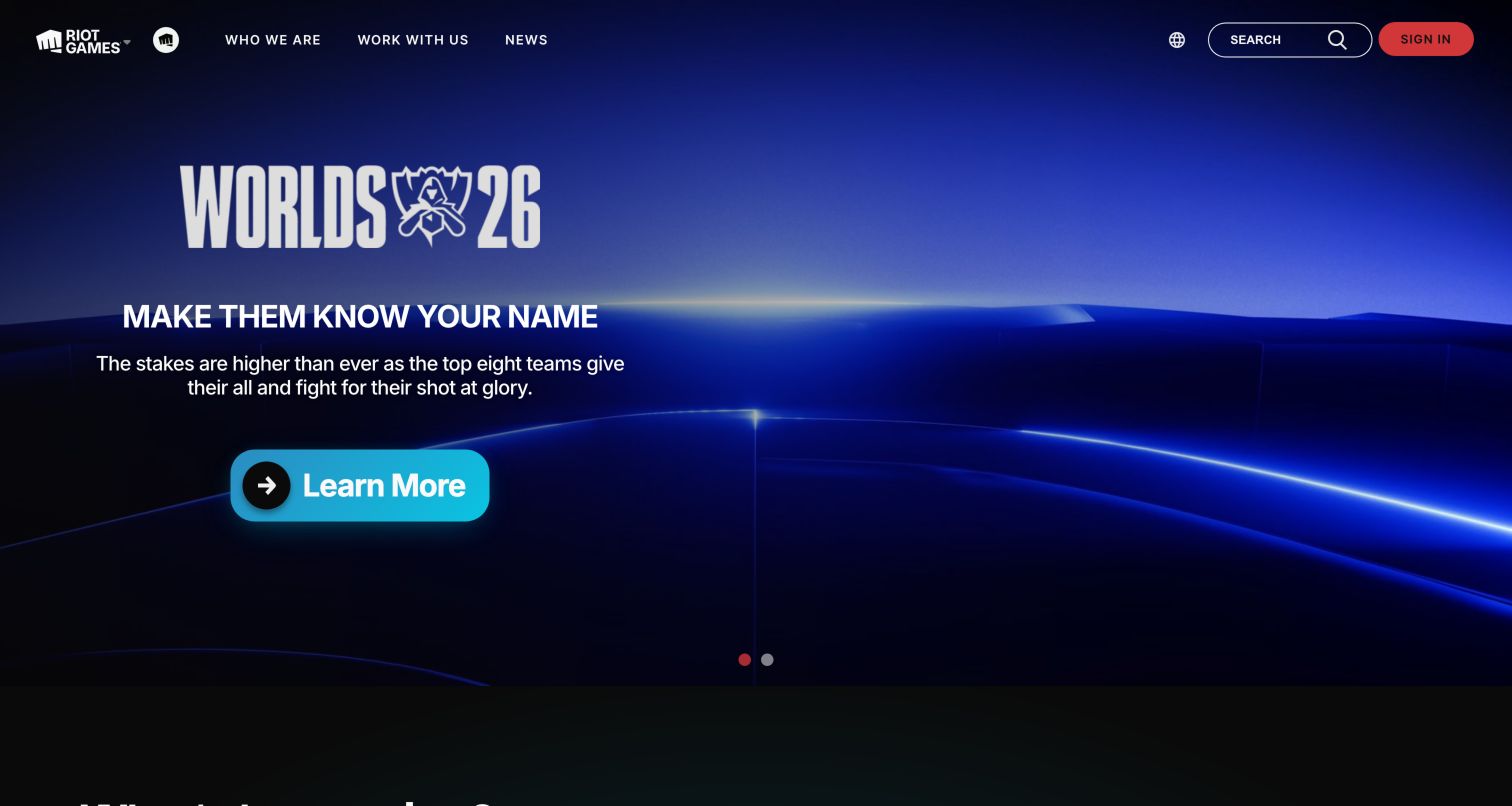
Riot Games’ public page leads with a Worlds event feature against a blue arena-like background. A large event mark, short supporting line and prominent learning action establish the current story, while company and careers navigation remain visible above. The page is a studio gateway, not a game client or an authenticated player account. Riot Games describes internal collaboration since 2015 and Enterprise Grid from 2017, with build pipelines, support intake and engineering incident integrations. This is not proof of game-server runtime.
What you can learn
A large entertainment organization can feature a timely event without losing its corporate routes. Engineering collaboration should likewise distinguish a release, incident and general company conversation. Keep the dated Slack case tied to internal build and support processes rather than implying that messaging software runs competitive gameplay.
Pros
The event mark and dramatic blue scene give the feature a clear theme and audience.
Company and careers navigation preserve practical routes beyond the current entertainment campaign.
Cons & considerations
A highly specific event can be less useful to visitors unfamiliar with its name or context.
Large campaign media needs accessible alternatives and reliable performance on modest connections.
Platform source: Official product-specific customer case or dated announcement. Riot Games describes internal collaboration since 2015 and Enterprise Grid from 2017, with build pipelines, support intake and engineering incident integrations. This is not proof of game-server runtime. This establishes only the stated organization, workload, product family, regional or historical association. It does not prove the pictured public page runtime, reveal its CMS or frontend, establish a complete current stack, or independently verify vendor-reported results. Platform evidence is separate from the direct website screenshot and is not a complete current infrastructure audit.
Kegan has 15+ years of experience working with small businesses, Fortune 500 companies, and everything in between. No development job is too big or too small: he brings the same hands-on attention to a focused improvement, a complete website, or a custom application.
For Slack projects, he can help with content architecture, custom functionality, system integrations, testing, and maintainable handover. He works directly with clients on scope, design, implementation, testing, and handover, with an emphasis on clear communication and a system that remains practical to maintain after launch.
Show 3 other Slack developersHide other Slack developers
Before commissioning software, improve the way the team organizes existing work. Define project channels, announcement routes, decision records and escalation responsibilities. Agree when a thread is sufficient and when a durable record must be updated elsewhere. This approach is appropriate when the principal problem is inconsistent communication rather than missing technical capability.
A bounded workflow or existing integration
A repeatable intake, reminder or status handoff may fit an existing workflow or supported application. Test whether it preserves the required context and works with the team’s permissions. Keep the first release focused on one job and make its limitations visible. A low-code implementation still needs an owner, error handling and a way to change the process responsibly.
A maintained custom Slack application
Use a custom app when the required interaction, data source or authorization cannot be served reliably by a simpler option. Specify installation scope, event handling, action validation and token storage. Separate acknowledgement of an interaction from longer-running business work. Budget for monitoring, changes in connected systems and support rather than treating the initial bot response as the finished product.
From references to requirements
Define the workflow before connecting systems
Map one conversation to one business outcome
Choose a real process such as onboarding, support intake or release coordination. Trace where the request starts, who owns the next step and which system records completion. Include a rejected or incomplete request in the map. Success should be measured in fewer lost handoffs or more reliable completion, not simply a larger number of automated messages.
Review identity and information boundaries
Identify the workspace, organization, external collaborators and data sources involved. Decide which information may enter a channel and which should stay behind a link to an authorized system. Review requested app permissions with the administrator and document why each is necessary. Test the experience when a person leaves, loses access or belongs to the wrong organization.
Test reliability and human fallbacks
A repeated event, expired credential or unavailable source system should not create duplicate records or misleading success messages. Use representative test cases and keep useful logs without storing unnecessary message content. Define who investigates failures and how users continue safely. A clear manual fallback is often more valuable than another integration feature nobody can support.
A useful handover demonstration
Ask the actual team to carry out its routine job: publish a realistic update, correct a mistake, preview a narrow screen, and identify who owns an integration failure. For a library or frontend framework, also ask who maintains the content source and deployment. A polished screenshot does not answer those operational questions.
Beyond the screenshot
Slack application and workflow checklist
Name the business task and the responsible process owner.
Choose a clear channel purpose and escalation destination.
Identify the authoritative record outside the conversation.
Document what information may be shared with each audience.
Review external Slack Connect participation and confidentiality boundaries.
Request the minimum justified application permissions.
Verify workspace or organization identity during installation.
Keep tokens and secrets out of public pages and client code.
Validate user actions against current source-system permissions.
Handle rate limits, duplicate events and unavailable dependencies.
Provide useful failure messages and an accountable support route.
Test the real workflow before expanding to additional teams.
Test with real content, a keyboard, a small screen, slow or failed requests, and the people who will maintain the system. These are planning checks, not an accessibility, security, performance, or search-ranking certification.
Sources & editorial method
How this Slack collection was reviewed
The public pages were captured directly in Chrome and visually reviewed. Official Slack customer cases support each named association. Dates, departments and regional limits are retained, and future plans are not treated as completed adoption. Vendor-reported productivity figures are not independent benchmarks, and the ordering is editorial rather than a performance ranking.
Every image is an unmodified capture from the actual website, with its source and capture date. Some captures are reused from our shared catalog; their dates remain the original capture dates. None comes from a vendor gallery or a generated reconstruction. Moving imagery and live content can change.
Technology attribution uses public page assets or metadata, official platform documentation, or a cited first-party project case study. Documentary and framework-relationship evidence is identified where used; it is not a complete current backend inventory. A CMS image CDN alone does not establish a full CMS deployment. A library’s presence does not prove which individual controls use it, and a platform label does not establish AI authorship.
The composition notes, lessons, pros and tradeoffs are original editorial observations. We have not measured conversion, traffic, security, performance or accessibility conformance. Website owners retain their brands and imagery; these examples are not our client portfolio. Written, Edited and Curated are independent records, not dates advanced by a build. See our editorial standards or suggest a correction.
Questions worth asking
Slack website development FAQs
Are these websites built on Slack?
The collection does not make that claim. The source establishes an internal collaboration, integration or customer relationship. The screenshot is a separate public design reference, and its website technology needs independent evidence.
Do we need a custom app?
Not always. Clear channel practices or an existing supported workflow may solve the problem. Build custom software when it provides a necessary interaction or control that simpler options cannot support reliably.
Can people approve work directly in a channel?
An appropriately designed integration can support approvals, but it must show context, verify current authorization and record the result in the authoritative system. A button and a success message alone are not sufficient controls.
Should every event create a message?
No. Match notification detail and urgency to the recipient’s actual responsibility. Group low-value updates, preserve a route to investigate and measure whether people act on the information rather than simply receiving more of it.
How should old customer stories be interpreted?
Keep the implementation period, business unit and stated workload attached. A 2017 engineering rollout or 2023 regional case can be informative without proving current employee totals, group-wide deployment or the public website’s runtime.
Borrow a communication pattern that reduces uncertainty, then test it with the people who own the work. The strongest Slack implementation helps a team make and record better decisions without adding unnecessary noise.