Best Workday Websites of 2026 (20 Real-World Examples)
Public websites from documented Workday customers, with practical lessons for finance, HR and Extend applications.
Explore twenty public design references alongside precisely scoped Workday associations. Human Capital Management, Financial Management and Extend are different claims; none automatically identifies the technology behind the pictured website.
Workday development begins with a business process and a controlled enterprise environment, not a public homepage layout. An organization may use Human Capital Management, Financial Management, Extend or a combination, with different data, teams and implementation responsibilities. This collection keeps those distinctions visible while examining how the same organizations communicate with their public audiences.
Most of the examples are named in Workday’s official customer-facts categories, which establish a product-family relationship but not a module inventory or deployment timeline. The Netflix, Target and Salesforce cases provide more specific workflow detail. Use that evidence at its actual level of precision. A university finance listing does not establish its student system, and a retailer’s HCM adoption does not explain its storefront architecture.
Before the examples
What makes good Workday website development in 2026?
Define the product and process before the interface
Specify whether the project concerns employee administration, financial operations or an extension of an existing workflow. Name the business object, responsible team and completion condition. A purchase-order request, compensation nomination and public recruitment page have different audiences and controls. Treating them all as a generic dashboard can conceal the most important implementation decisions.
An attractive page must not make a record visible or editable merely because someone can reach the interface. Review the relevant service, data and page-level security with the organization’s administrators. Test both permitted and forbidden actions using representative roles. Keep sensitive employee and financial information out of screenshots, public examples and unnecessary application logs.
Extend deliberately instead of multiplying data copies
Before creating another satellite application, identify which data already exists and why a separate copy would be needed. A useful extension can simplify a task while preserving the authoritative record and business rules. Document synchronization boundaries when another system is necessary. Removing one manual spreadsheet should not create an unmaintained collection of hidden integrations.
The examples pair actual public website captures with official product-specific cases or customer-facts listings. Each entry preserves the named organization and workload. Old case descriptions remain historical, and limited vendor listings are not embellished into detailed implementation stories.
We start with five recognizable brands or organizations: Netflix, Target, Salesforce, Pfizer, Siemens. Each attribution applies to the named website property, not every product or website belonging to its organization. This is a curated reading sequence, not a measured ranking.
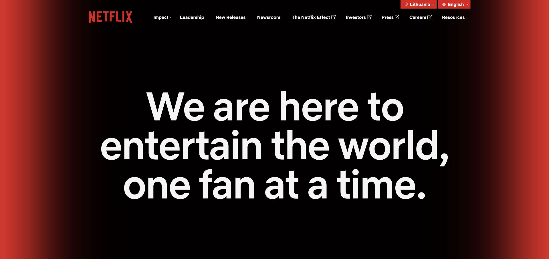
Netflix’s company page trades a catalog of shows for a monumental statement about entertaining fans. Black space, red edges and a compact corporate navigation make the institution recognizable without reconstructing the consumer streaming interface. The spare opening is particularly useful for studying how a familiar brand can address a different audience. Workday’s historical Netflix case documents Extend apps for external and internal purchase-order requests, job requisitions and Open Connect inventory; its old subscriber figure is not current.
What you can learn
Borrow the separation of concerns: a corporate introduction should explain the organization, while staff procurement and HR tasks belong behind appropriate access controls. Keep the public brand experience coherent without exposing the internal application or implying one platform runs both.
Pros
A single dominant statement establishes a clear reading order before secondary corporate destinations.
The red-and-black identity remains recognizable without requiring entertainment imagery or a sales promotion.
Cons & considerations
The abstract mission needs supporting stories below the opening to become tangible.
Visitors seeking a specific title or subscription must recognize they are on the corporate property.
Platform source: Official product-specific customer case or dated announcement. Workday’s historical Netflix case documents Extend apps for external and internal purchase-order requests, job requisitions and Open Connect inventory; its old subscriber figure is not current. This establishes only the stated organization, workload, product family, regional or historical association. It does not prove the pictured public page runtime, reveal its CMS or frontend, establish a complete current stack, or independently verify vendor-reported results. Platform evidence is separate from the direct website screenshot and is not a complete current infrastructure audit.
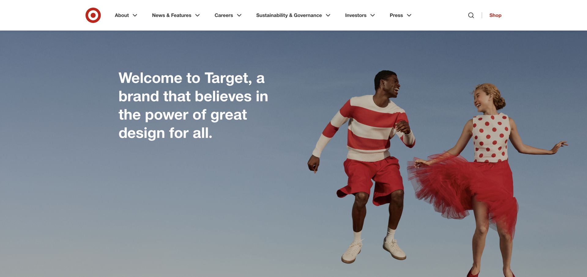
Target’s corporate homepage places two brightly dressed people against a soft blue field, with a short welcome statement alongside them. The bullseye and restrained header keep the brand recognizable, while the absence of product pricing establishes a company-information context. The composition feels lighter than a typical investor-oriented portal. Target documents more than ten Workday Extend apps since 2020, including commuter benefits, award nominations and remote-work arrangements tied to HR data.
What you can learn
An employee-facing extension can inherit a familiar interface without copying a promotional homepage. Study the clear hierarchy and human tone, then define the actual staff task, authorization rules and confirmation state separately. A pleasant introduction does not replace a reliable benefits or approval workflow.
Pros
The welcome message and portrait composition communicate the brand before requiring deeper exploration.
A compact corporate menu leaves the main visual and purpose statement easy to scan.
Cons & considerations
Company-purpose language alone does not answer a specific applicant or investor question.
Large editorial imagery requires useful text alternatives and careful cropping on narrow screens.
Platform source: Official product-specific customer case or dated announcement. Target documents more than ten Workday Extend apps since 2020, including commuter benefits, award nominations and remote-work arrangements tied to HR data. This establishes only the stated organization, workload, product family, regional or historical association. It does not prove the pictured public page runtime, reveal its CMS or frontend, establish a complete current stack, or independently verify vendor-reported results. Platform evidence is separate from the direct website screenshot and is not a complete current infrastructure audit.
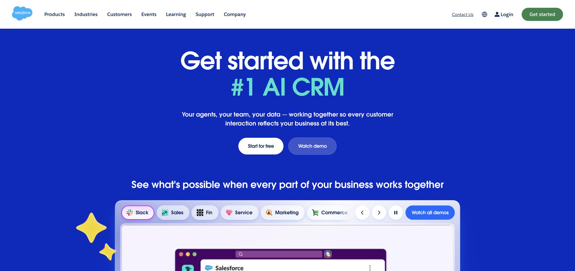
Salesforce opens with a blue field, a large AI CRM proposition and two clearly differentiated actions. A rounded product-preview area begins below the main message, with category tabs suggesting a broader suite. Decorative characters and brighter accents soften a dense enterprise offer without removing its product focus. Salesforce’s vendor case describes Workday Financial Management and Accounting Center data integrations, legal-entity work and financial-close automation.
What you can learn
Use progressive disclosure to introduce a complex business platform: state the core outcome, provide a credible demonstration and only then explain modules. For financial operations, keep legal-entity setup and accounting permissions explicit rather than allowing a friendly dashboard to obscure consequential changes.
Pros
The primary trial and secondary demo actions serve different levels of buyer readiness.
The product-category strip makes a broad suite discoverable without a wall of descriptive text.
Cons & considerations
An expansive AI promise needs specific examples and evidence further down the page.
Motion and decorative elements can compete with detailed product evaluation if overemphasized.
Platform source: Official product-specific customer case or dated announcement. Salesforce’s vendor case describes Workday Financial Management and Accounting Center data integrations, legal-entity work and financial-close automation. This establishes only the stated organization, workload, product family, regional or historical association. It does not prove the pictured public page runtime, reveal its CMS or frontend, establish a complete current stack, or independently verify vendor-reported results. Platform evidence is separate from the direct website screenshot and is not a complete current infrastructure audit.
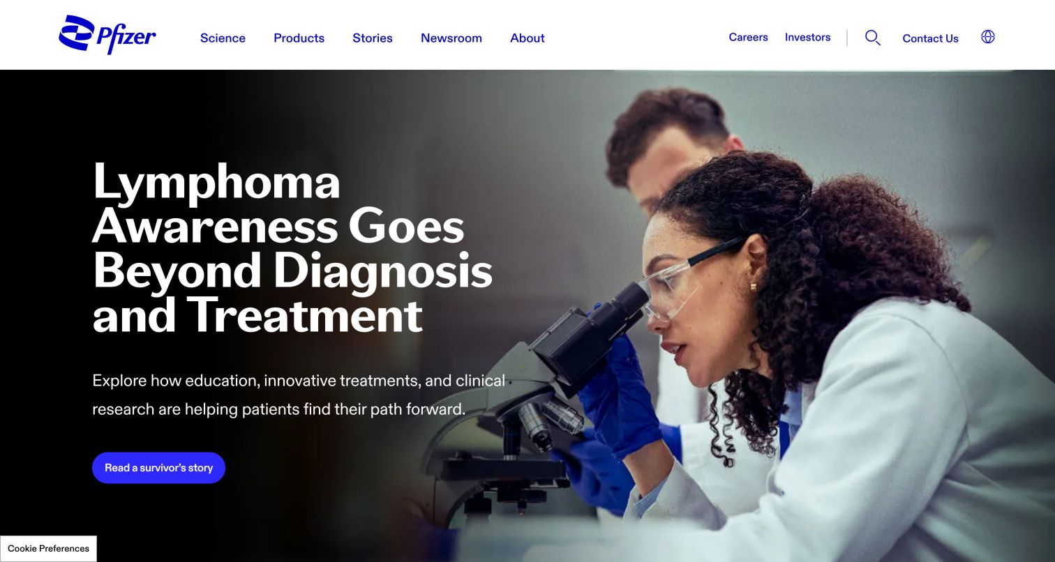
Pfizer’s public page leads with a health-awareness story rather than presenting every research area at once. A laboratory photograph fills the hero while a dark text region holds the headline, a short explanation and one story link. Science, products and company information remain visible as distinct header routes. Workday’s customer-facts page lists Pfizer under Human Capital Management. No specific modules, deployment date or rollout scope are stated.
What you can learn
A strong enterprise page can begin with one timely, understandable subject while preserving access to its larger information architecture. Borrow the editorial hierarchy, not the clinical message, and distinguish a public science story from the confidential personnel records supported by an HR platform.
Pros
The dark text panel creates a readable space beside a detailed laboratory photograph.
Separate navigation labels help users choose between scientific, product and corporate information.
Cons & considerations
A campaign-led opening can conceal the breadth of the organization until visitors explore.
Platform source: Official named Workday product-family customer list. Workday’s customer-facts page lists Pfizer under Human Capital Management. No specific modules, deployment date or rollout scope are stated. This establishes only the stated organization, workload, product family, regional or historical association. It does not prove the pictured public page runtime, reveal its CMS or frontend, establish a complete current stack, or independently verify vendor-reported results. Platform evidence is separate from the direct website screenshot and is not a complete current infrastructure audit.
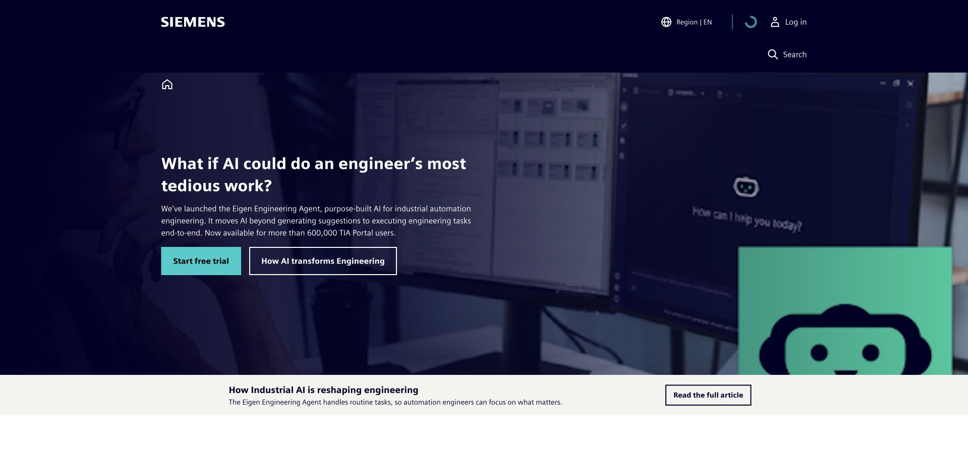
Siemens uses a dark technical image, a question about engineering work and a conspicuous turquoise action to frame an AI offer. A lighter article strip below the hero provides an alternative reading path. The page demonstrates how an industrial business can move from a broad corporate identity into one practical application. Workday’s customer-facts page lists Siemens under Human Capital Management; it does not establish finance adoption or the public website platform.
What you can learn
Explain an enterprise feature through the work a person performs, then make the supporting evidence easy to find. Do not let an appealing AI campaign imply that an unrelated HR system controls industrial equipment, or that a named customer relationship establishes every subsidiary’s configuration.
Pros
A concrete engineering question gives an abstract software proposition an understandable context.
The contrasting article strip offers an informational alternative to a trial-oriented action.
Cons & considerations
The dense dark image and multiple technical terms may challenge less specialized visitors.
A prominent campaign needs clear pathways back to the wider product and company catalog.
Platform source: Official named Workday product-family customer list. Workday’s customer-facts page lists Siemens under Human Capital Management; it does not establish finance adoption or the public website platform. This establishes only the stated organization, workload, product family, regional or historical association. It does not prove the pictured public page runtime, reveal its CMS or frontend, establish a complete current stack, or independently verify vendor-reported results. Platform evidence is separate from the direct website screenshot and is not a complete current infrastructure audit.
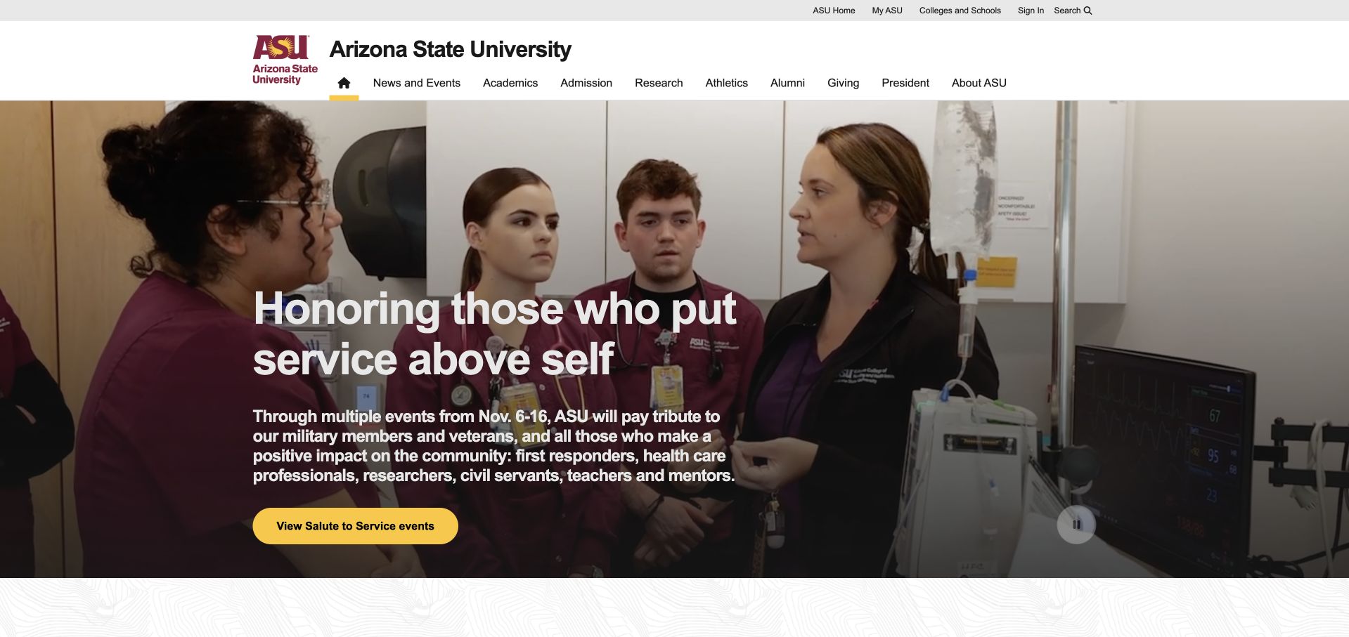
Arizona State University combines a substantial university header with a current community-service feature. A warm photograph, white headline and yellow action form the central composition, while admissions, academics, research and athletics remain accessible above it. The institutional identity is strong without making every department compete in the hero. Arizona State University is named as a Human Capital Management customer on Workday’s current vendor facts list. No student-information-system claim follows.
What you can learn
A university needs clear boundaries between public recruitment, community information and employee administration. Study how a single feature can sit beneath a stable audience-oriented menu, then plan staff applications around authorized roles and actual tasks rather than replicating the homepage’s many public destinations.
Pros
The university name and crest establish institutional context before the editorial feature.
The yellow action stands out against a photographic background without needing several competing buttons.
Cons & considerations
A large navigation system can become demanding on smaller screens without careful grouping.
A date-sensitive feature needs editorial ownership so the opening does not become stale.
Platform source: Official named Workday product-family customer list. Arizona State University is named as a Human Capital Management customer on Workday’s current vendor facts list. No student-information-system claim follows. This establishes only the stated organization, workload, product family, regional or historical association. It does not prove the pictured public page runtime, reveal its CMS or frontend, establish a complete current stack, or independently verify vendor-reported results. Platform evidence is separate from the direct website screenshot and is not a complete current infrastructure audit.
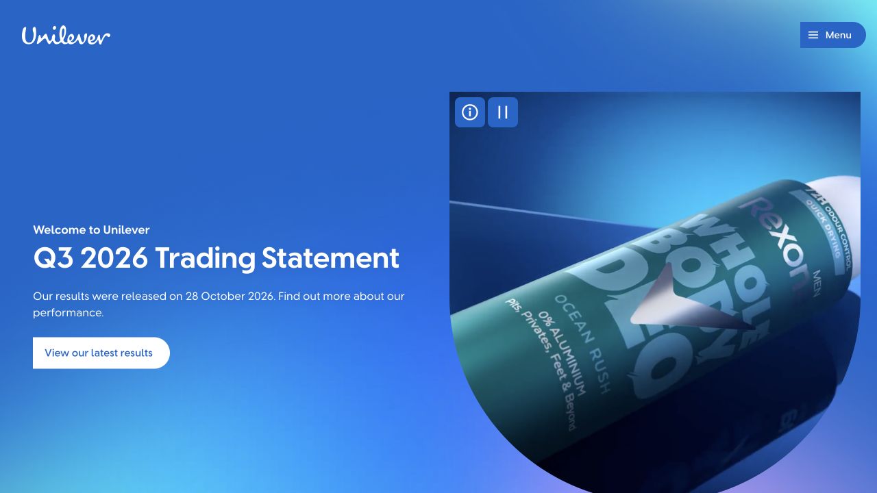
Unilever turns a trading statement into a substantial blue hero, pairing the announcement with a large illustrated consumer package. White text and a pale action keep the financial update readable without abandoning the company’s consumer identity. A compact menu avoids placing the full organizational structure across the top. Workday lists Unilever under Human Capital Management; the list does not provide a module inventory or confirm adoption by every acquired or divested brand.
What you can learn
Corporate reporting need not look disconnected from the brand, but the report, period and publication context must remain obvious. Reuse the visual confidence while separating public investor documents from HR information and avoiding assumptions about which current or former brands share internal systems.
Pros
The strong blue field gives a routine corporate update a distinctive and coherent identity.
The report action is specific enough to distinguish it from general company exploration.
Cons & considerations
A results-led homepage may not immediately orient visitors looking for individual consumer brands.
A compressed menu shifts significant wayfinding work into the expanded navigation experience.
Platform source: Official named Workday product-family customer list. Workday lists Unilever under Human Capital Management; the list does not provide a module inventory or confirm adoption by every acquired or divested brand. This establishes only the stated organization, workload, product family, regional or historical association. It does not prove the pictured public page runtime, reveal its CMS or frontend, establish a complete current stack, or independently verify vendor-reported results. Platform evidence is separate from the direct website screenshot and is not a complete current infrastructure audit.
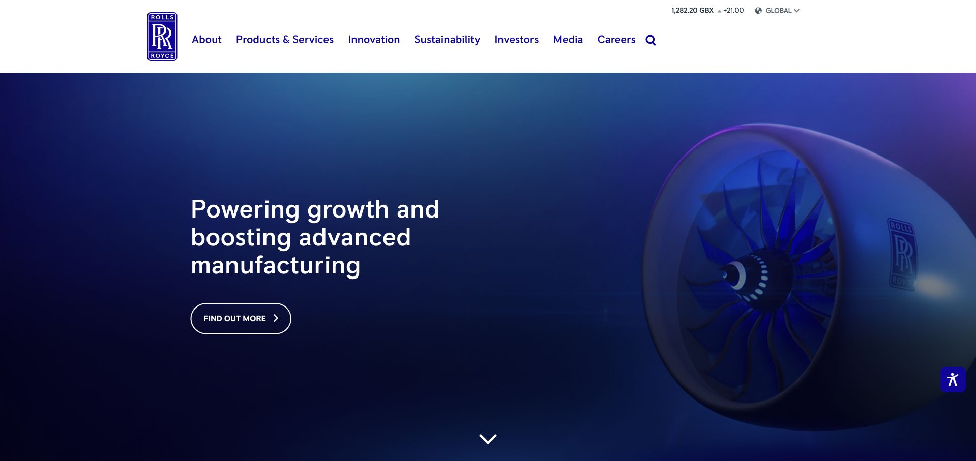
Rolls-Royce pairs a large engine rendering with a concise message about growth and advanced manufacturing. Its crest, blue palette and technical imagery establish the aerospace and power-systems company rather than the luxury car brand. Product, innovation and investor routes form a conventional but useful corporate header. Workday names Rolls-Royce under Human Capital Management. This example refers to the aerospace and power-systems company, not Rolls-Royce Motor Cars.
What you can learn
When a name spans different businesses, visual identity and precise company naming matter as much as headline polish. Show the relevant industrial product and give users a logical next destination. Keep employee-system association claims tied to the correct company instead of borrowing recognition from an unrelated brand.
Pros
The engine visual immediately clarifies which Rolls-Royce business the page represents.
A restrained action and familiar navigation support both campaign discovery and corporate research.
Cons & considerations
A broad growth statement needs a more specific destination to explain the actual initiative.
Dark technical imagery can hide important details when reduced to a small mobile crop.
Platform source: Official named Workday product-family customer list. Workday names Rolls-Royce under Human Capital Management. This example refers to the aerospace and power-systems company, not Rolls-Royce Motor Cars. This establishes only the stated organization, workload, product family, regional or historical association. It does not prove the pictured public page runtime, reveal its CMS or frontend, establish a complete current stack, or independently verify vendor-reported results. Platform evidence is separate from the direct website screenshot and is not a complete current infrastructure audit.
Bayer’s opening uses a close photograph of smiling children, an oversized purpose statement and a compact floating navigation bar near the lower edge. The circular Bayer mark anchors the composition without a conventional full-width header. It is a memorable alternative to the dense menus common on diversified corporate sites. Workday lists Bayer AG as a Human Capital Management customer. The association does not identify research systems or this public website backend.
What you can learn
A bold purpose-led hero can establish emotional context, but users still need direct routes to products, investors and company information. Test the floating navigation’s discoverability and keyboard behavior. Treat its human imagery as brand storytelling, not evidence about an HR deployment or product effectiveness.
Pros
The unusually placed navigation preserves the photograph’s scale while keeping several key routes visible.
The large central message creates a simple visual entry point for a complex organization.
Cons & considerations
Purpose language is less useful for visitors arriving with an immediate technical or regulatory question.
A floating menu over photography needs reliable contrast across every rotating image or crop.
Platform source: Official named Workday product-family customer list. Workday lists Bayer AG as a Human Capital Management customer. The association does not identify research systems or this public website backend. This establishes only the stated organization, workload, product family, regional or historical association. It does not prove the pictured public page runtime, reveal its CMS or frontend, establish a complete current stack, or independently verify vendor-reported results. Platform evidence is separate from the direct website screenshot and is not a complete current infrastructure audit.
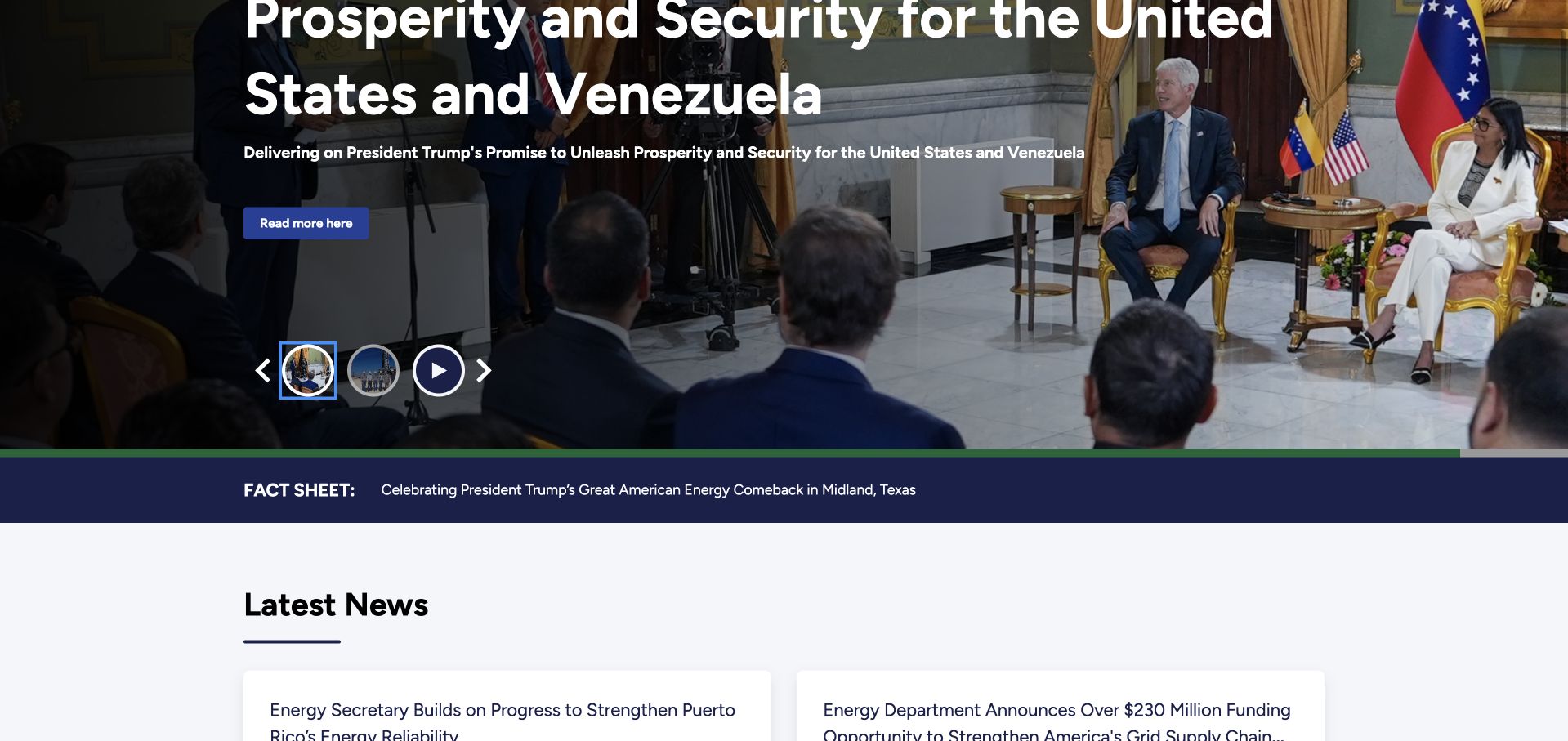
The Department of Energy page combines official-government identification, a broad policy menu and a prominent news carousel. Visible slide controls and a nearby fact-sheet strip make the featured stories feel like a publishing system rather than a standalone campaign. Latest-news cards offer a second route into the institution’s current work. Workday lists the U.S. Department of Energy under Human Capital Management. No agency-wide module configuration or public-site integration is specified.
What you can learn
Public-sector design benefits from explicit provenance and straightforward navigation, but rotating news should not make the agency’s practical services difficult to find. Preserve a pause control and stable reading order. Employee HCM association is a separate documentary fact, not a claim about this publishing system.
Pros
Official identification and recognizable institutional navigation establish the source of the information.
Featured news and a separate latest-news area support more than one browsing route.
Cons & considerations
A rotating lead story can push service-oriented destinations out of the first viewport.
Long political or policy headlines need careful wrapping and stable layouts during slide transitions.
Platform source: Official named Workday product-family customer list. Workday lists the U.S. Department of Energy under Human Capital Management. No agency-wide module configuration or public-site integration is specified. This establishes only the stated organization, workload, product family, regional or historical association. It does not prove the pictured public page runtime, reveal its CMS or frontend, establish a complete current stack, or independently verify vendor-reported results. Platform evidence is separate from the direct website screenshot and is not a complete current infrastructure audit.
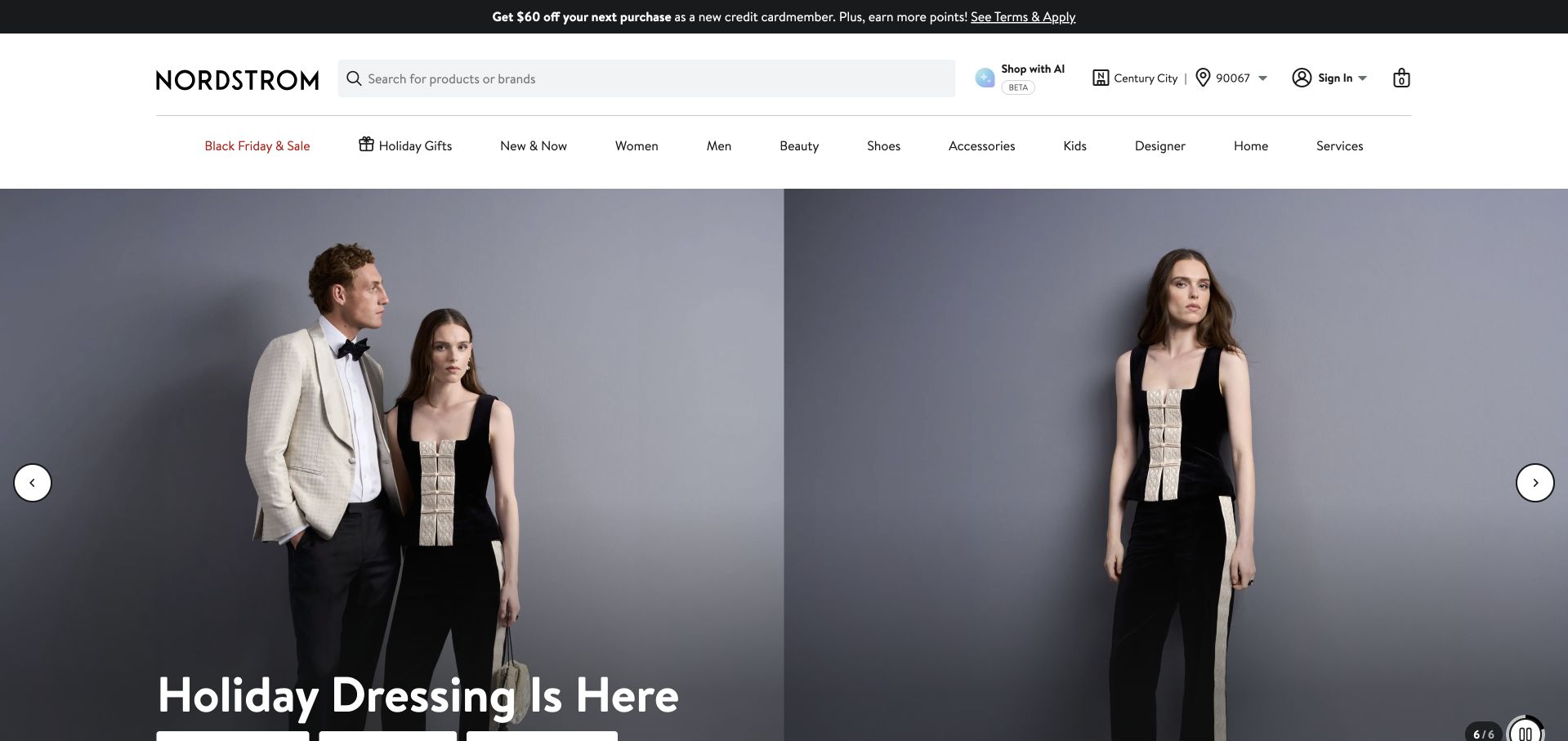
Nordstrom keeps a detailed retail header above a restrained fashion campaign. Search, service utilities and department labels provide practical shopping routes, while two models and a short seasonal line occupy the hero. The gray image background lets clothing silhouettes and typography carry the campaign without a busy decorative scene. Workday’s facts list names Nordstrom as a Human Capital Management customer; this is not evidence that its retail storefront uses Workday.
What you can learn
Separate the stable navigation that people repeatedly need from the campaign content that changes frequently. This also applies to internal HR: an employee should not relearn a task because the public brand campaign changes. Build durable labels, predictable account boundaries and accessible alternatives to image-led promotion.
Pros
Visible search and department labels offer direct alternatives to the seasonal campaign.
The neutral photographic setting gives products and the campaign headline a clear visual hierarchy.
Cons & considerations
Multiple utility and promotional rows reduce the space available for the main content.
Location and store utilities require careful handling so visitors understand defaults without mistaking them for personal data.
Visible tech stack
Earlier / documented evidence
Workday
Platform source: Official named Workday product-family customer list. Workday’s facts list names Nordstrom as a Human Capital Management customer; this is not evidence that its retail storefront uses Workday. This establishes only the stated organization, workload, product family, regional or historical association. It does not prove the pictured public page runtime, reveal its CMS or frontend, establish a complete current stack, or independently verify vendor-reported results. Platform evidence is separate from the direct website screenshot and is not a complete current infrastructure audit.
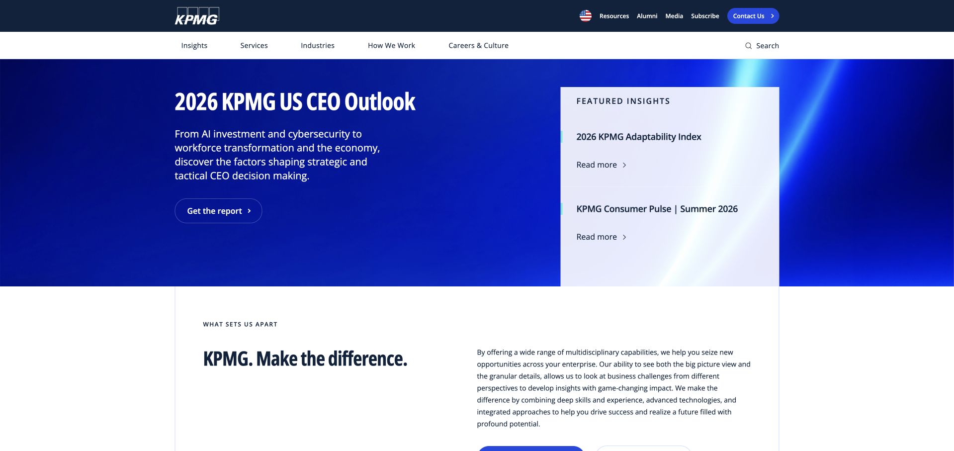
KPMG’s US site opens with a CEO outlook report, supporting explanatory text and a contrasting panel of related insights. The blue hero and conventional white service navigation communicate an established professional firm. The smaller article panel is especially useful: it gives visitors alternatives without turning the entire opening into an undifferentiated grid. Workday names KPMG LLP, not every member firm of the KPMG network, as a Human Capital Management customer. The public US firm site matches that scope.
What you can learn
Organize expertise around questions a buyer or researcher already has, then provide clear paths to deeper evidence. For a networked professional firm, name the relevant legal entity in technical claims. Shared branding does not mean every member firm uses the same internal software or deployment.
Pros
A primary report and a smaller related-insights panel create a useful editorial hierarchy.
Clear service and industry navigation supports visitors who do not want the featured report.
Cons & considerations
An executive research feature can be less helpful to visitors seeking an immediate local contact.
Several closely related reports need distinctive titles and dates to avoid blending together.
Platform source: Official named Workday product-family customer list. Workday names KPMG LLP, not every member firm of the KPMG network, as a Human Capital Management customer. The public US firm site matches that scope. This establishes only the stated organization, workload, product family, regional or historical association. It does not prove the pictured public page runtime, reveal its CMS or frontend, establish a complete current stack, or independently verify vendor-reported results. Platform evidence is separate from the direct website screenshot and is not a complete current infrastructure audit.
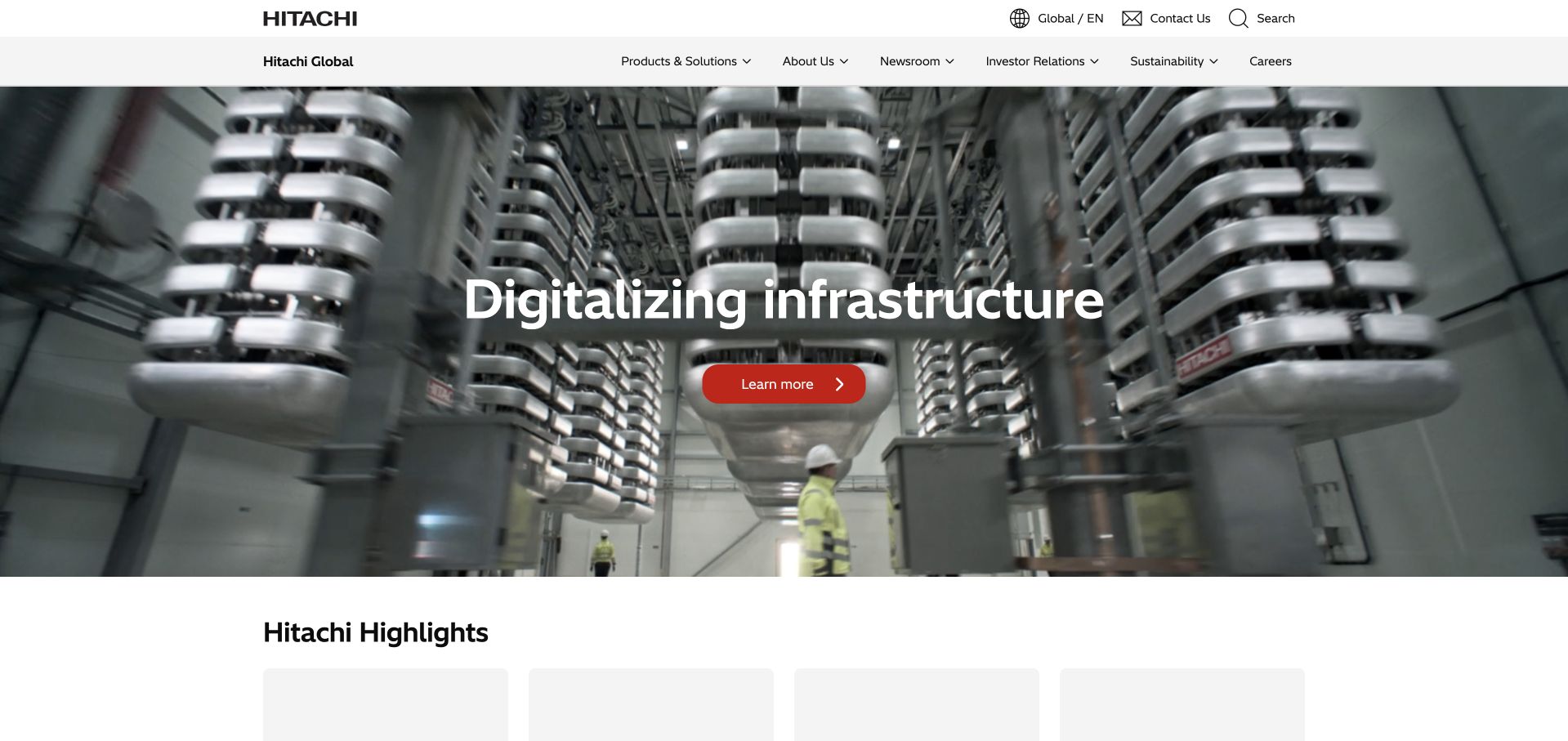
Hitachi’s public page uses a full-width industrial photograph and a short digital-infrastructure message, followed by a highlights section. A two-level header separates global utilities from product, company and investor information. The physical equipment gives a broad technology group something tangible to show before visitors choose a more specialized area. Workday names Hitachi as a Human Capital Management customer without detailing subsidiaries, dates or individual HR modules.
What you can learn
For diversified industrial organizations, make the first example concrete and keep the route to the broader portfolio obvious. A photograph can establish context, but the next page must explain the actual system and audience. Avoid turning a generic customer listing into subsidiary-specific implementation claims.
Pros
Real industrial context gives the technology proposition a clearer physical setting.
The highlights area offers a second level of discovery beneath the large lead feature.
Cons & considerations
A very broad headline may need supporting copy before buyers understand the offer.
A two-tier header can become cumbersome unless mobile navigation preserves clear grouping.
Platform source: Official named Workday product-family customer list. Workday names Hitachi as a Human Capital Management customer without detailing subsidiaries, dates or individual HR modules. This establishes only the stated organization, workload, product family, regional or historical association. It does not prove the pictured public page runtime, reveal its CMS or frontend, establish a complete current stack, or independently verify vendor-reported results. Platform evidence is separate from the direct website screenshot and is not a complete current infrastructure audit.
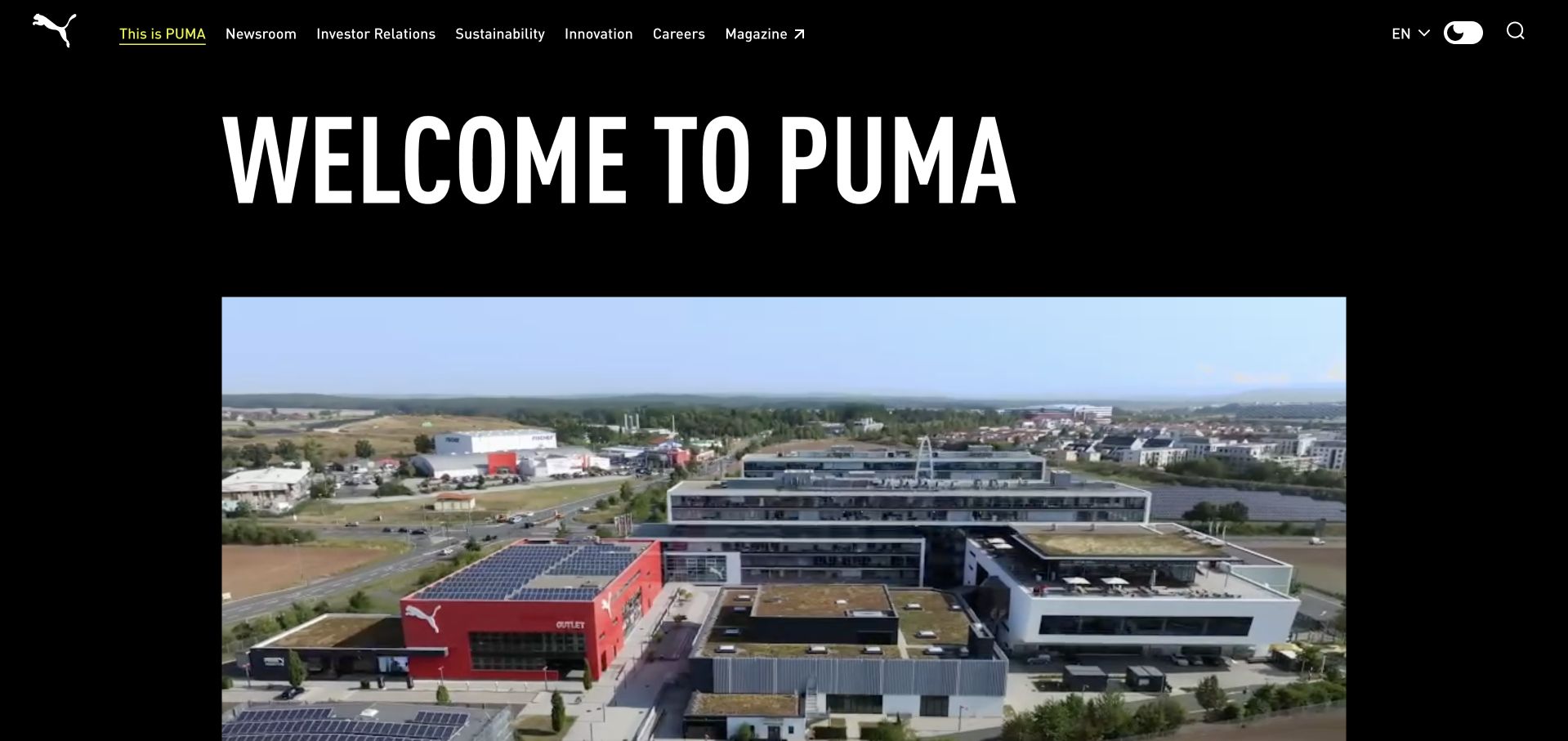
Puma’s corporate page opens with a large white welcome headline on black, followed by a wide campus photograph. Navigation emphasizes company information, news, investors, sustainability and careers rather than product categories. The high-contrast presentation makes the corporate audience clear while retaining the sports brand’s energetic visual identity. Workday lists Puma under Human Capital Management. The documentary association is distinct from Puma commerce or corporate publishing technology.
What you can learn
Decide whether a page is meant to sell products, explain the business or support employees before selecting its opening content. Puma’s corporate framing is a useful contrast to a retail storefront. HR tooling should remain a separate layer with its own permissions and task-oriented navigation.
Pros
The black-and-white opening creates strong typographic hierarchy with minimal visual clutter.
Corporate navigation prevents a company-information visitor from being forced through a shopping catalog.
Cons & considerations
The oversized welcome consumes space without immediately explaining a particular corporate question.
A large campus image needs useful supporting context for readers unfamiliar with the organization.
Platform source: Official named Workday product-family customer list. Workday lists Puma under Human Capital Management. The documentary association is distinct from Puma commerce or corporate publishing technology. This establishes only the stated organization, workload, product family, regional or historical association. It does not prove the pictured public page runtime, reveal its CMS or frontend, establish a complete current stack, or independently verify vendor-reported results. Platform evidence is separate from the direct website screenshot and is not a complete current infrastructure audit.
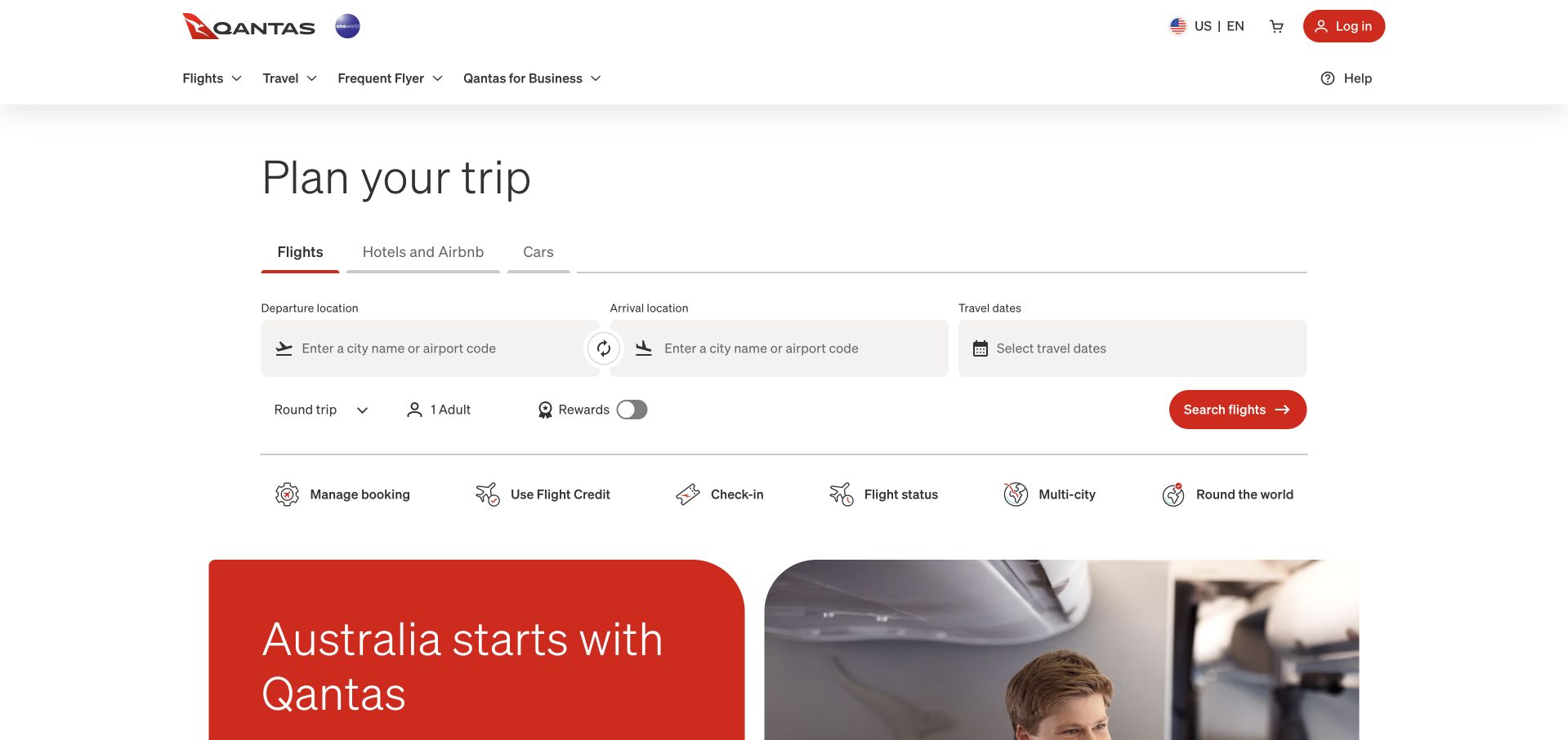
Qantas puts trip planning ahead of brand storytelling. A prominent panel organizes flights, hotels and cars, with labeled departure, arrival and date controls followed by a red search action. Booking management, check-in and flight-status shortcuts sit nearby. The captured public interface contains no entered passenger information or selected itinerary. Workday lists Qantas Airlines as a Human Capital Management customer. No flight-reservation or passenger-data system adoption is implied.
What you can learn
Lead with the task when visitors already know the brand and arrive with a specific intention. Group related controls, preserve clear labels and make defaults understandable. The booking experience can inspire form design, but it provides no evidence that the airline’s internal HCM platform powers reservations.
Pros
The booking panel makes the dominant customer task immediately available without a promotional detour.
Nearby utility links acknowledge that existing travelers have different needs from new bookers.
Cons & considerations
Several travel modes and ancillary options can increase the cognitive load of the first screen.
Forms require robust keyboard, error and date-selection behavior that cannot be judged from a screenshot.
Visible tech stack
Earlier / documented evidence
Workday
Platform source: Official named Workday product-family customer list. Workday lists Qantas Airlines as a Human Capital Management customer. No flight-reservation or passenger-data system adoption is implied. This establishes only the stated organization, workload, product family, regional or historical association. It does not prove the pictured public page runtime, reveal its CMS or frontend, establish a complete current stack, or independently verify vendor-reported results. Platform evidence is separate from the direct website screenshot and is not a complete current infrastructure audit.
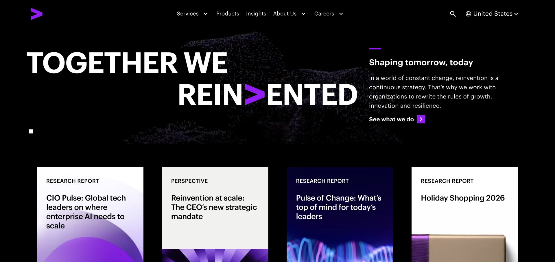
Accenture combines a black background, an oversized reinvention headline and a quieter explanatory column. Purple brand accents tie the composition together, while a row of research cards begins below. The opening relies on typography and controlled contrast rather than a conventional executive portrait or stock meeting-room photograph. Workday names Accenture under Human Capital Management; that customer fact is separate from Accenture’s consulting services or partner credentials.
What you can learn
A services company can be visually assertive without abandoning useful reading paths. Pair a bold statement with specific research or service destinations, and ensure the mobile version retains a sensible sequence. Customer use of an HR platform should not be confused with implementation-partner capability or website technology.
Pros
Large type and a limited palette create a strong identity without elaborate photography.
The visible research cards give readers concrete next steps beneath the broad positioning statement.
Cons & considerations
The reinvention proposition is broad and needs specific evidence to support procurement decisions.
Animated lettering should respect reduced-motion preferences and remain understandable when motion is unavailable.
Platform source: Official named Workday product-family customer list. Workday names Accenture under Human Capital Management; that customer fact is separate from Accenture’s consulting services or partner credentials. This establishes only the stated organization, workload, product family, regional or historical association. It does not prove the pictured public page runtime, reveal its CMS or frontend, establish a complete current stack, or independently verify vendor-reported results. Platform evidence is separate from the direct website screenshot and is not a complete current infrastructure audit.
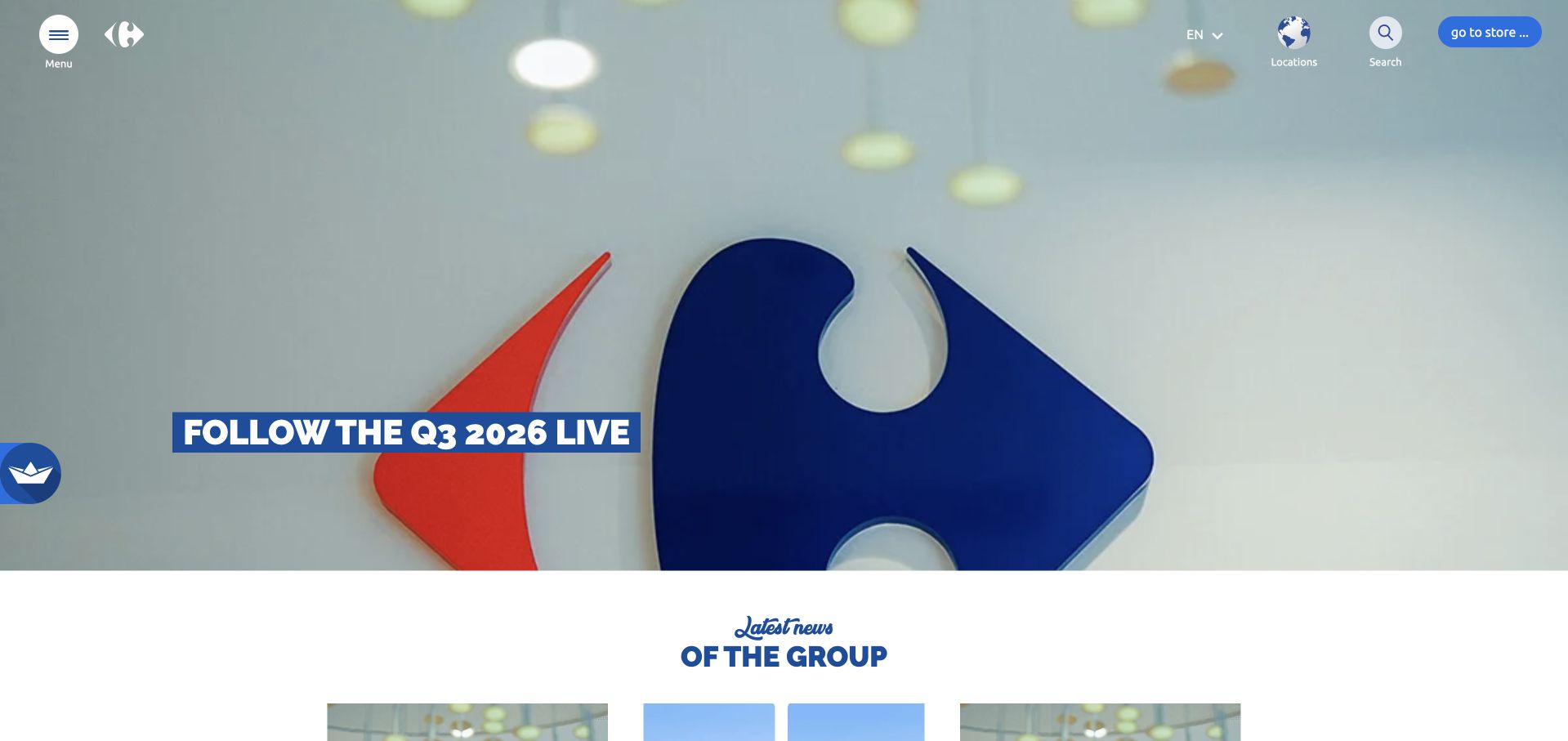
Carrefour’s corporate opening fills the hero with its recognizable emblem and a current results message. Small circular controls and a store link sit around the visual, with group news starting immediately below. The approach gives the brand mark unusual scale while maintaining a distinction between corporate reporting and everyday grocery shopping. Workday lists Carrefour as a Human Capital Management customer, with no country-by-country rollout or storefront runtime specified.
What you can learn
Use a familiar identity to orient visitors, then make the purpose of the current page unmistakable. Corporate news should have stable dates and readable fallback text. For enterprise software references, keep country coverage and business units explicit instead of assuming the retailer operates one uniform global system.
Pros
The enlarged emblem gives the corporate page immediate recognition without relying on a product display.
The transition into group news makes continued exploration apparent after the opening feature.
Cons & considerations
Minimal icon-led controls can require extra effort for people unfamiliar with their meaning.
A results feature should not obscure direct routes for careers, suppliers or local-company information.
Visible tech stack
Earlier / documented evidence
Workday
Platform source: Official named Workday product-family customer list. Workday lists Carrefour as a Human Capital Management customer, with no country-by-country rollout or storefront runtime specified. This establishes only the stated organization, workload, product family, regional or historical association. It does not prove the pictured public page runtime, reveal its CMS or frontend, establish a complete current stack, or independently verify vendor-reported results. Platform evidence is separate from the direct website screenshot and is not a complete current infrastructure audit.
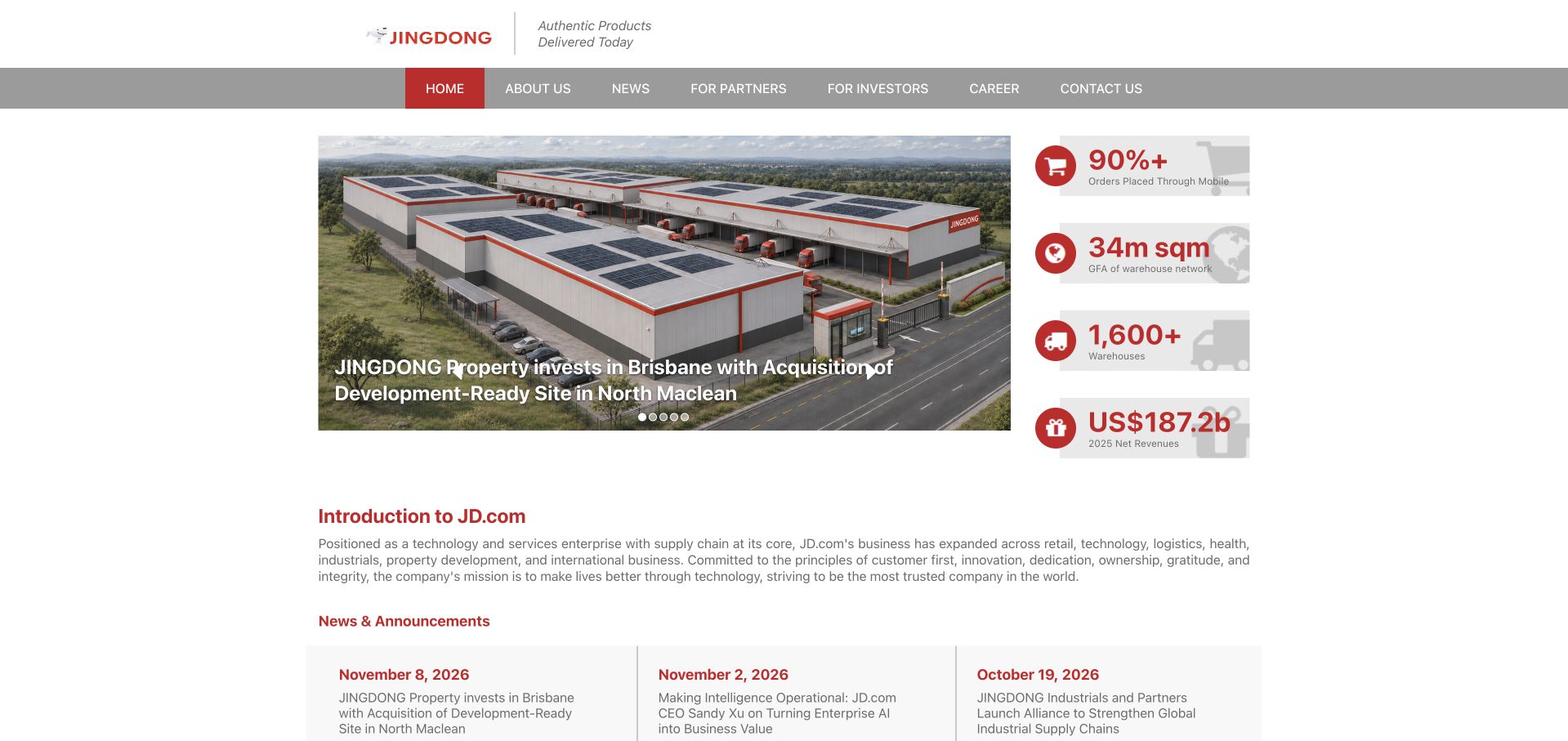
JD.com’s corporate page uses a compact centered layout with a logistics-property feature, numeric panels and a written company introduction. News items appear directly beneath the overview rather than behind a large editorial transition. The result is information-dense and utilitarian, with red accents connecting metrics, navigation and announcements. Workday lists JD.com under Financial Management. The case does not identify JD’s consumer commerce or logistics software as Workday applications.
What you can learn
A corporate audience may value facts and current announcements more than an immersive full-screen hero. Group metrics by meaning, retain dates and avoid presenting vendor-era figures as current. Financial-management adoption is a back-office association; it does not establish the technology behind JD’s shopping or logistics products.
Pros
Company introduction, operational figures and news are available within a relatively compact reading area.
Consistent red accents distinguish important categories without requiring many different decorative styles.
Cons & considerations
Small typography and tightly packed panels may be difficult to read on modest displays.
Metric labels need clear periods and definitions so their apparent precision does not mislead.
Visible tech stack
Earlier / documented evidence
Workday
Platform source: Official named Workday product-family customer list. Workday lists JD.com under Financial Management. The case does not identify JD’s consumer commerce or logistics software as Workday applications. This establishes only the stated organization, workload, product family, regional or historical association. It does not prove the pictured public page runtime, reveal its CMS or frontend, establish a complete current stack, or independently verify vendor-reported results. Platform evidence is separate from the direct website screenshot and is not a complete current infrastructure audit.
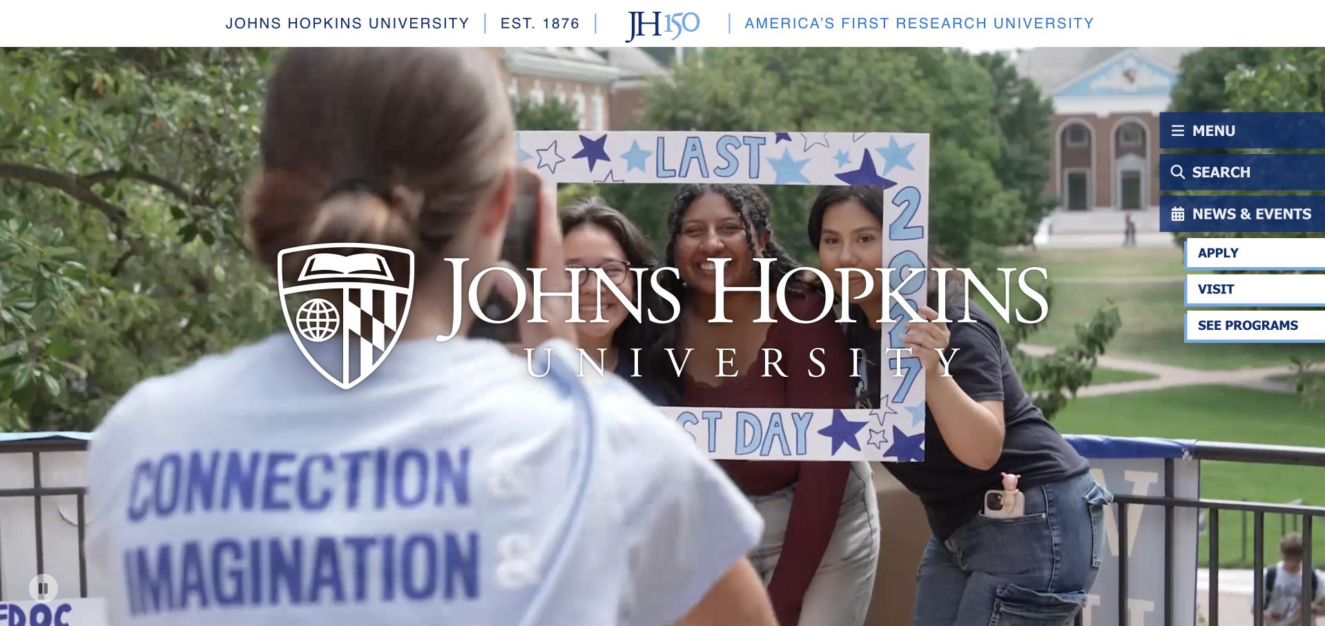
Johns Hopkins University overlays its name and crest on a campus scene, with an anniversary line above and a vertical set of practical shortcuts at the side. The composition treats the institution’s identity as the main subject while still surfacing apply, visit and program-related routes. The scene feels situated rather than generically academic. Workday lists Johns Hopkins University as a Financial Management customer. This is not evidence for every Johns Hopkins health-system entity.
What you can learn
A university can express heritage without forcing every visitor through a long institutional story. Preserve practical shortcuts and label the relevant organization precisely. A financial-management customer listing for the university should not automatically extend to affiliated hospitals or imply anything about their clinical or public web systems.
Pros
The crest, anniversary reference and campus image establish a specific institutional identity.
A side-mounted shortcut group makes several common university tasks visible over the feature.
Cons & considerations
A very large wordmark can compete with the human subjects in the photograph.
Overlay navigation needs reliable contrast, touch targets and a clear order for keyboard users.
Visible tech stack
Earlier / documented evidence
Workday
Platform source: Official named Workday product-family customer list. Workday lists Johns Hopkins University as a Financial Management customer. This is not evidence for every Johns Hopkins health-system entity. This establishes only the stated organization, workload, product family, regional or historical association. It does not prove the pictured public page runtime, reveal its CMS or frontend, establish a complete current stack, or independently verify vendor-reported results. Platform evidence is separate from the direct website screenshot and is not a complete current infrastructure audit.
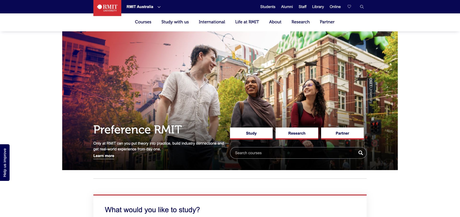
RMIT’s public page combines a navy institutional header with a campus-and-student collage. Study, research and partner tabs sit beside a course-search field, giving the hero a practical role beyond a campaign image. Utility links for students, alumni and staff remain separate from the main prospect-oriented navigation. Workday names Royal Melbourne Institute of Technology under Financial Management. The public RMIT University page is the matched institution’s design reference.
What you can learn
Define audiences before arranging university content. A future student, research collaborator and staff member need different routes even when they share one brand. Use explicit labels and stable search behavior, and keep finance-platform association distinct from claims about the learning environment or public course catalog.
Pros
Study, research and partnership routes give the main visual a useful navigational structure.
The course-search field acknowledges a concrete prospective-student task within the opening area.
Cons & considerations
Several navigation levels and audience utilities can create considerable complexity on mobile screens.
The collage needs clear alternative text and careful responsive cropping to retain its meaning.
Platform source: Official named Workday product-family customer list. Workday names Royal Melbourne Institute of Technology under Financial Management. The public RMIT University page is the matched institution’s design reference. This establishes only the stated organization, workload, product family, regional or historical association. It does not prove the pictured public page runtime, reveal its CMS or frontend, establish a complete current stack, or independently verify vendor-reported results. Platform evidence is separate from the direct website screenshot and is not a complete current infrastructure audit.
Kegan has 15+ years of experience working with small businesses, Fortune 500 companies, and everything in between. No development job is too big or too small: he brings the same hands-on attention to a focused improvement, a complete website, or a custom application.
For Workday projects, he can help with content architecture, custom functionality, system integrations, testing, and maintainable handover. He works directly with clients on scope, design, implementation, testing, and handover, with an emphasis on clear communication and a system that remains practical to maintain after launch.
Show 3 other Workday developersHide other Workday developers
Start by reviewing the current process with the business owner and Workday administrator. A confusing approval path, missing instruction or inconsistent role may be a configuration or change-management problem rather than a reason to build an app. Test the revised process with real examples, including a declined request and a person who changes role during processing.
Build a focused Extend application
Use Extend when a specific business need justifies an application within the Workday environment. The Target and Netflix cases illustrate bounded staff and procurement tasks rather than a replacement for the entire platform. Define the screens, underlying data, authorization and completion record. Include development, testing, promotion and support responsibilities in the brief from the beginning.
Integrate with a separate system
Some workflows must exchange data with an external service, website or enterprise application. Identify the system of record, permitted fields and approved direction of change. Use an appropriate integration identity and validate the actual response rather than assuming delivery means acceptance. Document reconciliation, monitoring and recovery when the systems disagree or an update is interrupted.
From references to requirements
Build the brief with process owners and administrators
Map ordinary work and exceptions
Follow a real request from its origin to the final record and notification. Identify approvers, delegates and business rules, including cancellation and correction. Distinguish local requirements from group-wide policy. Agree on the measurable improvement, such as reducing duplicate entry or clarifying approval status, without promising results based on another customer’s vendor-reported performance.
Separate access, migration and validation decisions
Document which people may see, change and approve each type of information. Inventory imported and synchronized data, including source identifiers and effective dates. Reconcile representative records with the business owner rather than checking only totals. Record what will not be migrated and how historical information remains available to the appropriate authorized users.
Plan the application lifecycle
Define the nonproduction environment, test accounts and evidence needed before a release. Include a promotion process, rollback or recovery plan and named support ownership. Test dependencies after changes to roles, business processes or connected systems. A project is not finished when one demonstration works; it is ready when the organization can operate and maintain the workflow responsibly.
A useful handover demonstration
Ask the actual team to carry out its routine job: publish a realistic update, correct a mistake, preview a narrow screen, and identify who owns an integration failure. For a library or frontend framework, also ask who maintains the content source and deployment. A polished screenshot does not answer those operational questions.
Beyond the screenshot
Workday development planning checklist
Name the relevant Workday product and business process.
Identify the legal entity, region and intended user groups.
Define the authoritative record and completion condition.
Map approvals, delegation, cancellation and correction paths.
Review data and page access with the Workday administrator.
Use representative nonproduction roles and test data.
Inventory every external dependency and exchanged field.
Define integration identity and credential ownership.
Reconcile migrated or synchronized records with business owners.
Test denied access and interrupted updates, not just successful requests.
Document release, recovery and ongoing support responsibilities.
Train users on the actual workflow before expanding its scope.
Test with real content, a keyboard, a small screen, slow or failed requests, and the people who will maintain the system. These are planning checks, not an accessibility, security, performance, or search-ranking certification.
Sources & editorial method
How this Workday collection was reviewed
Each public page was captured directly in Chrome and visually inspected. The associated evidence comes from official Workday cases or the current customer-facts list. The list is vendor documentation, not an independent deployment audit. Dated workflows and old company statistics are not restated as current facts, and affiliated entities are not silently merged.
Every image is an unmodified capture from the actual website, with its source and capture date. Some captures are reused from our shared catalog; their dates remain the original capture dates. None comes from a vendor gallery or a generated reconstruction. Moving imagery and live content can change.
Technology attribution uses public page assets or metadata, official platform documentation, or a cited first-party project case study. Documentary and framework-relationship evidence is identified where used; it is not a complete current backend inventory. A CMS image CDN alone does not establish a full CMS deployment. A library’s presence does not prove which individual controls use it, and a platform label does not establish AI authorship.
The composition notes, lessons, pros and tradeoffs are original editorial observations. We have not measured conversion, traffic, security, performance or accessibility conformance. Website owners retain their brands and imagery; these examples are not our client portfolio. Written, Edited and Curated are independent records, not dates advanced by a build. See our editorial standards or suggest a correction.
Questions worth asking
Workday website development FAQs
Does a Workday customer listing establish every module used?
No. A listing under Human Capital Management or Financial Management supports that category only. Specific modules, regions, dates and workflows need their own evidence. This collection does not infer them from brand recognition.
Can Workday power a public website?
The relevant question is which specific product or integration serves a defined task. These screenshots do not establish public website runtime. A marketing CMS, recruitment experience and internal tenant should be evaluated as separate architectural components.
When is Extend a good fit?
Consider it for a defined application need within an existing Workday environment when the data, security model and lifecycle fit the organization. Review simpler configuration options first and involve administrators and process owners in the decision.
Why keep HR and finance examples separate?
Their records, approvals, users and risks differ. An employee benefits application and an accounting-data integration may share a vendor but require different controls, subject-matter expertise and acceptance tests.
What does a responsible handoff contain?
A process map, access decisions, tested application or configuration, integration inventory, migration reconciliation, release instructions and named support owners. Include known limitations and a safe procedure for recovering from interrupted work.
Start with the precise enterprise task and its owners. Borrow a useful communication pattern from the public examples, then build the authorized workflow, validation and support needed for your organization’s actual environment.