SvelteKit website examples for clear routes and useful interfaces (20 Real-World Examples)
Twenty distinct public properties, genuine screenshots and exact SvelteKit evidence across search, publishing, commerce, documentation and developer tools.
A framework gives a website structure; the design decides whether that structure is understandable. These examples connect route planning, content models and interaction states to the visible experience.
SvelteKit supports building websites and applications with Svelte. The collection focuses on identifiable public properties with exact SvelteKit build resources or bootstrap signatures. Evidence for a marketing page, annual report or documentation site does not establish the architecture of a separate private application, checkout system or every other website owned by the same organization.
The references range from a single search input to a multi-pane code workspace. Their common design challenge is continuity: visitors need to know where they are, what can happen next and how to return to useful context. The reviews examine those decisions using real captures rather than treating framework choice as proof of speed, accessibility or product quality.
Before the examples
What makes good SvelteKit website development in 2026?
Choose rendering behavior for the route
SvelteKit supports page-level control over rendering and prerendering. Decide which content can be prepared ahead of time and which depends on a request or a user. Let that decision follow the information being presented; a public annual report and a personalized workspace do not have the same needs.
Use descriptive page titles and deliberate focus behavior. SvelteKit provides route announcements and focus management, but application code still needs careful headings, labels and meaningful destinations. Check the actual interface with keyboard and assistive technology rather than assuming the framework completes accessibility work.
SvelteKit form actions support server-handled submissions with optional progressive enhancement. Plan the ordinary form behavior before adding richer client feedback. Preserve useful input after validation errors and distinguish a rejected field from a network problem or a completed action.
Decathlon Sustainability, Brave Search, Rakuten Viki, Stack Overflow’s 2025 Developer Survey and Yelp’s Top 100 property open the collection. Each is scoped to the specific public website or edition shown, followed by fifteen examples spanning visual publishing, software marketing, component documentation and smaller commercial sites.
We start with five recognizable brands or organizations: Decathlon Sustainability, Brave Search, Rakuten Viki, Stack Overflow Developer Survey 2025, Yelp Top 100 Places to Eat 2025. Each attribution applies to the named website property, not every product or website belonging to its organization. This is a curated reading sequence, not a measured ranking.
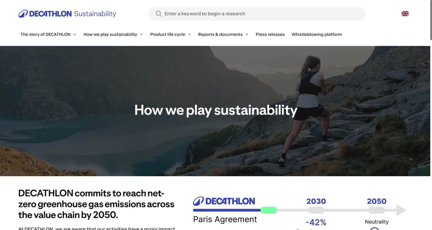
Decathlon Sustainability opens with a broad outdoor photograph and a short heading, then moves directly into a net-zero statement and a timeline graphic. The blue wordmark, keyword search and horizontal menu give the page a clear relationship to the wider retail brand while separating this property from the shopping catalog. Reports and documents have their own navigation route, which matters for readers who want supporting material rather than campaign imagery. Current SvelteKit bootstrap and immutable asset references were visible on this exact property. They support a scoped website association; the design review does not assess the underlying sustainability claims or infer the technology of Decathlon’s other websites.
What you can learn
Make evidence navigation as visible as the story itself. A content framework should support short narrative pages and longer reporting material with clear routes, consistent titles and stable document links across languages and screen sizes.
Pros
The reporting route gives detail-oriented readers an alternative to the hero narrative.
The timeline introduces a structured way to scan the stated goals.
Cons & considerations
The large photograph delays the supporting detail below the opening screen.
Several long navigation labels need careful handling on smaller displays.
Platform source: Public reference: sustainability.decathlon.com. Current public DOM inspected 2026-11-05 contains a __sveltekit bootstrap and SvelteKit _app/immutable assets, including https://sphere-assets.decathlon.net/prod-c0e7aeb8-1791903540/_app/immutable/assets/index-wonder-foundations.Df6bs2RH.css. Scoped to the Sustainability property; no assertion about the retail website. Platform evidence is separate from the direct website screenshot and is not a complete current infrastructure audit.
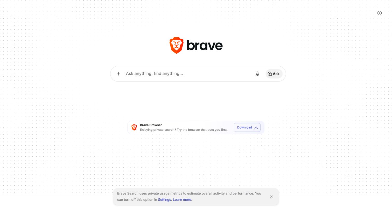
Brave Search reduces its landing page to a centered brand mark and a large query field. The field includes separate affordances for AI features, voice input and asking a question, while a small browser-download action sits below. Settings remain in the upper corner and informational links occupy the footer. This is a useful SvelteKit example because the interface emphasizes one primary task rather than treating the home route as a long marketing page. Current DOM inspection showed the SvelteKit bootstrap and immutable application resources on search.brave.com. No search was submitted, and the visual review does not establish how results, ranking or account features are implemented.
What you can learn
Define a clear default interaction before adding alternate modes. Keep secondary controls legible and explain their purpose, then test keyboard focus and error states without letting the framework’s routing make the search entry point feel unpredictable.
Pros
The central input is unmistakably the principal action on the page.
Footer information remains separate from the query interface.
Cons & considerations
Several small controls share the input and may need clearer differentiation.
The sparse opening provides little explanation of how the available query modes differ.
Visible tech stack
Earlier / documented evidence
SvelteKit
Platform source: Public reference: search.brave.com. Current public DOM inspected 2026-11-05 contains a __sveltekit bootstrap and SvelteKit immutable resources, including https://cdn.search.brave.com/serp/v3/_app/immutable/nodes/0.D9OtP8FW.js. Scoped to the public search landing page; no search or account workflow was submitted. Platform evidence is separate from the direct website screenshot and is not a complete current infrastructure audit.
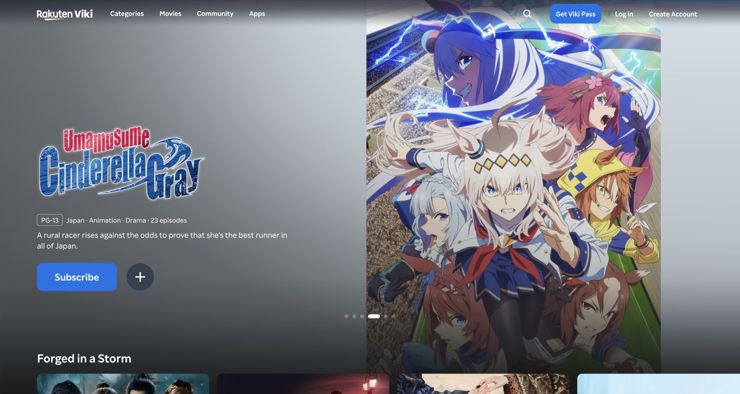
Rakuten Viki opens with a featured title presentation rather than a generic statement about streaming. The capture pairs illustrated key art with a title mark, age guidance, country, genre and episode count, followed by a short synopsis and a subscription action. The navigation offers categories, movies, community and apps, and another content row begins below the hero. For SvelteKit planning, the useful pattern is the separation between route-level content data and repeated catalog components. A featured title needs its own metadata and destination, while the surrounding navigation and card rows should remain consistent as visitors move between very different programs.
What you can learn
Build content routes around reliable metadata before polishing transitions. Keep title identity, availability and the primary viewing or subscription action understandable, and ensure that a large artwork crop does not become the only way to recognize the featured program.
Pros
The hero supplies concrete genre and episode context alongside its imagery.
The next content row signals that the catalog extends beyond the featured title.
Cons & considerations
Large key art leaves limited room for longer descriptions on smaller screens.
Subscription and discovery actions need clear differentiation for new visitors.
Visible tech stack
Referenced on the public page
SvelteKit
Platform source: Public reference: viki.com. Linked stylesheet matches SvelteKit on 2026-11-04: https://1.viki.io/a/vwk8s-svelte/_app/immutable/assets/button.Czsy0wn2.css. The public build-resource signature is scoped to this exact page/property; it does not establish the architecture of other services or private applications. Platform evidence is separate from the direct website screenshot and is not a complete current infrastructure audit.
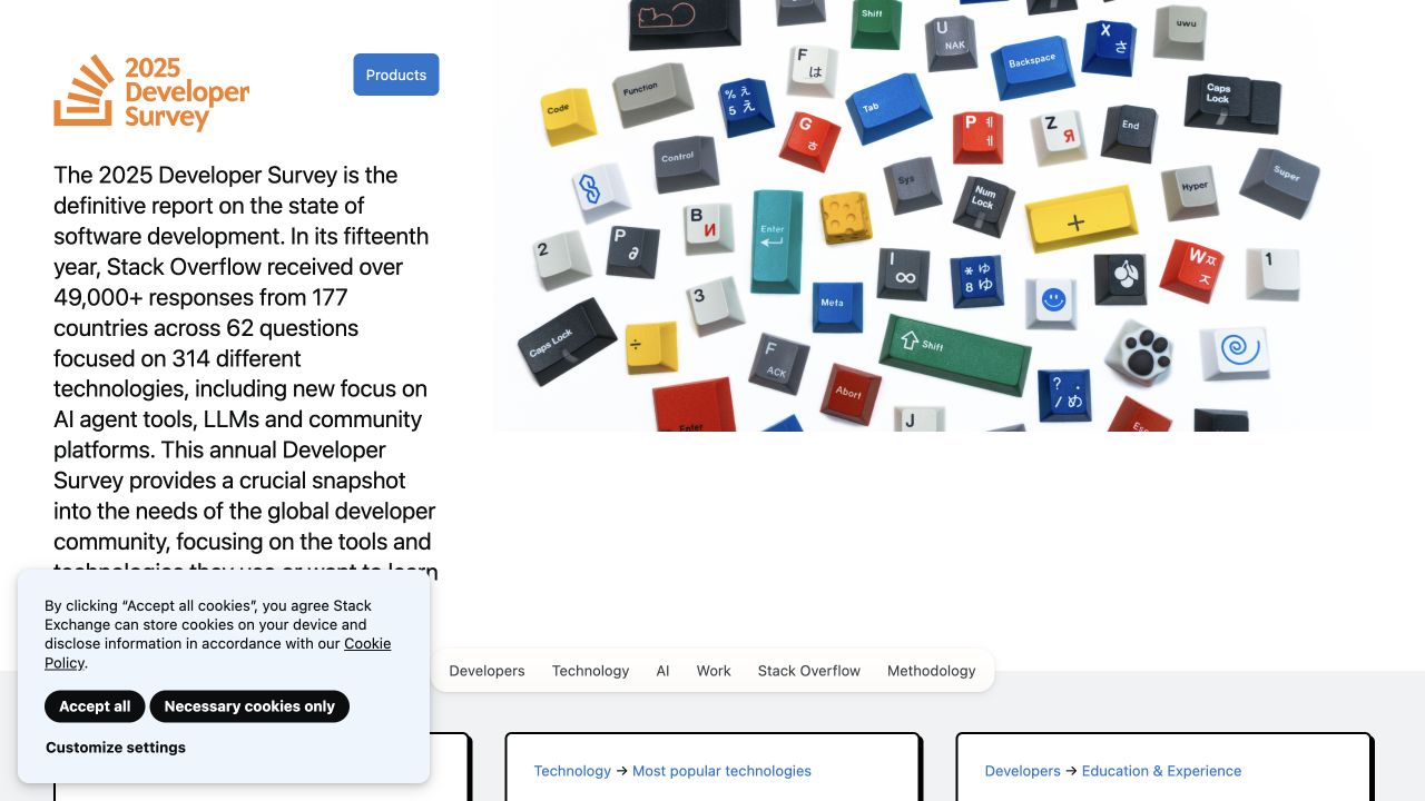
Stack Overflow’s 2025 Developer Survey presents its edition prominently, with an introduction beside a collage of illustrated technology tiles. The text explains the survey’s scale and subject matter before a horizontal set of report sections begins below. This is a distinct annual publication, and the capture should be understood as the 2025 edition rather than a current-year survey. The design offers a useful SvelteKit reference for a large report: introductory context, thematic navigation and individual data sections need to work together as a coherent reading experience. A cookie panel occupies part of the captured view, demonstrating how consent interfaces can interrupt otherwise carefully arranged editorial material.
What you can learn
Give research editions stable URLs and conspicuous dates. Organize sections so that a reader can enter through a deep link, understand which edition they are reading and move to methodology without returning to the opening page.
Pros
The edition is clearly identified before the visitor encounters individual findings.
Thematic section navigation gives the lengthy publication a visible structure.
Cons & considerations
The dense introduction asks for substantial reading before the first data view.
The captured consent panel covers some introductory content and navigation space.
Platform source: Observed first-party page or linked application asset. Linked stylesheet matches SvelteKit on 2026-11-03: https://survey.stackoverflow.co/2025/_app/immutable/assets/2.Dv1kzRbA.css. The public build-resource signature is scoped to this exact page/property; it does not establish the architecture of other services or private applications. Platform evidence is separate from the direct website screenshot and is not a complete current infrastructure audit.
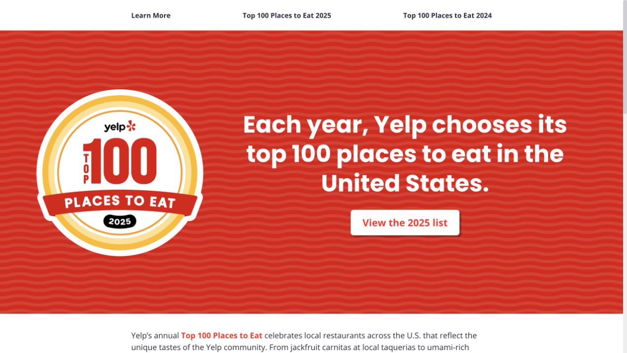
Yelp’s Top 100 property uses a saturated red field, a large award-style badge and a straightforward invitation to view the 2025 list. A slim header links to more information and the 2024 and 2025 editions. This precise edition context is important: the capture represents the displayed annual list, not a claim about the latest ranking. As a SvelteKit reference, the page shows the value of a focused editorial route with a small number of durable choices. The main action has a single destination, while the surrounding edition links give returning readers a way to compare or revisit earlier material.
What you can learn
Treat each annual collection as a durable piece of content with a clear year and accessible entry route. Keep the primary list action prominent, and use a consistent structure for future editions without silently rewriting the meaning of archived links.
Pros
The year is visible in both the badge and the primary list action.
Earlier-edition navigation supports readers returning to a specific annual collection.
Cons & considerations
The first screen provides little preview of the individual restaurants.
The promotional badge takes more space than the explanatory text.
Platform source: Public reference: top100.yelp.com. Linked stylesheet matches SvelteKit on 2026-11-03: https://top100.yelp.com/_app/immutable/assets/2.0be078d9.css. The public build-resource signature is scoped to this exact page/property; it does not establish the architecture of other services or private applications. Platform evidence is separate from the direct website screenshot and is not a complete current infrastructure audit.
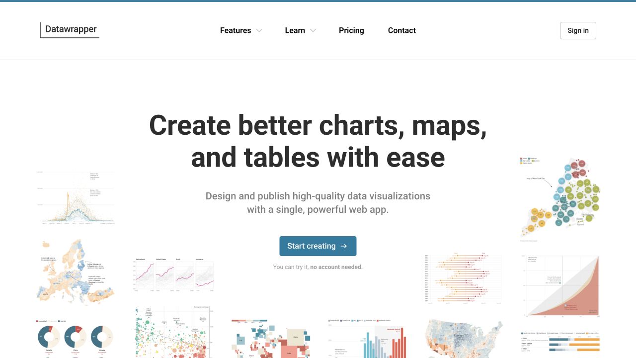
Datawrapper places a concise promise about charts, maps and tables in the center of a mostly white page. Small visualization examples spread around and below the headline, giving concrete shape to the otherwise broad product category. A blue creation action sits beneath a short explanation, with a note about trying the tool without an account. The navigation separates features, learning, pricing and contact. For SvelteKit site planning, this is a useful marketing-to-product boundary: the public route explains the output and offers a clear next step without pretending that the landing page itself demonstrates the full editing workflow or the implementation of the signed-in application.
What you can learn
Show representative outputs near the promise, then make the transition into the tool explicit. Keep marketing navigation and application navigation conceptually separate so that visitors understand when they are reading, evaluating or starting an editing task.
Pros
The visualization collage makes the range of possible outputs easy to grasp.
The trial note reduces uncertainty around the primary creation action.
Cons & considerations
Some miniature charts are too small to read as substantive examples.
The generous white space delays detailed feature explanations below the hero.
Platform source: Observed first-party page or linked application asset. Linked stylesheet matches SvelteKit on 2026-11-03: https://www.datawrapper.de/_app/immutable/assets/0.qY5RrYDZ.css. The public build-resource signature is scoped to this exact page/property; it does not establish the architecture of other services or private applications. Platform evidence is separate from the direct website screenshot and is not a complete current infrastructure audit.
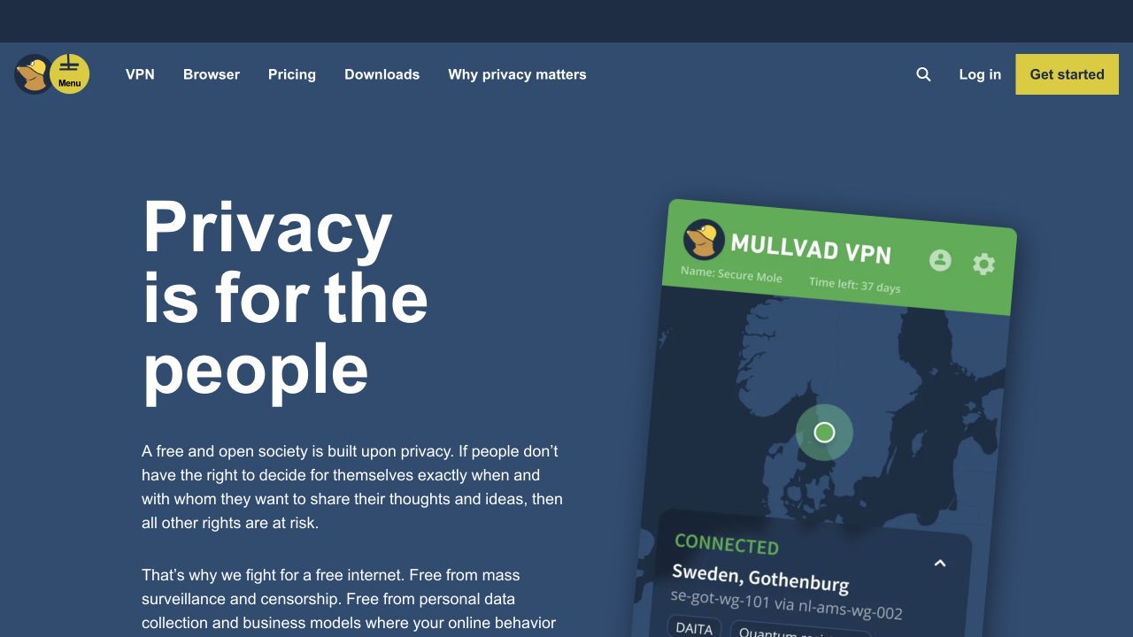
Mullvad uses a blue background, a large privacy statement and several short explanatory paragraphs beside an enlarged VPN interface. The app image shows a map and a connected state, turning an abstract promise into a familiar product shape. VPN, browser, pricing and downloads are all present in the header, with a yellow Get started action at the far right. The SvelteKit lesson is about route clarity rather than a specific visual effect: different product and explanation pages need to share a coherent structure while letting visitors move quickly from values to pricing or installation information. The screenshot does not verify the privacy performance of the service.
What you can learn
Connect broad principles to concrete product routes. A framework can organize a substantial information site, but the designer still needs plain language, explicit destinations and enough visual context to help visitors distinguish the website from the downloadable application.
Pros
The product interface gives the service a tangible visual reference.
Pricing and downloads remain visible alongside the explanatory content.
Cons & considerations
The text-heavy opening may require more reading than a task-focused visitor expects.
The large tilted app image reduces space available for detailed website guidance.
Platform source: Observed first-party page or linked application asset. Linked stylesheet matches SvelteKit on 2026-11-03: https://mullvad.net/_app/immutable/assets/0.X8-HNnkP.css. The public build-resource signature is scoped to this exact page/property; it does not establish the architecture of other services or private applications. Platform evidence is separate from the direct website screenshot and is not a complete current infrastructure audit.
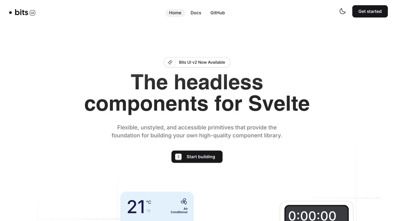
Bits UI centers a large statement about headless components for Svelte, followed by a short explanation of the intended building blocks and a dark Start building action. The navigation remains sparse, with home, documentation and GitHub grouped across the top. Small component demonstrations enter the bottom of the first screen, including a weather-style card and a timer. This is useful for SvelteKit documentation planning because the introduction sets expectations before exposing the full component inventory. The visual examples suggest variety, while the primary action makes the next route clear. The page itself is an example of the framework; that does not validate every accessibility claim made by the library.
What you can learn
Explain what a developer receives before asking them to install anything. Keep conceptual positioning, documentation and source access distinct, and make component examples representative enough that they clarify the library’s purpose rather than merely decorating the introduction.
Pros
The short explanation defines the library’s role without a dense feature list.
Documentation and source-code routes are easy to locate.
Cons & considerations
Only the upper portions of demonstration cards appear in the first screen.
The broad headline leaves implementation constraints for later documentation pages.
Platform source: Observed first-party page or linked application asset. Linked script matches SvelteKit on 2026-11-03: https://bits-ui.com/_app/immutable/entry/start.CEc7AveK.js. The public build-resource signature is scoped to this exact page/property; it does not establish the architecture of other services or private applications. Platform evidence is separate from the direct website screenshot and is not a complete current infrastructure audit.
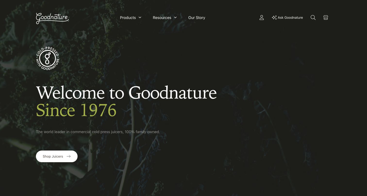
Goodnature uses a dark botanical image and a restrained serif headline to introduce its history. The date in the hero gives the brand story a specific anchor, while a light Shop juicers button supplies a practical next step. Products, resources and the company story remain visible in the header, alongside account, search and cart utilities. As a SvelteKit example, the useful pattern is the coexistence of editorial and commercial routes within one visual system. The landing page can establish the company’s character without forcing a visitor to read its history before reaching the equipment. The captured scene does not establish the implementation of checkout or account functions.
What you can learn
Design story and product routes together so that each supports the other. Keep the primary product action visible on editorial pages, and use shared navigation to make resources easy to reach without obscuring the main equipment selection journey.
Pros
The historical date makes the brand introduction more concrete.
The product action remains visible within the atmospheric hero.
Cons & considerations
Dark imagery and subdued text demand careful contrast checks.
The first screen offers little detail for comparing specific juicer models.
Platform source: Prismic’s official public website gallery. Linked stylesheet matches SvelteKit on 2026-11-03: https://www.goodnature.com/_app/immutable/assets/0.B8C0KnDl.css. The public build-resource signature is scoped to this exact page/property; it does not establish the architecture of other services or private applications. Platform evidence is separate from the direct website screenshot and is not a complete current infrastructure audit.
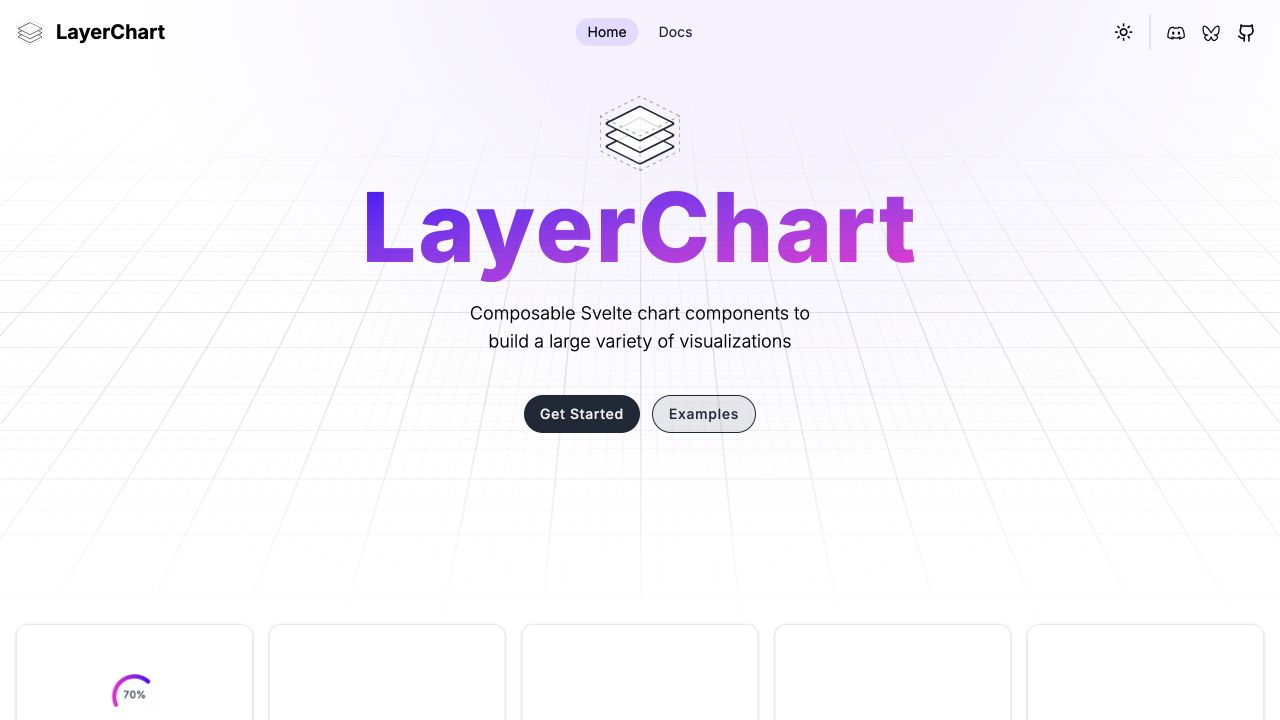
LayerChart places its name in a large purple gradient above a concise description of composable Svelte chart components. A subtle perspective grid creates a technical setting, while Get started and Examples provide two different entry routes. The first demonstration cards appear below the main introduction. The SvelteKit design lesson is the division between learning and inspection: some visitors need installation guidance, while others want to see whether a particular chart type is possible. The page’s restrained header leaves those two decisions prominent. Its visuals suggest a broad visualization system without requiring the opening route to contain every chart, option or interaction at once.
What you can learn
Separate the route for understanding an API from the route for examining outputs. Give examples meaningful titles and stable addresses so that developers can return to a relevant chart directly after reviewing the introductory material.
Pros
The two principal actions acknowledge different stages of product evaluation.
The brief description explains the relationship to Svelte before deeper exploration.
Cons & considerations
The decorative grid occupies substantial space without explaining a specific capability.
The chart previews begin near the fold and require scrolling for detail.
Platform source: Observed first-party page or linked application asset. Linked stylesheet matches SvelteKit on 2026-11-03: https://www.layerchart.com/_app/immutable/assets/dist.By1c9Fve.css. The public build-resource signature is scoped to this exact page/property; it does not establish the architecture of other services or private applications. Platform evidence is separate from the direct website screenshot and is not a complete current infrastructure audit.
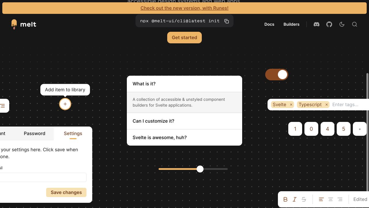
Melt surrounds its introduction with recognizable interface elements: an accordion, a switch, a slider, segmented controls and small utility cards. A dark dotted background and warm yellow accent tie these otherwise different examples together. Documentation and builder links stay in the header, along with a visible installation command and a version-related announcement. This is a useful SvelteKit reference because the public site behaves visually like a catalog of interaction primitives. The collection of controls explains the product more directly than a long feature paragraph could. At the same time, a screenshot cannot establish keyboard behavior, focus management or the accessibility of those demonstrated components.
What you can learn
Use demonstrations to explain what the library supplies, then provide a deliberate route into the corresponding documentation. Keep version notices conspicuous and test the actual controls with keyboard input instead of treating a polished component collage as behavioral evidence.
Pros
Recognizable controls communicate the library’s scope quickly.
The installation and documentation routes are visible near the top.
Cons & considerations
Many demonstration elements compete for attention in the same viewport.
A prominent version announcement can distract from the core introduction.
Platform source: Observed first-party page or linked application asset. Linked stylesheet matches SvelteKit on 2026-11-03: https://melt-ui.com/_app/immutable/assets/0.N0FjClQv.css. The public build-resource signature is scoped to this exact page/property; it does not establish the architecture of other services or private applications. Platform evidence is separate from the direct website screenshot and is not a complete current infrastructure audit.
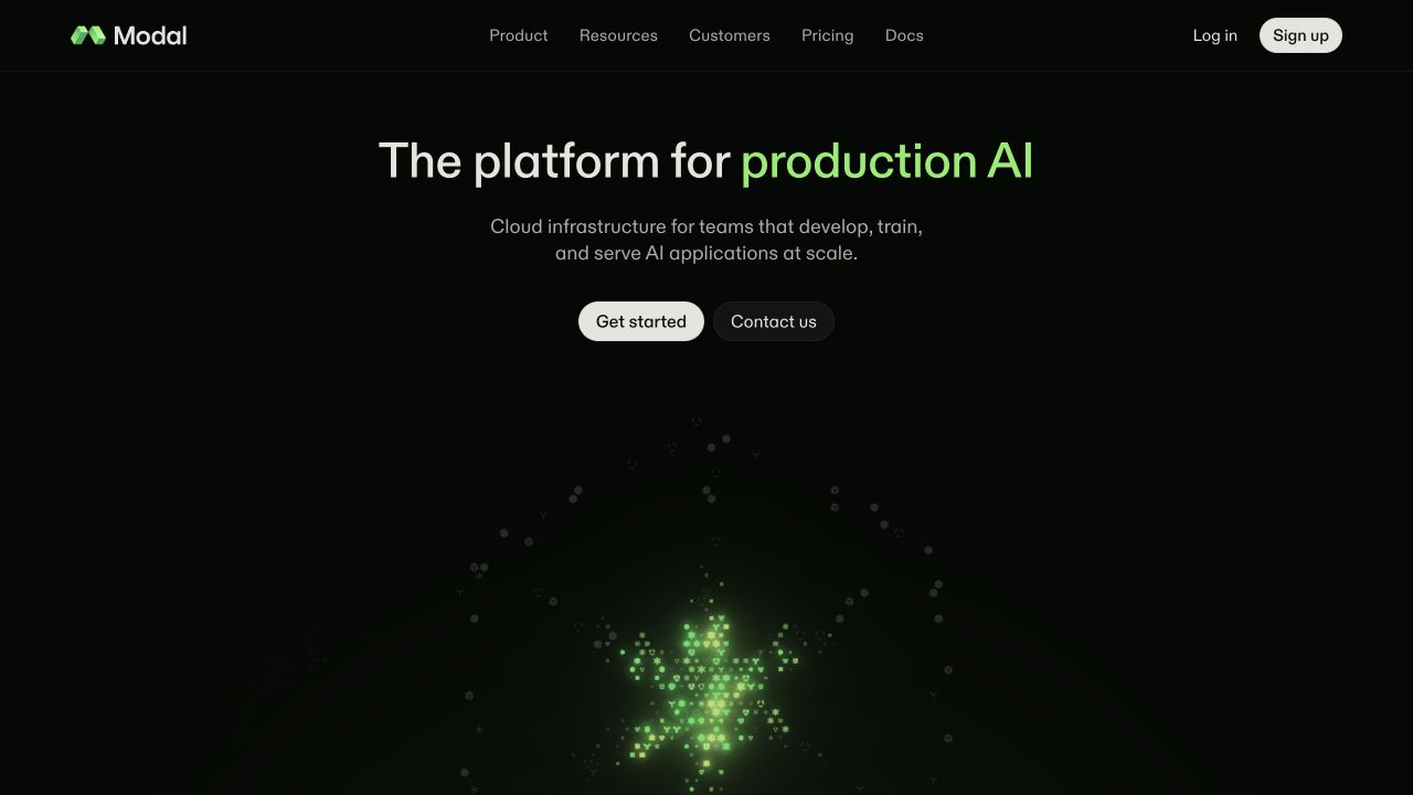
Modal uses a near-black canvas, a short production-AI headline and a compact explanation of its infrastructure role. A green particle-like visual appears lower in the hero, leaving the text and two actions largely unobstructed. Get started and Contact us sit together, while product, resources, customers, pricing and documentation occupy the header. For SvelteKit marketing architecture, the useful pattern is the parallel path: one visitor can begin learning or building, while another can seek a conversation. The public landing page’s framework evidence concerns this website; it does not establish the architecture, model capabilities or operational performance of the infrastructure being marketed.
What you can learn
Keep the developer and evaluation paths equally understandable. Let deeper routes explain product constraints, pricing and documentation, and use the landing page to orient visitors before introducing elaborate interactive demonstrations or a large feature inventory.
Pros
The two actions support different purchasing and learning preferences.
The restrained hero leaves the main explanation easy to scan.
Cons & considerations
The abstract visual does little to explain how the platform works.
The first screen contains limited concrete evidence of the advertised capabilities.
Platform source: Observed first-party page or linked application asset. Linked stylesheet matches SvelteKit on 2026-11-03: https://modal.com/_app/immutable/assets/A.hG1Z8V-D.css. The public build-resource signature is scoped to this exact page/property; it does not establish the architecture of other services or private applications. Platform evidence is separate from the direct website screenshot and is not a complete current infrastructure audit.
MUZE Salon puts its practical information in a narrow left column and gives the rest of the screen to a fashion-oriented photograph. The black wordmark, vertical menu, online booking link, social icons and address form a compact stack against a pale background. The image establishes the aesthetic without carrying essential navigation text. As a SvelteKit reference, this is a reminder that a modern framework need not produce a dense application-like interface. A small service site can benefit from a restrained set of routes and a consistent visual shell. The public page evidence does not establish the technology behind the separate booking destination.
What you can learn
Start with the few tasks a local customer needs: services, people, location and booking. Keep those routes readable and easy to revisit, and let editorial photography support the business identity without becoming a barrier to contact information.
Pros
Booking and contact information occupy the same predictable information column.
The separate image area protects menu text from photographic contrast changes.
Cons & considerations
Small address and contact details are visually quieter than the main menu.
The large image provides atmosphere but little explanation of specific services.
Platform source: Public reference: muzesalon.com. Linked stylesheet matches SvelteKit on 2026-11-03: https://www.muzesalon.com/_app/immutable/assets/0.KNYgp9k_.css. The public build-resource signature is scoped to this exact page/property; it does not establish the architecture of other services or private applications. Platform evidence is separate from the direct website screenshot and is not a complete current infrastructure audit.
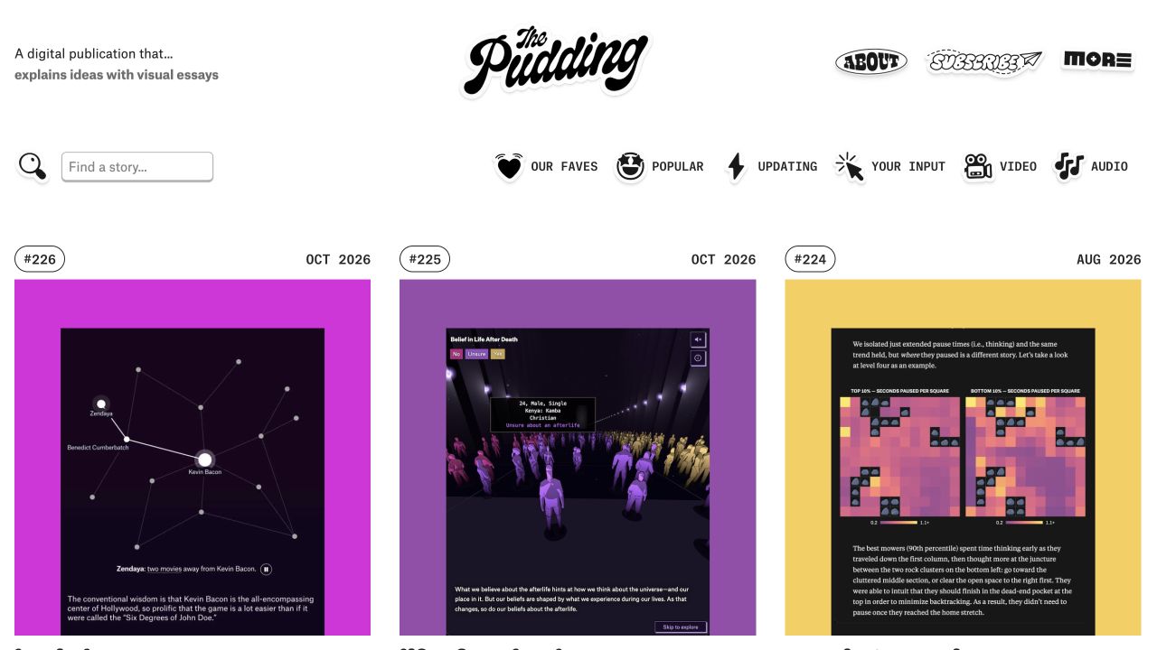
The Pudding treats its homepage as a visual index of stories. A distinctive script wordmark sits above a row of category-like filters, search and a set of large, colorful story cards. Edition numbers and dates appear above the cards, helping distinguish the individual essays even though their imagery varies widely. The SvelteKit lesson is about the relationship between a shared archive and custom article experiences. The index needs dependable structure and recognizable navigation, while each story can retain its own visual language. Framework evidence for the homepage should not be stretched into a claim that every historical interactive essay uses the same implementation.
What you can learn
Build the archive as a durable navigation system for diverse work. Preserve story dates and direct links, and give custom articles a clear path back to the collection so their individual art direction does not strand the reader.
Pros
Dates and sequence numbers give the visual cards useful editorial context.
Search and topical routes support readers who do not browse by image alone.
Cons & considerations
Highly varied card artwork can make the archive feel visually busy.
Small labels above large images require careful treatment on narrow screens.
Platform source: Observed first-party page or linked application asset. Linked stylesheet matches SvelteKit on 2026-11-03: https://pudding.cool/_app/immutable/assets/0.C2Vp5USR.css. The public build-resource signature is scoped to this exact page/property; it does not establish the architecture of other services or private applications. Platform evidence is separate from the direct website screenshot and is not a complete current infrastructure audit.
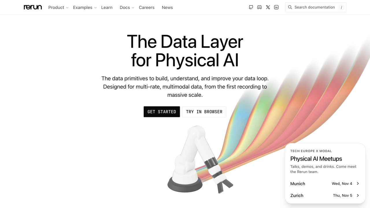
Rerun combines a large data-layer headline with a robotic-arm illustration that emits colored streams across the right side of the page. A short explanation sits above Get started and Try in browser actions. Product, examples, learning and documentation routes remain visible in the header, and a small event card appears in the lower corner. The SvelteKit reference is the clear distinction between learning about the product and trying a bounded demonstration. The image connects the abstract data language to a physical system, but it is still explanatory artwork rather than evidence of a specific live application or its performance.
What you can learn
Offer a clear demonstration route beside documentation, and explain what a visitor can expect before entering it. Keep event promotions secondary so that time-sensitive announcements do not obscure the durable product and learning navigation.
Pros
The two actions distinguish setup guidance from an immediate browser experience.
The robotic illustration gives the abstract data proposition a concrete context.
Cons & considerations
The event card competes with the lower portion of the main visual.
The broad headline requires supporting detail to explain the product’s boundaries.
Platform source: Observed first-party page or linked application asset. Linked stylesheet matches SvelteKit on 2026-11-03: https://rerun.io/_app/immutable/assets/0.BHpqILSx.css. The public build-resource signature is scoped to this exact page/property; it does not establish the architecture of other services or private applications. Platform evidence is separate from the direct website screenshot and is not a complete current infrastructure audit.
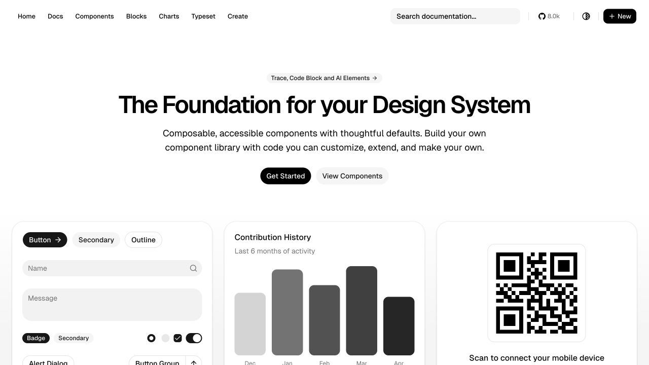
shadcn-svelte introduces its design-system proposition with a broad headline, a short explanation and two actions: getting started and viewing components. A utility-rich header includes documentation search and several content categories, while the first row of demonstrations includes controls, a contribution chart and a QR-code panel. The page is useful for SvelteKit information architecture because it balances orientation with direct lookup. New visitors can read the introduction, while returning developers can search or jump to a known component. The variety of examples also makes the scope visible without requiring the hero to enumerate every available primitive or layout.
What you can learn
Design documentation for both first visits and repeated reference. Keep search prominent, use consistent component destinations and make the relationship between examples and source guidance explicit. Visual polish should be supported by actual interaction and accessibility testing.
Pros
Documentation search supports visitors returning with a specific component in mind.
The examples show several different interface categories near the introduction.
Cons & considerations
The dense header can compete with the two primary onboarding actions.
Small demonstration text becomes difficult to interpret when cards are compressed.
Platform source: Observed first-party page or linked application asset. Linked script matches SvelteKit on 2026-11-03: https://www.shadcn-svelte.com/_app/immutable/entry/start.DO0C8uU9.js. The public build-resource signature is scoped to this exact page/property; it does not establish the architecture of other services or private applications. Platform evidence is separate from the direct website screenshot and is not a complete current infrastructure audit.
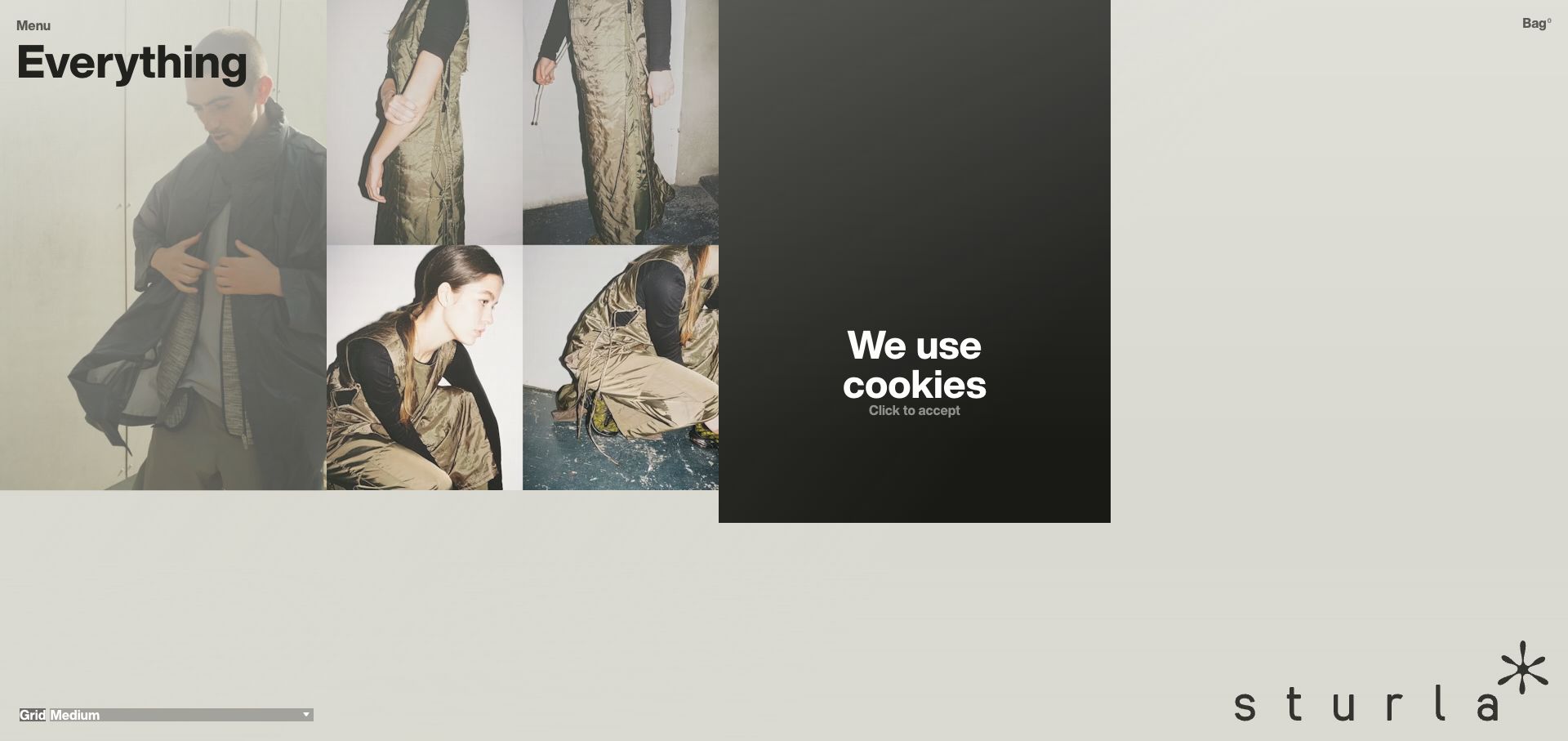
Sturla London uses a pale canvas, a compact Everything heading and a collage of fashion images near the top of the page. Menu and bag controls sit at opposite corners, while the spaced-out brand mark anchors the lower right. The captured cookie panel forms a dark rectangle beside the images, visibly affecting the composition. This is a useful SvelteKit reference for an unconventional storefront because the design depends on deliberate placement and sparse controls rather than a familiar category-heavy header. The framework association concerns this public property; the capture alone does not establish how checkout, inventory or account operations are implemented.
What you can learn
Keep unconventional browsing layouts understandable through stable labels and predictable destinations. Evaluate the page with consent panels and other real overlays present, since those states can alter the intended editorial composition more than a normal content change.
Pros
The restrained interface gives the fashion photography a distinctive editorial setting.
Menu and bag occupy consistent opposite corners of the viewport.
Cons & considerations
The captured consent panel interrupts the image grouping.
Minimal labels offer little guidance about available categories before opening the menu.
Platform source: DatoCMS customer case or implementation-partner project showcase. Linked stylesheet matches SvelteKit on 2026-11-03: https://sturlalondon.com/_app/immutable/assets/0.ye_D3C2D.css. The public build-resource signature is scoped to this exact page/property; it does not establish the architecture of other services or private applications. Platform evidence is separate from the direct website screenshot and is not a complete current infrastructure audit.
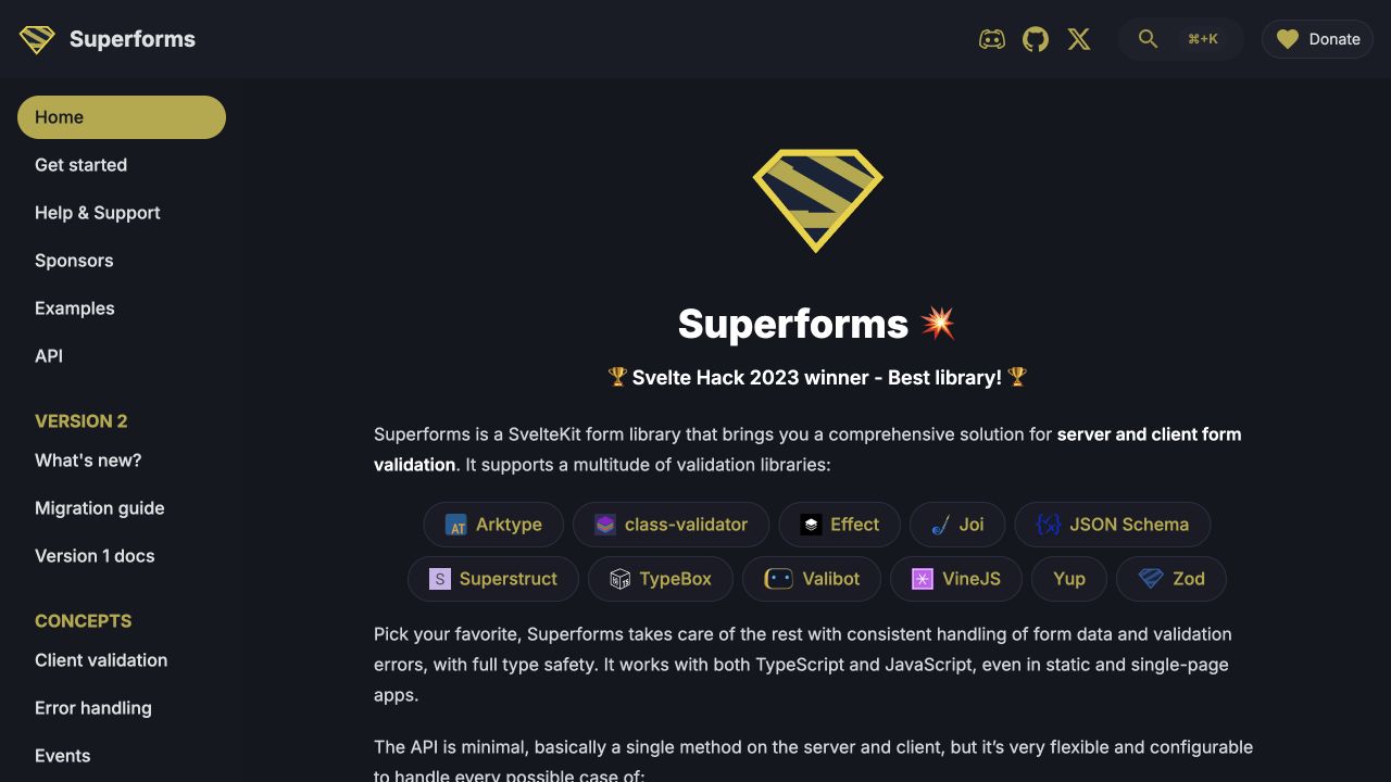
Superforms places a persistent left navigation beside a dark main content area. The opening section explains its role as a SvelteKit form library, then displays a collection of validation-library badges and further explanatory text. The sidebar separates getting started, support, examples, API material, version information and concepts. This is a useful framework documentation pattern because visitors can see the shape of the learning journey before reading deeply. The main page supplies context while the sidebar makes specialized topics discoverable. The visual review does not establish the behavior of the library’s forms; those need separate implementation and interaction testing.
What you can learn
Make concepts, reference material and migration guidance distinct routes. A documentation shell should help readers preserve their place as they move between examples and API details, especially when different library versions require different instructions.
Pros
The sidebar exposes practical learning and reference routes at once.
Integration badges make the range of supported validation approaches visible.
Cons & considerations
The opening contains substantial text before a concrete form example appears.
Many sidebar sections can become cumbersome in a compressed mobile menu.
Platform source: Observed first-party page or linked application asset. Linked stylesheet matches SvelteKit on 2026-11-03: https://superforms.rocks/_app/immutable/assets/ProgressBar.GF2QhaCt.css. The public build-resource signature is scoped to this exact page/property; it does not establish the architecture of other services or private applications. Platform evidence is separate from the direct website screenshot and is not a complete current infrastructure audit.
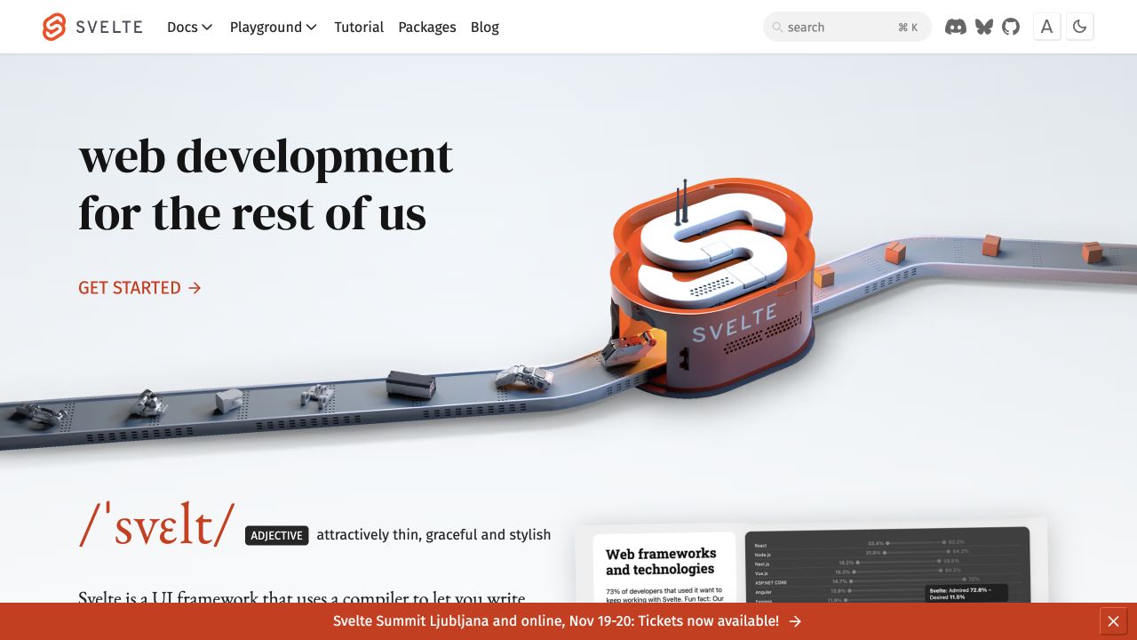
Svelte’s homepage pairs a large editorial headline with a playful conveyor-belt illustration centered on the framework’s orange identity. Documentation, playground, tutorial, packages and blog appear in the header, with search and utility icons on the right. The beginning of a dictionary-style explanation is visible below the hero. As a SvelteKit example, the page shows how a technical ecosystem can use a memorable visual introduction without hiding its practical learning routes. The public site’s use of the framework is distinct from the capabilities of every package linked from it, and the image should be read as branding rather than a technical architecture diagram.
What you can learn
Keep learning destinations visible from the first screen and maintain consistent navigation across the ecosystem. Use expressive visuals to establish recognition, but let documentation, examples and searchable reference material carry the explanation of how the technology actually works.
Pros
Tutorial and playground routes are available before the visitor starts scrolling.
The orange visual identity connects the illustration with the framework wordmark.
Cons & considerations
The large hero postpones detailed technical explanation below the fold.
The crowded utility area needs careful prioritization on smaller displays.
Platform source: Observed first-party page or linked application asset. Linked script matches SvelteKit on 2026-11-03: https://svelte.dev/_app/immutable/entry/start.BbyJB1oN.js. The public build-resource signature is scoped to this exact page/property; it does not establish the architecture of other services or private applications. Platform evidence is separate from the direct website screenshot and is not a complete current infrastructure audit.
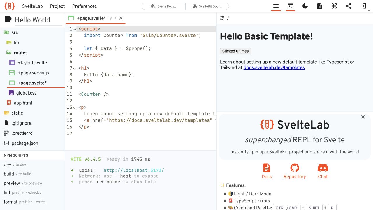
SvelteLab presents a multi-pane workspace rather than a conventional marketing hero. A file tree sits on the left, an editor occupies the center and a live preview appears on the right, with terminal output below the editor. The captured project includes SvelteKit route files and a simple rendered page, giving the user an immediate relationship between source structure and visible output. This is a particularly useful SvelteKit design reference because the interface must preserve context across several simultaneous tasks. The screenshot shows a public workspace state; it does not establish how code execution is isolated or how saved projects are stored.
What you can learn
Keep file selection, editing feedback and rendered output distinguishable even when space is limited. Provide clear pane boundaries and keyboard routes, and decide which areas should collapse on smaller screens without losing the relationship between the selected file and its result.
Pros
Source files and the rendered page are visible within one workspace.
Terminal output has a dedicated area separate from the editor and preview.
Cons & considerations
The many panes leave limited space for each task on a laptop-sized screen.
Small icons and dense controls require deliberate labeling and keyboard support.
Platform source: Observed first-party page or linked application asset. Recognizable SvelteKit signature in inline code/styles on 2026-11-03: https://www.sveltelab.dev/. The public build-resource signature is scoped to this exact page/property; it does not establish the architecture of other services or private applications. Platform evidence is separate from the direct website screenshot and is not a complete current infrastructure audit.
Kegan has 15+ years of experience working with small businesses, Fortune 500 companies, and everything in between. No development job is too big or too small: he brings the same hands-on attention to a focused improvement, a complete website, or a custom application.
For SvelteKit projects, he can help with responsive interfaces, reusable components, custom functionality, API connections, and performance-minded implementation. He works directly with clients on scope, design, implementation, testing, and handover, with an emphasis on clear communication and a system that remains practical to maintain after launch.
Show 3 other SvelteKit developersHide other SvelteKit developers
Keep dates, editions and methodology visible. Give substantial sections stable addresses so readers can share or revisit a finding without starting at the homepage. Preserve archived meaning when a new annual edition appears.
Product marketing and discovery
Separate learning, comparison and starting an account. Use representative output or product imagery near the promise, and make transitions into a different application or checkout explicit. The public marketing framework need not be the architecture of every linked service.
Documentation and browser tools
Design for both first visits and repeated lookup. Keep search, examples and reference material easy to distinguish. For workspaces, use clear pane boundaries and sensible collapse behavior so file selection, editing feedback and output remain connected on smaller screens.
From references to requirements
Define the content and state boundaries
Map durable destinations
List the pages people need to link, bookmark and return to. Decide which content belongs in a shared layout and which needs a distinct route. Keep language, edition and product identity visible instead of relying on transient client state to supply essential context.
Design loading and error content
Prepare meaningful states for missing records, delayed responses, invalid inputs and unavailable third-party services. A loading indicator should explain what is pending without making a completed page appear empty. Keep critical navigation usable while optional content is still arriving.
Review deployment and rendering assumptions
Confirm the deployment target and rendering options in the actual project. Test direct entry to deep links, refreshes and navigation from older URLs. Keep server-only data out of public output and verify that page metadata matches the route being delivered.
Ask the actual team to carry out its routine job: publish a realistic update, correct a mistake, preview a narrow screen, and identify who owns an integration failure. For a library or frontend framework, also ask who maintains the content source and deployment. A polished screenshot does not answer those operational questions.
Beyond the screenshot
SvelteKit development checklist
Define stable routes for products, reports, articles and documentation.
Keep property and edition scope explicit in headings and metadata.
Choose rendering behavior according to each route’s information needs.
Design useful loading, missing-content and error states.
Preserve form input and clearly distinguish validation from network errors.
Test titles, focus, keyboard navigation and route announcements.
Check deep links, refreshes and narrow-screen navigation.
Verify the actual public output rather than inferring behavior from a framework signature.
Test with real content, a keyboard, a small screen, slow or failed requests, and the people who will maintain the system. These are planning checks, not an accessibility, security, performance, or search-ranking certification.
Sources & editorial method
How this SvelteKit collection was reviewed
Twenty distinct public properties were selected using exact SvelteKit resource or bootstrap evidence and genuine browser captures. Reused screenshots retain their original dates, dimensions and attribution. Resource observations retain their original dates separately. New Brave Search and Decathlon Sustainability DOM observations were made on November 5, 2026. Every source has a broad public stack-audit attempt; a rate-limited audit does not erase separately recorded browser evidence or authorize bypassing restrictions. No searches, forms, account creation or purchases were submitted.
Every image is an unmodified capture from the actual website, with its source and capture date. Some captures are reused from our shared catalog; their dates remain the original capture dates. None comes from a vendor gallery or a generated reconstruction. Moving imagery and live content can change.
Technology attribution uses public page assets or metadata, official platform documentation, or a cited first-party project case study. Documentary and framework-relationship evidence is identified where used; it is not a complete current backend inventory. A CMS image CDN alone does not establish a full CMS deployment. A library’s presence does not prove which individual controls use it, and a platform label does not establish AI authorship.
The composition notes, lessons, pros and tradeoffs are original editorial observations. We have not measured conversion, traffic, security, performance or accessibility conformance. Website owners retain their brands and imagery; these examples are not our client portfolio. Written, Edited and Curated are independent records, not dates advanced by a build. See our editorial standards or suggest a correction.
Questions worth asking
SvelteKit website development FAQs
Does SvelteKit evidence on a homepage identify the entire company’s stack?
No. The evidence is scoped to the inspected public property and path. A company may use different technologies for its marketing site, application, checkout, support center and archived publications.
Are Svelte and SvelteKit the same thing?
Svelte supplies the component framework, while SvelteKit provides the application and website framework around it. This collection requires exact SvelteKit evidence rather than treating any Svelte association as sufficient.
Does using SvelteKit guarantee accessibility or fast loading?
No. Content, assets, application code, deployment choices and interaction design still need review. Framework features can support the work, but the finished interface must be tested in its own context.
Why preserve the year on the Stack Overflow and Yelp examples?
Those captures represent specific annual publications. Keeping the edition visible avoids presenting an archived report or ranking as the latest one and preserves the meaning of its URL and screenshot.
Use SvelteKit’s structure to support clear destinations, understandable state changes and durable content. The route should make sense to the visitor before the transition feels polished.