Best Resend Websites of 2026 (20 Real-World Examples)
Twenty public websites and web services with documented Resend email workflows, direct screenshots and original design observations.
A good website explains what happens next. A good email continues that explanation after the visitor leaves: a sign-in link, an invitation, a receipt or an update they chose to receive.
Resend is an email delivery platform, so its role often sits behind the visible website. The examples here connect a public product experience with a specific communication workflow described in an official customer case. A creator marketplace, a signing service and a flight-alert tool have very different needs, even when they use the same delivery provider. Their interfaces are useful references for how clearly they introduce those needs.
The collection separates what can be seen on the page from what the supporting source documents. A current screenshot shows the public design. A customer case describes an email relationship that may have begun earlier. Neither alone proves the entire current backend, deliverability, conversion rate or security of the service. Study the decisions and their tradeoffs, then choose an implementation that fits your own users.
Before the examples
What makes good Resend website development in 2026?
Start with the message’s job
Name the event and the reader’s next action before choosing a template. An account invitation, an expiring login link and a weekly product digest need different wording, urgency and expectations. The website should establish those expectations before a message arrives. A successful API response is an operational event; it is not proof that someone read or acted on an email.
Keep sending authority on the server
The official Node.js guide requires an API key and a verified domain. Keep sending credentials in server configuration, not a public page or browser bundle. Build a narrow application action around the legitimate user task, with an approved sender and a validated destination, instead of exposing a general-purpose email form.
Use a sender identity people can connect to the service they visited. Resend documents verified domains and separately configured subdomains for different sending purposes. Plan the visible sender, reply handling and message category together. A familiar identity helps readers understand a message, but it does not replace permission or accurate content.
An interrupted request can leave the application unsure whether an email was accepted. Resend documents idempotency keys for supported sending requests, with a twenty-four-hour retention window. Keep a durable application record of the underlying event as well, so retries and later recovery can be reconciled without treating every timeout as permission for another message.
These examples include marketplaces, developer platforms, document tools and specialist web services. Each review explains the public design and the narrower email relationship supported by its cited customer case.
We start with five recognizable brands or organizations: Gumroad, HARO (Help a Reporter Out), Convex, Mintlify, Firecrawl. Each attribution applies to the named website property, not every product or website belonging to its organization. This is a curated reading sequence, not a measured ranking.
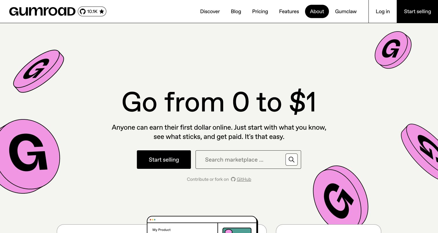
Gumroad builds its opening around a modest first sale rather than a sprawling feature inventory. Oversized lettering and scattered pink coin illustrations give the cream page a playful identity, while the central selling button makes the creator route unmistakable. A marketplace search immediately below serves visitors who came to buy. That combination explains both sides of the service without two competing hero panels. Resend's customer case describes creator updates and audience communications after a migration; it documents an email relationship, not the technology that draws this homepage. The restrained starting promise is the most transferable design decision.
What you can learn
Choose a first milestone customers can understand, then make its next action obvious. When buyers and sellers share an entrance, give the secondary audience a useful route without diluting the main invitation.
Pros
Distinctive illustration and large type make the introductory promise easy to remember.
The marketplace search offers an immediate alternative to the creator signup path.
Cons & considerations
The sparse opening postpones detailed selling terms until visitors explore further.
Playful income language needs concrete product information nearby to support informed decisions.
Platform source: Official Resend customer case — documented email workflow. Official Resend customer case read November 11, 2026. Creator updates and new-release communications to purchasers and audiences, as described by Gumroad’s CEO in the vendor case. Official customer-case association for the named web service’s email workflow. The current public screenshot is not proof that Resend renders the page or of its complete current infrastructure; historical case claims are not newly measured results. Platform evidence is separate from the direct website screenshot and is not a complete current infrastructure audit.
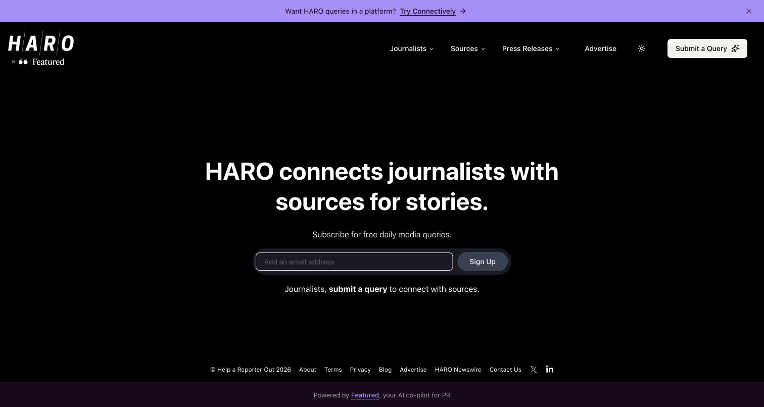
HARO's black opening screen makes a complicated exchange look unusually simple. A large white headline identifies the relationship between journalists and sources, with an email field positioned as the main entry point. A separate query link underneath helps journalists find their own route. Audience labels in the navigation reinforce the distinction, while the purple announcement bar adds context above the otherwise spare composition. Resend's Featured customer case explicitly describes HARO's recurring journalist and source emails following its revival. That evidence belongs to HARO's email service; it does not make Featured and HARO interchangeable websites.
What you can learn
Explain who supplies information and who receives it before asking either audience to register. Keep the alternate participation route close to the primary action, and make expectations about recurring communication easy to find.
Pros
The headline quickly establishes the practical relationship between the two audiences.
Minimal navigation and generous space keep the central participation action visible.
Cons & considerations
The opening offers little preview of what an actual journalist query contains.
A single email field still needs clear frequency and eligibility information around it.
Platform source: Official Resend customer case — documented email workflow. Official Resend customer case read November 11, 2026. HARO’s recurring journalist and source emails following the service’s revival, explicitly identified in the Featured customer case. Official customer-case association for the named web service’s email workflow. The current public screenshot is not proof that Resend renders the page or of its complete current infrastructure; historical case claims are not newly measured results. Platform evidence is separate from the direct website screenshot and is not a complete current infrastructure audit.
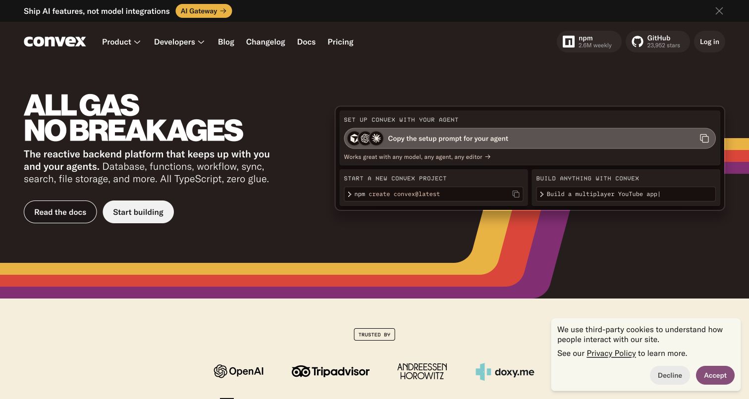
Convex pairs a distinctive dark palette and striped border with a direct developer proposition. The main heading is followed by a concise list of backend responsibilities, giving the visual slogan a concrete foundation. Documentation and building actions sit together, while the adjacent setup panel shows a command and agent-oriented instructions. This is useful because a technical buyer can see both the promise and the beginning of implementation. Resend's case documents account validation, invitations, deployment notices and billing emails for Convex. The dated migration account supports those workflows, not a complete inventory of the public page's current infrastructure.
What you can learn
Place a realistic starting instruction beside the marketing explanation. Give a reader enough context to recognize the workflow, while keeping fuller prerequisites and integration details available through a clearly named documentation route.
Pros
The setup panel turns an abstract backend claim into an understandable next step.
The distinctive visual framing helps the platform stand apart from generic developer pages.
Cons & considerations
A cookie panel occupies part of the lower content in the captured view.
The energetic headline needs its supporting feature sentence to explain the actual product.
Platform source: Official Resend customer case — documented email workflow. Official Resend customer case read November 11, 2026. Account validation, team invitations, deployment-change notices and billing messages for the Convex developer platform. Official customer-case association for the named web service’s email workflow. The current public screenshot is not proof that Resend renders the page or of its complete current infrastructure; historical case claims are not newly measured results. Platform evidence is separate from the direct website screenshot and is not a complete current infrastructure audit.
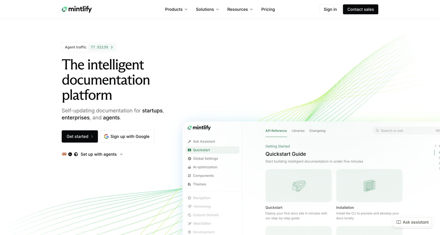
Mintlify uses a pale green background pattern, editorial typography and a large documentation preview to present a technical product calmly. The left column explains the service, while the right column shows the interface people would actually use. Starting options and a separate agent setup route acknowledge that visitors arrive with different workflows. The product preview is more persuasive as an explanation than a decorative illustration would be. Resend's founder case describes login and activation emails for Mintlify. Historical conversion statements in that case are not measurements of this captured page, and the association does not establish its frontend runtime.
What you can learn
Show the information structure your product creates, not just a list of promised benefits. Separate human onboarding from machine-oriented setup with clear labels, while keeping both connected to the same underlying product explanation.
Pros
The documentation preview gives the central product claim a tangible visual reference.
Calm color and generous spacing help the explanatory copy remain easy to scan.
Cons & considerations
The large preview extends beyond the initial view, limiting immediate inspection of details.
Several starting methods require careful labels so newcomers can choose with confidence.
Platform source: Official Resend customer case — documented email workflow. Official Resend customer case read November 11, 2026. Login and activation emails for the Mintlify documentation service, described in a founder customer case. Official customer-case association for the named web service’s email workflow. The current public screenshot is not proof that Resend renders the page or of its complete current infrastructure; historical case claims are not newly measured results. Platform evidence is separate from the direct website screenshot and is not a complete current infrastructure audit.
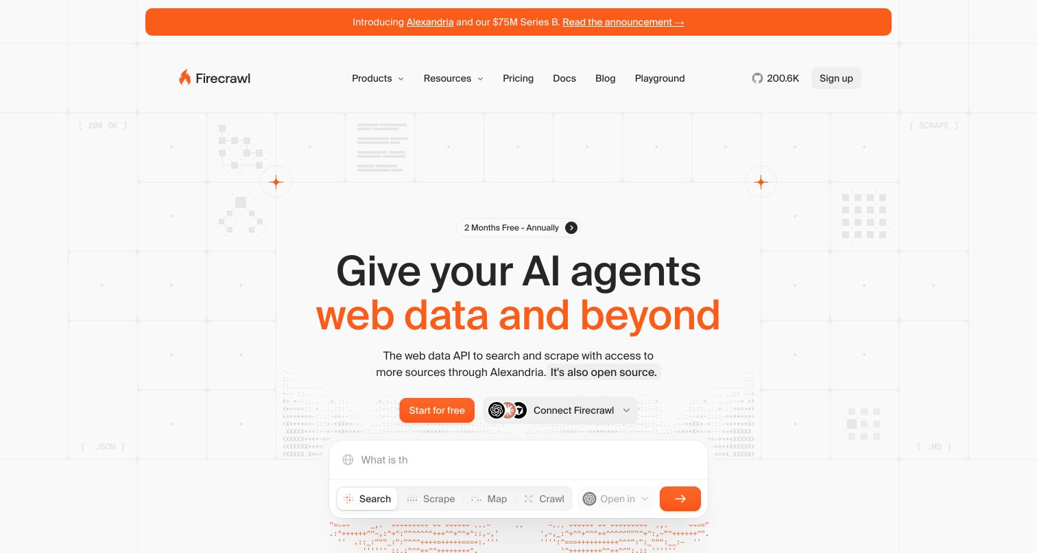
Firecrawl combines a light technical grid with orange emphasis and a clear description of its web data API. The opening introduces search and scraping in ordinary language, then presents a large input area with labeled modes. That public interface makes the product feel approachable before a visitor reads the documentation. The signup and connection routes sit above the composer, while documentation and a playground remain easy to find in the header. Resend's customer story names data-ingestion notifications and team invitations for the service. Those are user communication workflows, rather than proof that Resend renders or crawls the pictured page.
What you can learn
Give a developer tool a recognizable starting surface, but label each operation precisely. Connect the demonstration to documentation so a visitor can distinguish an approachable preview from the requirements of a production integration.
Pros
The restrained orange accents direct attention to the product promise and primary actions.
Named input modes make the range of web-data tasks easier to understand.
Cons & considerations
The announcement banner and subscription offer add competing messages above the central task.
The input preview needs supporting limits and output examples elsewhere for a complete evaluation.
Platform source: Official Resend customer case — documented email workflow. Official Resend customer case read November 11, 2026. Notifications about data ingestion and team invitations for the Firecrawl web-data service. Official customer-case association for the named web service’s email workflow. The current public screenshot is not proof that Resend renders the page or of its complete current infrastructure; historical case claims are not newly measured results. Platform evidence is separate from the direct website screenshot and is not a complete current infrastructure audit.
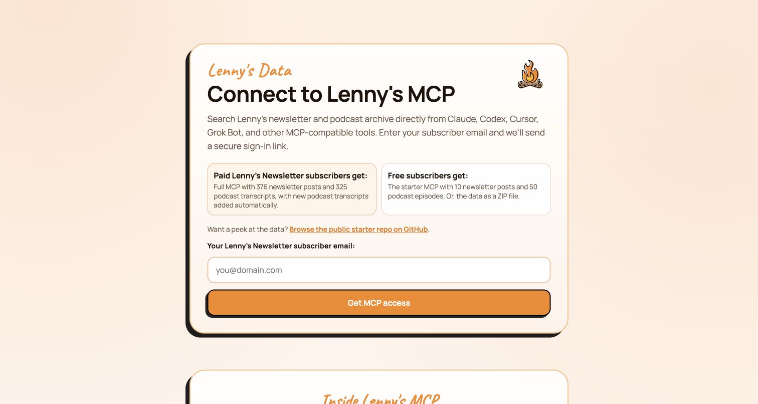
Lenny's Data puts the access decision inside a single rounded card. Its heading identifies the MCP connection, and a short explanation names the newsletter and podcast archive behind it. Two side-by-side panels distinguish paid and free subscriber access before the email field appears. A public repository link offers a way to inspect a sample without beginning authentication. The orange button and illustrated campfire keep the page personal rather than institutional. Lenny Rachitsky's Resend case specifically describes magic-link authentication for Lenny's Data. It is not evidence that Resend distributes the separate general newsletter subscription.
What you can learn
Explain entitlement before requesting an email address. A concise comparison of access levels and a public sample can answer the most important questions while leaving the authentication step focused on one clear purpose.
Pros
Free and paid access are compared immediately above the sign-in request.
The public sample repository provides a useful inspection route before registration.
Cons & considerations
MCP terminology assumes familiarity that some newsletter subscribers may not yet have.
The prominent access form leaves deeper setup instructions below the opening card.
Platform source: Official Resend customer case — documented email workflow. Official Resend customer case read November 11, 2026. Magic-link authentication for Lenny’s Data, specifically identified by the founder; not the general newsletter distribution service. Official customer-case association for the named web service’s email workflow. The current public screenshot is not proof that Resend renders the page or of its complete current infrastructure; historical case claims are not newly measured results. Platform evidence is separate from the direct website screenshot and is not a complete current infrastructure audit.
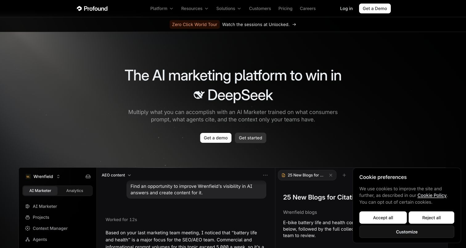
Profound's dark introduction names AI marketing and rotates the search platform reference in its heading. A short supporting paragraph connects the category to prompts, citations and organizational context, followed by demo and self-service actions. Below, an expansive product demonstration shows a working environment with navigation, project tabs and a conversation panel. This helps translate an unfamiliar category into recognizable work. Resend's case covers onboarding, product notifications and certification-step emails in Profound University. The relationship concerns those communications; the captured marketing page is not evidence of the internal email implementation or the claims displayed in the demo.
What you can learn
Follow a broad category promise with a concrete example of work moving through the product. Label demonstrations clearly and give readers a way to explore details without confusing sample activity with independently measured results.
Pros
The embedded workspace supplies context that a category headline cannot provide alone.
Separate demo and get-started actions accommodate different levels of buying readiness.
Cons & considerations
The cookie panel obscures part of the product demonstration in this captured state.
Rotating platform names can draw attention away from the stable product explanation.
Platform source: Official Resend customer case — documented email workflow. Official Resend customer case read November 11, 2026. Product onboarding, changelog and notification emails, together with Profound University certification-step messages. Official customer-case association for the named web service’s email workflow. The current public screenshot is not proof that Resend renders the page or of its complete current infrastructure; historical case claims are not newly measured results. Platform evidence is separate from the direct website screenshot and is not a complete current infrastructure audit.
Thieve opens with oversized serif typography on a muted background, presenting product discovery as a curated collection. Google and email registration choices sit centrally, with concise reassurance about the entry requirements. A strip of product photographs begins at the bottom of the view, giving the broad promise something tangible. The result is an editorial storefront that prioritizes joining before extensive browsing. Resend's customer case documents the member product digest and its email templates. Its historical audience and sending-volume statements should not be treated as current measurements, and they do not establish the present page's complete technical stack.
What you can learn
Let a small, specific sample support a membership proposition. When registration is the main action, explain what the collection contains and what a visitor can inspect first, rather than relying entirely on community-size claims.
Pros
The large type and restrained palette give product discovery a distinctive editorial character.
The initial view reveals only a narrow strip of the wider product selection.
Prominent joining controls can delay understanding the depth and organization of the collection.
Visible tech stack
Earlier / documented evidence
Resend
Platform source: Official Resend customer case — documented email workflow. Official Resend customer case read November 11, 2026. The product-discovery service’s member newsletter digest and email templates, described in a historical founder case. Official customer-case association for the named web service’s email workflow. The current public screenshot is not proof that Resend renders the page or of its complete current infrastructure; historical case claims are not newly measured results. Platform evidence is separate from the direct website screenshot and is not a complete current infrastructure audit.
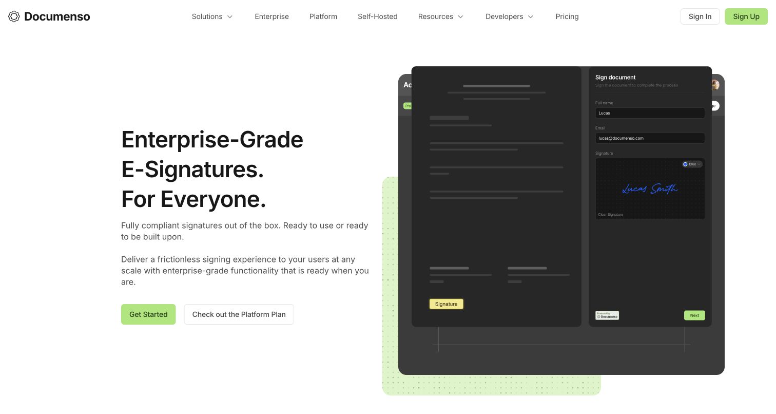
Documenso uses a split composition to connect its signature proposition with an interface demonstration. The left column introduces the service and offers two starting routes; the right side layers a document view with a signing panel. Green accents link the calls to action with the product illustration without overwhelming the white background. Enterprise, self-hosting and developer navigation make the wider product options discoverable. Resend's case describes signature requests and completion messages in the document-signing journey, with React Email used for templates. That supports a communication workflow association, not an independent verification of the page's compliance language.
What you can learn
Show the important transaction in a state a new customer can recognize. Keep the demonstration focused on the handoff between participants, then provide separate evidence and documentation for security, hosting and contractual requirements.
Pros
The layered signing preview explains the central interaction before a visitor creates an account.
Navigation distinguishes platform, enterprise and self-hosted options without hiding the primary action.
Cons & considerations
Broad compliance wording needs the detailed supporting material linked elsewhere on the site.
Two similarly prominent starting choices require visitors to understand the product-plan distinction.
Platform source: Official Resend customer case — documented email workflow. Official Resend customer case read November 11, 2026. Signature-request and document-completion communications for the Documenso signing service. Official customer-case association for the named web service’s email workflow. The current public screenshot is not proof that Resend renders the page or of its complete current infrastructure; historical case claims are not newly measured results. Platform evidence is separate from the direct website screenshot and is not a complete current infrastructure audit.
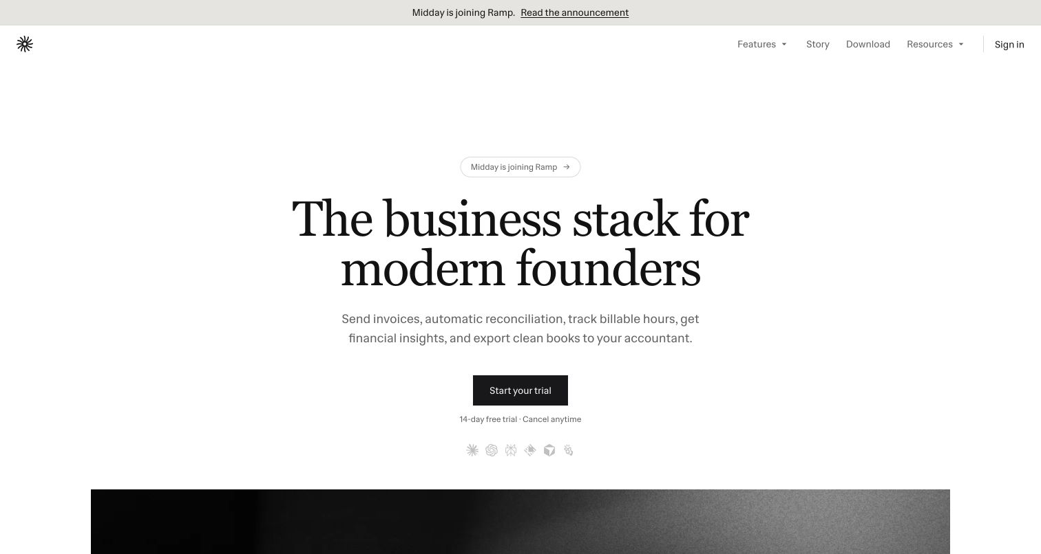
Midday introduces its business platform with a large serif heading and a practical sentence about invoices, reconciliation, billable hours and accounting exports. The centered trial button is followed by a short trial explanation, while the product preview begins below. A prominent announcement about joining Ramp provides timely context without replacing the product introduction. The combination is restrained and task-oriented. Resend's earlier customer case describes transaction notifications, invitations and account interactions. That documentary association remains historical evidence for those communication workflows; neither the announcement nor this public capture proves the service's current private banking connections or full infrastructure.
What you can learn
Use concrete administrative tasks to explain an ambitious business platform. If company circumstances change, make the announcement easy to find while preserving a clear route to product details, access conditions and current support information.
Pros
The concise task list explains the product more concretely than the broad category heading.
Trial terms appear near the main action instead of being left entirely to another page.
Cons & considerations
The opening screenshot shows little of the dashboard that supports the product promise.
The acquisition announcement creates a reasonable need for visitors to inspect continuity details.
Platform source: Official Resend customer case — documented email workflow. Official Resend customer case read November 11, 2026. Client transaction notifications, invitations and account interactions, described in the earlier Midday customer case. Official customer-case association for the named web service’s email workflow. The current public screenshot is not proof that Resend renders the page or of its complete current infrastructure; historical case claims are not newly measured results. Platform evidence is separate from the direct website screenshot and is not a complete current infrastructure audit.
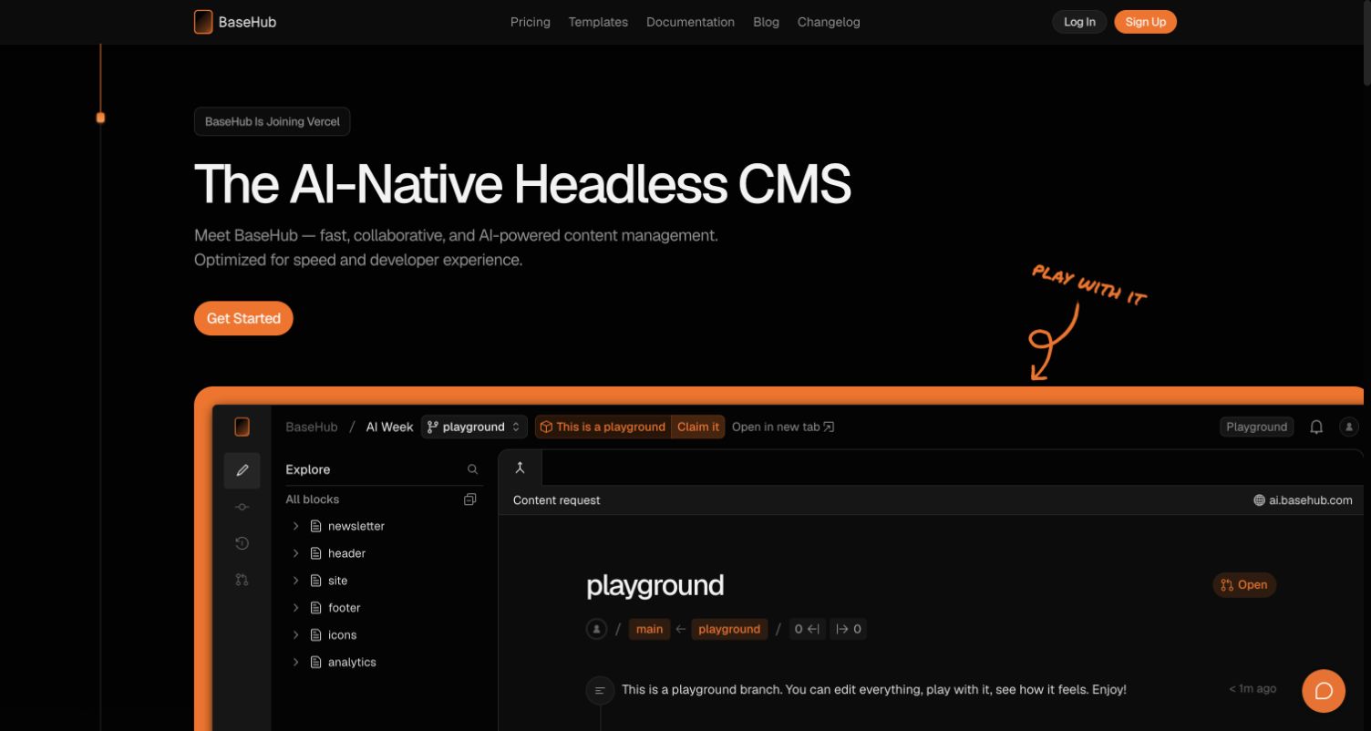
BaseHub's black and orange page places a large editor playground immediately beneath its headless CMS introduction. A handwritten prompt points toward the interface, making the demonstration an explicit part of the invitation. The visible tree of content blocks, branch label and editing workspace explains the product's structure more effectively than an abstract illustration. Documentation and pricing remain in a compact header. Resend's customer case describes login and account-event emails. It does not establish the current CMS implementation of this marketing page or the future effect of the visible announcement that BaseHub is joining Vercel.
What you can learn
Use a clearly labeled sample workspace to reveal how a technical product organizes information. Separate the demonstration from real customer work and give visitors straightforward routes to documentation, ownership details and access requirements.
Pros
The prominent playground makes the content model and editing environment immediately tangible.
The orange frame creates a strong visual boundary between introduction and product demonstration.
Cons & considerations
The large editor has dense controls that may require explanation for first-time CMS buyers.
The corporate announcement introduces continuity questions that the opening alone does not answer.
Platform source: Official Resend customer case — documented email workflow. Official Resend customer case read November 11, 2026. User login and important account-event messages for the BaseHub content platform. Official customer-case association for the named web service’s email workflow. The current public screenshot is not proof that Resend renders the page or of its complete current infrastructure; historical case claims are not newly measured results. Platform evidence is separate from the direct website screenshot and is not a complete current infrastructure audit.
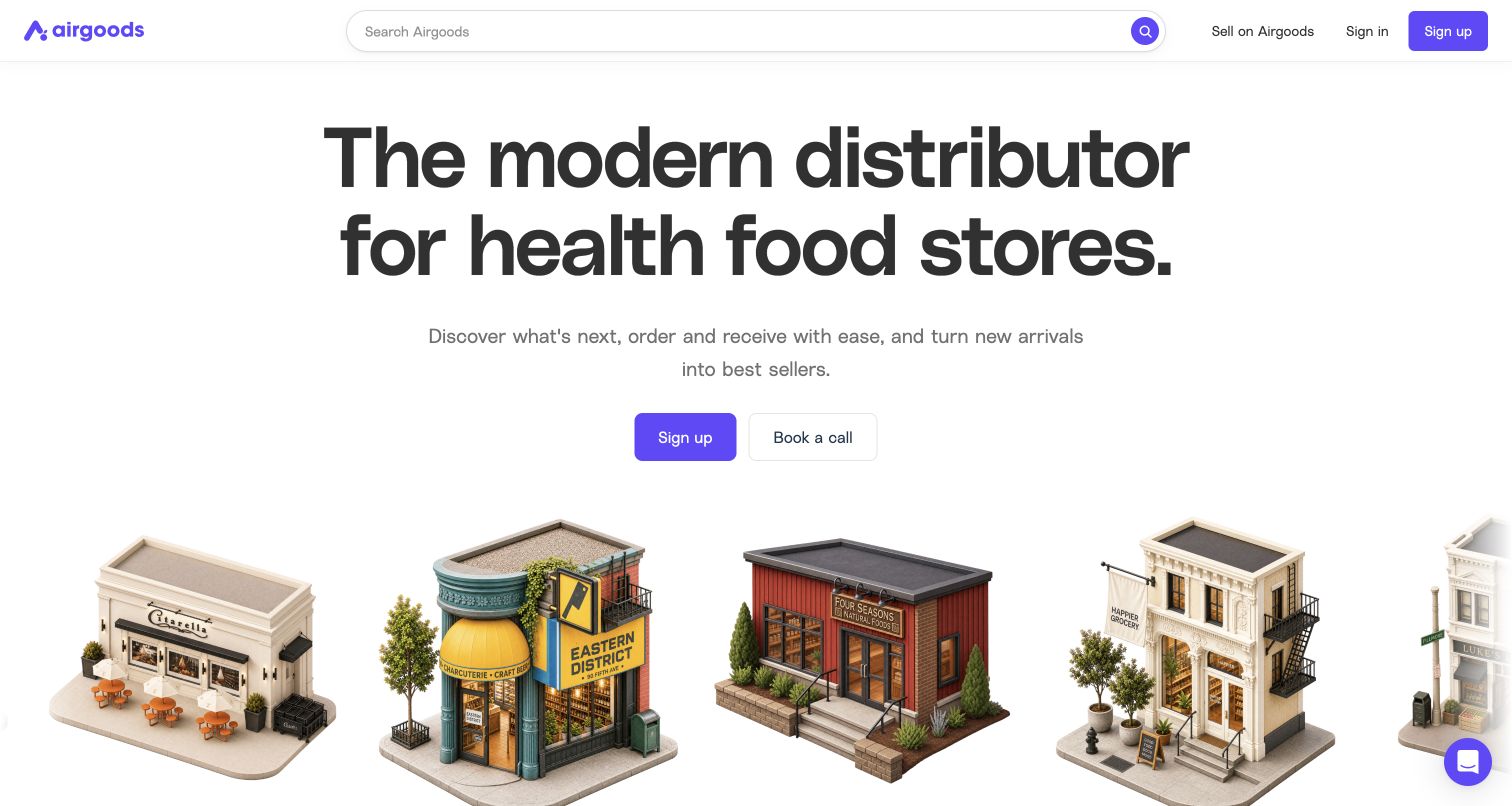
Airgoods makes its audience concrete through an oversized distributor headline and illustrated independent storefronts. The purple brand accents connect the search control, signup action and small supporting interface details. A wide marketplace search is always available in the header, while the hero offers both registration and a conversation. The storefront illustrations communicate the kind of buyer the service is addressing without reducing the page to product packaging. Resend's customer case describes operational and marketing communications, including a migration of transactional templates. It supports the marketplace's email relationship, not a claim about current order volumes or fulfillment performance.
What you can learn
Show the customer context before introducing the entire inventory. A wholesale entrance should help a retailer recognize their business, then provide distinct routes for searching products, opening an account and asking about commercial requirements.
Pros
Recognizable storefront illustrations give the distributor proposition a specific audience and setting.
The persistent search field provides a practical route beyond the broad introductory message.
Cons & considerations
The illustrated opening does not yet show product prices or account eligibility requirements.
The rotating audience phrase needs stable supporting copy so the offer remains unambiguous.
Platform source: Official Resend customer case — documented email workflow. Official Resend customer case read November 11, 2026. Operational, transactional and marketing communication for the Airgoods wholesale marketplace. Official customer-case association for the named web service’s email workflow. The current public screenshot is not proof that Resend renders the page or of its complete current infrastructure; historical case claims are not newly measured results. Platform evidence is separate from the direct website screenshot and is not a complete current infrastructure audit.
Roame places its flight search directly over a landscape photograph, combining destination appeal with an immediate task. Origin, destination and date sit in one translucent bar, while cabin, traveler and view controls remain just above it. Pink emphasis identifies the search action without making every control compete. The header includes guides and membership information for visitors who need more context. Resend's customer story describes flight-award alerts and personalized customer emails through the service's API workflow. This is documentary communication evidence, not verification of the savings advertised in the hero or any particular award availability.
What you can learn
Keep an aspirational travel message close to the fields needed to explore it. Explain points, availability and membership limits near the search journey, and treat alert preferences as a separate decision rather than an automatic consequence of browsing.
Pros
The search inputs are visible immediately instead of being hidden behind an introductory button.
The photograph gives the task an emotional setting while the pink action stays recognizable.
Cons & considerations
White text over the landscape relies on the chosen image and overlay for readability.
The large savings claim requires qualification beyond what the opening screen can establish.
Platform source: Official Resend customer case — documented email workflow. Official Resend customer case read November 11, 2026. Personalized flight-award alerts to customers of the Roame travel-search service. Official customer-case association for the named web service’s email workflow. The current public screenshot is not proof that Resend renders the page or of its complete current infrastructure; historical case claims are not newly measured results. Platform evidence is separate from the direct website screenshot and is not a complete current infrastructure audit.
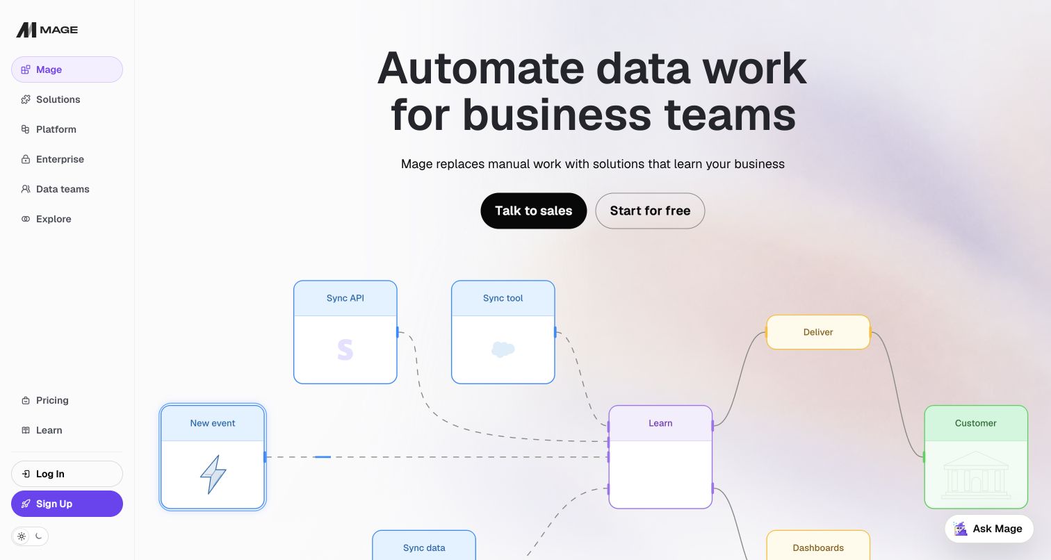
Mage uses a persistent left rail rather than a conventional horizontal marketing menu. The arrangement gives solutions, platform information and audience routes a familiar application feel. Its main area introduces business automation, then shows a diagram of events, tools, learning and delivery. Rounded colored blocks make a complex workflow approachable without requiring a visitor to read code. Resend's customer case describes payment messages, trial alerts, password resets and marketing emails for Mage. The captured page now emphasizes broader business automation; the earlier email case is a qualified relationship, not proof of every current product capability or deployment choice.
What you can learn
A diagram should explain the movement of work, not just decorate a technical promise. Pair each important stage with plain language and keep the navigation organized around the decisions a buyer needs to make next.
Pros
The left rail makes product and audience navigation consistently visible beside the introduction.
The connected diagram gives automation a concrete beginning, transformation and destination.
Cons & considerations
Several nested navigation labels increase the number of choices for an unfamiliar visitor.
The broad business promise needs detailed examples to establish which workflows are actually supported.
Platform source: Official Resend customer case — documented email workflow. Official Resend customer case read November 11, 2026. Product payment messages, trial alerts, password resets and marketing communication for Mage. Official customer-case association for the named web service’s email workflow. The current public screenshot is not proof that Resend renders the page or of its complete current infrastructure; historical case claims are not newly measured results. Platform evidence is separate from the direct website screenshot and is not a complete current infrastructure audit.
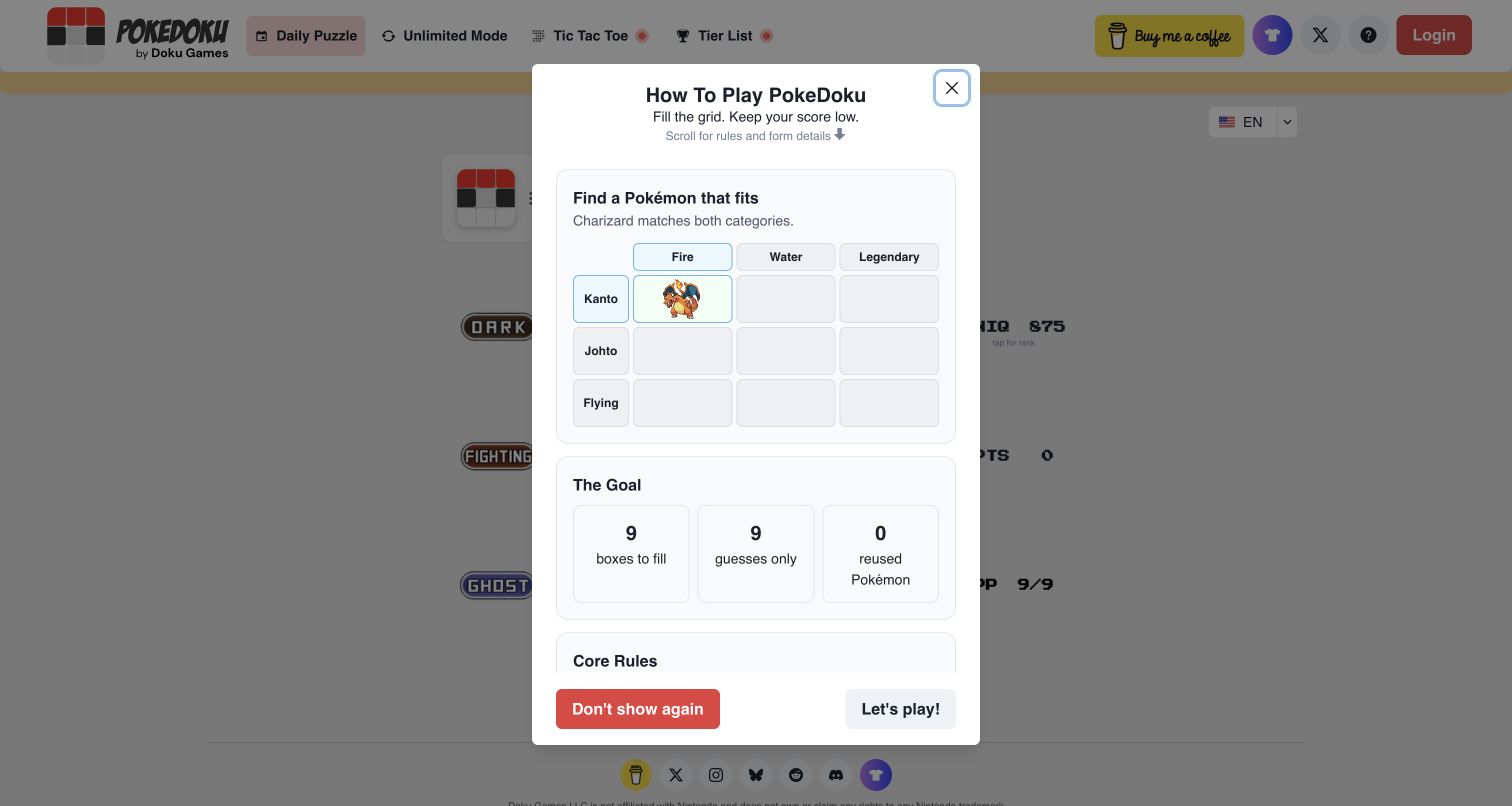
Pokedoku's first-visit state presents a focused instruction dialog over the game grid. A small illustrated example explains how one answer can match two categories, followed by simple counts for boxes, guesses and reuse. The game remains visible behind the panel, so the instructions have an immediate visual reference. Mode links across the header show the broader play options. Resend's case explicitly describes this web-based game's user-engagement emails. That evidence concerns communication with players; the capture records the public onboarding state and does not demonstrate email delivery, a submitted answer or any account-specific game history.
What you can learn
Teach the first interaction with one concrete example and a small number of rules. Keep the underlying task visible, make dismissal obvious, and distinguish optional future notifications from the act of learning how to play.
Pros
The illustrated category match explains a rule more quickly than a long paragraph could.
Clear numerical limits make the puzzle's basic constraints easy to understand before starting.
Cons & considerations
The instruction dialog covers much of the live grid in the initial captured view.
Abbreviated scoring labels behind the dialog may still need explanation for new players.
Platform source: Official Resend customer case — documented email workflow. Official Resend customer case read November 11, 2026. User-engagement email for the explicitly identified web-based Pokedoku game. Official customer-case association for the named web service’s email workflow. The current public screenshot is not proof that Resend renders the page or of its complete current infrastructure; historical case claims are not newly measured results. Platform evidence is separate from the direct website screenshot and is not a complete current infrastructure audit.
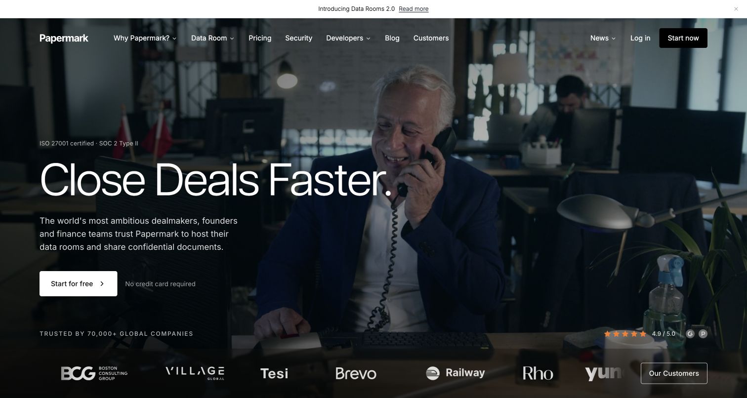
Papermark opens with a workplace scene and a large outcome-oriented headline, then identifies data rooms and confidential document sharing in the supporting copy. A white starting button remains distinct against the darker background. Security navigation, customer references and a link beside the displayed certifications provide routes for deeper evaluation. The introductory scene emphasizes the people using the product rather than a dense interface. Resend's customer case describes document-visit notifications, magic links and visitor email verification. Its former Papermark domain redirects to this current site, but the documentary email relationship does not independently substantiate the page's security certifications.
What you can learn
An outcome-led opening needs a concrete product category close by. For sensitive document tools, connect visual reassurance to inspectable security information and explain how recipients gain access before asking customers to share real material.
Pros
The short supporting paragraph makes the data-room purpose clear beneath the broad headline.
Security and customer routes are available directly from the opening navigation.
Cons & considerations
The workplace scene communicates context but does not itself explain document permissions or controls.
Displayed ratings and certifications require their linked details for a meaningful evaluation.
Platform source: Official Resend customer case — documented email workflow. Official Resend customer case read November 11, 2026. Document-visit notifications, magic links and visitor email verification for Papermark’s document-sharing service. Official customer-case association for the named web service’s email workflow. The current public screenshot is not proof that Resend renders the page or of its complete current infrastructure; historical case claims are not newly measured results. Platform evidence is separate from the direct website screenshot and is not a complete current infrastructure audit.
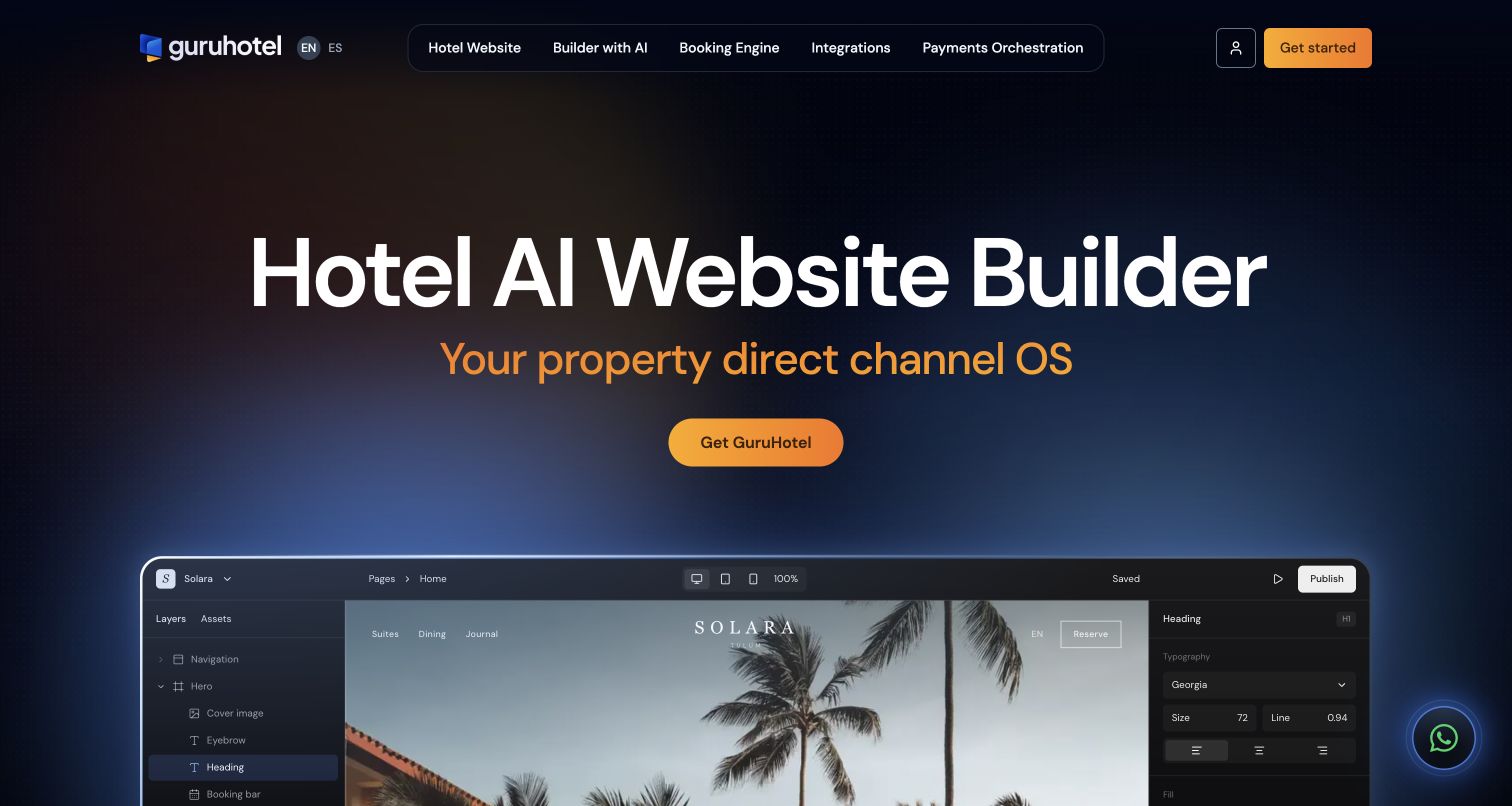
GuruHotel introduces its hotel website builder with a dark gradient, warm action color and a large editor preview. The sample hotel page sits inside a visible editing workspace, with layers and typography controls framing the result. This makes the relationship between management tools and guest-facing presentation unusually clear. Navigation separates the website, booking engine, integrations and payment functions. Resend's customer story documents hotelier onboarding and guest reservation messages, including confirmations and cancellations. It supports those hospitality communication workflows; it does not identify the pictured sample hotel as a separate customer or verify a live reservation system.
What you can learn
Demonstrate both the operator's tools and the customer-facing result when selling specialist software. Keep the example clearly recognizable as a product demonstration, and explain which functions belong to publishing, booking and ongoing communication.
Pros
The editor preview links hotel design controls to a realistic guest-facing page layout.
The navigation separates several operational products instead of treating them as one vague feature.
Cons & considerations
The oversized introductory headline pushes much of the editor below the initial view.
The short operating-system description needs supporting explanation for less technical hotel owners.
Platform source: Official Resend customer case — documented email workflow. Official Resend customer case read November 11, 2026. Hotelier onboarding and guest reservation vouchers, confirmations and cancellations for the GuruHotel platform. Official customer-case association for the named web service’s email workflow. The current public screenshot is not proof that Resend renders the page or of its complete current infrastructure; historical case claims are not newly measured results. Platform evidence is separate from the direct website screenshot and is not a complete current infrastructure audit.
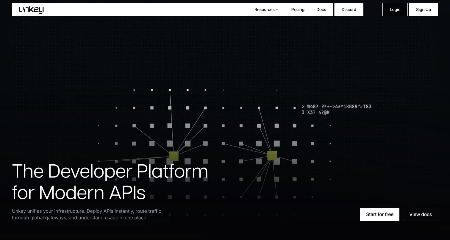
Unkey uses a dark field of connected points and a stark white navigation bar to frame its API platform. The headline sits low in the composition, with a concise explanation of deployments, gateways and usage beneath it. Starting and documentation actions occupy the opposite side, creating a clear path from message to next step. The sparse opening prioritizes identity over detailed interface proof. Resend's customer case describes onboarding, billing-status messages and changelog emails for Unkey. It documents the customer communication layer, rather than proving the implementation of the animated homepage or every capability now advertised by the platform.
What you can learn
Give infrastructure a memorable visual language, then translate it into concrete responsibilities. Keep a documentation route as prominent as signup so developers can examine limits and integration requirements before committing to a new platform.
Pros
Strong contrast and restrained controls give the technical proposition a distinctive visual presence.
The adjacent documentation action supports evaluation without requiring an account first.
Cons & considerations
Large decorative space delays the detailed product explanation until further down the page.
Muted supporting text has to remain legible against the dark animated background.
Platform source: Official Resend customer case — documented email workflow. Official Resend customer case read November 11, 2026. Customer onboarding, billing-status notices and changelog emails for Unkey. Official customer-case association for the named web service’s email workflow. The current public screenshot is not proof that Resend renders the page or of its complete current infrastructure; historical case claims are not newly measured results. Platform evidence is separate from the direct website screenshot and is not a complete current infrastructure audit.
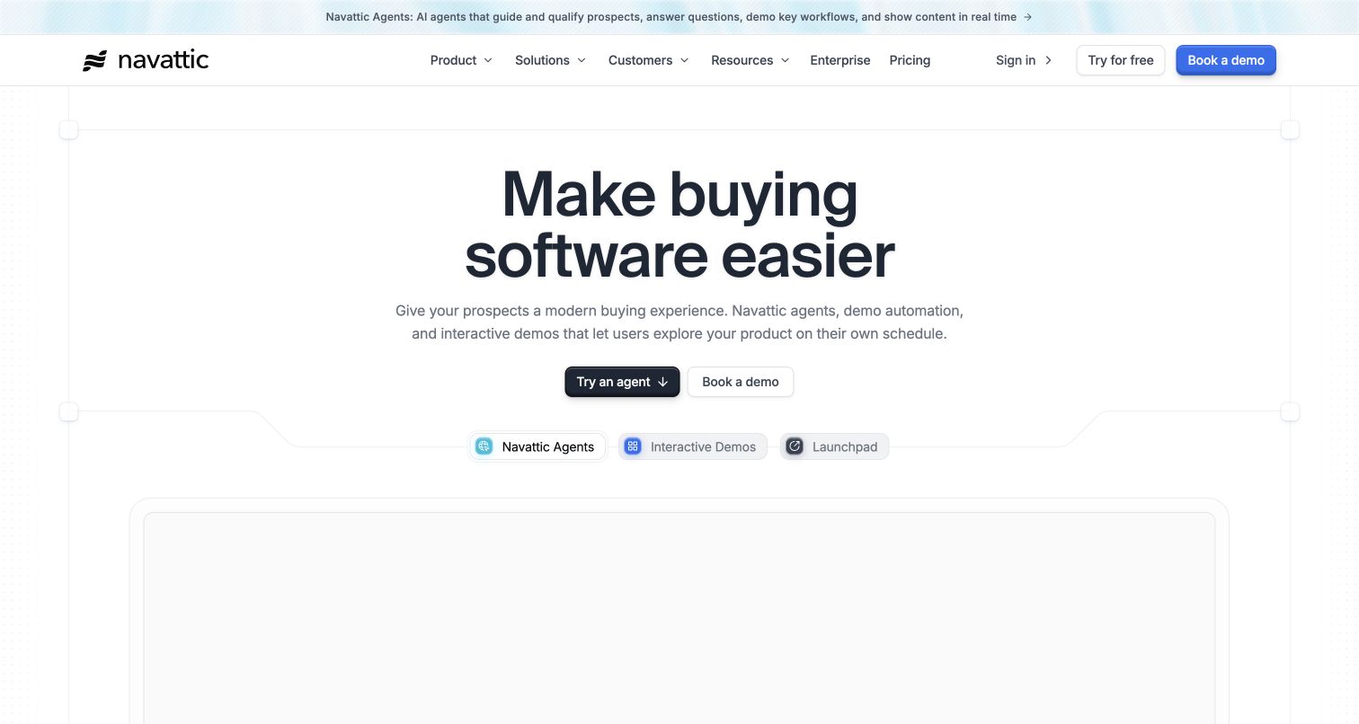
Navattic's light page introduces a clear buyer benefit, then distinguishes agents, interactive demos and its launchpad through compact product tabs. The main actions offer an agent experience and a sales conversation, while the demonstration area begins immediately below. Thin borders and a restrained blue accent give the interface a precise, orderly feel. Resend's customer story specifically describes notifications when visitors engage with customers' demos, with templates maintained by product engineers. That is evidence for an email-enabled product feature. It does not show that the captured demonstration was completed or establish the email behavior of every embedded customer experience.
What you can learn
Explain how a demonstration helps the buyer before displaying its controls. Keep self-guided exploration and sales contact as distinct routes, and state clearly when an interaction may generate notifications or be recorded for follow-up.
Pros
Product tabs help readers separate three related offerings without an overwhelming feature list.
The main explanation connects the software to a recognizable problem in the buying journey.
Cons & considerations
The large demonstration region provides limited information before its content fully engages.
Several demo and signup actions can feel repetitive unless their different outcomes stay clear.
Platform source: Official Resend customer case — documented email workflow. Official Resend customer case read November 11, 2026. Customer notifications when visitors engage with interactive product demos managed through Navattic. Official customer-case association for the named web service’s email workflow. The current public screenshot is not proof that Resend renders the page or of its complete current infrastructure; historical case claims are not newly measured results. Platform evidence is separate from the direct website screenshot and is not a complete current infrastructure audit.
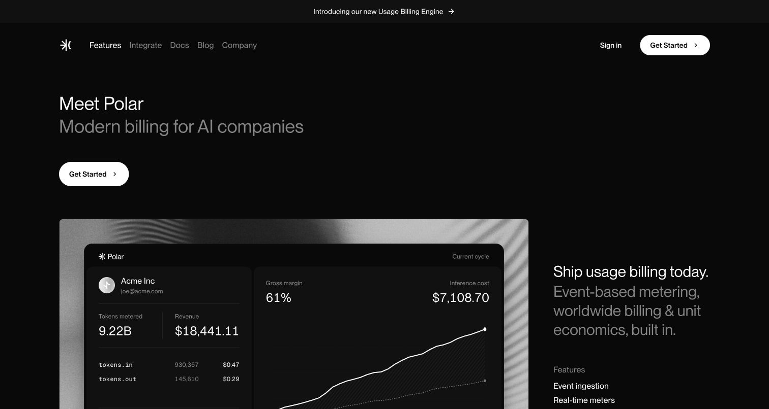
Polar's restrained black page pairs a short billing introduction with a large dashboard illustration. The preview shows metered activity, revenue, costs and margin, making the product's commercial context visible without a lengthy explanation. Feature links alongside it let a technical reader move toward event ingestion and metering details. A single white starting button keeps the initial action simple. Resend's customer case documents receipts, one-time login codes and access to purchased digital assets. These are customer communication workflows, not evidence of this demonstration's financial results or a complete description of Polar's current payment and tax responsibilities.
What you can learn
Use a focused example to show how usage becomes something a business can understand. Distinguish illustrative numbers from real customer performance, and make pricing rules, responsibilities and failure handling available before integration begins.
Pros
The dashboard connects metering and business outcomes in a compact, understandable visual.
The limited palette and concise introduction keep attention on the billing product.
Cons & considerations
The broad billing proposition needs detailed documentation about supported commercial arrangements.
Small dashboard labels may be harder to inspect than the surrounding headline and actions.
Platform source: Official Resend customer case — documented email workflow. Official Resend customer case read November 11, 2026. Order receipts, one-time login codes and access to order history, license keys and digital downloads for Polar customers. Official customer-case association for the named web service’s email workflow. The current public screenshot is not proof that Resend renders the page or of its complete current infrastructure; historical case claims are not newly measured results. Platform evidence is separate from the direct website screenshot and is not a complete current infrastructure audit.
Kegan has 15+ years of experience working with small businesses, Fortune 500 companies, and everything in between. No development job is too big or too small: he brings the same hands-on attention to a focused improvement, a complete website, or a custom application.
For Resend projects, he can help with responsive interfaces, reusable components, custom functionality, API connections, and performance-minded implementation. He works directly with clients on scope, design, implementation, testing, and handover, with an emphasis on clear communication and a system that remains practical to maintain after launch.
Show 3 other Resend developersHide other Resend developers
Use a short, focused message when the task is entering an account or joining a team. Explain who initiated the action, what the link does and how someone can respond if it was unexpected. Keep sensitive state and authorization checks in the application. Treat link expiry, repeat requests and support recovery as part of the experience.
Transactions and product events
Receipts, document completion notices and reservation changes should describe the event plainly. Include enough context to recognize it without exposing unnecessary personal information. Link to a secure application view when details belong behind authentication. The copy should distinguish a request received, a process completed and an action still awaiting the user.
Optional digests and product updates
A recurring digest needs a recognizable purpose and a manageable cadence. Explain the subscription near the website’s entry point, keep preference changes straightforward and make each issue useful on its own. Do not treat a transactional address as automatic permission for unrelated announcements. Follow the requirements that apply to your audience and use case.
From references to requirements
Plan the website, message and recovery together
Map the complete handoff
Write the path from the website action to its confirmation screen, email and destination. Decide what the screen says while delivery is pending, what happens if the address was mistyped and how the person can recover. A polished message cannot repair an unclear or misleading starting interaction.
Separate templates from business decisions
Give the application responsibility for who receives a message and why. Let templates express that decision in clear language and a consistent visual system. Review long names, translated text, missing optional fields and plain-text alternatives before assuming the short demonstration content represents real use.
Record delivery events carefully
Resend webhooks can report email events to an HTTPS endpoint, and the documentation provides verification and replay guidance. Decide which events your application actually needs, authenticate incoming requests and avoid processing a replay as a new business event. Keep access and retention appropriate to the personal information involved.
Name who maintains the sending domain, templates, application integration and support process. Include a way to investigate delayed or failed delivery without exposing credentials or private message content in public logs. Review changes to product language and sender identity together so the website and inbox experience remain coherent.
A useful handover demonstration
Ask the actual team to carry out its routine job: publish a realistic update, correct a mistake, preview a narrow screen, and identify who owns an integration failure. For a library or frontend framework, also ask who maintains the content source and deployment. A polished screenshot does not answer those operational questions.
Beyond the screenshot
A practical Resend integration brief
Identify the exact event, recipient and purpose for every message type.
Explain the expected email on the website before asking the user to act.
Keep sending credentials and recipient decisions in trusted server code.
Confirm the sending domain and visible sender identity are appropriate.
Provide useful confirmation, pending and recovery states in the application.
Use a durable event identity and reconcile uncertain sending outcomes.
Validate template content with long, missing and translated values.
Authenticate webhook events and handle repeated deliveries safely.
Keep optional updates separate from essential account and transaction messages.
Document support ownership, access limits and private-data retention.
Test with real content, a keyboard, a small screen, slow or failed requests, and the people who will maintain the system. These are planning checks, not an accessibility, security, performance, or search-ranking certification.
Sources & editorial method
How this Resend collection was reviewed
We reviewed the twenty public pages and their official Resend customer cases on November 11, 2026. The screenshots show public opening views; Pokedoku includes its first-visit instructions, and some sites retain a visible cookie notice. The cases support specific email, authentication or notification workflows, not a claim that Resend renders the marketing pages. Historical dates and reported outcomes remain documentary context. Broad public stack observations are separate from these customer relationships and retain their original observation dates. No account access, email delivery, transaction, game answer or customer form submission was used to review the collection.
Every image is an unmodified capture from the actual website, with its source and capture date. Some captures are reused from our shared catalog; their dates remain the original capture dates. None comes from a vendor gallery or a generated reconstruction. Moving imagery and live content can change.
Technology attribution uses public page assets or metadata, official platform documentation, or a cited first-party project case study. Documentary and framework-relationship evidence is identified where used; it is not a complete current backend inventory. A CMS image CDN alone does not establish a full CMS deployment. A library’s presence does not prove which individual controls use it, and a platform label does not establish AI authorship.
The composition notes, lessons, pros and tradeoffs are original editorial observations. We have not measured conversion, traffic, security, performance or accessibility conformance. Website owners retain their brands and imagery; these examples are not our client portfolio. Written, Edited and Curated are independent records, not dates advanced by a build. See our editorial standards or suggest a correction.
Questions worth asking
Resend website development FAQs
Are these websites built with Resend?
Resend handles email rather than building the visible page. These examples have documented Resend relationships for a named web service’s communication workflow. The screenshots and design reviews concern the public pages; each technology statement is limited to its supporting source.
What makes an example useful for planning?
Look for a clear transition between the user’s intention and the next step. A recognizable sender, an understandable confirmation and a recoverable failure can matter more than elaborate visual styling. The examples show different ways to introduce that journey.
Does a customer case prove current delivery performance?
No. It records a documented relationship and the customer’s account at the time of the case. We have not independently measured present inbox placement, delivery speed, uptime or conversion for these services.
How should duplicate sending be handled?
Give each intended message a stable application event identity and record its outcome. Resend’s documented idempotency support can help with repeated requests within its stated retention window. Recovery outside that window still needs application-level reconciliation and careful operational decisions.
Should email opens be treated as completed user actions?
No. A delivery or engagement event has a narrower meaning than a completed task in the product. Define the outcome you actually need to understand, collect only suitable information and avoid presenting an email signal as proof of a purchase, login or successful onboarding.
Can a public screenshot reveal the whole technology stack?
No. Public assets and metadata can reveal some components, while vendor cases document specific associations. Private infrastructure and delivery behavior may remain unknown. A blocked public audit is recorded as a gap rather than filled with an inferred backend.
Borrow a clear expectation, a focused message or a thoughtful recovery path. The strongest email integration feels like a useful continuation of the website because the same user task guides both.