Best Amplitude Websites of 2026 (20 Real-World Examples)
Public design inspiration alongside documented Amplitude analytics and experimentation cases.
Explore 20 public interfaces, then frame a product-measurement project around meaningful questions, validated events and deliberate privacy boundaries.
Cisco, Ford, The Economist Group, NTT DOCOMO and Coca-Cola FEMSA begin the collection. Their public sites demonstrate very different communication jobs. The accompanying sources describe scoped product adoption, analysis or experimentation—not a common frontend used by every organization. FEMSA is the specific bottler in the cited case, and DOCOMO is not interchangeable with other NTT businesses.
A useful analytics brief starts with a decision rather than a desire to collect more data. Use the examples for interface lessons, then define your own audience, success criteria and measurement limits. Vendor-reported improvements provide context but do not predict results for another site. The guidance below does not authorize new tracking on Website Unpacked or imply that every project needs user-level analysis.
Before the examples
What makes good Amplitude website development in 2026?
Give an event a business meaning
A useful observation represents a defined action in a defined context. Specify what happened, what counts as completion and what should be excluded. Avoid naming an event after a temporary button label if the real question concerns a lasting business outcome. Keep the explanation understandable to both product and implementation teams.
Use a plan as an agreement, not a dumping ground
Amplitude’s documentation describes planning events and properties before implementation and maintaining a reviewed tracking plan. Use that plan to record intent, ownership and expected behavior. Do not let it become an inventory of every easy-to-capture detail. A narrow first scope is easier to validate and explain.
Write down the hypothesis, eligible audience and guardrails before looking at a result. A higher number is not automatically a better experience if quality, reliability or accessibility deteriorates. Define how uncertainty and incomplete evidence will be handled rather than treating every movement in a dashboard as proof of causation.
The collection · 20 examples
20 Amplitude website examples worth studying
Exactly 20 independently inspected public design references, with documentary associations separated from claims about the visible page’s implementation.
We start with five recognizable brands or organizations: Cisco, Ford, The Economist Group, NTT DOCOMO, Coca-Cola FEMSA. Each attribution applies to the named website property, not every product or website belonging to its organization. This is a curated reading sequence, not a measured ranking.
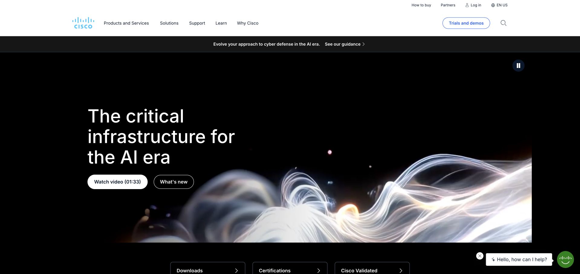
Cisco uses a spacious white header above a dark, abstract infrastructure campaign. The large headline has a clear reading area, with separate actions for a short video and current developments. Product, solution and support routes remain conventional above the image. Amplitude’s Cisco story documents a product-adoption and behavioural-data initiative involving an Autocapture system. That organisational evidence explains Cisco’s inclusion here; it does not establish that the captured marketing page or every Cisco product runs the same analytics implementation. The public homepage is reviewed independently as a design reference.
What you can learn
Separate a broad enterprise message from the practical routes different visitors need. A product buyer, existing customer and curious newcomer should not have to watch the same introductory video before reaching relevant information. Keep the analytics case scoped to its documented product work.
Pros
Distinct video and news actions support two different levels of exploration.
A stable white header keeps complex enterprise navigation independent of moving imagery.
Cons & considerations
The abstract hero supplies little immediate detail about individual product categories.
Several audience routes need disciplined mobile grouping and clear destination labels.
Platform source: Primary documented Amplitude association. Documented association: Documented product adoption/data innovation; not the runtime of every Cisco product or marketing page. Platform evidence is separate from the direct website screenshot and is not a complete current infrastructure audit.
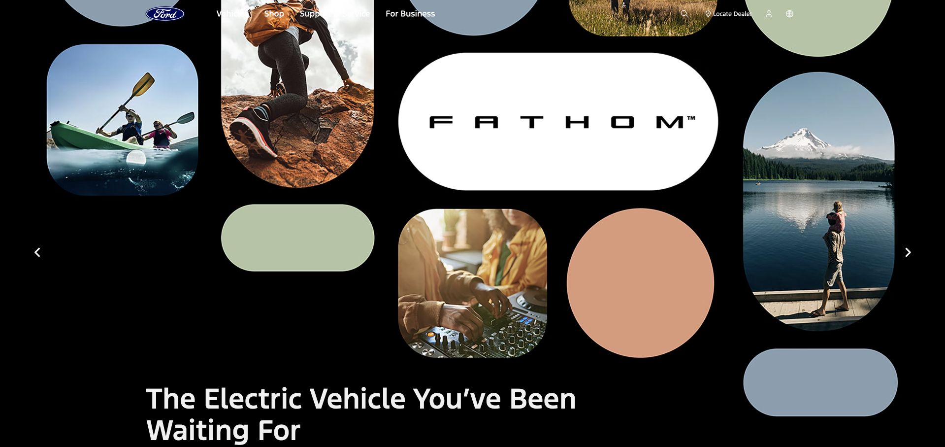
Ford’s observed homepage places a Fathom campaign inside a black composition of rounded image panels and muted coloured shapes. The white central product wordmark and large statement give the collage a clear centre, while vehicle, shopping and support navigation remains available above. Amplitude’s official customer directory explicitly features Ford’s use of analytics for product managers. This is a documented organisational association, not evidence of the current campaign’s frontend or of analytics inside every vehicle. The captured public shopping page supplies a separate visual reference for balancing brand campaigns and practical tasks.
What you can learn
A visually unusual campaign can sit inside a dependable shopping structure. Keep vehicle discovery, dealer information and support readable while the campaign changes. Treat the vendor’s product-manager feature as its stated scope rather than extrapolating it into a complete website or connected-vehicle technology inventory.
Pros
Rounded panels give varied campaign images one coherent visual system.
Conventional shopping and support routes remain available outside the campaign composition.
Cons & considerations
An abstract product introduction delays detailed vehicle information for comparison-minded visitors.
Large campaign graphics need deliberate mobile reordering rather than simple shrinking.
Visible tech stack
Earlier / documented evidence
Amplitude
Platform source: Primary documented Amplitude association. Documented association: Official customer-directory Ford feature describes product-manager analytics; no current frontend inference. Platform evidence is separate from the direct website screenshot and is not a complete current infrastructure audit.
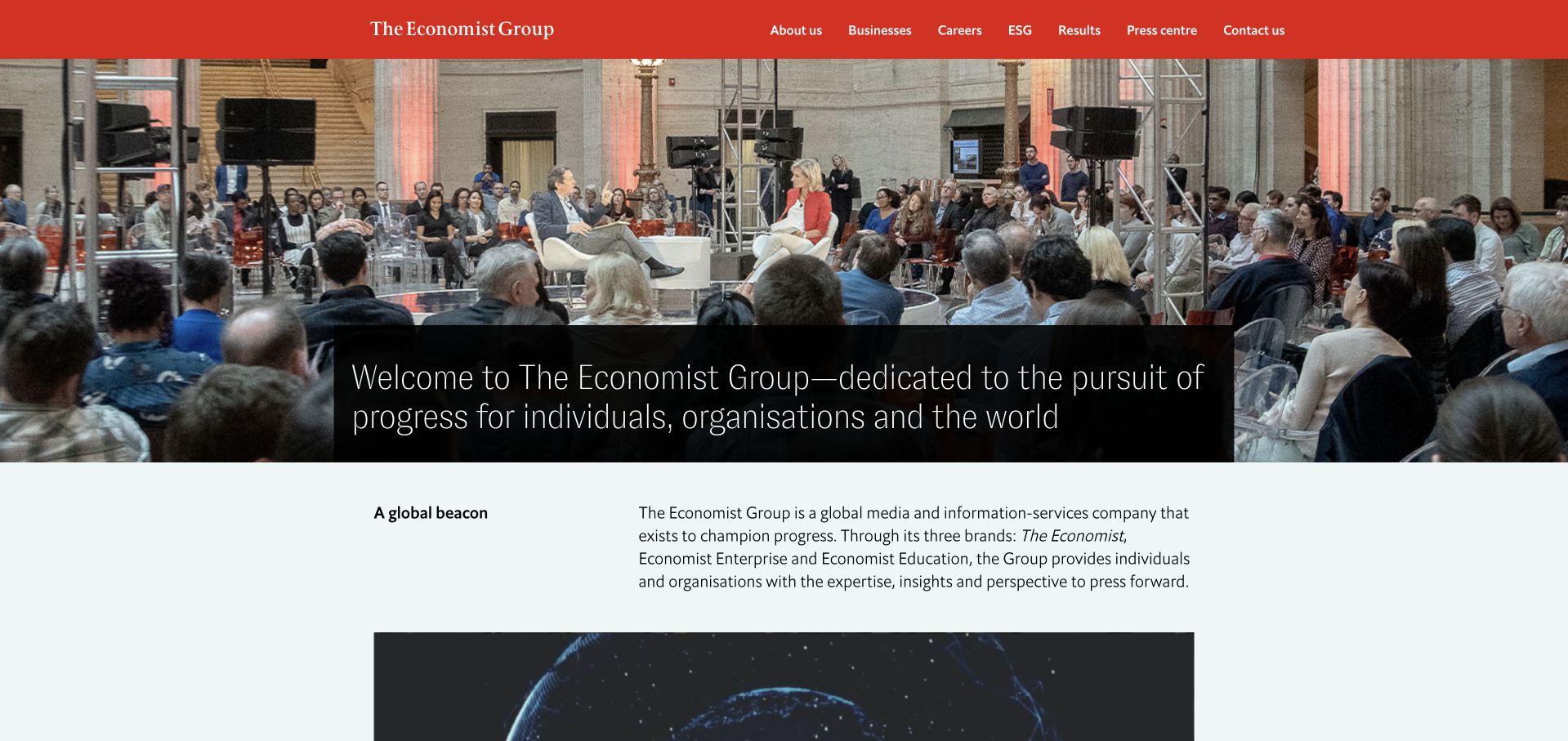
The Economist Group uses a red masthead above a wide event photograph, with a dark text panel introducing the organisation. A plain section below begins explaining the group and its different businesses. This is a corporate site rather than the publication’s article or subscription interface. Amplitude’s case concerns analytics and experimentation workflows used to answer product and audience questions across the publication. It does not verify the corporate page’s backend or identify the complete editorial stack. Keeping those two evidence streams separate makes the design reference more useful and the technology association more accurate.
What you can learn
A publishing group should explain its corporate structure without making visitors decode product names from a photograph. Keep reader products, commercial businesses and corporate information distinct. The analytics story can inform measurement planning without being presented as proof of the rendering technology behind every public page.
Pros
A red masthead gives the corporate site immediate and consistent brand recognition.
Written business context follows the photograph rather than another oversized campaign panel.
Cons & considerations
The event scene cannot explain the group’s different business relationships by itself.
Corporate visitors still need precise labels distinguishing editorial and commercial destinations.
Platform source: Primary documented Amplitude association. Documented association: Analyst/product insight workflow; publisher corporate page is independently reviewed. Platform evidence is separate from the direct website screenshot and is not a complete current infrastructure audit.
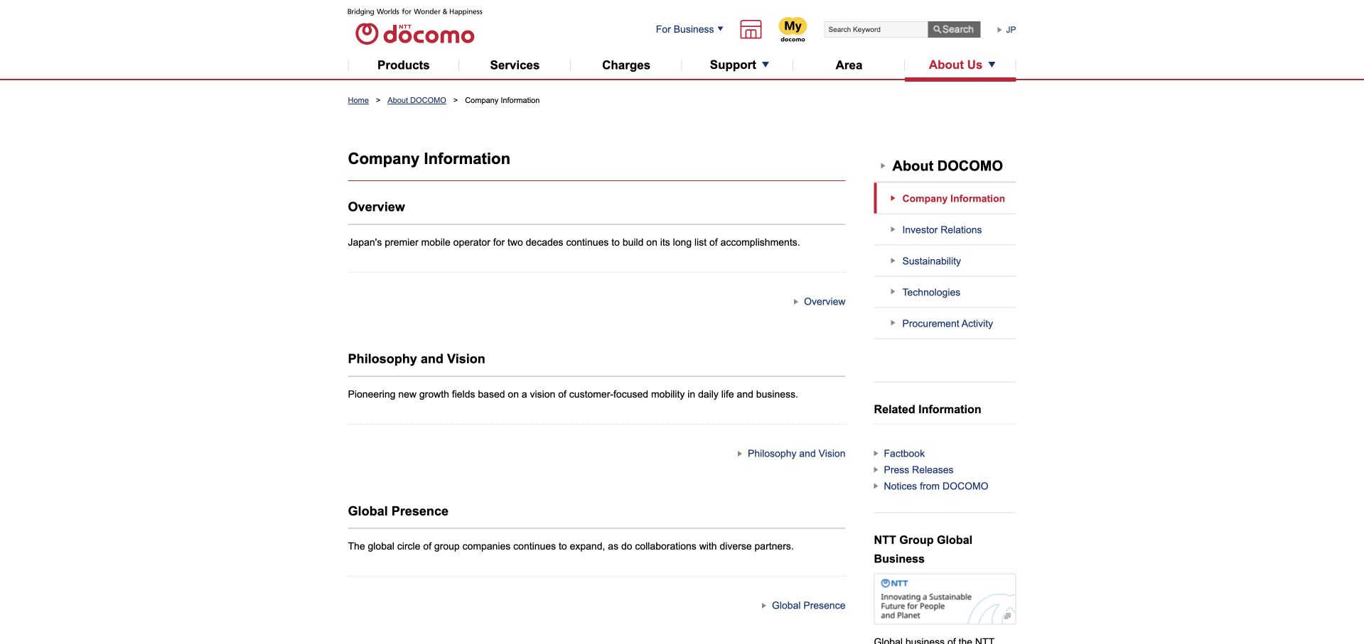
NTT DOCOMO’s company-information page uses a white background, red brand accents and a conventional two-column directory. Overview, philosophy and global-presence sections form the main column, while a right-hand navigation groups related corporate material. The page is a public company-information destination, not a consumer app screen. Amplitude’s source explicitly concerns DOCOMO’s customer-experience analytics and a regional branch’s dashboard-related AI-agent pilot. It is not an NTT DATA case and does not establish the technology of every NTT subsidiary or of the captured corporate page itself. The visual lesson is disciplined informational hierarchy.
What you can learn
For corporate reference content, plain structure can be more valuable than a large campaign. Use descriptive headings and related-information grouping so visitors can find a company fact quickly. Keep analytics adoption attached to the named entity and documented workflow instead of broadening it across similarly branded organisations.
Pros
Main headings and related links create a predictable corporate information hierarchy.
A restrained red-and-white identity leaves substantial company text easy to scan.
Cons & considerations
Dense utility navigation can compete with the focused company-information task.
Compact directory labels need generous sizing and spacing in mobile layouts.
Platform source: Primary documented Amplitude association. Documented association: DOCOMO customer-experience analytics; not NTT DATA or every NTT subsidiary. Platform evidence is separate from the direct website screenshot and is not a complete current infrastructure audit.
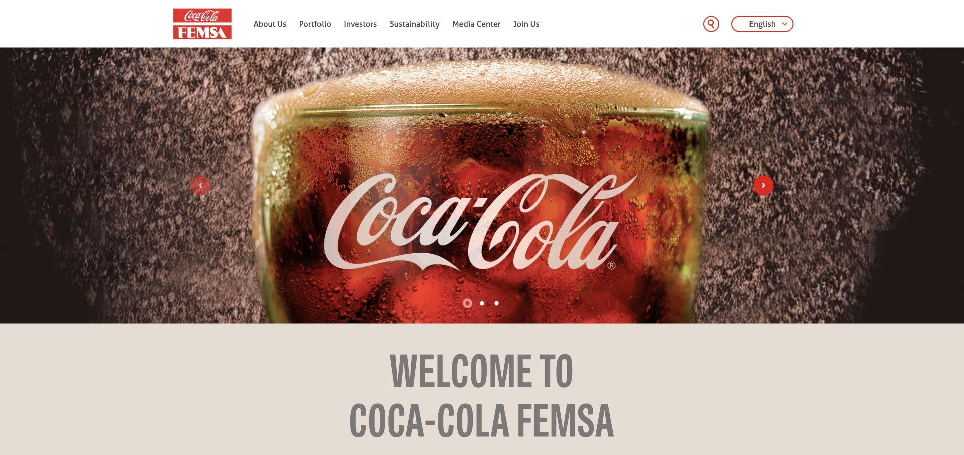
Coca-Cola FEMSA uses a large beverage photograph below a white corporate header, followed by a prominent company welcome. The red product identity connects the image to the brand, while portfolio, investor and sustainability routes have separate navigation labels. Amplitude’s case is specifically about Coca-Cola FEMSA’s retailer personalisation measurement, connecting Juntos+ interactions, campaigns and purchase behaviour. It is not evidence about every Coca-Cola bottler, the global parent or this public corporate homepage’s runtime. The design reference is the way a familiar consumer image introduces an operating company with a much broader information audience.
What you can learn
A recognisable product can introduce a corporate business, but the next section must explain the entity and its responsibilities. Keep investor, portfolio and consumer routes clearly labelled. Attribute the analytics association to the documented retailer workflow rather than treating the product brand as one universal technology footprint.
Pros
A familiar product photograph gives the corporate introduction immediate visual recognition.
Platform source: Primary documented Amplitude association. Documented association: Retail personalization analytics for FEMSA; not all Coca-Cola bottlers or the global parent. Platform evidence is separate from the direct website screenshot and is not a complete current infrastructure audit.
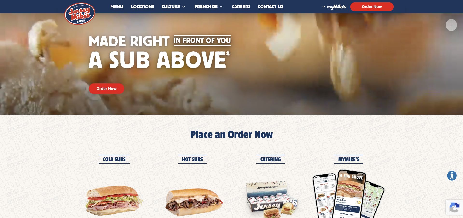
Jersey Mike’s uses a blue header, red order actions and a close food photograph with a short headline. A Place an Order Now section begins immediately below, separating cold subs, hot subs, catering and the app. This gives the hero an obvious practical continuation. Amplitude’s case documents mobile-app personalisation using data routed through Twilio Segment, with Amplitude and Iterable playing distinct roles. It does not establish this homepage’s frontend, every restaurant system or the current implementation of all named tools. The public page remains a separate reference for clear ordering-oriented design.
What you can learn
Connect a product photograph to the task it supports. Make menu categories and location context clear before ordering, and keep app promotion separate from direct purchase. When describing analytics, preserve the source’s distinct collection, analysis and messaging roles rather than collapsing the documented tools into one interchangeable platform.
Pros
Food imagery and a red action establish a clear ordering-oriented reading hierarchy.
Menu categories start promptly beneath the hero instead of remaining hidden in navigation.
Cons & considerations
A broad national introduction still needs accurate local menu and availability information.
Several ordering and app routes require clear labels to avoid duplicate-looking actions.
Visible tech stack
Earlier / documented evidence
Amplitude
Platform source: Primary documented Amplitude association. Documented association: Mobile app personalization within the cited Amplitude/Segment story; target product names remain distinct. Platform evidence is separate from the direct website screenshot and is not a complete current infrastructure audit.
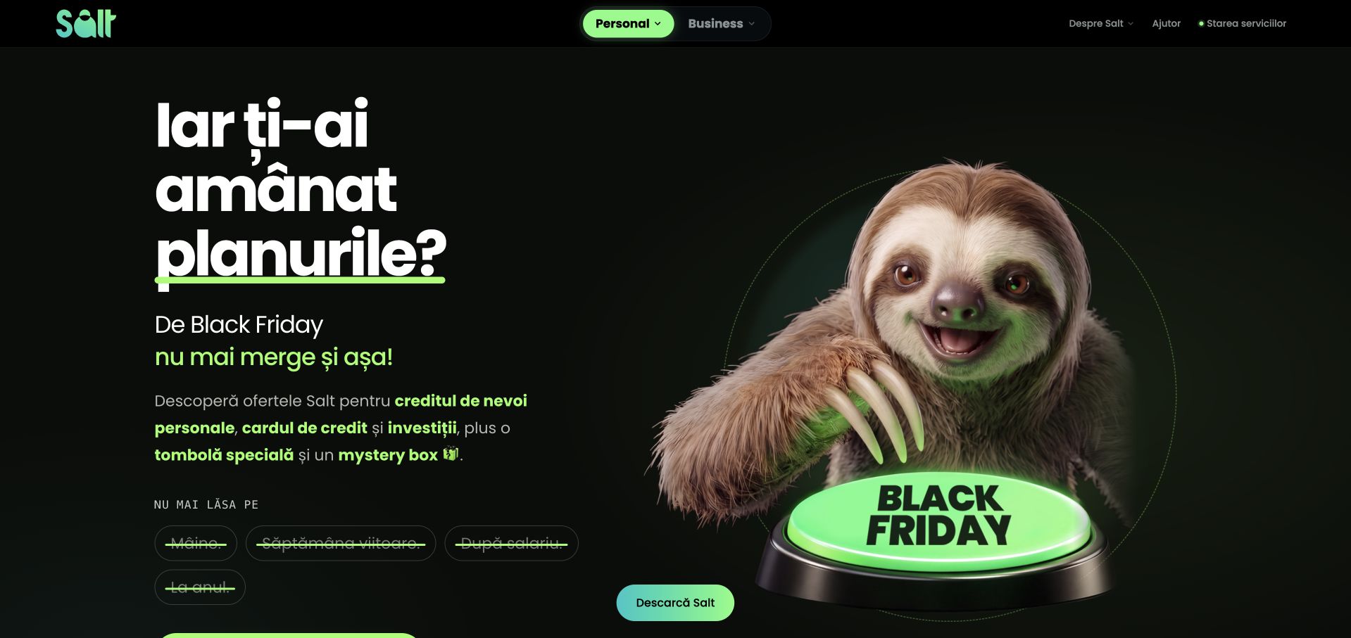
Salt Bank’s captured homepage uses a black background, bright green accents and a sloth character inside a Black Friday campaign. Personal and business routes are visibly separated above the main message, which is presented in the site’s local language. The composition is memorable, but its promotional conditions need their own readable destination. Amplitude’s case concerns app launch, onboarding analysis and experiments around activation and identification steps. That evidence is not a recommendation of a banking product or proof of this marketing page’s current technology. The design and the documented app workflow are separate observations.
What you can learn
A playful campaign should not obscure the service category, audience choice or conditions. Keep personal and business journeys distinct and provide clear information before a sign-up. Treat the analytics story as an account of product work, not permission to infer regulated-product suitability or collect sensitive information casually.
Pros
Green accents and the character create a strong, coherent campaign identity.
Separate personal and business routes preserve an important audience distinction above promotion.
Cons & considerations
Seasonal financial promotions need clear conditions and timely editorial maintenance.
A character-led hero provides limited detail about the actual service offer.
Platform source: Primary documented Amplitude association. Documented association: App launch and product analytics; no assertion about public bank-page runtime or regulated product suitability. Platform evidence is separate from the direct website screenshot and is not a complete current infrastructure audit.
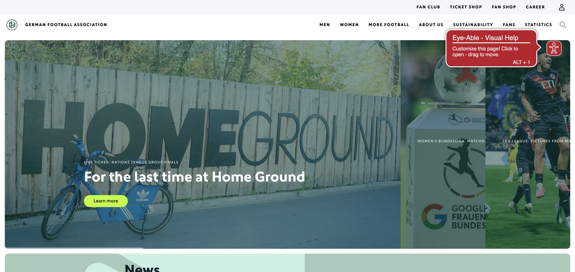
The German Football Association uses a white institutional header above a large football-related campaign and a narrower adjacent story image. A bright action identifies the lead feature, while news begins below. Fan, shop, association and football routes share the header but remain separately labelled. Amplitude’s DFB case documents a migration across part of the federation’s digital portfolio with an implementation partner and shared analytics model. It is not evidence that every club, team platform or the pictured page uses an identical current setup. The public page is independently useful for its mix of campaign and editorial hierarchy.
What you can learn
A federation homepage needs to distinguish organisational information from fan and participation tasks. Let one current story lead, but preserve clear routes to the wider service catalogue. Keep portfolio-level analytics evidence scoped to the documented federation implementation rather than extending it automatically to affiliated organisations.
Pros
A main campaign and adjacent story create an understandable editorial priority.
Distinct fan and association routes acknowledge different reasons for visiting the site.
Cons & considerations
A dense audience menu needs careful grouping when compressed for mobile.
Floating utility widgets should not obscure campaign text or story controls.
Platform source: Primary documented Amplitude association. Documented association: DFB analytics migration case; not evidence about every club or Germany national-team platform. Platform evidence is separate from the direct website screenshot and is not a complete current infrastructure audit.
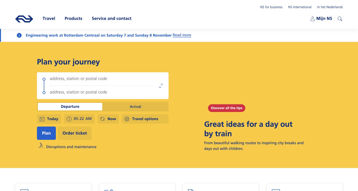
NS uses its familiar yellow field to frame a journey planner immediately beneath a white header. Origin, destination, departure choices and the planning action are visible before broader travel inspiration. A short service notice sits above the main panel, giving current operational context its own place. Amplitude’s case describes digital customer-experience analytics and experimentation at the Dutch rail organisation. It does not identify train-control systems, establish booking-page frontend technology or verify that the captured planner itself uses Amplitude. The design reference is the priority given to a real visitor task rather than a generic promotional opening.
What you can learn
Put the main travel task first, then provide inspiration and service information around it. Label current notices clearly and keep date and journey choices understandable. An analytics case about customer experiments should remain distinct from operational safety systems and the technical implementation of a public journey planner.
Pros
The yellow planner makes the primary visitor task immediately recognisable.
A separate notice area gives current service information a clear location.
Cons & considerations
Dense date and travel controls need accessible labels and understandable defaults.
Promotional travel ideas should not compete with essential planning or disruption information.
Platform source: Primary documented Amplitude association. Documented association: Dutch rail experimentation case; not proof of train-control systems or booking-page frontend. Platform evidence is separate from the direct website screenshot and is not a complete current infrastructure audit.
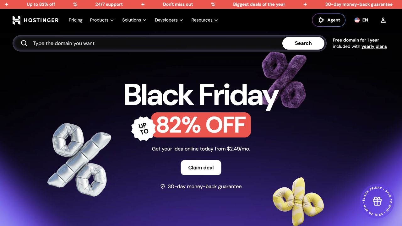
Hostinger’s captured public page uses a dark purple promotional hero beneath a black navigation bar and a prominent domain-search field. The seasonal discount is the visual centre, supported by one claim action and concise offer context. Pricing, products and developer routes remain separate above. Amplitude’s case concerns Hostinger’s consolidation of product and marketing analytics and its experimentation workflow. It does not mean that all sites hosted by Hostinger use Amplitude, nor does it independently inventory this public page’s frontend. The screenshot is a separate example of campaign hierarchy around a durable product-search task.
What you can learn
Keep a useful product task available while seasonal campaigns change. A domain search and a hosting promotion are related but different intentions, so preserve clear destinations and conditions. Limit analytics claims to the provider’s documented experimentation work rather than extending them to every customer website on its infrastructure.
Pros
Domain search remains visible outside the large seasonal promotional statement.
A limited dark palette gives the bright discount treatment a clear focal point.
Cons & considerations
A prominent discount requires current conditions and regular campaign maintenance.
Multiple products and promotions can delay a newcomer’s basic plan comparison.
Platform source: Primary documented Amplitude association. Documented association: Conversion experimentation, not evidence that every hosted customer uses Amplitude. Platform evidence is separate from the direct website screenshot and is not a complete current infrastructure audit.
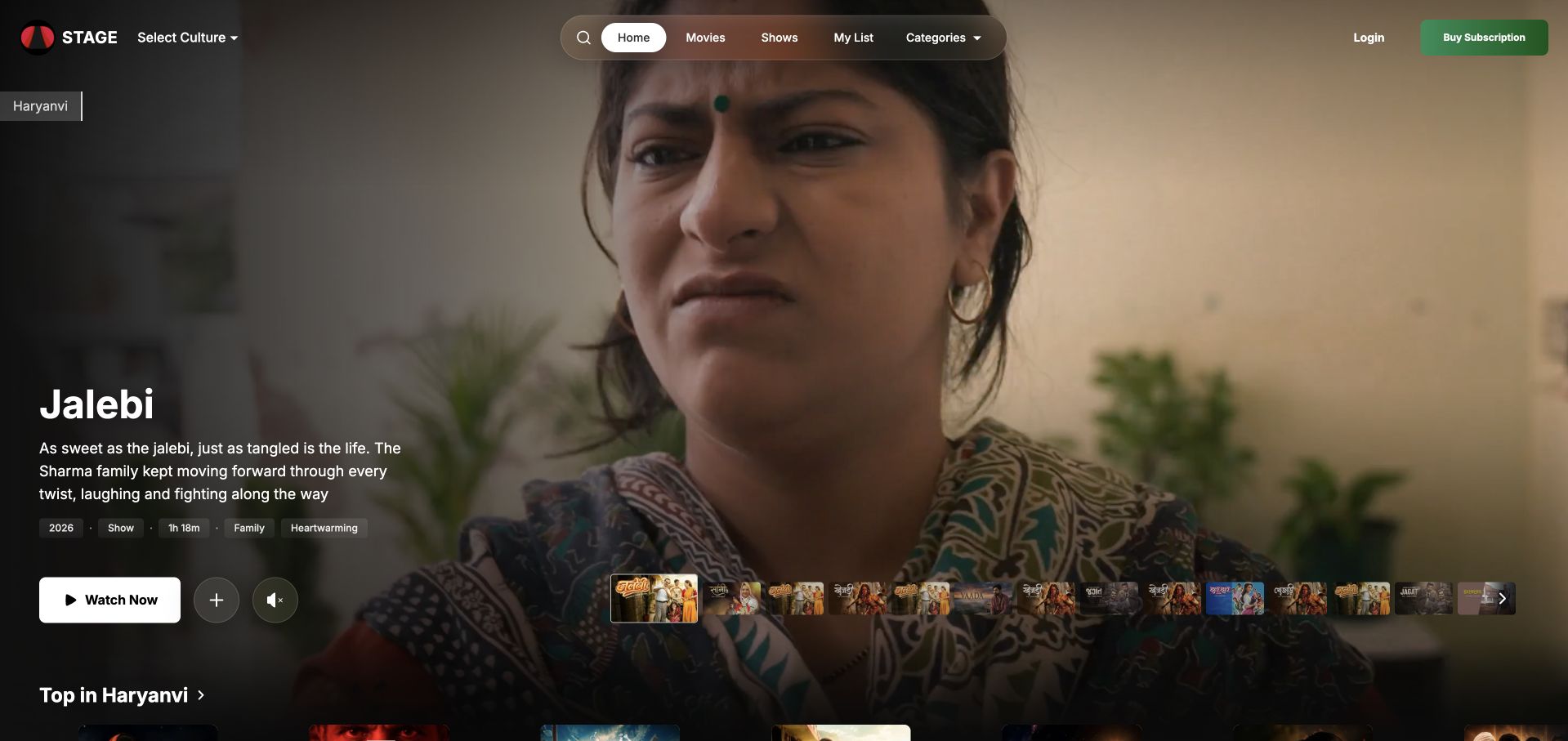
STAGE opens with a large programme image, a short title description and a visible Watch Now action. Culture selection and content navigation remain at the top, while thumbnail previews suggest more titles without replacing the lead story. The composition feels like a viewing interface rather than a corporate brochure. Amplitude’s STAGE case concerns subscriber funnels, engagement patterns and retention-related product analysis for this Indian streaming platform. It does not identify the complete video-delivery stack or every player component on the public page. The screenshot supplies a separate reference for content-discovery hierarchy.
What you can learn
Let one title lead while keeping browsing and culture selection understandable. Explain subscription requirements before playback or purchase, and keep preview controls distinct from the main watch action. Behavioural-analytics evidence can describe the product team’s work without being mistaken for proof of streaming infrastructure or guaranteed retention results.
Pros
A title, short description and watch action create a useful viewing hierarchy.
Thumbnail previews offer alternatives while preserving the lead programme’s visual priority.
Cons & considerations
Large programme imagery needs readable text and controls across mobile crops.
A content hero still needs clear subscription and access requirements nearby.
Platform source: Primary documented Amplitude association. Documented association: Streaming-product analytics for STAGE; not other similarly named brands. Platform evidence is separate from the direct website screenshot and is not a complete current infrastructure audit.
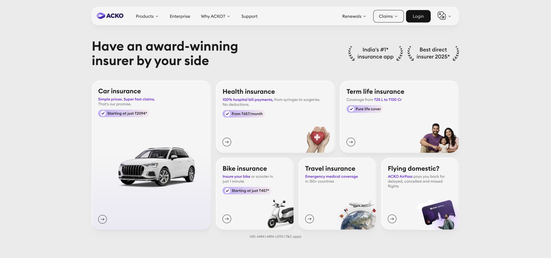
ACKO’s settled homepage uses a pale background, a compact rounded header and a grid of insurance-related cards. The larger car card anchors smaller routes for health, term-life, bike and travel needs. Product illustrations and short labels make the selection task explicit without a large cinematic hero. Amplitude’s source concerns analysis of a customer-help and conversion journey involving a generative-AI chat experience. That case is not coverage advice, an assessment of insurance suitability or a complete inventory of this page’s technology. The public design reference is the clear organisation of several distinct service intentions.
What you can learn
For a broad service catalogue, a labelled card grid can be more useful than a generic reassurance statement. Keep each route’s conditions and responsibilities clear, especially where decisions involve financial products. Describe the analytics workflow without turning vendor conversion claims into a promise about the service itself.
Pros
Cards turn several product categories into clear, individually labelled starting points.
A larger lead card creates hierarchy without hiding the other service routes.
Cons & considerations
Promotional prices need clear context and must not replace product conditions.
Category illustrations cannot establish the suitability or coverage of an individual policy.
Platform source: Primary documented Amplitude association. Documented association: Insurance customer-experience analytics described by vendor; not advice on coverage or a full frontend inventory. Platform evidence is separate from the direct website screenshot and is not a complete current infrastructure audit.
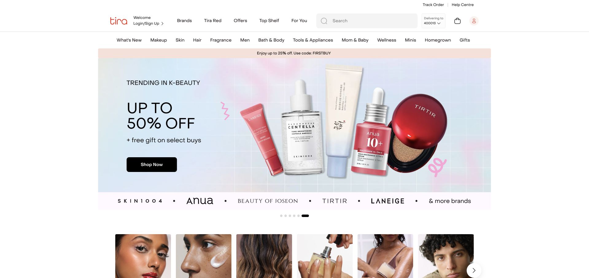
Tira uses a white retail header with extensive category navigation above a framed beauty-product campaign. The main offer has one dark Shop Now action, while brand names and photographic category tiles start immediately beneath it. The bounded campaign leaves room for the catalogue structure to remain visible. Amplitude’s source specifically concerns Tira’s analytics workflow within Reliance, including dashboard-linked analysis and internally identified user journeys. It is not evidence about all Reliance brands or this storefront’s complete technology. The page is reviewed separately as a design example of campaign-to-catalogue continuity.
What you can learn
Keep a promotion connected to real product browsing. Brand, category and search routes should remain useful when the campaign changes, with accurate offer conditions at the destination. Preserve the source’s Tira-specific organisational scope rather than treating a parent-company name as evidence across every related retail business.
Pros
A framed campaign leaves room for category and brand browsing below.
The dark retail action remains distinct within a restrained pale product composition.
Cons & considerations
A wide catalogue navigation needs clear grouping on smaller mobile screens.
Discount-led imagery needs current conditions and must not obscure product information.
Visible tech stack
Earlier / documented evidence
Amplitude
Platform source: Primary documented Amplitude association. Documented association: Tira retail analytics within Reliance; no inference across all Reliance brands. Platform evidence is separate from the direct website screenshot and is not a complete current infrastructure audit.
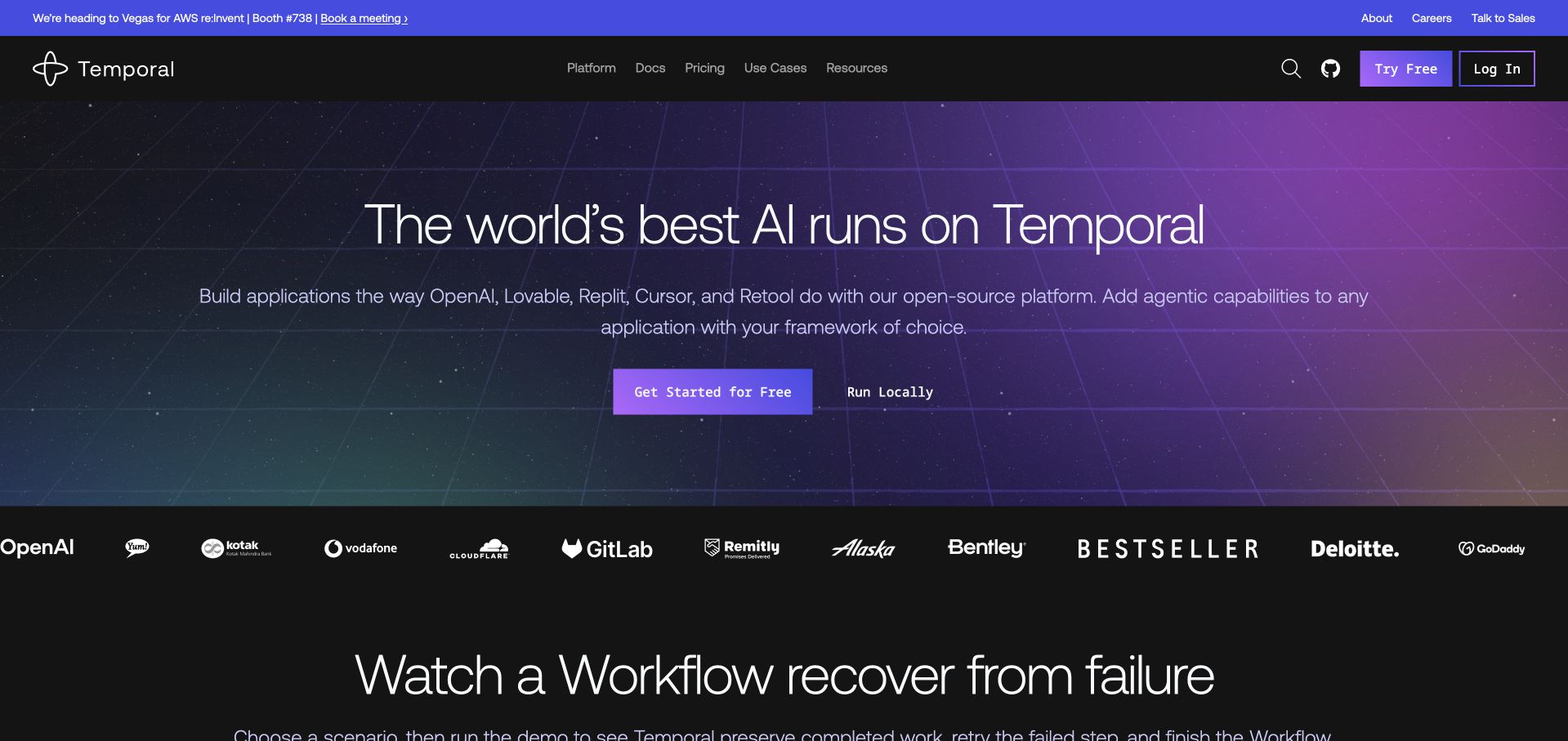
Temporal uses a dark grid background, a purple gradient and a large developer-platform headline. Get Started for Free and Run Locally are distinct actions, while documentation and pricing remain conventional navigation routes. Customer names and a workflow demonstration begin below. Amplitude’s Temporal case describes product-led growth analysis connecting web and product journeys, including signup and activation experiments. This is different from Temporal’s own workflow-engine internals and does not establish the runtime of the captured marketing page. The useful design pattern is the explicit choice between a managed starting route and local exploration.
What you can learn
A technical platform should distinguish trying a managed product from running software locally. Keep prerequisites and destination labels clear, then connect demonstrations to actual documentation. Product-analytics adoption does not mean the analytics vendor supplies the product’s execution engine, infrastructure or every component shown on the homepage.
Pros
Separate hosted and local actions recognise two different developer starting intentions.
Documentation and pricing remain accessible outside the main promotional platform statement.
Cons & considerations
Broad AI-focused positioning needs concrete capability details on the following pages.
Customer logos require context rather than implying identical adoption across every organisation.
Platform source: Primary documented Amplitude association. Documented association: Product-led growth/sign-up analytics; distinct from Temporal workflow-engine internals. Platform evidence is separate from the direct website screenshot and is not a complete current infrastructure audit.
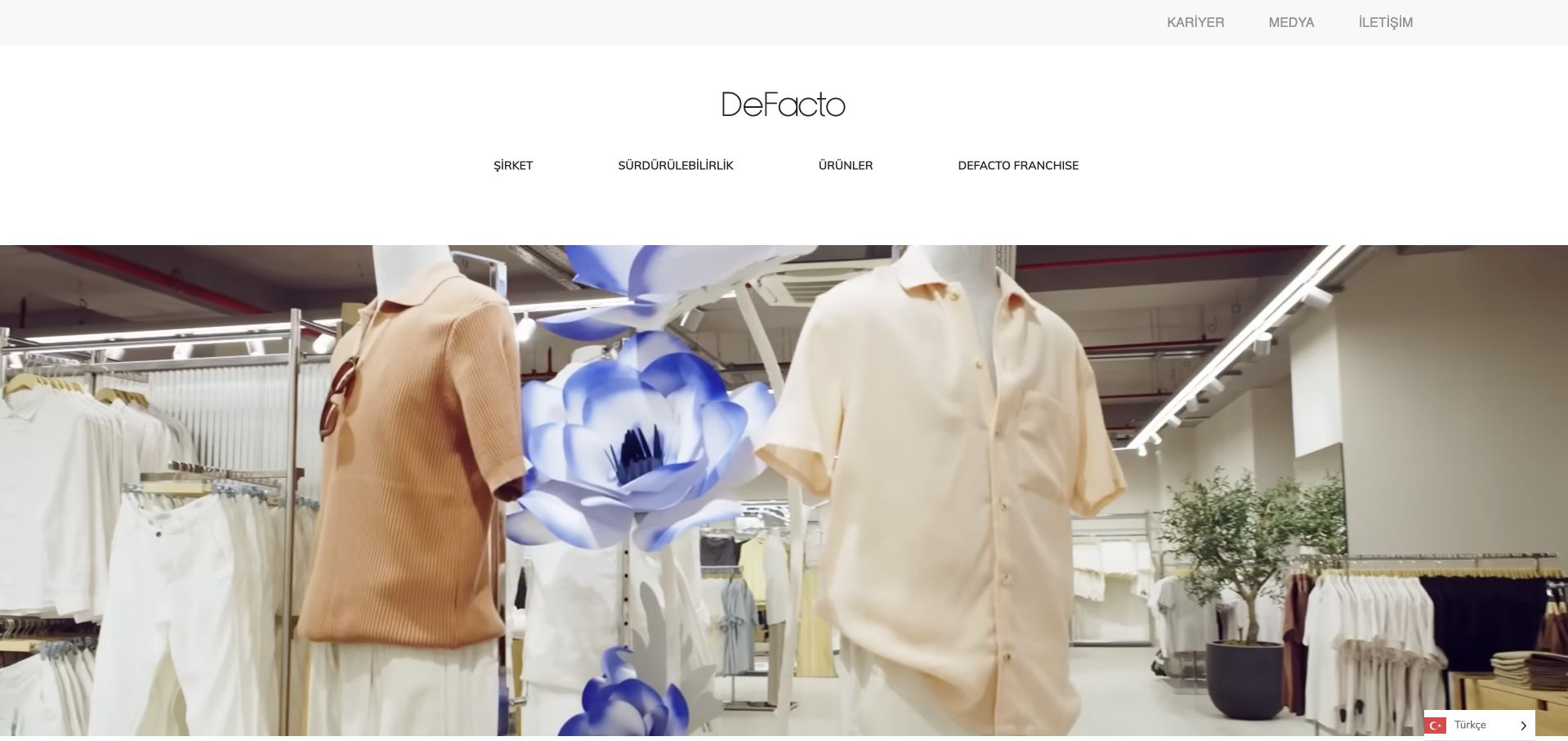
DeFacto’s corporate destination uses a spacious white masthead and a large fashion-interior photograph. Company, sustainability, product and franchise routes form the main navigation, with careers and media utilities above. The captured official source resolves to the current corporate domain; it is not a regional consumer product listing. Amplitude’s DeFacto case documents retail experimentation across web, mobile and markets, including product-image tests with a partner. That evidence does not prove the corporate page’s current backend or identify all regional storefront technology. The design reference is the separation of corporate audiences from transactional shopping.
What you can learn
A retail group’s corporate page should identify its audience and purpose clearly. Keep investor, career, sustainability and franchise information separate from consumer shopping routes. Use the analytics case to describe the documented retail workflow, not to infer identical technology across a corporate site and every international storefront.
Pros
A spacious masthead gives corporate categories a clear, stable navigation setting.
Fashion imagery preserves brand character without turning the page into a checkout interface.
Cons & considerations
A large image delays detailed corporate information for task-focused visitors initially.
Regional and corporate destinations need clear labels to prevent mistaken shopping expectations.
Platform source: Primary documented Amplitude association. Documented association: Retail experimentation; corporate site is a separate design reference from regional ecommerce surfaces. Platform evidence is separate from the direct website screenshot and is not a complete current infrastructure audit.
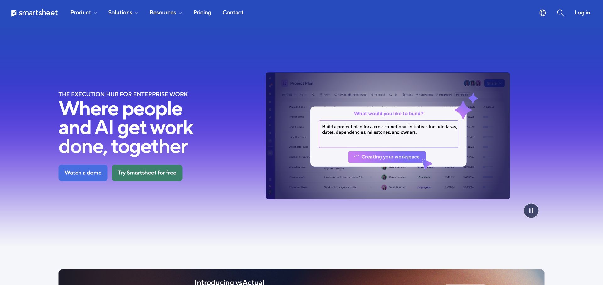
Smartsheet uses a blue-to-purple gradient with a clear enterprise-work headline on the left and a product-interface demonstration on the right. Watch a Demo and Try Smartsheet for Free remain distinct actions, while product, solution and pricing navigation sits above. The screenshot gives the broad AI-oriented message a more concrete visual counterpart. Amplitude’s case concerns self-serve product research and engagement analysis by Smartsheet teams. It is not evidence that Amplitude supplies Smartsheet’s work-management engine, current frontend or entire infrastructure. The public homepage is independently reviewed for its explanation and action hierarchy.
What you can learn
Pair a broad platform statement with a specific, understandable interface example. Keep an explanatory demo distinct from account creation, and make pricing available before either commitment. Treat product analytics as a supporting organisational workflow rather than a substitute explanation of the software’s own underlying architecture.
Pros
A product-interface example gives the broad enterprise headline concrete visual context.
Demo and trial actions support visitors at different stages of product investigation.
Cons & considerations
A polished demonstration may not explain prerequisites or actual account capabilities.
AI-led positioning needs specific supporting detail beyond the introductory campaign statement.
Platform source: Primary documented Amplitude association. Documented association: Product research/analytics case; not proof of all Smartsheet product infrastructure. Platform evidence is separate from the direct website screenshot and is not a complete current infrastructure audit.
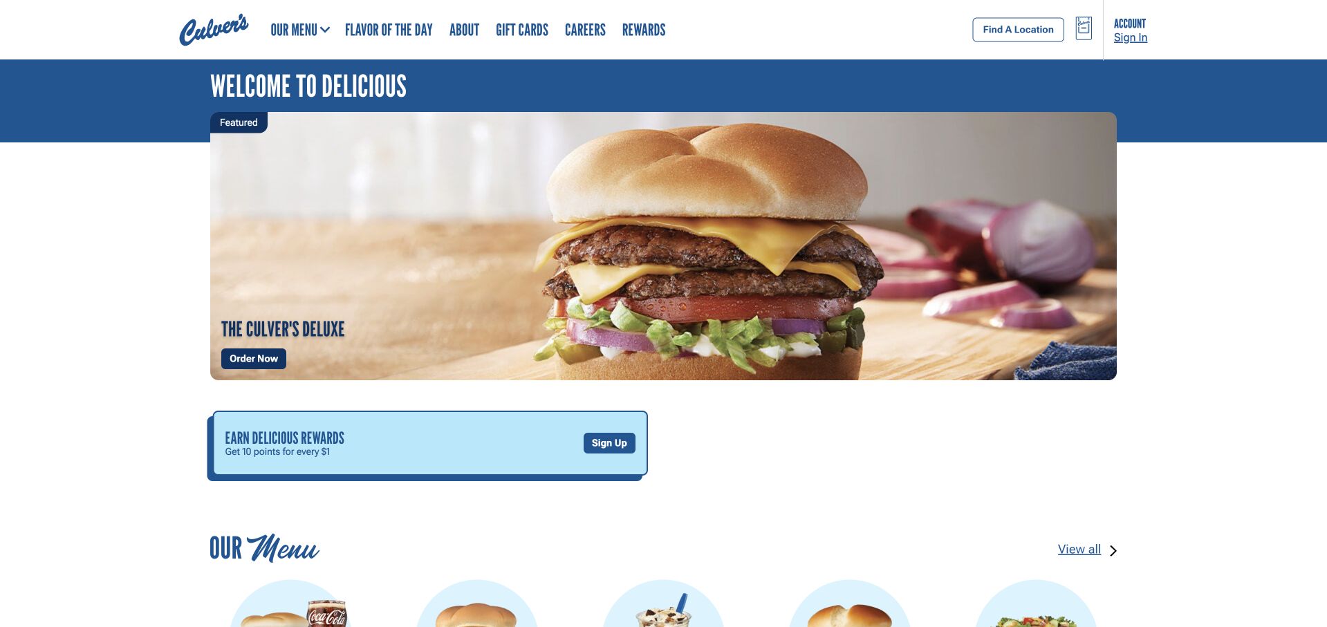
Culver’s uses a blue header band above a bounded burger photograph, with a short feature label and an Order Now action. A rewards prompt and menu introduction follow immediately below, while location search remains visible at the top. The page connects appetite-driven imagery to practical restaurant tasks without an extended brand film. Amplitude’s case concerns digital guest-journey analytics, audience work and experimentation around ordering. It does not establish restaurant operational systems or the public page’s frontend. The screenshot is a separate design reference for connecting a current promotion to a stable ordering and menu structure.
What you can learn
Let the featured item lead without hiding location and menu information. Keep rewards enrolment separate from placing an order, and explain local availability before checkout. Vendor-reported digital-order results describe a documented programme, not a guarantee that a similar layout or analytics installation produces the same business outcome.
Pros
A bounded food photograph gives the featured promotion one clear visual focus.
Location, rewards and menu routes remain recognisable beyond the main order action.
Cons & considerations
A national promotion still needs accurate local availability and ordering context.
Rewards messaging should not interrupt someone simply trying to browse the menu.
Platform source: Primary documented Amplitude association. Documented association: Digital ordering analytics case; no inference about restaurant operational systems or the public frontend. Platform evidence is separate from the direct website screenshot and is not a complete current infrastructure audit.
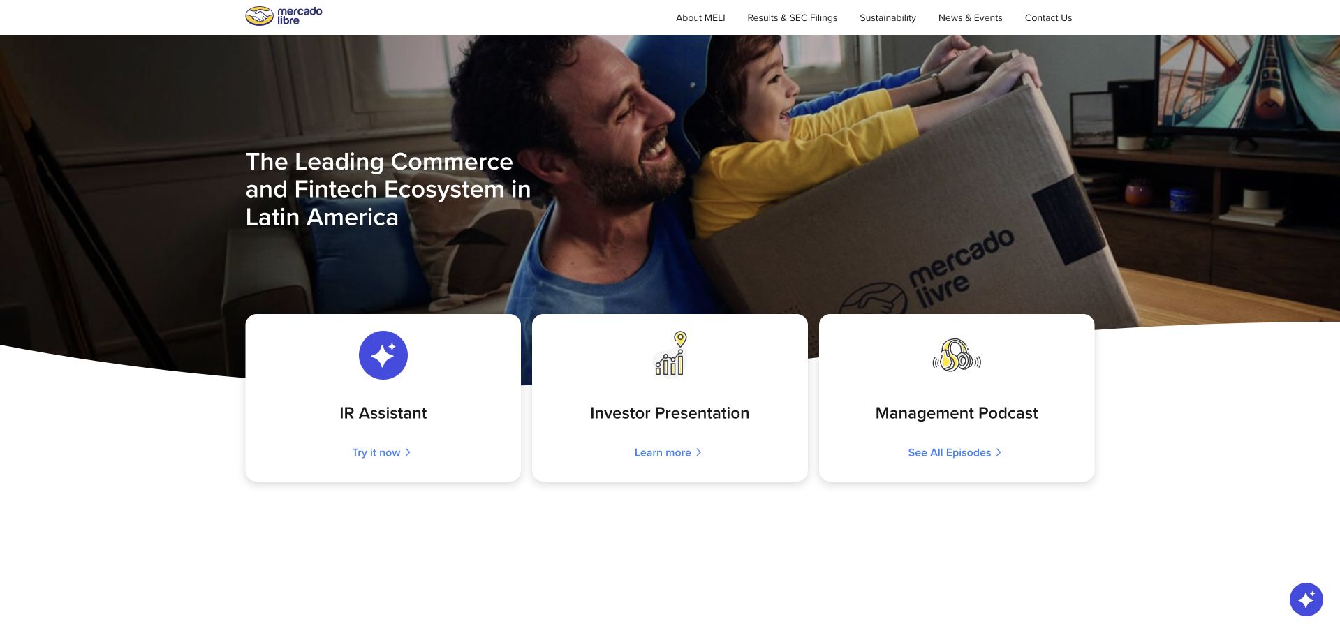
Mercado Libre’s investor page uses a family-and-delivery photograph beneath a white corporate header. A concise commerce-and-fintech statement introduces the business, while three large cards lead to an IR assistant, investor presentation and management podcast. This is an investor destination, not the marketplace checkout. Amplitude’s source describes enterprise behavioural analytics and AI-assisted decision workflows across Mercado Libre teams. It does not establish that this investor page runs Amplitude or reveal the marketplace’s complete stack. The design reference is the way a familiar consumer setting leads into clearly labelled corporate research tasks.
What you can learn
An investor site should connect the company story to authoritative reference material quickly. Keep presentations and formal disclosures easy to identify, and distinguish an assistant from the source documents themselves. Enterprise analytics evidence must remain separate from claims about the current implementation of a public investor-information page.
Pros
Three prominent cards give corporate visitors practical destinations beyond the introductory photograph.
A short business statement connects consumer imagery to the investor-information context.
Cons & considerations
An assistant needs clear boundaries from formal disclosures and current source documents.
The family photograph cannot explain the platform’s full organisational or financial structure.
Platform source: Primary documented Amplitude association. Documented association: Enterprise decision-making analytics; investor site is separately reviewed and not claimed to run Amplitude. Platform evidence is separate from the direct website screenshot and is not a complete current infrastructure audit.
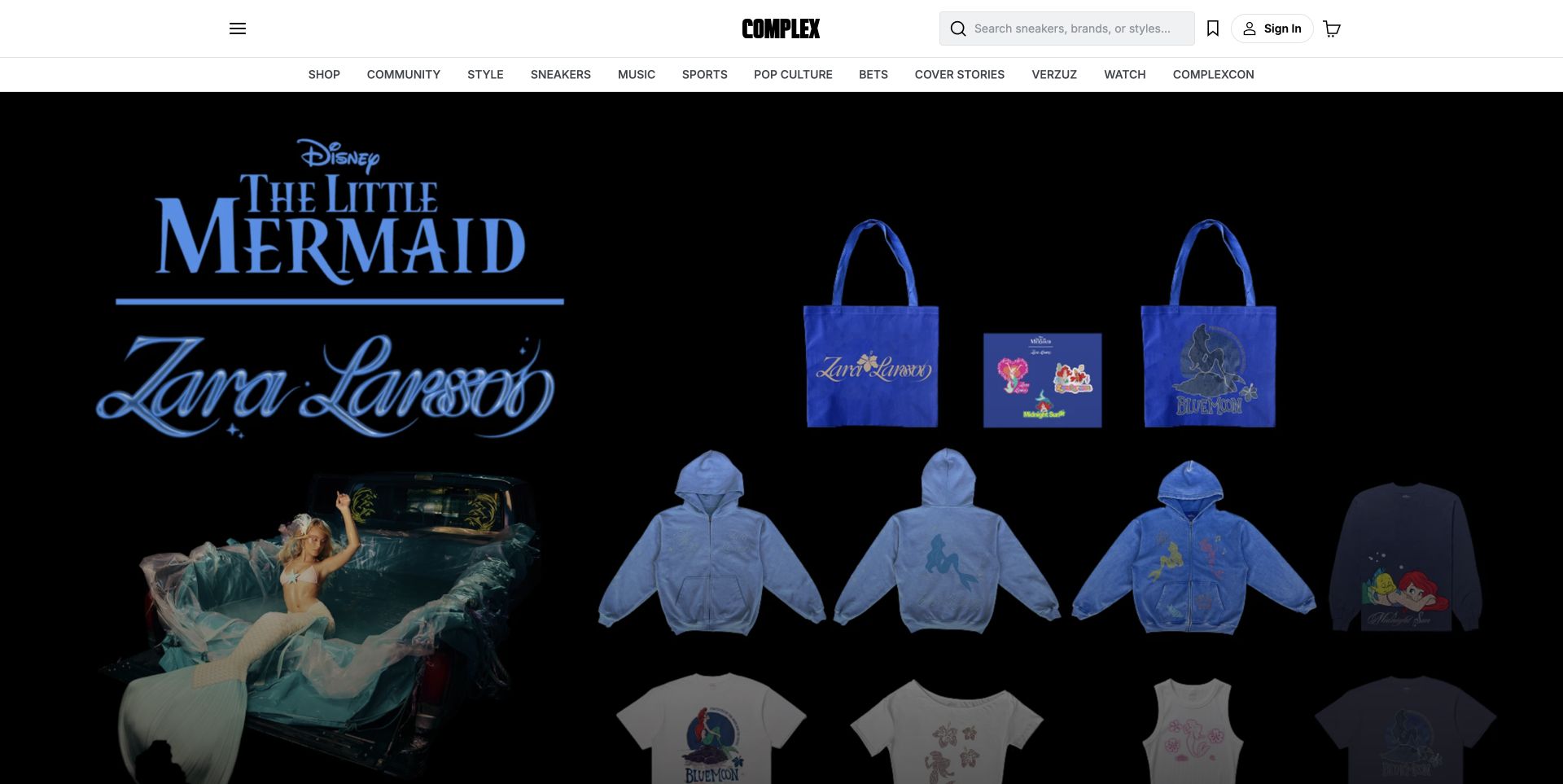
Complex’s captured public page leads with a Little Mermaid and Zara Larsson merchandise collaboration beneath a white masthead. Shop and editorial categories share the upper navigation, while the large dark campaign displays several products together. This is a commerce-led public view within a broader culture-media brand, not a representative article page. Amplitude’s Complex story concerns audience and commerce analysis and AI-agent support for interpreting engagement. It does not identify the editorial CMS or prove this campaign’s current runtime. The design reference is the challenge of keeping retail and content discovery clear under one recognisable identity.
What you can learn
A media brand can promote commerce without making editorial browsing disappear. Keep shop and content labels distinct, and give collaboration imagery a clear product destination. Analytics can inform interpretation of audience behaviour without dictating editorial taste or establishing the technology used to render every article and campaign page.
Pros
A white masthead keeps the brand recognisable above a dark collaboration campaign.
Shop and editorial categories acknowledge two genuinely different visitor browsing intentions.
Cons & considerations
A commerce-led hero can delay orientation for visitors seeking news or features.
Campaign imagery needs clear product scope and current collaboration availability information.
Platform source: Primary documented Amplitude association. Documented association: Media analytics/AI-agent workflow; not proof of editorial CMS or article rendering technology. Platform evidence is separate from the direct website screenshot and is not a complete current infrastructure audit.
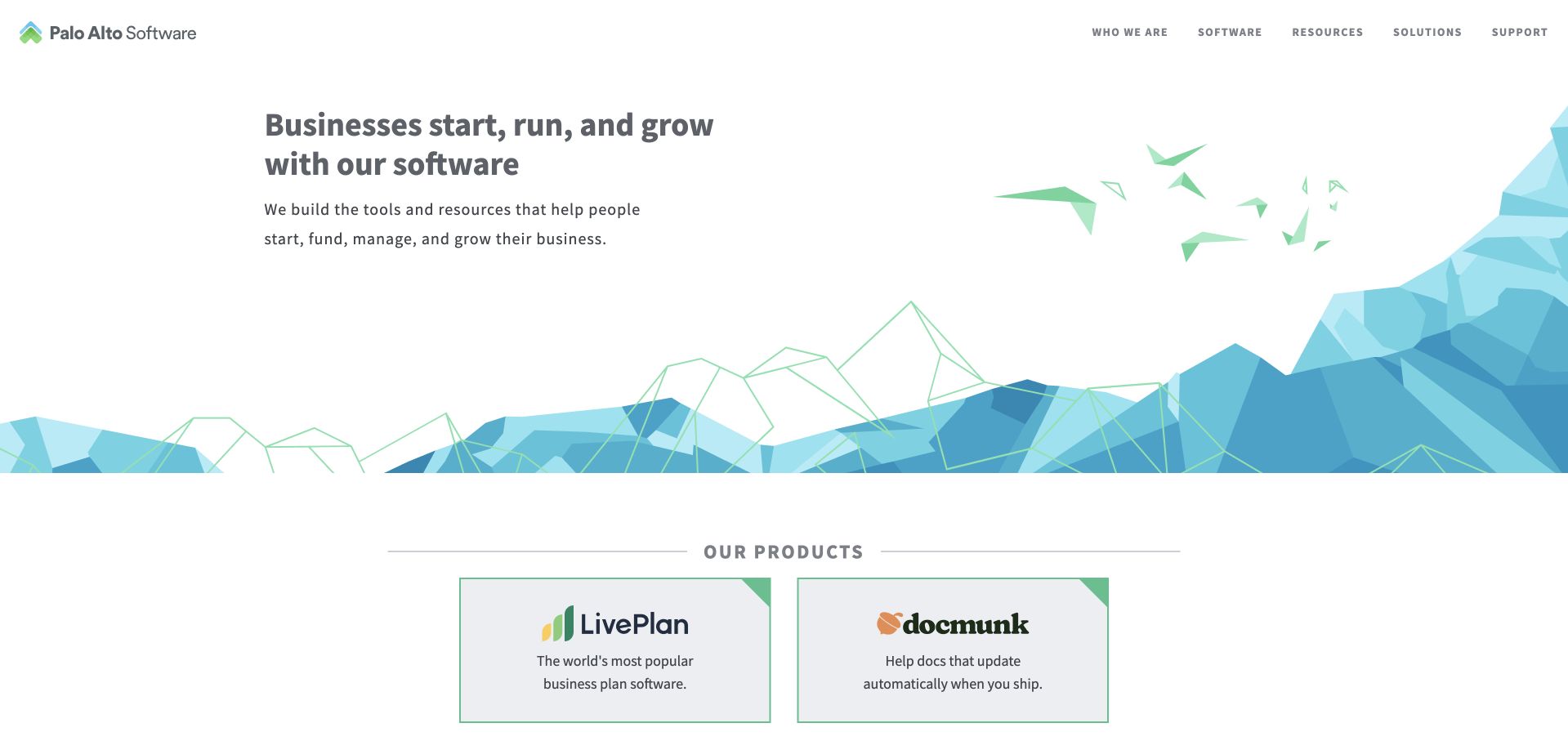
Palo Alto Software uses a white introduction, a short business-software statement and blue geometric scenery. Two product cards begin below, giving the company’s portfolio an explicit structure. The header separates company, software, resources and support information. Amplitude’s source concerns experimentation and AI-assisted analysis at Palo Alto Software, including onboarding and core product workflows. This is not Palo Alto Networks and is not evidence of a security-product stack. The captured corporate page shows how a small product portfolio can be introduced without an elaborate campaign or ambiguous brand assumptions.
What you can learn
Explain the company and its products as related but distinct layers. Give each product a clear destination and keep support routes understandable. Attach analytics evidence to the named software business and documented experiment workflow rather than broadening it to another company that happens to share part of the name.
Pros
A short introduction explains the company before presenting its individual product cards.
Two visible portfolio routes provide a clear alternative to a generic enquiry action.
Cons & considerations
Abstract scenery offers limited information about the actual software interfaces or capabilities.
Company and product support destinations need clear labels to prevent mistaken expectations.
Platform source: Primary documented Amplitude association. Documented association: Software product experimentation; unrelated to Palo Alto Networks security products. Platform evidence is separate from the direct website screenshot and is not a complete current infrastructure audit.
Kegan has 15+ years of experience working with small businesses, Fortune 500 companies, and everything in between. No development job is too big or too small: he brings the same hands-on attention to a focused improvement, a complete website, or a custom application.
For Amplitude projects, he can help with website integrations, form and campaign connections, analytics implementation, testing, and clear ownership after launch. He works directly with clients on scope, design, implementation, testing, and handover, with an emphasis on clear communication and a system that remains practical to maintain after launch.
Show 3 other Amplitude developersHide other Amplitude developers
Choose a meaningful feature and explain what successful use looks like. Separate discovering the feature, attempting it and obtaining its intended result. Start with a small set of observations and a known group of examples that can be reconciled. The initial outcome should be an actionable understanding, not simply a populated dashboard.
A reviewed event vocabulary across teams
Inventory overlapping names and conflicting definitions before adding new instrumentation. Agree on who owns a meaning and who may approve changes. A shared plan should help a new contributor implement the same behavior consistently, with enough examples to distinguish similar actions and avoid silently combining unlike journeys.
Start with a change small enough to evaluate responsibly. Document the hypothesis, assignment expectations, eligibility and relevant operational guardrails. Keep exposure and business outcomes conceptually distinct. Decide what would justify keeping, revising or stopping the change before inspecting results, and make sure someone owns the decision.
From references to requirements
Plan meaning, validation and responsible interpretation together
Turn a product question into a precise observation plan
Describe what the team needs to learn and what decision follows. If the question concerns ordering, distinguish viewing a menu, beginning checkout and receiving a confirmed order. Those steps can answer different questions and may have different authoritative sources. Define the unit being counted, the eligible audience and the observation window. Include common exceptions such as retries, canceled actions and delayed confirmation.
Name the minimum context required to interpret the action. A small reviewed category may answer the question better than an unrestricted text field. Keep message contents, form text and sensitive attributes out unless an explicit approved purpose requires them. Record why each property exists and who owns its meaning. A future maintainer should be able to remove an unnecessary observation without guessing whether it secretly supports a critical report.
Make the plan readable by the people who will use the result. Include a short example journey with expected observations and a clear completion definition. Keep application behavior and analytical interpretation aligned. An event stream can be technically valid while representing a different business action from the one the product team thinks it is measuring.
Validate the lifecycle before opening a dashboard to everyone
Choose an isolated development or test context and walk through the actual flows. Amplitude’s data-team guidance describes planning, collecting and validating events; use that sequence as a prompt for concrete acceptance checks rather than stopping when a library loads. Inspect names, trigger conditions and the intended context. Compare known outcomes with the application’s source of truth.
Test the account lifecycle deliberately. Include guest use, account creation, sign-in, sign-out and a second person using the same device. Define what an identifier represents and how it should behave when the context changes. Do not assume an available email address is the appropriate identifier or that more stitching is automatically better. Keep privileged credentials server-side and review what reaches the browser.
Plan for missing or duplicated observations. A blocked script, a network interruption and a retry can affect the apparent journey. Document those limits and decide which outcomes require backend confirmation. Keep the report’s wording proportional to what was actually observed. A dashboard should not imply a complete census when the implementation intentionally measures only part of the audience or flow.
Make interpretation and access part of the handoff
Write down the hypothesis and decision rule before evaluating a change. Identify the audience to which the result applies and the guardrails that could outweigh an apparent improvement. Keep quality, reliability and accessibility in the discussion rather than reducing the decision to one conversion number. Document the limits of the comparison and avoid treating correlation in an observational report as proof that a design change caused the result.
Assign access intentionally. Amplitude documents data-access controls, but a product permission setting does not replace decisions about permitted collection, retention or privacy obligations. Review those with the appropriate owners for the actual audience and jurisdiction. Separate the ability to see analytical data from the authority to change definitions or launch a new experiment. Give each responsibility a clear owner.
The operational handoff should include the plan, test journeys, identity decisions, source map and known gaps. Review event changes alongside application releases. Preserve a record of meaningful definition changes so later readers can interpret a trend across versions. Name the person who investigates discrepancies and the person who can pause an unreliable report. A useful analytics system remains explainable after the original implementer has left the project.
Ask the actual team to carry out its routine job: publish a realistic update, correct a mistake, preview a narrow screen, and identify who owns an integration failure. For a library or frontend framework, also ask who maintains the content source and deployment. A polished screenshot does not answer those operational questions.
Beyond the screenshot
Amplitude project planning checklist
Name the product decision and accountable reviewer.
Define successful use and the eligible audience.
Distinguish discovery, attempts and confirmed outcomes.
Record event triggers, names and minimal required properties.
Exclude unrestricted text and sensitive payloads unless explicitly approved.
Choose and test the intended identity lifecycle.
Keep test observations separate from production reporting.
Reconcile known journeys with authoritative application outcomes.
Plan for retries, duplicates and missing observations.
Define experiment hypotheses and guardrails before reading results.
Review access, permitted purpose and retention responsibilities.
Document definition changes, investigation and report-pause ownership.
Test with real content, a keyboard, a small screen, slow or failed requests, and the people who will maintain the system. These are planning checks, not an accessibility, security, performance, or search-ranking certification.
Sources & editorial method
How this Amplitude collection was reviewed
Twenty public interfaces were independently inspected and paired with checked Amplitude customer material. Product, organization and workload boundaries are retained. Recommendations are original planning guidance; customer outcomes remain vendor-reported context rather than independent benchmarks or promises.
Every image is an unmodified capture from the actual website, with its source and capture date. Some captures are reused from our shared catalog; their dates remain the original capture dates. None comes from a vendor gallery or a generated reconstruction. Moving imagery and live content can change.
Technology attribution uses public page assets or metadata, official platform documentation, or a cited first-party project case study. Documentary and framework-relationship evidence is identified where used; it is not a complete current backend inventory. A CMS image CDN alone does not establish a full CMS deployment. A library’s presence does not prove which individual controls use it, and a platform label does not establish AI authorship.
The composition notes, lessons, pros and tradeoffs are original editorial observations. We have not measured conversion, traffic, security, performance or accessibility conformance. Website owners retain their brands and imagery; these examples are not our client portfolio. Written, Edited and Curated are independent records, not dates advanced by a build. See our editorial standards or suggest a correction.
Questions worth asking
Amplitude website development FAQs
Do these examples prove Amplitude renders their public websites?
No. The public designs and documentary analytics cases are separate evidence. A source may concern a product, subsidiary or particular team rather than the marketing site or the whole organization.
Should every new website start with product analytics?
No. Begin with the actual decision and audience. A simple informational site may not need user-level analysis. Choose the least collection that answers a legitimate question and review the privacy implications separately.
What is the difference between an attempted action and success?
An attempt can fail validation, be canceled or be repeated. Define the confirmed business outcome and its authoritative source, then make the report’s labels reflect that distinction.
Can a vendor case establish our likely conversion improvement?
No. It describes another organization’s reported context. Your audience, implementation and measurement limits may differ. Define a responsible evaluation process rather than adopting someone else’s percentage as a forecast.
What keeps an analytics project useful after launch?
A reviewed event plan, known acceptance journeys, explicit identity decisions and accountable change owners. The team must be able to explain what the records mean and when the result should not be trusted.
Begin with one useful question and a measurement plan people can explain. Expand only when the observations are validated and the decisions, privacy boundaries and owners remain clear.