Best Pharmaceutical Manufacturer Websites of 2026 (19 Real-World Examples)
Pharmaceutical manufacturer website examples for clear corporate and audience journeys
A pharmaceutical company's public website has to explain the organization while helping different visitors find the right information. These eighteen examples compare editorial storytelling, investor updates, research navigation and practical audience routes.
Pharmaceutical websites serve several kinds of intent at once. An investor may need a dated announcement, a journalist may need a press release, a prospective employee may want company context, and a patient may be looking for an appropriate product or support resource. A good homepage makes these differences visible. Its first screen can establish the brand, but the navigation and content hierarchy must do the work of directing people to information with the correct scope.
This collection concentrates on the design of public corporate and regional homepages from eighteen distinct manufacturers. Some use immersive photography, some feature financial reporting, and others behave like editorial publications. The reviews describe what was visible during inspection. They do not assess medicines, repeat promotional claims as independent facts, recommend treatment or establish regulatory or accessibility compliance.
Before the examples
What makes good pharmaceutical manufacturer website design in 2026?
Name the audience and purpose
Distinguish corporate information, patient resources, professional material, investor documents and careers. Use labels that make sense to the visitor, and explain meaningful transitions into local sites or specialized services before they happen.
Separate news from explanation
Press releases, long-form stories, pipeline summaries and financial documents have different purposes and maintenance needs. A shared card system should preserve their content type, date and destination rather than making every item look interchangeable.
Keep regional context visible
A global company site and a local product-information site are not the same thing. Show the current market or global context where it matters. Maintain useful links between them without implying that information available in one region applies everywhere.
Make the non-media experience complete
Large videos and image sequences can create a strong opening, but the page still needs a readable headline, explanation and next action when media is slow, unavailable or paused. Treat that state as a designed experience.
These eighteen reviews examine specific patterns, from compact reporting banners to patient portraits and science-magazine features. Each identifies a practical lesson and a tradeoff for teams designing a public pharmaceutical website.
Aprecia uses a dark red visual identity, a concise challenge-led introduction and a clear contact action. The page then organizes formulation, development and manufacturing capabilities into distinct routes, giving technical buyers a more focused entry point than a broad corporate brand story.
What you can learn
Translate a specialist capability into the questions a prospective partner needs answered. Use the visual identity to frame that explanation, not to substitute for process, evidence and contact details. Specialist manufacturing requires a clear explanation of capability and process, with technical detail available at the next level rather than every qualification competing in the opening.
Pros
Capability routes connect the introduction with specific stages of work.
A consistent palette and limited primary navigation reduce visual competition.
Cons & considerations
Animated statistics need meaningful static values and supporting context.
Regulatory and manufacturing claims require current technical evidence; visual polish is not qualification.
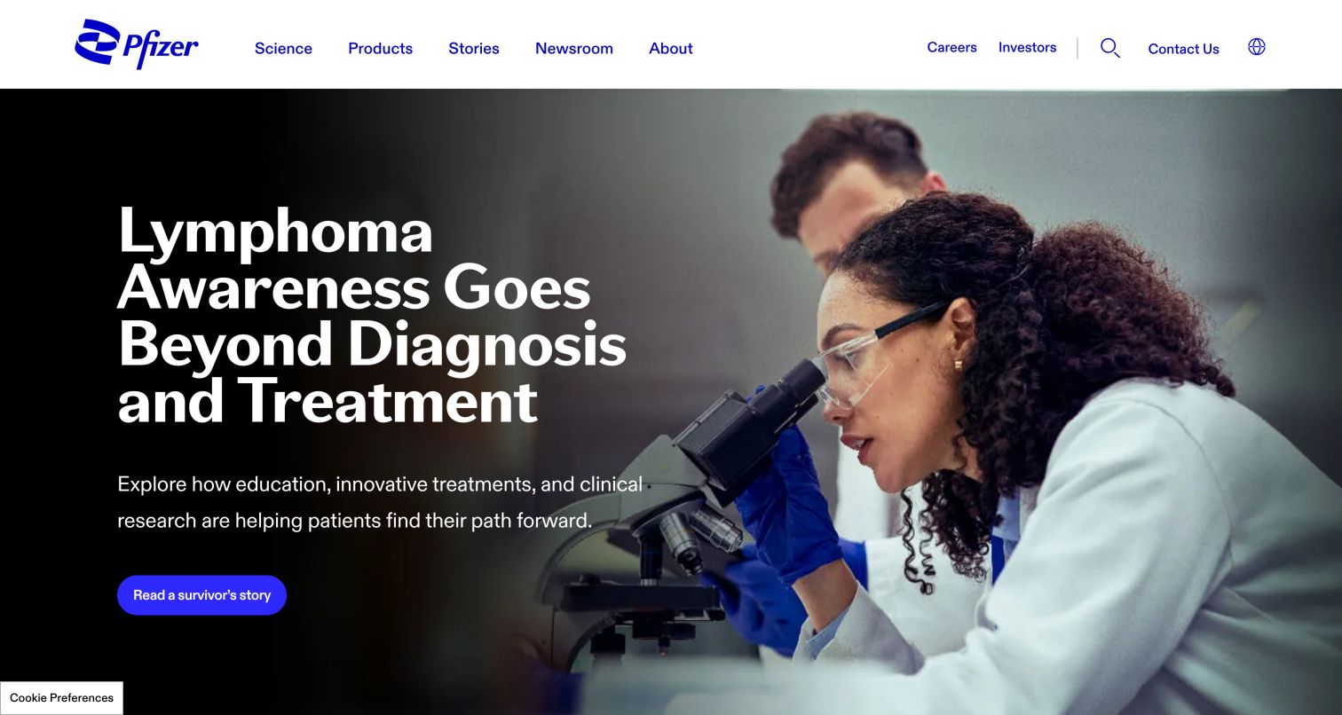
Pfizer places a scientist at work behind a large, high-contrast story headline. The photographic opening establishes a human setting for research, while the main navigation keeps Science, Products, Stories and Newsroom distinct. Further down, articles and dated press releases occupy separate areas rather than blending into one undifferentiated feed. A product search and a browse-all route give visitors two ways into medicine information. Assistance and pipeline links add practical destinations beneath the broad corporate introduction. This makes the homepage useful as both an editorial publication and a directory, though the visitor still needs to identify the relevant information category.
What you can learn
Borrow the separation between corporate narrative and task-based destinations. Give a product lookup, an assistance route and a press archive stable positions that do not depend on the featured story. Review the wording and audience of every medicine-related destination with its owner before treating the homepage as a general consumer journey.
Pros
Products and editorial stories have distinct navigation labels.
Search and browse routes accommodate different starting points.
Cons & considerations
A large story hero delays some practical destinations until scrolling.
Several audiences compete for attention on one long page.
Merck uses a minimal header with its logo on the left and prominent Search everything and Menu controls on a teal panel. The captured hero promotes quarterly results over a full-width video frame, with a clear financial-summary button and an exposed pause control. Research, investor and sustainability routes follow as separate content choices, while additional stories and pipeline information expand the company picture below. This is a corporate communications entry rather than a product catalog. The restrained header gives the financial message room, but it also hides most of the site's hierarchy behind the menu.
What you can learn
Make the role of a temporary homepage feature unmistakable. A results announcement needs a specific date or period and a destination that explains what the visitor will receive. Preserve permanent routes for research and other audiences so the announcement can change without changing the whole information architecture. Test whether the collapsed desktop menu suits frequent visitors.
Pros
The results action describes a concrete destination.
Visible video controls support a calmer reading experience.
Cons & considerations
Most topic navigation requires opening the menu.
A financial feature may be less relevant to patients seeking product information.
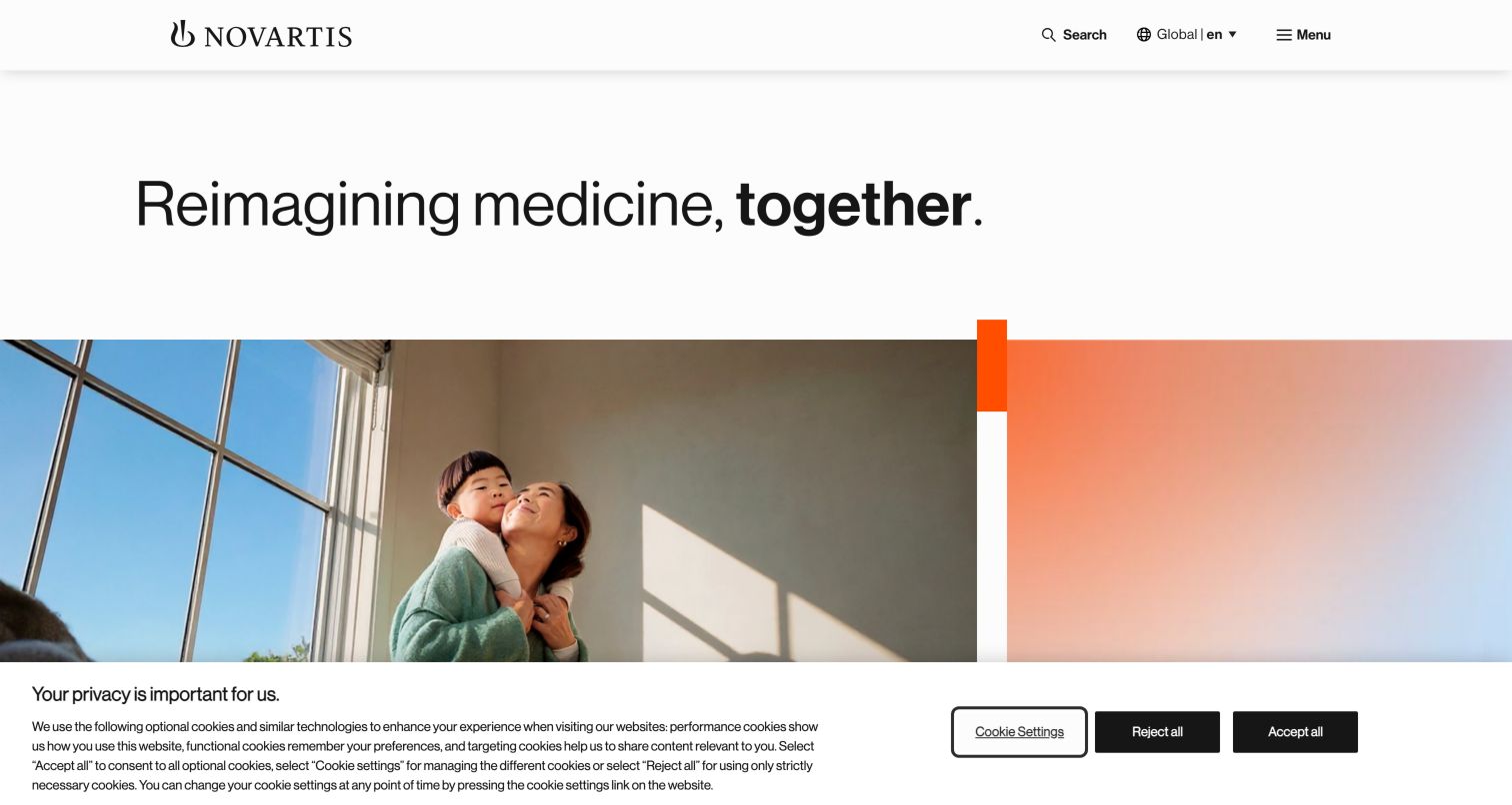
Novartis opens with oversized black typography and a family photograph, using a warm color treatment to soften a highly structured page. The header keeps the brand, global language context, search and menu compact. Beneath the introduction, a financial-results feature and large gateways to therapeutic areas, research, sustainability and careers give the general statement useful destinations. Dated news then provides a separate update layer. The design works by moving from broad purpose to recognizable topics, rather than asking a visitor to understand the organization's divisions immediately. Its sparse first screen still places a burden on the menu and the next sections to explain the full offering.
What you can learn
Pair an ambitious corporate headline with a small set of specific entrances. Treat research, therapeutic areas and employment as different tasks with distinct labels and content owners. On smaller screens, ensure those entrances remain visible and their image treatment does not hide the words visitors need to choose confidently.
Pros
Large type and a single photograph create a clear opening hierarchy.
Topic gateways connect corporate purpose with useful next steps.
Cons & considerations
The compact menu conceals breadth until opened.
The general introduction does not immediately answer a specific product query.
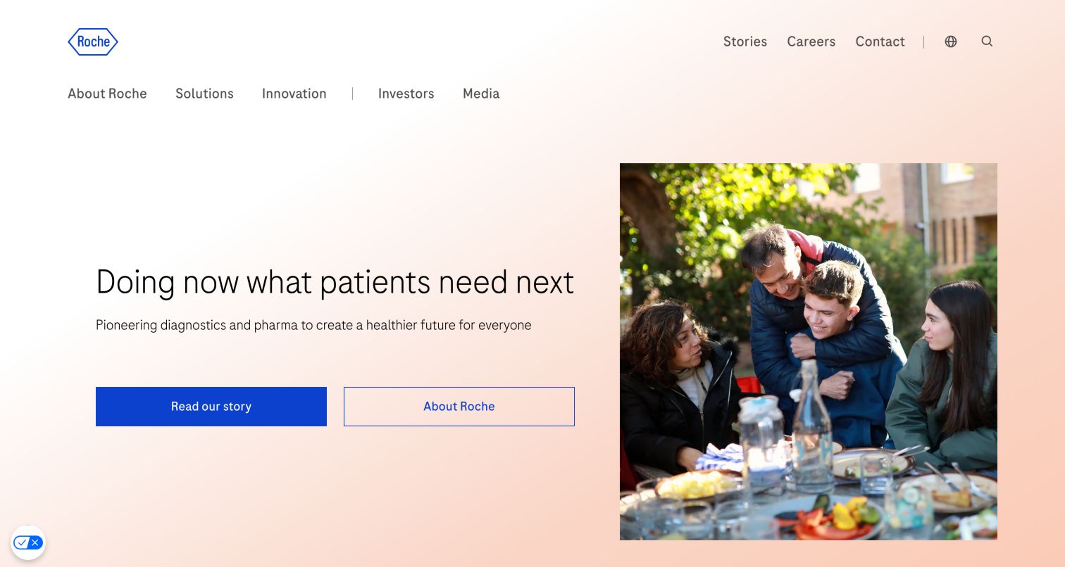
Roche places a restrained headline and two rectangular actions beside an everyday family photograph. The warm pale background and generous space create a calm opening, while two visible navigation rows distinguish core subjects from stories, careers and contact. The page then separates current announcements, investor information and the company's broader mission into recognizable sections. Pharmaceuticals and diagnostics appear as named routes, which matters for a company whose public website covers more than one business. The composition is approachable without making a product recommendation. Its many subsequent sections also make page length and recurring destination clarity important design considerations.
What you can learn
Use the first screen to state the company's scope and give visitors a choice between a story and a factual company overview. For a mixed portfolio, name the business areas in ordinary language and repeat those entrances where they become relevant. Keep investor metrics and promotional narrative visually distinct so their different purposes remain clear.
Pros
Visible navigation exposes the main corporate categories.
Two hero actions distinguish narrative from company information.
Cons & considerations
The long homepage asks visitors to scan several content types.
Portfolio-specific information sits beyond the general introduction.
Sanofi's captured homepage gives a quarterly-results announcement a white card over a laboratory photograph. Purple accents connect the action button, logo detail and global controls without overwhelming the neutral background. A caption identifies the people and location in the image, adding context often missing from corporate photography. The navigation separates company, science, patients and partnering from media, investors and careers. Below the announcement are articles, people stories, a company overview, pipeline content and press releases. Several areas use carousels, so the apparent simplicity at the top is supported by a substantial editorial structure underneath.
What you can learn
Treat image captions and content type labels as part of the design system. An investor update, personal story and scientific article should remain distinguishable even when they share card components. If carousels are used repeatedly, provide understandable controls and a way to discover the full collection without waiting for movement or guessing hidden items.
Pros
The hero keeps announcement text on a readable white surface.
Photography includes a useful identifying caption.
Cons & considerations
Repeated carousels can make the depth of a section less apparent.
Several editorial streams require consistent maintenance and clear ownership.
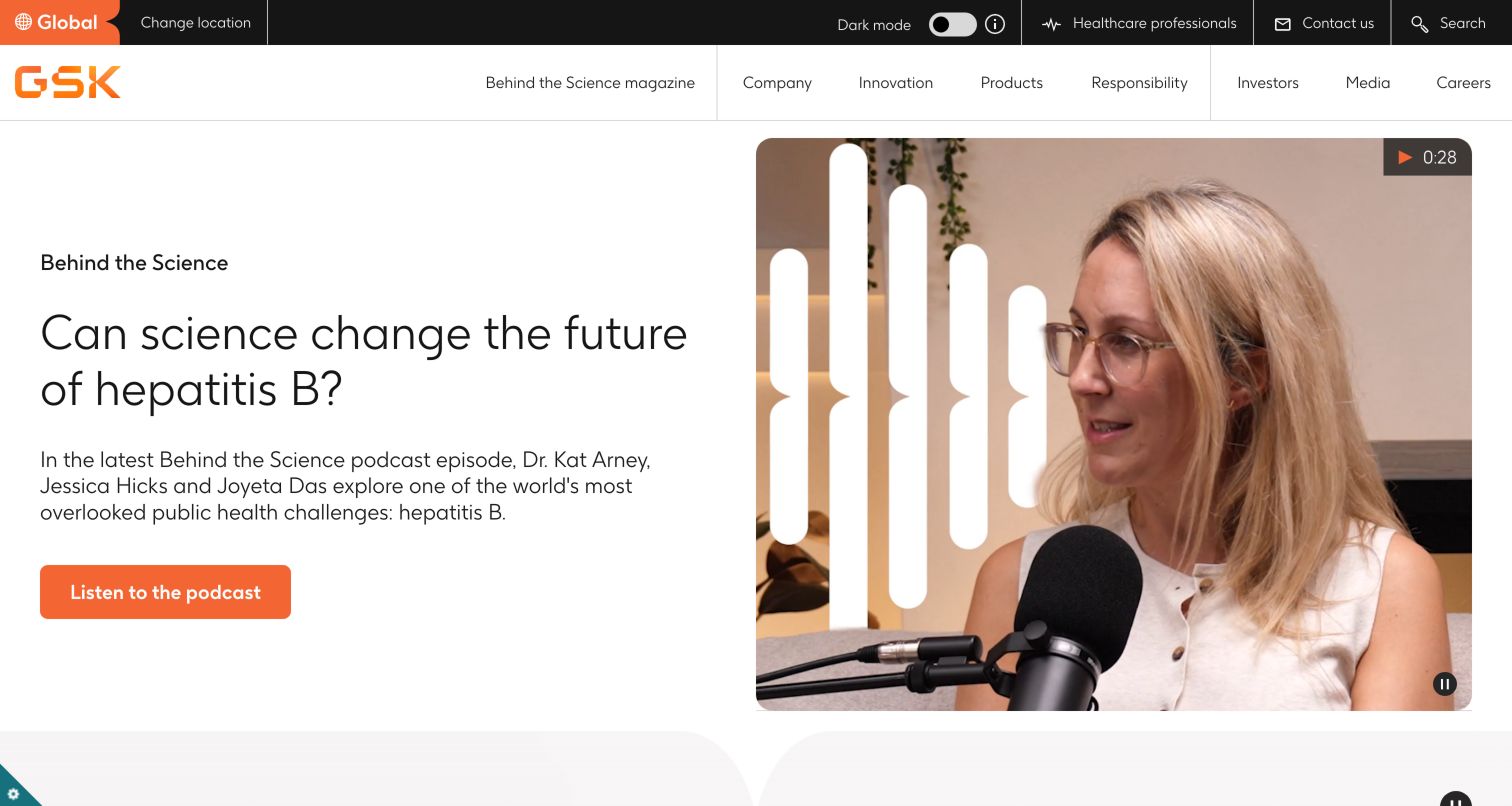
GSK makes its Behind the Science magazine visible in the main navigation and leads the page with a podcast feature. The opening pairs a large question headline and short explanation with a speaker photograph and a strongly colored action. A dark utility strip separates location, professional information, contact and search from the lighter topic navigation. The page then introduces the company and presents therapeutic-area gateways before a substantial editorial collection. The result feels like a publication with corporate resources attached. That approach makes explanation central, while a visitor arriving for a medicine or an investor document still needs a clearly signposted alternative route.
What you can learn
Give a recurring editorial program a consistent name, destination and visual language. A podcast promotion should identify its format before a visitor clicks, and key information should remain available without playing media. Balance the story-led opening with permanent product and company navigation, then test the density of the two header rows on narrow screens.
Pros
The podcast action identifies the content format.
Utility navigation is visually distinct from the subject menu.
Cons & considerations
Two navigation rows create considerable header density.
A large editorial feature may postpone practical product tasks.
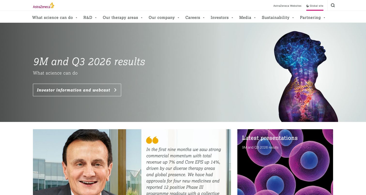
AstraZeneca's captured page leads with a quarterly-results headline on an illustrated scientific background. The investor and webcast action is placed directly beneath the announcement, while the header exposes a broad list of research, therapy, company and stakeholder categories. Below the hero, a quotation, a latest-presentations card, pipeline information and science-center features form a modular grid. Featured articles and sustainability content extend the page beyond reporting. This is an example of a corporate homepage temporarily organized around a dated event while retaining its permanent information structure. The amount of material makes hierarchy and concise labels especially important.
What you can learn
Build a repeatable reporting-event module with a clear period, publication destination and archive path. Keep supporting quotations and research highlights subordinate to the primary action. On mobile, review the order of the grid carefully so an executive quotation does not separate the announcement from the document or webcast a visitor came to find.
Pros
The reporting period and investor action are explicit.
Permanent subject navigation remains visible during the event feature.
Cons & considerations
A broad desktop menu can become difficult to scan.
The dense grid mixes several priorities immediately below the hero.
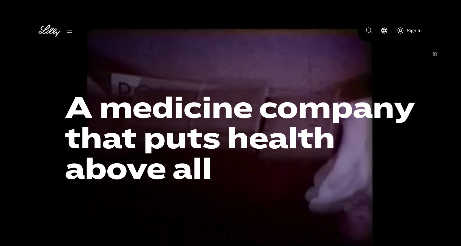
Lilly uses an oversized white statement over a dark video treatment, with a small logo and compact menu, search, region and sign-in controls. Below that brand opening, the page presents distinct routes for finding care, pharmacy access and clinical trials. Condition information, a patient story, company facts and manufacturing-related content follow. The design shifts from an expressive first screen to concrete tasks, which is useful to study even though the destinations have different audiences and requirements. The prominent sign-in control and external service routes also mean that visitors need to understand when they are leaving general information for a specific service.
What you can learn
Separate broad brand content from actions that start a service journey. Label the destination and any change of context before a visitor proceeds. Keep essential explanatory text available outside video, and test whether a full-screen statement helps returning visitors find their task quickly. Do not infer the safety or suitability of a service from its visual prominence.
Pros
Large typography gives the opening one clear focal point.
The following section organizes several practical tasks distinctly.
Cons & considerations
The opening screen offers little detail about those practical tasks.
Service and corporate destinations need careful transition labels.
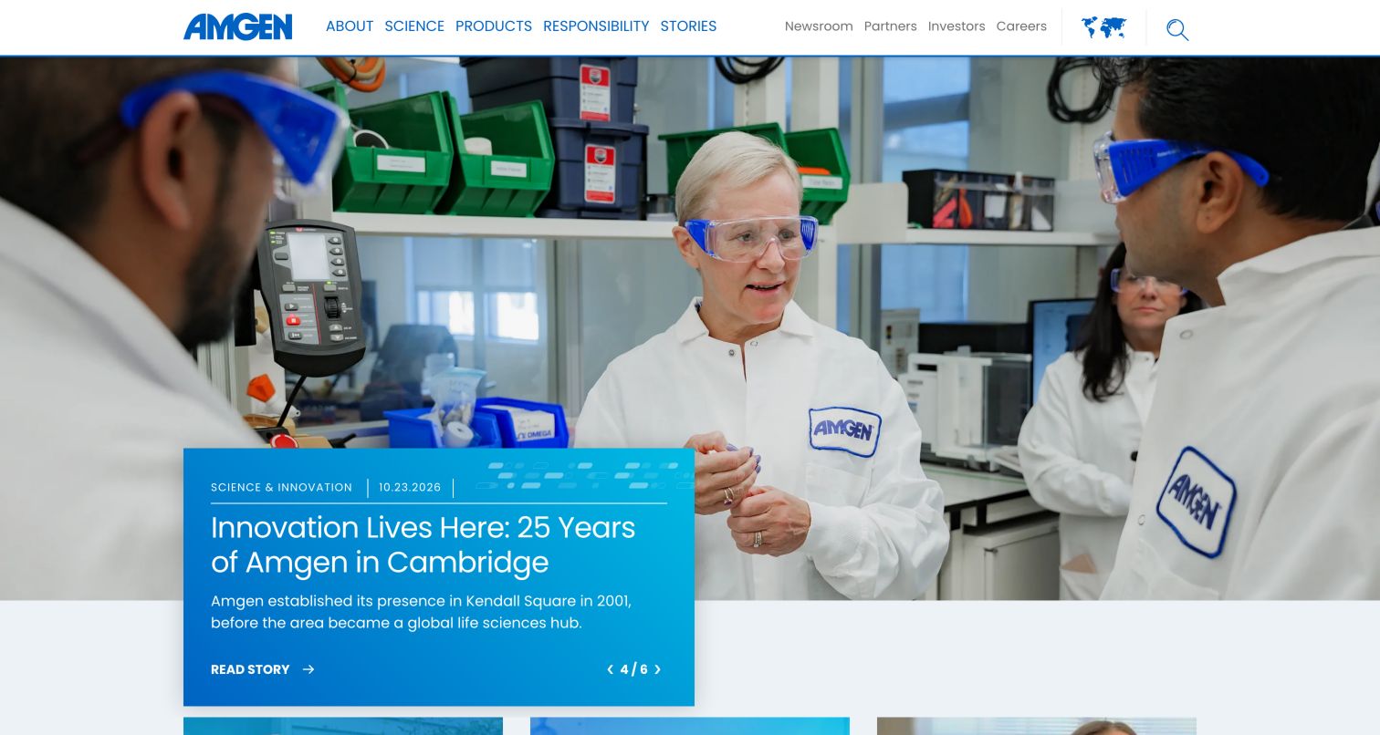
Amgen presents a large photograph with an overlapping blue text card. The captured carousel slide identifies a science-and-innovation story with a date, headline and read-story action, while a numbered indicator communicates its place in the sequence. Other visible page content includes patient stories and corporate news, and the header keeps Products, Science, Responsibility and Stories separate from investor and career links. This is a useful example of making content type and freshness part of the visual hierarchy. The large rotating feature can be compelling, but it requires visitors to discover material that is not initially visible.
What you can learn
Use a stable taxonomy across homepage features and their archives. A press release, employee story and patient narrative should carry different labels even if they share a card style. Keep the complete story list available through a clear destination, and test carousel controls, motion preferences and reading time before relying on rotation to expose important content.
Pros
Category and date appear alongside the featured headline.
The overlapping card separates text from busy photography.
Cons & considerations
A six-item hero carousel hides most features initially.
Large media can dominate the route to a specific product or resource.
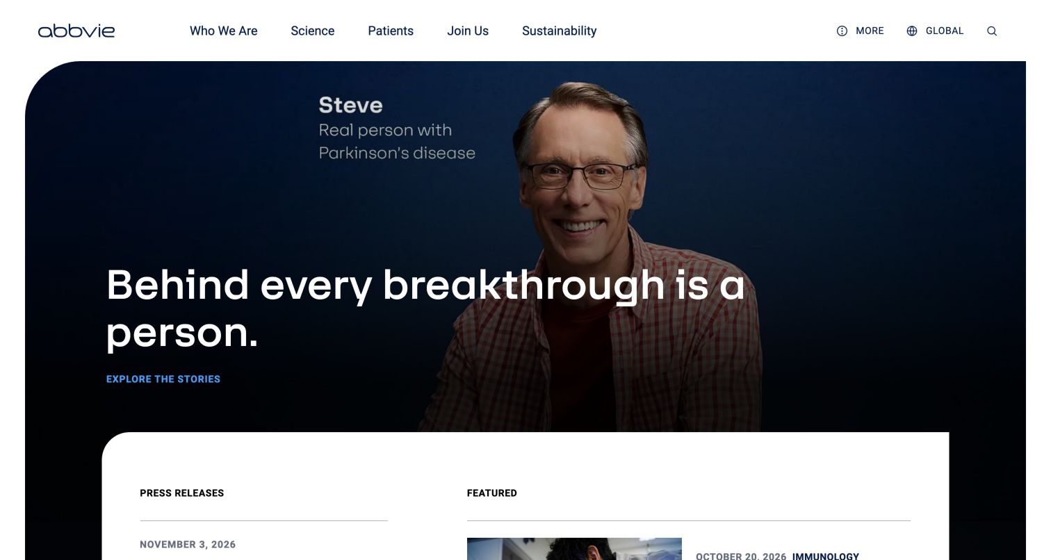
AbbVie frames a person's portrait inside a dark, rounded hero with a short white statement and a blue story action. The header gives patients their own route alongside science, company, careers and sustainability. A white panel overlaps the lower hero and begins two different streams: press releases and featured editorial content. Further sections use story labels, dates and reading-time indicators before expanding into science, company and careers. The page gives a strong human focal point without replacing its corporate hierarchy. The large portrait and promotional statement still need clear boundaries from detailed medical or product information.
What you can learn
Use personal stories as a recognizable content category with their own context and destination. Keep press releases separate from longer editorial features, and surface useful metadata such as date and reading time consistently. Preserve a direct patient-information route outside the story campaign so visitors are not required to interpret a narrative before finding practical resources.
Pros
Press releases and featured stories are separated visually.
Patient navigation is visible in the main header.
Cons & considerations
The hero places story exploration ahead of direct information tasks.
Several content layers can make the page lengthy on mobile.
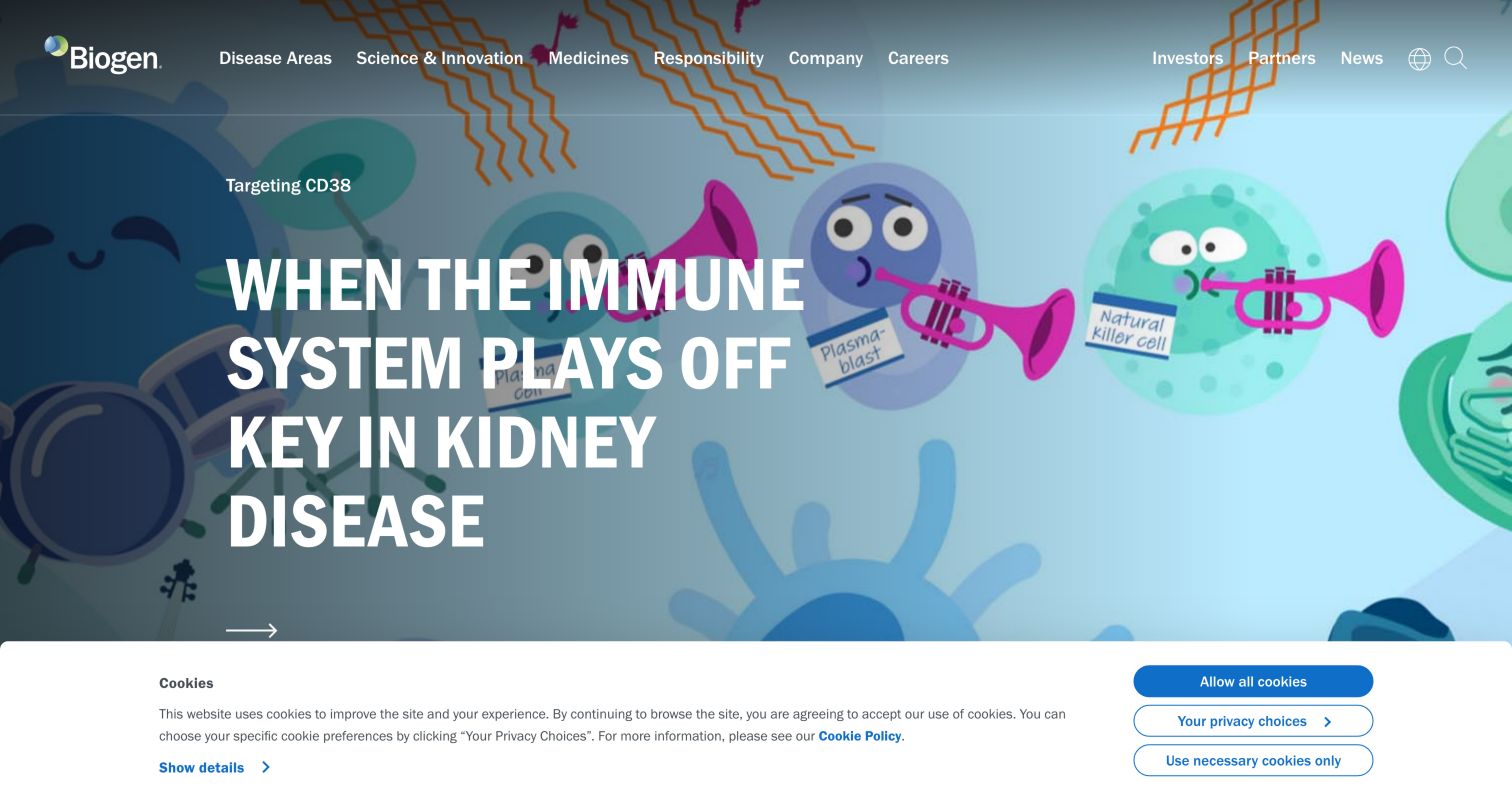
Biogen opens with a colorful editorial illustration and a large white headline, using a dark overlay to keep the text readable. The main navigation names disease areas, science and innovation, medicines, responsibility and company information, with investor and partner routes on the right. Below the opening are company introduction, pipeline, careers and story sections. The pipeline receives a direct action rather than being implied by the general research narrative. This gives the site an identifiable scientific editorial character. The captured privacy banner occupied the lower edge of the viewport, showing why first-visit overlays should be considered when evaluating the complete opening experience.
What you can learn
Commission illustrations around the actual subject of an article, then pair them with straightforward navigation and a clear research destination. Do not make an illustration carry factual explanation by itself. Review contrast across the whole image and ensure banner placement leaves the title and its next action usable, especially when the screen is narrow.
Pros
A distinctive illustration gives the editorial feature a recognizable identity.
Pipeline and medicines have explicit destinations.
Cons & considerations
The initial privacy banner takes meaningful vertical space.
The prominent science feature may not match every visitor's immediate task.
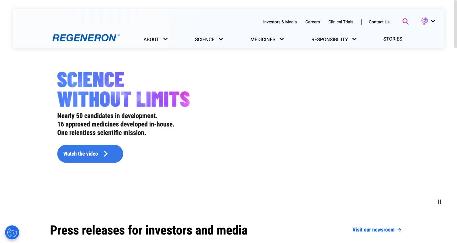
Regeneron uses a wide, pale header with primary subjects below a row of stakeholder links. The captured hero presents a large gradient-colored statement, a compact supporting paragraph and a rounded video action on a generous white field. The next section explicitly names press releases for investors and media, while a separate story area and links to medicines, company and pipeline broaden the journey. The sparse first screen gives the statement emphasis, but its large reserved media area contains little information in this observed state. That is a useful reminder to assess the experience visitors actually receive when media is unavailable or delayed.
What you can learn
Design the non-video state as a complete composition. A headline, short explanation and meaningful action should work without relying on an animation to fill the space. Keep news archives, pipeline and medicine routes independently reachable, and make the different purposes of press releases and corporate stories clear through their headings and card metadata.
Pros
Stakeholder links are separated from primary subjects.
Press releases and stories have their own sections.
Cons & considerations
The observed hero leaves a large area visually empty.
The video-led introduction provides limited detail without further navigation.
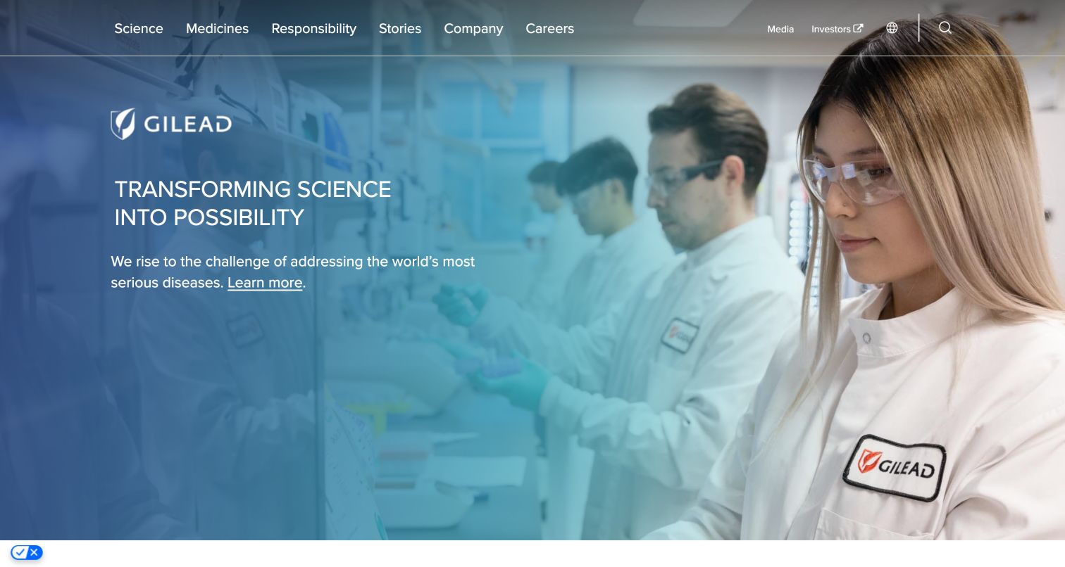
Gilead places its wordmark within a photographic hero rather than relying only on the navigation bar. A cool gradient across a laboratory scene supports white headline text, while a short explanation links to therapeutic areas. The page then moves through a company overview, science, pipeline, three named therapeutic-area routes, careers, news and investor resources. The footer explicitly describes the global website's scope and points to international corporate sites. This structure combines a simple first impression with several purposeful entrances below. The absence of a large button in the opening makes the inline next step quieter than on many other examples.
What you can learn
Match the prominence of the first action to the intended job of the homepage. If discovery is the priority, a restrained editorial link can work; if visitors need a specific resource, give that route stronger emphasis. Keep geographic scope and the difference between corporate and local information visible near the relevant destinations, rather than burying all context in a general footer.
Pros
Therapeutic areas receive named, direct routes.
The site explains its global information scope.
Cons & considerations
The hero's inline action is less prominent than the headline.
A long sequence of corporate sections requires careful mobile ordering.
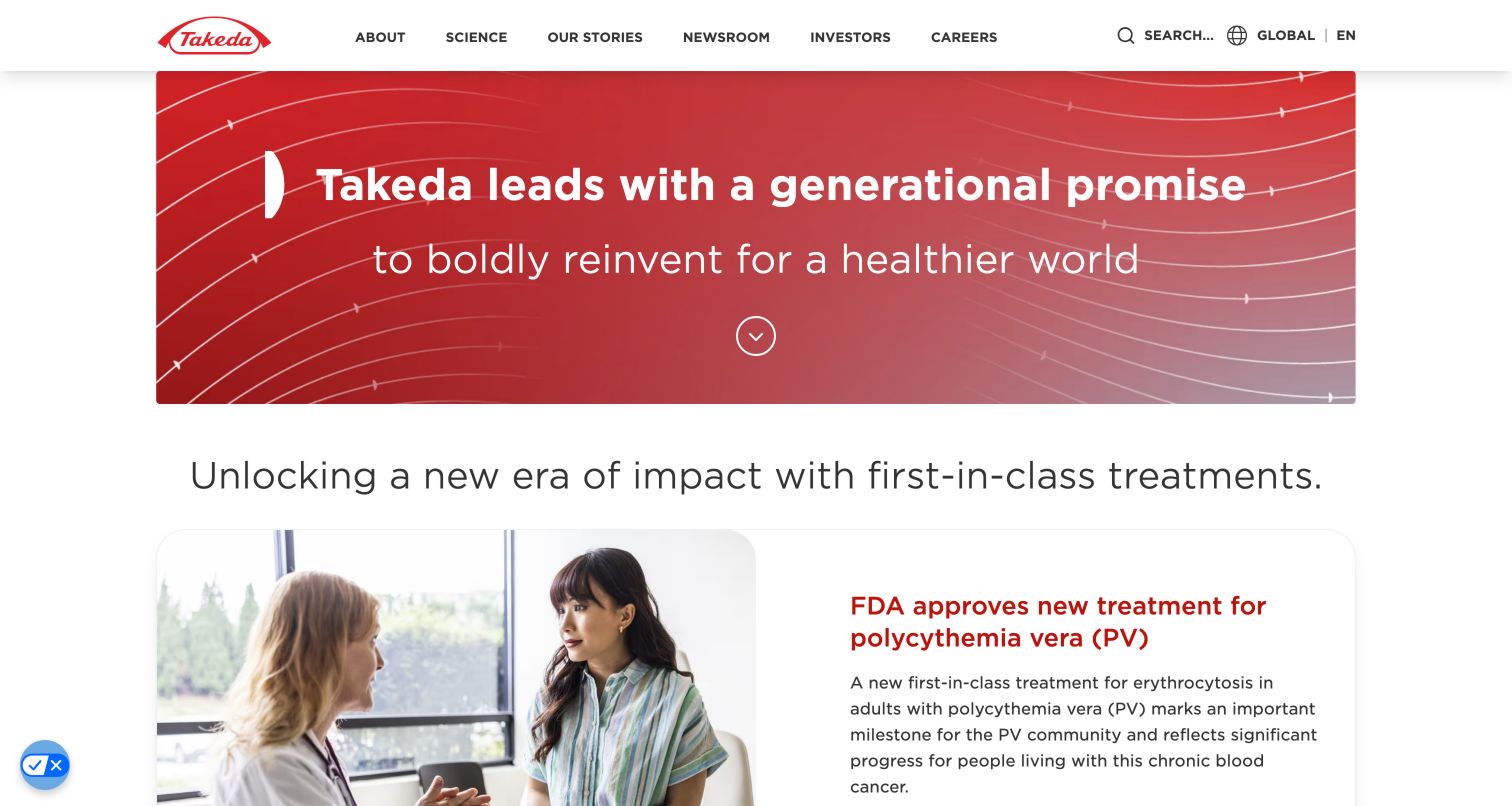
Takeda uses a red graphic banner within a centered content width, leaving room for the next section to begin in the first viewport. Its navigation names science, stories, newsroom, investors and careers, while global context and search remain separate utilities. The captured page moves from the short brand statement to a topical feature, then dated stories and recent news. A comparatively shallow hero gives the content program immediate visibility. The broad introductory language does not itself explain the product portfolio, so the surrounding navigation and science routes carry much of that responsibility.
What you can learn
Consider a shorter hero when current content matters more than cinematic immersion. Keep a clear separation between the permanent company statement and time-sensitive cards, with dates and specific destinations for the latter. Use consistent content width and spacing to make the transition feel deliberate, and verify that the order remains meaningful when cards stack on a phone.
Pros
The short banner exposes the next content section quickly.
Stories and recent news use separate headings and dates.
Cons & considerations
The broad brand statement needs supporting product context.
A global site requires careful routing to local information.
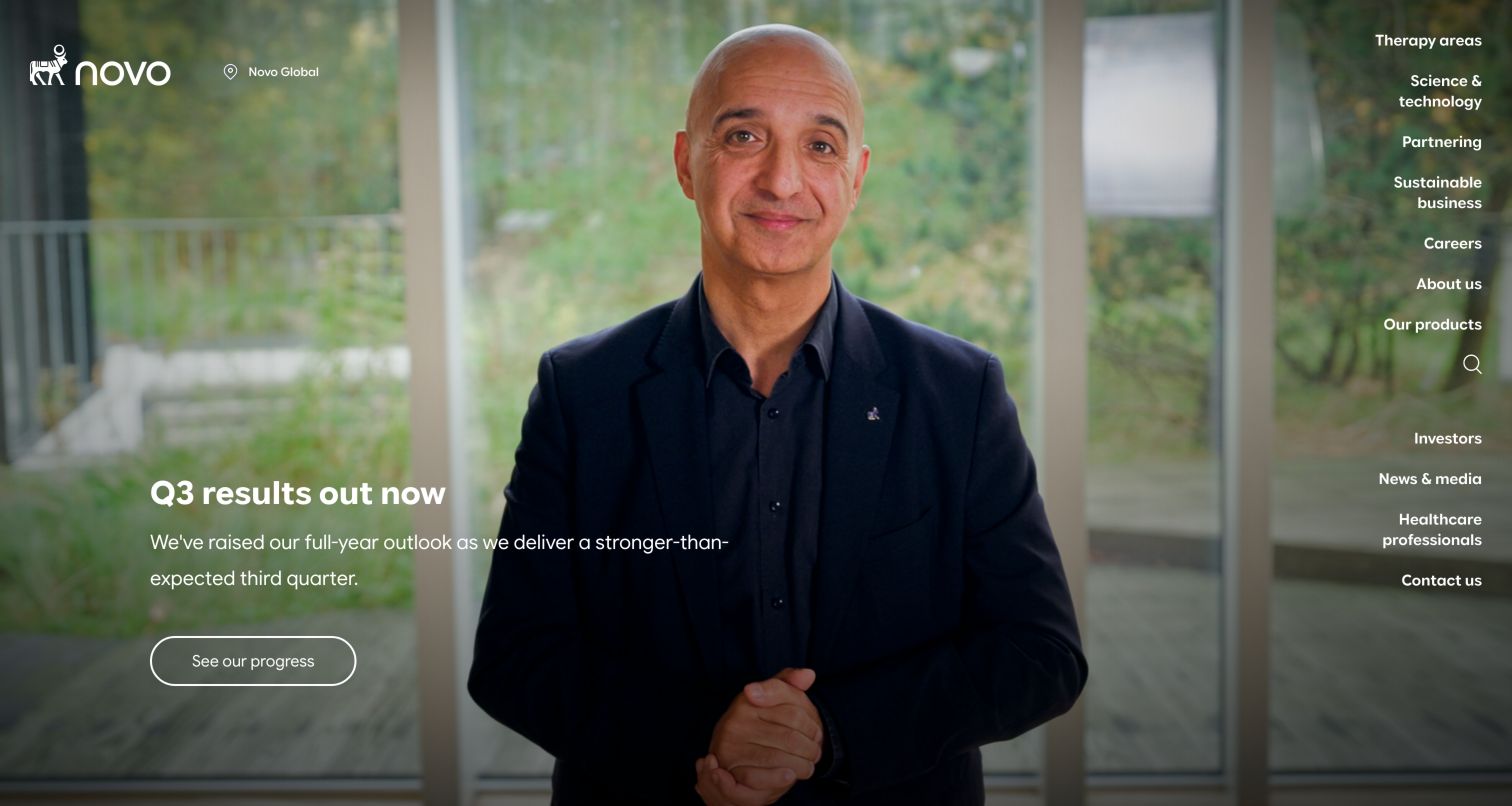
Novo Nordisk's captured first screen places a financial update over a full-height portrait, with the brand and global-site indicator at upper left. A vertical menu runs down the right edge, naming therapy areas, science, partnering, sustainability and other audiences. The result gives the central image unusual space while keeping many destinations visible. Beneath the hero, news and product-related information continue the corporate journey. This is a distinctive alternative to a horizontal header, but it depends on image composition that leaves readable space at both sides and a responsive treatment that preserves the menu's hierarchy.
What you can learn
Prototype the actual content against a vertical navigation concept before committing to it. Long translated labels, portrait crops and the featured headline all compete for horizontal room. Keep the market indicator legible, provide a predictable mobile menu, and use a stable archive destination for time-sensitive announcements so the dramatic homepage is not the only way to find them.
Pros
Many corporate categories remain visible beside the hero.
The global-site indicator clarifies the page context.
Cons & considerations
Vertical navigation competes with hero content for width.
The layout needs careful adaptation for long labels and narrow screens.
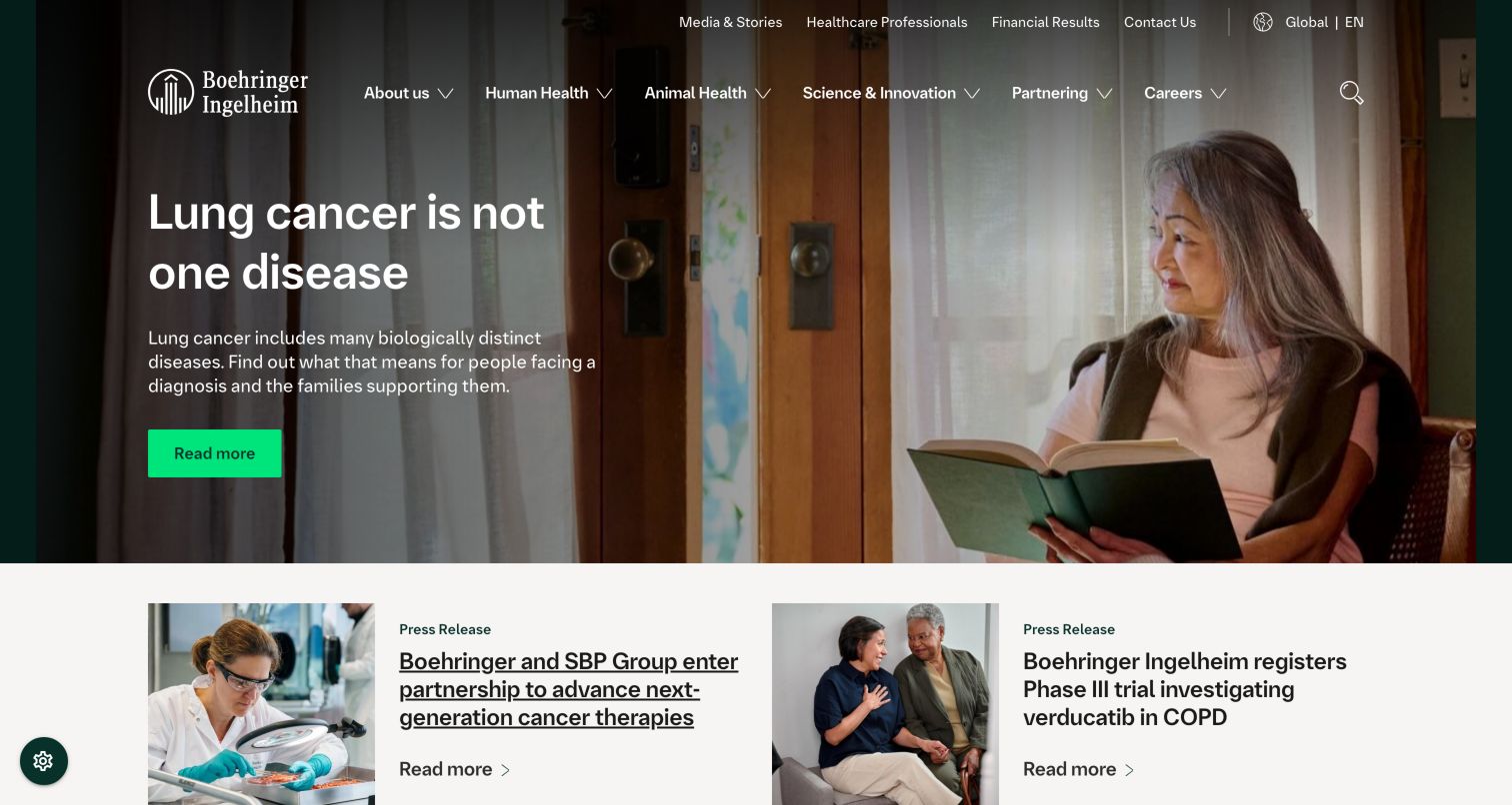
Boehringer Ingelheim presents a warm everyday photograph beneath two navigation rows. The main menu explicitly distinguishes Human Health from Animal Health, with science, partnering and careers alongside them. A short editorial headline and bright green action sit on the darker side of the image. Press-release cards begin directly below, followed by a broader news-and-stories collection. The visible design makes portfolio scope clear without requiring the visitor to open the menu first. It also shows how a single topical story can introduce a company whose information needs extend well beyond that feature.
What you can learn
Make materially different portfolios visible at the top level, then use a shared editorial system to connect them. Preserve distinct labels for press releases, research stories and general explanations. When using photography behind text, choose crops and overlays that keep the action readable across breakpoints and avoid placing a first-visit privacy panel over the principal content.
Pros
Human and animal health have explicit main-menu entries.
The bright action contrasts clearly with the darkened photograph.
Cons & considerations
Two navigation rows consume substantial header space.
A single featured topic represents only part of the portfolio.
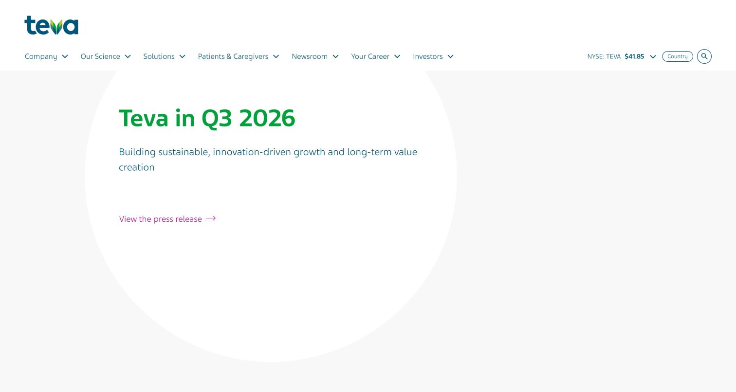
Teva's captured opening is unusually restrained: a financial-period headline, short explanation and simple press-release link sit within a pale geometric treatment. The broad navigation exposes company, science, solutions, patients and caregivers, newsroom, careers and investors. Below the financial feature, a sequence of explanatory content, a downloadable paper and personal stories focuses on one subject area, with category tags helping to describe the stories. This contrast between a quiet investor introduction and a richer editorial body is useful to study. The spacious first screen contains relatively little information and relies on the navigation or scrolling for depth.
What you can learn
Keep financial announcements concise and precisely labeled, then give thematic editorial content a recognizable section structure. Identify downloadable material before a visitor clicks and use topic tags consistently. Test whether the large amount of open space helps the current announcement or unnecessarily separates visitors from the practical resources they came to find.
Pros
The results feature has a clear reporting period and destination.
Patients and caregivers have a dedicated navigation route.
Cons & considerations
The large pale hero provides little detail within its height.
A dominant editorial topic can obscure the breadth of the company.
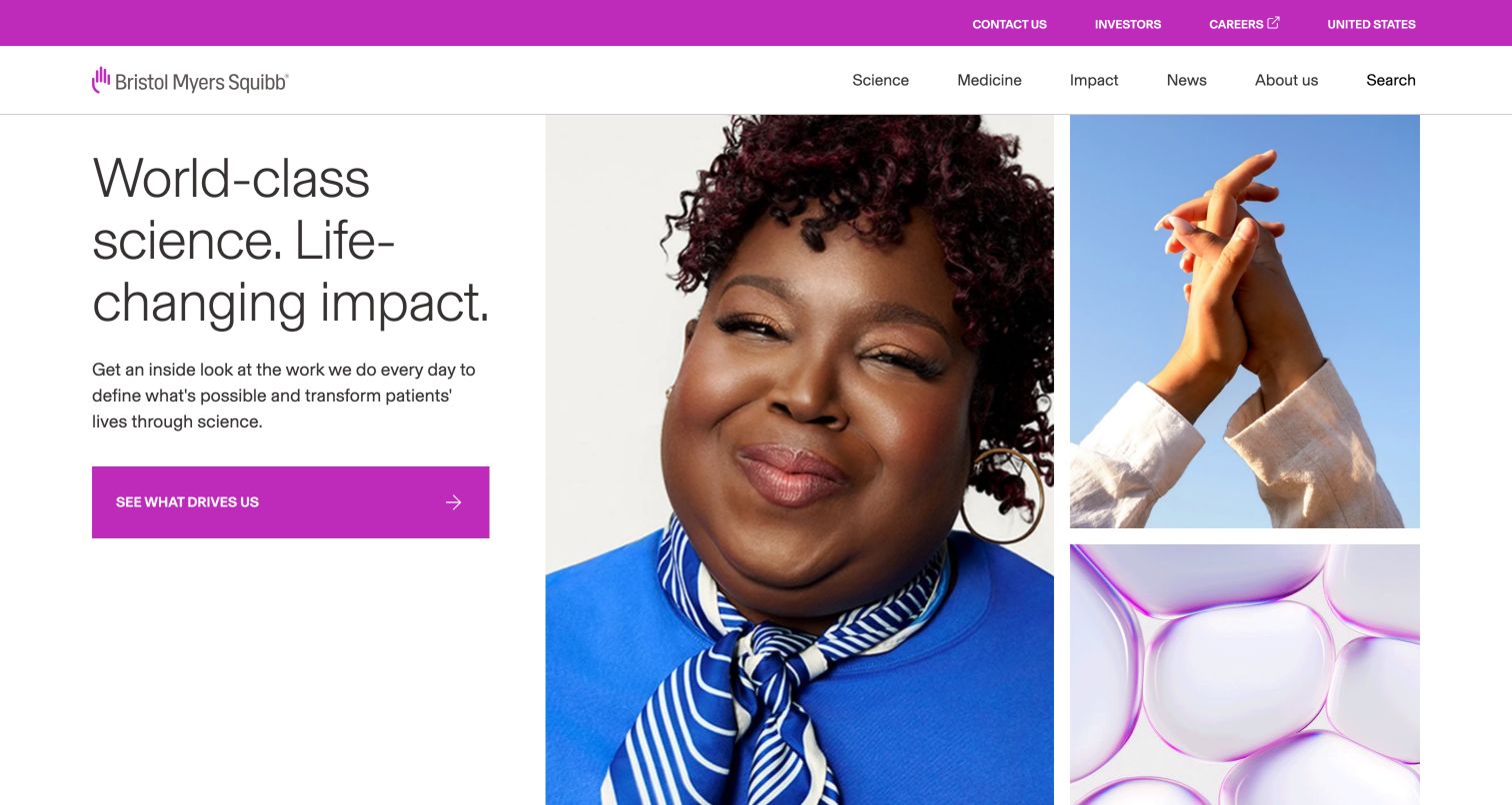
Bristol Myers Squibb pairs a large text column with a portrait and two smaller image tiles. Magenta buttons and a matching utility strip provide consistent accents against a mostly white page. Science, medicine, impact, news and company information remain visible in the main navigation, while investor and career routes sit above. Below the opening, the page separates financial results, stories, areas of focus, pipeline and press releases. The pipeline block carries an explicit as-of date, which is an important editorial detail for information that changes. The collage adds visual interest without making the text compete directly with a photograph.
What you can learn
Use a split composition when the headline and explanation need dependable readability. Give dynamic corporate facts a visible date and a maintained source destination. Keep reporting documents, editorial stories and research summaries as distinct content types, then review whether each section has a useful fallback when an external feed or interactive component is slow to load.
Pros
Text sits on a clear surface beside the image collage.
The pipeline section exposes its information date.
Cons & considerations
Several sequential corporate sections create a long homepage.
Feed-driven areas need useful loading and empty states.
Kegan is a freelance web designer and developer with 15+ years of experience helping businesses turn complicated website requirements into clear, maintainable digital experiences. He works directly with clients from planning and design through development, launch, and ongoing support.
For pharmaceutical manufacturer website design, his development approach focuses on audience-specific navigation, approved product information, resource discovery, and content governance. The scope can be a targeted improvement or a complete custom build, with responsive layouts, thoughtful content structure, and integrations chosen around the people using and maintaining the site.
Show 3 other pharmaceutical manufacturer website designersHide other pharmaceutical manufacturer website designers
Plan the public information system before the homepage campaign
Inventory the recurring tasks
Map the information visitors repeatedly seek: company facts, medicine resources, trial information, press material, reports, careers and support. Separate discovery tasks from exact lookups. Give important recurring routes permanent locations independent of homepage campaigns.
Define content types and dates
Set fields for publication date, review date where relevant, audience, market, content owner, document format and related resources. Financial results and pipeline information should preserve their time context when linked or reused elsewhere.
Design global-to-local transitions
Document how visitors choose a market, what changes when they do, and how they return to general corporate information. Avoid ambiguous redirects that silently replace a global page with a local experience. Test the transition with realistic visitor questions.
Establish an editorial hierarchy
Choose which material deserves the first screen and why. A financial reporting event may temporarily lead; a science feature may serve a longer campaign. Preserve a stable archive and alternate audience routes so temporary prominence does not become the only discovery path.
Plan ownership and review
Assign responsible teams to research summaries, product routes, documents and public contact information. Define how changes reach related pages and how superseded materials are handled. The interface should support these responsibilities with clear structure and version-aware linking.
Test the full first visit
Review the page with consent interfaces, slow media, long translations, keyboard navigation, enlarged text and narrow screens. Include search and empty states, not just a polished desktop screenshot. Engage appropriate specialists for the actual site's accessibility and content requirements.
The editing job behind the design
Choose a platform that supports durable public information
Structured content, dependable search, controlled publishing and regional variants usually matter more than the animation framework behind the hero. Evaluate how the system handles a new reporting period, corrected document, moved product resource and outdated pipeline summary. Give editors a clear way to maintain links and metadata across these changes.
Public website stack observations can reveal exposed content-system references, libraries and delivery services. They do not establish a manufacturer's internal research systems, medical review process or security controls. Keep observed references, historical associations and dependencies distinct, and use qualified evidence to inform technical questions.
Our WordPress website examples offer a separate look at publishing approaches. A visible platform label is evidence for that named page, not a guarantee that the same system will suit your requirements.
Before the public launch
Pharmaceutical website planning checklist
The homepage identifies its corporate or regional scope.
Patients, professionals, investors, media and applicants have understandable routes.
Product information is distinguishable from corporate editorial content.
Financial updates identify the relevant reporting period.
Pipeline summaries retain a clear information date.
Press releases and stories use consistent type labels and dates.
Download links identify the document and format before opening.
Global and local journeys preserve useful context.
Video and carousel content remains understandable without automatic movement.
Search includes meaningful empty and ambiguous-result states.
Cookie interfaces do not prevent use of essential navigation.
Content owners can find, review and replace outdated public material.
These checks are a project checklist, not a performance, legal, security, or accessibility certification. Test real journeys with the people responsible for the website before making claims about the result.
Sources & editorial method
How this collection was selected and reviewed
Original selection: The saved pre-research target for this collection was eighteen. We inspected eighteen distinct public manufacturer websites and captured their rendered pages directly, retaining the actual URL, date, dimensions and attribution. A further candidate, Bayer, was excluded after its page did not render reliably and one safe reload did not resolve the observed problem. One page-reading timeout at Boehringer Ingelheim resolved on a single retry. Reviews cover visible design and information organization; no medical-professional attestations, service forms, clinical evaluations or full accessibility audits were performed. Public technology evidence is supplied separately by the publisher's broad stack audit. On November 5, 2026, Aprecia was reviewed and added as Editors Choice in the first slot, bringing this collection to 19 examples. All earlier reviews and their original capture dates are retained. The badge is an editorial design selection, not a user-vote award or an endorsement of the organization’s services.
Each example links to its actual source page. Screenshots are direct browser captures with their own capture dates; moving imagery, announcements and live designs can change. The notes describe observable design choices and conditional tradeoffs, not measured traffic, conversion results, service quality, or accessibility conformance.
Technology labels use public page metadata, asset evidence, or explicitly cited platform documentation. Platform documentation is not a complete current deployment audit. A component reference may be legacy or unused; it is not a complete backend inventory. Unknown stacks are omitted. These sites are editorial examples, not our client portfolio.
Written, Edited and Curated are separate editorial records, not timestamps advanced by a rebuild. Website designs and imagery belong to their owners. See our editorial standards or suggest a correction.
Should a pharmaceutical homepage lead with research or investor news?
The primary task and current publishing context should decide. A reporting event can justify a temporary investor feature, while research stories may better support ongoing discovery. Keep permanent audience routes and archives available in either case.
How can patient stories fit a corporate website?
Give them a clearly identified editorial section with context and a specific destination. Keep practical patient resources independently accessible. A story should not be treated as a substitute for appropriately reviewed medicine information or individualized advice.
What makes a useful pipeline section?
A clear scope, an information date, understandable categories and a maintained source destination. This collection considers how that information is presented, not the accuracy or clinical significance of the underlying research claims.
Is a large video hero necessary?
No. The examples include shallow graphic banners, split layouts and editorial cards as well as full-screen media. Choose the treatment that supports the intended task, and make the page complete when media is paused or unavailable.
Do these examples prove that a site is compliant or effective?
No. Public visual review cannot establish regulatory compliance, accessibility conformance, conversion performance, security or the quality of a medicine. Those questions require separate evidence and appropriate evaluation.
Use these pharmaceutical manufacturer website examples to make each visitor's information route easier to recognize. Clear content types, dated updates and explicit audience context provide a stronger foundation than copying a campaign's visual treatment alone.