New Relic website examples and browser-monitoring planning (20 Real-World Examples)
Twenty public properties with dated New Relic browser-agent evidence, real screenshots and original lessons for defining useful monitoring coverage.
A monitoring project should start with what people need to accomplish. These commerce, university, service and publishing examples show very different public journeys behind a shared browser-agent association.
New Relic browser monitoring is a real-user-monitoring offering that can report browser performance, JavaScript errors and other browser activity. Its official documentation distinguishes initial page loading from the wider page lifecycle. Those capabilities are reasons to write a useful monitoring brief, not evidence that any particular example has configured every feature or achieved a particular performance result.
This collection studies the interface around the integration. A product campaign, university search route, care-finding page and account handoff need different definitions of success. Each example has a dated public New Relic browser-agent reference, but its screenshot is a visual record rather than a performance measurement. There is no private telemetry, customer-account access or claim about a business outcome behind these reviews.
Before the examples
What makes good New Relic website development in 2026?
Define the visitor task before the dashboard
List the public journeys that matter and their accountable owners. A homepage response, visible campaign and working downstream destination are separate conditions. Decide which failures warrant investigation and which observations provide context, rather than treating a successful image load as proof that a service is usable.
Separate browser evidence from backend assumptions
A browser-agent initializer identifies a public integration surface. It does not reveal private instrumentation, successful data delivery or application health. Use your own authorized implementation records to map dependencies. The official documentation describes browser activity and troubleshooting capabilities, but each project still needs verified coverage and clear operational ownership.
Decide which URLs, attributes and error details are appropriate before collecting them. Identify login, payment, healthcare and personal-information boundaries in the brief. Have qualified owners review configuration and retention. Useful troubleshooting does not require treating every field or visitor action as an acceptable diagnostic payload.
Nike, the Coca-Cola Store, Cambridge, Yale and Capital One open the collection. Each is a specifically reviewed public property, not a claim about all websites or private systems operated by its organization.
We start with five recognizable brands or organizations: Nike storefront, Coca-Cola Store, University of Cambridge, Yale University, Capital One. Each attribution applies to the named website property, not every product or website belonging to its organization. This is a curated reading sequence, not a measured ranking.
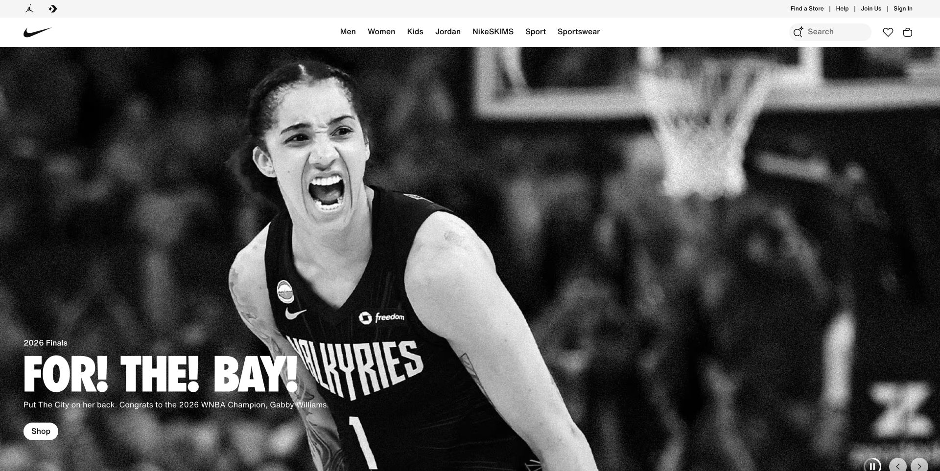
Nike gives the athlete photograph nearly the whole opening screen, while a white navigation frame keeps product families and shopping utilities separate. The high-contrast campaign lettering is concentrated at the lower left rather than scattered across the image. This makes the boundary between changing promotional media and the permanent retail interface especially clear. For this layout, a meaningful release check would compare entering a product category with following the sports campaign, while confirming that search remains usable if the large photograph is delayed.
What you can learn
For a monitoring brief, treat campaign presentation and the shopping shell as separate journeys. Establish whether people can reach product navigation when media is delayed, then compare that route with campaign clicks. A visually complete hero is not proof that the next shopping step responds.
Pros
The white header keeps navigation separate from the photograph.
The campaign has a compact action beside its explanation.
Cons & considerations
Large media deserves a loading budget on constrained connections.
Rotating promotions need an independently usable route into the catalog.
Platform source: Dated public source inspection. The dated public response includes NREUM browser-agent initialization/configuration and New Relic browser monitoring references. This identifies a sampled browser-monitoring integration, not successful telemetry, private backend instrumentation or measured performance. Platform evidence is separate from the direct website screenshot and is not a complete current infrastructure audit.
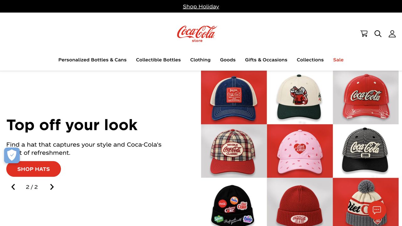
The Coca-Cola Store pairs a plain text campaign with a tidy grid of brightly colored caps. Its centered wordmark and narrow category menu give the merchandise room without losing brand identity. The red shopping control is deliberately smaller than the products, and the carousel position provides a visible clue that other promotions exist. The cap grid supplies the merchandise context that a generic sale heading would lack. Keep that relationship intact when a replacement collection uses different image proportions or longer supporting labels.
What you can learn
Define a useful commerce baseline around category entry, campaign selection and product arrival. Measure those transitions independently of a successful page response. When seasonal merchandise changes, keep the event vocabulary stable enough to compare the same visitor task across different creative campaigns.
Pros
Product photography communicates the offer before a long description.
A restrained red button creates a clear next step.
Cons & considerations
Carousel position alone does not explain every available promotion.
Dense category labels need practical narrow-screen treatment and readable focus states.
Platform source: Dated public source inspection. The dated public response includes NREUM browser-agent initialization/configuration and New Relic browser monitoring references. This identifies a sampled browser-monitoring integration, not successful telemetry, private backend instrumentation or measured performance. Platform evidence is separate from the direct website screenshot and is not a complete current infrastructure audit.
Cambridge leads with a conversation between people in a library and a prominent postgraduate invitation. The headline sits on solid white blocks, so it does not compete directly with the photograph. Institutional branding, search and the menu remain on the white header above, separating the campaign from permanent university utilities. The invitation should remain understandable if the photograph cannot load. A recruitment release also needs checks on the destination and search route, rather than only confirming the homepage composition is intact.
What you can learn
Set separate monitoring objectives for recruitment pages and general information routes. A campaign click, search attempt and menu entry are different tasks, even when they begin on the same homepage. Track failures by route without putting a prospective student's search text or personal details into telemetry.
Pros
Solid headline blocks preserve a predictable contrast surface.
Search remains visible outside the recruitment campaign.
Cons & considerations
A dominant recruitment story can hide other audience priorities.
Menu-only navigation requires testing beyond the captured opening view.
Platform source: Dated public source inspection. The dated public response includes NREUM browser-agent initialization/configuration and New Relic browser monitoring references. This identifies a sampled browser-monitoring integration, not successful telemetry, private backend instrumentation or measured performance. Platform evidence is separate from the direct website screenshot and is not a complete current infrastructure audit.
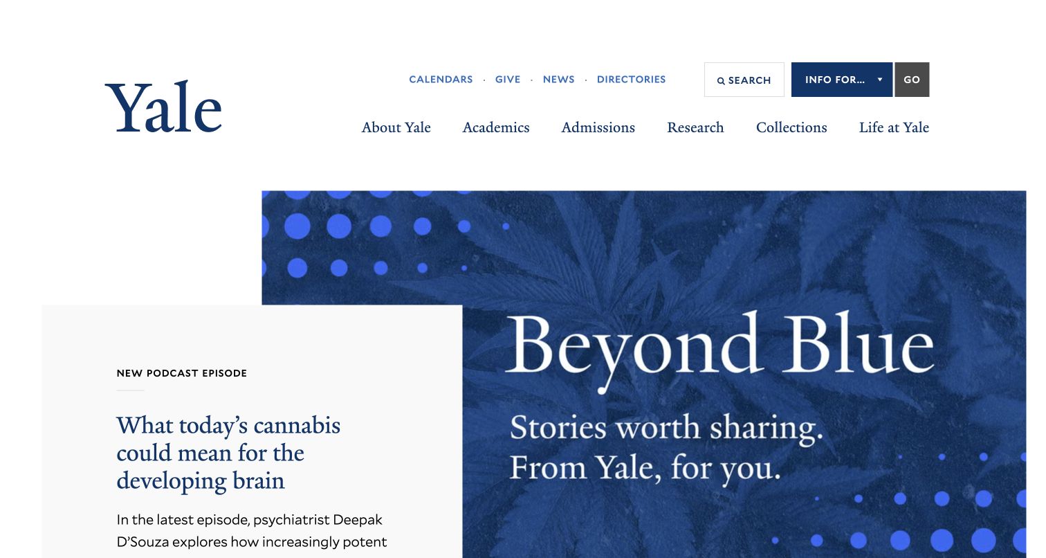
Yale uses a large blue editorial panel beside a smaller white story card. The university name is prominent but not crowded by promotional copy, and the top navigation offers conventional institutional entrances. The overlap gives the page an editorial rhythm rather than treating every story as an equal rectangular tile. The small story card offers a second editorial entrance without repeating the large feature. Check both destinations when updating the panel so the visual hierarchy does not disguise a broken link.
What you can learn
Monitor the editorial handoff from feature to destination, not just the loading of its decorative panel. Keep identifiers tied to the underlying story so a changed headline or image does not fragment reporting. Test whether layered cards remain distinct when content length or viewport width changes.
Pros
The restrained palette connects the feature with institutional branding.
Different card scales express a clear editorial priority.
Cons & considerations
Overlapping panels need careful reading and focus order on smaller screens.
A featured story cannot replace permanent audience and service routes.
Platform source: Dated public source inspection. The dated public response includes NREUM browser-agent initialization/configuration and New Relic browser monitoring references. This identifies a sampled browser-monitoring integration, not successful telemetry, private backend instrumentation or measured performance. Platform evidence is separate from the direct website screenshot and is not a complete current infrastructure audit.
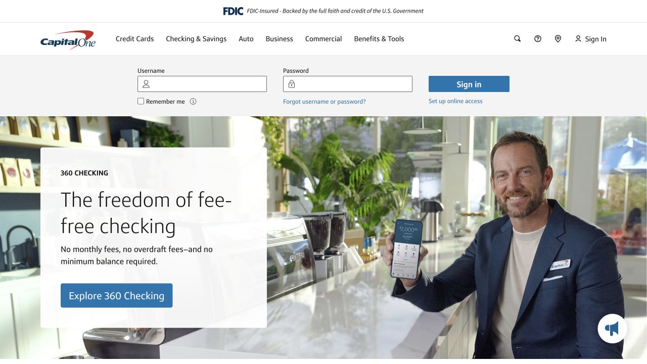
Capital One puts a sign-in strip directly below the main navigation and above its checking-account promotion. The campaign combines a human photograph with a short product proposition and a blue action. This is a useful contrast between an everyday utility for returning customers and a larger space intended for discovery. A useful test distinguishes an existing customer trying to reach account access from someone comparing checking information. Combining those goals would conceal which part of this split opening actually needs investigation.
What you can learn
Give authentication entry and public product exploration different operational definitions. Monitor availability of the public handoff without collecting credentials or attempting real account actions. A campaign can look correct while a sign-in dependency fails, so neither route should be represented by a single homepage health indicator.
Pros
Existing customers receive a visible route before promotional content.
The product action is close to the supporting claim.
Cons & considerations
Authentication controls create sensitive-data boundaries for instrumentation.
The campaign image requires readable text treatment at different widths.
Platform source: Dated public source inspection. The dated public response includes NREUM browser-agent initialization/configuration and New Relic browser monitoring references. This identifies a sampled browser-monitoring integration, not successful telemetry, private backend instrumentation or measured performance. Platform evidence is separate from the direct website screenshot and is not a complete current infrastructure audit.
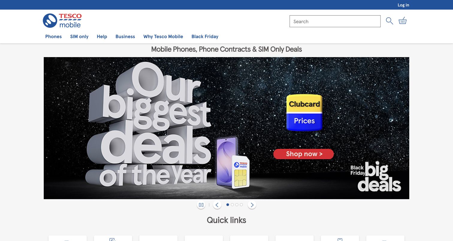
Tesco Mobile's opening view places search and commerce utilities above a large dark promotional graphic. Price and shopping buttons are separated from the large headline, and a quick-links area begins immediately below. The blue header gives the colorful sales artwork a stable frame that can remain familiar between campaigns. The quick-links area is especially useful as a stable destination inventory when the large sale changes. Confirm its labels still describe current routes instead of inheriting assumptions from an expired promotion.
What you can learn
Use the quick-link route as a comparison against the promotional route when defining performance checks. A shopper seeking a known plan should not depend on the hero image finishing. Record which public destination fails, rather than assuming every device offer shares the same downstream implementation.
Pros
Search is positioned outside the main sales artwork.
Quick links provide a less promotional route below the hero.
Cons & considerations
Large embedded campaign text may be difficult to adapt across widths.
Short-lived offers need stable destination checks when creative changes.
Platform source: Dated public source inspection. The dated public response includes NREUM browser-agent initialization/configuration and New Relic browser monitoring references. This identifies a sampled browser-monitoring integration, not successful telemetry, private backend instrumentation or measured performance. Platform evidence is separate from the direct website screenshot and is not a complete current infrastructure audit.
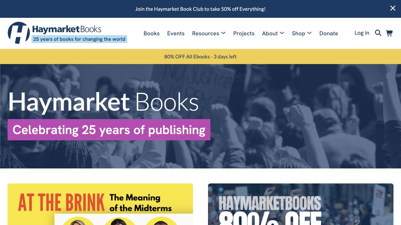
Haymarket Books makes its anniversary prominent inside a blue photographic banner. The publisher's wordmark, search and subject navigation remain above, while colorful book covers begin below. A separate subscription strip occupies the very top. The page therefore contains several different invitations without making the campaign itself carry the entire catalog structure. The first visible book covers provide a concrete continuation after the anniversary banner. Verify that those title links and subject entrances survive an editorial refresh, even if the celebratory artwork is removed.
What you can learn
Create separate checks for subject browsing, search and campaign destinations. Monitoring should distinguish a content-led visit from an attempted purchase without treating either as evidence of the publisher's commercial results. Keep book and topic URLs meaningful after the anniversary treatment is retired.
Pros
Book imagery gives the next section an immediate catalog character.
Search and subjects remain separate from the anniversary announcement.
Cons & considerations
Multiple promotional strips can crowd the path to a specific title.
Campaign retirement needs link checks as well as a visual refresh.
Platform source: Dated public source inspection. The dated public response includes NREUM browser-agent initialization/configuration and New Relic browser monitoring references. This identifies a sampled browser-monitoring integration, not successful telemetry, private backend instrumentation or measured performance. Platform evidence is separate from the direct website screenshot and is not a complete current infrastructure audit.
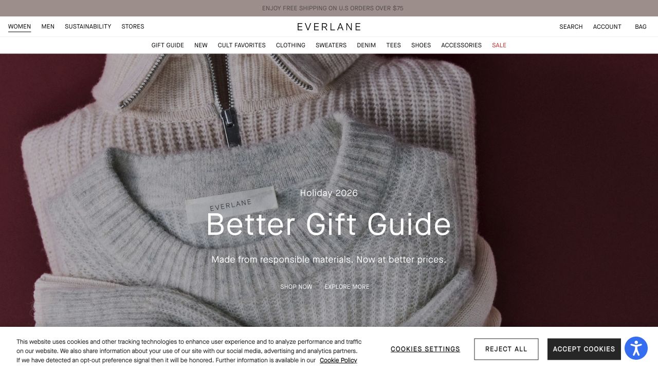
Everlane places a close crop of knitwear behind a restrained gift-guide title. Its compact navigation and muted color palette let texture carry the visual story. A consent panel occupies the bottom of the captured view, making the difference between the brand composition and the visitor's actual first-screen experience especially visible. The consent panel makes a clean campaign screenshot an incomplete baseline. Include the banner state in visual and operational checks, and preserve the direct category routes when the gift story changes.
What you can learn
Compare meaningful shopping paths with and without optional consent rather than treating the banner as a cosmetic detail. A monitoring specification should account for overlays, campaign-media delay and category entry. Do not assume that a script reference establishes which events are collected after a visitor makes a choice.
Pros
Texture makes the gift campaign tangible without a crowded collage.
The category shell stays distinct from the seasonal artwork.
Cons & considerations
Consent controls compete with content in the captured viewport.
Subtle campaign typography needs checks against every image crop.
Platform source: Dated public source inspection. The dated public response includes NREUM browser-agent initialization/configuration and New Relic browser monitoring references. This identifies a sampled browser-monitoring integration, not successful telemetry, private backend instrumentation or measured performance. Platform evidence is separate from the direct website screenshot and is not a complete current infrastructure audit.
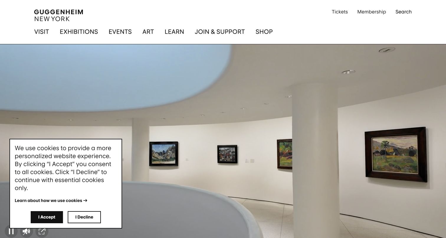
The Guggenheim's white header lists exhibitions, events, art and visitor information above an interior gallery photograph. The restrained layout gives the building itself visual prominence. A small consent dialog sits over the lower-left portion of the image, illustrating how a practical overlay can alter an otherwise quiet opening composition. For a visitor planning a trip, opening information and tickets matter more than completing the architectural image. Check those public entrances separately so an attractive gallery scene cannot mask missing practical information.
What you can learn
Separate visit-planning routes from exhibition browsing in a monitoring plan. Ticket handoffs, opening information and editorial pages should have their own accountable destinations. Verify public availability without buying tickets, and avoid reading the calm screenshot as evidence that every external reservation service is healthy.
Pros
Permanent visitor routes are visible before the image.
Architectural photography reinforces the museum's specific identity.
Cons & considerations
An overlay obscures part of the opening photograph and demands attention.
A large visual introduction delays detailed visit information below the fold.
Platform source: Dated public source inspection. The dated public response includes NREUM browser-agent initialization/configuration and New Relic browser monitoring references. This identifies a sampled browser-monitoring integration, not successful telemetry, private backend instrumentation or measured performance. Platform evidence is separate from the direct website screenshot and is not a complete current infrastructure audit.
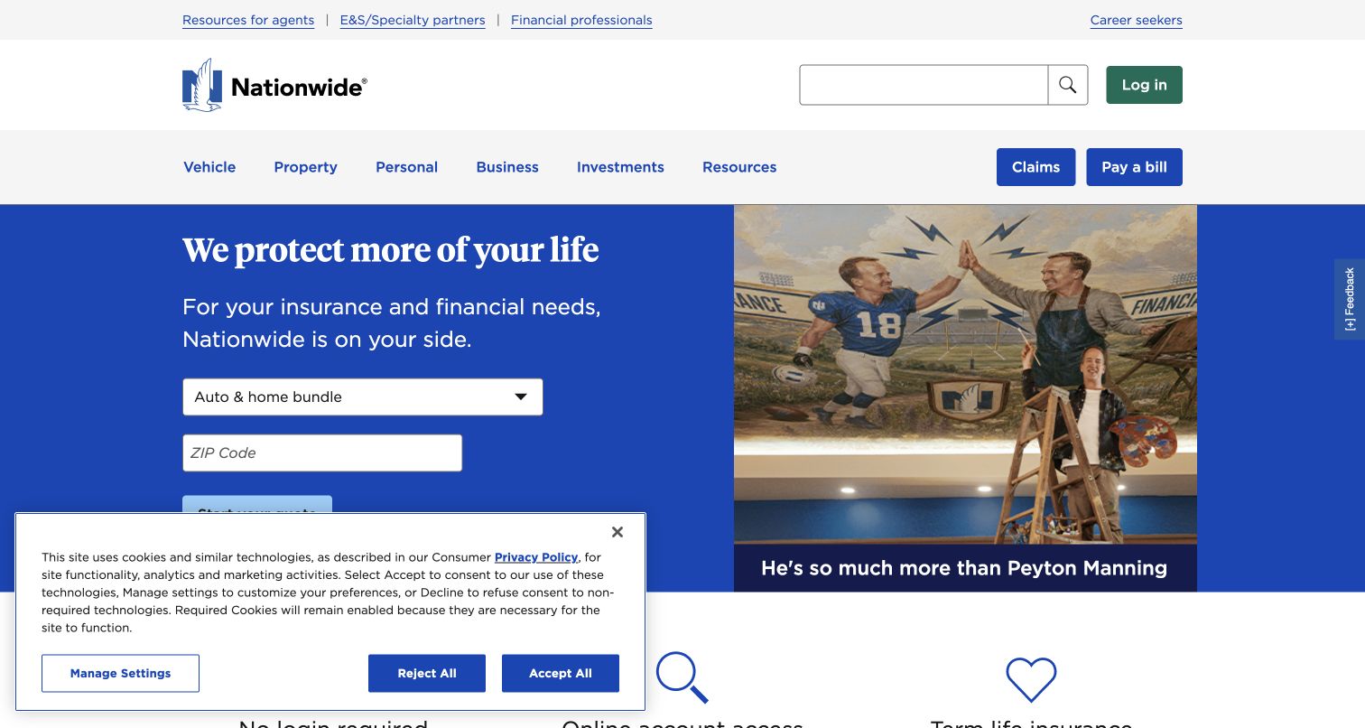
Nationwide combines a blue quotation panel with a family-oriented campaign image. Product tabs sit above the offer, while login, claims and payment utilities occupy their own positions in the header. A consent notice covers part of the lower content. The captured screen clearly contains both acquisition tasks and returning-customer utilities. The quote panel needs a clearly identified product context after a tab change. Test that public entry state separately from the login and claims routes rather than treating all blue actions alike.
What you can learn
Define separate synthetic or controlled checks for public quote entry, claims information and account handoffs. Instrument task failures without recording insurance answers or personal identifiers. A monitoring project should identify which dependency owns each route before aggregating everything under the homepage's availability.
Pros
Product tabs communicate that the quote has a specific scope.
Claims and payment utilities are not buried inside the hero.
Cons & considerations
Consent and quote interfaces compete for space in the opening view.
Sensitive form journeys require explicit collection and suppression boundaries.
Platform source: Dated public source inspection. The dated public response includes NREUM browser-agent initialization/configuration and New Relic browser monitoring references. This identifies a sampled browser-monitoring integration, not successful telemetry, private backend instrumentation or measured performance. Platform evidence is separate from the direct website screenshot and is not a complete current infrastructure audit.
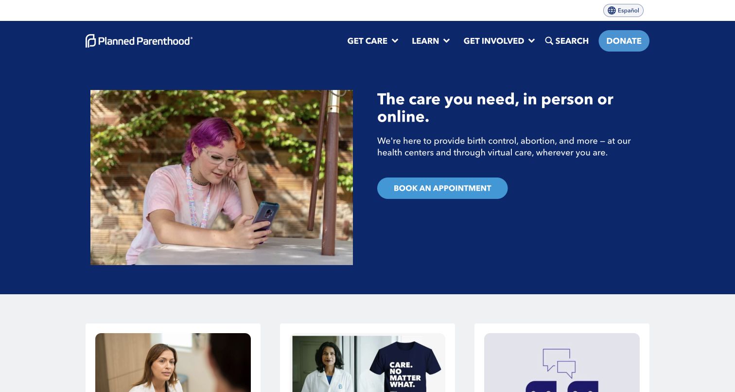
Planned Parenthood gives its care message a blue panel, paired with a human photograph and a prominent appointment action. The header separately exposes care, learning and involvement routes. Smaller editorial cards follow below. The result is a visible distinction between an urgent practical task and the organization's wider public information. The lower editorial cards should not interrupt the route toward care. A controlled check can confirm that public appointment information remains reachable without collecting personal details or attempting a real patient booking.
What you can learn
Treat care-finding availability as a distinct operational concern, not a generic promotional click. Review any telemetry design for sensitive URLs, search terms and appointment information. Use controlled public-page checks only; the screenshot and script reference do not establish privacy compliance or how a real appointment progresses.
Pros
The appointment invitation is close to the care message.
Learning and involvement remain separate navigation categories.
Cons & considerations
Health-related paths demand especially careful data minimization.
The photographic campaign should not delay essential service information.
Platform source: Dated public source inspection. The dated public response includes NREUM browser-agent initialization/configuration and New Relic browser monitoring references. This identifies a sampled browser-monitoring integration, not successful telemetry, private backend instrumentation or measured performance. Platform evidence is separate from the direct website screenshot and is not a complete current infrastructure audit.
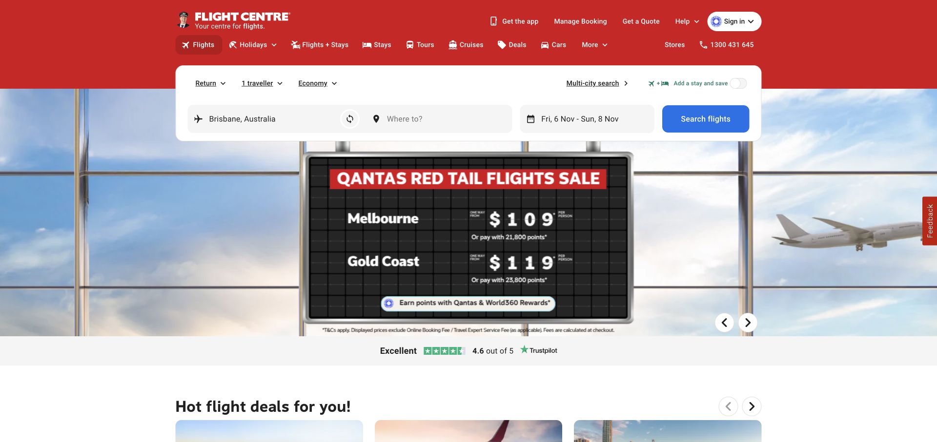
Flight Centre puts a white flight-search strip over a large airport scene and sale artwork. Its red navigation frame remains distinct from the image, while flight deals start below. The contrast between the practical search fields and the graphic fare promotion provides a concrete example of two different kinds of homepage content. The fare artwork and search form have different update cycles. A release brief should identify both owners and verify that a changed promotion does not obscure labels or leave an expired destination.
What you can learn
Specify monitoring around search readiness and the public result handoff rather than merely the arrival of the promotional image. Separate validation problems from dependency failures in a controlled environment. Do not send real booking searches or traveler details as part of visual quality assurance.
Pros
The search form occupies a conspicuous place near the top.
Deals continue below without replacing the main search entry.
Cons & considerations
A changing fare graphic can compete with search labels.
Real booking dependencies cannot be judged from a static homepage capture.
Platform source: Dated public source inspection. The dated public response includes NREUM browser-agent initialization/configuration and New Relic browser monitoring references. This identifies a sampled browser-monitoring integration, not successful telemetry, private backend instrumentation or measured performance. Platform evidence is separate from the direct website screenshot and is not a complete current infrastructure audit.
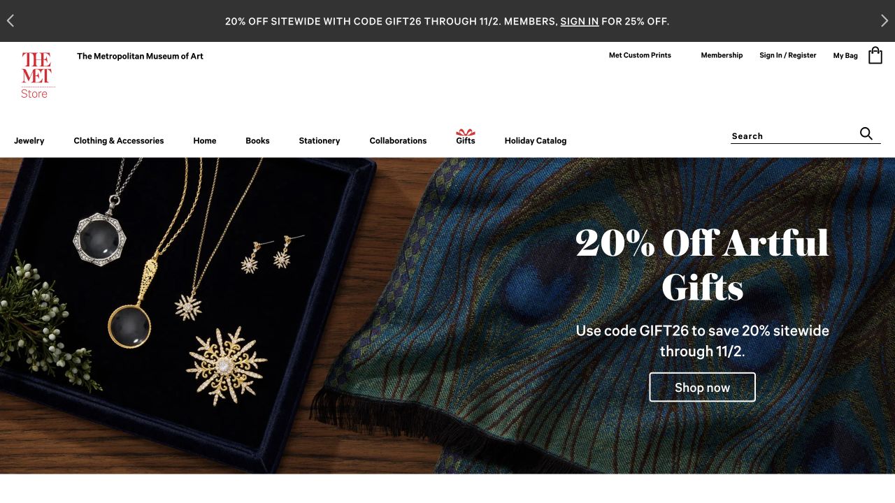
The Met Store places jewelry and a fan across a dark gift-promotion image. Its narrow white header separates shopping categories from the museum identity, and a discount strip sits above. The visual treatment feels connected to collectible objects rather than a generic sale grid, while retaining familiar commerce navigation. The museum identity helps explain why these particular objects belong together. Preserve the connection between the campaign and its collection destination, especially when discount language changes independently of the pictured merchandise.
What you can learn
Monitor the transition from a collection campaign into product detail as well as category browsing. A release checklist should verify promotional destinations when a discount expires. Keep observed errors separate from assumptions about payment, fulfillment or museum systems that are outside the public screenshot.
Pros
Object photography gives the promotion a specific visual character.
Categories remain readable on a plain header above the campaign.
Cons & considerations
Discount copy and offer dates require ongoing editorial maintenance.
A large hero does not reveal catalog filtering or checkout behavior.
Platform source: Dated public source inspection. The dated public response includes NREUM browser-agent initialization/configuration and New Relic browser monitoring references. This identifies a sampled browser-monitoring integration, not successful telemetry, private backend instrumentation or measured performance. Platform evidence is separate from the direct website screenshot and is not a complete current infrastructure audit.
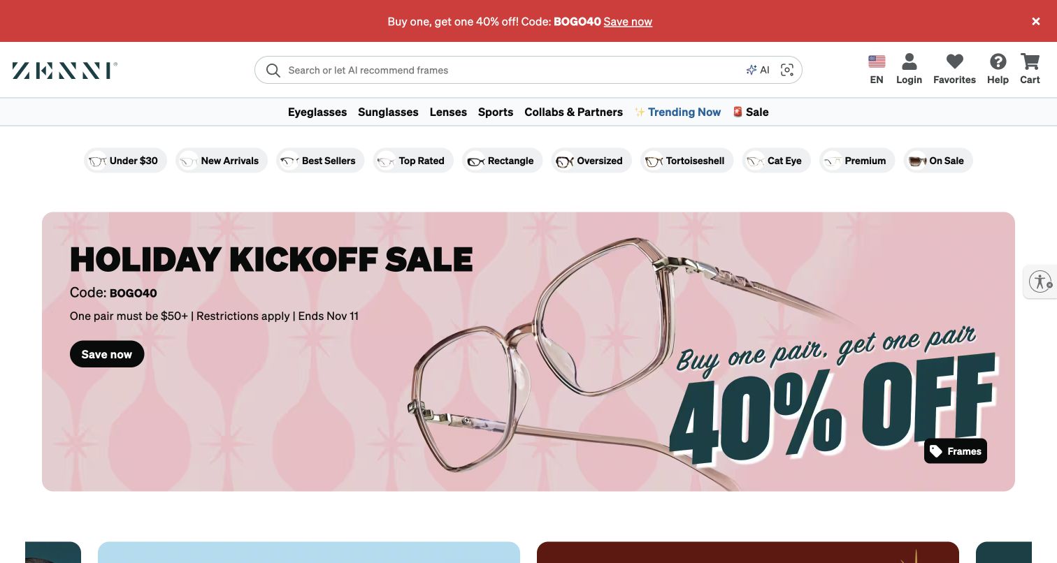
Zenni's pale pink campaign shows oversized eyeglass frames next to a bold discount message. Above it, several navigation rows distinguish eyewear types, lenses and other shopping routes. Search is prominent in the white header. The page gives products immediate visual scale while using the surrounding shell to handle a more complicated catalog. The detailed navigation makes the difference between browsing frames and researching lenses explicit. Preserve that distinction in route inventories rather than using a single generic shopping event to represent both tasks.
What you can learn
Divide monitoring by public task: finding frames, researching lens options and following a promotion. Avoid collecting prescription or health-related details in diagnostic payloads. The practical lesson is to maintain an explicit boundary between browseable merchandising and sensitive personalization, rather than measuring the whole experience as one click funnel.
Pros
Large frame photography makes the product category unmistakable.
Search and detailed navigation support visitors with specific intent.
Cons & considerations
Several header rows increase the need for narrow-screen testing.
Personalization and prescription journeys require separate privacy-aware validation.
Platform source: Dated public source inspection. The dated public response includes NREUM browser-agent initialization/configuration and New Relic browser monitoring references. This identifies a sampled browser-monitoring integration, not successful telemetry, private backend instrumentation or measured performance. Platform evidence is separate from the direct website screenshot and is not a complete current infrastructure audit.
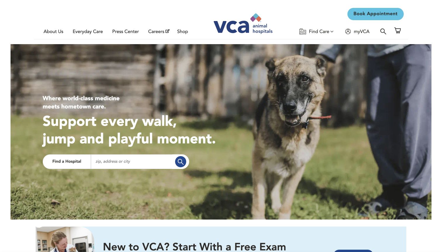
VCA combines a large dog photograph with a reassuring headline and a hospital-finding action. Its white header exposes care categories and appointment access independently. A new-client offer begins underneath. This creates a useful hierarchy: recognize the service, find a suitable location, then explore promotions or supporting information. The hospital-finding action is more durable than the new-client offer below it. Keep its destination checks independent so a promotional update cannot silently redirect a person away from relevant local care.
What you can learn
Make location finding a separately monitored public route rather than a secondary campaign event. Check that the chosen hospital destination stays valid through content updates. Keep appointment details and animal-care information out of casual telemetry, and distinguish a public route check from testing an actual booking.
Pros
Location finding is tied directly to the main service promise.
Appointment access remains visible in the navigation shell.
Cons & considerations
The large photograph can postpone location detail on smaller screens.
Local destinations need ongoing checks beyond the corporate homepage.
Platform source: Dated public source inspection. The dated public response includes NREUM browser-agent initialization/configuration and New Relic browser monitoring references. This identifies a sampled browser-monitoring integration, not successful telemetry, private backend instrumentation or measured performance. Platform evidence is separate from the direct website screenshot and is not a complete current infrastructure audit.
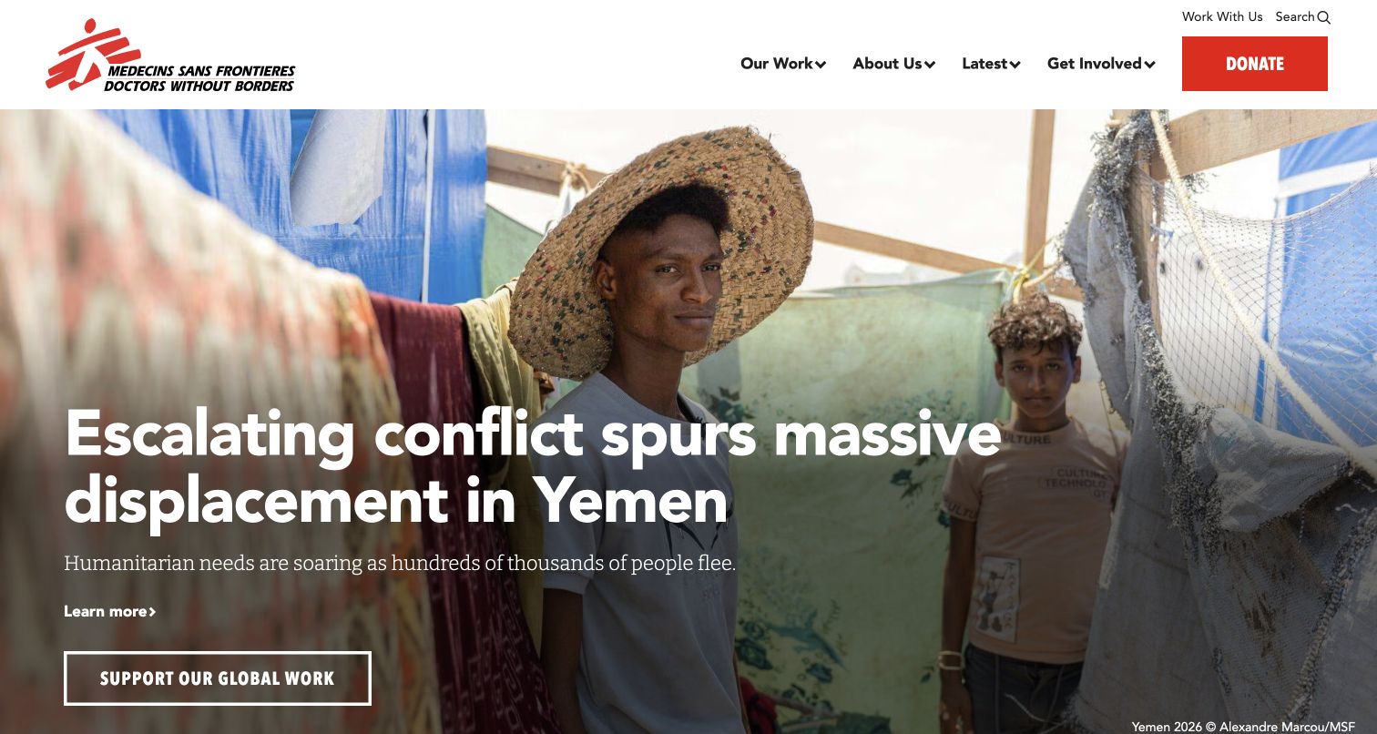
Doctors Without Borders leads with a field photograph and a large headline about displacement. Its white header keeps organizational information, news and a red donation action separate from the story. A supporting button appears within the feature. The page uses editorial urgency without requiring the permanent support route to inherit the photograph's styling. The field report and donation route require different update practices. Keep the story link tied to its permanent article while checking the support destination separately from the changing news photograph and headline.
What you can learn
Track public story availability and donation handoffs independently. A news update should not silently break a long-lived support destination. Use error signals to investigate, not to infer whether a campaign persuaded readers or whether a third-party donation transaction completed; those require separate evidence and appropriate authorization.
Pros
The donation action remains visible outside the featured story.
The photograph and headline establish a specific editorial subject.
Cons & considerations
Urgent stories need careful replacement and link-retention workflows.
A public homepage cannot establish the health of payment processing.
Platform source: Dated public source inspection. The dated public response includes NREUM browser-agent initialization/configuration and New Relic browser monitoring references. This identifies a sampled browser-monitoring integration, not successful telemetry, private backend instrumentation or measured performance. Platform evidence is separate from the direct website screenshot and is not a complete current infrastructure audit.
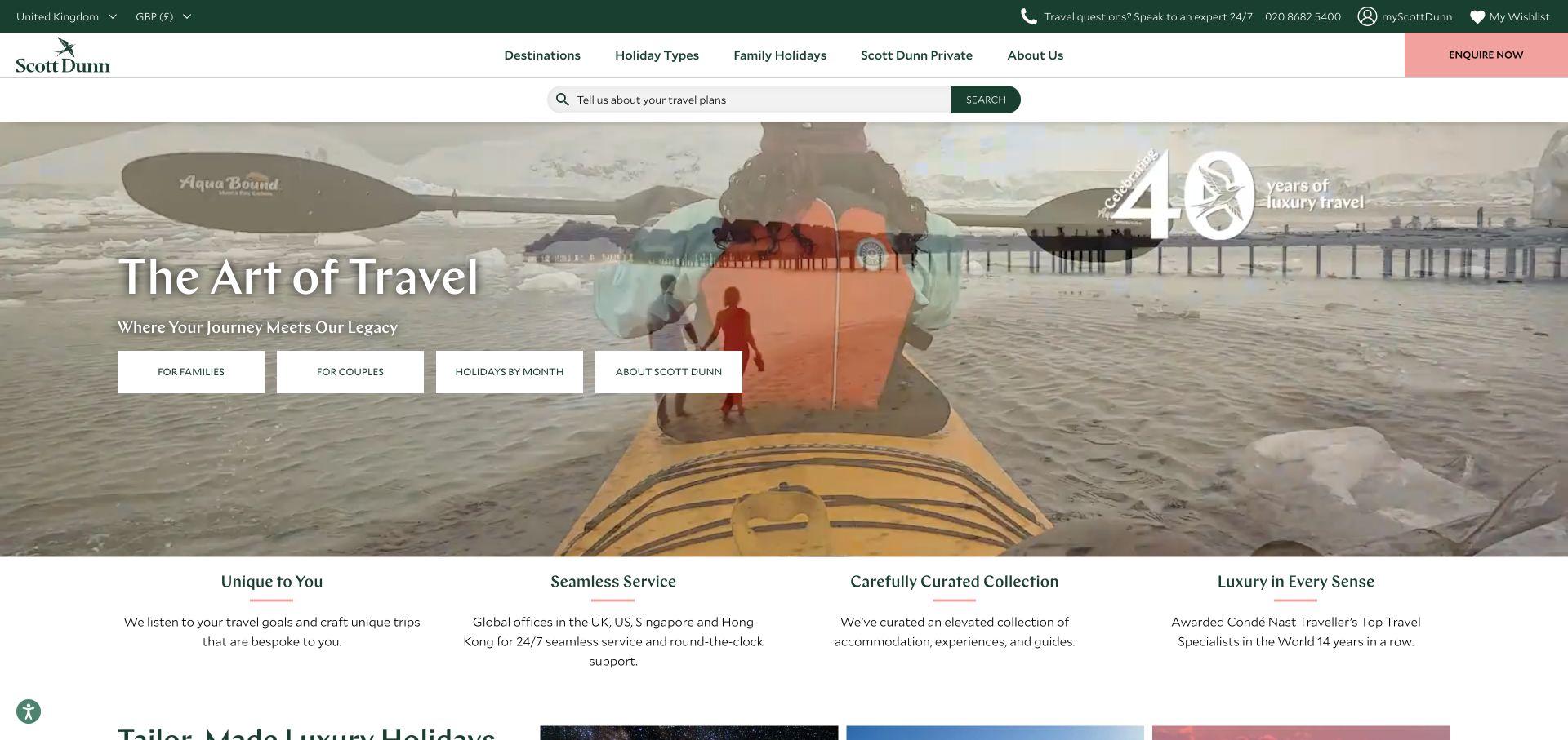
Scott Dunn layers a destination photograph with a quiet headline and a row of planning controls. Its restrained green and white header remains visually separate, and explanatory service blocks begin below. The page presents travel as a considered consultation rather than immediately filling the screen with a dense collection of discounted departures. The small planning controls supply a useful bridge from the destination photograph to practical exploration. Check their individual destinations when editorial images change, rather than treating the whole hero as one interaction.
What you can learn
Define public task boundaries around choosing a destination, understanding the service and reaching inquiry information. A monitoring plan should preserve those routes when campaign photography changes. Do not use a successful hero load as a proxy for a working inquiry journey, or submit real requests during testing.
Pros
Planning controls sit within the visual invitation instead of far below.
Supporting service explanations appear immediately after the campaign.
Cons & considerations
Text over a pale landscape needs crop-specific contrast review.
Consultative journeys are longer than a single measurable homepage event.
Platform source: Dated public source inspection. The dated public response includes NREUM browser-agent initialization/configuration and New Relic browser monitoring references. This identifies a sampled browser-monitoring integration, not successful telemetry, private backend instrumentation or measured performance. Platform evidence is separate from the direct website screenshot and is not a complete current infrastructure audit.
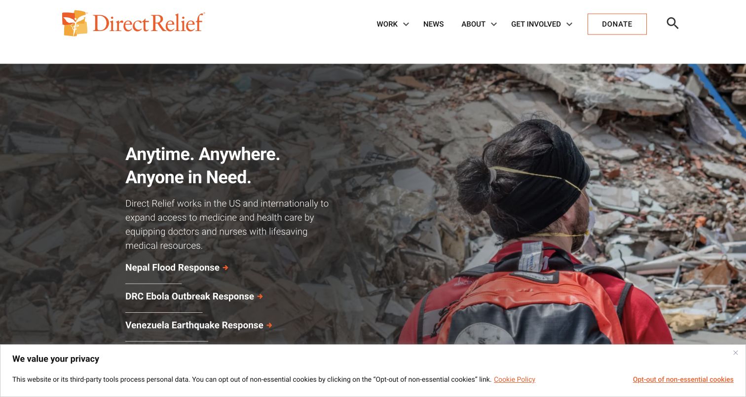
Direct Relief uses a field-response image behind a compact statement and several current-response links. The logo and a restrained navigation bar sit above. A consent strip covers the lower edge. The composition gives timely needs prominence while retaining a recognizable organizational frame that can survive a change in the featured emergency. The response links beneath the headline make the featured emergency actionable as information. Preserve their destinations through updates, while distinguishing current reporting from the broader organizational pages that stay relevant over time.
What you can learn
Monitor the current-response links as named destinations rather than anonymous hero clicks. Build a clear process for retiring emergency content without leaving broken routes. Diagnostic collection should not include sensitive beneficiary information, and the presence of browser monitoring does not establish impact or the success of any relief activity.
Pros
Specific response links give the campaign more than one practical entrance.
The restrained header keeps the organization recognizable above changing imagery.
Cons & considerations
Consent controls alter the visible first-screen composition.
Rapid editorial changes require destination verification as well as accurate copy.
Platform source: Dated public source inspection. The dated public response includes NREUM browser-agent initialization/configuration and New Relic browser monitoring references. This identifies a sampled browser-monitoring integration, not successful telemetry, private backend instrumentation or measured performance. Platform evidence is separate from the direct website screenshot and is not a complete current infrastructure audit.
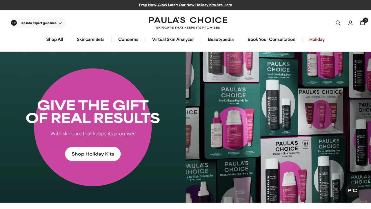
Paula's Choice combines a green and pink gift graphic with a tight arrangement of bottles and packaging. The white navigation offers skin concerns and product categories alongside shopping. A small action is placed inside the large circular campaign element. The promotional composition is forceful, but the permanent header supports more specific research tasks. The concern-based menu serves a different purpose from the gift-kit button. A release check should preserve both pathways and verify their public destinations without inferring an individual visitor’s skincare needs or intent.
What you can learn
Keep campaign browsing and concern-based navigation distinct in a measurement plan. Monitor public page failures without collecting personal skin concerns or form details. A visible initializer is evidence of a browser-monitoring reference, not evidence about consent execution, data retention or whether particular product claims perform well.
Pros
The product packaging connects the promotion to tangible merchandise.
Concern-based navigation offers a route beyond seasonal gifting.
Cons & considerations
Several navigation categories can crowd small screens.
Personalized skin information should not become an incidental diagnostic payload.
Platform source: Dated public source inspection. The dated public response includes NREUM browser-agent initialization/configuration and New Relic browser monitoring references. This identifies a sampled browser-monitoring integration, not successful telemetry, private backend instrumentation or measured performance. Platform evidence is separate from the direct website screenshot and is not a complete current infrastructure audit.
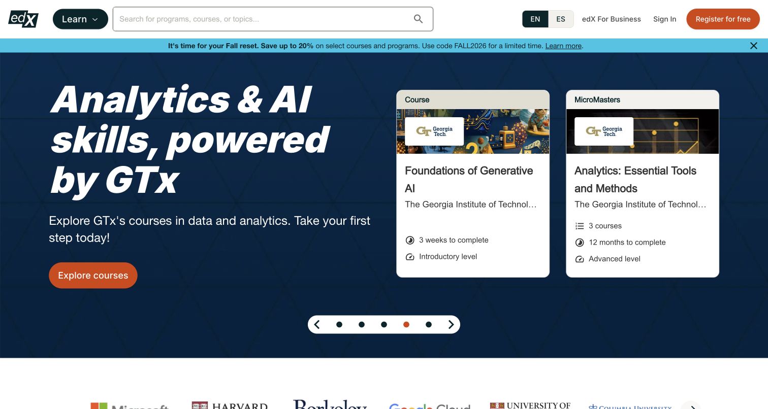
edX pairs a dark analytics-and-AI campaign with white course cards and a conspicuous orange action. Search sits in the header above, separated from the promotional panel. The composition gives a broad learning theme a more concrete expression through named course tiles, while retaining a route for visitors who already know what they want. The white course tiles make the broad subject campaign more specific. Check each public course destination as well as search, since one unavailable course should not be hidden inside an aggregate homepage result.
What you can learn
Monitor search entry, course-detail arrival and campaign navigation as distinct public tasks. Keep learning interests and account information out of unnecessary diagnostic fields. A screenshot can establish how choices are presented, but enrollment success, completion and authenticated learning experiences require entirely different evidence.
Pros
Course cards make the broad campaign more concrete.
Persistent search supports visitors who do not need the featured theme.
Cons & considerations
Multiple course choices compete with the single campaign action.
Enrollment and authenticated study cannot be evaluated from this public view.
Platform source: Dated public source inspection. The dated public response includes NREUM browser-agent initialization/configuration and New Relic browser monitoring references. This identifies a sampled browser-monitoring integration, not successful telemetry, private backend instrumentation or measured performance. Platform evidence is separate from the direct website screenshot and is not a complete current infrastructure audit.
Kegan has 15+ years of experience working with small businesses, Fortune 500 companies, and everything in between. No development job is too big or too small: he brings the same hands-on attention to a focused improvement, a complete website, or a custom application.
For New Relic projects, he can help with website integrations, form and campaign connections, analytics implementation, testing, and clear ownership after launch. He works directly with clients on scope, design, implementation, testing, and handover, with an emphasis on clear communication and a system that remains practical to maintain after launch.
Show 3 other New Relic developersHide other New Relic developers
Separate category entry, search, product-detail arrival and campaign destinations. Use stable task names when promotions change, and verify that expired offers do not leave broken public routes. Keep real payment activity outside ordinary visual QA.
Information and service discovery
Define the route from a broad homepage to a useful answer or local service. Check permanent information paths independently of featured stories. An attractive opening screen can coexist with an unavailable or confusing destination.
Account and external handoffs
Document where the public site hands a visitor to an account, booking or other external service. Assign responsibility for each boundary. A shared brand does not prove a shared application, and a successful homepage check cannot establish the downstream outcome.
From references to requirements
Write a monitoring brief that someone can operate
Establish a meaningful baseline
Record representative routes, visible states and dependency owners. Include delayed media, narrow screens and unavailable optional scripts. Preserve the distinction between a visual baseline and actual performance measurements collected with an appropriate method.
Define investigation and response
Specify who examines a signal, what corroborating evidence they need and how they distinguish a real failure from a noisy symptom. Keep the monitoring description aligned with the actual deployment rather than copying another organization’s apparent setup.
Review coverage after content releases
A new campaign, service route or account handoff can change what needs checking without changing the homepage template. Include destination verification in the release process and retain a clear record of what was observed, when and by which method.
A useful handover demonstration
Ask the actual team to carry out its routine job: publish a realistic update, correct a mistake, preview a narrow screen, and identify who owns an integration failure. For a library or frontend framework, also ask who maintains the content source and deployment. A polished screenshot does not answer those operational questions.
Beyond the screenshot
Browser-monitoring planning checklist
Name the public tasks and their destination owners.
Separate initial rendering from successful downstream navigation.
Confirm actual instrumentation in your own authorized environment.
Review URL, attribute and error-payload data boundaries.
Keep credentials and sensitive form values out of diagnostic collection.
Define representative device, network and failure scenarios.
Set a practical investigation owner for actionable signals.
Recheck coverage after campaign, route or dependency changes.
Test with real content, a keyboard, a small screen, slow or failed requests, and the people who will maintain the system. These are planning checks, not an accessibility, security, performance, or search-ranking certification.
Sources & editorial method
How this New Relic collection was reviewed
Twenty distinct public properties were selected from previously documented source pages and dated public technology observations. The direct browser captures retain their original source URLs, capture dates, dimensions and attribution. The new collection-specific reviews describe visible composition and planning implications separately from technical evidence. Previously recorded source observations were rechecked without being relabeled as fresh observations. The retained screenshots were visually re-reviewed; no real form, account, purchase or booking was submitted. New Relic inclusion requires browser-agent initialization or configuration evidence rather than a generic keyword. It does not establish active telemetry, private backend coverage, consent settings, current performance or an endorsement. The public evidence supports a scoped association with the sampled page only.
Every image is an unmodified capture from the actual website, with its source and capture date. Some captures are reused from our shared catalog; their dates remain the original capture dates. None comes from a vendor gallery or a generated reconstruction. Moving imagery and live content can change.
Technology attribution uses public page assets or metadata, official platform documentation, or a cited first-party project case study. Documentary and framework-relationship evidence is identified where used; it is not a complete current backend inventory. A CMS image CDN alone does not establish a full CMS deployment. A library’s presence does not prove which individual controls use it, and a platform label does not establish AI authorship.
The composition notes, lessons, pros and tradeoffs are original editorial observations. We have not measured conversion, traffic, security, performance or accessibility conformance. Website owners retain their brands and imagery; these examples are not our client portfolio. Written, Edited and Curated are independent records, not dates advanced by a build. See our editorial standards or suggest a correction.
Questions worth asking
New Relic website development FAQs
Does a New Relic reference mean a website is fast?
No. It identifies a monitoring integration in the sampled public source. Speed, reliability and the success of a real user task require separate measurements and context.
Can these examples tell me which dashboards to copy?
No private dashboards were accessed. Use the examples to identify visitor tasks and operational boundaries, then define appropriate measurements for your own implementation.
Does the browser agent prove backend monitoring?
No. The sampled browser evidence does not establish server-side instrumentation, coverage of external services or successful telemetry delivery.
Are the screenshots new performance tests?
No. They are retained direct captures with original dates. Their visual composition was reviewed for this guide, while the separate dated source observations identify the technology association.
Borrow the task definitions and interface lessons, then verify monitoring coverage, privacy boundaries and operational responsibility in your own environment.