Definitive guide · Salesforce CRM website development
Best Salesforce CRM Websites of 2026 (20 Real-World Examples)
Public websites paired with official Salesforce customer-workflow evidence, with marketing pages and CRM implementations clearly distinguished.
A good Salesforce-connected website makes the handoff between visitor, form, customer record and responsible person clear. Start with that service journey rather than treating the CRM as a visual design system.
Salesforce customer stories can describe sales, service, commerce, marketing, industry-specific records or agentic workflows. They do not automatically identify the CMS or frontend serving an organization’s public homepage. This collection pairs independently inspected public design references with the exact workflow described by the official source, including business-unit and planned-work qualifications where needed.
For your own project, map what happens after a person submits a request. Identify the record created, the team that owns it, the expected response and the route for correcting a mistake. A successful-looking thank-you screen is not enough if the submission is lost, duplicated or routed to someone who cannot act on it. The visible experience and the internal operating process should be designed together.
Before the examples
What makes good Salesforce CRM website development in 2026?
Define the handoff in business terms
Write down what a submission represents: a new lead, an existing-customer case, a booking request or a general note. Do not create the same record type for every form simply because it is easy to integrate. The receiving team needs enough context to act without asking the person to repeat everything.
Collect the minimum useful information
Each field should have a reason connected to the next action. Separate necessary project or service information from optional qualification questions. Explain the submission’s purpose and avoid placing private customer data into public analytics, email subjects or unrestricted logs. A shorter form is not automatically better, but an unexplained field is a warning sign.
Choose the integration pattern deliberately
Some workflows need an immediate response from a connected system; others can be queued and acknowledged. Define timeout, retry and duplicate-handling behavior before connecting the form. The interface should report the state of the user’s request honestly rather than showing success merely because the browser submitted an HTTP request.
The 20 public references are connected to official Salesforce cases describing customer, sales, service, commerce or related operational work. The first five are major brands; each source note identifies the actual business or product context instead of claiming the pictured homepage runs on Salesforce.
We start with five recognizable brands or organizations: FedEx, Formula 1, Siemens, L’Oréal, PepsiCo. Each attribution applies to the named website property, not every product or website belonging to its organization. This is a curated reading sequence, not a measured ranking.
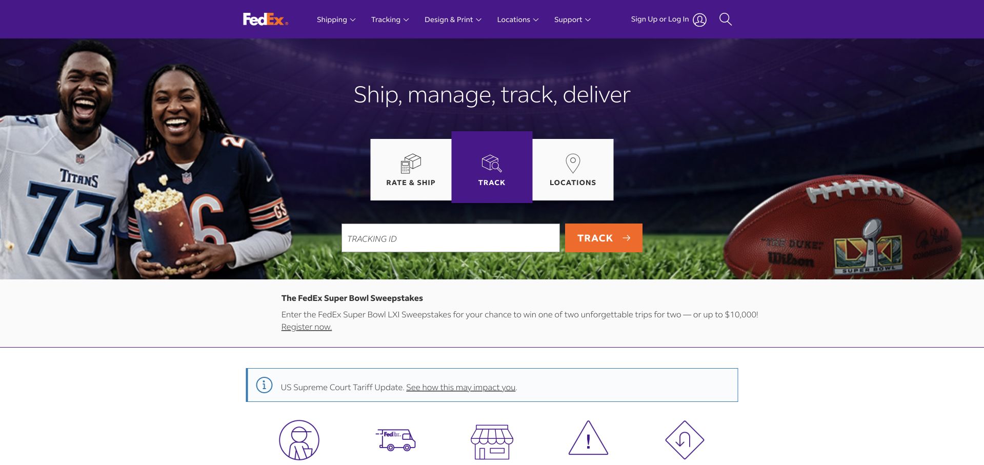
FedEx’s public homepage places a tracking interface in the center of its opening composition. Shipping and location tools sit beside tracking as clearly labeled alternatives, while the purple header retains familiar service categories. The current promotional image gives the page personality, but it does not remove the operational task that many visitors need. This is a useful model for a business with frequent repeat visits: the homepage can carry a campaign without becoming a campaign-only landing page. Salesforce’s case documents customer-data, sales and service products; the public image does not verify the implementation of the tracking application.
What you can learn
Start with the task customers repeat most often. Give it a prominent label, explain the required input and preserve neighboring tasks as clear alternatives. Promotions should fit around that utility rather than forcing customers through an unrelated sales journey.
Pros
Tracking, shipping and location choices are grouped into one recognizable tool area.
The brand header remains consistent while the campaign artwork changes.
Cons & considerations
Tracking-reference formats need useful examples and accessible error handling.
Seasonal promotion and service alerts can compete with the operational panel.
Visible tech stack
Earlier / documented evidence
Salesforce CRM
Platform source: Official product-specific customer case. Salesforce’s FedEx case identifies Sales Cloud, Service Cloud, Marketing Cloud and Data 360 in its customer-data environment. This source establishes only the stated organization, product or workload association. It does not prove the pictured public page uses this technology, identify its CMS or frontend, establish a complete current architecture, or independently verify vendor-reported outcomes. Platform evidence is separate from the direct website screenshot and is not a complete current infrastructure audit.
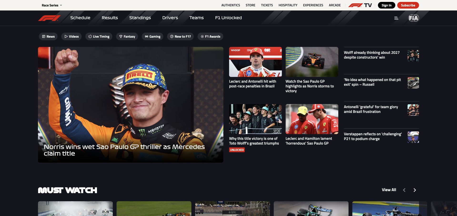
Formula 1’s homepage uses a dark editorial grid, with one large race story beside smaller news and video cards. The red brand mark and familiar motorsport typography create continuity without requiring every article to share the same visual treatment. Navigation separates schedules, results, standings, drivers and teams from entertainment and subscription routes. The layout is useful because a fan can either catch up quickly or enter a more specific information stream. Its density demands clear dates and labels so yesterday’s story does not look like a live result. Salesforce’s case concerns fan service and marketing, not a complete audit of this public publication.
What you can learn
Design sports publishing around different time horizons. A lead story provides context, while results, schedules and standings need stable destinations that do not move whenever the editorial team changes the homepage feature.
Pros
A lead-and-support grid makes current coverage easy to scan.
Permanent results and schedule routes support visitors with specific information needs.
Cons & considerations
Dense story grids can make relative freshness difficult to judge.
Video cards need descriptive text rather than relying entirely on thumbnails.
Platform source: Official product-specific customer case. Salesforce’s Formula 1 case describes fan support with Service Cloud, personalized marketing and Agentforce fan engagement. This source establishes only the stated organization, product or workload association. It does not prove the pictured public page uses this technology, identify its CMS or frontend, establish a complete current architecture, or independently verify vendor-reported outcomes. Platform evidence is separate from the direct website screenshot and is not a complete current infrastructure audit.
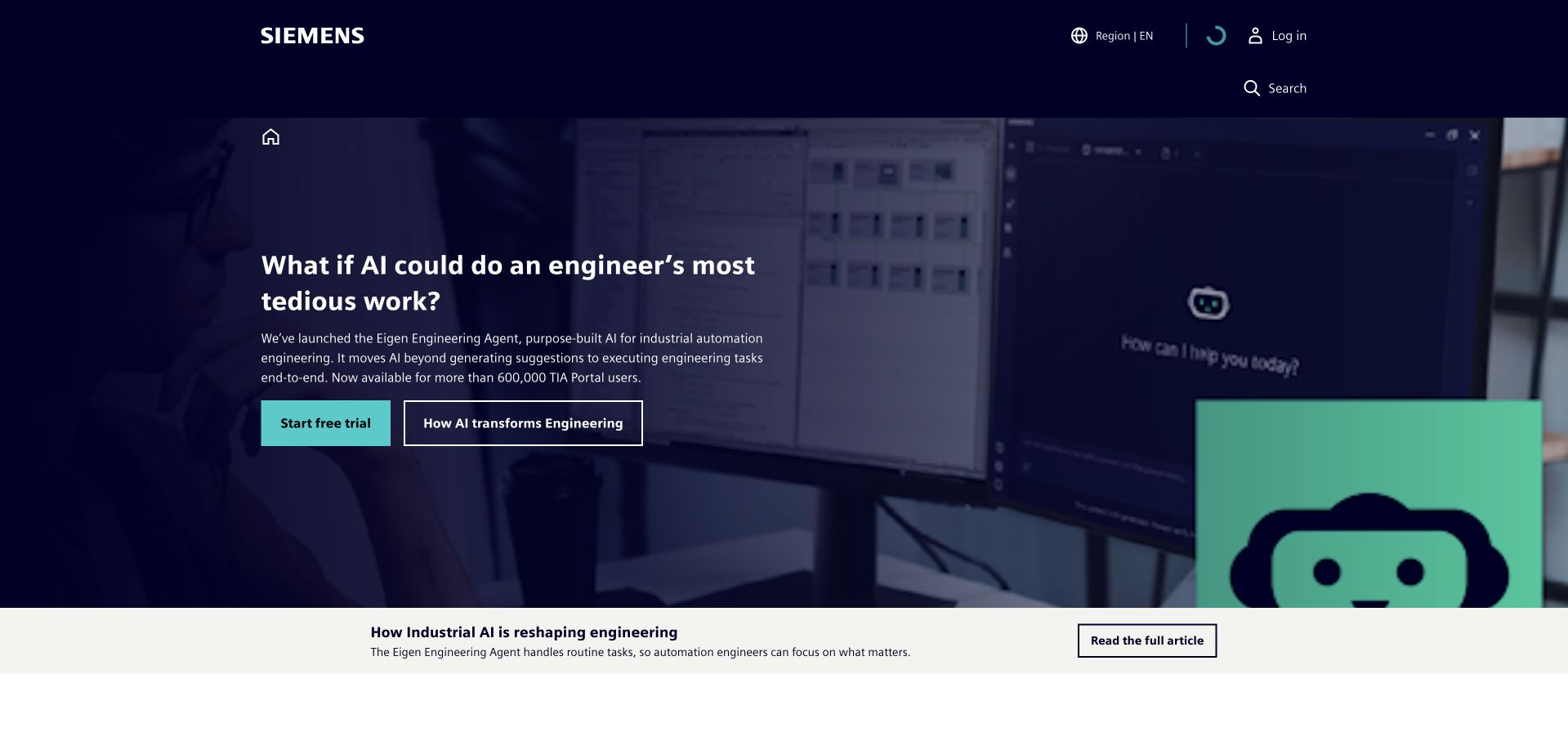
Siemens’ homepage introduces an engineering-AI story through a large product-context image and a compact text panel. The dark blue frame, turquoise action and small robot illustration create a coherent campaign without changing the company’s wider navigation. The next content band offers a deeper article rather than forcing every visitor directly into a trial. This is a useful pattern for a complex industrial brand: one specific capability supplies an accessible entry point, while the broader organization remains discoverable. Salesforce’s case concerns SiePortal commerce and lead qualification; it does not establish that the pictured corporate page runs on Salesforce.
What you can learn
Use a concrete technical story to open a broad portfolio, then offer an explanatory route alongside the commercial action. Buyers should be able to understand the workflow and its limitations before deciding whether a trial is relevant.
Pros
A specific engineering scenario is more informative than a generic innovation slogan.
Article and trial routes support different levels of technical and buying readiness.
Cons & considerations
A single campaign may not represent the company’s wider industrial scope.
Specialist terminology needs supporting explanations for non-engineering stakeholders.
Platform source: Official product-specific customer case. Salesforce’s Siemens case describes SiePortal commerce and customer lifecycle work, plus Agentforce lead engagement and qualification in the stated business context. This source establishes only the stated organization, product or workload association. It does not prove the pictured public page uses this technology, identify its CMS or frontend, establish a complete current architecture, or independently verify vendor-reported outcomes. Platform evidence is separate from the direct website screenshot and is not a complete current infrastructure audit.
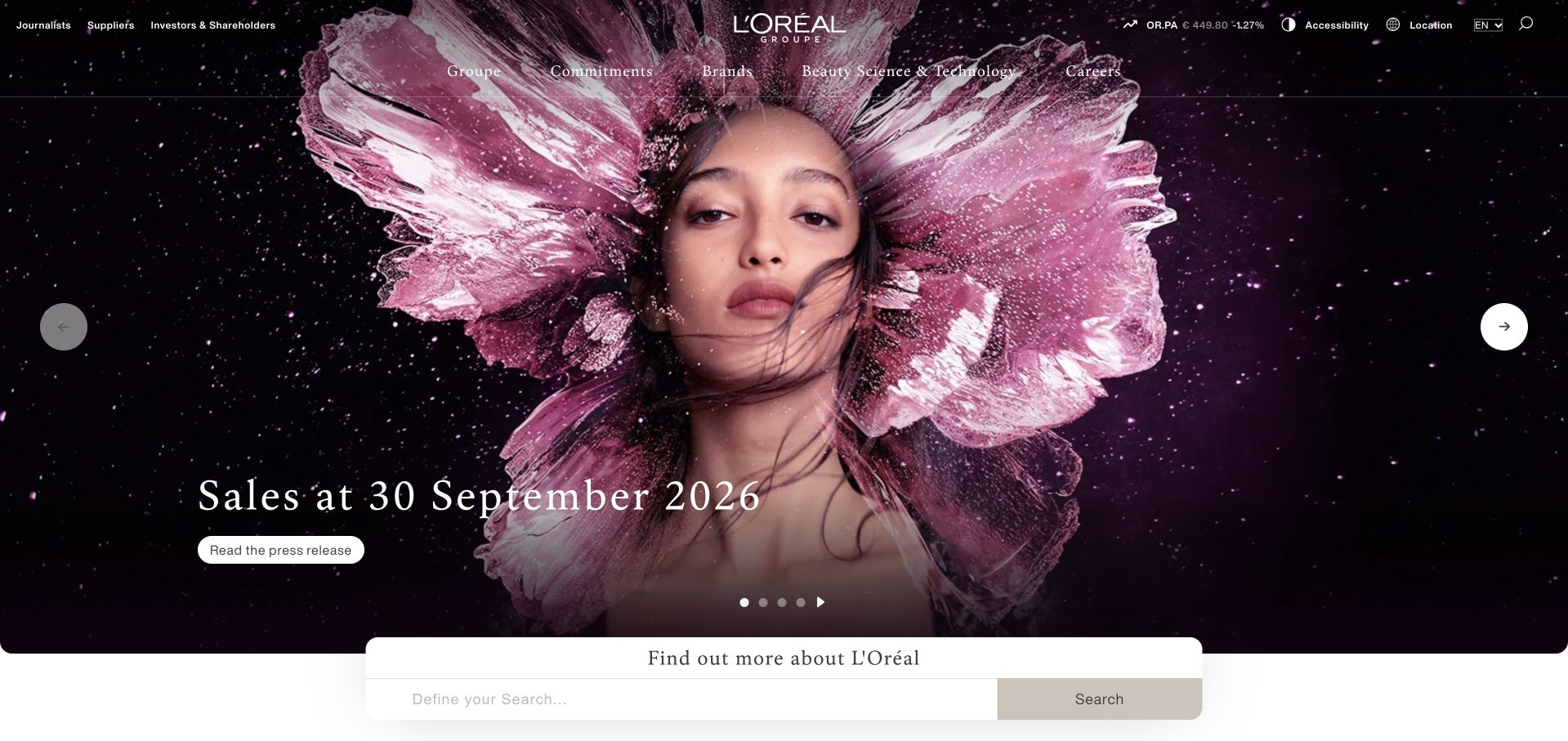
L’Oréal’s corporate homepage combines dramatic beauty photography with a concise sales-results message. The company mark and navigation remain light against the dark image, while a small materials action connects the campaign to its supporting announcement. A separate search area begins below the hero. The interesting balance is between category identity and institutional purpose: the page looks unmistakably connected to beauty, but the current message serves corporate readers rather than product shoppers. Text contrast and responsive crops need careful attention. Salesforce’s case concerns consumer-service workflows across specified brands and regions, not the runtime of this group-level corporate homepage.
What you can learn
An institutional page can retain the visual language of its consumer category. Keep the financial or company message concise and dated, then provide a clear source route instead of asking the photograph to carry factual evidence.
Pros
Distinctive beauty imagery preserves category identity on a corporate information page.
A concise results action gives the featured message a concrete destination.
Cons & considerations
White navigation over complex photography needs careful contrast testing.
A corporate update does not explain individual brands or product availability.
Platform source: Official product-specific customer case. Salesforce’s L’Oréal case describes Service Cloud and Data 360 for consumer-care advisors, with specified brand and regional Agentforce support experiences. This source establishes only the stated organization, product or workload association. It does not prove the pictured public page uses this technology, identify its CMS or frontend, establish a complete current architecture, or independently verify vendor-reported outcomes. Platform evidence is separate from the direct website screenshot and is not a complete current infrastructure audit.
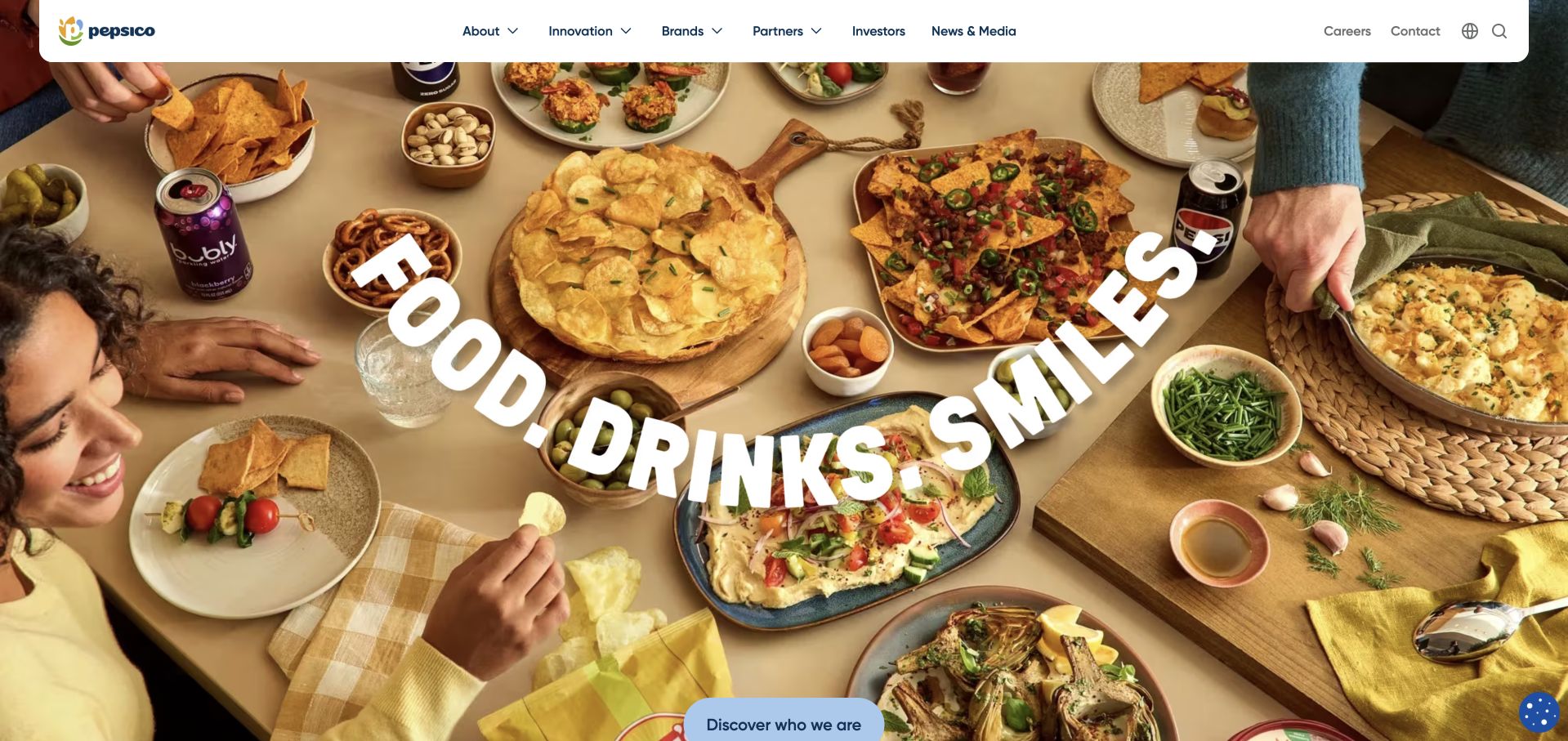
PepsiCo’s homepage uses an overhead table scene to bring several food and drink brands into one coherent image. A large curved statement connects the products to a shared social occasion, while the white navigation bar keeps corporate categories readable. The result feels warmer and more specific than a wall of brand logos. It also leaves a gap that the next section must fill: a broad lifestyle image cannot explain the organization’s operations, commitments or business relationships. Salesforce’s case documents consumer-goods and service workflows at PepsiCo, not every brand website or the technical implementation of this public homepage.
What you can learn
A portfolio story becomes easier to understand when products share a meaningful context. Use an occasion or task to connect them, then provide explicit routes into brands, company information and business relationships rather than relying on visual recognition alone.
Pros
A single everyday scene connects multiple brands without becoming a disconnected logo grid.
The white header keeps corporate navigation separate from colorful campaign imagery.
Cons & considerations
Lifestyle imagery cannot explain the parent company’s operating responsibilities.
Curved display text needs a readable text alternative and resilient mobile treatment.
Platform source: Official product-specific customer case. Salesforce’s PepsiCo case identifies Consumer Goods Cloud, Service Cloud, marketing and field-service products in its customer and retailer operations context. This source establishes only the stated organization, product or workload association. It does not prove the pictured public page uses this technology, identify its CMS or frontend, establish a complete current architecture, or independently verify vendor-reported outcomes. Platform evidence is separate from the direct website screenshot and is not a complete current infrastructure audit.
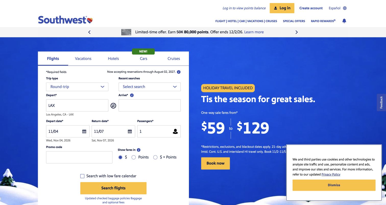
Southwest’s public homepage places a flight-booking form beside a blue seasonal promotion. The form exposes trip type, departure, arrival, dates and passenger count, making the transaction’s requirements visible before account creation. A tab row also acknowledges vacations, hotels, cars and other travel services. The composition works because the offer and the operational task are adjacent but not identical. Its density is the main tradeoff: small labels, promotional conditions and several inputs compete in a limited area. Salesforce’s case documents shared customer-service information and self-service support, not the current technical architecture of the booking interface.
What you can learn
Keep the transactional form understandable before optimizing its appearance. Labels, date defaults and correction paths matter more than fitting every option into one compact panel, especially when a visitor is completing the task on a phone.
Pros
The visible form explains what information a booking requires.
The seasonal promotion remains separate from the core flight-search controls.
Cons & considerations
Dense inputs and promotional conditions can overwhelm a small viewport.
Preselected dates and airports must remain clearly editable and never imply a confirmed booking.
Visible tech stack
Earlier / documented evidence
Salesforce CRM
Platform source: Official product-specific customer case. Salesforce’s Southwest case describes Service Cloud shared customer information and Agentforce self-service support for travelers. This source establishes only the stated organization, product or workload association. It does not prove the pictured public page uses this technology, identify its CMS or frontend, establish a complete current architecture, or independently verify vendor-reported outcomes. Platform evidence is separate from the direct website screenshot and is not a complete current infrastructure audit.
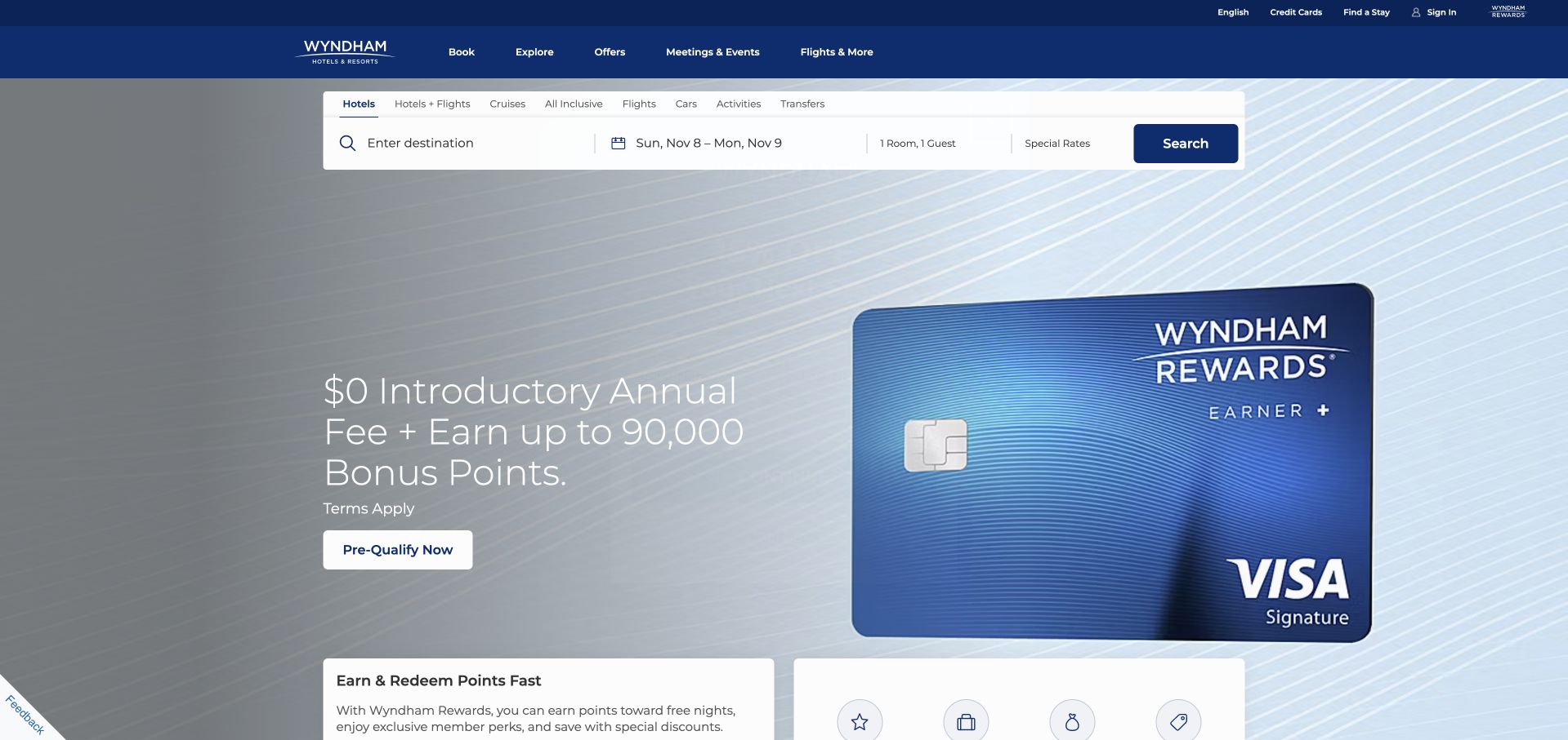
Wyndham’s homepage keeps a horizontal reservation strip near the top while a larger loyalty campaign occupies the main visual area. The deep blue header separates booking, exploration, offers, meetings and loyalty information. This structure gives a repeat guest a predictable starting point even when the featured promotion changes. The campaign is visually polished, but its financial and loyalty conditions need supporting detail that remains readable outside the hero. A large card image is not a substitute for explaining who qualifies or what the offer includes. Salesforce’s case concerns unified guest information and franchisee service, not proof of the public booking site’s complete stack.
What you can learn
Protect the recurring reservation task from promotional changes. Keep dates, destination and room choices in a stable location, then make loyalty or financial offers clearly optional and linked to their own terms.
Pros
The reservation strip remains recognizable above the larger promotion.
Booking, meetings and loyalty audiences have distinct navigation routes.
Cons & considerations
Financial and loyalty conditions need more detail than a hero panel can hold.
A wide search strip requires a deliberate input sequence on mobile.
Platform source: Official product-specific customer case. Salesforce’s Wyndham case describes unified guest profiles, service information and Agentforce support for franchisees. The evidence is not the technical inventory of the booking site. This source establishes only the stated organization, product or workload association. It does not prove the pictured public page uses this technology, identify its CMS or frontend, establish a complete current architecture, or independently verify vendor-reported outcomes. Platform evidence is separate from the direct website screenshot and is not a complete current infrastructure audit.
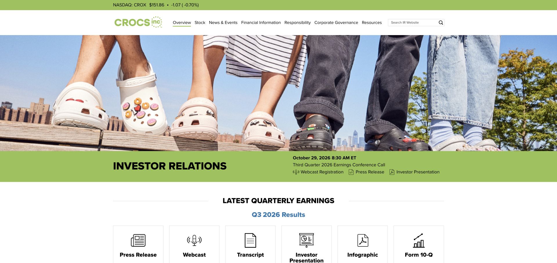
Crocs’ investor homepage uses a large footwear photograph above a green investor-relations band and a row of quarterly-materials shortcuts. The product remains instantly recognizable, but the actions are clearly institutional: press release, webcast, transcript, presentation and report materials. The design is useful because it does not make financial readers search through a retail storefront to find corporate information. It also shows how an investor site can retain personality without sacrificing conventional document access. Current figures and presentation dates still require careful maintenance. Salesforce’s case documents connected commerce, marketing and service work; the pictured investor page is not claimed to use that platform.
What you can learn
Give investors the materials they repeatedly need in a consistent order. Product imagery can establish context, but dated documents and clearly labeled formats should do the practical work of supporting research.
Pros
Quarterly materials are presented as explicit, recognizable document types.
Product photography maintains a connection to the consumer brand without introducing shopping controls.
Cons & considerations
Financial shortcuts need visible dates and an archive for older periods.
A large product image can postpone the data some repeat visitors want immediately.
Platform source: Official product-specific customer case. Salesforce’s Crocs case documents Commerce Cloud, Marketing Cloud and Agentforce shopping and customer-service workflows. This source establishes only the stated organization, product or workload association. It does not prove the pictured public page uses this technology, identify its CMS or frontend, establish a complete current architecture, or independently verify vendor-reported outcomes. Platform evidence is separate from the direct website screenshot and is not a complete current infrastructure audit.
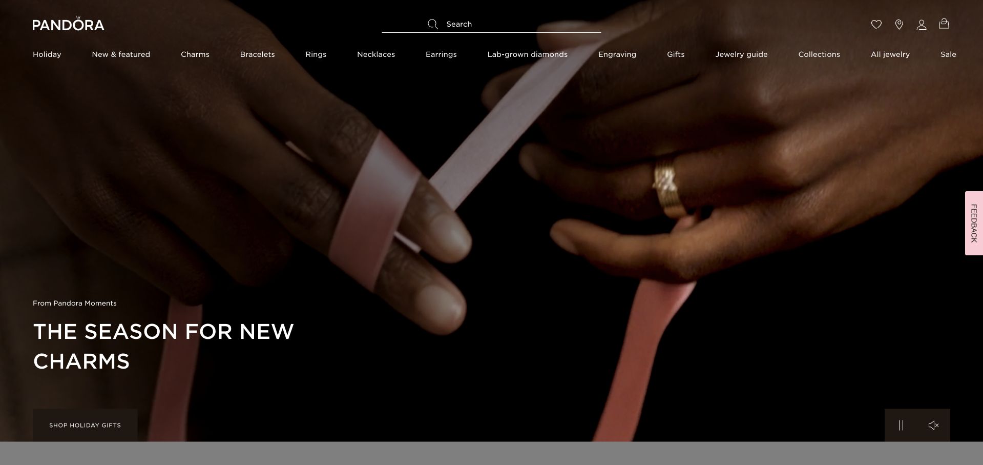
Pandora’s captured storefront leads with a close-up of hands and jewelry, using a short seasonal statement near the lower edge. The dark image lets the gold-toned product and pale typography establish a restrained, premium mood. A wide category navigation remains visible above, with search and shopping controls kept familiar. The photograph is useful because it shows jewelry in context rather than as an isolated object on a plain background. The tradeoff is that small product details can disappear when the image is cropped or reduced. Salesforce’s case documents commerce and customer-service functions, not every technical component of the pictured storefront.
What you can learn
Choose a product image for the question it answers. Wearing context can communicate scale and texture, but shoppers still need clear category routes, detailed product photography and factual information once they move beyond the campaign.
Pros
Close-up imagery gives the jewelry a clear human scale and tactile context.
Conventional category and shopping controls remain available around the campaign.
Cons & considerations
Dark crops can hide fine product details on small or low-contrast displays.
Seasonal language provides limited help to a visitor seeking a specific item.
Visible tech stack
Earlier / documented evidence
Salesforce CRM
Platform source: Official product-specific customer case. Salesforce’s Pandora case identifies Commerce Cloud, Service Cloud, loyalty and Agentforce customer conversations. This source establishes only the stated organization, product or workload association. It does not prove the pictured public page uses this technology, identify its CMS or frontend, establish a complete current architecture, or independently verify vendor-reported outcomes. Platform evidence is separate from the direct website screenshot and is not a complete current infrastructure audit.
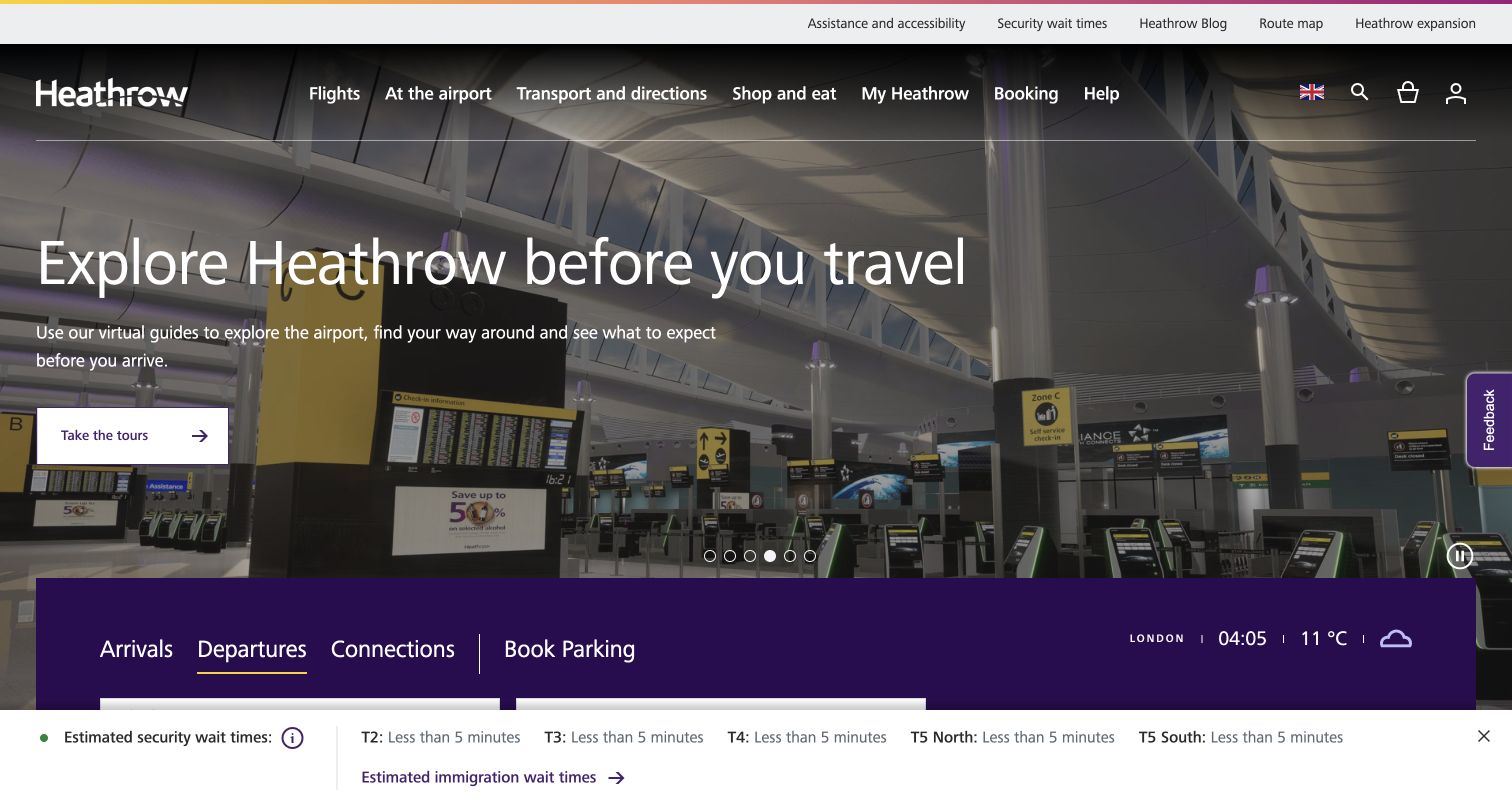
Heathrow’s homepage places a current travel-oriented story above a prominent purple tool area for arrivals, departures, connections and parking. The header separates flights, airport information, transport, shopping and help. The composition recognizes that visitors arrive at very different stages of a journey: some are planning a visit, while others need a time-sensitive operational answer. The image supplies a sense of place without replacing the functional controls. Current information still needs clear timestamps and a lightweight fallback. Salesforce’s case concerns passenger-service, marketing and commerce work; this collection does not verify the infrastructure behind live flight information.
What you can learn
Make the urgent travel tasks independent of the featured campaign. Arrivals, departures and connections need stable labels, useful current information and accessible mobile controls even when the homepage is promoting a different experience.
Pros
The operational tool band gives time-sensitive travel tasks a prominent location.
A clear category header separates planning, airport services and shopping needs.
Cons & considerations
Dynamic travel information needs explicit freshness and source context.
Promotional content should not slow access to urgent operational tools.
Platform source: Official product-specific customer case. Salesforce’s Heathrow case identifies Service Cloud, Marketing Cloud, Commerce Cloud and passenger-service Agentforce work; future-oriented statements in the source are not treated as completed independent verification. This source establishes only the stated organization, product or workload association. It does not prove the pictured public page uses this technology, identify its CMS or frontend, establish a complete current architecture, or independently verify vendor-reported outcomes. Platform evidence is separate from the direct website screenshot and is not a complete current infrastructure audit.
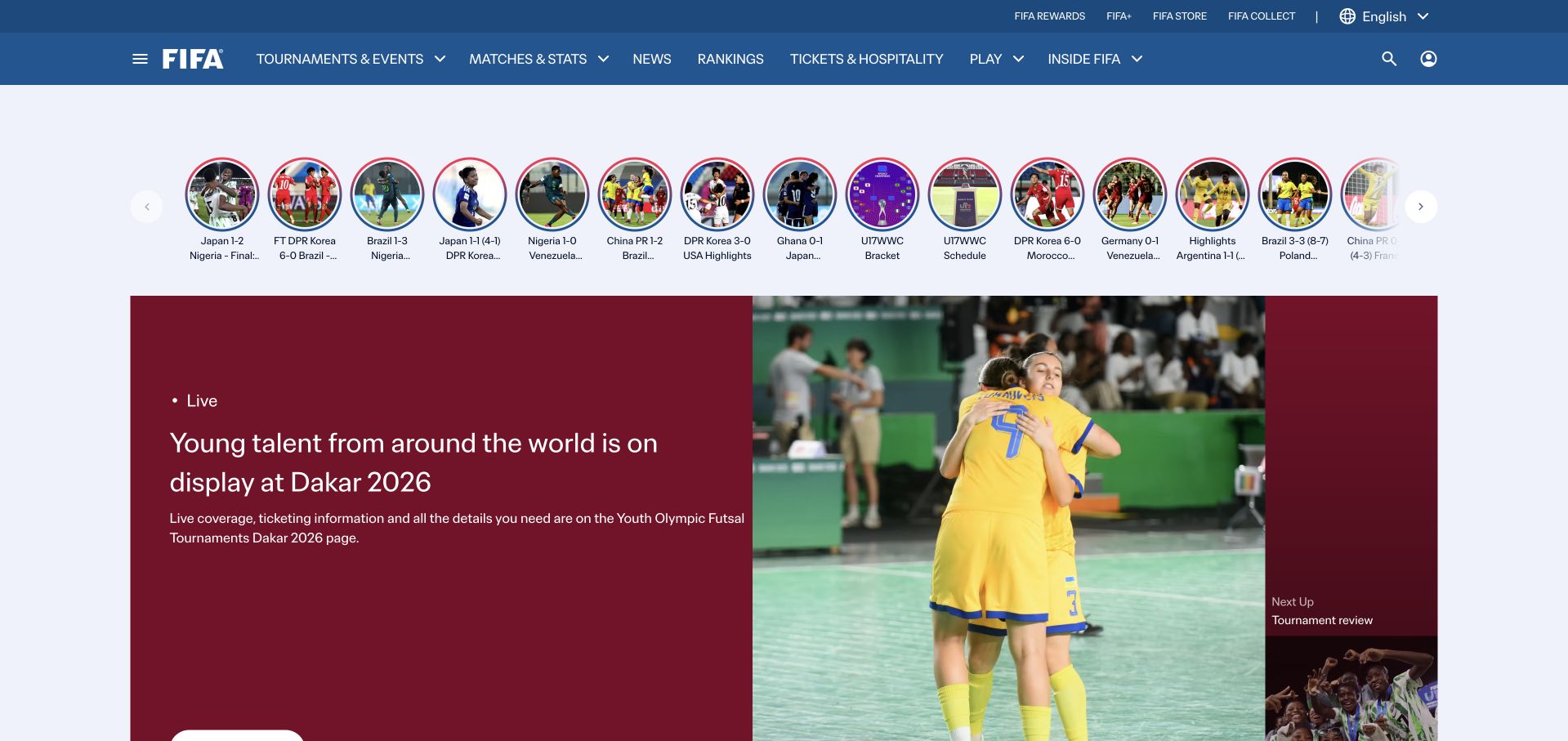
FIFA’s public homepage combines a row of compact story entries with a larger lead article and supporting tournament coverage. Blue panels and a consistent header keep the organization recognizable across different competitions. The layout can support both quick browsing and deeper reading, but it must keep tournament names, dates and age or gender categories explicit. Similar match photographs are not enough to distinguish events on their own. Durable routes to competitions, rankings and organizational information remain important around the changing editorial layer. Salesforce’s case documents tournament coordination, media support and Salesforce-record workflows, not a verified implementation of the public publication.
What you can learn
Sports collections need precise context around the image. Put competition, date and story type where a reader can recognize them before opening an item, and maintain stable event pages that do not depend on the current homepage arrangement.
Pros
A lead-story composition gives major coverage clear visual priority.
Consistent blue framing connects multiple tournaments and editorial formats.
Cons & considerations
Similar sports imagery needs explicit competition and date labels.
Promotional dialogs can interrupt access to otherwise useful event information.
Platform source: Official product-specific customer case. Salesforce’s FIFA case describes workforce coordination, media-service agents and searching Salesforce records within tournament operations, not the public FIFA homepage backend. This source establishes only the stated organization, product or workload association. It does not prove the pictured public page uses this technology, identify its CMS or frontend, establish a complete current architecture, or independently verify vendor-reported outcomes. Platform evidence is separate from the direct website screenshot and is not a complete current infrastructure audit.
Uber’s investor homepage places a large operating figure over a city-and-car photograph, then moves into a concise company mission. The navigation is deliberately institutional, grouping financials, news, governance and resources rather than reproducing the rider application. This separation is useful for a platform with many different consumer and business journeys. The number is easy to notice, but its reporting period and definition are essential to understanding it. The pictured property is public investor information, selected instead of an account-personalized rider homepage. Salesforce’s case concerns business lead handling and advertising-sales workflows, not the investor site’s technical runtime.
What you can learn
Choose the public surface that matches the reader’s task. An investor site should explain operating context and provide dated source materials, while the consumer application handles personal activity and transactions.
Pros
Institutional navigation keeps financial and governance research separate from rider tasks.
An everyday service photograph gives an abstract operating figure a recognizable context.
Cons & considerations
A large metric needs a clear reporting period and definition.
A corporate mission alone cannot explain every part of a diversified platform business.
Platform source: Official product-specific customer case. Salesforce’s Uber case describes Uber for Business lead onboarding and advertising-sales RFP and opportunity workflows. This source establishes only the stated organization, product or workload association. It does not prove the pictured public page uses this technology, identify its CMS or frontend, establish a complete current architecture, or independently verify vendor-reported outcomes. Platform evidence is separate from the direct website screenshot and is not a complete current infrastructure audit.
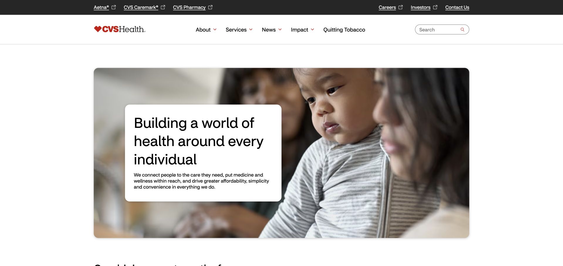
CVS Health’s corporate homepage pairs a family photograph with a white text panel and a concise organization-level proposition. A separate upper strip names major related businesses, while the main navigation groups company information, services, news and impact. The next section introduces how those businesses connect, rather than asking the hero to explain the entire organization. This is a useful pattern for a complex health-services group, but the public company page must remain distinct from personal care and account workflows. Salesforce’s source specifically concerns CVS Caremark’s member-service console, Health Cloud and order-status support, not every CVS property or clinical system.
What you can learn
A group-level health page should explain relationships without becoming a substitute for the actual service destination. Make the business boundaries clear, keep private account routes distinct and use people imagery as context rather than evidence of a clinical outcome.
Pros
Related-business links make the corporate group’s structure easier to recognize.
A readable white panel gives the central proposition reliable contrast over photography.
Cons & considerations
A broad personal-care statement needs concrete service boundaries nearby.
Corporate information should not be confused with a private member-service workflow.
Visible tech stack
Earlier / documented evidence
Salesforce CRM
Platform source: Official product-specific customer case. Salesforce’s CVS Health case specifically concerns CVS Caremark, its Health Cloud service console and Agentforce member order-status support, not every CVS business or public website. This source establishes only the stated organization, product or workload association. It does not prove the pictured public page uses this technology, identify its CMS or frontend, establish a complete current architecture, or independently verify vendor-reported outcomes. Platform evidence is separate from the direct website screenshot and is not a complete current infrastructure audit.
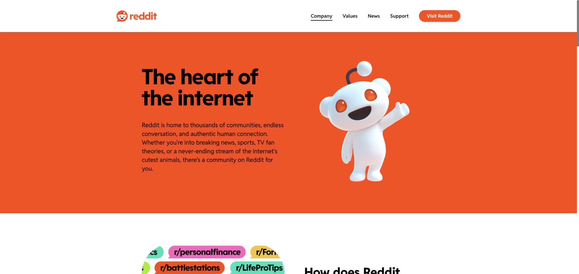
Reddit’s corporate homepage uses a bright orange field, a large mascot illustration and a concise description of its communities. The restrained white header keeps company, values, news and support visible, with a separate Visit Reddit action. This is a useful distinction between a platform’s public company identity and its personalized product experience. The page explains the idea of the service without publishing a particular user’s feed or activity. The mascot provides recognition, but the following content needs to explain operations and responsibilities in more concrete terms. Salesforce’s case concerns advertiser support, sales and service records, not the frontend of the public corporate page.
What you can learn
A public company introduction should not rely on private product state. Explain the platform’s purpose using non-personalized material, then make the route into the actual application explicit for readers who want to participate.
Pros
The bright brand field and mascot create immediate recognition without a busy content grid.
A separate product action distinguishes corporate reading from community participation.
Cons & considerations
A broad community statement needs supporting detail about the organization’s responsibilities.
Large character artwork should not displace essential information on narrow screens.
Platform source: Official product-specific customer case. Salesforce’s Reddit case identifies Sales Cloud and Service Cloud for advertiser support and sales information, alongside Agentforce. This source establishes only the stated organization, product or workload association. It does not prove the pictured public page uses this technology, identify its CMS or frontend, establish a complete current architecture, or independently verify vendor-reported outcomes. Platform evidence is separate from the direct website screenshot and is not a complete current infrastructure audit.
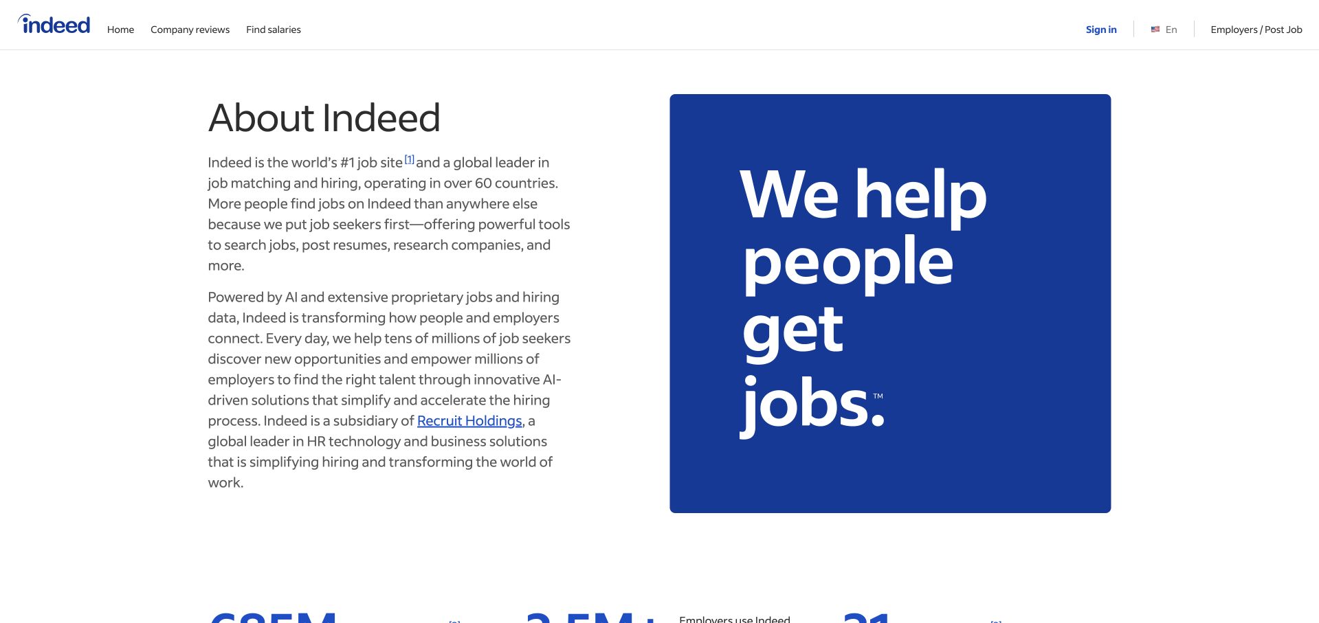
Indeed’s About page uses a familiar header, a short company explanation and a large blue mission panel. The product’s role is described in ordinary language before supporting figures appear further down. The design avoids filling the page with decorative job cards or a second search interface, which helps keep its corporate purpose distinct from the job-seeker application. Quantitative statements still need readable definitions and footnotes. The page is public and does not show a personalized job history. Salesforce’s case documents employer-related data, marketing and planned agentic workflows; it is not used as evidence of the current public page’s CMS or hosting.
What you can learn
Use company information to clarify the service’s role and operating context. Keep statistics defined and dated, and preserve an obvious route back to the product rather than making an About page perform the same job as the application.
Pros
A restrained text-and-graphic layout makes the company’s purpose easy to understand.
The familiar product header gives misplaced visitors an immediate route back.
Cons & considerations
Small references can make the basis of large quantitative claims difficult to inspect.
A broad mission graphic still needs practical explanation of the marketplace relationship.
Platform source: Official product-specific customer case. Salesforce’s Indeed case identifies customer-related Data 360, Marketing Cloud Next and Agentforce work. Planned hiring and digital-workforce outcomes remain prospective, not independently verified production claims. This source establishes only the stated organization, product or workload association. It does not prove the pictured public page uses this technology, identify its CMS or frontend, establish a complete current architecture, or independently verify vendor-reported outcomes. Platform evidence is separate from the direct website screenshot and is not a complete current infrastructure audit.
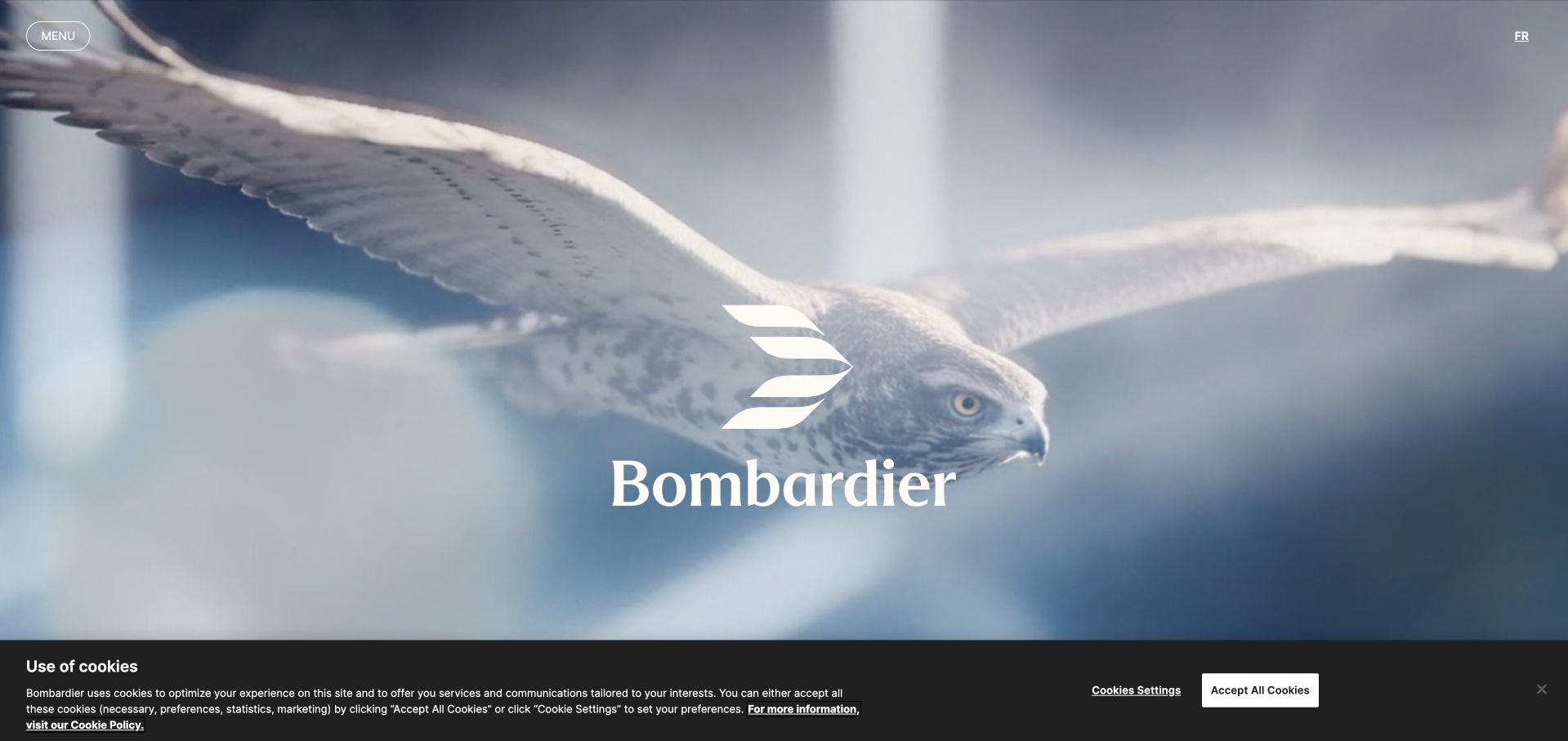
Bombardier’s homepage uses a large nature-led visual and a centered brand mark before moving into aircraft, defense and support content. The compact header leaves the image room to establish the premium tone, while the following sections supply the practical categories a buyer or owner needs. This is an effective way to communicate a high-value product world without beginning with a specification table. The opening still depends heavily on motion and imagery, and the service proposition should not disappear while a visitor waits for a sequence to finish. Salesforce’s case concerns sales information and aircraft-service coordination, not the public homepage’s full technology stack.
What you can learn
An aspirational introduction should lead into concrete ownership information. Keep aircraft discovery, technical support and contact routes easy to find, and provide a stable text alternative when the opening uses cinematic video.
Pros
The restrained opening creates a distinctive premium visual atmosphere.
Aircraft and support sections acknowledge both prospective buyers and existing owners.
Cons & considerations
Cinematic sequences can delay practical information on slower connections.
The brand image alone does not explain specifications, availability or service scope.
Platform source: Official product-specific customer case. Salesforce’s Bombardier case describes CRM and market-information context for sellers, plus Service Cloud aircraft-service coordination. This source establishes only the stated organization, product or workload association. It does not prove the pictured public page uses this technology, identify its CMS or frontend, establish a complete current architecture, or independently verify vendor-reported outcomes. Platform evidence is separate from the direct website screenshot and is not a complete current infrastructure audit.
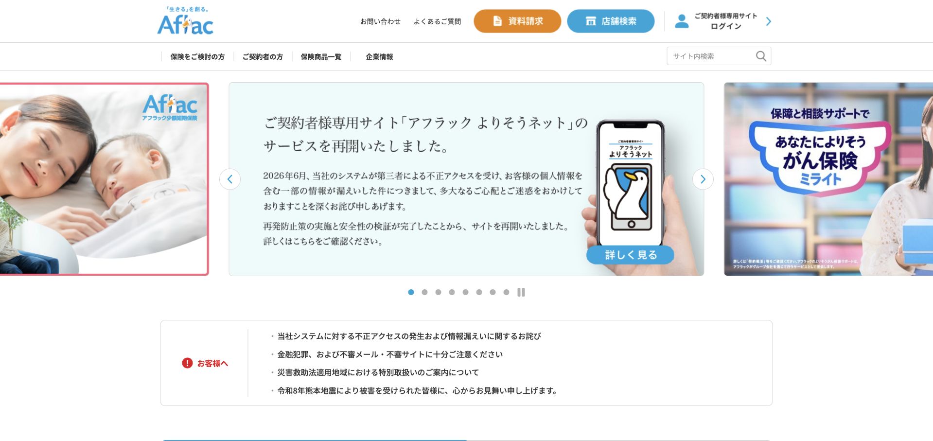
Aflac Japan’s homepage uses a familiar white header, blue and orange service controls, and a carousel containing current customer information. In the captured frame, the message concerns access to a policyholder service rather than a new-product advertisement. Existing-customer routes, consultation, documents and product categories remain distinguishable around it. The useful lesson is the prominence of service communication within a commercial site. The information is dense, however, and image-based Japanese text needs an accessible equivalent. Salesforce’s case specifically identifies Aflac Japan’s sales-proposal and service environment; it does not verify the current policyholder portal or the pictured public site’s implementation.
What you can learn
Protect existing-customer communication from being buried under acquisition campaigns. Use clear dates and service labels, provide the full explanation in accessible text and keep the actual secure account destination visibly separate from the general information page.
Pros
Existing-policyholder and new-customer routes are visibly differentiated.
A current service notice receives prominence alongside product information.
Cons & considerations
Dense text embedded in campaign imagery needs a readable accessible alternative.
Important service information should not be available only through a rotating carousel.
Visible tech stack
Earlier / documented evidence
Salesforce CRM
Platform source: Official product-specific customer case. Salesforce’s case specifically identifies Aflac Japan and its Financial Services Cloud, Service Cloud and Agentforce insurance-proposal and service context. This source establishes only the stated organization, product or workload association. It does not prove the pictured public page uses this technology, identify its CMS or frontend, establish a complete current architecture, or independently verify vendor-reported outcomes. Platform evidence is separate from the direct website screenshot and is not a complete current infrastructure audit.
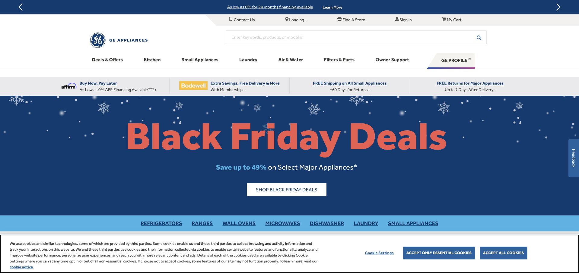
GE Appliances’ homepage combines a large seasonal-sales panel with a broad product-category navigation and visible ownership-support links. The campaign uses strong blue and red contrast, while the header keeps search, store discovery, account access and service information recognizable. This is useful for a durable product category: a visitor may be buying an appliance or trying to maintain one purchased years earlier. The number of promotional strips can make the opening feel busy, especially on a smaller screen. Salesforce’s case concerns the Bodewell customer-care ecosystem and specified service products, not every component of the current retail website.
What you can learn
A durable-goods homepage should support the whole ownership lifecycle. Preserve parts, registration, repair and support routes beside shopping, and prevent multiple seasonal promotions from pushing those recurring tasks out of view.
Pros
Product search and ownership support remain available around the sales campaign.
A consistent category row helps shoppers enter a large appliance catalog.
Cons & considerations
Several stacked promotional strips can reduce the space available for useful content.
Sale language needs clear conditions and should not obscure service-related navigation.
Visible tech stack
Earlier / documented evidence
Salesforce CRM
Platform source: Official product-specific customer case. Salesforce’s GE Appliances case describes the Bodewell customer-care ecosystem, Service Cloud, field service and related Salesforce products. This source establishes only the stated organization, product or workload association. It does not prove the pictured public page uses this technology, identify its CMS or frontend, establish a complete current architecture, or independently verify vendor-reported outcomes. Platform evidence is separate from the direct website screenshot and is not a complete current infrastructure audit.
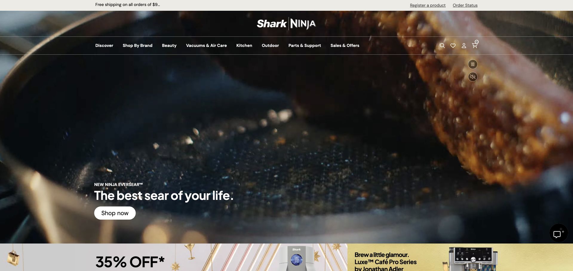
SharkNinja’s homepage leads with a close-up cookware sequence and a short result-oriented headline near the lower edge. The translucent header keeps the brand, product categories, search and account controls over the image, while a separate promotional row begins below. The image is effective because it shows the product in use rather than simply arranging a box on a background. The tradeoff is readability and loading behavior: the product message should remain understandable if the video does not play. Salesforce’s case documents customer support, commerce and setup-related agentic experiences, not every technology or service behind this public storefront.
What you can learn
Show the result a physical product creates, then make the product itself easy to identify. Use a concise text explanation, preserve a static visual fallback and keep support or setup information accessible after the initial purchase decision.
Pros
The close-up use sequence gives the product claim a concrete visual context.
Familiar category navigation remains visible around the campaign.
Cons & considerations
Moving imagery needs an obvious pause control and a meaningful static fallback.
A dramatic result does not replace specifications, compatibility or care information.
Visible tech stack
Earlier / documented evidence
Salesforce CRM
Platform source: Official product-specific customer case. Salesforce’s SharkNinja case describes Commerce Cloud and customer support, order, warranty and setup-related agentic experiences. This source establishes only the stated organization, product or workload association. It does not prove the pictured public page uses this technology, identify its CMS or frontend, establish a complete current architecture, or independently verify vendor-reported outcomes. Platform evidence is separate from the direct website screenshot and is not a complete current infrastructure audit.
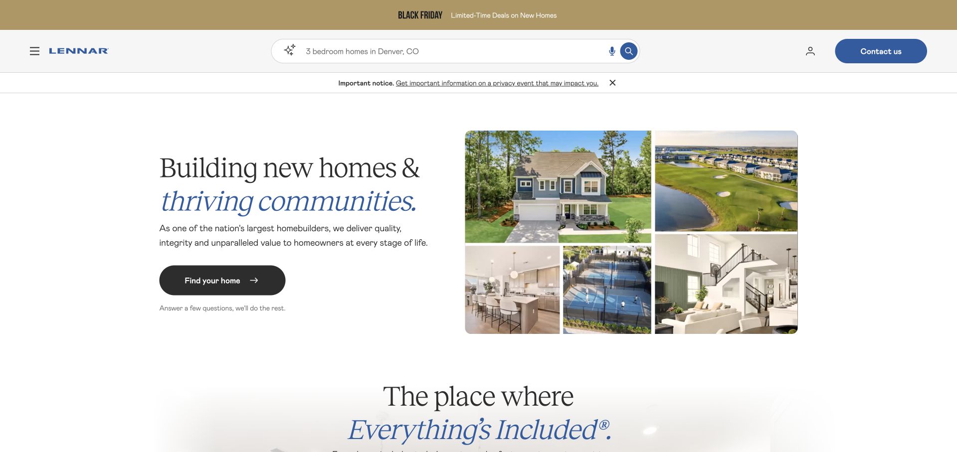
Lennar’s homepage combines a large homebuilding statement with a collage of homes, rooms and community amenities. A visible search field and a guided-search action offer two ways to move from a broad introduction into a more specific location or requirement. The light background keeps the composition approachable, while the image group suggests that the offer includes both a building and a community setting. The page still needs to distinguish illustrative amenities from what is available at a particular development. Salesforce’s case documents sales, service and appointment-related workflows, not the complete architecture of this public property-search experience.
What you can learn
Property marketing should help visitors narrow the search without implying that every pictured feature is universally included. Connect lifestyle imagery to clearly labeled location and community pages, and make search assumptions easy to inspect and change.
Pros
Search and guided discovery support visitors with different levels of certainty.
The image collage communicates both homes and their surrounding community context.
Cons & considerations
Illustrative amenities need clear development-specific availability information.
Promotional and privacy notices should not obscure the practical search controls.
Visible tech stack
Earlier / documented evidence
Salesforce CRM
Platform source: Official product-specific customer case. Salesforce’s Lennar case identifies Sales Cloud, Service Cloud and appointment-related Agentforce workflows. Expected appointment outcomes are not treated as independently verified completed results. This source establishes only the stated organization, product or workload association. It does not prove the pictured public page uses this technology, identify its CMS or frontend, establish a complete current architecture, or independently verify vendor-reported outcomes. Platform evidence is separate from the direct website screenshot and is not a complete current infrastructure audit.
Kegan has 15+ years of experience working with small businesses, Fortune 500 companies, and everything in between. No development job is too big or too small: he brings the same hands-on attention to a focused improvement, a complete website, or a custom application.
For Salesforce CRM projects, he can help with website integrations, form and campaign connections, analytics implementation, testing, and clear ownership after launch. He works directly with clients on scope, design, implementation, testing, and handover, with an emphasis on clear communication and a system that remains practical to maintain after launch.
Show 3 other Salesforce CRM developersHide other Salesforce CRM developers
A public website with a controlled form integration
Keep editorial publishing in the platform best suited to the site. Send validated submissions through a maintained server-side integration, with clear ownership and duplicate protection. Test the full handoff from form to assigned person, not only whether a record appears somewhere in the CRM.
A customer-service or account experience
Define identity, record access and the actions customers may complete before designing the portal. Separate general help from private account information. Include escalation and correction routes so a self-service interface does not become a dead end when the person’s request falls outside the automated path.
A connected commerce or sales workflow
Map the boundary between catalog, order, payment, customer and service records. Identify which system is authoritative for each state and how updates move between them. A visually unified journey still needs clear operational ownership when a payment, fulfillment step or service request fails.
From references to requirements
Plan the records and response process behind the interface
Audit existing forms and record quality
List every public submission route, the record it creates and the team that receives it. Check for duplicate fields, obsolete routing rules and submissions that are stored but never reviewed. Use a few representative requests to trace the actual process. A redesign should improve that handoff rather than simply adding a more attractive form.
Design access, integration and observability together
Use limited credentials and a controlled integration layer. Record which fields are sent, how validation errors are returned and where operational failures are monitored. Keep private details out of public error messages while giving the support team enough information to investigate. Review platform limits and the actual API behavior for the chosen implementation.
Submit a valid request, a duplicate, an incomplete request and a request while the receiving system is unavailable. Verify the user-facing message, the resulting record, ownership and the team’s next action. Test mobile and keyboard use as well as the internal queue. A form is complete only when the service can reliably act on what it receives.
A useful handover demonstration
Ask the actual team to carry out its routine job: publish a realistic update, correct a mistake, preview a narrow screen, and identify who owns an integration failure. For a library or frontend framework, also ask who maintains the content source and deployment. A polished screenshot does not answer those operational questions.
Beyond the screenshot
A Salesforce-connected website checklist
Name the purpose of every public form.
Map submissions to the appropriate record types.
Assign a responsible team and response process.
Explain why each requested field is needed.
Protect private details from analytics and unrestricted logs.
Use limited server-side integration credentials.
Define duplicate and retry behavior.
Choose honest loading, success and failure messages.
Test unavailable-system and timeout scenarios.
Verify record ownership after a real end-to-end test.
Provide escalation and correction routes.
Document maintenance, platform limits and operational monitoring.
Test with real content, a keyboard, a small screen, slow or failed requests, and the people who will maintain the system. These are planning checks, not an accessibility, security, performance, or search-ranking certification.
Sources & editorial method
How this Salesforce CRM collection was reviewed
Each public page was independently inspected and captured through a normal browser. Official Salesforce customer cases establish only the named organization, business unit, product and workflow scope. Screenshots are not private-system audits, planned work is not described as completed implementation, and vendor-reported outcomes were not independently measured.
Every image is an unmodified capture from the actual website, with its source and capture date. Some captures are reused from our shared catalog; their dates remain the original capture dates. None comes from a vendor gallery or a generated reconstruction. Moving imagery and live content can change.
Technology attribution uses public page assets or metadata, official platform documentation, or a cited first-party project case study. Documentary and framework-relationship evidence is identified where used; it is not a complete current backend inventory. A CMS image CDN alone does not establish a full CMS deployment. A library’s presence does not prove which individual controls use it, and a platform label does not establish AI authorship.
The composition notes, lessons, pros and tradeoffs are original editorial observations. We have not measured conversion, traffic, security, performance or accessibility conformance. Website owners retain their brands and imagery; these examples are not our client portfolio. Written, Edited and Curated are independent records, not dates advanced by a build. See our editorial standards or suggest a correction.
Questions worth asking
Salesforce CRM website development FAQs
Does a Salesforce customer story prove the homepage uses Salesforce?
No. It supports only the sales, service, commerce or other workflow described. The public marketing page can use a separate CMS, frontend and hosting environment.
Should every form create a sales lead?
Not necessarily. Existing-customer support, general notes and booking requests have different purposes. Choose a record and routing process that matches the action the receiving team needs to take.
Can the website show success before the CRM responds?
Only if the request has been safely accepted into a deliberately designed queue and the message describes that state accurately. Do not claim a completed handoff when the system has only attempted delivery.
What should be tested before launch?
The entire journey from browser input to a correctly assigned record and the team’s next action, including duplicates, validation errors and temporary integration failures.
Do automated agents remove the need for support staff?
No assumption should be made. Define their allowed scope and provide an escalation route for requests that require judgment, private context or an action outside the automated workflow.