Definitive guide · Backbone.js website development
Best Backbone.js Websites of 2026 (20 Real-World Examples)
Twenty public properties with documented historical Backbone.js associations, real screenshots and original design analysis; current runtime is not inferred.
A useful web application makes changing information understandable. These examples show different ways to organize discovery, search, publishing and repeat visits. Their Backbone.js associations are historical and explicitly scoped; the screenshots document the public designs actually captured, rather than proving that an earlier implementation remains in place.
Begin with the work someone needs to accomplish. A reader choosing a story, a traveler setting search dates and a person exploring a visualization need different structures. Decide what should remain visible, which state changes need explanation and how a visitor can recover from a mistake. Those decisions matter more than reproducing the appearance of a recognizable brand.
The collection opens with Hulu, Khan Academy, Airbnb, The Verge and WordPress.com. The official Backbone examples page warns that its showcase is historical. Each association below therefore identifies a past public property or feature, while the review discusses the genuine retained or newly captured page. Public marketing screens are not substituted as proof of account systems, private tools or today’s product architecture.
Before the examples
What makes good Backbone.js website development in 2026?
Make application state understandable
Write down the states that matter to the visitor before designing the ideal screen. A search can be empty, loading, successful, ambiguous or unavailable. A collection can contain an item that has changed since it was first displayed. Give those transitions understandable feedback and preserve context where appropriate. Keep the data model and presentation responsibilities clear so a visual update does not become the only record of what happened. The same discipline helps when maintaining an older application or designing a replacement.
Visitors arrive through search, bookmarks, shared links and the browser’s history as well as your main navigation. Plan a meaningful destination for important content and make direct arrival understandable. A selected filter, a document or a particular view should not become impossible to explain outside the current session. Decide which state belongs in the URL and which should remain private. Verify reload and back-navigation behavior as part of the actual workflow, including when content moves or disappears.
A search box, a news stream and a visualization have different priorities. Establish one clear starting point, then arrange secondary routes around it. Use consistent labels and recurring visual roles instead of making every panel equally prominent. Account for notices, account prompts and commercial content when measuring available space. The examples show both useful hierarchy and real interruptions; a polished ideal-state mockup should not conceal the constraints that visitors will actually encounter.
The collection · 20 examples
20 Backbone.js website examples worth studying
These twenty original reviews pair genuine public-page screenshots with historical, explicitly qualified Backbone.js evidence. Fourteen captures were made on November 10, 2026; six retain their earlier capture dates. Every source has a broad audit attempt, with blocked or partial outcomes preserved rather than turned into technology conclusions.
We start with five recognizable brands or organizations: Hulu, Khan Academy, Airbnb, The Verge, WordPress.com. Each attribution applies to the named website property, not every product or website belonging to its organization. This is a curated reading sequence, not a measured ranking.
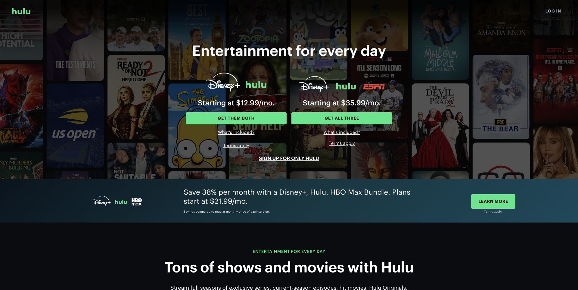
Hulu builds its welcome page around a controlled contrast between abundant entertainment imagery and a very small set of decisions. The darkened poster wall supplies atmosphere, while bright green buttons make the two central bundle paths easy to compare. A quieter standalone Hulu link preserves another route without giving every offer equal weight. This is the retained public welcome-page capture, not an inspection of signed-in playback. The historical Backbone association concerns Hulu’s video web interface; it does not establish the technology behind the pictured offers.
What you can learn
For an application with several access paths, keep the first decision simple and expose secondary explanations nearby. Separate choosing a plan from using the product, and make the transition understandable. Recreate the hierarchy around your own audience’s choices rather than copying the visual volume of a large entertainment catalog.
Pros
Parallel offer columns support comparison without requiring a long preliminary explanation.
High contrast actions remain legible against a dense background of recognizable artwork.
Cons & considerations
Several bundles still require careful reading before someone understands the total proposition.
The atmospheric poster wall occupies substantial space before practical product detail appears.
Platform source: Official historical Backbone showcase: Hulu. Historical public video web interface; not current marketing-page implementation. Historical documentary association only. The official showcase says its list is not current. The captured public page is design evidence, not proof of the present runtime, private systems or other properties. Platform evidence is separate from the direct website screenshot and is not a complete current infrastructure audit.
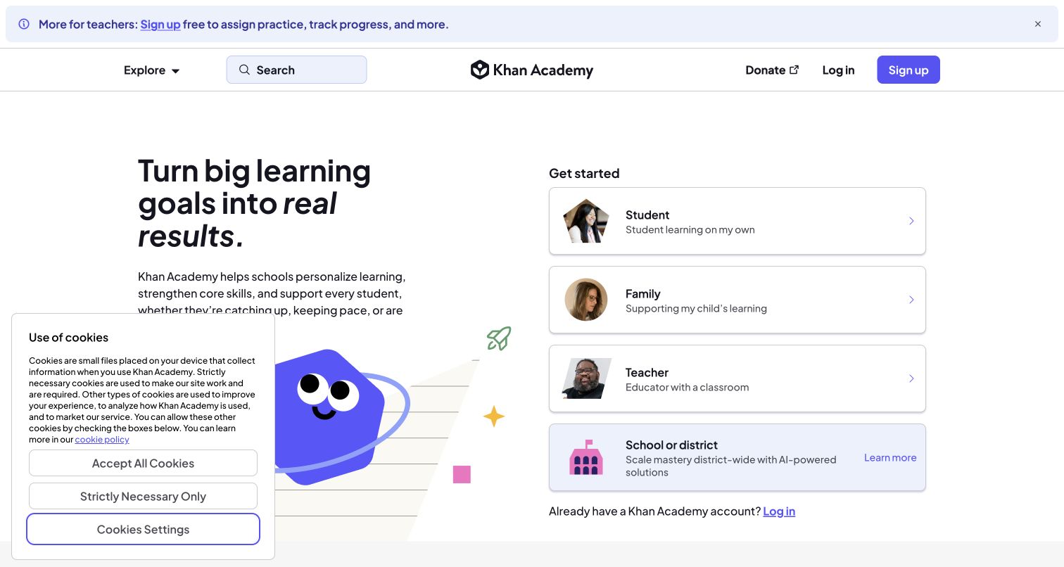
Khan Academy makes audience selection the organizing principle of its opening screen. The large learning message sits on the left, while separate cards identify students, families, teachers and institutional visitors on the right. Each card combines a recognizable role with a short explanation, reducing the effort required to identify the right starting point. The retained cookie notice obscures part of the left column and is part of the actual captured state. Backbone’s historical learning-profile association is distinct from the current appearance of this public entry page.
What you can learn
When several audiences share one application, offer paths based on what they are trying to do. Use consistent card structures and concrete role labels, then carry that selected context into subsequent screens. Do not require a visitor to understand the organization’s internal departments before finding the appropriate learning experience.
Pros
Audience cards communicate both the role and a useful reason to choose it.
A calm layout gives the primary routes more attention than promotional decoration.
Cons & considerations
The visible privacy panel interrupts the introductory reading area in this capture.
Institutional and individual routes need clear explanations to prevent mistaken account choices.
Platform source: Official historical Backbone showcase: Khan-Academy. Historical learning-site profiles and goal-setting frontend; not a current implementation claim. Historical documentary association only. The official showcase says its list is not current. The captured public page is design evidence, not proof of the present runtime, private systems or other properties. Platform evidence is separate from the direct website screenshot and is not a complete current infrastructure audit.
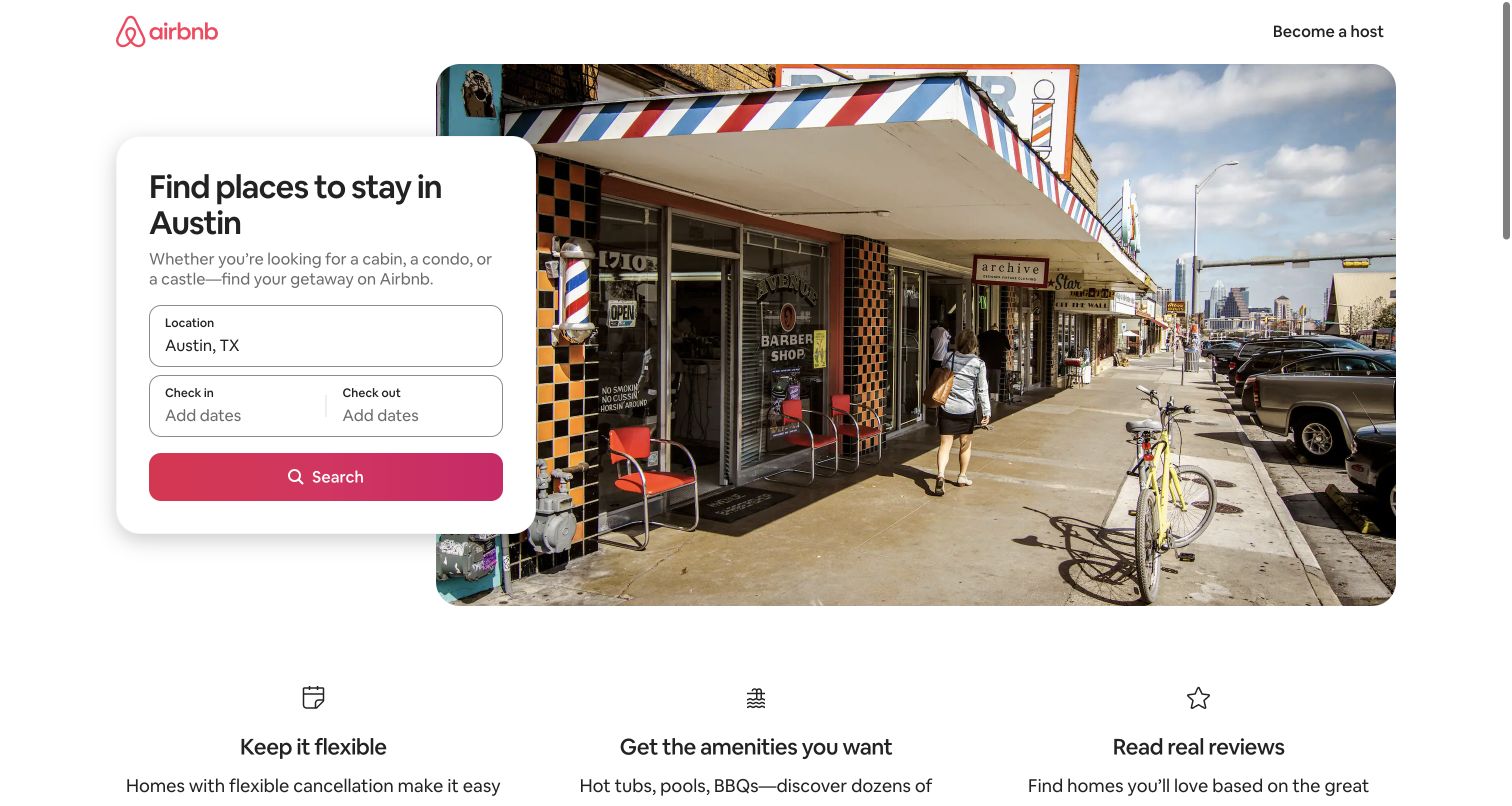
Airbnb’s Austin landing page combines a destination photograph with a compact search panel that overlaps its left edge. The photograph establishes place, while location and date fields define the practical next step. Three benefit explanations below broaden the page beyond a search box without competing with it. This is a genuine retained Austin public-page capture, with its original date. The historical Backbone evidence concerns public search and wishlist features, not proof that the pictured page or today’s booking flow uses that library.
What you can learn
A task-oriented landing page can establish context without making the visitor scroll past it. Keep essential inputs together, label their meaning clearly and place the result-producing action beside them. Treat the destination image as orientation, then ensure that empty, invalid and unavailable states receive equally careful design.
Pros
The overlapping panel gives the search task a distinct visual boundary and priority.
A specific destination image makes the page feel relevant before any interaction.
Cons & considerations
The large photograph leaves comparatively little first-screen room for alternative planning needs.
A static capture cannot establish availability, search behavior or the quality of booking recovery.
Platform source: Official historical Backbone showcase: Airbnb. Historical public search and wishlist features; retained Austin listings capture does not establish current Backbone runtime. Historical documentary association only. The official showcase says its list is not current. The captured public page is design evidence, not proof of the present runtime, private systems or other properties. Platform evidence is separate from the direct website screenshot and is not a complete current infrastructure audit.
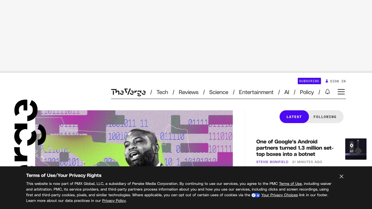
The Verge pairs an unusually expressive editorial identity with a compact, practical navigation bar. Its retained capture shows a large lead image on the left and a narrower stream of recent stories on the right. The first screen also includes substantial advertising space and a privacy notice, both of which affect how much journalism is immediately visible. The historical Backbone association is limited to public Chorus components documented for this property. It is not a current claim about the entire site or its publishing backend.
What you can learn
Editorial interfaces need a clear distinction between the featured story and the ongoing stream. Give each a recognizable structure, and account for advertising and privacy messaging when deciding how much content fits on arrival. A strong brand treatment works best when it does not obscure the reading choices beneath it.
Pros
The lead-story and latest-story regions provide two understandable modes of discovery.
Consistent accent color distinguishes interactive and commercial controls from editorial text.
Cons & considerations
The retained ad space and notice substantially reduce the usable first-screen reading area.
Expressive graphic elements require careful responsive handling to preserve headline clarity.
Platform source: Official historical Backbone showcase: Vox. Historical Chorus public commenting/liveblog features on named Vox Media properties; not current sitewide implementation. Historical documentary association only. The official showcase says its list is not current. The captured public page is design evidence, not proof of the present runtime, private systems or other properties. Platform evidence is separate from the direct website screenshot and is not a complete current infrastructure audit.
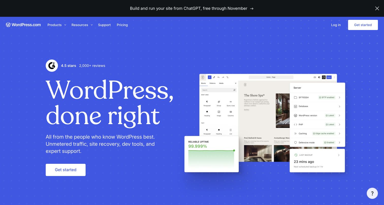
WordPress.com uses a broad blue hero to connect a publishing promise with a visible editing interface. The left side carries the message and a direct starting action; the right side demonstrates the product through overlapping interface panels. The restrained header groups product information separately from account access, while an announcement strip introduces an additional current offering. Its inclusion rests on a historical association with WordPress.com homepage and notification features, not proof of the current marketing implementation. It also says nothing about the technology used by independently operated WordPress websites.
What you can learn
A platform homepage should show what a person can make and explain the next step without collapsing every feature into one screen. Keep product previews readable enough to convey the workflow. Separate historical implementation evidence from current design analysis, particularly when a hosted service shares its name with a wider software ecosystem.
Pros
A product-interface preview makes the publishing proposition more concrete than abstract illustrations.
Clear separation between navigation, account access and the main action supports scanning.
Cons & considerations
Overlapping interface panels may be difficult to read at smaller display sizes.
An additional announcement competes with the core publishing message for early attention.
Visible tech stack
Earlier / documented evidence
Backbone.js
Platform source: Official historical Backbone showcase: WordPress.com. Historical WordPress.com notifications and homepage-feature association; not the current marketing homepage or unrelated WordPress sites. Historical documentary association only. The official showcase says its list is not current. The captured public page is design evidence, not proof of the present runtime, private systems or other properties. Platform evidence is separate from the direct website screenshot and is not a complete current infrastructure audit.
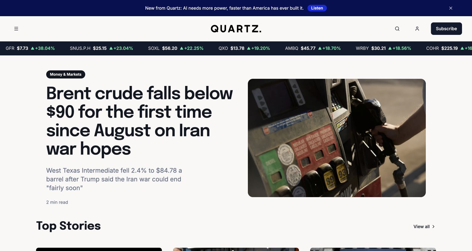
Quartz’s captured homepage uses a newspaper-like hierarchy with a strong lead headline, a prominent accompanying photograph and narrower supporting stories. A market strip above the masthead introduces a different kind of information without turning the whole page into a dashboard. Thin rules and a restrained palette separate editorial modules while leaving typography to establish priority. Backbone’s historical relationship concerns the publication’s content interface. The present screenshot demonstrates editorial organization only; it does not verify the current frontend or identify the system behind every module.
What you can learn
For a news product, define a small number of recurring visual roles: lead story, supporting item, latest update and contextual data. Keep those roles stable as content changes. Distinguish information that needs immediate attention from information that helps a reader decide where to go next, rather than making every card equally emphatic.
Pros
Different column widths and headline sizes establish a readable editorial order.
The market strip adds context without consuming the central story space.
Cons & considerations
Several simultaneous information streams can make the first screen feel dense.
The layout depends on disciplined headline lengths and reliable image cropping.
Visible tech stack
Earlier / documented evidence
Backbone.js
Platform source: Official historical Backbone showcase: Quartz. Historical public news website content interface; not proof of the current framework. Historical documentary association only. The official showcase says its list is not current. The captured public page is design evidence, not proof of the present runtime, private systems or other properties. Platform evidence is separate from the direct website screenshot and is not a complete current infrastructure audit.
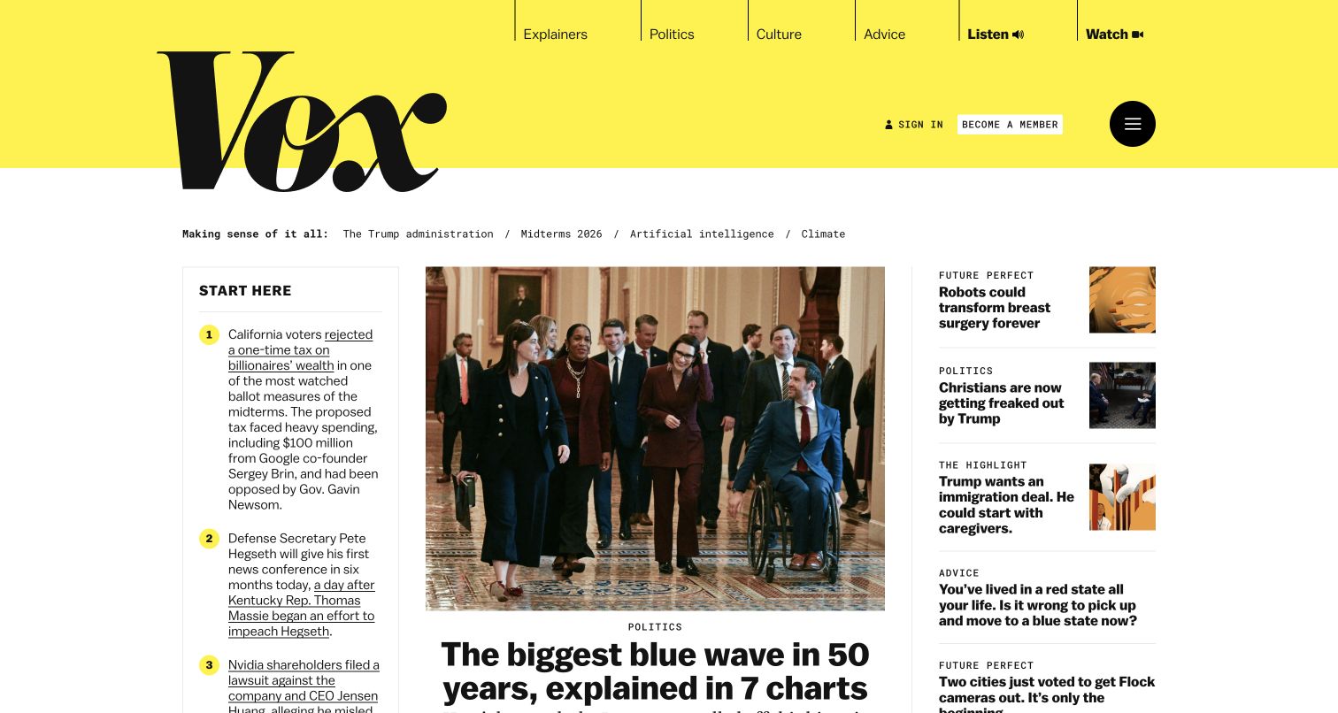
Vox places its large black wordmark on a yellow header, then moves into a three-part editorial arrangement. The central lead image carries the greatest visual weight, with a briefing area on one side and supporting stories on the other. Category labels and compact text groups help explain the role of each item without repeating the same card treatment everywhere. The historical Backbone association concerns public Chorus features and Vox Cards. The current capture is a design observation, not evidence that those earlier implementations remain in use.
What you can learn
A publication can serve both readers seeking explanation and readers seeking the latest story. Make those intentions visible in the layout. Keep recurring briefing content clearly labeled, and give a lead feature enough space to establish its subject without allowing it to erase the surrounding routes into the publication.
Pros
The memorable masthead establishes identity before the denser editorial material begins.
Distinct columns give briefing, lead coverage and supporting stories recognizable roles.
Cons & considerations
A three-column introduction requires careful prioritization when the screen narrows.
Multiple headline styles can increase scanning effort if the editorial hierarchy becomes inconsistent.
Platform source: Official historical Backbone showcase: Vox. Historical public Chorus features and Vox Cards; not current sitewide implementation. Historical documentary association only. The official showcase says its list is not current. The captured public page is design evidence, not proof of the present runtime, private systems or other properties. Platform evidence is separate from the direct website screenshot and is not a complete current infrastructure audit.
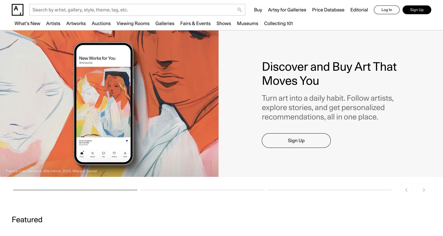
Artsy’s opening screen balances a large visual artwork presentation with a plain promotional panel and direct action. The image does much of the expressive work, leaving the adjacent text area calm and readable. Above it, search and a broad set of art-navigation choices support visitors with a more specific intention. Its historical Backbone association relates to the public art-discovery application. The direct capture does not establish the framework used by the current marketing area, transactions or any private collector tools.
What you can learn
For a visually rich collection, let strong imagery establish interest while retaining clear ways to search and narrow the field. Avoid placing essential labels over complex artwork. An expressive discovery experience still needs predictable routes, readable information and a clear distinction between browsing, learning and making a consequential purchase.
Pros
A spacious text panel keeps the main action legible beside visually complex art.
Search and category navigation accommodate visitors who arrive with a specific interest.
Cons & considerations
Extensive navigation can feel demanding before a new visitor understands the collection.
Large promotional imagery can delay the appearance of practical information about individual works.
Visible tech stack
Earlier / documented evidence
Backbone.js
Platform source: Official historical Backbone showcase: Art.sy. Historical public art-discovery web application; not current frontend attribution. Historical documentary association only. The official showcase says its list is not current. The captured public page is design evidence, not proof of the present runtime, private systems or other properties. Platform evidence is separate from the direct website screenshot and is not a complete current infrastructure audit.
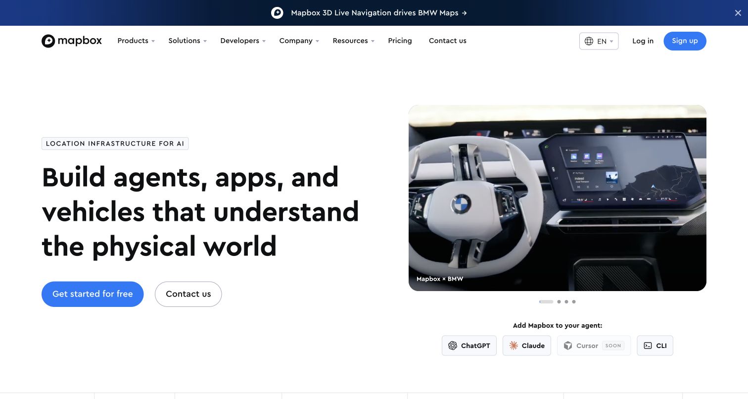
Mapbox’s captured homepage explains a technical platform through a large product-oriented statement and a substantial visual demonstration. The left column carries the main proposition and two clear actions; the right shows an automotive mapping context. A separate customer announcement introduces evidence of application without replacing the primary explanation. The official historical account specifically associates an earlier Mapbox homepage with Backbone. That older statement does not establish the current page’s framework, the implementation of the demonstration or the technology inside customers’ products.
What you can learn
A developer platform needs to connect a technical capability with a recognizable use case. Pair a concise explanation with a demonstration that shows why it matters, then provide separate paths for evaluation and documentation. Keep customer examples carefully scoped so an illustration does not become an unsupported architecture claim.
Pros
The paired text and demonstration connect a broad capability with a concrete context.
Two prominent actions accommodate different stages of a technical evaluation.
Cons & considerations
A broad platform proposition can require further reading before implementation boundaries become clear.
Moving demonstrations may compete with the introductory text for attention.
Platform source: Official historical Backbone showcase: TileMill. Official historical account explicitly identifies the Mapbox homepage as a Backbone app; not a current runtime claim. Historical documentary association only. The official showcase says its list is not current. The captured public page is design evidence, not proof of the present runtime, private systems or other properties. Platform evidence is separate from the direct website screenshot and is not a complete current infrastructure audit.
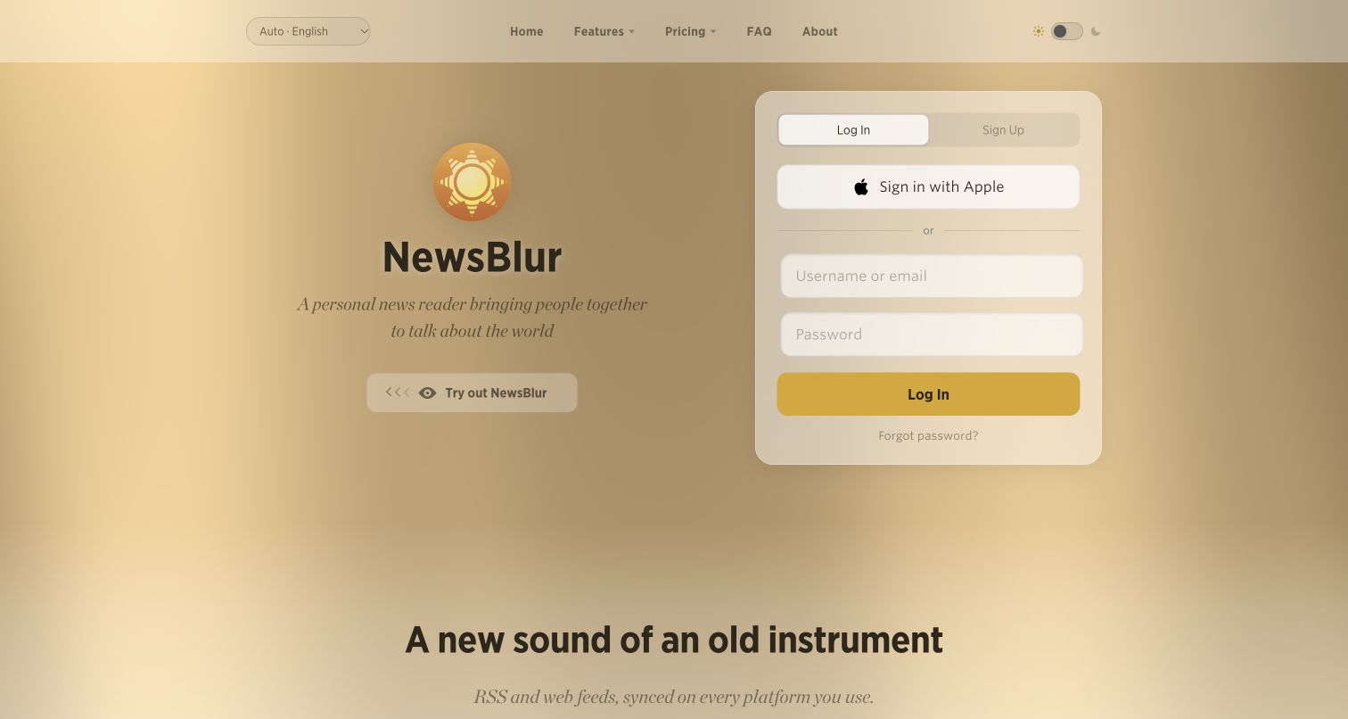
NewsBlur presents its identity and feature navigation against a warm gradient, with a clearly bounded sign-in panel on the right. The split gives returning readers a fast route into the product while preserving a public introduction for visitors who are still evaluating it. The page feels closer to an application entrance than a long promotional campaign. The historical Backbone association concerns the browser news-reader product. This logged-out screenshot does not inspect a user account or establish the current implementation of every visible component.
What you can learn
For a service used repeatedly, decide how the public entrance should balance explanation and return access. Keep the account boundary visually clear and make supporting information available without hiding the main task. Treat empty, loading and error states as part of the design rather than assuming a successful sign-in is the only experience.
Pros
A distinct sign-in region serves returning users without taking over the entire introduction.
The warm background gives a compact application entrance an identifiable visual character.
Cons & considerations
Gradient treatment can reduce the clarity of small text if contrast is not controlled.
A first-time visitor may need more concrete product explanation before choosing an account route.
Platform source: Official historical Backbone showcase: NewsBlur. Historical public browser news-reader application; not proof that every marketing element uses Backbone today. Historical documentary association only. The official showcase says its list is not current. The captured public page is design evidence, not proof of the present runtime, private systems or other properties. Platform evidence is separate from the direct website screenshot and is not a complete current infrastructure audit.
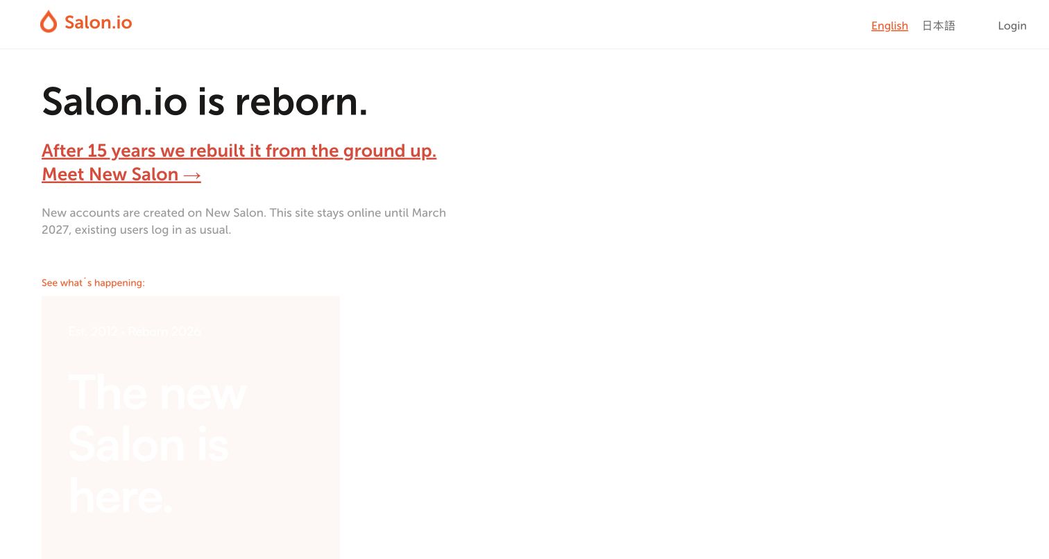
Salon.io’s captured page makes a service transition its leading message. A restrained header and generous white background frame an announcement about a rebuilt offering, with portfolio imagery beginning below. Orange accents identify the important update while the familiar logo and navigation preserve continuity. The Backbone evidence belongs to the historical portfolio frontend. The source now describes a separately rebuilt service, so this review does not attribute Backbone to that replacement or present the new capture as proof of continuity.
What you can learn
When replacing a public product, explain which experience is changing, how existing users are affected and where they should go next. Keep the transition message prominent enough to prevent confusion while preserving access to relevant examples. Maintain a clear distinction between the legacy service and the replacement in both copy and technical documentation.
Pros
The prominent announcement makes the service transition difficult to miss.
A minimal frame allows portfolio imagery to retain its expressive role.
Cons & considerations
A transition-focused introduction gives less immediate space to routine product evaluation.
Visitors need precise legacy and replacement labels to avoid choosing the wrong destination.
Platform source: Official historical Backbone showcase: Salon.io. Historical public portfolio-publishing frontend; source now announces a separate rebuilt service, so no current generator assertion. Historical documentary association only. The official showcase says its list is not current. The captured public page is design evidence, not proof of the present runtime, private systems or other properties. Platform evidence is separate from the direct website screenshot and is not a complete current infrastructure audit.
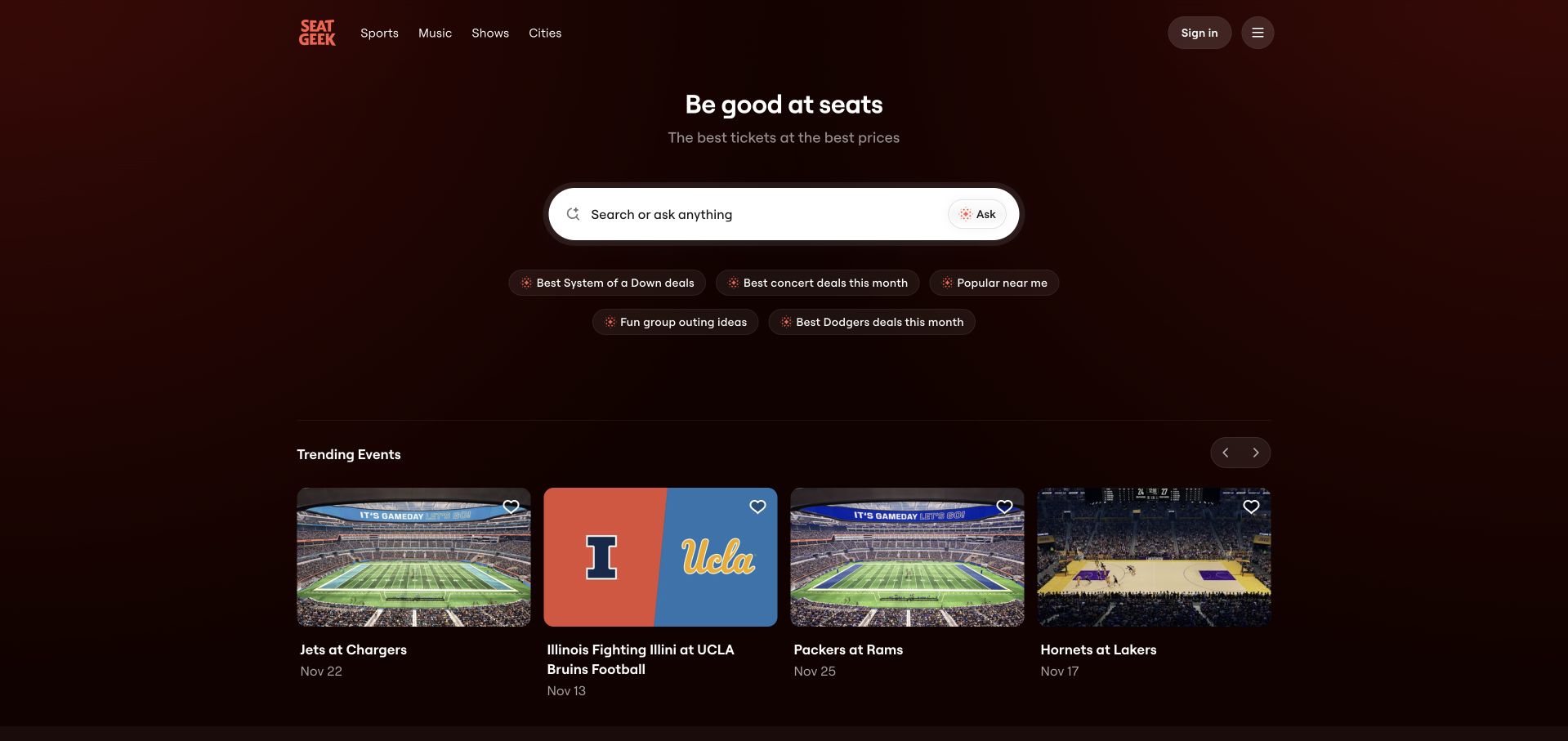
SeatGeek’s retained homepage capture puts a wide search field at the center of a dark, spacious opening screen. Suggested queries sit directly below it, helping visitors understand the range of requests they can make. Event cards provide a second route for people who prefer to browse, using photographs and concise labels rather than lengthy descriptions. The historical Backbone association concerns stadium ticket maps. Neither the screenshot nor the retained unavailable audit establishes the current map implementation, checkout behavior or private account technology.
What you can learn
A search-led marketplace should explain the breadth of its inventory through useful examples rather than an overloaded form. Place suggested queries near the input, then offer a distinct browsing route below. Keep exploratory actions separate from purchase decisions, and design clear recovery paths for missing results or ambiguous requests.
Pros
Suggested queries make an open-ended search field easier to understand.
Large event cards provide an alternative to typing without crowding the main task.
Cons & considerations
A large amount of introductory space may hide useful inventory below the fold.
Natural-language prompts need clear boundaries so visitors know what results to expect.
Platform source: Official historical Backbone showcase: SeatGeek. Historical stadium ticket-map interface; retained public homepage capture does not verify current map runtime. Historical documentary association only. The official showcase says its list is not current. The captured public page is design evidence, not proof of the present runtime, private systems or other properties. Platform evidence is separate from the direct website screenshot and is not a complete current infrastructure audit.
Earth Nullschool makes the data visualization itself the opening experience. The completed capture shows a luminous, color-coded globe against a black background, with minimal controls placed near the edges. There is no large promotional header separating the visitor from the object of interest. The retained image is the fully rendered state, not the earlier loading frame. Backbone’s historical association concerns this public weather visualization; its current appearance alone does not prove that the same runtime architecture remains in place.
What you can learn
When the visualization is the product, remove competing decoration and make controls available without covering the data. Explain colors, time and measurement context clearly when a person needs them. Plan for loading, incomplete data and unavailable layers, because a compelling final frame is only one state of an interactive information tool.
Pros
A nearly uninterrupted globe gives the visualization immediate focus and strong contrast.
Peripheral controls preserve space for the subject rather than competing with it.
Cons & considerations
Minimal initial labeling can leave new visitors unsure how to interpret the colors.
A static capture cannot convey motion, layer selection or the timing of displayed data.
Platform source: Official historical Backbone showcase: Earth. Historical interactive public weather globe; current implementation not inferred from appearance. Historical documentary association only. The official showcase says its list is not current. The captured public page is design evidence, not proof of the present runtime, private systems or other properties. Platform evidence is separate from the direct website screenshot and is not a complete current infrastructure audit.
Pitchfork’s captured homepage combines a black masthead with a white editorial field arranged into a lead feature and supporting columns. Large music photography establishes the subject quickly, while a latest-story area offers a more compact way to scan. The contrast between the header and content gives the publication a strong frame without making every card visually heavy. Subscription messaging remains visible as a separate commercial layer. The historical Backbone association concerns audio and navigation components. The present review evaluates the public layout only, without asserting that the current player, subscription system or complete frontend uses Backbone.
What you can learn
A media product can combine immersive imagery with efficient reading paths when it assigns each a clear role. Reserve the largest space for the lead feature, keep supporting items concise and make persistent audio or navigation controls predictable. Commercial messages should be recognizable without disrupting the continuity of editorial browsing.
Pros
Strong photography and differentiated columns establish a clear editorial hierarchy.
A compact latest-story stream supports readers who want to scan quickly.
Cons & considerations
Subscription messaging adds another competing layer to an already dense introduction.
Large images require careful cropping to retain meaning across narrower layouts.
Platform source: Official historical Backbone showcase: Pitchfork. Historical public audio-player and navigation components; not current sitewide runtime. Historical documentary association only. The official showcase says its list is not current. The captured public page is design evidence, not proof of the present runtime, private systems or other properties. Platform evidence is separate from the direct website screenshot and is not a complete current infrastructure audit.
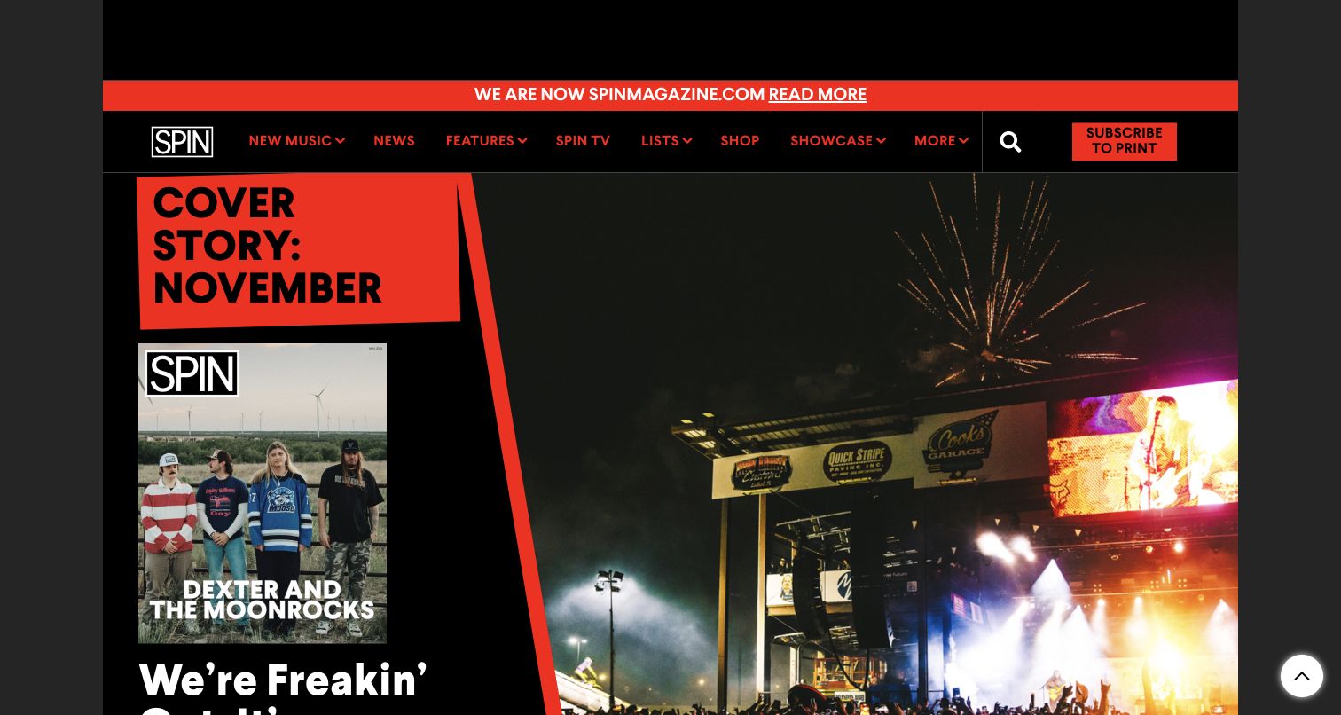
SPIN’s current public homepage combines a prominent red migration notice with a black-and-red editorial identity. Magazine imagery and a large concert photograph reinforce the publication’s music focus, while navigation separates news, features and other recurring formats. The notice is particularly useful because the captured destination is spinmagazine.com, rather than the domain named in the older technology showcase. SPIN’s own announcement documents that move. The Backbone association belongs to its historical news-feed and navigation components; the domain continuity is verified, but no claim is made that the present site retained that implementation.
What you can learn
A domain move should preserve the publication’s identity while explaining the changed address in plain language. Make the notice easy to recognize and keep core navigation familiar. Record the relationship between old and new properties explicitly, rather than treating a redirect or similar visual design as evidence that the underlying application stayed the same.
Pros
The migration notice resolves a potentially confusing change of public address.
Consistent music imagery and brand colors preserve a recognizable editorial identity.
Cons & considerations
A persistent announcement consumes space that could otherwise introduce current coverage.
Several strong visual elements compete for priority within the first screen.
Platform source: Official historical Backbone showcase: Spin. Historical SPIN news-feed and navigation association, before its documented February 2026 domain migration; current runtime unverified. Historical documentary association only. The official showcase says its list is not current. The captured public page is design evidence, not proof of the present runtime, private systems or other properties. Platform evidence is separate from the direct website screenshot and is not a complete current infrastructure audit.
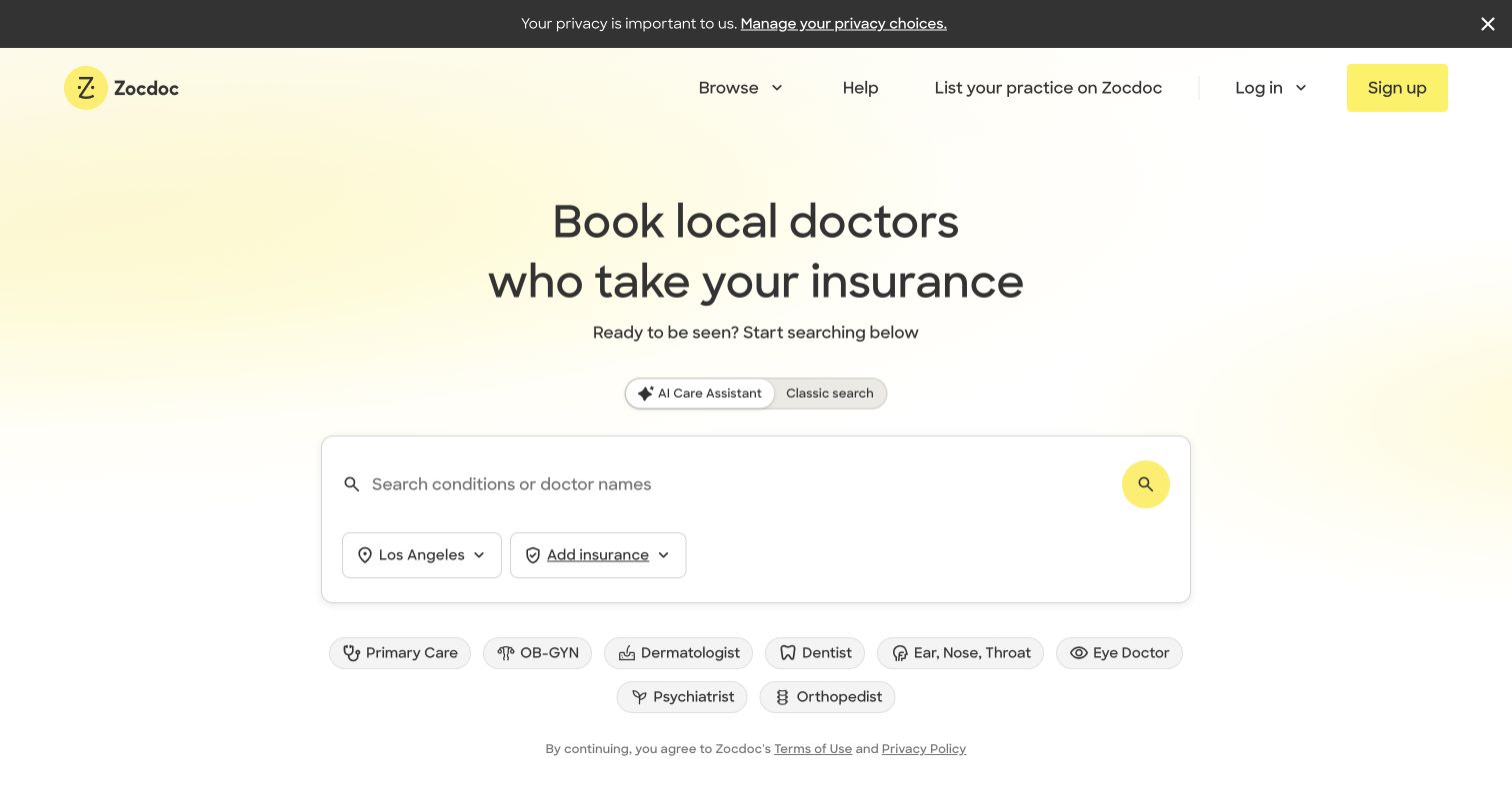
Zocdoc’s completed public-page capture centers a large search interface beneath a concise explanation of its purpose. The pale yellow background, dark text and generous spacing make the initial task easy to locate. Location and insurance controls sit inside the same bounded panel, while common categories appear below as alternative entry points. The historical Backbone association concerns public doctor search and profile features. This review does not inspect private patient information, verify healthcare outcomes or attribute the current assistant or provider systems to Backbone.
What you can learn
For a search involving several constraints, group related inputs and make their purpose understandable before someone begins. Separate search modes clearly, keep optional category shortcuts nearby and explain how missing information affects results. A simple opening screen should lead to equally clear validation and recovery, especially when users may be unfamiliar with the terminology.
Pros
The bounded search panel makes location and insurance context part of one task.
Category shortcuts give visitors a starting point when they do not know a name.
Cons & considerations
Two search modes require clear expectations about what each will return.
The privacy notice adds another reading layer before the main task begins.
Visible tech stack
Earlier / documented evidence
Backbone.js
Platform source: Official historical Backbone showcase: ZocDoc. Historical public doctor search/profile interface; no attribution of private provider or patient systems. Historical documentary association only. The official showcase says its list is not current. The captured public page is design evidence, not proof of the present runtime, private systems or other properties. Platform evidence is separate from the direct website screenshot and is not a complete current infrastructure audit.
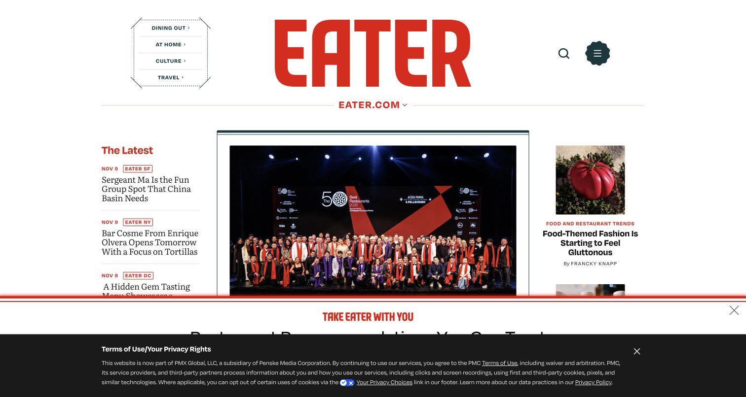
Eater’s captured homepage gives its large red masthead a central role, then organizes stories around a prominent lead photograph. A latest-story column on the left carries compact local labels, while supporting features occupy the right. The composition communicates both a national publication and a network of city-specific coverage. The actual capture includes an app promotion and privacy notice at the bottom, which reduce the visible editorial space. Its historical Backbone evidence concerns public Chorus components, not the current implementation or the publication’s present ownership structure.
What you can learn
When a publication spans many places, make geographic context visible within the story hierarchy rather than burying it in navigation. Give the lead feature room to establish its subject, but keep a compact route into local updates. Plan promotional and privacy layers together so they do not repeatedly cover the most useful content.
Pros
City labels provide quick context for the latest-story stream.
A strong central lead image makes the primary editorial choice unmistakable.
Cons & considerations
Two bottom overlays obscure a substantial part of the captured reading area.
An oversized masthead delays the beginning of the main editorial material.
Platform source: Official historical Backbone showcase: Vox. Historical public Chorus commenting/liveblog features on the named Eater property; not current sitewide implementation. Historical documentary association only. The official showcase says its list is not current. The captured public page is design evidence, not proof of the present runtime, private systems or other properties. Platform evidence is separate from the direct website screenshot and is not a complete current infrastructure audit.
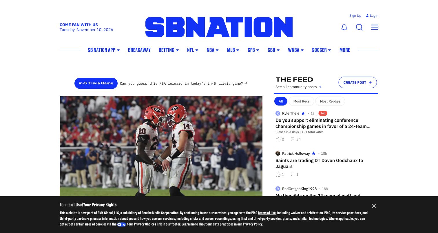
SB Nation’s public homepage places a vivid blue masthead above sport-specific navigation and a split editorial area. A large lead image occupies the left, while a community feed on the right exposes a different kind of participation. Tabs within that feed make its organization visible, and a create-post control remains distinct from ordinary reading. The captured privacy notice covers the lower portion of both columns. The historical Backbone association concerns public Chorus features and SB Nation Live. It does not establish the current feed implementation, moderation process, account system or any betting service linked from navigation.
What you can learn
A publication with community participation should distinguish editorial content from member contributions without making either difficult to find. Use clear labels, separate controls for reading and posting, and consistent treatment for discussion metadata. Keep consequential or third-party destinations understandable, and ensure notices do not conceal the context people need before interacting.
Pros
The separate community column makes participation visible alongside professional editorial coverage.
Sport-based navigation offers a straightforward route for visitors with a specific interest.
Cons & considerations
Dense navigation and discussion controls create several competing first-screen choices.
The retained privacy overlay obscures content across both major columns.
Platform source: Official historical Backbone showcase: Vox. Historical public Chorus features and SB Nation Live; not current implementation. Historical documentary association only. The official showcase says its list is not current. The captured public page is design evidence, not proof of the present runtime, private systems or other properties. Platform evidence is separate from the direct website screenshot and is not a complete current infrastructure audit.
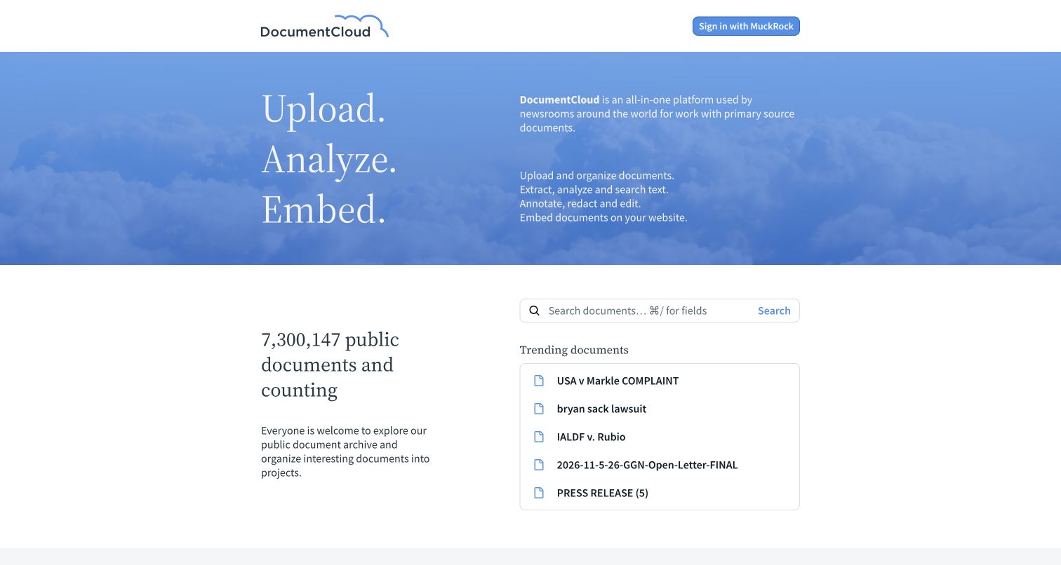
DocumentCloud introduces its purpose through three large verbs beside a concise explanation of the document workflow. A blue cloud background gives the upper section a recognizable identity, while the lower white area brings public search and trending documents into view. The split makes a useful distinction between understanding the platform and immediately exploring its archive. The historical Backbone association concerns the document workspace. This current public landing-page capture does not inspect private projects, validate uploaded documents or establish the implementation of today’s viewer and analysis tools.
What you can learn
A specialist information product benefits from explaining its workflow in a small number of concrete actions. Pair that explanation with a useful public entry point, then make the boundary between discovery and account-based work clear. Treat document context, provenance and access permissions as essential parts of the experience rather than decorative metadata.
Pros
A concise workflow explanation makes a specialist platform understandable to newcomers.
Public search is available without forcing the visitor through an account step.
Cons & considerations
A broad feature introduction leaves detailed workflow constraints for later pages.
Trending documents need clear context so prominence is not mistaken for verification.
Visible tech stack
Earlier / documented evidence
Backbone.js
Platform source: Official historical Backbone showcase: DocumentCloud. Historical document workspace and public viewer product; current frontend not verified by homepage capture. Historical documentary association only. The official showcase says its list is not current. The captured public page is design evidence, not proof of the present runtime, private systems or other properties. Platform evidence is separate from the direct website screenshot and is not a complete current infrastructure audit.
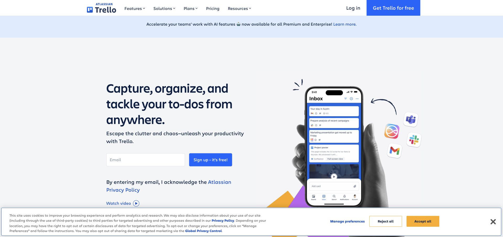
Trello’s retained public homepage pairs a large task-management message with a phone interface that demonstrates the product in context. The left column contains a short explanation and a clearly visible signup area; the right combines the device image with familiar integration marks. The captured cookie notice remains visible across the bottom and is part of the original state. Backbone’s historical association concerns Trello’s public board application. The marketing screenshot does not establish the current board runtime, mobile implementation or technology inside connected services.
What you can learn
A productivity product should make its central workflow concrete before presenting a long feature inventory. Use a legible interface demonstration, keep evaluation routes available and distinguish integration possibilities from guaranteed behavior. Explain what a person is signing up for without letting the registration form become the only way to learn about the product.
Pros
A recognizable interface demonstration connects the promise with an actual style of work.
Feature and pricing navigation remain accessible alongside the main signup path.
Cons & considerations
The large device composition leaves less space for detailed workflow explanation.
The retained cookie panel occupies a meaningful portion of the first screen.
Platform source: Official historical Backbone showcase: Trello. Historical public board application; the retained marketing capture does not establish current board runtime. Historical documentary association only. The official showcase says its list is not current. The captured public page is design evidence, not proof of the present runtime, private systems or other properties. Platform evidence is separate from the direct website screenshot and is not a complete current infrastructure audit.
Kegan has 15+ years of experience working with small businesses, Fortune 500 companies, and everything in between. No development job is too big or too small: he brings the same hands-on attention to a focused improvement, a complete website, or a custom application.
For Backbone.js projects, he can help with responsive interfaces, reusable components, custom functionality, API connections, and performance-minded implementation. He works directly with clients on scope, design, implementation, testing, and handover, with an emphasis on clear communication and a system that remains practical to maintain after launch.
Show 3 other Backbone.js developersHide other Backbone.js developers
Choose a Backbone.js approach around the application
Maintain an established application deliberately
For an existing Backbone application, begin with its actual code, dependencies, data contracts and support needs. Identify which screens are valuable and which failures cause confusion. Improve one coherent task at a time, preserving public routes and known integration behavior. Record how state moves between the interface and services, and identify the owners responsible for each boundary. A historical brand example can provide design context, but it cannot determine whether your own application should be retained or replaced.
Some public sites need a focused interactive component rather than a complete application rewrite. Define the feature’s data, controls and failure states, then decide how it fits into the surrounding page. Keep account and service permissions on the appropriate trusted boundary. Make the component usable without forcing unrelated content into the same structure. Explicit ownership and a limited scope make it easier to understand which part of a page needs to change when requirements evolve.
Plan a staged replacement when requirements justify it
A replacement should solve documented problems instead of merely changing the technology label. Inventory useful routes, content, integrations and user expectations. Decide which behavior must remain compatible and which can change. Establish a sequence that allows each important task to be checked against real requirements. Communicate transitions clearly, especially when an old and new service coexist. Salon.io’s public transition notice is a design example of that communication; it is not evidence that its replacement retained Backbone.
From references to requirements
Plan the complete public experience
Describe tasks with real content and exceptions
Collect representative stories, documents, search terms and other records before expanding the interface. Include missing images, long labels, unavailable results and expired information. Define what must be visible for someone to make a useful decision. Separate content requirements from visual decoration so the team can explain why each field and control exists. The first screen should introduce a coherent task, and later screens should preserve the context established there.
Map responsibilities and service boundaries
Record which system owns content, search, identity and persistent data. Explain what information may be public and what requires authorization. Decide how failures are reported without exposing private details. Public evidence about one component should never become an assumption about everything linked from it. A marketing page, an account application and an embedded service can have different implementations, owners and maintenance schedules even when they share a consistent brand.
Make verification and maintenance part of delivery
Check the actual paths people depend on, including direct URLs, navigation history, empty results and recoverable errors. Verify essential assets and content after release. Assign owners for dependencies, publishing changes and service monitoring. Preserve dated evidence so a later review can distinguish a new observation from a reused screenshot or historical association. A maintainable application is one whose team can explain both the successful task and what happens when a dependency fails.
A useful handover demonstration
Ask the actual team to carry out its routine job: publish a realistic update, correct a mistake, preview a narrow screen, and identify who owns an integration failure. For a library or frontend framework, also ask who maintains the content source and deployment. A polished screenshot does not answer those operational questions.
Beyond the screenshot
A practical Backbone.js project checklist
Identify the primary task and the information a visitor needs to complete it.
Define loading, empty, invalid, unavailable and successful states.
Keep important public destinations understandable on direct arrival.
Check back navigation, reload and meaningful filter or view URLs.
Document data ownership and the boundary between public and private services.
Keep interface components focused on a clearly defined responsibility.
Use realistic content lengths and missing-data cases during implementation.
Account for privacy notices, account prompts and commercial overlays.
Preserve useful routes and explain any transition between old and new services.
Assign dependency, content and release-verification ownership.
Test with real content, a keyboard, a small screen, slow or failed requests, and the people who will maintain the system. These are planning checks, not an accessibility, security, performance, or search-ranking certification.
Sources & editorial method
How this Backbone.js collection was reviewed
Twenty distinct public properties were reviewed for the original November 9 evening batch, with editorial work on November 10, 2026. Fourteen original direct browser captures and six unchanged earlier captures were visually inspected as source research. The official Backbone.js showcase supplies historical public-property or feature associations and explicitly cautions that its list is not current. Those documentary associations were reviewed on November 10; their historical implementation dates are not invented. Existing broad audit records retain their original dates, and fourteen newly encountered pages received one bounded broad audit attempt each. Blocked and partial outcomes remain recorded. The marketing screenshots do not verify private accounts, backend systems or current feature runtimes. SPIN’s domain move is separately documented; Salon.io’s rebuilt offering is explicitly excluded from the legacy Backbone claim. No forms, accounts, purchases, votes or messages were submitted.
Every image is an unmodified capture from the actual website, with its source and capture date. Some captures are reused from our shared catalog; their dates remain the original capture dates. None comes from a vendor gallery or a generated reconstruction. Moving imagery and live content can change.
Technology attribution uses public page assets or metadata, official platform documentation, or a cited first-party project case study. Documentary and framework-relationship evidence is identified where used; it is not a complete current backend inventory. A CMS image CDN alone does not establish a full CMS deployment. A library’s presence does not prove which individual controls use it, and a platform label does not establish AI authorship.
The composition notes, lessons, pros and tradeoffs are original editorial observations. We have not measured conversion, traffic, security, performance or accessibility conformance. Website owners retain their brands and imagery; these examples are not our client portfolio. Written, Edited and Curated are independent records, not dates advanced by a build. See our editorial standards or suggest a correction.
Questions worth asking
Backbone.js website development FAQs
Do all twenty examples currently use Backbone.js?
That is not established. The official showcase describes historical associations and warns that its list is not current. This guide keeps those associations separate from current public-page design observations and the narrower results of bounded source audits.
Does a marketing screenshot prove the product implementation?
No. A public landing page can use different technology from its linked application. The reviews identify the historical property or feature and do not attribute private accounts, mobile applications, payment systems or a complete backend from a screenshot.
Why include sites with newer frontend evidence?
A site can change its implementation while remaining useful to study. New public observations are retained alongside the earlier documentary association, with separate dates and scopes. Neither the current design nor an old case study is treated as a complete implementation inventory.
Should an existing Backbone application be replaced?
That decision needs evidence from the application’s requirements, dependencies, maintenance burden and operating behavior. Start with the problems people actually encounter. A staged improvement or replacement should preserve useful routes and integrations while solving those documented problems.
What do blocked broad audits mean?
They mean the bounded scanner could not establish a new public-source conclusion within its permitted access and request limits. Existing cited evidence remains qualified. No access control was bypassed, and a blocked result is not treated as evidence that a technology is absent.
Why do screenshot and evidence dates differ?
They describe different events. A screenshot records a particular visible state; a broad audit records its source observation; an editorial date records the review. An undated historical showcase can be read today without turning the implementation it describes into a current claim.
Borrow the clear tasks, durable destinations and thoughtful content hierarchy in these examples. Keep historical technology relationships accurately scoped, and choose an implementation from the requirements of the application you actually need to maintain.