Best Bookstore Websites of 2026 (15 Real-World Examples)
Bookstore websites that connect literary identity with finding a book
These 15 bookstore examples examine staff recommendations, title discovery, events, and the relationship between an online catalog and a physical shop.
A bookstore can introduce a point of view without making visitors work to find a title. Give search, browsing, and staff picks clear roles, then explain whether an online order is shipped, reserved, or collected locally.
City Lights is the editorial choice for connecting its literary character with featured books and shelf-based browsing. The useful lesson is that an independent voice becomes more valuable when it guides a concrete choice.
Before the examples
What makes good bookstore website design in 2026?
Make recommendations actionable
Pair a recommendation with the title, author, format, and a direct book page. Explain why the shop selected it instead of repeating publisher copy or presenting a cover image without context.
Connect digital and physical stock carefully
A catalog listing is not necessarily a promise that a copy is on the shelf. Label ordering, special orders, reservations, and pickup according to the shop’s actual process.
Give the shop a useful local presence
Publish hours, address, access information, and event arrangements alongside the editorial material. Readers should be able to plan a visit without interpreting a promotional carousel.
The collection · 15 examples
15 bookstore websites worth studying
Compare the examples by the visitor decisions they support. Each review identifies a specific pattern, practical lesson, strengths, and limitations in the directly inspected page.
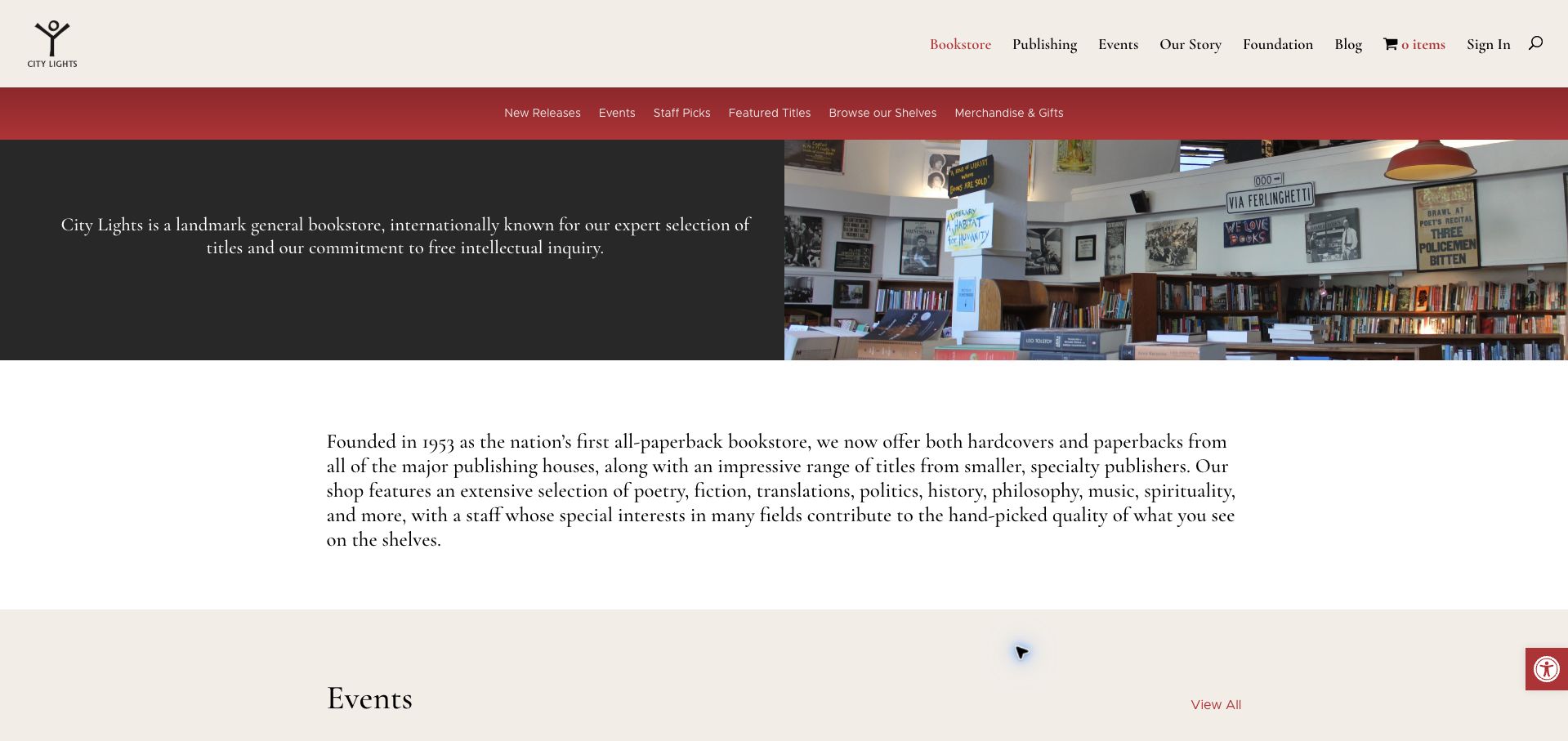
City Lights introduces its bookstore through a large photograph of the shop and a clear account of its literary character. Cream, red, and black give the page an identity that feels connected to printed books, while a second navigation row makes Staff Picks, Featured Titles, and Browse Our Shelves explicit destinations. The longer page connects that identity to actual books, events, merchandise, and practical visiting information. This is our editorial choice for making curation a visible part of the store rather than a generic product filter. The opening also has a cost: the large introductory treatment delays individual titles, and shoppers who arrive with a specific purchase in mind must use the search control or secondary navigation.
What you can learn
Let the shop’s point of view organize discovery, then connect that story to useful shelves. Keep a direct search route available for readers who already know the title they need.
Pros
Named editorial sections make browsing feel intentional.
The physical bookstore and online selection belong to one coherent identity.
Cons & considerations
The first viewport prioritizes introduction over individual books.
A long opening paragraph slows the route to product discovery.
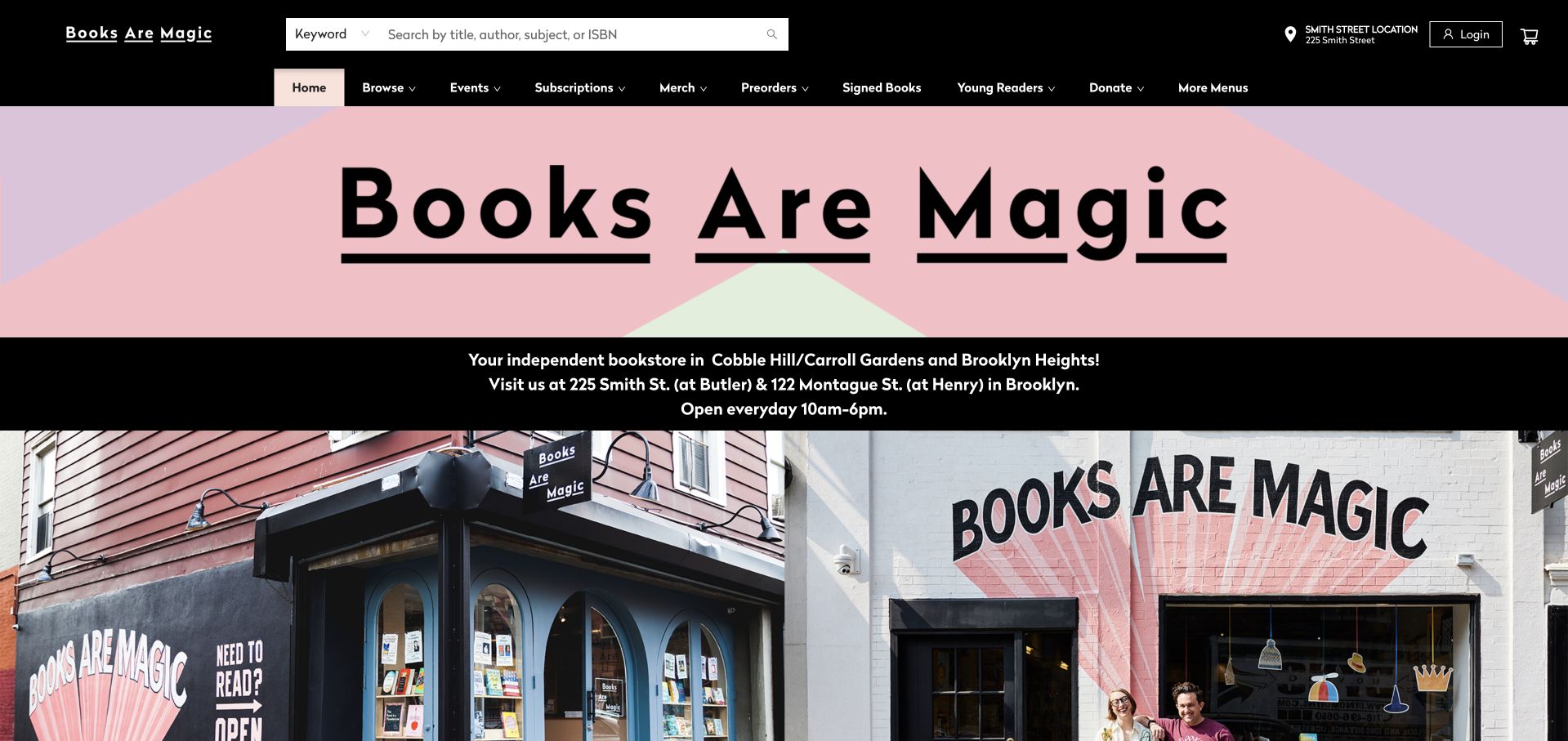
Books Are Magic places a large, playful wordmark above photographs of its two storefronts. Crucially, the addresses and opening hours sit near that introduction, so the imagery also helps someone decide which location to visit. A title, author, or ISBN search offers a direct shopping route, while signed books, young readers, and preorders give browsing a more particular shape. The page continues into dated events and staff selections rather than relying entirely on the visual brand. A newsletter overlay initially interrupted the visit and was dismissed for the capture. The oversized masthead and photographs also mean that readers need to scroll before reaching much of the actual catalogue.
What you can learn
When a bookstore has multiple branches, pair each location with its own practical details. Storefront photography becomes more useful when visitors can connect the image to an address and opening hours immediately.
Pros
Both locations receive prominent addresses and hours.
Specific browsing categories reflect the shop’s programming and selection.
Cons & considerations
The large opening treatment pushes book listings down the page.
A newsletter modal interrupts the initial browsing experience.
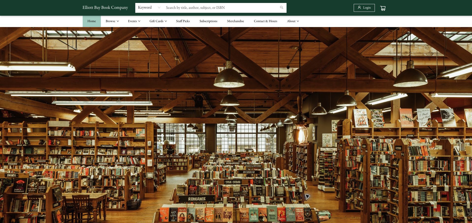
Elliott Bay Book Company uses a sweeping photograph of its timber-lined interior to establish the appeal of spending time in the shop. The compact green header keeps a title, author, or ISBN search accessible above that image, with staff picks, subscriptions, and practical information nearby. Further down, Booknotes, new releases, preorders, bestsellers, and events translate the physical atmosphere into online discovery. The photograph does most of the introductory work, which gives the opening considerable character but little explicit direction. There is no equally prominent hero message telling a first-time visitor whether to browse a selection, plan a visit, or explore an upcoming program.
What you can learn
Use an interior photograph to communicate a bookstore’s atmosphere, but give it a clear next step. An evocative room and a concise route to the shelves can support each other without adding visual clutter.
Pros
The interior photograph communicates a distinctive physical setting.
Prominent search supports visitors who already know their title.
Cons & considerations
The dominant photograph delays the curated book sections.
The opening lacks a clear action tied directly to the hero image.
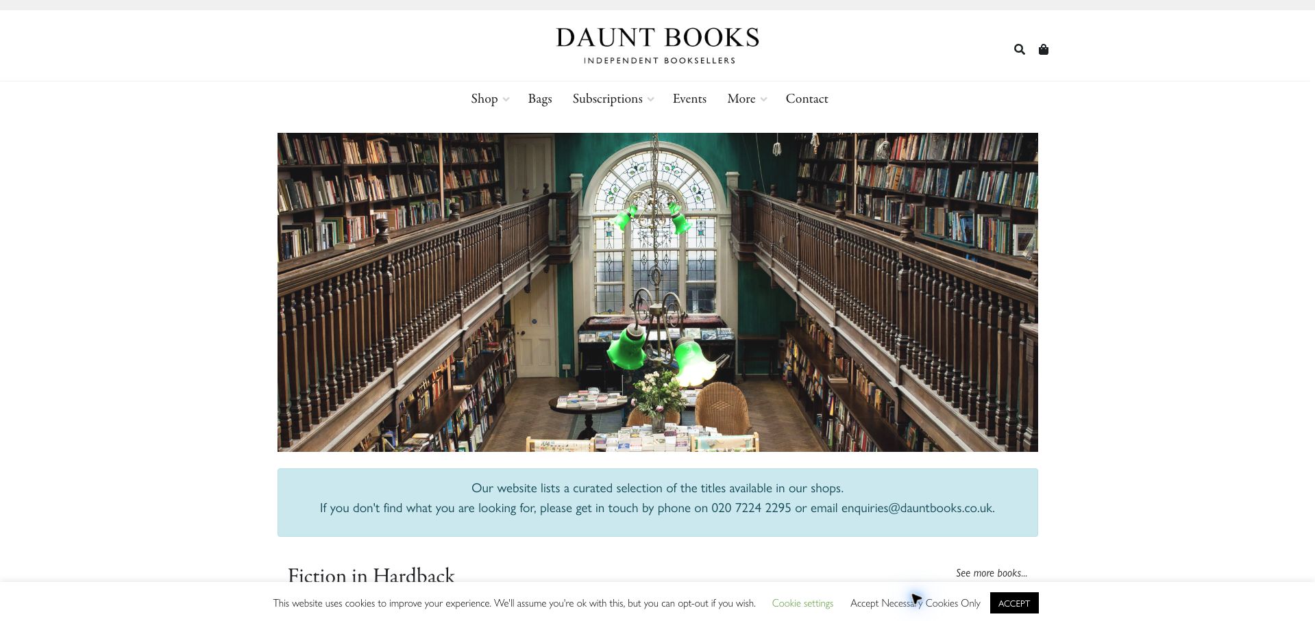
Daunt Books combines a restrained serif masthead with an expansive photograph of its shop interior. Beneath that atmospheric opening, a blue information box explains an important operational detail: the website carries a curated selection, and readers can contact the shop about titles they cannot find. That disclosure prevents the online catalogue from being mistaken for a complete account of the shelves. Genre sections, subscriptions, bags, and talks broaden the page beyond a single shopping journey. The clean visual hierarchy helps those sections feel related, although the initial image occupies considerable space. A small cookie bar remained visible in the captured view after the necessary-cookie choice, creating an additional layer at the bottom edge.
What you can learn
Explain the limits of online stock before a failed search becomes a lost customer. A concise catalogue note and a clear human contact route can preserve the value of a carefully selected online range.
Pros
The catalogue-scope notice answers a practical stock question.
The restrained typography complements the physical shop photography.
Cons & considerations
The opening image gives little immediate product-level information.
The persistent cookie bar competes with content near the lower edge.
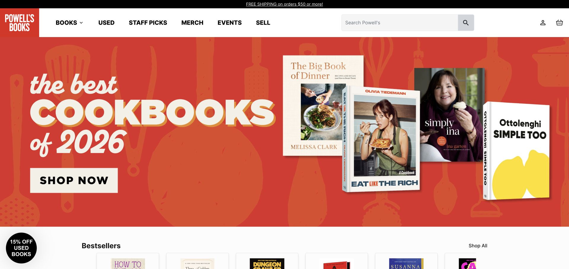
Powell’s leads the captured homepage with a large red cookbook campaign and a direct Shop Now action. Search remains prominent above it, and the primary navigation clearly separates books, used books, staff picks, merchandise, events, and selling books. That last distinction matters: a bookstore that buys as well as sells needs to make both journeys understandable. Product rows below the campaign provide a route back to individual titles. The opening is energetic and commercially clear, but the campaign takes most of the first viewport. A small used-book discount badge also competes for attention. Those observed promotions illustrate the page’s presentation, rather than a promise that the same offers will remain available.
What you can learn
Give each major bookstore task an explicit route, especially when buying used stock is part of the business. Keep promotional artwork subordinate to dependable search and catalogue navigation.
Pros
Used-book shopping and selling are distinct navigation choices.
The featured campaign has an unmistakable next action.
Cons & considerations
The large promotion dominates the initial view of the catalogue.
A floating discount badge adds another competing message.
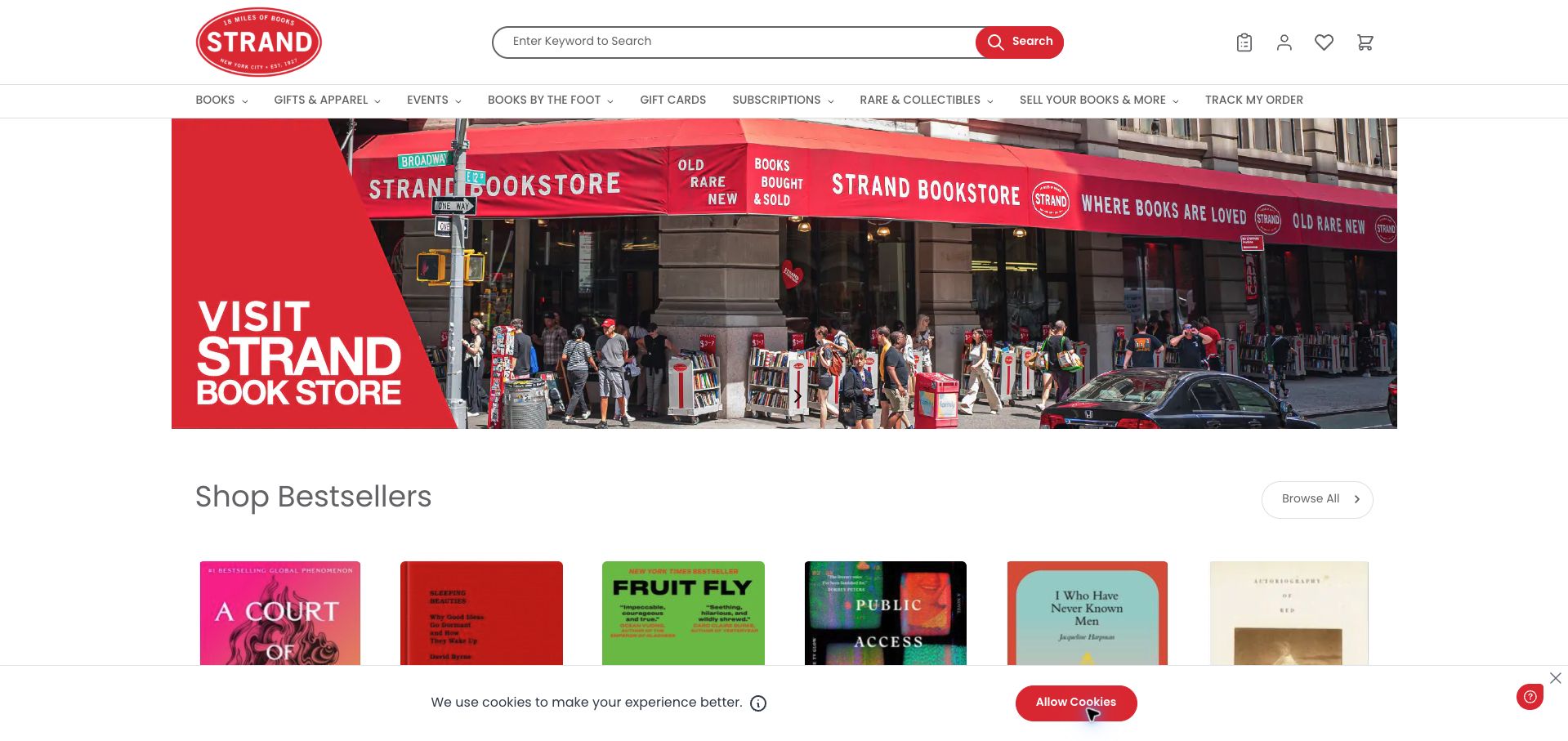
Strand combines a storefront-led promotional banner with a substantial search field and a clearly labeled Search button. The navigation acknowledges several different audiences: ordinary book shoppers, rare-book collectors, visitors, and people interested in selling their books or using Books by the Foot. A visible bestseller row starts the transition from those broad routes to individual covers. The design carries the shop’s red identity consistently, but the number of choices makes the header busy. Utility icons and specialist services share limited space, so a new visitor has to scan carefully. The captured page also retains a cookie notice across the bottom, partially covering the lower product area.
What you can learn
A large bookstore can support many audiences without giving every task equal visual weight. Make search the dependable anchor, group specialist services clearly, and reserve enough unobstructed space for book covers to begin the browsing journey.
Pros
The search field includes an explicit text-labeled action.
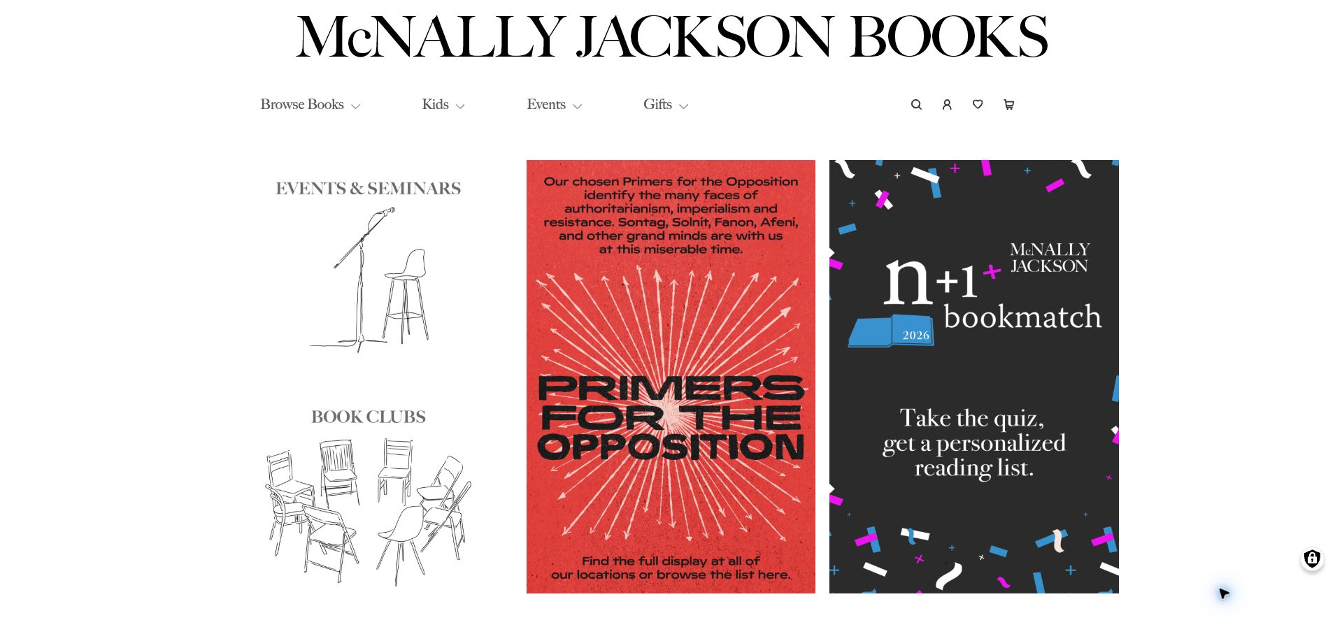
McNally Jackson opens with an oversized serif masthead and a small set of primary categories: browsing, children’s books, events, and gifts. The main content then uses three striking panels for seminars and book clubs, a themed reading selection, and a personalized book-matching offer. This makes the homepage feel like an edited reading agenda rather than a warehouse of covers. Weekly bestsellers, new and noteworthy titles, and location-specific events give that editorial framing a practical catalogue underneath. The strongest promotional panels rely heavily on words embedded in artwork, however, and the search route is an icon instead of a persistent field. Both choices ask more of a visitor who arrives with a precise task.
What you can learn
An editorial homepage should still make its basic shopping tools obvious. Use strong thematic selections to express taste, while keeping descriptive links and a visible search route available outside promotional artwork.
Pros
A small primary navigation keeps the broad journeys understandable.
Distinct editorial panels explain several ways to discover books.
Cons & considerations
Important promotional text is carried within images.
An icon-only search entry is less explicit than an open search field.
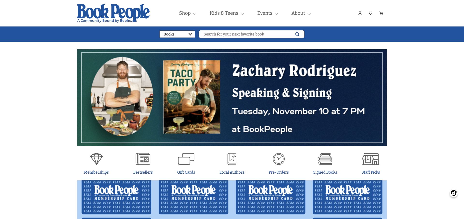
BookPeople’s blue header separates Shop, Kids and Teens, Events, and About, then supplies a search strip with choices for books, audiobooks, merchandise, and services. The captured hero promotes a dated author event, while a row immediately below offers recognizable shortcuts to memberships, bestsellers, gift cards, local authors, preorders, signed books, and staff picks. That sequence links the shop’s community life to concrete shopping destinations. Later event entries include dates and venue context, helping the page support an actual visit. The initial newsletter modal and cookie interface required dismissal, and the hero’s important event information is embedded in a large graphic. These layers make an otherwise useful structure slower to reach on arrival.
What you can learn
Let a featured event introduce the bookstore’s personality, then place durable shopping shortcuts directly beneath it. Keep dates and venue details available as readable text alongside any promotional graphic.
Pros
Search distinguishes several types of products and services.
The shortcut row exposes useful curated shopping routes early.
Cons & considerations
Multiple initial overlays interrupt the first visit.
The event hero depends heavily on text within artwork.
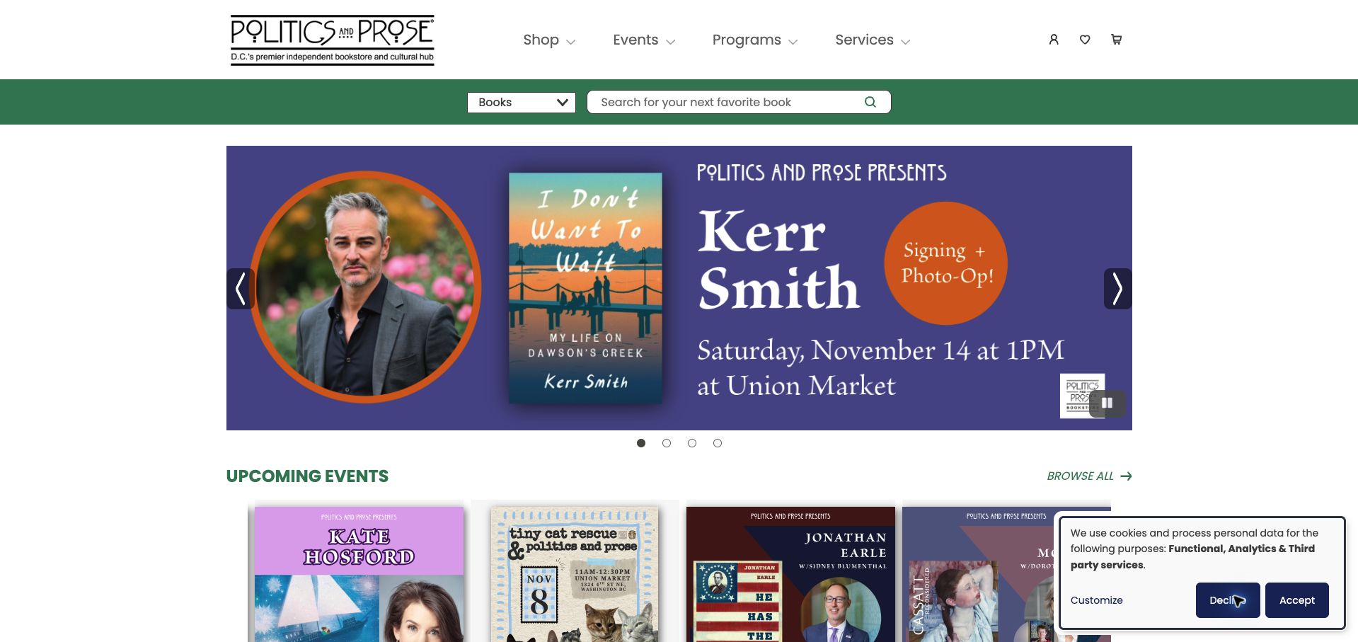
Politics and Prose uses a green search band and a concise navigation structure to connect shopping, events, programs, and services. A large author-event promotion anchors the captured homepage, with a dated Upcoming Events section beginning immediately underneath. That placement gives the shop’s public program a meaningful role in the browsing experience. Individual event descriptions identify branch venues or livestream context, which is especially important when one brand serves several locations. The hero includes visible pause and slide controls, giving readers some control over rotating promotions. Its scale still competes with the catalogue, and a small privacy notice occupies the lower corner of the captured screen.
What you can learn
For a bookstore with several venues, treat location as part of an event’s title-level information. A prominent program can encourage participation when the date, branch, and format stay clearer than the surrounding promotional artwork.
Pros
Upcoming events appear directly beneath the main promotion.
Visible carousel controls include a pause option.
Cons & considerations
The large promotional image delays ordinary book browsing.
Branch and format details require close attention across event entries.
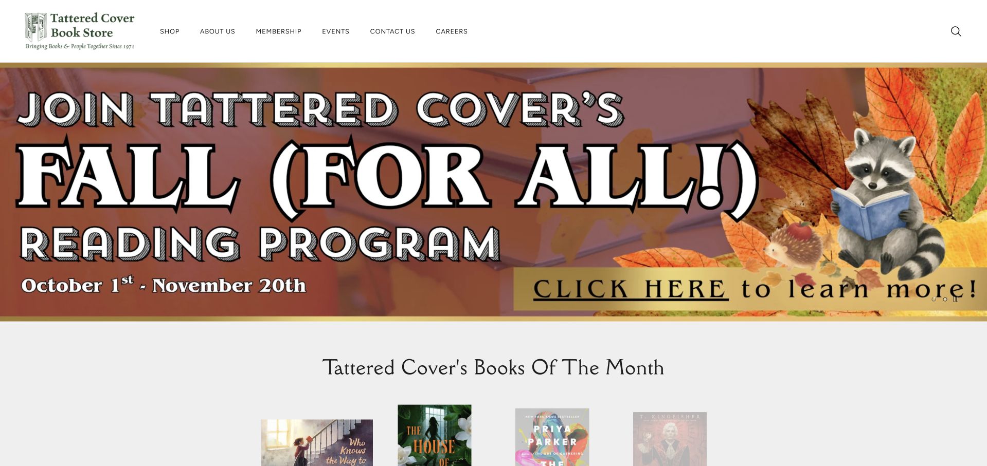
Tattered Cover keeps its header relatively restrained, using a small green identity and clearly named shopping, membership, event, and contact routes. The main visual treatment is much larger: a colorful seasonal reading-program banner fills the opening before the Books of the Month section begins. That sequence gives the campaign a tangible follow-through, since readers encounter named books, formats, and prices beneath the promotional message. Visible carousel dots and a pause control acknowledge that the main banner rotates. Search is represented by an icon at the far side of the header, so it is less immediate than the central campaign. The page is useful for studying how a regional bookstore balances a temporary reading initiative with repeatable recommendation modules.
What you can learn
Connect seasonal bookstore campaigns to a stable recommendation section. Readers should be able to move from the broad invitation to a specific title without having to interpret several unrelated promotional panels.
Pros
Books of the Month gives the campaign a concrete catalogue destination.
The header keeps major service routes plainly labeled.
Cons & considerations
The large banner consumes most of the opening viewport.
The small search icon is visually secondary to the promotion.
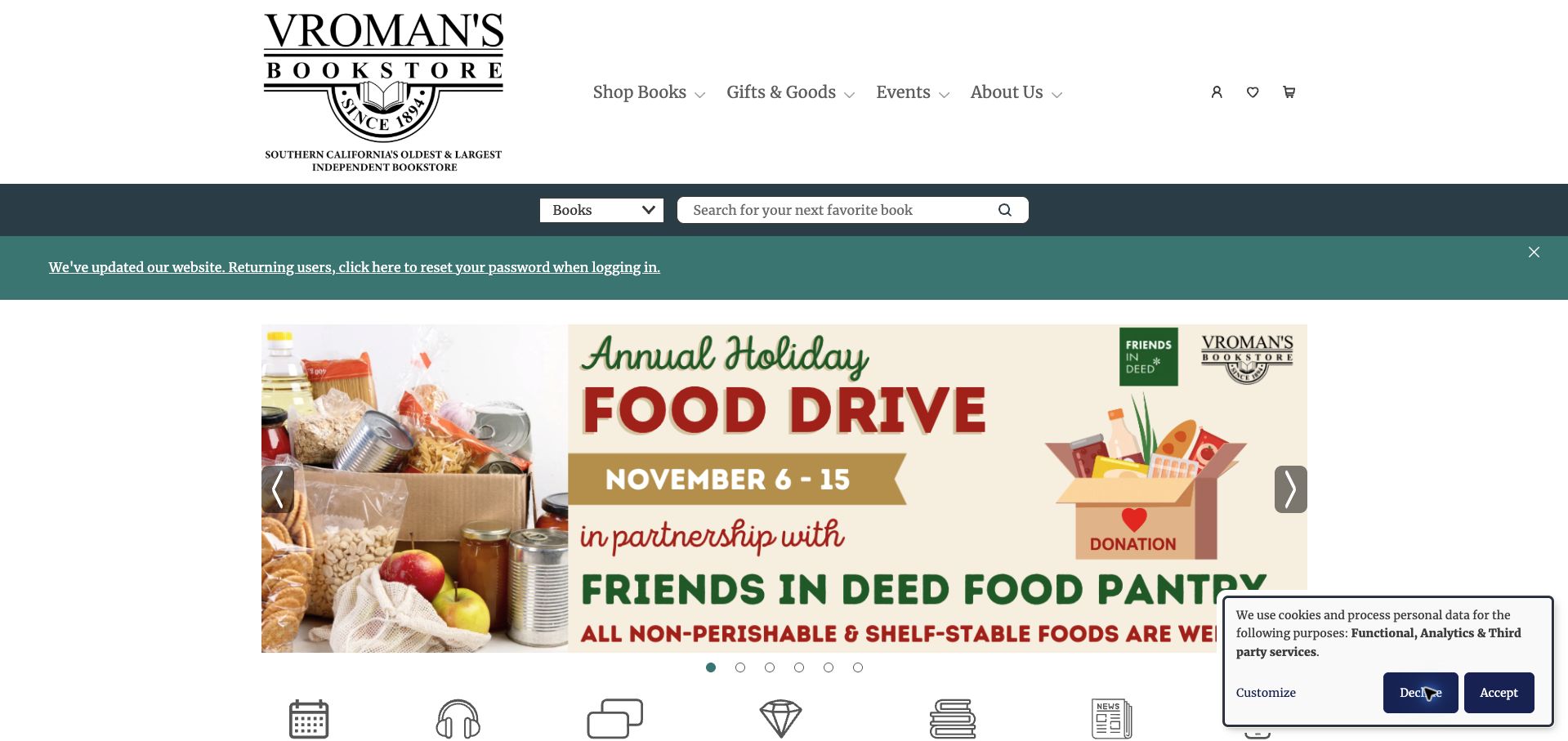
Vroman’s presents a large heritage wordmark above clear routes to books, gifts, events, and store information. A search band remains visible, followed in the captured page by an explicit website-migration notice for returning account holders. The main campaign then introduces a community food drive, and a row of shortcuts exposes events, audiobooks, gift cards, book clubs, and other services. This combination shows how a bookstore can function as both retailer and neighborhood institution. It also demonstrates the cost of stacking several important messages: the tall masthead, account notice, and campaign collectively push individual books well below the opening. The review concerns the visible notice; no account or password process was entered.
What you can learn
Operational notices deserve clear wording and a defined place, especially during a website change. Keep them concise enough that search, curated books, and community programming still form an obvious hierarchy.
Pros
The migration notice explains a concrete issue for returning users.
The service shortcut row exposes more than ordinary book shopping.
Cons & considerations
Several header and notice layers delay the catalogue.
Rotating campaign artwork requires careful labeling to remain understandable.
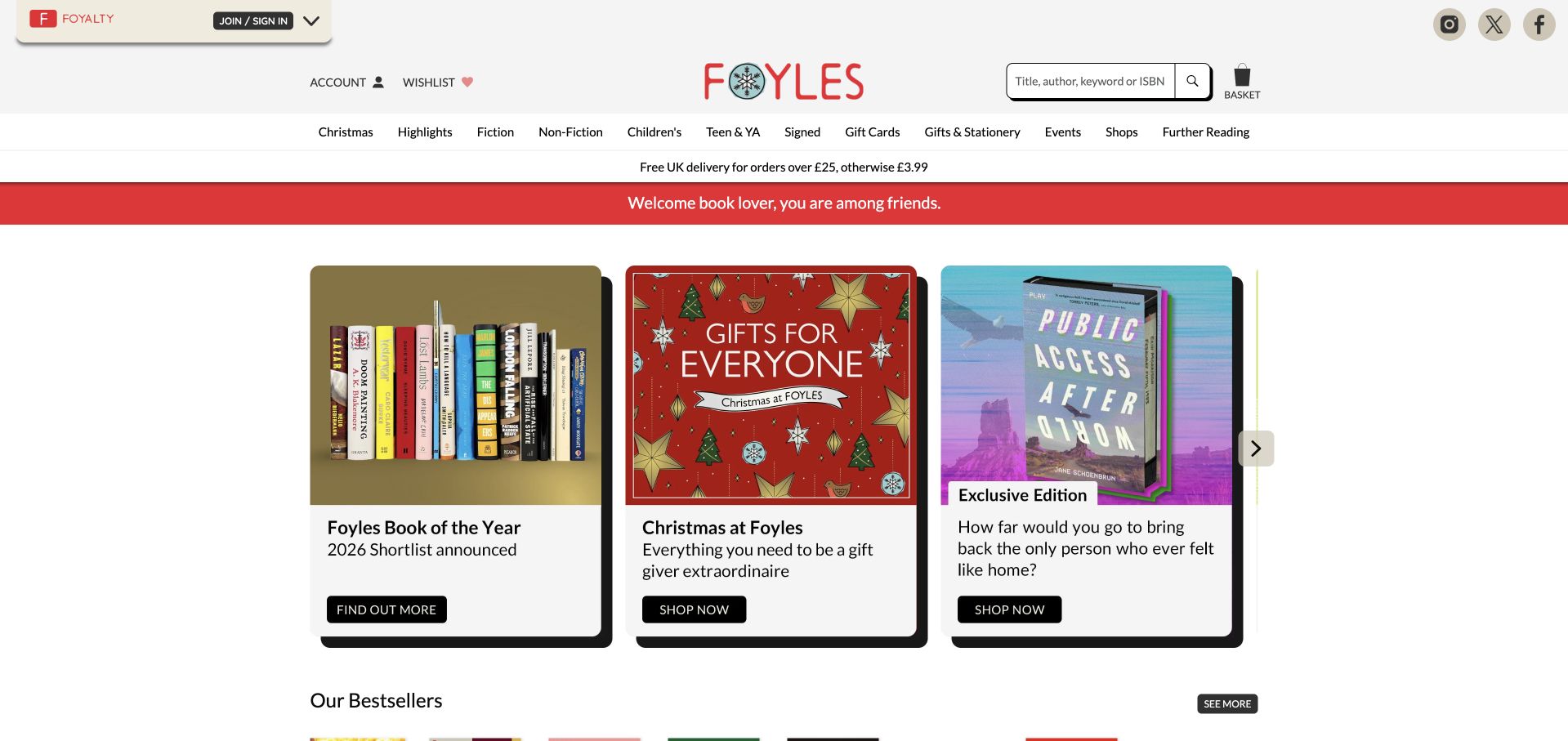
Foyles places three substantial promotional cards side by side, allowing visitors to see a literary shortlist, seasonal shopping, and an exclusive edition in the same opening view. Each card has a label and button, while strong black shadows make the panels feel distinct from the white page. The surrounding header supplies search, account tools, delivery and collection information, and a wide genre menu. This is a useful alternative to making one enormous campaign the only visible choice. The tradeoff is density: loyalty messaging, utility links, genre categories, and promotions all compete before the reader reaches individual books. Additional cards remain behind carousel navigation, so the visible trio is still only part of the selection.
What you can learn
A multi-card campaign area can communicate variety without forcing visitors to wait for rotation. Limit surrounding header layers so the cards’ labels and actions remain the clearest choices on the page.
Pros
Three labeled campaigns can be compared in one view.
Search and collection information remain available above the promotions.
Cons & considerations
Many utility and navigation layers make the opening busy.
Later promotional cards still require carousel navigation.
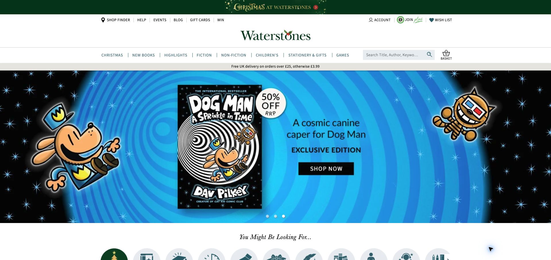
Waterstones surrounds its large book campaign with an extensive but recognizable retail framework. Store finding, help, events, a blog, gift cards, search, and genre navigation all have visible places in the header. The captured hero features a particular illustrated-book edition, and a category shortcut row begins beneath it. This arrangement supports shoppers who recognize the promotion while preserving routes for people with a different title or local-store task in mind. The layered header and delivery strip take considerable vertical space, however, and the rotating hero dominates what remains. The captured promotional wording describes the page at observation time; it does not establish continuing price or stock availability.
What you can learn
A bookstore campaign should sit within dependable navigation that survives each promotion. Keep store services and title search easy to locate, and use concise category shortcuts to reconnect the hero to broader browsing.
Pros
Store services and catalogue search are visible within the main header.
Category shortcuts begin directly below the featured promotion.
Cons & considerations
Several header rows reduce the space available for books.
The rotating hero makes the opening heavily dependent on one campaign.
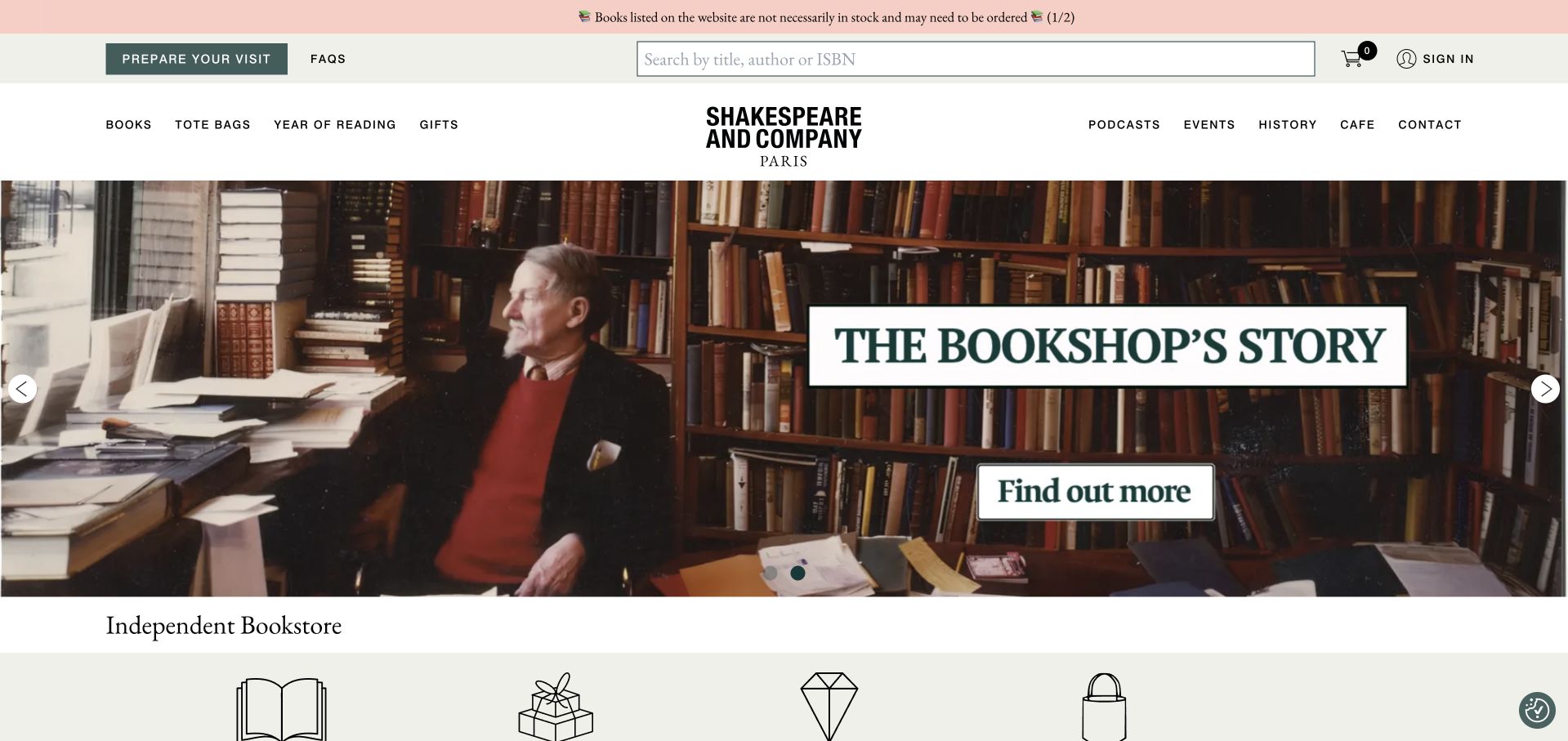
Shakespeare and Company balances its literary identity with unusually explicit practical information. Prepare Your Visit sits beside a large title, author, or ISBN search, while navigation separates books and gifts from events, podcasts, history, and the café. The captured carousel shows the bookshop’s story through an atmospheric photograph, then the page continues into curated titles, subscriptions, rare books, and staff selections. A notice also explains that listed titles are not necessarily in stock, preventing the catalogue from implying immediate availability. The page offers considerable depth, but its many sections create a long browsing journey. The large rotating artwork also gives less immediate product detail than the clearly structured listings further down.
What you can learn
A destination bookstore needs to answer visiting and shopping questions at the same time. Put stock limitations and visit planning near the top, then let history and curation deepen the experience without obscuring those practical routes.
Pros
Visit planning and catalogue search are both prominent.
The stock notice sets a useful expectation before ordering.
Cons & considerations
The long homepage asks visitors to scan many distinct sections.
Large rotating artwork delays individual book information.
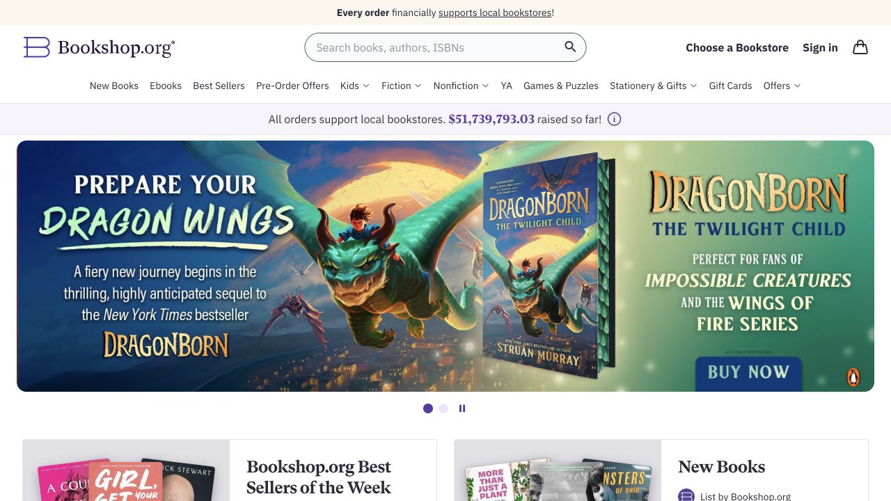
Bookshop.org makes its relationship with local bookstores visible before the main promotion. A support message appears above the header, a cumulative contribution figure occupies a separate strip, and Choose a Bookstore sits beside the prominent title, author, or ISBN search. The captured page then introduces an illustrated-book campaign with a clear purchase action, followed by bestseller and new-book panels. The structure gives an online marketplace a specific purpose while retaining familiar retail navigation. Its impact figure is a dated display in the preserved capture, not a current independently audited total. Repeated mission messaging and a large campaign consume much of the first screen, so individual titles remain secondary until the reader scrolls.
What you can learn
Explain the marketplace’s purpose where shoppers choose their route, then make the associated action explicit. A visible bookstore-selection link connects a broad mission to something the visitor can actually do.
Pros
The bookstore-selection route sits beside central search.
The mission is connected to recognizable shopping categories.
Cons & considerations
Repeated support messages use space above the catalogue.
A dominant campaign delays the individual book listings.
Kegan is a freelance web designer and developer with 15+ years of experience helping businesses turn complicated website requirements into clear, maintainable digital experiences. He works directly with clients from planning and design through development, launch, and ongoing support.
For bookstore website design, his development approach focuses on book discovery, staff recommendations, event information, fulfillment explanations, and maintainable catalog connections. The scope can be a targeted improvement or a complete custom build, with responsive layouts, thoughtful content structure, and integrations chosen around the people using and maintaining the site.
Show 3 other bookstore website designersHide other bookstore website designers
Decide which system owns titles, editions, prices, availability, and fulfillment. Test multiple editions of one book and an out-of-stock title before deciding how search results should look.
Plan the editorial rhythm
Assign staff picks, reading lists, and event announcements to named editors. Remove expired booking actions while preserving useful event history. Give lists meaningful themes rather than duplicating the whole catalog.
Rehearse a local purchase journey
Check discovery, edition selection, pickup explanation, and store details on a phone. If another platform completes ordering, carry the book context across and explain the change of destination.
The editing job behind the design
Choose systems the team can keep accurate
Use a maintained book catalog or commerce connection for transactional facts and a flexible publishing system for staff recommendations. Avoid manually duplicating prices and availability across promotional pages.
Keep event tickets, mailing-list signup, and general inquiries separate. Each action should explain its purpose without requiring an account simply to discover the store.
Our WordPress website examples offer a separate look at publishing approaches. A visible platform label is evidence for that named page, not a guarantee that the same system will suit your requirements.
Before the public launch
Website planning checklist
Expose title and author search.
Identify editions and formats.
Explain availability labels.
Separate pickup from shipping.
Show staff recommendations in text.
Maintain event dates.
Publish shop hours.
Label external checkout.
Test long book titles.
Assign an editor to expired promotions.
These checks are a project checklist, not a performance, legal, security, or accessibility certification. Test real journeys with the people responsible for the website before making claims about the result.
Sources & editorial method
How this collection was selected and reviewed
These 15 examples match the collection target saved before research. Public pages were directly opened and visually inspected; the pictured source and capture date identify the reviewed state. Reused captures retain their earlier dates. Each source also has a bounded public stack-audit attempt, with inaccessible and unknown results kept explicit. Editors Choice recognizes website design and information, not service quality or promised outcomes. No purchases, bookings, applications, or private forms were submitted. Images and trademarks belong to their owners.
Each example links to its actual source page. Screenshots are direct browser captures with their own capture dates; moving imagery, announcements and live designs can change. The notes describe observable design choices and conditional tradeoffs, not measured traffic, conversion results, service quality, or accessibility conformance.
Technology labels use public page metadata, asset evidence, or explicitly cited platform documentation. Platform documentation is not a complete current deployment audit. A component reference may be legacy or unused; it is not a complete backend inventory. Unknown stacks are omitted. These sites are editorial examples, not our client portfolio.
Written, Edited and Curated are separate editorial records, not timestamps advanced by a rebuild. Website designs and imagery belong to their owners. See our editorial standards or suggest a correction.
Questions worth asking
Bookstore website design questions
What should lead a bookstore homepage?
A useful combination is book discovery, a small current selection, and a clear shop-visiting route. Choose the emphasis according to whether most customers order online or visit locally.
Does every bookstore need its own checkout?
No. A clear handoff to a suitable catalog or ordering partner can work when fulfillment and the shop relationship are explained accurately.
How should staff picks differ from categories?
Staff picks explain a considered recommendation. Categories organize the catalog. Let visitors use both without making recommendations the only route to finding a known title.
Can events remain after their date?
Yes, as clearly labeled past events with useful context. Remove or disable expired registration actions so an archive cannot look like a current booking offer.