Best Commercial Real Estate Websites of 2026 (29 Real-World Examples)
Commercial real-estate websites that connect property searches, local expertise and service information without losing sight of the visitor’s actual task.
Compare 29 real commercial-property websites, from regional brokerages to global advisers and diversified developers. Study how they organize available space, people, markets and research.
A commercial-property homepage can serve a tenant looking for space, an owner considering representation, an investor researching a business and a person trying to find a particular broker. Those visitors may share an interest in the same building while needing very different information.
This collection looks at the public design choices that help separate those journeys. Some examples are inventory-led regional brokerages; others are corporate gateways, specialist advisers or developers. The reviews preserve those distinctions and assess presentation, navigation and useful next steps rather than property values, investment suitability or professional-service outcomes.
Before the examples
What makes good commercial real estate website design in 2026?
Connect the market to the next step
Name the actual territory and property types early. A regional brokerage can often move directly into inventory, while an international adviser may need a country or office choice first. Each routing step should resolve a real difference in service or content rather than simply adding a corporate-looking layer.
Make listing information comparable
Use consistent labels for sale or lease, location, area and asking terms. Keep photographs attached to the property they show, distinguish available inventory from completed transactions, and explain when details need confirmation. An attractive card is useful only when its information can be maintained.
Separate research, services and people
Market reports can support an advisory brand, but they should not replace direct property and contact routes. Give reports dates and scope, describe services in ordinary language, and help visitors reach the relevant local team without interpreting a global campaign headline.
The collection · 29 examples
29 commercial real estate websites worth studying
Compare property-search controls, audience routes, market selectors, broker directories and editorial features across these 29 source pages. The Editors Choice is a website-design selection, not an endorsement of brokerage services or investment opportunities.
The Dunham Group grounds its homepage in a recognizable waterfront view and an explicit Maine commercial-property focus. The large photograph establishes place, while the next section turns that context into a practical search by property type, town and sale or lease. Featured listings then supply the details needed to compare opportunities, including location, area and asking terms where published. Broker and market-report routes sit alongside that inventory rather than replacing it. The useful quality is the connection between a regional identity and specific browsing tools: visitors are not asked to interpret an abstract corporate promise before reaching the stock the firm represents.
What you can learn
Put the actual territory and search task close together. A regional brokerage can make a stronger introduction with a useful inventory and clear local context than with an elaborate international-style navigation system.
Pros
Town and transaction filters reflect concrete commercial-property decisions.
Listing cards provide more useful context than unlabeled building photographs.
Cons & considerations
The large opening image still pushes the search below the initial headline.
Published asking terms and availability require an assigned maintenance process.
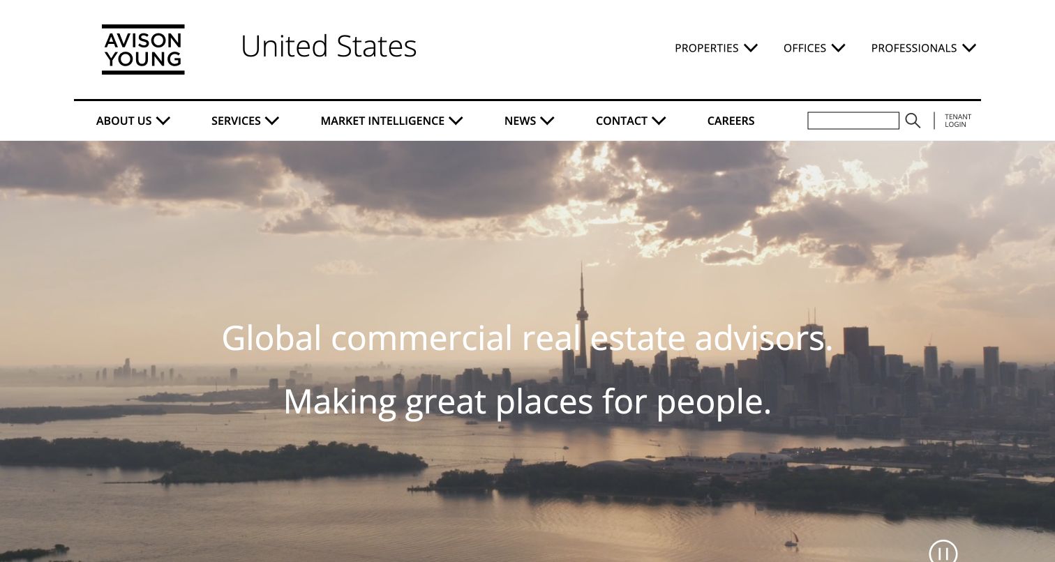
Avison Young uses two levels of white navigation above a broad city image. Properties, offices and professionals are given a distinct utility row, while services, market intelligence and company information occupy another. The country label establishes the scope of this particular website before the visitor reaches the large commercial-advisory message. That structure is more instructive than the cinematic background itself. A tenant searching for space, an owner seeking a service and someone trying to find a named adviser can begin with different labels. The opening remains brand-led, but its permanent navigation supplies a practical counterweight to the broad statement.
What you can learn
Organize navigation around both the object being sought and the service being considered. Keep the selected market visible, particularly when similar global and national websites could otherwise send a visitor to the wrong office.
Pros
Properties and professionals are independently discoverable in the header.
The market label gives the visitor useful geographic context.
Cons & considerations
Two navigation rows demand careful prioritization on smaller screens.
A moving city scene provides little detail about a particular available property.
Kidder Mathews places a large serif message over a darkened architectural photograph, with a gold accent that carries through the presentation. The unusually useful part of the first screen is its framing: boxed links to professionals and properties appear above, while a horizontal service bar sits below the hero. These stable routes keep the image from becoming a dead end. Company, research and location links remain available in the header, but are visually quieter than the two common discovery tasks. The composition gives a broad real-estate-services firm a recognizable identity without making visitors wait for a carousel to expose the category they need.
What you can learn
If the opening is primarily a brand statement, give it persistent task links at its edges. The property search and adviser directory should remain available regardless of which photograph or campaign occupies the center.
Pros
Property and professional discovery receive clear, separate entry points.
The lower service bar adds useful structure to an otherwise atmospheric hero.
Cons & considerations
Text over photography needs contrast across every image state.
Several header and service choices can compete if their labels are not tightly edited.
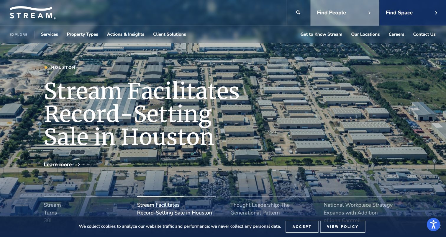
Stream Realty Partners leads with a named transaction story over an aerial industrial-property image. A location label gives the feature context, and the large headline makes the current story the focal point. Find People and Find Space remain conspicuous in the header, which is important when an editorial success story is not the visitor’s immediate reason for arriving. Story selectors beneath the feature signal that the lead content changes. In the captured view, a small cookie notice remains along the bottom. The transferable idea is a specific, place-based feature supported by permanent discovery tools, rather than a sequence of unsupported statements about expertise.
What you can learn
Connect a transaction feature to a real location and an understandable story, but keep the property and team routes independent of that campaign. Do not make a visitor read a press release merely to begin searching for space.
Pros
The location label makes the featured project less anonymous.
People and space use plain task-oriented labels in the header.
Cons & considerations
An industrial feature may not match the needs of an office or retail visitor.
Large rotating stories need readable controls and a stable alternative route.
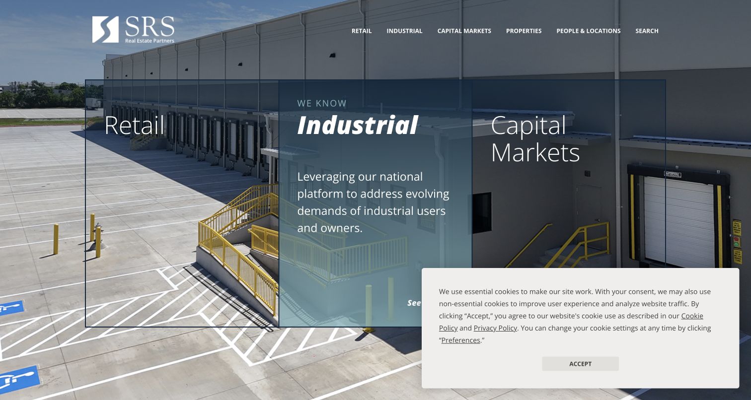
SRS Real Estate Partners divides its opening into large labeled areas for retail, industrial and capital markets. The industrial state shown in the capture uses a warehouse scene behind its supporting copy, connecting the category to a recognizable property type. A conventional white header provides the surrounding company navigation. This approach gives several business lines comparable prominence without requiring a long paragraph to explain the organization. The public page also offers property-search routes and sale or lease distinctions. A privacy panel covers part of the lower-right area in the captured first visit, illustrating how overlay placement can affect an otherwise carefully arranged set of choices.
What you can learn
Use a few strongly differentiated service entrances when the business genuinely has separate audiences. Keep the labels visible in every state, and test the composition with real consent notices present rather than only an empty preview.
Pros
The three major categories are easy to compare at the same level.
Property imagery supplies a direct visual cue for the active service.
Cons & considerations
A large privacy panel can obscure lower content and actions.
Broad division labels still need specific service and inventory pages behind them.
Colliers places its featured location-strategy report in a blue card over a wide workplace photograph. Because the headline and action sit on an opaque surface, their readability does not depend on the changing detail in the image. Small numbered selectors acknowledge the rotating feature, while a lower strip introduces further news or property content. The header remains compact and separate from this editorial area. For a commercial real-estate website, the composition is a useful way to give a report prominence without turning every piece of text into an image overlay. It also shows the tradeoff of leading with thought leadership before a visitor has identified a service.
What you can learn
Treat a featured report as a bounded content module with its own readable text surface. Preserve permanent service and property routes so the report can change without changing the basic task structure of the homepage.
Pros
The solid blue panel protects headline contrast against the photograph.
A restrained header keeps the report from competing with multiple utility rows.
Cons & considerations
Carousel selectors are less descriptive than named story links.
A research-led opening can delay visitors who simply need a property or local adviser.
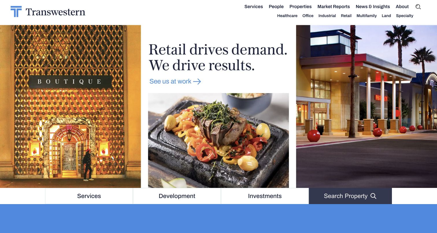
Transwestern uses a retail-focused opening with three adjoining image areas rather than a single generic skyline. Shopfront and shopping-center scenes frame a central headline, creating a recognizable sector story. A white header separates the broader property-type navigation, and the lower edge of the opening supplies routes for services, development, investments and property search. This makes the page useful as a study in organizing a diverse commercial business: the current feature has a clear theme, while the permanent service structure remains outside it. The photographs work as supporting context, not as substitutes for the labels that tell visitors where the links will lead.
What you can learn
Give an editorial feature a defined subject and a limited image sequence. Keep the enduring business categories in a separate navigation layer, especially when a visitor’s property type may differ from the homepage campaign.
Pros
The retail imagery and headline reinforce the same topic.
Service and property-search routes remain visible around the changing feature.
Cons & considerations
Three image areas can lose clarity when compressed onto a narrow screen.
Visitors outside the featured sector need obvious alternative routes.
Cresa puts its occupier focus at the center of the first screen, using oversized outlined lettering with a yellow accent over an industrial scene. That message is unusually explicit about whom the business serves. A contrasting Connect button in the header supplies a consistent next step, while the beginning of an insights section appears beneath the hero. The public navigation and copy reinforce the occupier-oriented scope rather than presenting every possible property service as equal. For a specialist practice, the useful lesson is the directness of the audience definition. The visual treatment supports that distinction, although the large outlined letters place considerable demands on contrast and screen space.
What you can learn
Name the audience before listing every capability. A specialist adviser can simplify its introduction by making its role unmistakable, then offering service and contact paths that reflect the same scope throughout the site.
Pros
The opening makes the intended commercial audience clear.
The contrasting contact action is separate from the decorative headline treatment.
Cons & considerations
Oversized outlined text can become difficult to read over detailed imagery.
An audience statement still needs concrete service explanations below the opening.
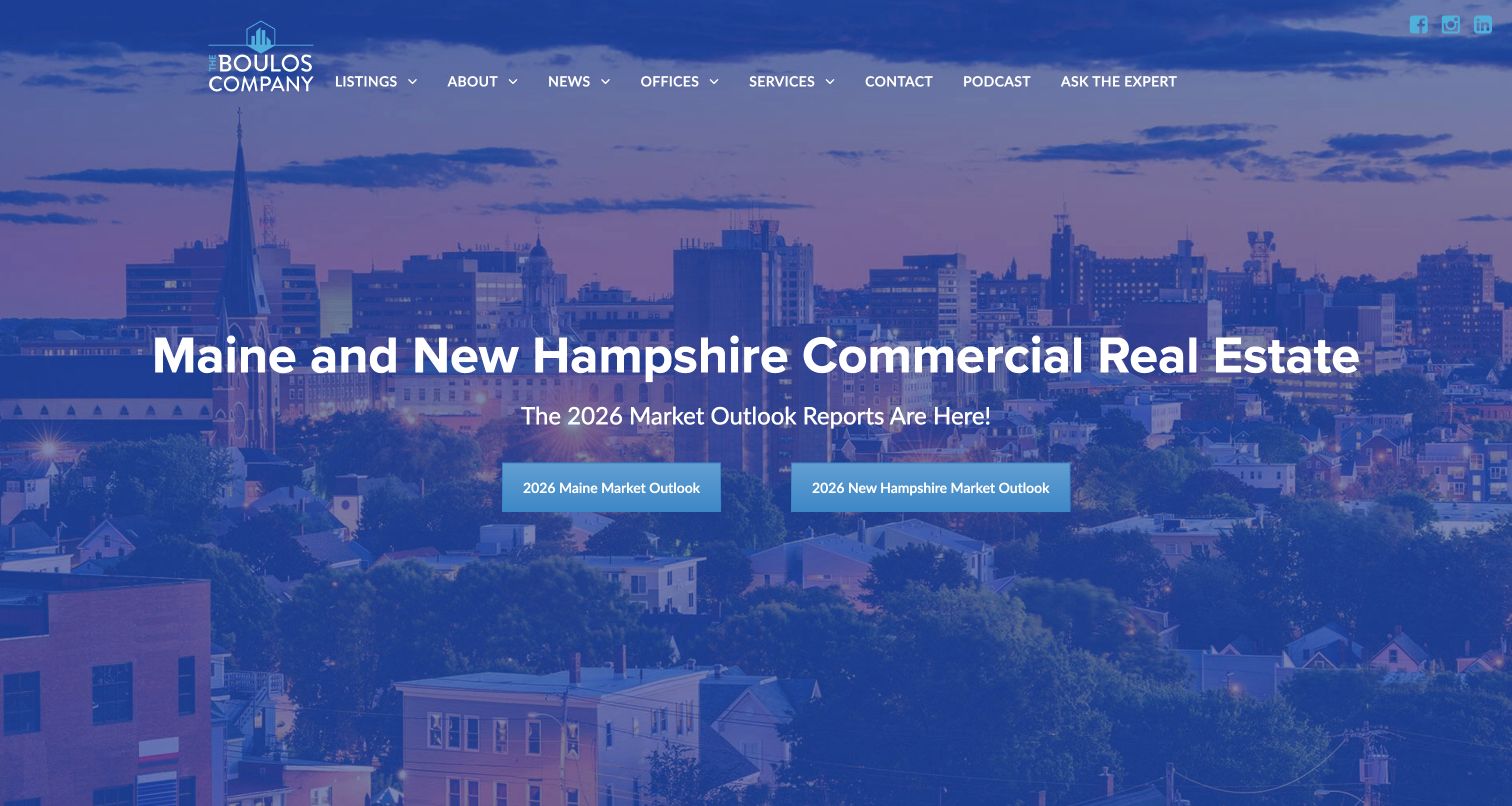
The Boulos Company uses a blue-tinted waterfront skyline beneath a clear Maine and New Hampshire commercial-real-estate heading. Two prominent market-outlook buttons distinguish the states rather than presenting one undifferentiated regional report. The single header supplies listings, offices, services and contact alongside editorial resources such as news and a podcast. This is a useful middle ground between a purely local listing site and a global corporate gateway. Geography is concrete enough to help a visitor recognize relevance, but the structure does not require choosing among dozens of countries before proceeding. The photograph establishes atmosphere while the state names do the more important routing work.
What you can learn
For a business serving adjacent markets, make their differences visible in maintained reports and office routes. A shared regional brand can remain coherent without pretending that every location has identical inventory or conditions.
Pros
The two state-specific report actions provide meaningful geographic choices.
Listings and offices remain plain, visible header destinations.
Cons & considerations
A report-led hero may be secondary to an urgent property search.
Market-outlook links require clear dates and an ongoing editorial owner.
Malone Commercial Brokers gives its wordmark generous space above a wide harbor video. The opening is deliberately visual, with a visible pause control and a compact menu instead of a crowded set of links over the footage. Below that scene, the page identifies its Maine commercial-property focus and introduces listing and contact routes. Featured properties use photographs and links to their details. The design is worth studying for its simple division between place-setting imagery and practical inventory content. It also demonstrates the cost of that choice: a visitor looking for a specific space must move beyond a large first-screen image before reaching the more actionable material.
What you can learn
Use local imagery to establish territory, then transition promptly into inventory and a clear contact path. Keep motion controllable, and ensure a static image can still communicate the setting without delaying the property information.
Pros
The large wordmark remains readable on a separate white header.
The visible pause control gives visitors a way to stop the moving scene.
Cons & considerations
A menu-only header adds a step before discovering services or listings.
An expansive video can postpone the details a motivated property searcher needs.
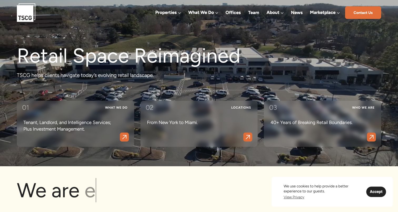
TSCG uses an aerial retail-property image behind a large headline, then places three numbered routing cards across the lower part of the scene. What We Do, Locations and Who We Are give visitors a manageable set of first choices. The translucent cards preserve the photograph while remaining distinct from the larger brand message. Orange contact and arrow accents add a consistent action color. This is a useful example of showing the organizational map inside the opening rather than relying entirely on a menu. A small privacy notice remains visible in the captured view, but the main routing cards and headline can still be understood.
What you can learn
Offer a small number of meaningful entrances when the homepage serves several intentions. Keep the labels literal and give each destination a distinct purpose; numbering is useful only if it improves scanning rather than implying an unnecessary sequence.
Pros
The three cards reveal the main site structure without opening a menu.
A single orange action color ties contact and directional controls together.
Cons & considerations
Translucent panels require contrast checks across changing imagery.
Visitors seeking a specific listing may prefer a direct property-search entrance.
Thalhimer combines its own name with the Cushman & Wakefield alliance identity in a white header, then places a diagonal dark panel over a building photograph. The headline and market-exploration action remain together within that panel. Below the hero, the page moves into a regional commercial-service explanation and distinguishes visitors who have property from those who need it. Named market routes supply more practical geography than the opening slogan alone. The design demonstrates how an affiliated regional firm can present both its relationship and its own service territory without making the entire homepage look like a generic copy of a larger corporate site.
What you can learn
Explain an alliance clearly while retaining specific local destinations. An affiliation mark can provide context, but a visitor still needs to know which office, market and service team will handle the actual request.
Pros
The angled overlay gives the headline a predictable readable area.
Have-property and need-property routes recognize different visitor intentions.
Cons & considerations
Two brand identities require a clear explanation of their relationship.
An abstract opening promise depends on the regional content below for substance.
Voit Real Estate Services uses a relatively shallow photographic hero with a bold condensed headline, followed by a white introduction section. The important practical detail is the pair of bright cyan buttons for Available Properties and People Search. They translate a broad service proposition into two recognizable tasks before the page becomes a long corporate narrative. The header adds services and market-research routes, so those looking for advisory context are not forced through the inventory. This is a useful proportioning example: the hero establishes tone, but it does not consume so much vertical space that the property and professional directories disappear from the opening experience.
What you can learn
Allocate the first screen according to the visitor’s tasks, not just the dimensions of the hero photograph. A short introduction plus clear inventory and people routes can communicate more than a full-height slogan.
Pros
Property and people searches receive equal, unmistakable button treatments.
The shorter hero leaves room for useful service context immediately below.
Cons & considerations
Condensed all-capital headlines need care at smaller sizes.
Two strong buttons still require clear destination pages and maintained records.
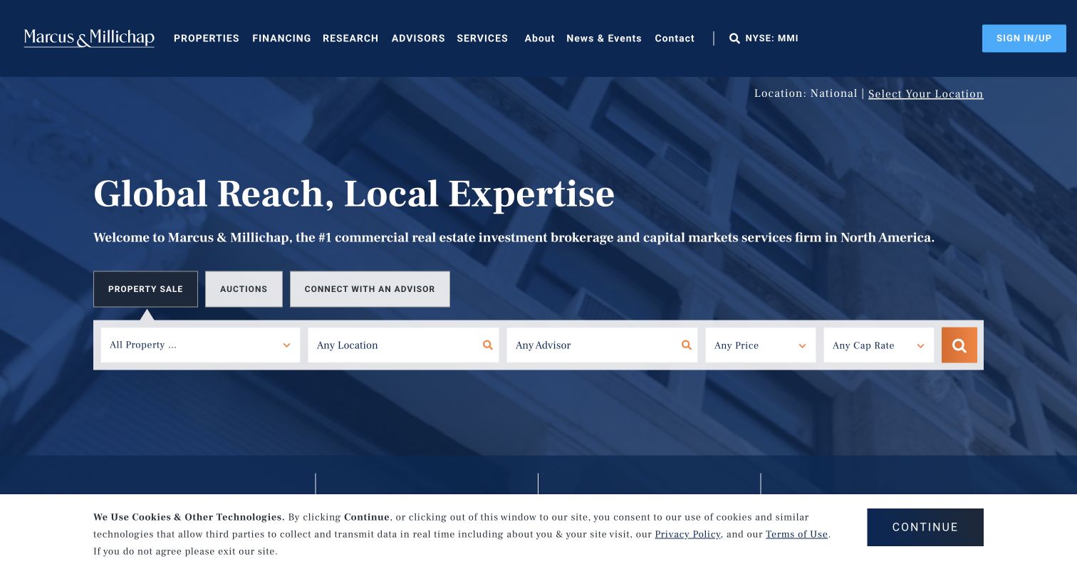
Marcus & Millichap puts a tabbed property-discovery interface inside its architectural hero. Properties for sale, auctions and adviser discovery are distinguished before the filter row, which includes property, location, adviser and pricing-related choices. The navy header and orange search accent provide a consistent hierarchy around a complex set of controls. The useful design pattern is the separation of transaction modes before a visitor begins narrowing the inventory. This review concerns that interface, not the investment claims or opportunities it presents. A cookie notice remains across the bottom of the direct capture, while the primary tabs and filter controls are still visible.
What you can learn
When an inventory supports different transaction types, establish that distinction before asking for detailed filters. Explain specialized field labels on the results journey, and avoid treating the search interface as a substitute for property-specific documentation.
Pros
Transaction modes appear before the detailed search controls.
The search action is visually distinct from the surrounding white fields.
Cons & considerations
Several filters can be demanding for someone unfamiliar with investment terminology.
A large search interface needs a carefully considered mobile arrangement.
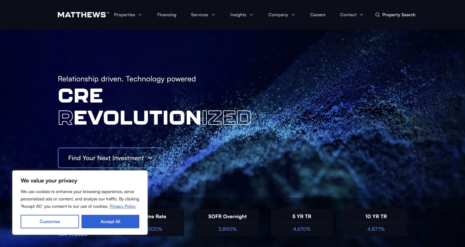
Matthews Real Estate Investment Services pairs a dark blue animated scene with oversized typography and a clear Find Your Next Investment action. The opening uses scale and motion to establish a technology-oriented brand impression, while the next area introduces a dated rate strip. These are separate communication jobs: one invites exploration, and the other supplies time-sensitive context. The captured first visit also includes a privacy panel in the lower-left corner. For a commercial-property website, the useful study is how a visually assertive opening can still offer one legible next step. The styling itself does not establish the accuracy or suitability of any financial information.
What you can learn
Keep a strong visual introduction tied to a plainly labeled destination. If rates or other changing figures appear nearby, identify their date and source and assign responsibility for updates rather than using them as permanent decoration.
Pros
A single main action avoids competing calls to action within the large headline.
The dark palette gives the white typography a consistent visual field.
Cons & considerations
Motion and oversized outlined lettering can reduce readability on some screens.
Time-sensitive numerical content requires more maintenance than ordinary brand copy.
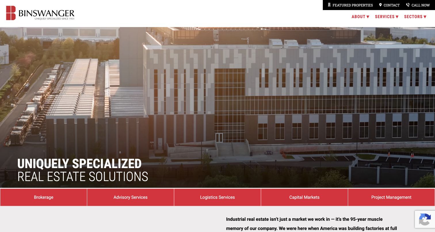
Binswanger uses an industrial-facility aerial as the main visual, with a large white headline anchored near the lower-left corner. The white header carries the brand and practical property and contact utilities. Immediately beneath the image, a continuous red bar divides brokerage, advisory, logistics, capital markets and project management into separate destinations. That service strip does the essential explanatory work: the photograph establishes the industrial context, while the labels show how the company participates in it. This is worth studying when several services share a common audience and visual setting but should not be collapsed into one vague all-purpose service page.
What you can learn
Use the hero to establish the property context, then name the actual services in a stable adjacent component. Give each route enough space to read clearly and make its destination explain scope, process and the relevant team.
Pros
The red service strip is easy to distinguish from both header and photograph.
The aerial image provides a recognizable industrial context for the service labels.
Cons & considerations
White copy over a detailed aerial image needs a sufficiently dark overlay.
Five adjacent services require a different arrangement on narrow screens.
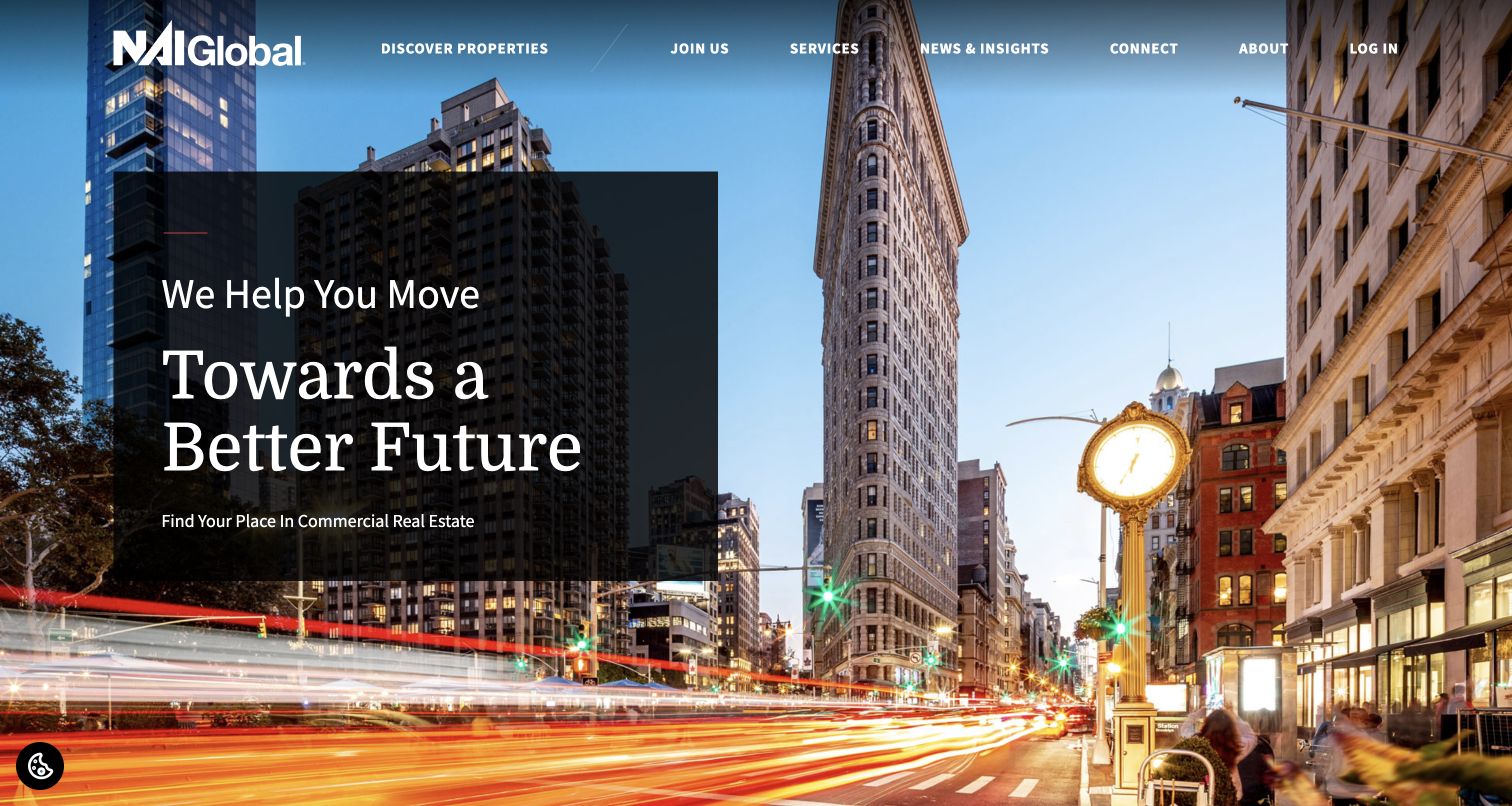
NAI Global places its introductory message in a dark translucent rectangle over a wide city photograph. The image retains a sense of place, but the text has a defined area rather than wandering across the full scene. Discover Properties appears prominently in the header alongside services and connection routes. Elsewhere, the public page distinguishes client and property needs from professional-network participation and provides an office locator. The design is useful for studying the front door of a network: it needs a shared identity while acknowledging that the eventual relationship is likely to involve a particular location or member office.
What you can learn
Give a network homepage a clear route toward local offices and actual properties. The global brand story can frame the experience, but should not obscure which part of the organization owns the next step.
Pros
A contained dark panel protects the headline from the detailed city photograph.
Property discovery has a visible place in the main navigation.
Cons & considerations
The broad opening message offers limited detail about specific markets.
Network and client audiences need clearly separated destinations to avoid confusion.
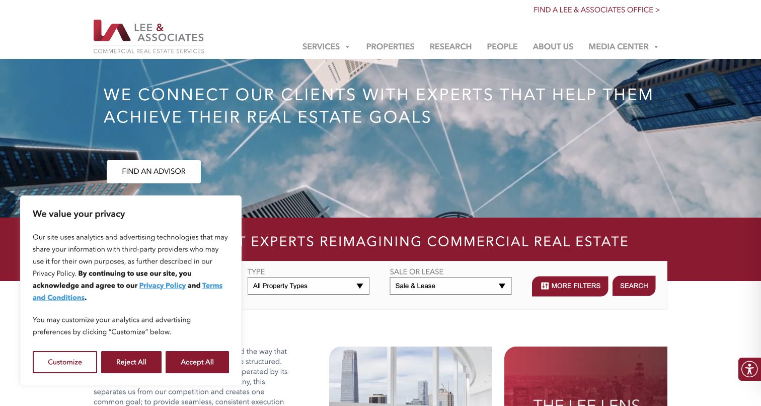
Lee & Associates leads with an adviser-oriented headline and button over an upward-looking building photograph. Immediately below, a burgundy band introduces the commercial-property context and a search row distinguishes property type from sale or lease. This sequencing recognizes two legitimate starting points: finding a professional or finding a space. The public page then supplies office and specialty routes. In the captured first visit, the privacy panel covers part of the lower-left search area, making it a useful reminder that the real opening includes consent UI. The underlying task hierarchy remains understandable, but overlay placement affects how quickly every field can be reached.
What you can learn
Provide both people and property routes when visitors may arrive with different levels of certainty. Review the real first-visit state with notices present, especially when a search form sits near the viewport edge.
Pros
The adviser entrance is explicit rather than hidden under a general contact label.
Sale and lease are distinguished within the property-search structure.
Cons & considerations
The captured privacy panel obstructs part of the search section.
A broad office network requires clear local context after the first click.
Foundry Commercial divides its opening between a strong orange text field and a people-focused video image. The large headline is followed by a concise explanation of its commercial-real-estate, development and investment scope. Find a Property remains visible in the header even though most navigation is condensed into a menu. Below the opening, services and development receive distinct sections, followed by dated company stories. The useful distinction is between emotional tone and literal explanation: the people imagery establishes a relationship-oriented mood, while the supporting sentence tells visitors what the company actually does. Neither has to perform the other’s job alone.
What you can learn
Pair a personal brand statement with a concrete service sentence. Keep common inventory tasks visible outside the menu, and make company stories clearly dated so they support the introduction without becoming an ambiguous activity feed.
Pros
The opaque orange field keeps the main copy independent of the video imagery.
Find a Property remains directly available in the compact header.
Cons & considerations
Menu-based navigation adds a step for visitors seeking a particular service.
A large video entrance needs usable playback and reduced-motion behavior.
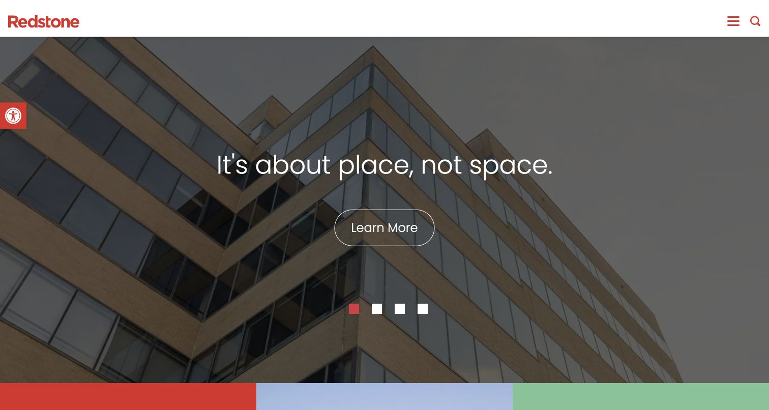
Redstone uses a simple red wordmark above a large building photograph and a centered introductory message. The visible Learn More action leads to a named property, while the expanded navigation distinguishes Commercial Properties from apartment rentals, property management and development. Separate resident, commercial and investor portals are also labeled. This makes the site relevant to commercial-property design without pretending it is exclusively a commercial brokerage. The most useful pattern is the deliberate separation of different audiences inside one property business. The opening image can establish a shared identity, but the routes beneath it must keep an office tenant’s needs distinct from an apartment resident’s.
What you can learn
When a business spans commercial and residential property, use explicit audience and property-type labels. Keep operational portals separate from public marketing pages, and do not make people guess which login or inventory applies to them.
Pros
Commercial properties have their own named route alongside residential categories.
Separate portal labels acknowledge different ongoing customer relationships.
Cons & considerations
The generic Learn More button does not describe its property destination.
A rotating mixed-property hero may show a residential story to a commercial visitor.
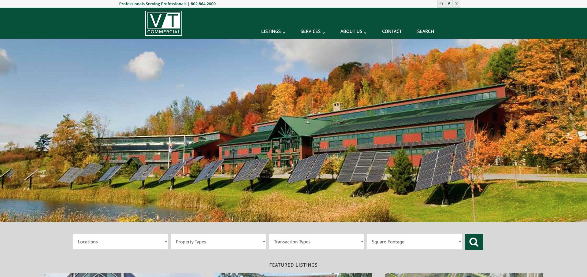
V/T Commercial places a large Vermont property photograph above a compact search row for location, property type, transaction type and square footage. The green header provides listings, services and contact routes without competing with that practical sequence. Featured records below include addresses, sale or lease status, area and published asking terms. For commercial-property design, the valuable detail is the specificity of the filters: they reflect the questions a prospective occupier or buyer actually brings. The photograph gives the page regional character, but the inventory structure makes the visit useful. The saved capture is retained with its original date rather than presented as a newly photographed view.
What you can learn
Choose filters from the real inventory and the questions staff receive. Keep area units and transaction labels consistent across search controls and listing cards, and maintain one reliable source for availability and asking terms.
Pros
The four filters describe meaningful commercial-property requirements.
Featured listings connect photographs to location, size and transaction context.
Cons & considerations
The large image occupies substantial space before the search controls.
Long location dropdowns need a usable alternative when the inventory grows.
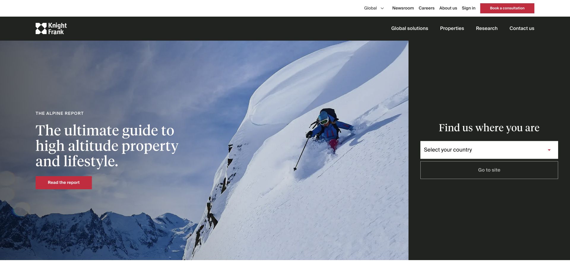
Knight Frank’s preserved homepage view pairs an Alpine property report with a separate dark country-selection panel. The two areas do different jobs: one promotes editorial content, while the other moves visitors toward the relevant national site. Properties, global solutions, research and contact remain available in the header. For a commercial-property firm, this is useful as a geographic-routing study rather than an example of an immediate office or industrial search. The featured report itself is broader than commercial leasing, and that scope should remain clear. The strong structural lesson is that a seasonal campaign does not have to consume the only visible route into the business.
What you can learn
Keep country or market selection independent of the current homepage story. A commercial visitor should be able to reach the correct local service and inventory even when the featured campaign addresses a different property audience.
Pros
The dedicated country panel provides a stable geographic entrance.
Property, research and advisory categories remain distinct in the header.
Cons & considerations
A national-site selection adds a step before local commercial inventory.
The Alpine campaign may have little relevance to a visitor seeking business premises.
Savills uses a skyline photograph as the setting for a short global introduction and a prominent location choice. The yellow brand color identifies the routing control as well as the logo, creating a simple relationship between identity and action. Find a Property and Find a Service are separate header destinations, which matters for a commercial audience: a tenant seeking premises and an owner seeking advice are not necessarily starting the same journey. The preserved image shows an international gateway, not a local commercial listing interface. Its value lies in the way it organizes geography and intention before asking visitors to navigate a much larger service catalog.
What you can learn
When local operations differ, make market selection understandable and preserve separate property and service routes. Do not add a global gateway to a regional firm merely for visual effect; each routing step should resolve a real difference in content.
Pros
The yellow location control has a clear functional role within the brand palette.
Property discovery and advisory services are explicitly separated.
Cons & considerations
Global introductory copy cannot answer a specific local occupancy requirement.
Small white navigation over a skyline needs dependable contrast.
Lincoln Property Company uses a full-screen meeting scene and a large serif headline, but adds a dark service card in the lower-right corner. In the preserved capture, that card names leasing and provides a short explanation with a Read More route. This is the most useful commercial-property detail in the composition: the brand-led scene is tied to an actual activity instead of remaining entirely abstract. Small carousel controls show that the service annotation can change. The compact menu keeps the visual field uncluttered, though it also means a visitor looking for an office or available property must take another navigation step.
What you can learn
Anchor cinematic brand material with a stable, plain-language service explanation. If the annotation rotates, make every service reachable through ordinary navigation as well so the visitor does not have to wait for the right slide.
Pros
The contained leasing card gives the photograph a concrete commercial context.
The large type and dark card create distinguishable levels of information.
Cons & considerations
A menu-only header delays discovery of specific property or office routes.
A rotating annotation needs controls and should not be the sole service index.
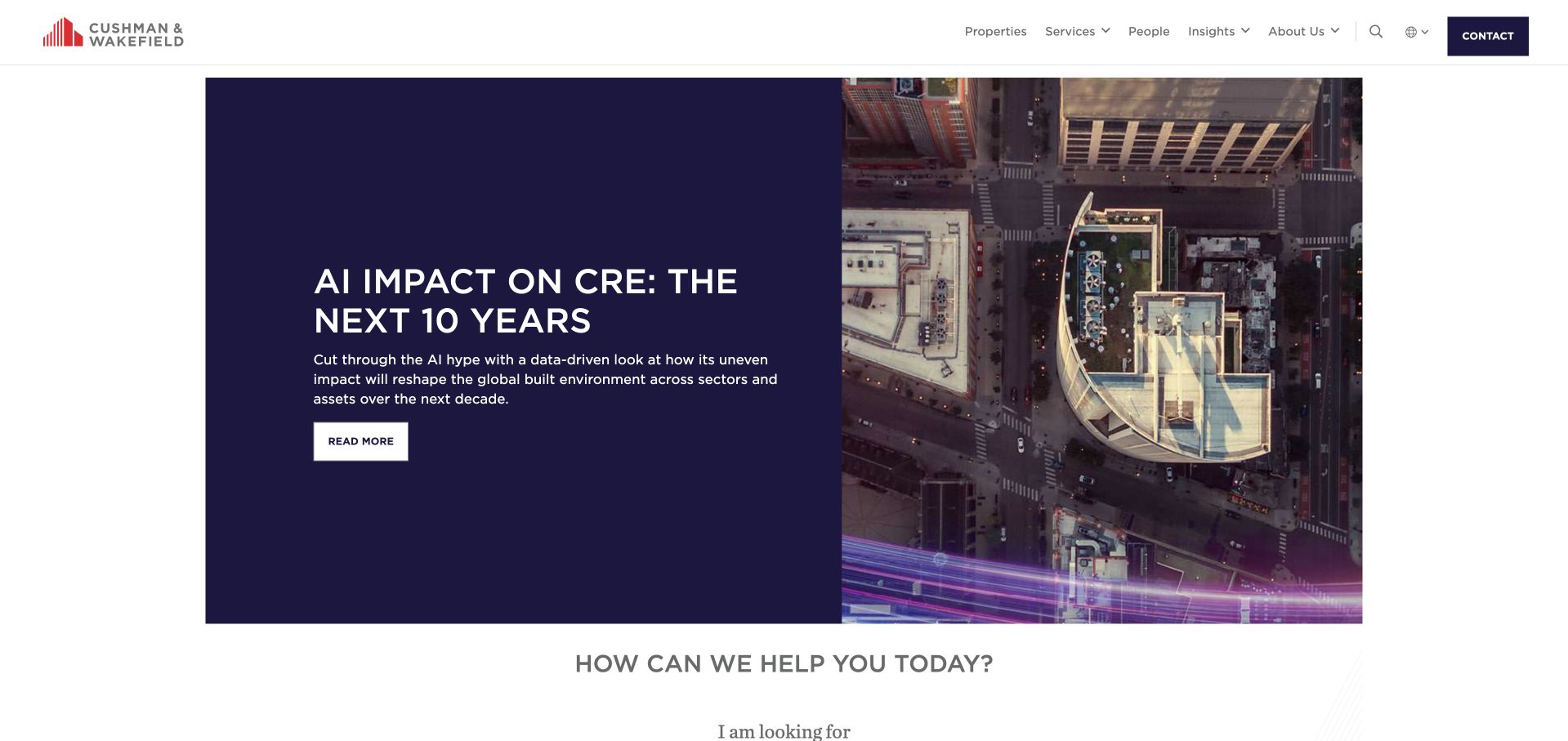
Cushman & Wakefield places an AI-and-commercial-real-estate report in a two-column feature with a dark text panel and an aerial city image. Unlike a full-bleed hero, the module has white space around it and a clear boundary. The next visible section asks how the company can help, bringing attention back to the visitor’s task. Properties, services and people are directly named in the header. For commercial-property design, the useful relationship is between temporary editorial content and permanent navigation. A report can establish the subject of a conversation without becoming the only way to discover the organization’s inventory, expertise or relevant contact.
What you can learn
Bound a research feature visually and follow it with useful task routing. Keep sector commentary separate from property-specific representations, and ensure the site still works for a visitor who has no interest in the featured report.
Pros
The solid text panel keeps the report headline readable beside a detailed aerial image.
Properties and people remain visible independently of the editorial campaign.
Cons & considerations
A broad report does not communicate a particular office’s services or inventory.
A large organization needs clear geographic context after the initial task choice.
JLL’s preserved homepage view features a November 2026 real-estate perspective over a wide skyline image. The date makes the editorial context explicit, while the white header separates properties, services, technology, people, insights and industries. Country selection and contact sit above those categories. This is a useful example for firms whose public website has to support both recurring research and practical discovery. The featured report can be replaced without altering the main task structure. The tradeoff is breadth: a large amount of navigation occupies the first screen before a visitor reaches a particular market, service or available property.
What you can learn
Give recurring research an explicit date and keep its placement separate from the permanent site map. Scale the number of navigation categories to the real content a team can maintain, rather than imitating a global firm’s breadth.
Pros
The report date helps visitors interpret the featured material’s time frame.
Property, people and service routes remain stable outside the changing story.
Cons & considerations
Multiple navigation rows may overwhelm a smaller firm’s simpler audience.
The skyline and report title do not explain an individual available space.
CBRE’s saved opening pairs a data-center image with a large report headline on a muted green field. Three smaller story links sit below it, separated by thin rules rather than competing button styles. The main header still names services, properties and people or offices. For a commercial-real-estate website, the instructive detail is the editorial hierarchy: one piece leads, supporting stories remain subordinate, and practical business routes occupy a separate layer. The review concerns that presentation. The report’s market figures are time-bound source content, not independently verified investment conclusions or permanent facts about the property sector.
What you can learn
Use one lead feature and a limited supporting row when the firm genuinely maintains a research program. Keep dates, report scope and source context attached to changing market content, and preserve a direct route to inventory and local people.
Pros
Text is placed beside the detailed server image rather than across it.
Secondary stories have a consistent, visibly quieter treatment.
Cons & considerations
Research-heavy openings may delay visitors who need a specific property.
Market statistics require ongoing editorial maintenance and clear time context.
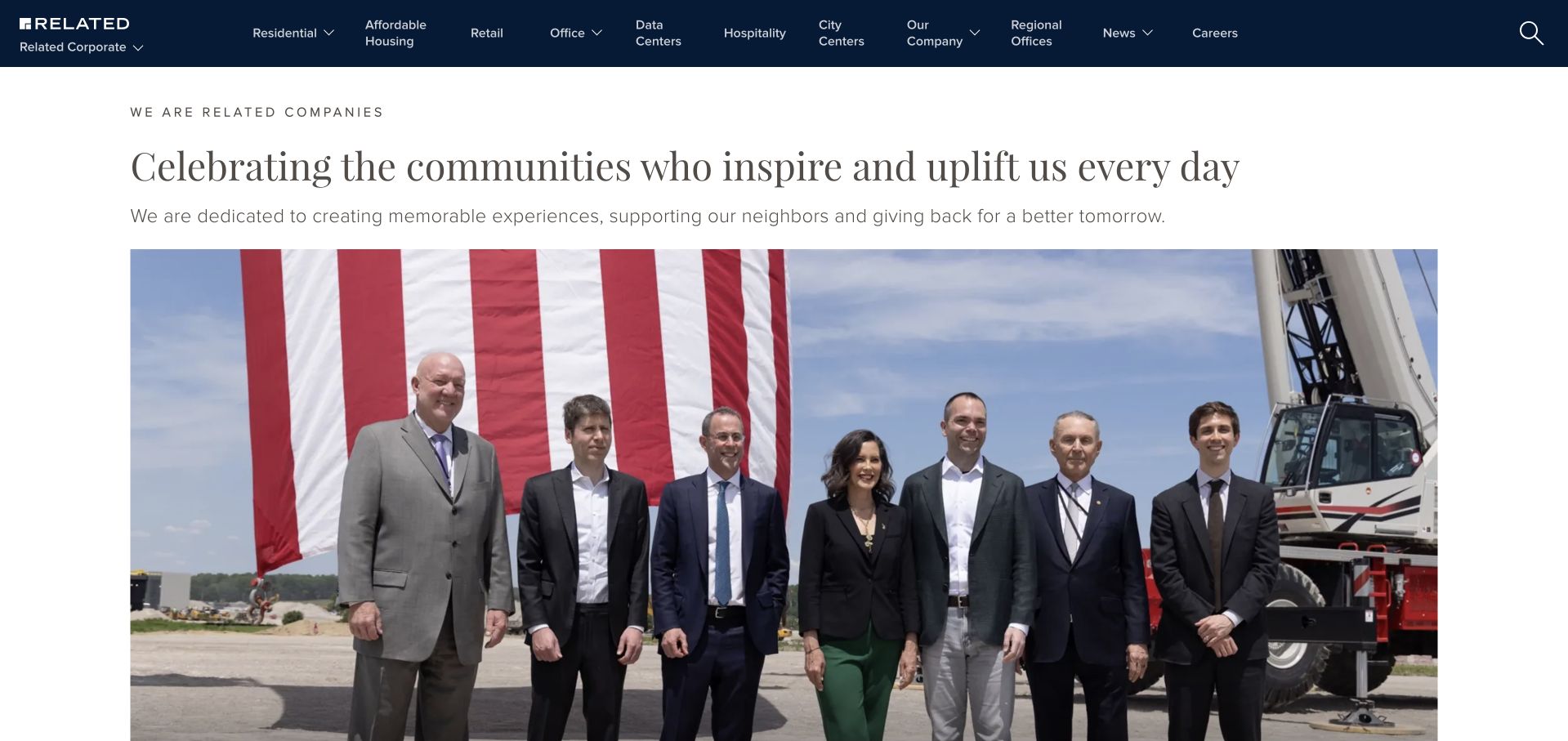
Related’s preserved homepage introduces the company with a community-focused headline and a large event photograph. The dark header provides explicit sector routes, including retail, office, data centers and hospitality alongside residential categories. This is a corporate developer’s front door, not a dedicated commercial brokerage search. Its relevance is the way it makes a diverse operating structure visible before the visitor begins exploring individual projects. The sector labels carry more practical routing value than the general corporate message, while the photograph and short introduction give the page a shared identity across those different activities.
What you can learn
For a diversified property organization, name the actual sectors in the navigation and explain the company’s role on their destination pages. Do not ask a corporate story to answer every leasing, development or operational question on its own.
Pros
Specific sector names help commercial visitors bypass unrelated residential material.
The introductory text supplies context before the large event photograph.
Cons & considerations
A company event may be less useful than a project or availability view for a tenant.
A wide sector menu would be excessive for a firm with a narrow service range.
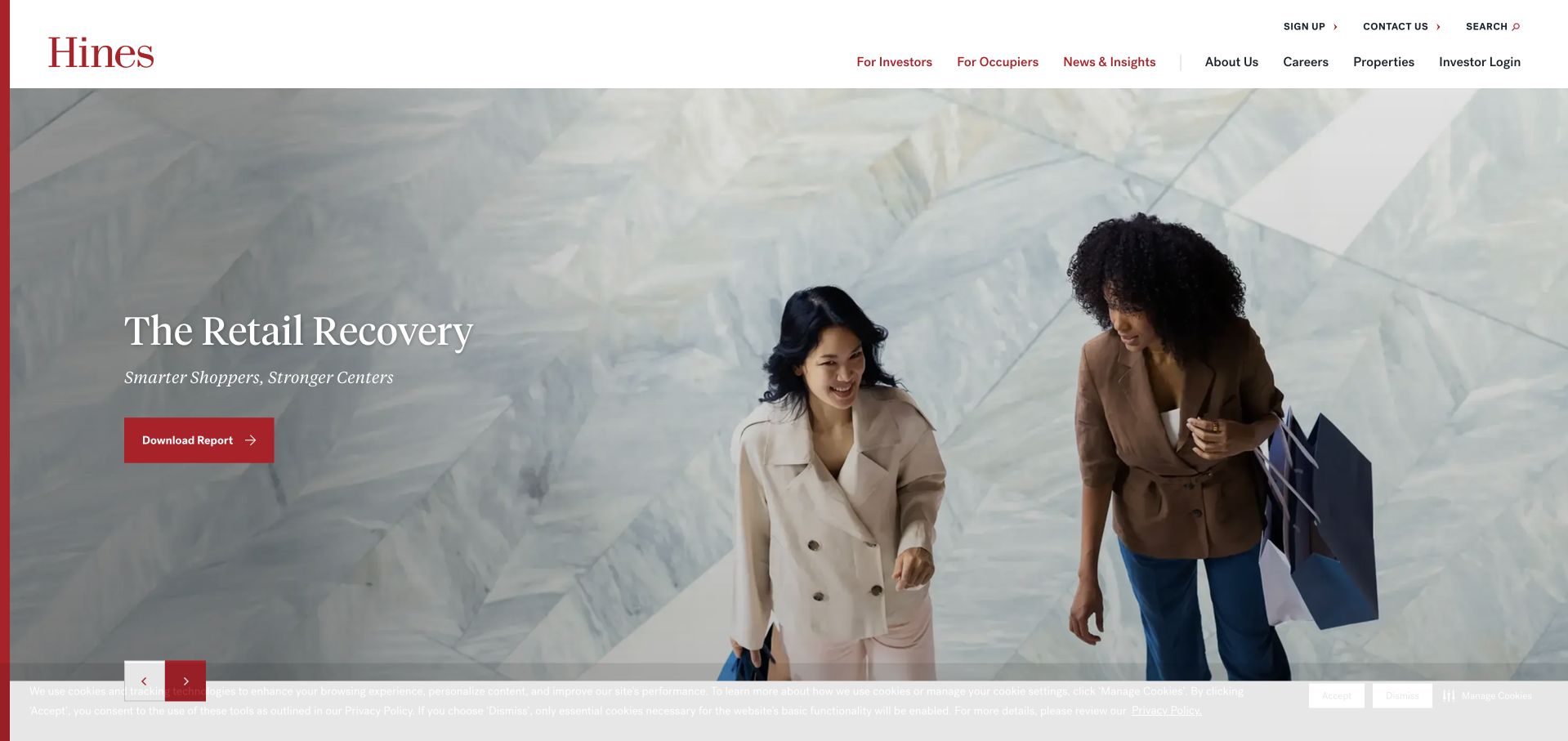
Hines presents a retail report over a wide photograph, with a restrained red download action and a white header. The most useful structural detail is the pair of audience routes for investors and occupiers. Those entrances remain separate from properties, company information and the changing news feature. A person seeking workspace and someone researching the firm’s investment activities can therefore begin with different labels even when the homepage story is the same. The saved view includes a narrow privacy notice along the bottom. This is a corporate real-assets example, and its report presentation should not be mistaken for a recommendation about any investment or property.
What you can learn
Use audience labels when they lead to genuinely different information and responsibilities. Keep a changing sector feature subordinate to those permanent routes, and describe the destination clearly before asking a visitor to download material.
Pros
Investor and occupier labels distinguish two materially different visitor needs.
The red action uses the established brand color without adding visual clutter.
Cons & considerations
A report-led hero may not answer an immediate space-availability question.
Audience pages need clear boundaries so users do not encounter irrelevant investment or leasing material.
Kegan is a freelance web designer and developer with 15+ years of experience helping businesses turn complicated website requirements into clear, maintainable digital experiences. He works directly with clients from planning and design through development, launch, and ongoing support.
For commercial real estate website design, his development approach focuses on maintained property-search and listing information, clear market and service routes, broker and office directories, dated research, and well-routed property inquiries. The scope can be a targeted improvement or a complete custom build, with responsive layouts, thoughtful content structure, and integrations chosen around the people using and maintaining the site.
Show 3 other commercial real estate website designersHide other commercial real estate website designers
Plan the website around inventory, territory and the people handling inquiries
Define the audience and market before choosing the homepage format
Start with the actual business rather than a preferred hero layout. A brokerage representing local listings, an occupier adviser, a developer and an international service network may all operate in commercial real estate, but their websites have different responsibilities. Write down the main visitor tasks and identify which ones the organization can genuinely support. Someone looking for a vacant office should not be sent through the same unexplained path as an existing tenant needing operational assistance.
Map geography at the level that affects the service. A local firm may need only a clear territory statement and town filters. A national network may need office selection, and an international adviser may need country routing. Keep those choices separate from temporary homepage campaigns. Once a visitor has selected a market, carry that context into services, people and inventory instead of silently returning them to a global view.
Choose navigation labels that describe destinations rather than internal departments. Properties, people, offices and services are useful when their pages do different work. Audience labels such as occupiers and investors can also help, provided the destination explains the relationship clearly. Avoid adding categories merely because a larger competitor has them; every route creates an ongoing content responsibility.
Establish one maintained source for property records
Decide where listing information comes from before designing cards, filters and property pages. Identify who controls availability, asking terms, photographs, area figures, brochures and the contact person. If the website connects to a specialist listing provider, document which fields it receives and how updates or withdrawn records reach the public page. Avoid a second manually maintained inventory that gradually diverges from the source the brokerage actually uses.
Choose filters that match the real stock. Location, property type, sale or lease and area can be useful starting points, but empty or overlapping categories make the search harder. Use consistent units and explain specialized labels where they appear. A result should connect its photograph to a recognizable address or property name and an appropriate next step. A building image alone does not establish current availability or the terms on which it is offered.
Plan for records changing status. A completed transaction can remain useful as a clearly labeled case study, but should not look like an active listing. Keep shared links useful when a space is no longer available, and provide a route back to current inventory. Assign responsibility for reviewing attachments and external links as well as the visible card; an outdated brochure can contradict an otherwise accurate page.
Connect inquiries and editorial content to accountable people
Give every important public journey an understandable destination. A general contact page may be appropriate for an early question, while a property page can identify the relevant team or broker when that information is approved for publication. Explain what an inquiry confirms and how it is handled. Receiving a message is not the same as reserving a property, confirming availability or accepting a proposal.
Treat research and transaction stories as maintained editorial content. Include the publication date, the market or sector covered and the source of any figures. Distinguish a company announcement from independent analysis and avoid turning a historical result into an implied future promise. A small regional firm can publish a limited number of useful local resources instead of adopting a large newsroom structure it cannot keep current.
Test the tasks with realistic first-visit conditions: consent notices, long property names, missing images, no matching results and narrow screens. Check that people can reach a listing or contact route without waiting for a rotating campaign. Keep forms proportionate to the inquiry and private records outside the public content library. The final design should make the next conversation easier to start while leaving property-specific confirmation and professional advice with the appropriate people.
The editing job behind the design
Choose tools around the maintained inventory and editorial workload
A content-management system should make services, office details, people and dated reports straightforward to update. A complex animated homepage does not resolve an unclear publishing process.
If a specialist platform owns property inventory, preserve that source of truth and document the public handoff. Consider useful fallback links when an embed or search service is unavailable.
Keep inquiry records, client documents and operational portals separate from public marketing content. The visible stacks below reflect bounded public-page evidence, not a complete inventory of a firm’s internal property or customer systems.
Our WordPress website examples offer a separate look at publishing approaches. A visible platform label is evidence for that named page, not a guarantee that the same system will suit your requirements.
Before the public launch
Commercial real-estate website brief checklist
State the actual market, property types and service scope.
Distinguish occupiers, owners and other audiences only where their journeys differ.
Provide direct routes to properties, people and relevant offices.
Use one maintained source for listing availability and asking terms.
Label sale, lease and completed transactions consistently.
Keep area units and property categories consistent across search and detail pages.
Attach accurate captions and permissions to property photography.
Give research reports dates, geographic scope and source context.
Explain external inventory and portal handoffs.
Make contact routing specific enough to reach the right team.
Test empty results, withdrawn listings, consent notices and mobile controls.
Assign owners for inventory, office details, people records and editorial updates.
These checks are a project checklist, not a performance, legal, security, or accessibility certification. Test real journeys with the people responsible for the website before making claims about the result.
Sources & editorial method
How this collection was selected and reviewed
The collection contains 29 distinct public website properties, matching the original saved industry draw. Twenty-one direct captures were prepared for this collection; eight verified earlier captures retain their original dates and receive new commercial-real-estate commentary. Reviews address visible design and information structure. Broad public technology-audit attempts are recorded separately; blocked, partial and size-limited scans are not treated as complete backend knowledge. Several genuine first-visit screenshots include the source site’s privacy notice. No property inquiry, transaction, account action or form submission was made for this review.
Each example links to its actual source page. Screenshots are direct browser captures with their own capture dates; moving imagery, announcements and live designs can change. The notes describe observable design choices and conditional tradeoffs, not measured traffic, conversion results, service quality, or accessibility conformance.
Technology labels use public page metadata, asset evidence, or explicitly cited platform documentation. Platform documentation is not a complete current deployment audit. A component reference may be legacy or unused; it is not a complete backend inventory. Unknown stacks are omitted. These sites are editorial examples, not our client portfolio.
Written, Edited and Curated are separate editorial records, not timestamps advanced by a rebuild. Website designs and imagery belong to their owners. See our editorial standards or suggest a correction.
Questions worth asking
Commercial Real Estate website design questions
Should a commercial-property homepage lead with search or a brand story?
Use the visitor’s main task and the business model to decide. An inventory-led regional brokerage may benefit from immediate search, while an adviser or developer may first need to explain its role. Keep property and contact routes easy to find in either structure.
Which property filters belong on the homepage?
Use filters supported by the actual inventory. Location, property type, sale or lease and area are common useful distinctions, but the labels and available options should reflect the records the team maintains.
Can completed deals stay on the website?
Yes, when they are clearly identified as completed transactions or case studies. Do not present them as currently available inventory, and preserve the relevant date and scope of the published information.
Does a corporate gateway need a country selector?
Only when market selection changes the relevant content or service route. A regional business should not add an unnecessary geographic step simply to resemble an international adviser.
Do these examples recommend any property investment or broker?
No. The collection and its Editors Choice assess public website design and communication. They do not establish property value, investment suitability, professional-service quality or transaction outcomes.