Best Self Storage Websites of 2026 (17 Real-World Examples)
Self-storage websites that make location, space and rental terms easier to compare.
A storage website should help someone choose the right facility and unit without hiding the practical conditions of moving in. These examples show different ways to organise location search, size guidance, human help and tenant account tasks.
Renting storage is a physical decision made through a digital interface. Visitors need to know where the unit is, how they reach it, what fits inside, when they can enter and what the quoted price includes. A dramatic photograph cannot answer those questions by itself.
The examples include regional networks, single-location facilities and supporting about pages with useful policy or ownership explanations. They are design references, not recommendations about security, pricing or service quality. Published commercial claims remain the operators' claims and should be checked against current rental terms.
Before the examples
What makes good self storage website design in 2026?
Identify the facility before the unit
Make the street address and locality unmistakable. A regional search result should not lose its location context when a visitor moves into a booking system.
Explain usable space
Pair dimensions with access type, floor, door clearance and relevant restrictions. A size label alone does not tell someone whether their equipment will fit.
Make costs understandable
Separate the advertised rent from insurance, administration, locks, taxes and other mandatory charges. Explain any promotional period or rate commitment in plain language.
Support existing tenants
Payment, access help and move-out instructions are repeat tasks. Give them clear routes without making first-time visitors navigate through an account portal.
The collection · 17 examples
17 self storage websites worth studying
These seventeen self-storage website examples show how regional networks and individual facilities explain location, space, rental costs and the next step. Ranpac is the Editors Choice for its clear two-city routing and recognizable facility imagery. The selection is an editorial assessment of website design, not a service endorsement or a result of visitor votes.
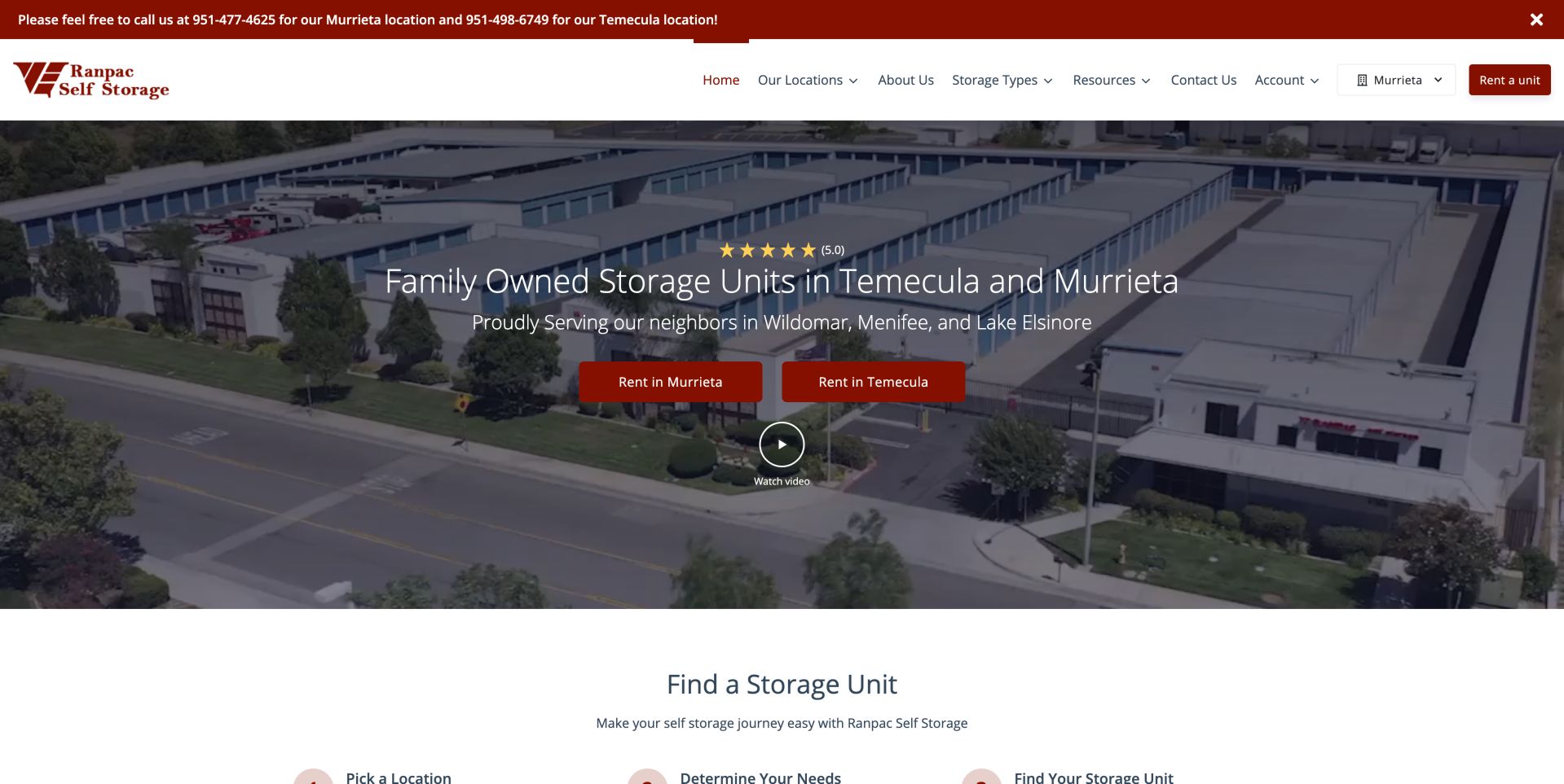
Ranpac turns a regional network into two immediately understandable choices. Two red rental buttons name Murrieta and Temecula over an aerial view of the facility, while the announcement above the header pairs each city with its own phone contact. Visitors can therefore orient themselves before entering a unit-selection flow. The photograph shows the storage buildings and surrounding roads, giving the page a specific sense of place rather than relying entirely on a lifestyle image. Under the hero, a three-step section introduces location choice, needs assessment and unit selection. That sequence supports people who do not already know the size they need. A location selector and another rental button in the header provide shortcuts, though their relationship to the two hero buttons could be clearer. This combination of local identity and explicit geographic routing supports the Editors Choice selection.
What you can learn
A few named destinations can outperform an empty search box for a small network. Keep size guidance on the route to availability.
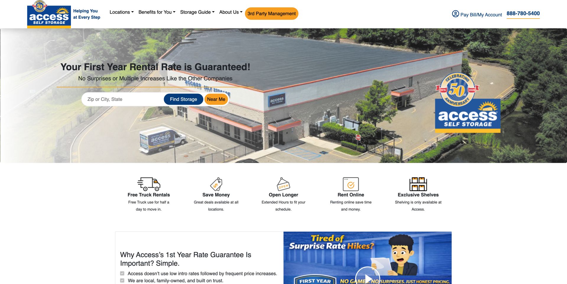
Access makes its first-year rate guarantee the opening argument, placing location search immediately underneath it. The facility photograph extends across the page while a pale gradient keeps the black headline legible on the left; blue and orange controls connect that search to the established logo. Below, five small illustrations translate benefits into quick categories, including truck use, hours and online rental. This creates a clear progression from commercial promise to location choice to supporting detail. The header gives existing tenants their own account route, although the orange management-services link attracts attention comparable to the customer search. The guarantee would be strongest with its qualifying terms close to the claim. The screenshot establishes how the offer is presented, without independently confirming rates, eligibility or the availability of the pictured benefits.
What you can learn
Pair a defined rate policy with location finding, then link the promise to precise eligibility and contract terms.
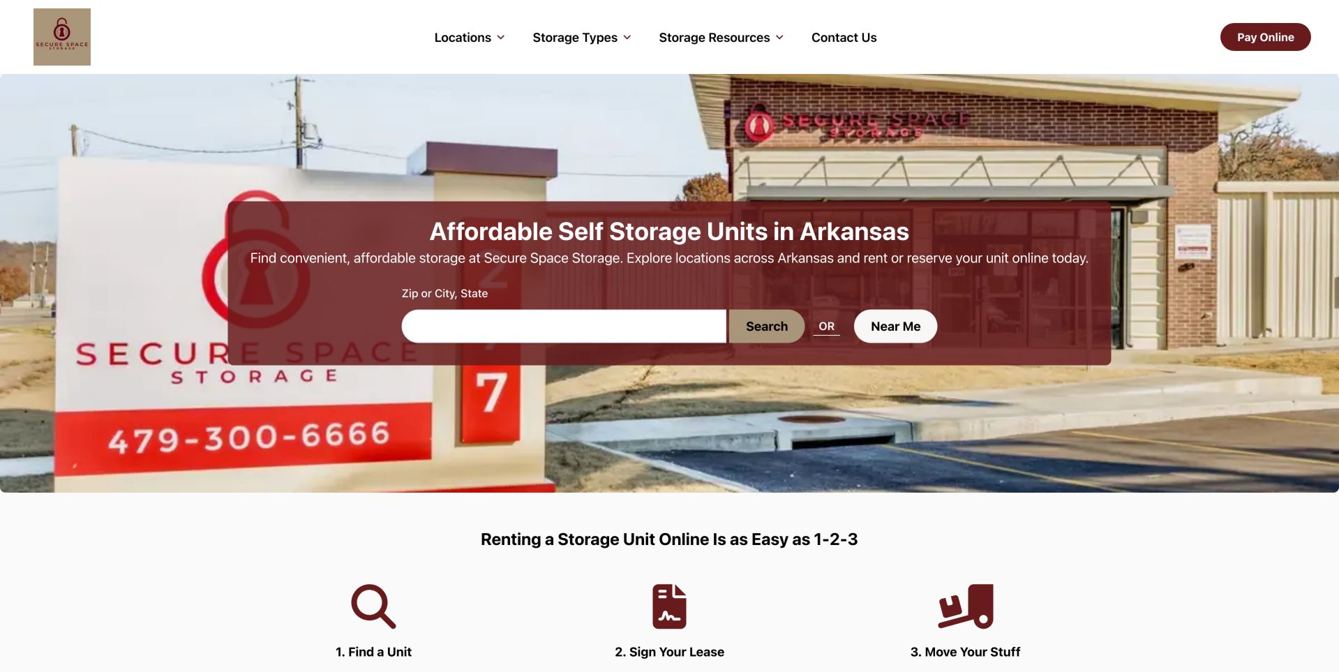
Secure Space puts its Arkansas service area into a large, direct headline and groups the search controls inside a burgundy panel. The building and roadside sign remain recognizable behind the panel, connecting the digital identity with a physical facility. The search field has a separate visible label, and the adjacent location action offers another way to begin. A compact header separates locations, storage types and resources from the existing-tenant payment control. Immediately below the photograph, three burgundy icons explain the progression from choosing a unit through signing a lease to moving belongings. That is a helpful statement of the intended process, although the review did not complete it. The large translucent overlay sacrifices some facility detail for readable controls. Location-specific prices, conditions and unit availability still need to be established beyond this network overview.
What you can learn
State the service area before showing inventory, and attach address context to every rental action to prevent wrong-location bookings.
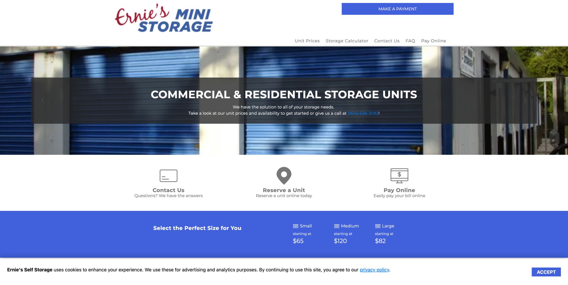
Ernie's uses blue storage doors as the dominant visual, linking the hero photograph to the blue payment button and price band below. Its opening message addresses both residential and commercial storage, with a phone contact embedded in the supporting text. The next row offers three concrete tasks: contact the facility, reserve a unit and pay online. These labels are more useful than a general promotional button because they distinguish prospects from existing tenants. A size band then introduces small, medium and large categories with starting prices. In the captured view, the large category starts below the medium category, illustrating why size labels alone cannot explain cost: features, available stock or other differences need clarification. Payment also appears repeatedly in the header and task row. The layout is practical, but a clearer primary rental action would reduce competition among the shortcuts.
What you can learn
Show rates alongside dimensions and features, rather than treating size-category names as enough information for a fair comparison.
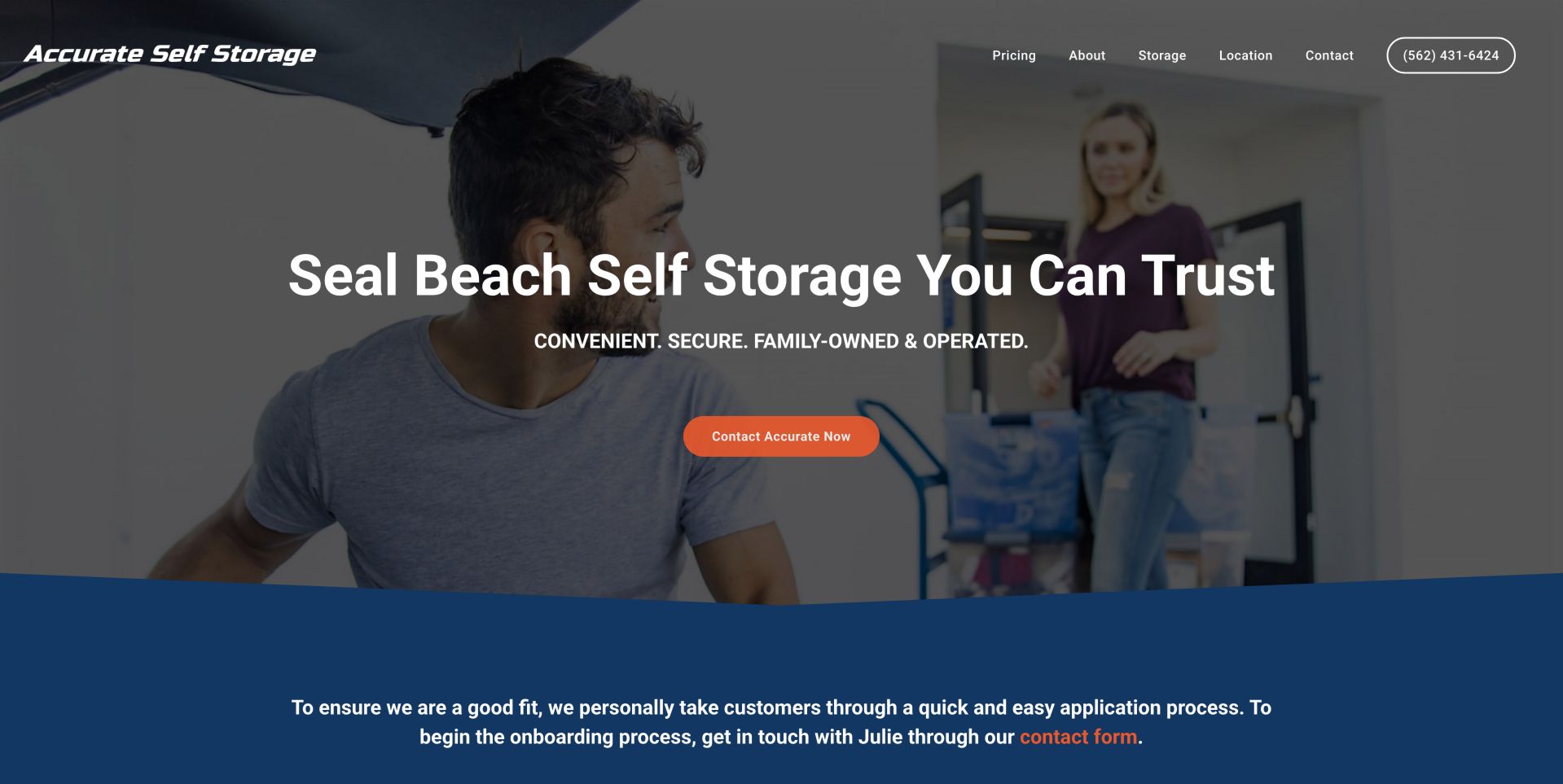
Accurate centers its homepage on a human-assisted inquiry. A moving scene fills the hero, a large Seal Beach headline establishes geography, and one orange contact button stands out against the darkened photograph. The navigation is unusually direct: pricing, storage and location are all named without a broad services category. Just below the hero, the page explains that prospective customers go through an application process and identifies Julie as the contact. That detail gives the next step a person and a purpose instead of presenting an unexplained lead form. It also sets a different expectation from an instant online rental system. The large photograph delays more detailed comparison information, and the opening screen does not show unit availability. A useful adaptation would retain the personal contact while previewing the information a caller should gather and the decisions that staff can help resolve.
What you can learn
Explain who will help when a rental needs a conversation, but still answer basic size and pricing questions before asking visitors to call.
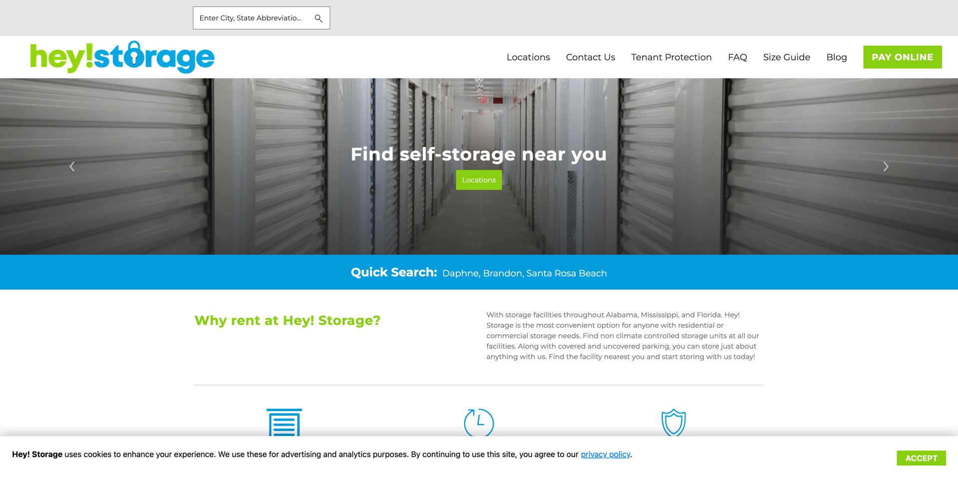
Hey! Storage gives a familiar storage template a conspicuous identity through a lime and cyan wordmark, matching buttons and a bright geographic shortcut strip. The corridor photograph makes the product immediately recognizable, while the short hero headline asks visitors to find nearby storage. A search field above the header, a locations link in navigation, another hero button and named city shortcuts all support that goal. The Daphne, Brandon and Santa Rosa Beach links are especially useful for a small network because they reduce the need to guess a search term. The body begins with an explanation of the regional footprint and storage options, while tenant protection, sizing help and payment remain visible navigation categories. Several routes repeat the same location decision, which can dilute priority. The cookie notice also occupies a substantial band at the bottom of the captured first view.
What you can learn
Strong colour should support concrete destinations. Named market links help visitors act without having to interpret a regional brand first.
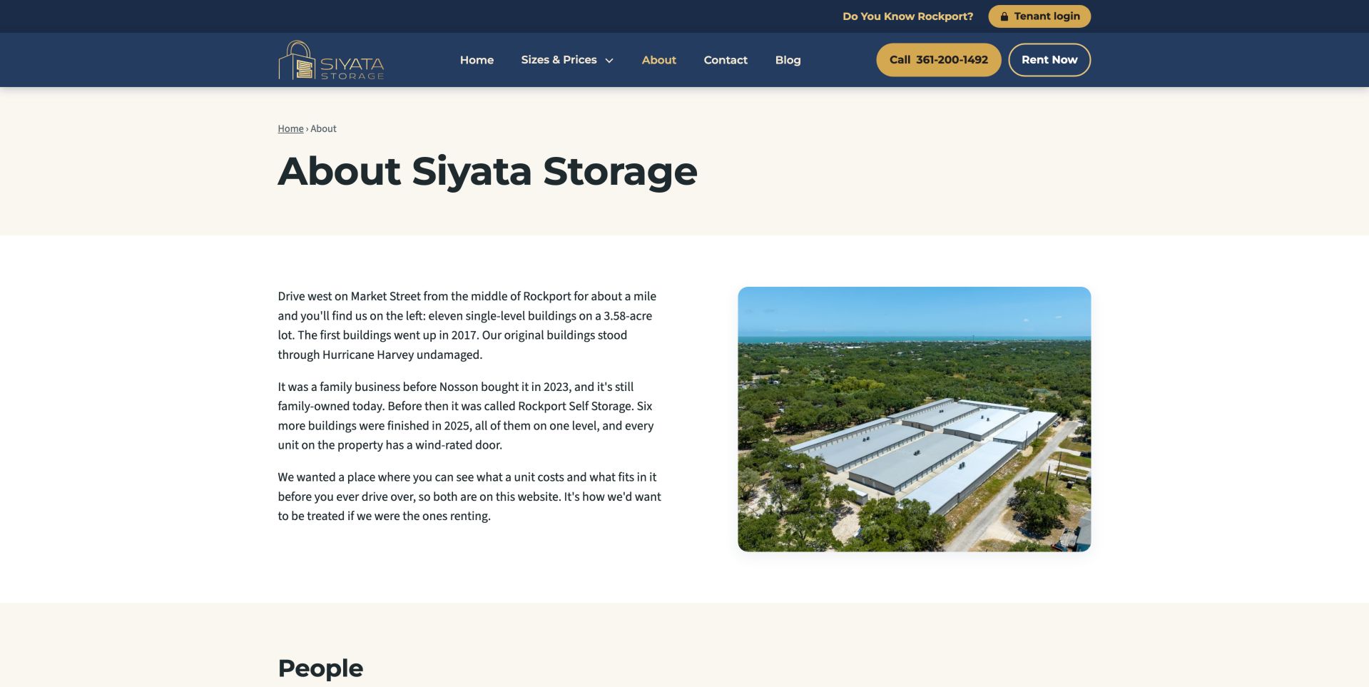
Siyata's about page uses a restrained navy and gold header, a cream title band and a straightforward text-and-photograph layout. Its aerial facility image supports a narrative that explains where the property is, how its buildings developed and why some visitors may know the former Rockport Self Storage name. Explaining that name transition is particularly useful for a local business whose signs, reviews or customer memories may span different ownership periods. The text connects the story to a practical intention: letting people understand cost and capacity before driving over. A People section begins below, adding another route to identifying the operators. Phone and rental controls remain prominent even on this informational page. The review concerns the presentation of the history, not independent verification of its building-performance claims. Visitors comparing units still need the separately labeled sizes and prices section.
What you can learn
Connect old and new business names explicitly, using real place and people information to make a change of identity understandable.
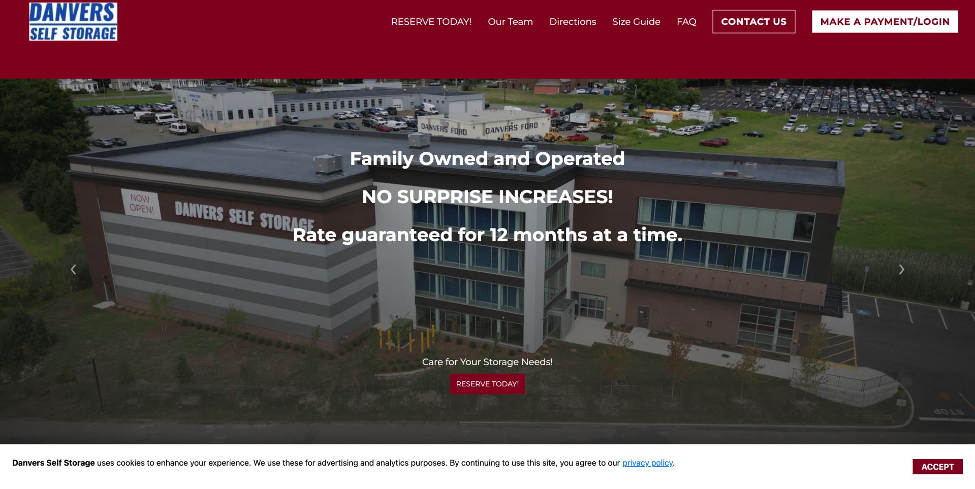
Danvers gives its building almost the entire opening viewport. The aerial photograph shows the facility name and surroundings, while large white statements emphasize family ownership and a twelve-month rate guarantee. A burgundy header ties those claims to a consistent visual identity and provides plainly labeled routes for reservations, directions, sizing help and payment. A smaller reservation button near the bottom of the photograph repeats the principal prospect action without introducing another service category. The tradeoff is hierarchy: three substantial messages compete over the same image, with little supporting detail visible before scrolling. The guarantee is a strong positioning device only when its conditions and applicable rental period are easy to inspect. The review does not establish those terms or current rates. The saved capture also shows a cookie band reducing the amount of the first screen available for practical facility information.
What you can learn
Publish the period and conditions of a pricing commitment, then give it one strong explanation instead of repeating several reassurance slogans.
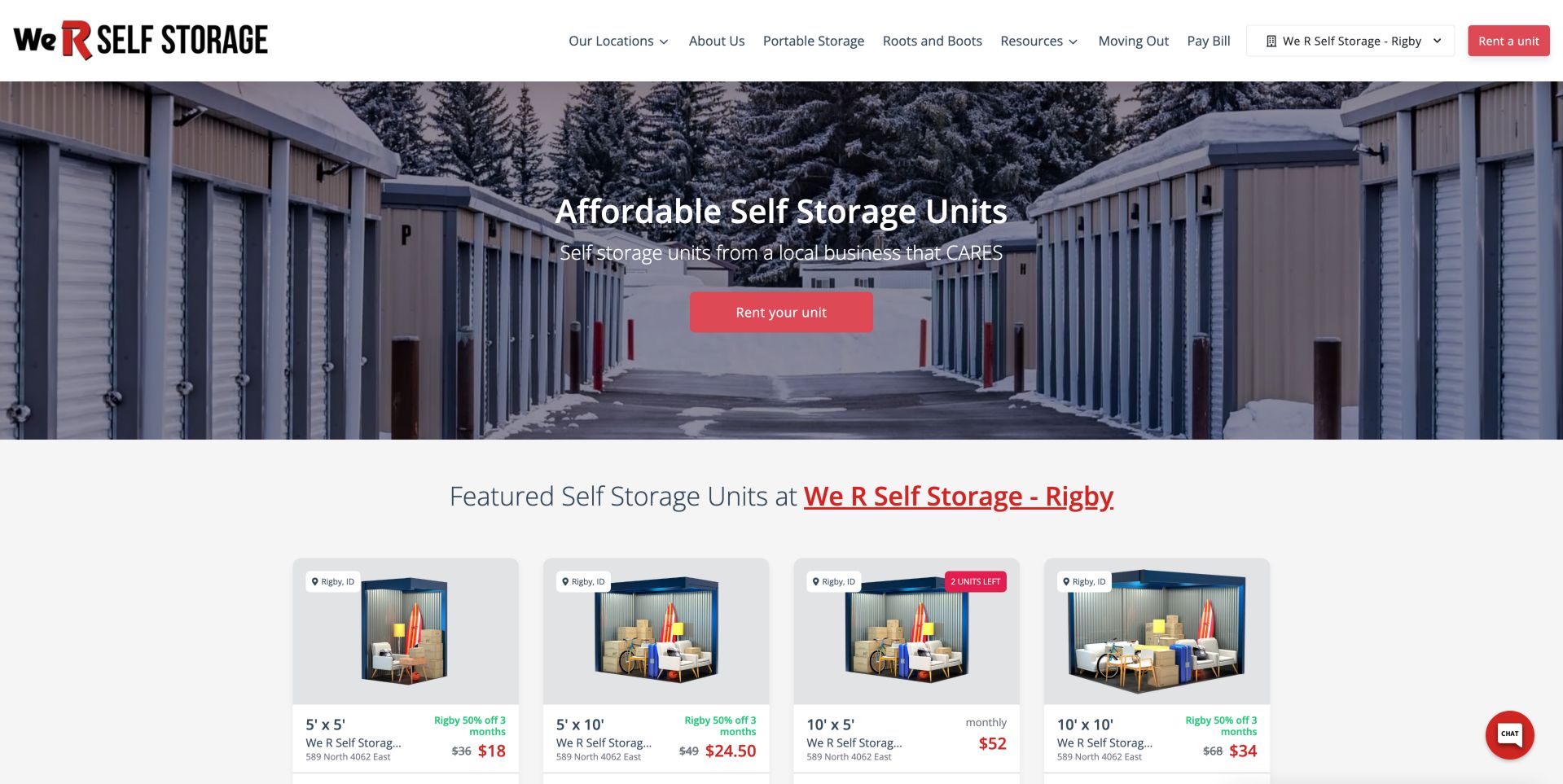
We R Self Storage moves quickly from a photographic introduction to specific inventory-style cards. A snowy drive-up scene establishes the physical setting, while the header identifies the selected Rigby location beside a rental action. Directly below the hero, the featured-unit heading repeats that location, helping maintain context as visitors compare options. The visible cards combine a dimension label, a contents illustration, a street address and displayed pricing; some also distinguish an introductory offer from a regular amount. This is more concrete than presenting size categories without location or cost. Those figures and stock labels remain observed interface content, not verified availability. The page also retains separate payment and moving-out routes for current tenants. An important improvement would be to make promotional duration and the continuing price equally easy to compare across every card, especially where different offers appear together.
What you can learn
Explain access requirements before treating all space as interchangeable. A contractor and a household need different unit-selection guidance.
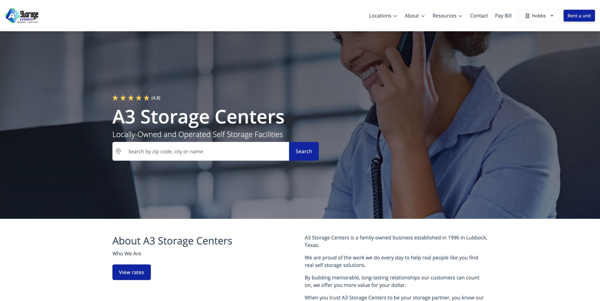
A3's about page preserves a commercial path while introducing the organization. The upper section uses a telephone-assistance photograph, a large company heading and a wide location search, so arriving on the story page does not strand a prospective renter. The next section changes to a two-column arrangement: a concise about heading and rates button sit beside the narrative. The text introduces the business's Lubbock origins and family ownership before discussing its approach to customer relationships. That separation makes the story easy to skim without requiring the reader to work through it before checking a location. A selected-facility menu, bill-payment link and rental button remain in the header. The search occupies more visual space than the actual history, which suits a conversion-oriented page but makes the page's purpose less distinctive. Stated longevity and service claims are company assertions rather than independent findings.
What you can learn
Keep location or rate access beside the company story. Supporting pages should answer trust questions while still helping visitors reach their next task.
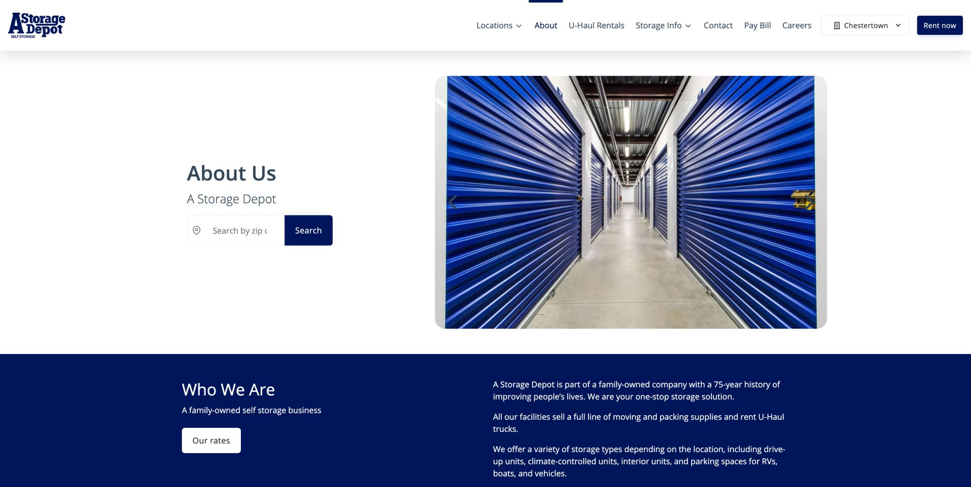
A Storage Depot pairs a blue-door corridor photograph with a compact about heading and search field. The asymmetrical opening gives the actual storage environment more visual emphasis than the text, then switches to a navy section for the business story. Within that section, an adjacent rates button keeps a practical next step close to the narrative. A useful qualification explains that storage types depend on location, preventing the network's full list of offerings from being mistaken for a promise at every facility. Drive-up, interior, climate-controlled and vehicle options are described separately. The header also maintains a selected location beside the rental control. In the captured desktop layout, the search placeholder is clipped, making the accepted input less clear. Expanding that field or adding a persistent label would improve an otherwise simple bridge between the company overview and facility selection.
What you can learn
Separate network-wide capabilities from individual facility features so visitors do not assume every advertised option is available everywhere.
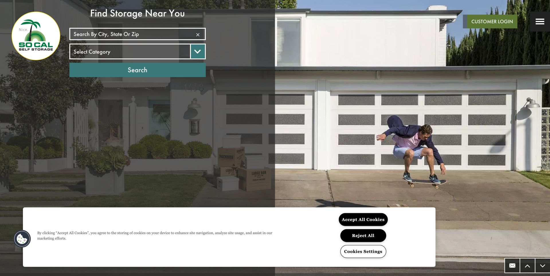
SoCal uses a residential scene and a skateboarder to frame storage around everyday living rather than rows of doors. A palm-tree logo and green accents reinforce the regional personality, while a darkened panel on the left holds a location field, category selector and broad search button. This lets visitors express both geography and storage type at the outset. The existing-customer login sits separately at the upper right, alongside a menu icon that conceals the broader navigation even at desktop width. That choice protects the photographic composition but asks users to open the menu before seeing other resources. In the saved view, a large cookie panel covers much of the lower screen, adding another decision before the page's supporting content. The design offers a distinctive lifestyle direction; its strongest practical element is the explicit pairing of location and category, provided both controls remain understandable on smaller screens.
What you can learn
Retain practical location and size controls when using lifestyle photography, and make consent choices usable without consuming the central decision area.
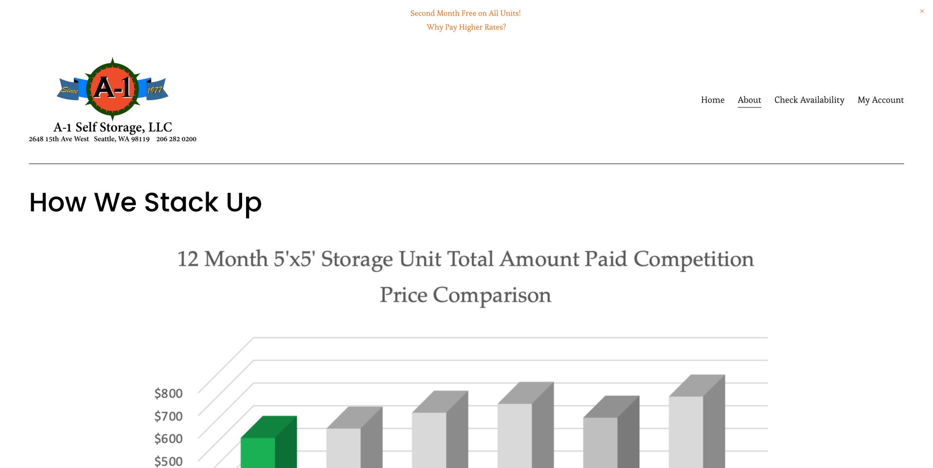
A-1's about page makes cost comparison its main visual subject. The header contains the facility's address and telephone number alongside a small set of links, including availability and an existing-customer account. Below, a very large chart introduces a twelve-month comparison for a specific unit size. This is a more detailed proposition than a generic low-price headline, but the chart's scale pushes qualifications below the first view. The saved page notes identify the comparison as dated March 2020, so it should be understood as historical material rather than evidence of present savings. Elsewhere on the page, separate explanations of administrative charges, insurance, locks, reservations and move-out rules address components of the actual rental decision. The useful lesson is the choice to expose cost components; the caution is that comparison graphics need prominent dates, assumptions and a maintained relationship to current terms.
What you can learn
Explain every component of a rental bill in text. Put comparative-pricing dates beside the comparison and refresh or retire old evidence.
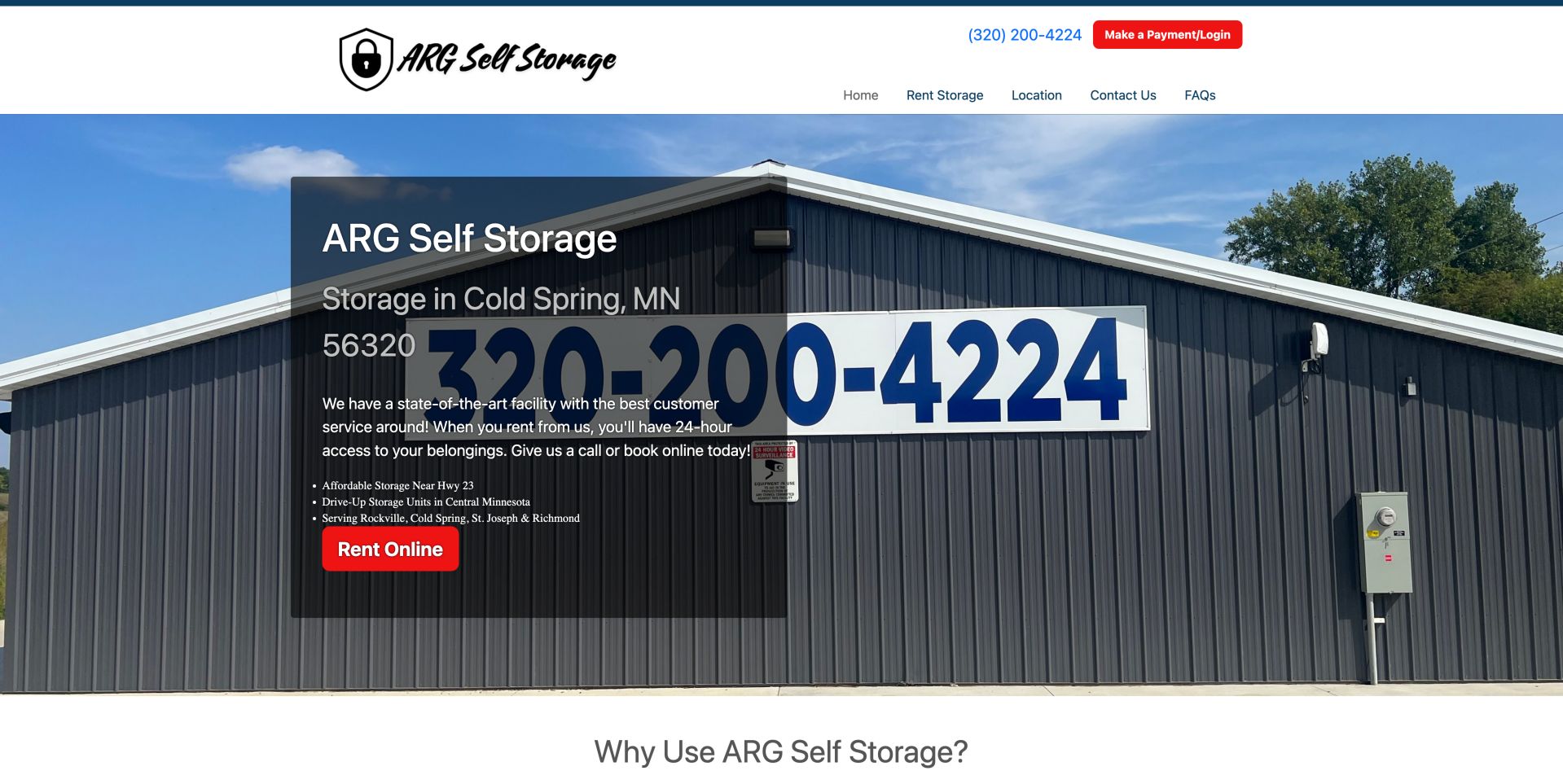
ARG's homepage is anchored by a recognizable photograph of its building, including the large telephone sign on the facade. A dark panel overlays the left side with the Cold Spring location, a brief service description and a red rental button. Nearby towns and the drive-up format add useful local context beyond a generic storage promise. The header repeats a clickable-looking phone presentation and gives existing tenants a separate payment and login control. This straightforward arrangement makes the principal tasks easy to identify. However, the photograph's oversized phone number competes with the overlay text, so the same authenticity that helps establish place also produces visual clutter. The introductory claims about service and security are not independently established by the image. A tighter crop or a less obstructed text area would preserve the real facility while improving the hierarchy of address, access details and rental action.
What you can learn
A modest website can work when it identifies the physical facility and separates rental from account tasks. Replace superlatives with useful specifications.
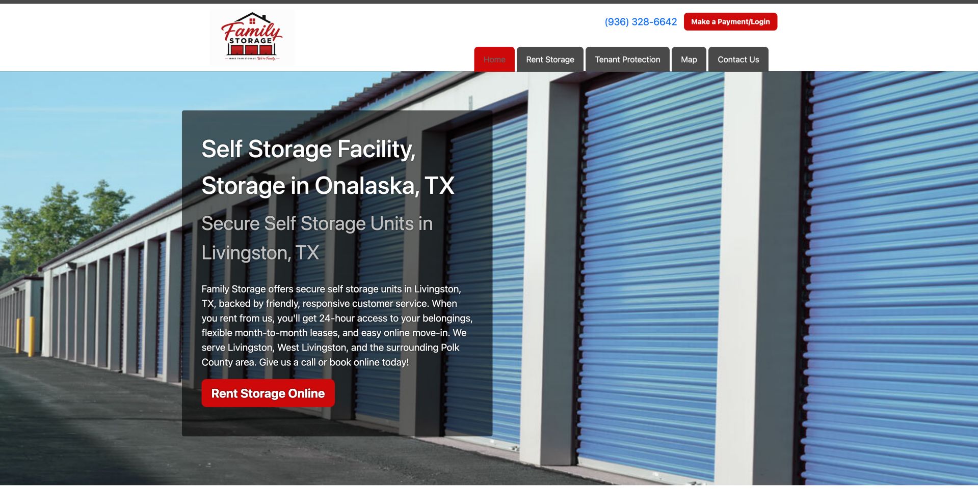
Family Storage uses blue storage doors, red controls and a compact header to make renting the obvious next action. The opening panel places a descriptive heading, local references and a large rental button together, while payment and login remain above the main navigation. Links for a map and tenant protection indicate that practical supporting information has its own place in the structure. The main weakness is geographic consistency: the opening heading names Onalaska, while the following heading and paragraph refer to Livingston. Those names might reflect nearby markets, but the visible copy does not explain their relationship. For a physical rental, that uncertainty matters more than another reassuring adjective. The text also presents access and lease claims that require the applicable terms. A clearer street-address anchor and an explicit service-area sentence would help visitors distinguish the facility's actual location from the communities it serves.
What you can learn
Use one precise facility location and describe surrounding markets separately. Link prices to actual dimensions and availability rather than relying on category names.
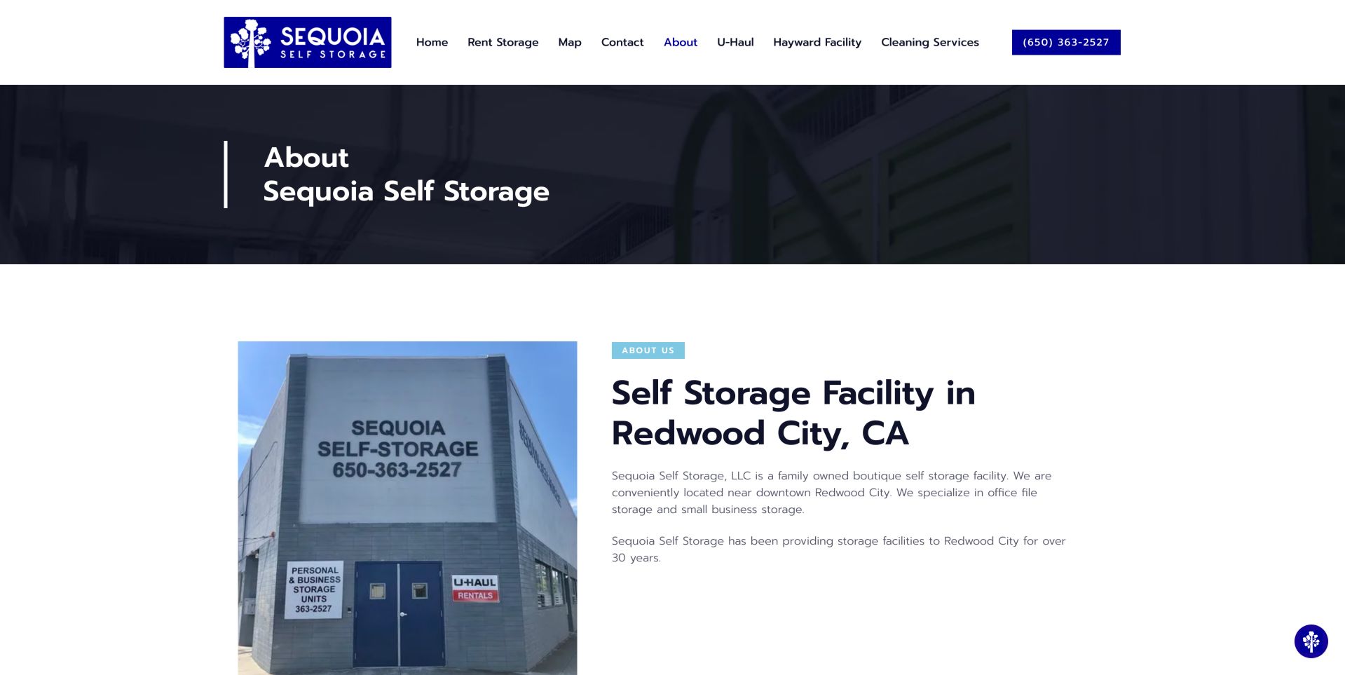
Sequoia's about page gives its small-business positioning a concrete setting. A photograph of the building sits beside a Redwood City heading and short copy identifying office-file and small-business storage as particular uses. The photograph includes the facility name and entrance, making it useful for recognition rather than merely decoration. Above, a dark title band and restrained blue accents separate the page heading from the main content without overwhelming it. The surrounding navigation retains rental, map and contact routes, but also includes moving-truck, other-facility and cleaning-service links. That breadth may be useful to the operator while asking a storage visitor to sort through several different services. The saved notes also identify specific access features further down the page. The strongest reusable idea is the connection between a particular customer need and a real place; current availability still requires the rental route.
What you can learn
Name the storage job you specialise in and explain floors, lifts and access hours. Business customers need physical constraints as much as a reassuring brand.
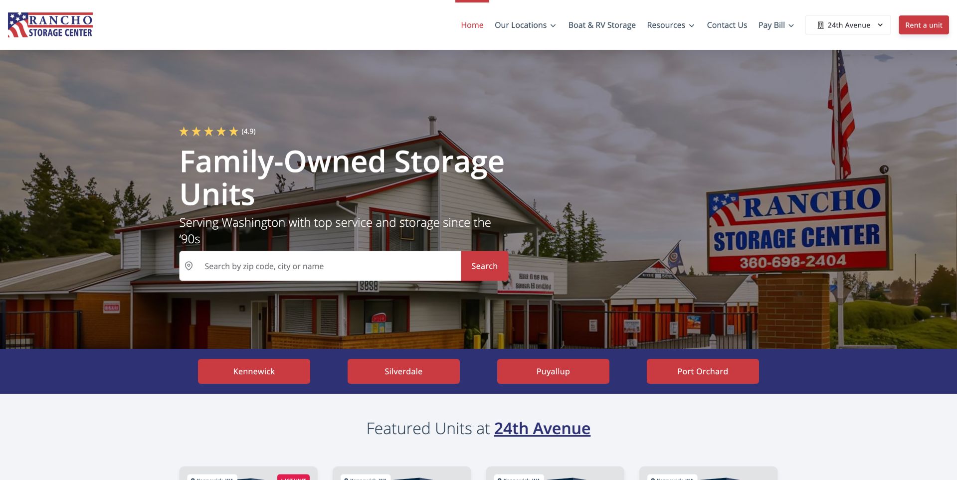
Rancho combines a real facility photograph with two ways to choose geography. A wide search field sits below the introductory headline, and a contrasting strip immediately below offers four named city shortcuts: Kennewick, Silverdale, Puyallup and Port Orchard. Visitors who recognize their destination can therefore bypass a text search. The header also shows a selected facility beside the rental control, while the next section names that selection again above featured units. This repeated context is useful when the same operator serves multiple cities, though it should stay synchronized with the visitor's choice. The building sign and established color palette provide visual continuity between the business and its website. The page's ownership story and star display are less actionable than the location controls. A clearer hierarchy between network search, city shortcuts and selected-facility inventory would make the path especially helpful to first-time visitors.
What you can learn
Combine search with city shortcuts when the network is manageable, and keep each facility's address attached to its action to avoid wrong-site bookings.
Kegan is a freelance web designer and developer with 15+ years of experience helping businesses turn complicated website requirements into clear, maintainable digital experiences. He works directly with clients from planning and design through development, launch, and ongoing support.
For self storage website design, his development approach focuses on facility and service-area pages, clear unit-size information, accessible location search, and careful rental-system handoffs. The scope can be a targeted improvement or a complete custom build, with responsive layouts, thoughtful content structure, and integrations chosen around the people using and maintaining the site.
Show 3 other self storage website designersHide other self storage website designers
Document what happens from selecting a facility through receiving access instructions. Distinguish a nonbinding reservation, a paid rental and a request for staff help. The website should use those labels consistently.
Build a facility information model
Assign each location a stable address, phone number, opening hours, access hours, unit types and amenity list. Avoid copying network-wide claims into every facility page when they do not apply everywhere.
Design a fair unit comparison
Show dimensions, storage conditions, floor or drive-up access and the price period together. Explain whether an advertised rate is introductory and what additional costs must be considered.
Provide a useful sizing route
Use realistic packing examples and dimensions to help visitors estimate their needs. Say when they should call for assistance rather than presenting a size estimate as a guarantee.
Keep identity through checkout
When inventory or payments live on another system, preserve the facility name and explain the destination. Verify that the selected location remains visible throughout the handoff.
Plan maintenance ownership
Assign responsibility for rates, holiday hours, amenities and location changes. Historical comparisons need visible dates and an owner who will refresh or retire them when the evidence ages.
The editing job behind the design
Choose tools that preserve the facility context
Evaluate rental software through actual customer tasks rather than a feature list. Confirm that the selected property, unit details, fee disclosures and contact path survive the handoff from the marketing site. Test safely in a sandbox, never by creating real rentals during a design review.
Treat search, maps, account access and marketing content as separate dependencies with clear responsibilities. Public page evidence can identify visible tools, but it cannot establish a hidden inventory system, payment security or the completeness of an operator's records.
Our WordPress website examples offer a separate look at publishing approaches. A visible platform label is evidence for that named page, not a guarantee that the same system will suit your requirements.
Before the public launch
A practical self-storage website checklist
Show the exact facility address beside each rental action.
Separate office hours from tenant access hours.
Describe unit dimensions and access conditions.
Explain climate-control claims without implying guarantees.
Disclose mandatory charges and promotional periods.
Label reservations and paid rentals differently.
Provide size guidance with clear limits.
Keep phone and directions available on location pages.
Make tenant payment and move-out instructions easy to find.
Use real facility photographs with appropriate rights.
Date price comparisons and review them regularly.
Test keyboard navigation, form labels and error recovery without making a real rental.
These checks are a project checklist, not a performance, legal, security, or accessibility certification. Test real journeys with the people responsible for the website before making claims about the result.
Sources & editorial method
How this collection was selected and reviewed
The linked public pages and their visible layouts were reviewed on November 6, 2026 UTC. Screenshots are direct browser captures, with their individual dates retained. Reviews describe visible presentation and navigation, not completed rentals, verified availability, facility security or independent customer-service findings. Commercial statements and testimonials were not treated as independently verified facts.
Each example links to its actual source page. Screenshots are direct browser captures with their own capture dates; moving imagery, announcements and live designs can change. The notes describe observable design choices and conditional tradeoffs, not measured traffic, conversion results, service quality, or accessibility conformance.
Technology labels use public page metadata, asset evidence, or explicitly cited platform documentation. Platform documentation is not a complete current deployment audit. A component reference may be legacy or unused; it is not a complete backend inventory. Unknown stacks are omitted. These sites are editorial examples, not our client portfolio.
Written, Edited and Curated are separate editorial records, not timestamps advanced by a rebuild. Website designs and imagery belong to their owners. See our editorial standards or suggest a correction.
Questions worth asking
Self Storage website design questions
Should a storage homepage start with search?
Search is useful for a larger network, but a single facility may be better served by a clear address and unit-selection link. A small regional network can offer named city shortcuts alongside search.
Should we show prices before asking for contact details?
Useful pricing context helps visitors judge fit. Explain the period, unit features and additional required charges, and distinguish indicative starting rates from current availability.
Is a size guide enough to recommend a unit?
No. Dimensions, packing method, access requirements and the items themselves matter. Use the guide to support an estimate and offer staff help for uncertain or unusual needs.
Can we say our facility is completely secure?
Avoid absolute protection claims. Describe verified measures accurately and explain the limits of any protection or insurance arrangement through the appropriate terms.
How should an external rental portal be introduced?
Explain that the next step opens the rental system, retain the selected facility identity and offer a clear way back or a phone contact if the process fails.
Start with the information that prevents a wrong choice: location, usable space, access and total cost. A distinctive visual identity becomes more valuable when those fundamentals are easy to understand.