Best Costume Shop Websites of 2026 (22 Real-World Examples)
Twenty-two real costume-shop and costume-hire websites show how visual inspiration, rental logistics, specialist services and product browsing can work together.
Make the next step clear for someone buying one outfit, hiring a costume or planning an entire production.
A costume website may serve a party guest, a school theatre coordinator, a stylist or a professional production team. Those visitors can admire the same photograph while needing completely different information. The useful design question is how quickly each person can identify an appropriate route, understand the conditions and decide what to do next.
These twenty-two examples include local costume shops, online retailers, specialist studios and professional hire departments. The reviews examine their visible website presentation and information structure. They do not assess garment quality, costume suitability, cleaning claims, delivery performance or the outcome of an unplaced order. Institutional and professional services are identified where they differ from ordinary individual fancy-dress hire.
Before the examples
What makes good costume shop website design in 2026?
Separate buying, hiring and production inquiries
Use distinct labels and pages for retail products, individual rentals, full productions and bespoke work. Explain whether the website shows complete stock or only examples. A visitor should not mistake an inquiry gallery for live availability, or assume a rental can be purchased through an ordinary cart.
Put dates, fit and collection conditions near the decision
Costume needs are often tied to an event date. Explain the hire period, collection or delivery process, fitting expectations and the return arrangement before encouraging a commitment. Make geographic or customer-eligibility limits visible, and keep store hours and appointment requirements current.
Use photographs to explain the assortment
Show genuine garments and useful details, then group the collection by the way customers ask for it: production, period, occasion, character or item type. Keep the practical route visible beside expressive artwork. Avoid letting seasonal campaigns obscure ordinary categories or persist after their date has passed.
The collection · 22 examples
22 costume shop websites worth studying
Compare the twenty-two source pages for the relationship between inspiration and practical next steps. The explicit Editors Choice recognizes specialist website design and communication, not a guarantee about costumes, fitting, cleaning or service quality.
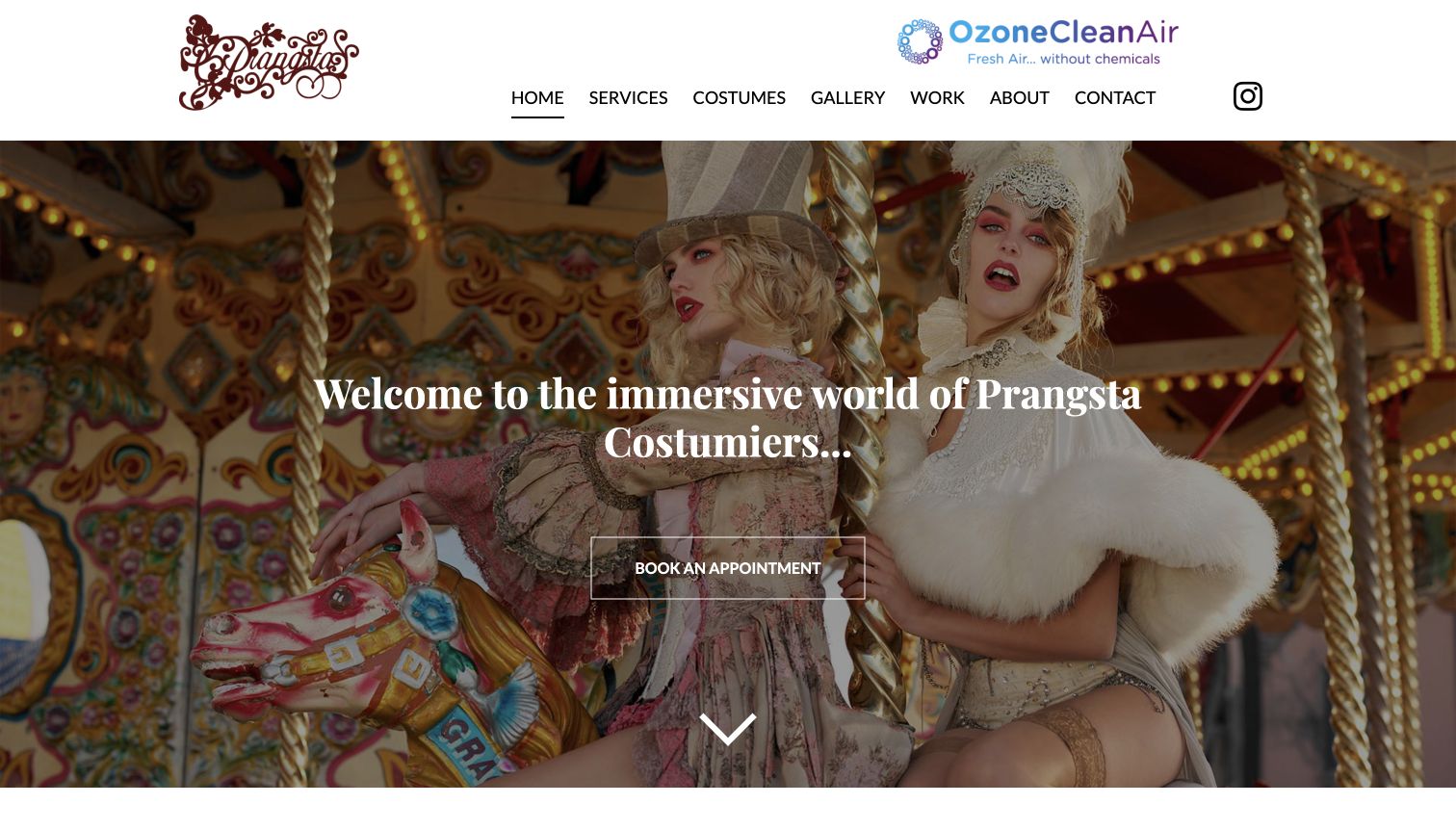
Prangsta makes its particular kind of costume work immediately recognizable. An elaborate fashion photograph fills the opening screen, while the restrained white header keeps the service menu readable. The central appointment link gives that theatrical presentation a practical destination. Below it, separate routes distinguish styling, bespoke work, photography and event services. The directly reviewed styling page then explains appointment expectations, preparation, hire periods and the difference between consultation and alterations. Its company page describes the New Cross studio, giving the creative language a specific place and working context. The result feels more like an introduction to a specialist than an undifferentiated costume warehouse.
What you can learn
Use an expressive image to establish the specialty, then connect it to plain service information. Visitors should understand what happens after choosing an appointment.
Pros
Distinctive styling photographs communicate the creative direction before visitors read the longer introduction.
The separate styling page explains preparation and service boundaries beyond the homepage’s broad promise.
Cons & considerations
The opening appointment link does not itself explain pricing, duration or availability for newcomers.
The prominent third-party cleaning graphic competes visually with the studio’s own decorative brand mark.
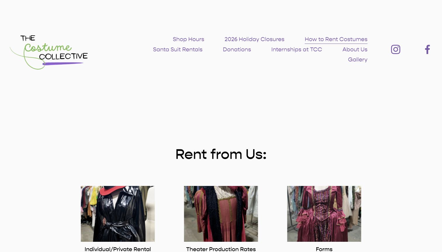
The Costume Collective’s rental page puts the mechanics of borrowing ahead of a large promotional image. Three photographed columns introduce individual rentals, theatre rentals and forms, allowing different customers to recognize their route. The supporting text distinguishes rental periods, included cleaning, extra items and production arrangements. Download links cover the practical documents a theatre coordinator may need. This is a useful contrast to shops that show costumes first and leave all rental questions for a phone call. The spacious header and modest typography give the page a straightforward local-business character, although a visitor still has to read substantial text to compare the options.
What you can learn
Separate individual outfits from production orders early. Each route should explain timing, included items, required information and the next contact step in one coherent sequence.
Pros
Customer-specific columns make the rental process easier to scan than one uninterrupted policy paragraph.
The page links operational forms directly beside the explanation of how production rentals work.
Cons & considerations
Much of the rental detail remains in dense paragraphs rather than an easily compared summary.
The large header leaves less opening-screen space for the practical information underneath the photographs.
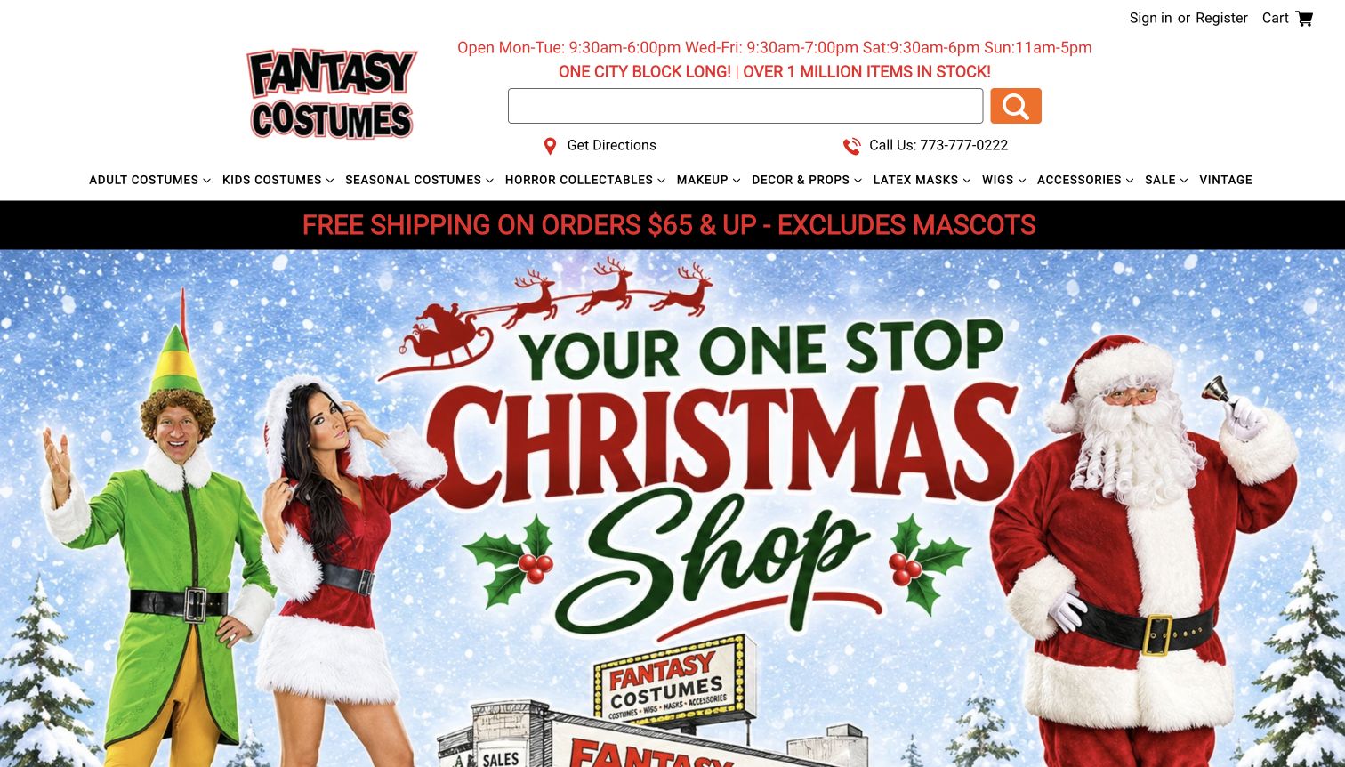
Fantasy Costumes treats the physical store as part of the shopping experience from the first screen. Opening hours, a phone number and directions sit above a broad category menu and a prominent search field. The large Christmas campaign then supplies a timely visual entry into the catalog. Categories extend beyond outfits into masks, wigs, makeup, props and accessories, which reflects how customers assemble a complete look. The page’s bold red, black and white furniture is easy to distinguish from its colorful promotional artwork. It combines local visit planning with online browsing, although the volume of categories and large seasonal imagery can compete for attention.
What you can learn
Keep store logistics visible even when the campaign changes. A visitor planning a same-day trip needs a different route from someone browsing a broad costume catalog.
Pros
Hours and directions appear before the main campaign, helping visitors orient themselves to the store.
The extensive category structure acknowledges accessories and makeup as separate shopping tasks alongside costumes.
Cons & considerations
The large seasonal artwork delays a clear view of ordinary product listings on smaller screens.
A dense assortment menu can require several choices before an unfamiliar shopper finds a starting point.
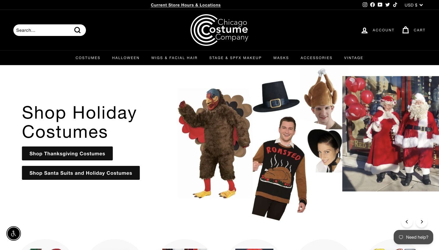
Chicago Costume’s opening screen uses a simple seasonal split: holiday artwork sits beside two clear shopping buttons. Search, location information and store hours remain in the dark header above it. The contrast between the black navigation and mostly white campaign panel creates a strong hierarchy without much introductory copy. The wider site distinguishes retail categories from rentals, including a separate route for Santa suits and production costumes. That distinction matters because buying a packaged outfit and arranging a rental involve different questions. The homepage works best as a quick shopping gateway; visitors with production requirements still need to follow the appropriate rental route for detail.
What you can learn
Use the campaign to suggest a current occasion, while preserving visible routes for stores, everyday categories and rentals. Similar-looking costumes can belong to very different transactions.
Pros
Two focused holiday buttons offer a manageable first choice within an otherwise broad costume assortment.
The header keeps search and local-store information accessible without requiring a visit to the footer.
Cons & considerations
The seasonal first screen gives limited explanation of the rental process or production-specific requirements.
Moving between retail and separate rental destinations can require visitors to reorient themselves during research.
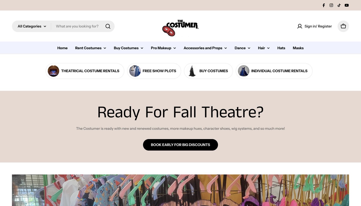
The Costumer organizes its opening experience around recognizable jobs. Four rounded links separate theatrical rentals, show plots, purchases and individual rentals before the main promotional panel. The header also provides a large search field and categories for makeup, accessories, dancewear and costume components. This structure helps a teacher arranging a show avoid the same path as someone buying a single item. The theatre-oriented promotion and garment imagery reinforce the production focus without replacing those practical routes. The design uses restrained cream and lavender panels rather than an entirely seasonal visual identity, making it easier to imagine the navigation remaining useful throughout the year.
What you can learn
Name the customer’s task before presenting the full inventory. Production resources, rental inquiries and ordinary purchases deserve separate entry points even when they share the same stockroom.
Pros
The opening task buttons distinguish full-show resources from individual rentals and retail shopping immediately.
A prominent search field supports returning visitors who already know the product or show name.
Cons & considerations
The main promotional panel occupies substantial space before visitors reach specific examples of available garments.
The broad assortment still requires careful category choices after the initial task has been selected.
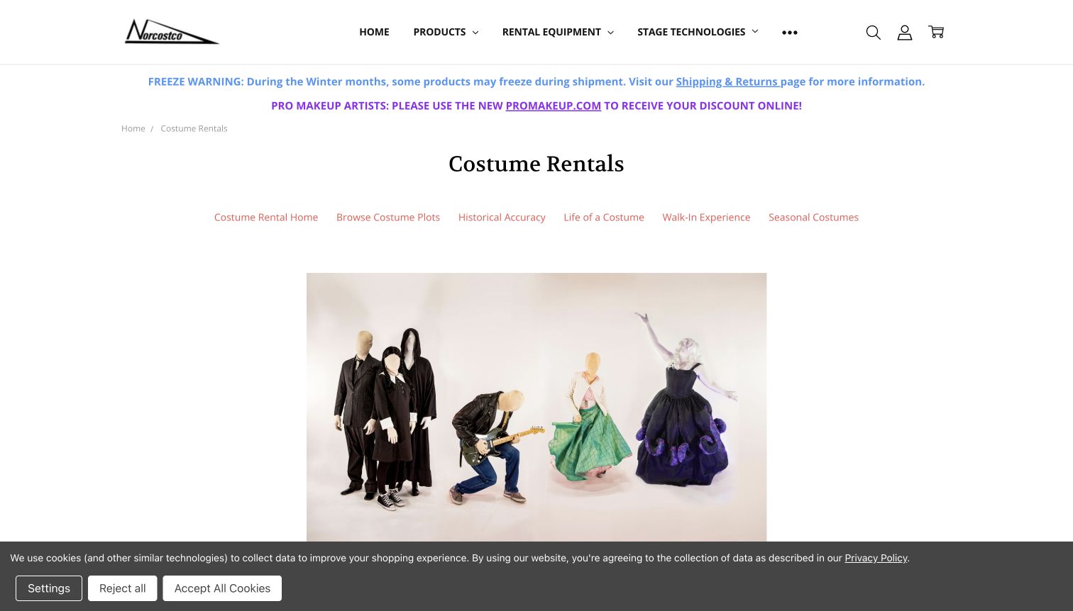
Norcostco’s dedicated costume-rental page gives a specialized service its own heading and secondary navigation inside a much broader theatrical-supply site. The opening garment photograph establishes the costume context, while links lead into show plots and rental information. The text explains how production needs, measurements and alterations influence selection, instead of presenting every costume as a simple retail item. This is particularly relevant to organizations sourcing an entire show. The main navigation still contains many technical departments, however, and operational notices appear above the service content. The page demonstrates the value of a focused landing page when a supplier’s overall inventory would otherwise obscure the costume department.
What you can learn
Give an important specialist service a dedicated page with its own practical sequence. Keep the parent business visible, but make the next rental step unmistakable.
Pros
Show-plot resources connect the costume department to the way theatre teams plan an actual production.
The service explanation acknowledges measurements and preparation instead of implying that stock alone resolves every need.
Cons & considerations
The broad technical-supply header introduces categories unrelated to a visitor researching costume rentals specifically.
Operational notice bands consume opening-screen space before the rental heading and supporting garment photograph.
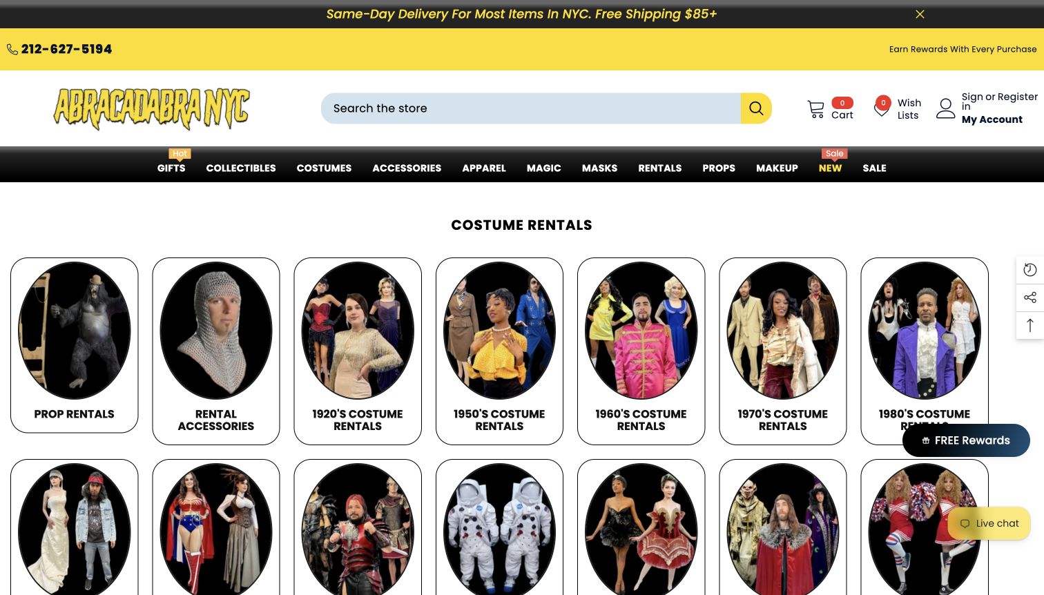
Abracadabra NYC’s rental collection opens with a large grid of photographic theme tiles. Decades, accessories, armor and character-oriented groups give visitors several ways into a varied inventory. The bright yellow header, dark navigation and clear rental heading make the page feel different from a generic fashion category. This is useful for customers who know the occasion or visual reference but not a specific product name. Rental listings and supporting information introduce deposits and collection arrangements further into the journey.
What you can learn
Use real category imagery to make unfamiliar rental inventory understandable. Pair each theme with the practical conditions that distinguish borrowing an outfit from buying one outright.
Pros
Photographic theme tiles help visitors recognize a costume direction without knowing specialist inventory terminology first.
A dedicated rental heading keeps this service distinguishable from the store’s broader retail assortment.
Cons & considerations
The many similarly weighted category tiles can overwhelm visitors who arrive with only a loose brief.
Floating rewards and chat elements compete with the catalog rather than helping every rental research task.
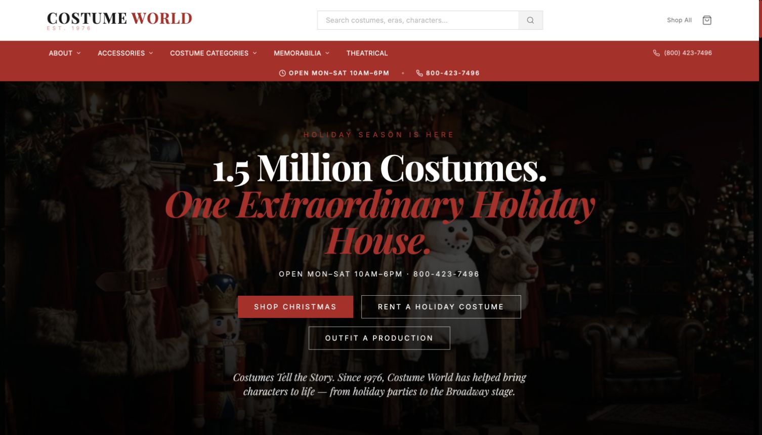
Costume World’s homepage uses dramatic holiday imagery, but its most useful decision is the separation of three next steps. Visitors can shop seasonal items, rent a holiday outfit or begin outfitting a production. Those labels acknowledge different levels of commitment and information needs. The header supports search and a broad shop route, while the page continues into merchandise and service content. Strong red and white typography supplies a theatrical tone without making every action identical. The opening is compelling as a gateway, although the large campaign scene leaves the details of rental timing and production coordination for subsequent pages.
What you can learn
Give each commercial model its own action label. Buying, renting and arranging a cast should not all lead through an unexplained general shop button.
Pros
The three opening actions separate transactions that would otherwise be easy for first-time visitors to confuse.
Large type and strong color contrast make the seasonal message and principal routes easy to recognize.
Cons & considerations
The oversized campaign scene postpones practical service details below or beyond the first screen.
A production customer must continue elsewhere to understand requirements, timing and the scope of assistance.
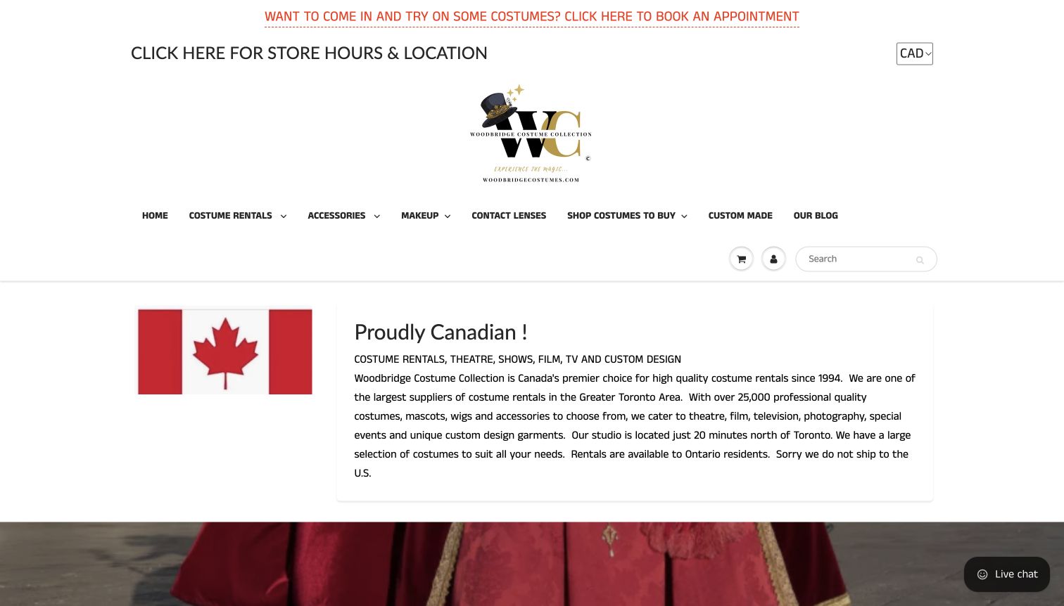
Woodbridge Costumes gives local logistics considerable space at the top of its homepage. Appointment access, store hours, location information and a currency selector precede a menu separating rentals, purchases, custom work and supplies. The introduction then identifies the Canadian service context and states important geographic limits for rentals. That specificity can prevent visitors from assuming every pictured costume is available for unrestricted delivery. The catalog contains period and themed categories, while rental FAQs and policies provide supporting detail. The page’s weakness is mainly hierarchy: several header rows and a large logo delay the actual assortment.
What you can learn
Publish rental territory and visit expectations early. A clearly explained limit is more useful than a broad promise that a visitor discovers does not apply later.
Pros
Distinct rental, retail and custom-work navigation reflects the different services offered by the same shop.
The introduction makes geographic rental limitations visible rather than leaving them entirely inside policy pages.
Cons & considerations
Multiple header rows take up substantial space before visitors see the first costume categories or images.
The opening emphasis on logistics can feel text-heavy for shoppers who are still looking for inspiration.
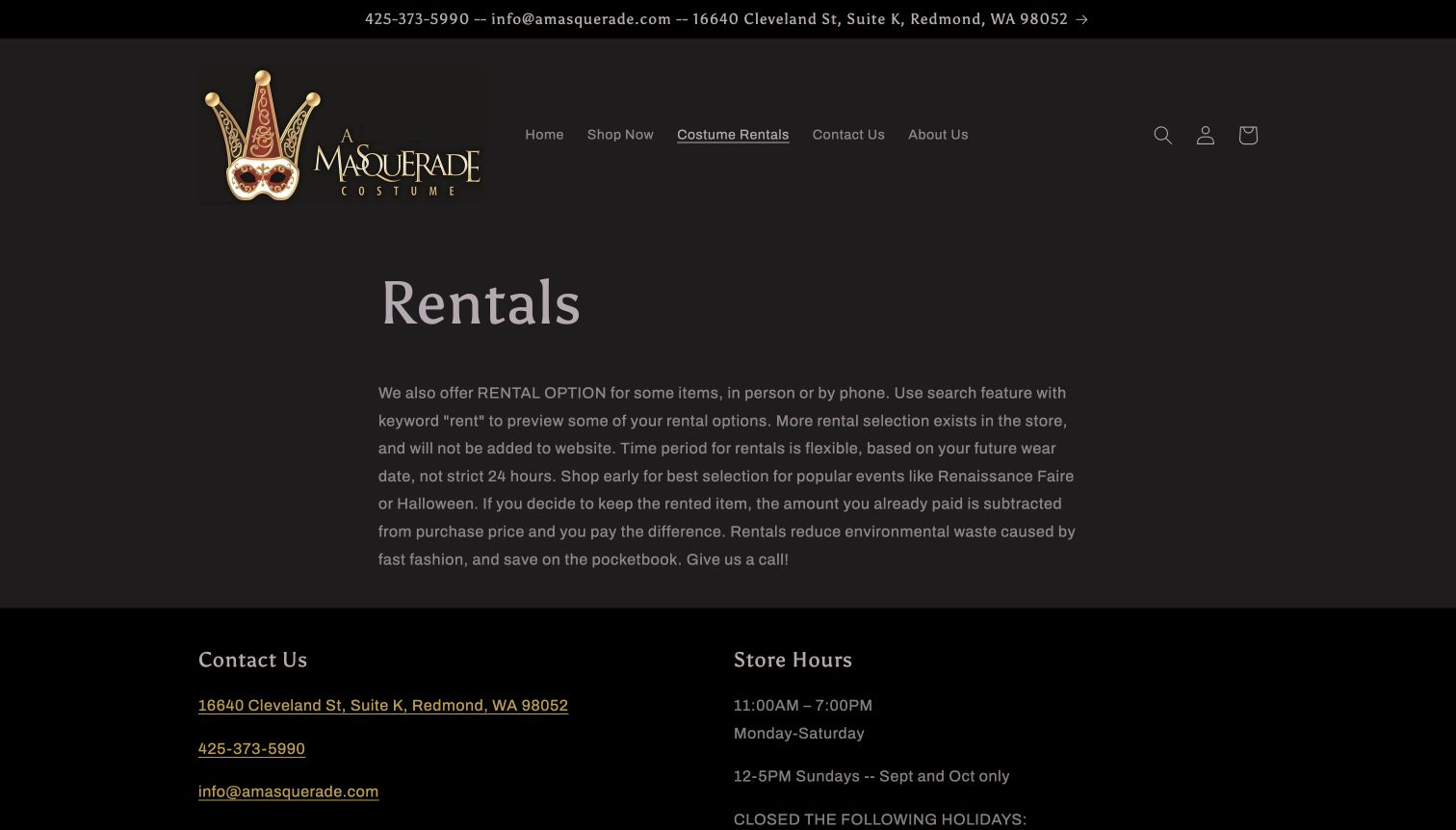
A Masquerade Costume’s rental page is unusually direct about what the website can and cannot do. It explains that rentals are arranged in person or by phone and that the online selection represents only part of the stock. The dark background and gold-accented logo give the page a consistent theatrical identity, while a compact menu keeps the route back to ordinary shopping visible. A short paragraph covers timing and how to explore some rental options. Address, phone and opening hours follow immediately below.
What you can learn
When the website is a preview of a physical inventory, say so plainly. Explain the offline next step before customers invest time treating the catalog as complete.
Pros
The page clearly distinguishes online browsing from the phone or in-person process required for rentals.
Contact details and store hours sit directly below the explanation, making the next practical step available.
Cons & considerations
Several rental instructions are compressed into one paragraph rather than separated into short labeled steps.
The page includes no costume photographs to help visitors understand the range before contacting the shop.
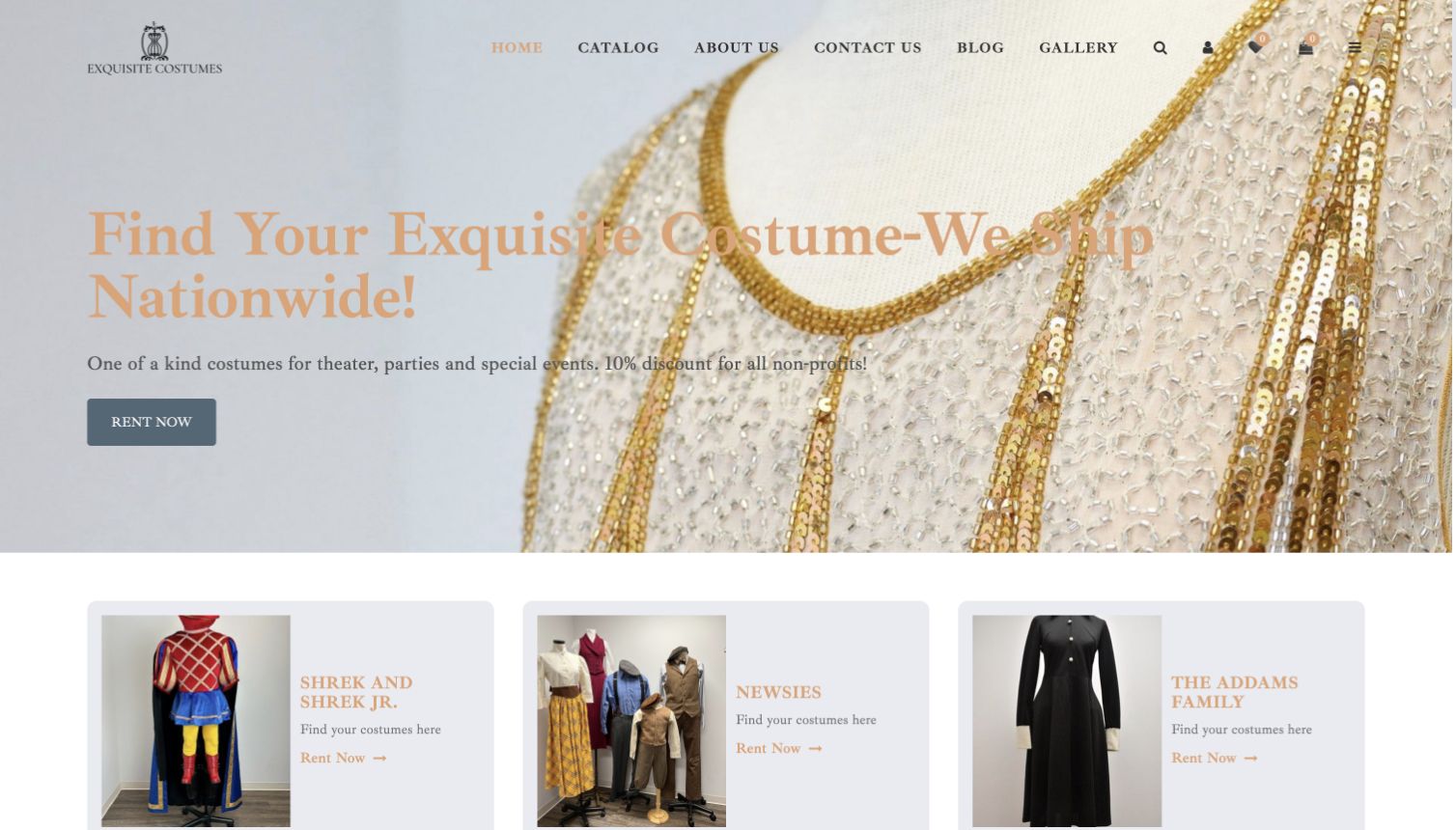
Exquisite Costumes leads with a close-up of embellished fabric and a direct rental action, then moves into named productions and historical periods. The category cards combine garment photographs with recognizable show titles, helping theatre customers start from the production they are planning. Further down, the site explains details such as sizing information, cleaning and custom work alongside featured rental items. This combination gives the catalog more context than a simple image gallery. The pale peach text and spacious composition create a softer identity than a seasonal costume retailer, although some text has limited contrast against the hero photograph.
What you can learn
Let productions and periods organize specialist stock, then explain how the rental works. Attractive fabric photography should lead toward useful item and service information.
Pros
Show-specific category cards translate a theatre brief into a more focused route through the catalog.
The homepage explains several rental considerations rather than relying solely on promotional garment photographs.
Cons & considerations
Pale text over a detailed fabric image is harder to read than the clearer category labels below.
Numerous service claims compete for attention in the long explanation before the featured-item section finishes.
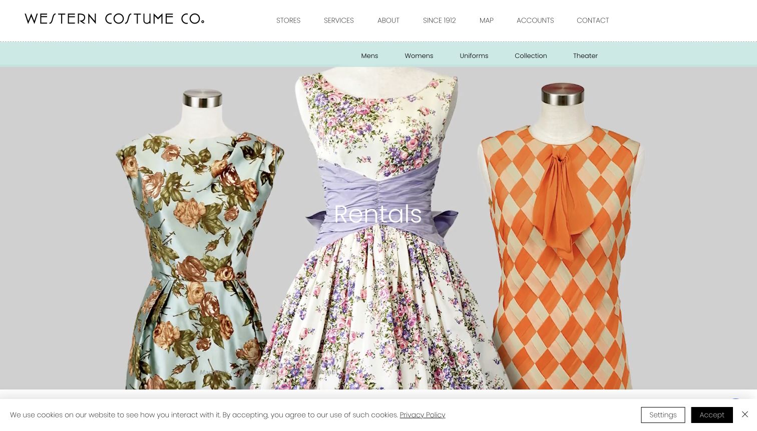
Western Costume’s rental page uses a clean secondary menu to divide a large professional collection into menswear, womenswear, uniforms, collection pieces and theatre. A full-width photograph of garments on mannequins establishes the material character of the inventory before the department descriptions begin. The page then explains each area with photographs and contextual text, rather than attempting to turn the entire warehouse into an ordinary shopping grid. The quiet header and pale blue navigation strip help those divisions remain readable.
What you can learn
Use departments to organize specialist inventory when a simple product grid would be misleading. Give each department a clear scope and a route toward the appropriate inquiry.
Pros
The secondary menu provides a concise map through several distinct areas of a professional costume collection.
Large garment photographs show materials and silhouettes without the visual clutter of a retail promotion.
Cons & considerations
The opening image occupies most of the screen before visitors reach detailed department explanations.
Practical account and rental arrangements require further navigation beyond this visually focused collection overview.
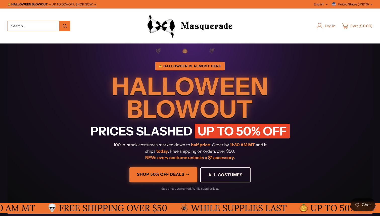
Masquerade concentrates its homepage around a single Halloween campaign. Orange lettering, a dark purple background and two large buttons distinguish the promotional collection from the complete costume catalog. Supporting copy states dispatch and offer conditions near the principal message, while the next section introduces accessories related to the campaign. This is a clear example of a landing page built for a particular retail moment. It also shows why maintenance matters: the captured November page still says Halloween is approaching. The strong visual hierarchy makes that message impossible to miss, so stale timing becomes especially noticeable.
What you can learn
A focused campaign needs an equally clear expiry plan. Keep a route to the full assortment and review date-sensitive language whenever the featured occasion passes.
Pros
The two main buttons separate the promotional selection from the complete catalog without a complicated first decision.
Offer conditions appear near the campaign message instead of being entirely detached from the shopping invitation.
Cons & considerations
The captured November page retained language suggesting Halloween was still ahead, reducing the message’s timeliness.
A strongly seasonal first screen gives little immediate guidance for visitors shopping for another occasion.
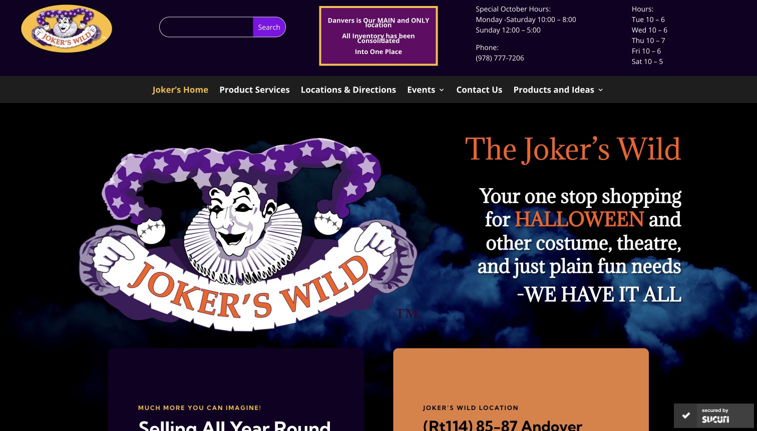
The Joker’s Wild makes its physical location hard to overlook. A highlighted notice identifies Danvers as the consolidated store, with phone information and hours beside it. Below, a large illustrated mascot establishes an energetic identity, while the navigation leads to product services and directions. The page describes accessories, masks, wigs and other items as reasons to visit, rather than presenting a fully transactional catalog in the opening view. This is useful for a shop where browsing and staff assistance are part of the intended experience.
What you can learn
For a destination shop, answer where and when before asking visitors to travel. Then show enough real product context to make the visit understandable and worthwhile.
Pros
The prominent consolidation notice reduces ambiguity about which store location a visitor should use today.
Directions and product-service links support an in-person shopping journey instead of implying complete online stock.
Cons & considerations
Seasonal and ordinary hours appear together, requiring visitors to determine which schedule currently applies.
The oversized mascot occupies space that could introduce specific costume categories or recent merchandise sooner.
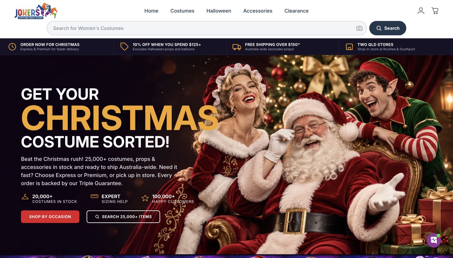
Jokers Costume Mega Store places a wide search field immediately beneath a compact navigation row. A service strip then distinguishes delivery choices, an offer condition and the two Queensland stores before the Christmas hero begins. The page continues into costume categories and separate explanations of its delivery, price and sizing policies. This is a practical structure for visitors balancing an event date with the need to choose an outfit. The source also presents a sizing tool, but this review did not submit measurements or test its recommendations.
What you can learn
Place delivery context and store options near search, then explain any guarantee on its own page. A visible policy label should lead to conditions a visitor can evaluate.
Pros
The service strip makes delivery options and physical-store availability visible before the main promotional image.
Search and occasion browsing offer different starting points for shoppers with precise or exploratory requirements.
Cons & considerations
Several promotional statistics and assurances compete with the main shopping action in the opening composition.
The large seasonal hero delays the category grid for visitors who need a different type of costume.
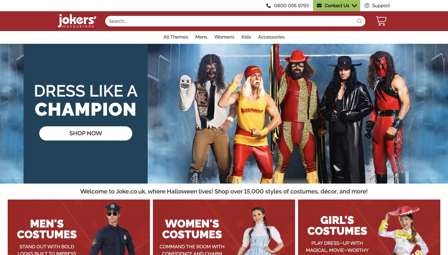
Jokers’ Masquerade uses a relatively short menu to organize a large assortment. A red header gives search considerable width, with support information above and audience categories below. The captured hero promotes wrestling-inspired costumes through recognizable character styling and one clear shopping action. Beneath it, photographic tiles divide the catalog by audience and theme. This keeps the first navigation decision manageable even when the underlying range is broad. The page is strongest as a direct shopping gateway, rather than a detailed service introduction.
What you can learn
Keep the top menu short when the catalog is large. Use clear category photographs to reveal the range gradually, while maintaining a prominent route for exact searches.
Pros
The wide search field is easy to locate and does not disappear behind the campaign artwork.
Photographic category tiles provide a concrete next step after the opening character-focused promotional scene.
Cons & considerations
The featured entertainment theme may be irrelevant to visitors arriving for another occasion or style.
Practical buying conditions are not explained in the main hero and require further reading elsewhere.
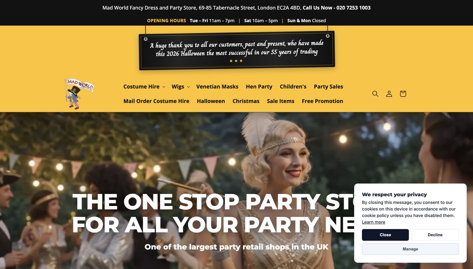
Mad World Fancy Dress uses a bold yellow header and moving-image hero to establish a lively party identity. The opening includes its London address and hours before a broad menu covering hire, accessories and seasonal items. Below the hero, three explicit routes separate costume hire, mail-order hire and party sales. That distinction is useful because collecting locally, arranging delivery and buying supplies involve different expectations. The source also connects costumes to specific themed events, giving visitors an alternative to browsing by garment alone.
What you can learn
Distinguish local service from remote delivery before presenting the full assortment. Event inspiration is most useful when it connects to a clearly described transaction or hire process.
Pros
Local address and opening information appear before the visual campaign, supporting visitors planning a store trip.
Separate hire, mail-order and retail cards make the business’s different service models understandable at a glance.
Cons & considerations
Several stacked announcements and menu rows create a crowded opening before the main service choices appear.
The captured cookie notice obscures part of the hero and adds another decision during initial browsing.
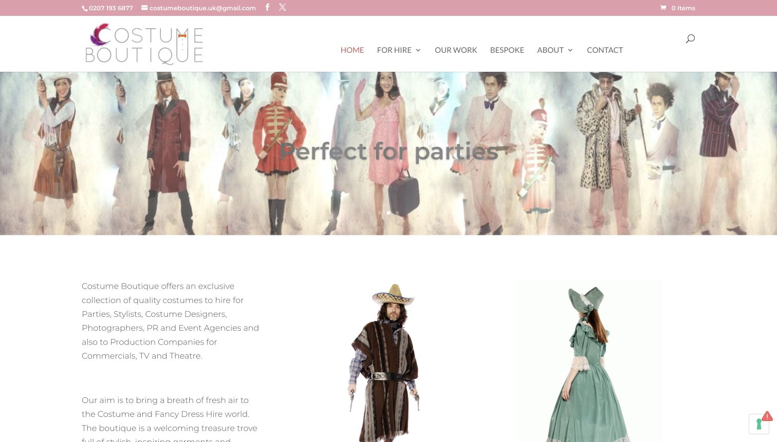
Costume Boutique introduces its collection with a wide photographic sequence of different outfits rather than a single seasonal sale. The white and pale pink interface leaves the garments as the main visual material. Navigation separates hire, previous work, bespoke services and contact information, while the introductory copy identifies several kinds of creative customer. The page also explains that the online selection is only part of what is available, encouraging an inquiry for a specific brief. This is a useful model for a studio whose value lies partly in combining pieces.
What you can learn
Show the range of possible looks, then explain whether visitors are browsing complete stock or an illustrative selection. A creative service needs a clear inquiry route alongside the gallery.
Pros
Separate hire and bespoke links distinguish choosing existing garments from arranging something more specific to a brief.
The introduction explains the intended client types and acknowledges that the website is not the entire collection.
Cons & considerations
Light typography over pale photography reduces the clarity of the short opening campaign message.
The long assortment presentation offers less immediate guidance on the steps and timing of a rental inquiry.
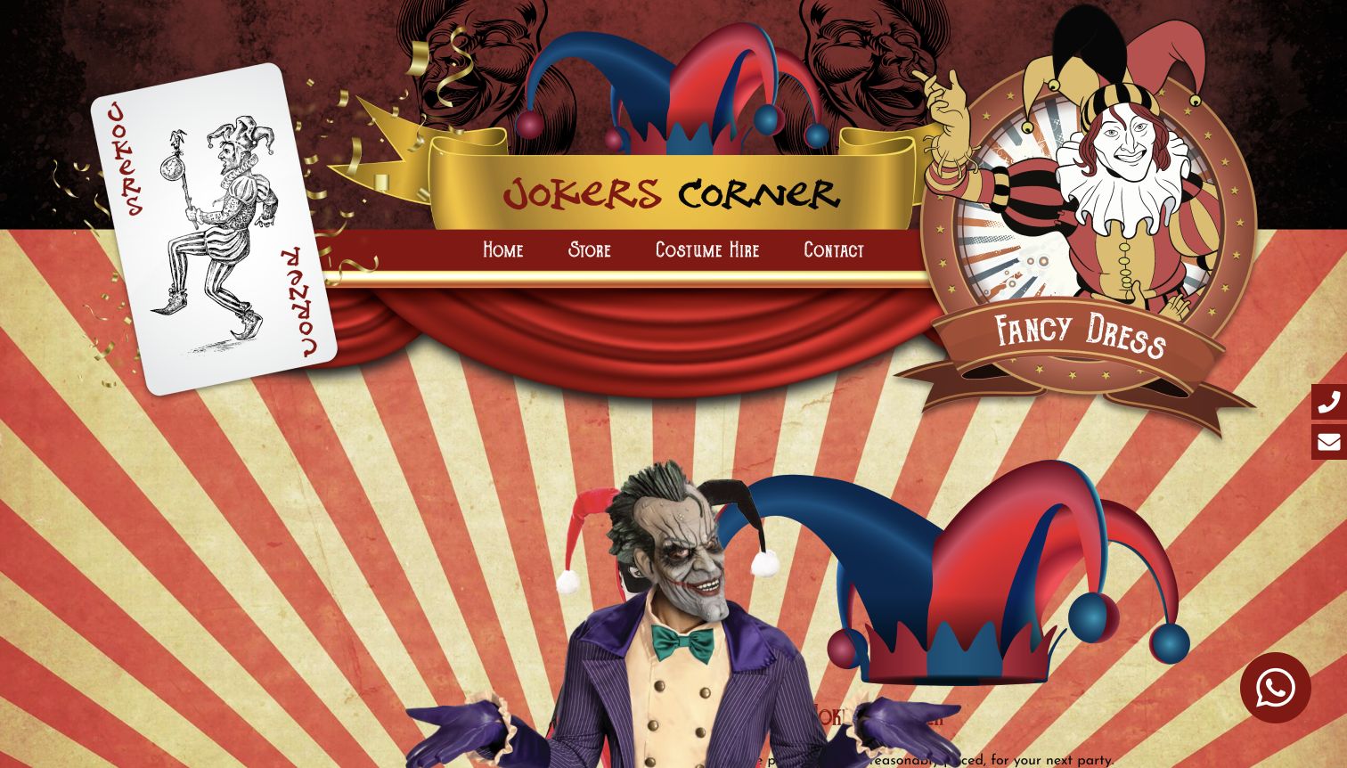
Jokers Corner commits strongly to its theatrical identity. Illustrated cards, curtains, gold ribbons and a central jester motif surround a short navigation bar for the store, costume hire and contact. That compact menu is easier to understand than the dense decorative background might suggest. The homepage distinguishes purchase and hire in its rotating content and links visitors toward the Coventry shop. It also promotes accessories and themed occasions as ways to assemble an outfit. The opening is memorable, but the large decorative treatment delays useful product and service details.
What you can learn
A distinctive theme can support a local shop’s identity, provided the essential routes remain plain. Match each button’s promise to the destination visitors actually reach.
Pros
A short menu keeps store browsing, rental information and contact as recognizable choices within an elaborate design.
The site acknowledges both buying and hiring, rather than treating every costume inquiry as the same transaction.
Cons & considerations
Large decorative artwork occupies most of the opening screen before visitors see practical assortment information.
Several shopping-style campaign labels lead to contact, which can interrupt expectations of direct product browsing.
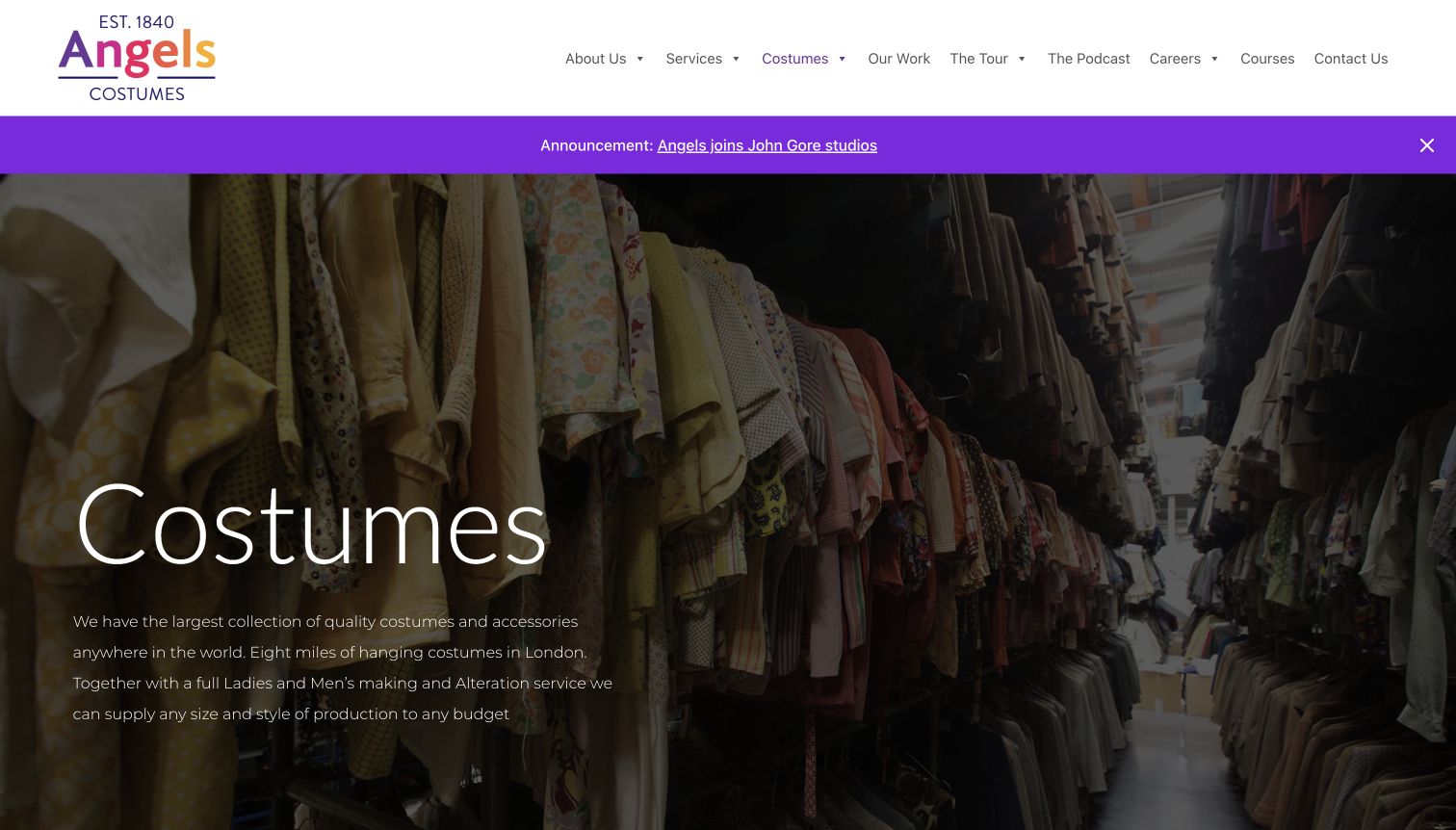
Angels’ costume-collection page starts with a wide photograph looking into racks of garments. The image makes the inventory tangible, while the accompanying introduction explains the production-oriented scope. A restrained white header and purple announcement strip keep navigation visually separate from the darkened photograph. Further content divides the collection into departments such as costume selection, uniforms and accessories, with links to more specific information. This is a useful presentation for a supplier where customers need knowledgeable routing more than a standard retail checkout.
What you can learn
Use a real working environment to establish context, then divide a complex collection into meaningful departments. Help visitors find the right conversation rather than implying every item is directly purchasable.
Pros
The warehouse photograph provides a concrete sense of the collection rather than relying only on promotional language.
Department links offer more focused routes for visitors researching accessories, uniforms or general production costumes.
Cons & considerations
The large introductory image delays detailed department content for visitors who already know their requirements.
General scale claims receive more opening emphasis than the practical steps for initiating a rental inquiry.
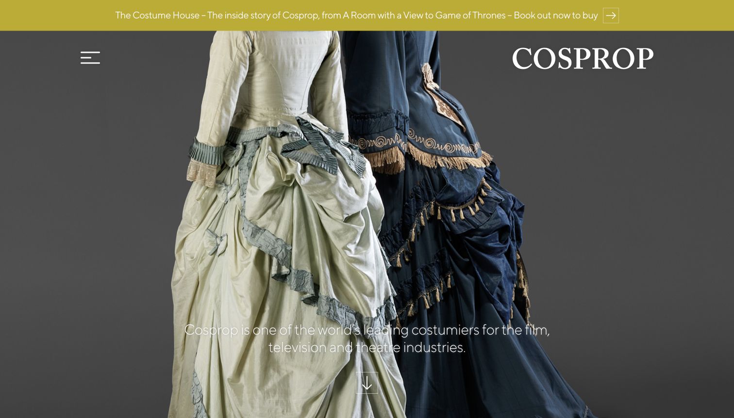
Cosprop lets two detailed period garments dominate the opening screen. The restrained gray background, large serif wordmark and minimal visible controls give the clothes room to communicate texture and construction. A short statement identifies the intended production audience, while the next section separates making, hiring, exhibitions and research. Those service distinctions are more useful than treating every visitor as someone shopping for a party outfit. The page’s visual restraint creates a strong identity, but the collapsed menu and full-screen image mean a visitor must take another step to locate practical hire information.
What you can learn
Let detailed photography establish a specialist collection, then organize the services according to what clients actually need. Keep the route from inspiration to practical hire information short.
Pros
The close garment composition communicates the period-costume focus without a crowded set of promotional labels.
Separate making, hire, exhibition and research routes acknowledge distinct professional needs within one costume business.
Cons & considerations
The collapsed desktop menu hides the available service routes until visitors open it or continue down the page.
The opening screen offers little information about appointments, timing or the process of arranging a hire.
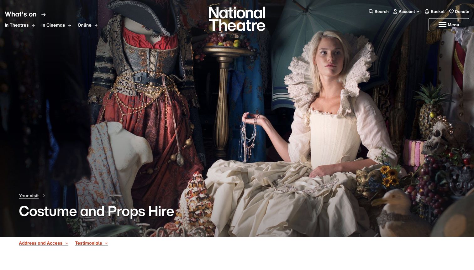
The National Theatre’s costume-and-props hire page combines an expressive photograph with unusually useful eligibility information. After the opening image, visitors can find the department’s address, appointment-only hours and examples of the collection. The page explicitly lists the organizations it serves and states that private fancy-dress hire for individuals is unavailable. Separate contact details distinguish costumes from props, while access information supports planning a visit. This is an institutional rental service rather than an ordinary party shop, and the page makes that distinction visible.
What you can learn
State who a service is for, including meaningful exclusions. Eligibility, appointment requirements and the correct department contact can prevent more confusion than another gallery of attractive outfits.
Pros
The page clearly explains its organizational audience and excludes private individual fancy-dress hire without ambiguity.
Separate costume and prop contacts, appointment hours and access information support a practical next step.
Cons & considerations
The parent theatre’s ticketing and donation controls are unrelated to most costume-hire research tasks.
A large opening photograph postpones the important eligibility and appointment details until visitors move further down.
Kegan is a freelance web designer and developer with 15+ years of experience helping businesses turn complicated website requirements into clear, maintainable digital experiences. He works directly with clients from planning and design through development, launch, and ongoing support.
For costume shop website design, his development approach focuses on rental-versus-purchase clarity, costume discovery and practical fitting or appointment information. The scope can be a targeted improvement or a complete custom build, with responsive layouts, thoughtful content structure, and integrations chosen around the people using and maintaining the site.
Show 3 other costume shop website designersHide other costume shop website designers
Plan the costume journey before choosing the campaign artwork
Define the customer and the transaction first
Begin with the requests the business actually handles. An individual looking for a party outfit, a school choosing costumes for a cast and a stylist planning a shoot may all use the word costume. Their deadlines, quantities, fitting needs and approval processes are different. Map those journeys before arranging the homepage around a large photograph or a seasonal promotion.
Give each supported transaction a specific label. Buying an item should lead to product information and availability. Hiring should explain the rental period, collection or delivery, returns and any deposit conditions. A production inquiry should describe the information the team needs, such as dates, roles, measurements or a design brief. Bespoke work needs its own explanation of scope and lead time. Do not imply that a general contact form is a confirmed booking.
Be equally clear about limits. A regional rental shop may not ship internationally. A theatre department may serve organizations but not private party customers. A studio may require appointments, even when it welcomes exploratory conversations. Put those facts near the relevant route. Keep essential service navigation stable while campaign artwork changes, and assign someone responsibility for checking that labels still match their destinations. This preparation reduces avoidable misunderstandings before any customer shares a brief.
Create useful costume and collection records
Plan the information behind each photograph. A useful record identifies whether the item is for sale, hire or illustration, the available size or measurement guidance, included components and any separately arranged accessories. If the photograph shows a complete styled look, explain which pieces belong to the offer. Do not rely on the image alone to communicate those boundaries.
Choose categories that match the inventory and the customer. A production supplier may organize by show, period or department. A retail shop may need occasion, audience and item categories. A styling studio may benefit from galleries paired with service explanations. Avoid copying a large retailer’s taxonomy when the business mainly handles personal consultations. Give exact search a clear role for visitors who already know a product or production name.
Use genuine photographs with enough detail to distinguish garments, textures and silhouettes. Include helpful views of closures, accessories and scale where appropriate. Maintain the relationship between photographs and the actual item or service described. A gallery can inspire without claiming current availability, provided that limitation is explicit. Keep image descriptions useful, headings readable and important text outside the artwork. Review old images and captions when stock changes, rather than allowing an attractive but unavailable outfit to become an unexplained promise.
Maintain the details that make the service usable
Costume websites often change quickly around holidays and productions. Build a simple maintenance routine for opening hours, seasonal notices, appointment information and campaign end dates. A highly visible message becomes a liability when it describes an occasion that has already passed. Give each temporary promotion an owner and a planned removal or replacement date.
Keep operational policies close to the decisions they affect. Explain how customers confirm availability, what a rental period includes and how garments are collected or returned. Distinguish information requests from reservations, and describe any required follow-up. For production work, provide accessible instructions for measurements and forms without requiring visitors to guess which document applies. Avoid collecting more personal information than the task needs.
Test the ordinary paths without completing real orders or submitting inquiries. Confirm that a button promising a collection opens that collection, that contact details are current and that important service pages remain reachable on small screens and keyboards. Check photographs, downloads and internal links after updates. Review the website with staff who answer recurring questions; those questions reveal missing explanations more reliably than decorative preferences. Keep a concise record of changes so future campaigns preserve the stable routes, accurate conditions and useful source material the business has already established.
The editing job behind the design
Choose technology around inventory and service needs
A retail storefront needs maintainable products, variants, search and clear buying conditions. A rental business may instead need an inquiry-led catalog, availability confirmation and practical service pages. Select the system around the real workflow rather than assuming every costume photograph requires an online checkout.
For specialist studios and production houses, flexible editorial pages can be as important as catalog features. Keep photographs, service explanations and contact routes manageable by the team responsible for updates. Do not promise real-time stock or booking unless the operational system supports it.
The technology records below are bounded observations of public source pages and linked resources. They may identify publishing tools, libraries, fonts, analytics or delivery services, but they do not expose a complete private backend. Failed, restricted and partial scans remain recorded; a screenshot alone does not establish a platform, and a third-party asset does not prove the host website’s CMS.
Our WordPress website examples offer a separate look at publishing approaches. A visible platform label is evidence for that named page, not a guarantee that the same system will suit your requirements.
Before the public launch
A practical costume-shop website checklist
Separate retail purchases, individual hire, production inquiries and bespoke work.
State whether online photographs represent complete stock or an illustrative selection.
Explain rental duration, collection, delivery, return and deposit conditions where relevant.
Publish geographic limits and customer eligibility beside the relevant service route.
Keep appointment requirements, store hours, address and contact details current.
Identify included costume components and separately arranged accessories.
Provide item-specific measurement or sizing guidance without implying guaranteed suitability.
Use real garment photographs with useful detail and clear descriptions.
Organize the assortment by meaningful occasions, periods, productions or item categories.
Keep search and essential service routes visible when seasonal artwork changes.
Remove expired campaign language and check that button labels match their destinations.
Check links, downloads, keyboard access and small-screen navigation without placing real orders.
These checks are a project checklist, not a performance, legal, security, or accessibility certification. Test real journeys with the people responsible for the website before making claims about the result.
Sources & editorial method
How this collection was selected and reviewed
These twenty-two distinct public website properties match the saved random-before-research target of 22 for the original November 9 evening batch. The actual direct source review and captures occurred on November 10, 2026. Each example has an individually inspected browser capture, exact source URL, timestamp, dimensions and attribution. Several examples use a dedicated rental or service page rather than a homepage; those exact paths are retained. Broad bounded public technology-audit attempts were recorded for every source page, including access and partial-scan limitations. Reviews concern visible design and communication, not independently tested product, rental, cleaning or delivery outcomes. Prangsta Costumiers was explicitly selected after comparing the collection and reviewing its studio and styling pages. Its Editors Choice is an editorial website-design selection, not a vote-derived ranking or a service-quality endorsement. No orders, bookings, inquiries or account actions were submitted.
Each example links to its actual source page. Screenshots are direct browser captures with their own capture dates; moving imagery, announcements and live designs can change. The notes describe observable design choices and conditional tradeoffs, not measured traffic, conversion results, service quality, or accessibility conformance.
Technology labels use public page metadata, asset evidence, or explicitly cited platform documentation. Platform documentation is not a complete current deployment audit. A component reference may be legacy or unused; it is not a complete backend inventory. Unknown stacks are omitted. These sites are editorial examples, not our client portfolio.
Written, Edited and Curated are separate editorial records, not timestamps advanced by a rebuild. Website designs and imagery belong to their owners. See our editorial standards or suggest a correction.
Start with the customer’s next practical decision, then use costume photography to make the available paths inviting. A memorable identity works best when the visitor can also understand the service, its conditions and how to proceed.