Best Nail Salon Websites of 2026 (25 Real-World Examples)
Nail salon websites that make creative work and appointment scope equally clear
These 25 nail salon websites examine visual identity, service comparison, nail-art presentation and the information a visitor needs before choosing an appointment.
A nail salon visitor may arrive with a photograph, a product preference or only a general idea of a manicure. The website needs to translate that intention into a bookable service. Base service, removal, extensions and art can involve different time and price commitments, so an attractive gallery should sit alongside clear explanations rather than replace them.
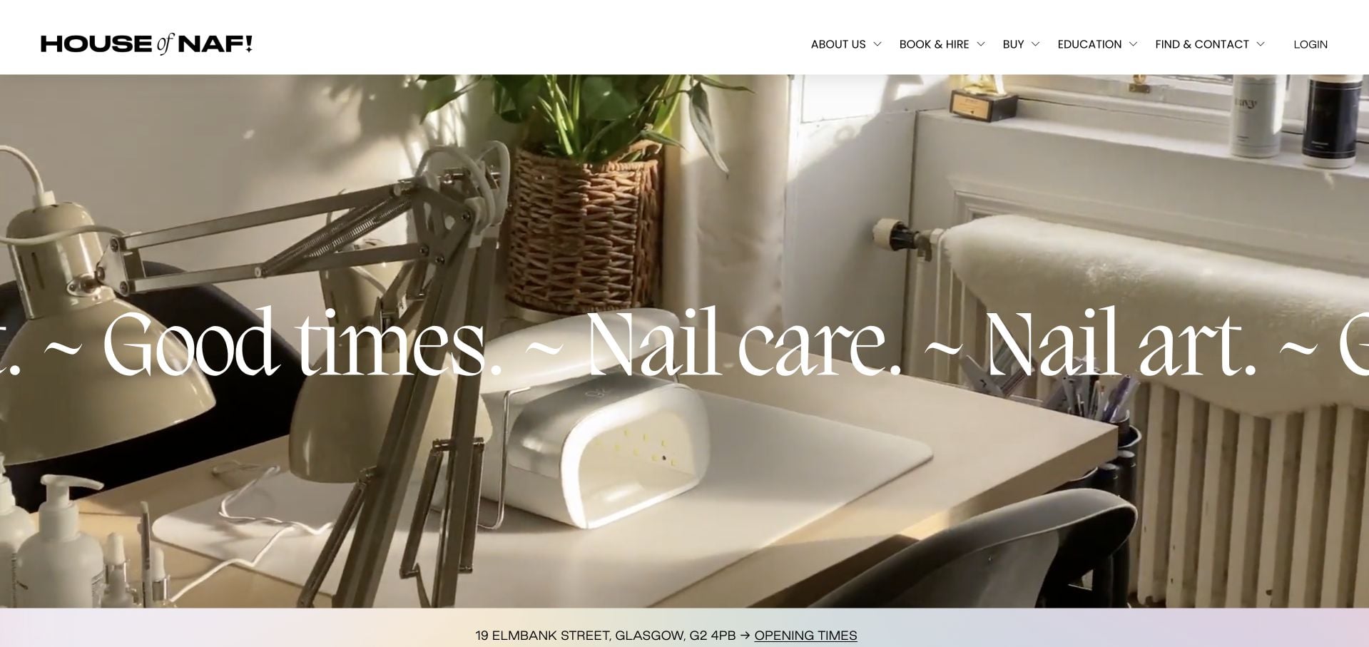
NAF! Salon is our Editors Choice for a playful Glasgow identity and a deliberate route into pre-booking information. Its inspected page distinguishes nails and beauty from hair booking, introduces the team and keeps contact and location discovery available. The lesson is not to copy its colors; it is to give an expressive brand an appointment structure that acknowledges different kinds of visits.
Before the examples
What makes good nail salon website design in 2026?
Explain the service and its additions
Separate the base appointment from removal, extensions, repairs and art where those are booked differently. Explain starting prices and time allowances in ordinary language. Visitors should not have to guess whether a look in the gallery fits the shortest or least expensive service.
Use the gallery as a practical reference
Show actual work with enough context to identify the style or service category. Where useful, describe the art tier, time requirement or consultation route. A visually dense social feed is less helpful than a smaller, well-labeled collection that remains readable outside the social platform.
Give first-time visitors a clear preparation route
Make before-you-book information, location details and appointment policies easy to find. Provide a route for questions about an existing set or an unfamiliar service without inviting sensitive personal details into an open public form.
The collection · 25 examples
25 nail salon websites worth studying
Compare how these salons organize creativity into choices. The collection ranges from concise local pages to multi-location brands; a memorable identity is most useful when the visitor can still identify the correct service and salon.
NAF! Salon’s page within House of NAF uses an actual workstation photograph, warm surfaces and oversized serif lettering to introduce its Glasgow studio. The flowing type gives the opening energy, while a narrow address-and-hours strip brings the visitor back to practical details. The wider site separates appointments, products and education, rather than treating every visitor as a shopper. Staff and studio personality support the nail-art positioning. The expressive moving headline is less efficient for someone scanning quickly, and the service-price comparison still requires another step, but the site has a strong connection between its visual identity and real physical space.
What you can learn
Make the studio and its artists the visual subject, then anchor the expressive design with an address, opening hours and an unambiguous booking route. Separate education and retail from the appointment decision.
Pros
The real studio photograph makes the creative setting concrete.
Address and opening-time information sit close to the visual introduction.
Cons & considerations
The moving, oversized headline demands attention from a quick visitor.
Comparing treatment prices requires continuing into the service journey.
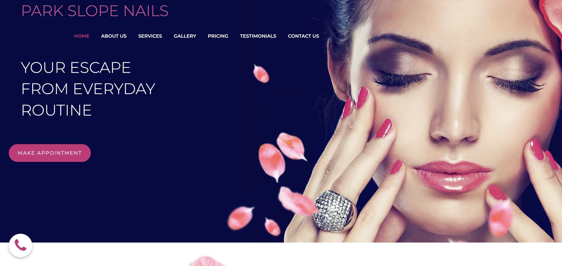
Park Slope Nails uses navy, hot pink and a large manicure portrait for a recognizably beauty-focused opening. The first action offers an appointment, and the navigation exposes Pricing and Gallery directly. Farther down, simple priced service introductions lead to a fuller menu, while a virtual tour gives another way to understand the space. The inspected page also contained repeated introductory copy and a thin news area. Those details show why a striking hero should be accompanied by regular content maintenance rather than treated as the complete redesign.
What you can learn
Give price and work-gallery pages plain labels alongside the appointment action. Keep the useful service menu, but remove repeated introductions and empty editorial sections when there is no current material to support them.
Pros
Pricing and Gallery are explicit navigation choices.
The page supplies priced services and a way to explore the interior.
Cons & considerations
Repeated introductory copy lengthens the page unnecessarily.
Sparse news content makes the editorial area less useful.
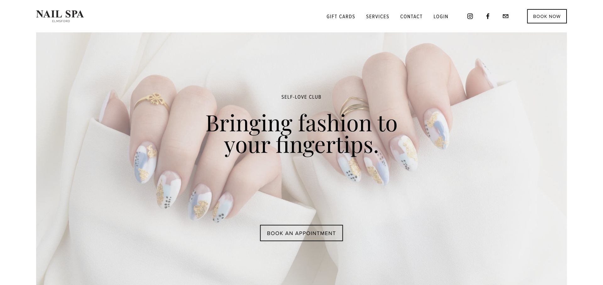
Nail Spa Elmsford lets a close nail-art photograph carry most of the opening, supported by black serif text and a white header. Services, Contact, Gift Cards and Book Now are recognizable choices without a complicated branded vocabulary. Lower sections introduce pedicure features and customer quotations. The overall visual restraint is effective, but some testimonials still discuss pandemic-era precautions without clear date context. A calm design can remain visually current while its supporting content ages, so the maintenance lesson matters as much as the uncluttered hero.
What you can learn
Use one strong photograph and a short service menu before adding more promotional components. Date or refresh testimonials whose context is time-sensitive, rather than letting old operational references look like current guidance.
Pros
The appointment route is visible within a compact header.
The close manicure image gives the site a clear service context.
Cons & considerations
Some testimonial context is visibly dated.
Detailed treatment comparison requires moving past the image-led opening.
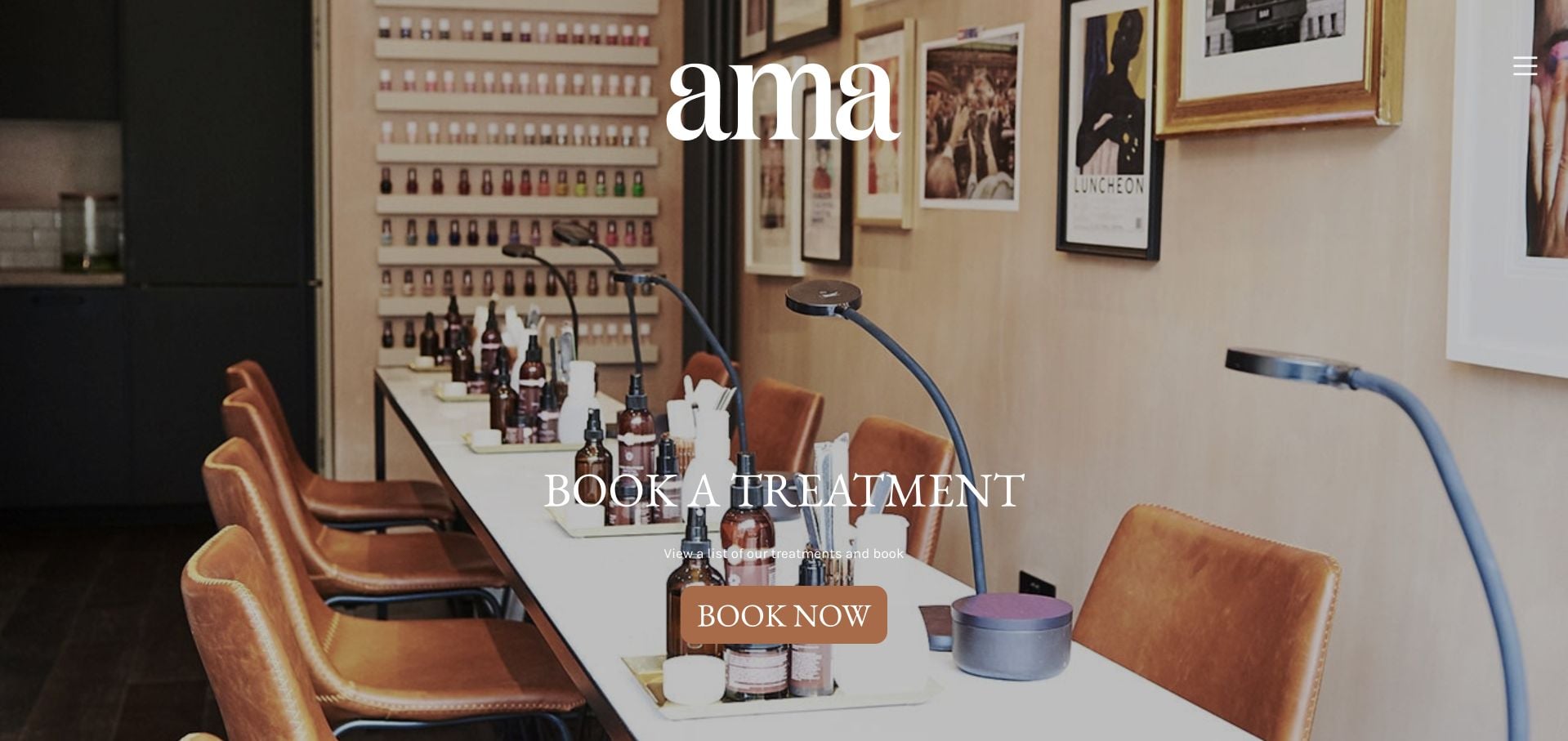
AMA The Salon opens with warm photography of its Brixton space and a large white serif brand name. Book a Treatment is placed directly in the scene, giving the atmospheric introduction a practical next step. The inspected site introduces founders Ama Quashie and Latoyah Lovatt and develops the salon’s approach through artist and work imagery. The first screen is less concerned with enumerating every treatment. That makes the identity coherent, but also means a visitor comparing prices or techniques needs to open the menu and explore further.
What you can learn
Use the actual room to establish a specific atmosphere, then make the appointment label literal. A founder story should explain the salon’s point of view without replacing a clear treatment and pricing destination.
Pros
The photograph connects the visual identity to a recognizable physical studio.
A plainly named treatment-booking action accompanies the hero.
Cons & considerations
The compact menu hides some discovery options.
Treatment details and costs are not the opening emphasis.
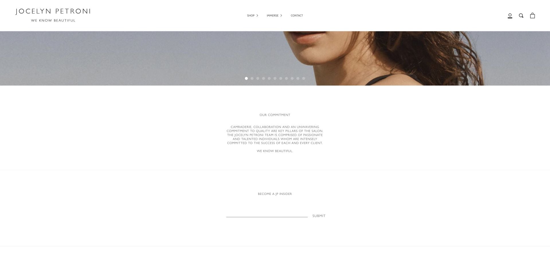
Jocelyn Petroni’s site uses restrained white space and a short header built around Shop, Immerse and Contact. The inspected homepage develops a treatment philosophy and a substantial sequence of attributed testimonials, including references to manicures and pedicures as well as skincare. The saved content view shows the salon’s commitment statement and newsletter area rather than claiming a complete service menu is visible in the hero. It is useful as an example of a luxury positioning, but the abstract Immerse label and retail emphasis make an ordinary nail-service comparison less direct.
What you can learn
Let testimonials support a clearly described appointment offer rather than asking them to explain the service by implication. If navigation uses editorial language, provide an obvious plain-language route for visitors seeking a manicure or treatment menu.
Pros
The restrained color system creates a consistent luxury presentation.
Testimonials are attributed rather than presented as anonymous praise.
Cons & considerations
The editorial navigation is less literal than a Services label.
Shopping and long testimonial content can overshadow appointment logistics.
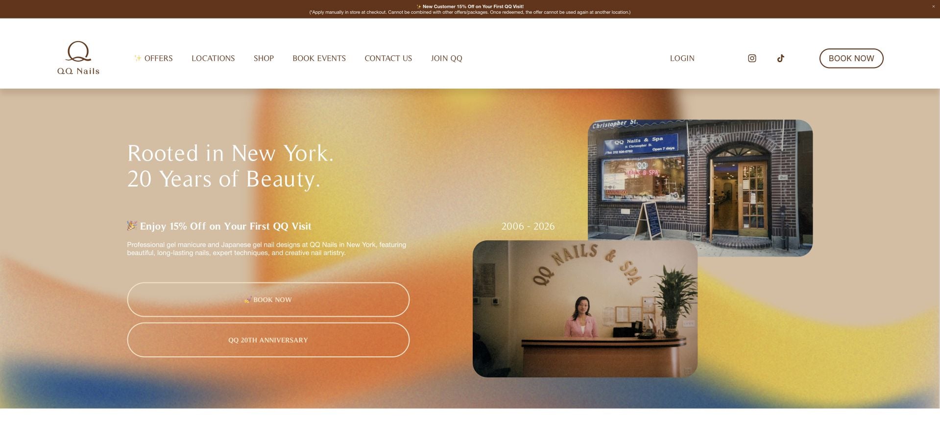
QQ Nails & Spa combines an anniversary-led introduction with a prominent booking route and a large location directory. Branch records pair addresses, hours, phone numbers and booking links, with regional filtering to narrow the choice. The page also explains the conditions attached to its first-visit promotion instead of showing a discount alone. Founder context and frequently asked questions extend the introduction. The sheer length of the location list and the repeated moving location text are the main costs: a useful directory still needs careful scanning and mobile treatment.
What you can learn
For multiple salons, make each branch record complete enough to choose confidently. Put offer conditions beside the promotion, and distinguish a location-finding interface from decorative repeated text.
Pros
Branch cards group hours, directions, phone and booking details.
Promotion terms accompany the first-visit offer.
Cons & considerations
The large location list creates a lengthy homepage.
Repeating location text adds motion without improving the search task.
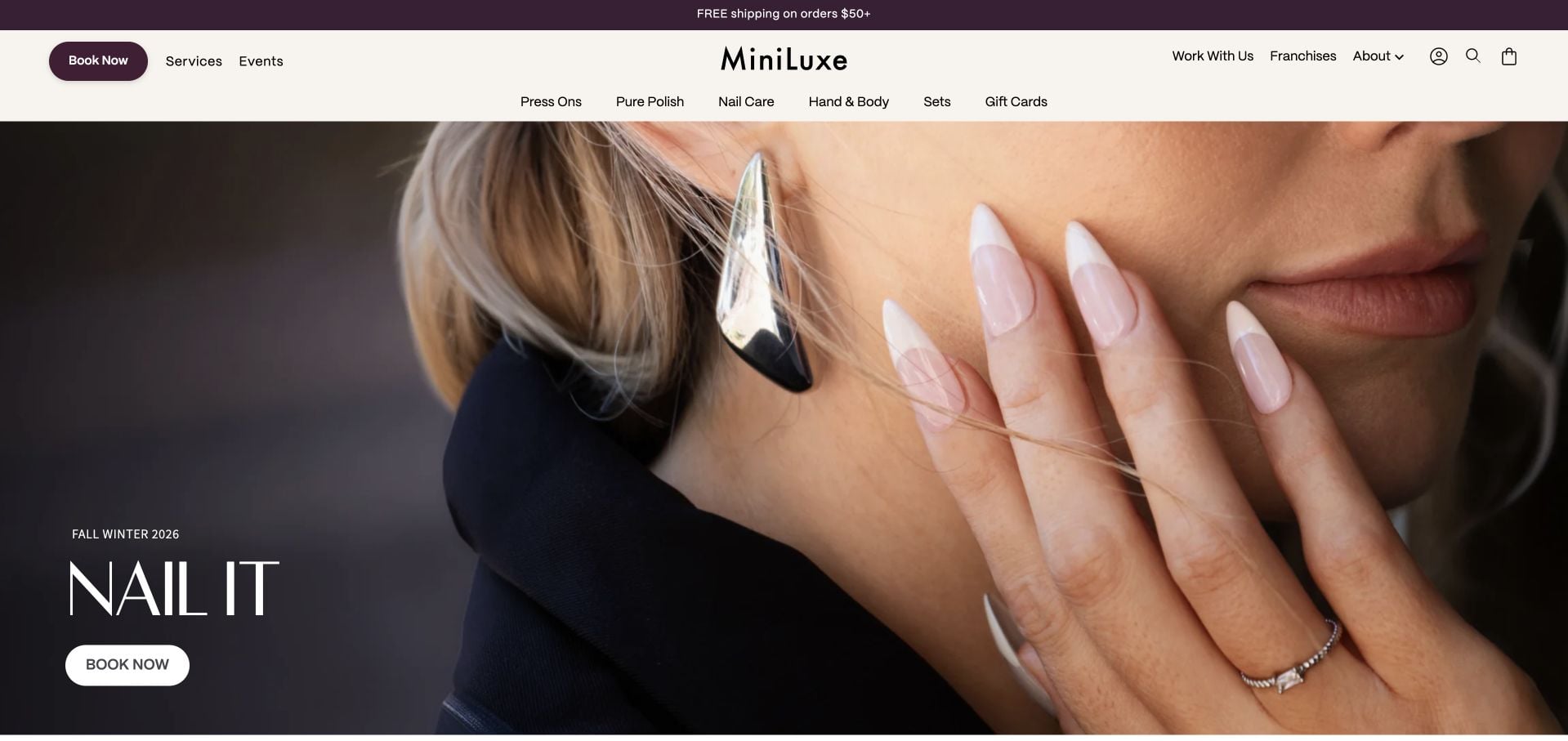
MiniLuxe places a seasonal nail campaign in the hero, using a close fashion portrait, dark plum accents and a compact booking action. The header separates appointments from the product range, while the page continues into a substantial polish catalog. This creates a coherent retail-and-studio identity, with service discovery still available rather than hidden inside the cart experience. It also reveals the tension between those purposes: a visitor seeking a local appointment may have to pass significant shopping content, and treatment costs depend on reaching the relevant studio context.
What you can learn
Give booking and buying separate routes even when they share imagery and products. Evaluate the homepage for a local service visitor as well as a shopper before deciding how much catalog content belongs in the main sequence.
Pros
Service booking remains a visible alternative to shopping.
The seasonal photograph and plum accents form a cohesive campaign.
Cons & considerations
A long product catalog competes with the appointment journey.
Local treatment pricing requires more context than the opening provides.
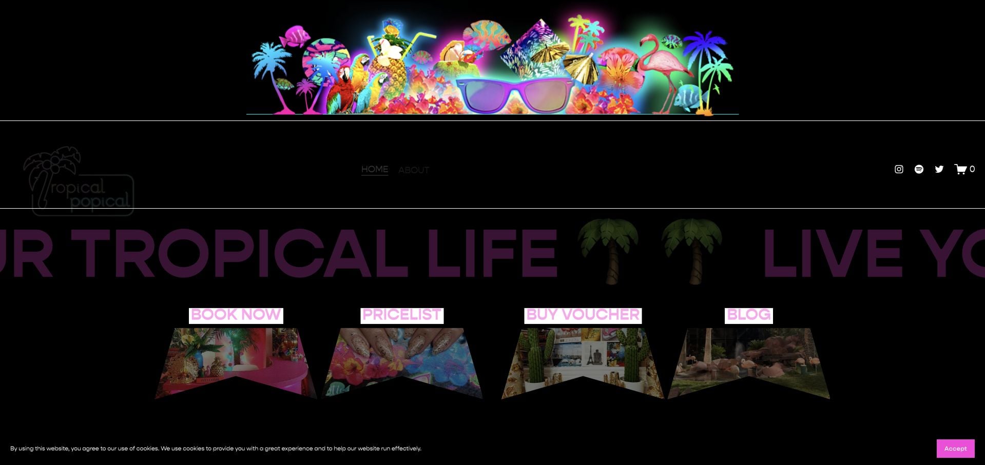
Tropical Popical uses neon pink, black backgrounds and elaborate tropical graphics rather than a neutral spa aesthetic. Four visual destinations—booking, prices, vouchers and the blog—keep that expressive design connected to recognizable tasks. The inspected page also identifies its Dublin address and contact information. The useful lesson is not that every salon should adopt this style, but that a strong point of view can coexist with simple labels. Dark purple text on black and moving promotional text are less transferable choices when readability and quick scanning matter.
What you can learn
Keep the number of first decisions small when the visual identity is loud. Literal labels for booking, prices and gift vouchers prevent a distinctive art direction from becoming a navigation puzzle.
Pros
The first task choices include an explicit price list.
A specific Dublin address anchors the highly expressive brand.
Cons & considerations
Some dark-on-dark text has limited visual contrast.
Moving text adds another attention demand to an already busy composition.
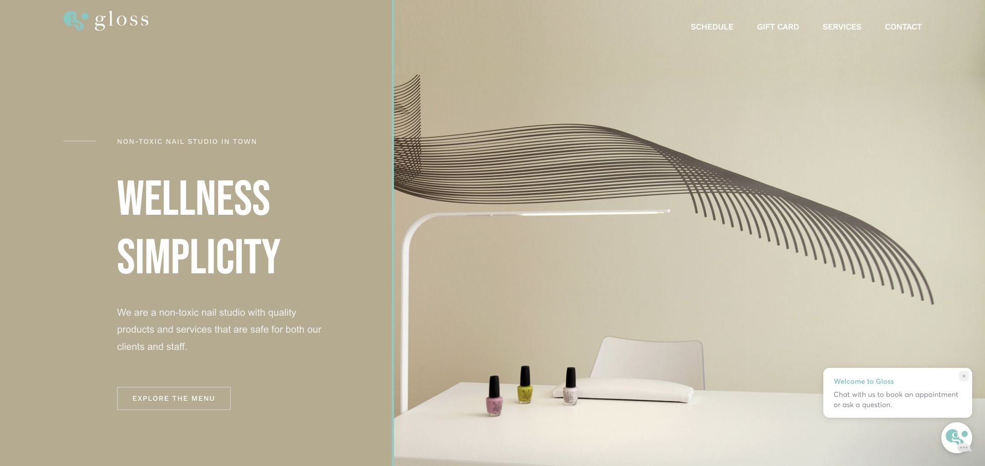
Gloss Spa combines a muted beige text panel with a photograph of its curved studio interior. The header reduces the main choices to Schedule, Gift Card, Services and Contact, making the hierarchy unusually easy to understand. The inspected page also provides its Melrose address and a service-menu route. The simplicity gives the room space to establish the mood. Supporting policy content and the dated footer show the less glamorous maintenance side of this approach: a small site still needs its operational language reviewed as carefully as its design.
What you can learn
A compact site can begin with four genuinely useful actions rather than a large menu. Keep address and policy information current so that a deliberately restrained presentation does not become an excuse for missing practical detail.
Pros
The four-item navigation uses direct task labels.
The room photograph and muted palette create a coherent visual introduction.
Cons & considerations
Some policy language retains dated operational context.
The first screen offers little direct treatment-price comparison.
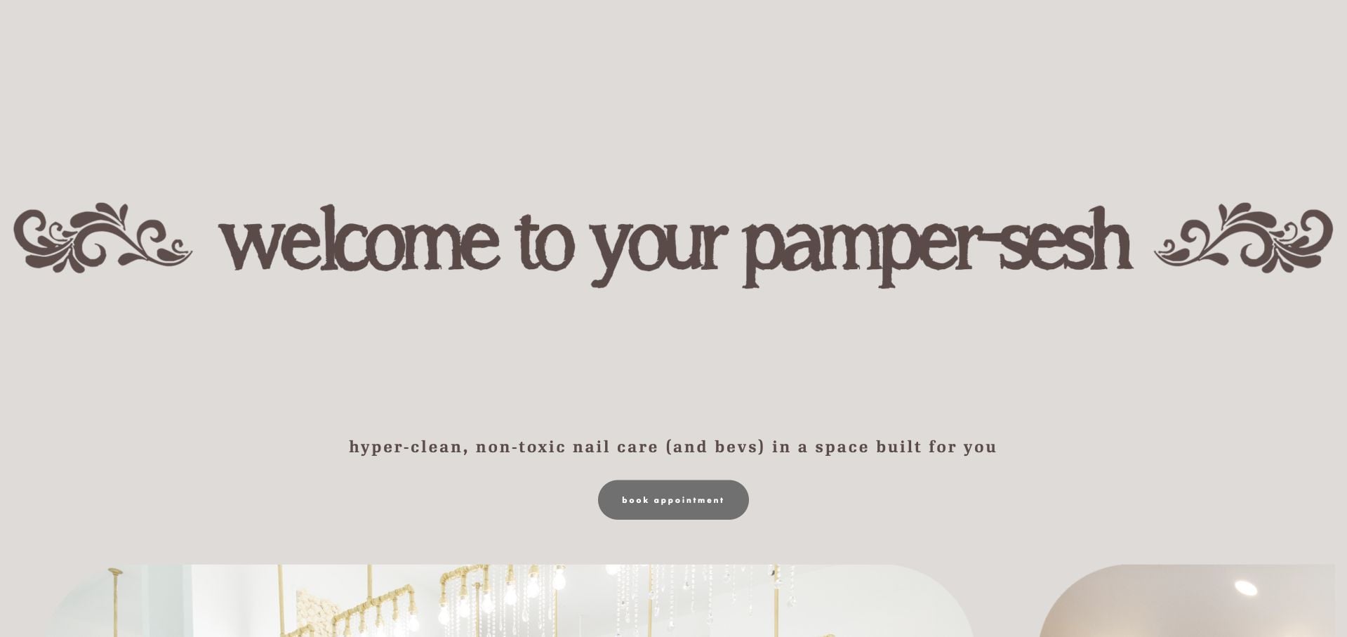
nailsaloon centers a playful welcome on a pale background, using oversized lettering and decorative flourishes rather than a dense service grid. A short promise introduces nail care and the space, while appointment and gift-certificate links remain obvious. The navigation uses the brand’s own language for locations and events. The page quickly reaches a newsletter invitation, so the minimal structure favors visitors already comfortable moving into a separate booking or service page. It is a useful exercise in restraint, not a complete checklist for first-time appointment information.
What you can learn
A strong welcome can be short, provided that services, locations and booking are available as explicit next steps. Do not let a newsletter become the main remaining content before a new visitor understands the appointment offer.
Pros
The appointment and gift-certificate choices are easy to identify.
The typography gives a short page a distinctive voice.
Cons & considerations
Detailed service comparison is not present in the introduction.
Newsletter signup arrives before much practical visit context.
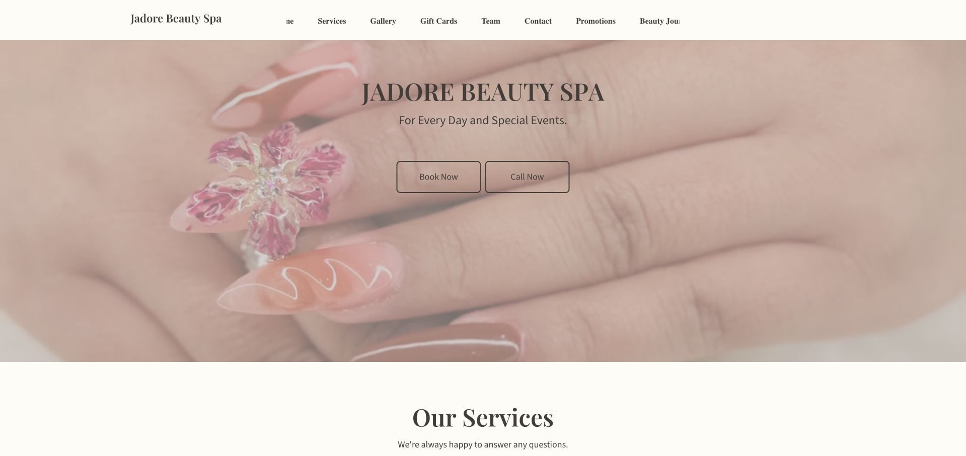
Jadore Beauty Spa uses a soft manicure photograph and a peach-toned palette above two different actions: Book Now and Call Now. Service cards separate nails, waxing, lashes and facials, making the broader offer visible without requiring every detail in the hero. The inspected site includes its Washington address, nearby transit context and hours. Some navigation elements were crowded in the desktop capture, a reminder that adding more services should not mean shrinking the menu until it becomes difficult to read or clips at the edge.
What you can learn
Offer phone contact as a real alternative to online booking when the business supports it. Group additional beauty services into readable categories, then test the header at intermediate widths as well as the widest desktop layout.
Pros
Booking and phone contact are distinct, adjacent actions.
Service categories and local visit details support the visual opening.
Cons & considerations
The desktop header is crowded at the edges.
A broad beauty offer requires more service comparison than the hero alone provides.
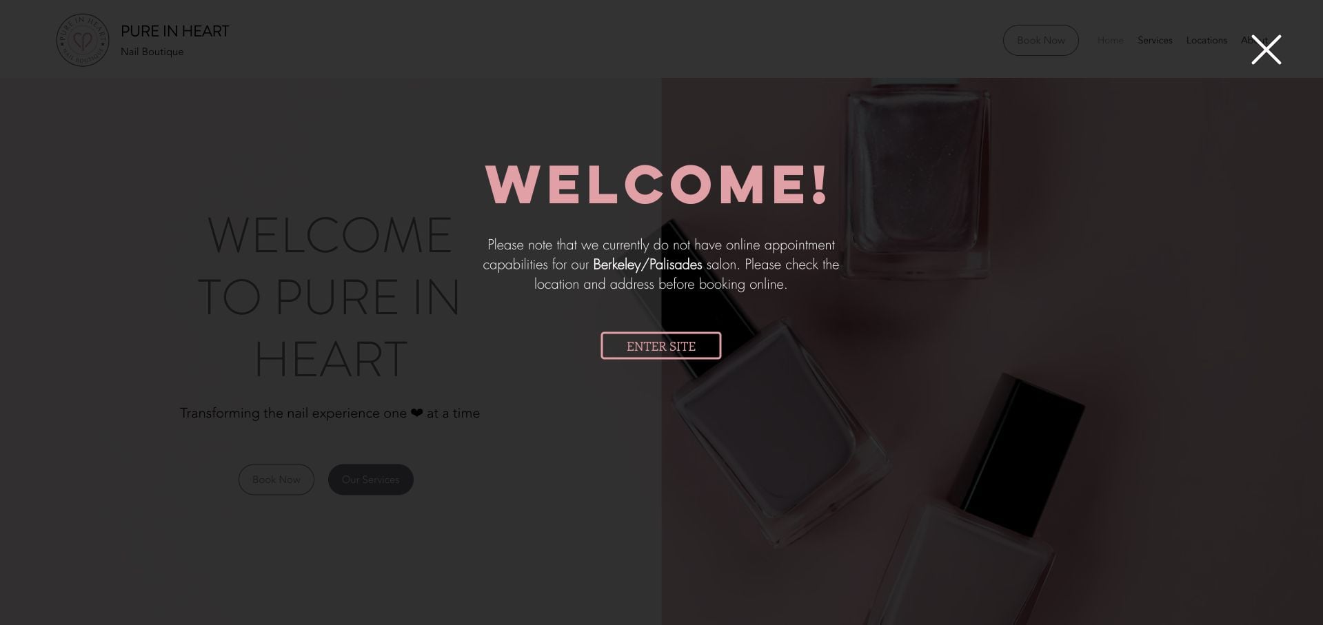
Pure in Heart uses a pale pink presentation and three named appointment levels. Crucially, it also translates those names into Express, Standard and Luxury, then explains what is included at each level. That makes an otherwise abstract branded menu easier to compare. The inspected site warns that online booking is not available for one salon and asks visitors to check the location before reserving. This is useful operational honesty. The welcome layer and separate branch choices add friction, so the comparison and location qualifications need to remain visible rather than becoming hidden details.
What you can learn
Pair proprietary package names with ordinary descriptions, and show what changes between tiers. Surface branch-specific booking limits before the handoff so the appointment action does not promise the same process everywhere.
Pros
Branded tiers are translated into express, standard and luxury levels.
The site explicitly qualifies an online-booking limitation by location.
Cons & considerations
The welcome layer adds an extra step before normal browsing.
Visitors still need branch context to choose the correct booking route.
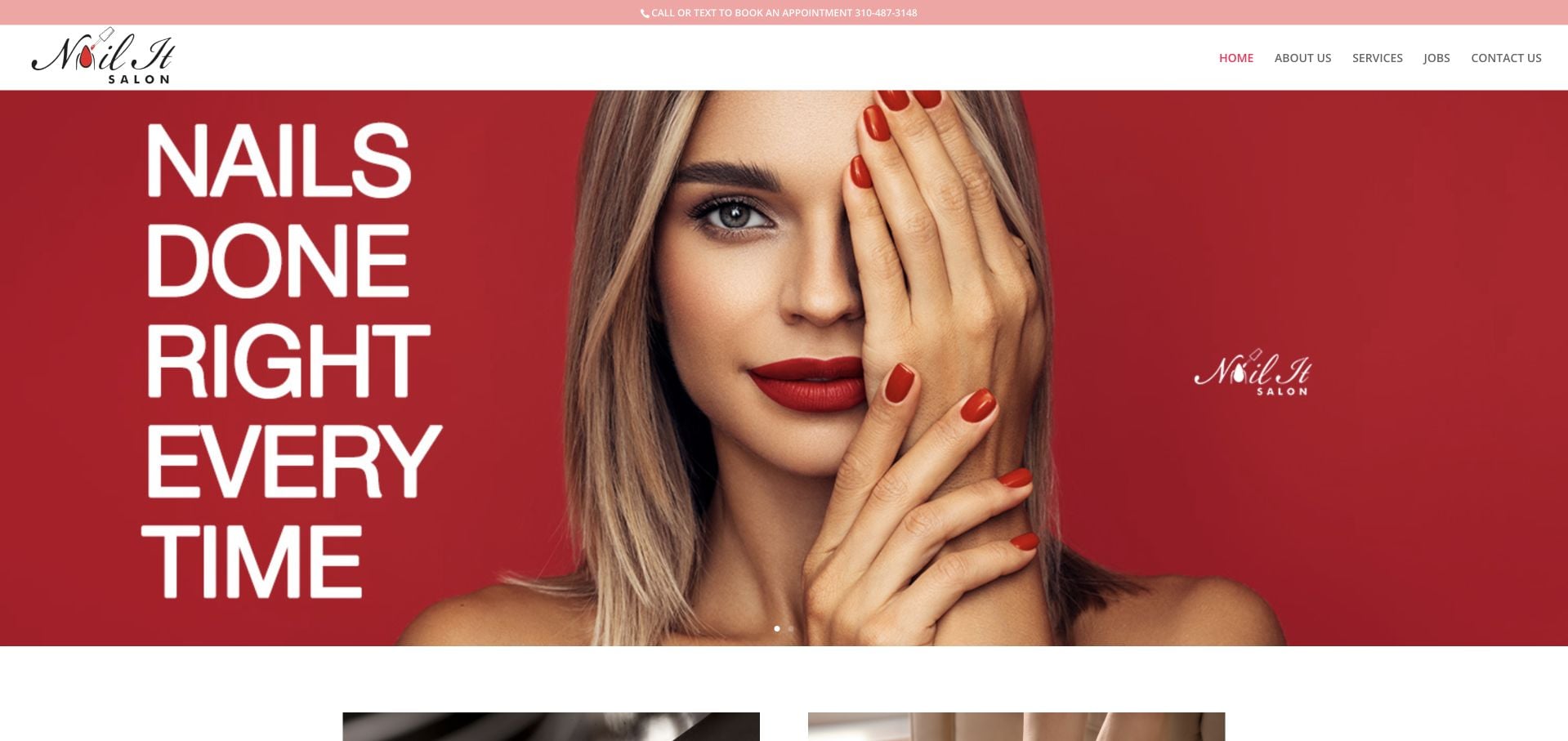
Nail It Salon combines burgundy and pink accents with a large manicure portrait and a strong all-caps headline. The inspected site is clear that clients can call or text, rather than implying that every appointment happens through a live scheduling system. Manicure and pedicure categories support the introduction, while the Culver City address and hours appear later. Some testimonial context still references older pandemic practices. This makes the page useful for studying a personal contact-led booking model, alongside the need to keep supporting content current.
What you can learn
Name the actual booking channel instead of styling every appointment button as instant online availability. Include hours and location close to that contact route, and review time-sensitive testimonial language when updating the homepage.
Pros
Call-or-text wording reflects a specific appointment process.
The strong headline and manicure image immediately identify the service.
Cons & considerations
Visit details sit later in the page than the main invitation.
Older testimonial context needs clearer dating or editorial review.
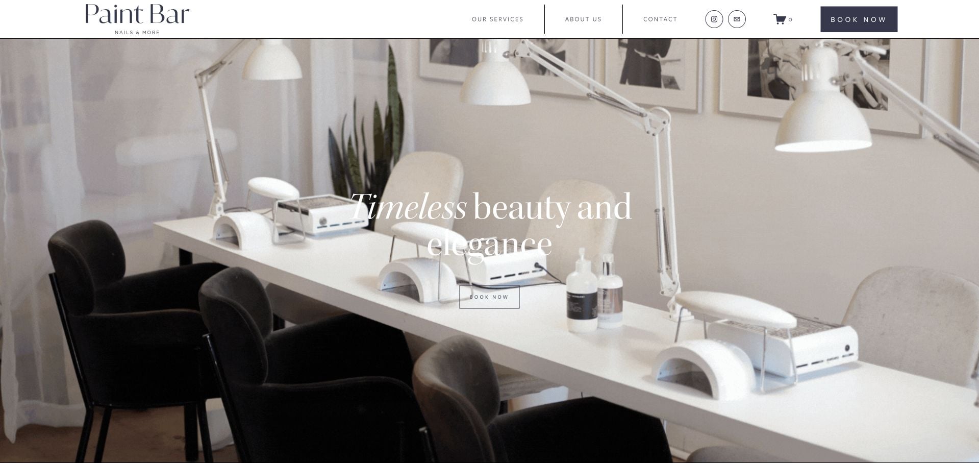
Paint Bar LA uses a broad photograph of its actual interior, restrained serif lettering and a direct booking action. The service navigation goes beyond a generic manicure list, with What to Book guidance and separate nail-art design tiers. Bridal services, gift cards and retail products have their own routes. That structure is valuable when appointment length and the required artist depend on the complexity of a design. The numerous secondary interests still need careful priority, and the first-screen photograph supplies atmosphere more readily than an immediate price comparison.
What you can learn
Explain which appointment to select before asking customers to commit to a slot. A nail-art tier guide should connect the desired design to the correct service rather than leaving that decision entirely to a booking form.
Pros
What to Book guidance supports first-time service selection.
Nail-art tiers acknowledge differences in appointment complexity.
Cons & considerations
Bridal, retail and gift interests add several secondary journeys.
The image-led opening does not provide an immediate treatment-price comparison.
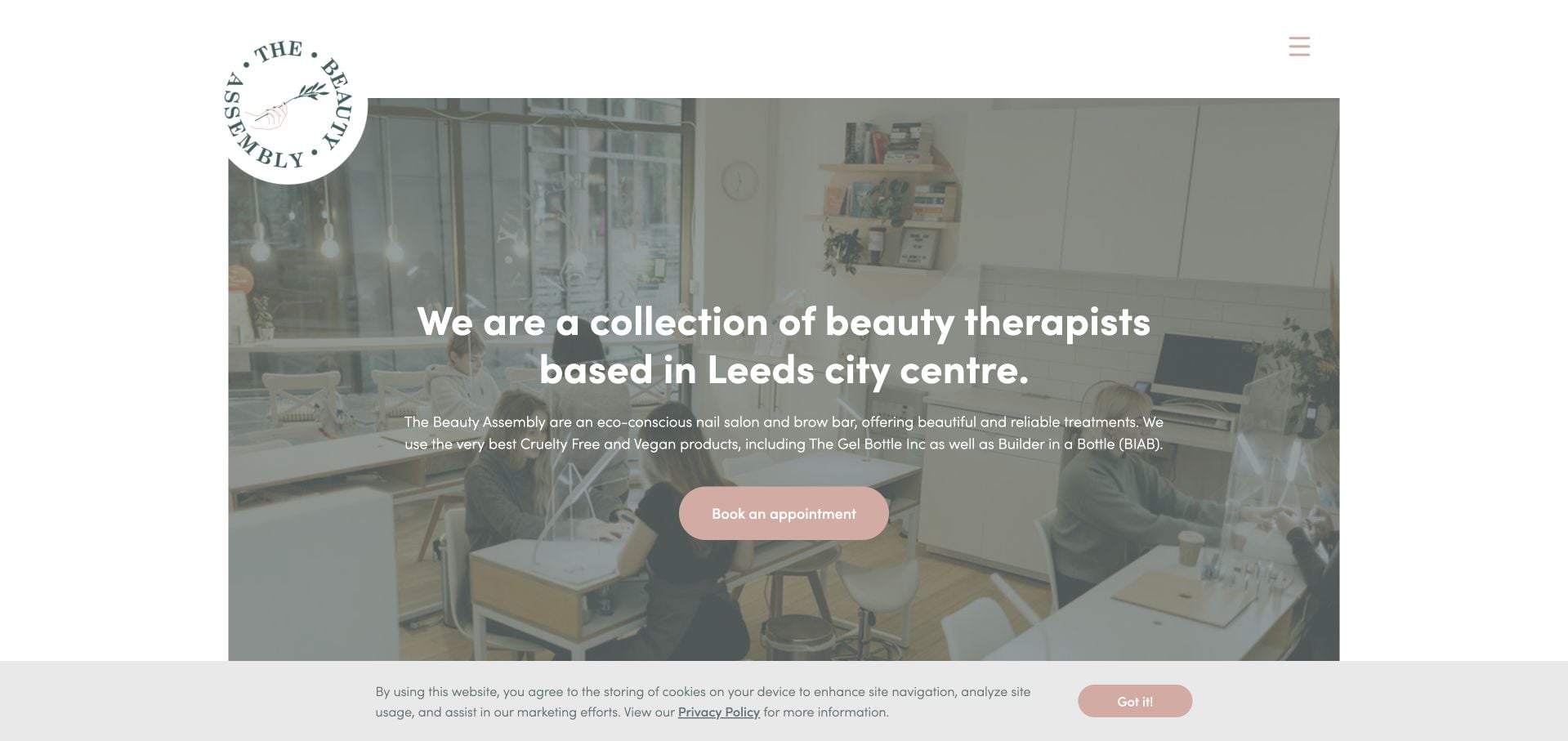
The Beauty Assembly places a concise Leeds city-centre introduction over an interior photograph, with a soft green-and-pink identity and a clear appointment action. The inspected content explains the collective model and sends visitors toward treatments and the team. Current journal material gives the site something more concrete than an empty blog placeholder, while the Granary Wharf address supplies a local anchor. The hidden menu and a substantial privacy notice are the main presentation costs. The design is worth studying for how a small team can feel cohesive without pretending to be a large chain.
What you can learn
Explain the working model of a collective in plain language, then connect each treatment to the relevant people. Publish journal content only when it can be maintained, and keep privacy controls from obscuring the main introduction.
Pros
The opening names Leeds city centre and offers a clear appointment route.
Team, treatment and current editorial content support the collective identity.
Cons & considerations
Some navigation is behind the menu.
The privacy notice occupies a substantial portion of the first view.
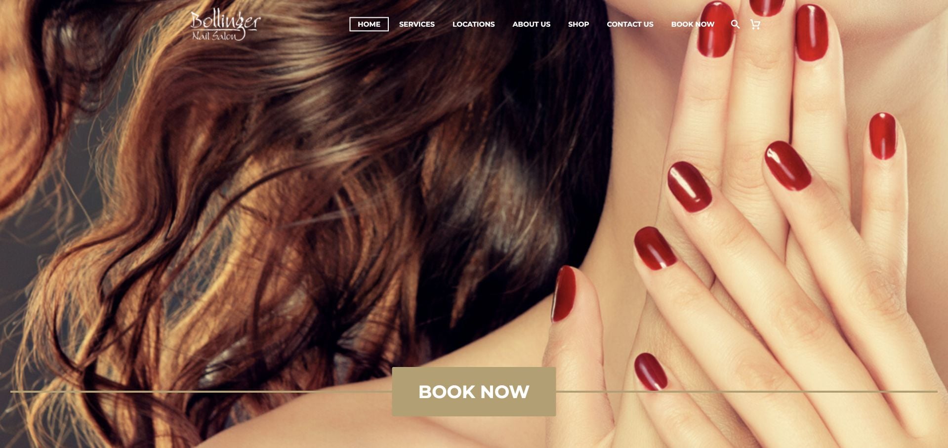
Bollinger Nail Salon uses a large beauty photograph, warm gold accents and an easily identifiable Book Now action. The inspected service navigation distinguishes nail-spa treatments, enhancements and waxing, which is more useful than grouping every appointment under a single general label. The page also spends considerable space describing sanitation practices. Those are the salon’s own claims rather than an independent assessment. The broad promotional copy and image-led opening mean visitors still need to continue into the menu for a meaningful service comparison.
What you can learn
Organize the service list around the distinctions that affect booking, such as natural-nail care versus enhancements. Keep operational explanations specific and current without letting repeated promotional language displace prices, durations and location details.
Pros
The main booking action is straightforward and visually distinct.
Service categories distinguish nail-spa treatments, enhancements and waxing.
Cons & considerations
Long promotional explanations reduce scanning efficiency.
The first view leaves detailed appointment comparison to another section.
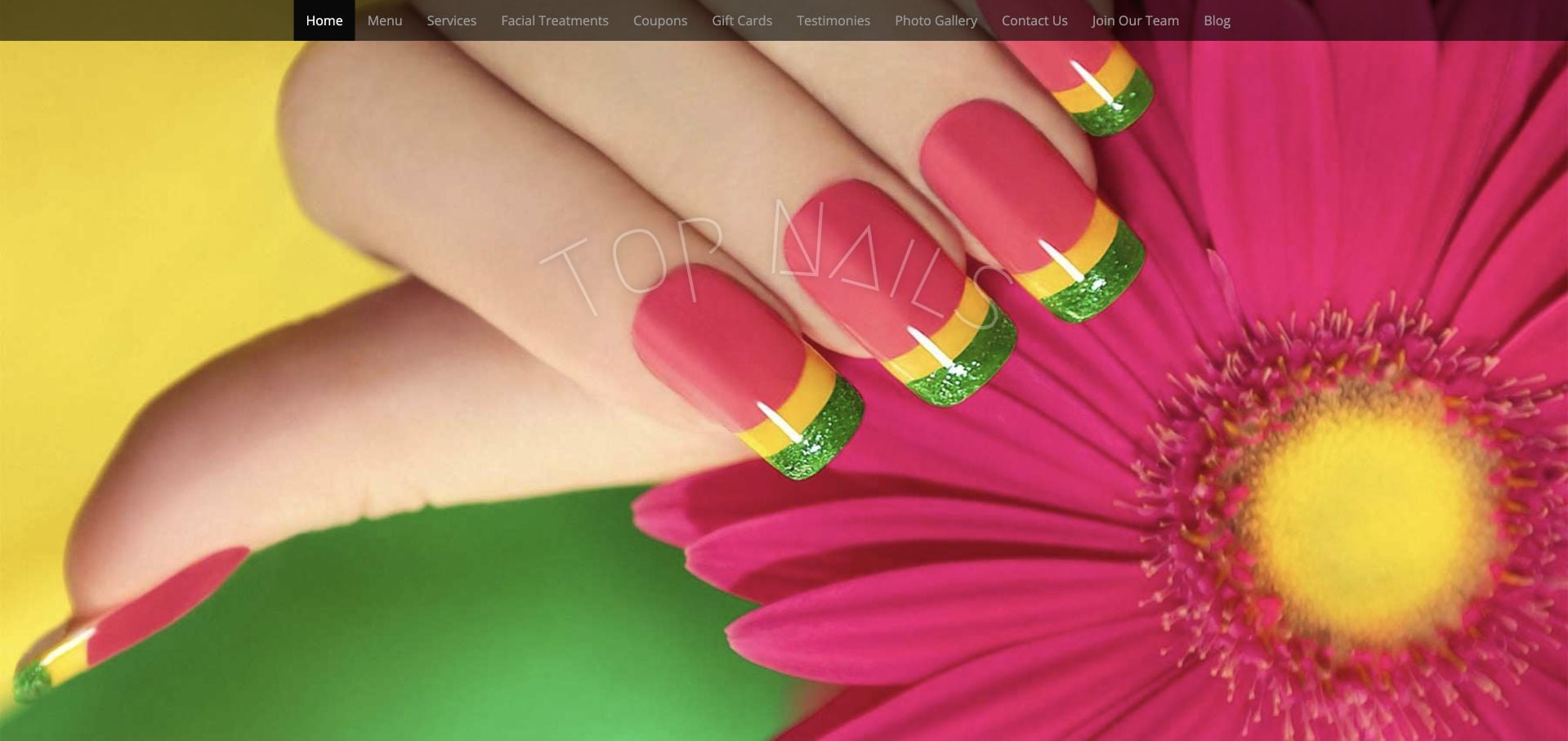
Top Nails opens with a colorful close manicure photograph beneath a dense conventional navigation bar. The inspected site supplies Clarksville context, working hours and a concrete distinction between walk-ins and calling ahead. Menu, photos and testimonials have their own destinations, so the practical information is not entirely dependent on the image. The visual treatment is less restrained than newer boutique examples, and the header offers many similarly weighted choices. The useful borrowing opportunity is the explicit visit information rather than the number of links or decorative effects.
What you can learn
Keep the business facts that answer whether someone can visit today. A redesign can simplify the header and modernize the typography without losing clear hours, walk-in expectations and a plain service-menu destination.
Pros
Hours and walk-in guidance give the site practical local value.
Menu and work photographs are identifiable navigation options.
Cons & considerations
Many equally weighted header links make the first decision harder.
The dated visual treatment can distract from otherwise useful visit information.
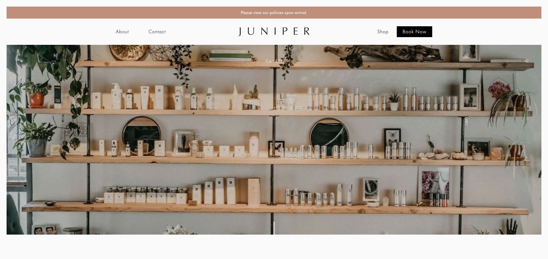
Juniper’s Phoenix site uses a quiet editorial presentation and three simple treatment categories: Body, Face and Nails. Attributed customer quotations and the people behind the business form much of the supporting content. The inspected page states that visits are by appointment only and includes its Indian School Road address. This is a useful hybrid example rather than a nail-only service catalog. The sparse opening and lengthy testimonial sequence mean a visitor looking for a particular manicure price must deliberately continue into the relevant treatment route.
What you can learn
For a boutique with several disciplines, make the top-level categories plain and mutually understandable. Keep appointment-only status and location accessible, then let each service page handle the details that do not belong in a shared brand introduction.
Pros
Body, Face and Nails provide a concise treatment structure.
Appointment-only status and a specific address clarify the visit model.
Cons & considerations
The sparse opening provides limited direct service comparison.
A long testimonial sequence can delay concrete treatment information.
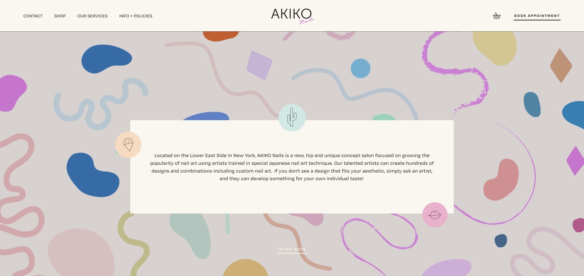
AKIKO Nails surrounds a small introductory panel with pastel abstract illustrations, including familiar everyday objects and playful organic shapes. The effect is more like a creative studio than a generic beauty template. Services, information, policies and booking remain recognizable routes. The inspected content explains its Lower East Side location, hours and custom nail-art context, with separate booking guidance and monthly designs. The illustration-heavy opening is memorable, but examples of finished work and an understandable service selection still need to support the personality.
What you can learn
Use an illustration system to distinguish the studio, not to replace proof of the work. Keep policy and booking guidance in plain language when custom designs change the appointment requirements.
Pros
The illustrated identity is distinctive without a crowded header.
Booking guidance, policies and local information support custom design appointments.
Cons & considerations
The first screen gives more space to illustration than finished nail work.
A new client still needs to interpret the appropriate custom-service option.
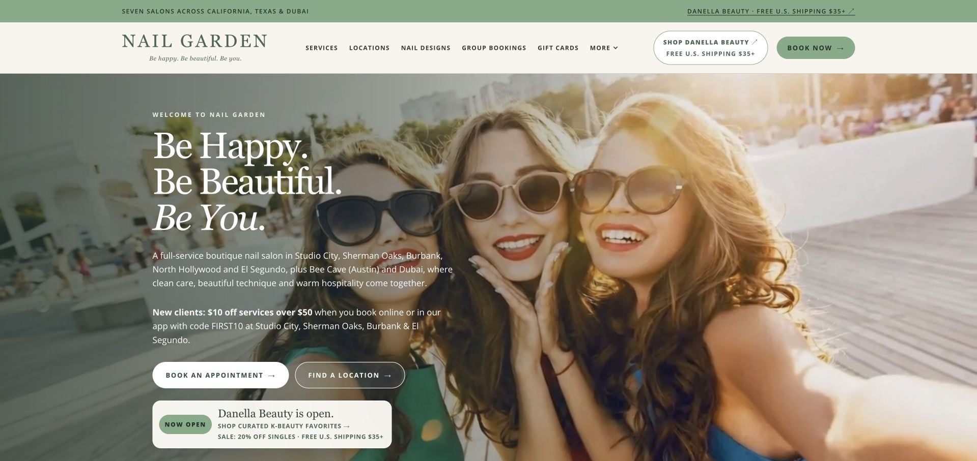
Nail Garden pairs a pale green visual system with a broad lifestyle photograph and a short introductory text block. The opening supplies a geographic overview and distinct actions for booking and finding a location. Lower branch cards bring addresses and appointment routes together, while work imagery gives the brand a more service-specific layer. Retail promotion adds another commercial interest. The useful pattern is the separation between brand-level introduction and branch-level facts; the caution is letting those additional product and offer messages make a simple local visit feel complicated.
What you can learn
Make location discovery a first-class action for a multi-market salon. Keep each branch’s address and booking route together, and avoid forcing a visitor through retail content before they know which salon they can actually visit.
Pros
Booking and location discovery are distinct opening choices.
Branch cards connect local addresses with appointment routes.
Cons & considerations
The lifestyle hero shows less nail detail than a work-focused image would.
Retail and promotional layers add competing calls to action.
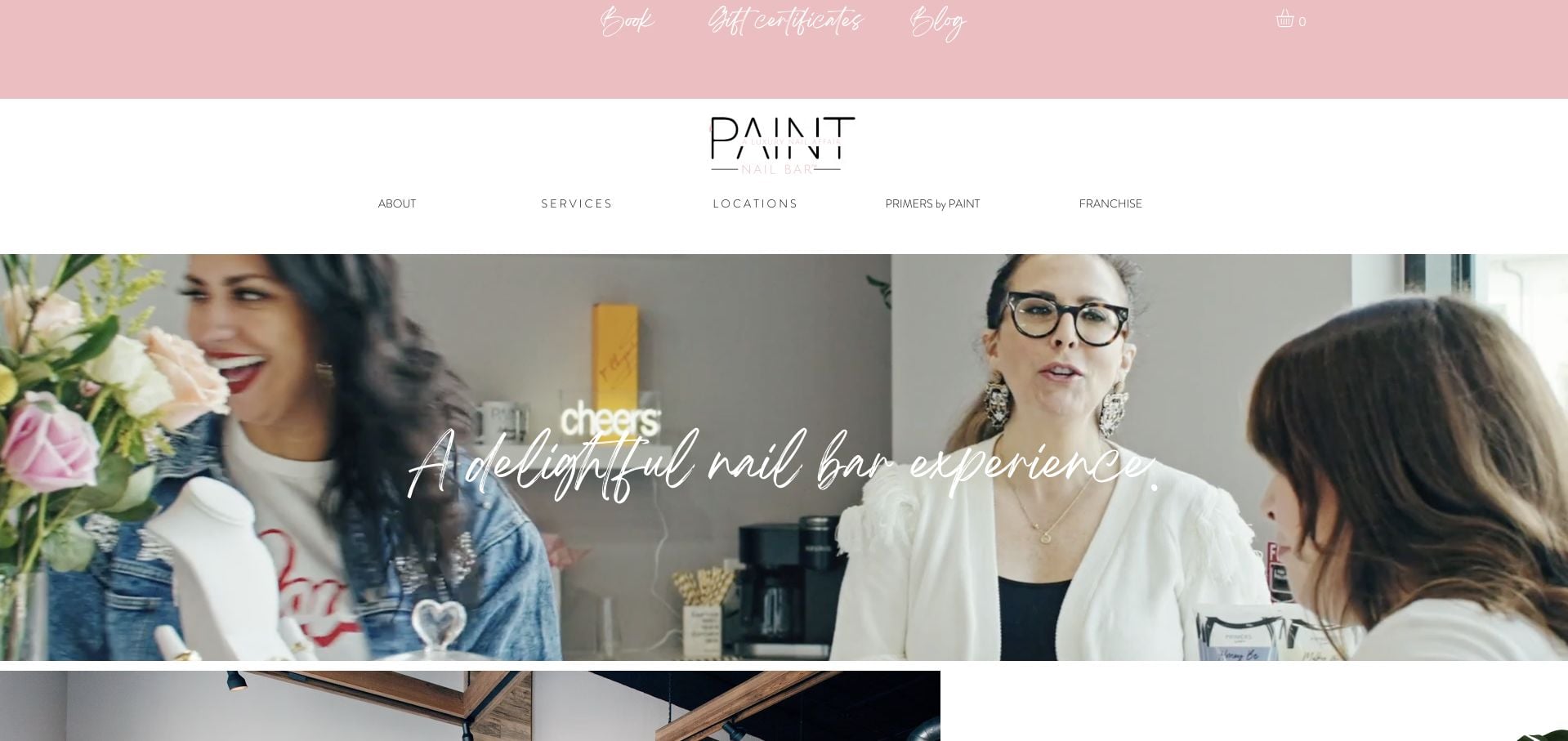
PAINT Nail Bar uses a pale pink header, delicate typography and a room-led introduction. Its service menu is intentionally conversational, but the inspected page explains what names such as the quick service and full nail-care option actually include. Booking, locations and the full menu remain available, alongside product and franchise routes. This makes it a useful comparison for translating brand voice into an operational menu. It also demonstrates the risk of splitting attention among guests, product shoppers and prospective franchise operators on the same homepage.
What you can learn
Keep a playful appointment name only when its plain-language description explains the scope. Distinguish the guest journey from franchise and retail interests, especially where they share a compact header.
Pros
Service descriptions translate the branded menu into concrete inclusions.
Location and booking routes are identifiable.
Cons & considerations
The delicate, widely spaced navigation requires careful small-screen testing.
Franchise and product routes compete with guest appointment information.
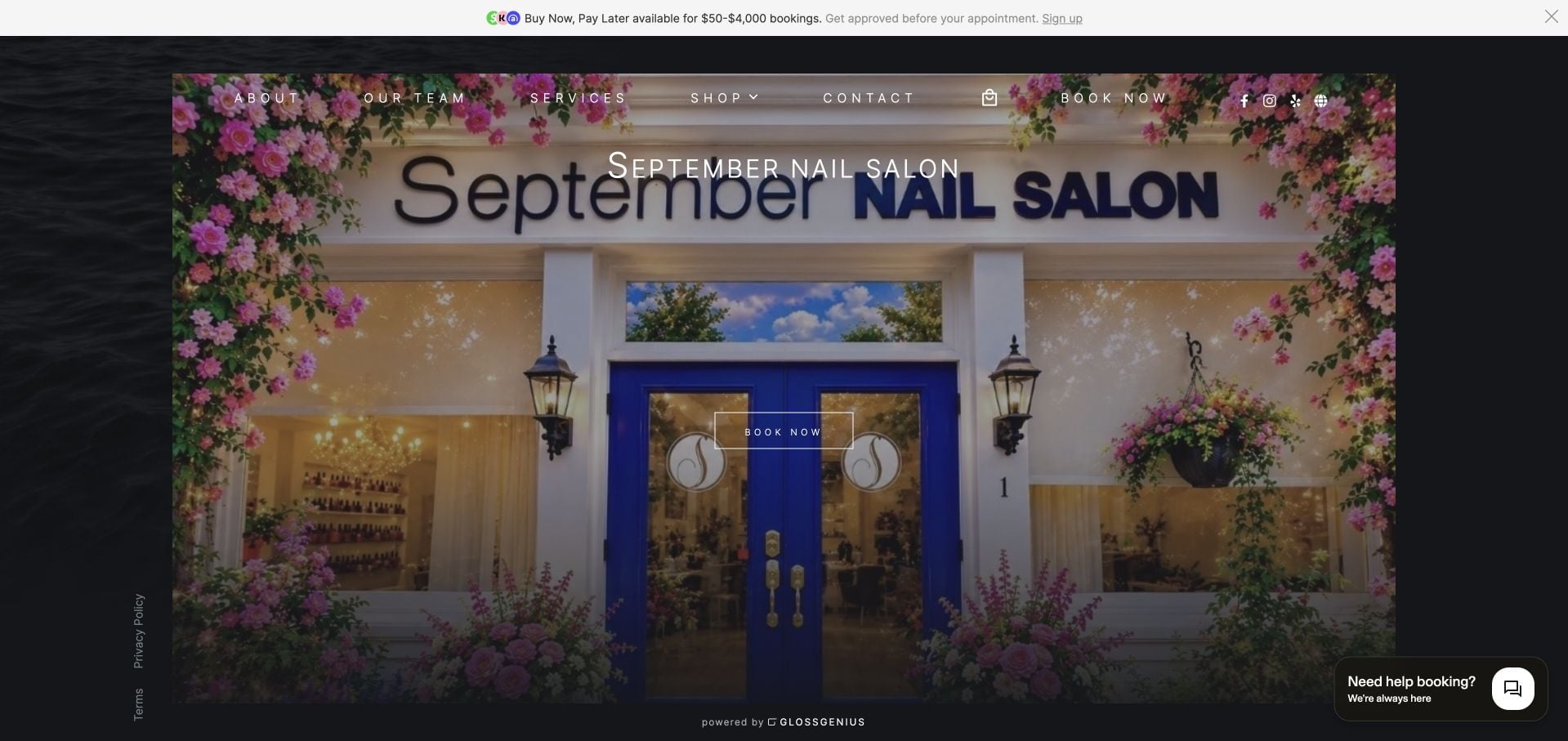
September Nail Salon uses a GlossGenius-hosted page with a real storefront photograph, a prominent Book action and a compact set of About, Team, Services, Shop and Contact destinations. The recognizable blue shopfront and flowers do more to identify the physical business than a generic manicure background would. The platform supplies a conventional booking-oriented structure, with additional chat and payment-promotion elements. It is useful as a restrained operational reference, while also showing the limits of a shared platform layout and the distractions that can accompany its optional widgets.
What you can learn
A hosted appointment site can still feel specific when its own storefront, team and service details are supplied carefully. Evaluate chat and payment promotions against the main task instead of enabling every available platform feature.
Pros
The real exterior photograph helps clients recognize the salon.
The compact navigation and Book action support a straightforward appointment journey.
Cons & considerations
A shared platform layout offers less bespoke editorial control.
Chat and payment-promotion widgets add competing interface elements.
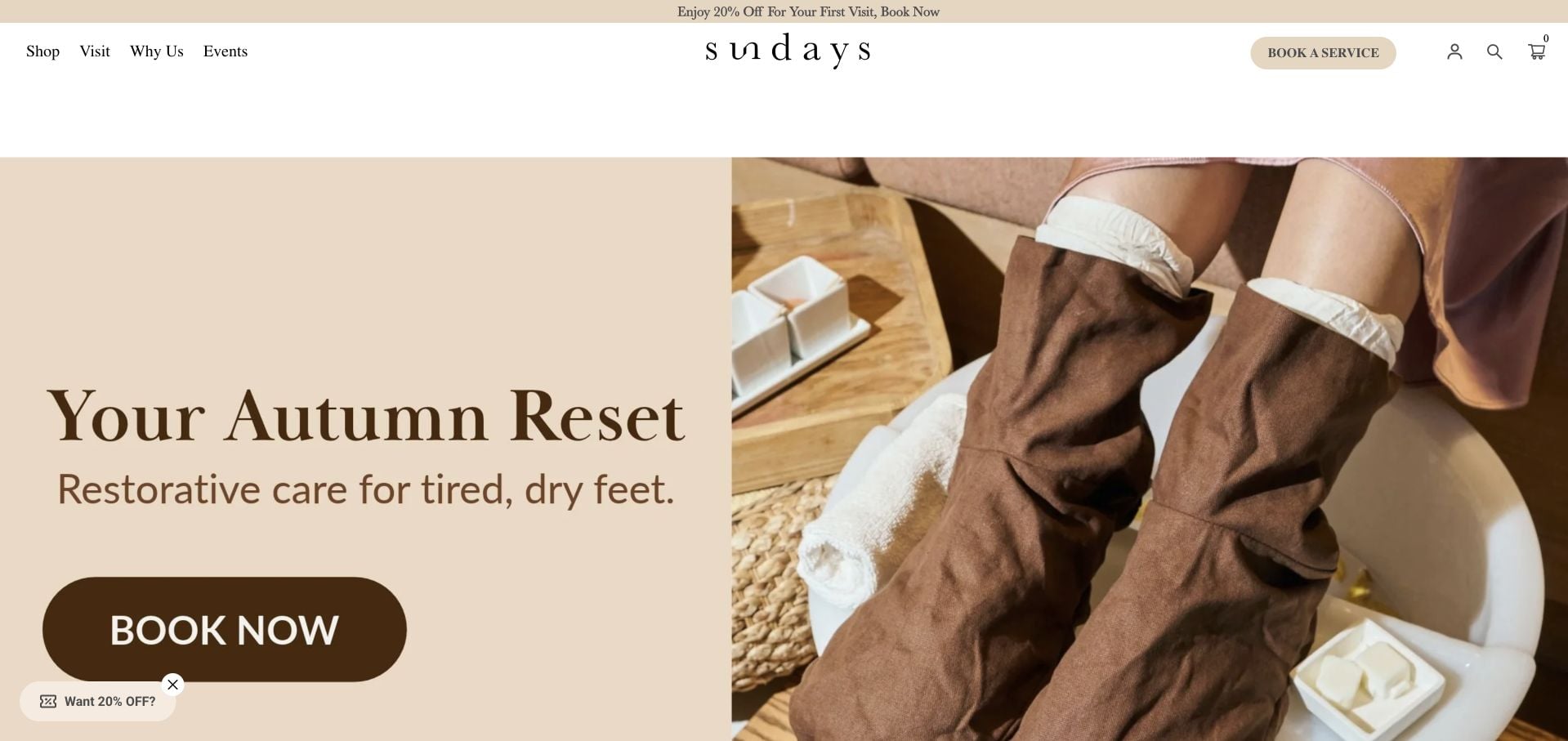
sundays presents a seasonal foot-care campaign with warm cream surfaces, a close treatment photograph and a direct booking action. Shop and Visit separate product browsing from the studio journey. Lower location records include individual addresses, phone numbers, opening times and booking links, giving the brand-level introduction practical depth. The product catalog and wellness content are extensive, so a local visitor has several competing paths to navigate. Its ingredient and wellness promises are brand claims, not something this design review independently verifies.
What you can learn
Separate the visit journey from the product catalog, then make each studio record operationally complete. A seasonal campaign should point to a specific service without burying the everyday address, hours and appointment route.
Pros
Shop and Visit distinguish the two principal customer tasks.
Studio records pair addresses and hours with booking links.
Cons & considerations
A substantial product catalog lengthens the service visitor’s journey.
Multiple wellness and retail messages compete with appointment selection.
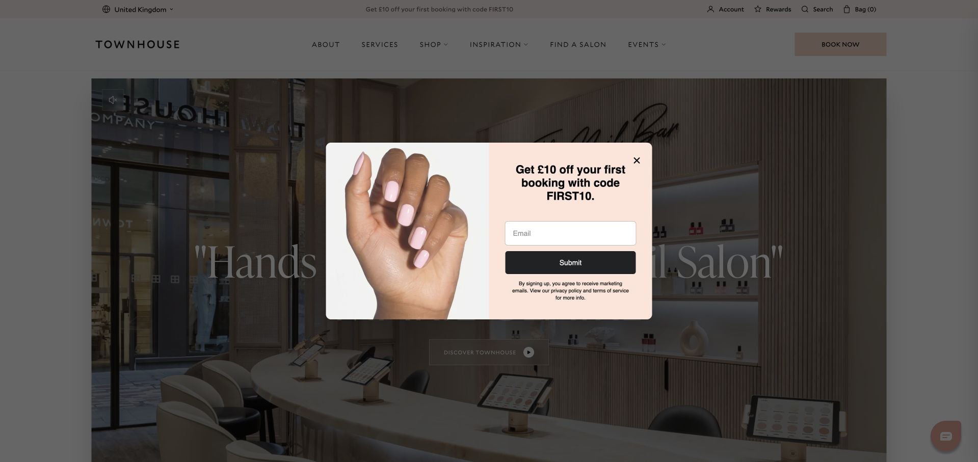
Townhouse uses a restrained cream identity and a large salon photograph, with Book Now and Find a Salon available alongside the shop. The inspected service section distinguishes Express, Signature, Luxury and Extensions and shows duration ranges for each. That is a practical way to translate a branded hierarchy into scheduling expectations. Founder context and attributed reviews support the introduction. Retail products and promotional offers occupy substantial space, while the opening image gives limited direct guidance on which service a new client should choose.
What you can learn
Show appointment-duration differences before handing visitors into a scheduler. A consistent branded service hierarchy is easier to use when the site explains how those levels differ and preserves a direct route to the appropriate salon.
Pros
Service levels include useful duration ranges.
Booking and salon-finding are visible alternatives to shopping.
Cons & considerations
Retail products and offers compete with service discovery.
The image-led opening still requires further exploration to compare appointments.
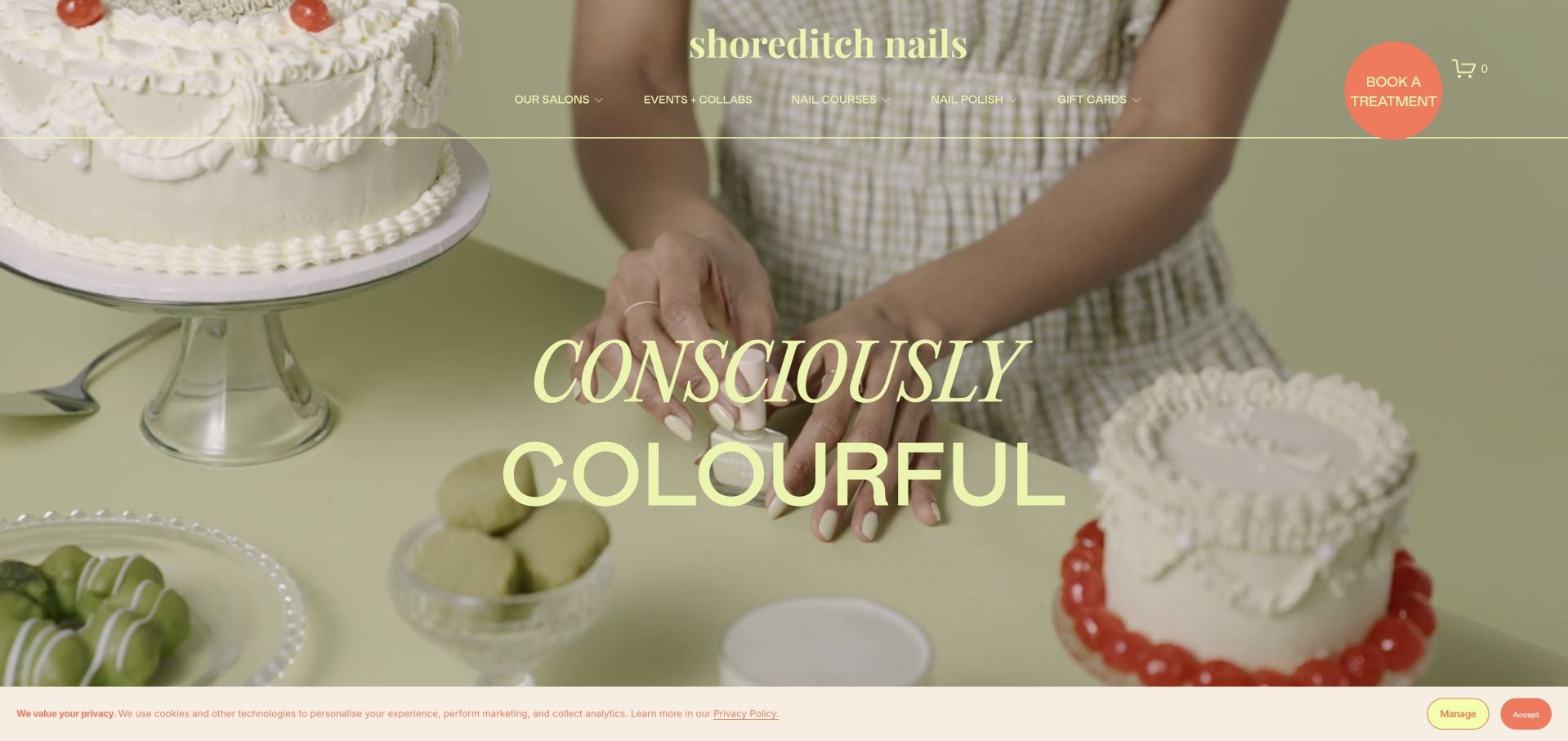
Shoreditch Nails uses a playful green-and-cream campaign photograph and prominent serif lettering to introduce its identity. The page then separates nail studios, polish and the academy, making three different audiences explicit. A treatment-booking action remains available above those wider interests. Service and course explanations use different routes, while the product range has its own visual presentation. The expressive campaign is coherent, but a first-time local visitor must still reach a studio or treatment page for prices and visit details. Privacy controls also occupy part of the opening.
What you can learn
When appointments, products and education are genuinely different businesses, name those paths clearly. Keep the treatment action persistent enough that a customer does not mistake the site for only a polish shop or training provider.
Pros
Studios, polish and academy are distinct content paths.
The treatment-booking action remains visible within the wider brand.
Cons & considerations
Local prices and visit information require continuing into a studio route.
Privacy controls reduce the available space around the first-screen campaign.
Kegan is a freelance web designer and developer with 15+ years of experience helping businesses turn complicated website requirements into clear, maintainable digital experiences. He works directly with clients from planning and design through development, launch, and ongoing support.
For nail salon website design, his development approach focuses on treatment and nail-art tier explanations, artist introductions, studio information, clear appointment policies, and booking connections. The scope can be a targeted improvement or a complete custom build, with responsive layouts, thoughtful content structure, and integrations chosen around the people using and maintaining the site.
Show 3 other nail salon website designersHide other nail salon website designers
Document what is included, which additions require extra time and how an existing set changes the appointment. Use consistent names on service pages, artist profiles and the booking platform. Define a contact route for cases that cannot be selected confidently online.
Plan the nail-art decision
Decide whether visitors book by art tier, estimated time, artist or consultation. Give examples of those categories using work the salon has permission to publish. Do not imply that every pictured design is available from every artist at every location.
Separate salons, retail and other beauty services
A product store, training offer or hair department can share a brand without sharing the same transaction. Label each route directly. For groups, attach the appropriate address, service menu and booking destination before asking someone to reserve.
The editing job behind the design
Keep a useful menu outside the booking platform
Use structured service pages that can carry descriptions, price context, duration and relevant additions without turning into an uneditable image. Keep the main gallery on the website or provide an accessible fallback rather than making social-media access a prerequisite for understanding the salon’s work.
Treat booking as the final service-selection step, not the only place where the service is explained. Clearly identify external providers and preserve salon context where possible. Keep appointment policies consistent across the website and provider, and give dated seasonal offers a responsible editor and an expiry process.
Our WordPress website examples offer a separate look at publishing approaches. A visible platform label is evidence for that named page, not a guarantee that the same system will suit your requirements.
Before the public launch
Nail salon website planning checklist
Explain base services in ordinary language.
Distinguish removal and extensions.
Describe nail-art booking categories.
Show accurate price and duration context.
Label actual portfolio work.
Keep first-visit information visible.
Identify the selected salon location.
Separate beauty, hair, training and retail routes.
Publish appointment-change policies clearly.
Offer a contact route for uncertain service choices.
These checks are a project checklist, not a performance, legal, security, or accessibility certification. Test real journeys with the people responsible for the website before making claims about the result.
Sources & editorial method
How this collection was selected and reviewed
These 25 examples match the collection count saved before research. The editorial team directly inspected the public company pages and recorded source URLs, visible text and screenshot provenance in the supporting capture manifest. Direct browser captures are individually dated; the collection may also reuse an existing direct capture of the same primary property without changing its original capture date. The guide-level narrative was prepared from that inspected evidence. Reviews describe website design, service information and navigation, not professional competence, safety, treatment effectiveness, availability or promised outcomes. Business claims, testimonials and badges are not independent verification. Public technology labels require source evidence; unknown stacks remain unlisted. No appointments, purchases, inquiries or private intake forms were completed for this review. Parked, blocked, empty and unrelated pages were excluded. Website imagery and trademarks belong to their respective owners.
Each example links to its actual source page. Screenshots are direct browser captures with their own capture dates; moving imagery, announcements and live designs can change. The notes describe observable design choices and conditional tradeoffs, not measured traffic, conversion results, service quality, or accessibility conformance.
Technology labels use public page metadata, asset evidence, or explicitly cited platform documentation. Platform documentation is not a complete current deployment audit. A component reference may be legacy or unused; it is not a complete backend inventory. Unknown stacks are omitted. These sites are editorial examples, not our client portfolio.
Written, Edited and Curated are separate editorial records, not timestamps advanced by a rebuild. Website designs and imagery belong to their owners. See our editorial standards or suggest a correction.
Questions worth asking
Nail Salon website design questions
Should nail-art prices be fixed or tiered?
Either can work when it matches the salon’s process. Explain the pricing unit and what changes the total, then illustrate the categories with actual examples. Avoid a single low starting figure with no explanation of additional time or work.
Is an Instagram gallery enough?
It can support discovery, but it should not be the only way to see work or understand services. A small website gallery with labels remains useful when an external feed is unavailable or requires an account.
What belongs before the booking button?
Service scope, relevant additions, location and a clear route to appointment policies. If the salon needs a visitor to read preparation guidance or ask about an existing set first, make that step explicit.
Can one site serve several salons?
Yes. Choose the salon before presenting location-dependent menus or booking links. Retain that choice and explain differences rather than implying that every artist, price and service is identical across the group.
The most useful nail salon site connects creative inspiration to a realistic appointment: the right service, enough time, a clear price basis and the correct location.