Best Delicatessen Websites of 2026 (12 Real-World Examples)
Delicatessen websites that connect a recognizable place with menus, ordering and everyday visits.
A deli website should make someone hungry and help them act. The useful design work lies in connecting appetite with the right location, menu and fulfillment choice without making customers decode a complicated brand story.
Delicatessens can be neighborhood counters, sit-down restaurants, shipped-food businesses and catering kitchens, sometimes under the same name. That makes a homepage unusually demanding. A sandwich photograph can establish the category, but it cannot tell a customer whether a button begins pickup, local delivery, a nationwide shipment or a group-order enquiry. The site needs a recognizable identity and a practical structure that keeps those tasks distinct. Familiarity is valuable, but the design must also work for someone who has never visited the restaurant or heard its history.
These 12 public examples include heritage institutions, family delis and contemporary neighborhood brands. Their visible designs range from large food photographs to intentionally sparse graphic identities. Zingerman’s Delicatessen is the first editorial selection for connecting a real storefront with ordering and current hours. The order is not a ranking of food, hospitality, dietary suitability or customer outcomes. Use the collection to compare how each page introduces place, product and action, then adapt the relevant patterns to the actual operations of the deli you are planning.
Before the examples
What makes good delicatessen website design in 2026?
Make the ordering destination unmistakable
A customer should know whether an action starts pickup, delivery, shipped food or catering before following it. Where those services use different systems, name the distinction and preserve the deli’s identity across the transition. A large Order Now button is only helpful when its destination matches the visitor’s intention. Keep menu access available for people investigating prices and options before they are ready to enter a transaction.
Give the physical place a practical introduction
A real storefront, host or dining room can distinguish a deli more effectively than anonymous hospitality imagery. Pair it with current hours, an address and a clear location route. For multiple branches, make the branch choice explicit before ordering. Attman’s named location buttons are a useful reference for that early decision. Do not assume every location offers the same menu, services or holiday opening arrangements.
Keep food imagery specific and useful
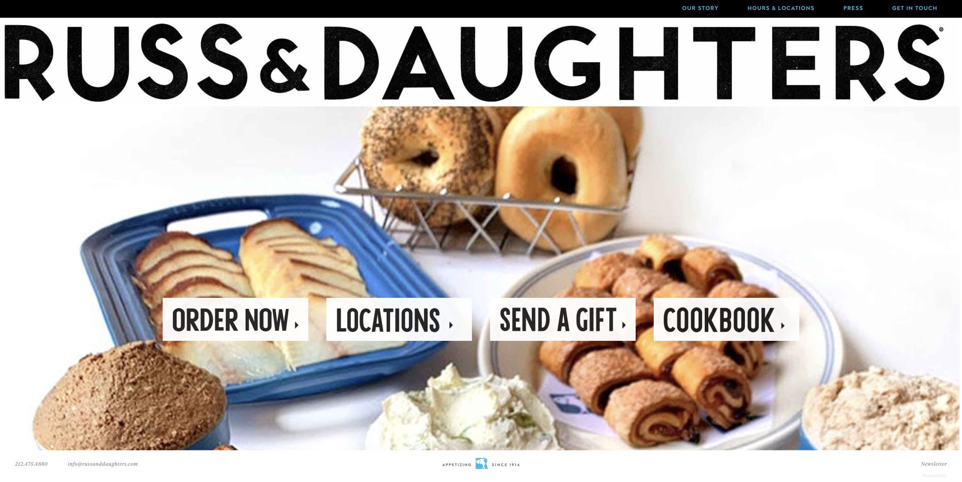
Choose a photograph that communicates the offer: a particular sandwich, an assortment for a group or the actual counter. Explain what is included rather than letting props or serving suggestions imply a package. Russ & Daughters combines food imagery with simple task labels, while Mile End uses a shared-table scene. Both illustrate how a photograph can introduce appetite without doing all the operational explanatory work.
The collection · 12 examples
12 delicatessen websites worth studying
Look beyond the sandwich photograph. Compare each page’s location choice, menu access, ordering destination and current notices, then decide which parts support the type of deli and customer journey you actually have.
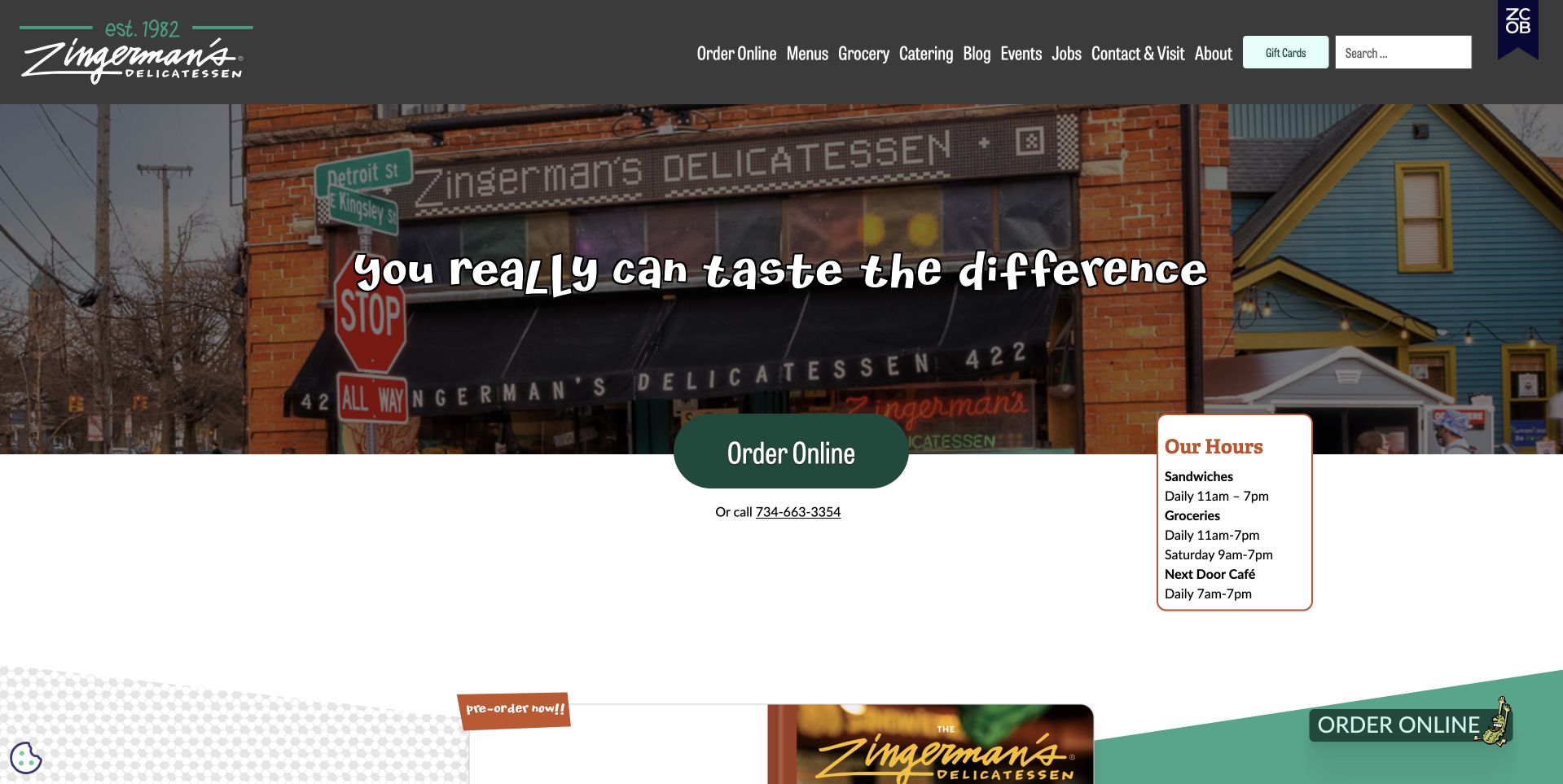
Zingerman’s Delicatessen uses a photograph of its actual storefront as the opening scene, with a handwritten-style statement across the brick facade. The dark header keeps the familiar identity, ordering, menus and store information in one place. A large green Order Online button sits near a small hours card, connecting the atmospheric image with two practical needs. This is our first editorial selection because the page does not separate personality from usefulness: the real entrance establishes the place, while ordering and opening information make the next step concrete. Its changing menu, catering and event routes also acknowledge that a deli visit is not always a single sandwich purchase.
What you can learn
A deli homepage should work as both an invitation and a useful front door. Pair a recognizable photograph of the place with current hours and a literal ordering action, then separate catering and events from the ordinary menu journey.
Pros
The storefront gives the business a recognizable setting.
Hours and ordering remain connected to the main introduction.
Cons & considerations
Small hours-card text needs careful enlargement for comfortable mobile reading.
Several header routes require clear grouping when customers arrive on phones.
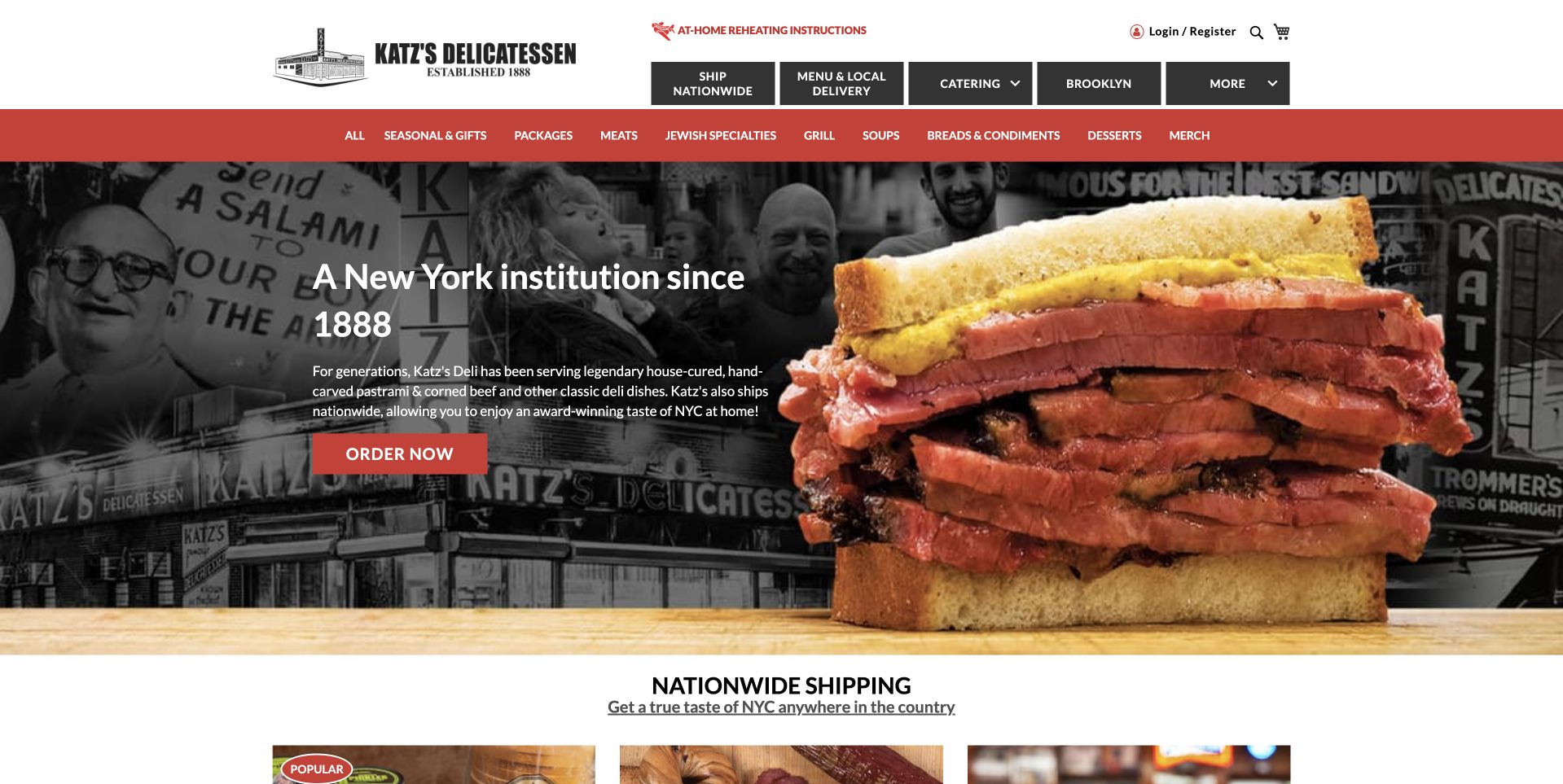
Katz’s Delicatessen pairs an oversized sandwich photograph with a monochrome wall of historic-looking restaurant imagery. The red-and-white header and compact central copy make the opening feel direct and recognizable. Order Now is the main action, while the next section introduces nationwide shipping. That separation is useful because a local meal order and a shipped food package involve different expectations. The design gives the heritage story a visible texture without requiring the customer to read it before acting. The large sandwich remains the product focus, and the practical shopping routes are framed by a conventional, easily recognized navigation rather than an elaborate interaction.
What you can learn
Use a deli’s history as context, not as an obstacle to ordering. Distinguish local pickup or delivery from shipped packages, and make the relevant menu, lead times and availability clear on each route instead of using one undifferentiated order button for every situation.
Pros
The sandwich and heritage wall explain product and place together.
A shipping section distinguishes another customer journey.
Cons & considerations
The large sandwich crop leaves limited space for practical first-visit information.
An Order Now label needs a clear destination when multiple fulfillment models exist.
Russ & Daughters gives its name exceptional scale across the top of the homepage. Beneath it, a bright overhead food arrangement provides the background for four practical actions: ordering, locations, gifts and the cookbook. The white canvas, black lettering and simple button treatment keep the food from becoming visually cluttered. This is useful because the business’s cultural identity is already strong; the page can focus on helping visitors choose what they want to do with it. The opening offers a clear choice between buying food, finding a place and exploring related products without needing a conventional long introductory paragraph.
What you can learn
If the name and visual identity are strong, let the first screen route customers rather than repeat a brand manifesto. Keep location finding separate from ordering and gifting, especially when those actions lead to different operating conditions or external services.
Pros
The oversized wordmark creates an unmistakable identity before the food appears.
Four literal actions make ordering, visiting and gifting easy to distinguish.
Cons & considerations
The very large identity consumes space that could show practical store details.
A sparse introduction relies on destination pages to explain fulfillment and availability.
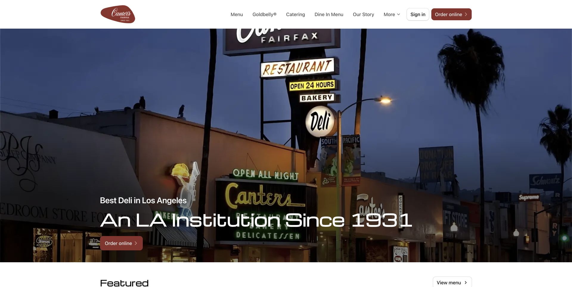
Canter’s Deli opens with a nighttime photograph of its illuminated exterior sign and restaurant entrance. The white header remains restrained, leaving the recognizable sign and street setting to supply the character. A short institutional headline and modest order action sit over the darker lower part of the photograph. This is useful for a deli that is also a physical destination: the opening gives newcomers a sense of the place they might visit. Menu, catering, story and ordering routes remain available above, so the photograph does not have to carry every piece of information. It works as a location-led invitation rather than a product catalog.
What you can learn
When the building or sign is part of the deli’s identity, show it clearly, then supply ordinary menu and ordering routes around it. Visitors still need current hours and location details; the atmosphere of a night photograph should not imply a particular opening schedule.
Pros
The exterior sign makes the destination distinctive.
The restrained header gives the landmark photograph room.
Cons & considerations
White copy over a dark street scene needs careful cropping and contrast checks.
The first view provides less detail about the actual food assortment.
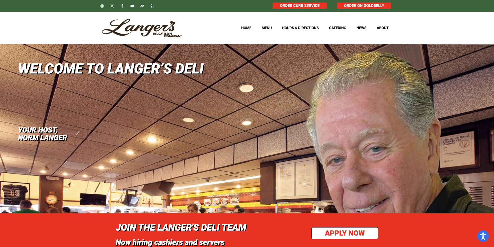
Langer’s Delicatessen uses a large photograph of its named host in the dining room rather than opening with a sandwich close-up. The green-and-white header supplies the brand and navigation, while pickup and delivery routes receive their own small buttons above. This creates a personal introduction without forcing the whole business story into the hero. A red recruitment strip sits below the main image as a distinct, current notice. The useful pattern is the separation between a durable human identity and practical operating actions. The photograph shows the place and its representative; the navigation then offers a direct way to use the business.
What you can learn
A real host or owner photograph can introduce a deli more effectively than generic hospitality imagery. Keep the person’s role accurately labelled, preserve separate pickup and delivery paths and give temporary notices their own removable section rather than baking them into the portrait.
Pros
The named host gives the restaurant a human introduction.
Pickup and delivery remain distinct from the portrait.
Cons & considerations
The portrait-led opening shows less of the food than product-focused alternatives.
A recruitment strip can distract from ordering if its priority is not managed.
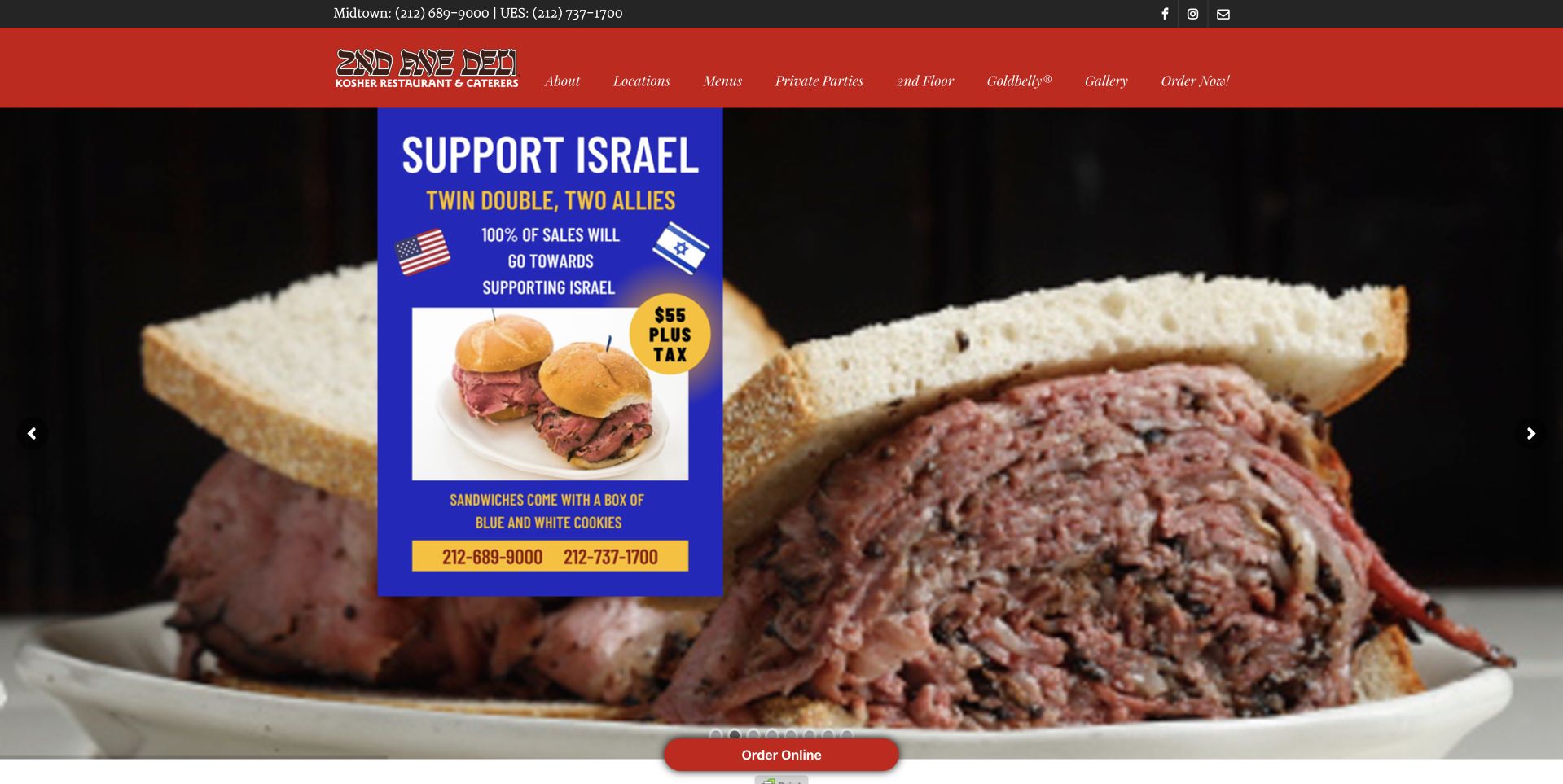
2nd Ave Deli uses a large sandwich photograph beneath a red header, with a small ordering action near the bottom of the image. The logo and navigation are compact, leaving most of the first screen to the food. A prominent campaign card also appears over part of the photograph in the reviewed page, demonstrating the tradeoff when an additional current message shares the hero. The core sandwich still establishes the business category, but the card competes with it for attention. This is useful as a design study in priority: a highly appetizing product image does not automatically make several overlapping messages easy to follow.
What you can learn
Give temporary campaigns a deliberate place rather than placing them over important product imagery by default. Preserve one clear ordering route and ensure practical menu, location and opening information remain usable even when the deli publishes additional messages.
Pros
The large sandwich image makes the central food offer immediately recognizable.
A compact red header maintains a consistent identity around the photograph.
Cons & considerations
The overlaid campaign competes with the sandwich and main ordering action.
Small navigation labels need careful testing for touch access and readability.
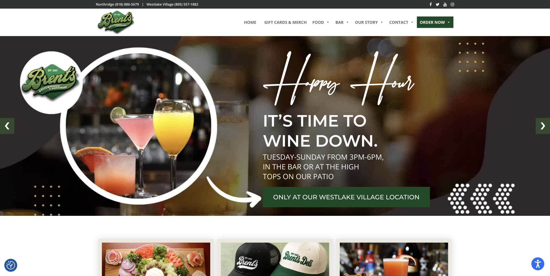
Brent’s Deli combines a green-and-white header with a large drinks campaign in the opening carousel. The reviewed panel explicitly limits its happy-hour offer to the Westlake Village location, which is an important detail for a business with more than one place. Circular imagery and handwritten-style campaign lettering give the promotion a separate character from the stable identity above it. Product and food thumbnails begin below. The page is useful for studying location-aware promotions: the seasonal or timed offer can be visually bold, but it still needs to tell visitors exactly which restaurant it applies to instead of appearing universal.
What you can learn
Attach the relevant location to every offer that is not available everywhere. Keep hours, menus and ordering destinations tied to the correct branch, and treat campaign conditions as essential information rather than optional fine print beneath an attractive photograph.
Pros
The reviewed campaign states its location restriction within the main promotional panel.
The stable header remains separate from the more expressive carousel artwork.
Cons & considerations
A drinks-first slide can obscure the deli’s main food proposition for newcomers.
Carousel campaigns need accessible controls and current conditions on their destination pages.
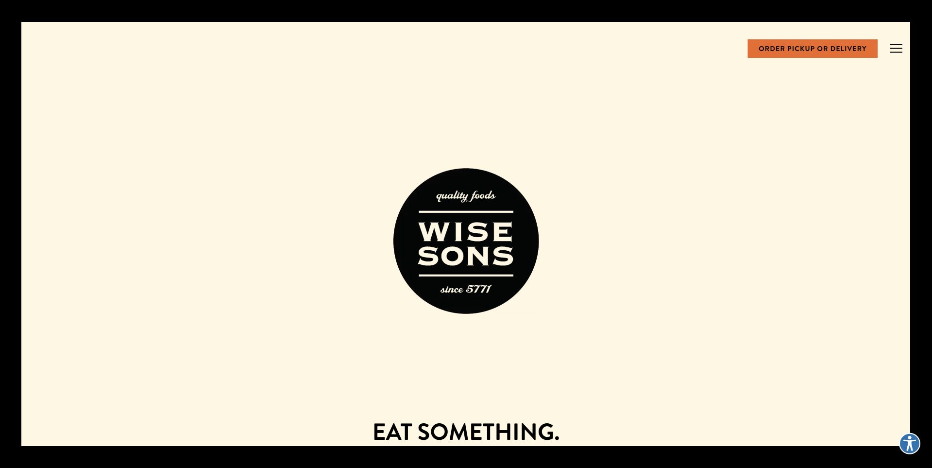
Wise Sons opens with a pale cream canvas, a large black circular identity and very little accompanying copy. A short Eat Something line sits at the bottom, while an orange pickup-or-delivery action remains near the top. The absence of a food photograph is a deliberate contrast with the sandwich-heavy pages in this collection. It gives the brand mark unusually strong emphasis, but it also means newcomers receive less immediate explanation of the menu. This is worth studying as a minimal approach, not as a recommendation to remove useful information. The design depends on clear navigation and a functioning ordering route to turn recognition into a practical next step.
What you can learn
Minimalism works only when the remaining elements do their jobs clearly. Keep the order action easy to identify, make the menu and locations readily available and check that a first-time visitor can understand the offer without already knowing the brand.
Pros
The cream-and-black composition gives the identity clarity.
A contrasting order action remains visible in the sparse opening.
Cons & considerations
The first screen offers little food context for newcomers.
Sparse content depends on readily available menu and location routes.
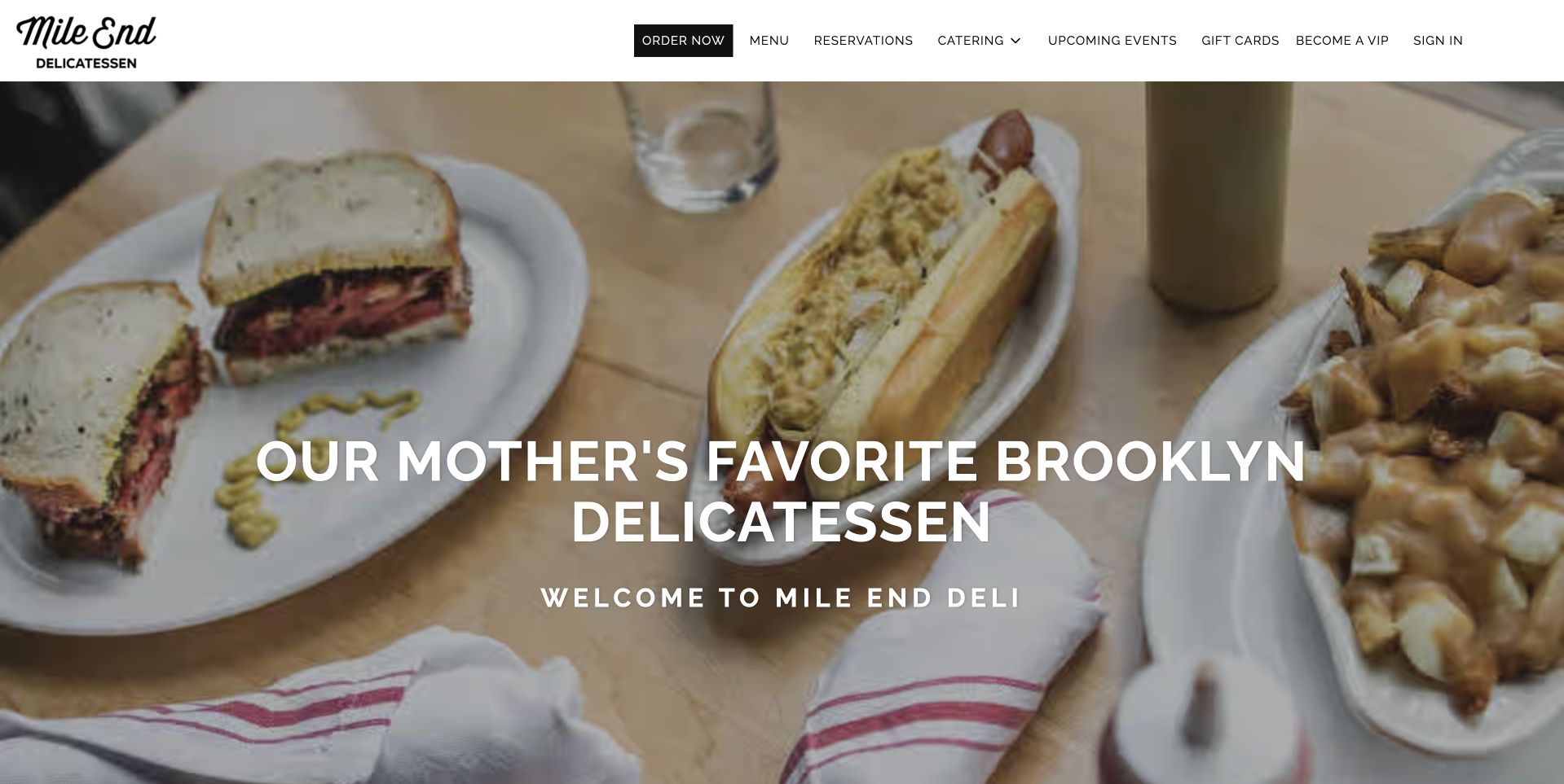
Mile End Deli uses an overhead photograph of a meal spread across a table, with sandwiches, fries and drinks visible around the central headline. The white header keeps its compact identity and a separate Order Now button readable above the photograph. Menu, reservations and catering have their own labels, acknowledging different reasons to visit the website. The table scene is useful because it makes the food feel like a shared meal rather than an isolated catalog item. At the same time, the navigation prevents that atmosphere from becoming the only explanation of how customers can order, visit or plan for a group.
What you can learn
Use a shared table image to introduce the occasion, then keep individual ordering, reservations and catering as separate tasks. A customer organizing a group needs quantities and lead times that do not belong in the same journey as an immediate lunch order.
Pros
The meal photograph introduces several foods without a product grid.
Ordering, reservations and catering have separate routes.
Cons & considerations
White central lettering can lose contrast where the table photograph becomes bright.
The scene does not itself explain serving sizes or what a catering order includes.
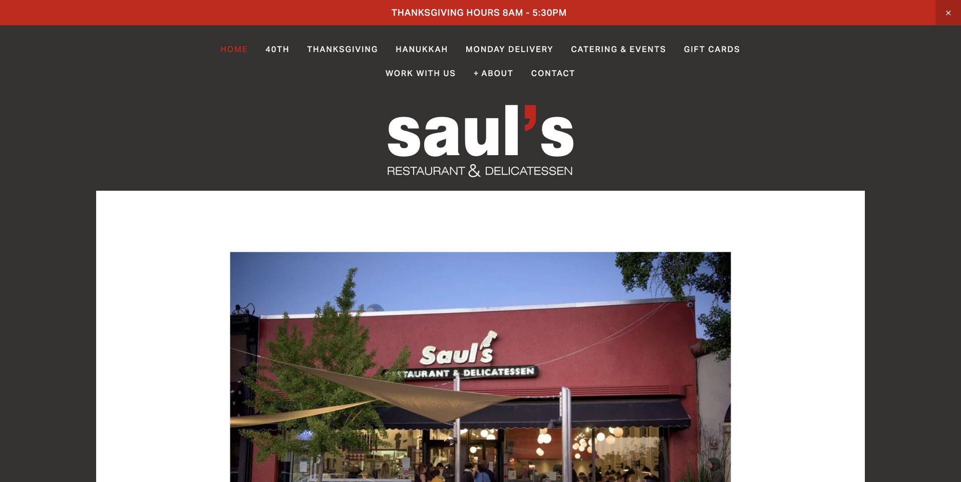
Saul’s Restaurant & Delicatessen places a large white-and-red wordmark on a dark background above a framed photograph of its storefront. The cream border around the image makes it feel like a neighborhood postcard rather than a full-bleed advertising banner. A narrow red strip carries a current hours notice, while the header includes everyday ordering and catering routes. This is useful for a deli that wants to make the place itself recognizable. The photograph and identity establish familiarity; the separate notice allows holiday information to change without altering the central design. The result is more place-led than the product-centered sandwich pages nearby.
What you can learn
Keep the permanent image of the place separate from temporary opening notices. Give holiday hours a short, editable strip with a clear date, and make sure everyday menu and ordering routes remain available when that notice is no longer relevant.
Pros
The framed storefront photograph creates a clear, recognizable sense of place.
A separate hours strip can be updated without redesigning the main introduction.
Cons & considerations
The dark header contains many small routes that need careful mobile grouping.
A storefront-led first view shows less of the food available to order.
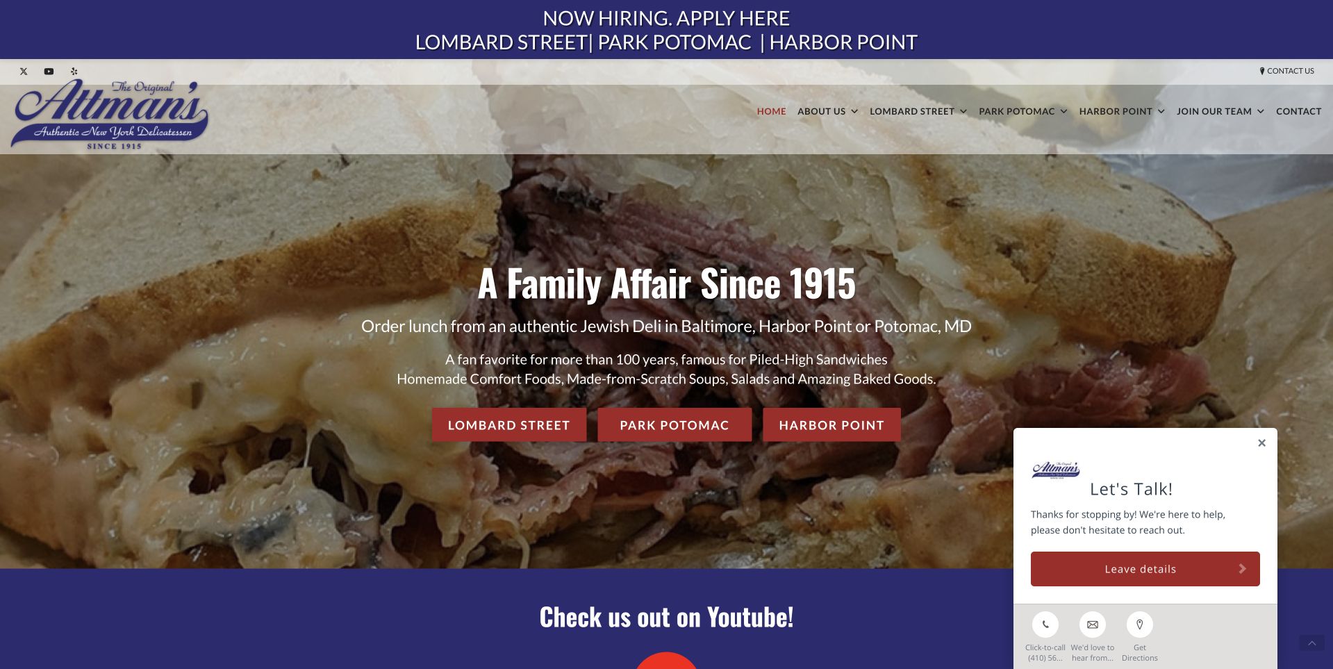
Attman’s Delicatessen uses a purple-and-white identity above a large sandwich photograph. The headline introduces the family history, but the most practical feature is a row of red buttons naming the individual locations. This is a useful way to prevent a brand-level homepage from sending everyone into the wrong branch’s ordering flow. The narrow top notice and the next content band give current information separate places around the central image. A chat panel is also visible at the edge of the reviewed page. Study the branch buttons first: they connect a familiar food image with a specific place rather than treating all locations as interchangeable.
What you can learn
Make branch selection an explicit step when menus, hours or fulfillment differ. Use the actual location names on buttons, preserve those names on the destination page and avoid asking a generic chat widget to repair confusion created by an ambiguous ordering route.
Pros
Named location buttons create a concrete ordering choice.
Purple styling distinguishes the identity from red-and-cream alternatives.
Cons & considerations
The visible chat panel competes with part of the main food photograph.
Family-history wording still needs useful current details on each branch page.
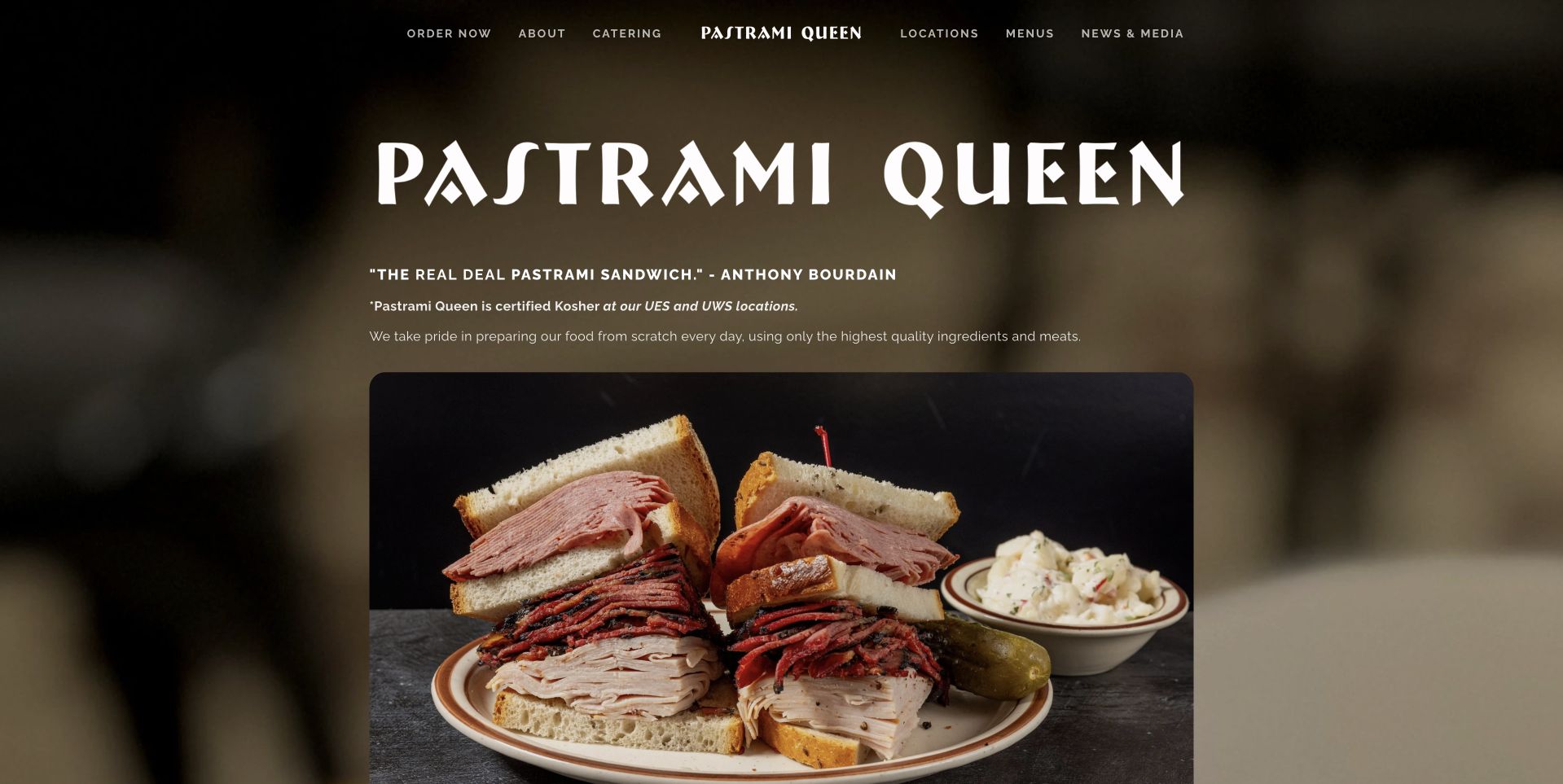
Pastrami Queen uses a dark, blurred food background behind a large irregular white wordmark. Below a short introduction, a sharper framed photograph shows sandwiches and accompaniments on a plate. The contrast between the soft background and the clear meal image gives the food a deliberate focal point without a wall of product tiles. Compact navigation across the top separates ordering, catering, locations and menus. This is useful for a deli with more than one customer journey: the food supplies the appetite, while the menu supplies the route. The page’s quoted praise is publisher content rather than an independently assessed quality claim in this review.
What you can learn
Keep the clearest food photograph at the center of an atmospheric design. Distinguish menus, branch locations and catering from immediate ordering, and support evocative copy with practical details about the actual products and fulfillment rather than expecting visual appetite to answer every question.
Pros
The framed meal stands out against the softer background.
Menu and location routes support investigation before ordering.
Cons & considerations
A dark visual treatment needs careful contrast checks for small navigation labels.
Quoted praise should not take the place of clear current menu and service information.
Kegan is a freelance web designer and developer with 15+ years of experience helping businesses turn complicated website requirements into clear, maintainable digital experiences. He works directly with clients from planning and design through development, launch, and ongoing support.
For delicatessen website design, his development approach focuses on readable current menus, location and collection information, dietary detail, separate catering inquiries, and practical ordering connections. The scope can be a targeted improvement or a complete custom build, with responsive layouts, thoughtful content structure, and integrations chosen around the people using and maintaining the site.
Show 3 other delicatessen website designersHide other delicatessen website designers
Plan for lunch orders, future events and first-time visitors
Write the menu as usable website content
Build a readable menu with names, descriptions, prices where maintained and the practical information the business is qualified to publish. Avoid making an image or a scanned document the only menu. Decide how availability and changes are updated and whether the displayed menu differs by branch or time. A customer should not need to start checkout simply to understand the offer. Provide an accurate downloadable version only as an additional convenience, not the sole accessible route.
Separate immediate orders from catering enquiries
A lunch order needs a short path to the correct fulfillment method. Catering usually needs quantities, dates, service area, notice and a clear explanation of what happens after an enquiry. Give those processes different forms or destinations. State whether a submitted request confirms anything or merely starts a conversation. Use real menu examples to test the structure: an individual sandwich, an office lunch and a holiday platter should not all be forced through the same sequence.
Create a dependable location and notice system
Give each branch a single current record for its address, hours, telephone, menus and services. Let notices reference that record rather than duplicating details across banners and footers. Date exceptional hours and expire campaigns when they end. A website that looks established can still cause frustration if a stale holiday notice sends a customer to the wrong place. Include a clear contact route for questions without relying on a chat widget as the main source of operational truth.
The editing job behind the design
Make the website and ordering systems work together
[object Object]
[object Object]
[object Object]
Our WordPress website examples offer a separate look at publishing approaches. A visible platform label is evidence for that named page, not a guarantee that the same system will suit your requirements.
Before the public launch
A deli website brief that supports real visits and orders
Identify the main tasks: reading a menu, visiting a branch, ordering a meal, arranging catering or shipping food.
Create a current record for every branch’s address, hours, telephone and available services.
Keep menu content readable in the browser rather than relying on a scanned or image-only document.
Label pickup, delivery, shipped products and catering as different journeys where their requirements differ.
Explain which branch and service a location-specific promotion actually applies to.
Use real food and place photographs with permissions, accurate captions and useful text alternatives.
Clarify what a platter or meal photograph includes and which elements are only serving suggestions.
Give catering enquiries clear date, quantity and follow-up expectations without implying an automatic booking.
Publish approved ingredient and allergen information without inventing personal dietary or health assurances.
Date and expire holiday hours, special offers and temporary notices through a maintainable process.
Test mobile menus, branch selection, external ordering and forms without submitting a real customer transaction.
Assign an owner for menu changes, notification delivery and consistency between website and ordering provider.
These checks are a project checklist, not a performance, legal, security, or accessibility certification. Test real journeys with the people responsible for the website before making claims about the result.
Sources & editorial method
How this collection was selected and reviewed
The examples were reviewed as public website-design references and captured in a normal browser. Commentary concerns visible layout and customer journeys, not taste, dietary suitability, hospitality or measured sales performance. Location, shipping and mixed-service contexts are identified where relevant. A screenshot does not establish a complete technology stack or prove an operational claim.
Each example links to its actual source page. Screenshots are direct browser captures with their own capture dates; moving imagery, announcements and live designs can change. The notes describe observable design choices and conditional tradeoffs, not measured traffic, conversion results, service quality, or accessibility conformance.
Technology labels use public page metadata, asset evidence, or explicitly cited platform documentation. Platform documentation is not a complete current deployment audit. A component reference may be legacy or unused; it is not a complete backend inventory. Unknown stacks are omitted. These sites are editorial examples, not our client portfolio.
Written, Edited and Curated are separate editorial records, not timestamps advanced by a rebuild. Website designs and imagery belong to their owners. See our editorial standards or suggest a correction.
Questions worth asking
Delicatessen website design questions
Should a deli menu be a PDF?
A downloadable menu can be useful, but it should not be the only version. Readable browser text is easier to search, resize and maintain. Make sure any PDF and the ordering system agree with the current menu and branch availability.
What should the main homepage button say?
Use the task the destination actually supports. Order Pickup, Order Delivery or Find a Location may be clearer than Order Now when several services exist. A general label is reasonable only when the next step clearly explains those choices.
Can one website cover several branches?
Yes, provided location-specific information stays explicit. Give each branch a clear page or selection state, keep its menu and hours accurate and do not let a promotion or ordering link silently apply to a different restaurant.
Should the homepage emphasize the deli’s history?
History can establish character through a real photograph, host or short statement. It should not prevent someone from finding current hours or reading the menu. Keep the longer story available for visitors who want it without making it a required step before ordering.
Is a chat widget necessary?
Not necessarily. Accurate menus, location details and clear contact routes may answer most questions more reliably. If chat is offered, explain realistic response expectations and make sure the widget does not cover the main ordering controls or important information.
Start with an ordinary lunch order and a first-time visit, then test the proposed design against both. A successful deli homepage feels like the actual place while making the correct menu, branch and next action easy to find.