Best Audiology Websites of 2026 (27 Real-World Examples)
Audiology websites that make communication access part of the appointment journey
These 27 hearing-care websites explore independent clinics, regional groups, university services, device information and the practical difference between online screening and a clinical appointment.
An audiology website should not depend on the communication channel some of its visitors find difficult. A large telephone number can be useful, but it needs a clear written or online alternative. The page also has to distinguish assessment, device information, ongoing support and other services rather than treating every visit as an immediate hearing-aid purchase.
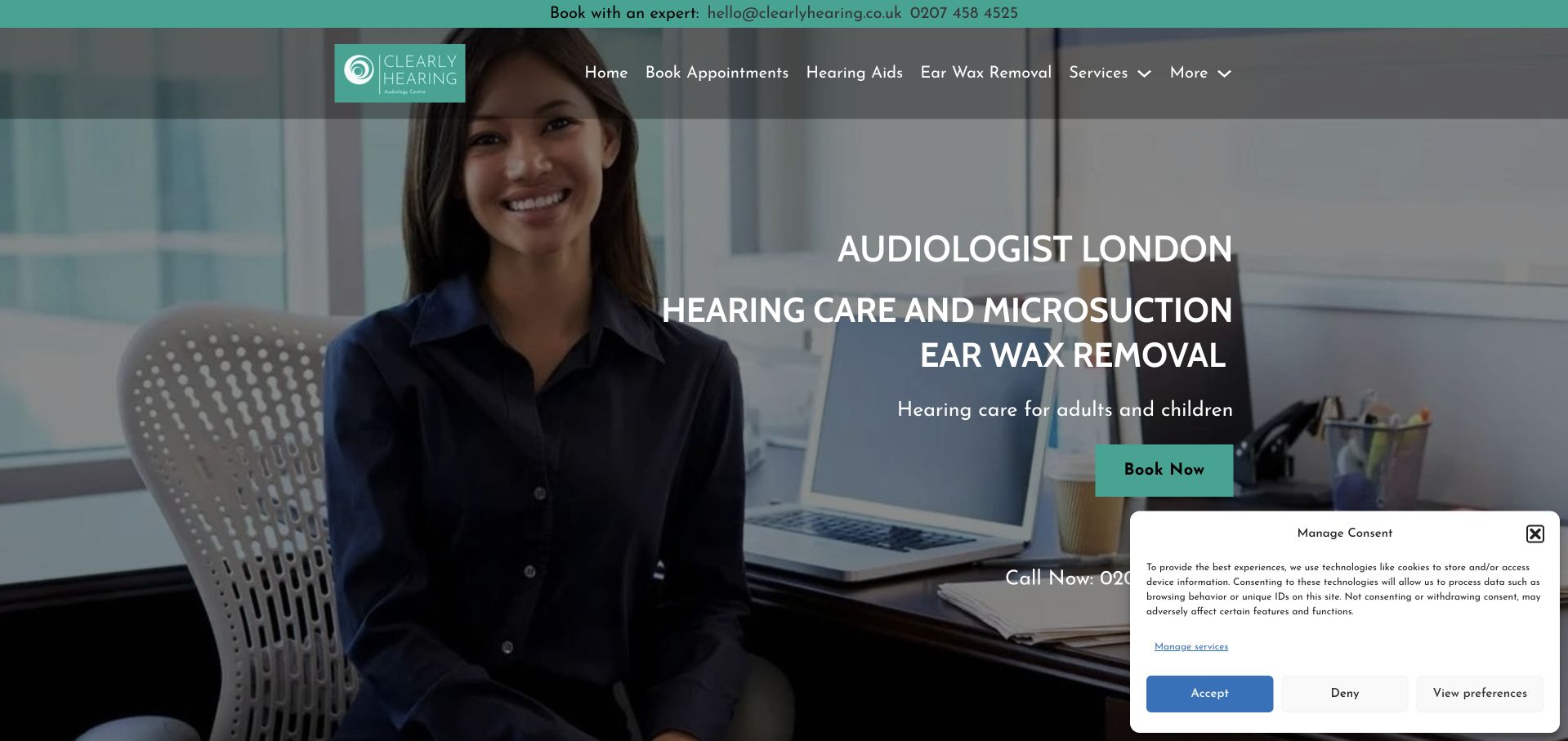
Clearly Hearing is our Editors Choice for bringing a real practitioner, a London location and a literal service description into the same first-screen identity. The teal palette and portrait make the small independent practice recognisable, while hearing aids and other services retain distinct navigation routes. This is an editorial observation about the website, not an endorsement of care quality, clinical claims or individual suitability.
The collection includes product-led sites and institutional pages as well as smaller practices. Their operating models differ. A device demonstration, online screening result, hearing assessment, repair request and university clinic enquiry should not be presented as interchangeable. Compare how each site explains what happens next and whether a person can establish the appropriate route without a voice call.
Before the examples
What makes good audiology website design in 2026?
Offer more than a phone-only route
Give written contact and online enquiry options clear labels and explain how the practice responds. Make appointment confirmations and next-step instructions understandable without audio. Provide captions and useful written alternatives for important media. Do not assume that a visitor who can read the homepage can also complete a telephone-only scheduling process.
Separate assessment from product browsing and screening
A service directory should distinguish hearing assessment, devices, ongoing care and any other services the practice actually offers. An online hearing test needs an explanation of its purpose and limits; it should not imply that it is a comprehensive diagnosis or a personalised product recommendation. ASHA’s adult-screening material is a useful professional reference for maintaining that distinction.
Explain the ongoing relationship, not only the first sale
Returning visitors may need repairs, maintenance, accessories, appointment changes or their patient portal. Give these tasks stable routes outside new-patient promotions. Explain any care plans, trials, finance or free-test offers with accurate terms. A prominent commercial device brand or review figure should not substitute for a readable account of what the practice does.
The collection · 27 examples
27 audiology websites worth studying
Compare the actual task supported by the opening: contacting a person, arranging an assessment, finding an office or browsing devices. The strongest ideas keep those tasks distinct and offer a route that does not rely only on a telephone conversation.
Clearly Hearing uses a real clinician photograph, teal accents and a direct London audiology heading. The introduction names hearing care and ear-wax removal rather than requiring visitors to understand the brand first. A clear booking action sits within the photographic opening, while the navigation separates hearing aids from other services. The named-practitioner material gives the organisation a human point of reference. This is a useful small-practice example because person, place and service are visible together.
What you can learn
Introduce the clinician and actual service in readable text, not only through a portrait or logo. Keep booking and written contact routes easy to find, and test the initial page with privacy controls visible rather than reviewing only a pristine marketing screenshot.
Pros
A real practitioner image makes the local practice more identifiable than a generic hearing-aid graphic.
The opening names both the city and service categories before visitors enter the navigation.
Cons & considerations
The dark overlay requires careful contrast checking over different parts of the photograph.
A cookie panel occupies part of the initial view and competes with the main booking route.
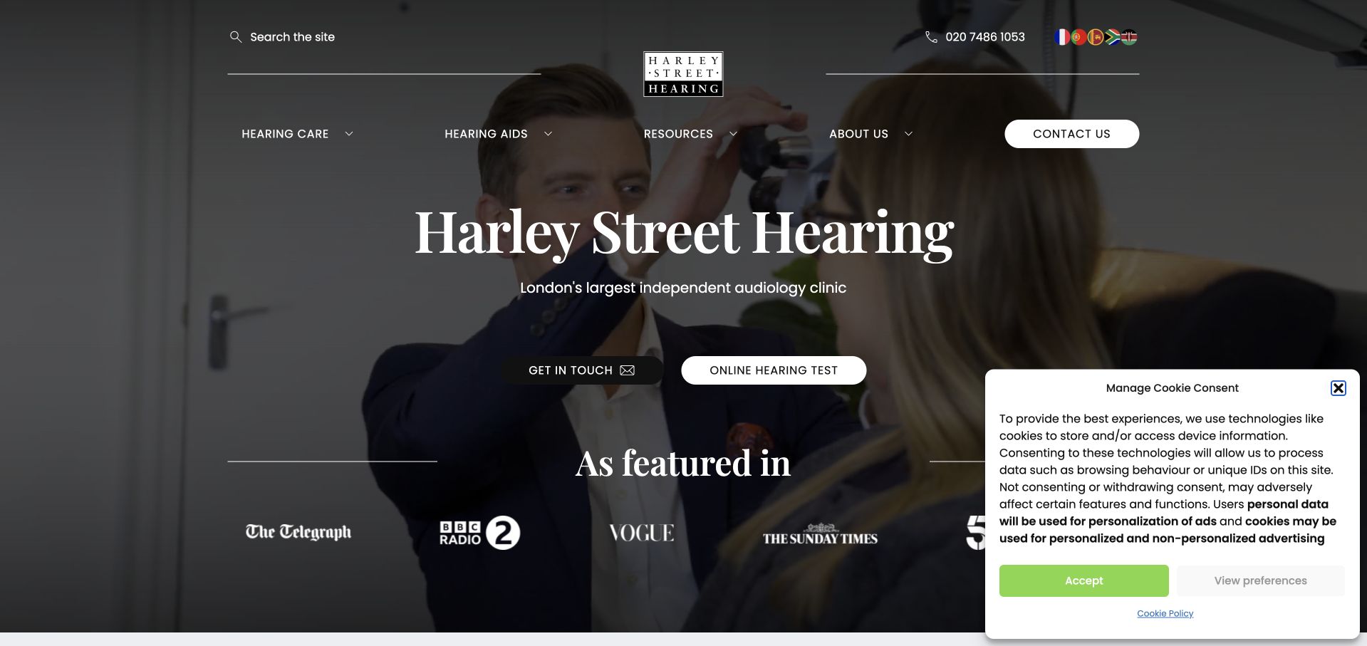
Harley Street Hearing uses dark photographic imagery, restrained typography and a compact appointment action to establish its practice identity. A separate online hearing-test route acknowledges visitors who are not ready to contact the clinic. The supporting service material extends beyond hearing aids to assessment, protection and a musicians’ service, giving the site more depth than a product catalogue. Media logos occupy prominent space in the introduction, but the most useful structure is the distinction between general hearing care and specialist professional needs. The moving imagery and initial cookie controls add complexity that should not obstruct essential contact information.
What you can learn
Separate specialised audiences when their needs and service arrangements differ from the general appointment journey. Keep an online screening tool clearly distinct from a clinical assessment, and ensure practical service information remains available without watching media or interpreting publicity logos.
Pros
The musicians’ pathway gives a specialist audience a recognisable destination within the broader practice.
An online-test route and appointment action accommodate different stages of visitor readiness.
Cons & considerations
Media recognition can displace the practical service information a new visitor needs first.
Dark imagery and privacy controls introduce additional contrast and first-view usability considerations.
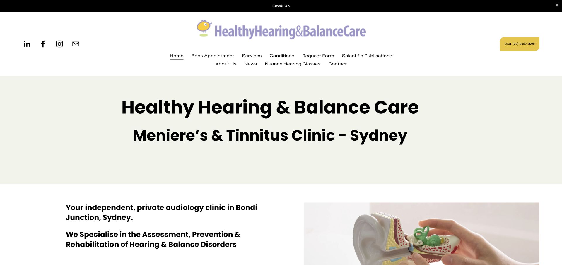
Healthy Hearing & Balance Care uses a simple white header, pale green title area and direct Sydney location wording. The opening names the clinic’s hearing-and-balance focus rather than beginning with a hearing-aid promotion. A short introduction then establishes the Bondi Junction practice and offers a booking route. The quieter composition makes it easy to understand what kind of organisation the visitor has reached. Its service vocabulary can be specialised, however, so the site benefits from plain-language explanations and clear distinctions between appointment types.
What you can learn
Name a clinic’s genuine service focus before presenting device brands or broad lifestyle promises. Explain unfamiliar hearing and balance terminology in supporting pages, and give visitors a clear route to ask which appointment type is appropriate without requiring self-diagnosis.
Pros
The opening distinguishes the clinic’s hearing-and-balance focus from a general retail message.
A restrained layout keeps the location and booking route relatively easy to identify.
Cons & considerations
Specialist condition terminology may need more plain-language orientation for first-time visitors.
The modest visual hierarchy can make the main next step less prominent than the clinic title.
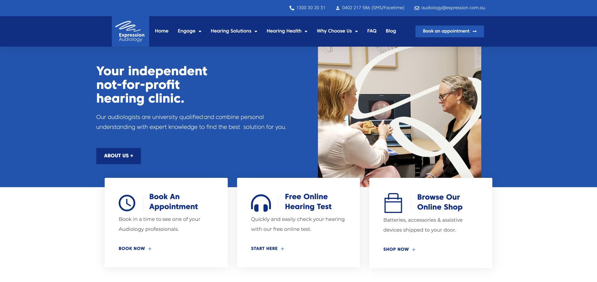
Expression Audiology uses a strong blue-and-white split hero and an assessment photograph to introduce its independent not-for-profit identity. Immediately below, separate cards distinguish appointment booking, an online hearing test and the online shop. This is a useful task model because those actions have different purposes and should not be conflated. The main navigation also separates hearing solutions from hearing-health information. The first screen is clear, but the screening route needs appropriate explanation so visitors do not mistake an online result for a complete assessment. The shop should remain visibly separate from clinical recommendations and appointment expectations.
What you can learn
Treat clinical appointments, online screening and product purchases as different journeys. Give each a clear label and explanation, and state what the screening tool can and cannot establish before inviting visitors to interpret its result or choose a product.
Pros
The three task cards make booking, screening and purchasing visibly distinct.
A service photograph and clear organisational description provide context beyond product imagery.
Cons & considerations
An online-test promotion needs clear limits and an accessible alternative to completing the tool.
Retail and clinical journeys require careful separation so product browsing does not imply personalised advice.
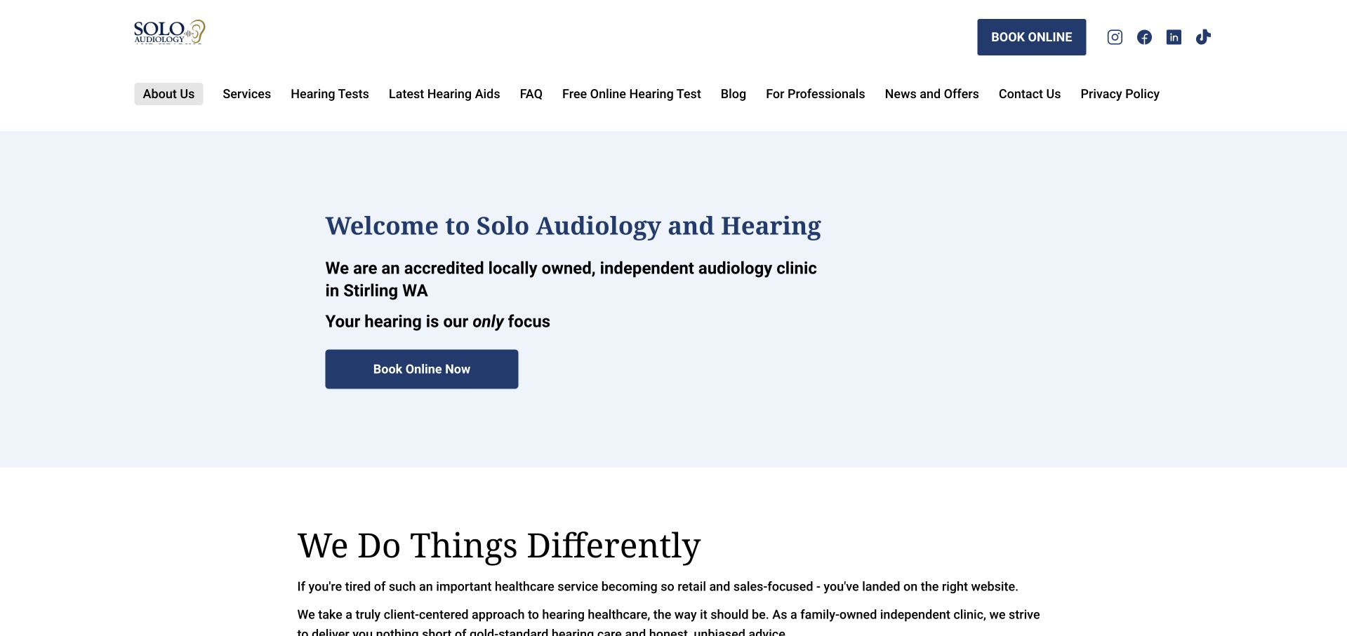
Solo Audiology uses a restrained white-and-pale-blue layout and a direct welcome to its Stirling practice. The opening names the local independent clinic and provides a booking button, followed by an explanation of how the service works. The navigation gives hearing tests, devices, professional referrals and contact information distinct destinations. This is a useful reference for a small practice that does not need an elaborate cinematic introduction to be understandable. Its first screen is visually sparse, however, and the relationship between device browsing, clinical services and the online screening tool needs continued clarity throughout the journey.
What you can learn
A small clinic can lead with concise, literal information instead of a full-screen image. Use the saved space for location, appointment expectations and accessible contact choices, while separating professional referrals and screening tools from ordinary patient booking.
Pros
The local practice identity is explained in text rather than left to the brand name.
Distinct navigation destinations support both patients and professional referrers.
Cons & considerations
The sparse introduction could make service differences and the next step more prominent.
Online screening and device navigation need clear context so they are not confused with clinical assessment.
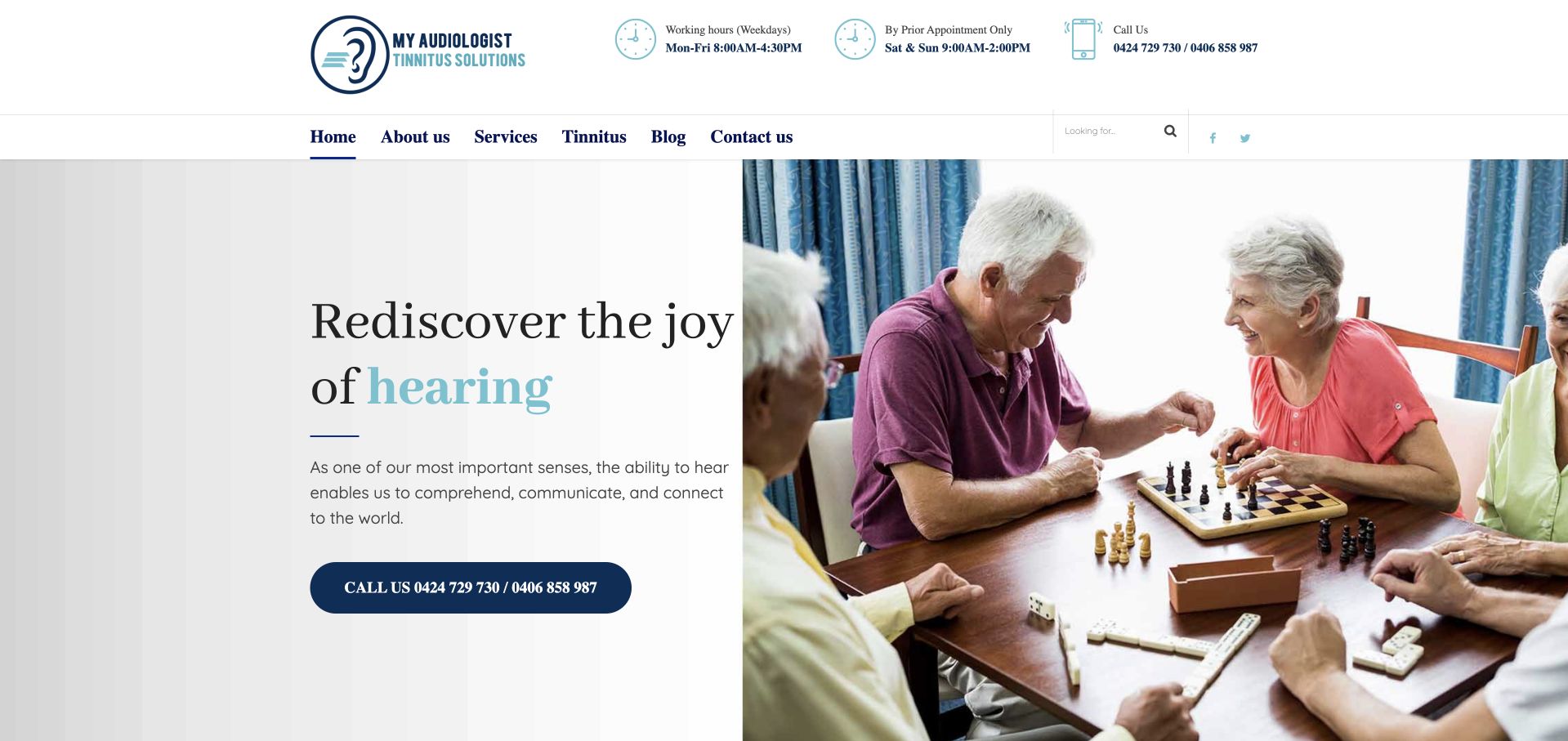
My Audiologist pairs a warm photograph of older adults with a light, restrained introductory layout. The service menu is notably more comprehensive than the hero: testing, fitting, repairs, accessories and specialised assessments have individual routes. That distinction is useful because returning patients may be looking for maintenance rather than a first consultation. The site therefore functions as more than a hearing-aid sales page. Its rotating headlines and broad lifestyle language need a stable practical counterpart, especially for visitors who want a specific service quickly or use assistive technology to navigate the menu.
What you can learn
Design for returning patients as well as first-time enquiries. Give repairs, maintenance and specialised appointments clear destinations, and keep those tasks available outside a carousel so visitors do not have to wait for the right promotional message to appear.
Pros
The service menu recognises ongoing device support as a separate visitor need.
The warm photograph gives the practice an approachable introduction without dominating the whole page.
Cons & considerations
Rotating broad headlines can delay a precise explanation of the clinic’s services.
A long nested menu requires careful keyboard, touch and zoom testing to remain usable.
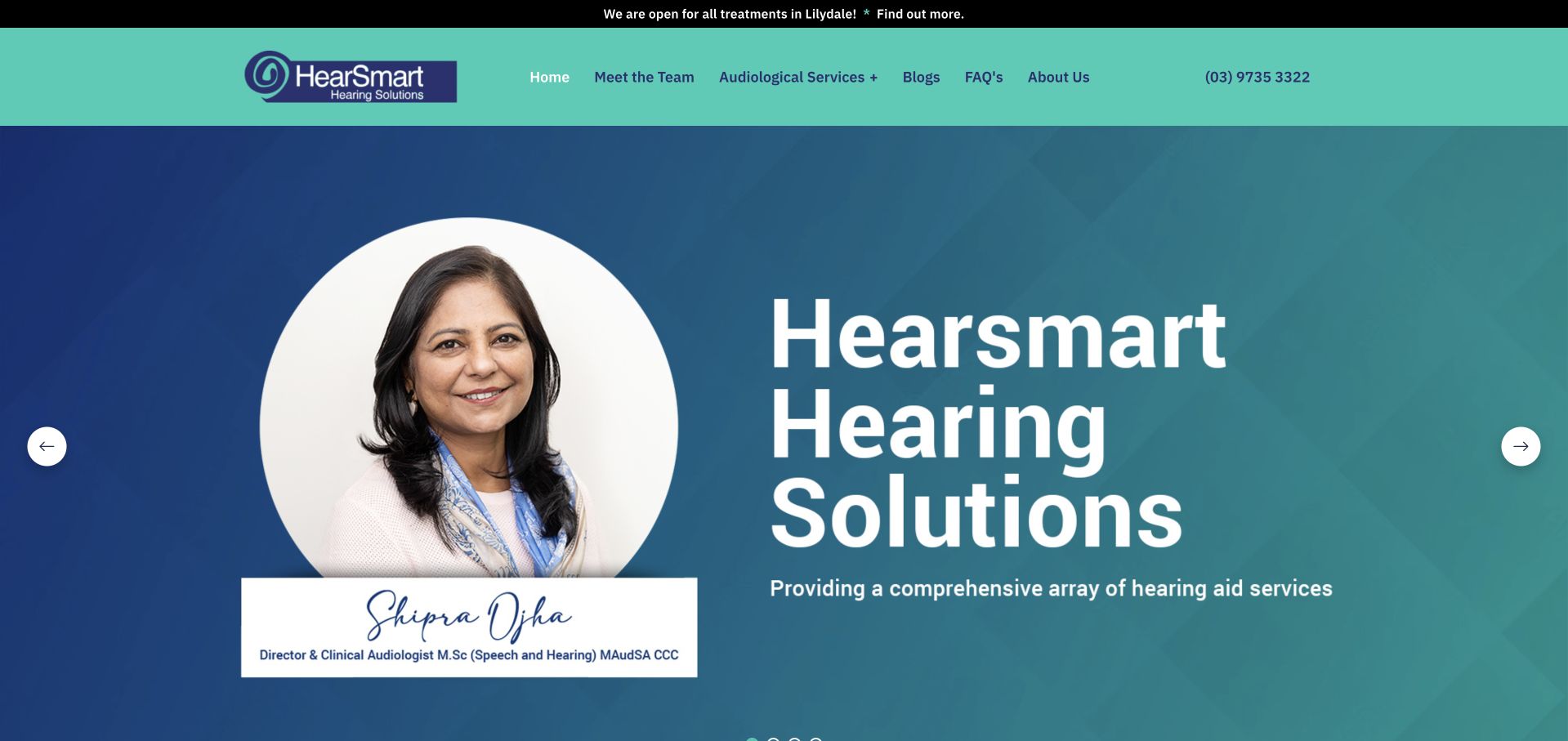
HearSmart uses a teal-and-blue composition with a prominent clinician portrait and a clear Yarra Valley identity. The supporting copy explains the two-clinic structure and separates hearing, balance and ear-care services. Rather than relying only on device logos, the page introduces the clinical team and practical service categories. This gives visitors several useful orientation points before they book. Its independence statements are part of the practice’s own positioning and require context; the transferable design principle is the explicit relationship between a named person, real locations and a service directory, not an assumption that a visual claim proves clinical neutrality.
What you can learn
Explain a multi-location independent practice through people, places and services. Make the relationship between clinics clear, provide local contact information and give any ownership or independence statement a substantive explanation rather than treating it as a decorative badge.
Pros
The clinician portrait gives the local brand an identifiable human reference.
The page explains the two-clinic structure alongside clearly named service categories.
Cons & considerations
Large portrait-led panels can postpone the detailed appointment information some visitors need.
Independence claims require supporting context rather than being accepted solely from their visual emphasis.
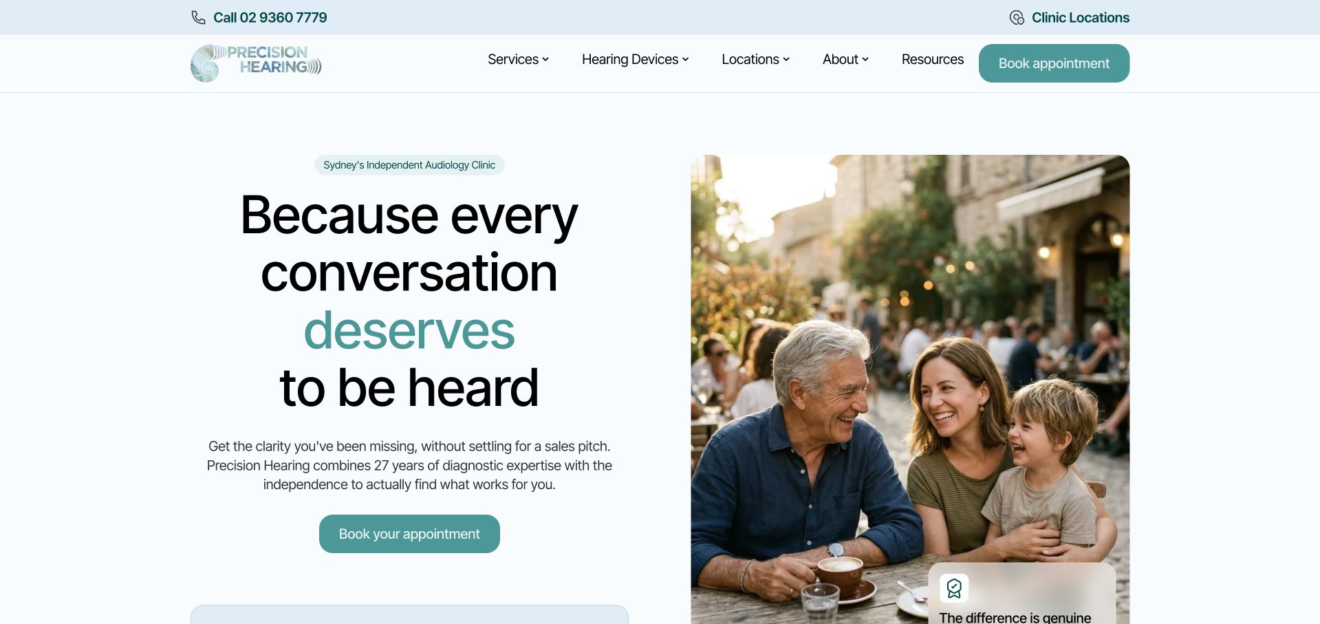
Precision Hearing uses a pale blue-and-white split layout, a conversational headline and a family photograph. A descriptive Sydney audiology heading establishes the service context, while a turquoise booking action remains distinct from the supporting copy. The page’s language positions the service around communication rather than beginning with a product catalogue. Review and satisfaction figures sit close to the introduction, adding another layer of claims that need explanation. The useful design pattern is the balance between an approachable message and literal service identification, with practical location and appointment details available beyond the first screen.
What you can learn
An emotional communication-focused headline works best beside a literal service-and-location description. Give visitors a clear appointment route, but keep review figures and satisfaction claims contextualised so they do not replace substantive information about clinicians, process and service scope.
Pros
The split composition gives the introductory copy and booking action a clear visual hierarchy.
The local service heading prevents the conversational message from becoming too abstract.
Cons & considerations
Prominent review and satisfaction figures need definitions, dates and supporting context.
A broad family image cannot explain the clinic’s full appointment range or individual suitability.
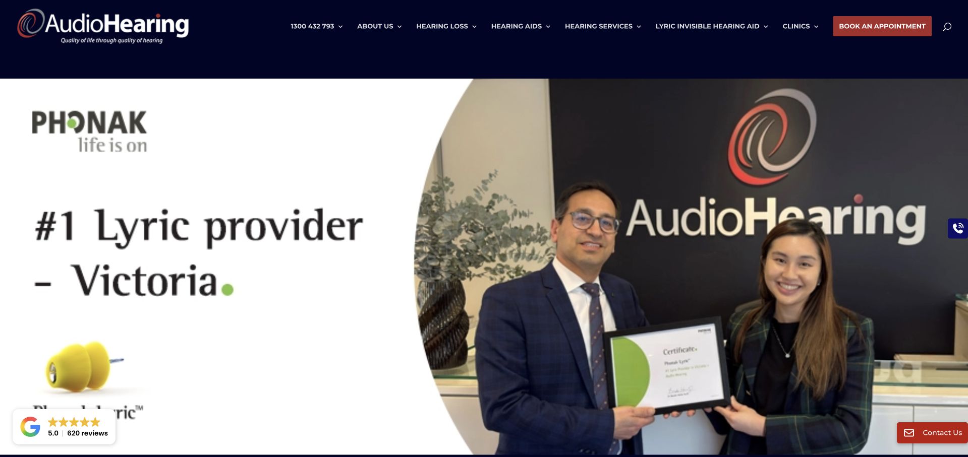
AudioHearing Melbourne combines dark navy navigation with a prominent hearing-device promotion and real team imagery. The broader menu separates hearing loss, hearing aids and hearing services, giving visitors routes beyond the featured product. Supporting sections explain the practice’s independence and practitioner background. This is useful for studying a common audiology tension: product information may be important, but it should not become the only visible explanation of the clinic. The first screen’s brand and provider statements remain marketing claims, while appointment suitability and the range of services require their own clear supporting information.
What you can learn
If a device occupies the hero, maintain an equally clear route to assessment and general services. Explain the difference between learning about a product and receiving an individual recommendation, and avoid allowing commercial badges to stand in for clinician and appointment information.
Pros
The navigation distinguishes hearing education, devices and clinical services as separate tasks.
Real team imagery adds a human reference alongside the featured product.
Cons & considerations
A large device promotion can make the clinic feel more retail-led than service-led.
Provider-status and independence statements need context beyond prominent logos or headline claims.
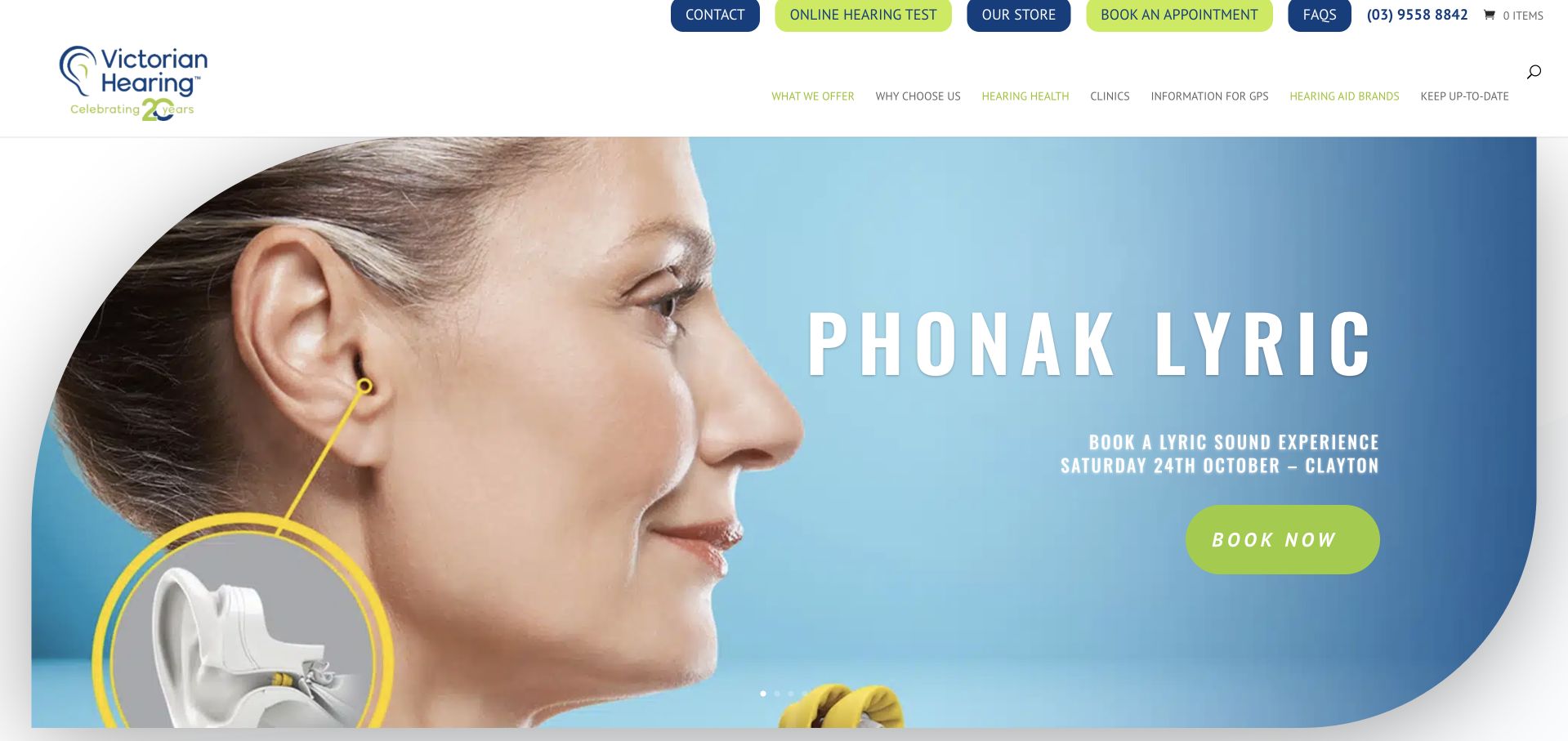
Victorian Hearing uses a large blue product panel, a close-up device photograph and a bright green action to promote a particular hearing-aid experience. Around that campaign, the header preserves routes to hearing health, brands, appointments and an online hearing test. The page therefore shows how a practice can host time-sensitive promotions without replacing its permanent service structure. It also illustrates a maintenance risk: event information can remain prominent after its date has passed. The strongest design lesson is the need for stable general-service navigation and an editorial process that retires or updates temporary campaign material.
What you can learn
Give event and product campaigns an expiry plan. Keep assessment, contact and service information available independently of the promotion, and remove or clearly archive dated booking invitations so the first screen does not suggest an event is still upcoming.
Pros
Permanent hearing-health and appointment navigation remains available around the product campaign.
The device photograph gives a specific visual subject rather than a generic lifestyle banner.
Cons & considerations
A dated event promotion can undermine confidence if it remains live after the relevant date.
The product-led first screen may obscure the broader assessment and service offering.
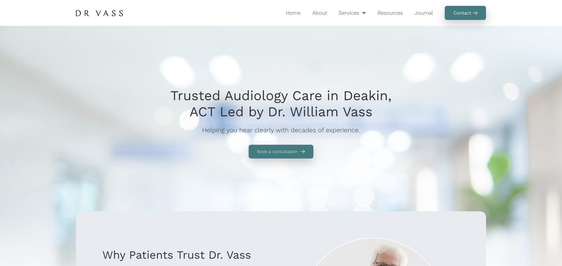
Dr Vass Hearing uses a pale clinical background, restrained teal actions and an introductory heading that names both the practitioner and Deakin location. The page then groups its positioning into short supporting themes rather than one uninterrupted biography. This is useful for a practice built around an identifiable professional: visitors are not left to infer who the brand represents. The background image is intentionally soft, which keeps the text prominent but makes written information especially important.
What you can learn
For a clinician-named practice, connect the person to the real location and service in the first heading. Let the supporting profile explain background and current roles, while the homepage concentrates on appointment scope, access and the visitor’s next useful action.
Pros
The opening identifies both the named practitioner and the local practice area.
Short supporting themes make the practice introduction easier to scan than a long biography.
Cons & considerations
A soft photographic background adds little practical information about the appointment environment.
Experience and credential comparisons require supporting sources and should not function as self-verifying claims.
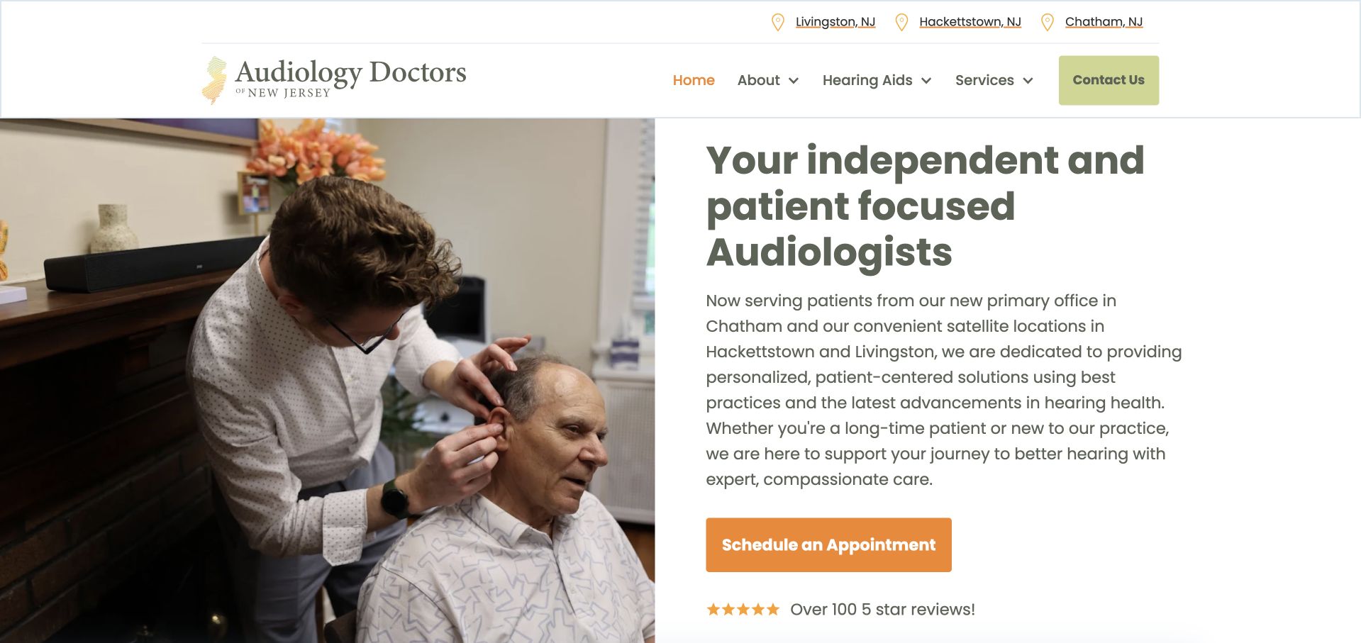
Audiology Doctors of New Jersey uses a white-and-gold layout with a large assessment photograph and a substantive introductory paragraph. The opening explains the relationship between the primary office and satellite locations instead of treating every address as interchangeable. A clear appointment action follows the description, with service and contact information in the navigation. This is a useful reference for a practice expanding or reorganising its offices: the page tells visitors what has changed and where they can attend.
What you can learn
Explain office changes and satellite arrangements directly rather than relying on an address list. Give each location its own contact and access information, and keep the selected office visible through the appointment request so visitors understand where they are enquiring.
Pros
The introduction explains the relationship between the main office and satellite locations.
A real assessment photograph shows the clinical service rather than only a device or lifestyle image.
Cons & considerations
The long introductory paragraph places several practical details inside one reading block.
Location-specific availability still needs clear confirmation beyond the organisation-wide appointment button.
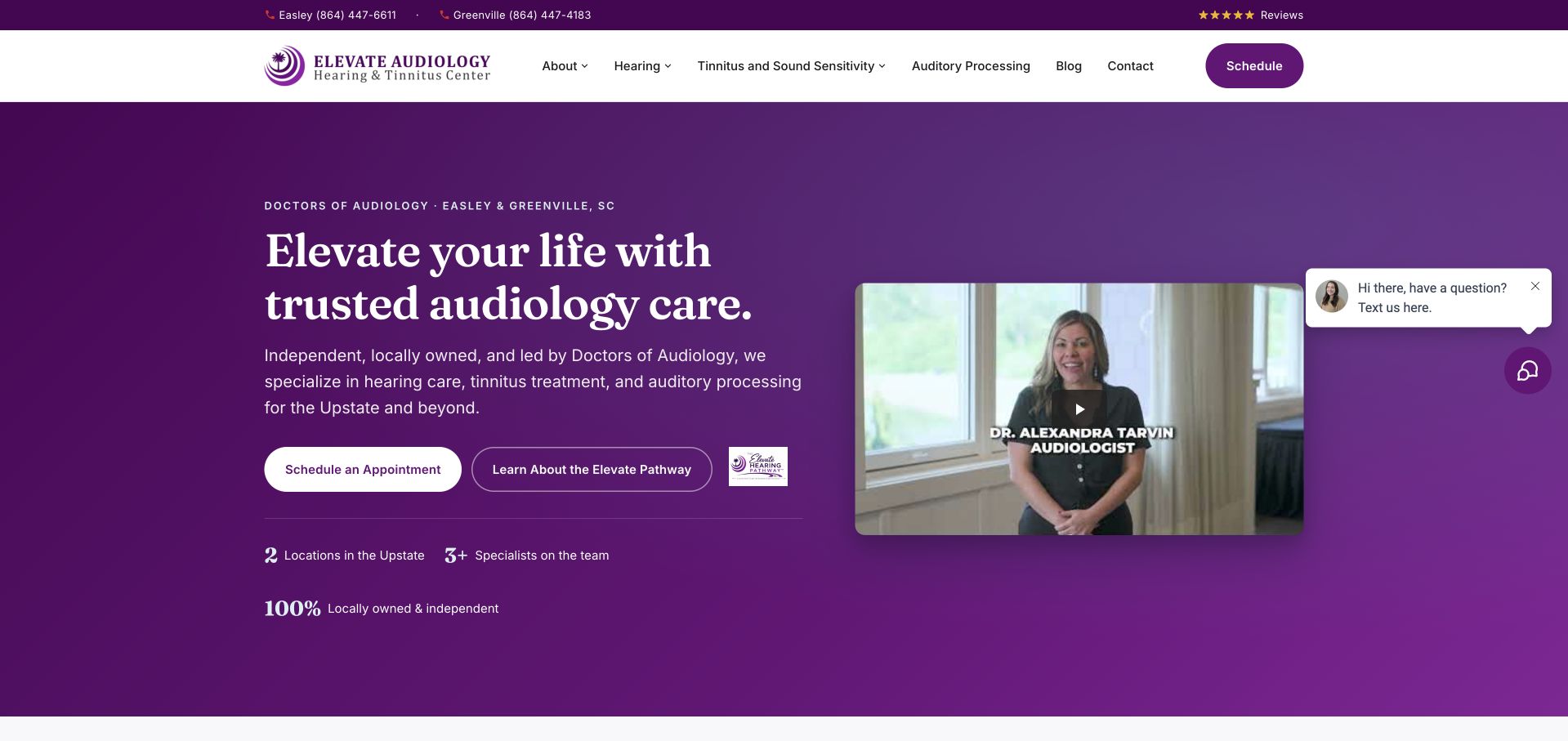
Elevate Audiology uses a rich purple identity, a compact practitioner image and a clear appointment action. The opening explains that the practice serves the Upstate area and names hearing care, tinnitus and auditory-processing services. Supporting copy introduces the clinicians and local offices, giving the brand more specificity than a broad hearing-wellness statement. This is a useful example of maintaining a distinctive visual language while still naming the service categories plainly. Award and independence statements add promotional emphasis, but the most important supporting pages are those that clarify appointment types, location and what visitors can expect after enquiring.
What you can learn
Use a strong colour system to unify the practice, not to replace a service explanation. Name the main appointment categories and relevant areas early, then give each specialist service a readable destination with practical information and appropriate limitations.
Pros
The purple identity is consistent and recognisable without depending on device-brand imagery.
The opening names specialist service categories alongside the practice’s regional context.
Cons & considerations
Award and independence statements need context rather than functioning as visual proof of quality.
A compact clinician image cannot replace substantive profiles and office-specific appointment information.
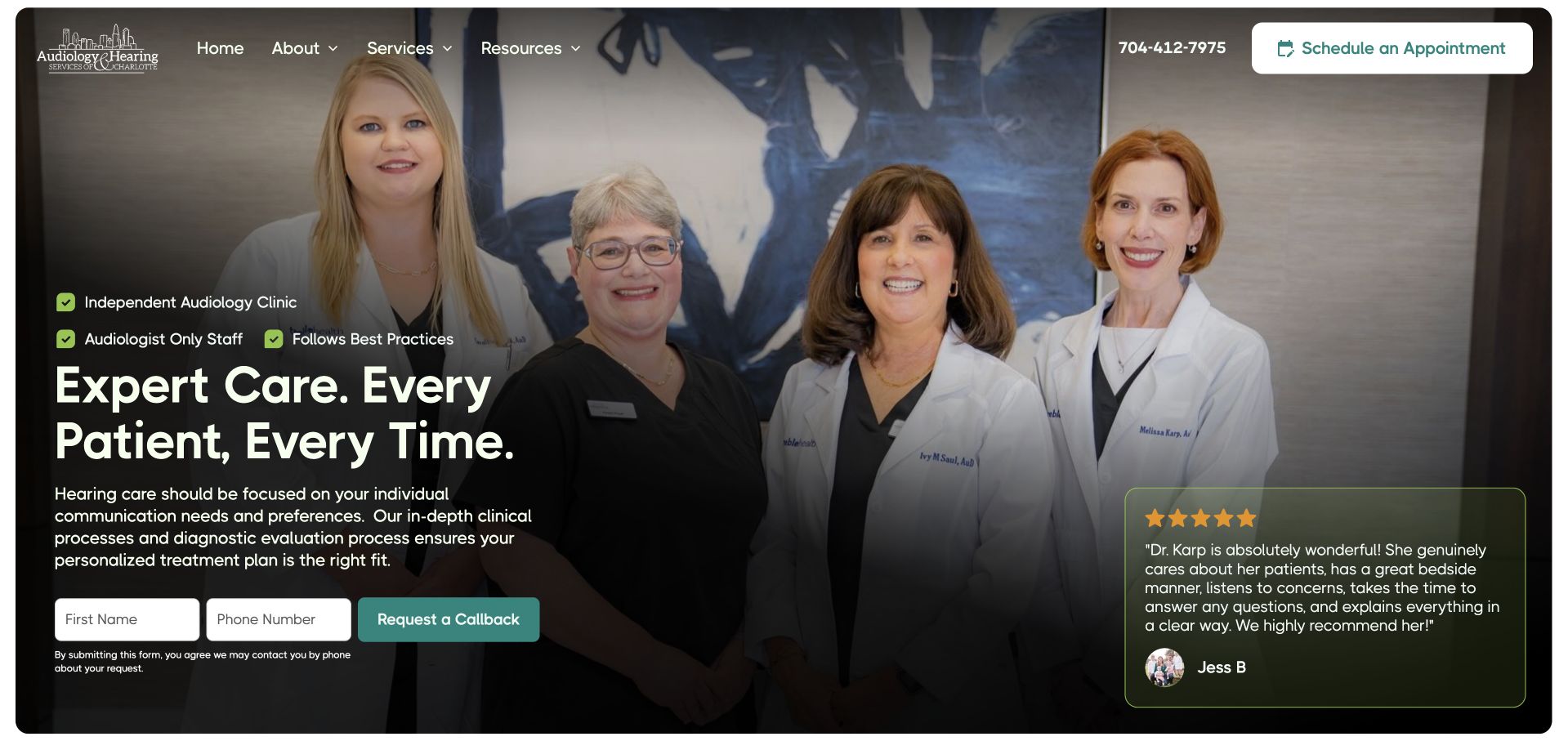
Audiology & Hearing Services of Charlotte uses a broad team photograph, dark overlay and large introductory heading. Supporting labels identify the local clinic and clinical staffing model, while appointment and patient-information routes remain visible. The composition gives visitors an immediate sense of who the practice presents as its team rather than beginning with an anonymous product promotion. The copy then expands into service details and enquiry options.
What you can learn
Show the actual team when it helps visitors identify the practice, then link to meaningful profiles and service descriptions. Keep contact permissions specific and readable, and offer a written route that does not require someone with hearing difficulty to rely only on a telephone callback.
Pros
The visible team gives the practice a more concrete identity than a stock healthcare image.
Local and service-oriented labels support the introduction without relying solely on a broad slogan.
Cons & considerations
Text over a detailed group photograph needs careful contrast and responsive crop testing.
Contact-permission wording and callback expectations need as much clarity as the main appointment action.
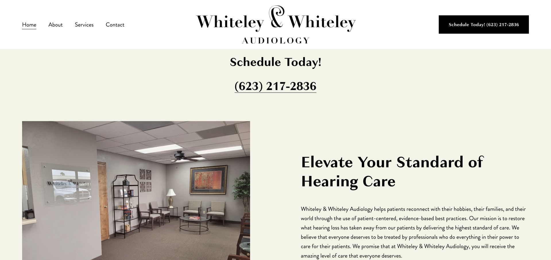
Whiteley & Whiteley Audiology uses a restrained black-and-cream identity with a large scheduling telephone number above its introductory content. A practice-interior photograph then sits beside the explanation of its approach, making the environment part of the story without occupying the whole first screen. The page identifies the family-run independent practice and gives its service philosophy substantial space. The layout is easy to understand, but the telephone-heavy opening needs accessible alternatives for visitors who cannot comfortably make a voice call. Long comparative statements about other providers also deserve careful editorial review rather than being copied as a positioning shortcut.
What you can learn
A prominent phone number can be useful, but audiology websites should offer equally clear written and online contact routes. Use real premises imagery to set expectations, and explain the practice’s own process without relying on sweeping comparisons with other kinds of provider.
Pros
The interior photograph makes the appointment environment tangible rather than abstract.
A restrained layout gives the practice introduction and scheduling information clear visual roles.
Cons & considerations
A telephone-led first screen needs visible alternatives for visitors with communication barriers.
Long comparative positioning statements can distract from concrete service and appointment information.
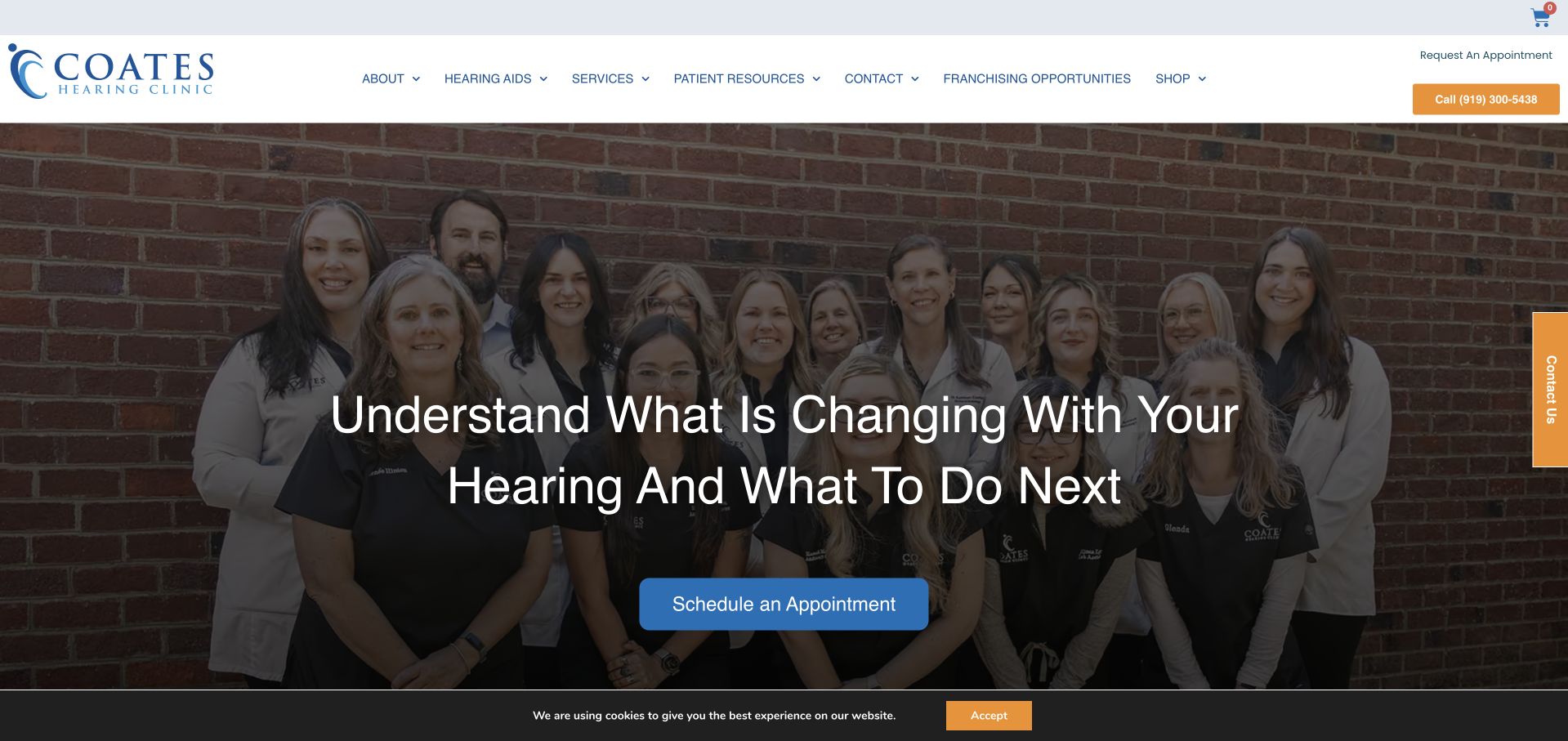
Coates Hearing Clinic uses a real team photograph and a direct headline about understanding changes in hearing. A contrasting blue appointment action gives the opening a clear next step, while services and hearing aids remain distinct navigation destinations. The message is more enquiry-oriented than a device advertisement, which makes it a useful reference for an assessment-led practice. The larger site also includes contact and messaging consent language, illustrating how much care is needed beyond the polished hero. A visitor should understand what submitting a request means and which communications are necessary for the appointment rather than general marketing.
What you can learn
Frame the first step around an assessment question rather than assuming a visitor already wants a device. Keep appointment contact permissions understandable and separate optional marketing choices from the practical communications needed to respond to the enquiry.
Pros
The headline connects the visit to a concrete question instead of leading with a product catalogue.
Real team photography and a distinct appointment action create a clear first-screen hierarchy.
Cons & considerations
A darkened group photograph requires careful text contrast and mobile crop testing.
Detailed messaging-consent language can overwhelm an otherwise straightforward appointment journey if poorly organised.
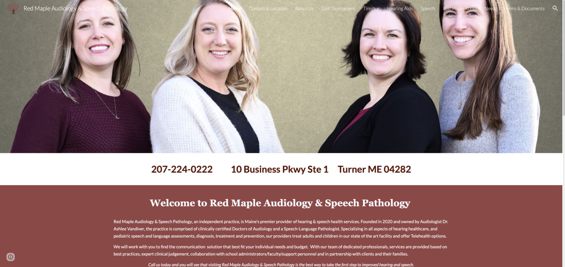
Red Maple Audiology & Speech Pathology leads with a real provider group photograph and prominently displayed telephone and Turner address information. The warm burgundy palette gives the practice a recognisable identity, while the introduction explains the relationship between audiology and speech services. A provider section adds further human context. The page is useful as a small-practice reference because the organisation is not presented as an anonymous service directory. Its introductory text is substantial, however, and the two disciplines need clear individual routes so visitors do not have to read the full practice description to determine the relevant appointment category.
What you can learn
When audiology shares a practice with another discipline, explain that relationship and then separate the service journeys. Keep address and accessible contact options visible, and give each provider a meaningful profile rather than relying only on a group photograph.
Pros
The provider photograph and physical address make the local practice identifiable immediately.
The introduction explains that audiology and speech services operate within the same organisation.
Cons & considerations
Long introductory paragraphs make it harder to isolate the relevant service quickly.
A prominent telephone route needs clear written alternatives for visitors who prefer or require them.
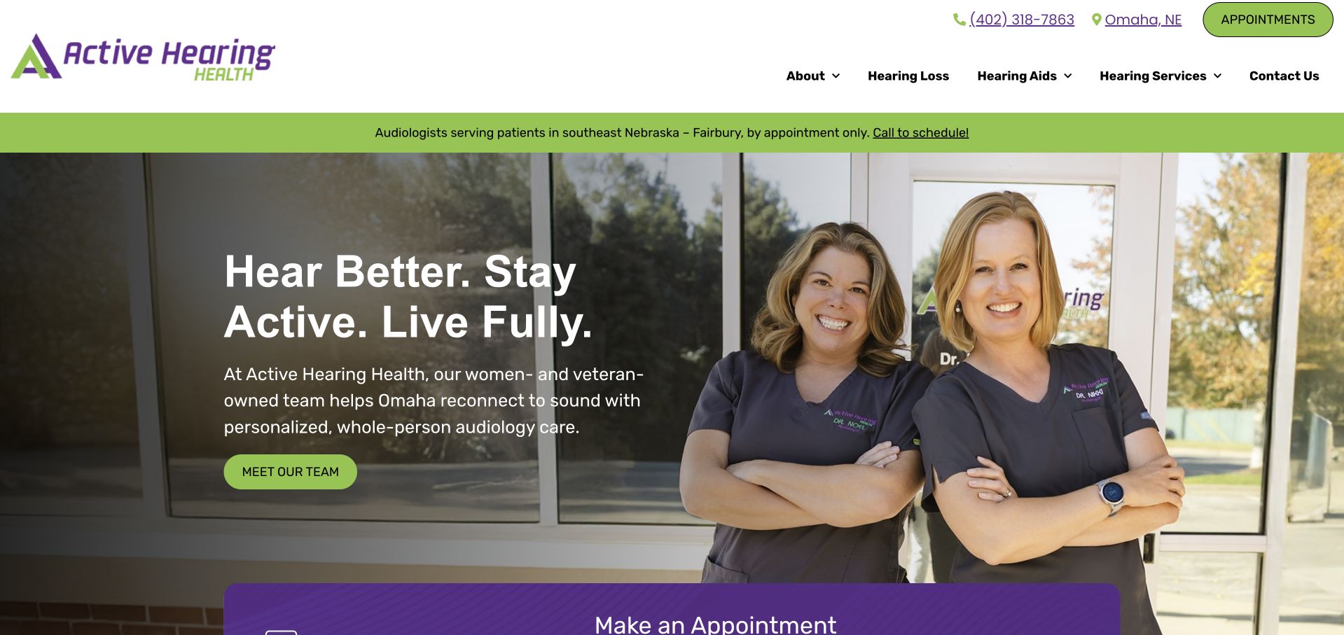
Active Hearing Health uses lime-green accents, a darkened environment photograph and a separate clinician group image. The opening connects its brand to everyday activity, while supporting text names the doctors and introduces the Omaha practice. Clear service navigation and an appointment route keep the page from becoming only a lifestyle statement. The dual-image composition is particularly useful for studying how a practice can show both people and context without one generic full-screen portrait. Its strong outcome-oriented language still needs balanced service information nearby, and the multiple visual panels require careful mobile ordering.
What you can learn
Use lifestyle language as an introduction, then promptly name the clinicians, location and actual services. Make the reading order work when image panels stack on mobile, and keep written contact options available alongside the appointment action.
Pros
The clinician group gives the lifestyle-oriented brand a concrete human reference.
Service navigation and local context provide useful detail beyond the opening slogan.
Cons & considerations
Multiple image panels require deliberate mobile reading order and contrast testing.
Outcome-oriented language should not replace an explanation of assessment, suitability and individual service limits.
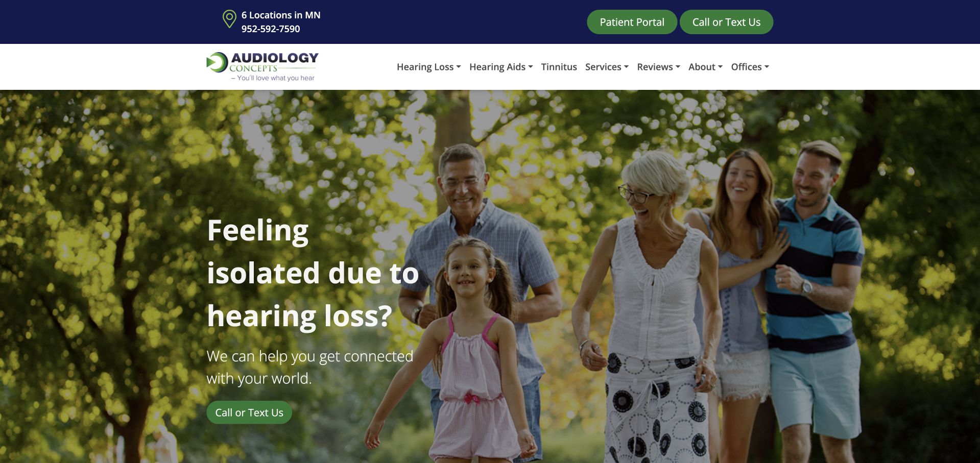
Audiology Concepts uses a family-outdoors photograph, deep green overlay and a communication-focused opening message. The header preserves patient-portal and telephone routes, while services, hearing loss and device information have separate destinations. The supporting heading establishes the Minnesota service context rather than leaving visitors to infer geography from the brand. This is useful for a practice with both new and returning patients: the portal is a different task from scheduling an initial assessment. The visual message is broad, so practical office information and appointment expectations need to be easy to locate beyond the large lifestyle banner.
What you can learn
Design distinct routes for returning patients and new enquiries. Keep portal access stable, explain the local office structure in text and ensure a broad family-oriented hero does not imply that the same appointment or device is appropriate for every visitor.
Pros
Patient-portal access recognises a returning-patient task separate from new appointment enquiries.
Separate educational, service and device routes give the site a more useful structure than a single sales funnel.
Cons & considerations
The large lifestyle banner delays more specific office and appointment information.
The opening’s broad emotional framing needs clear service detail to avoid becoming generic.
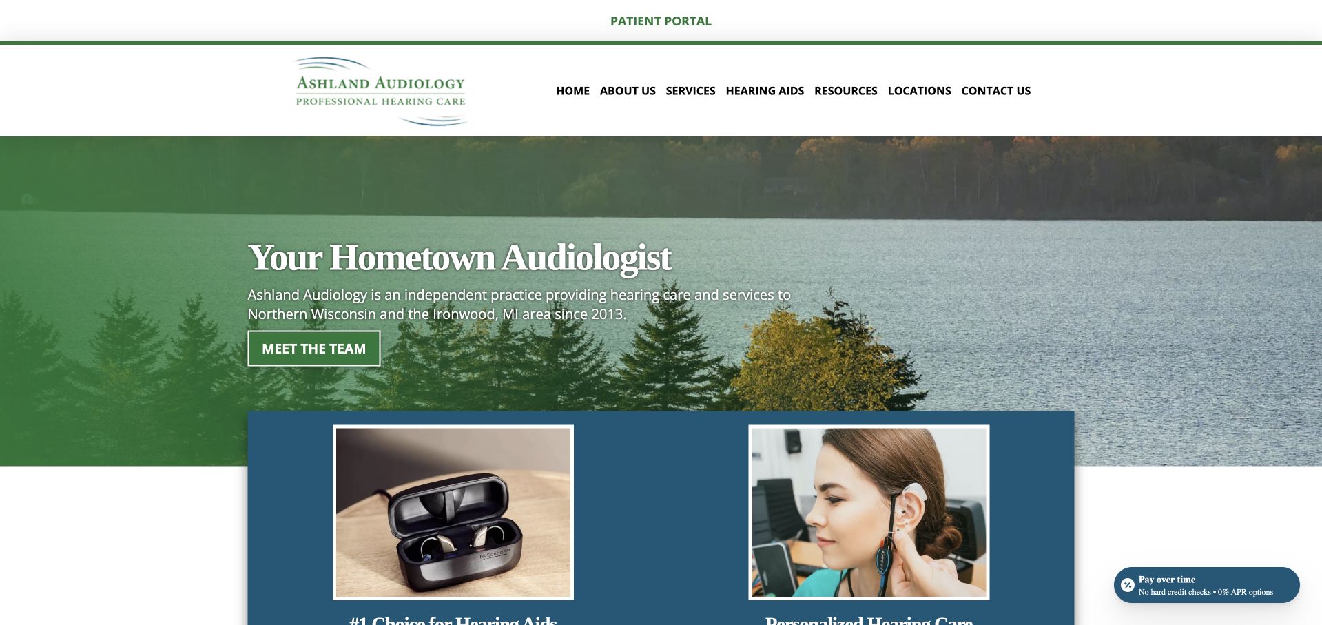
Ashland Audiology uses a woodland-and-water image, green branding and a direct hometown introduction. Below the opening, hearing-aid and service material are presented as separate destinations, while the navigation includes locations and contact information. The landscape gives the practice a regional character without relying only on clinical imagery. This is a useful reference for a business serving several communities: a local visual identity can coexist with a practical multi-office structure. The page also contains health and product claims that need professional review; its design value lies in orientation and navigation rather than any independent validation of those statements.
What you can learn
Use regional imagery to establish place, but name the actual offices and service area in text. Keep educational claims reviewed and dated, and separate hearing-aid product information from the explanation of how a visitor arranges an assessment.
Pros
The landscape image gives the practice a recognisable regional identity.
Separate location, service and device routes support several different visitor tasks.
Cons & considerations
A large scenic opening provides little direct information about the appointment environment.
Health and product claims need maintained professional review rather than being inferred from design presentation.
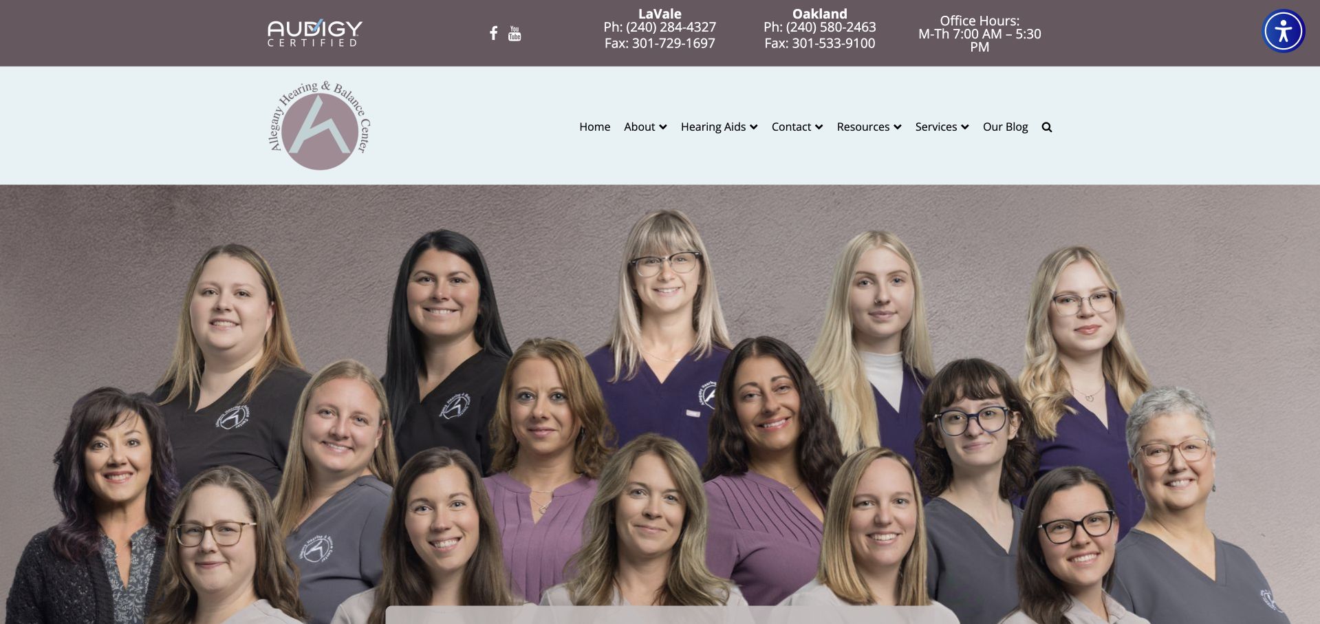
Allegany Hearing & Balance uses a broad provider photograph and a muted grey-and-lilac identity. Its header gives substantial space to office contact information, while navigation separates services, hearing aids and contact destinations. The supporting page introduces the practice and its hearing-and-balance offering rather than relying entirely on the team image. This is useful for studying how a regional organisation can remain person-centred while handling multiple offices. The amount of header information also creates a clear tradeoff: returning visitors may benefit from quick numbers, but new visitors need a less cluttered route to understanding the service.
What you can learn
Keep office-specific contact details useful without letting them overwhelm the primary service hierarchy. Pair the real team image with named profiles and clear hearing-versus-balance routes, and provide accessible written contact options rather than relying exclusively on telephone and fax information.
Pros
The real provider group makes the practice less anonymous than a generic medical brand.
Service and device categories remain distinct within the broader multi-office structure.
Cons & considerations
Several office contact details create a dense header before the main introduction.
Certification and trust statements need explanatory context rather than functioning as independent proof of quality.
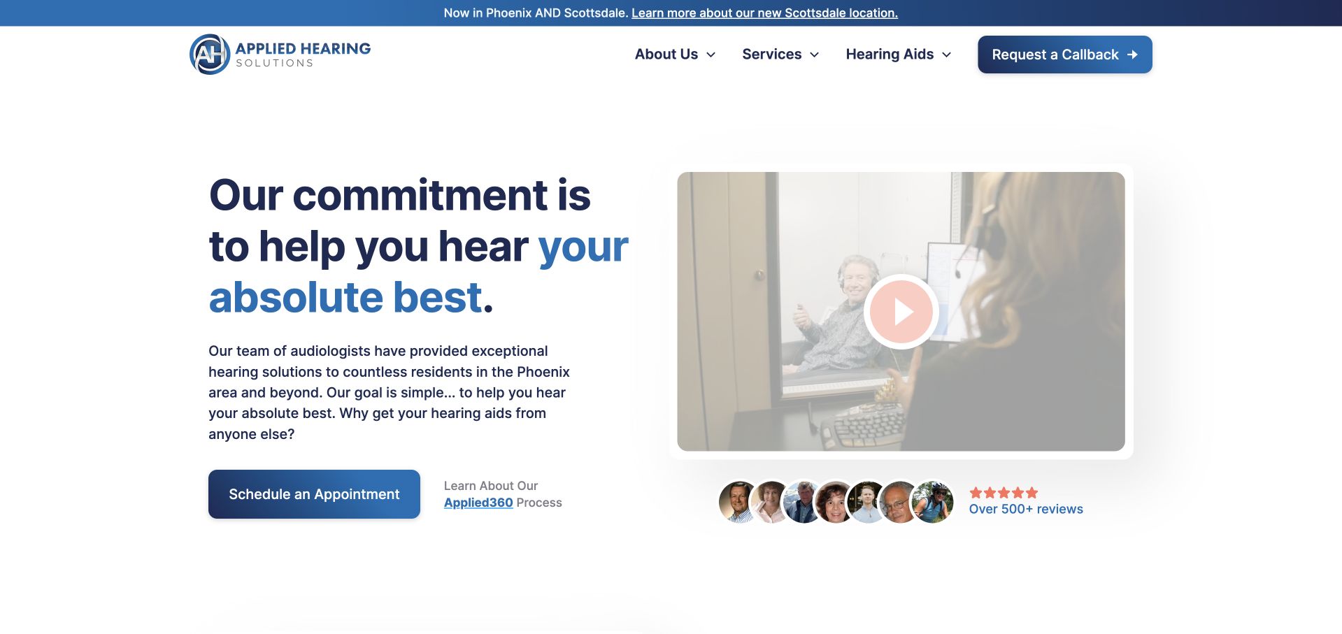
Applied Hearing Solutions uses a clean white-and-blue layout, a concise introductory statement and an optional video panel. An appointment action sits beside the opening, while later sections introduce a named service process, the audiologists and a broader service catalogue. The site is useful for studying how an organisation turns an abstract promise into an explainable sequence. The video is a supplement rather than the only visible source of information. Its branded process and strong comparative language still need careful context, so visitors can distinguish the practice’s own positioning from independently established clinical evidence or an individual treatment recommendation.
What you can learn
If a practice names its own process, explain the actual stages in ordinary language. Keep the written explanation available beside optional media, and clarify assessment, fitting and ongoing support without suggesting that a branded framework guarantees a particular result.
Pros
The clean layout gives the appointment action and optional video separate, understandable roles.
Clinician and service sections add substance beyond the opening statement.
Cons & considerations
A proprietary process name needs plain-language explanation rather than functioning as a quality badge.
Strong comparative or outcome-oriented language requires balanced context and professional review.
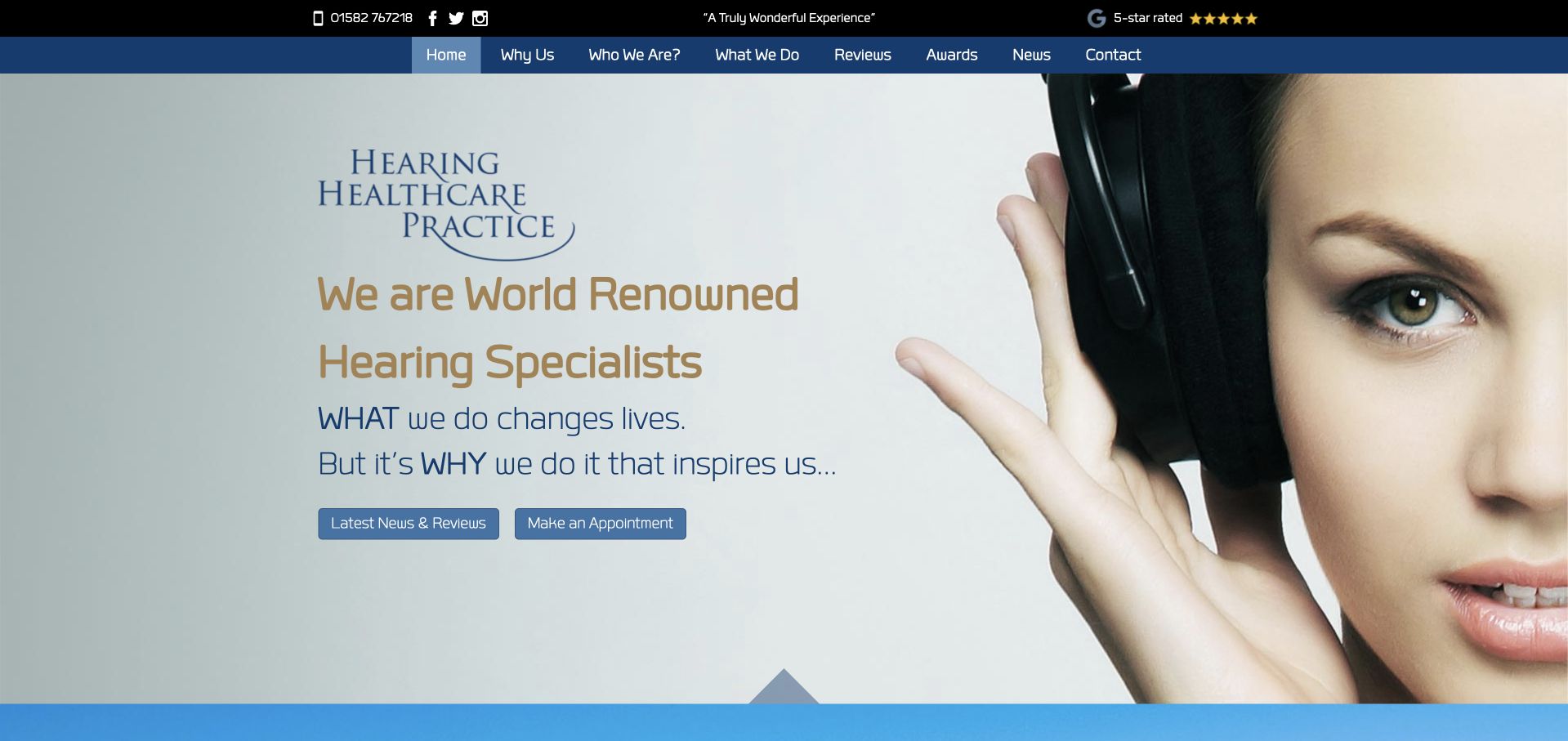
Hearing Healthcare Practice uses a striking close-up portrait with headphones, pale blue tones and a compact appointment action. The visual is more distinctive than a standard smiling-family montage, while the surrounding navigation preserves service and contact routes. Supporting copy gives the practice’s approach more space after the opening. This is a useful reference for art direction within a clinical category: a memorable image can make the site recognisable without turning it into a product catalogue. The headline’s prestige language is broad, however, and needs more concrete practitioner, location and appointment information to be useful to a first-time visitor.
What you can learn
A distinctive portrait can create recognition, but the first screen still needs literal service and location information. Use the supporting content to explain the practice’s actual process and people, rather than asking a prestige-oriented headline to carry the whole introduction.
Pros
The close-up image gives the practice a memorable visual identity without a device catalogue.
A compact appointment action remains identifiable within the photographic introduction.
Cons & considerations
Broad prestige wording communicates less practical information than a descriptive service-and-location heading.
A large portrait does not itself explain the clinic environment, access arrangements or appointment scope.
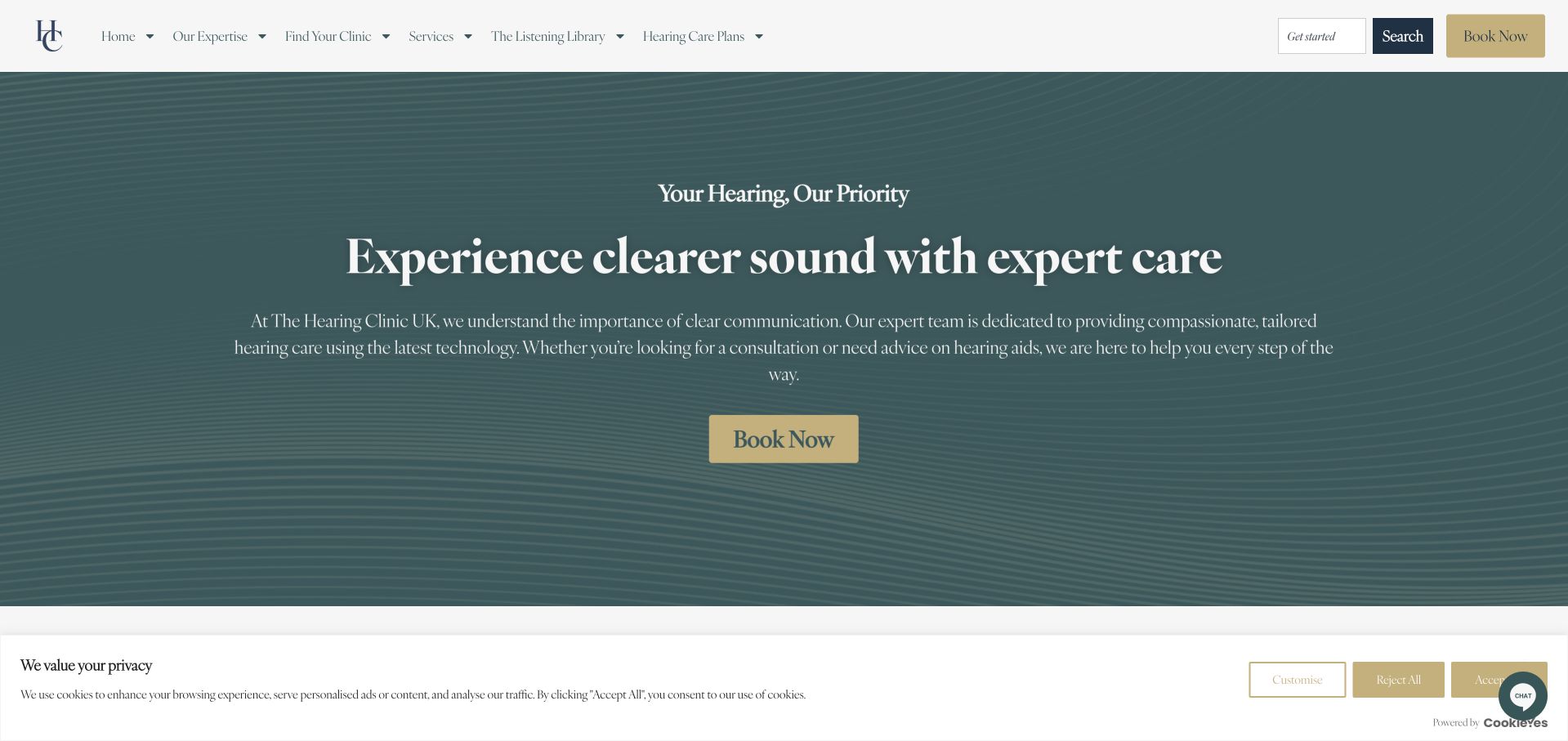
The Hearing Clinic UK uses a muted green hero, large light typography and a warm contrasting booking action. The header keeps services, hearing-care plans and contact information in distinct destinations. This creates a relatively calm first screen compared with product-heavy clinic sites, while still acknowledging that some visitors are researching ongoing support rather than one appointment. The supporting content introduces patient stories and hearing technology further down. The design’s main challenge is specificity: a broad reassuring headline needs nearby information about actual locations, practitioners and appointment types, and care-plan language should explain what is included rather than remaining a generic benefit label.
What you can learn
If a practice offers care plans, separate them from one-off appointment booking and explain the included services clearly. Keep the calm visual hierarchy, but make location, clinician and appointment information concrete enough to support a useful enquiry.
Pros
The restrained palette and contrasting booking action create a clear first-screen hierarchy.
Care-plan and service destinations recognise different stages of a visitor’s research.
Cons & considerations
A broad introductory headline needs more specific service and local information nearby.
Plan terminology requires clear inclusions, exclusions and terms rather than a general reassurance message.
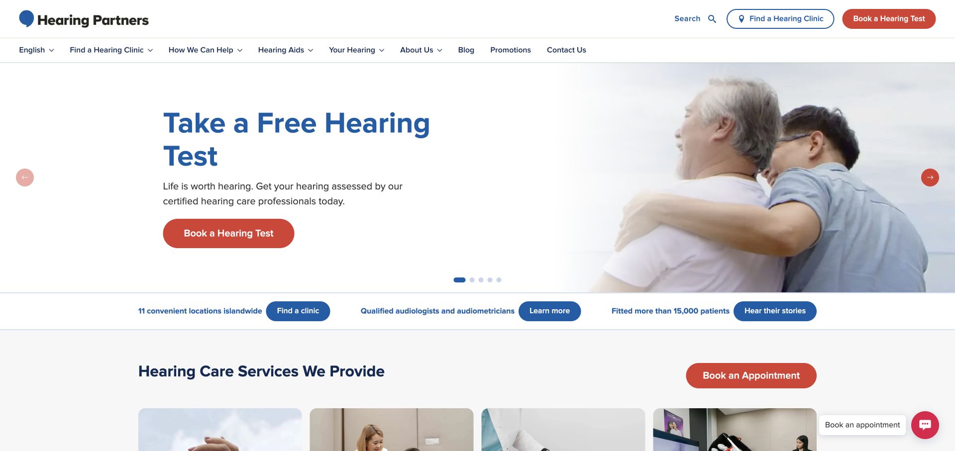
Hearing Partners uses a white layout with blue and red actions, combining a hearing-test invitation with a large lifestyle photograph. The header gives clinic finding a prominent role, while product campaigns appear as separate material within the broader site. The first-screen task is understandable: arrange a hearing test or identify a location rather than immediately choose a device. This is useful for a multi-clinic organisation where practical access may be a visitor’s first concern. The word “free” needs clear terms, and rotating promotional content should not obscure eligibility, assessment scope or the distinction between clinical evaluation and a sales consultation.
What you can learn
Make clinic discovery and appointment scope clear before presenting devices. Explain the conditions of a free-test offer, preserve a stable location route outside campaigns and avoid implying that a test invitation establishes a visitor’s suitability for a particular product.
Pros
Clinic finding remains prominent alongside the hearing-test action.
The page separates the initial assessment invitation from the wider device catalogue.
Cons & considerations
Free-test language needs accessible terms explaining scope, eligibility and any subsequent costs.
Rotating product promotions can compete with the more practical location and booking journey.
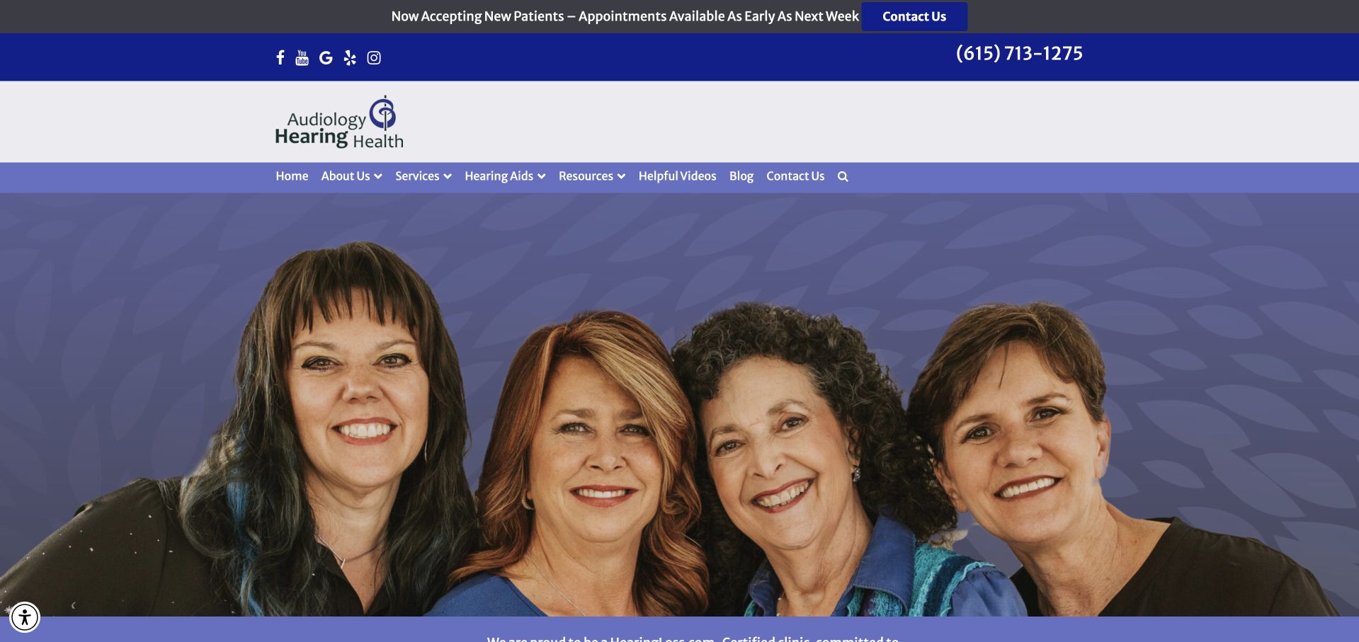
Audiology & Hearing Health uses a blue-and-purple identity and a broad team photograph, followed by a named audiologist introduction and welcome section. The navigation keeps services, hearing aids and contact destinations separate, while the page gives the practice’s approach additional written explanation. This is useful as a conventional small-practice reference: the organisation has identifiable people and a recognisable local-service structure rather than only commercial device branding. Certification and best-practice statements are prominent in the copy, so their meaning and evidence need explanation instead of being accepted as a substitute for practical appointment and access information.
What you can learn
Give clinician names and roles a substantive place in the page, then connect them to services and appointment expectations. Explain certifications and professional claims in context, and keep written contact options visible for visitors who cannot rely on a telephone conversation.
Pros
The clinician introduction gives the practice a clear human reference beyond the team photograph.
Service and device routes are visibly distinct rather than merged into one product-led journey.
Cons & considerations
Large team imagery can delay the more specific appointment and service information.
Certification and quality claims need supporting context rather than being treated as visual proof.
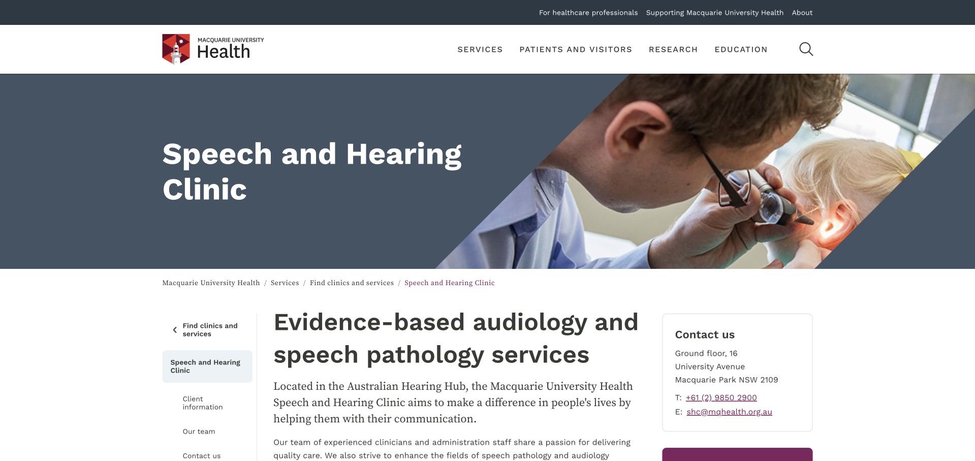
Macquarie University Health’s Speech and Hearing Clinic uses a conventional institutional header, a descriptive hero and a two-column content layout. The main explanation names audiology and speech pathology, while contact information is available beside the text rather than hidden at the end. The page also explains its relationship to clinician education and the university’s wider activity. This is a useful reference for showing organisational context without assuming visitors understand it already. The institutional navigation adds complexity, but the clear service title and supporting local information help distinguish the clinic from general academic information about hearing research.
What you can learn
Explain the relationship between a university, its teaching activity and its clinical service in plain language. Keep appointment and referral information distinct from research participation, and give audiology and speech-pathology visitors clear routes into the relevant service details.
Pros
The descriptive title establishes that the page concerns an actual clinical service.
Contact information beside the main explanation supports practical enquiries within an institutional layout.
Cons & considerations
Institution-wide navigation adds layers that are not directly relevant to arranging an appointment.
Teaching, research and clinical roles need clear distinctions so visitors do not assume identical access arrangements.
Kegan is a freelance web designer and developer with 15+ years of experience helping businesses turn complicated website requirements into clear, maintainable digital experiences. He works directly with clients from planning and design through development, launch, and ongoing support.
For audiology website design, his development approach focuses on hearing-care service information, practitioner and clinic introductions, access and appointment details, responsible device education, and privacy-conscious booking handoffs. The scope can be a targeted improvement or a complete custom build, with responsive layouts, thoughtful content structure, and integrations chosen around the people using and maintaining the site.
Show 3 other audiology website designersHide other audiology website designers
Plan around assessment, communication preferences and ongoing support
Map the real appointment and support catalogue
List the services, ages, offices and appointment formats the practice genuinely supports. Separate first assessments from existing-patient care and product maintenance. My Audiologist’s repair and maintenance routes show why returning visitors need more than a new-consultation funnel; Expression Audiology’s separate booking, screening and shop tasks illustrate another useful distinction.
Make local access and professional identity concrete
Introduce the actual clinicians and explain their roles accurately. Give each office a useful page with address, contact routes, hours and relevant arrival or communication information. State the practice’s ownership or independence positioning with substantive context rather than relying on a badge. A provider portrait should lead to a real profile, not an anonymous generic biography.
Explain the first action and its communications
Tell visitors whether they are requesting contact, reserving a time or entering an external scheduling system. Offer sensible ways to express communication preferences without demanding a medical narrative. Separate optional marketing permissions from practical appointment contact, and make success messages and confirmations as clear as the form itself.
Build a review process for promotions and educational claims
Assign responsibility for device campaigns, event dates, screening explanations and care-plan terms. Remove expired booking invitations promptly. Keep general educational content professionally reviewed and avoid suggesting a particular product or result is appropriate for every visitor. The website’s design review does not verify the clinical or commercial claims it displays.
The editing job behind the design
Build accessible information routes before adding more interactive tools
A reliable service directory, office pages, clinician profiles and returning-patient routes are the starting point. Use readable type, clear headings and meaningful action labels. Keep written explanations available outside video, avoid autoplay sound and ensure menus, forms and embedded systems can be used with keyboard navigation and enlarged text. An automated scan or overlay alone does not establish complete accessibility.
Review scheduling, contact, screening and portal tools as separate workflows. Decide what information each collects, who receives it and what should remain out of public forms or analytics events. Requirements depend on the organisation and jurisdiction; obtain appropriate privacy and accessibility review rather than assuming a platform brand or HTTPS connection resolves the whole problem. Use test data when rehearsing the journey.
Our WordPress website examples offer a separate look at publishing approaches. A visible platform label is evidence for that named page, not a guarantee that the same system will suit your requirements.
Before the public launch
Audiology website planning checklist
Offer a clear written alternative to telephone contact.
Name the clinic’s actual services and age groups.
Separate assessment, screening and device information.
Explain the limits and next steps of any online screening tool.
Introduce current clinicians with accurate roles and office context.
Publish location-specific address, hours and arrival information.
Keep repairs and ongoing-support routes easy to find.
Explain care plans, trials and free-test terms accurately.
Caption important videos and provide written alternatives.
Keep appointment contact and optional marketing choices distinct.
Review campaign dates and educational claims regularly.
Test the full enquiry and scheduling journey without relying on sound.
These checks are a project checklist, not a performance, legal, security, or accessibility certification. Test real journeys with the people responsible for the website before making claims about the result.
Sources & editorial method
How this collection was selected and reviewed
The 27-example target was saved before this research began and was not rerolled to fit the available material. The editorial team directly inspected the official public pages, captured them in a normal browser and recorded actual capture URLs, timestamps and image dimensions. Blank loading frames, challenge pages, broken destinations and unrelated content were excluded or replaced. Reviews concern observable website presentation, navigation and information, not the competence of a audiology provider, clinical outcomes, safety, appointment availability or accessibility conformance. Commercial claims, testimonials and badges remain the source organisation’s statements, not independent verification. Technology labels require public source evidence and do not establish a complete backend inventory. No appointments, accounts, enquiries, screenings or private intake forms were completed. Website imagery and trademarks belong to their owners.
Each example links to its actual source page. Screenshots are direct browser captures with their own capture dates; moving imagery, announcements and live designs can change. The notes describe observable design choices and conditional tradeoffs, not measured traffic, conversion results, service quality, or accessibility conformance.
Technology labels use public page metadata, asset evidence, or explicitly cited platform documentation. Platform documentation is not a complete current deployment audit. A component reference may be legacy or unused; it is not a complete backend inventory. Unknown stacks are omitted. These sites are editorial examples, not our client portfolio.
Written, Edited and Curated are separate editorial records, not timestamps advanced by a rebuild. Website designs and imagery belong to their owners. See our editorial standards or suggest a correction.
Questions worth asking
Audiology website design questions
Should an audiology website still display a telephone number?
Yes, where the practice uses it, but not as the only useful contact route. Make written or online options equally understandable and explain how the practice will respond. The full journey should account for communication preferences, including confirmations and follow-up, rather than treating access as a homepage-only concern.
Is an online hearing test the same as an audiology appointment?
No. Explain the specific screening tool’s purpose, limits and suggested next step without presenting it as a comprehensive diagnosis or an individual product recommendation. The practice should approve the wording and any follow-up workflow. Do not add a screening tool solely as a way to collect contact details.
Should the homepage lead with hearing-aid brands?
Only when that genuinely serves the visitor and does not obscure assessment or service information. Keep device education separate from an individual clinical recommendation. Visitors should be able to understand the practice, clinicians, location and appointment process before being asked to compare commercial products.
What do returning patients need from the site?
Clear routes for appointment changes, repairs, maintenance, accessories, existing care plans and portal access where those services exist. Those tasks should remain available outside promotional carousels and new-patient funnels. Explain whether a request is handled locally, through another vendor or by the practice’s usual team.
How should a practice describe independence or specialist expertise?
Use accurate, sourceable information about ownership, professional roles and the services actually provided. Explain what a claim means rather than relying on a badge or a broad comparison with other providers. A polished website or prominent title is not independent verification of care quality or suitability for an individual.
A strong audiology website makes the practice understandable without requiring a voice call, and keeps assessment, devices and ongoing support clearly connected but distinct.