Best Flower Farm Websites of 2026 (23 Real-World Examples)
Real flower farm websites showing how to explain seasonal bouquets, subscriptions, workshops, wedding flowers and visits with clear expectations.
A good flower farm website connects the beauty of the crop with the practical details of buying it or visiting the place where it grows.
A flower farm can be a local bouquet supplier, a wedding grower, a teaching business and a visitor destination at the same time. Those activities share a visual identity, but they do not share one customer journey. A bride considering bulk buckets needs different information from a subscriber arranging pickup or a family planning a U-pick visit. The website needs to make those distinctions before an attractive photograph becomes an ambiguous promise.
These 23 directly reviewed properties show several ways to manage that challenge. Some pages lead with the field, others with finished arrangements, class products or practical questions. Compare how each one communicates seasonality, service area, availability and the next step. The reviews study observed website design and content; they do not assess flower quality, environmental performance, farming standards or the outcome of a purchase.
Before the examples
What makes good flower farm website design in 2026?
Make seasonality an explicit part of the offer
State what is available now, what has finished and when the next season is expected. A farm can continue taking wedding enquiries or running winter workshops after fresh bouquets end. Explain those differences near the relevant action instead of letting an evergreen field photograph imply year-round availability.
Separate the ways people buy or visit
Give bouquets, subscriptions, bulk flowers, workshops and field visits distinct routes when their arrangements differ. For each, explain quantity or duration, location, lead time and the decision the customer needs to make. A general contact form should not carry the entire burden of explaining the business.
Show the crop honestly
Use real field, process and arrangement photographs, with the context needed to understand them. Explain whether a design uses the farm’s own flowers, other growers’ crops or both. Describe palette choices and seasonal variation without guaranteeing specific varieties that may not be available.
The collection · 23 examples
23 flower farm websites worth studying
Compare the seasonal notices and practical product descriptions first, then the photographic and editorial approaches. The examples include homepages and clearly labelled service pages, each with its own genuine source capture.
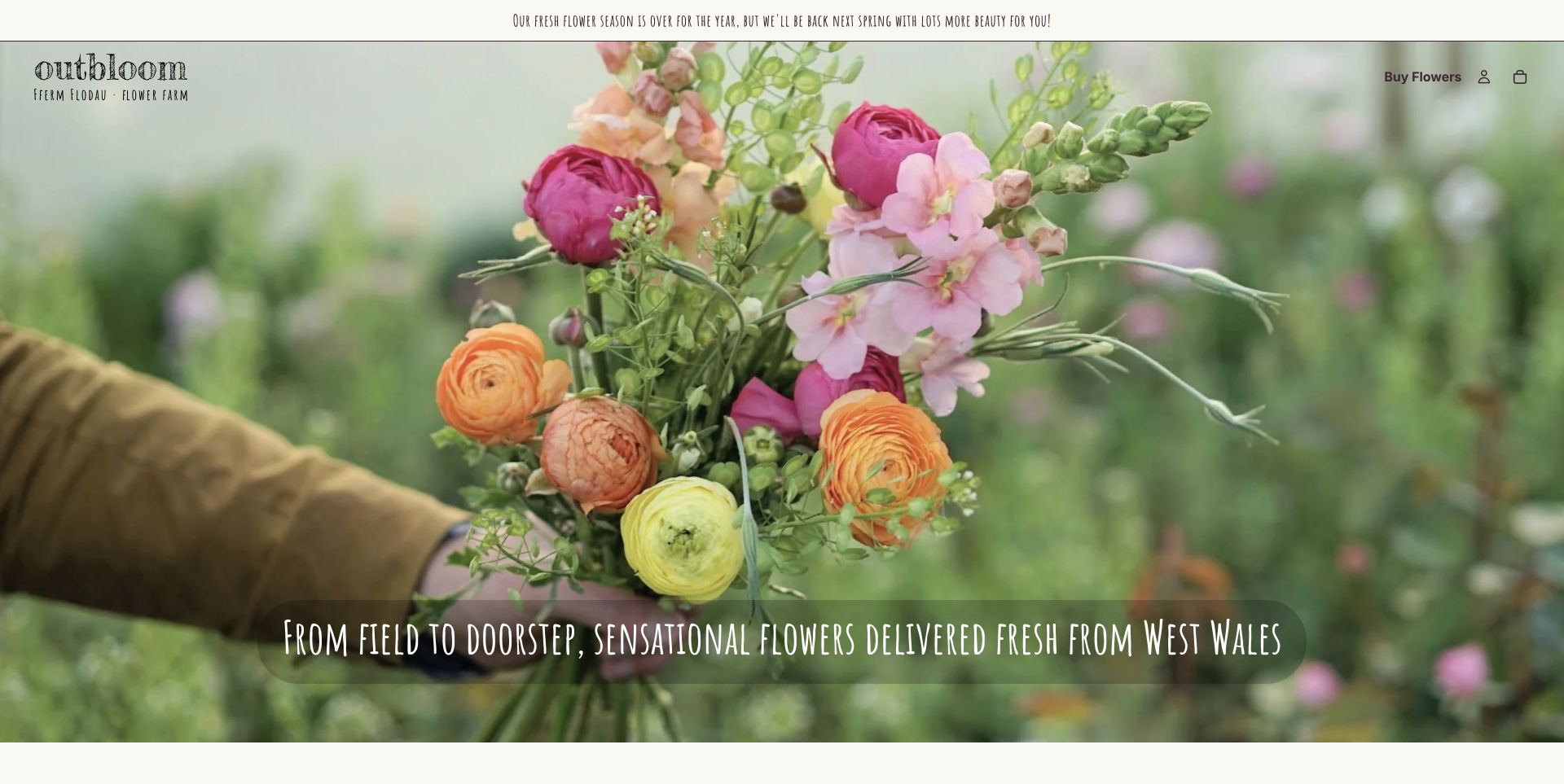
Outbloom combines a close photograph of a freshly held bouquet with a spare header and a narrow, hand-drawn-style headline. The most useful design decision sits above that image: the farm says its fresh-flower season is over and tells visitors to expect its return in spring. Postal bouquets, workshops and wedding enquiries then receive separate explanations farther down. That keeps the attractive field-to-doorstep story connected to real availability. The full-height photograph delays those service choices, and the decorative lettering takes more effort to scan, but the page offers a strong model for a regional grower that wants personality without disguising seasonal limits.
What you can learn
Keep the seasonal exception beside the invitation to buy. Then give each way of working with the farm its own short explanation, so an attractive bouquet photograph does not imply immediate availability for every visitor.
Pros
Season-over notice is visible before the shopping route.
Postal flowers, workshops and wedding enquiries are clearly separated.
Cons & considerations
The large hero pushes service choices below the first screen.
Narrow decorative lettering requires more attention than plain body type.
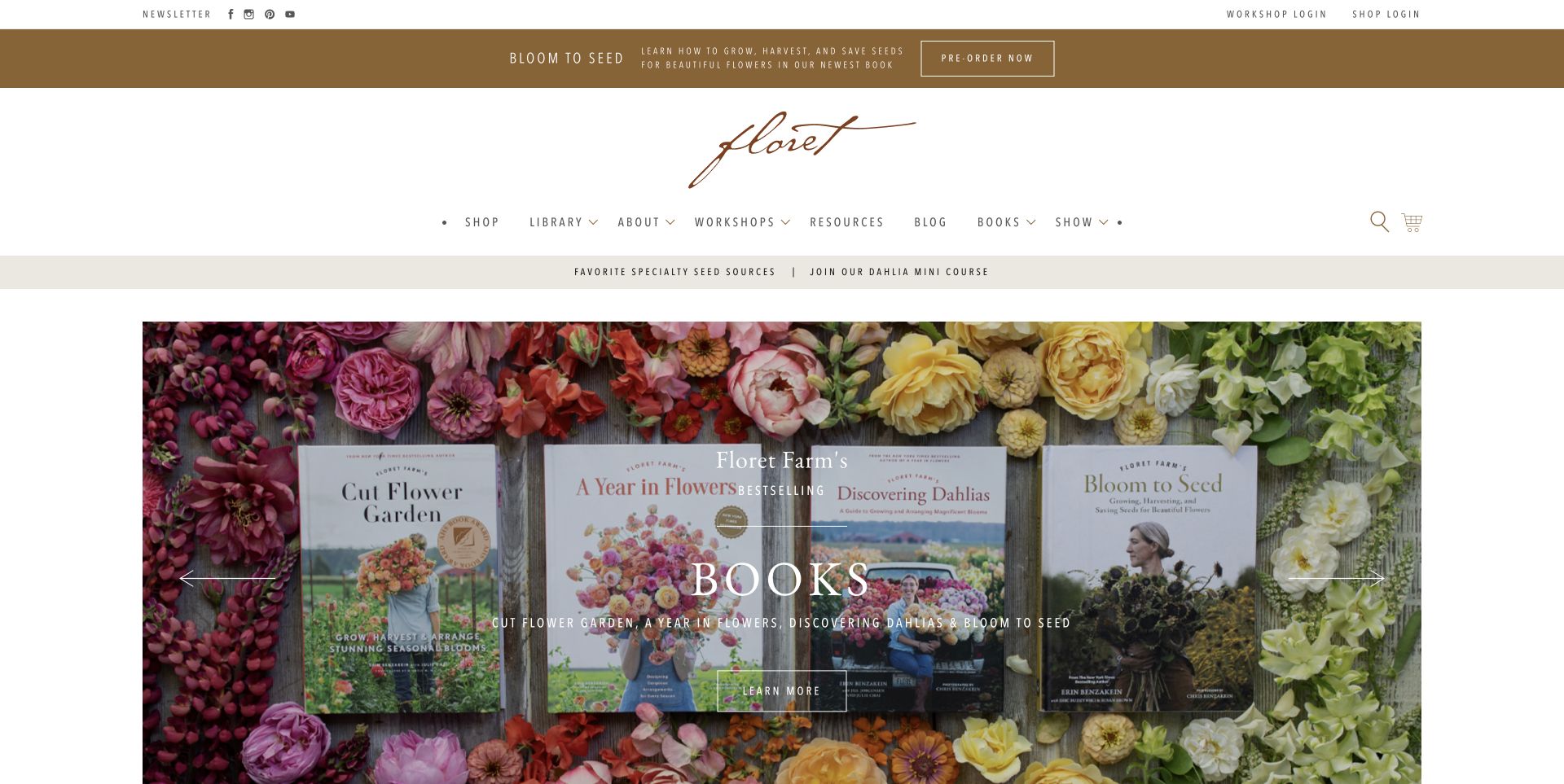
Floret uses a restrained cream-and-brown editorial masthead, a distinctive script wordmark and spacious navigation to organise a very broad offering. In the retained carousel frame, books sit among colour-grouped flowers, making the connection between growing and publishing tangible. Shop, Library, Workshops, Resources, Blog and Books give readers several depths of involvement. This is a useful reference for a farm whose expertise is itself part of the product. The multiple promotional strips and extensive navigation can compete for attention, so a smaller farm should borrow the clear editorial categories rather than reproduce the whole catalogue.
What you can learn
Organise educational material by the task it serves: a tutorial library, an in-depth workshop and a book purchase are different decisions. Let real flowers and finished learning products explain how the farm's knowledge becomes useful.
Pros
Editorial categories provide several clear routes into education.
Photographs connect books and resources to actual flower growing.
Cons & considerations
Several promotional strips compete with the main introduction.
The broad catalogue may be more navigation than a small grower needs.
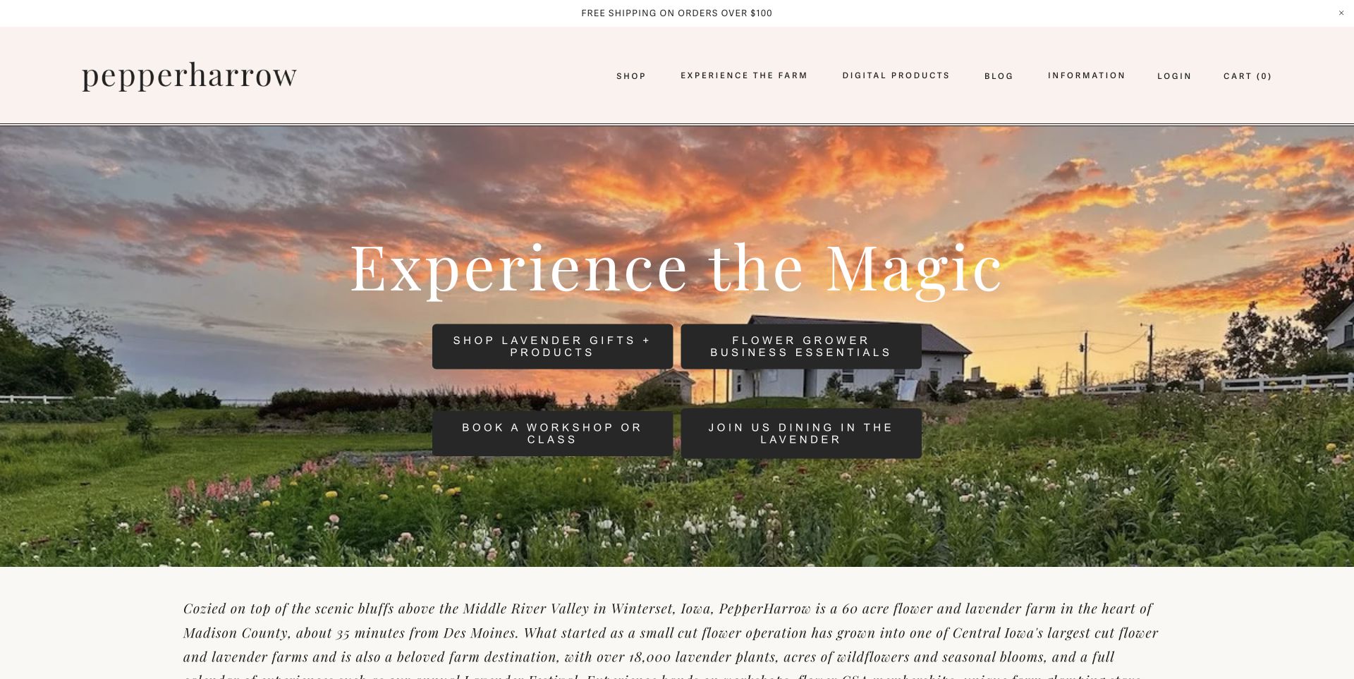
PepperHarrow places a warm sunset landscape beneath a blush masthead and a quiet lowercase wordmark. Four dark buttons distinguish lavender products, workshops, flower-grower business education and dining, making the breadth of the farm more concrete than a general Visit Us invitation. The longer page adds subscriptions, retreats and other experiences around that structure. The approach is especially useful for a farm whose income does not depend on bouquets alone. Equal visual weight across four actions still asks a visitor to compare several possibilities, while the italic introduction could be easier to scan. Study the service separation and setting rather than treating the imagery as proof of every experience offered.
What you can learn
When a flower farm has several business lines, name each in an explicit action. A single landscape can unify the identity, but the routes beneath it should distinguish buying a product, learning a skill and attending an experience.
Pros
Four labelled actions explain different parts of the business.
Landscape photography gives the destination a specific atmosphere.
Cons & considerations
Equal-weight actions can make the first choice harder.
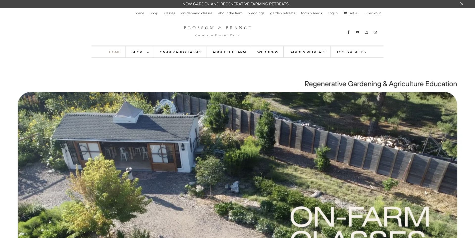
Blossom & Branch Farm leads with a real garden building and generous rounded photography, using a fine wordmark and a light visual palette. Its content makes teaching the organising idea: on-demand classes, on-farm learning and retreats sit alongside seeds, tools and the founder's book. The page is a useful example of a farm website that sells access to knowledge as much as access to flowers. The prominent photograph supports that story without requiring a stock classroom image. At the same time, repeated navigation rows occupy space, and the large image pushes the first detailed class explanation down the page. Farming-method claims remain the site's own statements, rather than outcomes established by this design review.
What you can learn
Make the learning format explicit before asking someone to enrol. Separate remote lessons, visits and longer retreats, and support the teaching proposition with actual pictures of the place where the work happens.
Pros
On-demand and on-farm learning have distinct routes.
Real growing-space imagery supports the educational identity.
Cons & considerations
Repeated navigation rows use valuable opening space.
Large photography delays the first detailed class description.
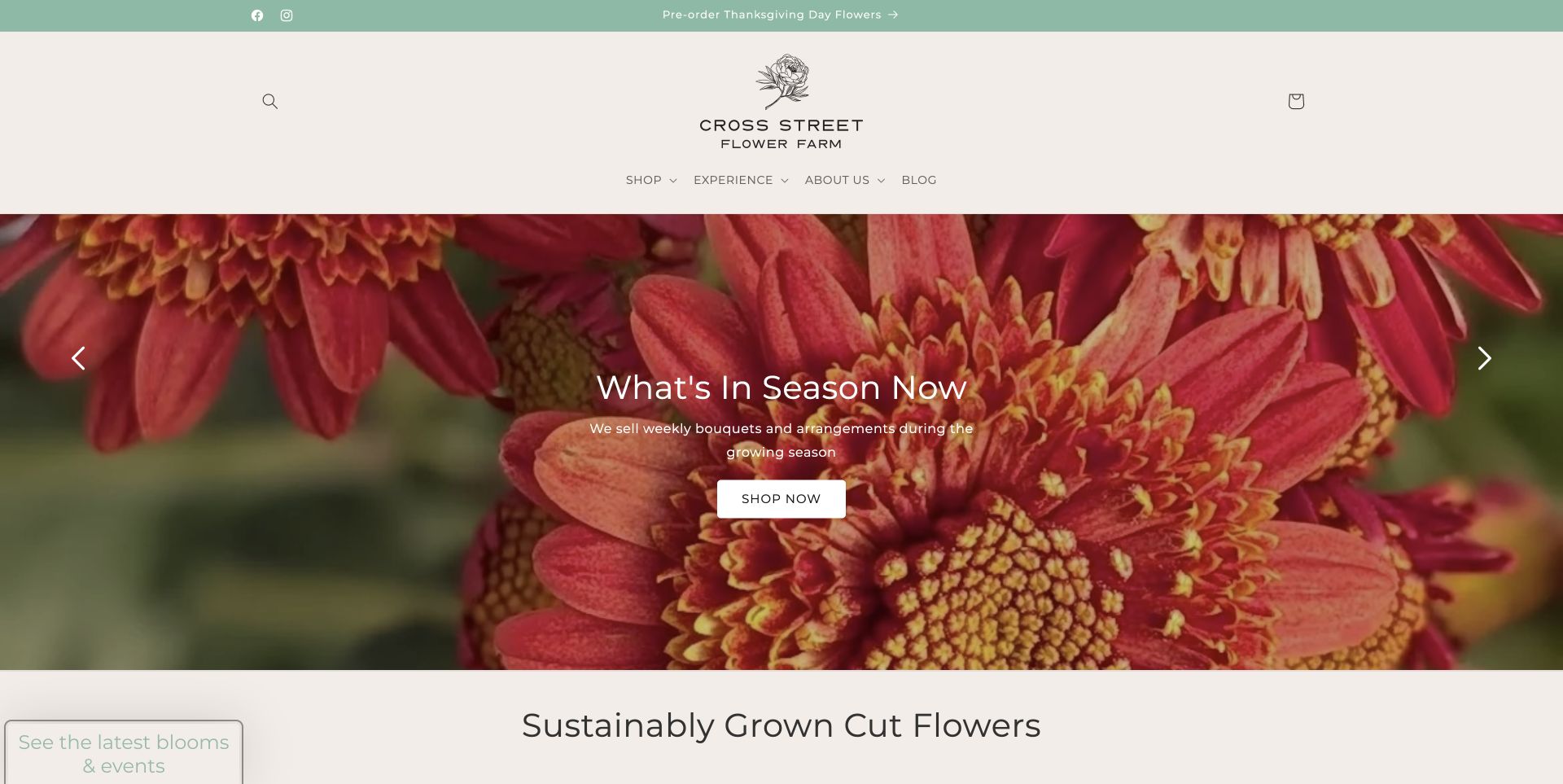
Cross Street Flower Farm uses a sage announcement strip, a cream header and an illustrated floral logo above a vivid close-up of red and peach flowers. A short What's In Season Now invitation directs attention to current buying opportunities, while Shop, Experience and About Us keep the main navigation compact. Farther down, Thanksgiving flowers, the artisan market, CSA availability and barn-shop information each have a place. The site shows how a small number of broad navigation labels can support a busy seasonal calendar. Its substantial header and promotion layers still consume a large part of the first screen, so timely updates are essential to keeping those choices clear.
What you can learn
Keep a stable, short navigation structure and let dated seasonal cards do the changing. Separate the current buying opportunity from farm background so visitors can act without reading the entire growing story.
Pros
Compact navigation groups shopping, experiences and background.
Seasonal promotions name specific buying and visiting opportunities.
Cons & considerations
Header and promotion layers take considerable vertical space.
Several seasonal offers require regular editorial maintenance.
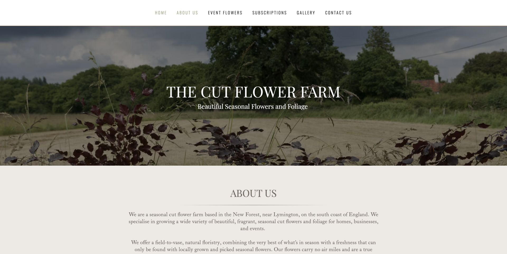
The Cut Flower Farm pairs slim white navigation with a muted photograph of its growing field and a centred serif introduction. The page then locates the business near Lymington in the New Forest before separating event flowers, subscriptions and a gallery into their own panels. That order helps the visitor connect a visual style with a real local service. The restrained treatment feels personal and avoids a crowded catalogue, but the calls to action are quiet and some image labels are generic. It is a useful reference for a farm that needs a straightforward service explanation more than an elaborate online shop.
What you can learn
Place the farm's actual area near its introduction, then divide the services into understandable panels. A calm visual style still needs clear action labels so visitors can move from admiring flowers to finding the relevant offering.
Pros
Local context appears alongside the introductory farm story.
Event flowers, subscriptions and gallery content are separated.
Cons & considerations
Calls to action have limited visual emphasis.
Generic image labels provide little additional context.
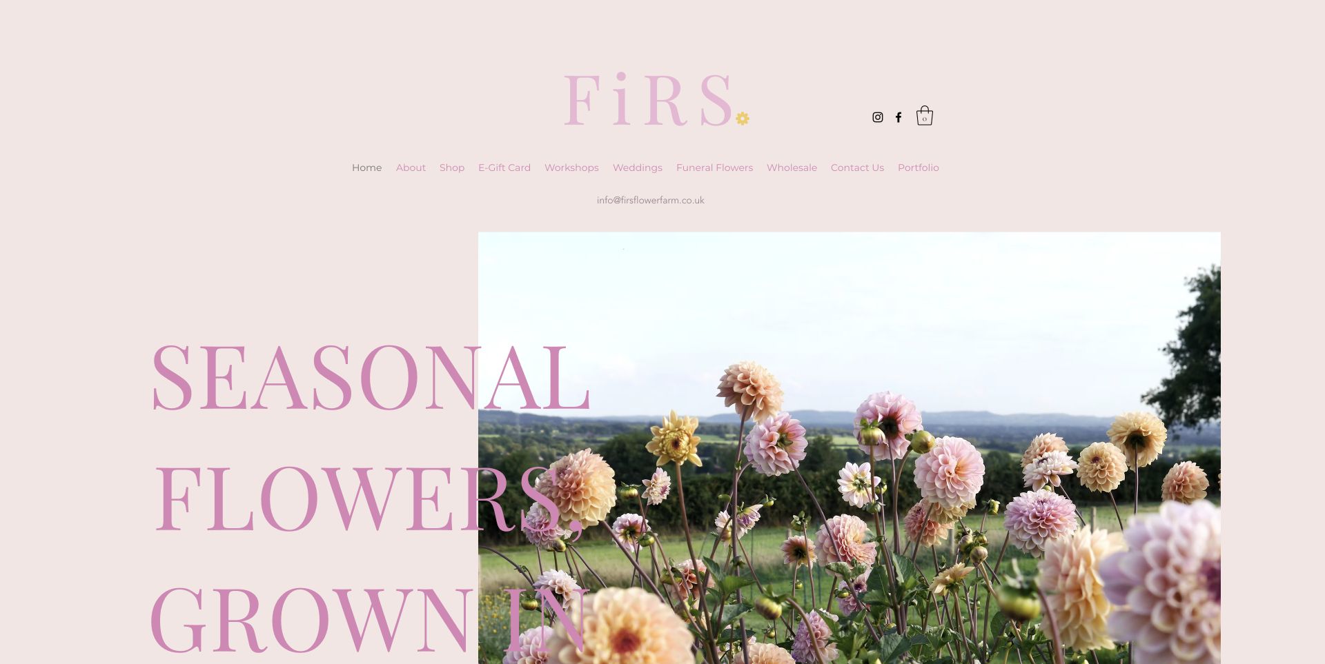
FiRS Flower Farm builds its first impression from a blush background, a pink serif wordmark and oversized type over a real dahlia field. The style makes the growing setting immediately recognisable and gives the farm a consistent colour identity. The page's practical structure distinguishes buying flowers, weddings, workshops and wholesale enquiries, with a grower portrait adding human context farther down. The large headline extends beyond the opening view, however, and the pale navigation is less assertive than the photograph. The useful lesson is the combination of a specific visual identity with different routes for consumer and trade visitors, rather than scale for its own sake.
What you can learn
Give the farm a consistent photographic and colour language, then keep audience routes explicit. Retail buyers and florists need different information even when the same field supplies both.
Pros
Field photography and colour choices create a coherent identity.
Wholesale, wedding and retail audiences receive separate routes.
Cons & considerations
Oversized typography extends below the first viewport.
Pale navigation has limited emphasis against the larger visual elements.
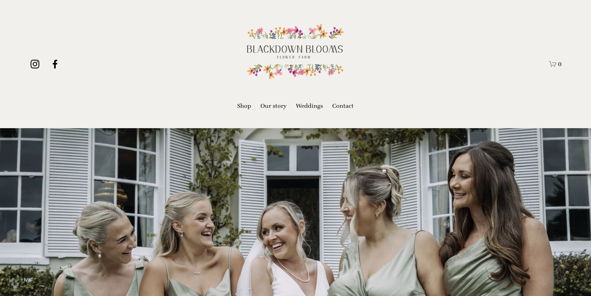
Blackdown Blooms places an illustrated floral identity in a generous cream masthead above a wedding-party photograph. Four direct navigation choices keep Shop, Our Story, Weddings and Contact easy to distinguish. The homepage explains its small-scale growing practice and is unusually candid that other growers and wholesalers may supply flowers when its own crop cannot meet demand. That qualification makes the relationship between farm and finished arrangements clearer. The tall masthead and broad photographic crop delay the exact offer, and the carousel needs the accompanying copy to explain what is grown and what is designed. Study the provenance explanation as closely as the wedding imagery.
What you can learn
Explain the relationship between flowers grown on the farm and flowers sourced for an event. A wedding portfolio can show the result, but plain sourcing language prevents the farm identity from implying an inaccurate all-homegrown promise.
Pros
Four direct menu choices keep the main structure simple.
Sourcing limits are stated rather than hidden behind the farm identity.
Cons & considerations
The tall masthead delays the service explanation.
A broad wedding crop does not immediately show the flower detail.
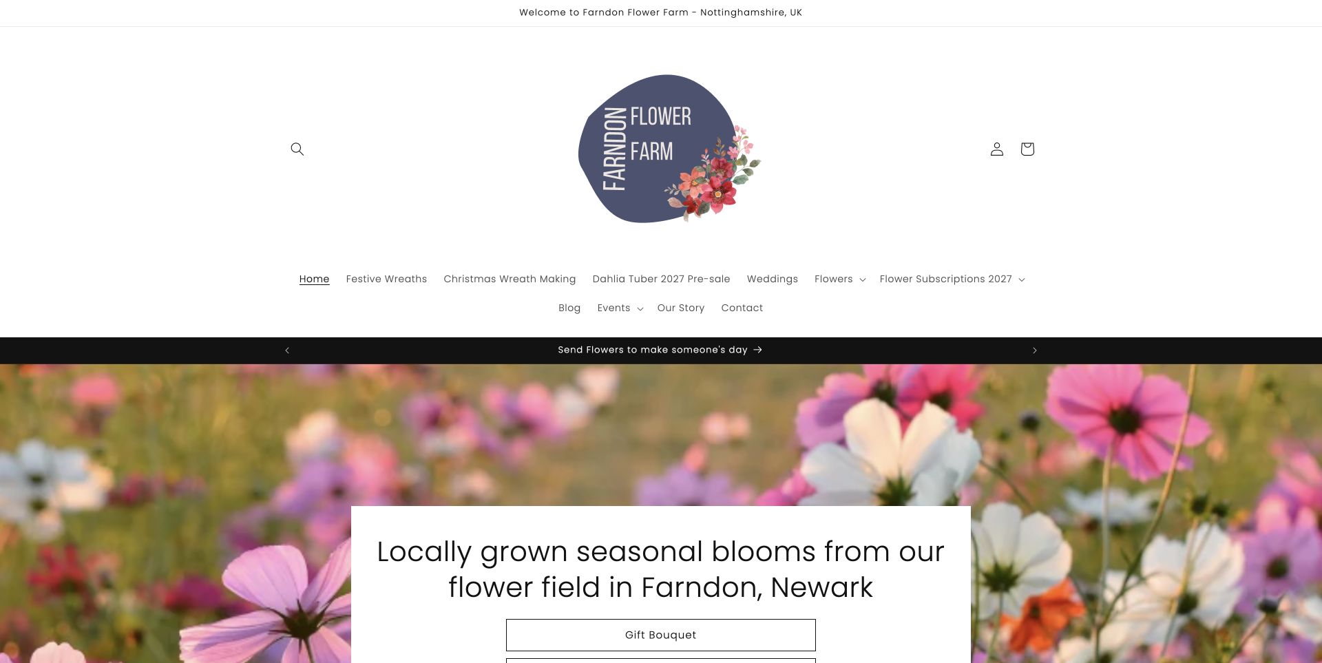
Farndon Flower Farm uses a large illustrated logo and an airy white masthead above a cosmos photograph. A white headline card states that the blooms are grown in Farndon, Newark, and offers a direct Gift Bouquet route. The longer introduction is valuable because it explains subscription delivery, collection, the growing season and advance notice for gift orders. Those details make a small farm's fulfilment model understandable. The product-rich menu wraps to two lines, and a spring-2026 subscription promotion remains alongside future-2027 navigation. It is a useful example of locally specific commerce, with an equally useful reminder to keep every seasonal message in agreement.
What you can learn
Put fulfilment rules near the product story: where collection happens, which delivery options exist and how much notice is needed. Check announcement strips and navigation together when a new growing season begins.
Pros
Location and bouquet action are explicit in the hero card.
Delivery, collection and notice requirements are explained.
Cons & considerations
A very large masthead pushes products down the page.
Mixed seasonal references can leave availability ambiguous.
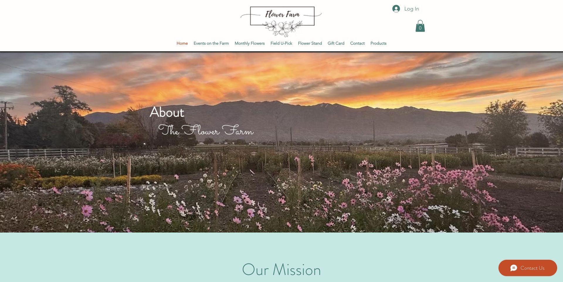
The Flower Farm UT introduces its setting with a sunset over actual flower rows, a white header and a pale aqua mission section. Field U-Pick and Flower Stand are separate navigation choices, while monthly passes and events have their own routes. The homepage clearly says the 2026 season is closed and names July 2027 as the expected return, then explains the self-serve model and available containers. That practical distinction is useful for an attraction where visitors participate rather than simply collect an order. The long mission statement precedes those details, and the vase price differs between the explanatory text and a payment-button label. Those inconsistencies matter even on an inviting page.
What you can learn
Explain how a self-service visit works before presenting payment choices. Keep the seasonal status, container options and prices synchronised so a visitor can understand the process without relying on assumptions from a field photograph.
Pros
U-pick, farmstand and events are separate navigation tasks.
Seasonal closure and expected reopening are stated clearly.
Cons & considerations
The mission statement delays practical visit information.
Vase pricing is inconsistent between copy and button wording.
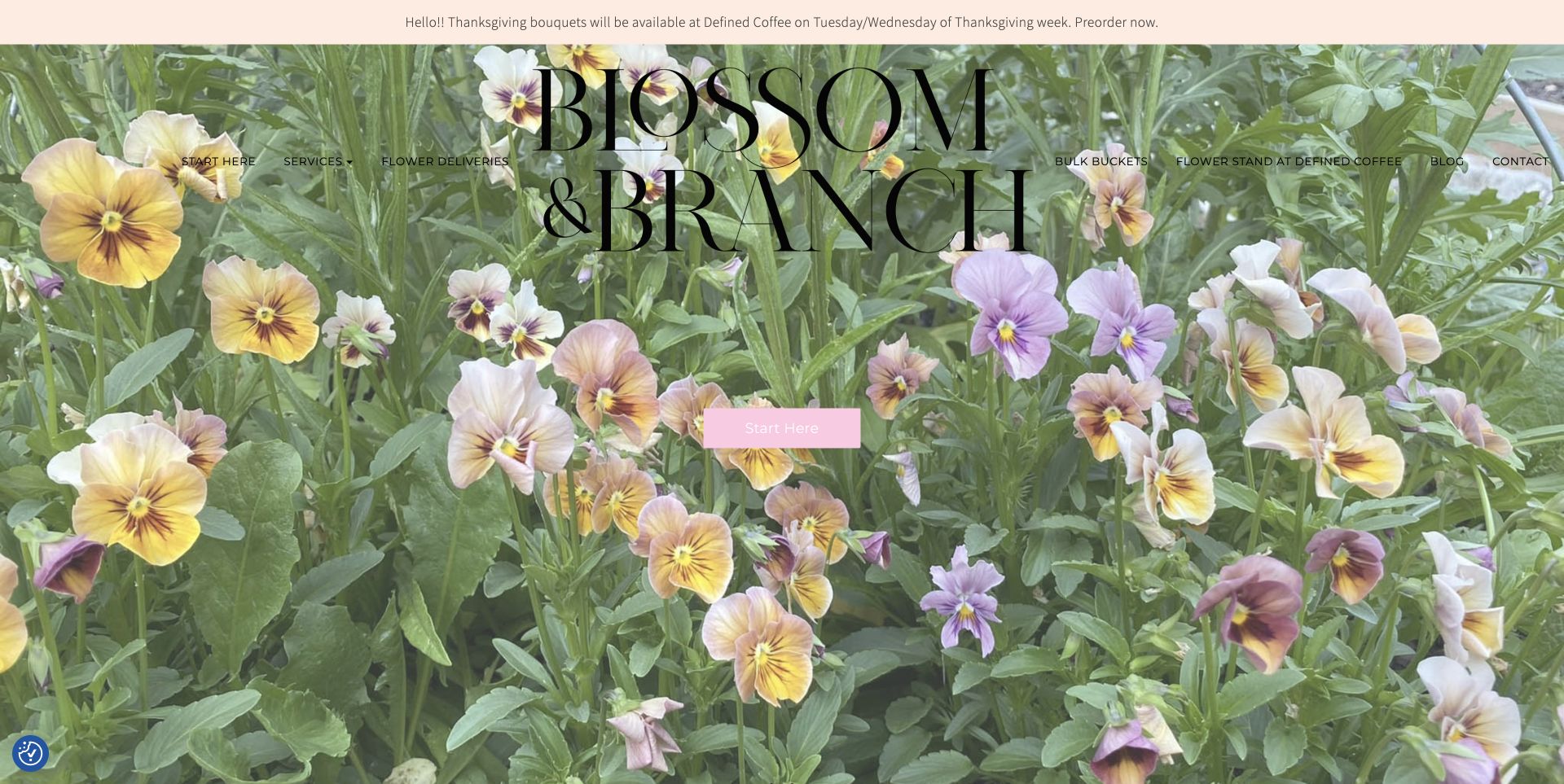
Blossom and Branch NC fills the opening view with pansies and an oversized serif wordmark, using a pastel announcement strip and a simple Start Here action. The more practical structure distinguishes delivery, bulk buckets and a flower stand at a named coffee shop. Seasonal Thanksgiving preorders and a flower-cart service make the buying occasions concrete, while the grower's introduction identifies the Lake Norman and Charlotte area. The full-screen image is memorable, but navigation crosses a busy photograph and the pale button label has limited emphasis. An exposed Instagram shortcode in the footer is another reminder that decorative presentation and functional finishing need separate attention.
What you can learn
Use specific buying occasions and collection partners to organise a local flower business. A seasonal announcement should tell people what is available and where to collect it, while the main page still explains the grower behind the offer.
Pros
Local pickup and delivery routes are clearly named.
Seasonal preorders and flower-cart service provide concrete entry points.
Cons & considerations
Navigation overlaps a visually busy photograph.
A visible footer shortcode interrupts the otherwise finished page.
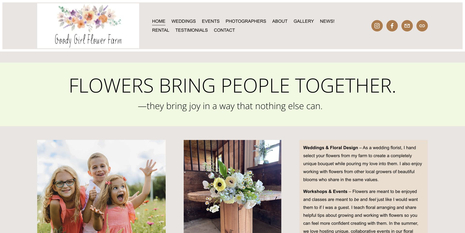
Goody Girl Flower Farm uses a pale green statement strip and warm gray background around family and floral-arrangement photographs. A neighbouring text panel explains wedding design, workshops, photography fields and barn rental, giving the imagery a practical purpose. Photographer credits are linked, and the footer makes clear that access is by pre-booked appointment or ticketed event. This is a useful pattern for a flower farm that is also a setting for other people's occasions. The broad emotional headline does not describe the offer on its own, and the many equal-weight menu links wrap. Its strongest feature is the connection between actual uses of the farm and explicit access rules.
What you can learn
Show the people and activities a flower farm supports, then state the access boundary plainly. A photography field or private event venue should not be presented in a way that implies unrestricted drop-in access.
Pros
Service copy gives the people-and-flowers photographs a clear purpose.
Appointment and ticket requirements are explicit.
Cons & considerations
Numerous menu links compete at the same visual level.
The opening emotional statement needs supporting practical copy.
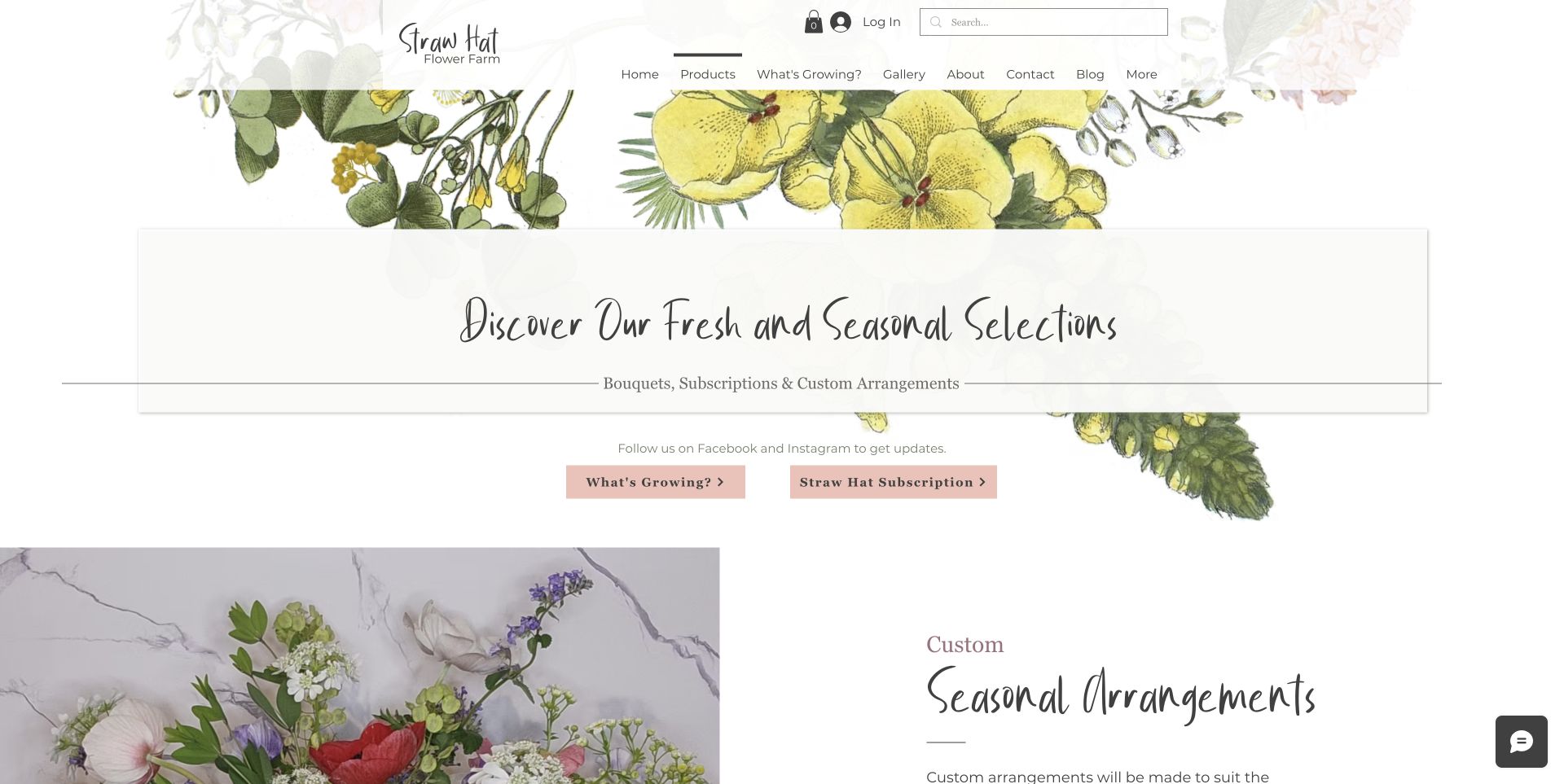
Straw Hat Flower Farm's Products page uses botanical illustrations, cream panels and script headings to introduce bouquets, subscriptions and custom arrangements. Two blush actions distinguish What's Growing from the subscription route. The detailed sections then explain custom pricing, pickup, weekly bouquet plans and smaller short-stem posies, connecting the product range to what the farm can grow. That is more informative than a grid of unexplained bouquet photographs. Decorative headings and long paragraphs slow comparison, while some availability still relies on social updates. The generic future-dated footer credit also shows why template cleanup remains part of a small business website's credibility.
What you can learn
Connect each product format to availability and fulfilment. Explain why a custom arrangement, a recurring bouquet and a small farmstand posy differ, then link them to the crop information that shapes those choices.
Pros
Product formats have separate explanations and price context.
Current-crop links support realistic arrangement expectations.
Cons & considerations
Multiple script headings reduce fast comparison.
Some availability information depends on social posts.
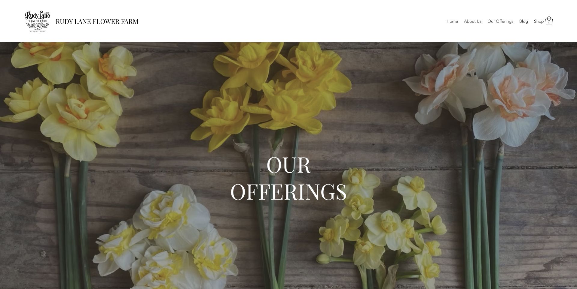
Rudy Lane Flower Farm presents its offerings beneath a full-height photograph of daffodil stems arranged on wood. A restrained header leads into separate descriptions of spring and fall subscriptions, farmstand access, wreath workshops and DIY flowers. The page is particularly useful when it says the farmstand has no fixed weekly schedule and labels possible on-farm events as still in planning. Those qualifiers prevent an attractive rural setting from becoming an overpromise. The oversized hero delays comparison, and Available Now subscription wording lacks clear date context. The design lesson is to keep each offering's operating conditions attached to its description.
What you can learn
Use explicit status language for seasonal and tentative offerings. A planned event, an occasional farmstand and a regular subscription should not share a vague invitation that leaves visitors guessing how to arrange them.
Pros
Farmstand uncertainty and tentative events are described plainly.
Each major seasonal offering has its own section.
Cons & considerations
The full-height image delays practical comparison.
Available Now wording lacks a clear seasonal date.
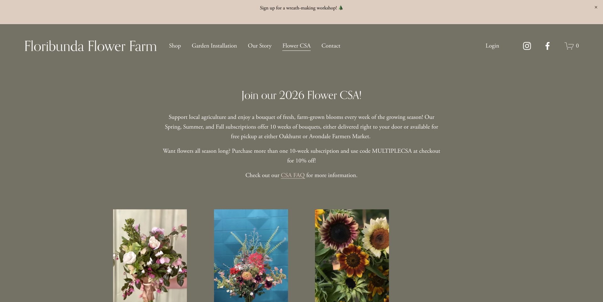
Floribunda Flower Farm's CSA page puts the subscription model ahead of the shop grid. White serif text on a muted olive background explains the ten-week spring, summer and fall options, delivery and named farmers-market pickup points. Three bouquet photographs then represent the seasonal subscriptions, with prices and sold-out states in the catalogue. This order gives readers useful context before they compare products. The reviewed page still invites people to join the 2026 programme even though all three options are sold out, so a next-season route would make the closed state more helpful. Small centred paragraphs also ask more reading effort than a compact comparison table would.
What you can learn
Explain what a flower subscription includes before displaying its purchase cards. When a season sells out, replace the dead end with a clearly labelled next-season or notification route, while retaining honest inventory status.
Pros
Duration and delivery or pickup choices precede the catalogue.
Sold-out states are explicit on the seasonal products.
Cons & considerations
The invitation remains tied to a sold-out season.
Small centred text is less convenient for comparing options.
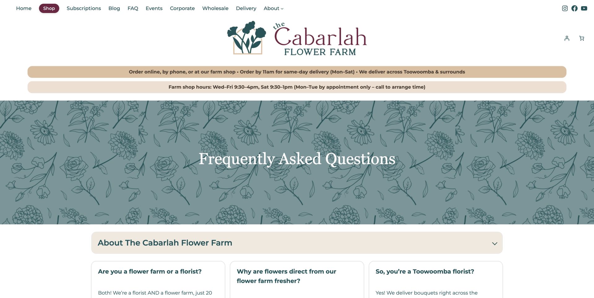
The Cabarlah Flower Farm's FAQ page uses teal botanical illustration and cream question cards beneath two useful operational strips. Delivery cutoff and farm-shop hours appear before the decorative page title, while individual questions have direct links. The answers distinguish the public florist shop from the working farm, which is not open for tours, and explain retail, wholesale and seasonal flower choices. This is a strong information pattern for a business that visitors might otherwise misunderstand. The large title area delays the answers, and broad freshness comparisons remain the business's own claims. The useful design lesson is the specificity of the questions and access rules, rather than an assumption that the FAQ verifies every claim it contains.
What you can learn
Build FAQs around real misunderstandings, especially when a farm and retail shop share one property. Put hours and delivery rules in a stable visible place, and give important answers direct links that staff can share.
Pros
Shop access and farm-tour limits are explicitly distinguished.
Delivery cutoff and hours remain prominent above the FAQ.
Cons & considerations
A large decorative title delays the answer cards.
Some comparative claims need evidence beyond the page itself.
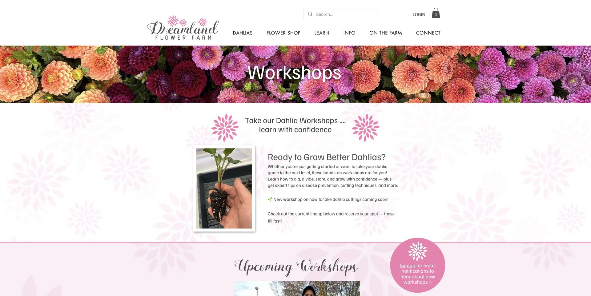
Dreamland Flower Farm's workshop page combines a colourful dahlia banner with pink floral motifs and a photograph of a seedling held in a hand. The introduction names the skills being taught, including digging, dividing and storing, rather than relying only on an attractive finished arrangement. The current workshop section distinguishes a sold-out date from a possible additional date that depends on interest. That makes the educational offer more specific and its availability more honest. Several type styles compete, and the out-of-stock card still exposes Add to Cart wording. Study the way the page shows the learning task, while keeping booking-state wording consistent.
What you can learn
Show the process that a workshop teaches, not only the finished flowers. Pair that demonstration with a precise description of skills and an honest distinction between confirmed sessions, sold-out dates and tentative waitlists.
Pros
Process photography makes the learning proposition tangible.
Confirmed and tentative workshop availability are distinguished.
Cons & considerations
Several type styles compete for attention.
Out-of-stock and cart wording could be more consistent.
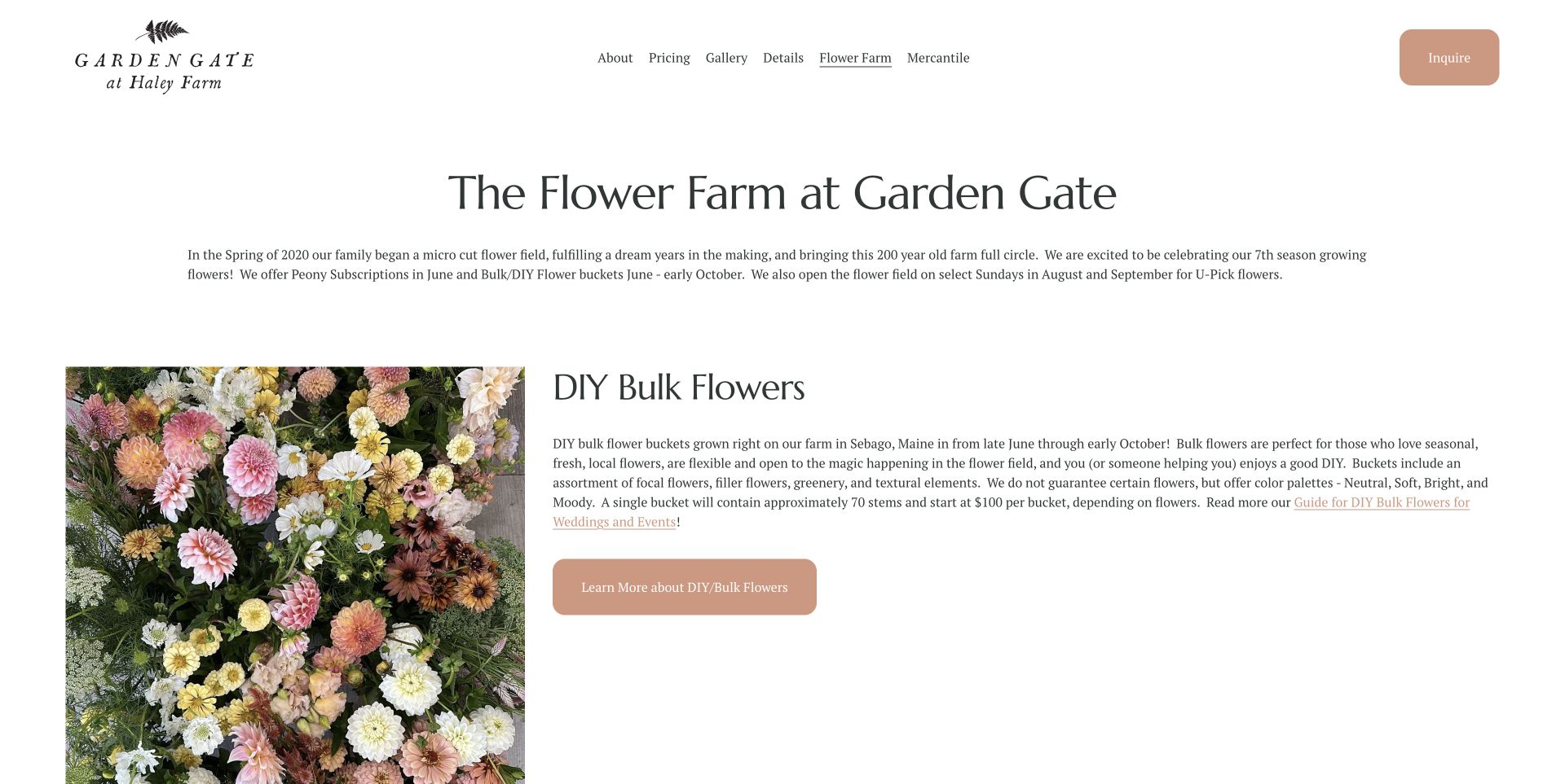
Garden Gate at Haley Farm uses an airy white layout with a large flower photograph beside a clearly headed DIY Bulk Flowers explanation. The text gives seasonal windows, approximate stem quantity, starting price and palette options while explicitly declining to guarantee particular varieties. A la carte event flowers and a monthly CSA follow as separate choices. This is a useful example of selling the flexibility of seasonal growing without leaving the customer to guess what a bucket means. The long text lines could be more comfortable to read, and the broad Inquire action competes with specific purchasing routes. The content's strength is its concrete description of scope and limits.
What you can learn
Define a seasonal product by the decisions customers can actually make. Palette, approximate quantity, collection window and starting price can be more useful than promising exact varieties that the field may not produce on a particular date.
Pros
Bulk quantities, palette choices and starting prices are explained.
Specific varieties are clearly not guaranteed.
Cons & considerations
Wide paragraphs make detailed information harder to scan.
General enquiry and specific purchasing actions share attention.
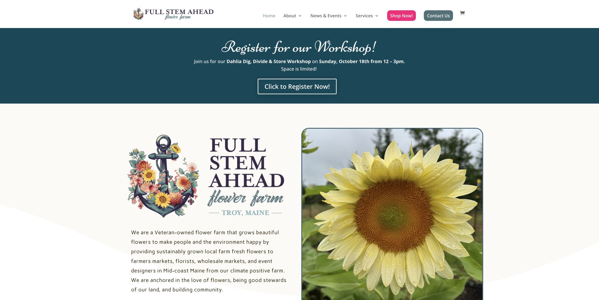
Full Stem Ahead Farm pairs a cream introduction and framed sunflower close-up with a dark teal workshop callout. A bright pink Shop Now button provides a clear commercial action, while the longer page identifies the founders and explains arrangements, wholesale supply, DIY buckets and subscription pickup points. The specificity of delivery radius and collection locations makes the farm's local service area more understandable. The prominent October workshop promotion is still present during the November review, however, and environmental claims should remain attributed to the business unless independently checked. This example is useful for the practical service matrix and named local context, with a reminder to retire expired promotions.
What you can learn
Give each service enough operational detail to stand alone: who it is for, where it is available and how to arrange it. Review time-sensitive banners separately from evergreen farm-story content so an expired event does not dominate the homepage.
Pros
Pickup sites and delivery area make the local offer concrete.
Retail, wholesale, DIY and subscription services are separated.
Cons & considerations
An expired workshop promotion remains highly prominent.
Broad environmental claims need independent support before being repeated as results.
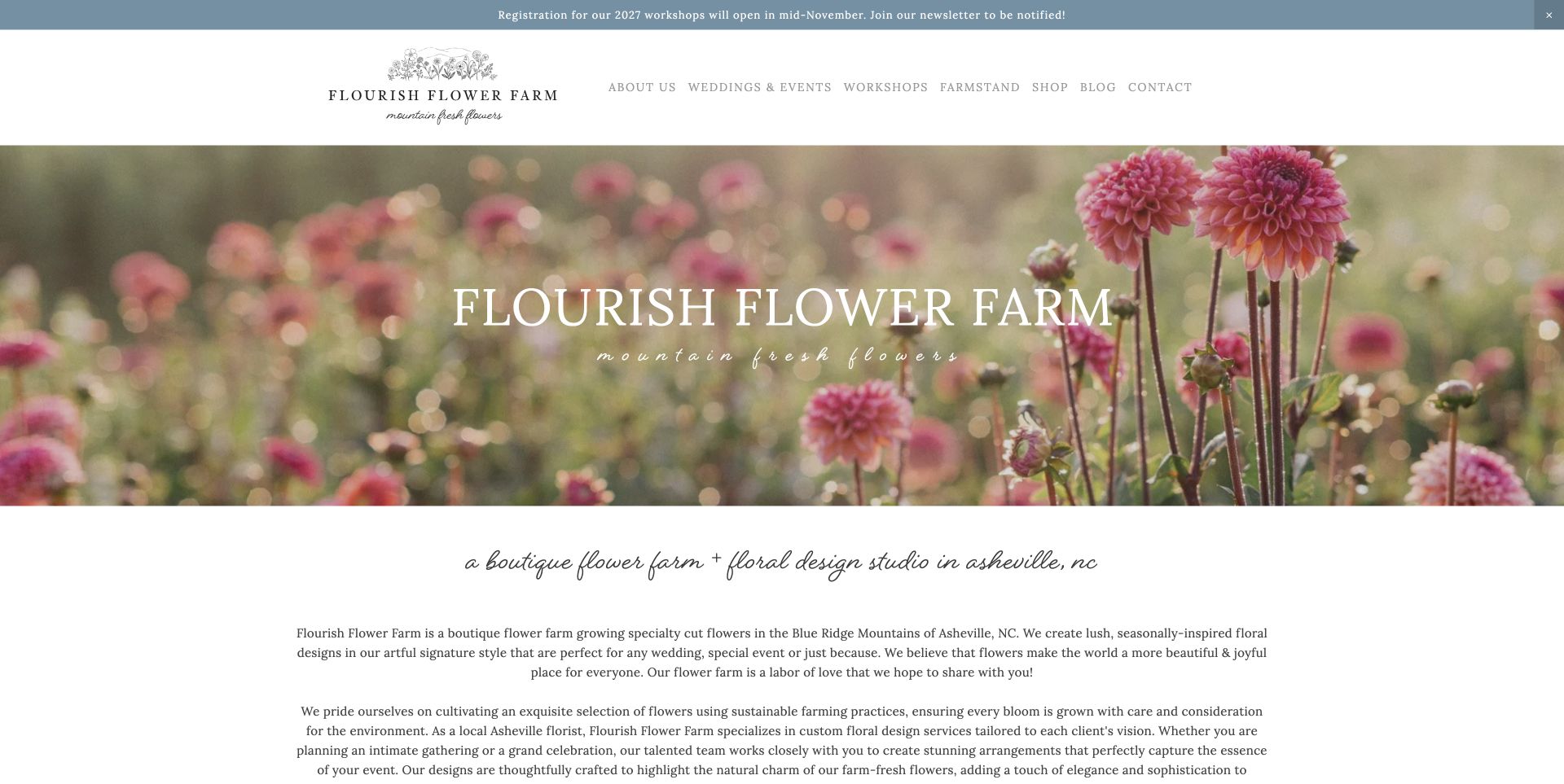
Flourish Flower Farm introduces itself with soft-focus dahlias, a white serif title and a scripted regional subtitle. The page then explains its Asheville growing and floral-design context before branching into the farm and farmers, workshops and wedding design. A dated announcement gives the next workshop-registration window, and the associated blog provides deeper growing and business material. This is useful editorial structure for a farm with several kinds of expertise. The long centred introduction delays those branches, and an older indexed workshop URL no longer resolves. The main lesson is to keep a stable overview of the services while maintaining current paths into seasonal products and learning.
What you can learn
Build a durable overview around the farm, its teaching and its floral services, then keep current booking links beneath it. When old workshop products expire, help search arrivals find the current programme rather than leaving them at a dead end.
Pros
Farm, workshop and wedding content have distinct homepage branches.
A dated notice explains upcoming registration timing.
Cons & considerations
Long centred paragraphs delay the action choices.
An older indexed workshop product URL returned a missing-page response.
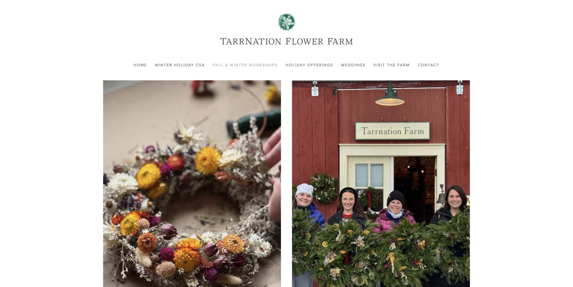
Tarrnation Flower Farm's current fall-and-winter catalogue uses a restrained white masthead and a two-column photographic grid. A close view of a dried wreath sits beside an actual group holding evergreen wreaths, showing both the result and the social nature of the classes. Four workshop products carry prices, with the holiday-centrepiece option marked sold out. The catalogue is straightforward, but the tall images push titles and prices below the opening screen. An older workshop page remains an archive of a 2018 event, so current seasonal navigation is especially important. Study the pairing of finished work and participant imagery, while making product details easier to compare.
What you can learn
Show both what people will make and what attending looks like. Keep dates, prices and availability close to those images, and distinguish current classes from old event archives that may still appear in search.
Pros
Images show a finished piece and the participant experience.
Workshop prices and sold-out state are explicit.
Cons & considerations
Tall photographs delay the product names and prices.
Historic workshop pages need clear routes to current sessions.
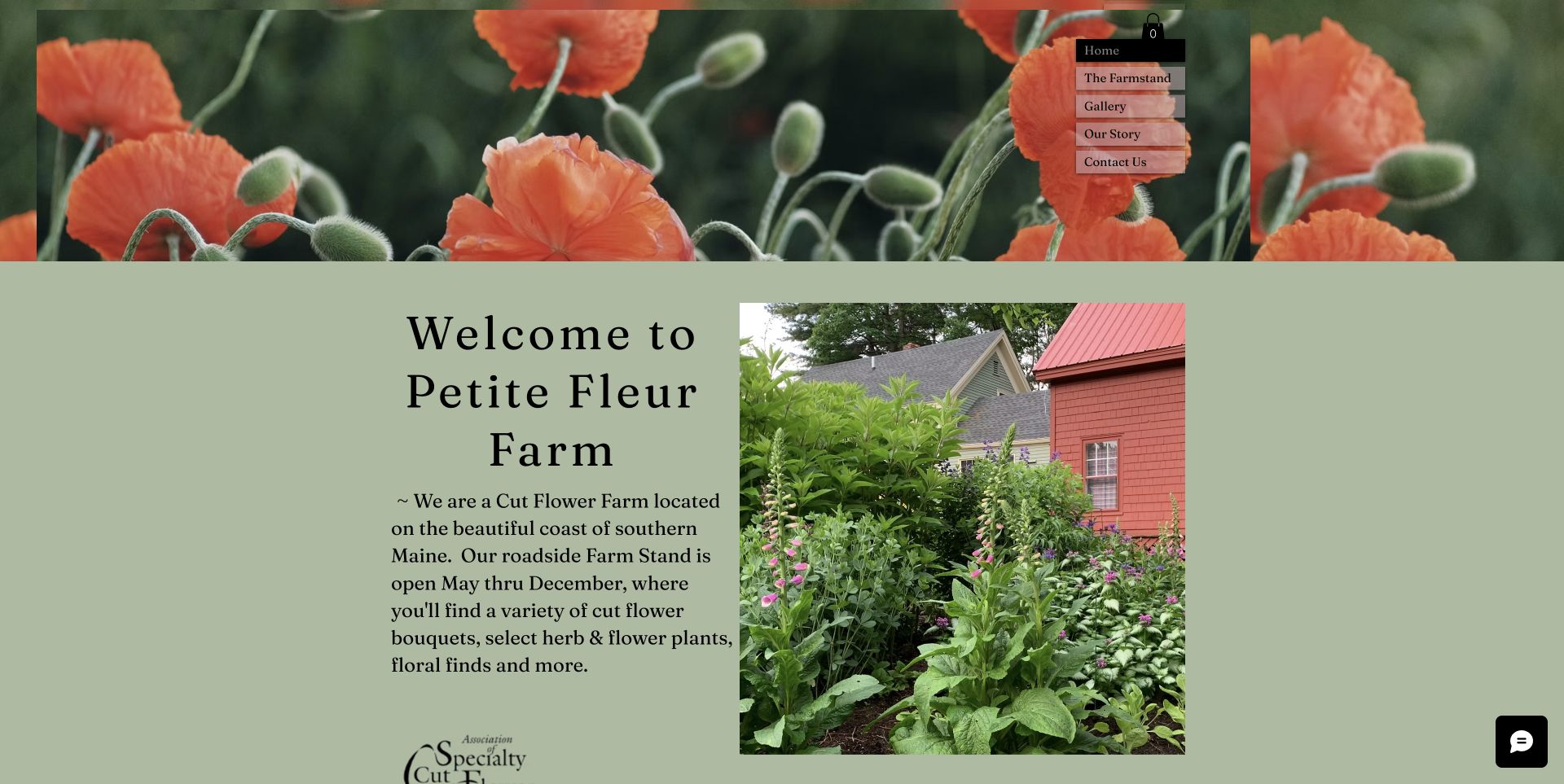
Petite Fleur Farm combines a poppy-photo masthead with a sage background, a short serif introduction and a real view of flower beds beside the farm building. The text quickly identifies a cut-flower farm on the southern Maine coast and gives the roadside stand's May-to-December season. Farmstand, Gallery, Our Story and Contact are the main routes, keeping the site focused on a modest local offer. The narrow vertical navigation is easy to overlook against the photograph, and precise hours and address do not appear in the opening content. Its useful quality is the short, specific introduction: a small farm does not always need a large catalogue to explain itself.
What you can learn
Start a small local farm site with a clear description of the place, the product and the visiting season. Keep the navigation equally simple, but make the practical farmstand route more visible than decorative imagery.
Pros
Short introductory copy identifies the farm type and season.
Real farm-building photography provides specific local context.
Cons & considerations
Vertical navigation is easy to miss over the image.
Opening content does not supply precise hours and address.
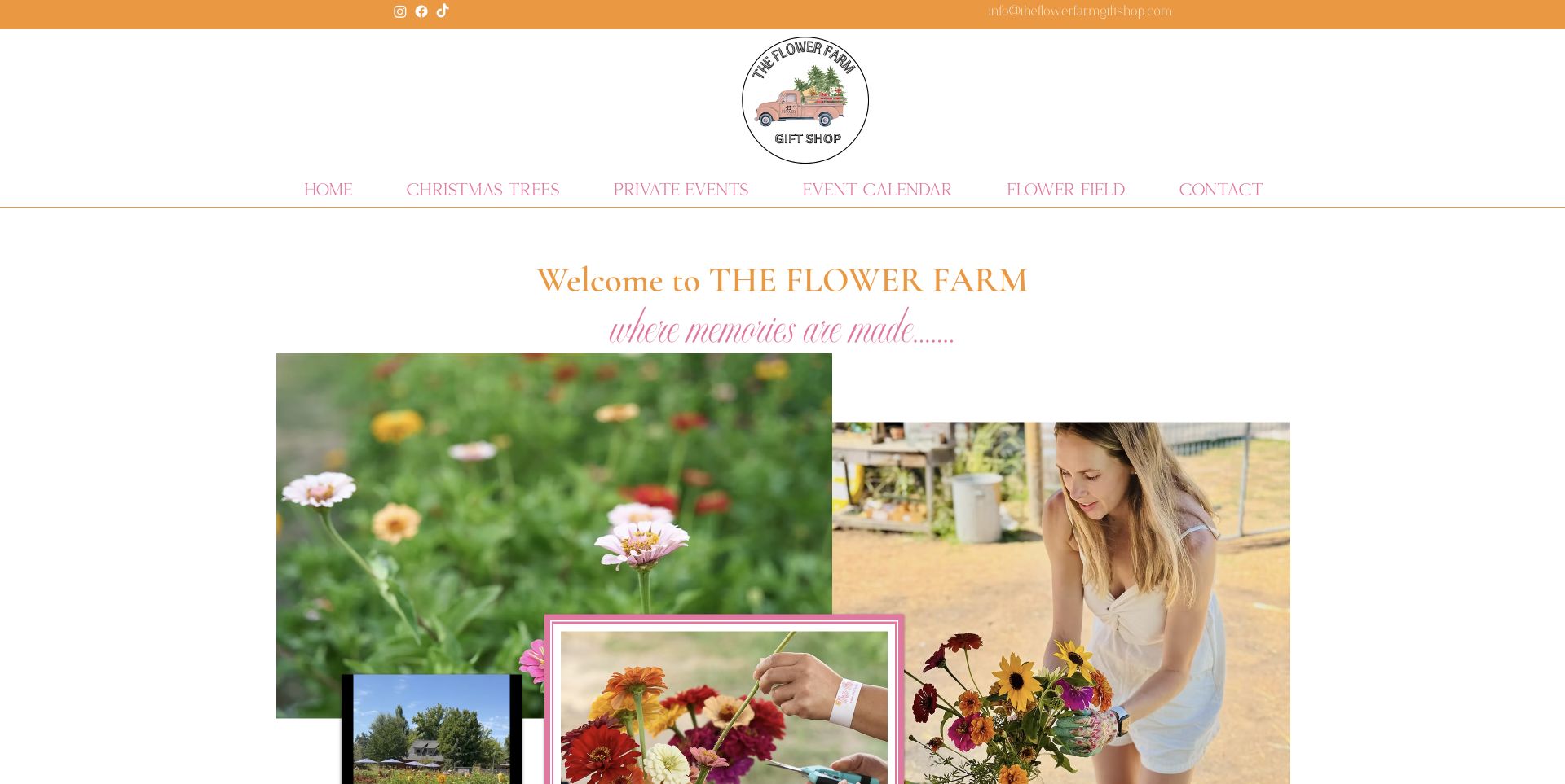
The Flower Farm in Loomis gives its flower field a dedicated page beneath the gift-shop identity. Overlapping photographs show growing flowers, cutting and arranging, with orange and pink type creating a scrapbook-like invitation. The practical content is more valuable: a current season-ended notice precedes numbered arrive, purchase and pick instructions, including where wristbands are obtained and how tools are supplied. It also distinguishes picking visitors from spectators. The large collage delays those details, and older indicative pricing remains beneath the future-season notice, so readers should not assume it is the next season's confirmed rate. The page is useful for translating an unfamiliar field visit into a simple sequence.
What you can learn
Break a participatory farm visit into the actual steps a guest follows. Explain arrival, admission, supplied tools and what they take home, then separate current operating status from previous-season prices and arrangements.
Pros
Numbered arrival, payment and picking steps explain the experience.
Season-ended and spectator-access information are explicit.
Cons & considerations
The large collage delays the practical instructions.
Prior-season pricing needs clear separation from forthcoming-season information.
Kegan is a freelance web designer and developer with 15+ years of experience helping businesses turn complicated website requirements into clear, maintainable digital experiences. He works directly with clients from planning and design through development, launch, and ongoing support.
For flower farm website design, his development approach focuses on seasonal flower availability, farm visits, bouquet subscriptions, workshops and clear collection or delivery information. The scope can be a targeted improvement or a complete custom build, with responsive layouts, thoughtful content structure, and integrations chosen around the people using and maintaining the site.
Show 3 other flower farm website designersHide other flower farm website designers
List what someone can do with the business: order a bouquet, join a subscription, buy bulk buckets, arrange wedding flowers, attend a workshop or visit the field. Do not combine these under a vague Shop or Experience label unless the next page clearly explains the choices. Use the language customers use when they contact the farm.
Write down the operating rules for each offer before designing its page. A bouquet may require advance notice, a subscription may use fixed collection days, and a workshop may have limited places. Those rules should sit with the relevant description, not in a general paragraph that every visitor has to interpret.
Identify where the website hands off to another system or person. Explain whether an action opens a product page, requests a quote or leads to an external booking service. Keep the farm’s contact and practical information available without requiring an account.
Build a calendar that does not contradict itself
Create a stable place for current-season status and a clear owner for updating it. Review announcement strips, navigation labels, product inventory and event pages together. A sold-out subscription page with a prominent Join Now headline sends two different messages even if the stock control itself is correct.
Distinguish confirmed dates from expected opening periods and tentative extra sessions. If weather or crop timing affects an event, explain that uncertainty in ordinary language. A waitlist should not imply that another session is guaranteed.
Keep older event pages useful as archives, but label them and link to the current programme. When a product is removed, help visitors arriving from search find the current equivalent. Preserve accurate historical dates rather than silently making old content appear newly available.
Use photographs to explain, not merely decorate
Choose images for different questions. A field photograph establishes the setting, a finished bouquet shows style, a cutting or propagation image explains a workshop, and a group photograph can show the nature of an event. Each image should support the adjacent offer rather than stand in for missing practical information.
For seasonal products, describe the choices customers can reliably make. A palette, approximate stem count, vessel or arrangement format may be more honest than a fixed list of varieties. Show example arrangements as examples and explain how the current crop can change the result.
Keep the page usable around its photography. Avoid placing essential navigation over a busy crop, keep labels legible, and bring prices, dates and actions close to the relevant image. A large photograph can be compelling without consuming the entire route to the information someone needs.
The editing job behind the design
Choose technology around fulfilment and seasonal updates
A bouquet shop needs manageable inventory, collection or delivery choices and clear order lead times. A subscription programme needs a way to explain its dates and fulfilment pattern. Workshops and U-pick visits may need capacity-based booking. Choose the system for those processes rather than copying a platform simply because another farm’s page looks attractive.
The public stack audit records visible source references, not a complete account of the farm’s operations. A detected storefront or embedded tool does not establish the quality of checkout, stock handling or customer service. Keep observed technologies separate from unverified backend assumptions and retain the evidence date.
Plan for routine maintenance. Seasonal notices, product availability, workshop dates and current-crop photographs all need an update path that the farm can sustain. A simpler structure with accurate information is more useful than a complex homepage whose prominent offers have expired.
Our WordPress website examples offer a separate look at publishing approaches. A visible platform label is evidence for that named page, not a guarantee that the same system will suit your requirements.
Before the public launch
Flower farm website planning checklist
Identify the farm’s location and real service area near its introduction.
State the current growing, selling or visiting season clearly.
Separate fresh-flower availability from winter workshops and future enquiries.
Give bouquets, subscriptions, bulk flowers and events distinct explanations.
Explain collection points, delivery area, lead time and order cutoffs.
Describe subscription duration, frequency and what each collection includes.
Keep prices and availability labels consistent with purchase buttons.
Clarify palette choices, quantities and limits on specific flower varieties.
Distinguish the farm’s own crop from flowers sourced elsewhere.
Explain arrival, admission and supplied tools for U-pick visits.
Label old event pages and link them to the current programme.
Use genuine photographs with accurate page, capture and attribution records.
These checks are a project checklist, not a performance, legal, security, or accessibility certification. Test real journeys with the people responsible for the website before making claims about the result.
Sources & editorial method
How this collection was selected and reviewed
We directly reviewed these 23 distinct flower-farm properties and captured the cited pages on November 12, 2026 UTC during the November 11 Pacific editorial batch. The original saved draw of 23 was retained. Each review describes visible page decisions and specific tradeoffs; no purchase, booking, enquiry, mailing-list signup or farm-quality assessment was performed. Actual source pages were captured, with ordinary notices dismissed through their own controls where needed and no reconstructed imagery. Outbloom is the explicitly researched Editors Choice for its clear season-over notice, regional grower identity and separation of postal flowers, workshops and wedding enquiries. This is a website-design selection, not a service or environmental endorsement. All 23 sources received the standard bounded public technology audit, covering an exact source page and a limited same-origin asset sample; provenance, qualifications and observation dates remain in the underlying records.
Each example links to its actual source page. Screenshots are direct browser captures with their own capture dates; moving imagery, announcements and live designs can change. The notes describe observable design choices and conditional tradeoffs, not measured traffic, conversion results, service quality, or accessibility conformance.
Technology labels use public page metadata, asset evidence, or explicitly cited platform documentation. Platform documentation is not a complete current deployment audit. A component reference may be legacy or unused; it is not a complete backend inventory. Unknown stacks are omitted. These sites are editorial examples, not our client portfolio.
Written, Edited and Curated are separate editorial records, not timestamps advanced by a rebuild. Website designs and imagery belong to their owners. See our editorial standards or suggest a correction.
Questions worth asking
Flower Farm website design questions
What should a flower farm website show first?
Identify the farm, its area and the main ways people can buy or visit. Then make current availability explicit. A strong flower photograph helps establish the style, but it should be accompanied by the season, relevant action and any immediate limit such as closed fields or sold-out subscriptions.
How should flower subscriptions be explained?
State the number and frequency of bouquets, the season or date range, collection or delivery arrangements and what customers can expect to vary. Put that explanation before the purchase choices. If the programme is sold out, make the next-season or notification route clear.
How can a farm describe wedding flowers without overpromising?
Explain the formats it offers, such as bulk buckets, a la carte arrangements or full floral design. Describe palette options and the role of seasonal availability. Be clear about whether flowers come entirely from the farm or are supplemented from other growers, and avoid guaranteeing varieties the crop cannot reliably supply.
What information does a U-pick flower page need?
Explain when the field is open, whether booking is required, where visitors arrive and pay, what tools or containers are supplied, what they can take home and whether spectators need admission. Keep current operating status separate from previous-season pricing or schedules.
Does Editors Choice verify a farm’s flowers or sustainability?
No. The selection is an editorial judgement about the reviewed website’s design and communication. It does not establish flower quality, farming standards, environmental results or the outcome of a booking. Business claims remain attributed unless supported by separate evidence.
Make the flowers inviting and the arrangement practical: explain the season, the product or experience, and the next step with the same care as the photography.