Best Animal Sanctuary Websites of 2026 (28 Real-World Examples)
28 real sanctuary websites showing how resident stories, practical visiting information and transparent support journeys can work together.
An animal sanctuary website needs to earn attention without treating the animals as a marketing prop. Its most useful job is to explain the work, make current information easy to find and help a visitor choose an appropriate next step.
This collection includes regional farm sanctuaries, species-specialist refuges and a dedicated sanctuary destination within a larger organisation. They do not all permit the same kinds of visiting, adoption or animal interaction. Study their communication choices without assuming that one organisation’s policies should be copied by another.
The examples are editorial selections based on public website review, not a welfare accreditation, donation recommendation or measured popularity ranking. Heartwood Haven is the explicit Editors Choice for its resident photography, coherent actions and distinct support routes. The remaining order is editorial; feedback does not change it.
Before the examples
What makes good animal sanctuary website design in 2026?
Explain the kind of sanctuary
Permanent resident care, rehoming and wildlife rehabilitation involve different promises. Name the actual work and species rather than relying on the word rescue to cover everything.
Set visiting expectations early
State whether the sanctuary is open, appointment-only, seasonal or closed to general visitors. Keep public learning spaces distinct from resident habitats.
Make support understandable
Differentiate donations, recurring gifts, symbolic sponsorship, membership and purchases. Tell supporters what the action means before asking for payment details.
Give animals individual context
Use accurate names, thoughtful stories and genuine photographs with appropriate permissions. Avoid invented progress, distressing surprise images or promises the organisation cannot substantiate.
The collection · 28 examples
28 animal sanctuary websites worth studying
Look at the relationship between each introductory image and the next useful action. The notes focus on website communication, original visual observations and conditional tradeoffs, not on independently verified standards of animal care.
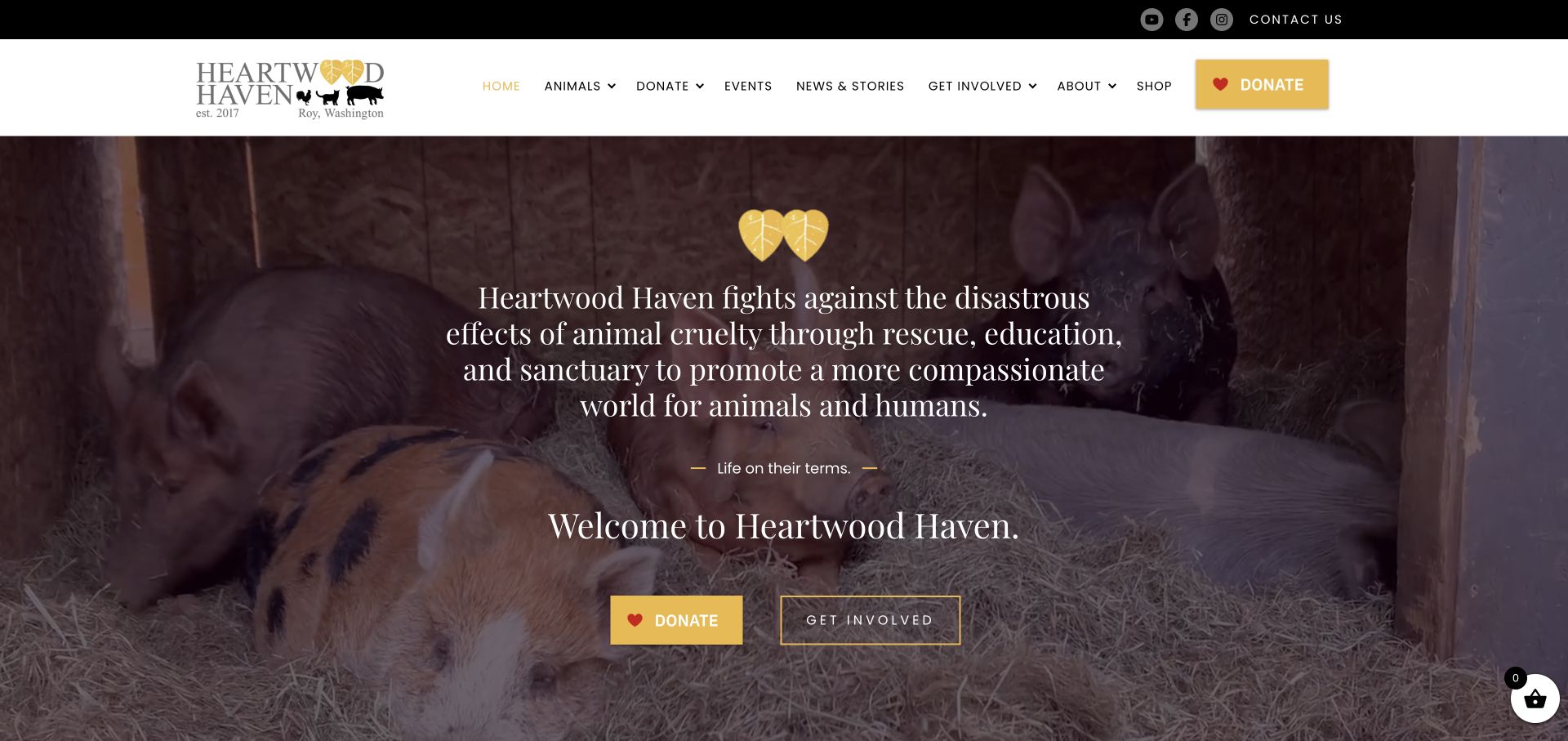
Heartwood Haven combines a warm yellow accent with a full-width photograph of pigs resting together. Its long mission statement stays over the photograph, followed by distinct Donate and Get Involved actions. Below, rescue, rehabilitation and education become separate explanations, while individual animal stories, adoption listings and support options extend the introductory invitation.
What you can learn
Pair an emotionally specific photograph with recognisable support actions. Separate volunteering, sponsorship, adoption and tours instead of expecting one donation button to answer every visitor’s question.
Pros
Donate and Get Involved offer different levels of commitment.
Individual animal stories connect the broad mission with identifiable residents.
Cons & considerations
The opening mission statement needs careful line lengths on smaller screens.
Repeated donation links should not make practical visit and adoption information secondary.
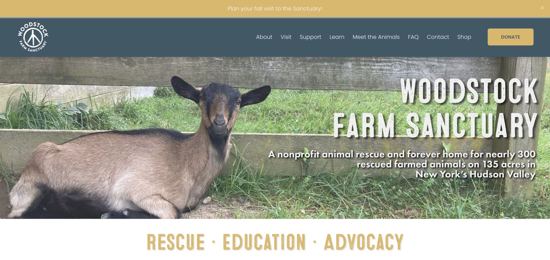
Woodstock introduces its sanctuary with a close photograph of a goat, a large textured wordmark and a concise Hudson Valley description. Meet the Animals is a visible navigation route, while dated stories and upcoming events give the site an active editorial rhythm. Visiting, volunteering, donations and the on-site inn are presented as different ways to participate.
What you can learn
Give visitors location and purpose alongside the emotional image, then let current stories demonstrate activity. Keep accommodation, tours and volunteering distinct so a visit does not become an ambiguous transaction.
Pros
The introductory description establishes the sanctuary’s location and animal focus.
Dated stories and named events distinguish current information from evergreen pages.
Cons & considerations
Seasonal campaign dialogs can interrupt the useful opening context.
Text placed over detailed photography needs a reliable contrast treatment.
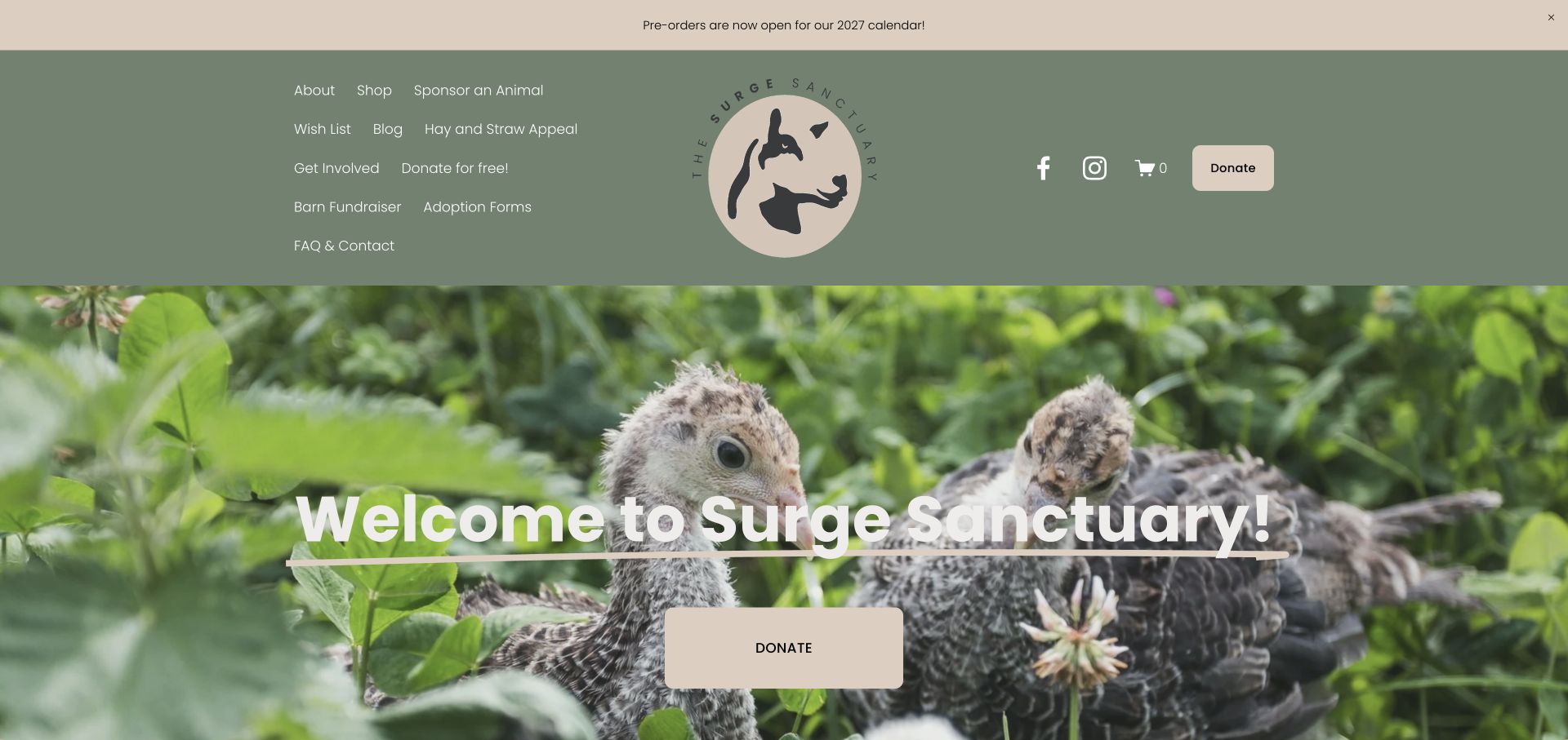
Surge uses a sage-and-cream palette, an illustrated animal mark and large turkey photography rather than a generic nonprofit template. Its homepage moves from the welcome into sanctuary updates and individual residents with sponsorship links. Practical support choices include a wish list, donation routes and specific building or fencing appeals.
What you can learn
Give recurring fundraising needs an identifiable context and a resident story. Keep broad support choices easy to distinguish from limited campaigns so supporters know whether their action is ongoing or project-specific.
Pros
Resident profiles give sponsorship links a specific subject.
The restrained palette connects the logo, navigation and main actions.
Cons & considerations
The multi-row desktop navigation consumes much of the first screen.
A welcome headline alone provides less orientation than a concise location and mission sentence.
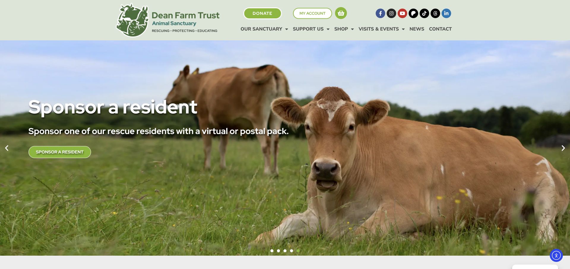
Dean Farm Trust uses a consistent green palette, rounded actions and a photograph carousel to explain its sanctuary. The observed settled slide focuses on sponsoring a resident, with a plainly labelled action. The page then separates donation, sponsorship, shopping and visiting before introducing individual resident stories and practical contact information.
What you can learn
Use the same visual language across different support routes, but explain their differences in plain text. A sponsorship should not be mistaken for an adoption or a ticketed visit.
Pros
Separate support cards explain several ways someone can help.
Individual resident stories make the generic sanctuary mission more concrete.
Cons & considerations
Important introductions should not depend on which carousel slide happens to appear.
Several tiers of icons and utility links make the desktop header busy.
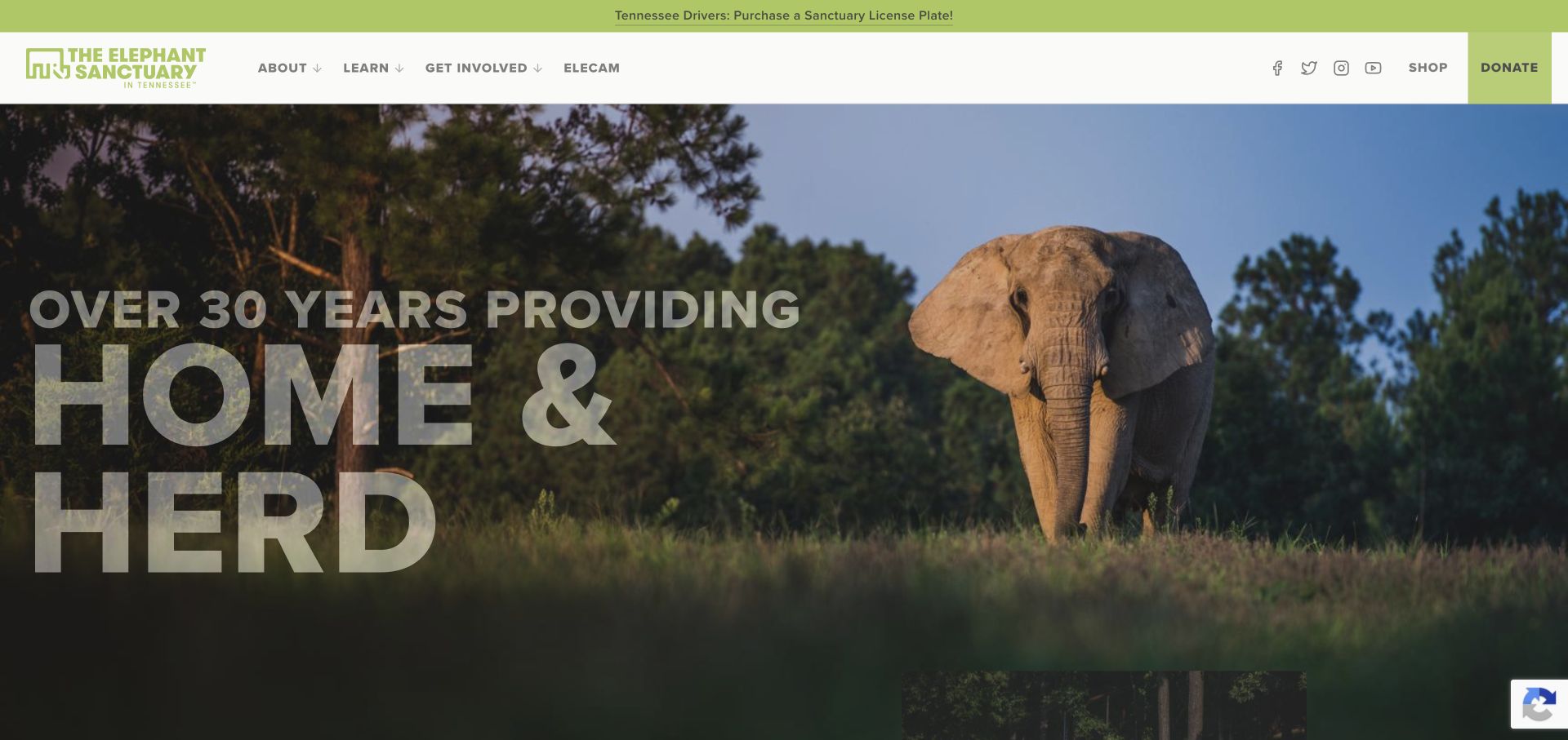
The Elephant Sanctuary in Tennessee uses a large elephant landscape and an unusually concise home-and-herd introduction. EleCam receives a primary navigation position, while learning and support have their own routes. Further down, the Discovery Center description explicitly distinguishes the public learning venue from habitats that are closed to visitors.
What you can learn
Explain what the public can and cannot visit before a trip is planned. A remote viewing route can support education without implying that sanctuary residents are available for physical encounters. Give the remote camera and public learning venue different destination labels. Both support engagement, but neither should be mistaken for permission to enter resident habitats.
Pros
EleCam has an identifiable place in the main navigation.
The Discovery Center copy makes the no-habitat-access boundary explicit.
Cons & considerations
The large introductory slogan needs supporting context for unfamiliar visitors.
Background image contrast and decorative animated text need robust readable fallbacks.
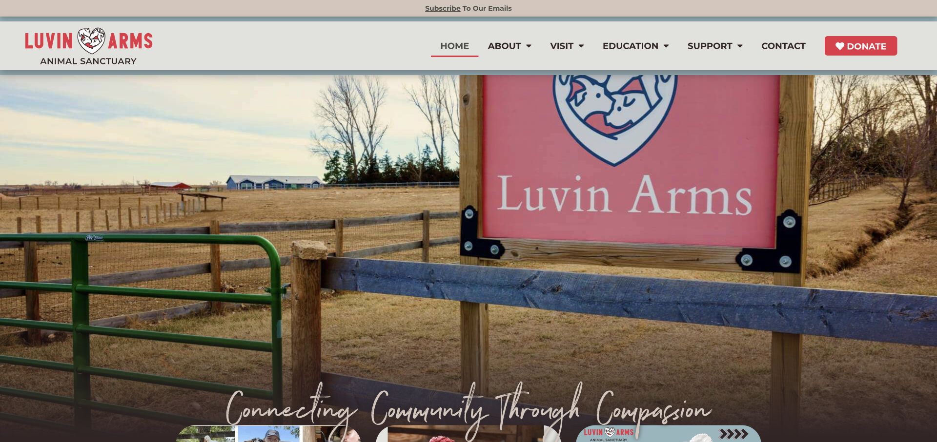
Luvin Arms opens with the actual sanctuary gate and its heart-shaped animal identity. Red donation accents stand apart from the quiet neutral header. The homepage then introduces the Colorado setting, current campaigns and a newest-resident feature before offering a species-based directory of residents and educational routes.
What you can learn
Use a photograph of the real entrance or grounds to establish place, but follow it with practical context. A species directory can make a large resident archive easier to explore without replacing individual names and stories.
Pros
Species links give a large resident archive an understandable structure.
The donation accent is distinct from general navigation.
Cons & considerations
The expansive opening photograph pushes explanatory content low in the viewport.
A handwritten tagline needs adequate size and a text alternative rather than being the only mission statement.
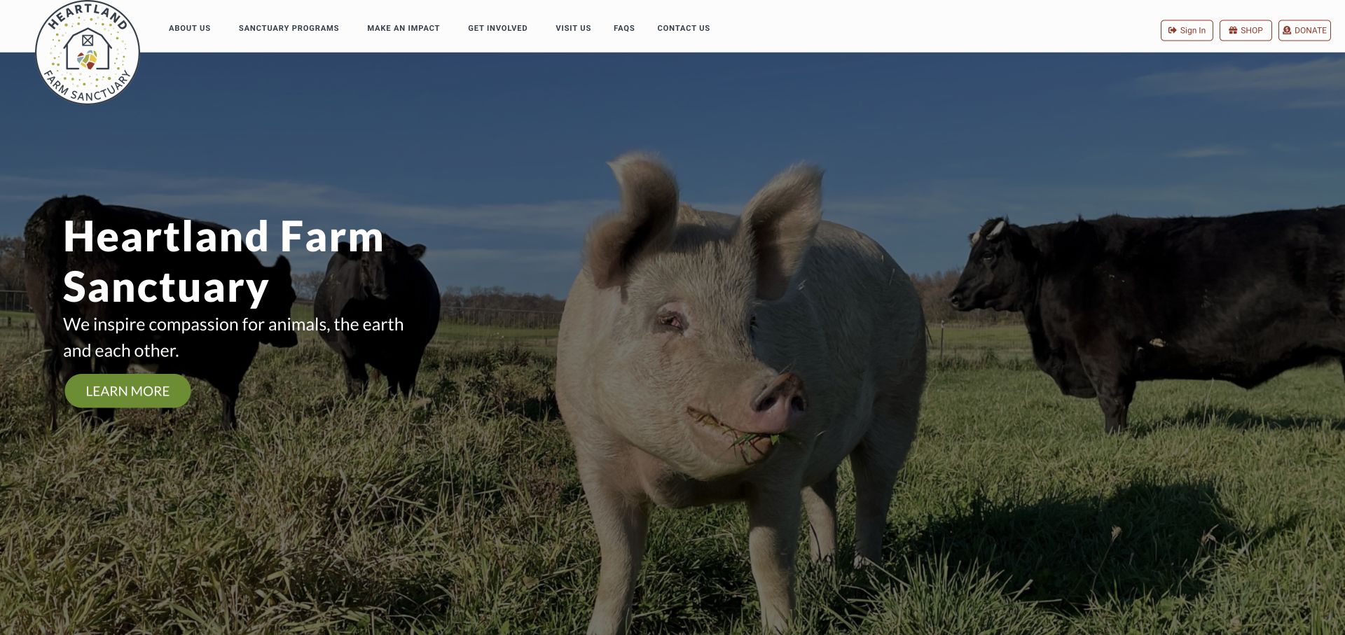
Heartland combines a large pig-and-cattle photograph with a short mission sentence and a quiet green action. The main navigation distinguishes Sanctuary Programs, Get Involved and Visit Us. Shop and Donate sit in a utility cluster, and the site identifies its education and connection work separately from the imagery of resident animals.
What you can learn
Make different audiences visible in the navigation before elaborating the mission. Visiting, program participation and donations should have separate explanations even when they share a common emotional story. Program information should explain participation separately from visiting the grounds. The shared animal photograph can introduce both without implying that every visitor receives the same experience.
Pros
Program and visitor routes are clearly named in the header.
A short mission sentence remains readable beside the resident photograph.
Cons & considerations
The small utility actions need comfortable touch targets on mobile.
External booking and store destinations should clearly explain the transition.
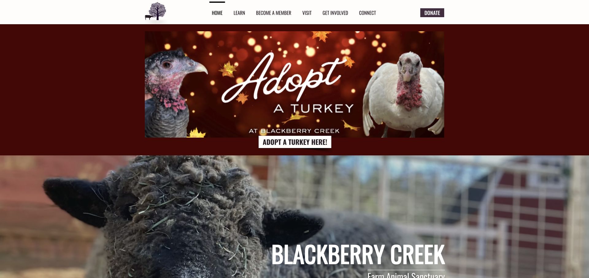
Blackberry Creek places a seasonal turkey appeal above its core sanctuary introduction, with a high-contrast direct action. The black tree-and-animal mark and condensed type hold the page together. Membership, sponsorship and sanctuary visits become separate illustrated sections, and the homepage states its Colfax location rather than leaving place entirely to the footer.
What you can learn
Give seasonal campaigns a bounded area, then preserve an evergreen introduction underneath. Membership, sponsorship and visits need their own descriptions so a supporter understands the commitment they are choosing.
Pros
Membership and sponsorship are presented as different support arrangements.
The actual sanctuary location is part of the main introduction.
Cons & considerations
The large seasonal panel delays the evergreen sanctuary explanation.
Condensed uppercase labels need careful sizing and spacing on narrow screens.
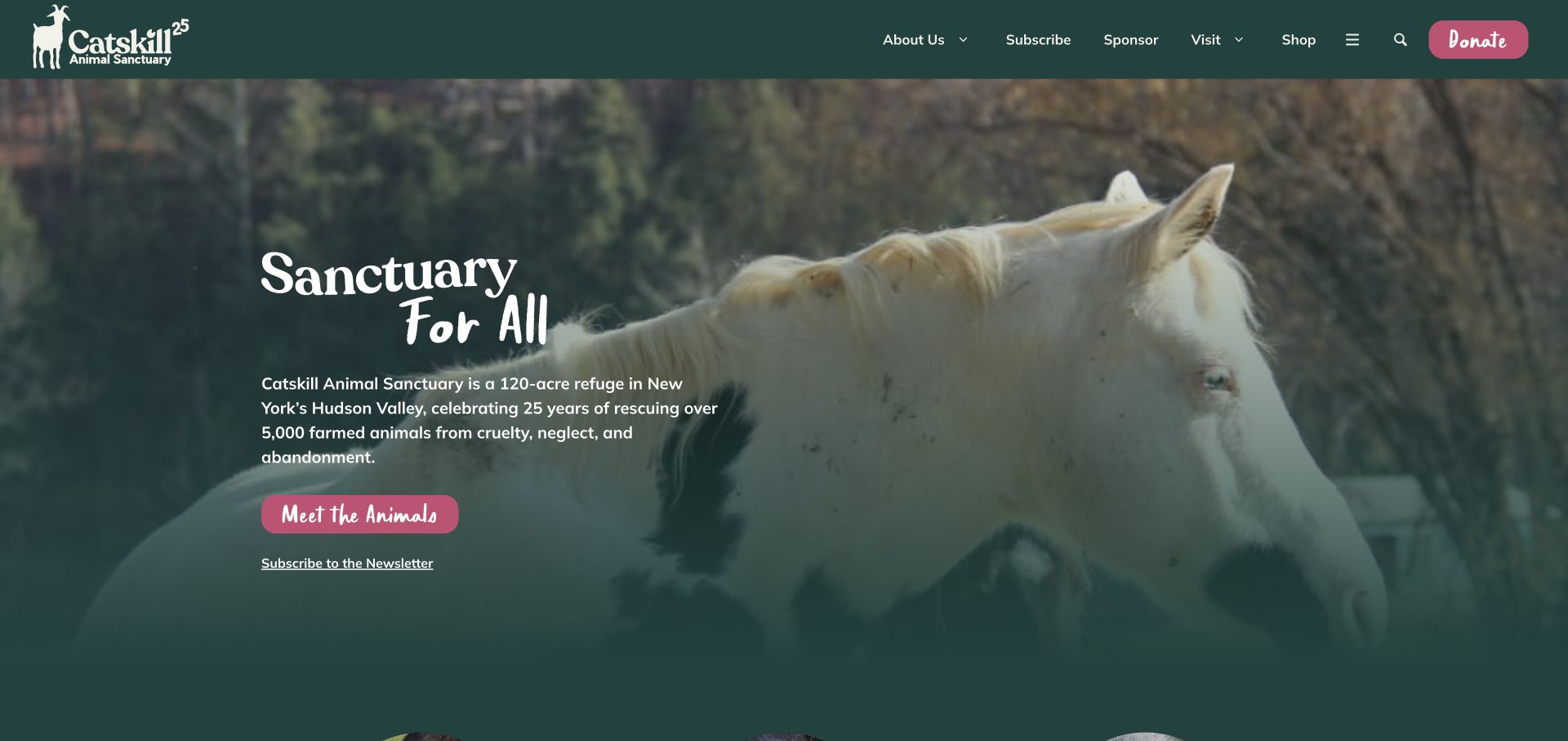
Catskill uses a dark forest-green identity, pink actions and a close photograph of horses. The homepage pairs a compact introduction with a prominent Meet the Animals button rather than leading only with a donation form. Sponsorship, volunteering and monthly giving become separate panels below the hero, while the footer preserves organisational and contact routes.
What you can learn
A resident directory can be a useful first action for an unfamiliar visitor. Let someone understand the animals and the organisation before presenting several distinct forms of ongoing support. Keep the resident introduction useful before presenting a financial commitment. The later support panels can then explain differences between volunteering, symbolic sponsorship and recurring giving.
Pros
Meet the Animals creates a specific, low-pressure first step.
The green-and-pink palette makes primary actions recognisable.
Cons & considerations
Seasonal overlay promotions should not obscure the resident introduction.
Script-style action labels require enough size and contrast to remain legible.
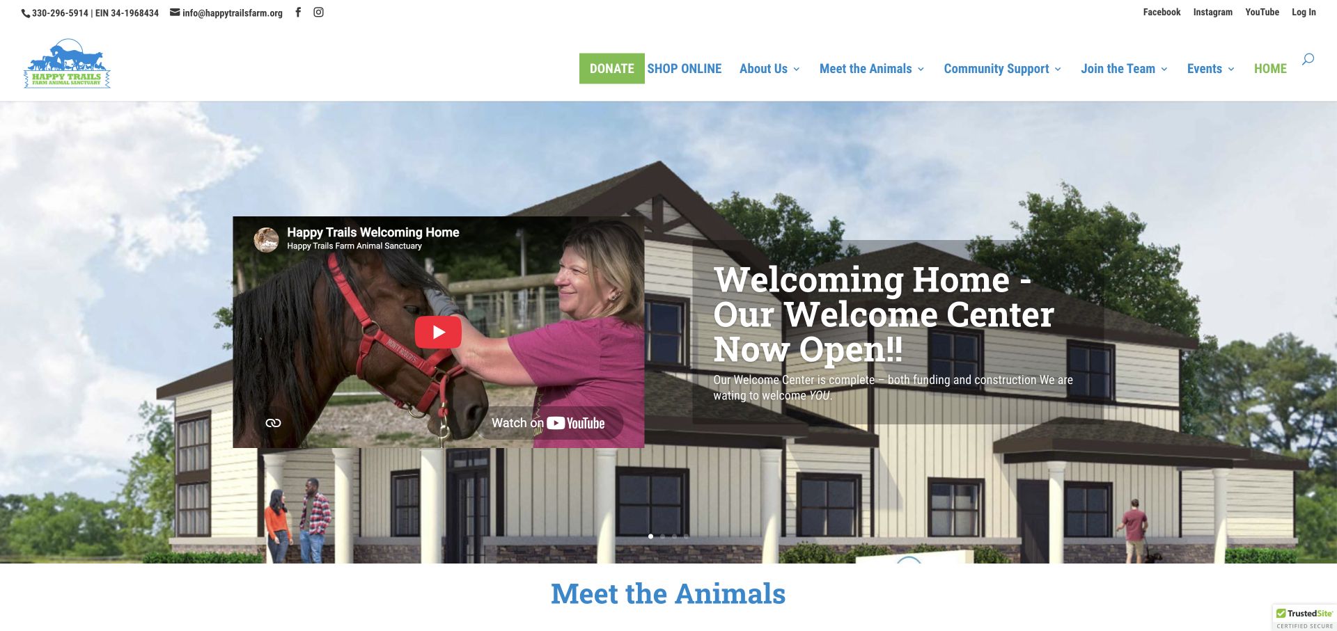
Happy Trails uses its welcome-center announcement as the opening story, placing a real video preview beside an architectural image and explanatory copy. Contact details and a charity identifier appear in a compact utility strip. The next section divides animal discovery into farm animals and equines, with other organisational and adoption routes available in the header.
What you can learn
Connect a facilities update to an actual visitor task and a clear next step. If a rendering and a real video appear together, label their roles so future plans are not confused with an existing experience.
Pros
The utility strip makes telephone and email contact readily identifiable.
Animal categories give the resident and adoption content an initial structure.
Cons & considerations
The busy multi-level header requires careful mobile prioritisation.
A facility announcement needs an expiry or update plan when it is no longer new.
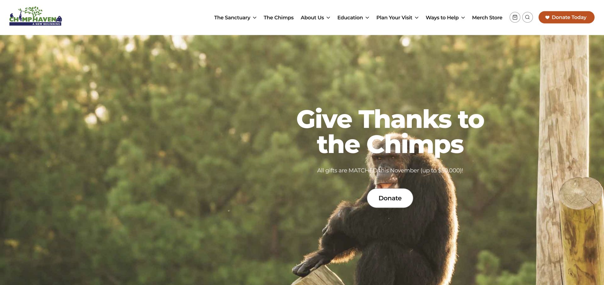
Chimp Haven opens with a seasonal matching campaign over a chimpanzee photograph while retaining Sanctuary, Chimps, Education and Plan Your Visit in the header. Below, its mission and resident profiles provide the evergreen context the campaign does not supply. Support, merchandise and visiting are kept as distinguishable destinations.
What you can learn
A campaign can lead the homepage without replacing the organisation’s basic structure. Keep permanent information visible and date campaign conditions clearly so the page remains useful after the appeal ends.
Pros
The primary navigation retains resident, education and visitor information.
Resident profiles add individual stories beyond the campaign headline.
Cons & considerations
The opening campaign does not explain the sanctuary fully to a first-time visitor.
Copy over detailed photography needs reliable contrast across every selected image.
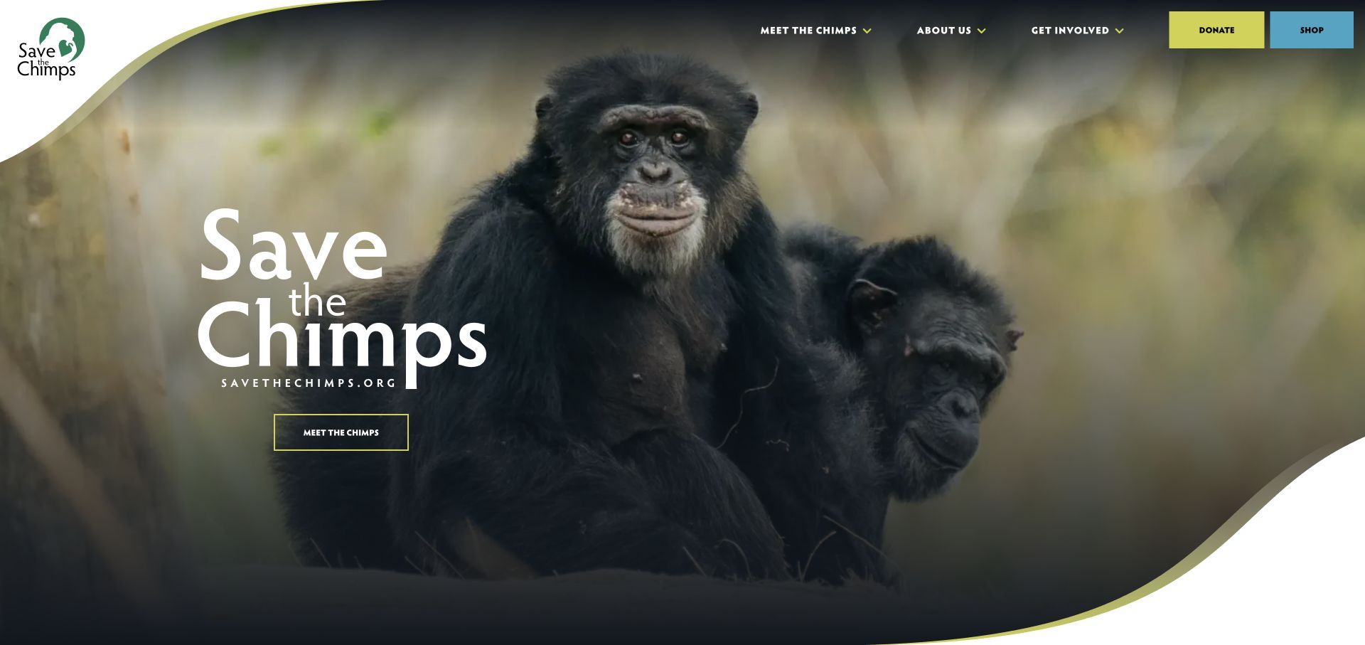
Save the Chimps uses curved white framing around a full-width chimpanzee photograph and a short route to meet the residents. Only a few main navigation groups compete with Donate and Shop. Its mission, care explanation and resident spotlight follow below, providing a more detailed path than the minimalist opening screen.
What you can learn
Use a restrained hero to invite exploration, then ensure the next section explains the organisation rather than repeating the slogan. Keep donation appeals dismissible so they do not prevent that introduction.
Pros
Meet the Chimps is a specific and understandable first action.
A resident spotlight connects the wider mission with an individual story.
Cons & considerations
The first screen needs a plain contextual explanation for visitors arriving without prior knowledge.
Large fundraising modals interrupt the otherwise focused route into the site.
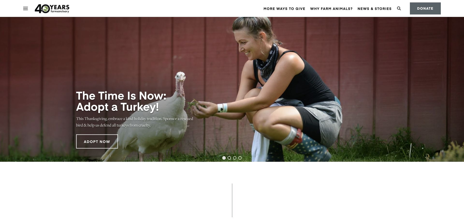
Farm Sanctuary uses a restrained header, a large seasonal photograph and clearly framed campaign action. The homepage then separates rescue, education and advocacy and presents rescued-resident stories as editorial content. Its visible structure connects current campaigns with a broader publishing system rather than treating the homepage as a single permanent fundraising poster.
What you can learn
Create reusable editorial routes for different kinds of work. Rescue stories, educational material and advocacy actions should have their own identities, dates and destinations instead of being mixed into an undifferentiated news feed.
Pros
Rescue, education and advocacy have separate content destinations.
Resident stories provide a repeatable format for ongoing updates.
Cons & considerations
Some important routes are behind a mega-menu rather than directly visible.
Carousel campaigns need clear current states and a plan for retiring expired appeals.
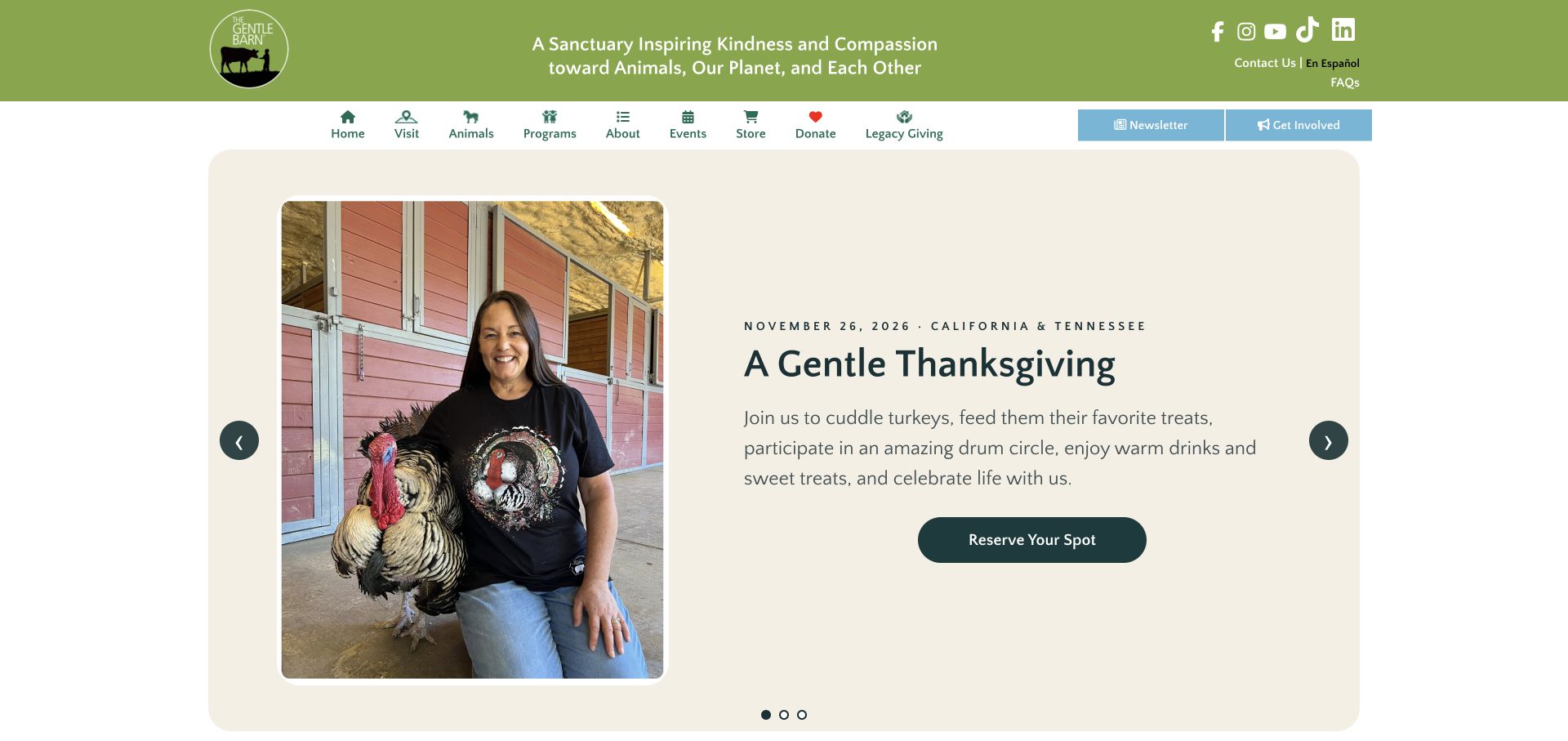
The Gentle Barn uses a contained split panel rather than a full-bleed slogan: a person with a turkey sits beside a dated event, location information and a reservation action. Its icon-assisted navigation distinguishes visits, animals, programs, events and legacy giving. Supporting cards below introduce sponsorship and other routes without making the event the only option.
What you can learn
A date, location and explicit reservation label can make an event more usable than a generic Learn More button. Preserve a separate evergreen visiting route for people whose interests do not match the current promotion.
Pros
The featured event names its date and relevant locations.
Navigation labels distinguish visiting, animal profiles and programs.
Cons & considerations
Many equally weighted navigation items need prioritisation on mobile.
Program marketing language should not be mistaken for independently verified health outcomes.
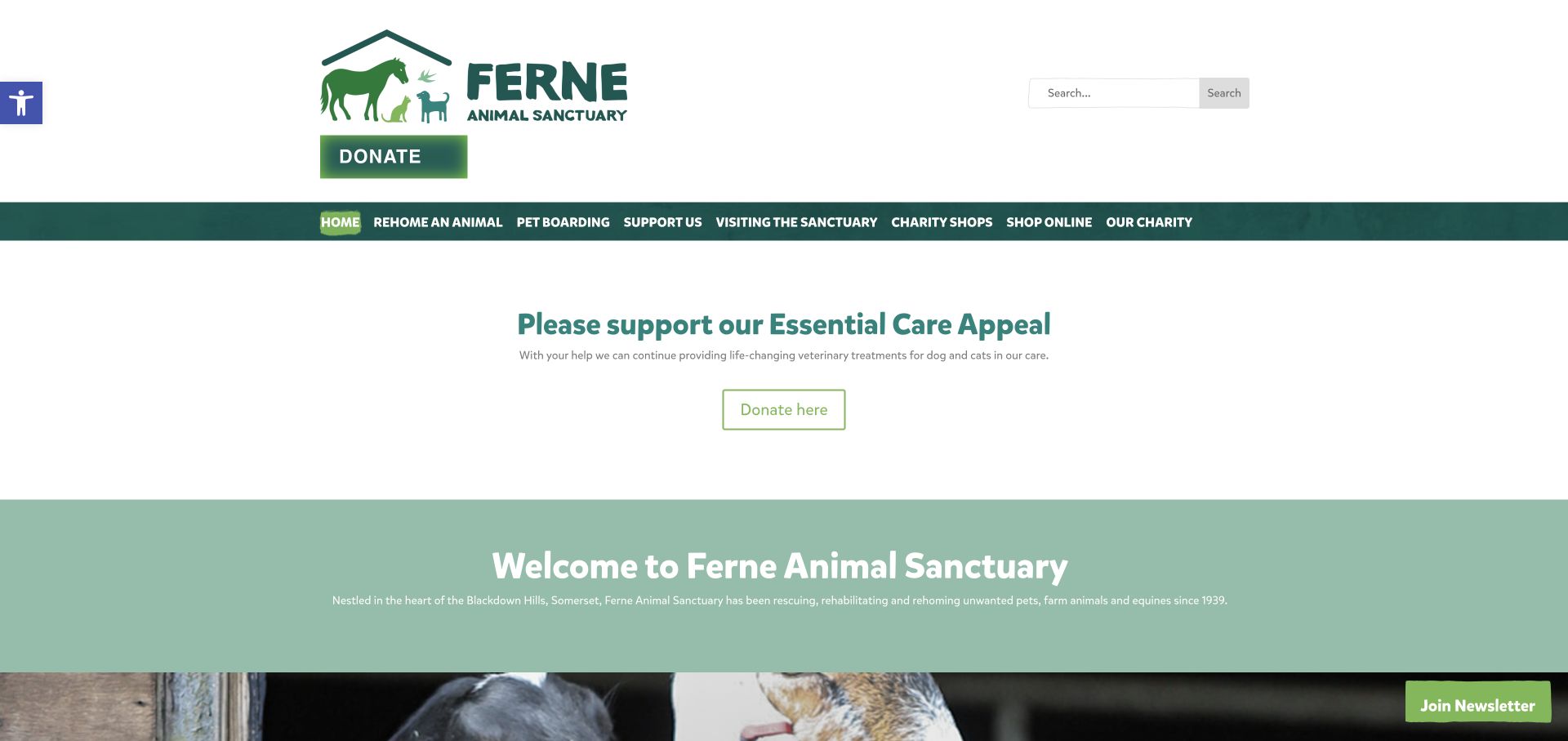
Ferne uses clear navigation labels for rehoming, pet boarding, visiting and charity shops, with a separate donation action and search. Its homepage places a specific care appeal before a welcoming sanctuary introduction. The body then explains the differences between finding a pet, planning a visit and supporting the charity.
What you can learn
When a sanctuary operates several public services, name them directly instead of grouping everything under Get Involved. Each service should explain appointment requirements and who it is intended for before presenting an action.
Pros
Rehoming and visiting are not treated as the same visitor journey.
Search and practical service labels help people with a specific task.
Cons & considerations
The tall header and generous appeal spacing postpone the resident imagery.
A large set of services can compete with the central sanctuary mission.
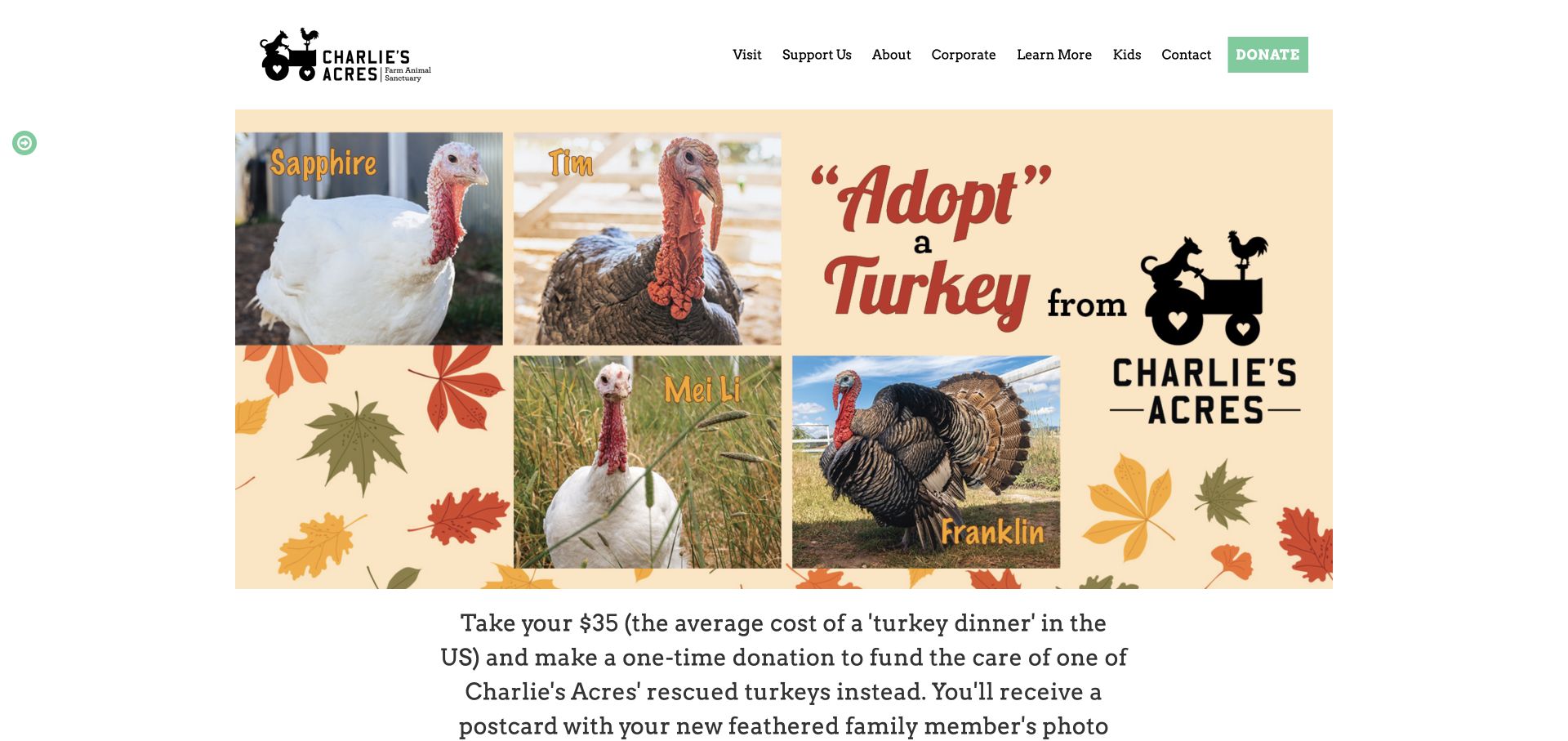
Charlie’s Acres gives its seasonal turkey appeal a large illustrated panel with named animal photographs. A compact white header retains visiting, support, corporate and learning destinations. The page explains what the sponsorship supports and then returns to the mission and dated outside coverage, rather than relying solely on the campaign graphic.
What you can learn
Name the animals and explain what a symbolic sponsorship means. Campaign graphics should supplement readable text and preserve enough evergreen navigation for people who are not ready to contribute. A named turkey makes the appeal specific, but its illustration should not carry the sponsorship terms alone. Preserve a readable explanation when the seasonal graphic is replaced.
Pros
Named resident photographs make the seasonal appeal concrete.
The header retains visits and learning beyond the current campaign.
Cons & considerations
Large graphic-led campaigns need equivalent readable text and sensible mobile crops.
An unsolicited newsletter modal interrupts the initial explanation.
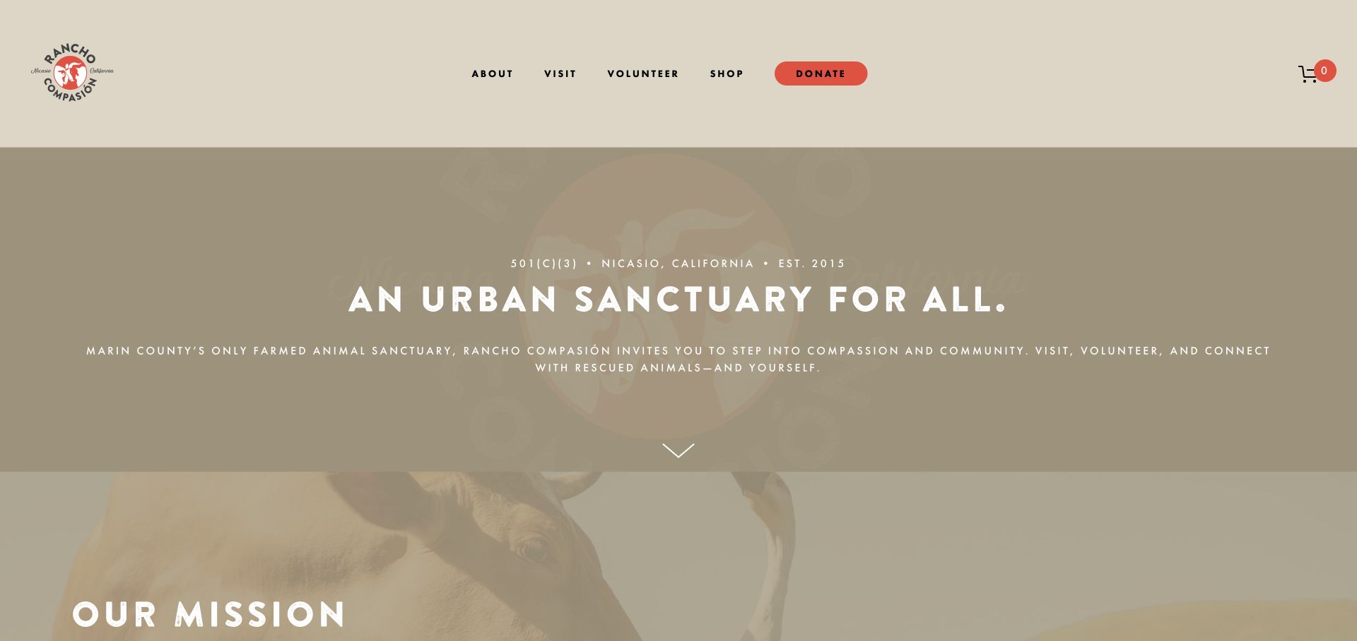
Rancho Compasión uses a muted warm palette, a concise regional introduction and a limited set of main actions. Visit and Volunteer sit alongside a contrasting donation button. The homepage connects its Nicasio setting with events, the resident farmily and youth programs, while its contact and visitor-FAQ routes offer practical context.
What you can learn
Tie the visual identity to the actual place, then name the participation routes. A friendly brand voice works best when visitors can still establish scheduling, access conditions and the distinction between tours and volunteering.
Pros
Visit and Volunteer are visible without opening the donation journey.
Resident and youth-program routes broaden the introductory mission.
Cons & considerations
The very muted opening image needs sufficient contrast behind long text lines.
Seasonal event announcements need prompt updates after their dates pass.
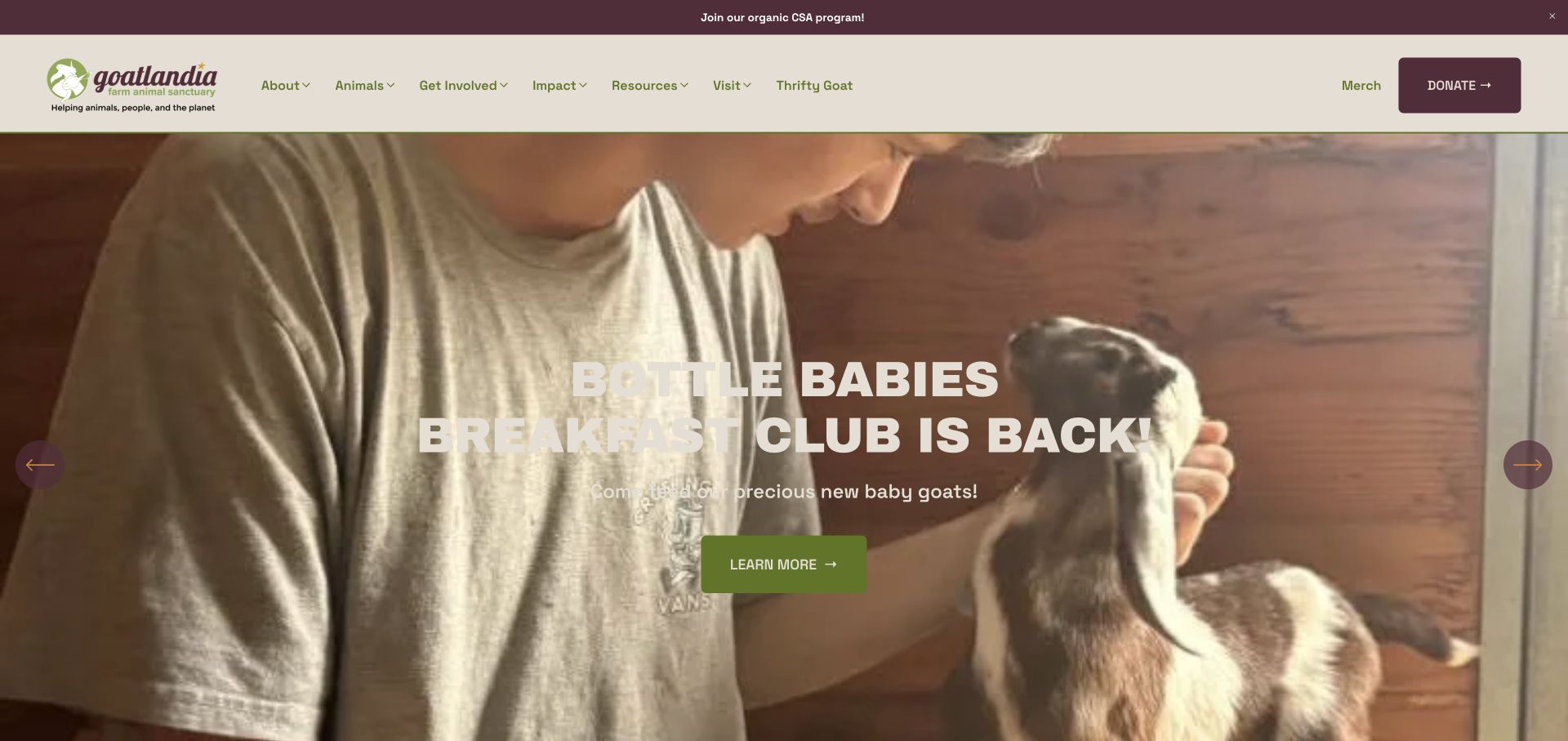
Goatlandia combines a cream-and-plum identity with a photographic carousel of specific activities. The observed slide promotes a baby-goat event, while navigation separates animals, impact, resources and visiting. Below, its mission explains the connection between rescue, community and plant-based food, with different routes to experiences and support.
What you can learn
Use specific activity invitations to explain how the broader mission works in practice. Keep the invitation’s conditions and scheduling visible so an appealing photograph does not imply unrestricted animal access. The event route should carry the actual visit conditions, not leave them to inference from the baby-goat photograph. Keep the enduring mission separate from temporary availability.
Pros
Activities have named destinations rather than one generic participation button.
Impact and Resources are separated from visit and donation routes.
Cons & considerations
Text over light clothing in photography can lose contrast.
A carousel should not be the only place an important current event is discoverable.
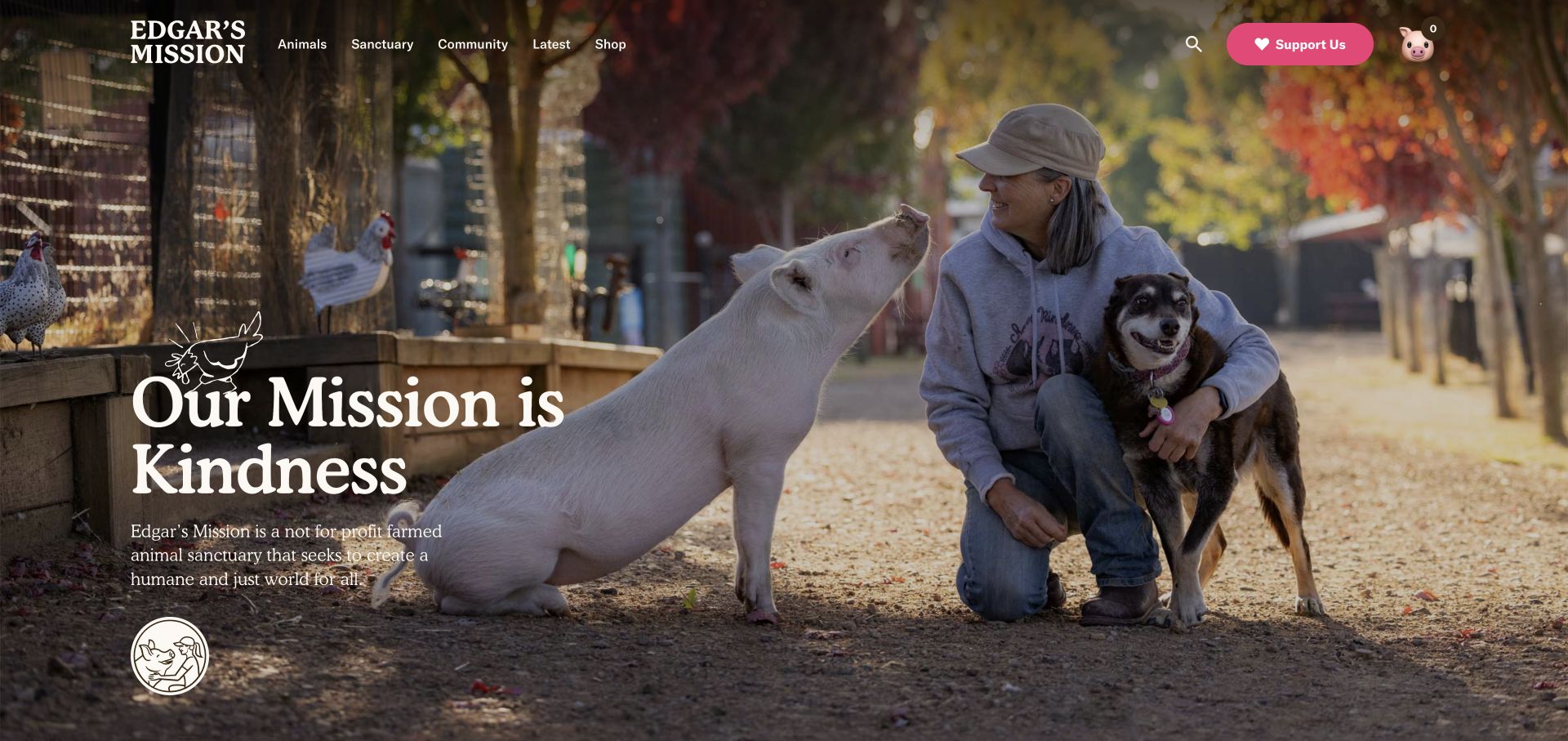
Edgar’s Mission uses an actual human-and-animal photograph, expressive serif type and hand-drawn details to establish a warm identity. Animals, Sanctuary, Community and Latest provide concise entry points, with support visually separated in pink. Sanctuary updates distinguish tributes from other stories, while visiting and accommodation appear as their own destinations.
What you can learn
Make the editorial vocabulary specific enough to handle different kinds of animal stories. A tribute, a rescue update and a visitor offer have different reader expectations and should not be indistinguishable cards.
Pros
Story categories explain the tone and purpose of different updates.
The compact navigation leaves room for a strong photographic introduction.
Cons & considerations
The mission-led hero needs a readily identifiable practical visiting route below.
Decorative lettering and photography require careful responsive contrast checks.
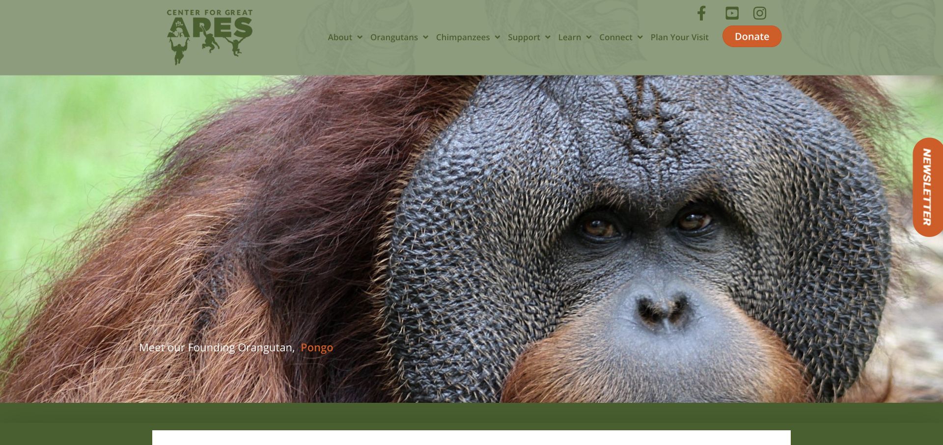
The Center for Great Apes opens with a close image of Pongo and a link naming the resident. Orangutans and Chimpanzees receive separate navigation destinations, while planning a visit is distinct from support. The mission explanation follows the photograph, and further content distinguishes animal profiles, education and ways to contribute.
What you can learn
Introduce residents as individuals while preserving the context a first-time visitor needs. Separate species directories can be useful, but should lead to substantive profiles rather than merely a visual gallery.
Pros
The photograph is connected to a named resident and profile route.
Plan Your Visit remains separate from donation and species information.
Cons & considerations
A very large close-up postpones the organisation’s purpose on smaller screens.
A newsletter edge tab should remain unobtrusive and keyboard usable.
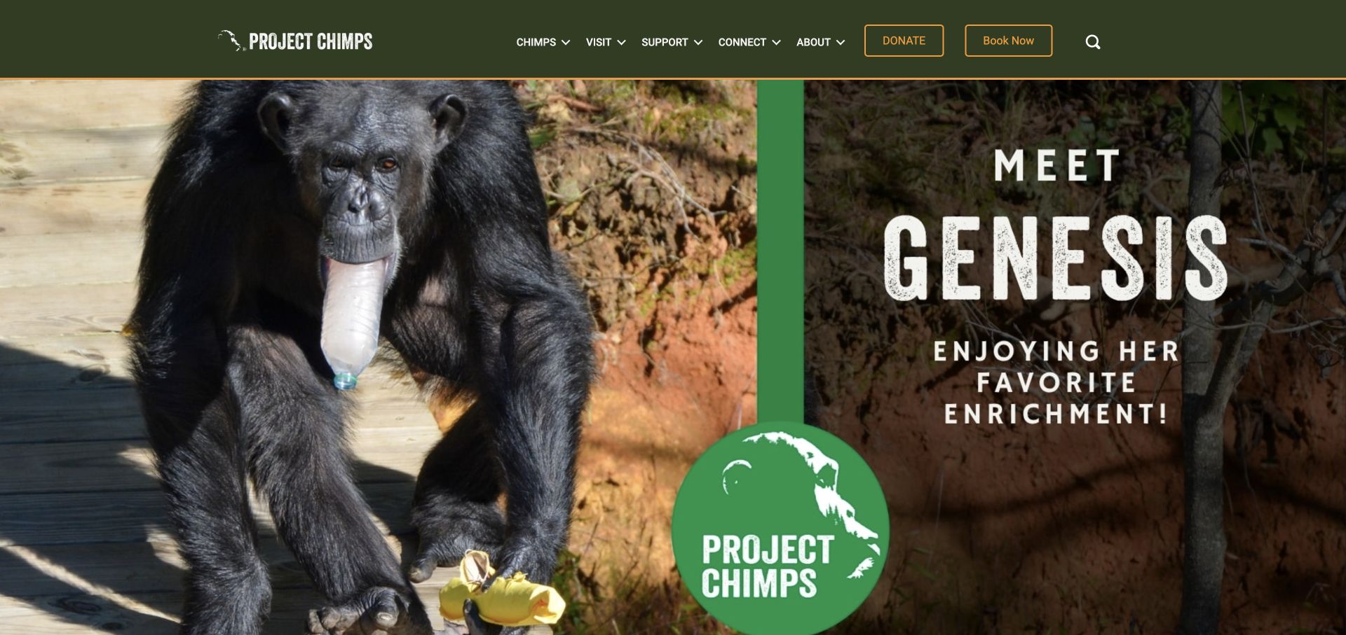
Project Chimps uses a resident image and a named enrichment activity as its large homepage introduction. A dark-green header separates chimps, visits, support and organisational information, with distinct Donate and Book Now actions. The content below adds featured activities, a care mission and a directory route to meet more residents.
What you can learn
Show a specific everyday activity rather than only abstract impact language. Explain booking conditions and the visitor offer before taking someone into a reservation system, particularly when sanctuary access is controlled.
Pros
The resident introduction shows a specific activity and names its subject.
Donate and Book Now are visibly different actions.
Cons & considerations
The graphic hero’s text needs a proper readable equivalent on the page.
Large introductory imagery delays essential explanation of the booking offer.
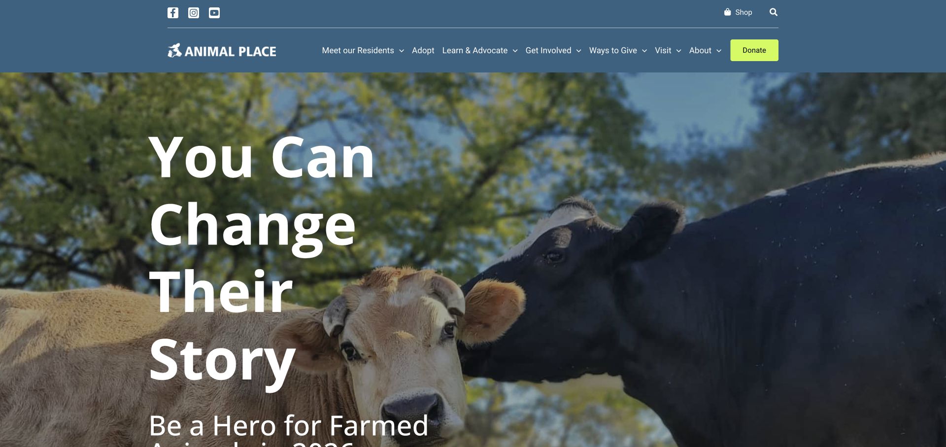
Animal Place uses a strong blue header and lime donation accent above a photograph of cattle. The page links separately to residents, adoption, learning, involvement and visiting. Current advocacy and sponsorship material appear below the broad hero, while editorial content includes an explicit warning when linked material may be graphic.
What you can learn
Separate resident care, adoption and public advocacy into recognisable journeys. Content notices should explain the nature of difficult material before someone opens it, rather than making every page equally confrontational. Preserve the distinction between learning about advocacy and arranging a visit or adoption. A content warning should qualify its destination without obscuring those separate practical routes.
Pros
Adoption and visiting receive distinct primary navigation labels.
An explicit content note adds context to potentially distressing linked material.
Cons & considerations
The oversized multi-line slogan pushes explanatory copy outside the first screen.
Several simultaneous campaigns can dilute the main introductory message.
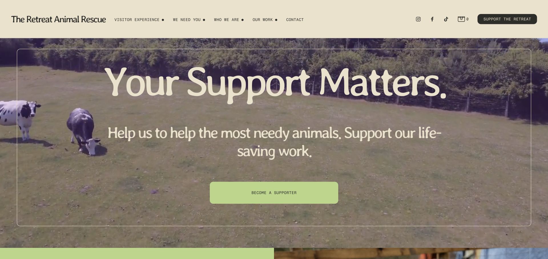
The Retreat uses warm cream, informal typography and footage of animals in an open setting. Its header names visitor experience and support separately, while the main action invites ongoing support. Lower on the page, items such as hay and veterinary supplies give the fundraising request tangible examples, followed by volunteer and contact information.
What you can learn
Explain ordinary operating needs in concrete language without turning the entire sanctuary into a shop. Keep symbolic contributions distinct from literal goods purchases and make support terms clear before checkout.
Pros
Specific operational needs provide context for the general support request.
The header distinguishes visiting, the organisation and its work.
Cons & considerations
The support-first opening needs practical visit conditions nearby.
Background footage and decorative type require a useful still and readable text treatment.
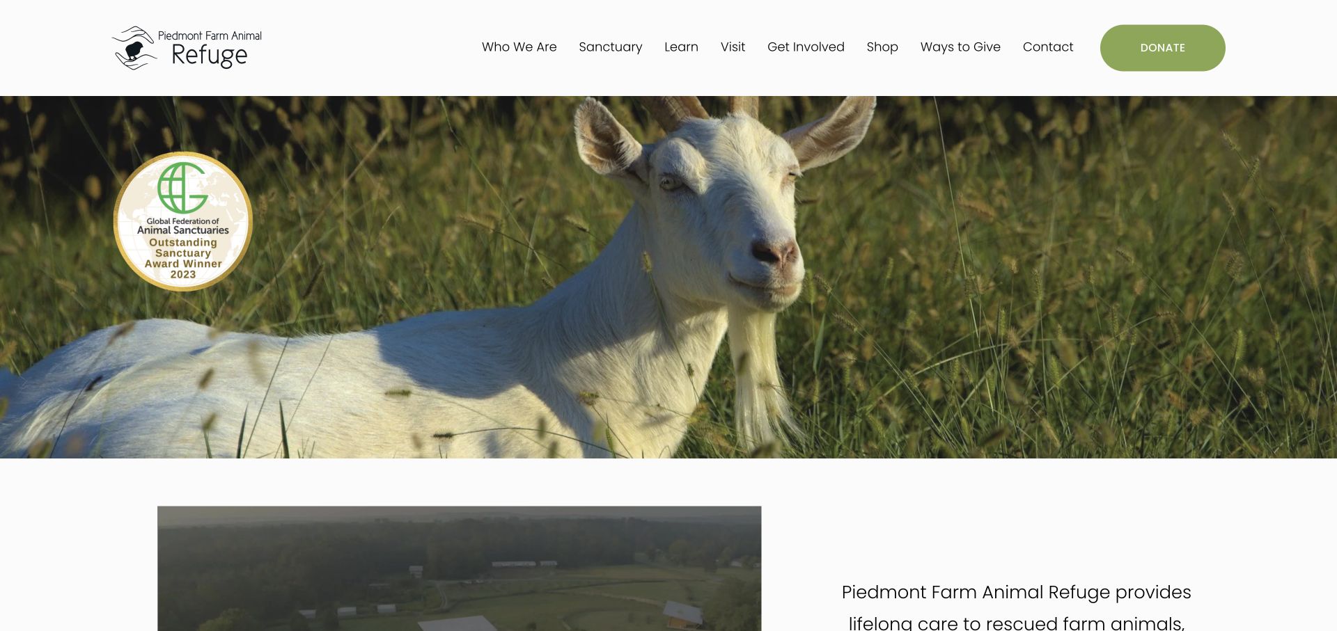
Piedmont uses a quiet white header, olive donation action and large goat photograph. Its homepage follows the image with a mission statement and video, then presents events and resident profiles grouped by species. The content also gives animal-centered design its own destination rather than treating the sanctuary’s facilities as an unexplained backdrop.
What you can learn
Follow the emotional image with a clear explanation of the organisation’s work. A useful resident directory can coexist with educational material about why the physical environment is arranged as it is.
Pros
Species groupings provide a repeatable resident discovery pattern.
Animal-centered design receives a dedicated educational route.
Cons & considerations
The opening image alone gives little orientation before the mission appears.
Embedded videos need captions and text context rather than being the sole explanation.
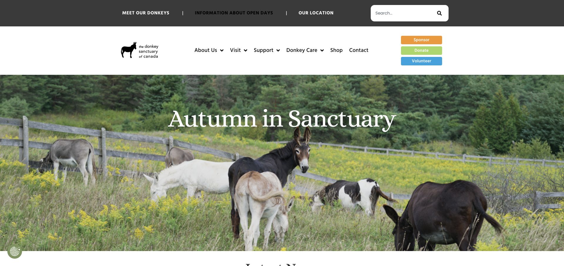
The Donkey Sanctuary of Canada gives open days, resident discovery and location their own utility links. Sponsor, Donate and Volunteer appear as three separately colored actions beside the main navigation. A seasonal donkey photograph establishes the setting, while current news introduces sponsorship and community work events.
What you can learn
Put scheduled opening information and the actual location close to the beginning of the visit journey. Distinguish symbolic sponsorship from volunteering and donations in both wording and layout, not with color alone. Open-day links should resolve into maintained dates and access details before the support choices take over. A seasonal image can set the tone without establishing when the public may arrive.
Pros
Open-day information and location have explicit header links.
Sponsor, Donate and Volunteer remain separate named choices.
Cons & considerations
Two navigation levels and three action colors can make the header busy.
The seasonal hero needs an evergreen explanatory sentence nearby.
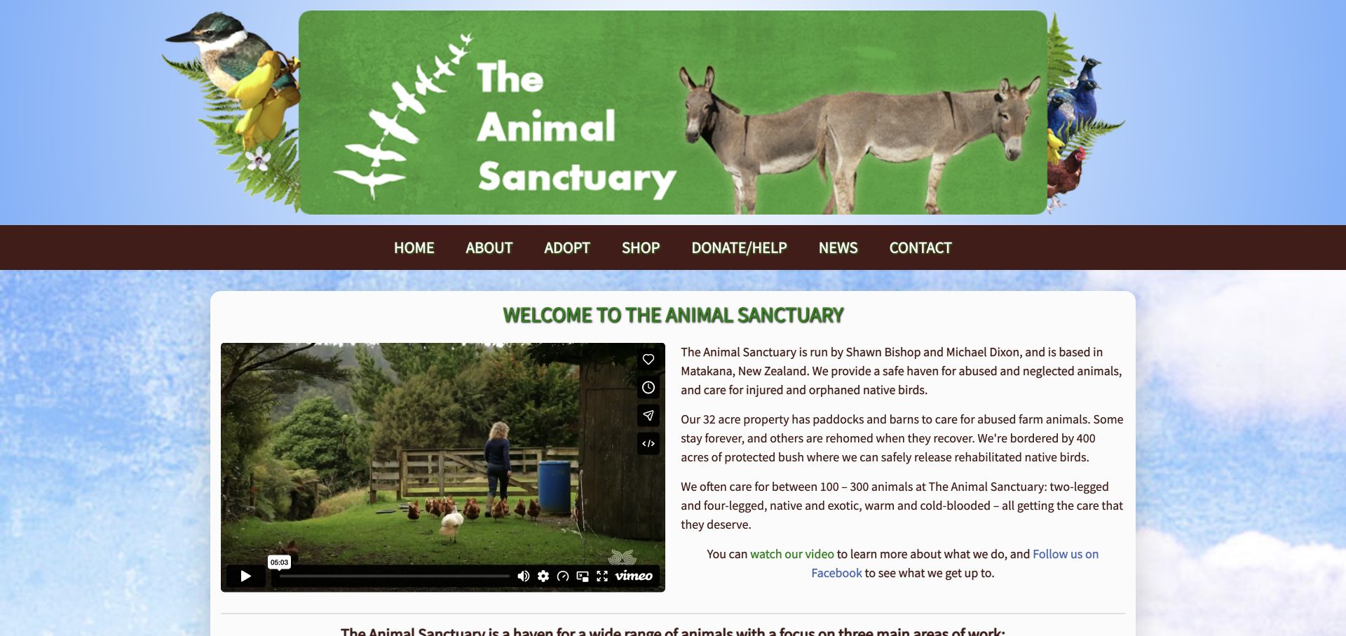
The Animal Sanctuary in New Zealand uses an illustrated banner above a plain two-column introduction with a real video preview. Its text identifies the operators and Matakana setting, then distinguishes permanent refuge, hen rehoming and native-bird rehabilitation. A recurring-support explanation later makes clear that general public access is restricted.
What you can learn
State the different kinds of care precisely. A permanent sanctuary, an adoption service and wildlife release are not interchangeable, and a straightforward explanation can be more useful than an elaborate animated introduction.
Pros
The three care categories explain materially different work.
The page identifies people and place rather than relying only on a generic brand story.
Cons & considerations
The tall illustrated banner uses space before the useful explanation.
The logo links to Facebook rather than functioning as a conventional home link.
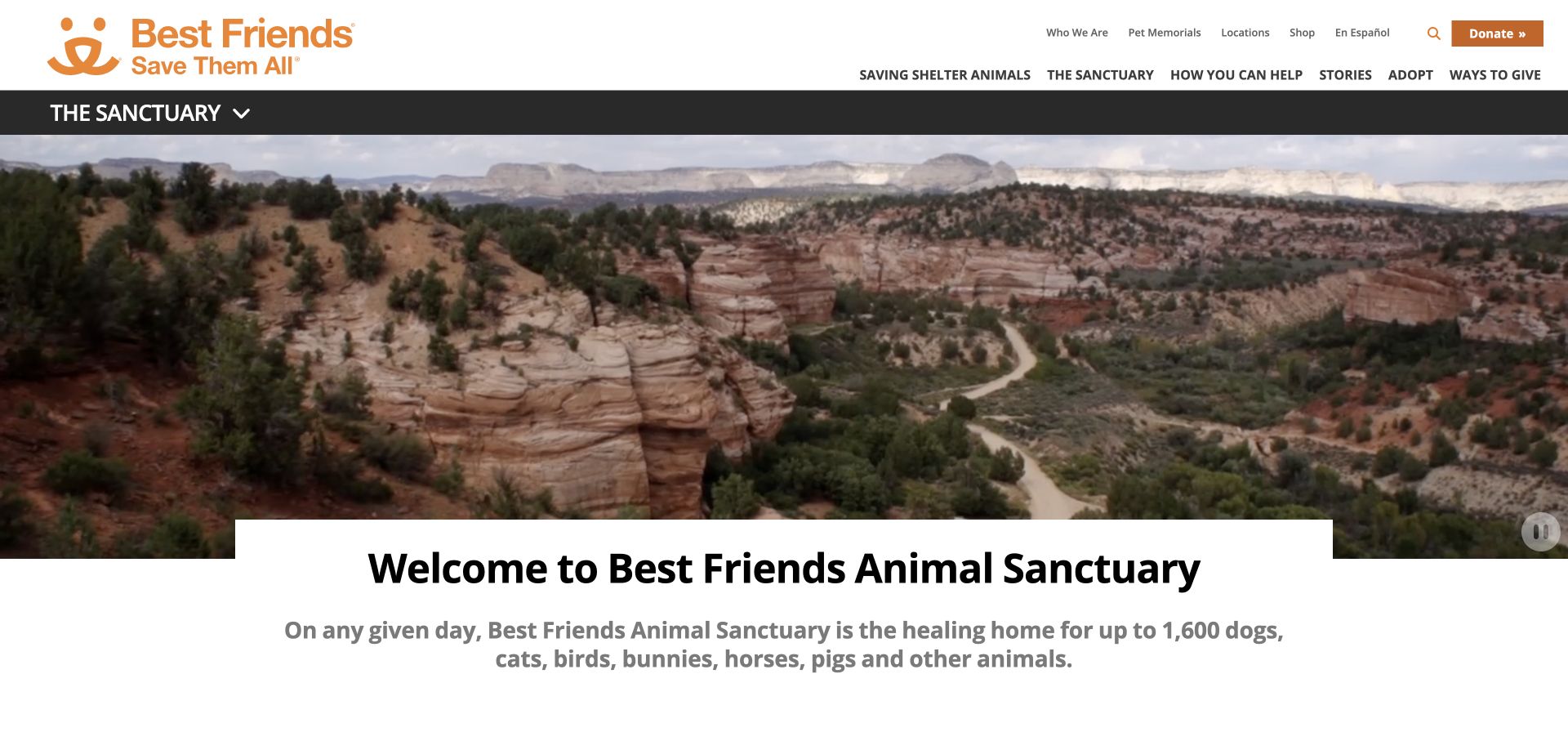
Best Friends’ sanctuary landing page uses a second navigation band to distinguish the physical Utah destination from the organisation’s broader work. A landscape video is followed by a direct sanctuary introduction, a visit-planning link and an area-by-area directory. Dogtown, Cat World and other named care areas provide smaller, understandable entry points.
What you can learn
A large organisation can give a physical destination its own information architecture. Use place-specific navigation and an area directory so visitors do not confuse national campaigns with what they can do at one location.
Pros
A dedicated sanctuary navigation distinguishes the destination from national work.
Named care areas make a large site easier to explore in smaller parts.
Cons & considerations
Multiple navigation bands can consume significant mobile space.
The scenic opening needs resident and practical access information immediately below.
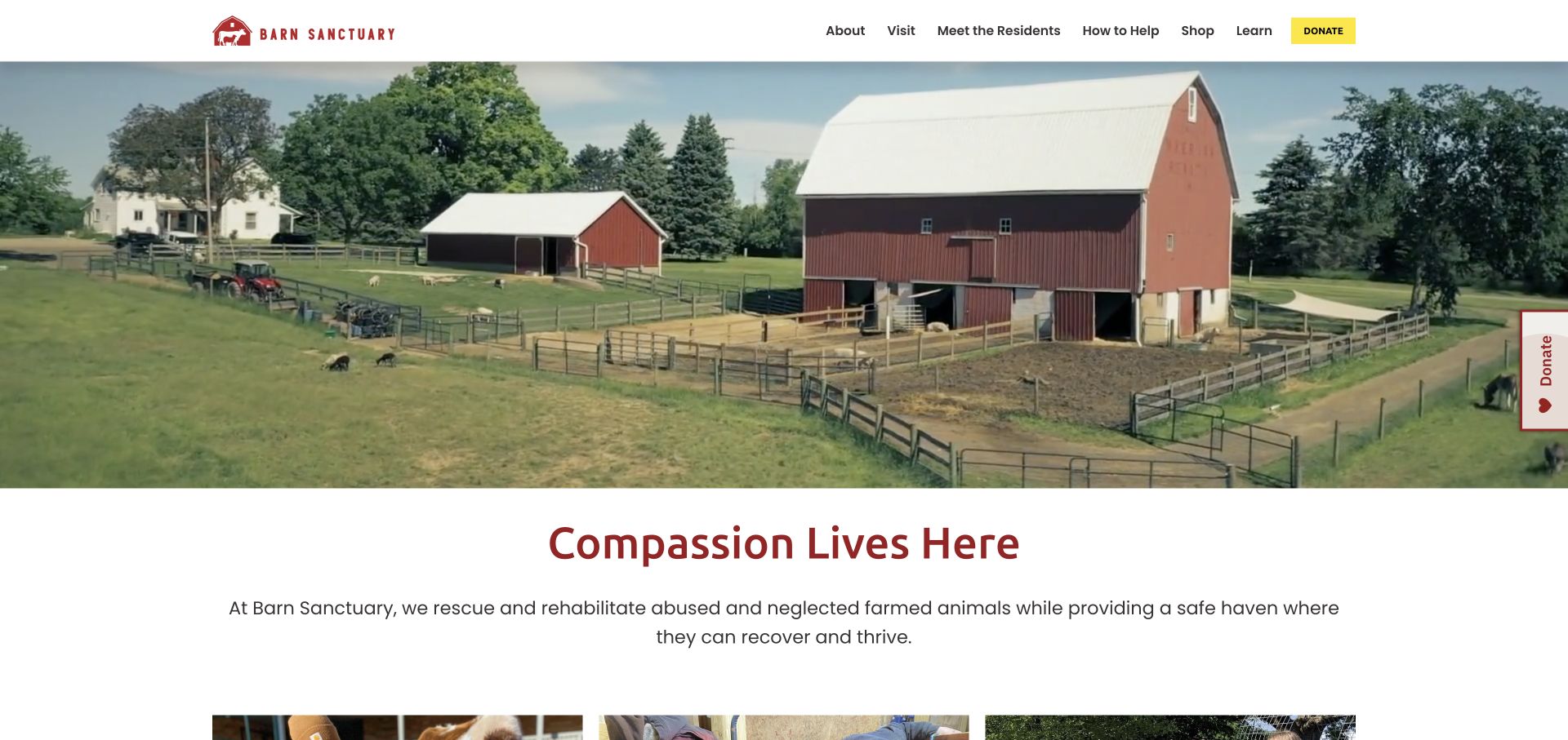
Barn Sanctuary uses footage of its actual grounds followed by a concise mission heading and explanation. A compact header separates visiting, resident profiles and ways to help. The body names rescue, rehabilitation and education as different activities, and the visiting section explains that tour types and availability vary by season.
What you can learn
Make the place visible without relying on footage to explain the work. Put seasonal access and booking requirements directly into visitor copy, and preserve individual resident profiles as a separate low-pressure exploration route.
Pros
The mission explanation follows the grounds footage in the same page flow.
The visiting section states seasonal and advance-planning conditions.
Cons & considerations
An opening fundraising modal can obscure the otherwise straightforward introduction.
Moving footage should have a stable fallback and accessible pause control.
Kegan is a freelance web designer and developer with 15+ years of experience helping businesses turn complicated website requirements into clear, maintainable digital experiences. He works directly with clients from planning and design through development, launch, and ongoing support.
For animal sanctuary website design, his development approach focuses on individual animal stories, clearly stated welfare work, accurate visit and volunteering information, and transparent support and adoption-style sponsorship journeys. The scope can be a targeted improvement or a complete custom build, with responsive layouts, thoughtful content structure, and integrations chosen around the people using and maintaining the site.
Show 3 other animal sanctuary website designersHide other animal sanctuary website designers
Plan an animal sanctuary website around real responsibilities
1. Separate care, rehoming and public participation
Begin with a short service and policy inventory written with the people doing the work. Which animals can the organisation help? Which residents are permanent? Does it arrange adoptions, handle wildlife emergencies or offer advice only? These distinctions determine navigation and enquiry routing. Do not let a generic rescue button imply unlimited intake capacity.
Map at least four visitor tasks: understand the sanctuary, learn about a resident, plan an authorised visit and offer support. Add adoption or emergency routes only when the organisation actually provides them. Each route should state eligibility, limitations and the next step before asking for a detailed form.
Publish restrictions in ordinary language near the action they qualify. Someone booking a tour needs to know about scheduling, terrain, children, dogs, food rules and cancellations. Someone seeking emergency help needs the correct service and its current operating hours. Do not promise emergency monitoring merely because an inbox exists.
2. Build resident stories as durable records
Give every resident a stable page identity with an accurate name, species, photograph credit and editorial owner. A short introduction can explain how the animal arrived without making distress the only reason to care. The story should respect the individual and avoid inventing thoughts, outcomes or a recovery timeline that has not been documented.
Use separate states for current residents, animals available for adoption, transfers and memorials. Keep existing links working when a status changes. A sponsorship page should clearly explain whether a gift is symbolic, how funds are used and whether it includes updates or a physical package. Never imply that a donation purchases ownership of the animal.
Decide who can update sensitive stories and how corrections are handled. Keep source records and image permissions outside the public content system. Provide relevant content notices before difficult photographs or descriptions, and offer a readable summary so visitors do not have to view distressing material to understand the work.
3. Design support journeys without overwhelming visitors
Choose one primary support action and a small number of clear alternatives. A recurring donor, a volunteer and a person offering supplies need different information. Present the commitment, any eligibility requirements and the expected next step. A specific operational need can explain the appeal, but should not suggest a restricted allocation unless that is actually how the gift is administered.
Keep campaign content in reusable dated fields rather than baking it into permanent imagery. Record the campaign owner, start and end dates, target wording and fallback. After an appeal closes, replace the action with a current destination or an honest outcome, not an expired deadline. A fundraiser must not make visiting information disappear.
Review the complete donation journey, including the external provider if one is used. Explain recurring frequency, currency, fees and cancellation before payment. Keep success and error states accessible and send a clear receipt where appropriate. Do not auto-enrol someone in unrelated marketing or imply that a button click has already made a donation.
4. Make everyday maintenance part of the design brief
Assign responsibility for visiting hours, events, resident status, contact routing and donation destinations. A visually polished site with an obsolete booking link is not a good handoff. Give editors a small, maintainable set of page patterns and a checklist for testing important links whenever a seasonal change is published.
Prioritise readable text, meaningful link names, keyboard access, visible focus and clear form errors. Test the site with relevant assistive technologies and actual users rather than treating an accessibility toolbar as certification. Provide captions and text context for video, respect reduced-motion preferences and make imagery work at realistic mobile sizes.
Measure only the information the organisation can responsibly use and explain the privacy choices honestly. Avoid exposing surrender details, volunteer records or donor information in a public listing. Backups, access control, patching and a documented correction process matter as much as the opening photograph. The public website cannot itself prove the quality of care behind it.
The editing job behind the design
Choose technology for the sanctuary’s publishing work
A maintainable content system should support resident profiles, events, policies and reusable support actions without requiring an editor to rebuild page layouts. Choose it around real staff capacity, image management, accessibility needs and long-term ownership rather than the appearance of one example.
Donation, membership, booking and adoption systems may be separate products. Document the boundary between them, who receives each enquiry and what happens if an integration fails. A payment provider or embedded video is not evidence of the sanctuary’s underlying CMS.
Visible stack information is limited to public evidence, not a complete inventory or a recommendation of a vendor. Source captures establish the page reviewed and its actual appearance; the publisher’s separate broad technology audit supplies dated observations where verifiable. Unknown items are left out, not guessed from the design.
Our WordPress website examples offer a separate look at publishing approaches. A visible platform label is evidence for that named page, not a guarantee that the same system will suit your requirements.
Before the public launch
Animal sanctuary website planning checklist
State the species and actual scope of sanctuary work.
Separate permanent care, adoption and wildlife rehabilitation.
Publish current visit restrictions and booking requirements.
Distinguish the sanctuary address from a mailing address.
Give resident pages stable identities and accurate status.
Document photograph permissions and credits.
Explain symbolic sponsorship and recurring commitments.
Date campaigns and retire expired actions.
Keep donation and volunteer journeys separate.
Provide captions, readable text and reduced-motion support.
Test forms, external booking and donation links.
Assign an editor for policies, hours and corrections.
These checks are a project checklist, not a performance, legal, security, or accessibility certification. Test real journeys with the people responsible for the website before making claims about the result.
Sources & editorial method
How this collection was selected and reviewed
The 28 distinct source pages were reviewed and directly captured in a normal browser on November 13, 2026. Actual UTC capture times, source URLs, image dimensions and independent SHA256 records are retained privately. Optional cookies were rejected where available and normal close controls used for obstructing promotions; original obstructed or transition captures remain excluded. Reviews describe observed design and public information, not tested donation completion, welfare accreditation, accessibility conformance, service quality or verified impact. The explicit Editors Choice recognises communication choices at a regional sanctuary, not popularity or voting. Technology information depends on separately scoped public audit evidence.
Each example links to its actual source page. Screenshots are direct browser captures with their own capture dates; moving imagery, announcements and live designs can change. The notes describe observable design choices and conditional tradeoffs, not measured traffic, conversion results, service quality, or accessibility conformance.
Technology labels use public page metadata, asset evidence, or explicitly cited platform documentation. Platform documentation is not a complete current deployment audit. A component reference may be legacy or unused; it is not a complete backend inventory. Unknown stacks are omitted. These sites are editorial examples, not our client portfolio.
Written, Edited and Curated are separate editorial records, not timestamps advanced by a rebuild. Website designs and imagery belong to their owners. See our editorial standards or suggest a correction.
Questions worth asking
Animal Sanctuary website design questions
What should an animal sanctuary homepage explain first?
Identify the organisation, its location, the animals it serves and what it actually does. Then provide distinct routes to resident stories, authorised visiting and support. Do not assume all visitors already understand the difference between sanctuary care, adoption and wildlife rehabilitation.
Should every sanctuary offer a visit button?
Only if visiting is actually permitted. Some resident habitats are closed to the public or accessible on limited dates. Explain the policy directly, and distinguish a learning center or remote camera from physical access to the animals.
How should symbolic animal sponsorship work on the website?
Explain that it is a support arrangement rather than ownership or adoption, state any recurring commitment and describe what updates or items are included. Have the organisation confirm how funds are administered before making allocation promises.
Are the listed sanctuaries independently ranked for animal care?
No. This is an editorial website-design collection. Its reviews and Editors Choice concern public communication and observed design, not a welfare assessment, independent accreditation, charity rating or recommendation to donate.
Does an accessibility widget mean the website is accessible?
No. A visible toolbar is not evidence of conformance. Evaluate the actual content and journeys with appropriate manual, automated and user testing, including keyboard access, form errors, captions, focus and screen-reader use.
Borrow the information architecture: clear boundaries, honest resident stories and support choices people can understand. Build the design around the sanctuary’s actual policies and capacity, not another organisation’s promises.