A plumbing website should help someone recognize the right service and reach the right local team without having to diagnose the problem first.
A person with a current plumbing problem approaches the site differently from someone comparing a water-heater replacement or arranging ongoing work for a property. The design should acknowledge those different intentions with clear service labels, an honest coverage area and contact choices that describe what happens next.
These 18 official company websites offer references for local routing, service navigation, recognizable people and vehicles, request forms and promotional content. Several businesses provide additional home services. Their plumbing pages should still explain the department clearly. The reviews assess observable website design and content, not workmanship, licensing or the truth of advertised performance claims.
Before the examples
What makes good plumbing website design in 2026?
Name the problem in the customer’s language
Use recognizable categories such as drains, water heaters and plumbing repairs when they reflect actual services. Do not ask a visitor to identify a technical cause before making contact. Keep general help available alongside the specific categories, and distinguish a service request from a quote or replacement discussion.
Make coverage and availability concrete
State the towns or region served and explain how a visitor reaches the appropriate office. A national logo or a broad regional claim does not establish that a particular address is covered. Publish emergency or round-the-clock wording only when the actual operating process supports it, with clear instructions for the relevant contact route.
Explain the first step before collecting details
Label calling, online scheduling and callback requests accurately. A short form should say whether it requests an appointment or starts a conversation. Ask for enough information to route the request, while leaving detailed assessment to the appropriate person. Keep a useful contact alternative if an embedded booking tool fails.
The collection · 18 examples
18 plumbing websites worth studying
Compare how each site turns a broad service brand into a relevant plumbing journey. Notice the tradeoff between offers, service detail and the amount of work a visitor must do before reaching the local team.
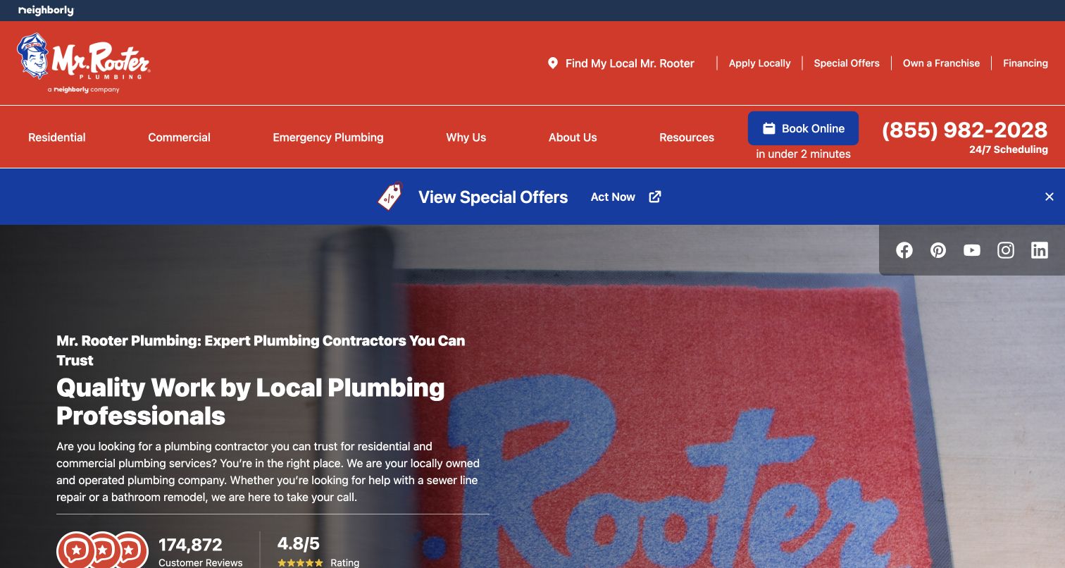
Mr. Rooter places its mascot, phone route and online booking high in a layered red header, then uses a technician photograph to make the service tangible. Residential, commercial and emergency labels help people enter by situation. The local finder is especially relevant for a national plumbing company: the brand can reassure a visitor, but the next useful answer is which office serves their home. Offers and review signals occupy substantial space, giving the page a busy retail character. The example shows how a recognizable identity can coexist with practical service navigation, although a small independent firm would need much less navigation.
What you can learn
Put coverage checking before a long request form. Keep urgent plumbing help, planned projects and commercial inquiries recognizable, and make the result identify the actual local team rather than returning visitors to another generic brand page.
Pros
The service labels distinguish residential, commercial and urgent needs.
Phone and online routes are visible without scrolling through company history.
Cons & considerations
Several header layers compete with the main introduction.
National reassurance still requires a separate local service check.
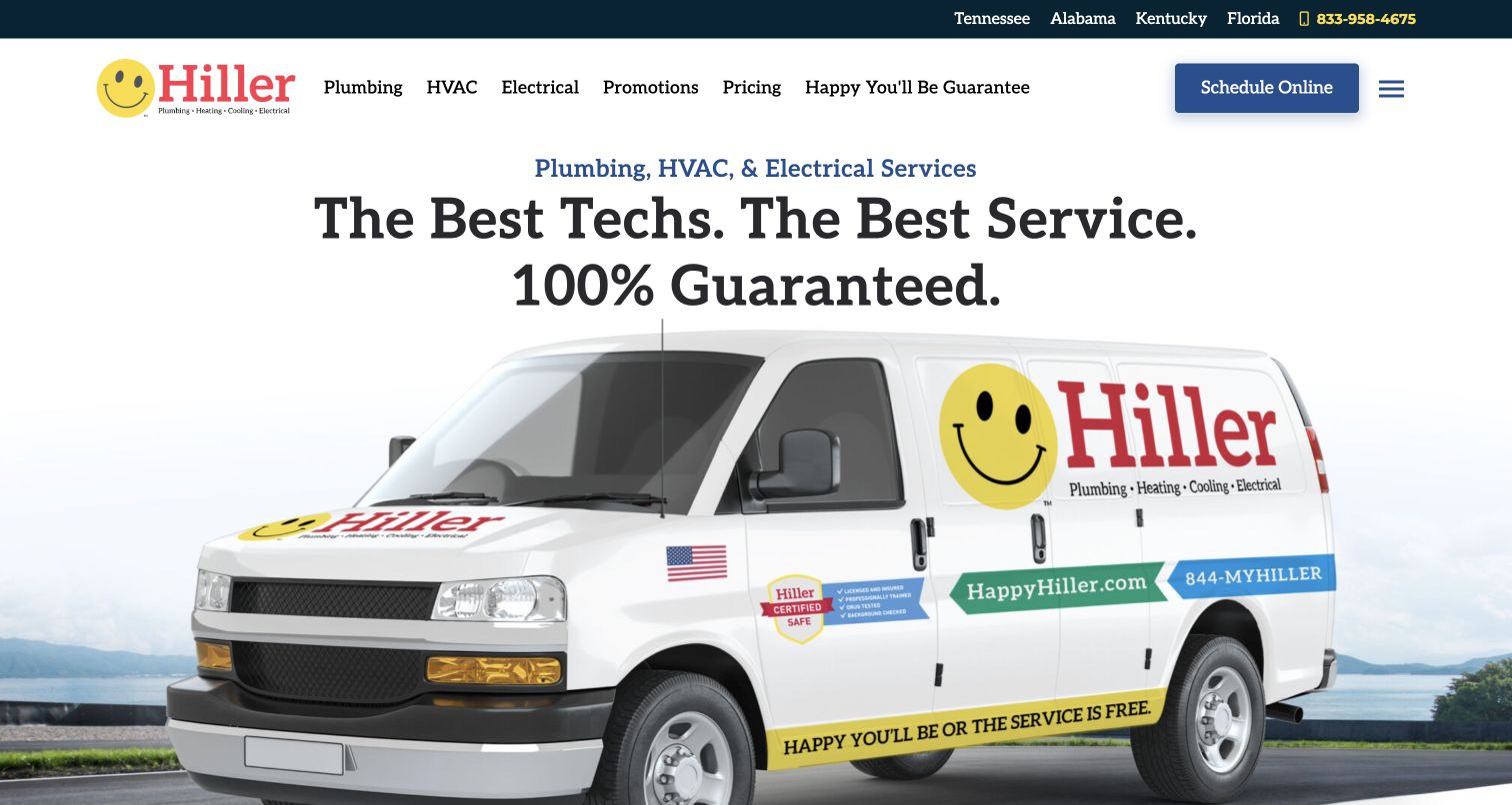
Hiller combines a smiling brand mark with a large service-van image and a bright blue scheduling action. Plumbing remains a first-level navigation choice beside HVAC and electrical, so the broader company identity does not erase the original visitor need. State links provide an early coverage clue, while pricing and promotions receive their own navigation entries. That is a useful combination for someone comparing a plumber: scope and process are easier to find than if everything sat under Services. The light composition feels approachable, though the large vehicle treatment uses space that could answer a specific plumbing question sooner.
What you can learn
Use recognizable team or vehicle imagery to establish continuity, then let plain labels do the practical work. A plumbing visitor should reach relevant services, coverage and pricing explanations without interpreting a broad home-comfort slogan.
Pros
Plumbing is a direct main-menu choice.
Pricing and coverage receive explicit routes.
Cons & considerations
The broad brand hero provides limited problem-specific detail.
Promotions create an additional decision beside scheduling.
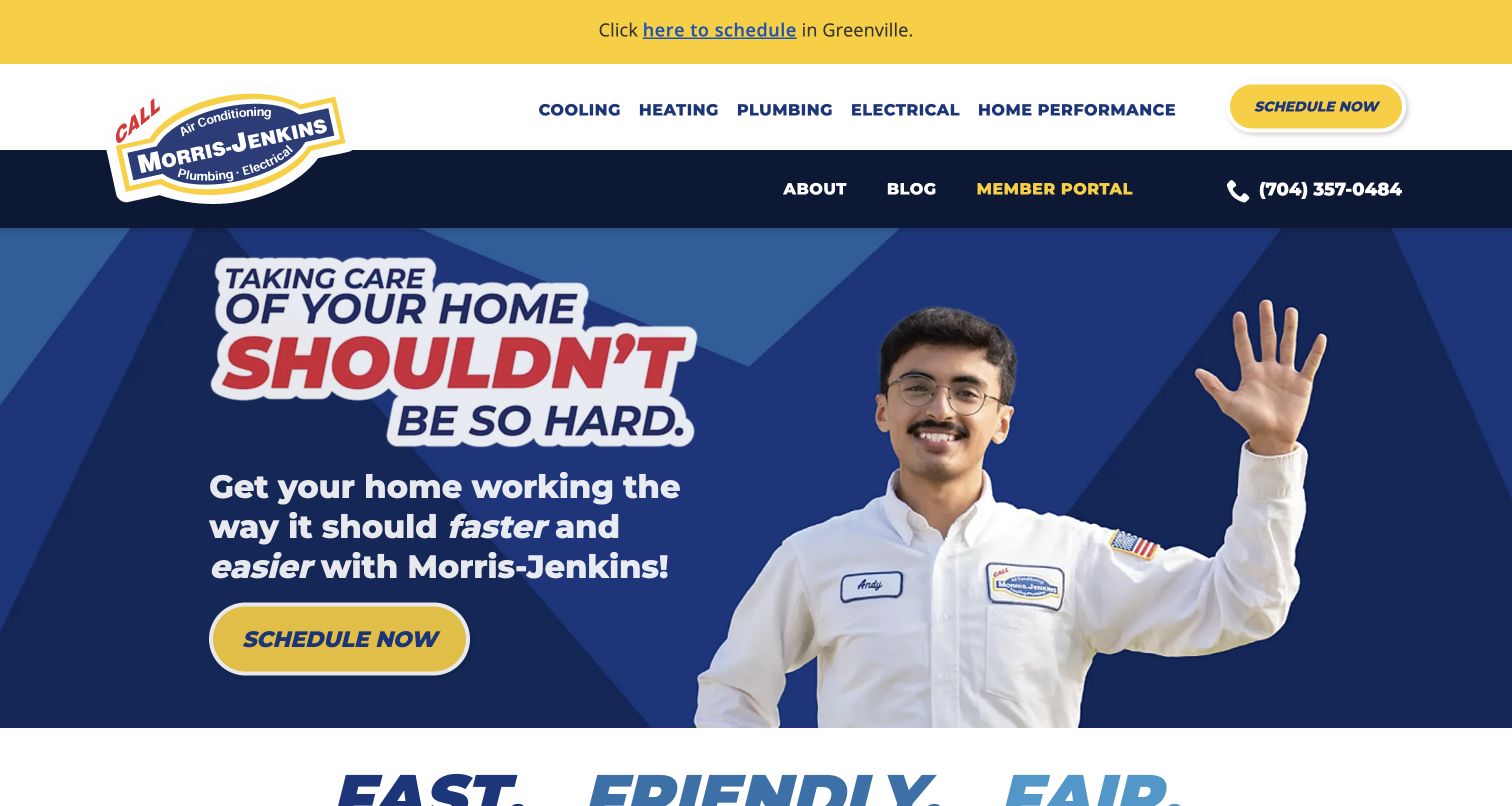
Morris-Jenkins uses a waving technician, a blue background and a yellow scheduling button to give the homepage a conversational tone. The main message addresses the difficulty of managing a home rather than leading with a list of pipe components. Plumbing is clearly separated in the navigation, with heating, cooling and electrical alongside it. A location announcement at the top shows how regional information can be surfaced without rebuilding the hero. For a plumbing business, the approachable treatment is useful when visitors are unsure how to describe a problem. It depends on the service pages to supply the precision that the friendly introduction deliberately omits.
What you can learn
Let the first screen reassure people, but pair that reassurance with a direct plumbing route and clear coverage. Carry the same plain language into service pages so that friendly branding does not become a barrier to practical answers.
Pros
A real person and strong color contrast establish a clear focal point.
Scheduling is easy to distinguish from service browsing.
Cons & considerations
The opening message is broad across several trades.
The regional announcement adds another competing strip above the navigation.
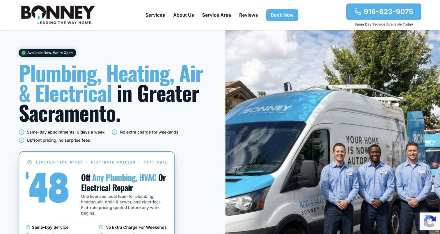
Bonney’s captured landing page uses a simple split composition: service and regional copy on the left, a team and vehicle photograph on the right. Greater Sacramento appears in the opening message, so the reader does not need to infer geography from a telephone prefix. A prominent offer card sits near the main action, while the header keeps its choices short. This is a useful reference for a plumbing campaign because it establishes who, where and how to respond quickly. The tradeoff is breadth: the same opening also advertises heating, air and electrical, and the featured offer can pull attention away from a visitor’s original plumbing problem.
What you can learn
Build a campaign page around one clear service area and an actual local team. If an offer appears above the fold, state its scope nearby and preserve an obvious route for inquiries that do not qualify for that promotion.
Pros
The region is explicit in the opening copy.
Team photography gives the compact page a concrete identity.
Cons & considerations
Several trades share the main promise.
An offer card may dominate nonpromotional plumbing needs.
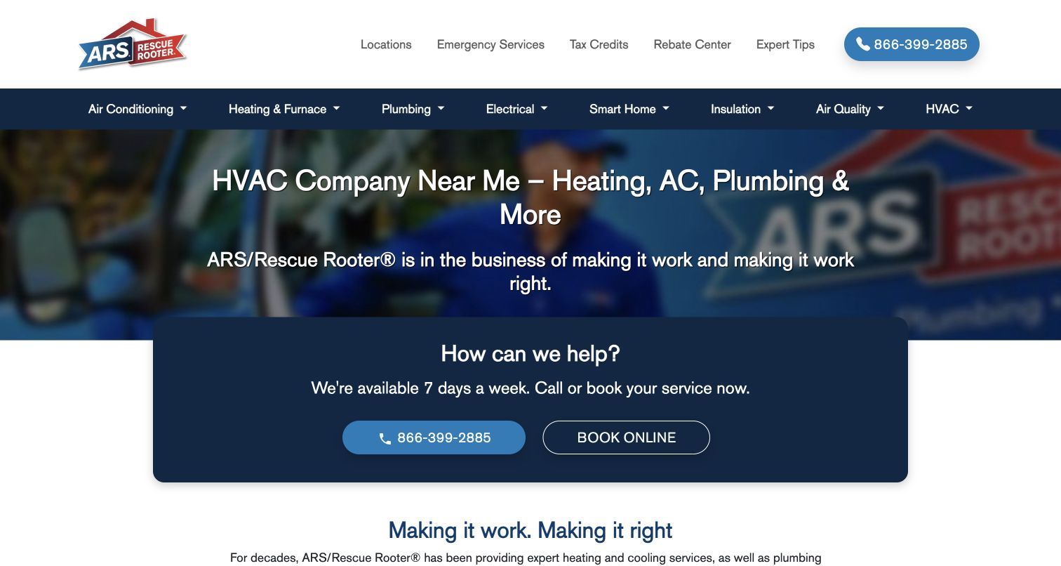
ARS places an overlapping help card in the hero, with call and online booking actions grouped together. The restrained white and blue header introduces services by recognizable home systems, and the longer page expands into more detailed categories. For plumbing, the strongest feature is the relationship between a simple first decision and the depth behind it: a reader can ask for help immediately or explore the kind of work. The blurred vehicle image supports the brand without carrying essential information. Because this is a broad home-services network, the page still needs local qualification before its service availability becomes meaningful for an individual household.
What you can learn
Make the urgent contact choice visually compact, then organize deeper plumbing information below it. Grouping the two response channels together can reduce searching, provided each route explains the next step and reaches the appropriate office.
Pros
Call and booking actions form one coherent help block.
System-based navigation supports more detailed service discovery.
Cons & considerations
The opening remains general across several trades.
A national presentation needs an additional local availability check.
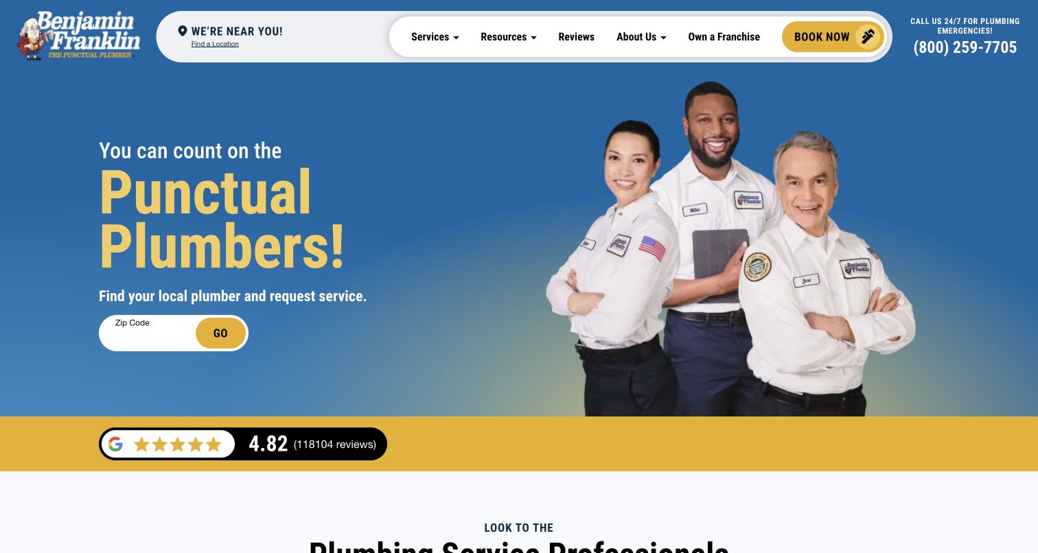
Benjamin Franklin Plumbing makes punctuality the dominant idea, pairing its blue and yellow identity with a photograph of uniformed technicians. A ZIP-code finder sits close to that message, translating a national brand promise into a practical local next step. The rounded white navigation panel separates service exploration from the stronger hero content. This is a useful plumbing reference because the positioning is easy to remember without requiring technical vocabulary. The design also demonstrates the burden a simple promise creates: visitors need clear local terms and scheduling expectations behind it. The review strip reinforces confidence visually, but its presence alone does not independently establish service quality.
What you can learn
Choose a service promise that the operation can explain and consistently support. Place the local routing action beside it, and make exceptions or terms accessible before customers interpret a slogan as a universal guarantee.
Pros
The central promise is concise and closely tied to the trade.
ZIP routing appears early in the journey.
Cons & considerations
The strong promise requires clear supporting terms.
Brand reassurance precedes detailed information about individual plumbing tasks.
Visible tech stack
Referenced on the public page
nginxReported response header
Public source checked November 3, 2026. References may be embedded or legacy—not a complete backend inventory.
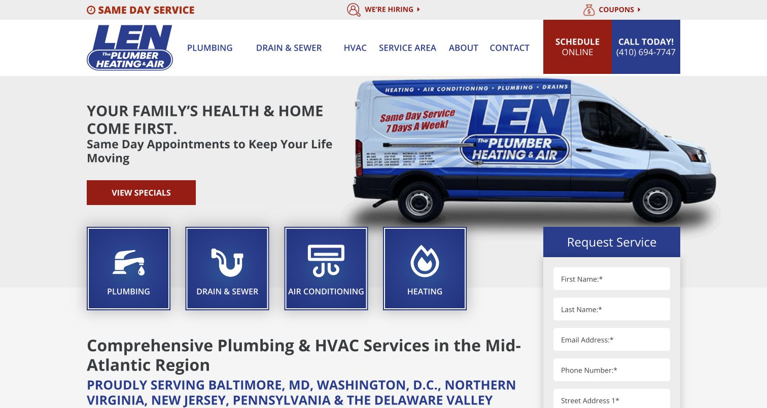
Len The Plumber pairs a branded van with a simple household-focused introduction and a visible request form. Four service tiles separate plumbing, drain and sewer work, cooling and heating. Giving drains their own entry is useful because homeowners may name a symptom rather than think in trade categories. Regional copy further down anchors the business to its actual market. The red and navy palette produces a clear relationship between brand and actions, although specials and the form compete for the same opening attention. The page is a useful study in combining direct response with enough service structure to help a visitor choose where to start.
What you can learn
Treat recurring customer language as navigation evidence. If drain problems generate a distinct class of calls, make that route explicit and connect it to the same clear intake process used by broader plumbing inquiries.
Pros
Drain and sewer work has an immediately recognizable shortcut.
The request form is visible near the introduction.
Cons & considerations
Offers compete with the form for attention.
The multi-trade layout gives plumbing only part of the first screen.
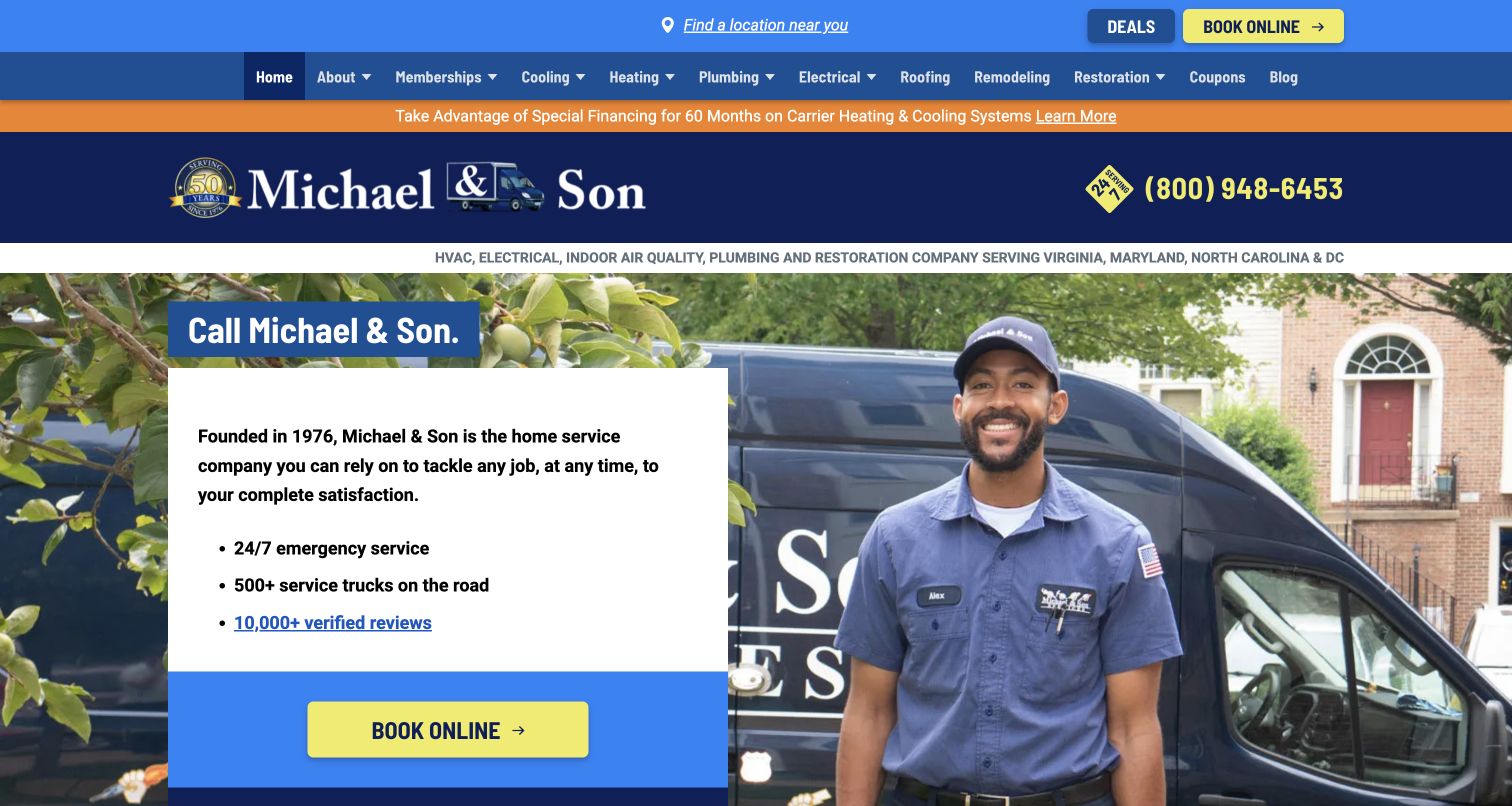
Michael & Son uses blue, orange and white layers to frame a technician and service van in a neighborhood setting. The left-hand information card combines company reassurance with a prominent booking action, while a full service navigation sits above. For plumbing visitors, the human and vehicle imagery makes the organization feel available and recognizable; the service menu then provides the more precise route. The page demonstrates how an established company can present scale without beginning with an institutional history. Its density is also instructive: badges, utility links and several colored bars ask for attention before the visitor reaches the first detailed plumbing explanation.
What you can learn
Connect broad brand reassurance to a clear service-level destination. A household photograph or fleet image is most useful when the next click answers a concrete question about the plumbing work, coverage and response process.
Pros
People and vehicles give the service business a tangible presence.
The main booking action is visually distinct.
Cons & considerations
Multiple header layers increase visual density.
The reassurance card covers the business broadly rather than a plumbing situation.
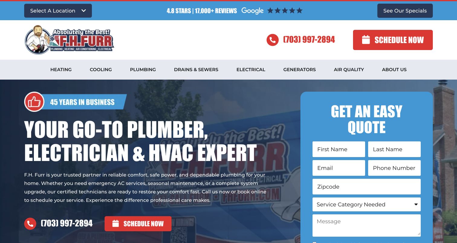
F.H. Furr puts a blue request panel directly over a branded service image, making inquiry the center of the homepage rather than a footer task. The form begins with service selection, which matters for a company spanning plumbing, HVAC and electrical work. Location selection and specials remain visible in the utility layer. This is a useful plumbing pattern when the office needs an initial category to route a request, but it should be kept proportionate to what the team truly needs before speaking with someone. The large form also reduces the amount of room available for service scope, so the surrounding copy must be especially clear.
What you can learn
Design the initial form with the people who handle plumbing calls. Use a short service choice to support routing, explain that submission requests a conversation, and give urgent callers a visible alternative to waiting for a form response.
Pros
The form is integrated into the primary layout.
Service selection supports department routing.
Cons & considerations
The form occupies much of the first screen.
Specials and location controls add decisions before detailed service information.
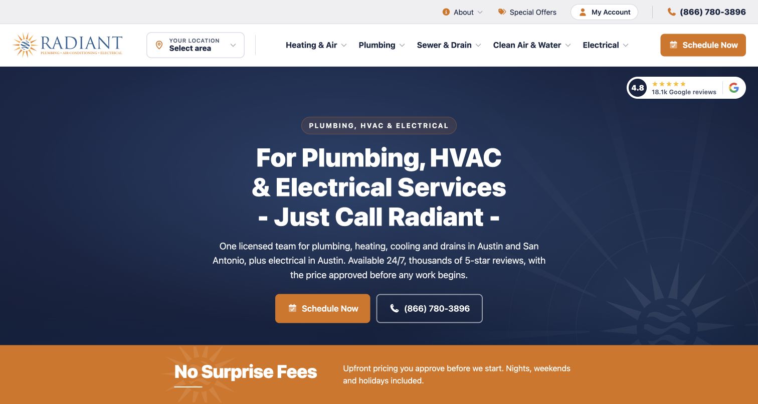
Radiant uses a dark navy introduction, concise service wording and gold actions to keep the first screen relatively restrained. Austin and San Antonio are named directly, while the page qualifies electrical availability separately. For a plumbing reader, that geographic specificity is more useful than a vague regional slogan: it demonstrates that the site can explain where each service actually applies. A no-surprise-fees strip adds a second reassurance layer below the hero. The design is a strong reference for keeping scope visible, although broad pricing language and multi-city coverage still need service-level explanations before a customer can know the likely process for a particular repair.
What you can learn
Model geography per service instead of assuming every department has the same coverage. Put the relevant cities near the main contact action and link pricing reassurance to an explanation of how the office evaluates a request.
Pros
Service geography is stated near the opening message.
A limited palette keeps the primary actions easy to identify.
Cons & considerations
Broad fee language needs a more detailed explanation.
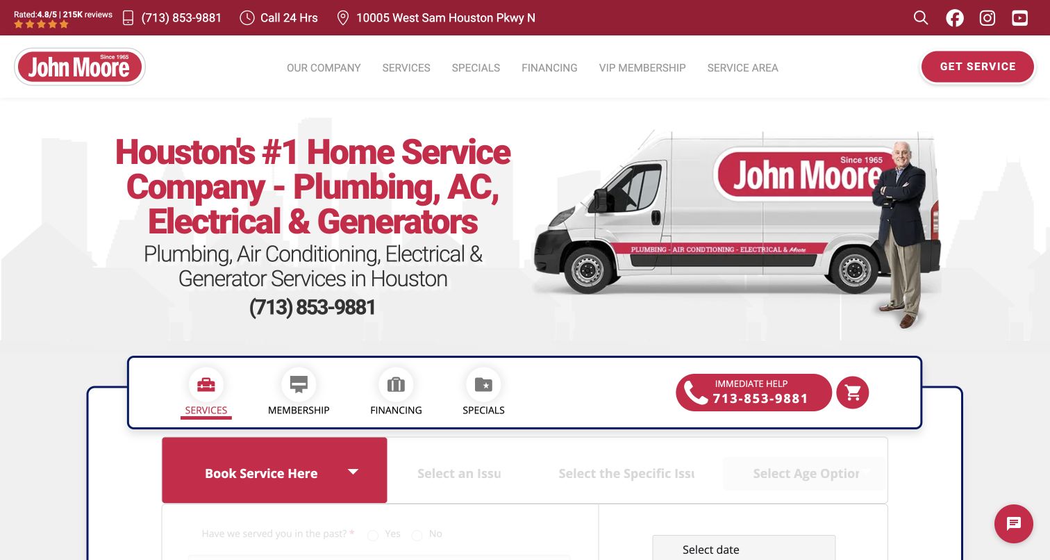
John Moore places a sequence of service and issue choices inside the hero, under tabs for booking, maintenance, financing and specials. The crimson identity and branded vehicle establish continuity while the form does the practical work. For plumbing, the progression from a broad category toward a specific issue is more useful than asking a visitor to write a diagnosis immediately. It also exposes a design risk: the opening screen contains several competing journeys and can feel like a service desk before the reader understands the company. This example is strongest as an intake pattern, particularly when the selectable language reflects how customers actually describe problems.
What you can learn
Use progressive choices to reduce uncertainty, but stop before asking visitors to diagnose plumbing systems. Preserve a general description option and explain what the office will do with the selected issue after submission.
Pros
The issue sequence gives structure to an uncertain request.
Maintenance and new service inquiries have separate entry points.
Cons & considerations
Several tabs create a dense first decision.
Specific issue choices can become confusing if written in technician language.
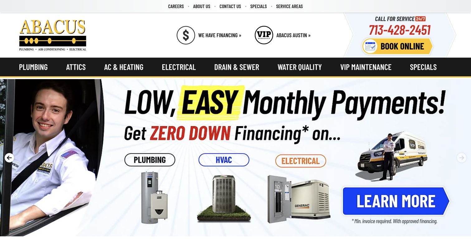
Abacus uses a high-contrast black service bar beneath a large logo and phone-and-booking block. Plumbing, drains, water quality and water heaters have visible routes, making the breadth of the department more apparent than on a generic home-services hero. Large rotating campaign artwork supplies the page’s strongest visual element, while supporting cards describe recurring service categories. This is useful for a plumbing business with several distinct customer needs, especially when maintenance and installation deserve different explanations. The same approach demands disciplined editing: campaign graphics and finance language can dominate the page, and important service text should remain readable outside an image or carousel.
What you can learn
Build durable plumbing category pages beneath temporary campaigns. Let offers point into those pages, and make the terms, eligibility and ordinary contact route available even when a visitor never sees the relevant carousel slide.
Pros
Plumbing-related categories are separated in the main navigation.
Phone and booking actions remain prominent above campaign artwork.
Cons & considerations
Large promotional slides can overshadow service explanations.
Text embedded in artwork is harder to maintain and adapt across screens.
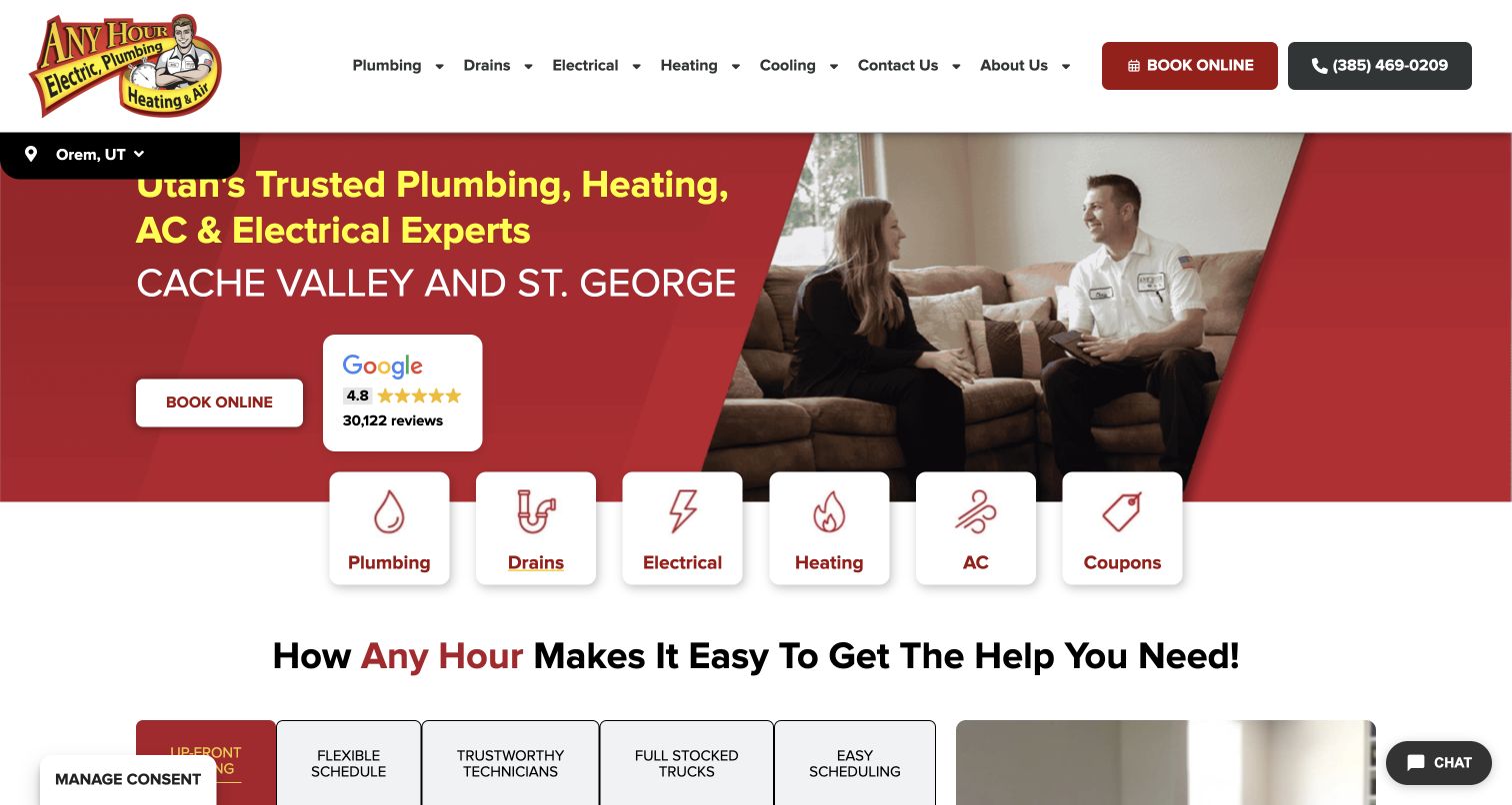
Any Hour places a row of white service cards across the boundary between its red hero and the content below. Plumbing and drains are separate choices beside electrical, heating, cooling and coupons. A technician talking with customers provides a domestic setting, while a location strip anchors the regional version of the page. For plumbing visitors, the most transferable detail is the compact icon-and-label entry point: it requires little interpretation before someone can reach the relevant department. The hero still carries broad multi-trade messaging, and the coupon tile gives a commercial offer equal structural weight to an actual service category.
What you can learn
Use short labels and recognizable service grouping to make a broad company easy to scan. Decide whether offers belong in the same row as essential plumbing routes, and preserve enough room for the local service boundary.
Pros
Plumbing and drains have separate visible entry cards.
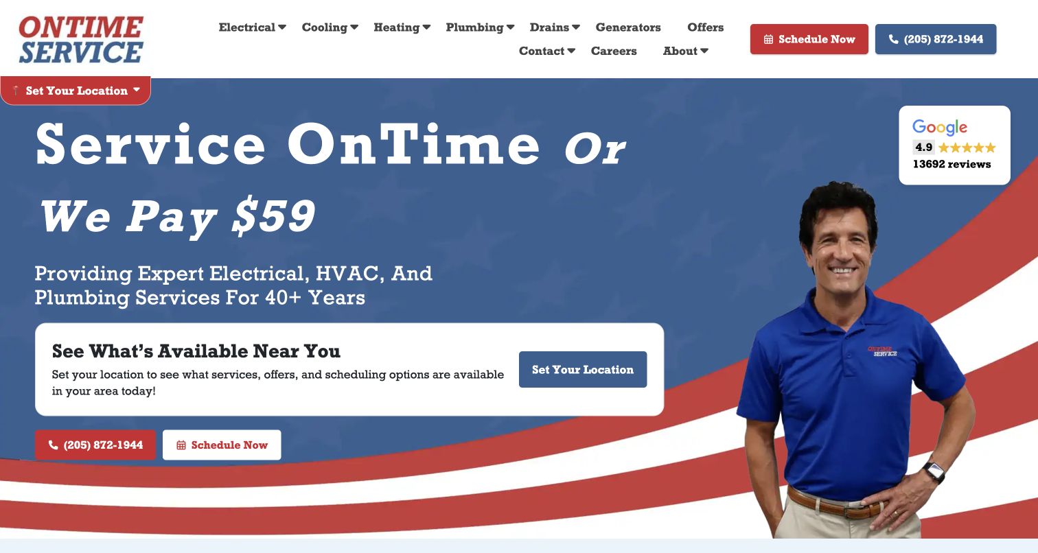
OnTime Service in Alabama makes its timing-related promise the hero’s main message, combining a technician photograph with a red diagonal accent and a local-selection card. The white navigation covers plumbing alongside heating, cooling and electrical work. For a plumbing site, this is a useful way to foreground an operational concern that customers recognize: waiting for a service visit. It also shows why a promise needs context. The large headline is easier to notice than its conditions, and the location choice adds another step before a visitor can understand specific availability. The design works best when the supporting pages explain the actual appointment process plainly.
What you can learn
When punctuality is part of positioning, explain the policy and appointment sequence close to the claim. Make local routing simple and avoid letting a memorable offer substitute for a clear description of plumbing services.
Pros
The hero has one memorable service-process message.
Local selection is part of the opening journey.
Cons & considerations
The headline promise needs accessible conditions.
A broad navigation can delay plumbing-specific information.
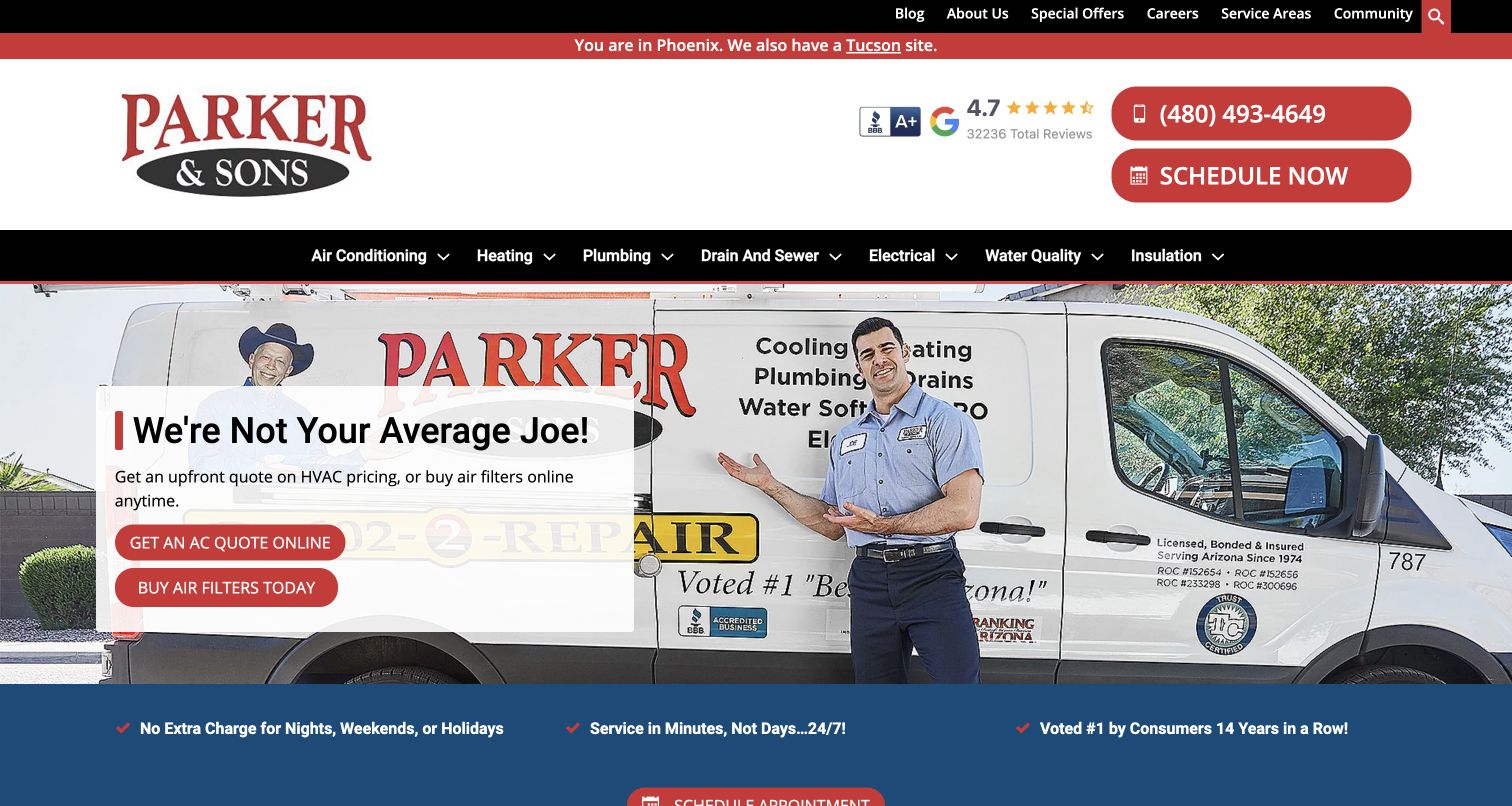
Parker & Sons states that the visitor is viewing Phoenix and offers a Tucson alternative in a thin top strip. Below, a branded van and technician provide a straightforward service-business image, with phone and scheduling actions in the header. Plumbing and drain-and-sewer routes are separate in the black navigation bar. The captured hero favors HVAC pricing and filter shopping, making the plumbing menu especially important. This is a useful example of geographic orientation within a multi-trade brand, but it also illustrates the cost of giving one department the campaign spotlight: visitors with a plumbing problem must rely on the persistent navigation to find relevance.
What you can learn
State which regional site the visitor is using, then keep plumbing routes stable while seasonal campaigns change. A department-specific landing page can carry the relevant promise when the shared homepage is focused on another service.
Pros
The active city and alternate region are explicit.
Plumbing and drain routes remain visible during other campaigns.
Cons & considerations
The captured hero emphasizes HVAC instead of plumbing.
Several service categories create a wide desktop menu.
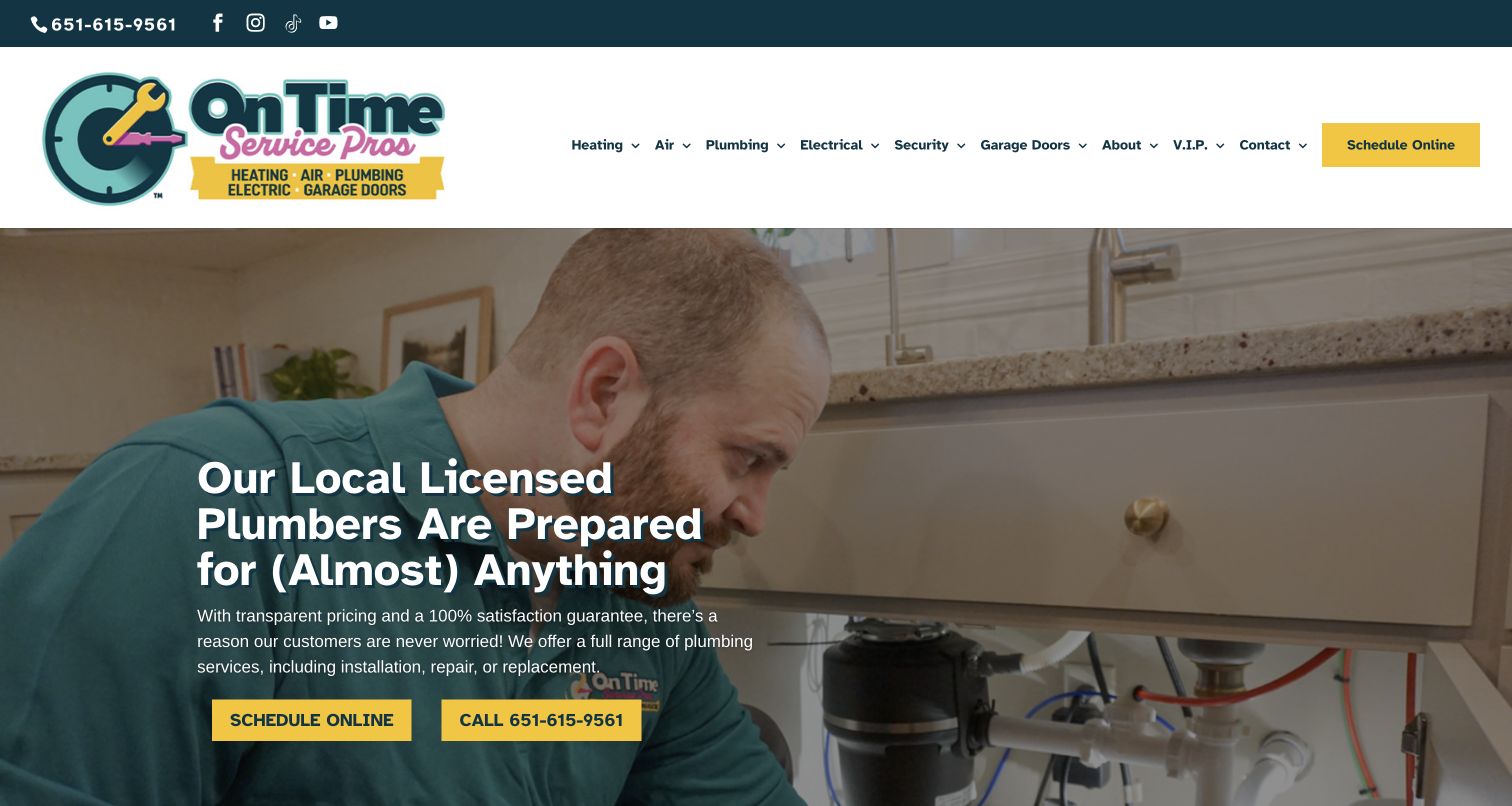
On Time Service Pros uses a technician working at a sink as the captured visual anchor, with a compact row of heating, cooling, plumbing and electrical choices above it. The yellow scheduling action stands apart from the otherwise restrained header. Additional security and garage-door categories reveal the breadth of the business, while membership has a separate route. For a plumbing designer, the value is in retaining a plain Plumbing label even as the company’s catalog grows. The broad campaign material does not itself explain a plumbing job, so the page depends on its service routes and local information to move a visitor from brand recognition to a useful inquiry.
What you can learn
Keep trade labels literal when the company offers many household services. Build the plumbing destination around actual calls and coverage, while using the shared header to preserve recognition and one consistent scheduling route.
Pros
A distinct scheduling action is available in the header.
Plumbing remains a first-level choice within a broad catalog.
Cons & considerations
Many departments compete in the main navigation.
The opening campaign offers limited plumbing-specific explanation.
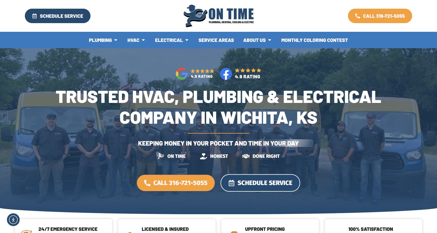
On Time Plumbing, Heating, Cooling & Electric names Wichita in its opening presentation and uses a technician-and-fleet image to reinforce the local service identity. Orange calling and outlined scheduling actions offer two obvious ways forward. Review-platform badges and a short set of service values support the introduction without requiring a long company history. For plumbing visitors, the location cue is the most useful part: they can establish relevance before exploring individual services. The page is also a reminder to keep independent-looking badges in proportion. They may help orient a reader, but the website’s display of them is not a separate verification of workmanship or availability.
What you can learn
Put the city, actual services and response options together. Use testimonials and badges as supporting material, with clear sources, while giving plumbing visitors concrete information about the work and the next conversation.
Pros
Wichita is explicit in the introductory content.
Calling and scheduling are visually distinct choices.
Cons & considerations
Several trades share one headline.
Review badges can distract from practical service scope.
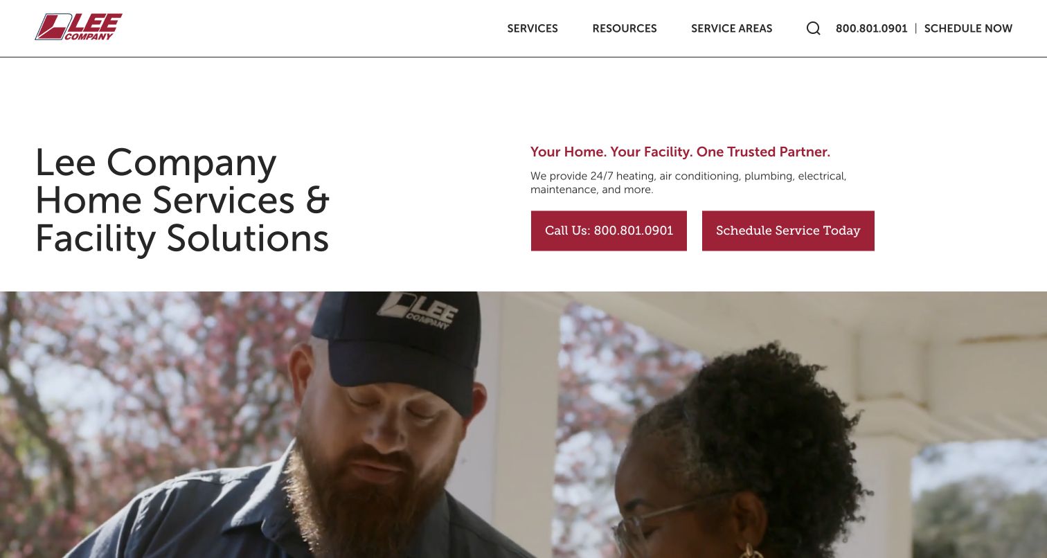
Lee Company introduces home services and facility solutions in a spacious, text-led composition. The left headline establishes the two broad audiences, while a right-hand paragraph and contact choices explain the organization before a wide photograph appears below. For plumbing, that audience split is useful: a household repair and a facility-maintenance relationship need different evidence and intake. The restrained white and cranberry presentation provides an alternative to the coupon-heavy service homepage. Its limitation is immediacy for a narrow task. Someone seeking a plumber still has to enter the services structure, and the broad introductory language does not provide an instant explanation of the specific plumbing work available.
What you can learn
Separate residential plumbing requests from facility work early, using labels clients recognize. Give each path its own relevant proof, scope and contact process instead of forcing both audiences through one generic estimate form.
Pros
Home and facility audiences are acknowledged clearly.
The restrained layout gives explanatory text room to work.
Cons & considerations
A plumbing task requires a deeper navigation step.
Broad company positioning can feel indirect during an urgent repair search.
Plan around the calls the plumbing office receives
Map the recurring request types
Ask the office which problems customers describe most often and how those calls are routed. Use that language to plan a manageable set of service pages. Separate urgent help, routine work and larger planned projects where the process differs, rather than generating a page for every slight keyword variation.
Prepare evidence with useful context
Collect approved team photographs, service vehicles and project examples that reflect the actual business. Add a short explanation of the work when showing a project. Keep customer permissions and review sources on record, and distinguish company claims from independently sourced information.
Define the handoff and ownership
Choose who receives each request and what happens if the primary notification fails. Write a confirmation that sets a realistic expectation. Assign an owner for service areas, phone numbers, offers and membership terms so the website stays consistent with how the office operates.
The editing job behind the design
Use a publishing system the service team can maintain
A conventional CMS can support service pages, genuine local-office records and a small project library. Model shared details once so a changed phone number or coverage boundary does not require editing dozens of pages. The quality of those records matters more than adopting a particular platform from an inspiration site.
Choose booking or CRM integrations around the existing office process. Preserve a plain contact route, keep form data out of public pages, and check confirmations and staff notifications in an approved test workflow. Use temporary campaign content without letting it overwrite the durable explanation of the service.
Our WordPress website examples offer a separate look at publishing approaches. A visible platform label is evidence for that named page, not a guarantee that the same system will suit your requirements.
Before the public launch
Plumbing website launch checklist
Confirm every service category, office, coverage boundary and phone number with the business.
Make urgent contact, routine service and planned-project requests distinguishable.
Check that offer terms and any availability promises match the operating process.
Review photo permissions, testimonial sources and the context of project examples.
Test mobile navigation, tap-to-call, form labels and confirmations without real customer details.
Assign an owner for broken booking tools, expired campaigns and service-area changes.
These checks are a project checklist, not a performance, legal, security, or accessibility certification. Test real journeys with the people responsible for the website before making claims about the result.
Sources & editorial method
How this collection was selected and reviewed
We reviewed 18 distinct official plumbing-company websites using direct browser observation and captured the public pages shown. Some firms also provide HVAC and electrical services; this guide evaluates their plumbing navigation and inquiry patterns specifically. Screenshots retain their actual capture dates. Visible brand marks belong to the source companies, and no unverified website-platform attribution is assigned.
Each example links to its actual source page. Screenshots are direct browser captures with their own capture dates; moving imagery, announcements and live designs can change. The notes describe observable design choices and conditional tradeoffs, not measured traffic, conversion results, service quality, or accessibility conformance.
Technology labels use public page metadata, asset evidence, or explicitly cited platform documentation. Platform documentation is not a complete current deployment audit. A component reference may be legacy or unused; it is not a complete backend inventory. Unknown stacks are omitted. These sites are editorial examples, not our client portfolio.
Written, Edited and Curated are separate editorial records, not timestamps advanced by a rebuild. Website designs and imagery belong to their owners. See our editorial standards or suggest a correction.
Questions worth asking
Plumbing website design questions
Should a plumbing homepage start with a form?
Only when the form is short and its purpose is clear. A prominent phone route and a concise service explanation may be more useful for someone who is unsure what help they need. Do not make form completion the only way to understand coverage or contact the business.
Should drain services have their own page?
A separate page is useful when it describes a real service with enough distinct information to help customers. Use the language people use on actual calls, and connect the page to the appropriate request process rather than repeating generic plumbing copy.
How should a plumber use offers on the website?
Keep the scope, eligibility and dates close to the offer. Preserve ordinary service routes for visitors who do not qualify. A rotating graphic should not be the only place where a reader can find the terms or learn what the appointment involves.
Does every service area need a separate page?
Create a location page when it can provide useful, accurate local information such as an office, coverage details or relevant work. Avoid near-identical pages that merely exchange city names. A clear regional page may be easier to maintain and more useful to customers.
Borrow the service hierarchy and contact patterns that fit the plumbing operation. Build the final site around real coverage, useful explanations and a follow-up process the office can deliver.