A heating and cooling website has to serve several different decisions. The design should make those paths clear before asking everyone to book the same appointment.
Someone with a current heating or cooling problem needs a clear service route and local availability. A homeowner considering new equipment needs explanations, scope and a conversation about the next assessment. A building manager may be evaluating ongoing support. Those intentions can share one brand without sharing the same landing page or form.
This collection contains 29 official company websites and service pages. The examples span national networks, regional operators and focused local brands. We examine navigation, local routing, appointment and quote paths, maintenance content and seasonal campaigns. The reviews are design observations, not endorsements of equipment, performance claims or installation quality.
Before the examples
What makes good heating and cooling website design in 2026?
Separate repair, maintenance and replacement
Make the type of help recognizable in navigation and in the next-step labels. A service visit, maintenance plan and equipment estimate involve different questions. Do not require a visitor to diagnose a fault, and do not let a generic Book Now button imply that every appointment follows the same process.
Keep local scope visible
Identify the actual service market before collecting details. If branches offer different work or equipment support, preserve those distinctions in their pages and forms. A default city or ZIP prompt should be easy to change and should not silently determine an offer without explaining the location context.
Support campaigns with durable explanations
Seasonal offers can draw attention, but heating and cooling information should remain useful when the campaign expires. Publish offer terms as readable text, explain the appointment scope and keep replacement, repair and maintenance routes available regardless of which hero slide is visible.
The collection · 29 examples
29 heating and cooling websites worth studying
Look for the relationship between a friendly first screen and the practical detail that follows. The most useful pattern is often the way a site separates different HVAC decisions, rather than the size of its hero image or promotional headline.
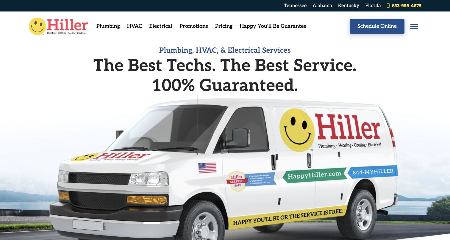
Hiller gives HVAC a dedicated navigation entry alongside a Pricing link and Promotions route. That combination is useful for heating and cooling because visitors arrive with different levels of commitment: one wants a repair appointment, another wants to understand a larger equipment purchase. The large van photograph and friendly mark hold the broader brand together without forcing all those questions into the hero. State links help establish regional coverage before the service journey deepens. The opening remains deliberately general, so an HVAC landing page still needs to distinguish equipment types, maintenance and replacement rather than treating every inquiry as the same booking request.
What you can learn
Give repair, maintenance and replacement research recognizable destinations. A pricing route should explain scope and assumptions, while promotional content should support those durable service pages instead of becoming the only way to understand the offer.
Pros
HVAC and pricing have direct navigation routes.
Regional links make the coverage structure visible.
Cons & considerations
The hero does not distinguish repair from replacement.
A large brand image leaves equipment details to later pages.
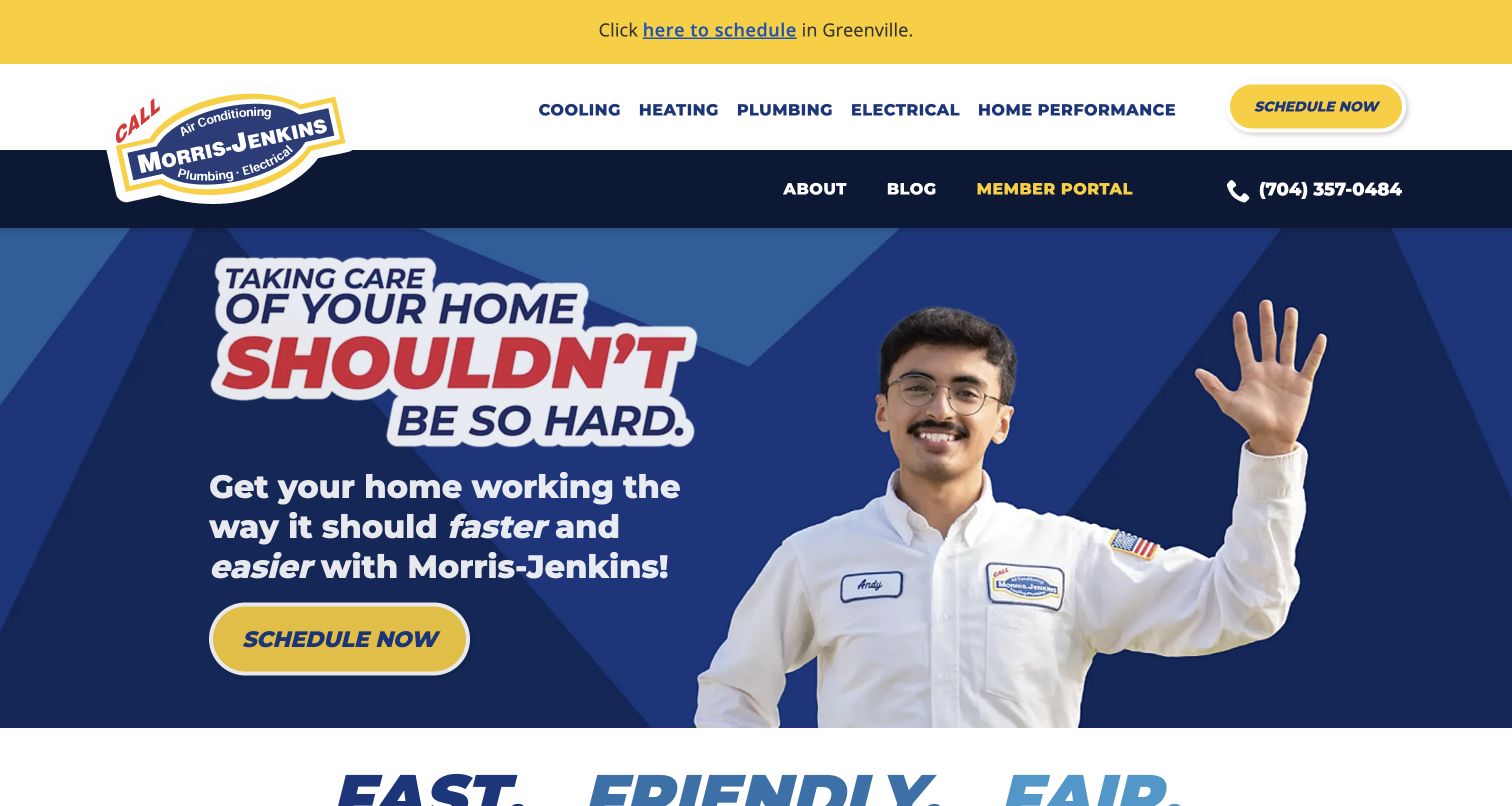
Morris-Jenkins separates heating and cooling in its navigation while keeping the hero focused on a simple household concern. The waving technician and strong blue-and-yellow contrast make the page feel approachable before the visitor has to choose a system category. That is useful for HVAC work, where someone may know the house feels uncomfortable without knowing the equipment vocabulary. A distinct scheduling action provides a quick route for a current problem. The broader reassurance needs more detailed service content behind it, particularly for visitors comparing replacement options rather than requesting the next available visit. The example succeeds most clearly at the first conversation.
What you can learn
Use the household’s language to introduce the service, then make system-specific information easy to reach. Separate the path for an immediate appointment from research about replacement equipment, without requiring a visitor to diagnose the fault.
Pros
Heating and cooling are recognizable top-level categories.
The human imagery supports an approachable tone.
Cons & considerations
Replacement research is not the hero’s main focus.
Broad reassurance needs detailed service pages behind it.
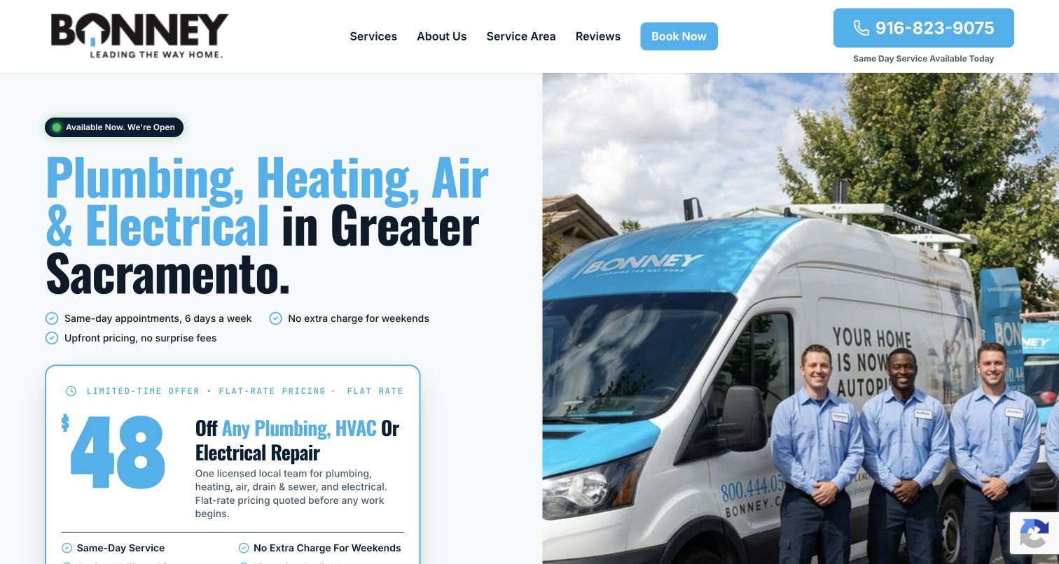
Bonney’s Greater Sacramento landing page pairs service copy and a promotion panel with a team-and-van photograph. Heating and air are named in the introductory service list, making the page relevant without technical product language. The short header and split layout support a focused campaign journey, particularly when a visitor already knows the brand or arrives from an advertisement. For HVAC work, the risk is that an offer can appear more specific than the underlying scope. The page should lead quickly to what is included, which systems qualify and whether the action requests repair, maintenance or a replacement conversation.
What you can learn
Give a seasonal HVAC campaign one clear purpose and a specific local audience. Keep the service scope beside the offer, and preserve a route for equipment questions or existing faults that do not fit the promoted appointment.
Pros
The service area is stated in the opening copy.
Team imagery supports the compact local presentation.
Cons & considerations
A broad trade list competes with the HVAC message.
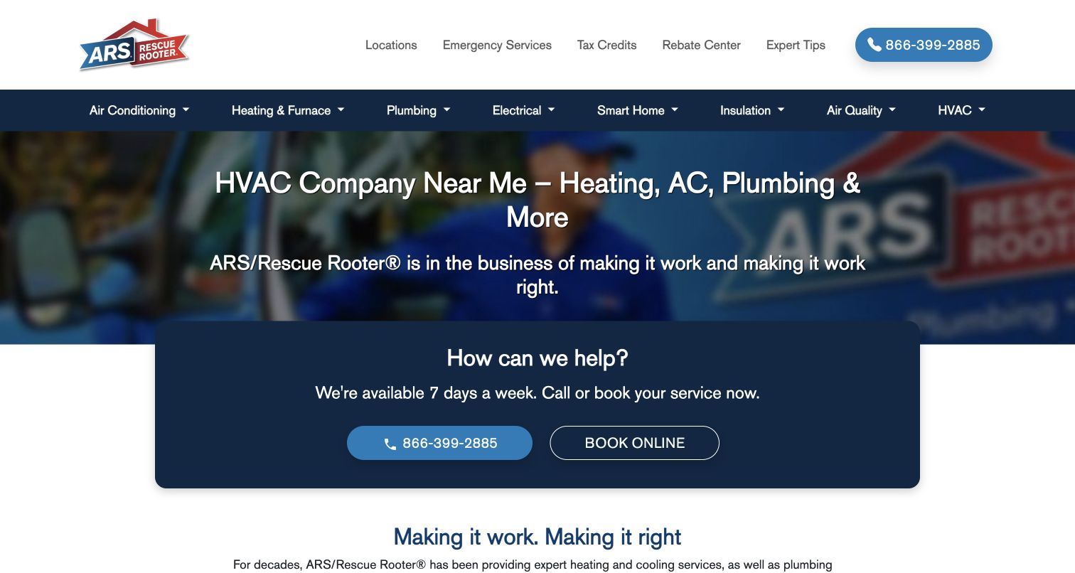
ARS brings calling and online booking together in a large central help card. Above it, a white and blue service navigation supports more detailed exploration of household systems. For heating and cooling, this arrangement recognizes two common behaviors: asking for help now and browsing the service categories before deciding. The muted vehicle imagery does not compete strongly with the help block. The challenge is local relevance. A broad network homepage can introduce the brand well, but equipment services, coverage and scheduling still need to resolve to the appropriate branch. The design is a useful reference for the handoff between national familiarity and local HVAC detail.
What you can learn
Keep the first contact choice simple, then show local HVAC scope once the region is known. Make repair, maintenance and installation explanations reachable without forcing every researcher into the same immediate-booking flow.
Pros
Two response channels are grouped coherently.
System navigation supports more than a single campaign.
Cons & considerations
The national page cannot settle local availability on its own.
A broad help prompt does not distinguish equipment-replacement research.
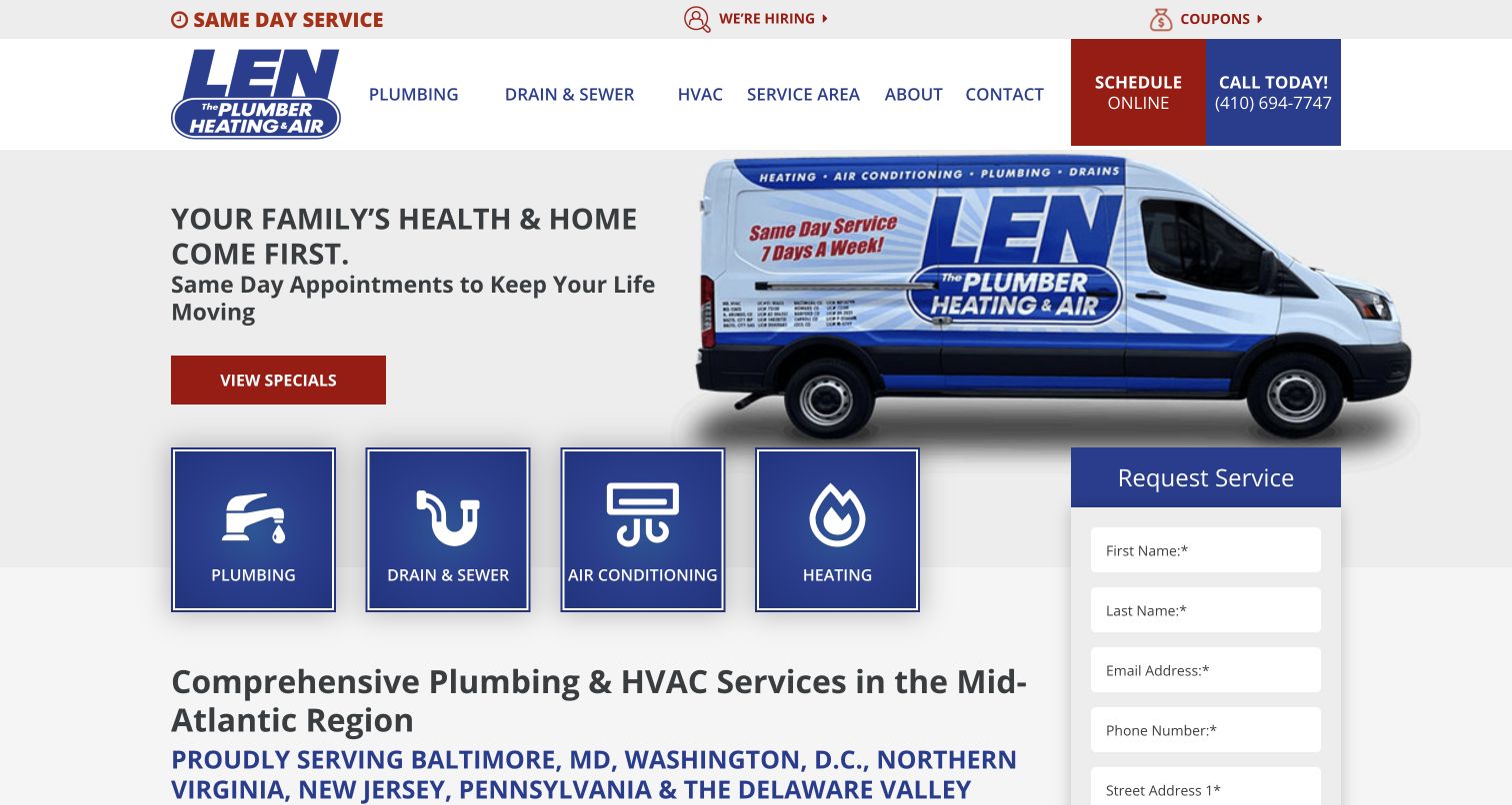
Len The Plumber places air conditioning and heating tiles beside its plumbing and drain categories. For an HVAC review, those tiles matter more than the established plumbing name: they make the expanded service scope visible before a visitor has to infer it. A request form sits near the introduction and a branded van reinforces continuity with the existing company identity. This is a useful reference for a firm adding heating and cooling to a familiar local brand. The tradeoff is category clarity. Equipment replacement, seasonal maintenance and a current breakdown each need further explanation after that initial tile, especially when the homepage still carries strong plumbing associations.
What you can learn
When adding HVAC to an established brand, give heating and cooling visible labels and dedicated explanations. Make the appointment type clear after entry so new services feel operationally complete rather than merely appended to a familiar logo.
Pros
Heating and cooling appear as explicit service shortcuts.
The visible form supports a direct first inquiry.
Cons & considerations
The established brand name may still suggest a narrower trade.
Each HVAC shortcut needs deeper repair-versus-replacement context.
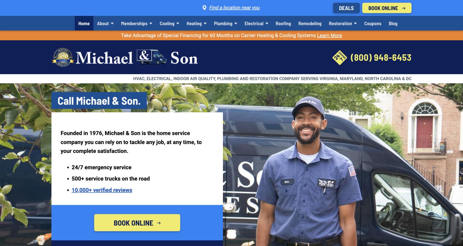
Michael & Son combines a technician and van photograph with a prominent left-hand booking card. The layered blue and orange header gives the service menu strong visibility, while company reassurance sits close to the action. For HVAC, the design is useful at the point where a household wants a recognizable provider and a clear way to request help. It is less specific about the equipment decision itself. A visitor weighing replacement, maintenance or repair needs the service navigation to resolve those questions. The dense presentation also shows the importance of keeping seasonal messages from obscuring the essential heating and cooling choices.
What you can learn
Use established brand recognition to support an HVAC journey, then move quickly into the visitor’s equipment goal. Keep maintenance, repair and replacement content distinct enough that the office receives a useful inquiry without demanding technical diagnosis.
Pros
The booking action has a clear visual home.
A visible service menu supports department selection.
Cons & considerations
Several colored header layers compete for attention.
The first screen gives little equipment-specific comparison information.
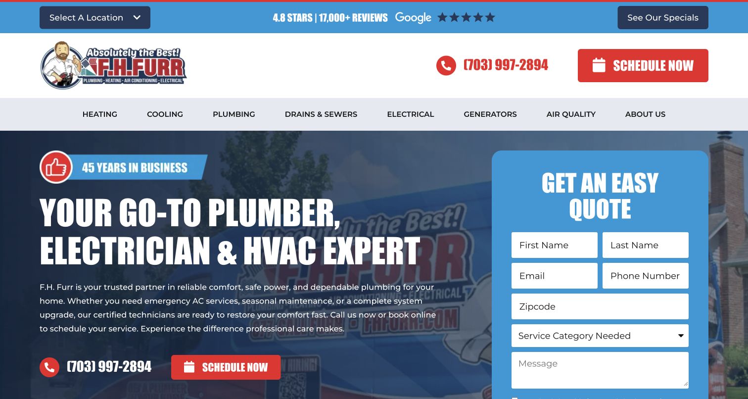
F.H. Furr puts a large request form in the hero rather than asking readers to find a contact page. A service selector is especially useful for HVAC because it can help route heating or cooling needs before the office follows up. The branded van background and location control establish the larger company around that form. This is a practical intake reference, but the visual weight of the panel leaves less room to explain what an appointment involves. A replacement researcher may need a different promise from someone reporting a breakdown, so the selected category should affect the information and expectations that follow.
What you can learn
Start HVAC intake with the minimum information needed to route a conversation. Explain whether the next step is scheduling, a callback or an estimate discussion, and provide a phone alternative for visitors who cannot describe the issue in a form.
Pros
The request panel is prominent and easy to locate.
A service choice can support useful routing.
Cons & considerations
The form reduces space for service explanations.
One generic submission message may not suit every HVAC appointment type.
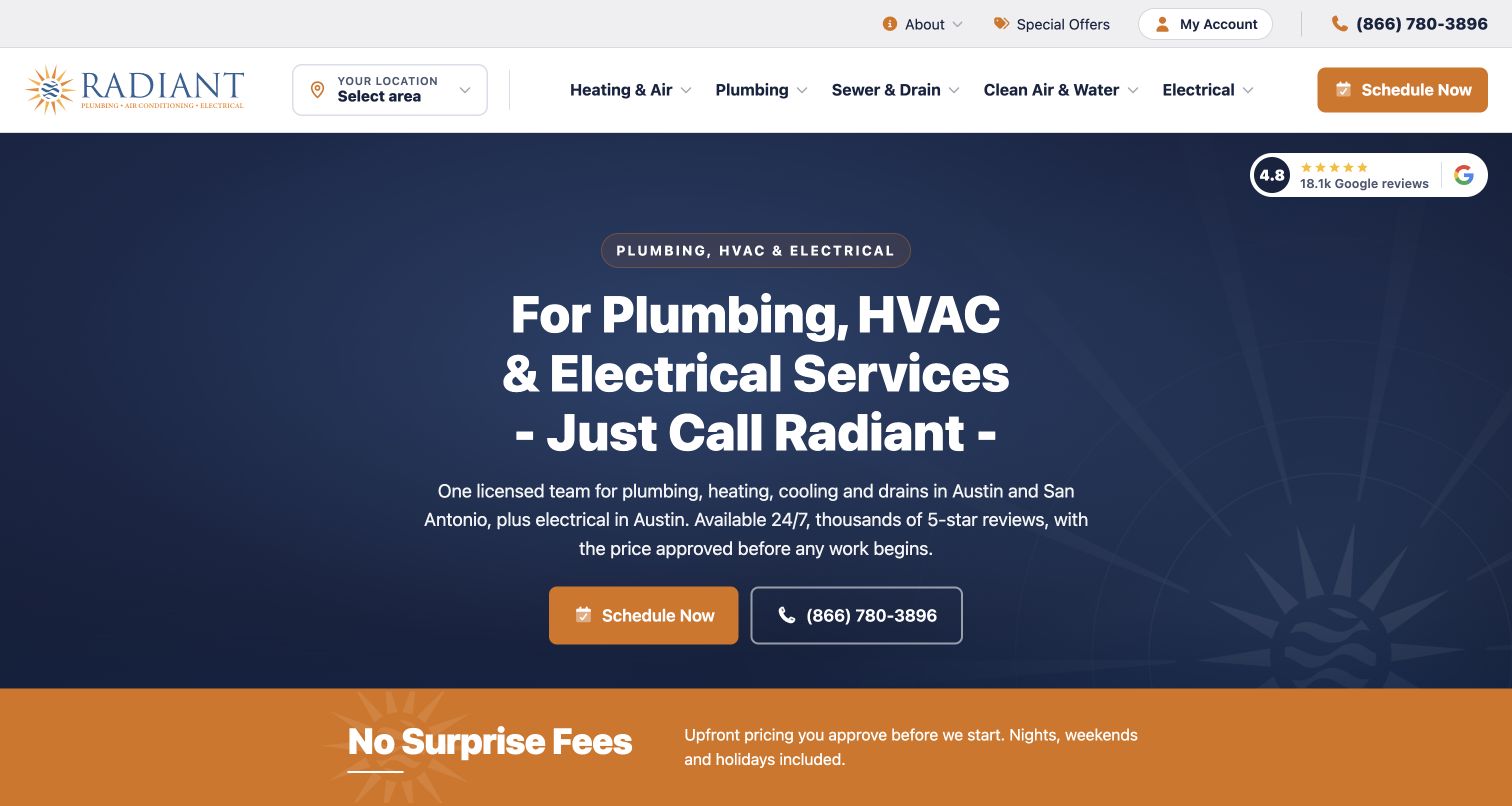
Radiant names Austin and San Antonio in its introduction and uses navy and gold to keep the main scheduling choices distinct. Heating and air conditioning appear in the service navigation, while the body separates the geographic scope of another trade. That careful qualification is useful for HVAC sites with multiple markets: visitors should not have to assume that every office offers identical work. A fee-related reassurance strip supports the hero, but equipment pricing and appointment scope remain questions for deeper content. The restrained layout is a useful alternative to a crowded seasonal sales banner when the priority is clear local orientation.
What you can learn
Tie each HVAC service to its actual geography and make that visible early. Keep general fee reassurance separate from equipment estimates, with plain explanations of what a diagnostic visit or replacement conversation does and does not establish.
Pros
The opening names the two service markets.
A limited palette makes the actions easy to distinguish.
Cons & considerations
Broad fee reassurance needs supporting scope.
Repair and replacement are not separated in the opening message.
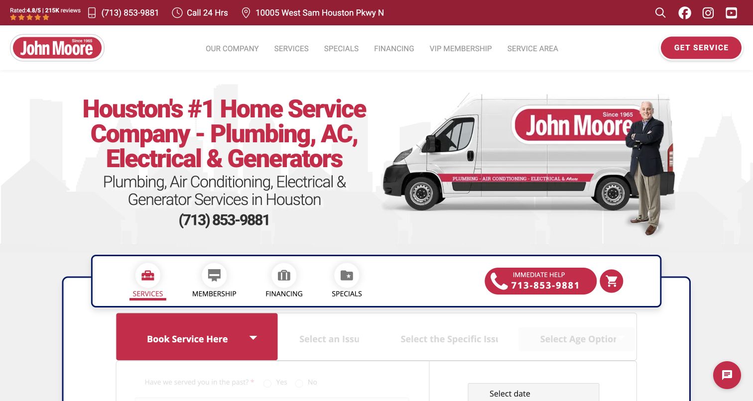
John Moore’s hero places service, issue and more specific issue choices in sequence. Maintenance, financing and specials have separate tabs, creating a visible distinction between different reasons to contact the company. For HVAC design, this is useful because an equipment failure, a maintenance visit and a replacement budget question should not feel identical. The red brand treatment and large vehicle image hold the busy interface together. Its main tradeoff is cognitive load: several tabs and fields arrive before a visitor has read much service explanation. The issue labels need to match customer language and leave room for uncertainty rather than implying that the user must identify the fault.
What you can learn
Use staged questions to clarify the HVAC goal, then keep the rest of intake short. Allow an uncertain description and explain the next human step, particularly when someone switches between maintenance, repair and financing information.
Pros
Maintenance and financing have distinct entry points.
The staged service choices can improve request routing.
Cons & considerations
Several tabs and fields make the hero dense.
Issue labels can overburden visitors unfamiliar with equipment terminology.
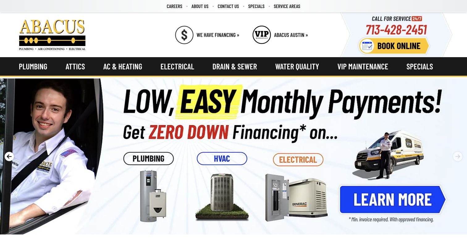
Abacus places AC and Heating in a high-contrast main service bar, with prominent phone and booking actions above it. Large campaign slides then take over the hero, including financing and equipment-related material, while supporting cards identify maintenance, tune-ups, repairs and installations. For HVAC, the useful pattern is the stable service structure beneath changing promotional content. Visitors can still reach the department when a different offer is on screen. The risk is overdependence on campaign artwork: eligibility, exclusions and appointment purpose need readable page text, and the core service explanation should remain useful after a promotion expires.
What you can learn
Treat HVAC offers as temporary entry points into permanent service content. Keep their dates and scope current, and make repair, maintenance and replacement routes available independently of which slide happens to be visible.
Pros
The HVAC department remains visible above campaigns.
Supporting categories name several equipment-service needs.
Cons & considerations
Promotional graphics dominate the first screen.
Rotating artwork can hide the offer a visitor expected to find.
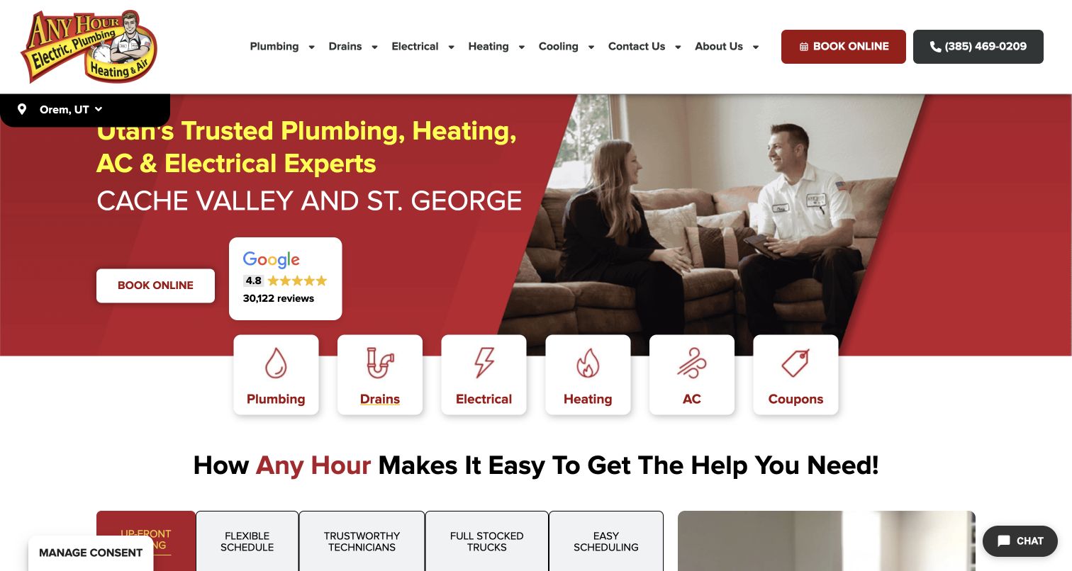
Any Hour bridges the hero and body with simple labeled cards for heating and air conditioning, beside plumbing, drains and electrical. The domestic conversation photograph makes the service feel personal, while the region strip adds useful location context. For HVAC visitors, the paired system cards reduce the first decision to familiar language. The lower page then introduces service-process benefits. This is a useful pattern for broad residential companies, although the coupon tile and several departments compete for equal prominence. The initial system choice also needs to lead to different appointment goals, since routine maintenance and a new installation require more explanation than the icon can provide.
What you can learn
Use familiar heating and cooling labels as a first step, then distinguish the actual service goal. Keep offers secondary to those essential routes, and repeat local coverage where a visitor begins an appointment request.
Pros
Heating and air conditioning have separate visual shortcuts.
The region is identified above the hero.
Cons & considerations
Coupons share the same hierarchy as core services.
The icon row cannot explain different appointment types by itself.
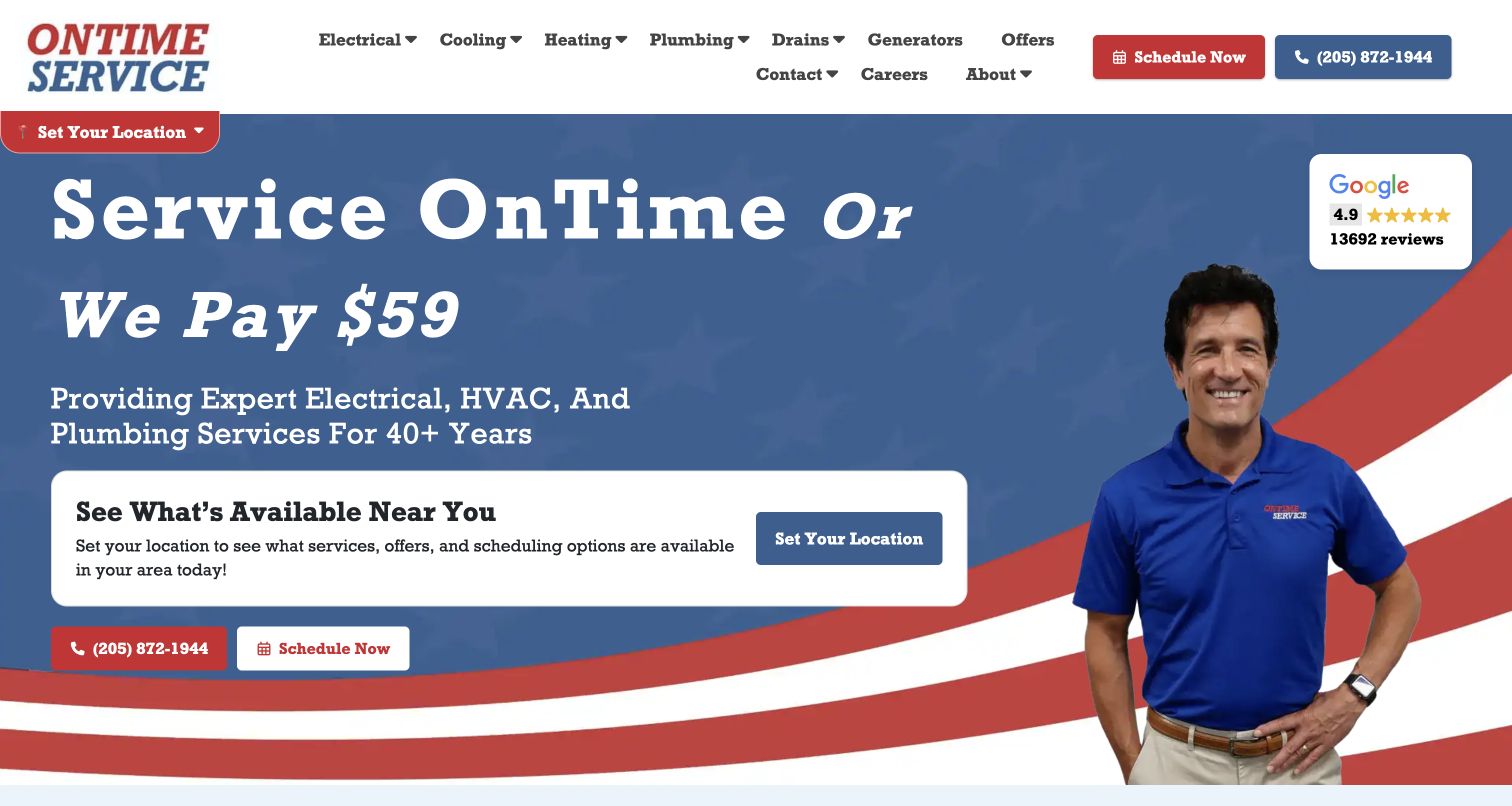
OnTime Service in Alabama makes its timing promise the dominant headline, supported by a technician portrait and local-selection card. Heating and cooling remain clear navigation categories alongside other household trades. For HVAC visitors, this focuses on a real service concern: arranging a visit and knowing what to expect from the appointment. The design does not attempt to explain equipment in the hero, which keeps the positioning memorable but leaves replacement researchers with another step. The visual promise also needs visible policy context. Its usefulness depends on connecting the memorable introduction to local availability, service scope and a clearly described follow-up process.
What you can learn
Explain the HVAC visit as carefully as the equipment service. If timing is a central promise, put its conditions and local application within easy reach, and keep a separate route for planned replacement research.
Pros
The hero communicates one recognizable service-process concern.
Heating and cooling have direct navigation labels.
Cons & considerations
The timing promise requires clear supporting conditions.
Equipment selection and replacement information sit beyond the opening view.
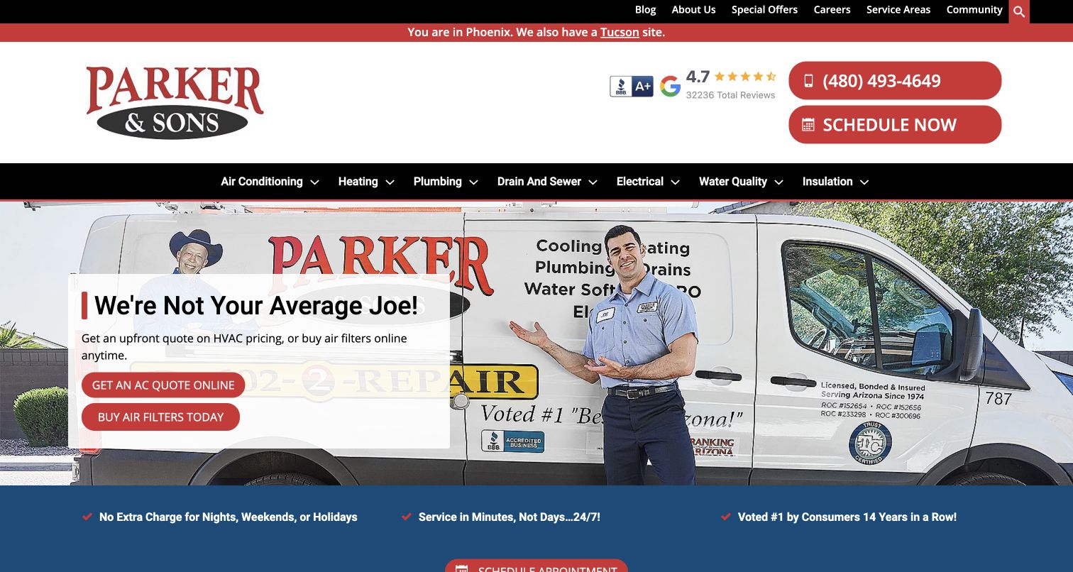
Parker & Sons identifies Phoenix in its utility strip and offers a Tucson alternative before presenting a technician beside a branded van. The captured hero gives HVAC-specific actions to obtain an online quote and buy filters, while the header preserves phone and scheduling options. That creates distinct paths for a larger equipment decision, a routine product need and a service visit. It is a useful example of a mature HVAC site offering more than one form. The design needs careful labels around those transitions: an online quote may have assumptions, and shopping is a different workflow from asking a technician to diagnose a problem.
What you can learn
Separate service booking, replacement research and routine product shopping. Explain what each path provides before handing visitors into another tool, and carry the active city context through the transition so the offer stays locally relevant.
Pros
The active regional site is explicit.
Quote, filter-shopping and service routes have different labels.
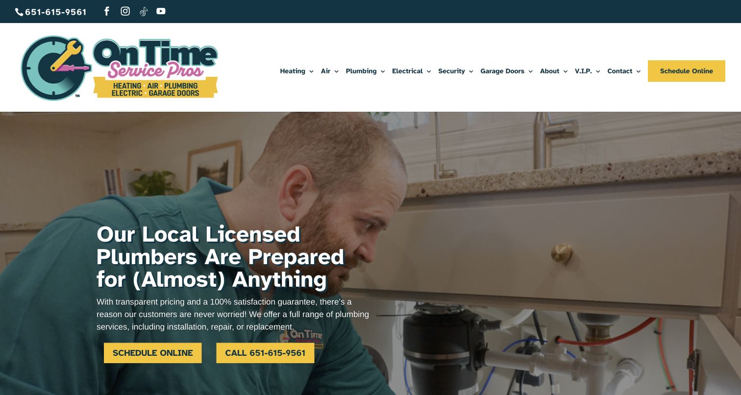
On Time Service Pros keeps Heating and Air at the start of its main menu, followed by plumbing, electrical and other household categories. A bright scheduling action anchors the right side while rotating technician-at-work imagery supplies the larger brand context. The page’s equipment campaign and membership route support more than a one-off service call. For HVAC design, the lesson is structural: retain direct access to the core systems even as the company adds unrelated services. The crowded menu is the corresponding limitation. A visitor comparing replacement equipment needs a clear second-level journey rather than a long list of departments competing with the original heating or cooling task.
What you can learn
Keep HVAC navigation stable as the business expands. Organize the next level around repair, maintenance and replacement, and connect membership explanations to concrete recurring services rather than relying only on a broad loyalty label.
Pros
Heating and air remain prominent menu entries.
Scheduling and membership are easy to identify.
Cons & considerations
The expanded service catalog makes navigation dense.
The shared hero cannot explain every equipment decision.
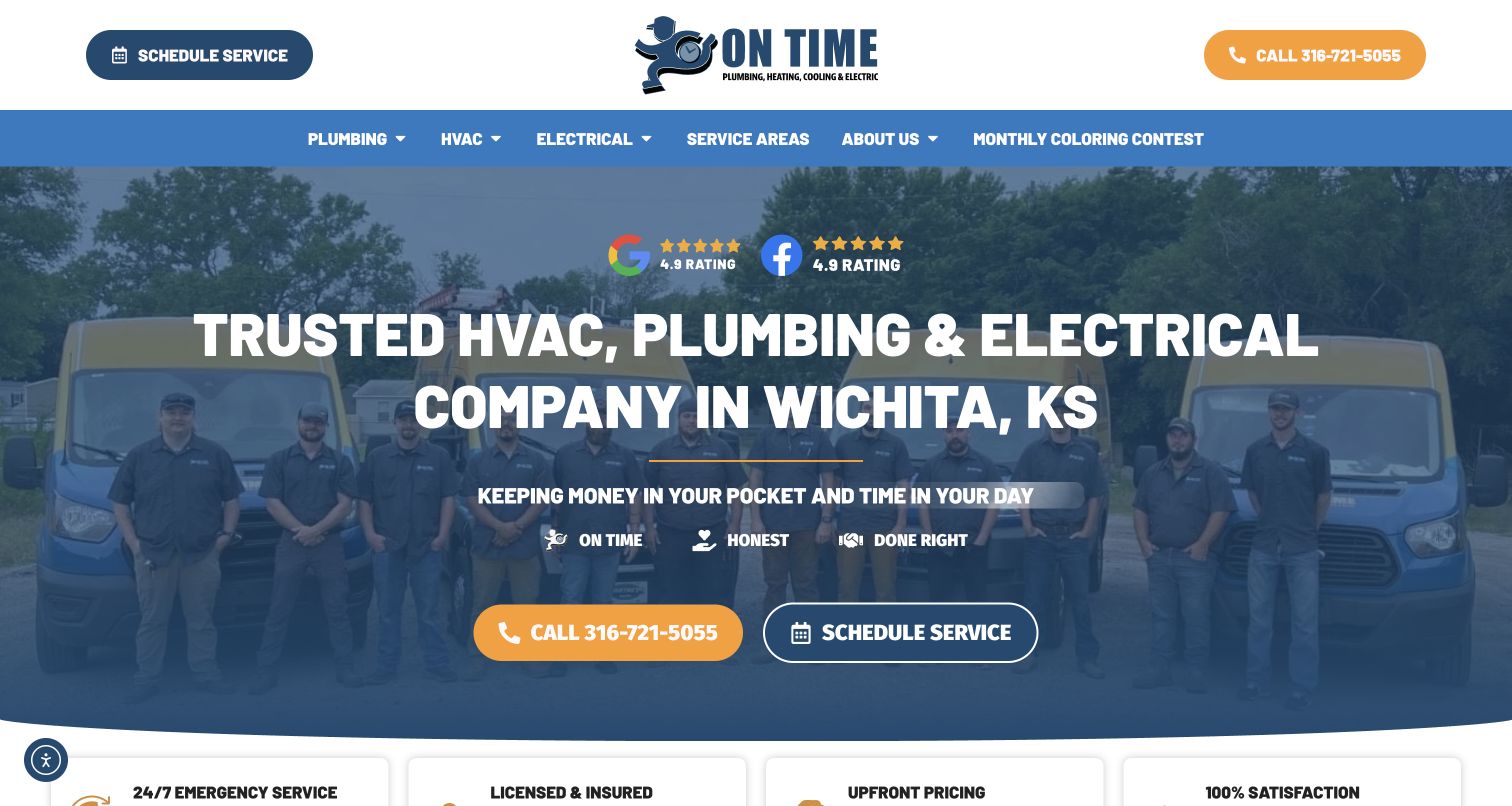
On Time’s Wichita site combines a fleet-and-technician photograph with an opening message that names the city and the available trades. Calling and scheduling are separate, high-contrast actions. For heating and cooling, the immediate benefit is geographic relevance: a visitor can establish that the company serves the right market before browsing equipment categories. The review badges and short value statements support the service presentation but take room that could describe the appointment itself. This is a useful local homepage reference when paired with stronger HVAC service pages, especially for replacement questions that need more context than the initial call-or-book choice.
What you can learn
Answer the local relevance question before collecting contact details. Then distinguish an HVAC service visit from a replacement consultation, keeping the same clear response options but changing the explanation to match the visitor’s actual goal.
Pros
The opening makes Wichita explicit.
Call and scheduling actions are clearly differentiated.
Cons & considerations
Several trades share the introductory space.
Badges do not explain equipment scope or the appointment process.
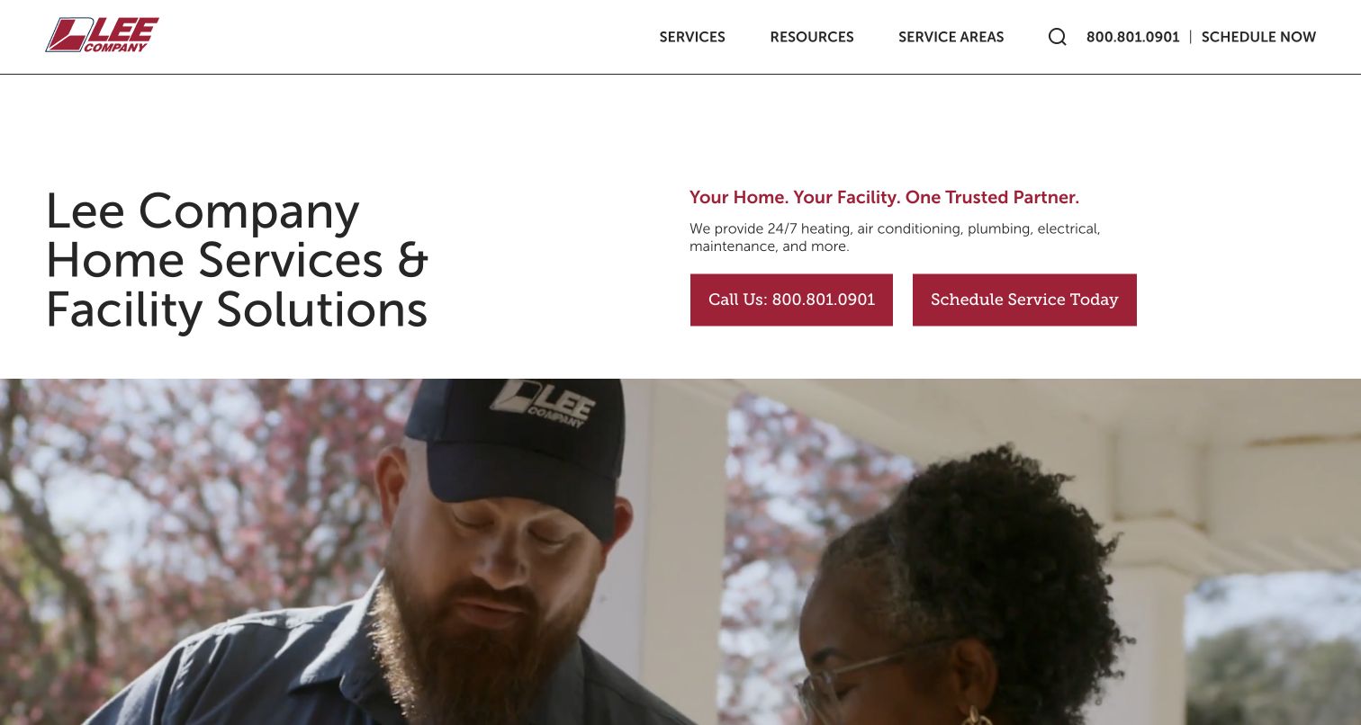
Lee Company uses a spacious introductory layout to distinguish home services from facility solutions. That distinction is particularly valuable for HVAC: a homeowner arranging a repair and a facilities team planning ongoing system support need different information and proof. The restrained typography and cranberry accents let the explanation lead, with broader imagery below. It is a useful reference for businesses that should not look exclusively like a coupon-driven residential contractor. The tradeoff is speed for a narrow request. The opening statement is broad, so a visitor with a heating fault still needs direct service navigation and a contact path that reflects urgency and local availability.
What you can learn
Separate residential HVAC from facility services at the audience level, then provide relevant detail within each path. Building managers need scope and operational evidence; household visitors need understandable equipment services and a clear appointment process.
Pros
The layout acknowledges two genuinely different audiences.
Explanatory text receives space rather than competing with a large offer.
Cons & considerations
A specific HVAC task requires further navigation.
Broad company language can feel indirect during a current breakdown.
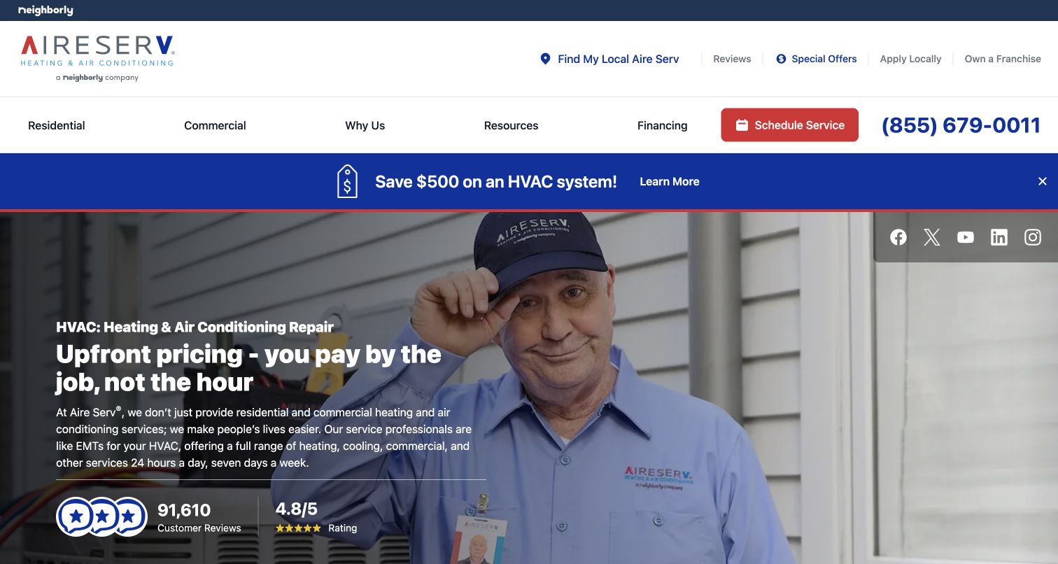
Aire Serv places residential and commercial choices in its header and uses an outdoor-unit service photograph as the main visual. A blue promotion strip and left-aligned hero copy create a recognizably HVAC-specific first screen, unlike the general household imagery common on multi-trade sites. The branded technician and system context make the service tangible without requiring a technical diagram. For a franchise network, the audience distinction is useful, but local availability remains essential before an appointment can be understood. Pricing reassurance and review signals support the message visually; their terms and sources still belong in accessible supporting content.
What you can learn
Use equipment-context photography when it clarifies the service, then separate residential and commercial journeys. Resolve the local provider early and explain what the next appointment or pricing discussion will actually cover.
Pros
The hero image is directly relevant to HVAC work.
Residential and commercial paths are distinguished.
Cons & considerations
A national brand still needs local qualification.
Promotion and pricing reassurance require supporting terms.
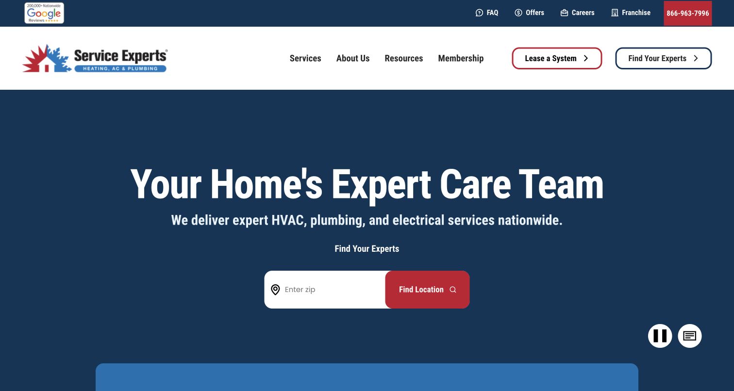
Service Experts makes a ZIP-code finder central to a dark, text-led hero. Membership and system leasing appear in the main navigation, showing that the company expects visitors beyond immediate repair callers. For HVAC design, this is a useful example of separating local routing from the broader equipment relationship. A reader can identify the nearby operation before comparing ongoing maintenance or acquisition options. The dark hero is legible even when motion is not the main visual feature, and video controls are available. The main tradeoff is that multiple commercial models need careful explanations: maintenance membership, equipment leasing and a service appointment are different commitments.
What you can learn
Resolve location first, then explain each HVAC relationship in plain language. Make the differences between repair service, maintenance membership and equipment leasing visible before asking users to choose a path or provide contact information.
Pros
ZIP routing is a clear central action.
Membership and leasing have explicit navigation labels.
Cons & considerations
Different service models create more comparison work.
The opening offers limited detail about any individual equipment task.
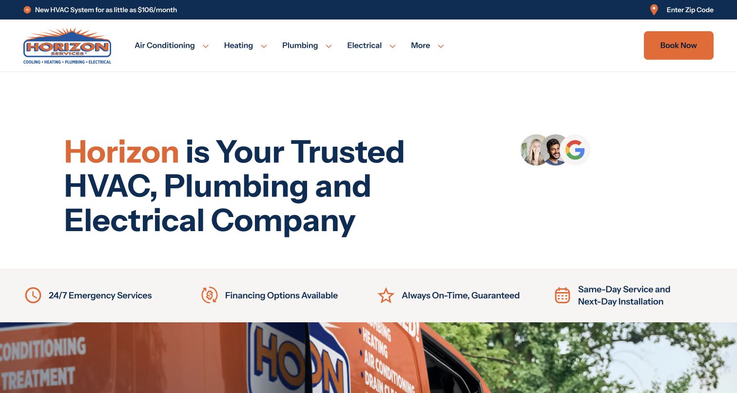
Horizon Services uses white space, navy text and orange accents to make its opening service message easy to scan. A short reassurance strip follows, while the branded orange vehicle imagery sits lower in the composition. ZIP selection and booking controls provide practical routes without requiring the hero to become a large form. For HVAC, this is useful when clarity matters more than presenting every seasonal offer at once. The design still needs deeper content to distinguish maintenance, a current failure and planned replacement. Its restraint works because the navigation and local selection remain visible, rather than because a simple headline can answer every equipment question.
What you can learn
Give an HVAC homepage one clear introduction and a short set of response choices. Use the following section to explain appointment types, and keep geographic qualification visible so a calm visual treatment still produces a practical next step.
Pros
The white-space-heavy introduction is easy to scan.
ZIP and booking controls provide clear next steps.
Cons & considerations
The opening does not explain equipment options in detail.
Reassurance statements need specific supporting information.
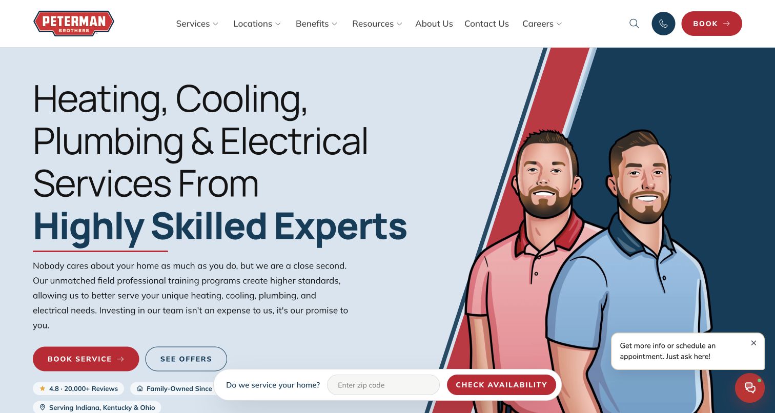
Peterman Brothers uses illustrated figures against a light blue hero, pairing its brand personality with copy about the team and training. Book Service and See Offers appear as separate choices, so visitors can distinguish an immediate appointment from promotional research. A location prompt and small chat control add practical routes around the main composition. For HVAC design, the illustration offers a recognizable alternative to another service-van photograph. Its success depends on the surrounding information doing enough factual work: a character illustration cannot show equipment expertise or project scope. The service pages need to connect the friendly introduction to concrete repair, maintenance and installation explanations.
What you can learn
Use illustration to create recognition, while reserving service content for evidence and scope. Keep appointments distinct from offers, and make location checks clear before a visitor begins an HVAC request.
Pros
Service booking and offers have different action labels.
The illustrated identity is visually distinctive.
Cons & considerations
The hero does not show actual equipment or project work.
Location and chat controls add competing interface elements.
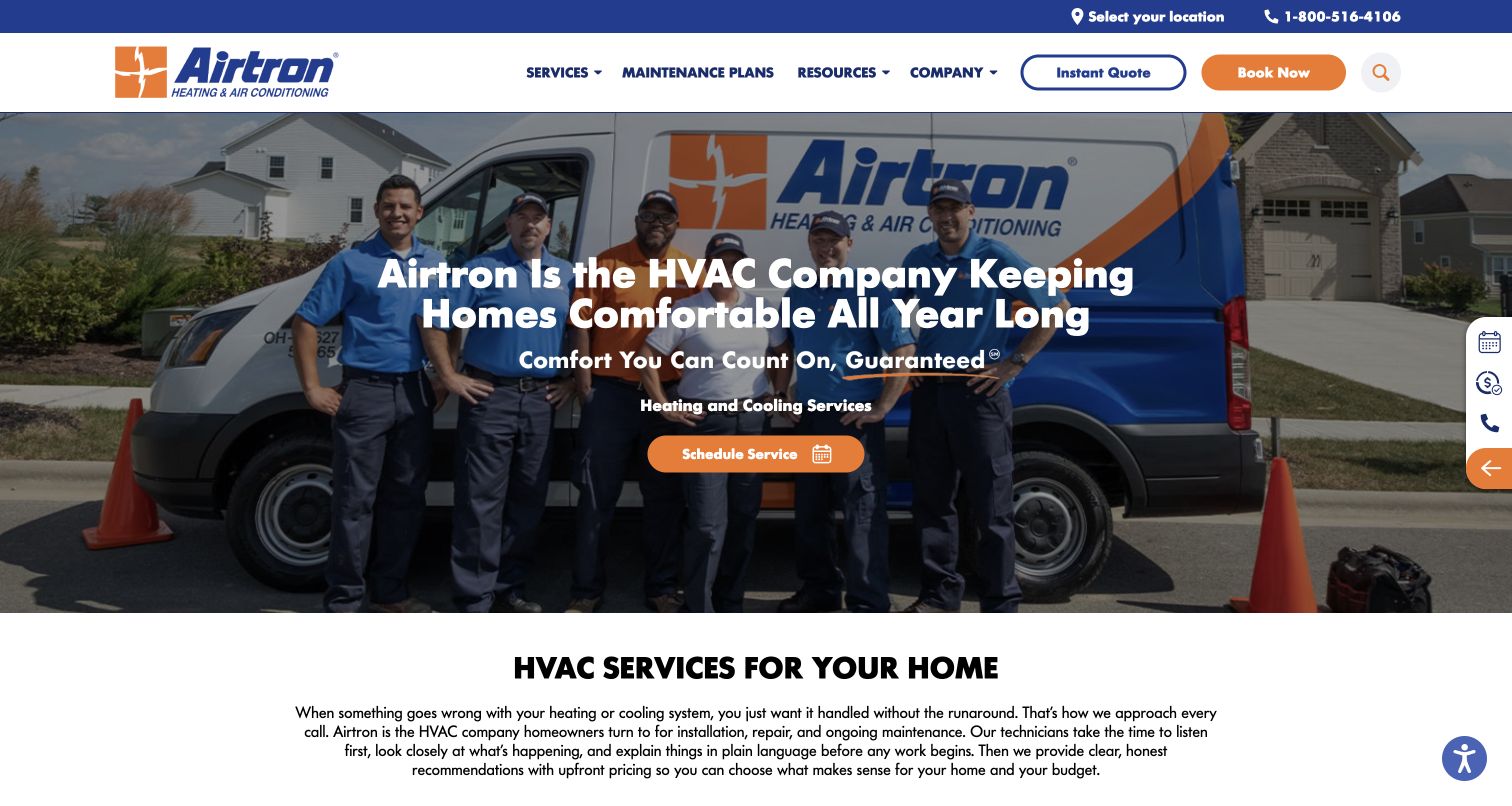
Airtron overlays a concise service message on a team-and-vehicle photograph, using orange actions against a navy and white header. Scheduling is prominent in the hero, while an instant-quote route receives its own header position. That distinction is useful for heating and cooling because a maintenance or repair appointment is different from investigating a new system. The group photograph also communicates a staffed operation without requiring a long company-history section. The main limitation is the amount of context that must live beyond the buttons. A quote workflow needs clear assumptions, and visitors should understand whether it concerns replacement equipment or a particular service before entering it.
What you can learn
Label HVAC actions by the outcome they provide. Keep scheduling separate from a system quote, and explain the scope of any online estimate before collecting details so the visitor can choose the appropriate route.
Pros
Scheduling and quoting are visibly separate.
The team photograph establishes a concrete service-business presence.
Cons & considerations
The hero cannot explain estimate assumptions on its own.
General service copy leaves equipment-specific questions to later pages.
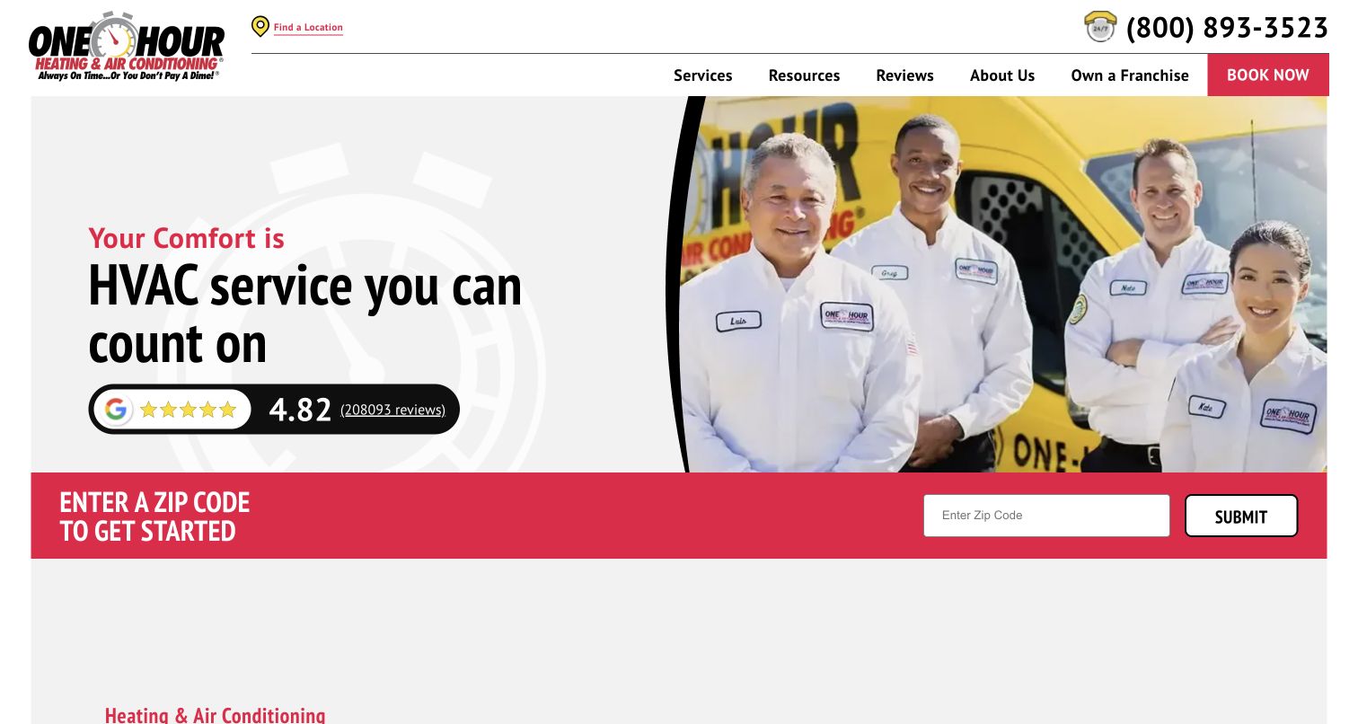
The captured One Hour Heating & Air Conditioning services page leads with a technician-team image and a broad HVAC service introduction. A ZIP entry sits near the start, while the longer page organizes work into more specific service categories. Using an inner service page as a reference is useful here: it shows the bridge between a brand homepage and individual equipment topics. The red, yellow and white identity stays recognizable without becoming the only content. For a national network, the local finder remains necessary, and the large catalog needs clear distinctions so readers do not confuse a symptom, a system type and an appointment category.
What you can learn
Build a service index that helps visitors move from ordinary language to the right HVAC topic. Preserve local routing and a direct contact alternative, and avoid presenting a long list of near-duplicate service names without explanations.
Pros
The page concentrates on HVAC rather than unrelated trades.
A service index supports deeper topic discovery.
Cons & considerations
The national structure adds a local qualification step.
A large catalog needs careful grouping to avoid choice overload.
Visible tech stack
Referenced on the public page
Adobe Fonts
nginxReported response header
Public source checked November 3, 2026. References may be embedded or legacy—not a complete backend inventory.
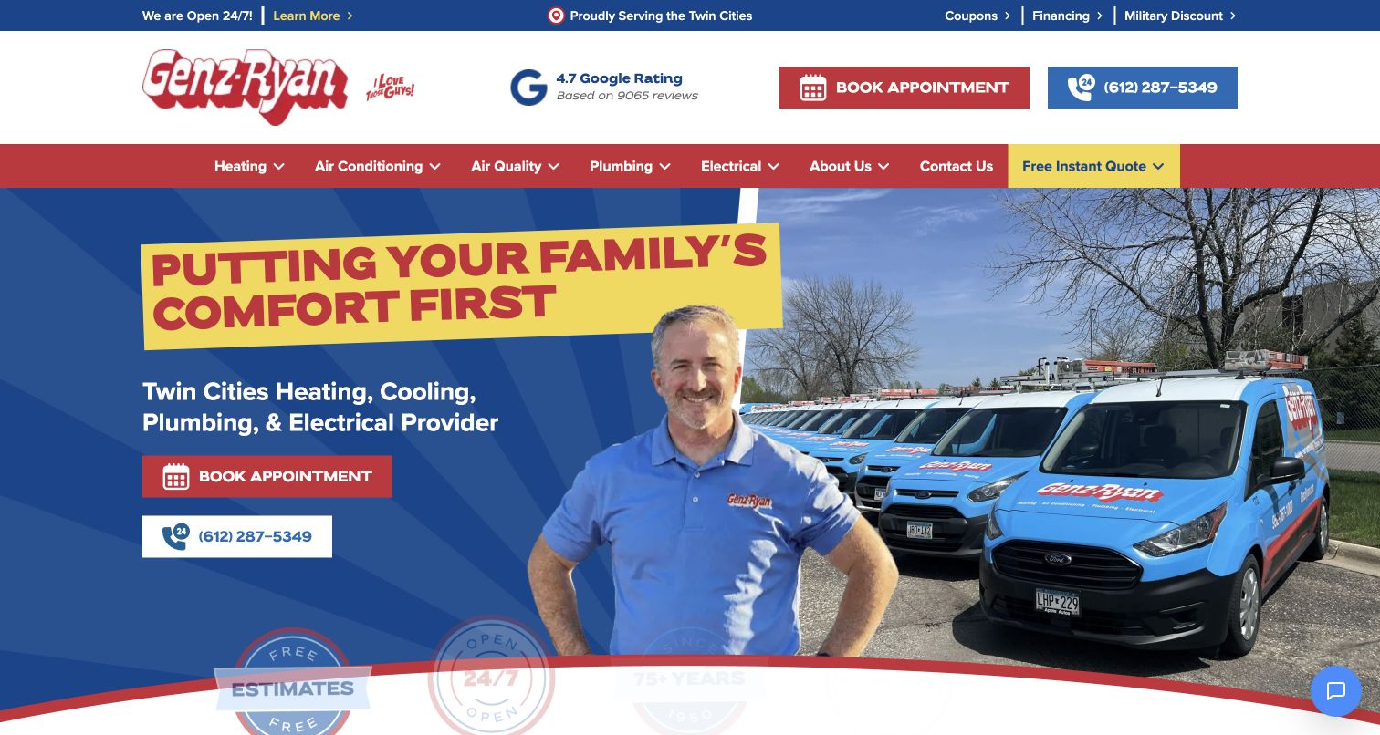
Genz-Ryan combines a technician-and-fleet image with a family-comfort message and contrasting blue and yellow actions. Heating and cooling are direct menu choices, while an instant-quote route and appointment option serve different intentions. The page continues into process explanations, troubleshooting video material and maintenance-plan comparisons. For HVAC design, that progression is valuable: the site can begin with reassurance and then supply practical detail rather than repeating the same promise down the page. The number of possible routes also requires discipline. A visitor with a current fault should not have to evaluate a membership or quote tool before finding ordinary service assistance.
What you can learn
Use the homepage to introduce the service, then support it with process and maintenance information. Keep repair help easy to reach while letting replacement researchers and plan shoppers explore at their own pace.
Pros
The page connects reassurance to more practical supporting sections.
Appointment and quote routes address different intentions.
Cons & considerations
Several commercial routes compete for attention.
Troubleshooting content needs clear limits and careful maintenance.
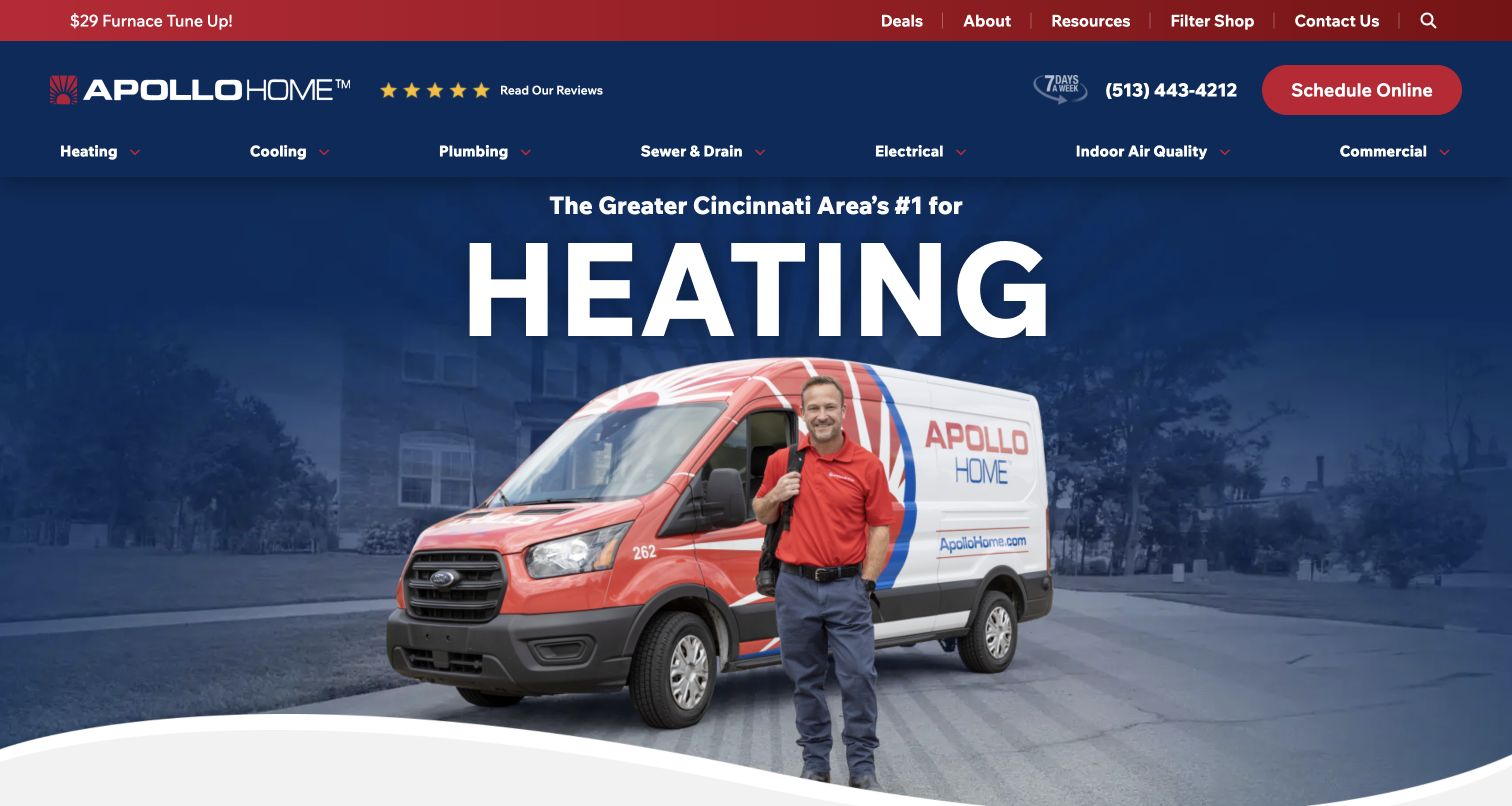
Apollo Home uses a navy, red and white identity around a technician-and-vehicle hero. A large heating-focused message and a furnace-related promotion make the captured season unmistakable, while the service navigation remains stable above. For HVAC sites, the useful pattern is a seasonal opening that does not replace the permanent catalog. Visitors can recognize the current campaign and still find other household services. The large rotating treatment also reveals a weakness to avoid: essential service context should not depend on seeing a particular slide or animated word. A fixed route to heating, cooling and appointment information remains necessary throughout the year.
What you can learn
Let seasonal campaigns change the emphasis without changing essential navigation. Keep campaign terms current and ensure a cooling visitor can still find relevant information when the homepage is promoting a heating appointment.
Pros
The seasonal HVAC focus is immediately recognizable.
Persistent navigation supports needs outside the current campaign.
Cons & considerations
Large rotating messages can delay useful details.
The offer needs scope and dates outside the headline artwork.
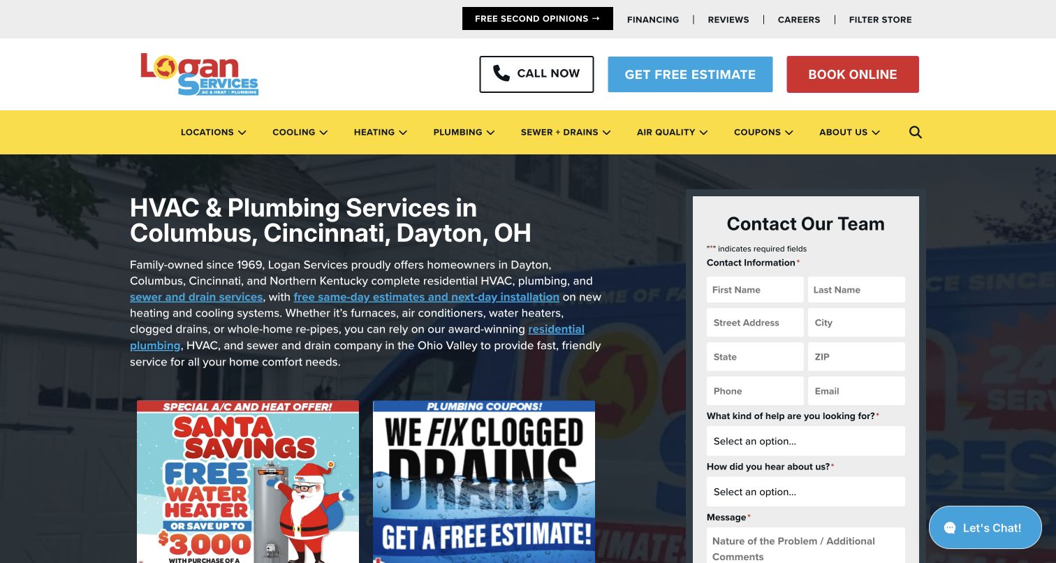
Logan Services names its Ohio markets in the introductory content and places a full form beside promotional panels. Estimate and booking actions are separated in the header, with additional routes for filters and second opinions. For HVAC design, that range acknowledges different decisions: a visitor may want routine service, equipment replacement or a comparison before committing. The form-forward composition makes conversion prominent, but it is dense. Promotional imagery, city text and several action types compete at once. The strongest lesson is to preserve those meaningful distinctions while keeping the initial explanation and form requirements proportionate to the visitor’s stage of research.
What you can learn
Define separate HVAC paths for service, replacement estimates and second opinions. Make the purpose of each form clear, show the service area early, and collect only the information needed for that particular next conversation.
Pros
Estimate and booking actions have different labels.
The regional cities are stated explicitly.
Cons & considerations
Promotional panels and a large form make the first screen busy.
Several specialist routes require clear prioritization.
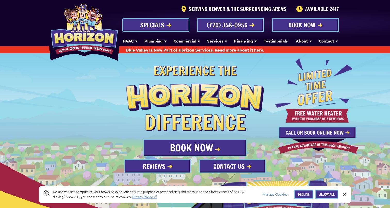
Horizon Services in Denver uses a purple and yellow illustrated skyline around its main identity and service message. Book, reviews and contact actions are grouped in the hero, with regional context in the header and a promotion beside the main content. This is a different company and visual approach from Horizon Services on the East Coast. For HVAC design, the local illustration makes the brand memorable while the explicit response choices remain practical. The strong graphic treatment also occupies space that could explain equipment services. A visitor should be able to move quickly from the brand presentation into heating or cooling information appropriate to the local operation.
What you can learn
Use a distinct local identity to improve recognition, then make the service paths literal and easy to find. Keep acquisition notices and promotions secondary to the appointment, coverage and equipment information a new visitor needs.
Pros
The purple-and-yellow identity is distinctive.
Booking, reviews and contact are separate visible actions.
Cons & considerations
Promotional and company-change messages add visual competition.
The graphic hero provides little equipment-specific detail.
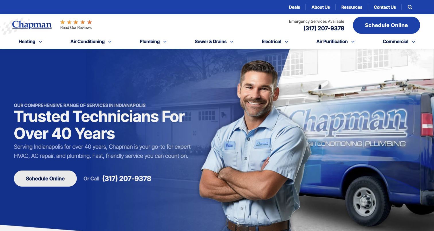
Chapman uses a technician cutout and branded vehicle against a simple blue and white composition. Indianapolis is identified near the opening message, and scheduling and calling receive distinct actions. The company-experience statement supports the introduction without turning the first screen into a long history. For HVAC visitors, this is a useful balance of local relevance, human presence and immediate next steps. The copy still needs deeper service pages to explain equipment decisions, particularly replacement or maintenance plans. The design’s relative simplicity makes that next layer important: a concise homepage should point to detailed answers rather than leave visitors with only a general reassurance statement.
What you can learn
Pair local context with a real service-team image and two clear response options. Use the following pages to explain HVAC appointment types and equipment work, keeping the homepage concise without making the service itself vague.
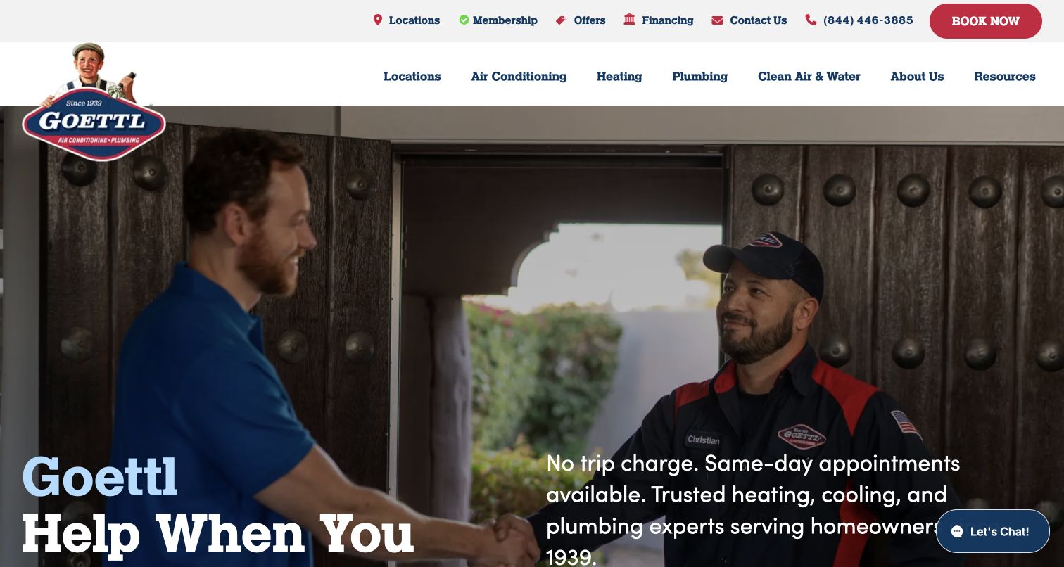
Goettl’s hero shows a technician meeting a homeowner, with large white service copy and a separate reassurance paragraph over the motion background. The two-level header keeps locations, membership, offers and financing apart from heating, air conditioning and other service categories. For HVAC design, the human interaction emphasizes the visit experience rather than a product photograph. The service menu supplies the practical structure around that story. The tradeoff is visual complexity: text sits over changing footage, and several business models compete above it. The design needs readable fallbacks and a clear route for a simple service request when visitors are not interested in membership or financing.
What you can learn
Use motion to support the HVAC service story only when the essential message remains readable. Keep appointment, membership and financing routes distinct, and maintain a still-image fallback and plain service navigation.
Pros
Heating and cooling remain visible in the main service menu.
The hero depicts an actual household service interaction.
Cons & considerations
Text overlays must remain legible as the footage changes.
Several utility choices compete before the service journey begins.
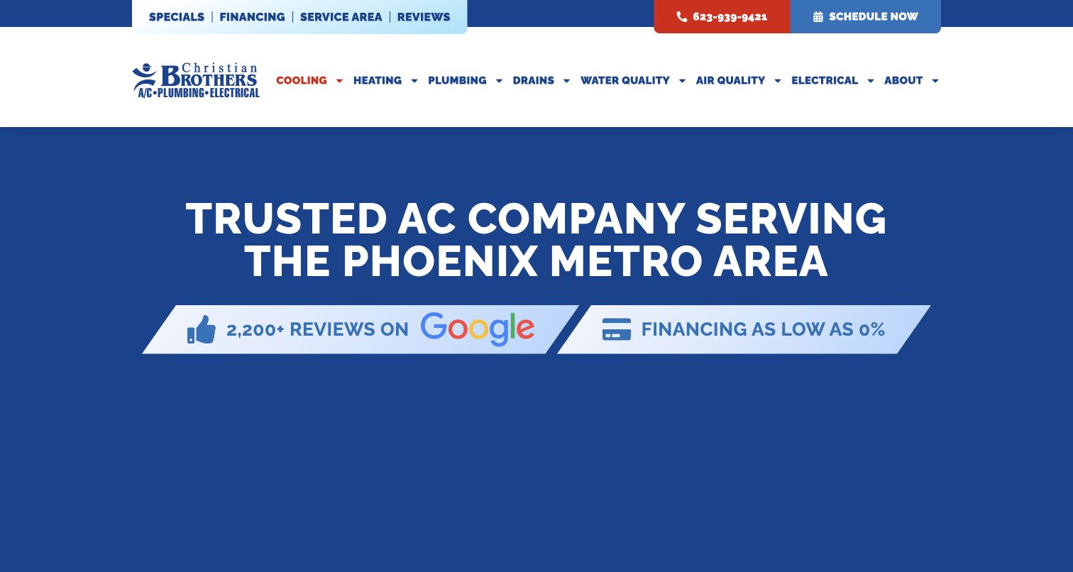
Christian Brothers' captured cooling page uses a solid blue title area to state its Phoenix air-conditioning focus. The branded white header and red accents remain consistent, while review and financing signals sit near the introduction and the request form begins below. This is useful as a service-page reference because the visitor does not need to choose among several trades before learning the subject. The limited opening image treatment also makes the text carry the local relevance. The page still needs to distinguish repairs, maintenance and equipment replacement farther down, and financing should remain a supporting path rather than the only explanation of the next step.
What you can learn
Use dedicated HVAC pages to make the city and system explicit. Keep the contact route close, but provide distinct explanations for repair, maintenance and installation so a focused landing page can serve more than one appointment goal.
Pros
The title area states both location and cooling service.
The page avoids an extra trade-selection step.
Cons & considerations
The opening provides little project or equipment imagery.
Financing and review signals need relevant supporting context.
Plan the HVAC journey before designing the campaign
Identify the visitor’s actual goal
Map common office requests into a small set of journeys: current problems, routine maintenance, equipment replacement and any genuine commercial work. Define what each person needs to know before contacting the team. Use customer language for symptoms and goals rather than turning the form into a technical diagnosis.
Create a stable service and equipment structure
Plan service pages that explain what the company actually handles and where. If equipment categories require different information, give them clear relationships to repair, maintenance and installation content. Avoid duplicating the same broad paragraph across every system and city.
Specify every external handoff
Document where booking, quote tools, financing information and membership enrollment lead. Label those actions differently and explain what the visitor will receive. Keep ordinary contact available, and establish a process for expired promotions, changed terms and integrations that stop working.
The editing job behind the design
Build for dependable updates and clear service handoffs
Use a CMS with repeatable service, location and campaign records. Give seasonal offers explicit dates and an owner, while keeping evergreen service information separate. Make phone numbers and office details shared fields so they remain consistent across pages and campaign destinations.
Choose appointment and CRM tools that match the team’s workflow. A quote calculator or online equipment shop adds another interaction to test and explain; it does not replace clear scope. Keep essential text available without video, and use responsive images so a useful local service page does not depend on a large media download.
Our WordPress website examples offer a separate look at publishing approaches. A visible platform label is evidence for that named page, not a guarantee that the same system will suit your requirements.
Before the public launch
Heating and cooling website launch checklist
Verify actual service markets, equipment scope and the contact route for each office.
Distinguish repair appointments, maintenance, replacement estimates and commercial inquiries.
Check seasonal-offer dates, exclusions and readable terms outside image artwork.
Explain the scope of quote tools, memberships and financing destinations before handoff.
Review mobile menus, keyboard access, video fallbacks and appointment confirmations.
Assign owners for campaign updates, integration failures and service-content review.
These checks are a project checklist, not a performance, legal, security, or accessibility certification. Test real journeys with the people responsible for the website before making claims about the result.
Sources & editorial method
How this collection was selected and reviewed
We selected 29 distinct official HVAC-company websites or focused service pages and reviewed their public presentation directly in the browser. Several also provide plumbing or electrical services; the observations here focus on heating and cooling decisions. Captures retain their actual dates, and company claims are described as website content rather than independently verified performance. No platform is inferred from appearance.
Each example links to its actual source page. Screenshots are direct browser captures with their own capture dates; moving imagery, announcements and live designs can change. The notes describe observable design choices and conditional tradeoffs, not measured traffic, conversion results, service quality, or accessibility conformance.
Technology labels use public page metadata, asset evidence, or explicitly cited platform documentation. Platform documentation is not a complete current deployment audit. A component reference may be legacy or unused; it is not a complete backend inventory. Unknown stacks are omitted. These sites are editorial examples, not our client portfolio.
Written, Edited and Curated are separate editorial records, not timestamps advanced by a rebuild. Website designs and imagery belong to their owners. See our editorial standards or suggest a correction.
Questions worth asking
Heating and Cooling website design questions
Should heating and cooling be separate menu items?
They can be useful when each route provides meaningful information and matches how customers ask for help. The next level should also distinguish the service goal, such as repair, maintenance or replacement. Avoid making visitors choose a technical equipment category before they understand the options.
Is an online quote tool necessary?
No. A clear estimate-request process can work well. If a tool is used, explain its scope and assumptions, what information it requires and what happens afterward. Keep a plain contact alternative for visitors whose situation does not fit the tool.
Where should a maintenance plan appear?
Give it a clear route and explain the included services and terms. Do not make it an unavoidable step for someone who simply wants a repair appointment. Keep the information current and connect it to the actual maintenance work the team provides.
How should seasonal HVAC offers change the homepage?
They can change emphasis while the main navigation and service paths remain stable. Include readable scope and dates, preserve routes for needs outside the campaign, and avoid making essential information depend on a rotating slide.
Use the examples to make HVAC decisions easier to understand. Clear local scope, distinct appointment goals and dependable handoffs matter more than copying a campaign’s visual style.