Best Art Fair Websites of 2026 (27 Real-World Examples)
Art fair websites that connect a distinctive cultural identity to galleries, programmes and a practical visit.
Explore 27 real fair websites and specific exhibitor pages, with direct screenshots, original reviews and practical lessons. Study how specialist and international fairs manage the changing needs of visitors, galleries and press.
An art fair website has a seasonal job. A visitor may arrive to discover galleries, buy a ticket, check the right day and venue, understand preview access or plan several events across a city. A gallery has a different journey: scope, sections, application dates and participation information. A strong opening image can communicate atmosphere, but it cannot safely carry every one of those tasks.
These examples include large international platforms and smaller specialist fairs. Some reviewed pages promote 2027 while others preserve completed 2026 editions; that distinction is part of the design lesson. EXPO CHICAGO and ArtVerona are explicitly identified exhibitor pages, and ZⓈONAMACO is a scrolled overview. Reviews assess public presentation, not independently measured visitor numbers, sales results or the artistic quality of a fair.
Before the examples
What makes good art fair website design in 2026?
Make the edition unmistakable
Show the event name, city, actual venue and date range together. Distinguish public days, previews and gallery-application dates. Do not reuse an expired invitation as if it were current.
Separate visitor and exhibitor tasks
Tickets, hours, access, programme and gallery applications serve different needs. Use clear labels and stable destinations so a first-time attendee does not enter an exhibitor login or VIP-only flow accidentally.
Give the art useful context
Identify galleries, artists, works and image credits where permitted. Explain curated sections and programme formats, and provide a searchable or otherwise usable roster rather than a wall of unlabelled logos.
Plan for the months between fairs
Keep completed editions as real archives, explain what is pending for next year and update the primary action with the event season. A date change must agree across the homepage, footer, ticketing and calendar records.
The collection · 27 examples
27 art fair websites worth studying
The target of 27 was randomly drawn and saved before research. All 27 accepted examples have genuine browser captures and original editorial observations. ceramic brussels is the explicit Editors Choice for its clear specialist proposition, credited imagery and practical resource routes.
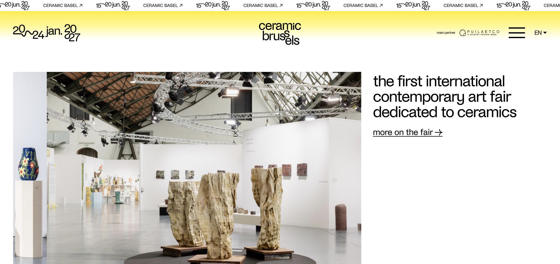
ceramic brussels places its specialist purpose alongside a large, credited installation photograph rather than making the entire opening an unexplained poster. The distinctive stacked wordmark and drawn dates establish the identity, while gallery, prize and visitor routes provide practical next steps. Later features distinguish the guest artist, participating galleries and a hotel partner. Its published figures are explicitly grouped as 2026 information, separate from the 2027 event identity.
What you can learn
State the fair’s distinctive scope in plain language, then give photographs enough space and context to demonstrate it. Keep annual results separate from the upcoming edition.
Pros
The opening explains the ceramics focus without requiring a menu visit.
Image credits and individually identified features add useful editorial context.
Cons & considerations
The separate Basel announcement can distract from the Brussels event if both are equally prominent.
The tall opening and hidden main menu require deliberate small-screen and keyboard testing.
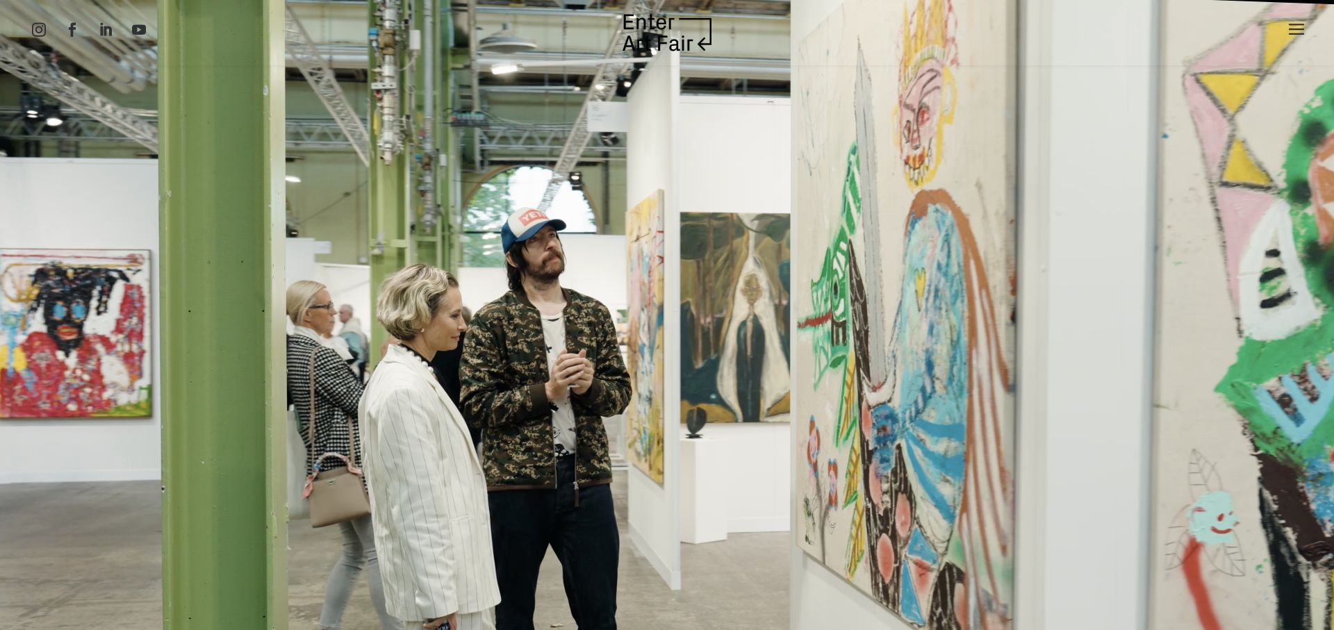
Enter Art Fair starts with moving views of the Copenhagen venue, with a compact centred logo and menu at the edges. The text below introduces the next dates and then returns to clearly labelled 2026 sculpture, programme and gallery content. Conversations, curated selections and exhibition recommendations extend the site beyond ticket sales. Office and venue addresses are separately identified in the footer, an important distinction for an event with a temporary visitor destination.
What you can learn
Use the venue to communicate atmosphere, but keep the next dates and actual visitor address close to the practical planning journey.
Pros
Office and event-venue information are distinguished.
Programme and gallery material remains identifiable by edition year.
Cons & considerations
The full-screen opening delays the date and ticket information on first load.
Several image alternatives are filenames rather than descriptive editorial labels.
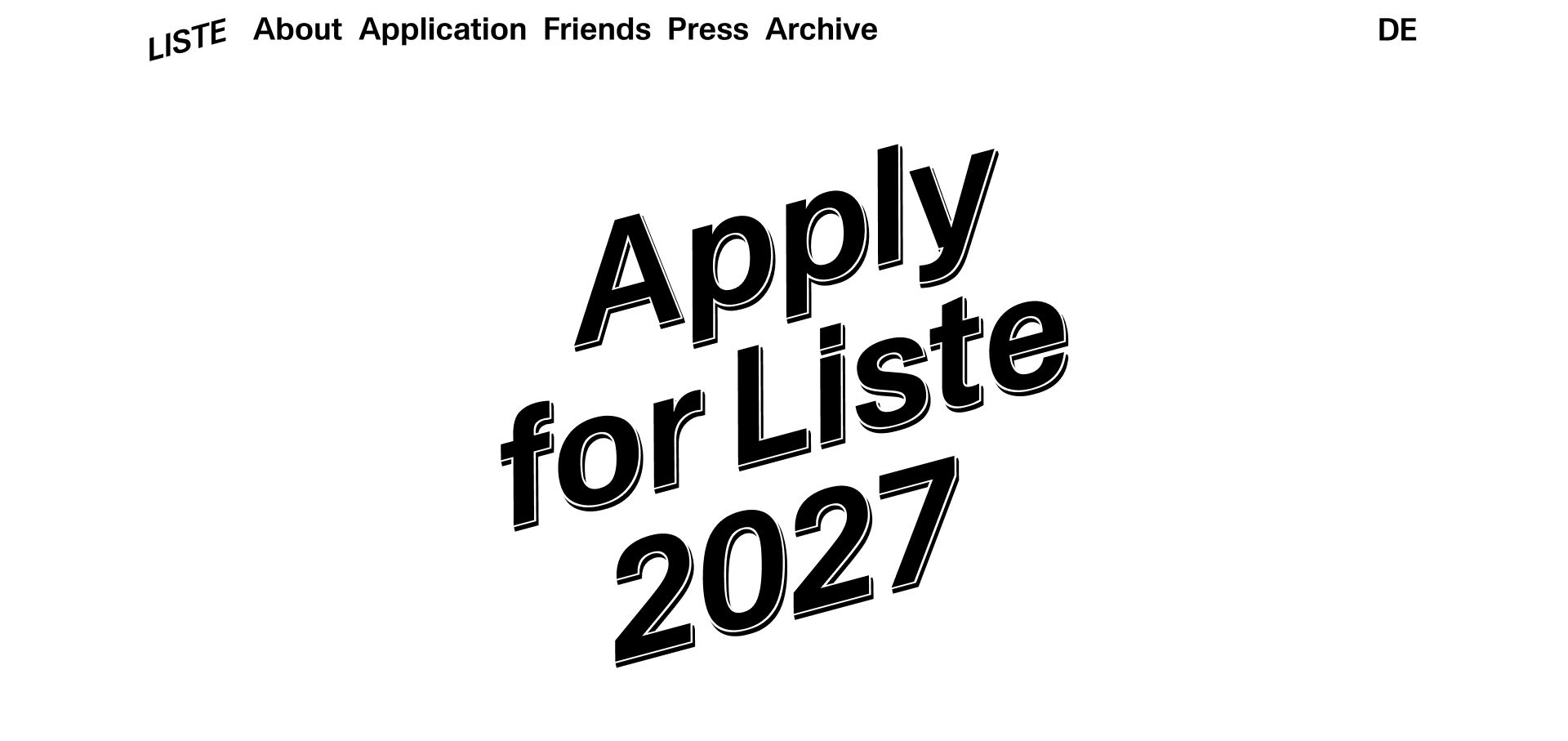
Liste uses a large tilted typographic application invitation as its principal visual rather than a photograph. A short paragraph supplies the next edition’s dates and hall, while the top navigation retains About, Application, Friends, Press and Archive. This is a deliberately narrow between-editions homepage: the gallery application is the main task, with supporter and historical routes still available. It is less suitable as a complete model for visitors arriving during the live fair.
What you can learn
Let the primary action change with the event season, but preserve stable archive and information routes. A striking application poster still needs a concise date and venue statement.
Pros
The application priority is unusually unambiguous.
A compact persistent navigation keeps the essential organisational routes available.
Cons & considerations
The oversized invitation pushes basic visitor context lower on the page.
The reviewed homepage does not provide a full live-fair planning dashboard.
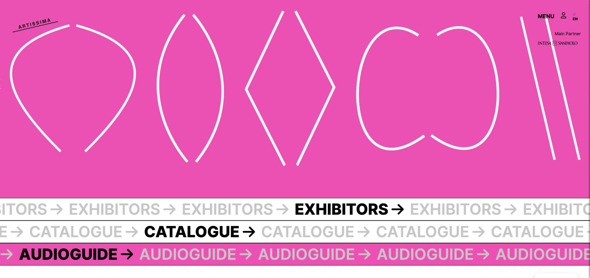
Artissima combines a bright pink campaign graphic with three large moving strips for exhibitors, the catalogue and an audioguide. Behind the menu, practical information, projects, prizes, events in Turin and press resources form a substantial structure. The homepage’s dated news explicitly reports the conclusion of the 2026 edition. The identity is memorable, but repeated animated words create far more visual and document noise than three ordinary task links would.
What you can learn
Keep the essential catalogue, exhibitor and visit tasks available even when a fair’s campaign art is highly abstract. Provide a calmer alternative to repeated moving labels.
Pros
The three principal resources are named explicitly rather than hidden in campaign copy.
Dated post-fair news establishes the edition’s current state.
Cons & considerations
Long repeated marquee labels can burden assistive navigation.
Motion and saturated colour require reduced-motion and contrast review.
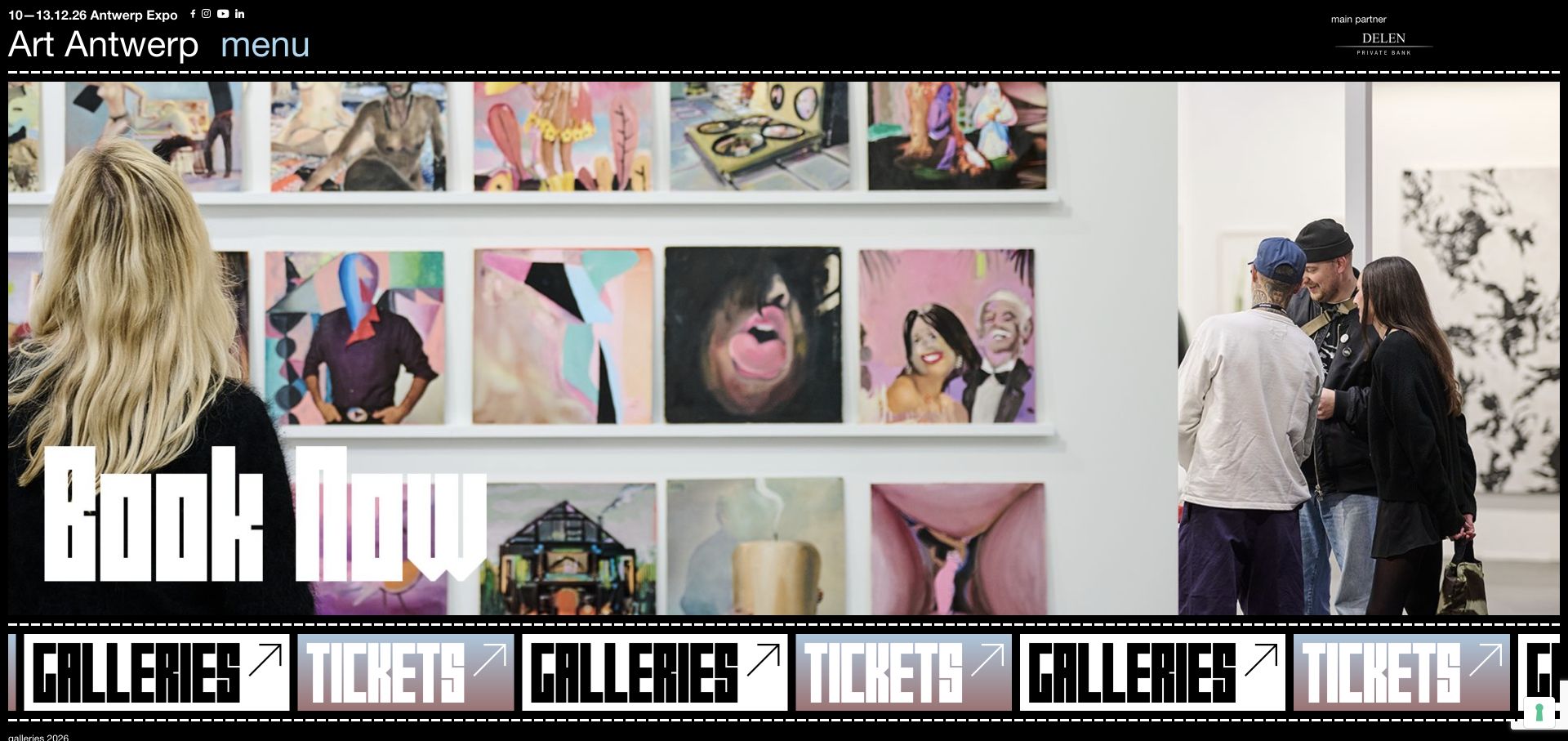
Art Antwerp keeps dates and Antwerp Expo in a small top line, then frames a large installation photograph with a black background and dashed separators. A prominent booking message and repeated gallery/ticket strip emphasise the imminent event. The menu groups visitor tasks, the fair, city recommendations, partners and organisational information. Guided tours, advisory help and the floor plan are recognisable options rather than being folded into a single vague visit page.
What you can learn
Group practical choices by visitor purpose and retain the date and venue outside the image. Treat city recommendations as supporting context, not the main ticket journey.
Pros
Access, hours, floor plan and tours have distinct navigation labels.
The date-and-venue line stays visually separate from campaign imagery.
Cons & considerations
Repeated moving ticket labels need a quieter accessible equivalent.
A reviewed Facebook link contains a malformed hhttps prefix and should be corrected.
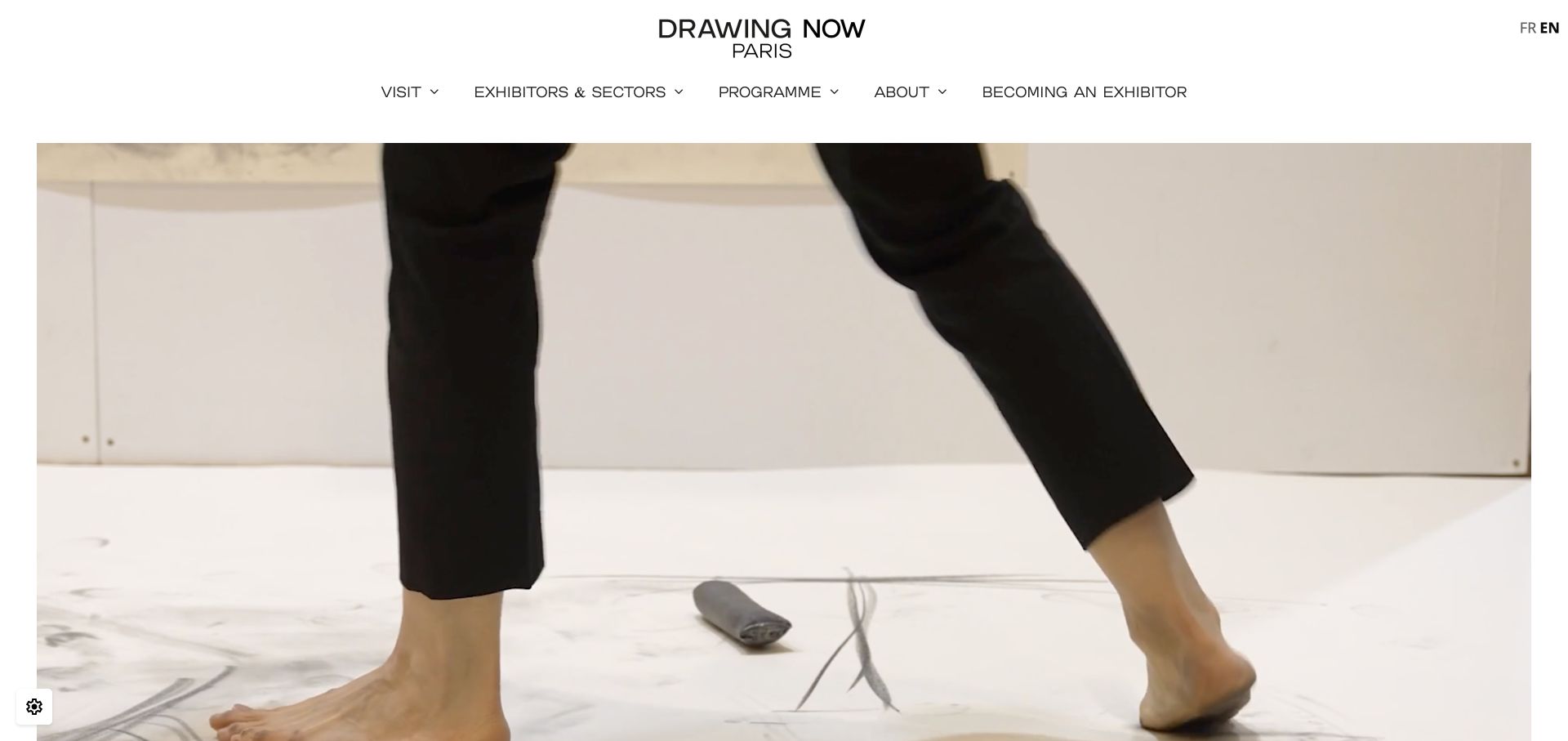
Drawing Now Paris leads with fair footage and a restrained logo/navigation, then explains the contemporary-drawing focus in real text. The introduction distinguishes an invitation-only preview from the daily public opening schedule and offers an add-to-calendar file. Programme cards link to galleries, awards, talks and exhibitions, followed by attributed testimonials. The long page mixes future practical information with clearly labelled 2026 programme material, so year labels are essential.
What you can learn
Explain the specialist medium and separate preview access from public admission. Dates, daily hours and calendar links should be real content, not text embedded only in a poster.
Pros
Public hours and invitation-only preview rules are explicit.
Programme features use photographs and recognisable destination names.
Cons & considerations
Some English headings link into French or differently named programme paths.
Filename-like image labels and repeated generic links weaken accessible discovery.
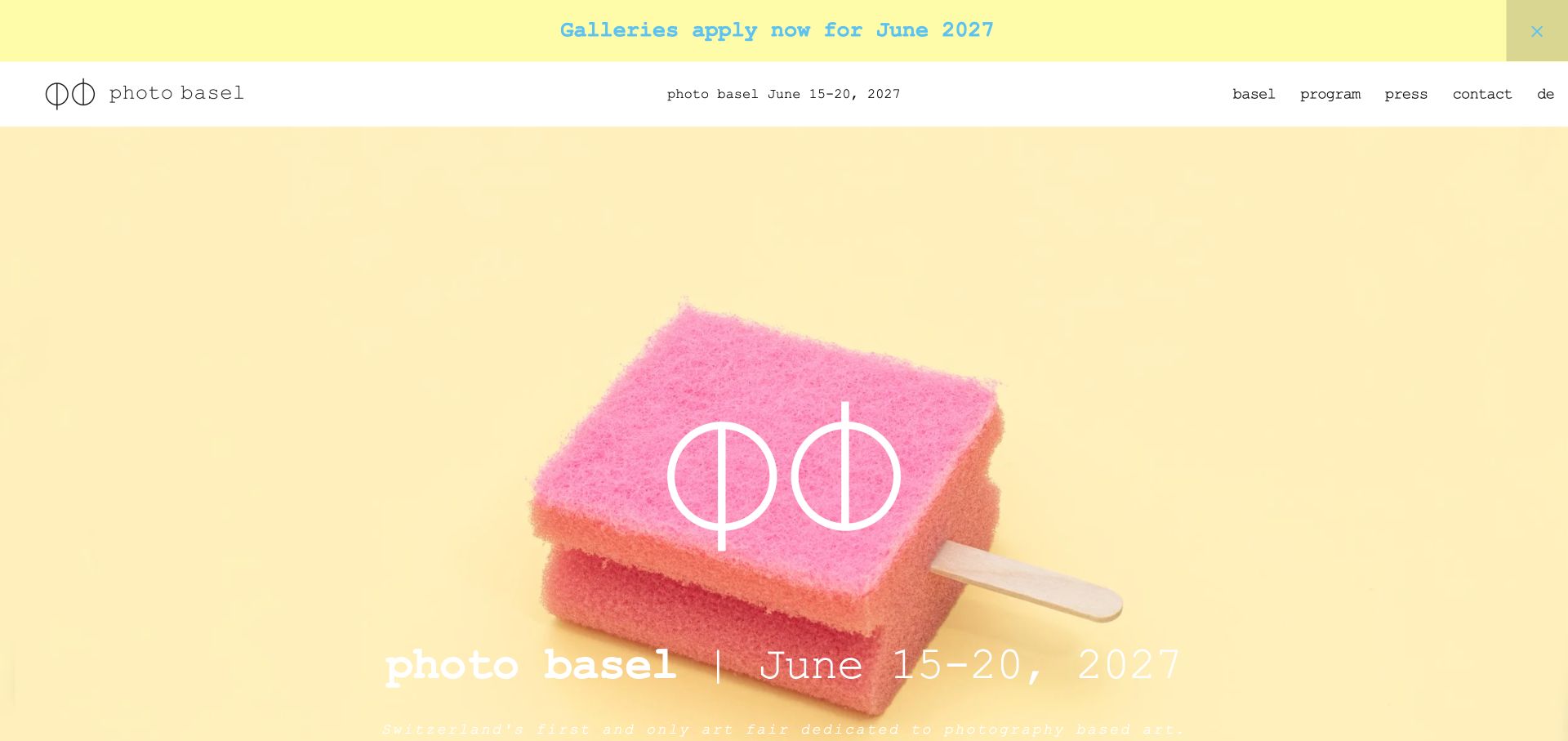
photo basel uses a playful popsicle-like visual on a pale yellow field, paired with the fair’s dates in its header. The page then answers what, how, when, where and why in short blocks, with the new Musical Theater Basel location called out and linked to a map. A gallery-application announcement sits above the navigation. The unusually clear explanatory structure is more useful to borrow than the low-contrast white text over the pale campaign image.
What you can learn
Answer a new visitor’s basic planning questions directly. When the venue changes, identify the new address prominently rather than assuming returning guests will notice.
Pros
The what/how/when/where/why structure makes event context scannable.
The new location is explicitly identified and connected to a map.
Cons & considerations
White campaign text over a light yellow image needs stronger contrast.
The extensive submenu and partner inventory can overwhelm a small fair’s key tasks.
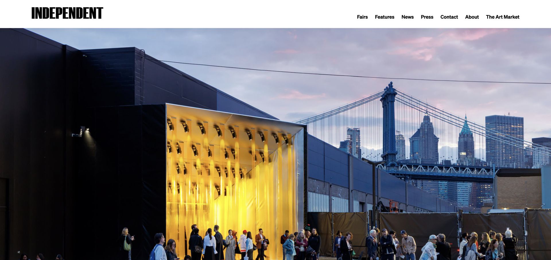
Independent pairs its condensed black wordmark with a large waterfront venue photograph and a compact navigation. Below the opening, news and features give substantial context to recorded conversations, including named participants and the building discussed. Fairs and editorial material are different destinations, rather than an undifferentiated card stream. The reviewed homepage prioritises atmosphere and cultural publishing more than immediate dates, ticketing or a first-time visit checklist.
What you can learn
Give year-round editorial work a clear home, while making the route to the actual fair equally recognisable. A strong venue photograph is not a substitute for current attendance information.
Pros
Conversation summaries identify participants and subject matter.
Features, news and fair destinations are separated in the main navigation.
Cons & considerations
The opening image provides little immediate date or admission context.
A photograph-first homepage needs a dependable practical-information route for new visitors.
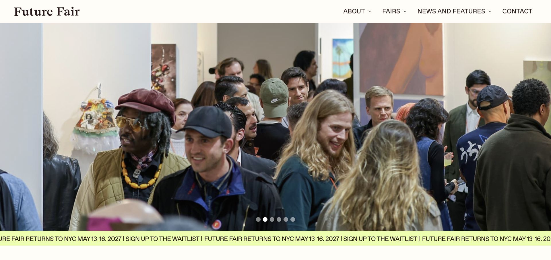
Future Fair places installation imagery under a cream header with a quiet serif wordmark. A contrasting strip announces the next New York dates and waitlist, followed by a separately dated studio programme and a concise description of the fair’s community focus. Stories distinguish local, national and international exhibitors, while on-demand talks give the site a purpose outside the annual event. Carousel controls are present, but the repeated moving waitlist message can be distracting.
What you can learn
Use a consistent visual system for events, exhibitor stories and recorded talks, while giving each initiative its own dates and destination.
Pros
The next fair and the studio programme are separately dated.
Exhibitor stories explain different parts of the participating community.
Cons & considerations
Repeated marquee text needs a reduced-motion alternative.
The large initial carousel postpones the fair’s short explanatory statement.
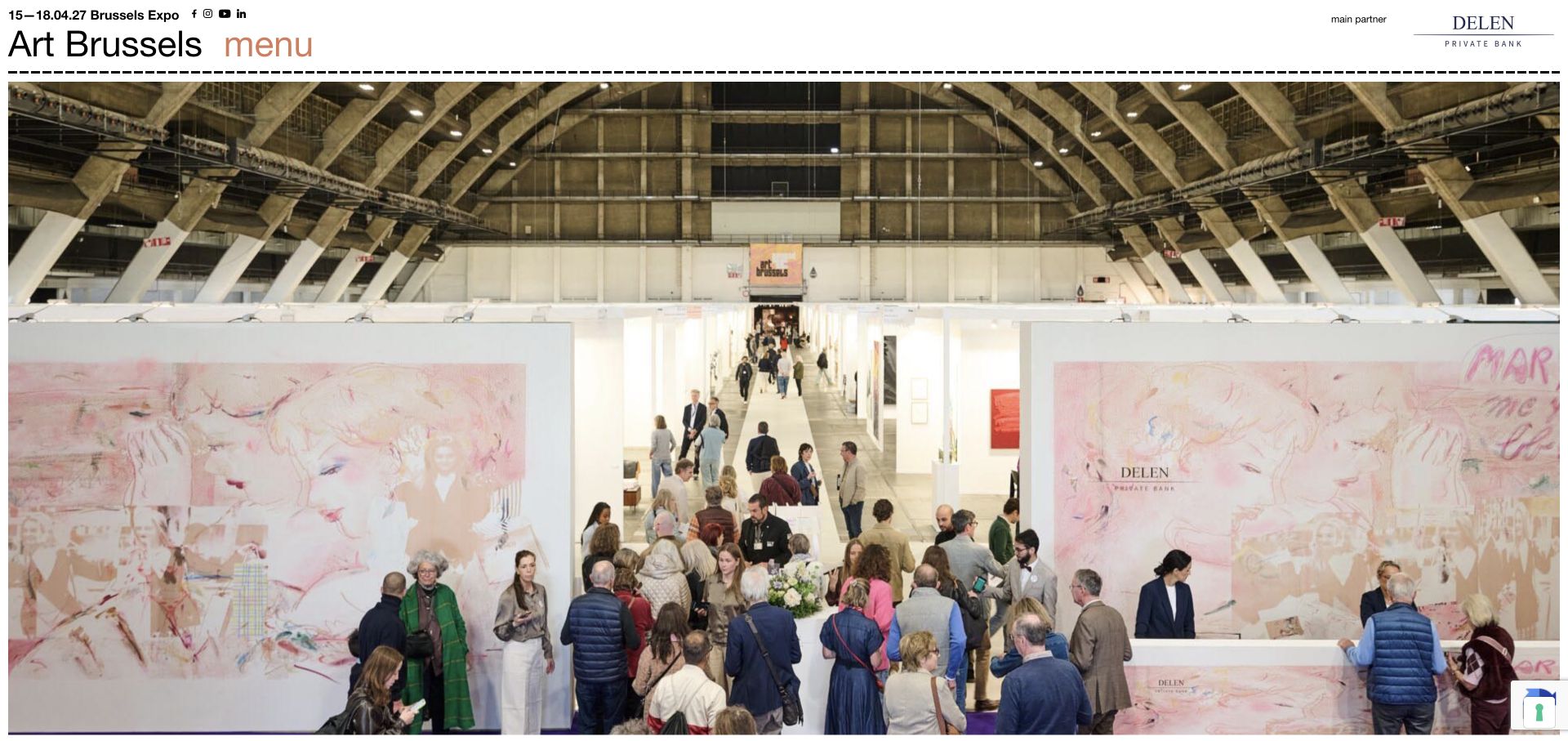
Art Brussels uses a white masthead, dashed divisions and an immersive entrance photograph, with the next date and venue above the logo. Its content extends from gallery and prize information to off-site exhibitions, restaurants, hotels and a gallery night. Interviews identify curators and artists instead of relying entirely on generic highlights. The reviewed page mixes 2027 context with 2026 archive material, and some destinations still carry older year-based paths.
What you can learn
Separate the core fair, practical visit and wider city programme, then label edition years consistently. Older URLs can remain useful, but visible context should remove uncertainty.
Pros
City information supports a realistic multi-stop visit.
Curator and artist interviews give editorial features an identifiable subject.
Cons & considerations
The reviewed Facebook destination has a malformed protocol.
Year-labelled copy and older image-page paths need careful editorial reconciliation.
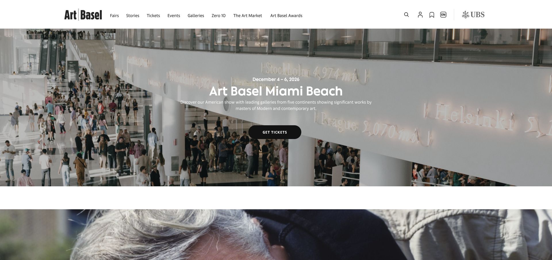
Art Basel gives the upcoming Miami Beach show a clear date, summary and Get tickets action over a muted venue image. A broad header separates fairs, stories, tickets, events, galleries and market material. Dated editorial cards sit alongside a next-fairs list that identifies different cities and editions. This scale requires unusually careful destination checks: in the reviewed document, a Hong Kong fair link pointed to the Qatar path rather than the labelled city.
What you can learn
A global event platform should make the currently promoted show obvious without losing city-specific journeys. Validate that labels and destinations agree across reused event cards.
Pros
The hero combines date, show name, explanation and a primary action.
Editorial bylines and dates distinguish stories from fair logistics.
Cons & considerations
A Hong Kong label linked to a Qatar destination in the reviewed page.
The breadth of market, awards and editorial content increases navigation complexity.
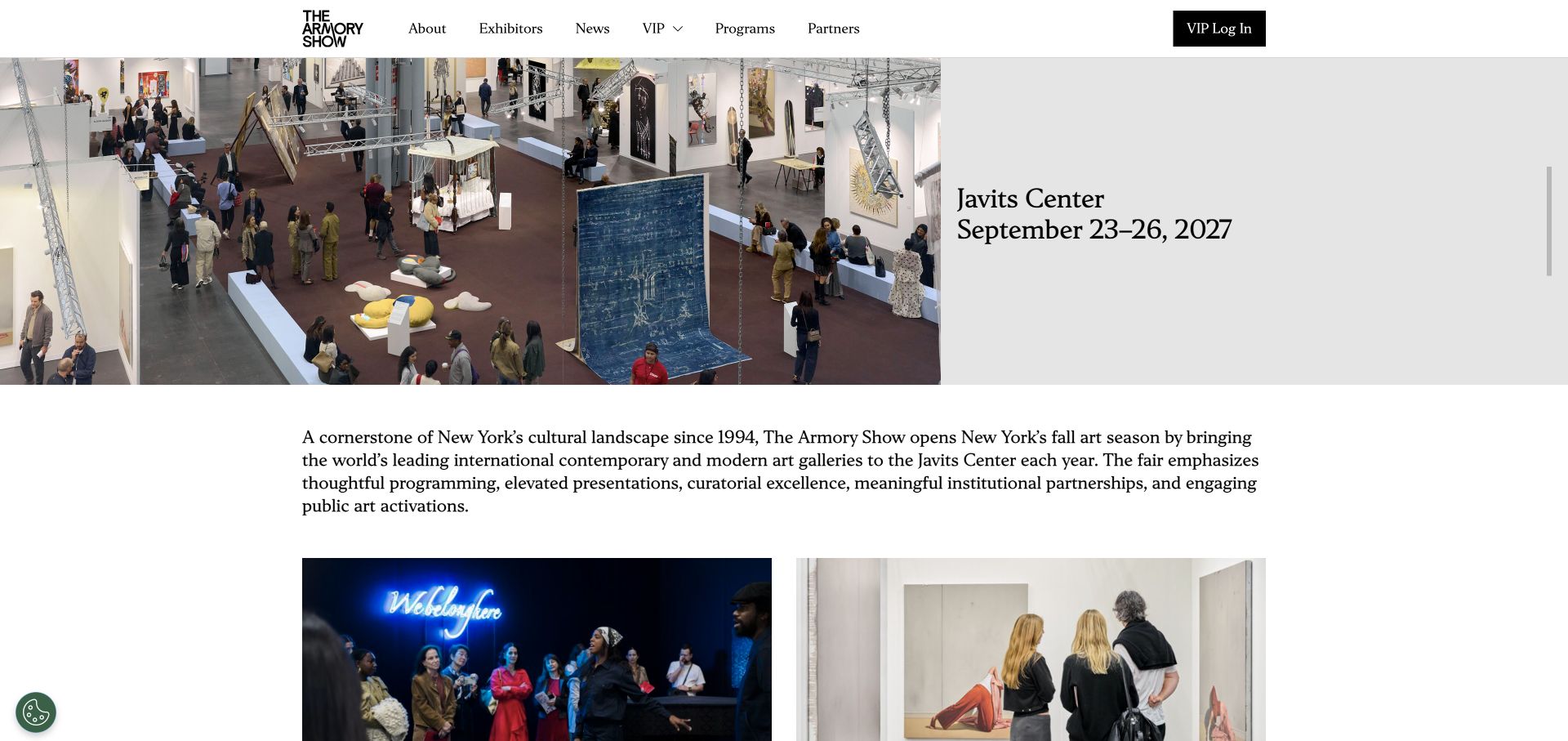
The Armory Show pairs a wide installation photograph with the Javits Center name and next dates on a plain grey field. A short explanatory paragraph follows before simple News and Exhibitors entry points. The lower page repeats the venue address and date, while the header separates public information from VIP login. Compared with many poster-led fairs, this version gives practical timing useful prominence without placing text over a visually busy artwork.
What you can learn
Keep the next venue and dates in a stable text panel beside event photography. Let the period between fairs have a smaller, clearer set of next steps.
Pros
Date and venue are readable without interpreting campaign artwork.
The exhibitor entry point explicitly refers to the completed edition.
Cons & considerations
Two newsletter forms repeat similar requests on a short page.
Login and general attendance routes need clear distinction as ticketing reopens.
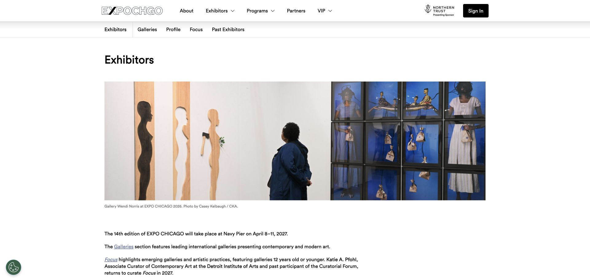
EXPO CHICAGO’s exhibitor overview uses a credited installation photograph, a clear page heading and a secondary navigation for Galleries, Profile, Focus and Past Exhibitors. Text explains the differences between the sections and identifies the curators. It also states that the next exhibitor information will arrive in 2027, rather than presenting the old list as new. This is a useful detail-page reference, not a claim that the capture is the fair’s homepage.
What you can learn
When next-year records are not available, retain the structure and explain what is pending. Define section names and preserve previous exhibitors as an explicitly historical resource.
Pros
The forthcoming exhibitor status is stated honestly.
Section descriptions and named curators explain a potentially unfamiliar taxonomy.
Cons & considerations
Several header and footer routes compete with the secondary section navigation.
A future list still needs a clear update owner and release date when known.
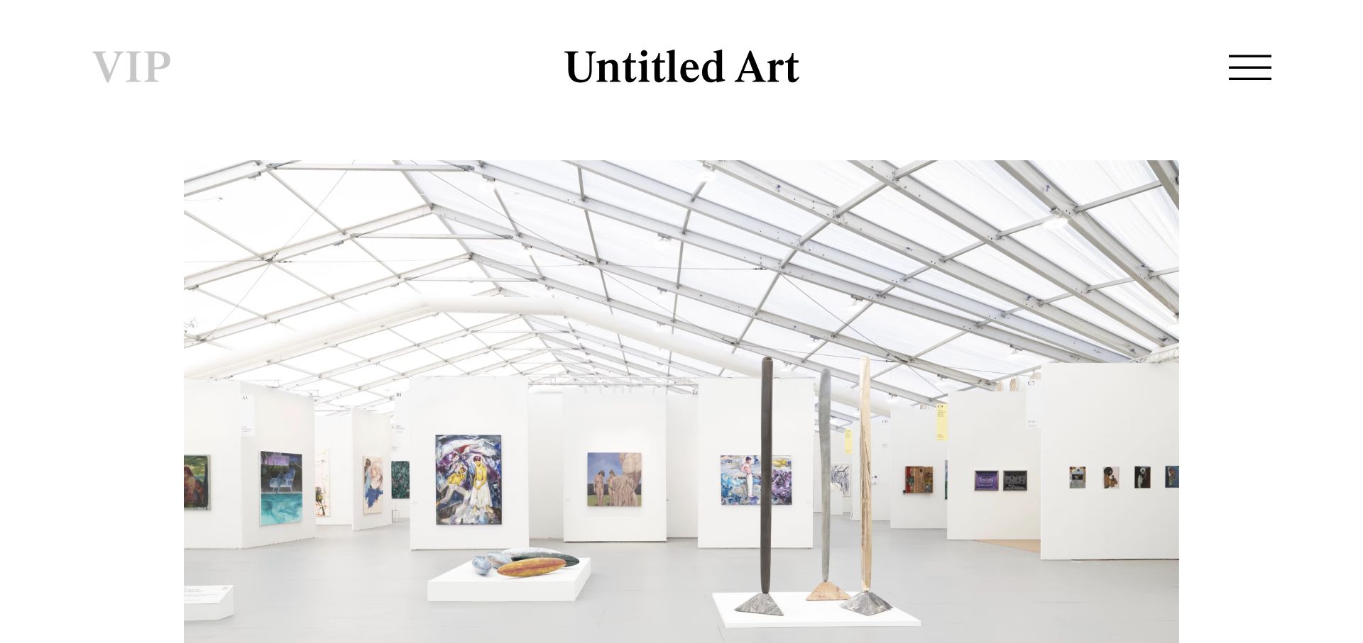
Untitled Art opens with very large serif words for the fair, Miami Beach and its dates. The subsequent page becomes more practical, separating galleries, programme, visit information, interviews, podcasts and news. The visit block distinguishes the public event from the VIP and press preview, while the latest podcast and dated press releases show year-round activity. The dramatic opening is distinctive, but its pale date text and large vertical footprint are not ideal universal defaults.
What you can learn
Give the event a recognisable campaign identity, then move into compact practical modules. Separate attendance dates, preview conditions and year-round editorial work.
Pros
Visit information distinguishes public attendance from the preview.
Podcasts, interviews and news have clearly different roles.
Cons & considerations
Pale grey oversized date text needs contrast review.
The typographic opening postpones the explanatory and visit modules.
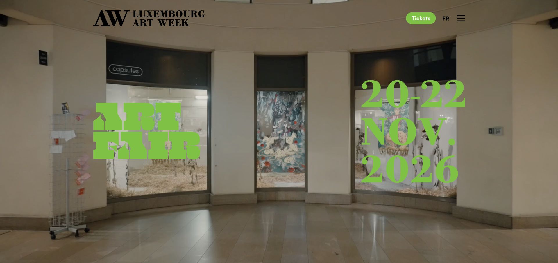
Luxembourg Art Week overlays bright green event dates on footage of the fair, with a visible ticket button in the header. Below, an exhibitor introduction leads into dated news and a detailed programme. Programme records distinguish on-site and off-site activities, dates, times, venues and language or booking conditions. The strongest lesson is the structure of these records: an art week needs more context than an image and a generic event title.
What you can learn
Model programme items with place, time and attendance conditions. Keep the core ticketed fair distinct from off-site events that may have different access rules.
Pros
Programme labels distinguish on-site and off-site activities.
Records include useful venue, language and booking context.
Cons & considerations
Green text over changing footage needs contrast checks across every frame.
A long programme feed benefits from strong filtering and prioritised visitor tasks.
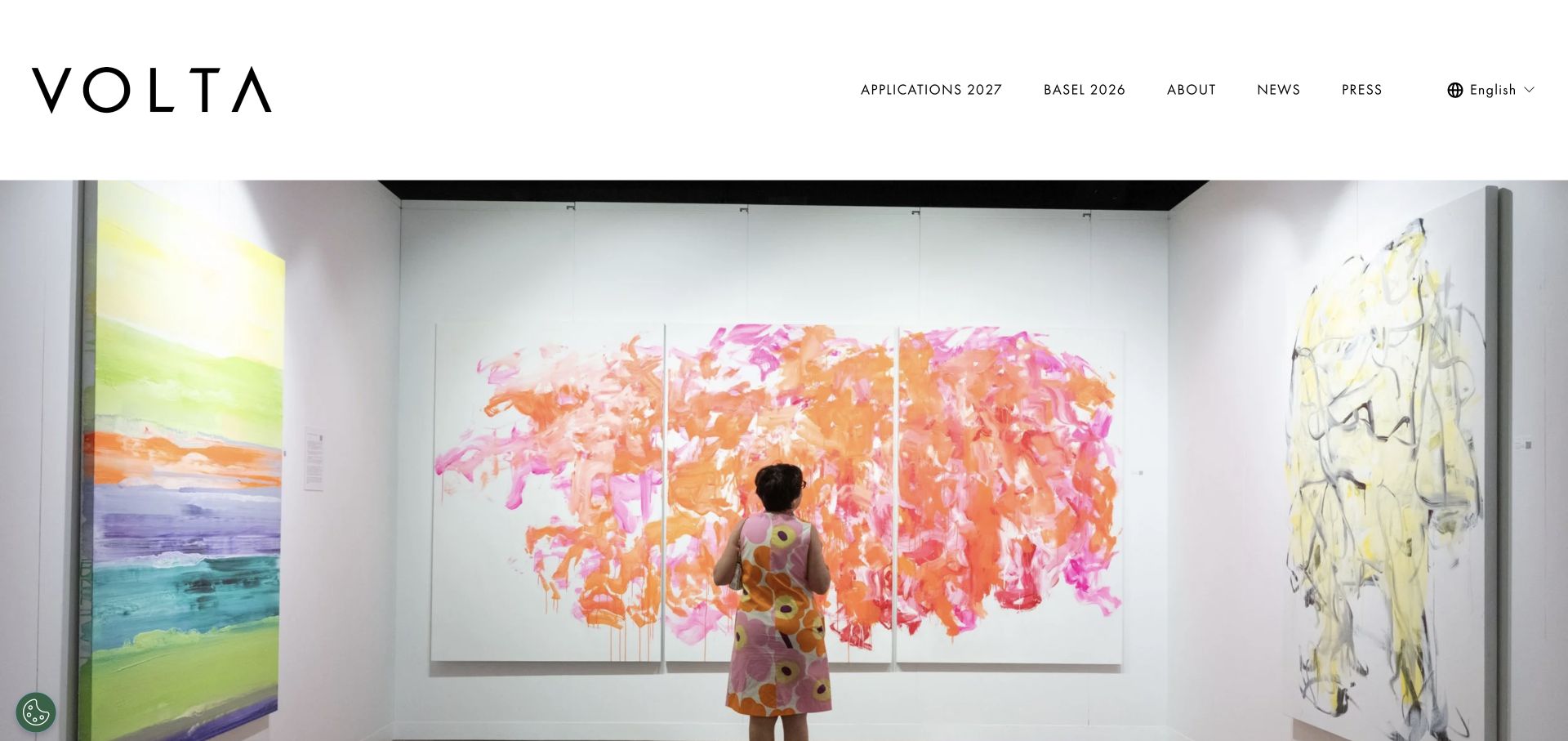
VOLTA gives its widely spaced wordmark and installation photography a restrained white frame. The main navigation highlights 2027 applications while retaining the 2026 Basel material, news and press. Below the imagery, attributed press quotations link to their sources, and an ordinary video player provides playback controls. The reviewed homepage focuses on gallery applications and identity, so it offers fewer immediate practical details for a visitor planning a future day at the fair.
What you can learn
Keep applications, archive and current visitor information distinct. Support reputation statements with identifiable linked sources instead of turning them into unattributed slogans.
Pros
The next application cycle has a clearly labelled route.
Press quotations retain source links and attributions.
Cons & considerations
A full-screen image delays direct visitor context.
Retaining a previous-year menu label needs an explicit archive role as the next edition develops.
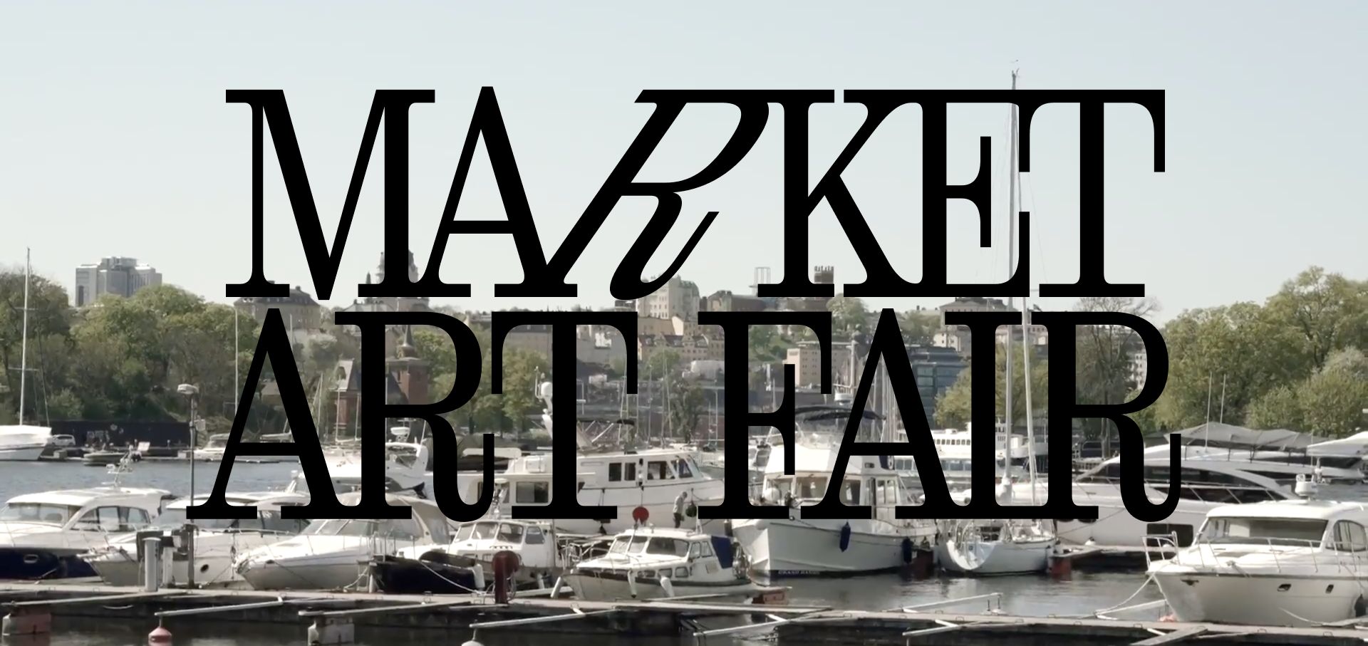
Market Art Fair places an oversized black wordmark over city footage, then supplies the next dates and Magasin 9 venue. Dated stories and a sequence of annual archive summaries make the fair’s development legible. Exhibitor cards identify gallery country and booth number rather than showing logos alone. The reviewed page has a maintenance issue worth noting: the prominent date reads 22–25 April while the footer and title use 23–25 April, so a visitor must confirm admission dates.
What you can learn
Annual archives and useful exhibitor metadata can outlive a campaign. Keep every repeated date in sync from a single event record to avoid conflicting attendance information.
Pros
Annual summaries distinguish editions rather than overwriting the past.
Gallery country and booth numbers make exhibitor cards practical.
Cons & considerations
The reviewed header and footer give different starting dates.
The very large wordmark obscures much of the initial venue footage.
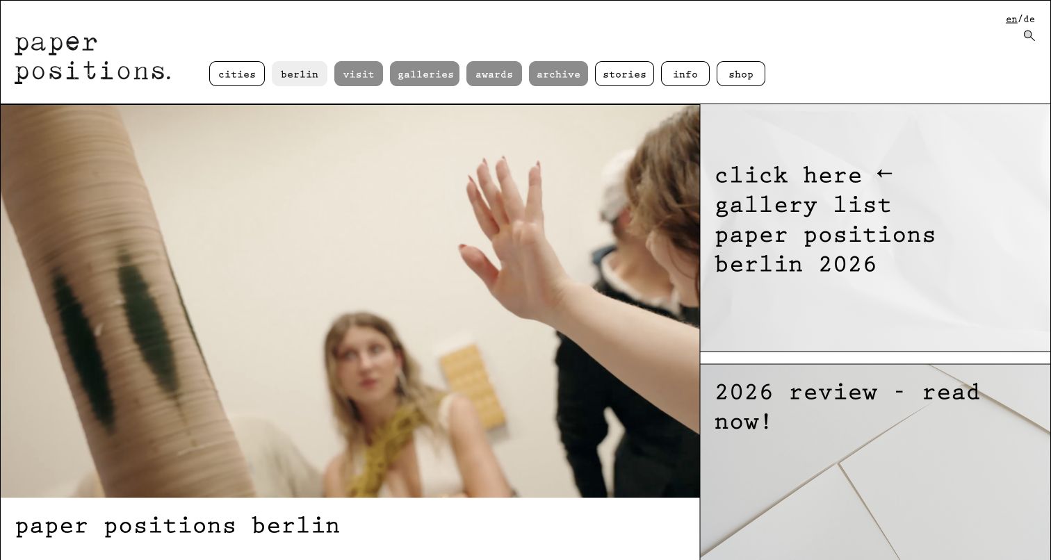
paper positions berlin uses a typewriter-style identity, outlined navigation pills and a split layout with fair imagery beside large resource links. The text explains its paper focus, the Tempelhof venue and the forthcoming gallery-application deadline. Programme information that is not yet available is labelled accordingly, while award records identify the relevant year and recipients. The main resource link is visually emphatic, though its click-here wording is less precise than a direct descriptive title.
What you can learn
Use a consistent medium-specific identity, but keep current applications, historical gallery lists and forthcoming programme records separate and clearly dated.
Pros
The application deadline and new edition dates appear in text.
Pending programme information is not disguised as a finished schedule.
Cons & considerations
Generic click-here wording adds little meaning to the gallery-list link.
Dense paragraphs could be divided into shorter practical sections for scanning.
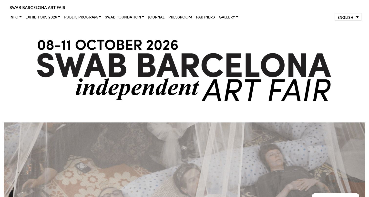
SWAB Barcelona combines a large typographic event title with an expressive photograph and a straightforward two-row header. Its body describes the fair’s community role before introducing exhibitors, radio, performance and workshops as different formats. Each programme has an explanatory paragraph and its own destination. The reviewed edition dates remain from October 2026, so this is a completed-event presentation rather than evidence that the fair is currently open.
What you can learn
Explain how each programme format works, not just its name. Keep an independent fair’s broader mission connected to specific activities people can explore.
Pros
Radio, performance and workshop content receive distinct descriptions.
The edition year is visible in the event identity and navigation.
Cons & considerations
Long all-capital introductory passages can be tiring to read.
Past event dates need clear archival status before a next-edition promotion begins.
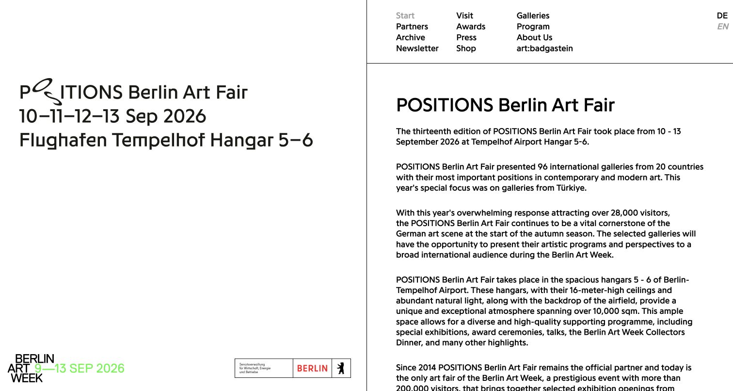
POSITIONS Berlin uses a fixed-looking left identity panel and a right-hand text column under a compact navigation matrix. The main copy states that the 2026 edition took place, identifies the galleries’ geographic focus and explains the venue. A later sentence introduces the next dates rather than silently replacing the finished event. A fair magazine, awards, archives and associated programmes provide additional resources, though the long text column asks for sustained reading.
What you can learn
Use past tense and edition labels to preserve event history, then give the next event its own clear statement. Do not let an archival poster look like a current booking invitation.
Pros
The completed edition is described in explicit past tense.
Magazine and archive links preserve longer-lived fair material.
Cons & considerations
Long unbroken paragraphs reduce quick access to practical details.
The next date sits well below the much larger previous-edition identity.
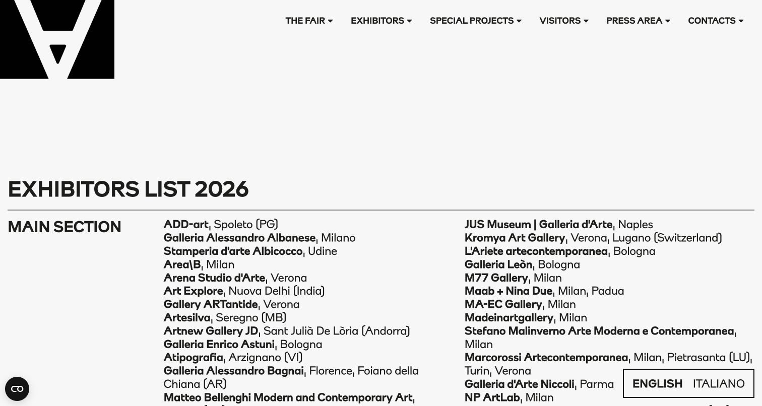
ArtVerona’s 2026 exhibitor-list page uses a strong heading and a large three-column structure: the section label on the left, gallery names and cities across the remaining columns. Further sections distinguish painting, experimental presentations and photography-related work. The page does not rely on dozens of inconsistent gallery logos. Its limitation is that the visible names are largely text rather than individual, richly linked profiles, making deeper discovery less direct.
What you can learn
Use consistent text metadata when a visitor needs to compare exhibitors quickly. Distinguish curated sections, but give gallery names dependable detail or outbound routes where available.
Pros
The edition year is explicit in the page title.
Gallery cities remain readable alongside names instead of being buried in imagery.
Cons & considerations
Long dense lists need careful narrow-screen reflow.
Plain-text gallery names provide less exploration than linked exhibitor records.
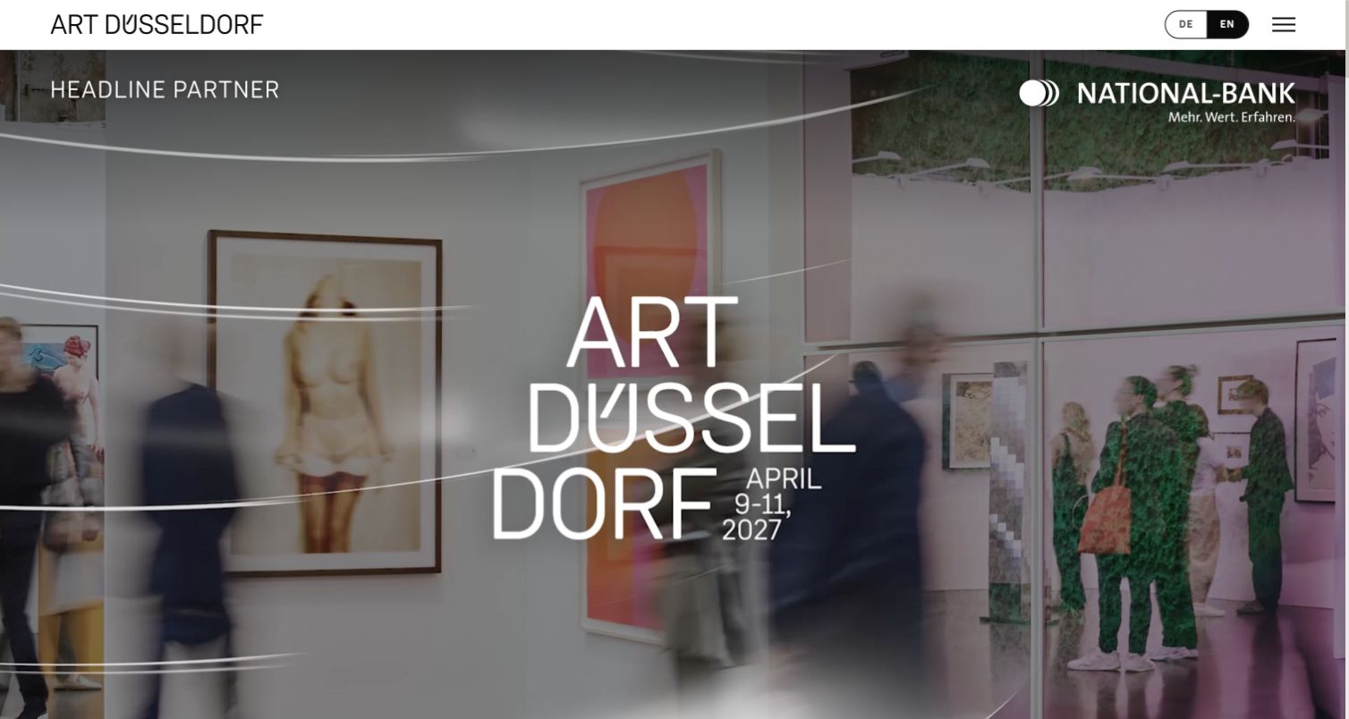
Art Düsseldorf places a stylised wordmark and next dates over fair footage, then explains the event and gallery application process in ordinary text. The 2027 themes each receive a title, image and substantial explanation, giving exhibitors more than a generic call to participate. The reviewed application strip still says applications are open despite its October deadline being in the past. That is an editorial-state issue to resolve, not a reason to copy the urgency message unchanged.
What you can learn
Explain the curatorial themes that make an edition distinctive. Drive application labels from the actual deadline so a visually attractive campaign does not advertise an expired opportunity.
Pros
Theme descriptions provide meaningful context for the next edition.
The English source keeps date and venue in visible text.
Cons & considerations
The application-open wording remains after the stated deadline.
Motion-heavy campaign imagery needs a dependable still and reduced-motion route.
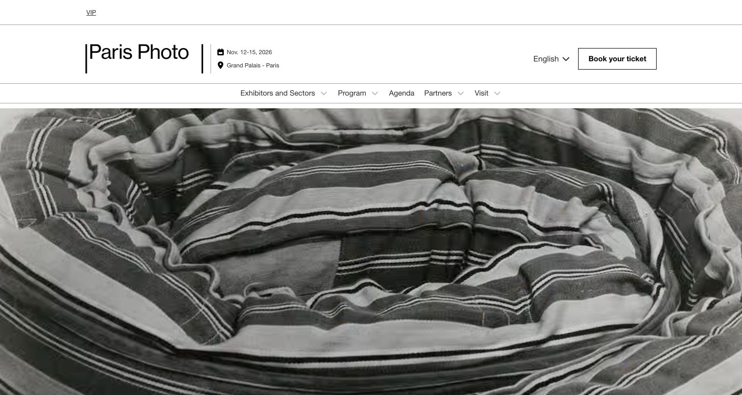
Paris Photo’s English homepage uses a conventional masthead with the date range, Grand Palais location, language choice and Book your ticket button before the animated opening. Navigation separates exhibitors, programme, agenda, partners and visiting. The body adds specific exhibition, book, conversation and thematic routes with image credits. Its practical masthead is a useful counterpoint to the moving hero, although several footer help and commitment routes still point into an older edition’s archive.
What you can learn
Put the essential live-fair context outside the moving media. Audit help and policy destinations as carefully as headline programme links when a new edition is published.
Pros
Date, venue and ticket action appear before the hero media.
Programme imagery is accompanied by descriptive credits.
Cons & considerations
Some footer guidance points to older year-specific archive paths.
The moving opening needs clear playback and reduced-motion support.
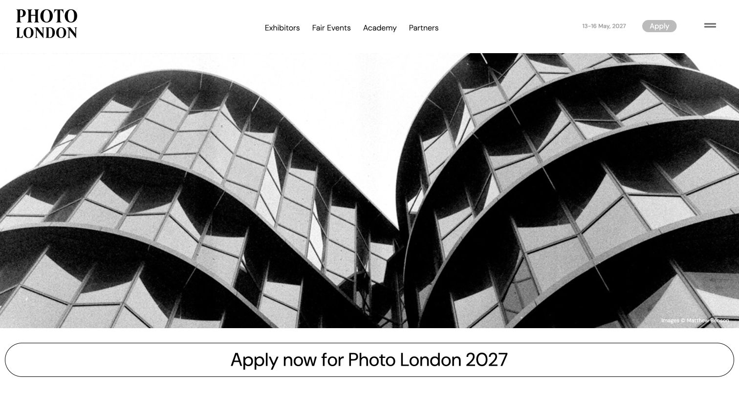
Photo London leads with a large black-and-white venue photograph, a compact header and a broad 2027 application link. Its introduction explains the Olympia setting and distinguishes the next fair from the 2026 exhibitor and exhibition material below. Academy, magazine and talks resources give the platform a year-round layer. The date and Apply controls in the header are pale and small compared with the image, so emphasis could be more balanced.
What you can learn
When a venue or event format changes, explain the reason and practical context in text. Preserve past exhibitors as archives rather than presenting them as the forthcoming roster.
Pros
The venue change is explained rather than left implicit in a photograph.
Exhibitor and exhibition content retains the completed edition’s year.
Cons & considerations
Small pale header dates and application control need stronger contrast.
The long homepage and mixed archive/current labels need deliberate content hierarchy.
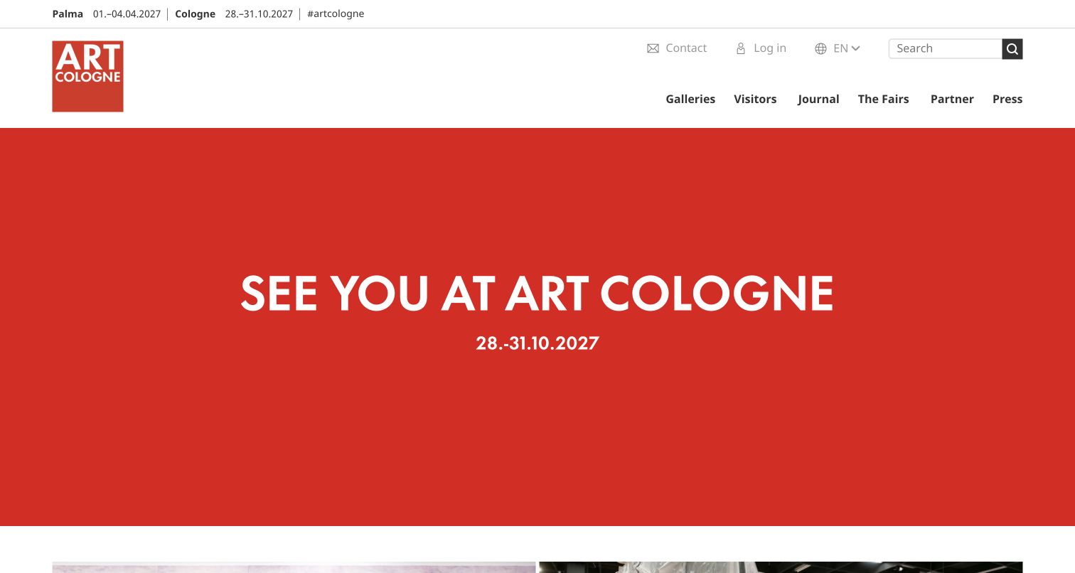
ART COLOGNE uses a large red panel to announce its return date, while the header distinguishes Cologne from the related Palma dates. The body retains 2026 gallery and programme resources alongside a substantial journal and podcast. Rather than showing an active Buy tickets message for an ended edition, the primary opening becomes a clear next-year notice. The broad header still needs well-labelled submenus to help visitors distinguish the two fair locations.
What you can learn
A post-fair homepage can be deliberately simple: state when the event returns, preserve historical resources and keep genuinely useful editorial material available.
Pros
The main return date is highly visible and readable.
Gallery resources, journal stories and podcasts have distinct roles.
Cons & considerations
Two locations in one header need consistent date and city labelling.
The large announcement panel supplies little explanation for a first-time visitor.
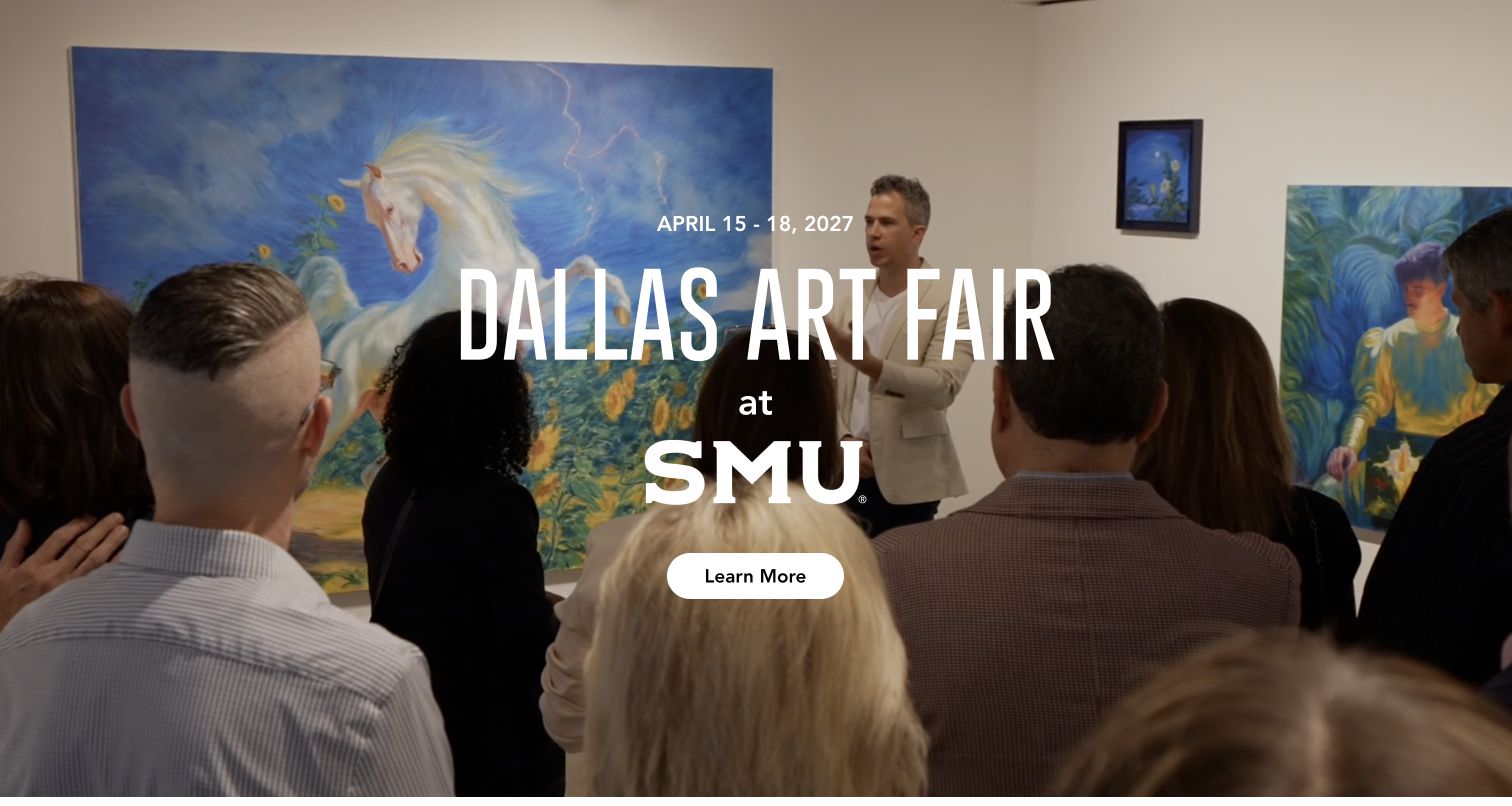
The Dallas Art Fair domain redirects to a focused 2027 landing page that combines moving SMU imagery, a clear date range and a Learn More link. The text names Armstrong Fieldhouse, explains the new venue and describes the fair. Named director, VIP and marketing contacts appear below. This is a genuine transition-page design rather than a full fair platform; the primary information links open a PDF and the visitor planning detail is limited.
What you can learn
For a major venue transition, prioritise the actual new place, dates and an accountable contact. Keep the interim page honest about how much of the next event is ready.
Pros
The new venue is named and explained in real text.
Named staff and their exact business email links provide accountable contact routes.
Cons & considerations
The main Learn More handoff is a PDF rather than an integrated HTML detail page.
The reviewed landing page has limited ticket, access and exhibitor discovery information.
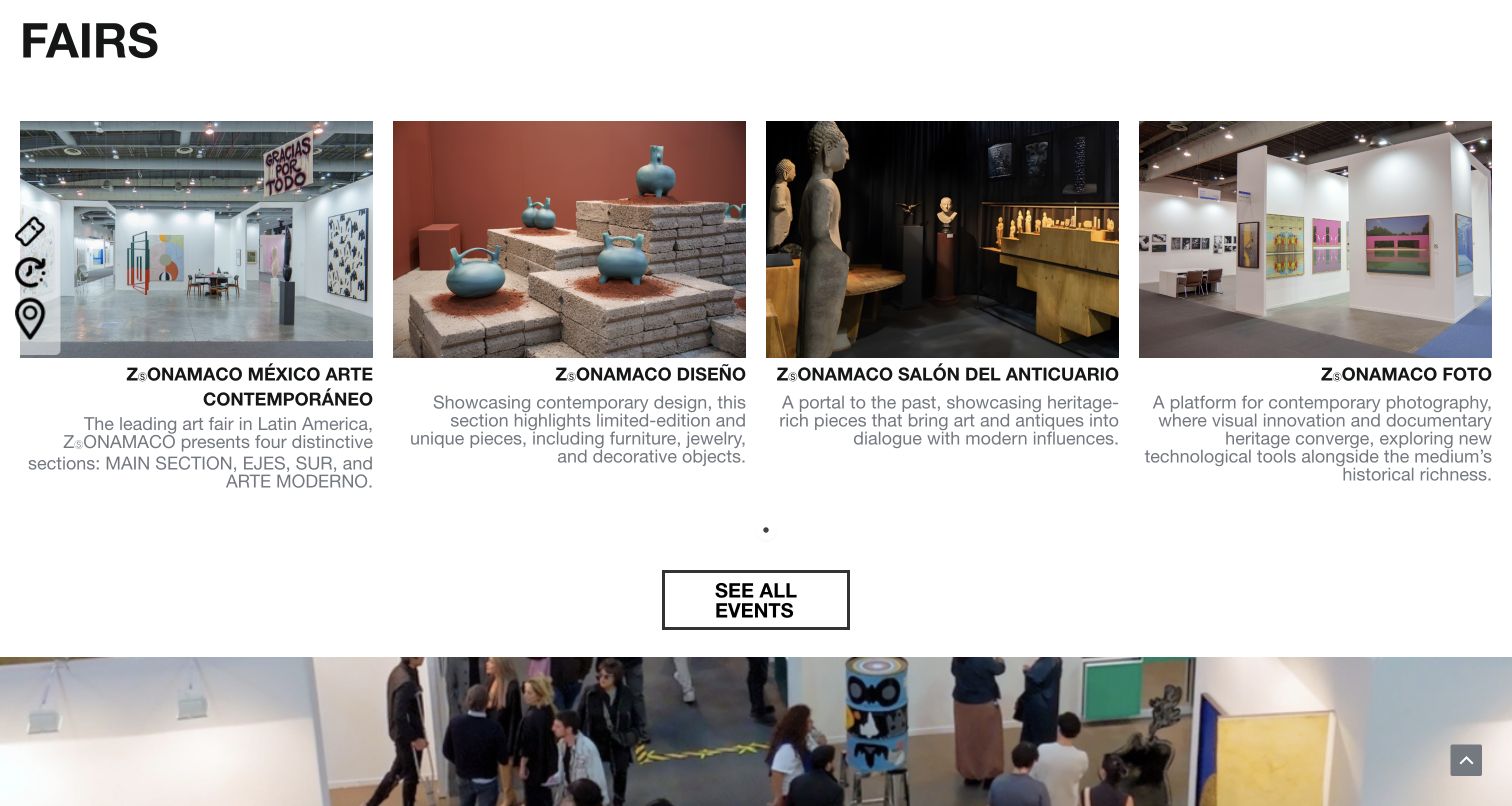
ZⓈONAMACO’s English homepage groups contemporary art, design, antiques and photography into a consistent four-card overview. Each card explains the discipline rather than relying on a name alone, with ticket, hours and location shortcuts available at the side. Later blocks distinguish future editions, VIP information and the conversation programme. The accepted screenshot shows this overview after keyboard scrolling, not the large, mostly empty opening area above it.
What you can learn
When a platform contains several related fairs, show the difference between them in parallel. Keep practical shortcuts labelled as well as icon-based.
Pros
Each fair discipline has a short comparative explanation.
Tickets, hours and location are given separate practical routes.
Cons & considerations
Icon image labels such as icono0 do not explain the destination accessibly.
The large empty opening area separates the navigation from the useful fair overview.
Kegan is a freelance web designer and developer with 15+ years of experience helping businesses turn complicated website requirements into clear, maintainable digital experiences. He works directly with clients from planning and design through development, launch, and ongoing support.
For art fair website design, his development approach focuses on edition-specific dates and venues, exhibitor and artist directories, ticket and access information, and separate visitor and exhibitor application journeys. The scope can be a targeted improvement or a complete custom build, with responsive layouts, thoughtful content structure, and integrations chosen around the people using and maintaining the site.
Show 3 other art fair website designersHide other art fair website designers
Build one dependable edition record before designing the poster
Start with structured information for the edition: public title, city, venue, address, timezone, public opening dates and daily hours, preview conditions, contact and practical visitor pages. Keep gallery-application deadlines in a separate field from attendance dates. A month and day on an animated campaign asset is not a sufficient source for every other page, email and ticket link that needs those details.
The Armory Show demonstrates the value of a simple text panel beside event photography. Paris Photo keeps a date, location and ticket action in the masthead above its moving media. ART COLOGNE switches to a clear return-date announcement. These treatments differ visually, but the practical information does not depend on seeing a particular frame or knowing the fair already.
Repeated information is where errors multiply. Market Art Fair’s reviewed header and footer give different starting dates. Art Düsseldorf’s application-open wording remains after its stated deadline. Define a single authoritative edition record, decide which days are public or restricted and make the page’s state follow those facts. A manual editorial check still needs to compare the actual ticketing and calendar destinations before publication.
Design separate journeys for attendees, galleries and professional visitors
Map the principal visitor questions before expanding the navigation. A public attendee needs admission, hours, travel, accessibility and the programme. Galleries need eligibility, sections, application timing and a clearly identified portal. Press needs accreditation and approved materials. VIP visitors may need separate conditions or an account, but a public ticket journey should not look like a login requirement.
Art Antwerp’s menu distinguishes visitor information, fair content and city recommendations. ceramic brussels names galleries, the art prize and visitor information directly. Liste deliberately centres the next application cycle in its between-editions opening. The useful lesson is not that every fair needs every label: it is that the hierarchy should reflect the stage of the event and the real task being promoted.
Keep private portals visibly separate from public editorial pages. Explain external ticket or application handoffs, retain a dependable route back and avoid collecting personal information merely to show basic access details. Give staff a way to update exceptional arrangements. A form confirmation, an application receipt and a paid ticket are different outcomes and should never be described interchangeably.
Make exhibitors and programmes useful beyond the opening image
A gallery roster benefits from consistent names, cities or countries, section, booth identifier when assigned and a stable detail page. A programme record needs a title, format, date, time, venue and any language, price or booking condition. Identify whether a talk is inside the ticketed fair, invitation-only, online or at a separate city venue. Do not assume a general admission ticket includes every special event.
Luxembourg Art Week labels on-site and off-site activities and provides event-specific context. EXPO CHICAGO explains what Galleries, Focus and Profile mean while the next roster is still pending. ArtVerona shows how a clear typographic list can make names and cities comparable without relying on inconsistent logos. Future Fair differentiates talks and exhibitor stories from the next attendance invitation.
Choose filters only where they answer actual questions. City, section, format and day can be useful; empty categories and an excessively complex taxonomy can make discovery harder. Give images meaningful labels, captions and credits. Preserve text-based listings when a visual map or installation gallery is unavailable. A public artwork image is not automatic permission for a visitor to reproduce it elsewhere.
Keep expressive campaigns usable and archives trustworthy
A fair can use a fresh visual identity each year without rebuilding its information architecture. Keep core navigation and resource records stable while campaign colour, typography and imagery change. Test text contrast across all hero frames, provide sensible playback controls and respect reduced-motion preferences. The compelling look of a screenshot alone does not establish a usable mobile, keyboard or assistive-technology experience.
Artissima’s repeated moving resource strips, Untitled Art’s oversized type and Enter’s venue footage show different ways to create presence. Each also creates a tradeoff in how quickly practical information appears. The reviewed photography fairs often combine large images with substantial year-round publishing. Borrow the communication principle, not the exact animation, artwork or claims about commercial success.
After closing, put the edition into a deliberate historical state. Retain exhibitors, photographs, recorded talks, award results and catalogues where appropriate, but remove misleading purchase or application urgency. Explain what is not yet ready for the next edition. Assign owners for dates, external destinations, credits and visitor arrangements. Periodic link checks matter even on major platforms: a correctly labelled card can still point to the wrong city or an outdated help page.
The editing job behind the design
Choose technology for edition records, not only campaign animation
Evaluate the content system with realistic editions, galleries, venues, sessions, dates and archive states. Editors should update shared facts once, preserve historical editions and clearly distinguish draft programme information from published records.
Ticketing, gallery applications and VIP accounts may require separate systems. Describe their handoffs, access rules and data boundaries. A public marketing page should not expose private attendee, applicant or collector records through a convenient shared template.
Visible technology labels describe bounded public signals, not a complete inventory of ticketing, CRM or back-office tools. The shared publication process performs broader audit attempts. An inaccessible or inconclusive scan is not permission to guess the CMS from a visual style.
Our WordPress website examples offer a separate look at publishing approaches. A visible platform label is evidence for that named page, not a guarantee that the same system will suit your requirements.
Before the public launch
Art fair website planning checklist
Keep event title, city, venue and timezone in one authoritative edition record.
Distinguish public opening, preview and application dates.
Check repeated dates across header, footer, calendar and ticketing.
Make visitor information available without an unnecessary account.
Separate gallery, VIP, press and public attendance journeys.
Explain curated section names before expecting visitors to filter by them.
Give exhibitors consistent names, locations and booth details when known.
Attach time, venue and booking rules to programme records.
Label off-site events and separate admission conditions.
Retain image credits and meaningful text alternatives.
Test motion, media controls, contrast and mobile navigation.
Give completed editions a deliberate archive state and maintain their useful links.
These checks are a project checklist, not a performance, legal, security, or accessibility certification. Test real journeys with the people responsible for the website before making claims about the result.
Sources & editorial method
How this collection was selected and reviewed
The saved random target was 27 before research, and no reroll was made. Each accepted source was read and visually inspected in Chrome and has a genuine JPEG capture, actual UTC timestamp and independently pinned hash. Optional cookies were rejected where offered and nonbinding notices were dismissed through ordinary controls. No DOM or CSS was edited to remove overlays. EXPO CHICAGO and ArtVerona are specifically reviewed exhibitor pages; Dallas is the official redirected venue-announcement landing page. ZⓈONAMACO is a keyboard-scrolled overview. A Paris Internationale source was held for an intrusive custom cursor; an old-binding screenshot was retained as rejected, not counted. A fresh owned tab supplied clean later captures. Miart was not accepted after an initial navigation timeout and empty rendered document. These are design observations, not independent certification of fair results.
Each example links to its actual source page. Screenshots are direct browser captures with their own capture dates; moving imagery, announcements and live designs can change. The notes describe observable design choices and conditional tradeoffs, not measured traffic, conversion results, service quality, or accessibility conformance.
Technology labels use public page metadata, asset evidence, or explicitly cited platform documentation. Platform documentation is not a complete current deployment audit. A component reference may be legacy or unused; it is not a complete backend inventory. Unknown stacks are omitted. These sites are editorial examples, not our client portfolio.
Written, Edited and Curated are separate editorial records, not timestamps advanced by a rebuild. Website designs and imagery belong to their owners. See our editorial standards or suggest a correction.
Questions worth asking
Art Fair website design questions
What information belongs above the fold on an art fair website?
Show the fair’s name, city, venue, relevant edition dates and a clear primary next step. The action may be ticketing during a live sales period or gallery applications between editions, but it must match the current event state.
Should last year’s exhibitor list stay online?
Usually it can remain a useful historical resource. Label the edition clearly, keep it separate from a forthcoming roster and state when new information is pending instead of relabelling the old list as current.
Does every fair need an animated homepage?
No. Expressive type, strong photographs and a clear information hierarchy can communicate an identity without motion. If media is used, preserve practical information outside it and provide appropriate controls and reduced-motion support.
How should an art week distinguish off-site activities?
Each programme record should identify its venue, date, time and access or booking conditions. Make clear whether the main fair ticket includes that activity or whether it follows a separate admission process.
Why is ceramic brussels the Editors Choice?
The directly reviewed homepage clearly states its specialist focus beside credited installation imagery and supplies recognisable gallery, prize and visitor routes. This is a design selection, not a ranking of sales, attendance or artistic quality.
Start with clear edition records and practical visitor tasks. Let the campaign identity express the character of the fair, while galleries, programmes and archives remain understandable long after the opening weekend.