Best Aquaculture Websites of 2026 (26 Real-World Examples)
Fish farmers, aquaculture engineering companies, monitoring platforms and feed suppliers worth studying.
A strong aquaculture website makes the species, production context and reader’s next question clear without letting ocean imagery stand in for evidence.
Aquaculture websites can speak to very different audiences: seafood buyers, farm operators, technology partners, employees, investors and local communities. These 26 examples include producers, systems businesses, monitoring platforms and feed companies. The useful comparison is how each explains its own role, not which business has the most dramatic underwater footage.
Nofitech connects a memorable visual idea to hatchery-to-grow-out delivery. Bakkafrost separates consumers, trade customers and investors. Skretting organizes feed research around species and production context. Borrow these information patterns while keeping claims about fish health, environmental impact, commercial performance and product quality tied to their actual evidence.
Before the examples
What makes good aquaculture website design in 2026?
Name the species and production context
Identify whether the business farms a product, supplies a system, provides monitoring or sells nutrition. Sea-based, land-based, hatchery and grow-out decisions should not be hidden inside an abstract innovation promise.
Separate the reader’s purpose
Seafood buyers, farm operators, investors and communities need different information. Offer clear routes rather than making every person start with the same corporate story.
Connect claims with specific records
Keep sustainability, certification, welfare and performance information qualified by scope and date. Nature imagery and a logo strip do not independently establish an outcome.
Explain the commercial or project handoff
Make sourcing, demonstrations, technical research, country contacts and existing-user access distinct. State whether a facility is proposed, under development or operational using current verified information.
The collection · 26 examples
26 aquaculture websites worth studying
The original saved target is 26 distinct public websites. Nofitech is the explicit Editors Choice for a focused specialist narrative that connects land-based production stages, reference locations and lifecycle support. The choice assesses communication and design, not farming results or engineering performance.
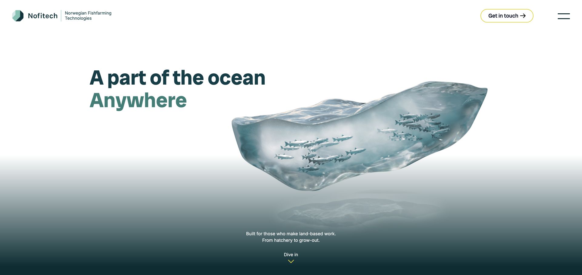
Nofitech introduces land-based fish farming with an illustrated slice of ocean, then immediately names the hatchery-to-grow-out context. Its modular concept, named project locations and design, adaptation and operational-support stages give the visual metaphor practical substance. The specialist site explains a delivery relationship rather than showing an unexplained catalog of tanks.
What you can learn
Use a distinctive visual idea to earn attention, then anchor it to the production stages and support responsibilities the customer is investigating. Named references and a clear lifecycle make the specialist offer easier to understand.
Pros
The visual concept is directly connected to land-based aquaculture.
Reference locations and delivery stages extend the introduction into useful project research.
Cons & considerations
A minimal hamburger menu can hide important technical routes until it is opened.
Predictable-performance language needs project-specific evidence rather than inference from the website design.
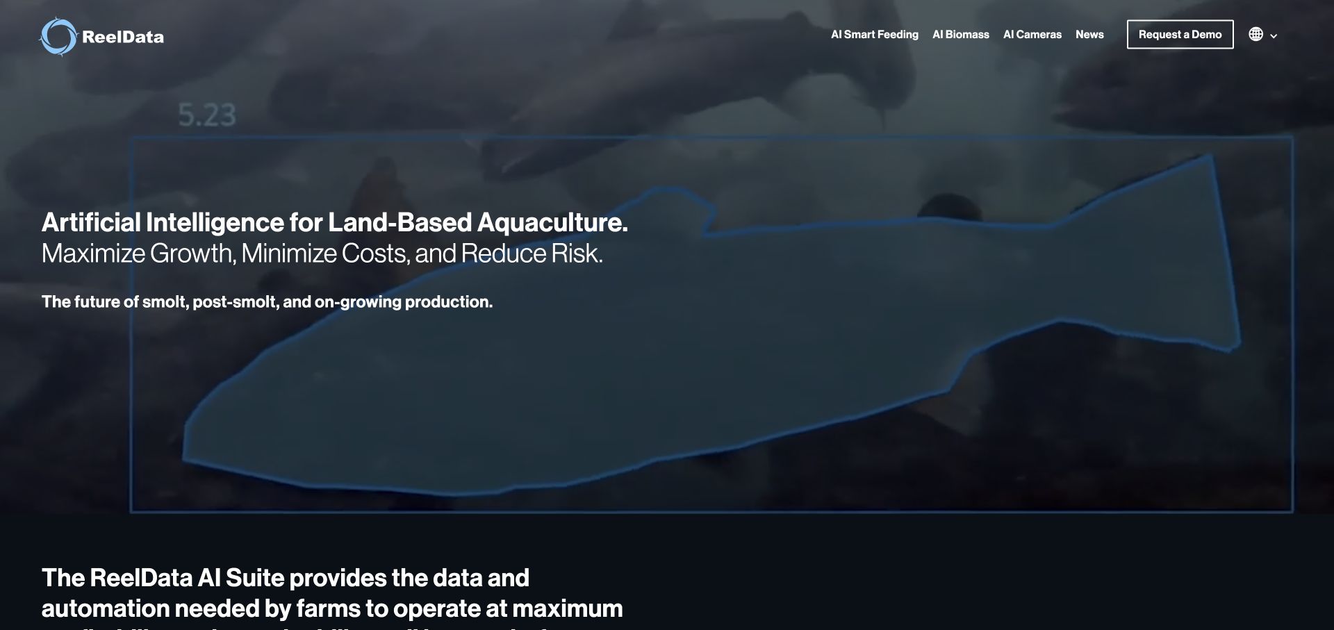
ReelData names land-based aquaculture and smolt, post-smolt and on-growing production in the introductory screen. Feeding, biomass and cameras have separate navigation and product explanations. Underwater footage makes the subject tangible, while a demonstration route supports further research without treating every component as the same generic AI capability.
What you can learn
Name the production context and split the platform into recognizable farm decisions. Feeding, biomass estimation and camera hardware need related but distinct explanations. A smolt operator and an on-growing operator can first identify the relevant production setting, then investigate the monitoring decision instead of decoding an undifferentiated suite.
Pros
The intended land-based production context is explicit.
Three product categories give the suite a simple initial structure.
Cons & considerations
The page uses many top-level headings, which can weaken the document outline for assistive navigation.
Accuracy, growth and cost claims need documented testing conditions beyond a product description.
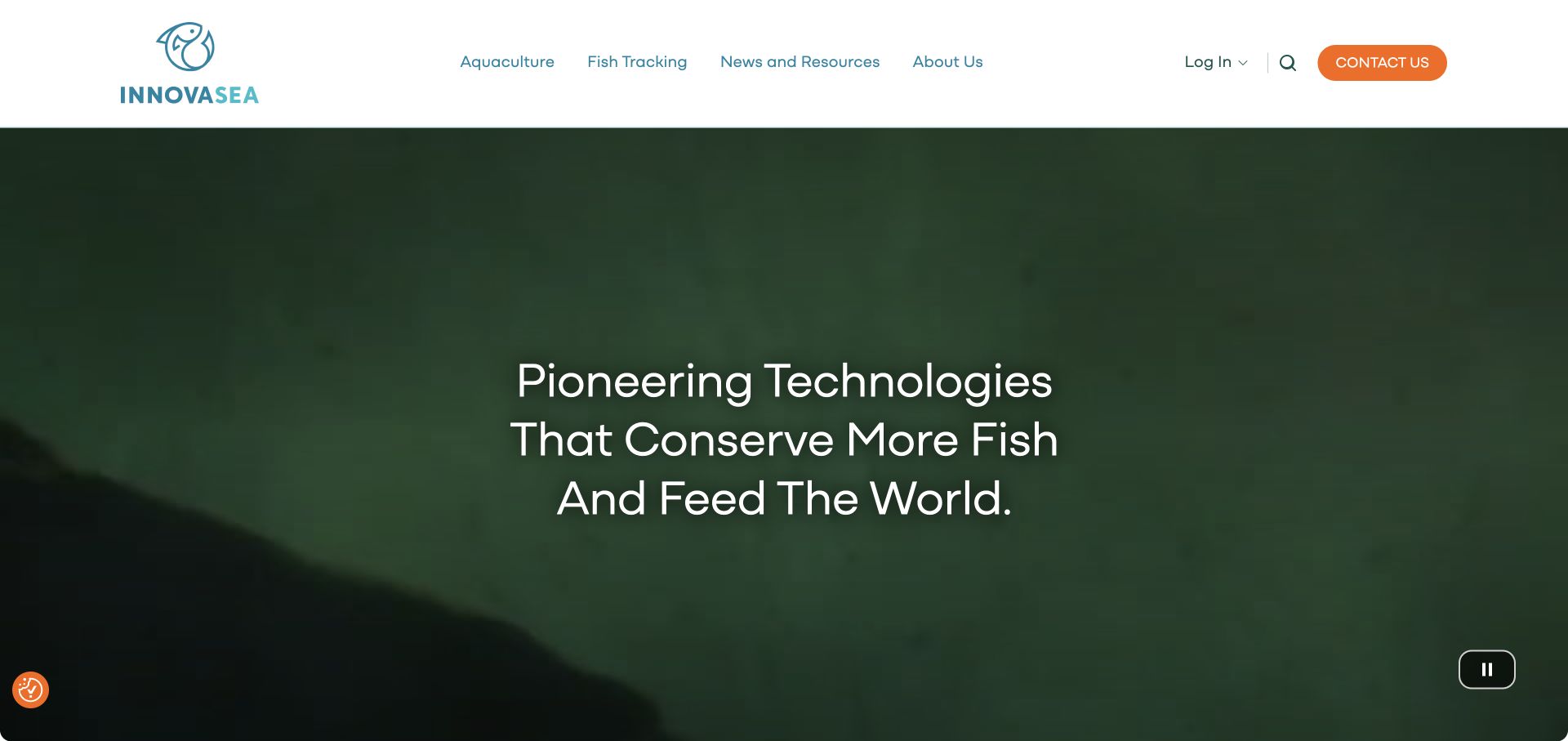
Innovasea gives aquaculture and fish tracking separate image-led entrances. Submersible net pens, environmental monitoring and underwater cameras sit on one side, while acoustic receivers, tags and counting technology serve the other. A visible pause control supports the background video, and login is distinct from general contact.
What you can learn
Separate professional contexts before presenting the product list. Farm operators and fish-tracking researchers may use related technology but need different information and terminology. Acoustic tags and receivers give the research entrance concrete meaning, whereas pens and cameras orient the farming entrance; the distinction matters more than a shared aquatic image.
Pros
The main audience split prevents research and production products becoming one mixed catalog.
Specific product categories and a video pause control support practical browsing.
Cons & considerations
A broad conservation-and-food headline depends on the categories below it for specificity.
Technical performance and environmental claims still need application-specific supporting material.
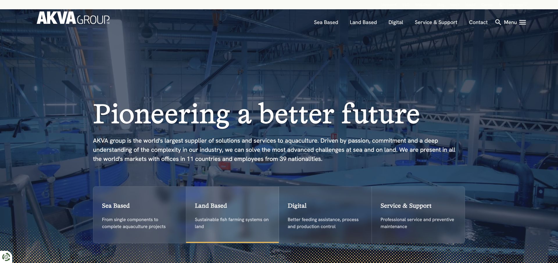
AKVA group places sea-based, land-based, digital and service/support cards beneath its broad company introduction. Each card has a short explanation, so the labels are more useful than a bare list of departments. News, investor, ESG, career and webshop destinations are kept around the main solution structure rather than replacing it.
What you can learn
Use production environment as a consequential first division, then keep digital systems and ongoing support visible. Large corporate audiences should not obscure the practical catalog entrance.
Pros
Four short category descriptions clarify the initial research choices.
Service and maintenance have an explicit place alongside equipment and systems.
Cons & considerations
An extensive utility navigation can increase the scanning burden on smaller screens.
Scale and leadership claims are company positioning, not a substitute for project-specific suitability information.
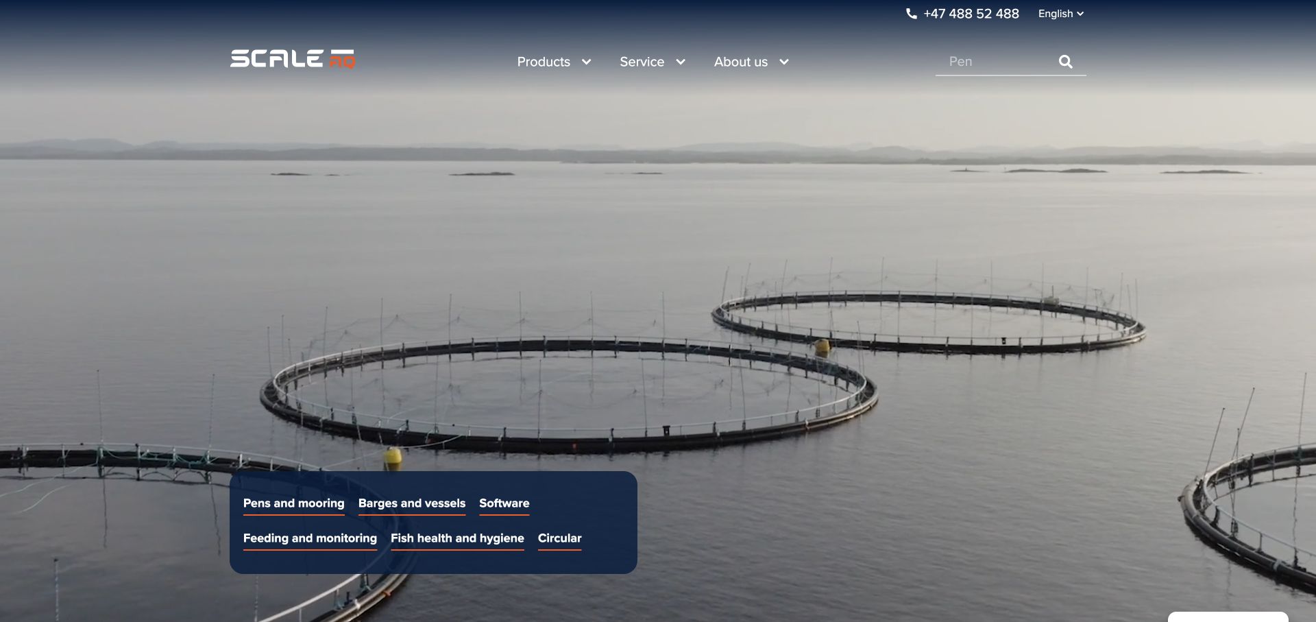
ScaleAQ overlays a compact group of product links on real marine footage. Pens and mooring, barges and vessels, software, feeding and monitoring, fish health and circular services form the initial catalog structure. The wider navigation also exposes manuals, warranty and service information, acknowledging that the site is useful after equipment has been installed.
What you can learn
Make the core system categories visible without forcing a user to decode the company organization. Maintain equally clear routes for manuals, warranty and service. A returning operator looking for a manual or warranty information has a different task from a buyer comparing pens, so neither route should obscure the other.
Pros
A small product-category panel gives the media-led entrance practical navigation.
The support structure includes specific post-purchase tasks.
Cons & considerations
A media-heavy opening needs a readable alternative when video is unavailable.
Deep equipment menus need consistent product naming and comparison information to remain manageable.
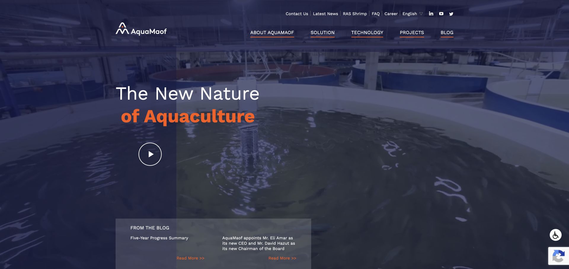
AquaMaof spells out Recirculating Aquaculture Systems and separates solution, technology and project destinations. Featured project links identify species or facility type and location, including hatchery, salmon, trout, kingfish and shrimp contexts. The opening facility imagery gives the system a physical setting, while a general inquiry route remains available.
What you can learn
Expand the technical acronym and connect the system to specific project contexts. Species, facility stage and location are useful labels for a portfolio that would otherwise become a row of similar building photographs.
Pros
The RAS acronym is explained in ordinary introductory copy.
Project labels distinguish species, facility use and geography.
Cons & considerations
Generic project-link text needs clearer accessible names for people navigating by links alone.
Robustness and sustainability claims need operational evidence rather than a visual project listing.
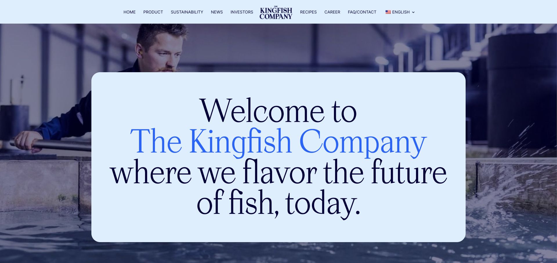
The Kingfish Company uses large editorial typography and a light blue visual treatment over farm imagery. Its egg-to-plate story leads toward product information and chef inspiration, while methodology and investor destinations remain separate. The distribution explanation gives prospective trade partners a more relevant path than an undifferentiated general contact invitation.
What you can learn
Connect production provenance to the way the product reaches a kitchen. Keep methodology, culinary inspiration and trade distribution distinct so each can answer a different reader question.
Pros
Product and recipe routes connect the farming story with a usable food context.
Distribution-partner language makes a commercial next step understandable.
Cons & considerations
Very large introductory type can postpone detailed product information below the first screen.
Environmental and quality positioning needs supporting methods and records beyond its visual presentation.
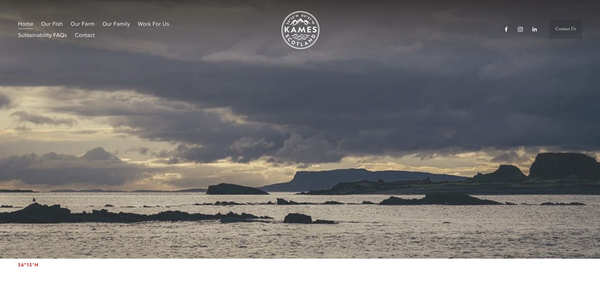
Kames uses a full-width Scottish coastal landscape and a centered seal-style identity before introducing its trout. Our Fish, Our Farm and Our Family are plain-language destinations, supported by sustainability FAQs and contact information. The body provides product-format details and a place-based company narrative rather than treating scenery as the complete explanation.
What you can learn
Use location imagery to establish a real sense of place, then make product, farming and people information easy to find. Specific product formats give a provenance-led site practical value for buyers.
Pros
Simple navigation labels are understandable without industry jargon.
Product formats and farming context extend the scenic introduction.
Cons & considerations
A full-screen landscape can delay the first clear explanation of what is being sold.
Taste, welfare and environmental comparisons require appropriate supporting evidence, not scenic associations.
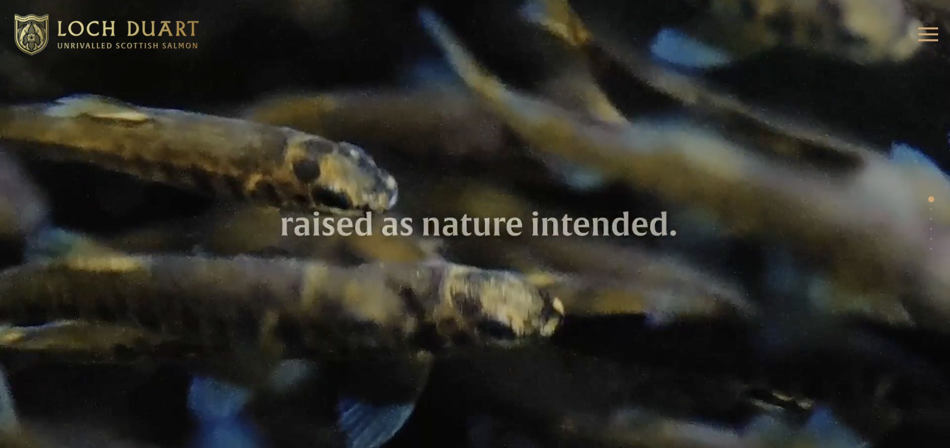
Loch Duart uses full-screen lifecycle and product media with restrained gold branding. Its sections distinguish chef quality, a heritage-breed narrative, the farming approach and sourcing. The page is strongly story-led, while the sourcing route gives professional buyers a destination beyond simply appreciating the imagery.
What you can learn
Give a premium story an explicit commercial destination. Heritage, farming method and culinary use can build context, but a buyer still needs a clear way to investigate supply.
Pros
Distinct story sections prevent the premium proposition becoming one long undivided paragraph.
Sourcing is an identifiable reader task rather than an implied next step.
Cons & considerations
Section labels such as Section 1 are less useful than descriptive names for assistive navigation.
Immersive motion and minimal menus need careful keyboard, reduced-motion and small-screen treatment.
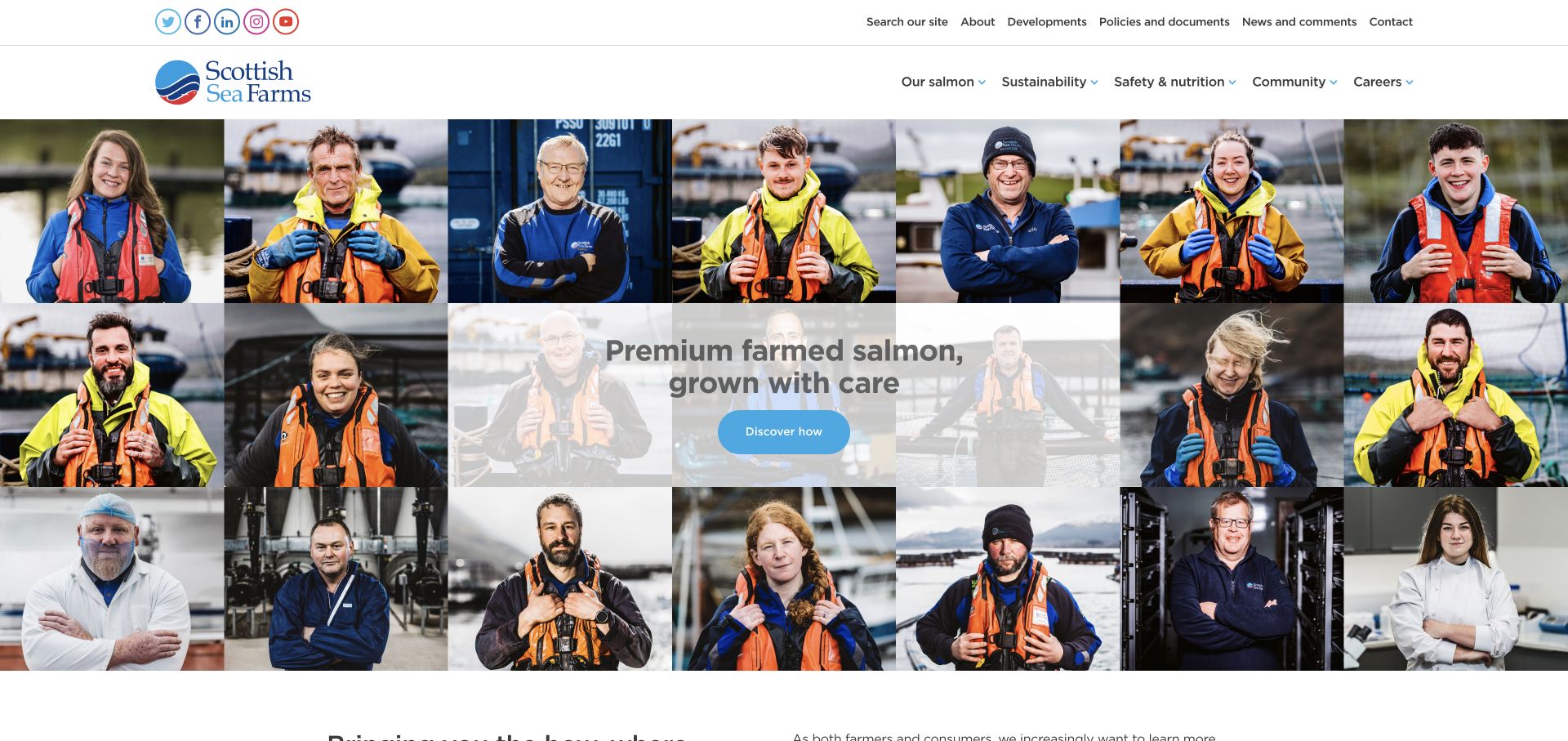
Scottish Sea Farms opens with a mosaic of staff portraits rather than only scenery or plated food. The introduction explicitly offers the how, where and why of farming, with routes to sustainability indicators, production information, policies and documents. Product, safety, nutrition, community and careers remain separate topics in the main navigation.
What you can learn
Make transparency a navigable information structure, not only a tone of voice. People imagery can humanize the business, while dashboards and documents provide places to investigate the stated practices.
Pros
The staff mosaic gives the producer a visible human dimension.
Indicators and document routes provide concrete follow-on research destinations.
Cons & considerations
A large portrait mosaic needs descriptive alternative text and careful mobile cropping.
The availability of a dashboard does not independently verify the underlying environmental or welfare measures.
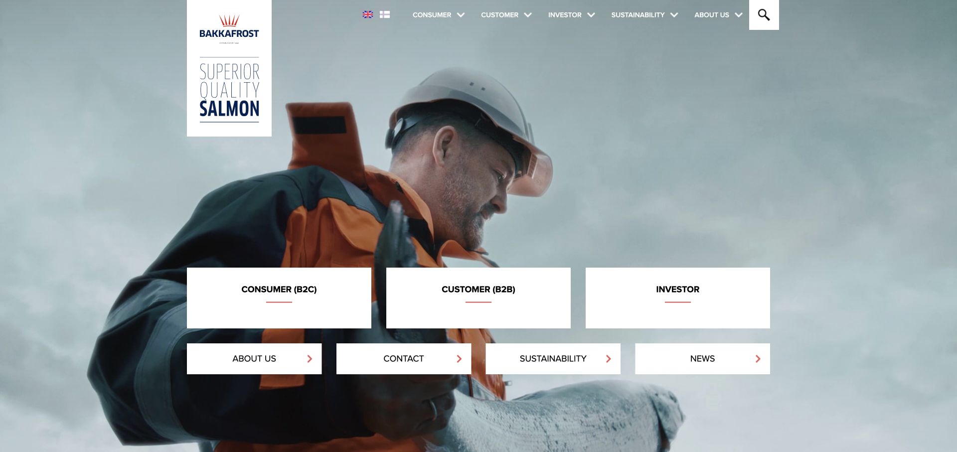
Bakkafrost places Consumer B2C, Customer B2B and Investor cards over a working-farm image. The supporting navigation gives consumers preparation information while trade customers receive products, logistics, certification and sales contacts. Sustainability is also a separate route, keeping a large corporate information requirement from becoming one mixed homepage feed.
What you can learn
Use explicit audience labels when the tasks genuinely differ. A person cooking salmon, a distributor investigating logistics and an investor looking for reports should not have to follow the same path.
Pros
Audience cards establish a consequential first choice.
Trade logistics and sales information are distinct from consumer preparation content.
Cons & considerations
Abbreviations such as B2B should retain plain-language context for less familiar readers.
Deep audience menus need consistent cross-links so readers can change context without starting over.
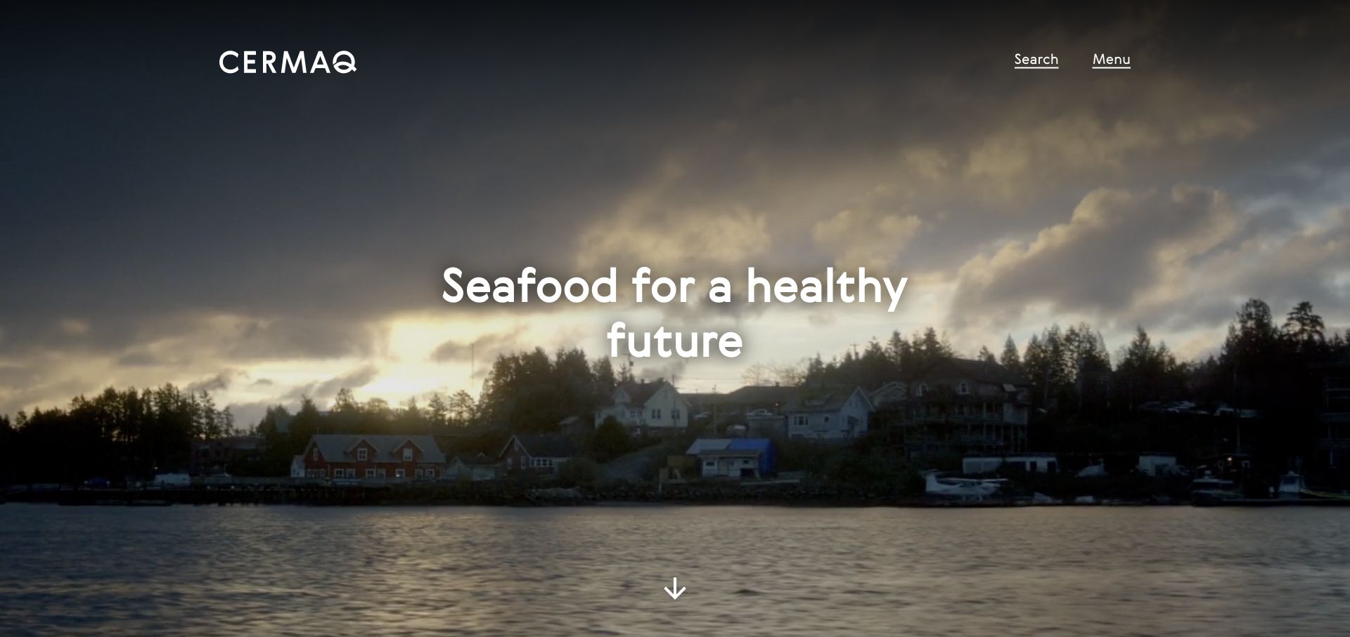
Cermaq combines a global seafood introduction with separate Canada, Chile and Norway routes. Product, sustainability reporting and careers form different body sections. Its contact explanation specifically identifies a press purpose and excludes general commercial proposals, an unusually clear example of setting expectations before a person starts an inquiry.
What you can learn
Explain both where information applies and what a contact route is for. A global business should not make visitors infer whether they need a country team, a press contact or a product destination.
Pros
Country routes give a broad corporate story a regional structure.
The contact-purpose explanation can prevent unsuitable inquiries.
Cons & considerations
A minimal Menu entrance can make the full information architecture less immediately apparent.
Health and footprint comparisons need documented methodology and appropriate qualification.
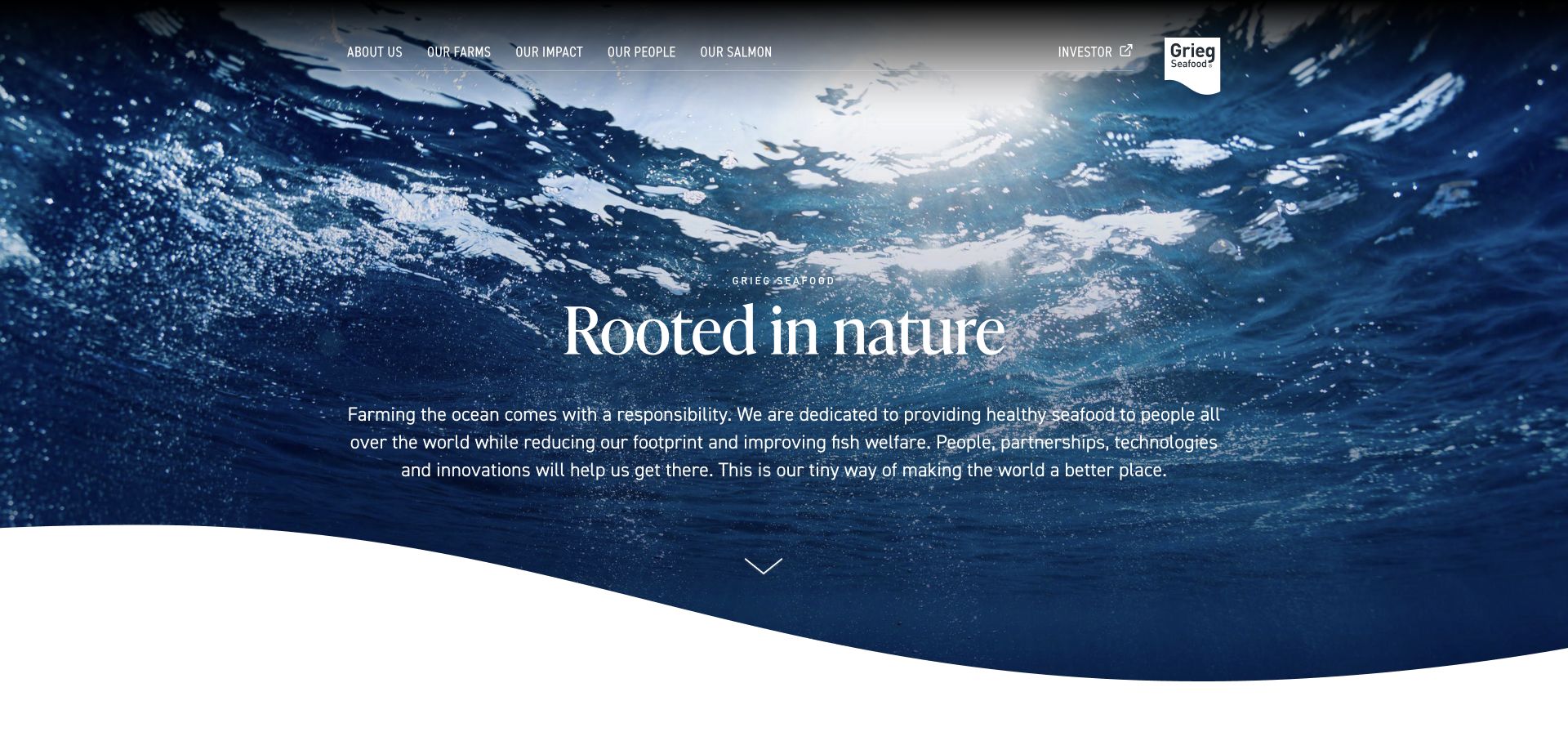
Grieg Seafood pairs an underwater image with a nature-led introduction and a small set of farms, impact, people and salmon routes. Investor information is visibly a separate destination. The impact section acknowledges that challenges remain, which is a more useful starting point for further reading than presenting improvement as a completed visual claim.
What you can learn
Give impact and people information their own maintained destinations. Acknowledge ongoing challenges and support the story with specific records rather than expecting nature imagery to establish responsibility.
Pros
A focused navigation makes the main public-interest topics visible.
The introductory impact language leaves room for continued improvement rather than suggesting completion.
Cons & considerations
Nature-led visual associations should not be mistaken for environmental verification.
A broad responsibility paragraph needs accessible paths to concrete measures and reporting periods.
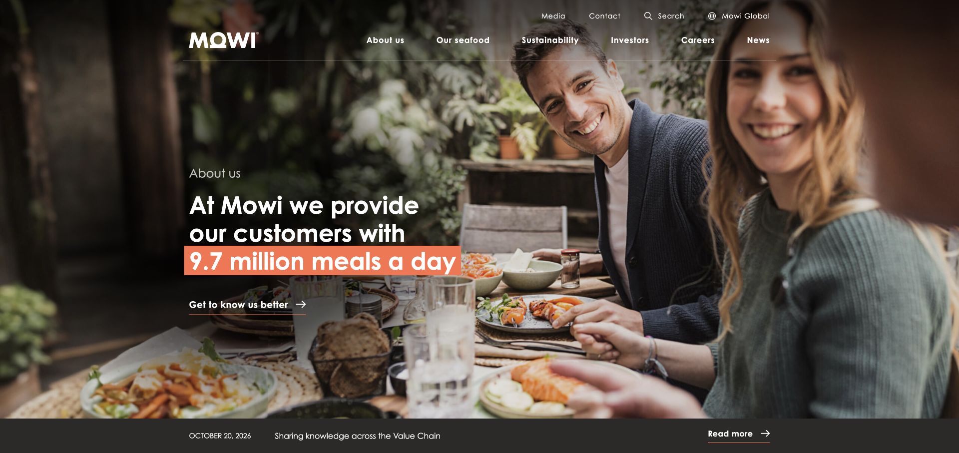
Mowi introduces its scale through a consumer meal image and a company-provided meals figure. Seafood, trading, value-added products, traceability and salmon farming have their own routes, while investors, careers and sustainability documentation are separate. A country selector acknowledges the difference between the global company view and local information.
What you can learn
Connect a large producer to the food people recognize, then provide distinct product, process and corporate paths. Keep quantitative scale statements clearly separate from claims about quality or individual outcomes.
Pros
The food context makes a large producer less abstract.
Traceability and farming information sit alongside product and trade categories.
Cons & considerations
A company-scale number needs a clear basis and reporting period to remain meaningful.
Large multi-country navigation requires maintained localization and clear destination labels.
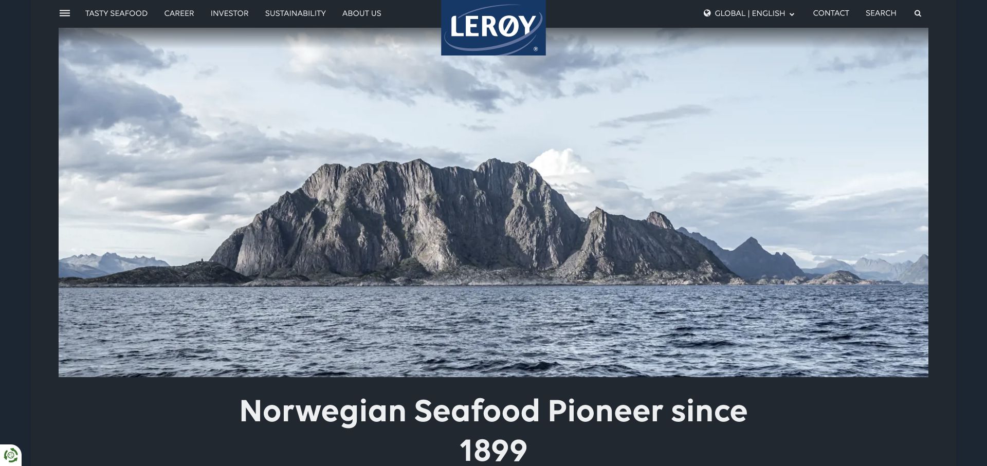
Lerøy’s English homepage pairs coastal imagery with a history-led introduction. Food, careers, investors and sustainability form separate main choices. The news stream includes aquaculture infrastructure, people and production stories, giving the broad company identity several more specific ways into the organization. A visible language menu connects the Norwegian and English experiences.
What you can learn
Use editorial stories to explain specific work within a large group, while retaining stable navigation for core audiences. Language choices should be easy to discover and should preserve meaningful content routes.
Pros
Distinct food, employment and corporate destinations support different visitor purposes.
Specific production and people stories add substance to the company introduction.
Cons & considerations
A long mixed news stream needs clear topic and date labels to remain useful.
A history claim can establish context but does not independently establish present product or environmental performance.
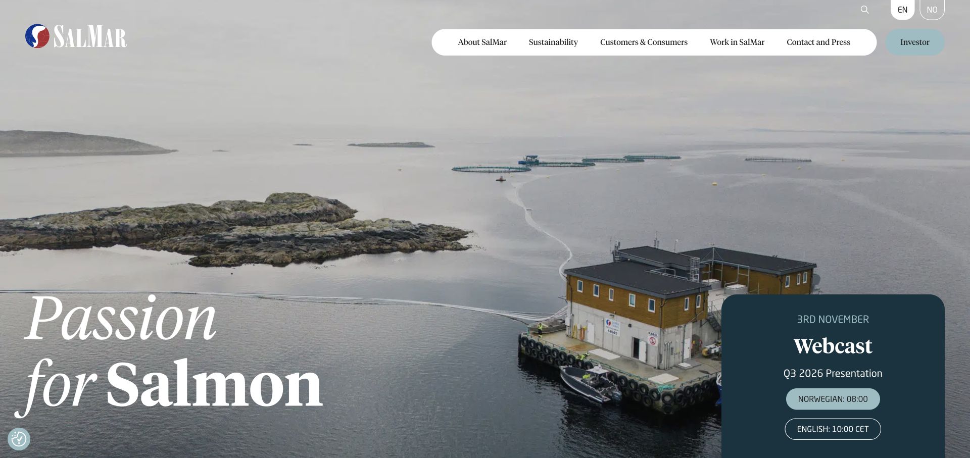
SalMar’s reviewed entrance combines sea-farm imagery with a dated quarterly webcast panel. Customers and consumers, sustainability, careers, contact/press and investors have different navigation paths. The body breaks responsibility into fish, environment and people, while operating-area and product links provide more concrete context than the broad passion-for-salmon headline.
What you can learn
Keep reporting campaigns visible without making them the only route through the business. Stable product, operating-area and responsibility destinations should remain available when the webcast is no longer current. An upcoming or archived webcast is time-sensitive content; product and operating-area information supplies the more durable context for readers who arrive outside that reporting window.
Pros
Commercial and investor destinations are visibly distinct.
Responsibility is divided into understandable fish, environment and people themes.
Cons & considerations
A dated webcast panel needs timely archiving or replacement.
A broad leadership or quality claim still needs relevant product and operating evidence.
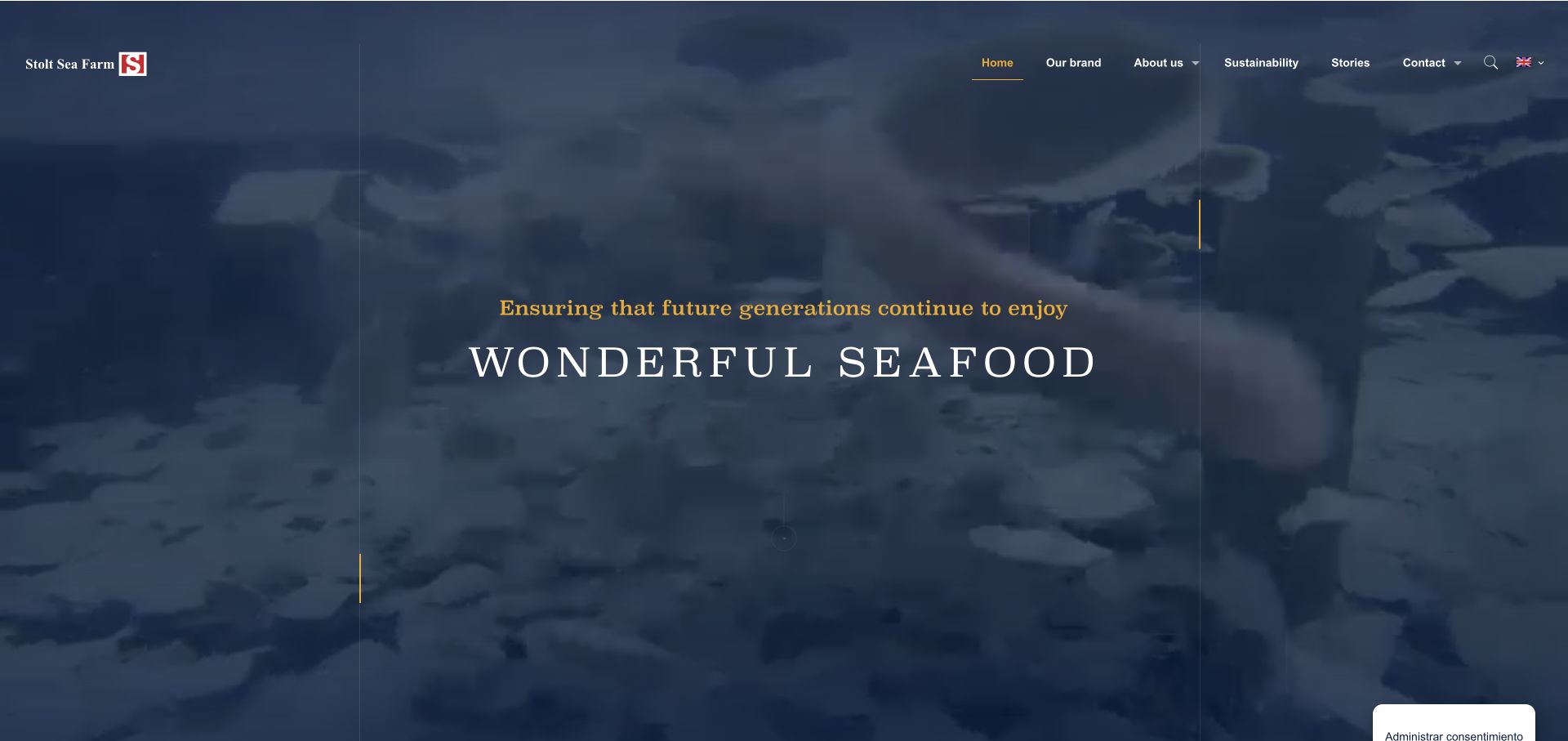
Stolt Sea Farm identifies turbot and sole and introduces land-based farming with an innovation and research explanation. Product-brand, sustainability and story routes give the page a compact structure. A taste-award reference links to an external award record rather than remaining an untraceable decorative mark, while contact remains a distinct action.
What you can learn
Name the species and production context early, and connect recognition to its actual source. A focused product story is more useful when readers can investigate the specific claim and commercial route.
Pros
Species specialization makes the offering concrete.
The external award link provides a source for a particular piece of recognition.
Cons & considerations
Awards should not be treated as evidence for unrelated production or sustainability claims.
Inconsistent heading levels and generic link text can make a visually compact page harder to navigate accessibly.
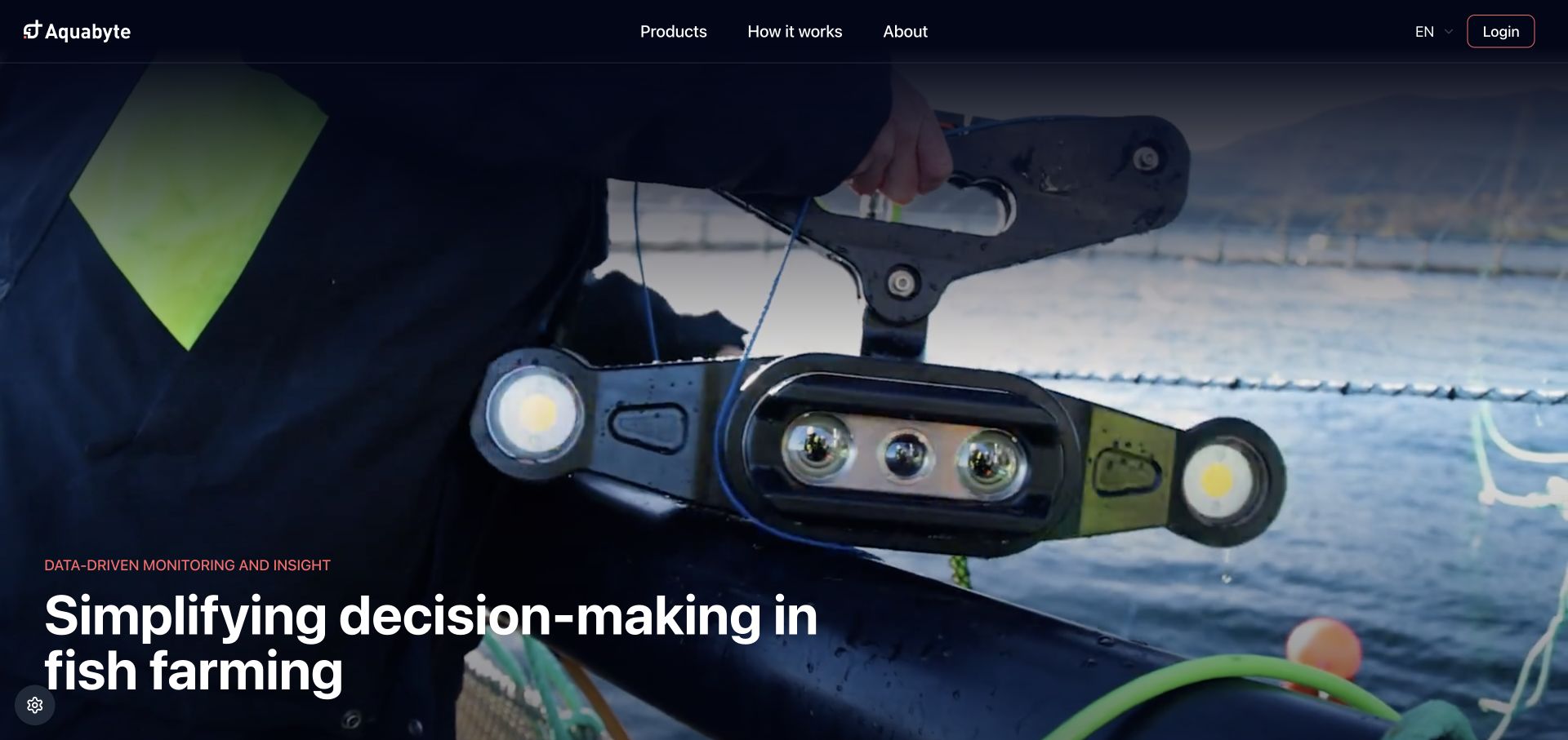
Aquabyte explains fish monitoring through a camera-to-cloud-to-user-portal relationship. Weight, lice, welfare, behavior, feeding and decision support are separate product categories, while production phase, species and farming technology provide additional contexts. A clear login acknowledges existing users without merging their access task into the demonstration journey.
What you can learn
Explain the sensing-to-software relationship and give each decision category its own meaning. Species and production-stage context help prevent a broad analytics claim from sounding universally applicable. The fish-pen, cloud and portal illustration supplies a simple system relationship, while the production filters help a reader ask where that relationship actually applies.
Pros
Named product categories translate the monitoring suite into recognizable questions.
Production context and existing-user access have explicit routes.
Cons & considerations
A large media-led opening can postpone the first readable software example.
Accuracy and welfare language needs appropriate validation evidence and operating limits beyond a homepage.
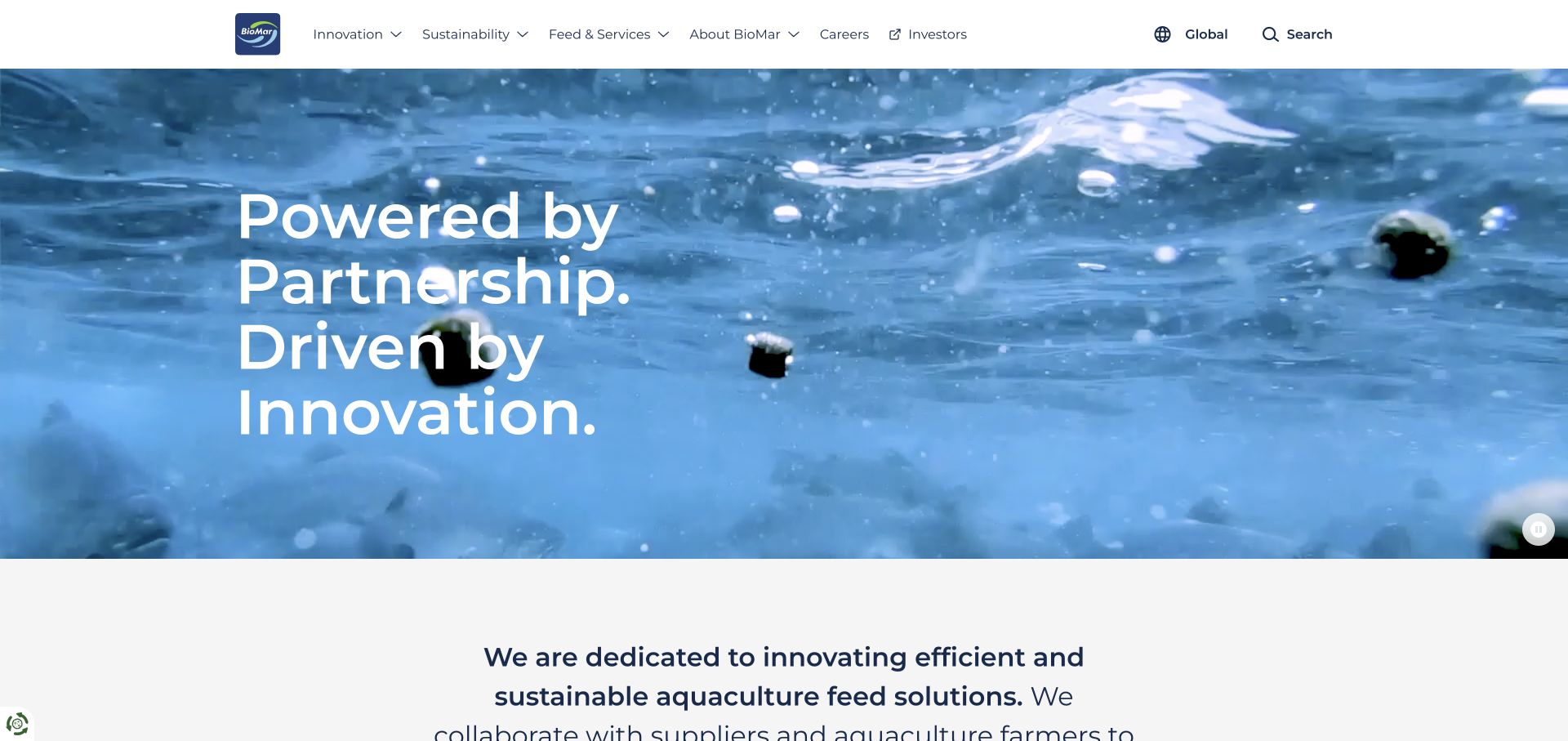
BioMar uses underwater fish-and-feed footage with a visible pause control, then explains its aquaculture-feed focus. Feed and services, innovation, sustainability and a regional selector form the stable structure. The news collection uses topic labels and summaries to extend the page beyond a broad partnership proposition into specific products, research and supply-chain subjects.
What you can learn
Pair a broad supplier identity with clearly labeled technical and regional paths. Topic-based knowledge content can help a customer investigate the feed story rather than relying on a general innovation claim.
Pros
The moving introduction has a visible pause control.
Feed/services and region choices make the broad company proposition more navigable.
Cons & considerations
A partnership-led headline needs the following explanation to identify the actual product.
Research and certification stories require current records and precise scope rather than generalized assurance.
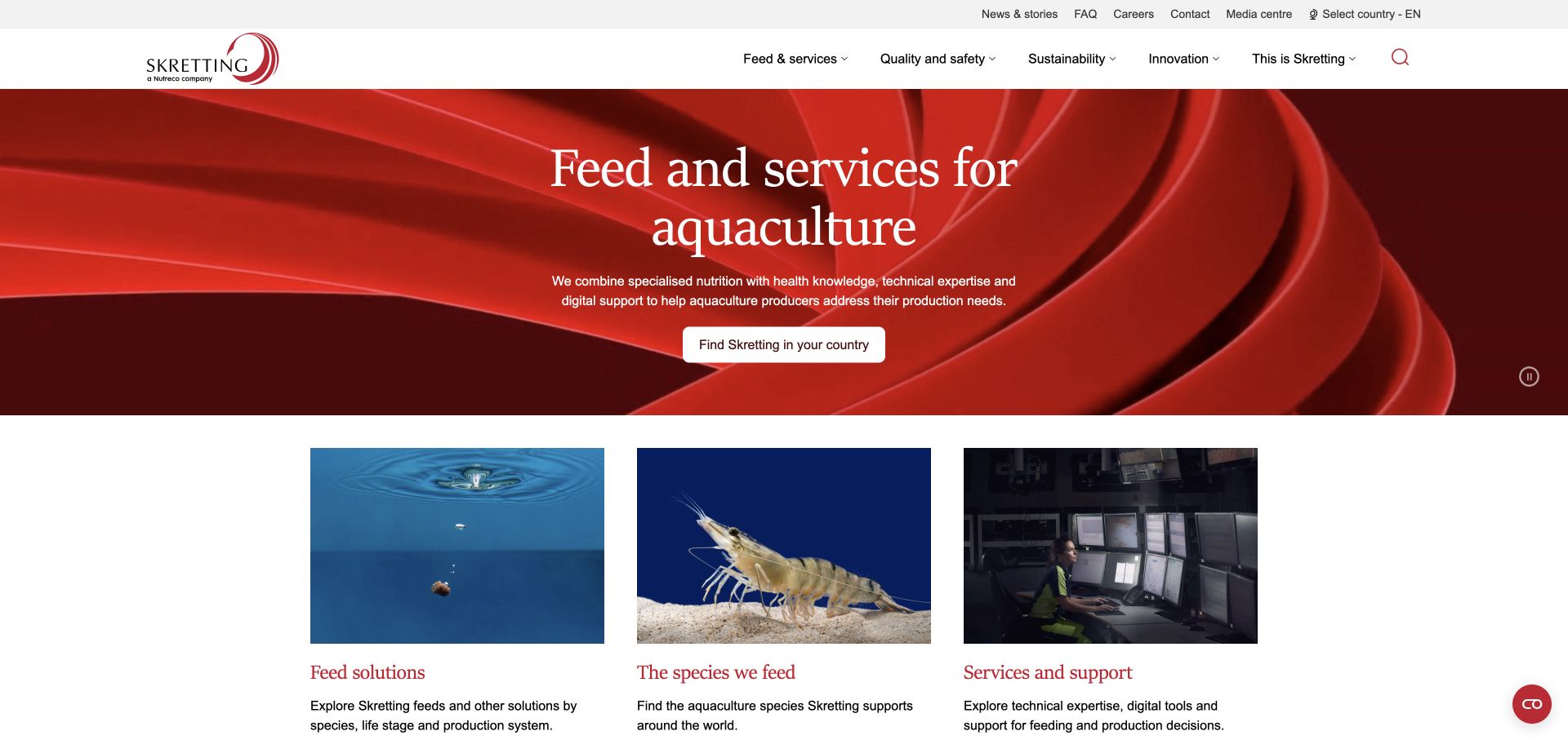
Skretting plainly identifies feed and services for aquaculture before offering feed solutions, species and support cards. The explanatory text names species, life stage and production system as research dimensions. Quality and safety, innovation and sustainability remain distinct topics, and a country route helps visitors find locally relevant information.
What you can learn
Use the biological and operational dimensions of the product as catalog structure. Species, life stage and production system are more useful research labels than an unexplained list of feed names. A species entrance helps identify the relevant biological context, while the country selector addresses a different question: which information and offer apply in the visitor’s region.
Pros
Three concise cards explain different ways into the offer.
The country and quality-information routes acknowledge important purchase context.
Cons & considerations
Product availability and formulation information need maintained regional detail.
Nutrition and health-related claims require appropriate evidence and cannot be validated through website appearance.
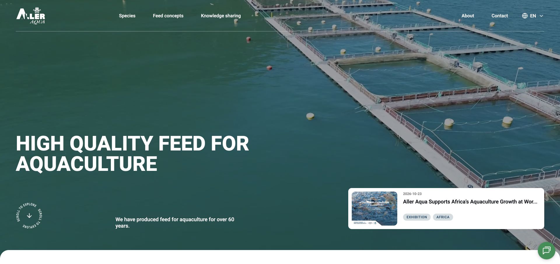
Aller Aqua uses a direct feed-for-aquaculture headline over sea-farm imagery. Species and feed concepts are distinct menu choices, while a substantial knowledge-sharing stream labels items with dates, regions and subjects such as raw materials, RAS and research collaborations. The page connects the commercial offer with practical topical reading rather than only a corporate introduction.
What you can learn
Make a technical knowledge library searchable through meaningful subject and regional labels. Keep the product catalog’s species and concept choices understandable before a visitor enters individual feed details.
Pros
The introductory product category is immediately clear.
Tagged and dated knowledge items expose useful research dimensions.
Cons & considerations
A long update list needs a clear hierarchy so important evergreen material is not buried.
Experience and quality claims need maintained supporting records rather than age alone.
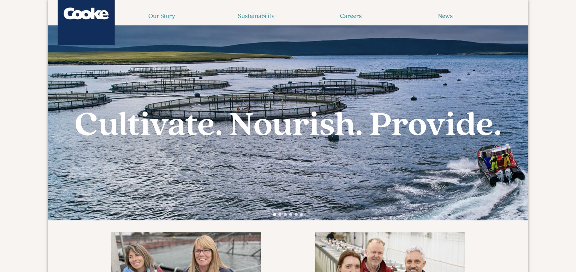
Cooke uses a bounded page layout, sea-farm imagery and a short main navigation around story, sustainability, careers and news. A family-of-companies directory explains that the group spans several brands and businesses, with search available for those destinations. The structure is more corporate than product-specific, which suits some visitors better than others.
What you can learn
Show the operating-brand structure when the parent site is not the main product destination. Keep brand links and contact handoffs maintained so the directory actually helps someone reach the right business.
Pros
The main navigation is compact despite the scale of the group directory.
The family-of-companies section provides a route beyond the parent identity.
Cons & considerations
The reviewed careers call to action pointed to a staging host, illustrating the need to audit destination links.
A group-level sustainability story needs operating-company and reporting context for detailed research.
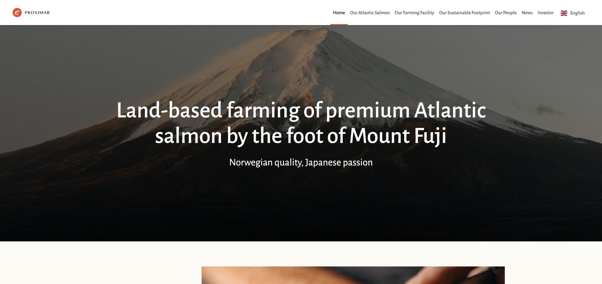
Proximar places Mount Fuji behind a direct explanation of Atlantic salmon farming in Japan. Fish, facility, footprint and people have separate destinations, while the introductory body describes a first harvest and the Fuji Atlantic Salmon brand. Investor information is distinct from the product and production story, giving the location-led identity a practical structure.
What you can learn
Use a real location to explain the market proposition, not merely as scenic decoration. State the species, production approach and current project stage in readable text beside the image.
Pros
Species, production approach and location are explicit in the headline.
Facility and product information are separated from investor material.
Cons & considerations
Capacity, biosecurity and environmental statements need current operational evidence and appropriate qualification.
Long homepage paragraphs benefit from clearer summaries and maintained status dates.
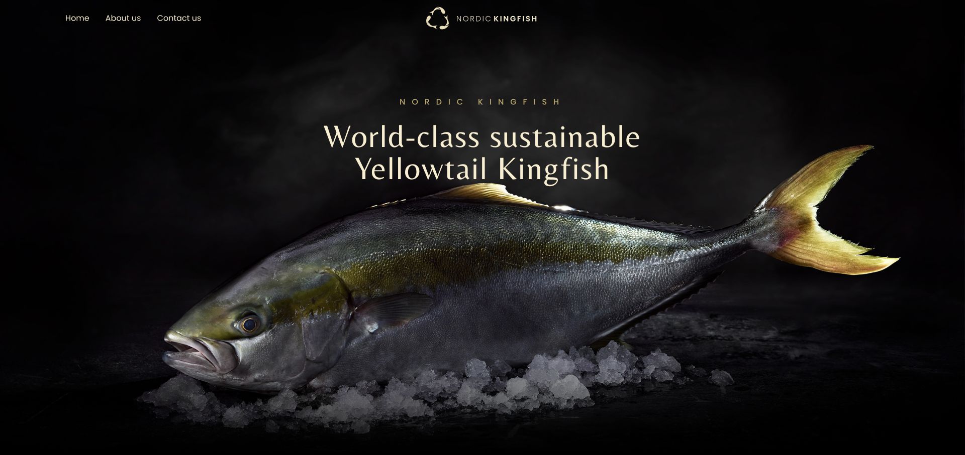
The reviewed Nordic Aquafarms address leads to Nordic Kingfish, where a large yellowtail photograph dominates a black-and-gold introduction. Home, About and Contact keep the navigation compact. Preparation ideas make the fish tangible as food, while the body explains the Nordic Aquafarms relationship and land-based production rather than leaving the product image without provenance.
What you can learn
Make the species visually unmistakable and connect it to real product uses. Even a compact premium site should explain the producer relationship and the production context behind the brand.
Pros
A clear product photograph immediately identifies the subject.
Preparation ideas and parent-company context extend the premium positioning.
Cons & considerations
Minimal navigation can make detailed production and trade information harder to locate.
Broad sustainability and welfare statements need specific evidence beyond a premium visual treatment.
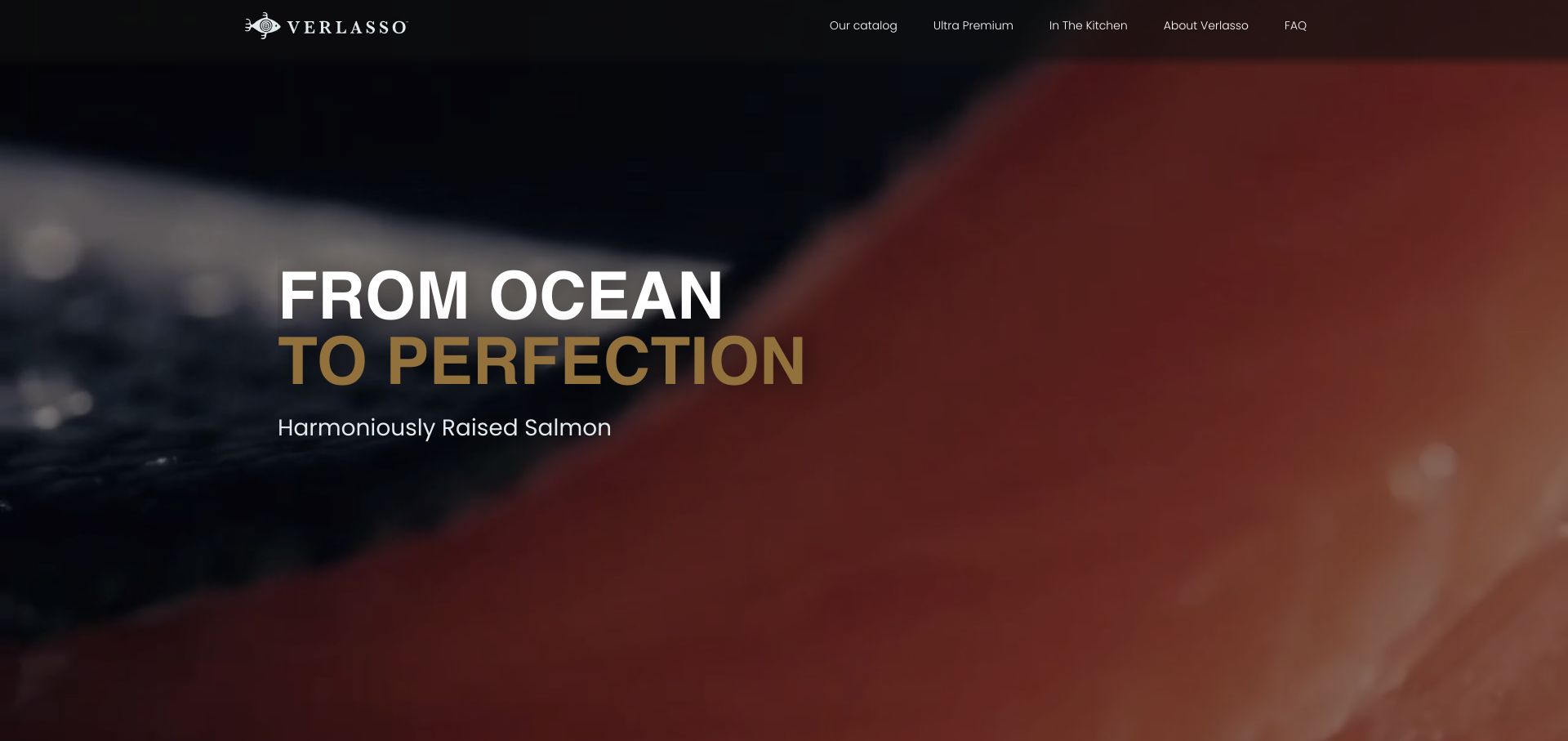
Verlasso combines ocean and preparation footage with restrained black-and-gold branding. A Patagonia origin story leads into catalog, premium-product and kitchen destinations, while a chef-inspired recipe collection offers a concrete use for the fish. An FAQ route provides a separate place to investigate questions that the brand-led introduction cannot fully answer.
What you can learn
Connect provenance to the kitchen through actual product and recipe information. Keep an explanatory FAQ close to the brand story so readers can investigate rather than only absorb the imagery. A catalog visitor can investigate the product, while a recipe visitor can explore preparation; keeping both routes explicit makes the culinary story useful beyond the opening film.
Pros
Catalog and kitchen routes distinguish buying research from culinary inspiration.
Specific recipes make the food proposition more tangible.
Cons & considerations
Environmental and animal-welfare claims need clearly sourced scope and verification.
A moving full-screen opening needs readable alternatives and accessible playback behavior.
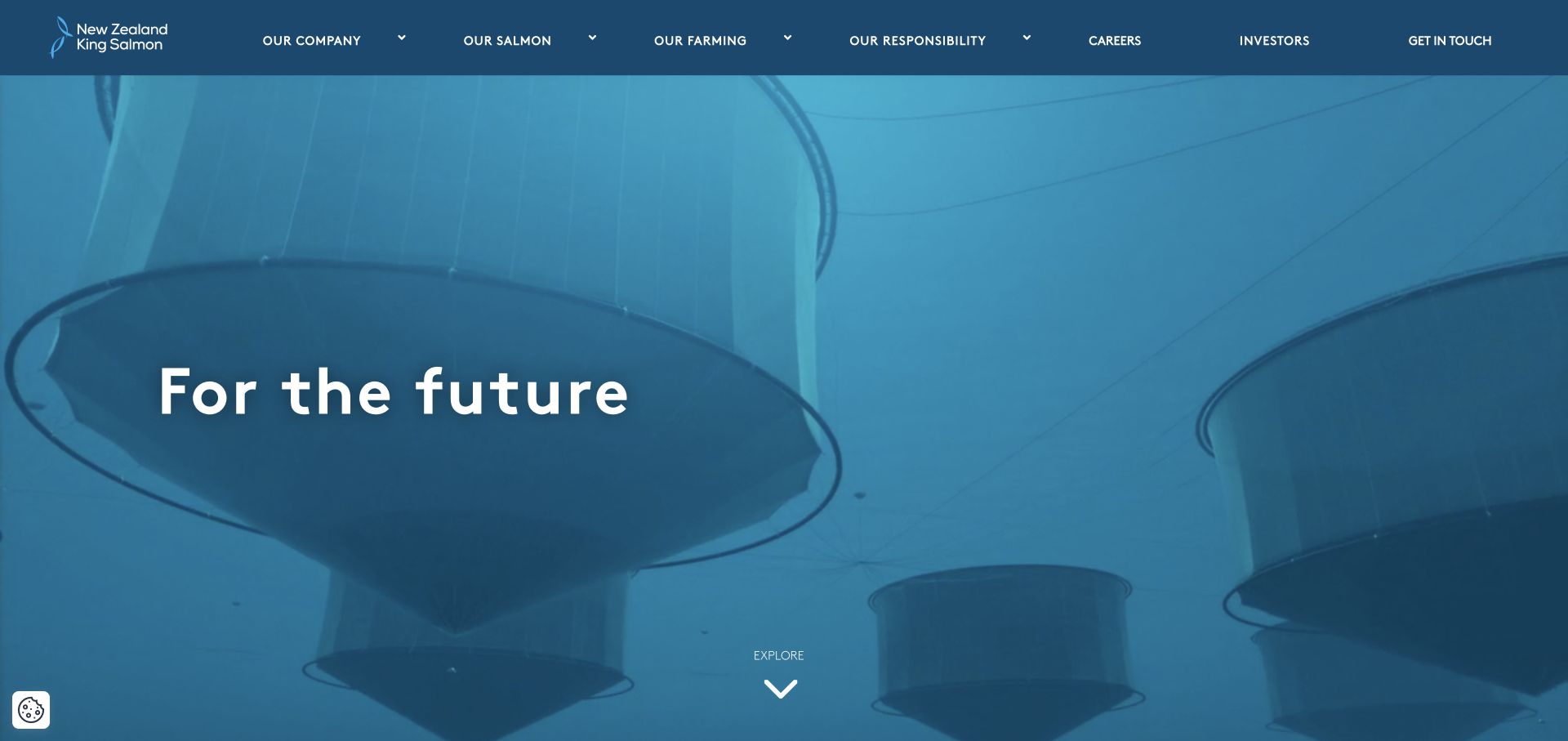
New Zealand King Salmon introduces its company over production imagery and separates salmon, farming, responsibility and investor information. The body labels its open-ocean farm work as a proposal and links onward for detail, while a brand-family section connects the corporate site with product identities. Certification and endorsement references also have their own destinations.
What you can learn
Distinguish a proposal from an operating facility and keep the brand-family structure understandable. Public project status and product information should be precise enough that readers do not infer more than the source says.
Pros
Farming, responsibility and product audiences have distinct navigation paths.
The open-ocean project is explicitly introduced as a proposal.
Cons & considerations
Project status needs regular review so older proposal wording does not become misleading.
Certification logos need current scope and records; their presence alone is not independent verification.
Kegan is a freelance web designer and developer with 15+ years of experience helping businesses turn complicated website requirements into clear, maintainable digital experiences. He works directly with clients from planning and design through development, launch, and ongoing support.
For aquaculture website design, his development approach focuses on species and production context, clearly qualified sustainability and welfare information, product and service scope, and distinct commercial, research and public-information journeys. The scope can be a targeted improvement or a complete custom build, with responsive layouts, thoughtful content structure, and integrations chosen around the people using and maintaining the site.
Show 3 other aquaculture website designersHide other aquaculture website designers
Plan an aquaculture website around species, production and audience
Start by defining the business and the reader
Write down the actual role of the company before choosing a visual direction. A fish producer, a feed business and a monitoring platform may all use underwater imagery, but they answer different questions. Nofitech describes land-based systems, ReelData names a specific production setting, and Kames connects its trout with product formats and farm context.
Map the primary visitor tasks. Bakkafrost makes Consumer B2C, Customer B2B and Investor entrances explicit. Innovasea distinguishes aquaculture from fish-tracking research. This is a useful pattern when audience needs differ materially; it is less useful when it simply repeats the company’s internal departments. Use plain labels and let people change context easily.
Give each task a relevant destination. Seafood sourcing is different from equipment demonstration, press contact, career research or customer login. Cermaq explains the intended purpose of its contact route. Preserve that clarity and avoid asking a buyer or community member to send information into a form that is intended for another purpose.
Turn imagery into an explanation rather than a substitute for one
Real farms, fish, equipment, people and product photographs can establish context quickly. Scottish Sea Farms uses staff portraits; Nordic Kingfish makes the species visually unmistakable; Proximar uses Mount Fuji to explain a regional proposition. In each case the text still needs to say what the business does and why that information matters to the reader.
Show the relationship between the components of a technical offer. Aquabyte separates cameras, software and monitoring decisions. AKVA group and ScaleAQ divide large portfolios into recognizable systems and production environments. For engineering businesses, show the path from concept to delivery and operational support instead of only finished-facility photographs.
Provide readable alternatives to moving media and diagrams. Innovasea, BioMar and Skretting expose pause controls on background footage. Keep the essential proposition and next step available without playback, optional cookies or high-bandwidth imagery. Captions, descriptive links and a coherent heading hierarchy matter even on a visually polished site.
Give responsibility and product claims a maintained evidence structure
Create a content structure for reporting period, species, facility scope, certification and the source behind a claim. Scottish Sea Farms links to indicators and documents; Mowi separates traceability and sustainability records; Stolt Sea Farm links a particular award to its external record. These are research destinations, not independent verification by Website Unpacked.
Avoid turning a company-wide statement into a promise for every product or project. Environmental impact, fish welfare, feed performance and business economics depend on methods and conditions. Explain what was measured and what remains uncertain. Grieg’s impact introduction acknowledges remaining challenges, a useful reminder that responsibility can be discussed without implying that all problems are solved.
Keep project status precise. New Zealand King Salmon labels its open-ocean work as a proposal in the reviewed content. Proximar describes a harvest stage and product brand. Put a review date and content owner behind status information so a planned facility, trial or commercial launch does not remain frozen in an old marketing paragraph.
Design for sourcing, technical support and changing company structures
Model species, product formats, production stages, system categories and regional availability as maintained records. Skretting’s species/life-stage/system approach and Naïo-style crop structures in adjacent industries show why meaningful comparison fields matter more than a collection of model names. Use only dimensions that are relevant to the actual aquaculture offer.
Keep brand and company handoffs transparent. The reviewed Nordic Aquafarms entrance leads to Nordic Kingfish; Cooke maintains a family-of-companies directory. A parent business may be the right source for corporate information but not the place to buy a product. Label destinations, review redirects and remove accidental staging links before release.
Plan the long relationship after first contact. Equipment and monitoring users may return for software login, manuals, warranty or service. Seafood buyers may need sourcing contacts and product records. Keep these useful routes accessible without repeatedly pushing existing users toward a generic new-business form.
The editing job behind the design
Choose tools that keep production and product content maintainable
Model species, production environment, facility status, product formats, technical systems and regional contacts as explicit content records. Reuse verified facts consistently rather than repeating them in unmaintained promotional images.
Keep corporate reporting, product sourcing and operational software access distinct. Explain external handoffs and protect customer, farm and commercially sensitive information in examples and inquiry workflows.
Visible website technology evidence does not establish a farm’s control software, biological systems, feed formulation or internal data practices. Unknown website technologies remain empty until a bounded public audit supports a specific observation.
Our WordPress website examples offer a separate look at publishing approaches. A visible platform label is evidence for that named page, not a guarantee that the same system will suit your requirements.
Before the public launch
Aquaculture website planning checklist
Identify the species and actual role of the business.
Distinguish sea-based, land-based and relevant production stages.
Map buyer, operator, investor, employee and community tasks.
Show real product, farm, equipment or team context.
Explain the relationship between hardware, software and services.
Give sourcing and demonstration routes clear expectations.
Maintain facility and project status with review dates.
Qualify environmental, welfare and performance statements.
Link certification or recognition to its specific current scope.
Keep software login, manuals and service easy to reach.
Audit regional, brand-family and external destination links.
Provide accessible alternatives to motion and large diagrams.
These checks are a project checklist, not a performance, legal, security, or accessibility certification. Test real journeys with the people responsible for the website before making claims about the result.
Sources & editorial method
How this collection was selected and reviewed
The original 26-example draw was preserved. Each included public website was directly reviewed and captured in a real browser, with actual UTC capture timestamps, dimensions and hashes retained. Optional cookies were declined or necessary-only choices retained where available; normal controls dismissed overlays without source edits. The obstructed AquaMaof original is retained privately and excluded in favor of the clean replacement. Nofitech is an explicit editorial choice for specialist website communication. These observations do not test aquaculture equipment, validate environmental claims, establish food safety or animal welfare, or assess financial viability. Unavailable, parked-domain, certificate-warning and unobstructable candidates were excluded. Two failed attempts to save an Ōra King capture remain held; that example was not counted. Every accepted source received a bounded broad public website-technology audit attempt; unavailable results remain unavailable.
Each example links to its actual source page. Screenshots are direct browser captures with their own capture dates; moving imagery, announcements and live designs can change. The notes describe observable design choices and conditional tradeoffs, not measured traffic, conversion results, service quality, or accessibility conformance.
Technology labels use public page metadata, asset evidence, or explicitly cited platform documentation. Platform documentation is not a complete current deployment audit. A component reference may be legacy or unused; it is not a complete backend inventory. Unknown stacks are omitted. These sites are editorial examples, not our client portfolio.
Written, Edited and Curated are separate editorial records, not timestamps advanced by a rebuild. Website designs and imagery belong to their owners. See our editorial standards or suggest a correction.
Questions worth asking
Aquaculture website design questions
What should an aquaculture website explain first?
Identify the species, production context and role of the business. A producer, feed supplier, engineering firm and monitoring platform need different initial explanations even when they share similar imagery.
How should an aquaculture site organize different audiences?
Use explicit routes for tasks that genuinely differ, such as seafood sourcing, technical systems, investor reporting, careers and community information. Keep the labels understandable and make it easy to move between them.
What belongs beside an aquaculture sustainability claim?
Provide the relevant scope, reporting period, method and source. A certification, award or company report should not be generalized beyond what it actually covers.
Do the examples establish fish welfare, food safety or system performance?
No. The collection reviews public website communication and design. It does not test farms, certify products, validate environmental measurements or establish operational or financial outcomes.
Why is Nofitech the Editors Choice?
The reviewed specialist site connects a distinctive land-based visual idea with production stages, named reference locations and lifecycle support. The choice recognizes an understandable website narrative, not an engineering-performance ranking.
Make the production context understandable, connect the imagery with useful information and give each audience a clear route. A good aquaculture website supports investigation without confusing a polished brand story with verified performance.