Best Air Duct Cleaning Websites of 2026 (15 Real-World Examples)
Service scope, local availability, straightforward contact, and useful explanations without unsupported health promises.
An air duct cleaning website should explain the service a visitor can actually inquire about, where it is available, and how the company establishes an appropriate scope. Clear information is more useful than a frightening dust photograph or a universal promise of healthier air.
This collection looks at air duct cleaning within specialist cleaning, restoration, and broader home-service websites. That range is intentional: a single-service business and a multi-location provider have different navigation problems, but both need to make the relevant service easy to find.
The examples are design references rather than service recommendations or medical advice. Study the relationship between local routing, service explanations, inquiry forms, and visible business identity. Do not copy another company’s technical, certification, pricing, health, or efficiency claims without appropriate evidence and approval.
Before the examples
What makes good air duct cleaning website design in 2026?
Distinguish the actual services
Explain the company’s actual air duct cleaning offering and keep dryer-vent cleaning, HVAC repair, filtration products, and other services distinct. A visitor should understand what they are asking about without needing to diagnose a system or infer that every related task is included.
Make local availability understandable
Show the genuine service region and a useful contact route. For a multi-location business, let visitors verify the relevant office and offered service rather than implying that every branch delivers every task shown on the national homepage.
Show accountability rather than anxiety
Use real company information, appropriately scoped credentials, and understandable process wording. Avoid promising health improvements or fixed energy savings from a marketing image. Give uncertain visitors a normal route to discuss their question with the appropriate professional.
The collection · 15 examples
15 air duct cleaning websites worth studying
Compare how each site introduces its business, exposes the air duct service, distinguishes location and customer type, and offers a practical next step. A strong visual treatment is not evidence of a health outcome or cleaning result.
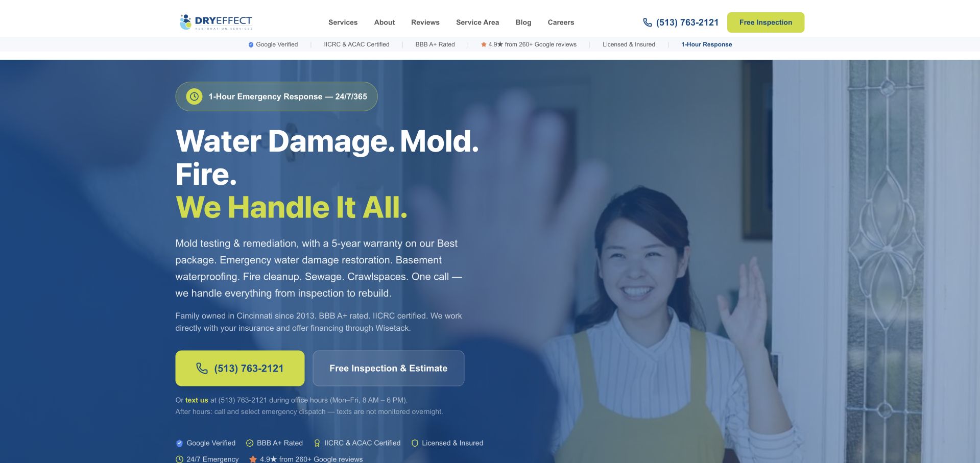
Dry Effect uses blue and lime accents, a welcoming doorway photograph, and a clear Cincinnati identity to make a broader restoration business feel tangible. The retained capture separates a large call button from an inspection-and-estimate action and explains when text messages are monitored. Its current homepage explicitly lists air duct cleaning within the service offering, rather than relying on a generic indoor-air claim. The most useful reference is this contact clarity and local accountability, not the emergency emphasis of the larger restoration headline.
What you can learn
Explain which communication channel is monitored and what the next action requests. A person asking about routine duct cleaning should not have to infer the difference between an ordinary office inquiry and emergency dispatch.
Pros
The distinction between office-hours texting and after-hours calls adds practical meaning to the contact buttons.
A clear Cincinnati identity helps a visitor establish regional relevance before investigating the wider service range.
Cons & considerations
If duct cleaning is the primary campaign, the restoration-led hero needs a more direct supporting service route.
Urgent restoration language should not be copied into ordinary cleaning inquiries or treated as proof that work is necessary.
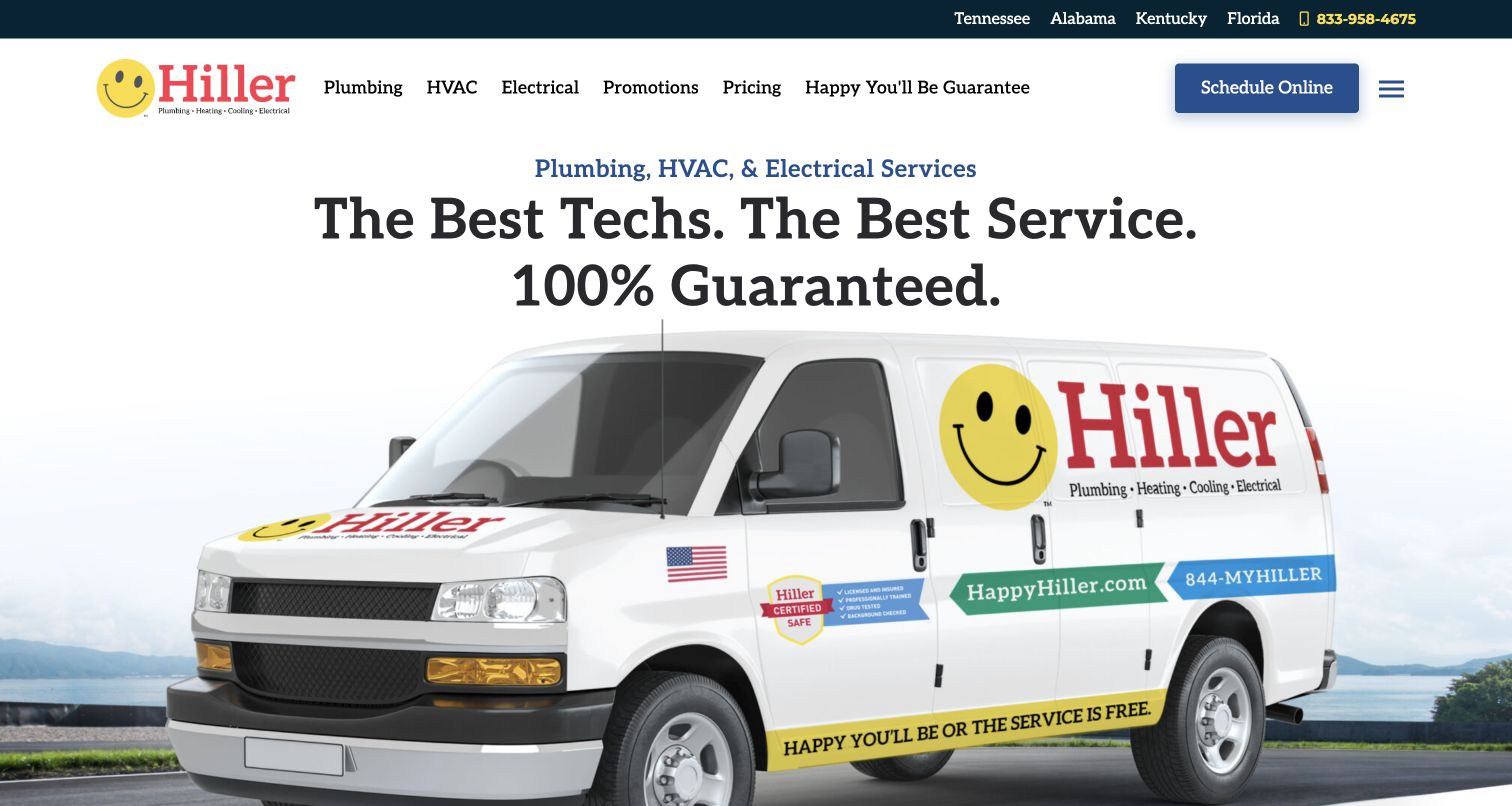
Hiller’s retained homepage centers a branded van beneath a large service statement, with a schedule button visible in the header. The smile emblem, yellow highlights, and vehicle graphics make the identity coherent across the page. Current first-party Chattanooga and Knoxville pages explicitly offer duct cleaning within local HVAC services, establishing the collection fit without assuming every location is identical. For an air duct business, the useful pattern is a recognizable company introduction paired with a persistent scheduling route; the broad guarantee in the artwork remains a company claim, not our verification.
What you can learn
Make the company easy to recognize, then provide a specific local service destination for the task being researched. A large umbrella brand statement cannot replace an explanation of where duct cleaning is offered and how an inquiry proceeds.
Pros
A persistent header action avoids making the visitor search the photograph for a contact route.
Consistent vehicle and logo treatment connects the website identity to a recognizable field-service presence.
Cons & considerations
The broad multi-trade headline does not itself explain an air duct cleaning scope or local availability.
Prominent absolute guarantees require clear supporting terms and should not become unsupported health or technical promises.
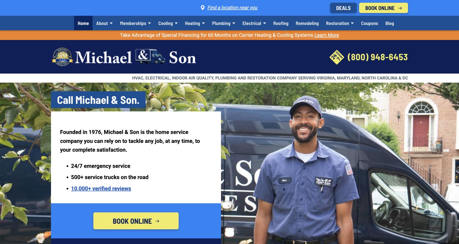
Michael & Son gives a uniformed technician and branded vehicle a prominent role beside a white introduction panel. The retained view puts location discovery and online booking above a broad service navigation, while indoor air quality is named in the supporting category strip. Its current Baltimore and Raleigh duct-cleaning pages establish a specific offering with local contact routes. This is useful for studying how an umbrella homepage can lead into a service-and-location combination, while recognizing that a first-screen fleet or review claim does not independently establish cleaning quality.
What you can learn
Pair a human company introduction with a visible way to identify the relevant office. A local duct-cleaning page should then answer the specific scope and inquiry questions that the general home-service homepage cannot cover in its opening panel.
Pros
Location discovery is visible before the booking action, supporting a visitor who needs to establish the right office.
The white introduction panel separates important text from the detailed technician-and-vehicle photograph.
Cons & considerations
A large multi-trade navigation can make a narrow air duct task less obvious without a clearly named service route.
Financing and promotional strips may consume attention before an uncertain visitor reaches the practical service explanation.
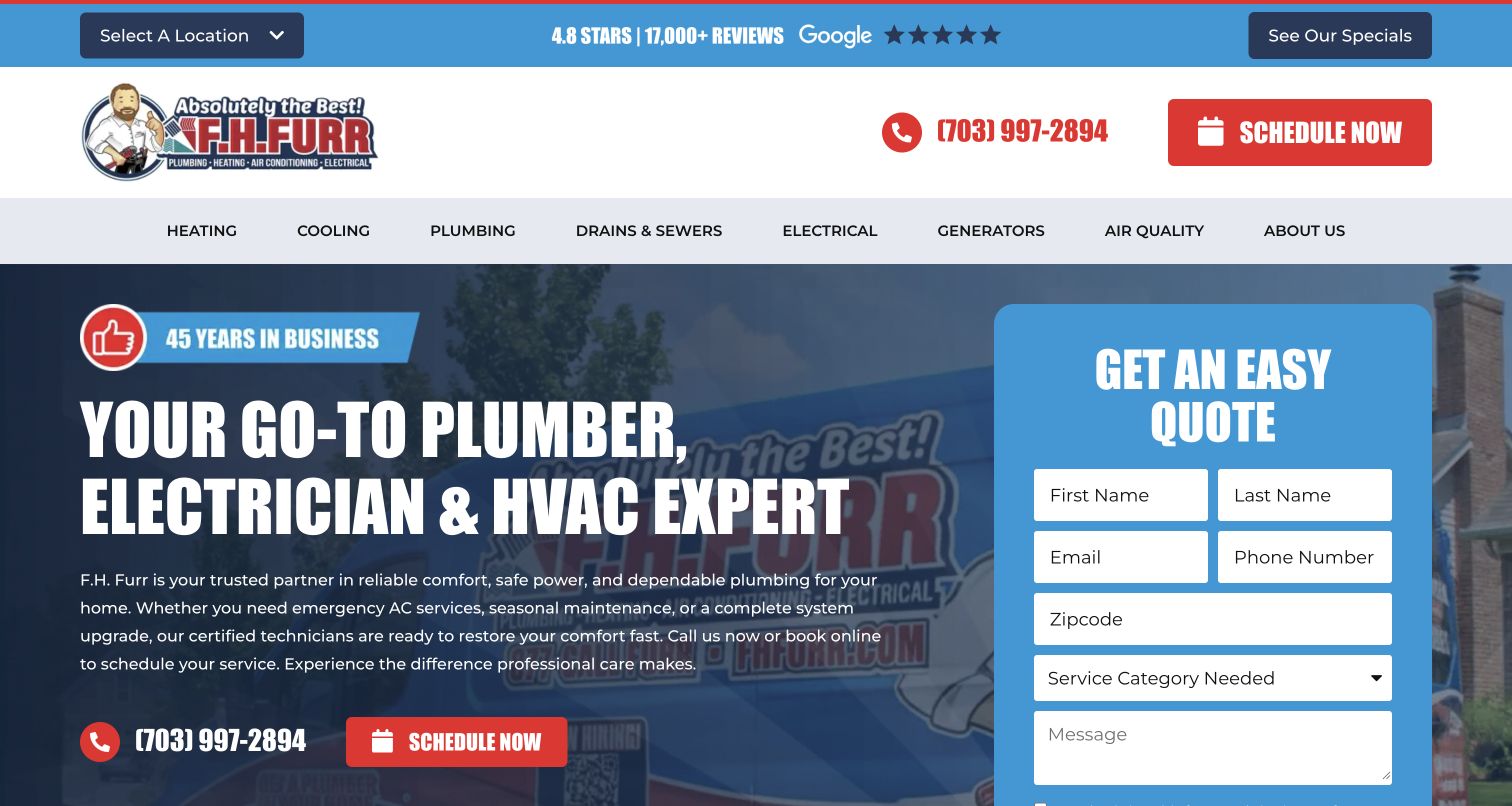
F.H. Furr combines a multi-trade headline with a bright blue form panel in the retained screenshot. The header separates a location selector, telephone contact, and scheduling action, and the main menu names Air Quality as a distinct category. Current DC-metro and Delaware service pages explicitly offer duct cleaning, so the industry association is based on service evidence rather than the HVAC label alone. For a cleaning website, the useful idea is the combination of regional routing and structured service discovery, not a suggestion that every visitor should complete the entire quote form immediately.
What you can learn
Use an understandable service category and a clearly identified location to guide a narrow inquiry inside a large home-service site. Keep the option to read service information available alongside the more committed form action.
Pros
The location selector makes regional context an explicit part of the header rather than an invisible assumption.
The colored quote panel visually separates the contact task from the background vehicle imagery.
Cons & considerations
A broad category such as Air Quality needs clear service names underneath it for visitors unfamiliar with the taxonomy.
A large first-screen form can overshadow scope information when a person is still deciding which service to ask about.
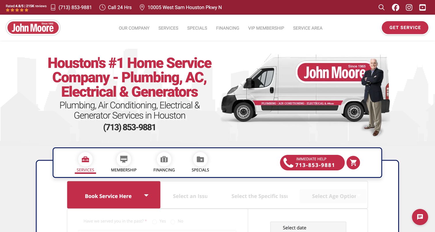
John Moore uses its red identity, a branded van, and a Houston-focused headline to introduce a broad home-service operation. Beneath the retained hero is a staged booking interface with service selection rather than a single unstructured contact box. The current dedicated duct-cleaning page includes service explanations and price-factor headings, establishing a specific destination beyond the general homepage. The design lesson is the transition between those layers: a strong local brand can orient visitors, but the service page still needs to make a narrow cleaning inquiry understandable without relying on the headline’s comparative marketing claim.
What you can learn
Let an umbrella homepage establish identity while a dedicated service page does the explanatory work. A multi-step intake should make the selected category and next step clear, rather than asking a visitor to guess what an internal issue label means.
Pros
The Houston emphasis gives the wide service offering a concrete local context before the visitor starts an inquiry.
A dedicated duct-cleaning destination offers more relevant detail than the general homepage can reasonably contain.
Cons & considerations
Staged service selection may be awkward for someone who cannot identify the right issue category.
Comparative claims and displayed review totals need verification and currency checks rather than being treated as design evidence.
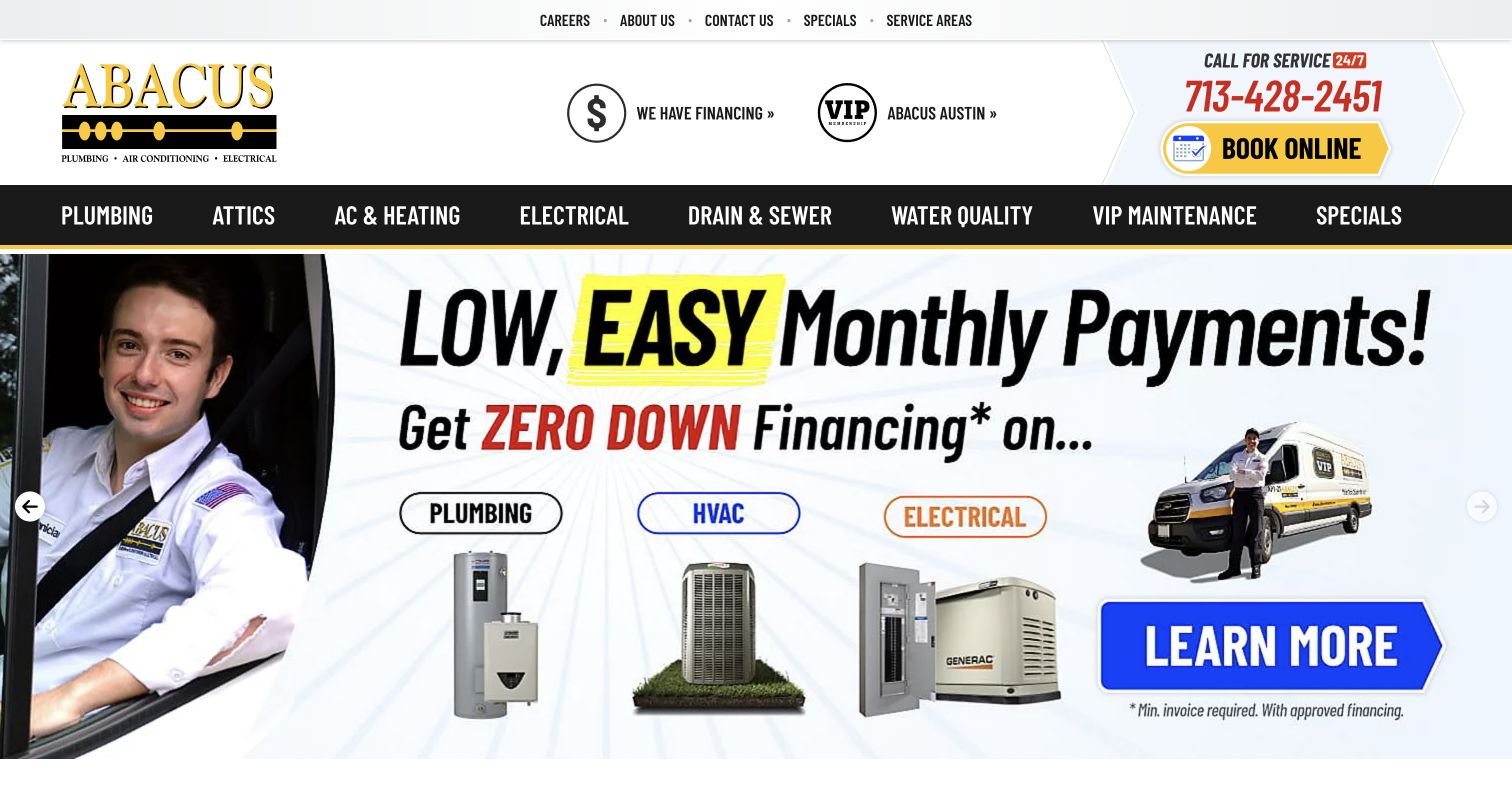
Abacus uses black-and-yellow branding and a substantial top navigation that groups plumbing, attics, heating, electrical, and other work. The retained hero is a financing promotion, while the phone and booking control remain visible above it. A current first-party air-duct analysis page explicitly describes cleaning and related assessment, providing the narrow service context this collection requires. The example is useful as a navigation study: the permanent service structure must carry the visitor to duct information even when the largest promotional area is about something else entirely.
What you can learn
Do not make a specific service depend on the homepage promotion of the week. Keep a stable category route and ordinary contact option available, then explain the actual scope on a dedicated page before the visitor is asked to choose work.
Pros
The booking and telephone controls remain visible outside the changing promotional hero.
A separate first-party duct-service destination gives the broad menu somewhere substantive to lead.
Cons & considerations
A financing-led first screen may be irrelevant to someone trying to understand whether duct cleaning is offered.
A dense multi-trade navigation needs careful grouping so a narrow indoor-air inquiry is not lost among larger categories.
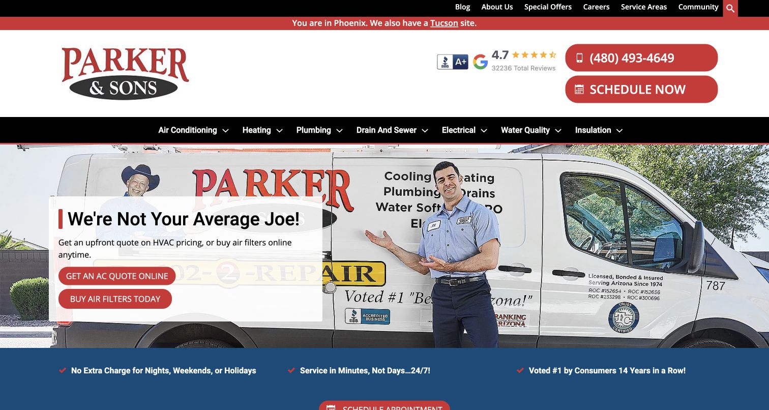
Parker & Sons shows a Phoenix context and a link to its Tucson site in the retained top strip, with prominent call and schedule buttons beneath. A technician and branded van give the broad home-service identity a recognizable setting, while the hero promotion itself concerns an AC quote and filters. Current Tucson air-quality content explicitly offers duct cleaning and sealing. This provides a useful example of the need to keep location and service scope connected: the existence of one local service page should not be interpreted as a guarantee that every offering is identical across regions.
What you can learn
Show visitors which regional version they are using and let them change it. A duct-cleaning inquiry needs a local service explanation, not an assumption that an AC promotion or national-looking brand proves the offering in every area.
Pros
The regional switch is stated plainly rather than leaving a visitor to infer the selected city from a phone number.
Call and schedule actions are visually consistent with the brand and sit outside the photographic promotion.
Cons & considerations
The hero’s AC and filter actions do not directly answer an air duct cleaning question.
Location-specific service claims need ongoing coordination so one regional page is not generalized to the entire business.
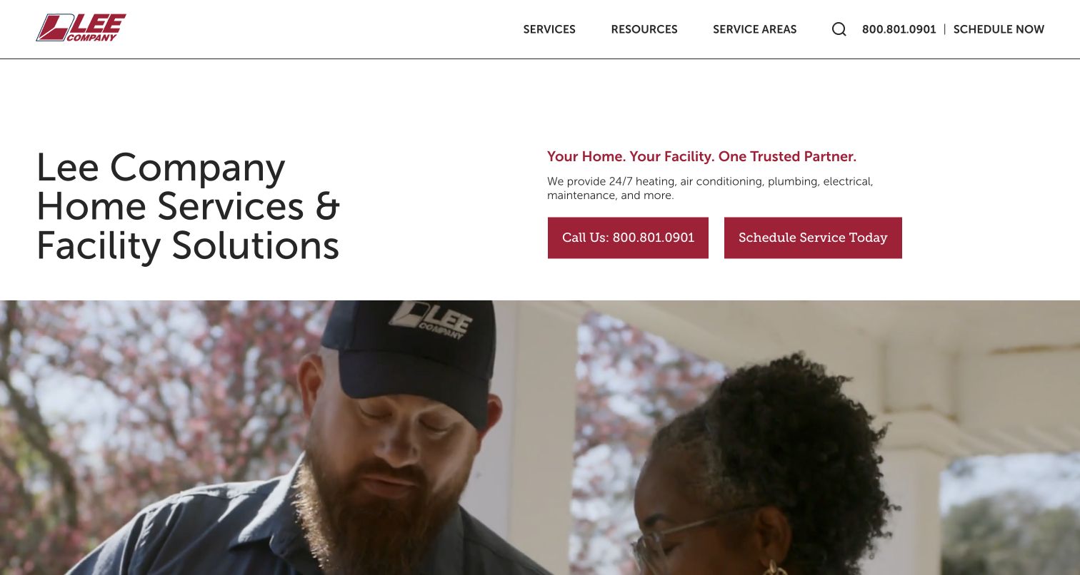
Lee Company uses generous white space and restrained red accents to introduce home services and facility solutions in the retained homepage. Call and schedule controls sit beside a short service overview above human-centered imagery. Current first-party duct-cleaning content supplies a dedicated explanation and local service destinations rather than leaving the category inside an umbrella HVAC statement. The relevant lesson is the two-level hierarchy: a visitor can first recognize the kind of organization and customer relationship, then move to a specific service without a wall of promotional cards.
What you can learn
Keep the broad customer relationship readable, then give the narrow service a dedicated route. Residential and facility audiences can share a brand introduction without being forced into identical questions or an unnecessarily busy first-screen promotion.
Pros
The restrained opening makes the telephone and scheduling choices easy to distinguish from explanatory text.
Home and facility language acknowledges two different customer responsibilities within the same company identity.
Cons & considerations
An air duct visitor still needs a clearly exposed service destination beyond the general home-services introduction.
A broad service-area story must distinguish local home services from any wider commercial operations.
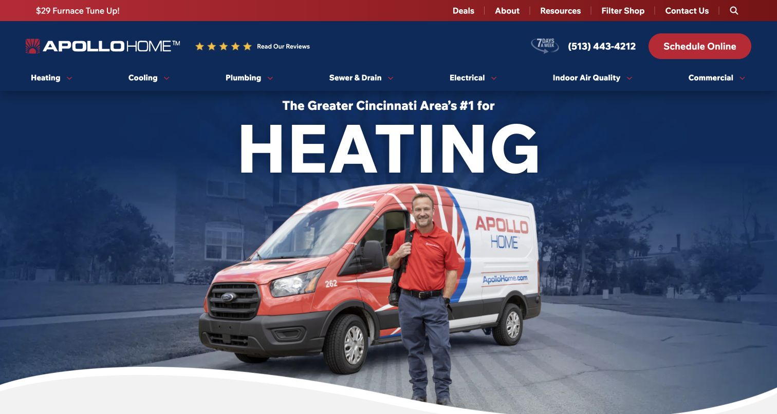
Apollo Home’s retained screenshot uses navy, red, and white with a technician standing beside a branded van. Heating dominates the first view, while Indoor Air Quality remains a named navigation category and the schedule button stays visible above. The current homepage explicitly lists duct cleaning among its services and includes a related offer, establishing the genuine service association. For an air duct website, this is a useful reminder that seasonal visual emphasis should not displace permanent service discovery. The relevant route must remain understandable when the visitor’s need does not match the largest headline.
What you can learn
Separate permanent service navigation from the seasonal hero message. A person looking for duct cleaning should be able to find it immediately even when the homepage is promoting heating, and should not need to interpret a coupon as the only service explanation.
Pros
Indoor Air Quality remains visible in the primary menu while the largest headline promotes heating.
The persistent scheduling control provides an ordinary action outside the changing main image and seasonal copy.
Cons & considerations
A broad indoor-air label needs explicit duct-service wording on the next destination to avoid ambiguity.
Promotions should not replace an approved explanation of scope or imply that an advertised service suits every property.
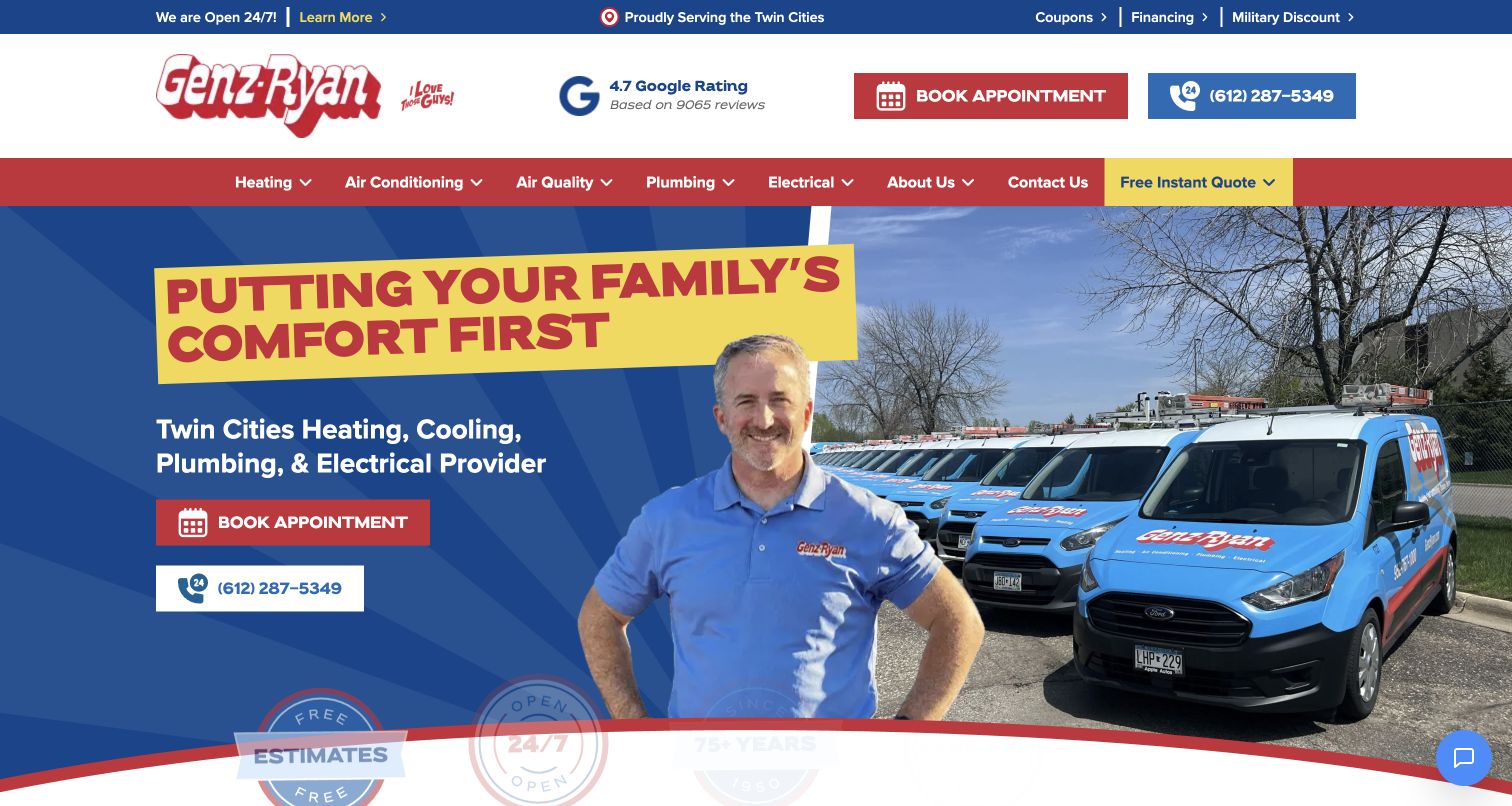
Genz-Ryan uses a high-energy red, yellow, and blue identity with a uniformed representative and a row of branded vehicles. The retained view states its Twin Cities focus, exposes Air Quality in the main menu, and repeats appointment and telephone choices in the hero. Current first-party content has a dedicated air-duct cleaning destination rather than relying only on the general heating-and-cooling introduction. The useful design pattern is the relationship between region, persistent contact, and a narrow service path; the displayed review count and family-comfort language remain marketing context rather than independently measured outcomes.
What you can learn
Use repetition to keep contact choices available, but preserve a readable service route for visitors who need information first. Pair an air-quality category with the specific local duct-cleaning page rather than assuming the broad label explains the work.
Pros
The Twin Cities identity gives the service brand a clear regional reference in the header and opening content.
Both phone and appointment actions are visible without needing to open a large service menu.
Cons & considerations
Bold promotional colors can make every element compete if smaller service descriptions receive the same emphasis.
A general comfort message cannot establish a health benefit or replace a clear description of the particular cleaning service.
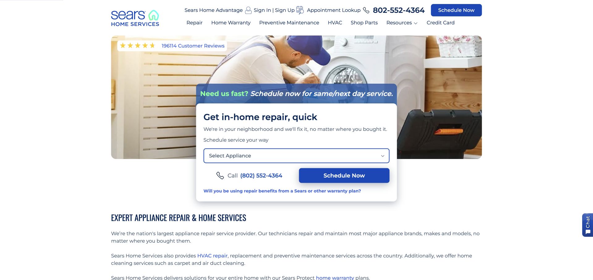
Sears Home Services places an appliance-repair scheduler at the center of the retained homepage, over a technician image. The surrounding text explicitly mentions air duct cleaning as part of home cleaning, and current homepage content still makes that offering visible. This is a genuine but less direct air duct reference: its largest interface is not designed around cleaning. That tension is useful for planning a broad service site. A relevant offering can exist in the catalog while the first-screen action still asks the visitor a question that does not match their task.
What you can learn
Make a narrow service reachable without forcing visitors through an unrelated intake category. If a large umbrella website leads with repairs, provide a clearly labeled alternative route for home-cleaning inquiries and explain any separate scheduling relationship.
Pros
The wider-service explanation explicitly names air duct cleaning instead of expecting the visitor to infer it from HVAC repair.
Contact and appointment controls remain visible in the header alongside the dominant repair interface.
Cons & considerations
An appliance selector is not an appropriate first question for a person seeking duct cleaning.
A broad service catalog needs clear routing so the visitor understands which organization and booking flow handles the selected work.
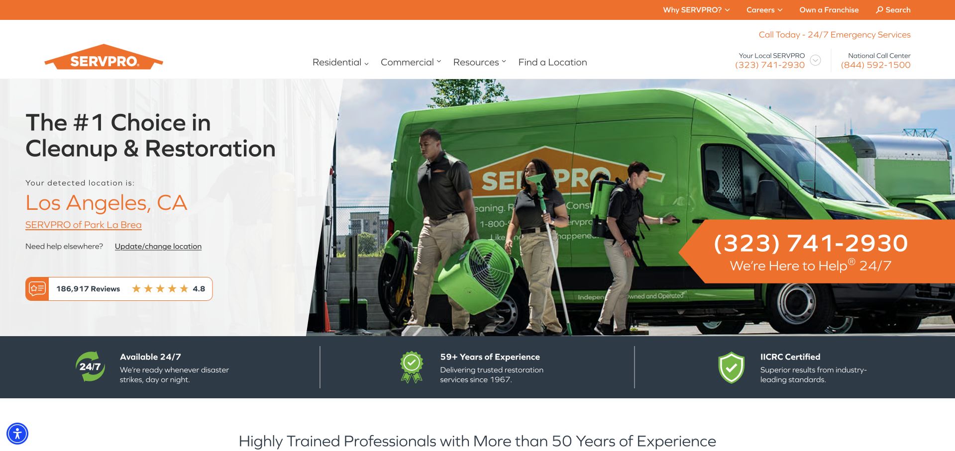
SERVPRO’s retained homepage combines a large crew-and-vehicle image with an explicitly selected local office and a way to change location. Residential and commercial navigation sit above a broad restoration message. The current website includes air ducts within specialty cleaning and offers a dedicated national service destination, so the collection fit is explicit rather than inferred from disaster restoration. For an air duct inquiry, the useful lesson is regional routing and customer-type navigation, while the main emergency message also illustrates why a narrower service explanation is needed beyond the hero.
What you can learn
Show which office is selected and let the visitor correct it before providing property information. A specialty-cleaning page should explain its own inquiry context rather than requiring a person to interpret an emergency-restoration homepage as a complete service description.
Pros
The selected local office and location-change route are visible in the retained first screen.
Separate residential and commercial navigation supports different property contexts within a broad business.
Cons & considerations
A detected location is not a verified service address and can be wrong, so correction must remain easy.
Emergency-restoration language should not imply that every ordinary air duct inquiry requires urgent intervention or identical branch services.
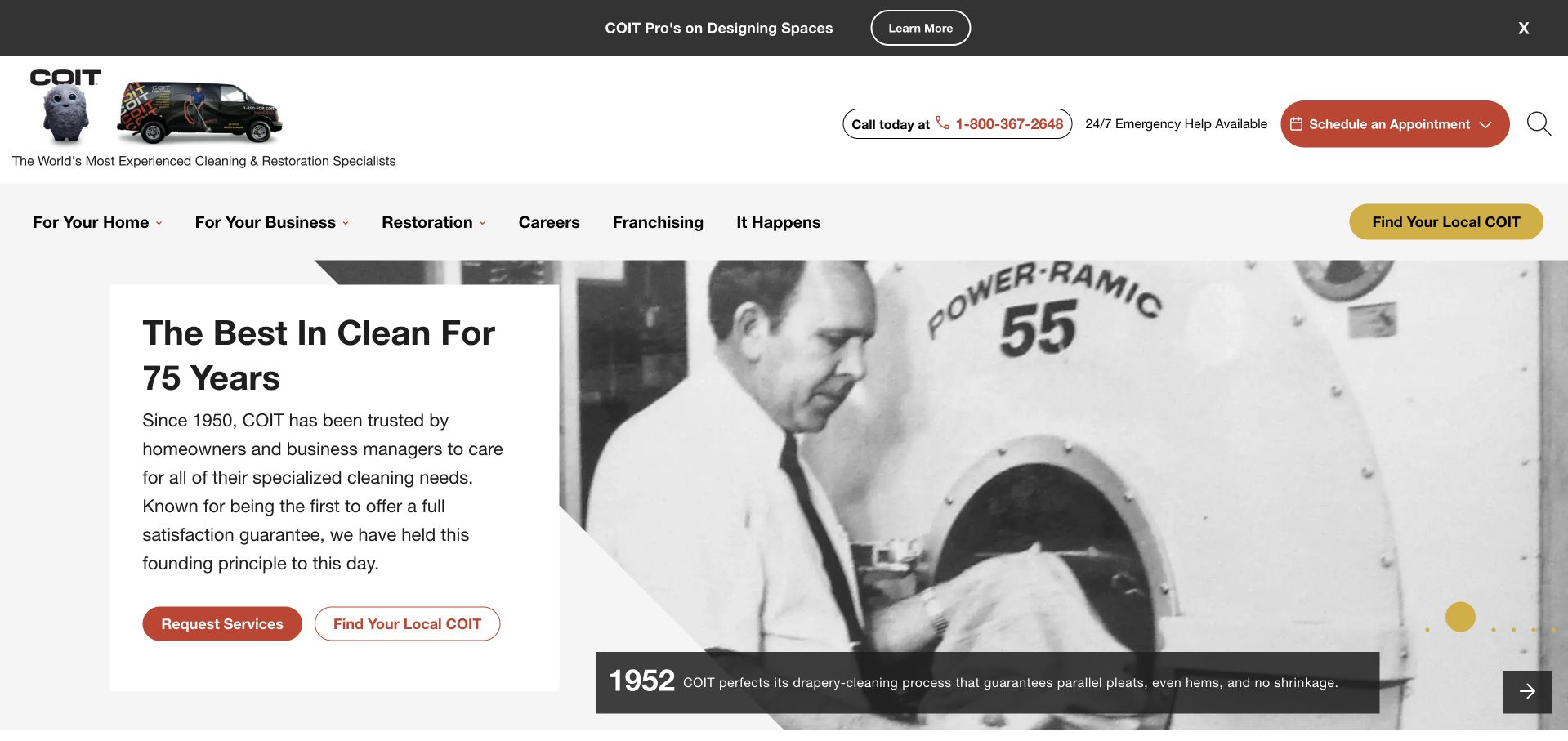
COIT uses an anniversary-style opening with historical imagery, a restrained introductory panel, and prominent request and local-provider choices in the retained capture. The main navigation separates home and business services. Current first-party navigation explicitly lists air ducts for both audiences, and the homepage also gives the category its own service block. This makes the example relevant beyond its drapery-cleaning history: a large brand story can coexist with concrete service discovery, provided the visitor does not have to interpret the historical hero as an explanation of today’s duct-cleaning offering.
What you can learn
Keep heritage as supporting context and make current services findable through ordinary audience-based navigation. A visitor should be able to choose home or business and then reach a specific air duct explanation without relying on an anniversary story or rotating slide.
Pros
Separate home and business service routes provide understandable starting points for different property responsibilities.
Request-service and local-provider actions support both readiness to inquire and the need to establish regional availability.
Cons & considerations
A history-focused first screen delays a narrow service explanation unless the relevant navigation remains obvious.
Broad health, efficiency, or satisfaction statements require appropriate supporting evidence and should not be copied as independently verified claims.
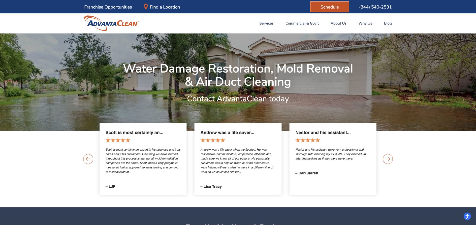
AdvantaClean explicitly includes air duct cleaning in the retained hero headline rather than leaving it to a lower-page service list. A location action and schedule control sit above the main content, while customer-review cards overlap the lower edge of the large property photograph. Current navigation keeps Air Ducts as a distinct group and the site states that franchise offerings can vary. The useful pattern is the clarity of naming the service, balanced against a broader disaster-restoration image that does not itself show routine duct cleaning or establish the relevance of every displayed review.
What you can learn
Name the specific service visibly when it matters to the audience, but make its location and scope explicit too. A broad restoration image and mixed-service review carousel should support rather than stand in for the dedicated duct-cleaning explanation.
Pros
The hero names air duct cleaning directly, reducing the guesswork present in a generic indoor-air message.
A visible location route supports checking the relevant office before assuming that a national service is available nearby.
Cons & considerations
Flood-related imagery may make an ordinary cleaning visitor uncertain whether the company handles non-emergency inquiries.
Mixed-service reviews need clear attribution and should not imply that every testimonial specifically concerns duct cleaning.
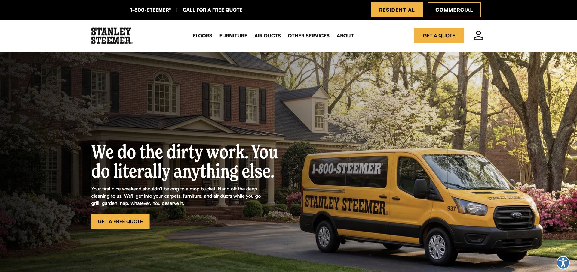
Stanley Steemer gives Air Ducts the same main-menu prominence as floors and furniture in the retained capture. Its yellow vehicle, strong black-and-yellow actions, and residential/commercial toggle make the wider brand recognizable, while the opening paragraph explicitly includes ducts within the offered cleaning work. Current service content confirms a dedicated duct-cleaning destination. The practical reference is the category hierarchy: the visitor does not need to know an internal indoor-air label or search a long list to discover that the company provides this separate kind of service.
What you can learn
Give a service its ordinary customer-facing name and a visible route when it has a distinct inquiry journey. A broader cleaning brand can introduce multiple categories without making air duct visitors pass through carpet-specific questions first.
Pros
Air Ducts is a clear top-level navigation label rather than an implied subcategory of another cleaning service.
Residential and commercial choices acknowledge different property contexts before the visitor requests a quote.
Cons & considerations
A broad lifestyle headline still needs a substantive service destination to explain the actual cleaning scope.
Brand recognition and a prominent vehicle photograph do not independently establish technical quality, health benefits, or local availability.
Kegan is a freelance web designer and developer with 15+ years of experience helping businesses turn complicated website requirements into clear, maintainable digital experiences. He works directly with clients from planning and design through development, launch, and ongoing support.
For air duct cleaning website design, his development approach focuses on explicit duct-cleaning scope, local availability, service-process explanations, qualified before-and-after material, and well-routed estimate enquiries without unsupported health or energy claims. The scope can be a targeted improvement or a complete custom build, with responsive layouts, thoughtful content structure, and integrations chosen around the people using and maintaining the site.
Show 3 other air duct cleaning website designersHide other air duct cleaning website designers
Plan an air duct cleaning website around clear scope and useful contact
Start with questions the office can answer
Ask the people who handle inquiries which questions arrive before an appointment is arranged. Visitors may be checking whether the company covers their area, whether a building type is supported, or whether their question belongs with cleaning or a different service. Write down these questions in the language customers actually use. Separate the information needed to make contact from information a qualified person will establish later. A website should not require the visitor to identify a contaminant, diagnose a ventilation problem, or choose a technical procedure simply to ask about availability.
Decide whether the main audience is residential, commercial, or both, and whether the same team handles those requests. A facilities manager may need procurement details and a documented conversation about scope, while a homeowner may first need a local office number. Create distinct routes only when those differences are real. Keep basic contact details visible without forcing an account, a postcode search, or a lengthy form before any useful information is available. Test the proposed navigation with someone unfamiliar with the business and revise labels that require internal knowledge to understand.
Define the service without making a universal recommendation
Create an approved plain-language description of the work the company offers and what an initial inquiry involves. Distinguish air duct cleaning from dryer-vent cleaning, ventilation repair, equipment servicing, filtration installation, and any restoration work. Those services can be related in the navigation without being presented as automatically included. Have the relevant professional review technical statements and make clear where an assessment is needed. Do not use website copy to prescribe a universal cleaning interval, diagnose a health concern, or claim that everyone needs the same service regardless of the building or system.
If the company publishes exclusions, qualifications, or conditions, place them where the visitor can find them before submitting a request. A brief overview can link to a substantive service page containing the approved scope, common questions, and a local contact route. Avoid creating multiple pages that merely change a city name or repeat a frightening list of possible problems. The editorial job is to reduce uncertainty about the service being discussed, not to amplify anxiety. Record the source and approval for any technical or health-related statement, and provide a correction process when the company’s offering changes.
Keep the relevant service visible inside a larger business
A cleaning or HVAC company may offer many services, but the air duct visitor still needs a short path to the right information. Decide where the category belongs in the main menu and give it an understandable label. If it sits within indoor air quality, support that broader heading with visible service names rather than expecting a new visitor to understand the taxonomy. Link between genuinely related services without treating them as interchangeable. A large rotating homepage banner is a weak substitute for persistent navigation because a visitor may never see the relevant slide.
Use the service page as a self-contained destination for visitors who arrive through search or a referral rather than the homepage. Repeat the business identity, genuine region, scope explanation, and normal contact choice there. If commercial and residential inquiries have different requirements, explain the distinction rather than directing everyone into one generic booking funnel. Give a visitor an opportunity to read before committing personal details. A prominent schedule button can be useful, but a person checking relevance should not have to pretend to book a job just to learn whether the company handles the kind of question they have.
Make local routing accurate and reversible
For a regional business, state the operating area in ordinary place names and explain how to check an edge-of-area inquiry. For a franchise or multi-office provider, identify the selected location and allow visitors to correct it. Do not silently treat a guessed location as a confirmed service address or expose a city-specific telephone number without saying what it represents. Make it clear that a service listed nationally may require confirmation from the relevant branch. Keep office addresses, dispatch regions, and general corporate contacts distinct, particularly when a building manager is comparing providers across several properties.
Ask only for the location information needed at the current stage. A postcode may help establish availability, while a complete property address can wait until the visitor requests an assessment or appointment if the business does not need it earlier. Explain what happens when an address falls outside the supported area and provide a normal way to ask a question. Preserve entered information appropriately when a user changes branches. Do not send a hidden inquiry merely because someone interacts with a location selector. Test wrong, empty, and unsupported locations as carefully as the ideal example used in the design presentation.
Use photographs and credentials with appropriate limits
Choose photographs that help a visitor recognize the company and service context. Real team, vehicle, and approved work images can make the business tangible, but should not be presented as proof that a particular technical result was achieved. If using an inside-duct photograph or before-and-after pair, verify permission and explain the actual project and viewing context. Avoid representing one unusual image as typical of every building. Do not infer a health effect or measured energy saving from a photograph. A calm caption describing what is shown is more defensible than a dramatic claim that goes beyond the evidence.
Keep credentials specific. Identify the actual holder and scope of any qualification or membership and link to an appropriate verification source when available. Company membership, individual training, equipment branding, and regulatory authorization are different claims. A logo strip should not blur them together. Attribute customer comments honestly and avoid inventing reviewer headshots, star counts, or performance statistics. If a review concerns another service, do not make its placement imply that it specifically endorses air duct cleaning. Give a reader enough context to understand what the evidence is and what it does not establish.
Design the inquiry as the beginning of a conversation
Keep the first form proportionate to the task. Name, contact preference, approximate location, property type when useful, and a short optional description may be enough to begin. Ask the business which fields help route the inquiry and which are only convenient for later administration. Do not request medical histories, photographs taken in unsafe places, or a self-diagnosed contamination category. If the visitor does not know the service name, let them say so. A clear telephone alternative can support someone who needs to explain a situation, uses assistive technology, or cannot complete the form.
State whether the action requests information, a callback, an estimate, or an actual appointment. Those outcomes are not interchangeable. Show truthful confirmation wording that reflects what the server accepted, and explain any further human confirmation the business requires. Keep errors readable, field-specific, and independent of color alone. Protect the endpoint with server-verified anti-spam measures and appropriate rate and origin controls. Before launch, test a clearly marked internal request through the complete delivery route and check only that authorized record. A form that looks polished but loses submissions is not a finished contact journey.
Make practical appointment questions easy to discuss
Ask the office which ordinary logistical questions can be answered publicly without making project-specific promises. Visitors may want to know whether someone needs to be present, how they can discuss accessibility needs, whether a business property uses a separate inquiry route, or how to request a change to an appointment. Publish the company’s actual arrangements in plain language and distinguish general information from details confirmed for an individual booking. Avoid inventing a standard duration or promising that every property can be handled in one visit. A short set of approved practical answers can be more useful than another paragraph about the brand’s superiority.
Keep this information easy to find after the visitor submits the form. Link confirmation messages to the relevant contact or appointment information and provide a way to correct a mistaken location. The website should help the office begin a better conversation, not encourage someone to prepare equipment, move into restricted spaces, or undertake technical work before a professional has discussed the situation.
Maintain the website’s claims, routes, and records
Assign a named person to keep service areas, branch details, contact methods, credentials, project permissions, and offers current. Give temporary promotions an end date and an owner so they do not become permanent unsupported promises. Document who approves technical copy and how changes are reviewed. A content management system should make ordinary corrections simple without allowing a casual editor to alter protected forms or publish private inquiry records. Keep backups, administrator ownership, and the update process documented separately from the public website.
Review the ordinary visitor experience periodically: finding the duct-cleaning service, changing a location, calling the correct number, reading on a phone, using the menu by keyboard, and completing a form with errors. Check photographs for reasonable file sizes and reserve their layout space so the page remains readable while assets load. Use appropriate testing before claiming accessibility, security, or performance results. Commercial improvement also requires real evidence; a cleaner homepage is not proof of more bookings or a health benefit. Use recurring customer questions to improve missing explanations while retaining a restrained, accountable tone.
The editing job behind the design
Choose publishing and scheduling tools around real office workflows
A manageable site needs structured service pages, accurate locations, approved credentials, and an inquiry route the office can support. Choose the publishing platform around those editing tasks; another company’s platform is not a recommendation for your business.
If using location-aware scheduling, document which office receives the request, what information is needed, and whether a human confirms the appointment. Do not confuse an attractive booking interface with a verified end-to-end workflow.
Keep public pages separate from inquiry storage, use appropriate server-side spam protection, and document administrator access and backups. Optimize actual photographs and test phone-sized layouts rather than assuming a framework or builder guarantees speed or usability.
Our WordPress website examples offer a separate look at publishing approaches. A visible platform label is evidence for that named page, not a guarantee that the same system will suit your requirements.
Before the public launch
Air duct cleaning website launch checklist
Confirm business identity, working contact details, and the genuine service region.
Distinguish air duct cleaning from dryer vents, HVAC repair, and other services.
Have the appropriate professional approve technical and health-related wording.
Remove universal cleaning recommendations and unsupported health or savings promises.
Make the relevant service reachable without waiting for a carousel slide.
Clearly identify and allow changes to a selected local office.
Explain branch-specific availability rather than implying every location offers everything.
Verify permissions and accurate context for photographs and before-and-after imagery.
Keep credentials, memberships, and customer reviews correctly scoped and attributed.
Avoid collecting unnecessary health information or asking for unsafe photographs.
State whether the form requests a callback, estimate, or confirmed booking.
Test accessible validation, server-side spam checks, delivery, and truthful confirmation.
Check phone, keyboard, mobile, location-error, and ordinary contact-alternative journeys.
Assign owners for service updates, promotions, private data, backups, and corrections.
These checks are a project checklist, not a performance, legal, security, or accessibility certification. Test real journeys with the people responsible for the website before making claims about the result.
Sources & editorial method
How this collection was selected and reviewed
The examples are reviewed as website communication, including explicit first-party evidence that air duct cleaning is an offered service within the pictured company’s wider business. Retained direct source captures keep their original dates. Comments about navigation, identity, and inquiry design do not verify technical practice, medical benefits, energy savings, service quality, or every branch’s current availability.
Each example links to its actual source page. Screenshots are direct browser captures with their own capture dates; moving imagery, announcements and live designs can change. The notes describe observable design choices and conditional tradeoffs, not measured traffic, conversion results, service quality, or accessibility conformance.
Technology labels use public page metadata, asset evidence, or explicitly cited platform documentation. Platform documentation is not a complete current deployment audit. A component reference may be legacy or unused; it is not a complete backend inventory. Unknown stacks are omitted. These sites are editorial examples, not our client portfolio.
Written, Edited and Curated are separate editorial records, not timestamps advanced by a rebuild. Website designs and imagery belong to their owners. See our editorial standards or suggest a correction.
Questions worth asking
Air Duct Cleaning website design questions
Can an HVAC or restoration homepage belong in this collection?
Yes, when the company explicitly offers air duct cleaning and the review explains how that service is exposed within the broader website. A general HVAC label alone is not enough to establish the offering.
Should the homepage promise healthier air?
Do not turn a design message into an unsupported medical or technical promise. Have appropriate professionals review claims and focus the website on accurate scope, business identity, availability, and a useful contact route.
Should every visitor be sent straight into a booking form?
No. Provide readable service information and a normal contact alternative. Clearly distinguish an inquiry, an estimate request, and a confirmed appointment so the visitor understands what the action will do.
How should a franchise show service availability?
Make the selected location clear, allow it to be changed, and explain when the relevant branch must confirm an offering. A national service page does not establish that every office delivers identical work.
What should before-and-after pictures communicate?
The actual approved project and viewing context, with appropriate captions and permission. Images should not imply a diagnosis, health improvement, or measured energy saving that has not been independently established.
Borrow the clearer service route, more honest location selector, or more useful inquiry explanation. Build around the questions your company can answer and keep medical and project-specific technical judgments out of the marketing interface.