Best Preact Websites of 2026 (20 Real-World Examples)
Twenty real public properties linked by Preact’s project directory, with genuine screenshots and original design reviews.
Preact is a component library for building interfaces, but a framework association does not explain a finished design. This collection studies twenty public properties linked from Preact’s own directory: product brands, marketplaces, developer tools, publishers and services. The useful lessons concern clear choices, recognizable content and understandable next steps. The directory documents public-project associations; the screenshots do not establish that every pictured homepage currently runs Preact.
A useful interface gives people enough information to choose their next action without asking them to understand its implementation. Pepsi’s campaign imagery, Etsy’s gift browsing and Lyft’s audience routes solve different problems. Their component boundaries may be invisible to a visitor, but the consistency of labels, cards, states and transitions still matters. Review those public decisions before deciding which patterns belong in your own project.
The collection opens with Pepsi, Etsy, Groupon, Lyft and HashiCorp. Each is the specific property linked by the official directory, with redirects and current branding recorded where relevant. Smaller products and specialist publishers follow. The reviews describe the actual captured designs, including visible limitations. They do not attribute visual quality, commercial results, security or accessibility to the choice of library.
Before the examples
What makes good Preact website development in 2026?
Start with the visitor’s decision
Identify what someone needs to choose on each screen: a product, a destination, a story, a plan or a way to participate. Give the essential facts a stable place, and distinguish a primary action from supporting exploration. A prominent button is useful only when its destination is understandable. Compare the product and service examples here by how clearly they explain their next step, rather than by how much animation or promotional copy they contain.
Use components to protect consistency
Repeated cards and controls should communicate the same kind of information in the same order. Define what happens when a title is long, an image is missing, a price has conditions or a result is unavailable. Those rules help prevent a changing catalogue from turning into a collection of one-off exceptions. The marketplace, hotel and editorial examples provide different reference points for deciding which details deserve to be repeated and which belong on the destination page.
Test browser behavior deliberately
Preact’s core uses native browser events and differs from React in some details. Its compatibility layer covers many React conventions, but a migration still needs checks of actual controls and dependencies. Test typing, selection, focus and error recovery with representative components. Treat familiar component syntax as a starting point, not proof that every imported interaction will behave identically.
These twenty properties appear in Preact’s maintained public-project directory. That is a documented association, sometimes potentially historical; it is not a current homepage fingerprint or a complete architecture inventory. Each design review is grounded in an accepted direct capture.
We start with five recognizable brands or organizations: Pepsi, Etsy, Groupon, Lyft, HashiCorp. Each attribution applies to the named website property, not every product or website belonging to its organization. This is a curated reading sequence, not a measured ranking.
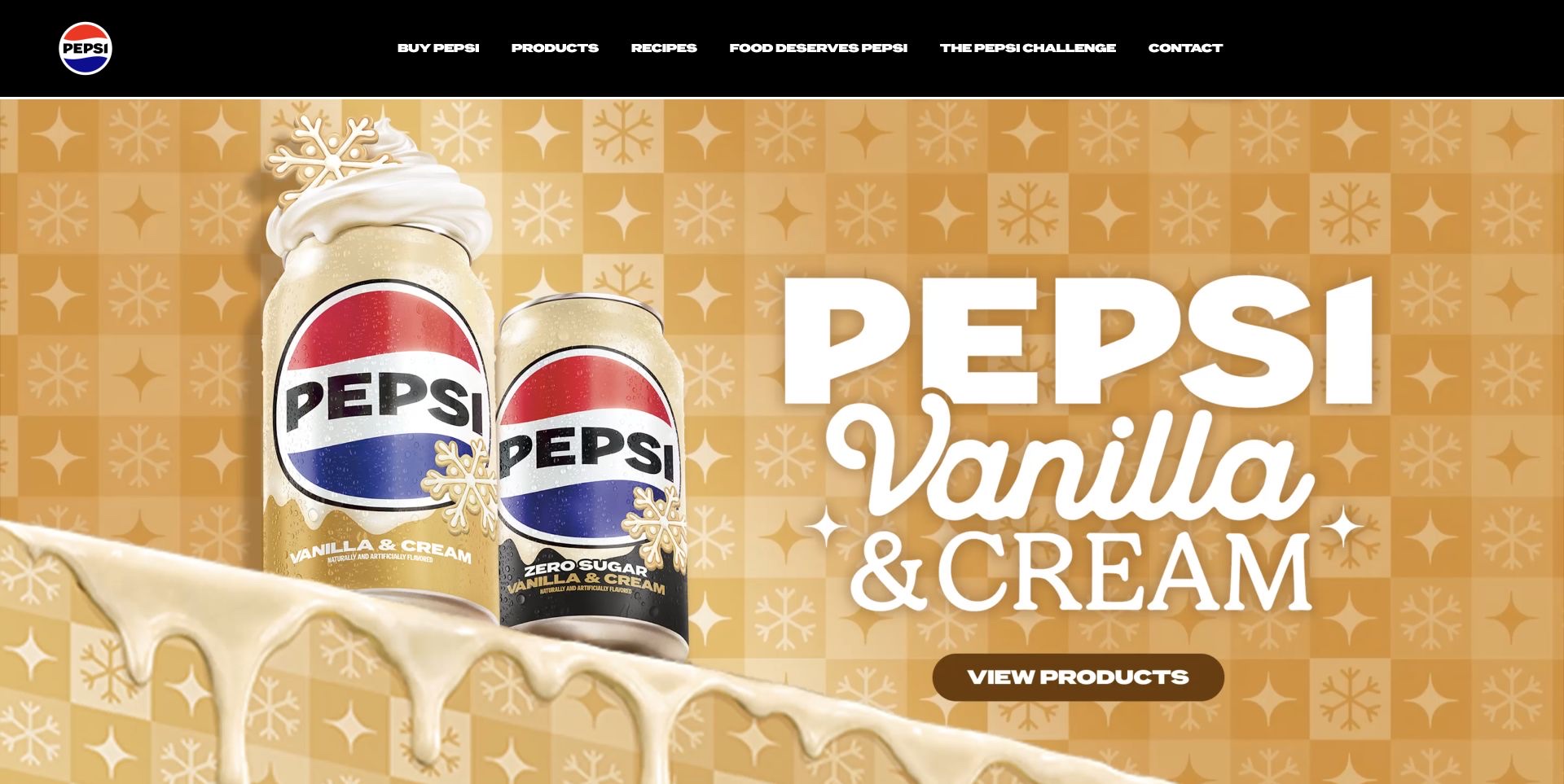
Pepsi turns its seasonal product packaging into the main visual system. Tall cans, gold and cream lettering, and a dark background make the flavor family recognizable before a visitor reads the supporting copy. The small navigation row stays above that campaign rather than competing with another large promotional panel. A product route gives the opening composition a practical destination, while the flavor carousel and social material extend the brand story further down. The useful lesson is the hierarchy between one campaign and the durable product catalog. This is a study of the public marketing page; its animation and composition do not establish which library currently produces them or whether a particular campaign increased sales.
What you can learn
Give a campaign one clear visual subject and a durable next step. Let the packaging explain the product family, then make the route to actual product information easy to recognize.
Pros
Distinctive packaging carries the campaign without a crowded explanation.
A compact header leaves room for the product presentation.
Cons & considerations
Large campaign artwork delays detailed product information.
Motion and decorative lettering need separate readability checks.
Visible tech stack
Earlier / documented evidence
Preact
Platform source: Official Preact public-project directory. The official Preact project directory lists Pepsi and links https://pepsi.com/ among organizations with public-facing Preact projects. Documented organization/project association in the Preact-maintained public-facing-projects directory. The linked public property is reviewed for design; this does not verify that its current pictured page runs Preact, a current version, the complete company stack, or any private backend. Other current public technologies may coexist or reflect a redesign. Platform evidence is separate from the direct website screenshot and is not a complete current infrastructure audit.
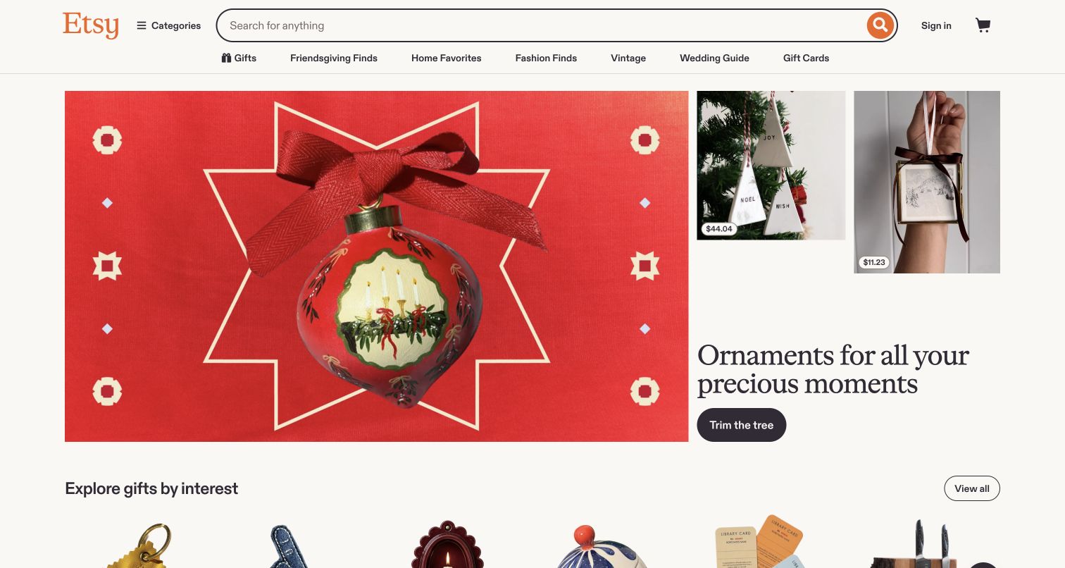
Etsy gives its large search field a steady place above a changing seasonal feature. The retained November 4 capture shows a red ornament photograph beside smaller product images with visible prices, followed by a short seasonal heading and a rounded action. A row of gift, home, fashion and vintage destinations provides browsing routes without taking away the search entrance. Below, gifts organized by interest start another discovery path. The contrast between a vivid campaign and a quiet page background helps the product imagery carry attention. It also exposes a useful tradeoff: the feature introduces a mood immediately, but the visitor needs another step to compare the individual items and their seller conditions.
What you can learn
Keep the known-item search available when editorial campaigns change. Use the campaign to open a useful category, and reserve clear space for product facts when readers move into comparison.
Pros
Search remains prominent above the seasonal story.
Small price labels connect inspiration to tangible products.
Cons & considerations
The oversized feature postpones the broader item grid.
Several gift-oriented navigation labels overlap in intent.
Platform source: Official Preact public-project directory. The official Preact project directory lists Etsy and links https://etsy.com among organizations with public-facing Preact projects. Documented organization/project association in the Preact-maintained public-facing-projects directory. The linked public property is reviewed for design; this does not verify that its current pictured page runs Preact, a current version, the complete company stack, or any private backend. Other current public technologies may coexist or reflect a redesign. Platform evidence is separate from the direct website screenshot and is not a complete current infrastructure audit.
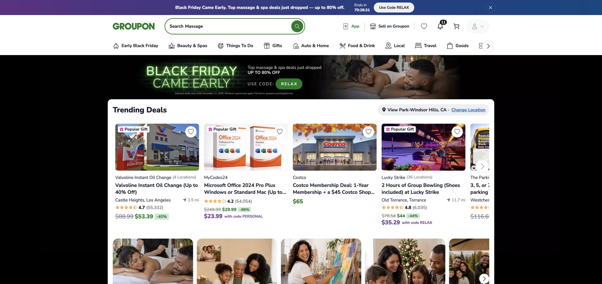
Groupon’s retained capture places a white deal panel inside a dark promotional frame. Each card combines an image with a merchant or product name, a location or distance where relevant, a rating, and a price treatment. That repeated structure makes unlike offers easier to scan together. The chosen location appears above the cards with a change control, while the main header combines search with a compact category index. Promotional codes and struck-through prices add another layer of information, so the display is both useful and dense. The screenshot records the offers shown at its original capture time; the review does not verify their discounts, availability, ratings or eligibility today.
What you can learn
Define the facts that make unlike listings comparable, then repeat their positions. Keep location and conditions near the result set so the browsing context is visible before a visitor opens an offer.
Pros
Cards expose several practical comparison facts early.
Location has an explicit change route above the results.
Cons & considerations
Multiple price and promotion styles compete within each card.
Long product titles truncate before all conditions are visible.
Platform source: Official Preact public-project directory. The official Preact project directory lists Groupon and links https://groupon.com/ among organizations with public-facing Preact projects. Documented organization/project association in the Preact-maintained public-facing-projects directory. The linked public property is reviewed for design; this does not verify that its current pictured page runs Preact, a current version, the complete company stack, or any private backend. Other current public technologies may coexist or reflect a redesign. Platform evidence is separate from the direct website screenshot and is not a complete current infrastructure audit.
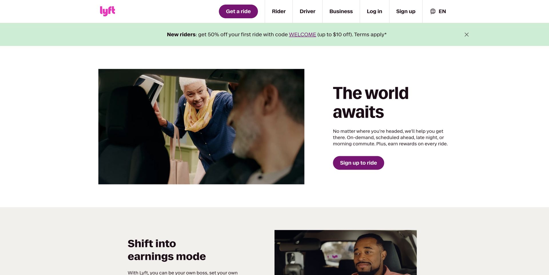
Lyft pairs a large photograph of a rider entering a car with a compact promise and a purple signup action. Its white header separates rider, driver and business routes, giving different audiences a choice before the main story begins. Below the rider feature, a second section introduces driving and earnings, followed by app imagery and practical ride information. The layout makes a two-sided service understandable without presenting every possible journey at once. A pale promotional strip remains part of the page above the hero, with its own close control. The new capture is unobstructed; its older cookie-covered image is retained historically and is not reused in this collection.
What you can learn
Separate audience choices before asking for commitment. A shared brand can support several journeys, but each section should identify who it addresses and offer a specific next step.
Pros
Rider and driver routes are easy to distinguish.
Photography explains the service through an ordinary human moment.
Cons & considerations
The promotional strip adds another competing message.
Signup appears before detailed conditions and ride availability.
Platform source: Official Preact public-project directory. The official Preact project directory lists Lyft and links https://lyft.com/ among organizations with public-facing Preact projects. Documented organization/project association in the Preact-maintained public-facing-projects directory. The linked public property is reviewed for design; this does not verify that its current pictured page runs Preact, a current version, the complete company stack, or any private backend. Other current public technologies may coexist or reflect a redesign. Platform evidence is separate from the direct website screenshot and is not a complete current infrastructure audit.
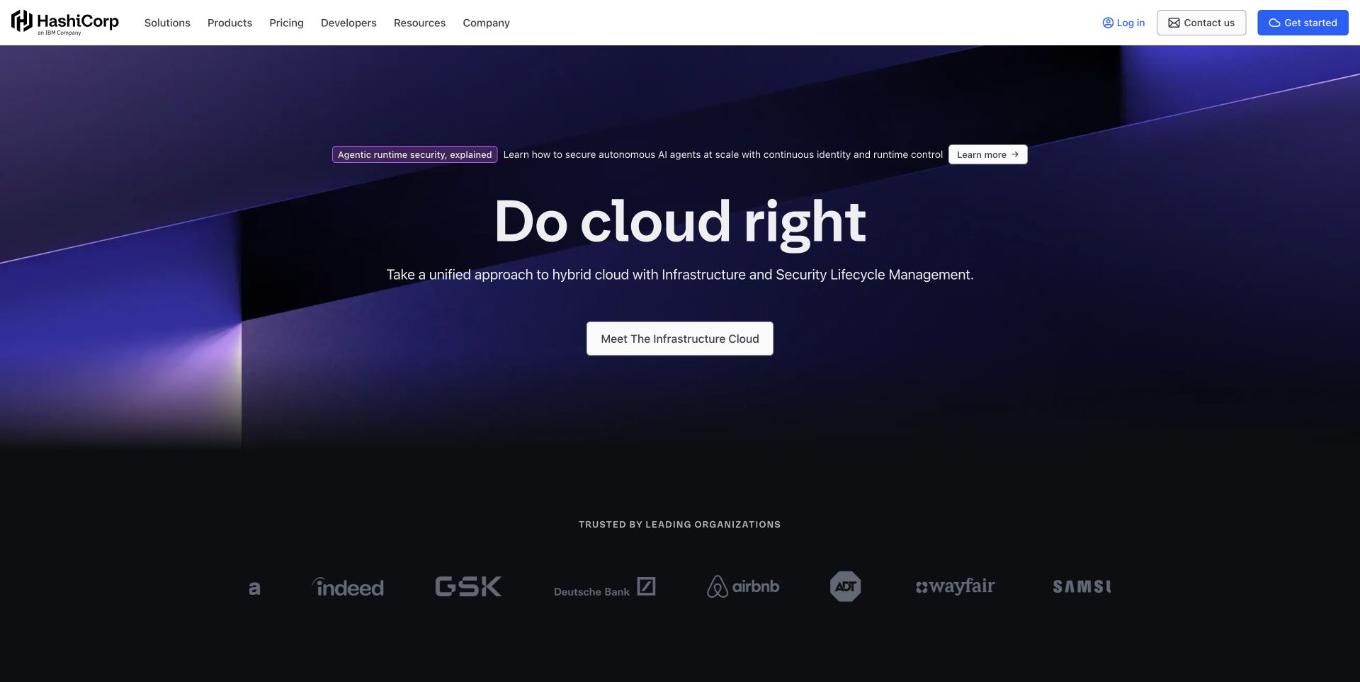
HashiCorp’s retained homepage uses a dark violet field and a short central statement to establish a single umbrella story. The header then exposes products, solutions, pricing, developers and resources as separate ways into the ecosystem. A narrow announcement links to a particular security topic, while a larger central action points toward the infrastructure offering. Customer logos sit lower in the composition rather than surrounding the main message. This makes the first screen unusually restrained for a company with many technical products. The cost is abstraction: someone seeking a particular tool must use navigation or continue reading before the broad cloud proposition becomes a concrete product decision.
What you can learn
Give a large product family one understandable entrance, but preserve direct routes for people who already know the tool or documentation they need. An umbrella message should orient, not replace the product map.
Pros
A restrained central action creates a clear starting point.
Developer and pricing routes remain visible in the header.
Cons & considerations
The broad proposition gives little immediate product detail.
Several general navigation labels require a second decision.
Platform source: Official Preact public-project directory. The official Preact project directory lists HashiCorp and links https://hashicorp.com/ among organizations with public-facing Preact projects. The capture uses the public language/region landing reached from the listed domain. Documented organization/project association in the Preact-maintained public-facing-projects directory. The linked public property is reviewed for design; this does not verify that its current pictured page runs Preact, a current version, the complete company stack, or any private backend. Other current public technologies may coexist or reflect a redesign. Platform evidence is separate from the direct website screenshot and is not a complete current infrastructure audit.
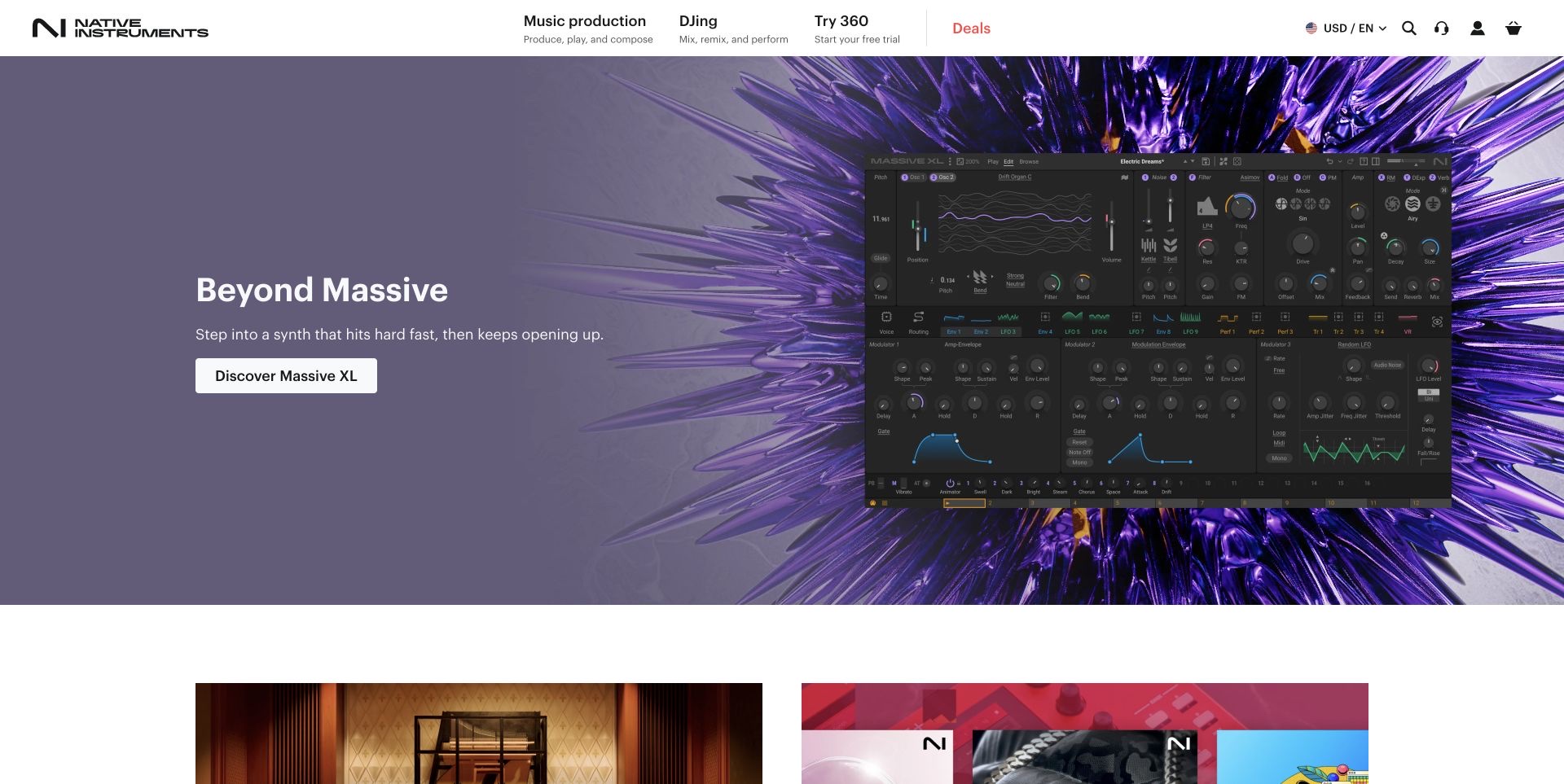
Native Instruments places a large synthesizer interface inside a purple product campaign. The image offers a concrete view of knobs, panels and the product identity rather than relying entirely on an abstract description of sound. A white header separates music production, DJing, subscription discovery and deals, while a direct discovery action anchors the feature. Lower product cards extend the same visual approach to other instruments and tools. The design is useful because it lets the software itself become the main illustration. It remains a presentation, however: the capture does not demonstrate how the instrument sounds, whether every pictured control is interactive on the page, or how the product performs in a musician’s workflow.
What you can learn
Show enough of a creative product to explain what users will work with. Pair a recognizable interface image with a clear route to demonstrations, compatibility details and purchase conditions.
Pros
The product interface supplies concrete visual information.
The white header separates navigation from the colored campaign.
Cons & considerations
Small interface labels are difficult to inspect in the hero.
Several product and subscription routes compete for newcomers.
Platform source: Official Preact public-project directory. The official Preact project directory lists Native Instruments and links https://native-instruments.com/ among organizations with public-facing Preact projects. Documented organization/project association in the Preact-maintained public-facing-projects directory. The linked public property is reviewed for design; this does not verify that its current pictured page runs Preact, a current version, the complete company stack, or any private backend. Other current public technologies may coexist or reflect a redesign. Platform evidence is separate from the direct website screenshot and is not a complete current infrastructure audit.
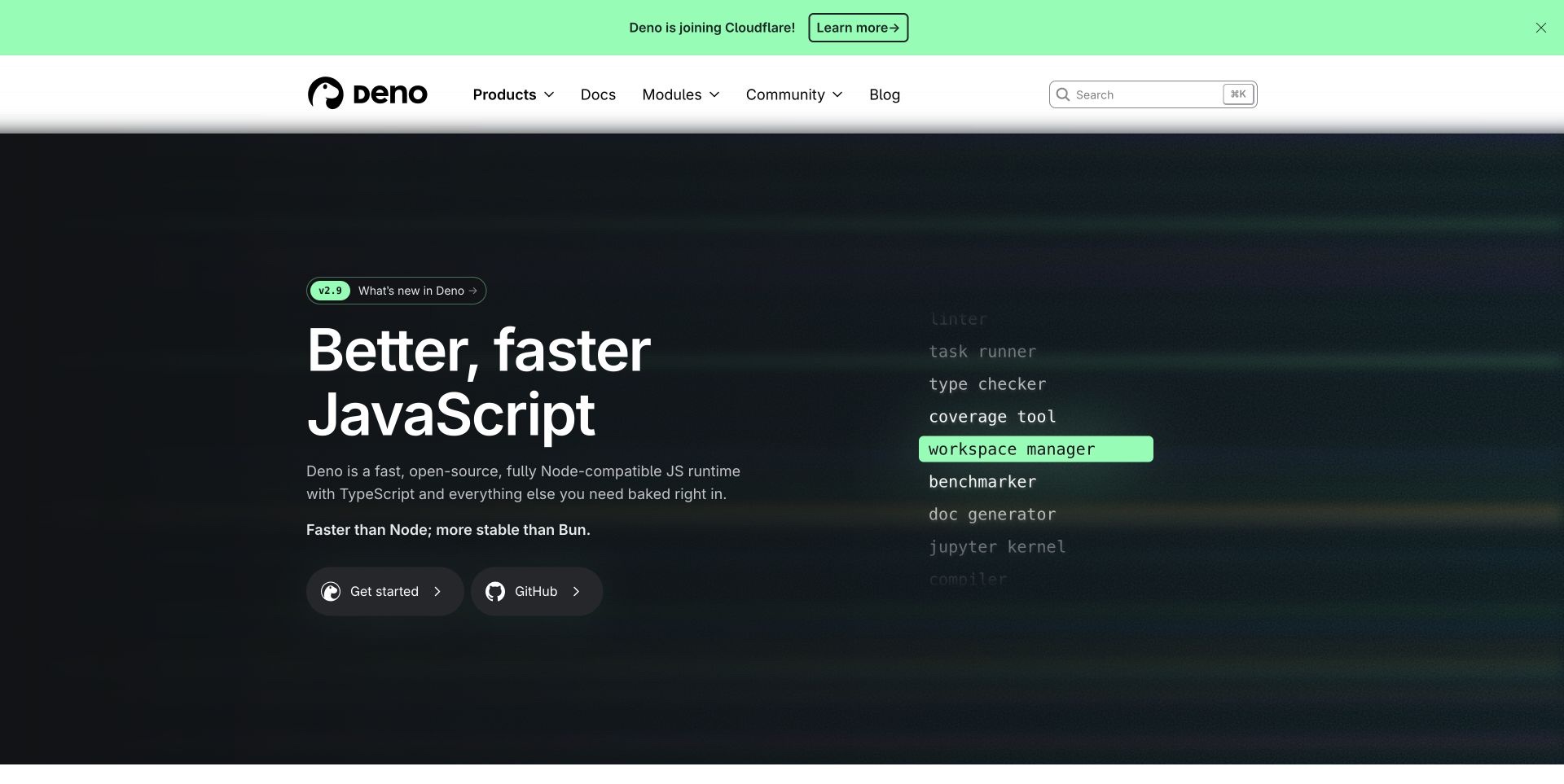
Deno’s homepage moves from a light header and a visible company announcement into a black hero with a rotating tooling message. Green accents identify the important actions and make the changing words stand out against the dark field. Getting started and the source repository have separate entrances, while version information and installation material offer more technical context further down. The contrast between the expressive opening and concrete developer routes is the useful pattern. The official Preact directory links the former deno.land address, which now redirects here; that documented association is kept separate from any claim about this redesigned homepage’s current frontend or the Deno runtime itself.
What you can learn
Give developers both a short explanation and an immediate path to technical material. Keep version and installation information specific, and ensure the animated proposition is understandable when viewed as a still frame.
Pros
Getting-started and repository routes address different intentions.
Strong contrast makes the main action easy to locate.
Cons & considerations
Rotating text can interrupt a visitor’s first reading.
The announcement adds a separate story above the main proposition.
Platform source: Official Preact public-project directory. The official Preact project directory lists Deno and links https://deno.land/ among organizations with public-facing Preact projects. The listed deno.land address redirected to the captured deno.com homepage; this is a documented organization association, not a current homepage-runtime finding. Documented organization/project association in the Preact-maintained public-facing-projects directory. The linked public property is reviewed for design; this does not verify that its current pictured page runs Preact, a current version, the complete company stack, or any private backend. Other current public technologies may coexist or reflect a redesign. Platform evidence is separate from the direct website screenshot and is not a complete current infrastructure audit.
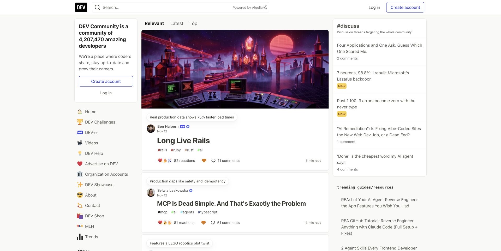
DEV uses a three-column layout to separate community navigation, the main article feed and current discussions. The central cards expose authors, dates, tags and interaction counts beside large cover images, giving readers several clues before opening a post. Feed tabs create a visible choice between different ways of sorting the material. The left column explains the community and offers recognizable topic routes, while the right column makes ongoing discussion visible. This is a useful alternative to treating a publishing homepage as a sequence of anonymous thumbnails. The same density creates work for newcomers, who must distinguish joining, reading, searching and following topics within a relatively busy first view.
What you can learn
Give community content an identifiable author and context before asking for engagement. Separate navigation, reading and discussion areas so repeated card metadata can remain predictable as the feed changes.
Pros
Author, date and tags add context to each article.
Discussion has a visible place beside the editorial feed.
Cons & considerations
Three columns create several simultaneous starting points.
Participation counts can compete with the subject of an article.
Visible tech stack
Earlier / documented evidence
Preact
Platform source: Official Preact public-project directory. The official Preact project directory lists DEV Community and links https://dev.to/ among organizations with public-facing Preact projects. Documented organization/project association in the Preact-maintained public-facing-projects directory. The linked public property is reviewed for design; this does not verify that its current pictured page runs Preact, a current version, the complete company stack, or any private backend. Other current public technologies may coexist or reflect a redesign. Platform evidence is separate from the direct website screenshot and is not a complete current infrastructure audit.
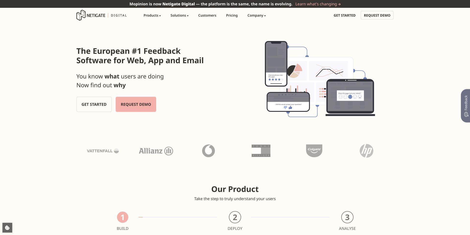
The Mopinion domain now introduces Netigate Digital, with a prominent explanation that the product has changed its name. That message helps returning visitors reconcile the familiar address with a different wordmark before they interpret the rest of the page. A cream background surrounds a product illustration spanning web, app and email feedback, while paired actions offer a direct start or a demonstration. Customer marks and a numbered build, deploy and analyze sequence extend the explanation below. The useful design decision is to acknowledge the transition in ordinary page content instead of leaving the address and identity unexplained. The page’s product claims are observed copy, not independently verified performance results.
What you can learn
Explain a rename where returning users will encounter it. Connect the new identity to familiar product tasks, then use a short sequence to show how the offering fits into someone’s work.
Pros
The old and new identities are explicitly connected.
A multi-device illustration makes the product scope tangible.
Cons & considerations
Two primary actions require visitors to choose a commitment level.
The transition announcement competes with the main product headline.
Platform source: Official Preact public-project directory. The official Preact project directory lists Mopinion and links https://mopinion.com/ among organizations with public-facing Preact projects. The reviewed property now introduces Netigate Digital and explains the Mopinion rename. Documented organization/project association in the Preact-maintained public-facing-projects directory. The linked public property is reviewed for design; this does not verify that its current pictured page runs Preact, a current version, the complete company stack, or any private backend. Other current public technologies may coexist or reflect a redesign. Platform evidence is separate from the direct website screenshot and is not a complete current infrastructure audit.
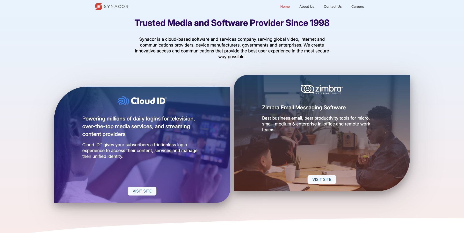
Synacor’s opening page is organized around two large rounded cards for Cloud ID and Zimbra. A pale background and a restrained corporate introduction give the cards most of the visual weight, while their different imagery helps separate the offerings. A row of customer marks follows beneath them, making the page feel like a gateway rather than a long product specification. The approach is useful for a company whose visitors may arrive looking for very different services. It also makes the destination controls particularly important: the public DOM exposed the pictured visit actions as disabled during review, so their appearance alone should not be taken as proof of a working onward journey.
What you can learn
When a homepage mainly routes to separate products, make those destinations explicit and test the controls themselves. A well-balanced card is only useful if its label, enabled state and destination agree.
Pros
Two distinct cards make the product split easy to see.
The restrained corporate frame avoids competing with both offerings.
Cons & considerations
The observed visit controls were disabled in the public DOM.
The first view provides limited detail for comparing the products.
Platform source: Official Preact public-project directory. The official Preact project directory lists Synacor and links https://www.synacor.com/ among organizations with public-facing Preact projects. Documented organization/project association in the Preact-maintained public-facing-projects directory. The linked public property is reviewed for design; this does not verify that its current pictured page runs Preact, a current version, the complete company stack, or any private backend. Other current public technologies may coexist or reflect a redesign. Platform evidence is separate from the direct website screenshot and is not a complete current infrastructure audit.
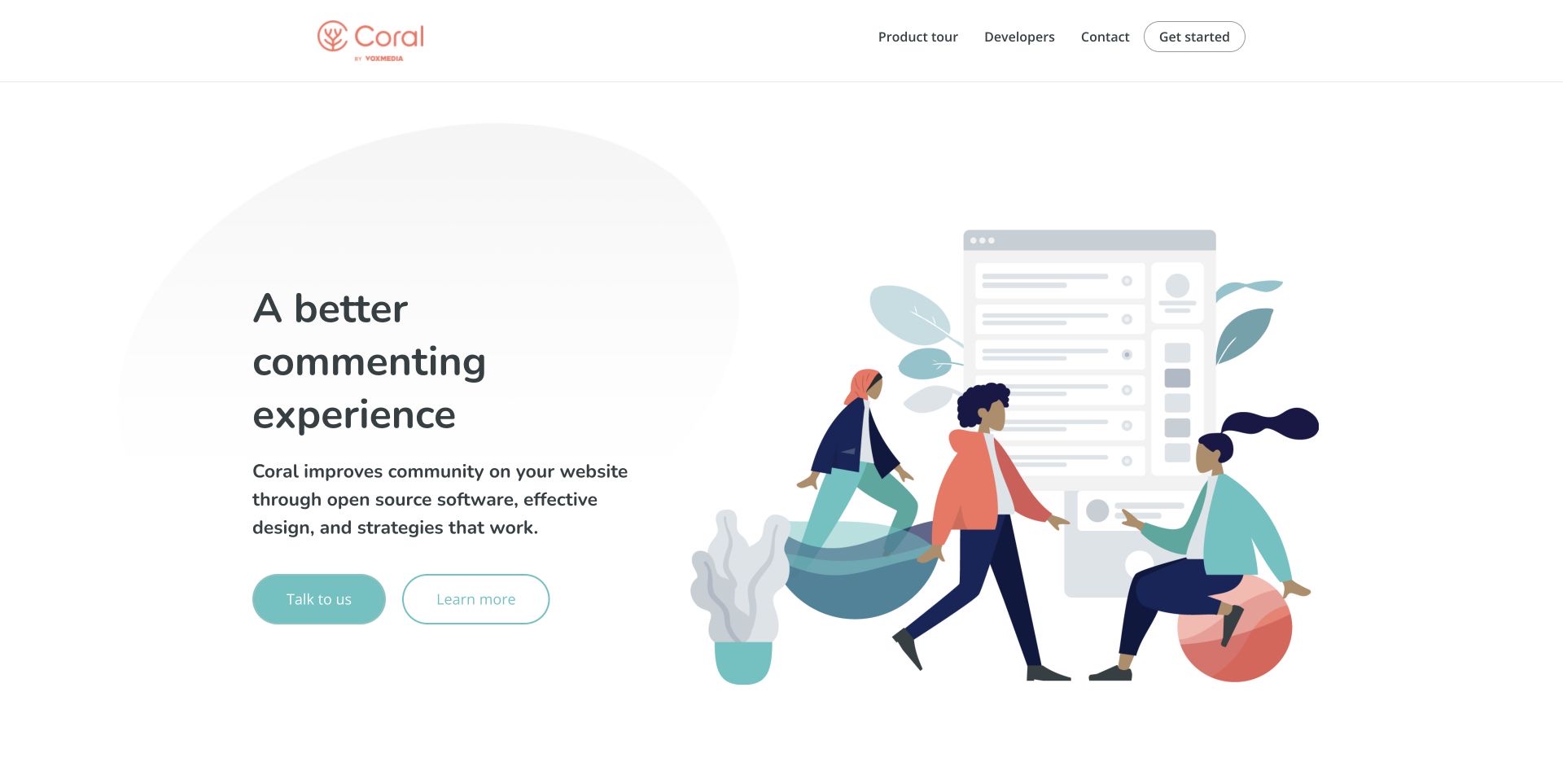
Coral combines a simple white masthead with a friendly illustration of people in conversation. The restrained coral and turquoise palette reinforces that human subject without making the interface look like a generic enterprise dashboard. A short headline establishes the commenting purpose, and separate contact and learning routes let visitors choose between investigation and a direct conversation. Further down, the page addresses commenters, moderators, journalists and developers rather than assuming one audience makes every decision. Pricing, documentation and source-code destinations support that role-based structure. The resulting page is useful as a study in explaining a collaborative tool through the people it serves, while keeping implementation detail available for those who need it.
What you can learn
Name the people affected by a shared tool and give each a useful route. A welcoming illustration can establish tone, but concrete role labels and documentation should carry the explanation beyond the first screen.
Pros
Role-specific sections clarify different visitor needs.
Documentation and pricing are discoverable alongside the brand story.
Cons & considerations
The opening illustration does not show the product interface.
Visitors must scroll for detailed moderation and implementation information.
Visible tech stack
Earlier / documented evidence
Preact
Platform source: Official Preact public-project directory. The official Preact project directory lists Coral and links https://coralproject.net/ among organizations with public-facing Preact projects. Documented organization/project association in the Preact-maintained public-facing-projects directory. The linked public property is reviewed for design; this does not verify that its current pictured page runs Preact, a current version, the complete company stack, or any private backend. Other current public technologies may coexist or reflect a redesign. Platform evidence is separate from the direct website screenshot and is not a complete current infrastructure audit.
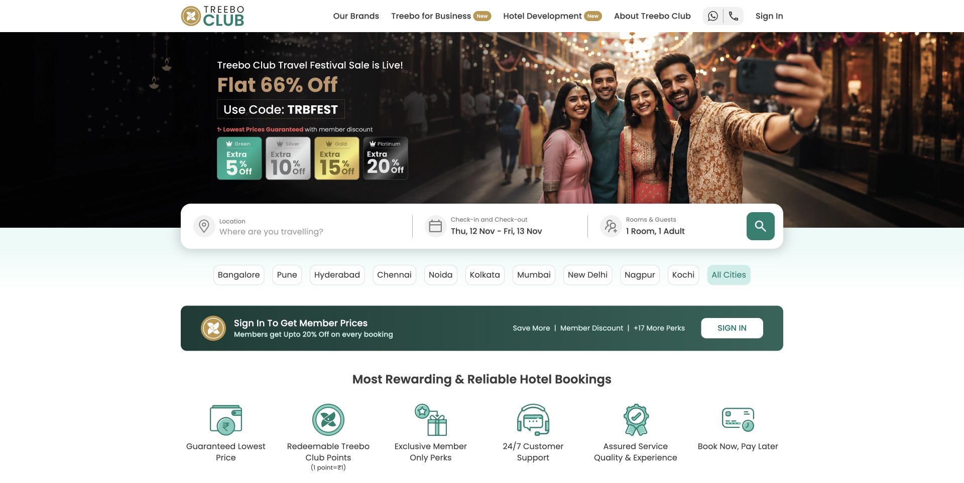
Treebo places a white search panel across the lower edge of a large seasonal promotion. Location, dates and room information appear together, making the practical task distinct from the surrounding discount message. City shortcuts provide a browsing alternative, and a row of benefit icons begins to explain the booking proposition underneath. The green and gold brand colors connect the header, promotional artwork and member material. The accepted screenshot was taken after closing a late sign-in promotion through its normal control; no search or booking was submitted. This is a useful example of bringing the functional entry point into the campaign, while also showing how membership messages and promotional conditions can crowd the same space.
What you can learn
Keep the travel search readable as one task, even when a campaign changes behind it. Offer city browsing for undecided visitors and put the conditions of promotional offers close to their claims.
Pros
Location, dates and rooms share one visible search panel.
City shortcuts support browsing without a precise destination query.
Cons & considerations
Several promotional and membership messages compete for attention.
Discount artwork can overshadow the conditions attached to the offer.
Platform source: Official Preact public-project directory. The official Preact project directory lists Treebo and links https://www.treebo.com/ among organizations with public-facing Preact projects. Documented organization/project association in the Preact-maintained public-facing-projects directory. The linked public property is reviewed for design; this does not verify that its current pictured page runs Preact, a current version, the complete company stack, or any private backend. Other current public technologies may coexist or reflect a redesign. Platform evidence is separate from the direct website screenshot and is not a complete current infrastructure audit.
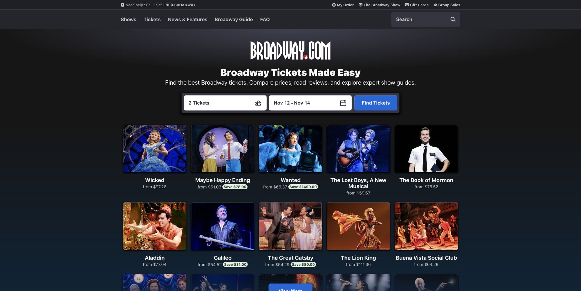
Broadway.com uses a dark page frame with a prominent date and ticket-quantity search above a row of show cards. The production photographs do much of the recognition work, while names and starting prices introduce practical comparison. A clear navigation split between shows, news, features and visitor guidance accommodates both someone ready to book and someone still learning about a production. The opening view is commercially direct without reducing every card to a single purchase button. It is also information-heavy: savings labels, prices and several productions compete across the row. Those figures are part of the observed display; this review does not verify a ticket’s current availability, final price or promotional saving.
What you can learn
Let distinctive show artwork support recognition, then repeat the comparison facts in consistent positions. Keep date and quantity choices separate from editorial browsing so visitors understand which action changes the result set.
Pros
Show names and starting prices accompany recognizable imagery.
Date and quantity controls establish a concrete search task.
Cons & considerations
Multiple savings messages add visual competition.
A starting price leaves final ticket conditions for a later step.
Platform source: Official Preact public-project directory. The official Preact project directory lists Broadway.com and links https://broadway.com/ among organizations with public-facing Preact projects. Documented organization/project association in the Preact-maintained public-facing-projects directory. The linked public property is reviewed for design; this does not verify that its current pictured page runs Preact, a current version, the complete company stack, or any private backend. Other current public technologies may coexist or reflect a redesign. Platform evidence is separate from the direct website screenshot and is not a complete current infrastructure audit.
Bustle opens with an oversized red serif wordmark and a large portrait feature rather than a crowded row of article teasers. The menu remains small at the edge, and a narrow date treatment contributes to the magazine-like composition. Lower sections introduce numbered editorial groupings, bylines and credits, extending the sense of a deliberately arranged issue. The opening portrait is powerful as an introduction to a person, but it takes up enough space that some story context sits below the first screen. That balance is the useful subject of the review: a publication can make its identity memorable through scale while still needing clear headlines and metadata to tell readers what the image introduces.
What you can learn
Use an expansive portrait when the person is central to the story, then keep the title, author and subject close enough to explain it. Visual confidence should not make readers infer the article’s purpose.
Pros
The distinctive masthead creates a strong editorial identity.
A single portrait avoids competing feature images in the opening.
Cons & considerations
The large image postpones some headline context.
Minimal top-level navigation requires another action to explore sections.
Platform source: Official Preact public-project directory. The official Preact project directory lists Bustle and links https://bustle.com/ among organizations with public-facing Preact projects. Documented organization/project association in the Preact-maintained public-facing-projects directory. The linked public property is reviewed for design; this does not verify that its current pictured page runs Preact, a current version, the complete company stack, or any private backend. Other current public technologies may coexist or reflect a redesign. Platform evidence is separate from the direct website screenshot and is not a complete current infrastructure audit.
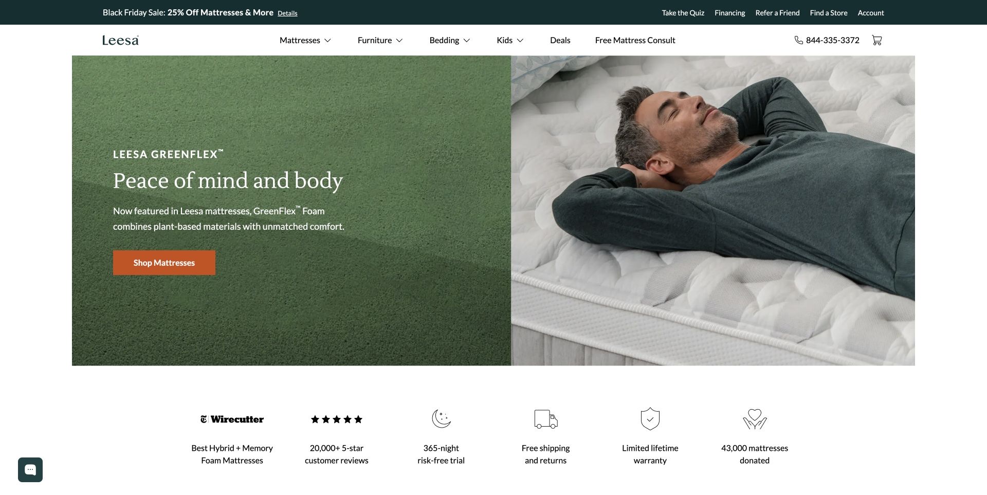
Leesa divides its hero between a close view of green material and a person resting on a mattress. The left side carries a short product-material introduction and an orange shopping action; the right side shows the product in use. A separate strip below summarizes the trial, shipping, warranty and other reassurance claims with simple icons. The header preserves product categories, store discovery and a mattress-consultation route above the campaign. This arrangement gives visitors an emotional scene and practical next steps without asking one image to explain everything. The review describes how those claims are presented, not whether the material improves sleep, whether ratings are representative or whether every advertised condition applies to a particular purchase.
What you can learn
Pair the material story with a recognizable use case, then separate shopping reassurance into a scannable strip. Link detailed conditions from each claim instead of expecting an icon and a number to explain them.
Pros
Texture and a human scene explain different aspects of the product.
A clear shopping action sits beside the short introduction.
Cons & considerations
The reassurance strip compresses important conditions into brief labels.
A seasonal sale and consultation route add competing choices above the hero.
Platform source: Official Preact public-project directory. The official Preact project directory lists Leesa and links https://leesa.com/ among organizations with public-facing Preact projects. Documented organization/project association in the Preact-maintained public-facing-projects directory. The linked public property is reviewed for design; this does not verify that its current pictured page runs Preact, a current version, the complete company stack, or any private backend. Other current public technologies may coexist or reflect a redesign. Platform evidence is separate from the direct website screenshot and is not a complete current infrastructure audit.
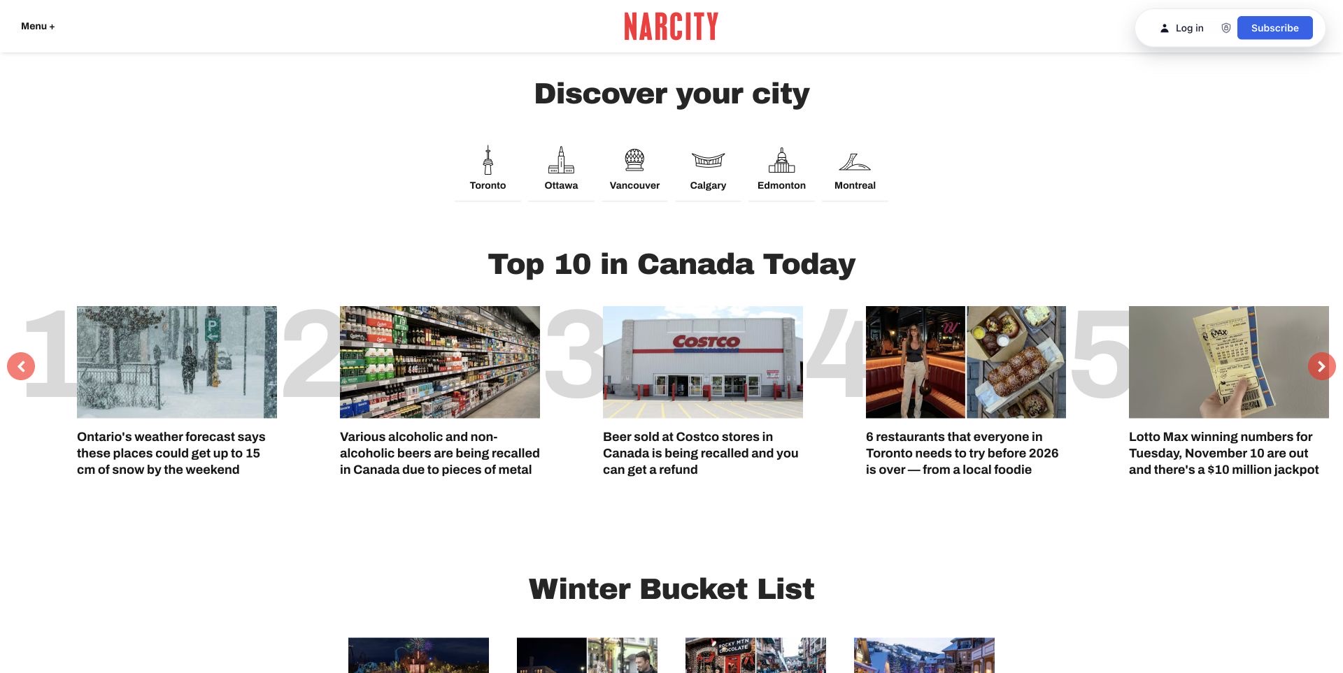
Narcity begins with a plain invitation to choose a city and a row of recognizable landmark icons. That geographical frame appears before the ranked national stories, giving readers a route to local relevance instead of requiring a search. Large pale numbers sit behind the leading article cards, while photographs and short headlines carry the actual story information. Seasonal and thematic groups follow beneath the ranking. The design makes the difference between location and editorial theme visible through separate sections. Its tradeoff is breadth: a national top-ten list, city choices and several themed feeds all ask for attention before the reader has committed to one particular area or subject.
What you can learn
Separate geographic navigation from editorial grouping. Use familiar location labels for orientation, and make the ranking or theme of a story list explicit so readers know why the items appear together.
Pros
Landmark icons reinforce clearly written city labels.
Ranked cards have a distinct visual structure from themed sections.
Cons & considerations
Large ranking numerals add decoration around already busy cards.
National and local interests compete in the first few sections.
Platform source: Official Preact public-project directory. The official Preact project directory lists Narcity and links https://www.narcity.com/ among organizations with public-facing Preact projects. Documented organization/project association in the Preact-maintained public-facing-projects directory. The linked public property is reviewed for design; this does not verify that its current pictured page runs Preact, a current version, the complete company stack, or any private backend. Other current public technologies may coexist or reflect a redesign. Platform evidence is separate from the direct website screenshot and is not a complete current infrastructure audit.
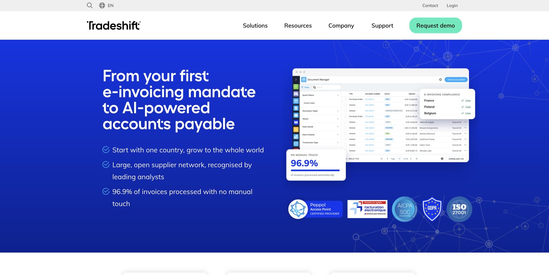
Tradeshift places a large accounts-payable proposition beside an invoice-management screen and a compact country-status panel. The blue hero gives the interface preview a clear stage, while check-marked bullets summarize the intended workflow. Below it, three routes separate e-invoicing compliance, automation and the supplier network, allowing the broad opening to resolve into distinct product interests. Analyst and resource sections add further investigation paths rather than leaving the page at a demo request alone. The screenshot is useful for studying how a technical service is introduced through a recognizable business object: the invoice. The displayed compliance marks, processing percentages and savings are the company’s claims, not outcomes verified in this design review.
What you can learn
Show the business object that anchors a complex service, then divide the offering into understandable decisions. Keep quantitative and compliance claims connected to their conditions and supporting material rather than treating them as decorative proof.
Pros
An invoice screen makes the workflow less abstract.
Three follow-on routes clarify the main product interests.
Cons & considerations
Several performance and compliance claims compete in the hero.
The long headline requires substantial space before the next section.
Platform source: Official Preact public-project directory. The official Preact project directory lists Tradeshift and links https://tradeshift.com/ among organizations with public-facing Preact projects. Documented organization/project association in the Preact-maintained public-facing-projects directory. The linked public property is reviewed for design; this does not verify that its current pictured page runs Preact, a current version, the complete company stack, or any private backend. Other current public technologies may coexist or reflect a redesign. Platform evidence is separate from the direct website screenshot and is not a complete current infrastructure audit.
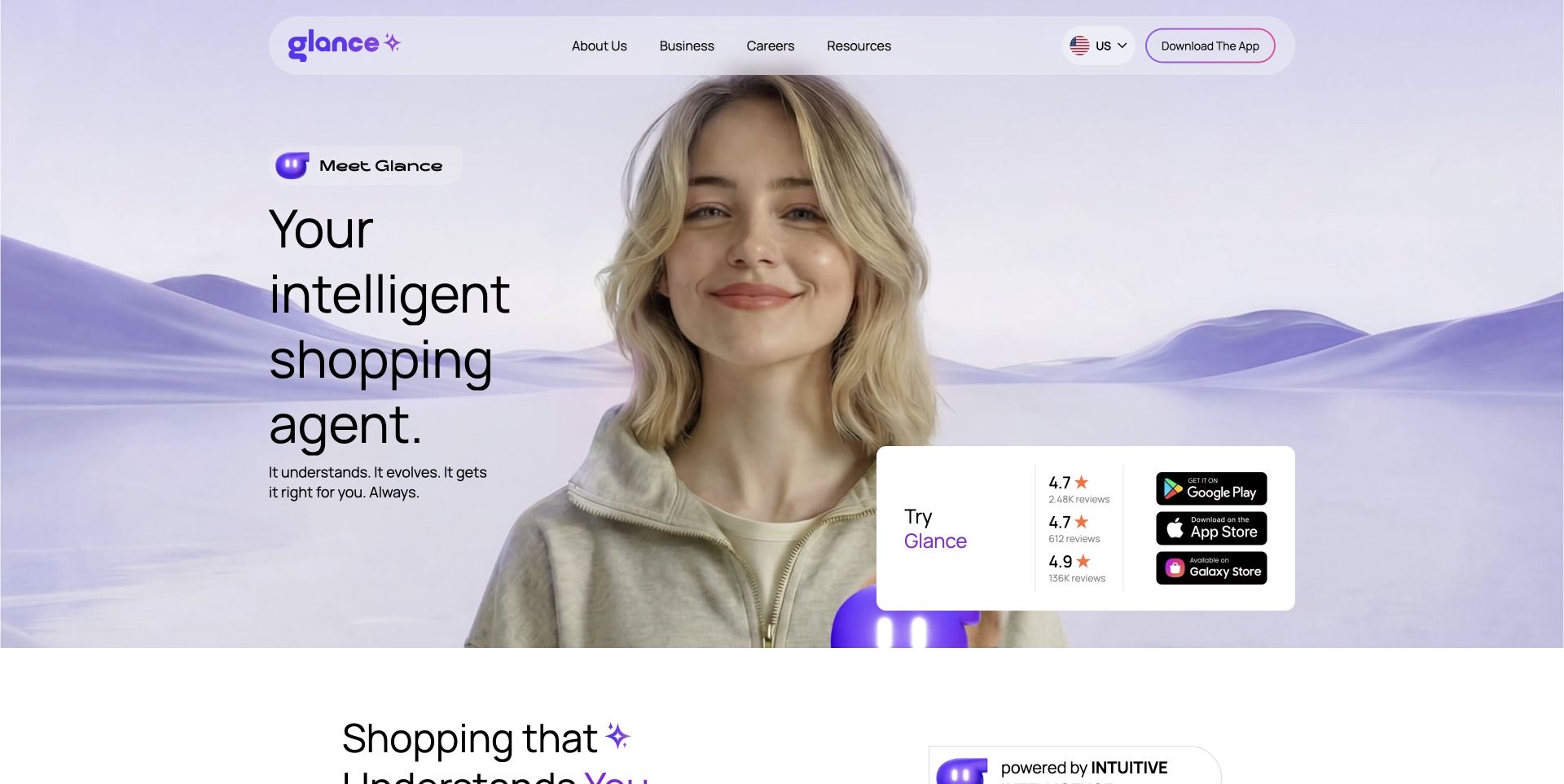
Glance uses a pale purple scene, a human portrait and a small animated mascot to introduce its shopping-agent proposition. A rounded navigation bar floats visually above the composition, while a white panel groups the app-store destinations and displayed review figures. That panel gives the expressive opening a practical next step without sending every visitor to the same store. Further sections explain conversation, recommendations and shopping through repeated demonstrations and category choices. The accepted capture follows a normal decline of optional cookies. This review concerns the public explanation and the handoff to app stores; no personal photo, shopping preference or account information was entered, and the personalization or review claims were not independently tested.
What you can learn
Give an app campaign an obvious installation route for each supported platform. Use demonstrations to explain the proposed workflow, and distinguish visual marketing promises from capabilities a visitor can actually try on the public page.
Pros
Store destinations are grouped in one readable panel.
A consistent purple visual language connects the campaign sections.
Cons & considerations
Animated wording and imagery can compete with the main explanation.
Displayed review figures need context beyond a compact numeric summary.
Platform source: Official Preact public-project directory. The official Preact project directory lists Glance and links https://glance.com/ among organizations with public-facing Preact projects. The capture uses the public language/region landing reached from the listed domain. Documented organization/project association in the Preact-maintained public-facing-projects directory. The linked public property is reviewed for design; this does not verify that its current pictured page runs Preact, a current version, the complete company stack, or any private backend. Other current public technologies may coexist or reflect a redesign. Platform evidence is separate from the direct website screenshot and is not a complete current infrastructure audit.
Neo4j’s dark homepage uses a network of glowing nodes and connections to make its graph-oriented subject visible. A large statement and a changing emphasized word sit to the left, with separate getting-started and learning routes beneath. The header exposes developers, pricing and the product console alongside broader business navigation. A customer-logo row begins the next layer of the page, followed by explanations and case material. The accepted replacement capture preserves the animation’s actual state after choosing necessary cookies only. The network illustration helps establish the product’s subject, but it is not a diagram of an actual customer deployment or evidence for the performance claims elsewhere on the page.
What you can learn
Use a technical metaphor to orient visitors, then offer direct documentation and product routes. Keep the core statement readable throughout animation, and explain quantitative claims through evidence rather than visual scale alone.
Pros
The network image relates clearly to the product’s subject.
Developer, pricing and console entrances remain visible.
Cons & considerations
Changing headline words can interrupt reading.
The extensive logo row adds breadth before detailed explanation.
Platform source: Official Preact public-project directory. The official Preact project directory lists Neo4j and links https://neo4j.com/ among organizations with public-facing Preact projects. Documented organization/project association in the Preact-maintained public-facing-projects directory. The linked public property is reviewed for design; this does not verify that its current pictured page runs Preact, a current version, the complete company stack, or any private backend. Other current public technologies may coexist or reflect a redesign. Platform evidence is separate from the direct website screenshot and is not a complete current infrastructure audit.
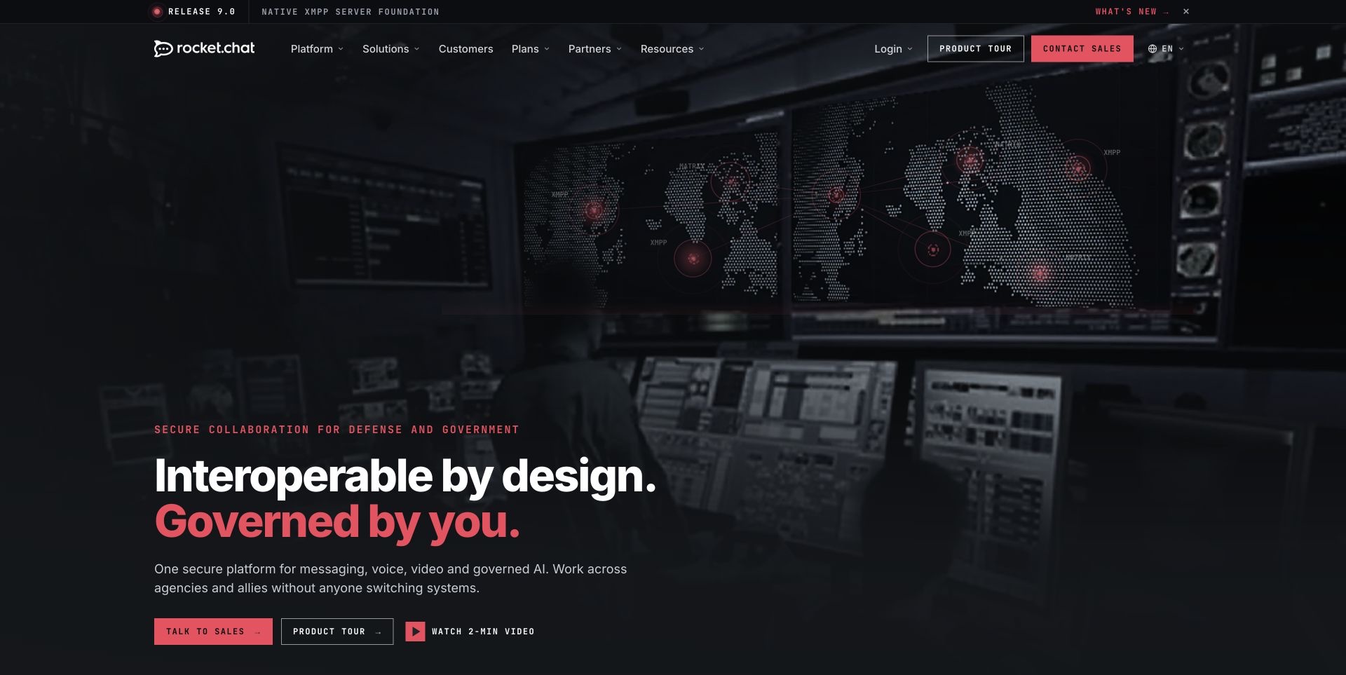
Rocket.Chat’s current opening names defense and government as its audience above a large white-and-red headline. A dark operational-room image fills the background, while a release strip and compact navigation introduce the platform’s broader capabilities. Sales, a product tour and a short overview video are presented as different next steps rather than one repeated request. Further down, the public page demonstrates messaging and governance concepts through interface material and separately labeled product areas. The visual shift from the older retained image is substantial, so this collection uses a new direct capture. The review does not validate security claims, customer relationships, deployment assurances or the correctness of any example conversation shown in the demonstration.
What you can learn
State a specialist audience plainly before introducing a broad platform. Offer investigation paths at different commitment levels, and keep illustrative product scenarios clearly separate from proof of operational capability or security assurance.
Pros
The intended audience is explicit near the headline.
Tour and video routes provide alternatives to contacting sales.
Cons & considerations
Dark imagery demands careful contrast across changing frames.
Specialist terminology may require explanation for new evaluators.
Platform source: Official Preact public-project directory. The official Preact project directory lists Rocket.Chat and links https://rocket.chat/ among organizations with public-facing Preact projects. Documented organization/project association in the Preact-maintained public-facing-projects directory. The linked public property is reviewed for design; this does not verify that its current pictured page runs Preact, a current version, the complete company stack, or any private backend. Other current public technologies may coexist or reflect a redesign. Platform evidence is separate from the direct website screenshot and is not a complete current infrastructure audit.
Kegan has 15+ years of experience working with small businesses, Fortune 500 companies, and everything in between. No development job is too big or too small: he brings the same hands-on attention to a focused improvement, a complete website, or a custom application.
For Preact projects, he can help with responsive interfaces, reusable components, custom functionality, API connections, and performance-minded implementation. He works directly with clients on scope, design, implementation, testing, and handover, with an emphasis on clear communication and a system that remains practical to maintain after launch.
Show 3 other Preact developersHide other Preact developers
The current Preact getting-started guide recommends a Vite-based setup and also describes using Preact without a build tool. Choose the approach your team can maintain and test. Before adding integrations, build a small representative page with its real content and interaction states. Keep the setup understandable enough that a future maintainer can identify where rendering, styling and deployment responsibilities sit.
Preact’s server renderer can produce HTML strings or streams. That capability does not automatically settle a project’s loading experience. Decide which content must appear in the initial response, how delayed data is explained and what remains useful if an interaction cannot initialize. Test the transition from rendered content to interactive controls with the real page. A complete-looking screenshot does not demonstrate that this transition works.
A button may lead from a public marketing page to an account, booking system, app store or hosted payment flow. Make that boundary clear before the visitor leaves. Preserve the relevant product, language and task context where possible, and provide an understandable route back. The examples show many such handoffs, but this review does not test transactions or authenticated destinations. Their public labels are design evidence, not confirmation that the complete service works.
From references to requirements
Plan the interaction states before polishing the hero
Inventory content and unusual cases
Collect representative titles, prices, images, locations and status messages before finalizing reusable layouts. Include an unavailable item, an empty search, a long translated label and a link that leaves the site. Document which information is required and who maintains it. This makes the component system serve actual material rather than a perfect demonstration dataset. Keep promotional claims distinguishable from the practical facts visitors need to compare choices.
Review dependencies at their real boundaries
If a project uses React-oriented packages through Preact’s compatibility layer, verify the packages and interactions it actually needs. The official documentation describes compatibility choices and remaining differences; it does not certify every third-party combination. Record the supported versions and test critical paths before upgrading. Keep a small reproduction of a difficult integration so failures can be diagnosed without guessing which part of a larger application changed.
A source screenshot can show hierarchy, composition and visible labels. It cannot establish keyboard access, assistive-technology behavior, processing correctness or production reliability. Check those separately with appropriate tools and representative users. Include loading, rejection and recovery states in ordinary development work. When reviewing another website, describe the evidence you actually have and avoid turning an appealing opening view into a claim about the entire service.
A useful handover demonstration
Ask the actual team to carry out its routine job: publish a realistic update, correct a mistake, preview a narrow screen, and identify who owns an integration failure. For a library or frontend framework, also ask who maintains the content source and deployment. A polished screenshot does not answer those operational questions.
Beyond the screenshot
A practical Preact website checklist
Give each opening screen a clear visitor task.
Keep repeated cards and controls consistent across real content.
Explain price units, conditions and external destinations.
Test long labels, empty results and unavailable items.
Verify browser events and dependencies used through compatibility layers.
Decide which content belongs in the initial HTML response.
Provide understandable loading and error-recovery states.
Check focus, keyboard access and motion controls separately from screenshots.
Preserve useful context when handing off to another service.
Keep framework evidence scoped to the actual documented property.
Retain original capture dates and review changing promotional content.
Test with real content, a keyboard, a small screen, slow or failed requests, and the people who will maintain the system. These are planning checks, not an accessibility, security, performance, or search-ranking certification.
Sources & editorial method
How this Preact collection was reviewed
Twenty distinct directory-linked public properties were reviewed for this collection during the November 12, 2026 Pacific batch. Seventeen accepted screenshots are new direct browser captures recorded on November 13 UTC. Three previously accepted captures, for Etsy, Groupon and HashiCorp, retain their original November 4, November 9 and November 2 dates respectively and were independently inspected again for this review. New capture files do not replace historical screenshots used by other collections. Source URLs, dimensions, timestamps where available and accepted image hashes are retained. Normal site controls dismissed obstructing notices while optional consent was rejected where available; no DOM or image alteration removed content. Babbel and Dailymotion captures were excluded because obstructing consent interfaces remained. Preact’s official directory and its visible source list supply the qualified project associations. Deno’s listed address redirects to deno.com, and Mopinion’s current page explains its Netigate Digital branding. Every selected source page has a broad public stack-audit attempt: checked, partial, blocked and retained observations remain distinct. Coral’s audit was unavailable because the scanner rejected a private/reserved network resolution; no bypass was attempted. No accounts, uploads, enquiries, purchases, bookings or payment flows were submitted. These are editorial observations of public presentation, not performance measurements, security assessments, service endorsements or proof of a current private implementation.
Every image is an unmodified capture from the actual website, with its source and capture date. Some captures are reused from our shared catalog; their dates remain the original capture dates. None comes from a vendor gallery or a generated reconstruction. Moving imagery and live content can change.
Technology attribution uses public page assets or metadata, official platform documentation, or a cited first-party project case study. Documentary and framework-relationship evidence is identified where used; it is not a complete current backend inventory. A CMS image CDN alone does not establish a full CMS deployment. A library’s presence does not prove which individual controls use it, and a platform label does not establish AI authorship.
The composition notes, lessons, pros and tradeoffs are original editorial observations. We have not measured conversion, traffic, security, performance or accessibility conformance. Website owners retain their brands and imagery; these examples are not our client portfolio. Written, Edited and Curated are independent records, not dates advanced by a build. See our editorial standards or suggest a correction.
Questions worth asking
Preact website development FAQs
Do all pictured homepages currently run Preact?
That is not established. Preact’s maintained directory documents public-facing project associations and links these properties. A current homepage may have changed or may use other technologies alongside the documented project.
Why can another framework appear in a listed website’s stack?
Public observations and directory associations answer different questions. An organization can use multiple technologies, and an older project association can remain documented after a redesign. The evidence is retained with its scope instead of forcing one exclusive framework label.
Is Preact identical to React?
No. The projects share familiar concepts, and Preact provides a compatibility layer for many React conventions. Its official documentation also describes differences. Test the actual components and packages required by a project.
Do the screenshots prove the sites are fast or accessible?
No. They support observations about visible design at a recorded time. Performance, keyboard operation and accessibility need separate checks; a framework association alone does not establish them.
Why do three screenshots have earlier dates?
Verified original captures can be reused with a new collection-specific review. Etsy, Groupon and HashiCorp retain their actual earlier capture dates, rather than being presented as newly captured images.
Were accounts, purchases or hotel bookings tested?
No. The review concerns public content and presentation. It does not verify paid services, checkout outcomes, account features or claims made by the websites.
Borrow the clear choices, useful content structures and honest descriptions of what happens next. Select implementation tools around your own requirements, and keep each technology claim tied to the evidence that supports it.