Best Piano Dealer Websites of 2026 (18 Real-World Examples)
Real piano dealer websites that connect an expressive instrument with clear inventory, helpful advice and a practical showroom visit.
Buying a piano involves more than choosing a photograph. These examples show how dealers explain instrument type, condition, dimensions, price and aftercare while helping a visitor decide whether to browse online, ask a question or arrange a visit.
A piano website needs to serve people with very different starting points. An experienced player may know a model and want its year, preparation history and availability. A first-time buyer may need to understand the difference between an upright, a digital instrument and a grand before comparing stock. The reviewed sites offer different combinations of showroom photography, practical guidance, product records and consultation routes.
This collection includes specialist piano businesses and the piano departments of broader music retailers. The reviews concern the actual public pages captured, including their strengths and limitations. They do not rank instrument quality, verify every commercial claim, endorse financing or establish the quality of a dealer's service. A useful design lesson can come from an imperfect website when the observation is specific.
Before the examples
What makes good piano dealer website design in 2026?
Make every instrument identifiable
Publish a stable stock reference, maker, model, dimensions, year where known, condition and availability. Distinguish a photograph of a particular used piano from a representative manufacturer image. Give readers enough information to ask about the same instrument without ambiguity.
Separate browsing from requesting advice
Provide an obvious stock route alongside a consultation or showroom action. A beginner may appreciate guided questions; an experienced buyer should be able to reach relevant instruments without completing a quiz or supplying contact details first.
Explain the practical purchase arrangement
Clarify which items can be ordered online, which require a visit, and what published delivery or service statements cover. Keep exceptions close to the relevant offer. Do not let a general store shipping banner imply that every piano qualifies.
Keep the showroom visit dependable
Use one maintained source for addresses, appointment requirements, opening hours and telephone links. Tell visitors whether a listed instrument is available to try and how to confirm that before travelling. Practical details deserve the same attention as the hero photograph.
The collection · 18 examples
18 piano dealer websites worth studying
The saved random target was 18, and all 18 included source pages have genuine direct captures and original reviews. Living Pianos is the explicit Editors Choice for connecting named buyer guidance with comparable instrument records and stated purchase conditions. The remaining examples are design references, not a ranking of piano quality.
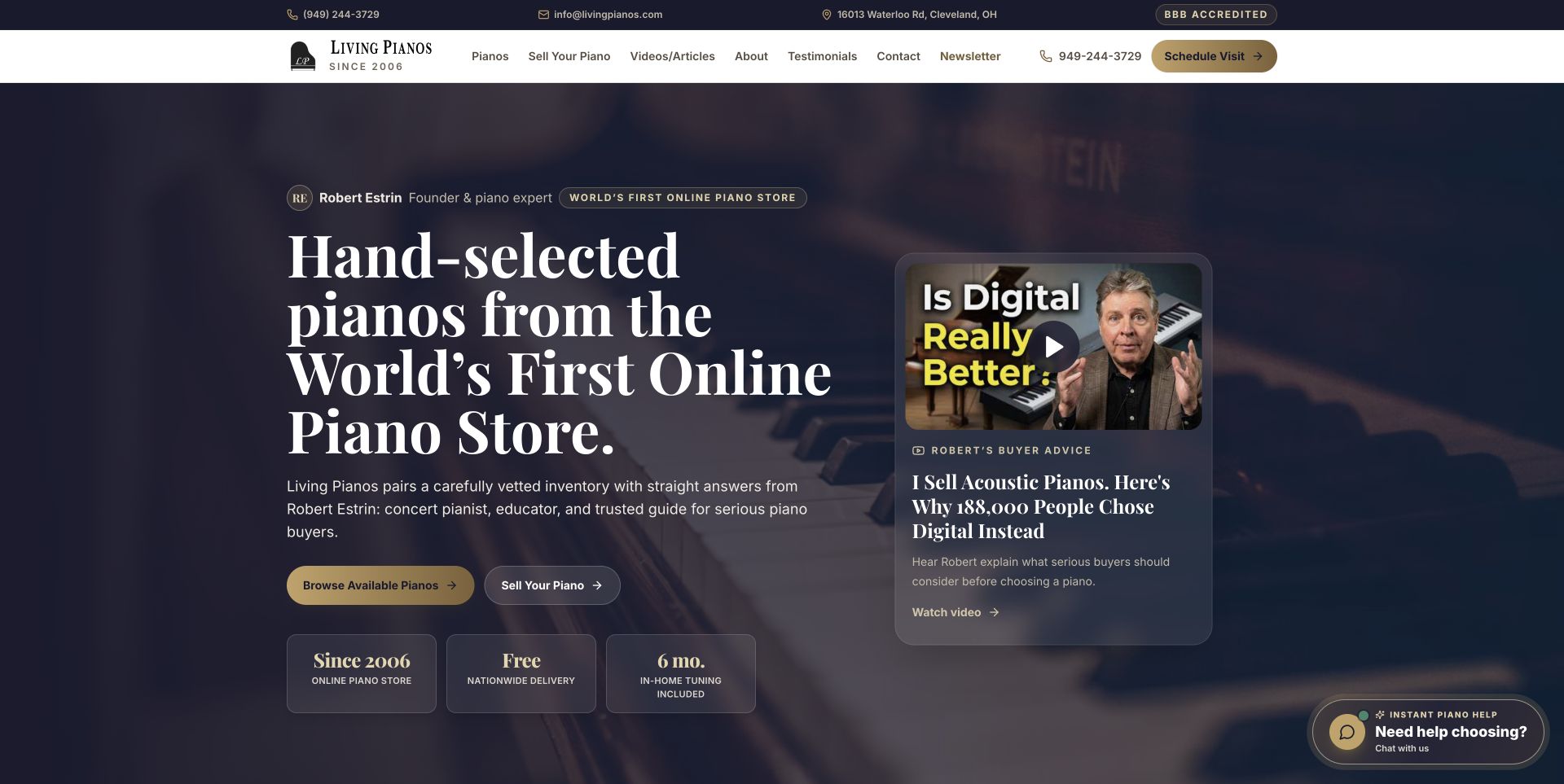
Living Pianos makes a named adviser part of the opening composition. A large serif headline and two purchase-or-sale routes sit beside Robert Estrin's buyer-advice video, all within a restrained navy and gold palette. Below, featured instruments carry model, year, size, availability and price instead of requiring an enquiry for every basic fact. Delivery and tuning messages also state useful scope. The educational material gives a visitor something to investigate before arranging a private appointment. There is a qualification worth noticing: the prominent selling route is explained farther down as forwarding enquiries to wholesalers because the business is not currently buying pianos.
What you can learn
Connect advice with the precise instruments it helps people evaluate. Name the adviser, make inventory facts comparable and explain transaction limits beside the relevant action, especially when a familiar label such as selling hides a different arrangement.
Pros
Instrument cards expose age, size and price before the detail page.
Advice and appointment routes support an involved purchase without forcing an immediate enquiry.
Cons & considerations
The selling qualification deserves placement nearer the opening action.
Repeated authority messages make an already substantial page longer.
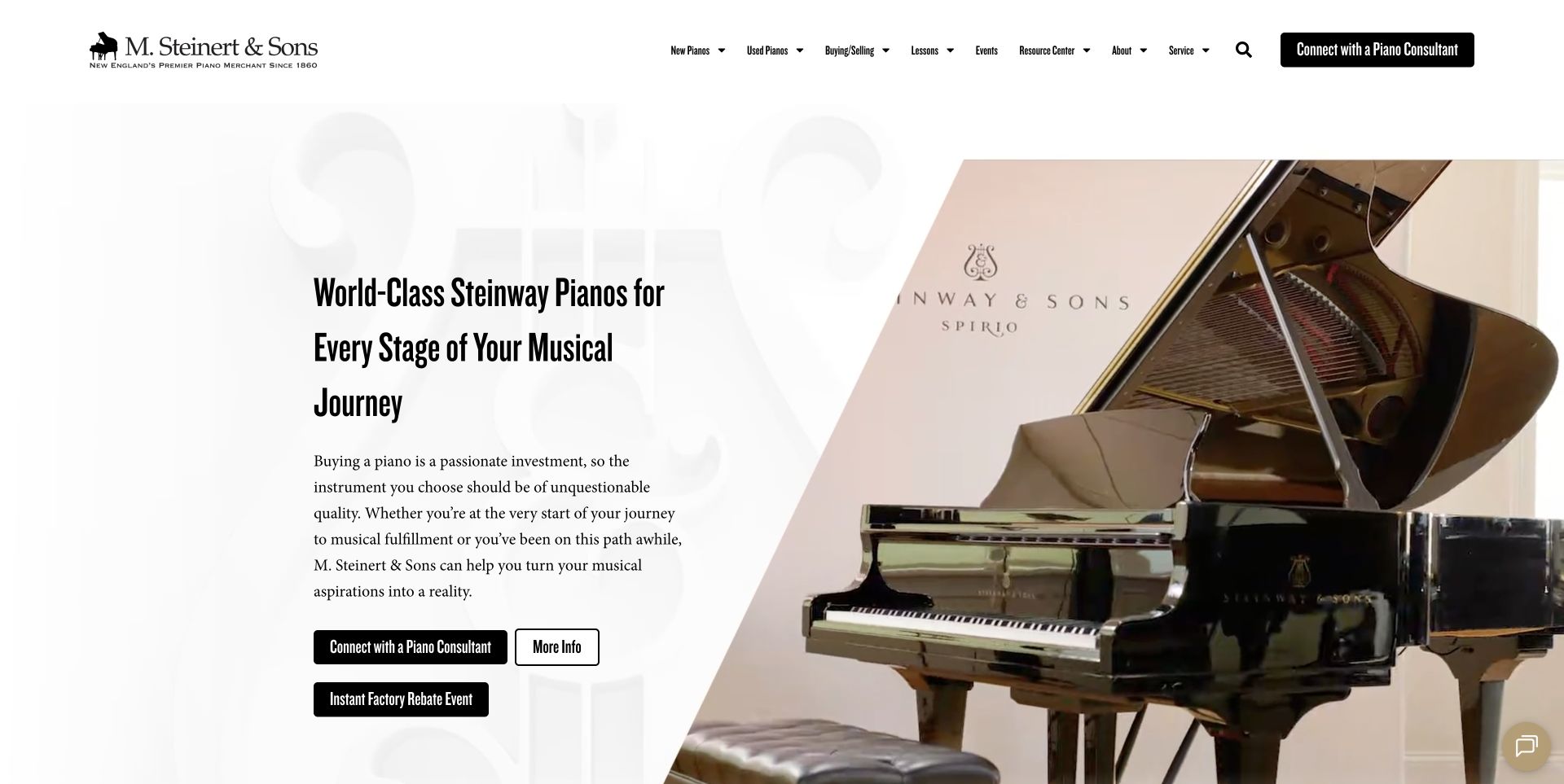
M. Steinert & Sons opens with an oversized piano photograph beside condensed typography and a consultant invitation. The image presents the instrument as an object worth inspecting, while the text gives visitors a human next step. Farther down, novice, experienced and expert pathways acknowledge that buyers arrive with different questions. Named piano families, a guidebook and local events extend the page beyond a basic stock list. The design connects retail, learning and an ongoing musical community without making the first screen a dense specification table. Its tradeoff is that a shopper who already knows their budget must continue into the site to compare particular instruments.
What you can learn
Use experience level to organise guidance, but keep a direct inventory route available alongside it. A consultation can help an uncertain visitor; it should not become the only way to discover useful model, condition or price information.
Pros
Player-oriented paths give inexperienced visitors an understandable starting point.
Local events and named product families supply concrete destinations beyond the hero.
Cons & considerations
The large opening composition delays side-by-side product comparison.
Introductory price context is absent from the captured first screen.
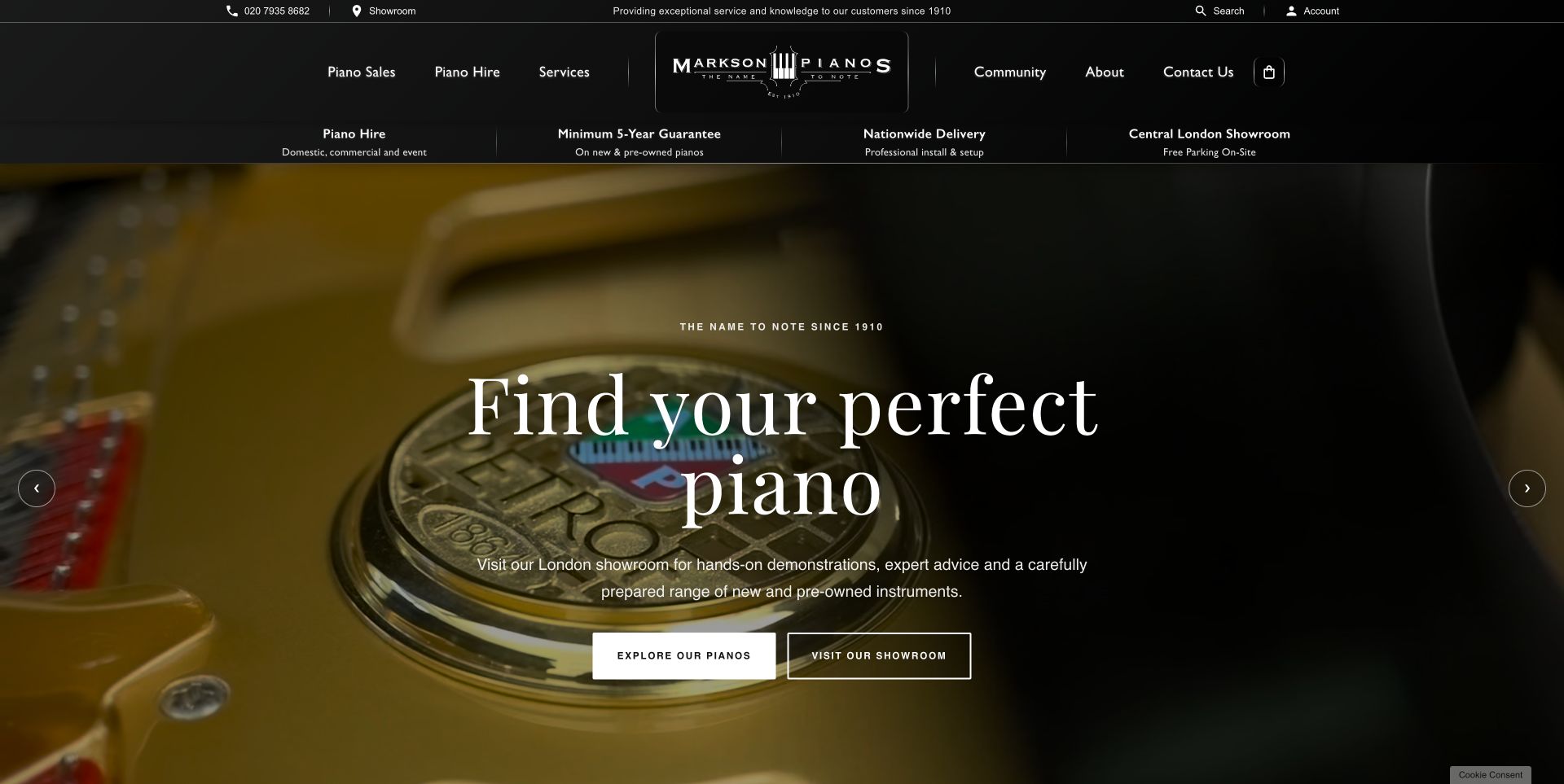
Markson Pianos centres its piano-key identity within a symmetrical black header. A short assurance strip introduces hire, guarantee, delivery and visiting information before a moving piano image fills the main feature. Large serif lettering gives the opening a familiar showroom character, and separate browse and visit actions distinguish online exploration from travelling to the store. New, pre-owned and hire categories then make the commercial choices more specific. Priced promotions further down provide a useful counterweight to the broad opening invitation. The page also contains substantial customer testimony and historical material, which can help orientation but makes a quick stock comparison less direct.
What you can learn
Distinguish browsing, hiring and visiting with clear labels before explaining the business at length. Keep practical terms close to those routes, and let product information remain accessible without asking visitors to read the full history or testimonial sequence.
Pros
The browse and showroom actions represent different intentions clearly.
Product categories and visible promotional prices make the offering more tangible.
Cons & considerations
Moving hero imagery competes with the introductory message.
Long testimonial sections add distance between the first invitation and detailed comparison.
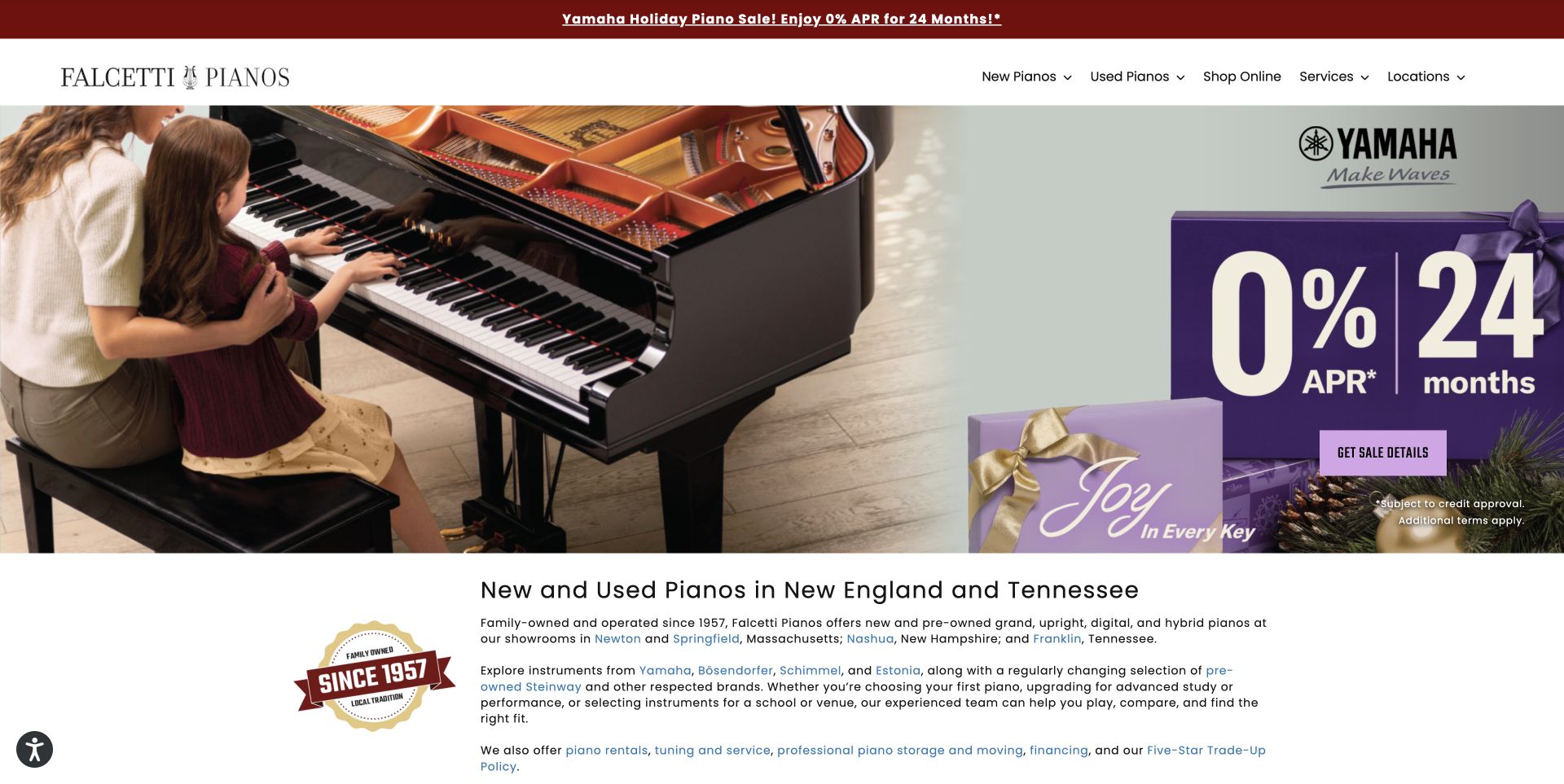
Falcetti Pianos uses a red promotion strip, a spacious white navigation row and a seasonal manufacturer image to establish its retail offer. The opening paragraph then names the regional locations and links directly to them, giving the broad campaign a local destination. Brand marks, workshop imagery, a trade-up explanation and named staff add different kinds of supporting information. Those sections suggest what a visitor can explore after choosing an instrument, rather than treating the sale as the entire relationship. The first screen remains dominated by the manufacturer's promotion, so the business's own service identity becomes clearer only as the reader moves down the page.
What you can learn
Give a shared manufacturer campaign a local frame: which showroom can help, who works there and what services follow the purchase. Keep offer conditions explicit and provide direct comparison routes for shoppers who have already chosen an instrument category.
Pros
Location links make the regional showroom network easy to identify.
Workshop photographs and staff introductions give aftercare a concrete presence.
Cons & considerations
Campaign artwork receives more initial emphasis than the dealer itself.
Model-level comparison requires navigation beyond the opening page.
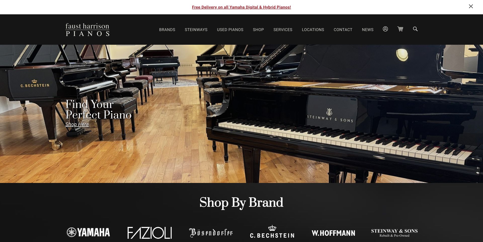
Faust Harrison Pianos places a compact serif invitation over a broad showroom panorama. The black header and restrained overlay leave much of the instrument-filled space visible, while a brand strip quickly identifies the range beneath the feature. Inventory, restored Steinway and piano-locator routes provide more focused ways into the offering. A location finder, buyer guide and educational material support visitors who need help planning a visit or understanding their options. The homepage also carries several rotating sections and substantial testimony. These supply depth, but distribute important information across changing states and a long sequence rather than one concise comparison view.
What you can learn
Let the showroom photograph establish context, then give different purchase situations their own clear destination. A restored-instrument buyer needs condition and preparation detail, while a new buyer may need a guide; both should be able to reach the relevant inventory directly.
Pros
The wide photograph gives a tangible sense of the showroom setting.
Specialised inventory and location routes help different visitors narrow their next step.
Cons & considerations
Several rotating groups require extra exploration to see all content.
Individual prices and condition details sit beyond the opening invitation.
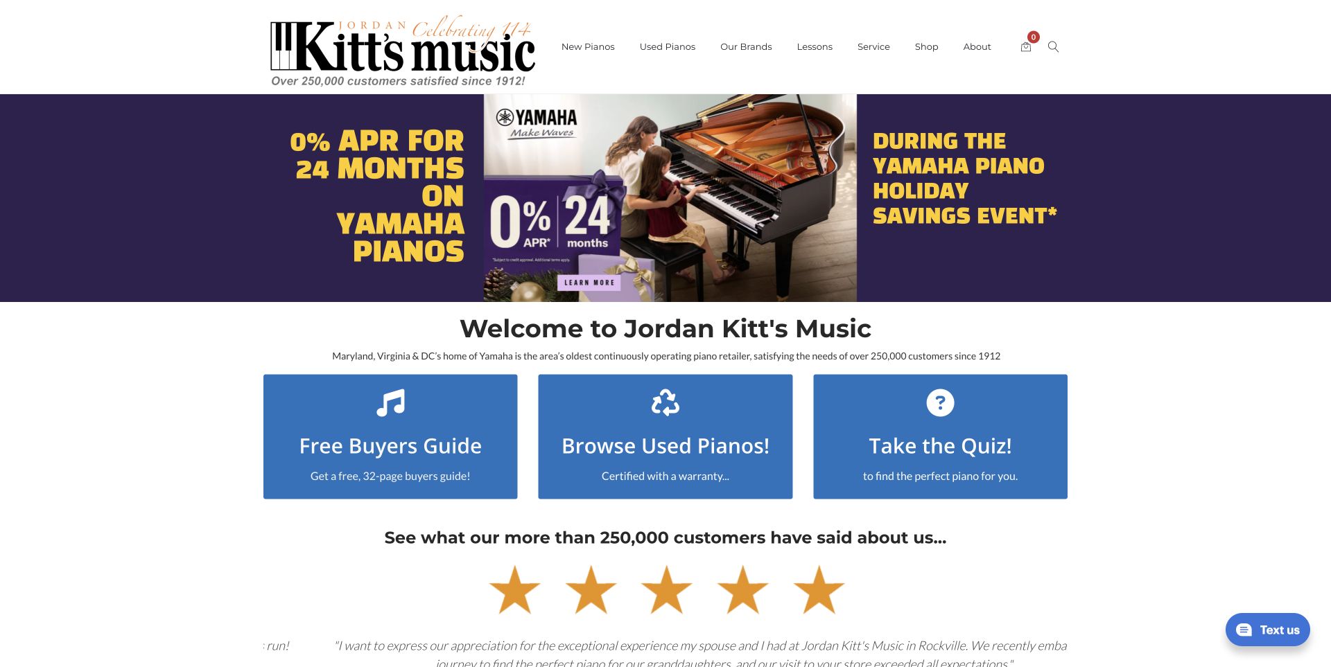
Jordan Kitt's Music places three blue pathways beneath its seasonal feature: a buying guide, used instruments and a needs quiz. Their equal weight makes the alternatives legible without demanding that a beginner already understand the full product range. Brand panels and family lesson imagery connect shopping with learning, while four showroom sections publish practical hours and telephone details. The composition gives advice a visible place alongside sales rather than confining it to a footer. The opening still depends on a rotating campaign, and testimonials add another layer before the visitor reaches more detailed comparisons. Those choices make the page welcoming but less compact for an experienced shopper.
What you can learn
Offer a small number of clearly different starting points and explain what each will help someone decide. Preserve a quick route to actual stock and local visit information so educational content supports the purchase journey without becoming a compulsory detour.
Pros
Guide, used-stock and quiz labels speak to distinct buyer needs.
Showroom sections provide specific opening and contact information.
Cons & considerations
Campaign rotation separates the initial messages into different states.
Promotional and testimonial content can delay a straightforward product comparison.
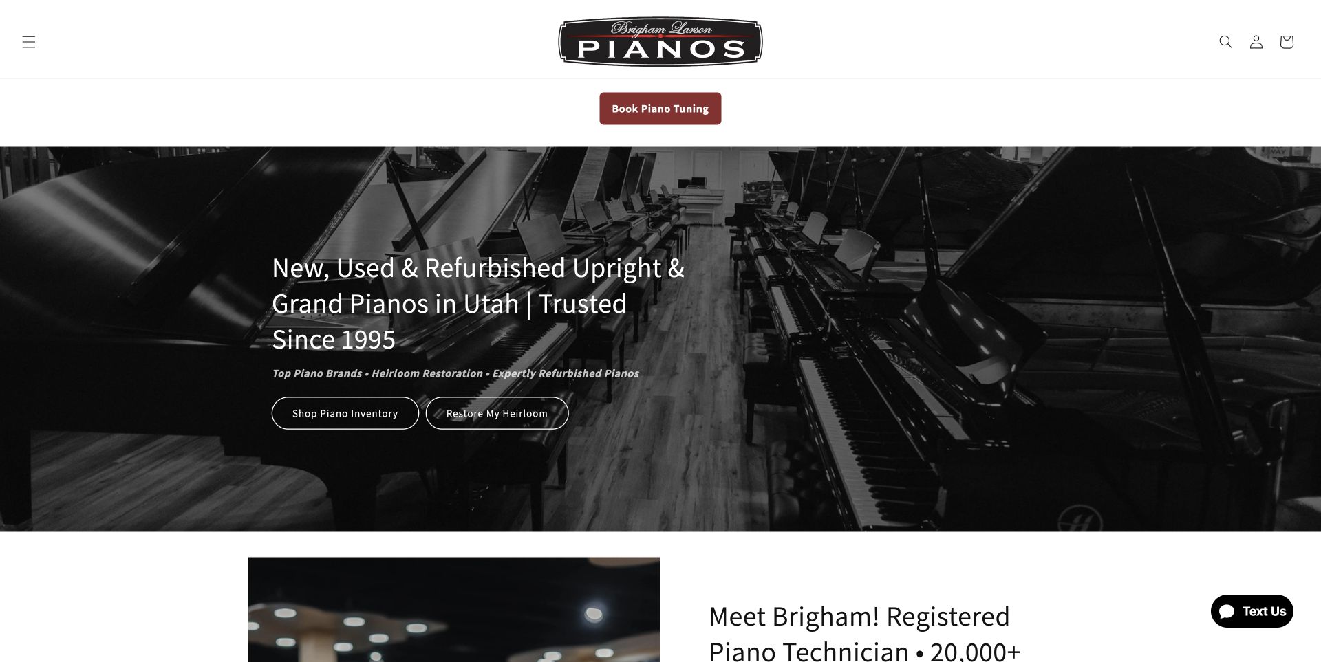
Brigham Larson Pianos uses a monochrome showroom photograph with separate actions for buying an instrument and restoring an heirloom. That distinction matters because the two visitors need different evidence and next steps. A named technician introduction, photographic service cards and dated restoration stories make the workshop part of the website's substance. Tuning, moving, refinishing and storage have visible destinations rather than disappearing inside a general services paragraph. The page therefore presents the business as more than an inventory source. However, a desktop hamburger hides the broader navigation, and repeated expertise statements lengthen the route through an already detailed page.
What you can learn
Give restoration its own journey, supported by actual project records and clearly named services. Explain the work visitors can inspect before requesting an assessment, while keeping purchase and repair routes distinct enough that neither audience has to decode the other's terminology.
Pros
Separate purchase and restoration actions clarify two different intentions.
Dated case studies and service imagery give technical work a visible context.
Cons & considerations
The desktop menu conceals categories that could help immediate browsing.
Repeated expertise messages reduce the efficiency of the long page.
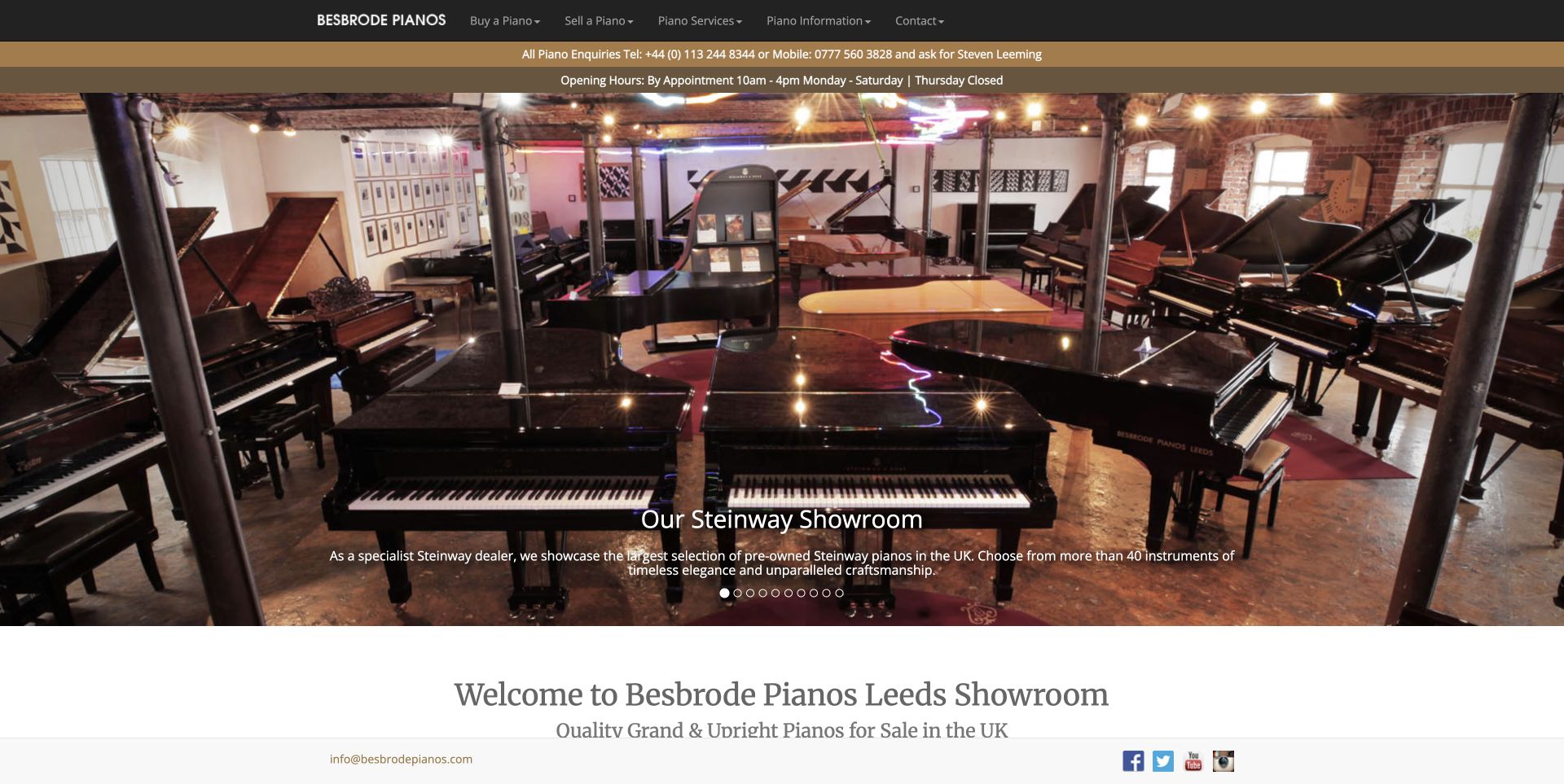
Besbrode Pianos combines a showroom photograph with compact black navigation, contact details and opening information. Its deeper inventory is particularly useful as a design reference: a stock table identifies instruments by reference, model, year and condition, giving shoppers fields they can discuss with the dealer. A featured restored instrument, tour material and piano-dismantling workshops show different aspects of the specialist business. The site offers more than atmospheric photographs, because visitors can connect the showroom story with individual objects and workshop activity. The drawback is density: introductory material, events and numerous carousel controls postpone the most practical stock information.
What you can learn
Choose inventory fields that remain useful in a conversation or showroom visit. A stable reference and explicit condition can make a vintage instrument easier to identify than a persuasive headline. Keep those records accessible before expanding into the dealer's broader cultural story.
Pros
Reference, year and condition fields support precise instrument enquiries.
Workshop and tour material connects inventory with the physical business.
Cons & considerations
The opening sequence is lengthy before stock details become prominent.
Many carousel dots offer little explanation of the hidden content.
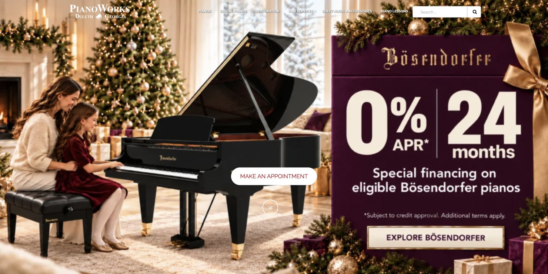
PianoWorks opens with manufacturer campaign imagery, an overlaid navigation row and an appointment action. Farther down, featured instruments include model, year and size, which are useful distinctions when a photograph alone cannot explain what makes one piano suitable. Routes for new, pre-owned, digital and restored instruments separate different shopping situations. Accessories live on a distinct shop destination, while local contact information grounds the business. The observed page also exposed an unrendered video shortcode in its media area. That is a useful reminder that a polished campaign feature can coexist with a maintenance problem in the supporting content.
What you can learn
Give product cards enough identifying detail to make the next click meaningful, then maintain the supporting media as carefully as the hero. A readable fallback link should survive when a video integration fails; raw publishing syntax should never become the visitor's explanation.
Pros
Model year and dimensions add substance to featured instrument cards.
Purchase categories distinguish used stock, digital models and restoration.
Cons & considerations
Navigation placed over a busy photograph is harder to scan.
The visible video shortcode interrupts the otherwise finished presentation.
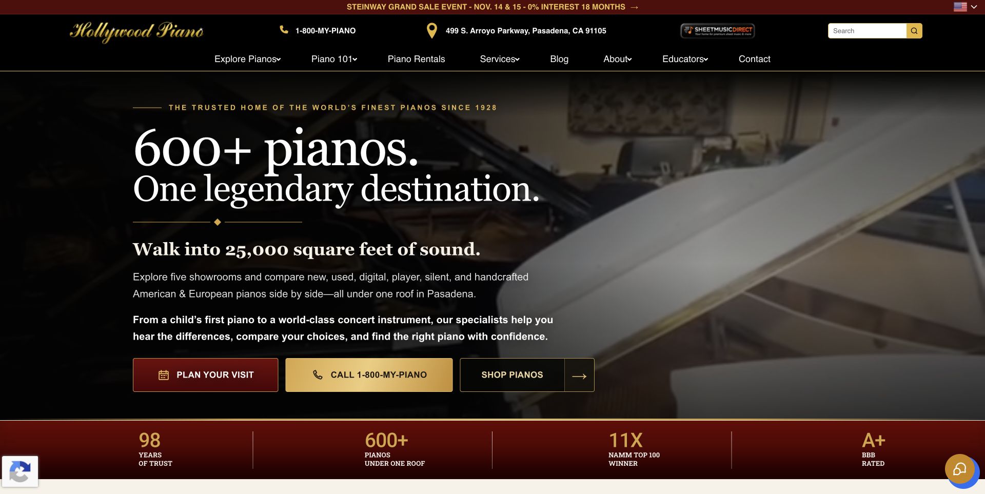
Hollywood Piano uses a black, red and gold palette over moving showroom imagery. The opening groups a large headline with three practical actions: visit, call and shop. This lets people choose their preferred mode of enquiry before exploring a large catalogue. Instrument-type cards distinguish grand, upright, digital, player and pre-owned options, while named showroom sections provide a geographic structure. Featured stock adds condition, dimensions and prices, supplying concrete information beneath the broad brand presentation. The header and promotional statements are busy, however, and repeated scale or award claims compete with the details a shopper can independently compare.
What you can learn
Keep contact methods distinct and pair them with actual instrument facts. A multi-location retailer should make it clear where a visitor can inspect stock, what a product card describes and whether the next action starts online shopping or a conversation with a showroom.
Pros
Visit, call and shop actions make the initial choices explicit.
Condition, dimensions and prices help differentiate the featured instruments.
Cons & considerations
The dense header competes with the moving background for attention.
Repeated promotional claims can overshadow specific buying information.
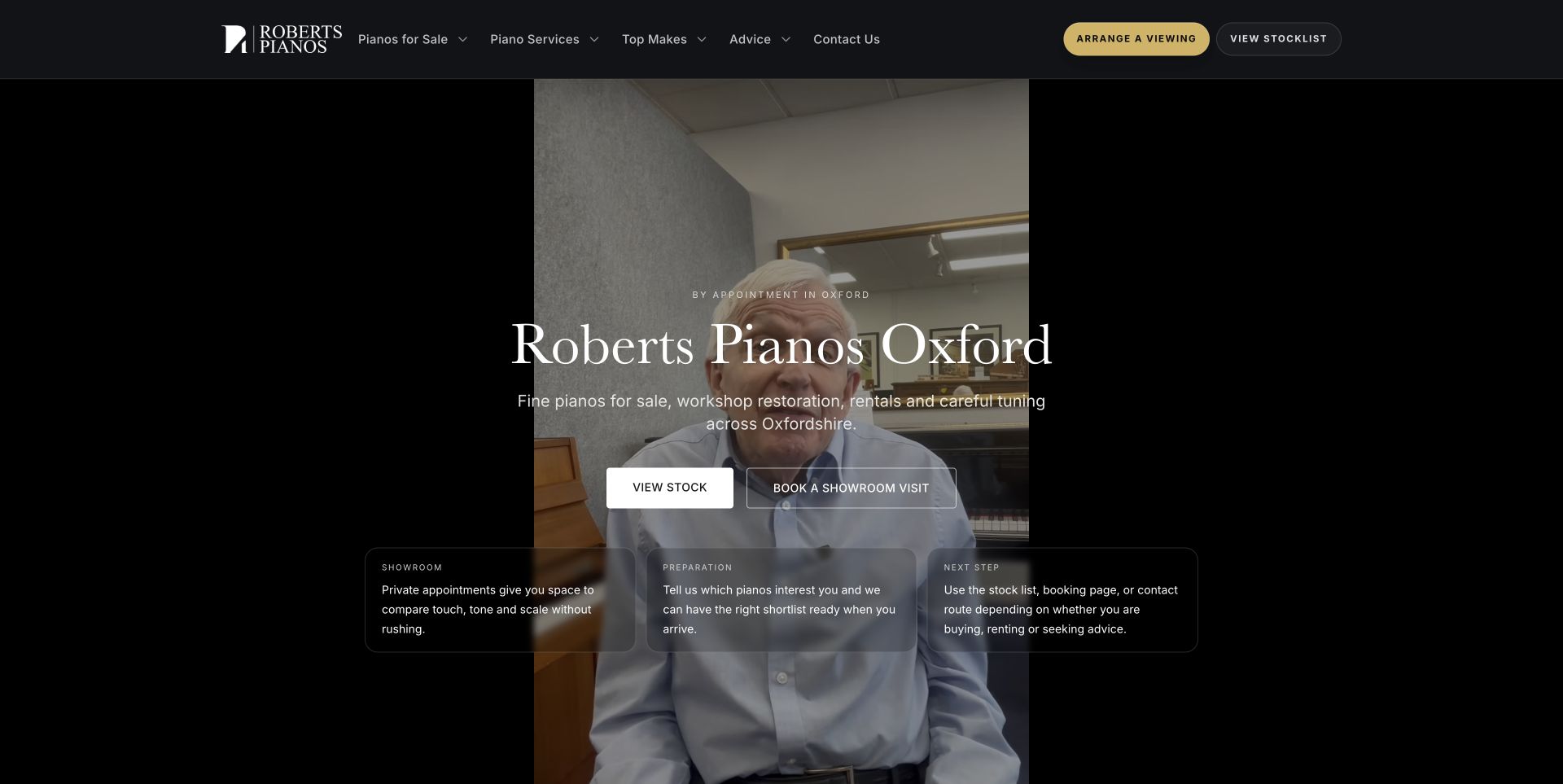
Roberts Pianos gives stock and visiting their own actions over a portrait-format piano video. A black and gold header frames the opening, while supporting cards introduce the showroom, preparation work and the next step. The copy becomes most useful when it explains how to compare instruments: play familiar music, listen from elsewhere and consider condition and preparation. Service cards include starting prices for activities such as tuning and rental, so aftercare is not entirely abstract. The site also distinguishes an appointment-based Oxford visit. On desktop, the narrow video creates a strongly framed composition, but text over motion can distract from this practical guidance.
What you can learn
Turn expertise into questions and actions a buyer can use during a visit. Explain how to compare instruments, what preparation means and which services have published starting prices. Keep that advice readable independently of any background video or decorative presentation.
Pros
Comparison guidance goes beyond broad statements about service quality.
Appointment context and service prices clarify practical expectations.
Cons & considerations
The portrait video leaves an unusual proportion of framing space on desktop.
Stock-level prices require another step beyond the introductory feature.
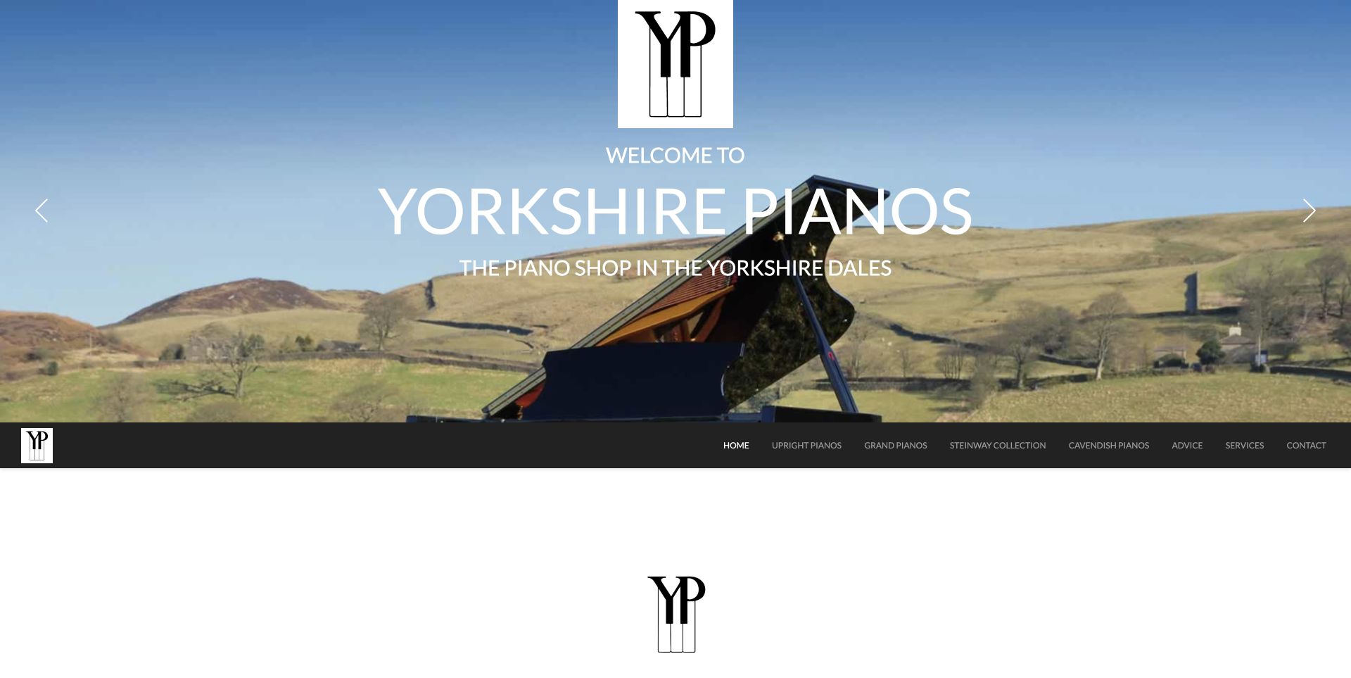
Yorkshire Pianos places a grand piano in a Dales landscape, turning geography into the opening visual identity. The main navigation sits beneath that broad photograph and distinguishes upright, grand, Steinway and Cavendish paths alongside advice and services. The page then connects the showroom with an on-site piano-making story, giving the business a subject beyond resale. That relationship is presented by the site and should be investigated through its supporting pages rather than treated as independent proof of every manufacturing claim. Large stretches of whitespace slow the transition into detail. Opening-hours information also differs between the main text and the footer's Wednesday appointment note.
What you can learn
Use place to create a memorable identity, then make the practical visit details consistent. If a workshop or manufacturing story distinguishes the business, connect it to specific products and observable work while separating those facts from broad claims of uniqueness.
Pros
The landscape photograph makes the regional identity immediately recognisable.
Instrument and advice categories remain plainly named beneath the feature.
Cons & considerations
Generous blank space delays the next useful section.
Different opening-hours messages leave an avoidable planning question.
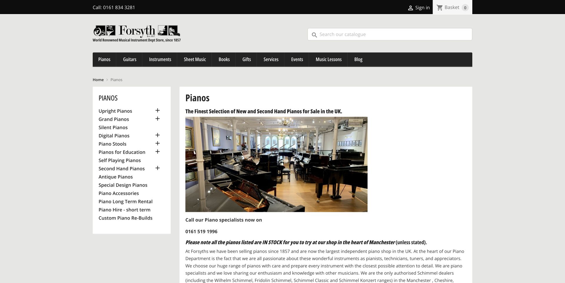
Forsyth's piano department uses a detailed left-hand category list beside a showroom photograph and specialist telephone number. Upright, grand, silent, digital, antique, rental and rebuilding routes are visible together, making the breadth of the department easy to understand. An explicit in-stock caveat explains that listed instruments can normally be tried at the Manchester shop. The page also explains why some products have prices and online ordering while others invite a visit. Below a lengthy introduction, the catalogue combines instrument cards with accessories and sorting controls. The structure is practical, although the amount of prose and mixed product types slows a focused comparison.
What you can learn
Explain the relationship between online listings and physical stock before visitors plan a journey. Use a stable category structure, distinguish accessories from instruments and say when a missing price reflects a consultation process rather than leaving shoppers to infer the reason.
Pros
A persistent category list exposes specialist instrument and service routes.
The stock and pricing explanation sets useful expectations before a visit.
Cons & considerations
Long introductory paragraphs push the product grid well down the page.
Accessories mixed into broad results make instrument comparison less direct.
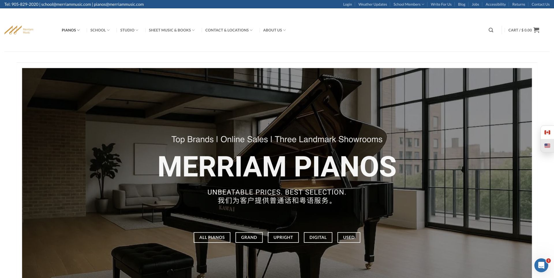
Merriam Pianos places five concise shopping routes across a large piano-room hero: all, grand, upright, digital and used. The category labels give the atmospheric opening a practical function. A visible Mandarin and Cantonese service notice adds audience context, while later sections explain instrument families and identify the three showroom locations. The wider site navigation also connects the piano business with its school and other music services. This breadth is useful but creates a busy global header above an already large feature. The observed seasonal promotion and chat notification needed normal dismissal before capture, illustrating how extra messaging can compete with otherwise clear category choices.
What you can learn
Use the hero to expose meaningful product families, then connect each family to local availability and relevant advice. When a business serves several audiences or languages, make that help discoverable without allowing unrelated services and promotional layers to dominate the shopping route.
Pros
Five explicit categories offer a direct starting point within the feature.
Showroom details and language-service information add practical context.
Cons & considerations
The global header carries many destinations beyond piano shopping.
Promotional overlays can interrupt the otherwise straightforward category entry.
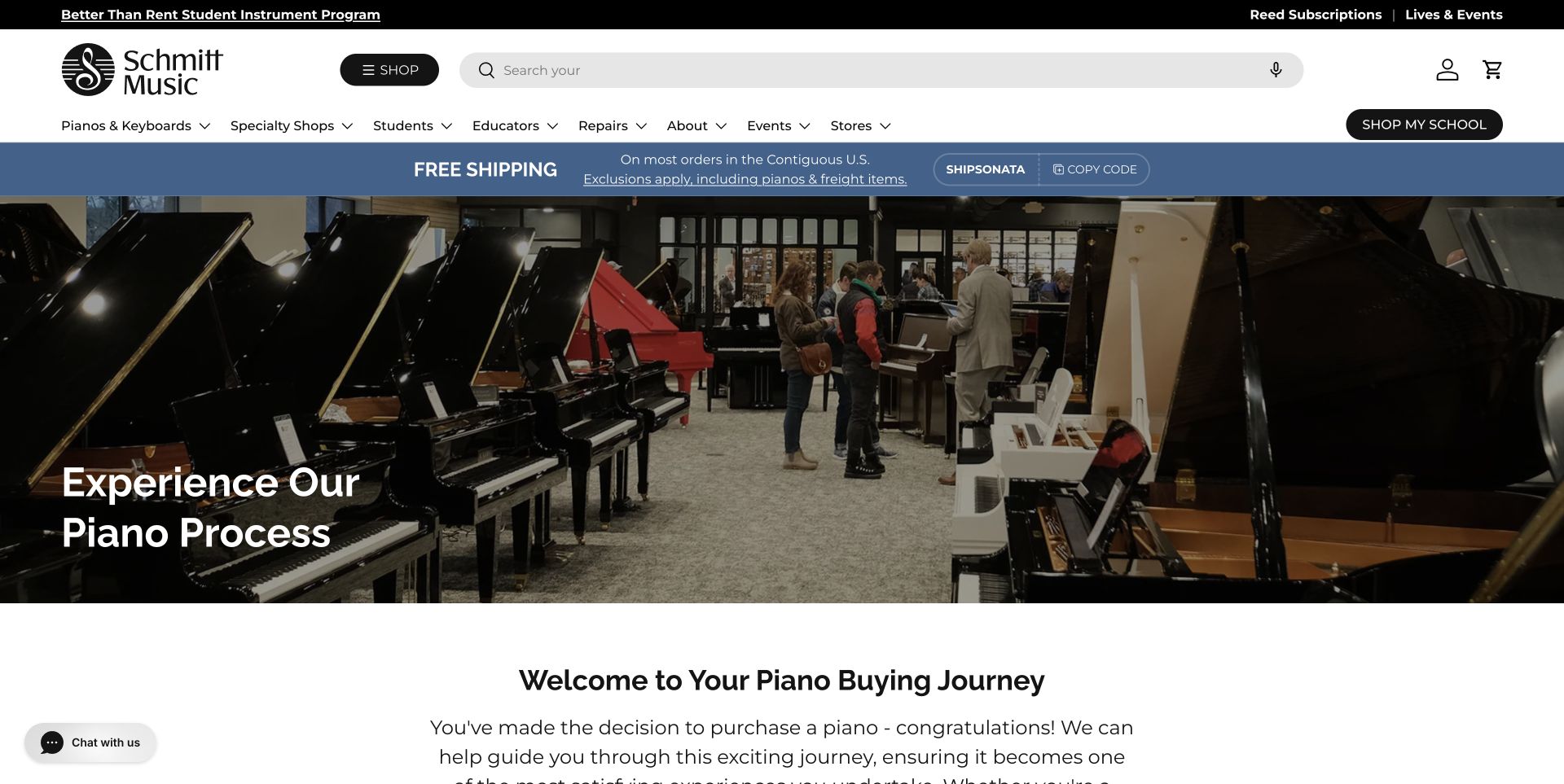
Schmitt Music's piano process page starts with a showroom photograph and a simple invitation to understand the buying journey. Its strongest content is a short set of questions: who will play, where the instrument will sit and whether the buyer wants new or used stock. Three piano-type explanations translate those questions into options, followed by showroom and inventory routes. This sequence makes advice feel like preparation for a real decision rather than a separate marketing essay. The surrounding shop header and shipping promotion are less focused; the shipping strip specifically excludes pianos, and the downloadable guide leads into a marketing form.
What you can learn
Organise beginner guidance around decisions people can answer before learning every model name. Keep room, player and purchase condition visible, and distinguish freely readable advice from a guide that requires contact details so visitors can choose knowingly.
Pros
Player and room questions make the buying process understandable.
Piano-type explanations connect advice with relevant stock and showroom routes.
Cons & considerations
The general shipping promotion is distracting on a page about excluded instruments.
The guide route introduces a contact requirement beyond the public advice.
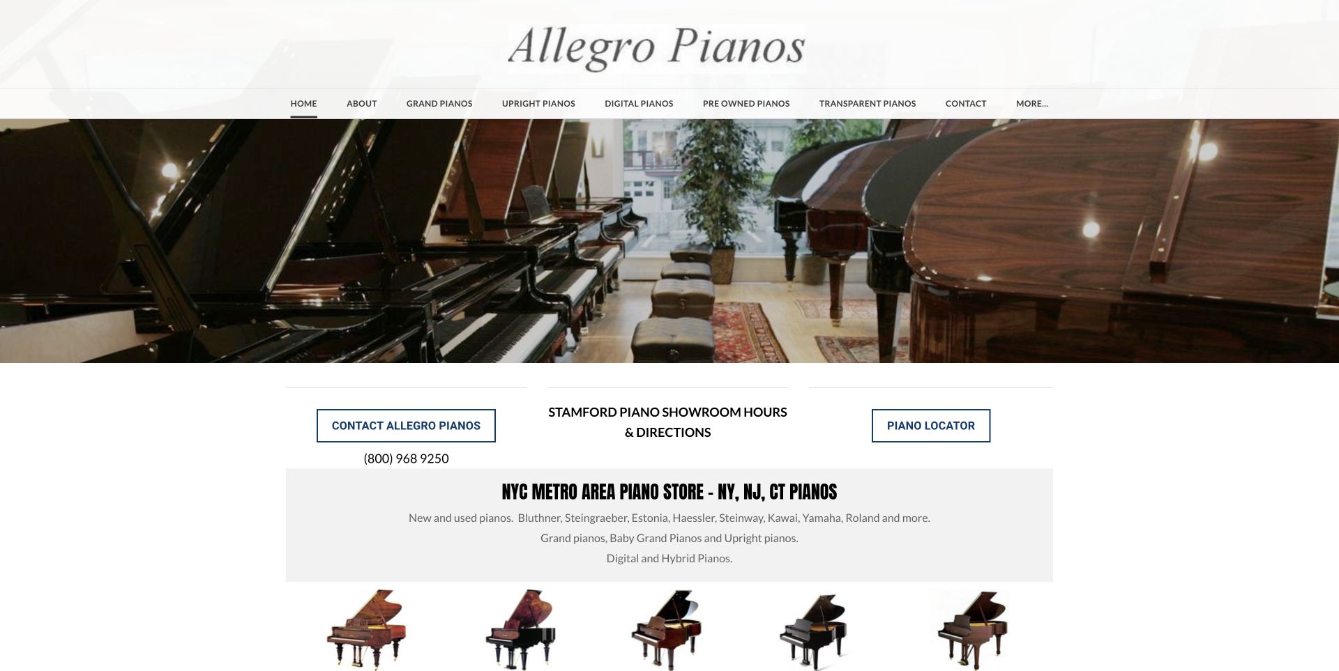
Allegro Pianos combines a broad showroom photograph with plainly named instrument categories. Immediately below, contact, showroom directions and piano-locator actions establish useful alternatives before the longer introduction. Brand tiles then give specialist buyers direct routes into particular makers, and supporting sections discuss restoration, digital instruments and the Stamford location. The site devotes considerable space to regional travel context, recognising that a piano purchase may justify a planned journey. Its visual and structural treatment is more traditional: dense columns and repeated geographic prose make the lower page demanding, and one observed brand-text link returned to the homepage instead of its matching category.
What you can learn
Put the practical visit and inventory routes before the regional sales story. Precise travel information can help, but consolidate repeated place names and verify that every image and text label in a brand tile leads to the same intended destination.
Pros
Contact, directions and locator choices are visible near the opening.
Brand and instrument categories provide routes for knowledgeable shoppers.
Cons & considerations
Dense lower-page columns make lengthy explanatory text harder to scan.
An inconsistent brand link weakens the otherwise useful tile navigation.
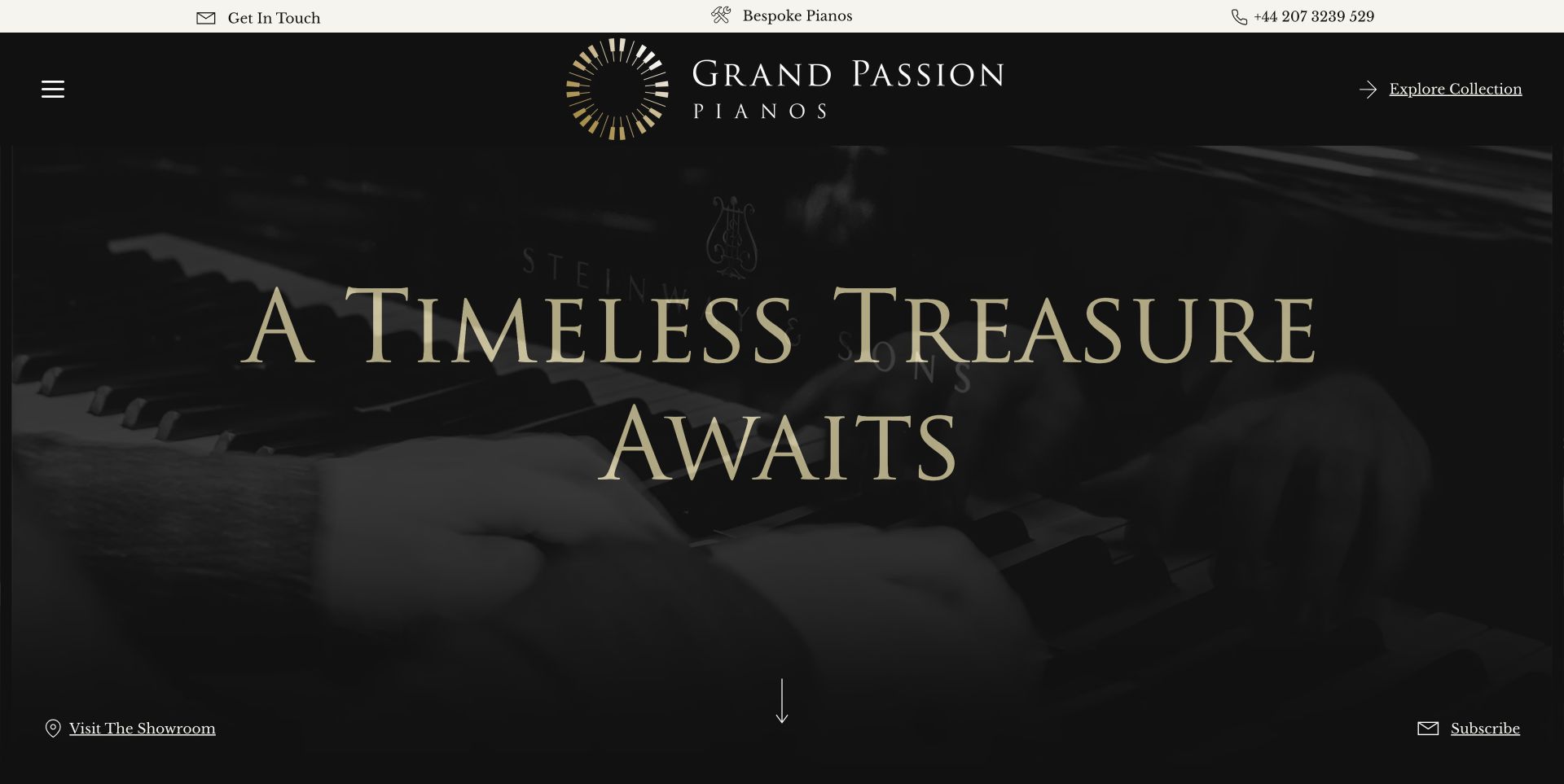
Grand Passion Pianos uses black, muted gold and large serif typography over moving instrument imagery. Collection, bespoke and visit actions surround the feature, giving the narrow grand-piano proposition a consistent visual treatment. Featured records later identify brand, year, colour, price and sold status, which is useful detail beneath the poetic opening. The Pleyel and Steinway focus, bespoke route and showroom imagery establish a more specialised catalogue than a general music store. Practical details deserve the same care: the displayed telephone number differs from its click-to-call destination, and the desktop menu hides categories while the broad headline says little about stock.
What you can learn
A restrained luxury presentation still needs precise product and contact records. Keep availability and identifying specifications close to each instrument, verify displayed and linked telephone details together, and ensure visitors can reach the collection without interpreting a purely atmospheric slogan.
Pros
Featured records make year, finish, price and sold status explicit.
The limited brand focus gives the collection a coherent editorial identity.
Cons & considerations
The observed telephone label and destination do not agree.
Hidden navigation and a poetic opening delay practical stock information.
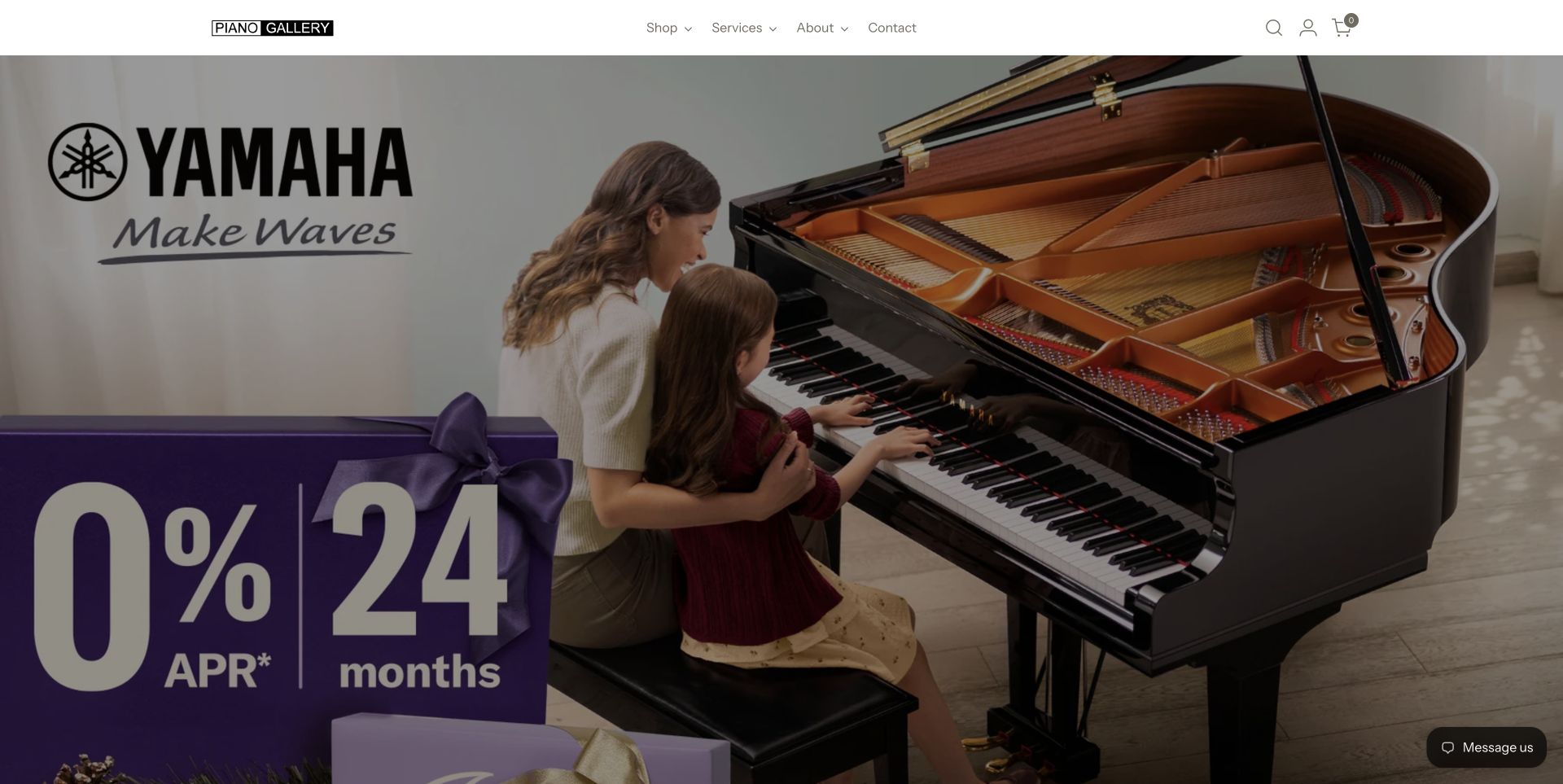
Piano Gallery keeps the opening navigation minimal above a full-height manufacturer campaign image. The page then distinguishes in-store exclusives from products available online, an important difference for shoppers comparing a visit with home delivery. Category collections and digital-piano tabs lead into cards with visible starting prices. Moving, refinishing and recital-hall information broaden the relationship beyond the initial purchase, while a location route reconnects the catalogue with physical showrooms. The opening image is much more about the manufacturer than the local dealer. Repeated testimonial and promotional sections also add length before visitors reach all of the practical service and location information.
What you can learn
Explain which products can be ordered online and which need a showroom conversation. Keep that distinction consistent on product cards, and give delivery, moving and service information their own clear destinations rather than relying on a broad assurance statement in the hero.
Pros
Separate online and in-store routes clarify different purchase arrangements.
Starting prices and service categories add useful detail beyond campaign imagery.
Cons & considerations
The full-height manufacturer feature postpones the dealer's own identity.
Repeated promotional material lengthens the route to practical local information.
Kegan is a freelance web designer and developer with 15+ years of experience helping businesses turn complicated website requirements into clear, maintainable digital experiences. He works directly with clients from planning and design through development, launch, and ongoing support.
For piano dealer website design, his development approach focuses on instrument inventory and condition records, showroom and appointment information, buyer guidance, delivery scope, and clear restoration and aftercare journeys. The scope can be a targeted improvement or a complete custom build, with responsive layouts, thoughtful content structure, and integrations chosen around the people using and maintaining the site.
Show 3 other piano dealer website designersHide other piano dealer website designers
Plan a piano dealer website around the instrument, the player and the visit
Define the stock record before the product layout
Begin with the information that identifies an individual instrument. A used piano is not interchangeable with every other example of its model: age, serial or stock reference, finish, dimensions, condition and preparation can matter to a buyer. Decide which fields the team can verify and maintain. Unknown information should remain unknown rather than becoming a persuasive assumption in the description.
Besbrode demonstrates the usefulness of reference, year and condition fields, while Living Pianos places year, dimensions, availability and price on its featured cards. These details make the next click more informed and can make a telephone enquiry more precise. Use consistent units and distinguish the instrument being sold from a current model used only as a price comparison.
Plan the record lifecycle as carefully as the first publication. Reserve, sold and unavailable states should update wherever the instrument appears, while a historical restoration story may remain useful after a sale. A sold item can illustrate the workshop's past work, but its action should no longer imply that the same instrument is available to buy. Keep representative imagery clearly distinguished from photographs of the actual stock.
Give beginners useful guidance without blocking experienced buyers
Schmitt Music organises its advice around the player, the room and new-versus-used preferences. Jordan Kitt's offers a guide, used-stock route and quiz as separate starting points. These patterns acknowledge uncertainty without requiring a visitor to know every product term. Write guidance around questions the business actually receives and connect the answers to relevant categories or inventory records.
Keep a direct route for a visitor who already knows what they want. Advice, video and consultation can support the decision, but they should not be the price of entry to basic product information. Explain when a downloadable guide requires contact details and leave useful public information available without a form. The website should make the available choices understandable before requesting personal information.
Use technical explanations to clarify tradeoffs, not to promise an identical experience for every player. Room constraints, acoustic needs, practice arrangements and instrument condition can lead to different decisions. Publish advice within the dealer's actual knowledge, and direct questions that depend on an individual instrument to the relevant record or specialist. A short, specific explanation is more useful than repeated claims that every option is perfect.
Connect online discovery with a reliable showroom visit
A visit often involves travel and time to compare instruments. Put the actual showroom address, appointment policy and contact route near the relevant action. Distinguish the office, warehouse and customer showroom if they differ. A multi-location business should identify where a particular instrument can be tried, rather than relying on a generic list of branches in the footer.
Forsyth explains the relationship between its listings and stock available to try, while Roberts gives appointment context and practical comparison advice. Carry this specificity into the visit page. Explain how to confirm availability, whether a companion or teacher can attend where appropriate, and which information the dealer needs to prepare. Do not promise services or arrangements that have not been confirmed by the business.
Keep contact data synchronised across visible labels and underlying links. Grand Passion's reviewed phone mismatch and Yorkshire's differing hours illustrate how a small content inconsistency can undermine an otherwise useful invitation. Use maintained fields for each location and review them when staff, schedules or premises change. A working call action and accurate opening notice are part of the design, not administrative details to add later.
Show the workshop and aftercare with specific evidence
Restoration, tuning, moving and storage involve different questions from buying a new instrument. Brigham Larson gives restoration a separate opening route and supports it with dated project stories. Falcetti adds workshop imagery and named staff. Decide which services the business actually provides, which are referred elsewhere and what a visitor can reasonably learn before requesting an assessment.
For a restoration story, identify the instrument, the problem and the documented work without overstating what photographs can prove. Preserve actual project dates and distinguish a completed project from a proposed service. For moving or tuning, explain service area, enquiry requirements and any published starting-price limitations. A broad assurance should not silently become a fixed quote for every location or instrument.
Keep the visual presentation maintainable. PianoWorks' observed video shortcode shows why a media section needs a readable fallback and routine checks. Moving backgrounds should not be the only source of important information, and promotional dialogs should remain easy to dismiss. A strong still photograph with clear text can communicate a workshop or showroom more reliably than a complicated media feature that obscures its own message.
The editing job behind the design
Choose tools that keep stock and showroom information accurate
Compare content systems by how they manage individual instruments, shared product families, availability and location. Staff should be able to update a sold state or appointment notice without editing several unrelated page sections. Keep the flexible editorial story around a predictable set of maintained facts.
Separate online ordering from consultation, restoration and visit requests. Each route needs clear expectations and a suitable information structure. Do not assume that a standard retail template explains delivery of a large acoustic instrument, and keep public browsing useful without testing real orders or sending enquiry forms.
The technology stacks below reflect bounded public-source audit attempts. They are not a complete backend inventory or evidence that a particular platform caused the observed design. Retain unsuccessful and partial findings honestly, and choose integrations around verified operational requirements rather than copying a platform from a similar-looking dealer.
Our WordPress website examples offer a separate look at publishing approaches. A visible platform label is evidence for that named page, not a guarantee that the same system will suit your requirements.
Before the public launch
Piano dealer website planning checklist
Give each individual instrument a stable stock reference.
Record maker, model, dimensions and verified year where available.
Distinguish actual stock photographs from representative product imagery.
Keep available, reserved and sold states consistent across the website.
Explain condition and preparation without replacing unknown facts with claims.
Provide direct inventory browsing alongside advice and consultation.
Explain any contact requirement before a visitor opens a guide form.
Separate online-order products from showroom-only arrangements.
State the relevant scope and exceptions of delivery and service offers.
Keep addresses, hours, appointment notices and telephone links synchronised.
Give restoration and aftercare services their own useful information routes.
Keep essential details readable outside moving media and dismissible promotions.
These checks are a project checklist, not a performance, legal, security, or accessibility certification. Test real journeys with the people responsible for the website before making claims about the result.
Sources & editorial method
How this collection was selected and reviewed
The original random target of 18 was saved before research. Each included public source page was directly reviewed and captured in Chrome with no open obstructing popup. Normal consent and close controls were used; optional cookies were rejected or left disabled where choices were offered. Earlier obstructed captures remain private. Coach House Pianos is held after two obstructed capture attempts, and PianoCraft's incomplete first capture is not included. Piano departments are identified as such rather than described as homepages. Every included source received the standard bounded broad technology-audit attempt. Living Pianos was selected explicitly for observed information design, not instrument quality, service quality, commercial outcomes or its self-reported rankings. Source promotions and stock describe the observation and may change.
Each example links to its actual source page. Screenshots are direct browser captures with their own capture dates; moving imagery, announcements and live designs can change. The notes describe observable design choices and conditional tradeoffs, not measured traffic, conversion results, service quality, or accessibility conformance.
Technology labels use public page metadata, asset evidence, or explicitly cited platform documentation. Platform documentation is not a complete current deployment audit. A component reference may be legacy or unused; it is not a complete backend inventory. Unknown stacks are omitted. These sites are editorial examples, not our client portfolio.
Written, Edited and Curated are separate editorial records, not timestamps advanced by a rebuild. Website designs and imagery belong to their owners. See our editorial standards or suggest a correction.
Questions worth asking
Piano Dealer website design questions
What information should a piano listing include?
A stable reference, maker, model, dimensions, verified year where known, condition and availability. Use photographs of the actual instrument when describing individual used stock, and clearly label representative images or comparisons.
Should every piano have an online checkout?
That depends on the dealer's actual purchase process. Some instruments can be ordered online, while others need a visit or discussion. Explain the arrangement clearly and publish useful stock information even when the final purchase is handled personally.
How can a dealer help a first-time piano buyer?
Offer readable guidance around the player, room, practice needs and new-versus-used choices. Connect advice to relevant categories while keeping a direct inventory route available. Explain when a guide or consultation requires contact details.
How should a showroom website handle sold instruments?
Update availability wherever the instrument appears. A sold piano can remain in a clearly labelled restoration or historical gallery, but its action and wording should no longer suggest that the same instrument is available for purchase.
Why is Living Pianos the Editors Choice?
The reviewed homepage connects named buyer advice with instrument cards showing year, dimensions, availability and price, plus stated purchase conditions. This is a website information-design selection, not an endorsement of the instruments or a verification of the business's commercial claims.
Start with precise instrument records and a clear choice between browsing, asking and visiting. Let the photographs and editorial style support those decisions, then keep stock status and practical showroom details dependable.