Best Attic Insulation Websites of 2026 (18 Real-World Examples)
A clear explanation of the company’s scope, real property context, local coverage, and a useful route to a professional assessment.
An attic insulation website should help a homeowner understand what the company offers and how to discuss a property, without turning a headline into a diagnosis or promising the same savings for every house.
This collection studies website communication rather than recommending an insulation material, installation method, or contractor. The examples include service businesses with documented attic offerings and manufacturers with explicit attic product destinations. Their broader homepages show different routes into a specialist subject; a manufacturer catalog is not presented as a local installation service.
A property owner may be uncertain whether their question concerns insulation, another building condition, or a service outside the company’s scope. Good design gives that person a calm way to begin a professional conversation. It does not ask them to enter an attic, inspect unfamiliar material, or select a technical solution before making contact.
Before the examples
What makes good attic insulation website design in 2026?
Describe the offered work without diagnosing the house
Separate the company’s actual assessment, installation, removal, air-sealing, and related offerings. Use approved plain-language explanations and identify where a professional must determine the appropriate scope. Do not imply that one material or intervention suits every property.
Show useful property and regional context
Give genuine service areas and approved projects with readable captions. Explain the work actually delivered without treating an attractive photograph as proof of energy savings, regulatory compliance, or a particular building-performance result.
Make contact useful for an uncertain homeowner
Allow a visitor to describe a concern in their own words and provide ordinary contact alternatives. Keep technical measurements, material identification, and project-specific recommendations with qualified people rather than making them compulsory form questions.
The collection · 18 examples
18 attic insulation websites worth studying
Study how service companies connect regional identity to an assessment request, and how manufacturers connect a building application to product information and professional support. The retained screenshots show their original broader homepages or catalog pages; the review identifies the current first-party attic destination separately. These observations concern design choices, not independently measured energy performance or contractor quality.
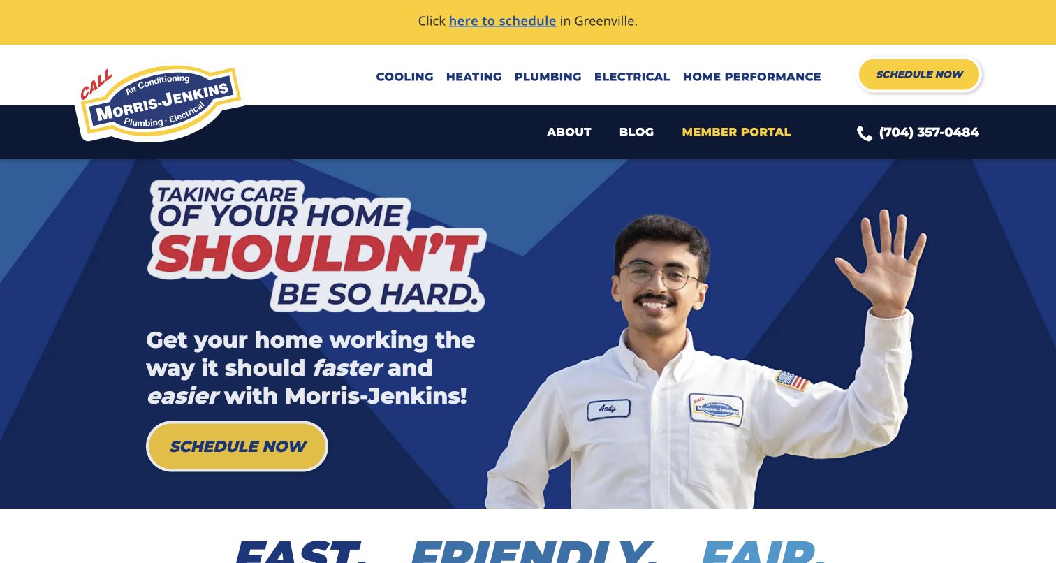
Morris-Jenkins uses a bold blue and yellow identity, a uniformed person, and conversational language rather than an anonymous photograph of insulation. Home Performance sits in the main navigation beside the familiar heating and plumbing categories. That is the useful connection for this collection: its current Charlotte service page explicitly explains the attic insulation offering, while the captured homepage remains a broader introduction. The regional scheduling notice also distinguishes Greenville from the main contact journey. The page feels approachable without requiring the visitor to understand a material or construction detail before starting.
What you can learn
Give a less familiar service a stable home in the navigation, then explain its actual scope on a dedicated page. A memorable local identity can make an initial conversation feel less intimidating, but friendly branding should support an accurate explanation rather than substitute for one. This is an editorial choice about communication, not an assessment of installation quality.
Pros
Home Performance is a visible first-level route rather than an unexplained item buried in a footer.
The recognizable palette, person-led image, phone number, and scheduling action form a coherent regional introduction.
Cons & considerations
If attic insulation is the visitor’s only concern, the broad home-services headline adds another navigation step.
If service availability differs between the displayed regions, each destination must preserve the selected location clearly.
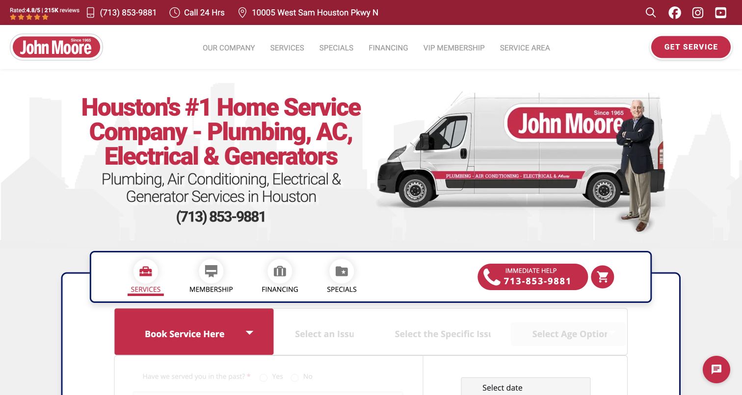
John Moore pairs its Houston introduction with a branded van, a person, and a prominent phone number. The captured page gives substantial space to a service-booking interface immediately below the opening, including a choice of issue before later scheduling steps. Its current air-conditioning page explicitly includes Attic Insulation as a service destination; the pictured homepage is not an attic project photograph. The useful design contrast is between recognizable local identity and a more elaborate intake system. A person who knows the company can begin quickly, while an uncertain homeowner may need more explanation before choosing the correct issue.
What you can learn
Keep the company and region recognizable, then make the booking vocabulary understandable to someone who has not diagnosed their house. A progressive form can avoid showing every field at once, provided there is a plain-language option and a normal contact alternative when the visitor cannot confidently classify the request.
Pros
The regional introduction and branded vehicle connect the website to a recognizable service business.
The phone route remains visible alongside the more structured online service interface.
Cons & considerations
If a homeowner cannot identify the relevant issue, the staged booking choices may feel premature.
If insulation is a priority service, a general HVAC route may make its explanation harder to discover from the homepage.
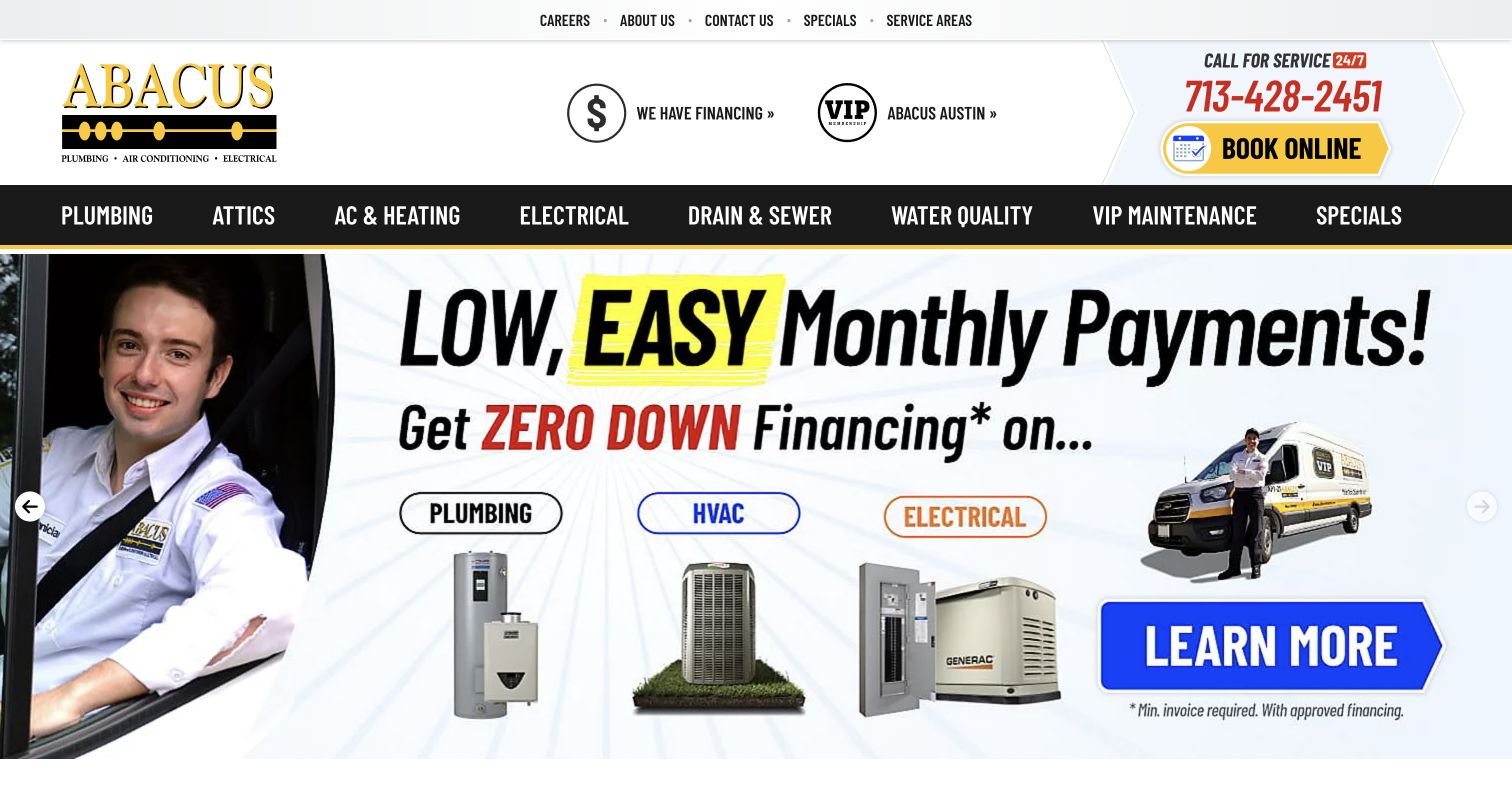
Abacus makes Attics a first-level navigation item alongside plumbing, air conditioning, and electrical work. That naming is more direct than asking a visitor to infer the service from an HVAC label. The captured carousel slide, however, concentrates on monthly-payment messaging and several other service categories. A current first-party estimate page explicitly names an attic insulation project and provides contact routes, establishing the relevant offering without turning the homepage image into evidence of completed work. The contrast is useful: the navigation answers what the company does, while the dominant promotion answers a different financial question.
What you can learn
A clearly named attic route can do valuable work even when the business offers many other services. Keep that route stable across promotional changes, and place financing information where its conditions can be read. Do not let a payment-led campaign replace a substantive explanation of the assessment and quotation process.
Pros
Attics has a direct position in the main service menu rather than relying on technical terminology.
The header separates phone contact, online booking, service areas, and the wider company navigation.
Cons & considerations
If the current carousel is unrelated to attic work, its large footprint delays the relevant service explanation.
If financial promotions are emphasized, important eligibility and scope conditions need equally usable text rather than image-only wording.
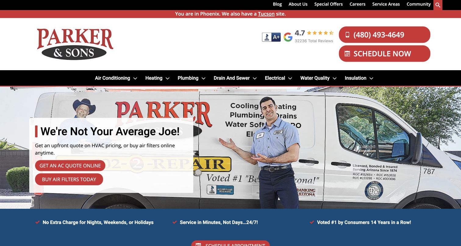
Parker & Sons identifies Phoenix in a thin regional notice and offers a separate route to Tucson. Insulation appears directly in the black service-navigation bar, even though the captured hero promotes other HVAC tasks. The current insulation destination explicitly describes its attic offering and separates further information about adding or removing insulation. In the screenshot, a branded vehicle and a person carry the visual identity, while phone and scheduling controls occupy a distinct header area. This is a useful example of keeping a secondary service findable without pretending every campaign slide is about that service.
What you can learn
Treat region and service as separate choices that remain clear throughout the journey. A broader home-services homepage can support attic inquiries when the insulation label is visible and the destination explains the actual local offering. Keep any performance, warranty, and promotional claims specific to their approved conditions rather than transferring them from one service to another.
Pros
Insulation is named at the same navigation level as the established home-service categories.
The Phoenix notice and Tucson link make the website’s regional context visible before contact.
Cons & considerations
If an insulation visitor follows the hero’s HVAC-specific action, they may enter an unrelated journey.
If the company changes region automatically, the chosen location and phone routing must remain understandable.
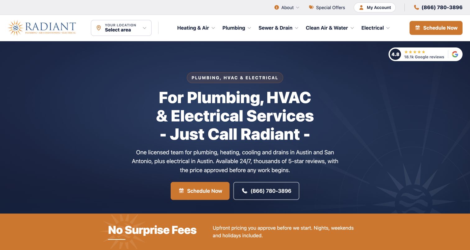
Radiant’s captured homepage uses a dark blue field, orange actions, and a centered service headline rather than a busy collage of equipment. A location selector and clear call or scheduling actions establish the main tasks. Its current insulation page discusses attic-related work within a broader home-insulation offering, so this is a reference for the route into that explanation rather than an attic-specific homepage. The uncluttered opening gives the company a consistent identity. At the same time, the service’s position within the larger heating and air structure shows why descriptive destinations matter for visitors who arrive with a narrower concern.
What you can learn
Let the general homepage establish who can help and where, then make the insulation destination answer the specialist questions. Consistent visual language can join those stages without repeating the same broad headline everywhere. Explain the inquiry process before asking the visitor to choose a technical treatment or assume a diagnosis.
Pros
The limited palette and simple opening make the phone and scheduling choices easy to distinguish.
The location control is separate from service navigation, helping the visitor understand both decisions.
Cons & considerations
If attic work is a major inquiry type, the broad hero does not immediately establish that scope.
If insulation sits inside a large service hierarchy, clear labels and internal links become essential for discovery.
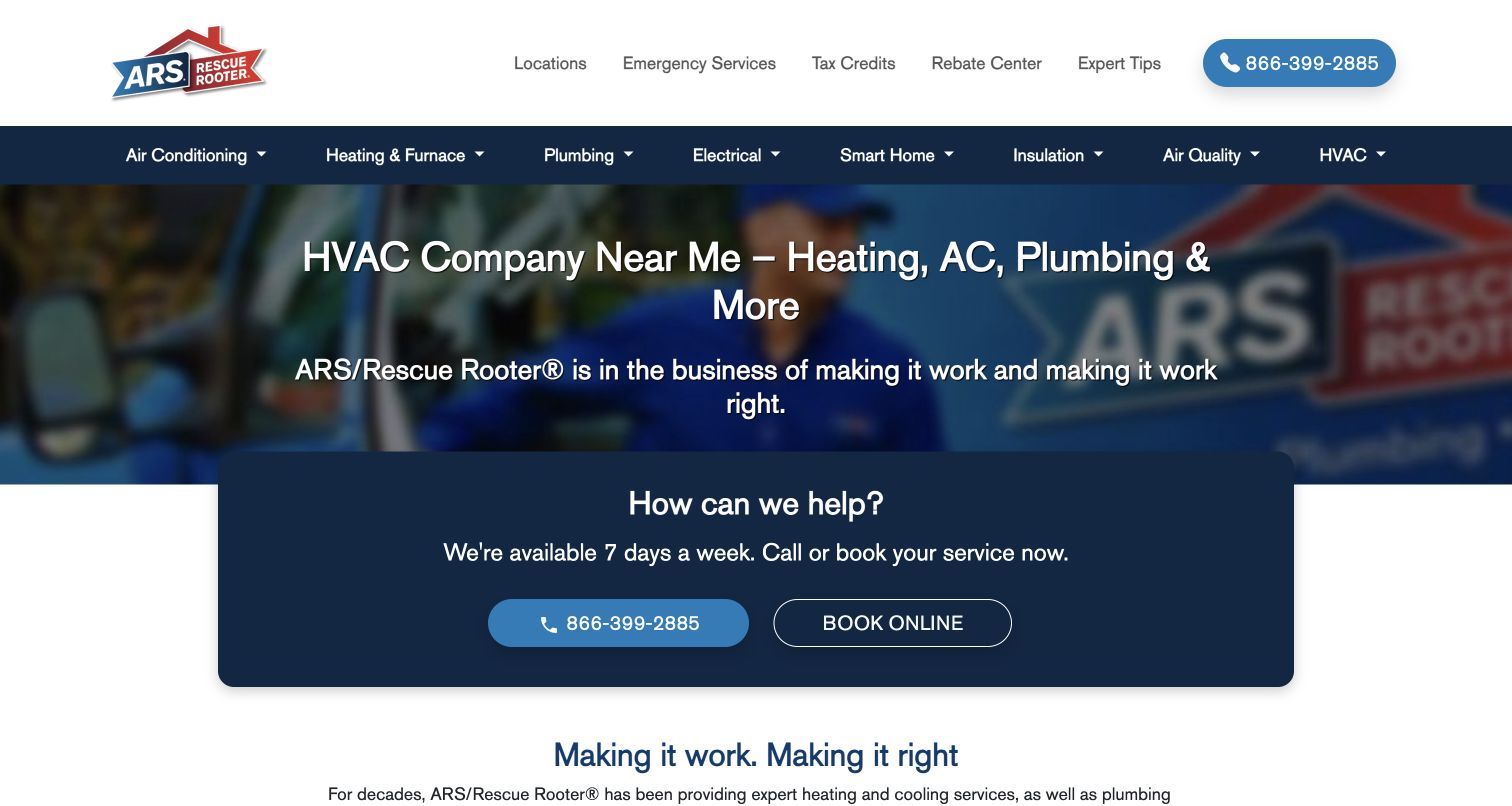
ARS / Rescue Rooter places Insulation directly in its main blue navigation, next to other home-service categories. The captured opening then concentrates on a short company introduction and a large phone-and-booking panel. Its Houston South service page explicitly describes attic insulation for the Webster area, providing a genuine local example of the offering; that does not establish every branch’s availability. The design is worth studying because the national homepage does not need a separate promotional tile for every service to keep the category visible. The local page must finish the job by establishing the applicable region and contact.
What you can learn
For a multi-location business, make service discovery simple but confirm local scope before treating an inquiry as bookable. The same insulation label can lead to different regional arrangements. A useful website distinguishes the brand-level introduction from the office that will actually discuss the property, without implying universal service availability.
Pros
Insulation is a direct, readable top-level destination rather than an inferred HVAC capability.
The main contact panel offers a phone alternative to the online booking route.
Cons & considerations
If the national navigation is read as a promise of local availability, visitors can develop incorrect expectations.
If the broad homepage is the only landing destination, a narrow attic question still requires further regional context.
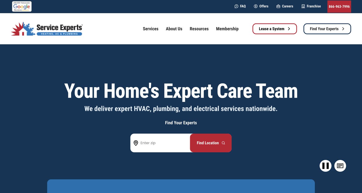
Service Experts makes a ZIP-code location search the central action in its captured opening. The broad headline identifies home services, while the header separates finding a provider from leasing a system. Its current dedicated attic-insulation page explicitly names the installation offering and describes multiple material categories. The pictured homepage therefore demonstrates network routing, not a specific local insulation project. This is a useful reference when the same brand covers many territories and service combinations. It also exposes an important dependency: the visitor needs the location result to lead to relevant scope rather than a generic list of nearby offices.
What you can learn
Use a location-first interface when geography genuinely determines the next step, and explain why the location is needed. Preserve that choice on the destination and offer contact alternatives if a lookup fails. A national service description should not be treated as proof that every local office offers every named installation option.
Pros
The location search has one conspicuous place in the opening instead of competing with many forms.
Finding a provider and leasing equipment are labeled as different journeys in the header.
Cons & considerations
If the visitor wants to understand the insulation service first, location entry alone does not answer that question.
If service availability varies, the destination must confirm attic work rather than simply return the nearest office.
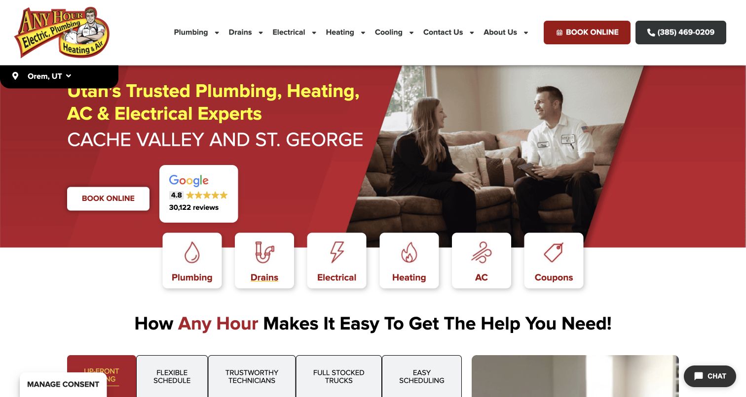
Any Hour’s retained homepage identifies Orem, Utah and presents plumbing, drains, electrical, heating, and air-conditioning choices as large illustrated cards. The captured composition places an in-home conversation beside the booking action, giving the service relationship a human context. Its current Phoenix first-party destination explicitly offers blown-in attic-insulation installation; the Utah homepage image does not establish that offering in Utah. This distinction is the reason to study the example carefully. Regional brands need to connect a broad home-service identity with the correct local service description, rather than letting a single attractive homepage imply identical scope everywhere.
What you can learn
Make the selected region visible and keep service availability attached to that region. When an offering is documented for one branch, link to that branch’s explanation instead of generalizing it across the brand. Ordinary navigation and a telephone alternative can help a visitor recover if the first region or category is wrong.
Pros
The selected location is visible in the captured interface rather than concealed in a footer.
Large service cards provide an additional route beyond the text menu and booking button.
Cons & considerations
If a Phoenix attic inquiry lands on the Utah homepage, the pictured regional context can confuse the next step.
If the attic service exists only on a branch page, broad category labels may not make it easy to locate.
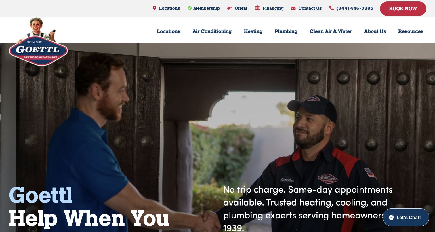
Goettl’s captured homepage uses a branded technician and customer scene, a large white headline, and a clearly separated utility row. Locations, contact, booking, and the main service categories remain accessible above the photograph. A current San Antonio first-party page explicitly names blown-in attic insulation under the wider clean-air-and-water structure. The homepage itself is broader, and its compact chat launcher remains ordinary site interface rather than an open conversation obscuring the content. This is a useful reference for maintaining a memorable brand while giving a specialist service a substantive destination, although the category name does not immediately explain insulation.
What you can learn
A strong identity can work across several service lines, but the less obvious offering still needs a plain-language destination and local scope. Give attic-insulation visitors a direct route from relevant content rather than expecting them to infer it from a broad category. Keep regional promotions and their conditions attached to the actual location.
Pros
The header keeps locations and contact separate from the main service categories.
The person-led photograph and established colors give the broad service introduction a recognizable identity.
Cons & considerations
If a visitor is looking only for insulation, the broader category wording may not be the expected label.
If regional offers appear throughout the site, they must not imply the same terms or availability in every territory.
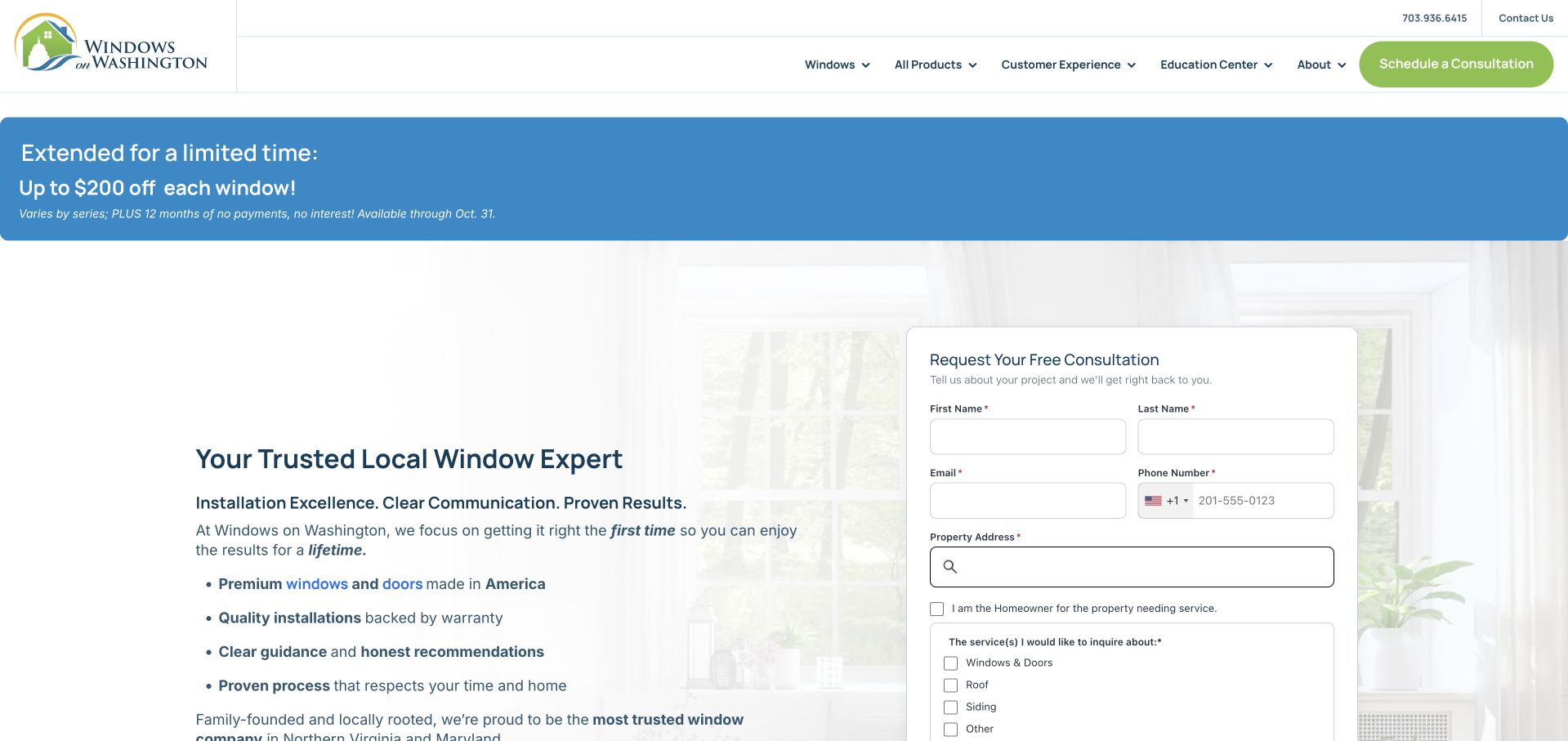
Windows on Washington pairs a local window-company introduction with an immediately visible consultation form. An Education Center and Customer Experience route sit in the navigation, while the form asks about the property and broad service categories. Its current roofing page explicitly invites a discussion of attic insulation and air sealing, and the team page names an insulation specialist. The screenshot remains a window-led homepage, not a specialist insulation landing page. Its relevance lies in how a broader regional contractor begins a property conversation and provides further educational routes, including the tradeoff of giving the form more prominence than the narrower service.
What you can learn
When attic work is part of a wider home-improvement business, make the relationship explicit without claiming every service is the same project. A consultation form can accept an uncertain inquiry, but its options should help rather than require a forced fit. Link to accurate scope and people information before asking for detailed property data.
Pros
The consultation route is visible beside the introduction instead of requiring a separate contact-page search.
Education and customer-experience sections give visitors routes beyond promotional claims.
Cons & considerations
If the visitor seeks only attic insulation, the window-led headline and broad service choices may obscure relevance.
If an initial inquiry requires a full property address, the page should explain why and provide a simpler contact alternative.
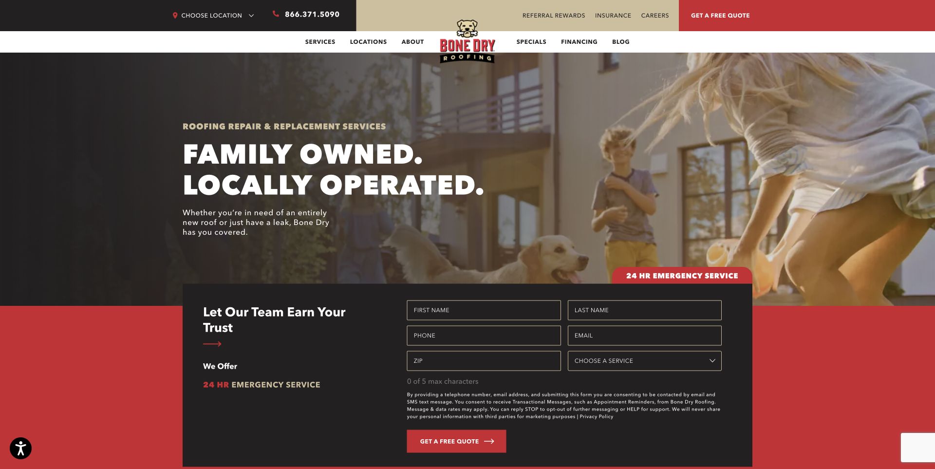
Bone Dry’s retained homepage combines a roof-services headline, a household scene, regional selection, and a substantial inquiry form. The captured opening is deliberately about the broader roofing business; its current Indianapolis page separately names attic-insulation work and places it within a wider roof-system discussion. That relationship makes the example relevant here without presenting the photograph as an insulation case study. The form gives a service choice and ZIP field, which can help route a question, but it also creates a relatively large intake block before the visitor has read much about the narrower offering.
What you can learn
Explain the relationship between adjacent services while keeping their actual scopes distinct. A roofing company can offer an attic-insulation destination without turning every roof inquiry into an insulation recommendation. Let the relevant local team discuss the property, and distinguish the initial request from a confirmed scope, quotation, or booking.
Pros
The location selector and service-choice field recognize that the inquiry needs routing.
The current local insulation destination gives the related offering an explicit explanation beyond the broad homepage.
Cons & considerations
If the homepage is the only entry point, the roof-focused hero does not immediately answer an attic-only question.
If the form asks for several details before explaining scope, an uncertain visitor may prefer a simpler initial conversation.
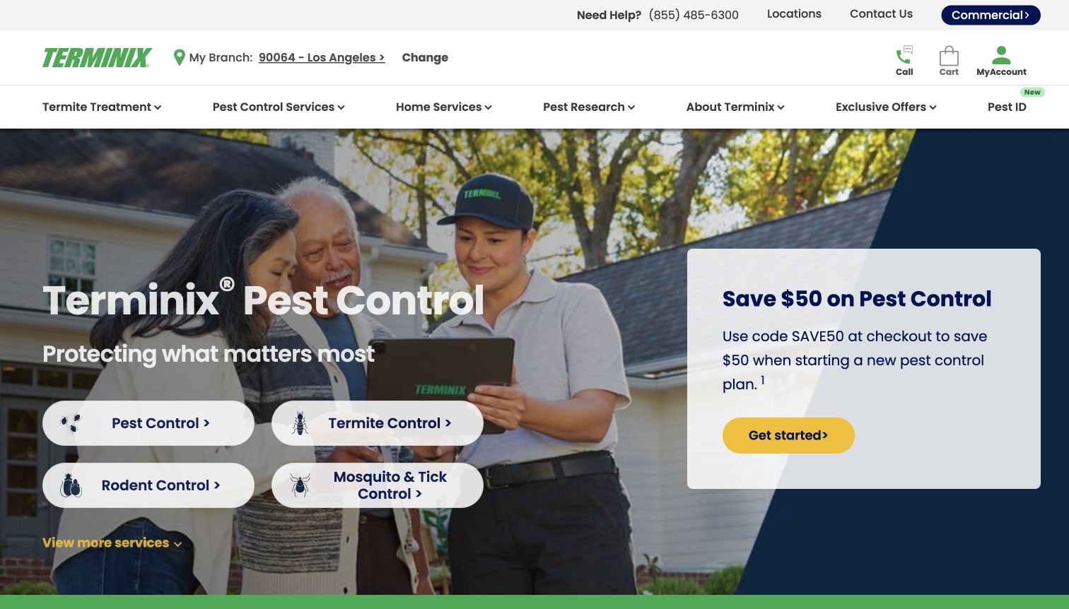
Terminix’s captured homepage leads with pest categories, a customer-and-technician scene, and a separate promotional panel. Home Services appears in the navigation rather than competing with every pest treatment in the hero. Its current attic-insulation page explicitly describes that offering and gives it a dedicated process and inquiry destination. The relevant design lesson is the separation between a familiar primary business and an adjacent home service. The homepage’s branch selector is also visible, which matters when a national brand needs to route a local property question. The retained image is the original pest-led view, not a new attic capture.
What you can learn
Give an adjacent offering a clear service family and its own explanation. A company’s main brand association may help recognition, but it should not leave visitors guessing whether attic insulation is actually offered. Keep claims about materials, pests, and savings within their specific approved conditions rather than merging them into a universal home-protection promise.
Pros
Home Services provides a distinct route rather than placing insulation among individual pest treatments.
The visible branch choice helps establish the local context for an inquiry.
Cons & considerations
If a visitor arrives with an insulation question, the large pest-control promotion can delay relevance.
If several different services share a quote journey, the selected service and local availability need explicit confirmation.
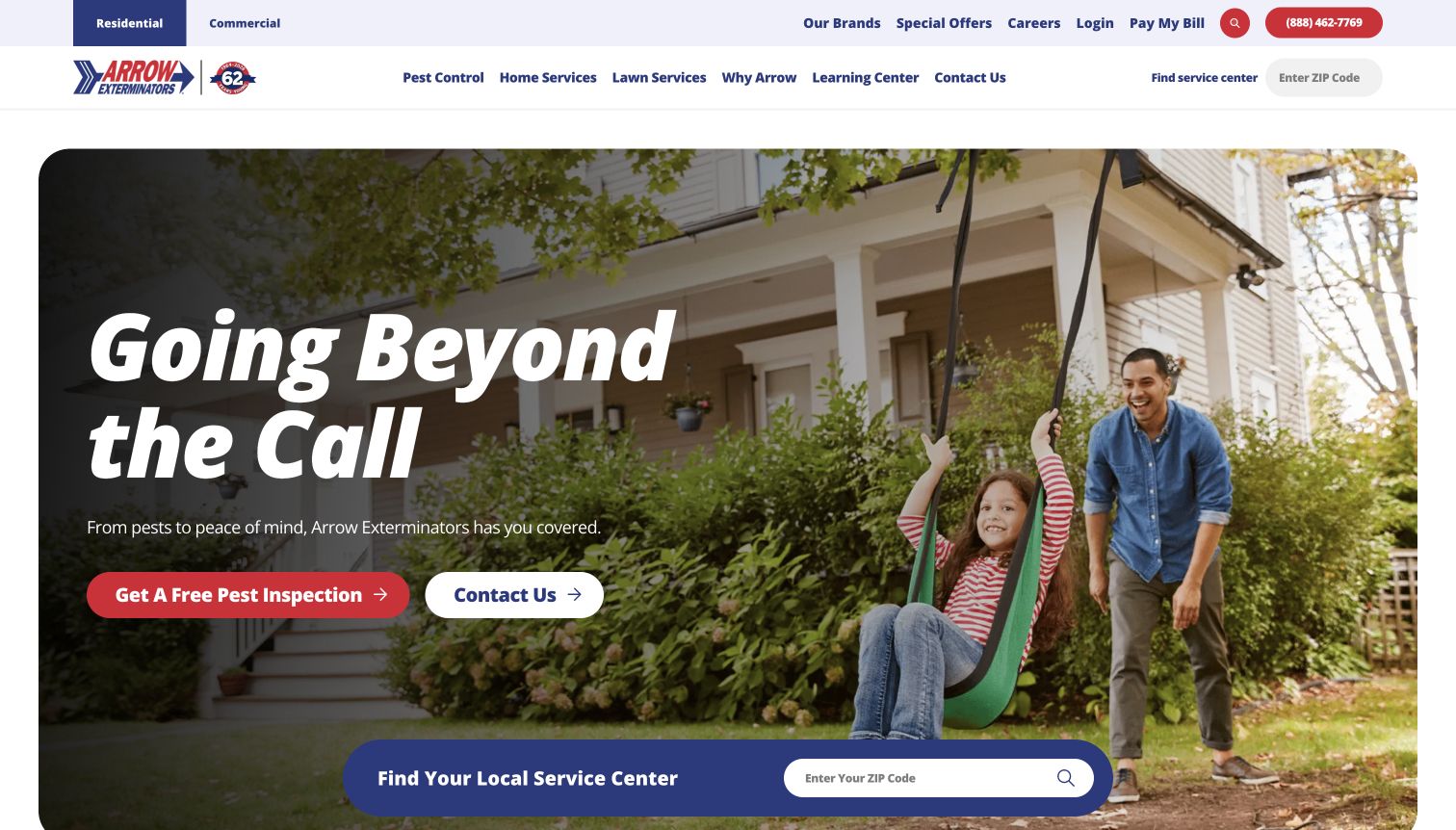
Arrow Exterminators uses a rounded household photograph, a short brand introduction, and a prominent local service-center finder. Home Services is a separate menu item beside pest and lawn categories. Its current first-party insulation destination explicitly describes the company’s home-insulation offering, and the home-services overview states that availability varies by location. The captured homepage is broader than attic work, so its main value is the way it structures discovery and regional routing. The central finder provides an obvious next task, although the hero’s inspection wording is pest-led and does not by itself explain an insulation assessment.
What you can learn
Keep related services organized in a way a non-specialist can navigate, then confirm regional availability before promising the next step. A local finder is useful when its result leads to the requested service rather than a generic office page. Use a separate approved explanation for insulation instead of treating pest-control language as interchangeable.
Pros
Home Services has a readable first-level position alongside the established pest and lawn categories.
The large service-center finder makes geographic routing a visible task.
Cons & considerations
If the visitor follows the pest-inspection hero action, an attic question may need reclassification later.
If the local center does not offer insulation, the destination must make that limit clear before collecting a detailed inquiry.
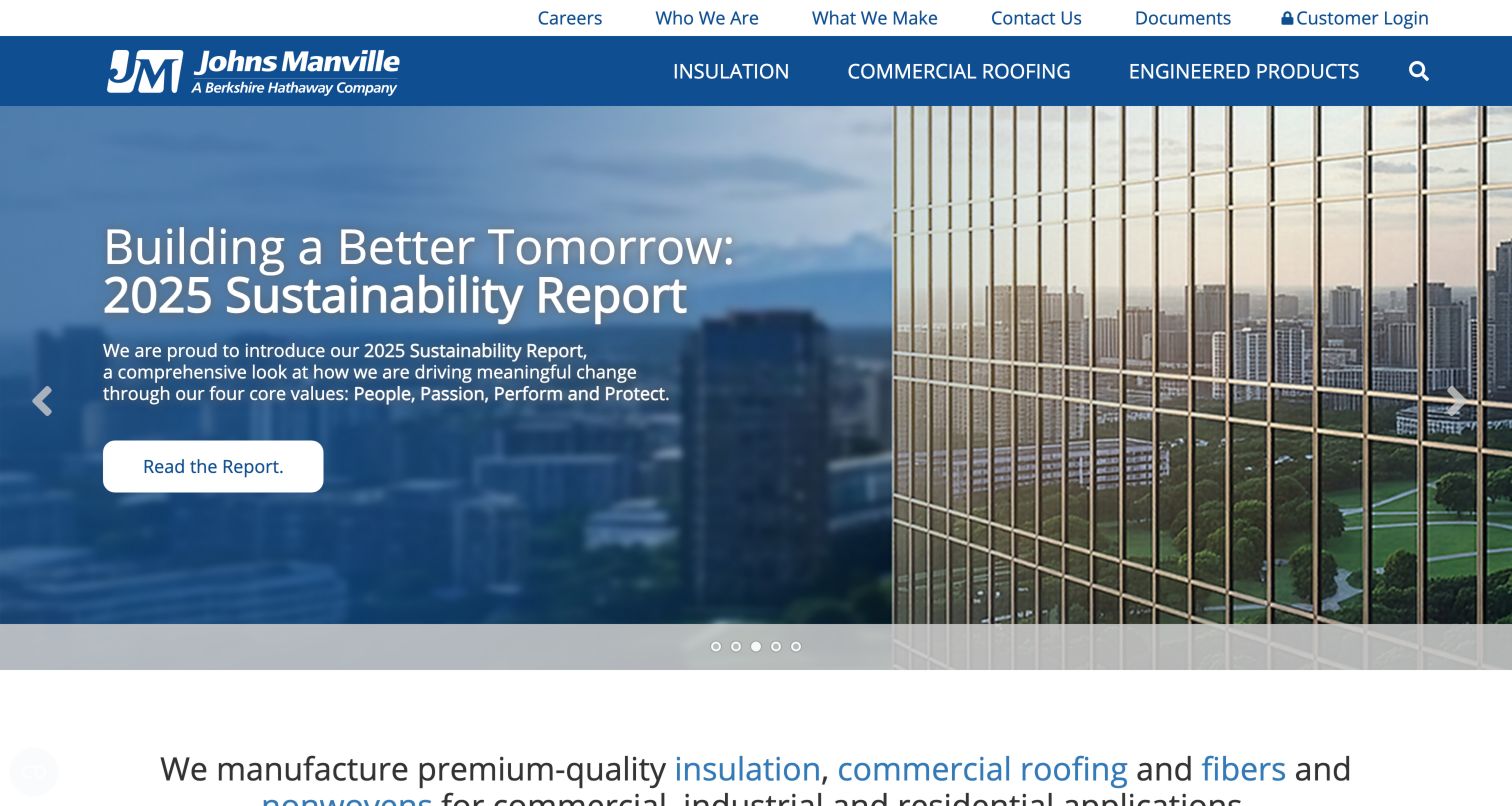
Johns Manville’s retained homepage presents three main business divisions and a separate utility row for documents, contact, and customer access. The captured slide promotes a company report rather than a particular attic product. Its current homeowner destination explicitly organizes products for insulating an attic and includes documentation and a contractor-finding route. This is a manufacturer example, not a local installer recommendation. The useful contrast is between a broad corporate front door and a specific application journey: visitors can investigate products and resources without the website pretending that a corporate image establishes suitability for their individual property.
What you can learn
For a product manufacturer, make the building application and audience clear before presenting branded products. Keep homeowner learning, professional documentation, and finding a supplier or contractor as distinct tasks. A service company borrowing the structure should adapt it to its actual assessment process rather than copying technical recommendations or implying a manufacturer relationship it does not have.
Pros
The main divisions and document utility link give different audiences recognizable starting points.
The dedicated attic destination connects a real application with product and support routes.
Cons & considerations
If a homeowner begins at the corporate homepage, the large report feature delays the relevant application information.
If product guidance is read as a property-specific recommendation, its scope and need for qualified assessment must remain clear.
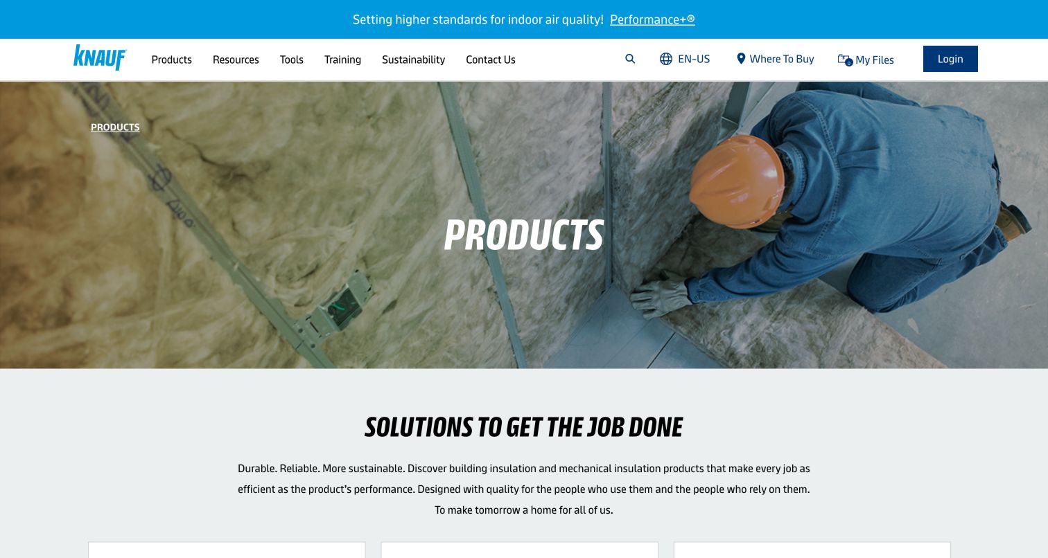
Knauf Insulation’s retained North American product page begins with installation imagery and clear navigation for resources, tools, training, and purchasing locations. The current attic application page connects that building location with specific product categories and supporting information. The pictured page is a manufacturer catalog, not an installation contractor’s homepage or a completed attic case study. Its value for this collection is the way product vocabulary and practical resources can sit together. Someone who knows a product name can follow the catalog, while someone who starts with the attic as a place has an application-oriented route.
What you can learn
Offer application-based navigation alongside product names when visitors may know the problem location but not the brand vocabulary. Keep professional documents and learning resources identifiable. Do not turn a product selector or calculator into an automatic determination that a specific material or quantity is right for an unseen property.
Pros
Resources, tools, training, and purchasing routes are distinct rather than mixed into one long product menu.
The attic application destination gives unfamiliar product names a relevant building context.
Cons & considerations
If a visitor needs a local assessment rather than product research, the catalog is not a substitute for that service.
If technical tools appear authoritative, their assumptions and limitations need to remain accessible with the result.
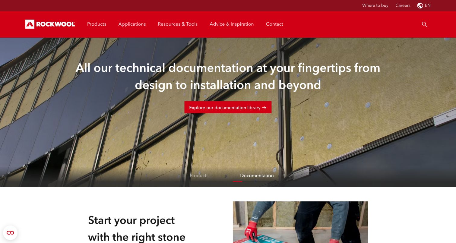
ROCKWOOL North America’s retained homepage gives technical documentation a major feature position and keeps Products, Applications, and Resources & Tools in the main navigation. Its current attic destination explicitly links the application to products, documentation, and support. The screenshot is a manufacturer’s broader building-material introduction, not evidence of a particular home installation. What makes it useful here is the separation of learning by application from searching by product name. The homepage also gives purchasing and support their own routes, recognizing that a visitor may be researching before they are ready to contact a supplier.
What you can learn
Make documentation part of the navigation architecture rather than an afterthought below a promotional claim. A manufacturer can explain an attic application while preserving routes to qualified technical support and local purchasing information. A contractor should borrow that clarity, not assume that displaying the same material establishes suitability, performance, or a commercial relationship.
Pros
Applications and documentation are visible alternatives to starting with a product name.
The dedicated attic page connects learning, product investigation, and support as separate tasks.
Cons & considerations
If a homeowner wants a local installation conversation, the broad manufacturer homepage adds research steps first.
If general material claims are reused in a contractor’s marketing, they need review for the actual product, assembly, and project scope.
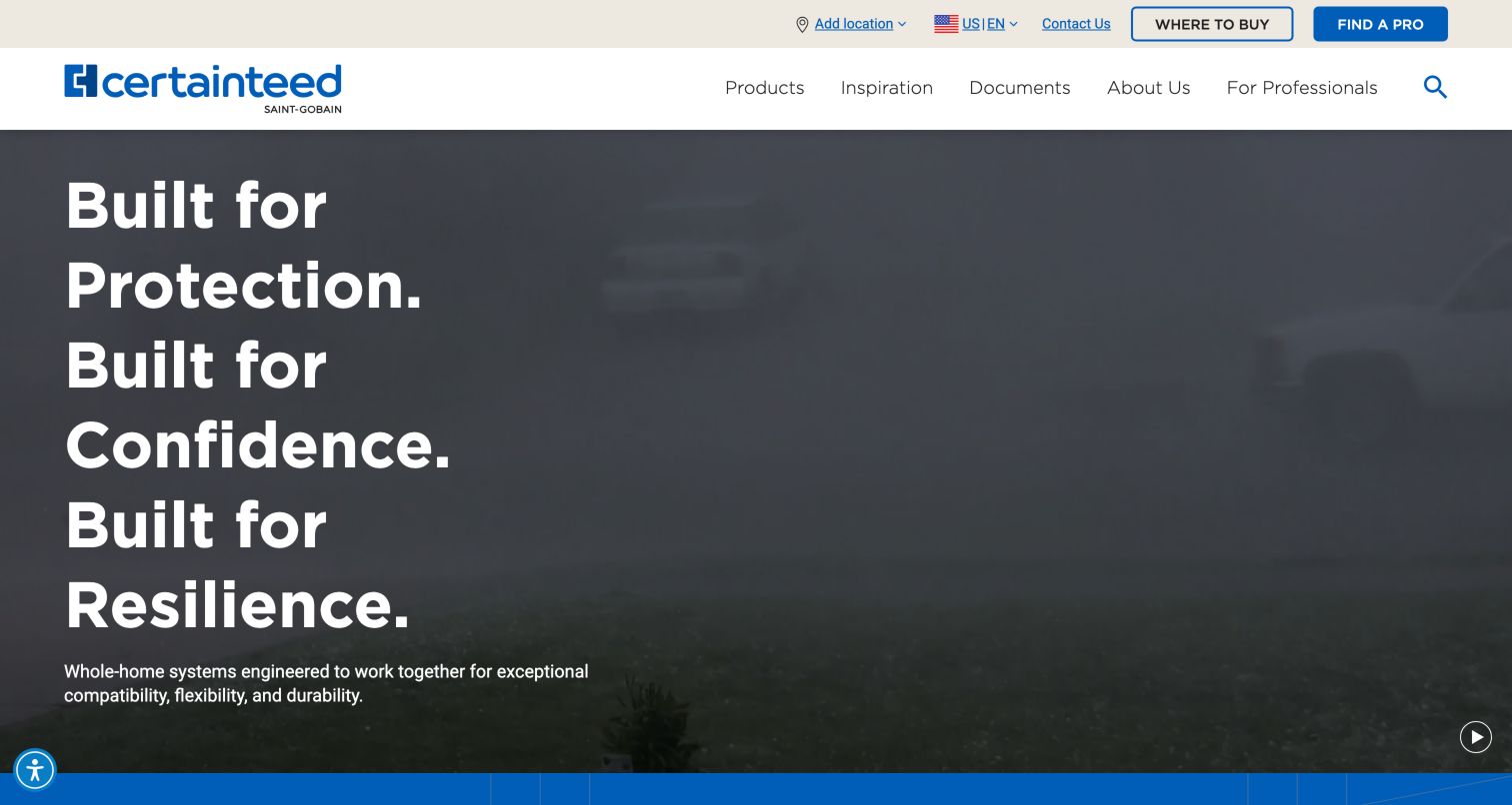
CertainTeed’s retained homepage emphasizes a coordinated whole-building identity with large typography and direct utility links for buying products and finding a professional. Documents has its own main-menu position. Its current attic-insulation destination names several product families and shows the intended application context. This is a manufacturer reference rather than a local installer example. The design problem is familiar to broader service businesses: an ambitious brand statement can establish identity, but useful category destinations must quickly turn it into something concrete. The separate professional and purchasing routes also show that different visitors may need different kinds of help.
What you can learn
Join the broad brand story to specific application destinations and make the next task explicit. Product documentation, purchasing, and finding professional help should not be collapsed into the same vague action. When borrowing this approach for a local company, state the work actually offered rather than implying the complete manufacturer portfolio is available.
Pros
Documents, purchasing, and professional-search routes have clear places in the navigation.
The attic destination names concrete product families rather than relying only on a general building promise.
Cons & considerations
If the visitor starts at the corporate hero, the abstract opening delays attic-specific information.
If a local contractor uses manufacturer imagery, permission and the actual relationship must be clear rather than inferred from a logo.
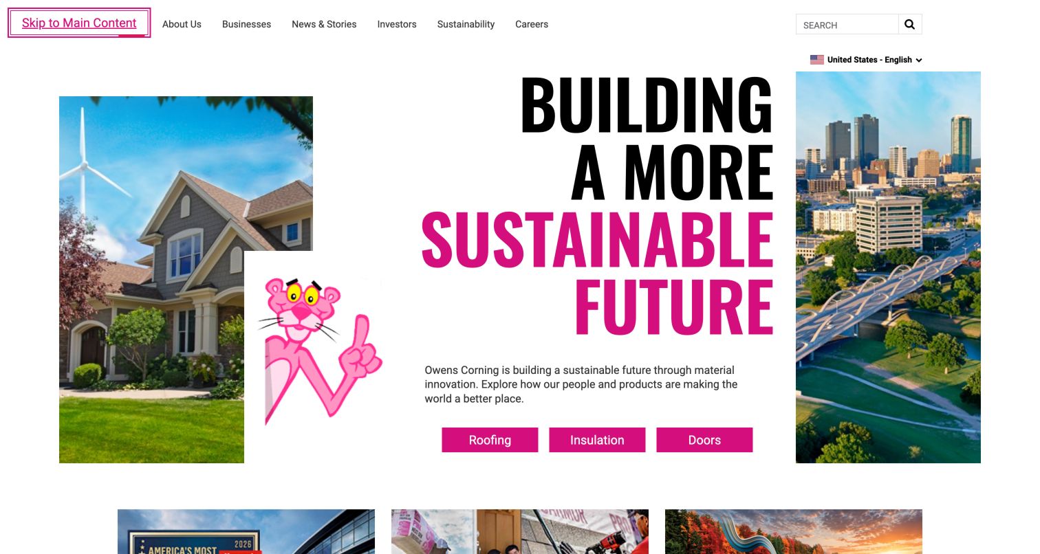
Owens Corning’s retained corporate homepage combines its recognizable pink identity with oversized type and three concise business choices: roofing, insulation, and doors. A utility-style navigation also serves company, investor, and career audiences. Its current residential-attic destination provides a more specific product-research path with material and format filters. The screenshot therefore shows the corporate front door, not a home assessment or installation outcome. The useful lesson is how a broad organization can provide a small number of obvious exits toward practical tasks, while retaining a distinct brand that does not depend on a generic construction photograph.
What you can learn
Use a few clearly named routes to move visitors from broad recognition toward the information they actually need. Application pages can then organize products and documentation without crowding the corporate opening. Keep product research separate from a professional recommendation for a particular home, and make purchasing or finding help a distinct next step.
Pros
The insulation business has a direct action alongside the other major product divisions.
The dedicated attic destination offers a narrower application context than the corporate homepage.
Cons & considerations
If a homeowner needs an installer or assessment, the corporate introduction does not provide that answer by itself.
If product filters imply suitability, visitors still need the applicable documentation and qualified project-specific guidance.
Kegan is a freelance web designer and developer with 15+ years of experience helping businesses turn complicated website requirements into clear, maintainable digital experiences. He works directly with clients from planning and design through development, launch, and ongoing support.
For attic insulation website design, his development approach focuses on clearly qualified insulation and attic service scope, local availability, product and installation distinctions, project context and useful assessment enquiries without unsupported energy or health guarantees. The scope can be a targeted improvement or a complete custom build, with responsive layouts, thoughtful content structure, and integrations chosen around the people using and maintaining the site.
Show 3 other attic insulation website designersHide other attic insulation website designers
Plan an attic insulation website around informed inquiry rather than instant diagnosis
Start with the questions a property owner already has
Interview the people who answer the company’s calls and record the questions they repeatedly explain before a visit is arranged. A homeowner might be checking local coverage, wondering whether an existing material is within scope, or trying to understand whether the company handles a particular kind of property. They may not know which technical service name applies. Build the opening content around those everyday questions instead of requiring the visitor to diagnose the building. A short explanation of who the company helps and how an inquiry begins creates a more useful starting point than a dramatic promise about every home’s energy bill.
Identify the audiences the business genuinely serves and any differences in their inquiry routes. A homeowner, a landlord, and a renovation contractor may have different information available and different responsibilities. Create separate pages or form routes only when the distinction helps a real visitor task. Do not invent specialist experience or a new service category to fill a navigation grid. Test the proposed labels with someone outside the company. If a visitor cannot tell whether a service is an assessment, installation, or another task, improve the description before adding more promotional language or interaction.
Define service boundaries with the appropriate expert
Ask a qualified person within the business to approve each public service description. Insulation installation, existing-material removal, air sealing, ventilation-related work, and other building services are not interchangeable simply because they share an attic setting. Explain what this company actually offers and what requires further professional assessment. Keep technical recommendations and code-specific requirements out of general design advice. The page should not prescribe a material, thickness, ventilation arrangement, or work sequence for an unseen property. An accurate explanation of the company’s role is both more useful and more defensible than a one-size-fits-all recommendation.
Give the most important service questions substantive destinations. A short overview can link to fuller approved explanations, relevant project examples, and the right inquiry route. Avoid building many nearly identical pages that swap a material or town name without adding useful information. If the company does not handle a particular condition, say so in an appropriate place and let the office discuss the next step. Do not turn an ordinary description of building discomfort into a warning that a visitor must urgently buy insulation. Keep a private approval and review record so the website changes when the actual scope changes.
Make the professional assessment process understandable
Describe what a visitor can expect after making contact, using the business’s actual process. Explain whether the initial response is a phone conversation, a request for information already available, or arranging a professional visit when appropriate. Distinguish an assessment request from a confirmed booking or a final quotation. Avoid promising an exact price or result from a few online fields if the business cannot reliably provide it. A readable process section should make the conversation less mysterious without becoming a tutorial for inspecting a building or handling unfamiliar materials.
Keep preparation information under professional control. Do not ask a homeowner to climb into an attic, move equipment, identify material, or take photographs from an unsafe location for the sake of a lead form. If the company accepts documents or pictures, make them optional and ask only for items the visitor already has and is authorized to share. Provide a normal way to explain access needs or limitations. A well-designed inquiry supports the office in arranging an appropriate next step; it should not make the customer responsible for technical checks that belong to trained personnel.
Use real projects to explain the company’s role
Create a structured project record containing an approved property description, the work actually delivered, publication permissions, and any limitations on naming the client or location. Select photographs that help the visitor understand context rather than simply showing a large expanse of material. A broad property view and a carefully reviewed work image can serve different purposes. Have an appropriate company expert check the captions so a picture is not presented as evidence of an outcome it cannot establish. Do not infer code compliance, safety, measured energy savings, or a particular thermal result from how a finished image looks.
If publishing a case study with measured results, identify the actual source, conditions, relevant scope, and limitations under an approved review process. Do not transfer one property’s result to every homeowner reading the page. Before-and-after imagery needs honest labels and a real relationship between the photographs, not contrasting lighting that implies a technical improvement. Avoid using customer utility bills or private property documents in public examples without explicit permission and appropriate privacy review. The most useful project story describes a genuine problem discussion and delivered scope without turning the marketing page into an engineering assessment.
Give regional availability and credentials practical meaning
State the genuine operating area in readable place names and distinguish it from the office address and past project locations. If coverage depends on project type, let a visitor ask rather than publishing an overly broad map. For a multi-location business, identify the selected office and make it easy to correct an inaccurate selection. Do not assume a national service list establishes every local offering. Keep the same regional information consistent in service pages, forms, phone links, and the footer so visitors do not receive conflicting signals about who can handle the inquiry.
Use the correct business identity and appropriately scoped credentials. A manufacturer relationship, an association membership, a license, and an individual qualification are different kinds of evidence. Explain what a displayed mark actually represents and link to a suitable verification source where available. Keep claims current and do not invent an accreditation merely because a design needs a trust badge. Attribute customer comments accurately, and make clear when they concern a different service within a larger business. A restrained evidence section can help a homeowner investigate the company without pretending the website-design collection certifies its work.
Keep the initial inquiry proportionate and truthful
Decide what the office genuinely needs to begin a conversation. Name, preferred contact method, location, property type when useful, and a short description may be enough. Do not make the visitor provide exact attic dimensions, material classifications, technical performance targets, or health information simply to ask a question. An option to describe the concern in ordinary words is often more useful than a compulsory list of treatments. Give people a phone route and a way to discuss accessibility needs, and keep marketing consent separate from the basic act of requesting a response according to the organization’s approved policy.
Specify server-side handling before launch: spam checks, delivery or storage, internal responsibility, access controls, and error behavior. Confirm that a submission was actually accepted before showing success, and state the real next step rather than implying that the work is booked or a savings claim has been validated. Make field errors readable and specific. Test a clearly marked internal request through the complete system and check only the authorized test record. A short form that reaches the right person reliably is more useful than a complicated calculator or polished animation with an unverified delivery path.
Plan readable content, realistic images, and routine maintenance
Build the page hierarchy around information that helps the visitor decide whether to inquire: scope, region, process, project context, and contact. Keep long technical explanations reviewed and structured rather than placing a wall of text over a photograph. Use real text for important claims, clear headings, meaningful field labels, and readable contrast. Optimize approved images for their actual display contexts and check the layout while they load or fail. Test the menu, links, and form with a keyboard and on phone-sized screens. Do not infer accessibility or performance conformance from a template, plugin, or attractive screenshot.
Assign an editorial owner for service changes, contact details, project permissions, credentials, and time-sensitive offers. Give any rebate or incentive wording a source, applicable conditions, and a review date; do not assume a program or eligibility remains unchanged. Keep backups, administrator ownership, update responsibility, and a correction route documented. Review recurring inquiry questions with the office after launch and improve missing explanations rather than adding unsupported claims. The durable website is an accurate introduction to a professional service, not an unattended promise that every property can achieve the same outcome from the same intervention.
Separate a useful price conversation from a universal calculator
If cost is a common question, ask the business how it can explain the discussion responsibly. A description of the information needed for a quotation may be more helpful than an instant number that omits assessment, access, or property-specific scope. Publish ranges only when the company has approved a defensible basis and the limitations are clear. Keep promotional financing and incentive information separate from a claim about what an individual homeowner will pay or save. The design should make it easier to request a relevant conversation, not create false certainty from an attractive result panel.
The editing job behind the design
Choose a publishing and inquiry system the company can keep accurate
Use structured service, area, credential, and project records so ordinary updates do not depend on rebuilding a complex page. Choose the platform around the actual editors and approval process rather than a competitor’s technology label.
Keep inquiry delivery and private customer data separate from public project examples. Document server-verified spam protection, access, retention, account ownership, and appropriate handling for optional documents.
Treat images, mobile layout, accessible forms, backups, and updates as separate acceptance tasks. A particular CMS or builder does not establish measured energy results, service quality, or compliance.
Our WordPress website examples offer a separate look at publishing approaches. A visible platform label is evidence for that named page, not a guarantee that the same system will suit your requirements.
Before the public launch
Attic insulation website launch checklist
Verify the correct business identity, working phone, and inquiry destination.
State genuine coverage and distinguish office, service, and past project locations.
Have qualified people approve technical service descriptions and boundaries.
Remove universal material, savings, health, and building-performance promises.
Do not ask visitors to enter an attic, inspect material, or take unsafe photographs.
Explain assessment, estimate, and booking as distinct stages when applicable.
Check permissions and accurate scope for every project image and customer comment.
Keep any measured case-study result specific to its actual evidence and conditions.
Verify credentials, source links, incentive conditions, and time-sensitive offers.
Keep initial intake short and avoid unnecessary technical or health fields.
Test accessible errors, server-side spam checks, delivery, and truthful confirmations.
Check phone-sized layouts, keyboard navigation, image behavior, and contact alternatives.
Assign owners for editorial approvals, updates, private data, backups, and corrections.
These checks are a project checklist, not a performance, legal, security, or accessibility certification. Test real journeys with the people responsible for the website before making claims about the result.
Sources & editorial method
How this collection was selected and reviewed
This collection examines public website communication about attic insulation, combining a fresh reading of first-party service or product destinations with genuine earlier direct screenshots reviewed for this editorial purpose. Original capture dates are preserved; a retained screenshot is not relabeled as a new capture. Broader service homepages and manufacturer catalogs are identified as such. Editors Choice is a communication judgment about the regional Morris-Jenkins website and its visible Home Performance route, not a measured ranking or an endorsement of installation quality. The collection does not recommend a material or method, diagnose a property, or establish energy savings, health benefits, safety, or regulatory compliance.
Each example links to its actual source page. Screenshots are direct browser captures with their own capture dates; moving imagery, announcements and live designs can change. The notes describe observable design choices and conditional tradeoffs, not measured traffic, conversion results, service quality, or accessibility conformance.
Technology labels use public page metadata, asset evidence, or explicitly cited platform documentation. Platform documentation is not a complete current deployment audit. A component reference may be legacy or unused; it is not a complete backend inventory. Unknown stacks are omitted. These sites are editorial examples, not our client portfolio.
Written, Edited and Curated are separate editorial records, not timestamps advanced by a rebuild. Website designs and imagery belong to their owners. See our editorial standards or suggest a correction.
Questions worth asking
Attic Insulation website design questions
Should the website recommend a material before a property is assessed?
The design brief should explain the company’s offered services and direct project-specific questions to qualified professionals. It should not prescribe a material, installation method, or technical target for an unseen property.
Can we publish energy savings in the hero?
Only with an appropriate evidence and approval process that explains the actual scope and limitations. Do not imply that every property will achieve the same result or that a photograph establishes a measured benefit.
Should people upload attic photographs to request a quote?
Keep uploads optional and ask only for material they already have and are authorized to share. Do not instruct visitors to enter unsafe spaces, disturb material, or perform technical checks for the form.
How should a broader HVAC company present insulation?
Give the actual local offering a clearly named service destination with an approved explanation and contact route. Do not assume that a general HVAC label or national service list establishes insulation availability everywhere.
Is a price calculator necessary?
No. A clear explanation of the quotation process and an effective inquiry route can be more useful than an instant figure that cannot account for the property’s actual scope and conditions.
Borrow the clearer service explanation or more useful assessment route. Build the final website around the work your company actually provides, with technical and property-specific judgments kept with qualified people.