Best Dog Grooming Websites of 2026 (27 Real-World Examples)
Dog grooming websites that explain services before the appointment
These 27 grooming websites compare service menus, starting prices, coat-specific explanations, salon or mobile coverage, and appointment requests.
A grooming appointment depends on more than a breed label. The website can explain service types, the factors affecting time and price, and how the business confirms suitability without pretending that an online estimate is a final assessment.
Hair of the Doggy is the editorial choice. Its review focuses on the clarity of the business’s service presentation and next step, not an assessment of animal care quality.
Before the examples
What makes good dog grooming website design in 2026?
Define what the service includes
Distinguish a bath, full groom, tidy, and individual extras in plain language. Explain exclusions or conditions beside the service rather than hiding them in a general policy page.
Qualify starting prices
State the relevant size, coat, condition, or time basis when those factors affect a quote. A prominent low number becomes misleading when the visitor cannot tell which appointment it describes.
Explain the appointment sequence
Show whether the first step requests a time, asks for a consultation, or opens a scheduling provider. Make salon addresses and mobile service areas visible before collecting details.
The collection · 27 examples
27 dog grooming websites worth studying
Compare the examples by the visitor decisions they support. Each review identifies a specific pattern, practical lesson, strengths, and limitations in the directly inspected page.
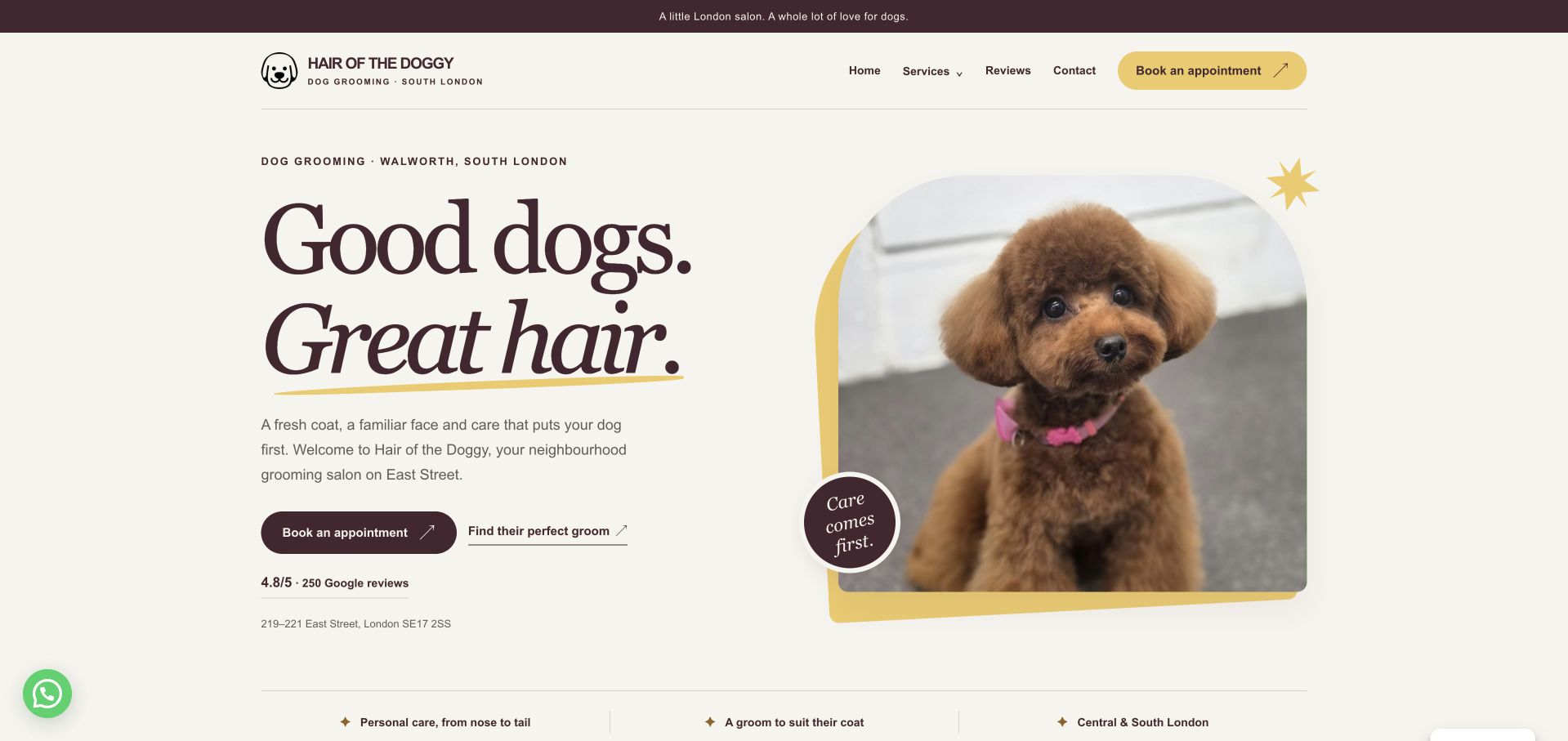
Hair of the Doggy puts its South London location, a groomed-dog portrait, and two useful routes into one composed opening. Visitors can book an appointment or explore which groom suits their dog, while the street address remains visible beneath those choices. Burgundy typography, cream space, and yellow accents give the salon character without obscuring the basic task. The service menu further down distinguishes grooming from other offerings instead of treating every visitor as ready to reserve. This is our editorial choice for the balance between personality and practical orientation. The displayed review score is a site claim, and the initial cookie dialog interrupts the otherwise restrained layout.
What you can learn
Place the salon’s location beside the first decision. Pair a booking action with a service-exploration route so new customers can understand their options before entering an appointment system.
Pros
The address is visible within the opening service introduction.
Booking and service exploration have different, readable actions.
Cons & considerations
The initial cookie dialog covers part of the introduction.
Detailed pricing requires moving beyond the opening panel.
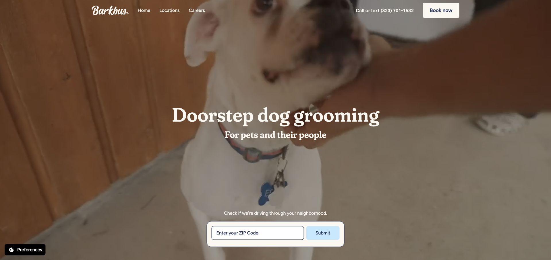
Barkbus makes the mobile nature of its service immediately understandable through moving doorstep imagery and a prominent ZIP-code field. The header keeps a telephone number, call-or-text wording, and booking nearby, while the page explains the single-stylist model and lists the regions it serves. The design addresses a fundamental mobile-service question before presenting a long menu: whether the business can reach the visitor’s neighborhood. That is a useful structural lesson even without submitting the field, which was left untouched during review. The full-height video still delays package details, and the geographic check uses a generic Submit label rather than naming the result it will provide.
What you can learn
Check service coverage close to the first booking invitation. Label the location action with its purpose, and explain enough of the mobile visit that customers understand what happens after their area qualifies.
Pros
The ZIP-code field makes geographic eligibility a primary task.
Call, text, and online booking routes are easy to identify.
Cons & considerations
The large video opening pushes package details below the fold.
The location form’s Submit label gives little outcome context.
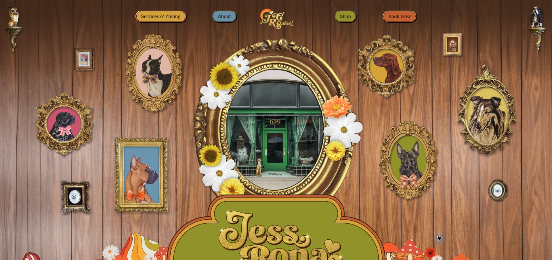
Jess Rona Grooming turns its opening into a decorative salon wall, complete with wood paneling, ornate dog portraits, flowers, and a central view of the storefront. Small colored navigation buttons keep services and pricing, the salon story, shopping, and booking accessible above the spectacle. Further down, the page introduces choosing a service, choosing a groomer, and arranging an appointment as separate steps. This is a distinctive example of using visual personality to signal an experience, rather than relying on a generic pet photograph. The same treatment takes up nearly the whole first viewport, however, leaving the location and explanation of the actual service lower in the page.
What you can learn
A highly expressive salon website still needs plain task labels. Preserve direct routes to pricing and appointments so visitors can enjoy the visual identity without having to decode the decoration to act.
Pros
The visual setting gives the salon a highly recognizable character.
Services and pricing remain explicitly named in the navigation.
Cons & considerations
The elaborate opening delays practical service information.
Decorative elements compete with the relatively small navigation buttons.
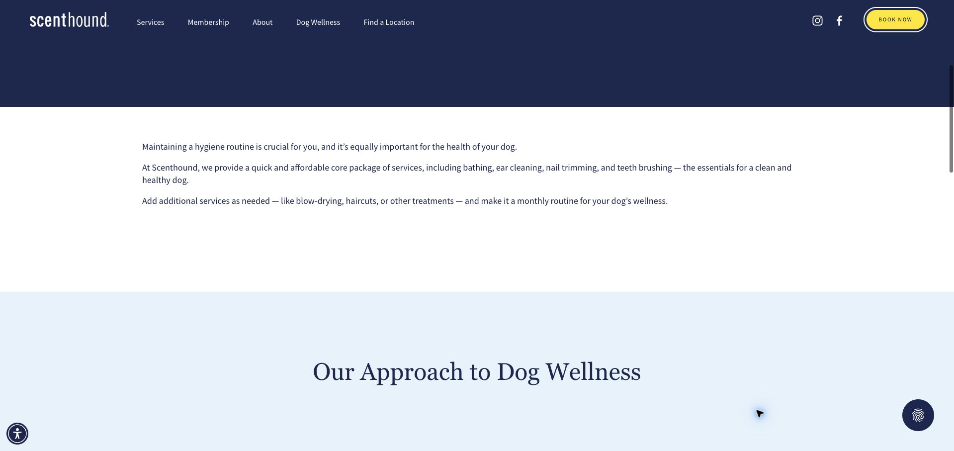
Scenthound organizes its proposition around a recurring hygiene routine, explaining a core package before introducing additional treatments and membership options. The navy header keeps Services, Membership, location finding, and a yellow booking button distinct. In the captured scrolled view, the introductory paragraphs clearly separate included tasks from services that may be added, giving readers a framework for understanding the offer. The page then introduces its broader approach in a pale blue section. This is more useful as service communication than as evidence for the wellness claims themselves. Large areas of space and a long opening hero slow the route to those details, and the introductory explanation does not show a price comparison between membership choices.
What you can learn
Explain the base service before selling a recurring plan. Customers should understand what is included, what is optional, and where to compare membership choices without inferring those distinctions from marketing language.
Pros
Core services and optional additions are described separately.
Membership and location finding have explicit navigation routes.
Cons & considerations
Large empty areas lengthen the path to service details.
The opening explanation lacks a side-by-side membership price comparison.
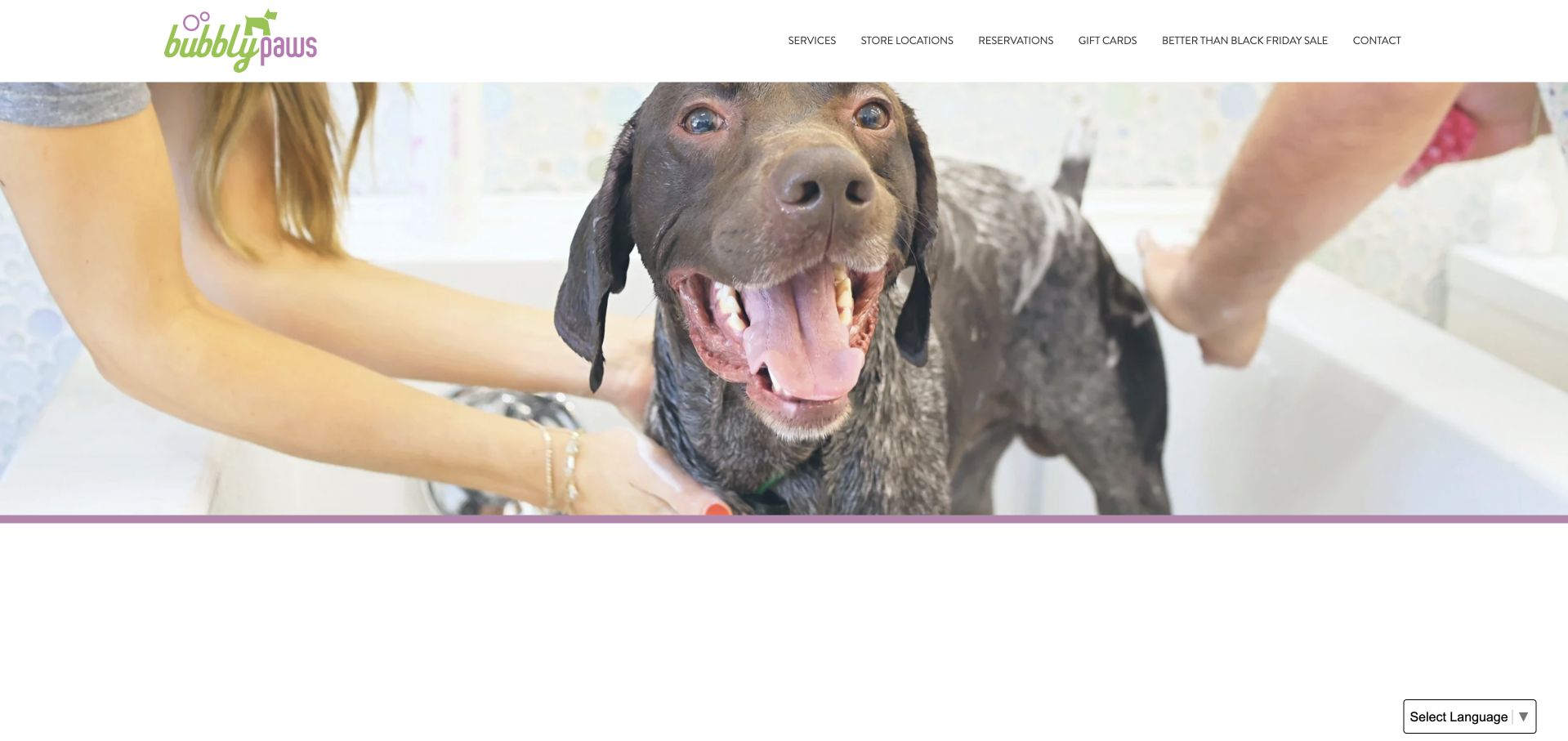
Bubbly Paws begins with a large photograph of a dog being bathed, then distinguishes self-service washing, a staff-provided bath, and professional grooming in the page content. That division is useful because those services require different customer effort and appointment expectations. Store locations and reservations remain plainly labeled in the header, while a membership program provides another route for repeat visitors. The green and purple identity gives the otherwise white layout a friendly character. The opening photograph has no equally prominent explanatory message or action over it, so the service distinctions arrive only after scrolling. A seasonal sale also receives a full navigation item, adding a temporary message beside the more durable tasks.
What you can learn
Separate self-wash, assisted washing, and grooming before asking customers to reserve. Those labels should describe the amount of help provided, making the appointment path easier to understand for first-time visitors.
Pros
The page distinguishes three materially different service models.
Locations and reservations are visible primary navigation choices.
Cons & considerations
The large opening photograph delays the service explanation.
A temporary sale competes with permanent navigation tasks.
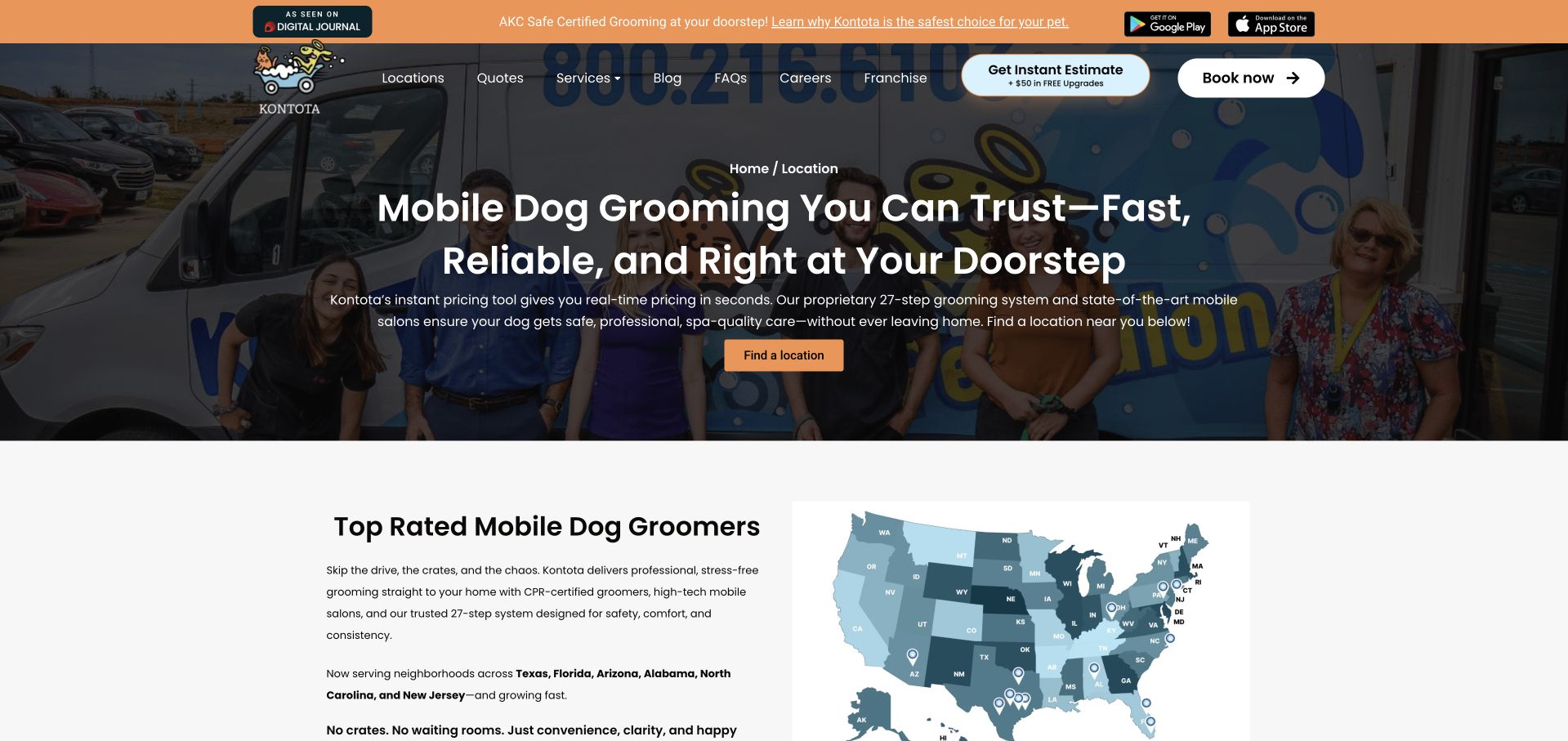
Kontota’s location page combines a photograph of its team and vans with a location-finding action, then introduces regional coverage through a map and local entries. The directory gives each operation its own contact and booking routes, which is more useful than presenting a national brand as a single service area. Estimate and booking actions are both visible in the header, acknowledging that some customers need cost context first. The opening is crowded with a promotional strip, app badges, several navigation choices, and two commercial actions. Certification wording also needs careful reading: a later disclaimer distinguishes corporate requirements from independently operated franchise locations.
What you can learn
A franchise directory should connect each service area to its own contact and booking information. Keep system-wide claims qualified where local practices vary, and let the location task remain more prominent than promotional extras.
Pros
Local entries connect geographic coverage to direct next steps.
Separate estimate and booking routes support different readiness levels.
Cons & considerations
The opening contains several competing promotional and navigation layers.
Certification scope is explained later than the prominent opening claims.
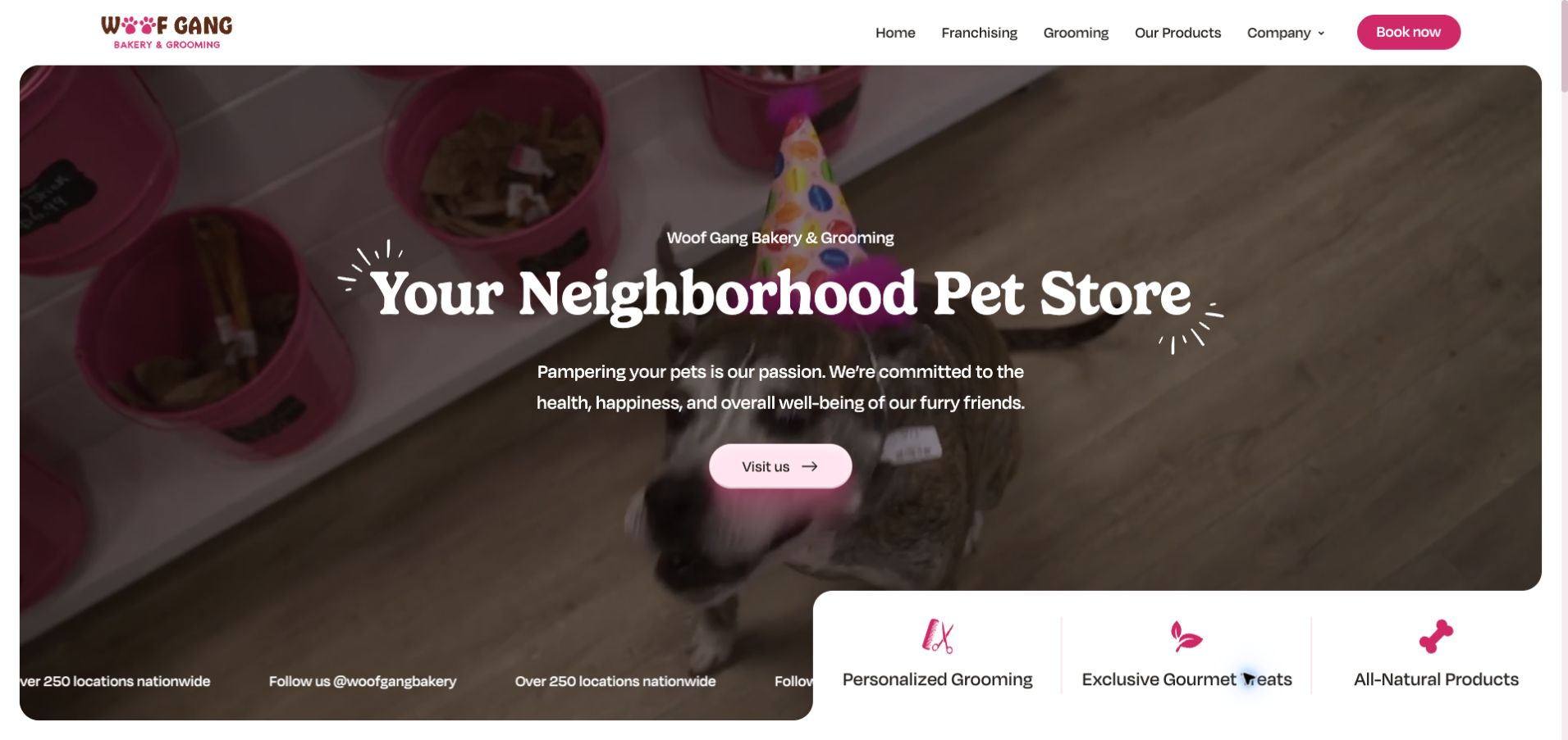
Woof Gang Bakery & Grooming uses a large rounded video panel, warm typography, and pink accents to introduce its neighborhood-store positioning. A simple row identifies grooming, treats, and products as the business’s main strands, while the header gives grooming its own route and keeps booking visually prominent. The longer page expands on the grooming offer instead of leaving it implicit in the brand name. This is useful for a business whose customers may arrive for either a service or a retail purchase. The hero’s broad store message does not explain grooming packages, however, and a moving location-count strip adds visual activity without helping someone choose the right branch.
What you can learn
When grooming shares a business with retail, identify each offer clearly and give the service its own path. A local-store finder should turn a broad brand promise into a specific place to visit.
Pros
Grooming is separated from treats and products in the opening structure.
The booking button remains distinct from ordinary navigation.
Cons & considerations
The main store message gives little grooming-package detail.
The moving promotional strip competes with the service introduction.
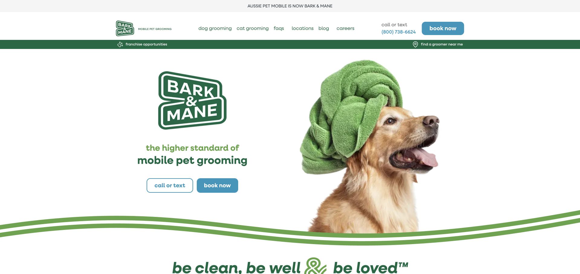
Bark & Mane places a concise rebrand notice above its header, explaining that the former Aussie Pet Mobile name now leads to this identity. Below it, a towel-wrapped dog, restrained green palette, and separate call-or-text and booking actions introduce mobile grooming clearly. Dog and cat services have distinct navigation links, and a location route remains available before a visitor starts an appointment. The page later describes the visit as a short sequence of steps. This is a useful example of acknowledging returning customers while presenting a new brand. The large logo is repeated prominently within the hero, and the opening gives little package or pricing information for comparison.
What you can learn
During a service-business rebrand, explain the name change before asking customers to trust a new booking destination. Preserve familiar contact and location routes so the transition does not interrupt practical tasks.
Pros
The rebrand notice resolves the old-to-new name relationship immediately.
Phone contact and online booking are presented as distinct choices.
Cons & considerations
Repeated brand marks take space from service detail.
The opening provides little context for comparing grooming packages.
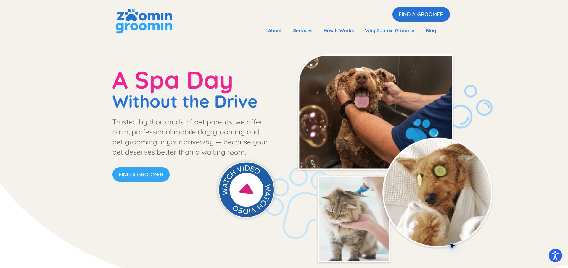
Zoomin Groomin pairs a concise convenience message with photographs of dogs and a cat, making the breadth of its mobile pet service visible immediately. Blue and pink accents organize the cream-colored opening, while a repeated Find a Groomer action ties the general proposition to the practical next step. The page expands into how the service works and individual care categories, so the homepage is more than a booking splash screen. A circular video control provides another explanation format, although its scale and motion compete with the main action. The first viewport also leaves exact service-area and pricing information to later exploration rather than stating them alongside the introductory promise.
What you can learn
Use one consistent location-finding action across a mobile-service homepage. Supporting video and photographs should explain the visit while leaving that action visibly stronger than optional media.
Pros
The location-finding action is repeated with consistent wording.
The opening imagery represents more than one kind of pet customer.
Cons & considerations
The large circular video control competes with the primary action.
Exact coverage and pricing are not established in the opening.
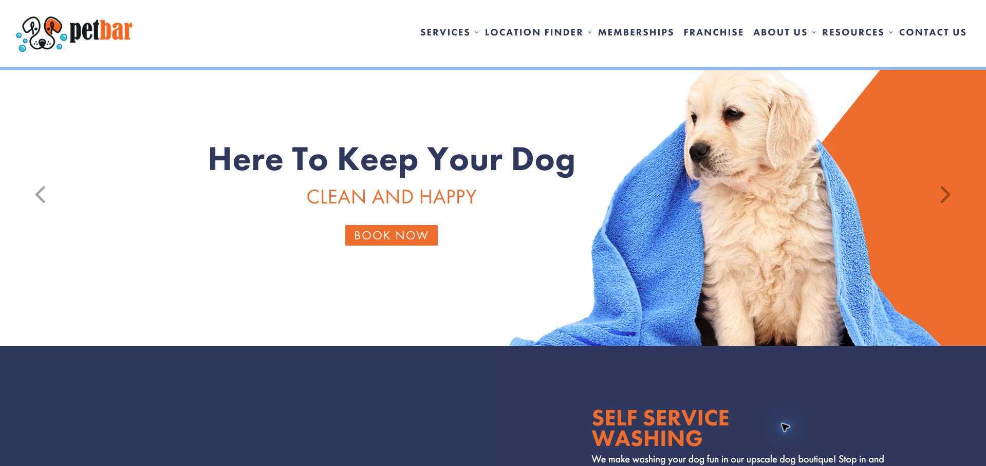
petbar uses orange and navy to connect a large booking campaign with a more specific explanation of its services. The page distinguishes self-service washing, a full-service bath, and professional grooming, and it states different appointment expectations for the first two. That practical distinction helps customers understand whether they can simply arrive or need to reserve time. Location finding and memberships are prominent in the main navigation, supporting both first visits and repeat use. The hero rotates between customer and franchise messages, which mixes two audiences in the same visual space. Its broad cleanliness message also gives less information than the service blocks immediately below.
What you can learn
Explain appointment requirements where service types are compared. A customer should not have to start a booking process to discover that one option is walk-in and another requires a reserved session.
Pros
The service descriptions distinguish appointment requirements clearly.
Location and membership routes are easy to recognize.
Cons & considerations
Customer and franchise campaigns share the rotating hero.
The large opening message is less specific than the service sections.
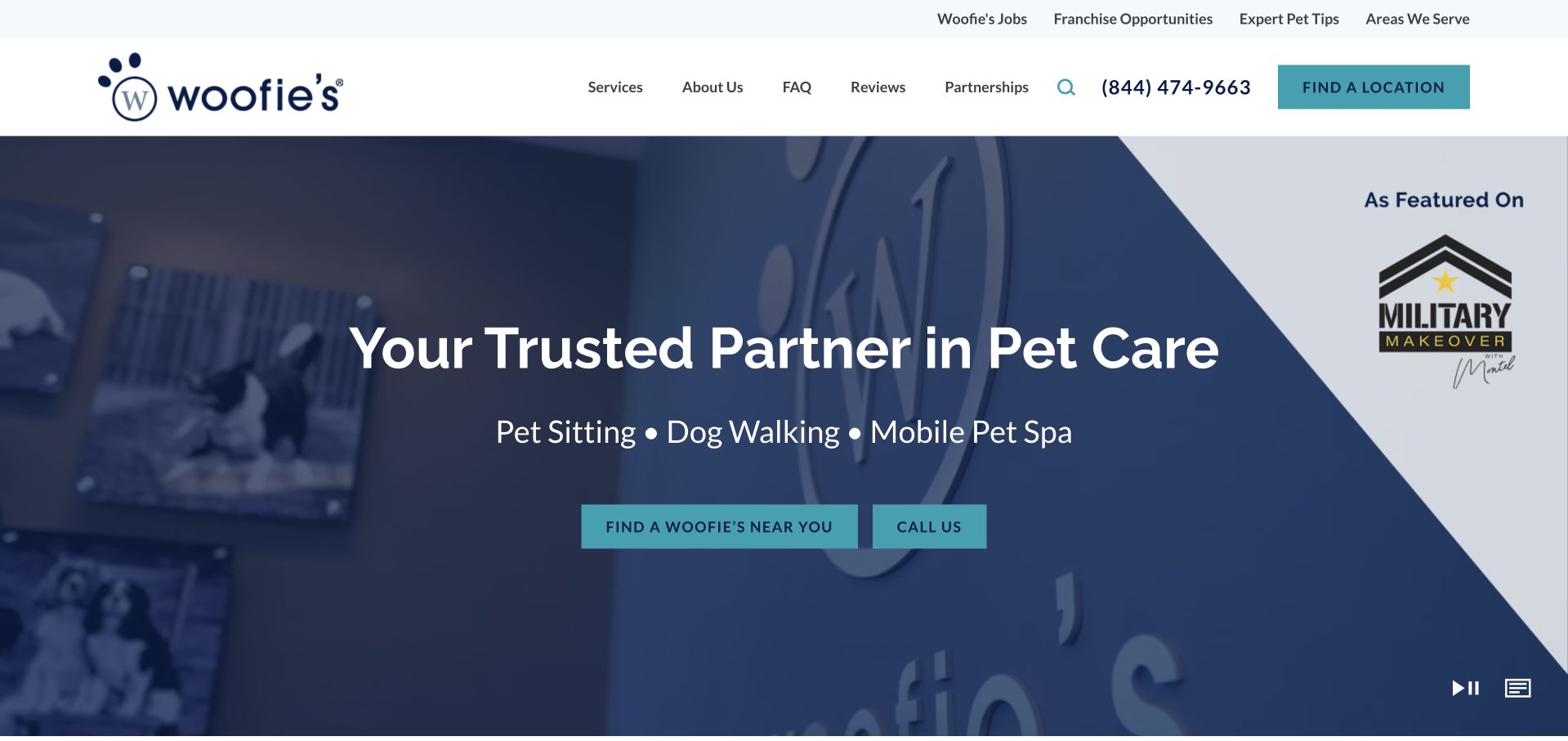
Woofie’s names pet sitting, dog walking, and its mobile spa directly beneath the main headline, avoiding the ambiguity of a broad pet-care promise alone. A large location-finding button and a phone action sit over the video introduction, while the header repeats the location route. The page’s public video description explains the scenes for visitors who cannot rely on the moving imagery, a useful detail in an otherwise media-heavy opening. Grooming remains one of several parallel offerings, so customers still need to move into the relevant service path to understand packages. Recruitment, franchise, editorial, and partnership links add further choices around that initial customer task.
What you can learn
For a business offering several kinds of pet care, name the services before presenting the shared local contact route. Keep supporting corporate and recruitment navigation visually secondary to the customer’s next step.
Pros
The service categories are explicit in the opening message.
The video has a public text description of its content.
Cons & considerations
Grooming-package detail sits beyond the broad introduction.
Several business and editorial links compete with customer navigation.
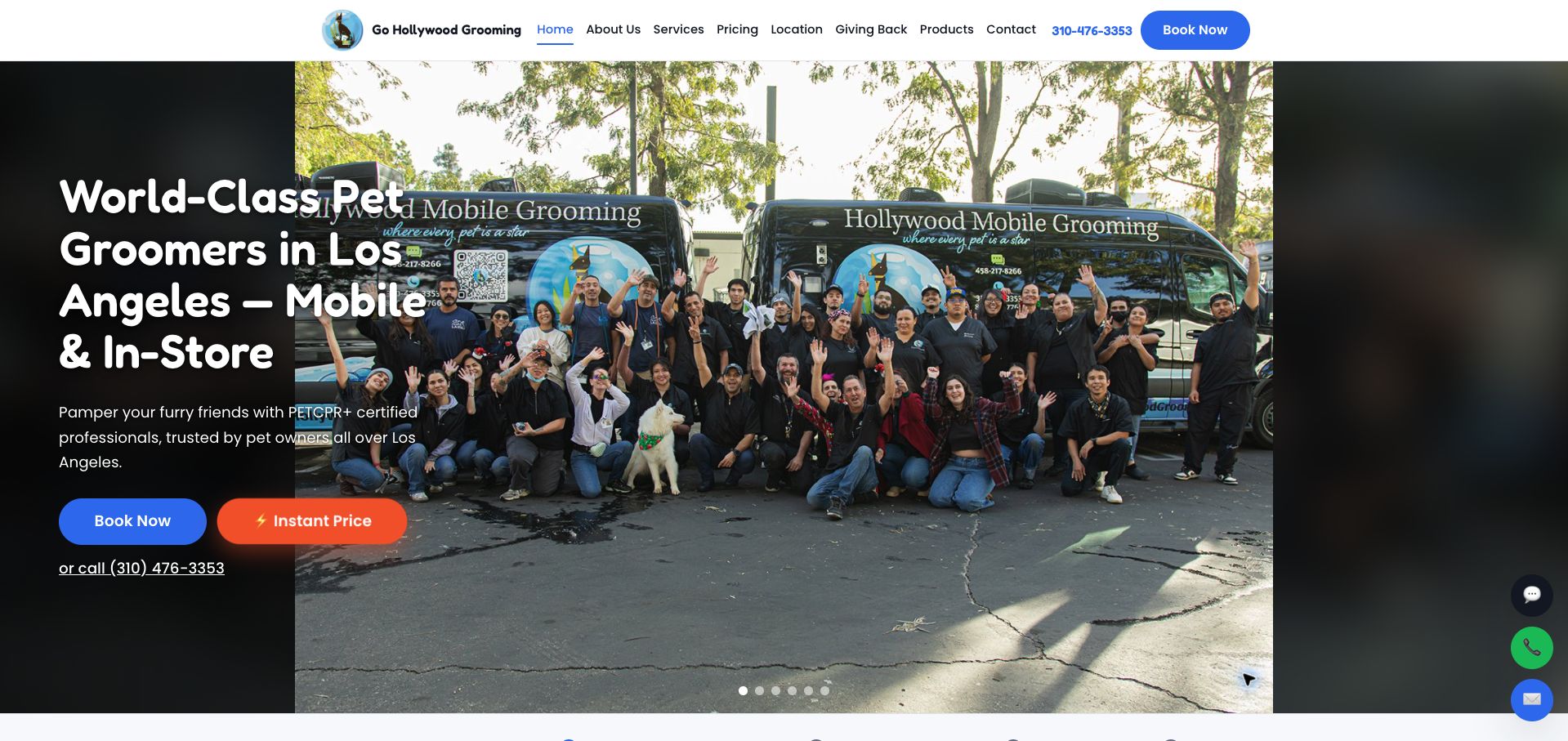
Go Hollywood Grooming names Los Angeles and both mobile and in-store service in its opening headline. Team-and-van photography reinforces the business behind the offer, while booking, an instant-price route, and a telephone link provide different ways to continue. The longer page distinguishes the Burbank store from mobile coverage and introduces a self-wash option alongside grooming. That combination is useful for customers who might otherwise assume every appointment comes to their home. The hero’s long headline overlaps a busy photograph, and floating chat, phone, and email controls compete with the already prominent contact choices. The review evaluates those communication patterns rather than the site’s certification or charitable-impact claims.
What you can learn
When one grooming business offers both a salon and a van, state that distinction early. Keep location, service type, and price exploration connected so customers enter the appropriate appointment path.
Pros
The headline specifies both geography and delivery model.
Pricing exploration is offered separately from immediate booking.
Cons & considerations
The long hero text sits over visually busy photography.
Several floating contact controls duplicate the main actions.
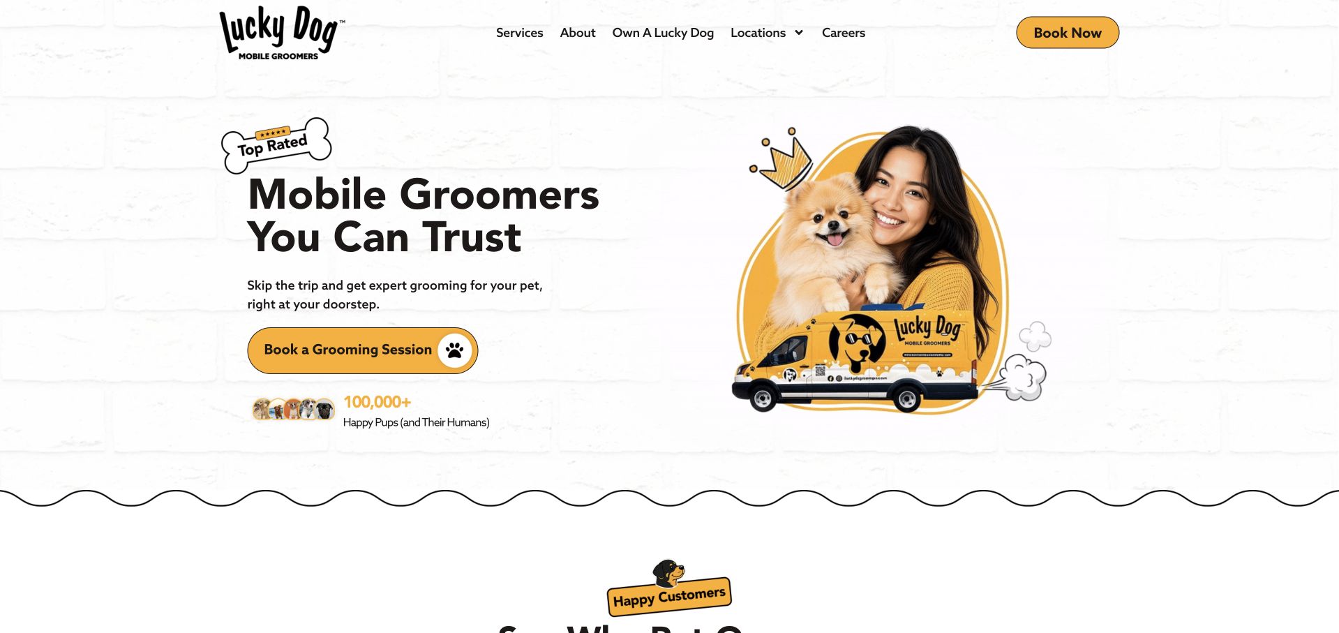
Lucky Dog Mobile Groomers uses a yellow-and-black identity, a dog-and-owner portrait, and a branded van graphic to explain its service at a glance. The main booking action is large and plainly worded, with services and locations available in the header for visitors who need more information first. A displayed customer-volume claim provides social proof within the design, although it was not independently verified for this review. The captured homepage stays compact, directing readers toward separate destinations rather than providing a full service comparison. That makes the first decision easy to see, but leaves package inclusions, exact coverage, and pricing outside the opening experience.
What you can learn
A compact service homepage works best when its primary action is unmistakable and its supporting routes answer the obvious questions. Give hesitant customers a clear path to coverage and inclusions before asking them to commit.
Pros
The main grooming-booking action is visually prominent.
The van graphic makes the mobile delivery model recognizable.
Cons & considerations
The opening offers little package or price detail.
A large social-proof figure appears without nearby methodological context.
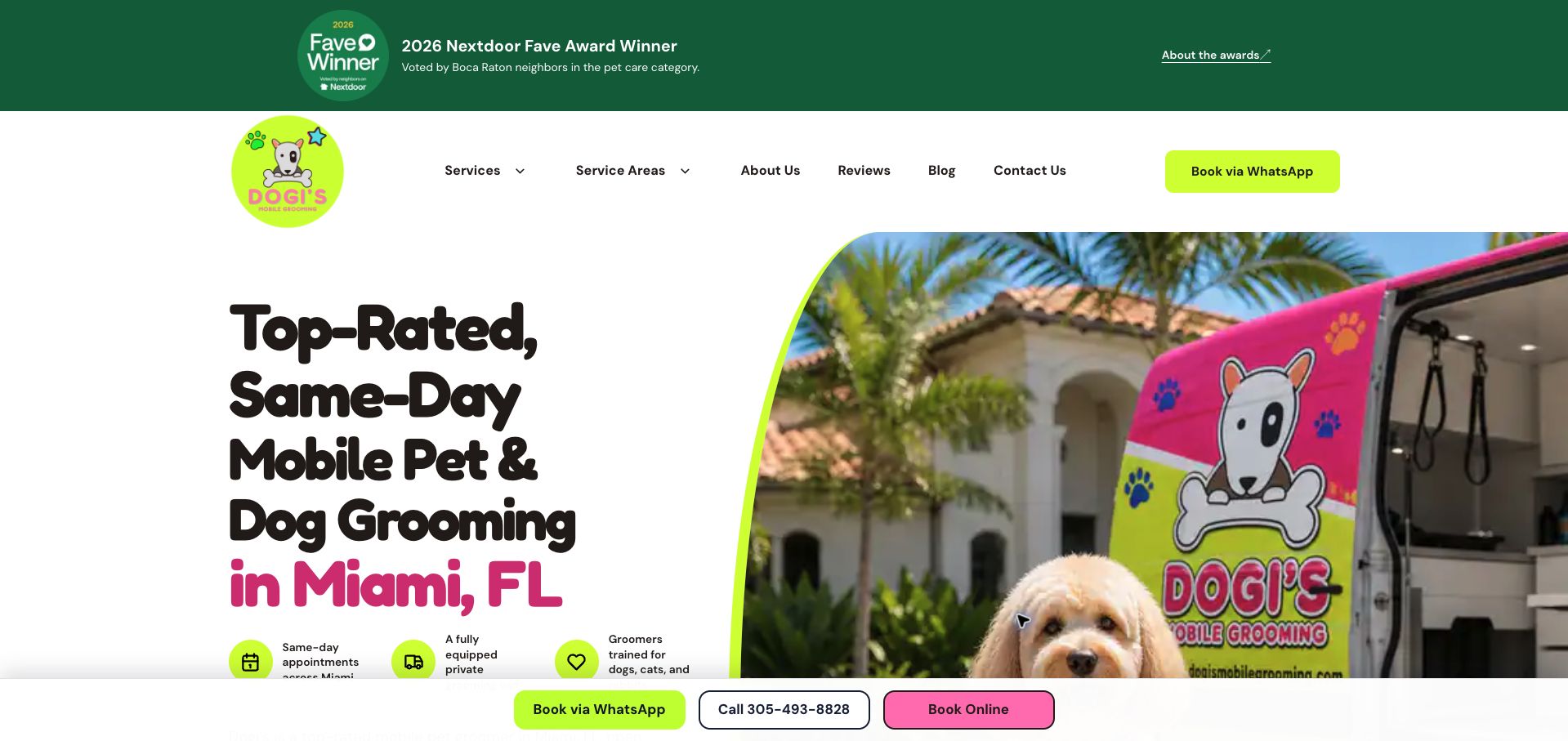
Dogi’s names Miami in a large, playful headline and pairs it with a photograph of a brightly branded grooming van. The opening also identifies the broader counties served, a starting-price claim, and several ways to contact the business. A persistent bottom strip repeats WhatsApp, telephone, and online booking, making those actions easy to find as the page continues. Service sections distinguish dogs, cats, and other offered care rather than leaving the scope entirely implicit. The number of repeated contact routes can become visually busy, and a tall award banner consumes space above the service explanation. The availability and price wording are observed marketing claims, not an independently confirmed appointment quote.
What you can learn
State geographic coverage alongside the main mobile-service message. Offer more than one contact channel when useful, but establish a clear hierarchy so repeated sticky controls do not overwhelm service information.
Pros
The opening clearly identifies the main city and broader service region.
Persistent contact choices remain available while browsing.
Cons & considerations
Repeated booking and messaging controls compete for attention.
The tall award strip pushes practical service details downward.
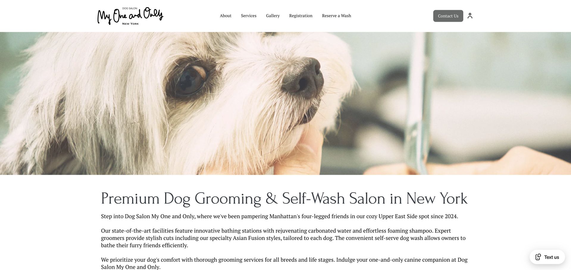
Dog Salon My One and Only uses a close-up grooming photograph, a handwritten wordmark, and restrained typography to introduce its New York salon. The page explains professional grooming and self-wash as separate offers, with services, a gallery, registration, and wash reservations available in the header. Address, telephone, hours, and the last appointment time appear together later in the page, making the practical visit information more useful than hours alone. The opening photograph dominates the first view, while the explanation beneath it is presented as several long paragraphs. The prominent reservation wording specifically refers to a wash, so customers seeking a haircut must look elsewhere in the navigation for the appropriate process.
What you can learn
Name each reservation route precisely when self-wash and professional grooming coexist. Pair opening hours with the last appointment time so customers can understand the actual service window.
Pros
The page distinguishes self-wash from professional grooming.
Visit details include a last-appointment time as well as hours.
Cons & considerations
Long introductory paragraphs slow scanning.
The most explicit reservation label serves only the wash journey.
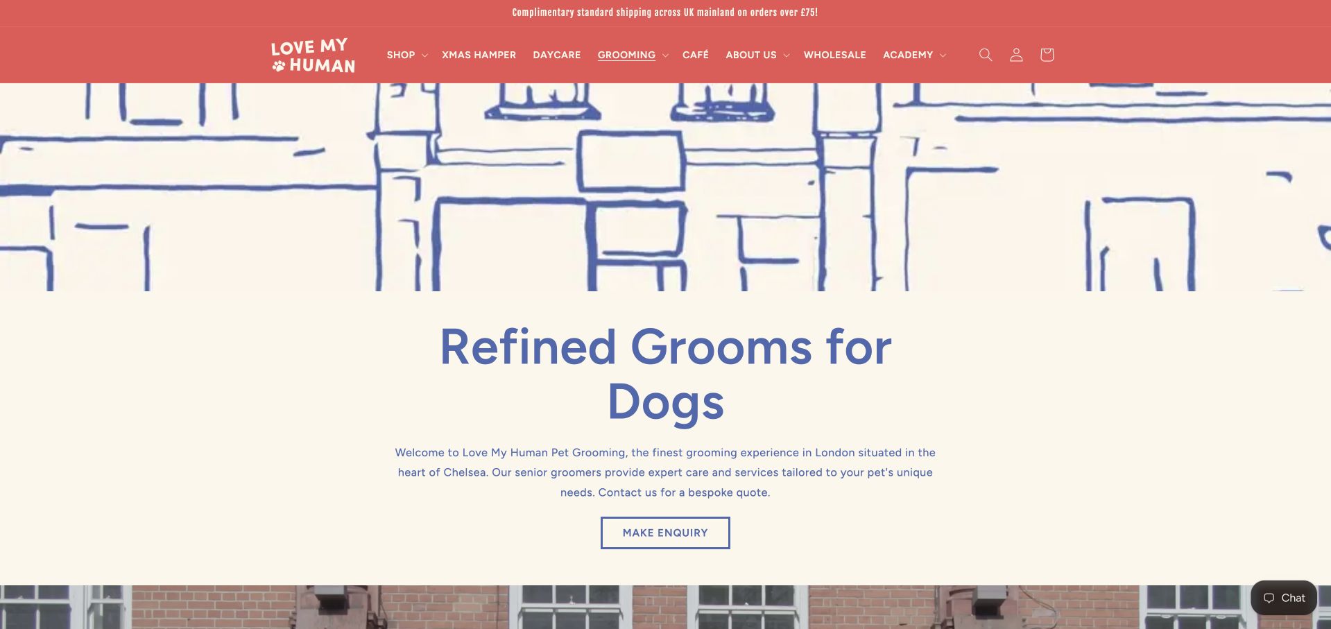
Love My Human’s dedicated grooming page sits within a broader boutique website but gives the service its own heading, introduction, and enquiry action. The cream-and-blue treatment is restrained, and the page moves into named treatments with inclusions, estimated duration, and conditions that may affect the work required. That structure explains why a bespoke quote might be necessary instead of presenting contact as an unexplained barrier to pricing. The opening still contains a large decorative illustration and the shop’s extensive retail navigation. Visitors also need to read beyond the general introduction to compare treatments, since the first enquiry button appears before the detailed service menu.
What you can learn
If grooming is quoted individually, explain the variables before the enquiry. Treatment inclusions, approximate duration, and coat-condition qualifications give customers useful preparation even when a final price requires discussion.
Pros
Treatment descriptions include useful timing and scope details.
The page explains why additional work can affect a quote.
Cons & considerations
Retail navigation competes with the dedicated service journey.
The opening illustration delays the treatment comparison.
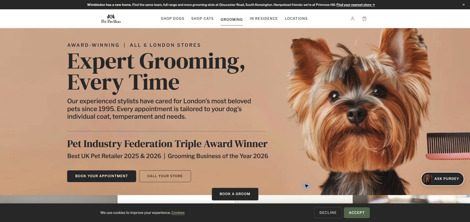
Pet Pavilion gives grooming a dedicated page with a strong dog portrait, clear appointment and telephone actions, and an explicit connection to its London stores. Below the opening, named packages explain the difference between a bath, a tidy-up, and fuller grooming rather than leaving the visitor to interpret a generic service label. A relocation notice also directs returning customers toward current branches. The enquiry area clarifies that the request will be confirmed, helping distinguish an enquiry from a completed appointment. The captured opening is crowded by a sticky booking button, chat control, and cookie strip, while prominent award messaging occupies space that could otherwise introduce prices or package differences.
What you can learn
Tie grooming packages to a specific branch, and state whether the next action requests an appointment or confirms one. Relocation notices should preserve that route for returning customers.
Pros
Named packages make different levels of grooming easier to compare.
The enquiry wording explains the later confirmation step.
Cons & considerations
Several persistent controls crowd the captured viewport.
Award messaging delays package and price information.
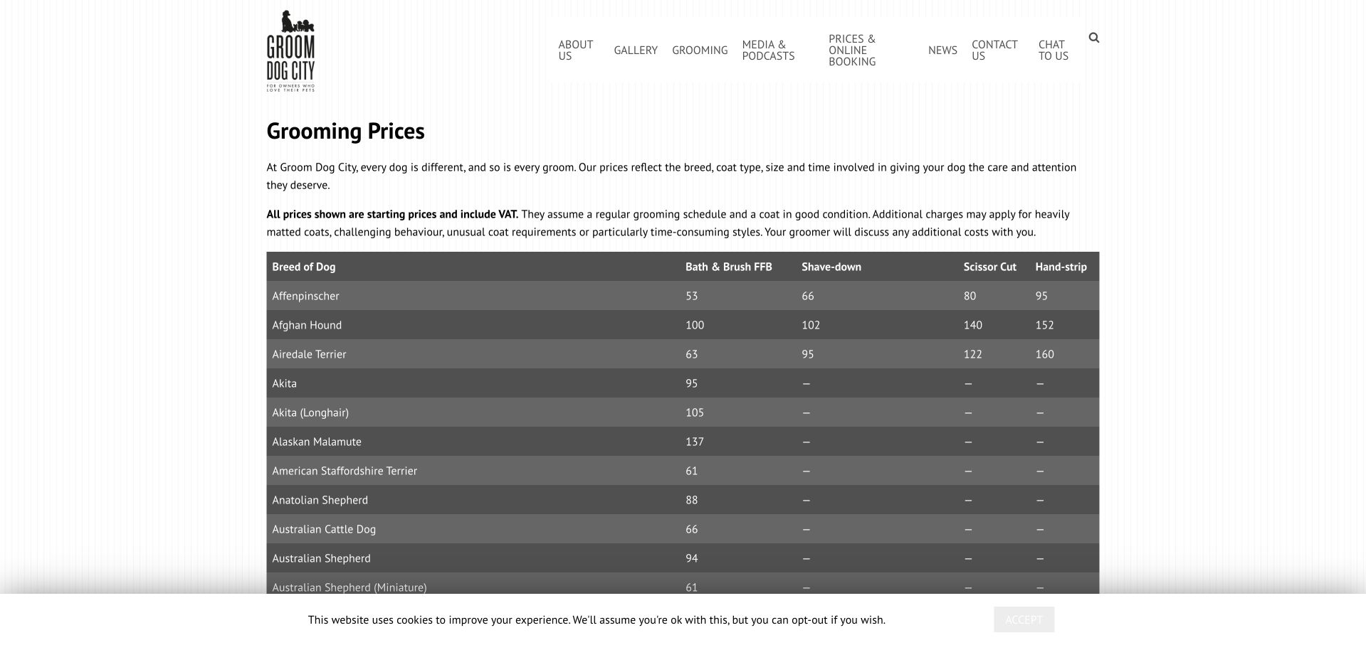
Groom Dog City’s pricing page replaces promotional imagery with a substantial table organized by breed and service type. A short introduction explains that the listed amounts are starting prices, include VAT, and assume particular coat conditions and grooming frequency. This context matters because the table would otherwise suggest that every dog of the same breed receives an identical quote. Alternating gray rows help readers follow prices across bath-and-brush, scissor-cut, and other columns. The information is unusually concrete, but the long unfiltered table demands considerable scrolling. Some service abbreviations and dash entries also require interpretation, so a visitor unfamiliar with grooming terminology may still need help deciding what the numbers mean.
What you can learn
When publishing a detailed grooming price table, put its assumptions before the numbers. Add plain-language service definitions and explain unavailable or inapplicable entries so specificity does not become another source of confusion.
Pros
Starting-price assumptions are explained directly above the table.
Alternating rows support comparison across service columns.
Cons & considerations
The long breed list lacks an obvious narrowing control.
Abbreviations and dash entries need clearer explanation.
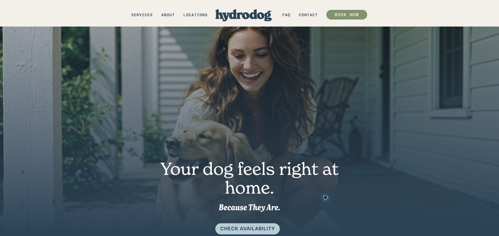
Hydrodog introduces mobile grooming with a quiet portrait and a prominent availability action, then explains the journey as a sequence: choose a local operation, choose a service, choose a groomer, and select an appointment. The page also separates preparation from what happens after the visit, giving the service more context than a booking button alone. Named care packages distinguish routine washing, haircuts, curls, and heavier coats. That organization is useful for customers who do not arrive knowing which package to request. The full-height opening postpones those details, and the homepage’s softer lifestyle message does not state the mobile-van model as explicitly as the supporting sections do.
What you can learn
Explain the sequence around a grooming appointment, not just the booking transaction. Service selection and preparation guidance help customers understand what they are arranging before they enter a scheduling tool.
Pros
The page breaks the appointment journey into understandable stages.
Package names distinguish different coat and grooming needs.
Cons & considerations
The large opening image delays the practical explanation.
The mobile delivery model is clearer below the hero than within it.
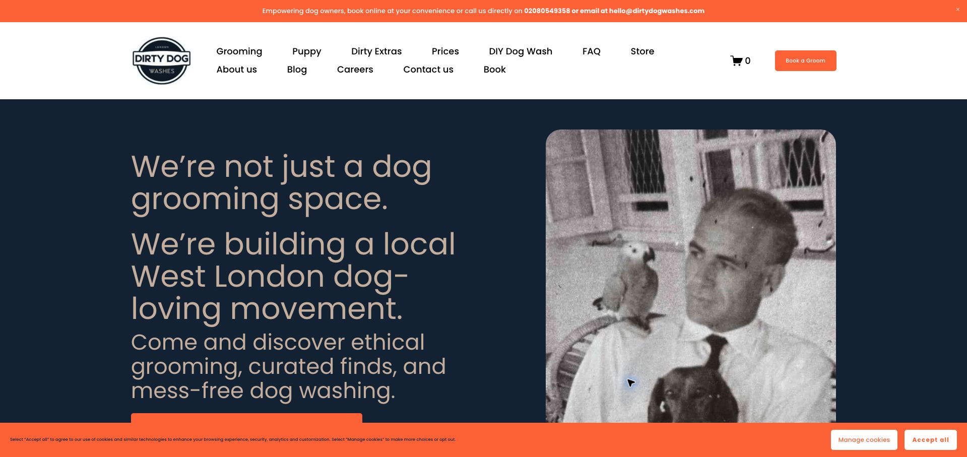
Dirty Dog Washes uses a strong orange-and-navy palette and conversational copy to introduce its West London identity. Its navigation is unusually explicit about the range of tasks, separating grooming, puppy services, prices, self-wash, and frequently asked questions. A contact strip supplies telephone and email alternatives, while the body explains the app-based booking route and offers in-person help if that route causes difficulty. Those practical alternatives prevent the app from becoming the only way to proceed. The opening itself is wordy, with a large statement about the business before the service details. Two rows of navigation and an orange cookie strip further compete for attention in the captured view.
What you can learn
If a salon relies on an app, provide a clearly explained human fallback. Keep service and price routes concise so a distinctive brand voice does not obscure the customer’s immediate task.
Pros
Prices, puppy care, and self-wash have explicit navigation labels.
The page offers help for customers who struggle with the app.
Cons & considerations
The long opening statement delays specific service information.
Two navigation rows and a cookie strip make the viewport busy.
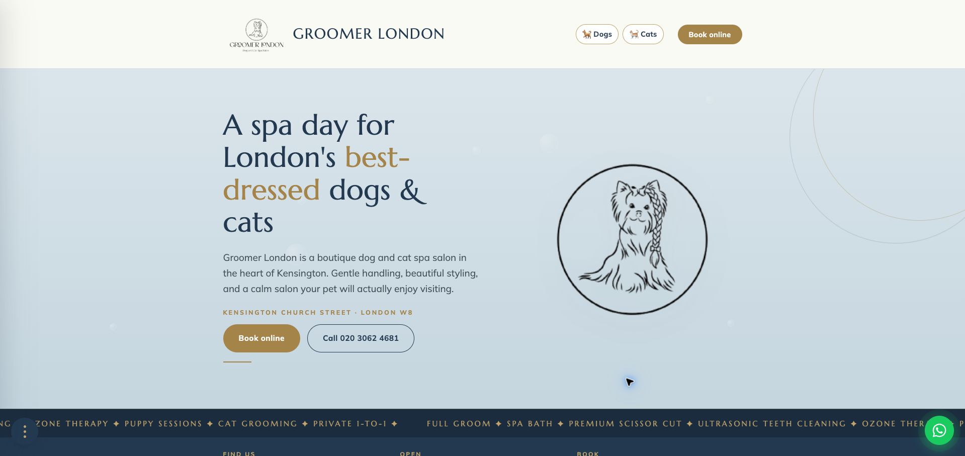
Groomer London uses a restrained blue-and-gold palette, an illustrated dog emblem, and separate dog and cat choices to introduce its salon. The opening states the neighborhood and offers both online booking and telephone contact. Further down, address and hours sit ahead of a service-and-price menu, with guidance for visitors who are unsure of their dog’s size or coat category. This makes the page useful as a decision aid rather than merely an attractive invitation. The large emblem provides less evidence of actual grooming work than a portfolio photograph would, and the moving treatment strip introduces many specialist terms before their meaning or suitability has been explained.
What you can learn
Organize a grooming menu around decisions customers can recognize, then help them resolve uncertain categories. Size and coat guidance should sit close to prices rather than becoming a hidden prerequisite to booking.
Pros
Dog and cat service routes are clearly separated.
The price section acknowledges uncertainty about size and coat categories.
Cons & considerations
The opening emblem gives little visual evidence of completed work.
The moving treatment list introduces many unexplained specialist labels.
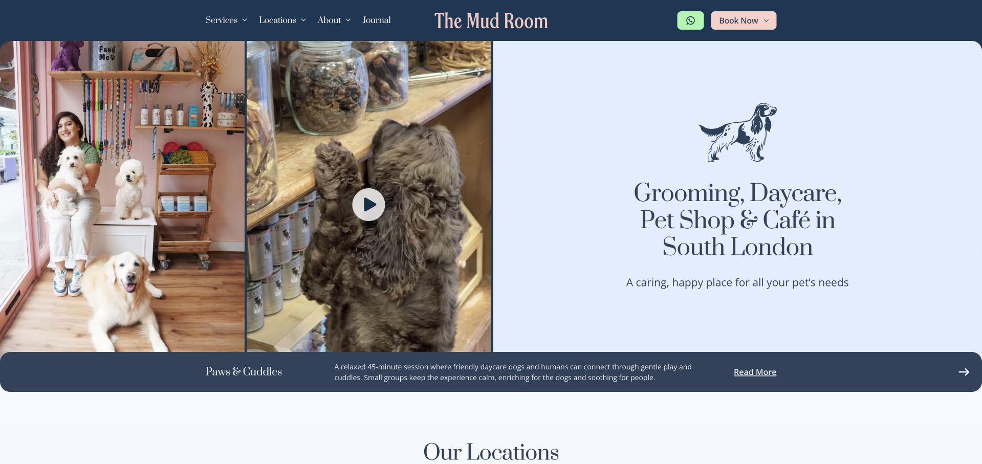
The Mud Room combines shop photography, a video entry point, and a concise list of its main offers in a split opening layout. Grooming, daycare, retail, and the café are all named, while the header supplies separate service and location menus. The page then gives Streatham Hill and Battersea their own addresses, phone numbers, and booking actions, which helps prevent a general brand enquiry from reaching the wrong salon. The warm editorial treatment suits the business’s community positioning. Grooming-package detail is still secondary to the broader destination message, and the captured event strip repeats the same program title over descriptions of different activities, weakening the distinction between those promotions.
What you can learn
For a multi-location salon, attach booking actions to named branches and their contact details. Community programming can enrich the page when each event remains clearly distinguished from the core service journey.
Pros
Each branch has its own address, phone number, and booking route.
The opening explicitly names the business’s different service strands.
Cons & considerations
The broad destination message delays grooming-package detail.
Repeated event labeling makes different promoted activities harder to distinguish.
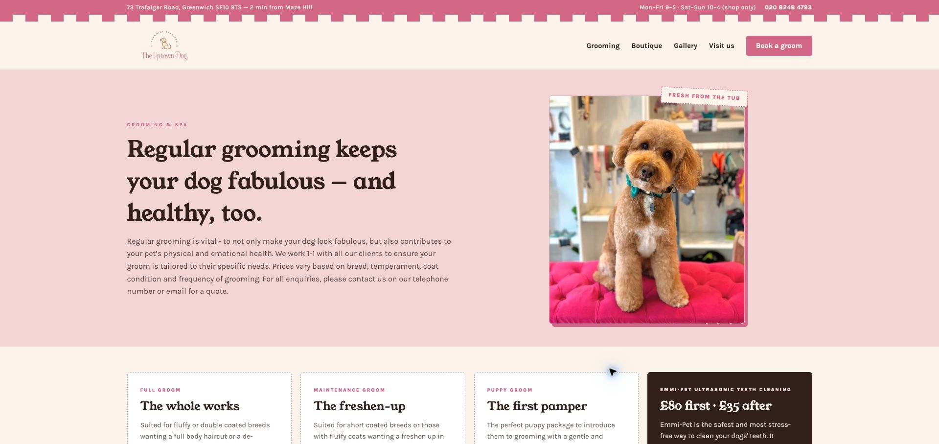
The Uptown Dog’s grooming page combines a clear location strip, pastel colors, and a groomed-dog portrait with an explanation of how quotes vary. The introduction names breed, temperament, coat condition, and grooming frequency as factors, then the page separates full, maintenance, and puppy services into distinct cards. Included tasks are listed rather than buried in prose, making comparison easier. The top strip also qualifies weekend hours as shop-only, a useful distinction for a business offering retail alongside appointments. The opening paragraph is fairly dense, and visitors still need to contact the salon for a complete grooming quote. Decorative labels and additional treatment cards can make the service hierarchy less immediate further down.
What you can learn
State the reasons a grooming quote varies, then make package inclusions easy to compare. When retail and salon hours differ, qualify the hours wherever customers first encounter them.
Pros
Service cards list concrete inclusions for comparison.
The hours strip distinguishes shop access from grooming availability.
Cons & considerations
The opening explanation is dense for a quick service scan.
A final grooming quote requires a separate contact step.
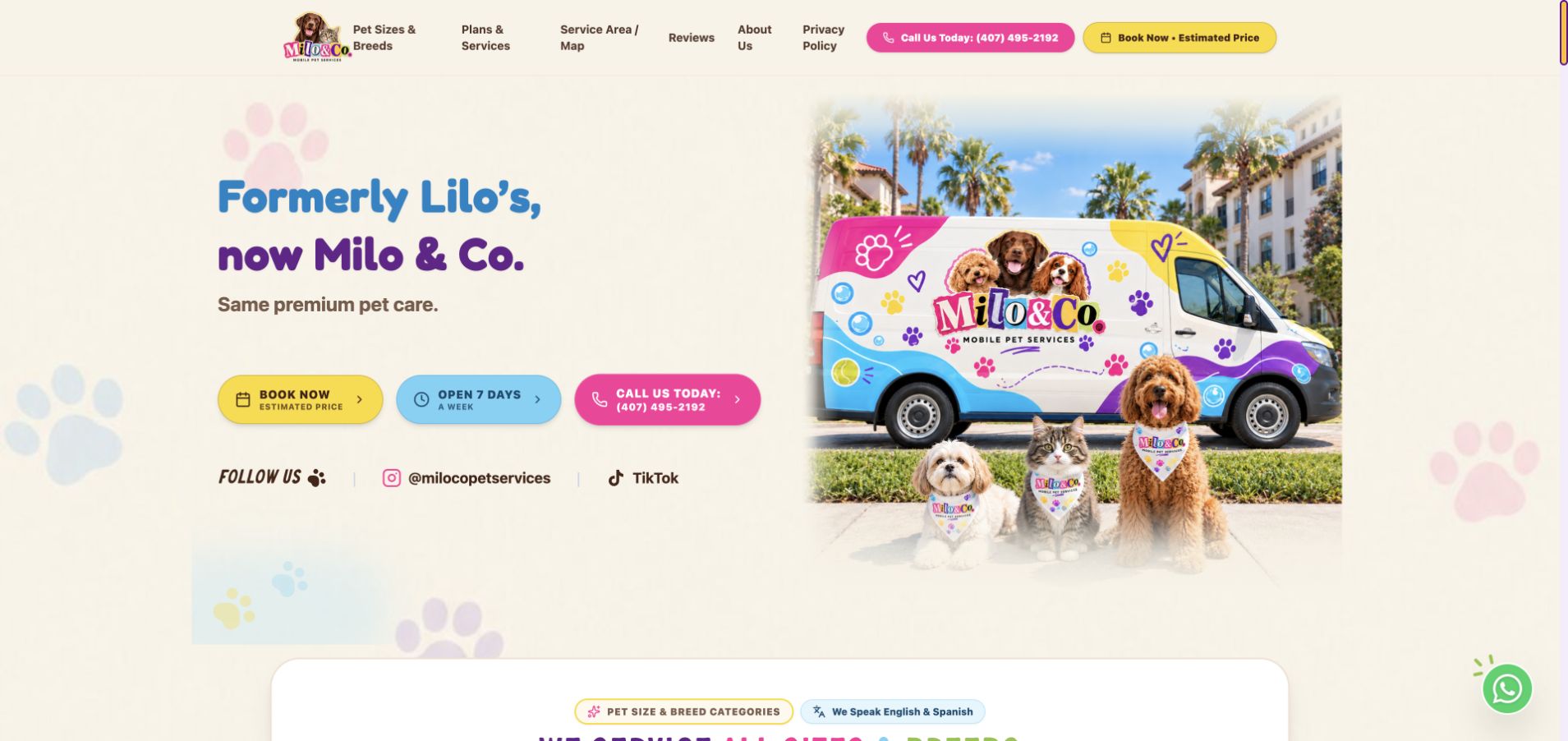
Milo & Co opens with a clear notice explaining its former name, a colorful van illustration, and a combined booking-and-estimate action. The navigation then foregrounds pet sizes, services, and the coverage map, acknowledging the questions that determine whether a mobile appointment is suitable. Below the opening, size and coat categories use weight ranges and breed examples to make service selection more concrete. English and Spanish availability is also stated near that section. The design is energetic but visually busy, with several colors, repeated contact actions, and decorative paw shapes. The hero devotes much of its message to the name change, leaving the actual service area to later exploration.
What you can learn
Use examples and weight ranges to help customers choose a grooming category, while keeping the final quote qualified. A rebrand notice should reassure returning customers without displacing the location and service explanation.
Pros
Weight and coat categories make service selection more concrete.
The former-to-current brand relationship is explained immediately.
Cons & considerations
Many colors and repeated actions compete for attention.
The opening emphasizes the rebrand more than geographic coverage.
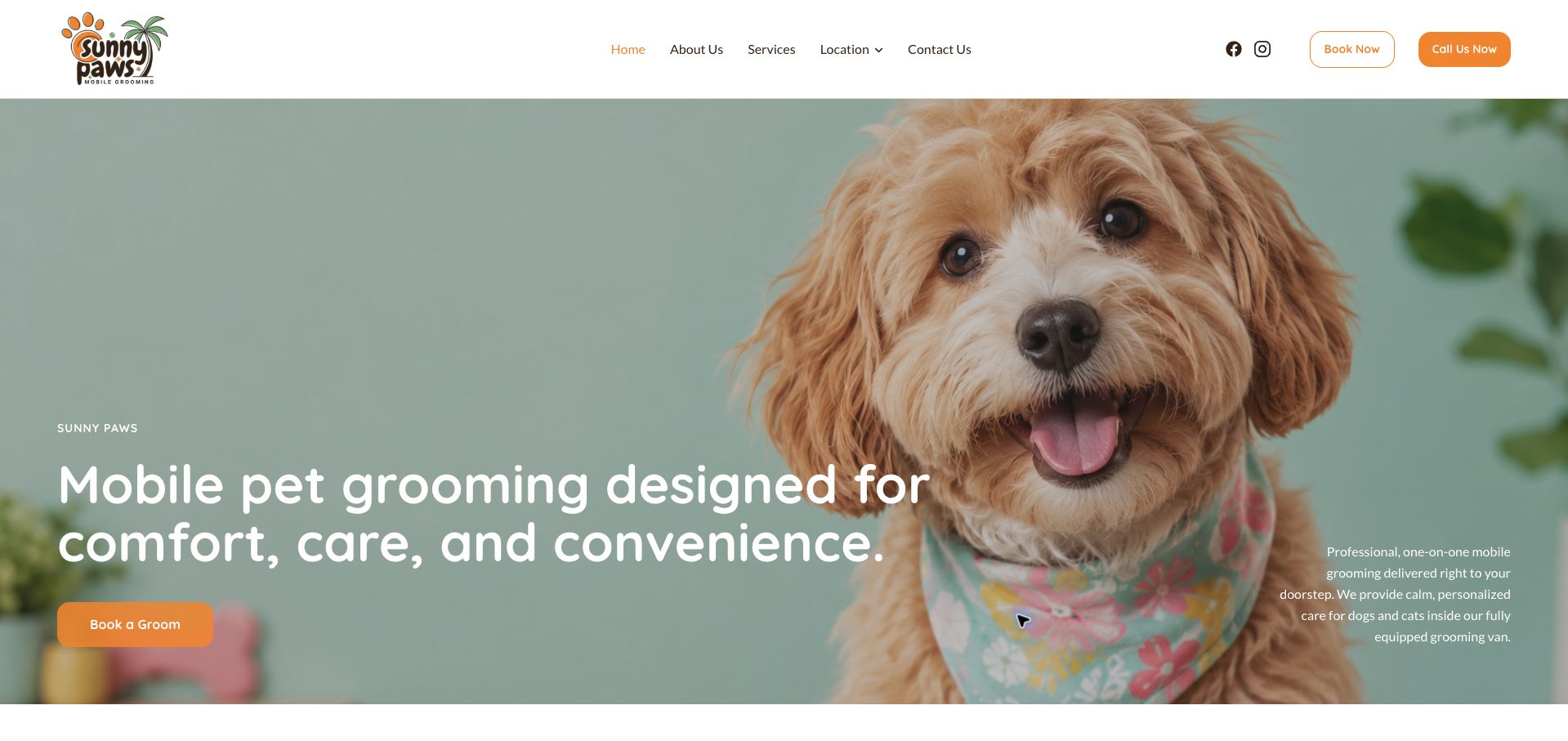
Sunny Paws uses a large dog portrait, orange actions, and a short statement about mobile grooming to establish its offer. The header keeps Services, Location, and Contact Us plainly named, while booking and calling are presented as separate buttons. Supporting text explains that the visit happens in a grooming van and can serve dogs or cats, giving the emotional comfort message a concrete delivery model. The opening is visually calm compared with many contact-heavy competitors, but its layout spreads the headline, button, and explanation across a very wide image. The initial view also does not state a city or service boundary, so customers must use the location route before knowing whether the offer applies to them.
What you can learn
A simple mobile-grooming hero still needs a geographic anchor. Keep the service explanation close to its action, and name the area served before asking a visitor to enter a booking process.
Pros
Booking and telephone contact are separate, readable actions.
The supporting text explains the van-based service model.
Cons & considerations
The opening does not identify a specific service area.
The wide layout separates the explanation from the main action.
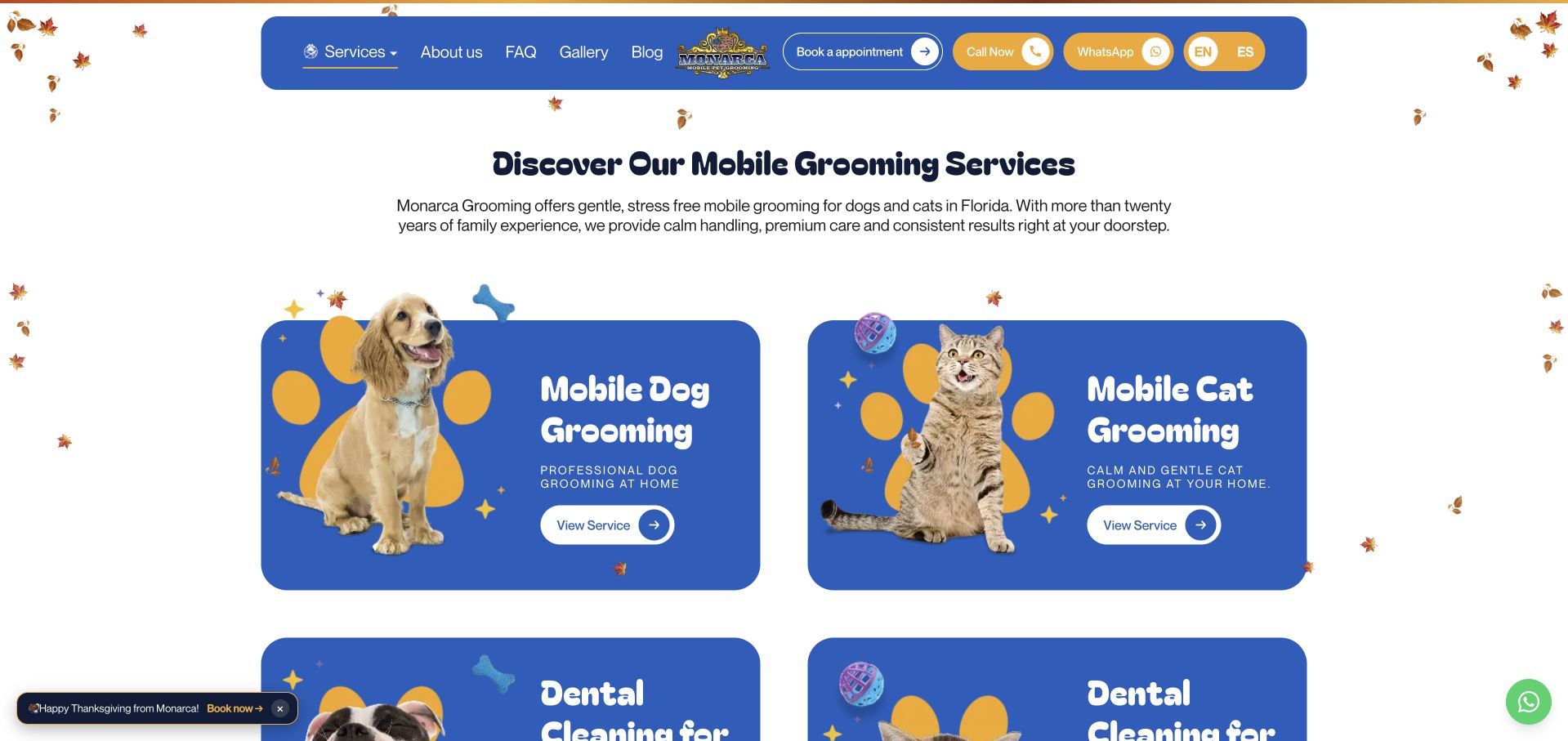
Monarca Grooming’s service page uses large blue cards to distinguish dog grooming, cat grooming, and other offered treatments. Each card pairs an animal image with a clear category title and a detail link, making the first level of the menu easy to scan. Booking, telephone, WhatsApp, and English or Spanish choices remain visible in the header. This structure provides a straightforward route into a service-specific explanation without forcing every visitor through the same generic enquiry. Seasonal falling leaves, a floating promotion, and an initial puppy-booking modal add considerable distraction, however. The page also gives broad Florida context before the more specific service-area links in the footer.
What you can learn
Divide a broad pet-service menu into clearly named entry points, then explain each service on its own page. Seasonal decoration and promotions should leave the category choices and coverage information easy to read.
Pros
Large service cards clearly separate dog and cat grooming.
Language and contact options are visible in the header.
Cons & considerations
Seasonal effects and an initial modal interrupt service browsing.
Specific coverage information appears later than the main menu.
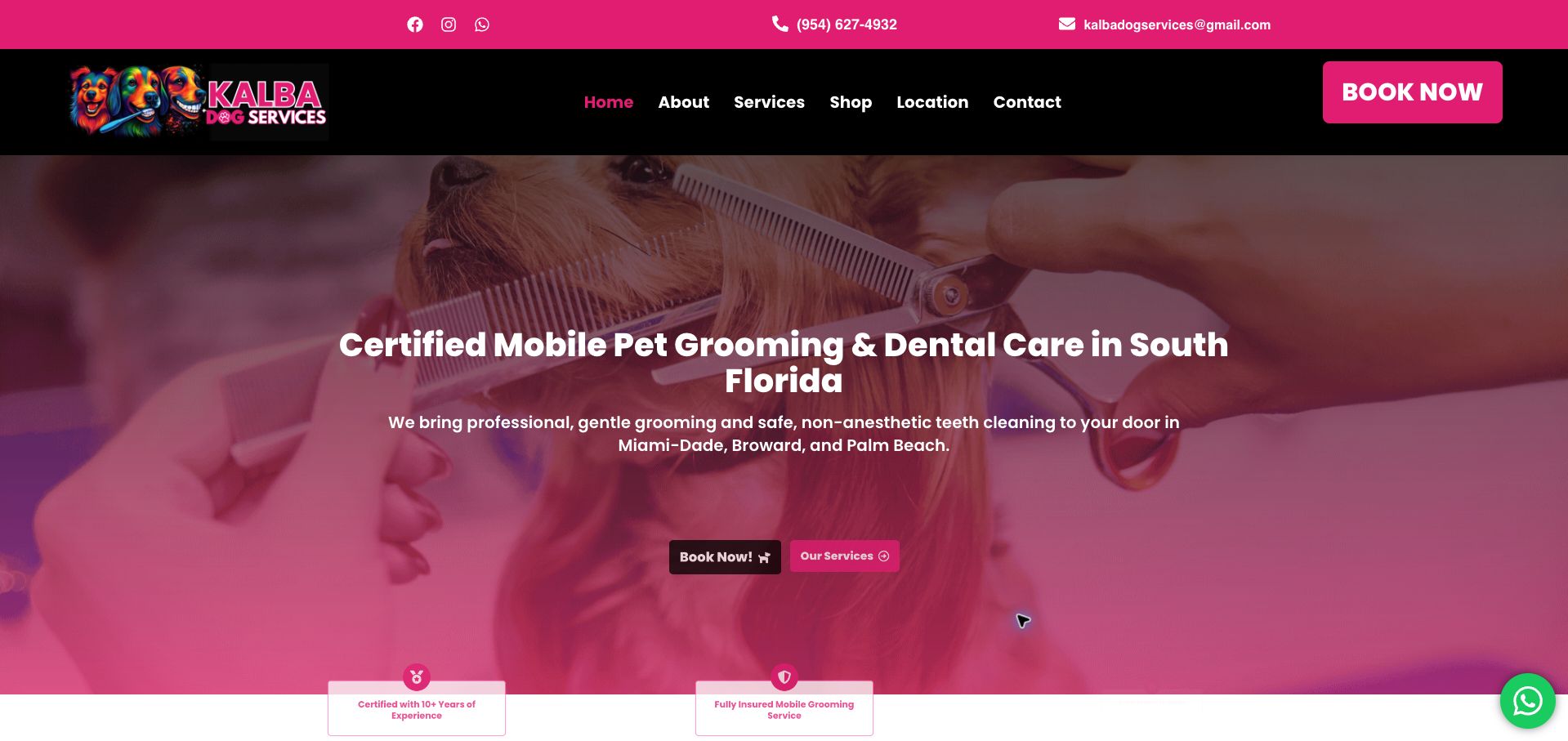
Kalba Dog Services uses a vivid pink-and-black identity and grooming photography to introduce its mobile business. The opening names South Florida and then specifies Miami-Dade, Broward, and Palm Beach, giving the visitor useful geographic context before the booking action. Telephone and email are visible in a separate top strip, while the main page offers both booking and service exploration. The longer content introduces the process and a grooming gallery, providing alternatives for customers who want to learn more first. The large booking button in the header is much stronger than the smaller hero actions, and the page makes prominent certification and care assertions without explaining their scope in that opening view.
What you can learn
Put the service region beside the initial proposition, then support trust claims with clear scope and evidence. Keep booking controls consistent in scale so the intended next step remains obvious across the page.
Pros
The opening names three specific counties served.
Service exploration is available alongside the booking action.
Cons & considerations
The header and hero booking controls have inconsistent visual weight.
Prominent credential claims lack immediate scope or explanatory context.
Kegan is a freelance web designer and developer with 15+ years of experience helping businesses turn complicated website requirements into clear, maintainable digital experiences. He works directly with clients from planning and design through development, launch, and ongoing support.
For dog grooming website design, his development approach focuses on service and coat-type information, clear appointment expectations, location details, and grooming booking connections. The scope can be a targeted improvement or a complete custom build, with responsive layouts, thoughtful content structure, and integrations chosen around the people using and maintaining the site.
Show 3 other dog grooming website designersHide other dog grooming website designers
Use the business’s actual terminology and have staff approve preparation, coat, and appointment guidance. Keep any individual care decision with the groomer rather than encoding unsupported advice into a form.
Map locations and travel coverage
Give each salon accurate hours and contact details. For mobile services, explain the coverage check, arrival window, and any area-based conditions before the booking handoff.
Prepare common exceptions
Explain late arrivals, cancellations, difficult coat conditions, and price adjustments using current policies. Make the contact route easy to find when an owner cannot confidently choose a service.
The editing job behind the design
Choose systems the team can keep accurate
A structured service menu and location records are usually more valuable than a complex homepage builder. Connect them to the scheduling system while retaining readable service explanations outside the widget.
Keep public inquiry fields limited to what staff need for the next step. Photos, records, and detailed appointment information should follow the business’s approved process.
Our WordPress website examples offer a separate look at publishing approaches. A visible platform label is evidence for that named page, not a guarantee that the same system will suit your requirements.
Before the public launch
Website planning checklist
Explain each service.
Qualify starting prices.
State the location or service area.
Distinguish request from confirmation.
Describe preparation accurately.
Publish cancellation terms.
Use genuine salon imagery.
Keep policies current.
Test the mobile booking handoff.
Provide a questions route.
These checks are a project checklist, not a performance, legal, security, or accessibility certification. Test real journeys with the people responsible for the website before making claims about the result.
Sources & editorial method
How this collection was selected and reviewed
These 27 examples match the collection target saved before research. Public pages were directly opened and visually inspected; the pictured source and capture date identify the reviewed state. Reused captures retain their earlier dates. Each source also has a bounded public stack-audit attempt, with inaccessible and unknown results kept explicit. Editors Choice recognizes website design and information, not service quality or promised outcomes. No purchases, bookings, applications, or private forms were submitted. Images and trademarks belong to their owners.
Each example links to its actual source page. Screenshots are direct browser captures with their own capture dates; moving imagery, announcements and live designs can change. The notes describe observable design choices and conditional tradeoffs, not measured traffic, conversion results, service quality, or accessibility conformance.
Technology labels use public page metadata, asset evidence, or explicitly cited platform documentation. Platform documentation is not a complete current deployment audit. A component reference may be legacy or unused; it is not a complete backend inventory. Unknown stacks are omitted. These sites are editorial examples, not our client portfolio.
Written, Edited and Curated are separate editorial records, not timestamps advanced by a rebuild. Website designs and imagery belong to their owners. See our editorial standards or suggest a correction.
Questions worth asking
Dog Grooming website design questions
Should prices be fixed online?
Only when the business can honor them for the described service. Otherwise explain the starting basis and how staff confirm the final quote.
What should a mobile groomer show first?
Coverage, the service menu, the arrival process, and a clear way to check availability. A van photograph does not explain the booking territory.
Are before-and-after photos enough?
They can illustrate styling, but they do not explain inclusions, cost, timing, or the business’s appointment policies.
Should visitors choose solely by breed?
Breed can be one input, but the site should explain the operator’s actual pricing and assessment factors rather than suggesting every dog of one breed needs the same appointment.