Best Modernizr Websites of 2026 (20 Real-World Examples)
Real websites with public Modernizr references, and practical lessons for designing experiences that survive different browser capabilities.
Modernizr helps a website detect browser features. It is not a page builder, a visual style, or evidence that a site has been tested in every browser. These examples connect a dated public script reference with a separate review of the actual website design.
The interesting design question is not whether a visitor owns the newest browser. It is whether the person can read the content, find the right destination, and complete an important task when a particular enhancement is unavailable. A capable interface starts with a useful baseline, then adds richer presentation where the environment supports it. Modernizr is one tool a developer may use to make those decisions explicit.
A file named Modernizr in a public page is a scoped association, not a complete explanation of the application. It may be part of an older theme, a custom bundle, or an actively used feature-detection workflow. We do not infer the active version, every enabled test, a performance improvement, or a complete backend from that reference. Study the screenshots for hierarchy and content decisions; use the evidence for the narrower technology finding.
Before the examples
What makes good Modernizr website development in 2026?
Test a capability rather than guessing from a browser name
The official documentation distinguishes feature detection from user-agent sniffing. A design brief should describe the capability the experience needs and the useful alternative when it is absent. A browser brand or device label is not a reliable substitute for that requirement.
Keep essential information outside the enhancement
Navigation, prices, contact routes, schedules, and explanatory text should not disappear merely because a decorative effect cannot run. Ask what a person sees before enhancement and after a failed request. The fallback is part of the designed experience, not an apology added at launch.
Modernizr supports custom builds containing selected tests. Tie each test to an actual decision in your interface rather than including a large historical bundle simply because an old starter theme shipped it. Keep the configuration with the project so another maintainer can reproduce the build.
Compare how these websites organize tasks, imagery, and useful information. Their exact cited pages expose a Modernizr-specific public asset reference; that finding does not establish which pictured effects use it or whether all advertised browser behaviors were exercised.
We start with five recognizable brands or organizations: Rakuten, Python, NS, Nova Scotia Power, Houston Ballet. Each attribution applies to the named website property, not every product or website belonging to its organization. This is a curated reading sequence, not a measured ranking.
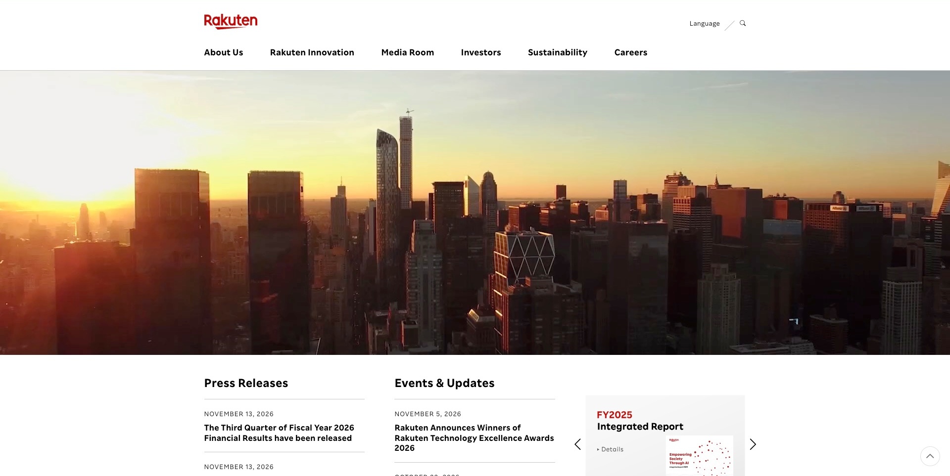
Rakuten’s corporate page places a red wordmark and white navigation above a broad sunrise-city video frame. Dated press releases and events begin immediately beneath, alongside an integrated-report card. About, innovation, investor and career routes remain distinct. The useful pattern is a strong corporate frame around changing imagery and communications, not a retail storefront. The current exact-page source references a Modernizr script asset. That is evidence of the named public component reference, not proof that Modernizr creates the video, that a particular feature test succeeds or that every Rakuten property shares this stack.
What you can learn
Keep essential navigation and current communications understandable independently of the media frame. Feature-detection tooling can be one implementation component, but content, fallback behaviour and working controls still need their own review. Explain corporate and consumer destinations rather than relying on the brand name alone.
Pros
The corporate audience routes are explicitly labelled.
Dated communication columns give the image a practical continuation.
The red identity remains separate from changing media.
Cons & considerations
If video dominates, preserve useful content without playback.
If many audiences share navigation, test task discovery.
If component assets are present, do not infer their runtime role from the photograph.
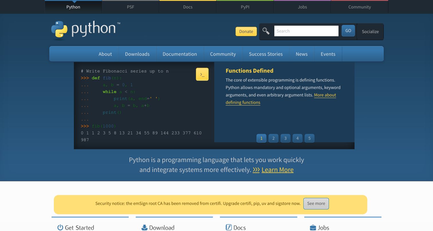
Python.org’s retained homepage uses a blue header to organize documentation, downloads, jobs and community resources. A code example and explanatory panel introduce the language, with numbered feature controls and lower task cards. Current page evidence references a Modernizr script. That identifies a browser-feature dependency, not the runtime of Python applications, the cause of the pictured layout or the behavior of every ecosystem domain. The useful example is a resource hub where visitors with different intentions still have ordinary routes beyond the featured panel.
What you can learn
Keep documentation and download links useful before adding capability-dependent presentation. Use detection for a specific enhancement and preserve a meaningful alternative. A feature-detection dependency should not become a reason to infer that the homepage installs software or validates a visitor’s development environment.
Pros
Documentation, downloads and community routes have recognizable labels.
A code-and-explanation pairing gives the language introduction concrete content.
Cons & considerations
The many navigation levels need careful prioritization on smaller screens.
A Modernizr reference does not reveal active tests or establish fallback behavior.
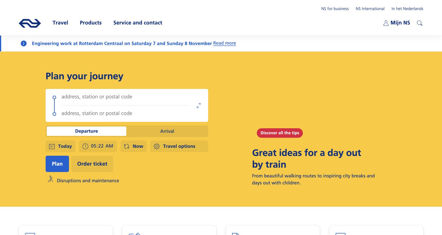
NS places origin and destination fields in a yellow planning area, with distinct departure and arrival choices, date, time and travel options. Plan and Order Ticket are different actions, and an engineering-work notice remains above the planner. Current source evidence references Modernizr. The reference does not prove that the library powers the planner, validates a route or completes a ticket purchase. The useful pattern is a complex public task broken into understandable controls rather than hidden inside a purely promotional introduction.
What you can learn
Define useful alternatives for capability-dependent controls without collapsing planning and purchasing into one claim. Keep disruption information and ordinary service links accessible independently. Test the actual inputs, errors and fallback journey; a script path and a screenshot cannot establish a successful trip search.
Pros
Planning and ticket purchasing have separate visible actions.
Operational information appears before a visitor starts the main task.
Cons & considerations
Several timing and travel controls need clear keyboard and small-screen behavior.
The asset association does not identify the active tests or the planner’s implementation.
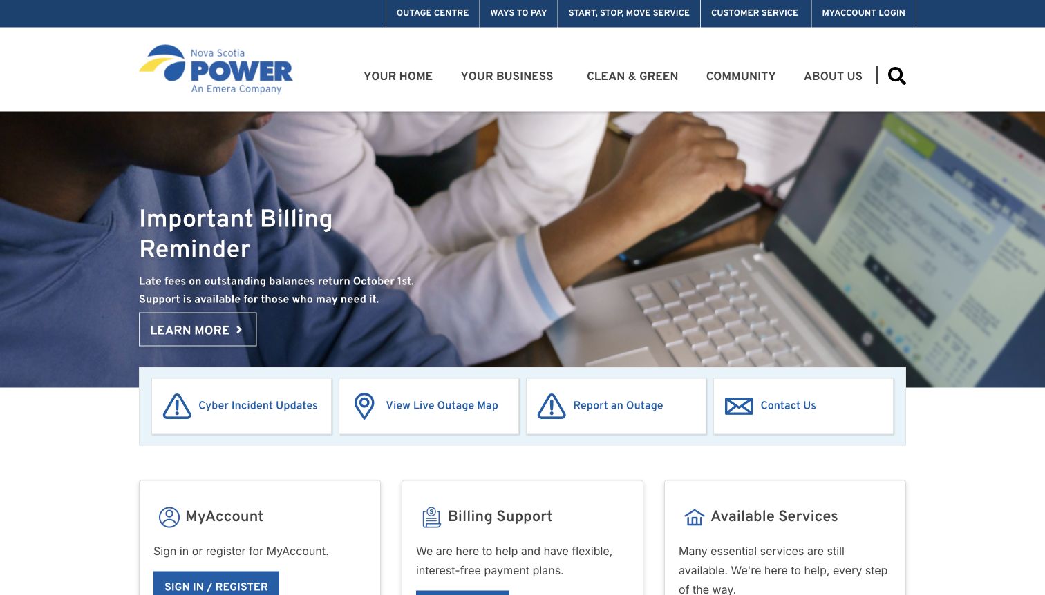
Nova Scotia Power’s retained homepage uses a billing-reminder image above clearly labeled cyber-update, outage-map, outage-reporting and contact routes. Account, billing-support and service cards begin below. The captured notices are a historical page state, not an assessment of the underlying events or current policy. Current source evidence references a custom Modernizr asset. This supports a feature-detection association without identifying the account system, outage-map implementation or availability of any service. The useful design priority is readable operational navigation that does not depend on interpreting the promotional image.
What you can learn
Keep essential notices and support destinations available in the base page, with alternatives for any capability-dependent map or interface. Assign an owner to temporary information. Verify the actual fallback separately rather than assuming a custom detection file guarantees continuity or compatibility.
Pros
Operational destinations are labeled independently of the large banner.
Support and account tasks have distinct content areas.
Cons & considerations
Historical notices must not be mistaken for current service status.
The Modernizr reference does not establish which features are tested or whether service routes work.
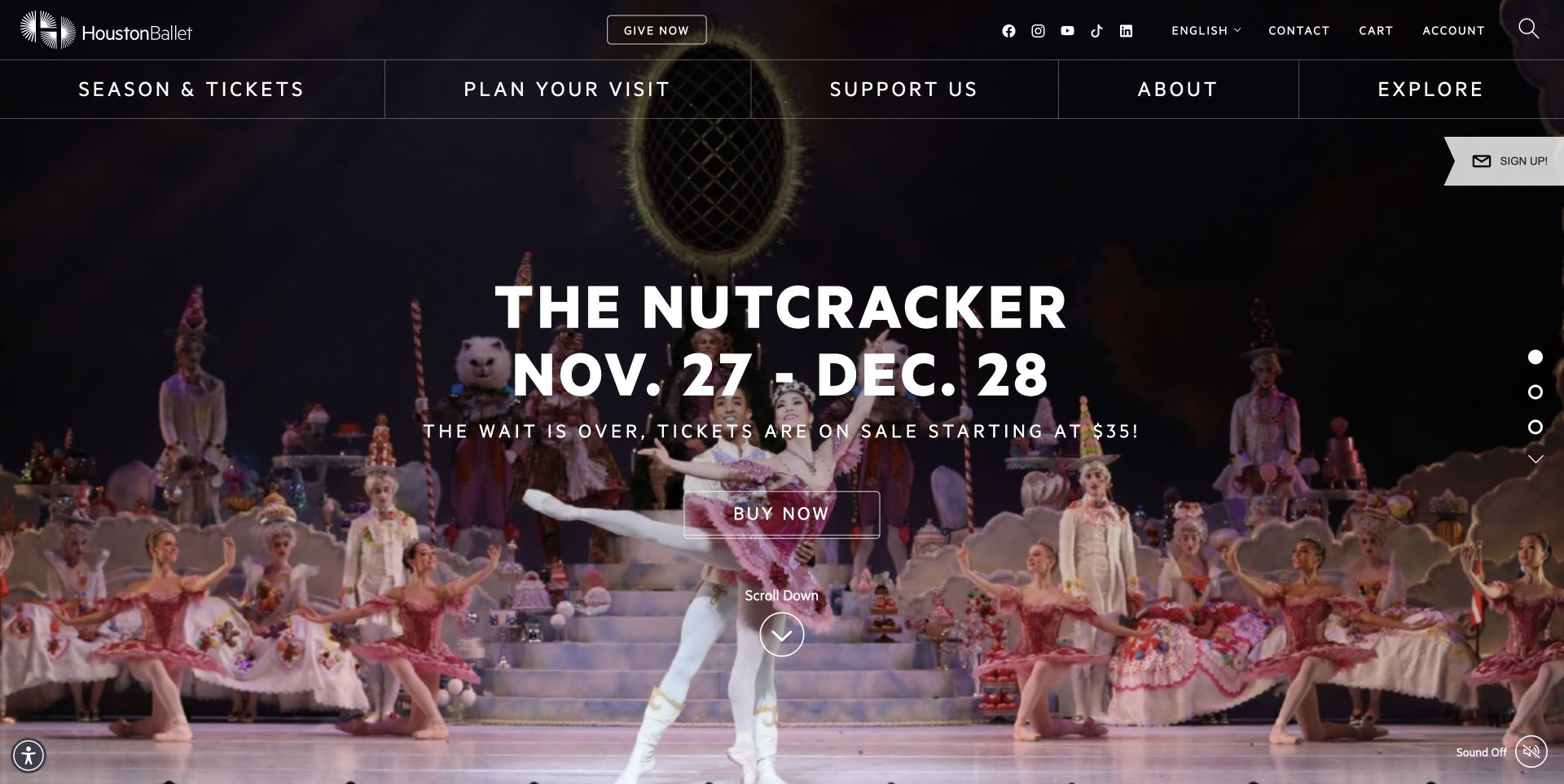
Houston Ballet’s retained homepage places a production title, date range and ticket action over stage footage. Broad navigation remains above, with account, language and search utilities. The saved frame includes a visible sound-off control and separate slide indicators. Current evidence references Modernizr, but it does not show which capability tests run or prove that the library controls the media or ticketing. The useful example is a visually prominent event invitation that still preserves routes for visitors interested in other productions, education or planning a visit.
What you can learn
Keep the production identity, date and next step readable without requiring motion or sound. Define a useful still and ordinary event links before enhancing the presentation. Test the actual media and focus behavior; a feature-detection asset does not establish accessibility or a completed ticket purchase.
Pros
The featured production has practical identifying information in the opening.
Surrounding navigation supports tasks beyond the promoted event.
Cons & considerations
Text contrast needs checking across changing stage frames.
The public reference does not identify active tests or guarantee media fallback behavior.
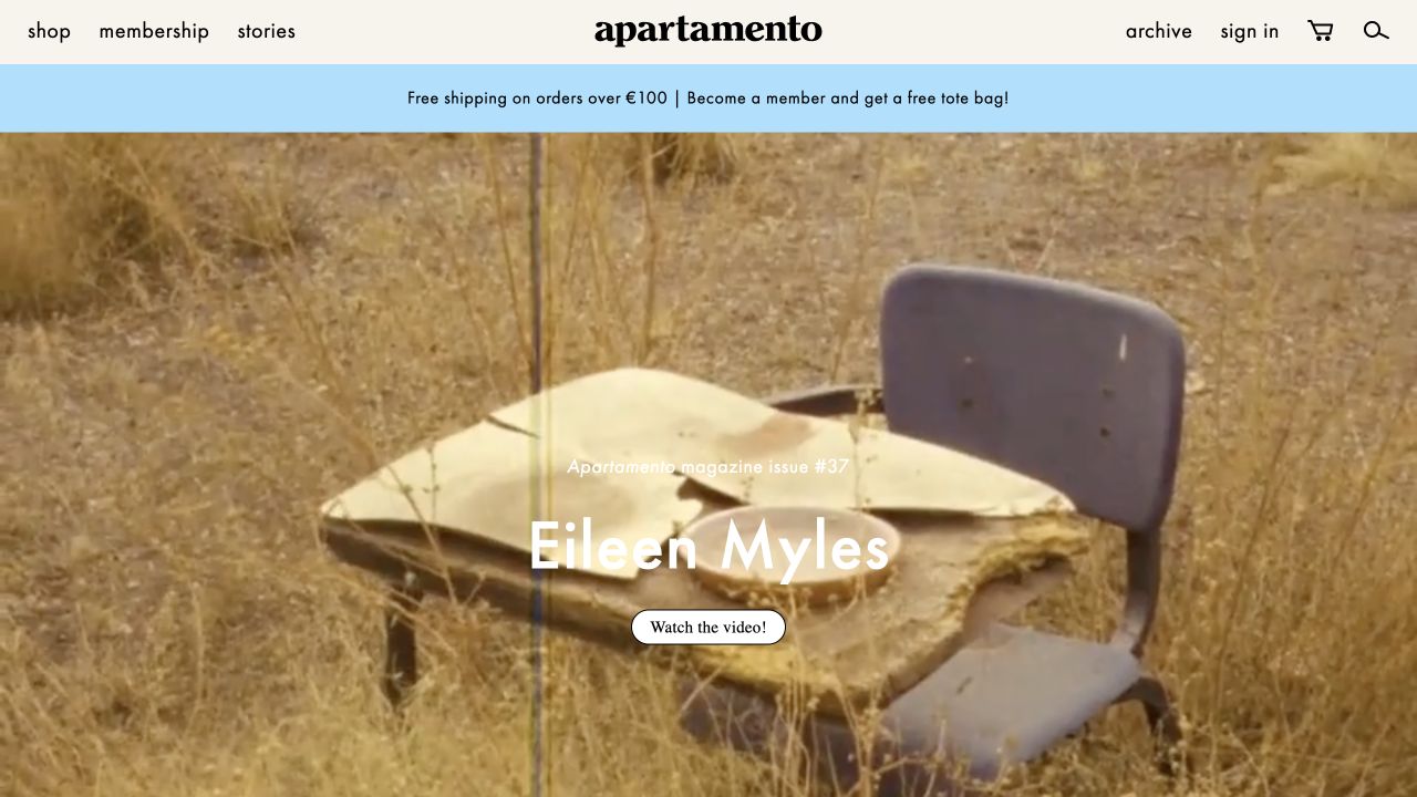
Apartamento’s retained opening shows a large Eileen Myles feature image beneath a compact header. Shopping, membership, stories and archive are separate routes, while a clear video invitation sits over the feature. Current evidence references a theme asset whose path names Modernizr alongside Respond. This identifies a public dependency association, not which pictured elements use it or whether every bundled capability remains active. The useful design distinction is between editorial discovery and commerce within one recognizable publication identity.
What you can learn
Preserve story titles, summaries and ordinary links when media or a presentation enhancement is unavailable. Keep shopping and membership tasks independently labeled rather than making them depend on a feature carousel. Review legacy capability tests deliberately; an asset filename is not proof that the current implementation needs every bundled fallback.
Pros
Editorial and commercial destinations remain distinct in the header.
The featured subject and video invitation are identifiable without opening a menu.
Cons & considerations
White feature text needs contrast checks across imagery.
The combined asset path does not reveal active tests, version suitability or actual fallback behavior.
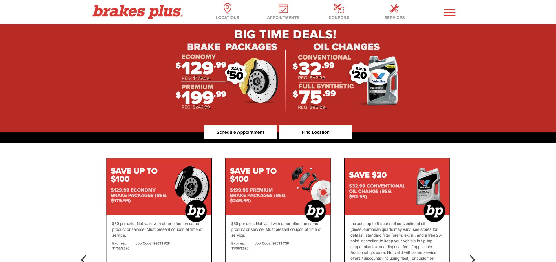
Brakes Plus uses a large red offer panel, compact service navigation and separate scheduling and location actions. Additional cards repeat the advertised categories below, with visible qualifications. Current page evidence references a Modernizr asset. That does not establish the booking system, prove that a particular offer card is enhanced or validate the advertised work and prices. The useful reference is a commercial page where ordinary service and location routes can remain clear independently of any richer promotional presentation.
What you can learn
Keep essential offer conditions and local-service links readable before adding capability-dependent effects. Give a useful alternative if an enhanced card or control is unavailable, and distinguish an appointment request from confirmed work. Review the active feature tests rather than assuming a legacy dependency guarantees support.
Pros
Scheduling and location discovery are separate visible actions.
The offer cards provide space for conditions beyond the headline price.
Cons & considerations
Promotional text embedded in imagery needs equivalent readable content.
The asset reference does not identify active tests or verify any booking outcome.
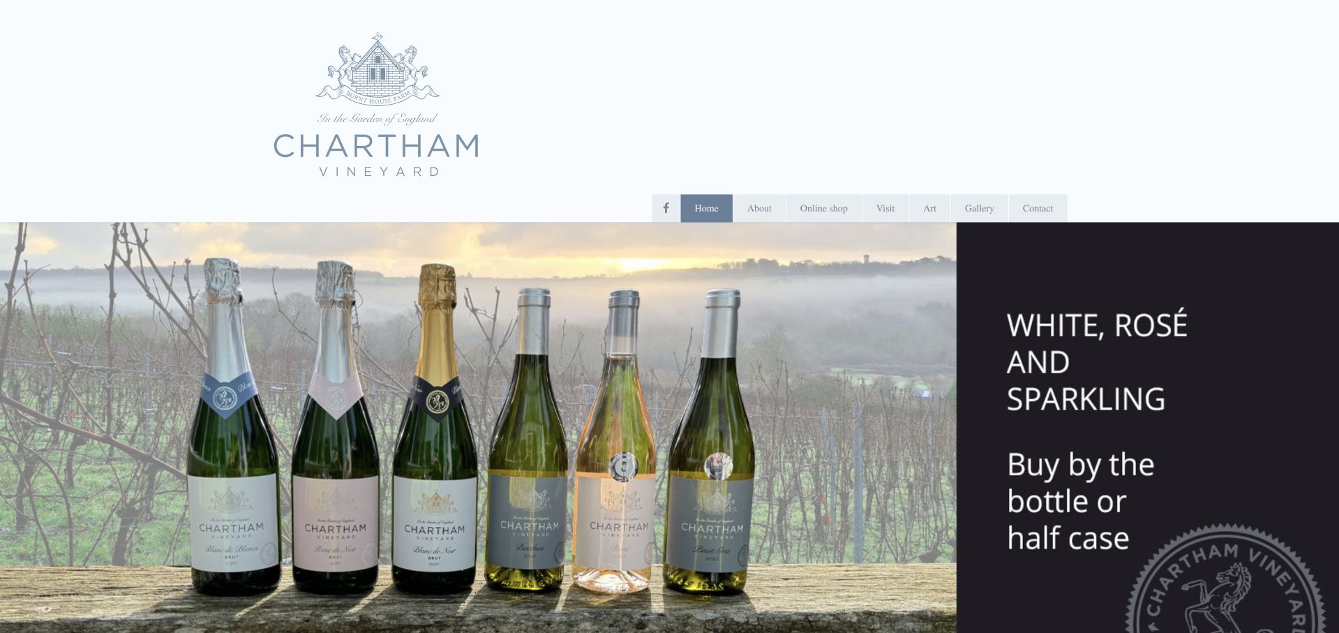
Chartham Vineyard pairs a large identity area with a wine-range image and ordinary links to the shop, visits, art and contact. The retained frame places the bottles against the vineyard, with a separate promotional text panel at the right. Current page evidence references a Modernizr script. That establishes a public dependency association, not that Modernizr produced the banner, chose its layout or controls the shopping journey. The useful example is a comparatively simple content structure where essential information can remain independent of optional presentation effects.
What you can learn
Use feature detection to support a defined enhancement rather than make ordinary navigation depend on a capability test. Keep opening arrangements, visit information and shopping routes readable in the base page. Test the actual fallback separately; a script reference and a still image do not establish that it works.
Pros
The navigation separates several practical visitor tasks without a complex visual interface.
The range photograph and adjacent text have distinct roles.
Cons & considerations
Promotional words inside an image need an accessible text equivalent.
The observed Modernizr asset does not identify active tests or prove current-browser support.
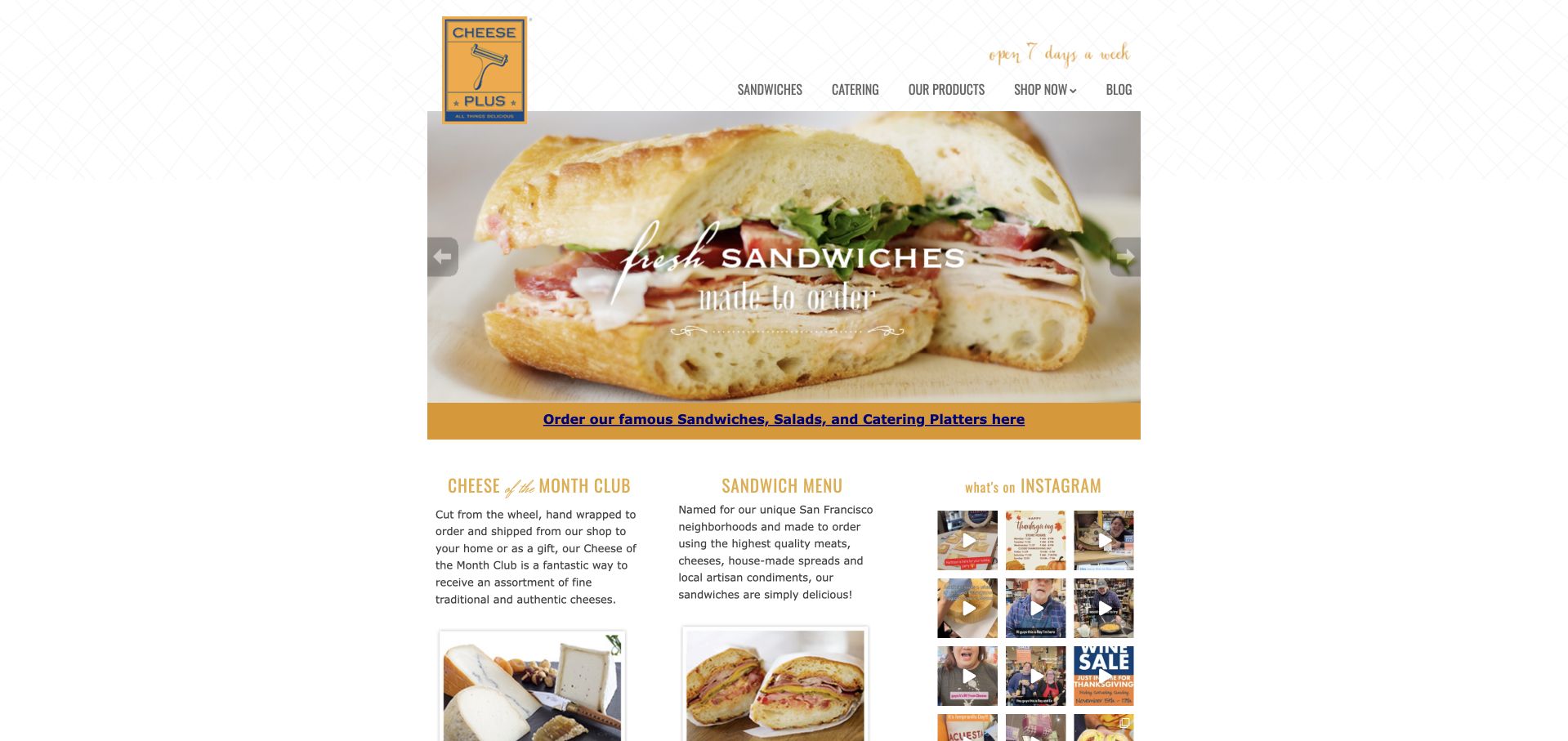
Cheese Plus uses a narrow central column, a yellow cheese-grater identity and a fine patterned background. A sandwich image sits above a gold ordering strip, with cheese-club, menu and social content beginning below. Current evidence references Modernizr within the site’s theme. The asset does not prove that Modernizr creates the food slider, handles orders or powers the embedded social material. The useful pattern is a small shop’s practical information structure remaining visible alongside several different kinds of visual content.
What you can learn
Keep ordering links, menu information and recurring-shop features available independently of optional media. If a capability test gates an enhancement, preserve a usable still or ordinary link. A feature-detection association should not become a claim that third-party ordering or social embeds work.
Pros
The ordering strip provides an explicit route beneath the image.
Compact content columns distinguish several reasons to return to the shop.
Cons & considerations
Small type and several columns require careful narrow-screen treatment.
The public dependency does not reveal active tests or validate the ordering workflow.
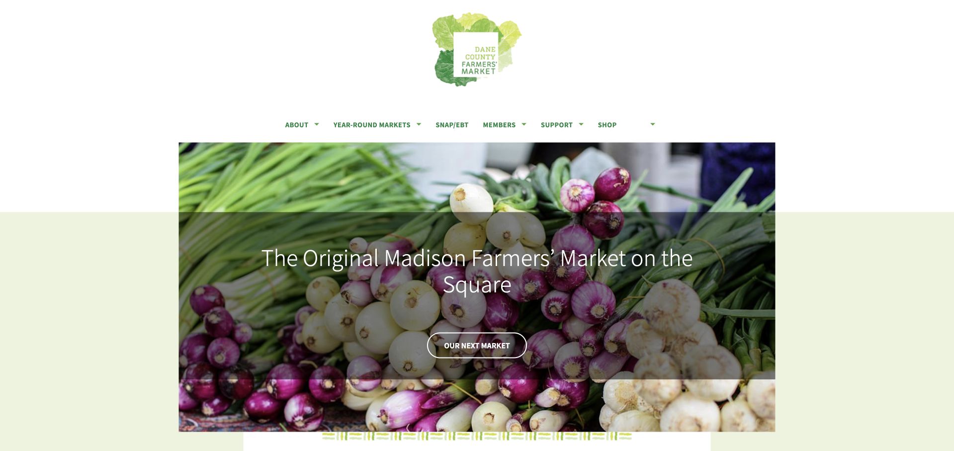
Dane County Farmers’ Market places a small green identity above a large vegetable photograph. A concise Madison-market statement and an Our Next Market action give the image a practical destination. Generous margins and pale green bands keep the page restrained. Current evidence references a Modernizr asset. That identifies a public feature-detection dependency, not the source of the layout or proof that current market details are correct. The useful example is a simple introductory structure whose main task can remain understandable even without optional visual enhancements.
What you can learn
Keep market names, schedules and location links available as ordinary content before adding richer effects. Define alternatives for any enhanced discovery control and maintain temporary notices deliberately. A browser-feature test cannot establish whether a market is open or that a visitor’s route has been planned.
Pros
One identifiable action follows a clear place-based introduction.
The image and restrained identity have separate visual roles.
Cons & considerations
A large photograph delays detailed visit information.
The asset reference does not identify active tests or prove a working fallback.
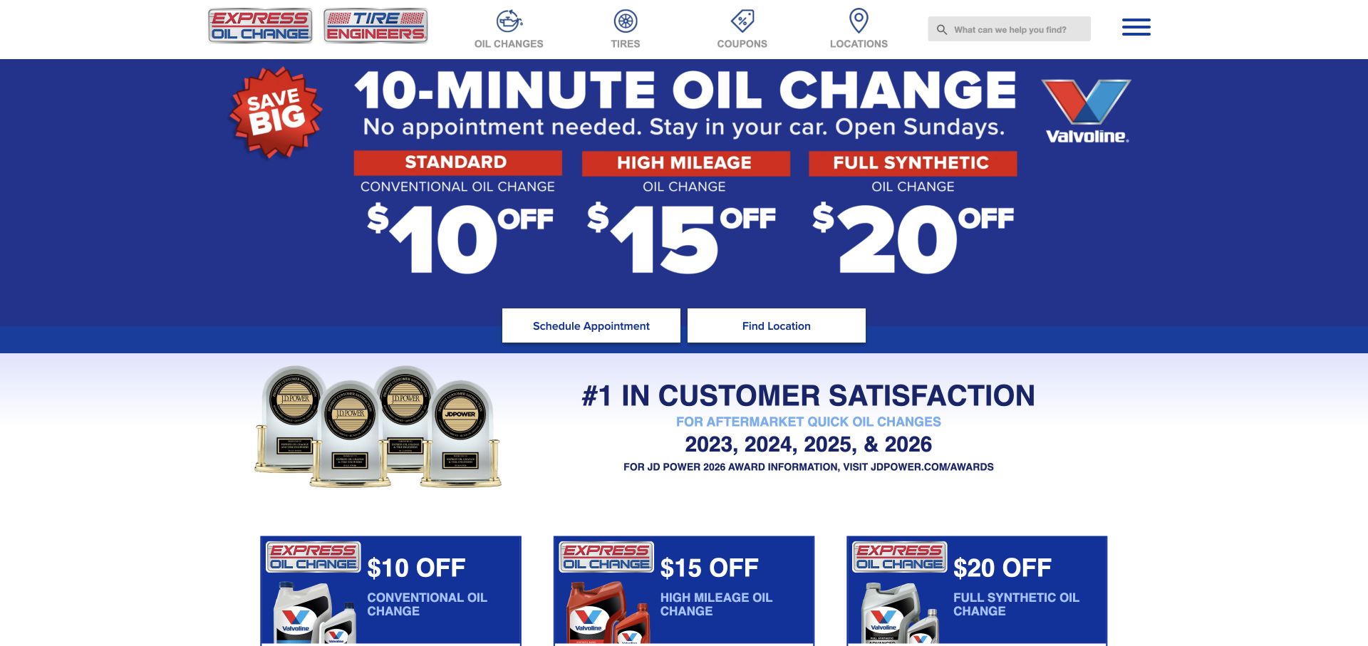
Express Oil Change & Tire Engineers leads with a blue routine-service offer and separate scheduling and location actions. Compact header icons identify oil changes, tires, coupons and locations, while recognition material begins below. Current source evidence references Modernizr. This supports a browser-detection association, not a claim that the plugin generates the offer, calculates a price or completes an appointment. The useful design pattern is a recurring service made easy to identify without requiring the visitor to interpret a complex animation.
What you can learn
Preserve service descriptions, offer conditions and location routes in a useful base page. Add capability-dependent effects only with a defined fallback, and test that fallback independently. Keep an appointment request distinct from confirmed availability or work; a detection asset is not evidence of operational completion.
Pros
The main recurring service and local-discovery route are clearly labeled.
Scheduling and location actions remain separate from recognition graphics.
Cons & considerations
Image-based promotional text needs readable equivalents and current qualifications.
A Modernizr reference does not identify the active test set or guarantee control behavior.
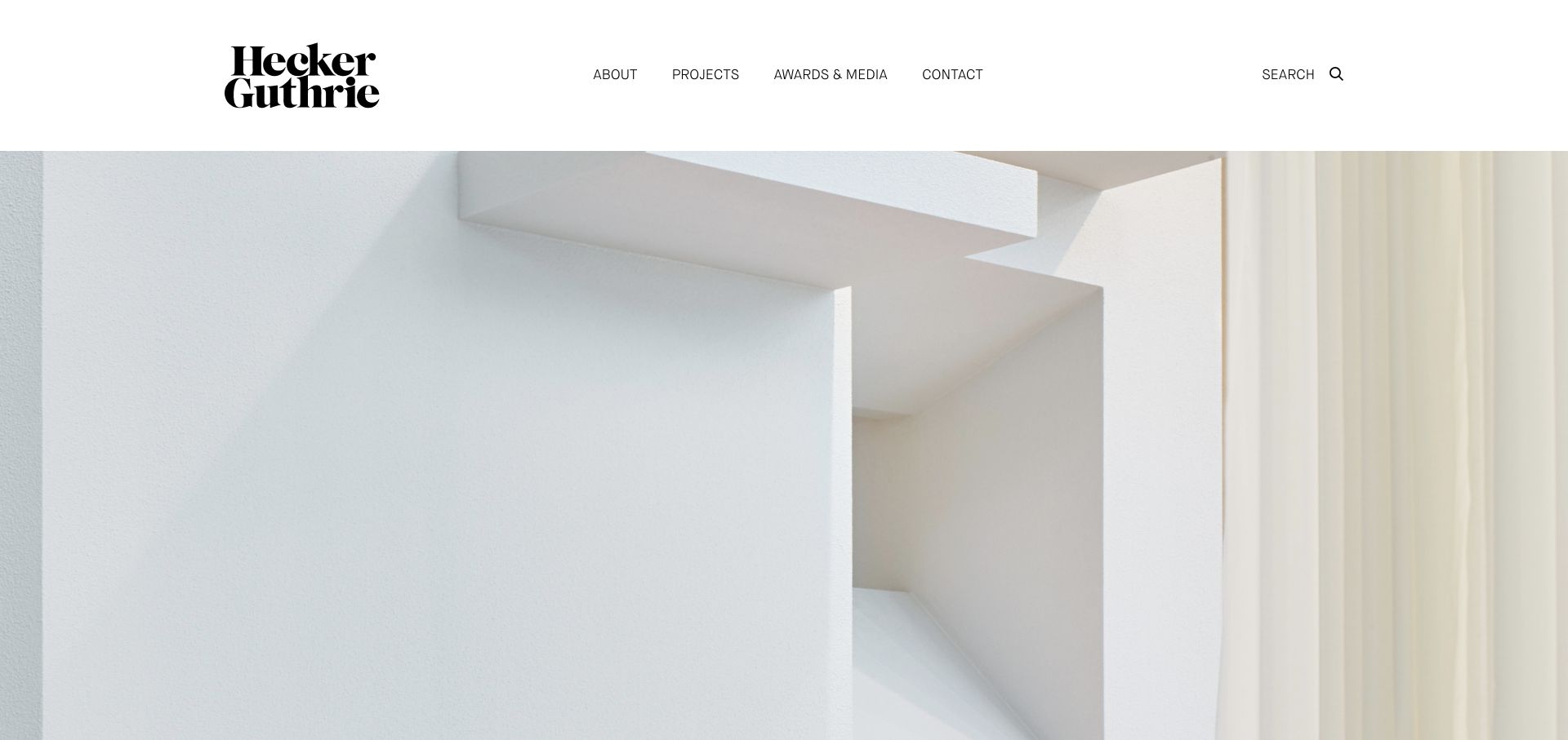
Hecker Guthrie’s retained homepage uses a substantial white header, a stacked serif identity and descriptive links to projects, company information, media and contact. A large photograph of pale sculptural architectural surfaces begins below. Current page evidence references Modernizr. That establishes an observable feature-detection dependency, not the cause of the photographic composition or proof that every portfolio transition uses it. The useful example is a quiet interface where the project archive can remain reachable independently of optional visual effects.
What you can learn
Keep project links and descriptive information available before adding capability-dependent transitions. Give close-up imagery a route to a complete project record and preserve a useful still presentation. Review active tests against actual requirements instead of treating a familiar legacy dependency as a compatibility certificate.
Pros
Descriptive navigation offers a direct route into the project collection.
The restrained header leaves the photograph’s material detail largely uninterrupted.
Cons & considerations
A close-up opening provides limited project identification without supporting context.
The public asset does not reveal test configuration or verify transition and fallback behavior.
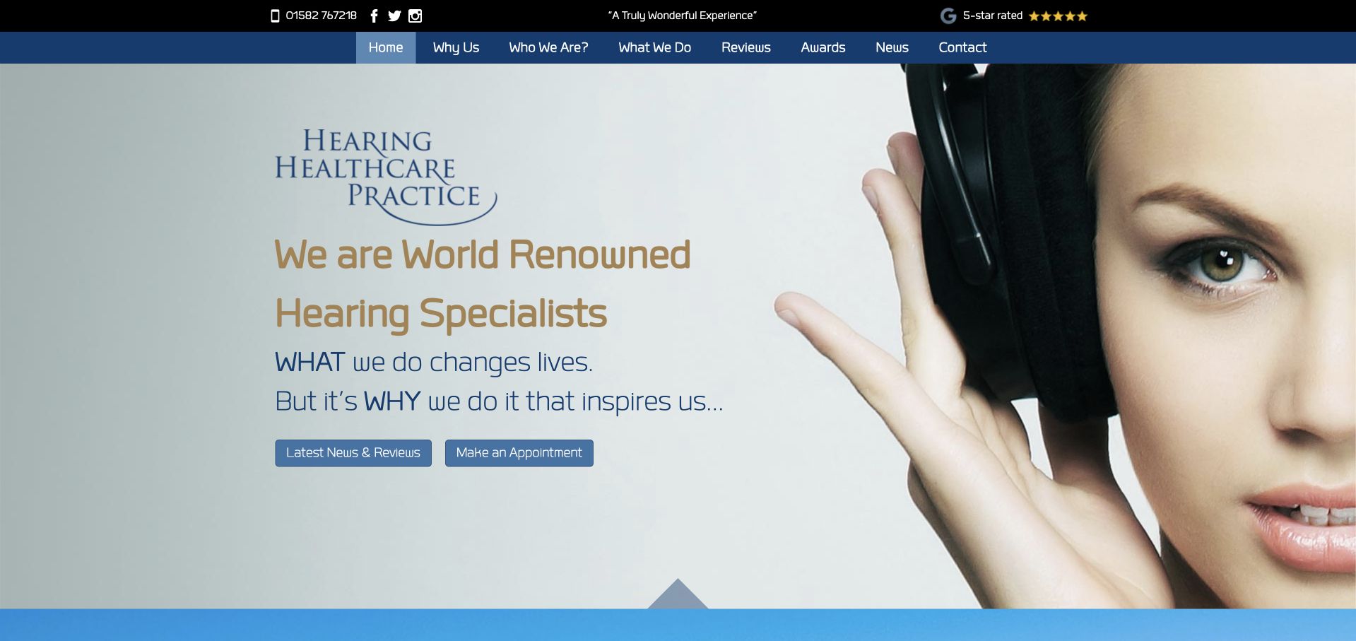
Hearing Healthcare Practice uses a close-up headphone portrait, pale blue tones and visible news and appointment actions. The header preserves service, review and contact routes around the large image. Current evidence references a Modernizr asset within the site’s theme. It does not establish how booking works, identify active tests or substantiate the prestige language in the introduction. The useful design contrast is a memorable image paired with ordinary service routes, rather than a claim that feature detection creates or validates the care experience.
What you can learn
Keep service and contact information useful when an enhancement is unavailable, and avoid making critical text depend on media. Review the actual capability tests and provide meaningful alternatives. A library association does not establish accessibility, clinical quality or a successful appointment request.
Pros
The portrait creates a recognizable visual introduction.
Appointment and explanatory content have distinct visible actions.
Cons & considerations
Broad prestige language needs concrete service context nearby.
The observed asset cannot verify active tests, fallback behavior or the appointment workflow.
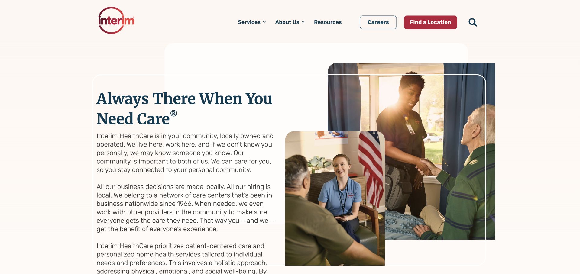
Interim HealthCare’s retained homepage places a substantial cream text panel beside overlapping home-visit photographs. Services, resources, careers and location discovery remain separate in the header. Current source evidence references Modernizr. This identifies a browser-feature dependency, not the implementation of the location finder or the availability of particular services. The photographs and broad introduction also do not establish a specific care arrangement. The useful design question is how to keep practical definitions and contact routes clear when the presentation includes layered imagery and substantial copy.
What you can learn
Keep service descriptions and location links available before adding capability-dependent effects. Provide alternatives for enhanced controls and review temporary information separately. A feature test does not establish care eligibility or service availability, and a still image cannot verify the fallback journey.
Pros
The header separates service research from careers and location discovery.
Written explanation and photographs have distinct visual areas.
Cons & considerations
Long introductory copy slows scanning for a specific need.
The asset reference does not identify active tests or verify the location interface.
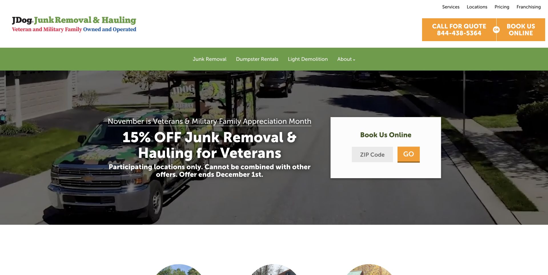
JDog’s retained homepage combines green service navigation, a vehicle photograph and a seasonal offer with visible conditions. A white ZIP-code card provides a local booking route at the right. The captured campaign is a historical page state, not a permanent price promise. Current evidence references Modernizr within the theme. That does not prove that the library powers the ZIP lookup, confirms a job or renders the promotion. The useful pattern is a temporary campaign kept beside a practical local-discovery task.
What you can learn
Keep campaign conditions, expiry information and ordinary service routes readable before adding enhancements. Define a fallback for any capability-dependent local control and test it separately. A feature-detection dependency cannot establish participating locations, availability or a completed booking.
Pros
The offer’s conditions appear near the promotional headline.
A separate local task gives the network-wide message a practical next step.
Cons & considerations
Large seasonal imagery can delay evergreen service context.
The public asset does not identify active tests or validate the ZIP-code workflow.
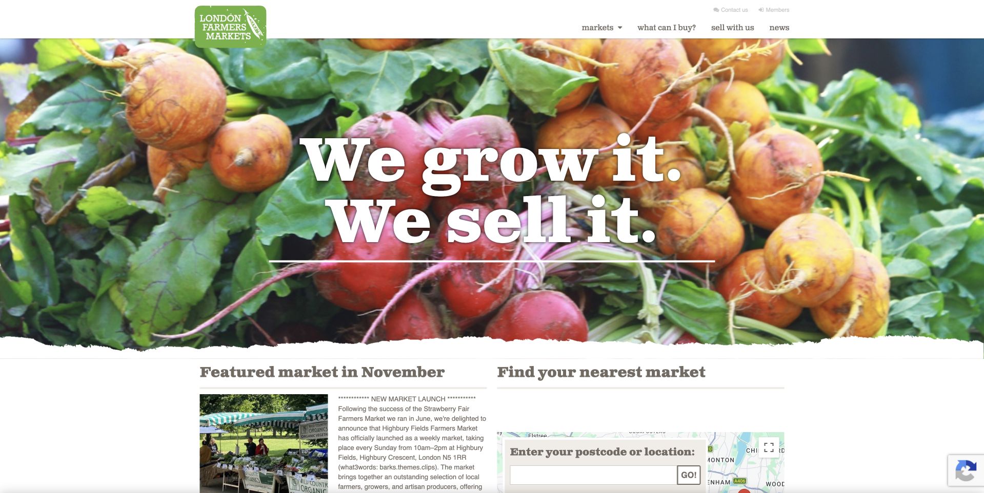
London Farmers’ Markets places a large white grower statement over vivid vegetable photography. Below, the page separates a featured-market story from a nearby-market search with a postcode or location field. Compact green branding links the regional system together. Current evidence references Modernizr, but it does not identify the map implementation, prove that a search succeeds or establish current opening arrangements. The useful design pattern is appetite followed quickly by a practical discovery task, with the featured story kept distinct from the search.
What you can learn
Keep market names and ordinary destination links available when a capability-dependent map or search enhancement cannot run. Provide maintained location and schedule information at the destination. A detection library is not evidence that geography, results or opening exceptions are correct.
Pros
Featured editorial content and nearby-market discovery have distinct areas.
The main navigation remains compact beside the large image.
Cons & considerations
Location interfaces need an accessible alternative beyond a visual map.
The observed dependency does not reveal active tests or verify the search behavior.
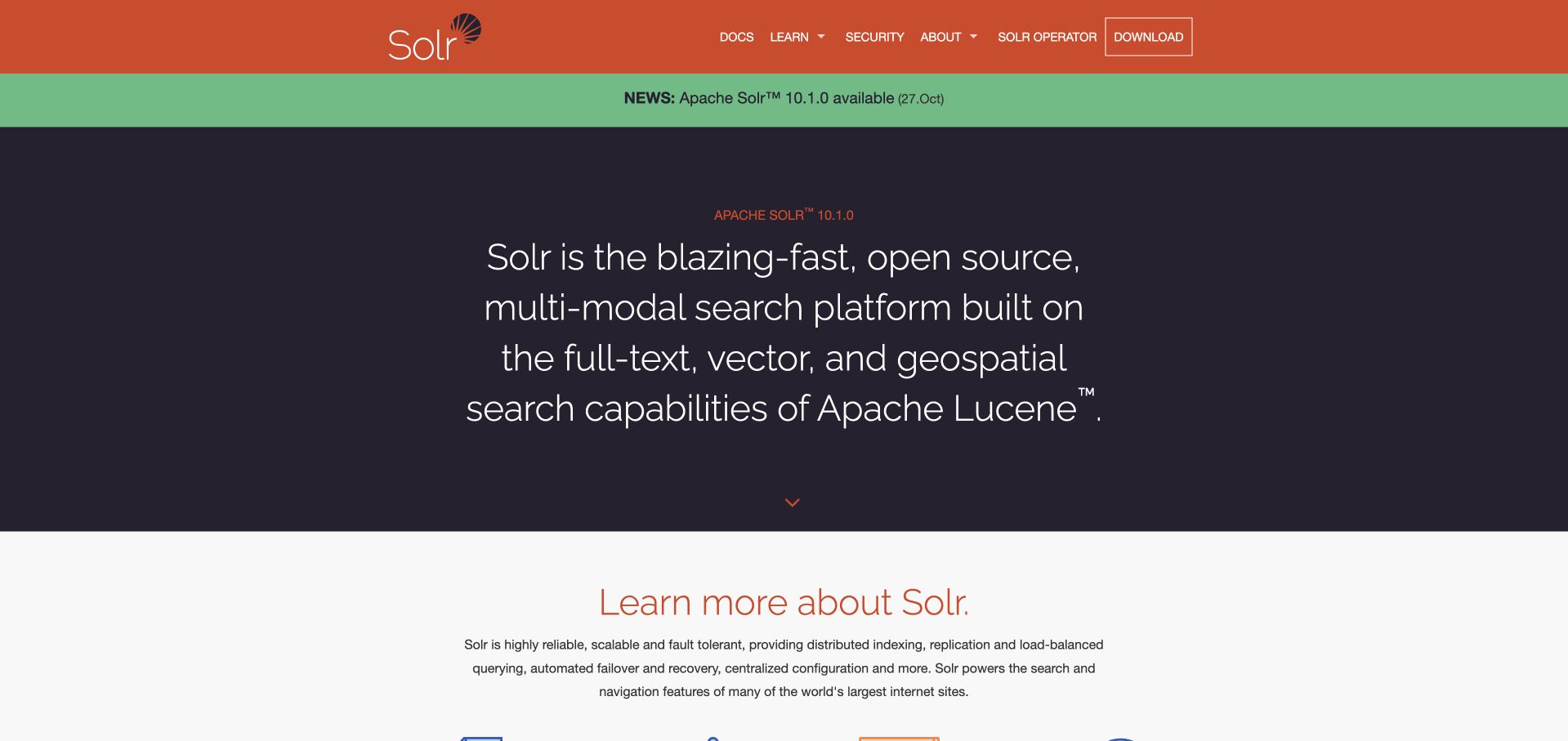
Apache Solr’s retained homepage uses orange navigation, a release notice and a dark panel describing its search-platform category. Documentation, learning, security and download routes remain visible above the explanation. Current page evidence references Modernizr within a frontend framework asset path. This concerns the public website’s browser-feature layer, not Solr’s search runtime, indexing implementation or every application using the project. The useful pattern is a technical introduction that can preserve ordinary resource navigation independently of optional presentation features.
What you can learn
Keep documentation and release information available in the base page, with a useful alternative for any capability-dependent control. Review tests against the website’s actual requirements rather than transferring conclusions about the product runtime to its marketing site. A public asset reference does not verify behavior.
Pros
The project category and ordinary documentation routes are clearly separated.
Release information has a distinct position above the longer introduction.
Cons & considerations
A broad capability statement still needs task-specific documentation.
The Modernizr asset does not establish active tests, frontend version suitability or fallback behavior.
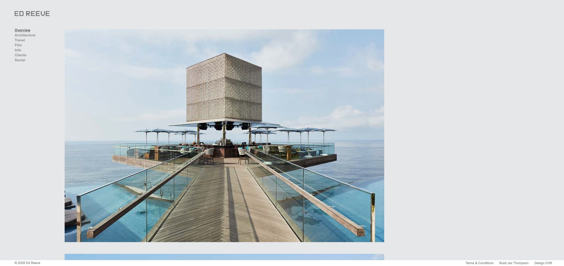
Ed Reeve places a large architectural photograph beside a compact gray sidebar. Architecture, travel, film, information and client routes remain visible, while the image receives most of the page width. A slim footer supplies terms and credits. Current source evidence references a Modernizr asset within the website’s theme. The photograph and sidebar do not reveal which tests execute, so this is a dependency association rather than proof that feature detection creates the layout. The useful design pattern is a stable set of ordinary routes beside expressive visual material.
What you can learn
Keep portfolio categories and project links available before adding browser-dependent effects. Use a capability test only where an enhancement genuinely requires it, and define a useful alternative. A feature-detection library should not become a reason to hide basic information or infer accessibility from the stack.
Pros
The persistent category list gives the image-led page a practical structure.
A restrained frame leaves the photograph’s composition largely untouched.
Cons & considerations
Small gray navigation needs adequate contrast and comfortable sizing.
A static capture cannot verify fallback behavior or the purpose of the Modernizr tests.
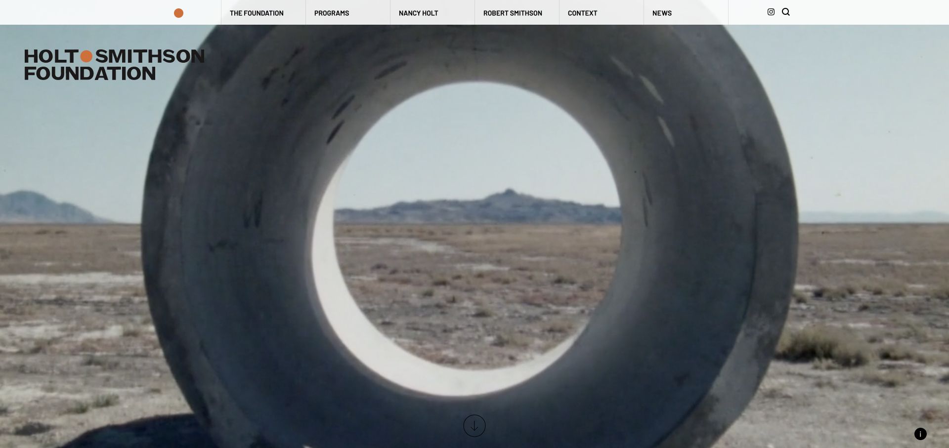
Holt/Smithson Foundation places a bold identity over a landscape-art image, with ordinary navigation to the foundation, programs, the artists, context and news. The saved view gives the artwork a strong physical setting while preserving those text routes. Current page evidence references Modernizr and an additional-tests asset. These references identify a feature-detection layer; they do not establish which pictured component uses it, whether every test remains necessary or how the site behaves when an enhancement is unavailable.
What you can learn
For an art archive with potentially richer discovery tools, preserve a text-based route to the work and explanatory records. Map each capability test to a specific enhancement and review its fallback deliberately. A familiar library name is not evidence that the resulting interface is accessible or compatible across devices.
Pros
The principal content categories remain visible outside the artwork image.
A strong image and restrained navigation perform different introductory roles.
Cons & considerations
Text over varying landscape imagery needs contrast checks beyond one frame.
The public asset references do not verify the active test set or enhanced-interface behavior.
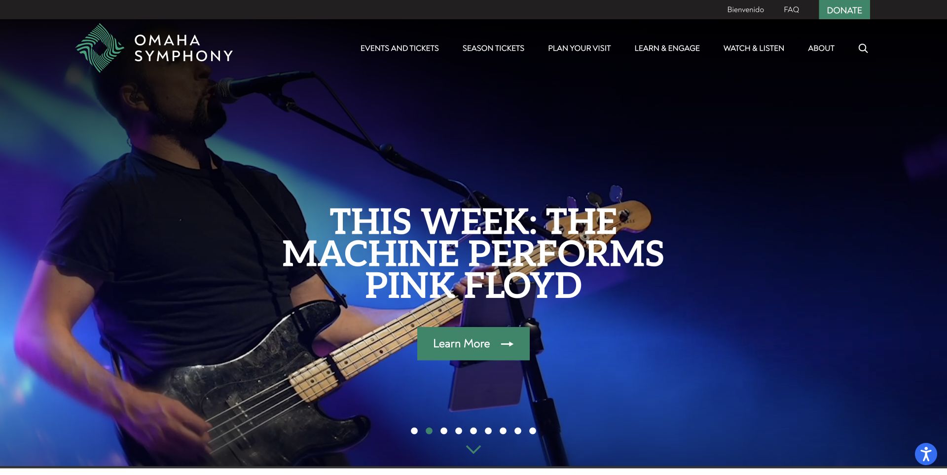
Omaha Symphony’s retained homepage promotes The Machine Performs Pink Floyd through a musician photograph, large white title and green Learn More action. Stable navigation remains above the campaign, with a row of slide indicators below. Current evidence references a custom Modernizr asset. That establishes a browser-feature association, not which component uses it or whether the hero, ticketing and other pages share one implementation. The useful design distinction is a dramatic campaign introduction surrounded by ordinary routes for visitors researching a different event or planning a visit.
What you can learn
Keep event names, practical information and ordinary programme links available without requiring a media sequence. Define a useful still and review any feature-gated behavior directly. A custom detection file does not establish accessible controls, a correct schedule or successful ticket purchasing.
Pros
A clearly named campaign and action give the opening a defined purpose.
Stable navigation remains available outside the promotional sequence.
Cons & considerations
Many slide indicators can make the wider event list important for comparison.
The asset reference does not reveal active tests or verify the hero’s behavior.
Kegan has 15+ years of experience working with small businesses, Fortune 500 companies, and everything in between. No development job is too big or too small: he brings the same hands-on attention to a focused improvement, a complete website, or a custom application.
For Modernizr projects, he can help with purposeful progressive-enhancement requirements, scoped browser-feature detection, reproducible custom builds, useful fallback states, compatibility checks, and maintainable dependency handover. He works directly with clients on scope, design, implementation, testing, and handover, with an emphasis on clear communication and a system that remains practical to maintain after launch.
Show 3 other Modernizr developersHide other Modernizr developers
Choose the enhancement strategy before the library
Begin with a functional document
For a content-heavy business site, first make headings, links, reading order, and important actions work in a straightforward document. Add an enhancement only when it improves that baseline. This produces a clearer acceptance standard than asking for an impressive desktop animation alone.
Where a genuinely conditional experience exists, document both branches and the transition between them. The requirement should name the feature, the result when supported, and the acceptable alternative. The library should serve that decision rather than determine the entire visual system.
An old Modernizr reference is a reason to investigate, not permission to delete a script on production. Search the authorized codebase for dependent classes and checks, test the relevant routes, and keep a rollback. A seemingly unused file can still support an overlooked template.
Plan progressive enhancement as an understandable project requirement
Write the baseline task in plain language
Choose a few journeys that genuinely matter to the organization: finding a service, comparing a product, checking opening hours, reading a policy, or starting an inquiry. Describe what success looks like without referring to a specific animation or JavaScript library. Identify the minimum information and controls a visitor needs at each step. This separates the essential task from the attractive presentation around it. For example, an architectural portfolio can benefit from a cinematic transition, but the project title, photographs, description, and contact path still need an understandable route when that transition is unavailable.
Make the baseline visible in early design reviews. Ask a person unfamiliar with the project to explain what the page offers and where they would go next. Record ambiguities in labels, hierarchy, or order before adding more effects. A fallback cannot rescue a page whose basic content is unclear. Include unusually long titles, missing images, empty results, and narrow screens in the reference set. Those states reveal structural weaknesses that a carefully staged homepage demonstration may conceal. Assign an owner to approve the baseline rather than leaving it as an informal developer preference.
Create a short register of the capabilities that actually change behavior. For each one, record the feature being tested, the component that uses the result, the supported state, and the fallback state. Link the entry to a real template or component rather than a vague instruction to support older browsers. This register helps a reviewer distinguish necessary detection from inherited code that no longer serves an obvious purpose. It also gives the maintainer a practical starting point when a browser update changes an observed result.
Modernizr documents JavaScript results and optional classes on the root element, including configuration controls for those classes. Decide which pattern the project will use and keep its naming understandable. Do not scatter undocumented feature-dependent styling across unrelated templates. Test the actual behavior rather than assuming that a truthy result guarantees every detail of a complex interaction. A feature check answers a bounded question; input method, network conditions, reduced-motion preferences, content size, and other factors still require their own design and testing decisions.
Make the build reproducible and the dependency removable
Store the chosen configuration, source location, and build instructions with the project. Explain why each selected detection exists and where its result is consumed. A future maintainer should be able to recreate the shipped asset without recovering a forgotten download from somebody’s laptop. Avoid copying a competitor’s script simply because it appears in public source. Their enabled tests, licensing context, theme assumptions, and support obligations may have little relationship to your own website. The smallest useful configuration is a deliberate engineering choice, not a competition to achieve an arbitrary file size.
Plan how a detection will eventually be retired. When the supported environment or component changes, the team needs to know which checks can be removed safely and which visual branches must change with them. Keep upgrades and removals separate from unrelated redesign work when possible so regressions are easier to isolate. Review the actual deployed asset and its cache behavior after a release. A correct source change that never reaches visitors is not a completed update. Preserve a known working release and an understandable rollback route for material changes.
Test failures as complete journeys, not isolated widgets
A component can look acceptable by itself while blocking the next action in a real page. Follow each selected journey through navigation, content, and completion states under the relevant conditions. Check that focus remains understandable, controls retain useful labels, and the reading order still makes sense. Where an enhancement changes visibility or layout, inspect the content before initialization and after a failed asset request. Record what was actually exercised rather than declaring universal compatibility because a desktop browser loaded the homepage once.
Use an agreed support matrix based on the audience and operational needs. Include representative screen sizes and input methods, but avoid promising that one library makes every environment equivalent. Save specific failures with the URL, conditions, expected result, and observed result. Distinguish a visual difference that still supports the task from a genuine loss of functionality. That distinction helps prioritize fixes without treating every browser variation as a crisis. Recheck important fallbacks after changing a theme, navigation component, or content pattern, because enhancement dependencies often cross those boundaries.
Budget enhancements against content and motion needs
An effect should earn its place by helping a visitor understand or complete something. Compare the proposed treatment with a simpler alternative and identify the difference in comprehension, control, or useful emphasis. Large moving introductions can establish a mood, but they should not delay the first meaningful explanation or obscure the main action. Provide appropriate control and consider motion-sensitive visitors in the design brief. Feature detection and motion preference are different questions; a browser can support an effect that a person would rather not experience.
Review real content rather than only ideal demonstration assets. A slow photograph, a long translation, an unusually tall card, or a missing video can change the apparent quality of a transition. Ask who will maintain those assets and what constraints editors need to understand. Measure relevant page behavior under comparable conditions before making performance claims. Finding Modernizr in an admired website does not demonstrate that its experience is fast, accessible, or commercially effective. Borrow the design reasoning that fits your task and test the implementation against your own evidence.
The handover should explain the baseline experience, the selected enhancements, the checks that activate them, and the person responsible for each component. Show how to reproduce a known fallback and how to report a failure with enough context for diagnosis. Give editors a short explanation of content patterns that require extra care, such as an image-led hero with essential embedded lettering. Keep private operational details out of public documentation, but make sure the authorized team can find the configuration and release history when a problem appears.
Agree how future changes will be reviewed. A new feature, third-party widget, or visual refresh may introduce a different compatibility requirement than the original site. Revisit the support matrix and acceptance journeys when the audience or business task changes rather than assuming a one-time launch checklist lasts indefinitely. Keep the evidence modest: record tested conditions, observed outcomes, and remaining limits. An understandable set of decisions is more valuable than a long list of supported technology names that nobody can connect to the visitor’s experience.
Ask the actual team to carry out its routine job: publish a realistic update, correct a mistake, preview a narrow screen, and identify who owns an integration failure. For a library or frontend framework, also ask who maintains the content source and deployment. A polished screenshot does not answer those operational questions.
Beyond the screenshot
Modernizr design and implementation checklist
Define the essential visitor task before choosing effects.
Record a useful baseline for important content and actions.
Map each feature detection to a real component and fallback.
Keep the selected custom-build configuration with the project.
Document dependent root classes and JavaScript checks.
Audit inherited references before removing them.
Test initialization and relevant asset-failure states.
Check keyboard order and labels in both branches.
Review motion preferences independently of feature support.
Use real content and representative narrow layouts.
Record actual tested conditions rather than universal compatibility claims.
Demonstrate reproducible builds, issue reporting, and rollback at handover.
Test with real content, a keyboard, a small screen, slow or failed requests, and the people who will maintain the system. These are planning checks, not an accessibility, security, performance, or search-ranking certification.
Sources & editorial method
How this Modernizr collection was reviewed
Visual reviews study the actual captured pages. A fresh, dated public-source check found a Modernizr-specific script or stylesheet path on each cited exact page. That association does not establish active feature use, a particular version, complete architecture, or measured quality. Retained original captures keep their original dates. Product explanations reference official project documentation; planning recommendations are original project guidance.
Every image is an unmodified capture from the actual website, with its source and capture date. Some captures are reused from our shared catalog; their dates remain the original capture dates. None comes from a vendor gallery or a generated reconstruction. Moving imagery and live content can change.
Technology attribution uses public page assets or metadata, official platform documentation, or a cited first-party project case study. Documentary and framework-relationship evidence is identified where used; it is not a complete current backend inventory. A CMS image CDN alone does not establish a full CMS deployment. A library’s presence does not prove which individual controls use it, and a platform label does not establish AI authorship.
The composition notes, lessons, pros and tradeoffs are original editorial observations. We have not measured conversion, traffic, security, performance or accessibility conformance. Website owners retain their brands and imagery; these examples are not our client portfolio. Written, Edited and Curated are independent records, not dates advanced by a build. See our editorial standards or suggest a correction.
Questions worth asking
Modernizr website development FAQs
Is Modernizr a website builder?
No. It detects browser capabilities and can expose results for conditional behavior or styling. The content system, layout, backend, and design process are separate questions.
Does every pictured effect use Modernizr?
Not necessarily. A public asset reference establishes a scoped association with the page. Identifying which component consumes a result requires a separate implementation review.
Should a new site include it automatically?
No. Define the required capability checks and fallbacks first. The appropriate implementation depends on the actual interface and support requirements, not a competitor’s technology list.
Can an old reference simply be deleted?
Investigate dependent classes and checks in the authorized project, test affected journeys, and keep rollback evidence before removal. An old filename alone does not establish that a dependency is unused.
Does feature detection guarantee accessibility?
No. A detected capability says nothing by itself about labels, keyboard behavior, reading order, motion preferences, content quality, or the accessibility of the resulting interaction.
Borrow the hierarchy and useful interactions, then specify a baseline your own visitors can rely on. The best enhancement is one whose purpose, fallback, and maintenance are all understandable.